If you’re craving a grunge painting vibe, think raw texture, imperfect edges, and feelings that show up as smears, drips, and bold contrast. Here are my favorite grunge painting ideas—starting with the classics and getting weirder as we go.
Graffiti Tags And Paint Runs
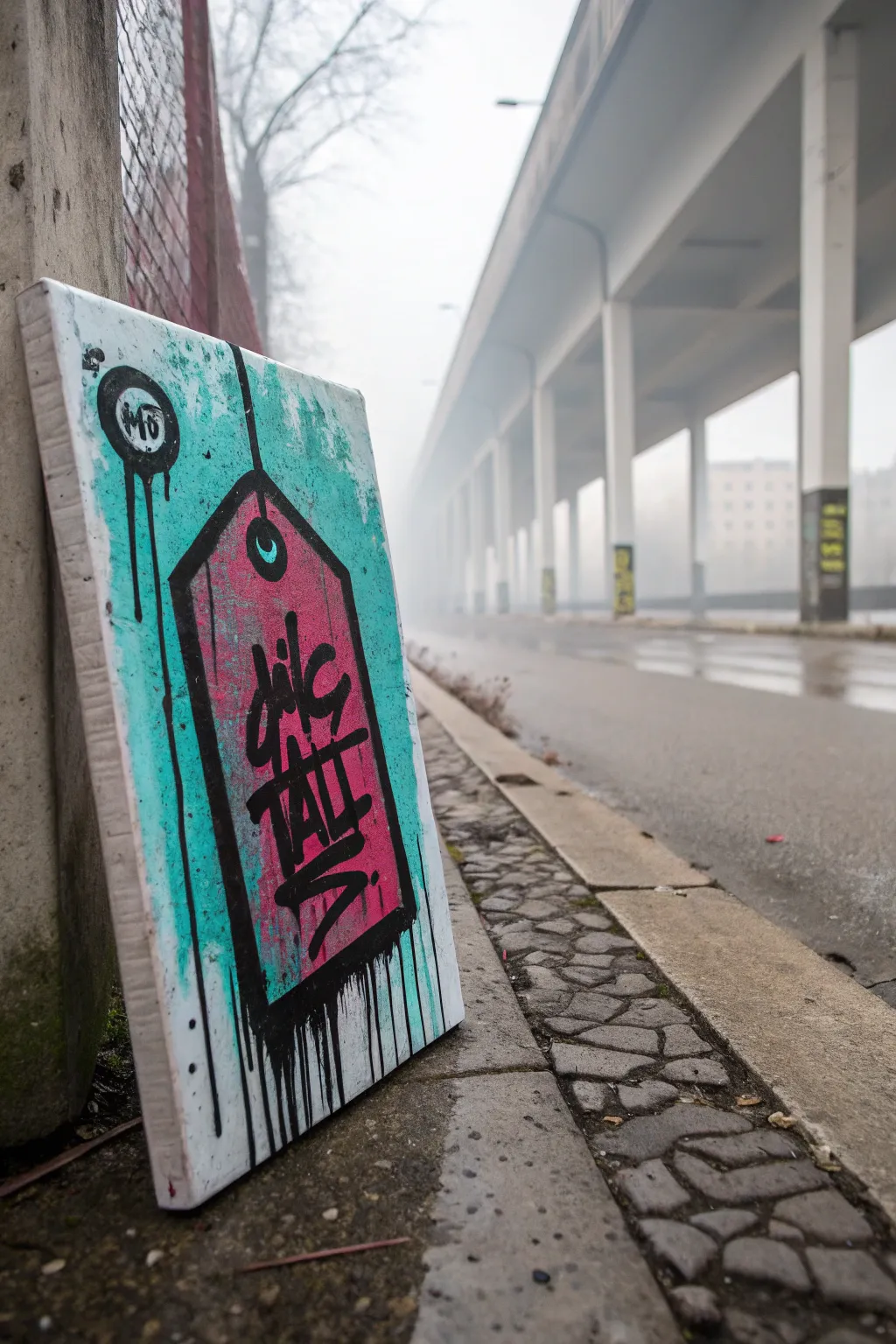
Bring the street to your studio with this gritty, graffiti-inspired canvas project. Featuring paint drips, distressed layers, and a bold central tag, this artwork captures the essence of urban decay perfectly.
Detailed Instructions
Materials
- Rectangular stretched canvas (e.g., 16×20 inches)
- Acrylic paints: Turquoise/Teal, Fluorescent Pink, Black, White
- Gesso (optional but recommended for texture)
- Wide flat brush
- Medium round brush
- Detail liner brush
- Black acrylic paint marker or Posca pen (broad tip)
- Spray bottle with water
- Painter’s tape or stencil film
- Pencil and ruler
- Cardboard scrap or palette knife
Step 1: Setting the Background
-
Prime and texturalize:
Start by applying a rough coat of gesso to your canvas. Don’t smooth it out perfectly; use cross-hatching motions to create ridges that will catch the later paint layers and add to the grunge aesthetic. -
Base color application:
Mix a vibrant turquoise with a touch of white to get a slightly milky teal color. Apply this generously over the entire canvas using a wide flat brush. -
Create background distress:
While the teal paint is still wet, splatter some pure white paint onto the surface. Use a dry brush or a rag to dab and lift patches of the teal, creating a mottled, weathered appearance. -
Adding grit:
Dip an old toothbrush into diluted black paint and flick fine speckles across the teal background. Focus on the edges to simulate dirt and urban grit. -
Dry completely:
Let this background layer dry fully before moving on. I usually give it about an hour, or use a hair dryer to speed up the process.
Step 2: The Tag Structure
-
Outline the shape:
Using a pencil and ruler, lightly draw a large rectangle in the center of the canvas, angling the top corners inward to create a classic luggage tag shape. -
Tape the edges:
Apply painter’s tape along the pencil lines of your tag shape. Press the edges of the tape down firmly to prevent significant bleeding underneath. -
Fill the tag:
Paint the interior of the taped area with fluorescent pink. You might need two coats to ensure the pink pops against the teal underpainting. -
Distress the pink layer:
Before the pink is fully dry, lightly scuff it with a dry paper towel or sponge to reveal tiny hints of the texture beneath, keeping that worn-in look consistent. -
Remove tape:
Carefully peel away the painter’s tape while the paint is tacky but not wet. Let the pink shape dry completely.
Control Your Drips
Test the viscosity of your watered-down paint on a scrap paper first. It should flow like milk, not syrup, to get those long, natural gravity runs.
Step 3: Graffiti Details & Runs
-
Outline the tag:
Using black acrylic paint and a medium round brush—or a broad paint marker—draw a thick, somewhat messy black outline around the pink tag shape. -
Sketch the letters:
Lightly pencil in your graffiti-style lettering inside the tag. The image uses a vertical, condensed style that reads something like ‘dic TALLS’. -
Paint the lettering:
Go over your lettering with deep black paint. Focus on sharp angles and varying line widths to mimic a chisel-tip marker feel. -
Add the hanger hole:
Near the top point of the tag, paint a small black circle. Once dry, add a smaller teal ‘crescent’ inside it to imply a hole punching through to the background. -
Draw the string:
Extend a thin black line from the top hole straight up off the canvas edge to look like a hanging string. -
Create the signature drip:
Mix a small amount of black paint with water until it’s ink-like. Load a brush heavily and press it against the bottom edge of the black outline allow gravity to pull drips down. -
Enhance the drips:
If the paint is too thick to run naturally, mist it gently with your spray bottle just below the paint line to encourage those long, vertical streaks. -
Add floating elements:
In the upper left corner, paint a small circular logo or icon with similar drips running down, balancing the composition. -
Final weathering:
Using a very dry brush with a tiny amount of white, scumble (lightly scrub) over parts of the black lettering and outline to make the tag look like it has been exposed to the elements.
Level Up: Concrete Texture
Before painting, mix a little sand or modeling paste into your initial gesso layer. This creates actual rough grit that mimics a concrete wall.
Hang your finished piece in a well-lit spot to let those fluorescent contrasts really shine
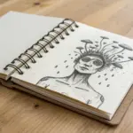
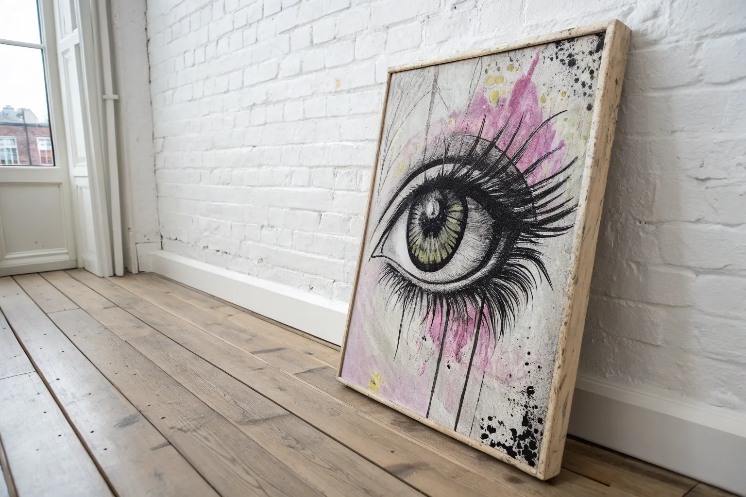
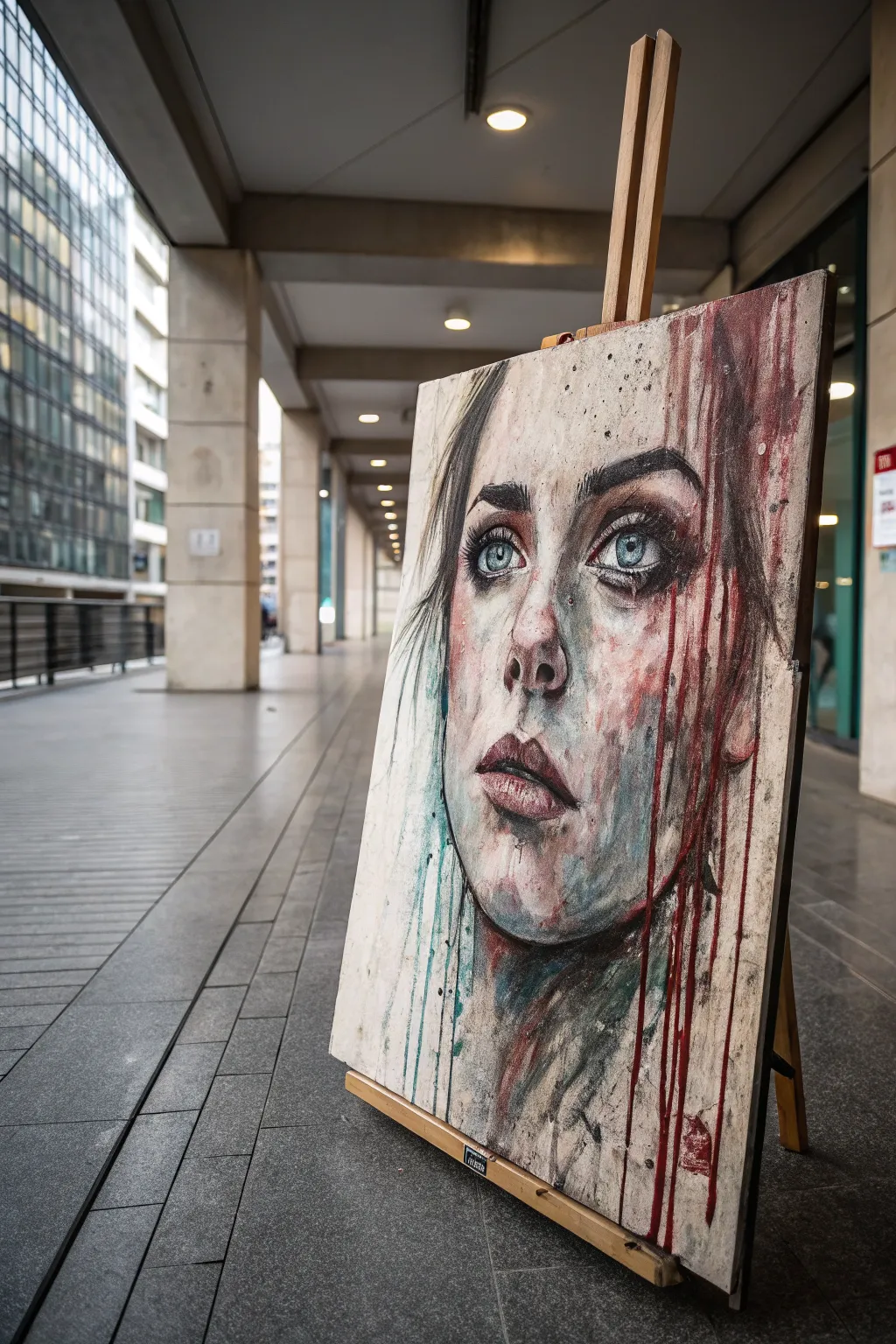
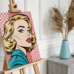
Portrait With Attitude And Heavy Linework
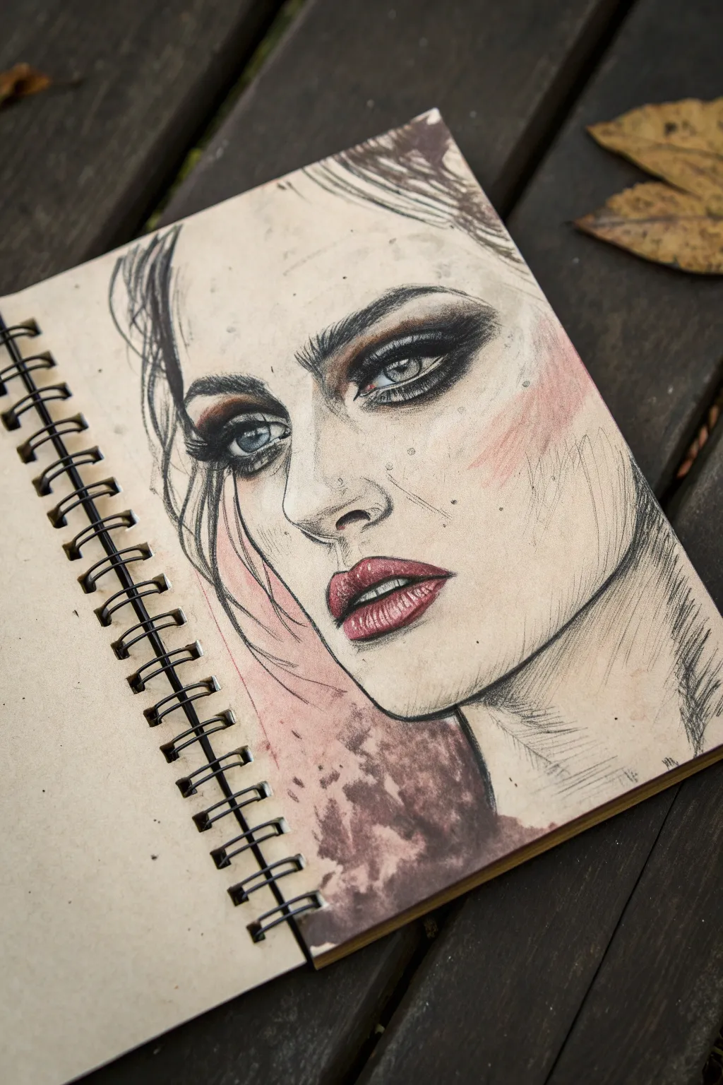
Capture raw emotion and gritty aesthetics with this mixed-media portrait that combines delicate facial features with harsh, expressive textures. The contrast between the detailed eyes and resulting grunge splatters creates a striking piece full of attitude.
Step-by-Step Guide
Materials
- Heavyweight mixed-media or watercolor sketchbook (tan or off-white paper preferred)
- Graphite pencils (HB, 2B, 6B)
- Charcoal pencils (soft and medium)
- Watercolor paints (Alizarin Crimson, Burnt Umber, Black)
- Small round brushes (size 2 and 4)
- White gel pen or white gouache
- Paper blending stump or tissue
- Kneaded eraser
Step 1: Sketching the Foundations
-
Initial outline:
Begin with an HB pencil to lightly map out the facial proportions. Focus on the tilt of the head and the placement of the eyes, nose, and mouth, keeping lines faint so they can be adjusted or erased easily. -
Refining features:
Start defining the almond shape of the eyes and the arch of the eyebrows. Keep the jawline somewhat angular to match the sharp aesthetic of the reference style. -
Building shadows:
Switch to a 2B pencil to lightly shade the hollows of the cheeks, the sides of the nose, and under the bottom lip. Use cross-hatching to build up texture rather than smooth blending for a grittier look. -
Hair placement:
Sketch the hair loosely, focusing on messy strands falling over the face. Don’t draw individual hairs yet; just block in the flow and volume with sweeping strokes.
Step 2: Adding Depth and Drama
-
Intensifying the eyes:
Using a 6B pencil or charcoal, darken the pupils and the upper lash line. This is the focal point, so don’t be afraid to go very dark here. -
Smoky eye effect:
Smudge graphite around the eyes using a blending stump to create that heavy, smoky makeup look. Extend the shadow outward slightly past the eye corners. -
Reddening the tones:
Mix a watery wash of Alizarin Crimson and Burnt Umber watercolor. I like to carefully apply this to the iris and the crease of the eyelids for a bruised, moody effect. -
Lip detailing:
Paint the lips with a slightly more concentrated red mix. Leave the center of the bottom lip unpainted or very pale to suggest a highlight. -
Lip texture:
Once the watercolor is dry, use a sharp pencil to draw tiny vertical cracks and lines on the lips to emphasize fullness and realism.
Smudge Control
Place a scrap piece of paper under your drawing hand while working on the face. This prevents your palm from smearing the graphite and charcoal you’ve already laid down.
Step 3: Grunge Elements & Finishing
-
Cheek flush:
Dilute your red watercolor significantly and apply a rough, uneven wash to the cheek on the right side. Let the edges remain hard rather than blending them out perfectly. -
Heavy linework:
Go back over the main contours—especially the jaw and neck—with a soft charcoal pencil. Press hard to create jagged, broken lines that emphasize the sketch-like quality. -
Neck shading:
Instead of smooth shading on the neck, use vigorous, directional hatch marks with your pencil to indicate shadow. -
The grunge splatter:
Mix a dark, muddy pot of red and black watercolor. Load your brush and let it pool at the bottom left of the portrait, near the neck/hairline, allowing it to bleed naturally into the paper. -
Adding texture spots:
Flick the bristles of a toothbrush or stiff brush dipped in diluted black paint to create tiny speckles across the cheek and nose area. -
Highlighting:
Use a white gel pen or a fine brush with white gouache to add sharp highlights to the eyes (the catchlight), the tip of the nose, and the wettest part of the lower lip. -
Final darks:
Re-assess your blacks. If the charcoal has faded, punch up the darkest strands of hair and the corners of the eyes one last time.
Coffee Stain Effect
For an even grimier, aged aesthetic, splash strong cold coffee onto the paper instead of watercolor for the background stains and let it pool naturally.
Step back and admire the wonderfully edgy character you’ve brought to life on the page

Distorted Face With Extra Features
Capture the raw emotion of a distorted face in this evocative grunge painting project. Combining realistic portraiture with aggressive textures and intentional drips creates a hauntingly beautiful aesthetic that embraces imperfection.
How-To Guide
Materials
- Large canvas or primed wood panel
- Gesso (white)
- Charcoal sticks (willow and compressed)
- Acrylic paints (Titanium White, Mars Black, Crimson Red, Burnt Umber, styling blue/teal)
- Assorted synthetic brushes (rounds and flats)
- Palette knife
- Spray bottle with water
- Fixative spray
- Rags or paper towels
- Sandpaper (fine grit)
Step 1: Preparation & Base Sketch
-
Prime the Surface:
Begin by applying an uneven layer of gesso to your canvas. Don’t smooth it out perfectly; leave ridges and brushstrokes visible to catch the charcoal later. -
Distress the Background:
Once the gesso is dry, lightly scuff random areas with fine-grit sandpaper. Mix a very watery wash of Burnt Umber and Black acrylics and splash it across the surface, wiping most of it back with a rag to leave a ‘dirty’ patina. -
Rough Outline:
Using willow charcoal, sketch the basic proportions of the face. Focus on placing the eyes large and emotive, and the nose slightly off-center to fit the ‘distorted’ theme. -
Block in Shadows:
Smudge the charcoal with your fingers or a rag to establish the main shadows under the brow bone, under the nose, and along the jawline. This creates a ghostly underlayer before paint is applied.
Gravity is Your Friend
Tilt your canvas at different angles while the drip layers are wet. Use a hair dryer to freeze a drip mid-flow for a frozen-in-time effect.
Step 2: Painting the Features
-
Flesh Tone Foundation:
Mix Titanium White with a tiny touch of Burnt Umber and Crimson to create a pale desire flesh tone. Apply this loosely over the highlighted areas of the face—forehead, nose bridge, and cheeks—letting the charcoal gray show through in the mid-tones. -
Define the Eyes:
Use a small round brush with watered-down black acrylic to sharpen the eyelids and pupils. Paint the irises a striking pale blue or teal to contrast against the red tones we will add later. -
Add Skin Texture:
Dab a dry brush or a sponge with varied reddish and grey tones onto the cheeks and nose. This stippling effect mimics pores and adds a raw, unpolished skin texture. -
Deepen the Contrast:
Go back in with compressed charcoal or black paint to darken the nostrils, the parting of the lips, and the pupils. High contrast is key to the grunge look. -
Highlights:
Apply pure Titanium White to the catchlights in the eyes, the tip of the nose, and the bottom lip. This makes the features pop forward from the murky background.
Step 3: Grunge Effects & Drips
-
Create the Red Wash:
Dilute Crimson Red acrylic with plenty of water until it has the consistency of ink. You can add a drop of black to deepen the red so it looks less like candy and more like dried blood. -
Controlled Dripping:
Load a large round brush with the watery red mix. Press it against the top edge of the canvas or specific points on the hair and let gravity pull the paint down in long streaks. -
Enhance the Flow:
If the drips stop too soon, mist them gently with your water spray bottle to encourage them to run all the way to the bottom edge. -
Teal Accents:
To balance the warmth of the red, add streaks of watery teal or blue running down the left side of the face or hair. This creates a complementary color vibration. -
Splatter Texture:
Load a stiff toothbrush with thinned black or dark brown paint. Flick the bristles to spray fine speckles across the face, simulating dirt and decay. -
Charcoal Re-definition:
I find that the liquid layers can wash out the drawing, so re-trace key outlines—like the jaw and heavy eyebrows—with charcoal while the surface is still slightly damp for a blurred line.
Mixed Media Mashup
Paste ripped distinct newspaper or book pages onto the canvas before gessoing. The text will faintly show through the paint layers for extra depth.
Step 4: Final Touches
-
Scratch Details:
Use the edge of your palette knife to scratch through some of the wet paint, revealing the white gesso underneath. This works great for hair strands or highlighted textural scratches. -
Final Glaze:
Apply a very sheer glaze of dirty water (from your brush rinsing jar) over bright areas that look too clean to knock them back into the atmosphere. -
Seal the Work:
Once fully dry, spray the entire piece with a fixative or matte varnish. This is crucial to prevent the charcoal from smearing further.
Step back and admire the stark beauty of your grunge masterpiece, where every drip adds to the story

Melting Eye With Ink Drips
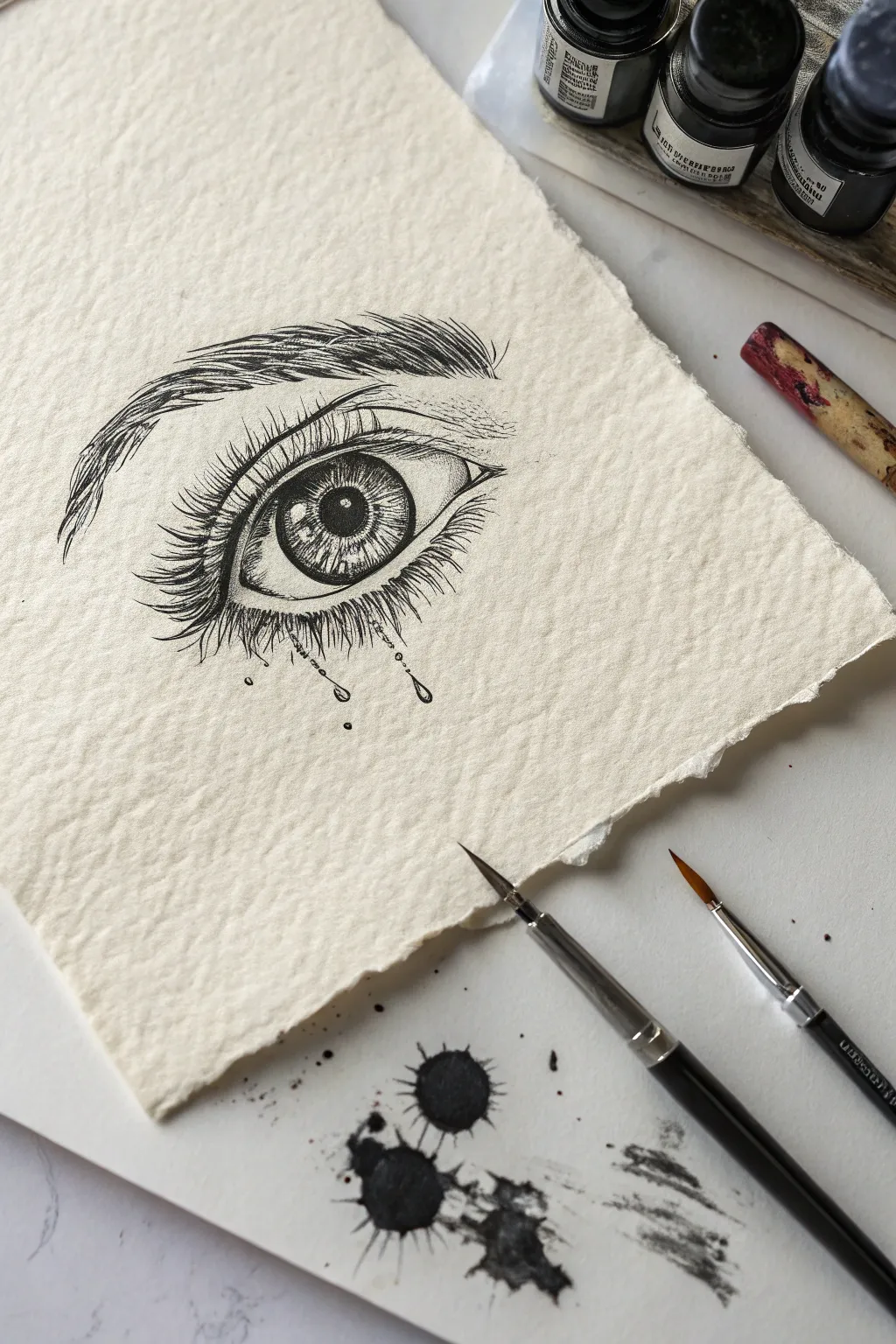
This evocative project combines precise pen-and-ink techniques with the raw emotion of grunge aesthetics. By sketching a realistic eye on beautifully textured paper and allowing ink to pool and drip, you’ll create a piece that feels both delicate and undone.
Step-by-Step Tutorial
Materials
- Heavyweight textured watercolor paper (deckle edge optional)
- Black waterproof graphic liners (sizes 0.1, 0.3, and 0.5)
- Black India ink or acrylic ink
- Small round paintbrush (size 0 or 2)
- Pencil (HB) and kneaded eraser
- Water jar
- Paper towels
Step 1: Drafting the Foundations
-
Positioning the eye:
Begin with a light pencil sketch in the center of your textured paper. Draw the basic almond shape of the eye, marking the placement of the iris and pupil. Keep your lines faint so they can be easily erased later. -
Adding the crease and brow:
Sketch the upper eyelid crease parallel to the top lash line. Lightly outline the eyebrow shape above it, following the natural arch of the brow bone. -
Outlining in ink:
Switch to your 0.3 graphic liner. Carefully go over your pencil lines for the eye shape, pupil, and iris. Create the pupil as a solid black circle, leaving a small, stark white circle inside for the highlight.
Ink Bleeding too Much?
If the ink feathers into the paper grain unwontedly, your paper might be too absorbent. Let the paper dry completely between layers or use a fixative spray before adding wet ink.
Step 2: Building Texture and Detail
-
Detailing the iris:
Use your finest pen (0.1) to draw lines radiating from the pupil outward to the edge of the iris. Add shorter lines coming from the outer edge inward to create depth and realistic texture. -
Drawing the lashes:
Switch to a 0.5 pen for the lashes. Start at the lash line and flick your wrist outward, lifting the pen at the end of the stroke to create a tapered hair. Make the upper lashes thick and curved, clustering them slightly. -
Creating the brow hairs:
Using the 0.1 pen, draw short, fine strokes for the eyebrow. Follow the direction of hair growth—upward at the start of the brow and smoothing outward toward the tail. Layer strokes to build density. -
Shading the skin:
Add subtle stippling (tiny dots) or very light hatching around the tear duct and under the brow bone to suggest shadow without overwhelming the drawing.
Step 3: The Grunge Effect
-
Lower lashes with ink:
For the lower lashes, mix your liner work with a tiny bit of liquid ink on a brush. Draw them sparser than the top, but allow the ink to pool slightly at the roots where they meet the skin. -
Creating the drips:
Dip your fine brush into the black India ink. Touch the tip of the brush to the base of the lower lashes and let gravity pull a droplet down. Tilt your paper vertically if needed to encourage a natural drip. -
Adding teardrop details:
Draw small, hollow teardrop shapes or circles hanging from the tips of the lashes or falling midway down the cheek using your 0.1 pen. -
Controlled splatters:
Load a larger brush with ink and water. Tap the handle against your finger over a scrap piece of paper first to test the splatter size, then add a few intentional splatters near the bottom of the page for that grunge aesthetic. -
Making the ink bloom:
I particularly enjoy adding a tiny drop of clean water to the center of one of the larger ink splatters while it’s still wet. This pushes the pigment to the edges, creating a dark ring effect. -
Final touches:
Once the ink is fully dry, gently erase any remaining pencil marks. If the lash line needs more depth, re-trace it with the 0.5 pen to ensure the eye remains the focal point.
Add a Pop of Color
Mix a single drop of crimson watercolor into your black ink drips. It adds a subtle, haunting tone that isn’t immediately visible but adds emotional depth.
Now you have a striking piece of art that balances realism with expressive, grungy textures
BRUSH GUIDE
The Right Brush for Every Stroke
From clean lines to bold texture — master brush choice, stroke control, and essential techniques.
Explore the Full Guide
Doodle-Bomb Grunge Journal Page
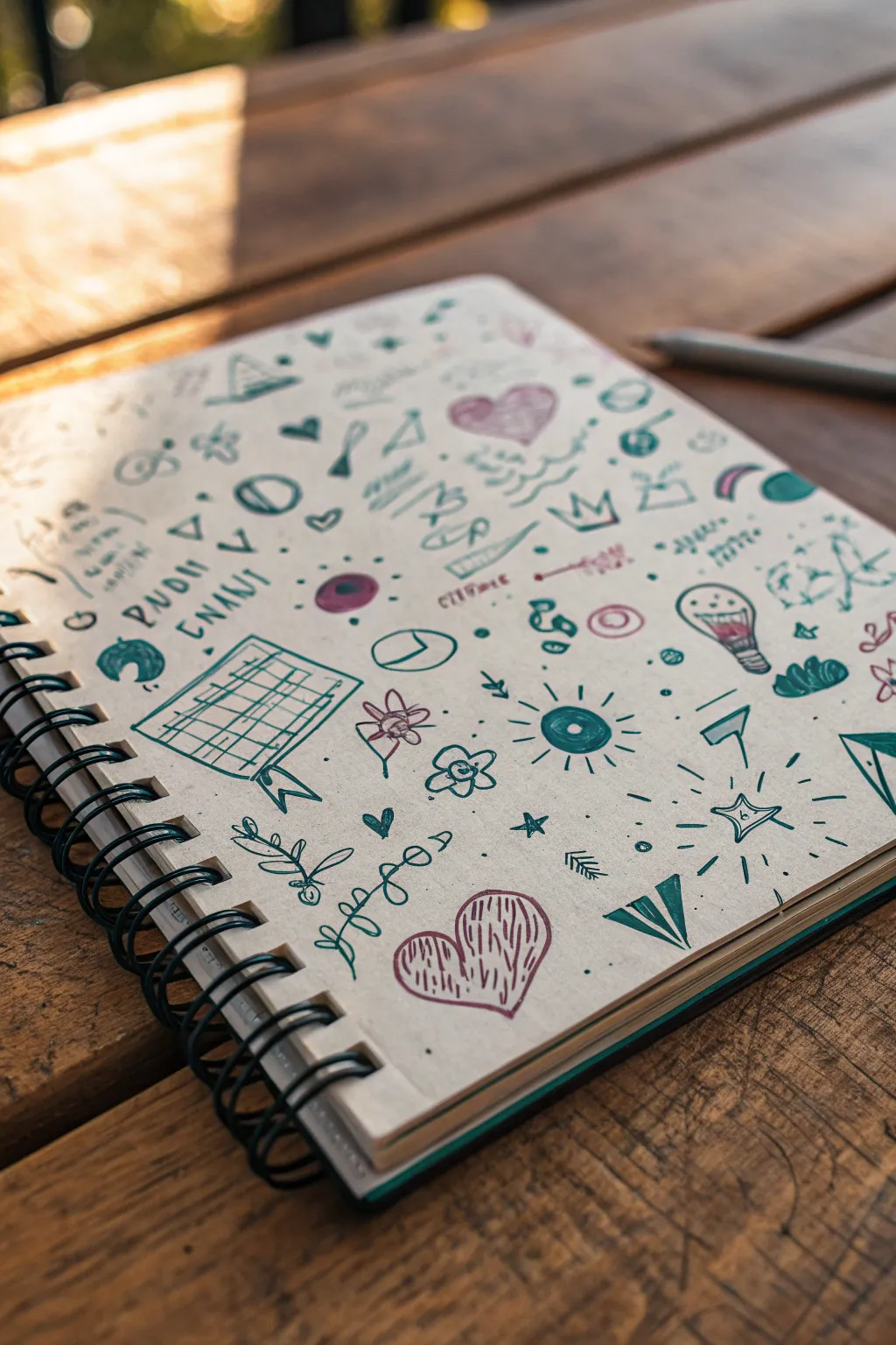
Transform a plain notebook page into a vibrant, nostalgic canvas filled with charming micro-art. This doodle-bombing style combines simple shapes, retro motifs, and a limited color palette to create a cohesive and energetic composition.
Detailed Instructions
Materials
- Spiral-bound notebook with unlined paper
- Teal or forest green felt-tip pen (medium point)
- Burgundy or dusty rose felt-tip pen (medium point)
- Pencil (optional for outlines)
- Eraser
Step 1: Setting the Composition
-
Start with anchors:
Begin by placing your largest elements first to anchor the page. In the lower center, draw a large heart using the burgundy pen, filling the inside with vertical scribbles for texture. -
Add the grid element:
To the left of the center, draw a tilted rectangular grid using the teal pen. Create a slightly wavy bottom edge and add a little ribbon tail to make it look like a hanging note or calendar. -
Create radial focal points:
Move to the upper right quadrant and draw a lightbulb with a filament inside. Near the center, draw a circle with lines radiating outward—a simple sun or eye motif—using the teal ink.
Step 2: Building the Texture
-
Draw organic elements:
Scatter floral and organic shapes around the remaining empty spaces. Draw a simple four-petal flower near the grid and a vine with small leaves curving along the bottom left edge. -
Add geometric flair:
In the lower right corner, draw a starburst shape containing a smaller star. Add a triangle or paper airplane shape nearby to emphasize directional movement. -
Include textual scribbles:
Near the top left, add some illegible ‘asinemic writing’ or mock text blocks. Just create loops and jagged lines that mimic handwriting without actually spelling words. -
Incorporate classic icons:
Fill the upper section with classic doodle icons: a small crown, a heart, a few triangles, and a steaming coffee cup or bowl shape. -
Layering shapes:
Look for gaps in your composition. Draw a few overlapping circles or ‘planets’ with rings to add depth and interest.
Ink Smudge Savior
Smudged a line? Don’t erase! Turn the smudge into a shadow or draw a solid shape (like a dark planet or leaf) over it to hide the mistake.
Step 3: Finer Details & Filler
-
The second color pass:
Switch back to your burgundy pen. Add a second heart near the top right and color in small circles or accents within the teal drawings to tie the palette together. -
Connect the elements:
Draw small clusters of dots, tiny stars, or dashes in the negative space between your larger drawings. This ‘confetti’ effect helps the page feel full and unified. -
Add movement lines:
Draw short action lines or ‘movement marks’ around the hearts and the sun motif to make them feel dynamic and alive. -
Cross-hatching texture:
Select a few enclosed shapes, like parts of the grid or the paper airplane, and add simple directional hatching lines for shading. -
Creating text elements:
Write a few random words or names in block letters, like ‘RUDI’ or ‘NANI’, keeping the lettering loose and informal. -
Final assessment:
Step back and look for any large white gaps. I usually find one or two spots that need just a tiny spiral or a single dot to feel complete. -
Rough it up:
If everything looks too perfect, go over a few lines again loosely to give it that sketched, hurried grunge aesthetic.
Vintage Patina
Before drawing, lightly brush the paper edges with a tea bag or distress ink pad for an aged, weathered look that enhances the grunge vibe.
Enjoy flipping through your sketchbook and seeing this lively explosion of creativity
Watercolor Bleeds With Ink Splatters
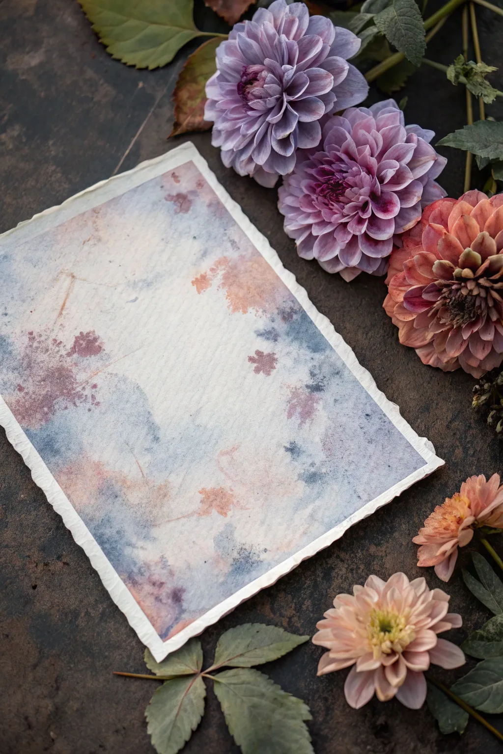
Capture the moody elegance of a floral garden after the rain with this textured grunge painting project. By layering watercolor washes and ink splatters on deckle-edged paper, you’ll create a beautifully aged, organic piece perfect for framing or use as a sophisticated backdrop.
Step-by-Step Tutorial
Materials
- Heavyweight watercolor paper (300gsm cold press)
- Watercolor paints (Indigo, Burnt Sienna, Dusty Rose)
- Liquid watercolor or acrylic ink (sepia or dark brown)
- Flat wash brush (3/4 inch)
- Round brush (size 6 or 8)
- Sea sponge or crumpled paper towel
- Spray bottle with water
- Table salt (optional)
- Painter’s tape
- Ruler (preferably metal)
Step 1: Preparing the Surface
-
Tearing the Edges:
To achieve that vintage, handmade look, start by placing your ruler along the edge of your watercolor paper. Firmly hold the ruler down and tear the paper upward against the metal edge to create a soft, deckled border on all four sides. -
Dampening the Paper:
Lay your paper flat on your work surface. Take your spray bottle and mist the entire surface lightly with clean water. You want the paper to be damp and glistening, but not swimming in puddles.
Unwanted Puddles?
If pools of water form, don’t wipe them! Twist the corner of a paper towel into a wick and touch it to the puddle edge to soak up excess liquid without smearing pigment.
Step 2: Creating the Atmosperic Base
-
Applying the First Wash:
Load your flat wash brush with a very watery mix of Indigo. Using broad, sweeping strokes, apply the color diagonally across the paper, leaving some areas white. -
Softening the Edges:
While the blue is still wet, rinse your brush and use clean water to soften the hard edges of your strokes, encouraging the pigment to bleed and spread organically. -
Adding Warmth:
Next, mix a diluted wash of Burnt Sienna or a soft peach tone. Drop this color into the white spaces and let it touch the edges of the wet blue paint, watching them merge to create muted grays and purples. -
Lifting for Texture:
Take a crumpled paper towel or a dry sea sponge and gently dab at wetter areas of the wash. This lifts pigment to create cloud-like textures and highlights within the background.
More Vintage Vibes
Brew a strong cup of black tea or coffee. Use this liquid instead of plain water when mixing your Burnt Sienna paints for an authentic, sepia-toned antique effect.
Step 3: Adding Grunge & Detail
-
Building Grunge Layers:
Once the initial wash is semi-dry (cool to the touch but no sheen), mix a slightly more concentrated Dusty Rose color. Use your round brush to dab irregular patches of color near the corners and edges. -
Creating Blooms:
I like to drop a tiny amount of clean water directly into these semi-dry pink patches. This pushes the pigment outward, creating ‘cauliflower’ blooms that mimic aged water stains. -
The Salt Technique:
If you want extra grittiness, sprinkle a pinch of table salt onto the dampest areas of paint. Let it sit; the salt will absorb the pigment and create star-like speckles. -
Splattering Ink:
Dip your round brush or a toothbrush into the sepia ink. Hold it over the paper and tap the handle firmly to send fine sprays of dots across the composition. -
Defining Stains:
Using a very fine brush and the sepia ink, lightly trace a few of the natural watermarks created by the drying paint to emphasize the ‘stained’ effect.
Step 4: Finishing Touches
-
Drying:
Allow the paper to dry completely. If you used salt, gently brush the crystals off the surface once everything is bone dry. -
Flattening:
Because of the water usage, the paper might buckle slightly. Place the dry artwork under a heavy book overnight to flatten it perfectly.
Once flattened, your gracefully aged grunge painting is ready to bring a touch of timeless beauty to your space

PENCIL GUIDE
Understanding Pencil Grades from H to B
From first sketch to finished drawing — learn pencil grades, line control, and shading techniques.
Explore the Full Guide
Rust And Corrosion Color Palette Study
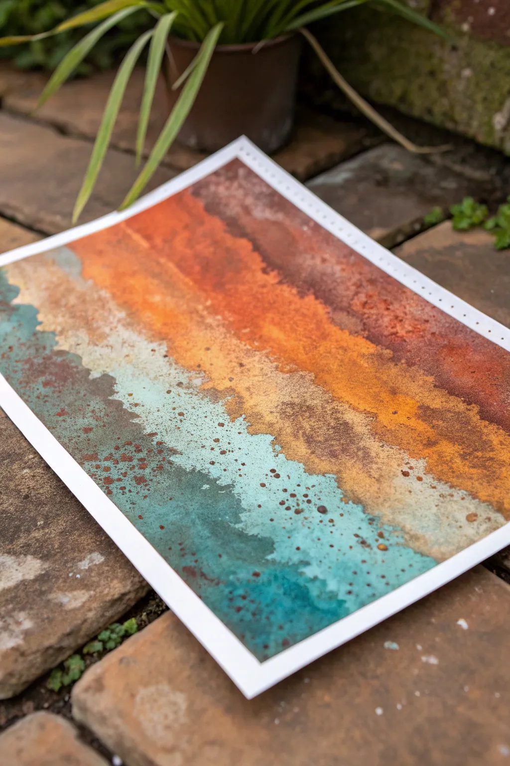
Capture the beauty of oxidation with this textural watercolor study that mimics the layers of rust and patina on aging metal. The vibrant interplay between burnt sienna, deep ochre, and oxidized teal creates a stunning, organic gradient perfect for grunge aesthetics.
Step-by-Step Guide
Materials
- Heavyweight watercolor paper (300gsm, cold press)
- Watercolor paints: Burnt Sienna, Yellow Ochre, Burnt Umber, Turquoise, Payne’s Grey
- Granulation medium (optional but recommended)
- Sea salt or coarse kosher salt
- Medium round brush (size 8 or 10)
- Small stiff bristle brush (e.g., old toothbrush)
- Masking tape
- Spray bottle with water
- Paper towels
Step 1: Preparation and Base Washes
-
Secure the paper:
Tape down all four edges of your watercolor paper to a board using masking tape. This prevents buckling when we add heavy washes and creates a clean white border. -
Wet the surface:
Using your medium round brush or the spray bottle, mist the entire paper surface lightly. We want a wet-on-wet technique to encourage colors to bleed naturally. -
Apply the rust layer:
Load your brush heavily with Burnt Sienna mixed with a touch of Burnt Umber. Paint the top third of the paper using horizontal strokes, letting the pigment pool slightly. -
Introduce the transition color:
While the top is still wet, mix Yellow Ochre with a dot of Burnt Sienna. Apply this band just below the dark rust, allowing the edges to touch and merge organically. -
Add the oxidation layer:
Skip a small section to leave some negative space (paper white) or add a very watery wash of cream. Then, paint the bottom third with a rich Turquoise or Teal color to represent copper patina. -
Soften the boundaries:
Tilt your board slightly back and forth. This encourages the pigments to run into each other, creating those jagged, uneven skylines where the colors meet.
Step 2: Texturing and Details
-
Create granulation:
If you have granulation medium, drop small amounts into the wet paint, especially in the transition zones. If not, sprinkle coarse salt onto the wettest areas of the paint. -
Lift pigment:
Crumple a small piece of paper towel. Gently dab randomly along the band edges to lift color, creating a mottled, worn texture typical of peeling paint. -
Partial drying time:
Let the painting dry until it loses its wet sheen but still feels cool to the touch. This semi-dry state is crucial for the next splatter step. -
Prepare splatter mix:
Mix a concentrated, creamy puddle of Burnt Umber or a dark rust color. It needs to be thicker than the initial washes so it sits on top. -
Apply speckles:
Dip your stiff bristle brush or toothbrush into the dark paint. Run your thumb over the bristles to flick tiny specks across the entire piece, focusing heavier clusters on the rust sections. -
Add oxidized speckles:
Repeat the splatter process using the Turquoise paint, flicking it primarily over the rust and ochre sections. This mimics spots of fresh corrosion breaking through. -
Bloom technique:
Dip a clean brush into varying amounts of clean water and touch the tip to semi-dry areas of pigment. This pushes the pigment away, creating ‘cauliflower’ blooms that look like water damage.
Blooms not forming?
If your water drops aren’t creating texture, the paper is likely too wet. Wait a few minutes for the sheen to disappear, then add drops again to push the pigment.
Step 3: Final Touches
-
Remove salt:
Once the paper is completely bone dry, gently brush off the salt crystals. You should see intricate, star-like textures left behind in the pigment. -
Assess contrast:
Look for areas that feel too flat. I prefer to go back in with a nearly dry brush and scumble a bit of dark Payne’s Grey into the deepest rust areas for added depth. -
Reveal the border:
Carefully peel away the masking tape at a 45-degree angle, pulling away from the painting to ensure a crisp, clean edge.
Go Mixed Media
For realistic grit, mix a pinch of fine sand or embossing powder into the wet rust-colored paint before it dries to build actual tactile texture.
Step back and admire the rugged, industrial beauty of your unique rust study
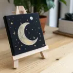
Celestial Tarot-Style Sun And Moon Twist
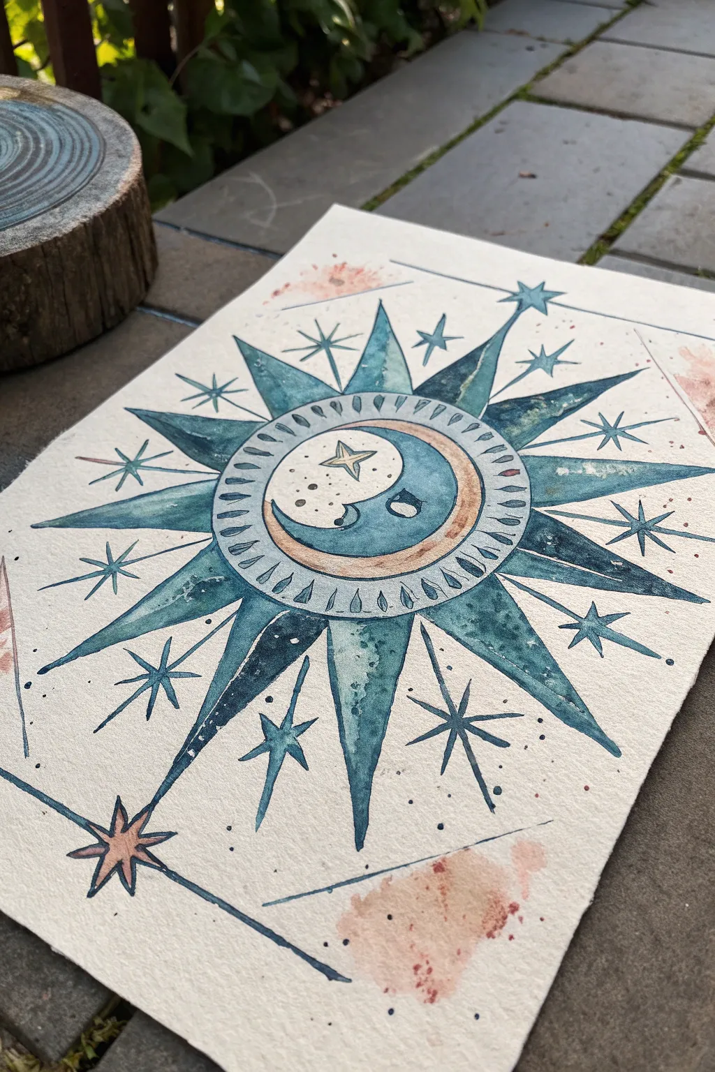
Channel the ancient wisdom of the stars with this Tarot-inspired sun and moon painting. Using deep teal watercolors and subtle grunge textures, you’ll create a piece that feels both timeless and wonderfully worn.
Detailed Instructions
Materials
- Cold press watercolor paper (300 gsm)
- Watercolor paints (Indigo, Phthalo Blue, Burnt Sienna, Payne’s Gray)
- Compass and ruler
- HB pencil and eraser
- Round watercolor brushes (sizes 2, 4, and 6)
- Fine liner brush or rigger brush
- Water jars and paper towels
- Masking tape (optional)
Step 1: Drafting the Design
-
Establish the center:
Begin by finding the center of your paper. Using a compass, lightly draw a circle about 2 inches in diameter for the central moon face. Around this, draw a second, slightly larger concentric circle to form the decorative ring. -
Sketch the rays:
Use a ruler to lightly pencil guide lines radiating from the center. Mark 12 points evenly around the outer circle. Sketch large, triangular sun rays extending outward from these points, alternating their lengths slightly if you want a more organic feel. -
Add celestial details:
Inside the center circle, sketch a crescent moon profile with a closed eye. Add a small star near the moon’s nose. In the spaces between the large sun rays, draw smaller, thin lines that will become starbursts or accent rays later. -
Border and corners:
Draw an angular, geometric border that frames the sun. It doesn’t need to be a perfect square; let the lines intersect the sun rays. Sketch large, four-pointed stars in the open corners or where the border lines meet.
Embrace the “Bloom”
Drop clean water into damp teal paint on the rays. As it dries, the pigment pushes outward, creating those jagged, cauliflower-like textures that mimic ancient stone.
Step 2: Painting the Core
-
Mix your palette:
Create a deep, moody teal color by mixing Phthalo Blue with a touch of Payne’s Gray and a tiny bit of Burnt Sienna to desaturate it. You want a color that looks like aged ink. -
Wash the moon:
With a size 4 brush, paint the background of the inner circle (the night sky behind the moon face) with your teal mix. Leave the crescent moon itself and the small star unpainted for now. -
Paint the decorative ring:
Dilute your paint slightly for a lighter teal. Fill in the ring surrounding the moon. While it’s still damp, dab in tiny dots of concentrated Indigo to create texture. -
Detail the crescent:
For the crescent moon face, use a very watery wash of Burnt Sienna to give it a parchment-like glow. Leave the cheek area lighter for a highlight.
Gilded Edges
Once fully dry, re-trace the smallest details—like the star inside the moon or the ray outlines—with metallic gold watercolor or ink for a magical shimmer.
Step 3: Rays and Atmosphere
-
Fill the sun rays:
Switch to the size 6 brush. Paint the large triangular rays with the deep teal mix. I like to let the pigment pool slightly at the tips or bases to create natural gradients—don’t aim for perfectly flat color. -
Vary tonal values:
While painting the rays, occasionally dip your brush in water before picking up paint. This ensures some rays are lighter and more transparent than others, adding depth to the wheel. -
Create the splatter effects:
Mix a watery solution of Burnt Sienna or a reddish-oxide color. Load a brush and tap it against your finger over the corners of the paper to create the grunge splatters visible in the reference image. Let these dry completely before painting over them. -
Paint the corner stars:
Fill in the corner star silhouettes with a medium-strength teal. If the splatter underneath is dry, the transparency of the watercolor will allow that grunge texture to show through the star.
Step 4: Fine Lines and Finishing
-
Outline the geometry:
Using a size 2 brush or a very fine liner brush loaded with concentrated Indigo or Payne’s Gray, carefully outline the outer edges of the sun rays and the corner stars. -
Detail the inner ring:
Paint small, repeating teardrop shapes or dashes inside the decorative ring surrounding the moon. This gives it a mechanical, clock-like quality. -
Add specific star accents:
Draw thin, crossing lines centered on the tips of the sun rays to create the ‘sparkle’ effect. Use the tip of your finest brush for crisp lines. -
Enhance texturing:
If some areas look too flat, use a nearly dry brush with dark pigment to scumble (lightly drag) texture over the main sun rays, mimicking the look of stone or old paper. -
Final border lines:
Paint the straight geometric border lines that frame the piece. It’s okay if the lines break or vary in thickness; this adds to the hand-drawn tarot aesthetic.
Step back and admire your celestial creation, perfectly imperfect and full of mystical character.

Have a question or want to share your own experience? I'd love to hear from you in the comments below!