Brush pens are one of my favorite tools because you can get crisp details and juicy, bold strokes from the same tip just by changing pressure. Here are some brush pen art ideas I come back to again and again when I want something colorful, relaxing, and totally doable.
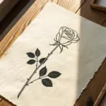
Simple Floral Wreath
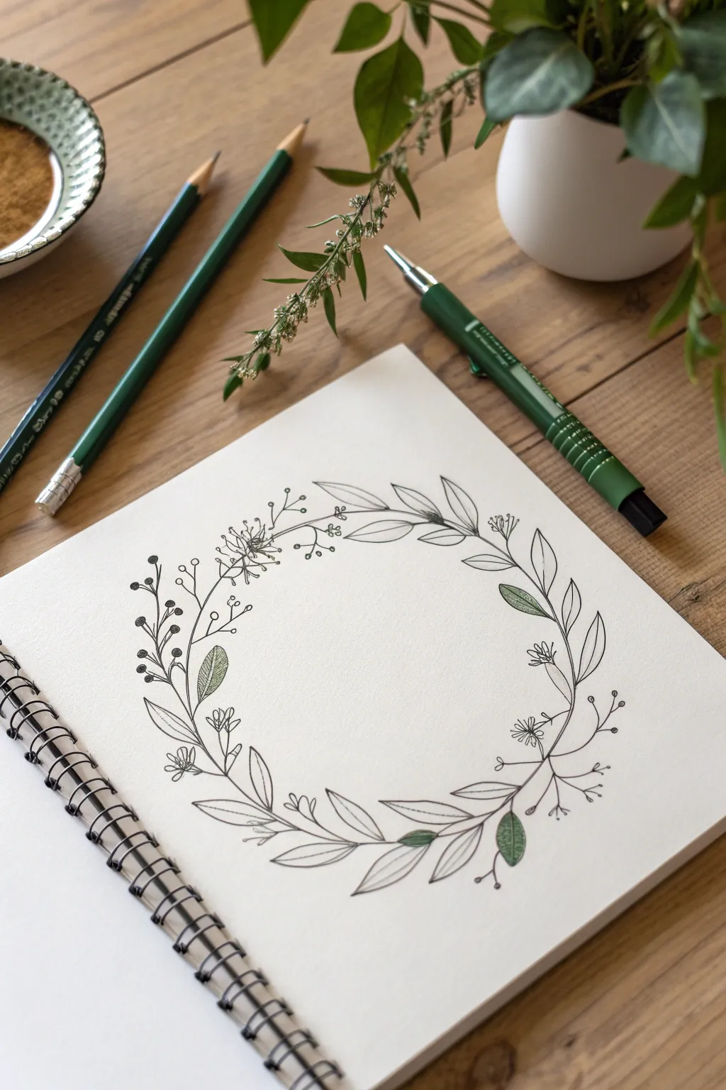
This delicate botanical wreath combines simple line work with subtle touches of green for a fresh, organic look. It is the perfect beginner project to practice leaf shapes and composition without getting overwhelmed by heavy ink usage.
Detailed Instructions
Materials
- Sketchbook with smooth, heavy paper (mixed media or bristol)
- Fine liner pen (01 or 03 nib size, black)
- Brush pen or marker (Sage or Olive Green)
- HB Pencil
- Compass or a round object to trace
- Kneaded eraser
Step 1: Planning and Foundation
-
Draw the guide circle:
Start by lightly drawing a perfect circle in the center of your page using a compass or by tracing a bowl. This pencil line will be your anchor for the entire composition. -
Mark stem directions:
Visualize the flow of your wreath. Using your pencil, sketch a few loose, curving lines that follow the circle’s path but occasionally wander slightly inward or outward to keep it looking natural. -
Rough placement of elements:
Lightly mark where your largest leaf clusters will go. Aim for balance rather than perfect symmetry; place a cluster at the bottom left and top right to draw the eye across the circle.
Natural Flow Tip
Rotate your sketchbook as you work around the circle. Drawing towards your body is easier and helps maintain consistent curve angles for the stems.
Step 2: Inking the Structure
-
Start the main stems:
Switch to your fine liner pen. Begin tracing over your main pencil stems, but keep your hand loose. Don’t draw one continuous rigid line; break it up slightly where leaves will attach. -
Add pointed oval leaves:
Draw simple, pointed oval leaves branching off the main stems. These are your ‘filler’ leaves. Keep them open and unshaded for now, focusing on varying their angles. -
Incorporate varied foliage:
Mix in a different leaf shape to add interest. Try drawing thin, willow-like leaves that curve gently along the circle’s edge, overlapping the main stems just a bit.
Step 3: Adding Details and Berries
-
Draw berry sprigs:
Extend thin, branching lines outward from the main circle. At the ends of these tiny branches, draw small circles to represent berries or buds. -
Add floral bursts:
Sketch small, star-shaped flowers or clusters of tiny blooms in the gaps between leaves. These delicate elements soften the look of the heavier leaves. -
Detail the leaves:
Go back to your larger oval leaves and draw a single center vein down the middle of each one. Keep the line thin and don’t let it quite touch the tip of the leaf for a lighter feel. -
Refine the connections:
Check where stems meet. Thicken the junction points slightly with your pen to mimic the natural nodes found on real plants.
Make It Personal
Add a short quote or a single initial in a modern calligraphy style to the center of the wreath to create a custom greeting card or title page.
Step 4: Color and Final Touches
-
Select accent leaves:
Choose a random scattering of leaves to color in—about 10-15% of the total foliage. Don’t color everything; the white space is crucial for this style. -
Apply green ink:
Using your sage or olive green brush pen, gently fill in the selected leaves. I find that leaving a tiny sliver of white space near the vein line makes the leaves look less flat. -
Add texture with hatching:
On a few other leaves, use your fine liner to add very light diagonal hatching lines instead of solid color. This creates a third texture between the solid green and the white paper. -
Erase guidelines:
Wait until the ink is completely dry to avoid smudging. Then, gently roll your kneaded eraser over the entire design to lift the original pencil circle and sketch marks. -
Assess and balance:
Step back and look at the wreath. If one side feels too empty, add a small floating sprig or a few extra berries to even out the weight.
You now have a beautifully balanced floral illustration ready to adorn a card or journal page


One-Stroke Leaves and Branches
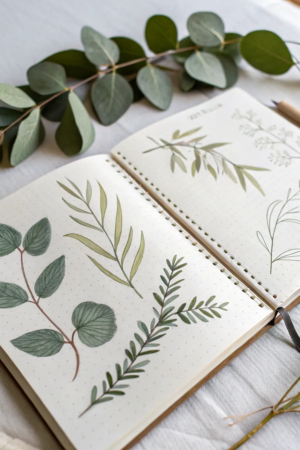
Create a serene nature study spread in your bullet journal using brush pens to capture the delicate transparency of leaves. This project focuses on four distinct botanical illustrations, exploring different leaf shapes and branching patterns.
How-To Guide
Materials
- Dotted bullet journal or mixed media sketchbook
- Dual-tip brush pens (olive green, sage green, cool grey-green)
- Fine liner pen (0.1mm or 0.3mm, warm brown or dark grey)
- Pencil and eraser
- Water brush or small paintbrush
- Paper towel
Step 1: Preparation & Layout
-
Plan the composition:
Visualize the placement of four primary botanical specimens across a double-page spread. Aim for the left page to feature a large, round-leafed branch and a tall, slender fern-like leaf. The right page will hold an olive branch style drawing and a minimal line-art sketch. -
Lightly sketch the stems:
Using a pencil with a very light touch, draw the central curved lines that will serve as the main stems for each plant. This establishes the flow and direction without locking you into details just yet.
Fixing Blotchy Ink
If your brush pen leaves uneven streaks, go over the area immediately with a slightly damp water brush to blend the pigment into a smooth watercolor wash.
Step 2: The Round-Leafed Eucalyptus (Bottom Left)
-
Draw the main stem:
Switch to your brown fine liner or the fine tip of a brown marker. Trace over your pencil line for the main stem, adding tiny, slightly thicker nodes where the leaf stalks will emerge. -
Outline the round leaves:
With a cool grey-green brush pen, draw rounded, slightly oval shapes attached to the stem. Leave some white space or vary the pressure to make them look organic, not perfect circles. -
Fill and texture:
Gently fill in the leaves using a glazing technique—layering the ink to create darker patches. Once dry, use a fine liner to add delicate veins radiating from the center of each leaf.
Add Realism
Leave tiny slivers of white space (negative space) down the center of your leaves to represent the main vein catching the light.
Step 3: The Slender Fern-Like Frond (Bottom Right)
-
Create the central axis:
Draw a long, slightly curved stem using a dark green brush pen tip. Press lightly so the line tapers nicely at the top. -
Add the first leaflets:
Starting from the bottom, use a tiny ‘flicking’ motion with the brush tip to create small, narrow leaves growing upward from the stem. -
Build the density:
Work your way up the stem, making the leaflets slightly smaller as you reach the tip. Angle them sharply upward to mimic the growth pattern of a fern or rosemary sprig.
Step 4: The Broad Willow-Style Leaf (Top Left)
-
Draft fading stems:
Sketch a tall, central stem that splits into two or three main branches. Use a lighter sage green for this to keep it subtle. -
Apply the two-tone technique:
For the long, lance-shaped leaves, try loading your brush pen with two colors for a gradient effect, or simply paint one half of the leaf darker than the other to suggest light and shadow. -
Define the edges:
Use the very tip of your brush pen to crisply define the pointed ends of these leaves, letting the bodies of the leaves remain somewhat translucent.
Step 5: The Olive Branch & Line Art (Right Page)
-
Paint the olive leaves:
On the top of the right page, paint elliptical leaves using an olive-toned pen. Use a ‘press and lift’ stroke: touch the paper, press down to widen the stroke, and lift while dragging to create a tapered point. -
Connect the foliage:
Draw thin, woody stems connecting these olive leaves, ensuring the branches look interconnected and natural. -
Sketch the minimalist sprig:
In the bottom right corner, forgo the heavy filling. Use a fine liner to draw a simple, airy outline of a plant with no color fill. This contrast balances the heavier drawings on the left.
Step 6: Final Details
-
Erase pencil guides:
Wait until all ink is completely dry to the touch to avoid smearing. Gently erase any visible pencil marks from your initial sketch. -
Add subtle shadows:
I like to take a light grey marker and add a tiny drop shadow under a few overlapping leaves to give the page depth.
Your botanical spread is now a peaceful garden on paper, ready for your notes.


Mini Flower Doodles Grid
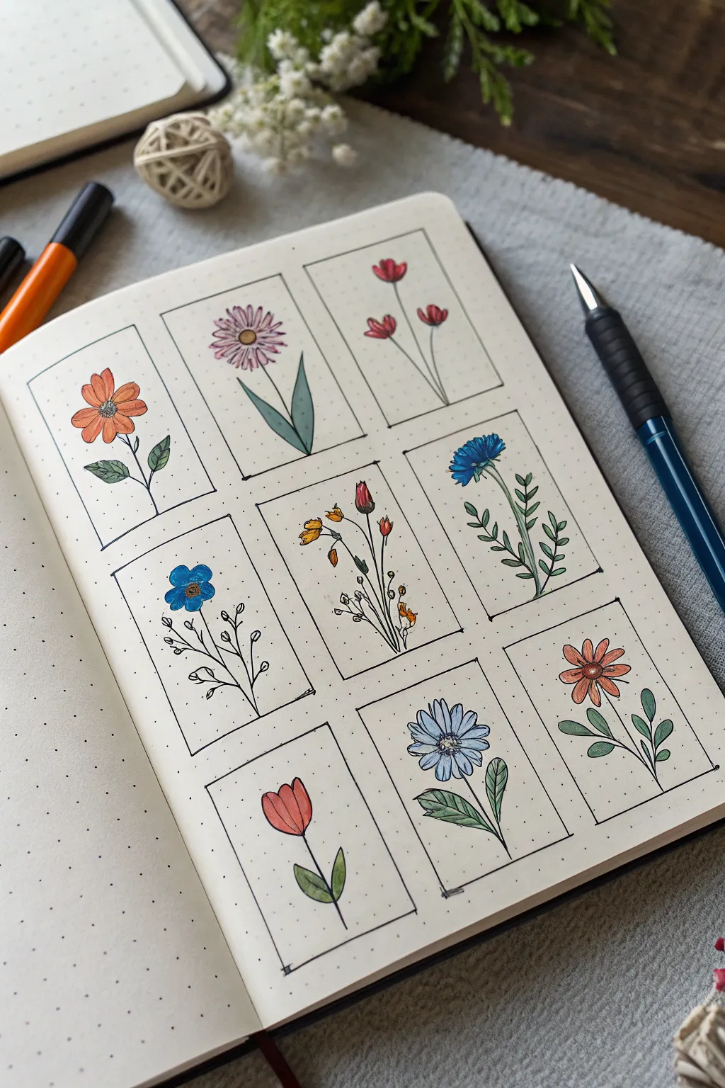
Transform a simple bullet journal page into a botanical gallery with this neat 3×3 grid layout. Each tiny rectangle houses a unique flower doodle, combining clean black linework with vibrant pops of marker ink for a charming, organized aesthetic.
Detailed Instructions
Materials
- Dotted bullet journal or heavyweight sketch paper
- Pencil (HB or H)
- Ruler
- Eraser
- Fine tip black drawing pen (0.3mm or 0.5mm)
- Assorted colored brush pens or markers (orange, pink, red, blue, green, yellow)
- White gel pen (optional for highlights)
Step 1: Setting the Structure
-
Measure the grid:
Begin by determining the center of your page. Using your ruler and faint pencil lines, map out a large 3×3 grid structure. Each individual rectangle should be roughly 1.5 inches wide by 2.5 inches tall, with consistent spacing between them. -
Define the frames:
Once you are happy with the spacing, use your fine tip black pen and a ruler to ink the borders of the nine rectangles. Keep the corners sharp and lines straight. -
Initial clean up:
Wait a moment for the ink to dry completely, then gently erase your pencil grid lines to leave just the clean black boxes.
Grid Genius
Use the dots on your journal paper to count spaces rather than measuring with inches. It guarantees perfectly even boxes.
Step 2: Drawing the Base Flowers
-
Sketch the orange daisy (Top Left):
In the first box, draw a small circle in the upper third. Surround it with simple, tear-drop shaped petals. Add a curved stem and two small leaves near the bottom. -
Create the pink aster (Top Center):
For the middle box, draw a tight cluster of thin, radiating petals. Give this flower two tall, broad leaves that reach upward from the base of the stem. -
Draft the red buds (Top Right):
Sketch three simple stems branching out. Top each stem with small, U-shaped buds that have tiny separations at the top to indicate opening petals. -
Outline the blue pansy (Middle Left):
Draw five rounded petals overlapping slightly around a center point. Keep the stem thin and add very delicate, wispy line leaves on the side. -
Compose the wildflower spray (Center):
This is a bouquet of tiny stems. Draw three main stalks: one with a tulip-like bud, one with small hanging bells, and one with tiny dot-like blossoms. -
Sketch the cornflower (Middle Right):
Draw a messy, spiky flower head tilted to the right. The leaves on this stem should be small, paired ovals traveling all the way down the stalk. -
Draw the red tulip (Bottom Left):
Create a simple U-shape with a W-shape on top for the tulip head. Add two broad leaves at the very bottom of the stem. -
Draft the blue daisy (Bottom Center):
Draw a larger flower here with layered petals, giving it more fullness. Add two distinct, veined leaves at the base. -
Finish with the orange zinnia (Bottom Right):
Draw a flat oval center, then add multiple layers of short petals. Give it a curved stem with simple round leaves.
Step 3: Inking and Coloring
-
Ink the outlines:
Carefully trace over all your pencil flower sketches with the fine tip black pen. Add small details like veins in the leaves or dots in the flower centers now. -
Erase pencil marks:
Ensure the ink is totally dry, then thoroughly erase all remaining pencil sketches from inside the boxes. -
Color the petals:
Using your brush pens, specific colors to the flower heads. I like to leave tiny slivers of white paper showing at the tips or edges to mimic light reflection. -
Add greenery:
Use a sage green or olive marker for the stems and leaves. Vary the pressure to taper the ends of the leaves elegantly. -
Final accents:
If desired, add very subtle secondary shading to the petals using a slightly darker shade of the same color, or use a white gel pen to add tiny highlight dots.
Ink Smudge SOS
If you smudge a line, transform it! Turn a stray mark into a falling petal, a buzzing bee, or an extra leaf on the stem.
Now you have a charming botanical collection archived right in your notebook


Gradient Background With Silhouette
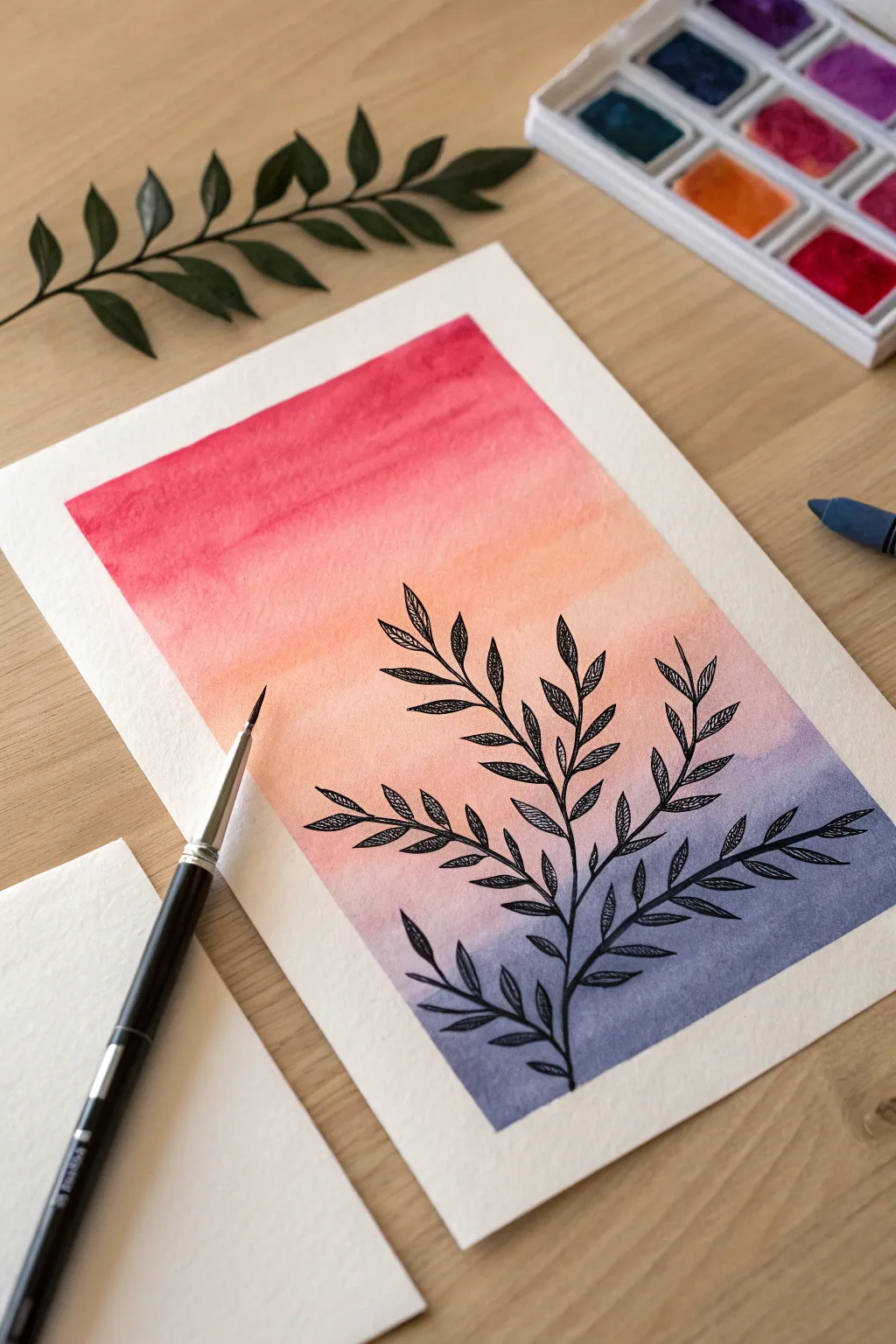
This elegant project combines the soft, fluid beauty of watercolor with the crisp precision of brush pen illustration. You will create a vibrant sunset gradient that transitions from warm pinks to cool violets, overlaid with a delicate leafy branch design.
Step-by-Step Guide
Materials
- Watercolor paper (cold press, at least 300gsm)
- Masking tape or painter’s tape
- Watercolor paints (Pink, Orange, Purple/Indigo)
- Wide flat brush or mop brush
- Clean water jar
- Paper towels
- Black brush pen (fine tip)
- Pencil and eraser (optional)
Step 1: Creating the Background
-
Prepare the paper:
Begin by taping down all four edges of your watercolor paper to a hard surface or drawing board. This creates the crisp white border seen in the example and prevents the paper from buckling while wet. -
Wet the surface:
Using a clean, wide brush, apply a layer of clear water across the area inside the tape. The paper should be glisten evenly but not have standing puddles. -
Start with pink:
Load your brush with a vibrant pink or rose watercolor. Apply this color horizontally across the top third of the paper, letting the pigment flow into the wet surface. -
Transition to orange:
Mix a soft orange or coral shade. Apply this directly below the pink, slightly overlapping the two colors. Gently stroke back and forth where they meet to encourage a smooth blend without hard lines. -
Add the cool tones:
For the bottom third, pick up a muted purple or indigo blue. Paint this across the bottom section, working upwards to meet the orange. -
Refine the blend:
I find that tilting the board slightly can help the colors merge naturally. If the transition between orange and purple looks muddy, clean your brush, dampen it slightly, and gently soften the border between them. -
Let it dry completely:
This is the most crucial step. Allow the background to dry until the paper is flat and warm to the touch. Using a hairdryer on a low setting can speed this up, but air drying is safest.
Bleeding Lines?
If your black ink creates spiderwebs, the paper was still damp. Wait longer or use a hairdryer before inking. Waterproof fineliners are safer if you’re impatient.
Step 2: Drawing the Silhouette
-
Sketch the stem placement:
If you are nervous about going straight to ink, lightly sketch a central curved line for the main stem using a pencil. Keep the curve gentle and organic. -
Draw the main stem:
Using your black brush pen, start at the bottom center and draw the main stem upwards, following your guide or intuition. Apply slightly more pressure at the base for thickness and release pressure as you reach the top for a tapered tip. -
Add primary branches:
Add smaller branches extending outward from the main stem. Alternate them on the left and right sides so they aren’t perfectly symmetrical, which looks more natural. -
Outline the leaves:
Draw simple, pointed oval shapes for the leaves attached to your branches. Keep the outlines fine and delicate. -
Add leaf details:
Instead of filling the leaves in solid black, draw a central vein line down the middle of each leaf. -
Texture the leaves:
Add tiny, diagonal hatching lines inside the leaves, branching from the central vein. This intricate detail gives the illustration the textured look shown in the reference. -
Balance the composition:
Step back and look at your branch. If any areas look too empty, add a small twig or a few extra leaves to fill the space visually. -
Reveal the border:
Once the ink is fully dry, slowly peel away the masking tape at a 45-degree angle, pulling away from the artwork to ensure a clean, sharp edge.
Make it Shine
Once everything is dry, add highlights to the black leaves using a white gel pen. A few dots or lines on the leaf tips add magical contrast.
Frame your beautiful sunset silhouette or turn it into a thoughtful greeting card for a friend

PENCIL GUIDE
Understanding Pencil Grades from H to B
From first sketch to finished drawing — learn pencil grades, line control, and shading techniques.
Explore the Full Guide
Cute Food Icons With Bold Outlines
These simple yet striking food doodles are perfect for decorating your bullet journal or sketchbook. Using thick, confident outlines paired with soft markers creates a charming sticker-like effect that pops off the page.
Step-by-Step Tutorial
Materials
- A5 dotted grid notebook or mixed media paper
- Fine liner pen (0.5mm or 0.8mm) for outlines
- Thick black brush pen or chisel tip marker for bold lines
- Alcohol-based markers or colored brush pens (Red, Yellow, Light Pink, Cream)
- Pencil and eraser for sketching
Step 1: Planning and Sketching
-
Layout Planning:
Visualize the placement of your seven icons on the page. Leave generous white space between them to let each doodle breathe. -
Sketch the Strawberry:
Starting at the top left, lightly pencil a rounded triangle shape. Add three small leaf shapes fanning out from the top center. -
Sketch the Heart Balloons:
To the right of the strawberry, draw two hearts—one slightly higher than the other. Add wavy strings trailing down from each. -
Sketch the Plate and Mug:
Below the strawberry, draw a circle with a smaller circle inside it and a heart in the center. Next to it, sketch a simple mug shape with a handle and a small flower detail on the front. -
Sketch the Watermelon and Candy:
Below the plate, draw a triangular wedge for a watermelon slice. To its right, sketch a larger circle with segmented lines (like a wagon wheel) and a smaller four-petal flower shape next to it. -
Sketch the Cupcake and Pastry:
At the bottom, draw two cupcake-like shapes. One should have a swirled frosting top (left), and the other a simpler mound with a cherry on top (right).
Smudgy Lines?
If your black ink smears when coloring, switch the order! Color with markers first, let them dry completely, and then apply the black outlines on top.
Step 2: Adding Color
-
Color the Strawberry:
Using your red marker, fill in the body of the strawberry completely. Don’t worry about the seeds yet; we’ll add those later. -
Color the Hearts:
Fill both heart balloons with the same red tone. You can leave a tiny speck of white near the top of the right heart for a highlight effect. -
Fill the Mug and Plate:
Color the heart on the plate red. For the mug, use a yellow marker to fill the body, leaving the rim white if you prefer a ceramic look. -
Color the Watermelon:
Fill the main triangle area with a soft pink or coral color. Use a darker grey or black later for the rind, so leave that edge empty for now. -
Color the Cupcakes:
For the bottom cupcake wrapper on the left, use a cream or beige tone. For the right cupcake, color the frosting area pink and the cherry bright red.
Highlight Hack
Use a white gel pen to add tiny ‘shine’ marks on the cherry, balloon curves, and mug handle. It instantly makes the doodles look glossy and dimensional.
Step 3: Inking and Details
-
Outline the Strawberry:
Switch to your thick black pen. Trace the outer edge of the strawberry with a bold, consistent line. Outline the leaves with the same thickness. -
Add Strawberry Details:
Use a white gel pen or a fine white paint marker to add small dots over the red area for seeds. -
Ink the Balloons:
Outline the hearts boldly. Switch to a finer tip pen to draw the squiggly strings so they look delicate compared to the balloons. -
Define the Plate and Mug:
Draw heavy black circles for the plate. Outline the mug, adding horizontal stripes or simple flower centers with the fine liner. -
Finish the Watermelon:
Draw a thick black line along the bottom of the pink triangle for the rind. Add small black teardrop shapes inside the pink area for seeds. -
Detail the Candy Shapes:
Outline the round candy and draw the internal segments carefully. Outline the small flower shape beside it with a heavy hand to make it stand out. -
Finalize the Pastries:
Outline the cupcake wrappers and frosting swirls. I find adding vertical lines on the wrappers gives them that classic baked-good texture. -
Clean Up:
Once the black ink is fully dry, gently erase any remaining pencil sketches to keep the page looking crisp and professional.
Now you have a whole page of charming, bold icons ready to brighten up your journal spreads
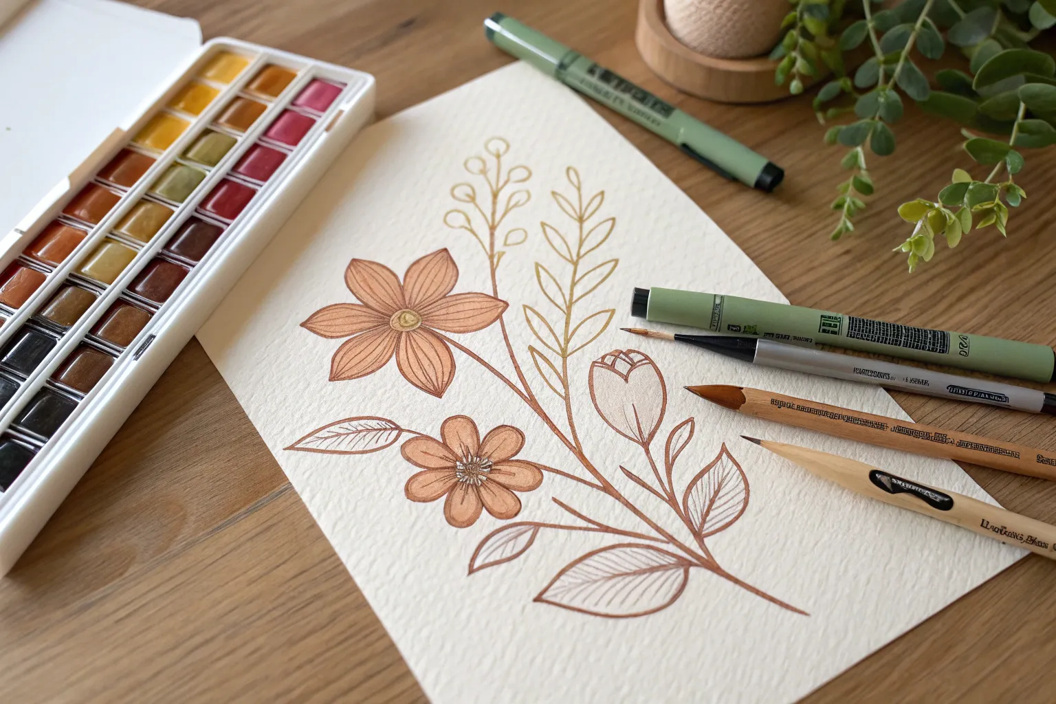
Layered Petals With Transparent Color
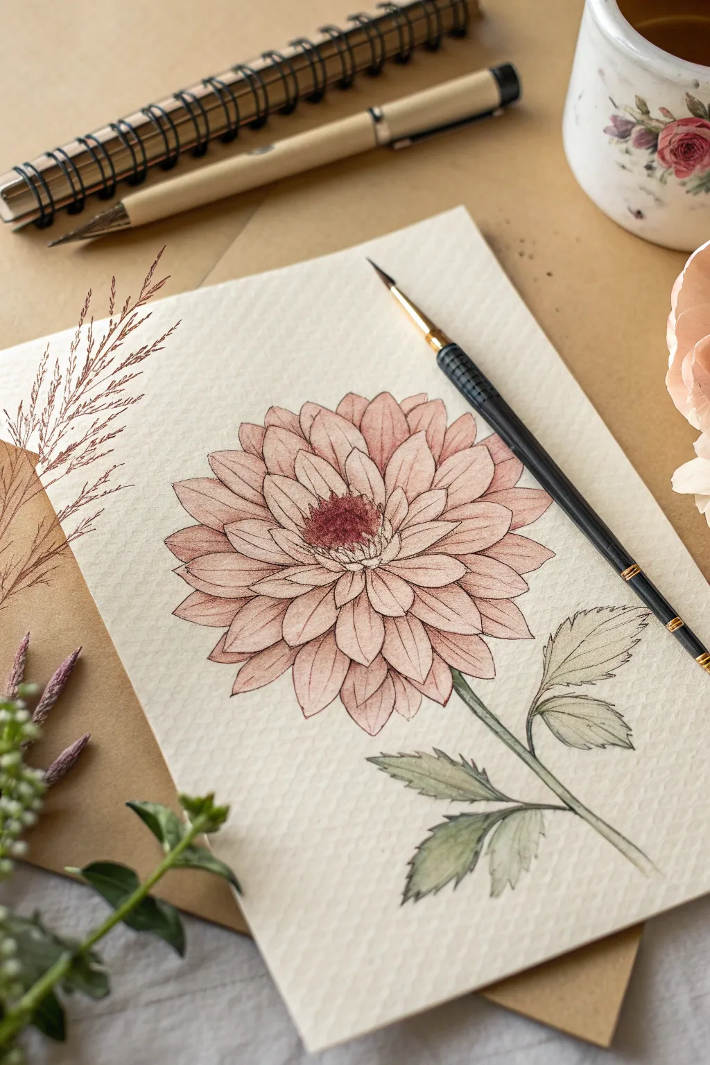
Capture the fragile beauty of a dahlia bloom using the translucency of water-based ink or brush pens. This project focuses on building depth through subtle layering of petal shapes, creating a soft, botanical illustration that feels both precise and organic.
Detailed Instructions
Materials
- Cold press watercolor paper (A5 size)
- Water-based brush pens (dusty pink, deep maroon, olive green)
- Fine liner pen (black or sepia, waterproof, size 01 or 03)
- Water brush or small round paintbrush (size 2 or 4)
- Pencil (HB or 2H)
- Clean water container
- Paper towel
Step 1: Planning the Structure
-
Lightly sketch the center:
Begin by drawing a small, rough oval for the center of the flower using your pencil. Keep your pressure extremely light so graphite lines don’t show through the pale colors later. -
Draft the inner petals:
Sketch the first ring of petals around the center. These should be short, tightly packed, and point slightly upward towards the viewer. -
Expand the bloom:
Continue drawing concentric rings of petals, making each subsequent layer slightly larger and more open. Aim for a teardrop or slightly pointed oval shape for each petal. -
Add the stem and leaves:
Draw a slender stem extending from the bottom of the flower. Add two or three leaves branching off, keeping their edges jagged or serrated to mimic a real dahlia leaf.
Wet-on-Wet Magic
To get softer petal gradients, pre-wet individual petals with clean water before dropping in ink. The color will flow beautifully into the damp area on its own.
Step 2: Inking the Outline
-
Outline the center:
Using your fine liner, trace the very center of the flower. Use small stippling dots or tiny hatched lines rather than a solid outline to suggest a pollen-heavy texture. -
Trace the petals:
Carefully ink the pencil lines of your petals. I find that breaking the line occasionally, especially near the tips, gives the flower a more organic, less ‘stamped’ feeling. -
Refine the leaves:
Outline the leaves and stem. Add a central vein line to each leaf, but leave the smaller veins for the coloring stage to keep the look delicate. -
Erase guidelines:
Once the ink is completely dry—give it a few minutes to be safe—gently erase all pencil marks to leave a clean black-and-white drawing.
Texture Play
Add splatter for an artistic touch. Load your brush with watered-down pink ink and tap it over the flower to create tiny, random specks of color.
Step 3: Coloring the Bloom
-
Apply base color to petals:
Scribble a bit of your dusty pink brush pen onto a plastic palette or piece of plastic. Pick up the color with a wet water brush and apply a very pale, watery wash to all the petals. -
Deepen the center:
While the petals are drying, take your deep maroon brush pen and dot color directly into the stippled center of the flower. Let the ink bleed slightly if the paper is still damp. -
Shade the inner petals:
Using the dusty pink pen directly (or a less diluted mix), add color to the base of the petals closest to the center. Use a damp brush to pull this color outward, fading it to white at the tips. -
Layering the outer petals:
Repeat the shading process on the outer layers. Focus the darker pigmnent at the bottom of each petal where it tucks under the one above it. This shadow creates the illusion of 3D layering. -
Add contrast:
For the very deepest shadows between overlapping petals, touch the tip of the maroon pen lightly into the wet pink wash. Watch the colors blend naturally.
Step 4: Finishing Touches
-
Paint the leaves:
Dilute your olive green ink and apply a wash over the leaves and stem. Keep it transparent so the line work remains visible. -
Shade the greenery:
Once the base green is dry, add a second layer of green along the central vein and near the stem connection points to give the leaves volume. -
Final leaf details:
If you want more detail, use the very tip of your brush pen to draw faint lateral veins on the leaves. -
Assess and adjust:
Step back and look at the whole piece. If the center feels too light, add a few more maroon dots. If a petal edge is lost, re-emphasize it very gently with the fine liner.
Now you have a timeless botanical illustration ready to be framed or gifted
BRUSH GUIDE
The Right Brush for Every Stroke
From clean lines to bold texture — master brush choice, stroke control, and essential techniques.
Explore the Full Guide
Abstract Blob Shapes With Highlights
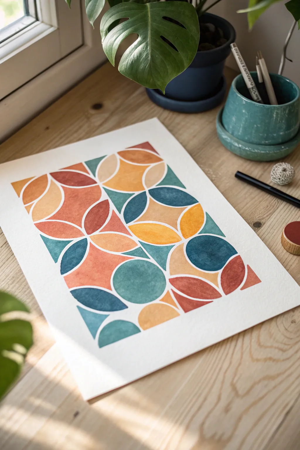
Embrace the mid-century modern aesthetic with this interlocking geometric design featuring warm earth tones and cool blues. By carefully leaving negative white space between your shapes, you create a sophisticated stained-glass effect using just brush pens or markers.
How-To Guide
Materials
- Thick watercolor paper or mixed media paper (cold press texture is nice)
- Pencil (HB or H)
- Ruler or straight edge
- Compass or circle stencil
- Brush pens (dual-tip markers work great) in: Rust Orange, Mustard Yellow, Deep Teal, Navy Blue, and Terracotta Red
- Kneaded eraser
Step 1: Drafting the Grid
-
Establish the boundaries:
Begin by lightly drawing a large rectangle in the center of your paper. This will be the outer boundary for your entire design, leaving a nice white mat-like border around the edge. -
Create a square grid:
Divide your large rectangle into smaller, equal squares. Looking at the reference, the pattern relies on a grid structure where circular arcs intersect. A 4×6 or 5×7 grid of squares works well depending on your paper size. -
Draw the primary circles:
Using your compass, place the point at the intersection of your grid lines. Draw circles that touch the edges of adjacent grid squares. You don’t need to draw full circles everywhere; focus on creating arcs that swoop from one corner of a square to the opposite corner. -
Add intersecting arcs:
Move the compass point to the center of the squares themselves and draw intersecting arcs. The goal is to create that four-petal flower shape or ‘orange slice’ shape where the circles overlap. -
Refine the composition:
Step back and look at your pencil web. Erase any lines that feel too cluttered, or connect shapes to create larger continuous curves. The design doesn’t have to be perfectly symmetrical; a little irregularity adds to the abstract charm.
Uneven White Lines?
If you struggle to leave consistent gaps freehand, draft your pencil lines as double lines (like tracks). Color only up to the inner line to ensure your white spacing stays perfectly uniform.
Step 2: Adding Color
-
Plan your color palette:
Beforeinking, decide which shapes will get which color. You want to scatter your colors so that no two adjacent shapes are the same shade. I sometimes put tiny dot of color in each section as a reminder. -
Start with the lightest tone:
Take your Mustard Yellow brush pen. Begin filling in your chosen yellow sections. Use the flexible tip of the brush pen to carefully trace the inner curve of your pencil line first. -
The crucial gap technique:
This is the most important step: Do not color all the way to the pencil line. Leave a consistent 1-2mm gap of white paper between the color you are laying down and the pencil line. This creates the ‘white grout’ look. -
Fill the warm shapes:
Move on to your Rust Orange and Terracotta Red markers. Fill in the petal shapes and semicircles designated for these warm tones. Keep your strokes consistent to minimize streakiness, though a little texture on watercolor paper looks lovely. -
Add the cool tones:
Switch to your Deep Teal. Look for areas adjacent to your warm colors to create high contrast. Remember to maintain that consistent white gap, especially where a teal shape meets an orange one. -
Anchor with dark blue:
Use your Navy Blue for the final shapes. These darker values act as anchors for the composition. The brush tip is perfect for getting into sharp corners of the intersecting arcs.
Step 3: Final Touches
-
Review edges:
Check the outer perimeter of your rectangle. Ensure the colored shapes end in a crisp, straight line to maintain that boxy, framed appearance. -
Let it set:
Allow the ink to dry completely. Although brush pens dry fast, the paper might be slightly damp if you layered the ink heavily. -
Clean up the guides:
Once you are 100% sure the ink is dry, take your kneaded eraser and gently dab or roll it over the white gaps to lift up the original pencil grid lines. Avoid heavy rubbing so you don’t smudge the ink.
Add Metallic Flair
Once the main colors are dry, use a gold or silver gel pen to trace extremely thin accent lines inside the white gaps for a touch of Art Deco elegance.
You have now created a vibrant piece of geometric art perfect for framing or scanning for a card design
Mixed Media: Brush Pens With Fineliner Texture
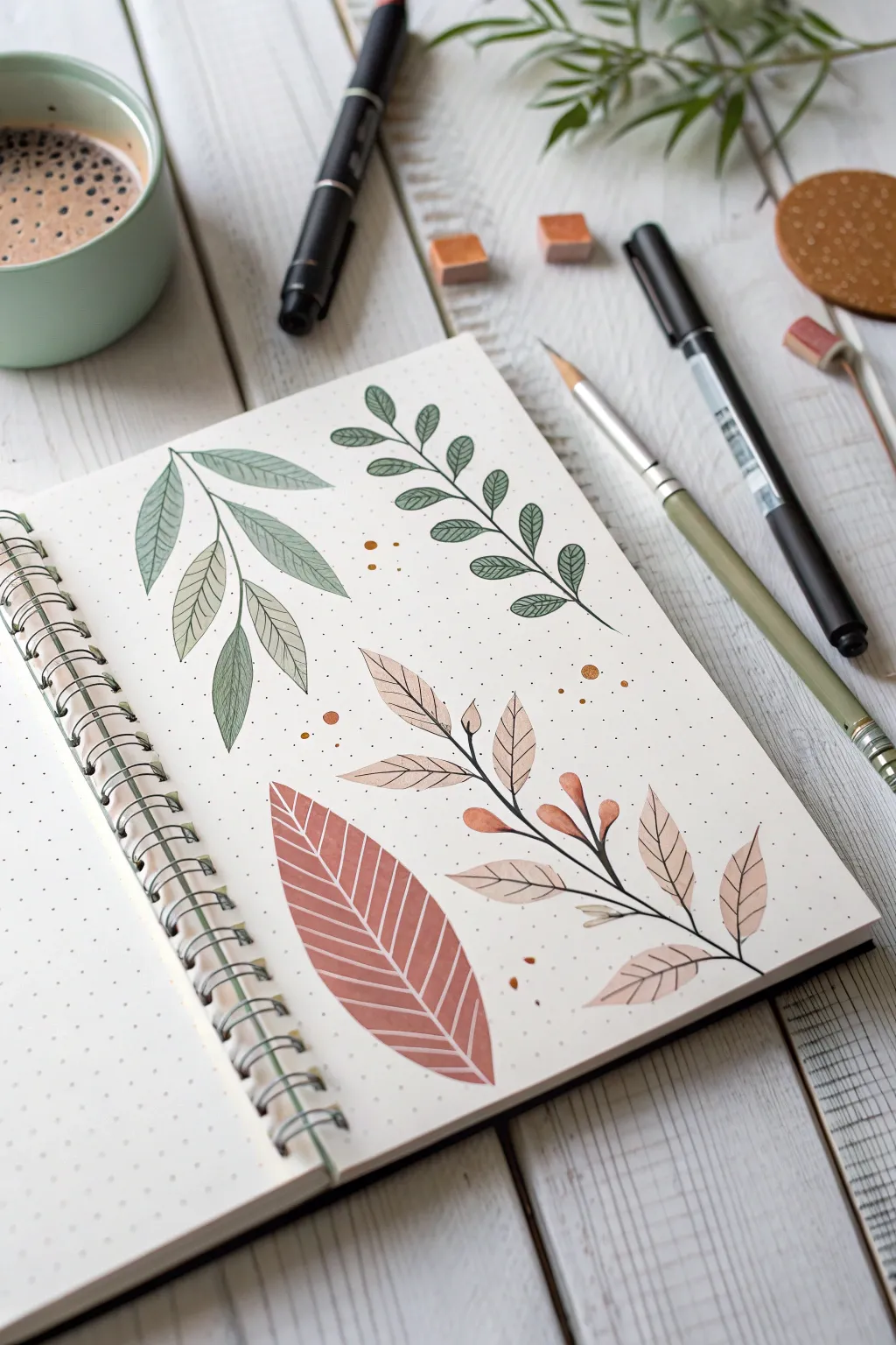
This sketchbook spread combines the soft, organic washes of brush pens with the crisp precision of fineliners to create distinct botanical studies. By layering ink outlines over muted color blocks, you achieve a stylish illustrative look perfect for bullet journals.
Detailed Instructions
Materials
- Dotted or blank sketchbook (heavyweight paper recommended)
- Dual-tip brush pens (muted green, sage, olive, terracotta/peach)
- Black fineliner (0.1mm or 0.3mm)
- Pencil and eraser
- Ruler (optional for layout)
- Gold or bronze metallic marker (optional accent)
Step 1: Preparation & Layout
-
Plan placement:
Visualize the page layout. You will be drawing four distinct leaf elements: a large drooping sprig on the top left, a climbing vine on the top right, a broad single leaf at the bottom center, and a flowering branch on the bottom right. -
Light sketching:
Use a pencil to lightly sketch the central veins or ‘spines’ of each botanical element. This acts as a skeleton to guide your brush strokes later. -
Define leaf shapes:
Sketch the rough outer shapes of the leaves attached to your stems. Keep the pressure very light so these lines can be erased completely later.
Step 2: Base Color Layer
-
Pale green wash:
For the top-left drooping sprig, use a pale sage green brush pen. Press the side of the brush nib down to create the almond-shaped leaf bodies in one stroke if possible, filling your pencil sketches. -
Olive vine fill:
Switch to a slightly darker, more olive-toned green for the climbing vine on the top right. Fill in small, rounded leaflets along the stem. -
Terracotta base:
For the large single leaf at the bottom, use a terra-cotta or rust-colored brush pen. Fill the entire leaf shape solidly. Don’t worry if the coverage interacts with the paper texture; that adds character. -
Peach tones:
On the bottom-right branch, use a soft peach or beige brush pen for the leaves and small buds. Keep these strokes light and airy. -
Drying time:
Allow the ink to dry completely. If you draw over wet brush ink with a fineliner, the paper might tear or the ink might bleed.
Ink Compatibility
Test your fineliner over your brush pen on a scrap piece of paper first. Some water-based markers can re-activate or smudge certain ink brands.
Step 3: Fineliner Detailing
-
Outline the sage sprig:
Using your black fineliner, trace the outline of the pale green leaves on the top left. Keep the line slightly loose—it doesn’t need to perfectly match the color edge. -
Add veins:
Draw a central vein in each sage leaf, then add fine diagonal strokes to create a detailed vein texture. -
Structured vine details:
Move to the olive vine. Outline the stem and leaves with a consistent, smooth black line. Add a simple single central vein to each small leaf. -
Inverse texture:
On the large terracotta leaf, draw the outline first. Then, instead of drawing veins in black, use a white gel pen or—if you left negative space—use the fineliner to draw the veins *around* the color, effectively creating a white vein look. Here, simple diagonal white lines work best. -
Floral branch accents:
For the peach branch, draw a dark, solid black main stem. Outline the peach leaves delicately. -
Bud details:
Add small black ‘caps’ to the bottom of the peach-colored buds to connect them to the stem.
Level Up: White Gel Pen
Use a white gel pen to draw veins on top of the darkest leaves (like the terracotta one) for a striking, high-contrast pop that adds dimension.
Step 4: Final Touches
-
Erase guidelines:
Gently erase any remaining pencil marks that haven’t been covered by marker. Be careful not to smudge the black ink. -
Decorative dots:
Take a bronze or gold metallic marker, or a complementary brush pen color, and add tiny dots scattered around the leaves to fill negative space. -
Evaluation:
Check the balance of the page. If a certain area feels empty, add a few more small ink specks or simple circles to tie the composition together.
Now you have a beautifully textured botanical spread to start your new journal


Have a question or want to share your own experience? I'd love to hear from you in the comments below!