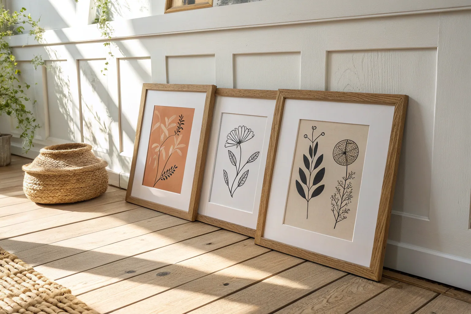
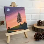
If you’ve ever made a piece you loved and thought, “Now what?”—that’s the perfect moment to start an art series. I like series work because it gives you a simple set of rules to play inside, so your pieces feel connected and intentional.
Same Subject, New Light
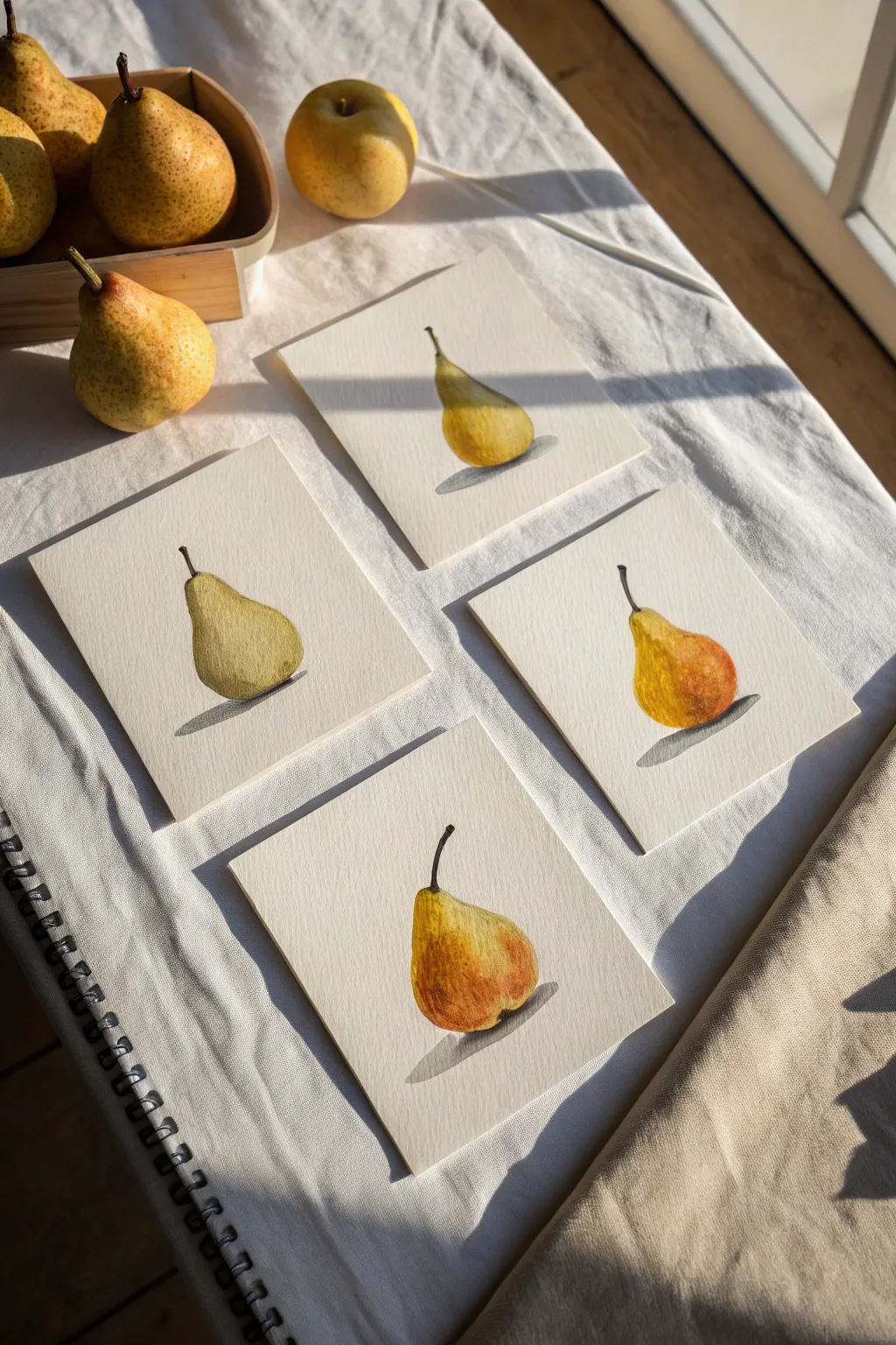
This elegant watercolor series explores the subtle variations of a single organic form, capturing the humble pear in four distinct color palettes and lighting scenarios. By painting the same subject multiple times, you will learn to observe the delicate interplay of shadow, texture, and hue on rounded surfaces.
How-To Guide
Materials
- Cold press watercolor paper (cut into four equal 15x15cm squares)
- Watercolor paints (Yellow Ochre, Lemon Yellow, Sap Green, Burnt Sienna, Burnt Umber, Payne’s Gray)
- Round watercolor brushes (size 4 and 8)
- Graphite pencil (HB or 2H)
- Kneaded eraser
- Two jars of water
- Paper towels
- Mixing palette
Step 1: Drawing and Preparation
-
Preparing the surface:
Begin by cutting your watercolor paper into four identical squares. This uniform format unifies the series and gives the final display a cohesive, gallery-like feel. -
Light sketching:
On each square, lightly sketch the outline of a pear using an HB pencil. Vary the shapes slightly or rotate the pear’s orientation for visual interest—make one lean left, one stand tall, and one lean right. -
Refining the form:
Be sure to include the stem curve and a small indication of where the cast shadow will fall. Use a kneaded eraser to lift any heavy graphite lines so they won’t show through the translucent paint later.
Step 2: Base Layers and Wet-on-Wet
-
First wash: The green pear:
For the first pear, mix a watery Sap Green with a touch of Yellow Ochre. Wet the inside of the pear shape with clean water first, then drop in the pigment, letting it bloom naturally to create a soft, underlying volume. -
First wash: The yellow pear:
On the second square, use a clean wash of Lemon Yellow. While it’s still damp, touch the bottom curve with a slightly darker mix of Yellow Ochre to begin suggesting roundness. -
First wash: The russet pears:
For the remaining two pears, start with a base of Yellow Ochre. While wet, drop in Burnt Sienna on the ‘shadow’ side of the fruit (usually the right side) to create that classic warm pear skin tone. -
Stem foundation:
Paint a thin line of pale Burnt Umber for the stems on all four studies, just to establish their placement before adding detail later.
Natural Speckling
Flick the bristles of a toothbrush loaded with diluted Burnt Sienna over the dry paintings (masking the background) to mimic organic fruit speckles.
Step 3: Building Form and Texture
-
Developing the green pear:
Once the first layer is dry, mix a slightly thicker Sap Green. Paint the shadowed side of the fruit using a lifting motion to blend the edge into the light, giving the object 3D form. -
Adding warmth:
For the yellow and russet pears, glaze over the dry base with a mix of Burnt Sienna and a tiny dot of Red. Focus this color on the bottom-heavy part of the pear to show ripeness. -
Creating texture:
I like to use a ‘dry brush’ technique here—blot your brush on a paper towel until it’s barely damp with pigment, then drag it gently over the highlight areas to create the speckled look of pear skin. -
Deepening contrast:
Mix Burnt Umber with a touch of Payne’s Gray. Use this dark value to paint the very bottom edge of each pear where it touches the table, anchoring the objects.
Muddy Colors?
If your shadows look dirty, let the paper dry completely. Then, glaze with a transparent cool blue or violet instead of adding more black or brown.
Step 4: Details and Shadows
-
Stem definition:
Switch to your size 4 detail brush. Use dark brown (Burnt Umber) to outline one side of the stems and add the rough, woody texture at the tip. -
Cast shadows:
Mix a cool gray using Payne’s Gray and a lot of water. Paint the cast shadow under each pear, mirroring the shape of the fruit but stretching it horizontally to the left. -
Softening edges:
Immediately after painting the shadow, rinse your brush and run clean water along the outer edge of the shadow to soften it, so it doesn’t look like a solid cutout. -
Final highlights:
If you’ve lost your highlights, you can gently scrub a small spot on the pear’s upper curve with a clean, damp stiff brush and blot with a tissue to lift the paint back to white. -
Evaluating the series:
Place all four paintings side by side. If one looks too pale compared to the others, add a final light glaze of color to balance the visual weight of the set.
Arranging these four studies together creates a sophisticated gallery wall that celebrates the beauty of simple things


Seasons in One Place
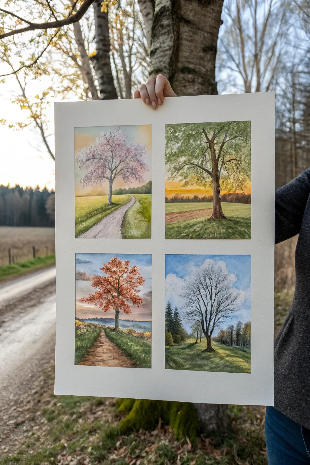
Capture the passing of time with this elegant four-panel watercolor series, showcasing the same solitary tree transforming through spring, summer, autumn, and winter. The soft washes and detailed branches create a harmonious grid that celebrates nature’s cycle on a single sheet.
Step-by-Step Tutorial
Materials
- Large sheet of cold press watercolor paper (approx. 11×14 or larger)
- Watercolor paint set (pan or tube)
- Artist tape or masking tape
- Pencil (HB or similar light graphite)
- Ruler or T-square
- Round brushes (sizes 2, 6, and 10)
- Rigger or liner brush for fine branches
- Palette for mixing
- Two jars of water
- Paper towels
Step 1: Preparation & Sketching
-
Tape the boundaries:
Begin by taping down your paper to a rigid board. Use your ruler and artist tape to divide the paper into four equal quadrants, leaving a crisp border around each rectangle to create the ‘window’ effect. -
Establish the horizon:
Lightly sketch a horizon line that connects across all four panels. This continuity is key; even though the seasons change, the landform should feel consistent. -
Draft the tree structure:
Sketch the same central tree in each panel. Focus on the trunk and main boughs. Don’t worry about leaves yet; just get the skeleton of the tree identical in size and placement for each season. -
Add paths and background:
Draw the winding path in the left two panels and the rolling fields in the right two. Keep pencil lines faint so they disappear under the paint.
Tape Trick
Run a credit card or bone folder firmly over the edges of your masking tape before painting. This seals the edge and prevents paint from bleeding into the white borders.
Step 2: Painting Spring (Top Left)
-
Soft sky wash:
Wet the sky area and drop in a very pale, warm yellow fading into soft blue. Keep it airy and light to represent morning spring light. -
Blossom texture:
Using a stippling motion with a size 6 brush, dab a mix of diluted pink and magenta around the branches. Keep the edges soft and leave white gaps for light. -
Fresh green grass:
Paint the field with a vibrant yellow-green. Use horizontal strokes for the distance and slightly more detailed vertical strokes near the path. -
Path details:
Wash the path with a diluted shadowy purple-grey, darker at the edges to show the worn dirt track.
Step 3: Painting Summer (Top Right)
-
Golden hour sky:
Create a sunset gradient using rich orange near the horizon blending into a muted purple-grey at the top. -
Full canopy:
Mix sap green with a touch of burnt sienna. Paint the full leaf canopy using loose, leafy strokes, ensuring you cover most of the branches but leaving some ‘sky holes’. -
Dappled light:
While the tree is drying, paint the ground with darker, warmer greens. Add cast shadows stretching away from the tree to match the sunset lighting. -
Trunk definition:
Darken the trunk with a mix of burnt umber and payne’s grey, adding texture to the bark.
Color Harmony
Mix a tiny amount of your trunk color (burnt umber/grey) into the greens and sky colors of every panel. This shared pigment unifies the four distinct seasons.
Step 4: Painting Autumn (Bottom Left)
-
Moody sky:
Paint a cloudier sky with indigos and greys, suggesting a crisp overcast day. -
Fiery foliage:
Load your brush with burnt orange, red ochre, and yellow oxide. Dab these onto the tree, allowing colors to bleed slightly into one another for a rich, changing look. -
Fallen leaves:
Stipple some orange dots on the ground beneath the tree. Darken the path with a muddier brown to suggest damp artist earth.
Step 5: Painting Winter (Bottom Right)
-
Bright cold sky:
Use a clear cerulean blue with puffy white areas left unpainted for clouds. This contrast makes the scene feel cold and crisp. -
Bare branches:
Switch to your rigger brush. With a dark, inky mix of ultramarine and brown, carefully trace the fine, bare branches reaching upward. -
Long shadows:
Paint the grass in cool, desaturated greens and greys. Add long, distinct shadows stretching from the tree and the background evergreens. -
Evergreen background:
Add the dark pine trees in the background left, which provide a stark contrast to the bare deciduous tree.
Step 6: Final Touches
-
Refine details:
Go back through all four panels. Deepen the darkest shadows on the trunks and refine any edges that look too messy. -
The Reveal:
Wait for everything to be completely bone dry. Carefully peel away the tape at a 45-degree angle to reveal the crisp white borders separating your seasons.
Step back and enjoy how your four panels tell a complete story of the year on a single page

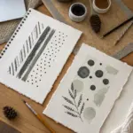
Limited Palette Mood Set
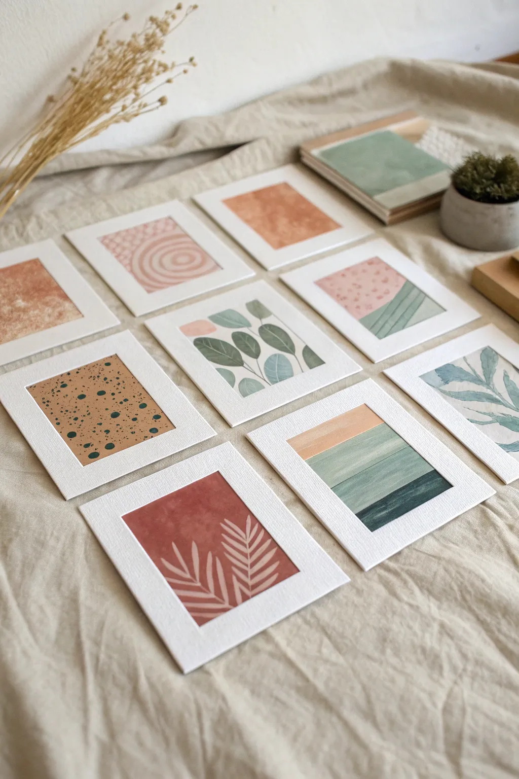
Create a sophisticated collection of mini artworks using a cohesive, limited palette of terracotta, sage, and dusty pink. This project explores abstract shapes, botanical motifs, and clean lines, perfect for building a gallery wall or a curated greeting card set.
Step-by-Step Guide
Materials
- Heavyweight watercolor paper or mixed media paper (300gsm)
- Gouache or acrylic paints (Terracotta, Sage Green, Beige, White, Black)
- Set of small, pre-cut white photo mats (approx. 4×5 inch outer size)
- Assorted brushes (small flat, medium round, fine liner)
- Washi tape or masking tape
- Ruler and pencil
- Palette for mixing
- Jar of water and paper towels
Step 1: Planning and Preparation
-
Define the series size:
Decide on the number of pieces for your collection. The image shows nine distinct works, which creates a balanced grid, but you can start with a set of three or four. -
Prepare the paper:
Cut your watercolor paper into rectangles slightly larger than the opening of your photo mats. This ensures you have room to tape them down without losing the painted edge. -
Secure the workspace:
Tape each piece of paper down to a flat board or table using washi tape. This prevents the paper from buckling when wet and creates a clean border if you decide to frame them without the mats later. -
Mix your palette:
Prepare your limited color palette. Mix a soft sage green, a deep terracotta, a pale dusty pink, and keep a pure black and beige ready. Consistently using the same four or five mixes across all pieces ties the series together.
Fixing Smudges
Get a smudge on a white mat? Don’t wet it. Use a clean, white vinyl eraser to gently lift the mark. If it’s paint, let it fully dry before trying to scratch it off with a craft knife.
Step 2: Abstract Compositions
-
Paint the color block backgrounds:
For the abstract pieces, paint large sections of solid color. Try a solid terracotta rectangle on one sheet, and a split composition of pink and green on another. Let these base layers dry completely. -
Add landscape stripes:
On a fresh sheet, paint horizontal bands of varying thickness. Start with a thin peach stripe at the top, followed by progressively darker shades of green to mimic a simplified landscape. -
Create texture with speckles:
Take a sheet painted solid beige. Dilute some dark green or black paint slightly. Load a stiff brush and flick the bristles to splatter fine dots over the beige background for a terrazzo effect. -
Paint geometric shapes:
On another piece, use a flat brush to paint clean, overlapping color blocks or circles. The image features a lovely soft pink circle on a patterned background; try recreating this by painting the background first, letting it dry, and then carefully adding the circle.
Step 3: Botanical Details
-
Sketch lead shapes:
For the botanical pieces, lightly sketch stylistic leaf shapes with a pencil. Aim for variety: round eucalyptus-style leaves on one, and long, slender fern-like leaves on another. -
Paint flat leaves:
Using your sage green and blue-green mixes, fill in the leaf shapes. Keep the paint relatively opaque for a modern, illustration-style look rather than a watery wash. -
Layer foliage:
For the multi-colored leaf print, paint the background leaves in a lighter mint shade first. Once dry, paint darker olive or sage leaves that appear to be in the foreground. -
Negative space technique:
Try the reverse technique seen in the terracotta piece. Paint a solid terracotta rectangle, let it dry, and then use a fine liner with opaque beige or white paint to draw the fern shapes on top.
add some shine
Enhance the geometric pieces by adding a thin line of gold leaf or gold watercolor paint between the color blocks. It adds a touch of luxury to the matte gouache finish
Step 4: Assembly and Finishing
-
Dry thoroughly:
Ensure every piece is completely dry to the touch. Gouache can smudge easily if handled while damp. -
Remove tape:
Carefully peel away the wash tape pulling away from the paper at a 45-degree angle to prevent tearing. -
Position the mats:
Place your white photo mats over the artworks. Adjust the positioning until you find the most pleasing composition within the window. -
Secure the art:
Flip the mat and artwork over together. Use tape to secure the back of the artwork to the back of the mat, locking the position in place. -
Final arrangement:
Lay out your finished mini-gallery on a table or attach them to a wall in a grid to appreciate the interplay of the limited color palette.
Enjoy seeing how simple shapes and colors come together to form a beautiful, unified collection


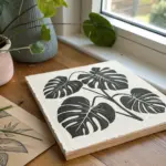
One Motif, Many Mediums
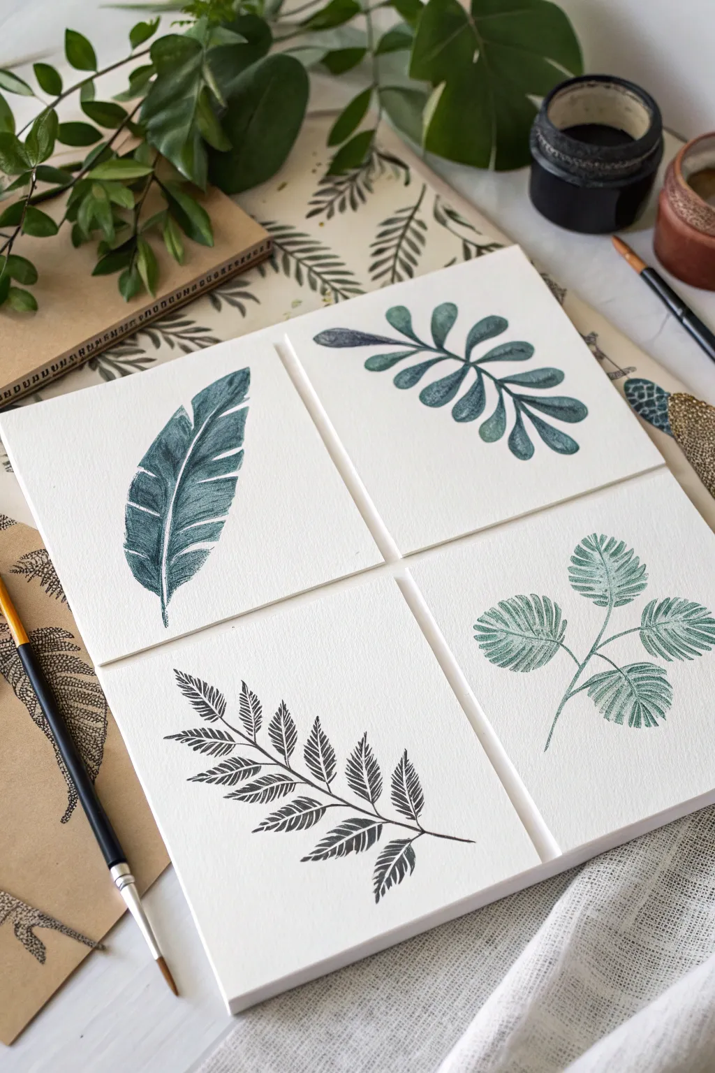
Capture the elegance of nature with this set of four square botanical studies, focusing on minimalist leaf forms and muted teal-green tones. These pieces combine the crisp lines of scientific illustration with a textured, print-like aesthetic perfect for a gallery wall series.
Detailed Instructions
Materials
- 4 sheets of cold-press watercolor paper (cut to 5×5 inch squares)
- Black ink or dark watercolor (Payne’s Grey or Sepia)
- Teal and Deep Green watercolor paints
- Fine liner brush (size 0 or 00)
- Round watercolor brush (size 4)
- Pencil (HB or H)
- Kneaded eraser
- Painter’s tape
- Mixing palette
Step 1: Preparation & Sketching
-
Prepare the canvas:
Begin by cutting your mixed media or watercolor paper into four equal squares. If you want perfectly crisp edges like the reference, tape down each square to your work surface using low-tack painter’s tape. -
Outline the first leaf:
On the first square, lightly sketch a large, single feather-shaped leaf. Draw a central curved spine, then add the outer edges, tapering them to a point at the top. -
Detail the feather structure:
Add the segments of the feather leaf by drawing slightly angled lines from the spine to the edge, leaving small gaps to indicate separation. -
Draft the rounded branch:
On the second square, sketch a central stem that splits into smaller branches. At the end of each stem, draw small, rounded, paddle-like leaves in an alternating pattern. -
Sketch the fern:
For the third square, draw a long, diagonal main stem. Along this stem, sketch triangular fronds that get smaller toward the tip. Inside each frond, indicate the central vein. -
Outline the palm clusters:
On the final square, draw a thin, branching stem structure. At the end of each branch, sketch a circular fan shape that will become the palm-like leaf clusters.
Pro Tip: Texture Trick
To mimic the ‘stamp’ look in the photo, blot your painted areas with a paper towel while wet. This lifts pigment unevenly, creating that beautiful, rustic grain.
Step 2: Inking & Painting
-
Mix the vintage teal:
Create a signature color by mixing a deep green with a touch of blue and a tiny drop of black. Aim for a muted, vintage teal shade rather than a bright primary color. -
Paint the feather leaf base:
Using the round brush, fill in the segments of the first leaf. Use a ‘dry brush’ technique here—load the brush with pigment but blot it slightly before painting—to create the textured, slightly scratchy look visible in the image. -
Add spine details:
Switch to your fine liner brush and use a darker concentration of the teal (or pure black ink) to define the central spine and the separation lines between the leaf segments. -
Color the rounded leaves:
For the second card, use a more fluid wash of the teal mix. Fill in the rounded leaves, allowing the color to pool slightly at the base of each leaf for natural shading. -
Define rounded leaf veins:
While the paint is still damp, drop in a tiny bit of dark pigment at the center of each leaf to suggest a central vein without drawing a hard line. -
Paint the fern fronds:
On the third square, use a very dark grey or black ink. Paint the individual leaflets on the fern with short, deliberate strokes that flick outward to mimic the feathery texture. -
Detail the fern stem:
Carefully trace the main stem of the fern with your liner brush, ensuring it connects all the fronds seamlessly. I find it helps to rotate the paper to get a better angle for these long lines. -
Wash the palm clusters:
On the last square, paint the circular fan shapes with a semi-transparent wash of green. Leave tiny white slivers unpainted to represent the ribs of the palm leaves. -
Enhance texture:
Once the base layers are dry on all cards, go back with a nearly dry brush and very dark pigment. Gently scumble over the darker areas to enhance the print-like texture. -
Clean up:
Wait until everything is completely dry to the touch. Gently erase any visible pencil marks with the kneaded eraser so you don’t damage the paper surface.
Troubleshooting: Warping
If your square cards start to curl from the moisture, tape them down to a flat board on all four sides and let them dry completely overnight before removing.
Display these four miniatures together to bring a serene, naturalist quality to your space
BRUSH GUIDE
The Right Brush for Every Stroke
From clean lines to bold texture — master brush choice, stroke control, and essential techniques.
Explore the Full Guide
Still Life Rotation Series
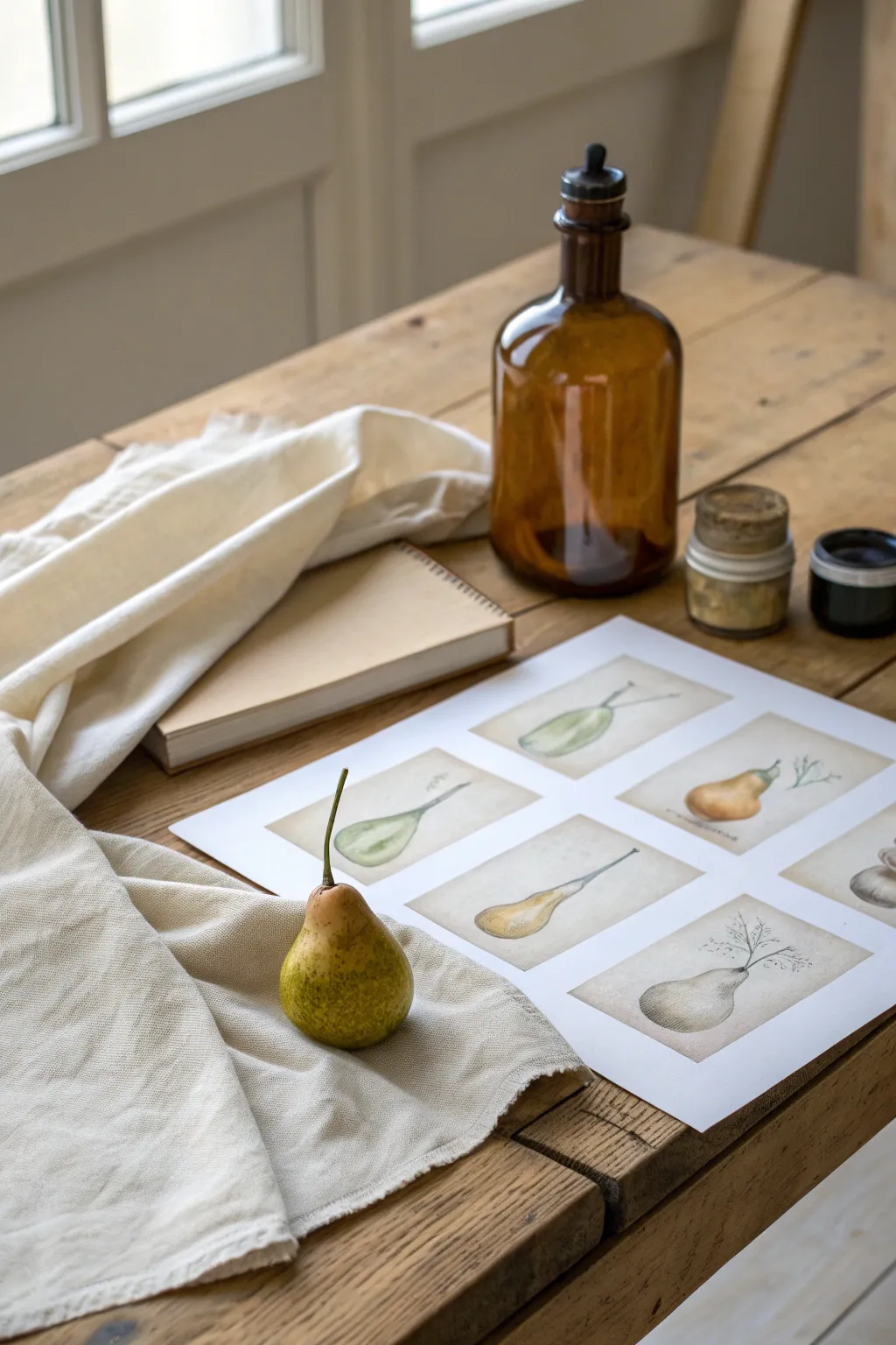
Capture the delicate beauty of a single subject through multiple perspectives with this vintage-inspired botanical illustration series. By arranging several small watercolor studies on a single sheet, you’ll create a cohesive narrative that feels like a page torn from a 19th-century naturalist’s field guide.
Step-by-Step
Materials
- Hot press watercolor paper (A3 size)
- Pencil (HB or 2H)
- Kneaded eraser
- Watercolor paints (Sap Green, Yellow Ochre, Burnt Sienna, Raw Umber, Indigo)
- Small round brushes (size 2 and 4)
- Fine liner pen (sepia or brown, waterproof)
- Ruler
- Fresh pear for reference
Step 1: Planning and Sketching
-
Establish the Grid:
Begin by lightly measuring out a 2×3 grid on your watercolor paper. Leave generous margins around the edges and consistent spacing between the six imaginary boxes where your illustrations will sit. -
Observe the Subject:
Take your fresh pear and rotate it. Notice how its shape changes from the top, side, and bottom. Decide on six distinct angles or ‘specimen states’ (e.g., whole, halved, or just the stem) to depict. -
Draft the Outlines:
Using your H pencil, lightly sketch the pear shapes into the center of each grid space. Keep your lines incredibly faint, as you want the watercolor to define the form, not the graphite. -
Refine the Forms:
Go back over your sketches to add slight irregularities. Real pears have bumps and uneven curves; capturing these imperfections will make your study look more authentic and scientific.
Step 2: Base Washes
-
Mix the Base Green:
Create a watery mix of Sap Green with a touch of Yellow Ochre. You want a pale, tea-like consistency for the first layer. -
Apply the First Wash:
Paint the body of the pears in the top row. Use the ‘wet-on-dry’ technique, carefully filling the pencil outline but leaving small white spaces for highlights where the light hits the skin. -
Varying the Tones:
For the pears in the bottom row or different angles, add a tiny bit of Burnt Sienna to your green mix to suggest ripening or bruising. Apply this wash and let all the illustrations dry completely.
Muddiness Monitor
If your pear colors look muddy, you likely didn’t let the first green layer dry fully before adding the brown shadows. Patience is key; wait until the paper is cool to the touch.
Step 3: Building Depth and Texture
-
Modeling the Form:
Mix a slightly darker, thicker green by adding a touch of Indigo. Paint along the shadowed side of each pear (usually the bottom and right side) to create volume. Soften the edges with a clean, damp brush so the shadow fades into the base color. -
Adding Warmth:
While the shadow layer creates roundness, a glaze of pure Yellow Ochre on the sun-facing sides gives the fruit a ripe, sun-kissed look. Apply this gently so you don’t lift the previous layers. -
Detailed Stippling:
Pears have a unique texture. Using your smallest brush and a fairly dry mix of Raw Umber or green, add tiny dots or ‘stippling’ over areas of the skin to mimic the fruit’s natural speckling. -
Painting the Stems:
Mix Burnt Sienna and Indigo to get a deep woody brown. Paint the stems with confident, thin strokes. Add a tiny shadow where the stem meets the fruit body to anchor it.
Tea Stain Effect
For a truly antique look, gently dab a used, cool tea bag over the empty white space of the paper before starting. It creates a natural, parchment-like beige tone.
Step 4: Vintage Finish
-
Inking Details:
Once the paint is bone dry, use a sepia fines liner to selectively outline parts of the pear. Don’t outline the whole shape; broken lines look more artistic and less like a coloring book. -
Scientific Annotations:
To enhance the ‘field guide’ aesthetic, lightly pencil in some faux-Latin names or small anatomical notes near the stems or leaves in a cursive script. -
Adding a Root System:
For one of the studies (perhaps the bottom right), imagine the pear as a bulb or sapling and sketch delicate, hair-like roots extending downward. Wash over them lightly with dilute brown watercolor. -
Background Ageing:
I prefer to add a final touch of age by mixing a very watery wash of Raw Umber and painting a rectangular ‘plate’ behind each pear, leaving the edges uneven to simulate old staining or parchment. -
Final Erasure:
Wait until you are absolutely certain the paper is dry, then gently use the kneaded eraser to lift any remaining visible pencil guidelines from your initial grid.
Frame this study simply to let the quiet details of your botanical observation shine
Portraits With One Rule
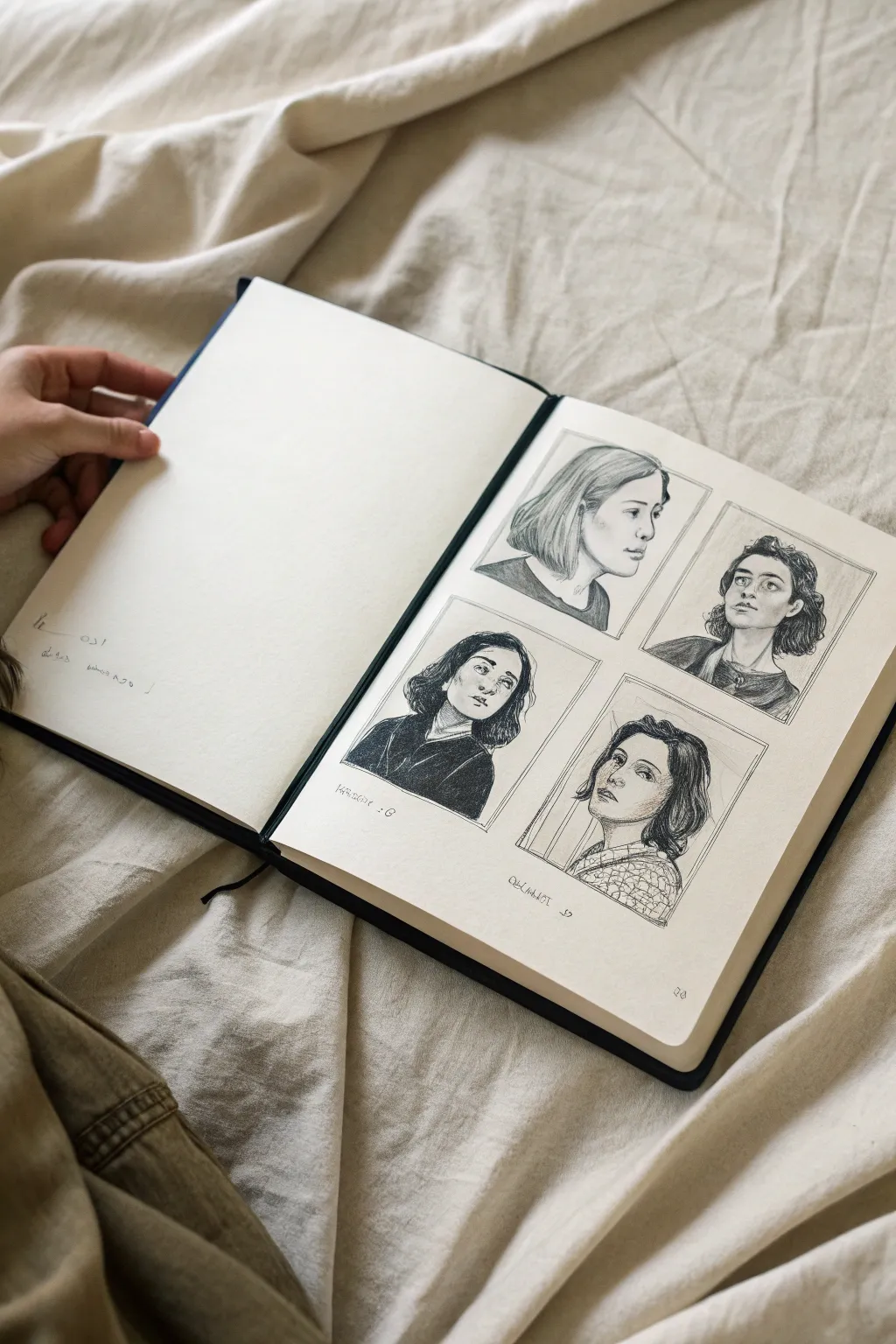
This sketching exercise challenges you to create a cohesive series of four portraits on a single page, focusing on consistent framing and graphite techniques. The result is a beautifully structured layout that showcases subtle variations in expression and angle.
Step-by-Step Guide
Materials
- Hardbound sketchbook (A4 or similar size)
- Graphite pencils (HB, 2B, 4B, 6B)
- Ruler
- Kneaded eraser
- Precision eraser or eraser stick
- Paper blending stump (tortillon)
- Tissue or clean scrap paper (to protect the page)
Step 1: Planning the Layout
-
Measure the margins:
Begin by finding the center of your sketchbook page. Use your ruler to measure equal margins from the edges, ensuring the drawing area is centered. -
Divide the space:
Draw faint guidelines to split the drawing area into four equal quadrants. Leave a small gap (gutter) between the frames, both vertically and horizontally, to keep the portraits distinct. -
Draw the frames:
Using an HB pencil and a light touch, outline the four rectangular boxes. I prefer using a very sharp pencil here to keep the lines crisp but easy to erase if needed.
Smudge-Free Zone
Place a piece of clean scrap paper under your drawing hand. This prevents natural oils and friction from smearing your earlier work as you move across the page.
Step 2: Drafting the Subjects
-
Select your references:
Choose four reference photos. For this ‘One Rule’ project, aim for consistency—perhaps all subjects are looking off-camera, or all share a similar lighting direction. -
Construct the head shapes:
Start with loose circles and basic jawlines to establish the head placement in each box. Ensure the heads are roughly the same size relative to their frames. -
Map facial features:
Lightly sketch guidelines for the eyes, nose, and mouth. Pay attention to the angle of the head; the tilt of these lines should match natural posture. -
Refine the outlines:
Go over your construction lines with clearer strokes to define the eyelids, nostrils, and lips. Don’t press too hard yet; you want the paper to remain smooth for shading later. -
Block in hair shapes:
Outline the general volume of the hair around the face. Treat the hair as large shapes or ribbons rather than individual strands.
Step 3: Shading and Definition
-
Establish core shadows:
Switch to a 2B pencil. Lightly shade the darkest areas first—under the chin, the eye sockets, and the side of the nose—to build form. -
Mid-tones and skin:
Use an HB pencil for the skin mid-tones. Use a soft, circular motion to apply graphite, then gently smooth it with a blending stump for a soft, realistic complexion. -
Deepen the darks:
Take a 4B or 6B pencil to punch up the contrast. Darken the pupils, the lash line, and the corners of the mouth. This high contrast brings the drawings to life. -
Render the clothing:
Fill in the clothing areas with broad, confident strokes. For solid black tops, use the 6B pencil heavily; for patterned tops, sketch the texture lightly first. -
Detail the hair:
Add texture to the hair by following the direction of growth. I like to focus on the roots and tips, leaving the highlighted areas somewhat empty to suggest shine. -
Clean the boundaries:
Use your ruler and a harder pencil to re-trace the rectangular frames, making them sharp and definitive. Erase any smudges in the gutters between frames. -
Final highlights:
Use a precision eraser to lift out small highlights in the eyes, on the tip of the nose, and on the bottom lip.
Creative Twist
Instead of four different people, draw the same person with four different emotional expressions to practice facial anatomy changes.
Step back and appreciate how the framed constraints make your portrait study look like a curated gallery collection

PENCIL GUIDE
Understanding Pencil Grades from H to B
From first sketch to finished drawing — learn pencil grades, line control, and shading techniques.
Explore the Full Guide
Background Pattern Variations
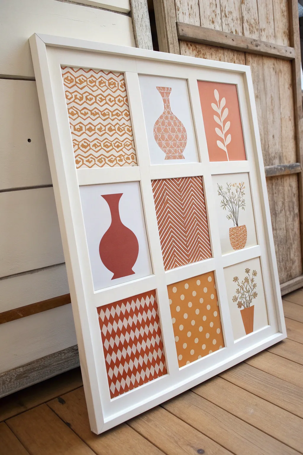
This project creates a striking, cohesive gallery wall effect inside a single large frame by blending geometric patterns with simple botanical and ceramic silhouettes. Using a warm terracotta color palette against crisp white, you will craft nine distinct yet harmonizing mini-artworks.
Detailed Instructions
Materials
- Large white collage frame (9 openings, roughly 4×6 or 5×7 inches each)
- Heavyweight watercolor paper or cardstock (white or cream)
- Terracotta or burnt orange acrylic paint
- Fine liner brush
- Medium flat brush
- Painter’s tape or masking tape
- Pencil and eraser
- Ruler
- Scissors or a paper cutter
- Optional: Pattern stencils
Step 1: Preparation and Planning
-
Measure and Cut:
Begin by removing the backing board and mat from your collage frame. Measure the exact size of the openings and cut nine pieces of your heavyweight paper to fit these dimensions perfectly, adding a tiny margin if you want to tape them from behind later. -
Plan the Layout:
Lay your nine blank cards on a table in a 3×3 grid. Sketch a rough plan on scrap paper first. You want to balance the ‘heavy’ pattern cards (like the full checkerboard) with the ‘lighter’ subject cards (like the single vase) so the final composition feels balanced.
Uneven Lines?
If your hand-painted geometric lines feel too shaky, use thin masking tape or washi tape to mask off the white areas before painting. Peel it off while the paint is still slightly wet for crisp edges.
Step 2: Creating Patterns
-
The Checkerboard (Bottom Left):
For the bottom-left diamond pattern, use your ruler to lightly draw a grid of diamonds. Paint alternating diamonds with your terracotta paint, leaving the white spaces clean. Use a steady hand and a small flat brush for crisp edges. -
The Chevron (Center):
For the center panel, draw vertical zig-zag lines. Paint the background in terracotta, carefully painting around the white zigzag lines (subtractive method) or use white paint pens on terracotta paper if you prefer, though painting the negative space creates a richer texture. -
The Geometric Hexagon (Top Left):
This is the most complex pattern. Sketch a repeating hexagon link pattern lightly with a pencil. Using your fine liner brush, trace the lines in terracotta paint. I like to keep the paint consistency slightly fluid here so the lines flow smoothly. -
The Polka Dot (Bottom Center):
Paint the entire card background with a solid coat of terracotta paint. Allow it to dry completely. Once dry, use the end of a paintbrush handle or a round sponge dabber dipped in white paint to create uniform dots in offset rows.
Step 3: Painting Subjects
-
The Solid Vase (Middle Left):
Sketch a simple, curvaceous vase silhouette in the center of the card. Fill this shape in completely with solid terracotta paint for a bold, graphic look. -
The Patterned Vase (Top Center):
Draw a bottleneck vase outline. Instead of filling it solid, use your fine liner brush to fill the inside of the vase shape with horizontal bands of tiny triangles, lines, and grids. -
The Leaf Stem (Top Right):
Paint this card solid terracotta first and let it dry. Then, using white paint (or a white paint pen for easier control), draw a single stem with alternating leaves curving upwards. -
The Potted Plants (Middle Right & Bottom Right):
For the final two cards, start by painting the pots. One should be a patterned texture (like small scales), and the other a solid terracotta trapezoid. Once dry, use a very fine brush or a thin black/brown pen to draw delicate stems and tiny leaves emerging from the pots.
Add Texture
Mix a teaspoon of baking soda into your acrylic paint. This creates a grainy, ceramic-like texture that makes the flat paper look like actual pottery pieces.
Step 4: Assembly
-
Erase and Refine:
Once all paint is 100% dry to the touch, gently erase any visible pencil marks. Check for any smudges and touch them up with a dab of white paint if needed. -
Frame Mounting:
Place your painted cards face down into the frame openings, double-checking your 3×3 arrangement against your original plan. Secure them with small pieces of tape if the backing board doesn’t hold them tight. -
Final Check:
Secure the frame backing, flip it over, and clean the glass to remove fingerprints.
Hang your new grid gallery in a well-lit spot to let the warm tones brighten the room
Warm vs Cool Diptychs
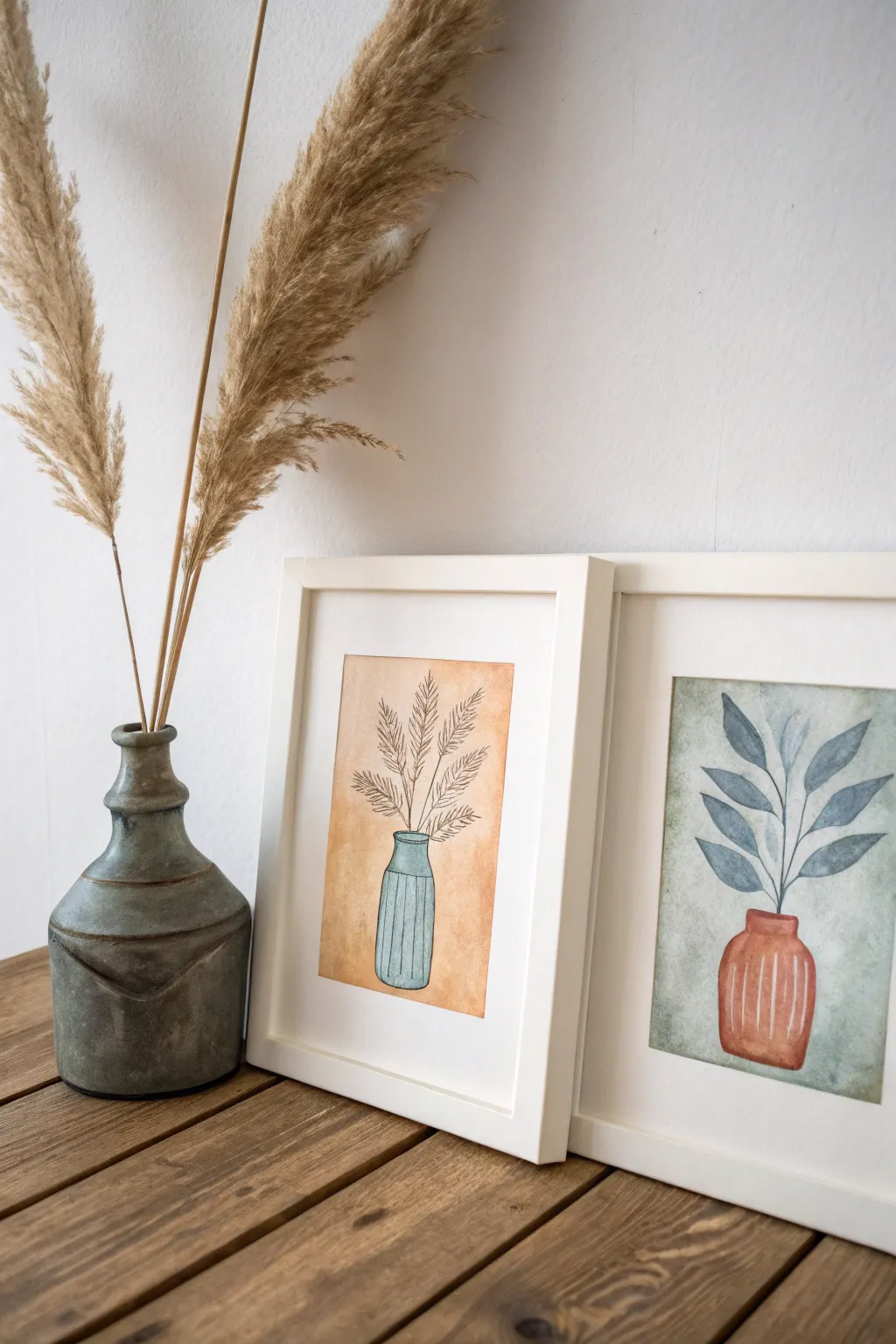
Create a harmonious pair of botanical artworks that play with complementary color temperatures and vase shapes. This diptych juxtaposes a warm, sun-baked backdrop with a cool, verdant one, tying them together through simple ink illustrations and ceramic-inspired focal points.
Step-by-Step Guide
Materials
- Cold press watercolor paper (approx. 5×7 inches)
- Watercolor paints (Burnt Sienna, Yellow Ochre, Indigo, Sap Green, Burnt Umber)
- Black waterproof fine liner pen (0.3mm or 0.5mm)
- Round watercolor brushes (sizes 4 and 6)
- Painter’s tape or masking tape
- Pencil and eraser
- Two white frames with mats
- Water cups and paper towels
Step 1: Planning and Sketching
-
Prepare the workspace:
Cut your watercolor paper to fit inside your chosen frames. Tape the edges of both sheets down to your work surface. This creates a crisp white border and prevents the paper from buckling when wet. -
Outline the compositional boxes:
Using a ruler and a very light pencil touch, draw a rectangle in the center of each paper sheet. This is the boundary where your background wash will live. -
Draft the left vase:
On the first sheet, sketch a tall, slender vase shape near the bottom center of the rectangle. Give it a distinct neck and a slightly wider body, similar to a traditional bottle shape. -
Draft the right vase:
On the second sheet, draw a shorter, stouter vase. It should feel grounded, with a wider mouth and round body, creating a nice contrast to the tall vessel on the left. -
Sketch the foliage:
Lightly pencil in the plant life. For the tall vase, draw sweeping, feathery lines radiating upward to mimic pampas grass. For the short vase, sketch a structured branch with broad, simple leaves reaching out.
Wet-on-Dry Trick
Work wet-on-dry for the backgrounds. Applying the wash to dry paper gives you those lovely, distinct hard edges and textures (sometimes called ‘blooms’) that make watercolors look organic.
Step 2: Applying the Background Washes
-
Mix the warm background:
For the left piece, mix a watery wash of Yellow Ochre with a tiny touch of Burnt Sienna. You want a soft, transparent amber glow. -
Paint the warm wash:
Carefully paint inside your pencil rectangle on the left sheet, painting *around* the vase shape but going right over the feathery plant stems (since they will be inked later). Keep the color uneven for texture. -
Mix the cool background:
For the right piece, create a subtle, muted green-grey wash. Mix plenty of water with a little Sap Green and a dot of Indigo or Payne’s Grey. -
Paint the cool wash:
Apply this cool wash to the rectangle on the second sheet, again painting around the vase shape but ignoring the leaf sketches for now. Let both backgrounds dry completely.
Make it Metallic
Swap the black marker details on the vases for a gold or copper gel pen. The metallic sheen adds a modern, sophisticated touch that catches the light beautifully when framed.
Step 3: Painting the Subjects
-
Paint the tall blue vase:
On the warm background, paint the tall vase a cool blue-grey tone. This contrast is key. Allow the paint to pool slightly at the bottom for a dimensional effect. -
Paint the stout red vase:
On the cool background, paint the round vase using a saturated mix of Burnt Sienna or terracotta. I find that deepening the color at the edges makes the object look rounder. -
Paint the leaves:
Switch to your smaller brush for the right-hand painting. Paint the leaves using a dusty blue-green shade (Indigo mixed with a bit of the background color). Keep the strokes loose and translucent. -
Add highlights:
While the vases are drying but still slightly damp, you can lift a tiny strip of color with a clean, thirsty brush to create a vertical highlight on the curves. -
Wait for total dryness:
This is crucial. Touch the paper lightly with the back of your hand. If it feels cool or damp, wait longer before moving to ink.
Step 4: Inking and Details
-
Outline the pampas grass:
On the warm painting, use your fine liner to draw the stems and feather-like details of the grass. Use quick, flicking motions to capture the fluffy texture. -
Detail the leafy branch:
On the cool painting, outline the stems and trace the leaves. Don’t worry if your ink line doesn’t perfectly match the paint edge; that misalignment adds charm. -
Add vase contours:
Gently outline both vases with ink. Keep the lines somewhat broken or lighter on the highlighted side to avoid a cartoonish look. -
Create texture lines:
Draw vertical stripes or fluting on both vases using the pen. Follow the curve of the vase form—curving downward at the bottom—to emphasize the volume. -
Erase and frame:
Once the ink is 100% set, gently erase any visible pencil marks from the borders. Peel off the tape, pop them into mats and frames, and display them side-by-side.
Now you have a stunning pair of custom art pieces that perfectly balance temperature and form


Triptych: One Image Split
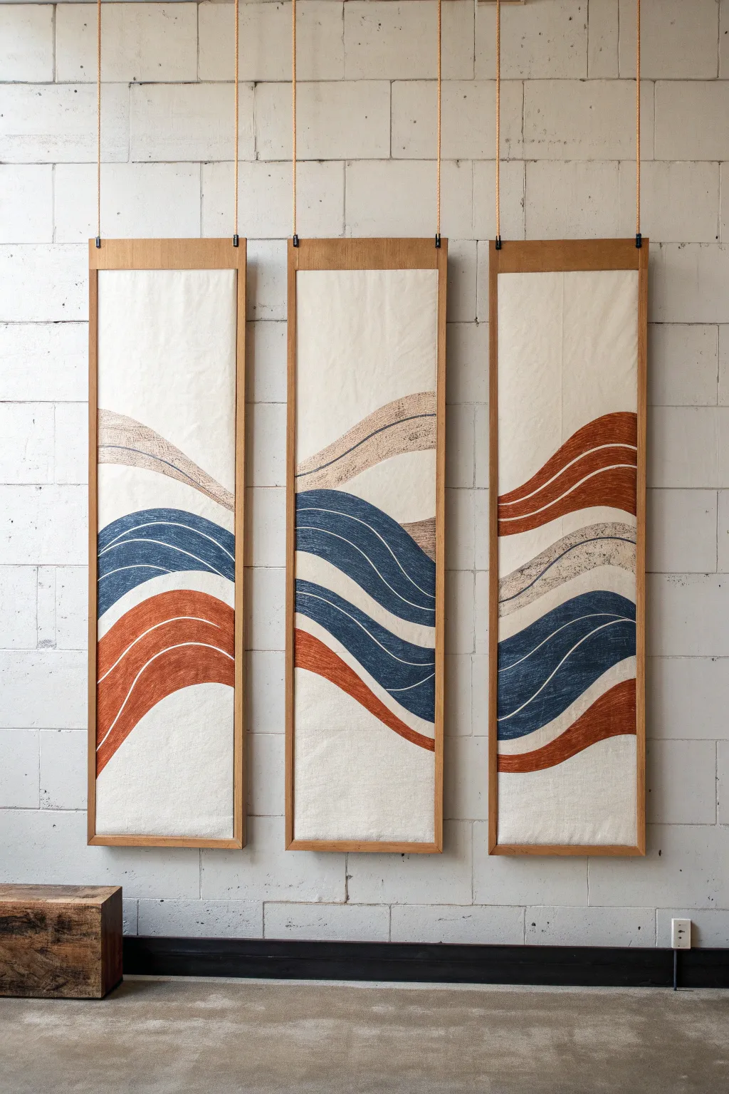
This stunning triptych uses the elegance of negative space and flowing lines to create a cohesive abstract landscape across three separate panels. By mounting painted canvas onto simple wooden frames, you achieve a high-end, gallery-worthy textured art piece perfect for filling vertical wall space.
Step-by-Step
Materials
- 3 large artist’s canvas panels (long rectangular format) or heavy cotton duck cloth
- 1×2 inch pine lumber (for framing)
- Wood stain (light oak or pecan)
- Acrylic paints (rust orange, navy blue, beige/tan)
- Fabric medium (if painting on raw fabric)
- Wide flat paintbrushes (2-3 inch)
- Painter’s tape or masking fluid
- Pencil and eraser
- Staple gun and staples
- Jute rope or thick twine
- Screw eyes (6 total)
- Wall hooks or command strips
Step 1: Preparing the Canvases
-
Plan the composition:
Before touching the canvas, sketch your wave flow on a piece of paper. The key to a triptych is ensuring the lines ‘travel’ from one panel to the next. You want the rust wave to exit the right side of the first panel and enter the left side of the second panel at the same height. -
Prep the fabric:
If you are using raw canvas or cotton duck cloth, iron it thoroughly to remove any creases. These need to be perfectly flat before you begin painting. -
Transfer the guide lines:
Lay all three fabric pieces or canvases side-by-side on a large floor space. Lightly draw your flowing wave patterns with a pencil, connecting the lines across the gaps between panels to ensure continuity.
Uneven Hanging?
If panels twist or won’t hang flat, the rope tension might be uneven. Try taping a small coin or washer to the back bottom corner of the lighter side to act as a counterweight.
Step 2: Painting the Design
-
Mix your palette:
Prepare your acrylic paints. Mix a fabric medium into your acrylics if you want a softer, more flexible finish that soaks into the weave rather than sitting on top. -
Paint the rust waves:
Start with your rust/orange color. Use a wide flat brush to fill in the designated wave sections. Keep your brush strokes horizontal to mimic the flow of water or sediment layers. -
Add the navy sections:
Once the rust sections are touch-dry, paint the deep navy blue waves. Be careful near the edges where colors meet; leave a tiny sliver of raw canvas showing between colors if you want a distinct separation, or butt them up distinctively. -
Apply the beige accents:
paint the lighter beige or tan waves. For a textured look like the original image, you can dry-brush this color on, dragging a mostly dry brush across the fabric so the canvas tooth shows through. -
Create the white lines:
The image shows thin white (or unpainted) lines running through the colored waves. You can achieve this by painting carefully around thin strips of negative space, or by using a white paint pen after the base colors dry to add these contour lines. -
Adding texture details:
I like to go back in with a finer brush and add subtle striations within the colored waves—darker blue lines inside the navy patch, for example—to give the piece depth and movement. -
Allow to cure:
Let the fabric dry completely, preferably overnight. This ensures the paint doesn’t smudge during the mounting process.
Step 3: Framing and Assembly
-
Cut the frame pieces:
Cut your 1×2 pine lumber. You need top and bottom header pieces for each panel. They should be the exact width of your fabric panels. -
Stain the wood:
Apply your chosen wood stain to the lumber pieces. Wipe off excess stain with a rag and let them dry fully. -
Mount the fabric:
Sandwich the top edge of your canvas between two pieces of wood (if you want a finished back) or simply staple the fabric to the back of a single wood strip. Repeat for the bottom to weigh the fabric down. -
Secure with staples:
Use a staple gun to firmly attach the canvas to the back of the wood strips. Pull the fabric taut as you staple to prevent sagging in the middle. -
Install hardware:
Twist a screw eye into the top edge of the wooden frame on both the left and right sides. Do this for all three panels.
Crisp Lines
For super sharp edges, iron freezer paper (shiny side down) onto the fabric as a stencil. It adheres temporarily and peels off cleanly without leaving residue.
Step 4: Installation
-
Attach the rope:
Thread your jute rope through the screw eyes. Tie a sturdy knot at each eyelet, leaving a long loop of rope extending upwards for hanging. -
Hang the panels:
Install hooks on your wall or from the ceiling. Adjust the rope lengths so that the panels hang perfectly level with each other and the wave pattern aligns across the gaps.
Step back and enjoy the calming rhythm your new artwork brings to the room
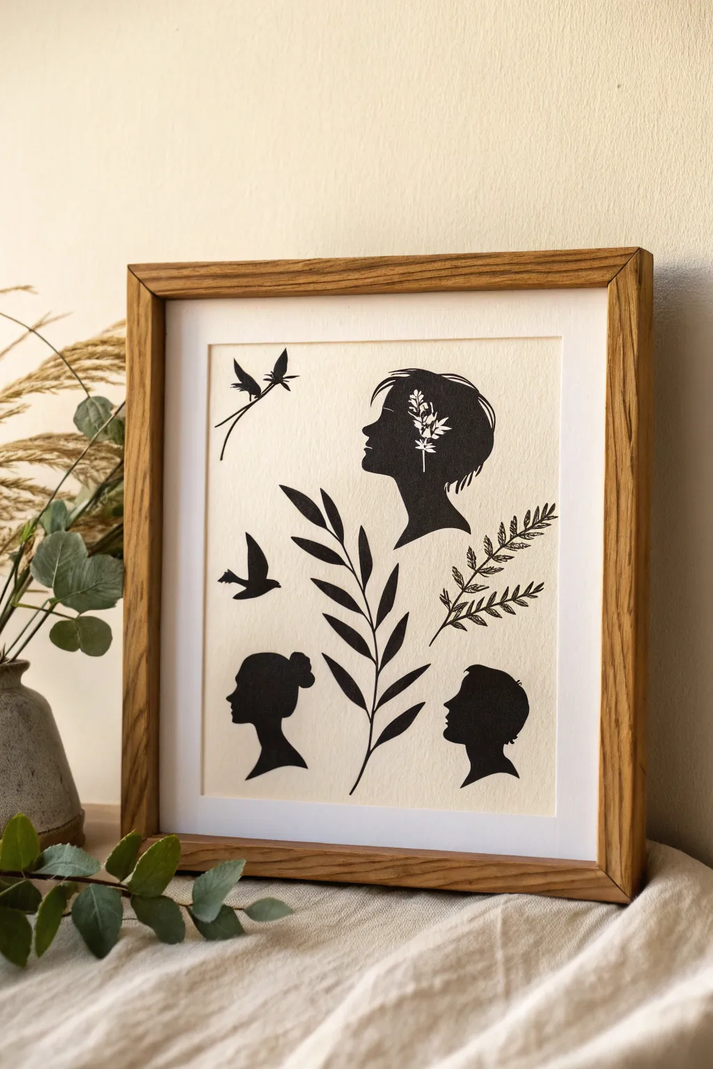
Negative Space Silhouettes
Capture the delicate interplay of shadow and light with this elegant paper cut-style artwork. By combining classic portrait silhouettes with botanical elements and negative space detailing, you’ll create a timeless piece that feels both vintage and modern.
Step-by-Step
Materials
- High-quality black cardstock or matte art paper
- Heavyweight cream or off-white textured paper (for background)
- Precision craft knife (X-Acto or similar)
- Cutting mat
- Sharp detail scissors
- Pencil and eraser
- Spray adhesive or fine-tip glue pen
- Tracing paper (optional)
- White mat board
- Wooden frame (oak or light wood finish)
Step 1: Conceptualizing and Sketching
-
Plan your composition:
Begin by lightly sketching the layout on a scrap piece of paper to establish the balance. Notice how the original artwork uses a central botanical branch to separate the lower profiles, anchoring the design while the birds add movement to the upper left. -
Draft the profiles:
On your black cardstock, lightly draw the outlines of the three human profiles. You need a large profile for the upper right, a female bun silhouette for the bottom left, and a male profile for the bottom right. -
Add botanical and avian elements:
Sketch the supporting elements onto the black paper: a long, sweeping leafy branch for the center, a fern-like frond for the right edge, and two flying birds—one perching or diving, and one soaring. -
Detailing the main profile:
For the largest upper profile, sketch the internal floral design. Draw small leaves and stems directly inside the head shape where the ear and temple would be. This will be cut away later to create the negative space effect.
Fixing Jagged Edges
If your scissor cuts look choppy, don’t recut the whole piece. Use a fine-grit sandpaper file or an emery board to gently smooth out the bumpy edge of the cardstock.
Step 2: Cutting the Silhouettes
-
Cut the main outlines:
Using your detail scissors, carefully cut out the exterior shapes of the three heads and the two birds. Keep your wrist flexible and turn the paper, not the scissors, to get smooth curves around the noses and chins. -
Tackle the central branch:
Switch to a craft knife for the long central branch. The leaves are pointed and sleek; cut slowly toward the tips to keep them sharp and defined without tearing the cardstock. -
Create the fern detail:
For the fern-like plant on the right, use the craft knife to cut the tiny gaps between the leaflets. This requires patience, as the stems are very thin and delicate. -
Carve the negative space:
Place the large upper profile on your cutting mat. Using a fresh blade in your craft knife, carefully excise the floral shapes you sketched inside the head. Remove the tiny black pieces to reveal the ‘white’ holes that will form the flowers.
Step 3: Assembly and Framing
-
Prepare the background:
Cut your cream textured paper to size. I find it helpful to tape the corners down to the work surface with low-tack tape to prevent it from shifting during placement. -
Dry run arrangement:
Place all your black cutouts onto the cream paper without glue. Adjust the spacing until the composition feels balanced, ensuring equal margins around the edges. -
Mark the positions:
Once satisfied, use a pencil to make tiny, faint guide marks where the main elements should sit, or simply lift one piece at a time to glue. -
Apply adhesive:
Flip a cutout over onto a scrap sheet. Apply a light mist of spray adhesive or use a glue pen on the thickest parts. Only tiny dots of glue are needed for thin stems to prevent oozing. -
Mount the artwork:
Gently press each piece onto the cream paper, smoothing from the center outward. Pay special attention to the thin tips of the leaves and the bird wings. -
Clean up:
Check for any stray pencil marks and gently erase them. If there’s any excess glue residue, use a glue eraser to pick it up carefully. -
Matting:
Place the white mat board over your artwork. The mat helps draw the eye inward and provides professional spacing between the art and the frame. -
Final framing:
Clean the glass of your wooden frame thoroughly to remove dust. Insert the matted artwork, secure the backing, and your silhouette collection is ready to display.
Pro Tip: Digital Templates
Not confident drawing profiles? Taking a photo of a friend against a bright window creates a perfect reference photo you can print and trace directly onto your black paper.
Now stepping back, admire the sharp contrast and narrative created by your simple yet striking silhouettes
Same Format, New Prompt
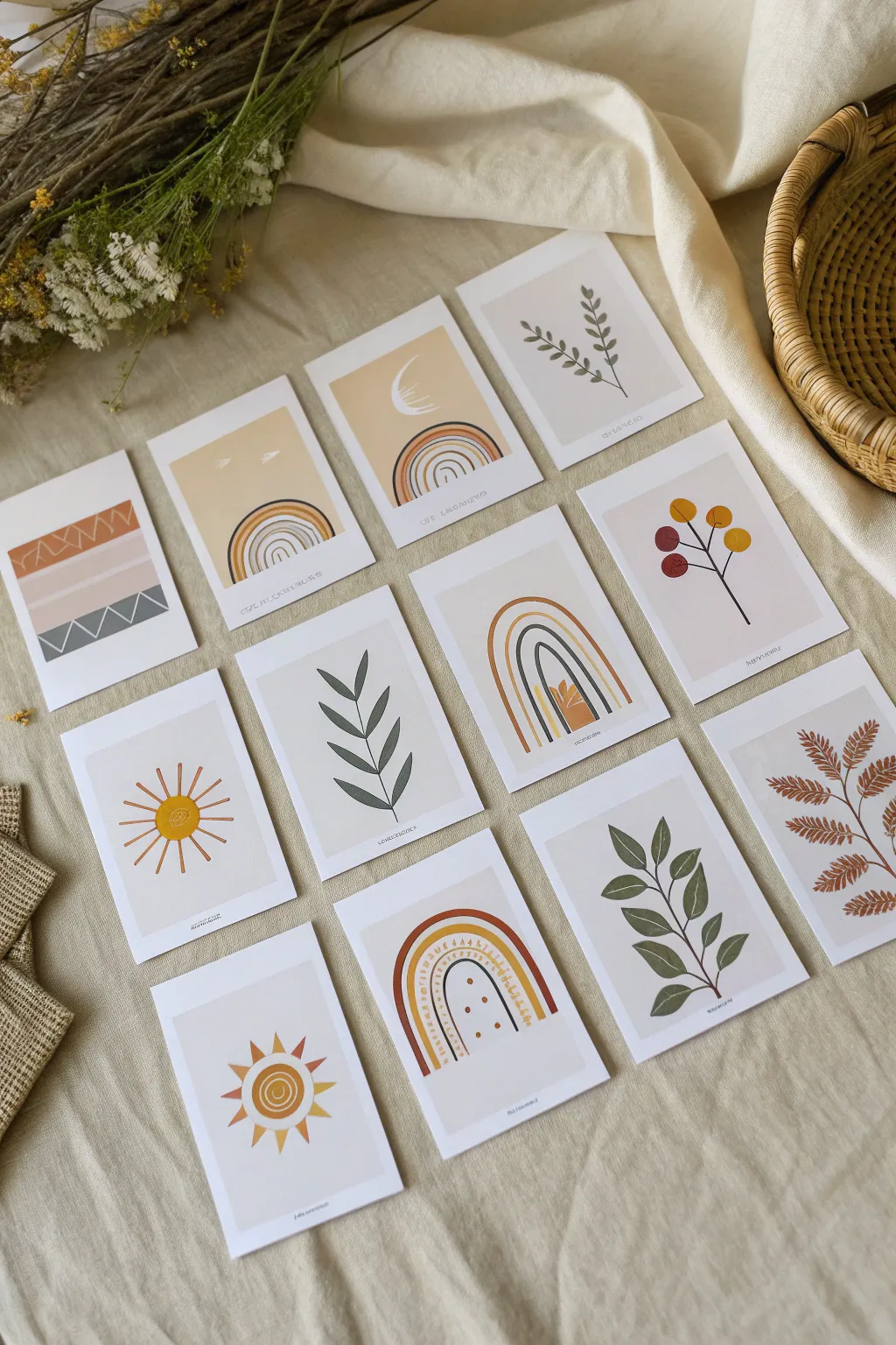
Create a cohesive collection of abstract, nature-inspired art prints using a warm, earthy color palette. This project emphasizes simple shapes and consistent framing to turn twelve individual designs into a unified gallery wall set.
Step-by-Step Tutorial
Materials
- Heavyweight matte cardstock (white or cream)
- Gouache or acrylic paints (burnt sienna, mustard yellow, sage green, gray, terracotta)
- Fine-point black ink pen (archival)
- Flat shader brushes (sizes 4 and 6)
- Round detail brush (size 0 or 1)
- Ruler and pencil
- Paper cutter or craft knife
- Mixing palette
- Washi tape or masking tape
Step 1: Planning and Preparation
-
Define the Dimensions:
Begin by deciding on the final size for your cards. A standard postcard size (4×6 inches) or slightly smaller (3×5 inches) works perfectly for this intimate scale. Measure and mark your cardstock accordingly. -
Cut the Base Cards:
Using a paper cutter or a craft knife and ruler, cut out twelve identical rectangles from your heavyweight cardstock. Precision here is key to the series looking professional. -
Establish the Margins:
Lightly mark a consistent border on every card—about half an inch from the edge works well. This creates the ‘polaroid’ style white frame that unifies the disparate designs. -
Mask the Edges:
Apply washi tape or painter’s tape exactly along your pencil lines to mask off the borders. This ensures crisp, clean edges for your painted backgrounds and protects the white frame.
Step 2: Painting the Backgrounds
-
Mix Your Palette:
Prepare your signature colors. Aim for a muted, earthy scheme: mix a soft sage, a deep terracotta, a muted mustard, and a sandy beige. I like to keep a tester sheet nearby to ensure all colors harmonize before applying them. -
Apply Base Washes:
For designs that require a full colored background (like the beige or soft gray cards), paint the entire inner rectangle with a flat shader brush. Use smooth, horizontal strokes to minimize texture. -
Create Abstract Horizons:
For the design featuring the abstract landscape (bottom left in the set), paint horizontal bands of color. Start with the lightest color at the top and work down to darker grays or browns. -
Let the Base Dry:
Allow all base layers to dry completely. Gouache dries visually matte and lighter than when wet, so be patient before adding details.
Palette Consistency
Limit yourself to 4-5 main colors for the entire series. Reuse these specific mixes across different cards to ensure the whole collection feels like a unified set.
Step 3: Designing the Motifs
-
Draft the Shapes:
Lightly sketch your central motifs with a pencil inside the masked areas. Focus on three main themes: botanical stems, celestial bodies (suns/moons), and geometric arcs (rainbows). -
Paint the Rainbow Arcs:
Using the round brush, carefully paint the concentric arches for the rainbow designs. Vary the line thickness and alternate between your palette colors (mustard, terracotta, gray) to keep visual interest. -
Add Botanical Elements:
For the leaf designs, use a single confident stroke for the stems. Then, press the belly of the round brush down and lift up to create simple, almond-shaped leaves. -
Paint the Grid Sun:
For the sun design (bottom left quadrant), paint a solid yellow circle first. Once dry, use a contrasting burnt orange to paint the straight rays radiating outward. -
Detailing the Berries:
On the berry branch design, paint small circles in alternating red and yellow attached to the main dark stem. Keep the paint relatively thin so it lays flat.
Bleeding Edges?
If paint bled under the tape, wait for it to dry completely, then use a white gel pen or a tiny amount of white gouache to carefully touch up the border line.
Step 4: Final Touches
-
Inking the Details:
Once the paint is bone dry, use your fine-point black pen to add definition. Draw stems for the more delicate leaves or outline specific shapes if you want a bolder, illustrative look. -
Add Subtle Patterns:
Using the very tip of your smallest brush or a white gel pen, add tiny dots or dashed lines inside the rainbow arches or sun rays for extra texture. -
Remove the Tape:
Ideally, peel the tape away from the center of the artwork at a 45-degree angle. This prevents the paper from tearing and reveals those crisp, clean edges. -
Stamp or Sign:
If desired, adding a tiny, unreadable ‘signature’ scribbling or typewritten text at the very bottom of the painted area adds an authentic art-print feel. -
Flatten the Prints:
If the paint has caused the paper to buckle slightly, place the finished cards under a heavy book overnight to flatten them perfectly.
Arrange your mini-prints in a grid or hang them along a string to enjoy your own curated art gallery.
One Shape, Infinite Compositions
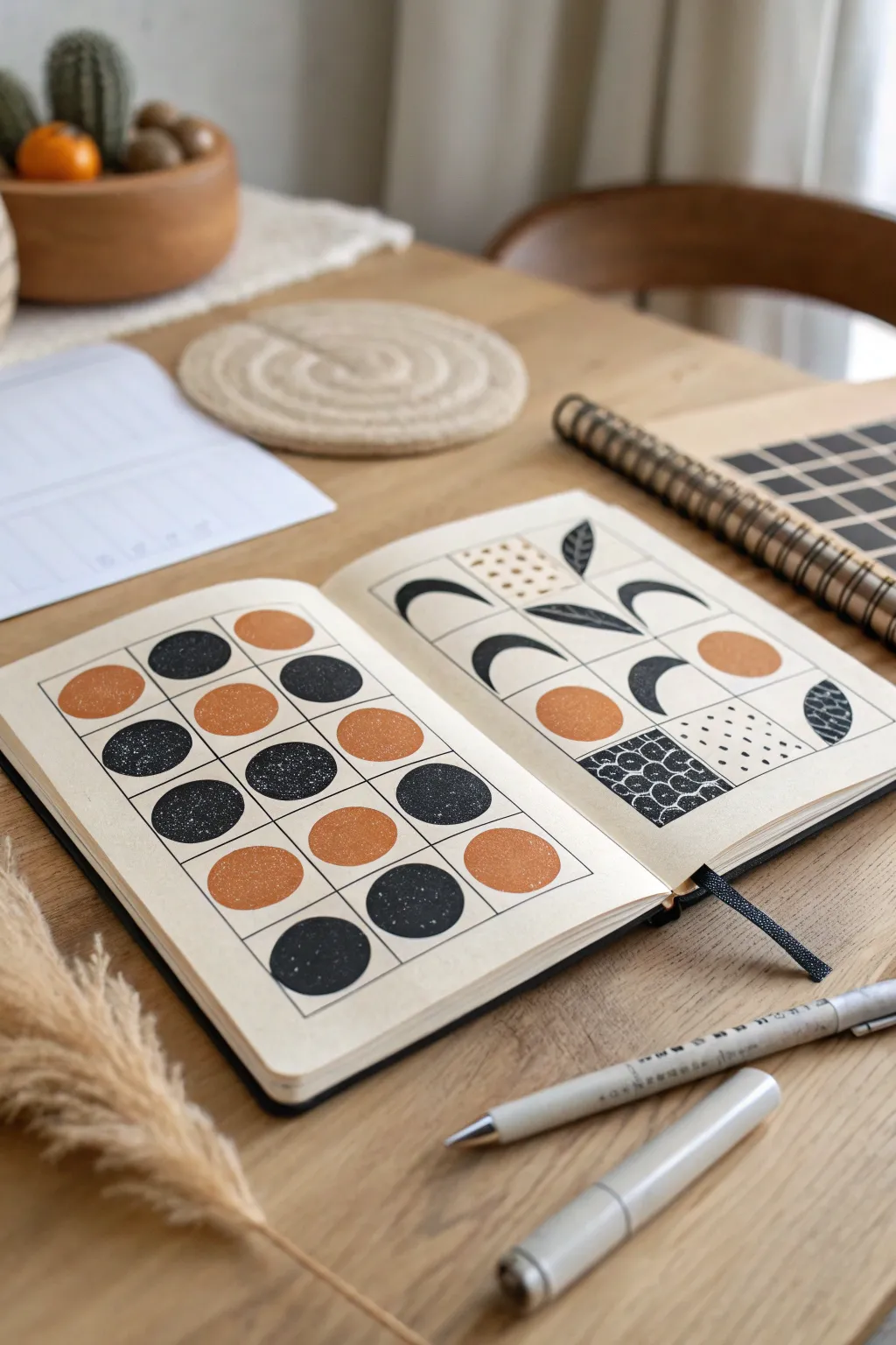
Transform simple grids into striking minimalist art by exploring the interplay of solid shapes, negative space, and texture. This project uses a limited palette of black and terracotta to create two distinct yet harmonious compositions focusing on circles and crescents.
Detailed Instructions
Materials
- A5 Sketchbook or heavy drawing paper
- Pencil (HB or H)
- Ruler
- Eraser
- Fine liner pen (0.3mm or 0.5mm, black)
- Black ink marker or gouache paint
- Terracotta or rust-orange marker/paint
- Circle stencil (optional but helpful)
Step 1: Planning the Grid
-
Measure your page:
Start by measuring the usable area of your left-hand page. You want to create a centered rectangle that leaves a comfortable border of white space around the edges. -
Draw the frame:
Using your ruler and a light pencil touch, draw the outer rectangular frame for your grid. -
Create the matrix:
Divide this rectangle into a 4×4 grid. Measure equally so each square is identical, lightly marking the dividing lines with your pencil. -
Repeat on the right:
Move to the right-hand page and recreate the exact same 4×4 grid structure so your two compositions mirror each other in layout.
Clean Edges
For ultra-crisp circles, use a circle template and a fine-tip pen for the outline before filling them in. This prevents the marker from bleeding outside the shape.
Step 2: Left Page: Circle Studies
-
Draft the circles:
In the center of each grid square on the left page, lightly sketch a circle. A circle stencil is perfect here for consistency, but freehand works if you prefer an organic feel. -
Ink the grid lines:
Take your fine liner pen and carefully trace over your pencil grid lines to define the boxes. Do not ink the circles yet. -
Plan your palette:
Decide on a random or patterned distribution for your colors. In the example, I’ve alternated between black and terracotta to keep the eye moving across the page. -
Fill the black circles:
Using your black marker or paint, carefully fill in the selected circles. Aim for opaque coverage; if you see streaks, let the first layer dry and apply a second. -
Add texture:
While the black ink is wet (if using specific inks) or by adding white speckles later (with a gel pen), you can create a subtle speckled texture like the photo, or simply keep them matte solid. -
Fill the terracotta circles:
Fill the remaining circles with your rust-colored marker. Work slowly near the edges to keep the circular shape crisp.
Step 3: Right Page: Shape & Pattern
-
Sketch the variations:
On the right page, we break the rules. Instead of just circles, pencil in crescents, semi-circles, and full circles. Experiment with rotation—have some crescents facing left, some down. -
Incorporate organic elements:
Select a few squares to feature leaf shapes or simple botanical motifs instead of geometric ones, adding a nice contrast to the rigid grid. -
Ink the structure:
Go over your straight grid lines with the fine liner pen, just like on the first page. -
Fill solid shapes:
Use your black and terracotta markers to fill in the solid crescents and circles you sketched. Leave the botanical shapes for the next step. -
Detail the botanicals:
Ink the leaf outlines with the fine liner. Fill one half of the leaf with solid black to create dimension. -
Create pattern blocks:
Choose 2-3 squares to be ‘texture blocks’ rather than shape blocks. Fill one with tiny stippled dots and another with a scallop or ‘fish scale’ pattern. -
Invert the colors:
For the scallop pattern, color the negative space black, leaving the lines white (or draw with white gel pen over a black square) for a bold look. -
Final erase:
Once all ink and paint is completely dry—give it a few extra minutes just to be safe—gently erase any visible pencil guidelines to clean up your spread.
Metallic Accent
Swap the terracotta color for gold or copper gouache. The metallic sheen against the matte black ink creates a luxurious, high-contrast finish.
Now you have a dynamic double-page spread that proves simple shapes can produce endless visual interest


Have a question or want to share your own experience? I'd love to hear from you in the comments below!