Pop art is basically permission to be loud with color, simple with shapes, and playful with everyday stuff. If you’ve got paper and a few bold colors, you’ve already got everything you need to make something that seriously pops.
Classic 2×2 Color Grid Portrait
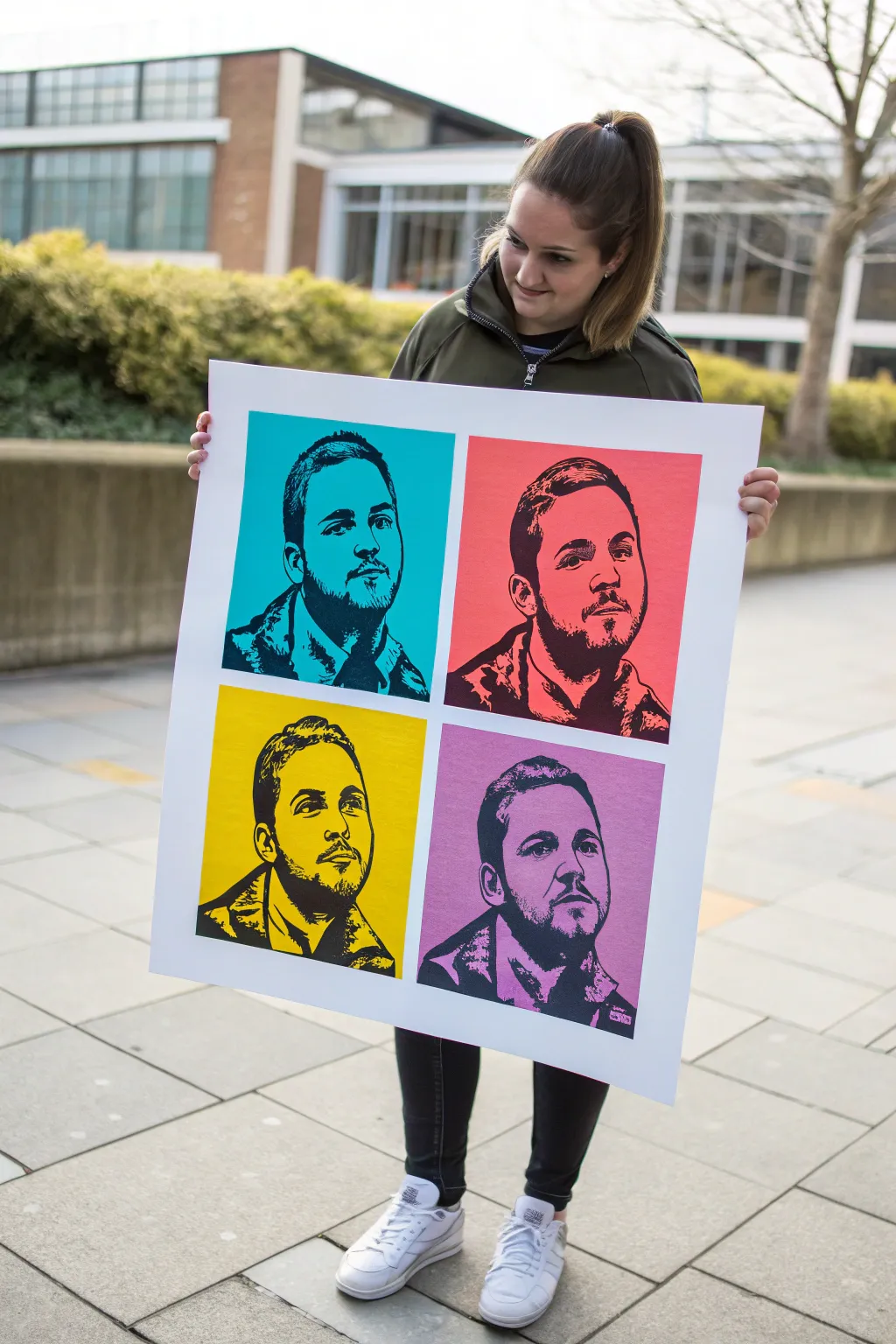
Channel your inner Andy Warhol with this striking four-panel pop art portrait. Using a high-contrast photo technique and bold, blocked colors, you’ll transform a simple selfie into a gallery-worthy masterpiece perfect for modern decor.
Step-by-Step Guide
Materials
- High-resolution digital photo of subject
- Photo editing software (Photoshop, GIMP, or similar)
- Large heavy-weight poster paper (matte finish)
- Printer (or access to a print shop)
- Four vivid acrylic paints (cyan, salmon, yellow, lavender)
- High-density foam roller or wide flat brush
- Spray adhesive
- X-Acto knife or cutting machine (optional for stencil route)
- Black acrylic paint or black ink (for screen/block print method)
- Masking tape
Step 1: Digital Preparation
-
Select the Right Photo:
Choose a photo with strong lighting and clear facial features. A slightly angled profile often works better than a straight-on shot for creating dramatic shadows. -
Crop and Isolate:
Use your editing software to crop the image into a square. Remove the background entirely so the subject is isolated against transparent pixels. -
Desaturate and Contrast:
Convert the image to black and white. Push the contrast slider significantly higher until you lose the mid-tones and are left with mostly stark blacks and whites. -
Threshold Adjustment:
Apply a ‘Threshold’ filter (or ‘Posterize’ set to 2 levels). This flattens the image into purely black shapes and white space, creating that iconic stencil look. -
Clean Up Edges:
Zoom in and erase any stray black pixels or ‘noise’ that distracts from the main facial features. Smooth out jagged lines where the shoulder meets the background.
Clean Edges Secret
Before painting your colored squares, paint a thin layer of white (or clear matte medium) over the tape edge first. This seals the gap so your bright colors won’t bleed under.
Step 2: Creating the Backgrounds
-
Layout the Grid:
On your large poster paper, lightly measure and mark a 2×2 grid with a pencil. Leave a consistent white border around the edge and between the four squares. -
Mask the Borders:
Use high-quality masking tape or painter’s tape to cover the borders and the grid lines. Press the edges down firmly to prevent paint bleed. -
Paint the Blue Quadrant:
Pour your cyan acrylic paint. Using a foam roller for the smoothest finish, fill in the top-left quadrant completely. -
Apply Remaining Colors:
Repeat the painting process for the other three squares: salmon pink for top-right, bright yellow for bottom-left, and lavender for bottom-right. Ensure distinct, flat coverage on each. -
Dry and Peel:
Allow the paint to fully dry—usually about an hour. Carefully peel away the masking tape at a 45-degree angle to reveal crisp white grid lines.
Go Halftone
Instead of a solid black threshold, use a ‘halftone’ filter in Photoshop for the black layer. This creates the image using tiny dots like a comic book for extra retro flair.
Step 3: Printing the Portrait Layer
-
Method Selection:
Decide on your transfer method. For the cleanest look shown here, printing the black layer directly onto the painted paper via a wide-format printer is ideal, though screen printing is a great analog alternative. -
Digital Layout:
If printing digitally, import your painted background scan or layout your black threshold layer four times in your software to match the physical dimensions of your painted quadrants. -
Test Print:
Run a test print on plain paper first to ensure the faces align perfectly with the centers of your quadrants. -
Final Printing:
Feed your pre-painted poster paper into the printer (ensure it is compatible with the paper weight). Print the black ink layer directly over the colored blocks. -
Alternative: Screen Printing:
If painting by hand, burn your threshold image onto a silkscreen. Register the screen over each colored block and pull black ink through for a tactile, authentic pop-art texture. -
Final Inspection:
Check for any ink or paint smudges on the white borders. You can touch these up carefully with opaque white paint if necessary.
Mount your finished piece on foam core or frame it to make the colors really pop from the wall
Comic Speech Bubble With Action Words
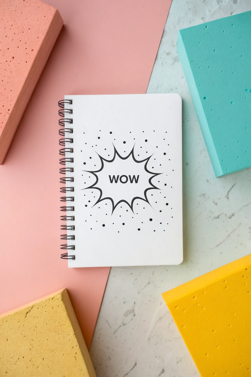
Transform a plain white notebook into a comic book statement piece with this high-contrast design. The sharp lines and exploding speech bubble create that classic Roy Lichtenstein vibe using nothing but black marker.
Step-by-Step
Materials
- White spiral-bound notebook (blank cover)
- Pencil (HB or lighter)
- Eraser
- Fine-point black permanent marker or drawing pen
- Medium-point black permanent marker
- Ruler (optional)
- Scrap paper
Step 1: Planning the Layout
-
Find the center:
Place your notebook on a flat surface. Using your pencil, lightly make a tiny dot in the visual center of the cover to guide your design placement. -
Sketch the word:
Lightly sketch the word ‘WOW’ in the center in all capital letters. Keep the font simple and sans-serif, ensuring the letters are evenly spaced. -
Check proportionality:
Step back and look at your lettering. The word should be large enough to be legible but small enough to fit inside the upcoming burst shape.
Step 2: Drawing the Burst
-
Draft the inner spikes:
Around the word, lightly sketch a multi-pointed starburst shape. Draw jagged V-shapes pointing outward, varying their lengths slightly for a dynamic look. -
Create the curve:
Connect the inner points of your V-shapes with deep, curved lines that dip toward the center word. This creates the tension of an explosion. -
Refine the points:
Review your pencil sketch. Make sure the points of the burst are sharp and distinct. If any look too rounded, erase and sharpen the angle. -
Add motion lines:
Sketch a few curved lines coming off the tips of the longest spikes. These ‘action lines’ help suggest movement and energy.
Smudge Prevention
Place a scrap piece of paper under your drawing hand while inking. This acts as a barrier, preventing oils from your skin from affecting the paper and stopping accidental ink smears.
Step 3: Inking the Design
-
Outline the text:
Take your fine-point black marker or pen. Carefully trace over your pencil letters, keeping your hand steady for clean, crisp edges. -
Outline the burst:
Switch to the medium-point marker for the burst shape itself. The thicker line weight helps the bubble stand out against the white background. -
Vary line weight:
I like to go back over the curves of the burst one more time on just one side to thicken them slightly, giving the drawing a subtle 3D shadow effect. -
Ink the details:
Use the fine-point pen again to ink the action lines you sketched earlier. Keep these lines swift and tapering—thicker at the base, thinner at the end.
Level Up: Color Pop
Fill the letters with a primary yellow or cyan marker to make it truly pop. Just ensure your black outline is 100% waterproof first to avoid bleeding.
Step 4: Adding Texture
-
Plan the dots:
Visualizing the ‘Ben-Day dots’ used in comic printing, lightly tap your pencil around the burst to plan where you want scattered dots. -
Ink the large dots:
Using the medium marker, fill in your larger planned dots. Keep them random and scattered, mostly clustering near the burst spikes. -
Add micro dots:
Switch back to the fine tip. Add tiny pin-prick dots in the empty white spaces between the larger dots to create density and texture. -
Erase guidelines:
Wait at least five minutes to ensure the ink is completely dry. Gently erase all remaining pencil marks, being careful not to smudge the fresh ink.
Now you have a dynamic sketchbook ready to hold your boldest ideas

Ben-Day Dots Background Fill
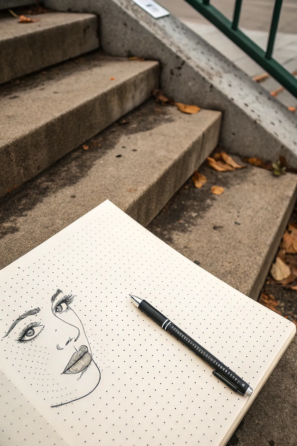
Blend classic sketching with a modern geometric twist using nothing more than a dot-grid notebook and a trusty pen. This project creates a striking partial portrait where the pre-printed dots serve as both a structural guide and a subtle pop-art texture.
Step-by-Step Guide
Materials
- Dot grid sketchbook or journal (A5 size recommended)
- Black drawing pen (fine tip, approx. 0.5mm)
- Pencil (HB or H for light lines)
- Soft eraser
- Reference photo of a face (optional)
Step 1: Conceptualizing & Drafting
-
Analyze the Grid:
Begin by opening your sketchbook and observing the dot grid. Notice how straight lines can connect dots horizontally, vertically, or diagonally. These points will help anchor your drawing’s proportions. -
Position the Features:
Visualize where the face will sit on the page. For this aesthetic, focusing on just one side of the face or a three-quarter view works beautifully, leaving plenty of negative space around it. -
Rough Sketching:
Using your pencil very lightly, sketch the basic oval shape for the head. Mark horizontal lines for where the eyes, nose, and mouth will align, using the grid rows to keep everything level. -
Define the Eye:
Sketch the almond shape of the eye. Since this is a partial portrait, you might only draw one eye fully. Pay attention to the spacing between the inner corner of the eye and where the bridge of the nose begins. -
Nose & Mouth Placement:
Lightly draw the curve of the nose bridge and the nostril. Move down to sketch the lips, ensuring the center of the lips aligns correctly with the nose and eye placement. -
Jawline Curve:
Trace the jawline and chin. Let this line fade out or stop abruptly as it moves toward the ear area, maintaining that floating, unfinished sketchbook look. -
Review Tone and Proportion:
Step back and check your pencil draft. The dot grid makes it easy to spot if one feature is higher than intended. Eraser adjustments are easiest at this stage.
Grid Freedom
Don’t feel pressured to connect every line to a dot. Treat the grid as a ghostly suggestion for alignment rather than a strict constraint.
Step 2: Inking & Detailing
-
Start with the Eye:
Switch to your black pen. Carefully outline the upper eyelid, making the line thicker to suggest eyelashes. Draw the iris and pupil, leaving a small white circle for a highlight. -
Lash Details:
Flick the pen upward from the lash line to create individual eyelashes. I find that grouping two or three lashes together slightly at the tips creates a more natural, voluminous look. -
Eyebrow Texture:
Ink the eyebrow using short, directional strokes that mimic hair growth. The strokes should start thicker near the nose and thin out toward the temple. -
Inking the Nose:
Draw the nostril with a confident, dark line. For the bridge of the nose, use a broken or thinner line to suggest the shape without making it look too rigid. -
Lip Contours:
Outline the lips. Emphasize the separation line between the upper and lower lip with a darker stroke. Keep the outer edges of the lips slightly softer. -
Shading the Lips:
Add vertical hatching lines on the lips to show curvature and texture. The lines should curve slightly outward to simulate the roundness of the lower lip. -
Defining the Jaw:
Go over your pencil line for the jaw and chin. Keep this line smooth and clean, as it defines the silhouette of the face against the dotted background. -
Stippling Shadows (Optional):
To enhance the ‘Ben-Day’ dot feel, add tiny, hand-drawn dots of your own around the eyes or under the chin to create shading that blends with the printed grid. -
The Cleanup:
Let the ink dry completely for at least five minutes to prevent smudging. Sometimes I test a small corner with my finger to be sure before erasing. -
Erase Pencil Lines:
Gently erase all visible pencil marks. Pass the eraser lightly over the page so you don’t roughen the paper surface or fade the ink.
Smudge Control
If you’re left-handed or dragging your hand, rest it on a scrap piece of paper while drawing to keep oils and ink smears off your clean page.
Close your book knowing you’ve captured a moment of beauty perfectly aligned with the page.
Everyday Object With Bold Outline
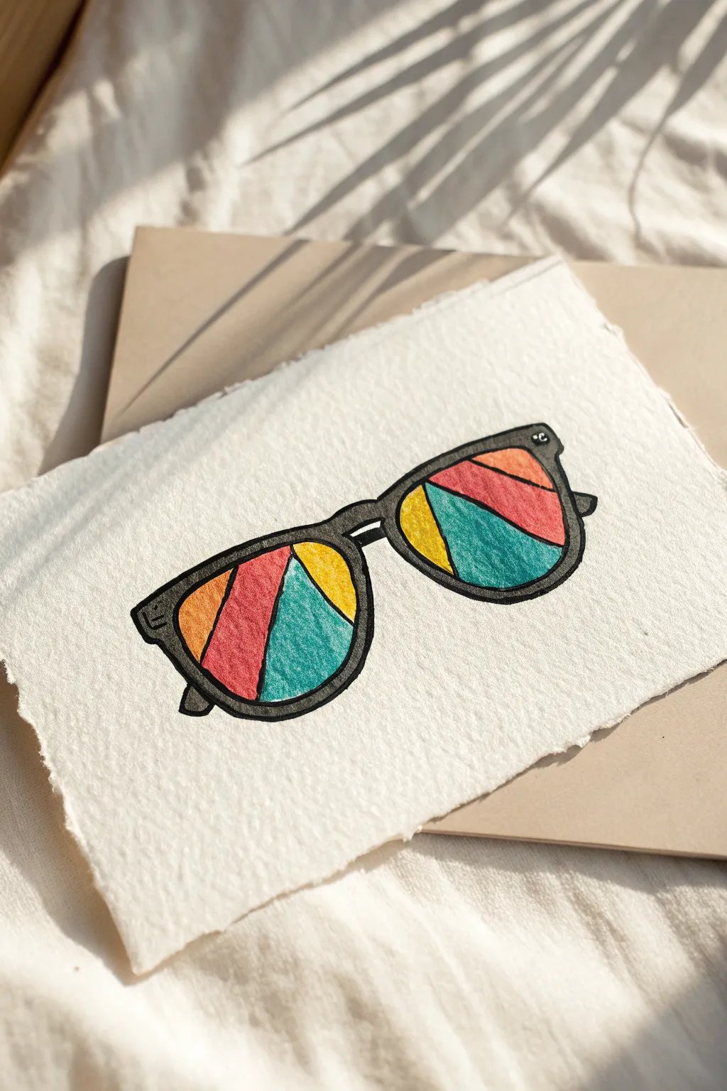
Transform a simple pair of sunglasses into a vibrant pop art statement using bold lines and abstract color blocking. This project mimics the look of stained glass on textured paper, creating a striking contrast between the heavy black frames and the playful, segmented lens colors.
Detailed Instructions
Materials
- Heavyweight textured paper (watercolor or mixed media paper with raw edges)
- Pencil (HB or 2H)
- Eraser
- Thick black marker or brush pen (waterproof)
- Fine liner pen (black)
- Colored markers or brush pens (Teal, Red, Orange, Mustard Yellow)
- Ruler (optional)
Step 1: Sketching the Framework
-
Outline the lenses:
Begin by lightly sketching two large, slightly rounded shapes for the lenses in the center of your paper. Make sure they are tilted slightly to the right to give the glasses a dynamic angle. -
Draw the frames:
Sketch the thick rims around your lens shapes. Keep the lines chunky to emulate the pop art style shown in the reference image. -
Connect the bridge:
Draw the bridge connecting the two lenses. Add a small curve underneath the bridge to show depth. -
Add the temples:
Sketch the small visible parts of the arms (temples) of the glasses extending backward on the left and right sides. -
Refine the shape:
Go over your pencil lines to ensure the curves are smooth and the frame thickness is relatively consistent, though a hand-drawn wobble adds charm.
Bleeding Lines?
If your markers bleed into the textured paper aka ‘feathering’, outline with a waterproof fine liner first, then fill with color carefully.
Step 2: Designing the Geometric Pattern
-
Segment the left lens:
Inside the left lens, draw diagonal lines to divide the space into four distinct sections. Vary the sizes of the shapes—create a large central triangle and smaller slivers on the sides. -
Segment the right lens:
Repeat the process for the right lens, but change the angles of your dividing lines slightly so the pattern doesn’t look perfectly symmetrical. -
Clean up the sketch:
Lightly erase any stray pencil marks or lines that overlap where they shouldn’t, preparing the drawing for the ink stage.
Go Metallic
Swap the black marker for gold or silver paint pen for the frames to give the artwork a chic, mirrored sunglass effect.
Step 3: Adding Bold Color
-
Color the teal sections:
Select one segment in each lens to fill with teal. I prefer to place these near the bottom or center to anchor the design. -
Fill the red sections:
Color a large central segment in each lens with bright red. This will be the focal point of the color palette. -
Add orange accents:
Choose an upper segment in each lens to color with orange, creating a warm gradient effect next to the red. -
Finish with yellow:
Fill the remaining segments with a mustard yellow. Ensure the colors are solid and saturated, going over them a second time if your markers look streaky. -
Let the color set:
Allow the ink to dry completely for a minute or two to prevent smudging during the outlining phase.
Step 4: Finalizing the Outline
-
Outline the frame:
Use your thick black marker to trace the outer and inner edges of the glasses frames. Press firmly to create a bold, heavy line weight. -
Fill the frame body:
Color in the entire frame area with the black marker. If you want a slightly textured look like the reference, you can use a dark grey or charcoal marker instead of solid black. -
Outline the lens segments:
Carefully trace the dividing lines between the colors inside the lenses. These lines should be slightly thinner than the main frame to keep the design legible. -
Add highlight details:
Use a white gel pen or leave tiny slivers of white paper exposed on the corners of the frame (like the hinge area) to suggest a reflective shine. -
Erase final pencil marks:
Once the black ink is totally dry, gently run your eraser over the entire drawing to remove any remaining graphite guidelines.
Display your new artwork on a desk or clipboard for a permanent splash of summer vibes
BRUSH GUIDE
The Right Brush for Every Stroke
From clean lines to bold texture — master brush choice, stroke control, and essential techniques.
Explore the Full Guide
Pop Art Soup Can Redesign
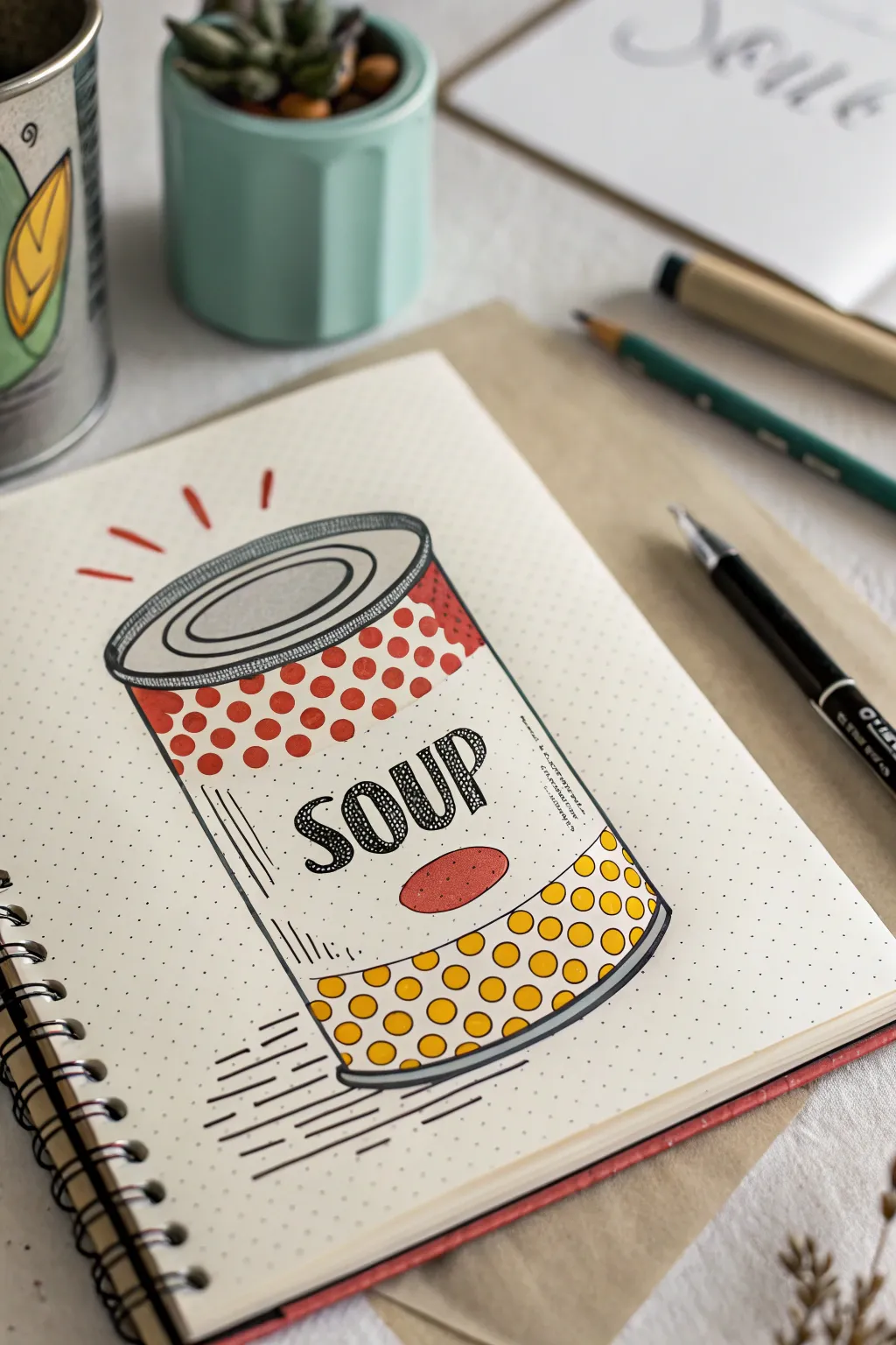
Channel your inner Andy Warhol with this fun and approachable sketchbook exercise. This design reinvents the classic soup can look with bold outlines, bright pointillism-style dots, and playful typography.
How-To Guide
Materials
- Dotted journal or sketchbook
- Pencil (HB or H)
- Eraser
- Black fineliner pen (0.5mm or 0.8mm)
- Red dual-tip marker or felt pen
- Yellow dual-tip marker or felt pen
- Ruler (optional)
Step 1: Sketching the Structure
-
Draw the main cylinder:
Start with a light pencil sketch. Draw two parallel vertical lines about 3-4 inches apart to define the sides of the can. -
Create the ellipses:
Connect the top of the vertical lines with a flattened oval (ellipse). Mirror this curve slightly at the bottom to give the can its 3D roundness. -
Define the lid:
Inside the top oval, draw a slightly smaller oval to create the rim thickness. Add a curved line across the top surface, resembling a crescent moon, to indicate the inner ridge of the lid. -
Section the label:
Draw three curved horizontal lines across the body of the can. One near the top, one near the bottom, and one in the middle, dividing the label into a top banner, a central text area, and a bottom banner.
Step 2: Inking the Outline
-
Outline the can shape:
Using your black fineliner, firmly trace over your pencil lines for the main cylinder and the lid details. A slightly thicker line weight here helps the pop art style stand out. -
Add motion lines:
To give the drawing energy, add three short, floating dashes above the can lid. At the bottom left, draw a series of straight horizontal speed lines to ground the object. -
Refine the label borders:
Ink the horizontal dividers on the label. I like to double up these lines or make them slightly thicker to clearly separate the decorative sections from the white space. -
Erase guidelines:
Once the ink is completely dry—give it a full minute—gently erase all the underlying pencil sketches to clean up your canvas.
Uneven Circles?
Don’t sweat perfectly round dots. If a circle looks lopsided, expand the outline slightly to round it out before filling. Organic shapes fit this style perfectly.
Step 3: Adding Typography & Pattern
-
Write the text:
In the central white band, sketch the word ‘SOUP’ in confident serif block letters. Ink the outlines of the letters, then fill them with a scribbled, textured shading or small dots for a retro feel. -
Draw the tomato shape:
Just below the text, draw a simple, flattened oval tomato shape. Stipple it with tiny dots inside the outline rather than coloring it solid. -
Add vertical texture:
On the left side of the label’s central band, draw a few thin, vertical lines to suggest the curvature and metallic sheen of the can. -
Create red polka dots:
Take your red marker. In the top section of the label, draw evenly spaced circles. They don’t need to be perfect circles; a hand-drawn look adds character. Fill them in solidly. -
Fill the background corners:
Use the red marker to fill in the tiny triangular spaces where the label meets the rim at the top corners, grounding the pattern. -
Create yellow polka dots:
Repeat the polka dot process in the bottom section of the label using your yellow marker. Try to keep the spacing similar to the red section for balance.
Make It a Series
Draw three cans side-by-side. Keep the design identical but swap the dot colors (e.g., blue/pink, green/purple) to create a true Warhol-style triptych.
Step 4: Finishing Touches
-
Shadow the bottom:
Use your black pen or a dark grey marker to add a thick shadow line along the bottom right curve of the can. This adds weight and dimension. -
Enhance text details:
Add tiny bits of shading text to the right of the main ‘SOUP’ letters if the area looks too empty. Scribbled faux-text works great here. -
Final texture check:
Look over the rim of the can. Add small vertical hatch marks along the side of the lid to mimic the ridges found on tin cans.
Now you have a bold, graphic illustration that leaps right off the page
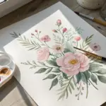
Simple Flower Repeat Panels
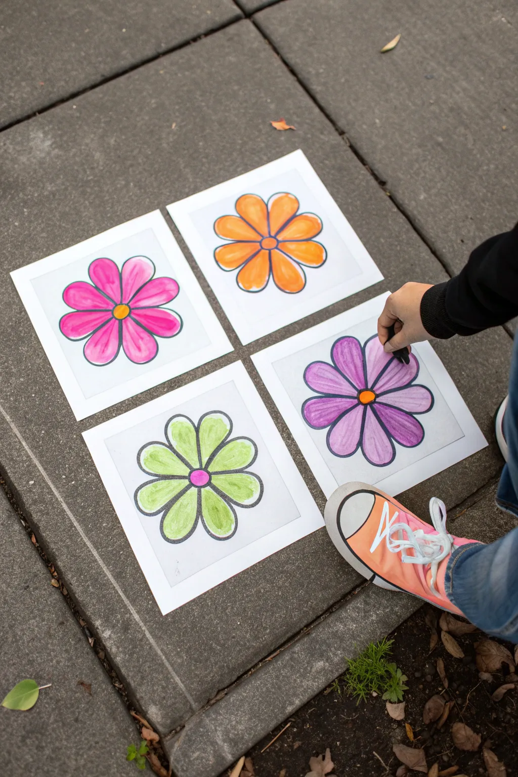
Create a vibrant quartet of repeating flower motifs that celebrates the bold simplicity of Pop Art style. This project uses simple coloring materials to transform four identical drawings into a cohesive and colorful gallery wall display.
Step-by-Step Guide
Materials
- 4 sheets of square white paper (approx. 8×8 inches)
- Black permanent marker (fine or medium tip)
- Washable markers or brush pens (pink, orange, purple, lime green, yellow)
- Pencil and eraser
- Ruler
- Paper template or circular object for tracing (optional)
Step 1: Preparation & Sketching
-
Prepare your squares:
Begin by cutting four identical squares of white paper. A size of 8×8 inches works well for framing later, but any consistent square size will do. Lay them out on a flat surface to ensure they match perfectly. -
Draw the center:
On your first sheet, lightly sketch a small circle in the exact center using a pencil. You can eyeball this or use a ruler to find the midpoint for precision. -
Sketch the petals:
Draw eight simple, rounded petals extending from the center circle. Aim for symmetry, keeping the petals roughly the same length and width. Don’t worry about perfection; a hand-drawn look adds character. -
Trace or replicate:
To ensure the repeating Pop Art effect, the flowers need to look identical. Place your first sketch under the second sheet of paper and trace the design lightly with a pencil. Repeat this for all four sheets.
Streak-Free Coloring
Work in small circular motions rather than long back-and-forth lines. This helps blend the ink better and reduces visible marker streaks for a smoother finish.
Step 2: Outlining
-
Define the lines:
Take your black permanent marker and carefully trace over your pencil lines on the first square. Use a steady hand to create a bold, consistent outline for both the center circle and the petals. -
Vary line weight (optional):
I sometimes like to go over the outer edge of the petals a second time to make the silhouette slightly thicker than the inner details, which makes the image pop more. -
Repeat the outlining:
Proceed to outline the remaining three flower sketches. Ensure the marker ink is fully dry before moving on to avoid smudging. -
Erase guidelines:
Once the ink is completely set, gently erase any visible pencil marks underneath the marker lines to keep the artwork clean and professional.
Step 3: Coloring
-
Select your palette:
Choose four distinct color combinations. In the example, we use pink, orange, lime green, and purple for the petals, paired with contrasting centers. -
Color the first flower:
Start with the top-left panel. Color the petals with a bright pink marker. Use long, even strokes to minimize streak marks. -
Add the center:
Fill the center circle of the pink flower with a contrasting yellow or orange marker. -
Color the second flower:
For the top-right panel, color the petals a vibrant orange. To add depth, you can leave tiny slivers of white space near the outline or saturate the color fully for a flatter look. -
Fill the second center:
Use a dark blue or purple for the center of the orange flower to create a strong visual contrast. -
Color the third flower:
Move to the bottom-left panel. Fill the petals with a fresh lime green. This lighter color often requires a second layer to look solid and opaque. -
Finish the third center:
A bright pink dot in the center of the green flower creates a playful, energetic vibe. -
Color the final flower:
For the bottom-right panel, use a rich purple for the petals. Be careful near the black outlines to keep the edges crisp. -
Complete the set:
Finish by coloring the center of the purple flower with orange. Step back and check your panels together to ensure the colors look balanced as a group.
Pop Art Variation
Instead of white paper, draw on colored construction paper. Use oil pastels for opaque, vibrant coverage that stands out against a colored background.
Now you can display your artwork in a grid formation on the wall or floor for an instant burst of color

PENCIL GUIDE
Understanding Pencil Grades from H to B
From first sketch to finished drawing — learn pencil grades, line control, and shading techniques.
Explore the Full Guide
Handprint Pop Art Grid
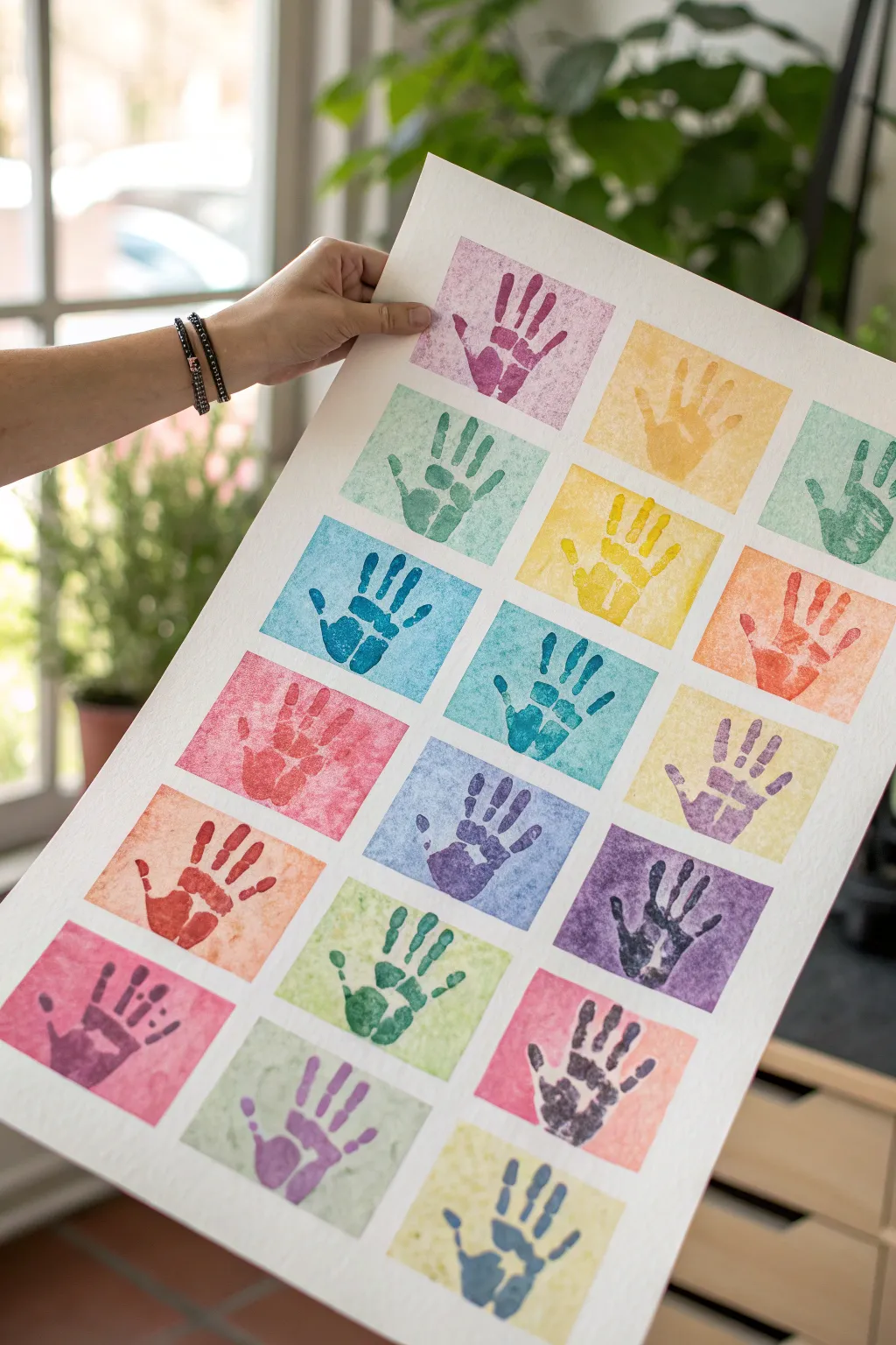
Transform a simple handprint into a vibrant Warhol-inspired masterpiece with this easy block-printing project. By creating a reusable stamp and playing with colorful backgrounds, you’ll produce a striking grid of hands that pops with personality.
Detailed Instructions
Materials
- Large sheet of white watercolor paper or heavy mixed-media paper (at least A2 size)
- Craft foam sheet (adhesive-backed is easiest)
- Scrap cardboard or a small wooden block (slightly larger than your hand)
- Acrylic paints in various colors
- Watercolor paints or thinned acrylics for backgrounds
- Paintbrushes (flat brush for acrylics, wash brush for backgrounds)
- Ruler
- Pencil
- Scissors
- Washi tape or masking tape (low-tack)
- Palette or paper plates
Step 1: Preparing the Grid
-
Measure the canvas:
Lay out your large sheet of watercolor paper on a clean, flat surface. Decide on the layout; the example uses a 4-column by 4-row grid, totaling 16 spaces. -
Mark the grid lines:
Using your ruler and a pencil, lightly mark out sixteen equal rectangular boxes. Leave a generous white border around the outside edge of the paper and smaller, uniform gaps between each box to frame the artwork. -
Tape the borders:
Apply low-tack washi tape or painter’s tape over the pencil lines to mask off the white borders and the grid lines between the boxes. Press the edges down firmly to prevent paint from bleeding underneath.
Fixing Smudged Lines
If paint bled under your tape, wait for it to dry fully, then use a white gel pen or white acrylic paint on a fine brush to touch up the grid lines and restore the crisp edges.
Step 2: Creating Colorful Backgrounds
-
Select your palette:
Choose a variety of colors for the background squares. Aim for a mix of pastels and brights—think soft pinks, sunny yellows, teals, and light purples. -
Apply the first color wash:
Dilute your acrylic paint with a little water or use watercolors for a semi-transparent look. Paint the first few squares, spreading the color evenly. -
Vary the texture:
As you paint different squares, don’t worry about perfect uniformity. A little blotchiness or brushstroke texture adds to the artistic, print-like quality of the final piece. -
Complete the grid:
Continue painting until all 16 squares are filled with different colors. Try not to place two identical colors right next to each other. -
Let it dry completely:
Wait for the paint to fully dry. This is crucial because if the paper is damp, the tape might tear the surface when removed later. -
Remove the tape:
Check the dryness, then carefully peel away the masking tape. Pull the tape away from the painted area at a sharp angle to reveal crisp, clean white lines between your colorful squares.
Pro Tip: Foam Texture
Before cutting your foam hand, gently crumple the foam sheet and flatten it back out. This adds a subtle distressed texture that mimics authentic screen printing when stamped.
Step 3: Making the Handprint Stamp
-
Trace your hand:
Place your hand on a sheet of craft foam. Trace the outline with a pencil or pen. Spread your fingers slightly to get a classic handprint shape. -
Cut out the shape:
Carefully cut out the foam hand shape using scissors. Take your time around the fingers to keep the edges smooth. -
Mount the stamp:
Stick the foam hand onto a piece of sturdy cardboard or a wooden block. If your foam isn’t adhesive-backed, use strong craft glue. This creates a stamp that is easy to handle and press repeatedly.
Step 4: Printing the Pop Art
-
Prepare contrast colors:
Squeeze out darker, bolder colors of acrylic paint onto your palette. These will be for the handprints themselves and should contrast well with your lighter backgrounds. -
Load the stamp:
Use a brush or sponge to apply a thin, even layer of paint onto your foam hand stamp. Do not dip the stamp directly into paint, as this causes globs. -
Test print:
I always do a quick test print on a scrap piece of paper first to ensure I have the right amount of paint loaded. -
Stamp the first row:
Center the stamp over your first colored square and press down firmly. Apply pressure to the palm and each finger area to ensure a good transfer. -
Lift and repeat:
Lift the stamp straight up to avoid smudging. Clean the stamp off with a damp paper towel or baby wipe before switching paint colors. -
Vary colors and orientation:
Change paint colors frequently as you move through the grid. You can also slightly rotate the angle of the hand from left to right to create dynamic movement across the canvas. -
Final drying time:
Once all 16 squares have a handprint, set the artwork aside to dry completely. The thicker acrylic on the prints will take longer to dry than the background washes did.
Hang your finished grid in a bright room to enjoy the cheerful burst of color every day
Fruit Stamping Pop Art Patterns
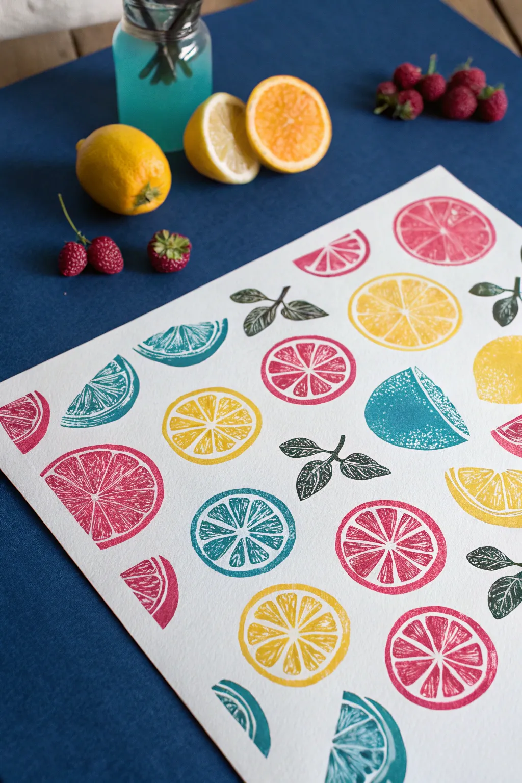
Brighten up your workspace with this zestful pop art print featuring stylized citrus slices. By carving your own repeating stamps, you can create a vibrant, structured pattern that mimics professional screen printing with rustic charm.
Step-by-Step Guide
Materials
- Soft-cut lino block or rubber carving block
- Lino cutting tool set (with U and V gouges)
- Pencil and eraser
- Tracing paper
- Craft knife
- Block printing ink pads (Lemon Yellow, Magenta/Pink, Teal/Blue)
- Heavyweight white printmaking paper or cardstock
- Scrap paper for testing
- Ruler
Step 1: Design & Carving
-
Draft your fruity motifs:
Sketch a perfect circle on paper to serve as your citrus base. Draw the internal segments, leaving a thin border around the edge and thin lines separating the juicy wedges. Don’t forget to sketch a separate semi-circle wedge and a pair of leaves. -
Transfer to the block:
Place your tracing paper over the sketches and trace the lines heavily with a soft pencil. Flip the tracing paper onto your rubber carving block and burnish the back to transfer the graphite design. -
Carve the outlines:
Using a fine V-gouge tool, carefully carve along the transferred lines. You are carving away the white space, so remove the material around the circle and the lines between the fruit segments. Keep the blade cutting away from your fingers. -
Clear the negative space:
Switch to a wider U-gouge to clear away the larger background areas around your fruit shapes. You want the stamp to be relatively deep so the background doesn’t pick up ink. -
Refine the details:
Go back in with your smallest blade to add texture to the fruit segments if you like, or keep them smooth for a bold pop art look. Trim the excess rubber block away with a craft knife so you just have the shaped stamps.
Uneven Ink Coverage?
If your prints look patchy, try putting a foam mat or a stack of newspapers underneath your print paper. The slight cushion helps the stamp make better contact.
Step 2: Printing the Pattern
-
Plan your layout:
Lay your large printmaking paper on a flat surface. To achieve the balanced pop art look, you might want to lightly mark a grid with a pencil, or eyeball it if you prefer a more organic scattering. -
Load the yellow ink:
Press your full citrus circle stamp firmly onto the lemon yellow ink pad. Ensure the surface is evenly coated but not gloopy. -
Stamp the primary color:
Press the yellow stamp onto your paper in random spots. Apply firm, even pressure over the entire back of the stamp without rocking it to avoid smudging. -
Add pink accents:
Clean off your stamp (or use a second carved one) and switch to the pink/magenta ink. Stamp full circles and semi-circles in the gaps between the yellow fruits, rotating the orientation for variety. -
Introduce the cool tones:
Using the teal or blue ink, add a few full circles and wedges. This cool color contrasts beautifully with the warm citrus tones and anchors the pop art composition. -
Stamp the leaves:
Finally, take your small leaf stamp and ink it with black or dark green. Nestle these little leaf clusters near the fruit shapes to fill empty white spaces and connect the elements visually. -
Let it dry completely:
Block printing inks can take longer to dry than standard markers. Leave your artwork flat in a safe place until the ink is fully set and smudge-proof.
Design Continuity
To visualize the final pattern before inking, cut paper shapes matching your stamps and arrange them on the page first. It saves you from committing to a bad placement.
Once framed, this cheerful print brings a permanent slice of summer to your walls


Pop Art Pet Portrait In Two Colors
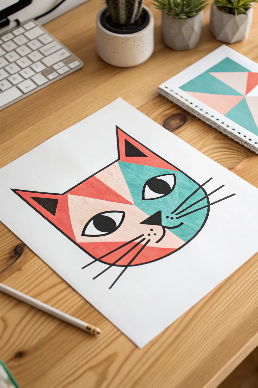
Transform a simple feline outline into a striking piece of modern art using bold geometric shapes and a limited color palette. This project relies on clean lines and contrasting hues to create a playful, stylized portrait that really pops off the page.
How-To Guide
Materials
- Heavyweight white drawing paper or cardstock
- Pencil (HB or lighter)
- Eraser
- Fine-point black permanent marker or drawing pen
- Medium-point black marker (for filling)
- Ruler
- Coral/Salmon pink marker or paint pen
- Teal/Turquoise marker or paint pen
- Light beige/blush marker or paint pen
Step 1: Planning and Sketching
-
Draw the main contour:
Start by sketching a wide, U-shaped curve for the bottom of the cat’s face in the center of your paper. Keep your pencil strokes very light so they can be erased easily later. -
Add the ears:
From the top corners of your U-shape, draw two large, pointed triangles for the ears. Make the outer lines slightly curved outward for a more organic feel, connecting them with a flat line across the top of the head. -
Map out the geometry:
Using a ruler, lightly draw a vertical line down the center of the face to help with symmetry, then divide the face into large angular sections. I like to draw a diagonal line from the inner ear to the center of the cheek on both sides to create the main color-blocking zones. -
Sketch facial features:
Draw two large almond shapes for eyes. Place a small, inverted triangle for the nose right on your center line, and add a W-shape below it for the mouth. -
Detail the eyes:
Inside the almond shapes, draw large circles for the irises/pupils. Make sure they are looking in the same direction—slightly to the right gives the cat a cute, inquisitive look. -
Position the whiskers:
Mark the positions for the whiskers. You’ll want three long lines on each side, radiating outward from the cheek area. Don’t draw the final thick lines yet, just mark their placement.
Step 2: Adding Color Blocking
-
Fill the teal section:
Select your teal marker. Color the large geometric section on the right side of the face (surrounding the right eye), being careful not to color over the eye shape itself. -
Fill the coral sections:
Switch to your coral or salmon pink marker. Fill in the left side of the face (surrounding the left eye), the triangle inside the right ear, and the lower jaw section on the right side. -
Add the neutral tones:
Use the light beige or blush marker to fill the remaining sections: the triangle inside the left ear, the cheek area on the right, and the upper section of the left face. -
Check for gaps:
Go back over your coloring to ensure the ink is solid and even. If you’re using alcohol markers, layer a second coat to smooth out any streaks.
Bleeding Lines?
If marker ink bleeds into neighboring sections, switch to paint pens (like POSCA). They sit on top of the paper rather than soaking in, creating sharper edges.
Step 3: Inking and Definition
-
Outline the main shapes:
Take your medium-point black marker and carefully trace over all the pencil lines for the outer head shape, ears, and geometric dividers within the face. -
Fill the black details:
Using the same marker, color in the pupils (leaving the rest of the eye white), the nose triangle, and the inner ear triangles completely black. -
Thicken the outline:
Go over the exterior perimeter of the cat head one more time to make the outline slightly bolder than the interior lines. This helps separate the subject from the background. -
Draw the whiskers:
With confident, quick strokes, draw the three whiskers on each side. Start pressure heavy near the face and lift off as you move outward to taper the lines slightly. -
Add muzzle details:
Draw three small dots on the muzzle area on the right side, just between the nose and the whiskers, for added texture. -
Refine the eyes:
Use your fine-point pen to carefully outline the white part of the eyes to define them sharply against the colored background. -
Final cleanup:
Once the black ink is totally dry, gently erase any remaining visible pencil sketch lines to leave a crisp, clean finish.
Make It 3D
Instead of coloring, cut the geometric shapes out of colored construction paper and collage them onto the white background before drawing the black outlines.
Now you have a bold, geometric pet portrait ready for framing
Bold Shadow Silhouette With Color Pop
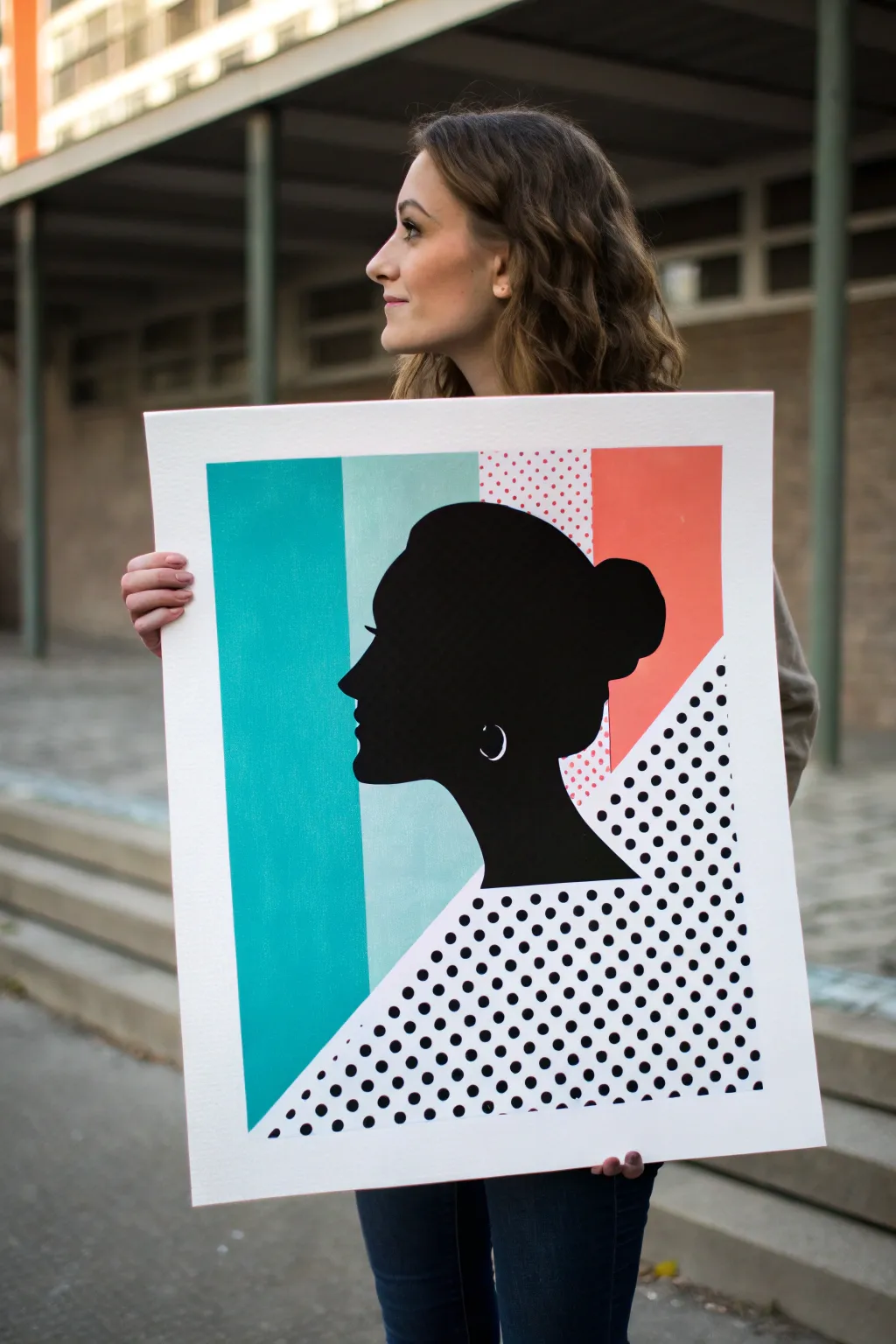
This striking project combines bold color blocking with classic pop art patterns to frame a sleek, modern silhouette. By mixing flat matte paints with precise geometric lines, you’ll create a graphic statement piece that looks professionally printed.
Step-by-Step
Materials
- Large heavyweight white bristol board or canvas panel (approx 18×24 inches)
- Acrylic paints: Teal/Turquoise, Mint, Coral/Salmon, Black, White
- Painter’s tape (low-tack, various widths)
- Pencil and eraser
- Ruler or T-square
- Round foam pouncers or sticker dots (for the polka dots)
- Fine detail paintbrush
- Medium flat paintbrush
- Silhouette template or printed profile photo
- Compass or circular object (optional for spacing)
Step 1: Planning and Layout
-
Prepare the surface:
Ensure your bristol board or canvas panel is clean and free of dust. If using a canvas with a heavy texture, apply a coat of gesso and sand it smooth to help achieve those crisp pop-art lines. -
Mark the vertical zones:
Using your ruler and pencil, lightly draw vertical lines to divide the background. The design features three main vertical stripes behind the head: a wide teal stripe on the left, a narrower mint stripe in the middle, and a coral/patterned section on the right. -
Define the diagonal split:
From the bottom left corner area, draw a sharp diagonal line slicing upward toward the right side. This will separate the solid color blocks from the black-and-white polka dot section at the bottom. -
Sketch the silhouette:
Lightly sketch the woman’s profile in the center. Position the silhouette so the neck/chest area interacts with the diagonal line. You can project an image to trace or print a large profile photo, cut it out, and trace around it for accuracy. -
Tape off sections:
Apply painter’s tape along your pencil lines to isolate the first color zone—the large teal rectangle on the left. Press the tape edges down firmly to prevent paint bleed.
Bleeding Lines?
If paint seeps under your tape, wait for it to fully dry. Then, re-apply tape slightly over the error and paint over the bleed with the correct background color to create a crisp, sharp edge again.
Step 2: Painting the Color Blocks
-
Paint the teal section:
Fill in the left vertical rectangle with the teal acrylic paint. Use a flat brush for smooth, even strokes. Apply two coats if necessary for full opacity, letting the first coat dry completely. -
Paint the mint section:
Once the teal is dry, move the tape to expose the middle vertical stripe. Paint this section with the mint green color, ensuring a clean edge where it meets the teal. -
Create the coral zone:
Tape off the upper right section. Paint the top portion solid coral/salmon. For the section below it (but above the diagonal), paint the background a very pale pink or white first. -
Add pink polka dots:
On that small pale pink section behind the head, create a pattern of small coral dots. I find using a small foam pouncer gives the most consistent circle shape here.
Step 3: The Polka Dot Graphic
-
Prepare the lower triangle:
Ensure the bottom right triangular area (below the diagonal line) is painted pure white. Let it dry fully before attempting the dots. -
Plot the dot grid:
Use a ruler to lightly mark a grid of points where your black dots will go. Regular spacing is crucial for that mechanical pop-art look. -
Paint black dots:
Using black paint and a small round brush or a stencil, fill in the dots. Work carefully from top to bottom to avoid smudging your fresh work.
Pro Tip: Sticker Hack
Make the dots easier by using round office stickers! Stick them on, paint over the whole section black, then peel them off to reveal white dots (or use black stickers on white paper).
Step 4: The Silhouette & Details
-
Outline the profile:
With the background completely dry, use a fine detail brush and black paint to carefully outline the silhouette you traced earlier. Smooth out any shaky lines now. -
Fill the silhouette:
Switch to a larger brush to fill in the entire head and neck shape with solid black paint. Apply thin, even layers to avoid texture buildup; you want it to look like a flat print. -
Add the earring detail:
Once the black paint is bone dry, visualize where the earlobe is. Use a tiny brush with white paint to create the small ‘C’ shape of the hoop earring. This high-contrast detail adds instant dimension. -
Clean up edges:
Remove any remaining tape slowly. Use a small angled brush with white paint (or the appropriate background color) to touch up any areas where paint might have bled under the tape. -
Seal the artwork:
Finish by applying a matte spray varnish. This unifies the sheen of the different paint colors and protects that deep black silhouette from scuffs.
Hang your bold new artwork in a well-lit spot to let those colors really pop
Cut-Paper Color Block Pop Art
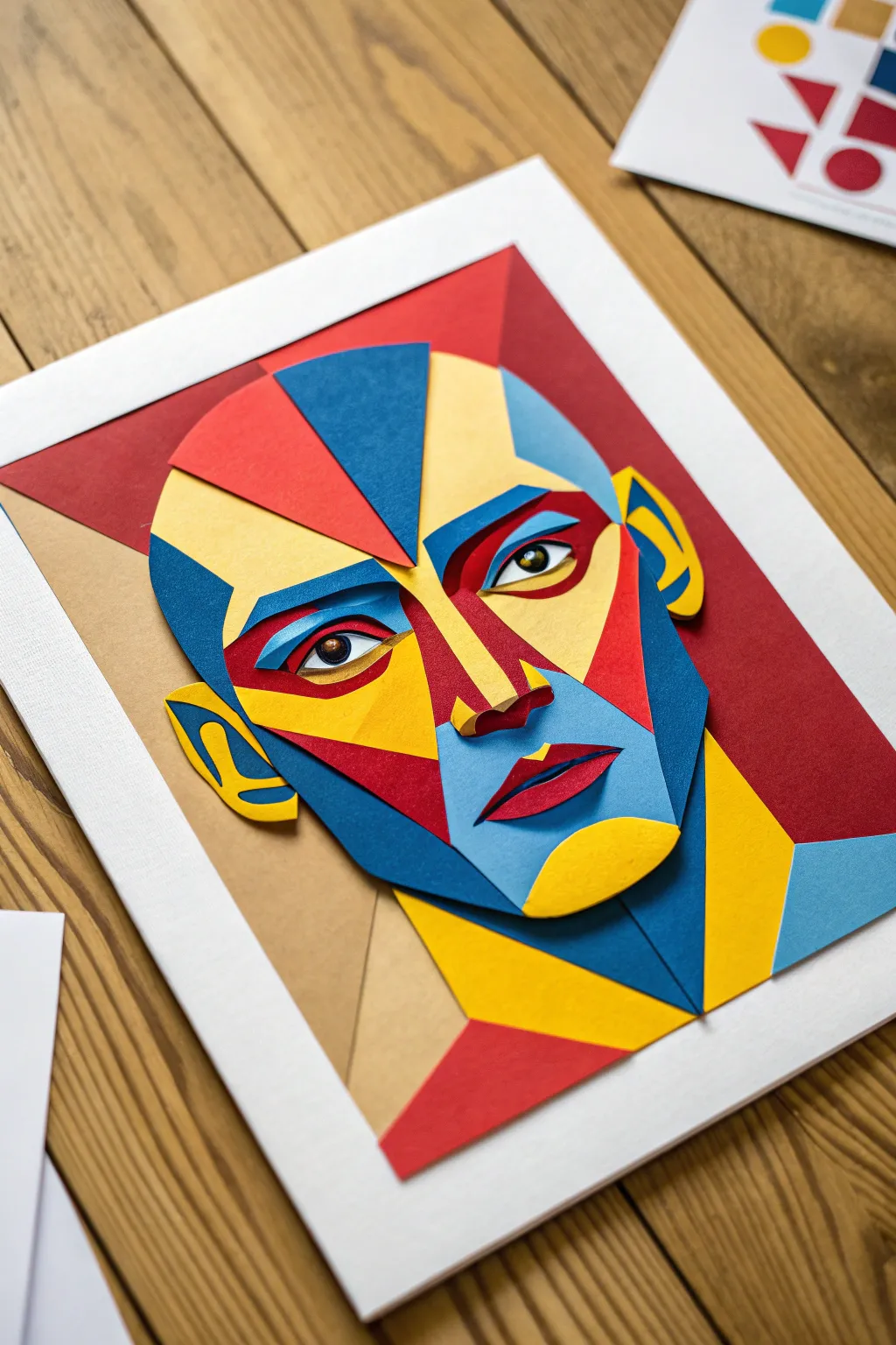
Transform a classic portrait into a vibrant pop art masterpiece using layers of colorful cardstock. This project relies on sharp geometric shapes and bold color blocking to create a dimensional, Cubist-inspired face that literally pops off the page.
How-To Guide
Materials
- Heavyweight cardstock (Red, Dark Blue, Light Blue, Yellow, Tan/Beige)
- White backing board or heavy watercolor paper (A4 or letter size)
- Pencil for sketching
- Tracing paper (optional but recommended)
- Sharp craft knife (X-Acto style) with fresh blades
- Self-healing cutting mat
- Precision scissors
- Craft glue stick or acid-free liquid craft glue
- Fine-point tweezers
- Optional: Foam mounting tape for extra depth
Step 1: Planning and Mapping
-
Sketch the Base:
Begin by sketching a face lightly on a plain sheet of paper to serve as your template. Don’t worry about realistic shading; instead, break the facial features down into angled polygons—triangles, trapezoids, and sharp curves. -
Color Mapping:
Decide which shapes correspond to highlights and shadows. Mark your sketch with ‘R’ for red, ‘Y’ for yellow, and colors for blue shadows to ensure a balanced composition before cutting. -
Create a Tracing Guide:
If you want precision, lay tracing paper over your sketch and trace the individual geometric shapes. I find it easiest to group them by color at this stage so you can cut efficiently later.
Clean Cuts Matter
Change your X-Acto blade frequently. A dull blade drags on the paper fibers, creating fuzzy edges that ruin the sharp, geometric pop art look.
Step 2: Cutting the Components
-
Cut the Background Layer:
Cut a large, abstract red shape that will sit behind the head. This acts as a framing device and adds immediate contrast against the white backing board. -
Cut the Main Face Shapes:
Using your tan or beige cardstock, cut the large foundational shapes for the neck and the side of the face. These will likely be the bottom-most layers of the actual portrait. -
Prepare the Blue Shadows:
Cut the dark blue elements, which represent the deepest shadows. Focus on the sharp triangle for the left forehead, the jawline, and the neck shadow. -
Slice the Light Blue Tones:
Cut the light blue pieces for the mid-tones around the nose, the chin area, and the upper cheekbone. Keep your craft knife vertical for crisp, non-beveled edges. -
Craft the Highlights:
Cut bright yellow shapes for the high points: the forehead, the bridge of the nose, and the brightly lit side of the cheek. Sharp corners are key here to maintain the geometric style. -
Detailed Feature Cutting:
Carefully cut the smaller, intricate pieces for the eyes and mouth. You will need tiny slivers of red, blue, and black (or very dark blue) for the pupils and lips.
Add Real Depth
Use small squares of foam mounting tape instead of glue for the topmost layers (like the nose or eyebrows) to create actual physical shadows.
Step 3: Assembly and Layering
-
Mount the Background:
Glue the large red abstract shape onto your white backing board. Ensure it is centered but slightly offset to create dynamic tension. -
Build the Face Base:
Attached the large tan and blue structural pieces first. These provide the canvas for the smaller detailed layers. -
Layer the Nose and Cheeks:
Start building dimension by gluing the light blue and yellow shapes over the base layers. Pay close attention to how the nose shapes interlock to create a 3D illusion. -
Construct the Eyes:
Assemble the eyes separately before gluing them to the face. Layer the white of the eye, the colored iris, and the pupil, then carefully place this assembly onto the face using tweezers. -
Define the Lips:
Construct the mouth using sharp red shapes for the lips and a dark sliver for the opening. Position this carefully on the lower light blue face section. -
Ears and Edges:
Add the yellow and blue ear shapes. These often sit distinct from the main face oval, helping to frame the portrait. -
Final Adjustments:
Check for any gaps where the white paper shows through unintentionally. If needed, cut tiny slivers of the appropriate color to patch these areas, or embrace them as part of the collage aesthetic.
Step back and admire how simple distinct shapes have come together to form a complex and expressive face
Sticker-and-Marker Pop Art Collage
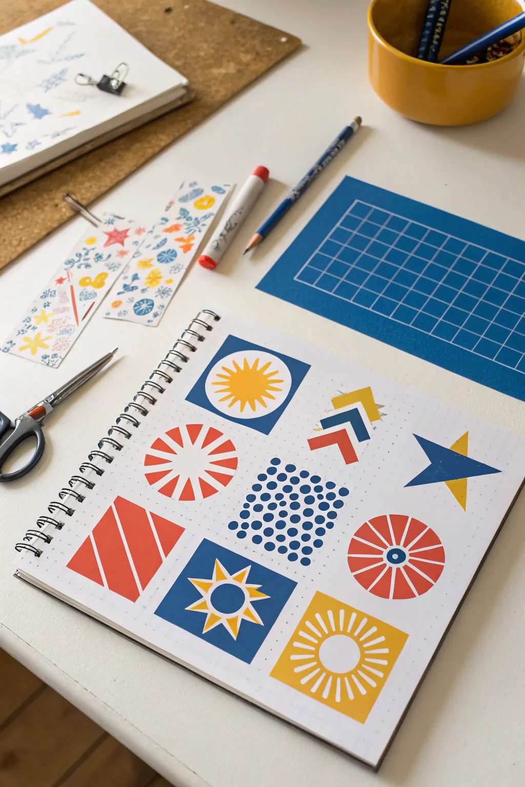
Create a bold, graphic statement using simple shapes and a restricted primary color palette. This project combines the clean lines of geometric design with the playful energy of pop art, resulting in a striking nine-square grid that looks professionally printed but is entirely hand-drawn.
Step-by-Step Guide
Materials
- Spiral-bound notebook with grid or dot grid paper
- Fine-tip markers or gel pens (Navy Blue, Coral Red, Mustard Yellow)
- Ruler or straight edge
- Pencil
- Eraser
- Circle template or compass (optional)
Step 1: Planning the Grid
-
Establish the layout:
Begin by counting the grid squares on your notebook page to determine the size of your design. You want to create a 3×3 layout of nine equal squares. -
Draw the boundaries:
Using a pencil and ruler, lightly mark out the nine square boxes. Leave a small amount of white space or a single grid row between each box to let the designs breathe. -
Rough sketch:
Lightly sketch the basic geometric concept for each square. Aim for variety: plan some squares to have solid colored backgrounds with white shapes, and others to have white backgrounds with colored shapes.
Clean Lines Hack
Use washi tape or low-tack painter’s tape to mask off the edges of your squares before coloring. This guarantees perfectly straight, crisp borders.
Step 2: Drawing the Designs
-
Center sunburst:
Start with the center top square. Draw a circle in the middle and add triangular rays extending outward. Color the background navy blue, leaving the sun (circle + rays) white. -
Golden sun:
Inside the white sun shape you just created, use your mustard yellow marker to draw a smaller sunburst with thin rays. -
Radial stripes:
Move to the middle-left square. Draw a circle shape composed entirely of radiating red wedges, leaving a white center. This creates an exploding starburst effect. -
Chevrons:
For the top right, sketch three stacked arrows or chevrons pointing upward. Color the bottom one red, the middle navy, and the top yellow. -
Polka dot field:
In the center square, create a dense pattern of navy blue dots. I find it helps to start with a circle of larger dots in the middle and make them progressively smaller as they move toward the square’s edges. -
Diagonal stripes:
For the bottom left square, draw a solid coral red square but leave two diagonal white stripes cutting through it. -
Multi-colored wheel:
In the middle right square, draw a wagon wheel design. Use red for the outer rim sections and the center hub, leaving the spokes white. Add a small navy dot in the very center. -
Star within a square:
For the bottom center, color the background navy blue. Leave a large star shape white in the middle. Inside that white space, draw a smaller yellow star with a blue ring center. -
Overlapping stars:
In the furthest right middle section (if following a different order) or the remaining open spot, draw a large navy star shape partially overlapped by a yellow triangle tip, creating a layered look. -
Corner sun:
Finish with the bottom right square. Draw a large yellow sunburst on a white background, using a white circle for the center and thick yellow rays.
Step 3: Refining and Finishing
-
Erase pencil lines:
Wait until the marker ink is completely dry to avoid smudging. Gently run your eraser over the whole page to remove the initial grid and sketch marks. -
Sharpen edges:
Go back over your straight lines with a ruler and marker to ensure edges are crisp. The contrast between sharp edges and the dot grid texture is key to the look. -
Fill gaps:
Check your solid colored areas (like the navy squares) for uneven strokes and apply a second coat of marker if necessary for a solid, opaque look.
Make it Stickers
Draw these designs on full-sheet sticker paper instead of a notebook. Cut them out individually to create a custom geometric sticker pack.
You now have a vibrant page of modern pop art patterns to brighten your sketchbook
Pop Art Typography In Block Letters
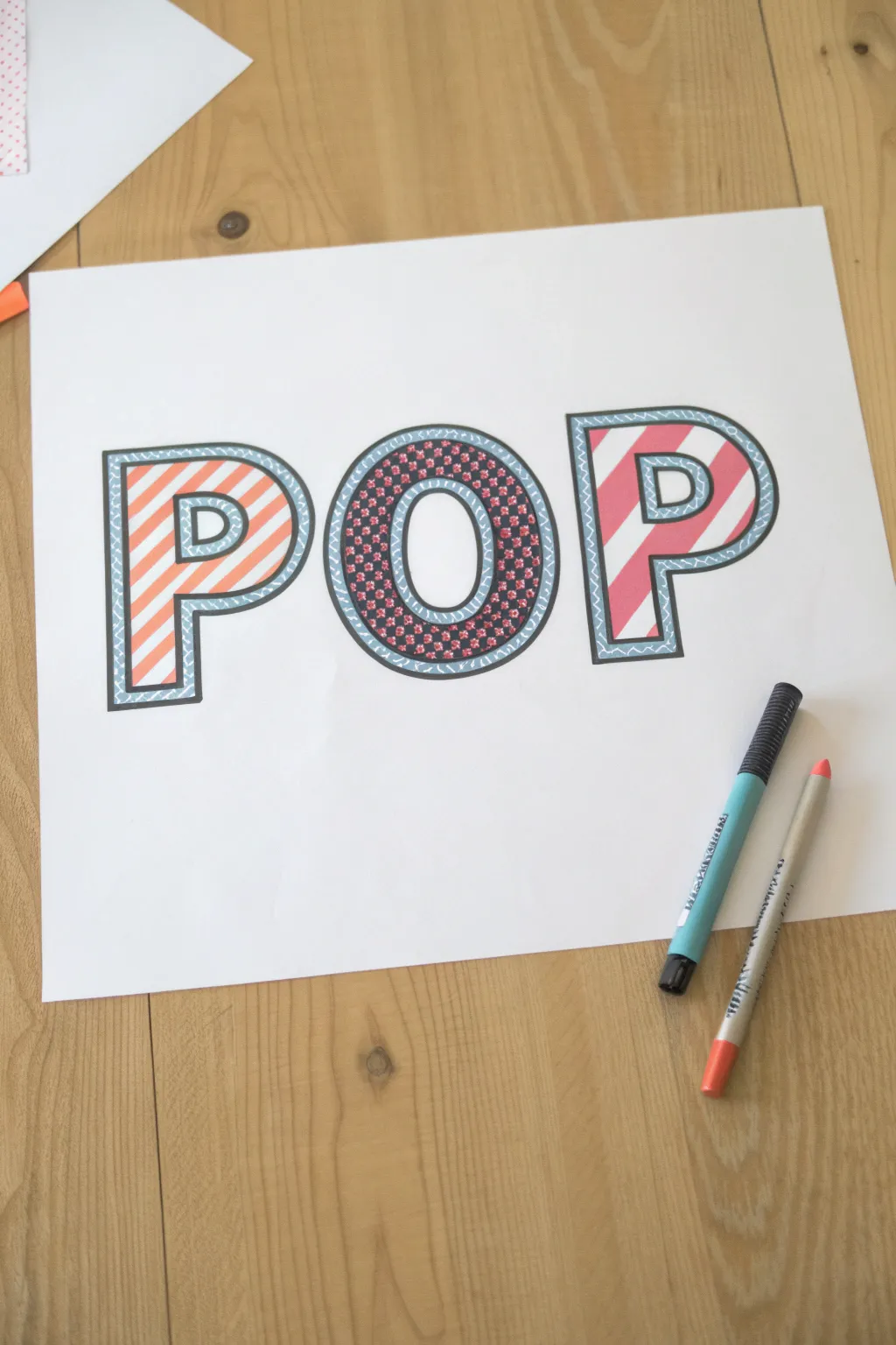
Bring a burst of energy to your walls with this bold typographic art project that mixes patterns and vibrant colors. This design features large block letters filled with whimsical designs like stripes and florals, all framed by a distinctive double outline.
Step-by-Step Tutorial
Materials
- White cardstock or heavy drawing paper
- Pencil and eraser
- Ruler
- Compass or circle template (optional for the ‘O’)
- Black felt-tip pen or fine liner (medium thickness)
- Light teal or blue fine-tip marker
- Orange marker or colored cancy
- Pink or Red marker
- Dark blue or black marker (for ‘O’ background)
- Red fine-tip pen (for ‘O’ details)
Step 1: Planning and Outlining
-
Draft the letters:
Start by lightly sketching the word ‘POP’ in large block letters across the center of your paper. Make the letters thick enough to hold patterns inside. -
Use tools for precision:
Use a ruler for the straight lines of the ‘P’s to keep them crisp. For the ‘O’, a compass helps create perfect outer and inner circles. -
Ink the main outline:
Go over your pencil sketch with a medium-thickness black felt-tip pen. Trace the outer edge and the inner holes (counters) of the letters firmly. -
Create the inner border:
Using the same black pen, draw a second line inside each letter, parallel to your first outline. Leave a gap of about 1/4 inch between the two black lines. -
Erase pencil marks:
Once the black ink is completely dry, gently erase all visible pencil guidelines to clean up your canvas.
Clean Lines Tip
When coloring stripes near the black outline, drag your marker away from the outline rather than toward it to prevent ink bleeding.
Step 2: Adding the Border Detail
-
Draw the scalloped pattern:
Inside the gap between your two black outlines, use a light teal or blue fine-tip marker to draw a continuous wavy or scalloped line. -
Fill the border background:
Color in the space behind the teal wavy line. You can gently shade it with the same teal marker or add tiny hatch marks for texture.
Step 3: Patterning the First P
-
Mark stripe guidelines:
Lightly pencil diagonal lines across the body of the first ‘P’ to ensure your spacing is even. -
Color the orange stripes:
Fill in alternating diagonal bands with an orange marker. Try to keep your strokes in one direction for a smooth finish. -
Leave white space:
Leave the alternating bands plain white to create a bright, high-contrast candy stripe effect.
3D Shadow Effect
Add a gray drop shadow to the right and bottom of each letter to make the word look like it’s floating above the paper.
Step 4: Designing the O
-
Create the dark base:
This letter uses a negative space technique. Start by outlining tiny flower shapes scattered throughout the ‘O’. -
Fill the background:
Color the space *around* your flower shapes with a dark blue or black marker, leaving the flowers themselves uncolored for now. -
Detail the flowers:
Use a red or pink fine-tip pen to add small dots or petals inside the empty flower shapes you preserved. -
Add white accents:
If you accidentally colored too much, you can use a white gel pen to bring back the center dots of the floral pattern.
Step 5: Finishing the Second P
-
Mirror the stripe angle:
For dynamic balance, draw diagonal guidelines on the second ‘P’, but angle them in the opposite direction of the first letter if you want variety, or keep them parallel. -
Apply pink stripes:
Color in the diagonal bands using a distinct pink or red marker, maintaining the same width as the orange stripes. -
Broaden the outer lines:
Finally, inspect your main black outlines. I like to go over the very outer edge one more time to make the letters really pop off the white page.
Now step back and admire how a few simple patterns can turn plain text into a vibrant statement piece
Tape-Resist Pop Art Stripes
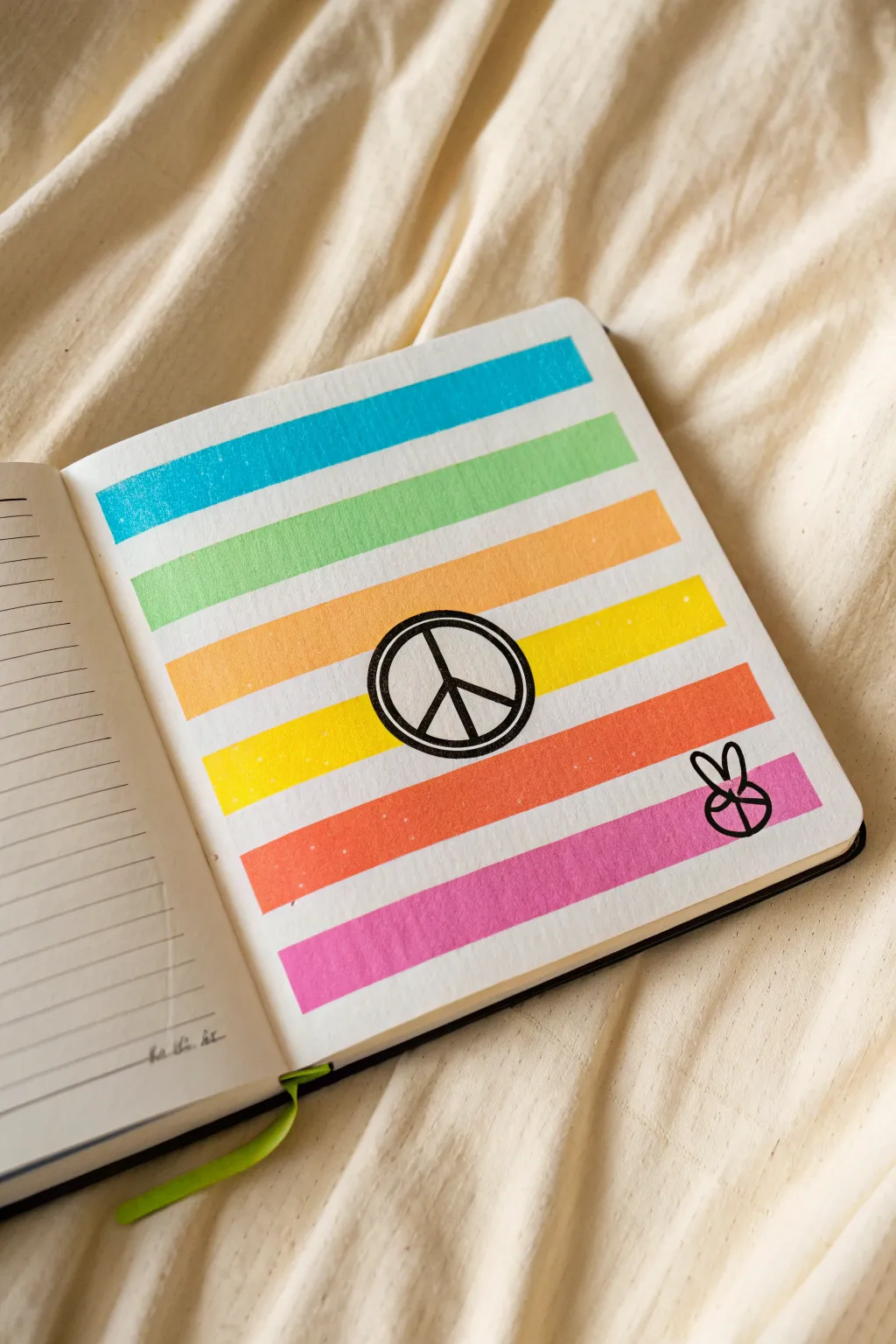
Brighten up your sketchbook with this vibrant page that combines satisfying straight lines with iconic symbols. This project uses a clever tape-resist method to create distinct, colorful bands that frame a bold peace sign perfectly.
Step-by-Step
Materials
- Sketchbook or high-quality art paper
- Washi tape or low-tack painter’s tape
- Acrylic paints or heavy-body gouache (various colors)
- Flat paintbrush
- Black fine-line marker or felt-tip pen
- Pencil
- Eraser
- Ruler
Step 1: Preparing the Stripes
-
Measure your page:
Start by deciding how many colored stripes you want to fit on your page. The example uses six bands of color, so lightly measure the vertical space to ensure they will fit evenly. -
Apply the first tape strip:
Place a horizontal strip of washi tape across the very top of your page. Press it down firmly to seal the edges. -
Create the spacing:
Place a second strip of tape parallel to the first, leaving a gap of about one inch (or your desired stripe width) between them. This gap is where your first color will go. -
Continue taping:
Repeat this process down the page. I find it easiest to use a scrap piece of tape as a spacer to keep the white gaps between colored stripes consistent. -
Seal the edges:
Run your fingernail or a bone folder along the edges of every piece of tape. This is crucial for preventing paint from bleeding underneath and ruining distinct lines.
Step 2: Painting the Colors
-
Start with blue:
Load a flat brush with bright blue acrylic paint. Fill in the top gap completely, brushing horizontally to match the direction of the tape. -
Move to green:
Clean your brush thoroughly and switch to a light green shade for the second stripe. Apply an even coat, making sure the color is opaque. -
Paint the warm tones:
Proceed down the page with your remaining warm colors. Paint the third stripe orange and the fourth stripe a bright, sunny yellow. -
Finish the gradient:
Complete the bottom two stripes with a reddish-orange and finally a hot pink. Let the paint dry completely before moving on. -
The reveal:
Once the paint is dry to the touch, carefully peel back the tape. Pull it slowly at a 45-degree angle to keep the paper from tearing.
Bleeding Paint?
If paint seeps under the tape, wait for it to dry, then use a white gel pen or white gouache to carefully touch up the edges and restore the crisp line.
Step 3: Adding Symbols
-
Pencil placement:
Lightly sketch a circle in the center of the page, overlapping the yellow and orange stripes. Use a compass or trace a small cup if you need a perfect circle. -
Draw the peace sign:
Sketch the internal lines of the peace symbol inside your circle. Make the lines thick enough to stand out against the background colors. -
Ink the outline:
Using your black marker, trace over your pencil circle carefully. Go over the line a second time to thicken it, giving it a bold, sticker-like appearance. -
Fill the symbol:
Ink the inner lines of the peace sign. Ensure the black ink is solid and opaque where it crosses over the transition between the yellow and orange stripes. -
Add the hand detail:
In the bottom right corner, on the pink stripe, sketch a small ‘peace fingers’ hand symbol. Keep it simple and graphical. -
Ink the hand:
Trace the hand symbol with your black marker. I like to make the lines slightly thicker where they intersect with the colorful background to help them pop. -
Clean up:
Wait for the black ink to dry fully, then gently erase any visible pencil marks from your initial sketches.
Make it Sparkle
Mix a tiny amount of iridescent medium or glitter into your acrylic paint before applying. It adds a subtle shimmer that only shows when the light hits it.
Now you have a retro-inspired pop art page that brings a positive vibe to your sketchbook
Big Dancing Figures With Radiating Lines
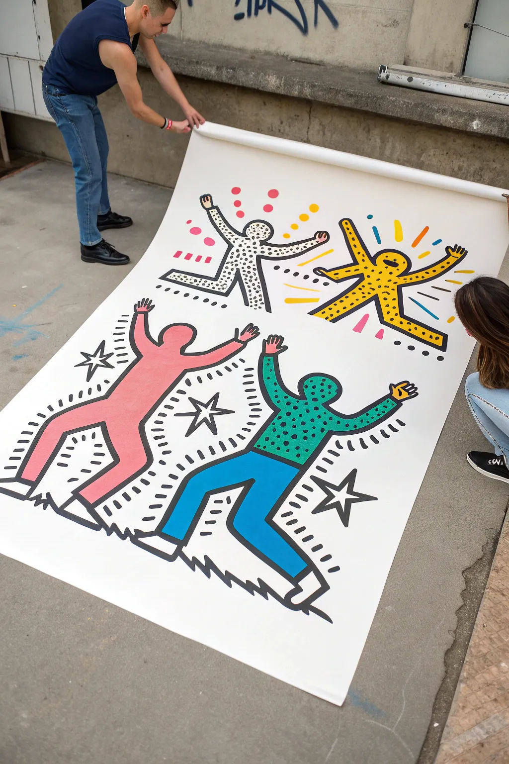
Bring the kinetic energy of street art into your home with this large-scale mural project inspired by the iconic style of Keith Haring. You’ll create bold, dancing figures with thick outlines and vibrant patterns that seem to jump right off the paper.
Detailed Instructions
Materials
- Large roll of heavy white paper or canvas drop cloth (at least 4-5 feet wide)
- Black acrylic paint or India ink
- Wide flat brush (1-2 inch) for outlines
- Medium round brushes for details
- Acrylic paints in bright, primary colors (red, blue, yellow, green, teal)
- Pencil and eraser
- Painter’s tape or weights to hold corners down
- Drop cloth or newspapers for floor protection
Step 1: Planning and Sketching
-
Prepare your workspace:
Find a large, flat surface like a garage floor or patio. Lay down protective covering, then unroll your large paper or canvas. Secure the corners with tape or heavy weights so it doesn’t curl back up on you. -
Map out the composition:
Visualize dividing your canvas into quadrants. You want four distinct figures, each occupying its own space but interacting with the center. Lightly mark the center point to help you balance the layout. -
Sketch the first figure:
Starting in the top left, use a pencil to draw a simple stick figure in a dynamic pose. Then, draw a bubble outline around the stick figure to create that classic tubular body shape. Keep the head a simple oval without facial features. -
Draw the remaining figures:
Repeat this process for the other three quadrants. Vary the poses—have one jumping, one waving, and perhaps two interacting at the bottom. Make sure the limbs are thick and consistent in width. -
Add motion lines and symbols:
Sketch short, radiating lines around the heads and limbs to signify movement. Add classic pop-art motifs like stars or X-shapes in the negative spaces between the bodies.
Step 2: Adding Color and Patterns
-
Paint the solid figures:
Choose two figures to be solid colors. In the example, the bottom left is pink and the bottom right is teal/blue. Fill these shapes in completely with acrylic paint, using a broad brush for coverage and a smaller one for edges. -
Create the patterned figures:
For the top two figures, leave the background white. Paint specific details inside them. For the yellow figure, paint the entire body yellow first, then let it dry completely before adding dots later. -
Detail the dotted figure:
For the white figure (top left), use a small round brush to paint black dots all over the body. Keep the spacing relatively random but dense to create texture. -
Add secondary colors:
If a figure has clothes or different colored limbs (like the bottom right figure with the green screen-tone shirt), paint those distinct sections now. Let all base colors dry thoroughly before moving to the next step.
Clean Lines
For the crispest possible outlines, use a Posca paint marker or a wide chisel-tip permanent marker instead of a brush. It gives you way more control over the uniform thickness.
Step 3: The Bold Outline
-
Prepare your black paint:
This is the most crucial step for the ‘pop’ look. Ensure your black acrylic is fluid enough to flow but thick enough to be opaque. I sometimes add a tiny drop of water to improve flow. -
Outline the main bodies:
Using your 1-2 inch flat brush, paint decisive, heavy black lines over your initial pencil sketches. Confidence is key here; try to make long, continuous strokes rather than short, sketchy ones. -
Add internal details:
Paint the internal details, such as the dots on the yellow figure or the separation lines between the shirt and pants on the blue figure. Use a slightly thinner brush if the main outline brush feels too clumsy for this. -
Outline the motion marks:
Go over your pencil sketches for the ‘action lines’ surrounding the figures. These should be painted with the same thick black paint to match the visual weight of the bodies. -
Final touches:
Step back and look for any pencil lines that are still visible. Erase them gently once the paint is bone dry. Touch up any colored areas that might clearly show white canvas through the paint.
Go 3D
Cut the finished figures out and mount them on foam board. Hang them slightly off the wall to create actual shadows and depth for a gallery installation feel.
Roll up your masterpiece carefully to transport or mount it proudly on a large feature wall

Have a question or want to share your own experience? I'd love to hear from you in the comments below!