Scratch art is one of my favorite ways to get instant drama on the page—those high-contrast lines on black feel like pure magic. Here are my go-to scratch art ideas (from classic crowd-pleasers to a few unexpected twists) to help you dive in and make something you can’t stop staring at.
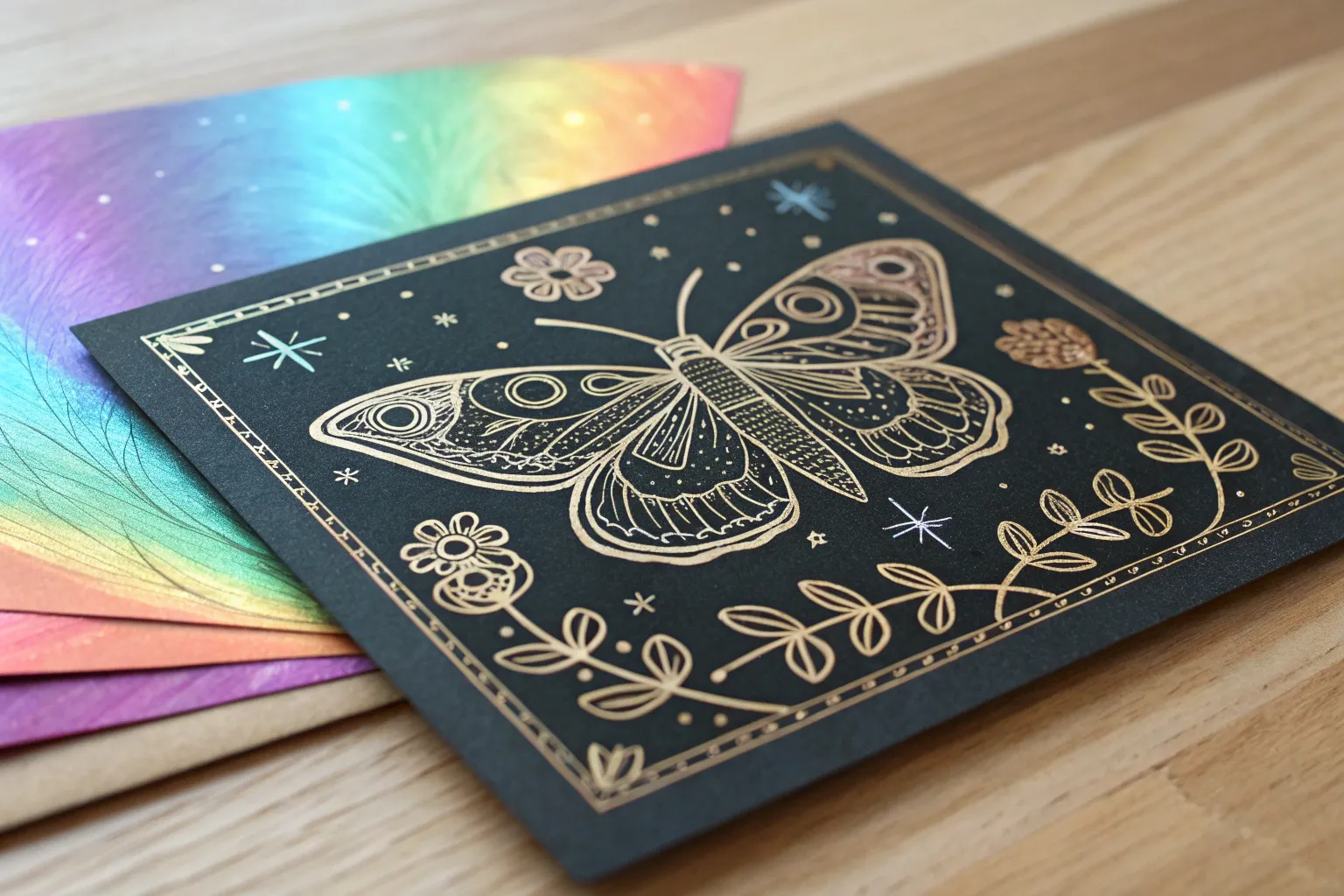
Butterflies With Patterned Wings
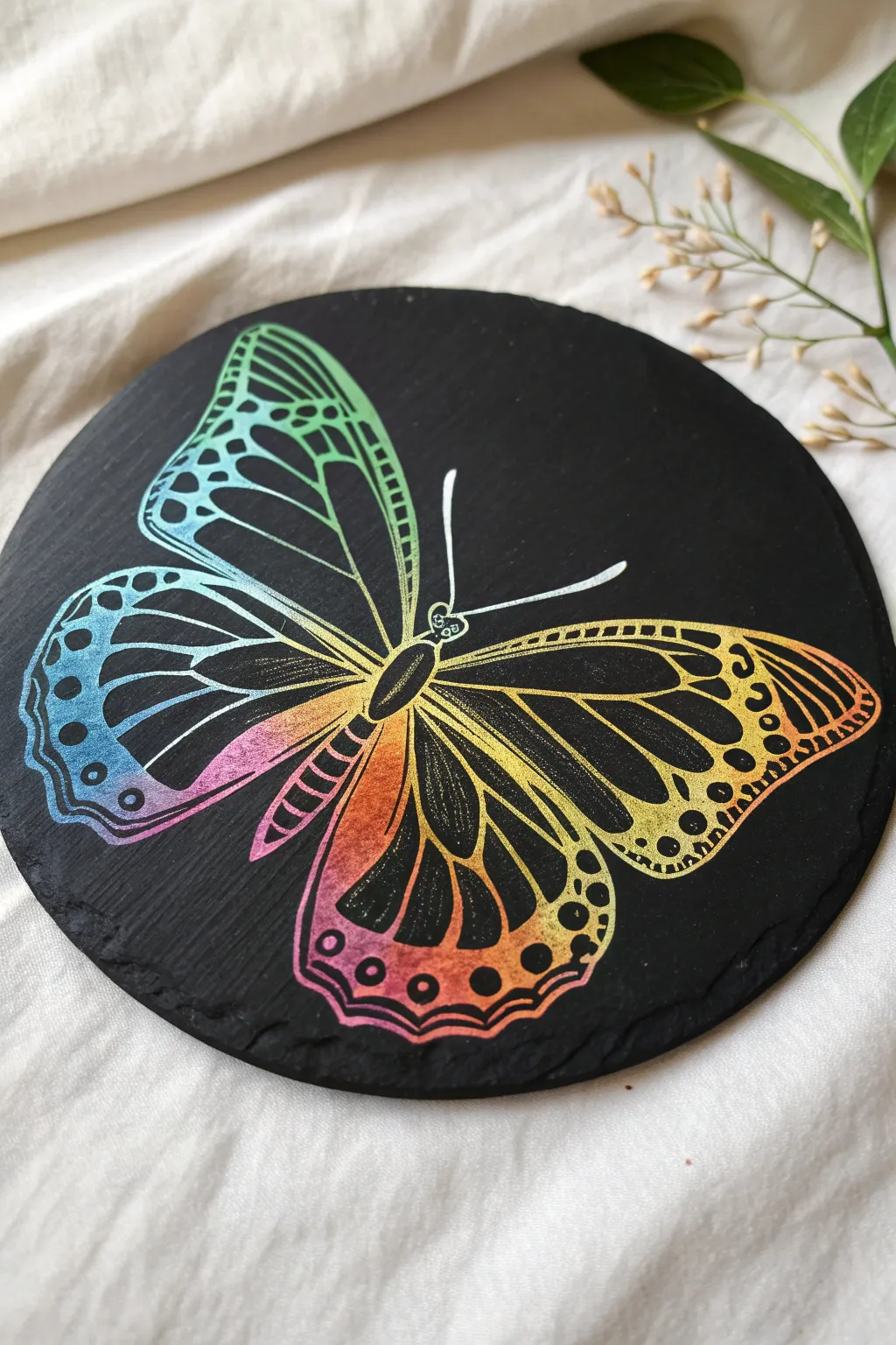
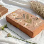
Transform a simple dark slate coaster into a vibrant display of color with this stunning butterfly scratch art project. The contrast between the matte black surface and the underlying rainbow gradients makes the delicate wing patterns truly pop.
How-To Guide
Materials
- Round black slate coaster impact
- Oil pastels (vibrant spectrum)
- Scrap paper or cardstock
- Black acrylic paint
- Foam brush or wide flat brush
- White chalk pencil
- Wooden stylus or scratching tool
- Fine-point etching needle (optional for details)
- Matte spray sealant (optional)
- Printer and paper (for template)
Step 1: Preparation & Base Layer
-
Clean surface:
Begin by wiping down your slate coaster with a slightly damp cloth to remove any dust or stone grit. Let it dry completely before moving on. -
Map color zones:
Visualize a diagonal gradient for your butterfly. Since the final design uses a spectrum, plan to apply colors in patches: teals and blues on the top left, transitioning to yellows in the center, and warm oranges and pinks on the bottom right. -
Apply oil pastels:
Rub your oil pastels heavily onto the slate surface. Use firm pressure to ensure a thick, waxy layer. Don’t worry about neatness here; just cover the area where the butterfly will sit with vibrant, solid color. -
Blend transitions:
Use your finger or a paper towel to slightly smudge the boundaries between colors. This creates that seamless ombre effect seen in the wings later. -
Masking coat:
Pour a small amount of black acrylic paint into a dish. Add a tiny drop of dish soap to help it adhere to the waxy pastel. -
Paint application:
Using a foam brush, paint an even layer of black over the entire colored area. You want to hide the colors completely. If the first coat is streaky, let it dry and apply a second coat.
Paint Slipping?
If the black paint beads up on the oil pastel layer, add a tiny drop of liquid dish soap to your paint. This breaks the surface tension and helps it stick.
Step 2: Sketching & Outlining
-
Create a template:
Find a butterfly line drawing you like or sketch one on scrap paper. Cut it out to check the sizing against your coaster. -
Transfer the shape:
Place your paper template on the dried black surface. Lightly trace the outline using a white chalk pencil. This gives you a guide that can easily be wiped away later. -
Scratch the body:
Using your wooden stylus, scratch out the central thorax and abdomen first. This anchors your drawing. Use firm strokes to reveal the yellow-orange core beneath. -
Outline the wings:
Carefully trace the main outline of the upper and lower wings. Keep your hand steady to create smooth, continuous curves. -
Add antennae:
Scratch two simple lines extending from the head for the antennae. I find a quick, confident flick of the wrist helps keep these lines looking natural rather than wobbly.
Step 3: Detailing the Patterns
-
Divide the wings:
Draw the main veins inside the wings. These should radiate outward from the body like sun rays, separating the wing into sections. -
Upper wing cells:
In the top left wing (the blue/teal section), scratch out the ‘cells’ or shapes between the veins. Leave thick black lines between them to mimic the distinct stained-glass look of a butterfly wing. -
Lower wing gradient:
Move to the bottom wing sections. As you scratch the shapes here, you’ll see the color shift from yellow to warm pinks and oranges. -
Add edge spots:
along the outer margins of the wings, scratch small circles and dots. Vary the sizes—some tiny, some larger—to create that classic Monarch-style border pattern. -
Refine the lines:
Go back over your main structural lines (the veins) to thicken them slightly if needed. This contrast makes the delicate inner patterns stand out more. -
Clean up:
Use a soft, dry brush to sweep away the black paint crumbs created by scratching. Wipe away any remaining white chalk guidelines with a dry finger. -
Seal (Optional):
If you plan to use this as a functional coaster, spray it lightly with a clear matte sealant to protect your artwork from moisture.
Pro Tip: Sharp Lines
Keep a piece of sandpaper nearby. Periodically rub the tip of your wooden stylus on it to re-sharpen the point for the finest details.
Now you have a captured rainbow ready to brighten up your coffee table


Mandala Circles
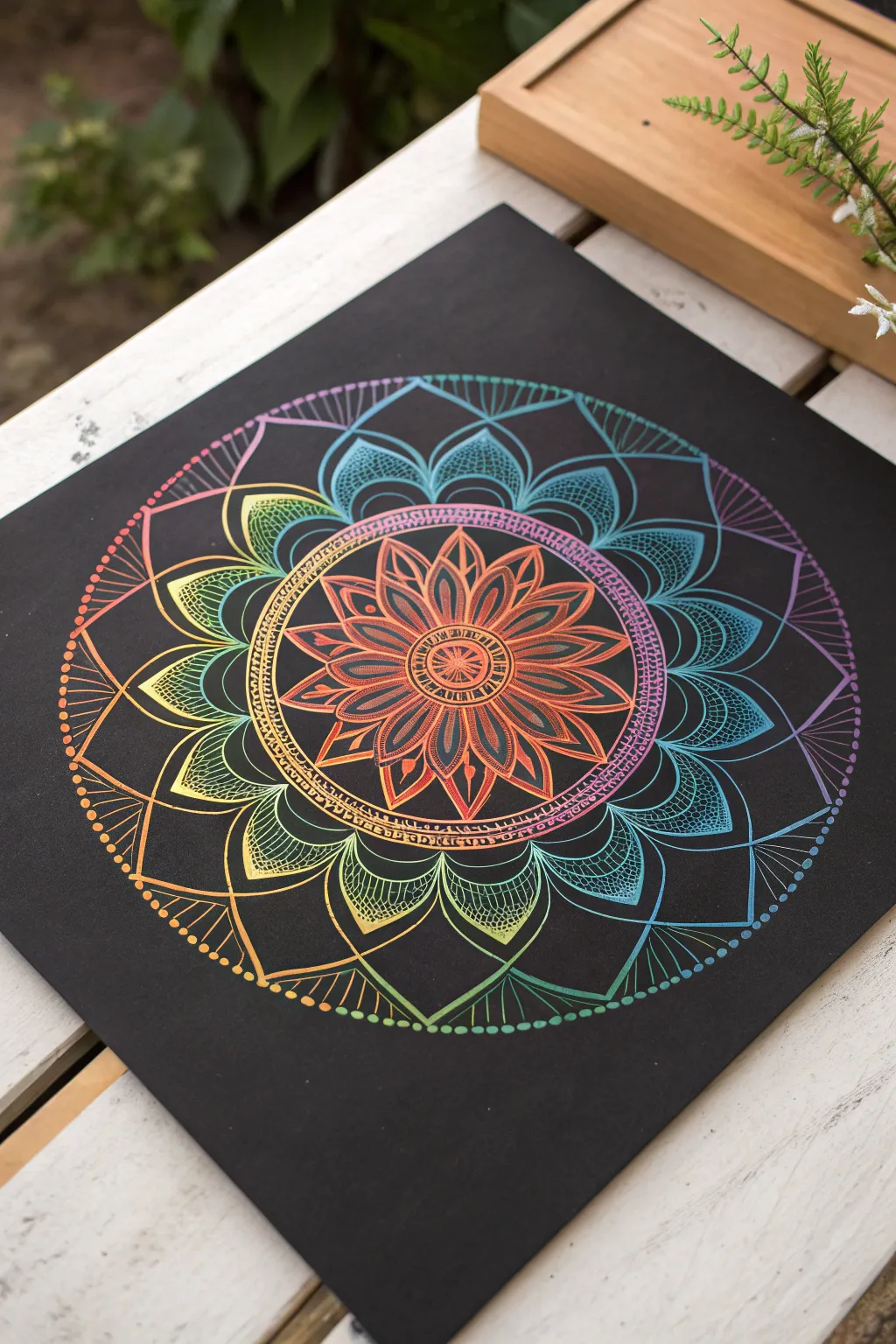
Uncover a vibrant spectrum of color hidden beneath a midnight black surface with this mesmerizing scratch art mandala. The resulting design features intricate, glowing petals that radiate outward in a perfect gradient, mimicking the look of neon lights against a dark sky.
Detailed Instructions
Materials
- Square scratch art paper (rainbow background)
- Wooden stylus or scratching tool (fine point)
- Compass
- Pencil (soft lead, e.g., 2B)
- Ruler
- Soft brush (for sweeping away debris)
- Paper towel or tissue
Step 1: Setting the Structure
-
Find the center:
Begin by gently laying your ruler diagonally across the square sheet from corner to corner to lightly mark an ‘X’ in the middle with your pencil. Make sure your pencil pressure is extremely light so you don’t accidentally scratch the surface yet. -
Draft the guide circles:
Using your compass, place the point on your center mark. Lightly scribe four concentric circles expanding outward. The smallest should act as the core, with three larger rings spaced evenly to define the tiers of petals. -
Divide the circle:
Use your ruler to draw a vertical and horizontal line through the center, dividing the circle into quadrants. Then, bisect each of those quadrants with diagonal lines. This creates 8 equal sections to help you keep your petals symmetrical. -
Subdivide specifically for petals:
For the intricate detail shown here, you’ll want even more precision. Lightly add tick marks halfway between your 8 main sections on the outer rings. These guides don’t need to be full lines, just reference points for where petal tips will land.
Oops! Scratched a mistake?
Since you can’t erase, turn mistakes into features! If you scratch a line in the wrong spot, thicken the line intentionally or turn it into a filled geometric shape like a triangle.
Step 2: Scratching the Core
-
Create the central button:
Pick up your scratching tool. Firmly scratch a small circle right in the center. Inside this, scratch a tiny geometric starburst pattern to reveal the first pop of orange-red color. -
Add the first ring details:
Around your central button, scratch a double ring. Connect these two rings with tiny, straight hash marks, creating a ladder-like border that frames the core. -
Draw the primary petals:
Working within the smallest guideline circle, scratch eight pointed petals. Start from the center ring and curve outward to a sharp point, then curve back down. Ensure the points align with your 8 main pencil guides. -
Fill the primary petals:
Inside each of these initial flower petals, scratch a smaller, identical petal shape. Then, add a singular line down the center of each leaf to give it definition and depth. -
Sweep away debris:
Pause here and use your soft brush to gently whisk away the black scrapings. Avoiding blowing on it, as moisture droplets can sometimes spot the paper.
Pattern Play
Vary your scratching tools for different textures. Try using the flat edge of a wooden stick for wide petals or a needle tip for ultra-fine cross-hatching in the center.
Step 3: Expanding the Design
-
Create the decorative band:
Moving to the next pencil ring, scratch a distinct, thick band. Instead of a solid line, create this boundary using tiny, closely packed geometric shapes or small squares, forming a textured belt around the central flower. -
Draft the middle tier petals:
Scratch a new layer of larger petals emerging from behind that textured band. These should be wider and rounder than the central ones. Aim for roughly 16 petals here, letting them overlap slightly. -
Detail with cross-hatching:
This is where the magic happens. Inside these middle petals, don’t scratch them solid. Instead, use a cross-hatching technique—diagonal lines going one way, crossed by diagonal lines going the other—to create a mesh texture that reveals the green and yellow gradient. -
Outline the large outer petals:
Extend the largest set of petals to your outermost guideline. These are broad, sweeping curves. Make the outline slightly thick to emphasize the grand scale of this layer. -
Add the inner vein details:
Inside these large outer petals, scratch a ‘leaf vein’ pattern. Draw a central spine, then add curved lines branching off it. This mimics the organic look of natural leaves while exposing the teal and blue tones.
Step 4: Final Flourishes
-
Execute the fan border:
Between the tips of the largest petals, scratch delicate fan shapes. These are composed of straight lines radiating from a single point between the petal dips, extending outward like sun rays. -
Dot the perimeter:
Finish the design by placing a single, bold dot at the tip of each fan ray. I find that varied pressure here creates nice variations in dot size. -
Clean up edges:
Check your main lines. If any look timid or broken, go over them one more time with firm pressure to ensure the black coating is fully removed and the color shines brightly. -
Final debris removal:
Give the entire piece one last thorough clean with your soft brush to ensure no black flecks remain on the colorful exposed areas. -
Sign your work:
Find a small, unobtrusive spot near the edge or nestled within the pattern to scratch your initials.
Display your radiant mandala in a prominent spot to enjoy its glowing symmetry.


Moon And Starry Sky
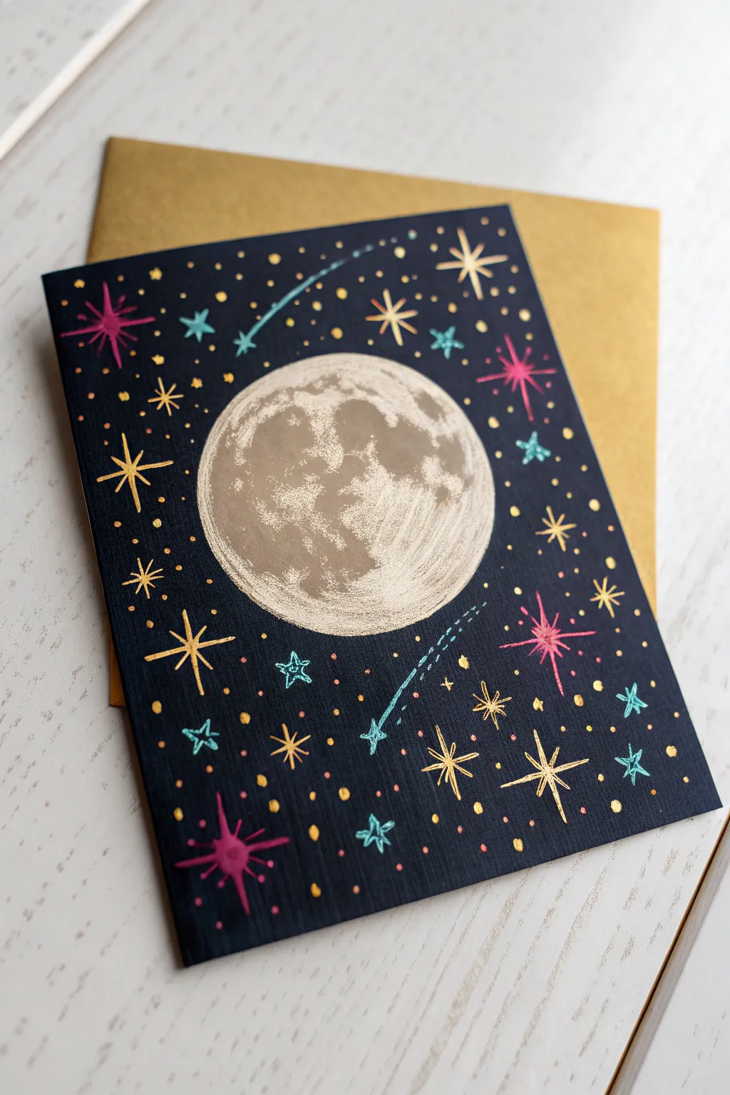
Capture the magic of a midnight sky with this striking scratch art project featuring a detailed, textured full moon surrounded by colourful shooting stars. The contrast between the deep black background and the vibrant foil or ink beneath creates a luminous effect perfect for greeting cards or wall art.
How-To Guide
Materials
- Rainbow or metallic scratch art paper (black coated)
- Wooden scratch tool (stylus) with a fine point
- Pencil (optional for sketching)
- Circle stencil or compass (approx. 2.5 – 3 inches)
- Soft brush (for sweeping away dust)
- Gold shimmer envelope (for presentation)
Step 1: Setting the Scene
-
Prepare your canvas:
Cut your scratch art paper to standard card size (e.g., 5×7 inches) if it isn’t pre-cut. Place it on a flat, hard surface to ensure your lines remain steady. -
Outline the moon:
Using a circle stencil or a compass, lightly scratch the outline of a large circle right in the center of your card. Don’t press too hard yet; just mark the boundary. -
Initial moon texture:
Begin scratching away the black coating inside your circle. Instead of scratching the whole thing clean, use short, rapid strokes to reveal the lighter layer underneath while leaving patches of black intact.
Sharpness Matters
Keep a piece of sandpaper nearby to sharpen your wooden stylus as you work. A dull tip will scrape off too much coating and make fine details like the moon currents difficult.
Step 2: Creating Lunar Detail
-
Map the craters:
Look at the reference image to see where the darker shadows lie on the moon. Leave larger islands of black coating untouched in the middle and slightly towards the left side to represent lunar maria (seas). -
Refine the edges:
Scratch closely along the inner edge of your circle outline to make the moon look round and sharp, but let the scratching become rougher as you move inward. -
Add texture variance:
Use the very tip of your tool to make stippling dots or tiny cross-hatching marks in the transition zones between the bright scratched areas and the dark black shadows. This mimics the cratered surface. -
Highlight the bright side:
On the right side of the moon, scratch away almost all the black coating to create a strong highlight, suggesting the light source is hitting that edge. -
Clean up:
I like to pause here and use a soft brush to sweep away all the black scrapings so I can clearly see the contrast developing.
Metallic Magic
Use a gold or silver gel pen to add extra highlights on top of the black areas. This creates a dual-layer effect that makes the stars pop even more against the darkness.
Step 3: Adding the Constellations
-
Plan your stars:
Visualize a border of stars surrounding the moon. You’ll want a mix of large ‘burst’ stars and smaller dots. -
Draw the large bursts:
Create 4-5 large starbursts by scratching a cross shape, then adding smaller diagonal lines between the main arms. Place a few of these in the corners. -
Create medium stars:
Fill in the gaps with medium-sized five-pointed stars. Draw these by scratching a simple outline, or fill them in completely if you want them brighter. -
Scatter tiny stars:
Use the sharp point of your stylus to prick tiny dots all over the background. Vary the pressure to make some dots bigger and some barely visible, creating depth in the galaxy. -
Mix gold and color:
If you are using multi-colored scratch paper, try to position your stars so different colors reveal themselves—some might appear pink, others teal or gold, depending on the underlying layer.
Step 4: Finishing Touches
-
Add shooting stars:
Choose two spots for shooting stars. Scratch a small five-pointed star, then draw a curved tail behind it. -
Detail the tails:
Make the tails look like motion trails by scratching two parallel dashed lines rather than a solid stroke. -
Enhance star clusters:
Group some of your tiny dots together in clusters around the shooting stars to simulate the Milky Way dust. -
Review the balance:
Step back and look at the composition. If there are any large empty black spaces, fill them with a small plus-sign star or a few more dots. -
Final polish:
Give the card one last thorough sweep with your soft brush to remove any lingering black dust before slipping it into a gold envelope.
Now you have a celestial masterpiece ready to gift to a stargazer or frame for your own wall
Firework Bursts
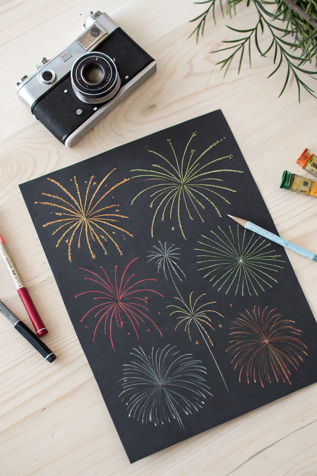
Capture the magic of a celebratory evening with this vibrant scratch art project that lights up dark paper with bursts of color. Using simple radiating lines and varying pressures, you can create a dynamic firework display that feels full of movement and energy.
Step-by-Step Tutorial
Materials
- Black scratch art paper
- Wooden stylus or scratching tool
- Pencil (optional for planning)
- Clean, soft brush (for sweeping away debris)
Step 1: Planning and Placement
-
Map out your composition:
Visualize where your fireworks will explode on the page. Aim for variety by placing centers at different heights and spacing them out so they don’t look too crowded. -
Mark the centers:
Using the very tip of your scratching tool, make tiny, almost invisible dots to mark the center point of each firework burst. This will help you keep your radial lines organized. -
Vary the sizes:
Decide which bursts will be large main features and which will be smaller fillers. In my experience, having one or two dominant bursts creates a much more balanced composition.
Clean Lines
Keep a piece of scrap paper under your hand while working. This prevents oils from your skin transferring to the matte black surface and leaving shiny spots.
Step 2: Creating the Bursts
-
Start the first burst:
Choose a center point near the top left. Place your stylus at the center dot and draw a long, slightly curved line outward. Repeat this, creating spoke-like lines radiating in all directions. -
Vary line length:
To make the explosion look natural, ensure your radiating lines aren’t all the exact same length. Let some stretch further out than others to create an organic, uneven edge. -
Add secondary lines:
Between your main long spokes, scratch shorter lines that originate from the same center point. This adds density to the core of the explosion. -
Create the ‘Willow’ effect:
For the large burst on the right side, curve your lines downward slightly at the ends, mimicking gravity pulling the sparks down like a weeping willow tree. -
Texture the lines:
Instead of smooth strokes, try making some lines slightly jittery or bumpy. This mimics the sizzling path of a firework rocket climbing into the sky.
City Skyline
Scratch a simple silhouette of buildings or a tree line at the very bottom of the page. This gives the fireworks context and scale, making them look huge.
Step 3: Adding Details and sparkle
-
Create spark tips:
At the very end of select lines, scratch small clusters of dots or tiny ‘V’ shapes to represent the final pop of the firework fading out. -
Add floating embers:
Scratch a few stray dots or short dashes disconnected from the main lines, floating in the negative space around the bursts. This adds depth and realism. -
Draw the ‘Peony’ style:
For the rounder bursts near the bottom, focus on a spherical shape. Keep your lines straighter and more uniform in length to create a perfect ball of light. -
Layer overlapping bursts:
If you have space, draw a smaller firework slightly behind a larger one. You can achieve this by stopping the lines of the ‘background’ firework before they touch the ‘foreground’ one. -
Include rocket trails:
For one or two bursts, draw a thin, wavering line extending from the bottom of the page up toward the center of the explosion, showing the path the shell took to get there.
Step 4: Final Touches
-
Review the density:
Step back and look at your composition. If a burst looks too thin, go back in and add very fine, hairline scratches between the major spokes to brighten it up. -
Clean up the surface:
Take a soft brush or a tissue and gently sweep away all the black scratch dust. Be careful not to press down, as the debris can smudge or scratch the black coating. -
Brighten the centers:
If you want more intensity, scratch a little more heavily right at the convergence point of the lines to reveal more of the underlying color.
Now you have a vibrant display of pyrotechnics captured permanently on paper
BRUSH GUIDE
The Right Brush for Every Stroke
From clean lines to bold texture — master brush choice, stroke control, and essential techniques.
Explore the Full Guide
Glowing Jellyfish
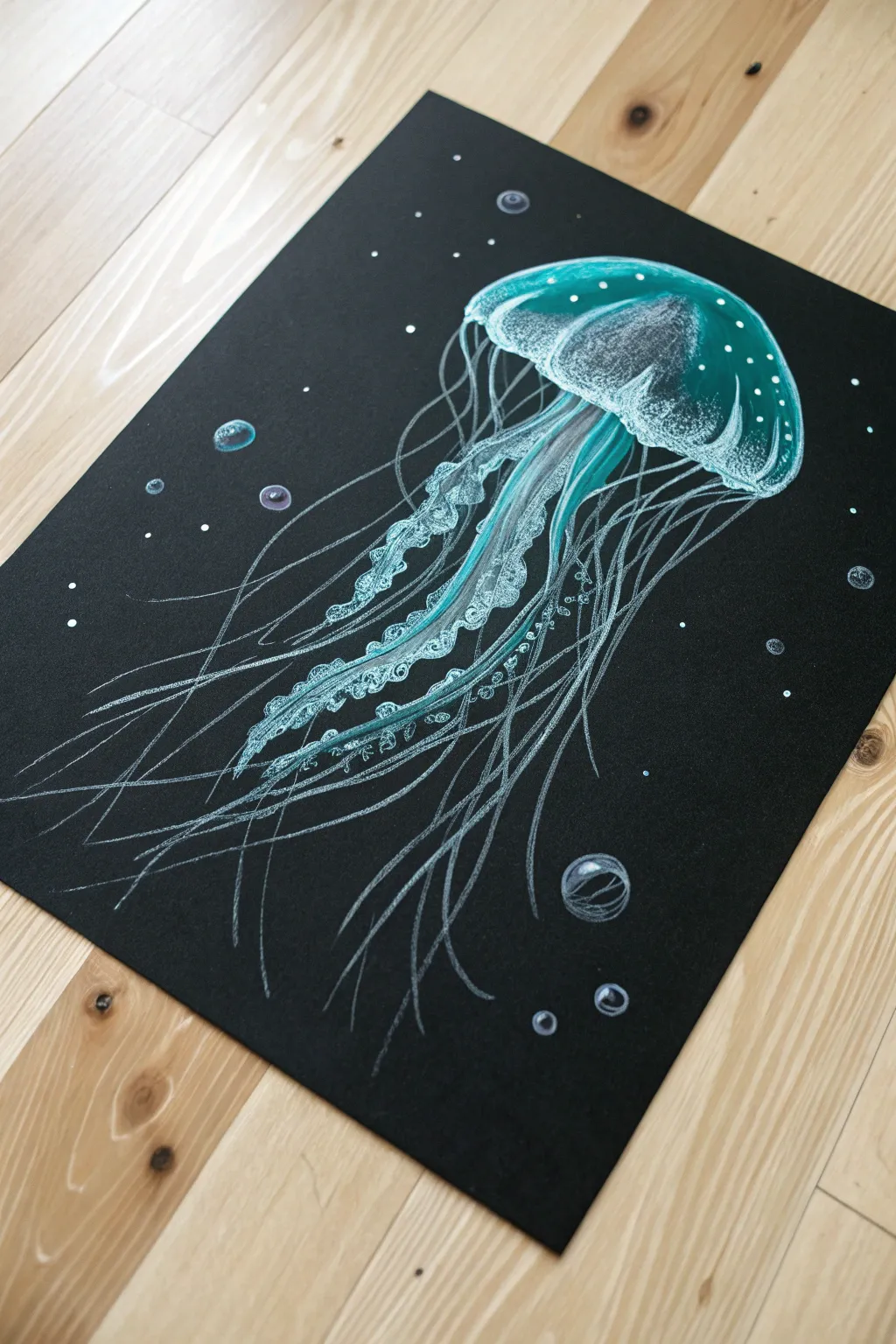
Capture the ethereal glow of deep-sea life with this striking jellyfish drawing on black paper. Using a limited palette of white and teal gel pens or pencils creates a vibrant, bioluminescent effect that pops against the dark background.
Detailed Instructions
Materials
- Black cardstock or heavyweight black drawing paper
- White gel pen (fine and broad tip)
- Teal or aqua colored pencil (soft core works best)
- White colored pencil
- Pencil and eraser for sketching
- Compass or circular object (optional)
Step 1: Sketching the Form
-
Outline the bell:
Start by lightly sketching the jellyfish’s bell (the head) using a regular pencil. Draw a semi-circle or mushroom cap shape near the top right third of your paper to leave room for the tentacles. -
Define the rim:
Drawing lightly, add a wavy, ruffled line along the bottom edge of the bell to give it dimension and movement. -
Sketch the inner oral arms:
Lightly pencil in the central, thicker tentacles (oral arms) flowing downward from the center of the bell. These should be curvy and ribbon-like. -
Map the flow:
Faintly sketch sweeping, curved lines extending outward and downward to guide where the thinner tentacles will go later.
Step 2: Creating the Glow
-
Base layer of color:
Take your teal colored pencil and gently shade the top curve of the bell. Press lighter as you move toward the center to create a highlight zone. -
Highlight the rim:
Go over the ruffled bottom edge of the bell with the teal pencil, pressing harder to define the shape against the black paper. -
Add white accents:
Using the white colored pencil, layer over the lightest part of the teal shading on the bell. Blend them slightly to create a glowing gradient. -
Detail the oral arms:
Color the ribbon-like central tentacles with the teal pencil. Use the white gel pen to draw tiny, irregular loops or squiggles along the edges of these ribbons to make them look frilly.
Smudge Alert
Gel ink sits on top of the paper longer than you’d expect. Place a scrap piece of paper under your hand while drawing to prevent smearing your fresh lines.
Step 3: Tentacles and Details
-
Draw fine tentacles:
Switch to your white gel pen or a very sharp white pencil. Trace over your guide lines to create the long, thin tentacles. Make the lines vary in thickness—sometimes breaking the line makes it look more delicate. -
Add color variation:
Go back over some of the long tentacles with the teal pencil, or draw new teal lines alongside the white ones. This mix of white and color enhances the bioluminescent look. -
Texture the bell:
Use the white gel pen to add stippling (tiny dots) specifically around the top edge of the bell and scattered throughout the body for texture. -
Enhance the transparency:
To make the bell look see-through, draw faint vertical lines inside the bell shape using the white pencil, curving them to match the dome’s form.
Neon Pop
Try swapping the teal pencil for a neon highlighter pencil or a fluorescent gel pen. Under a blacklight, your jellyfish will literally glow in the dark.
Step 4: Background Atmosphere
-
Create bubbles:
Draw several small circles of varying sizes around the jellyfish using the white pencil. Leave the centers black. -
Define the bubbles:
Add a crisp white or teal highlight on just one side of each bubble (like a crescent moon shape) and a tiny dot on the opposite side to make them look spherical and wet. -
Add floating particles:
Dot the background randomly with the white gel pen to represent sea sparkle or distant plankton. -
Final glow check:
Step back and look at your contrast. If the jellyfish needs more ‘pop,’ carefully go over the brightest white highlights on the bell rim one last time with the gel pen.
Now you have a serene underwater scene that glows right off the page
Feather Studies
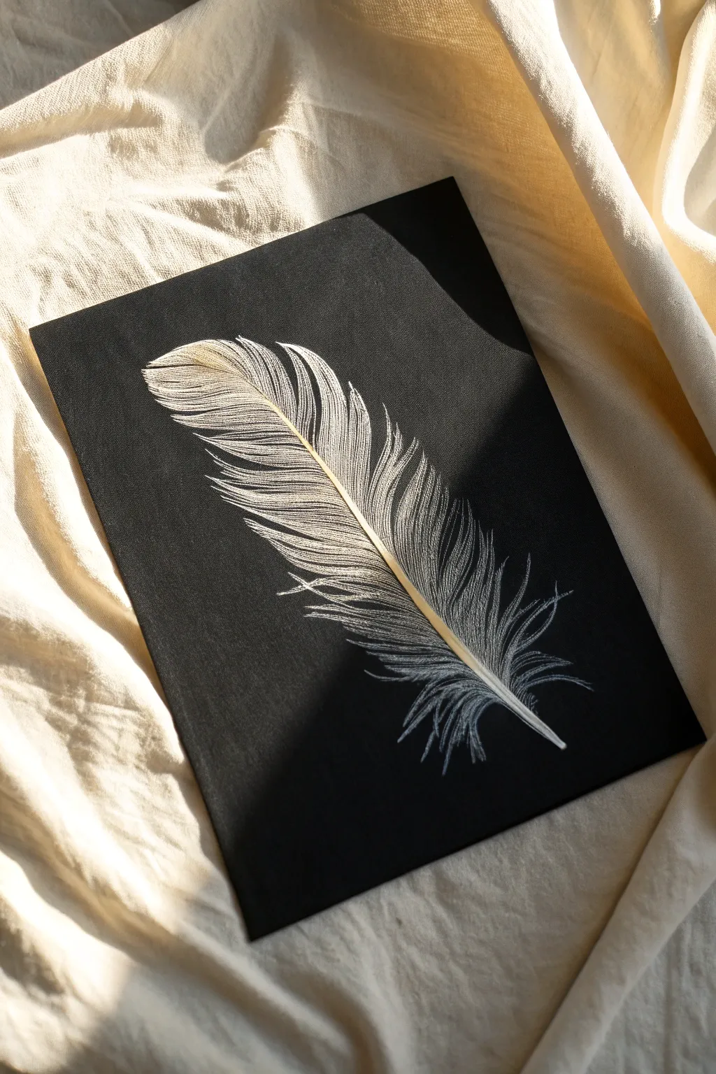
Capture the delicate softness of a feather using the sharp precision of scratchboard art. This project focuses on building texture through thousands of tiny strokes, creating a striking high-contrast image that glows against the black background.
Step-by-Step Guide
Materials
- Black scratchboard paper or panel (approx. 8×10 inches)
- Scratch knife holder with standard cutter blade
- Fine-point scratch tool or needle tool
- White transfer paper or soft graphite pencil
- Reference photo of a feather
- Soft brush (for sweeping away debris)
- Masking tape
- Microfiber cloth
Step 1: Preparation and Outline
-
Clean your surface:
Begin by gently wiping your scratchboard with a microfiber cloth to remove any oils or dust. Even invisible fingerprints can affect how the tool cuts into the surface. -
Establish the curve:
Using a very light touch with white transfer paper or just a faint graphite sketch, draw the central shaft (rachis) of the feather diagonally across your board. Give it a gentle, natural curve rather than a stiff straight line. -
Outline the vane:
Lightly sketch the outer boundary of the feather’s vanes. Don’t make this a solid, heavy line; instead, use dashed marks to suggest where the feather edges will eventually be. -
Mark the splits:
Identify a few key areas where the feather barbs separate naturally. Mark these open spaces early so you don’t accidentally scratch through them later.
Keep it Sharp
Scratchboard blades dull surprisingly fast. Rotate your blade frequently or swap it for a fresh one halfway through to ensure your lines stay crisp and thin.
Step 2: Scratching the Central Shaft
-
Etch the rachis:
Using your standard cutter blade, carefully scratch out the central shaft. Start at the thicker base (quill) and taper it gradually as you move toward the tip. -
Create dimension:
Don’t just scratch a flat white line. Leave a tiny sliver of black shadow on one side of the shaft to give it a cylindrical, 3D appearance. -
Refine the quill base:
At the very bottom, round off the quill tip slightly. You want a solid, bright white area here to anchor the visual weight of the feather.
Tinting Technique
Once finished, you can apply a wash of transparent scratchboard ink (like sepia or blue) over the scratched area to give your feather a realistic tint.
Step 3: Developing the Barbs
-
Establish directionality:
Before scratching in earnest, practice the angle of the barbs on a scrap piece. The barbs near the base extend outward more loosely, while those near the tip angle sharply upward. -
Start from the shaft:
Begin scratching the individual barbs, always starting your stroke at the central shaft and flicking outward toward the edge. This ensures the connection looks natural. -
Vary your pressure:
Apply slightly more pressure at the start of the stroke (near the shaft) and lift off as you reach the end. This creates a tapered line that mimics hair or fine fibers. -
Layering the strokes:
Work in small sections. Don’t try to draw every single barb in one pass. Scratch a base layer of spaced-out lines first to establish the flow. -
Filling in density:
Go back over your base layer and add more strokes in between the existing ones. I like to overlap them slightly to create that dense, soft look characteristic of flight feathers.
Step 4: Highlighting and Detailing
-
Identify light sources:
Decide where the light hits the feather. In this project, the upper curve of the feather catches the light most strongly. -
Intensify brightness:
In those high-light areas, scratch more densely, removing more black ink. Cross-hatching very subtly at a harsh angle can help whiten these areas without losing the texture. -
Feather the edges:
Use your finest needle tool to fray the outer edges of the feather. The strokes here should be wispy, irregular, and vanishingly thin. -
Address the splits:
Return to those gaps you marked earlier. Ensure the barbs on either side of a split curve slightly away from each other, emphasizing the break in the vane. -
Add the downy base:
Near the bottom quill, change your stroke style completely. Use erratic, curly, and fluffy strokes to depict the soft down feathers that sit at the base. -
Final cleanup:
Use your soft brush to sweep away all scratch dust. Check for any stray scratches on the black background and touch them up with a black marker or ink if necessary.
Now you have a luminous feather study that demonstrates the beautiful contrast of scratchboard art

PENCIL GUIDE
Understanding Pencil Grades from H to B
From first sketch to finished drawing — learn pencil grades, line control, and shading techniques.
Explore the Full Guide
Furry Animal Close-Ups
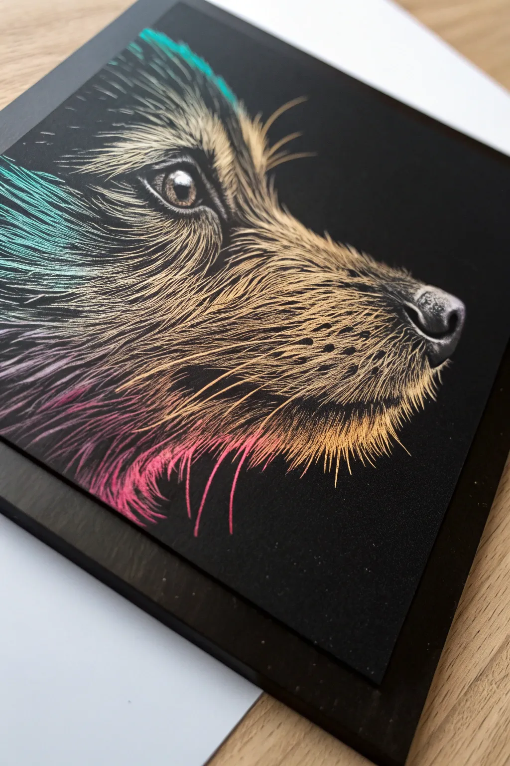
This striking project captures the intense gaze and soft fur texture of a dog in profile, utilizing the vibrant under-layers of scratch art paper. By carefully controlling your scratching pressure and direction, you can create realistic fur that transitions beautifully from cool teals to warm golds and pinks.
Step-by-Step Tutorial
Materials
- Rainbow or holographic scratch art paper (black coating)
- Fine-point scratch tool or etching needle
- Wooden stylus (broad tip)
- Soft brush or drafting brush (for sweeping away debris)
- Graphite transfer paper (optional)
- Reference photo of a dog in profile
- Masking tape
Step 1: Preparation and Outline
-
Secure the paper:
Tape the corners of your scratch art paper to a flat, clean surface to prevent it from shifting while you work. -
Transfer the guide:
Place your reference photo over the black paper. If you aren’t confident freehanding, slide a sheet of graphite transfer paper between them. Trace the main contours—the snout, the eye, the ear, and the neck line—very lightly with a dull pencil. -
Map the flow:
Before scratching, study your reference photo to understand the direction of fur growth. Lightly mark small arrows outside the drawing area or on a scrap paper to remind you which way the hairs should flow.
Stroke Direction
Always pull the scratch tool towards you, mimicking the direction the hair grows from root to tip. This creates naturally tapered ends.
Step 2: The Eye and Nose
-
Detail the eye:
Start with the most critical focal point: the eye. Use your finest point tool to scratch the highlight first, ensuring it remains pure white or the brightest underlying color. -
Refine the iris:
Work outward from the pupil, using short, radiating lines to create the iris texture. Leave the pupil black for depth. -
Define the eyelids:
Scratch the rim of the eyelids with a slightly heavier hand to create a defined outline, but keep the lines somewhat broken to look organic, not cartoonish. -
Shape the nose:
Move to the nose tip. Instead of lines, stipple or use tiny, circular scratches to mimic the bumpy texture of a dog’s nose leather. -
Add highlights to the snout:
Scratch the top edge of the nose where the light hits to give it dimension, leaving the nostril shadow deep black.
Mistake Fix
If you scratch too much off, you can camouflage the error with a permanent black marker or fine-liner pen. Dot it in sparingly to blend.
Step 3: Creating Fur Texture
-
Start on the muzzle:
Begin scratching the fur on the top of the muzzle. Use short, quick strokes that follow the curve of the bone structure. Keep these strokes quite dense. -
Transition to the cheek:
As you move back towards the cheek and jaw, lengthen your strokes slightly. The fur here is usually flatter, so your lines should be smoother and more parallel. -
Work around the eye:
Be very delicate around the eye area. The fur here acts like eyelashes or eyebrows; use upward, curving strokes that fan out away from the eye socket. -
Texturize the neck:
The fur on the neck is typically longer and creates the ‘ruff.’ Use long, sweeping strokes that curve downward. I find it helpful to vary the pressure here to reveal more of that vibrant pink and gold underneath. -
Layering for density:
Go back over areas you’ve already scratched. Add a second layer of finer lines in between the first set to build up the look of thick, dense fur. -
Whisker placement:
Identify the whisker spots on the muzzle. Instead of scratching lines, create small, dark dots by scratching tiny circles around a black center point. -
Draw the whiskers:
For the actual whiskers, use a confident, quick motion to create long, tapered lines extending from the muzzle. These should break the silhouette against the black background.
Step 4: Final Touches
-
Enhance the ear:
Detail the ear with soft, fluffy strokes on the inside and sleek, longer strokes on the outer edge to define its shape against the dark background. -
Cross-hatching for shadow:
In areas where the fur is shadowed (like under the jaw), use fewer strokes or very light cross-hatching to keep the area darker while still suggesting texture. -
Clean up:
Use your soft brush to gently sweep away all the black scrapings. Check your work under a bright light. -
Pop the highlights:
Identify the brightest spots—usually the brow bone and the bridge of the nose—and scratch a few more lines firmly to reveal the brightest possible color intensity.
Step back and admire how the vibrant colors bring your furry friend to life against the dramatic black background
Reptile Or Dragon Scales
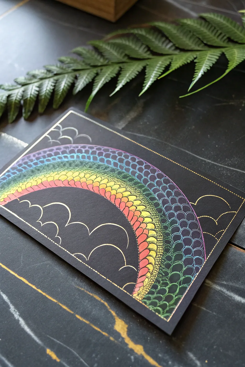
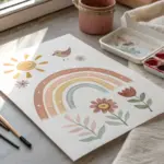
Transform a simple arc into a mythical masterpiece with this dragon-scale inspired rainbow design. Using the magic of scratch art paper, you’ll reveal a spectrum of iridescent colors underneath a matte black surface, creating texture that looks almost 3D.
Step-by-Step Guide
Materials
- Rainbow scratch art paper (black coated)
- Wooden stylus or scratch art tool
- Ruler
- Pencil (optional, for light sketching)
- Soft brush (for sweeping away debris)
Step 1: Setting the Scene
-
Define the borders:
Begin by using your ruler and the stylus to lightly scratch a straight border around the edge of your paper, about a half-inch from the sides. You don’t need to scratch deeply yet; a thin gold line is perfect. -
Add detail to the frame:
Go back over your border lines to make them slightly bolder. To add a finished touch, scratch small, evenly spaced dashes along the inner side of this border frame.
Step 2: Drafting the Rainbow
-
Outline the main arc:
Start the rainbow by scratching a large, smooth arc from the bottom left quadrant to the bottom right. This will be the top of your rainbow. -
Create the bands:
Draw three or four concentric arcs underneath your first line to create the bands of the rainbow. Try to keep the spacing between lines roughly equal, but don’t worry if they aren’t perfect. -
Sketch the clouds:
At the base of the rainbow on both sides, scratch simple, bubbly cloud shapes. Use half-circle motions to create a fluffy appearance that anchors your rainbow to the bottom of the frame. -
Add floating clouds:
Fill the empty space in the upper left and right corners with a few smaller, floating cloud outlines to balance the composition.
Oops, skipped a spot?
If you mess up the offset pattern on the scales, don’t panic. Just scratch the area completely solid to create a ‘highlight’ reflection, or turn that scale into a larger, merged dragon scale.
Step 3: Creating the Scales
-
Start the top row:
Begin in the outermost band of your rainbow. Starting at the far left, scratch a row of small ‘U’ shapes or semi-circles that touch each other, moving all the way to the right side. -
Offset the second row:
For the next row down within the same band, start your ‘U’ shape so its middle point aligns with the gap between the two scales above it. This brick-laying pattern affects the dragon scale look. -
Fill the first band:
Continue this offset pattern until the entire top band of the rainbow is filled with scales. As you scratch, you’ll see the underlying colors shift from blue to purple or green depending on your paper. -
Refine the scale outlines:
I find it helpful to go back over the ‘U’ shapes in this first band to make the lines slightly thicker. This reveals more color and makes the scales pop against the black. -
Move to the second band:
Repeat the scaling process for the second band. Try to make these scales slightly smaller or larger than the first band to create visual interest. -
Complete the inner bands:
Finish filling the remaining rainbow bands with the scale pattern. As you work your way down, the colors revealed underneath often shift to warmer tones like red, orange, and yellow. -
Thicken the band dividers:
Once all scales are drawn, re-trace the original long arc lines that separate the rainbow bands. Making these dividing lines bolder helps separate the rows of scales distinctively.
Pro Tip: Line Variation
Vary your pressure. Pressing harder removes more black coating, creating brighter, bolder lines for the main outlines, while lighter pressure is perfect for delicate scale textures.
Step 4: Final Polishing
-
Clean up the clouds:
Go back to your cloud outlines. Enhance them by scratching a second, thinner line just inside or outside the original one to give them dimension. -
Detail the corners:
Add tiny dashed lines to the tops of the cloud curves, mirroring the border detail you created in the first step. -
Clear the debris:
Use a soft brush or a dry tissue to gently sweep away all the black scrapings. Don’t use your hand, as the oils can smudge the matte surface.
Now you have a shimmering piece of reptile-inspired art that catches the light beautifully


Koi Fish And Water Ripples
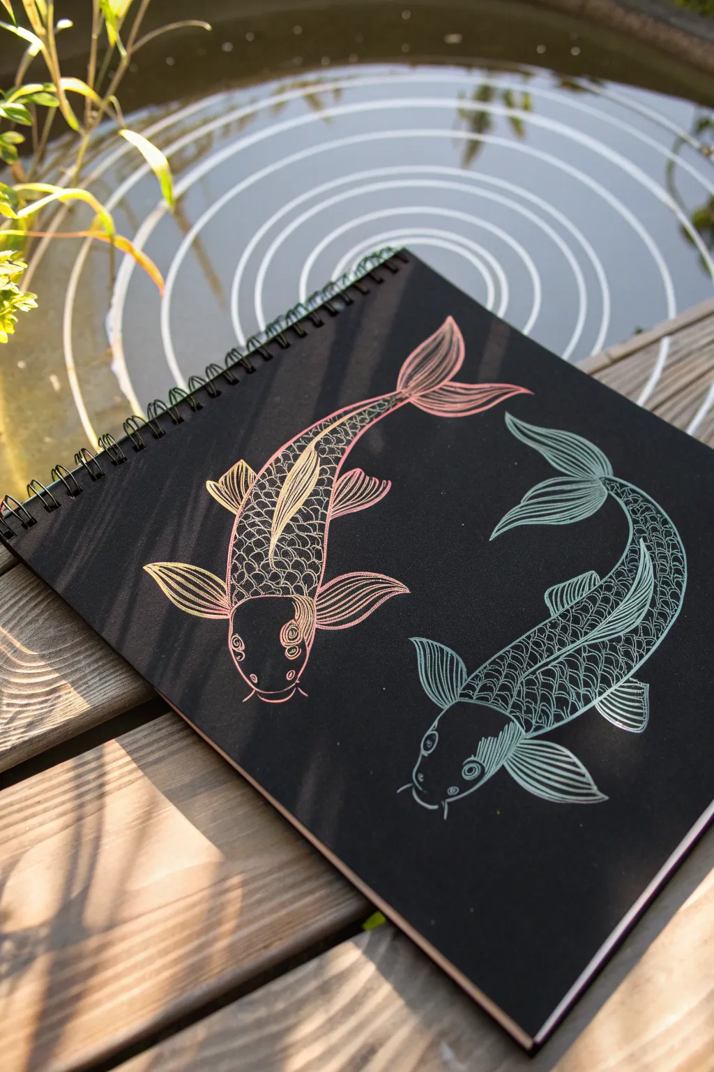
Capture the graceful movement of two koi swimming in a circle using the stunning contrast of metallic scratch art paper. This design features intricate scales and flowing fins in shimmering pink and teal tones against a stark black background.
Step-by-Step Tutorial
Materials
- Black scratch art paper pad (spiral bound)
- Wooden scratch stylus (fine tip)
- Pencil (HB or H)
- Eraser
- Soft brush or cloth (for dust removal)
- Reference image of koi fish
Step 1: Drafting the Composition
-
Establish the curve:
Begin by lightly sketching a large circle in the center of your page with a pencil. This guide doesn’t need to be perfect, but it helps maintain the cyclical flow of the fish. -
Outline the bodies:
Drawing lightly so you don’t accidentally scratch the surface, sketch two teardrop shapes curving around each other within your circle guide. Think of the classic Yin-Yang symbol as you place them. -
Add basic features:
Sketch the broad triangular shapes for the pectoral fins (on the sides) and add the flowing, ribbon-like tail fins at the narrow end of each teardrop. -
Define the heads:
Mark a curved line near the front of each fish to separate the head from the body. Add small circles for the eyes and little barbels (whiskers) near the mouth area.
Oops! Scratched too much?
If you make a mistake or scratch an area you wanted to keep black, use a fine-tip black permanent marker or a bit of black acrylic paint to carefully cover the error.
Step 2: Scratching the Pink Koi
-
Outline the silhouette:
Using your wooden stylus, firmly trace over your pencil outline for the top fish. This paper likely reveals a pink/gold gradient, so watch the colors emerge as you work. -
Detail the head:
Scratch inside the eye circles, leaving a tiny black dot for the pupil. Add curved lines around the gill area to give the head dimension. -
Create the spine:
Draw a single line down the center of the fish’s back. This will act as the anchor point for your scale pattern. -
Scratch the scales:
Starting from the head and moving toward the tail, scratch small, overlapping ‘U’ shapes on either side of the spine. Keep them tighter near the spine and slightly larger toward the belly. -
Texture the fins:
Fill the pectoral and tail fins with long, sweeping lines that follow the curve of the fin. Leave thin black gaps between strokes to define the fin rays.
Go Geometric
Instead of realistic scales, try filling the fish bodies with zentangle patterns, triangles, or spirals for a more abstract, modern artistic look.
Step 3: Scratching the Teal Koi
-
Trace the second outlines:
Repeat the outlining process for the bottom fish. On multicolor scratch pads, this area often reveals cool tones like blue or teal. -
Mirror the details:
Add the eye and gill details just as you did before, ensuring the expression matches the first fish. -
Scale variation:
For the scales on this fish, try varying your pressure slightly. I find pressing harder creates thicker lines that make the teal pop against the black. -
Flowing fin lines:
Scratch the long lines for the tail and side fins. Make sure these lines curve in the direction the fish is swimming to enhance the sense of movement. -
Final clean up:
Use a soft brush to gently sweep away all the black scratch dust. Check your work for any uneven lines or areas that need a bit more definition.
Now you have a shimmering piece of aquatic art that captures balance and movement perfectly
Snowflake Symmetry
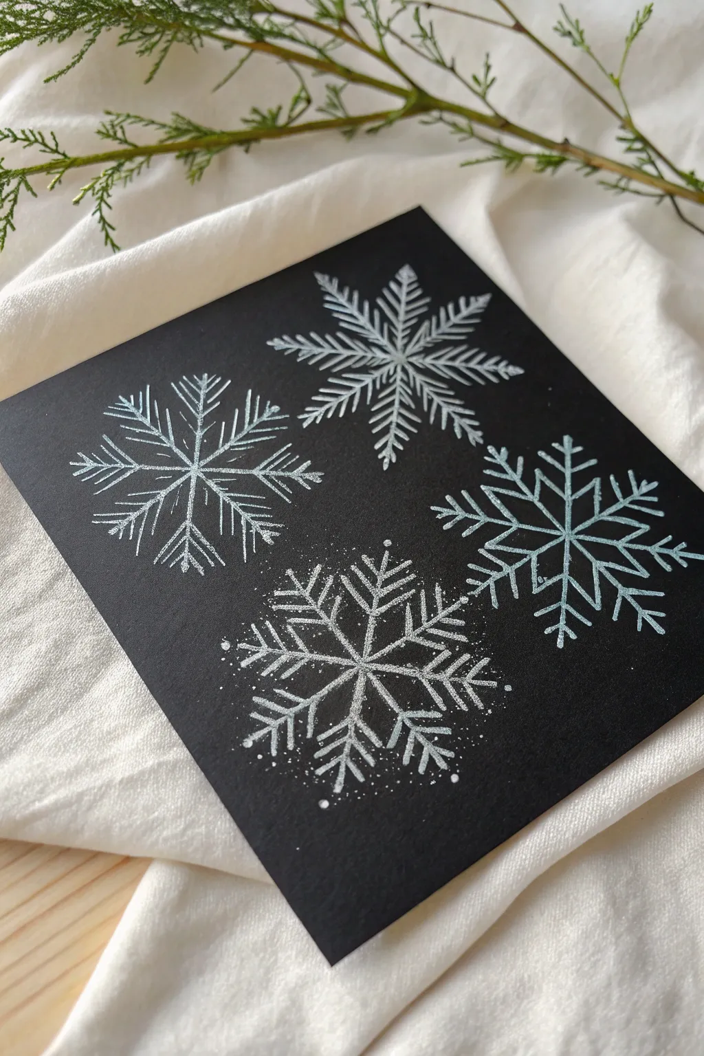
Capture the delicate beauty of winter with this striking reverse-contrast study. By scratching away a black surface to reveal the white beneath, you’ll create four unique snowflakes that seem to glow against a midnight sky.
How-To Guide
Materials
- Black scratchboard paper (approximately 6×6 inches)
- Small wooden stylus or scratch art tool
- Fine-point etching needle (optional, for details)
- Soft brush (to sweep away scratch residue)
- Ruler
- Pencil (white or graphite)
- Reference images of snowflakes
Step 1: Planning and Layout
-
Prepare the surface:
Begin with a clean sheet of black scratchboard. Ensure your workspace is well-lit, as identifying the black-on-black marks before scratching can be tricky. -
Divide the space:
Mentally or very lightly with a pencil, divide your square canvas into four equal quadrants. This ensures each of your four snowflakes will have its own dedicated space without crowding the others. -
Mark center points:
Place a tiny dot in the approximate center of each quadrant. These will serve as the anchors for your radial designs. -
Draft the skeleton:
Using extremely light pressure with your stylus (just enough to leave a faint sheen on the surface without scratching through), draw a simple six-armed cross for the first snowflake. Remember, snowflakes always have six-fold symmetry.
Uneven Lines?
If your scraped lines look jagged or uneven, your tool might be dull. Rotate the stylus frequently to find a sharp edge, or use fine grit sandpaper to resharpen the wooden point.
Step 2: Scratching the Top Snowflakes
-
Define the first arms:
Starting with the top-left quadrant, firmly scratch the six main radial lines you just drafted. Use a ruler if you want machine-perfect precision, but freehand lines add an organic charm. -
Add feathery details:
Moving outward from the center, add short, diagonal V-shapes extending from each arm. For this first design, keep the lines straight and needle-like to resemble pine needles. -
Connect the inner structure:
Near the center hub, scratch a small hexagon specifically connecting the six arms together to give the flake a solid core. -
Create the second flake:
Move to the top-right quadrant. Scratch your six main axes again, but this time, vary the details. Try make the projecting branches slightly thicker or more intricate, creating a denser, fern-like pattern. -
Clean as you go:
Every few minutes, use your soft brush to verify your progress by sweeping the black scratchings off the surface. Blowing them off can introduce moisture, so a brush is safer.
Step 3: Creating the Bottom Snowflakes
-
Design the geometric flake:
For the bottom-right snowflake, aim for a cleaner, more geometric look. Draft your six arms, then add secondary branches that create a star shape in the middle. -
Etch rigid branches:
Instead of feathery strokes, scratch distinct, perpendicular or 45-degree angle branches coming off the main stems. Keep your pressure consistent so the white lines appear bold and unbroken. -
Start the final flake:
In the bottom-left quadrant, begin the last snowflake. This one features a mix of textures. Draw the main six arms first. -
Layer the texture:
Add the branching arms, but try a stippling or broken-line technique for some of the outer edges. This mimics the look of frost gathering on the crystal. -
Add magical dust:
I particularly enjoy this last detail: gently tap the point of your tool around the bottom-left snowflake to create tiny white dots. This stippling effect makes the snowflake look like it’s actively freezing or sparkling. -
Refine the edges:
Go back over any main structural lines that look too thin. A second pass can widen the line and make the white pop more dramatically against the black background. -
Final cleanup:
Give the entire piece a thorough sweep with your brush to remove all black residue. Check for any accidental smudges or finger oils and gently wipe the black areas with a dry, lint-free cloth if needed.
Symmetry Hack
Draw your six-point skeleton on a piece of scrap paper first, poke holes at the tips, and use it as a stencil to mark perfect dots on your scratchboard before starting.
Display your wintry quartet near a window where the light can catch the stark contrast of your intricate scratching
City Skyline At Night
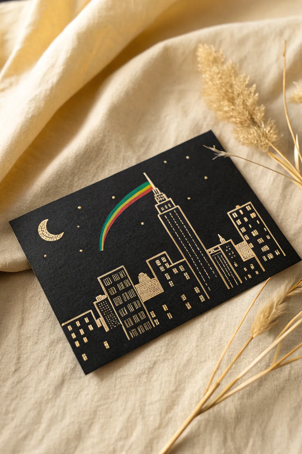
Capture the magic of the city that never sleeps with this striking scratch art project featuring a glowing skyline and a whimsical rainbow. Using a pre-inked scratchboard allows the underlying gold and colors to shine through specifically where you carve, creating an elegant night scene.
Step-by-Step Tutorial
Materials
- Gold foil scratchboard paper (black coating over gold)
- Small piece of rainbow scratch paper (or rainbow foil)
- Scratch art tool set (stylus, fine-point scratcher)
- Pencil (HB or lighter)
- Ruler
- Soft brush (for dusting)
- Tracing paper (optional)
- Masking tape or painter’s tape
- Glue stick or double-sided tape
Step 1: Planning and Layout
-
Prepare your workspace:
Lay down a clean sheet of paper or a placemat to catch the black scratch dust. Secure your gold foil scratchboard to your surface with a small loop of painter’s tape on the back to keep it from sliding while you work. -
Sketch the horizon:
Using a ruler and a very light touch with your pencil, mark a horizontal line about an inch from the bottom of the card. This doesn’t need to be scratched yet; it simply serves as a guide for where your building foundations will rest. -
Outline the central tower:
Locate the center of your paper. Lightly sketch a tall, tiered skyscraper shape resembling the Empire State Building. Start with a wide base, then add a narrower rectangular section above it, and finish with a thin spire at the very top. -
Fill in the skyline:
To the left and right of your central tower, sketch simpler rectangular building shapes of varying heights. I like to overlap one or two slightly to create a sense of depth, ensuring they all sit on your horizon line. -
Add celestial details:
In the upper left corner, lightly sketch a crescent moon shape. Dot small points around the sky area where you want your stars to twinkle later.
Step 2: Scratching the City
-
Reveal the outlines:
Take your standard scratch stylus and firmly trace over your pencil lines for the building outlines. Use the ruler to ensure the sides of your skyscrapers remain perfectly straight and vertical. -
Create window patterns:
For the taller side buildings, use the ruler to scratch vertical lines running down the facades. Intersect these with short horizontal dashes to create grid-like window patterns. -
Detail the central tower:
On the main central skyscraper, scratch vertical pinstripes running up the main body. Near the top tiers, switch to small square windows or dots to distinguish the architecture. -
Texture the smaller buildings:
For the shorter buildings in the foreground, try a different texture. Use horizontal hatching or small ‘L’ shapes to suggest brickwork or different window styles, adding variety to the architecture. -
Dusting off:
Periodically pause to use your soft brush to sweep away the black residue. Avoid using your hand, as the oils from your skin can smudge the matte black surface.
Fixing Slips
Accidentally scratched where you shouldn’t have? A fine-point permanent black marker is your best friend. Carefully dab ink over the mistake to hide the exposed gold.
Step 3: The Rainbow and Sky
-
Draw the moon:
Scratch out the crescent moon shape you sketched earlier. To replicate the look in the image, you can add a small profile face inside the crescent or fill it with tiny decorative patterns and squiggles. -
Add the stars:
Using the sharpest point of your tool, press down firmly on your pencil dots to create bright, golden stars. Vary the pressure to make some stars larger and brighter than others. -
Prepare the rainbow strip:
Take your separate sheet of rainbow scratch paper. Cut a very thin, curved strip that tapers slightly at one end. This will be the beam of light coming from the tower. -
Reveal the rainbow colors:
Scratch the entire surface of this small cut-out strip to remove the black coating completely, revealing the vibrant gradient colors underneath. -
Attach the rainbow:
Apply a tiny amount of glue or a sliver of double-sided tape to the back of the rainbow strip. Position the thinner end right at the tip of the central tower’s spire, curving outward into the sky. -
Final check:
Give the entire piece one last gentle brush to remove any lingering dust. Check your window lines and sharpen up any corners that look a bit fuzzy to ensure a crisp, city-smart finish.
Sharper Lines
If your stylus tip becomes dull, sandpaper can sharpen wood tools. For plastic tools, try wiping the tip frequently to stop clumped wax from blurring your lines.
Display your cityscape in a frame without glass to keep the velvety texture of the scratchboard visible
Stained-Glass Panels
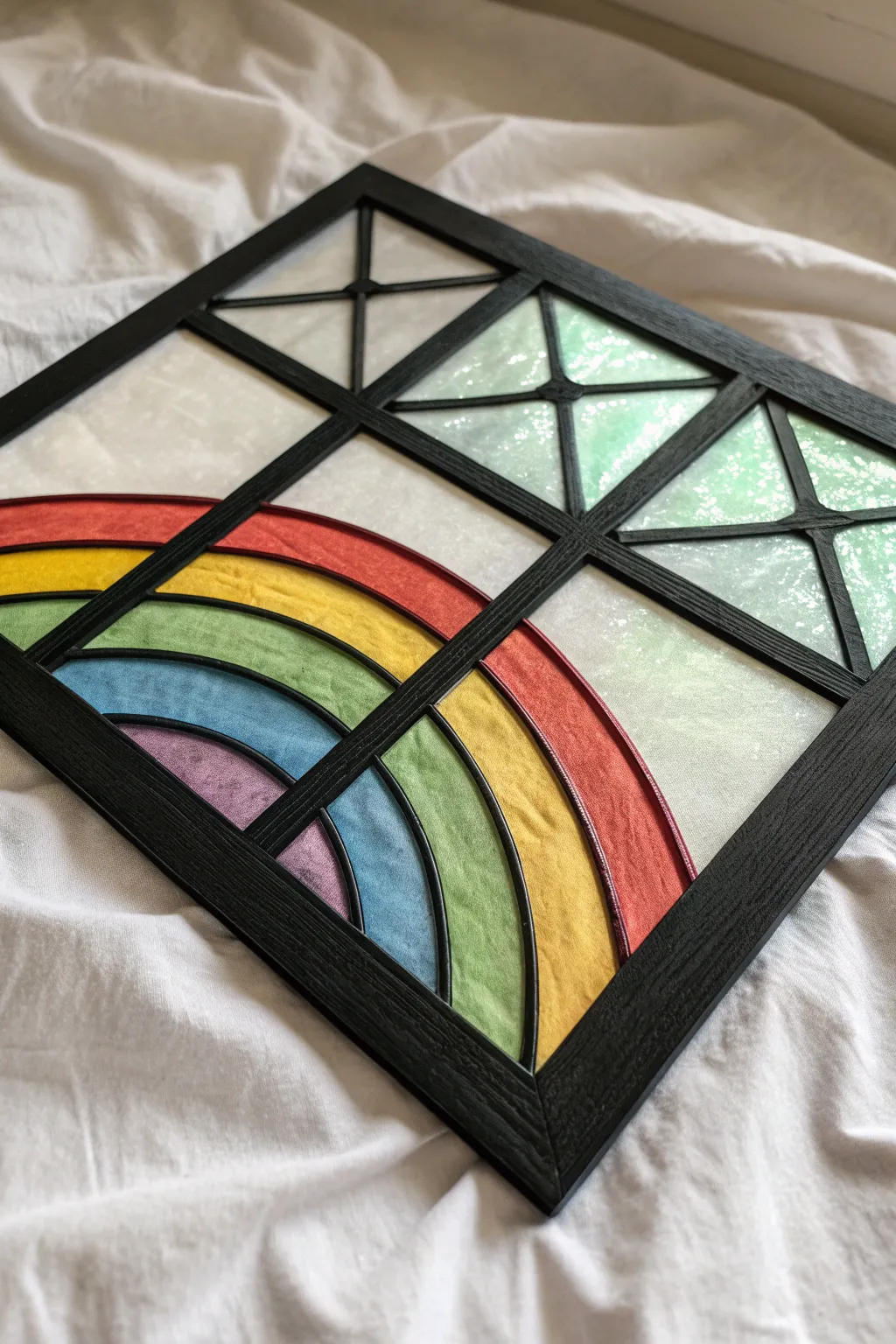
Brighten any window with this striking faux stained glass panel featuring a vibrant rainbow arc set against a geometric grid. The contrast between the matte black framework and the translucent, tissue-paper-like inserts creates a stunning luminous effect when backlit by natural light.
Step-by-Step
Materials
- Black cardstock or thin black craft foam (for the frame)
- Translucent colored vellum or tissue paper (red, orange, yellow, green, blue, purple)
- Iridescent or textured white parchment paper
- Craft knife or precision scissors
- Cutting mat
- PVA glue or double-sided tape
- Ruler
- Pencil
- Clear acetate sheet (optional, for backing)
Step 1: Designing the Grid
-
Create the main frame:
Start by cutting a large square outer frame from your black cardstock. For a sturdy look, make the border about 1/2 inch thick. -
Add the crossbars:
Cut two long strips of black cardstock the same width as your border. Glue them into the frame to form a distinct ‘plus’ sign, dividing the large square into four equal smaller quadrants. -
Prepare the rainbow struts:
Focusing on the bottom-left quadrant, sketch a series of concentric arcs to represent the rainbow. Carefully cut curved strips of black cardstock to serve as the separators between colors. -
Prepare the geometric struts:
For the other three quadrants, cut thinner strips of black cardstock to create the ‘X’ shapes. You’ll need diagonal pieces that meet in the center of each small square. -
Thicken the lines:
To mimic the look of lead came used in real stained glass, you might want to layer a second identical black strip over your grid lines to give them raised dimension.
Glue Wrinkle Woes?
If liquid glue makes your tissue paper wrinkle, switch to a glue stick or double-sided tape for the paper layers. Only use liquid PVA for the thick cardstock frame parts.
Step 2: Adding Color
-
Trace the rainbow segments:
Place your colored vellum or tissue paper under the rainbow quadrant. Trace the shape of each open arc segment onto the corresponding color (red for the outer, purple for the inner). -
Cut the rainbow inserts:
Cut out your colored arc shapes, adding a small margin (about 1/8 inch) around the edges so they can be glued to the back of the black frame. -
Glue the rainbow:
Apply a thin line of glue to the back of the black rainbow struts. Carefully press the colored paper pieces into place, starting from the smallest purple arc and working outward. -
Prepare the iridescent panels:
For the remaining three quadrants, trace the triangular shapes created by your ‘X’ struts onto the iridescent or textured white parchment paper. -
Cut the background panels:
Cut these triangular wedges out, again leaving a small margin for adhesion. I find it helpful to keep these organized by quadrant to ensure a perfect fit. -
Attach background panels:
Glue the white textured paper to the back of the geometric ‘X’ struts. Ensure the paper is pulled taut preventing any sagging or wrinkles.
Level Up: 3D Frame
Instead of cardstock, design the black frame in a vector program and 3D print it or laser cut it from wood. This adds genuine depth and shadow for a professional feel.
Step 3: Assembly and Finish
-
Secure the main grid:
If you created the grid elements separately in the first phase, now is the time to fully assemble them. Glue the rainbow section and the ‘X’ struts firmly into the main outer frame. -
Check for light leaks:
Hold the panel up to a light source. If you see gaps where light shines through between the paper and the black frame, patch them with small scraps of black cardstock or a black marker. -
Backing for durability:
For a longer-lasting project, cut a piece of clear acetate to the exact size of your outer frame. -
Seal the back:
Glue the acetate sheet to the back of your artwork. This protects the delicate tissue paper from tearing and gives the piece a glossy, glass-like finish from behind. -
Clean up edges:
Trim any excess paper or dried glue from the outer edges of the frame to ensure a clean, sharp silhouette. -
Final display:
Place the artwork on a windowsill or hang it directly against the glass to see the colors fully illuminated.
Now you have a permanent rainbow to brighten your room even on cloudy days
Decorative Monogram Letter
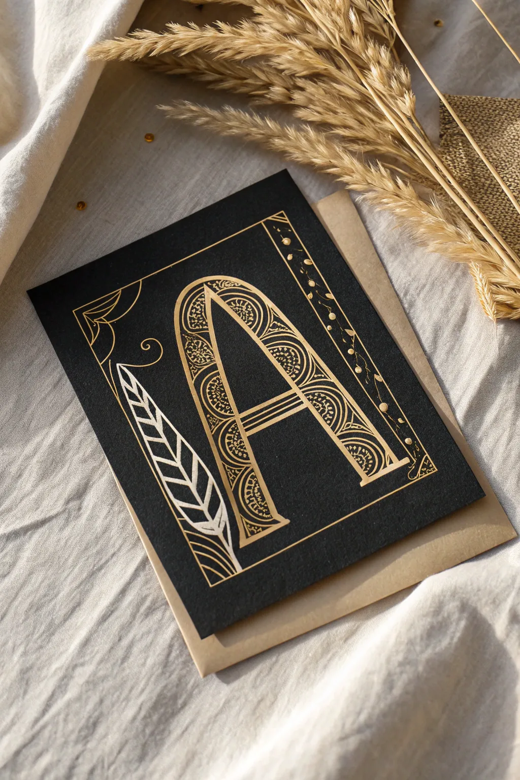
Transform a plain black surface into a sophisticated work of art with this intricate monogram design. The regal gold-on-black contrast evokes the feel of illuminated manuscripts, perfect for a personalized gift or framed keepsake.
How-To Guide
Materials
- Black scratchboard sheet (or heavy black cardstock)
- Small square envelope (kraft paper tone)
- Scratch art tools (stylus, fine-point wood stick, scratch knife)
- White transfer paper or graphite paper
- Pencil
- Ruler
- Reference image of a serif font letter
- Masking tape
- Soft brush (for dusting away crumbs)
Step 1: Planning and Layout
-
Preparing the surface:
Begin with a high-quality black scratchboard sheet cut to your desired square size, roughly 5×5 or 6×6 inches to match the envelope scale. Wipe the surface gently with a soft cloth to ensure it is free of oils or dust. -
Creating the guidelines:
Using a ruler and a very light touch with your stylus (or a white pencil that can be erased), mark a rectangular border about half an inch from the edge. This will define your working area. -
Drafting the letter:
Sketch a large, serif letter ‘A’ in the center of the rectangle. You can freehand this lightly or use transfer paper to trace a printed font. Focus on creating thick downstrokes where the decorative patterns will eventually go. -
Adding structural motifs:
To the left of the letter, sketch a long, stylized feather or leaf shape that curves slightly upward. On the right side, lightly mark a vertical column between the letter and the border for the creeping vine detail.
Step 2: Outlining the Design
-
Scratching the borders:
Take your fine-point scratch tool and firmly trace the outer rectangular border. Use a ruler to keep these lines perfectly straight and crisp, revealing the gold layer underneath. -
Defining the letter shape:
Outline the entire letter ‘A’. Instead of scratching the entire solid shape, you are only defining the edges at this stage. Keep your lines confident and continuous. -
Creating the inner frame:
Scratch a second, inner line inside the thick strokes of the ‘A’. This creates a ‘hollow’ space within the letter limbs where the intricate pattern work will live. -
Detailing the feather:
Outline the feather shape on the left. Draw a central spine, then add the veins using bold, angled strokes. Leave some black space between the veins to create contrast and texture. -
Adding corner flourishes:
In the top left corner, scratch a delicate, webbing-like decorative corner piece. Use curved lines that echo the corner angle, connecting them with small perpendicular strokes.
Clean Lines Pro-Tip
Keep a piece of scrap paper under your drawing hand while you work. This prevents oils from your skin transferring to the matte black surface, which can leave shiny smudges that are hard to remove.
Step 3: Intricate Pattern Work
-
Starting the letter fill:
Inside the hollow space of the designated letter leg, begin adding the fill pattern. Start by scratching small semi-circles or scallops along one edge of the inner border. -
Filling with curves:
Layer concentric curved lines inside the scallops. These should look like tiny rainbows stacking on top of each other. Variation in line spacing here adds visual interest. -
Adding micro-details:
In the negative spaces between your curved patterns, use the very tip of your sharpest tool to effect tiny stippling dots or miniature triangles. This density of detail makes the gold pop. -
Decorating the crossbar:
For the horizontal crossbar of the ‘A’, switch to a linear pattern. Scratch three or four parallel horizontal lines to connect the two vertical legs solidly.
Level Up: Gemstones
Add tiny self-adhesive rhinestones or drop a small bead of gold dimensional fabric paint in the center of the largest circles for a 3D, jeweled effect.
Step 4: Final Flourishes
-
The side vine:
Move to the vertical column on the right. Scratch a wavy, meandering line from top to bottom. This serves as the main stem for your floral border. -
Buds and leaves:
Along the wavy stem, alternate scratching small dots and tiny leaf shapes. I find that varying the size of the dots makes the vine look more organic and less rigid. -
The spiral accent:
Between the feather and the letter ‘A’, add a single, elegant spiral curl. This fills the negative space and balances the composition. -
Cleanup:
Use your soft brush to sweep away all the black scratchings. Check closely for any stray black flecks interrupting your gold lines and gently retouch if necessary. -
Mounting:
Place the finished scratch art piece on top of your kraft paper envelope or mount it onto a folded kraft card to complete the rustic, elegant aesthetic.
Now you have a stunning, personalized piece of scratch art ready to be gifted or framed
Doodle Sampler Sheet
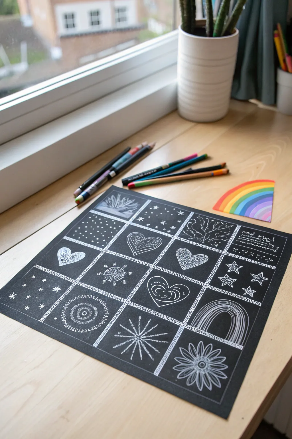
Transform a single sheet of scratch paper into a stunning gallery of miniature doodles. This project uses a grid layout to break the blank page into manageable sections, perfect for practicing different textures and patterns.
Step-by-Step Guide
Materials
- Black scratch art paper (square or rectangular sheet)
- Wooden scratch tool (stylus)
- Ruler
- Masking tape or painter’s tape (optional)
- Pencil (for light grid guides)
- Soft brush (for sweeping away crumbs)
Step 1: Setting the Stage
-
Prepare your workspace:
Lay your scratch art paper on a flat, clean surface. Ensure you have good lighting, as the black surface can sometimes make it tricky to see your initial markings. -
Draft the grid:
Using a ruler and your wooden stylus, gently scratch a large outer border around the entire paper, leaving about a half-inch margin from the edge. -
Subdivide the space:
Divide the interior space into a grid of 16 smaller squares (4 rows by 4 columns). Instead of just drawing straight lines, create a decorative border for each separation. -
Detail the borders:
Thicken your grid lines by scratching small, repetitive patterns along them. I like to use tiny triangles, zig-zags, or small circles to make these dividing lines look like ornate frames.
Clean Hands, Clean Art
Keep a piece of scrap paper under your drawing hand. This prevents oils from your skin transferring to the black coating, which can leave shiny smudges.
Step 2: Texture and Pattern Studies
-
Stippling stars:
In the top left sections, experiment with simple geometric fillers. Create a starry night box by scratching small crosses and dots of varying sizes. -
Polka dot practice:
Dedicate a neighboring square to a classic polka dot pattern, focusing on keeping the spacing consistent between each white dot. -
Organic growth:
For a nature-inspired box, scratch a leafless tree or branch, starting with a thick trunk at the bottom and gradually thinning your lines as they reach upward. -
Burst of light:
In one of the bottom corners, create a sunburst or flower design. Start from a central point and scratch lines radiating outward, alternating between long and short strokes. -
Spiral scribbles:
Fill another square with concentric circles or spirals. You can make these lines jagged or smooth to test out different hand movements.
Step 3: The Heart of the Art
-
Center layout:
Reserve the central row for heart motifs. Draw outline shapes of hearts in three or four different squares. -
Internal textures:
Fill each heart with a unique texture. Try filling one with tight scribbles, another with concentric inner lines, and a third with intricate lace-like patterns. -
Geometric stars:
Move to the right side of the sheet and draw several five-pointed stars. Instead of filling them solid, use internal hatching or outline them multiple times for a neon-sign effect. -
Rainbow arches:
In a lower square, draw a series of arched lines to create a rainbow shape. Leave thin black lines between the scratched white areas to define the separate bands. -
Floral finish:
For a final detailed square, draw a large daisy-like flower. Create petals that loop outward from a center disk, adding veins inside the petals for extra realism.
Rainbow Reveal
Try this on rainbow-background scratch paper! The grid format looks incredible when colors shift gradually from one square to the next.
Step 4: Final Touches
-
Clean up:
Take your soft brush and gently sweep away all the black scratching residue. Avoid wiping with your hand, as natural oils can smudge the matte surface. -
Refine the frames:
Look back at your grid lines. If any doodle crossed over a border accidentally, broaden the border pattern slightly to hide the overlap. -
Add variance:
Examine your work for balance. If a particular square looks too dark, add a few more highlights or stippling dots to brighten it up.
You now have a completed sampler sheet that showcases a wide variety of scratching techniques
Topographic Map Lines
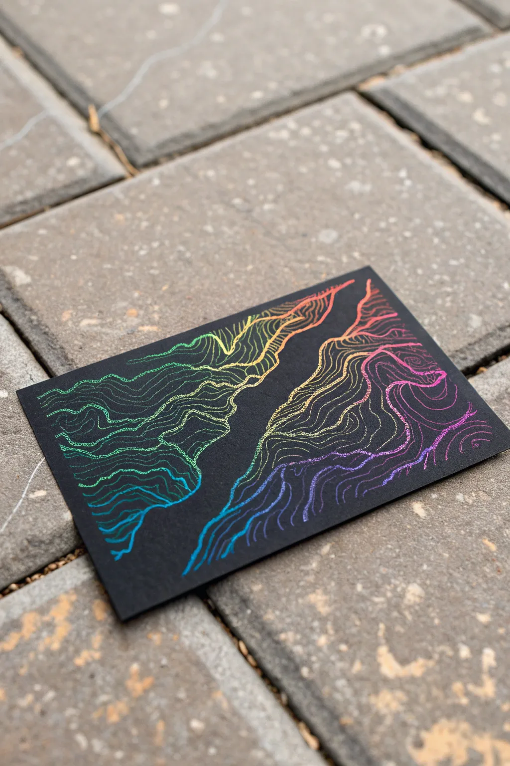
Transform a simple black card into a vibrant, shifting landscape using the topographic mapping technique. The rainbow underlay of the scratch paper does most of the heavy lifting, letting you focus on the rhythmic flow of organic lines.
Detailed Instructions
Materials
- Rainbow scratch art paper (black coated)
- Wooden stylus or fine-point scratch tool
- Pencil (optional, for sketching)
- Soft brush or cloth (for dust removal)
- Masking tape (low tack)
Step 1: Planning the Terrain
-
Secure the paper:
Place your scratch art card on a flat, hard surface. Use a tiny bit of low-tack masking tape on the very corners or the back to keep it from sliding around while you work. -
Visualize the geography:
Look at the negative space. The design relies on a central ‘canyon’ or divider of black space that runs diagonally through the piece. Imagine a river or valley cutting through the middle. -
Lightly sketch the boundary (optional):
If you are nervous about going freehand, use a dull pencil to very lightly trace the two main wiggly lines that will define the central gap. Don’t press hard, or you will activate the scratch effect too early.
Step 2: Stating the Main Contours
-
Scratch the first primary line:
Take your wooden stylus and scratch the first major boundary line on the left side of your invisible canyon. Make it jagged and organic, not a smooth curve. -
Scratch the opposing line:
Now do the same for the right side, leaving about a half-inch to an inch of black space between the two landmasses. This creates the dramatic separation seen in the photo. -
Establish the high points:
Draw a small, enclosed loop or wobbly circle near the top right corner and another in the bottom left area. These will serve as your ‘peaks’ or high points that the other lines wrap around. -
Clean the debris:
You will notice black residue building up. Gently sweep it away with a soft brush or drafting brush to keep your workspace clean.
Uneven Reveal?
If the color isn’t showing effectively, your stylus might be too dull. Sharpen it with sandpaper or switch to a metal-tipped tool for cleaner cuts.
Step 3: Building the Topography
-
Begin the echo lines:
Starting from your initial canyon edge, draw a second line that runs parallel to the first. It shouldn’t be perfect; let it pinch closer in some spots and drift apart in others. -
Vary the line proximity:
As you continue adding concentric lines moving outward from the gap, vary the spacing. Tighter lines suggest steep slopes, while wider gaps suggest flat terrain. -
Work in sections:
I find it easier to work on one landmass at a time. Complete the left side first, letting the lines ripple out until they run off the edge of the card. -
Navigate the peaks:
When your lines approach those small peaks you drew earlier, start curving around them. The lines should envelope the peak circles like ripples in a pond. -
Complete the second landmass:
Move to the right side of the card and repeat the process. Follow the contours of the canyon edge, creating a mirroring effect. -
Handle the corners:
As you get closer to the corners of the paper, your lines might turn into simple arcs. This is fine and helps frame the composition.
Line Variation
Vary your pressure slightly. Pressing harder creates thicker bolder lines for major elevations, while lighter touches make delicate intermediate contours.
Step 4: Refining and Texture
-
Inspect line quality:
Look closely at your scratches. If the stylus skipped or the line is too thin to show the color, go over it again lightly to broaden the stroke and reveal more vibration. -
Add tributaries:
To make it look more like a real map, you can add small ‘V’ shapes or indentations in your lines where imaginary streams might flow down the hill. -
Connect breaks:
Ensure your lines are mostly continuous. If you lifted your hand and left a gap, carefully bridge it so the contour feels solid. -
Final dust off:
Give the entire piece a final, thorough dusting. The black coating can smudge if you rub it with your hand, so stick to the brush. -
Check the contrast:
Verify that the central black channel is distinct enough. If the lines are too close to the middle, the dramatic separation effect might be lost.
Now you have a stunning, colorful visualization of imaginary terrain
Portrait With Scratch Highlights
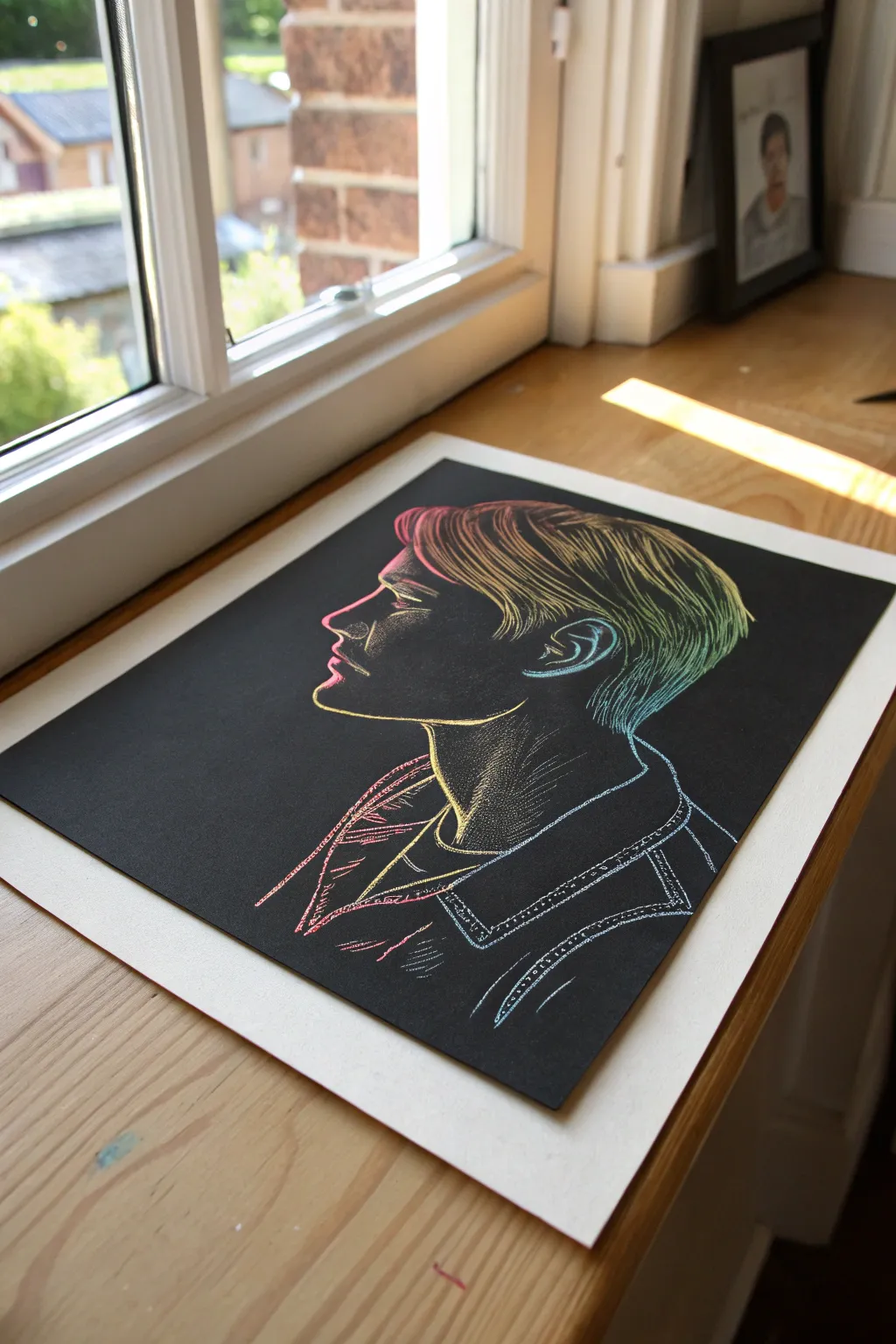
This striking portrait utilizes the negative space of a scratchboard to create a moody, illumined profile. By strategically scratching away the black surface to reveal a rainbow gradient underneath, you can build up form and volume with simple line work.
Step-by-Step
Materials
- Rainbow gradient scratchboard paper (A4 or comparable size)
- Wooden stylus or fine-point scratch tool
- Graphite transfer paper (white or yellow)
- Reference photo of a side profile
- Painter’s tape or masking tape
- Soft brush or drafting brush (for dust)
- Pencil (HB or 2B)
Step 1: Preparation and Outline
-
Prepare your reference:
Choose a side-profile photo with clear lighting. If you aren’t comfortable drawing freehand, print your reference photo to the same size as your scratchboard paper. -
Secure the layers:
Place your scratchboard on a flat surface. Any grit underneath can damage the surface, so ensure the table is clean. Tape your transfer paper (chalk side down) onto the black board. -
Trace the main contours:
Tape your reference photo over the transfer paper. Using a pencil and firm pressure, trace the main outline of the face, neck, ear, and the general shape of the hair. Be careful not to press so hard that you dent the board. -
Check the transfer:
Lift one corner carefully to peek at your transferred lines. You should see a faint, chalky guideline on the black surface. If it’s too faint to see, re-trace with slightly more pressure. -
Refine the guidelines:
Remove the paper layers. If the transferred lines are too thick or messy, you can very gently lift excess chalk with a kneadable eraser, but be extremely gentle to avoid scratching the coating prematurely.
Step 2: Defining Features
-
Start with the profile line:
Using your fine-point scratch tool, begin at the forehead. Scratch a thin, single continuous line down the nose, lips, and chin. This establishes your boundary. -
Detail the eye and ear:
Carefully etch the shape of the visible eye and the intricate curves of the ear. Use very short strokes here; facial features require precision rather than long sweeping movements. -
Begin the neck structure:
Draw the line of the jaw and the front of the neck. Don’t worry about shading yet; we are just locking in the ‘skeleton’ of the drawing. -
Outline the clothing:
Scratch the collar of the jacket or shirt. Use slightly bolder, straighter lines here to suggest the texture of fabric, distinct from the organic curves of the face.
Oops, scratched too much?
If you make a mistake and scratch away too much black, you can carefully re-fill the area with black India ink or a fine-tip black permanent marker to ‘erase’ the error.
Step 3: Shading and Texture
-
Hatch the face:
To create the shadow on the cheek and jaw, use a hatching technique. Scratch parallel diagonal lines. Spacing them farther apart leaves more black (shadow), while placing them closer reveals more color (highlight). -
Stipple the neck:
For the neck area, switch to stippling. Make tiny dots with the point of your tool. Gather the dots densely under the chin for shadow, and spread them out as you move down the neck to create a gradient. -
Flow the hair:
Observe the direction the hair grows in your reference. Scratch long, sweeping curves that follow the shape of the head. I like to vary the pressure here—press harder at the crown for bright highlights and lighter at the tips. -
Layer hair strands:
Go back over the hair section. Add shorter, finer strokes between your long primary lines to add volume and texture. This prevents the hair from looking like solid blocks. -
Texture the clothing:
Use cross-hatching (intersecting sets of parallel lines) on the jacket collar to differentiate the fabric texture from the skin and hair. -
Add stitching details:
If the clothing has seams like denim, scratch broken, dashed lines to mimic stitching along the collar and shoulder. -
Clean continuously:
Throughout the process, frequently use a soft brush to sweep away the black scratch dust. Don’t use your hand, as oils can smudge the surface.
Pro Tip: Vary Your Tool
Don’t just use the sharp point use the side of the stylus blade for broader strokes on the hair. This creates ribbon-like highlights that contrast beautifully with thin lines.
Step 4: Final Touches
-
Enhance highlights:
Look at your drawing from a distance. Identify the brightest spots (usually the nose tip, cheekbone, and top of the hair). Go over these areas again with more scratches to remove more black and reveal intense color. -
Clean up stray marks:
If you have any messy edges or transfer lines still visible that you haven’t scratched over, gently dab them with a barely damp cloth or a black marker if absolutely necessary to hide mistakes.
Display your vibrant portrait near a window where natural light can catch the rainbow gradients revealed in your line work
Have a question or want to share your own experience? I'd love to hear from you in the comments below!