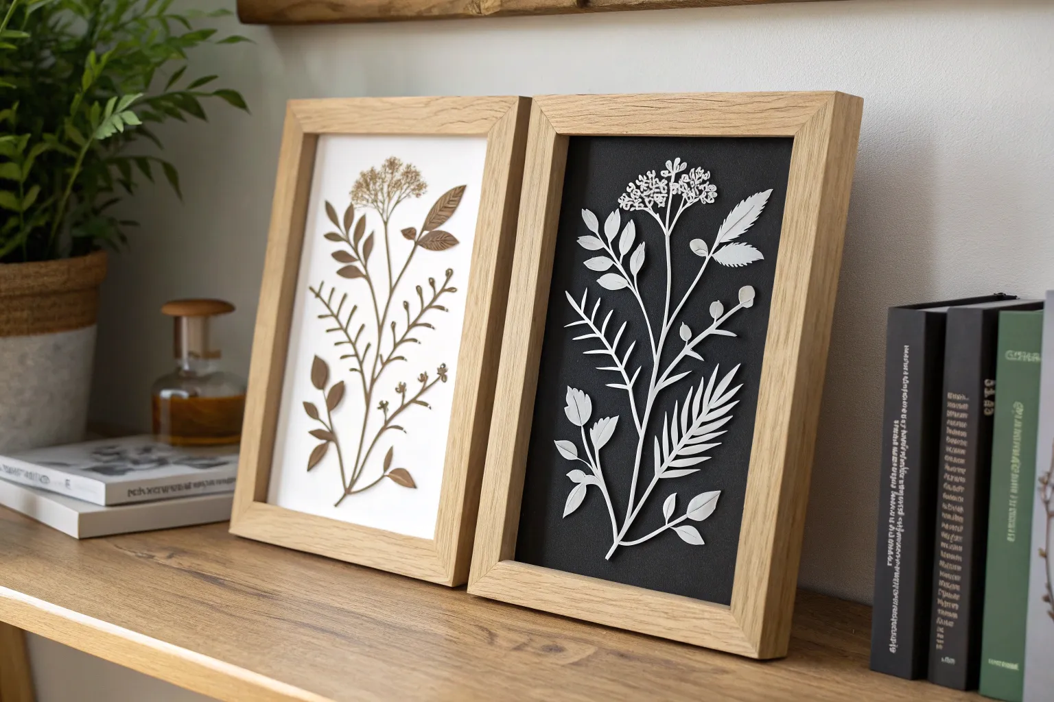
If you’ve ever stared at a design and felt your eyes “flip” between the subject and the background, you’ve already felt the magic of positive space and negative space. Here are my favorite high-contrast art ideas that make that figure-ground switch super clear (and seriously fun to create).
Classic Notan Cut-and-Flip
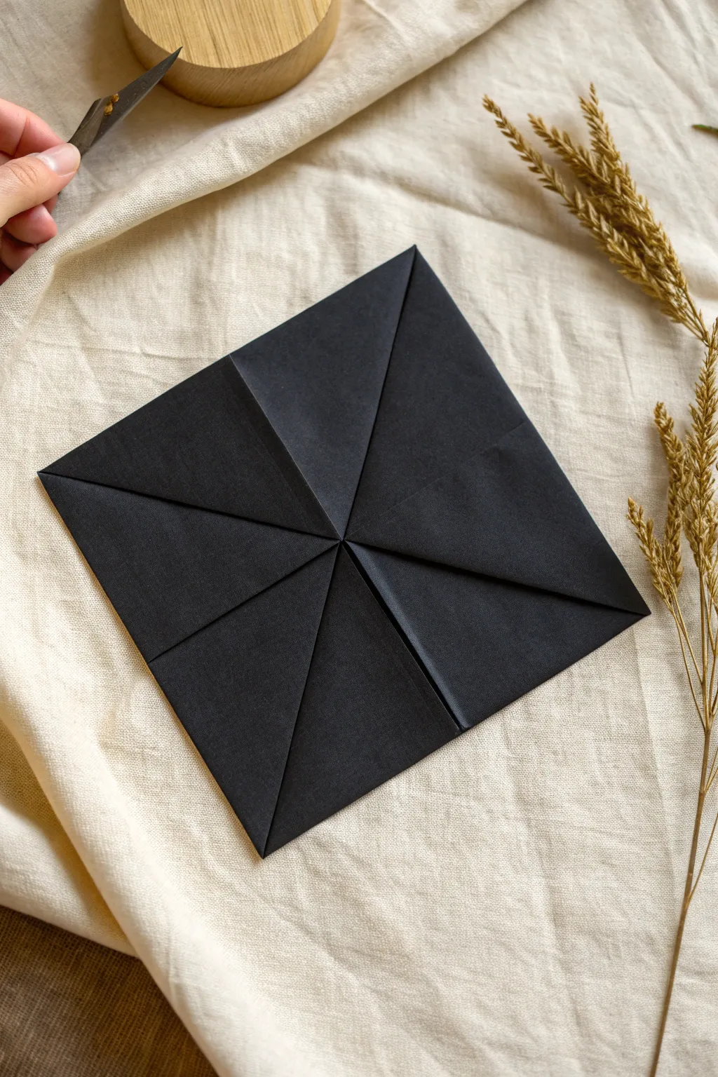
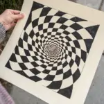
This striking project serves as the foundational first stage for a sophisticated Notan study, focusing on precision folding and high contrast. The result is a perfect black square with crisp triangular flaps meeting at the center, ready for the intricate cutting that defines positive and negative space art.
Step-by-Step Guide
Materials
- High-quality black construction paper or cardstock (square sheet)
- Bone folder (optional but recommended for sharp creases)
- Ruler
- Small craft knife or scalpel (visible in image)
- Cutting mat
Step 1: Preparation and Center Finding
-
Select your paper:
Begin with a perfectly square sheet of black paper. If you are starting with a rectangular sheet (like A4 or Letter), fold one corner diagonally to the opposite edge to form a triangle, crease sharply, and carefully trim off the excess strip. -
Establish the diagonals:
Lay the paper flat. Fold the paper diagonally from one corner to the opposite corner to create a large triangle. Create a sharp crease. -
Cross-fold:
Unfold the paper back to a square. Now fold along the other diagonal axis, matching the remaining two corners together. Crease sharply. -
Mark the center:
Unfold the paper completely so it lies flat again. You should see an ‘X’ crease pattern. The point where these two lines intersect is your exact center point, which is crucial for the next phase.
Uneven Center Point?
If your corners overlap or leave a gap in the middle, your initial square wasn’t perfect. Unfold, trim the paper to a true square, and refold for a precise fit.
Step 2: Creating the Blintz Fold
-
First corner fold:
Take one of the four corners of your square and fold it inwards so the tip touches the exact center point you identified earlier. -
Secure the crease:
While holding the corner tip at the center, use your finger or a bone folder to press the fold flat, moving from the center outwards to the edge. This ensures the paper doesn’t shift. -
Second corner fold:
Rotate the paper slightly and bring the next adjacent corner into the center point. It should sit snug right next to the first corner without overlapping. -
Check alignment:
Pause to ensure the edges of these two folded triangles form a straight line. If there is a gap or an overlap, adjust slightly before creasing firmly. -
Third corner fold:
Fold the third corner into the center. As the paper gets thicker in the middle, I find it helpful to press a bit harder to keep everything flat. -
Final corner fold:
Bring the fourth and final corner to the center. This completes the ‘envelope’ or ‘blintz’ shape. All four points should kiss in the middle. -
Flatten the assembly:
Go over all four edge creases one last time with your bone folder or fingernail to make the unit as flat as possible.
Crisp Creases
Use a bone folder or the back of a spoon to sharpen folds. Sharp creases prevent the paper from springing open during the intricate cutting phase.
Step 3: Refining for Notan Work
-
Inspect the center:
Look closely at the center intersection. For a classic Notan cut-and-flip, you ideally want zero gaps, so the black background is solid. -
Prepare the cutting tool:
If you are proceeding immediately to the cutting phase (as suggested by the knife in the image), ensure your craft knife has a fresh, sharp blade. -
Positioning:
Place the folded square on a textured background or cutting mat, oriented as a diamond shape relative to you, ready for the next stage of design.
With your base perfectly folded, you are now ready to draw and cut your Notan design patterns
Split-Page Silhouette Swap
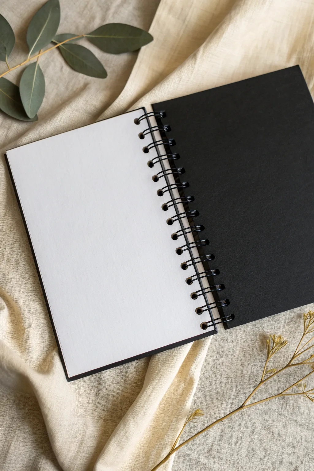
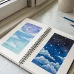
Create the ultimate workspace for silhouette studies by hand-binding a custom sketchbook with alternating paper types. This dual-tone journal places a crisp white sheet directly opposite a deep black one, offering an immediate visual playground for exploring positive and negative space.
How-To Guide
Materials
- Heavyweight white drawing paper (approx. 160gsm)
- Smooth black cardstock or art paper
- A5 size backing board or heavy card
- Black 1-inch twin-loop wire binding spine
- Wire binding machine (or compatible pitch punch)
- Paper trimmer
- Wire cutters
Step 1: Preparing the Sheets
-
Determine dimensions:
Decide on your finished book size; standard A5 (5.8 x 8.3 inches) is comfortable for hand-held studies and fits most binding machines easily. -
Trim white paper:
Using a sharp paper trimmer, cut your white drawing paper down to your exact chosen dimensions to ensure completely clean, straight edges. -
Trim black paper:
Repeat the trimming process with your black cardstock, ensuring it matches the white paper’s dimensions precisely so the finished book feels uniform. -
Create the sequence:
Clear a large workspace and begin collating your papers into a single stack, alternating the types: one white sheet, followed by one black sheet. -
Check the thickness:
Continue stacking until you reach a comfortable thickness, usually about 40-50 sheets total, depending on the capacity of your wire coil. -
Align the stack:
Tap the edges of the stack firmly against a flat table surface to ensure every sheet is perfectly flush and square with its neighbors. -
Prepare backing:
Cut a piece of heavy backing board or extra-thick black card to size to serve as the sturdy foundation for your journal.
Holes tearing out?
If holes rip easily, your margin is too shallow. Adjust the ‘depth of punch’ knob (if available) to move holes 2mm inward, or punch fewer sheets at once to reduce stress on the paper fibers.
Step 2: Punching Holes
-
Set the guide:
Adjust the edge guide on your binding machine to correctly center your paper size, preventing ‘half-holes’ at the ends of the page. -
Test punch:
Take a scrap sheet of paper cut to your project size and punch it once to verify that the holes are centered and aligned. -
Punch the backer:
Punch the heavy backing board first; do this singly if the board is thick to avoid straining the machine’s punch dies. -
Punch the pages:
Begin punching your alternating paper stack in small batches of 4-5 sheets at a time to keep the cuts clean and prevent jamming. -
Maintain order:
As you finish punching each small batch, stack them carefully to preserve the specific black-white alternating sequence you set up earlier. -
Clear debris:
Inspect the punched holes to ensure they are free of any hanging paper bits (chads) that might obstruct the wire binding later.
Add a Ghost Layer
Insert a sheet of semi-transparent vellum between a black and white page. This creates a ‘ghost’ layer where you can trace elements from the layer below for complex silhouette overlays.
Step 3: Binding Assembly
-
Measure the wire:
Lay your binding wire alongside the punched edge of your paper stack to count exactly how many loops you need. -
Trim the wire:
Use wire cutters to snip off any excess loops, ensuring you don’t leave a sharp, jagged edge on the final loop. -
Position the wire:
Hang the wire spine onto your machine’s holding hooks (or hold it steady on a table edge) with the wide, open loops facing upward. -
Load the back:
Thread the heavy backing board onto the wire loops first, positioning it so the back of the board faces away from the wire opening. -
Load the pages:
Carefully thread the inner pages onto the wire loops in small sections, starting from the back of the stack and working forward. -
Add the front:
Place the final front sheet onto the wire; I like to ensure this is a black sheet to act as a sleek introductory cover. -
Crimp to close:
Move the assembled book to the machine’s closing channel and gently pull the lever to squeeze the wire loops until they form a perfect circle. -
Final test:
Flip the pages all the way around to ensure they turn smoothly over the wire seam without catching.
Now you have a professional-grade contrast journal ready for your next silhouette masterpiece.


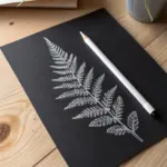
Figure-Ground Illusion Studies
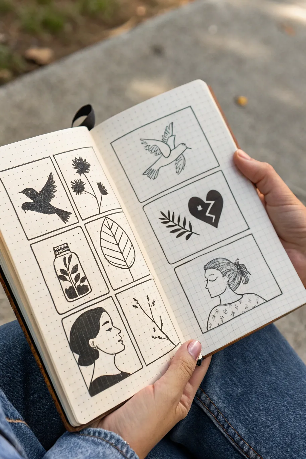
Explore the interplay of positive and negative space with this minimalist sketchbook study. Using simple black ink on dotted grid paper, you’ll create a series of framed illustrations that play with silhouette and line to train your eye for balance.
Detailed Instructions
Materials
- A5 dotted grid notebook or sketchbook
- Fine liner pens (sizes 01, 03, and 05)
- Black brush pen or broad marker for filling
- Ruler
- Pencil (HB or 2B)
- Eraser
Step 1: Setting the Framework
-
Grid Layout:
Open your notebook to a fresh spread. Using a pencil and ruler, lightly map out your layout. On the left page, draw a 2×3 grid of rectangles. On the right page, draw a single column of three larger rectangles. -
Refining Borders:
Ensure there is uneven spacing between the boxes—keep them relatively close to each other but leave generous margins around the outside of the page. This negative space around your frames is just as important as the space inside them. -
Inking Frames:
Go over your pencil boxes with an 03 or 05 fine liner. Use the ruler for crisp, unwavering lines. Let the ink dry for a moment before erasing the pencil guides to avoid smudging.
Step 2: Left Page: High Contrast Silhouettes
-
Sketching the Bird:
In the top-left box, lightly sketch a bird in mid-flight. Focus on the outline shape rather than internal details, as this will be filled in completely. -
Filling the Positive Space:
Use your brush pen or broad marker to color the bird entirely black. The stark black shape becomes the ‘positive’ space against the empty dotted background. -
Floral Outlines:
In the top-right box, sketch three tall-stemmed flowers. Unlike the bird, use your 03 fine liner to draw textured, spiky petals, keeping the interior of the flowers black for a seed-head effect. -
Jar Composition:
Move to the bottom-left box. Draw a simple mason jar outline. Inside, sketch a plant, but here’s the trick: fill the plant leaves black, but leave the jar transparent. -
Inverted Leaf:
In the middle-right box, draw a large, single leaf shape. Instead of filling the leaf, use your 01 pen to draw the veins and outline, keeping the style open and airy to contrast with the solid blocks nearby. -
Profile Study:
For the bottom-left corner, sketch a side profile of a woman’s face. Fill her hair and shirt with solid black ink, leaving her face as negative white space. This firmly grounds the figure. -
Branch Detail:
In the final bottom-right box of this page, draw a delicate, sparse branch using your thinnest 01 pen. Add tiny leaves or buds, keeping the lines shaky and organic.
Smudge Prevention
Use a piece of scrap paper under your hand while drawing to prevent oils from your skin transferring to the paper, which can cause ink to skip or smear.
Step 3: Right Page: Line vs. Shape
-
Linear Dove:
In the top large rectangle, sketch a dove. Instead of filling it in, use an 01 pen to create a ‘contour drawing’ style—using loose, scratchy lines to define the form without any solid shading. -
Heart and leaf:
In the middle box, draw a branch on the left and a broken heart on the right. Fill the heart solid black with a white ‘crack’ zigzagging through it. Keep the branch strictly linear. -
Portrait in Line:
In the final large bottom box, sketch another profile of a woman, similar to the one on the left page. This time, do not fill anything in. -
Adding Texture:
I like to use the 005 or 01 pen here to add tiny patterns to her shirt—little stars or flowers—and use fine lines to suggest the flow of her hair without creating a solid mass. -
Final Cleanup:
Wait at least five minutes for all heavy ink areas to dry completely. Gently erase any remaining pencil marks from your initial sketches.
Level Up: Shape Reversal
Try creating a ‘checkerboard’ effect by coloring the background black and leaving the drawing white for half the boxes to maximize contrast.
Enjoy flipping through your sketchbook and seeing how simple black ink can create such depth and variety

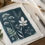
Silhouette With No Outlines Rule
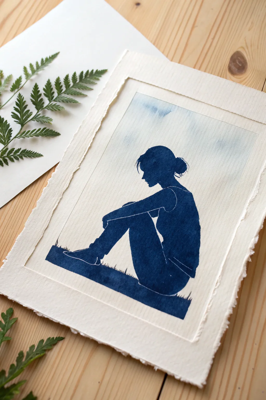
Capture a moment of quiet reflection using the fascinating cyanotype process, where sunlight does the painting for you. This project creates a striking deep blue silhouette against a soft, textured background, perfectly embodying the balance of positive and negative space.
Step-by-Step Tutorial
Materials
- Cyanotype kit (Part A and Part B solutions)
- Heavyweight watercolor paper (300gsm cold press is ideal)
- Wide foam brush or hake brush
- Transparency film suitable for your printer (inkjet or laser)
- Computer and printer
- Digital image editing software
- Sheet of glass or clear acrylic (plexiglass)
- Backing board (cardboard or MDF)
- Clamps or bulldog clips
- Tray or tub for rinsing
- Hydrogen peroxide (optional, for enhancing oxidation)
- White gel pen (optional, for fine details)
Step 1: Preparing the Negative
-
Select your image:
Choose a photo of a seated figure with a clear, engaging outline. High-contrast images with minimal background clutter work best for silhouettes. -
Create a digital silhouette:
Using your editing software, trace or mask the figure to turn it solid black against a white background. -
Invert for a positive print:
Since cyanotype creates a negative image (where light hits, it turns blue; where blocked, it stays white), you need to decide on your look. For the dark blue figure in the example image, your transparency needs to be transparent where the figure is, and black everywhere else. This is actually a ‘positive’ method in photography terms, but for a silhouette, just ensure the figure area is clear on your transparency film. -
Print the transparency:
Print your design onto the transparency film. Use the highest quality setting on your printer to ensure the black areas are dense enough to block UV light effectively.
Double It Up
If your printer’s black ink isn’t dense enough, print two copies of your transparency and stack them perfectly aligned. This ensures the background stays truly white.
Step 2: Coating the Paper
-
Mix the chemicals:
In a dim room away from sunlight, mix equal parts of solution A and solution B from your cyanotype kit. -
Apply the emulsion:
Using a wide foam brush, apply the solution to your watercolor paper. Don’t worry about coating all the way to the edge; leaving a rough, brush-stroked border mimics the handmade charm of the example. -
Achieve even coverage:
Work quickly using horizontal and then vertical strokes to ensure an even coat without puddles. -
Dry in darkness:
Place the coated paper in a completely dark place (a drawer or closet) to dry completely. This usually takes about 30 minutes to an hour.
Step 3: Exposing the Print
-
Assemble the sandwich:
Once the paper is bone dry, place it on your backing board. Lay your printed transparency on top, ensuring the ink side touches the paper for the sharpest lines. -
Secure the layers:
Place the glass or acrylic sheet over the transparency. Use clamps to press the sandwich tightly together; good contact prevents blurry edges. -
Expose to sunlight:
Take your setup outside into direct sunlight. The UV rays will react with the chemicals. Expose for about 10–20 minutes depending on the sun’s intensity. I like to wait until the exposed areas turn a weird, bronzed-grey color.
Cloudy Day Blues?
You can still make cyanotypes on overcast days, but exposure times increase significantly—often 30+ minutes. If the paper doesn’t look bronze-grey, leave it longer.
Step 4: Developing and Finishing
-
Rinse the print:
Bring the board back inside or into the shade. Disassemble the layers and immediately submerge the paper in a tray of cool water. -
Wash thoroughly:
Agitate the tray gently. You will see yellow chemicals washing away. Change the water repeatedly until it runs perfectly clear, usually about 5 minutes. -
Oxidize the blue:
For that instant, deep Prussian blue seen in the reference, you can add a splash of hydrogen peroxide to the final rinse water. Watch the color deepen instantly! -
Dry the artwork:
Blot excess water carefully with clean paper towels, then lay the print flat or hang it to line dry. -
Add subtle details:
Once fully dry, examine your silhouette. If you want to define the arm or legs more clearly like the original image, use a fine white gel pen to draw very thin, faint lines indicating the separation of limbs. -
Create the deckle edge:
To match the rustic look of the example, tear the edges of the paper manually against a ruler rather than cutting them, giving it that soft, fibrous border.
Frame your deep blue masterpiece in a simple floating frame to show off those beautiful torn edges.
BRUSH GUIDE
The Right Brush for Every Stroke
From clean lines to bold texture — master brush choice, stroke control, and essential techniques.
Explore the Full Guide
Block Letters Made From Cutouts
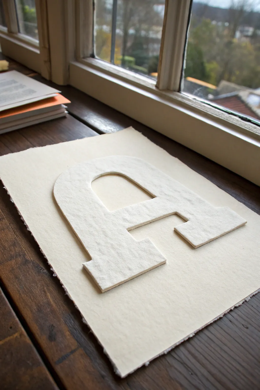
Create a subtle yet striking piece of art using nothing but texture and shadow. This project relies on heavy, handmade-style paper to turn a simple block letter into a sculptural element that plays with positive space.
Step-by-Step
Materials
- Two sheets of heavy, textured cotton rag paper or handmade paper (cream or off-white)
- Thick foam board or white foam core (for the backing structure)
- X-Acto knife with fresh #11 blades
- Metal ruler
- Self-healing cutting mat
- Pencil
- Spray adhesive or strong craft glue stick
- Double-sided foam tape or adhesive foam squares
- Optional: Bone folder
- Printed letter template (large serif font like ‘A’)
Step 1: Preparing the Base
-
Select your paper:
Choose two sheets of high-quality paper with a visible tooth or texture. Cotton rag paper works beautifully because its torn edges separate cleanly and create a soft, fibrous look. -
Create the rough edge:
For the bottom base sheet, you want that lovely deckled effect. Lay a metal ruler near the edge of your paper. -
Tear the paper:
Firmly hold the ruler down and pull the paper upwards against the metal edge to tear it. Repeat this on all four sides to create a uniform, organic border. -
Flatten the sheet:
If the tearing caused any curling, place the sheet under a heavy book for an hour to ensure it lies perfectly flat.
Ragged Edges?
If your cutting blade catches and tears the cotton fibers rather than slicing them, your blade is too dull. Use a brand new blade for every 3-4 major cuts.
Step 2: Creating the Structural Core
-
Trace the template:
Print out your chosen block letter. Cut out the paper letter first, then trace its outline onto your piece of thick foam board. -
Cut the foam core:
Using your X-Acto knife, cut out the foam letter. Keep your blade perfectly vertical to ensure the sides are straight, not slanted. -
Check the edges:
The foam edges don’t need to be pretty, but they must be clean. Trim away any jagged bits of foam that stick out past the paper outline.
Add Depth
Before mounting the top paper, lightly brush the edges of the foam core with white acrylic paint. This hides the raw foam and makes the piece look like solid stone.
Step 3: Crafting the Surface Letter
-
Trace onto texture paper:
Take your second sheet of textured paper. Place your foam letter on top and lightly trace around it with a pencil. -
Cut the final letter:
Carefully cut out the paper letter using a fresh blade. I prefer to change blades here because a dull knife will drag on the textured fibers and ruin the clean line. -
Align the layers:
Place the cut paper letter on top of the foam letter to ensure they match perfectly. The paper should completely cover the foam face.
Step 4: Assembly and Mounting
-
Adhere paper to foam:
Apply a generous coat of spray adhesive or a strong glue stick to the face of the foam letter. Carefully press the textured paper letter onto it. -
Smooth it down:
Use a bone folder or the back of a spoon to gently press the paper down, ensuring full contact without damaging the texture. -
Prepare the mount:
Flip your assembled letter over. Apply adhesive foam squares or strips of double-sided foam tape to the back of the foam letter. -
Position the letter:
Hover the letter over your torn-edge base sheet to find the optical center. Even spacing is crucial for a professional look. -
Secure the artwork:
Once satisfied with the placement, press the letter firmly onto the base sheet. The added thickness of the foam core will cast a subtle shadow, emphasizing the form.
Place your finished dimensional letter on a stand or in a shadowbox frame to let the light play across the textures
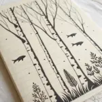
Tree Branch Notan Balance
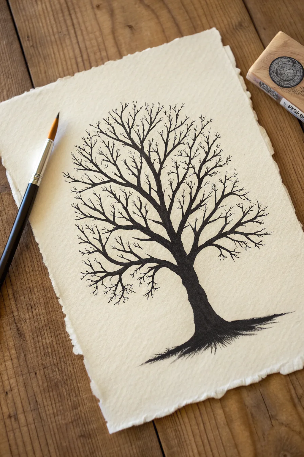
This striking silhouette study relies on high contrast to create a stark, beautiful balance between the black ink of the tree and the creamy white of the negative space. Using traditional materials on deckle-edged paper gives the piece a timeless, handcrafted feel perfect for framing.
Step-by-Step Tutorial
Materials
- Heavyweight textured paper with deckle edge (watercolor or handmade paper)
- India ink or high-quality black watercolor
- Pointed round brush (size 4 or 6)
- Fine liner brush (size 0 or 00)
- Pencil (HB or H)
- Kneaded eraser
- Paper towel
- Water container
Step 1: Preparation and Sketching
-
Paper Selection:
Begin by selecting a piece of heavy, textured paper. The rough surface and torn ‘deckle’ edges are crucial for replicating the rustic aesthetic shown in the example. -
Light Framework:
Using an H or HB pencil, lightly sketch a central vertical line to mark the trunk’s position. This doesn’t need to be perfectly straight; a slight curve adds organic character. -
Mapping the Canopy:
Sketch a faint oval or circle shape around the top of your trunk line. This will serve as a boundary guide to keep your branch spread balanced and contained. -
Drafting Major Limbs:
Lightly draw three to four main structural branches extending outward from the top of the trunk. Keep your lines faint so they can be easily erased or covered later.
Natural Texture
Use a “dry brush” technique on the roots. Wipe most ink off your brush and drag it quickly across the paper to let the paper’s grain break up the black line.
Step 2: Inking the Foundation
-
Loading the Brush:
Dip your pointed round brush into the India ink. You want the brush fully saturated but not dripping; blot it gently on a paper towel if it looks too heavy. -
Anchoring the Tree:
Start at the very base of the trunk. Press the brush down firmly to create a wide stroke, then lift slightly as you move upward to taper the trunk. -
Creating Roots:
While the ink at the base is still wet, use the tip of the brush to pull jagged, horizontal strokes outward to the left and right. This grounds the tree and simulates shadow and roots. -
Filling the Trunk:
Work your way up the trunk, maintaining a solid, opaque black coverage. Allow the texture of the paper to show through slightly at the edges for a natural look. -
Main Splits:
Where the trunk divides, split your stroke into the main branches you sketched earlier. Use less pressure now to make these lines thinner than the trunk.
Step 3: Branching Out
-
Secondary Branches:
Switch to a lighter touch or a smaller brush if needed. Draw branches growing off your main limbs, ensuring they angle upward and outward toward your canopy guide. -
The ‘Y’ Technique:
A helpful rule of thumb is to think of the letter ‘Y’. Every time a branch splits, it should generally form a narrow Y shape, getting thinner as it moves away from the center. -
Crossing Lines:
Don’t be afraid to let some branches cross over or behind others. This overlap creates depth and prevents the tree from looking flat. -
Detailing the Extremities:
Switch to your fine liner brush (size 0 or 00). This is essential for the delicate markings at the very tips of the canopy. -
Fine Twigs:
Add tiny, rapid strokes at the ends of your branches. I like to hold the brush loosely near the end of the handle to encourage jittery, natural lines rather than stiff straight ones. -
Refining the Silhouette:
Step back and look at the overall shape. Is there a gap that feels too empty? Add a stray twig there to balance the negative space. -
Clean Up:
Once the ink is completely dry—give it a good 20 minutes—gently use the kneaded eraser to lift any visible pencil guidelines.
Level Up: Seasonal Shift
Add tiny dots of white gouache on the upper sides of the main branches after the ink dries to simulate a fresh snowfall for a wintery variation.
Now you have a bold, meditative piece of art that celebrates the beauty of winter structure

PENCIL GUIDE
Understanding Pencil Grades from H to B
From first sketch to finished drawing — learn pencil grades, line control, and shading techniques.
Explore the Full Guide
Leaf Veins as Negative Space
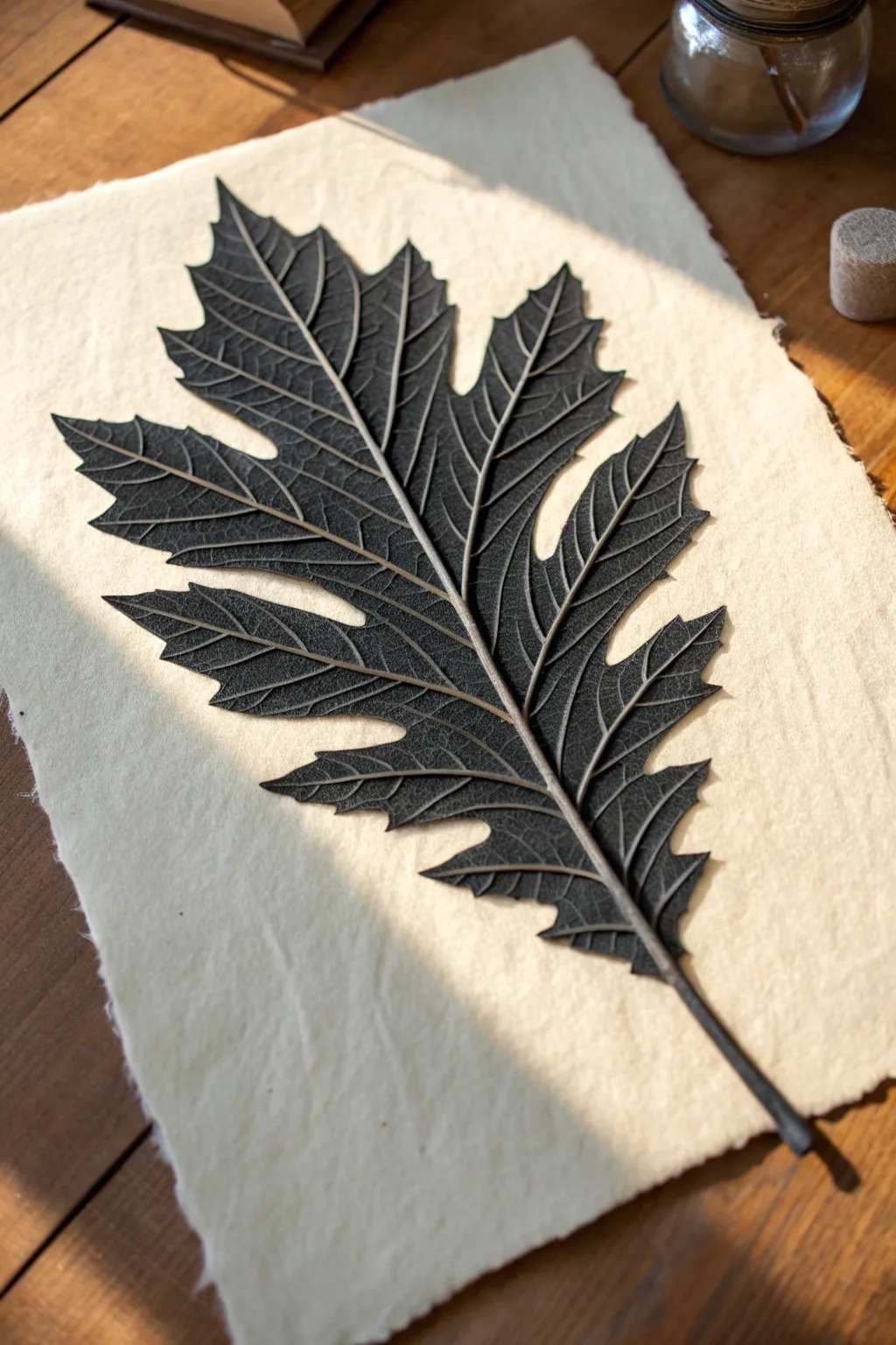
This stunning project mimics the delicate intricacy of a fossilized leaf using thick-body acrylics and charcoal powder on textured handmade paper. The high-contrast result makes the leaf’s veins pop as if they were carved, creating a sophisticated piece of botanical art.
How-To Guide
Materials
- Heavyweight handmade paper (deckled edge preferred)
- Black modeling paste or heavy structure gel
- Mars Black acrylic paint
- Fine charcoal powder
- Fresh, large leaf (oak or fern variety work best)
- Small palette knife
- Fine-point needle tool or sculpting stylus
- Synthetic flat brush
- Soft blending brush
- Matte spray fixative
Step 1: Preparation & Base Impression
-
Prepare your workspace:
Lay down a protective mat. Since modeling paste dries quickly, have your tools ready and your leaf cleaned and dried. -
Mix the medium:
On a palette, mix roughly 70% modeling paste with 30% Mars Black acrylic paint. The goal is a thick, consistent deep grey-black paste that holds its shape. -
Apply the base shape:
Using the palette knife, spread a thin, even layer of your black paste mixture onto the handmade paper, roughly following the shape of your chosen leaf but slightly smaller. -
Press the leaf:
Gently press your real leaf, vein-side down, into the wet paste. Use a brayer or your fingers to ensure every part of the leaf makes contact with the paper. -
Remove the leaf:
Carefully peel the leaf away to reveal a faint, textured impression in the paste. Don’t worry if it’s imperfect; this is just a guide.
Vein Architecture
Work quickly when sculpting veins. If the paste skins over, mist it lightly with water to keep it workable for another few minutes.
Step 2: Sculpting the Veins
-
Build the primary vein:
Load a small amount of the black paste onto the tip of your palette knife. Run it down the center line of the impression to create a raised, distinct central vein or midrib. -
Define the edges:
Use the edge of your palette knife to crisp up the jagged perimeter of the leaf lobes. Push the paste slightly inward to create a sharp, defined silhouette against the paper. -
Carve the secondary veins:
Switch to your needle tool or stylus. With the paste still wet, gently carve channels radiating from the center vein out to the leaf tips. -
Add texture:
Stipple the flat areas between the veins with a stiff brush to create that leather-like surface texture seen in the reference. -
Highlight the ridges:
I like to take a tiny bit of fresh paste on the stylus and physically build up the ridges of the main veins, making them stand taller than the leaf surface.
Step 3: Finishing Details
-
Dry thoroughly:
Let the artwork dry completely. Because of the thickness of the modeling paste, this might take several hours or even overnight. -
Apply charcoal powder:
Once hard, dip a soft dry brush into fine charcoal powder. Dust it heavily over the entire black leaf shape. -
Buff the high points:
Using a clean, soft cloth or your finger, gently rub the raised veins. This removes the charcoal from the highest points, revealing the slightly glossier acrylic beneath, while the matte charcoal stays in the crevices. -
Refine the stem:
Paint the stem extending off the bottom using a fine brush and slightly thinned black paint for a sharp, realistic exit point. -
Clean the edges:
If any charcoal dust migrated onto the white paper, use a kneaded eraser to lift it away for a pristine background. -
Seal the work:
Finish by spraying a light coat of matte fixative over the piece to prevent the charcoal from smudging later.
Gilded Touch
For a luxurious twist, gently rub a tiny amount of gold wax or metallic pigment powder onto just the raised central vein for a subtle shimmer.
The deep contrast and tactile surface of your sculpted leaf will create a captivating focal point in any room
Symmetrical Insect Reversal
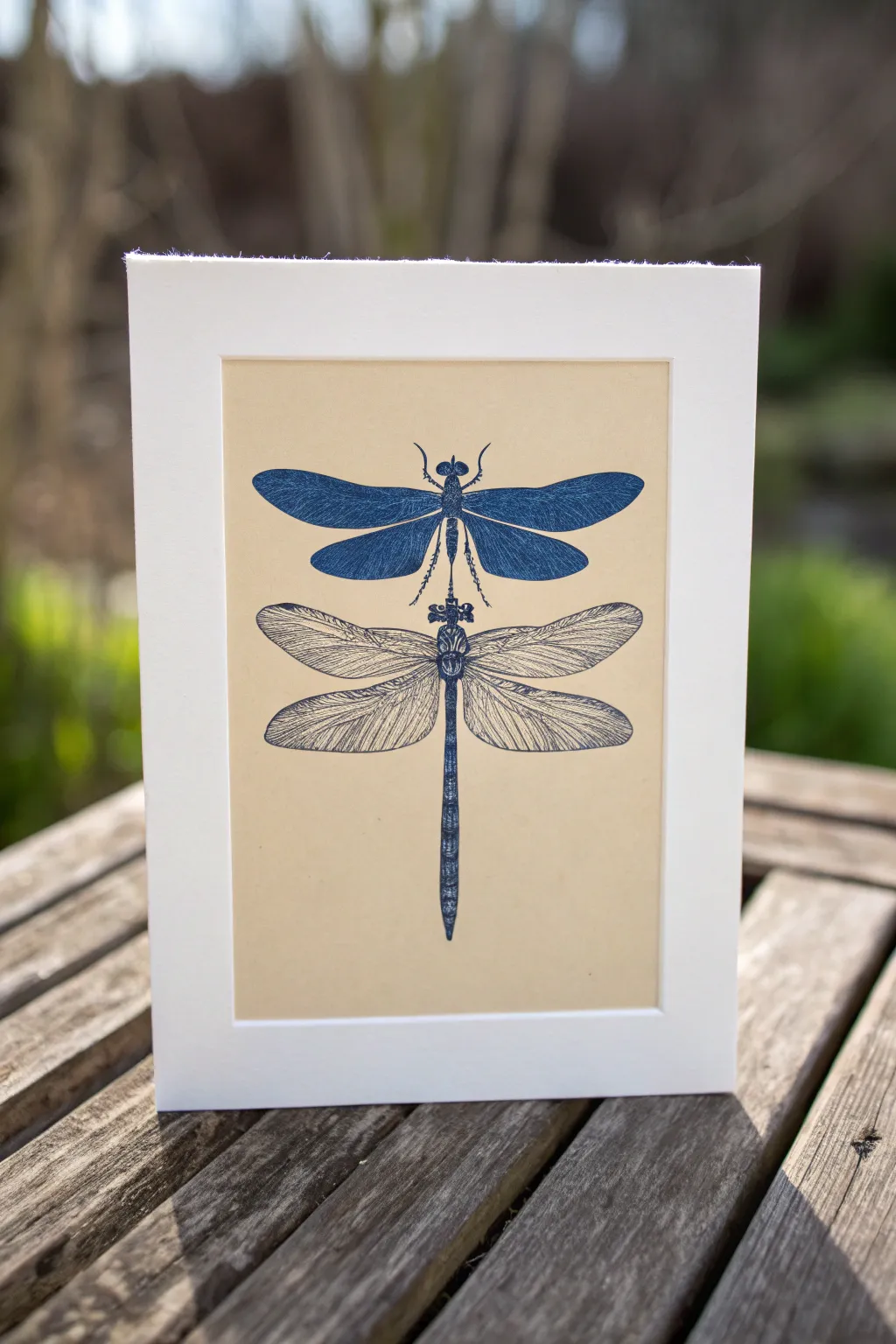
Explore the balance between positive and negative space with this striking insect study. By pairing a bold, block-printed silhouette with a delicate line drawing, you’ll create a sophisticated piece of art that plays with visual weight and texture.
Detailed Instructions
Materials
- Soft-cut lino block (4×6 inches)
- Lino cutting tools (V-gouge and U-gouge)
- Deep blue block printing ink (water-based or oil-based)
- Brayer (roller)
- Glass or acrylic sheet for inking
- Buff or tan colored cardstock (smooth finish)
- Fine-liner pen (0.3mm and 0.5mm, matching blue ink)
- Pencil and eraser
- Tracing paper
- Burnishing tool or wooden spoon
- Ruler
Step 1: Planning and Carving
-
Sketch the Design:
Begin by drawing a detailed dragonfly shape on a piece of paper. You want a symmetrical, top-down view. Focus on the distinct segments of the body and the vein patterns in the wings. -
Transfer to Block:
Use tracing paper to transfer just the top dragonfly silhouette onto your soft-cut lino block. I prefer to flip the image horizontally before tracing so the final print mirrors my original sketch perfectly. -
Carve the Veins:
Using your finest V-gouge, carefully carve out the thin vein lines within the wings. These lines will remain the color of the paper, creating the negative space effect. -
Detail the Body:
Carve small details into the thorax and head. Remember, anything you cut away will not print, so leave the main body shape solid to hold the ink. -
Clear the Background:
Switch to a wider U-gouge to remove all the linoleum surrounding the dragonfly. Carve relatively deep to ensure the background doesn’t pick up unwanted ink ‘chatter’ marks.
Step 2: Printing the Silhouette
-
Prepare the Ink:
Squeeze a small line of deep blue block printing ink onto your inking plate. Roll it out with the brayer until you hear a sticky, sizzling sound and the texture looks like orange peel. -
Ink the Block:
Roll the brayer over your carved lino block. Apply the ink in thin, even layers. Roll in multiple directions to ensure the solid areas of the wings are fully coated. -
Position the Paper:
Place your buff cardstock on a flat surface. Carefully position the inked block face down on the upper half of the paper, leaving enough room below for the second dragonfly. -
Burnish the Print:
Using a burnishing tool or the back of a wooden spoon, apply firm, circular pressure over the entire back of the block. Pay special attention to the edges. -
Reveal the Print:
Gently peel the paper away from the block starting at one corner. Set the print aside and let the ink dry completely before moving to the next phase.
Clean Lines
If you struggle with shaky lines on the wing veins, try pulling the pen toward your body rather than pushing it away. This offers better control.
Step 3: Drawing the Details
-
Mark the Alignment:
Once the block print is dry, lightly mark a vertical center line with a pencil to ensure the bottom dragonfly aligns perfectly with the printed one above. -
Sketch the Outline:
Lightly sketch the second dragonfly directly below the first using a pencil. Mirrors the top shape, but this time, the wings should be slightly more open or angled differently for variety. -
Ink the Body:
Switch to your 0.5mm blue fine-liner. Draw the outline of the thorax and abdomen, using small stippling dots or cross-hatching to create shadow and volume without filling it in solid. -
Draw Wing Veins:
Use the finer 0.3mm pen for the wings. Draw the main structural veins first, then fill in the delicate cellular patterns. Keep your hand loose to mimic the organic texture. -
Add Texture:
Add tiny hatching lines along the bottom edges of the wings to give them a sense of transparency and weight. -
Connect the Pair:
Ensure there is a small visual gap between the tail of the top insect and the head of the bottom one, creating a nice tension between the two forms. -
Clean Up:
Wait for the pen ink to dry fully, then gently erase your pencil guidelines and the center alignment mark.
Metallic Accent
Add a touch of magic by tracing over just the main wing veins of the bottom dragonfly with a silver or gold gel pen for a subtle shimmer.
Frame your dual masterpiece in a simple white mount to let the stark contrast shine


Tentacles and Negative Space Waves
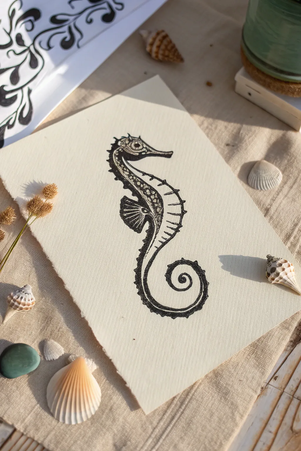
Capture the delicate beauty of marine life with this intricate seahorse illustration, drawn in striking high-contrast black ink. The textured paper and careful stippling create a piece that feels both organic and elegantly defined.
Step-by-Step Tutorial
Materials
- Heavyweight textured paper (watercolor or handmade paper)
- Pencil (HB or 2H for sketching)
- Eraser (kneaded preferred)
- Fine liner pens (sizes 0.1, 0.3, and 0.5)
- Black India ink or brush pen (for larger dark areas)
- Ruler (optional for reference)
Step 1: Sketching the Form
-
Outline the curve:
Begin lightly with your pencil to establish the main S-curve of the seahorse’s body. Start with a small circle for the head, a larger oval for the chest, and a long, sweeping curve that spirals tightly at the tail. -
Define the head:
Detail the head shape by drawing the elongated snout and the crowned top. Keep the lines faint so they can be easily erased later. -
Add body segmentation:
Along the back of the curve, mark out the ridges or segments of the seahorse’s armor. These should look like small, rhythmic bumps running from the neck down to the tail. -
Position the fin:
Sketch the small dorsal fin on the back and the pectoral fin near the head. Use simple fan shapes as placeholders.
Step 2: Inking the Foundation
-
Trace the silhouette:
Switch to a 0.5 fine liner to carefully go over your pencil outline. Create a solid, confident line for the snout and the outer spiral of the tail. -
Thicken the spine:
On the back of the seahorse, thicken the line work significantly. I like to double up the line here to create a heavy, shadowed edge that contrasts with the lighter belly area. -
Create the heavy shadow:
Using your thickest pen or brush pen, fill in the deep black areas along the spine and the underside of the neck. This negative space technique defines the form without needing an outline on the inner edge. -
Detail the eye:
Draw the eye clearly with a 0.3 pen, leaving a tiny white highlight to bring it to life. Surround the eye with a ring of small dots.
Ink Control Pro Tip
Keep a scrap piece of the same paper nearby to test your pen flow. Textured paper can sometimes snag fine tips or cause ink to bleed unexpectedly.
Step 3: Stippling and Texture
-
Begin stippling:
Switch to your 0.1 fine liner for the delicate shading. Start placing small dots near the darkened spine area, clustering them tightly where the shadow meets the light. -
Gradient effect:
Gradually space the dots further apart as you move towards the center of the body. This creates a smooth gradient that makes the seahorse look rounded and three-dimensional. -
Texture the head:
Add tiny clusters of dots on the snout and the top of the head to mimic the rough texture of a real seahorse’s skin. -
Detail the fins:
Use fine, flicking lines to detail the fins rather than solid outlines. This keeps them looking translucent and delicate against the heavier body. -
Belly segments:
Draw thin, curved horizontal lines across the lighter belly area to indicate the ribbed texture. Keep these lines broken or dotted so they aren’t overpowering.
Level Up: Gold Accents
After the black ink dries, use a metallic gold gel pen or gold leaf paint to highlight just the eye and a few dorsal spines for a luxurious touch.
Step 4: Refining and Cleanup
-
Deepen contrast:
Step back and look at your drawing. Go back in with the 0.5 pen or brush pen to darken the deepest shadows, ensuring there is a stark difference between ink and paper. -
Enhance texturing:
Add patterns of small circles or irregular shapes within the dark spinal area to suggest intricate markings or scales. -
Final stipple pass:
Add a very light dusting of dots on the outermost edges of the belly and tail to soften the transition between the drawing and the paper. -
Erase guidelines:
Once you are certain the ink is completely dry—give it a few extra minutes just to be safe—gently erase all visible pencil marks. -
Deckle the edges:
To match the reference, you can carefully tear the edges of your paper against a ruler to create a soft, deckled look that enhances the organic feel.
Now you have a stunning piece of marine art that balances bold shadows with delicate details
Seasonal Icon Notan Series
This rustic yet modern art piece celebrates the changing seasons through stark, high-contrast imagery on beautiful handmade paper. By creating a grid of simple autumn and winter icons, you explore the powerful balance between positive and negative space in a visually striking format.
How-To Guide
Materials
- Heavyweight handmade cotton rag paper (deckle edge)
- Black block printing ink or heavy body acrylic paint
- Soft rubber brayer (roller)
- Linoleum carving block or pre-cut stamps
- Linoleum carving tools (V-gouge and U-gouge)
- Pencil and eraser
- Ruler
- Painter’s tape or masking tape
- Glass palette or acrylic sheet for ink rolling
- Small piece of paper for testing
Step 1: Preparing the Grid
-
Measure the Artwork Area:
Begin with your sheet of handmade paper. Use a ruler to determine the center of the page, as deckle edges can make finding the exact middle tricky. Lightly mark the boundaries of your 3×3 grid area with a pencil, ensuring equal margins on all sides. -
Mark the Individual Squares:
Divide your main square area into nine smaller, equal squares. Leave a small gap (about 1/4 inch) between each square to create the negative space ‘gutters’ that will separate your icons. -
Tape the Grid Lines:
Using low-tack painter’s tape, mask off the grid lines you just drew. You want to cover the spaces *between* the squares and the outside border, leaving only the nine square ‘windows’ exposed. Press the tape edges down firmly to prevent ink bleed. -
Background Toning (Optional):
If you want the subtle aged look seen in the example, lightly brush a very diluted tea stain or beige watercolor wash inside the exposed square areas. Let this dry completely before proceeding.
Clean Lines Pro-Tip
Before painting or stamping, run a credit card or bone folder firmly over the edges of your painter’s tape. This seals the edge and prevents black ink from bleeding into the white ‘gutters’ between squares.
Step 2: Creating the Icons
-
Design the Motifs:
Sketch nine simple seasonal shapes on a piece of scrap paper first. Think of high-contrast silhouettes: an acorn, a pine tree, a snowflake, a maple leaf, a simple snowman, and a pumpkin work well. -
Transfer to Block:
Draw these designs onto your linoleum block. Remember that if you are carving stamps, the image will reverse when printed, though for symmetrical objects like snowflakes or pumpkins, this matters less. -
Carve the Negative Space:
Use your V-gouge to carve the outline of your shape first. Then, use the wider U-gouge to clear away the background material on the block. You want the icon itself to remain raised and flat. -
Clean the Carvings:
Brush away any loose rubber or linoleum crumbs. Check your stamp against a light source to ensure there are no high spots in the background that might catch ink.
Level Up: Texture
Instead of solid black ink, mix a tiny drop of metallic gold or copper into your black paint. It won’t change the color much, but it creates a subtle shimmer that catches the light on the textured paper.
Step 3: Printing the Series
-
Ink the Brayer:
Squeeze a small line of black block printing ink onto your glass palette. Roll the brayer back and forth across it until you hear a ‘velcro’ production sound, indicating an even, thin coat of ink. -
Test Print:
Always do a test print on scrap paper first. This helps you gauge how much pressure is needed and if your carving needs any final adjustments. -
Ink the First Stamp:
Roll ink onto your first icon stamp (e.g., the pine tree). Ensure the raised surface is fully black but not gloopy, as too much ink will squash out and ruin the sharp edges. -
Position and Press:
Carefully align the stamp within one of the taped-off squares on your final paper. Press down firmly and evenly without wiggling the stamp. I usually hold it for a few seconds to let the paper absorb the ink. -
Lift and Repeat:
Lift the stamp straight up. Re-ink your brayer and repeat the process for the next icon in the grid. Vary the placement of heavy and light shapes (like placing the dark snowman away from the dark pine tree) to balance the composition. -
Address Fine Details:
For intricate shapes like the snowflake, use a lighter hand when inking to keep the small interior lines crisp. If a print looks too patchy, you can carefully touch it up with a fine brush and a tiny bit of black ink, though handmade imperfections often add charm.
Step 4: Finishing Touches
-
Dry Time:
Allow the ink to dry significantly before touching the tape. Block printing ink can stay tacky for a while; waiting at least an hour reduces the risk of smudging. -
Reveal the Grid:
Very slowly peel back the painter’s tape. Pull it away at a 45-degree angle to keep from tearing the soft handmade paper surface. The clean lines between your stamped icons should now be distinct. -
Flattening (If Needed):
If the paper has buckled from the printing pressure, place a piece of clean parchment paper over the dry artwork and weigh it down with heavy books overnight.
This minimal monochrome grid is now ready to bring a touch of seasonal elegance to your wall.
Geometric Grid Swap Pattern
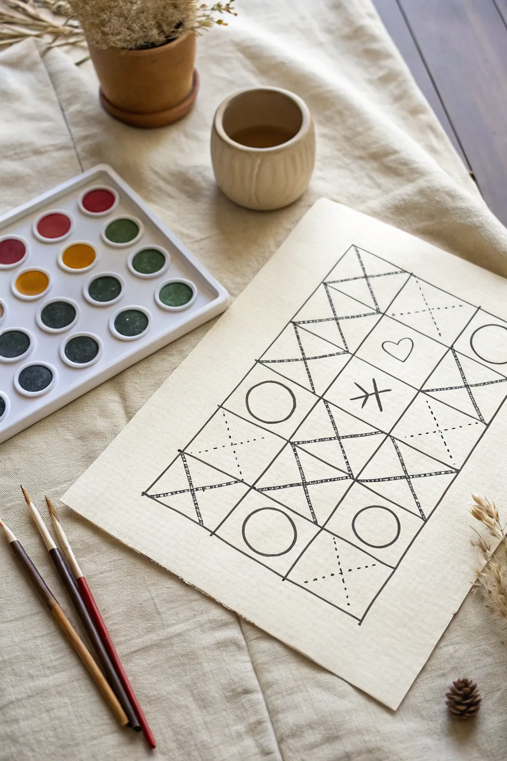
This minimalist project plays with structure and whimsy by combining rigid geometric grids with hand-drawn organic symbols. It acts as a perfect meditative warm-up exercise or a foundational sketch for a future watercolor exploration.
Detailed Instructions
Materials
- Heavyweight drawing paper or watercolor paper (approx. 9×12 inches)
- Fine liner pen (0.5mm or 0.8mm, archival ink)
- Ruler or straight edge
- Pencil (HB or H)
- Eraser
Step 1: Setting the Framework
-
Paper preparation:
Begin with your sheet of heavyweight paper. Since we are creating a grid, clear off a flat workspace so you have plenty of room to maneuver your ruler. -
Marking the perimeter:
Using a pencil and ruler, lightly mark out a large rectangle in the center of your page. Leave a generous margin of about 1.5 to 2 inches around the edges to frame the artwork nicely. -
Dividing the grid:
Measure the height of your rectangle and divide it by four; place tick marks at these intervals. Now divide the width by three. Connect these marks to create a grid of twelve equal squares (4 high by 3 wide). -
Inking the main lines:
Switch to your fine liner pen. I personally prefer a slightly thicker nib here, like an 0.8mm, to make the structure bold. Trace over your pencil grid lines carefully. -
Adding texture to lines:
To give the grid a hand-drawn, rustic feel, go back over the main grid lines with a second pass. Don’t worry about being perfectly straight; let the line wobble slightly or double up in places to create a sketchy, textured effect.
Ink Smudge Rescue
If you accidentally smudge wet ink, don’t erase it! Turn the smudge into a shadow or sketch a small geometric shape over it to disguise the error.
Step 2: Creating Internal Geometry
-
Drawing the ‘X’ diagonals:
Select specific squares to divide with diagonals. Following the reference, draw large ‘X’ shapes in the top-left, top-center, bottom-left, and bottom-right corners of the grid. -
Adding the central diamonds:
In the middle two rows, verify your diagonals creates a diamond pattern where the corners of the squares meet. Draw these diagonal lines to connect the central structure. -
Double-lining the diagonals:
Just like the exterior grid, go over these new diagonal lines a second time. Add small hash marks or ‘stitching’ lines across some of the diagonals to simulate a texture like fabric or rope. -
Dotted line details:
Look for the open triangular spaces created by your ‘X’ patterns. Using your pen, carefully stipple or dash a line extending from the center of the ‘X’ outwards, bisecting the triangles.
Step 3: Adding Symbols
-
Placing the circles:
In the open squares (specifically the second row left, and third row right), draw a simple, imperfect circle. It doesn’t need to be geometrically perfect; a hand-drawn look adds charm. -
The heart motif:
Locate an upper triangular space on the right side of the grid. Sketch a small, simple heart floating within that triangle. -
The central rune:
In the very center of the composition, draw a linear symbol resembling a stick figure or a rune—a vertical line crossed by a downward-pointing chevron and a horizontal dash. -
Additional shapes:
Check the far right edge; if your grid allows, add a semi-circle or full circle shape encroaching on the border, breaking the rigid square format. -
Erasing guidelines:
Wait at least five minutes for the ink to dry completely. Gently run your eraser over the entire piece to remove the initial pencil grid, leaving only the crisp ink work. -
Final assessment:
Step back and look at the balance of the piece. If any lines look too thin compared to others, thicken them slightly now to ensure the grid feels solid and unified.
Add a Wash
Once the waterproof ink is totally dry, use the watercolor set shown to paint the negative spaces. Try a single color in varying transparencies for depth.
You now have a beautifully structured geometric drawing ready for display or further coloring
Hidden Second Image in the Background
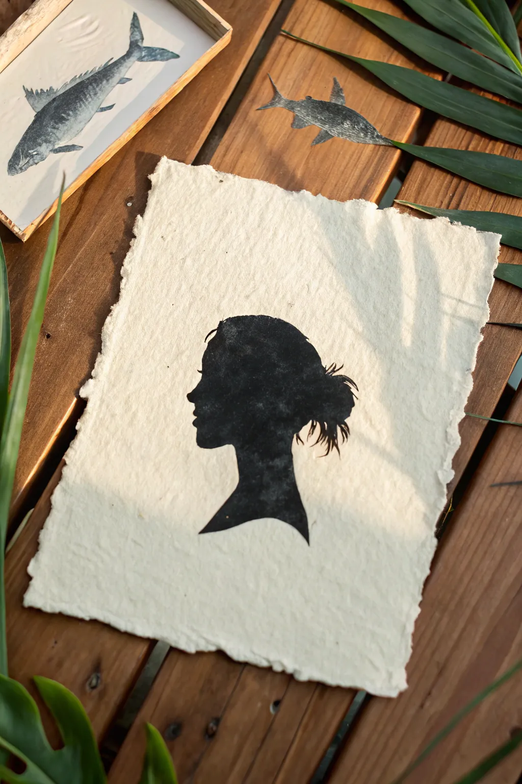
Capture the elegance of a classic profile with this striking negative space silhouette project. Using textured handmade paper and rich block printing ink, you’ll create a vintage-inspired portrait that balances bold darkness with soft, natural edges.
How-To Guide
Materials
- Heavyweight handmade paper with deckled edges (creamy white)
- Black block printing ink (water-soluble)
- Soft rubber brayer (roller)
- Linoleum block (soft-cut style) or stencil sheet
- Linoleum cutter tool (V-gouge and U-gouge)
- Pencil and eraser
- Tracing paper
- Craft knife or scalpel (if stenciling)
- Glass or acrylic palette for rolling ink
- Profile photograph for reference
Step 1: Preparing the Design
-
Capture the profile:
Begin by taking a side-profile photograph of your subject against a plain, light background. Ensure their hair is styled distinctively, like the messy bun shown, as this creates interesting negative space details. -
Trace the outline:
Use photo editing software to turn the photo into a high-contrast black and white image, or simply print it out. Lay tracing paper over the print and carefully trace the outer edge of the entire silhouette. -
Transfer to the block:
Flip your tracing paper over and place it graphite-side down onto your linoleum block. Scribble over the back of the lines to transfer the image. Remember, the final print will be a mirror image of what is carved, so flipping the tracing paper now orients it correctly. -
Refine the edges:
Go over the faint transferred lines on the block with a darker pencil or Sharpie. Pay special attention to the hair strands and eyelashes; simple, bold shapes work better than tiny, intricate details for this technique.
Patchy Ink?
If the black looks gray or speckled, your paper is likely very textured. Apply a slightly thicker layer of ink, or mist the paper very lightly with water before printing to help it grab the pigment.
Step 2: Carving the Negative Space
-
Outline the silhouette:
Using a small V-gouge tool, carefully carve just outside your drawn line. This establishes the boundary between the black silhouette (the uncarved surface) and the white background (the carved away area). -
Carve the background:
Switch to a wider U-gouge to clear away the rest of the linoleum block surrounding the head. You want to remove everything *except* the profile shape. -
Check for high spots:
Run your finger over the carved background areas. Any ridges left behind might catch ink and create ‘chatter’ or noise in the background. Smooth these down unless you want a rougher look. -
Clean the block:
Use a soft brush or a distinct puff of air to remove all tiny linoleum crumbs from the block. Stray crumbs can ruin the solid black finish of the silhouette.
Natural Frame
Instead of a traditional cut, tear your paper against a ruler to create a soft, deckled edge. Float mount the finished piece in a shadow box to show off the paper’s texture and raw edges.
Step 3: Inking and Printing
-
Prepare the ink:
Squeeze a small line of black block printing ink onto your glass palette. Roll the brayer back and forth and lift it occasionally to create a consistent, velvety texture on the roller. -
Ink the silhouette:
Roll the brayer over your carved block. Apply the ink in thin, even layers. I like to roll in multiple directions—vertical, horizontal, and diagonal—to ensure the silhouette is completely solid black. -
Position the paper:
Gently pick up your handmade paper. Center it over the inked block, keeping it hovering until you are sure of the placement, then drop it straight down. Do not drag it. -
Burnish the print:
Using a clean baren, the back of a wooden spoon, or your palm, rub the back of the paper firmly in circular motions. Focus pressure on the silhouette area to transfer the ink into the textured crevices of the paper. -
The reveal:
Pick up one corner of the paper and slowly peel it back from the block to reveal your high-contrast print. -
Dry and display:
Place the print on a flat surface to dry completely. Block printing ink can take a day or two to fully cure, especially on absorbent, rag-content paper.
Now you have a striking piece of personal art that celebrates the beauty of shape and shadow
City Skyline With Window Cutouts
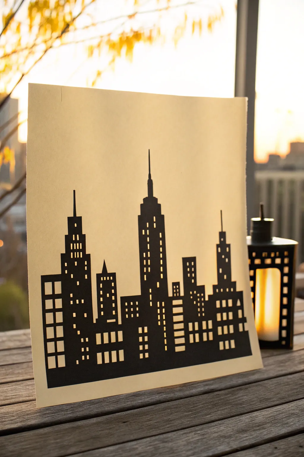
Capture the magic of an urban sunset by creating this striking silhouette artwork that plays with light and shadow. By carefully cutting away tiny windows from black cardstock, you’ll transform a simple piece of paper into a glowing metropolis.
Step-by-Step Guide
Materials
- Black cardstock (medium weight)
- Cream or translucent vellum paper
- Pencil and eraser
- Ruler
- Craft knife (X-Acto knife) with fresh #11 blades
- Self-healing cutting mat
- Spray adhesive or glue stick
- Painter’s tape (low tack)
Step 1: Planning the Metropolis
-
Draft the horizon:
Begin by lightly sketching a horizontal baseline about an inch from the bottom of your black cardstock to ground your buildings. -
Sketch building shapes:
Use a ruler to draw rectangular pillars of varying heights rising from your baseline. To recreate the classic feel of the example image, include recognizable stepped skyscrapers like the Empire State Building in the center. -
Add architectural details:
Refine the tops of your buildings. Add spires, triangle roofs, and stepped setbacks to break up the blocky shapes and give the skyline character. -
Grid the windows:
This is the most crucial step for the negative space effect. Lightly draw grid lines inside your building shapes to map out where the windows will go. Vary the patterns—some buildings should have vertical columns of windows, while others might have scattered lights.
Scalpel Skills
Change your blade the moment you feel resistance. A sharp tip is the only way to get crisp, square corners on tiny windows.
Step 2: The Cutting Process
-
Secure your paper:
Tape the corners of your black cardstock down to the self-healing cutting mat using low-tack painter’s tape to prevent it from shifting while you work. -
Start with the smallest windows:
Always cut the smallest interior details first. Using a fresh blade in your craft knife, carefully cut out the tiny squares and rectangles for the windows. -
Technique for corners:
When cutting square windows, I find it helpful to slightly overcut the corners just a hair—this ensures the little paper chip falls out cleanly without tearing. -
Work centrally outward:
Continue cutting the window details, moving from the center of the sheet toward the edges. This maintains the structural integrity of the paper for as long as possible. -
Cut the larger negative spaces:
Once all windows are removed, cut out the sky area between the buildings. Be very careful around thin spires and antennas. -
Final perimeter cut:
Finally, cut along the outer left and right edges and the bottom baseline to free your skyline from the rest of the cardstock sheet.
Step 3: Assembly and Display
-
Prepare the backing:
Cut your cream paper or vellum to the exact same dimensions as your finished black silhouette. -
Apply adhesive:
Flip your black skyline face down on a piece of scrap paper. Apply a light, even coat of spray adhesive. If using a glue stick, focus only on the solid areas between windows to avoid gumming up the holes. -
Mount the layers:
Carefully align the cream paper over the sticky side of the black cardstock and press down firmly. Smooth it out gently with clean hands to ensure good contact. -
Clean up edges:
If there is any overhang between the two layers, trim the edges with your craft knife and ruler for a perfectly flush finish. -
Erase guidelines:
Gently erase any remaining pencil marks from the front of the black cardstock. -
Backlighting setup:
To truly see the effect, place the artwork in front of a natural light source like a sunset window, or place a battery-operated candle behind it to make the windows glow.
Glow Up
Instead of plain cream paper, use yellow or orange tissue paper behind specific windows to create the look of different room lights.
Place your finished skyline on a windowsill to watch the city lights come alive as the sun goes down
Crop-and-Trace Negative Space Remix
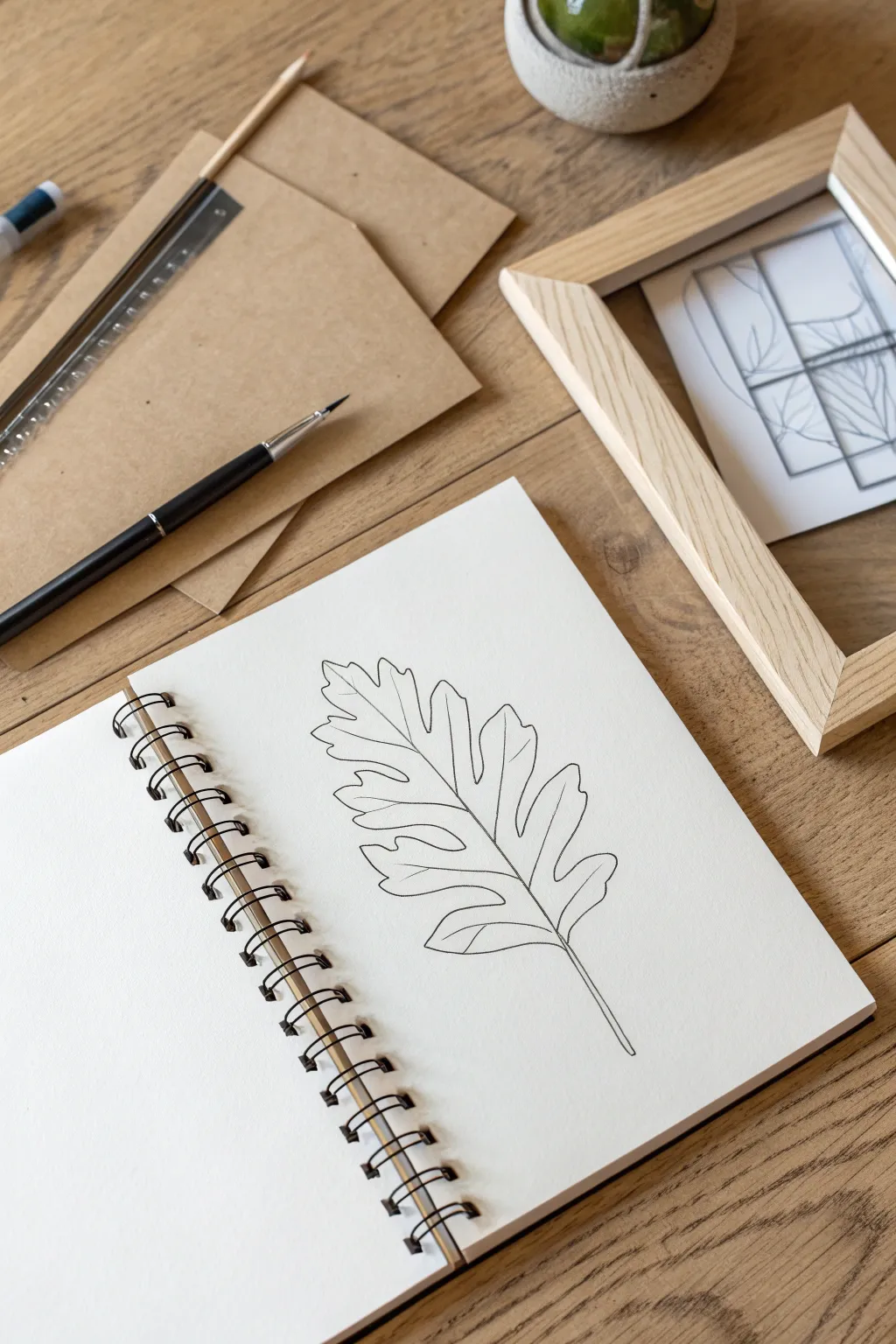
This elegant project focuses on the beauty of organic forms through clean, confident linework. By sketching a simple oak leaf on high-quality paper, you create a minimalist piece that celebrates negative space and natural geometry.
Detailed Instructions
Materials
- Wire-bound sketchbook with heavy drawing paper
- Fine-liner pen (black, 0.5mm or 0.8mm)
- H or HB graphite pencil
- Soft gum eraser
- Real oak leaf or reference photo
- Ruler (optional for stem alignment)
Step 1: Conceptualizing & Drafting
-
Observe your subject:
Begin by studying an oak leaf’s structure. Notice the characteristic lobed edges and the central vein that runs from the stem to the tip. This observation is key to capturing the right shape. -
Mark the central vein:
Using your pencil lightly, draw a gentle curve that will serve as the central spine of the leaf. I like to start slightly lower on the page to leave room for the tip, giving the leaf a slight, natural-looking droop. -
Sketch the overall envelope:
Before drawing details, sketch a very faint, rough outline or ‘envelope’ shape around where the leaf will sit. This ensures your leaf stays centered on the page and doesn’t run off the edges. -
Draft the lobes:
Lightly sketch the undulating lobes on either side of your central vein line. Keep your pencil strokes loose. Oak leaves are asymmetrical, so don’t worry about making the left and right sides match perfectly. -
Refine the perimeter:
Go back over your rough lobe sketches and define the edges more clearly. Sharpen the points where the lobes turn outward and soften the dips where they curve inward toward the vein. -
Add vein details:
Sketch the secondary veins branching out from the center line into each lobe. These should flow naturally, tapering as they reach the outer edges of the leaf shape.
Wobbly Lines?
If your hand shakes, try drawing ‘from the shoulder’ rather than just the wrist. Also, intentionally broken lines can add artistic character.
Step 2: Inking & Finalizing
-
Test your pen:
Before touching the final paper, test your fine-liner on a scrap piece of paper to ensure the ink is flowing smoothly and hasn’t dried out. -
Ink the central stem:
Start by inking the central vein you sketched earlier. Use a confident, continuous stroke if possible, slightly thickening the line near the base where it becomes the stem. -
Outline the leaf edge:
Carefully trace over your refined pencil perimeter. Focus on keeping a steady hand. If your hand shakes, pause at the sharp points of the lobes rather than in the middle of a curve. -
Ink the secondary veins:
Draw the veins extending into the lobes. Connect them smoothly to the central spine. Keep these lines slightly thinner or lighter touch than the outer perimeter to create subtle hierarchy. -
Let the ink set:
Allow the drawing to dry completely for at least 5-10 minutes. Smudging fresh ink with an eraser is a common mishap, so patience is crucial here. -
Erase pencil guides:
Gently run your soft gum eraser over the entire drawing to lift the graphite sketch lines. Hold the paper taut with your other hand to prevent crinkling the page. -
Assess line weight:
Look at your drawing from a distance. If the outer edge feels too thin, retrace it carefully to bolden the silhouette, emphasizing the negative space around it. -
Clean up stray marks:
Inspect the white space around the leaf for any lingering pencil smudges or dust and clean them up to ensure a crisp, high-contrast finish.
Level Up: Botanical Frame
Use a utility knife to cut out rectangular sections of your drawing and mount them in a floating frame for a deconstructed, modern art look.
Now you have a serene botanical study that captures nature’s elegance in simple black and white.
Layered Color Wash Over a Notan Design
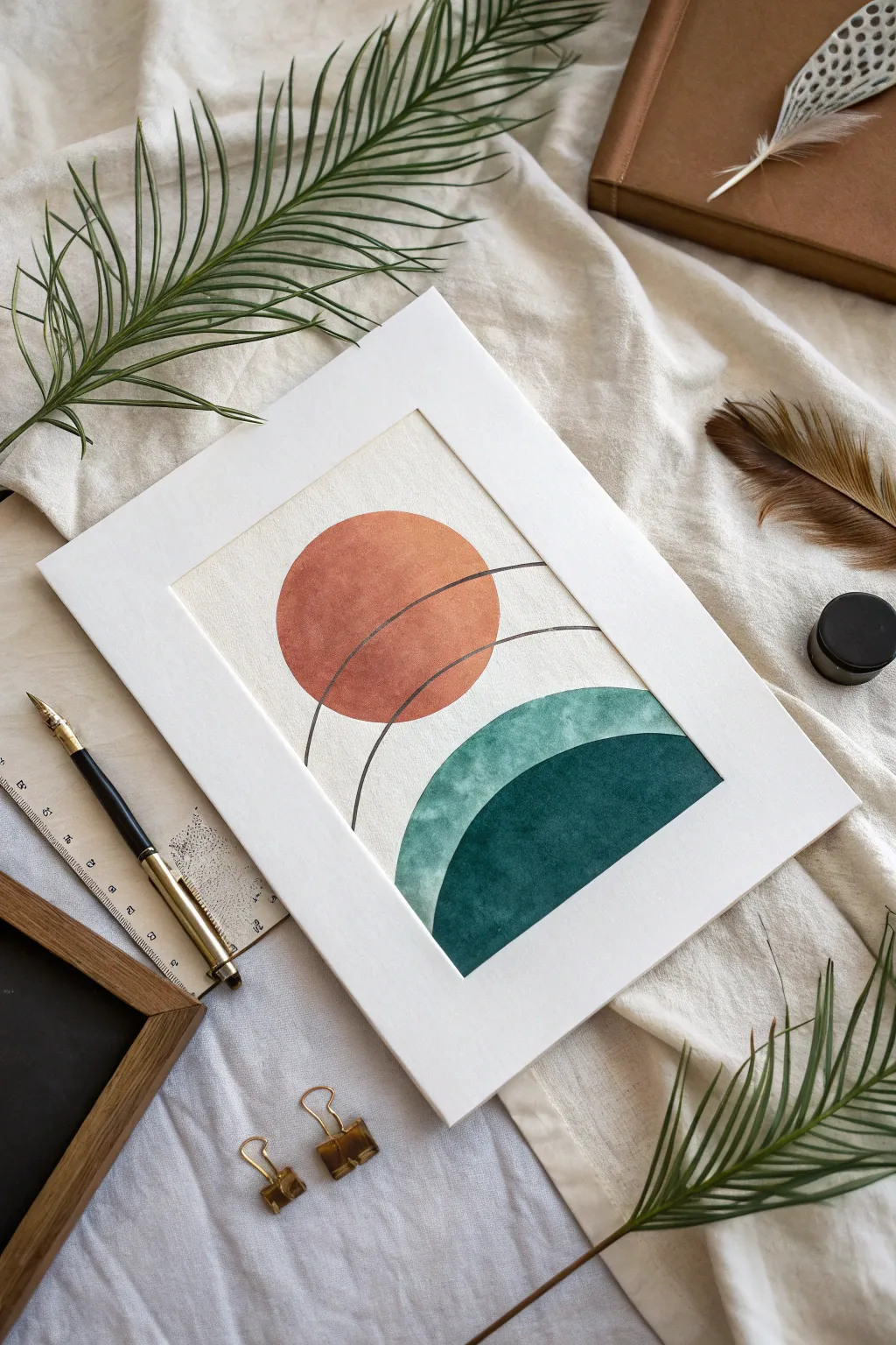
This minimalist watercolor project plays with transparency and geometric layering to create a serene, abstract landscape. Using warm terracotta and cool emerald tones intersected by delicate lines, you’ll craft a piece that feels both structured and fluid.
Step-by-Step Tutorial
Materials
- Cold press watercolor paper (300 gsm)
- Watercolor paints (Terracotta/Burnt Sienna, Emerald Green, Indigo)
- Round watercolor brushes (size 6 and 10)
- Compass or round objects for tracing
- Fine liner pen (0.3mm or 0.5mm, waterproof aesthetic)
- Pencil (H or 2H)
- Eraser
- Ruler
- Masking tape
- Two jars of water
- Paper towels
Step 1: Preparation & Sketching
-
Paper setup:
Begin by taping down your cold press watercolor paper to a board or table on all four sides. This prevents buckling when the paper gets wet and leaves a crisp white border if you paint to the edge. -
Center constraints:
While not strictly necessary, marking the faint center vertical line of your paper with a ruler can help align your geometric shapes perfectly. -
Drafting the sun:
Using a compass or a small round object (like a jar lid), lightly trace a circle in the upper-middle section of your paper. Keep your pencil pressure very light so the graphite doesn’t show through the paint later. -
Adding the horizon curve:
Below the circle, sketch a wide arc that creates a hill-like shape. Ensure there is a gap of negative space between the bottom of the sun and the top of this hill. -
Defining the layered hill:
Draft a second, steeper curve inside the first hill shape. This will divide the bottom section into two distinct color zones—a lighter upper band and a deep, saturated core.
Clean Edges Pro Tip
For the sharpest geometric shapes, use masking fluid or pieces of masking tape cut to shape to block out the circles before painting.
Step 2: Painting the Elements
-
Mixing the terracotta:
Mix a warm terracotta hue using Burnt Sienna with a tiny touch of Red. You want a consistency similar to tea—pigmented but fluid. -
Filling the sun:
Load your size 10 brush and carefully fill in the top circle. I like to work wet-on-dry here for sharper edges, guiding the bead of water down the shape for an even wash. -
Initial drying time:
Let the terracotta circle dry completely. It should be room temperature to the touch before you proceed, ensuring no accidental bleeding. -
Mixing the teal wash:
Create a watery mix of Emerald Green with a hint of blue. This needs to be lighter than your final dark green, as it will serve as the translucent upper hill layer. -
Painting the first hill layer:
Paint the entire hill shape (both the top and bottom sections you sketched) with this lighter teal wash. Don’t worry about the bottom separation line yet; just fill the main arc. -
Waiting game:
Allow this teal layer to dry fully. Patience is key in watercolor to achieve clean layering. -
Mixing the deep emerald:
Prepare a much thicker, saturated mixture of Emerald Green and Indigo. It should have the consistency of heavy cream. -
Creating the dark core:
Using the size 6 brush for better control, paint the inner, bottommost curve you sketched earlier. This creates the illusion of depth and shadow within the hill.
Level Up: Metallic Accent
Swap the black fine liner for a gold gel pen or gold leaf paint for the intersecting lines to add a luxurious, modern touch.
Step 3: Detailing & Finishing
-
Ensure total dryness:
Wait until the painting is bone dry. If the paper feels cool, it’s still damp. Using a hairdryer on a low setting can speed this up. -
Mapping the arcs:
Place your compass point lightly on the paper (or use a ruler) to visualize where the thin dividing lines will go. You want two arcs that cut through the sun and connect downward toward the hills. -
Inking the lines:
With a steady hand and your waterproof fine liner, draw the curved lines over the painted shapes. The contrast of the sharp black ink against the soft watercolor texture defines the style. -
Clean up:
Once the ink is set, gently erase any visible pencil marks, being careful not to rub the painted areas too vigorously. -
Final reveal:
Peel away the masking tape slowly at a 45-degree angle to reveal your clean edges and prepare the artwork for framing.
Place your finished piece in a wide mat frame to emphasize the elegant isolation of the shapes.

Have a question or want to share your own experience? I'd love to hear from you in the comments below!