If you want drawings that actually sell, you’re looking for that sweet spot: super appealing, easy to repeat, and simple to customize. Here are my go-to ideas that work beautifully as prints, commissions, and digital downloads—without you reinventing the wheel every time.
Botanical Line Art Print Sets
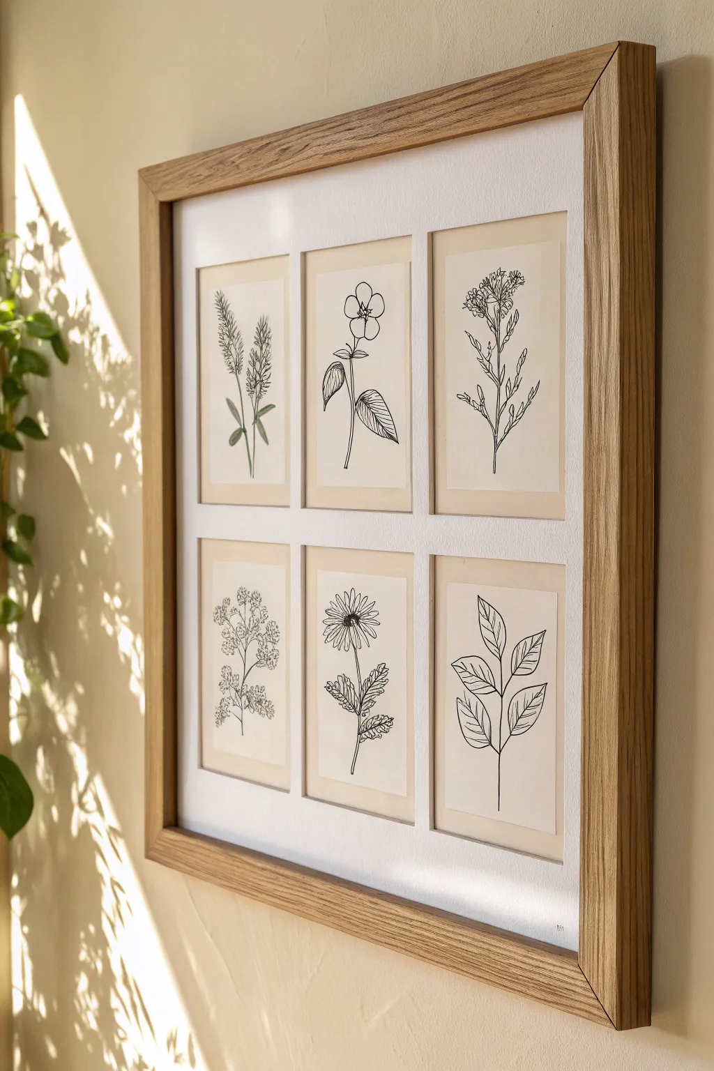
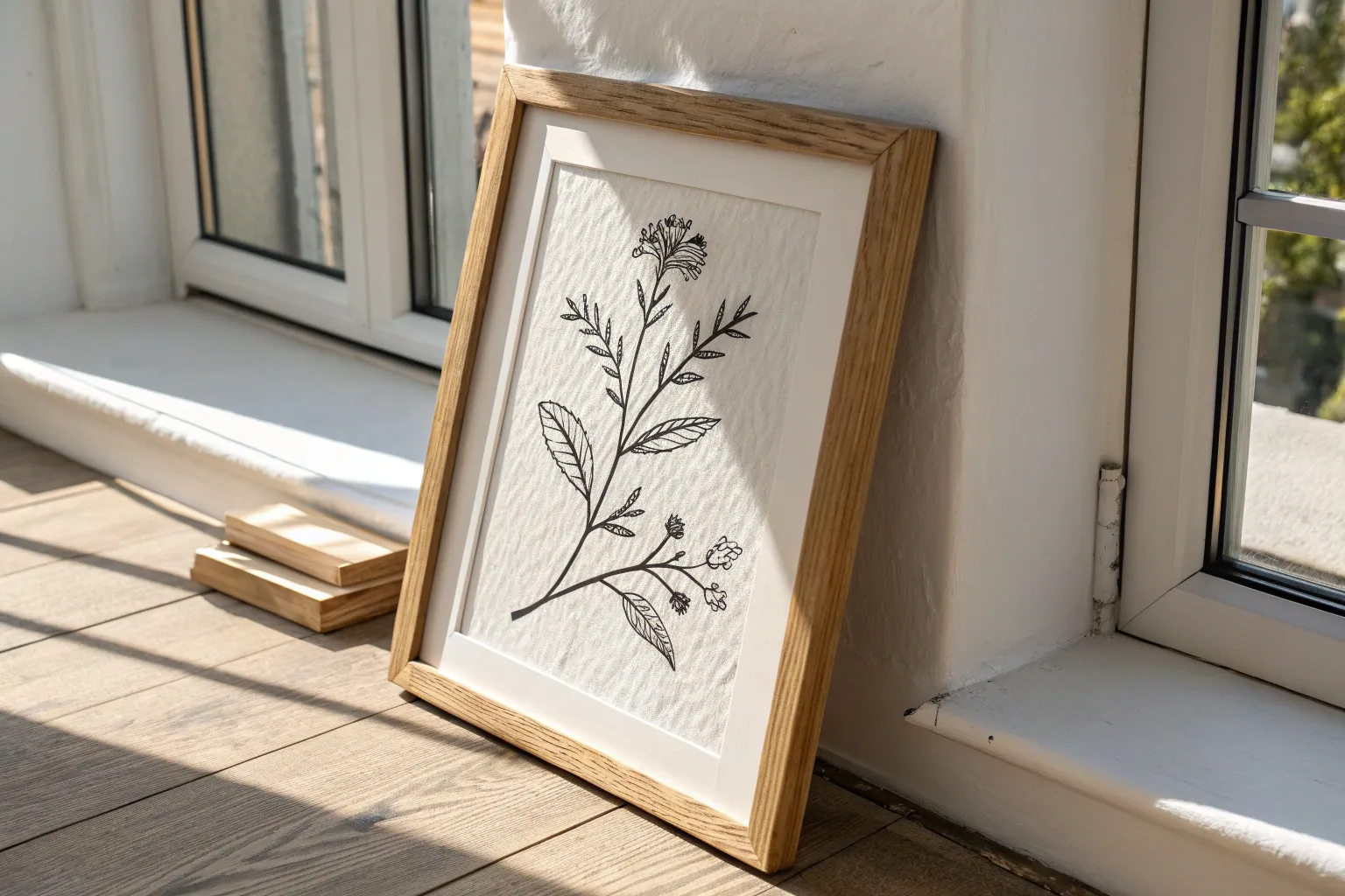
This elegant project creates a gallery-worthy display by combining six individual botanical line drawings into a cohesive collection. The stark contrast of fine black ink against warm cream paper, framed in natural oak, captures a timeless and sophisticated aesthetic perfect for selling.
Step-by-Step
Materials
- Six sheets of A5 cream or off-white bristol board or hot press watercolor paper
- Fine liner pens (sizes 0.1, 0.3, and 0.5)
- Pencil (HB or 2H)
- Kneadable eraser
- Ruler
- Large square wooden frame (oak finish recommended) with mount openings for six images
- Masking tape or acid-free framing tape
Step 1: Planning & Sketching
-
Select your specimens:
Choose six distinct plant varieties to feature. To mimic the example, aim for a mix of leaf shapes and flower types—try a tall grass, a rounded flower, a leafy spray, a daisy-like bloom, and a simple branch. -
Prepare the paper:
Cut your cream paper down to size if necessary so it fits slightly larger than the mount openings of your frame. This extra margin is crucial for taping later. -
Establish the central axis:
Using your ruler and pencil, lightly draw a vertical line down the center of your first paper sheet. This guide helps keep the stems straight and the composition balanced. -
Rough sketching:
Lightly sketch the basic forms of your first plant. Focus on the gesture of the stem first, then add circles or ovals to indicate where flowers or leaves will sit. -
Refining the sketch:
Add more detail to your pencil sketch. Define the jagged edges of leaves or the individual petals of flowers. Don’t press too hard; you want these lines to be barely visible references. -
Repeat for the set:
Sketch the remaining five plants on their respective sheets. Lay them out side-by-side on your table to ensure the visual weight is balanced across the collection.
Step 2: Inking the Botanicals
-
Outline main stems:
Switch to your 0.3 fine liner. Start at the top of the plant and work your way down the main stem with a confident, smooth stroke. A slight waiver adds organic charm, so don’t stress about perfect straightness. -
Detail the leaves:
Use the 0.1 fine liner for delicate details like leaf veins or flower stamens. For the outer edges of leaves, stick to the 0.3 pen to give them definition. -
Add depth with varying weights:
I like to go back in with a 0.5 pen at the very base of the stems or where leaves overlap. This subtle thickening of lines creates a shadow effect and grounds the drawing. -
Drawing texture:
For fuzzy textures like the top left specimen in the example, use short, quick stippling or hatching motions with your finest 0.05 or 0.1 pen rather than solid lines. -
Ink the remaining sheets:
Proceed to ink all six drawings. Be mindful of your hand placement to avoid smudging wet ink on previous lines.
Shaky Lines?
If your hand shakes while inking long stems, don’t stop. Pull the pen toward you rather than pushing away. A slightly wobbly line actually looks more organic and natural for botanicals.
Step 3: Finishing & Framing
-
Erase guidelines:
Wait at least 30 minutes to ensure the ink is completely bone dry. Gently roll a kneadable eraser over the drawings to lift the graphite without damaging the paper surface. -
Check for gaps:
Inspect your lines. If any lines look too engagingly thin or disconnected, carefully connect them now to ensure the image reads clearly from a distance. -
Prepare the frame:
Remove the backboard and the multi-aperture mount from your frame. Place the mount face down on a clean, flat surface. -
Position the artwork:
Place your drawings face down over the mount openings. adjusting them until the composition looks centered through the window. -
Secure the art:
Use small distinct pieces of masking tape or specialized framing tape to secure the top edge of the paper to the back of the mount. This ‘T-hinge’ method allows the paper to expand and contract with humidity. -
Final assembly:
Clean the glass on both sides, reinsert the mount and backboard, and secure the frame clips. Your cohesive botanical collection is ready to hang.
Vintage Patina
Dip the paper in tea or very dilute coffee before you start drawing. Let it dry flat under heavy books. This creates an aged, antique look that increases the perceive value of the set.
Hang this series in a well-lit spot where the afternoon sun can catch the texture of the paper and the clean lines of your botanical studies


Bird Illustration Collections
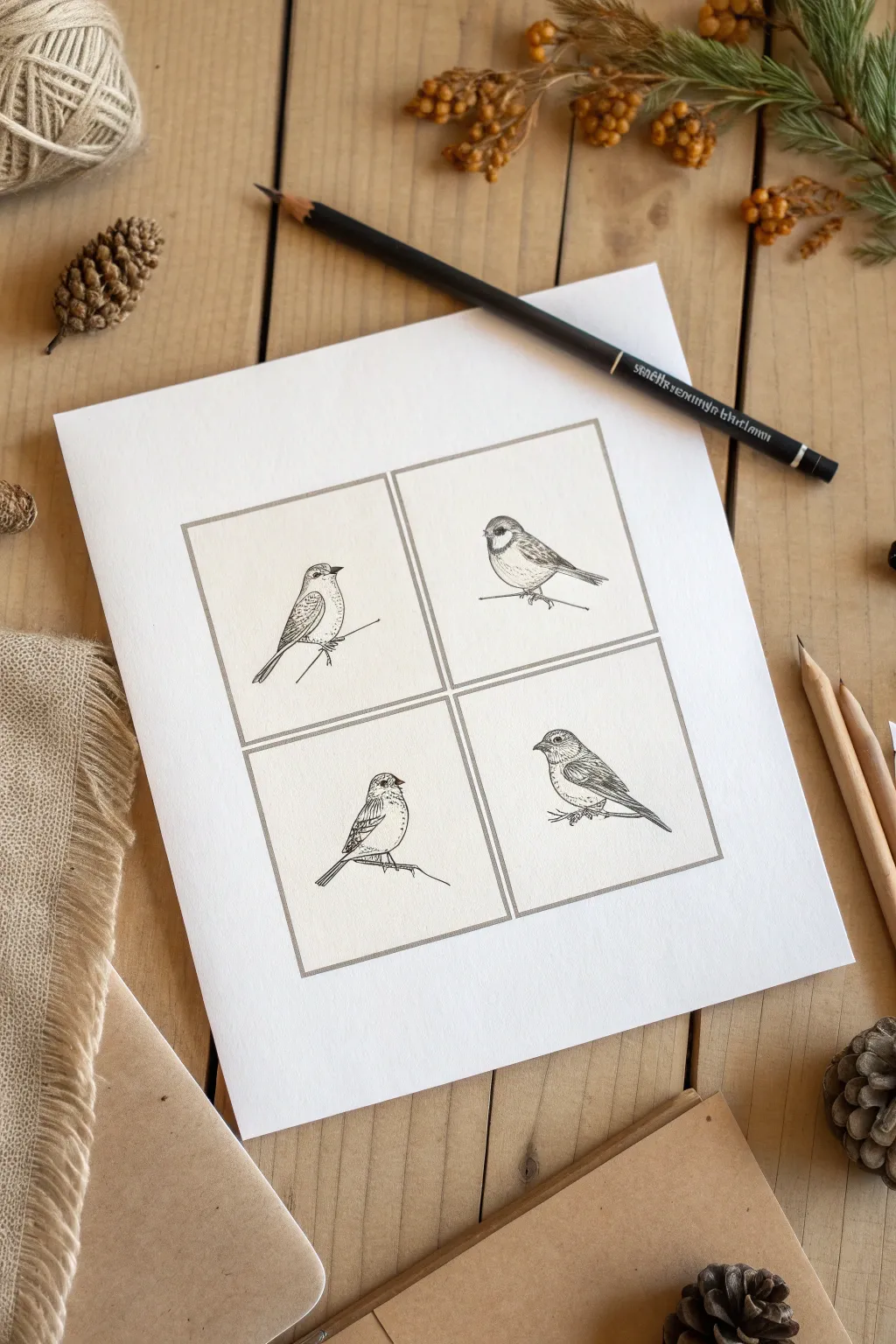
Capture the delicate charm of nature with this minimalist ink illustration collection featuring four distinct songbirds. This grid layout transforms simple sketches into a cohesive, vintage-style art print perfect for selling as greeting cards or framed decor.
Step-by-Step Guide
Materials
- Smooth bristol board or hot-pressed watercolor paper (8×8 inch square)
- Pencil (HB or H for light lines)
- Fine liner pens (005, 01, and 03 sizes)
- Ruler
- Kneaded eraser
Step 1: Setting the Composition
-
Measure the paper:
Begin with a square piece of paper, ideally around 8×8 inches. Find the exact center point to help guide your layout. -
Draw the main frame:
Using your ruler and a light pencil touch, draw a large outer square, leaving a generous margin of white space around the edges (about 1.5 to 2 inches). -
Divide the grid:
Split this large square into four equal quadrants by drawing a vertical line down the center and a horizontal line across the middle. -
Create the inner borders:
To separate the boxes like the reference image, draw a second set of lines just inside your grid lines, creating a small gap between the four individual frames.
Step 2: Sketching the Birds
-
Outline the top left bird:
In the first quadrant, sketch a bird facing right. Start with a simple oval for the body and a smaller circle for the head, keeping the posture upright. -
Sketch the top right bird:
For the second bird, draw a rounder, stouter shape facing left. This little sparrow-like bird should look like it’s perched low on a branch. -
Draft the bottom left bird:
Moving to the bottom left, sketch a bird facing right with its tail angled downwards, giving it an alert, perching posture. -
Outline the bottom right bird:
Finally, sketch a larger finch-like bird in the last box, facing left. Ensure all birds are roughly the same scale so the collection feels balanced. -
Add perch lines:
Draw simple, single lines beneath each bird to represent twigs or wires. Vary the angles slightly for visual interest.
Ink Confidence
Don’t connect every single line on the bird’s outline. Leaving small gaps, especially around the chest, makes the plumage look softer and fluffier.
Step 3: Inking the Details
-
Ink the frames:
Switch to an 03 fine liner to ink the four square boxes. Use a ruler here to ensure the lines are crisp and graphic. -
Outline the main forms:
Using an 01 pen, carefully go over your pencil sketches for the birds’ outlines. Use broken lines for fluffy areas like the belly to suggest feathers rather than a hard shell. -
Detail the eyes and beaks:
With your finest 005 pen, darken the eyes, leaving a tiny white speck for the catchlight. Define the beaks with sharp, precise strokes. -
Add wing texture:
Using the 005 pen, draw short, repetitive C-curves or scalloped lines on the wings to create the look of layered feathers. -
Shade the bodies:
Apply stippling (tiny dots) or very fine hatching on the undersides of the birds and beneath the wings to give them volume and roundness. -
Darken the markings:
Identify patterns like eye masks or wing bars. Fill these areas in with dense hatching using the 01 pen to create contrast. -
Ground the birds:
Ink the perch lines. Add a few tiny, scribbly marks where the feet grip the branch to add weight to the pose. -
Final cleanup:
Wait at least 15 minutes for the ink to fully cure, then gently erase all remaining pencil guidelines with a kneaded eraser.
Botanical Touch
To increase the value of your prints, intertwine small leaves or berries around the frame corners for a more ornate, cottage-core aesthetic.
Once framed or scanned, this quartet of birds offers a timeless, sophisticated look that appeals to nature lovers everywhere


Butterfly and Moth Vintage-Style Plates
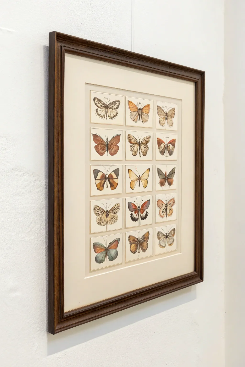
Capture the elegance of old-world scientific illustrations with this structured grid of butterfly specimens. Using fine ink and delicate watercolor washes, you will create a museum-worthy collection that feels both scholarly and artistic.
Detailed Instructions
Materials
- Hot-press watercolor paper (smooth finish)
- Fine liner pens (0.05, 0.1, and 0.3 sizes, waterproof ink)
- Watercolor paints (pans or tubes)
- Small round watercolor brushes (sizes 0, 2, and 4)
- Ruler and mechanical pencil
- Eraser
- Light beige or cream cardstock (for mounting)
- Dark wood frame with matting
Step 1: Planning the Grid
-
Measure the layout:
Begin by deciding the overall size of your composition based on your frame. Lightly calculate a grid of 3 columns and 5 rows. Leave uniform spacing between each ‘card’ area to mimic separate mounted plates. -
Draw the boundaries:
Using a ruler and a very light pencil touch, draw the 15 rectangles where your butterflies will live. These lines can either be erased later or kept as subtle borders, depending on your preference. -
Sketch the center lines:
Draw a faint vertical line down the center of each rectangle. This axis is crucial for maintaining the symmetry of the butterfly wings.
Aged Paper Hack
Before painting, lightly stain your paper with cold tea or coffee and let it dry flat. This instantly gives your scientific plate an authentic, antique library feel.
Step 2: Penciling the Specimens
-
Draft the bodies:
Sketch a small, elongated oval for the thorax and abdomen of each butterfly along the center axis lines. vary the sizes slightly to show different species. -
Outline the forewings:
Draw the top pair of wings (forewings) for each specimen. Try to vary the shapes; make some triangular, others more rounded or lobed. -
Add the hindwings:
Sketch the bottom pair of wings (hindwings), appearing to tuck slightly under the forewings. Ensure the left and right sides are roughly mirror images. -
Detail the patterns:
Lightly pencil in the major pattern blocks—spots, stripes, and veins. Do not shade yet; focus only on the shapes of the color zones.
Step 3: Inking the Details
-
Refine the outlines:
Using your 0.1 fine liner, trace over your pencil lines. Use a broken or stippled line for furry bodies to suggest texture. -
Add wing veins:
Switch to the finest 0.05 pen to draw the delicate veins radiating from the body to the wing edges. -
Inking the antennae:
Draw the antennae with a single confident stroke for each side to avoid shaky lines. Some can be simple threads, others slightly feathered. -
Erase pencil marks:
Wait for the ink to dry completely to avoid smudging, then gently erase all graphite guidelines.
Go 3D
Instead of drawing flat, cut the butterflies out, fold wings up slightly, and mount them with foam tape for a shadowbox effect.
Step 4: Watercolor Washes
-
Base layer:
Mix watery, muted tones—ochre, burnt sienna, and slate blue. Apply a very pale wash over the wings, avoiding any white spots you want to preserve. -
Building saturation:
Once the first layer is dry, come back with more concentrated pigment in the darker areas of the wings. I find layering thin glazes creates a more realistic depth than one heavy coat. -
Adding distinct patterns:
Paint the specific markings like eye-spots or bands using a size 0 brush for precision. Use contrasting colors like rusty orange against grey. -
Darkening the bodies:
Paint the bodies in dark greys or browns, dabbing the brush to enhance the fuzzy texture established by the ink.
Step 5: Mounting and Finishing
-
Prepare the background:
If you painted on individual cut papers, arrange them on your cream backing board. If you painted on a single sheet, ensure the paper is flat and clean. -
Labeling (Optional):
For extra scientific authenticity, use a sharp pencil to write tiny, illegible cursive ‘Latin names’ under each specimen. -
Framing:
Place the artwork behind a cream mat board and secure it in the dark wood frame.
Hang your finished collection in a well-lit spot to admire the intricate variety of your hand-painted specimens


Custom Pet Portrait Sketches
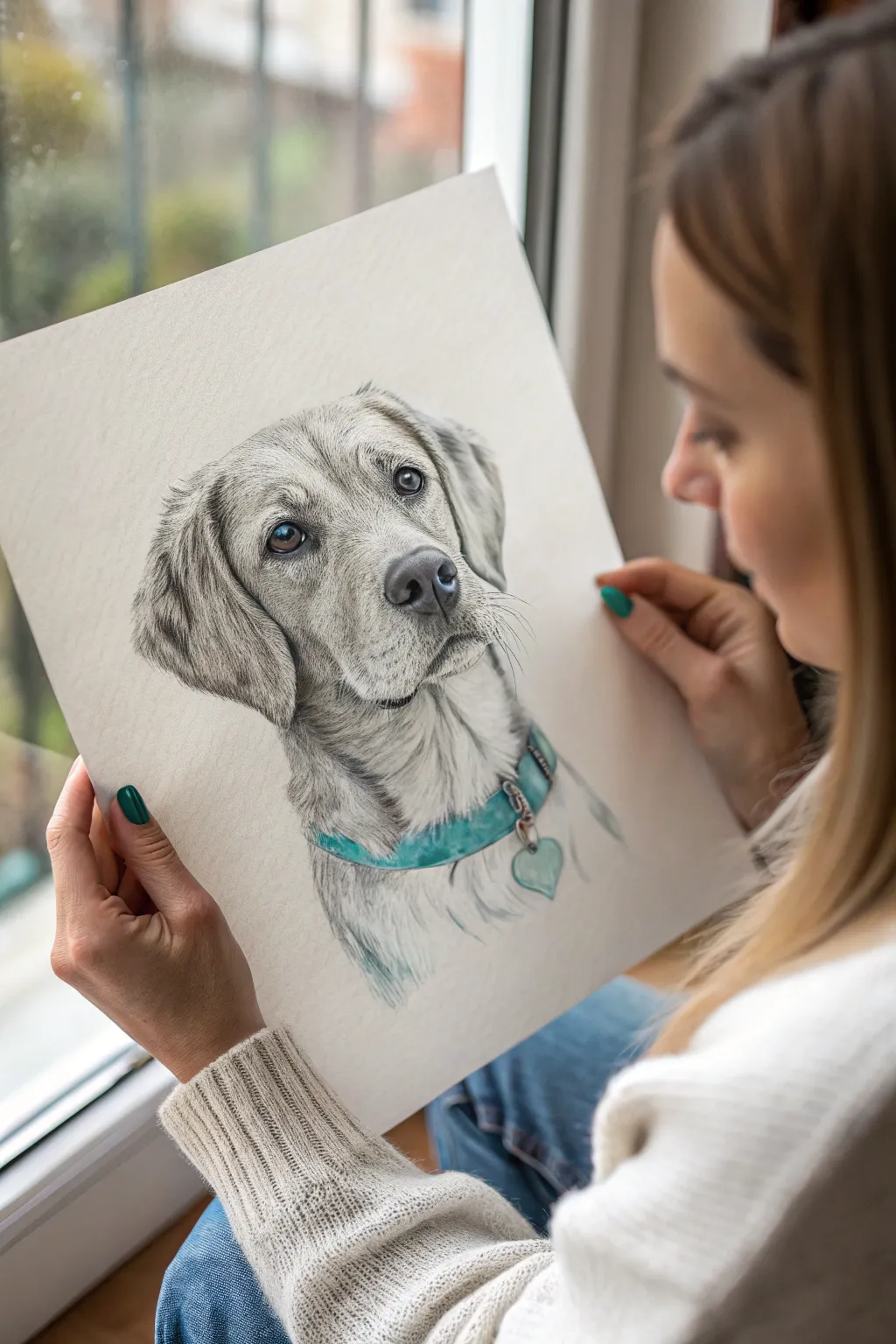
Capture the soul of a beloved pet with this detailed pencil sketch technique, featuring a striking pop of color on the collar. This tutorial guides you through layering graphite to achieve realistic fur texture and soulful eyes that jump off the page.
How-To Guide
Materials
- High-quality drawing paper (smooth or Bristol board, A3 or A4)
- Graphite pencils (HB, 2B, 4B, 6B)
- teal or turquoise colored pencil (wax or oil-based)
- Kneaded eraser
- Precision eraser (pencil style)
- Blending stumps or tortillons
- Reference photo of the pet
- Sharpener
Step 1: Laying the Foundation
-
Analyze the shapes:
Begin by observing your reference photo closely. Break the dog’s head down into simple geometric forms—a circle for the skull and a blocky rectangle for the snout. -
Initial outline:
Using an HB pencil with a very light hand, sketch these basic shapes onto your paper. Ensure the placement is centered and balanced before moving on. -
Refine the features:
Mark the positions for the eyes, nose, and ears. Pay slightly more attention to the eyes, as they need to be perfectly aligned to capture the dog’s likeness. -
Finalize the line art:
Clean up your rough shapes into a distinct outline of the dog. Sketch the collar lightly around the neck, including the dangling tag.
Keep it Sharp
Fur texture relies on a consistently sharp pencil point. Rotate your pencil slightly after every few strokes to maintain a fine edge, or keep a piece of sandpaper nearby to quickly hone the tip.
Step 2: Building Values and Texture
-
The eyes have it:
Start shading the eyes using a 4B pencil for the pupils to get a deep, dark black. Leave a small, crisp white circle unshaded for the catchlight reflection. -
Iris details:
Fill in the iris with a 2B pencil, using radial strokes that move from the pupil outward. Keep the top of the iris slightly darker to simulate the shadow from the eyelid. -
Nose texture:
Shade the nose with a 4B pencil. Instead of smooth shading, use tiny stippling or small circular motions to replicate the bumpy texture of a dog’s nose, darkening the nostrils significantly. -
Mapping fur direction:
With an HB pencil, draw light directional arrows or faint lines in the main areas of the face to remind yourself which way the fur grows. This is crucial for realism. -
Base fur layer:
Using the side of a 2B pencil, lay down a soft, mid-tone grey over the shadowed areas of the face, such as under the ears and beneath the chin. Smooth this gently with a blending stump.
Smudge Control
Right-handed artists should draw from left to right (and vice versa) to avoid smearing. Place a clean sheet of scrap paper under your drawing hand to protect finished areas from natural skin oils.
Step 3: Detailing the Coat
-
Creating individual hairs:
Switch to a sharp 2B pencil. Begin drawing short, quick strokes following your directional map. Lifting your pencil at the end of each stroke creates a tapered, hair-like look. -
Darkening the ears:
The ears often hold deeper shadows. Layer 4B pencil strokes here, ensuring the fur looks softer and slightly longer than the hair on the snout. -
Whiskers and muzzle:
Add small dots on the muzzle where the whiskers originate. Draw quick, confident, long strokes for the whiskers themselves using a sharp 2B or HB pencil. -
Deepening contrast:
I prefer to use a 6B pencil at this stage to punch up the darkest areas—specifically the corners of the mouth, the deepest ear folds, and the shadow cast by the collar. -
Highlights and cleanup:
Take your precision eraser and lift out thin lines of graphite to create bright white hairs, especially around the eyebrows and the lit side of the snout.
Step 4: The Pop of Color
-
Collar base layer:
Using your teal colored pencil, lightly shade the entire collar area. Keep the pressure even to avoid waxy buildup too early. -
Building saturation:
Go over the collar again with heavier pressure to create a vibrant teal. Leave the metal tag and buckle grey for now. -
Shadows on color:
Use a dark grey or black pencil to lightly shade over the teal collar where it tucks under the dog’s fur, creating depth and shadow. -
Metallic accents:
Shade the metal ring and heart tag with graphite, using high contrast (very dark darks and bright white highlights) to mimic a shiny metallic surface. -
Final chest fur:
Extend some fur strokes lightly over the top edge of the collar so it looks like the collar is sitting *in* the fur, not just pasted on top, and fade out the neck sketch at the bottom.
Now you have a stunning, sellable piece of art that perfectly memorializes a furry friend
BRUSH GUIDE
The Right Brush for Every Stroke
From clean lines to bold texture — master brush choice, stroke control, and essential techniques.
Explore the Full Guide
House Portraits With Cozy Details
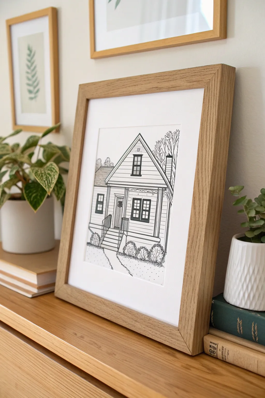
Capture the charm of a humble abode with this clean, architectural-style house portrait that emphasizes character over perfect realism. Using classic ink drawing techniques, you’ll create a timeless illustration perfect for personalized gifts or home decor commissions.
Detailed Instructions
Materials
- High-quality Bristol board or hot press watercolor paper (smooth texture)
- Graphite pencil (HB or H)
- Kneaded eraser
- Fine liner pens (sizes 005, 01, 03, and 05)
- Ruler or rolling ruler
- Reference photo of a house
- Light box (optional, for tracing sketches)
- Light wood picture frame with matting
Step 1: Drafting the Foundation
-
Analyze shapes:
Begin by looking at your reference photo and breaking the house down into its simplest geometric forms. Identify the large triangle for the gable roof and the primary rectangle for the main facade. -
Establish the horizon:
Lightly draw a horizontal line across your paper with a pencil to represent the ground level. This anchors your drawing so the house doesn’t feel like it’s floating. -
Block in the structure:
Using your ruler and light pencil strokes, map out the main walls and roof peaks. Focus on getting the proportions correct relative to each other rather than perfect measurements. -
Add architectural features:
Sketch in the placement of the windows, door, porch columns, and steps. Use the ruler to ensure vertical lines remain perfectly straight, but feel free to freehand horizontal elements slightly for a warmer look. -
Detail the surroundings:
Lightly sketch organic shapes for landscaping, such as the rounded bushes at the foundation and the suggestion of trees in the background. Keep these lines loose.
Step 2: Inking the Structure
-
Outline main lines:
Switch to an 03 or 05 fine liner pen. Use your ruler to carefully ink the primary structural lines of the roof, the corners of the house, and the foundation line. Pull the pen steadily to avoid wobbles. -
Define windows and doors:
Use a slightly thinner pen, like an 01, to outline the window sashes and door frames. I find that keeping the window panes free of heavy shading helps them look clean and reflective. -
Add siding texture:
With an 005 or 01 pen, draw the horizontal siding lines. You don’t need to use a ruler for every single line; sketching them freehand with a steady motion adds that ‘hand-drawn’ charm seen in the example. -
Ink the porch railing:
Carefully draw the vertical balusters of the porch railing. Ensure they are evenly spaced, using the 01 pen for a delicate touch that pushes them slightly into the foreground. -
Draw the roof shingles:
Instead of drawing every shingle, use horizontal lines to suggest rows, or leave the roof plain with just an outline for a high-contrast, graphic look as shown in the project image.
Straight Line Secret
If you struggle drawing perfectly straight siding lines freehand, place a piece of ruled notebook paper underneath your drawing paper on a light box to use as a guide.
Step 3: Adding Detail and Depth
-
Fill in dark accents:
Identify the darkest areas, such as the window panes or open doorways. Use your 05 pen to color these in solid black, leaving tiny slivers of white paper to suggest glass reflections. -
Texture the foliage:
For the bushes, use a scribbling motion with an 01 pen to create tight loops and squiggles. This texture contrasts beautifully with the straight lines of the architecture. -
Sketch background trees:
Draw the bare branches of the background trees using quick, jagged lines. Keep this linework thinner (005 size) so it recedes visually behind the house. -
Connect the path:
Draw the walkway leading up to the steps using broken, organic lines to suggest cracks or variations in the concrete or stone. -
Add ground stippling:
Dot the area around the base of the bushes and along the path with the 01 pen. This stippling effect grounds the house and adds a bit of grit to the yard. -
Final cleanup:
Once the ink is completely dry—give it a good ten minutes to be safe—gently erase all your graphite pencil lines with the kneaded eraser to reveal the crisp black and white art.
Fixing Ink Blobs
Did a pen slip or blot? Don’t panic. Use a white gel pen or a tiny dot of white gouache paint to cover the mistake. Once dry, you can carefully re-ink over it.
Place your finished portrait in a simple wooden frame to complete this cozy tribute to home
Minimal Face Line Drawings
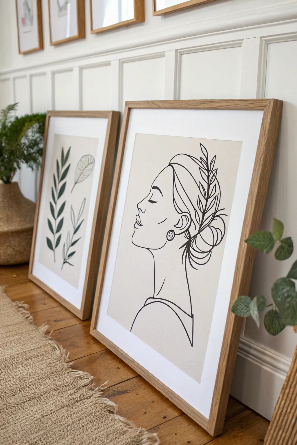
This elegant line drawing combines the simplicity of facial contours with organic botanical elements for a sophisticated, modern look. The finished piece captures a serene profile with a delicate leafy headpiece, perfect for creating a calming gallery wall atmosphere.
Step-by-Step Tutorial
Materials
- High-quality mixed media or watercolor paper (cream or off-white tone)
- Pencil (HB or H for sketching)
- Kneaded eraser
- Fine liner pens (sizes 0.3mm, 0.5mm, and 0.8mm, black archival ink)
- Ruler (optional for placement)
- Light box or tracing paper (optional if you aren’t drawing freehand)
- Wooden frame with mat board
Step 1: Conceptualizing & Sketching
-
Plan your composition:
Begin by deciding the placement of the head on your paper. The figure should sit centrally but slightly lower on the page to allow room for the hair accessories. Lightly mark the top of the head, chin, and back of the bun with faint pencil dots. -
Draft the profile outline:
Using your HB pencil, lightly sketch the curve of the forehead, moving down into the nose and lips. Keep your pressure extremely light so lines can be erased easily later. -
Define the features:
Sketch a simple closed eye with lashes pointing downward to evoke a peaceful expression. Add the eyebrow arching gently above it and a small curved line for the nostril. -
Structure the hair and ear:
Draw the ear lobe and outline, placing a small circular earring stud for detail. From the forehead, sweep lines back to indicate hair being pulled away from the face. -
Form the messy bun:
Create the bun shape at the back of the head using overlapping circular and looping motions. This doesn’t need to be perfect; the ‘messy’ look comes from loose, interlocking loops. -
Add the neck and shoulder:
Extending from the jawline and the back of the hair, draw the long, elegant neck. Continue downward to suggest the curve of a shoulder and a simple neckline of a garment.
Smooth Operator
Draw from your shoulder, not your wrist, especially for the long curve of the neck and profile. This prevents shaky, jagged lines.
Step 2: Adding Botanical Details
-
Position the main stem:
Sketch a curved line that starts near the ear and sweeps upward along the side of the head, acting as the spine for your leaves. -
Draft the leaves:
Along the stem, add small, almond-shaped leaves. Vary their direction slightly to make them look natural, tucking some behind the hair lines and overlapping others. -
Refine the composition:
Step back and look at your pencil sketch. Adjust any proportions now—ensure the neck isn’t too thick or thin and that the bun feels balanced against the face.
Step 3: Inking the Lines
-
Select your pens:
Test your pens on a scrap piece of the same paper. I find that using a slightly thicker nib (0.5mm) for the main profile outline and a thinner one (0.3mm) for hair details creates nice depth. -
Ink the face profile:
Start with the forehead and nose. Commit to the line with a steady hand, moving slowly to keep the curve smooth. Lift your pen cleanly at the end of the stroke. -
Detail the eye and ear:
Switch to your finer 0.3mm pen for the eyelashes and the inner details of the ear. This prevents these small areas from looking blotchy or heavy. -
Outline the hair and bun:
Use fluid, confident strokes for the hair. When inking the bun, allow lines to cross over each other intentionally to mimic strands of hair wrapped around. -
Ink the botanical crown:
Trace your leaf sketches carefully. You can make the outer edges of the leaves slightly bolder than the vein lines inside to make them pop. -
Complete the body lines:
Finish by inking the neck and shoulder line. A 0.8mm pen can work well here to ground the bottom of the drawing with a slightly weightier line.
Go Digital
Scan your line drawing and vectorize it in Illustrator. You can then print it on canvas or overlaid on colored abstract shapes.
Step 4: Finishing Touches
-
Erase pencil marks:
Wait until the ink is completely dry—give it at least 15 minutes to be safe. Gently gently roll a kneaded eraser over the entire drawing to lift the graphite without damaging the paper surface. -
Inspect and refine:
Check for any broken lines that need connecting or lines that could be thickened slightly to balance the visual weight of the piece. -
Frame your work:
Place your finished drawing behind a clean white mat and secure it in a light wood frame to match the organic, minimalist aesthetic shown in the photo.
Hang your new artwork alongside a plant print to create a cohesive and tranquil display

PENCIL GUIDE
Understanding Pencil Grades from H to B
From first sketch to finished drawing — learn pencil grades, line control, and shading techniques.
Explore the Full Guide
Simple Landscape Mini Prints
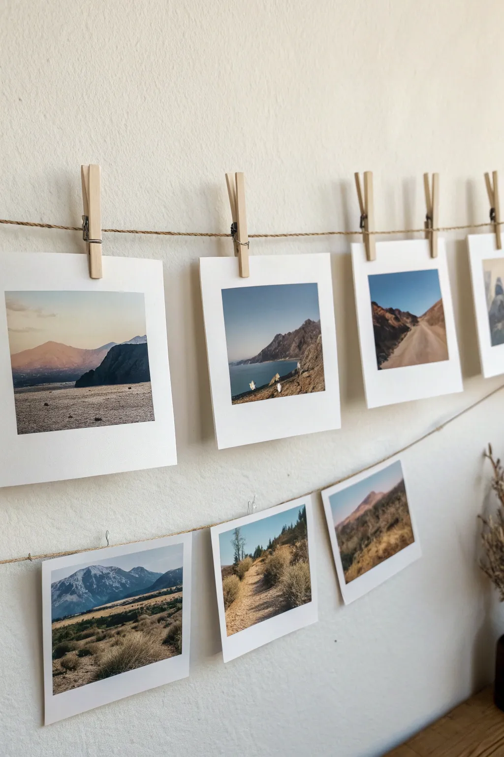
Capture the serenity of the great outdoors with these charming Polaroid-style mini paintings. Perfect for art markets or gift-giving, these bite-sized landscapes bring a touch of mountain air to any wall they adorn.
How-To Guide
Materials
- Heavyweight watercolor paper or mixed media cardstock (300gsm)
- White artist tape or masking tape
- Gouache or opaque watercolor set
- Small flat brush (size 4)
- Fine detail brush (size 0 or 00)
- Ruler and pencil
- Jute twine
- Mini wooden clothespins
- Paper trimmer or scissors
- Small mixing palette
Step 1: Preparation & Layout
-
Measure your squares:
Begin by measuring out a series of 3.5 x 4.25 inch rectangles on your watercolor paper. This size mimics the classic instant film format perfectly. -
Mark the image area:
Within each rectangle, lightly measure a 3.1 x 3.1 inch square for the image area. This leaves that iconic thicker border at the bottom and thinner borders on the sides and top. -
Mask the borders:
Carefully apply artist tape along the inner pencil lines of your image square. Press the edges down firmly with your thumbnail to ensure clean, crisp lines later. -
Tape down the sheet:
If you are painting multiple on one large sheet, tape the entire sheet to your work surface to prevent buckling when the paper gets wet.
Crisp Edges Secret
Before painting, seal your tape by brushing a thin layer of clear matte medium over the edge. This prevents paint bleed perfectly.
Step 2: Painting the Scenes
-
Choose your palette:
Select a cohesive color scheme for your series. Earthy tones like ochre, burnt sienna, slate blue, and sap green work beautifully together for these landscapes. -
Paint the sky gradient:
Start with the sky. Mix a light blue or soft sunset peach and apply it to the top third of the square. Add a touch of water to fade it gently as you move down toward the horizon line. -
Block in background mountains:
Using a diluted version of your mountain color (like a hazy purple or grey), paint the distant mountain shapes. Keep the edges soft to suggest atmospheric depth and distance. -
Layer the mid-ground:
Once the sky is dry, mix a slightly darker, more saturated earth tone. Paint the middle mountain ranges or hills, allowing the shapes to overlap the background layer naturally. -
Add foreground details:
For the closest elements, use your darkest and most opaque pigments. I often use a dry brush technique here to mimic the texture of rough terrain, scrub brush, or rocky shores. -
Refine with highlights:
Switch to your fine detail brush. Use white or a very light tint to add tiny highlights on mountain ridges, ocean whitecaps, or sun-drenched paths. -
Introduce vegetation:
Dab small dots of dark green or brown in the foreground to represent bushes or scrub. Keep these loose and impressionistic rather than overly detailed.
Level Up: Texture
Sprinkle fine salt onto wet watercolor sections like the ocean or sandy foregrounds. Brush it off when dry for organic, rocky textures.
Step 3: Finishing & Display
-
The reveal:
Wait until the paint is completely bone-dry. Slowly peel back the tape at a 45-degree angle, pulling away from the painted area to preserve the sharp edges. -
Cut the cards:
Using a paper trimmer or sharp scissors, cut along the outer pencil lines you measured in the very first step to separate your individual cards. -
Check the borders:
If any pencil marks remain visible on the white borders, gently erase them now with a white vinyl eraser. -
Prepare the hanging line:
Cut a length of jute twine to fit your desired wall space. Tie loops at the ends or simply tape the ends securely to the wall. -
Install the exhibition:
Attach a second, lower tier of twine if you have many prints. Let the twine droop slightly in the center for a relaxed look. -
Clip and hang:
Use mini wooden clothespins to clip the top center of each print to the twine. Space them evenly to let each landscape breathe.
Step back and admire your personalized gallery wall of miniature adventures.
City Skyline Ink Sketches
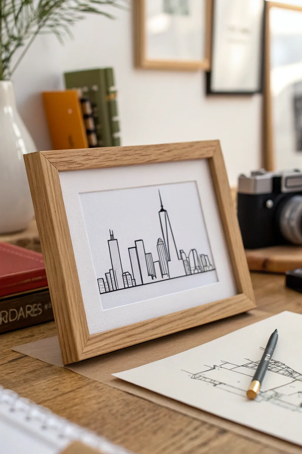
Capture the iconic silhouette of a city with this clean and sophisticated ink line drawing. The minimalist aesthetic allows the famous shapes of skyscrapers to stand out boldly against the negative space, creating a modern piece perfect for any desk or gallery wall.
Step-by-Step Guide
Materials
- Smooth bristol board or hot press watercolor paper (A5 size)
- Fine liner pens (sizes 0.1, 0.3, and 0.5)
- HB graphite pencil
- Kneaded eraser (putty rubber)
- Ruler or straighedge
- Reference photo of a city skyline (e.g., Chicago)
- Light oak wooden frame (5×7 inch with mount)
Step 1: Preparation & Sketching
-
Select your reference:
Choose a reference photo of a city skyline that has recognizable buildings. High contrast photos work best for identifying the silhouette. For this project, we are focusing on a simplified view featuring a prominent spire like the Willis Tower. -
Define the horizon:
Using your ruler and HB pencil, draw a very faint horizontal line across the bottom third of your paper. This will serve as the base for all your buildings and ensure the city doesn’t look like it’s tilting. -
Block in major shapes:
Start sketching the tallest buildings first. Don’t worry about windows yet; just focus on the basic rectangular and triangular prisms. Use light pressure so these lines can be erased later. -
Add secondary structures:
Fill in the gaps between the skyscrapers with lower buildings. Vary the heights and widths to create a dynamic rhythm across the page. I like to overlap some buildings slightly to create depth, rather than having them all stand side-by-side. -
Refine the outlines:
Go back over your pencil sketch to tighten the geometry. Ensure vertical lines are perfectly straight up and down, as slanted lines can ruin the perspective effect.
Pro Tip: Varying Line Weight
Use a thicker 0.8mm pen for the outermost silhouette of the entire city group. This creates a bold ‘sticker effect’ that separates the subject from the background.
Step 2: Inking the Silhouette
-
Outline the main towers:
Switch to your 0.5 pen for the primary outlines. Start with the most prominent building (the one with the spire). Draw confident, continuous lines for the long vertical edges. -
Ink the supporting buildings:
Continue outlining the remaining building shapes with the 0.5 pen. Be careful where buildings overlap; stop your line exactly where it hits the building in front to maintain the illusion of depth. -
Establish the ground line:
Draw a firm, continuous line across the bottom of the buildings using the 0.5 pen. This grounds the composition and gives it a finished architectural look. -
Add structural details:
Switch to a thinner 0.3 pen. Add internal details like the setbacks on skyscrapers, antennae, or distinctive roof shapes. Keep these lines slightly lighter than the main perimeter capabilities. -
Suggest windows and texture:
Using your finest 0.1 pen, add minimal texture suggestions. You don’t need to draw every window. A few small grids, horizontal stripes, or vertical lines on just a few buildings effectively suggest glass and steel without cluttering the drawing.
Step 3: Finishing Touches
-
Let the ink cure:
Wait at least 15 to 20 minutes for the ink to dry completely. Although pens dry fast, erasing over slightly damp ink will result in ugly gray smudges. -
Erase pencil guides:
Gently rub the kneaded eraser over the entire drawing to lift the graphite sketched lines. A kneadable eraser is preferred here because it doesn’t leave crumbs or damage the paper surface. -
Check line weights:
Inspect your drawing for any lines that look too thin or broken. Carefully re-trace any main structural lines that need more visual weight to pop against the white background. -
Prepare the frame:
Clean the glass of your frame thoroughly on both sides to remove dust and fingerprints. Place your artwork into the mount, ensuring it is perfectly centered. -
assemble:
Secure the backing board of the frame. The clean oak frame complements the stark black and white ink, making it ready for sale or display.
Troubleshooting: Shaky Lines
If your lines aren’t straight, don’t strive for perfection. Go over the line again loosely to create a deliberate ‘sketchy’ style, or use a ruler with a beveled edge for inking.
This sophisticated yet simple piece proves that sometimes less really is more when capturing urban landscapes


Food Illustration Recipe Cards
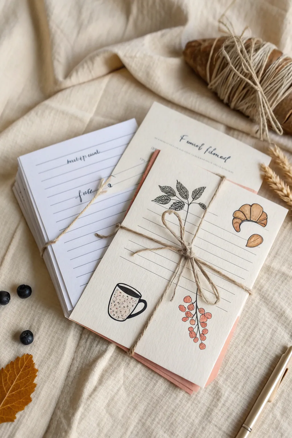
These charming, hand-illustrated recipe cards combine simple ink line work with soft touches of color for a cozy, rustic aesthetic. Perfect for gifting or selling as boutique stationery, they offer a delightful way to preserve favorite culinary memories.
Step-by-Step Tutorial
Materials
- Heavyweight cream or off-white cardstock (A5 size)
- Fine liner pens (0.3mm and 0.5mm, black waterproof ink)
- Colored pencils or alcohol markers (warm browns, reds, greens)
- Ruler
- Pencil and eraser
- Jute twine for packaging
- A paper trimmer or scissors
Step 1: Planning and Layout
-
Cut the cardstock:
Start by cutting your cream cardstock into uniform sheets. An A6 size (approx 4×6 inches) is standard for recipe cards, but you can go slightly larger if you want more writing space. -
Mark the guidelines:
Using a ruler and a light pencil, draw horizontal lines across the bottom two-thirds of the card for writing the recipe steps. Space them about 1cm apart. -
Sketch the illustrations:
Lightly sketch your motifs in the open spaces around the lines. Aim for a balanced composition: place the coffee mug in the bottom left, the berry branch bottom center-right, and the croissant and leaves in the upper corners.
Ink Confidence
Work steadily when inking. If a line goes astray, thicken the line slightly elsewhere to balance the visual weight rather than trying to erase it.
Step 2: Inking the Design
-
Ink the writing lines:
Go over your horizontal pencil guidelines with the 0.3mm fine liner. You can use a ruler for precision, or do it freehand like I often do for a more organic, handmade feel. -
Outline the botanicals:
Use the 0.5mm pen to trace the outlines of the leaves and berries. Keep the lines crisp but don’t worry about perfection; slight wobbles add charm. -
Detail the food items:
Ink the croissant and almond outlines. Add internal textural lines to show the flaky layers of the pastry. -
Define the coffee mug:
Trace the mug shape. Draw an oval for the coffee surface and fill it in with solid black ink, leaving a tiny white sliver for a reflection. -
Add texture to the leaves:
Switch back to the thinner 0.3mm pen to draw the veins inside the leaves. Use short, quick strokes for shading near the stem. -
Erase pencil marks:
Wait at least 5-10 minutes to ensure the ink is completely dry, then gently erase all visible pencil sketches.
Market Ready
Slip a loose dried flower or a sprig of dried wheat under the twine bow before photographing or selling to immediately elevate the rustic presentation.
Step 3: Adding Color and Finishing
-
Color the croissant:
Using a warm golden-brown pencil, lightly shade the croissant. Press harder in the crevices of the pastry layers to create depth and dimension. -
Tint the berries:
Fill in the berries with a soft red or coral shade. Leave a tiny speck of white paper showing on each berry to act as a highlight. -
Decorate the mug pattern:
Lightly color the mug’s body. If you drew a pattern (like the speckles shown), use a contrasting color or simple dots. -
Color the leaves:
Use a desaturated green for the leaves. Apply the color lightly so the intricate vein work remains visible underneath. -
Create a varied set:
Repeat the process for the rest of your cards. You can vary the illustrations on some sheets—keep the layout consistent but swap the croissant for a strawberry or a cookie. -
Bundle formatting:
Stack your finished cards neatly. If you have created a title card or a ‘From the Kitchen of’ header sheet, place that on top and bottom. -
Tie the bundle:
Cut a long length of jute twine. Wrap it around the center of the stack twice to create a sturdy hold. -
Secure the bow:
Tie a simple bow in the center of the twine wrap. Fluff the loops so they sit nicely against the top card.
You now have a beautiful set of artisanal recipe cards ready to capture culinary treasures
Baby Animal Alphabet Prints
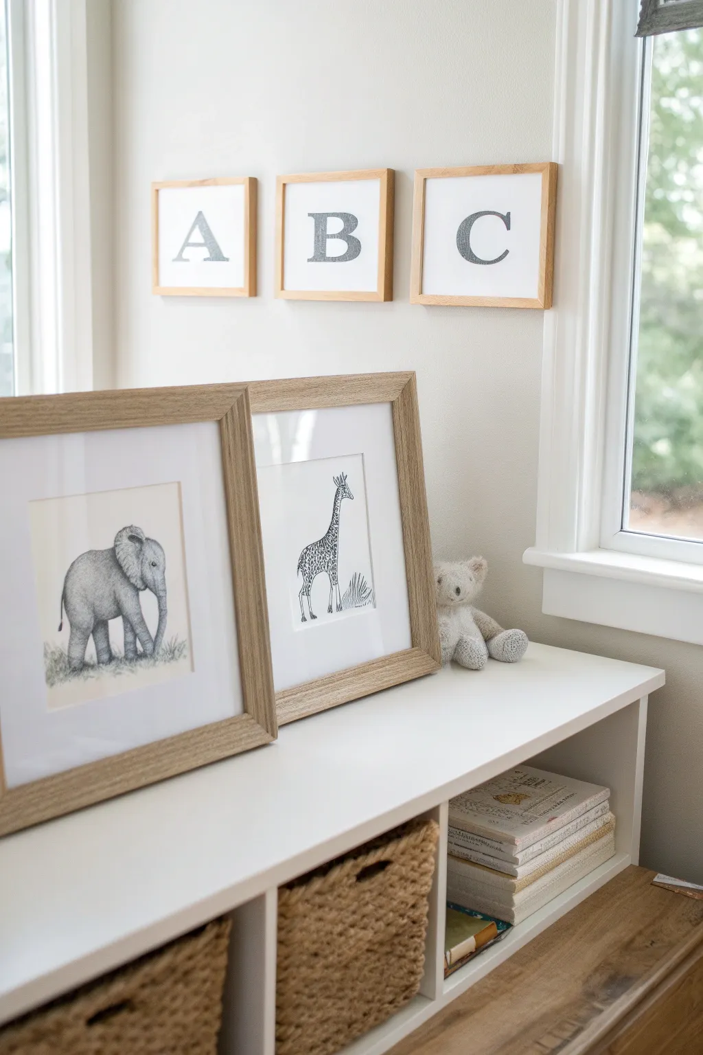
Capture the sweetness of the animal kingdom with these delicate graphite pencil illustrations featuring a baby elephant and a graceful giraffe. The result is a set of minimalist, high-contrast drawings that pair perfectly with light wood frames for a timeless nursery aesthetic.
Detailed Instructions
Materials
- Hot press watercolor paper or smooth Bristol board (white)
- Graphite drawing pencils (HB, 2B, 4B, 6B)
- Mechanical pencil (0.5mm with HB lead)
- Kneaded eraser
- Precision eraser or eraser stick
- Blending stump (tortillon)
- Fixative spray (matte finish)
- Ruler
- Light wood frames with white mats
Step 1: Planning and Sketching
-
Prepare your paper size:
Begin by measuring your paper to fit your designated frames. Standard 8×10 or 5×7 inches works best for these delicate subjects. Lightly mark the center of the paper to help with composition balance. -
Map out basic shapes (Elephant):
For the baby elephant, use an HB pencil to lightly sketch a large oval for the body and a rounded square shape for the head. Add the curve for the trunk and the large ear flap. -
Map out basic shapes (Giraffe):
On a separate sheet for the giraffe, start with a small oval for the head and a long, gentle S-curve for the neck leading into a rectangular body shape. Keep these lines extremely faint so they disappear later. -
Refine the outlines:
Switching to your mechanical pencil for precision, define the contours of the animals. Give the elephant slightly bumpy skin folds at the knees and trunk. For the giraffe, ensure the legs are spindly and elegant.
Step 2: Texturing the Elephant
-
Base shading:
Using a 2B pencil, apply a light, even layer of shading across the elephant’s body, avoiding the highlights on the forehead and the top of the ear. -
Creating wrinkled skin:
Use a 4B pencil to draw small, erratic lines and creases, particularly around the trunk, knees, and neck. These wrinkles are key to the realistic look. -
Deepen the shadows:
Switch to a 6B pencil for the darkest areas: under the belly, inside the ear, and beneath the trunk. This high contrast makes the drawing pop against the white paper. -
Soften the texture:
Here is where I like to use a blending stump to gently smudge the graphite shading, smoothing out pencil strokes while leaving the sharp wrinkle lines intact. -
Grounding the subject:
Sketch short, grassy strokes around the elephant’s feet using the HB pencil. Vary the direction of the strokes to make the grass look natural and unkept.
Clean Hands, Clean Art
Keep a piece of scrap paper under your drawing hand at all times. This prevents oils from your skin transferring to the paper and stops your palm from smearing the graphite.
Step 3: Detailing the Giraffe
-
Draw the ossicones and face:
Use the mechanical pencil to detail the giraffe’s face, adding large, dark eyes with tiny white catchlights. Sketch the ossicones (horns) and ears with fuzzy, broken lines to suggest fur. -
Map the spots:
Lightly outline the irregular geometric shapes of the giraffe’s spots all along the neck and body. Keep the spaces between them consistent like a mosaic. -
Fill the pattern:
Fill in the spots using a 4B pencil. Instead of solid black, use a tight cross-hatching technique to give the spots a textured, hairy appearance. -
Add the mane:
Draw the mane running down the back of the neck using short, stiff strokes with a 2B pencil. Ensure the hairs stand up straight rather than laying flat. -
Add environmental details:
Sketch a small cluster of tall grass or a bush near the giraffe’s legs to balance the composition, keeping the lines light and airy.
Add a Splash of Color
For a softer nursery look, use a watercolor wash in pale blue or sage green just on the background elements (like the grass) or add a tiny pink bow to an animal.
Step 4: Final Touches and Framing
-
Clean up highlights:
Use your kneaded eraser to lift off any smudges outside the drawings. You can also tap the eraser on the animals’ bodies to create soft highlights. -
Define edges:
Go back over the main outlines with a sharp 2B pencil to give the drawings a finished, illustrative quality. -
Seal the graphite:
In a well-ventilated area, spray a thin coat of matte fixative over the drawings to prevent the graphite from smearing or transferring to the frame glass. -
Mount and frame:
Once dry, place your artwork behind a clean white mat and secure it into the light wood frames to complete the gallery look.
Hang your beautiful new gallery set and enjoy the serene atmosphere it brings to the room.
Hand-Lettered Quote Posters
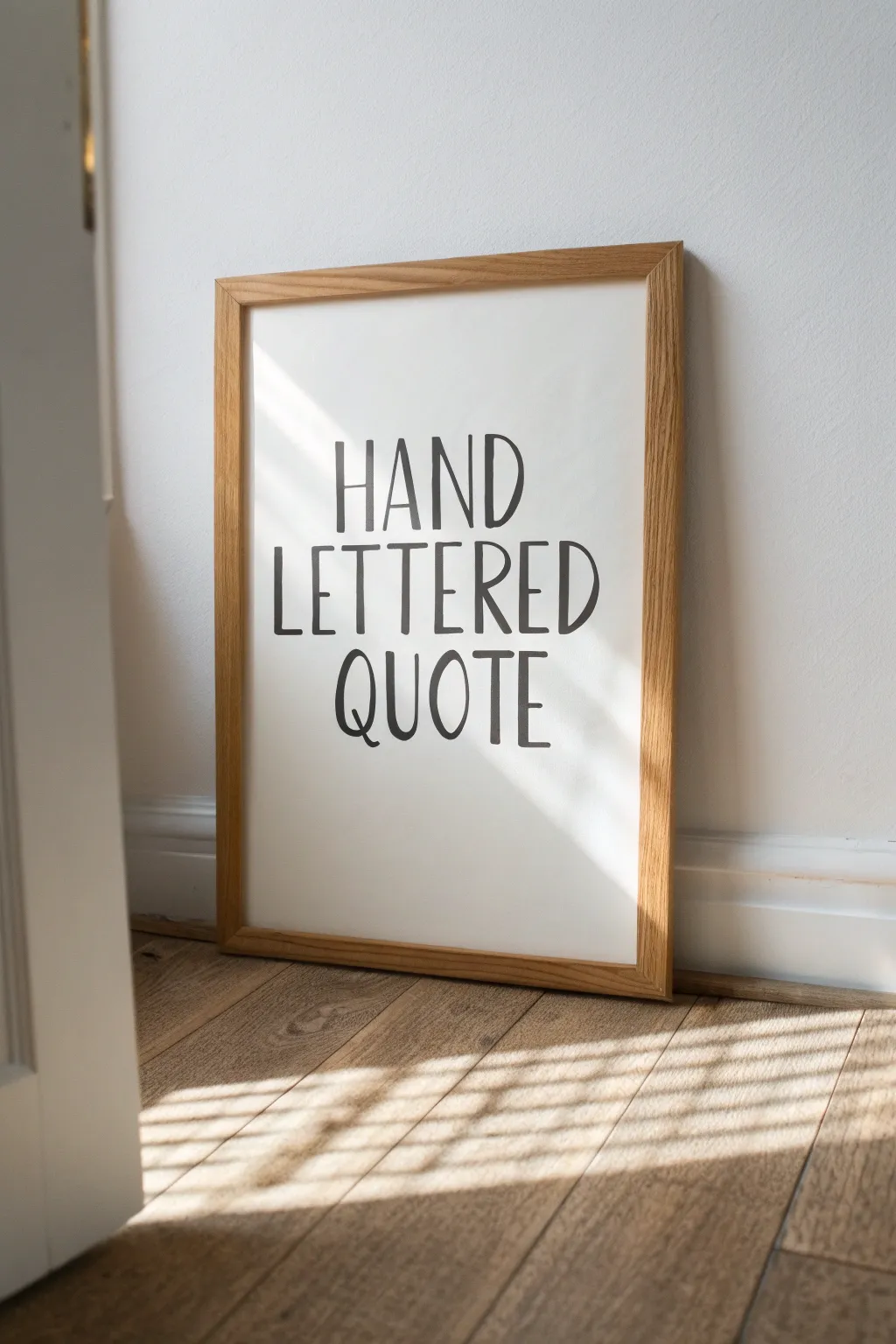
Capture the charm of simplicity with this tutorial for creating clean, hand-lettered wall art. The beauty of this project lies in its imperfect, organic lines, giving your favorite phrase a warm and personal touch that digital fonts just can’t replicate.
Step-by-Step Guide
Materials
- High-quality white Bristol board or hot press watercolor paper (A3 or A2 size)
- Pencil (HB for sketching)
- Kneaded eraser
- Ruler or T-square
- Black brush pen (medium firmness) or black India ink with a round brush (size 2 or 4)
- Light wood box frame (oak or pine finish)
- Scrap paper for practice
Step 1: Drafting the Layout
-
Choose your phrase:
Select a short phrase of about 3-5 words. For this specific look, sticking to three distinct lines of text works best to fill the vertical space evenly. -
Find the center:
Lightly measure and mark the exact vertical center of your paper using your ruler. This invisible line will be the anchor for your centering. -
Draw guidelines:
Using a very light touch with your pencil, draw three horizontal baselines where your text will sit. Leave generous, equal spacing between each line to keep the design airy. -
Determine cap height:
Draw faint ‘cap height’ lines above your baselines. This defines how tall your letters will be. The style shown uses tall, narrow letters, so give yourself plenty of vertical room. -
Sketch the skeleton:
Roughly sketch your letters. Focus on a monoline style first—just simple stick figures. Don’t worry about thickness yet; just ensure the spacing between letters is relatively consistent. -
Refine the letterforms:
Go back over your skeleton sketch to define the style. The look here is ‘casual tall sans-serif.’ Slightly bow the vertical lines of ‘H’ or ‘D’ to make them feel hand-drawn, and keep the crossbars on ‘E’ and ‘H’ slightly higher than the geometric center. -
Check the balance:
Step back from your sketch. Does the text feel centered? If a word looks too short, gently widen the kerning (space between letters) to balance the visual weight across the page.
Wobbly Lines?
If your hand shakes too much, try drawing the stroke faster. Momentum smooths out the jitters. Also, breathe out while pulling the stroke downward.
Step 2: Inking the Artwork
-
Warm up tight muscles:
Before touching the final paper, do a few practice strokes on scrap paper. I always make a few vertical lines and ‘O’ shapes to get the ink flowing and my hand steady. -
Begin the final lines:
Start with the top word. Use your brush pen or ink brush to trace your pencil lines. Apply consistent, moderate pressure to create a medium-weight line that doesn’t vary too much in thickness. -
Embrace the wobble:
Do not use a ruler for the inking process. The charm of this piece comes from the slight natural waver of the human hand. Let the vertical strokes curve ever so slightly. -
Manage ink flow:
If you are using dipped ink, reload your brush frequently to avoid dry brushing at the end of long strokes. If using a marker, keep a steady pace to prevent ink bleeding at stopping points. -
Round the ends:
The example shows terminals (ends of the lines) that are slightly rounded, not sharp. If your pen leaves a sharp point, gently touch the tip back to the end of the stroke to round it off. -
Let it dry completely:
Ink takes longer to dry than you think, especially on smooth Bristol paper. Wait at least 30 minutes to ensure no wet spots remain.
Go Digital
Scan your finished black and white lettering. You can then vectorize it in software like Illustrator to permit printing deeply saturated copies at any size.
Step 3: Finishing Touches
-
Erase guidelines:
Once the ink is bone dry, gently roll your kneaded eraser over the paper to lift the pencil marks. Use a rolling motion rather than scrubbing to protect the paper’s surface texture. -
Clean the frame:
Take your light wood frame and clean the glass (or acrylic) on both sides to remove dust and fingerprints before assembly. -
Mount the artwork:
Place your artwork into the frame. If the paper is thinner than the frame allowance, add a backing board to keep it pressed flat against the glass. -
Secure the back:
Close up the frame tabs, ensuring the paper hasn’t shifted and remains perfectly centered within the window.
Place your framed quote on the floor or hang it in a well-lit spot to enjoy your custom creation
Adult Coloring Page Bundles
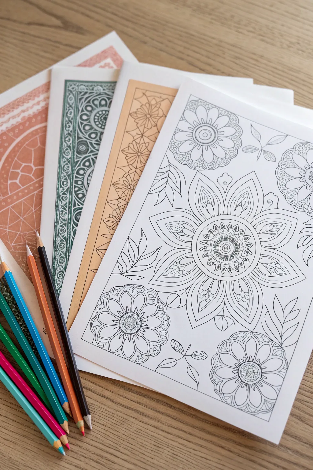
Create a stunning collection of market-ready adult coloring pages featuring intricate floral mandalas and geometric borders. This project focuses on designing clean, professional line art that can be digitized and sold as printable bundles.
Step-by-Step Tutorial
Materials
- Smooth bristol board or layout paper (A4 or Letter size)
- Pencil (HB or 2H for sketching)
- Fine liner pens (sizes 0.1, 0.3, 0.5, and 0.8mm)
- Ruler
- Compass or circle template
- Eraser (kneaded preferred)
- Scanner
- Vector software or image editing software (optional for digitization)
- Printer and cardstock (for testing)
Step 1: Drafting the Layouts
-
Define the borders:
Begin by lightly penciling a border around your paper, leaving about a half-inch margin. For the variety shown in the bundle, you can create different border styles: a simple double line for the main floral page, and intricate geometric patterns for the background sheets. -
Establish the focal point:
For the main floral page, use your compass to draw a light central circle. This will serve as the core of your primary mandala flower. Mark the center point clearly. -
Sketch structural guidelines:
From the center, lightly draw radiating lines like wheel spokes to divide the circle into equal sections (8 or 12 sections work well). This ensures your petals will be symmetrical. -
Place secondary elements:
Sketch circles in the corners or along the sides where smaller flowers will go. I like to vary the sizes to create visual interest and keep the eye moving across the page. -
Draft the central flower:
Using your guidelines, sketch the primary petals of the large central flower. Start with a small inner ring of petals, then add a second, larger layer behind them. -
Add nature details:
Fill the negative space between the main flower and corner flowers with sweeping leaf shapes and vine-like stems. Keep the flow organic and curving.
Line Weight Magic
Use 0.8mm pens for outer contours and 0.1mm for inner textures. This contrast makes the design easier to color and visually clearer.
Step 2: Inking the Design
-
Outline main shapes:
Switch to a 0.5mm or 0.8mm fine liner. Carefully trace the major outlines of your flower petals and large leaves. Using a thicker line for the main shapes helps them pop off the page. -
Add inner details:
Use a finer 0.3mm pen to draw the internal details, such as the veins on the leaves or the decorative lines inside the large petals. This hierarchy of line weight is crucial for a professional look. -
Create texture:
With your 0.1mm pen, add tiny details like stippling (dots) or hatching in the flower centers. This adds depth without making the image too dark to color. -
design the geometric variations:
For the background sheets in the bundle (the ones with colored borders in the photo), draw repetitive geometric patterns or tessellating flower shapes along the edges. Use a ruler to ensure these are perfectly straight and uniform. -
Clean up the artwork:
Once the ink is completely dry—give it a few minutes to be safe—gently erase all pencil guidelines. Check for any gaps in your lines and close them so colors won’t ‘leak’ when filled.
Digital Variation
Scan one geometric border and use software to change the background colors instantly, creating a multi-color pack from a single drawing.
Step 3: Digitizing and Finishing
-
Scan at high resolution:
Scan your inked drawings at 300 DPI or higher in black and white mode. This resolution is essential for crisp printing. -
digital clean-up:
Open the file in your image editor. Adjust the levels or contrast to make the background pure white and the lines deep black. Use the digital eraser to remove any stray specks or smudge marks. -
Add digital color borders:
To mimic the bundle look, you can digitally add a colored background layer behind your geometric border pages (like the teal, terracotta, and ochre examples). Set the line art layer to ‘Multiply’ mode so the color shows through the white spaces. -
Test print:
Print your designs on heavy cardstock or high-quality paper. Color a small section yourself to ensure the lines are thick enough to hold the pigment and the details aren’t too small to fill. -
Assemble the bundle:
Group a main focal design with 2-3 geometric or pattern-based pages to create a cohesive ‘themed’ coloring packet ready for sale or gifting.
Now you have a professional-quality coloring bundle ready to share with the world
Geometric Sun and Moon Designs
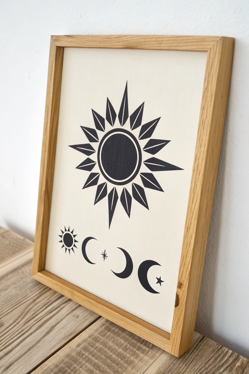
This minimalist black-and-white design balances a bold, geometric sunburst with a delicate sequence of moon phases below. The stark contrast and sharp lines make it a striking modern piece perfect for selling as a digital print or original ink drawing.
Detailed Instructions
Materials
- Heavyweight bristol board or hot-press watercolor paper (cream or off-white)
- Black ink fine liners (0.3mm and 0.8mm)
- Wide black marker or India ink with a brush
- Compass and ruler
- Pencil (2H or H for light lines)
- Eraser
- Wooden frame (oak or natural finish) matching your paper size
Step 1: Drafting the Geometry
-
Establish the Center:
Measure your paper carefully to find the horizontal center. Place the main sun element in the upper two-thirds of the page, leaving ample room below for the moon phases. -
Draw the Sun’s Core:
Using a compass, lightly draw two concentric circles. The inner circle will be solid black, and the outer ring creates the white negative space border. -
Map Out the Rays:
Lightly sketch a larger guide circle to mark the tips of the sun’s rays. Use a protractor or your eye to divide the circle into roughly 16 equal sections for the primary rays. -
Define Ray Shapes:
Sketch the triangular ‘leaf’ shapes for the rays. Notice how the design alternates between a standard triangle and a split-triangle shape. Keep the tips pointed outward toward your guide circle. -
Draft the Lower Elements:
In the lower third, use a ruler to draw a faint horizontal baseline. This ensures your moon phases and mini-sun stay perfectly aligned. -
Sketch the Icons:
From left to right, lightly sketch a small sun, a crescent moon facing right, a central four-pointed star, another crescent facing left, and a final crescent facing right with a star inside.
Pro Tip: Sharp Points
To get razor-sharp points on the sun rays, place your pen tip at the very point first and pull the ink inward toward the center, rather than pushing out.
Step 2: Inking the Design
-
Outline the Main Sun:
Switch to your 0.3mm fine liner. carefully trace the outlines of the sun’s core circle and every individual ray. Accuracy is key here to maintain that clean, graphic look. -
Fill the Core:
Use a wider marker or a brush with India ink to fill in the central circle of the sun. Ensure the coverage is solid and opaque without streaks. -
Detail the Rays:
I prefer to verify my outlines are dry before filling. Use the thicker pen to fill in the rays, being mindful of the split rays that have a thin white line running through the center. -
Ink the Mini Sun:
Move to the bottom row. Outline the small sun on the left. Fill the center circle, leaving a tiny white dot in the middle if desired, and carefully ink the small triangular rays. -
Ink the Crescent Moons:
Carefully trace and fill the crescent moon shapes. The curves need to be smooth, so try to use confident, sweeping strokes rather than short, sketchy ones. -
Ink the Stars:
Use the finest 0.3mm pen for the central four-pointed star and the small iconic star tucked into the final crescent moon to keep the points sharp.
Step 3: Finishing Touches
-
Erase Guide Lines:
Allow the ink to dry completely—give it at least 20 minutes to prevent smudging. Gently erase all pencil marks, holding the paper taut so it doesn’t crinkle. -
Check for Saturation:
Inspect all black areas under a bright light. If the ink looks patchy or grey, apply a second layer to achieve a deep, true black. -
Prepare the Frame:
Clean the glass of your wooden frame thoroughly on both sides to remove dust and fingerprints. -
Mount and Frame:
Place your artwork into the frame, securing the backing. The natural wood tone complements the stark graphic style of the drawing perfectly.
Level Up: Gold Leaf
Instead of black ink for the central sun circle, apply sizing and gold leaf. The metallic texture against the flat black rays creates a luxurious, high-value look.
Hang your new celestial art in a well-lit spot to admire the clean lines and modern aesthetic
Seamless Pattern Tile Sheets
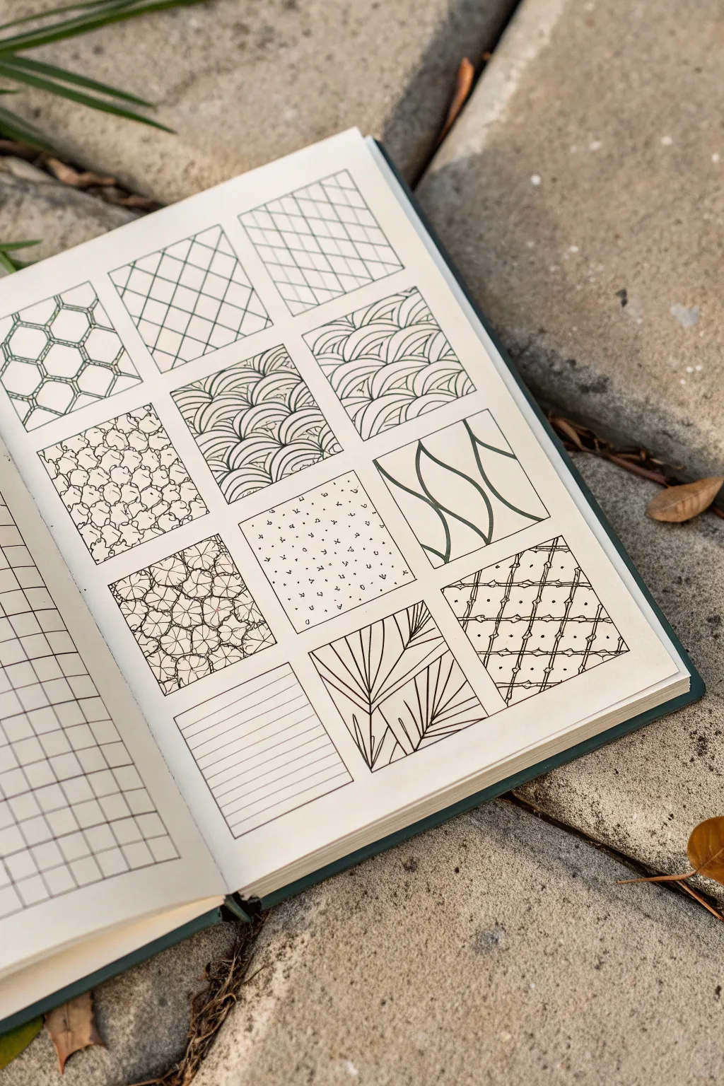
This project transforms a simple sketchbook page into an inspiring catalog of textural patterns and linework ideas. By dividing your page into neat squares, you create a controlled space to practice everything from organic curves to geometric precision without the pressure of filling a whole page.
Step-by-Step Guide
Materials
- Sketchbook or heavyweight drawing paper
- Pencil (HB or 2B)
- Ruler or straightedge
- Fine liner pens (0.3mm and 0.5mm)
- Eraser
Step 1: Setting the Framework
-
Measure margins:
Begin by deciding on the layout of your grid. Measure equal margins from the top, bottom, and sides of your sketchbook page to center your design area. -
Calculate square sizes:
Based on the remaining space, calculate the size of your squares. A 3×4 grid works perfectly for standard A5 journals, leaving a small gap (about 5-10mm) between each square for visual breathing room. -
Lightly sketch the grid:
Using your pencil and ruler, draw the twelve squares very lightly. Press gently so these guidelines can be easily erased later without damaging the paper surface.
Keep it clean
Place a scrap piece of paper under your drawing hand. This prevents skin oils from smudging your fresh pencil sketches or smearing wet ink as you move across the grid.
Step 2: First Row: Geometric Foundations
-
Draw the honeycomb:
In the first square (top left), sketch a hexagonal honeycomb pattern. Start with a central vertical line of hexagons and build outwards. Use a 0.3mm pen to ink the outlines. -
Create the simple lattice:
For the second square, use a ruler to draw diagonal lines in one direction, then cross them diagonally in the other direction to create diamonds. Keep the spacing consistent. -
Draft the double lattice:
In the third square, replicate the previous diamond pattern but draw a second line parallel to each original line, creating a woven trellis effect.
Step 3: Second Row: Organic Flows
-
Stipple the pebbles:
Moving to the second row, fill the first square with irregular, rounded pebble shapes. They should touch but not overlap. Add tiny dots or stippling in the crevices between stones for depth. -
Sketch basic distinct waves:
In the middle square, draw rows of overarching semi-circles (like rainbows). Start the next row from the peak of the arch below it to create a traditional Japanese seigaiha wave pattern. -
Detail the detailed waves:
For the third square, draw similar waves but make them more erratic and overlapping. Fill the interior of each wave shape with curved lines that follow the contour of the wave.
Add color depth
Once the ink is fully dry, use a light grey marker or watered-down ink wash to add drop shadows to patterns like the woven lattice or pebbles for instant 3D volume.
Step 4: Third Row: Texture and Movement
-
Botanical cluster:
In the first square of the third row, draw tight clusters of four-petal flower shapes. Fill the background gaps with solid black ink to make the white petals pop. -
Scattered confetti:
Create a random texture in the middle square. Draw tiny circles, triangles, squiggles, and dots. I like to rotate the paper occasionally while drawing this to ensure the randomness feels genuine. -
Flowing ribbons:
Draw three or four thick, wavy vertical lines in the third square. Vary the line weight—make the curves thicker and the straight sections thinner—to simulate twisting ribbons.
Step 5: Fourth Row: Structure and Stripes
-
Simple horizontal lines:
Use your ruler to fill the bottom-left square with evenly spaced horizontal lines. This simple texture acts as a visual rest/break among the complex patterns. -
Palm leaf angles:
In the middle square, draw a few diagonal guide lines. From these ‘stems,’ fan out straight lines to create abstract palm leaf structures that intersect and overlap. -
Bamboo trellis:
For the final square, draw a diagonal grid. Add small ‘knots’ or bumps where the lines intersect to mimic bamboo stems or a knotted net.
Step 6: Refining and Cleaning
-
Ink the borders:
Take your 0.5mm pen and carefully trace over the pencil borders of each square frame to give them a crisp look. -
Erase guidelines:
Wait at least 15 minutes to ensure the ink is completely dry. Then, gently erase all underlying pencil marks, rubbing in circular motions to avoid crinkling the paper.
Now you have a beautiful reference page for future detailed illustrations
Zodiac Constellation Minimal Prints
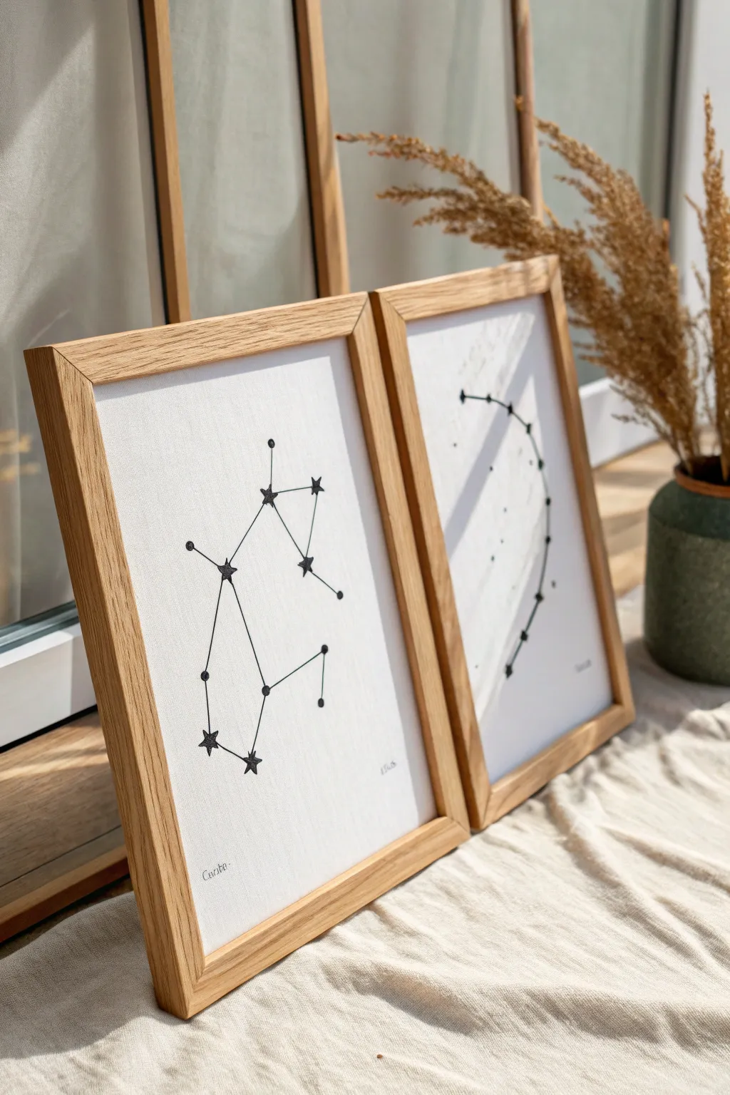
These elegant zodiac prints combine the precision of geometric drawing with the texture of fiber art. By stitching directly onto heavy paper or cardstock, you create a tactile, high-end finish that stands out far more than a simple ink print.
Step-by-Step
Materials
- High-quality textured cardstock or watercolor paper (A4 or letter size)
- Black embroidery floss
- Embroidery needle (size 5-7)
- Pencil
- Ruler
- Printed celestial star chart templates
- Piece of foam board or corrugated cardboard
- Push pin or awl
- Masking tape
- Light wood frames (oak or pine finish)
Step 1: Preparation & Mapping
-
Select your paper:
Choose a thick, textured paper. Watercolor paper is excellent because it has tooth and holds up well to being pierced without tearing. -
Prepare the template:
Print out a simple line drawing of your chosen zodiac constellation. Ensure the size fits nicely within your frame dimensions with plenty of negative space around it. -
Align the layers:
Place your foam board on your work surface. Lay your watercolor paper on top, and then center your printed template over the watercolor paper. -
Secure the stack:
Use small pieces of masking tape to hold the template and paper firmly against the foam board so nothing shifts during the next step.
Step 2: Piercing the Design
-
Mark the star points:
Using a push pin or a sharp awl, carefully poke holes through the template and into the watercolor paper at every point where a star should be. -
Differentiate star sizes:
For the main stars in the constellation, wiggle the pin slightly to make the hole just a tiny bit larger than the minor connecting points. -
Remove the template:
Gently peel away the tape and lift off the printed template. You should now have a clean sheet of paper with a perforated map of the stars. -
Inspect the holes:
Hold the paper up to the light to ensure all holes are fully punched through. If any paper fibers are sticking up, gently smooth them down with the back of a spoon.
Needle Know-How
Use a sharp embroidery needle rather than a dull tapestry needle. The sharp point navigates the paper holes cleanly without tearing the delicate edges.
Step 3: Stitching the Stars
-
Thread the needle:
Cut a length of black embroidery floss. I prefer using 2 or 3 strands for a bold line that isn’t too bulky. Knot the end securely. -
Begin the connections:
Starting from the back of the paper, pull your needle through the first star hole. Pull gently until the knot catches. -
Create the lines:
Follow your reference image to stitch straight lines connecting the star points. A simple backstitch works best here to create continuous geometric shapes. -
Maintain tension:
Keep the thread taut but not tight; pulling too hard can buckle the paper. The goal is flat, clean lines. -
Secure the thread:
When you reach the end of a section or run out of thread, tape the tail flat to the back of the paper instead of knotting it again, to keep the artwork lying flat in the frame.
Cosmic Sparkle
Add a subtle shimmer by mixing one strand of metallic silver or gold thread with your black floss. It catches the light just like real stars.
Step 4: Adding Details & Finishing
-
Embroider the stars:
Go back to the major ‘star’ points. Stitch a small star or cross shape over the hole to emphasize these points, giving them more visual weight than the connecting lines. -
Double-check the connection:
Verify against your chart that all lines are connected correctly. It’s easy to miss a small segment in complex constellations. -
Add text labels:
Using a very fine micron pen or a pencil, hand-letter the zodiac name or date in small, neat script at the bottom corner for a personalized touch. -
Clean up:
Use a kneaded eraser to gently lift away any accidental smudges or finger oils from the paper surface. -
Frame the piece:
Place the artwork into your light wood frame. If using a mat, ensure the constellation is centered within the window. -
Final inspection:
Check for any trapped dust behind the glass before sealing up the back of the frame.
Now you have a sophisticated piece of celestial art ready to display or gift to a star-gazing friend
Paper Doll Fashion Template Sheets
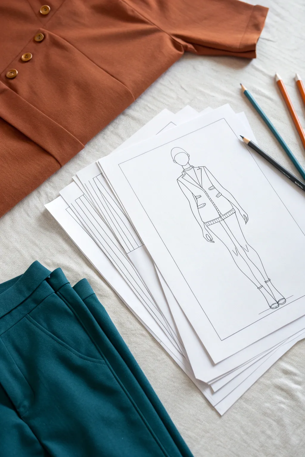
Create your own printable fashion template featuring a stylish stylized figure ready for outfit planning. This clean line art style is perfect for designing paper dolls or selling digital coloring sheets for aspiring designers.
How-To Guide
Materials
- Smooth white bristol board or sketchbook paper (A4 size)
- HB graphite pencil
- Fine-point black fineliner pens (0.1mm, 0.3mm, 0.5mm)
- Eraser (kneaded preferred)
- Ruler
- Reference photo of a pose (optional)
Step 1: Setting the Framework
-
Draw the boundary box:
Start by using your ruler to draw a crisp rectangular border about 1 inch from the edge of your paper. This frame grounds the sketch and gives it a professional ‘plate’ look. -
Establish the ground line:
Near the bottom of your framed area, lightly sketch a short horizontal line. This will serve as the floor where your figure’s feet will rest. -
Map the body axis:
Draw a faint vertical line down the center of the page. Mark the head height at the top and the feet at the bottom to ensure your figure fits comfortably within the frame.
Step 2: Sketching the Croquis
-
Block in the head:
Sketch a simple oval shape for the head at the top of your vertical axis line. Keep the features minimal or blank for a true template look. -
Draft the torso and hips:
Lightly sketch the shoulders, waist, and hips. Since fashion figures (croquis) are often elongated, you can slightly stretch the torso length for elegance. -
Extend the limbs:
Draw the arms hanging naturally at the sides and sketch long, slender legs meeting at the ground line. The pose in the example is static and straight, which is ideal for showing garment details clearly. -
Refine the silhouette:
Go over your blocked shapes to create a smooth, continuous outline of the body. Focus on the curve of the calves and the slope of the shoulders.
Keep it Symmetrical
For a balanced fashion template, fold your sketch paper in half vertically before starting. This creates a subtle crease guide to ensure shoulders and hips are perfectly aligned.
Step 3: Adding the Garments
-
Outline the blazer structure:
Sketch the lapels of the jacket first, starting from the neck down to the mid-chest. Then, define the shoulders with a sharp, structured angle. -
Define the waist closure:
Draw the center front line of the jacket and add faint markings for buttons. Ensure the fabric looks like it wraps slightly around the body’s form. -
Add pocket details:
Draw rectangular shapes for pockets on the lower torso area of the jacket. I find adding double lines here helps suggest piping or stitching detail. -
Sketch the trousers/skirt:
Extend lines downward from the jacket hem to create the bottoms. In this specific design, keep the legs fitted or slightly tapered toward the ankle. -
Detail the shoes:
Draw simple heeled boots or shoes at the feet. Keep details minimal so they don’t distract from the main outfit.
Fixing Wobbly Lines
If a long line goes astray, don’t scrap the drawing. Fashion sketches embrace style over perfection. Thicken the line slightly to mask the wobble, making it look like a deliberate shadow.
Step 4: Inking and Finalizing
-
Ink the main outlines:
Switch to your 0.5mm fineliner. Carefully trace the major outlines of the body and the garment silhouette. Use confident, single strokes rather than feathery ones. -
Add fine details:
Use a thinner 0.3mm or 0.1mm pen for interior details like the buttons, pocket flaps, and the center line of the legs. This line weight variation adds depth. -
Draw seam lines:
Add very thin, broken lines or delicate solid lines to indicate seams, specifically princess seams on the jacket or darts at the waist. -
Incorporate texture marks:
Add tiny hatching lines or a ribbed pattern at the hem of the jacket or cuffs to suggest a knit or textured fabric trim. -
Erase pencil marks:
Once the ink is completely dry (wait at least 15 minutes to avoid smudging), gently erase all underlying graphite sketches. -
Sharpen the border:
Go over your initial rectangular border with the ruler and a 0.5mm pen to enclose the artwork cleanly.
Now you have a professional-looking template ready to be photocopied or scanned for endless outfit experimentation


Have a question or want to share your own experience? I'd love to hear from you in the comments below!