If you love drawing but want that extra little magic of making the same image again and again, print drawing is where it’s at. These ideas are meant to help you turn simple sketches into bold, repeatable prints—from super beginner-friendly stamps to more artsy, layered experiments.
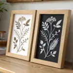
Simple Botanical Linocut
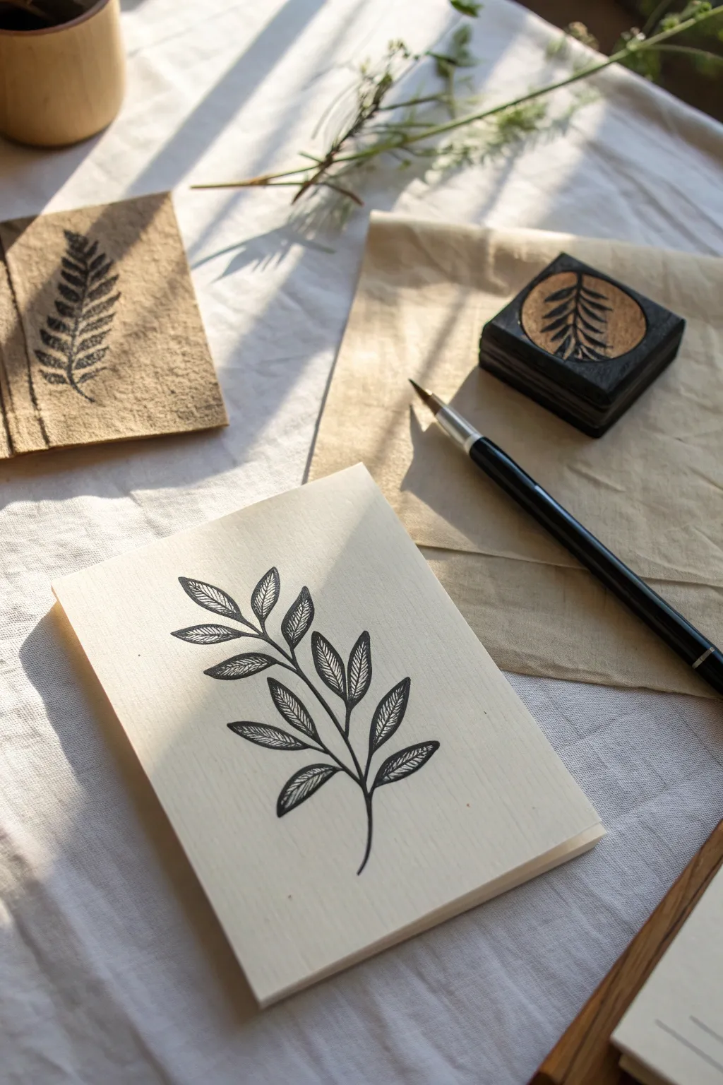
Create your own hand-stamped botanical stationery with this elegant linocut project. The finished result features crisp black lines against soft cream paper, capturing the organic beauty of a simple leafy branch.
Step-by-Step Guide
Materials
- Soft-cut lino block (rubber carving block)
- Linocut carving tools (V-gouge and U-gouge)
- Pencil and tracing paper
- Block printing ink (oil-based or water-soluble black)
- Brayer (rubber roller)
- Glass or acrylic sheet (for rolling ink)
- Cream cardstock or heavy printmaking paper
- Craft knife
- Wooden block for mounting (optional)
- Bamboo baren or wooden spoon
Step 1: Design and Transfer
-
Sketch your botanical:
Begin by sketching a simple branch design on paper. Focus on a central stem that curves gently, with paired leaves extending outwards. The leaves should have a distinct central vein and small diagonal texture lines. -
Refine the lines:
Go over your sketch with a darker pencil to solidify the lines. Keep the shapes relatively simple to make carving easier later on. -
Transfer to block:
Place a piece of tracing paper over your drawing and trace it carefully. Flip the tracing paper onto your lino block (graphite side down) and rub the back firmly to transfer the image. -
Reinforce the guide:
If the transfer is faint, draw over the lines directly on the lino block with a permanent marker so they don’t smudge while you work.
Clean Lines Pro-Tip
Warm the lino block slightly with a hairdryer or by sitting on it for a minute before carving. Warm rubber cuts much like butter, giving you smoother curves.
Step 2: Carving the Block
-
Outline the leaves:
Using a fine V-gouge tool, carve carefully along the outer edges of your drawn lines. Always cut away from your fingers for safety. -
Add leaf details:
Switch to your finest tool to carve the veins inside the leaves. These should be delicate cuts; remember, whatever you carve away will remain white (paper color). -
Clear background:
Use a wider U-gouge to clear away the negative space around the branch. You don’t need to go too deep, just enough so the background doesn’t pick up ink. -
Trim the edges:
Use a craft knife or scissors to cut the excess rubber block away, staying close to the design but leaving a small border for stability. -
Test print:
Do a quick test print on scrap paper. This reveals any ‘chatter’ (unwanted background ridges) that might need more carving. -
Mount the stamp:
For better handling, I adhere the carved rubber to a small wooden block or piece of thick plywood using superglue, though this is optional.
Step 3: Inking and Printing
-
Prepare the ink:
Squeeze a small amount of block printing ink onto your glass or acrylic slab. A pea-sized amount goes a long way. -
Charge the brayer:
Roll the brayer back and forth through the ink until it spreads into a thin, even layer. You want to hear a ‘velvety’ hissing sound. -
Ink the block:
Roll the inked brayer over your carved block. Apply light, even pressure to ensure all the raised surfaces are coated black, but avoid flooding the fine detail lines. -
Position the paper:
Place your cream cardstock on a flat surface. Carefully lower the inked block onto the center of the paper. -
Apply pressure:
Press down firmly. If unmounted, use a baren or the back of a spoon to rub the back of the block in circular motions to transfer the ink. -
The reveal:
Hold one corner of the paper down and gently lift the block away to reveal your design. -
Dry:
Set the print aside to dry completely. Oil-based inks may take a day or two, while water-based inks dry faster.
Ink Troubleshooting
If your print looks salty or speckled, you likely didn’t use enough ink. If the fine lines are filling in and disappearing, you used too much ink.
Now you have a reusable stamp ready to create endless custom stationery sets or art prints

Geometric Pattern Sampler Grid
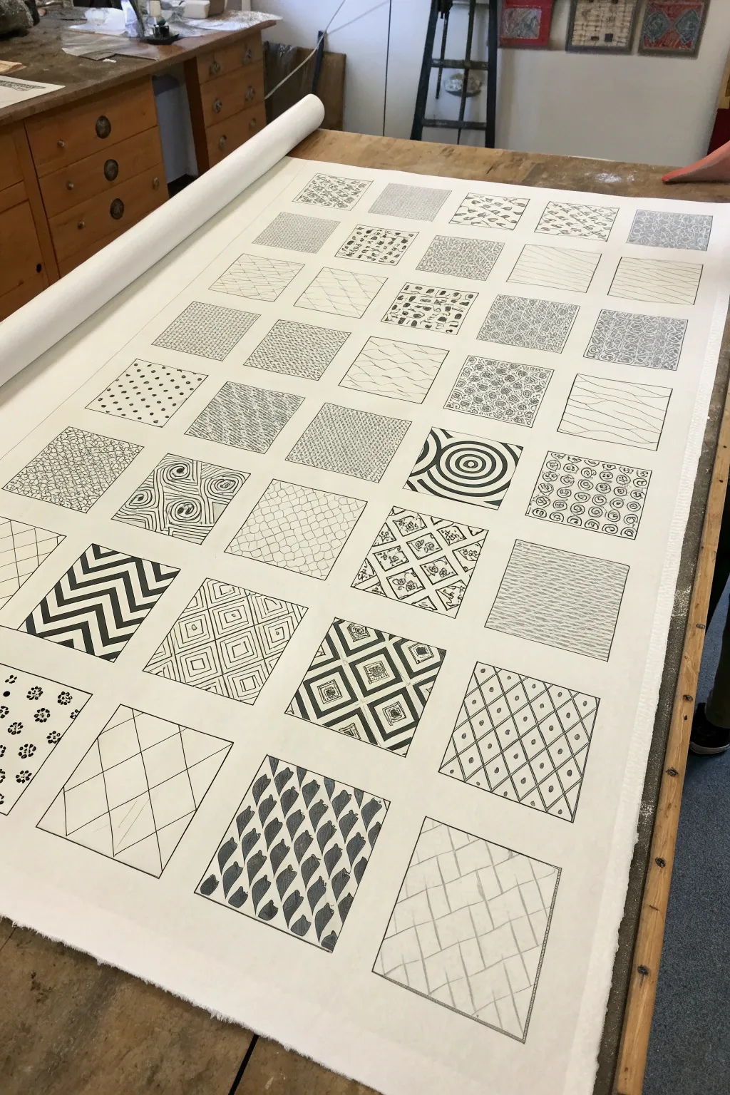
This expansive project turns simple mark-making into a stunning visual library of patterns and textures. By creating a rigorous grid to house organic and geometric doodles, you’ll produce a large-scale artwork that serves as both a meditation in repetition and a bold decor statement.
Step-by-Step Tutorial
Materials
- Large roll of heavy-weight cartridge paper or canvas (at least 24 inches wide)
- Black drawing ink or high-quality black fineliners (various nib sizes)
- Graphite pencil (HB or 2H)
- Long metal ruler or T-square
- Large eraser
- Flat workspace
- Masking tape
Step 1: Setting the Stage
-
Prepare your surface:
Begin by unrolling your paper or canvas across a large, flat table. You want plenty of room to work without creasing the material. I find it helpful to tape down the corners with low-tack masking tape to keep the sheet perfectly flat and stationary while I measure. -
Establish the margins:
Using your long ruler, measure a consistent border around the entire edge of your paper, perhaps 2-3 inches deep. This negative space frames the grid and makes the final piece look professional. -
Calculate the grid:
Determine the size of your squares. For a piece this scale, 4×4 inch or 5×5 inch squares work well. Calculate how many squares will fit horizontally and vertically within your margins, leaving a small gap (about 1/4 to 1/2 inch) between each square for breathing room. -
Draft the grid lines:
Lightly draw your grid using a graphite pencil. Press very gently so these lines can be erased later. Draw the full grid of squares, ensuring the spacing between them is uniform.
Ink Consistency
Switch between pen nib sizes frequently. Use 0.8mm for outlines and fills, and 0.1mm for texture. This prevents your fine pens from wearing out on solid blocks.
Step 2: Designing the Patterns
-
Plan your variety:
Beforeinking, sketch faint ideas inside a few squares to balance the composition. Alternate between dense, dark patterns (like checkerboards or heavy stripes) and lighter, airier textures (like stippling or thin waves) to keep the eye moving. -
Start with geometric classics:
Begin inking your first few squares with high-contrast geometric shapes. Try a chevron pattern, a concentric circle target, or a bold diamond grid. Use a thicker nib pen or brush with ink for these solid black areas to get a rich, opaque fill. -
Introduce organic flows:
Move to adjacent squares and fill them with organic lines. Try mimicking wood grain, flowing water, or fish scales. Allow your hand to relax here; these lines don’t need the rigid precision of the geometric blocks. -
Experiment with density:
Create several squares focused purely on density. Fill one box with tiny, tight circles (bubbles) and another with cross-hatching. The variation in ‘greyscale’ value created by the density of ink is what gives the artwork depth. -
Add intricate details:
For a few select squares, use your finest pen nib (0.1 or 0.3mm). Draw delicate floral motifs, tiny grids within grids, or intricate zentangle-inspired repeating shapes. -
Incorporate illusion:
Dedicate a row to optical illusions. Draw 3D cubes, weaving lines that look like fabric, or overlapping scales that imply depth. Using slightly curved lines can make a flat grid look like it’s bulging.
Color Pop
Instead of pure black and white, choose one accent color (like gold or neon pink) and fill just three random squares with it to create a modern focal point.
Step 3: Inking and Refining
-
Finalize the outlines:
Once a square’s interior pattern is complete, go over the perimeter of that specific square box with a steady, medium-weight pen. This crisp edge helps contain the pattern and separates it cleanly from the white gutter. -
Check for balance:
Step back from the table periodically. If one area looks too light, add a darker, heavier pattern nearby. If an area feels too chaotic, place a simple, orderly stripe pattern next to it. -
Let the ink cure:
Allow the entire sheet to dry completely. If you used liquid ink, give it at least an hour to ensure no wet spots remain that could smudge during cleanup. -
Erase guidelines:
Gently erase the visible pencil grid lines between the boxes. Be careful not to rub too vigorously over the inked areas, although good quality ink should be permanent. -
Clean up edges:
Inspect the white spaces. If there are any stray ink marks, you can carefully touch them up with a small amount of white gouache or white gel pen to keep the background pristine.
Once erased and cleaned, you have a massive, intricate tapestry of design that serves as an endless source of inspiration
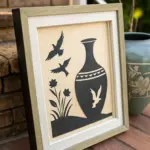
High-Contrast Animal Silhouette Print
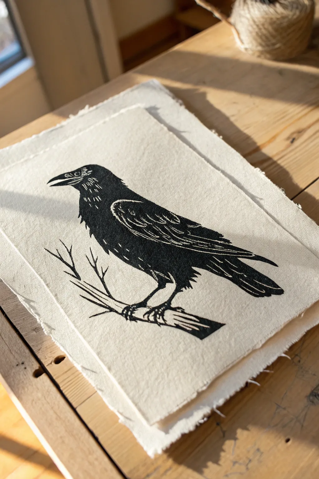
Capture the stark elegance of a raven with this high-contrast relief print project. Using soft linoleum blocks and textured fabric or paper, you will create a bold silhouette striking for its simplicity and fine carved details.
Detailed Instructions
Materials
- Soft-cut linoleum block (approx. 5×7 inches)
- Linoleum carving tools (V-gouge and U-gouge)
- Black block printing ink (water or oil-based)
- Brayer (rubber roller)
- Heavyweight printmaking paper or natural canvas with deckled edges
- Pencil and tracing paper
- Baren or wooden spoon
- Inking plate (glass or acrylic sheet)
- Craft knife
Step 1: Designing and Transferring
-
Sketch the outline:
Begin by drawing a simple side-profile of a raven perched on a branch. Focus on the strong outer silhouette first—the beak, the curve of the head, and the slope of the back down to the tail feathers. -
Add wing details:
Inside the body shape, sketch distinct areas for the wing feathers and tail. Don’t draw every single feather; instead, mark curved lines where white light would hit the glossy black feathers. -
Sketch the branch:
Draw a jagged, angular branch below the bird’s feet. Include a few smaller twigs branching upward to balance the composition, just like in the reference image. -
Transfer to the block:
Trace your final design onto tracing paper with a soft pencil. Flip the paper face-down onto your linoleum block and rub the back firmly to transfer the graphite image. -
Solidify the lines:
Go over the faint transferred lines on the block with a permanent marker. Color in the areas that will remain black (the bird’s body) so you don’t accidentally carve them away.
Clean Lines
Warm up your linoleum block with a hairdryer for 30 seconds before carving. The heat softens the material significantly, allowing your tool to glide through for smoother curves.
Step 2: Carving the Block
-
Outline the silhouette:
Using a fine V-gouge, carefully carve along the outer edge of your marker lines. This creates a ‘safety trench’ that protects your image when you remove the larger background areas. -
Clear the background:
Switch to a wider U-gouge to clear away the negative space around the bird. I find it helpful to carve away from the image outward to avoid slips. -
Carve wing details:
Return to your fine V-gouge to carve the internal details of the wing. These should be thin, confident strokes that represent the gaps between feathers or highlights. -
Define the beak and eye:
Carve a very thin line to separate the upper and lower beak. Carefully hollow out a small circle for the eye and add tiny texture lines around the neck area to suggest ruffed feathers. -
Refine the branch:
Carve lines into the branch to simulate wood grain. Allow the ink to act as the shadow, carving away only the lighter highlights of the bark. -
Clean up edges:
Inspect the non-printing background areas. Any raised ridges left behind might catch ink, so trim them down flat with a shallow U-gouge pass.
Step 3: Inking and Printing
-
Prepare the ink:
Squeeze a small line of black block printing ink onto your inking plate. Roll the brayer back and forth and lift it occasionally to create a smooth, velvety texture on the roller. -
Ink the block:
Roll the inked brayer over your carved block. Apply thin, even layers, rolling in multiple directions to ensure the textured areas of the feathers and branch are fully coated without flooding the fine carved lines. -
Position the paper:
Carefully place your deckle-edged paper or fabric gently on top of the inked block. Once it touches the ink, do not shift it or the image will smear. -
Burnish the print:
Using a baren or the back of a wooden spoon, rub the back of the paper in small circles. Apply firm, consistent pressure, paying special attention to the edges and the dense black body of the bird. -
Check clarity:
Designate one corner as your anchor and hold it down firmly. Gently peel up the opposite corner to peek at the ink transfer. If it looks spotty, lay it back down and rub that specific area more. -
Reveal the print:
Slowly peel the paper off the block from one end to the other. Lay the print flat or hang it up to dry completely before handling.
Patchy Ink?
If you see white speckles in the black areas (called ‘salt’), you likely didn’t use enough ink. Add a tiny bit more ink to your slab and listen for a ‘sizzling bacon’ sound when rolling.
Once the ink is fully cured, frame your bold raven print to add a touch of woodland mystery to your wall


Two-Tone Mountain Landscape Print
Capture the serene beauty of a twilight mountain range with this striking block-print style illustration. Using a limited color palette of earthy terracotta and deep slate blue, you’ll build stylized peaks and silhouette forests under a starry sky.
Step-by-Step
Materials
- High-quality mixed media or watercolor paper (A4 or A3 size)
- Gouache paints (Slate Blue, Navy Blue, Terracotta/Burnt Orange, White, Black)
- Flat shader brushes (medium and large)
- Fine detail liner brush (size 0 or 00)
- Pencil (HB) and eraser
- Ruler
- Masking tape
- Palette for mixing
Step 1: Preparation and Sketching
-
Tape the borders:
Secure your paper to a flat surface using masking tape. Create a crisp rectangular border by taping off about an inch from each edge. This frame will give the final piece a professional, polished look. -
Establish the horizon:
Lightly sketch the main forms. Start with the foreground hill that slopes gently upwards from left to right. Then, draw the jagged outlines of two major mountain peaks behind it—one central and tall, one to the right. -
Add celestial elements:
In the upper sky area, trace a perfect circle for the large sun/moon using a compass or a small round object. Just to the left of it, sketch a delicate crescent moon sliver. -
Detail the snow caps:
Draw jagged, uneven lines down the faces of the mountains to mark where the snow caps will sit. Keep these shapes angular to mimic the block-print aesthetic shown in the reference.
Clean Edges Only
If paint bleeds under your tape, use a slightly damp, stiff brush to gently scrub away the excess immediately. For next time, seal the tape edge with clear medium first.
Step 2: Blocking in the Sky
-
Mix the night sky color:
Create a deep, dusty blue by mixing Navy Blue with a touch of Slate and a tiny drop of Black. You want a matte, flat finish. -
Paint the background:
Using a large flat brush, carefully paint the entire sky area around the mountains and the celestial circle. Ensure the paint is opaque; I find applying two thin layers prevents streaks better than one thick one. -
Paint the large orb:
Mix a muted Terracotta color. Carefully fill in the large circle shape. The contrast between the warm orange and the cool blue is the heart of this piece’s palette.
Step 3: Painting the Landscape
-
Base coat the mountains:
Using a slightly lighter version of your Terracotta (add a little White), fill in the main body of the central mountain. For the mountain on the right, mix Terracotta with a bit of brown for variation. -
Address the shadowed slopes:
For the lower left mountain section, mix your Slate Blue with a little Terracotta to create a muddy, shadowed purple-brown. Paint this angular section to create depth between the ranges. -
Create the snow caps:
Once the mountain base colors are completely dry, use pure White (or a very light cream) to fill in the jagged snow shapes at the peaks. Use a smaller flat brush to keep the edges sharp and graphic. -
Layer the foreground hills:
The rolling hills at the bottom need to recede. Paint the furthest hill (right side) in a medium Slate Blue. Paint the closest hill (bottom center) in a softer, sandy-orange tint.
Digital Hybrid
Scan your finished painting and pull it into editing software. You can digitally alter the sky color to a deep purple or teal to create a totally different seasonal vibe.
Step 4: Fine Details and Finish
-
Add the stars:
Load a toothbrush or stiff brush with watered-down White paint. Flick the bristles to splatter tiny stars across the blue sky. Add a few larger, deliberate dots with your fine brush for major stars. -
Paint the crescent moon:
With your smallest brush and White paint, carefully fill in the crescent moon shape you sketched earlier. -
Start the pine trees:
Mix a very dark Navy or Black-Blue. Using the fine liner brush, paint vertical lines along the bottom ridge of the blue hill to serve as tree trunks. -
Foliage texture:
To create the pine branches, use short, quick horizontal dashes that get wider as you move down each trunk. Vary the height of the trees to make the forest look natural. -
Foreground accents:
Add a few smaller, silhouette trees on the lower left side in the dark shadow color to embrace the framing. -
Reveal:
Wait until the painting is bone dry. Slowly peel away the masking tape at a 45-degree angle to reveal your crisp, clean borders.
Frame this piece in natural wood to compliment the earthy tones of your mountain range
BRUSH GUIDE
The Right Brush for Every Stroke
From clean lines to bold texture — master brush choice, stroke control, and essential techniques.
Explore the Full Guide
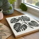
Easy Floral Mandala Block
Capture the symmetry of nature with this striking black and white floral mandala. Using soft-cut lino blocks and deckle-edged paper creates a professional, artisanal feel that looks beautiful framed or as a handmade card.
Detailed Instructions
Materials
- Soft-cut linoleum block (approx 4×4 or 6×6 inches)
- Linocut carving tools (V-gouge and U-gouge)
- Pencil and tracing paper
- Compass and ruler
- Block printing ink (black)
- Brayer (roller)
- Barren or wooden spoon (for burnishing)
- Heavyweight printmaking paper with deckled edge
- Glass or acrylic sheet (for rolling ink)
Step 1: Designing the Template
-
Establish the center:
Begin by finding the exact center of your linoleum block. Mark it lightly with a pencil. Use a compass to draw a small circle about half an inch in diameter around this center point for the flower’s core. -
Draft the petal layers:
Using the compass again, draw two larger concentric circles expanding outward. These will serve as guidelines for the tips of your inner and outer petals, ensuring the mandala stays symmetrical. -
Sketch the primary petals:
Lightly sketch twelve elongated petals radiating from the center circle. Make sure they are evenly spaced. If you struggle with freehand symmetry, draw one petal on tracing paper and transfer it twelve times around the circle. -
Add secondary details:
Between the tips of the main petals, sketch smaller pointed shapes or leaves. Inside each main petal, draw a smaller, narrower petal shape—this will become the intricate negative space texture later. -
Define the border:
Draw the final outer ring that encapsulates the design. Add small circles and dots in the negative spaces between the petals and the outer rim to create visual interest.
Step 2: Carving the Block
-
Outline the main shapes:
Switch to your fine V-gouge tool. Carefully carve along the pencil lines of your main petals and the central circle. Remember to always carve away from your body for safety. -
Detail the petal interiors:
This is the trickiest part. Using the finest blade you have, carve out the ‘texture’ inside the main petals. You aren’t removing the whole inside; rather, leave a central black shape and carve small horizontal lines or dashes on either side of it to create a shaded effect. -
Carve the negative space:
Switch to a wider U-gouge to clear away the large areas of linoleum that should not print. This includes the space outside the main mandala circle and the larger gaps between petal tips. -
Refine the center:
Go back to the center circle. Carve straight lines radiating from the very center point out to the edge of that inner circle, creating a wheel-spoke pattern. -
Clean up the edges:
Check the perimeter of your design. Carve away any high spots or ridges in the background that might accidentally catch ink. I like to do a quick rubbing with a crayon and thin paper here to check my progress before inking.
Clean Lines Only
If you get unintended “chatter” (ink spots) in the background areas, use a craft knife or smaller gouge to trim those ridges lower before your next print.
Step 3: Printing the Design
-
Prepare the ink:
Squeeze a small line of block printing ink onto your glass slab. Use the brayer to roll it out until it sounds ‘velvety’—like sizzling bacon. You want a thin, even layer. -
Ink the block:
Roll the inked brayer over your carved block. Apply ink in multiple directions (up-down, then side-to-side) to ensure all the raised ridges are coated evenly without flooding the fine details. -
Position the paper:
Carefully place your deckle-edged paper on top of the inked block. Once the paper touches the ink, do not shift or drag it, or the image will smudge. -
Transfer the image:
Using a baren or the back of a wooden spoon, apply firm, circular pressure over the entire back of the paper. Pay special attention to the edges and the detailed center to ensure a crisp transfer. -
The reveal:
Gently peel one corner of the paper up to peek at the transfer. If it looks solid, slowly peel the entire sheet off the block. Let the print dry completely on a flat surface, which may take a day or two depending on the ink used.
Try a Gradient
Place two ink colors next to each other on the glass and roll them together to create an ombré effect—for example, a deep navy blending into the black center.
Once dry, your handmade print is ready to be signed, framed, or gifted as a unique piece of art
Tiny Icon Stamp Collection
This project transforms a sheet of handmade paper into a charming patterned art print using tiny, nature-inspired icons. The result is a repeating but organic design featuring mushrooms, moons, and stars in a cozy, earthy color palette.
Step-by-Step Tutorial
Materials
- Heavyweight textured paper (deckle edge preferred)
- Small rubber stamps (mushroom, moon, heart, star, snowflake)
- Pigment ink pads (rust red, forest green, mustard yellow, deep teal)
- Scrap paper for testing
- Ruler (optional, for spacing)
- Paper towel or baby wipes
Step 1: Preparation and Planning
-
Select your paper:
Choose a high-quality paper with visible texture. A cold-press watercolor paper torn to size or handmade cotton paper with a deckled edge works best to achieve that rustic look. -
Test your colors:
Before stamping on your final sheet, press each ink pad onto a scrap piece of similar paper. Ensure the rust, mustard, and green tones look harmonious together. -
Plan the grid:
Visualize a loose diagonal grid for your pattern. You want the icons to feel evenly distributed without being rigidly perfect. I like to lay the un-inked stamps out on the paper first to get a feel for the spacing.
Stamp Pressure
On textured handmade paper, rock the stamp very gently side-to-side while pressing down to ensure the ink catches the deeper valleys of the paper texture.
Step 2: Stamping the Primary Icons
-
Start with the mushrooms:
This is your most complex shape, so place it first. Ink a mushroom stamp in forest green. -
Place the first impression:
Stamp the green mushroom near the top left, leaving generous margins. -
Continue the mushroom pattern:
Stamp the green mushrooms sporadically across the page. Try to keep them somewhat equidistant, but vary the rotation slightly so they don’t look like soldiers in a line. -
Add variety:
clean the stamp and switch to a different mushroom shape if you have one, or perhaps switch ink colors to a deep teal for a few accent mushrooms. -
Clean your tools:
Wipe the stamps thoroughly with a damp paper towel or baby wipe to prevent mudding your colors in the next steps.
Step 3: Building the Pattern
-
Add the hearts:
Using a rust-red ink, stamp small hearts into the gaps between the mushrooms. Orient them carefully so they feel upright relative to the paper. -
Incorporate the crescent moons:
Ink a crescent moon stamp in deep teal or dark green. Stamp these in the larger empty spaces, turning the curve of the moon in different directions for a playful effect. -
Introduce the stars:
Load a star stamp with mustard yellow ink. Look for the ‘rivers’ of white space running through your design and place stars there to bridge the gaps. -
Balance the color:
Step back and squint at the paper. If one area looks too green or too red, add a small yellow star there to balance the visual weight.
Make it Wrap
Create your own matching gift wrap by stamping this same pattern onto plain brown kraft paper or white tissue paper for a coordinated gift set.
Step 4: Finishing Touches
-
Fill with snowflakes:
Using a fine-lined snowflake or asterisk stamp and green ink, fill in the tiniest remaining gaps. -
Check the edges:
Don’t be afraid to stamp near the edge of the paper. A pattern that looks like it continues off the page feels more professional. -
Review and refine:
Scan the entire sheet for any missed spots or uneven balance. You can add a tiny dot or second star if a white space feels too large. -
Let it set:
Allow the ink to dry completely. Pigment inks sit on top of the paper fibers, so give them at least an hour to ensure they won’t smudge.
Now you have a piece of custom patterned art ready to frame or send as a heartfelt note

PENCIL GUIDE
Understanding Pencil Grades from H to B
From first sketch to finished drawing — learn pencil grades, line control, and shading techniques.
Explore the Full Guide
Negative Space Linework Relief Print
This elegant relief print captures the delicate structure of a eucalyptus-style branch by carving away the negative space to create a striking contrast. Using the reduction or negative line method, distinct white lines emerge from a deep, velvety black background on textured paper.
Step-by-Step Tutorial
Materials
- Soft-cut lino block or rubber carving block (4×6 inch or similar)
- Linocut carving tools (V-gouge and U-gouge)
- Block printing ink (oil-based or water-soluble black)
- Brayer (rubber roller)
- Barren or wooden spoon for burnishing
- Heavyweight printmaking paper (preferably with deckled edges)
- Pencil and tracing paper
- Inking plate or piece of glass
- Newsprint or scrap paper
Step 1: Preparation and Transfer
-
Select your botanical subject:
Choose a simple botanical illustration or reference photo similar to the eucalyptus sprig shown. Look for a design with clear, distinct leaves and stems that aren’t too cluttered. -
Sketch the design:
Draw your botanical design on tracing paper. Remember that relief prints print in reverse, so if your plant leans to the right in your drawing, it will lean to the left in the final print. -
Transfer to the block:
Place your tracing paper drawing face-down onto the lino block. Rub the back of the paper firmly with a spoon or your fingernail to transfer the graphite onto the surface. -
Reinforce the lines:
Go over the faint graphite lines on your block with a permanent marker. This ensures your design doesn’t smudge away while you are working with your hands.
Uneven Ink Coverage?
If your black background looks ‘salty’ (white speckles), you likely need more ink. Apply another thin layer with the brayer. Too much ink is worse than too little, so build up gradually.
Step 2: Carving the Negative Space
-
Outline the delicate stems:
Using your finest V-gouge tool, carefully carve along the very center of your drawn lines. In this negative line style, the parts you carve will remain white (the paper color), while the uncut surface will print black. -
Carve the leaf veins:
Switch to a slightly wider cutter if needed, or stick with the fine V-gouge. Carve the central vein of each leaf and add subtle texture lines or smaller veins radiating outward. -
Detail the blossoms:
For the small flower buds at the bottom and top, use short, controlled pecks with the tool to create the starburst effect of the stamens and the round buds. -
Create the border:
Decide on the rectangular shape of your background. You don’t need to carve away the excess material outside the rectangle yet; just ensure you have a clear boundary line where the black ink will stop. -
Clean up stray ridges:
Check your carved lines for any little debris or hanging bits of lino. Gently brush them away so they don’t get caught in the ink later.
Step 3: Inking and Printing
-
Prepare your paper:
Tear your printmaking paper to size. To get the beautiful deckled edge seen in the example, use a ruler as a straight edge and tear the paper manually rather than cutting it with scissors. -
Roll out the ink:
Squeeze a small line of black relief ink onto your inking plate. Roll the brayer back and forth and lift it occasionally to create a smooth, velvety texture—listen for a sticky hissing sound. -
Ink the block:
Roll the inked brayer over your carved block. Apply thin, even layers. You want the flat surface to be solid black, but be careful not to flood the fine lines you just carved. -
Position the paper:
Carefully lay your paper on top of the inked block. Once the paper touches the ink, do not wiggle or shift it, or the image will blur. -
Burnish the print:
Using a barren or the back of a wooden spoon, rub the back of the paper in small circles. Apply firm, even pressure over the entire image area. -
Check the transfer:
I like to hold one corner of the paper down firmly and gently peel back the opposite corner to peek at the ink coverage. If it looks patchy, lay it back down and burnish that area more. -
Reveal the print:
Slowly peel the paper off the block entirely to reveal your high-contrast botanical print. -
Dry the print:
Place the artwork on a flat surface or drying rack. Oil-based inks may take several days to cure completely, while water-based inks will dry much faster.
Try Gold Ink
Swap black ink for metallic gold or copper on dark navy paper. The negative lines will shine through beautifully in the metallic field for a luxurious alternative look.
Once dry, you can mount your striking botanical print on a larger piece of neutral cardstock to frame it
Reduction Print Color Build-Up
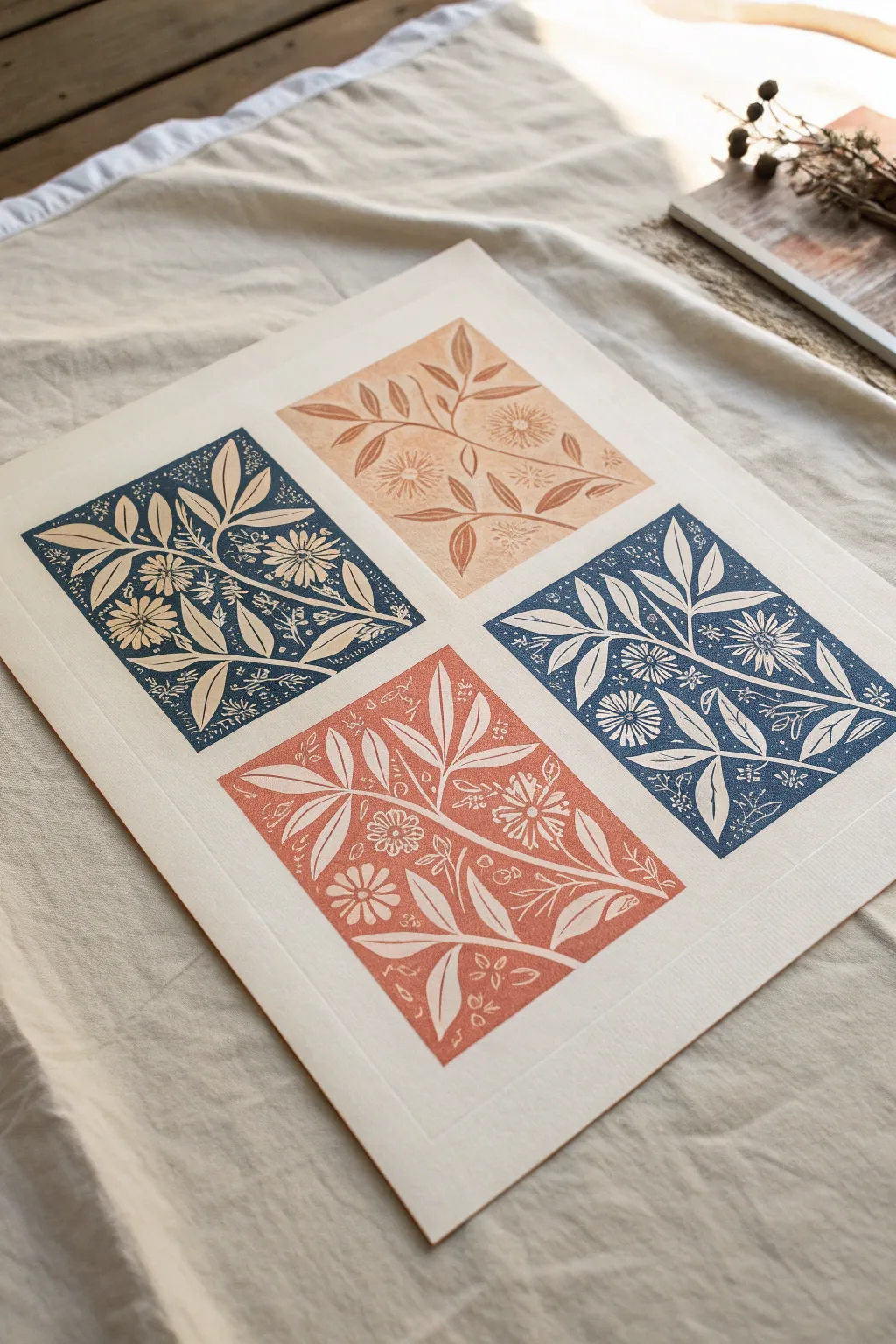
Create a stunning four-panel botanical artwork using block printing techniques. This project combines deep navy and warm terracotta tones in a repeating floral motif, perfect for adding a touch of nature-inspired geometry to your walls.
Step-by-Step
Materials
- Soft-cut lino block (roughly 4×6 inches)
- Lino carving tools (V-gouge and U-gouge)
- Block printing ink (Navy Blue, Terracotta/Rust, Light Peach)
- Brayer (rubber roller)
- Barren or wooden spoon for burnishing
- High-quality printmaking paper (cream or off-white, approx A3 size)
- Pencil and tracing paper
- Ruler and cutting mat
- Glass slab or acrylic sheet for ink rolling
Step 1: Design and Carving
-
Draft your motif:
Sketch a rectangular floral design on paper measuring about 4×6 inches. Focus on a central stem with radiating leaves and scattered geometric flower heads (like zinnias or daisies) to fill the corners. -
Transfer the image:
Trace over your final design with a soft pencil. Flip the tracing paper face down onto your lino block and rub the back firmly to transfer the graphite image. -
Carve the outlines:
Using a fine V-tool, carefully carve around the outlines of your leaves and stems. Remember, whatever you carve away will remain the color of the paper (white/cream). -
Clear the negative space:
Switch to a wider U-gouge to clear away the background areas between your floral elements. Leave some texture marks in the background to achieve that authentic ‘woodcut’ look rather than clearing it perfectly smooth. -
Add detail work:
Go back in with your finest tool to add veins to the leaves and texture to the flower centers. These small details really bring the print to life.
Fixing Patchy Prints
If your print looks salty or patchy, you likely didn’t use enough ink. Add a tiny bit more ink to the slab, listen for the hiss, and apply multiple thin layers to the block.
Step 2: Preparation and Registration
-
Prepare your paper:
Take a large sheet of printmaking paper. Use a ruler and pencil to very lightly mark a 2×2 grid or four corner points where your prints will sit, ensuring even margins between them. -
Prepare the palette:
Squeeze out a small amount of the lighter peach/terracotta ink onto your inking plate. Work the ink with your brayer until you hear a consistent ‘velcro-like’ hissing sound.
Step 3: Printing the Colors
-
Print the first light panel:
Roll a thin layer of the light peach ink onto your carved block. Position it carefully in the top-right quadrant of your marked paper. -
Burnish the first print:
Press down firmly. Using a baren or the back of a wooden spoon, rub the back of the paper (or the block if printing face down) in circular motions to transfer the ink. -
Clean the block:
Wipe your block clean of the light ink using a rag or baby wipe. Allow it to dry completely before switching colors. -
Mix the darker terracotta:
Add a touch of red or brown to your peach ink to create a deeper terracotta shade. Inking the block again, print this in the bottom-left quadrant to create a diagonal balance of warm tones. -
Clean and switch to blue:
Thoroughly clean the block and your brayer again. Now, roll out a rich navy blue ink. -
Print the blue panels:
Ink the block with navy and print it in the top-left quadrant. Re-ink and print the final design in the bottom-right quadrant to complete the checkerboard pattern. -
Erase guidelines:
Once the ink is fully dry (this may take a day or two depending on the ink type), gently erase your pencil registration marks.
Try a Gradient
Create an ombre effect by putting two ink colors side-by-side on the glass slab and rolling them out together. The colors will blend where they meet on the brayer.
Frame your new botanical quartet in a simple wood frame to let the textures speak for themselves


Fruit Cross-Section Stamping
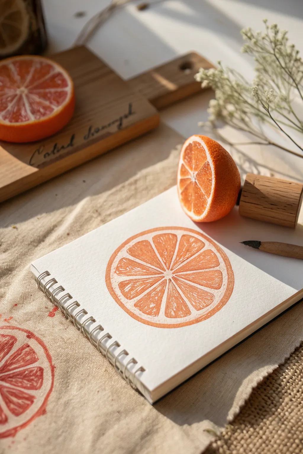
Capture the vibrant zest of citrus fruit without making a mess by recreating this stamped-look drawing. This project uses precise sketching and shading techniques to mimic the texture of a block print directly on your paper.
Step-by-Step Guide
Materials
- Spiral-bound sketchbook with textured paper
- Orange colored pencil (wax or oil-based)
- Pencil sharpener
- Real orange (for reference)
- Circle template or compass (optional)
- Small piece of scrap paper
Step 1: Planning the Composition
-
Observe your reference:
Start by studying a real orange half or the reference photo. Notice how the segments radiate from the center and how the rind has a specific thickness. -
Establish the outer boundary:
Using your orange pencil very lightly, sketch a perfect circle in the center of your page. If you struggle with freehand circles, trace a lid or use a compass, but keep the line faint. -
Define the rind:
Draw a second, slightly smaller circle inside the first one. The gap between these two lines represents the pith and rind of the orange. -
Mark the center:
Place a small dot in the exact middle of your inner circle. This will be the anchor point for all your fruit segments.
Step 2: Drawing the Segments
-
Draft the segment spokes:
Lightly draw straight lines radiating from the center dot to the inner circle edge. Imagine a pizza or bicycle wheel. Aim for roughly 10 to 12 evenly spaced lines. -
Round the corners:
Where your spokes meet the inner circle, curve the corners. Orange segments aren’t perfect triangles; they are rounded sacs. Soften the points near the center as well. -
Create segment gaps:
Thicken the lines between the segments by drawing parallel lines on either side of your initial spokes. This creates the white membranes that separate the juicy parts. -
Erase guidelines:
If you used a graphite pencil for the layout, gently erase the initial construction lines now, leaving only the segment outlines.
Stamp Sensation
To truly mimic a block print, don’t shade smoothly. Use a slightly blunt pencil tip and a consistent, slightly rough back-and-forth motion to create graininess.
Step 3: Creating the Stamped Texture
-
Outline the rind:
Pressing harder with your orange pencil now, trace the outer and inner circles of the rind to create a solid, bold boundary. -
Fill the rind:
Color in the space between the two circles. Use a consistent medium pressure to get a solid tone, mimicking the ink application of a stamp. -
Texture the segments:
Begin filling in the segments. Instead of coloring solid, use short, rapid diagonal strokes. This is crucial for the ‘print’ look. -
Leave white flecks:
As you color the segments, intentionally leave tiny specks of the white paper showing through your crayon strokes. These act as the ‘juice sacs’ catching light. -
Darken one side:
To give the illusion of a slightly uneven stamp application, apply a bit more pressure to the right side of each segment, creating a subtle gradient. -
Refine edges:
Go back over the edges of each segment to make them sharp and distinct against the white membrane lines. Crisp edges make the print look cleaner.
Pattern Play
Once you master the single orange, try drawing a repeating pattern of them across the page, rotating the angle slightly each time for a fabric design look.
Step 4: Final Details
-
Add surface noise:
On the solid rind ring, create a few tiny white scratches or dots with an eraser or white gel pen if you have one, or simply press lighter in some spots. -
Simulate ink pooling:
I like to darken the very outer edge of the rind just a hair more than the rest. This mimics where ink generates a ‘bead’ on the edge of a block stamp. -
Check the center:
Ensure the very center point, where the membranes meet, remains mostly white or very pale, mimicking the pith core. -
Clean up:
Brush away any pencil crumbs. The contrast between the vibrant orange and the clean white paper is what makes this simple shape pop.
Now you have a zesty piece of art that looks freshly pressed right on the page
Sponge Texture Tree Print
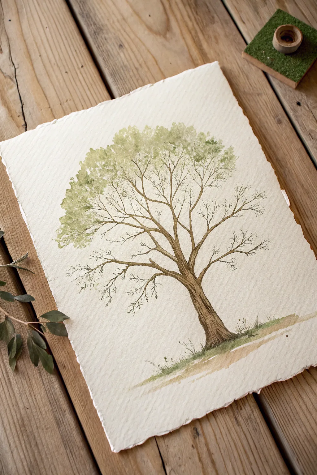
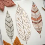
This elegant artwork combines the precision of fine liner pens with the organic texture of sponge painting to create a beautiful, airy tree canopy. The rough-edged paper adds a timeless, handcrafted feel that perfectly complements the natural subject matter.
Step-by-Step Tutorial
Materials
- Heavyweight textured watercolor paper (rough edge/deckle edge preferred)
- Brown fine liner pens (sizes 0.1, 0.3, and 0.5)
- Small natural sea sponge
- Watercolor paints (Sap Green, Olive Green, Burnt Umber)
- Small mixing palette or ceramic dish
- Paper towels
- Pencil (HB) and eraser
- Small round brush (size 2 or 4)
Step 1: Drawing the Structure
-
Outline the trunk:
Begin by lightly sketching the main trunk of the tree with your HB pencil. Start wide at the base and taper gently as you move upward, allowing the trunk to tilt slightly for a natural look. -
Add main branches:
Extend 3-4 primary branches from the top of the trunk. Let them curve outward like jagged lightning bolts, keeping the lines mostly organic rather than perfectly straight. -
Ink the trunk contours:
Switch to your 0.5 brown fine liner. Trace over your pencil lines on the trunk, adding small bumps or knots to suggest rough bark texture rather than a smooth line. -
Create bark texture:
Using the 0.3 pen, draw vertical, slightly wavy lines running up the length of the trunk. I like to break these lines occasionally so the texture doesn’t look too rigid. -
Branch out:
Continue using the 0.3 pen to ink the main branches. As the branches get thinner toward the ends, switch to your finest 0.1 pen to keep the delicate look. -
Add fine twigs:
With the 0.1 pen, draw many small, Y-shaped twigs extending from the main branches. Many of these will remain bare, while others will be covered by the foliage.
Natural Sponging
Don’t press hard! Touches should be feather-light. Test your sponge dab on a scrap paper first to ensure it looks like leaves, not a solid blob of paint.
Step 2: Creating the Canopy
-
Prepare the sponge:
Dampen your small natural sea sponge and squeeze it out completely until it’s just barely moist. Tear off a small piece about the size of a grape if the sponge is too large. -
Mix light green:
Dilute some Sap Green watercolor on your palette with a little water. You want a wash that is transparent, not thick or opaque. -
First foliage layer:
Dip the sponge into the paint and blot the excess onto a paper towel. Lightly dab the sponge near the upper branches, predominantly on the left side to match the reference image’s asymmetry. -
Build density:
Rotate the sponge as you work to avoid a repetitive stamp pattern. Keep the sponging light and airy at the edges, letting the paper show through. -
Mix shadow color:
Add a touch of Olive Green or a tiny bit of Burnt Umber to your green mix to create a slightly darker, mossy shade. -
Add depth:
Sponge this darker color sparingly into the refreshing center of the leaf clusters, particularly where the branches meet the leaves, to create volume and shadow.
Step 3: Grounding and Details
-
Paint the base:
Using your small round brush and a watery mix of Burnt Umber and Green, paint a quick, uneven wash at the foot of the tree to represent the ground. -
Add ground cover:
While the ground wash is still damp, dab a little concentrated green into it to create soft, grassy textures that blur slightly. -
Draw grass blades:
Once the watercolor base is dry, use the 0.1 pen to flick quick, upward strokes from the ground line to create defined blades of grass and tiny weeds. -
Add trunk shading:
Return to the trunk with a very diluted brown watercolor wash. Glaze over the shadowed side (usually the right) to give the tree three-dimensional form. -
Final touches:
Erase any remaining pencil marks carefully. Check if any branches look disconnected from the foliage and extend them slightly with the pen if needed.
Seasonal Shift
Change the feel entirely by using Burnt Sienna and Orange for autumn foliage, or pinks and whites for a spring cherry blossom version.
Frame your delicate tree piece in a floating frame to show off the beautiful textured edges of the paper
Fingerprint Heart and Flower Prints
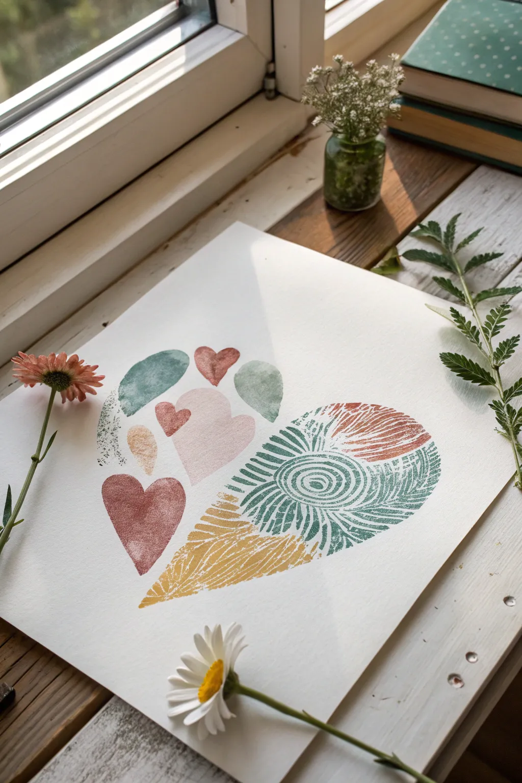
This charming project combines the simplicity of thumbprint impressions with detailed pattern work to create a unique, textured heart design. The soft, muted color palette of terracotta, sage green, and mustard brings a natural, organic feel to this mixed-media piece.
Step-by-Step
Materials
- High-quality white cardstock or heavy watercolor paper
- Stamp pads (terracotta/rust red, sage green, pale pink, mustard yellow)
- Black or dark grey fine-liner pen (0.3mm or 0.5mm)
- White gel pen (optional)
- Scrap paper for testing
- Paper towels or wet wipes
- Pencil and eraser
Step 1: Planning the Composition
-
Lightly sketch the outline:
Begin by lightly drawing a large heart shape on your paper with a pencil. This will serve as your boundary guide for placing the different print elements. -
Section off the design:
Visualize the heart in two distinct styles: the left side will feature solid thumbprint shapes, while the right side will be a large, singular abstract pattern. You can draw a faint dividing line if needed.
Clean Prints Only
Keep wet wipes nearby! Clean your finger thoroughly between every color change to keep your pastel tones from looking muddy or brown.
Step 2: Creating the Left Side
-
Test your colors:
Before committing to the final paper, press your thumb into the stamp pads and make a few test prints on scrap paper to gauge how much pressure gives the best texture. -
Print the large red heart:
Using the terracotta or rust ink, press your thumb firmly at an angle to create the left lobe of a heart shape, then overlap it slightly with a right-angled print to form the bottom red heart on the left side. -
Add floating elements:
Clean your thumb and switch to the sage green pad. Press a few oval or teardrop shapes near the top and side of the heart boundary, letting them float freely. -
Layer in pink tones:
Utilizing the pale pink ink, add a softer, central heart shape nestled between the green and red shapes. I find that staggering these creates a nice sense of movement. -
Include small details:
Use your pinky finger or the very tip of your index finger with a small red or yellow stamp pad to add tiny accent hearts or circles in the negative spaces. -
Incorporate subtle texture:
If you have a textured sponge or even a piece of bubble wrap, dab a tiny amount of green ink on the left edge to create the speckled, stippled effect shown near the edge of the heart.
Metallic Magic
Once the matte ink is dry, use a gold or copper gel pen to trace over selected ridges of your fingerprints for a shimmering, elegant finish.
Step 3: Designing the Right Side
-
Block out the spiral section:
The right side of the heart is composed of patterned sections rather than individual prints. Start by identifying where the central spiral ‘eye’ will sit. -
Create the mustard base texture:
Using a sponge or your thumb, lay down a faint wash of mustard yellow for the bottom tip of the heart. You don’t need a perfect print here, just a base of color. -
Lay down the green base:
Apply the sage green ink to the middle-right section. You can use multiple thumbprints pressed close together to fill this area with color. -
Apply the top rust section:
Do the same for the top right curve of the heart using the rust/terracotta ink, ensuring the overall shape follows your initial pencil guide. -
Let the ink dry completely:
This is crucial. Wait until all the stamped ink is completely dry to the touch so your pen lines won’t bleed or smudge.
Step 4: Adding Line Details
-
Draw the central spiral:
Using your green fine-liner or dark grey pen, draw a tight spiral directly over the green ink section on the right. Follow the natural curve of the thumbprint whorls if visible. -
Hatch the yellow section:
Over the mustard yellow area at the bottom tip, draw wavy white lines using a gel pen, or scratch through wet paint if you used acrylics. If using markers, simply draw wavy lines over the dry ink. -
Pattern the top red section:
On the top right rust-colored section, draw radiating curved lines that fan out towards the edge of the heart shape, mimicking the texture of a leaf or shell. -
Refine the green patterns:
Surround the central spiral with radiating dashes and curved lines in dark green or black ink to emphasize the texture and separate the zones. -
Erase guidelines:
Once the ink of your fine-liner is 100% dry, very gently erase any visible pencil marks from your initial sketch.
Frame your unique heart print in a simple wood frame to complement the organic textures
Collagraph Texture Plate Prints
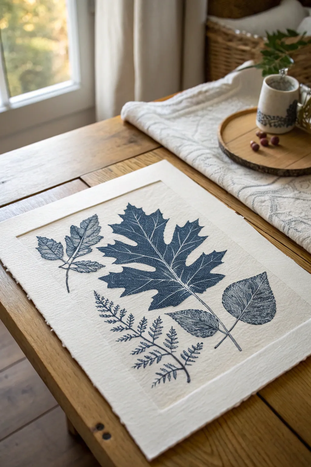
This elegant printmaking project captures the intricate vein structures of nature using relief techniques. The result is a series of deep indigo botanical impressions stamped onto textured paper, creating a timeless, natural centerpiece.
Step-by-Step Tutorial
Materials
- Heavyweight printmaking paper (rag or cotton blend)
- Mat board or heavy cardstock (white or cream)
- Collagraph plate material (mount board or cardboard)
- Textured wallpaper samples, fabric scraps, or dried leaves
- Gloss medium or PVA glue/Mod Podge
- Block printing ink (oil-based preferred, indigo or dark blue)
- Brayer (rubber roller)
- Baren or a clean wooden spoon
- Craft knife and cutting mat
- Pencil
- Scissors
Step 1: Creating the Collagraph Plate
-
Select your botanicals:
Gather reference images or actual pressed leaves for your design. For this project, you’ll need shapes resembling an oak leaf, a fern frond, and a few smaller compound leaves. -
Sketch the outlines:
Lightly draw the outlines of your chosen leaves onto your mount board or cardboard plate base. Keep the shapes simple enough to cut out but accurate to the species. -
Build the texture:
This is the heart of collagraphy. Cut out matching shapes from your textured materials—wallpaper samples, dried leaves, or even stiff fabric. Glue these firmly onto your cardboard base within the pencil outlines. -
Enhance the veins:
To create the intricate white vein lines seen in the example, use a dull pencil or a modeling tool to firmly press indentations into your textured material while the glue is tacky. Alternatively, apply fine string or thread for raised veins. -
Seal the plate:
Coat the entire surface of your leaf shapes with a thin, even layer of gloss medium or PVA glue. This prevents the ink from soaking into the cardboard and makes the plate wipeable. -
Let it cure:
Allow the plate to dry completely. Usually, I leave mine overnight to ensure the sealant is hard, which guarantees a crisp print later.
Too Much Ink?
If your delicate vein lines disappear, you’ve likely over-inked the plate. Wipe the plate clean with a rag and try again with a much thinner layer on your brayer.
Step 2: Inking and Printing
-
Prepare the paper:
Tear your heavy printmaking paper to size. For that lovely deckled edge look, crease the paper and tear it against a ruler rather than cutting with scissors. -
Create a registration guide:
On your work surface, mark lightly with pencil where your paper will sit, so you can place your inked plates in the correct composition without guessing. -
Roll out the ink:
Squeeze a small amount of Indigo block printing ink onto a glass slab or tray. Roll the brayer back and forth until the ink sounds like ‘velcro’—a sticky, hissing noise. -
Ink the plate:
Roll the ink evenly over your textured leaf plates. Be thorough but careful; you want to coat the textured surface (relief) but avoid filling in the deep vein indentations you created. -
Arrange the composition:
Carefully place your inked plates face-up onto your registration guide. Arrange the oak leaf centrally, with the fern and smaller leaves flanking it naturally. -
Place the paper:
Gently lay your printing paper on top of the inked plates. Once it makes contact, do not shift or slide it, or the image will smear. -
Burnish the print:
Using a baren or the back of a wooden spoon, rub separate circles over the back of the paper. Apply firm, consistent pressure to transfer the ink from the textured highs and lows. -
Check the transfer:
Carefully lift one corner of the paper to peek at the impression. If the ink looks patchy, lay it back down and rub that specific area with more pressure.
Embossed Edges
For a deeper impression, dampen your paper slightly with a sponge before printing. The wet fibers will mold around the plate edges, creating a beautiful 3D relief effect.
Step 3: Finishing Touches
-
Reveal the artwork:
Peel the paper completely off the plates. You should see a rich, textural print where the veins appear white (un-inked) against the dark blue leaf body. -
Dry the print:
Oil-based inks can take a few days to fully cure. Hang the print or lay it flat on a drying rack in a dust-free area. -
Mount on cardstock:
Once the ink is dry, mount your printed sheet onto the larger cream mat board or heavy cardstock using archival double-sided tape or mounting corners. -
Create the raised frame effect:
To mimic the ’embossed’ frame look in the image, cut a second piece of cardstock slightly smaller than your base and mount the artwork on top of it, creating a stepped border.
Hang your finished textured print in a spot with good natural light to highlight the intricate relief details
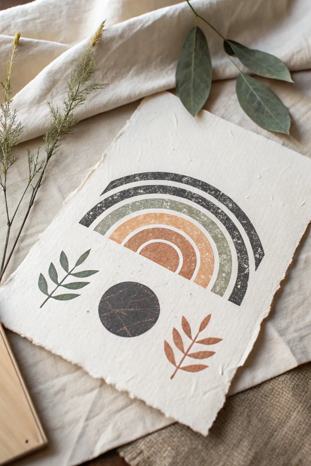
Stencil and Brayer Shape Prints

Embrace the textured charm of handmade paper with this earthy, bohemian-inspired shape print. Using simple stencils and a brayer technique creates a beautiful, weathered aesthetic perfect for modern wall art.
Step-by-Step Tutorial
Materials
- Deckle-edge handmade cotton rag paper (heavyweight)
- Block printing ink or heavy body acrylics (Charcoal, Sage Green, Terracotta)
- Soft rubber brayer (roller)
- Sheet of acetate, Mylar, or sturdy cardstock for stencils
- Craft knife and cutting mat
- Glass or acrylic inking plate
- Low-tack painter’s tape
- Baren or clean wooden spoon (for burnishing)
- Pencil and eraser
Step 1: Design & Stencil Creation
-
Sketch the Rainbow:
Begin by sketching your rainbow design on a piece of scrap paper first to get the sizing right. You’ll need four distinct arches: a wide outer arch, a middle arch, and two smaller inner arches. -
Draw the Leaf and Circle Elements:
Below the rainbow, sketch a simple circle about the width of the rainbow’s center. Flank this circle with two simple botanical sprigs—one on the left pointing somewhat upward, and one on the right mirroring it. -
Transfer to Stencil Material:
Place your Mylar or acetate sheet over your sketch. Trace the shapes carefully using a permanent marker so you can see your cutting lines clearly. -
Cut the Negative Space:
Using a sharp craft knife on a cutting mat, carefully cut out the shapes. For this specific technique, we want the negative space—the holes where the ink will go—so keep the surrounding sheet intact. -
Separate the Elements:
Cut your stencil sheet into manageable sections if needed. It is often easier to have the rainbow arches as one stencil piece (with bridges connecting the spaces between arches) and the leaves/circle as separate pieces.
Step 2: Inking & Printing
-
Prepare the Paper:
Position your handmade deckle-edge paper on a flat, clean surface. Secure the corners lightly with tape if the paper tends to curl. -
Mix the Sage Green:
Squeeze a small amount of sage green ink onto your inking plate. Roll your brayer back and forth to charge it evenly, ensuring a velvety texture on the roller. -
Print the Green Arch:
Secure the stencil over the paper. Roll the green ink specifically over the second-to-largest arch area. Because handmade paper is textured, use firm pressure. -
Add Green Leaf Detail:
Using the same green ink, position the left leaf stencil and roll the ink over it. Be careful not to go outside the stencil boundaries. -
Prepare the Terracotta:
Clean your brayer thoroughly (or use a second one). Prepare the terracotta/rust colored ink on the plate. -
Print the Inner Arches:
Apply the terracotta ink to the two smallest inner arches of the rainbow. Also, use this color for the leaf sprig on the bottom right. -
Mix the Charcoal Color:
Prepare a dark charcoal or soft black ink. This needs to be fairly opaque to stand out against the paper texture. -
Print the Outer Arch:
Carefully roll the charcoal ink over the largest, outermost arch of the rainbow stencil. -
Print the Central Circle:
Position the circle stencil centered below the rainbow. Apply the charcoal ink here as well. I like to vary the pressure slightly here to get that lovely distressed, stone-like texture. -
Burnish for Texture:
Before lifting the stencils, you can place a clean sheet of paper over the inked areas and rub securely with a baren or wooden spoon to force the ink into the deep textures of the cotton paper. -
Reveal the Print:
Slowly peel back the stencils. Don’t worry if the edges look a bit rugged or if the ink coverage is spotty—that’s the desired effect for this rustic style. -
Touch Ups:
If any major areas missed the ink entirely, you can lightly dab a little extra ink with a sponge, but resizing the stencil exactly can be tricky, so embrace imperfections. -
Drying Time:
Allow the print to dry completely flat. Handmade paper can take longer to dry than standard paper due to its absorbency.
Bleeding Edges?
If ink bleeds under the stencil, your brayer is likely overloaded with too much ink. Roll it out on a scrap paper first until the texture sounds ‘sticky’ rather than squishy.
Add Metallic Flair
Once the matte ink is dry, mix a tiny amount of gold gouache or ink and lightly dry-brush it over just the dark circle or leaf veins for a subtle shimmer.
Frame your textured masterpiece in a floating glass frame to show off those beautiful deckled edges.

Have a question or want to share your own experience? I'd love to hear from you in the comments below!