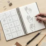
When I’m drawing connection, I’m really drawing the invisible stuff—care, tension, memory, and the tiny choices that pull us closer. Here are some of my favorite connection drawing ideas that turn relationships and links into simple, powerful visuals.
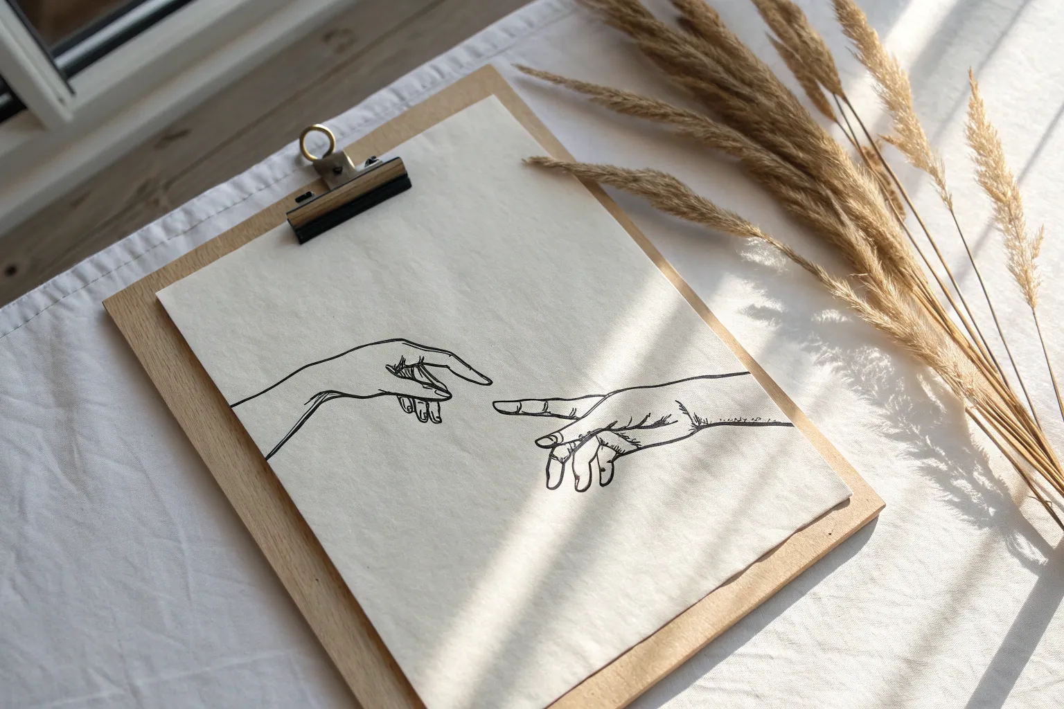
Hands Reaching Across a Gap
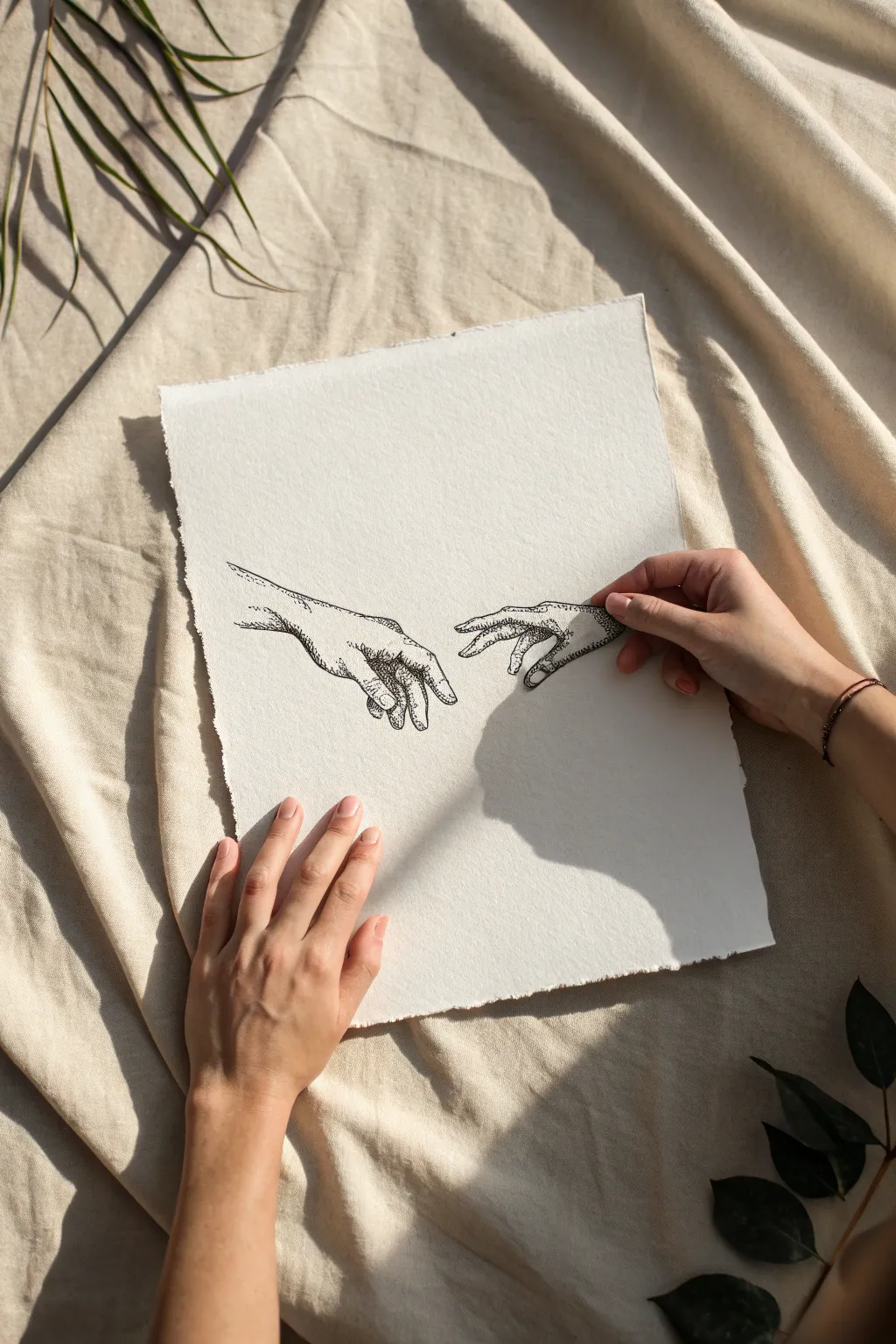
Capture the tension of connection with this intricate pen-and-ink drawing featuring a clever interactive element. Using stippling techniques on textured paper, you’ll create a timeless piece where one hand seems to lift right off the page.
Step-by-Step
Materials
- Heavyweight textured artistic paper (Cold press watercolor paper or handmade cotton paper)
- Fine liner pens (sizes 005, 01, and 03)
- Pencil (HB or 2B)
- Kneadable eraser
- Precision craft knife or sharp scissors
- Tracing paper (optional)
- Workable fixative (optional)
Step 1: Planning and Sketching
-
Prepare the paper:
Start by selecting a high-quality, textured paper. If your paper doesn’t already have deckled edges, you can create a faux-deckle look by carefully tearing the edges against a ruler or using a specialized tearing tool for that rustic, handmade feel. -
Map out the composition:
Lightly sketch the position of two hands reaching toward each other. Place the left hand (reaching from the bottom left) firmly on the main sheet. Position the right hand (reaching from the right) so it floats freely; this is the part you will eventually cut out. -
Refine the anatomy:
Use your pencil to detail the fingers, knuckles, and wrist bones. Focus on the gesture—the fingers should be slightly curled and extending, with a small but significant gap between the index fingers to create tension. -
Check proportions:
Step back and look at your sketch. Ensure the hands are similar in scale. The beauty of this piece relies on the delicate interaction between the two forms, so take your time getting the shapes right.
Dotting Patience
Don’t rush stippling! Fast dotting creates tails or dashes. keep your pen vertical and lift completely between dots for clean, round marks.
Step 2: Inking the Outlines
-
Outline the main shapes:
Using a 01 fine liner, carefully trace over your pencil lines. Use a broken or slightly wavering line technique rather than a solid, thick stroke; this mimics the texture of skin and matches the organic feel of the final stippling. -
Add primary creases:
Switch to a thinner 005 pen to draw the major skin folds on the knuckles and palms. Keep these lines very light and tapered at the ends so they don’t look like deep cuts. -
Erase pencil marks:
Once the ink is completely dry—I usually give it at least 15 minutes to be safe—gently dab a kneadable eraser over the sketch to lift the graphite without damaging the paper surface.
Step 3: Shading with Stippling
-
Start the base stippling:
Begin adding shading using dots (stippling) with your 005 pen. Start in the darkest areas—between the fingers and the undersides of the wrists. Keep the dots spaced out initially to establish the light grey tones. -
Build darker values:
Layer more dots over the shadowed areas to deepen the values. The closer the dots are to each other, the darker the shadow will appear. Focus on the curves of the muscles to give the hands volume. -
Define the contours:
Use the direction of your dot clusters to follow the form of the fingers. This helps ’round out’ the flat shapes. Leave the tops of the knuckles and the back of the hand largely white to represent highlights. -
Deepen contrast:
Switch to a 03 pen for the very darkest crevices, like the point where fingers touch or deep palm lines. Add just a few larger dots here to create visual weight and distinct contrast. -
Refine transitions:
Go back in with your finest 005 pen to soften the transition between the dense shadowed areas and the bright paper highlights. A smooth gradient is key to making the skin look realistic.
Shadow Play
Mount the cutout hand on small foam adhesive squares. This lifts it off the paper, casting a natural shadow that changes with the room’s light.
Step 4: Creating the 3D Element
-
Identify the cutout section:
Locate the hand on the right side of your composition. Depending on your preference, you can cut out just the hand and wrist, or include a portion of the arm. -
Score the paper:
Using a precision craft knife, very lightly score the outline of the right hand. Don’t cut all the way through yet; checking your path first prevents mistakes. -
Cut carefully:
Apply more pressure and cut along the outline. If you are cutting between fingers, be extremely gentle to avoid tearing the delicate paper web between them. -
Clean up edges:
If there are any fuzzy paper fibers left from the cut, carefully trim them with sharp scissors so the silhouette is crisp against the background. -
Position and finalize:
Place your cutout hand back onto the main sheet or hold it slightly above to test the shadow effect. The separate piece adds a beautiful physical dimension to the drawn connection.
Now you have a dynamic, dimensional artwork that beautifully captures the moment of contact

One Continuous Line, Two Faces
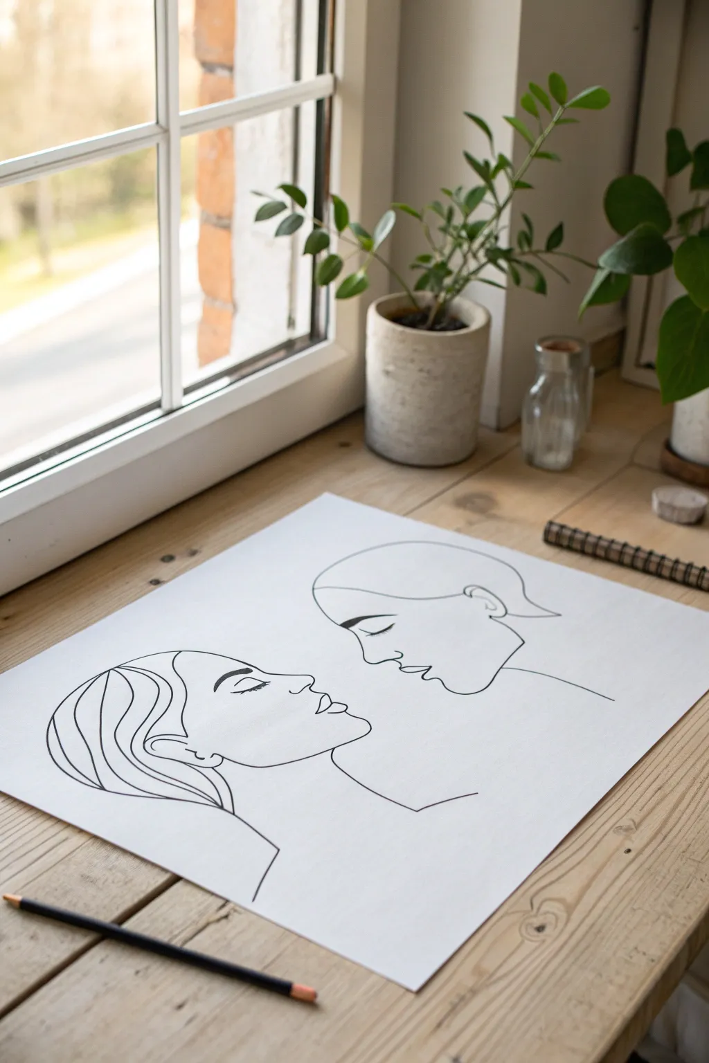
Capture the intimate moment right before a kiss with this elegant line drawing that emphasizes connection through simplicity. Using a minimalist, continuous-line style, you’ll create two profiles facing each other using bold, confident strokes on crisp white paper.
Step-by-Step Tutorial
Materials
- High-quality white drawing paper (A3 or similar large format)
- HB pencil for sketching
- Kneaded eraser
- Black fineliner pen (0.5mm or 0.8mm)
- Thicker black marker or brush pen (for variable line weight)
- Ruler (optional for centering)
Step 1: Planning and Sketching
-
Prepare your workspace:
Clear a large, flat surface near a window if possible, as natural light helps you see subtle sketch lines. Tape down the corners of your paper to prevent it from shifting while you draw. -
Map out the composition:
Visualize the page split into two halves. Lightly mark the center point where the two noses will almost touch. This negative space is the most crucial part of the drawing. -
Sketch the left profile’s forehead:
Using your pencil very lightly, start on the left side. Draw the curve of the forehead moving downward towards the bridge of the nose. -
Define the nose and lips:
Continue the line to form a soft, slightly upturned nose. Creating the lips requires a delicate touch; I like to sketch top, middle, and bottom lip curves separately first before connecting them to ensure the expression stays gentle. -
Chin and neck structure:
Sweep the line down for the chin and extend it into a long, elegant neck line that angles outward toward the shoulder. -
Add hair details:
Sketch the hair on the left figure using sweeping, wave-like curves that move back from the forehead and tuck behind the ear area. Keep these lines fluid. -
Sketch the right profile:
Now, sketch the responding profile on the right. Align the forehead slightly higher than the left. The nose should mirror the first one but leave a small gap between them. -
Complete the right face:
Draw the lips and chin for the right figure. The jawline here is depicted with a single sweep that transitions into the neck line. -
Refining the interaction:
Step back and look at the sketch. Adjust the distance between the faces if needed; they should feel magnetic but not actually touching. Clean up any confusing sketch lines with your kneaded eraser.
Master the Flow
Practice the continuous strokes in the air above the paper a few times before actually lowering the pen. This builds muscle memory for smoother curves.
Step 2: Inking the Final Lines
-
Test your marker:
Before touching the final paper, test your black marker on a scrap sheet to ensure the ink flows smoothly and isn’t drying out. -
Begin with the eyes:
Start by inking the closed eyes first. These disjointed elements anchor the emotion. Use a slightly thicker pressure for the eyelashes to give them weight. -
Ink the left profile contour:
Starting from the hair line, trace your pencil sketch for the left face. Try to keep your hand moving at a consistent speed to avoid shaky lines. -
Varying line weight:
As you move down the neck and shoulder, you can press slightly harder to create a bolder line, grounding the figure. -
Inking the hair waves:
For the hair on the left, use long, confident swoops. It helps to lock your wrist and move your whole arm to get smooth curves rather than short, scratchy strokes. -
Ink the right profile:
Move to the right figure. Trace the forehead, nose, and lips carefully. Pay special attention to the nose tip; make sure the line remains crisp. -
Completing the neck line:
Finish the right figure by drawing the jaw and neck line. Let this line trail off or stop abruptly at the bottom for a stylized look.
Step 3: Finishing Touches
-
Let the ink cure:
Wait at least 15 to 20 minutes for the ink to fully set. Even if it looks dry, thick maker lines can hold moisture deep in the paper fibers. -
Erase pencil marks:
Gently glide the kneaded eraser over the entire drawing to lift the graphite guideline. Hold the paper taut with your other hand to prevent crinkling. -
Final assessment:
Check for any gaps in your black lines that look unintentional. If needed, carefully re-go over small sections to darken them, but avoid overworking it.
Make it Metallic
Trace over the main profile lines with a gold or copper leaf pen for a luxurious, modern twist that catches the light beautifully.
Frame your new minimalist masterpiece in a simple wood or black frame to highlight the stark elegance of the lines
Intertwined Fingers With Simple Thread
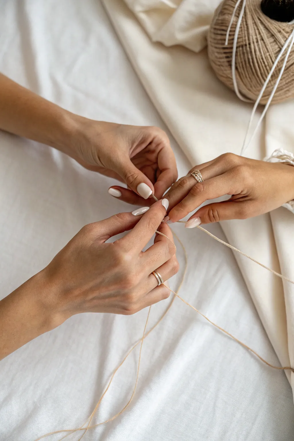
Capture the delicate connection of hands weaving string with this realistic drawing tutorial. You’ll focus on rendering soft skin textures and the subtle tension of thread held between fingers.
How-To Guide
Materials
- Smooth heavyweight drawing paper (Bristol or hot press watercolor paper)
- Graphite pencils (4H, 2H, HB, 2B, 4B)
- Blending stumps or tortillons
- Kneaded eraser
- Precision eraser (stick eraser)
- Mechanical pencil (0.5mm HB or 2B)
- Tissue or chamois cloth
Step 1: Drafting the Foundations
-
Gesture Sketch:
Begin with a very light 4H pencil to map out the overall placement of the three visible hands. Use loose ovals for the palms and simple lines for the fingers to capture the gesture rather than the details. -
Refining Shapes:
Define the contours of the fingers and knuckles more clearly. Observe the relationships between the knuckles—the left hand is reaching from the bottom, while the top right hand is gently grasping. -
Mapping the Thread:
Lightly draw the path of the thread. It creates a loose triangle shape, pulled taut between the central fingers. Don’t press hard; these lines need to remain thin and delicate. -
Adding Nail Details:
Sketch the almond shapes of the fingernails. Note the foreshortening on the fingers that are pointing away from the viewer.
Smudge Control
Place a scrap piece of paper under your drawing hand. This prevents natural oils from transferring to the paper and keeps you from smearing your careful shading work.
Step 2: Building Form and Tone
-
Base Shading:
Using an H or HB pencil, apply a light, even layer of graphite over the skin areas, avoiding the nails and the thread lines. I like to use the side of the pencil for a softer laydown. -
Smoothing texture:
Gently blend this base layer with a tissue or chamois cloth to create a smooth, skin-like foundation. -
Defining Shadows:
Switch to a 2B pencil to start darkening the areas between fingers and under the palms. Look for the deepest shadows where fingers overlap or touch. -
Modeling Knuckles:
Add shading around the knuckles to give them volume. The skin stretches here, so keep the highlights on the bony protrusions bright. -
Creating Skin Folds:
Use a sharp HB pencil to draw the fine wrinkles at the finger joints. These lines shouldn’t be solid black; lift them slightly with a kneaded eraser if they get too harsh.
Textural Contrast
Draw the background fabric with rougher, cross-hatching strokes compared to the smooth blending of the skin. This contrast makes the hands look even softer.
Step 3: Refining Details
-
Rendering Nails:
Shade the nails carefully, leaving a crisp white highlight to simulate the glossy polish. Darken the cuticles slightly to set the nail into the finger. -
Jewelry Accents:
Draw the rings on the fingers. Use sharp contrasts—deep darks next to bright white highlights—to mimic the reflective metal and stone textures. -
Thread Definition:
Go back to the thread lines. Use a mechanical pencil to sharpen their edges. If you shaded over them, use a precision eraser to lift the graphite back to white. -
Thread Shadow:
Add a very thin, faint cast shadow on the skin right underneath where the thread touches the fingers. This tiny detail anchors the string to the hands. -
Deepening Values:
With a 4B pencil, push the darkest values in the crevices between fingers to increase the sense of depth and dimension. -
Background Suggestion:
Lightly sketch the folds of the fabric in the background using broad strokes. Keep this soft and out of focus to ensure the hands remain the focal point. -
Final Highlights:
Use your precision eraser to pull out distinct highlights on the knuckles, the tips of the fingers, and the bridge of the nose if visible, emphasizing the light source.
Take a step back to admire the lifelike tension you have created in your drawing


Two Hands Making One Heart Shape

Capture the warmth of human connection with this realistic drawing of hands forming a heart shape. The high-contrast lighting and rich teal background create a dramatic, sculptural effect that makes the skin tones pop.
Step-by-Step
Materials
- Smooth bristol value paper or hot-press watercolor paper
- HB, 2B, and 4B graphite pencils
- Colored pencils (peach, warm beige, terracotta, burnt umber, dark brown)
- Teal or emerald green pastel or colored pencil for background
- White gel pen or gouache
- Blending stumps (tortillons)
- Kneaded eraser
Step 1: Drafting the Gesture
-
Establish the heart shape:
Start lightly with your HB pencil. Draw the central negative space first—that distinctive heart shape formed between the fingers and thumbs. This negative space acts as your anchor for the rest of the composition. -
Block in the thumbs:
Sketch the two thumbs curving downward to meet at the point of the heart. Pay attention to the angle; the left thumb is slightly higher, creating an asymmetrical, natural overlap. -
Outline the fingers:
Draw the index fingers curving upwards to touch, completing the top arches of the heart. Rough in the remaining fingers curled behind them, keeping the lines loose and geometric at this stage. -
Map the wrists and sleeves:
Extend the lines downward to form the wrists. Sketch broad, angular shapes for the white sleeves, ensuring the fabric folds follow a diagonal direction towards the bottom corners. -
Refine the anatomy:
Go back over your hand outlines. Mark the location of knuckles and the fingernails, specifically noting the long, almond shape of the nails on the thumbs and index fingers.
Hands look flat?
Increase the contrast! Deepen the shadows between the fingers with a dark brown or purple pencil. High contrast makes the lighter areas push forward visually.
Step 2: Color and Tone Application
-
Base layer for skin:
Using a light peach colored pencil, fill in all the skin areas with a soft, even layer. Keep your pressure light to allow the grain of the paper to accept more layers later. -
Building warmth:
Layer a warm beige over the hands, focusing on the areas that catch the light—the tops of the hands and the mounds of the thumbs. -
Establish the shadows:
Switch to terracotta and burnt umber. Look closely at the reference: there are deep shadows between the fingers and under the curved palms. Darken these areas significantly to create depth. -
Deepening the contrast:
I find that adding a touch of dark brown to the crevices between fingers really makes the hands look three-dimensional. Don’t be afraid of going quite dark here. -
Render the jewelry:
Identify the rings on the fingers and the bracelet on the left wrist. Use a golden-brown pencil for the metal, leaving tiny white specks of paper showing for the highlights.
Try a cosmic twist
Instead of a teal table, fill the background with a galaxy of stars and nebula clouds. Make the heart shape a window into a different colored universe.
Step 3: Background and Details
-
Fill the background:
Using a teal pastel or heavy colored pencil, color the entire background surrounding the hands. Create a flat, opaque surface to mimic the texture of the green table. -
Cast the main shadow:
The lighting creates a strong, distinct shadow below the hands. Using a dark green or even a black pencil lightly layered over the teal, draw the hard-edged shadow shape directly underneath the wrists and fingers. -
Shade the shirts:
For the white sleeves, use a very light gray or cool blue pencil to define the folds and creases. Keep the brightest parts pure white paper. -
Adding texture to skin:
Sharpen your terracotta pencil to a fine point. Lightly draw the tiny wrinkles on the knuckles and the fine lines on the palms to add realism to the skin texture. -
Highlights and nails:
Color the fingernails with a pale cream. Use a white gel pen or a tiny dot of gouache to add the brightest specular highlights on the nails, the rings, and the shiny bracelet beads.
Now step back and admire how simple lines and shadows have transformed into a touching symbol of love

PENCIL GUIDE
Understanding Pencil Grades from H to B
From first sketch to finished drawing — learn pencil grades, line control, and shading techniques.
Explore the Full Guide
Puzzle Pieces Snapping Together
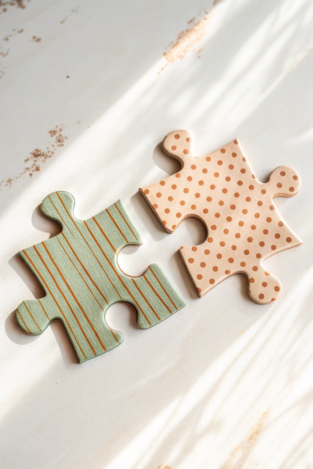
Capture the satisfying feeling of finding the perfect fit with this realistic illustration of two stylized puzzle pieces. The soft shadows and distinct patterns—crisp pinstripes and playful dots—create a warm, textural scene that looks almost three-dimensional.
How-To Guide
Materials
- Heavyweight smooth Bristol paper or Multimedia paper
- HB or 2H graphite pencil (for sketching)
- Kneaded eraser
- Alcohol-based markers (Sage Green, Sand/Beige, Warm Brown)
- Fine liner pens (Warm Grey or Sepia, 0.1mm and 0.3mm)
- White gel pen or gouache
- Ruler
- Circle template or stencil (optional)
Step 1: Sketching the Shapes
-
Outline the left piece:
Start by drawing the sage green puzzle piece on the left side of your paper. Sketch a standard square body, adding one rounded ‘outie’ tab on top and one on the right. Add corresponding ‘innie’ curved notches on the bottom and left sides. -
Outline the right piece:
Draw the second puzzle piece slightly apart from the first, angled as if it is about to snap into place. This piece should have an ‘innie’ notch on the left designed to receive the tab from the first piece. -
Add dimension lines:
To give the pieces thickness, draw a second, thinner line parallel to the bottom and right edges of each puzzle piece. This creates a side wall that will soon become the edge thickness. -
Clean up the sketch:
Gently erase any overflowing lines or heavy sketch marks with your kneaded eraser until only a faint guide remains visible.
Pro Tip: Shadow Realism
Keep the cast shadow closest to the object sharp and dark, then blur it as it moves away. This mimics how real light behaves and lifts the pieces off the page.
Step 2: Coloring the Base Layers
-
Fill the sage piece:
Using a sage green alcohol marker, color the entire top surface of the left puzzle piece. Work in smooth, parallel strokes to ensure an even coat without streakiness. -
Fill the beige piece:
Take your sand or beige-colored marker and fill in the top surface of the right puzzle piece. I find that applying two light layers often results in a smoother finish than one heavy layer. -
Color the edges:
Use a slightly darker shade of your respective base colors (or execute a second pass with the same marker) to color the thin side walls you drew earlier. This contrast establishes the physical thickness of the cardboard.
Level Up: Sunlight Effect
Lay strips of paper across your drawing and airbrush or gently shade over them with white/yellow pastel to create the “blind slat” lighting effect seen in the photo.
Step 3: Adding Patterns
-
Draft the stripes:
On the green piece, lightly use a ruler to mark spacing for diagonal stripes. They should run from the top-left to bottom-right. -
Draw the stripes:
Using a fine liner or a thin warm brown marker, carefully draw the diagonal pinstripes over the green base. Keep the pressure consistent for clean lines. -
Draft the grid for dots:
For the beige piece, lightly visualize or mark a grid pattern to ensure your polka dots are evenly spaced. -
Apply the polka dots:
Using the same warm brown color used for the stripes, carefully dot the beige piece. You can freehand these for a more organic look or use a small circle template for precision.
Step 4: Shading and Highlights
-
Cast shadows:
To make the pieces sit on the surface, draw shadows underneath them using a light warm grey marker. Focus the shadow on the bottom and right sides, mimicking a light source coming from the top left. -
Soften the shadows:
Use a blender marker or a very pale grey to soften the edges of the cast shadow, fading it out into the white of the paper. -
Edge definition:
Take a 0.1mm sepia or fine grey pen and very delicately outline the edges of the puzzle pieces to sharpen their silhouette against the background. -
Highlight the edges:
With a white gel pen, add a thin, crisp line along the top-left edges of both pieces. This represents light hitting the corner where the cardboard fits are cut. -
Surface texture:
Tap your colored pencil or stylus gently over the surface to add tiny imperfections or paper texture, making the material look like pressed cardboard.
Now you have a charming pair of connected pieces that celebrate the idea of finding the perfect fit
Bridge Line Between Two Silhouettes
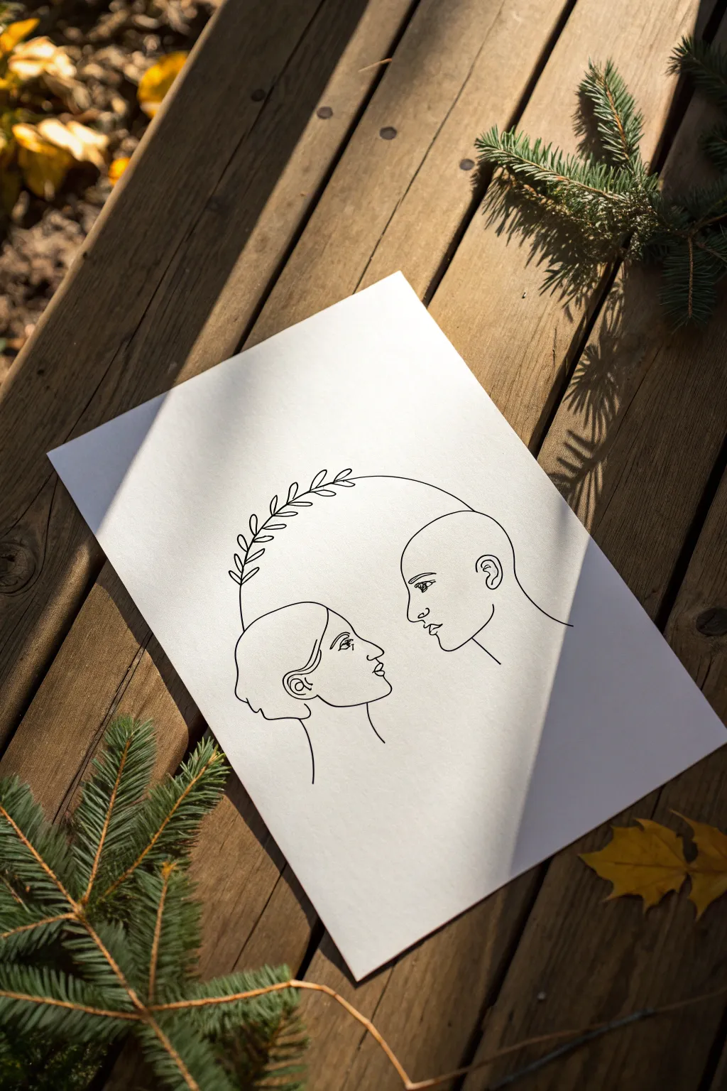
Capture the essence of human connection with this minimalist continuous-style line drawing. Using a single arched bridge to link two profiles creates a subtle yet powerful visual metaphor for relationships and shared growth.
Step-by-Step Tutorial
Materials
- High-quality white drawing paper (heavyweight cardstock or mixed media paper)
- HB or 2B pencil for sketching
- Fine-point black pigment liner (0.3mm or 0.5mm)
- Medium-point black marker (0.8mm or 1.0mm) for bolder lines
- Kneaded eraser
- Ruler (optional, for spacing)
- Reference photo of profiles (optional)
Step 1: Planning and Sketching
-
Establish the composition:
Begin by lightly marking the center of your paper. Decide where the two heads will sit; they should be positioned lower on the page to leave ample room for the arch above them. -
Sketch the left profile geometry:
Start sketching the left figure (the feminine profile) using basic geometric shapes. Draw a loose oval for the head and a gentle curve for the neck. Keep your pencil pressure very light so these lines can be erased later. -
Sketch the right profile geometry:
Sketch the right figure (the masculine profile) opposite the first. Ensure the eye levels align roughly across the page. I find it helpful to draw a faint horizontal guide line between the eyes to keep the gaze connected. -
Refine the facial features:
Detail the profiles. For the left face, focus on the curve of the hair bun, the nose, and the lips. For the right face, outline the bald head shape, the brow ridge, and the chin. Keep the expressions neutral and calm. -
Draft the connecting arch:
Draw a large, sweeping semi-circle that starts from the back of the right figure’s head and arches over to the left side. It shouldn’t touch the left head directly yet; instead, let it hover above. -
Add the botanical elements:
along the left side of that arch, sketch small, simple leaf shapes. These should look like a laurel branch, growing downwards toward the left figure’s hair.
Confident Lines
Draw the long arch using your shoulder, not your wrist. This creates a smoother curve without the shaky “hairy line” look.
Step 2: Inking the Connection
-
Test your pen flow:
Before touching the final paper, scribble on a scrap piece to ensure your black pigment liner is flowing smoothly and hasn’t dried out. -
Ink the right profile:
Start with the rightmost figure. Use a confident, steady hand to trace your pencil lines. Pay attention to the ear details and the sharp turn of the jawline. -
Ink the left profile:
Move to the left figure. Carefully outline the hair, ear, and facial profile. Leave the top of the head open where the leaves might interact with the hairline if you want them to visually merge. -
Draw the main arch line:
Place your pen at the connection point on the right head. Draw the long curved line in one smooth motion if possible. Stop when you reach the section where the leaves begin. -
Detail the leaves:
Switch to a slightly finer pen tip if available for the leaves. Ink the central stem of the branch first, then carefully outline each small leaf attached to it. -
Refine facial details:
Go back in and add the eyes. Keep them simple—just the suggestion of an eyelid and iris is enough. Don’t over-detail lashes or pupils, as this style relies on minimalism.
Step 3: Finishing Touches
-
Check line weight:
Look at your drawing from a distance. If the profiles feel too thin compared to the arch, slightly thicken the contour lines on the underside of the chins and necks for added weight. -
Let the ink cure:
Allow the ink to dry completely for at least 10-15 minutes. Pigment liners can smear easily if erased too soon. -
Erase guidelines:
Gently roll a kneaded eraser over the entire drawing to lift the graphite sketches. A kneaded eraser is gentler on the paper texture than a standard rubber eraser. -
Clean up stray marks:
Inspect the white space around the figures. Use a clean eraser to remove any smudges or fingerprints to ensure the background remains stark white.
Gold Highlighting
Trace over just the leaves or the connecting arch with a gold metallic gel pen to add a touch of elegance to the connection.
Frame your finished piece in a simple wood or black frame to let the artwork breathe
BRUSH GUIDE
The Right Brush for Every Stroke
From clean lines to bold texture — master brush choice, stroke control, and essential techniques.
Explore the Full Guide
Connect-the-Dots With a Hidden Image
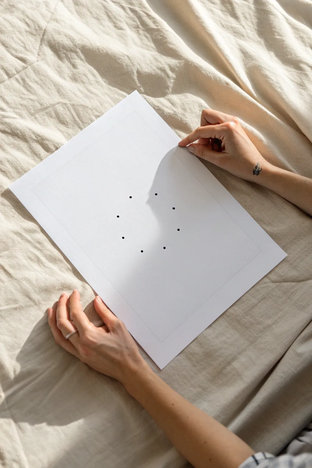
Create a deceptively simple connect-the-dots puzzle that forms a perfect circle when completed. This minimalist design focuses on balance and spacing, resulting in an elegant piece of interactive artwork that invites the viewer to complete the picture.
How-To Guide
Materials
- High-quality white cardstock or drawing paper (A4 size)
- Ruler
- Compass
- Pencil (HB or H)
- Fine-liner pen (black, 0.5mm or similar)
- Eraser (kneaded preferred)
Step 1: Preparation & Layout
-
Paper Selection:
Begin by selecting a smooth, heavyweight paper. Since this design relies on negative space, the quality and texture of your paper will be a significant part of the final look. -
Center Finding:
Using your ruler, lightly measure the width and height of your paper to determine the exact center point. Mark this tiny spot very faintly with your pencil. -
Drafting the Border:
Measure about 1.5 to 2 inches inward from each edge of the paper. Use your ruler to draw a very light rectangular frame. This internal border acts as a visual margin to ground your central design. -
Setting the Radius:
Place your compass point on the center mark you made earlier. Adjust the compass width to your desired circle size—about 1.5 to 2 inches radius works well for this paper size. -
Drawing the Guide Circle:
Gently rotate the compass to draw a complete circle. Keep this line extremely faint, as it serves only as a temporary guide for placing your dots and will be erased later.
Step 2: Plotting the Dots
-
Marking Cardinal Points:
Using the ruler to ensure straight alignment, lightly mark pencil ticks at the 12, 3, 6, and 9 o’clock positions on your guide circle. -
Adding Subdivision Guides:
To ensure even spacing for eight dots total, align your ruler diagonally through the center point to mark the exact midpoints between your cardinal points (1:30, 4:30, 7:30, and 10:30 positions). -
Inking the First Dot:
Take your fine-liner pen and carefully place a solid distinct dot at the top (12 o’clock) position. The dot should be bold enough to be seen clearly but not messy. -
Completing the Circle:
Continue around the circle, placing an ink dot over each of your eight pencil marks. Try to keep the pressure consistent so every dot is the same size. -
Drying Time:
Pause here and let the ink dry completely. Smudging is the biggest risk at this stage, so I usually give it at least five minutes just to be safe.
Even Spacing Trick
If you don’t have a protractor, visualize a clock face to help place dots. Start with the four main hours (12, 3, 6, 9) before splitting the differences.
Step 3: Finishing Touches
-
Erasing the Guide Circle:
Once dry, gently erase the continuous pencil circle line that connects the dots. Use a soft circular motion to avoid damaging the paper tooth. -
Removing Center Marks:
Erase the central point mark and the diagonal guidelines you used for spacing. -
Reinforcing the Border:
Return to the rectangular border you drew in the first phase. You can either leave it as a faint graphite border for a raw look or trace over it very thinly with your pen. -
Final Cleanup:
inspect the paper for any stray graphite dust or smudges. Use a kneaded eraser to lift away any gray cast left behind by the ruler. -
Quality Check:
Hold the paper at arm’s length to ensure the dots create a recognizable implied circle even without the connecting lines drawn yet.
Smudge Prevention
If your ink smears when erasing pencil lines, switching to a kneaded eraser often helps. Instead of rubbing, press and lift the eraser to pick up graphite.
Leave the puzzle unsolved as a minimalist statement or hand it to a friend to connect the loop
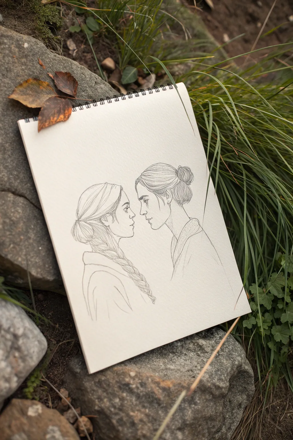
Mirrored Profiles Sharing One Thought
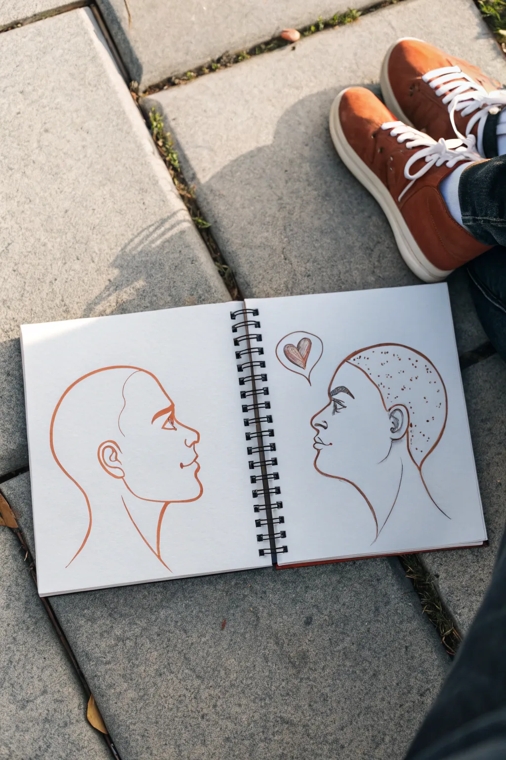
This minimalist line art sketch captures an intimate moment of connection between two profiles using a warm, terracotta-toned ink. It’s a perfect exercise for practicing mirrored proportions and expressive simplicity in your sketchbook.
Step-by-Step
Materials
- Spiral-bound sketchbook (heavyweight paper recommended)
- Terracotta or sepia fine liner pen (0.5mm or 0.8mm)
- Pencil (HB or 2B)
- Soft eraser
- Ruler (optional, for alignment checks)
Step 1: Planning the Layout
-
Establish the centerline:
Open your sketchbook to a fresh spread. Visualize an invisible vertical line right down the spiral binding; this will act as the center point of your conversation. -
Mark eye levels:
Using your pencil lightly, mark a horizontal line across both pages where the eyes will sit. This ensures your figures are looking directly at each other, not past one another. -
Draft the left profile shape:
Begin sketching the left profile with your pencil. Start with a simple curve for the forehead, dipping in for the eye socket, and extending out for the nose. -
Refine the left features:
Add the lips, chin, and jawline on the left side. Sketch a large, smooth curve for the back of the head and neck to complete the silhouette. -
Mirror the right profile:
On the opposite page, sketch the second profile facing the first. Try to keep the nose and chin at roughly the same distance from the center binding as the first face.
Step 2: Inking the Outlines
-
Begin the final left line:
Switch to your terracotta fine liner. Starting at the neck, draw a confident, single line up around the back of the head. -
Trace the facial features:
Continue the line down the forehead. Be careful around the nose and lips; I like to lift the pen slightly here to reset my hand for the curves. -
Detail the left ear and eye:
Draw the ear with a simple C-shape and inner curve. Add the eye profile, keeping lines clean and minimal. Do not shade; leave it as a pure outline. -
Ink the right profile:
Move to the right page. Trace your pencil lines for the face, neck, and ear, ensuring the ink flows smoothly to match the left side’s weight. -
Add hair texture:
Instead of a solid outline for the head on the right figure, use small dots or tiny dashes to create the suggestion of short, textured hair. -
Stipple the scalp area:
Fill the interior of the hair area with loose stippling. Keep the dots random but evenly spaced to give volume without drawing individual strands. -
Draw the eyebrow:
On the right figure, ink a slightly thicker, textured eyebrow using short, angled strokes to differentiate it from the clean line of the left figure.
Wobbly Lines?
Draw from your shoulder, not your wrist. If a line goes astray, thicken the contour slightly in that area to hide the wobble naturally.
Step 3: Adding the Connection
-
Position the thought bubble:
Lightly sketch a small thought bubble above the space between the two foreheads, favoring the right side slightly. -
Ink the heart:
Inside the bubble, draw a simple heart. Use diagonal hatching lines to shade it in, giving it a sketchy, hand-drawn feel. -
Connect the bubble:
Draw the tail of the thought bubble pointing towards the right figure’s forehead area. -
Erase guidelines:
Wait at least five minutes for the ink to dry completely. Gently run your soft eraser over the entire drawing to remove the graphite sketch. -
Final assessment:
Check your lines. If any outline feels too thin or broken, re-trace it carefully to thicken the line weight and unify the composition.
Style Variation
Swap the stippled hair for a messy bun or long waves on one figure to represent specific people you know while keeping the minimal style.
This simple yet emotive drawing is now ready to serve as a reminder of shared thoughts and quiet understanding


Tangled Thought Lines Meeting in the Middle
Capture the intimate tension of a shared gaze with this delicate graphite illustration. Featuring two minimalist profiles facing one another, this sketch focuses on fine linework and subtle textures to convey connection without words.
Detailed Instructions
Materials
- Spiral-bound sketchbook (medium weight paper)
- H or HB pencil (for initial sketching)
- 2B or 4B pencil (for definition and shading)
- Fine-liner pen (0.05mm or 0.1mm, optional for refinement)
- Kneaded eraser
- Precision eraser (for highlights)
- Blending stump or cotton swab
Step 1: Establishing the Framework
-
Position the craniums:
Begin by lightly sketching two circles near the center of your page to represent the skulls. Leave a small gap between them—about an inch or two—to create tension between the figures. -
Mark the face planes:
Draw vertical lines extending down from the front of each circle. These center lines will guide where the noses, lips, and chins will eventually sit. Curve them slightly inward to suggest the contour of the face. -
Map facial features:
Lightly mark horizontal guidelines across both faces to align the eyes, the base of the noses, and the mouths. Ensure the eye lines meet directly, establishing that crucial brow-to-brow connection.
Fixing Flat Faces
If profiles look flat, verify the forehead isn’t a straight vertical line. Most foreheads have a slight slope or curve out before dipping in at the bridge of the nose.
Step 2: Defining the Profiles
-
Sculpt the noses:
Refine the profile line for the figure on the left first. Sketch a gentle slope for the nose. Do the same for the figure on the right, ensuring the noses nearly touch but remain distinct. -
Shape the lips and chins:
Carefully draw the upper and lower lips for both figures. Keep the mouths slightly open or relaxed to create a sense of breath or whispering. Curve the jawlines back up toward where the ears will be. -
Place the eyes:
Draw the side view of the eyes. Instead of full almonds, think of them as triangular wedges. Add the suggestion of lashes, but keep the linework light. The gaze should be locked on the other person. -
Add the ears:
Sketch the ears behind the jawlines. The top of the ear generally aligns with the eyebrow, and the bottom aligns with the nose tip. Keep details simple since hair will cover parts of them.
Pro Tip: Line Variation
Vary your pressure. Use heavier, darker lines for the underside of the jaw and hair mass, and whisper-thin lines for the bridge of the nose and lips.
Step 3: Hairstyling and Details
-
Outline the hair masses:
For the left figure, sketch a loose shape sweeping back into a low braid. For the right figure, outline a shape that pulls back into a messy bun at the crown. -
Detail the braid:
On the left figure, draw the interlocking ‘V’ or ‘Y’ shapes of the braid draped over the shoulder. Keep the strokes fluid to show the weight of the hair. -
Refine the bun:
On the right figure, use swirling, curved strokes to create the texture of the bun. Add a few loose strands escaping near the neck and temple for a natural look. -
Indicate clothing:
Suggest collars and shoulders with just a few confident lines. Don’t over-detail the fabric; the focus should remain on the faces. A simple kimono-style collar or knit texture works well here.
Step 4: Shading and Final Polish
-
Clean up guidelines:
Use your kneaded eraser to gently lift away the initial circles and construction lines, leaving only your clean profile work. -
Darken the lash line:
Switch to your 2B or 4B pencil. Press a bit harder on the eyelashes and the pupils to make the eyes the focal point. -
Deepen hair strands:
Add darker strokes within the hair shapes to show direction and volume. Focus shading near the roots and where hair gathers at the hair ties. -
Add subtle hatching:
Place very light hatching or shading under the chin and jawline to give the heads three-dimensional form. I like to keep this minimal to maintain the airy feel of the sketch. -
Refine the connection:
Double-check the negative space between the faces. If needed, sharpen the profile lines of the noses and foreheads to make that space crisp and electric.
Close your sketchbook gently to preserve the quiet intimacy of your new drawing
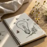
Heart and Brain Linked by Roots
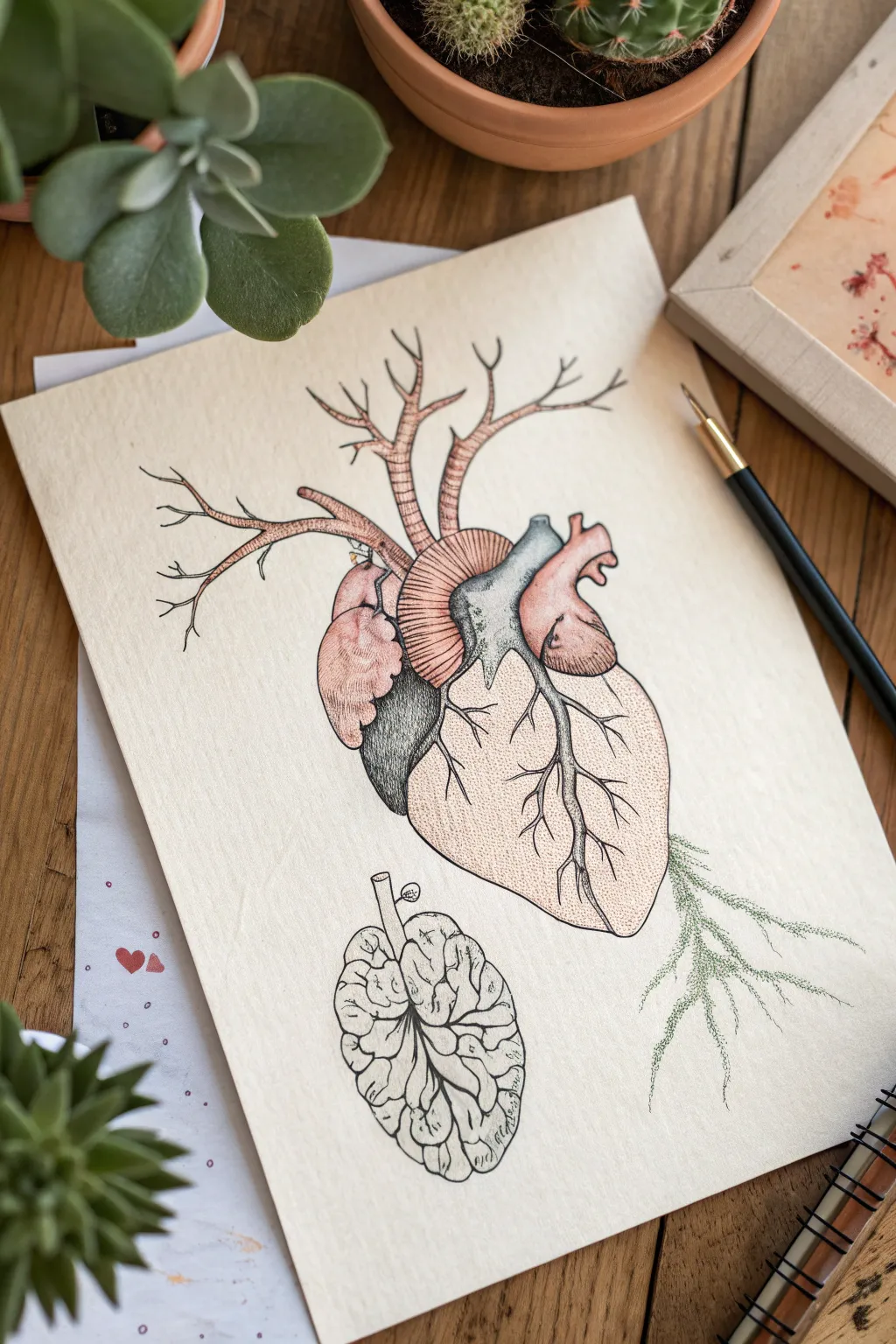
This striking illustration merges human anatomy with botanical elements, featuring a realistic heart sprouting branches and roots alongside a textured, seed-like brain. Using fine liners and subtle washes, you’ll create a piece that feels both scientific and surreal.
Step-by-Step
Materials
- Cream or off-white textured mixed media paper (heavyweight)
- Fine liner pens (sizes 0.05, 0.1, 0.3, and 0.5) in black
- Watercolor paints or ink washes (flesh tones, warm browns, slate blue, sage green)
- Small round watercolor brush (size 2 or 4)
- Pencil (HB or 2H)
- Kneaded eraser
- Ruler (optional for spacing)
Step 1: Penciling the Anatomy
-
Outline the heart:
Begin by lightly sketching the central anatomical heart shape in the middle of your paper. Focus on the main chambers—the ventricles and atria—keeping the lines faint. -
Add the aorta and arteries:
Sketch the aorta arching from the top. Instead of ending them naturally, extend the major arteries upward and outward, transforming them into bare tree branches that reach toward the paper’s edge. -
Sketch the brain-seed:
Below the heart, draw a vertical oval shape resembling a brain or a walnut. Add a small stem protruding from the top, leaning slightly left. -
Connect the roots:
From the bottom right of the heart, sketch delicate root structures extending downward and outward, mimicking the fine capillaries of a root system.
Ink Smearing?
If your fine liners aren’t waterproof, the watercolor step will ruin the lines. Test your pen on a scrap piece of paper with water first, or do the painting first and ink second.
Step 2: Inking the Outlines
-
Trace main contours:
Using a 0.3 fine liner, go over your pencil lines for the main body of the heart and the brain. Use a broken, organic line quality rather than a stiff, solid stroke. -
Define the branches:
Switch to a 0.1 pen for the upper arterial branches. Make the tips finer and intricate as they move away from the heart. -
Detail the roots:
Use your finest 0.05 pen for the root system at the bottom right. Keep these lines shaky and incredibly thin to suggest fragility. -
Erase pencil marks:
Wait for the ink to dry completely, then gently roll a kneaded eraser over the entire drawing to lift the graphing, leaving only the clean ink.
Go darker
For a vintage medical textbook look, lightly stain the entire paper with cold coffee or tea before you start drawing to give it an aged parchment background.
Step 3: Shading and Texture
-
Stipple the heart:
Using the 0.05 pen, add shading to the heart through stippling (tiny dots). Concentrate the dots heavily on the left side and under the main vessels to create roundness and depth. -
Texture the brain:
Fill the brain shape with squiggly, convoluted lines to represent the gyri and sulci. Keep the lines tight and organic. -
Cross-hatch the aorta:
Add horizontal curved hatching lines across the aorta and main arteries to give them a ribbed, tubular appearance. -
Deepen shadows:
I prefer to switch to a 0.5 pen here to add the darkest shadows in the deep crevices between the heart chambers, creating high contrast.
Step 4: Adding Color Washes
-
Paint the fleshy tones:
Mix a very watery, pale pinkish-brown watercolor. Apply this loosely to the atrium and the main body of the heart, keeping the wash transparent. -
Add cool shadows:
While the pink is drying, mix a slate blue or grey. Paint the pulmonary artery (the center vessel) and the shadowed left side of the heart to imply cool, oxygen-depleted blood. -
Wash the brain:
Apply a very faint, tea-stained wash to the brain element, keeping it nearly monochromatic. -
Green the roots:
Using a pale sage green, carefully tint the delicate roots on the bottom right, suggesting the transition from organ to plant life. -
Final touches:
Once all paint is dry, use the 0.05 pen to re-emphasize any stippling that got lost under the watercolor.
Frame your anatomical botanical study in a simple wood frame to highlight the natural textures
Woven Strips Forming a Single Image
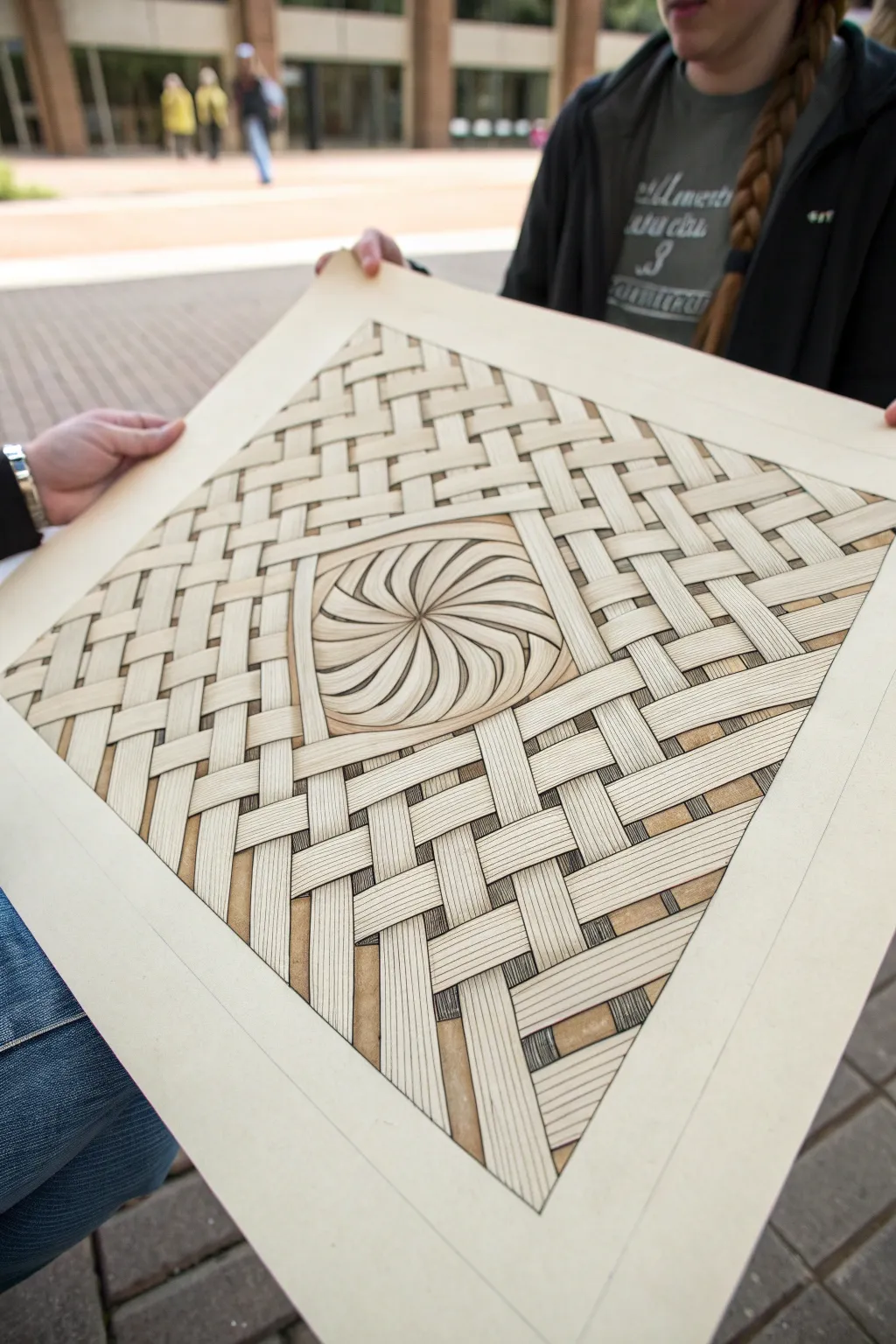
Create a mesmerizing optical illusion that mimics the texture of woven palm or bamboo strips on paper. This project combines strict geometric drafting with organic shading to produce a convincing, tactile effect centered around a dynamic spiral.
Detailed Instructions
Materials
- High-quality toned paper (tan or beige), ideally Bristol or heavy cardstock
- Pencil (H or HB for light guides)
- Fine-point pigment liners (0.1mm, 0.3mm, and 0.5mm black)
- Ruler or T-square
- Compass
- Protractor (optional but helpful)
- Alcohol-based markers (warm grays and tans) or colored pencils
- Eraser (kneaded preferred)
Step 1: Drafting the Grid
-
Establish the boundaries:
Begin by drawing a large square in the center of your paper. Leave a generous margin around the edges, as this negative space frames the artwork beautifully. -
Mark the center:
Draw faint diagonal lines from corner to corner to find the exact center point of your square. -
Create the central feature:
Using your compass, draw a circle in the middle of the square. Then, draw a square box around that circle to define the ‘window’ for the spiral pattern. -
Grid the weave:
Mark even increments along the top and side edges of your main square. I find that 1-inch or 2cm spacing works well for the width of the strips. -
Draw the strip guides:
Connect the marks to create a grid of diagonal lines. You want two sets of parallel lines intersecting to form diamonds, representing the base of the weave.
Strip Consistency
Use a ruler width as your strip width. By tracing the ruler itself rather than measuring every line, you guarantee perfectly even strips.
Step 2: Detailing the Weave
-
Define the over-under pattern:
Sketch the ‘over-under’ logic of the weave. Start at one corner and decide which strip goes on top. Be consistent—if a vertical strip goes over, the next horizontal one must go under it. -
Ink the main outlines:
Using a 0.5mm pen, carefully ink the outlines of the individual woven strips. Stop your lines precisely where a strip goes ‘under’ another one to maintain the illusion. -
Add fiber texture:
Switch to a finer 0.1mm pen. Draw three to five thin, parallel lines running down the length of every single strip. These lines simulate the fibrous nature of palm or bamboo material. -
Draft the center spiral:
Inside the central circle, lightly pencil curved lines radiating from the center point to the edge of the circle, creating a pinwheel shape. -
Refine the spiral:
Thicken these spiral sections so they look like twisted bundles of fibers. Ink them with the 0.5mm pen, ensuring the curves flow smoothly into the center. -
Texture the spiral:
Just like the flat strips, fill the spiral sections with fine lines using the 0.1mm pen. Follow the curve of the spiral to enhance the sense of motion.
Step 3: Shading and Depth
-
Erase pencil guides:
Once the ink is completely dry, gently erase all pencil marks. A kneaded eraser lifts the graphite without damaging the paper surface. -
Identify shadow zones:
Look at where the strips overlap. The strip underneath needs a shadow cast by the strip on top. This is the key to the 3D effect. -
Apply base shadows:
Use a light warm gray marker or colored pencil to fill in the small square gaps between the woven strips. This pushes the background into the distance. -
Deepen the intersections:
With a darker gray or brown marker, add a small line of shadow right next to where an ‘over’ strip meets an ‘under’ strip. -
Cross-hatch for extra depth:
For a classic drawn look, use your finest pen to add tiny cross-hatching in the deepest triangular shadows between the weave. -
Highlighting (Optional):
If you are using colored pencils, use a white pencil to add a subtle sheen to the highest point of each woven curve.
Antique Finish
Instead of gray shadows, use sepia or warm brown ink for the shading. It gives the piece the look of an old architectural diagram or parchment.
Step back and admire how simple lines on flat paper can transform into a complex, tactile object
Collage-Style Links With Tape and Staples
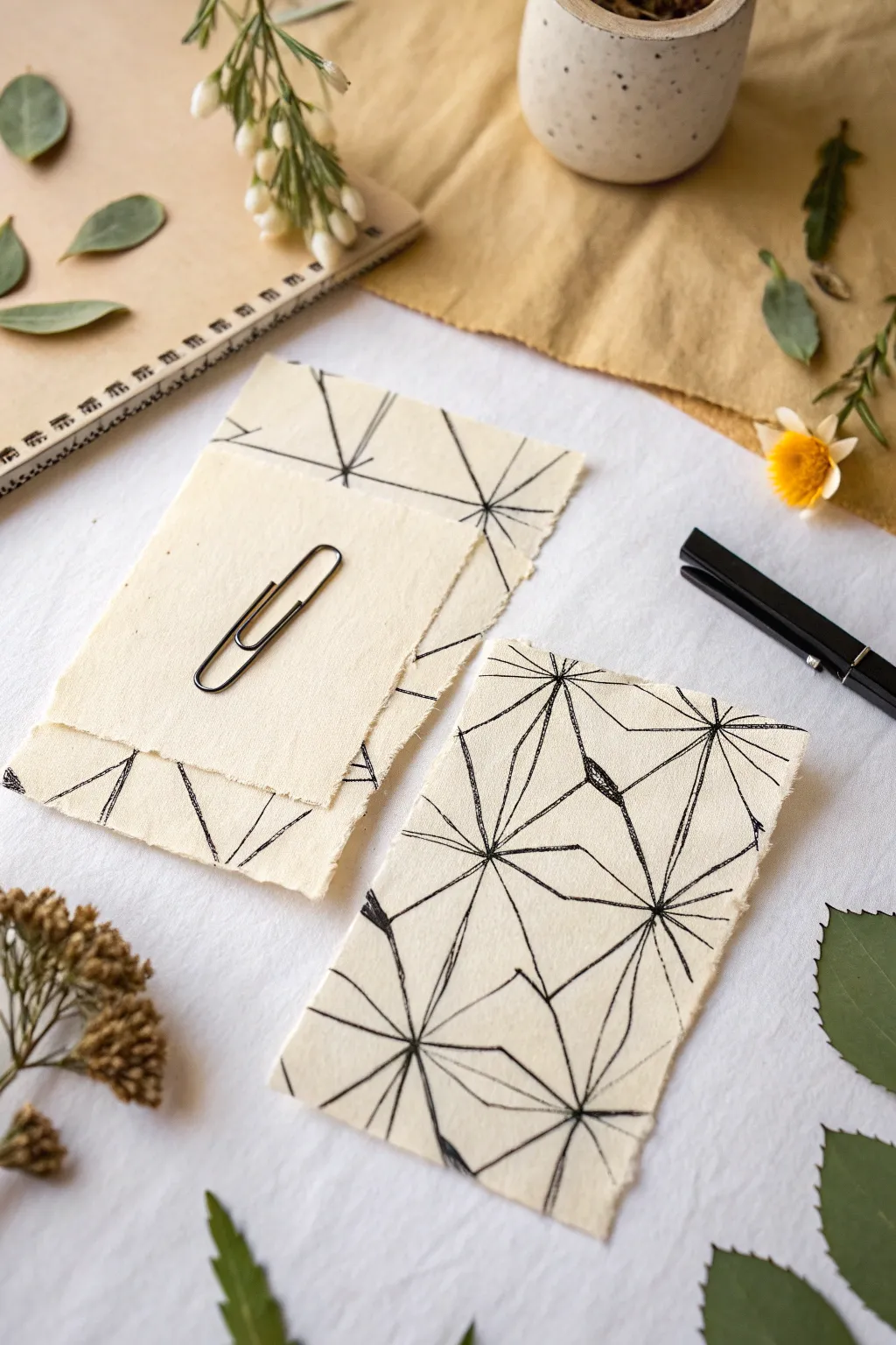
This project combines the organic texture of handmade paper with the sharp precision of geometric ink drawings. The result feels both modern and earthy, perfect for unique stationery or framed minimalist art.
Step-by-Step
Materials
- Textured handmade paper (deckle edge)
- Fine liner pen (black, 0.5mm)
- Ruler (clear acrylic works best)
- Pencil (HB or lighter)
- Kneaded eraser
- Paper clips (wire style)
- Scrap paper for testing
Step 1: Preparation & Layout
-
Select your canvas:
Choose sheets of handmade paper that have a rough, deckle edge. The texture is key here, so look for paper with visible fibers and a natural cream or off-white tone. -
Plan the composition:
Before marking your good paper, sketch a few ideas on scrap paper. The design relies on ‘starburst’ points where multiple lines converge. Decide if you want one central burst or scattered connection points. -
Mark anchor points:
Lightly touch your pencil to the handmade paper to mark where your main convergence points will be. I usually place these off-center to create a more dynamic look.
Ink Bleed Tips
Handmade paper is very absorbent. Move your pen quickly to prevent ink from pooling and bleeding into the fibers.
Step 2: Drawing the Network
-
Draw the primary spokes:
Using your ruler and fine liner, draw long straight lines radiating out from your first anchor point. These should extend all the way to the paper’s edge or intersect with other projected starbursts. -
Vary the angles:
Ensure the angles between your lines vary. Avoid making perfectly even ‘pizza slices’; irregular spacing makes the geometric pattern feel more artistic and less distinct. -
Connect the points:
Move to your second anchor point and repeat the process. Important: let these new lines intersect with or stop at the lines from your first starburst to build a web-like effect. -
Create the outer perimeter:
Instead of drawing a square border, draw straight lines that connect the tips of your radiating spokes near the edge of the paper. This creates jagged, triangular shapes along the border. -
Subdivide shapes:
Look for large empty triangles in your web. Draw a line from a corner to the midpoint of the opposite side to break up the negative space.
Add Metallic Accents
Trace over just one or two of the geometric lines with a gold or copper gel pen for a sophisticated pop of shimmer.
Step 3: Adding Depth & Detail
-
Thicken specific lines:
Go back over select lines with your pen to double their width. I like to thicken lines where multiple intersections happen to create visual weight. -
Add subtle shading:
Use very short, quick hatching marks in the tightest corners where lines converge. This adds a tiny bit of shadow and dimension to the flat geometry. -
Check for gaps:
Examine your intersections. If the ink skipped over the rough texture of the paper, carefully touch up these spots to ensure solid, continuous black lines. -
Erase guidelines:
Once the ink is fully dry—give it a few minutes to settle into the absorbent fibers—gently dab the marked points with a kneaded eraser to remove any pencil graphite.
Step 4: Assembly
-
Tear a layering piece:
Take a second, smaller piece of handmade paper. If it has straight edges, carefully tear them against a ruler to mimic the deckle edge of your base piece. -
Position the overlay:
Place this smaller blank piece on top of your drawn sheet. You can center it or offset it slightly to reveal the geometric pattern underneath. -
Secure with a clip:
Slide a simple wire paper clip over both sheets. This holds the collage together without adhesive, allowing the setup to be temporary or changeable.
Now you have a striking set of stationery that balances structure with natural texture
Two Figures Sharing One Shadow
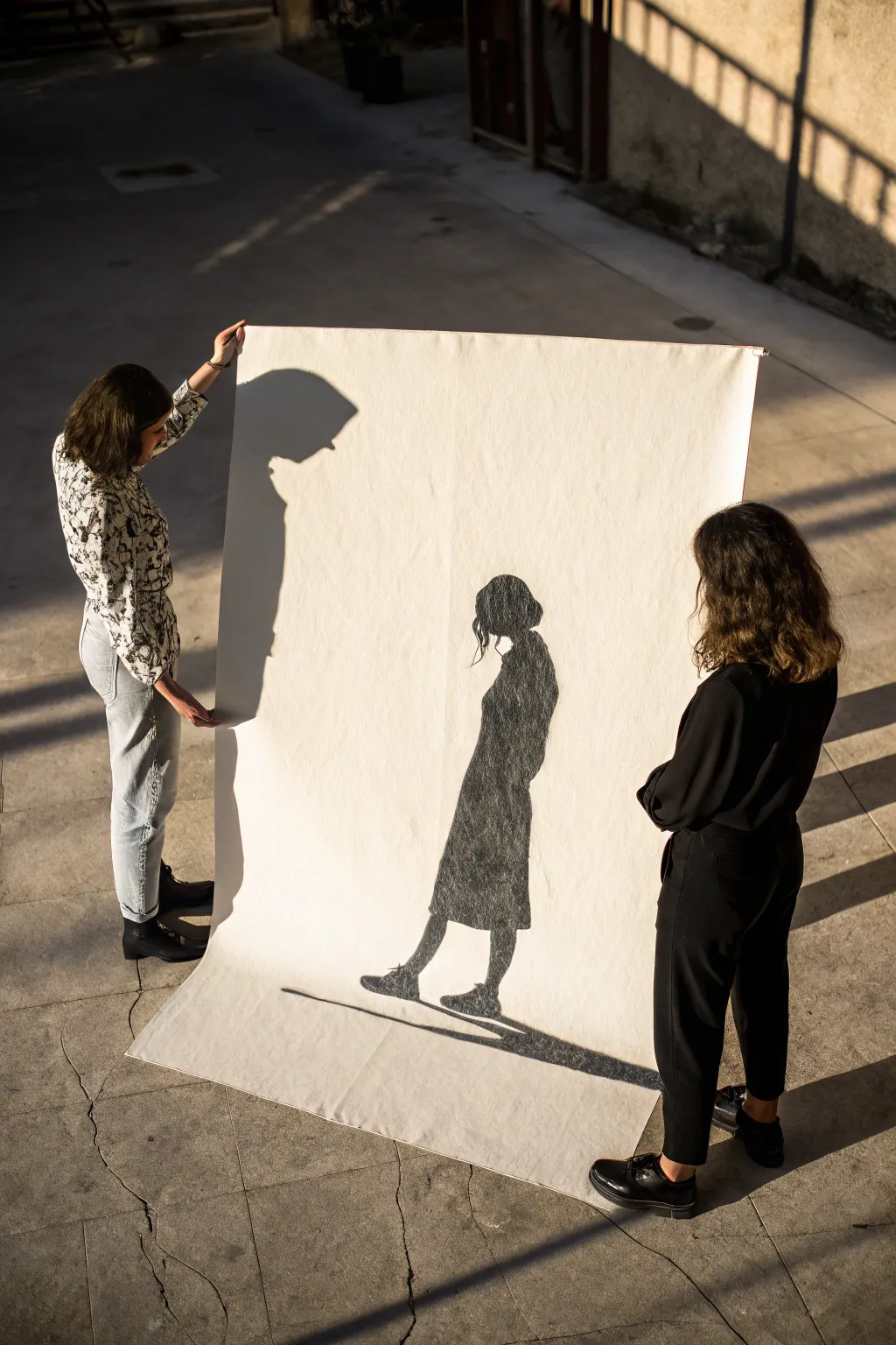
This striking project merges performance art with drawing, creating a life-sized silhouette that captures a fleeting moment forever on canvas. By tracing a real shadow cast by sunlight, you achieve an incredibly natural and proportional figure drawing without needing advanced drafting skills.
How-To Guide
Materials
- Large roll of heavy drawing paper or unprimed canvas (approx. 4×6 feet)
- Thick charcoal sticks (compressed charcoal)
- Vine charcoal (for initial sketching)
- Workable fixative spray
- Masking tape or painter’s tape
- Drawing board or wall surface (optional, if not holding by hand)
- A sunny day with strong, direct light
Step 1: Setting the Scene
-
Choose your light source:
Find a location with strong, direct sunlight. The lower the sun is in the sky (early morning or late afternoon), the longer and more dramatic the cast shadows will be. -
Position the paper:
Have a partner hold the large sheet of paper or canvas taut, slightly angled towards the ground to catch the shadow. Alternatively, tape the paper firmly to a wall or a large board propped against a support. -
Pose the model:
Position your subject between the sun and the paper. Have them stand sideways or in a walking stance so their profile creates a distinct, recognizable shape on the paper’s surface. -
Adjust distance:
Move the model closer to or further from the paper to change the sharpness of the shadow edges. Closer creates a sharper line; further away creates a softer, dreamier edge.
Sun chasing tip
Work quickly! The sun moves faster than you think. If you take too long, the shadow will shift across the page, distorting your figure’s proportions.
Step 2: Tracing the Form
-
Outline with vine charcoal:
Using light vine charcoal, quickly trace the outline of the shadow falling on the paper. I prefer to work rapidly here because the sun moves, shifting the shadow every minute. -
Capture the details:
Pay special attention to the nose, chin, and hair wisps in the profile, as these details define the likeness. Don’t worry about internal details; just focus on the perimeter. -
Mark the ground line:
Draw a simple horizontal line under the feet to ground the figure, giving the illusion that the shadow is walking on a surface rather than floating. -
Verify the shape:
Ask the model to step aside so you can view the outline clearly. Make any necessary corrections to the proportions or smoothing out shaky lines.
Step 3: Filling and Refining
-
Start filling with compressed charcoal:
Switch to a thick stick of compressed charcoal for deep blacks. Begin filling in the silhouette from the top down to avoid smudging your work with your hand. -
Use the side of the stick:
Break a piece of charcoal and use the broad side to cover large areas of the torso and legs quickly. This creates a rich, textured surface rather than just lines. -
Refine the edges:
Go back over the perimeter with the tip of the charcoal to crisp up the edges. A sharp edge on the face makes the silhouette pop, while looser strokes on the clothes add movement. -
Add texture density:
Layer the charcoal more heavily in the center of the figure. You can leave the edges slightly lighter or textured to mimic the way light diffracts around an object. -
Create the cast ground shadow:
Extend a long, thin shadow stretching from the feet along the ground line instructions you drew earlier. This anchors the figure to the composition. -
Clean up stray marks:
Use a kneaded eraser to lift away any smudge marks outside the main figure or the initial vine charcoal lines that didn’t make the final cut. -
Seal the artwork:
Take the paper to a well-ventilated area and spray it with a workable fixative. This is crucial, as the heavy charcoal application will otherwise smear instantly when touched.
Smudge control
If you are right-handed, trace and fill from left to right. Place a scrap piece of paper under your drawing hand to protect the white paper from charcoal dust.
Now you have a life-sized, dramatic piece of art that perfectly captures a personal moment in time

Have a question or want to share your own experience? I'd love to hear from you in the comments below!