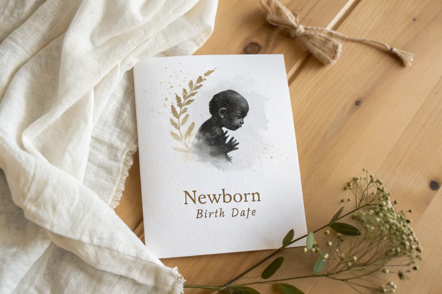
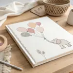
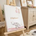
There’s something extra tender about turning those first few days into art you can actually hang on the wall. Here are my favorite newborn baby painting ideas—from classic keepsakes to playful, wow-factor approaches you can make your own.
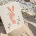
Classic Newborn Footprint Keepsake
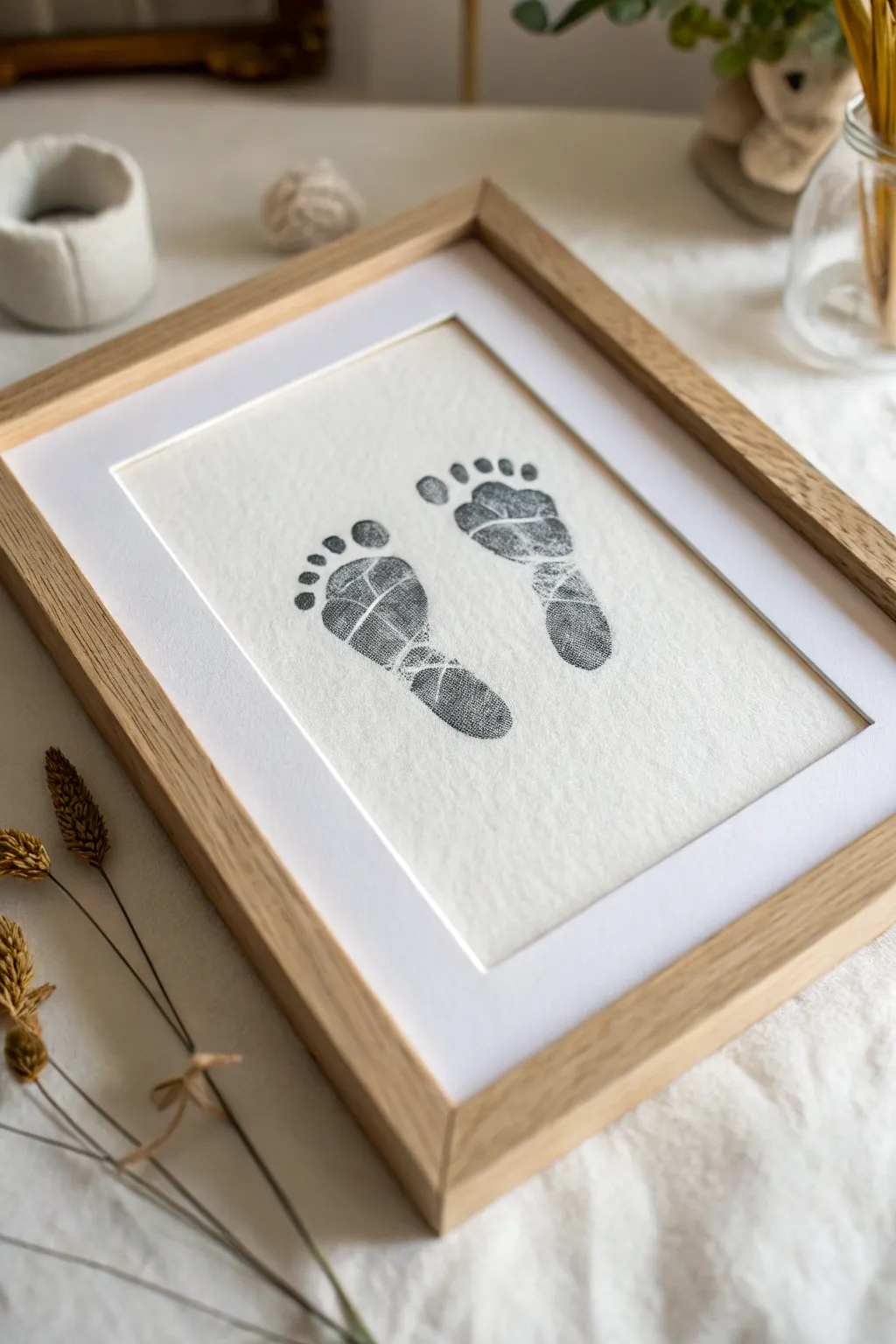
Capture the fleeting tininess of your little one with this elegant and minimalist footprint keepsake. Using archival ink on textured paper creates a high-quality, museum-style finish that turns simple prints into a sophisticated piece of wall art.
Step-by-Step Tutorial
Materials
- Heavyweight textured art paper (watercolor or cotton rag)
- Black archival ink pad (baby-safe/non-toxic)
- Light wood picture frame (A4 or similar size)
- White picture mount/mat board to fit the frame
- Baby wipes or damp cloth
- Double-sided tape or mounting tape
- Helper (essential for wriggly babies!)
Step 1: Preparation and Setup
-
Select your workspace:
Choose a well-lit area where you can lay the baby down comfortably. A changing table or a bed covered with a protective towel works best. -
Prepare the paper:
Cut your textured art paper to a size slightly larger than the opening of your picture mount. It’s wise to cut several sheets so you have backups if the first attempt smudges. -
Check the ink:
Open your black archival ink pad. Ensure it is juicy but not pooling, as too much ink destroys the fine details of the skin ridges. -
Recruit a partner:
This process is nearly impossible to do solo. Have your helper hold the baby securely and keep the baby calm while you focus entirely on the feet and paper.
Wrinkle Rescue
Does baby curl their toes when the cool ink touches them? Gently tickle the top of their ankle or rub the shin bone while printing—this reflex often makes them fan their toes out perfectly.
Step 2: Creating the Impressions
-
Ink the first foot:
Gently press the baby’s left foot onto the ink pad. Ensure coverage across the entire sole, paying special attention to the toes and the ball of the foot. Don’t press too hard; a light, even coat is better. -
Position the paper:
Place the paper on a hard, flat surface (like a clipboard or hardcover book) and bring the surface to the baby’s foot, rather than trying to force the foot down onto a table. -
Press for the print:
Guide the inked foot onto the paper, pressing the heel down first, then rolling gently toward the toes. Gently press each tiny toe down individually to ensure they make contact. -
Lift carefully:
Remove the paper from the foot quickly and cleanly, pulling it straight away to avoid dragging the ink. Clean this foot immediately with a baby wipe before moving on. -
Repeat for the second foot:
Ink the right foot just as you did the left. Aim to position this second print parallel to the first, leaving a small gap between them, mirroring the composition in the example image. -
Check for details:
Examine your prints. The beauty lies in the imperfections and the texture of the skin lines. If a print is too light, you might need slightly more pressure; if it’s a black blob, use less ink.
Add a Personal Date
Use a fine-nib archival pen to write the baby’s name and birth date in tiny, spaced-out capital letters underneath the prints for a custom typographic touch.
Step 3: Finishing and Framing
-
Allow to dry:
Let the ink dry completely. Archival ink can take a little longer on textured paper, so I usually give it at least an hour to ensure no smudging occurs during framing. -
Prepare the frame:
Disassemble your light wood frame. Clean the glass thoroughly on both sides to remove dust or fingerprints. -
Align the mount:
Place your white mount board over the artwork. Adjust the paper behind the window until the footprints are perfectly centered with equal visual weight on all sides. -
Secure the artwork:
Flip the mount and paper over together (keeping them aligned) and use two small pieces of mounting tape on the top edge of the paper to secure it to the back of the mount board. -
Assemble the frame:
Place the glass back into the frame, followed by your mounted artwork face down. Insert the backing board and secure the clips or tabs. -
Final inspection:
Turn the frame over and check for any trapped dust specks between the glass and the mount. If clear, your keepsake is ready for display.
Now you have a serene, minimalist piece of art that freezes a precious moment in time

Name and Birth Stats Watercolor Card
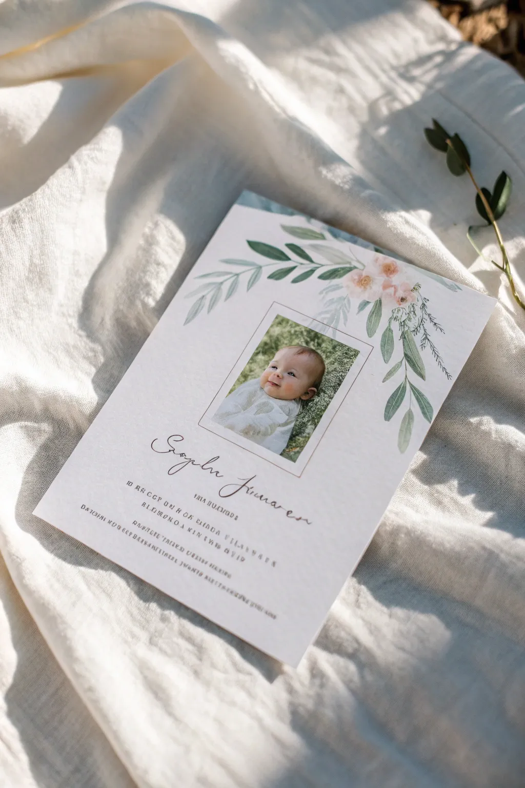
Blend the softness of watercolor florals with the sweetness of a newborn photo in this elegant announcement card project. This mixed-media approach combines traditional painting techniques with digital or physical collage to create a keepsake that feels both classic and modern.
Step-by-Step Tutorial
Materials
- Cold press watercolor paper (140lb/300gsm)
- Watercolor paints (Sap Green, Olive Green, Paynes Grey, Blush Pink)
- Round watercolor brushes (size 2 and 6)
- Fine liner pen (black or dark brown)
- Printed photo of the baby (approx. 2×3 inches)
- Ruler and pencil
- Double-sided tape or photo-safe glue
- Scanner and printer (optional for digital assembly)
Step 1: Painting the Botanical Elements
-
Map your layout:
Lightly trace a rectangle in the center of your watercolor paper using a pencil and ruler. This space represents where the photo will eventually go, helping you paint the florals around it without crowding the focal point. -
Mix your greens:
Prepare a palette of greens. I like to mix Sap Green with a touch of Paynes Grey to get that muted, trendy eucalyptus shade. Keep a separate puddle of lighter, yellowish-green for young leaves. -
Paint the main stem:
Using the size 6 brush, paint a thin, curving line originating from the top right corner of your penciled rectangle, draping down the side. Repeat on the top left, creating a gentle arch over the photo area. -
Add larger leaves:
While the stems are still damp, use a ‘press and lift’ motion with your brush to create almond-shaped leaves along the main stems. Vary the pressure to create natural irregularities in the leaf shapes. -
Incorporate delicate foliage:
Switch to your size 2 brush and a darker green mix. Paint very fine, wispy branches extending outward, adding tiny, needle-like leaves to mimic greenery like cypress or fern. -
Paint the floral accents:
Wet a small area near the top right cluster of leaves with clean water. Drop in very watery Blush Pink paint, allowing it to bloom into soft, undefined flower shapes. Keep them loose and ethereal. -
Refine the details:
Once the first layer is dry, add darker veins to a few leaves using the fine tip of your brush. This adds depth without making the painting look too illustrative.
Loose Leaf Hack
To get realistic watercolor leaves, load your brush with two slightly different greens. The colors will mix naturally on the paper as you press down.
Step 2: Assembly and Typography
-
Scan the artwork (Optional):
If you plan to print multiple copies, scan your dried painting at a high resolution (300 DPI or higher). You can then add text digitally. If making a single original, proceed to the next step. -
Attach the photograph:
Trim your baby photo to fit perfectly inside the initial penciled rectangle. Use double-sided tape to adhere it securely to the paper, ensuring it sits flat. -
Draft the lettering:
Below the photo area, lightly pencil in the baby’s name in a script font. Below that, pencil in guidelines for the birth statistics in a clean, sans-serif block style. -
Ink the name:
Go over the script name with a fine liner pen. Focus on fluid motion. I prefer faux-calligraphy here—thickening the downstrokes of the letters slightly to mimic a nib pen. -
Add the stats:
carefully write the birth date, weight, and length using the block lettering guidelines. Keep this text small and widely spaced for a modern, airy look. -
Erase guidelines:
Wait until the ink is completely dry—give it at least 15 minutes to be safe—before gently erasing any visible pencil marks. -
Frame the photo:
Using a ruler and a very fine pen or gold gel pen, draw a thin border directly around the edge of the photograph to give it a polished, framed appearance.
Go Digital
Scan your painted border first, then use a tool like Canva to drop in the photo and type the text. This lets you print dozens of identical cards easily.
This beautiful, personalized announcement is ready to be framed or mailed to loved ones as a perfect introduction to your little one


Sleeping Newborn Watercolor Portrait
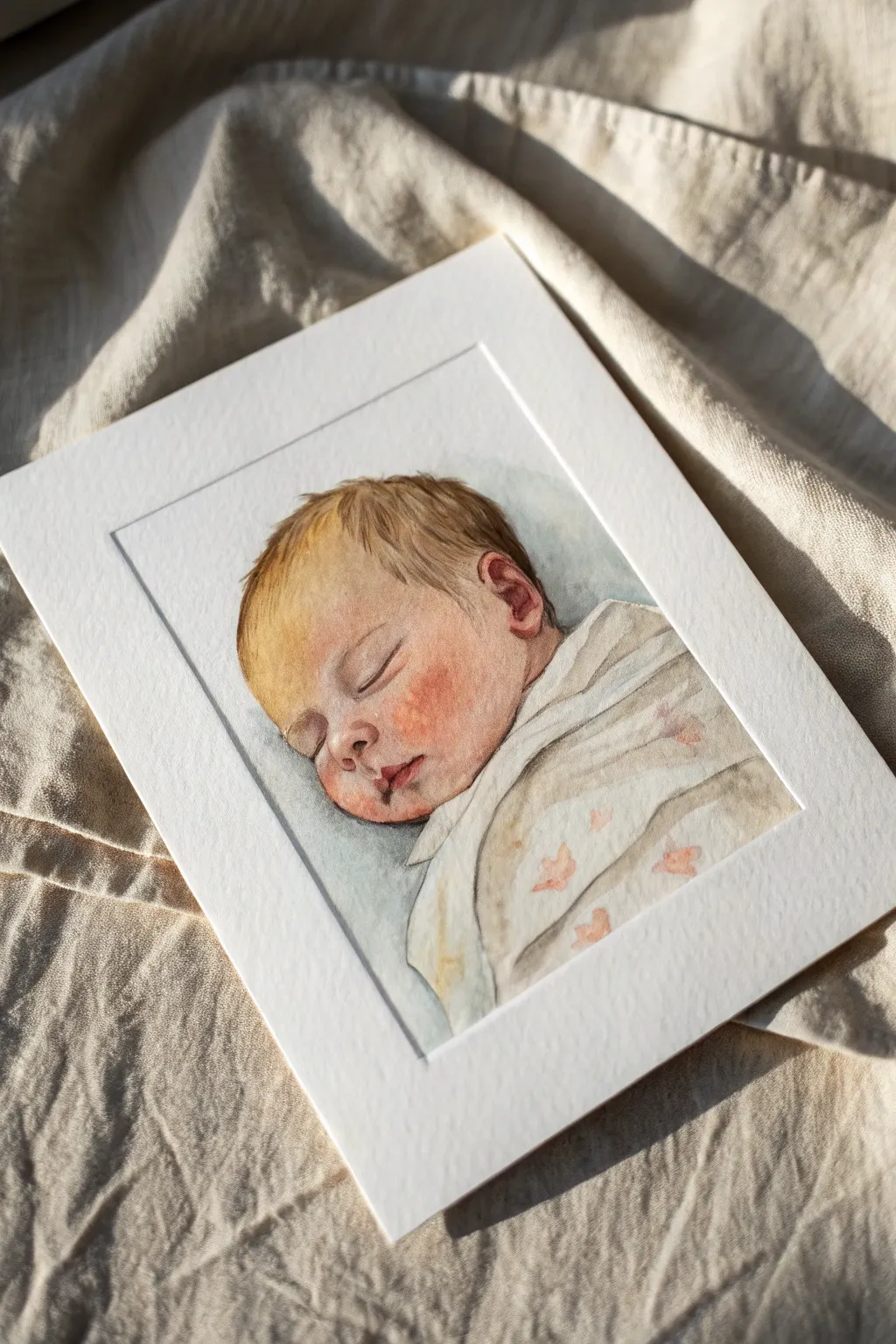
Capture the fleeting peace of a sleeping infant with this delicate watercolor portrait tutorial. Using soft washes and careful layering, you will create a heartwarming keepsake that emphasizes the gentle warmth of a baby’s skin and the soft texture of their swaddle.
Detailed Instructions
Materials
- Cold press watercolor paper (300 gsm)
- Watercolor paints (Yellow Ochre, Alizarin Crimson, Burnt Sienna, Ultramarine Blue, Burnt Umber)
- Round watercolor brushes (Size 2, 6, and 10)
- Masking tape
- Pencil (HB or 2B) and kneaded eraser
- Two jars of water
- Paper towels
- White mat board for framing
Step 1: Preparation and Sketching
-
Paper Setup:
Begin by taping down your watercolor paper to a board with masking tape. This prevents the paper from buckling when wet and creates a clean border. -
Initial Outline:
Lightly sketch the baby’s profile using an HB pencil. Focus on the curve of the closed eyelid, the small nose button, and the relaxed mouth. Keep your lines faint, as graphite can sometimes smear into light watercolor washes. -
Refining Features:
Add the details of the ear and the folds of the swaddle blanket. Pay attention to the hair direction, sketching light strokes to indicate where the hair falls.
Step 2: Painting the Skin Tones
-
First Wash:
Mix a very dilute wash of Yellow Ochre and a tiny touch of Alizarin Crimson to create a pale skin base. Apply this over the entire face, avoiding the brightest highlights on the forehead and nose tip. -
Adding Warmth:
While the first layer is still slightly damp, drop in a slightly more saturated mix of Alizarin Crimson and Burnt Sienna onto the cheeks and the ear. This wet-on-wet technique creates that flushed, rosy baby look without harsh edges. -
Shadows and Depth:
Once the previous layers are dry, mix Burnt Umber with a touch of Ultramarine Blue to make a soft shadow color. Gently paint the shadows under the chin, around the closed eye socket, and inside the ear to start building three-dimensional form. -
Defining the Features:
Switch to your size 2 brush. With a concentrated mix of Alizarin Crimson and Burnt Sienna, carefully paint the line of the closed lips and the crease of the eyelid. Soften the edges immediately with a clean, damp brush so they don’t look like harsh lines. -
Deepening Shadows:
Enhance the contrast by darkening the area right under the jawline where the head meets the swaddle. This separation is crucial for making the head look like it’s resting heavily in sleep.
Control Your Saturation
Baby skin is translucent and delicate. Always mix more water than you think you need; it’s much easier to add another layer of color than to scrub out a layer that is too dark or orange.
Step 3: Hair and Textiles
-
Hair Base Layer:
Mix Yellow Ochre with a bit of Burnt Sienna. Using the size 6 brush, apply broad strokes following the direction of the hair growth. Leave some paper white for highlights. -
Hair Texture:
Once the hair base is dry, use the size 2 brush with Burnt Umber to paint individual fine strands. I like to focus these darker strokes near the roots and behind the ear, letting the ends remain lighter. -
Painting the Swaddle:
For the blanket, keep it very loose. Use a watery mix of grey (Ultramarine Blue + Burnt Umber) to paint the shadows within the fabric folds. The white of the paper will serve as the main color of the cloth. -
Pattern Details:
If you wish to replicate the subtle pattern shown, use a very watery reddish-brown mix to dab small, indistinct shapes onto the dry fabric area. Keep them soft and low-contrast so they don’t distract from the face.
Add Texture
Try painting the swaddle on rough-grain paper or lift pigment with a natural sponge while wet to mimic the cozy texture of muslin or wool fabric.
Step 4: Final Touches and Framing
-
Background Wash:
Wet the area surrounding the head with clean water. Drop in a cool, neutral grey-blue mix (Ultramarine led) around the back of the head to make the warm skin tones pop. Let it fade out to white at the edges. -
Highlight Check:
Assess your painting. If you lost the bright highlights on the nose or lips, you can gently lift some pigment with a damp, stiff brush or use a tiny dot of white gouache. -
Finishing the Eye:
Add a tiny, darker line for the eyelashes using the tip of your smallest brush. Ensure this is delicate; too thick, and it will look like makeup. -
Matting:
Once the painting is completely bone-dry, carefully remove the masking tape. Place a bevel-cut mat over the artwork to frame the face tightly, giving it that professional, gallery-ready appearance.
This gentle portrait captures a moment of quiet serenity that you can treasure for years to come


Botanical Wreath Around a Newborn Initial
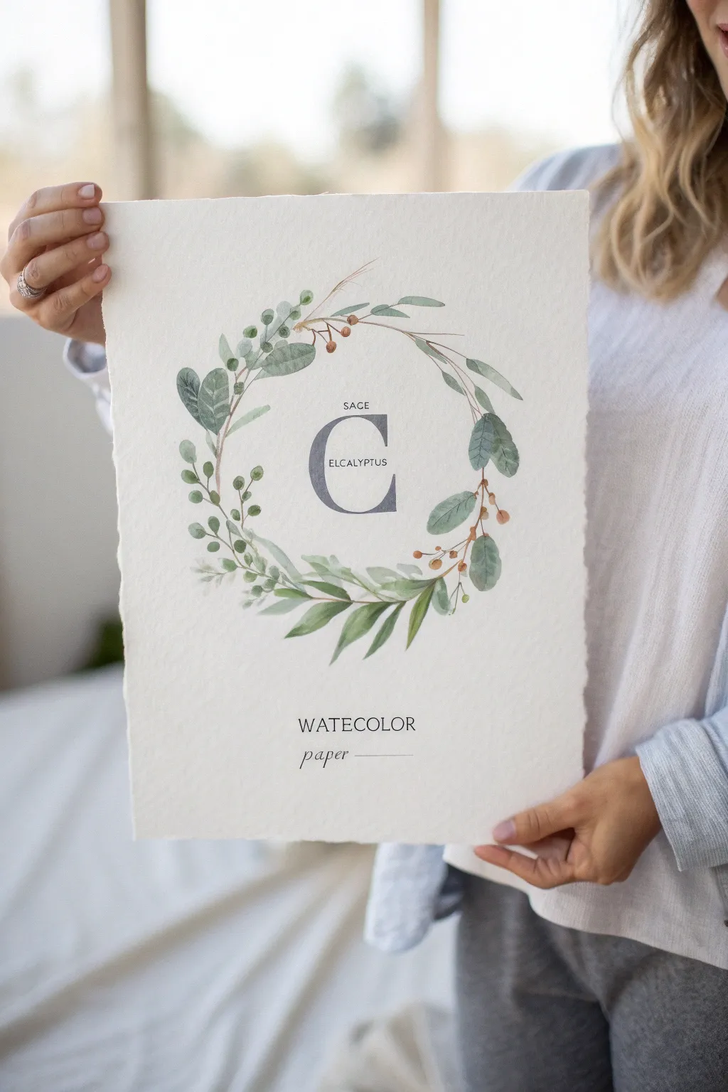
This elegant watercolor project centers a bold initial within a delicate, airy wreath of sage leaves, eucalyptus branches, and tiny berry accents. The result is a sophisticated piece of nursery decor with a soft, organic feel that perfectly celebrates a new arrival.
Detailed Instructions
Materials
- High-quality watercolor paper (cold press, roughly 140lb/300gsm)
- Watercolor paints (Sap Green, Hooker’s Green, Burnt Sienna, Payne’s Grey, Indigo)
- Round watercolor brushes (sizes 2, 6, and 8)
- Pencil (HB or H)
- Kneaded eraser
- Circular object or compass for tracing
- Ruler
- Clean water & paper towels
Step 1: Planning and Sketching
-
Define the circle:
Begin by lightly tracing a large circle in the center of your watercolor paper using a compass or a dinner plate as a guide. This will serve as the spine for your wreath. -
Place the initial:
In the exact center of that circle, sketch a large, serif-style letter ‘C’ (or your baby’s initial). Use a ruler to ensure the vertical lines of the letter are straight and the proportions are balanced. -
Draft the text:
Above the initial, lightly letter the word ‘SAGE’ in small, simple capitals. Across the center bar of the letter, sketch ‘EUCALYPTUS’ or the baby’s full name. Below the wreath, lightly mark where ‘WATERCOLOR’ and ‘paper’ will go if you are replicating the print look exactly. -
Sketch the foliage flow:
Lightly draw the main stems flowing around the circle. I like to leave a gap at the very top to keep the wreath feeling open and airy. Indicate where the larger eucalyptus leaves and smaller sprigs will sit.
Pro Tip: Color Harmony
Mix a tiny bit of your grey ‘letter color’ into your green leaf mixes. This unifies the palette and ensures the foliage doesn’t clash with the central initial.
Step 2: Painting the Initial
-
Mix the grey tone:
Create a watery mix of Payne’s Grey with a tiny touch of Indigo. You want a color that looks like slate—dark but translucent. -
Fill the letter:
Using your size 6 brush, carefully fill in the large initial. Work wet-on-dry to keep the edges crisp. If the paint pools, lift the excess with a dry brush corner. -
Add the smaller text:
Switch to your smallest brush (size 0 or 2) and very carefully paint the smaller text labels using a highly concentrated, darker version of your grey mix.
Level Up: Gold Accents
Once dry, use metallic gold watercolor paint or a gold leaf pen to trace the veins on just a few eucalyptus leaves for a touch of nursery sparkle.
Step 3: Creating the Botanical Layers
-
Mix your greens:
Prepare three puddles of green: a cool, bluish-green for the eucalyptus (Sap Green + Payne’s Grey), a warmer olive for the sage (Sap Green + Burnt Sienna), and a very pale, watery green for background leaves. -
Paint the first eucalyptus leaves:
Starting on the right side of the wreath, paint the round, silver-dollar eucalyptus leaves using the cool green mix. Let your brush belly press down to create the width of the leaf, then lift for the stem. -
Add the sage leaves:
On the bottom and left distinct sections, paint elongated, pointed leaves using your olive mix. Vary the pressure to make some leaves twist or curve naturally. -
Create depth with ghost leaves:
While the first layer dries, paint fainter, water-heavy leaves tucked behind the main ones. This adds volume to the wreath without cluttering it. -
Connect the stems:
Use a size 2 brush and a brownish-green mix to paint thin stems connecting your floating leaves to the main circular spine. -
Paint the berries:
Mix a soft Burnt Sienna or terracotta color. Dot small clusters of berries on the right side of the wreath, attaching them with very fine brown stems. -
Add wispy details:
Using the very tip of your smallest brush, add fine, hair-like sprigs and dried grass elements in a pale beige tone sticking out from the top and sides for texture.
Step 4: Finishing and Deckling
-
Add the bottom text:
Paint the ‘WATERCOLOR’ and ‘paper’ text at the bottom in your dark grey mix. Keep the script for ‘paper’ loose and elegant. -
Erase pencil marks:
Once the painting is absolutely bone-dry (wait at least 30 minutes), gently dab with a kneaded eraser to lift any visible pencil lines. -
Create the deckled edge:
To recreate the torn paper look from the photo, place a ruler along the edge of your paper. Wet the paper along the ruler’s edge with a clean brush, wait a moment, and gently tear the strip away to leave a soft, fibrous edge.
This serene and personalized artwork is now ready to be framed or hung with a simple magnetic poster hanger
BRUSH GUIDE
The Right Brush for Every Stroke
From clean lines to bold texture — master brush choice, stroke control, and essential techniques.
Explore the Full Guide
Moon-and-Stars Newborn Nursery Scene
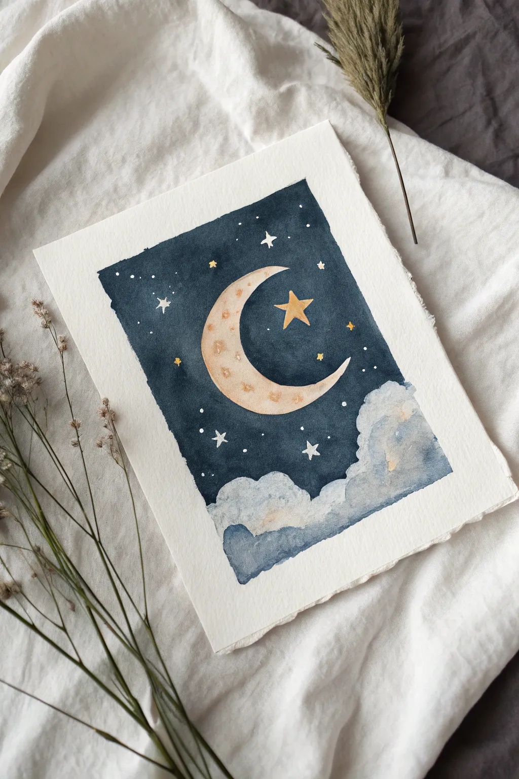
This soothing watercolor painting captures the gentle magic of a starry night with a smiling crescent moon resting above soft, billowy clouds. The deep indigo sky contrasts beautifully with the warm gold and cream tones, making it a perfect, tranquil addition to a newborn’s nursery.
Step-by-Step Tutorial
Materials
- Cold press watercolor paper (300 gsm or heavier)
- Watercolor paints (Indigo, Payne’s Gray, Yellow Ochre, Burnt Sienna, White Gouache)
- Masking fluid (optional but recommended)
- Round watercolor brushes (sizes 2, 6, and 10)
- Pencil and eraser
- Two jars of water
- Paper towels
- Washi tape or painter’s tape
- Gold metallic watercolor or pen (optional)
Step 1: Preparation and Sketching
-
Prepare the paper:
Begin by taping down your watercolor paper to a hard board. This prevents the paper from buckling when wet. If you want the deckled edge look shown in the photo, you can tear the edges against a ruler before starting, or leave a border to tear later. -
Sketch the outline:
Lightly sketch the large crescent moon in the center-right of the paper. Keep your pencil lines very faint so they don’t show through the final paint. -
Define the clouds:
Draw the fluffy cloud shapes at the bottom. Create 2-3 layers of cloud scallops to give depth to the scene. -
Mark the stars:
Lightly mark where your largest stars will go, including the prominent five-pointed star near the moon’s curve. -
Protect the highlights:
If you have masking fluid, apply it carefully over the moon, the large star, and the tiny star dots. This preserves the pure white of the paper and makes painting the dark sky much easier. Let it dry completely.
Bleeding Control
If blue sky paint bleeds into your white moon, dab it immediately with a clean paper towel. Once dry, cover the mistake with opaque white gouache before repainting yellow.
Step 2: Painting the Night Sky
-
Mix your sky color:
Create a deep, rich night sky color by mixing Indigo with a touch of Payne’s Gray. You want a heavy pigment load for that deep saturation. -
Apply the first wash:
Using your largest round brush (size 10), apply clean water to the sky area (avoiding the clouds and moon). While it’s damp, drop in your dark blue mixture. -
Building saturation:
Continue painting around the moon and clouds. The paint should be darkest at the top and slightly lighter near the horizon line where it meets the clouds. -
Refine the edges:
Switch to a smaller brush (size 6) to carefully paint the sharp edges around the moon and stars if you didn’t use masking fluid. Keep the edges ragged on the outer rectangle for that hand-painted charm. -
Let it dry:
Allow the sky layer to dry completely. If the blue looks too pale, apply a second layer of Indigo to get that midnight velvet look.
Metallic Magic
Use metallic gold watercolor for the stars and moon craters. It catches the nursery light beautifully and adds a magical shimmer that matte paint can’t achieve.
Step 3: Painting the Celestial Bodies
-
Remove masking:
Once the sky is bone dry, gently rub away the masking fluid with your finger or a rubber cement pickup to reveal the white paper. -
Base coat for the moon:
Dilute Yellow Ochre with plenty of water for a soft, creamy beige. Paint the entire moon surface. -
Add moon texture:
While the moon is still slightly damp, drop in tiny touches of Burnt Sienna or a slightly darker Ochre to create a cratered, textual effect. -
Paint the main star:
Paint the large star next to the moon with a mix of Yellow Ochre and a hint of gold if you have it. Make it slightly brighter than the moon.
Step 4: Painting the Clouds
-
First cloud layer:
Wet the cloud area with clean water. Drop in very diluted Indigo or a soft gray-blue at the bottom edges of the ‘fluffs’ to create shadows. -
Softening the focus:
Use a clean, damp brush to soften the paint upwards, leaving the tops of the clouds white or very pale gray. -
Deepening shadows:
Once the first layer is dry, add a darker blue-gray mix at the very bottom of the cloud formation to ground the image and add dimension. -
Adding warmth:
I like to add a tiny, barely-there glaze of the moon color (Yellow Ochre) to the tops of the clouds to show the reflection of the moonlight.
Step 5: Final Details
-
Small stars:
Using a size 2 brush or a white gel pen/gouache, add the tiny white stars and dots scattered throughout the dark sky. -
Sparkle details:
Paint tiny yellow or gold diamond shapes for the distant twinkling stars, ensuring they stand out against the dark blue. -
Moon details:
Add subtle, darker specks to the moon’s surface once it’s dry to enhance the texture, mimicking the craters shown in the reference.
Frame this gentle night scene in a light wood frame to let the deep blues really pop on the nursery wall
Family Hands Holding Newborn Feet
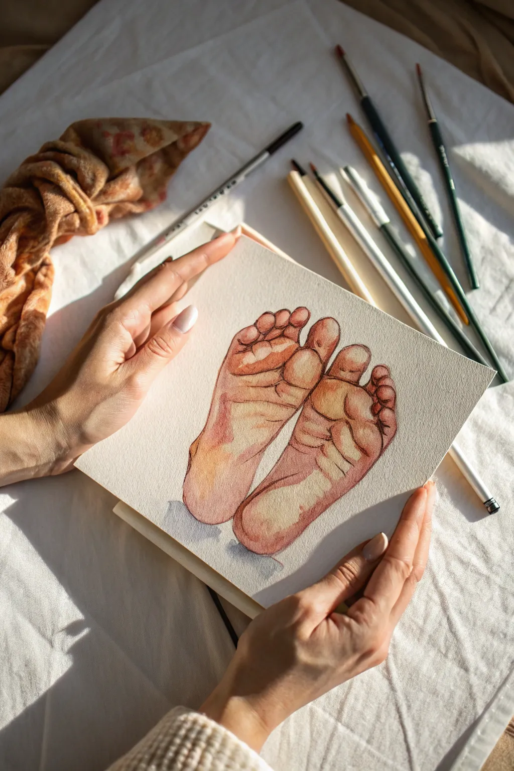
Capture the delicate details of infancy with this gentle watercolor study of newborn feet. The warm, earthy tones and soft shading create a timeless keepsake that celebrates the precious smallness of a new arrival.
Detailed Instructions
Materials
- Cold press watercolor paper (300 gsm)
- Pencils (HB and 2B for sketching)
- Kneaded eraser
- Watercolors (Burnt Sienna, Alizarin Crimson, Yellow Ochre, Ultramarine Blue, Burnt Umber)
- Round brushes (sizes 2, 4, and 6)
- Clean water jar
- Paper towels
- Reference photo of baby feet
Step 1: Sketching the Foundations
-
Analyze the shapes:
Begin by observing the basic shapes of the baby feet. Notice how the heel is a rounded oval and the ball of the foot is a wider, softer curve. The toes are tiny, rounded distinct shapes. -
Initial outline:
Using an HB pencil, lightly sketch the contour of the two feet. Keep the soles facing primarily outward to replicate the pose in the reference. Ensure the lines are faint so they won’t show through the transparent watercolor layers later. -
Refining the details:
Add the crease lines on the soles and the separation between the toes. Baby feet are very wrinkly, so sketch these creases lightly to guide your painting; these folds are crucial for giving the feet their characteristic newborn look.
Step 2: Applying the Base Wash
-
Mixing the skin tone:
Mix a base skin tone using a generous amount of water with Yellow Ochre and a tiny touch of Alizarin Crimson. Test the color on a scrap piece of paper first; it should be a very pale, warm beige. -
First wet-on-dry layer:
With a size 6 brush, apply this pale wash over the entire shape of the feet, avoiding only the very brightest highlights on the balls of the feet and heels. Let the white of the paper shine through for these high points. -
Softening edges:
While the paint is still damp, rinse your brush and run a clean, slightly wet brush along the edges of the wash to soften the transition into the white paper highlights.
Muddy Colors?
If your skin tones look gray or muddy, you may be overworking the paper while it’s wet. Let layers dry fully before glazing, and clean your water jar frequently to keep mixtures bright.
Step 3: Building Warmth and Form
-
Adding rosiness:
To capture that newborn flush, mix Alizarin Crimson with a bit of Burnt Sienna. Apply this warmer tone to areas with increased blood flow: the heels, the toes, and the outer edges of the soles. -
Creating volume:
Use a wet-on-wet technique here. Drop this reddish mix into the still-damp base layer so it blooms naturally, creating soft, organic gradients rather than hard lines. -
Initial shading:
Mix a small amount of Burnt Umber into your base skin tone to create a shadow color. Apply this under the individual toes and along the arch of the foot to begin establishing three-dimensional form. -
Drying time:
Allow these layers to dry completely. The paper should feel room temperature to the touch, not cool.
Pro Tip: Preserve Light
Don’t use white paint for highlights. Instead, use masking fluid or simply avoid painting the brightest spots on the heel and ball of the foot to keep the luminosity of the paper.
Step 4: Defining Texture and Detail
-
Deepening the creases:
Switch to a size 2 brush. Mix a more concentrated version of Burnt Sienna and Alizarin Crimson. Carefully paint into the sketched crease lines on the soles and the spaces between the toes. -
Softening the wrinkles:
Immediately after painting a crease, use a clean, damp brush to feather out one side of the line. This prevents the wrinkles from looking like scars and instead makes them look like soft folds of skin. -
Enhancing contrast:
I prefer to deepen the shadows furthest from the light source now. Add a touch of Ultramarine Blue to your shadow mix (Burnt Umber) to cool it down, and apply this to the deepest shadowed areas, typically under the toes and the outer curve of the heel. -
Refining the toes:
Add tiny glazes of the rosy mix to the tips of the toes and the nail beds. Leave infinitesimally small white spaces for the toenails. -
Checking the values:
Step back and assess the painting. If the feet look too flat, add another glaze of the warm shadow color to the sides of the feet to round out the form.
Step 5: Final Touches and Construction
-
Outline emphasis:
For an illustrative style similar to the reference, you can use a very fine brush with concentrated Burnt Umber to selectively re-line portions of the outline, particularly where shadows fall. -
Cast shadow:
Mix a very watery Ultramarine Blue with a touch of Burnt Sienna to make a neutral grey. Paint a simple, loose shadow beneath the heels to ground the subject so the feet don’t appear to be floating. -
Final dry:
Let the artwork dry completely before making any erasures of stray pencil marks.
Frame this delicate study in a simple mount to keep the focus on the tender subject matter

PENCIL GUIDE
Understanding Pencil Grades from H to B
From first sketch to finished drawing — learn pencil grades, line control, and shading techniques.
Explore the Full Guide
Newborn Portrait With a Soft Halo Glow
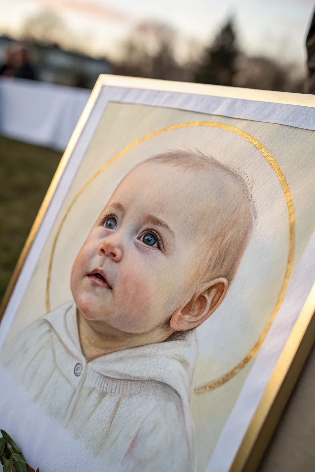
Capture the divine innocence of a newborn with this gentle technique that combines realistic skin tones with a symbolic golden halo. Using soft pastels or high-quality pastel pencils creates a dreamy, velvety texture perfect for angelic baby portraits.
Step-by-Step
Materials
- Heavyweight pastel paper (light cream or soft gray)
- Pastel pencils (flesh tones, warm browns, blues, white)
- Soft pastels (stick form for larger areas)
- Metallic gold paint or gold leaf pen
- Compass or circle template
- Paper stumps or tortillons for blending
- Kneaded eraser
- Fixative spray
- Graphite pencil (HB)
Step 1: Preparation and Sketching
-
Choose your reference:
Select a photo where the baby is looking upward to enhance the ethereal quality. Light hitting the face from the front or slightly above works best for this composition. -
Establish the halo:
Before drawing the portrait, lightly mark the center point for the head. Use a large compass to draw a perfect circle that will frame the baby’s head, leaving ample space around the future portrait. -
Outline the features:
Using a light graphite pencil or a pale brown pastel pencil, sketch the baby’s basic contours. Focus on large shapes first—the curve of the cheek, the placement of the ear, and the eye line. -
Refine the sketch:
Lightly detail the facial features. Ensure the eyes are looking up at the correct angle. Keep lines faint so they won’t show through the pastel layers later.
Keep it Clean
Place a sheet of glassine paper under your hand while drawing. This prevents the oils in your skin from smudging the delicate pastel work you’ve already completed.
Step 2: Layering Skin Tones
-
Base layer application:
Start with the skin. Apply a very light layer of cream or pale peach pastel across the face, avoiding the eyes and mouth. Use the side of the pencil or a soft stick for broad coverage. -
Initial blending:
Gently rub the base layer into the paper tooth using your finger or a large paper stump. This creates a smooth foundation for subsequent colors. -
Adding warmth to cheeks:
Introduce soft pinks and rosy hues to the cheeks, nose, and chin. Baby skin is translucent, so build this color up slowly in circles rather than heavy strokes. -
Developing shadows:
Use light ochre or cool purples for the shadows under the chin, inside the ear, and around the eye sockets. Avoid harsh blacks; cool tones create more natural shadows on infant skin. -
Refining the ear:
Pay special attention to the ear structure. Use a sharper terracotta or burnt sienna pencil to define the folds and curves, blending carefully so it doesn’t look outlined.
Level Up: Real Gold
For a museum-quality finish, use real gold leaf sizing and transfer sheets for the halo instead of paint. The genuine reflection adds an incredible spiritual depth.
Step 3: The Features and Hair
-
Painting the eyes:
Layer blues or greys for the iris. Crucially, leave the white of the paper or add a strong dot of white pastel for the catchlight—this brings the baby’s gaze to life. -
Soft infant hair:
Rather than drawing individual strands, sketch the *direction* of hair growth with light wisps. Use a pale brown or blonde shade, keeping the strokes incredibly light and feathery near the forehead. -
Clothing textures:
Sketch the collar and garment using white and light grey. Mimic the texture of heavy knit fabric by using short, repetitive strokes for the ribbed texture of the collar. -
Deepening contrast:
Go back into the darkest areas—nostrils, pupils, and deep clothing folds—with your darkest brown pencil to anchor the drawing.
Step 4: The Golden Halo
-
Tracing the gold line:
Return to your initial circle guide. Using your metallic gold paint and a fine brush, or a gold leaf pen, carefully trace the halo circle. -
Adding texture to the gold:
Don’t make the line perfectly uniform. Let it be slightly thicker in some areas or visibly brush-stroked to give it an artistic, hand-painted feel rather than a graphic design look. -
Final highlights:
Once the gold is dry, add a few final touches of pure white pastel to the highest points of the face (forehead, tip of nose) to match the brightness of the halo. -
Preserving the art:
Lightly mist the drawing with a workable fixative spray. Do this in a well-ventilated area to prevent the pastel from smudging when framed.
Frame your masterpiece in a simple, thin gold frame to echo the halo and complete this timeless keepsake
Ice Melt Washes Inspired by Newborn Colors
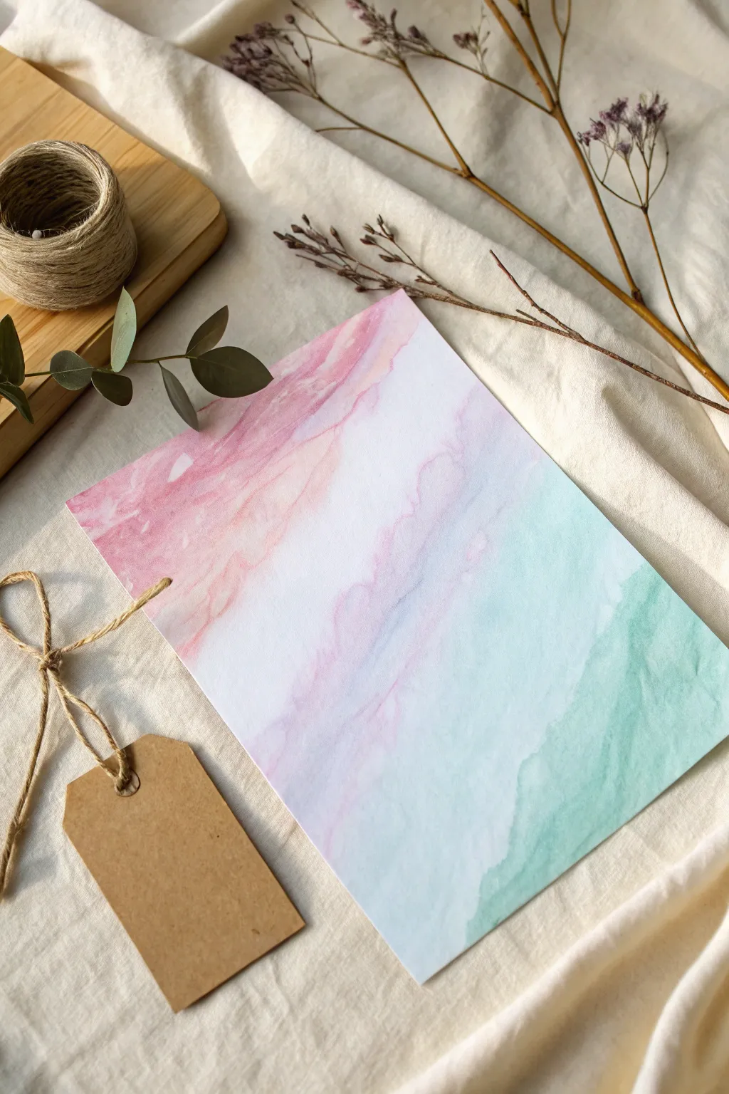
Capture the soft, ethereal beauty of newborn days with this delicate watercolor wash technique that mimics melting ice. The blending of pastel rose and mint green creates a soothing, marble-like effect perfect for nursery art or baby announcements.
Detailed Instructions
Materials
- High-quality watercolor paper (140lb/300gsm cold press)
- Watercolor paints (Rose Madder and Mint Green/Teal)
- Wide flat wash brush (1 inch)
- Round brush (size 6 or 8)
- Clean water jar
- Paper towels
- Masking tape
- Drawing board or thick cardboard
Step 1: Preparation
-
Set the Stage:
Begin by taping down your watercolor paper to a board using masking tape on all four sides. This prevents the paper from buckling when it gets wet and creates a crisp white border if you choose to frame it later. -
Prepare Your Palette:
Squeeze out a pea-sized amount of rose paint and mint green paint onto your palette. Dilute each with plenty of water in separate wells until you have two very watery, tea-like puddles of color. Keep a separate jar of completely clean water nearby.
Step 2: Creating the Wash
-
Pre-wet the Paper:
Using your large flat brush and clean water, gently wet the entire surface of the paper. You want an even sheen, not large puddles. If you see pools of water, dab them lightly with the corner of a paper towel. -
Introduce the Rose:
Load your round brush with the watery rose mixture. Start at the top left corner of the paper and gently touch the wet surface. Let the paint bloom naturally outward. -
Guide the Flow:
Tilt your board slightly so the pink flows diagonally downwards towards the center. Add a little more pigment near the top corner to intensify the color, leaving the edges soft and feathery. -
Soften the Edges:
Clean your brush and wipe it until it’s just damp. Gently tickle the edges of the pink wash where it meets the white paper to encourage further spreading without hard lines. -
Introduce the Mint:
Now, load your clean brush with the mint green mixture. Apply this to the bottom right corner, mirroring what you did with the pink. -
Create the Gradient:
Allow the green to flow upward diagonally towards the center. The goal is to leave a band of negative space (white paper) running diagonally through the middle. -
Encourage Texture:
To get that ‘ice melt’ look, drop tiny droplets of clean water into the still-wet painted areas. This pushes the pigment away slightly, creating beautiful cauliflower-like blooms and texture.
Salt Texture Trick
While the wash is still wet, sprinkle a pinch of table salt over the color. The salt absorbs pigment, creating star-like crystal textures.
Step 3: Refining and Layering
-
Wait for the Gloss to Fade:
Allow the first layer to dry until the paper is no longer shiny but feels cool to the touch. This semi-damp state is perfect for adding depth without disturbing the first layer too much. -
Add Depth:
Mix slightly more concentrated versions of your pink and green. Carefully add streaks of this darker color into the existing colored sections, following the diagonal flow. -
Define the Edges:
Use the tip of your round brush to create slightly harder edges within the colored zones, mimicking layers of melting ice strata. I find this gives the piece more structure. -
Merge Gently:
If the colors start to creep too close to each other in the center white band, use a clean, thirsty brush to lift away excess pigment, maintaining that clean separation. -
Final Texture Check:
While the second layer is drying, you can tilt the board again to let gravity pull the pigments into interesting, organic shapes. -
Dry Completely:
Let the painting dry completely flat. Do not remove the tape until the paper is bone dry, warmth-room temperature to the touch, to ensure it stays flat.
Gilded Edges
Once fully dry, use a fine brush and liquid gold leaf to trace the very edges where the color fades into white for a luxurious finish.
Peel away your tape carefully to reveal a serene, abstract landscape ready to welcome a new arrival.


Have a question or want to share your own experience? I'd love to hear from you in the comments below!