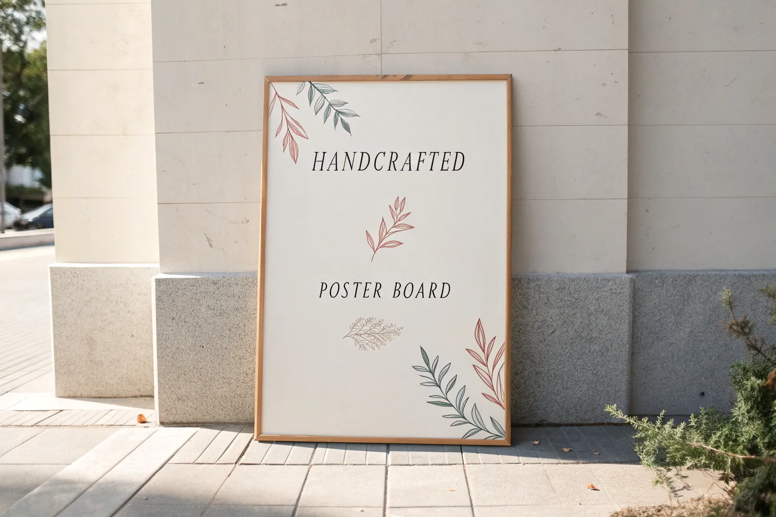
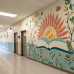
When I’m drawing on poster board, I always think “big, clear, and impossible to ignore from across the room.” Here are some of my favorite poster board drawing ideas that look awesome on walls and hallways, and they’re super doable whether you’re working solo or with a whole group.
Bold Quote With Oversized Lettering
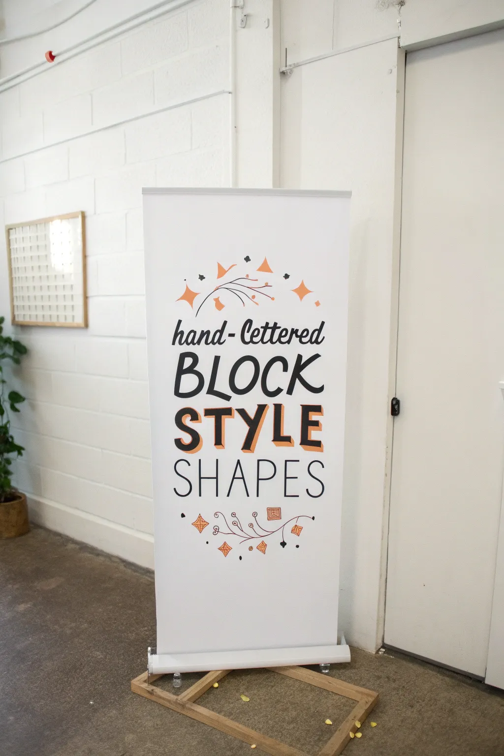
Master the art of high-impact typography with this large-scale hand-lettering project. The bold, shadowed block letters serve as the centerpiece, balanced by delicate script and whimsical geometric doodles for a professional, graphic design feel.
Detailed Instructions
Materials
- Large roll-up banner stand (blank) or large poster board
- Lead pencil (HB or B)
- Large eraser
- Black brush pen or chisel tip marker (large)
- Fine tip black drawing pen
- Orange acrylic paint marker or permanent marker
- Ruler or T-square
- Painter’s tape or masking tape
Step 1: Planning and Layout
-
Prepare your surface:
Set up your banner stand or lay your large poster board flat on a clean table. If working on a pre-made pull-up banner, ensure the material is taut and taped down slightly at the corners to prevent shifting while you work. -
Mark your baselines:
Using a ruler and a very light pencil touch, draw four horizontal guidelines. These will serve as the baselines for your four rows of text. Leave extra space between the third and fourth lines to accommodate the large, 3D block letters. -
Sketch the center point:
Find the vertical center of your board and mark it lightly on each baseline. This is crucial for keeping your text alignment symmetrical. -
Draft the script text:
On the top line, lightly sketch the words ‘hand-lettered’ in a cursive style. Start from the center and work outward to ensure it’s balanced, or write it once on scratch paper to gauge length before committing to the board. -
Draft the block capitals:
Sketch the word ‘BLOCK’ on the second line using tall, sans-serif capital letters. Keep the spacing tight but legible. -
Draft the 3D style letters:
For the third line (‘STYLE’), sketch thick sans-serif letters. Leave these open for now; we will fill them in later. Draw diagonal lines extending from the bottom-left corners of each letter to create a drop-shadow effect. -
Draft the thin sans-serif:
On the bottom line, sketch ‘SHAPES’ in a very thin, clean monoline font. Increase the tracking (spacing between letters) slightly to match the width of the words above.
Step 2: Inking the Lettering
-
Ink the script:
Using your large brush pen or chisel tip, trace your ‘hand-lettered’ sketch. Apply more pressure on the downstrokes to create thick lines and lift up for hairline upstrokes. -
Fill the ‘BLOCK’ text:
Switch if necessary to a steady, wide marker to trace the ‘BLOCK’ letters. These should be solid black lines with a uniform thickness, mimicking a classic casual sans-serif font. -
Create the 3D effect:
For ‘STYLE’, outline the main face of the letters in black. Then, use your orange marker to fill in the diagonal drop shadows you sketched earlier. This pop of color adds immediate dimension. -
Ink the bottom text:
Use a medium-point black marker for ‘SHAPES’. Keep your hand steady and maintain a consistent line weight; don’t fluctuate pressure here. -
Erase guidelines:
Wait until the ink is completely dry to the touch—I like to give it an extra five minutes just to be safe—then gently erase all pencil baselines and sketch marks.
Pro Tip: Shadow Science
For the drop shadows on ‘STYLE’, always project the shadow in the same direction (e.g., down and to the left) for every single stroke to keep the illusion convincing.
Step 3: Adding Decorative Flourishes
-
Sketch the top accents:
Above the text, lightly pencil in a semi-circle arch. Draw simple vine lines following this arch, adding small geometric diamonds and four-pointed stars (sparkles) in place of traditional leaves. -
Sketch the bottom accents:
Repeat the process below the text, creating an inverted arch. Incorporate similar motifs like swirls, dots, and hanging geometric charms. -
Ink the fine details:
Go over the vines and lines with your fine-tip black pen. Keep these lines delicate so they don’t compete with the bold text. -
Add color accents:
Use the orange marker to fill in specific shapes—the stars, diamonds, and occasional geometric ‘leaves’. Distribute the color evenly so the design feels balanced from top to bottom. -
Final clean-up:
Do one last pass with a large eraser to remove any remaining graphite from your decorative sketches. Brush away the eraser crumbs gently to avoid smearing.
Troubleshooting: Shaky Lines
If your long straight lines look wobbly, try moving your entire arm from the shoulder rather than just moving your wrist while drawing. It creates smoother strokes.
Step back and admire your professional-looking, hand-lettered display piece

Big Title and Simple Icon Spotlight
This project creates a striking, modern sign using clean lines and plenty of negative space to make a simple lightbulb icon pop. It’s perfect for brainstorming sessions or businesses wanting to signal big ideas, all done on a sturdy wooden-framed whiteboard or poster board.
Step-by-Step Guide
Materials
- Large white poster board or whiteboard (approx. 24×36 inches)
- Wooden frame moulding (thin profile, light wood)
- Black acrylic paint or black permanent marker (broad tip)
- Pencil for sketching
- Large compass or circular object (like a dinner plate)
- Ruler or T-square
- Fine grit sandpaper
- Wood glue or small finishing nails
- Small paintbrush (flat tip and pointed tip)
Step 1: Preparing the Base
-
Select your canvas:
Begin with a clean, large white surface. While you can use standard poster board, mounting it on a rigid backing like foam core or thin plywood will give it stiffness. -
Measure the frame:
Before drawing, measure and cut your thin wooden molding strips to create a frame that fits perfectly around the edges of your board. Do not attach them yet. -
Sand the edges:
Lightly sand the cut ends of your wooden frame pieces to ensure they are smooth and free of splinters. -
Dry fit the frame:
Lay the wooden strips around the board to ensure the corners meet neatly. This helps you visualize the final boundary so your drawing is centered.
Uneven Lines?
If your painted lines look shaky, thicken the entire line slightly to smooth out the wobble. Using a ruler as a guide for the straight filament lines also helps keep things crisp.
Step 2: Sketching the Icon
-
Establish the centerline:
Using a ruler, lightly mark a vertical centerline solely in the bottom third of the board. This ensures your lightbulb stands straight. -
Draw the bulb circle:
Place a circular object or use a compass centered on your line to draw the round top part of the bulb. Keep this sketch very light. -
Sketch the neck:
From the bottom sides of the circle, draw two lines curving inward and down, tapering toward the base where the screw threads will go. -
Draft the screw base:
Sketch a rectangular shape at the bottom of the neck, slightly rounded at the bottom, to serve as the socket base. -
Detail the filament:
Draw the inner filament structure. Start with a ‘V’ shape inside the bulb, connecting to a zigzag or bridge line near the center. -
Add the radiance lines:
I find it helpful to visualize a clock face here. Mark small dashes radiating outward from the top half of the bulb to represent light beams.
Level Up: Color Pop
Make the idea ‘active’ by painting the inside of the bulb a very pale, translucent yellow wash, or add gold leaf to the filament for a metallic shine.
Step 3: Inking and Finishing
-
Thicken the outline:
Go back over your main bulb shape with a pencil, thickening the line to give it a bold, graphic weight before painting. -
Paint the bulb outline:
Using black acrylic paint and a steady hand (or a broad permanent marker), carefully trace the exterior shape of the bulb. Keep the line width consistent. -
Fill the base details:
Paint the horizontal stripes on the screw base. Leave white gaps between the black stripes to distinguish the threads. -
Define the filament:
Switch to a finer brush or pen tip to ink the internal filament lines. These lines should connect clearly but can be slightly thinner than the outer bulb line. -
Paint the rays:
Fill in the radiating dash marks around the top. Ensure they are evenly spaced and roughly the same length for a uniform look. -
Erase pencil marks:
Once the black ink or paint is completely dry to the touch, gently erase any visible pencil guidelines. -
Attach the frame:
Apply a thin bead of wood glue to your wooden strips and press them firmly onto the edges of the board. -
Secure the corners:
For extra stability, you can add small finishing nails at the corners of the frame or simply weight the frame down while the glue sets.
Hang your finished sign in a workspace to inspire your next bright idea


Classroom Values Badge Board
Create a charming, rustic display for your classroom values using a large canvas scroll and simple, earthy illustrations. This grid-style banner mimics the look of vintage stitched textiles, offering a warm and inviting way to showcase positive traits like kindness, bravery, and growth.
How-To Guide
Materials
- Large roll of heavykraft paper or unstretched canvas (approx 24″ x 36″)
- Pencil and eraser
- Long ruler or yardstick
- Fine-tip black permanent marker or drawing pen
- Paint markers or acrylic paint (rust orange, sage green, slate blue, gold/ochre)
- Fine detail paintbrush (if using acrylic paint)
- Double-sided tape or adhesive putty (for mounting)
- Wooden dowels (optional, for hanging)
Step 1: Preparing the Grid
-
Measure the canvas:
Lay your large paper or canvas sheet flat on a clean surface. Decide on the overall dimensions for your banner, leaving a few inches of extra space at the top and bottom if you plan to mount it on dowels later. -
Draft the grid lines:
Using your yardstick and a light pencil touch, draw a large outer rectangle to frame your artwork. Inside this frame, measure and mark a grid of 15 equal squares (3 columns wide by 5 rows high). -
Add the stitching details:
Instead of solid straight lines, we want a textile look. Go over your pencil grid lines with a black drawing pen using a dashed line technique to simulate running stitches. -
Create the zig-zag border:
For the outer perimeter, draw a zig-zag ‘stitch’ pattern just inside the edge of the paper. I find that keeping the points of the zig-zags relatively loose and organic adds to the handmade charm.
Smudge Control
Work from top to bottom and left to right (if right-handed) to prevent your hand from dragging through wet ink or paint as you fill in the grid.
Step 2: Sketching the Badge Shapes
-
Outline the containers:
In the center of each grid square, lightly sketch a ‘container’ shape with your pencil. Alternate between circles, shield shapes, and simple crest outlines to create variety across the board. -
Draft the central motifs:
Inside each container, pencil in a simple symbol representing a value. Good options include hearts, stars, single leaves, radiating suns, or simple geometric patterns. -
Add laurel wreaths:
For several of the squares, sketch leafy branches or laurel wreaths flanking the central symbol. Vary the direction of the leaves—some curving up, some encircling the center entirely. -
Refine the sketches:
Step back and look at the composition. Ensure your symbols aren’t too crowded and that you have a good mix of simple and complex designs distributed evenly.
Step 3: Inking and Coloring
-
Ink the main outlines:
Using your chosen color palette (rust, green, blue, brown), carefully trace over your pencil sketches. Use a steady hand to outline the shields and circles. -
Paint the leaves:
For the laurel wreaths, use the sage green paint or marker. Instead of just outlining, fill the small leaf shapes in solidly for a bold, graphic look. -
Fill the central icons:
Color in your stars and hearts. For visual interest, leave some shapes as simple outlines (like the heart in the top center) and fill others in completely (like the green heart or gold star). -
Add detailed patterns:
On a few specific badges, use a fine-tip black pen to add tiny interior details, such as the veins on a leaf or a small scribbled texture inside a heart. -
Incorporate text elements:
If you want to label specific values, write them in a small, simple serif font inside a heart or shield. Keep the text tiny to maintain the illustrative focus. -
Erase guidelines:
Once the paint or ink is completely dry—give it plenty of time to avoid smearing—gently erase any visible pencil marks from your initial grid and sketching phase. -
Finalize the ‘fabric’ look:
Review your dashed grid lines. If any areas look too faint, go over them again with the black pen to ensure the ‘sewn’ effect stands out clearly against the canvas background.
Make it Interactive
Leave the center of the shields blank. Let students draw their own small symbols of ‘bravery’ or ‘kindness’ on paper, cut them out, and attach them inside.
Hang your beautiful new values banner where the whole class can see it and be inspired every day

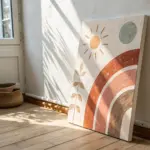
Growth Mindset Brain Split Design
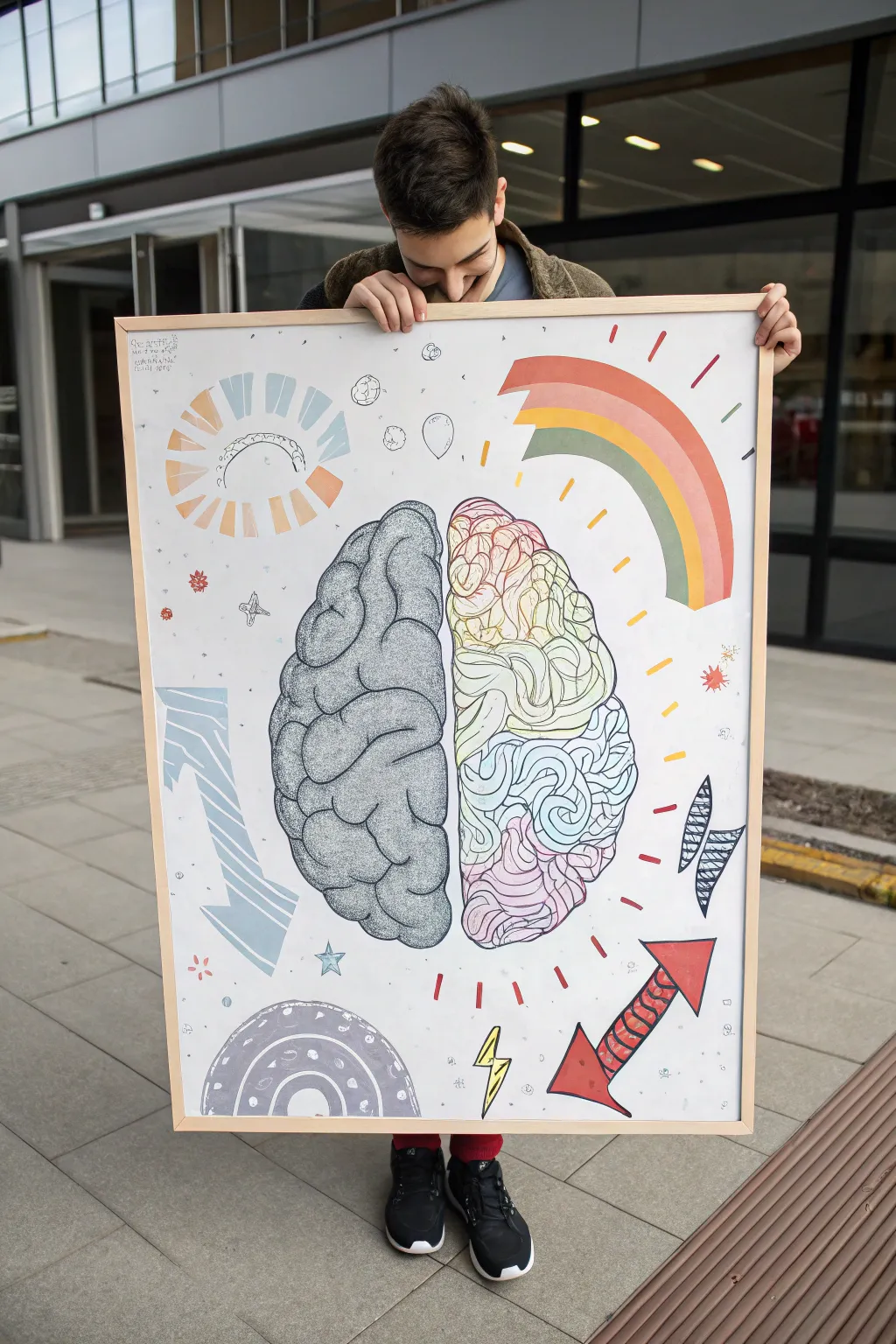
This large-scale poster project visualizes the concept of a growth mindset using a striking split-brain design. The left hemisphere depicts logical structure with cool greys and stippling, while the right bursts with creative color, loose lines, and playful icons.
Step-by-Step Guide
Materials
- Large format watercolor paper or poster board (A1 size recommended)
- Wooden frame (to fit paper size)
- Pencil (HB) and eraser
- Fine liner pens (Black, 0.3mm and 0.8mm)
- Colored markers or brush pens (yellow, orange, red, green, blue, pink)
- Grey markers (light and medium tones)
- Ruler
- Compass or circular object (for tracing shapes)
Step 1: Conceptual Sketching
-
Center layout:
Begin by lightly drawing a vertical line down the exact center of your poster board to divide the two hemispheres. -
Outline the brain:
Sketch the overall kidney-bean shape of a brain, centering it so the vertical line splits it evenly. Don’t worry about details yet, just get the silhouette right. -
Left hemisphere details:
On the left side, lightly sketch the logical lobes. Use curved, lumpy shapes that fit together like puzzle pieces to represent the brain’s folds. -
Right hemisphere details:
On the right side, sketch the lobes similarly, but keep the lines looser and more flowing to prepare for the colorful design later. -
Surrounding elements:
Sketch the surrounding icons: a segmented sun in the top left, a rainbow arc on the top right, arrows pointing diagonally, and various smaller shapes like stars and lightning bolts.
Uneven Coverage?
If your large marker areas look streaky, try coloring in small circular motions rather than straight lines. This blends the ink better for a smoother, uniform look especially on the rainbow.
Step 2: The Logical Left (Grey Scale)
-
Inking the outlines:
Using your 0.8mm black fine liner, trace the main outlines of the left brain hemisphere. Make these lines deliberate and slightly shaky to mimic organic tissue. -
Base shading:
Take a light grey marker and color in the entire left side of the brain. You don’t need perfect coverage; a little texture adds character. -
Adding depth:
With a medium grey marker, add shadows where the brain folds meet. This emphasizes the crevices and adds three-dimensionality. -
Stippling texture:
This is the time-consuming part: use a 0.3mm fine liner to add stippling (tiny dots) along the bottom edges of each brain fold. This creates a dense, textured shadow that contrasts with the right side. -
Left side icons:
Color the large downward-pointing arrow and the semi-circular shape at the bottom left using cool blue and grey tones. Keep these shapes geometric and structured.
Level Up: Metallic Pop
Use a silver or gold gel pen for the stars and lightning bolts. The metallic sheen catches the light and adds a magical, high-quality finish to the ‘creative’ side.
Step 3: The Creative Right (Color Explosion)
-
Colorful outlines:
Switch to your colored markers. Instead of black headings, outline each lobe section on the right side with a different color—pink, green, blue, or yellow. -
Scribble filling:
Inside each colored lobe, fill the space with loose, squiggly lines in a lighter shade of the outline color. I like to keep my wrist very loose here to make the lines feel energetic and spontaneous. -
Painting the rainbow:
Fill in the rainbow arc at the top right with broad strokes of red, orange, yellow, and green. Let the colors dry before adding adjacent stripes to prevent bleeding. -
Dynamic arrows:
Color the upward-pointing arrow in the bottom right with a bright red. Use a black pen to add a scribbled texture or pattern inside the arrow shaft for visual interest. -
Radiating energy:
Draw small dashes and lines radiating outward from the colorful brain side using yellow and orange markers to symbolize ideas sparking.
Step 4: Final Flourishes
-
Background doodles:
Go over your pencil sketches for the smaller background elements—stars, bubbles, and lightning bolts. Ink them randomly with black or colored pens. -
Erase pencil lines:
Wait until you are absolutely certain all ink and marker works are completely dry, then gently erase all remaining pencil guidelines. -
Framing:
Place your finished poster inside the wooden frame. Ensure the glass is clean on the inside before sealing the back.
Hang your masterpiece where it can inspire creative thinking every day
BRUSH GUIDE
The Right Brush for Every Stroke
From clean lines to bold texture — master brush choice, stroke control, and essential techniques.
Explore the Full Guide
Elements of Art Poster Board Chart
This project creates a professional-quality instructional display board perfect for an art classroom or educational fair. By breaking down complex art concepts into visual diagrams and swatch grids, you’ll produce a cohesive and visually striking reference tool.
Step-by-Step
Materials
- Large tri-fold presentation board (white)
- Black graphical tape (1/4 inch width)
- Black permanent markers (fine and ultra-fine tip)
- Ruler or T-square
- Compass for drawing circles
- Colored pencils (prismacolor or similar quality)
- Graph paper (optional, for drafting)
- Drawing pencils (HB, 2B, 4B)
- Adhesive letters or stencil set (for headers)
- Glue stick or spray mount
Step 1: Structure & Layout
-
Divide the Space:
Begin by using your ruler and pencil to lightly map out three wide vertical columns on your display board. Create a clear header area at the very top that spans the width of each column. -
Apply Framework Lines:
Take your black graphical tape and carefully run it along your pencil lines to create bold, clean borders for your columns. Run horizontal strips near the top of each column to create designated title boxes. -
Add Headers:
Using stencils or adhesive letters, place the main category titles at the top of each column. While the original text is abstract, you should use real terms like ‘Line & Pattern’, ‘Form & Shape’, and ‘Color Theory’ for a functional board.
Smudge Prevention
Place a scrap sheet of paper under your drawing hand while working. This prevents oils from your skin transferring to the board and stops graphite or ink from smearing across the white space.
Step 2: Column 1: Line & Pattern
-
Draft the Grid:
In the top third of the first column, use a ruler to draw a large rectangular box. Inside, lightly pencil a grid of squares, then draw diagonal lines connecting the corners to create a tessellated triangular pattern. -
Inking the Pattern:
Go over your pencil lines with a fine-tip black marker. Ensure the lines are crisp and uniform. This section demonstrates geometric repetition. -
Curvilinear Design:
Below the first grid, draw a second rectangle. This time, create a pattern using curved lines that radiate from central points, resembling starbursts or floral geo-patterns. Ink these carefully. -
Sketching Examples:
At the bottom of this column, create a 2×3 grid of smaller squares. Fill each with a different line drawing style—one contour sketch, one cross-hatched landscape, and one rapid gesture drawing.
Step 3: Column 2: Value & Form
-
Geometric Constructions:
In the top section of the middle column, draw a simple rectangle and a grid to show 2D shapes. Directly below, draw three triangles side-by-side to represent pyramids, adding hatch marks to one to suggest shadow. -
The Sphere Study:
Draw a perfect circle using a compass in the center of the column. This is crucial for showing form. Use drawing pencils (HB through 4B) to shade the circle, creating a smooth gradient from highlight to core shadow. -
Text Explanations:
Between the diagrams, use your ultra-fine pen to write short paragraphs explaining the concepts (e.g., ‘Shading adds depth to flat shapes’). Keep your handwriting neat or print onto paper and glue it down. -
Color Value Scales:
At the bottom, draw varying sizes of circles. Fill them with monochrome distinct patterns or single-color tonal scales to show how value works within a single hue.
Interactive Element
Attach small velcro dots to the color theory section and create removable color chips. This turns the bottom grid into an interactive puzzle for viewers to arrange gradients themselves.
Step 4: Column 3: Color & Texture
-
Primary Palette:
Near the top right, draw four small squares. Fill them with flat, opaque color using colored pencils or acrylic paint markers to represent a basic color palette. -
Shape Repetition:
Draw a horizontal row of four triangles. Color them in a single shade of green to demonstrate uniform shape and color. -
Texture Swatches:
Create three horizontal rectangular boxes. Fill the first with stippling (dots), the second with scribbles, and the third with a rough stone-like texture to demonstrate implied texture. -
The Color Grid:
For the bottom section, draw a large grid containing 16 squares (4×4). This will be your main color interaction chart. -
Filling the Gradient:
Fill the grid with a gradient of warm colors. Start with deep oranges and reds in the top right, fading into pale yellows and pastels in the bottom left. Blend your colored pencils smoothly for a professional finish. -
Final Concentric Square:
In the very last open space (bottom right), draw a series of squares nestled inside each other, getting progressively smaller, to create a ‘tunnel’ effect.
Step back and admire your organized, comprehensive guide to the foundations of art design
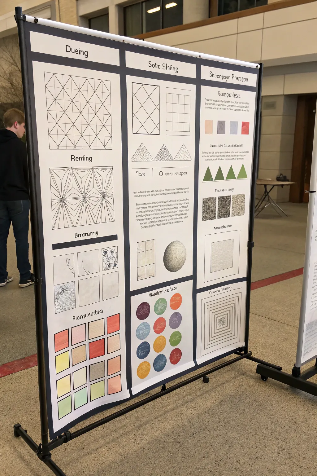
Math Thinking Strategy Poster Board
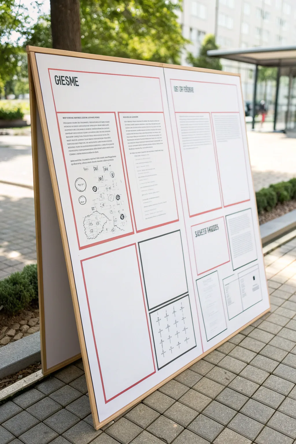
Recreate this sleek, museum-quality informational display featuring a structured layout of text, diagrams, and clean red borders mounted on a sturdy wooden A-frame. This project combines woodworking basics with precise graphic layout skills to build a professional-looking standing poster board ideal for outdoor presentations or math fairs.
Step-by-Step Tutorial
Materials
- Two large sheets of white foam core or PVC board (approx. 24×36 inches each)
- Wooden trim strips (1×2 inch lumber) for the frame
- Plywood backing sheet (optional for extra stability)
- Hinge mechanism for the top of the A-frame
- Red and black thin graphic tape (1/8 inch or 1/4 inch width)
- Fine-point black geometric markers or drafting pens
- Ruler or T-square
- Graphite pencil and eraser
- Spray adhesive or strong double-sided tape
- Printed text blocks on high-quality paper
- Sandpaper
- Wood glue and small finish nails
Step 1: Building the A-Frame Structure
-
Prepare the wood frame:
Cut your wooden trim strips to match the perimeter dimensions of your two main display boards. You will need four vertical pieces and four horizontal pieces to create two rectangular frames. -
Assemble the frames:
Join the wood strips using wood glue and small finish nails at the corners. Ensure the corners are perfectly square. I like to clamp them while drying to prevent shifting. -
Sand and finish:
Sand the wooden frames until smooth. You can leave them raw for that natural Scandinavian look shown in the photo, or apply a clear matte sealant for weather protection. -
Connect the A-frame:
Attach the two frames at the top edge using a hinge mechanism. This allows the board to stand freely like an easel. -
Mount the backing:
Secure your white foam core or PVC boards into the wooden frames. If using PVC, you can glue it directly to the wood; if using foam core, you might want a thin plywood backing for rigidity.
Tape Troubles?
If your graphic tape keeps peeling at the ends, add a tiny dot of clear glue under the very tip of the tape strip to lock it permanently in place.
Step 2: Planning the Graphic Layout
-
Draft the grid:
Lightly sketch your layout on the white board using a pencil and T-square. The design relies on a strict grid system, so measure out where your headers, text columns, and diagram boxes will go. -
Establish the red borders:
Apply the red graphic tape along your pencil guidelines to create the primary viewing areas. Notice how the design uses a thin double border in some areas and single borders in others. -
Add black accent frames:
Use black graphic tape or a thick black marker to create the distinct lower frames, specifically the square box intended for the math symbols. -
Position the main header:
Stencil or apply vinyl lettering for the main title “GIESME” in the top left section. Use a tall, condensed sans-serif font to match the reference.
Level Up: Velcro
Make the content modular by mounting your text blocks and diagrams on distinct cards with heavy-duty Velcro dots, allowing you to swap information easily.
Step 3: Adding Content and Details
-
Prepare text blocks:
Type up your project content in justified columns. Print these on bright white paper and trim them perfectly to size. -
Adhere text:
Use spray adhesive to mount the text blocks within the red tape borders. Smooth them down from the center outward to avoid bubbles. -
Draw the diagrams:
For the circular diagrams and maps in the left column, draw directly on the board or on separate paper using a fine-point drafting pen. Focus on thin, precise lines. -
Create the symbol grid:
In the bottom right black-bordered box, carefully draw the grid of cross-like mathematical symbols. Keep the spacing consistent to maintain the organized aesthetic. -
Final clean up:
Erase any visible pencil guidelines. Check the tape corners to ensure they aren’t peeling and press them down firmly.
Step 4: Weatherproofing (Optional)
-
Seal the surface:
If this will be displayed outdoors, lightly spray the entire face of the board with a matte art fixative or clear acrylic sealer to protect the paper and ink from moisture.
Now you have a structured, architectural display that professionally showcases your math thinking strategy

PENCIL GUIDE
Understanding Pencil Grades from H to B
From first sketch to finished drawing — learn pencil grades, line control, and shading techniques.
Explore the Full Guide
Science Diagram With Big Labels
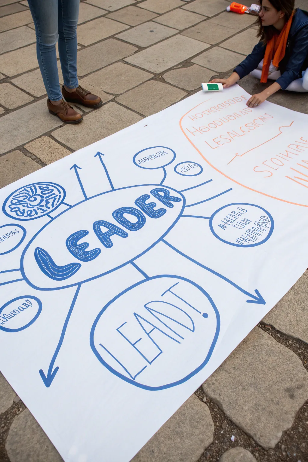
This tutorial guides you through creating a large-scale, impactful mind map poster perfect for presentations or group brainstorming. Focusing on the central theme of leadership, this design uses bold typography and radiating diagrams to organize complex ideas visually.
Step-by-Step
Materials
- Large roll of white butcher paper or poster cardstock
- Thick blue chisel-tip marker
- Thick orange chisel-tip marker
- Fine-point black permanent marker
- Graphite pencil
- Large eraser
- Ruler or straight edge (optional)
Step 1: Planning and Layout
-
Prepare the workspace:
Find a large, flat surface like a floor or a large table. Unroll your paper to the desired length (at least 3-4 feet) to comfortably fit the sprawling diagram. -
Rough sketch:
Using a pencil very lightly, sketch a large oval in the center-left area of the paper. This will house the main title. -
Draft the title typography:
Inside the central oval, lightly letter the word ‘LEADER’. To match the style, draw the letters as thick, block shapes rather than single lines. Give them a slight curve as if they are bulging outward. -
Plan the secondary focal point:
Below the main oval, sketch a slightly smaller circle. Inside this, lightly draft the word ‘LEAD!’ in a simple, monoline block style. -
Map out connections:
Still using your pencil, draw straight lines radiating outward from the central ‘LEADER’ oval. Some lines should end in arrows, while others should connect to smaller circles or blobs for sub-topics.
Step 2: Inking the Blue Section
-
The main outline:
Take your thick blue chisel-tip marker. Trace over the central oval pencil line with a steady hand. Go over the line twice if you want a bolder, more uneven organic look. -
Fill the title letters:
Outline the block letters of ‘LEADER’ with the blue marker. Then, use hatching (diagonal lines) or scribbles to fill the interior of each letter, leaving small white gaps to create texture. -
Draw the connecting lines:
Trace the radiating lines extending from the center. For the arrows, draw the shaft first, then add the arrowhead at the tip. Make these lines confident and straight. -
Create sub-topic bubbles:
At the ends of the connecting lines, draw the smaller circles and abstract shapes. Vary the sizes to keep the diagram visually interesting. -
Detail the ‘LEAD!’ bubble:
Outline the lower circle and the ‘LEAD!’ text inside it. Unlike the main title, leave these letters as outlines without filling them in to create contrast. -
Add graphical icons:
In one of the upper-left connected circles, draw a stylized brain or labyrinth pattern using the blue marker to represent complex thinking.
Smudge Prevention
Work from the center outwards, or if you are right-handed, work from left to right to avoid dragging your hand through wet ink.
Step 3: Inking the Orange Section
-
Establish the secondary zone:
On the right side of the paper, use the orange marker to draw a large, sweeping curve that separates a new section or ‘cloud’. -
Add orange text:
Write your secondary headers or lists inside this orange zone. Use a mix of block capitals and looser handwriting styles to differentiate it from the main blue diagram. -
Connect the zones:
Draw subtle orange lines or brackets that visually link this text back toward the blue center, showing a relationship between the two distinct thoughts.
Color Coding
Use a third color (like green or purple) for the arrows only. This visually separates the ‘action’ or flow from the static content bubbles.
Step 4: Final Touches
-
Faux text filling:
For the smaller blue bubbles, you don’t need real words. Use a fine-point pen or the tip of your marker to create ‘greeking’—squiggles and lines that imply text without being legible, unless specific labels are needed. -
Erase guidelines:
Wait at least 10 minutes to ensure all ink is completely dry. Gently erase all visible pencil marks, being careful not to smudge the marker ink. -
Review and refine:
Step back and look at the poster from a standing height. If any lines look too thin, thicken them with a second pass of the marker to ensure visibility from a distance.
Now you have a dynamic, professional-looking diagram ready to spark conversation
Timeline Ribbon Across Poster Boards
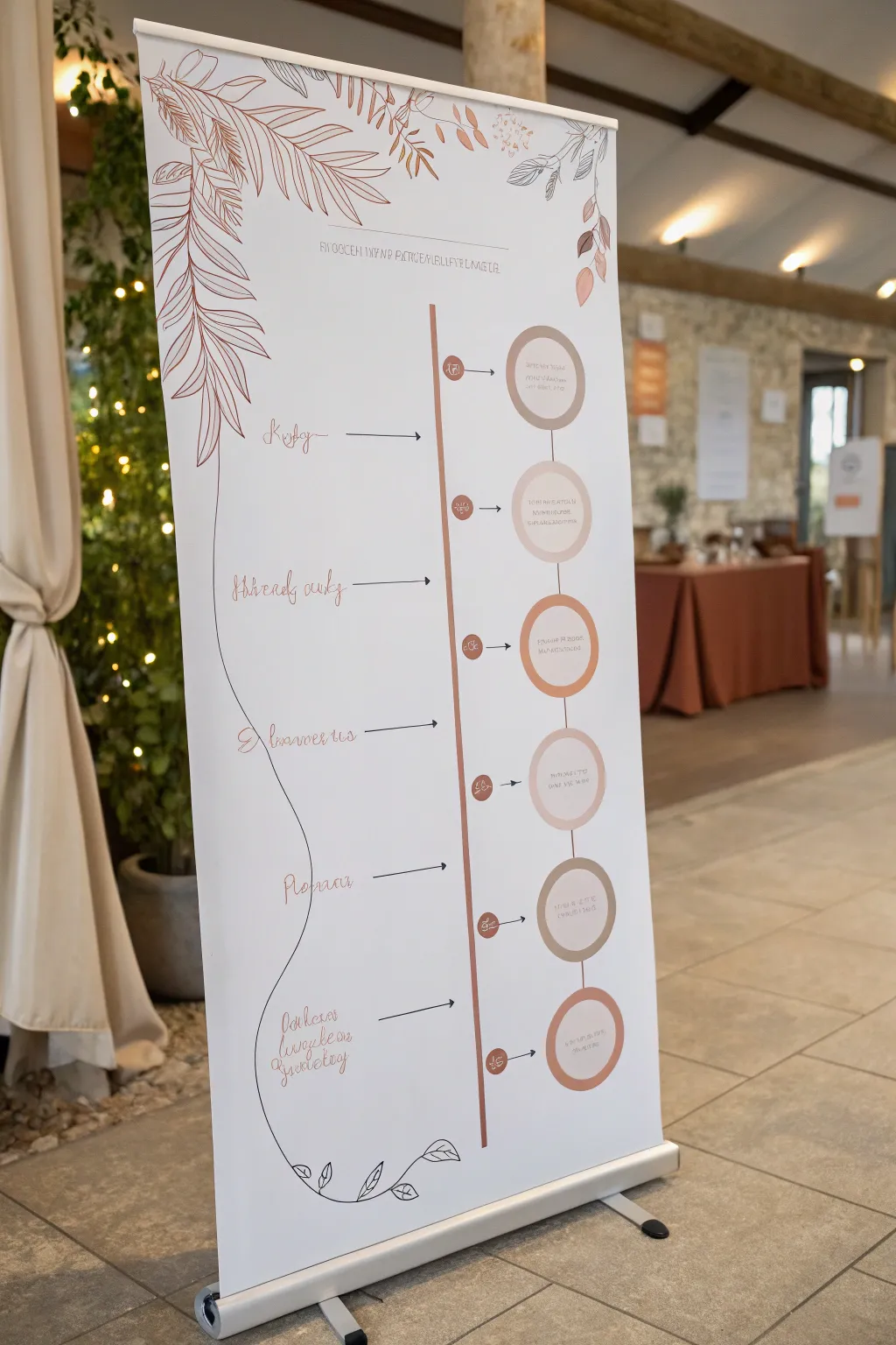
Transform a standard roll-up banner into an elegant, custom piece of event decor with this floral timeline project. This design combines minimalist line art with soft earth tones to create a sophisticated schedule or milestone tracker that stands tall.
How-To Guide
Materials
- Blank white roll-up banner stand (standard size, roughly 33×80 inches)
- Pencil and eraser
- Computer with design software (Canva, Illustrator) OR stencils
- Adhesive vinyl sheets (copper, terracotta, beige)
- Transfer tape
- fine-tip permanent markers (brown and black)
- Long ruler or T-square
- Scissors and X-Acto knife
- Squeegee or credit card
Step 1: Planning and Layout
-
Digital draft:
Before touching your banner, sketch your timeline on paper or draft it digitally. Map out exactly where your six circles will sit vertically on the right side and where the corresponding text will go on the left. -
Marking the centerline:
Unroll your banner fully and secure it flat on a large table or clean floor. Using a T-square, lightly draw a vertical pencil guide line down the center to act as your anchor point. -
Spacing the events:
Measure six evenly spaced points along your vertical guide for your timeline milestones. Ensure you leave ample space at the top for a header and at the bottom for the footer flourishes.
Vinyl Application Tip
When applying long vinyl strips, peel the backing off only 2-3 inches at a time. This prevents the strip from curling onto itself or sticking prematurely.
Step 2: Creating the Central Structure
-
Cutting the main line:
Cut a long, thin strip of copper or terracotta vinyl, about 0.5 inches wide. This will be the central vertical axis line. -
Applying the axis:
Carefully apply this vinyl strip just to the right of your pencil guide line. Use a squeegee to smooth it down as you go to prevent air bubbles. -
Cutting the circles:
Cut six circles from your vinyl sheets, alternating between light beige, terracotta, and copper tones. You’ll also need smaller contrasting circles or icons to serve as the ‘bullet points’ on the line itself. -
Placing the circles:
Adhere the large vinyl circles to the right of the vertical line, aligning them with your measured spacing marks. Place the smaller marker dots directly on the vertical line next to each large circle.
Step 3: Detailing and Text
-
Adding connecting arrows:
Using a thin black permanent marker or cutting very thin vinyl strips, create small horizontal arrows connecting the center line dots to the large circles. -
Lettering the labels:
For the left-side text (the event names), you can hand-letter using a calligraphy marker for a fluid look, or cut script words from vinyl. Ensure the baseline of the text aligns with the center of its corresponding circle. -
Adding circle content:
Write the specific details (times, locations) inside the large circles using a fine-point pen. If your handwriting is shaky, I suggest printing these onto clear sticker paper and applying them inside the circles. -
The meandering line:
Draw the distinct, wavy black line that travels vertically down the left side. Let it curve gently around the text blocks, acting as a decorative frame.
Level Up: Texture
Instead of marker for the leaves, cut the floral shapes out of matte cardstock and glue them onto the banner for a subtle 3D collage effect.
Step 4: Floral Illustrations
-
Sketching the foliage:
Lightly sketch large, drooping leaf motifs at the top left corner and bottom center using a pencil. Reference botanical line art for the vein structures. -
Inking the outlines:
Go over your pencil sketches with a brown or deep red fine-point marker. Vary your line weight—make the main stems slightly thicker than the delicate leaf veins. -
Adding color accents:
Use diluted acrylic paint or markers to fill in just a few leaves with solid terracotta color, leaving most as open line drawings for an airy feel. -
Final header:
Add your main title (like event names or date) at the very top using a simple, sans-serif font style in a color that matches your vertical line. -
Clean up:
Once all ink is completely dry, gently erase any remaining pencil guide lines. Roll the banner back into the stand slowly to check that everything retracts smoothly.
Now you have a stunning, professional-looking display ready to guide guests through your event


Silhouette Sunset Landscape
Capture the serene beauty of twilight with this striking gradient landscape project. You’ll master the art of smooth color blending to create a soft, glowing sky that perfectly contrasts with a crisp, dark forest silhouette.
Step-by-Step
Materials
- Large white poster board or heavy watercolor paper
- Soft body acrylic paints (indigo, purple, pink, orange, peach)
- Black acrylic paint or black India ink
- Wide flat wash brush (2-3 inch)
- Medium round brush
- Fine liner brush
- Palette or large plate for mixing
- Water cups
- Spray bottle with water (mister)
- Painter’s tape
Step 1: Setting the Sky
-
Prepare the Surface:
Begin by taping down the edges of your large poster board to a flat working surface. This prevents the paper from buckling when wet and gives you a satisfying clean white border at the end. -
Mix Your Gradient Palette:
Pre-mix your gradient colors on your palette before you start painting. You’ll need four distinct shades: a deep indigo-violet for the top, a mid-tone purple, a warm salmon pink, and a soft peach for the horizon. -
Start at the Top:
Using your wide flat wash brush, apply the deep indigo-violet across the top third of the board. Use horizontal strokes that go all the way across the paper. -
Transition to Purple:
While the top is still wet, pick up your mid-tone purple. Paint the next section down, overlapping slightly with the indigo. Quickly brush back and forth over the seam to blend them. -
Mist and Blend:
If the paint starts to drag or dry too fast, give the paper a very light mist of water from your spray bottle. This keeps the acrylics fluid and helps achieve that seamless, airbrushed look. -
Introduce the Warmth:
Clean your brush thoroughly or switch to a fresh one. Apply the salmon pink shade below the purple, blending the transition carefully just as before. The goal is to avoid harsh lines. -
Finish the Horizon:
Paint the bottom section of the sky with your lightest peach color, pulling it down far enough that it will eventually be covered by the treeline. Let the color fade slightly as it goes lower. -
Final Smooth:
I like to take a clean, slightly damp large brush and do final long horizontal sweeps across the entire gradient while it’s tacky to unify the texture. Let the entire background dry completely before moving on.
Gradient Troubles?
If you see streaks in your sky, your paint was likely too dry. Don’t overwork it; instead, wait for it to dry 100%, then apply a second thin, watered-down glaze of the colors over the top.
Step 2: Creating the Forest
-
Establish the Ground Line:
Using black paint and a medium round brush, create a low, uneven horizon line near the bottom of the paper. It doesn’t need to be straight; slight undulations look more natural. -
Map Out Tree Heights:
Lightly mark vertical lines using watered-down black paint to indicate where your tallest trees will stand. Vary the heights to create an interesting, organic rhythm. -
Paint the Trunks:
Switch to your fine liner brush and black paint. Draw thin, straight vertical lines for the tree trunks, tapering them to a very fine point at the top. -
Form the Upper Branches:
Starting at the top of a tree, dab very small horizontal marks. Keep them narrow at the peak. Pine trees generally have a triangular or conical overall shape. -
Thicken the Lower Foliage:
As you move down the trunk, make your dabbing strokes wider and slightly denser. Leave small gaps of sky showing through the branches to keep the trees from looking like solid triangles. -
Vary the Textures:
For some trees, angle the branches slightly downward; for others, keep them horizontal. Mixing firs, spruces, and perhaps a few leafless deciduous trees adds realism. -
Fill the Density:
Use the medium brush to fill in the dark mass of the lower forest where individual branches aren’t distinguishable. This grounds the image. -
Add Subtle Details:
For a pro touch, mix a tiny drop of white into your black to make a dark grey. Use this to add very faint highlights to the tips of a few foreground branches, suggesting moonlight. -
Clean Up:
Once the trees are fully dry, carefully peel away the painter’s tape at a 45-degree angle to reveal your crisp white border.
Natural Tree Tip
Don’t make your trees identical soldiers. Nature is imperfect! Make some trees crooked, some missing branches, and clump them together in uneven groups for a realistic silhouette.
Step back and admire how the dark forest brings out the glowing warmth of your painted sky
Zentangle Border to Fill Empty Space
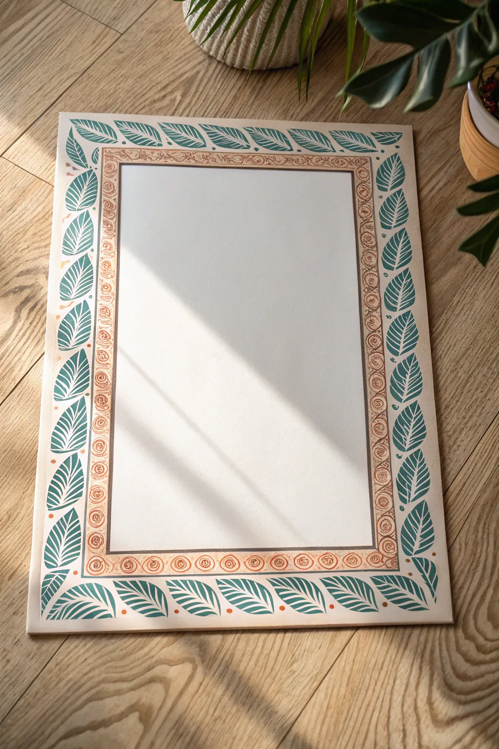
Transform a plain sheet of paper into an elegant framed space perfect for calligraphy or a central drawing. This design combines a rhythmic, organic leaf border with a warm, spiraling inner frame for a balanced and earthy look.
Step-by-Step Guide
Materials
- White creativity paper or poster board (approx. A3 size)
- Pencil (HB or H)
- Ruler
- Eraser
- Turquoise or teal gouache paint (or acrylic)
- Terracotta or reddish-brown fine liner pen (0.5mm or 0.8mm)
- Small round paintbrush (size 2 or 4)
- Fine detail paintbrush (size 0 or 00)
- Compass (optional, for spacing guides)
Step 1: Setting the Structure
-
Define the outer edge:
Begin by lightly measuring a margin of about 1.5 inches from the edge of your paper on all four sides. Draw a faint pencil rectangle to serve as the inner boundary for your leaf border. -
Mark the inner frame:
Measure another 0.5 to 0.75 inches inward from your first rectangle. Draw a second, smaller rectangle. This narrow channel between the two lines will house the spiral pattern. -
Clean up corners:
Erase any overshot lines at the corners so you have two distinct, concentric rectangles floating in the center of the page.
Wobbly Lines?
If your hand shakes while doing the spirals, rest your wrist on a clean piece of scrap paper over the artwork. This stabilizes your hand and prevents smudging the ink.
Step 2: Painting the Leaf Border
-
Draft the leaf shapes:
Using your pencil very lightly, sketch the outline of the leaves in the outer margin. Orient them so they ‘flow’ in one direction along each side. I find it helpful to start at the corners to ensure they meet neatly, then fill in the straight sections. -
Prepare the paint:
Mix your turquoise gouache with a tiny drop of water to get a creamy consistency that flows widely but is still opaque. -
Paint the leaf silhouettes:
With the size 2 round brush, carefully fill in the leaf shapes. Don’t worry about the internal veins yet; just create solid, smooth silhouettes. -
Add corner details:
Where the leaves meet at the corners, adjust the angle slightly so the visual flow turns the corner naturally, rather than colliding abruptly. -
Let it dry:
Allow the green paint to dry completely. Gouache dries matte and quickly, but give it at least 15 minutes to avoid smudging. -
Paint the veins:
Using the size 0 detail brush and white paint (or a white gel pen if you prefer easier control), draw the central vein and the smaller angled veins inside each dry turquoise leaf. -
Add accent dots:
Dip the handle end of a paintbrush into the terracotta paint (or use the pen) to place small dots in the negative spaces between the leaves for a pop of contrast.
Make it Metallic
Swap the white vein details for gold metallic paint or a gold gel pen. The shimmer against the matte turquoise adds a luxurious, illuminated manuscript feel.
Step 3: Drawing the Spiral Inner Border
-
Outline the channel:
Take your terracotta fine liner and trace over the pencil lines that define the inner narrow rectangle. This creates a hard boundary for your spirals. -
Start the spiral pattern:
Inside this channel, begin drawing tight, circular spirals. Start from one corner and work your way across. -
Vary the sizes:
While uniformity is nice, slight variations in the ‘hand-drawn’ quality of the spirals make the piece look more organic and less like a computer printout. -
Fill the gaps:
If you have tiny triangular gaps between the round spirals and the straight border lines, gently fill them with small dots or tiny curved hatching lines to add density. -
Erase guidelines:
Once the ink is fully dry, gently erase any visible graphite lines from your initial sketching phase. -
Final check:
Step back and look for any uneven areas. You can touch up the leaf edges with the turquoise paint if needed to sharpen the points.
You now have a beautifully constructed border ready to frame a poem, a quote, or a central illustration
Lift-the-Flap Interactive Poster Board
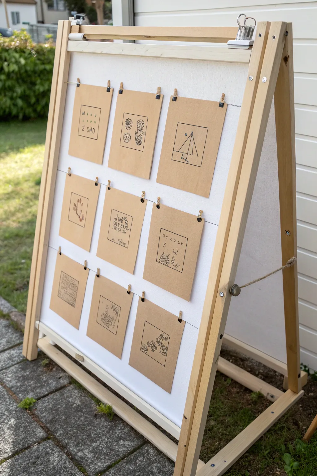
This rustic, interactive display turns simple line drawings into a cohesive gallery wall using a wooden A-frame and neutral kraft paper. It’s a perfect way to showcase a series of sketches, nature studies, or even clues for a scavenger hunt in a charming, minimalistic style.
Step-by-Step Tutorial
Materials
- Wooden A-frame chalkboard or display easel
- Heavyweight kraft paper or cardstock (8.5 x 11 inches or large sheets)
- Black fine-point felt tip pens or Micron pens (sizes 01, 03, 05)
- Ruler
- Pencil and eraser
- Paper cutter or sharp scissors
- Twine or durable hemp string
- Small wooden clothespins (approx. 1-1.5 inches)
- Staple gun or small tacks (if your easel lacks pre-drilled holes)
- Optional: White gel pen for highlights
Step 1: Preparing the Canvas
-
Measure and cut:
Begin by deciding on the size of your drawing squares. For a standard easel like this, 5×5 inch or 6×6 inch squares work well. Measure your kraft paper carefully and mark cut lines lightly with a pencil. -
Slice the squares:
Use a paper cutter for the cleanest edges, or a ruler and sharp scissors to cut out nine identical squares. Ensure the corners are crisp and 90 degrees. -
Create borders:
On each kraft square, draw a square border using a ruler and a medium-thickness black pen (like an 03 size). Leave about a 3/4-inch margin from the edge of the paper to frame your artwork nicely.
Twine Sagging?
If the twine droops after hanging the art, try twisting a small loop in the string near the frame edge and pinning it, or wrap the string an extra time around the frame leg to increase tension.
Step 2: Creating the Artwork
-
Sketch concepts:
Plan your nine drawings. Botanical themes, geometric shapes, or simple handwritten typographic elements work best with this aesthetic. Sketch your ideas lightly in pencil inside the borders. -
Ink the outlines:
Go over your pencil sketches with a fine-point black pen. Focus on clean, continuous lines. For botanical sketches, I like to use a slightly wavy line to mimic natural organic forms. -
Add details and texture:
Use a thinner pen (size 01 or 005) to add texturing, stippling, or cross-hatching to your drawings. This adds depth without overwhelming the simple look. -
Erase guidelines:
Once the ink is completely dry—wait at least 15 minutes to be safe—gently erase all pencil marks and grid lines to leave a clean finish. -
Flatten the paper:
If the heavy ink or erasing has curled the paper slightly, press the squares under a heavy book overnight to ensure they hang perfectly flat.
Interactive Twist
Make it a game! Draw a riddle on the front of the kraft paper and tape the answer on the back. Guests can flip the paper up to reveal the solution.
Step 3: Assembling the Display
-
Measure string placement:
On your A-frame easel, measure three equidistant horizontal lines where the rows of artwork will hang. Mark these spots on the wooden side rails. -
Attach the twine:
Secure lengths of twine across the frame at your marked points. You can wrap the twine around the side posts, use small tacks, or staple the ends to the back of the frame leg. Pull the twine tight so it doesn’t sag under the weight of the paper. -
Arrange the top row:
Clip the first three drawings onto the top string using two mini clothespins per square. Space them evenly, leaving equal gaps between the papers. -
Complete the grid:
Continue hanging the middle and bottom rows. Step back frequently to ensure vertical alignment, making sure the painting in the middle row hangs directly below the one above it. -
Final adjustments:
Slide the clothespins gently left or right to perfect the varying spacing. If the twine sags too much, tighten the knots or staples on one side until the lines are taut.
Now you have a charming, gallery-style display that can easily be swapped out with new art whenever inspiration strikes


Have a question or want to share your own experience? I'd love to hear from you in the comments below!