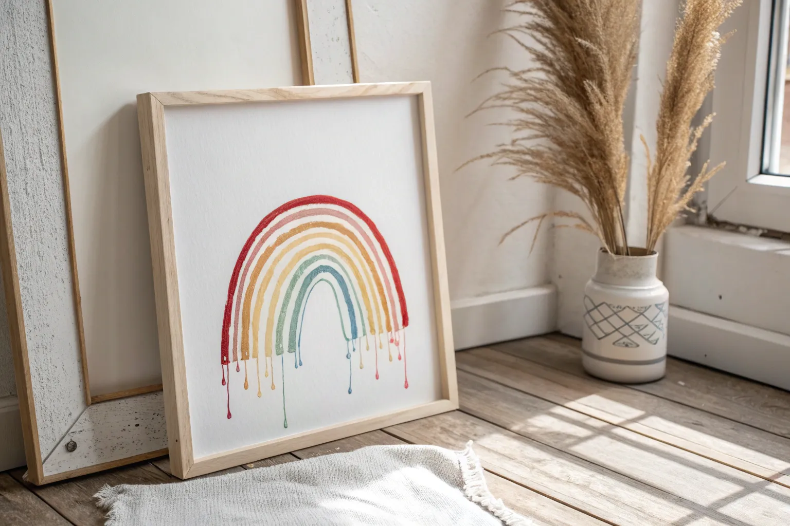
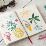
There’s something weirdly satisfying about turning a solid thing into a dreamy little mess of drips and puddles on paper. If you’re craving that surreal, gooey look, these melting drawing ideas will give you tons of directions to play in—whether you’re going full pencil realism or mixing in waxy color.
Melting Popsicle With Bite Marks
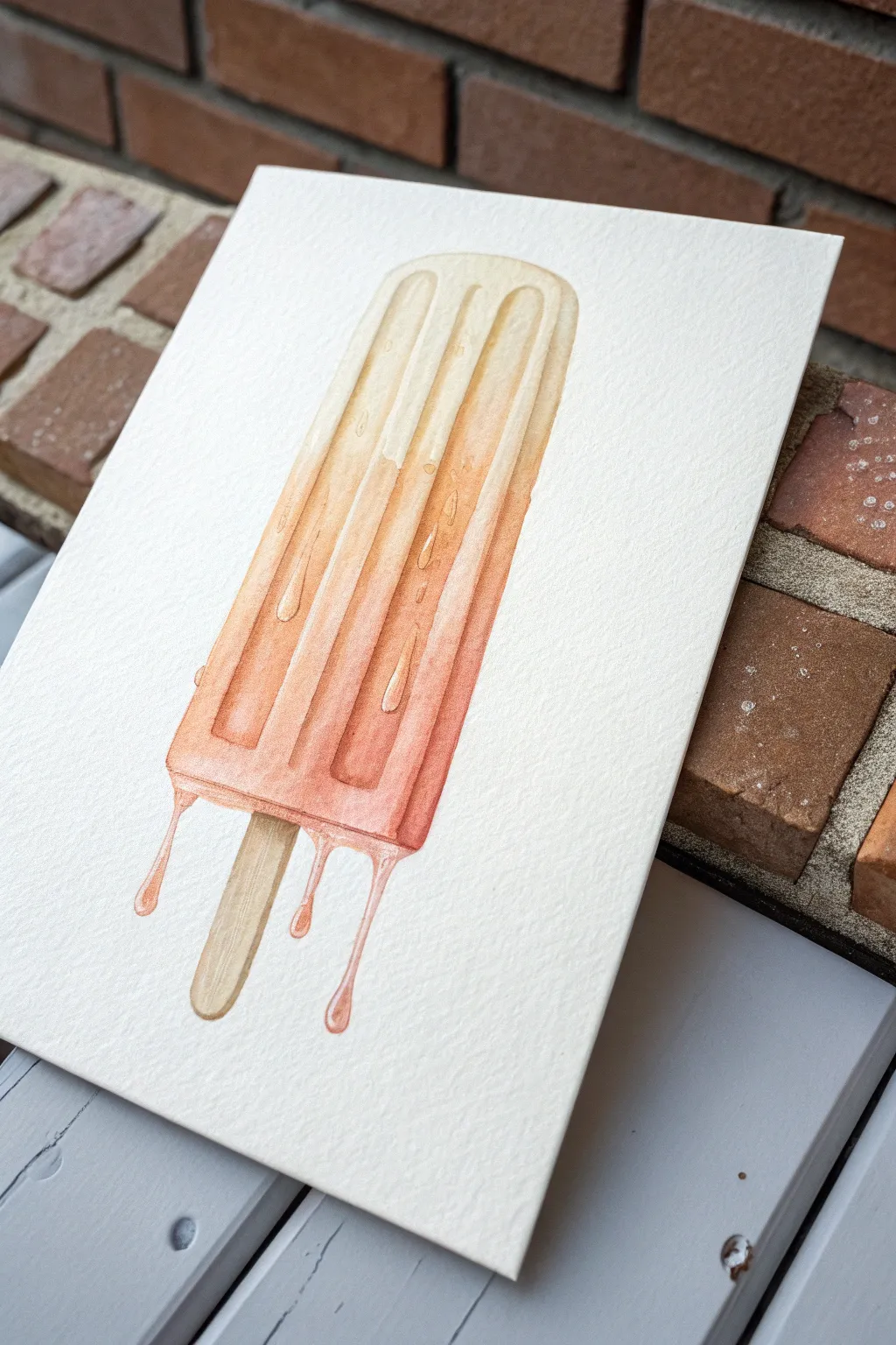
Capture the nostalgic essence of a hot summer day with this glistening watercolor popsicle. The piece features a beautiful gradient from creamy vanilla to warm orange, complete with realistic drips and condensation droplets.
Step-by-Step Guide
Materials
- Cold press watercolor paper (300 gsm)
- Watercolor paints (Yellow Ochre, Cadmium Orange, Burnt Umber, Alizarin Crimson)
- Pencil (HB or H)
- Kneaded eraser
- Round watercolor brushes (sizes 4 and 8)
- Fine detail brush (size 0 or 1)
- Masking fluid (optional but helpful)
- Water jars and paper towels
Step 1: Sketching the Base
-
Outline the Shape:
Lightly sketch the long, cylindrical shape of the popsicle with rounded top corners. Make sure the sides taper in very slightly towards the bottom. -
Add Grooves:
Draw two long, vertical indented lines down the face of the popsicle to mimic the traditional mold shape. These should stop just short of the top and bottom edges. -
Draw the Stick:
Sketch the wooden stick protruding from the bottom, keeping it centered and slightly rounded at the end. -
Sketch the Drips:
This is the fun part. Draw uneven, wavy lines at the bottom of the popsicle where it’s melting. Add three distinct drips falling downward—one on the left, two on the right. -
Clean Up:
Use your kneaded eraser to lighten the pencil lines until they are just barely visible, so the graphite won’t dirty your watercolor washes.
Muddy Gradient?
If your colors aren’t blending smoothly, re-wet the entire shape with clean water first (wet-on-wet technique) before dropping in pigment. This helps the gradient flow naturally.
Step 2: Painting the Gradient
-
Prepare the Colors:
Mix a watery pale yellow (Yellow Ochre + lots of water) and a vibrant orange (Cadmium Orange + a touch of Alizarin Crimson). -
First Wash – Top:
Start at the top of the popsicle with the pale yellow wash. Use a size 8 brush and keep it very wet and translucent. -
Gradual Transition:
As you move down the popsicle, slowly introduce the orange mixture into your brush. Let the colors bleed naturally on the paper to create a soft Ombré effect. -
Intensify the Bottom:
At the bottom third of the treat, use more concentrated orange pigment. This suggests gravity pulling the syrup downward as it melts. -
Paint the Drips:
Carry that concentrated orange color down into the dripping shapes you sketched earlier. Leave tiny white highlights in the bulb of the drip to make them look glossy.
Step 3: Adding Dimension
-
Shadowing the Grooves:
Once the base layer is completely dry, mix a slightly darker, reddish-orange. Paint vertical stripes inside the indented grooves, softening the edges with a clean, damp brush. -
Side Shadows:
Add a thin line of this darker shade along the right side of the popsicle and the right edge of each groove to suggest a light source coming from the left. -
The Wooden Stick:
Paint the stick with a wash of Yellow Ochre mixed with a tiny bit of Burnt Umber. Keep the color uneven to mimic wood grain. -
Wood Texture details:
Use a detail brush to add tiny vertical lines of darker brown on the stick for texture, darker on the sides.
Add Pop Art Flavor
Try painting the popsicle in unnatural colors like teal and violet, or add a heavy black ink outline after drying for a comic book illustration style.
Step 4: The Wet Look
-
Lifting Highlights:
If the paint looks too flat, use a clean, damp brush to gently lift pigment from the top left curved edge and the tops of the raised sections. -
Painting Droplets:
Using your fine detail brush and a slightly darker orange, paint small, oval U-shapes scattered on the surface. These are the shadows of water droplets. -
Defined Refraction:
Inside the top of those U-shapes, add a tiny dot of white gouache or darker paint to show refraction, but leave the paper white in the center of the droplet if possible. -
Enhancing the Drips:
Add a darker orange outline to one side of the falling drips to give them volume. I find this creates that sticky, syrupy look instantly. -
Stick Shadow:
Paint a very small, dark cast shadow directly underneath the popsicle body where the stick emerges.
Now step back and admire your refreshing, summery artwork that looks good enough to eat
Melting Smile With Dripping Teeth
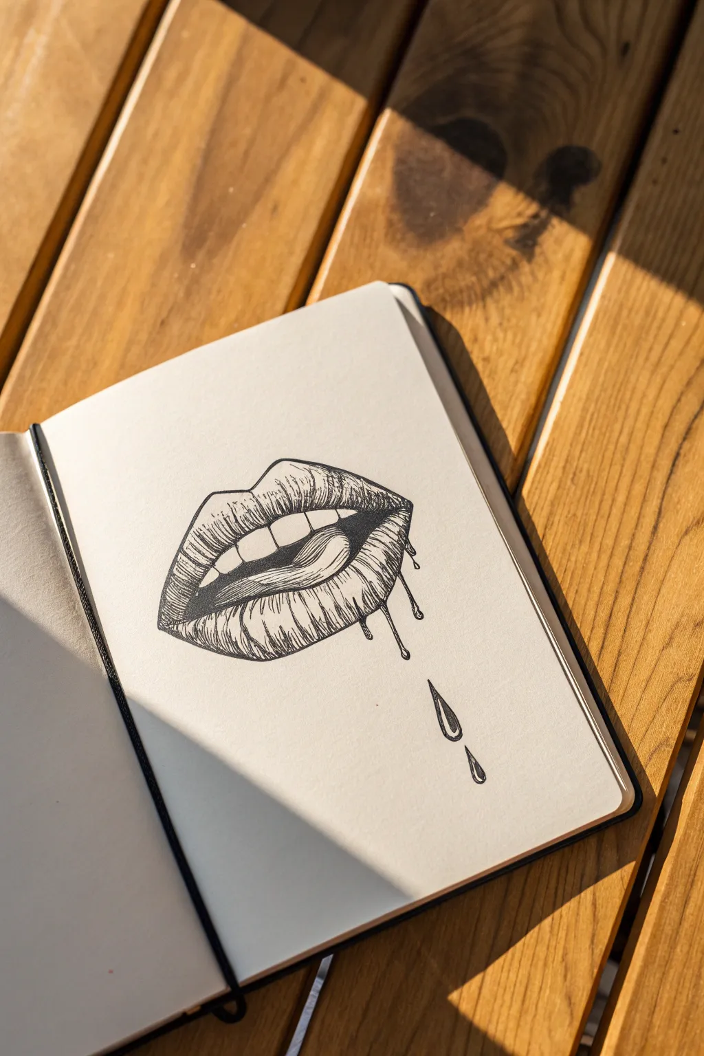
Capture a surreal, edgy vibe with this pen-and-ink illustration of lips that seem to be melting away. Using simple hatching techniques, you’ll create texture and depth that make the dripping effect pop off the page.
Detailed Instructions
Materials
- Sketchbook with smooth, heavy paper
- HB pencil for initial sketch
- Fine liner pens (sizes 0.1, 0.3, and 0.5)
- Kneaded eraser
- Ruler (optional for reference lines)
Step 1: Sketching the Outline
-
Establish the curve:
Begin by lightly drawing a gentle ‘M’ shape in the center of your page to represent the cupid’s bow of the upper lip. Keep your pencil pressure very light so these lines are easy to erase later. -
Define the mouth opening:
Sketch a curved line below the ‘M’ shape to create the bottom edge of the top lip. Then, draw a parallel curve slightly lower to mark the top edge of the bottom lip, leaving a gap for the mouth opening. -
Add teeth and tongue:
Inside the gap, lightly block in rectangular shapes for the upper teeth. Below them, sketch a sweeping curve to indicate the tongue licking upward towards the teeth. -
Create the melting effect:
Instead of drawing a perfect curve for the bottom lip’s lower edge, extend the line downward in irregular, wavy drips. Add two separate teardrop shapes falling below the main drawing to emphasize the melting look.
Highlight Hack
Use a white gel pen to add tiny, sharp highlights on the wettest parts of the drips and tongue after the black ink is fully dry.
Step 2: Inking the Lines
-
Solidify the main contours:
Switch to your 0.5 fine liner. Trace over your pencil outlines for the lips, teeth, and tongue. Be confident with your strokes to ensure clean, crisp edges. -
Detail the drips:
Carefully ink the wavy, dripping bottom edge. Make the connections between the lip and the drip smooth and fluid, like thick liquid pulling away. -
Outline the droplets:
ink the falling droplets below. Add a tiny highlight shape inside each droplet before you start shading to remind yourself to keep that area white. -
Erase pencil marks:
Wait a moment for the ink to dry completely to avoid smudging. Then, gently use your kneaded eraser to remove all visible pencil guidelines.
Step 3: Shading and Texture
-
Base texture on lips:
Using a 0.1 fine liner, draw vertical, slightly curved lines following the contour of the lips. These crack lines give the lips realistic texture. Leave small gaps for highlights on the fullest parts of the lip. -
Shading the upper lip:
Focus your hatching on the corners of the mouth and just under the cupid’s bow. Use short, flicking strokes to build up shadow, making the lip look rounded. -
Darkening the mouth interior:
Use the 0.5 pen to fill in the dark empty spaces inside the mouth, specifically the corners behind the teeth. This high contrast will make the white teeth pop forward. -
Shading the tongue:
With the 0.3 pen, add gentle stippling (dots) or very light hatching on the tongue’s surface. Keep the shading minimal to differentiate its wet texture from the drier lip skin. -
Detailing the bottom lip:
Return to the 0.1 pen for the bottom lip. Add dense vertical hatching at the bottom edge where the lip turns into drips, creating a gradient from light to dark. -
Shading the drips:
On the drips themselves, place curved hatch lines on one side to suggest volume. I find that keeping the center of the drip clear helps it look shiny and wet. -
Defining the droplets:
shade the falling droplets similarly, darkening the bottom and sides while leaving your reserved highlight crisp white. Add a thick outline on the shadowed side for weight. -
Final touches:
Review your drawing for contrast. Deepen the darkest shadows—like the corners of the mouth or under the top lip—with your 0.5 pen to finalize the depth.
Neon Drips
After inking, fill the drips with a neon highlighter or watercolor paint to verify the ‘toxic sludge’ aesthetic.
Now you have a striking, surreal ink drawing that perfectly balances realism with stylized melting effects

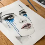
Melting Eye And Makeup Run
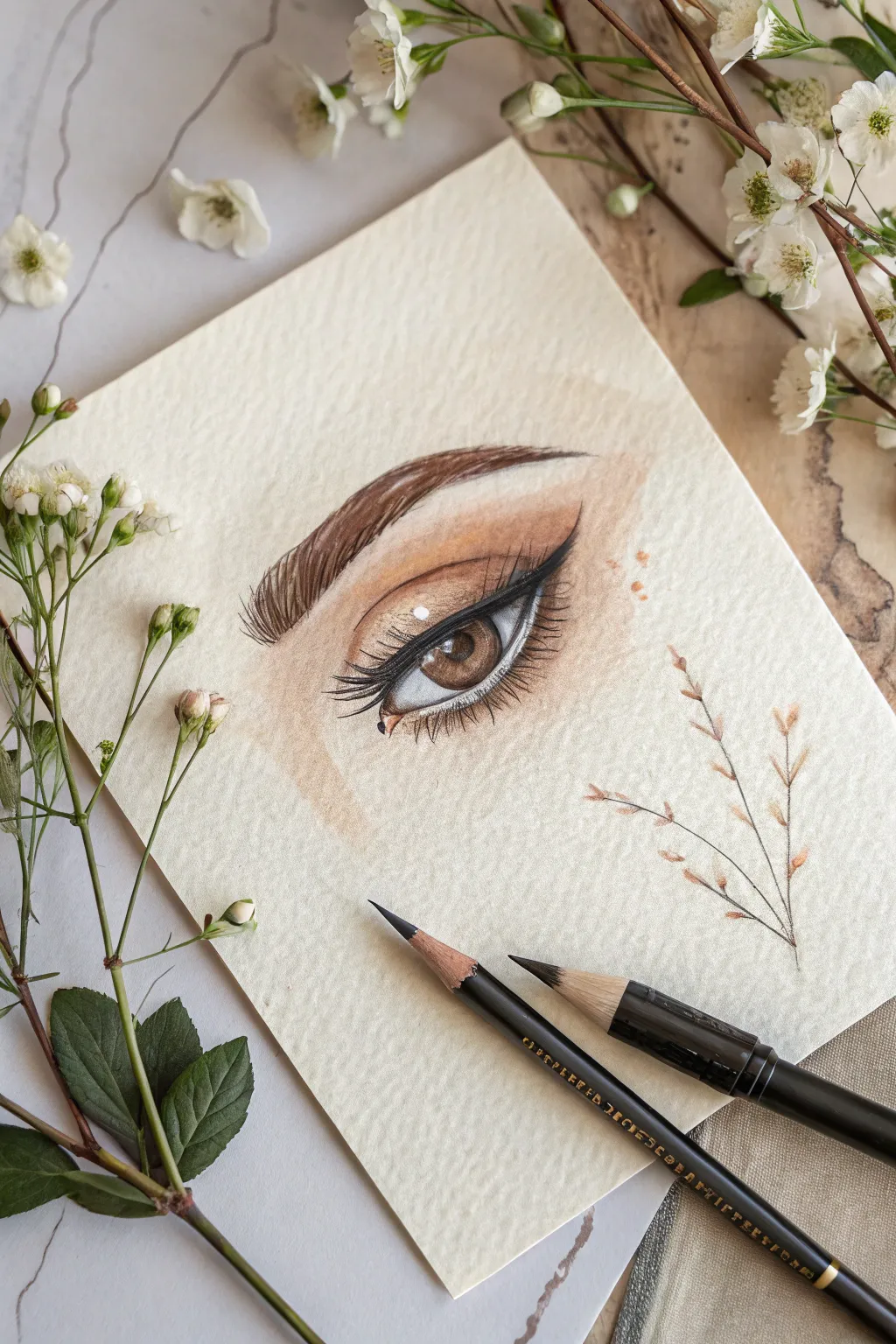
Capture the delicate beauty of a realistic eye with this detailed colored pencil tutorial. You will learn to layer warm skin tones and create depth in the iris, finishing with crisp lashes and a subtle decorative branch accent.
Step-by-Step
Materials
- High-quality colored pencils (earth tones, black, white)
- Textured fine art paper (cream or off-white)
- Graphite pencil (HB or 2B)
- Fine-tip black liner or intensely sharpened black pencil
- White gel pen or white gouache
- Pencil sharpener
- Blending stump or cotton swab
Step 1: Sketching the Framework
-
Outline the eye shape:
Begin by lightly sketching the almond shape of the eye using your graphite pencil. Keep your pressure extremely light so the graphite doesn’t indent the paper or show through later. Mark the position of the iris and the pupil within it. -
Define the crease and brow:
Sketch the arch of the eyebrow well above the eye. Draw a soft, curved line above the eyelid to indicate the crease, which will be crucial for the eyeshadow effect later. -
Map highlight areas:
Before adding any color, lightly circle the areas where the brightest highlights will be on the iris and the tear duct. Preserving the white of the paper here is helpful, though we will enhance it later.
Step 2: Layering Skin & Eyeshadow
-
Lay down basic skin tones:
Using a pale beige or peach colored pencil, gently shade the skin around the eye. Apply this base layer smoothly, avoiding harsh strokes. -
Start the eyeshadow gradient:
Select a warm brown or terra-cotta color. Begin shading the eyelid, starting from the crease and fading downward towards the lash line. This creates the ‘smoky’ base. -
Deepen the crease:
Take a darker brown pencil to deepen the crease line. Blend this upwards slightly to soften the transition, mimicking the look of blended makeup. -
Add warmth under the eye:
Apply a light wash of the terra-cotta shade along the lower lash line. Keep this soft and diffused to give the skin a natural, warm undertone.
Grainy Texture?
If the paper tooth shows through too much white speckling, verify your pencil is sharp and apply multiple light layers rather than one heavy one. Burnishing helps smooth it out.
Step 3: The Iris and Pupil
-
Fill the pupil:
Use your black pencil to color the pupil. Press firmly for a solid, dark black, but be careful not to color over your reserved highlight spot. -
Base color for the iris:
Fill the iris with a medium hazel or light brown shade. Use radial strokes—lines that go from the pupil outward toward the edge of the iris—to mimic the texture of eye muscle fibers. -
Add depth to the iris:
Layer a darker brown around the outer rim of the iris and near the pupil. Leave the middle area slightly lighter to suggest transparency and depth. -
Refine the sclera (white of the eye):
The ‘white’ of the eye isn’t pure white. Lightly shade the corners with a very pale grey or cool cream to give the eyeball a 3D spherical form, leaving the center bright.
Sharpen Up
For realistic eyelashes, rotate your pencil every few strokes to maintain the sharpest possible point. A dull tip makes lashes look thick and clunky.
Step 4: Lashes, Brows, and Details
-
Draw the eyeliner:
Using a very sharp black pencil or a fine liner, draw a crisp eyeliner wing along the upper lash line. Taper it to a sharp point at the outer corner. -
Create the eyebrow hairs:
Switch to a dark brown pencil. Draw the eyebrow hairs using quick, flicking strokes. Follow the natural growth direction: upward at the start, arching over the middle, and downward at the tail. -
Draw top eyelashes:
Sharpen your black pencil to a needle point. Draw long, curved lashes originating from the eyeliner. Ideally, group some lashes slightly together for a natural mascara look. -
Add subtle lower lashes:
Draw shorter, finer lashes along the bottom rim. Space them out more than the top lashes so the look doesn’t become too heavy. -
Apply bright highlights:
Use a white gel pen or a dot of white gouache to place a crisp reflection on the pupil and iris. I also like to add a tiny dot to the tear duct/inner corner to make the eye look wet and alive. -
Sketch the decorative branch:
To match the botanical aesthetic, lightly sketch a thin, branching stem to the right of the eye using a brown pencil. Add tiny, simple leaf shapes at the tips using quick, light strokes. -
Blend out edges:
Finally, assess the skin tone edges. Use a clean portion of paper or a blending stump to feather the edges of the skin coloring so it fades seamlessly into the cream paper.
Step back and admire the soulful depth you have created on the page

Melting Portrait Features
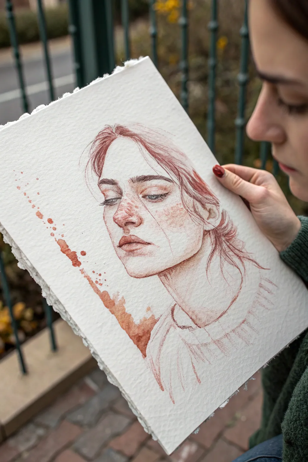
This evocative project combines the classic elegance of a sanguine portrait with a modern, expressive twist. By blending precise facial features with a raw, dissolving splatter effect, you’ll capture both emotion and movement on beautifully textured paper.
Detailed Instructions
Materials
- Heavyweight cold-press watercolor paper (300lb is ideal for texture)
- Sanguine (red chalk) pencils or Conté crayons
- Liquid watercolor or red ink (burnt sienna or terra cotta shade)
- Small round brushes (size 2 and 4)
- Kneaded eraser
- Paper towel or tissue
- Straw (for blowing ink)
- Workable fixative spray
Step 1: Laying the Foundations
-
Prepare your surface:
Begin with a piece of heavyweight watercolor paper. If you want the authentic look from the example, carefully tear the edges of the paper using a ruler or a deckle edge ripper to create that rustic, uneven border. -
Sketch the basic proportions:
Using a very light touch with your sanguine pencil, map out the head shape and neck. Keep your lines incredibly faint so they can be easily adjusted or erased later. -
Define the features:
Lightly place the eyes, nose, and mouth. The subject is looking down and to the left, so ensure the eyelids appear heavy and the nose angle reflects a three-quarter view. -
Establish the hair line:
Sketch the hairline loosely. Don’t draw individual strands yet; just block in the general shapes of the hair sweeping back from the forehead and the bun at the nape of the neck.
Natural Texture
Don’t press too hard when shading skin. Let the grain of the cold-press paper show through the pencil strokes to naturally simulate skin texture without extra effort.
Step 2: Developing the Portrait
-
Deepen the eyes:
Sharpen your pencil to a fine point. carefully detail the iris and pupil, leaving a tiny spot of white paper for the highlight. Add the eyelashes with quick, flicking motions. -
Refine the nose and lips:
shade the underside of the nose to create volume. For the lips, focus on the shadow line between them and the shading on the bottom lip, keeping the upper lip slightly lighter. -
Add facial shading:
Using the side of your pencil or crayon, gently shade the cheekbones, the side of the nose, and the neck. Use your finger or a paper stump to smudge these areas for a soft, skin-like texture. -
Detail the freckles:
This portrait features distinct freckles across the nose and cheeks. Dot these in randomly using a sharp point, varying the pressure so some are dark and distinct while others are faint. -
Render the hair:
Switch to broader strokes for the hair. Follow the growth direction, pressing harder in the shadowed areas near the roots and the bun. Let the hair look a bit messy with loose flyaways. -
Suggest the clothing:
Keep the clothing sketch minimal. Use loose, sketchy lines to suggest the collar and shoulders of a sweater without getting bogged down in texture or patterns.
Fixing Heavy Drips
If a drip runs too far or looks unnatural, quickly blot specifically that spot with a corner of a rolled tissue. Don’t rub, just lift the excess liquid straight up.
Step 3: The Melting Effect
-
Prepare the liquid medium:
Dilute a small amount of your red ink or liquid watercolor so it matches the hue of your sanguine pencil. Test it on a scrap piece of paper first. -
Create the splatter line:
Identify where you want the ‘melting’ line to occur, roughly parallel to the face on the left side. Load a brush with the liquid medium and tap it against your finger to create controlled splatters in a diagonal line. -
Encourage the drips:
While the splatters are wet, tilt your paper vertically. Add a little more water to the largest droplets so gravity pulls them down naturally, creating long, distinct drips. -
Integrate the wash:
I like to take a slightly damp brush and drag some of the pigment from the splatter line toward the bottom left corner, creating a washed-out, stained effect that mimics a shadow or bleeding ink. -
Soften facial edges:
Use a very slightly damp brush to touch a few lines on the face—specifically the hair strands or the sweater lines near the splatter. This helps unify the dry drawing with the wet effects.
Step 4: Final Touches
-
Re-establish contrast:
Once the wet elements are completely dry, go back in with your pencil. Darken the pupils, the nostrils, and the deepest shadows in the hair to bring the pop back into the portrait. -
Add white highlights (optional):
If you lost the highlights in the eyes or on the tip of the nose, you can use a white gouache or a white charcoal pencil to bring them back. -
Seal the artwork:
Sanguine smudges easily. In a well-ventilated area, spray a light coat of workable fixative over the piece to preserve your delicate shading and the sharp edges of the splatters.
This combination of precise drawing and spontaneous splashing results in a deeply soulful piece you can frame with pride
BRUSH GUIDE
The Right Brush for Every Stroke
From clean lines to bold texture — master brush choice, stroke control, and essential techniques.
Explore the Full Guide
Melting Flower Bloom
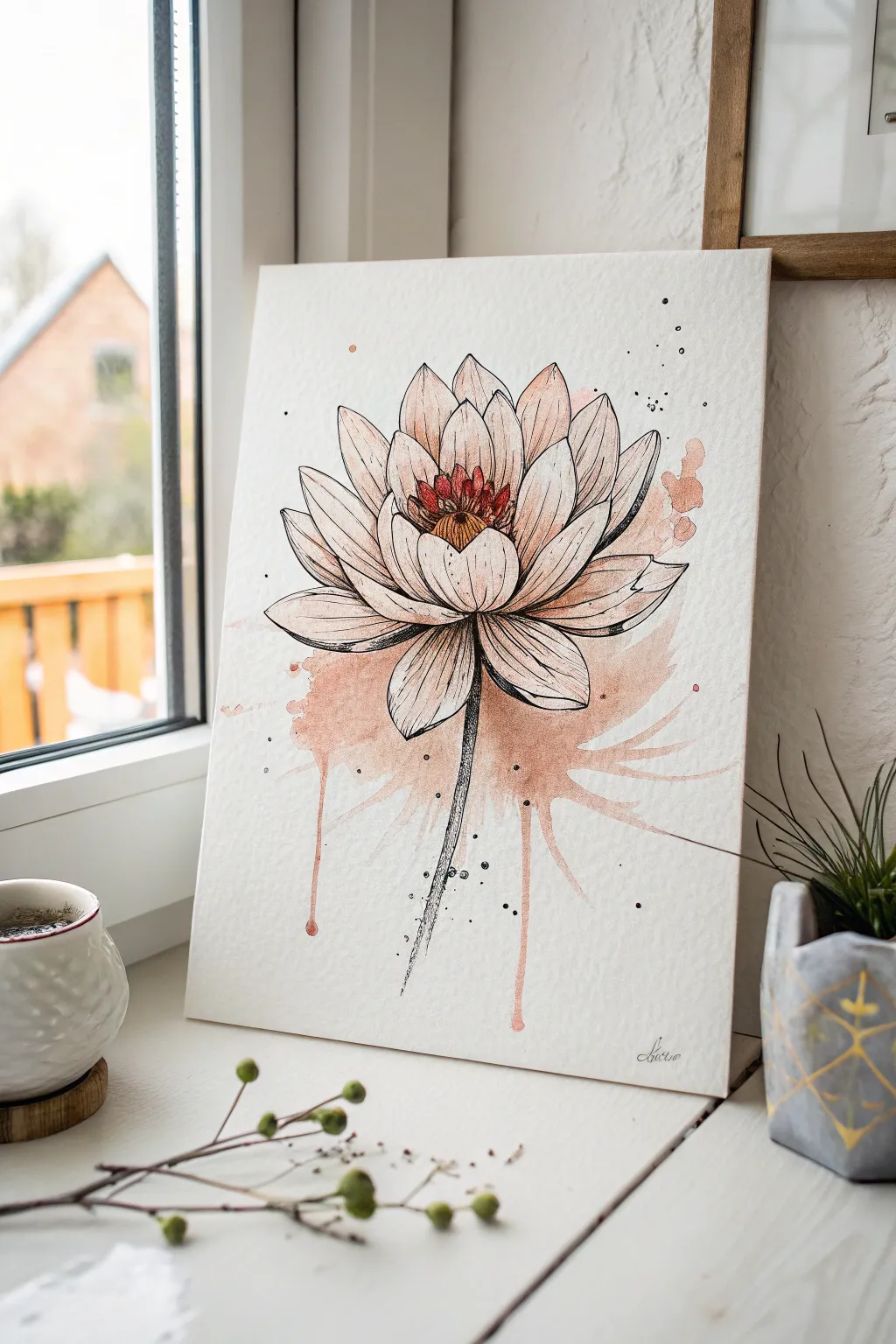
This project combines the delicate precision of botanical line art with the loose, fluid nature of watercolor to create a striking melting effect. The soft peachy-pink hues bleed downwards from the lotus petals, giving the impression that the flower is slowly dissolving onto the paper.
Step-by-Step Guide
Materials
- Cold press watercolor paper (300 gsm)
- Fine liner pens (black, sizes 0.1, 0.3, and 0.5)
- Watercolor paints (Peach, Rose Madder, Burnt Sienna, Yellow Ochre)
- Round watercolor brushes (size 4 and 8)
- Pencil (HB) and kneaded eraser
- Jar of clean water
- Paper towels
Step 1: Sketching the Structure
-
Center Placement:
Begin by lightly sketching a small oval near the upper-middle section of your paper to represent the seed pod of the lotus. Keep your pencil pressure very light so lines can be erased later. -
Inner Petals:
Draw the first layer of petals curving upward and inward around the central pod. These should be shorter and tighter than the outer layers. -
Outer Bloom:
Expand the flower by sketching larger, wider petals that fan outwards. Ensure the petals at the bottom droop slightly to create a sense of weight and openness. -
Stem Line:
Draw a single, slightly curved line extending downwards from the center of the flower base to establish where the stem will be inked later.
Ink Smearing?
Check your pen is waterproof (micron or pigment liner) before painting. If unsure, do a test scribble on scrap paper and wet it. If it bleeds, do all painting first, let dry, then ink last.
Step 2: Inking the Outline
-
Tracing Petals:
Using a 0.3 fine liner, carefully trace over your pencil lines for the petals. Use confident, sweeping strokes rather than short, sketchy ones for a clean look. -
Adding Detail:
Switch to a 0.1 pen to add delicate texture lines inside the petals, starting from the base and flicking the pen upward. This suggests veins and curvature. -
Darkening the Core:
Use a 0.5 pen to darken the crevices between the inner petals and the stamen area, adding depth where shadows would naturally fall. -
Texture the Stem:
Ink the stem using a scribbly, broken line technique rather than a solid line. This adds organic texture and prepares it for the watercolor effects. -
Erase Sketches:
Wait at least 10 minutes for the ink to fully dry, then gently use the kneaded eraser to lift all visible pencil marks.
Step 3: Adding Color and Melt
-
Center Warmth:
Mix a small amount of Yellow Ochre and Burnt Sienna. Paint the central seed pod, dabbing the color in to keep it concentrated. -
Petal Tips:
Dilute a soft Peach color with plenty of water. Lightly wash the tips of the petals, leaving the majority of the petal surface white for a high-contrast look. -
Base Saturation:
Load your size 8 brush with a mix of Peach and Rose Madder. Apply this wet paint generously to the bottom petals and the area just underneath the flower head. -
Creating the Splash:
While the base paint is still very wet, add more water to the paper directly below the flower. Let the pigment naturally bleed down into this wet area. -
The Dops:
To create the distinct ‘melting’ drips, load your brush with watery pigment and touch it to the bottom edge of the wet wash. Tilt your paper vertically so gravity pulls thin streams of paint down. -
Side Splatters:
Flick your brush bristles lightly to add tiny speckles of paint around the main bloom and the melting area. This adds energy and spontaneity to the composition. -
Ink Accents:
Once the paint is completely dry, use your 0.1 pen to add tiny stippling dots rising from the bottom wash, integrating the ink drawing with the watercolor melt.
Controlled Chaos
If the drips aren’t flowing naturally, don’t force them with brush strokes. Instead, add a single drop of clean water to the bottom of the paint puddle and tilt the paper again to encourage flow.
Now you have a beautiful, ethereal botanical piece that perfectly captures movement and stillness
Melted Crayon Rain Backdrop Drawing
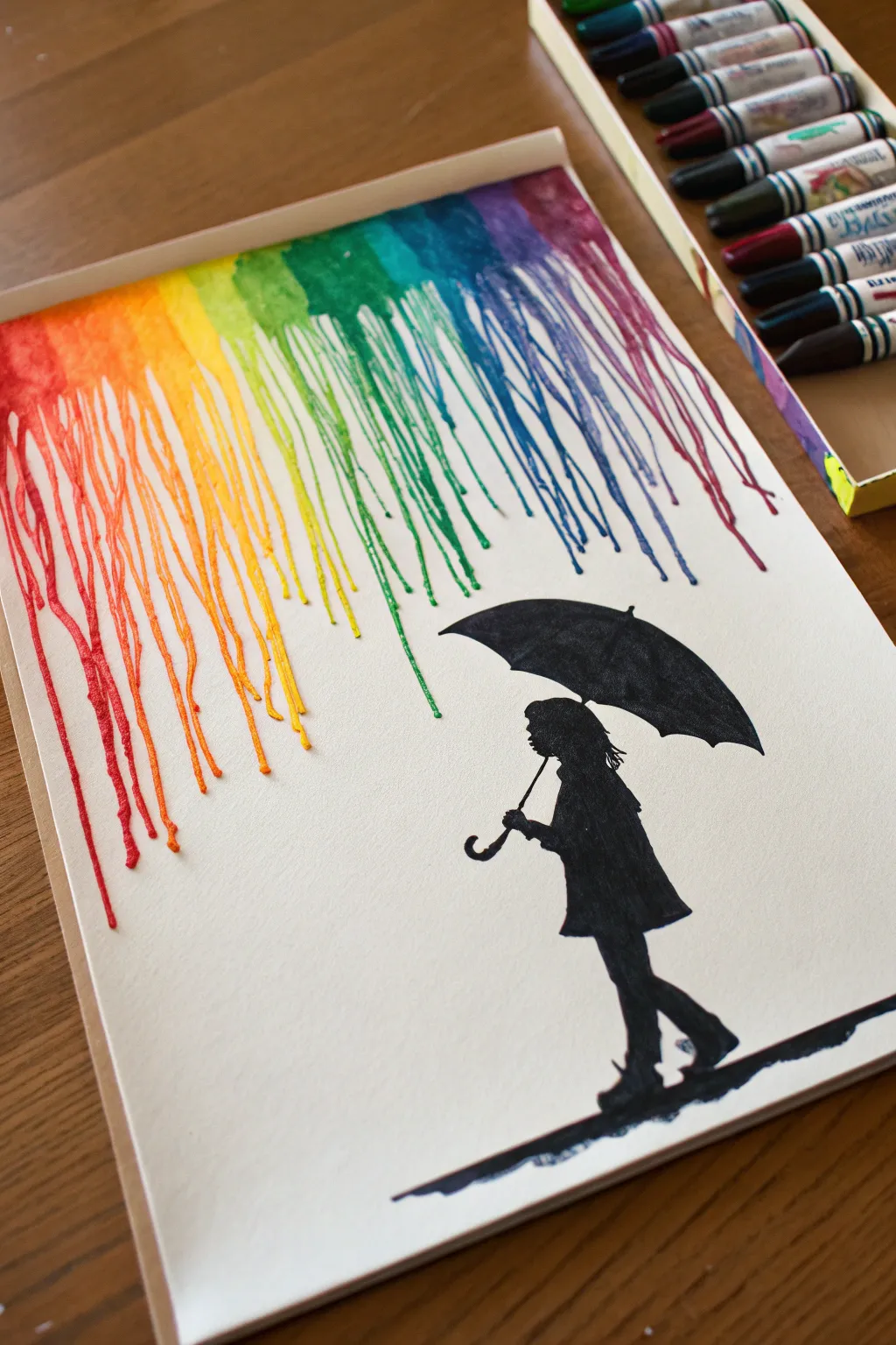
Brighten up a rainy day with this vibrant melted crayon art project that pairs colorful drips with a striking black silhouette. The contrast between the rainbow streaks and the dark figure creates a beautiful moment of shelter from the storm.
Step-by-Step Tutorial
Materials
- White thick drawing paper or canvas panel
- Box of wax crayons (rainbow colors)
- Hair dryer
- Hot glue gun and glue sticks
- Black acrylic paint or black permanent marker
- Fine detail paintbrush
- Pencil
- Protective table covering (newspaper or cardboard)
Step 1: Preparation and Sketching
-
Prepare your workspace:
Cover your table thoroughly with newspaper or cardboard. Melting wax can splatter, and it is difficult to clean off surfaces once it hardens. -
Sketch the silhouette:
Lightly draw the outline of a girl holding an umbrella near the bottom right of your paper. Focus on the shape of the umbrella, making sure its curve is wide enough to ‘catch’ the rain. -
Define the protected area water:
Use a pencil to lightly mark the area directly above the umbrella where the rain shouldn’t fall. This negative space is crucial for the effect to work.
Step 2: Creating the Silhouette
-
Fill in the figure:
Using black acrylic paint and a fine brush, carefully fill in your sketched silhouette. If you are more comfortable with pens, a thick permanent black marker works well here too. -
Paint the ground:
Add a jagged, uneven line of black paint beneath the girl’s feet to represent a wet reflection or shadow on the ground. -
Dry completely:
Let the black paint dry fully before moving on. We don’t want wet paint smearing when we work with the hot wax later.
Heat Control Pro Tip
Don’t hold the dryer too close! Too much air force will spray wax everywhere rather than letting it drip. Patience and low air speed yield the best streams.
Step 3: Preparing the Crayons
-
Select your colors:
Pick out your crayons in rainbow order: Red, Orange, Yellow, Green, Cyan/Blue, Dark Blue, Purple, and Magenta. -
Peel the wrappers:
Remove the paper wrappers from the crayons you intend to use. You can do this by soaking them in warm water for a few minutes if they are stubborn. -
Glue the crayons:
Using a hot glue gun, affix the crayons in a horizontal line across the very top edge of your paper or canvas. Make sure the pointed tips are facing downward.
Drip Direction Help
If wax creates a puddle instead of running, your board isn’t vertical enough. Tip it up straighter so gravity can pull the heavy wax down the paper.
Step 4: Melting the Rain
-
Set up your angle:
Prop your artwork up vertically. You can lean it against a wall (protected by cardboard) or use an easel. Gravity is essential for this step. -
Begin heating:
Turn your hair dryer to the high heat, low air setting. Aim it at the center of the crayons at the top, holding it a few inches away. -
Control the flow:
As the wax begins to liquefy and drip, move the hair dryer slowly back and forth across the line of crayons. -
Direct the streams:
I like to use the air direction to push the wax streams straight down. If the wax starts drifting sideways, adjust your dryer angle to correct it. -
Mind the umbrella:
When the drips get close to the umbrella, be very careful. You want the drips to stop naturally or divert around it. You can tilt the canvas slightly to steer flows away from the black silhouette. -
Create varying lengths:
Allow some drips to run all the way to the bottom of the page, while letting others stop midway. This variation creates a more realistic rain pattern. -
Cool down:
Once you are happy with the length and density of your rainbow rain, turn off the hair dryer and let the wax cool and harden completely.
Step 5: Finishing Touches
-
Clean up stray wax:
If any wax splattered onto your black silhouette or the white space under the umbrella, gently scrape it off with a fingernail or craft knife once hard. -
Touch up the black:
If scraping removed any paper or paint, do a quick touch-up with your black marker or paint to restore the crisp silhouette.
Display your colorful masterpiece somewhere bright where the texture of the wax can catch the light

PENCIL GUIDE
Understanding Pencil Grades from H to B
From first sketch to finished drawing — learn pencil grades, line control, and shading techniques.
Explore the Full Guide
Melted Wax Burst Around a Shape
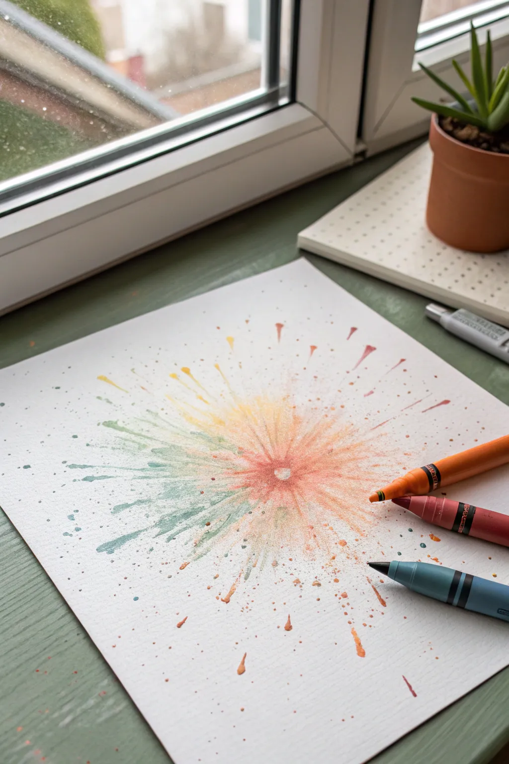
Create a vibrant, energetic burst of color that mimics a firework or a blooming flower using nothing but crayons and heat. This technique leaves a mesmerizing negative space in the center, giving your artwork a glowing, radiating effect that jumps off the page.
How-To Guide
Materials
- White cardstock or thick mixed-media paper
- Wax crayons (orange, red, yellow, teal/blue)
- Hairdryer or embossing heat gun
- Pencil
- Small round object (like a coin or bottle cap) for tracing
- Protective table covering (newspaper or craft mat)
- Paper towels
- Old cheese grater or pencil sharpener
Step 1: Preparation & Planning
-
Protect your workspace:
Before starting, cover your table with newspaper or a craft mat. Melted wax can travel quickly when blown by air, so ensure your surface is safe from splatters. -
Create the central mask:
Place your small round object in the center of your paper. Trace a light circle around it with a pencil to mark your ‘negative space’ zone. -
Prepare the wax shavings:
Select your crayon colors. A warm palette (reds, oranges, yellows) combined with a contrasting cool tone (teal) works beautifully. Peel the paper wrappers off the crayons. -
Shave the crayons:
Using a pencil sharpener or an old cheese grater, create fine shavings of each crayon color. Keep the colors in separate little piles for now so you can control the mixing later.
Step 2: Arranging the Wax
-
Place the center barrier:
Put the round object (coin or cap) back onto the penciled circle. This physical barrier prevents wax from entering the center, creating that crisp white heart. -
Apply the first color layer:
Sprinkle the orange and red wax shavings closest to the central object. Pile them slightly higher right against the edge of the object. -
build the gradient:
Moving outward from the red/orange ring, sprinkle your yellow shavings. Let them overlap slightly with the orange to encourage blending. -
Add the cool contrast:
On one side of the burst or interspersed near the edges, sprinkle the teal or blue shavings. This asymmetry adds visual interest and depth to the explosion. -
Dust the outer edges:
Scatter a few tiny specks of wax further out toward the edges of the paper. These will become the faint splatter marks that make the explosion look realistic.
Too Much Air?
If your wax shavings are blowing away before they melt, try putting a clear glass bowl over them while heating initially. This creates an oven effect to melt them without air turbulence.
Step 3: Melting & Blowing
-
Pre-warm the wax:
Turn your hairdryer to a low speed and high heat setting. Hold it about 8 inches above the paper to soften the wax without blowing it away immediately. -
Begin the melt:
Once the shavings look glossy and wet, bring the hairdryer closer and angle the nozzle outward from the center. -
Direct the flow:
Aim the airflow so it pushes the liquid wax away from the central object. I often rotate the paper slowly with my other hand to ensure the streaks radiate evenly in all directions. -
Create distinct streaks:
For long, dramatic spikes, hold the dryer close to a pool of melted wax and give it a quick blast of air outward. This forces the pigement into thin, energetic lines. -
Blend the transition zones:
Where the yellow meets the teal, use gentler heat to swirl them slightly, creating soft green transition hues.
Metallic Sparkle
Grate a small amount of a metallic gold or silver crayon into the mix. These heavier pigments often separate slightly, creating stunning glittering veins.
Step 4: Finishing Touches
-
Add splatter details:
If the outer area looks too clean, take a crayon and hold it directly under the hot air stream. Tap the crayon to flick tiny droplets of melted wax onto the empty spaces. -
Let it cool:
Allow the wax to cool and harden completely. This usually takes only a minute or two. -
Remove the barrier:
Carefully lift figure obstruction object from the center. You should see a pristine white circle surrounded by the dense ring of color. -
Clean up the edges:
If any wax seeped under the object, you can gently scrape it away with a craft knife or fingernail to sharpen the center circle. -
Final inspection:
Check for any large clumps of wax that didn’t melt fully. If you find them, give them a targeted blast of heat to flatten them into the paper texture.
Hang your finished burst near a window to let the natural light illuminate the waxy textures
Melting Object Into Geometric Blocks
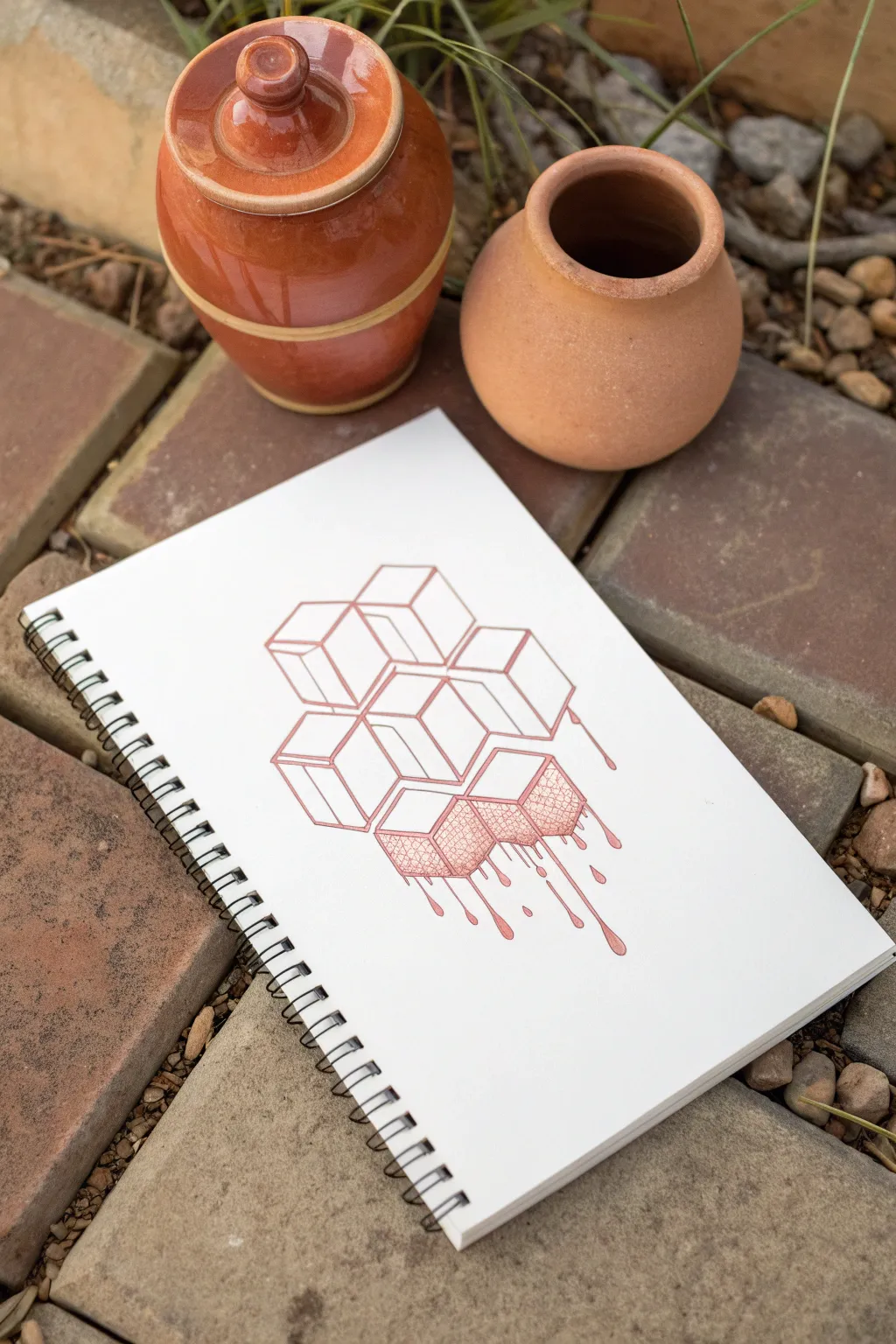
This fascinating optical illusion blends the rigid structure of isometric geometry with the organic flow of melting liquid. By combining clean architectural lines with dripping effects and texture, you’ll create a surreal floating block formation.
Step-by-Step
Materials
- A4 Spiral-bound sketchbook (heavyweight paper preferred)
- Terra cotta or sepia fineliner pen (0.3mm or 0.5mm)
- Matching colored pencil (optional, for shading)
- Ruler
- Pencil (HB or 2H for guidelines)
- Eraser
- 30-60-90 triangle (optional but helpful for isometric angles)
Step 1: Constructing the Isometric Grid
-
Establish the vertical axis:
Begin by drawing a faint vertical line in the center of your page using your pencil and ruler. This will serve as the central spine for your cube stack. -
Draw the ‘V’ shape:
From a central point on your vertical line, draw two lines angling upwards at 30 degrees to the left and right. This creates the bottom corner of your first central cube. -
Form the first cube:
Complete the first isometric cube by adding vertical lines on the sides and closing the top diamond shape. Keep your pencil pressure very light so these can be erased later. -
Build the honeycomb stack:
Add adjacent cubes to your central one. Build upwards and outwards, staggering them so they nestle together like honeycomb cells. Aim for a roughly diamond-shaped cluster of about 6-7 cubes. -
Refine the perimeter:
Decide which cubes are in the ‘front’ and which are tucked behind. Erase the internal overlapping lines so that the stack looks like a solid, fused mass rather than transparent wireframes.
Don’t connect everything
When drawing the drips, leave small gaps in the vertical lines occasionally. This breaks the solidity and mimics the way light hits a moving, translucent liquid.
Step 2: Inking the Structure
-
Outline the top blocks:
Switch to your terra cotta fineliner. Carefully trace the pencil lines for the uppermost cubes first. Use the ruler here to ensure these lines stay razor-sharp and architectural. -
Ink the middle section:
Work your way down to the middle row of cubes. Continue using the ruler, but stop your lines slightly short where they will meet the ‘melting’ section at the bottom. -
Freehand the melting edges:
For the bottom-most cubes, discard the ruler. Trace the vertical edges but let them wobble slightly as they descend, suggesting the rigid material is softening. -
Create the drips:
extend the vertical lines of the lowest cubes downward into long, viscous drips. Add rounded teardrop shapes at the ends of these lines to show gravity pulling the liquid down. -
Add secondary drips:
Draw a few disconnected droplets falling below the main melt to create a sense of movement. Vary their sizes for a more natural look.
Try a gradient melt
Shift colors as the object melts. Start with rigid blue cubes at the top and transition to purple or pink ink for the melting bottom section.
Step 3: Texturing and Details
-
Erase guidelines:
Once the ink is completely dry—give it a few minutes to be safe—gently erase all the graphite pencil marks underneath. -
Texture the melting faces:
Focus on the side faces of the melting cubes. I like to use a cross-hatching technique or tight stippling here. This differentiates the ‘melting’ texture from the smooth, solid cubes above. -
Detail the drip connections:
Where the drips detach from the block, add tiny curved lines or small dots at the separation point to simulate the surface tension of a thick liquid. -
Add gentle shading:
Using the same pen or a matching colored pencil, add very light hatching to the right-hand side of all cubes to establish a consistent light source coming from the top left. -
Thicken the outer contour:
Go over the outermost perimeter line of the entire shape one more time to thicken it slightly. This pops the drawing off the page. -
Final inspection:
Check your drip tips; if they look too flat, add a tiny curved line inside the bottom of the drop to suggest volume and reflection.
Now you have a striking piece of geometric art that playfully defies physics
Have a question or want to share your own experience? I'd love to hear from you in the comments below!