
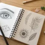
If you’ve ever wanted your art to say something without using a single spoken word, ASL-inspired drawings are such a beautiful place to play. I love how hand signs can turn into symbols, patterns, and whole little stories on the page.
ASL Alphabet Reference Grid
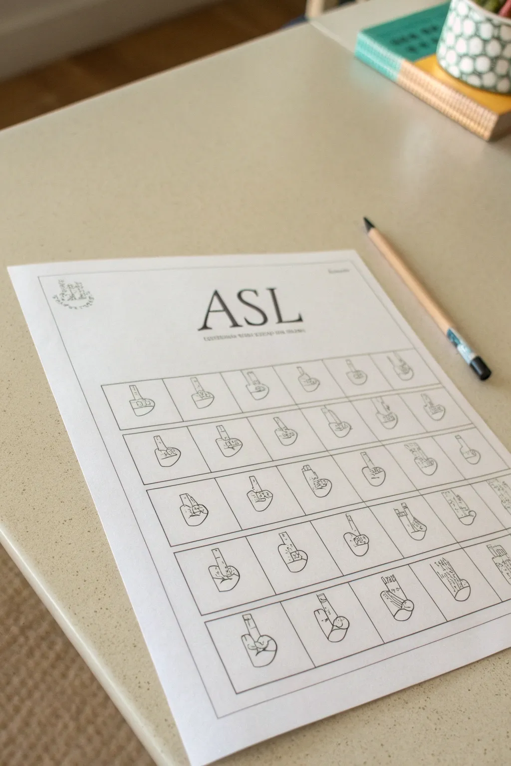
This project involves creating a clean, organized reference sheet for the American Sign Language alphabet using simple line art. The result is a helpful study tool or minimalist poster featuring a neat grid of hand signs in black ink.
Detailed Instructions
Materials
- White cardstock or heavy drawing paper (8.5 x 11 inches)
- Ruler
- Pencil (HB or H for light sketching)
- Fine-point black ink pen (0.3mm or 0.5mm)
- Eraser
- Computer and printer (optional for layout)
- Reference images of ASL alphabet signs
Step 1: Setting Up the Grid
-
Define the layout:
Decide on the dimensions of your grid. Accurately measure the available space on your paper, leaving a generous margin at the top for the title and smaller margins on the sides. -
Calculate box sizes:
For a standard alphabet, you will need at least 26 spaces. A grid of 5 columns by 6 rows works well (providing 30 spaces total), or you can adjust to fit your paper shape. -
Draw the grid lines:
Using your ruler and a very light pencil touch, draw the horizontal and vertical lines to create the boxes. Ensure they are evenly spaced. I usually double-check my measurements before drawing the final lines. -
Add the title:
At the top center of the page, sketch the letters ‘ASL’ in a serif font. Use the ruler to ensure the letters sit on the same baseline and have consistent height. -
Ink the structure:
Go over your pencil grid and title letters with the black ink pen. Use the ruler for the straight grid lines to keep them crisp. Let the ink dry completely before erasing any stray pencil marks.
Clean Lines
Keep a piece of scrap paper under your drawing hand. This prevents oils from your skin transferring to the paper and stops lead or ink from smudging as you move across the grid.
Step 2: Sketching the Hands
-
Study the forms:
Look closely at your ASL references. Notice how the fingers overlap and the general shape of the palm for each letter. -
Block in basic shapes:
Starting in the first box with ‘A’, lightly sketch the general volume of the hand using circles for knuckles and ovals for fingers. Don’t worry about details yet. -
Refine the outline:
Darken the correct contour lines. Pay special attention to the negative space between fingers, which helps define the hand shape more clearly than just drawing the fingers themselves. -
Add identifying details:
Sketch in fingernails, crease lines on the palm, and the thumb position. These small details are crucial for distinguishing similar signs. -
Proceed through the alphabet:
Continue this process for each box, moving from left to right. Keep the scale consistent so no single hand looks significantly larger or smaller than its neighbors. -
Check for consistency:
Step back periodically to ensure the style remains uniform. If you are using a simplified cartoon style, make sure realistic shading doesn’t creep in.
Digital Hybrid
Draw the hands on paper, then scan them. Use software to arrange them into a perfect digital grid, add a typed font, and print multiple copies for a classroom or study group.
Step 3: Inking and Finishing
-
Trace the hand outlines:
Switch back to your fine-point pen. Carefully trace over your refined pencil sketches. Use confident, continuous strokes rather than short, scratchy ones. -
Add detail lines:
Inking the fingernails and palm creases requires a lighter touch. You might want to break the line slightly on creases to suggest skin folds rather than rigid cuts. -
Fill overlapping areas:
Where fingers curl over the palm (like in ‘A’, ‘E’, or ‘S’), ensure the lines clearly clearly show which part is in the foreground. -
Let ink cure:
Allow the drawing to sit untouched for at least 15 minutes. Smudging wet ink at this stage is heartbreaking, so patience is key. -
Final clean up:
Gently erase all remaining pencil sketches. Brush away the eraser crumbs carefully to avoid crinkling the paper. -
Optional labeling:
If desired, write the corresponding English letter in the corner of each box using a small, neat print font.
Now you have a handmade, aesthetically pleasing guide to start practicing your spelling skills

Fingerspell Your Name Banner
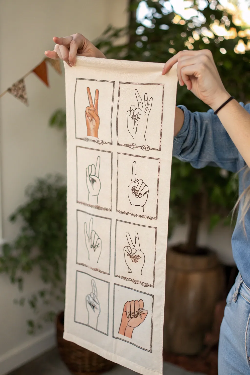
Celebrate identity and language with this minimalist vertical banner featuring hand-drawn American Sign Language illustrations. This customizable wall hanging uses simple line art on fabric to create a meaningful piece of decor that spells out a name or special word using ASL handshapes.
Step-by-Step Tutorial
Materials
- Heavyweight cream canvas or cotton duck fabric (approx. 10″ x 24″)
- Fabric markers (fine tip black for outlines, skin tones for coloring)
- Pencil and eraser
- Ruler or quilting square
- Iron and ironing board
- Fabric glue or sewing machine with cream thread
- Wooden dowel (12″ wide) and cotton hanging cord (optional for finishing)
Step 1: Fabric Preparation & layout
-
Cut and hem:
Cut your canvas to the desired size, adding an extra inch on all sides for hemming. Fold the raw edges back 1/2 inch, press them flat with an iron, and either stitch them down or use fabric glue for a no-sew finish. -
Create the grid:
Using a ruler and a light pencil, lightly sketch a grid of eight rectangles arranged in two columns. Leave about an inch of breathing room between the boxes and slightly wider margins on the outside edges. -
Draft the frames:
Go over your pencil rectangles again to ensure they are straight. You can add a decorative element now by drawing a double line for each frame border or adding small floral details at the corners, as seen in the inspiration piece.
Smooth Lines
Tape your fabric to a hard board before drawing. Fabric tends to shift, and taping it taut ensures your marker lines remain crisp and don’t skip.
Step 2: Drawing the Handshapes
-
Plan your letters:
Decide on the name or word you want to spell. In this banner, there are eight spaces—perfect for a name like ‘VICTORIA’ or a phrase. If your word is shorter, you can fill extra spots with decorative motifs or leave them blank. -
Get references:
Pull up reference images for the ASL manual alphabet. Look specifically for line-drawing styles to match the minimalist aesthetic. -
Sketch the hands:
With your pencil, lightly sketch the hand shape for each letter inside its corresponding box. Focus on the main contours first—the position of the palm and the extended fingers. -
Refine the details:
Go back into your sketches and add the necessary details like fingernails, creases in the knuckles, and the wrist lines. Keep the lines clean and simple.
Step 3: Inking & Coloring
-
Outline the frames:
Take your fine-tip black fabric marker and carefully trace over the rectangular frames. I find that breaking the line slightly in a few places gives it a lovely, organic hand-drawn feel rather than a rigid mechanical look. -
Outline the hands:
Trace your pencil sketches of the hands with the black marker. Use confident, steady strokes. If drawing the small floral details at the bottom of the frames, ink those now as well. -
Erase pencil marks:
Once you are absolutely certain the ink is dry (give it at least 15 minutes), gently erase the underlying pencil grid and sketch lines so the fabric looks clean. -
Add selective color:
Choose two or three hand shapes to color in fully, creating a focal point. Use skin-tone fabric markers to fill these specific hands, layering the color slightly at the knuckles for shading. Leave the rest as striking black-and-white line art. -
Highlight details:
If you added floral elements to any hands or borders, add a tiny touch of muted color to them, or keep them black for higher contrast.
Stitched Texture
Instead of drawing the frame borders with a marker, embroider them with dark brown embroidery floss using a simple backstitch for added texture.
Step 4: Finishing Touches
-
Heat set the ink:
Follow the instructions on your fabric markers to heat set the design. Usually, this involves ironing the back of the fabric for a few minutes to lock in the color. -
Create the casing:
Fold the top edge of the banner backward about 1.5 inches to create a loop for the dowel. Stitch across or glue the edge down, leaving the sides open. -
Assembly:
Slide your wooden dowel through the top casing and tie your cotton cord to both ends of the dowel for hanging.
Hang your personalized banner in an entryway or bedroom to welcome guests with a unique visual language


Classic ASL Words Flashcard Set
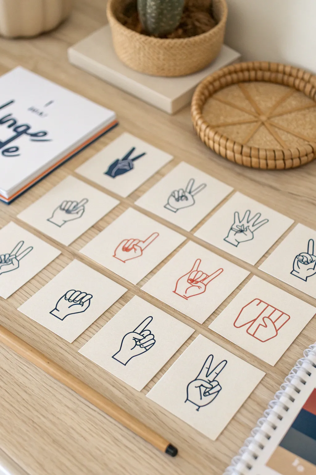
These elegant, minimalist flashcards feature clean line art of American Sign Language gestures, perfect for learning the basics in style. The project focuses on recreating the precise, graphic look using simple ink or marker lines on square cardstock.
Step-by-Step
Materials
- Heavyweight white or cream cardstock (smooth finish)
- Paper trimmer or scissors
- Ruler
- Pencil (HB or 2H)
- Eraser (kneaded preferred)
- Fine-liner pens or markers (Navy blue and muted orange/terra cotta)
- ASL reference chart
- Light table or bright window (optional for tracing)
Step 1: Preparing the Base
-
Measure and Cut:
Begin by deciding on the size of your cards. A 4×4 inch square is a comfortable size that allows for clear details without being overwhelming. Use a ruler to mark a grid on your cardstock. -
Trim the Cards:
Using a paper trimmer to ensure perfectly straight edges, cut out your twelve square cards. If I’m using scissors, I double-check my lines to keep the corners crisp. -
Organize Your References:
Select twelve ASL hand signs you want to draw. These can be letters, numbers, or simple words like ‘love’ or ‘peace’. Arrange your reference images nearby.
Fixing Shaky Lines
If a line wobbles, don’t try to redraw it. Instead, thicken the entire line slightly to hide the mistake. Consistency is key.
Step 2: The Sketching Phase
-
Identify Basic Shapes:
Look at your first hand reference. Break the complex hand shape into a simple palm square and cylinders for fingers to get the proportions right. -
Light Pencil Sketch:
With a very light hand, sketch the outline of the hand on the center of the first card. Keep the pressure minimal so the graphite doesn’t groove the paper. -
Refine the Contours:
Go over your rough shapes to define the final outline. Pay attention to where lines overlap at the knuckles to imply depth without shading. -
Add Key Details:
Draw in the essential details like fingernails or creases near the thumb. Keep these minimal; the style relies on clean, unbroken lines rather than realistic shading. -
Check Composition:
Before moving to ink, ensure the drawing feels centered and balanced within the square white space. Erase and adjust if the hand feels too high or low.
Level Up: Corner Rounding
Use a corner-rounding punch on your finished cards. It gives them a professional ‘playing card’ feel and prevents bent corners.
Step 3: Inking and Finishing
-
Choose Your Palette:
Decide which signs will be blue and which will be orange. Alternating colors creates a nice rhythm if you plan to display them together. -
Test Your Pens:
On a scrap piece of the same cardstock, test your markers to ensure they don’t bleed or feather. You want a consistent, solid line. -
Begin Inking:
Start tracing over your pencil lines with your chosen color. Use a steady, confident stroke. It’s often better to pull the pen toward you rather than pushing it away. -
Handle Intersections:
When lines meet (like between fingers), lift the pen cleanly to avoid ink pooling, which creates dark spots. -
Focus on Line Weight:
Try to keep the line width uniform throughout the drawing. This monoline style gives the cards their cohesive, modern graphic look. -
Let it Set:
Once the inking is complete, wait at least 15-20 minutes. The ink needs to be bone-dry before you touch it with an eraser. -
Erase Guidelines:
Gently erase the underlying pencil sketches. Hold the card down firmly with one hand while erasing to prevent the paper from buckling or crinkling. -
Inspect and Clean:
Brush away eraser crumbs and check for any gaps in your lines that might need a tiny touch-up, but be careful not to overwork it.
Now you have a beautiful set of handmade flashcards ready for study or framed display


Hello Sign Character Portrait
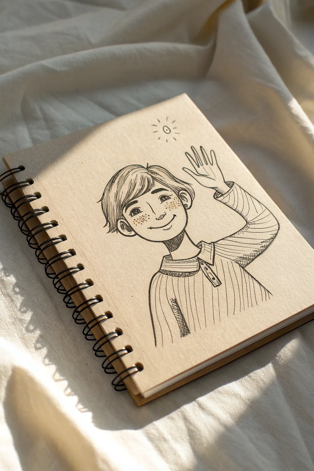
Capture the friendly warmth of a simple greeting with this charming character portrait. Using clean ink lines on kraft paper, you’ll create a welcoming personality waving hello under a bright little sun.
How-To Guide
Materials
- Spiral-bound kraft paper sketchbook (A5 or similar size)
- HB or 2B graphite pencil
- Kneaded eraser
- Fine liner pen (01 or 03 size, black ink)
- Brush pen or thicker marker (black) for fills
- White gel pen (optional, for highlights)
Step 1: Pencil Underdrawing
-
Head structure:
Begin by lightly sketching a rounded shape for the head. It’s not a perfect circle; think of a slightly wide oval to allow room for the cheerful cheeks. -
Facial guidelines:
Draw faint cross-hairs on the face to mark where the eyes and nose will sit. The horizontal eye line should be about halfway down the face, curved slightly upward to suggest the head is tilting back. -
Body basics:
Sketch the neck extending down from the jawline, leading into a simple collar shape. Map out the torso and the raised arm. The arm bends at the elbow, positioning the hand near the head for a casual wave. -
Hand construction:
Block out the palm and fingers. The palm is open and facing the viewer. Sketch the fingers extended upwards but slightly relaxed—they shouldn’t look stiff or rigid. -
Hair volume:
Outline the hair shape. Start from the crown and sweep bangs across the forehead to the left, tucking the hair behind the ear on the right side.
Ink Confidence
Don’t connect every single line perfectly. Leaving tiny gaps, especially in hair or fabric texturing, keeps the sketch looking lively and breathable and less stiff.
Step 2: Inking the Face and Hair
-
Defining the eyes:
Switch to your fine liner. Draw the upper eyelids with a thicker line to suggest lashes, then draw the irises looking towards the viewer. Add small eyebrows above them that arch gently for a happy expression. -
Nose and smile:
Ink a small, unobtrusive nose bridge. Below that, draw a long, curved smile line with tiny perpendicular ticks at the ends to emphasize the cheeks pushing up. -
Ear detail:
Outline the visible ear on the right. Add a small stud earring for a touch of character detail. -
Hair texture:
Ink the hairline using sweeping strokes. Instead of outlining every single strand, group the hair into chunks, using lines that follow the flow of the hair style from the part to the ends. -
Freckles:
Dot a few clusters of freckles across the cheeks and bridge of the nose. Keep the dots random in size and spacing for a natural look. -
Neck shadow:
Draw the neck lines. Add a patch of hatching (closely spaced parallel lines) or cross-hatching right under the chin to create a distinct shadow that separates the head from the neck.
Add ASL Context
Turn this into an ASL learning tool by drawing a small diagram in the corner showing the specific hand movement arrows for the sign “Hello” or “Good Morning”.
Step 3: Clothing and Finishing Touches
-
Collar detail:
Outline the shirt collar. Add a decorative striped pattern to the interior of the collar band to give the garment some texture. -
Shirt outlines:
Ink the shoulders and the rest of the shirt. Include the visible button placket down the center of the chest. -
Clothing texture:
Use vertical lines to create a ribbed or pinstripe texture on the shirt. These lines shouldn’t be perfectly straight; let them curve slightly with the fabric folds. -
Arm shading:
On the raised arm, particularly the lower section and elbow crease, add hatching lines to indicate folds in the fabric and shadow areas. -
Inking the hand:
Carefully trace your pencil sketch for the hand. Define the fingers clearly, leaving small gaps where the skin creases at the knuckles. -
The sunshine:
Above the character’s head, draw a small, uneven circle with short radiating lines to represent the sun, reinforcing the cheerful mood. -
Clean up:
Wait a few moments for the ink to dry completely. Gently erase all remaining pencil guidelines with your kneaded eraser. -
Final depth:
I like to go back in with a slightly thicker pen to reinforce the outer contour lines of the character, making them pop against the background paper.
Now you have a friendly inked character ready to greet anyone who opens your sketchbook

PENCIL GUIDE
Understanding Pencil Grades from H to B
From first sketch to finished drawing — learn pencil grades, line control, and shading techniques.
Explore the Full Guide
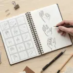
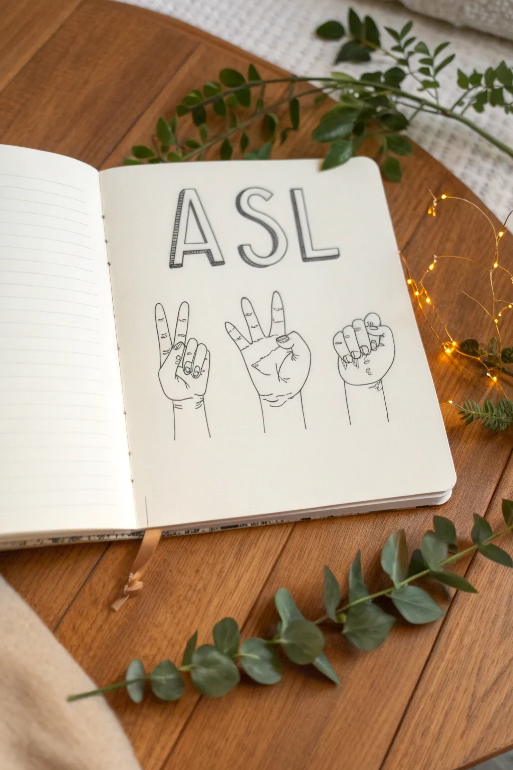
ASL Numbers 1–10 Study Page
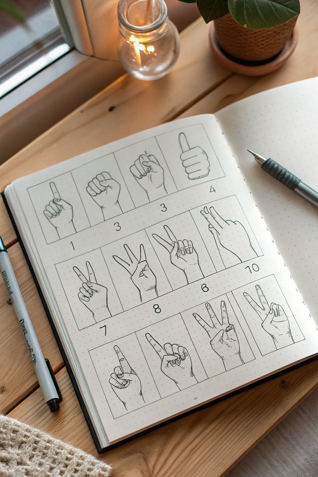
Master the art of hands with this clean, study-focused bullet journal spread featuring American Sign Language numbers. The layout uses simple grid lines and crisp ink work to create a beautiful and functional reference page.
Step-by-Step Tutorial
Materials
- Dotted or grid bullet journal notebook
- Pencil (HB or mechanical)
- Ruler
- Fine liner pen (0.3mm or 0.5mm, black)
- Eraser
- Reference images for ASL numbers
Step 1: Setting Up the Grid
-
Define the layout:
Start by counting the dots on your page to determine spacing. You will need three rows of rectangular boxes. The top row needs four boxes, while the middle and bottom rows will house signs for 7, 8, 6, 10 and three other variations not strictly 1-10 in order, so plan for roughly 12 boxes total in a 4×3 grid. -
Draft the boxes:
Using your ruler and pencil, lightly draw the main horizontal and vertical lines to create your grid. Leave a small margin of white space (about 1-2 dot grid squares) between the rows to allow room for writing the numbers later. -
Verify sizing:
Check that each box is large enough to contain a hand drawing without feeling cramped. A 5×7 dot grid area per box usually works well for this level of detail.
Step 2: Penciling the Hand Shapes
-
Block in basic shapes:
Before drawing fingers, look at the palm and overall hand shape. Sketch a rough square or oval for the palm in each box using very light pencil strokes. -
Sketch the ‘1’ sign:
In the first box, draw the index finger pointing up. Keep the other fingers curled into a fist. Focus on the distinct curve where the thumb wraps over the folded fingers. -
Draw the fist variations:
For numbers like 10 (which uses a thumbs-up motion) or the closed fist of ‘S’ or ‘A’ often practiced alongside numbers, focus on the knuckles. Draw the distinctive ridges where the fingers fold back against the palm. -
Sketch the open fingers:
For numbers like 3, 4, and 6, draw the extended fingers as cylinders first. Pay attention to the varying lengths—the middle finger is longest, while the pinky is shortest. -
Refine the thumb positions:
The thumb is crucial in ASL readability. For the number 3, ensure the thumb extends out; for 6, 7, 8, and 9 (though the order in the image varies), check exactly which finger the thumb is touching. -
Add wrist details:
Draw the start of the wrist at the bottom of each hand. This grounds the drawing so the hand doesn’t look like it’s floating in space. -
Review proportions:
Step back and look at your sketched hands. Are the fingers too long? Is the thumb too thick? Make adjustments now while it’s still just graphite.
Use Your Own Hand
Struggling with a specific angle? Make the sign with your non-drawing hand and use it as a live model to understand clear knuckle placement and shadows.
Step 3: Inking and Finalizing
-
Ink the frames:
Take your fine liner pen and carefully trace over the grid boxes. Using a ruler here ensures crisp, professional-looking borders. -
Outline the hands:
Switch to freehand for the hands themselves. Trace your pencil lines with smooth, confident strokes. Don’t worry about shaky lines; they add character to the sketch style. -
Add detail lines:
Draw the small creases in the palm, the lines on the knuckles, and the fingernails. These tiny details are what make the hands look realistic rather than like cartoons. -
Number the boxes:
In the spaces you left between the rows or directly under the boxes, write the corresponding number for each sign (1, 3, 4, etc.) in a small, neat serif or sans-serif font. -
Erase guidelines:
Wait until the ink is completely dry—I usually give it at least five minutes to be safe. Then, gently erase all pencil marks, leaving only the clean black ink.
Smudged Ink?
If you accidentally smudge wet ink, turn it into a shadow with hatching lines, or cover it with a small piece of matching paper tape to redraw that section.
Now you have a handy reference guide to help memorize your numbers
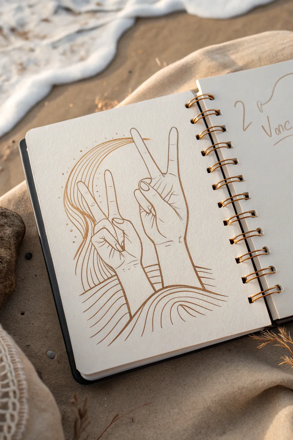
Motion Arrows for Moving Signs
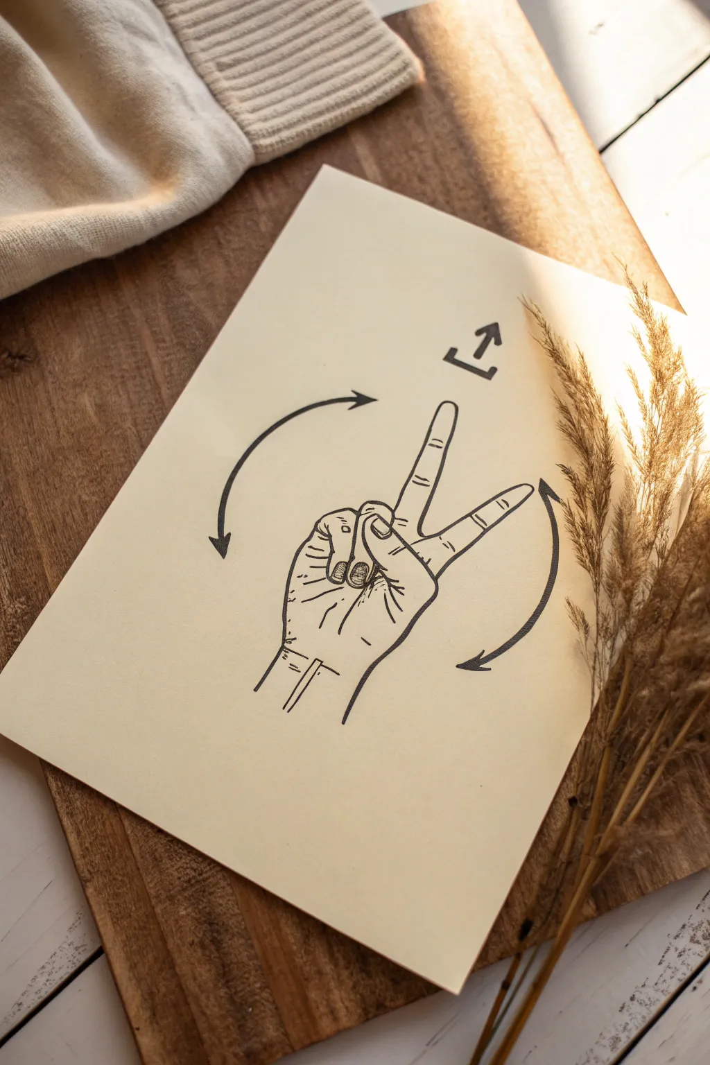
Capture the dynamic nature of American Sign Language with this clean, illustrative project that focuses on movement. You will create a stylized ink drawing of the ‘V’ handshape, accented with bold directional arrows to indicate the sign’s specific motion.
Step-by-Step
Materials
- Cream or off-white cardstock (smooth finish)
- HB pencil
- Kneaded eraser
- Fine liner pen (0.3mm or 0.5mm, black)
- Medium marker or brush pen (black)
- Ruler (optional)
- Reference photo of your own hand
Step 1: Drafting the Handshape
-
Observe your reference:
Start by making a ‘V’ shape with your own hand or looking at a reference photo. Notice how the index and middle fingers extend straight while the ring and pinky fingers curl into the palm, held down by the thumb. -
Block out the palm:
Lightly sketch a rough square or rectangular shape for the palm using your HB pencil. Keep your lines faint so they are easy to erase later. -
Position the extended fingers:
Draw two long, slender ovals extending upward from the palm to represent the index and middle fingers. They should separate slightly to form the distinct ‘V’ shape. -
Detail the folded fingers:
Sketch the curled ring and pinky fingers. In this angle, you mainly see the knuckles and the top joints folding inward toward the palm center. -
Place the thumb:
Draw the thumb crossing over the folded fingers. The tip of the thumb should rest near the first joint of the ring finger, creating a locking mechanism for the closed fingers.
Wobbly Arrows?
If you struggle to draw smooth curves freehand, lightly trace a round object like a bowl or cup with a pencil first to get a perfect arc.
Step 2: Refining and Adding Details
-
Outline the finger joints:
Refine your basic shapes by adding the natural contours of the fingers. Mark the location of the knuckles on the extended fingers with subtle horizontal lines. -
Add fingernails:
Sketch the fingernails on the index and middle fingers. Include the visible thumb nail, noting how it curves around the thumb’s form. -
Draw skin folds:
Add small crease lines at the knuckles and where the thumb presses against the fingers. These small details give the hand a realistic texture. -
Define the wrist:
Extend two lines downward from the palm to create the wrist. You can add a couple of horizontal crease lines at the base of the palm.
Step 3: Inking the Drawing
-
Trace outer contours:
Using your 0.5mm fine liner, carefully trace over your final pencil lines for the main outline of the hand. Use confident, smooth strokes. -
Ink the details:
Switch to a 0.3mm pen if you have one, or just use a lighter touch, to ink the fingernails, knuckle creases, and palm lines. These lines should be thinner than the outline. -
Add shading texture:
I like to add very minimal hatching or stippling near the palm creases and under the curled fingers to suggest depth without over-shading.
Pro Tip: Line Weight
Make the outline of the hand thicker than the internal details (like wrinkles). This creates visual hierarchy and makes the drawing easier to read.
Step 4: Adding Motion Indicators
-
Draft the motion arcs:
Visualize the movement of the sign—a side-to-side oscillation. Lightly sketch two curved arrows on either side of the hand, following the arc the fingers would travel. -
Add the directional icon:
Above the fingers, sketch a small icon representing linear direction if needed, like the ‘upload’ style arrow shown in the example, often used to indicate upward context or orientation. -
Ink the arrows:
Go over your motion lines with the thicker marker or brush pen. The arrows should be bold and dark to clearly distinguish them from the hand illustration. -
Erase pencil guides:
Wait until the ink is completely dry—give it a few minutes to be safe—then gently use the kneaded eraser to remove all underlying pencil sketches. -
Final clean-up:
Check for any gaps in your lines or smudges. You can thicken the outer perimeter of the hand slightly to make it pop off the page.
Now you have a clear, instructional illustration ready to be part of a larger ASL guide or framed as art
BRUSH GUIDE
The Right Brush for Every Stroke
From clean lines to bold texture — master brush choice, stroke control, and essential techniques.
Explore the Full Guide
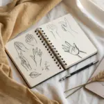
Minimal One-Line ASL Hands
Capture the elegance of hand gestures with this clean, minimalist drawing exercise that focuses on contour and form. Using simple black ink on cream paper creates a striking contrast that highlights the expressive nature of each pose.
Step-by-Step
Materials
- Sketchbook with cream or off-white paper (spiral bound preferred)
- Fine liner pen (black, size 0.3 or 0.5)
- Pencil (HB or 2H for light sketching)
- Kneaded eraser
- Reference photos of hands or a mirror
Step 1: Preparation and Layout
-
Select your poses:
Begin by deciding which four or five hand gestures you want to feature. The example shows a variety: a pointing finger (index up), a ‘peace’ sign (V-shape), a simple pointing gesture, an open palm gesture, and a relaxed hand. Aim for a mix of open and closed finger positions. -
Visual spacing:
Mentally divide your sketchbook page into a grid. You want the hands to float freely with plenty of negative space around them. Imagine placing them in a staggered pattern rather than perfect rows to keep the composition organic. -
Drafting basic shapes:
Using your pencil very lightly, sketch the rough geometric shapes for the first hand—usually a square for the palm and oval guidelines for the fingers. Don’t press hard; these lines will be erased later.
Step 2: Sketching the Gestures
-
Defining the ‘L’ shape (Left):
Start with the hand on the far left. Draw the palm shape first, then extend the index finger upward. Curl the remaining three fingers into the palm and tuck the thumb across them. Focus on the curve where the wrist meets the hand. -
Sketching the ‘Peace’ sign:
Move to the top middle area. Sketch the palm, then extend the index and middle fingers in a V-shape. Ensure the index finger is slightly shorter than the middle one. Curl the ring and pinky fingers down and cross the thumb over them. -
Drawing the upward point:
For the top right hand, draw a vertical pointing gesture. The difference here is the perspective; you see more of the side of the hand. Stack the curled fingers (middle, ring, pinky) tightly so they look like little ridges. -
Forming the bottom open hand:
In the lower left, sketch a hand with fingers together, slightly cupped. The thumb should be separate, creating a wide curve. This looks like a ‘stop’ or ‘flat’ hand shape depending on the angle. -
Creating the bottom ‘V’ variant:
For the final hand in the lower middle, draw another two-finger extension, but keep the fingers closer together or angled differently than the top one to show variety. -
Adding the botanical element:
In the remaining empty space (bottom right), sketch a small sprig of leaves. Draw a central stem that branches out, adding small, pointed oval leaves. This organic shape balances the structural look of the hands.
Uneven Lines?
If a line goes wobbly, don’t try to overwrite it. Instead, reinforce the line slightly to make it look like a weighted shadow, turning a mistake into artistic depth.
Step 3: Inking and Refining
-
Testing your pen:
Before touching the final paper, scribble on a scrap piece to ensure your fine liner is flowing smoothly and isn’t dried out. -
Tracing the first outline:
Choose one hand to start with. With a steady hand, trace over your pencil lines. I prefer to pull the pen toward me for straighter lines on the fingers. -
Handling creases and folds:
Don’t outline every single wrinkle. Use small, disconnected lines to suggest knuckles or the fold of the palm. Less is more here—just a tiny tick mark is often enough. -
Detailing the fingernails:
Add the fingernails on extended fingers. Draw them as soft, rounded rectangles or simple curves near the fingertips. This tiny detail instantly adds realism and orientation to the fingers. -
Inking the plant:
Go over the botanical sketch. Use slightly quicker, looser strokes for the leaves to make them feel natural and less rigid than the hands. -
Adding wrist definitions:
At the base of each hand, draw a small horizontal curve or a few dashed lines to suggest the wrist or a sleeve cuff, grounding the drawing so the hand doesn’t look like it’s floating aimlessly. -
Rest and dry:
Let the ink sit for at least 5 to 10 minutes. If you erase too soon, the fresh ink will smudge and ruin the crisp aesthetic. -
Cleanup:
Once the ink is completely dry, take your kneaded eraser and gently lift off the graphite guidelines. Rub in circular motions to avoid crumpling the paper.
Use Your Own Hand
Struggling with proportions? Take a photo of your own hand in each pose with your phone, then use that referencing the exact angle you want to draw.
Now you have a sketchbook page filled with expressive, minimalist hand studies ready to be admired
Rainbow Outline Hand Signs
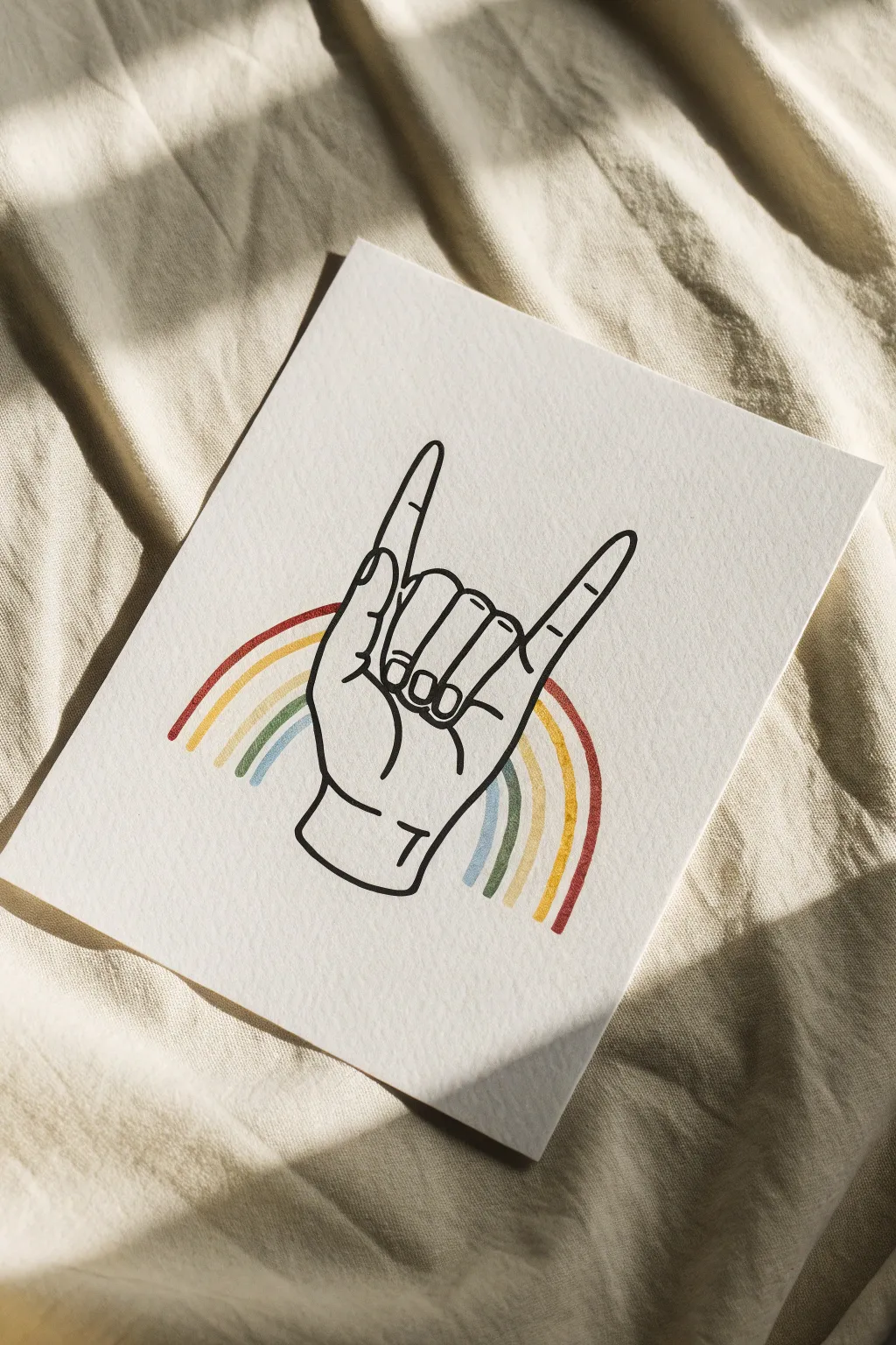
This minimalist art piece combines the clean aesthetic of black line work with a cheerful pop of color. The iconic ASL “I Love You” sign takes center stage, framed by a soft, muted rainbow that adds warmth without overwhelming the design.
How-To Guide
Materials
- Heavyweight textured art paper (watercolor or mixed media paper)
- Black fineliner pens (0.5mm and 0.8mm)
- Pencil (HB or 2H)
- Eraser (kneaded preferred)
- Colored markers or watercolor pens (red, orange, yellow, green, blue)
- Ruler (optional)
- Drafting masking tape (optional)
Step 1: Planning and Sketching
-
Paper selection:
Choose a heavyweight paper with a bit of tooth or texture. This adds character to the final piece and prevents the ink from bleeding too much. -
Rough layout:
Lightly sketch a central vertical axis on your paper to help center the hand. -
Hand structure sketch:
Start by sketching a basic rectangle for the palm area. Above it, lightly mark the positions for the extended index and pinky fingers, keeping them angled slightly outward. -
Defining the fingers:
Flesh out the shapes of the fingers. The thumb should extend outwards to the left. The middle and ring fingers need to be drawn folded down against the palm. -
Detailing the hand:
Refine the sketch by adding the wrist lines at the bottom. Use your own hand as a reference to get the knuckles and nail placements looking natural. -
Rainbow placement:
Lightly sketch two horizontal lines extending from the sides of the hand—one near the thumb and one near the pinky knuckle area—to serve as guides for where the rainbow starts and ends. -
Sketching the arc:
Draw the rainbow arches behind the hand. The lines should ‘pass through’ the hand mentally, so ensure the arc on the left aligns perfectly with the arc appearing on the right.
Steady Arcs
Can’t freehand the rainbow? Use a compass or trace circular household objects like bowls or lids to get perfectly symmetrical curves behind the hand sketch.
Step 2: Inking the Outline
-
Outline the hand:
Using a thicker fineliner (like a 0.8mm), carefully trace over your pencil lines for the hand. Use a confident, continuous stroke for the long lines of the fingers. -
Adding details:
Switch to a slightly thinner pen (0.5mm) for internal details like fingernails and creases in the palm or knuckles. This creates subtle depth. -
Drying time:
Allow the black ink to dry completely. This is crucial because erasing pencil marks over wet ink will cause smearing. -
Clean up:
Gently erase all the pencil marks inside the hand and the structural guides, leaving only the faint pencil lines for the rainbow.
Watercolor Wash
Swap the markers for watercolor paints. Apply them loosely for a splashy, artistic effect, letting the colors bleed slightly at the edges for a dreamy look.
Step 3: Adding Color
-
Color selection:
Select markers in muted, slightly earthy tones rather than neon brights to match the vintage vibe of the inspiration image. -
First band:
Start with the outermost red band. Carefully color along the curve. I find it easiest to turn the paper as I draw the curve to keep my hand in a natural position. -
Creating the gap:
Leave a tiny sliver of white space between the red band and the upcoming orange band. This mimics a print-style look. -
Middle bands:
Proceed with orange and yellow bands, maintaining that consistent curve and width. Don’t draw the bands through the hand; stop exactly at the black outline. -
Inner bands:
Finish with the green and blue bands on the inside of the arch. -
Final erase:
Once the colored ink is bone dry, do final pass with your eraser to remove any remaining stray pencil marks near the rainbow edges.
Now you have a meaningful, handcrafted piece of art ready to frame or gift to someone special.


Skin Tone Study of the Same Sign
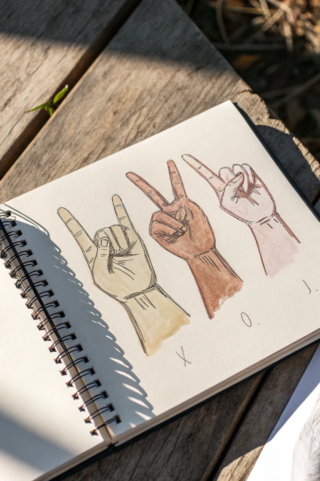
This sketchbook study features three hand signs spelling out ‘I Love You’ in American Sign Language, rendered in a warm, gradient palette of skin tones. The project combines precise ink liner work with soft watercolor washes to create a striking yet minimalist illustration.
Step-by-Step Tutorial
Materials
- Spiral-bound sketchbook (heavyweight mixed media paper recommended)
- Pencil (HB or H for light sketching)
- Eraser (kneaded)
- Fine liner pens (0.3mm and 0.5mm, waterproof black ink)
- Watercolor paint set or skin-tone specific markers/pens
- Small round paintbrush (size 2 or 4)
- Cup of water and paper towels
Step 1: Planning and Sketching
-
Establish the layout:
Visualize the diagonal composition on your paper. The hands should flow upward from left to right. Mark light anchor points where the wrist of each hand will begin to ensure they are evenly spaced. -
Sketch the ‘I’ hand shape:
On the far left, sketch the ‘I’ sign (pinky finger extended, thumb in, others folded). Keep the wrist lines slightly angled to suggest the arm is coming from the bottom left corner. -
Sketch the ‘L’ hand shape:
In the middle, draw the ‘L’ sign. The index finger points up and the thumb extends out to the left. Position this hand slightly higher than the first one. -
Sketch the ‘Y’ hand shape:
On the far right, sketch the ‘Y’ sign (thumb and pinky extended, middle three fingers folded). This should be the highest hand in the sequence. -
Refine the anatomy:
Go back over your rough shapes. Pay attention to the knuckles and the natural creases where fingers bend. Lightly indicate fingernails and wrist bones.
Step 2: Inking the Outlines
-
Start the main contours:
Using a 0.5mm waterproof fine liner, trace over your pencil lines. Focus on the main silhouette of each hand first. -
Add anatomical details:
Switch to a thinner 0.3mm pen for interior details. Draw the lines for the fingernails, the creases on the knuckles, and the palm lines. -
Create shadow hatching:
Add subtle hatching marks to suggest depth, particularly where fingers overlap or curl into the palm. Don’t overdo it; keep the lines clean and minimal. -
Erase pencil guides:
Wait until the ink is completely dry to avoid smudging. Gently erase all visible pencil marks to leave a crisp black-and-white drawing.
Reference Your Own Hand
Struggling with hand anatomy? Take a photo of your own hand making the sign in the correct lighting. Drawing from a reference photo is much easier than drawing from imagination.
Step 3: Coloring and Shading
-
Select three distinct tones:
Prepare three different skin tone shades. Aim for a light beige, a medium warm tan, and a deep brown to showcase diversity. -
Paint the first hand:
Apply the lightest beige wash to the ‘I’ hand on the left. Keep the wash transparent so the ink lines show through clearly. -
Paint the second hand:
Apply the medium tan shade to the middle ‘L’ hand. I like to drop in a slightly darker pigment near the wrist while it’s still wet to create a natural shadow gradient. -
Paint the third hand:
Fill the ‘Y’ hand on the right with the lightest wash of the deep brown color first, then build up the saturation. -
Add dimension:
Once the base layers are dry, mix a slightly darker version of each respective skin tone to add shadows along the edges of the fingers and wrists. -
Add subtle highlights:
If you are using watercolor, you can lift a tiny bit of color from the knuckles with a damp brush, or leave small areas of the paper white initially for highlights.
Try Alcohol Markers
For a smoother, streak-free finish without warping the paper, try alcohol-based markers (like Copics) instead of watercolor. They blend beautifully for skin tones.
Step 4: Final Touches
-
Inscribe the letters:
Below each hand, softly pencil in the corresponding English letters (I, L, Y) or interpretive symbols (X, O, J as seen in variations). -
Ink the text:
Go over your lettering with a very fine pen (0.1mm or 0.3mm) using a delicate, handwritten style. -
Final review:
Check for any uneven edges in the paint or missed eraser crumbs. Clean up the page to ensure that minimalist aesthetic shines.
Now you have a beautiful piece representing love and diversity to share with others
ASL Handshape Pattern Wallpaper
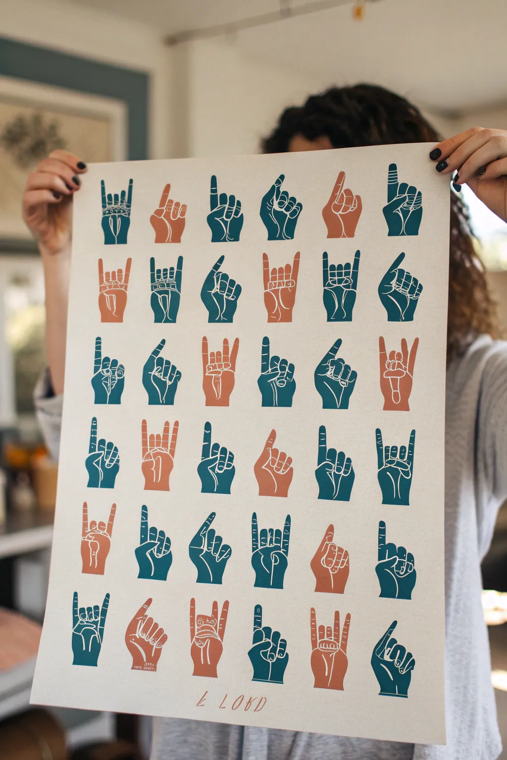
This striking poster art combines the graphic boldness of block printing with the expressive forms of American Sign Language handshapes. Using alternating teal and terracotta tones on a natural paper background creates a modern, rhythmic pattern perfect for gallery walls or studio spaces.
Step-by-Step
Materials
- Large sheet of cream or oatmeal-colored printmaking paper (approx. 18×24 inches)
- Soft-cut linoleum block (at least 4×6 inches)
- Linoleum carving tools (V-gouge and U-gouge)
- Block printing ink (Teal/Dark Blue and Terracotta/Burnt Orange)
- Brayer (rubber roller)
- Glass palette or acrylic sheet for rolling ink
- Pencil and eraser
- Tracing paper
- Barren or a clean wooden spoon (for pressing)
- Ruler or T-square
- Newsprint or scrap paper
Step 1: Designing the Master Block
-
Draft your handshape:
Begin by sketching a stylized hand in the ‘I love you’ or ‘rock on’ sign language shape on a piece of scrap paper. Keep the lines somewhat fluid and organic rather than anatomically perfect to mimic the illustrative style shown. -
Refine the linework:
Simplify your drawing into bold shapes. Decide which areas will be solid color (the hand silhouette) and which lines will be negative space (the white detailed lines defining fingers/knuckles). The drawing in the image relies heavily on negative white lines cutting through solid blocks of color. -
Transfer to lino:
Trace your final design onto tracing paper. Flip the tracing paper over and rub the back to transfer the graphite onto your soft-cut linoleum block. Remember, images print in reverse, though hand shapes are fairly symmetrical. -
Carve the negative space:
Using your V-gouge, carefully carve away the lines that delineate the fingers and palm details. These carved lines will remain the color of the paper. -
Carve the background:
Switch to a U-gouge to clear away all the linoleum surrounding the hand shape. You want the hand to be a standalone island of material. Be sure to clear enough space around the edge so ink doesn’t accidentally catch on the corners.
Ink Consistency Pro-Tip
If your ink looks like orange peel texture on the glass, it’s perfect. If it squelches, it’s too thick. Too thin, and your print will look faded.
Step 2: Setting Up the Grid
-
Calculate layout:
Measure your large poster paper. The example image uses a grid that is 6 columns wide and 7 rows high. Mark light pencil ticks along the edges of your paper to guide where each row and column should sit. -
Create a registration guide:
On a separate piece of scrap paper effectively the size of your final print, draw out a full grid. You will place your final paper *over* this sheet (if using a light table) or keep it nearby to visually gauge spacing.
Step 3: Printing the Pattern
-
Prepare the teal ink:
Squeeze a small amount of teal ink onto your glass palette. Roll the brayer back and forth until the ink makes a ‘velcro’ hissing sound and is evenly coated. -
Ink the block:
Roll the ink onto your carved lino block. Ensure the raised surface is fully saturated but not gloopy, which would fill in your fine detail lines. -
Print the first color instances:
Press the block onto the paper in the specific grid spots designated for teal. Looking at the reference, the colors alternate or are grouped randomly. I prefer to print all teal instances first to avoid washing the block constantly. -
Burnish the print:
Once the block is placed, apply firm pressure using a baren or the back of a wooden spoon. Rub in small circles to transfer the ink fully. -
Clean the block:
After printing all the teal hands, thoroughly clean the block with water (if using water-soluble ink) or vegetable oil/solvent (if using oil-based ink) and dry it completely. -
Prepare the terracotta ink:
Clean your palette and brayer, then roll out the terracotta/burnt orange ink similarly to how you did the first color. -
Print the second color:
Ink the block with orange and carefully print in the remaining empty grid spaces. Use your pencil guides to keep the alignment straight. -
Add variations (Optional):
To exactly replicate the variety in the photo, you might want to carve 2-3 slightly different hand blocks, or partially wipe ink off the block before printing to create slight variations in the hand shapes, though a single block rotated slightly works well too.
Level Up: Digital Hybrid
Carve one perfect block, print it once, scan it at high-res, and digitally assemble the colored grid and texture for infinite color experiments.
Step 4: Finishing Touches
-
Dry the print:
Let the poster dry flat. Water-based inks take about an hour; oil-based inks may take several days to cure fully. -
Add lettering:
At the bottom of the poster, use a fine liner brush and the terracotta ink (or a matching marker) to create the text ‘LOUD’ or your chosen signature in a thin, architect-style font. -
Erase guides:
Once the ink is completely bone-dry, gently erase any visible pencil grid marks from the edges of the paper.
Hang your rhythmic handshape poster in a well-lit spot to celebrate this visual language.
Hands Blooming Into Flowers
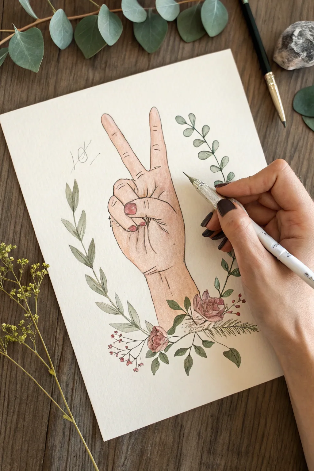
Create a serene composition featuring a hand forming the peace sign, beautifully framed by delicate greenery and soft florals. This project combines precise ink work with gentle watercolor washes to achieve a timeless, botanical aesthetic.
Step-by-Step
Materials
- High-quality watercolor paper (cold press recommended)
- Graphite pencil (HB or 2H)
- Kneadable eraser
- Fine liner pens (black or sepia, 0.1mm and 0.05mm)
- Watercolor paints (skin tones, sap green, olive green, dusty rose, maroon)
- Small round watercolor brushes (size 2 and 4)
- White gel pen (optional for highlights)
- Paper towel and water cup
Step 1: Sketching the Foundations
-
Establish the Hand Structure:
Begin lightly with your pencil in the center of the paper. Sketch a basic block shape for the palm and guidelines for the wrist. Extend two lines upward for the index and middle fingers to form the ‘V’ shape, keeping them proportional to the palm. -
Refine the Fingers:
Flesh out the fingers. The index and middle fingers should be straight but natural. Curl the ring and pinky fingers into the palm, ensuring the knuckles look rounded. Draw the thumb tucked over the curled fingers. -
Add Details:
Sketch the fingernails on the raised fingers and the thumb. Add defining lines for the knuckles and the major creases in the palm and wrist to give the hand realistic volume. -
Outline the Botanical Wreath:
Lightly draw a curved stem rising from the bottom left, sweeping up the side of the hand. Add small leaf shapes along this stem. Mirror this with a second stem on the right side, originating near the wrist. -
Sketch the Floral Accents:
At the base of the wrist where the stems meet, sketch two open rose-like blooms and a few small sprigs of filler flowers or berries. Keep these shapes loose for now.
Troubleshooting: Blurry Lines?
If your ink bleeds when you apply watercolor, your pen might not be waterproof. Always test your pen on a scrap piece of paper with water before starting the final piece.
Step 2: Inking the Design
-
Outline the Hand:
Using a 0.1mm fine liner, carefully trace over your pencil lines for the hand. Use broken or thinner lines for the skin creases and knuckles to keep them looking soft rather than harsh. -
Ink the Botanicals:
Go over the leaves and stems. For the leaves, you can add a central vein line but keep the edges organic. Ink the flower petals with delicate, wavy lines to suggest soft texture. -
Clean Up:
Once the ink is completely dry—give it a few minutes to be safe—gently erase all underlying pencil marks with your kneadable eraser to prepare for painting.
Step 3: Watercolor Application
-
Base Skin Tone:
Mix a diluted wash of a skin tone that matches your preference. Apply this evenly across the hand. While it’s still damp, drop slightly more concentrated pigment into the shadowed areas: between the fingers, under the curled fingers, and along the side of the wrist. -
Deepening Shadows:
Let the base layer dry completely. I prefer to mix a tiny bit of purple or brown into my skin tone for the second layer of shadows. Apply this strictly to the creases and the darkest points to add dimension. -
Painting the Nails:
Paint the fingernails with a small touch of dusty rose or red. Leave a tiny white spec unpainted on each nail to represent a highlight, or add it later with a gel pen. -
Greenery Base:
Using a mix of sap green and water, paint the leaves on the left stem. For the right stem, you might vary the shade slightly by adding a touch of blue or brown to the green for variety. -
Leaf Details:
Before the green wash fully dries on the leaves, touch the base of each leaf with a slightly darker green to create a natural gradient. -
Floral Colors:
Paint the main blooms with a dusty rose or mauve color. Start with a very pale wash for the petals, then dab darker maroon into the center of the flower while it’s wet to let it bleed outward softly. -
Berries and Fillers:
Use a fine brush to dot the small berries or filler flowers in red or deep pink. Paint the stems connecting these small elements with a very distinct, thin brown or dark green line.
Level Up: Seasonal Vibes
Change the florals to match the season! Use holly and pine for winter, bright daisies for summer, or maple leaves and acorns for an autumn-themed ASL artwork.
Step 4: Final Touches
-
Refine Contrast:
Once the paint is bone dry, use your 0.05mm pen to re-emphasize any lines that got lost under the paint, particularly near the flower centers and deep wrinkles of the hand. -
Optional Highlights:
If you want extra sparkle, use a white gel pen to add tiny dots of reflection on the fingernails or the dew points on the leaves.
Step back and admire how the natural elements soften the hand gesture creates a truly peaceful piece of art
ILY Sign as a Tree of Life
This serene project combines organic textures with simple line work to create a striking piece of natural art. Using handmade paper and botanical accents, you’ll craft a display that feels both earthy and modern.
How-To Guide
Materials
- High-quality cream or off-white handmade paper (deckled edge)
- Fine liner pen (micron size 05 or 08, black)
- Pencil (HB or H)
- Kneaded eraser
- Fresh or dried pine branches
- Small pinecones
- Green leafy twigs (like birch or aspen)
- White or cream linen fabric background
- Double-sided tape or photo mounting squares
Step 1: Preparing the Canvas
-
Select your paper:
Choose a thick, textured paper with a deckled edge. If your paper has straight edges, you can create a faux deckle by carefully tearing the edges against a ruler or using a wet paintbrush to weaken the fiber line before tearing. -
Center the design:
Lightly mark the center of your paper with a pencil to ensure the hand illustration sits perfectly in the middle. -
Sketch the palm:
Begin your sketch at the wrist, drawing two vertical lines up. Create the curved shape of the palm, keeping the lines loose and light.
Step 2: Drawing the Hand
-
Outline the fingers:
Sketch the two extended fingers (index and middle) forming a ‘V’. Keep the finger segments roughly equal in length. -
Detail the folded fingers:
Draw the ring and pinky fingers curled into the palm. Their knuckles should align with the base of the extended fingers. -
Add the thumb:
Sketch the thumb crossing over the curled ring finger. Pay attention to the joint placement to keep the anatomy looking natural. -
Refine the anatomy:
Go back over your pencil sketch to add subtle details like fingernails on the thumb and folded fingers, and the small creases at the knuckles. -
Ink the main lines:
Using your fine liner pen, carefully trace over your pencil lines. Use confident, continuous strokes rather than short, scratchy ones for a smooth look. -
Add line weight:
I like to thicken the outline of the hand slightly more than the interior details. This helps the subject pop against the textured paper. -
Erase guidelines:
Once the ink is completely dry (give it at least 15 minutes), gently roll a kneaded eraser over the drawing to lift the graphite without damaging the paper fibers.
Use Your Hands
Use your own hand as a reference model. Take a photo of your hand doing the peace sign against a wall to get the shadows and knuckle creases accurate.
Step 3: The Botanical Arrangement
-
Prepare the background:
Lay out your linen fabric on a flat surface, smoothing out any major wrinkles. -
Place the artwork:
Position your finished drawing in the center of the fabric. -
Add the pine branches:
Identify the natural curve of your pine branch. Place a large sprig on the right side, allowing the needles to gently frame the paper edge. -
Layer the leafy twigs:
On the left side, introduce the leafy green twigs. Weave a longer branch diagonally across the bottom left corner to balance the pine on the right. -
Place twig accents:
Add a smaller leafy twig section near the top left corner, ensuring it doesn’t obscure the drawing. -
Position pinecones:
Nestle a small pinecone near the leafy twig on the left side, and place a second one on the right side near the pine needles for asymmetry. -
Add bottom foliage:
Tuck a few sprigs of pine or additional leaves at the very bottom right to ground the composition. -
Final adjustments:
Step back and view the arrangement from above. Nudge elements slightly until the negative space feels balanced around the central paper.
Ink Bleeding?
Handmade paper is porous. Move your pen quickly to prevent ink from soaking in too deep and spreading. Test your pen on a scrap piece first.
Now you have a beautifully composed piece of nature-inspired art ready to be photographed or framed in a shadowbox
Vines Wrapping a Fingerspelled Word
Capture the beauty of American Sign Language with this clean, minimalist journal layout featuring bold block lettering and delicate hand illustrations. This project focuses on drawing the ASL letters ‘K’, ‘V’, and ‘S’ to spell out ‘KVS’—or swap them for your own initials for a personalized touch.
Detailed Instructions
Materials
- Hardcover sketchbook or bullet journal (blank or dot grid)
- HB or 2B pencil for sketching
- High-quality eraser
- Fine liner pens (sizes 01 and 03)
- Ruler (optional)
- Reference chart for ASL handshapes
Step 1: Drafting the Layout
-
Center key elements:
Begin by lightly marking the vertical center of your page with a pencil. This will help align your header text with the hand illustrations below so everything feels balanced. -
Sketch the header:
Near the top of the page, lightly sketch the letters ‘ASL’ in a simple sans-serif style. Leave ample space between each letter to accommodate the shadow detailing later. -
Create the block effect:
Turn your simple letters into 3D block letters by drawing diagonal lines extending down and to the left from each corner. Connect these diagonal lines with straight lines that mirror the main letter shape. I find it helpful to imagine a light source coming from the top right. -
Block in hand placements:
Below the text, lightly draw three vertical rectangles or ovals where the hands will go. These ‘envelopes’ ensure your hand drawings will be roughly the same size and height before you start adding details.
Step 2: Sketching the Handshapes
-
Draw the ‘K’ (Position 1):
For the first hand (left), start with the palm shape. Extend the index and middle fingers upward in a V-shape, but place the thumb against the base of the middle finger. Curl the ring and pinky fingers down. -
Draw the ‘V’ (Position 2):
For the middle hand, sketch a classic peace sign. Extend the index and middle fingers straight up and spread them apart. Fold the thumb onto the palm and curl the remaining fingers over it. -
Draw the ‘S’ (Position 3):
For the final hand (right), draw a fist shape. Curl all fingers into the palm and wrap the thumb across the front of the curled fingers horizontally. This creates a solid, compact shape. -
Refine the anatomy:
Go back over your rough geometric hand shapes and soften the edges. Add slight curves for knuckles, small lines for fingernails, and the natural creases where fingers bend. -
Add wrists and cuffs:
Draw vertical lines extending down from each hand to suggest wrists. To make them look floating and artistic, do not close the bottom of the wrist lines.
Wobbly Lines?
Drawing hands is tough! If a finger looks crooked, thicken the outline slightly on the opposite side to correct the visual balance without erasing.
Step 3: Inking and Finalizing
-
Outline the header:
Switch to your thicker fine liner (03 size). Carefully trace the outer perimeter of your ‘ASL’ block letters. Keep your hand steady for crisp, straight lines. -
Detail the 3D effect:
Use the fine liner to fill in the ‘shadow’ sides of the block letters with diagonal hatching or cross-hatching to emphasize the depth. -
Ink the hands:
Using the thinner pen (01 size), trace your pencil sketches of the hands. Pay attention to the overlapping lines where fingers cross over each other; line weight can help push some fingers into the background. -
Add texture marks:
Add tiny, broken lines at the knuckle bends and palm creases. These shouldn’t be solid lines, but rather delicate dashes to suggest skin texture without making the drawing look aged. -
Erase guidelines:
Wait at least 5-10 minutes for the ink to dry completely to avoid smearing. Once dry, gently erase all underlying pencil sketch marks. -
Optional shading:
If you want more depth, use your pencil or a grey marker to add very subtle shading on the palms and beneath the curled fingers.
Add Some Nature
Intertwine small vines or leaves wrapping around the wrists or fingers to soften the look and connect the three separate drawings visually.
Now you have a stylish reference page to practice your fingerspelling while enjoying your art
Visual Voice Waves From Signing Hands
Capture the beauty of sign language with this elegant line drawing featuring two hands forming the ‘V’ sign, surrounded by flowing, wave-like energy. The metallic ink on crisp paper creates a minimalist yet impactful illustration perfect for an art journal.
Step-by-Step
Materials
- A5 sketchpad or journal (smooth, high-quality paper)
- Metallic gold gel pen or fine-liner (0.5mm or 0.7mm)
- HB pencil for sketching
- Kneaded eraser
- Reference photo of hands (optional)
Step 1: Planning and Sketching
-
Establish the composition:
Begin by lightly marking the placement of the two hands on your page with your pencil. Position the left hand slightly lower than the right to create a dynamic, ascending flow. -
Block in basic shapes:
Use simple geometric shapes to construct the hands. Draw rectangular blocks for the palms and cylinders for the fingers. Don’t worry about details yet; just focus on getting the proportions correct. -
Refine the finger positions:
Sketch the specific ‘V’ sign gesture. Extend the index and middle fingers upward, keeping them relatively straight but with a natural curve. Curl the ring and pinky fingers down against the palm. -
Detail the thumbs:
Draw the thumbs crossing over the curled fingers. Pay attention to where the thumb joint bends and how the tip rests against the ring finger. -
Add wrist definition:
Extend lines downward from the palms to create the wrists and forearms. Keep these lines simple, as they will eventually disappear into the wave patterns. -
Sketch the wave guidelines:
Lightly draw sweeping, curved lines emanating from the sides and bottom of the hands. Imagine these lines as ripples in water or sound waves moving through the air.
Step 2: Inking the Hands
-
Outline the right hand:
Take your metallic gold pen and carefully trace over your pencil sketch for the right hand. Use a confident, continuous stroke for the long lines of the fingers. -
Add creases and details:
Draw the small creases at the knuckles and where the fingers bend over the palm. I prefer to use broken or thinner lines here to keep the drawing looking delicate. -
Outline the left hand:
Repeat the inking process for the left hand. Ensure the metallic ink flows smoothly; if it skips, draw on a scrap piece of paper to get the ink moving again. -
Define the fingernails:
Add the fingernails on the extended fingers. Keep the shapes simple—just a curved line for the cuticle and the nail tip is usually enough. -
Erase pencil marks:
Once the ink is completely dry (give it a few minutes to avoid smudging), gently use your kneaded eraser to lift away the graphite sketch lines from the hands.
Ink Flow Fix
If your metallic gel pen starts skipping on the textured paper, try warming the tip by drawing circles on your thumb or running the barrel briskly between your palms.
Step 3: Creating the Flow
-
Begin the background waves:
Start drawing the long, flowing lines that surround the hands. Start from the bottom of the page and sweep upward, following the curves you sketched earlier. -
Layer the lines:
Draw parallel lines next to your initial wave lines. Vary the spacing slightly—some lines closer together, some further apart—to create a sense of rhythm and movement. -
Connect the waves to the hands:
Allow some of the wave lines to pass behind the wrists and forearms. This integrates the hands into the environment rather than having them float on top. -
Add subtle stippling:
For a magical touch, add tiny dots or stippling between the upper waves or near the fingertips. This suggests sparkling energy or dissolving form. -
Final review:
Check the entire composition. If any line looks too thin or disconnected, carefully go over it again with the gold pen to unify the visual weight.
Make It Pop
Use a white gel pen to add tiny highlights on the fingernails and highest points of the waves. This adds dimension and makes the gold ink appear even brighter.
Enjoy the shimmering effect as your golden lines catch the light.
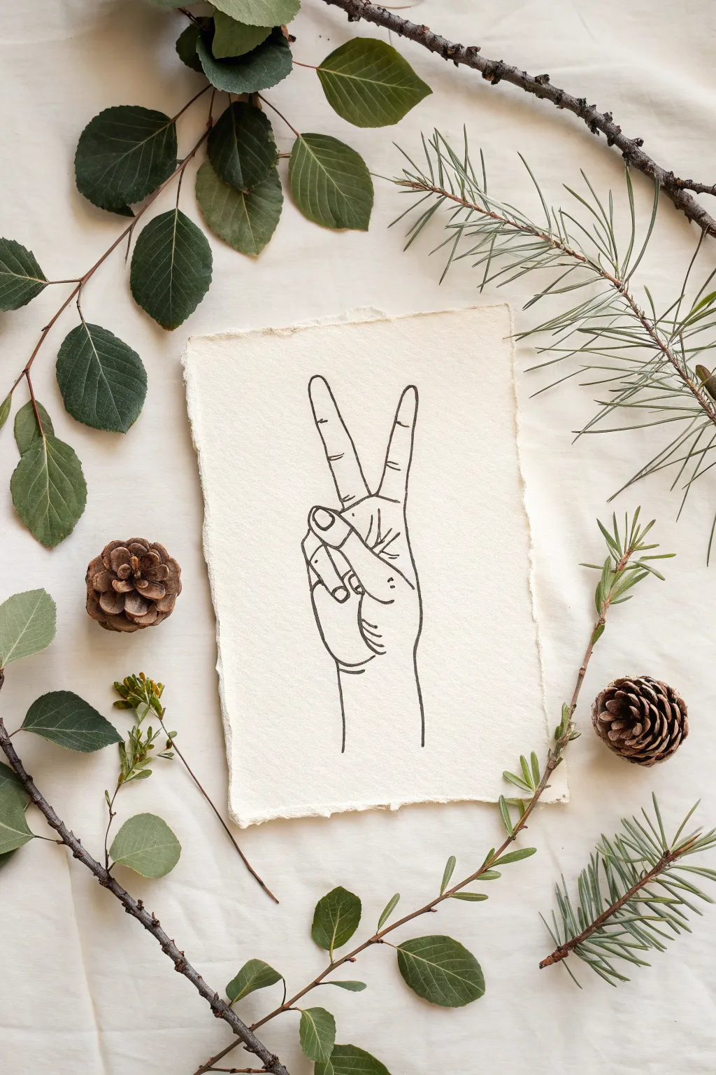
Negative Space ASL Cutout Design
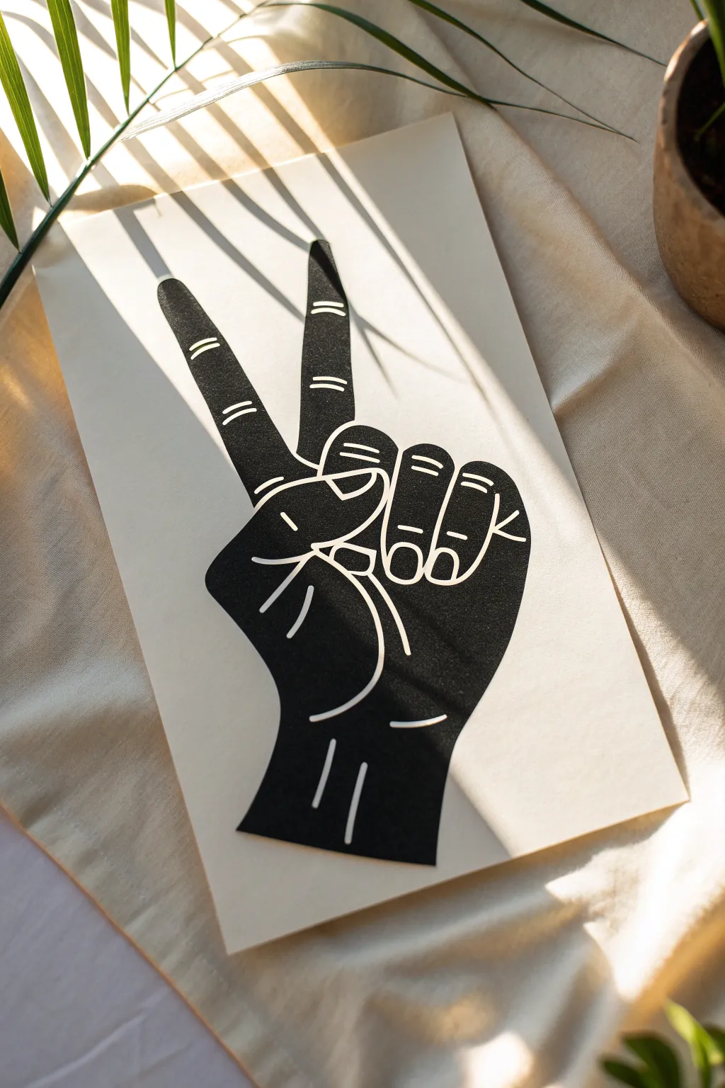
Capture the bold contrast and timeless appeal of a linocut with this striking block print project featuring the ASL sign for ‘V’ or ‘Peace’. This technique uses negative space carving to create dramatic black silhouettes accented by expressive white line work.
How-To Guide
Materials
- Soft-cut lino block (4×6 or 5×7 inch)
- Linoleum cutter set (with V-gauge and U-gauge blades)
- Pencil
- Tracing paper
- Carbon transfer paper (optional)
- Block printing ink (black)
- Brayer (rubber roller)
- Smooth printmaking paper or heavy cardstock (cream or white)
- Baren or a wooden spoon
- Acrylic sheet or glass (for rolling ink)
- Craft knife
Step 1: Design & Transfer
-
Draft your sketch:
Begin by sketching the hand shape on regular paper. Focus on the silhouette first: the two extended fingers (index and middle) forming a V, and the thumb tucked over the curled ring and pinky fingers. Keep the outlines smooth and graphical. -
Stylize the details:
Add the internal details that will become white lines. Draw curved lines across the fingers to represent knuckles and joints, and add lines on the palm and wrist to suggest creases. These shouldn’t be realistic wrinkles, but stylized dashes. -
Check the reversal:
Remember that block printing creates a mirror image. Since this is a generic ‘V’ sign, orientation might not matter, but if you want a specific left or right hand, trace your drawing onto tracing paper and flip it over before transferring. -
Transfer to the block:
Place your drawing (reversed if necessary) onto the soft-cut lino block. Use carbon paper underneath your sketch and trace over the lines firmly with a pencil to leave a clear guide on the rubber surface.
Clean Lines Hack
Warm the lino block slightly with a hairdryer or by sitting it in the sun before carving. It makes the material much softer and allows your cutter to glide more smoothly for precise curves.
Step 2: Carving the Block
-
Outline fine details:
Fit your cutter handle with a small V-gauge blade. Carefully carve shallow grooves along the internal lines of the hand—the knuckles, fingernails, and palm creases. These will remain white in the final print. -
Define the silhouette:
Switch to a slightly wider blade if needed. Carve clearly around the entire outline of the hand. You are removing the background material so the hand stands out as a raised surface. -
Clear the background:
Using a large U-gauge blade, gouge away the rest of the negative space outside the hand. Make sure you carve deep enough that these areas won’t pick up ink. -
Clean up edges:
Inspect the edges of your design. Use a craft knife to slice away any straggly bits of rubber that might catch ink and ruin the clean silhouette. -
Test proof (optional):
I like to do a quick rubbing with a crayon on scrap paper over the block to see if I’ve missed any spots before getting the messy ink involved.
Spotty Prints?
If your print looks ‘salty’ (white speckles in the black areas), you likely didn’t use enough ink. Add more ink to your palette and ensure the brayer has that distinct sizzling sound.
Step 3: Inking & Printing
-
Prepare the ink:
Squeeze a small line of black block printing ink onto your acrylic sheet or glass palette. It’s better to start with less and add more. -
Charge the brayer:
Roll the brayer back and forth through the ink until it sounds like ‘velcro’ or sizzling bacon. The texture on the roller should look like vibrant orange peel skin. -
Ink the block:
Roll the inked brayer over your carved block. Apply thin, even layers, rolling in multiple directions to ensure the raised handshake surface is completely black, but be careful not to flood the small carved crevices. -
Position the paper:
Place your printmaking paper carefully on top of the inked block. Once the paper touches the ink, do not shift it, or the image will smudge. -
Burnish the back:
Using a baren or the back of a wooden spoon, rub the back of the paper firmly in small circular motions. Apply pressure evenly across the entire image area. -
The reveal:
Slowly peel back one corner of the paper to check the transfer. If the black looks patchy, lay it back down carefully and rub that area more. If it looks solid, peel the paper completely off. -
Dry the print:
Place your wet print in a safe, flat place to dry. Oil-based inks can take days, while water-soluble inks might be ready in an hour or two.
Frame your bold monochrome print to add a touch of modern, symbolic art to your space
Hidden Fingerspelling Message in a Landscape
This project blends a soft, dreamy watercolor landscape with a subtle message, creating a serene piece of art that speaks volumes. The gentle gradient of the sky and rolling hills provides a perfect backdrop for the clean, superimposed lettering.
Step-by-Step
Materials
- Cold press watercolor paper (300 gsm)
- Watercolor paints (phthalo blue, sap green, yellow ochre, burnt sienna, rose madder)
- Round brushes (sizes 4, 8, and 12)
- Masking fluid or white watercolor gouache (optional)
- Pencil and eraser
- Ruler
- Painter’s tape
- Paper towels
- Two jars of water
Step 1: Preparation and Sketching
-
Prepare the canvas:
Begin by taping down all four edges of your watercolor paper to a board using painter’s tape. This prevents buckling when wet and creates that crisp white border shown in the final piece. -
Sketch the horizon:
Lightly sketch the landscape elements. Draw a faint line about one-third up from the bottom for the foreground field. Add gentle, rolling curves above that for the mountain ranges. -
Outline the text:
In the center of the sky area, lightly letter ‘ASL’ using a ruler to ensure the baseline is straight. Keep the pencil strokes incredibly faint so they don’t show through the translucent paint later.
Step 2: Painting the Sky
-
Wet-on-wet technique:
Clean your large size 12 brush and apply clean water to the entire sky area, stopping right at the mountain line. The paper should be glisten, but not hold puddles. -
Apply blue tones:
Dilute phthalo blue heavily with water to create a very pale tint. Touch the wet paper near the top with the blue, letting it bleed downwards naturally. -
Add cloud shapes:
While the paper is still wet, lift out pigment using a crumpled paper towel to create fluffy white cloud shapes near the top and middle. This negative space technique keeps the clouds soft. -
Infuse warmth:
Mix a watery wash of rose madder. Gently dab this pink hue into the lower clouds and near the horizon line to suggest a soft sunset or sunrise glow. Let the sky dry completely.
Bleeding Edges?
If paint bleeds under the tape, it usually means the tape wasn’t pressed down firmly enough or the paint was too watery. Next time, run a credit card over the tape edge to seal it tight.
Step 3: Painting the Landscape
-
Distant mountains:
Mix a cool greyish-blue using your blue and a touch of burnt sienna. Using the size 8 brush, paint the furthest mountain range. Keep the value light to indicate atmospheric perspective. -
Middle ground hills:
Once the first range is tacky but not fully dry, paint the next range of hills using a slightly stronger mix of blue and sap green. The overlap will create a nice soft edge. -
Foreground field base:
For the large field at the bottom, mix yellow ochre with a tiny bit of burnt sienna. Apply this as a flat wash across the bottom section, working quickly to avoid streaking. -
Texture the grass:
While the field wash is still damp, drop in concentrated burnt sienna or orange near the bottom edge. Use upward flicking motions with a smaller brush to suggest tall grasses.
Pro Tip: Masking Fluid
For perfectly crisp white letters, apply masking fluid over your pencil sketch before painting the sky. Rub it off only after the sky is totally dry to reveal the white paper underneath.
Step 4: Refining and Lettering
-
Add defined grass:
Switch to your size 4 brush. With a mix of burnt sienna and dry brush technique, flick distinct grass blades in the foreground to add texture and depth. -
Strengthen lower hills:
Darken the lowest green hill on the left side with a more saturated green mix to anchor the composition and create contrast against the yellow field. -
Paint the letters:
Using a grey-green mix (blue + tiny bit of orange + white gouache if you need opacity), carefully fill in your ‘ASL’ lettering. Use the smallest brush for crisp serifs. -
Final touches:
Check the cloud edges; if they need softening, use a damp brush to blur any harsh lines. I like to step back here to ensure the color balance feels peaceful. -
Reveal the border:
Wait until the painting is 100% bone dry. Slowly peel away the painter’s tape at a 45-degree angle to reveal the clean white frame.
Frame this serene landscape to add a thoughtful and artistic touch to your space

Have a question or want to share your own experience? I'd love to hear from you in the comments below!