
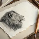
When I need a subject that practically draws itself, I reach for Louisiana—because it’s packed with instantly recognizable shapes, stories, and textures. Here are my favorite Louisiana drawing ideas you can riff on, whether you’re sketching in pencil, ink, or a splashy mixed-media style.
Louisiana State Outline Icon Collage
This elegant project captures the spirit of Louisiana through a stylized map filled with charming, hand-drawn icons representing the region’s diverse culture and flora. The clean black linework against cream paper creates a timeless, vintage botanical aesthetic perfect for framing.
How-To Guide
Materials
- Cream or off-white Bristol board or heavy mixed-media paper (smooth finish)
- Pencil (HB or 2H for light sketching)
- Kneaded eraser
- Fine liner pens (black, archival ink) in sizes 01, 03, and 05
- Louisiana state outline reference map
- Light box or sunny window (optional, for tracing)
- Ruler
Step 1: Planning and Outlining
-
Prepare the paper:
Cut your Bristol board or heavy paper to your desired size, often 8×10 or 11×14 inches for standard framing. -
Establish the state shape:
Using a reference map, lightly sketch the outline of Louisiana in pencil. Pay special attention to the ‘boot’ shape and the jagged coastline along the bottom right. You can also print a map outline and trace it using a light box for perfect accuracy. -
Draft the icon placement:
Lightly sketch circles or boxes inside the map where you want your icons to go. Balance the composition by placing larger items (like the palm tree or car) in wider areas and smaller botanical elements in the narrower southern tips. -
Sketch the title block:
Near the top border, sketch a small, wavy banner or text line for the state name. Keep the pencil pressure very light so it erases easily later.
Smudge Stopper
Place a scrap piece of clean paper under your drawing hand while inking. This protects the paper from hand oils and prevents you from smearing wet ink or graphite.
Step 2: Drawing the Icons
-
Sketch the northern elements:
Start with the top section. Pencil in a tall palm tree on the left and perhaps a small vehicle or building structure in the center. I like to keep these sketches loose initially. -
Add central details:
Moving down the map, sketch a small house or tent structure and adjacent cloud-like bushes. These represent local architecture and landscape features. -
Detail the flora:
In the wider bottom section, draw distinct botanical shapes. Include long fern-like leaves, pine cones, or cotton bolls. Add a large magnified flower bloom floating outside the state border on the right for artistic balance. -
Mock up the text:
Pencil in the labels next to each icon. In this style, you can use squiggly lines to simulate text if you want a purely decorative look, or carefully letter actual city names or plant species.
Step 3: Inking and Refining
-
Ink the state border:
Using your thickest pen (size 05), trace over the main outline of the state. Use a steady hand, and don’t worry if the line has a little natural variation; it adds character. -
Outline the icons:
Switch to a size 03 pen for the main contours of your interior drawings (the car, the palm trunk, the flower petals). -
Add fine details:
Use the finest 01 pen to add texture. deeply shade the tires of the car, add veins to the leaves, and stipple dots on the pine cones. -
Ink the typography:
carefully trace your text or faux-text lines with the 01 pen. Keep these lines crisp and distinct from the illustrations. -
Draw the external flower:
Ink the large magnolia or flower drawing outside the map boundary. Give the petals confident, sweeping strokes. -
Erase pencil lines:
Wait at least 15 minutes for the ink to dry completely. Gently use the kneaded eraser to lift all graphite marks, leaving only the stark black ink. -
Final touches:
Review your drawing for any gaps. If a line looks too thin, carefully thicken it to add weight, specifically on the ‘shadow side’ of objects (the bottom and right edges).
Antique Wash
To age the piece, lightly brush heavily diluted tea or coffee over the finished (waterproof) ink drawing for a parchment-style background effect.
Now your custom map is ready to be framed and displayed as a sophisticated tribute to Louisiana.


Fleur-de-Lis Filled With Louisiana Symbols
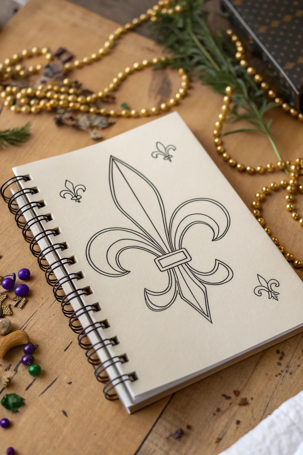
This project captures the classic elegance of Louisiana’s most iconic symbol through clean, precise line work. You’ll create a sophisticated black and white design centered on a sketchbook page, perfect for practicing symmetry and confident inking.
Step-by-Step
Materials
- Spiral-bound sketchbook with smooth, heavy paper
- HB or 2H graphite pencil
- Good quality eraser (kneaded or vinyl)
- Ruler (clear plastic is best)
- Fine liner pens (sizes 0.3mm, 0.5mm, and 0.8mm)
- Compass or circle template (optional)
- Tracing paper (optional for symmetry)
Step 1: Planning and Layout
-
Find the center:
Begin with your sketchbook open on a flat surface. Use your ruler to lightly mark the vertical center line of the page with your pencil. This line is crucial for keeping your fleur-de-lis symmetrical. -
Establish the height:
Mark the top and bottom boundaries for your main design. Leave plenty of white space around the edges to give the drawing room to breathe, especially if you plan to add the smaller accent symbols later. -
Draft the central petal:
Sketch a tall, pointed tear-drop shape along your center line. This is the main vertical petal. Keep the bottom slightly narrower where it will meet the band. -
Sketch the horizontal band:
Draw a small rectangle horizontally across the bottom of your central petal sketch. This represents the ‘tie’ or band that holds the fleur-de-lis together. -
Outline the side curves:
On the left side, lightly sketch the large C-curve that forms the side petal. Start from the band, curve outward and down, then hook back upward. Try to mimic this exact curve on the right side. I find looking at the drawing in a mirror helps check if the sides are even.
Step 2: Refining the Pencil Sketch
-
Form the bottom petals:
Below the horizontal band, draw the two smaller, downward-curving tails. These should mirror the outward flow of the top side petals but on a smaller scale. -
Add the bottom point:
Connect the two bottom tails with a sharp, central downward point, completing the silhouette of the symbol. -
Create the double-line effect:
To achieve the look in the photo, you need an inner border. Carefully draw a second line inside your entire shape, parallel to the outer edge. Keep the spacing consistent—about 2-3mm wide works well. -
Detail the center rib:
Draw a vertical line straight down the middle of the top petal. Add two curving lines within the side petals that follow their shape, creating a sense of dimension. -
Draft the accent symbols:
Sketch three small, simplified fleur-de-lis shapes around the main design: two near the top corners and one near the bottom right. Keep these much simpler than the central one.
Symmetry Hack
Draw one half of the design on tracing paper, flip it over onto the other side of your center line, and re-trace it to transfer graphite perfectly for a symmetrical base.
Step 3: Inking and Finishing
-
Ink the main outlines:
Switch to your 0.8mm or 0.5mm fine liner. Trace the outermost perimeter of the large fleur-de-lis first. Use smooth, continuous strokes rather than short, scratchy ones. -
Ink the inner details:
Use a slightly thinner pen, like a 0.3mm or 0.5mm, for the inner parallel lines and the decorative curves inside the petals. This line weight hierarchy makes the drawing look professional. -
Define the band:
Ink the rectangular band carefully. You can double the line here as well to match the rest of the style. -
Ink the small logos:
Trace your smaller accent fleur-de-lis sketches. Since these are small, a single line weight (0.3mm) usually looks best so they don’t become blobby. -
Let it dry completely:
Wait at least 15 minutes to ensure the ink is bone dry. Smearing wet ink at this stage is heartbreaking. -
Erase pencil marks:
Gently erase all your graphite guidelines. Hold the paper taut with one hand while erasing with the other to prevent the page from crinkling. -
Final clean up:
Brush away the eraser dust and inspect your lines. If any lines look too thin or skip, carefully go over them one last time to darken and solidify the black.
Wobbly Lines?
If your hand shakes while inking long curves, try ‘ghosting’ the movement (practicing in the air) a few times before touching the pen to the paper. Pull the pen toward you, don’t push.
Now you have a crisp, elegant piece of Louisiana-inspired art ready to be displayed or filled with further patterns
New Orleans Street Scene With Loose Perspective
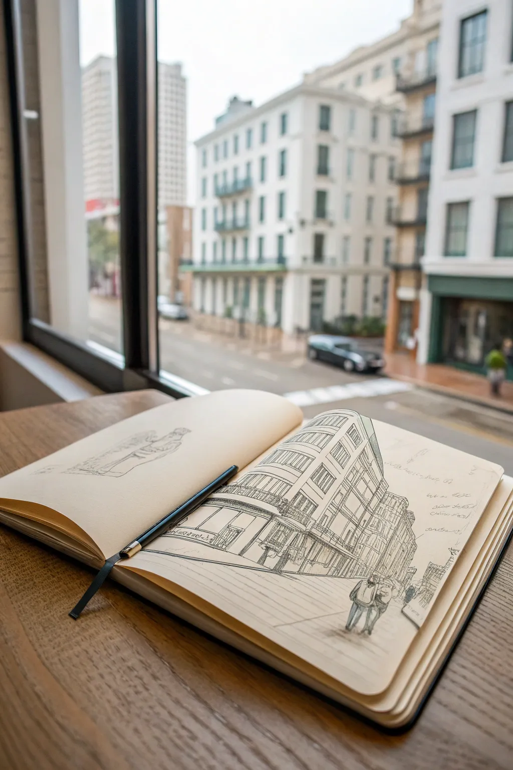
Capture the charm of a New Orleans streetscape with this loose, architectural line drawing in your favorite sketchbook. This project focuses on capturing the energy of the city through expressive ink lines and relaxed perspective, perfect for sketching from a window view.
Step-by-Step
Materials
- Hardbound sketchbook (A4 or A5 size, smooth cartridge paper)
- Fine liner pen (0.3mm or 0.5mm, black ink)
- Graphite pencil (HB or 2H for light underdrawing)
- Kneadable eraser
- Ruler (optional, for checking angles)
Step 1: Setting the Composition
-
Establish the horizon:
Begin by lightly sketching a horizontal line across the lower third of your right-hand page using your graphite pencil. This will serve as the eye-level line for your perspective. -
Block in the main corner:
Identify the vertical line of the main building’s corner nearest to you. Draw this vertical axis slightly off-center to the left of the page, ensuring it is the tallest element. -
Map the vanishing lines:
From the top and bottom of your corner vertical, draw light guidelines angling downwards toward the right edge of the paper. This creates the exaggerated, dramatic perspective seen in wide-angle urban sketches. -
Rough in the building masses:
Lightly box in the secondary buildings receding down the street. Don’t worry about details yet; just focus on getting the big rectangular shapes to diminish in size as they move toward the horizon.
Step 2: Architectural Structure
-
Define the floors:
Using your pencil guidelines, mark horizontal divisions for the different stories of the main building. Remember that the space between these lines should get narrower as the building goes up. -
Add window columns:
Sketch vertical lines to indicate where columns of windows will go. On the angled side of the building, space these lines closer together as they move away from the corner to enhance the depth. -
Sketch the balcony wrap:
Draw the signature wrap-around balcony on the second floor. Keep the lines curved slightly if you want to emphasize a sense of height, or straight for a classic look. -
Construct the street level:
Block in the storefronts at the base. Add a simple awning shape extending from the building facade over the sidewalk area.
Loose Lines Pro Tip
Hold your pen further back on the barrel, away from the tip. This reduces control slightly, preventing stiff lines and creating that lively, energetic urban sketch style naturally.
Step 3: Inking the Scene
-
Start with confident verticals:
Switch to your fine liner pen. I like to start by inking the main vertical structural lines first, intentionally keeping the lines slightly shaky or broken to maintain that ‘sketch’ aesthetic. -
Detail the windows:
Draw the window frames within your pencil guides. Fill the dark glass areas with diagonal hatching lines rather than solid black to keep the drawing airy. -
Ink the balcony ironwork:
Use scribbly, loopy lines to suggest the intricate wrought iron railings. You don’t need to draw every baluster; a suggestion of texture is often more effective than perfect detail. -
Add store details:
Ink the storefronts and awnings. Use heavier pressure or go over lines twice at the base of the building to ground the structure. -
Refine the perspective lines:
Go over the horizontal perspective lines of the building. Let these lines trail off or break as they move toward the edge of the page to create a vignette effect.
Level Up: Watercolor Wash
Add a quick splash of gray or sepia watercolor wash over the shadowed side of the building (the side moving away from the light) to instantly create 3D volume.
Step 4: Atmosphere and text
-
Populate the sidewalk:
Sketch a few small, silhouette-like figures walking near the building. Keep them simple—just oval heads and blocky bodies—to give a sense of scale to the architecture. -
Add street context:
Draw a few loose lines for the curb and sidewalk cracks, radiating out from the corner. This helps plant the building on the ground. -
Annotate the sketch:
In the blank sky area to the right, add some handwritten notes about the location, the weather, or your observations. Use a loose, cursive script that mimics the flow of your drawing lines. -
Erase pencil marks:
Once the ink is completely dry (give it a few minutes to avoid smudges), gently roll your kneading eraser over the page to lift the graphite guidelines, leaving only the crisp ink work.
Close your sketchbook knowing you’ve preserved a fleeting moment of city life on paper.

Alligator in a Quiet Swamp Scene
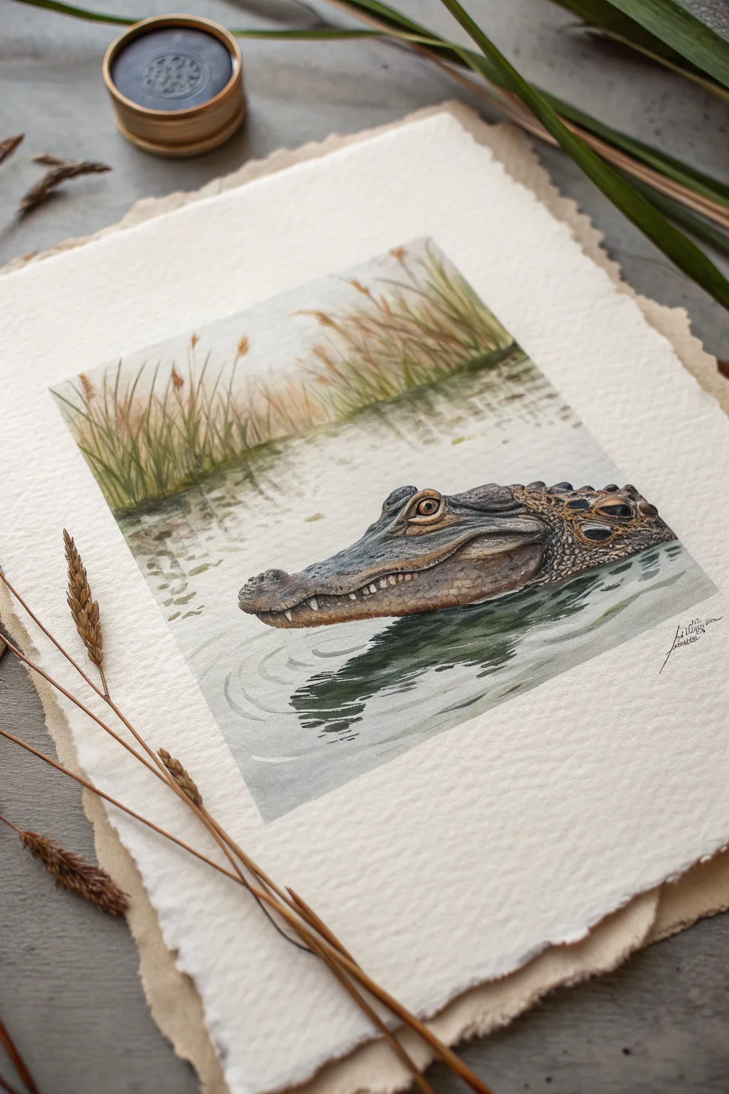
Capture the silent intensity of a Louisiana swamp with this detailed watercolor study of an alligator. The painting combines soft, hazy background reeds with the crisp, textured details of the gator’s scales, all set on beautiful deckled-edge paper.
Detailed Instructions
Materials
- Cold press watercolor paper (deckled edge preferred)
- Watercolor paints (Olive Green, Burnt Umber, Payne’s Gray, Yellow Ochre, Sepia, Ivory Black, Burnt Sienna)
- White gouache or white gel pen
- Watercolor brushes: Large flat wash brush, medium round (size 6 or 8), fine detail liner (size 0 or 1)
- HB Pencil
- Kneaded eraser
- Painter’s tape or masking fluid (optional)
- Two jars of water
- Paper towels
Step 1: Planning and Sketching
-
Map the Composition:
Begin by lightly marking the horizon line about two-thirds of the way up the paper. This high horizon places the focus on the water and the alligator. -
Outline the Alligator:
Sketch the alligator’s head emerging from the lower right. Focus on the triangular shape of the snout, the raised ridge of the eye socket, and the distinct line where the jaw meets the water. -
Detail the Scales:
Lightly pencil in the larger scutes (scales) along the neck and the pattern around the jaw. You don’t need every single scale, just the main structural lines. -
Indicate the Reeds:
Sketch faint vertical lines in the background for clustering reeds. Keep these loose and organic, as they will be painted softly.
Muddy Waters?
If your water reflections look too messy, let the paper dry completely. Then, re-wet just the area you want to fix and lift the pigment gently with a clean, damp paper towel.
Step 2: Painting the Atmosphere
-
Background Wash:
Wet the paper above the alligator’s head. Mix a very dilute wash of Yellow Ochre and a touch of Olive Green to drop in the background sky and distant water. -
Painting the Reeds:
While the paper is still slightly damp, paint upward strokes using a mix of Olive Green and Burnt Sienna to create the reeds. Let the bottoms of the strokes blur slightly into the ‘water’ line. -
Reflecting the Reeds:
Immediately paint soft, vertical strokes downwards into the water area beneath the reeds. Use a slightly darker, muted green to suggest reflection, keeping the edges soft. -
Water Base Layer:
Paint the water around the alligator using a pale wash of Payne’s Gray and a tiny bit of Olive Green. Leave some white paper showing for ripples.
Step 3: The Alligator Form
-
Base Skin Tone:
Apply a wash of Yellow Ochre and Burnt Sienna to the alligator’s head. While wet, drop in darker Sepia tones along the shadow areas under the jaw and the neck ridges. -
Building Shadows:
Once the base is dry, mix Payne’s Gray and Burnt Umber. Glaze this over the snout and around the eye to start carving out the three-dimensional form. -
The Eye:
Paint the iris with a bright Yellow Ochre or Gold. When dry, add the vertical slit pupil with black, and carefully preserve a tiny white highlight (or add it later with gouache). -
Scale Texture:
Using your fine detail brush and a dark mix of Sepia and Payne’s Gray, begin painting the individual scales. Paint the dark spaces *between* the scales or the shadows cast by them, rather than outlining each one. -
Adding Roughness:
Stipple (dot) some texture onto the top of the snout using a fairly dry brush with dark brown paint. This mimics the rough, bony texture of the skin.
Natural Texture
For realistic bumpy skin, sprinkle a tiny pinch of table salt onto the wet paint of the snout. Brush it off once totally dry for a pitted, organic texture.
Step 4: Final Details and Reflection
-
Deepening the Water:
Paint darker ripples around the alligator’s jawline using Payne’s Gray and Olive Green. Horizontal strokes work best here to show the water’s surface tension. -
The Main Reflection:
Paint the dark, distorted reflection of the alligator’s head directly below it. Use vertical, wavy strokes to break up the form so it looks like it’s in the water, not floating on top. -
Teeth and Highlights:
Use white gouache or a gel pen to pick out the small teeth along the jawline. Also add tiny specular highlights to the wet scales on the snout. -
Final Adjustments:
Check your values. If the alligator needs more contrast, deepen the darkest shadows under the chin and behind the eye ridge with a concentrated mix of Indigo or Black.
Sign your name near the water ripples and enjoy your serene slice of the swamp
BRUSH GUIDE
The Right Brush for Every Stroke
From clean lines to bold texture — master brush choice, stroke control, and essential techniques.
Explore the Full Guide
Jazz Horn and Sheet Music Doodle Spread

Capture the soulful essence of Louisiana jazz with this charming pen-and-ink illustration of a saxophone. The drawing balances technical details with whimsical elements like floating music notes and stars, all rendered in classic black and teal ink.
Step-by-Step Tutorial
Materials
- Sketchbook with cream or off-white paper
- Pencil (HB or 2B)
- Eraser (kneaded preferred)
- Fine liner pen (Black, 0.3mm or 0.5mm)
- Fine liner pen (Teal or Dark Green, 0.5mm)
- Ruler (optional)
Step 1: Basic Structure Sketching
-
Establish the curve:
Begin with your pencil by lightly drawing a large ‘J’ shape in the center of the page. This will act as the spine for the main body and the bell of the saxophone. -
Define the neck:
At the top of the ‘J’, draw a smaller, angled line pointing left for the neck and the mouthpiece area. -
Thicken the body:
Draw parallel lines alongside your initial ‘J’ curve to create the width of the instrument. The tube should gradually widen as it travels down into the bottom curve and up into the flared bell. -
Map key placements:
Sketch small circles and ovals along the straight vertical part of the body to indicate where the main keys and pads will sit. Don’t worry about perfect mechanical accuracy; just aim for the general placement.
Loose Lines
Don’t try to make straight lines perfect with a ruler. A slightly wavering hand-drawn line adds character and fits the jazz aesthetic better.
Step 2: Inking the Saxophone
-
Outline the mouthpiece:
Switch to your black fine liner. Carefully ink the mouthpiece at the very top, darkening the tip to represent the reed assembly. -
Draw the neck details:
Follow the pencil sketch down the neck, adding the small octave key mechanism that usually sits on top of this section. -
Ink the main body tube:
Draw the long vertical lines of the body. You can use slightly broken or sketchy lines here to give it a hand-drawn, organic feel rather than a rigid technical drawing. -
Detail the keypads:
Ink the circular keys you sketched earlier. Within the larger circles near the bottom (the bell keys), draw concentric circles to show the rims and the pads. -
Connect the rods:
Draw thin vertical lines connecting the keys. These represent the metal rods that operate the mechanism. Add small perpendicular ticks to suggest the posts holding the rods. -
Define the bell:
Ink the swooping curve of the bell. Draw a double line at the rim to show the thickness of the metal. -
Add hatching for dimension:
Using the black pen, add vertical hatching lines along the left side of the straight body and the inner curve of the bell. This shading gives the instrument a cylindrical, 3D form.
Step 3: Adding Color and Environment
-
Apply teal accents:
Switch to your teal or dark green pen. Gently shade over the hatching you just created on the saxophone body to add a subtle pop of color. -
Color the bell interior:
Use the teal pen to add curved hatching strokes inside the bell’s opening and along the bottom curve, suggesting the reflection of light on brass. -
Ground the instrument:
Beneath the saxophone, make quick, horizontal scribbling motions with the teal pen to create a shadow, anchoring the drawing so the horn doesn’t look like it’s floating. -
Sketch music notes:
Around the saxophone, pencil in various music symbols—beamed eighth notes, single quarter notes, and perhaps a treble clef flowing out from the instrument. -
Ink the notes:
Go over your music symbols with the black pen. Fill in the note heads, leaving a tiny spot of white if you want them to look shiny. -
Draw the stars:
Scattered among the notes, draw five-pointed stars using the teal pen. Keep them loose and sketchy rather than geometrically perfect. -
Final clean up:
Once the ink is completely dry, gently erase all remaining pencil guidelines to reveal a crisp, clean illustration.
Golden Glow
Use a metallic gold gel pen for the highlights on the brass tubing or the stars to make the drawing shimmer in the light.
Now you have a lively piece of visual jazz ready to tap your foot to
Riverboat Silhouette on the Mississippi
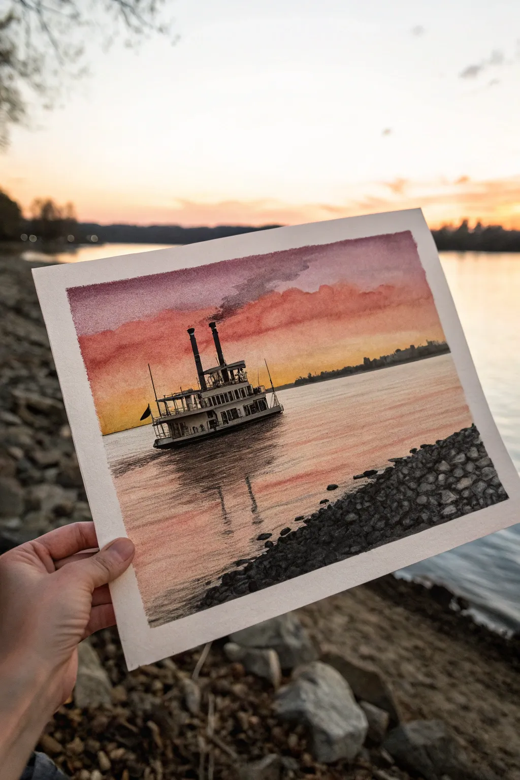
Capture the romantic nostalgia of the Mississippi River with this atmospheric mixed media piece. By combining soft watercolor washes for the sky with precise charcoal or ink details for the boat, you’ll create a striking contrast between the dreamy sunset and the industrial silhouette.
Step-by-Step
Materials
- Cold press watercolor paper (140lb/300gsm)
- Watercolor paints (Alizarin Crimson, Cadmium Yellow, Ultramarine Blue, Burnt Sienna)
- Flat wash brush (3/4 inch)
- Round detail brushes (size 2 and 4)
- Charcoal pencils (medium and hard) or black pigment liners
- White gel pen (optional for highlights)
- Masking tape
- Paper towels
- Graphite pencil (HB) for sketching
Step 1: Planning and Sky
-
Lay the foundation:
Begin by lightly sketching the horizon line about one-third of the way up the paper. Sketch the basic geometric shapes of the steamboat on the left side, keeping the lines faint so they don’t show through the paint later. -
Mask the edges:
Tape down all four edges of your watercolor paper to a board. This creates that crisp white border seen in the photo and prevents the paper from buckling during the heavy washes. -
Wet-on-wet preparation:
Using your large flat brush, apply clean water to the entire sky area above the horizon line. You want the paper glistening but not forming puddles. -
Paint the golden glow:
While the paper is wet, drop in a vibrant Cadmium Yellow near the horizon line, letting it bleed upwards. Keep the color strongest just above the water level. -
Add the dramatic reds:
Mix Alizarin Crimson with a touch of Burnt Sienna. Apply this rich reddish-orange to the middle of the sky, blending it softly into the yellow while the paper is still damp. -
Deepen the upper sky:
For the top of the sky, mix Ultramarine Blue with a little Crimson to create a dusky purple-grey. Paint the top edge and let gravity pull it down slightly into the red to create a gradient.
Clean Edges Trick
Before painting, run a bone folder or spoon edge firmly over your masking tape seal. This prevents watercolor from bleeding under the tape and ensures that perfect border.
Step 2: Water and Reflections
-
Mirror the sky:
Once the sky is damp but not soaking, repeat the color sequence in the water area. Start with yellow near the horizon, fading into soft reds closer to the bottom, using horizontal strokes to mimic ripples. -
Create water texture:
While the water wash is still wet, lift out a few horizontal highlights using a thirsty (damp but clean) brush to suggest light catching the waves. -
Dry thoroughly:
Wait for the entire painting to dry completely. If the paper feels cool to the touch, it’s still wet. I prefer to let this dry naturally to avoid pushing pigment around with a hair dryer.
Step 3: The Steamboat and Foreground
-
Draw the shoreline:
Using a charcoal pencil or black ink pen, carefully outline the distant shoreline on the right. Keep these shapes low and indistinct to create depth. -
Construct the boat structure:
Switch to your medium charcoal pencil. Darken the main decks and hull of the steamboat. Use a ruler if you want perfectly straight vertical lines for the smokestacks. -
Add architectural details:
Fill in the windows and railings with fine lines. Don’t worry about perfect symmetry; the looseness adds character. Darken the smokestacks significantly to make them stand out against the sunset. -
Render the reflection:
Directly under the boat, use horizontal scribbles with your charcoal to create the reflection. These lines should be broken and wavy, distorting the boat’s shape slightly. -
Add the rocky foreground:
In the bottom right corner, draw the rocky bank. Start by outlining irregular oval shapes for the larger stones at the water’s edge. -
Shade the rocks:
Fill in the gaps between the rocks with deep black to simulate shadows. Lightly shade the tops of the rocks with gray, leaving the very tops white or using a white gel pen to show the remaining light hitting them. -
Add subtle smoke:
Mix a very watery grey watercolor wash. Gently paint a trail of smoke drifting from the smokestacks to the right, blending it out so it disappears into the purple sky. -
Final touches:
Review the contrast. If the boat needs to be darker, go over it with a softer charcoal pencil. Once satisfied, carefully peel off the masking tape at a 45-degree angle.
Level Up the Atmosphere
Sprinkle a tiny pinch of salt onto the wet foreground rocks wash before it dries. This creates a natural, pebbled texture that looks incredibly realistic.
Now you have a serene river scene that perfectly captures the golden hour mood.

PENCIL GUIDE
Understanding Pencil Grades from H to B
From first sketch to finished drawing — learn pencil grades, line control, and shading techniques.
Explore the Full Guide
Louisiana Iris Line-and-Wash Study
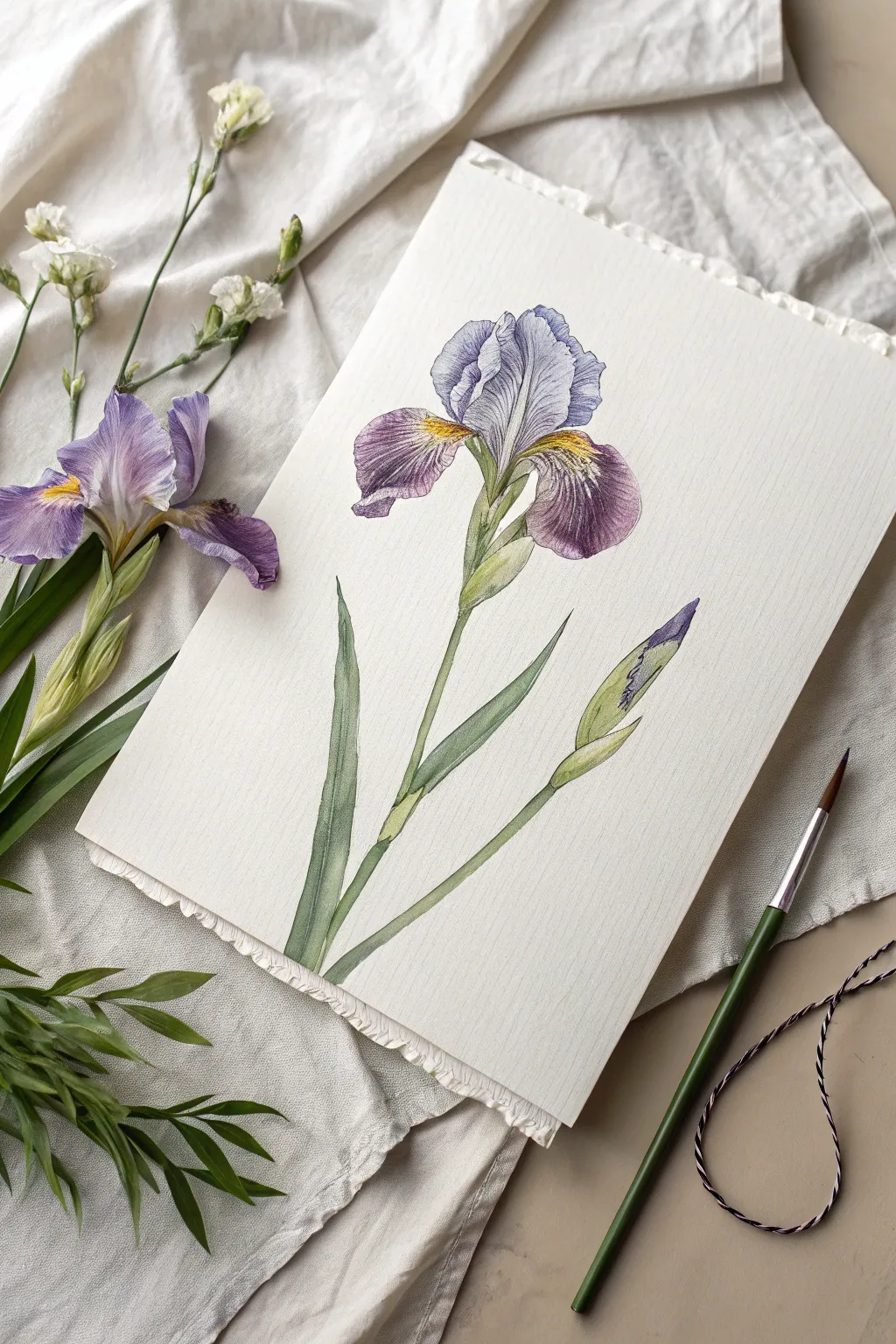
Capture the graceful curves and complex veining of a Louisiana Iris with this elegant watercolor line-and-wash project. The combination of soft purple washes and precise linework creates a botanical illustration style that feels both classic and contemporary.
Step-by-Step
Materials
- Hot press watercolor paper (smooth finish)
- Pencil (HB or 2H)
- Kneadable eraser
- Watercolor paints: Violet, Ultramarine Blue, Sap Green, Olive Green, Yellow Ochre
- Fine round brushes (Size 0 and Size 4)
- Fine liner brush or waterproof fine-tip pen (optional for details)
- Palette for mixing
- Two jars of water
- Paper towels
- Masking tape (optional)
Step 1: Planning and Sketching
-
Analyze the Composition:
Begin by observing the flower’s structure. Notice the central upright petals (standards) standing tall and the three drooping petals (falls) that curve downward. The main stem angles slightly to the left, balanced by a secondary bud on the right. -
Light Skeleton Sketch:
Using your HB pencil, lightly draw a simple vertical line for the stem, slightly curved. Mark the top for the flower head and a side branch for the bud. Keep your pressure extremely light so lines won’t show later. -
Define the Petal Shapes:
Sketch the outline of the iris. Start with the two central, upright petals, giving them ruffled edges. Then, draw the three larger, drooping petals. Don’t worry about perfect symmetry; organic shapes look more natural. -
Add Leaves and Stem:
Draw the thick stem sections, noting where the flower emerges from the green spathe (the leafy base). Add long, sword-like leaves at the bottom, curving them gently to follow the movement of the stem. -
Refine the Edges:
Go back over your outlines to add specific details: the gentle ruffles on the petal edges and the pointed tip of the unopened bud. Use a kneadable eraser to lift any heavy graphite, leaving only a ghost of a guide.
Veining Vitality
To make veins look natural, paint them wet-on-dry with a “rigger” or liner brush. Break the lines occasionally—continuous solid lines can make the flower look like a wireframe rather than organic tissue.
Step 2: First Wash Layers
-
Wet-on-Dry Petal Base:
Mix a very dilute wash of Violet with a touch of Ultramarine. Using your size 4 brush, paint a pale, even layer over the purple sections of the petals, leaving the center throat area white for now. -
Stem Foundation:
While the petals dry, mix a light Sap Green. Paint the stems and the leaves. Keep this layer varied—add a drop more water near the top of the leaves for a gradient effect. -
Yellow Signals:
Once the purple wash is dry to the touch, mix a bit of Yellow Ochre. Carefully paint the ‘signal’ patches (the yellow centers) on the drooping petals where they meet the stem. -
Bud Base Color:
Paint the bottom half of the bud with your green mix, and delicately drop a heavy violet mix into the wet tip. Let the colors bleed slightly where they meet for a seamless transition. -
Shadow Mapping:
Mix a slightly darker, cooler purple. Glaze this over the areas where petals overlap or curve downward to start establishing form and volume.
Muddy Purple Fix
If your purple shadows look brown or muddy, you likely overworked the wet paper. Let the area dry completely, then apply a clean glaze of pure Ultramarine Blue to cool down and clear up the shadow.
Step 3: Developing Texture and Detail
-
Deepening the Purple:
Mix a more concentrated Violet. Using the tip of your brush, darken the outer edges of the drooping petals and the deep folds of the upright standards to create contrast. -
Adding Veins:
Switch to your Size 0 brush. I prefer to ensure my paint is creamy, not watery, for this step. Painstakingly paint the fine, branching veins radiating from the yellow center outwards across the purple petals. -
Refining the Center:
Add small dashes of brownish-purple over the yellow signal patches to create texture. This mimics the fuzzy ‘beard’ or textured ridges often found on irises. -
Leaf Shadows:
Mix Olive Green with a tiny touch of Violet to make a shadow green. Paint along one side of the stem and the undersides of the leaves to make them look cylindrical rather than flat. -
Bud Details:
Add fine vertical lines to the purple tip of the bud, showing the tightly packed petals waiting to unfurl. Darken the green sheath below it to push the bud forward visually.
Step 4: Final Touches
-
Crisp Edges:
If any edges look too soft or lost, use your finest brush or a specialized fine-liner pen (in gray or purple) to re-state the outer contour with a broken, delicate line. -
Highlight Check:
Assess your painting. If you lost the highlights on the petal ruffles, you can use a tiny bit of white gouache or a white gel pen to reclaim those sparkling edges. -
Grounding the Stem:
Deepen the green at the very bottom where the leaves converge. This anchors the plant visually so it doesn’t feel like it’s floating in space. -
Final Assessment:
Step back and look at the overall balance. Add any final dark glazes needed to separating touching petals or define the separation between the stem and the flower head.
Now you have a timeless botanical study ready to be framed or gifted to a garden lover
Swamp Creatures Mini “Field Guide” Page
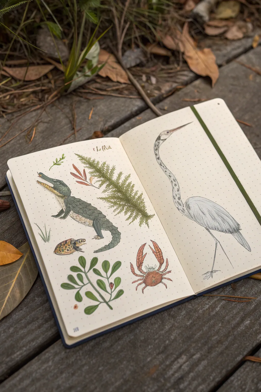
Capture the wild spirit of the Louisiana bayou with this charming nature journal spread featuring native swamp inhabitants. Using a dot-grid notebook to keep proportions in check, you’ll create a mini field guide complete with an alligator, heron, crab, and local flora.
Step-by-Step Tutorial
Materials
- Dot-grid sketchbook or journal
- Pencil (HB or H for sketching)
- Kneaded eraser
- Fine liner pens (sizes 0.1, 0.3, and 0.5, black)
- Watercolor paints or fluid acrylics
- Small round brushes (sizes 2 and 4)
- Optional: Colored pencils for texture
Step 1: Drafting the Layout
-
Establish the composition:
Begin by opening your dot-grid notebook to a fresh spread. Lightly mark the center of the right page for your heron, which will be the tallest figure. On the left page, visualize a diagonal flow: alligator in the center left, crab in the bottom right, and botanical elements filling the gaps. -
Sketch the heron’s gesture:
On the right page, draw a long, sweeping S-curve to represent the heron’s neck and body. The neck should be exceptionally long and slender, curving gracefully into an oval body shape. Add a long, sharp triangle for the beak. -
Outline the left page animals:
Sketch a long, low oval for the alligator’s body, tapering into a curved tail. Add a rectangular snout with the mouth slightly open. Below it, near the gutter, sketch a small oval for the turtle and a rounder shape for the crab’s shell in the bottom right corner. -
Add botanical placeholders:
Lightly draw the main stems for the flora. Place a large, fern-like branch sweeping from the top middle of the left page down towards the center. Add a smaller leafy sprig at the very bottom left.
Step 2: Inking the Outlines
-
Refine the heron:
Using a 0.1 fine liner, carefully trace your heron sketch. Use broken, feathery lines for the wing feathers to suggest softness. Keep the neck lines smooth but very thin. -
Detail the alligator:
Switch to a 0.3 pen for the alligator to give it more weight. Draw the jagged ridges along its back and tail. Don’t close every single scale shape; suggest texture with small, irregular bumps and dashes. -
Ink the smaller creatures:
Ink the crab with segmented legs and defined pincers. Ink the turtle’s shell with a pattern of small scutes. For the plants, use a confident, continuous line for stems and quick, repetitive strokes for the pine-like needles. -
Erase pencil lines:
Once the ink is completely dry—give it a full five minutes to be safe—gently roll your kneaded eraser over the entire spread to lift the graphite sketches.
Bleed-Through Blues?
If your markers bleed through the paper, try gluing two pages together with a glue stick before starting, or prep the page with a thin layer of clear gesso.
Step 3: Adding Color & Texture
-
Paint the heron:
Keep the heron mostly white or very pale grey. Add tiny touches of light grey wash to the underside of the wings for shadow. Paint the beak a muted orange-brown. Use a stippling technique with your pen to add spots along the neck. -
Color the alligator:
Mix a murky grey-green watercolor. Apply a wash over the alligator’s body, keeping the belly lighter (pale cream or tan). While the paint is still damp, drop in slightly darker green along the back ridges for depth. -
Detail the shell and crab:
Paint the turtle shell with varied browns and ochres to look mottled. For the crab, use a rusty red-orange, letting the color be more intense on the claws and lighter in the center of the shell. -
Greenery and flora:
Use an olive green for the large, needle-like branch. Use short, flicking brushstrokes to mimic the texture of the leaves. Paint the bottom leafy sprig a solid, vibrant green. -
Final shading:
Once dry, use colored pencils or a very dry brush to add texture. Add cross-hatching to the heron’s wings with a grey pen. darkening the tips. -
Labeling:
At the top of the page, freely hand-letter a small title or species name in a cursive script using a brown or black pen to complete the field guide look.
Make it Authentic
Add ‘handwritten’ field notes next to each creature, like ‘Spotted at dusk’ or specific dates, to enhance the scientific journal aesthetic.
Now you have a beautifully documented slice of the swamp preserved in your sketchbook


Louisiana Pattern Tiles in a Sketchbook Grid
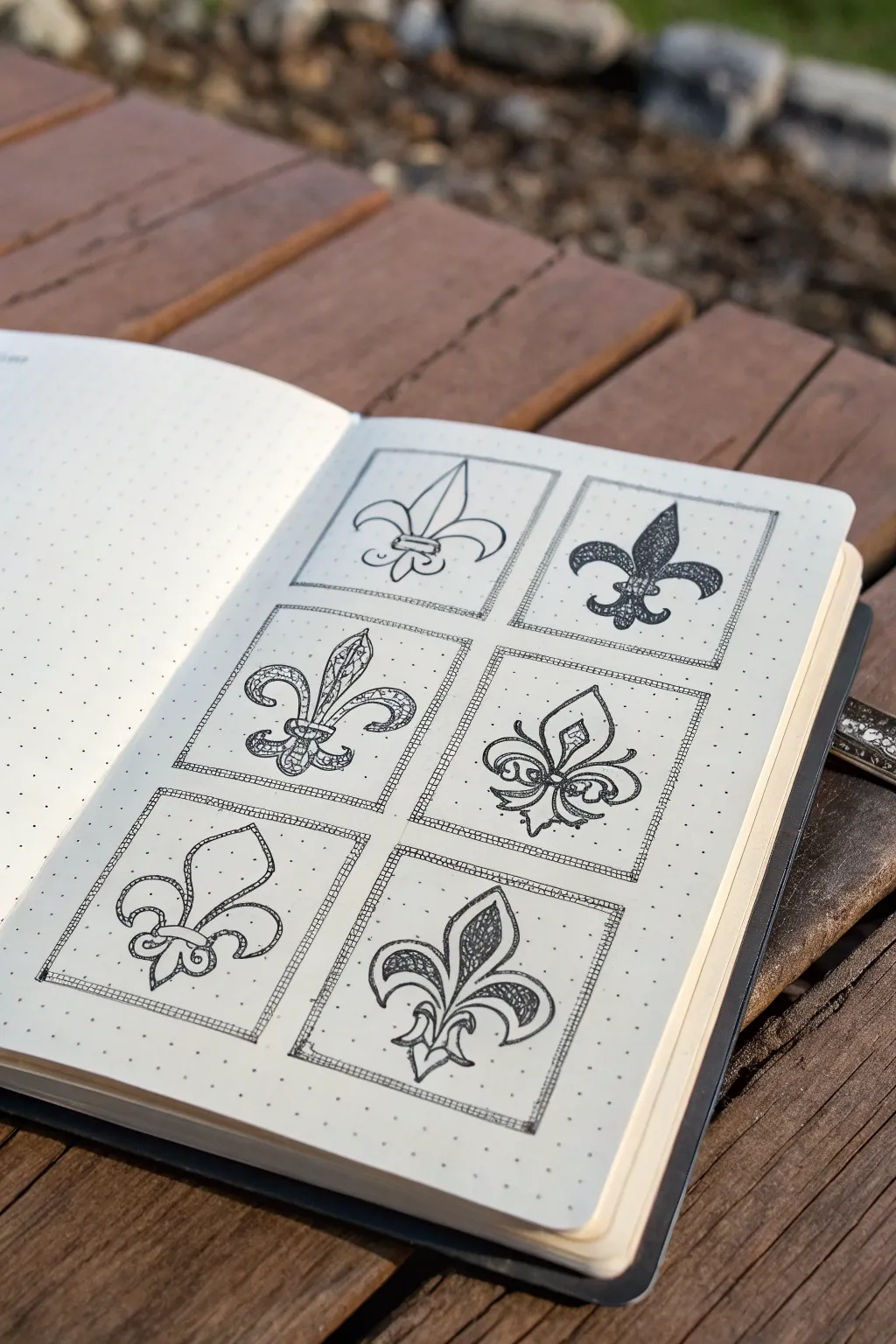
This elegant layout captures the spirit of Louisiana with six distinct variations of the iconic fleur-de-lis symbol drawn in a clean grid. Using the dotted guide of your journal, you’ll explore different weights, textures, and flourishes to create a cohesive yet varied collection of designs.
How-To Guide
Materials
- Dotted grid sketchbook or journal
- Fine liner pens (sizes 005, 01, and 05 recommended)
- Pencil (HB or H)
- Good quality eraser
- Ruler
Step 1: Setting the Grid
-
Measure the layout:
Begin by determining the size of your squares based on your notebook’s dot grid spacing. For this six-tile layout, a 2×3 grid works perfectly. -
Draft the boxes:
Using your pencil and ruler, lightly draw six equal squares. Leave a consistent margin of 2-3 dots between each square to let the designs breathe. -
Add inner borders:
Inside each pencil square, lightly sketch a second, smaller square about 2mm inward. This creates the double-frame look seen in the reference.
Step 2: Designing the Forms
-
Mark the center lines:
Lightly sketch a vertical line down the center of each box. The fleur-de-lis is a symmetrical symbol, and this axis is crucial for balance. -
Sketch the central petals:
In each box, sketch the central, upright petal first. Vary the shapes: make some sharp and sword-like, others rounded or teardrop-shaped. -
Add the curving arms:
Draw the two side petals curving outward and down. Experiment with how deeply they curl; some can be tight spirals, while others can be gentle waves. -
Draw the binding band:
Sketch the horizontal band that ‘ties’ the three petals together near the bottom. This can be a simple bar or a decorative ring. -
Complete the base:
Add the bottom flared section below the band. Match the style of the top petals—if the top is ornate, make the bottom ornate as well.
Symmetry Hack
Turn your sketchbook upside down to check your pencil sketches. Symmetrical errors pop out immediately when viewed from a new angle.
Step 3: Inking and Detailing
-
Ink the frames:
Switch to a size 01 fine liner. Carefully trace over your square borders. To replicate the ‘sketchy’ look, don’t use a ruler here; let your hand wobble slightly for an organic feel. -
Add cross-hatching to frames:
Fill the narrow space between your double border lines with tiny, diagonal hash marks to create a textured frame effect. -
Outline the first simple design:
Start with the top-left design (the simplest one). Outline the shape cleanly with an 01 pen, leaving the interior white for a minimalist look. -
Create the ‘filled’ design:
For the top-right tile, outline the shape and then use a thicker 05 pen to fill the interior solid black. Leave tiny white gaps where lines intersect to define the details. -
Detail the ornate variations:
Move to the middle-left tile. Outline the shape, then draw smaller teardrop shapes inside the petals. Fill the space around these inner shapes with stippling (tiny dots) for texture. -
Ink the floral style:
For the middle-right tile, focus on flowing, vine-like lines. Instead of solid shapes, use double lines created with the 005 pen to make the symbol look like bent wire or ribbon. -
Execute the open-line style:
On the bottom-left, draw the fleur-de-lis using only a single, confident contour line. Add a second inner line that echoes the outer shape without touching it. -
Finish with shading:
For the final bottom-right tile, use the 005 pen to add hatching (closely spaced parallel lines) inside the petals to create a shaded, vintage engraving look.
Add Gold Accents
Use a metallic gold gel pen to fill the binding bands or add small dots inside the frames for a touch of Mardi Gras flair.
Step 4: Final Touches
-
Erase pencil marks:
Wait at least 15 minutes to ensure the ink is completely dry, then gently erase all underlying pencil grids and construction lines. -
Clean up edges:
Inspect your borders. If any corners feel too open, add a tiny dot of ink to visually close the frame.
Now you have a stunning page of variations that celebrates this classic symbol


Have a question or want to share your own experience? I'd love to hear from you in the comments below!