
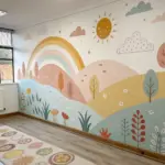
If you’ve been staring at your brushes thinking, “There has to be another way,” you’re in the right mindset. These alternative painting ideas are all about playful tools, happy accidents, and getting gorgeous results without needing perfection.
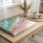
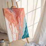
Acrylic Pouring and Tilt Effects
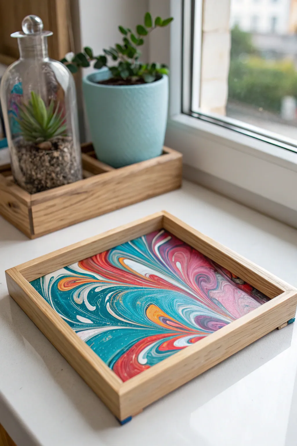
Transform a plain wooden tray into a stunning piece of functional are using the mesmerizing technique of acrylic ring pouring. The result is a vibrant, psychedelic pool of turquoise, coral, and white swirls that looks sophisticated yet is surprisingly achievable.
Step-by-Step Tutorial
Materials
- Square wooden serving tray (unfinished)
- Acrylic paints (Turquoise, Coral/Red, White, Yellow, Metallic Gold)
- Pouring medium (Liquitex or Floetrol)
- Painter’s tape
- Gesso (white primer)
- Clear epoxy resin kit
- Plastic cups (one for each color)
- Stir sticks
- Butane torch or heat gun
- Gloves and drop cloth
Step 1: Tray Preparation
-
Sand the Wood:
Begin by lightly sanding the entire wooden tray with fine-grit sandpaper to remove any rough splinters. Wipe away the dust with a damp cloth or tack cloth. -
Tape the Frame:
Carefully apply painter’s tape along the inside walls of the tray. This is crucial because we want the paint to only cover the bottom panel, leaving the natural wood sides clean. -
Prime the Surface:
Brush a layer of white Gesso onto the bottom panel of the tray. This prevents the wood from soaking up your paint and ensures the colors pop vividly. -
Dry Completely:
Allow the Gesso to dry fully, usually about 30 minutes to an hour. While waiting, set up your workspace with a drop cloth, as pouring gets messy.
Clean Lines Pro-Tip
Press the tape down firmly with a credit card before painting. This prevents paint bleed-under and ensures a crisp line against the wood.
Step 2: Mixing the Paint
-
Prepare Individual Colors:
In separate cups, mix your acrylic paints with the pouring medium. A standard ratio is 1 part paint to 2 parts medium, but check your bottle’s instructions. -
Check Consistency:
Stir each cup until the mixture flows like warm honey. If I lift the stick, the paint should trail off smoothly without breaking. -
Layer the Dirty Cup:
Take a larger, clean cup. Pour small amounts of each color into this single cup, one on top of the other. Don’t stir! Alternate turquoise, white, coral, and gold to build layers.
Level Up: Handles
Before the final resin pour, screw sleek brass handles onto the shorter outer sides to turn this art piece into a functional serving tray.
Step 3: The Pour and Design
-
Pour the Paint:
Gently pour the contents of your layered cup into the center of the tray’s bottom panel. You can pour in a small circular motion to encourage initial rings. -
Tilt to Fill:
Pick up the tray and slowly tilt it in different directions. Watch as the paint slides toward the corners. Let the patterns stretch and distort naturally. -
Manipulate the Swirls:
If you want that specific ‘combed’ look seen in the photo, gently drag a toothpick or the handle of a paintbrush through the wet paint, starting from the outside and pulling toward the center. -
Cover the Edges:
Ensure the paint reaches all the way to the taped edges. If there are stubborn corners, use a gloved finger to guide the paint into place. -
Pop Bubbles:
Quickly pass a butane torch or heat gun over the surface. This pops trapped air bubbles and can bring up small cells of color. -
Let it Cure:
Place the tray on a level surface to dry. This is the hardest part—waiting! Let it sit undisturbed for at least 24 to 48 hours until completely dry to the touch.
Step 4: Sealing and Finishing
-
Mix the Resin:
Once the paint is cured, mix your two-part epoxy resin according to the package directions. Stir slowly to avoid creating too many new bubbles. -
Pour the Resin:
Pour the resin over the painted bottom of the tray. It creates that glass-like, durable finish seen in the image. -
Spread and Torch:
Use a plastic spreader to ensure the resin hits all corners. Do one final pass with the torch to remove resin bubbles. -
Remove Tape:
About 45 minutes to an hour after pouring the resin (when it’s tacky but not flowing), carefully peel away the painter’s tape. -
Final Cure:
Allow the resin to cure fully for 72 hours before placing anything inside the tray or cleaning it.
Now you have a glossy, custom tray that brings a splash of artistic color to any coffee table or windowsill

Tape Resist Geometric Shapes
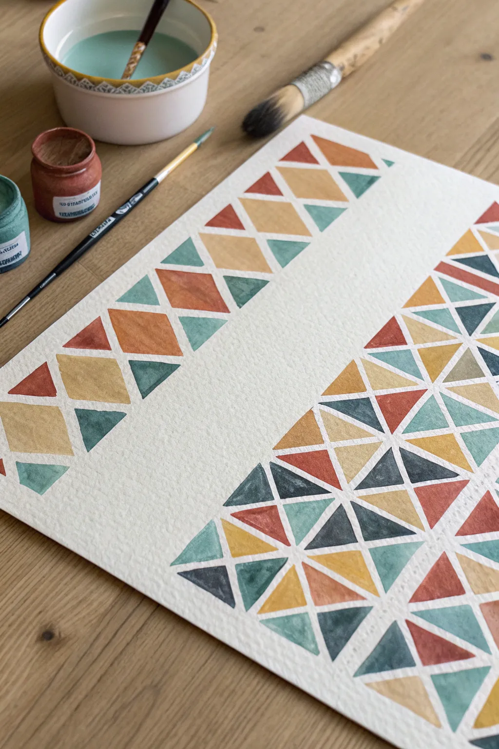
Create a stunning, modern piece of art using simple masking techniques and a warm, earthy color palette. This tape resist project transforms basic triangles and diamonds into a sophisticated pattern that looks much harder to paint than it actually is.
Step-by-Step
Materials
- Cold press watercolor paper (300 gsm recommended)
- Painter’s tape or specialized artist masking tape (various widths)
- Watercolor paints (burnt sienna, yellow ochre, teal/turquoise, payne’s gray)
- Round watercolor brush (size 4 or 6)
- Small flat brush (optional, for crisp edges)
- Palette for mixing
- Two water jars
- Paper towels
- Ruler
- Pencil
Step 1: Planning and Taping
-
Paper Prep:
Begin by taping down your watercolor paper to a sturdy board or your work surface. This prevents the paper from buckling when wet and creates a clean white border around the entire artwork. -
Define the Layout:
Lightly mark your design area. For this specific look, leave a large central channel of negative space. You want a narrower patterned border on the left and a larger field of triangles on the right. -
Tape the Grid:
Apply strips of tape to create your grid. Start by laying down long diagonal strips across the right section. Spacing them evenly is key, so use a ruler if you aren’t confident eyeing it. -
Cross-Diagonal Taping:
Lay a second set of diagonal tape strips perpendicular to the first set on the right side. This will create a lattice of diamonds or triangles, depending on your angle. -
Border Pattern:
For the left-side border, apply tape to create a vertical column of diamonds. You can achieve this by taping a zig-zag pattern or using small pre-cut pieces of tape to block out the shapes. -
Seal the Edges:
Run a bone folder or the back of your fingernail firmly along every edge of the tape. This is the secret to crisp lines; if the tape isn’t sealed perfectly, paint will bleed underneath.
Bleed Patrol
Using a tiny brush with white gouache is a great cheat for fixing mistakes. paint over any areas where color bled under the tape to restore crisp lines.
Step 2: Mixing and Painting
-
Prepare the Palette:
Mix your puddles of paint. You’ll want a harmonious earthy scheme: a deep rust red (burnt sienna), a golden mustard (yellow ochre), a muted teal, and a dark slate blue. -
Test Consistency:
Ensure your paint is fluid but rich in pigment. If it’s too watery, it might seep under the tape; too thick, and it won’t have that lovely watercolor transparency. -
Start with Ochre:
Begin painting random sections within your taped grid with the yellow ochre. Scatter them around the composition rather than bunching them together to keep the balance visually interesting. -
Add Rust Tones:
Rinse your brush and switch to the rust/red color. Fill in adjacent triangles or diamonds. I like to let the edges of the paint pool slightly against the tape for a defined rim. -
Cool Tones:
Move on to the teal and slate blue shades. These cool colors will make the warm earth tones pop. Paint the remaining empty shapes, being careful not to paint over the masking tape into an already wet wet area if possible. -
Gradient Variation:
For added depth, drop a tiny bit of clean water or a darker pigment into a wet shape while it’s still drying. This creates subtle blooms and texture characteristic of watercolor. -
Wait for Dryness:
This is the hardest part: patience. Let the painting dry completely. The paper should feel room temperature to the touch, not cool. If it’s cold, it’s still damp.
Add Metallic Flair
Once dry, use a gold pen or fine brush with metallic watercolor to outline specific triangles or fill in random shapes for a touch of luxury.
Step 3: The Reveal
-
Test Peel:
Pick a corner of the tape and peel it back slowly. Pull the tape away from the painted area at a 45-degree angle, keeping it close to the paper surface. -
Remove Grid Tape:
Gently remove all the interior masking tape. If the paper starts to lift, use a hairdryer on a warm setting to soften the adhesive before continuing. -
Clean Up:
Once the tape is gone, you’ll see crisp white lines separating your shapes. If you find any small bleeds, use a stiff, damp brush to gently lift the unwanted pigment. -
Erase Marks:
If any pencil construction lines are visible in the white gaps, gently erase them now that the paper is fully dry.
Step back and admire how the negative space turns simple painted shapes into a structured geometric mosaic
Stencil Pouncing for Graphic Layers
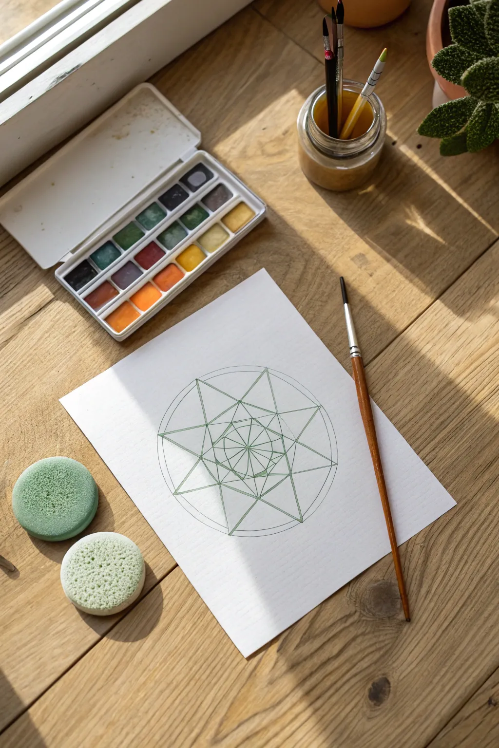
Combine precision drawing with soft, stenciled textures in this calming geometric art project. By using sponge pouncers alongside traditional linework, you create a mandala that feels both structured and effortlessly organic.
Step-by-Step Guide
Materials
- Heavyweight watercolor paper or mixed media paper
- Fine-liner pen or sharp colored pencil (forest green)
- Ruler and compass
- Pencil (HB or lighter)
- Watercolor paints (pan set recommended)
- Round sponge pouncers (small and medium sizes)
- Small round detail brush (size 2 or 4)
- Water jar and paper towels
Step 1: Drafting the Geometry
-
Find center:
Begin by marking the absolute center of your paper lightly with a pencil. This anchor point is crucial for keeping your symmetry aligned throughout the process. -
Draw the base circle:
Using a compass, draw a large outer circle centered on your mark. Keep the lead pressure light so it can be erased or integrated later. Create a second, slightly smaller inner circle about half an inch inside the first. -
Establish points:
Divide your circle into eight equal sections. You can do this by drawing a vertical and horizontal line through the center, then bisecting those angles. -
Form the large star:
Connect every third point on the circumference to create an acute, eight-pointed star shape. The points should touch the inner circle guide you drew earlier. -
Add inner layers:
Inside the main star, repeat the process on a smaller scale to create a nested rosette pattern. Connect the intersections of the larger star’s lines to form a smaller central octagon and starburst.
Moisture Check
Sponge pouncers hold a deceptive amount of water. Always blot on a paper towel before hitting your artwork to prevent puddles.
Step 2: Inking the Structure
-
Trace linework:
Switch to your fine-liner pen or a very sharp green colored pencil. Carefully trace over your finalized geometric pencil lines. -
Clean up:
Once the ink is fully dry—give it a few minutes to be safe—gently erase the original graphite construction lines and your center mark to leave a crisp green skeleton.
Masking Magic
For ultra-crisp edges, use low-tack painter’s tape to mask off adjacent triangles before pouncing inside specific geometric sections.
Step 3: Pouncing the Color
-
Prepare the sponges:
Dampen your round sponge pouncers slightly, squeezing out any excess water so they are moist but not dripping. -
Load pigment:
Rub the damp sponge directly into a pan of green watercolor paint rather than dipping it. You want a concentrated creamy layer of pigment on the foam surface. -
Test the texture:
Tap the sponge on a scrap piece of paper first. I always do this to remove the initial heavy blob of paint and ensure I’m getting an airy, textured stipple effect. -
Apply base color:
Gently pounce the sponge over specific sections of your design. Focus on the triangular negative spaces between the star points to build soft clouds of color. -
Layer intensity:
Let the first layer dry for a moment, then pounce again over the same area if you want deeper saturation, or switch to a lighter yellow-green for the central rosette area.
Step 4: Refining Details
-
Wet glazing:
Using a wet detail brush, dissolve a small amount of watercolor to create a translucent wash. -
Accentuate lines:
Run the brush along the inner edges of your main star lines. This technique, essentially a shadow line, helps lift the geometry off the page. -
Fill small segments:
Select a contrasting earthy tone, perhaps a warm ochre or terra cotta, and carefully paint in the smallest diamond shapes at the very center of the mandala. -
Final assessment:
Check for any uneven edges where the sponge pouncing might have bled outside desired areas. You can sharpen these boundaries by re-lining them with your green pen if necessary.
Step back and admire how the juxtaposition of sharp lines and soft textures creates a harmonious piece of art

Plastic Wrap Wrinkle Pulls
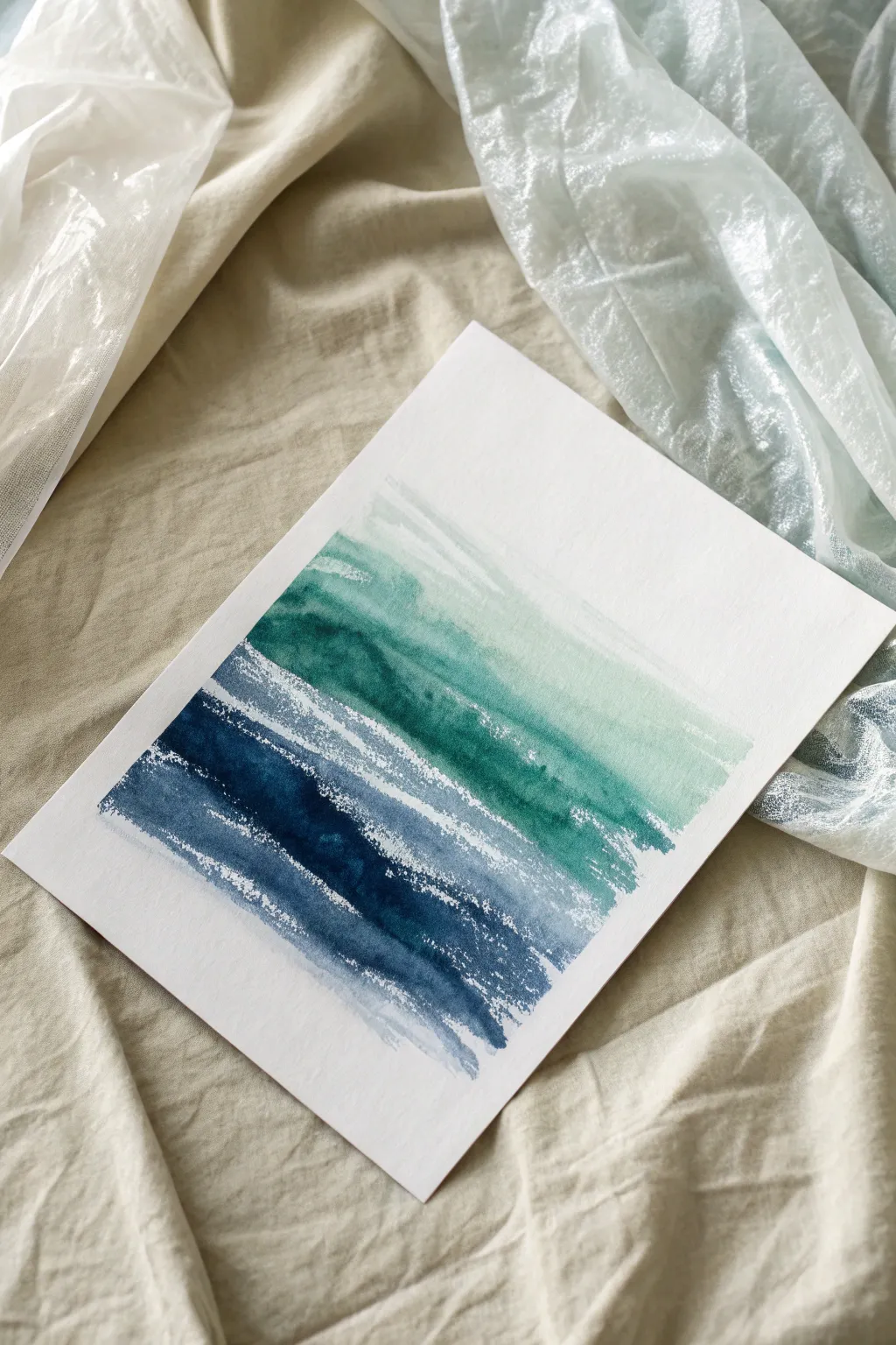
Capture the organic movement of ocean waves using nothing more than watercolor and household cling film. This technique creates stunning, unpredictable striations that mimic the foam and flow of water with minimal effort.
Step-by-Step Guide
Materials
- Cold press watercolor paper (300 gsm)
- Watercolor paints (Indigo, Phthalo Blue, Viridian Green)
- Large flat wash brush (3/4 inch or 1 inch)
- Plastic wrap (cling film)
- Masking tape
- Clean water jar
- Paper towels
- Palette or mixing dish
Step 1: Preparation & First Wash
-
Secure the Paper:
Tape your watercolor paper down to a hard board or your work surface on all four sides. This prevents the paper from buckling when it gets wet, which is crucial for this technique. -
Prepare the Wrap:
Tear off a sheet of plastic wrap that is slightly longer than the width of your paper. Ideally, you want a piece long enough to manipulate easily but not so big it gets in the way. -
Mix the Darkest Tone:
Load your palette with an Indigo or deep navy blue. You want a high pigment-to-water ratio here so the color remains bold even after the texture is applied. -
Apply the Bottom Band:
Using your large flat brush, paint a wide horizontal stripe of the Indigo across the bottom third of the paper. Use confident, sweeping strokes. -
Transition Color:
Quickly rinse your brush slightly, then pick up Phthalo Blue. Paint directly above the Indigo, overlapping the edges slightly so the colors begin to bleed together on their own.
Step 2: Gradient & Texture Application
-
Introduce the Green:
Clean your brush and pick up Viridian Green. Apply this to the middle section of the paper, again blending the lower edge into the Phthalo Blue while the paint is still wet. -
Create the Fade:
Dip your brush in clean water to dilute the remaining green pigment. Paint the next section upward, allowing the color to become translucent and watery. -
Final Water Wash:
Clean your brush completely and use only water to pull the faintest hint of green toward the top of the paper, leaving the very top edge pure white. -
Prepare for Plastic:
Check the moisture level. The paint needs to be wet and shiny for the plastic wrap technique to work. If it has started to dry, lightly mist it with water.
Wrinkle Master
Don’t just lay the wrap flat! Scrunch it primarily in the horizontal direction before placing it down to exaggerate the ‘wave’ look rather than random cells.
Step 3: Creating the Wrinkles
-
Lay the Plastic:
Take your pre-cut plastic wrap and lay it gently over the wet painted area. Do not press it flat; the goal is to create tension. -
Pinch and Pull:
Use your fingers to pinch the plastic wrap from the sides, creating horizontal wrinkles and folds. I find that pulling the wrap slightly taut horizontally encourages these linear shapes. -
Adjust the Contact:
Press down gently on the raised wrinkles. Wherever the plastic touches the wet paper, the paint will pool into the crevices and leave lighter marks where the plastic sits flat. -
Refine the Lines:
manipulate the plastic until you see long, jagged shapes that resemble crashing waves or sea foam. Ensure there are good points of contact in the dark blue areas. -
The Patience Phase:
Leave the plastic wrap in place and let the painting dry completely. This is the hardest part, but removing it too early will ruin the effect. -
Check for Dryness:
Touch the plastic wrap. If the paper underneath feels cool to the touch, it is still wet. Wait until it is room temperature. -
Reveal the Texture:
Gently peel back one corner of the plastic wrap. If the texture looks set and the paint is dry, pull the rest of the wrap off to reveal your oceanic texture.
Paint Dried Too Fast?
If the paint dried before you applied the wrap, mist the paper with a spray bottle. The surface must be glistening wet for the plastic to displace the pigment.
Peel off the tape carefully to reveal the crisp white border that frames your fluid seascape
BRUSH GUIDE
The Right Brush for Every Stroke
From clean lines to bold texture — master brush choice, stroke control, and essential techniques.
Explore the Full Guide
Straw-Blown Paint Rivers
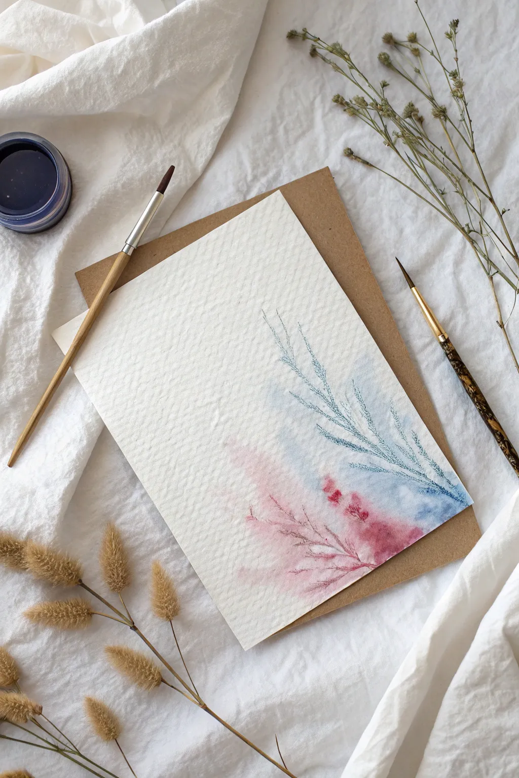
Create a delicate, ethereal greeting card using the unpredictable beauty of guided airflow. This project combines soft watercolor washes with straw-blown lines to mimic the look of frost patterns or wind-swept branches.
Detailed Instructions
Materials
- Cold-pressed watercolor paper (heavyweight and textured)
- Watercolor paints (Indigo Blue and Alizarin Crimson)
- Round watercolor brushes (size 4 and size 0 or rigger brush)
- Drinking straw
- Jar of clean water
- Mixing palette
- Paper towel
- Kraft paper envelope (for styling/backing)
Step 1: Preparation & Blue wash
-
Prepare your palette:
Begin by squeezing small amounts of Indigo Blue and Alizarin Crimson onto your palette. Add a drop of water to each to activate the pigment, creating a puddle that is fluid but still rich in color. -
Position the paper:
Tape your watercolor paper down onto a flat board or work surface if desired, or simply place it flat. Ensure you have room to move around the paper as you will need to blow air from different angles. -
Initial blue drop:
Load a medium-sized round brush with watery Indigo Blue paint. Place a generous puddle of this wet paint on the right side of the paper, about halfway down. Don’t spread it too much; you want a reservoir of liquid. -
Guide the river:
Position the end of your drinking straw about an inch away from the blue puddle. Blow gently and steadily through the straw, aiming upwards and towards the left to force the paint into a long, main ‘branch’ shape.
Step 2: Blowing the Branches
-
Create tributaries:
While the main blue line is still wet, blow sharp, quick bursts of air at the edges of the paint trail. This will force smaller shoots to branch off, looking like delicate twigs or frost. -
Extend the design:
If the paint stops moving, add a tiny drop of water or pigment to the end of a branch and blow again to extend it further up the page. -
Refine the structure:
Continue blowing the blue paint until you have a sweeping arch shape that reaches towards the upper left corner. Let the very ends taper off naturally as the paint runs out. -
Let it settle:
Allow this blue section to dry for just a moment—it doesn’t need to be bone dry, but the puddles should soak in slightly so steps don’t bleed uncontrollably.
Breath Control Pro-Tip
Rotate the paper as you work, rather than craning your neck. Blowing ‘away’ from your body is much easier than trying to blow sideways across the table.
Step 3: Adding the Pink Wash
-
Apply the crimson:
Clean your brush and pick up the watery Alizarin Crimson. Drop a puddle of this pinkish-red hue slightly below and to the left of your blue section, near the bottom right. -
Blend the transition:
Let the pink puddle touch the edge of the blue area slightly. If they bleed into each other, that’s perfect—it creates a dreamy, soft transition color. -
Blow the pink branches:
Using your straw again, blow this pink puddle outward towards the left, mirroring the movement of the blue section but keeping it lower on the page. -
Create texture:
Vary your breath strength. A soft breath moves a wash of color, while a hard puff creates those spindly, intricate lines.
Metallic Level-Up
Once the paint is dry, use a metallic gold pen or fine gold paint to trace a few select veins. The shimmer adds a magical, high-end finish to the rustic design.
Step 4: Detailing & Finishing
-
Switch brushes:
Once the blown shapes are mostly dry, switch to your smallest detail brush or a rigger brush. I find this control helps define the abstract shapes. -
Accentuate lines:
Dip into slightly thicker, darker blue paint. Lightly trace over some of the blown ‘spine’ lines to give them more definition, adding tiny flicked marks to suggest needles or smaller twigs. -
Add red details:
Repeat the previous step with a more concentrated red mix, adding tiny details to the pink section to enhance the botanical feel. -
Texture the background:
For a subtle effect, dampen a clean brush with just clear water and lightly touch the edges of your painted areas to soften any harsh lines that formed while drying. -
Dry completely:
Let the paper dry completely flat. If the paper buckled from the water, you can press it under a heavy book overnight once it is fully dry. -
Final assembly:
Pair your finished artwork with a kraft paper envelope to emphasize the natural, organic aesthetic.
Now you have a stunning, one-of-a-kind card ready to share with someone special
String Pull Drag Painting
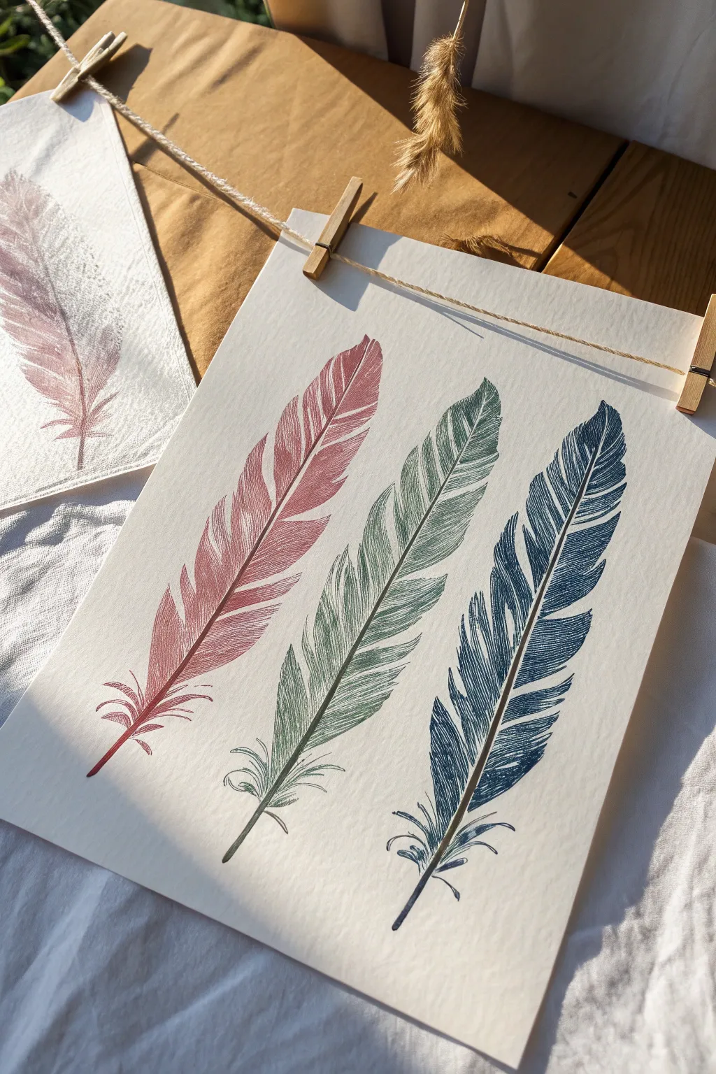
Using the surprisingly simple technique of string pulling, you can create elegant, detailed feather prints that look far more complex than they actually are. This project uses ink or fluid acrylics to stamp organic, vein-like textures directly onto high-quality paper for a stunning minimalist display.
Step-by-Step Tutorial
Materials
- Heavyweight mixed-media or watercolor paper (white or cream)
- Cotton twine or thick string (approx. 12-16 inches per feather)
- Liquid acrylic paints or acrylic inks (Muted Red, Sage Green, Deep Blue)
- Small shallow dishes or painter’s palette
- Paper towels
- Tweezers (optional, for handling messy string)
- A heavy book or flat board (for pressing)
- Jute twine and mini wooden clothespins (for display)
Step 1: Preparation and Setup
-
Cut the String:
Cut a piece of cotton twine roughly 12 to 16 inches long. Using a natural fiber string is best because the tiny fibers help create the realistic barbs of the feather. -
Prepare the Paint:
Pour a small amount of your red liquid acrylic paint or ink into a shallow dish. The consistency should be fluid like heavy cream; if you are using tube acrylics, thin them slightly with water or flow medium. -
Soak the String:
Submerge the string into the paint, leaving about 2-3 inches of one end clean to use as a handle. Use a craft stick or your fingers to ensure the string is thoroughly saturated but not dripping excessively.
String Theory
Use rough jute twine instead of smooth cotton string for a more rugged, textured feather look. The stray fibers on the twine create extra ‘fluff’ on the barbs.
Step 2: Creating the Feather Shape
-
Paper Position:
Place your paper on a flat, protected surface. You can tape the corners down lightly if you are worried about it shifting. -
Lay the Loop:
Lift the paint-soaked string and gently lay it onto the paper in a loop formation. The ‘clean’ handle end should be at the bottom. -
Form the Curve:
Arrange the string so the two sides of the loop touch at the bottom (the quill) and curve away from each other before meeting again at the top tip, mimicking the outline of a feather. -
Cover the Design:
Carefully place a scrap piece of paper or a paper towel directly over the wet string arrangement. Be careful not to shift the string underneath. -
Apply Pressure:
Place a heavy book or flat board on top of the covering paper, or use your hand to press down firmly and evenly across the entire design area.
Metallic Magic
Once the base color is dry, try overlaying a second pull using the same string dipped in gold or silver ink for a shimmering, dual-tone effect.
Step 3: The Pull Technique
-
Pull the String:
While maintaining firm pressure on the covering paper with one hand, grasp the clean end of the string with your other hand. Pull the string steadily downwards, straight out from under the book. -
Reveal the Print:
Remove the weight and the covering paper to reveal your first feather. The dragging motion creates the beautiful, symmetrical ‘veins’ radiating from the center. -
Check Consistency:
Inspect the print. If the paint was too thick, the lines might be blobby; if too thin, they may be faint. Adjust your paint mixture for the next feather if needed.
Step 4: Repeating the Process
-
Clean or Swap String:
Dispose of the red string. For the green feather, cut a fresh piece of twine to ensure the colors do not muddy. -
Position the Green Feather:
Repeat the soaking and looping process with the sage green paint. Position this loop next to the red impression, leaving equal spacing between them. -
Pull the Green Feather:
Cover, weight down, and pull the green string exactly as you did before. I find pulling slowly often yields clearer fine lines than a fast yank. -
Create the Blue Feather:
Repeat the entire process one final time with a fresh string and deep blue ink, placing it to the right of the green feather. -
Detailing the Quill:
Once the main prints are dry, look at the bottom stems. You can use a fine liner brush with a tiny bit of matching paint to extend or sharpen the central quill line if the string drag didn’t leave a solid enough stem.
Step 5: Display
-
Dry Completely:
Allow the artwork to dry flat for at least an hour to prevent any warping of the paper. -
Hang the Art:
String a length of jute twine across a window or wall. Use small wooden clothespins to clip the top corners of your paper to the twine for a rustic gallery look.
This simple technique results in sophisticated, nature-inspired art that looks beautiful anywhere in the home

PENCIL GUIDE
Understanding Pencil Grades from H to B
From first sketch to finished drawing — learn pencil grades, line control, and shading techniques.
Explore the Full Guide
Scratch-Back Sgraffito Lines
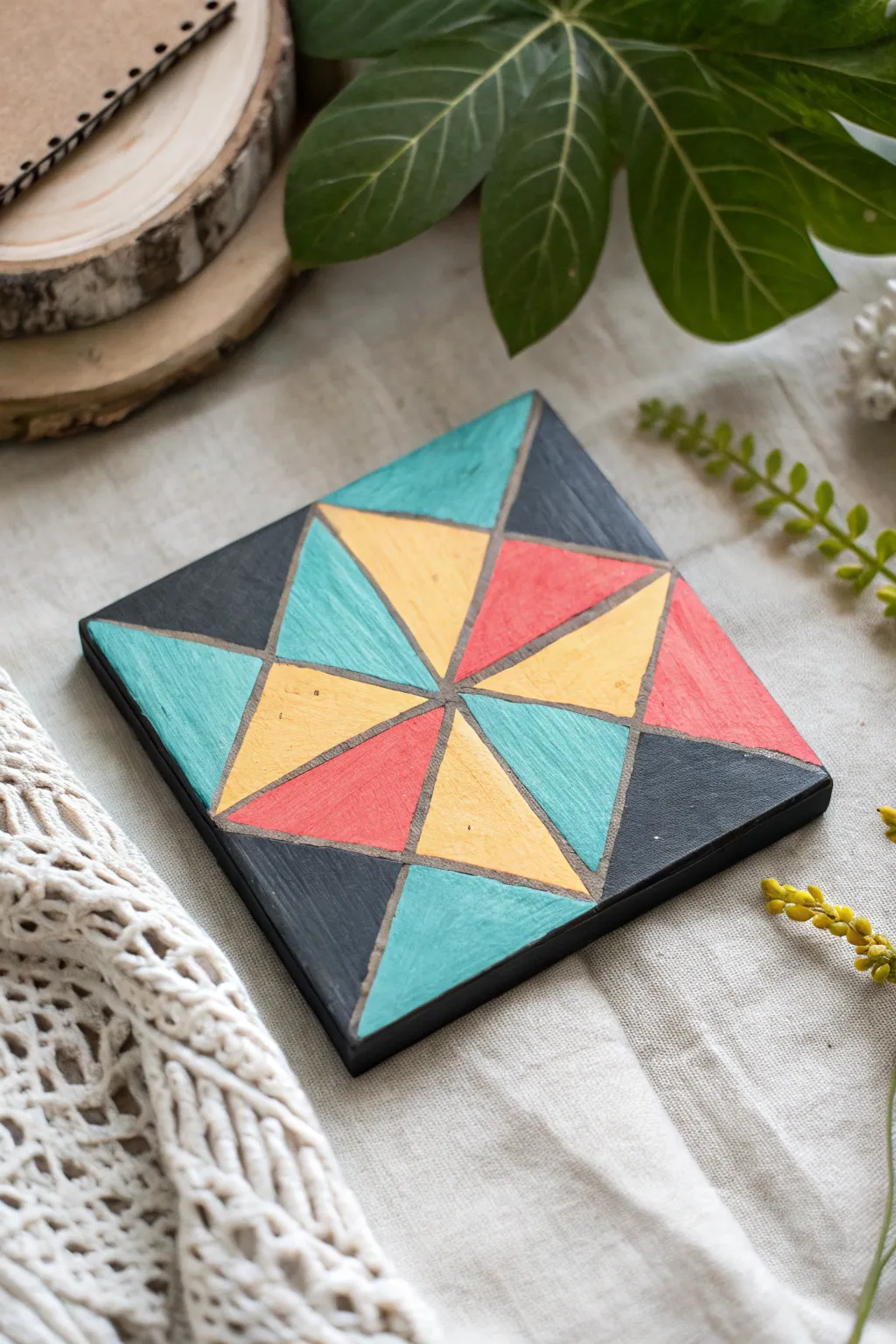
Transform a simple wooden base into a striking geometric statement piece using the ancient sgraffito technique. This project combines bold, color-blocked acrylics with satisfying scratch-work to reveal the natural grain underneath for a textured, rustic-modern finish.
Step-by-Step Tutorial
Materials
- Square wood block or coaster (4×4 or 6×6 inches)
- Acrylic paints (Teal, Mustard Yellow, Coral, Charcoal/Black)
- Pencil and ruler
- Flat paintbrush (medium size)
- Sgraffito tool, stylus, or an empty ballpoint pen
- Paper towels
- Matte spray varnish or sealer (optional)
Step 1: Preparation & Design
-
Prep the surface:
Begin with a small square of wood. If the surface feels rough, give it a quick sanding with fine-grit paper to ensure your tools will glide smoothly later. -
Map the center:
Find the exact center of your square by drawing very light diagonal lines from corner to corner with a ruler and pencil. -
Draw the starburst:
Draw a vertical line and a horizontal line through that center point, dividing the square into four smaller quadrants. -
Add diagonals:
Draw diagonal lines through the center of each quadrant to create the starburst effect. You should end up with a pattern where eight triangles meet in the middle. -
Define the outer triangles:
Connect the endpoints of your starburst lines to form the larger triangular shapes along the edges. Refer to the photo to replicate the specific ‘pinwheel’ layout.
Paint Flaking Off?
If paint chips off in chunks rather than clean lines, it’s likely too dry. Try slightly dampening the scratch line with a wet brush before carving.
Step 2: Painting
-
Plan your palette:
Select a color scheme of four distinct shades: a dark anchor (charcoal), a bright pop (coral), a warm tone (mustard), and a cool tone (teal). -
Paint the first section:
Dip your flat brush into the teal paint. Carefully fill in the specific triangular sections according to the pattern, applying a thick, even coat. -
Apply the warm tones:
Rinse your brush thoroughly and move on to the mustard yellow triangles. Paint somewhat quickly; for sgraffito to work best, the paint shouldn’t be bone dry yet. -
Add the coral accents:
Fill in the red/coral sections. Don’t worry if your painting isn’t perfectly inside the pencil lines—you will be carving those borders out anyway. -
Fill the dark voids:
Finish by painting the remaining corner triangles with charcoal or black paint to create contrast. -
Wait for the tackiness:
This is the crucial timing step. Wait until the paint is ‘leather hard’—dry to the touch but still soft underneath. This usually takes about 10-20 minutes depending on humidity.
Step 3: Sgraffito & Finishing
-
Test the scratch:
Take your stylus or scratching tool. Gently test a corner; if the paint peels up cleanly without smearing, it’s ready. -
Trace the main lines:
Place your ruler back over the original pencil lines you drew. Firmly drag your tool along the ruler’s edge to scratch through the paint layer, revealing the raw wood. -
Widen the channels:
Go over your scratched lines a second time to widen the channel slightly, ensuring the wood grain is clearly visible and the geometric shapes are separated. -
Clean up debris:
As you scratch, paint crumbs will accumulate. I find it helpful to gently blow them away or brush them off with a soft, clean dry brush to keep your workspace clear. -
Refine edges:
If any paint chipped off too much, touch it up with a tiny brush, or embrace the rustic look. -
Seal the work:
Once the paint is fully cured (colors are completely dry), apply a coat of matte spray varnish to protect the surface, especially if using this as a coaster.
Add Metallic Flair
Instead of raw wood, paint the base gold or copper first. When you scratch back the top colors, the metallic layer will shine through the lines.
Display your finished geometric piece on a mantel or use it to protect your coffee table with style
Alcohol Drip Ink Lifts
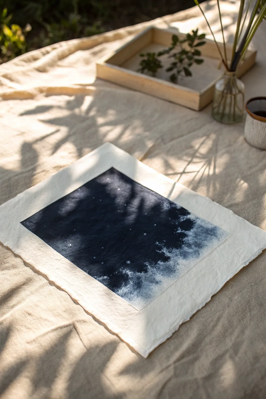
Create a mesmerizing, celestial-inspired abstract piece using the unpredictable beauty of alcohol inks. This project captures the mysterious depth of deep space or crashing waves using a single moody color and lifting techniques.
Step-by-Step Guide
Materials
- High-quality watercolor paper (cold press) or handmade rag paper with deckled edges
- Navy blue or Indigo alcohol ink
- 91% or higher Isopropyl alcohol (in a squeeze bottle or dropper)
- Small spray bottle with rubbing alcohol
- Clean paintbrush (synthetic bristles work best)
- Painter’s tape
- Protective surface cover
- Paper towels
- Pipette or eyedropper
Step 1: Preparation & Masking
-
Secure the paper:
Since this technique involves flowing liquid, tape your deckled-edge paper securely to your work surface. Create a border with masking tape to define a crisp square in the center, leaving a wide margin of the beautiful textured paper exposed. -
Burnish the edges:
Run your fingernail or a bone folder firmly along the inner edge of the tape. This is crucial to prevent the runny ink from bleeding underneath and spoiling your clean borders. -
Pre-wet the field:
Lightly brush a thin layer of isopropyl alcohol over the area inside the tape. This ‘priming’ step helps the ink flow smoothly and settle into the paper’s texture immediately.
Control the Flow
Use a hair dryer on the ‘cool’ setting to push the ink around. This creates ripples and hard ridges of color that dry instantly.
Step 2: Laying the Foundation
-
Initial pour:
Using your dropper, deposit a generous amount of indigo alcohol ink onto the left side of the taped square. Tilt the paper slightly if needed to encourage pooling in that area. -
Spread the color:
Use your brush to guide the ink across the square, filling about 80% of the space. Leave the right side somewhat sparse or lighter for now. -
Build saturation:
Add a second layer of ink to the far left side. We want this area to be the ‘deepest’ part of the image, almost black in its intensity. -
Create the gradient:
Dip your brush in clean rubbing alcohol and drag the dark ink toward the empty right edge. Allow the brush strokes to become wetter and looser as you move right, creating a natural fade. -
Pause for drying:
Let this base layer dry for about 5 to 10 minutes. Alcohol ink dries quickly, but waiting ensures the subsequent lifting steps have crisp edges rather than muddy blurs.
Gold Dust Accents
Mix a tiny amount of metallic brass or gold alcohol ink into your final spray. This adds a subtle shimmer that catches the light like star dust.
Step 3: The Lifting Technique
-
Prepare the lift solution:
Fill your small spray bottle or a pipette with clean high-percentage alcohol. This solvent will repel the dried ink, pushing it away to reveal the paper underneath. -
Create the cloudy edge:
Focus on the right side where the blue fades out. Using the pipette, drip tiny droplets of clean alcohol onto the transitional area. Watch as the dark blue retreats, creating organic, cloud-like shapes. -
Spray for texture:
Hold the spray bottle about 12 inches above the paper. Give a very light mist over the dark blue sections. The tiny droplets will create speckles that look like distant stars. -
Blotting:
I like to gently blot the ‘lifted’ areas on the right side with a crumpled paper towel. This removes excess pigment and adds a soft, foam-like texture to the white spaces. -
Reinforce the darks:
If the lifting process lightened your dark side too much, add one final drop of indigo ink to the far left corner and let it bleed naturally into the texture.
Step 4: Finishing Touches
-
Full dry time:
Allow the entire piece to dry completely. The alcohol smell should be entirely gone, and the paper should feel dry to the touch. -
Remove tape:
Slowly peel back the painter’s tape at a 45-degree angle, pulling away from the center of the artwork. This reveals the crisp square boundary against the soft paper margin. -
Flattening:
If the paper has buckled from the liquid, place the finished (and dry) artwork under a heavy book overnight to flatten it out before framing or displaying.
Once flattened, your cosmic abstract is ready to be displayed as a contemplative centerpiece on a desk or coffee table


Coffee or Tea Wash Monochromes
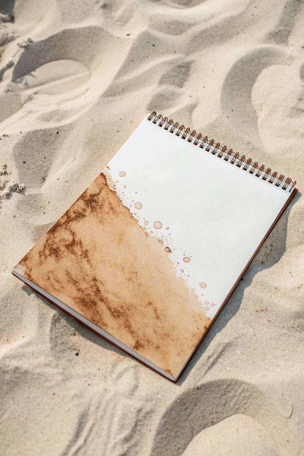
Embrace the organic beauty of spills and stains with this shoreline-inspired monochrome wash. Using strong coffee or tea creates natural granulation and earthy tones that mimic the look of wet sand meeting sea foam.
Detailed Instructions
Materials
- Spiral-bound watercolor sketchbook or heavy mixed-media paper
- Instant coffee (dark roast) or black tea bags
- Hot water
- Small cup or jar for mixing
- Round watercolor brush (size 8 or 10)
- Spray bottle with water (optional)
- Paper towel
- Table salt (optional for texture)
Step 1: Preparing the Medium
-
Brew a Concentrate:
Mix a very small amount of hot water with a generous heap of instant coffee crystals. You want a dark, syrupy consistency, much stronger than what you would drink. -
Create a Second Value:
Pour a small amount of your dark concentrate into a separate well or cup and dilute it with more water to create a lighter, mid-tone wash. -
Test the Color:
Swipe both shades on a scrap piece of paper. The dark tone should be rich and chocolatey, while the lighter tone should resemble a milky latte.
Step 2: Laying the Foundation
-
Wet the Page:
Use clean water to wet the bottom left corner of your page diagonally. Don’t worry about keeping a straight edge; let the water create an uneven, organic boundary. -
Apply the Base Wash:
Load your brush with the lighter coffee dilution. Touch it to the wet area of the paper, allowing the color to bloom and spread naturally into the damp surface. -
Tilt for Movement:
Gently tilt your notebook so the liquid pools slightly towards the bottom corner, encouraging the pigment to settle unevenly. -
Adding Depth:
While the paper is still wet, drop in your dark coffee concentrate near the bottom edge and left side. -
Blend Softly:
Let the dark pigment bleed naturally into the lighter wash. If needed, nudge the edges slightly with a damp brush, but avoid overworking it to keep the texture raw.
Sticky Situation?
If your pages stick together after drying, your coffee mix was likely too sugary or thick. Next time, use a cheaper instant coffee brand or dampen the back of the page to flatten it out.
Step 3: Creating Texture and Details
-
Create Granulation:
Sprinkle a few distinct granules of undissolved instant coffee directly onto the wet wash. As they dissolve, they will burst into dark speckles, mimicking the texture of sand. -
Soften the Transition:
Clean your brush and dampen it slightly. Run it along the dry edge of the wash to soften harsh lines, pulling the color out into the white space. -
Splatter Technique:
Load your brush with the mid-tone wash. Hold it over the white section of the page and tap the handle against a finger to send small droplets flying. -
Vary Droplet Sizes:
Repeat the splatter with the darker concentrate, aiming specifically near the wash’s edge to create a transition from solid color to scattered mist. -
Adding Blooms:
Drop tiny beads of clean water into the drying coffee wash. This pushes the pigment away, creating ‘cauliflower’ blooms that add fantastic organic texture. -
Dry Completely:
Allow the page to air dry completely. Do not use a heat gun, as the airflow can move the puddles and destroy the subtle granulation effects. -
Final Assessment:
Once dry, look for areas that feel too flat. You can glaze a second layer of dark coffee over the deepest shadows to intensify the contrast.
Salt the Earth
While the wash is still very wet, sprinkle coarse sea salt into the pigment. Let it dry fully before brushing it off to reveal unique starburst textures.
Enjoy the calming process of watching these earthy tones settle into your paper
Paint on Unusual Surfaces
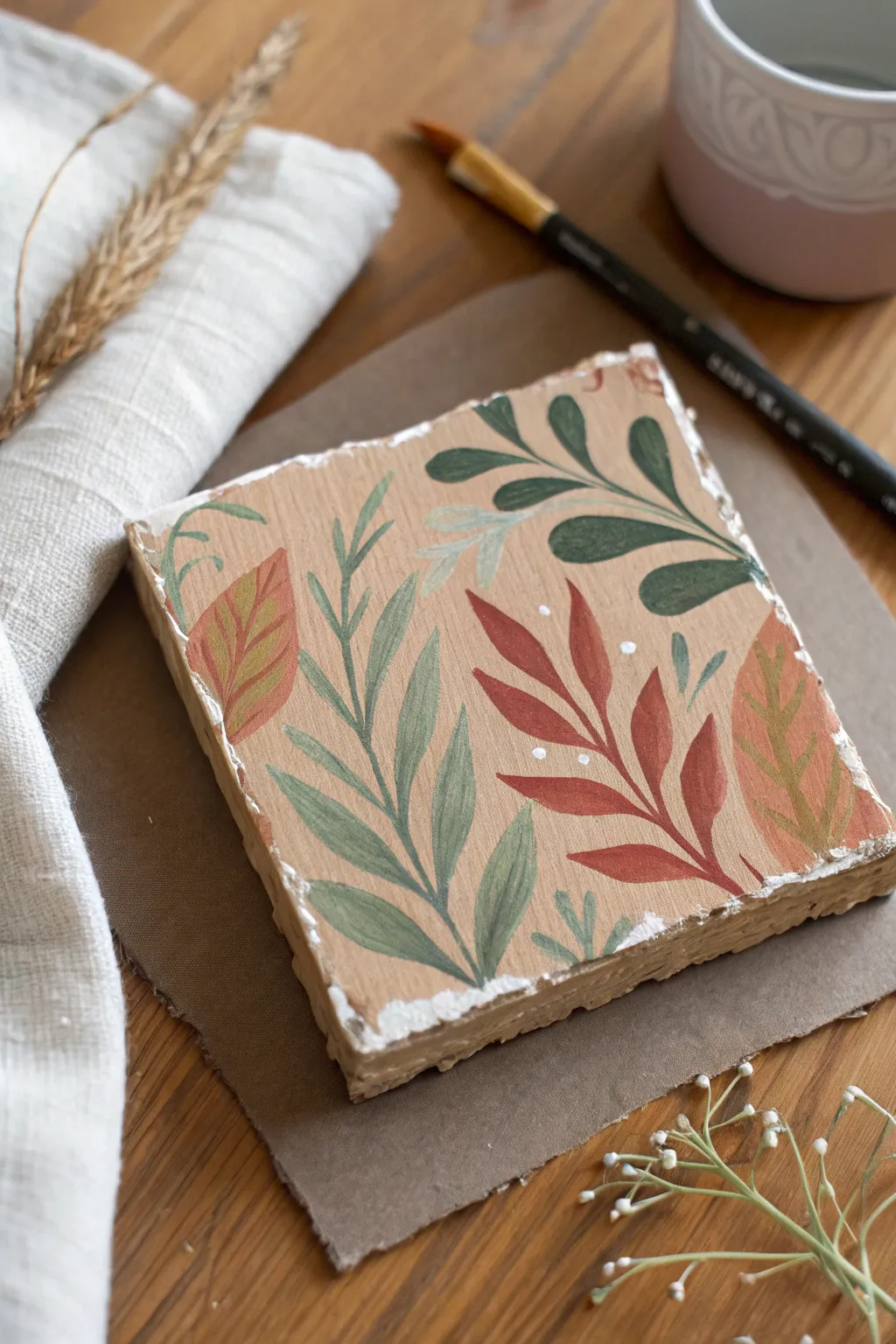
Transform a simple square block into a warm, nature-inspired art piece. This project uses muted earth tones and a variety of leaf shapes to create a cozy, layered botanical pattern on a textured surface.
Step-by-Step Tutorial
Materials
- Square ceramic bisque tile or wood block (approx. 4×4 inches)
- Acrylic paints (beige/tan, deep green, sage green, terracotta, mustard yellow, white)
- Gesso (if using wood)
- Texture paste (optional, for edges)
- Round synthetic brushes (sizes 2 and 4)
- Fine liner brush (size 0 or 00)
- Palette for mixing
- Water cup and paper towel
- Matte varnish
Step 1: Preparing the Base
-
Prime the surface:
If you are using a wood block, start by applying a coat of gesso to seal the pores. If using a ceramic bisque tile, you can skip this step or apply a base coat of white acrylic paint if the natural color is too dark. -
Add texture (optional):
To mimic the rustic look in the photo, apply a bit of texture paste along the rough edges of the block, dabbing it with an old brush or sponge to create an uneven, chipped-stone effect. -
Apply the background color:
Mix a warm, sandy beige hue using tan and a touch of white. Paint the entire top surface of the block with this mixture. You might need two coats for full opacity, letting the first coat dry completely before adding the second. -
Dry thoroughly:
Ensure the background is completely dry to the touch before starting any botanical work. A hairdryer on a low setting can speed this up if you’re impatient.
Uneven Coverage?
If your beige background looks streaky, paint the second coat in a cross-hatch direction (perpendicular to the first coat) to smooth it out.
Step 2: Painting the Foliage
-
Plan your composition:
Visualize where your main stems will go. Aim for a flow that comes from different edges—some stems rising from the bottom, others draping from the top corners. -
Paint the sage stems:
Using your size 2 round brush and sage green paint, create a central, upright stem. Press lightly at the tip and harder as you pull down to create variations in line thickness. -
Add sage leaves:
Branching off the sage stem, paint elongated almond-shaped leaves. Use a ‘press and lift’ motion: touch the tip to the surface, press down to widen the belly of the brush, and lift up as you drag to create a pointy tip. -
Create the terracotta stem:
Mix a warm rusty red or terracotta color. Paint a prominent stem on the right side, curving slightly inward. Add broad, teardrop-shaped leaves along this stem, filling the lower right quadrant. -
Add detail to terracotta leaves:
While the terracotta paint is still wet, you can blend in a tiny bit of darker red at the base of the leaves for subtle depth, though a flat color works lovely too. -
Paint the deep green foliage:
Switch to a dark forest green. Paint a stem arching down from the top right corner. Give this plant rounded, oval leaves rather than pointed ones to add visual variety to your garden. -
Add the large feature leaves:
Using a mustard yellow or ochre mixed with a dot of terracotta, paint two large, broad leaves on the left and right edges. These should look like distinct, single leaves rather than part of a stemmed plant. -
Detail the large leaves:
Once the ochre leaves are dry, mix a slightly lighter shade or use the background beige. With your fine liner brush, paint delicate veins inside the large leaves. -
Fill gaps with small sprigs:
Look for empty spaces in your composition. Use a pale mint green (mix sage with white) to add tiny, ghost-like sprigs in the background, making sure they appear to sit behind the main leaves.
Step 3: Finishing Touches
-
Add white accents:
Dip the handle of your brush or a dotting tool into white paint. Add clusters of three tiny dots near the red leaves to mimic small buds or pollen. -
Paint the rough edges:
Using white paint (or a very light cream), dry-brush the textured edges of the block. This highlights the ‘chipped’ texture and frames the artwork beautifully. -
Refine overlapping areas:
Check where leaves overlap. If a background leaf is showing through a foreground leaf too much, touch up the top leaf with another thin layer of paint to make it opaque. -
Varnish the piece:
Once the entire painting is bone dry (give it at least an hour), apply a coat of matte varnish. This seals the acrylic and gives the surface a unified, professional finish.
Make it a Coaster
Use a durable, heat-resistant varnish or resin topcoat, and glue a square of cork or felt to the bottom to protect your furniture.
Place your finished tile on a petite easel or use it as part of a flat-lay vignette to bring a touch of painted nature indoors

Have a question or want to share your own experience? I'd love to hear from you in the comments below!