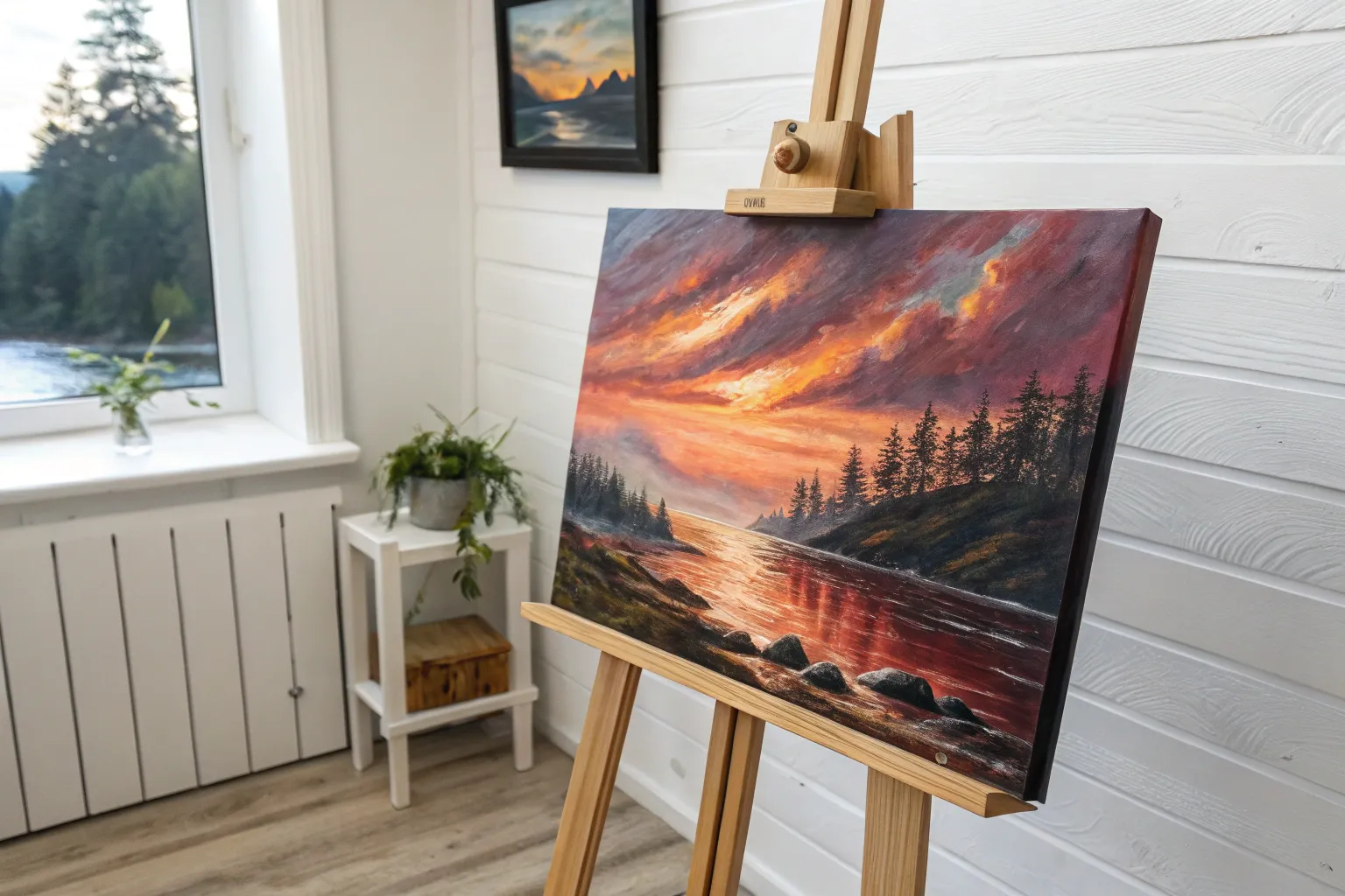
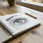
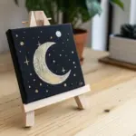
If you’re craving that next-level acrylic challenge, you’re in the right headspace. These ideas are all about control, layering, and those juicy little details that make a painting feel like it has a pulse.
Chiaroscuro Portrait With One Light Source
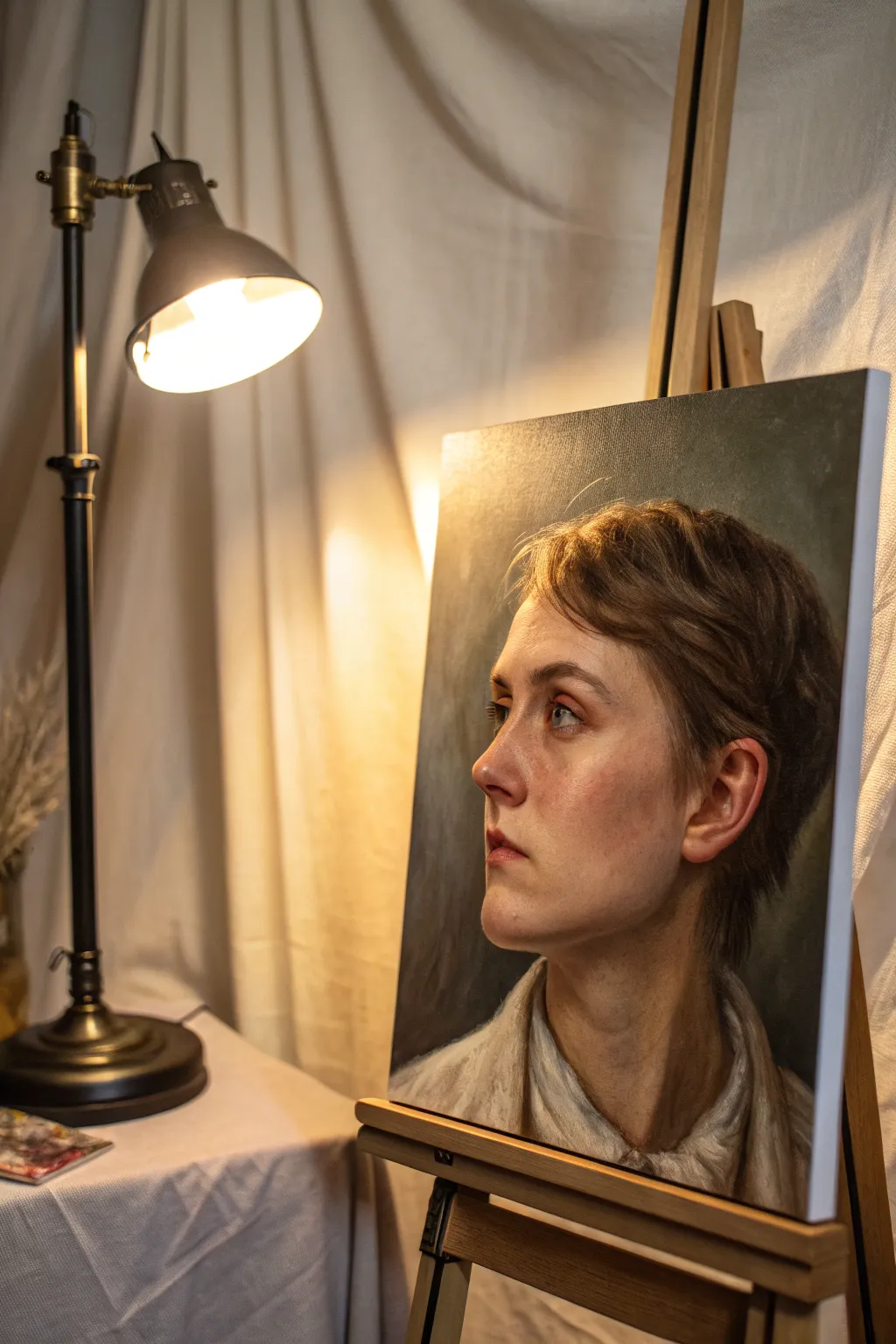
Master the dramatic art of chiaroscuro by painting a realistic 3/4 profile portrait bathed in a single, intense light source. This advanced acrylic project focuses on capturing subtle flesh tones, soft edges, and the stark contrast between illuminated planes and deep shadows.
How-To Guide
Materials
- High-quality stretched canvas (16×20 inches or similar)
- Heavy body acrylic paints (Titanium White, Burnt Umber, Yellow Ochre, Cadmium Red Medium, Alizarin Crimson, Ultramarine Blue, Ivory Black)
- Acrylic glazing medium
- Gesso (if canvas isn’t pre-primed)
- Variety of synthetic brushes (large flats for background, filberts for blending, fine rounds for details)
- Stay-wet palette
- Water container and rags
- Charcoal or graphite pencil for sketching
Step 1: The Unseen Foundation
-
Tone the Canvas:
Begin by covering your white canvas with a thin wash of Burnt Umber or a neutral grey. This kills the stark white and provides a mid-tone base that helps you judge your lighting values more accurately later. -
Draft the Structure:
Using a small round brush dipped in thinned Burnt Umber (or a charcoal pencil), sketch the basic head shape. Focus on the tilt of the head and the upward gaze, ensuring the eyes, nose, and ear are placed correctly for a 3/4 view. -
Map the Shadows:
Identify the ‘shadow shapes’—the areas where the light does not hit. Block these in roughly with a thin, dark mixture of Burnt Umber and Ultramarine Blue. This establishes your primary light source immediately.
Muddy Skin Tones?
If skin looks dirty, stop mixing black into your shadows. Instead, use opposing colors (like green mixed with red) or burnt umber and blue to darken values while keeping the color vibrant.
Step 2: Blocking and Flesh Tones
-
Mix Your Base Skin Palette:
Pre-mix three main values for the skin: a highlight (White + touch of Yellow Ochre), a mid-tone (White + Cadmium Red + Yellow Ochre), and a shadow tone (Burnt Umber + Alizarin Crimson + touch of Blue). -
Apply the Darkest Darks:
Paint the background around the head using a dark, murky grey-green or charcoal mix. Bring this dark value right up to the edge of the face on the shadow side to create an immediate sense of depth. -
Lay in the Mid-Tones:
Using a larger filbert brush, apply your mid-tone flesh mixture to the planes of the face that are transitioning away from the light, such as the cheekbone curve and the side of the neck. -
Strike the Lights:
Load your brush with the highlight mixture. Boldly paint the areas receiving direct light: the bridge of the nose, the forehead, the upper cheekbone, and the chin. Don’t worry about perfect blending yet; focus on placement. -
Paint the Neck and Clothing:
Block in the neck muscles and the collar of the shirt. Keep the clothing strokes loose and painterly, using a mix of white and raw umber to suggest folds without over-detailing them.
Create Atmosphere
To make the light source feel warmer, glaze the entire illuminated side of the face with a very thinned-down transparent yellow or orange once the painting is completely dry.
Step 3: Refining and Blending
-
Softening the Transitions:
This is where acrylics can be tricky. Use a clean, slightly damp brush or a dry blending brush to feather the edges where your light and mid-tones meet. If the paint dries too fast, mix in a little glazing medium to extend working time. -
Developing the Eyes:
Switch to a smaller round brush. Paint the sclera (whites) of the eyes, remembering they aren’t pure white but a soft greyish-cream. Add the iris color, ensuring the gaze is directed upward and to the left. -
Adding Warmth:
I like to glaze a tiny amount of Alizarin Crimson or thinned Cadmium Red over the cheeks, nose tip, and ear to simulate blood flow under the skin. This brings the portrait to life. -
Defining the Ear:
The ear is a complex shape of cartilage and shadow. Use your shadow mix to define the inner curves and a bright highlight on the rim where the light catches it. -
Hair Texture and Volume:
Paint the hair in masses first, not individual strands. Use a dark brown for the base, then layer lighter brown strokes on top where the light hits the crown and bangs.
Step 4: Final Glazes and Highlights
-
Deepening Shadows:
Once the main layers are dry, apply a very thin glaze of Transparent Brown or Black over the shadowed side of the face and neck. This unifies the darks and pushes them further back. -
High-Key Highlights:
Mix a near-pure White with a speck of Yellow. Apply tiny, impasto dots of highlight to the wetness of the eye, the tip of the nose, and the moistness of the lower lip. -
Stray Hairs:
Use a rigger brush or your finest round brush with thinned lighter paint to add just a few flyaway hairs catching the light against the background. This softens the silhouette. -
Background Nuance:
Add subtle variations to the dark background. A slightly lighter, greenish-grey halo near the light side of the face can enhance the glow effect through simultaneous contrast.
Step back and admire how just one simulated light source has given your portrait incredible volume and drama

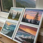
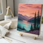
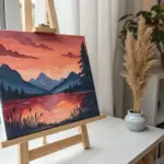
Atmospheric Landscape With Misty Depth
Capture the serene beauty of a high-altitude hike with this atmospheric acrylic landscape. You will learn to build depth through layers of mist and soft mountain ridges, contrasting them with crisp, detailed foreground pines.
Step-by-Step Tutorial
Materials
- Stretched canvas (12×16 or similar vertical format)
- Acrylic heavy body paints: Titanium White, Ultramarine Blue, Burnt Umber, Payne’s Grey, Sap Green, Cadmium Yellow Light, Alizarin Crimson
- Large flat brush (1-inch) for backgrounds
- Medium filbert brush for misty layers
- Small round brush (size 2) and liner brush (size 0) for details
- Slow-drying blending medium or retarder
- Palette knife
- Water container and paper towels
Step 1: Setting the Scene
-
Establish the horizon:
Begin by lightly sketching your horizon line about one-third of the way up the canvas. Sketch a few diagonal lines to indicate the mountain ridges receding into the distance and mark the winding path in the bottom left foreground. -
Paint the sky:
Mix Titanium White with a tiny touch of Ultramarine Blue and Cadmium Yellow to create a very pale, warm morning sky. Apply this to the top portion of the canvas using your large flat brush, using horizontal strokes. -
Create the atmospheric glow:
While the sky is still wet, blend in a hint of Alizarin Crimson and White near the horizon line to suggest a soft, hazy sunrise. Keep the transition seamless; I like to use a clean, dry brush to feather out any harsh edges.
Step 2: Building the Background
-
Paint the furthest mountains:
Mix a very light blue-grey using Ultramarine Blue, White, and a dot of Payne’s Grey. Paint the most distant mountain silhouette. The value should be very light, almost blending into the sky, to create the illusion of atmospheric perspective. -
Layer the middle ridges:
Darken your mountain mix slightly by adding a little more Blue and Payne’s Grey. Paint the next ridge coming forward. Allow the bottom edge of this ridge to be soft and blurry, simulating mist settling in the valley. -
Add misty valleys:
Using a clean filbert brush and a mix of White with glazing medium, gently scumble over the base of the mountains. This creates the thick fog effect. Let the canvas texture help you achieve a broken, misty look. -
Define the near hills:
For the closer hill on the left, mix Sap Green, Ultramarine Blue, and White. This should be greener and darker than the distant mountains but still muted. Block in the shape, ensuring a downward slope towards the center.
Mist Master
Use a dry brush technique with very little paint to create the softest mist. Rub the brush on a paper towel first until almost no color comes off.
Step 3: The Foreground Foundation
-
Block in the path:
Mix Titanium White with a touch of Burnt Umber for a sandy beige color. Fill in the winding path shape in the foreground. Stroke the brush following the direction of the path to suggest movement. -
Create the grassy texture:
Mix Sap Green, Burnt Umber, and Cadmium Yellow. Stipple this color around the path using an old, splayed brush to create the texture of rough mountain grass and shrubs. Keep the darker values near the bottom corners. -
Add autumnal accents:
Dab in small spots of Alizarin Crimson and Burnt Umber mixed with yellow into the grassy areas. These hints of fall foliage add warmth and contrast against the cool blue mountains.
Seasonal Shift
Swap the green foliage for vibrant oranges and reds to create a full autumn scene, or use cool whites and blues on the branches for a winter version.
Step 4: Detailing the Trees
-
Place the main tree trunks:
Using the liner brush and a dark mix of Burnt Umber and Payne’s Grey, paint the vertical lines for the three prominent pine trees on the right side of the path. Vary the thickness, making them slightly tapered at the top. -
Paint the branches:
Switch to a small round brush. Using a dark green-black mix, tap in the pine boughs. Start from the trunk and pull outward and slightly downward. Keep the branches sparse to show the height and age of the trees. -
Add highlights to foliage:
Mix Sap Green with a little Cadmium Yellow and White. lightly tap this lighter green onto the tops of the pine branches where the light would hit. Don’t overdo it; you want to maintain the silhouette. -
Add smaller saplings:
On the left side of the path, paint a few smaller, thinner vertical trunks and sparse branches using the same technique but with slightly lighter values to push them back just a bit.
Step 5: Final Touches
-
Shadows on the path:
Glaze a thin, watery mix of Payne’s Grey and Umber across parts of the path to simulate shadows cast by the trees. This grounds the path in the scene. -
Foreground rocks and debris:
Use the small round brush to add tiny dots and dashes of light grey and dark brown along the path edges to represent small rocks and fallen pine needles. -
Enhance the mist:
If the background dried too dark, apply one final extremely thin glaze of white over the distant valley floor to maximize that misty depth effect.
Step back and enjoy the tranquil depth you’ve created in your mountain escape


Wet-on-Wet Alla Prima With Bold Brushwork
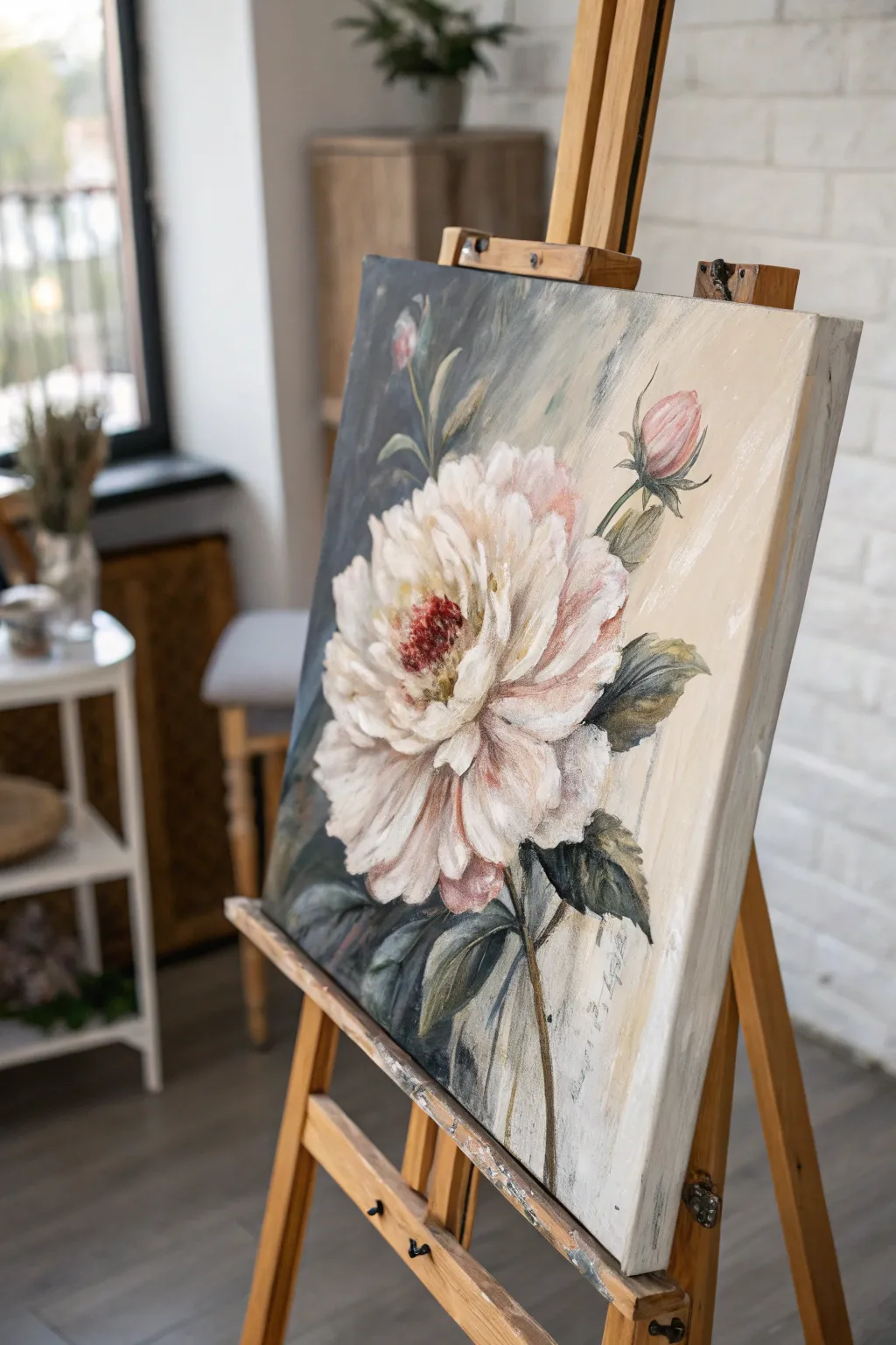
Capture the ephemeral beauty of a large-scale peony using the direct and expressive wet-on-wet technique. This project combines soft, romantic hues with a moody, contrasting background to make the white petals truly pop off the canvas.
Step-by-Step Guide
Materials
- Large stretched canvas (approx. 18×24 or 24×30 inches)
- Heavy body acrylic paints (Titanium White, Burnt Umber, Payne’s Grey, Alizarin Crimson, Yellow Ochre, Sap Green)
- Acrylic fluid retarder or slow-drying medium
- Large flat bristle brush (size 10 or 12)
- Medium filbert brush (size 6 or 8)
- Small round brush for details
- Palette knife
- Water container and rags
Step 1: Setting the Stage
-
Prime the Surface:
Even if your canvas is gessoed, apply a quick, thin wash of Yellow Ochre mixed with a lot of water. This tones the canvas, removing the harsh white and providing a warm undertone that will peek through later. -
Map the Composition:
Using a small round brush and a watery mix of Burnt Umber, sketch the basic placement of the flower head. It should be large and slightly off-center for dynamic impact. Sketch the stem and the two accompanying buds on the right. -
Prepare Your Palette:
Squeeze out generous amounts of your heavy body paints. Mix a separate pile of ‘shadow white’ using Titanium White with a tiny touch of Burnt Umber and Alizarin Crimson to create a warm, greyish pink. -
Apply Retarder:
Since acrylics dry fast and this is an alla prima (wet-on-wet) style, brush a thin layer of fluid retarder or slow-drying medium over the area where you will paint the background.
Pro Tip: Loose Grip
Hold your brush by the end of the handle, not near the ferrule. This forces you to make broader, looser gestures, preventing the painting from looking stiff or overworked.
Step 2: The Dramatic Background
-
Block in Darks:
Using the large flat brush, mix Payne’s Grey with a little Sap Green. Apply this boldly to the left side of the flower, cutting into the petal shapes to define their edges. This negative painting technique helps sculpt the flower without drawing an outline. -
Create the Gradient:
As you move toward the right side of the canvas, clean your brush slightly and mix Titanium White with a touch of Yellow Ochre and the existing grey on your brush. Blend this into the canvas so the background transitions from moody dark-left to airy light-right. -
Directional Strokes:
Keep your background brushstrokes loose and visible, moving diagonally from top-right to bottom-left. This adds energy and suggests light streaming in.
Step 3: Sculpting the Bloom
-
Base Shadow Layers:
Switch to your medium filbert brush. Using the ‘shadow white’ mix you prepared earlier, paint the inner sections of the petals. Don’t worry about details yet; just blocking in the general volume of the flower. -
Mid-tone Petals:
Mix Titanium White with a tiny dot of Alizarin Crimson to get a blush pink. Apply this over the shadow areas while they are still slightly tacky, allowing the colors to physically blend on the canvas for a soft, cloudy look. -
Defining the Center:
For the flower’s center, mix Alizarin Crimson with Burnt Umber. Stipple this color into the very middle of the bloom using the tip of a round brush to create texture and depth. -
High Contrast Highlights:
Load a clean filbert brush with pure Titanium White. Apply thick, impasto strokes to the outer edges of the petals where the light would hit. Lay the paint down and leave it alone; resist the urge to over-blend. -
Painting the Buds:
For the two buds on the right, use a mix of Alizarin Crimson and White for the bulb, and Sap Green with Burnt Umber for the casing. Use singular, confident strokes to suggest the spherical shape.
Troubleshooting: Muddy Colors
If your white petals are turning grey or muddy, stop blending immediately. Let that layer dry completely, then apply a fresh, clean stroke of opaque white on top.
Step 4: Foliage and Finishing
-
Add Leaves:
Mix Sap Green, Payne’s Grey, and a touch of Yellow Ochre. Using the edge of your flat brush, shape the leaves surrounding the main bloom. Twist the brush at the end of the stroke to create the tapered leaf tip. -
Stem Work:
Draw the stems using a liner or round brush with a mix of Burnt Umber and Sap Green. Keep the lines slightly broken or varying in thickness to make them look organic rather that rigid sticks. -
Refining Edges:
Look at where the petals meet the dark background. If you lost any definition, come back with your dark background mix and ‘cut in’ around the petals to sharpen the form. -
Stamen Details:
Once the dark red center is tacky but not fully dry, use a small round brush with bright Yellow Ochre to dot in tiny pollen stamens in the center of the dark red mass. -
Final Texture Check:
Step back five feet. If the flower looks too flat, add a few more strokes of pure, thick white to the foreground petals to maximize the textural contrast against the smooth background.
Allow the thickest parts of the paint to cure overnight before moving the easel, and enjoy the dramatic presence of your new floral centerpiece
Palette Knife Impasto Landscape
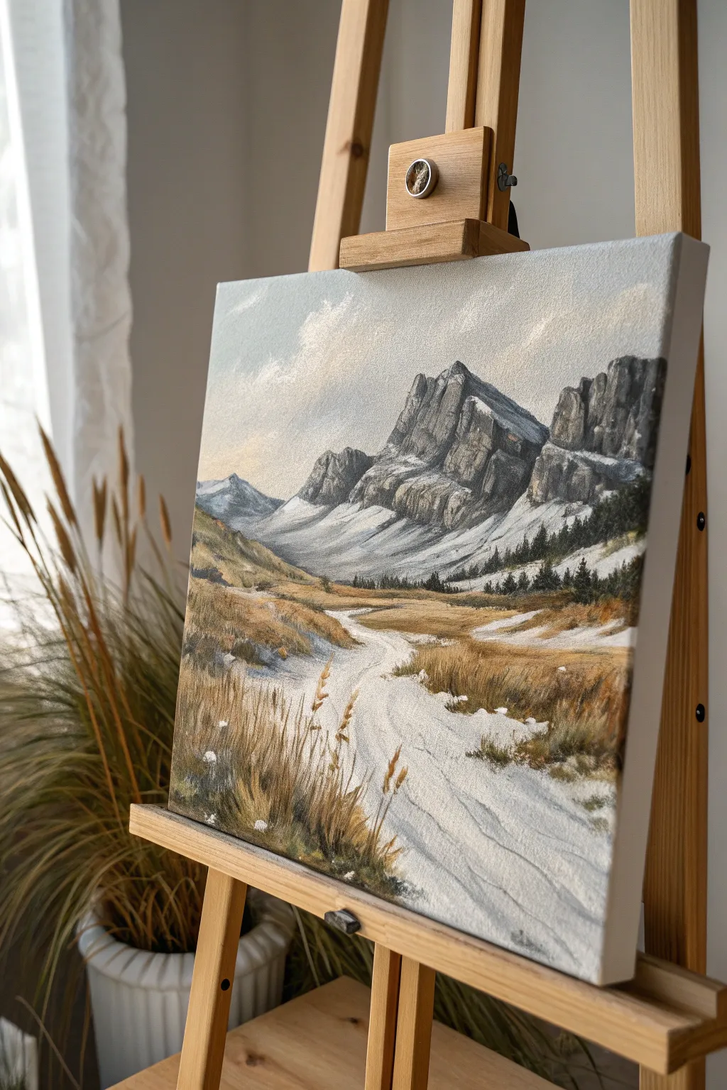
Capture the rugged beauty of a mountain pass with this textured acrylic landscape that balances heavy palette knife work with delicate brushstrokes. The scene features imposing rocky peaks, patches of lingering snow, and swaying foreground grasses that create a powerful sense of depth and atmosphere.
Detailed Instructions
Materials
- Stretched canvas (e.g., 16×20 inches)
- Heavy body acrylic paints (Titanium White, Mars Black, Burnt Umber, Yellow Ochre, Ultramarine Blue, Raw Sienna, Sap Green)
- Acrylic modeling paste or gel medium (optional for extra texture)
- Palette knives (assortment including a trowel shape and a thin, diamond-shaped painting knife)
- Synthetic brushes (large flat wash, medium filbert, fine liner)
- Water container and paper towels
- Palette for mixing
Step 1: Sky and Underpainting
-
Prime the Surface:
Begin by applying a very thin wash of Raw Sienna and white across the entire canvas. This warm undertone will peek through later layers, adding unity to the landscape. -
Block in Major Shapes:
Using a thinned mixture of Burnt Umber and Ultramarine Blue, loosely sketch the outlines of the mountain peaks, the sloping valley walls, and the winding path. Keep these lines faint. -
Establish the Sky:
Mix Titanium White with a tiny touch of Ultramarine Blue and a speck of Burnt Umber to create a muted, cloudy grey-blue. Apply this to the sky area with a large flat brush, using crisscross strokes to create a soft, airy texture. -
Add Cloud Highlights:
While the sky is still damp, scumble irregular patches of pure Titanium White near the left side and top edges to suggest wispy clouds drifting over the peaks.
Step 2: Sculpting the Mountains
-
Mix Mountain Greys:
Prepare three piles of paint on your palette: a dark charcoal (Black + Blue), a mid-tone granite grey (add White), and a light highlight grey. Do not overmix; marbling makes the rock look natural. -
Apply Shadows:
Load the edge of a trowel-shaped palette knife with the dark charcoal mix. Drag the knife firmly down the shadow sides of the mountain peaks (the right-hand facings) to create sharp, jagged rock textures. -
Create Mid-tone Form:
Switch to your mid-tone grey. Using the flat side of the knife, scrape layers onto the sun-facing rock surfaces, letting the paint break naturally over the canvas weave. -
Add Snow Patches:
Mix modeling paste with Titanium White (or use straight heavy body white). With a clean knife, gently drag thick paint onto the lower slopes and crevices of the mountains to represent lingering snow fields.
Knife Angle Trick
Hold the palette knife at a 45-degree angle to scrape paint thinly, revealing the texture below. Hold it flat to lay down thick, smooth impasto layers like butter.
Step 3: The Valley Floor
-
Base the Ground:
Mix Yellow Ochre, Burnt Umber, and White to create a sandy, dry grass color. Use a medium filbert brush to block in the valley floor, avoiding the path area. -
Define the Path:
Mix a very light grey-beige (White + tiny dot of Raw Sienna). Paint the winding path using horizontal strokes that follow the curvature of the trail, suggesting a worn, uneven surface. -
Texture the Grasses:
With a smaller palette knife, mix Yellow Ochre and Raw Sienna. Apply this thickly over the valley floor area, scraping and lifting slightly to create rough, tussocky textures that mimic dry vegetation. -
Deepen the Distance:
Mix a dark pine green using Sap Green and Burnt Umber. Using the tip of a small knife or a stiff brush, dab in tiny vertical shapes at the base of the mountains to suggest a distant evergreen forest line.
Muddy colors?
If your grey rocks look brown or muddy, clean your knife immediately. Wait for the brown under-layers to fully dry before applying the crisp grey and white mountain tones.
Step 4: Foreground Detail
-
Foreground Shadows:
In the bottom left and right corners, deepen the ground color with Burnt Umber to anchor the composition and push the lighter path backward visually. -
Paint Tall Grasses:
Thoroughly mix Raw Sienna with a little water or flow medium to make it inky. Using a fine liner brush, flick quick, upward strokes in the foreground to create tall, individual stalks of dried grass. -
Add Seed Heads:
Dip the liner brush into unthinned Yellow Ochre or White to add small dots and dashes at the tips of the tallest grass blades, representing seed heads catching the light. -
Path Highlights:
I like to take a clean palette knife with pure White and drag it very lightly over the center of the path to simulate bright sunlight hitting the most trampled areas. -
Final Adjustments:
Step back and check your values. Add crisp white highlights to the sharpest mountain ridges and ensure the foreground grasses are the darkest value to enhance depth.
Allow the thick impasto layers several days to cure completely before displaying your rugged mountain scene
BRUSH GUIDE
The Right Brush for Every Stroke
From clean lines to bold texture — master brush choice, stroke control, and essential techniques.
Explore the Full Guide
Scumbled Clouds Over a Clean Gradient
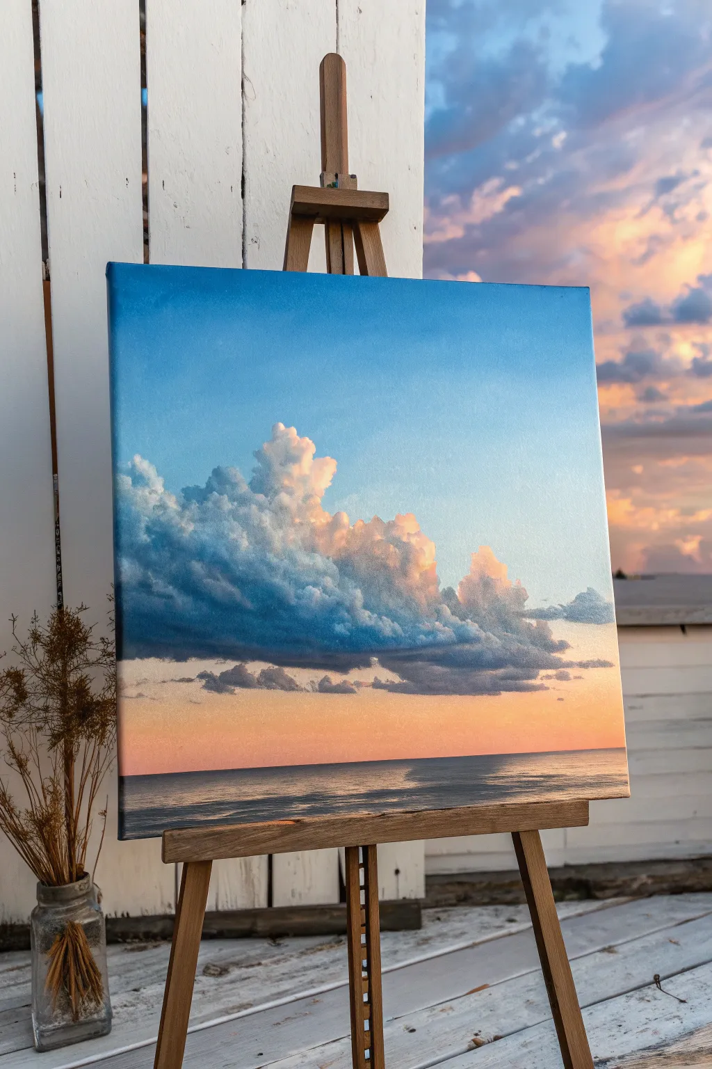
Master the art of atmospheric depth with this serene seascape, featuring fluffy, scumbled clouds floating over a flawless color gradient. This project combines smooth blending techniques with textured, dry-brush layering to create a striking contrast between the ethereal sky and the solid cloud forms.
Step-by-Step
Materials
- Square canvas (stretched or panel)
- Acrylic paints: Titanium White, Ultramarine Blue, Phthalo Blue, Quinacridone Magenta, Cadmium Yellow Light, Burnt Umber
- Large flat brush or blending brush (2 inch)
- Medium filbert brush
- Small round brush for details
- Old stiff-bristled brush (for scumbling)
- Slow-drying medium (retarder) or glazing liquid
- Palette knife
- Water container and paper towels
Step 1: The Seamless Gradient
-
Prepare the Palette:
Mix three main puddles of paint for your sky gradient. You’ll need a deep sky blue (Ultramarine + Phthalo Blue + White), a mid-tone lighter blue (add more White), and a glowing horizon color (White + tiny touch of Magenta + Cadmium Yellow). -
Apply the Base Blue:
Start at the very top of your canvas. Using the large flat brush, apply the deepest blue mixture in broad, horizontal strokes. Work quickly to keep the paint wet. -
Transitioning Down:
As you move down the canvas, pick up the mid-tone lighter blue without cleaning your brush thoroughly. Blend this into the bottom edge of the deep blue using long, sweeping strokes back and forth. -
The Horizon Glow:
Clean your large brush. Apply the pinkish-yellow horizon color starting just above where the water line will be. Blend this upwards into the lighter blue sky, creating a soft, peachy transition area where the colors meet. -
Smoothing the Blend:
I like to use a clean, dry blending brush (like a makeup brush or soft synthetic) to lightly tickle the canvas while the paint is still tacky. This removes harsh brushstrokes and creates that airbrushed look. -
Establish the Sea:
Mix a darker version of your blue with a touch of Burnt Umber for the sea. Paint the bottom section of the canvas with horizontal strokes, leaving the horizon line straight and sharp. Let this base layer dry completely.
Step 2: Scumbling the Clouds
-
Ghosting the Shape:
Mix a muted grey-violet color (Blue + Magenta + White + tiny bit of Umber). Using a medium filbert brush with very little paint, lightly sketch the general ‘blob’ shape of the main cloud formation. -
Building the Dark Shadows:
Load your brush with a deeper version of that blue-grey shadow color. Establish the heavy undersides of the clouds. Use a tapping motion to create a slightly rugged texture rather than smooth strokes. -
Scumbling Technique:
Switch to an older, stiff brush. Mix a lighter mid-tone grey-blue. Wipe most of the paint off onto a paper towel until the brush is almost dry. Scrub this color lightly over the upper parts of your shadow shapes to create softness. -
Adding Warmth:
Mix a soft peach tone (White + hint of Yellow + Magenta). Apply this to the right side and top edges of the clouds where the sunset light would hit. Keep the paint application loose and irregular. -
Highlight Pops:
Using pure Titanium White with a small amount of Yellow, scumble the brightest highlights onto the very tops of the cumulonimbus towers. Dab the paint on thickly in small areas to create dimension. -
Refining Edges:
Use a small dry brush to blur the edges of the distant, detached clouds on the right, making them look wispy. Keep the edges of the main cloud sharper where the light hits it. -
Lower Atmosphere:
Paint thin, horizontal streaks of dark grey-purple near the horizon line to suggest distant, low-hanging cloud banks. These anchor the large cloud mass.
Sticky Gradients
If your acrylics are drying too fast to blend smooth gradients, mix in a slow-drying medium or retarder. You can also mist the back of the canvas with water to keep it cool.
Step 3: Reflections and Details
-
Ocean Textures:
Return to the dark sea area. Mix a slightly lighter ocean blue and use a flat brush to paint horizontal dashes across the water surface, mimicking waves. -
Reflected Light:
Add a few streaks of the peach and pink sky colors into the water, specifically reflecting the area beneath the brightest part of the sunset. Keep these strokes perfectly horizontal. -
Final Glaze:
Once the clouds are fully dry, you can apply a very thin glaze (lots of medium, tiny pigment) of Magenta over the shadow areas of the clouds to unifying the warmth. This is optional but adds a professional glow.
Level Up
Add tiny, distant sailboats or birds on the horizon line using a script liner brush. These small scale indicators make the clouds look massive and imposing by comparison.
Step back and admire how the textured clouds pop against that smooth gradient sky
Sgraffito Details in Hair, Fur, or Grass
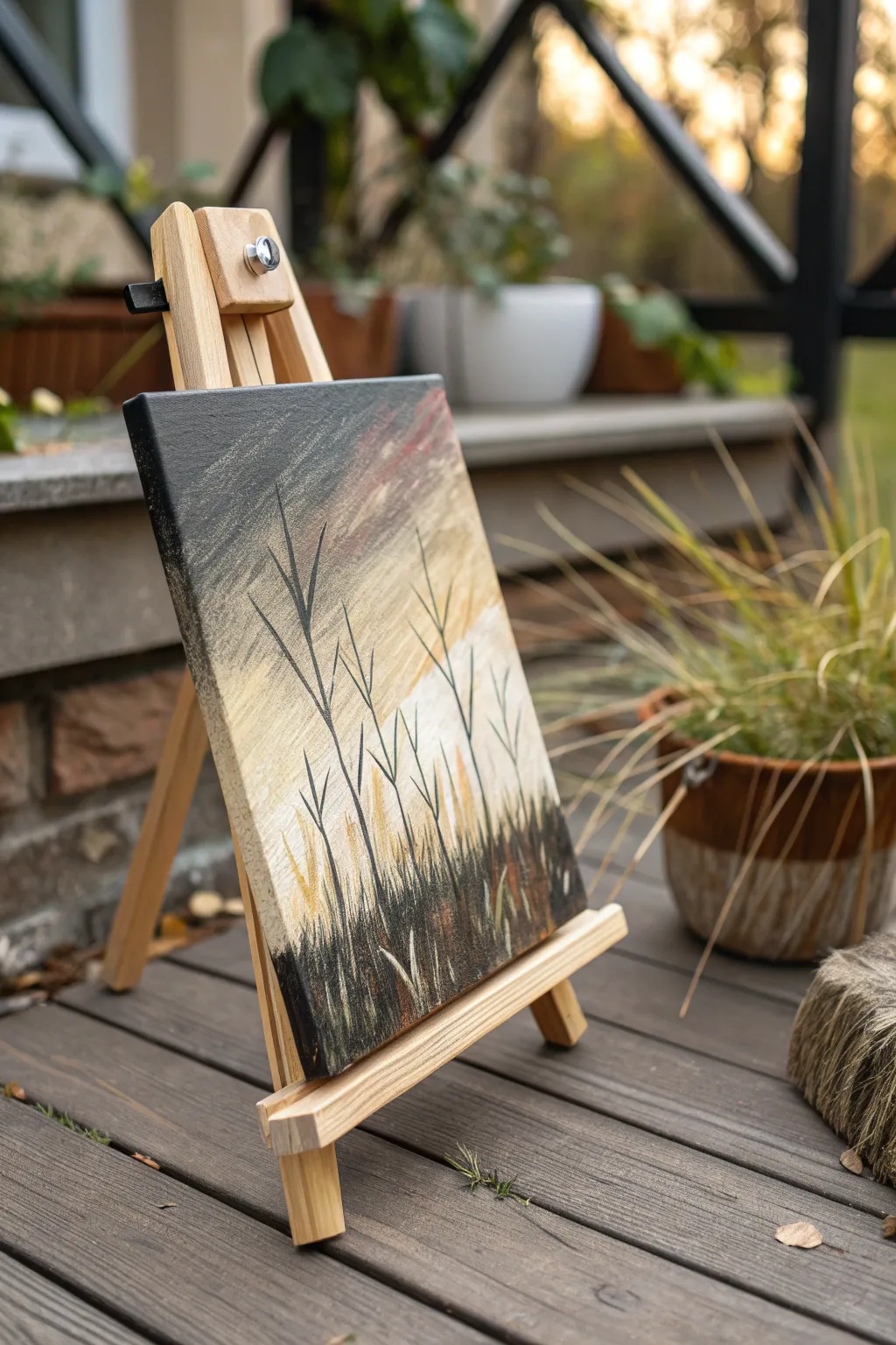
Capture the stark beauty of dormant winter grasses against a muted sunset sky using the sgraffito technique. This project combines smooth, blended gradients with precise scratch-work to reveal layers of color hidden beneath the surface.
Detailed Instructions
Materials
- Small square canvas or canvas board (approx. 6×6 or 8×8)
- Acrylic paints: Titanium White, Unbleached Titanium (or Cream), Raw Umber, Carbon Black, Burnt Sienna
- Soft synthetic flat brush (for blending)
- Small round brush (for details)
- Palette knife or stylus tool (for scratching)
- Water cup and paper towels
Step 1: Creating the Atmosperic Background
-
Prime the sky:
Begin by applying a generous layer of Titanium White mixed with a tiny drop of Unbleached Titanium to the bottom third of the canvas. This creates the glowing horizon line. -
Introduce warmth:
While the white is still wet, blend in Unbleached Titanium and a touch of Burnt Sienna just above the horizon. Use broad, horizontal strokes to ensure a smooth transition. -
Darken the upper sky:
Mix a grey tone using Titanium White and a small amount of Carbon Black. Apply this to the top left corner, blending it diagonally down into the warmer tones. -
Add stormy accents:
Introduce a hint of Burnt Sienna into the upper right corner to suggest fading sunset clouds. Keep your brush strokes loose and sweeping to mimic wind movement. -
Blend the gradient:
Use a clean, slightly damp flat brush to soften the edges where the grey, cream, and reddish tones meet. The goal is an atmospheric, out-of-focus background. -
Dry completely:
Let this background layer dry fully before proceeding. Sgraffito works best when the base layer is solid so you don’t scratch through to the canvas itself.
Paint drying too fast?
If your paint dries before you can scratch it, mix in a slow-drying medium or gel retarder. You can also lightly mist the paint with water to keep it workable longer.
Step 2: Layering the Foreground
-
Apply the dark grass layer:
Paint the bottom quarter of the painting with a thick, opaque mixture of Carbon Black and Raw Umber. Pull some of this dark color upward in short, vertical strokes to create the base of the grass. -
Wet-on-wet preparation:
I find it helpful to work quickly here; the paint needs to remain wet for the sgraffito technique to effective. Add a slightly lighter, muddy brown tone on top of the black. -
Scratch the texture:
Immediately take your palette knife edge or a stylus tool and scratch vertical lines into the wet dark paint. Vary the pressure to reveal the dried light background underneath. -
Create grass clumps:
Scratch sets of intersecting lines that angle outward from a central point to mimic natural clumps of dried grass.
Add metallic shimmer
Glaze a transparent gold or bronze over the horizon line after the painting is dry. This adds a subtle glow that mimics the reflective quality of a setting sun.
Step 3: Defining the Silhouettes
-
Paint structural stalks:
Using a small round brush loaded with thinned Carbon Black paint, draw three or four distinct, tall stalks rising from the grass bed. -
Branch out geometry:
Add ‘V’ shaped branches to these main stalks. Keep the lines thin and somewhat angular to capture the brittle nature of winter vegetation. -
Vary the heights:
Ensure the stalks reach different heights on the canvas, with the tallest one extending nearly to the top edge for dramatic composition. -
Add distant stems:
Mix a lighter grey-brown and paint thinner, fainter stalks in the background, between the dark black ones, to add create depth. -
Highlight the grass:
Once the scratched area is tacky or dry, dry-brush a tiny amount of Unbleached Titanium over the very tips of the scratched grass texture to catch the ‘light’. -
Final touches:
Add a few stray, leaning grass blades in the foreground using the thinned black paint to break up any uniform patterns.
This technique yields a beautiful contrast between the soft, blended sky and the sharp, textured foreground.

PENCIL GUIDE
Understanding Pencil Grades from H to B
From first sketch to finished drawing — learn pencil grades, line control, and shading techniques.
Explore the Full Guide
Water Study With Transparent Layers and Foam
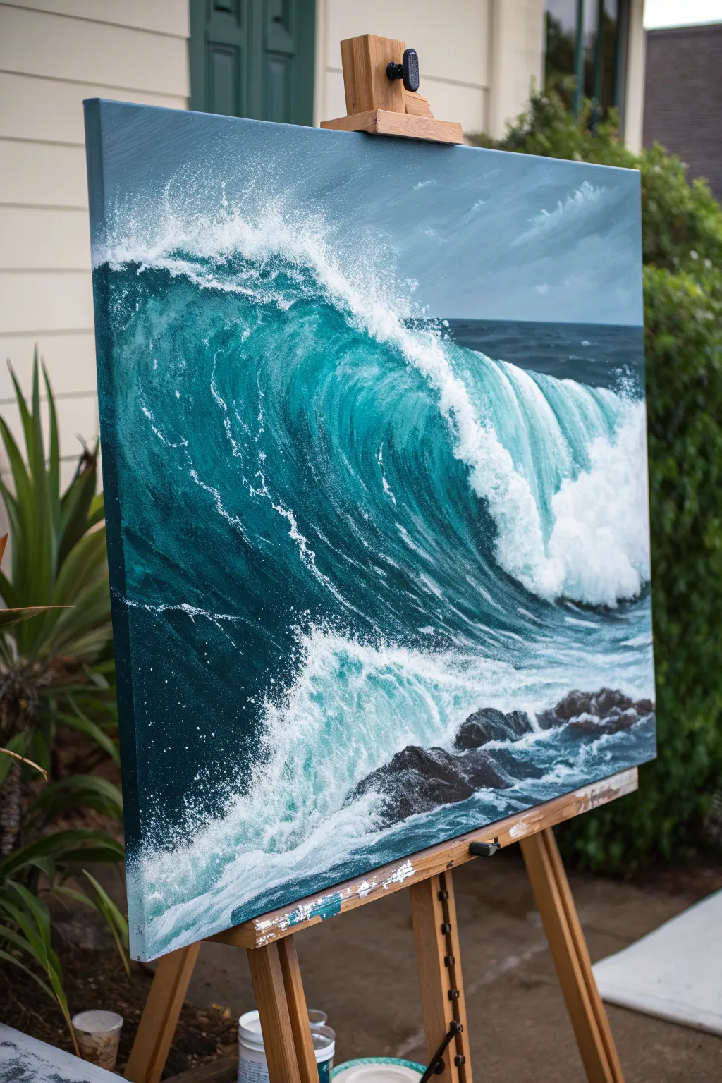
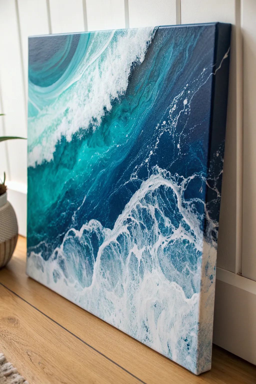
Capture the raw power and intricate movement of the ocean in this advanced acrylic study. You will build deep, translucent teals layer by layer and contrast them with explosive, textured white foam to create a striking sense of depth.
Step-by-Step Guide
Materials
- Large stretched canvas (e.g., 24×30 or 30×40 inches)
- Acrylic paints: Phthalo Blue (Green Shade), Phthalo Green, Titanium White, Burnt Umber, Ultramarine Blue, Mars Black, Grey (or mix white/black)
- Glazing medium (gloss or matte)
- Large flat brushes (2-3 inch)
- Medium filbert brushes
- Small round detail brushes
- Fan brush (optional)
- Old toothbrush (for splatter)
- Palette knife
- Water spray bottle
Step 1: Blocking the Foundation
-
Prime the Surface:
Begin by covering the entire canvas with a thin wash of neutral grey-blue. This eliminates the stark white of the canvas and provides a unifying undertone for the water and sky. -
Sketch the Composition:
Using a small round brush and watery dilute Ultramarine Blue, rough in the horizon line about 2/3 up the canvas. Sketch the large diagonal curve of the main wave and the placement of the foreground rocks. -
Paint the Sky:
Mix Titanium White with a touch of Ultramarine and a tiny bit of Burnt Umber for a stormy grey. Paint the sky area, using horizontal strokes. Soften the clouds while wet to create a hazy, distant atmosphere. -
Establish the Deep Water:
Mix Phthalo Blue, Phthalo Green, and a little Mars Black. This creates your deepest shadow color. Apply this to the face of the wave (under the curl) and the distant ocean line, keeping the edges rough where the foam will go.
Foam Looking Flat?
Don’t use pure white for all foam. Mix a shadow color (light grey-blue) for the bottom/back of the foam clouds, and save pure white only for the sun-hit top edges. This creates instant 3D volume.
Step 2: Building the Translucent Wave
-
Create the Mid-Tones:
Mix Phthalo Green and Phthalo Blue with a generous amount of Glazing Medium. Do not add white yet. Apply this transparent glaze over the curve of the wave where light would hit, letting the dark underlayer peek through slightly. -
Highlight the Curl:
Now mix a lighter version of your teal using a small amount of Titanium White and glazing medium. Paint the top curve of the wave. The white makes the paint more opaque, simulating the thickness of the water as it rises. -
Refine the Water Texture:
Use a dry brush technique with your mid-tone teal to create vertical streaks inside the wave face. This mimics the water being pulled upward by the force of the swell. -
Paint the Distant Ocean:
For the water behind the wave, use a darker blue-grey mix. Paint small, horizontal choppy strokes to suggest distant surface ripples without drawing too much attention.
Master The Splatter
Test your toothbrush splatter on scrap paper first. If the paint is too thick, you get blobs; too thin, you get drips. Aim for a consistency like heavy cream for perfect fine mist.
Step 3: Creating the Foam and Splash
-
Base Layer for Foam:
Mix Titanium White with a touch of blue-grey so it isn’t pure white. Using a worn filbert brush, scumble this color along the lip of the wave and the trailing foam behind it. Keep the edges ragged. -
Detailing the Veins:
With a fine round brush and thinned white paint, draw the intricate lacework of foam (sea foam veins) stretching across the dark face of the wave. Use shaky, organic lines rather than perfect curves. -
The Exploding Crash:
Load a large brush with thick Titanium White. Stipple and dab heavily where the wave breaks. I like to layer this paint quite thickly to create actual physical texture on the canvas. -
Mist and Spray:
Dilute white paint with water. Dip an old toothbrush into it and flick the bristles with your thumb to spray fine mist over the top of the wave and the crash zone. Shield the sky area with paper if needed. -
Foreground Turbulence:
Paint the churning water at the bottom using chaotic, crisscrossing strokes of white and light teal. Leave pockets of the dark underpainting visible to show depth in the foam.
Step 4: Rocks and Final Touches
-
Paint the Rocks:
Mix Mars Black and Burnt Umber. Paint the jagged shapes of the rocks in the foreground. While wet, add highlights on the top edges using grey to show wetness reflecting light. -
Integrate Rocks and Water:
Glaze a thin layer of white over the base of the rocks where the water hits them. This ‘pushes’ the rocks into the water rather than having them float on top. -
Enhance the Brightest Lights:
Take pure Titanium White straight from the tube. Add final, sharp highlights to the very top of the wave crest and the brightest splashes in the foreground. -
Final Glaze:
Once fully dry, you might choose to apply a very thin glaze of Phthalo Green over the shadowed parts of the foam to unify the color palette and cool down the shadows.
Step back and admire the powerful motion you’ve captured in your seascape.
Night Scene With Glowing Practical Lights
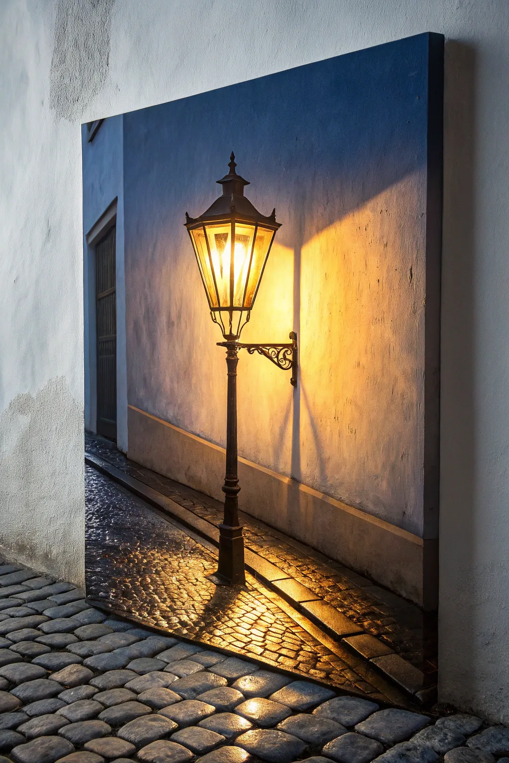
Master the art of painting light with this atmospheric study of a vintage streetlamp casting warm glows across cool, shadowed surfaces. You will learn to balance temperature contrasts and build luminous layers to create a convincing night scene.
Step-by-Step
Materials
- Stretched canvas or canvas board (16×20 inches recommended)
- Heavy body acrylic paints: Titanium White, Mars Black, Ultramarine Blue, Burnt Umber, Cadmium Yellow Medium, Cadmium Orange, Yellow Ochre
- Synthetic brushes: 1 inch flat, #6 filbert, #2 round, #0 liner
- Slow-drying medium or retarder
- Palette knife
- Water formatting and paper towels
- Ruler or straight edge
Step 1: Sketch and Underpainting
-
Establish the Horizon:
Begin by lightly sketching the main structural lines. Mark the vertical line of the wall corner on the left and the diagonal slope of the sidewalk curb. Use a ruler to ensure the lamp post stands perfectly vertical. -
Outline the Lamp:
Sketch the intricate shape of the lantern and its bracket. Don’t worry about tiny details yet, just get the geometric forms of the glass panes and the metal cap correct. -
Block in Cool Darks:
Mix Ultramarine Blue with a touch of Burnt Umber and White to create a muted slate blue. Paint the entire background wall with this cool tone, keeping the area directly behind the lamp slightly lighter. -
Establish the Shadows:
Deepen your blue-brown mix to near-black. Paint the dark doorway on the far left and the deep cast shadows on the cobblestones at the bottom left.
Step 2: Painting the Glowing Light
-
Base Glow:
Mix Cadmium Yellow with plenty of Titanium White. Paint the interior of the lantern glass panes, making the center almost pure white to represent the bulb’s intensity. -
Radiating Warmth:
Create a wash of Yellow Ochre and Cadmium Orange. Apply this thinly over the blue wall immediately surrounding the lamp to start the glow effect. The green tint that happens where yellow meets blue is natural for night scenes. -
Intensify the Halo:
Using a dry brush technique, scrub pure Cadmium Yellow and Orange onto the wall to the right of the lamp. Soften the edges where this warm light fades into the cool blue shadow of the wall. -
Cast Shadows on the Wall:
The lamp bracket casts a distinct shadow. Mix a semi-transparent dark grey and paint the shadow of the metalwork falling diagonally down the wall, blurring the edges slightly as they move away from the light source.
Glow Control
To make the light look truly blinding, keep the center of the light source pure white. Surrounding color only looks bright if it has a white core to contrast against.
Step 3: The Cobblestone Street
-
Base the Pavement:
Paint the sidewalk area with a dark, cool grey. While wet, mix in some Burnt Umber in the foreground to suggest dirt and warmth from the street. -
Reflections on Stones:
This is the crucial step for ‘wet’ looks. Mix a bright orange-yellow. Paint small, horizontal dashes on the tops of the cobblestones directly under the lamp. -
Fading Reflections:
As you move away from the light source toward the bottom left, switch your reflection color to a duller blue-grey. Paint curved strokes to suggest the rounded tops of the stones. -
Defining the Gaps:
Use a thin liner brush with Mars Black (thinned with water) to outline the deep crevices between the cobblestones and the curb edge. This separates the stones and gives the ground texture.
Muddy Walls?
If your orange glow turns the blue wall too green, let the blue layer dry completely first. Then, apply a layer of clear matte medium before glazing on the orange.
Step 4: Metalwork and Final Details
-
Painting the Iron:
Mix Mars Black with a tiny bit of Burnt Umber. Use your #2 round brush to paint the solid structure of the lamp post, the cap, and the decorative bracket. -
Metal Highlights:
I like to mix a warm grey (White + Umber) to add highlights to the ironwork. Place these focused strikes on the edges facing the light source to make the metal look cylindrical and metallic. -
Glazing the Glass:
Mix a very transparent glaze of Burnt Umber. Lightly brush over the edges of the glass panes to make them look aged and dirty, leaving the center hot spots bright. -
Final Adjustments:
Step back. If the light doesn’t look bright enough, add a final tiny dot of pure Titanium White to the center of the lantern and the brightest wet stone reflection.
Once dry, vanish the piece with a gloss medium to enhance the wet look of the cobblestones context


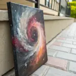
Galaxy Sky With Nebula Blends and Star Spatter
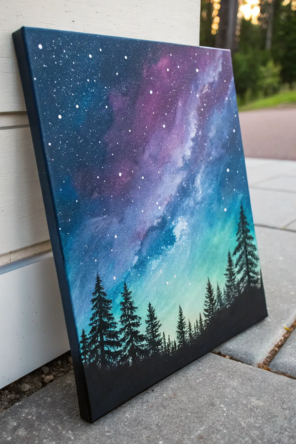
Capture the ethereal beauty of deep space meeting a forest silhouette with this vibrant acrylic study. You will create a seamless gradient sky transitioning into a glowing nebula, finished with crisp pine trees against the cosmic light.
How-To Guide
Materials
- Stretched canvas (square or rectangular)
- Acrylic paints: Carbon Black, Titanium White, Phthalo Blue, Dioxazine Purple, Teal or Turquoise
- Large flat wash brush (1 inch or larger)
- Medium filbert brush
- Small round brush or rigger brush
- Old toothbrush (for spattering)
- Palette for mixing
- Water cup and paper towels
- Painter’s tape (optional for sides)
Step 1: Setting the Midnight Gradient
-
Prime the canvas:
Begin by ensuring your canvas is clean. If you want a smoother texture for blending, you can apply a thin coat of gesso and sand it lightly once dry, though standard store-bought canvases are usually ready to paint. -
Map out the color zones:
Visualize the gradient diagonally. The top left corner will be the darkest space, and the bottom right horizon will be the lightest. Apply a blob of dark blue mixed with black to the top left, pure purple next to it, then blue, and finally a mix of teal and white at the bottom right. -
Blend the wet paint:
Using a slightly damp large flat brush, start blending the colors directly on the canvas. Work quickly while the paint is wet, using long, cross-hatch strokes to merge the boundaries between the deep purples, blues, and the glowing teal bottom. -
Deepen the corners:
While the layer is still workable, add a touch more black to your dark blue and reinforce the top left corner to create a vignette effect. This contrast is crucial for making the stars pop later. -
Smooth the transition:
Clean your brush and wipe it almost dry. Very lightly sweep over the entire canvas (without adding new paint) to soften any harsh brush strokes, ensuring a buttery smooth transition from the dark void to the light horizon. Let this base layer dry completely.
Muddy colors?
If your blue and orange/teal blend turns brown or grey, stop blending immediately. Let it dry, then apply a fresh layer of color. Overworking wet paint is the main cause of muddiness.
Step 2: Creating the Nebula
-
Sponge on the nebula clouds:
Mix a vibrant purple with a tiny bit of white to make it opaque but bright. Using a dry filbert brush or a small sponge, dabbing lightly, create an irregular cloud shape moving diagonally across the purple/blue section. -
Highlight the cosmic dust:
While the purple cloud is tacky, mix white with a drop of blue. Dab this into the center and edges of your nebula shape to create a ‘milky way’ effect. Keep the edges soft and feathery; you don’t want hard lines here. -
Glaze for depth:
I find that mixing a tiny drop of water into deep violet and glazing over the shadow side of the nebula helps integrate it back into the background, making it look translucent rather than pasted on.
Step 3: The Starfield
-
Prepare the spatter mix:
Dilute Titanium White paint with water until it reaches the consistency of heavy cream or ink. It needs to be fluid enough to fly off bristles but thick enough to stay opaque. -
Create distant stars:
Dip an old toothbrush into this watery white mix. Hold it about 6 inches from the canvas and run your thumb across the bristles to spray fine mist. Focus heavily on the darker upper sections and go lighter near the bright teal horizon. -
Add prominent stars:
Using a small round brush or a dotting tool, manually paint a few larger, brighter stars in the dark blue and purple areas. Vary their sizes to create a sense of distance.
Nebula Glow Up
Use a dry brush to scrub a tiny amount of Zinc White (transparent white) over the brightest parts of your teal sky after it dries. This creates a hazy, atmospheric glow.
Step 4: The Forest Silhouette
-
Establish the ground line:
Load a flat brush with pure Carbon Black. Paint a solid, uneven strip along the very bottom of the canvas to represent the forest floor. Keep it slightly undulating rather than perfectly straight. -
Paint the tree trunks:
Switch to a small round brush or liner brush. Paint vertical lines rising from the black ground. Make them various heights—some tall reaching into the teal sky, others shorter. -
Stipple the foliage:
Using the tip of a small brush or a fan brush turned vertically, tap side-to-side starting from the top of a tree trunk. Work your way down, widening your strokes as you descend to create the conical pine shape. -
Fill in density:
Don’t make every tree perfect. Overlap the branches of neighboring trees to create a dense forest wall. Ensure the black is solid and opaque to contrast sharply against the glowing background. -
Paint the sides:
For a finished gallery look, extend the black ground and the dark blue sky colors around the edges of the canvas, matching the lines where they meet the front face.
Step back and admire how the simple black silhouette transforms your colorful background into a deep, vast landscape
Negative Space Composition With One Focal Burst
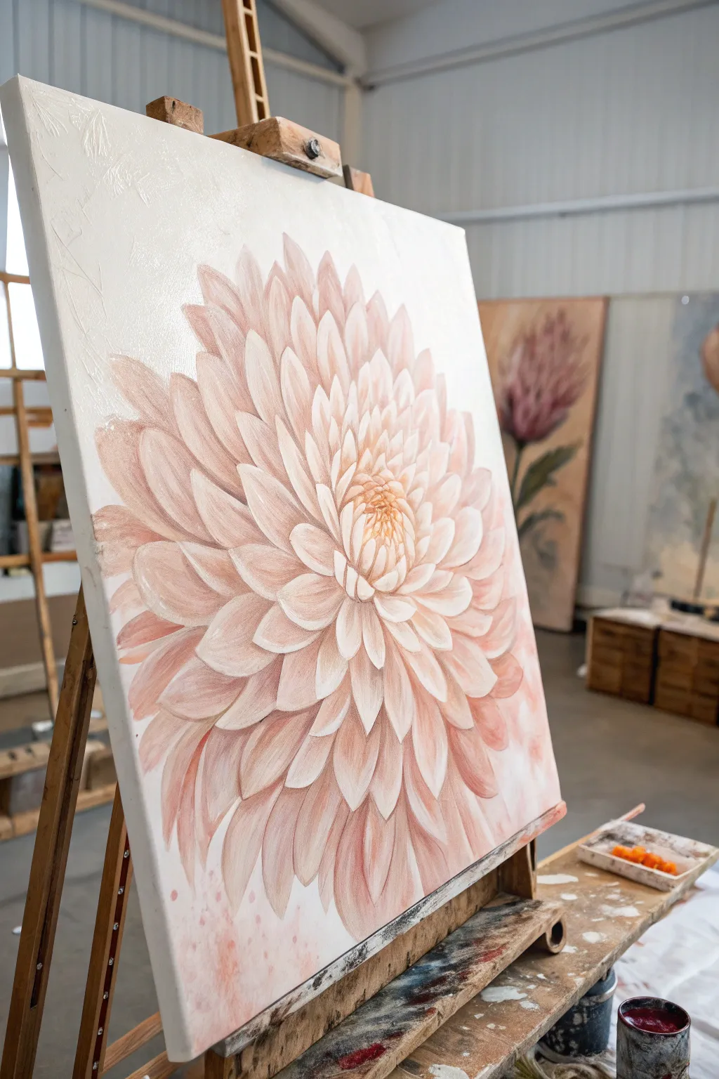
Master the art of negative space with this striking botanical study, where a single, oversized bloom commands attention against a stark white background. The soft peach and coral tones create a gentle yet powerful focal point, perfect for practicing petal layering and depth.
Detailed Instructions
Materials
- Large deep-profile canvas (approx. 24×30 inches or larger)
- Heavy body acrylic paints: Titanium White, Unbleached Titanium, Quinacridone Magenta, Yellow Ochre, Burnt Sienna
- Gesso (if canvas isn’t pre-primed)
- Large flat brush (2 inch) for background
- Filbert brushes (sizes 4, 8, and 12) for petals
- Small round detail brush (size 1)
- Palette knife for mixing
- Modeling paste (optional for texture)
- Water container and rags
- Chalk or pastel pencil for sketching
Step 1: Preparation and Base Sketch
-
Prime the Surface:
Begin by applying a fresh coat of Titanium White mixed with a very small amount of Unbleached Titanium to the entire canvas. This ensures a clean, uniform negative space that isn’t too starkly clinical. -
Establish the Center:
Once the background is thoroughly dry, locate the focal point. Instead of placing it dead center, offset the flower slightly to the left or right for a more dynamic composition. Mark the center point lightly. -
Rough Sketching:
Using a light-colored pastel pencil or chalk, sketch the outer circumference of the flower. Large blooms like this work best when they fill about 70-80% of the canvas width. -
Petal Guidelines:
Sketch concentric circles radiating from the center to guide your petal lengths. Draw the basic almond shapes of the petals, starting large on the outside and getting smaller and tighter toward the middle.
Step 2: Blocking in Color
-
Mix Your Palette:
Prepare a gradient of peach tones. Mix a dark shadow tone (Magenta + tiny Burnt Sienna + White), a mid-tone peach (Magenta + Yellow Ochre + White), and a highlight tone (mostly White + tiny mid-tone mix). -
Underpainting shadows:
With a size 12 filbert brush, apply the darkest shadow mix to the areas between the petals and the deep recesses of the flower center. Keep this loose; it’s just a map for depth. -
Base Coating Petals:
Block in the general shape of the outer petals using your mid-tone peach. Don’t worry about perfect edges yet; just cover the white canvas within the flower’s outline. -
Creating Texture:
For the subtle raised effect seen in the reference, mix a little modeling paste into your highlight color. I like to apply this to the tips of the petals nearest the viewer to physically build them up.
Muddy Centers?
If the flower center looks muddy, let it dry completely. Then, re-apply the deep shadows first, let dry, and layer the bright highlights on top. Wet-on-wet mixing often causes the mud.
Step 3: Layering and Refining
-
Outer Petal Definition:
Switch to a size 8 filbert. Paint the large outer petals, ensuring your brushstrokes follow the curve of the petal from base to tip. Blend a lighter peach at the tip into the darker base color while wet. -
Working Inward:
Move to the next ring of petals. These should slightly overlap the outer ones. Use a slightly lighter value mix here to bring them forward visually. -
The Mid-Section:
As you reach the middle rings, the petals become more upright and cup-like. Use more distinctly separated strokes here, darkening the shadows underneath each petal to make them ‘pop’ off the layer below. -
Tight Center Petals:
Use a size 4 brush for the tight cluster in the center. Here, the colors should be warmer—add a touch more Yellow Ochre to your mix to simulate the pollen-heavy center. -
Detailing Edges:
With a small round brush, sharpen the edges of the petals. Add very thin highlights of almost pure Titanium White to the very tips and curled edges of the petals where the light hits. -
Deepening Contrast:
Glaze a very thin wash of Magenta and Burnt Sienna into the deepest crevices between the petals. This increases the 3D effect without adding heavy paint.
Go Metallic
Mix a tiny amount of pearl or gold medium into your lightest petal highlight color. It won’t sparkle loudly but will give the flower a dewy, luminous glow when viewed from an angle.
Step 4: Final Touches
-
Correcting Negative Space:
Take your background white paint and carefully clean up the outer edges of the flower. This ‘cutting back’ technique makes the petals look crisp and sharp against the background. -
Softening Transitions:
If any petal edges look too harsh or sticker-like, use a clean, dry brush to gently soften the transition between shadow and highlight on the petal surface. -
Final Highlights:
Add the brightest specks of white to the very center cluster and the most prominent outer petal tips. These tiny dots of light bring the flower to life. -
Protective Coat:
Allow the painting to cure for at least 72 hours before applying a satin varnish to unify the sheen of the different paint layers.
Step back and admire how the simple composition allows the complex beauty of the petals to truly shine.
Intentional Fluid Acrylic Wave With Controlled Swipe
Capture the raw power of the ocean with this mesmerizing fluid acrylic technique that blends deep teals and midnight blues with frothy white cells. This project uses a controlled swipe method to create realistic sea foam lacing that crashes diagonally across the canvas.
Detailed Instructions
Materials
- Stretched canvas (square or rectangular)
- Acrylic paints (Phthalo Blue, Prussian Blue, Turquoise, Teal, Titanium White)
- Pouring medium (Liquitex or Floetrol)
- Silicone oil or treadmill lubricant
- Plastic cups and stir sticks
- Plastic sheet or swipe tool (a cut file folder works well)
- Hairdryer or straw (for blowing out waves)
- Palette knife
- Gas torch (optional, for popping bubbles)
- Drop cloth or plastic sheeting
Step 1: Preparation and Mixing
-
Prepare the workspace:
Fluid art is messy, so cover your entire table and floor area with a drop cloth. Level your canvas by placing push pins into the wooden corners underneath to raise it off the surface. -
Mix the colors:
In separate cups, mix your acrylic paints with pouring medium. Aim for a consistency like warm honey—fluid but not watery. A standard ratio is 1 part paint to 2 parts medium, but adjust as needed. -
Create the cell activator:
The white paint will act as your ‘cell activator’ to create the foam. Mix your Titanium White slightly thinner than the other colors. Add 2-3 drops of silicone oil only to the Teal and Turquoise cups to encourage cell formation under the white.
Pro Swipe Tip
Don’t press down when swiping! Let the weight of the plastic sheet or paper towel do the work. It should just kiss the surface of the paint.
Step 2: Laying the Foundation
-
Establish the deep ocean:
Start at the top right corner. Pour the darkest color, Prussian Blue, covering about a third of the canvas diagonally. Use a palette knife to spread it to the edges. -
Pour the mid-tones:
Next to the dark blue, pour a band of Phthalo Blue followed by the Teal. Let these colors overlap slightly with the dark blue to create a gradient effect. -
Add the shallow water:
Toward the bottom left, pour your lightest turquoise mixed with a little white. This represents the shallower, churning water near the shore. -
Blend the transitions:
Tilt the canvas gently back and forth to let the bands of color meet and merge naturally. You don’t want hard lines between your blue zones.
Step 3: Creating the Wave and Foam
-
Apply the white wave line:
Pour a generous line of your Titanium White mixture right along the boundary where the deep blues meet the lighter teal colors. This strip will become your crashing wave. -
The swipe technique:
Take your plastic sheet or swipe tool. Gently lay the edge into the white paint and drag it slowly backward over the dark blue and teal sections. I prefer to swipe in a slight arc to mimic the curl of a wave. -
Watch the cells emerge:
As the white paint glides over the silicone-infused colors below, you will see lacing and cells begin to pop up almost immediately, looking like sea foam. -
Soften the edges:
If the swipe lines look too rigid, use a clean palette knife to gently disturb the edges, blending the white foam into the blue so it looks organic.
Level Up: Gloss Finish
Once fully cured (after 2-3 weeks), apply a coat of high-gloss resin. This simulates the wet look of real water and makes the teals pop.
Step 4: Refining the Details
-
Blow out the crest:
Using a straw or a hairdryer on a low, cool setting, blow parts of the white paint upward into the dark blue area. This creates the wispy spray coming off the top of the wave. -
Enhance the lower foam:
At the bottom of the canvas, add a little extra white and blow it gently with a straw to create the turbulent, churning foam near the base of the wave. -
Torpedo bubbles:
If you see large, unwanted air bubbles, lightly sweep a kitchen torch over the surface. Do not hold it in one spot; keep it moving to avoid scorching the paint. -
Detail the shoreline:
Use the tip of a palette knife to drag small veins of white through the teal sections, mimicking the intricate webbing of foam on the water surface. -
Check the sides:
Walk around the canvas and ensure the paint has flowed over the edges. Dab the corners with fallen paint from the table to cover any bare canvas spots. -
The drying phase:
Leave the painting to cure in a dust-free area for at least 24-48 hours. The surface must remain level so the composition doesn’t slide off.
Now step back and admire the vibrant energy of your personal seascape.
Surreal Scene With Impossible Lighting Logic
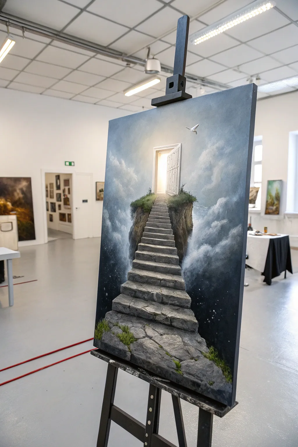
This surreal acrylic painting captures a dreamlike stone staircase floating amidst a sea of clouds, leading upward to a glowing, mysterious door. By blending realistic textures with impossible lighting, you’ll create a captivating scene that invites the viewer to step into another world.
Detailed Instructions
Materials
- Canvas (16×20 or 18×24 inches recommended)
- Acrylic paints: Titanium White, Mars Black, Prussian Blue, Burnt Umber, Raw Sienna, Yellow Ochre, Sap Green
- Assorted synthetic brushes: large flat shader, medium filbert, lush round brushes, small detail liner
- Mixing palette and palette knife
- Water container and paper towels
- Ruler or painters tape (for the stairs)
- Glazing medium (optional but recommended)
Step 1: Setting the Atmosphere
-
Create the gradient background:
Begin by establishing the sky. Mix a dark gradient starting with Prussian Blue and a touch of Black at the bottom corners, transitioning into pure Prussian Blue, then blending into a mix of Blue and White, and finally almost pure White near the top center where the light source will be. -
Rough in the clouds:
While the background is still slightly tacky, use a medium filbert brush to scumble in soft cloud formations. Use a grey-blue mix (White + tiny amount of Prussian Blue + Black) for the shadows and pure Titanium White for the highlights. -
Blend the cloud edges:
With a dry, clean brush, softly sweep over the edges of your clouds to create that misty, ethereal look. Focus on building volume on the sides, leaving the center relatively clear for the main subject. -
Paint the starry void:
In the darkest bottom corners, deepen the shadows with a glaze of Black and Blue. Once dry, flick a toothbrush loaded with watered-down White paint to create subtle stars, suggesting the stairs are rising from deep space.
Cloud Trouble?
If your clouds look too solid or heavy, dampen a clean rag or huge soft brush and gently lift off some paint while it’s wet to reveal the background blue again.
Step 2: Constructing the Structure
-
Sketch the layout:
Using a thinned wash of Raw Sienna and a small round brush, lightly sketch the outline of the floating island, the winding staircase, and the door frame at the top. Use a ruler to ensure your perspective lines for the stairs converge correctly toward the door. -
Block in the island base:
Fill in the floating rock mass beneath the stairs with a mix of Burnt Umber and Black. Don’t worry about texture yet; just establish a solid dark silhouette against the sky. -
Base coat the stairs:
Paint the flat tops of the stairs with a mid-tone grey (White + Black + tiny touch of Blue) and the vertical risers with a darker charcoal grey. This immediately creates a sense of dimension. -
Define the door and light:
Paint the door frame white. For the open doorway, apply pure Titanium White in the center, blending outward into a pale, warm yellow (White + tiny dot of Yellow Ochre) to simulate intense light pouring out.
Perspective Pro-Tip
Make the stairs gradually get smaller and narrower as they ascend. This forced perspective makes the staircase feel much longer and higher than it actually is.
Step 3: Texture and Details
-
Texture the stone steps:
Using a palette knife or a scruffy brush, dab varying shades of light grey and stone-white onto the steps to create a rough, weathered texture. I find that dragging the knife lightly allows the paint to break naturally, mimicking real stone. -
Add cracks and crevices:
With a thin liner brush and watered-down black, careful paint cracks, chips, and separation lines between the stones. Adding a thin highlight of white right next to a crack makes it look deeper. -
Detail the floating island:
Return to the dark island base. Dry brush vertical strokes of lighter browns and greys to suggest hanging cliffs and earth. Keep the bottom edge soft where it disappears into the clouds. -
Plant the greenery:
Mix Sap Green with a little Black for the base of the grass, stippling it along the edges of the stairs and the top of the island. Layer lighter greens (Sap Green + Yellow Ochre) on top to show where the light hits the moss and grass tufts. -
Refine the door:
Add subtle wood grain details to the door itself using a very pale grey wash. Ensure the door casts a faint shadow on the frame to show it’s swinging open.
Step 4: Final Lighting Effects
-
Enhance the glow:
Apply a very thin glaze of White mixed with glazing medium around the doorway, extending over the nearby clouds and the top of the stairs. This creates a blooming light effect. -
Cast shadows:
Deepen the shadows on the underside of the stairs and the side of the island facing away from the light. This contrast is crucial for the ‘impossible lighting’ logic. -
Add the bird:
Paint a small, simple silhouette of a white dove near the door. highlight the top of its wings where the light hits it to tie it into the scene. -
Final highlights:
Use pure thick Titanium White to add the sharpest highlights on the edges of the steps nearest the door and the tips of the grass blades catching the divine light.
Step back and admire your surreal masterpiece, a gateway to imagination rendered in stone and light.
Fragmented Face Study With Knife and Drips
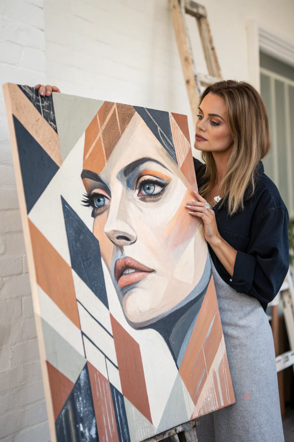
Merge classical portraiture with modern abstraction in this striking large-scale acrylic study. By combining realistic facial features with sharp, angular blocks of rust, navy, and cream, you’ll create a sophisticated piece that explores the relationship between structure and form.
How-To Guide
Materials
- Large canvas (e.g., 24×36 or 30×40 inches)
- Acrylic paints (Titanium White, Burnt Sienna, Yellow Ochre, Ultramarine Blue, Burnt Umber, Ivory Black)
- Large flat brushes (2-inch and 1-inch)
- Medium filbert brush for blending
- Small round detail brush
- Palette knife
- Drafting tape or painter’s tape (low tack)
- pencil or charcoal stick
- Ruler or straight edge
- Glazing medium
Step 1: Planning and Composition
-
Map out the geometry:
Begin by lightly sketching your composition on the canvas using a pencil or charcoal. Start with the large geometric shapes that frame the face—triangles and trapezoids—rather than the face itself to establish the grid-like structure. -
Place the features:
Within the central negative space left by your geometry, sketch the key facial features. Focus on placing one realistic eye, the nose, and the lips. The second eye can be partially obscured or fragmented by the geometric lines. -
Tape the boundaries:
Select the primary geometric lines that cut across the background and hair areas. Apply drafting tape along these lines to ensure crisp, razor-sharp edges later. Don’t tape over the facial features just yet.
Bleeding Lines?
If paint bleeds under your tape, wait for it to dry completely. Then, use the background color/white on a small brush to act as ‘correction fluid’ and paint a sharp line over the mistake.
Step 2: Blocking the Colors
-
Mix the palette:
Prepare your three main color zones: a deep navy-charcoal (Ultramarine + Burnt Umber), a warm terracotta (Burnt Sienna + touch of White), and a soft geometric beige (White + Yellow Ochre + tiny dot of Black). -
Fill the dark geometric zones:
Using a large flat brush, paint the dark navy sections. Apply the paint closer to the tape edges first and brush inward to prevent bleeding. Keep the paint application opaque and flat. -
Apply the rust tones:
Switch brushes and fill in the terracotta/rust sections. For some visual interest, I like to scumble this layer slightly or use vertical strokes to give it a bit of texture distinct from the flat dark areas. -
Remove tape and dry:
Carefully peel back the tape while the paint is still slightly tacky to avoid tearing the skin of the paint. Let these base geometric layers dry completely before proceeding.
Step 3: Painting the Portrait
-
Base flesh tones:
Mix a mid-tone skin color using White, Burnt Sienna, and a touch of Yellow Ochre. Block in the face shape, carefully painting up to the edges of your dried geometric shapes. -
Establish shadows:
Mix a darker shadow tone (your skin base + Burnt Umber + touch of Blue). Paint the shadows around the eye socket, under the nose, and the side of the cheek. Use a filbert brush to keep edges relatively soft, contrasting with the hard geometric lines. -
Highlighting:
Create a high-value tint using mostly White with a speck of the flesh base. Apply broad highlights to the forehead, bridge of the nose, and chin to create volume. -
Detailing the eyes:
Switch to your small round brush. Paint the iris with a mix of blue and grey, adding a sharp black pupil. Don’t forget the white reflection dot to bring the eye to life. -
Refining the lips:
Paint the lips using a muted pink (Red + White + touch of Burnt Umber). Keep the edges of the lips slightly soft, but use a sharper line where the lips meet.
Pro Tip: Clear Sealing
Before painting a colored section, brush a layer of clear matte medium over the tape edge. This seals the gap, ensuring the colored paint sits perfectly on top for a razor-sharp edge.
Step 4: Refinement and Textural Elements
-
Secondary geometry:
Once the face is dry, apply new tape lines that intentionally cut through parts of the portrait or hair. This creates that ‘fragmented’ look. -
Glazing geometry:
Mix a transparent glaze of your rust or navy color using glazing medium. Paint over these new taped sections. This allows the painting underneath to show through slightly, creating depth and layers. -
Palette knife texture:
Load a palette knife with heavy body white or beige. Drag it lightly over select geometric areas (like the hair blocks) to create a distressed, scraped texture that contrasts with the smooth face. -
Linear accents:
Use a liner brush with thinned dark paint to add thin graphic lines that extend the geometric shapes or create grid patterns in the background areas. -
Final clean up:
Remove all remaining tape. Use a small angled brush with your background white to touch up any edges that aren’t perfectly crisp.
Step back and admire how the rigid geometry frames the softness of the face.
Have a question or want to share your own experience? I'd love to hear from you in the comments below!