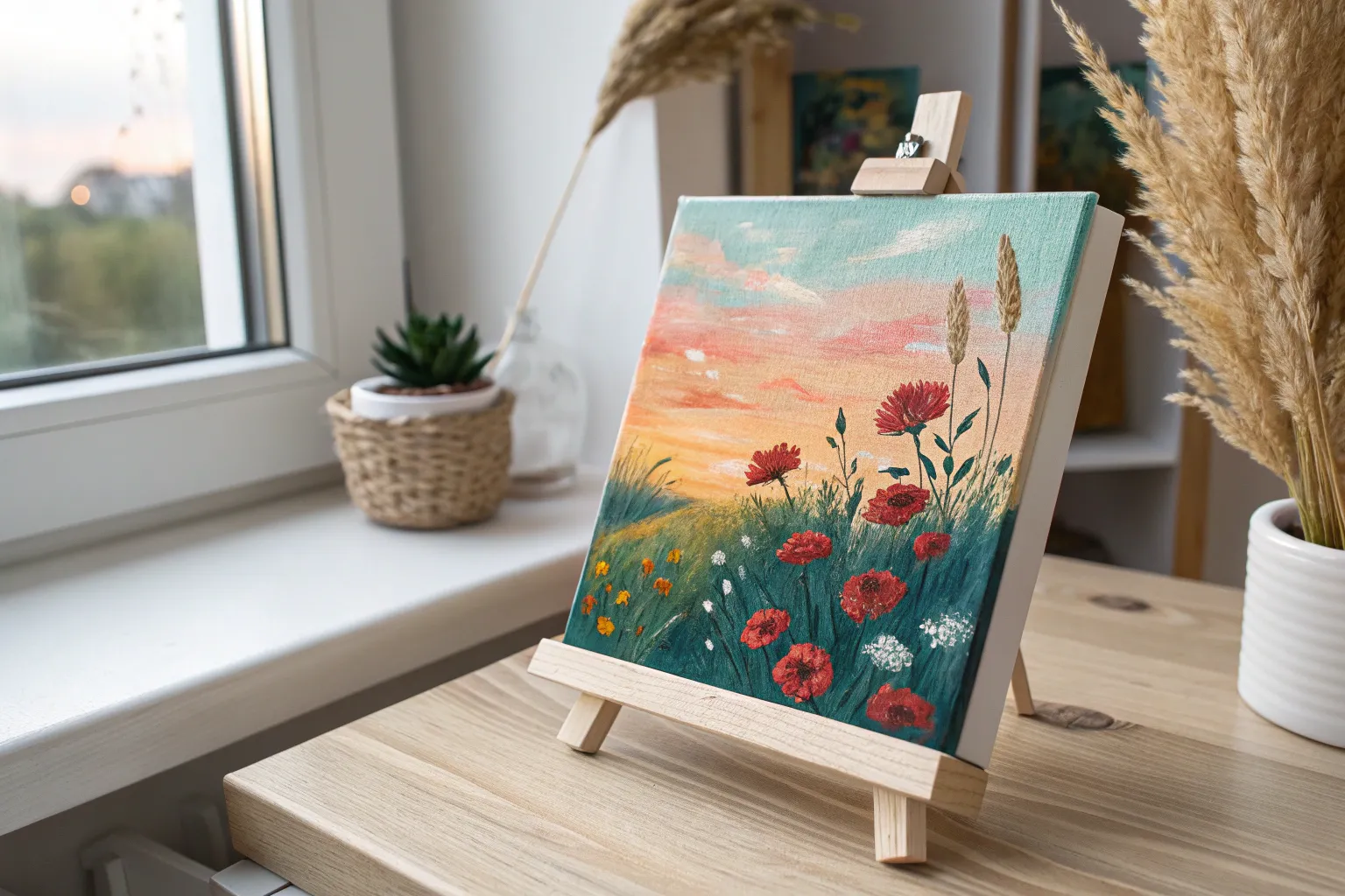
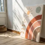
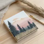
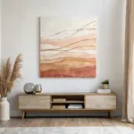
Canvas boards are my favorite little playgrounds for testing ideas without the pressure of a big, fancy canvas. If you’re craving quick wins and satisfying finishes, these canvas board painting ideas will keep your hands busy and your walls happily full.
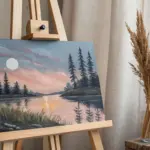
Sunset Gradient With Silhouette
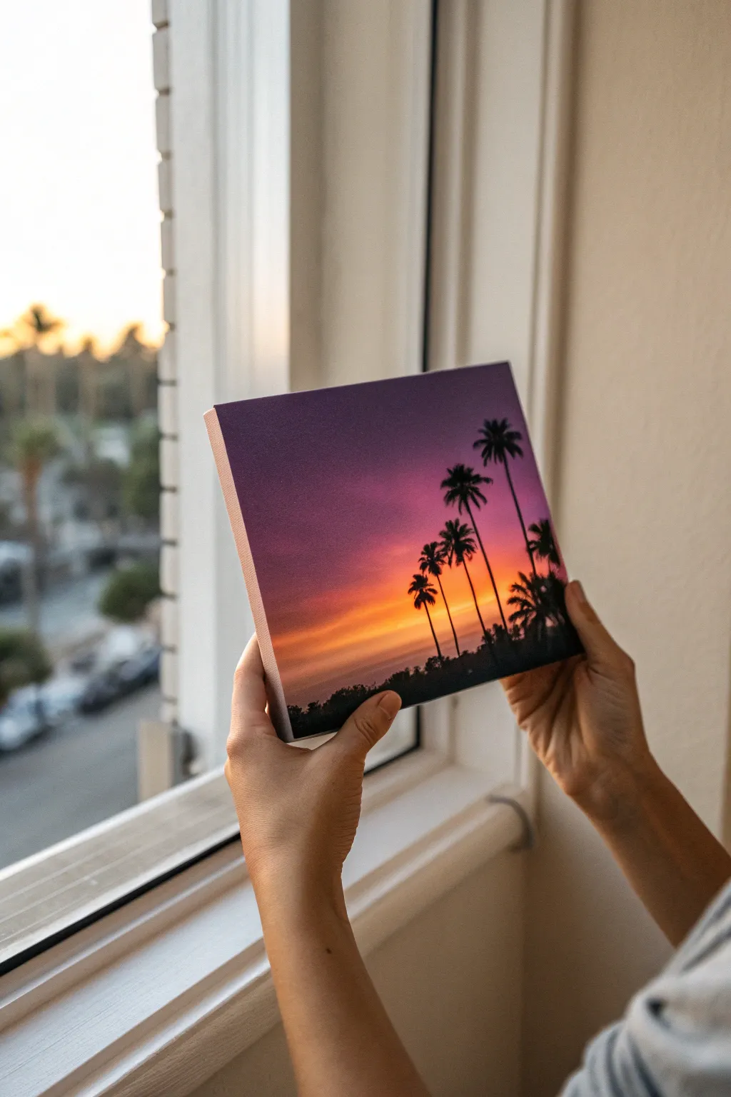
Capture the magic of a West Coast evening with this vibrant sunset study. This project focuses on achieving a perfectly seamless gradient blend from deep purple to glowing orange, framed by striking palm tree silhouettes.
Step-by-Step
Materials
- Small square canvas board (8×8 or 10×10 inches)
- Acrylic paints (Titanium White, Cadmium Yellow, Cadmium Orange, Alizarin Crimson, Dioxazine Purple, Mars Black)
- Wide flat brush (for blending)
- Medium filbert brush
- Small round detail brush (size 0 or 1)
- Palette paper or mixing tray
- Cup of water
- Paper towels
Step 1: Painting the Gradient Sky
-
Prepare your palette:
Squeeze out generous amounts of your sky colors: purple, crimson red, orange, yellow, and white. Keep the black separate for later. -
Apply the darkest tone:
Using your wide flat brush, start at the very top edge of the canvas with the deep purple paint. Paint a horizontal band about two inches wide. -
Introduce the red:
Without cleaning your brush fully, pick up the crimson red. Paint just below the purple, allowing the wet edges to touch. -
Blend the transition:
With the brush carrying both purple and red, use long, smooth horizontal strokes across the meeting point to create a soft, seamless violet transition. -
Move to orange:
Wipe your brush on a paper towel to remove excess dark pigment. Load it with orange and paint the next band below the red. -
Soften the mid-sky:
Work the brush back and forth between the red and orange sections. If the paint feels draggy, a tiny dampening of the brush helps the acrylics glide together. -
Brighten the horizon:
Clean your brush thoroughly. Mix yellow with a touch of white to make it opaque and glowing. Apply this to the lowest part of the sky area. -
Final sky blend:
Blend the yellow upward into the orange. I like to do one final pass of clean, dry brushing horizontally across the whole canvas while wet to ensure no harsh lines remain. -
Dry completely:
Let the gradient dry fully. This is crucial; if the sky is wet, the black silhouettes will muddy the colors.
Step 2: Adding the Silhouettes
-
Block in the ground:
Load a medium brush with Mars Black. Paint an uneven, low horizon line at the absolute bottom of the canvas to represent distant land or shrubbery. -
Texture the land:
Tap the top edge of your black landmass with the tip of the brush to simulate the texture of bushes and tree tops. -
Position the trunks:
Switch to your small round detail brush. With thinned black paint (adding a drop of water helps flow), paint thin, slightly curved vertical lines for the palm trunks. -
Scale and variety:
Make the trunks vary in height. Paint the tallest ones on the right side and shorter ones receding toward the left to create depth. -
Start the fronds:
At the top of a trunk, paint five or six curved lines exploding outward from the center point like a firework. -
Flick the leaves:
Using the very tip of the fine brush, flick small, jagged strokes downward from each main curved branch line to create the feathery palm leaves. -
Fill the canopy:
Repeat this for all trees. Don’t worry about perfection; messy, overlapping fronds look more natural. -
Add lower foliage:
Use the detail brush to add small hints of smaller palms or bushes peeking out from the bottom black mass. -
Final touches:
Check for any light spots in the black silhouettes and fill them in for a solid, opaque contrast against the sunset.
Smooth Blends
Work quickly while blending the sky! If acrylics dry too fast, mix in a retarder medium to extend the ‘open time’ for smoother gradients.
Starry Night Twist
Once the sky is dry but before adding trees, flick a stiff toothbrush with watered-down white paint to create faint stars in the upper purple section.
Display your tropical evening scene near a window to let natural light enhance those glowing colors

Mini Mountain Layers in Soft Neutrals
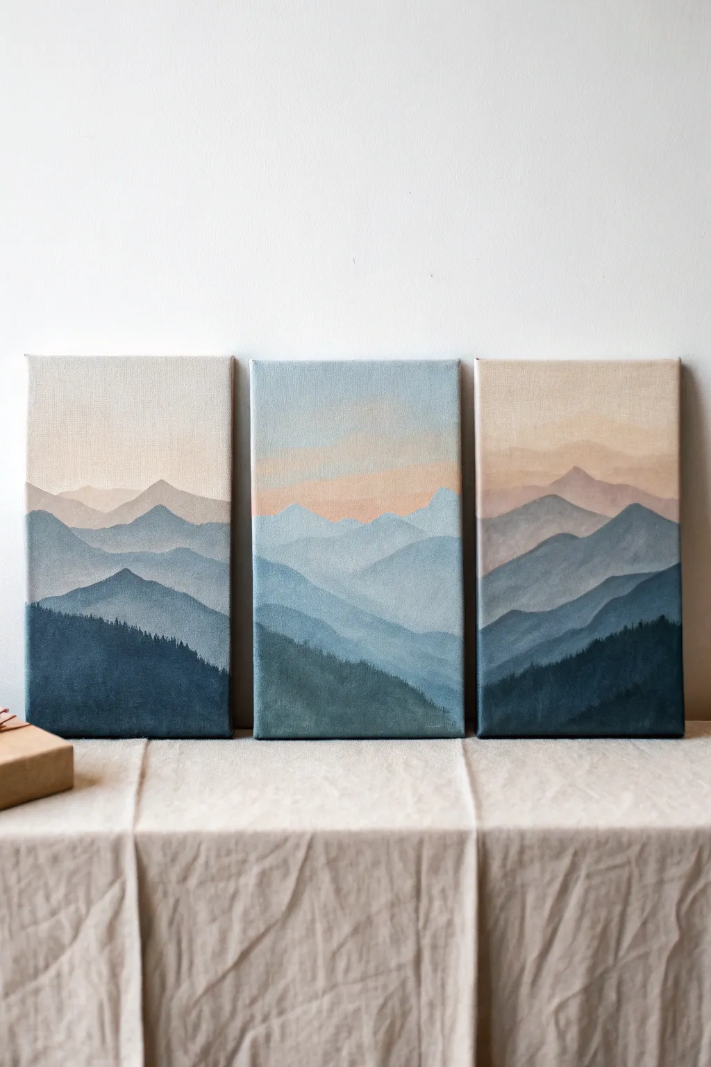
Capture the serene beauty of a mountain range fading into the distance with this beginner-friendly triptych project. Using a soothing palette of blues, teals, and soft peach tones, you’ll learn to create depth through atmospheric perspective and simple layering.
Detailed Instructions
Materials
- 3 small rectangular canvas boards (e.g., 5×7 or 6×8 inches)
- Acrylic paints: Titanium White, Ultramarine Blue, Phthalo Blue, Burnt Umber, Yellow Ochre, and a touch of Crimson
- Flat shader brushes (sizes 6 and 10)
- Small round detail brush (size 2)
- Palette for mixing
- Cup of water and paper towels
- Pencil for sketching (optional)
Step 1: Planning and Sky Gradient
-
Arrange the canvases:
Lay your three canvas boards side-by-side on your work surface, leaving a tiny gap between them. You want to visualize the mountain range flowing continuously across all three panels, so treating them as one large canvas initially helps keep the composition unified. -
Mix the sky colors:
Prepare a very pale, warm gradient for the sky. Mix a generous amount of Titanium White with a tiny dot of Yellow Ochre and a whisper of Crimson to create a soft, dusty peach or cream color. In a separate spot, mix white with a very light touch of blue. -
Paint the upper sky:
Using your larger flat brush, paint the top third of all three canvases with the white-cream mixture. Keep your strokes horizontal and smooth to eliminate obvious brush marks. -
Add the horizon gradient:
While the top paint is still slightly wet, blend in the soft peach tone near the bottom of where your sky will end (about halfway down the canvas). The goal is a seamless transition from the creamy top to a warm, sunset-like horizon line.
Step 2: Painting the Distant Layers
-
Mix the furthest mountain color:
For the most distant mountains, you need a color that barely stands out against the sky. Take your sky color and add just a hint of Ultramarine Blue and a tiny speck of Burnt Umber to create a pale, desaturated lavender-grey. -
Shape the first range:
Paint the silhouette of the furthest mountains right over the lower part of your sky gradient. Since these are far away, keep the peaks soft and rolling rather than jagged. Ensure the lines connect visually across the gaps between the three canvases. -
Create the second layer mix:
Darken your previous mixture slightly by adding a bit more blue. I find that adding a touch more white here keeps it hazy, simulating atmospheric perspective where things look lighter and bluer smoothly as they recede. -
Paint the second range:
Paint a new set of mountain shapes below and overlapping the first layer. Vary the height of the peaks so they don’t look like identical rows of teeth; some should dip low while others rise up to intersect the layer behind them. -
Add a teal transition:
For the third layer down, introduce some Phthalo Blue or teal to your grey-blue mix. This shift in temperature adds visual interest. Paint this layer slightly lower, making the shapes a bit more distinct and larger.
Mist Control
To make distant mountains look foggy, dip your brush in water, wipe most of it off, then lightly glaze a thin layer of watered-down white over the dry mountain tops.
Step 3: Foreground and Details
-
Mix the darkest mountain tone:
Prepare a deep, moody blue for the closest layers. Mix Phthalo Blue with a little Burnt Umber and just a touch of white. This should be significantly darker than your previous layers to ground the composition. -
Paint the foreground peaks:
Apply this dark teal-blue to the bottom third of the canvases. Create bold, sweeping slopes that dominate the foreground. This layer acts as the foundation for your treeline. -
Texture the slopes:
While the foreground paint is wet, you can streak in slightly lighter or darker variations of the teal color to suggest uneven terrain or valleys, but keep the contrast low to maintain the misty look. -
Mix the tree color:
Create a near-black green by mixing Phthalo Blue and Burnt Umber with very little to no white. It should be the darkest value on your palette. -
Stipple the distant trees:
Using the tip of your small round brush or the corner of a flat brush, gently stipple tiny vertical lines along the top ridge of your darkest foreground mountain layer. These tiny uneven marks simulate the tops of pine trees in the distance. -
Fill the bottom foreground:
Fill in the remainder of the bottom canvas area with this dark forest mixture. You can use a dabbing motion to keep the texture seemingly organic, rather than flat and smooth. -
Final continuity check:
Step back and look at the three boards together. If a mountain ridge stops abruptly at the edge of one canvas and starts at a different height on the next, use leftover paint to correct the alignment so the eye travels smoothly across the gap.
Touch of Gold
Once fully dry, trace the very top edge of the nearest mountain ridge with a thin line of metallic gold paint for a modern, glamorous accent.
Once dry, these panels can be mounted on a wall with small adhesive strips to create a serene window into a mountainous landscape

Cloud Study on a Canvas Board
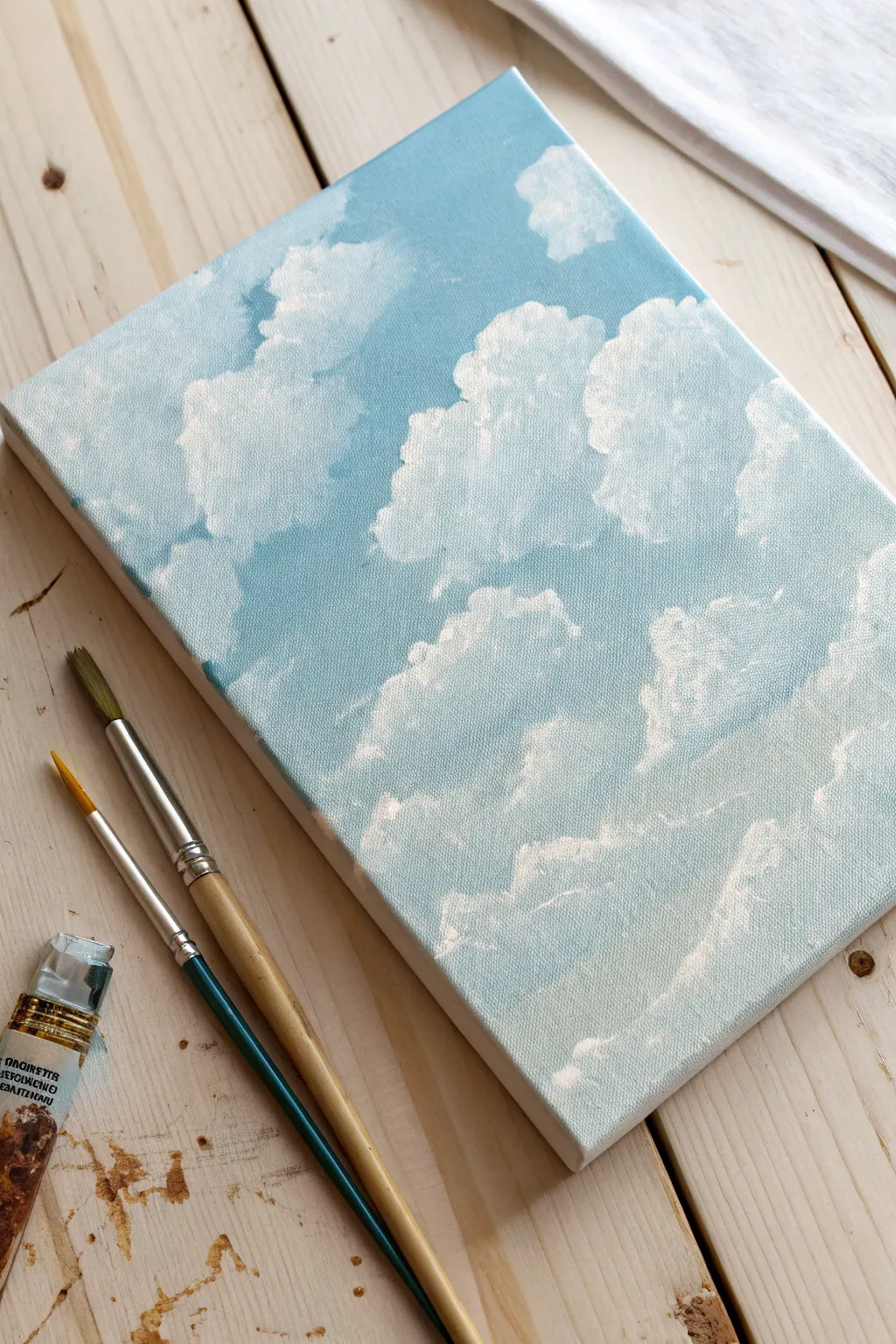
Capture the ephemeral beauty of a summer sky with this soft and airy cloud painting. By layering shades of blue and white on a textured canvas board, you’ll create depth and fluffiness that looks almost real enough to float away.
Step-by-Step
Materials
- Small rectangular canvas board or stretched canvas (approx. 5×7 or 6×8 inches)
- Acrylic paints: Titanium White, Cerulean Blue, Ultramarine Blue, maybe a touch of Grey or Violet for shadows
- Flat shader brush (size 6 or 8)
- Small round brush (size 2 or 4)
- Old scruffy brush or fan brush for texture
- Palette or paper plate
- Cup of water and paper towels
Step 1: Setting the Sky Base
-
Prepare your palette:
Squeeze out generous amounts of Cerulean Blue and Titanium White onto your palette. Add a smaller dot of Ultramarine Blue for depth. -
Mix a gradient base:
Create three distinct puddles of blue: a deeper blue using Cerulean mixed with a tiny bit of Ultramarine, a mid-tone blue (Cerulean + White), and a very pale, almost white blue. -
Apply the top layer of sky:
Using your flat brush, paint horizontal strokes across the top third of the canvas with your deepest blue mixture. Ensure the paint gets into the weave of the canvas. -
Blend the middle section:
Without cleaning your brush thoroughly, pick up the mid-tone blue. Paint the middle section of the canvas, overlapping the top section slightly to create a seamless gradient. -
Finish the bottom gradient:
Use the palest blue mix for the bottom third of the canvas. Blend upwards into the mid-tone section. The goal is a smooth transition from deeper blue at the top to pale atmospheric blue at the horizon. -
Initial dry time:
Let this background layer dry completely. This is crucial so your crisp white clouds don’t turn into a muddy light blue smear.
Textural Trick
Don’t over-mix your white paint with water for the final layer. Using thick, heavy body paint helps mimic the physical fluffiness of real clouds.
Step 2: Building the Clouds
-
Map out cloud shapes:
Load a round brush with slightly watered-down white paint. Lightly sketch the organic outlines of your main cloud formations. Keep shapes irregular and varied—avoid perfect circles. -
Block in the main masses:
Using pure Titanium White and a scruffy or dry brush, start dabbing paint inside your outlined shapes. Use a tapping motion rather than sweeping strokes to build texture. -
Soften the edges:
While the white paint is still wet, gently lightly feather the edges of the clouds outward into the blue sky. This makes them look wispy and soft rather than like stickers. -
Add volume with shadows:
Mix a tiny amount of grey or violet into your white. Apply this shadow color sparingly to the bottom and lower-middle areas of the larger cloud masses to give them 3D volume. -
Layering highlights:
Once your base cloud layer is tacky or dry, go back in with thick, pure Titanium White. Dab this onto the top-left curves of the clouds, assuming the light source is coming from above ledt. -
Create smaller floaters:
Use a smaller brush to add tiny, fragmented clouds detached from the main masses. These little wisps add realism and scale to the composition. -
Refine the texture:
I like to use a nearly dry brush with very little paint to scumble over the main body of the clouds, creating that fluffy, cotton-like surface texture visible on the canvas weave. -
Check transparency:
If your blue background is showing through too much in the bright center of a cloud, apply another coat of white. Clouds lead to be denser in the middle and sheer at the edges. -
Final highlights:
Add the brightest white dots to the very peaks of the ‘cumulus’ formations. This high contrast against the blue makes the painting pop.
Golden Hour Glow
Glaze a very thin, watery layer of pale pink or peach over the bottom third of the sky once dry to simulate a gentle sunset atmosphere.
Step back and admire your peaceful slice of the atmosphere, perfect for a desk or shelf display

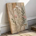
Easy Flower Close-Up Centerpiece
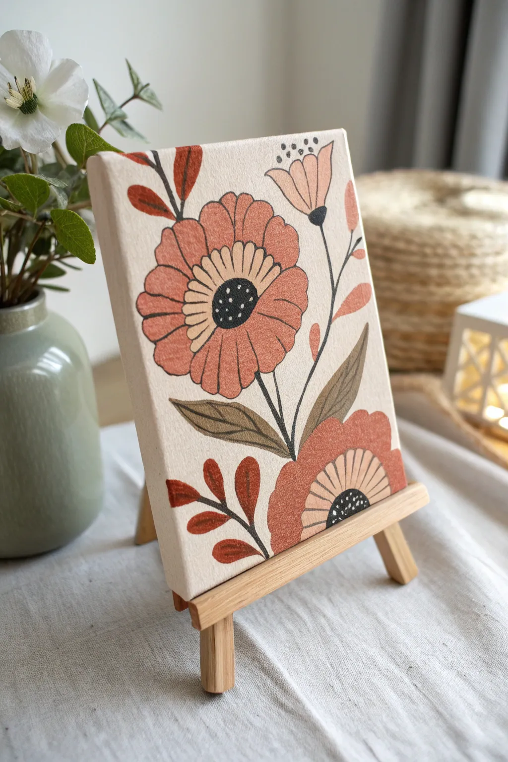
Capture the charm of vintage botanical illustrations with this warm, earth-toned floral study. The bold outlines and flat color blocks give it a distinctive, modern folk-art feel that looks perfect displayed on a miniature easel.
Step-by-Step Guide
Materials
- Small canvas board (e.g., 5×7 or 4×6 inch)
- Acrylic paints (burnt sienna, warm pink, olive green, cream/off-white, black)
- Small flat brush (size 4 or 6)
- Fine round brush (size 0 or 1)
- Pencil and eraser
- Palette for mixing
- Cup of water and paper towels
- Mini wooden easel for display
Step 1: Sketching the Composition
-
Rough placement:
Begin by lightly sketching the placement of your main elements on the canvas board. Draw a large circle slightly left of center for the main flower, and a semi-circle in the bottom right corner for the second bloom. -
Add stems and buds:
Sketch a curving line rising from the center to the top right for the smaller bud stems. Add a small cup shape at the top for the unopened flower. -
Define petals:
Around your main circle, draw wide, slightly scalloped petals. They should look somewhat like a daisy or zinnia but simplified. Do the same for the bottom corner flower. -
Leaf details:
Sketch the large, pointed leaves at the base of the stems and the smaller, rounded leaflet pairs near the top left and right edges.
Shaky Hands?
If painting fine lines is difficult, you can cheat the look by using a fine-tip black paint marker or permanent marker after the colored paint is 100% dry.
Step 2: Blocking in Color
-
Mix the main floral color:
Create a warm, dusty coral shade by mixing warm pink with a tiny touch of burnt sienna. Use your flat brush to paint the petals of the main flower and the bottom flower. -
Paint the bud:
Using a lighter version of that coral mix (add a little white or cream), fill in the petals of the small upper bud. -
Add the centers:
Mix a creamy beige tone. Paint a ring in the center of the main flower and the visible center area of the bottom flower. Leave the very center spot empty for now. -
Leaf base coat:
Mix an olive green using green and a touch of brown. Paint the two long leaves at the bottom center. For the smaller accent leaves on the sides, use pure burnt sienna for a reddish contrast. -
Let it dry:
Allow the base layers to dry completely. Acrylics on canvas board dry quickly, but give it about 10-15 minutes so your outlines don’t smear later.
Step 3: Outlining and Details
-
Prepare the black paint:
Thin your black acrylic paint slightly with a drop of water. This helps the paint flow smoothly off the liner brush for crisp lines. -
Draw the main stems:
Using your fine round brush, paint the thin black stems connecting your flowers and leaves. Keep the pressure light to maintain a delicate line width. -
Outline the petals:
carefully outline each coral petal. Don’t worry if the lines aren’t perfectly uniform; a little variation adds to the hand-painted charm. -
Detail the centers:
Paint a solid black circle in the very middle of the main flower and the bottom flower. Once that’s done, add thin lines radiating outward into the beige ring you painted earlier. -
Leaf veins:
Add a central vein line to your olive green leaves. For the reddish leaves, you can outline them or simply add a stem connection. -
Stipple details:
Dip the very tip of your smallest brush (or a toothpick) into white or cream paint. Add tiny dots inside the black floral centers for texture. -
Upper bud accents:
Add three small black dots floating just above the top bud to suggest pollen or stamens.
Texture Trick
Don’t over-mix your floral color. Leaving slight streaks of pink and orange creates a lovely petal texture that looks more organic than a flat, single color.
Once dry, place your board on the mini easel to enjoy a touch of nature on your desk or shelf
BRUSH GUIDE
The Right Brush for Every Stroke
From clean lines to bold texture — master brush choice, stroke control, and essential techniques.
Explore the Full Guide
Leaf Silhouettes on a Two-Tone Background

Embrace the beauty of minimalism with this clean, two-tone canvas design that serves as an elegant base for further art or stands beautifully on its own. The sharp diagonal split paired with a metallic accent line creates a sophisticated, modern aesthetic perfect for any gallery wall.
Step-by-Step Tutorial
Materials
- Square stretched canvas (e.g., 10×10 or 12×12 inches)
- Acrylic paint: Cream or Off-White
- Acrylic paint: Sage Green (muted tone)
- Painter’s tape or masking tape (low tack)
- Flat synthetic paintbrush (1 inch width)
- Gold paint pen or thin gold striping tape
- Ruler or straight edge
- Pencil
- Matte varnish (optional)
Step 1: Preparation & Mapping
-
Surface check:
Begin by inspecting your canvas for any loose threads or dust, wiping it down gently with a dry cloth to ensure a clean painting surface. -
Mark the diagonal:
Place your ruler from the top-right corner to the bottom-left corner of the canvas. Make light pencil marks at the very edges to guide your tape placement. -
Apply the first tape line:
Stretch a long piece of painter’s tape diagonally across the canvas, connecting your two pencil marks. Press the edge of the tape down firmly with your fingernail or a credit card to prevent paint bleed.
Step 2: Painting the Cream Section
-
Base coat application:
Load your flat brush with the cream acrylic paint. Paint the upper-left triangular section, brushing away from the tape edge initially to further seal it. -
smooth strokes:
Use long, even strokes parallel to the diagonal line to minimize visible brush marks. Ensure you paint the side edges of the canvas for a professional gallery-wrapped look. -
Second coat:
Allow the first layer to dry for about 15-20 minutes. Apply a second coat of cream paint to ensure full opacity and rich color coverage. -
Remove tape:
While the second coat is still slightly tacky (but not wet), carefully peel back the painter’s tape at a 45-degree angle to reveal a crisp line. Let this section dry completely.
Bleeding Lines?
If paint seeps under the tape, don’t panic. Wait for it to dry completely, then use a stiff, damp brush to gently scrub the excess away, or paint over it.
Step 3: Painting the Sage Section
-
Retaping the line:
Once the cream section is fully dry only (I usually wait at least an hour to be safe), apply fresh painter’s tape over the cream paint, aligning the edge perfectly with the existing diagonal line. -
Sealing the edge:
A great trick is to apply a very thin layer of the *cream* paint along the new tape edge first. This fills any tiny gaps; if bleed occurs, it will be cream-on-cream and invisible. -
Apply green paint:
Paint the lower-right triangular section with your sage green acrylic. Cover the front face and the corresponding side edges of the canvas. -
Second green coat:
Allow the green layer to dry to the touch, then apply a second coat to smooth out any streakiness. -
Reveal:
Gently peel away the tape to reveal the sharp contrast between the cream and sage sections.
Texture Twist
Mix a teaspoon of baking soda into your acrylic paint before applying. This creates a trendy, terra-cotta-like texture that feels very high-end.
Step 4: Finishing Touches
-
Clean up imperfections:
Inspect the diagonal line. If any paint bled through, use a tiny detailed brush and the appropriate color to carefully touch up the edge. -
Add the metallic accent:
Place your ruler slightly offset from the color split. Run a gold paint pen along the seam to create a thin, defining metallic line. -
Alternative gold method:
If you don’t have a steady hand for painting lines, adhere a strip of thin gold decorative tape or gold leaf directly over the seam where the colors meet. -
Sealing:
Once all paint and accents are thoroughly dry, apply a coat of matte varnish to protect the surface and unify the sheen of both colors.
Step 5: Adding the Silhouette (Optional Phase)
-
Leaf selection:
If you plan to add the intended leaf silhouette mentioned in the project title, choose a real leaf with an interesting shape to use as a stencil or reference. -
Placement:
Position the leaf or stencil centrally over the diagonal line so the silhouette bridges both colors.
Now you have a chic geometric canvas ready to display or serve as a backdrop for further creativity
Dandelion Puff With Floating Seeds
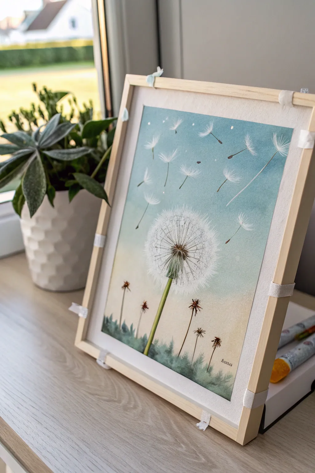
Capture the airy lightness of a dandelion puff releasing its seeds into a summer breeze with this serene painting project. Using a soft gradient background and fine detailing, you’ll create a piece that feels both delicate and full of movement.
Step-by-Step Guide
Materials
- Canvas board or watercolor paper stretched on a frame
- Watercolor paints (Phthalo Blue, Sap Green, Burnt Umber, Yellow Ochre)
- White gouache or white acrylic ink for opaque details
- Wide flat brush for washes
- Fine liner brush (size 0 or 00)
- Round brush (size 4 or 6)
- Masking fluid (optional)
- Palette for mixing
- Cup of water and paper towels
Step 1: Creating the Atmoshere
-
Prepare the gradient:
Begin by wetting your canvas board slightly with clean water to encourage blending. Mix a watery wash of Phthalo Blue with a touch of white for the upper sky. -
Paint the sky:
Apply the blue wash starting from the top, brushing horizontally. As you move down the canvas, gradually dilute the blue with more water and mix in a tiny amount of Yellow Ochre to create a warm, fading horizon line. -
Ground the scene:
While the bottom area is still slightly damp, drop in a very faint wash of Sap Green along the bottom edge to suggest a distant, out-of-focus grassy field. Let this background layer dry completely before proceeding.
Step 2: The Main Structure
-
Sketch the placement:
Lightly sketch a vertical line for the main stem and a circle where the dandelion puff head will sit. Keep pencil marks very faint so they don’t show through the final paint. -
Paint the main stem:
Mix Sap Green with a little Yellow Ochre for a fresh plant color. Using your round brush, paint the main stem, starting thicker at the base and tapering slightly as it reaches the center head. -
Add the seed head center:
At the top of the stem, paint the small, brownish-green receptacle (the center nub) using a mix of Sap Green and Burnt Umber. Use small, stippling motions to give it texture. -
Background foliage:
Using a more diluted green mix, paint loose, grassy shapes along the bottom edge. I like to keep these slightly blurry and undefined to ensure they don’t distract from the main subject. -
Dried flower stalks:
Mix a thin wash of Burnt Umber. With your fine liner brush, draw three or four thin, vertical lines rising from the grass for the dried companion plants. -
Details on dried stalks:
Add tiny, star-like shapes at the top of these brown stalks to represent dried sepals or dead blooms. Keep these dark and crisp for contrast against the soft background.
Use A Rigger Brush
For the ultra-thin seed stalks, a ‘rigger’ or ‘script’ brush is ideal. Its long hairs hold more paint and absorb hand tremors, creating straighter fine lines than a standard short brush.
Step 3: Fluff and Seeds
-
Map the white sphere:
Switch to white gouache or acrylic ink. Unlike watercolor, this will sit on top of your background. Dilute it slightly so it flows but remains opaque. -
Inner radiating lines:
Using your finest liner brush, paint very thin spokes radiating outward from the center nub. These are the stalks of the individual seeds attached to the head. -
Create the fluff texture:
At the end of each radiating spoke, paint tiny V-shapes or little asterisks in white. Focus on the outer perimeter of the circle first to define the round shape. -
Build density:
Fill in the rest of the sphere with more of these tiny white fibers. Leave some gaps so the background sky peeks through; this transparency is key to making it look airy. -
Add flying seeds:
Paint several individual seeds floating away into the blue sky. Draw a tiny brown dot for the seed seed, a thin white line for the stalk, and a small fan of white fibers at the top. -
Directional flow:
Ensure all flying seeds follow a similar imagined wind path, drifting diagonally upward towards the right for a natural sense of movement. -
Final highlights:
Add a few pure white dots around the flying seeds to represent caught sunlight or dust motes. Strengthen the white on the main dandelion if the paint dried too transparent.
Make It Sparkle
Mix a tiny pinch of iridescent medium or pearl watercolor into your white gouache for the final layer of fluff. It will add a subtle, magical shimmer when the light hits the artwork.
Step back and admire your gentle, wind-swept creation perfect for a peaceful corner of your home

PENCIL GUIDE
Understanding Pencil Grades from H to B
From first sketch to finished drawing — learn pencil grades, line control, and shading techniques.
Explore the Full Guide
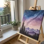
Galaxy Night Sky on a Small Panel
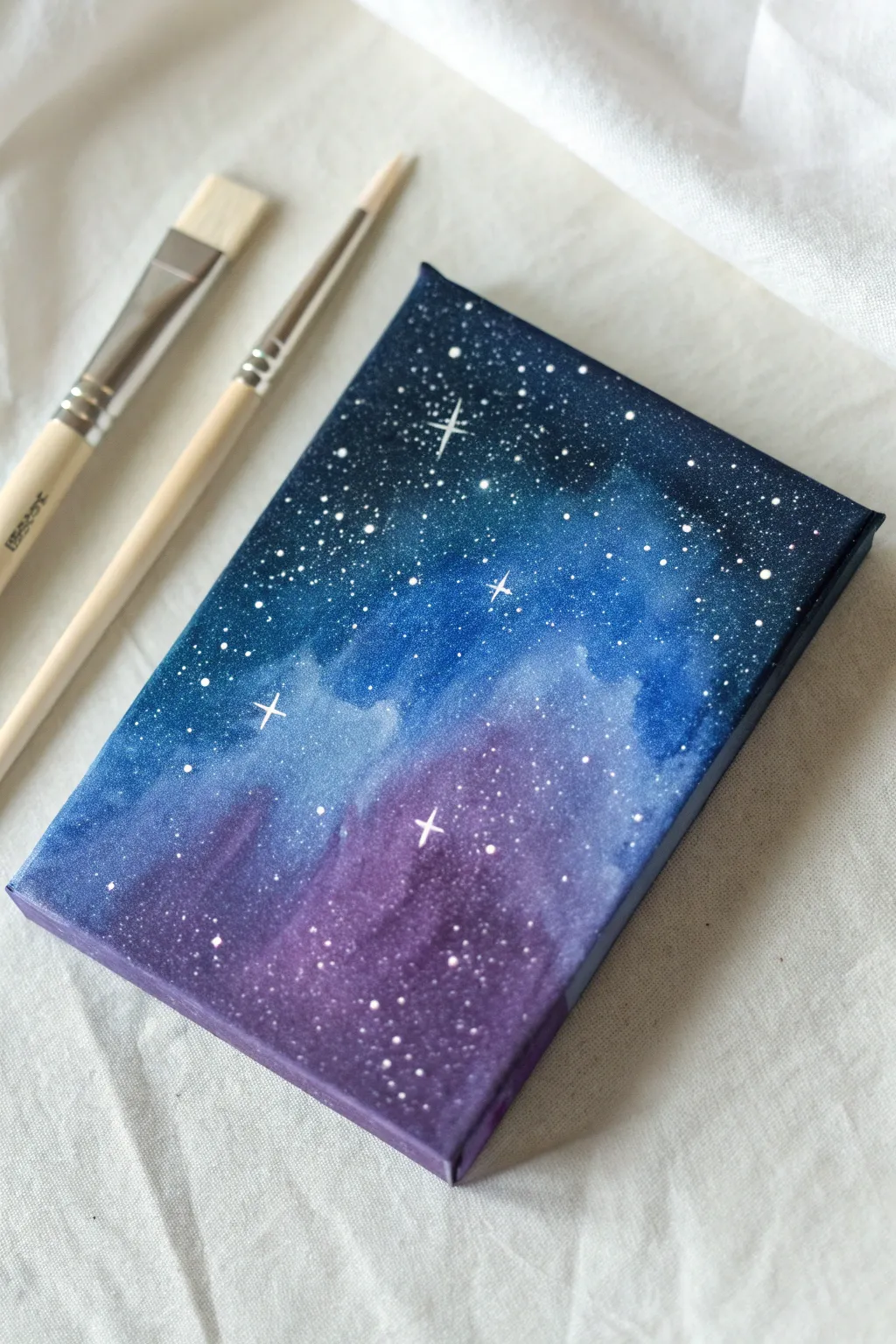
Transform a small canvas panel into a stunning window to the cosmos with this beginner-friendly galaxy painting tutorial. Using simple blending techniques and splatter effects, you’ll create a vibrant nebula that looks far more complex than it actually is.
How-To Guide
Materials
- Small rectangular canvas panel (approx. 4×6 or 5×7 inches)
- Acrylic paints: Navy Blue, Phthalo Blue (or Cyan), Purple, Magenta, Black, and Titanium White
- Flat shader brush (size 6 or 8)
- Round detail brush (size 0 or 1)
- Old toothbrush or stiff bristle brush
- Water cup
- Paper towels
- Palette or paper plate
Step 1: Creating the Nebula Base
-
Prime the background:
Begin by painting the entire canvas with a layer of navy blue mixed with a tiny drop of black. This creates a deep, dark base for your galaxy to sit on. -
Establish the color zones:
While the base is still slightly tacky, load your flat brush with purple paint. Apply it diagonally across the bottom third of the canvas using uneven, cloudy strokes. -
Add the mid-tones:
Clean your brush, then pick up the brighter blue (Phthalo/Cyan). Apply this to the center and upper-middle section, letting it overlap slightly with the dark edges. -
Blend the transition:
Using a clean, slightly damp brush, gently softly scrub the area where the blue and purple meet to create a blurry transition. Don’t over-mix or you’ll get a muddy color. -
Highlight the nebula:
Mix a small amount of white into your bright blue to create a light sky blue. Dab this into the center of the blue section to create a glowing core. -
Create depth:
Repeat the previous step with the purple section, mixing white and magenta to create a lighter orchid shade, and dabbing it into the center of the purple area. -
Soften the clouds:
Use a dry brush to gently pat the edges of your highlighted areas, softening them so they look like drifting gas clouds rather than solid shapes. -
Deepen the corners:
To make the center glow pop, paint the four corners of the canvas with pure black, blending it inward toward the navy base layer. -
Dry completely:
Allow the entire background to dry fully before moving on to the stars. This prevents the sharp white dots from turning gray or blue.
Starry Mistakes
If you accidentally splatter a giant blob of white paint, don’t panic. Quickly wipe it away with a damp Q-tip, or wait for it to dry and perform a touch-up with your background colors.
Step 2: Adding the Stars
-
Prepare splatter paint:
On your palette, mix Titanium White with a few drops of water until it reaches the consistency of heavy cream or ink. -
Test the splatter:
Load an old toothbrush or stiff brush with the watery white paint. Test flicking the bristles on a scrap paper first to ensure the drops aren’t too large. -
Create the starfield:
Hold the brush about 6 inches from the canvas and flick the bristles to spray a fine mist of stars across the painting. Concentrate more stars in the lighter nebula areas. -
Review the density:
Step back to look at the distribution. I usually add a second, very light layer of splatter if the galaxy needs more depth. -
Paint larger stars:
Dip the handle end of a small brush or a toothpick into pure white paint. Dot a few larger, distinct stars randomly across the sky. -
Start the sparkle details:
Select 3 or 4 of your largest dots to turn into twinkling stars. Using your finest detail brush, paint a thin vertical line through the center of the dot. -
Finish the sparkles:
Paint a horizontal line crossing the vertical one to create a cross shape. You can taper the ends of the lines to make them look sharper. -
Final touches:
If any stars look too stark, you can gently tap them with a clean finger to push them back into the distance slightly.
Level Up: Silhouette
Once the stars adhere to the canvas, paint a simple black silhouette along the bottom edge—like pine trees or a mountain range—to give your galaxy a sense of massive scale.
Place your mini masterpiece on a tiny easel or attach a magnet to the back to display your personalized slice of the universe
Minimal Line Art Over Washy Background
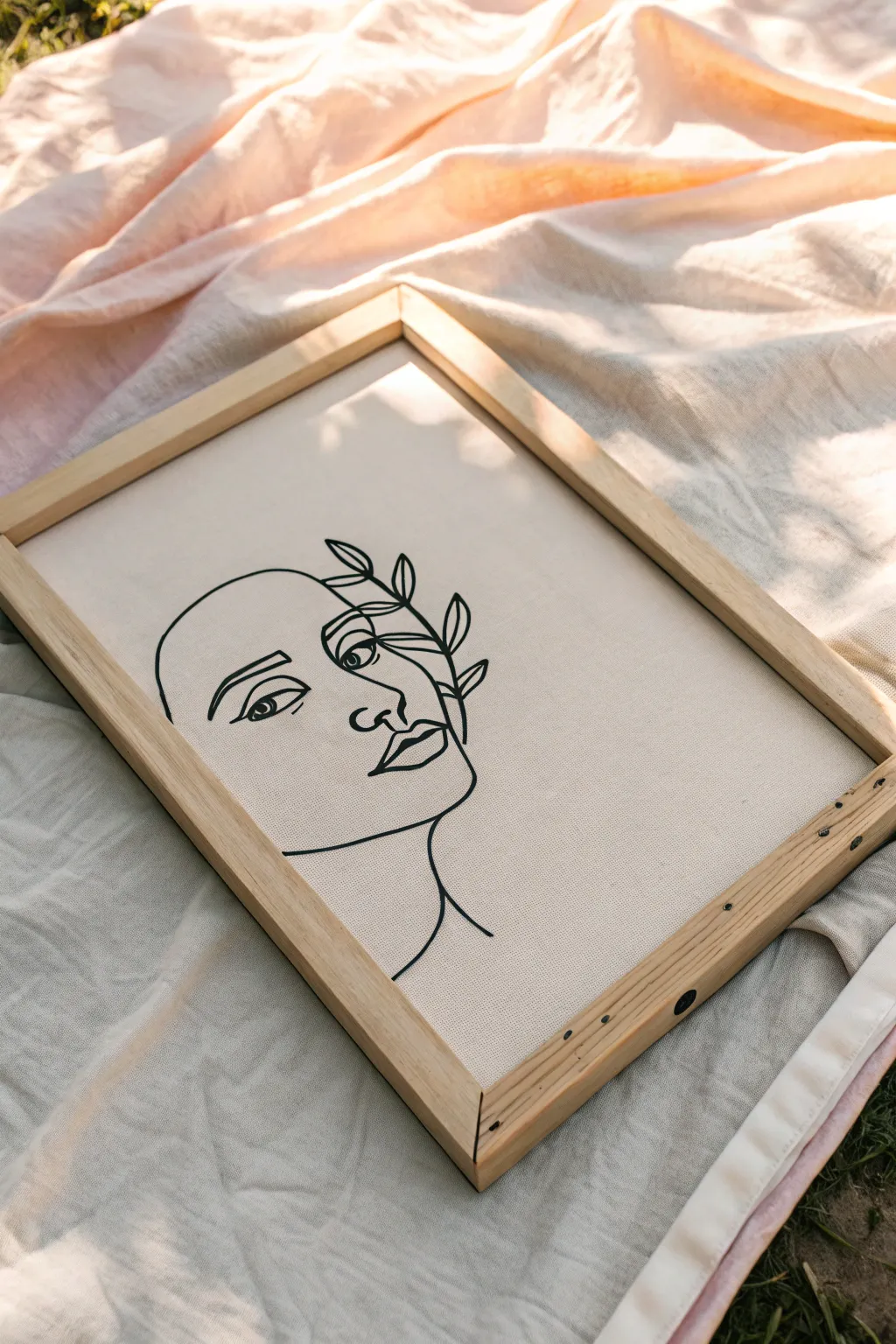
Embrace the elegance of minimalism with this striking line art project that combines organic botanical elements with a simple portrait. The beauty of this piece lies in its clean, continuous-look lines set against a textured, neutral canvas, making it a sophisticated addition to any modern space.
Detailed Instructions
Materials
- Primed canvas board or stretched canvas (approx. 11×14 or A3 size)
- Cream or off-white acrylic paint (for the background wash)
- Wide flat brush or sponge brush
- Carbon transfer paper
- Pencil (HB or 2B)
- Black acrylic paint pen (medium tip, 3mm-5mm)
- Fine liner black paint pen (0.7mm or 1mm tip)
- Paper for sketching or printing reference
- Painter’s tape
- Light wood floating frame (optional)
Step 1: Preparation
-
Canvas Prep:
Begin by ensuring your canvas surface is clean and free of dust. Even though most canvases come primed, adding a specific base color elevates the final look. -
Background Wash:
Mix a small amount of cream or off-white acrylic paint with water to create a milky consistency. Apply this wash evenly across the entire board using a wide flat brush to knock back the harsh bright white of the raw gesso. Let this dry completely. -
Design Selection:
Find or sketch your reference image. For this project, you want a continuous-line style face profile merged with a leafy branch near the eye. You can print a free stock vector or draw your own on a piece of printer paper first. -
Transfer Setup:
Place a sheet of carbon transfer paper (dark side down) onto your dry canvas. Position your reference sketch on top of the transfer paper, ensuring the face is centered but slightly offset to allow room for the leaves. -
Secure the Layers:
Use small pieces of painter’s tape to secure the corners of your paper stack to the canvas. This is crucial so the design doesn’t shift while you are tracing.
Steady Hands Secret
Rest your wrist on a clean book or a raised mahl stick to keep your hand off the canvas surface while drawing. This prevents smudging drawing fluid lines.
Step 2: Drafting the Design
-
Tracing the Profile:
Using a sharp pencil, firmly trace over the lines of your design. Start with the main facial features—the jawline, lips, and nose—applying distinct pressure to transfer the carbon. -
Adding Botanicals:
Trace the leafy branch elements carefully. These organic shapes overlap the eye area, so pay attention to where lines intersect. I find lifting a corner of the paper occasionally helps check if the transfer is clear. -
Reveal the Guide:
Remove the tape and lift off the paper layers. You should now have a faint charcoal-colored guide on your creamy background. If any lines are too faint, lightly reinforce them with your pencil now. -
Clean Up:
Use a kneaded eraser to dab away any stray smudges from the carbon paper or heavy hand rests, keeping the background pristine before you start painting.
Texture Twist
Mix a pinch of baking soda into your background cream wash paint. This creates a subtle grainy texture that makes the board look like expensive handmade paper.
Step 3: Inking the Art
-
The First Pass:
Shake your medium-tip black acrylic paint pen well. Test the flow on a scrap piece of paper to ensure no blobs occur. Ideally, you want a consistent, opaque black line. -
Bold Outlines:
Begin tracing your pencil lines with the medium pen. Maintain a steady speed; moving too slowly can cause shaky lines, while moving too fast might make the ink streak. Focus on the main silhouette profile first. -
Handling Curves:
When painting the lips and nose, try to complete curves in one fluid motion rather than sketching short strokes. This mimics the ‘continuous line’ aesthetic. -
Refining Details:
Switch to the fine liner paint pen for delicate areas, specifically the pupil of the eye and the veins in the leaves. This variation in line weight adds visual interest and prevents the drawing from looking clumsy. -
Filling Complexity:
Return to the medium pen to darken the iris and the main stem of the plant. Ensure the connection points—where the leaves meet the branch—are crisp. -
Drying Time:
Allow the ink to dry for at least 30 minutes. Acrylic markers dry fast, but smudging a wet line at this stage is heartbreaking. -
Cleanup Erasing:
Once the ink is bone dry, take a clean eraser and gently remove any visible pencil guidelines that are peeking out from under the black ink.
Step 4: Finishing
-
Sealing:
To protect the canvas from dust and UV light, apply a thin coat of matte spray varnish. Work in light, sweeping motions to avoid making the black ink bleed. -
Framing:
A light wood frame complements the neutral tones perfectly. If using a canvas board, you may need to attach backing clips to secure it into a standard open frame.
Now you have a serene piece of modern art ready to bring calm to your walls


Tiny Still Life: Fruit on a Canvas Board
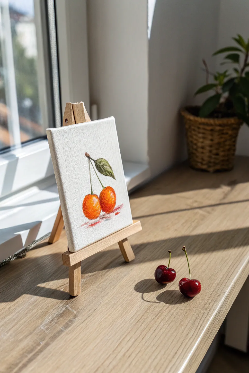
Capture the charm of summer fruit on a tiny scale with this delightful still life project. Using a small canvas board and acrylics, you’ll create a vibrant study of two cherries that brings a pop of color to any corner of your home.
How-To Guide
Materials
- Small rectangular canvas board (approx. 4×6 or 5×7 inches)
- Mini wooden easel for display
- Acrylic paints: Cadmium Orange, Cadmium Red, Alizarin Crimson, Sap Green, Burnt Umber, Titanium White
- Small flat brush (size 4 or 6)
- Small round detail brush (size 0 or 1)
- Palette or paper plate
- Cup of water and paper towels
- HB Pencil
Step 1: Sketching and Blocking In
-
Outline the composition:
Begin by lightly sketching the two cherries in the lower-center of your canvas board using an HB pencil. Place one slightly in front of the other to create depth. -
Add the stems and leaf:
Draw two long, thin stems that meet at the top. From this junction, sketch a single, pointed leaf extending to the right side. -
Mix the base orange:
On your palette, mix Cadmium Orange with a tiny touch of Titanium White to create a bright, sunny base color. You want this first layer to be vibrant and warm. -
Apply the first layer:
Use your flat brush to fill in the round shapes of the cherries with the orange mixture. Don’t worry about shadows yet; just get a solid coat of color down.
Step 2: Building Form and Color
-
Introduce redness:
While the orange is drying, mix a warm red using Cadmium Red and a speck of orange. Start blending this into the right side and bottom of the cherries where the shadows would naturally fall. -
Deepen the shadows:
Mix a darker red using Alizarin Crimson. With the small round brush, apply this to the very bottom edges and the area where the two cherries touch or overlap. -
Paint the leaf base:
Mix Sap Green with a little Burnt Umber to dull it slightly. Fill in the leaf shape, using the tip of your round brush to keep the edges crisp. -
Add leaf variation:
Mix a lighter green by adding Yellow or White to your Sap Green. Paint the top half of the leaf with this lighter shade to suggest light hitting the surface. -
Detail the leaf veins:
Using your smallest brush and a dark green-brown mix, carefully paint a central vein down the leaf and a few faint side veins.
Tip: Texture Talk
Canvas board has a distinct weave. To get smoother cherries, you can apply a layer of gesso and sand it down before painting, or use thick body acrylics.
Step 3: Stems and Final Details
-
Paint the stems:
I like to use a liner brush or very fine round brush for this. Mix Sap Green with a little White and paint the long, thin stems connecting the fruit to the top junction. -
Connect the stems:
Add a tiny dab of brown at the top where the stems meet the branch or leaf node to anchor them. -
Highlight the fruit:
Take pure Titanium White. Apply a small, curved dash or dot on the upper left side of each cherry. This specular highlight makes them look shiny and round. -
Create the cast shadow:
Mix a watery red-grey wash using Alizarin Crimson, a touch of Umber, and plenty of water. Paint a loose, horizontal scribble right underneath the cherries. -
Refine the shadow:
While the shadow paint is still wet, soften the edges so it doesn’t look like a solid dark block, giving the illusion the cherries are resting on a surface. -
Final assessment:
Step back and look at your canvas. If the texture of the canvas shows through too much on the cherries, add a second thin layer of orange glaze to boost the saturation.
Level Up: Glossy Finish
Once the painting is fully dry (wait 24 hours), apply a coat of gloss varnish only to the cherries themselves to make them look distinct from the matte background.
Set your mini masterpiece on its easel near a window to let the natural light enhance your work
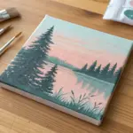
Underwater Scene With Simple Shapes
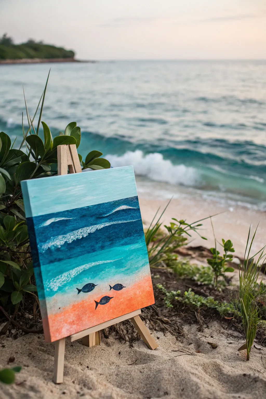
Capture the serene beauty of the ocean meeting the shore with this layered acrylic painting. By blending distinct bands of color and adding simple silhouettes, you’ll create a tranquil underwater scene that feels both modern and timeless.
Detailed Instructions
Materials
- Canvas board or stretched canvas (square or rectangular)
- Acrylic paints: Orange, Titanium White, Turquoise, Phthalo Blue (or similar deep blue), Navy Blue, Black
- Flat shader brushes (medium and large)
- Small round detail brush
- Palette or paper plate
- Cup of water
- Paper towels
- Optional: Tabletop easel
Step 1: Setting the Sky and Horizon
-
Prepare the sky color:
Mix a large amount of Titanium White with a tiny dot of Turquoise or Light Blue. You want a very pale, airy blue tint. -
Paint the sky:
Using a large flat brush, paint the top third of your canvas with horizontal strokes. Keep the coverage smooth and slightly semi-transparent if you like a breezy look. -
Establish the horizon line:
Mix a medium blue using Turquoise and a touch of Phthalo Blue. Paint a distinct horizontal line directly below your sky section.
Wave Texture Tip
Don’t overmix the white foam. Let the paint sit heavily on the canvas surface to create physical texture that catches the light like real sea foam.
Step 2: Building the Deep Ocean
-
Create the deep water band:
Below the horizon line, mix a darker, richer blue using Phthalo Blue and a tiny bit of Navy. Apply this across the canvas in a band about two inches wide. -
Blend the transition:
While the paint is still wet, use horizontal strokes to slightly soften the line where the horizon meets the deep water, creating a sense of distance. -
Add the mid-water section:
Mix Turquoise with a little bit of the previous deep blue. Paint the next band down, making it slightly lighter than the deep water above it. -
Paint the shallow water:
For the section approaching the sand, use pure Turquoise mixed with a generous amount of White. This should be a bright, tropical aqua color.
Make It Sparkle
Mix a tiny pinch of fine iridescent glitter into your final white highlights on the water’s surface to mimic sunlight hitting the ocean waves.
Step 3: Creating the Sandy Floor
-
Mix the sand color:
Take your Orange paint and mix it with Titanium White. You want a soft, coral-peachy tone rather than a blazing neon orange. -
Apply the beach base:
Paint the bottom section of the canvas with this coral mixture. I like to curve the top edge of this section slightly upward on one side to mimic a sloping shoreline. -
Blend into the water:
While the coral paint and the aqua water paint are both tacky, gently blend the meeting point with a clean damp brush to create a hazy transition.
Step 4: Adding Waves and Texture
-
Suggest distant waves:
Load a medium flat brush with pure Titanium White. In the deep blue section, drag standard horizontal lines that taper off to simulate rolling swells. -
Create crashing foam:
For the nearer waves, dab the white paint on more thickly. Use a stippling motion (up and down dabbing) to create the texture of sea foam. -
Refine the wave crests:
Add a crisp white line along the top edge of your textured foam areas to show where the wave is breaking.
Step 5: Details and Silhouettes
-
Dry the canvas:
Ensure the background, especially the lower coral and aqua sections, is completely dry before proceeding. -
Outline the fish:
Using a small round brush and Black paint mixed with a tiny bit of Navy, paint three simple oval shapes in the lower third of the painting. -
Add fins and tails:
Carefully add small triangular shapes for the tail fins and tiny distinct strokes for the dorsal and pectoral fins. -
Detail the eyes:
Once the black silhouettes are dry, use the very tip of your smallest brush or a toothpick to place a tiny white dot for the eye on each fish. -
Finishing touches:
Check your edges. If you are using a canvas board, you might want to wrap the colors around the sides for a polished gallery look.
Place your finished piece on a mini easel to bring a splash of the seaside to any corner of your home
Season Set: Four Canvas Boards, One Theme
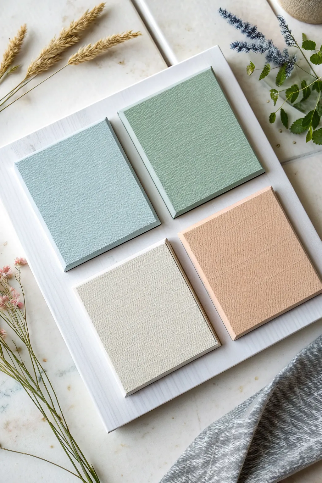
Embrace the calming hues of a seaside morning with this four-part color study that emphasizes texture over complex imagery. By painting simple squares in a harmonious, muted palette, you create a sophisticated piece of wall art that celebrates the subtle weave of the canvas itself.
Detailed Instructions
Materials
- 4 small square canvas boards (approx. 4×4 or 5×5 inches)
- 1 large wooden board or MDF panel (for mounting)
- White gesso
- Acrylic paints: Titanium White, Cerulean Blue, Sap Green, Burnt Sienna, Yellow Ochre
- Matte medium
- Wide, flat synthetic wash brush (1-inch width)
- Fine-grit sandpaper (220 grit)
- Strong craft glue or heavy-duty mounting tape
- Palette knife (for mixing)
- Clean rag or paper towels
Step 1: Preparing the Base
-
Prime the main board:
Start with your large mounting board. Apply a coat of white gesso evenly across the entire surface using your wide flat brush to seal the wood. -
Add a whitewash texture:
Once the gesso is dry, mix a small amount of water into Titanium White acrylic paint to create a milky consistency. Brush this over the board in long, vertical strokes to create a subtle, wood-grain effect. -
Sand for smoothness:
After the whitewash dries completely, lightly sand the surface with fine-grit sandpaper to remove any rough ridges, wiping away the dust with a clean rag.
Uneven Coverage?
If the canvas texture is showing distinct white speckles, thin your paint slightly with water or flow improver to help it sink into the weave.
Step 2: Mixing the Palette
-
Create the Sage Green:
On your palette, mix a generous amount of White with a touch of Sap Green and a tiny speck of Burnt Sienna to desaturate it. You want a soft, earthy herbal tone. -
Mix the Coastal Blue:
Combine White with a small dot of Cerulean Blue. To mute the brightness and make it feel more organic, add a minuscule amount of the Sage Green mixture you just created. -
Blend the Soft Peach:
Mix White with Burnt Sienna and a hint of Yellow Ochre. Keep adding White until you reach a warm, sandy terracotta shade that feels light and airy. -
Prepare the Cream:
For the final color, take a large amount of White and tint it very slightly with the Yellow Ochre and a pinhead-sized dot of Burnt Sienna for a warm, off-white tone.
Step 3: Painting the Canvases
-
Apply the first color coat:
Take your first small canvas board. Using the flat brush, apply the Coastal Blue paint. Brush primarily in one direction (horizontal) to emphasize the canvas weave. -
Paint the remaining squares:
Clean your brush thoroughly and repeat the process for the other three canvases, using the Sage Green, Soft Peach, and Cream mixtures respectively. -
Checking the edges:
Don’t forget to paint the sides and edges of each canvas board. This ensures the finished piece looks polished from every angle when mounted. -
Add a second coat:
Allow the first layer to dry to the touch. Apply a second thin coat to ensure opaque coverage, maintaining those directional brushstrokes to enhance the linen texture. -
Matte finish:
Once the colored paint is fully dry, apply a layer of matte medium over each square. This eliminates glossy glare and gives the surface a high-end, fabric-like appearance.
Pro Tip: Texture Boost
Mix a tiny amount of modeling paste into your acrylics before painting. It adds physical body to the paint, making the directional brushstrokes really pop.
Step 4: Assembly
-
Plan the layout:
Lay your large white board flat on a table. Arrange the four dry painted squares in a 2×2 grid, leaving equal spacing between them and a generous border around the outside. -
Measure the gaps:
Use a ruler to ensure the spacing is symmetrical. I find a gap of about 0.5 to 1 inch between the squares usually looks best. -
Mark the positions:
Lightly mark the corners of where each square sits with a pencil so you don’t lose your alignment during gluing. -
Adhere the squares:
Apply strong craft glue or heavy-duty mounting tape to the back of the Blue canvas. Press it firmly into its marked position. -
Secure the rest:
Repeat the gluing process for the Green, Peach, and Cream canvases, double-checking your alignment as you go. -
Final cure:
Place a heavy book on top of the mounted squares (with a sheet of protective paper in between) for an hour to ensure a strong bond.
Hang your finished color study in a bright room to let natural light play across the subtle textures you have created
City Skyline Silhouette at Dusk
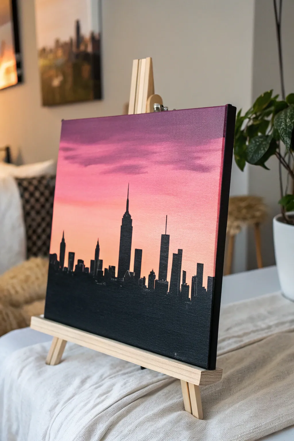
Capture the urban magic of twilight with this striking city skyline silhouette set against a vibrant gradient sky. The seamless blend of plums, pinks, and peaches creates a dramatic backdrop for the sharp, architectural details of the buildings.
Detailed Instructions
Materials
- Square stretched canvas or canvas board
- Acrylic paints (Titanium White, Deep Purple/Violet, Magenta, Cadmium Orange, Lamp Black)
- Wide flat brush (1-2 inch)
- Medium flat brush
- Small round or liner brush
- Pencil
- Ruler
- Palette or paper plate
- Cup of water and paper towels
Step 1: Painting the Gradient Sky
-
Prepare the Horizon Line:
Start by deciding where your city will sit. Use a ruler to lightly draw a straight horizontal line across the canvas about one-third of the way up from the bottom. This separates your sky from the future silhouette. -
Mix the Horizon Color:
On your palette, mix a soft peach color using a generous amount of Titanium White, a touch of Cadmium Orange, and a very tiny dot of Magenta. It should be bright and warm. -
Paint the Lower Sky:
Using your wide flat brush, paint horizontal strokes starting just above your pencil line. Carry this peach color upward about two or three inches. Keep the brush strokes long and fluid. -
Introduce Pink Tones:
Without cleaning your brush thoroughly, pick up some Magenta. Blend this directly into the peach section you just painted while it is still wet, working your way upward. The colors should mix on the canvas to create a soft transition. -
Deepen the Color:
As you move higher up the canvas, add more pure Magenta to your brush. Paint the middle section of the sky, ensuring you overlap with the lighter pink section below to maintain that smooth gradient. -
Add Purple to the Top:
Clean your brush. Load it with Deep Purple. Start painting at the very top edge of the canvas and work your way down. As you meet the pink section, gently brush back and forth to blur the line where purple meets pink. -
create Cloud Textures:
While the purple and pink sections are still slightly tacky, mix a slightly darker purple-grey. Use the corner of your brush to scrub in some horizontal, streak-like clouds in the upper purple area for realistic texture. -
Let it Dry:
This is crucial. Allow the entire sky background to dry completely. If the paint is wet, your sharp black lines later will bleed into the sky.
Step 2: Constructing the Skyline
-
Draft the Buildings:
Once the background is bone dry, use a pencil to lightly sketch the outline of your cityscape. Start with a simple horizontal line for the base, then add rectangles of varying heights. Don’t worry about details yet, just get the shapes. -
Feature the Landmarks:
Identify a focal point, like the Empire State Building shape in the center. Draw its distinctive tiered top and antenna spire accurately. Add another tall skyscraper with an antenna to balance the composition. -
Block in the Mass:
Switch to your medium flat brush and load it with Lamp Black paint. Fill in the large, solid rectangular shapes of the buildings. Since silhouettes are solid black, you don’t need to worry about shading. -
Fill the Water/Base:
Use the same black paint to fill in the entire bottom section of the canvas below the buildings. This grounds the image and provides visual weight. -
Refine Edges:
Use the edge of your flat brush to clean up the sides of the buildings. You want these lines to be as vertical and crisp as possible. -
Add Fine Details:
Switch to your smallest liner brush. Carefully paint the thin antennas and spires on top of the taller buildings. I find it helps to hold my breath for a second while pulling these thin lines to keep them steady. -
Create Texture (Optional):
If you want the effect of distant windows, you can leave tiny pinpricks of the background color showing through, or gently dry-brush a tiny bit of dark grey on the black mass, though a solid silhouette is often more striking. -
Paint the Canvas Sides:
Don’t forget the edges of your canvas board or stretched canvas. Extend the black of the water around the bottom sides and the sky colors around the top sides for a polished, gallery-ready look.
Uneven Gradient?
If your sky blending looks streaky, a clean, dry, soft brush feathering gently over the transition zone while the paint is wet can smooth it out instantly.
Make it Sparkle
Once the black paint is fully dry, use a toothpick dipped in white or metallic gold paint to add tiny dots for city lights scattered across the dark buildings.
Step back and admire how contrast brings your painted city to life against that glowing evening sky
Dot Painting Texture Using Simple Tools
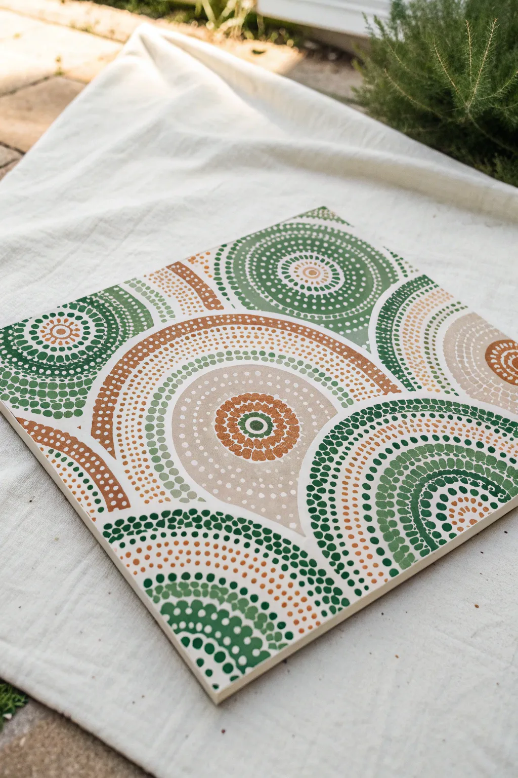
Embrace the calming rhythm of dot art with this nature-inspired mandala piece, perfect for bringing a touch of earthy tranquility to your space. Using simple tools and a muted palette of sage, terracotta, and cream, you’ll build complex-looking patterns from single, deliberate points.
Step-by-Step
Materials
- Square canvas board (e.g., 10×10 or 12×12 inches)
- Acrylic paints: Sage Green, Dark Forest Green, Terracotta/Rust, Beige, White
- Dotting tools (set of varying sizes) or improvised tools like pencil erasers and Q-tips
- Palette or paper plate
- Compass (optional, for guidelines)
- Pencil (H or HB)
- Damp cloth or paper towel
- Acrylic varnish (matte or satin finish)
Step 1: Preparation and Base
-
Prime the Surface:
Start by applying a smooth, even base coat of white acrylic paint mixed with a tiny drop of beige to warm it up. This off-white background will make the earth tones pop without being too stark. Let it dry completely. -
Map Out Guidelines:
Using a compass and a very light pencil touch, draw your primary circles. For this overlapping arc design, don’t just center one mandala; place the center points of your circles at different spots—some near the edges, some off the canvas—so the arcs intersect playfully. -
Prepare Your Palette:
Squeeze out your paint colors: Dark Green, Sage, Terracotta, and Beige. I like to keep a separate pool of white to mix lighter tints of the green and terracotta as I go.
Step 2: Creating the Major Arcs
-
Start the Central Motif:
Choose a focal point (like the large central teardrop shape in the image) and begin with the center element. Use a medium-sized dotting tool to place a central Dark Green dot. -
First Ring of Dots:
Dip a smaller tool into Terracotta paint. Place small dots closely together around your central green dot, maintaining even spacing. -
Expanding the Pattern:
Move outwards to the next pencil guideline. Switch to a larger tool and the Beige paint. Stamp dots along the line, reloading your tool frequently to keep the dot size consistent. -
Layering Colors:
Create the dense bands of color. For the thick, solid-looking arcs, use your largest dotting tool (or a pencil eraser) with Beige paint. Once dry, you can layer smaller white dots on top for depth. -
The Walking Dots Technique:
For the fading tail effect seen in the green arcs, dip your tool in paint once, then make 3-4 dots in a row without reloading. The dots will naturally get smaller, creating a tapered look.
Uneven Dots?
If paint peaks in the center of your dot (like a Hershey’s Kiss), your paint is too thick. Mix in a drop of fluid medium or water to get a creamy consistency similar to melted chocolate.
Step 3: Adding Complexity and Texture
-
Interlocking the Shapes:
Identify where your circular patterns meet. Instead of overlapping chaotically, stop the dots of one pattern right before they hit the dots of another, creating a distinct ‘border’ of negative space between sections. -
Filling the Negative Space:
In the large beige area, use a very small tool with white or light cream paint to fill the space with tiny ‘stardust’ dots. This adds texture without overwhelming the main design. -
Introducing Sage Green:
Create the outer contrast rings using Sage Green. Use a medium tool and space these dots slightly further apart than the inner rings to make the design feel more open. -
The Dark Green Accents:
Anchor the design with the darkest color. Use Dark Forest Green for the outermost arcs or corners. These bold dots frame the lighter colors beautifully. -
Top Dots:
Once the base dots are fully dry to the touch, add ‘top dots.’ Place a smaller dot of a lighter color on top of a larger, darker dot (e.g., a tiny white dot on a large Terracotta one). This creates a 3D button effect.
Pro Tip: Tool Cleaning
Keep a damp paper towel next to you and wipe your tool after every few dots. Dried acrylic builds up quickly on the tip, which will distort the roundness of your subsequent dots.
Step 4: Finishing Touches
-
Clean Up Edges:
Inspect the edges of your canvas board. If your pattern runs off the side, ensure the half-dots look intentional and clean, wrapping the design visually off the page. -
Erase Guidelines:
Wait until the paint is absolutely bone dry—usually overnight is safest. Gently erase any visible pencil marks from the unpainted areas. -
Seal the Artwork:
Apply a coat of matte or satin varnish. A glossy finish can cause too much glare on the texture, so matte is usually best for preserving the earthy, natural vibe.
Display your finished mandala on a small easel or mounted on the wall to enjoy the soothing patterns you have created


Have a question or want to share your own experience? I'd love to hear from you in the comments below!