When you’re craving contemporary painting ideas, it helps to think big: bold shapes, confident color, and a little bit of risk. Here are my favorite modern directions to try—starting with the classic statement looks and drifting into the weirder, more playful experiments.
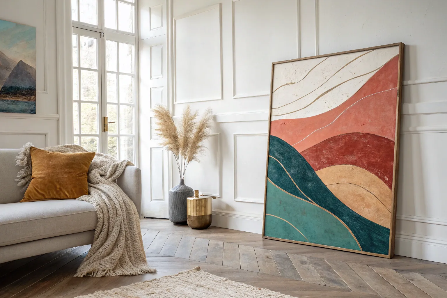
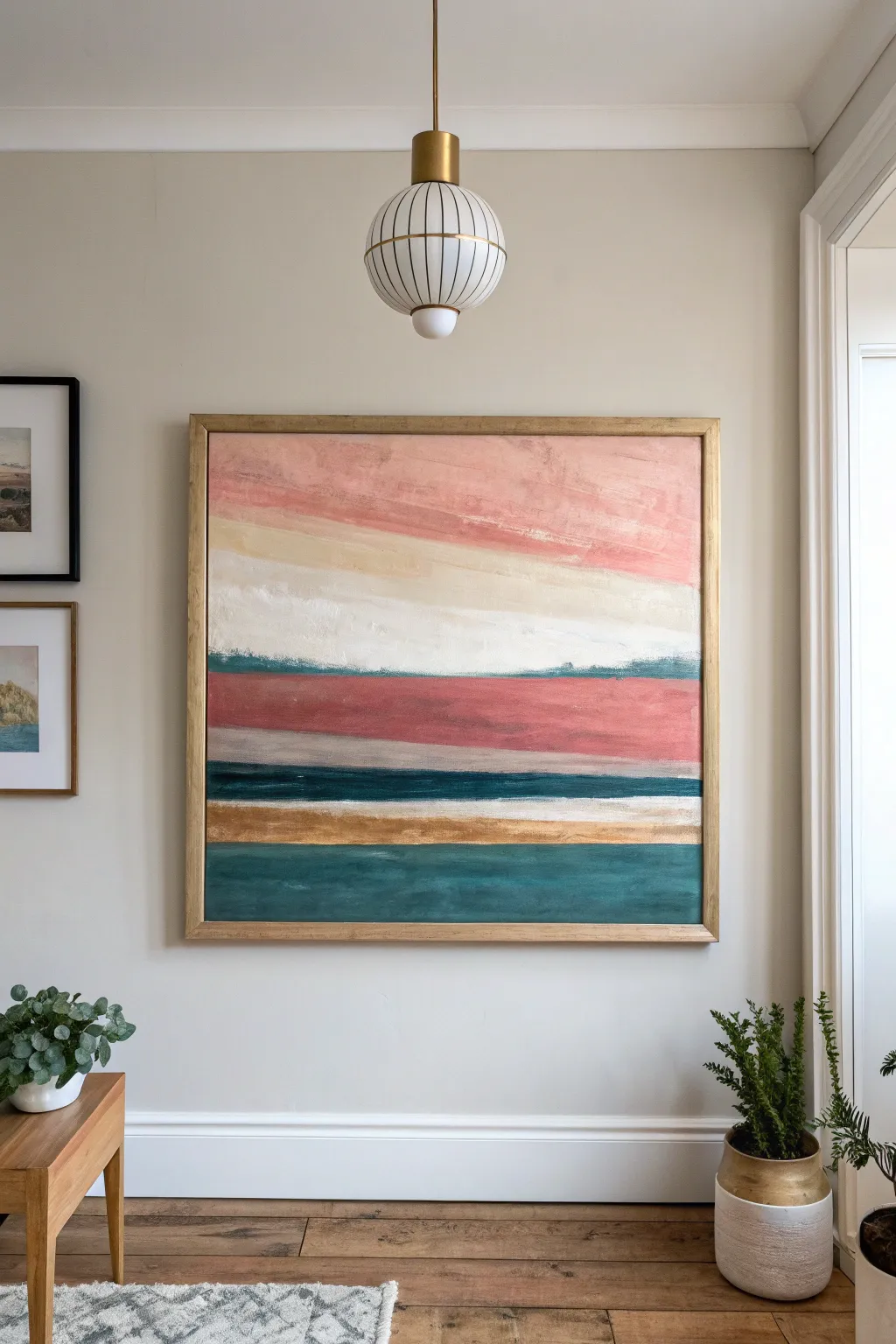
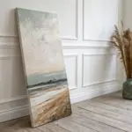
Oversized Abstract Statement Canvas
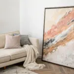
Transform your living space with this dramatic, oversized abstract canvas that features bold blocks of earthy terracotta and deep teal balanced by calm beige neutrals. The distressed, layered finish gives it a sophisticated gallery feel without requiring precise brushwork.
Step-by-Step Tutorial
Materials
- Oversized canvas (approx. 48×60 inches or larger)
- Acrylic paints: Burnt Sienna, Red Oxide, Teal (Phthalo Green + Blue), Unbleached Titanium, Raw Umber, Black
- Gesso (white)
- Wide painter’s tape or masking tape
- Large flat paintbrush (3-4 inch)
- Medium chip brushes
- Palette knife or plastic scraper
- Spray bottle with water
- Rags or paper towels
- Drop cloth
Step 1: Base Texture & Layout
-
Prime the Surface:
Lay your large canvas on a drop cloth. If it isn’t pre-primed, apply two coats of white gesso. Even if it is primed, adding a haphazard layer of gesso with a palette knife creates subtle ridges that will catch paint later for a textured look. -
Plan the Zones:
Visualize the composition: a large terracotta rectangle dominating the upper right, a teal block in the upper left, and a grounding teal strip along the bottom. The center and lower-middle areas will remain neutral. -
Create the Neutral Underlayer:
Mix Unbleached Titanium with a touch of white. Paint the entire central and lower section of the canvas with this creamy beige. Don’t worry about perfect coverage; a patchy application adds depth. -
Add Warm Undertones:
While the beige is still slightly tacky, scumble in very faint streaks of diluted Burnt Sienna near the edges of where your color blocks will go. This creates a glow underneath the darker colors.
Fixing “Muddy” Colors
If your red and teal accidentally mix and turn brown, stop! Let the paint dry completely. Once dry, re-apply the pure colors on top. Wet-on-dry layering prevents muddy blending.
Step 2: Blocking In Colors
-
Mix the Terracotta:
Squeeze out generous amounts of Red Oxide and Burnt Sienna. Mix them, but not thoroughly—leave streaks of the individual hues visible. I find this creates a richer, more organic surface than a flat color. -
Apply the Red Block:
Using your large flat brush, paint the large rectangular area in the upper right. Use vertical strokes primarily, mimicking the upright energy of the composition. -
Mix the Deep Teal:
Combine Teal with a tiny dot of Raw Umber or Black to deepen it. You want a sophisticated, moody blue-green, not a bright turquoise. -
Paint the Upper Left:
Apply this dark teal mixture to the upper left corner box. Allow the edges where it meets the beige to be slightly rough or ‘dry brushed’ rather than crisp lines. -
Create the Bottom Border:
Sweep a wide band of the deep teal across the bottom length of the canvas. Vary the height slightly as you move across to avoid it looking like a perfect stripe.
Step 3: Distressing & Detailing
-
Drip and Drag:
While the paint is wet in the red section, spritz a little water on it. Use a chip brush to drag the color downward slightly into the neutral zone, creating those bleeding, vertical drips seen in the original. -
Scrape Technique:
Take your palette knife or a plastic scraper. Firmly scrape across the heavy paint layers both vertically and horizontally. This reveals the texture of the canvas and effectively blends boundaries. -
Add the Dark Accents:
Mix a small amount of black with Burnt Sienna. Paint a thick, imperfect horizontal line cutting through the right side of the red block near the bottom third. -
Vertical Detail Line:
Add a vertical stripe of the dark teal descending from the top edge, roughly where the red and beige sections meet. This acts as a visual divider. -
Layering the Beige:
Once the main colors are dry to the touch, load a dry brush with the Unbleached Titanium. Lightly sweep horizontally across the ‘waist’ of the painting, overlapping parts of the red and teal to push them back visually. -
Final Wash:
Create a very watery wash of Raw Umber. Apply this randomly over the beige areas and immediately wipe it back with a rag. This ‘antiques’ the bright spots so they aren’t too stark.
Add Metallic Texture
For a luxe upgrade, mix a hint of gold leaf adhesive into your beige paint, or dry-brush distinct copper highlights over the rust-colored section for a shimmering finish.
Hang your massive masterpiece with pride and enjoy how the warm tones instantly cozy up your room
Black-and-White Gesture Painting
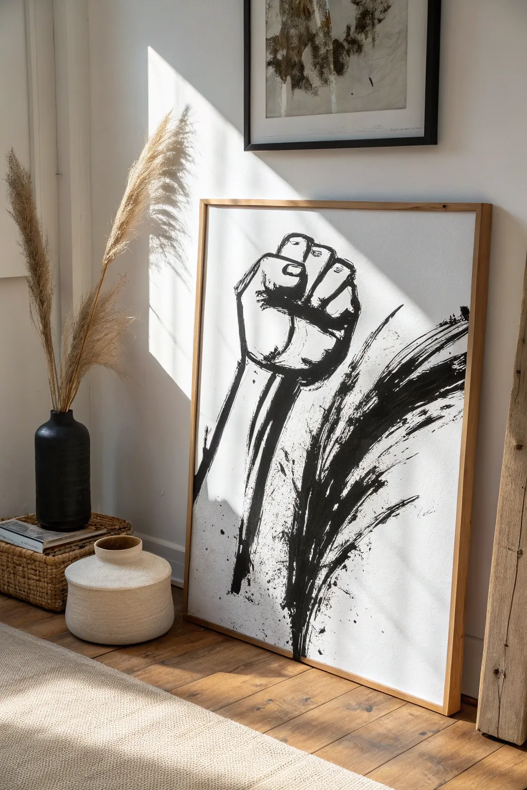
Merging political symbolism with the raw energy of Sumi-e style brushwork, this large-scale piece makes a powerful statement. The stark contrast of black ink against bright white canvas captures both strength and movement through bold, sweeping gestures.
Step-by-Step Guide
Materials
- Large primed canvas (approx. 24×36 inches)
- Black India ink or high-flow black acrylic paint
- Large flat brush (2-3 inch width)
- Medium round brush
- Generous cup of water
- Pencil (HB or 2B)
- Clean rag or paper towels
- Drop cloth
- Natural wood floating frame
Step 1: Planning and Sketching
-
Prepare your space:
Because this project involves splashes and potentially runny ink, lay down a drop cloth first. Ideally, work with the canvas upright on an easel or propped against a wall to allow for some natural drips, though working flat offers more control. -
Establish the composition:
Lightly visualize where the fist will sit. It should be positioned slightly off-center to the left to allow room for the sweeping motion lines on the right. -
Draft the fist outline:
Using your pencil, very lightly sketch the basic geometric shapes of the fist. Focus on the blocky nature of the knuckles and the thumb crossing over the fingers. -
Add structural details:
Refine the sketch by indicating the wrist bones and the distinct segments of the fingers. Keep these lines faint; they are just a guide for your brushwork.
Master the Dry Brush
For the rough texture on the motion lines, blot your brush on a paper towel before painting. This makes the bristles separate and creates that scratchy look.
Step 2: The Main Subject
-
Load the round brush:
Dip your medium round brush into the black ink. You want it fully saturated but not dripping uncontrollably just yet. -
Outline the thumb and fingers:
Start painting the contours of the fingers. Use varying pressure—press down for thick lines on the knuckles and lift up for thinner lines between segments. -
Fill the shadows:
Identify the darkest areas, such as the space under the bent fingers and the shadow side of the wrist. Fill these in with solid black to create volume. -
Create texture:
I like to use a slightly drier brush here to drag over the ‘skin’ areas, leaving some white canvas showing through the black strokes to simulate rough texture. -
Paint the forearm:
Extend two bold lines down from the wrist to form the arm. Let these trails fade or break slightly at the bottom to suggest the image is emerging from the void.
Ink Blobs?
If a pool of ink is too heavy or spreads too much, corner of a paper towel to wick up the excess liquid immediately, then let it dry before refining.
Step 3: Gestural Energy
-
Prepare the large brush:
Switch to your wide flat brush. Dip it in water first, then load the tips with ink. The mixture should be fluid. -
Practice the sweep:
Before hitting the canvas, practice a sweeping motion in the air. The movement should come from your shoulder, not your wrist. -
Execute the primary splash:
Starting near the wrist base, sweep the brush upwards and outwards to the right in one confident motion. Let the bristles split and splay to create the rough, organic edges seen in the reference. -
Add secondary motion lines:
Add a second, slightly smaller sweep parallel to the first one. Speed is your friend here; hesitant strokes look stiff. -
Create the splatter effect:
Load a wet brush with ink and tap it against a stick or your other hand over the lower section of the painting. This creates the dynamic droplets that give the piece its gritty energy. -
Enhance the drips:
Touch the very bottom of your vertical arm strokes with a wet brush to encourage a few natural drips to run down the canvas.
Step 4: Finishing Touches
-
Review contrast:
Step back five feet. If the fist feels too light compared to the heavy splash, go back in with pure black ink to deepen the outlines. -
Clean up:
If any unintended splatters landed on the pure white negative space (top left), carefully dab them with a damp cloth or paint over them with white acrylic once the ink is dry. -
Dry completely:
Allow the ink to dry fully. Depending on how thick the pools of ink are, this could take several hours. -
Frame the work:
Install the canvas into a simple natural wood floating frame. The warm tone of the wood balances the stark monochrome of the art.
Hang your new statement piece in a well-lit area where the morning sun can play across the textured brushstrokes
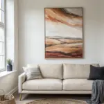


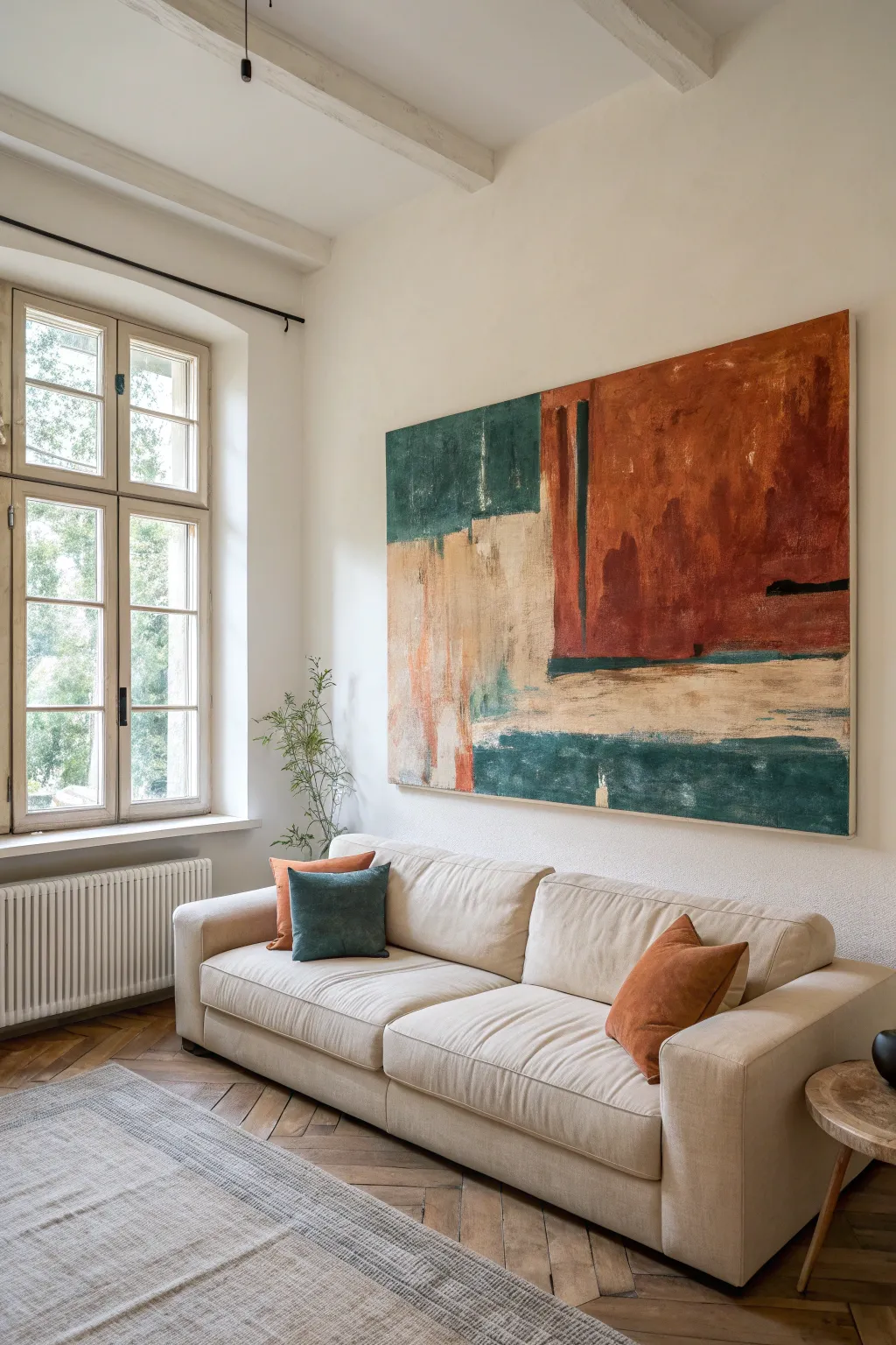
Color Field With Soft Edges
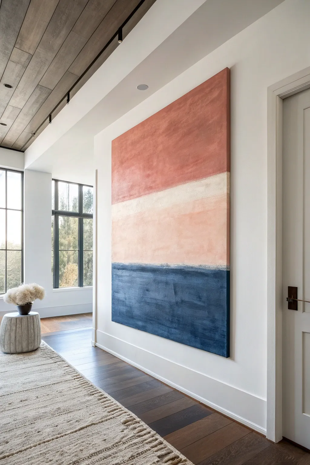
Embrace the tranquil beauty of abstract expressionism with this large-scale color field painting. Featuring three distinct horizontal bands—rusty terracotta, creamy peach, and deep indigo—this piece relies on layer blending and soft transitions to create a calming, modern focal point.
Step-by-Step
Materials
- Large-scale gallery-wrapped canvas (approx. 48” x 60” or larger)
- Heavy body acrylic paints: Burnt Sienna, Red Oxide, Titanium White, Unbleached Titanium, Ultramarine Blue, Mars Black
- Matte medium or glazing liquid
- Large flat paintbrush (3-4 inch)
- Medium filbert brush (1-2 inch)
- Sea sponge or smooth synthetic sponge
- Painter’s tape (optional)
- Palette knife
- Large mixing palette or paper plates
- Water container and rags
Step 1: Setting the Foundation
-
Prime the Surface:
Even if your canvas is pre-primed, apply an extra coat of white gesso mixed with a tiny drop of Unbleached Titanium. This creates a slightly warmer, velvety tooth for the subsequent layers to grip onto. -
Map the Horizon:
Visualize the canvas in distinct sections. Use a pencil or a very faint wash of watered-down paint to mark two horizontal lines. The top section for the red will take up about 40% of the canvas, the middle cream band about 25%, and the blue base about 35%. Don’t worry about making these lines perfectly straight; organic is better. -
Mix the Base Tone:
Mix a large batch of Titanium White with Unbleached Titanium to create a warm, off-white bonelike color. This will be the base for your middle section but will also serve as a mixing agent for the other colors to ensure harmony.
Tip: Dry Brushing technique
Wipe most of the paint off your brush onto a rag before blending seams. A ‘thirsty’ brush drags pigment softly without creating muddy blobs, essential for that hazy horizon line.
Step 2: The Upper Atmosphere
-
Create the Terracotta Hue:
Combine Burnt Sienna, a touch of Red Oxide, and a generous amount of your white base mixture. You want a muted, earthy red characteristic of Southwestern pottery, not a bright fire-engine red. -
Apply the First Red Layer:
Using your large flat brush, apply the terracotta mix to the top section. Use crisscross strokes (scumbling) rather than straight horizontal lines to build texture. Bring the color down almost to your pencil mark, leaving a ragged edge. -
Deepen the Tone:
While the first layer is tacky, mix a slightly darker version of the red (less white). Work this into the upper corners and random areas within the red block to create subtle depth and variation. -
Soften the Transition:
As you reach the bottom of the red section, dry brush the paint downwards so it fades out slightly. This prepares the boundary for blending later.
Troubleshooting: Muddy Colors
If your cream boundary turns pink or grey while blending, stop! The paint is too wet. Let it dry completely, then apply a fresh layer of the top color over the mistake.
Step 3: The Middle Ground
-
Apply the Cream Band:
Clean your brush thoroughly. Load it with the reserved Unbleached Titanium mixture and paint the middle section. Start in the center of the band and push the paint upward toward the red and downward toward the empty bottom section. -
Add a Peach Undertone:
To give the middle section its warmth, mix a microscopic amount of the terracotta paint into your cream mix. Glaze this very lightly over the cream section, letting the brush strokes remain visible for texture. -
Blend the Upper Seam:
Here I prefer to use a slightly damp sponge. Gently dab along the line where the red meets the cream. You aren’t trying to mix them into pink, but rather to blur the hard line so they sit softly against each other. If it gets too muddy, let it dry and dry-brush a thin layer of cream over the border.
Step 4: The Deep Ocean Base
-
Mix the Indigo:
Create a rich, dark navy by mixing Ultramarine Blue with Mars Black or a dark grey. Add just a hint of the Unbleached Titanium to prevent the color from looking like plastic; it creates a more chalky, natural matte finish. -
Block in the Blue:
Apply this dark mixture to the bottom third of the canvas. Use heavy, horizontal strokes to suggest the weight and stability of the earth or deep water. -
Build Textural interest:
Use a palette knife to scrape a second layer of slightly lighter blue (add a touch more white) across the main body of the blue section. This ‘skimming’ technique catches the tooth of the canvas and mimics the look of worn denim or stone. -
Create the Lower Seam:
Where the blue meets the cream, allow the blue to be slightly uneven. Don’t tape this off. Use a smaller dry brush to gently pull the dark blue up into the cream just a millimeter or two, creating a vibration between the light and dark values.
Step 5: Refinement and Finish
-
Assess the Edges:
Step back from the painting. The defining feature of this style is the ‘soft edge’ abstraction. If any transition looks too sharp, apply a very thin glaze (paint mixed with glazing liquid) of the lighter color over the edge to haze it out. -
Paint the Sides:
For a professional gallery look, extend the colors around the sides of the canvas, matching the horizontal bands. This makes framing optional. -
Final White Highlight:
For a finishing touch of separation, take pure Unbleached Titanium on a small brush and run a very thin, broken line right above the navy blue section. It acts as a highlight where the light meets the dark, adding pop to the composition. -
Seal:
Once fully dry (give it at least 24 hours due to the thick layers), apply a matte varnish to protect the surface and unify the sheen of the different paint mixtures.
Hang your new masterpiece in a well-lit hallway or living space to bring a sense of grounded calm to your home
Minimal Geometric Tape Design
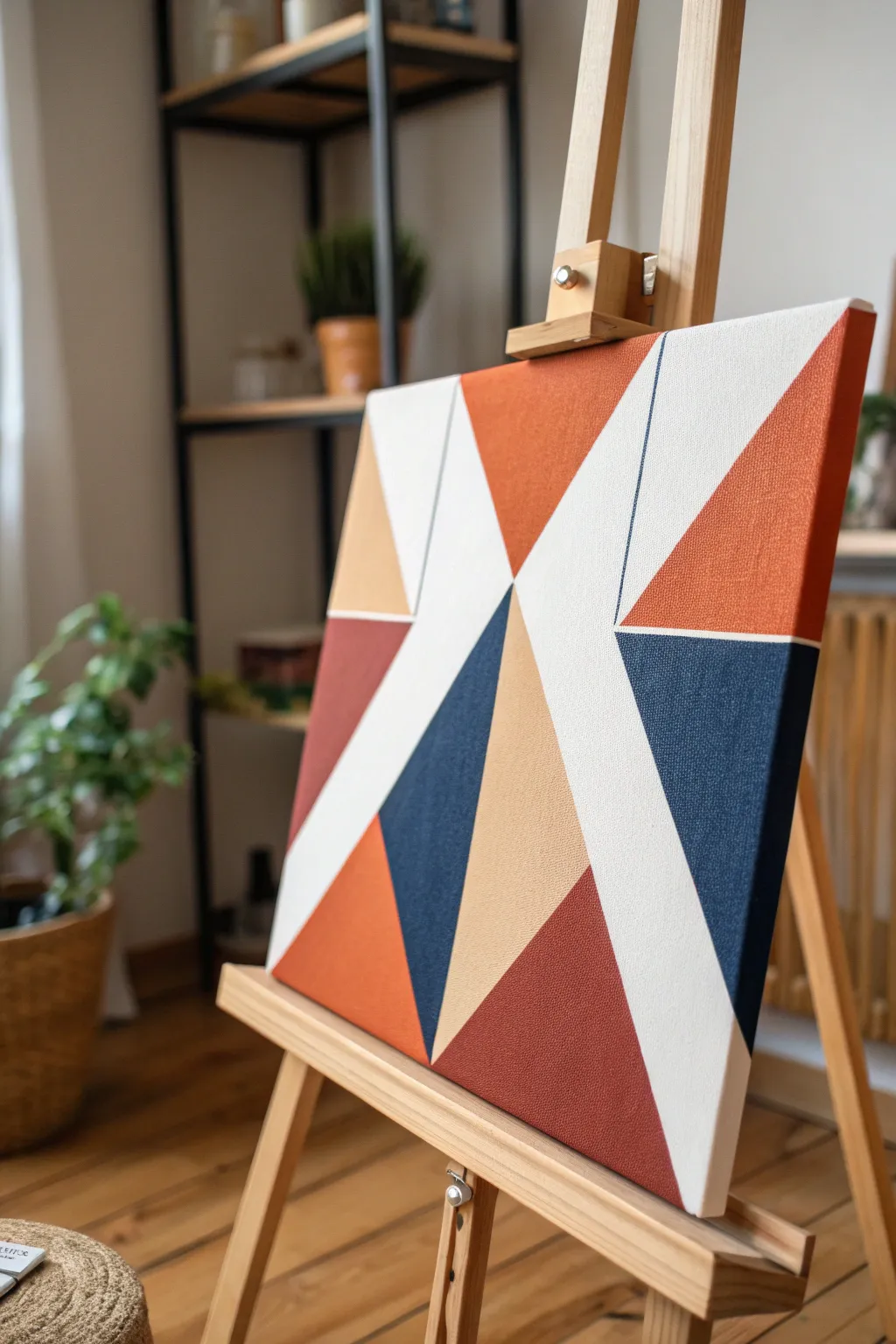
This striking geometric painting relies on sharp lines and bold blocks of color to create a modern focal point. Using a simple masking tape technique, the interplay of rust, navy, ochre, and crisp white creates a sophisticated look that is deceptively easy to master.
Step-by-Step Tutorial
Materials
- Rectangular canvas (e.g., 16×20 inches)
- Acrylic paints: White (titanium), rust/terracotta, navy blue, ochre yellow, deep burgundy
- Painter’s tape or drafting tape (various widths if desired, but 1-inch is standard)
- Flat synthetic paintbrushes (medium and large)
- Palette knife or old credit card
- Pencil and ruler (optional)
- Palette
- Cup of water and paper towels
- Hairdryer (optional for speeding up drying)
Step 1: Preparation and Base
-
Prime the canvas:
Even if your canvas is pre-primed, apply an even coat of titanium white acrylic across the entire surface. This ensures a consistent texture and bright white negative space later. -
Dry completely:
Allow the white base coat to dry fully. It must be bone dry; if it’s cool to the touch, it still needs time. A hairdryer can speed this process.
Bleed-Through Fix
Paint bled under the tape? Don’t panic. Wait for it to dry completely, then scrape gently with a craft knife or paint over the mistake with opaque white.
Step 2: Mapping the Geometry
-
Plan your diagonals:
Visualize a large ‘X’ or ‘W’ shape as your main structure. The design relies on intersecting diagonals. You can lightly sketch the main lines with a pencil, or simply trust the tape. -
Apply the first tape lines:
Apply long strips of painter’s tape diagonally across the canvas. Create large triangles that span from edge to edge. Press the tape down firmly. -
Create sub-sections:
Intersect your larger triangles with shorter pieces of tape to create smaller geometric facets. Aim for asymmetry to keep the composition dynamic. -
Seal the edges:
Here I always run a palette knife or an old credit card firmly along the edges of every piece of tape. This friction burnishing is crucial for preventing paint bleed. -
The white seal trick:
Paint a very thin layer of your base white paint over the tape edges. This seals any microscopic gaps; if anything bleeds under, it will be white and invisible.
Add Texture
Mix a modeling paste or sand into one of your paint colors (like the ochre) before applying it. This adds a tactile, grainy contrast to the smooth sections.
Step 3: Applying Color
-
Paint the rust sections:
Select 2-3 triangle sections for the rust/terracotta color. Balance them by placing them on opposite sides of the canvas. Apply paint from the tape inward to avoid pushing paint under the edge. -
Add the navy depth:
Identify the central or lower triangles for the heavy navy blue. This dark color anchors the piece visually. Apply two thin coats rather than one thick one for opacity. -
Integrate ochre and burgundy:
Fill remaining selected sections with the ochre yellow and deep burgundy. Leave several large sections unpainted to serve as the white geometric shapes. -
Check the edges:
Don’t forget to paint the sides of the canvas where the shapes extend off the edge. This gives the artwork professional, gallery-wrapped finish. -
Let paint set slightly:
Allow the paint to become touch-dry but not fully cured. Waiting until it’s rock hard can sometimes cause the paint to peel up with the tape.
Step 4: The Reveal
-
Peel the tape slowly:
Gently peel back the tape at a 45-degree angle away from the painted area. Do this slowly to ensure a crisp line. -
Touch ups:
If any minor bleeding occurred, use a small angled brush with white paint to clean up the lines once the colors are fully dry. -
Final cure:
Let the entire piece dry overnight before hanging or framing.
Hang your new modern art piece in a bright room to let those crisp angles shine
BRUSH GUIDE
The Right Brush for Every Stroke
From clean lines to bold texture — master brush choice, stroke control, and essential techniques.
Explore the Full Guide
Modern Ombré Gradient Panel
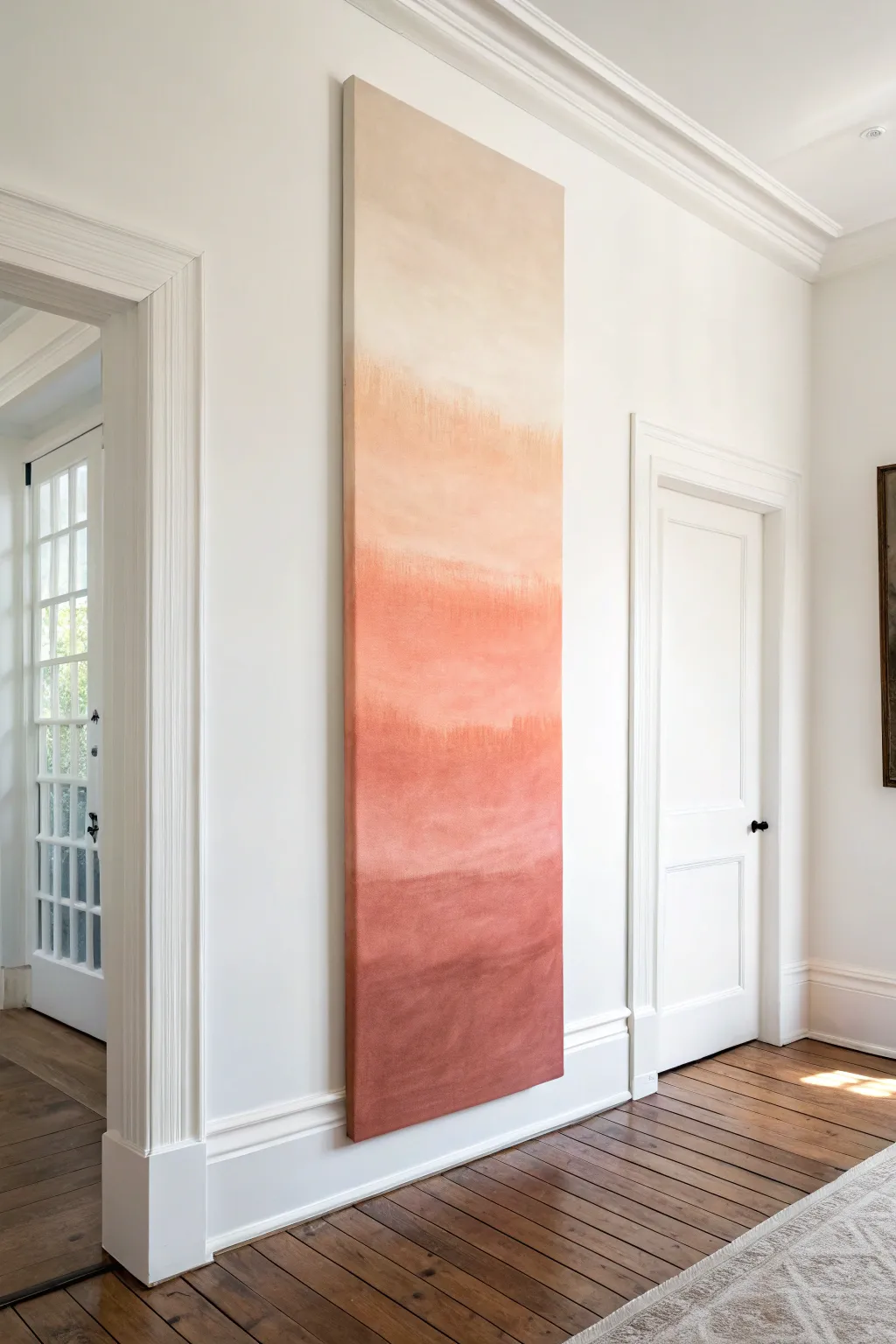
Transform a hallway or narrow wall with this striking floor-to-ceiling gradient panel that captures the warmth of a desert sunset. By blending acrylics from deep rust to pale cream, you’ll create a seamless ombré effect that adds sophisticated height and drama to your space.
Step-by-Step Guide
Materials
- Large custom stretched canvas (approx. 24″ x 80″, or sized to your wall)
- Heavy body acrylic paints (Burnt Sienna, Red Oxide, Unbleached Titanium, White)
- Large flat paintbrush (3-4 inches wide)
- Medium flat paintbrush (2 inches wide)
- Spray bottle with water
- Mixing palette or disposable plates
- Gesso (optional, if canvas is unprimed)
- Drop cloth
- Heavy-duty hanging hardware (French cleat recommended)
Step 1: Preparation and Base Coat
-
Prepare your workspace:
Lay down your drop cloth in a spacious area. Due to the unusual height of this canvas, you may find it easier to work with the canvas laying flat on the floor or propped up against a sturdy wall covered in plastic. -
Prime the canvas:
Even if your canvas came pre-primed, adding a fresh coat of white gesso ensures a smooth, absorbent surface for blending. Apply one even coat and let it dry completely. -
Map out your color zones:
Visualize the canvas in roughly four horizontal sections. You don’t need to draw lines, but mentally mark where the deepest red will fade into the mid-tone terracotta, then peach, and finally cream.
Step 2: Applying the Gradient
-
Mix your darkest tone:
On your palette, mix Red Oxide with a touch of Burnt Sienna to create a rich, earthy rust color. This will be the anchor color for the bottom of the piece. -
Paint the bottom section:
Using your large 4-inch brush, apply the rust mixture to the bottom quarter of the canvas. Use horizontal strokes that go all the way across from edge to edge. -
Create the mid-tone terracotta:
Add Unbleached Titanium to your rust mixture to lighten it significantly, creating a warm terracotta shade. Paint the next quarter up, leaving a small gap between this and the bottom wet paint. -
Blend the first transition:
With the paint still wet, bridge the gap between the rusty bottom and the terracotta mid-section. Spritz a very fine mist of water onto the canvas if the paint feels draggy. -
Feather the edges:
Work the brush back and forth rapidly over the meeting point of the two colors. I prefer to wipe my brush on a rag periodically to ensure I’m not dragging too much dark paint upwards. -
Mix the peach tone:
Clean your brush or switch to the medium one. Mix Unbleached Titanium with just a tiny dot of the Red Oxide to get a soft, warm peach color. -
Apply the upper middle section:
Paint the third quarter of the canvas with this peach tone. Again, blend the transition downwards into the wet terracotta section using horizontal, sweeping strokes. -
Mix the lightest cream:
For the top section, use mostly White with a small amount of Unbleached Titanium. It should be very pale, almost off-white, to blend into the wall color. -
Finish the top:
Apply this lightest cream to the very top, blending it gently down into the peach section. Keep your strokes loose and atmospheric.
Pro Tip: Keep It Misty
A fine-mist spray bottle is your best friend here. Acrylics dry fast; a gentle mist keeps the paint open longer, allowing for that buttery, seamless gradient blend.
Step 3: Refining and Sealing
-
Check for hard lines:
Step back and look for any abrupt shifts in color. If you see a hard line, use a barely damp, clean brush to lightly feather over that area horizontally to soften it. -
Paint the canvas edges:
Don’t forget the sides of your deep canvas. Extend the ombre effect around the edges so the transition looks seamless when viewed from the side. -
Let it dry extensively:
Because of the multiple layers and water blending, this large panel needs ample drying time—leave it overnight to be safe. -
Varnish the surface:
Apply a coat of matte or satin varnish to protect the paint and unify the sheen across the surface, which is especially important for large color fields. -
Install hardware:
Attach a French cleat or heavy-duty wire positioned high on the back frame to ensure the panel sits flush and stable against the wall.
Level Up: Texture Play
Add texture paste to your paint for the bottom third. As the color lightens upward, reduce the texture, making the gradient feel physical as well as visual.
Hang your masterpiece in a prominent spot and enjoy the serene, vertical warmth it brings to the room
Fluid Movement Pour With Control Lines
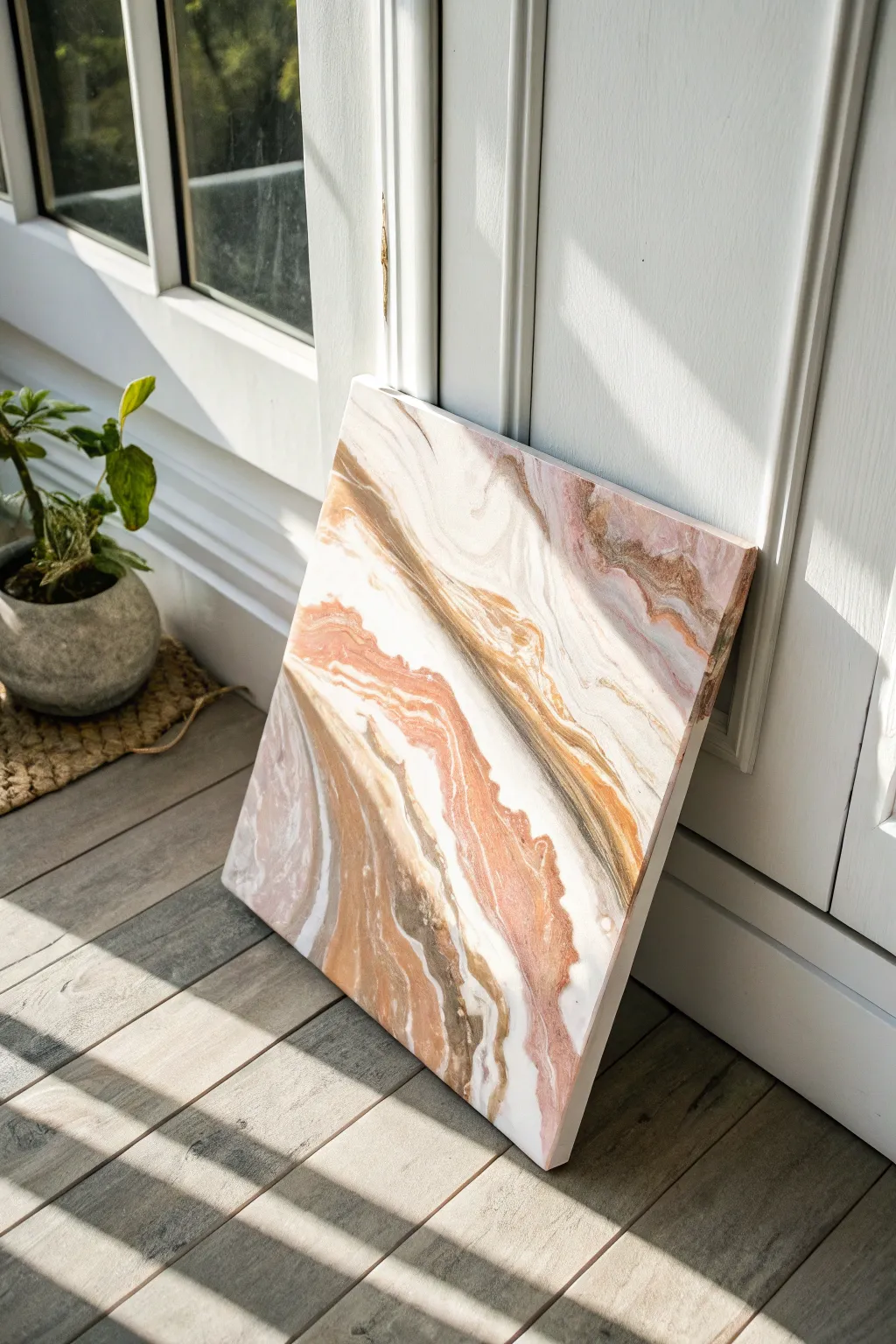
Capture the organic elegance of natural stone layers with this sophisticated fluid art technique. By manipulating lines of earthy browns, blush pinks, and metallic golds, you will create a piece that mimics the serene flow of a geode slice.
Step-by-Step
Materials
- Square stretched canvas (12×12 or 16×16 inches)
- White Gesso (optional, for priming)
- Acrylic fluid paints: Titanium White, Burnt Umber, Metallic Gold, Blush Pink, Raw Sienna
- Pouring medium (like Floetrol or Liquitex)
- Water (for thinning)
- Small plastic cups (one per color)
- Popsicle sticks
- Hair dryer with a concentrator nozzle
- Palette knife
- Plastic drop cloth
- Painter’s tape
- Level
Step 1: Preparation and Mixing
-
Prepare your workspace:
Fluid art is messy, so cover your entire table with a plastic drop cloth. Elevate your canvas by placing it on four inverted cups to allow paint to drip off the edges freely. -
Tape the back:
Apply painter’s tape to the entire back underside of the canvas frame. This captures the drips and keeps the back pristine once you peel the tape off after drying. -
Check the level:
Using a spirit level, ensure your canvas is perfectly flat. If it tilts, the paint will slide off or pool unevenly during the drying process, ruining your composition. -
Mix the pouring medium:
In separate cups, mix your acrylic paints with pouring medium. A standard ratio is 2 parts medium to 1 part paint, but check your product’s instructions. You want a consistency like warm honey—fluid, but not watery. -
Add water if needed:
If the mixture feels too thick, add a few drops of water at a time. The white paint should be *slightly* thinner than the colored paints to help the other colors glide over it.
Consistent Flow
Mix your paints consistently. If one color is thicker than the others, it will sink to the bottom or create lumps rather than flowing alongside its neighbors.
Step 2: Creating the Composition
-
Apply the base coat:
Pour a generous amount of white paint onto the canvas. Use a palette knife or a wide brush to spread it evenly, covering the entire surface and the sides. -
Pop the bubbles:
Quickly run a culinary torch or heat gun lightly over the wet white base to pop any air bubbles that formed during mixing. -
Lay the color lines:
Starting from one corner and moving diagonally across the canvas, pour thin, steady lines of your colors. Alternate the order: a line of Burnt Umber, followed by Metallic Gold, then Blush Pink, and Raw Sienna. -
Create negative space:
Don’t fill the whole canvas with color. Leave large sections of white space between your color bands to create that airy, marble-like aesthetic seen in the photo. -
Add white highlights:
Pour very thin threads of white paint directly on top of or next to your colored lines. This helps break up the bold colors and adds depth to the layers.
Step 3: Blowing and Manipulating
-
Blow out the paint:
Using your hairdryer on the ‘cool’ and ‘low’ setting with a concentrator nozzle, gently push the white base paint *over* the colored lines slightly, then push the color back out. -
Shape the waves:
Guide the air to stretch the paint into long, wavy ribbons. Aim for the paint to feather out at the edges, creating soft, semi-transparent transitions. -
Refine with breath:
For finer details where the hairdryer is too powerful, use a straw or just your mouth to blow on specific areas. I like to do this to create delicate tributaries and veins that branch off the main flow. -
Tilt for movement:
If the composition looks too static, gently lift the canvas and tilt it slightly to encourage a slow drift, then place it back on the cups immediately. -
Clean the edges:
Run your finger or a tool along the underside edge of the canvas to scrape off dripping paint. This prevents the drying paint from pulling the design on top down the sides. -
Let it cure:
Allow the painting to dry undisturbed for at least 24 to 48 hours. Do not move it, as fluid paint continues to shift until the surface is skinned over.
Add Clear Quartz
For a true geode effect, while the paint is wet, adhere crushed glass or clear glitter along the darkest brown vein for 3D texture and sparkle.
Once dry and sealed with a gloss varnish, your stone-inspired artwork will bring a grounding, natural touch to any sunlit corner

PENCIL GUIDE
Understanding Pencil Grades from H to B
From first sketch to finished drawing — learn pencil grades, line control, and shading techniques.
Explore the Full Guide
Triptych for a Wide Wall
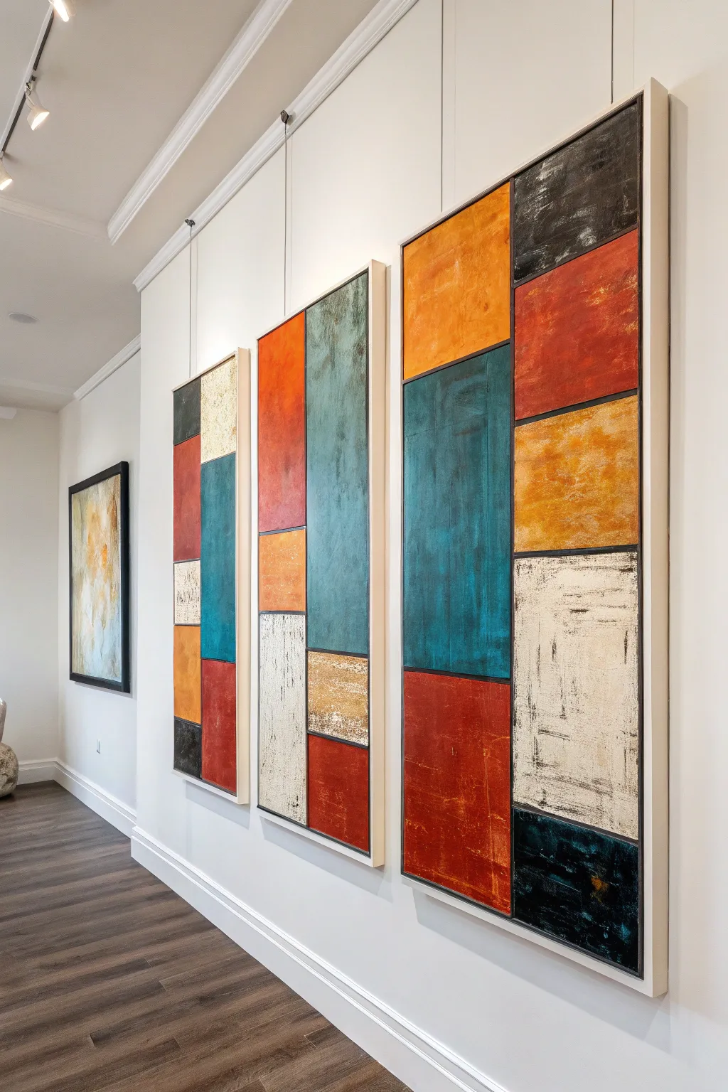
Transform a wide, empty wall into a gallery-worthy focal point with this bold, color-blocked triptych. By layering distressed textures and strong geometric lines, you’ll create a modern statement piece that feels curated and cohesive.
Step-by-Step Guide
Materials
- 3 Large rectangular canvases (e.g., 24 x 48 inches)
- Modeling paste or heavy structure gel
- Palette knives (assorted sizes)
- Acrylic paints: Burnt Orange, Deep Teal, Brick Red, Black, Titanium White, Cream
- Painter’s tape (various widths)
- Wide flat synthetic brushes
- Rags or paper towels
- Black acrylic paint marker or fine liner brush
- Matte varnish
- Sandpaper (fine grit)
Step 1: Planning and Texture Base
-
Map out the grid:
Lay your three canvases side by side on the floor with about 2 inches of space between them to visualize the flow. Sketch a rough geometric grid across all three using a pencil, ensuring some lines ‘continue’ visually from one canvas to the next. -
Create the texture:
Using a palette knife, spread modeling paste unevenly across the canvases within your sketched sections. Vary the direction of your strokes—vertical in some blocks, horizontal in others—to build a rich, tactile foundation. -
Distress the surface:
While the paste is semi-wet, press a crumpled rag or a coarse sponge into random areas to create pitted, aged effects. Let the canvases dry completely, preferably overnight. -
Knock it back:
Once hardened, lightly sand the highest ridges of the modeling paste. This helps the paint catch on the texture without being too sharp or aggressive.
Bleeding Lines?
If paint bleeds under the tape, wait for it to dry completely. Then, use the stiff texture paste to ‘spackle’ over the mistake before touching up with the correct color.
Step 2: Color Blocking
-
Tape the boundaries:
Apply painter’s tape along the pencil lines of your geometric grid. Press the edges down firmly to prevent paint bleed. -
First color application:
Pour your base colors (Teal, Orange, Red, Cream) into separate containers. I like to slightly water down the first coat so it sinks into the crevices of the texture paste. -
Layering for depth:
Apply the paint into the designated blocks. Don’t aim for perfect opacity; let some of the white canvas or texture peek through to maintain that rustic, weathered look. -
Add dimension:
While the paint is tacky, use a dry brush with a slightly darker or lighter shade of the same color to highlight the texture ridges. -
The scratch technique:
Use the edge of a clean palette knife to scrape gently over the wet paint. This reveals the texture underneath and adds to the distressed aesthetic typical of this style. -
Painting the black accents:
Fill the remaining designated blocks with black acrylic. For the black sections, keep the paint thinner to create a charcoal-like effect rather than a solid plastic finish. -
Remove tape:
Carefully peel off the painter’s tape while the paint is still slightly damp to ensure crisp lines.
Metallic Touch
Mix gold leaf flakes or brilliant gold paint into the cream/white sections for a luxe industrial vibe that catches the light.
Step 3: Refining and Finishing
-
Define the borders:
Using a black acrylic marker or a fine liner brush with fluid black paint, hand-paint the grid lines where the tape used to be. The lines shouldn’t be perfect; a shaky or varying thickness adds character. -
Add the ‘noise’:
Take a dry brush with a tiny amount of white or cream paint and scumble it lightly over the colorful sections, particularly near the edges, to simulate wear and tear. -
Enhance dark areas:
Do the same with black paint over the colored areas, applying very sparse, scratchy marks to unify the three canvases. -
Paint the sides:
Paint the deep edges of all three canvases. You can choose solid black for a framed look, or extend the colors around the bend for a gallery wrap style. -
Seal the work:
Once fully dry, apply a coat of matte varnish. This unifies the sheen of the different paints and protects the textured peaks from dust.
Hang your triptych with equal spacing to let the composition flow across the room
Metallic Accents and Bold Neutrals
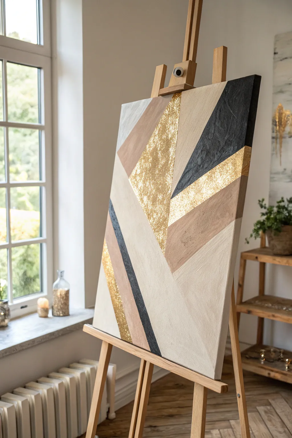
This striking canvas combines sharp geometric abstraction with the organic warmth of texture and metallic shine. By balancing neutral creams and tans with bold black and shimmering gold leaf, you create a sophisticated statement piece perfect for modern interiors.
How-To Guide
Materials
- Large rectangular stretched canvas (e.g., 24×36 inches)
- Acrylic paints: Titanium White, Unbleached Titanium (cream), Burnt Umber (for tan mixing), Mars Black
- Gold leaf sheets (imitation or real)
- Gold leaf adhesive size
- Gold leaf sealer
- Painter’s tape (various widths, high quality to prevent bleed)
- Modeling paste or heavy gel medium
- Palette knives (wide and narrow)
- Synthetic flat brushes (1-inch and 2-inch)
- Soft brush (for gold leaf application)
- Ruler or straight edge
- Pencil
Step 1: Preparation and Planning
-
Map the Design:
Begin by lightly sketching your geometric design onto the blank canvas using a pencil and ruler. The composition relies on large intersecting triangles and diagonal trapezoids, so ensure your lines intersect sharply. -
Color Planning:
Mark each section lightly with a letter (e.g., ‘B’ for black, ‘G’ for gold, ‘T’ for tan, ‘C’ for cream) to keep track of your color map. This prevents confusion once you start taping and painting.
Step 2: Building Texture
-
Tape the Textured Zones:
Select the sections destined for the prominent black triangle and the central gold triangle. Apply painter’s tape along the outside borders of these specific shapes to protect adjacent areas. -
Apply Modeling Paste:
Using a palette knife, spread a layer of modeling paste into these masked-off areas. Don’t smooth it out perfectly; dab and scrape the knife to create ridges and valleys. -
Create Directional Texture:
For the black section specifically, try creating vertical or slightly diagonal striations with the knife to mimic the rough, stone-like look in the reference image. -
Let it Cure:
Remove the tape while the paste is still wet to avoid peeling it up later. Allow the texture medium to dry completely, which may take several hours or overnight depending on thickness.
Clean Lines Pro-Tip
Before painting a new color, clear-coat your tape edge with a tiny bit of matte medium. This seals the tape and prevents color bleed, giving you razor-sharp geometric lines.
Step 3: Painting the Neutrals
-
Mix Your Palette:
Prepare your acrylics. You need a solid black, a warm tan (mix white with a touch of burnt umber), a creamy off-white (unbleached titanium), and a pure white. -
Tape the First Sections:
Once the texture is dry, re-tape the boundaries for your large cream and tan sections. Ensure the tape is pressed down firmly to prevent paint bleed. -
Paint the Cream Base:
Fill in the largest background sections with the unbleached titanium or cream color. Use a large flat brush for smooth, consistent coverage. -
Add the Tan Accents:
Move on to the diagonal bands and the upper-left triangle. Paint these with your mixed tan color. I like to apply two thin coats rather than one thick one for a more professional finish. -
Paint the Black Stone:
Paint over your dry textured area on the right side with Mars Black. Work the paint deep into the crevices of the modeling paste using a stiff brush to ensure no white texture shows through. -
Add the Thin Black Stripe:
Carefully tape off the thin diagonal stripe on the lower left. Paint this black, keeping the finish flatter than the large textured area. -
Remove Tape:
Peel off all tape while the paint is slightly tacky to ensure crisp lines. Let all paint layers dry completely before moving to the gold leaf.
Level Up: Texture Contrast
Mix fine sand into your black paint for the dark triangle instead of using paste. The gritty finish will contrast beautifully against the smooth cream paint and the smooth metallic foil.
Step 4: Gilding the Artwork
-
Prep for Gold:
Tape off the borders around the central textured triangle and the distinct diagonal stripes intended for gold. This step requires precision so the gold doesn’t stick where you don’t want it. -
Apply Adhesive Size:
Brush a thin, even layer of gold leaf adhesive size onto the target areas. The textured center will need careful stippling to get adhesive into the low points. -
Wait for Tackiness:
Allow the adhesive to sit until it turns clear and feels tacky to the touch—usually about 15 to 30 minutes. Do not rush this; if it’s too wet, the leaf will slide. -
Apply the Leaf:
Gently lay sheets of gold leaf over the tacky adhesive. Use a soft, dry brush to press the leaf down. On the textured areas, press firmly to mold the foil into the ridges. -
Burnish and Clean:
Rub the gold leaf with your soft brush in circular motions to remove excess flakes. This process, called burnishing, increases the shine and creates that crinkled, antique look. -
Seal the Gold:
Once all loose flake is brushed away, apply a coat of sealer over the gold leaf to prevent oxidation and tarnishing over time.
Hang your finished piece in a well-lit area where the changing daylight will catch the gold accents from different angles


Deconstructed Portrait With Abstract Shapes
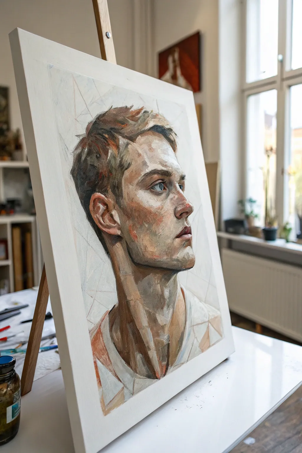
This striking project merges traditional portraiture with contemporary abstraction through a deconstructed, geometric approach. By breaking specific facial planes into angular shapes while keeping the eyes realistic, step into a modern style that feels both structured and wildly expressive.
Step-by-Step Guide
Materials
- Primed canvas or canvas board (approx. 16×20 inches)
- Acrylic or oil paints (Titanium White, Burnt Umber, Yellow Ochre, Cadmium Red, Ultramarine Blue, Ivory Black)
- Flat shader brushes (sizes 6, 8, and 12)
- Small round detail brush (size 2)
- Graphite pencil (2B or HB)
- Ruler or straight edge
- Palette knife
- Medium (Linseed oil for oils, Slow-Dri for acrylics)
Step 1: Structural Sketching
-
Map the Base Geometry:
Begin by lightly sketching the outline of the head and shoulders using your pencil. Instead of drawing fluid, curved lines typical of portraits, use straight, angular lines to form the jaw, neck, and cranium. Think of the face as a low-poly 3D model. -
Define the Features:
Place the eyes, nose, and mouth accurately. It helps to draw a vertical centerline to orient the profile view correctly. Keep the mouth slightly open and the gaze lifted upward to match the reference’s contemplative mood. -
Create the Grid:
Using a ruler, lightly draw intersecting lines across the background and overlapping onto the face and neck. These lines shouldn’t be a perfect grid but rather a shattered glass pattern that will guide your color blocking later.
Step 2: Blocking in Values
-
Mix Foundation Tones:
Prepare a palette of flesh tones ranging from light highlights (White + Yellow Ochre) to deep shadows (Burnt Umber + touches of Blue). You want distinct, muddy neutrals rather than overly saturated pinks. -
Establish the Shadows:
With a large flat brush, block in the darkest areas first—specifically under the jawline, the nape of the neck, and the deep recess of the ear. Apply the paint in deliberate, rectangular strokes rather than blending. -
Mid-tone Application:
Fill in the cheek, forehead, and bridge of the nose with your mid-tone mixes. Allow the brushstrokes to follow the geometric pencil lines you drew earlier, creating distinct planes of color. -
The White Space:
Leave the background and the shirt area mostly unpainted canvas or blocked in with pure Titanium White for now. This negative space is crucial for the high-key, airy feel of the piece.
Pro Tip: Hard Edges
Use masking tape for the long vertical lines on the neck or background to get razor-sharp edges. Remove the tape while the paint is still tacky to prevent tearing.
Step 3: Refining the Construct
-
The Eyes as Anchors:
Switch to your small round brush to paint the iris. Use a mix of Ultramarine and a touch of Umber for a steel-blue look. Keep the eye sharp and realistic; this is the focal point that anchors the abstraction. -
Sculpting the Ear and Nose:
Using a smaller flat brush, chisel out the shapes of the ear and nose. Use reddish-brown tones here to signify blood flow, but keep the edges hard. I like to let this dry briefly so subsequent layers don’t muddy the crisp lines. -
Fragmenting the Neck:
On the long neck muscle (sternocleidomastoid), paint vertical bands of alternating light and shadow. This emphasizes the ‘deconstructed’ style, making the anatomy look like stacked architectural blocks. -
Adding Warmth:
Glaze thin washes of Cadmium Red or burnt orange over the cheekbone and ear. This subtle warmth prevents the skin from looking too stony or cold against the white background.
Level Up: Color Pop
Introduce a surprising, non-local color into the geometric fractures, like a bright teal or neon pink line, to modernize the piece further.
Step 4: Abstract Integration
-
Background Geometries:
Paint faint, geometric shapes in the background using a very watered-down gray or off-white. These should look like faint echoes of the shapes on the face, blending almost invisibly into the white canvas. -
Texturizing the Hair:
Treat the hair as a collection of shards. Use short, sharp strokes of Umber and Ochre. Don’t paint individual strands; paint clumps of light and shadow that fit together like a puzzle. -
Integrating the Shirt:
Paint the clothing using simple triangular shapes of white and light grey. Allow the bottom of the painting to fade out or remain unfinished to enhance the artistic, sketchbook aesthetic. -
Highlight Accents:
Apply pure white highlights to the tip of the nose, the lip, and the wet line of the eye. These tiny dots bring the dimensional form forward. -
Enforcing Edges:
Return with a fine liner brush and reinforce specific geometric lines with a dark, thin glaze. This re-establishes the ‘wireframe’ look in areas that may have become too soft during painting.
Step back and admire how the sharp geometry balances perfectly with the human form to create a truly modern portrait
Abstract Landscape in Modern Colors
Capture the peaceful essence of a horizon with this contemporary abstract landscape, featuring layered bands of soft pink, cream, deep teal, and shimmering gold. This project uses strategic color blocking and texture to create a sophisticated statement piece that feels both modern and timeless.
How-To Guide
Materials
- Large square canvas (36×36 inch recommended)
- Acrylic paints: Titanium White, Unbleached Titanium, Light Pink, Salmon, Burnt Sienna, Teal, Phthalo Blue, Gold Metallic
- Large flat paintbrushes (2-3 inch width)
- Medium flat brush (1 inch width)
- Painter’s tape or masking tape (optional for crisp lines)
- Palette knife
- Cup of water and paper towels
- Floating wood frame (optional)
Step 1: Planning and Foundation
-
Prime your canvas:
Even if your canvas is pre-primed, apply a fresh coat of gesso or Titanium White acrylic to ensure a smooth, bright base. Let this dry completely before starting your color layers. -
Map out your horizon:
Visualize the composition as horizontal bands. Lightly sketch horizontal lines with a pencil to divide your canvas into roughly seven or eight distinct sections of varying thickness. -
Mix your base palettes:
Prepare three main color families on your palette: the warm pinks (mix Pink with White and a touch of Burnt Sienna), the neutrals (Unbleached Titanium and White), and the deep cool tones (Teal mixed with Phthalo Blue).
Step 2: Painting the Sky and Upper Layers
-
Start at the top:
Using a large flat brush, apply your lightest pink mixture to the very top section. Use long, horizontal strokes that go all the way across the canvas to create a smooth, sweeping effect. -
Create the sunset band:
While the top is still slightly tacky, paint the section immediately below it with a slightly deeper, more saturated salmon pink. Blend the seam gently where the two pinks meet for a soft transition, or leave it distinct for a bolder look. -
Introduce the cream layer:
Moving downward, paint a wide band of Unbleached Titanium mixed with plenty of White. This acts as a ‘cloud’ or negative space to separate the colorful zones. Keep your brushstrokes loose here to add subtle texture. -
Add texture with a knife:
For the white/cream section, I like to take a palette knife and lightly scrape over the wet paint. This drags the pigment and reveals a bit of the canvas grain, adding an wonderful organic feel.
Uneven Lines?
If you struggle with steady hands for the horizontal lines, apply painter’s tape across the canvas. Paint one section, let it dry, move the tape, and paint the next for perfect edges.
Step 3: Defining the Earth and Water
-
Anchor with the central red band:
Below the cream layer, apply a bold stripe of your deepest pink/red hue (Salmon mixed with a tiny drop of Phthalo Blue or Burnt Sienna to desaturate it). This strong horizontal line acts as the visual horizon. -
Paint the grey transition:
Mix a soft, warm grey using White, a touch of Teal, and a dab of Burnt Sienna. Paint a thin strip below the red band to act as a transition zone before the darker colors begins. -
Apply the deep teal:
Load a clean large brush with your dark Teal and Phthalo Blue mix. Paint a solid, heavy band below the grey. Apply the paint thickly here to give visual weight to the ‘water’ element of the landscape.
Level Up: Texture Pop
Mix a modeling paste or sand medium into your white and cream paints before applying. This adds physical 3D relief to the ‘clouds’ that contrasts beautifully with the smooth metallic gold.
Step 4: Gilding and Final Touches
-
Add the metallic stripe:
Below the first teal band, paint a strip using Burnt Sienna mixed with Gold Metallic paint. The brown undertone gives the gold substance so it doesn’t look transparent. -
Highlight with pure gold:
Once the base gold/brown layer is dry, dry-brush pure Gold Metallic paint over the top. This catches the light and adds a luxurious shimmer to your ‘sand’ layer. -
Finish the bottom section:
Fill the remaining bottom section of the canvas with your teal mixture, perhaps lightening it slightly with white towards the very bottom edge to suggest depth. -
Refine edges:
Stand back and look at your horizontal lines. If any look too messy, use a smaller brush with the adjacent color to tidy up the edges, or leave them rough for a painterly aesthetic. -
Seal and frame:
Once fully dry (give it at least 24 hours), apply a satin varnish to protect the paint and unify the sheen. Finish by installing the canvas into a floating wood frame to complete the high-end gallery look.
Now you have a stunning, custom piece of abstract art ready to bring warmth and color to your walls
Single-Line Figure With Negative Space
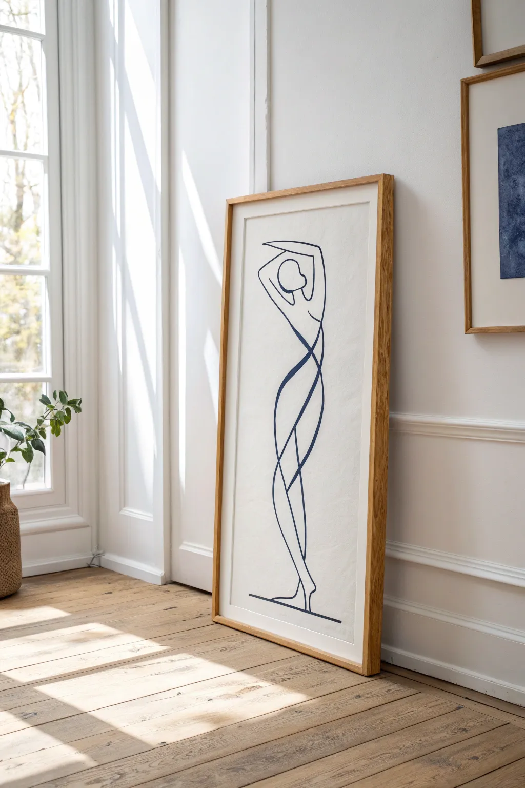
Using a striking single-line technique, this contemporary piece captures the essence of a standing figure through fluid motion and thoughtful negative space. The high contrast of deep navy ink against cream paper creates a sophisticated, gallery-ready look that feels both modern and timeless.
Step-by-Step
Materials
- Heavyweight mixed media paper or Bristol board (cream/off-white)
- Deep navy blue acrylic paint or high-flow fluid acrylics
- Round synthetic brush (size 4 or 6 for consistent line width)
- Pencil (HB or lighter)
- Kneaded eraser
- Ruler or straight edge
- Mixing palette
- Large wooden frame (approx. 24×36 inches) with mat board (optional)
Step 1: Planning and Sketching
-
Prepare the surface:
Lay your heavyweight paper on a flat, clean surface. If the paper has a texture, ensure the grain is running vertically to complement the standing figure’s height. -
Establish the baseline:
Using a ruler, lightly draw a horizontal line near the bottom of the page. This anchor line will serve as the ground for your figure. -
Visualize the flow:
Before drawing, practice the motion of the figure in the air with your hand. The goal is to understand how the curves of the hips connect to the raised arms in one sweeping thought. -
Lightly sketch the focal points:
Instead of drawing the whole figure immediately, lightly mark key points: where the head sits, the curve of the waist, and where the feet touch the baseline. -
Trace the continuous path:
Connect your key points with a very faint pencil line. Don’t worry about perfection here; focus on the rhythm of the line crossing over itself at the torso and legs to create that signature negative space. -
Refine the composition:
Step back and look at your pencil guide. Adjust curves to ensure the figure looks balanced and not tipping over. Use a kneaded eraser to lighten these lines until they are barely visible guides.
Step 2: Painting the Line
-
Prepare your paint:
Squeeze out your deep navy acrylic. I prefer to thin it slightly with a few drops of water or flow medium until it has an ink-like consistency—smooth enough to glide, but opaque enough to cover in one pass. -
Load the brush fully:
Saturate your round brush completely. A fully loaded brush allows you to paint longer segments without lifting, which is crucial for the continuous line effect. -
Start at the base:
Begin painting the horizontal baseline first. This gives you a moment to test your paint flow and steadiness before tackling the curves of the body. -
Begin the figure upward:
Starting from the feet, pull your brush upward in a confident, smooth motion. Follow the outer curve of the leg, keeping your wrist flexible. -
Navigate the crossovers:
As you reach the torso where lines intersect, try to maintain a consistent speed. Hesitation causes shaky lines, so trust your muscle memory from the sketch phase. -
Form the arms and head:
Paint the loop of the arms and the simple oval of the head. If you need to lift your brush to reload, do it at a natural stopping point, like a sharp corner or intersection. -
Complete the descent:
Bring the line back down the opposite side of the body, letting the brush taper off gently as you reconnect with the feet or baseline. -
Check for opacity:
Once the first layer is touch-dry, inspect the line. If the blue looks streaky or transparent, carefully retrace the same path with a second coat for a bold, solid finish.
Fixing the Wobbles
Shaky hand? Don’t panic. Simply widen the line slightly in that area to smooth out the jitter. A purposeful variation in wait can look artistic rather than accidental.
Step 3: Finishing Touches
-
Clean up the edges:
If any pencil marks are still visible outside the paint, use your kneaded eraser to gently lift them away without smudging the artwork. -
Verify the baseline:
Ensure the bottom horizontal line is crisp and extends slightly past the figure’s feet on both sides to ‘ground’ the image effectively. -
Let it cure:
Allow the painting to dry completely flat for at least 24 hours. This prevents the paper from warping when you place it inside the frame. -
Mount and frame:
Place the artwork into an oak or light wood frame. Using a bright white or cream mat can help separate the art from the glass and enhance the minimalist aesthetic.
Textured Background
Before painting the figure, apply a wash of diluted coffee or tea to the paper and let it dry. This creates an aged, parchment-like effect that mimics vintage sketches.
Hang your new minimalist masterpiece in a well-lit corner to let the clean lines truly shine
Text and Paint Layers
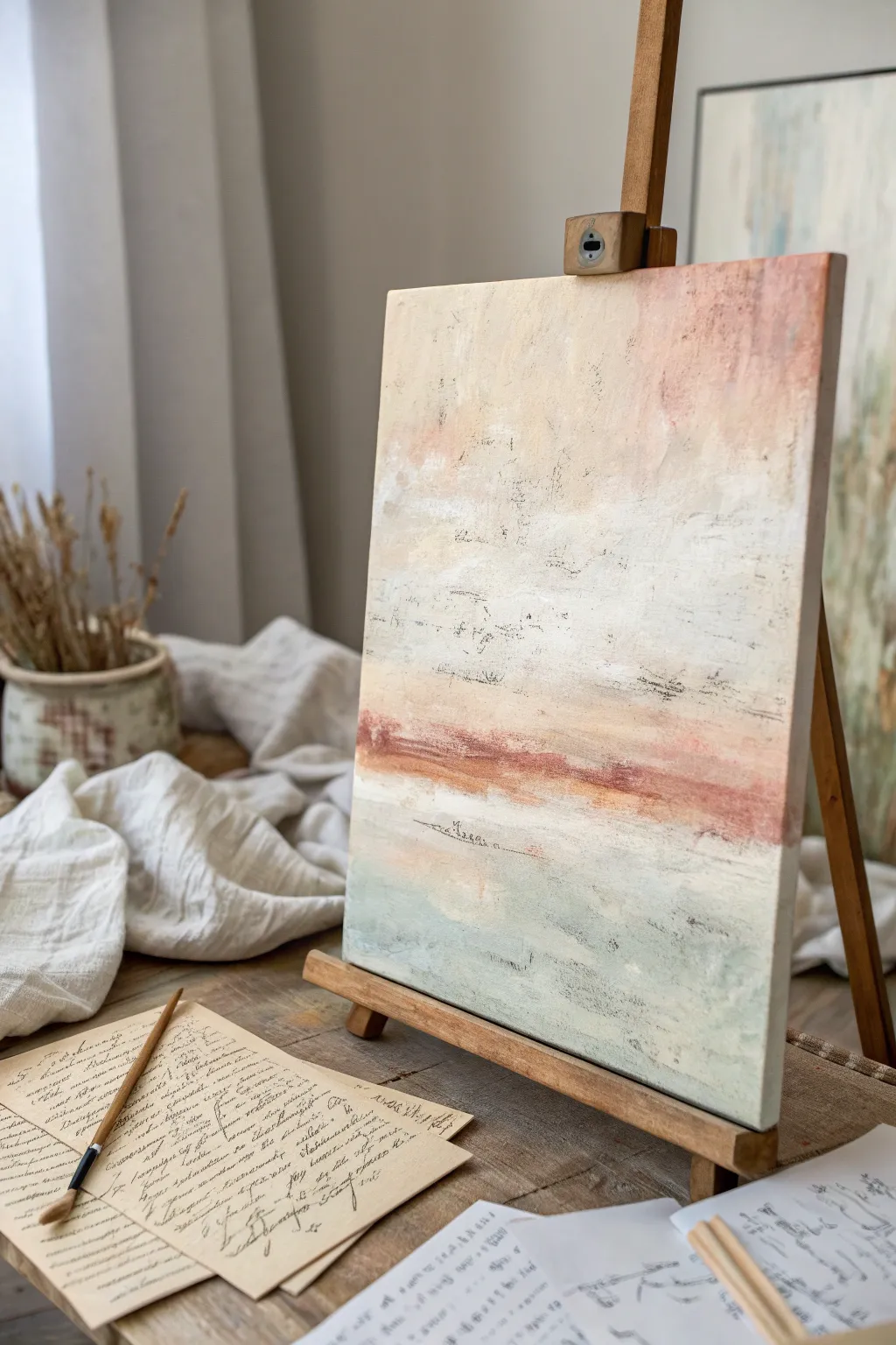
This project explores the delicate balance between obscured narrative and visual serenity, featuring an abstract landscape that hints at ancient manuscripts buried beneath layers of wash. By combining transfer techniques with thin glazes of acrylic, you’ll create a piece that feels both timeless and distinctly contemporary.
How-To Guide
Materials
- Stretched canvas (11×14 or similar)
- Acrylic paints: Titanium White, Unbleached Titanium, Burnt Sienna, Raw Umber, Sage Green, Pale Blue
- Matte medium or gel medium
- Old text printouts (laser printed) or tissue paper with script
- Palette knives (varying sizes)
- Wide flat synthetic brush
- Small round detail brush
- Fine-grit sandpaper (optional)
- Water spray bottle
Step 1: Setting the Verbal Foundation
-
Prepare the substrate:
Begin with a clean canvas. If you want a smoother finish like the inspiration photo, apply a coat of white gesso and lightly sand it down once dry to remove the harsh weave texture. -
Embed the text:
Tear pieces of your text printouts or script tissue into ragged strips. Apply them randomly across the middle and upper third of the canvas using matte medium as an adhesive, ensuring there are no air bubbles. -
Seal the story:
Once the paper is positioned, brush another thin layer of matte medium over the top to seal the paper fibers. Let this dry completely before adding any paint.
Step 2: Layering the Atmosphere
-
Create the base wash:
Mix a large amount of Titanium White with a touch of Unbleached Titanium and plenty of water or glazing medium. You want a semi-transparent milkiness. -
Obscure the text:
Brush this milky wash over the entire canvas, paying special attention to the text areas. The goal is to make the words barely legible, like a memory fading away. -
Introduce warmth:
While the surface is still slightly tacky, mix a very pale peach using Titanium White and a tiny dot of Burnt Sienna. Apply this loosely to the upper right corner allowing it to blend into the white. -
Build surface texture:
Switch to a palette knife. Mix a heavier body of Unbleached Titanium and scrape it vertically and horizontally across the central area, creating physical ridges that catch the light.
Script Trick
Don’t have vintage letters? Print text in a handwriting font on standard printer paper, crumple it up repeatedly to soften the fibers, and iron it flat before gluing.
Step 3: Defining the Horizon
-
Mix the horizon color:
Combine Burnt Sienna with a touch of red or orange to create a rusty, terracotta hue. This needs to be slightly thicker than your washes. -
Establish the divide:
Using the edge of your palette knife or a flat brush, drag this rusty color horizontally across the lower middle section. Don’t make a straight line; let it break and skip over the canvas canvas texture. -
Softening the edge:
Immediately mist the rusty line with water. Use a clean, dry brush to feather the top edge so it bleeds upward into the cream sky, mimicking a hazy sunset or distant earth. -
Adding depth marks:
Dip a fine round brush or even a twig into watered-down Raw Umber (ink-consistency). Scribble faint, illegible marks or ‘asemic writing’ near the horizon line to echo the printed text underneath.
Too Opaque?
If you accidentally cover too much of the underlying text, gently sand the dry paint surface with fine-grit sandpaper to bring the letters back to surface.
Step 4: The Grounding Layers
-
Cool the palette:
For the bottom third, mix white with Sage Green and a hint of Pale Blue. This creates a soft, misty foreground. -
Apply the foreground:
Brush this cool mixture from the bottom edge upward, stopping just short of the rusty horizon line. Let some of the white canvas peek through for airiness. -
Distress the surface:
I like to take a slightly damp rag and gently rub back small areas of paint in the foreground and sky. This reveals hint of the dark text or underlayers beneath. -
Add dark accents:
Using the edge of a credit card or palette knife with dark grey or umber paint, create tiny horizontal scratches and specks in the lower section to simulate debris or ground texture. -
The final wash:
Mix a very watery glaze of Unbleached Titanium. Brush it over the entire painting one last time to harmonize the colors and push the contrast back slightly for that vintage feel. -
Detail check:
Step back. If any text is too bold, dab more white paint over it. If the horizon feels too heavy, scrape through it with a clean knife.
Allow the painting to cure fully before hanging it to enjoy the quiet serenity of your thoughtful composition
Repetition Grid of Marks or Dots
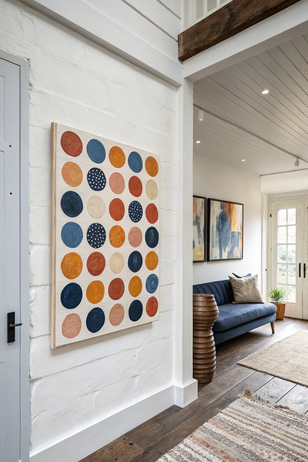
Bring playful structure to your walls with this contemporary grid painting featuring earthy, muted tones and organic shapes. The repetitive pattern is soothing yet visually engaging, perfect for bridging modern and rustic design styles.
Step-by-Step Tutorial
Materials
- Large wooden art panel or thick plywood sheet (approx. 24″ x 36″)
- Gesso or white acrylic primer
- Wide flat paintbrush (2-inch)
- Acrylic craft paints (burnt sienna, navy blue, mustard yellow, cream, blush pink)
- Round paintbrushes (size 8 and size 12)
- Ruler or T-square
- Pencil
- Paper plate or palette
- Small detail brush (size 0 or 2) for white dots
- Matte spray varnish
Step 1: Preparation & Layout
-
Prime the surface:
Begin by applying a coat of gesso or white acrylic primer to your wooden panel. You want a somewhat opaque base, but it’s lovely if faint wood grain shows through to keep it organic. Let this dry completely. -
Sand lightly:
Once the primer is dry, give the surface a very quick, light sanding with fine-grit sandpaper to ensure a smooth painting surface. Wipe away any dust with a damp cloth. -
Plan the grid:
Measure the width and height of your panel. You need a grid of 5 columns and 8 rows. Use your ruler and pencil to lightly mark the center points for each of the 40 circles. Don’t draw the circles themselves, just a small ‘x’ where the center will be. -
Test spacing:
Before painting, visualize the spacing. Ensure there is equal breathing room between each ‘x’ mark so the final composition feels balanced rather than crowded.
Circle Sizing Hack
Don’t trust your freehand circle skills? Lightly trace the bottom of a standard drinking glass or a small jar lid at each grid point before painting to ensure consistent sizing.
Step 2: Painting the Circles
-
Mix your palette:
Squeeze out your acrylic colors onto a paper plate. For this look, keep colors earthy: blend a little brown into your yellow for mustard, or a touch of white into the orange for a terracotta feel. -
Start with the navy circles:
Using a size 12 round brush, paint the navy blue circles first. Distribute them randomly across your grid marks. The edges don’t need to be perfectly sharp; a slightly rough, hand-painted edge adds character. -
Add the warm tones:
Wash your brush well, then paint the rust/terracotta circles. Scattered placement works best—try not to put two identical colors right next to each other. -
Fill in mustard and blush:
Continue filling the grid with your mustard yellow and blush pink tones. If the paint feels too thick, dip your brush in a tiny bit of water to help it flow in a circular motion. -
Add texture layers:
For some of the lighter beige circles, use a drier brush or dabbing motion. This creates a textured, stone-like appearance that contrasts nicely with the solid colored dots. -
Evaluate the balance:
Step back and look at your grid. If one area feels too ‘heavy’ with dark colors, balance it by adding a dark circle on the opposite side in remaining empty spots. -
Second coats:
Some lighter colors, especially the yellows and pinks, might need a second coat for opacity. I prefer to apply this second layer while the first is still slightly tacky to blend stroke marks.
Level It Up
Add true texture to the ‘stone’ colored circles by mixing a tablespoon of baking soda into your beige acrylic paint. It will dry with a gritty, realistic cement-like feel.
Step 3: Details & Finishing
-
Create the patterned dots:
Select 3 or 4 of your navy blue circles to feature distinct patterns. Using a small detail brush and cream paint, dab irregular small dots all over the surface of those specific blue circles. -
Vary the dotted pattern:
On one of the blue circles, try making the white dots slightly denser or larger to create visual variety among the patterned elements. -
Check edges:
Go back with your background white color if you made any major mistakes or drips outside the circle shapes, carefully touching up the negative space. -
Seal the work:
Once all paint is thoroughly dry (give it at least 24 hours to cure), spray a thin, even coat of matte varnish over the entire panel to protect the finish and unify the sheen. -
The final touch:
If your plywood panel has rough sides, paint the edges pristine white or add a simple floating wood frame to give it a gallery-ready appearance.
Now you have a striking, architectural piece of art that adds rhythm to your hallway without overwhelming the space


Have a question or want to share your own experience? I'd love to hear from you in the comments below!