Thermal painting is that deliciously bold look where your colors act like a heat map, shifting from cool blues and purples into fiery yellows and reds. If you’ve been craving a project that’s graphic, glowy, and totally addictive to layer, these thermal painting ideas will keep you busy in the best way.
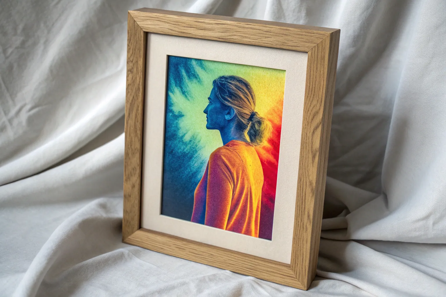
Classic Thermal Figure Study
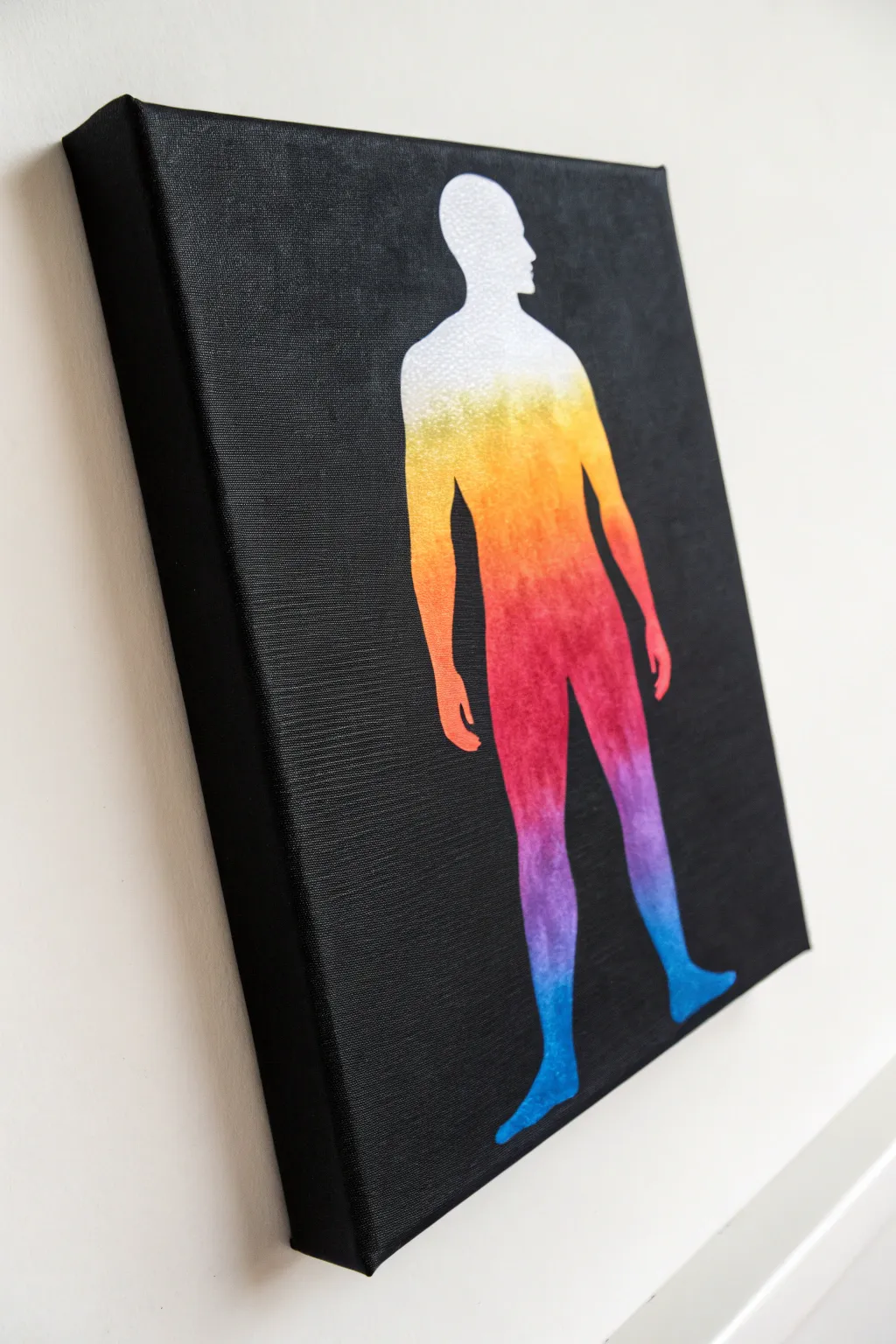
Capture the ethereal beauty of a thermal scan with this striking canvas project. By combining a stark black background with a vibrant, blending gradient, you’ll create a glowing human form that pops off the wall with modern intensity.
Step-by-Step Guide
Materials
- Stretched canvas (11×14 or similar)
- Black acrylic paint (heavy body preferred)
- White Gesso or primer
- Acrylic paints: White, Yellow, Orange, Red, Magenta, Violet, Phthalo Blue
- Stencil vinyl or contact paper
- Craft knife or stencil cutter
- Cutting mat
- Makeup sponges or dabber brushes
- Wide flat brush
- Painter’s tape
- Human figure silhouette template (printed)
Step 1: Preparation and Background
-
Prime the canvas:
Begin with a standard white stretched canvas. If it feels rough, apply a quick coat of white gesso to smooth out the grain, as this helps the gradient blend seamlessly later. Let it dry completely. -
Paint the black base:
Using a wide flat brush, coat the entire canvas in black acrylic paint. You want this to be opaque and matte. Don’t forget to paint the sides of the canvas for a finished, gallery-wrapped look. -
Apply a second coat:
Once the first layer is dry, hold it up to the light to check for streaks. Apply a second coat of black to ensure a deep, void-like background. Allow this to cure fully, perhaps for a few hours, to prevent peeling during the masking tape.
Step 2: Creating the Stencil
-
Prepare the silhouette:
Find or print a simple standing human figure silhouette. Tape your printed template over a sheet of stencil vinyl or contact paper on your cutting mat. -
Cut the negative space:
Carefully trace and cut out the figure using a sharp craft knife. For this project, you actually need the ‘negative’ space stencil—the large sheet with the person-shaped hole in the middle. -
Apply the stencil:
Peel the backing off your vinyl stencil. Carefully center it on the black canvas. Smooth it down firmly, paying extra attention to the edges of the figure (fingers, feet, nose) to prevent paint bleed. -
Seal the edges:
I like to brush a very thin layer of black paint over the stencil edges first. This seals the seal; if any paint bleeds under, it will be black and invisible against the background.
Bleeding Edges?
If paint sneaks under the stencil, don’t panic. Wait for it to dry completely, then use a flat-edged brush with black paint to ‘cut’ the edge back to a sharp line
Step 3: Painting the Gradient
-
Establish the white base:
Sponge a solid layer of white acrylic paint filling the entire silhouette area. This creates a bright underpainting so your neon colors don’t get dull against the dark background. -
Start at the head:
Begin the gradient at the top. Dab pure white paint on the head, then mix a tiny drop of yellow into the white as you move down the neck to start the transition. -
Yellow to Orange:
Switch to pure yellow for the shoulders. As you move toward the chest, begin blending in orange. Use a makeup sponge in a tapping motion (stippling) to blur the line between colors. -
The warm torso:
Transition from orange to bright red around the mid-torso. Keep dabbing wet paint into wet paint for the smoothest blend. Do not let the paint dry between color shifts. -
Hips and thighs:
Move from red to magenta/pink at the hips, then transition into a deep violent or purple as you work down the thighs. The stippling texture mimics a thermal grain perfectly. -
Legs and feet:
Finally, blend the purple into cool blue for the lower legs and feet. The feet should be the darkest, coolest tone, anchoring the figure.
Add Texture
Mix a little coarse modeling paste into your gradient colors before sponging. This adds a subtle, tactile grain that mimics the digital noise often seen in real thermal imaging scans
Step 4: Finishing Touches
-
Peel the stencil:
Wait until the paint is ‘tacky’ dry—not fully cured, but not soaking wet. Slowly peel back the vinyl stencil at a sharp angle to reveal the crisp edge. -
Touch ups:
If any color bled out, use a small detail brush and black paint to carefully clean up the perimeter. If the gradient needs smoothing, you can lightly dab over areas with a nearly-dry sponge. -
Varnish:
Once fully dry (give it 24 hours), apply a satin varnish over the whole canvas to unify the sheen of the black background and the colorful figure.
Hang your thermal masterpiece in a spot with good lighting to let that spectrum really shine
Thermal Torso With Bold Negative Space
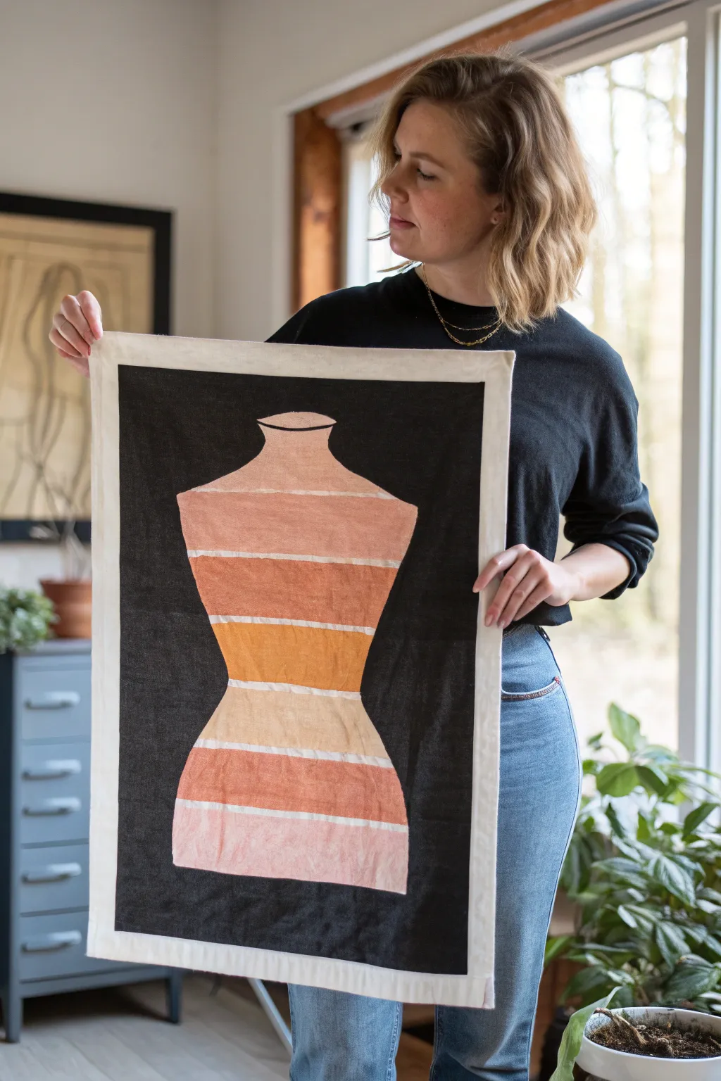
This striking textile art piece combines bold negative space with a soft, thermal-inspired gradient to create a modern graphic statement. The contrast between the saturated black background and the warm, earthy tones of the torso silhouette makes for a sophisticated wall hanging.
Detailed Instructions
Materials
- Cotton canvas or heavy muslin (white/natural)
- Black fabric paint or screen printing ink
- Fabric paints (rust orange, ochre yellow, pale pink, coral)
- Painters tape or masking tape
- Torso template (paper or cardstock)
- Flat paintbrushes (various sizes)
- Small foam roller (optional)
- Fabric medium (if using acrylics)
- Iron and ironing board
- Sewing machine and thread
Step 1: Preparation and Template
-
Prepare the canvas:
Cut your white cotton canvas to the desired size, leaving an extra 2 inches on all sides for the border and hem. Iron the fabric completely flat to ensure clean paint lines later. -
Create the silhouette:
Draw a torso shape onto a large piece of paper or cardstock. You want a classic dress form silhouette with a defined waist and neck. Cut this shape out carefully to create your stencil. -
Transfer the outline:
Center your paper template on the canvas. Using a pencil or disappearing fabric marker, lightly trace the outline of the torso onto the fabric. -
Tape off the borders:
Apply painter’s tape around the outer edges of your canvas to define the white border. Press the edges of the tape down firmly to prevent paint bleeding.
Bleed Patrol
If black paint bleeds into the white torso area, correct it by painting over the mistake with opaque white fabric paint, or simply paint that specific gradient stripe a bit wider to cover it.
Step 2: Painting the Negative Space
-
Mask the torso:
To keep the torso area clean while painting the background, you can either tape over the inside of your pencil line or use liquid frisket. I prefer to just paint carefully with a steady hand near the line. -
Apply the black background:
Using a flat brush or small foam roller, fill in the negative space around the torso with black fabric paint. Determine how rectangular you want the black field to be and tape off those inner edges if you want a sharp rectangle like in the example. -
Refine the edges:
Go back with a smaller brush to sharpen the curves around the neck, shoulders, and hips. The crispness of this edge is crucial for the final look. -
Let it cure:
Allow the black paint to dry completely. This usually takes at least 2-4 hours depending on the thickness of your application.
Step 3: Creating the Thermal Gradient
-
Mark the stripes:
Once the black is dry, use your pencil to lightly mark horizontal divisions across the white torso area. Space them relatively evenly, but organic variation adds character. -
Tape the stripe gaps:
Place thin strips of tape (or artist tape) over the specific lines where you want white space to remain between the color bands. -
Mix your palette:
Prepare your palette with warm thermal tones: muted pinks, deep coral, rust orange, and ochre. Mixing in a little fabric medium helps the paint penetrate the fibers better. -
Paint the top sections:
Start at the neck with a pale pink or nude tone. For the shoulder section, transition into a slightly deeper dusty rose. -
Work through the midsection:
Move down to the chest and waist area, applying your darkest rust and ochre tones here. Use a sweeping horizontal motion to mimic scanning lines. -
Complete the hips:
Fade back into softer corals and pale pinks for the bottom hip section, mirroring the lightness of the neck area. -
Remove tape:
While the paint is still slightly tacky (not fully wet but not rock hard), carefully peel away the tape strips to reveal the crisp white lines between the colors.
Add Texture
For a true mixed-media feel, try embroidering over the white separator lines with thick cotton floss or yarn instead of just leaving them as unpainted canvas.
Step 4: Finishing Touches
-
Heat set the paint:
Once all paint is fully dry (wait 24 hours for best results), iron the back of the fabric on a cotton setting to permanently set the pigment. -
Fold the hem:
Fold the raw white edges of the canvas backward twice to create a clean hem. The painted black area should define the inner edge of this frame. -
Stitch the border:
Use a sewing machine to topstitch the hem in place. A straight stitch in white thread keeps the attention on the artwork. -
Add hanging hardware:
Sew a simple loop or sleeve on the back top edge for a dowel, or attach commanding strips if you prefer a flush mount.
Hang your finished piece in a well-lit spot to let those warm thermal tones really glow against the deep black background
Thermal Face Portrait With Heat Zones
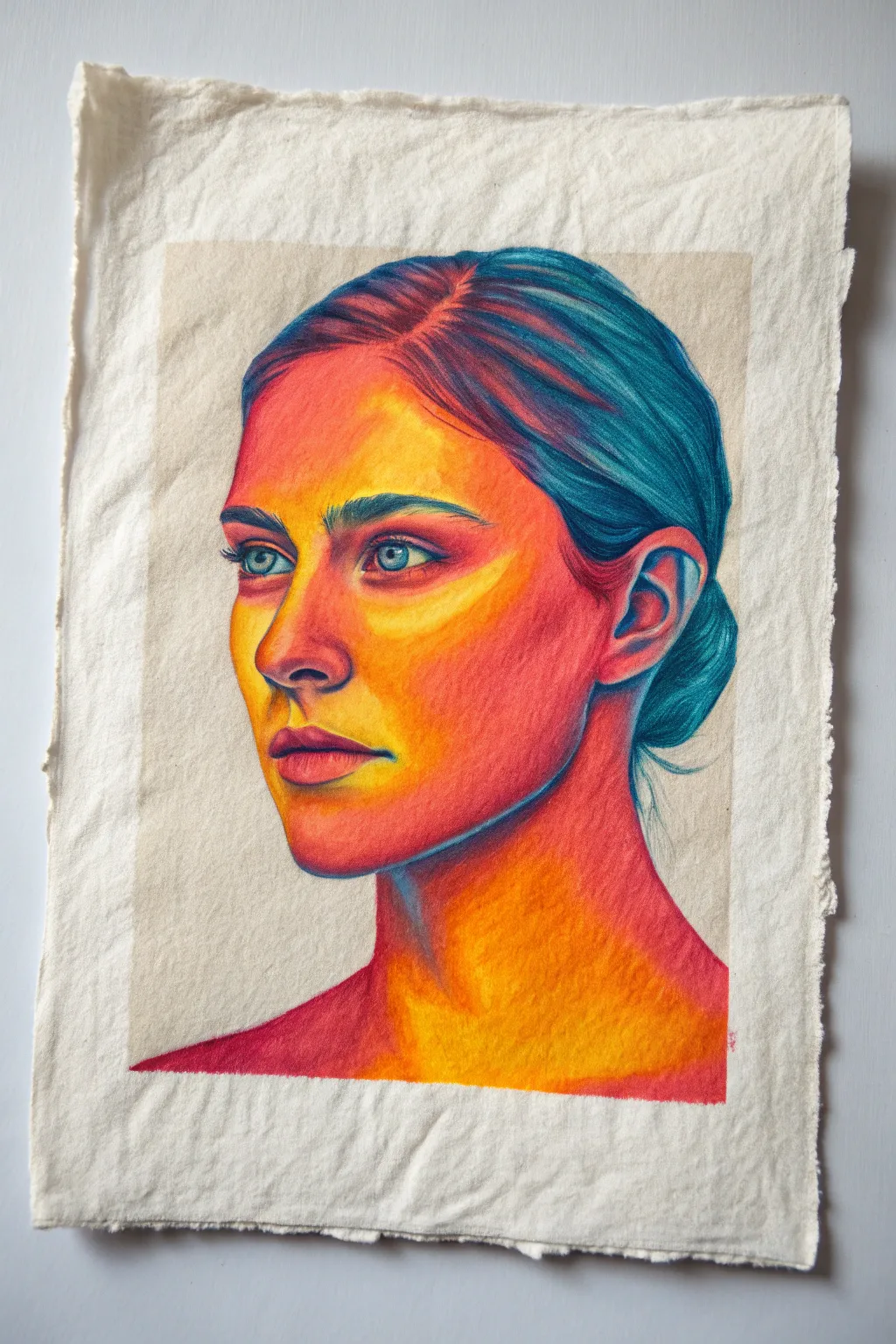
Capture the radiant energy of a thermal camera using traditional media on textured paper. This project balances vibrant neon hues against cool shadows to create a striking, heat-mapped portrait effect.
Detailed Instructions
Materials
- Heavyweight rag paper or cold-press watercolor paper with deckled edges
- Soft pastel pencils or high-quality colored pencils (Prismacolour or similar)
- Kneadable eraser
- Graphite pencil (HB or H)
- Blending stumps (tortillions)
- Workable fixative spray
Step 1: Planning and Sketching
-
Select your reference:
Choose a high-contrast portrait photo. You can run it through a ‘thermal camera’ filter app on your phone to see exactly where the hot (red/yellow) and cold (blue/purple) zones naturally fall. -
Prepare the paper:
If your paper doesn’t have deckled edges, you can tear the edges against a ruler to create that rustic, handmade look shown in the example. -
Light scaffolding:
Using an HB graphite pencil, lightly sketch the facial features. Keep these lines very faint, as you don’t want grey graphite muddying your bright thermal colors later. -
Map the temperature:
Instead of shading with graphite, draw faint contour lines outlining where the colors will change—circle the tip of the nose for yellow, outline the cheeks for red, and mark the hair for blue.
Color Theory Trick
Avoid using black entirely. To make shadows darker, layer deep purple over your dark blues. This keeps the image vibrant and true to the thermal cam aesthetic.
Step 2: Applying Base Temperatures
-
Establish the hottest points:
Start with your brightest yellow pencil. Firmly shade the ‘hottest’ areas: the bridge of the nose, the forehead, the chin, and the apples of the cheeks. -
Transition to warmth:
Blend an orange tone into the edges of the yellow zones. Use small, circular strokes to seamlessly mix the pigments on the paper’s tooth. -
Deepen the reds:
Introduce a vibrant red or magenta for the mid-tones of the skin. This should wrap around the orange areas, particularly on the darker side of the face and the neck. -
Lay down the cold base:
Switch to a light teal or cyan. Fill in the hair area and the eyes roughly, establishing the cool foundation that will contrast with the skin.
Muddy Colors?
If your oranges and blues are turning brown where they meet, clean your blending stump or use a barrier color like magenta to bridge the gap between warm and cool.
Step 3: Refining and Blending
-
Intensify the cool tones:
Take a deep indigo or navy blue pencil and define the strands of hair. I like to press harder here to build texture, creating flowy lines that contrast with the smooth skin blending. -
Define the features:
Use the dark blue or purple pencil to outline the eyes, nostrils, and the parting of the lips. This replaces traditional black, keeping the thermal spectrum consistent. -
Blend boundaries:
Use a blending stump to smudge the transition zones where red meets the background or where the hairline meets the forehead. The goal is a soft, radiating glow rather than hard cutouts. -
Layering for saturation:
Go back over the yellow and orange areas. The paper texture might show through, so add a second or third layer to make the ‘heat’ look intense and solid.
Step 4: Final Details
-
Detailed eye work:
Sharpen your pencils to a fine point. Draw the iris with a mix of cyan and dark blue, leaving a tiny spot of pure white paper for the catchlight. -
Add the coolest shadows:
Look for the absolute darkest points—under the chin, behind the ear, deep in the hair bun. Use a rich violet or deep teal to push these areas back. -
Highlight recovery:
If you lost any brightness, use a white pastel pencil or a white gel pen to tap in the absolute brightest highlights on the tip of the nose and tear duct. -
Seal the work:
Once satisfied with the vibrancy, lightly mist the drawing with a workable fixative to prevent the pigments from smudging or transferring.
Step back and admire how the interplay of warm and cool tones brings a lively, electric energy to your portrait
Thermal Silhouette With Neon Edges
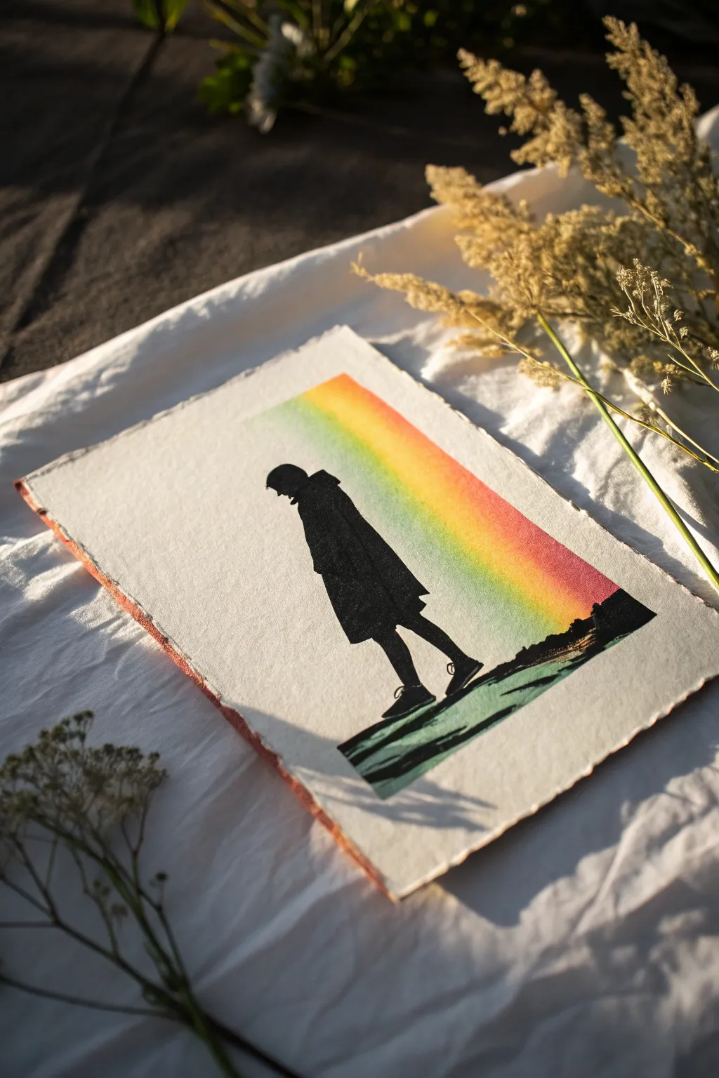
Capture a moment of quiet contemplation with this striking mixed-media print, featuring a stark black silhouette cutting across a vibrant thermal-gradient beam. The contrast between the matte black figure and the soft, glowing rainbow wash creates a modern, graphic look on beautifully textured paper.
Step-by-Step Guide
Materials
- Heavyweight textured watercolor paper or handmade cotton paper (deckle edge recommended)
- Black block printing ink or heavy body acrylic paint
- Soft rubber brayer (roller)
- Linoleum block or carving rubber
- Linoleum cutter tool with V and U gouges
- Pencil and tracing paper
- Watercolor paints (Red, Orange, Yellow, Green)
- Medium flat watercolor brush
- Painter’s tape or masking tape
- Glass palette or acrylic sheet for ink rolling
- Ruler
Step 1: Preparation and Gradient Base
-
Prepare the paper:
Begin by selecting a high-quality sheet of textured paper. If you want that rustic look shown in the example, gently tear the edges against a ruler to create a faux deckle edge, or start with handmade cotton rag paper. -
Mask the beam area:
Use painter’s tape to mark off a wide, diagonal or vertical rectangular section where your rainbow beam will go. Press the edges of the tape down firmly to prevent watercolor from bleeding underneath. -
Mix your colors:
Pre-mix your watercolor paints. You’ll need a vibrant red, a warm orange, a sunny yellow, and a lime green. Keep them fairly watery but pigmented enough to stain the paper well. -
Paint the gradient:
Start at the top of your masked area with the red paint. While it’s still wet, seamlessly blend it into the orange, then the yellow, and finally the green at the bottom. The goal is a smooth transition reminiscent of thermal imaging. -
Let it dry:
Allow the watercolor wash to dry completely. This is crucial—if the paper is damp, the tape might tear the surface when removed. -
Remove the tape:
Peel the painter’s tape away slowly at a 45-degree angle to reveal crisp, straight edges on your rainbow gradient.
Step 2: Creating the Silhouette
-
Draft the design:
On a piece of tracing paper, sketch the outline of a figure in a coat or cloak. You can work from a reference photo to get the posture of the walking stride just right. -
Transfer to block:
Flip your tracing paper graphite-side down onto your linoleum block or carving rubber. Rub the back of the paper firmly to transfer the image. Remember, the printed image will be a mirror of what you carve. -
Carve the negative space:
Using your linoleum cutter, carefully carve away everything *outside* the figure. You want the figure itself to remain raised and flat. I find using a small V-gouge works best for tight areas like the ankles and coat hem. -
Create the ground texture:
Leave a strip of rubber at the bottom for the ground. Carve rough, horizontal streaks into this area to mimic the texture of a path or shadow, rather than making it a solid block. -
Clean the block:
Brush away any loose rubber crumbs to ensure they don’t get stuck in the ink later.
Clean Edges Pro-Tip
Before painting the gradient, run a credit card or bone folder firmly over the edge of the painter’s tape. This seals the seal tightly and prevents watery paint from seeping underneath.
Step 3: Printing and Finishing
-
Ink the plate:
Squeeze a small amount of black block printing ink onto your glass palette. Roll the brayer back and forth until the ink makes a velvety, hissing sound and is evenly distributed. -
Apply ink to the block:
Roll the inked brayer over your carved figure. Apply a consistent, thin layer. Do this a few times to build up opacity without flooding the fine details. -
Align the print:
carefully hover your inked block over the dried watercolor gradient. Position the figure so it overlaps the beam, creating that stark foreground-background contrast. -
Press the image:
Place the block down decisively. Use a clean brayer, a barren, or the back of a spoon to apply firm, even pressure across the back of the block. -
The reveal:
Lift one corner of the block to peek at the transfer. If it looks solid, peel the block off completely. -
Add manual touch-ups:
If the black ink has small patchy spots (common with textured paper), use a fine brush with black acrylic or ink to carefully fill in the solid areas for a jet-black silhouette. -
Paint the foreground shadow:
Using a diluted green paint or a mix of the green and black, add a few loose, horizontal strokes under the figure’s feet to extend the shadow casually off the printed area.
Level Up: Gloss Finish
Once the black ink is 100% dry, paint a clear gloss varnish specifically over the black silhouette. It will make the figure pop against the matte watercolor paper background.
Frame your print with plenty of white space to let those textured edges truly stand out
BRUSH GUIDE
The Right Brush for Every Stroke
From clean lines to bold texture — master brush choice, stroke control, and essential techniques.
Explore the Full Guide
Thermal Lips or Eye Close-Up
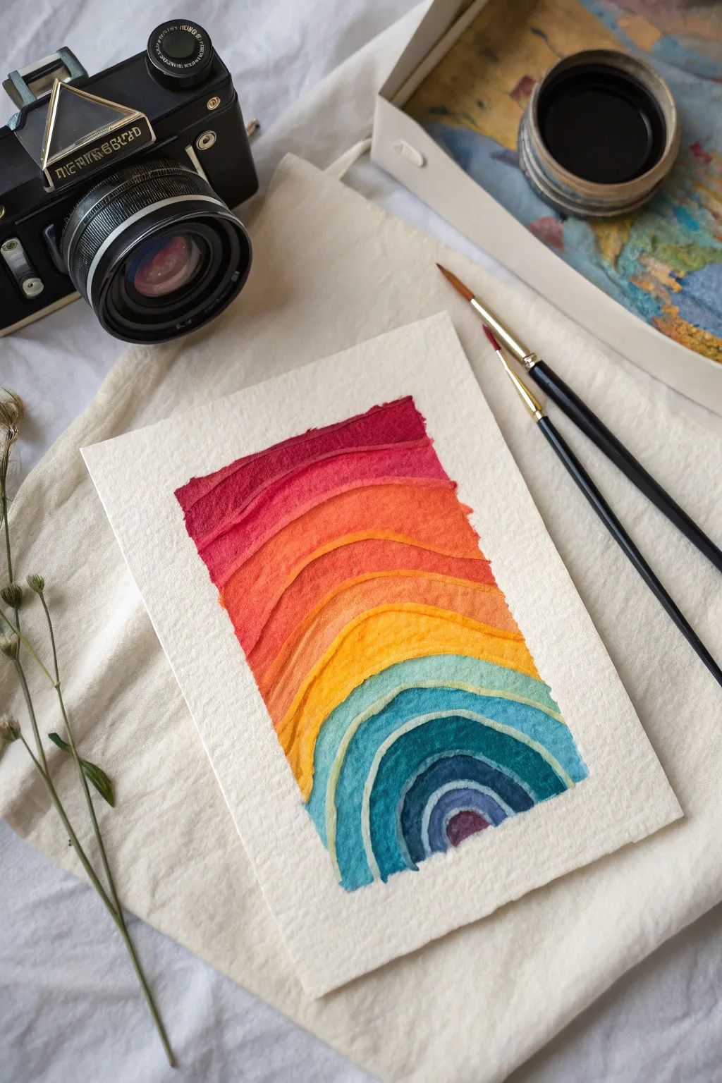
This project captures the mesmerizing gradients of thermal imaging in a tactile, layered watercolor form. The result is a vibrant, arching abstraction that feels both organic and structured, perfect for practicing smooth color transitions.
Detailed Instructions
Materials
- Cold press watercolor paper (300 gsm or heavier)
- Watercolor paint set (tubes or pans)
- Round watercolor brushes (sizes 4 and 8)
- Masking tape or painter’s tape
- Pencil (HB or lighter)
- Eraser
- Clean water jar
- Palette for mixing
- Paper towels
Step 1: Preparation and Sketching
-
Paper Setup:
Begin by tearing your watercolor paper down to size if you want those lovely decked edges shown in the photo, or simply cut a rectangular piece about 5×7 inches. -
Secure the Paper:
Tape the paper down to a hard board or your workspace using masking tape. This prevents buckling when the paper gets wet. -
Outline the Shape:
Lightly sketch a rectangular boundary in the center of your paper. This doesn’t need to be perfectly straight; a slightly organic edge adds character. -
Draw the Arches:
Starting from the bottom center, sketch a small arch. Continue drawing concentric arches moving upward, widening them slightly as you go to create the wave effect. -
Create Texture Guides:
Add slightly wavy, uneven lines within your main arches. These will guide your painting to ensure the ‘thermal’ bands look natural rather than perfectly geometric.
Step 2: Painting the Warm Tones
-
Mix the Red:
Load your brush with a deep crimson red. You want a high pigment-to-water ratio for the top band to create a bold, saturated start. -
Paint the Top Band:
Fill in the uppermost strip of your design. Use the tip of your brush to create a slightly ragged top edge, mimicking the texture seen in the reference. -
Transition to Orange-Red:
Add a touch of orange to your red mix. Paint the strip immediately below the red one. Let the wet edges touch slightly if you want a soft bleed, or wait for the red to dry for distinct lines. -
Pure Orange Layer:
Clean your brush and pick up a vibrant cadmium orange. Paint the next arch down, following the curve you sketched earlier. -
Yellow-Orange Blend:
Mix a warm yellow with a little orange. Apply this to the next band. I like to lift a little pigment with a dry brush here and there to create texture. -
Bright Yellow Arch:
Paint the central curving band with a pure, sunny yellow. This acts as the visual bridge between the warm top and cool bottom.
Clean Lines
For crisp separation between the color bands, wait for each strip to dry completely before painting the neighbor. Use a hair dryer to speed this up.
Step 3: Painting the Cool Tones
-
Green Transition:
Mix a light yellow-green using your yellow and a touch of phthalocyanine green/blue. Paint the band just below the yellow arch. -
Teal Layer:
Move into a turquoise or teal shade. Paint the next concentric arch, ensuring the color is rich and distinct from the yellow-green. -
Deep Blue Arch:
Mix a strong cobalt or ultramarine blue. Apply this to the next internal arch. The colors should be getting cooler and deeper as you move to the center. -
Indigo Center:
For the smallest, innermost arches, use a dark indigo or Prussian blue. Keep these shapes tight and precise. -
The Final Purple Accent:
In the very center ‘eye’ of the arch, drop in a small spot of deep purple or violet to complete the spectrum.
Muddy Centers?
If the bottom blue arches look muddy, your water is likely dirty. Change your water jar before switching from the warm yellows to the cool blues.
Step 4: Finishing Touches
-
Create Edge Texture:
Once the main colors are semi-dry, use a slightly damp, clean brush to gently rub the outer edges of the rectangle, softening them just a little to enhance the organic feel. -
Dry Completely:
Allow the painting to dry fully. If the paper feels cool to the touch, it is still wet deep down. -
Erase Guidelines:
Gently erase any visible pencil marks, being careful not to rub over the painted areas too vigorously. -
Flattening:
If the paper has buckled slightly from the water, place it under a heavy book overnight to flatten it out perfectly.
Display your colorful thermal abstraction proudly or use it as a striking handmade card for a friend
Thermal Body Pose With Topographic Bands
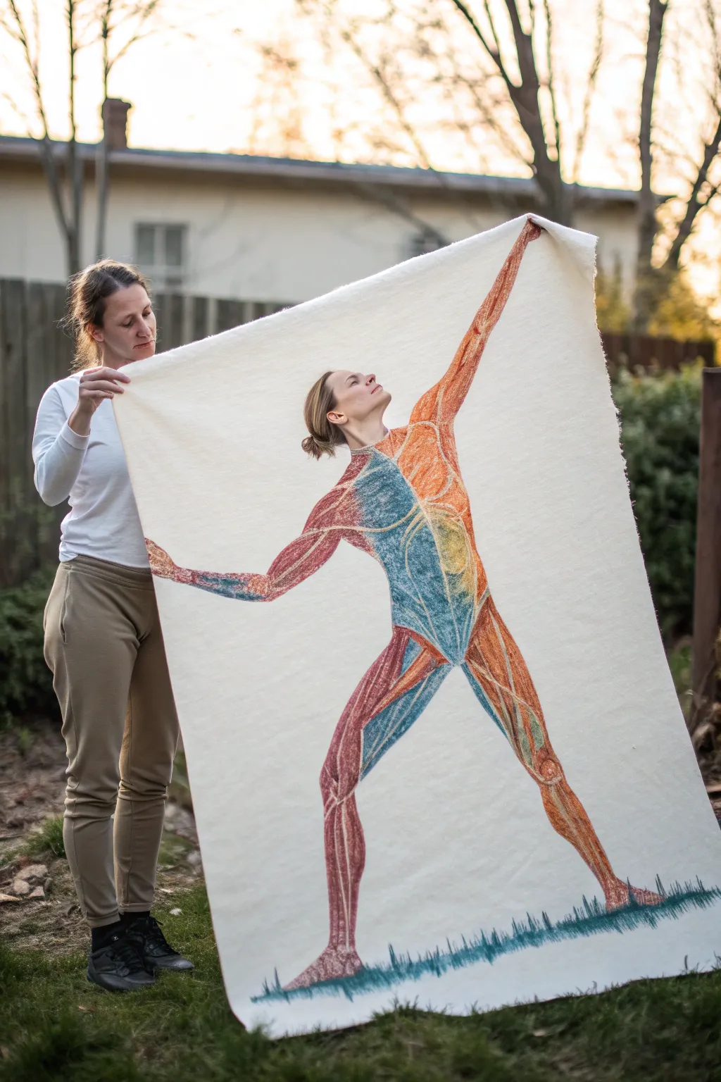
This striking large-scale project combines anatomical study with distinct thermal color zoning for a unique wall hanging. Using dry needle felting on a heavy wool backing, you’ll create a life-sized figure that balances warm muscle tones against cool topographic bands.
Step-by-Step
Materials
- Large sheet of heavy white industrial felt (approx. 4×6 feet)
- Carded wool roving in warm tones (rust red, bright orange, coral, deep maroon)
- Carded wool roving in cool tones (teal, slate blue, turquoise)
- Needle felting tool (multi-needle holder recommended)
- Single felting needles (fine gauge for details)
- Foam felting mat or thick sponge blocks
- Projector (optional but recommended)
- Tailor’s chalk or disappearing ink fabric marker
Step 1: Preparation and Outline
-
Prepare your canvas:
Lay your large felt sheet on a flat, clean surface like a floor or a large table. Since felt can hold wrinkles, use a steamer to smooth out any creases before you begin. -
Project the reference:
Set up a projector to cast an image of a model in a dynamic, reaching pose onto the felt. If you don’t have a projector, you can sketch the outline freehand, focusing on the gesture line from the back leg to the extended hand. -
Trace the anatomy:
Using tailor’s chalk, lightly trace the outline of the figure. Don’t stop at the silhouette; map out the internal zones where the ‘thermal’ shifts will happen—specifically, mark a divide down the torso and along the thighs where warm colors will meet cool ones. -
Create a safe work surface:
Place your foam felting mats underneath the specific section of the felt you are working on. You will need to shift these mats frequently as you move around the large tapestry to prevent needling into your floor.
Step 2: Blocking in Color Zones
-
Start with the warm core:
Take a wispy section of rust-red roving. Lay it thinly over the leg and arm areas designated for warm tones. Use the multi-needle tool to punch the fibers down, anchoring the base layer without worrying about perfect density yet. -
Establish the cool zones:
Switch to the teal and slate blue roving. Lay these fibers across the chest, stomach, and inner thigh areas. Tack them down lightly, ensuring the edges slightly overlap the warm zones to prepare for mixing later. -
Build opaque layers:
Go back over the initial red areas with brighter orange and coral wool. I find it safest to layer thin drifting clouds of wool rather than thick clumps to avoid a lumpy texture. Needle these down firmly until the white background no longer shows through. -
Define the head and hands:
The face requires precision. Switch to a single fine-gauge needle. Use very small amounts of flesh-toned or light orange wool to sculpt the profile, paying close attention to the nose and chin silhouette.
Needles Breaking?
Work vertically! If you bend the needle while it’s inside the fabric, it will snap. Always pull the needle straight out at the same angle it entered.
Step 3: Defining Musculature
-
Highlight the muscle groups:
Twist thin strands of lighter orange or yellow wool between your fingers to create ‘yarn-like’ lines. Needle these along the length of the red muscles (like the quadriceps and deltoids) to simulate fibrous muscle striations. -
Contour the cool zones:
Use a darker blue wool to create shadows within the teal sections. Add these darker lines along the ribcage and abdominal muscles to give the figure three-dimensional form. -
Deepen the outlines:
To make the figure pop against the white background, take a very thin strand of deep maroon (for warm sides) and dark teal (for cool sides) and needle-felt a crisp outline along the entire silhouette. -
Create the transition border:
Where the red and blue sections meet on the body, needle the fibers together thoroughly. Allow the colors to physically mesh, creating a natural gradient rather than a hard line.
Add Topographic Lines
Embroider thin, contour lines in gold or silver thread over the colored sections. This mimics topographic maps and adds a stunning metallic detail.
Step 4: Finishing Details
-
Refine the hands and feet:
Use the single needle to define the fingers and toes. Since these are small details, careful, shallow stabs are better to avoid breaking the needle. -
Add the ground plane:
At the feet of the figure, lay horizontal strips of teal and dark blue wool. Use vertical stabbing motions to create a ‘grass’ texture that grounds the figure so it isn’t floating in space. -
Check density and texture:
Run your hand over the surface. If any areas feel too fluffy or loose, spend extra time felting them down with the multi-tool until the surface is uniform and flat. -
Clean up the negative space:
Inspect the white felt background. Use masking tape or a lint roller to pick up any stray colored fibers that may have migrated outside the figure’s outline. -
Steam press (Optional):
For a very professional finish, you can hover a steam iron over the finished piece (do not press down hard) to help the fibers settle and lock together.
Hang your tapestry using a wooden dowel or magnetic poster hanger to showcase your anatomical artwork

PENCIL GUIDE
Understanding Pencil Grades from H to B
From first sketch to finished drawing — learn pencil grades, line control, and shading techniques.
Explore the Full Guide
Thermal Animal Portrait
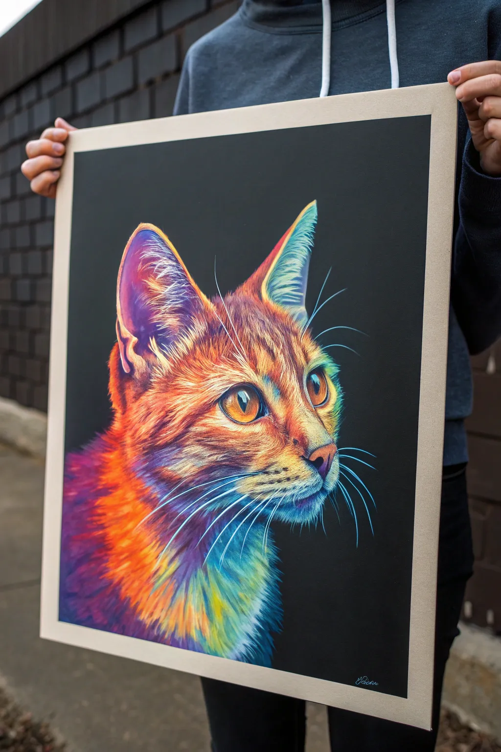
Capture the electric intensity of a thermal camera using traditional art supplies on dark paper. This project combines hyper-realistic fur texture with a striking neon palette to create a mesmerizing, glowing feline portrait.
Step-by-Step Tutorial
Materials
- High-quality black pastel paper or cardstock (A3 or larger)
- Soft pastels (stick form)
- Pastel pencils (fine detail)
- White charcoal pencil
- Kneadsble eraser
- Paper stumps or tortillons
- Fixative spray suitable for pastels
- Reference photo of a cat (thermal filter optional but helpful)
Step 1: Preparation and Sketching
-
Prepare your workspace:
Set up in a well-lit area. Tape your black paper to a drawing board or hard surface using masking tape to keep it flat and create a clean border. -
Outline the subject:
Using a white charcoal pencil, lightly sketch the basic shapes of the cat’s head. Focus on placement—the ears should be large and alert, and the eyes positioned roughly halfway down the face. -
Refine the features:
Gently refine the outline, marking the direction of the fur growth with faint strokes. Pay close attention to the almond shape of the eyes and the triangular nose structure. -
Map color zones:
Lightly circle areas where the ‘heat’ map changes color. Mark where the hot oranges will transition into cool blues and purples on the neck and ears.
Step 2: Base Layers and Eyes
-
Establish the eyes:
Start with the eyes to bring life to the portrait. Use a bright yellow-orange pastel pencil for the iris, blending into a deeper rust tone around the edges. -
Add eye details:
Draw the pupils using black, then add a sharp, pure white highlight to create that wet, reflective look. This anchors the realism immediately. -
Apply base colors to the face:
Using soft pastel sticks, block in the main colors. Lay down vibrant orange on the forehead and nose bridge, transitioning to purple on the cheeks. -
Blend the underlayer:
Use your fingers or a large paper stump to gently rub the pastel into the paper’s tooth. This creates a soft, glowing foundation without distinct fur details yet.
Muddy Colors?
If your bright oranges and blues turn gray where they meet, you are blending too much. Stop rubbing! Layer clean pencil strokes over one another instead of smudging them together.
Step 3: Building Fur Texture
-
Start the fur directions:
Switch to pastel pencils. Beginning at the nose, make short, sharp strokes radiating outward in orange and yellow to mimic short facial hair. -
Layering the ears:
For the ears, use strokes of neon pink and purple on the interior, blending into cool teals at the tips. Keep the strokes loose to represent the tufted texture. -
Transitioning zones:
Where the orange face meets the purple/blue neck, overlap your pencil strokes. I find drawing light hairs over the dark background first helps map the area before filling it in. -
Deepen the shadows:
Don’t be afraid to leave the black paper exposed in the deepest shadow areas, or reinforce them with black pastel pencil to make the bright colors pop more. -
Create the neck ruff:
Use longer, sweeping strokes for the neck fur. Blend stripes of electric blue, purple, and sunset orange, ensuring the strokes follow the curve of the cat’s body layer by layer.
Pro Tip: Keep it Sharp
Thermal portraits rely on contrast. Keep a dedicated scrap of sandpaper nearby to constantly sharpen your pastel pencils; a dull point won’t create those crisp, realistic individual hairs.
Step 4: Fine Details and Highlights
-
Sharpen the whiskers:
With a freshly sharpened white or light blue pastel pencil, draw the whiskers in single, confident sweeping motions. Vary the pressure so they taper at the ends. -
Add ear hairs:
Add fine, wispy white and light blue hairs protruding from the ears. These should look delicate and translucent against the black background. -
Final highlights:
Scumble tiny dots of bright yellow or white on the nose bridge and above the eyes to simulate skin texture and catch the light. -
Texture check:
Step back and look for flat areas. If a spot looks too smooth, add a few crisp pencil strokes on top to reintroduce the fur texture. -
Seal the work:
Once satisfied, lightly mist the drawing with a workable fixative spray. Do this in a well-ventilated area to prevent the pastel from smudging during framing.
Hang your stunning, glowing artwork in a spot that needs a burst of color and watch the eyes follow you across the room
Thermal Butterfly Wings Gradient
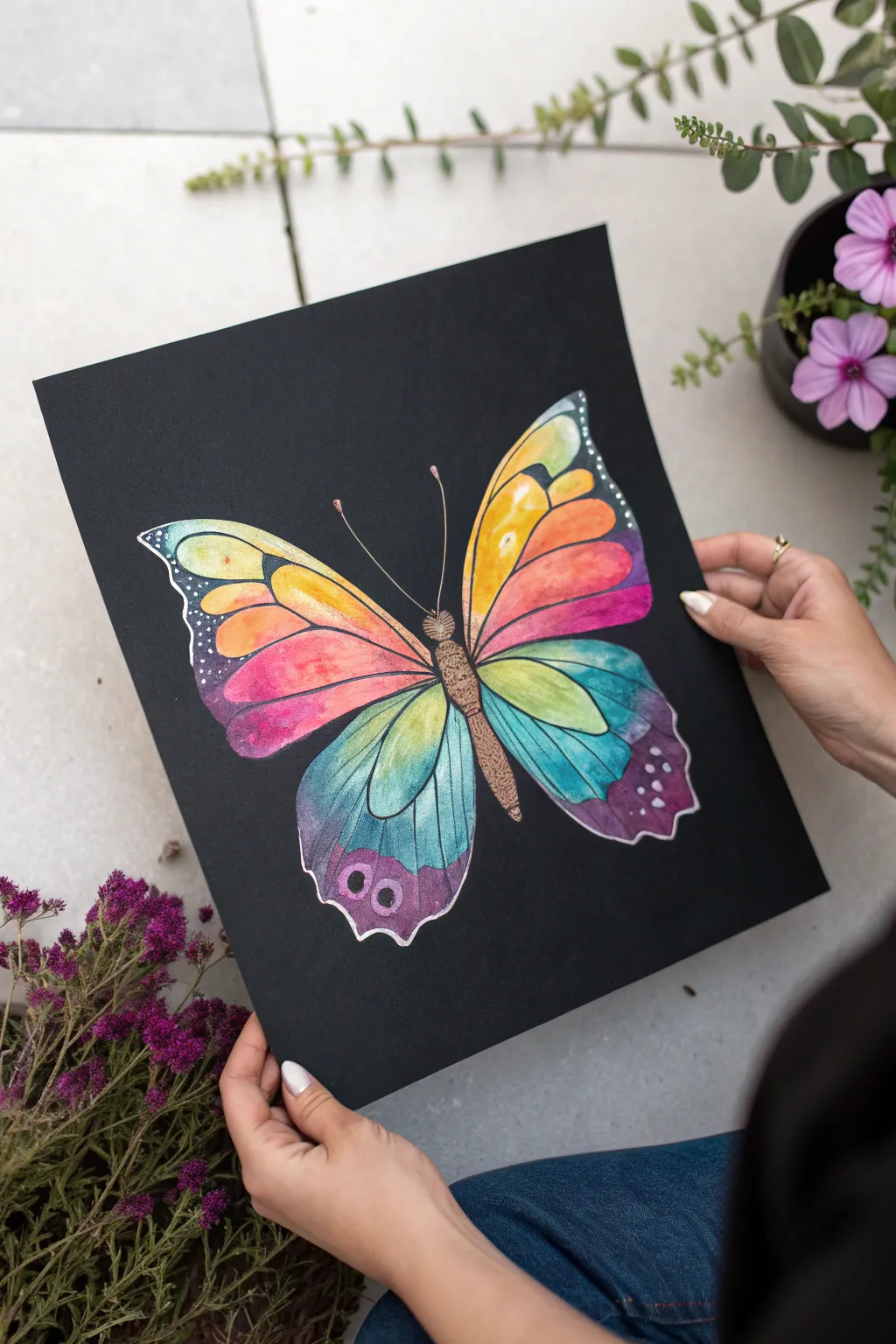
Capture the vibrancy of nature against a striking dark void with this colorful butterfly project. By using opaque paints or thermal-reactive pigments on black cardstock, you create an almost glowing effect that makes the wings pop.
Step-by-Step Guide
Materials
- Heavyweight black cardstock or black watercolor paper
- Pencil (white or metallic)
- White gel pen or fine liner (opaque)
- Gouache paints or opaque watercolors (neon/bright set)
- Small round brush (size 2 or 4)
- Fine detail brush (size 0 or 00)
- Metallic bronze or gold paint
- Water cup and mixing palette
- Paper towel
Step 1: Drafting the Design
-
Establish the symmetry:
Begin by lightly marking a vertical centerline on your black paper with a white pencil to ensure your butterfly sits straight. -
Sketch the body:
Draw an elongated oval for the thorax and a longer, tapered shape for the abdomen along your centerline. Add a small circle for the head. -
Outline the wings:
Sketch the large upper forewings first, swooping out and up from the thorax. Then, draw the lower hindwings, making them slightly rounder with scalloped bottom edges. -
Detail the wing segments:
Lightly draw the veins inside the wings. These lines will separate your color sections, so create teardrop shapes and elongated segments radiating from the body.
Step 2: Applying the Base Colors
-
Prepare your palette:
Set out your bright gouache colors: yellow, orange, pink, teal, and purple. The key is to keep them slightly creamy, not too watery, so they stand out on the black paper. -
Start with the upper wings:
Paint the inner segments of the top wings with a bright yellow, blending into orange as you move outward toward the wing tips. -
Transition to pink:
On the outer edges of the top wings and the upper part of the bottom wings, paint vivid pinks. You can blend the wet paint slightly where the orange meets the pink for a smooth gradient. -
Paint the lower wings:
For the bottom wings, switch to cool tones. Start with a teal or light blue near the center and blend into purple near the bottom scalloped edges. -
Fill the spots:
Locate the small circular details you sketched near the bottom of the hindwings and paint them a contrasting purple or magenta. -
Let it dry completely:
Allow the paint to fully dry. The colors might look slightly chalky as they dry, which is normal for gouache on dark paper.
Opacity Secret
If your watercolors are too transparent for black paper, mix a tiny dot of white gouache or acrylic into your colors to make them opaque pastels.
Step 3: Adding Details and Definition
-
Paint the body:
Use your metallic bronze or gold paint to fill in the head, thorax, and abdomen. Dab the brush to create a fuzzy, textured look. -
Outline in white:
Take your white gel pen or a very fine brush with white paint. Carefully trace over all your initial pencil lines, outlining every wing segment and the exterior of the wings. -
Add the wing veins:
Draw delicate white lines inside the colored sections to represent smaller veins, connecting the segments to the main structure. -
Detail the edges:
Along the outer black margins of the wings, use the white pen to add tiny stippling dots or small dashes. This gives the delicate spotted look seen in nature. -
Draw the antennae:
Using the white pen or metallic paint, draw two long, slender antennae curving outward from the head, ending in small bulbs. -
Refine the contrast:
If any color looks too sheer against the black, carefully add a second coat of paint inside the white outlines, being careful not to cover your linework. -
Final touches:
Review your gradients. If you want a smoother look, I sometimes use a slightly damp brush to soften the transition between the pink and teal sections.
Thermal Twist
Use thermal-chromatic pigment powder mixed with clear medium. The butterfly will change color from black to bright rainbow when you touch it.
Display this striking piece in a bright spot where the contrast can truly shine


Thermal Botanical Leaves as Heat Maps
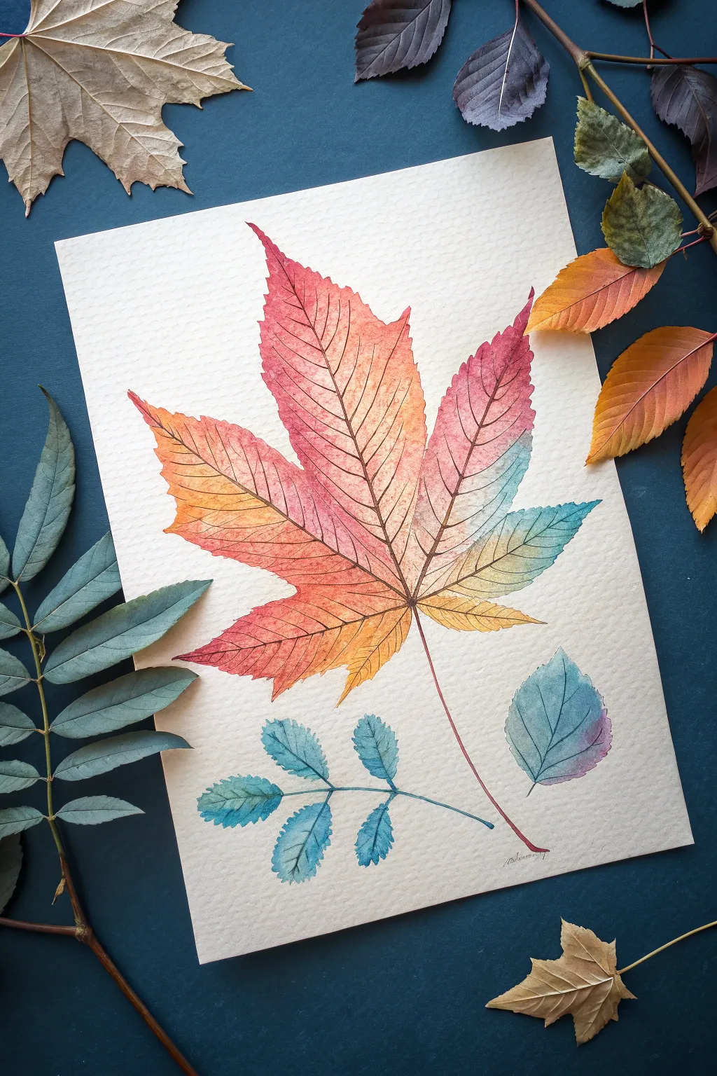
This striking watercolor project reimagines botanical illustration through the lens of a thermal camera, blending warm autumn hues with cool, icy tones. The result is a vibrant, dimensional study that captures the delicate vein structures of leaves against a textured paper background.
Step-by-Step
Materials
- Cold press watercolor paper (300 gsm)
- Watercolor paints (Alizarin Crimson, Cadmium Orange, Lemon Yellow, Phthalo Blue, Turquoise)
- Round watercolor brushes (sizes 2, 4, and 0 for details)
- H-grade pencil for sketching
- Kneaded eraser
- Two jars of water (one for clean, one for dirty)
- Paper towels
- Masking tape (optional)
Step 1: Sketching the Composition
-
Map out the placements:
Begin by lightly marking the positions of the three main elements: a large, central maple-like leaf, a smaller compound leaf at the bottom left, and a single ovate leaf at the bottom right. Keep your pencil strokes extremely faint so they won’t show through the translucent watercolor later. -
Define the main leaf shape:
Sketch the outline of the large central leaf. Focus on the jagged, serrated edges and the five distinct lobes. Don’t worry about perfect symmetry; natural leaves have character in their irregularities. -
Add the smaller botanical elements:
Draw the compound leaf on the left with small, paired leaflets attached to a central stem. Then, sketch the simple, rounded leaf on the right side. Ensure the stems of all three elements converge naturally towards the bottom center without touching. -
Draw the vein structure:
Lightly trace the primary veins running through the center of each leaf and lobe. Add the secondary veins branching off, as these will be crucial guides for your color transitions and fine detailing later. -
Clean up the sketch:
Take your kneaded eraser and gently roll it over the entire drawing. You want to lift up the excess graphite so only a ghost of the image remains visible to guide your painting.
Wet-on-Wet Control
To prevent muddy colors where the orange meets the blue, leave a tiny gap of unpainted damp paper between them. The water will bridge the gap, creating a clean blend.
Step 2: Painting the Thermal Gradient
-
Prepare your palette:
Mix puddles of your key colors: a deep crimson, a vibrant orange, a pale yellow, and a cool turquoise blue. You want these ready to go for wet-on-wet application. -
Wash the large leaf:
Wet the entire surface of the large central leaf with clean water until it glistens. Start dropping in the crimson at the very tips of the top and left lobes. -
Create the warm transitions:
While the red is still wet, introduce the orange paint, letting it blend softly into the red. Move towards the center of the leaf, transitioning from orange to yellow near the veins. Keep the paint fluid to avoid hard edges. -
Introduce the cool tones:
On the right side of the main leaf, drop in your turquoise. Let it touch the yellow and orange sections carefully; where they meet, you might get a soft, neutral green, which adds realism to the thermal look. -
Paint the bottom leaves:
For the compound leaf on the left and the single leaf on the right, use primarily cool blues and teals. Add a tiny touch of purple or crimson to the tips of the right-hand leaf to tie it visually to the main subject. -
Allow for complete drying:
Let the first wash dry completely. The paper must be bone dry before the next step, or the fine lines will bleed. I usually wait at least 20 minutes here.
Step 3: Detailing and Veins
-
Mix a darker vein color:
Create a concentrated mix of crimson with a touch of blue to make a dark, brownish-purple. This will be used for the intricate vein network. -
Paint the primary veins:
Using your size 0 brush, carefully paint the central stem and the main veins running through the lobes of the large leaf. Keep these lines steady and thin. -
Add secondary webbing:
Branching off from the main veins, paint the delicate network of smaller capillaries. Use a very light touch, barely skimming the paper surface to keep the lines crisp and hairline-thin. -
Detail the blue leaves:
Switch to a darker blue or teal mix for the veins on the smaller leaves. Repeat the process of painting the central stems followed by the branching veins. -
Refine the edges:
If any edges of your leaves look too soft or washed out, use a small brush with slightly more concentrated pigment to crisp up the serrated margins. This defines the silhouette against the paper. -
Final stem connection:
Extend the stem of the main leaf downwards with a reddish-brown mix, letting it taper off elegantly at the bottom.
Blooms and Backruns
If you get cauliflower-like textures (blooms), it means your brush had too much water when adding paint to a drying area. Wait for it to dry, then gently glaze over it.
Once the paint is fully cured, you can sign your work and frame it to display your glowing botanical heat map

Have a question or want to share your own experience? I'd love to hear from you in the comments below!