A 3 piece canvas painting (triptych) is such a fun way to make one idea feel bigger, airier, and more dramatic—without painting a single giant canvas. The magic is in how your image flows across the gaps, so those three panels read like one confident statement on the wall.
Ocean Waves With Continuous Motion
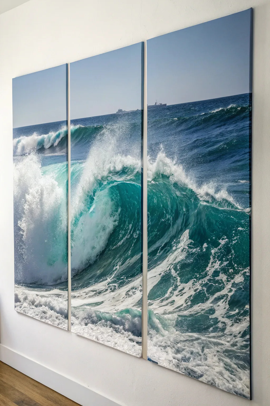
Capture the powerful motion of the sea with this breathtaking three-panel canvas project. Whether you choose to paint it yourself or mount a high-resolution print, splitting the image across multiple canvases creates a window-like effect that brings the ocean right into your room.
Step-by-Step Guide
Materials
- Three large gallery-wrapped canvases (same size, vertical orientation)
- High-resolution reference photo of a crashing wave
- Acrylic paints (Phthalo Blue, Ultramarine, Turquoise, Titanium White, Hookers Green)
- Large flat brushes (2-inch to 4-inch)
- Medium round brushes and fan brushes
- Spray bottle with water
- Gesso (optional for priming)
- Easel or large flat workspace
- Masking tape
- Gloss varnish
Step 1: Preparation and Layout
-
Prepare the workspace:
Lay your three canvases side-by-side on a flat surface or a large easel wall. Ensure they are touching so you can treat them as a single continuous surface during the initial sketching phase. -
Prime the surface:
Apply a coat of gesso across all three canvases if they aren’t pre-primed. This helps the paint glide smoothly across the gap between panels. -
Sketch the wave composition:
Using a diluted wash of blue paint or a soft charcoal pencil, sketch the major lines of the wave. The crest should peak in the center or right panel, with the trough extending into the left. -
Mark the horizons:
Use a level or a long straightedge to ensure the horizon line is perfectly straight and continuous across all three panels. A crooked horizon will ruin the illusion of continuity.
Step 2: Blocking and Underpainting
-
Paint the sky:
Mix a gradient of Phthalo Blue and White. Paint the sky area on all three panels, blending from a darker blue at the top to a pale, almost white blue at the horizon line. -
Block in deep water:
Mix Phthalo Blue, Hookers Green, and a touch of black or purple for the deepest parts of the wave face. Apply this dark base coat aggressively to establish the heavy shadows. -
Establish the mid-tones:
While the dark paint is still tacky, mix Turquoise and White. Start blending this into the wave face where the light hits the water, creating that translucent teal effect. -
Separate the panels:
Once the main blocks of color are established, I actually find it helpful to separate the canvases slightly (about an inch) to paint the wrapped edges. Extend your image over the sides so the artwork looks good from an angle.
Fixing Alignment
If your horizon line jumps noticeably between panels, create a paper template. Tape a long strip of paper across all three panels, mark the correct line, and re-paint the sky edge using the paper as a guide.
Step 3: Creating the Wave Detail
-
Deepen the barrel:
Return to the wave’s interior. Use glazes of dark green and blue to create depth inside the curling barrel of the wave. -
Start the foam patterns:
Using a fan brush and Titanium White, lightly stipple the sea foam on the surface of the water in the foreground. Follow the curve of the water movement. -
Create the crashing lip:
Load a large brush with thick white paint. Apply the crest of the wave using a dabbing motion to simulate the chaotic, exploding water spray. -
Add mist with a spray bottle:
To create the misty spray effect where the wave crashes, apply watered-down white paint and immediately spritz it with your water bottle. Let it drip and disperse naturally. -
Refine the foreground foam:
Use a smaller round brush to paint the intricate, lacy patterns of foam in the foreground water. These should look like stretched networks of bubbles.
Level Up: Texture
Mix heavy gel medium into your white paint for the wave crest. This creates actual 3D texture, making the crashing foam physically pop off the canvas for a tactile effect.
Step 4: Finishing Touches
-
Enhance highlights:
Mix a tiny bit of yellow into your white for the brightest highlights on the wave’s crest where the sun hits directly. This adds warmth and realism. -
distant details:
If desired, add tiny silhouettes of ships or distant land on the horizon line using a very fine brush and grey paint, ensuring they align perfectly across panel gaps. -
Check continuity:
Push the canvases back together. Step back 10 feet and check that your lines—especially the horizon and wave crest—flow seamlessly from one panel to the next. -
Varnish and Seal:
Once the painting is fully dry (wait at least 48 hours for acrylics), apply a coat of gloss varnish. This deepens the dark blues and gives the water a permanent ‘wet’ look. -
Install with precision:
When hanging, use a laser level. Leave strictly uniform gaps (usually 1 to 1.5 inches) between panels to maintain the visual flow without breaking the image.
Step back and admire the refreshing energy this massive seascape brings to your wall

Tree Branch Stretching Through All Three
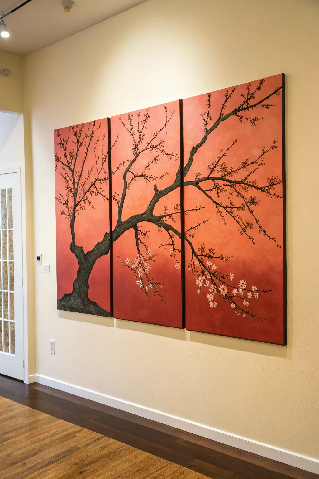
Capture the serene beauty of a sprawling tree branch silhouetted against a warm, glowing sky with this stunning three-panel painting. This project uses a seamless gradient technique to create a cohesive backdrop that makes the twisting dark wood and delicate blossoms pop.
Step-by-Step
Materials
- 3 large stretched canvases (equal size, e.g., 24×36 or 18×24 inches)
- Acrylic paints: Cadmium Red, Cadmium Orange, Yellow Ochre, Titanium White, Mars Black, Burnt Umber
- Large flat paintbrush (2-3 inch) for blending
- Medium round brush
- Small liner brush or rigger brush
- Spray bottle with water (misting)
- Easels or a flat wall space for setup
- Chalk or pastel pencil for sketching
- Palette for mixing
- Water cup and paper towels
Step 1: Setting the Sky
-
Prepare the workspace:
Arrange the three canvases side-by-side with a small gap (about 1-2 inches) between them. It is crucial to paint the background on all three simultaneously to ensure the colors match perfectly across the gaps. -
Mix your gradient colors:
Prepare three piles of paint on your palette: a deep red mixed with a touch of brown for the bottom, a vibrant orange for the middle, and a pale, creamy yellow for the top highlight area. -
Apply the base colors:
Using a large flat brush, quickly block in the colors. Paint the bottom third of all canvases red, the middle orange, and the top yellow. Don’t worry about blending yet; just get the paint on the canvas while it’s wet. -
Blend the gradient:
Clean your large brush and leave it slightly damp. mist the canvases lightly with water if the paint feels tacky. Use long, horizontal sweeping strokes to blend the transition zones where the red meets orange and the orange meets yellow. -
Refine the glow:
Work back and forth across all three canvases until the transition is seamless. I like to add a little extra white to the upper-left corner of the center panel to suggest a hidden light source. -
Let it cure:
Allow the background to dry completely. This is essential because you want a crisp silhouette for the tree, not muddy colors.
Alignment Issues?
If your branches don’t line up perfectly when hung, paint the branch design slightly around the wrapped edge of the canvas. This bridges the gap visually.
Step 2: Sculpting the Tree
-
Sketch the composition:
Use a piece of chalk to lightly sketch the main trunk and primary branches. Start the trunk thick on the bottom of the left canvas, sweeping it up and across into the middle and right panels. Treat the three canvases as one large surface while sketching. -
Mix the trunk color:
Combine Mars Black with a small amount of Burnt Umber. You want a very dark, near-black brown, but not a flat, unnatural black. -
Paint the main trunk:
Using a medium round brush, fill in the main trunk shape on the left canvas. Use uneven, shaky strokes to mimic the texture of rough bark rather than painting perfectly smooth lines. -
Extend the main branches:
Follow your sketch into the second and third panels. As the branch extends to the right, ensure it tapers gradually. Paint right over the edges of the canvas to the side where they meet, so the image wraps slightly around. -
Add secondary branches:
Switch to a smaller brush. Paint thinner branches sprouting from the main limb, reaching upward and outward. Let some branches cross over each other to create depth. -
Detail the twigs:
Use a liner brush with slightly watered-down dark paint. Use a light touch to flick tiny, spindly twigs off the ends of the branches. This fine detail adds the necessary realism.
Step 3: Blossoms and Finishing Touches
-
Highlight the bark:
Mix a dark grey-brown (lighter than your base trunk color). On the left side of the trunk and the tops of the main branches, dry-brush a little texture to show where the light hits the wood. -
Start the blossoms:
Mix Titanium White with a tiny dot of your background red to create a soft pinkish-white. Using a small round brush, dab clusters of simple 5-petal flowers on the lower right branches. -
Add fullness:
Continue adding flowers, focusing heavily on the ends of the drooping branches in the center and right panels. Vary the size of the dots so some look like full flowers and others like closed buds. -
Anchor the tree:
Paint a small, dark mound at the very bottom of the left canvas for the tree roots to disappear into, grounding the composition. -
Final inspection:
Step back and look at the painting as a whole. Check alignment across the gaps and add stray petals drifting in the ‘air’ if the space feels too empty.
Level Up: Texture
Mix heavy gel medium or modeling paste into your black trunk paint. Apply it with a palette knife to create actual raised ridges for 3D bark texture.
Hang your masterpiece with care and enjoy the warmth it brings to your living space
Big Bloom Flower Split Into Three
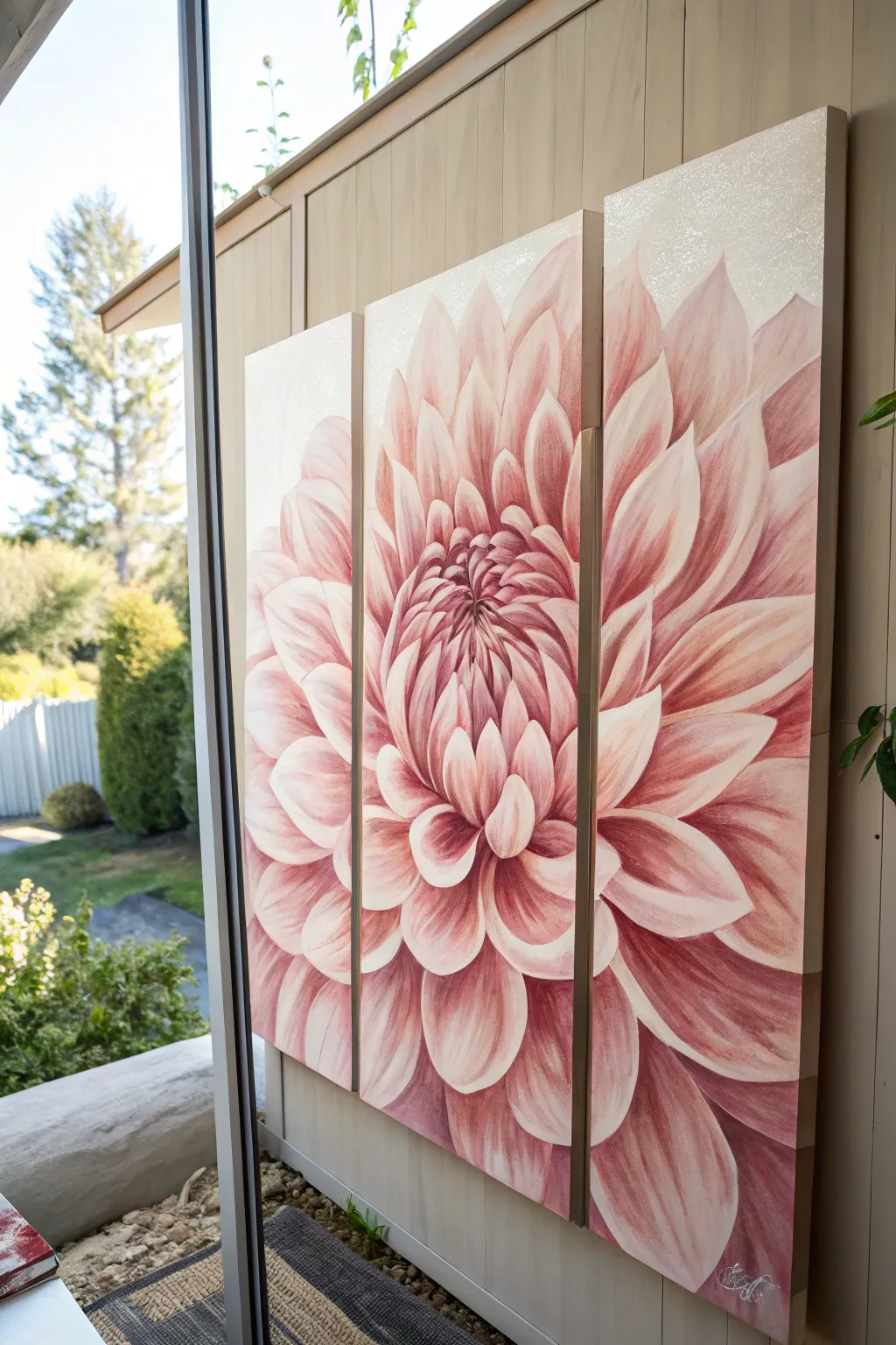
Bring the garden inside with this stunning oversized dahlia painting spread across three canvases. By magnifying a single bloom, you create an abstract yet organic focal point that utilizes soft pinks and creams for a delicate, textured finish.
Detailed Instructions
Materials
- 3 tall rectangular gallery-wrapped canvases (e.g., 24×48 inches each)
- Acrylic paints: Titanium White, Alizarin Crimson, Quinacridone Magenta, Yellow Ochre, Burnt Umber
- Large flat brushes (2-3 inch)
- Medium filbert brushes (for petal shapes)
- Small round brushes (for details)
- Acrylic glazing medium
- Fine iridescent glitter or texture paste (optional for top edge)
- Chalk or pastel pencil (light grey or pink)
- Easel or large wall space
- Reference photo of a dahlia
- Palette and water container
Step 1: Preparation and Sketching
-
Prepare the workspace:
Arrange all three canvases side-by-side on your easel or floor. Ensure they are touching or spaced exactly as you intend to hang them (usually 1-2 inches apart) so your sketch flows continuously across the gaps. -
Base coat the background:
Mix a very pale cream using Titanium White and a tiny touch of Yellow Ochre. Paint the top third of all canvases with this mixture, fading it out as you move down. This creates that soft, light upper background seen in the image. -
Optional texture application:
If you want the subtle sparkle seen in the reference, mix a small amount of fine iridescent glitter into your top coat paint, or dab a thin layer of texture paste near the very top edges for subtle dimension. -
Map the center point:
Locate the center of the flower. In this design, the heart of the bloom sits slightly off-center, predominantly on the middle canvas but leaning toward the right. Mark this spot lightly with chalk. -
Sketch the petals:
Using a light pink pastel pencil or chalk, draw the radiating petals. Start small and tight near the center, and make them large and sweeping as they extend to the outer canvases. ignore the gaps between canvases; draw as if it is one surface.
Step 2: Blocking and Layering
-
Mix your palette:
Create a gradient of pinks on your palette. You’ll need a deep shadow color (Alizarin Crimson + Burnt Umber), a mid-tone pink (Quinacridone Magenta + White), and a highlight color (White + tiny dot of Magenta). -
Paint the shadows first:
Look at the deep crevices between the petals. Use your darkest mix to block in these negative spaces. This establishes the depth of the flower immediately. -
Block in mid-tones:
With a large filbert brush, fill in the main body of each petal with your mid-tone pink. Don’t worry about perfect blending yet; just get the color on the canvas. -
Establish highlights:
Apply the lightest pink mixture to the tips and outer edges of the petals. The petals on the outer left and right canvases should generally be lighter and softer than the tight center.
Glazing Magic
Painting wet-on-wet can get muddy. Let the base layer dry, then use a glazing liquid with semi-transparent paint to build depth without losing your drawing.
Step 3: Detailing and Refining
-
Blend the gradients:
Dip a clean, slightly damp brush into glazing medium. Gently brush over the transition area between your shadow, mid-tone, and highlight on a single petal. The glaze extends dragging time, allowing for a smooth, soft ombre effect. -
Define the center:
I like to use a smaller round brush here. The center petals are tight and curled. Use sharper contrast here—darker darks and brighter highlights close together—to make the center pop. -
Add petal striations:
Mix a slightly darker pink than your mid-tone. Using a fine liner brush, paint delicate lines running from the base of the petal toward the tip to mimic the natural veins of the dahlia. -
Soften the edges:
The background petals should look slightly out of focus. Use a dry mop brush to lightly feather the edges of the outermost petals into the cream background, making them look airy. -
Paint the canvas edges:
Don’t forget the sides of your gallery-wrapped canvas. Continue the lines of the petals over the edges so the image looks complete from a side angle. -
Final highlights:
Mix a pure white with a heavy body texture or just thick paint. Add crisp white lines only on the very tips of the central petals to catch the light.
Lost the Sketch?
If you paint over your lines, project the reference image onto the canvas or re-sketch section by section using a watercolour pencil that dissolves into the paint.
Step back and admire how this split composition turns a simple flower into a bold architectural statement for your room
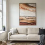
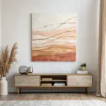
Abstract Color Field With Center Focus
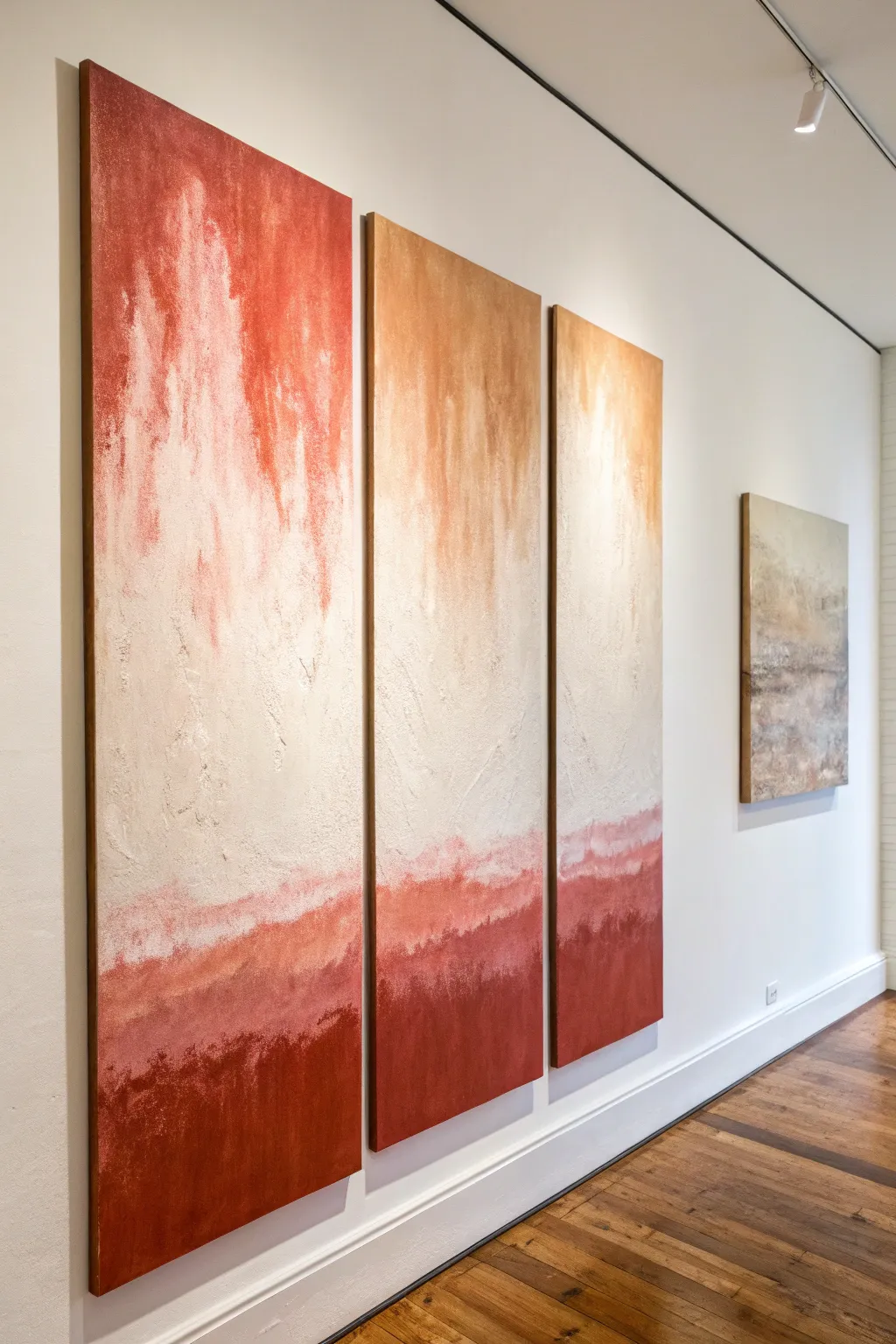
This striking three-piece wall art relies on heavy texture and a dramatic vertical gradient to create an intense, moody focal point. By layering modeling paste with warm earth tones, you’ll build a surface that mimics aged plaster or weather-worn stone.
How-To Guide
Materials
- 3 tall gallery-wrapped canvases (e.g., 24×48 or similar vertical ratio)
- Heavy body acrylic paints (Burnt Sienna, Red Oxide, Unbleached Titanium, White)
- Modeling paste (coarse or regular)
- Large palette knives (trowel shape)
- Wide flat synthetic brushes (3-4 inch)
- Spray bottle with water
- Sandpaper (medium grit)
- Glazing medium (optional)
- Drop cloth
Step 1: Preparation & Texture Base
-
Align the canvases:
Lay your three canvases side-by-side on your workspace or hang them temporarily on a wall with small gaps between them. Seeing them together is crucial for ensuring the horizon lines and texture flows match across the set. -
Apply the modeling paste:
Scoop generous amounts of modeling paste onto the centers of the canvases. Using a large trowel palette knife, spread the paste unevenly across the entire surface. -
Create vertical distressing:
While the paste is wet, drag the flat edge of your knife vertically down from the top third to the middle to create rain-like streaks. I find that varying pressure here creates the most organic, natural fissures. -
Build the lower texture:
For the bottom third, stipple the paste by tapping the flat side of the knife against the canvas. This creates a rougher, rock-like texture where the darkest colors will eventually sit. -
Allow specifically long drying time:
Let the texture dry completely. Depending on thickness, this can take 12-24 hours. Do not rush this step, as painting over wet paste will muddy your texture.
Master the Texture
Add a handful of fine sand to your modeling paste before applying. This gritty mix grabs the paint washes better and adds incredible depth.
Step 2: The Base Layer
-
Sand high peaks:
Once hardened, lightly run medium-grit sandpaper over the sharpest peaks of the paste. You don’t want to remove the texture, just knock down jagged edges that could damage your brushes. -
Apply the neutral base:
Mix Unbleached Titanium with a large amount of White. Paint the entire surface of all three canvases with this off-white cream mixture to seal the paste and provide a uniform starting point. -
Establish the cream zone:
While the base is tacky, add pure White to the center and upper-middle sections, blending it outwards with a wide brush to create a bright, hazy central area.
Muddy Gradient Fix
If your white and red turn pink instead of fading nicely, let the layers dry completely between colors. Glaze the rust over dried white rather than wet-blending.
Step 3: Building the Gradient
-
Mix your darks:
Prepare a deep rust color by mixing Red Oxide with a touch of Burnt Sienna. You want a color that looks like dried clay or brick. -
Anchor the bottom:
Using a fresh wide brush, apply this dark rust mixture heavily along the bottom edge of all three canvases, painting upwards about 10-12 inches. -
Create the lower transition:
Dip your dirty brush into a little water or glazing medium. Feather the top edge of the dark section upwards into the white area. Use vertical strokes to verify the transition is jagged and uneven, rather than a straight line. -
Add the ‘bleed’ from the top:
Mix a watery wash of Burnt Sienna (more golden brown). Lightly brush this from the very top edge downwards, letting it streak naturally into the white center. -
Connect the panels:
Step back and check the three pieces. Ensure the dark horizon line at the bottom feels continuous across the gaps, adjusting heights where necessary to maintain flow.
Step 4: Finishing Touches
-
Direct drip technique:
Spray a light mist of water onto the upper rust section. Let gravity pull faint drips of colored water down into the cream center, mimicking the natural weathering seen in the reference photo. -
Dry brush the texture:
Once the paint is dry to the touch, take a dry brush with a tiny amount of pure White. Lightly skim it over the dark bottom section to highlight the ridges of the modeling paste. -
Paint the edges:
Don’t forget the sides of your gallery-wrapped canvas. Extend the design and colors around the edges for a professional, frameless look. -
Final seal:
If desired, apply a matte varnish to protect the surface and unify the sheen of the different paint thicknesses.
Hang your new masterpiece with about 2-3 inches of spacing between canvases to let the composition breathe
BRUSH GUIDE
The Right Brush for Every Stroke
From clean lines to bold texture — master brush choice, stroke control, and essential techniques.
Explore the Full Guide
Forest Silhouettes With Misty Depth

Capture the serene grandeur of a foggy mountain forest with this striking three-piece canvas project. By layering shades of teal and forest green, you will create a sense of infinite depth and atmospheric mystery right on your wall.
Step-by-Step Guide
Materials
- 3 large vertical canvases (equal size, e.g., 24×48 inches)
- Acrylic paints: Carbon Black, Titanium White, Phthalo Green, Hooker’s Green
- Large flat brush (2-3 inch)
- Medium round brush
- Fan brush (stiff bristles)
- Fine liner brush
- Mixing palette or paper plates
- Water spray bottle
- Easel or wall space for vertical painting
Step 1: Setting the Atmospheric Background
-
Arrange the canvases:
Place your three canvases side-by-side on your easel or floor. You need to paint across all three simultaneously to ensure the horizon lines and gradients match perfectly. -
Mix the sky color:
Create a very pale, milky grey-white. Mix a larger amount of Titanium White with a tiny dot of black and the smallest whisper of Phthalo Green. -
Paint the upper gradient:
Using your large flat brush, cover the top third of all three canvases with this pale mixture. Use horizontal strokes to keep it smooth. -
Establish the mist layer:
Mix a slightly darker, blue-grey shade. Blend this into the bottom of your sky color while the paint is still wet, pulling it down to the middle section of the canvases. This transitional zone creates the ‘fog’.
Step 2: Building the Distant Forest
-
Mix the distant tree color:
Combine Titanium White with a small amount of Phthalo Green and a touch of black. The goal is a ghostly, pale teal-grey that is just slightly darker than your mist background. -
Block in distant shapes:
With a medium round brush, dab in vague tree shapes in the middle band of the canvas. These don’t need sharp details; just suggest the pointed tops of evergreens peeking through the fog. -
Soften the edges:
Immediately use the spray bottle to lightly mist these distant trees, or use a dry clean brush to blur their edges. This pushes them into the distance. -
Create the middle ground:
Mix a medium teal-green (less white, more Hooker’s Green and Phthalo Green). Paint a layer of trees below and slightly overlapping the distant pale ones. -
Texture the middle trees:
Switch to your fan brush. Tap the brush vertically to simulate pine needles on these middle-ground trees. Keep the bottom of this layer misty by blending it out with a little white paint.
Muddy colors?
If your greens are turning brown or muddy, clean your brush water immediately. Acrylic residue builds up fast. Keep two jars: one for dirty rinse, one for clean water.
Step 3: The Foreground Giants
-
Prepare the darkest shade:
Mix your darkest value: Hooker’s Green mixed with Carbon Black. It should look nearly black but retain a rich green undertone. -
Place the main focal trees:
Decide where your giant foreground trees will stand. In the reference, there is one dominant tree on the left canvas and one on the right canvas. Draw a straight vertical line for the trunk using a liner brush. -
Paint the treetops:
Using the fan brush turned vertically, tap gently at the very top of the trunk lines to create narrow, delicate evergreen tips. -
Flesh out the branches:
Work your way down the trunk with the fan brush, rocking it back and forth. Make the strokes wider as you descend to create the conical shape of the evergreens. -
Add foliage density:
I like to go back over the thickest parts of the branches with more dark paint to fill in gaps, ensuring these foreground trees look solid against the misty background. -
Fill the bottom area:
Use the dark mix to fill the bottom quarter of the canvases with dense forest tops. Vary the heights slightly so it doesn’t look like a solid wall. -
Bridge the gaps:
Step back and check the seams between canvases. Ensure a branch started on the left canvas continues naturally onto the middle canvas if they are meant to touch. -
Add final highlights:
Mix a tiny bit of the middle-ground teal. Lightly tap this onto a few tips of the dark foreground trees to suggest a bit of reflected light, but keep it subtle.
Level Up: Scale
For massive impact, paint the foreground trees so the tops go off the top edge of the canvas. This ‘cropped’ look makes the viewer feel like they are standing inside the forest.
Now step back and admire how your separate panels come together to form a single, breathtaking view
City Skyline Split At the Edges
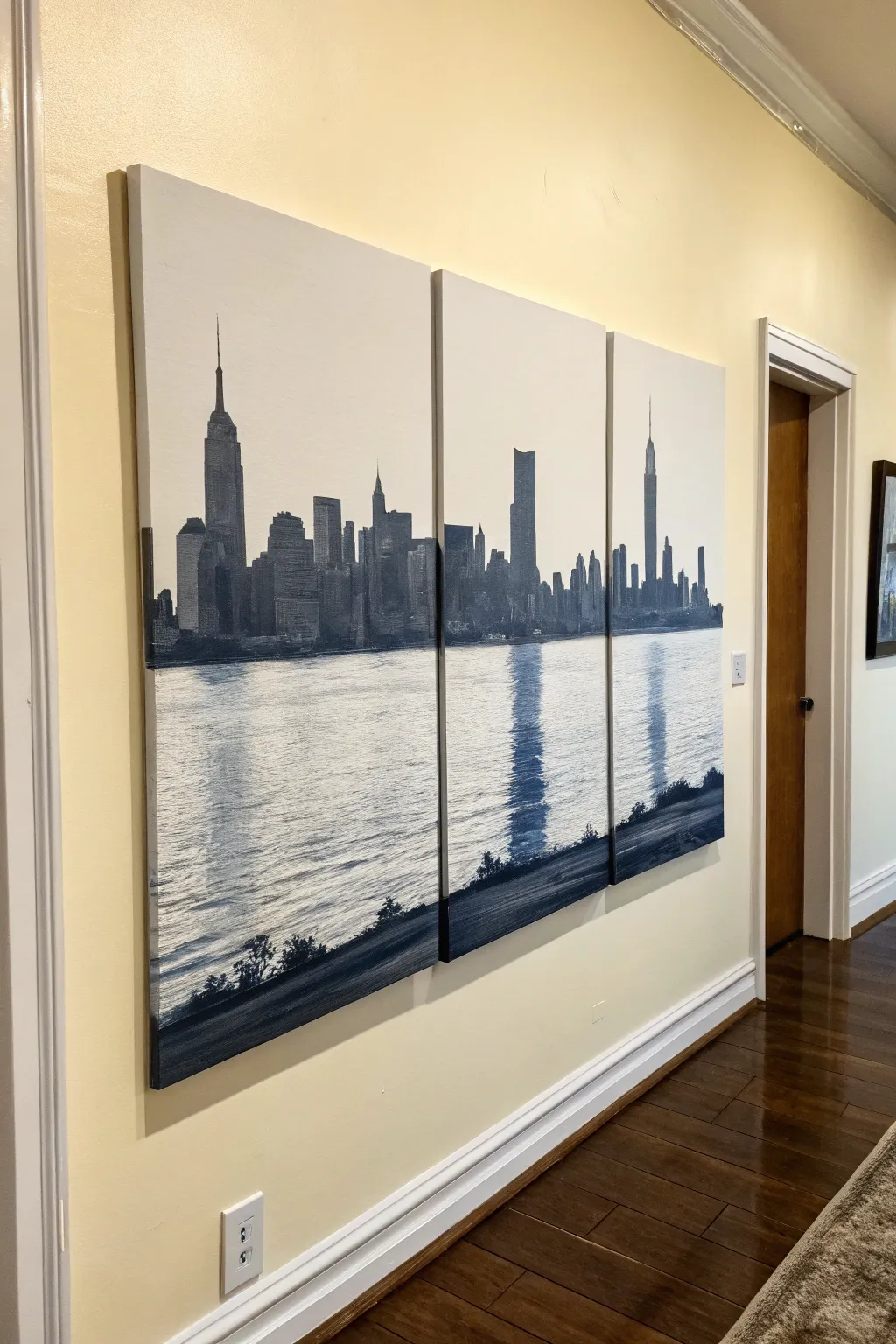
Bring the grandeur of the city skyline into your home with this stunning grayscale triptych. By splitting a single panoramic image across three large canvases, you create a modern, window-like effect that adds depth and architectural interest to any hallway or living space.
Detailed Instructions
Materials
- Three large gallery-wrapped canvases (e.g., 24×36 inches each)
- Black and white acrylic paint (heavy body preferred)
- Wide flat brush (2-3 inch) for backgrounds
- Detailed round brushes (sizes 0, 2, and 4) for buildings
- Long flat ruler or T-square
- Graphite transfer paper or a projector
- High-resolution reference photo of a city skyline
- Painter’s tape
- Matte or satin varnish
- Easel or large flat work surface
- Water container and palette
Step 1: Preparation and Layout
-
Prepare the canvases:
Lay your three canvases side-by-side on the floor or a large table. Leave a small gap (about 1-2 inches) between them to simulate how they will hang on the wall. This gap ensures your image flows naturally across the negative space. -
Prime the surface:
Even if your canvases are pre-primed, apply a fresh coat of white gesso or white acrylic paint to all three surfaces. This creates a uniform texture and brightness, which is crucial for the water reflections later. -
Establish the horizon:
Using a long ruler, draw a light horizontal line across all three canvases where the water meets the city. Position this about one-third of the way up from the bottom for a balanced composition. -
Transfer the skyline:
Project your reference image onto the canvases. If you don’t have a projector, can print your reference photo large-scale (split into three parts), tap graphite paper behind it, and trace the main outlines of the buildings. Focus on the silhouettes.
Alignment Issues?
If your lines don’t match up across canvases, lean the artworks together on the floor. Use a ruler to bridge the gap and pencil in correction marks before repainting the transition points.
Step 2: Painting the Cityscape
-
Block in the skyscrapers:
Mix a dark charcoal grey using black and a touch of white. Using a medium flat brush, fill in the solid shapes of the buildings. Don’t worry about windows yet; just get the solid silhouette established against the white sky. -
Define the edges:
Switch to a smaller round brush to refine the tops of the buildings, antennas, and spires. Sharp, crisp edges are vital here to distinguish the architecture from the background. -
Add atmospheric perspective:
For buildings that act as a ‘second row’ behind the main skyline, mix a lighter shade of grey. Paint these with slightly softer edges to push them into the distance. -
Detail the architecture:
Once the silhouettes are dry, use your smallest brush to add subtle texture. Dry brush a little lighter grey vertically on the sun-facing sides of the buildings to suggest depth and form.
Glow in the Dark
Mix a tiny amount of glow-in-the-dark medium with white paint and dot it into the building silhouettes. When the lights go out, your city skyline will light up with ‘windows’ at night.
Step 3: Creating the Water and Reflections
-
Start the water base:
The water area should remain predominantly white or very light grey. Ensure your original white background is clean, touching it up if necessary. -
Draft the reflection shapes:
Look at where the tallest buildings sit. Lightly sketch mirror images of these shapes extending downward into the water area, but make them longer and more distorted. -
Paint horizontal motion:
Load a flat brush with watered-down grey paint. Using horizontal, side-to-side strokes, paint the water texture. Let the white of the canvas show through significantly to create the shimmer effect. -
Build the deep reflections:
Identify the darkest reflection points (usually directly under the largest buildings). Use a darker grey and horizontal strokes to concentrate color here, mimicking the vertical dominance of the reflection broken by waves. -
Add the foreground shore:
Paint a dark, solid strip along the very bottom of the canvases to represent the near shore or highway. This grounds the image. I find diagonal brushstrokes here help suggest movement along the road. -
Texture the foreground:
Stipple or dab dark paint along the top edge of this bottom strip to suggest bushes, trees, or uneven terrain along the shoreline.
Step 4: Final Touches and Assembly
-
Review the flow:
Step back and look at the three canvases together. Ensure the horizon line and the tips of the buildings align visually from one canvas to the next correctly. -
Paint the canvas sides:
Don’t forget the edges! Paint the sides of the canvas (the gallery wrap depth) to match the image adjacent to it. For the sky area, paint the sides white; for the water, light grey; and continue the dark building shapes around the sides. -
Varnish the set:
Once the paint is fully cured (give it 24 hours), apply a varnish. A satin finish works beautifully to protect the paint without creating distracting glare on the dark areas. -
Install with precision:
When hanging, ensure you maintain that specific gap width you planned for earlier. Use a level extensively to keep that horizon line perfectly straight across the wall.
Now you have a sophisticated, expansive view of the city that opens up your room without needing a renovation

PENCIL GUIDE
Understanding Pencil Grades from H to B
From first sketch to finished drawing — learn pencil grades, line control, and shading techniques.
Explore the Full Guide
Galaxy Nebula With Seamless Stars
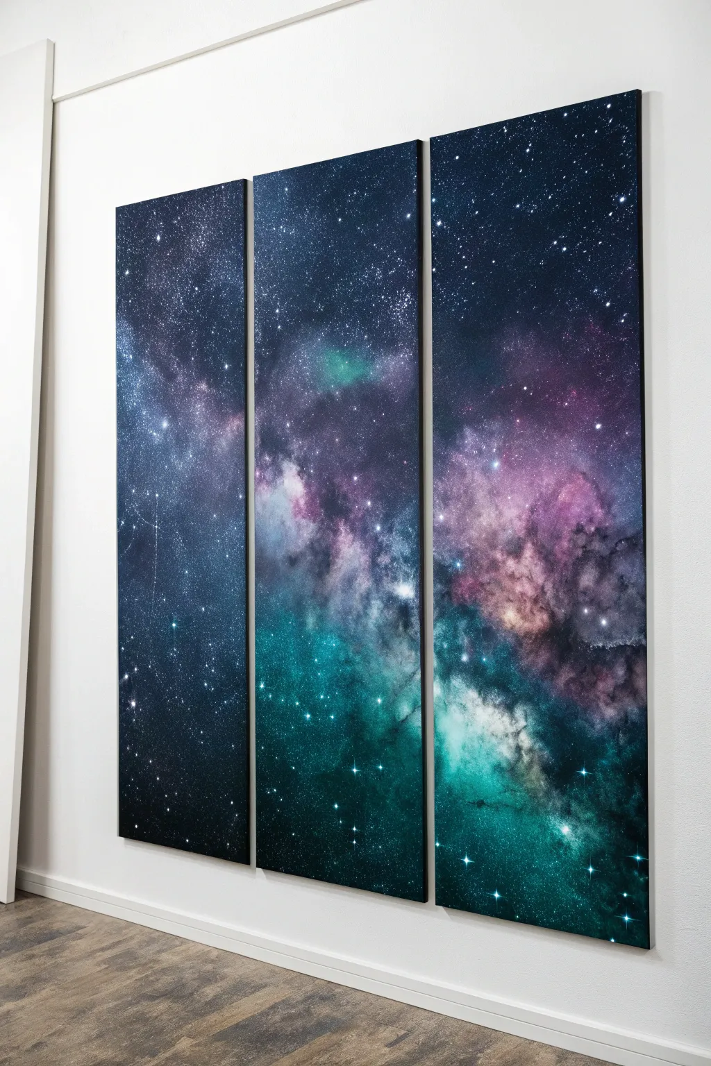
Bring the mysteries of deep space into your living room with this stunning three-piece canvas set. You’ll layer rich acrylics to form nebulas of violet, teal, and indigo that flow perfectly across separate panels for a unified, seamless horizon.
How-To Guide
Materials
- Three tall artist canvases (12×36 or similar)
- Black acrylic paint (heavy body)
- Acrylic paints: Phthalo Blue, Dioxazine Purple, Teal or Turquoise, Magenta, Titanium White
- Sponge set (sea sponges and high-density foam sponges)
- Wide flat synthetic brush (for base coat)
- Round bristle brush (small and stiff)
- Old toothbrush
- Mixing palette or paper plates
- Cup of water and paper towels
- Masking tape (for backs of canvases)
Step 1: Preparation and Base Coat
-
Align the canvases:
Lay your three canvases side-by-side on a protected work surface, pushing them together so they touch completely. You want to paint them as if they are one giant surface to ensure the nebula flows seamlessly. -
Secure the alignment:
Flip the canvases over carefully and use masking tape to bridge the gaps on the back. This temporarily holds them together so they don’t shift while you work on the front. -
Paint the void:
Using your wide flat brush, coat the entire surface of all three canvases with a solid layer of black paint. Ensure you paint the outer edges and sides now for a professional gallery-wrap finish. -
Let it cure:
Allow this black base coat to dry completely. A fully dry background is crucial so your colorful nebula layers sit on top rather than mixing into a muddy gray.
Muddy Nebula Fix
If colors are turning gray, stop! Let the layer dry completely. Apply a thin glaze of pure color mixed with water over the muddy area to restore vibrancy without adding opacity.
Step 2: Building the Nebula
-
Map the nebula path:
Dampen a sea sponge slightly and wring it out well. Dip it into Phthalo Blue mixed with a tiny drop of black. Lightly sponge a diagonal, organic cloud shape starting from the bottom right of the third panel, flowing up through the middle, and ending near the top left of the first panel. -
Add deep purples:
Switch to a clean area of your sponge or a new one. Load it with Dioxazine Purple. Stipple this color alongside and slightly overlapping the blue areas, focusing on the upper portions of the nebula cloud. -
Introduce teal vibrancy:
Using the Teal paint, sponge the lower and central sections of your nebula shape. This will be the brightest part of the gas cloud. Use a light hand; you want a soft, smoky texture, not hard blobs. -
Blend the transitions:
While the paint is still slightly tacky, use a dry, clean sponge to gently dab the areas where purple meets teal or blue. This creates that ethereal, gaseous fade characteristic of deep space photography. -
Create depth with black:
Load a sponge lightly with black paint. Gently dab over areas that became too bright or uniform. This ‘negative painting’ technique creates pockets of deep space within the nebula cloud.
Step 3: Highlights and Gases
-
Lighten the core:
Mix a small amount of Titanium White with your Magenta to make a soft pink, and white with Teal for a pale mint. Sponge these lighter shades very sparingly into the absolute centers of your purple and green clusters. -
Soften the edges:
I like to take a nearly dry sponge with a tiny bit of the dark blue and whisper it over the outer edges of the entire nebula shape, fusing it gently back into the black void background. -
Dry break:
Step back and let the nebula layers dry. The next step involves splatter, so you don’t want to wet-blend the stars into the clouds.
Glow In The Dark
Mix glow-in-the-dark medium into your final white star splatter. In daylight, it looks normal, but at night, your galaxy will reveal a hidden, glowing star map.
Step 4: Starlight and Finishing
-
Prepare the stars:
Dilute a small dollop of Titanium White with water until it reaches an ink-like consistency. It needs to be fluid enough to fly off a brush. -
Create distant stars:
Dip an old toothbrush into the thinned white paint. Point the bristles toward the canvas and run your thumb along them to spray a fine mist of tiny stars across the entire piece. -
Paint major stars:
Use a small round brush to manually dot larger, brighter stars in clusters, particularly within the denser parts of the nebula clouds. -
Add ‘lens flare’ stars:
Select 3-5 of your largest white dots. Using the very tip of a fine liner brush, paint a cross shape through them to mimic the diffraction spikes seen in telescope photos. -
Separate the panels:
Once the paint is fully dry, flip the artwork over and remove the masking tape. Use a craft knife to slice through the paint bridging the gaps between canvases if they are stuck together. -
Touch up edges:
Check the inner edges of the separate canvases. If white canvas is showing where they were joined, use a small brush and black paint to carefully cover the exposed strip so the image looks continuous even when hung with gaps.
Hang these vertical panels with an inch of space between them to let your seamless galaxy span the wall
Vertical Panel Trio for Tall Wall Drama
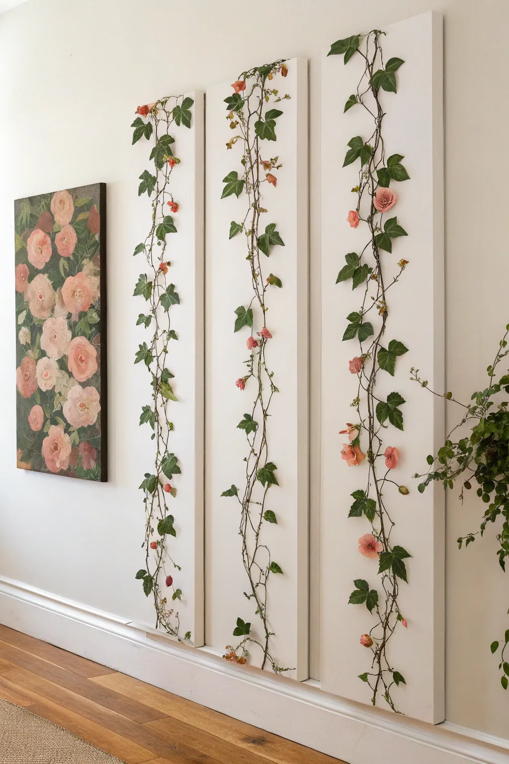
Bring the outdoors in with this elegant triptych that transforms simple canvases into a living wall illusion. By mounting realistic faux vines across three tall, narrow panels, you create visually striking vertical drama without the maintenance of real plants.
Detailed Instructions
Materials
- 3 tall, narrow stretched canvases or white wooden panels (e.g., 12×48 inches)
- Faux ivy vine garlands (wire-stemmed)
- Faux petite pink rose stems or garlands
- Hot glue gun and clear glue sticks
- Floral wire cutters
- Small white command hooks (optional, for removable mounting)
- Pencil
- Matte white acrylic paint (if using wood panels or touching up canvas)
- Small floral pins or U-pins
Step 1: Planning and Preparation
-
Prepare the Base:
If you are using raw wooden panels, prime and paint them with matte white acrylic paint. For pre-stretched canvases, ensure the surface is clean and taut. Lay all three panels side-by-side on large flat surface, leaving about 2-3 inches of space between them to simulate how they will hang on the wall. -
Map the Vine Path:
Before gluing anything, take your main ivy garlands and lay them loosely across the three panels. The goal is to create a continuous, organic flow that starts from the bottom and winds upward. -
Visualize the Breaks:
Pay special attention to the gaps between panels. The vine should look like it ‘jumps’ across the empty wall space, so ensure the exit point on one canvas aligns visually with the entry point on the next. -
Trim the Garlands:
Using floral wire cutters, snip the main garland into manageable sections. It is much easier to work with shorter lengths (gluing one section per panel) rather than trying to wrestle one long continuous vine across three separate movable objects.
Natural Texture
Mix two different shades of faux ivy (one darker, one variegated) to create depth and prevent the greenery from looking too flat or plastic.
Step 2: Attaching the Greenery
-
Anchor the Base:
Start at the bottom of the first panel. Apply a small bead of hot glue to the main stem of your vine and press it firmly onto the canvas. Hold for 10-15 seconds until the glue sets. -
Shape the Flow:
Gently bend the wired stem to create soft S-curves as you work your way up the canvas. You want natural meandering, not a straight line. Glue the stem down every 4-6 inches at key curve points. -
Secure the Leaves:
Once the main stem is secure, go back and spot-glue individual leaves. Turn some leaves slightly sideways or overlapping the stem to hide the wire and create dimension. -
Add the Rose Accents:
Snip individual pink rose heads or small clusters from your secondary garland. I prefer to strip the plastic calyx off the back so they sit flatter against the canvas. -
Position the Blooms:
Nestle the roses into the ivy at random intervals. Place them near leaf clusters to make them look like they are sprouting naturally from the vine rather than floating in white space. -
Glue the Flowers:
Apply a generous amount of hot glue to the base of the flower and press it onto the canvas, tucking it slightly under a nearby ivy leaf for a seamless integration.
3D Effect
Add 3D butterflies or small faux birds perching on the vines to bring a whimsical narrative element to your botanical scene.
Step 3: Refining and Hanging
-
Check the Transitions:
Move to the second and third panels. Ensure the vine placement at the edges matches up with the previous panel. The eye should easily travel from left to right without jarring interruptions. -
Fill the Gaps:
Step back and look for bald spots. Use leftover single ivy leaves to fill in any areas where the main stem looks too bare or where a glue glob might be visible. -
Add Delicate Tendrils:
If your vine kit came with thin, wispy tendrils, glue these at the very top of the arrangement to give it a growing, reaching effect. -
Clean Up:
Once all glue is completely dry, gently pull away all those inevitable hot glue strings (spiderwebs). A hairdryer on a low, cool setting can help blow the tiny ones away. -
Install the Artwork:
Hang the panels on the wall, using a level to ensure they are perfectly straight. Maintain the 2-3 inch gap you planned for to keep the continuous vine illusion intact.
Now you have a refreshing, maintenance-free garden feature that adds height and life to your walls


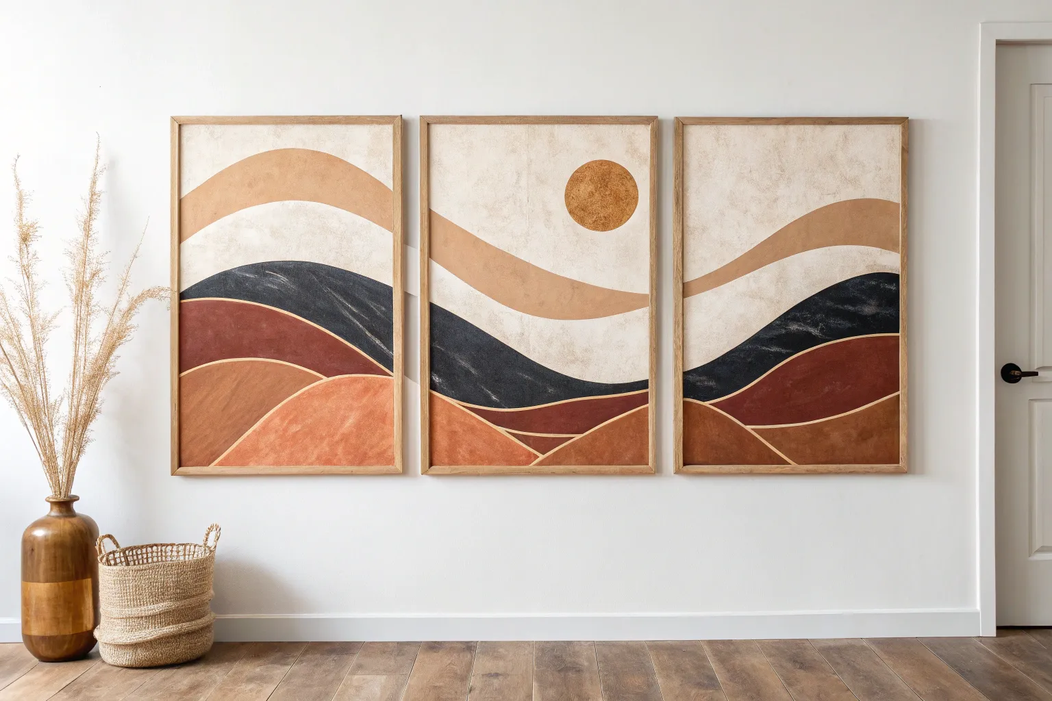
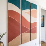
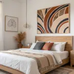
Negative Space Gaps as Part of the Design
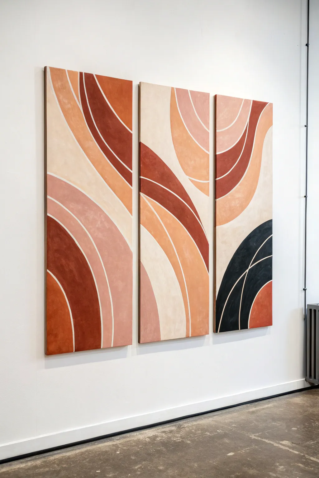
This striking three-piece wall art merges warm, earthy tones with bold, curved geometry that flows seamlessly across separate canvases. The design uses negative space to create crisp white lines between the colors, resulting in a modern, organic aesthetic perfectly suited for minimalist interiors.
Step-by-Step Guide
Materials
- 3 large rectangular stretched canvases (e.g., 24×60 inches)
- Acrylic paints (terracotta, burnt sienna, peach, cream, beige, black/dark navy)
- White gesso (optional, for priming)
- Fine-grit sandpaper
- Pencil
- Long flexible ruler or string
- Painter’s tape (1/4 inch width)
- Flat shader brushes (various sizes: 1-inch and 2-inch)
- Round detail brush
- Palette or mixing tray
- Matte varnish
Step 1: Preparation & Sketching
-
Prime the Surface:
Begin by applying a coat of white gesso to all three canvases if they aren’t pre-primed. This ensures a bright white base for your negative space lines. Once dry, lightly sand the surface with fine-grit sandpaper for a smoother painting texture. -
Arrange the Triptych:
Lay the three canvases on the floor or lean them against a wall side-by-side, leaving about a 1-inch gap between them. This helps you visualize the continuous flow of the design across the separate panels. -
Plan the Curves:
Using a pencil, lightly sketch the large swooping arches. Start from the bottom left of the first canvas, sweeping up towards the top right of the third canvas. Use a long flexible ruler or a piece of string pinned at a focal point to act as a giant compass for smoother curves. -
Define the Zones:
Continue adding concentric curved lines to create bands of varying widths. Pay close attention to where lines exit one canvas and enter the next to ensure visual continuity. Don’t worry about perfection; organic variations add character.
Step 2: Masking & Color Blocking
-
Apply Tape for Separation:
To create the crisp white lines between colors, carefully apply the 1/4 inch painter’s tape along your pencil lines. Press the edges of the tape down firmly with your thumbnail or a credit card to prevent paint bleed. -
Seal the Tape Edges:
Here I prefer to brush a very thin layer of white paint or matte medium over the tape edges. This creates a seal so that if any paint bleeds under, it’s clear or white, keeping your final color lines sharp. -
Mix Your Palette:
Prepare your acrylic colors. You’ll need a gradient of warm tones: a deep burnt orange, a mid-tone terracotta, a soft peach, a sandy beige, and a creamy off-white. Also, mix a deep charcoal or soft black for the contrast element. -
Start with the Darkest Tones:
Begin painting the darkest sections first, such as the deep reddish-brown arches and the black corner on the third canvas. Use a flat brush and apply the paint in smooth strokes following the curve of the tape. -
Apply Mid-Tones:
Move on to the terracotta and peach sections. Apply two thin coats rather than one thick coat to ensure opaque, solid coverage without visible brushstrokes. -
Paint the Light Areas:
Fill in the remaining sections with the beige and cream tones. Since these lighter colors can be translucent, allow the first coat to dry completely before assessing if a third coat is needed for full opacity.
Curve Master
Can’t freehand a smooth arch? Use a push pin, a string, and a pencil. Pin the string to the floor (or pivot point) and tie the pencil to the other end to draw perfect large-scale arcs.
Step 3: Refining & Finishing
-
Remove the Tape:
This is the satisfying part. Once the paint is touch-dry (but not fully cured), carefully peel off the painter’s tape at a 45-degree angle. Pull slowly to ensure clean edges. -
Touch Ups:
Inspect your white lines. If any paint has bled through, use a small flat brush with titanium white paint to carefully conceal the error. If a colored edge looks jagged, smooth it out with a round detail brush and the corresponding color. -
Paint the Edges:
Don’t forget the sides of the canvas especially for gallery-wrapped styles. Continue the design around the edges or paint them a solid neutral color for a framed look. -
Final Varnish:
Allow the entire artwork to cure for at least 24 hours. Once fully dry, apply a coat of matte varnish. This will unify the sheen of the different paint colors and protect the surface from dust and UV light. -
installation:
When hanging the finished pieces, use a level and ensure you maintain the negative space ‘gap’ between the canvases that matches the flow of your painted lines.
Bleeding Lines?
If you peel the tape and see fuzzy edges, don’t panic. Wait for the color to dry completely, then use a stiff, angled brush with heavy body white paint to ‘cut in’ and sharpen the line manually.
Step back and admire how the negative space guides your eye across the warm waves of your new masterpiece
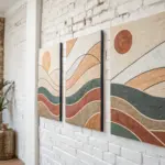
Mixed-Media Collage Triptych With Unified Palette
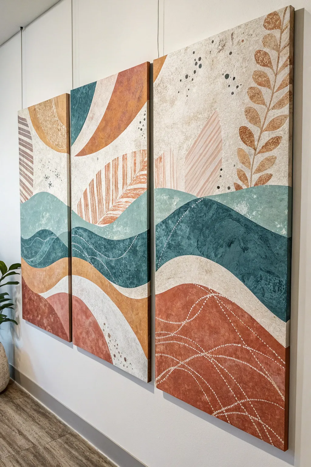
Bring warmth and movement to your walls with this sweeping abstract landscape that flows across three large canvases. By combining bold undulating curves with delicate textures like stippling and leaf motifs, you will create a unified statement piece perfect for modern bohemian interiors.
Detailed Instructions
Materials
- 3 large stretched canvases (e.g., 24×36 inches each)
- Acrylic paints: Terracotta/Rust, Teal/Deep Green, Beige/Sand, White, Burnt Orange
- Modeling paste or texture gel
- Palette knives (assorted sizes)
- Large flat brushes (2-3 inch)
- Medium round brushes
- Painter’s tape or masking tape
- White paint pen or small detail brush
- Pencil for sketching
- Stencils (optional, for leaf shapes) or stiff cardstock
- Old toothbrush or bristle brush for spattering
- Easel or large flat work surface
Step 1: Planning and Underpainting
-
Prepare the workspace:
Lay your three canvases side-by-side on a flat surface or mount them on a wall temporarily. It is crucial that they touch or are spaced exactly as they will hang so your lines flow continuously across the gaps. -
Sketch the flow:
Using a light pencil, draw your main horizon lines. Create rolling hills and valleys that start on the left canvas, dip and rise through the middle, and exit on the right. Aim for 4-5 distinct horizontal bands of color. -
Apply base texture:
Before adding color, mix some modeling paste with a little white paint. Use a palette knife to apply this to the bottom-most ‘hill’ sections to create a rough, earthy grain. Let this layer dry completely, usually for about 2-4 hours depending on thickness.
Step 2: Blocking in Color
-
Paint the bottom section:
Start with the lowest wavy section using your Terracotta or Rust color. Paint right over the dried texture paste, letting the roughness catch the paint naturally. -
Create the teal mid-ground:
For the middle bands (the rolling hills), mix a deep Teal or Green-Blue. Apply this smoothly with a large flat brush, ensuring the curves are crisp against the neighboring sections. I tend to add a drop of water to improve the flow for these long, sweeping strokes. -
Add the upper hills:
Paint the sections above the teal in shades of Burnt Orange and Golden Beige. Vary the movement of your brushstrokes—maybe using vertical strokes for one hill and horizontal for another—to distinguish the shapes. -
Fill the sky:
Use a mix of White and Beige/Sand for the topmost sky area. Keep this application somewhat sheer or uneven to mimic an atmospheric, cloudy look rather than a flat, solid wall of color.
Uneven Flow?
If your lines don’t match up across canvases, push the canvases together tightly. Repaint the transition area with a thick layer of paint to bridge the gap and smooth the line.
Step 3: Details and Motifs
-
Add the leaf motif:
On the far right canvas, draft a large, climbing leaf stem. Use a medium brush with a golden-brown mix to paint the leaves. You can create a ‘stamped’ look by pressing a sponge cut into a leaf shape, or just freehand it for a more organic feel. -
Create ghostly leaves:
In the middle and left panels, add fainter leaf or feather shapes in the upper beige sections. Mix your paint with a glazing medium or water to keep these semi-transparent, so they look like they are in the distance. -
Apply stippled texture:
Dip an old stiff brush or flat-head stencil brush into black or dark grey paint. Wipe most of it off, then dab (stipple) clusters of small dots in the upward curves of the sky area to add visual weight and interest. -
Paint the white wave lines:
Once the teal and terracotta sections are fully dry, use a fine liner brush or a white paint pen to draw delicate, erratic wave lines. These should follow the flow of the hills, mimicking topographical map lines. -
Add dotted trails:
Using the same white tool, add trails of dots weaving through the bottom rust-colored section. These dotted lines add a sense of movement and intricate detail to the otherwise heavy blocks of color.
Textural Depth
Mix sand or coffee grounds into your bottom-layer paint for an ultra-gritty, earthly texture that contrasts beautifully with smooth upper layers.
Step 4: Finishing Touches
-
Spatter effect:
Dilute some dark grey or black paint with water. Dip an old toothbrush into the mix and flick the bristles with your thumb to create a fine mist of speckles near the ‘sky’ area of the canvases. -
Refine the edges:
Paint the sides of your canvases (the depth edge). You can either wrap the main image around the edge or paint them a solid neutral color like black or beige for a framed look. -
Seal the artwork:
Allow the entire triptych to cure for at least 24 hours. Once dry, apply a layer of clear matte or satin varnish to protect the paint and unify the sheen of the different textures.
Hang your new masterpiece with a small gap between each canvas to let the design breathe while maintaining continuity


Have a question or want to share your own experience? I'd love to hear from you in the comments below!