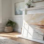
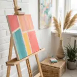
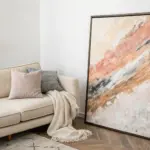
If you’re craving abstract art that looks polished without being fussy, you’re going to love these projects. I’m sharing easy abstract art ideas that lean on simple shapes, bold color, and happy accidents that magically look intentional.
Tape-Resist Geometric Blocks
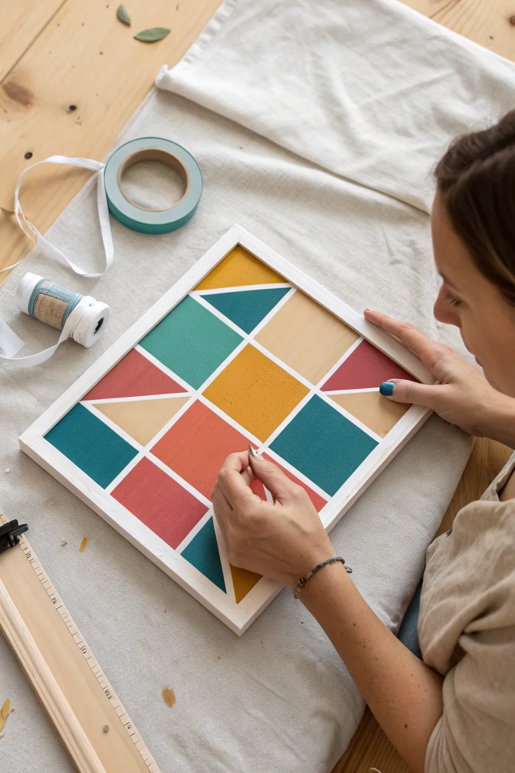
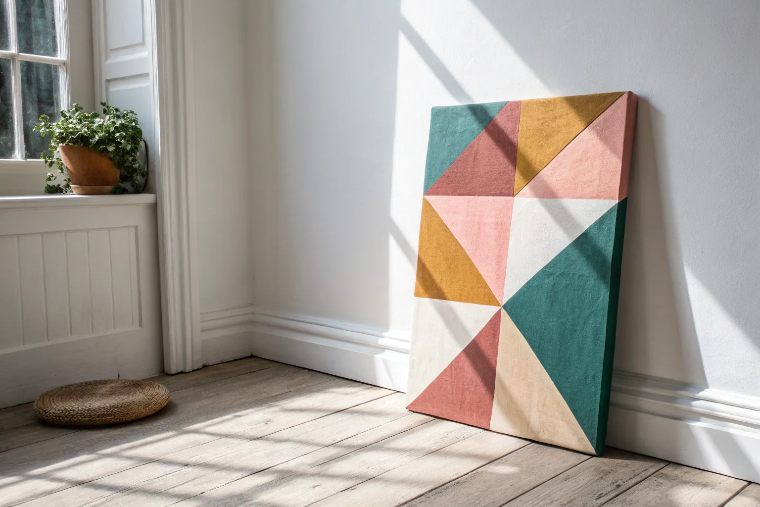
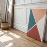
Transform a simple wooden panel into a striking piece of modern art using crisp lines and bold colors. This geometric block design relies on the magic of painter’s tape to create perfect separation between shapes, resulting in a professional-looking finish that is surprisingly simple to achieve.
Detailed Instructions
Materials
- Square wooden panel or canvas (approx. 12×12 inches)
- Painter’s tape (0.5 inch width is ideal)
- Acrylic paints (teal, mustard yellow, terracotta red, light wood/buff)
- Foam brushes or flat synthetic brushes
- Ruler
- Pencil
- White acrylic paint (for the frame/borders)
- Utility knife or craft knife
- Credit card or bone folder (for burnishing)
Step 1: Planning and Taping
-
Prepare the surface:
Begin with a clean wooden panel. If the wood is rough, give it a quick sand with fine-grit sandpaper and wipe away the dust. -
Paint the base borders:
Since the lines between the colors in this design are white (or light), paint the entire panel white first. This acts as a primer and ensures your dividing lines are crisp and bright. Let this dry completely. -
Create the outer frame:
Apply strips of painter’s tape along the four outer edges of your panel to create a clean border. Press down firmly. -
Mark the grid:
Using a ruler and a light pencil touch, mark the center points of each side. Connect these points to visualize a central diamond shape, then divine the space into a grid of quadrants. -
Apply the main tape lines:
Run long strips of painter’s tape diagonally from corner to corner to create a large ‘X’. Then, run tape vertically and horizontally through the center to create a cross. -
Tape the inner shapes:
Look at the design reference. You need to subdivide the larger triangles. Apply tape to break the big quadrants into smaller triangles and squares suitable for color blocking. -
Burnish the edges:
This is crucial for crisp lines. Run a credit card or a bone folder firmly over every edge of the tape. I find this extra step prevents the most common bleeding issues. -
Seal the tape (Optional):
For razor-sharp lines, paint a very thin layer of your base white color over the tape edges. This fills any microscopic gaps with white paint instead of your colored paint.
Step 2: Painting the Geometry
-
Mix your palette:
Prepare your acrylic colors: a deep teal, a warm mustard yellow, a terracotta red, and a soft beige-wood tone. -
Paint the first color group:
Start with the mustard yellow. Identify the central diamond sections and the corresponding outer triangles. Apply the paint in thin, even coats. -
Apply the teal tones:
Move on to the teal paint. Fill in the specific side triangles and corner blocks. Avoid overloading the brush to keep texture smooth. -
Fill in the terracotta:
Paint the red-orange sections. Be careful not to let wet paint from different colors touch if you are painting adjacent sections without a tape barrier. -
Finish with beige:
Apply the soft beige color to the remaining triangular sections. This neutral tone helps balance the bolder colors. -
Second coat:
Once the first layer is touch-dry, apply a second coat to all colors to ensure opacity and vibrancy.
Bleeding Lines?
If paint bleeds under the tape, wait for it to dry completely. Then, scrape the excess gently with a craft knife or paint over it with the base white color using a fine liner brush.
Step 3: The Reveal
-
Let it semi-dry:
Wait until the paint is dry to the touch but not fully cured (usually about 20-30 minutes). Peeling while slightly flexible prevents chipping. -
Peel the tape:
Slowly peel back the tape at a 45-degree angle. Pull gently and steadily away from the painted area. -
Touch ups:
If a little paint bled under the tape, don’t worry. Use a tiny detail brush with white paint to carefully conceal any imperfections. -
Add the outer rim:
If you are using a separate frame, attach it now. If painting the edges, ensure they are clean white to finish the look.
Add Metallic Flair
Replace one of the colors, like the mustard yellow or the beige, with a metallic gold leaf or gold paint. This adds a sophisticated shimmer that catches the light.
Hang your new geometric masterpiece in a spot that needs a pop of modern color

Bold Color-Blocking With Simple Shapes
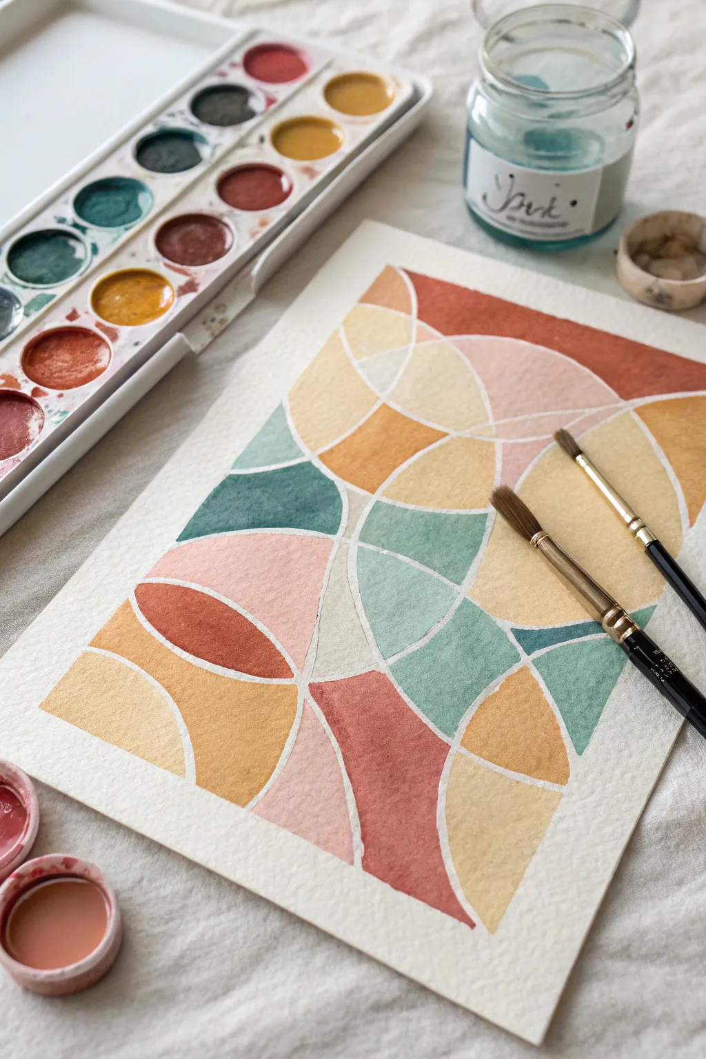
This project combines the soothing geometry of intersecting circles with Earth-toned watercolors to create a warm, modern abstract piece. The white negative space between shapes acts as a built-in frame, making the colors pop without needing ink outlines.
Step-by-Step
Materials
- Cold press watercolor paper (A4 or similar size)
- Watercolor pan set (Earth tones: ochre, terracotta, teal, slate blue, blush)
- Small round brushes (Size 2 and 6)
- Compass or circular objects for tracing
- HB Pencil
- Ruler
- Kneaded eraser
- Jars of clean water
Step 1: Drafting the Design
-
Establish the boundaries:
Begin by lightly marking a rectangular border about one inch from the edge of your paper. This central rectangle will contain your composition, keeping the edges clean. -
Draw the primary circles:
Using a compass or a medium-sized bowl, draw large, sweeping arcs that intersect with each other. Don’t worry about completing full circles; focus on how the curves overlap and flow off the edges of your inner border. -
Add secondary curves:
Adjust your compass to a slightly smaller radius. Draw new arcs that intersect the larger ones, creating a variety of small, medium, and large enclosed shapes. -
Refine the composition:
Look for areas that feel too empty. You can bisect larger shapes with a straight line using your ruler, or add one final curve to break up big spaces into more manageable puzzle pieces. -
Create the channels:
This is a crucial step for the ‘mosaic’ look. Go back over every pencil line and draw a second parallel line about 2-3mm away from the original. These channels will remain unpainted white space. -
Lighten the guides:
Gently roll a kneaded eraser over the entire drawing. You want the graphite to be barely visible—just enough to guide your brush, but faint enough that it won’t show through transparent watercolor.
Step 2: Planning and Painting
-
Plan your palette:
Pre-mix your colors in the palette lid or separate wells. Aim for a harmonious earthy scheme: burnt sienna, yellow ochre, a muted teal or slate blue, and a soft blush pink. -
Map the colors:
Before wetting your brush, visualize where colors will go. Try to ensure that no two shapes of the same color touch each other directly. -
Start with the lightest tones:
Load your size 6 brush with the yellow ochre or blush pink. Fill in your chosen shapes, carefully painting up to the pencil lines but never crossing into the ‘channel’ created in step 5. -
Fill the medium tones:
Switch to your teal or slate blue shades. I find it helpful to rotate the paper physically so my hand doesn’t smudge the wet paint from previous sections. -
Apply the darkest accents:
Use the burnt sienna or terracotta for the remaining shapes. These darker values will anchor the composition and provide contrast against the pastel tones. -
Refine edges:
Switch to your size 2 detail brush. Go back to any edges that look a bit ragged or uneven and carefully smooth them out with slightly thicker paint.
Clean Edges Pro-Tip
For ultra-crisp white lines, apply masking fluid to the ‘channels’ before painting. Rub it off at the very end to reveal perfect white borders.
Step 3: Finishing Touches
-
Let it dry completely:
Allow the painting to sit flat until it is bone dry. Watercolor paper can feel cool to the touch if it’s still damp, so wait until it feels room temperature. -
Erase guidelines:
Once you are 100% sure the paint is dry, gently erase the visible pencil lines inside the white channels to leave a crisp, clean gap. -
Assess the transparency:
If some colors dried too light or patchy, add a second layer (glaze) of the same color over the shape to increase richness and opacity.
Level Up: Texture
While the paint is still wet in the larger shapes, sprinkle a tiny pinch of salt into the center. It creates a blooming, starry texture as it dries.
Now you have a structured yet organic abstract piece that brings warmth to any room

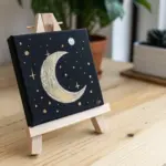
Minimalist Arch and Half-Moon Forms
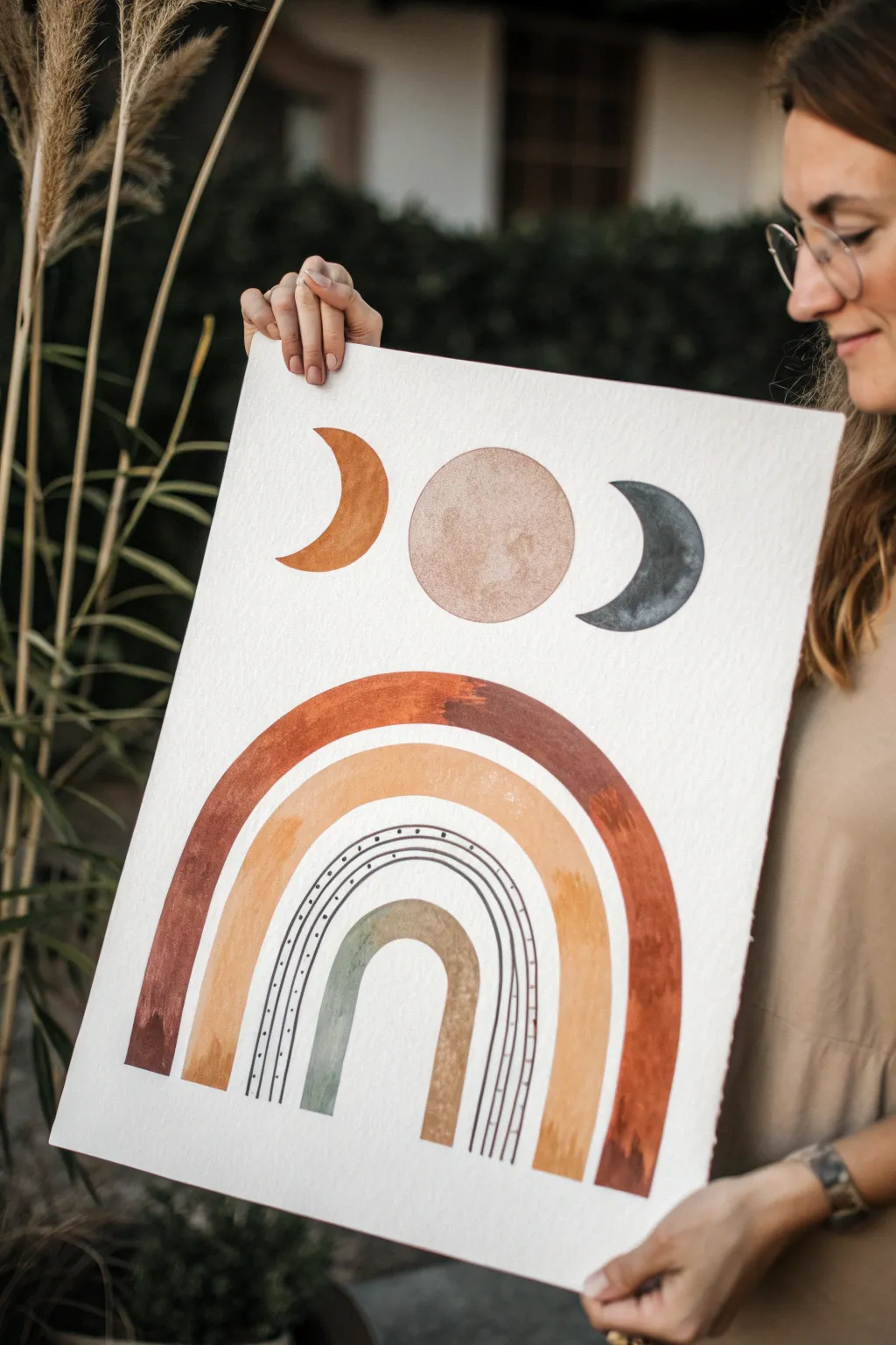
Embrace the earthy, celestial aesthetic with this minimalist watercolor piece featuring moon phases floating above a warm, multi-layered rainbow arch. The textured paper and organic shapes create a soothing, grounding focal point perfect for any modern bohemian space.
Step-by-Step Tutorial
Materials
- Heavyweight watercolor paper (300gsm/140lb, cold press for texture)
- Watercolor paints (Burnt Sienna, Yellow Ochre, Paynes Gray, Alizarin Crimson)
- Round watercolor brushes (Size 4, 8, and a script liner brush)
- Pencil and eraser
- Compass or round objects for tracing
- Ruler
- Masking tape
- Jar of water and paper towels
Step 1: Preparation & Sketching
-
Prepare the paper:
Begin by taping down your watercolor paper to a hard surface or board. This prevents the heavy paper from buckling when it gets wet and creates a clean border if you paint to the edge. -
Plan the moon phases:
Lightly sketch the top row first. Use a circular object or compass to draw a central full moon. Flank this circle with two crescents facing inward—one on the left, one on the right—ensuring they are evenly spaced. -
Sketch the arch foundation:
Below the moons, use your compass or large round objects to sketch the concentric arches. Start with the largest outer arch, leaving enough space for two smaller arches nestled inside it. -
Add detail lines:
Between the middle and smallest arch, sketch two very thin guidelines. These will become the delicate black line details later. Keep your pencil marks incredibly faint so they disappear under the paint.
Fixing Wobbly Lines
If your arch edges look jittery, don’t worry. Once dry, go over the edge again with a slightly damp, clean brush to soften and smooth the boundary, or thicken the line slightly to correct the curve.
Step 2: Painting the Moons
-
Paint the left crescent:
Mix a warm, rusty orange using Burnt Sienna with a touch of Yellow Ochre. Carefully fill in the left crescent moon, keeping the edges crisp. -
Create the full moon texture:
For the center moon, mix a very watered-down wash of pale brown or beige. Paint the circle, then while it’s still wet, drop in tiny spots of concentrated brown or gray to create a ‘crater’ texture. Let the water move the pigment naturally. -
Paint the right crescent:
Using Payne’s Gray (a dark blue-gray), fill in the right-hand crescent. I like to keep the pigment slightly uneven here to mimic the texture of stone or night sky. -
Allow to dry:
Wait for these top elements to dry completely before moving your hand lower down the page to avoid smudging.
Add Metallic Flair
For a magical touch, use gold watercolor paint or metallic ink for the full center moon or the tiny detail dots. It catches the light beautifuly when the artwork is hung.
Step 3: Building the Arch
-
The outer arch:
Mix a deep terracotta color (Burnt Sienna mixed with a little Alizarin Crimson). With your size 8 brush, paint the large outer arch. Use confident, sweeping strokes to avoid visible stop-and-start marks. -
Varied saturation:
As you paint the arch, dip your brush in water occasionally to dilute the paint slightly in some areas. This creates that lovely watercolor variation where some parts look transparent and others opaque. -
The middle arch:
Mix a mustard yellow tone using Yellow Ochre. Paint the second, thick arch below the terracotta one. Leave a small gap of white paper between them to keep the colors distinct. -
The inner arch:
For the smallest, innermost arch, create a muted sage or olive green by mixing Yellow Ochre with a tiny touch of Paynes Gray. Paint this curve carefully. -
Dry completely:
Let the entire piece dry thoroughly. If the paper feels cool to the touch, it is still damp inside the fibers.
Step 4: Fine Details
-
Mix the liner color:
Prepare a concentrated puddle of Paynes Gray or black watercolor. It should be the consistency of ink. -
Paint the curved lines:
Using your script liner brush or a very fine round brush, paint the two thin parallel lines in the white space between the mustard and green arches. -
Add the dots:
Dip just the tip of your brush into the dark paint. Gently press small dots along the upper curve of the top thin line. Try to keep the spacing consistent, but embrace slight irregularities for a handmade feel. -
Final touches:
Once everything is bone dry, gently erase any visible pencil marks that weren’t covered by paint. Remove the tape carefully, pulling it away from the paper at a 45-degree angle.
Now you have a serene, balanced piece of art ready to frame and bring warmth to your walls

Loose Layered Brushstrokes
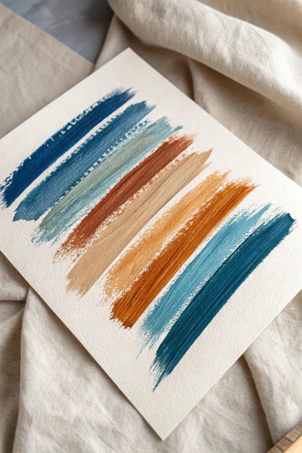
This minimalist project celebrates the beauty of color and texture through a simple, repetitive motion. By laying down bold, diagonal strokes on textured paper, you’ll create a soothing gradient that feels both modern and organic.
Step-by-Step
Materials
- Cold press watercolor paper (300 gsm or heavier)
- Wide flat brush (3/4 inch or 1 inch)
- Medium round brush (optional for mixing)
- Acrylic paints or Gouache (Navy Blueish-Indigo, Teal, Sage Green, Rust/Burnt Sienna, Beige/Sand, Ochre Yellow, Deep Burnt Orange)
- Palette or mixing plate
- Cup of water
- Paper towels
- Painter’s tape (optional)
Step 1: Preparation and Palette
-
Paper Setup:
Begin by securing your watercolor paper to a flat surface. If you want a pristine border, tape down the edges with painter’s tape, though leaving it loose allows for a more organic feel. -
Texture Check:
Ensure you are using cold press paper. The rough ‘tooth’ of the paper is essential for achieving the dry-brush breaks and white speckles seen in the reference image. -
Mixing the Indigo:
On your palette, squeeze out a deep Indigo or Navy Blue. Since we want a dry texture, don’t over-dilute it with water; keep the consistency creamy, like soft butter. -
Mixing the Teal:
Prepare a second blue tone, mixing a standard blue with a touch of green or turquoise to create a muted Teal shade. -
Preparing Earth Tones:
Set up your warm colors: a Burnt Sienna (rust), a sandy Beige, a Golden Ochre, and a deep Orange. Having all colors ready prevents the paint from drying out on the brush while you mix.
Too solid?
If your strokes look like solid blocks, your brush is too wet. Blot it aggressively on a paper towel before painting to ensure the paper’s texture breaks up the paint line.
Step 2: Painting the Cool Tones
-
Loading the Brush:
Dip your wide flat brush into the Indigo paint. Wipe the excess paint off on a paper towel—this is crucial. You want the brush to be slightly ‘thirsty’ to create that textured, broken edge. -
First Stroke:
Starting near the top left, pull the brush diagonally down and to the right. Apply firm pressure at the start and let the brush naturally run out of paint as you reach the end of the stroke. -
Second Blue Layer:
Clean your brush thoroughly and dry it well. Load up a slightly lighter Navy or Slate Blue. Paint a second diagonal stripe just below the first, slightly overlapping or touching the previous stroke. -
Transition to Green:
Mix a Sage green or cool Teal. Apply this as the third stripe. Focus on keeping the angle consistent with the first two lines, allowing the paper texture to show through the paint.
Curve it up
Instead of straight diagonal lines, try this same technique with gentle ‘S’ curves or waves to create an abstract seascape effect using the same color palette.
Step 3: Adding Warmth and Contrast
-
The Rust Accent:
Switch to your Burnt Sienna or deep Rust color. This warm tone provides a striking contrast to the cool blues. Paint this stripe right next to the sage green, keeping the edges rough. -
Softening with Beige:
Clean and dry the brush completely. Use the sandy Beige color next. This lighter value acts as a ‘breather’ in the composition, separating the dark rust from the brighter oranges. -
Introducing Ochre:
Apply the Golden Ochre or mustard yellow strip. I find that dragging the brush a bit faster here helps catch the high points of the paper for that lovely speckled effect. -
Deep Orange Intensity:
Paint the next stripe with a vibrant Deep Burnt Orange. Allow the bristles to splay slightly at the tail end of the stroke to enhance the feathered look. -
Final Cool Tone:
Finish the sequence by returning to the cool side of the spectrum. Paint the final stripe with a medium Teal or slate blue to bookend the composition.
Step 4: Finishing Touches
-
Texture Review:
Look closely at your strokes. If any look too solid or ‘heavy,’ you can lightly drag a dry, clean brush over them while they are damp to lift a tiny bit of pigment. -
Drying:
Allow the piece to dry completely flat. The heavy body of the paint combined with the water content might cause slight buckling, so letting it sit is important. -
Flattening:
Once dry, play a heavy book over the artwork overnight to flatten out any ripples in the paper.
Now step back and admire how a simple sequence of colors can create such a sophisticated visual rhythm
BRUSH GUIDE
The Right Brush for Every Stroke
From clean lines to bold texture — master brush choice, stroke control, and essential techniques.
Explore the Full Guide
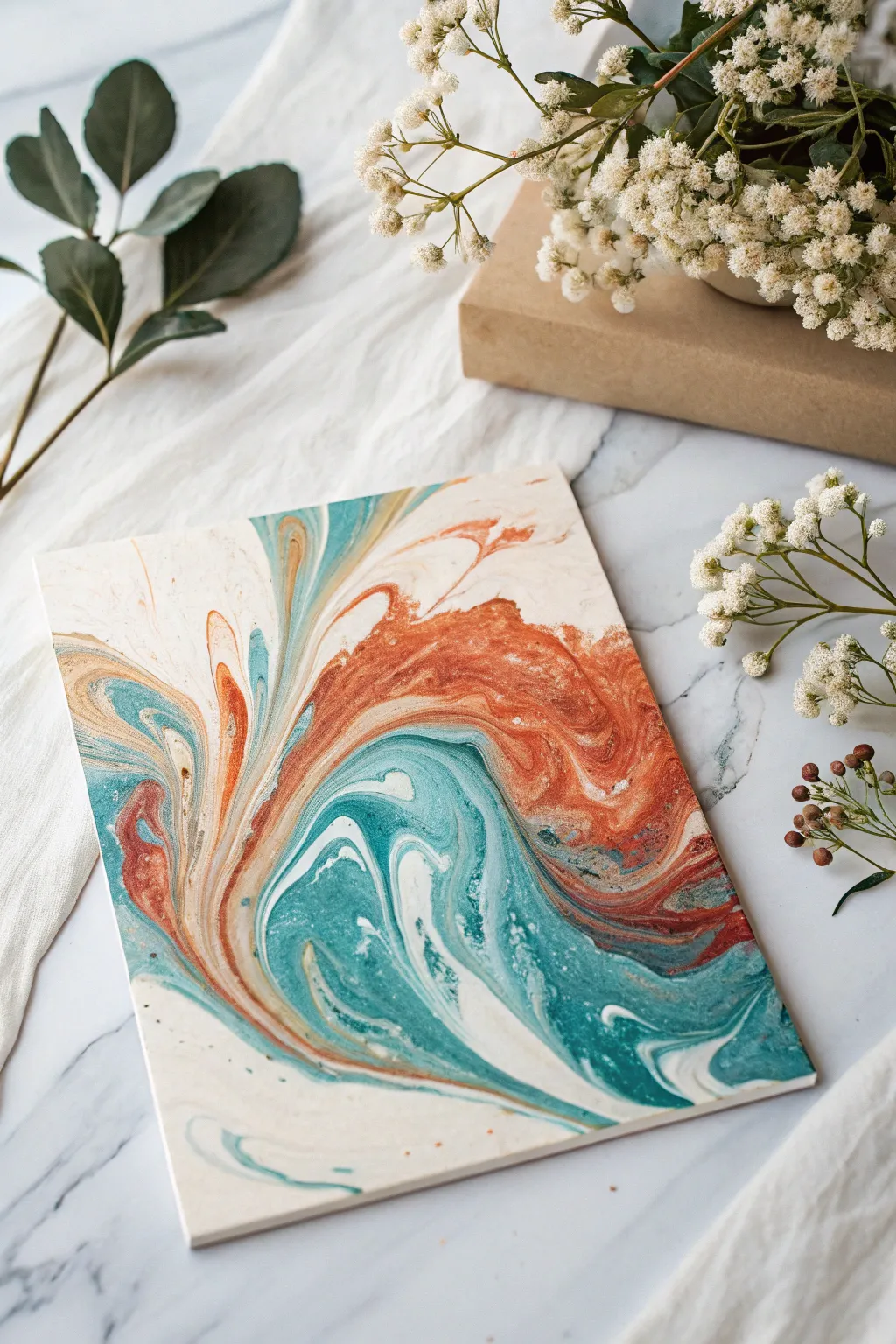
Easy Puddle Pour Patterns
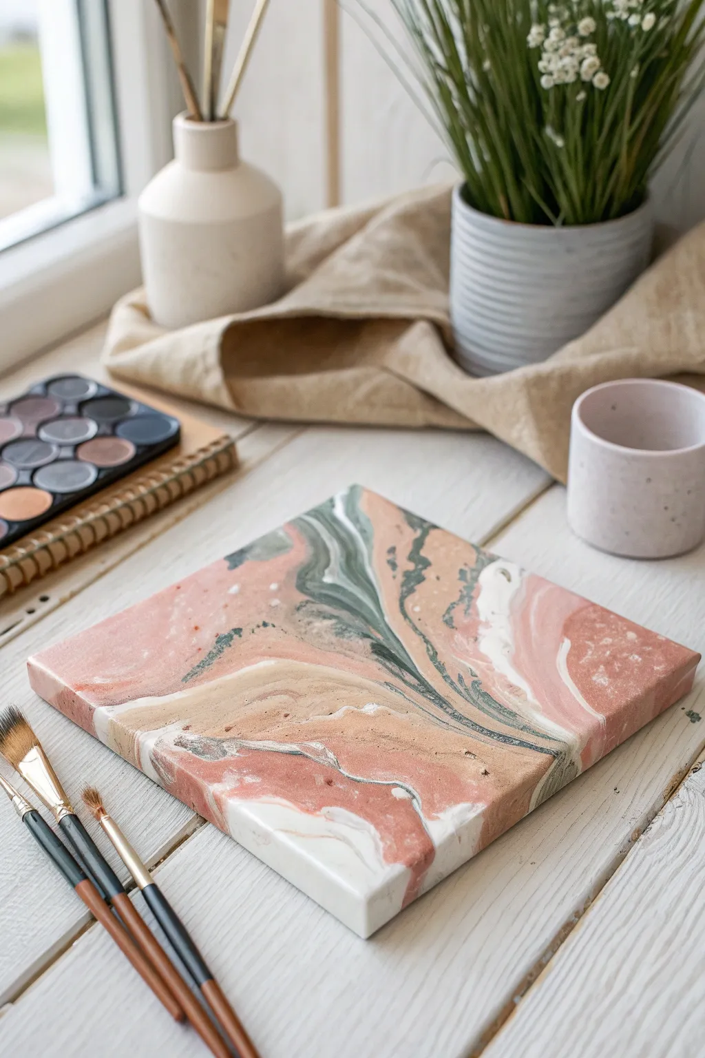
Capture the serenity of natural stone with this elegant acrylic pour project. Using a palette of dusty rose, sage green, and warm beige creates a sophisticated, marble-like finish on a small canvas that fits perfectly into modern decor.
Detailed Instructions
Materials
- Small square canvas (e.g., 6×6 or 8×8 inches)
- Acrylic paints (Dusty Pink, Beige/Sand, White, Sage Green)
- Acrylic pouring medium
- 4 small plastic cups for mixing
- Wooden stir sticks
- Palette knife or flat spreader tool
- Gesso (optional, for priming)
- Drop cloth or plastic sheet
Step 1: Preparation & Mixing
-
Prepare your workspace:
Cover your work surface thoroughly with a plastic sheet or drop cloth. Acrylic pouring can get messy, and dried paint is hard to remove from tables. -
Prime the canvas:
Ensure your canvas is clean and taut. Even though pre-stretched canvases come primed, applying a fresh coat of white gesso can help the paint glide better. -
Mix your pouring medium:
In your mixing cups, combine your acrylic paint with pouring medium. A standard ratio is usually 1:1, but check your specific medium’s instructions. You want a consistency similar to warm honey. -
Create the custom palette:
Mix your colors specifically to match the earthy tone. If your pink is too bright, tone it down with a tiny drop of brown or beige. Ensure the white is opaque and thick enough to hold its own against the colors. -
Check consistency:
Test the paint by letting it drip off a stir stick. It should flow continuously without breaking but mound slightly when it hits the surface before settling flat.
Muddy colors?
If colors merge into gray sludge, you’re likely tilting too aggressively or your paints are too thin. Keep movements slow and verify paint consistency before pouring.
Step 2: The Pour Technique
-
Start with a base puddle:
Pour a small puddle of the Beige or Sand color in the center of the canvas. This acts as a ‘cushion’ for the other colors to move on. -
Layering the puddles:
Gently pour a small amount of the Dusty Pink directly into the center of the beige puddle. I like to pour slowly to keep the circles relatively neat. -
Add the contrast color:
Pour a smaller amount of the Sage Green into the center of the pink. This dark tone provides the necessary contrast that mimics veins in marble. -
Incorporate the white:
Add a puddle of White to break up the darker colors. This helps create those creamy, highlight areas seen in the reference image. -
Create satellite puddles:
Don’t just stick to the center. Pour smaller, individual puddles of alternating colors near the corners and edges of the canvas to ensure full coverage later.
Step 3: Creating the Marble Effect
-
Tilt the canvas:
Gently lift the canvas and slowly tilt it. Allow the puddles to run into each other. Watch how the paint stretches and distorts naturally. -
Guide the flow:
Manipulate the angle to guide the paint toward the corners. You want the paint to flow over the edges to cover the sides of the canvas completely. -
Refine the pattern:
If you have a large area of a single color, use a palette knife to gently swipe a contrasting color through it. Use a very light touch; you want to drag the surface paint, not scrape the canvas. -
Pop surface bubbles:
Inspect the surface for tiny air bubbles. You can pop these with a toothpick, or if you have a kitchen torch, pass it quickly over the surface (keep it moving) to burst them. -
Check the edges:
Use your finger or a tool to touch up any spots on the sides of the canvas that might have been missed by the paint flow. -
Level drying:
Place the finished canvas on four overturned cups (one under each corner) to ensure it dries perfectly level. If it’s tilted, the design will slide off while drying.
Add some sparkle
For a luxe geology look, mix fine metallic gold or copper powder into one of your white or beige paint mixes before pouring to create shimmering veins.
Let your artwork dry undisturbed for at least 24 hours to reveal a smooth, stone-like surface.
Air-Blown Drips and Streams
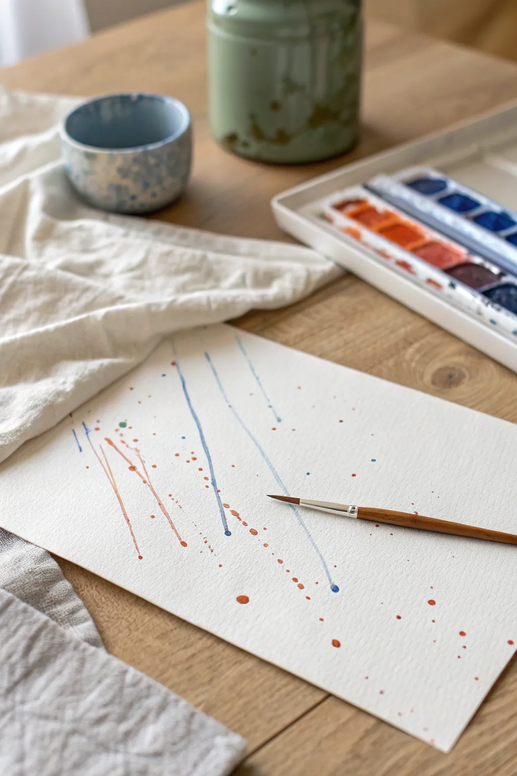
Embrace the unpredictable nature of watercolor with this simple yet striking abstract project. By guiding fluid paint across textured paper with currents of air, you’ll create dynamic streams and playful splatters that feel both energetic and organic.
How-To Guide
Materials
- Cold press watercolor paper (300 gsm recommended)
- Watercolor paints (Cobalt Blue and Burnt Sienna)
- Round watercolor brush (size 4 or 6)
- Jar of clean water
- Paper towel or cloth
- Drinking straw (optional)
- Masking tape
Step 1: Preparation & Mixing
-
Secure the paper:
Start by taping down your sheet of watercolor paper to a flat, movable surface like a drawing board or a piece of cardboard. Taping the edges helps prevent the paper from buckling when it gets wet, and being able to tilt the board is crucial for this technique. -
Activate the paints:
Add a few drops of water to your watercolor pans or squeeze tube paint onto your palette. You want to wake up the pigments so they are ready for mixing. -
Create fluid mixtures:
Mix a puddle of Cobalt Blue and a separate puddle of Burnt Sienna on your palette. Add significantly more water than usual; the consistency should be like tinted milk or ink, allowing it to flow freely across the page without dragging.
Pro Tip: Straw Control
Using a straw gives you the most precise control over the direction of the paint. Pinch the end of the straw slightly to increase the air pressure for finer, sharper lines.
Step 2: Creating the Blue Streams
-
Load the brush:
Fully saturate your round brush with the watery blue mixture. The bristles should be dripping wet. -
Place the initial drop:
Touch the tip of your brush to the top or middle section of the paper to deposit a large, heavy bead of blue paint. Do not spread it out; just let it sit as a puddle. -
Blow the stream:
Immediately blow a sharp, steady stream of air onto the paint puddle to force it across the paper. You can use your breath directly or aim through a drinking straw for more directional control. -
Guide the path:
As the paint runs, tilt your board slightly to help gravity assist the movement. This often creates thinner feelers that branch off the main line. -
Repeat the process:
Create two or three more blue streams in parallel or slightly angled directions. Vary the starting points so the composition doesn’t look too rigid. -
Vary the line weight:
If a line stops prematurely, drop a little fresh water or pigment onto the end of the trail and blow again to extend it further down the page.
Level Up: Metallic Lift
Once the painting is dry, add a few tiny splatters of gold gouache or metallic watercolor. The shimmer adds a sophisticated element that pairs beautifully with the earthy tones.
Step 3: Adding Warmth & Splatter
-
Switch to burnt sienna:
Rinse your brush thoroughly and load it with the watery Burnt Sienna mixture. I like to keep this mixture slightly more pigmented than the blue for contrast. -
Create counter-streams:
Apply drops of the orange-brown paint near the blue lines and blow them in the same general direction. Allow some lines to cross over or touch the blue streams; where they meet, the colors will bleed slightly, creating a beautiful greyish transition. -
Prepare for splatter:
Load your brush with the orange mixture again. Hold the brush handle horizontally about six inches above the paper. -
Tap for texture:
Firmly tap the handle of your wet brush against a second brush handle or your finger. This knocks fine droplets of paint onto the paper around the main streams. -
Vary the droplet size:
For larger splashes, load the brush more heavily and tap closer to the paper. Scatter these warm-toned dots randomly to break up the white space. -
Add blue accents:
Clean the brush and repeat the splatter technique with the blue paint. Focus these splatters in areas that feel empty, but don’t overdo it—you want to maintain the airy feeling of the composition.
Step 4: Refining & Finishing
-
Review the balance:
Step back and look at your composition. If one area feels too heavy, you can blot a wet spot gently with a clean tissue to lift some pigment. -
Connect elements:
If some droplets feel disconnected, use a barely damp brush tip to draw a microscopic line connecting a dot to a nearby stream, suggesting movement. -
Let it dry completely:
Allow the paper to dry flat naturally. Using a hair dryer might blow the wet puddles around and ruin your delicate lines. -
Remove the tape:
Once the paper is bone dry and cool to the touch, carefully peel away the masking tape at a 45-degree angle away from the artwork.
You now have a dynamic piece of abstract art that captures the feeling of movement frozen in time

PENCIL GUIDE
Understanding Pencil Grades from H to B
From first sketch to finished drawing — learn pencil grades, line control, and shading techniques.
Explore the Full Guide
Wavy Lines and Swirly Marbling
Capture the serene beauty of the ocean meeting earthy cliffs with this mesmerizing acrylic pour project. Using a simple swirly marbling technique, you will create organic lines and fluid motion that looks professionally curated.
Step-by-Step Guide
Materials
- Small stretched canvas or canvas board (5×7 or 8×10 recommended)
- Acrylic fluid paints (Teal/Turquoise, Rust/Burnt Sienna, Cream/Off-White)
- Pouring medium
- Small plastic cups for mixing
- Wooden craft sticks for stirring
- A larger plastic cup for the ‘dirty pour’
- Disposable gloves
- Drop cloth or plastic sheet
- Cardboard box or tray to catch drips
- Hairdryer (optional)
Step 1: Mixture Preparation
-
Set up your workspace:
Cover your working surface with a plastic sheet or drop cloth. Place your canvas inside a shallow cardboard box or tray to catch the excess paint that will inevitably flow off the edges. -
Mix the cream base:
In a small cup, mix your cream or off-white acrylic paint with the pouring medium. Aim for a ratio typically around 1:1 or follow the bottle’s instructions until the consistency resembles warm honey. -
Prepare the accent colors:
Repeat the mixing process for the teal and rust orange paints in separate cups. Stir gently with craft sticks to avoid creating too many air bubbles, which can cause pockmarks later. -
Check consistency:
Lift your stick from the paint; the stream should flow continuously without breaking. If it’s too thick, add a drop of water. If it’s too thin, add a touch more paint.
Muddy Colors?
If colors are mixing into gray/brown ‘mud,’ your paint is likely too thin or you are tilting too aggressively. Thicken mix and move slower.
Step 2: The Dirty Pour Layering
-
Start the layering:
Take your empty larger cup. Pour a generous amount of the cream paint into the bottom of this cup to serve as the dominant negative space color. -
Add color definition:
Gently pour a layer of rust orange on top of the cream, tilting the cup slightly so it slides down the side rather than plunging into the middle. -
Introduce the teal:
Layer the teal paint next. I like to alternate the amounts, sometimes adding a thicker layer of cream between the colors to separate them and keep the design airy. -
Repeat until full:
Continue layering your paints—cream, rust, teal—until the cup is approximately half to three-quarters full, depending on your canvas size.
Add Some Sparkle
Mix a pinch of fine gold mica powder into the cream paint. It creates a subtle, shimmering sand effect when dry.
Step 3: Pouring and Tilting
-
The flip or pour:
You can either place the canvas face down on the cup and flip them together, or simply pour the contents of the cup onto the center of the canvas in a slow, wandering stream. -
Release the paint:
If you flipped the cup, lift it straight up to release the puddle of paint. Let it settle for a moment so the colors can interact. -
Initial distribution:
Gently tilt the canvas just slightly to circle the paint in the middle, expanding the puddle without sending it over the edge yet. -
Create the waves:
Tilt the canvas more aggressively toward one corner. Watch how the rust and teal veins stretch out against the cream background. -
Direct the flow:
Rotate the canvas to guide the paint toward the opposite corner. The goal is to cover the entire surface while trying to maintain the distinct bands of color. -
Manage the edges:
Let the paint run off the edges to ensure full coverage. Use your finger to touch up any bare corners with the drips collected in the tray. -
Removing bubbles:
Inspect the surface for air bubbles. If you see any, you can pass a kitchen torch quickly over the surface or gently blow on them with a straw to pop them. -
Final drying phase:
Leave the artwork on a level surface to dry. This process is slow; it needs at least 24 to 48 hours to cure completely without cracking.
Once fully cured, your unique abstract seascape is ready to bring a calming, modern touch to your space
Concentric Circles and Bullseyes
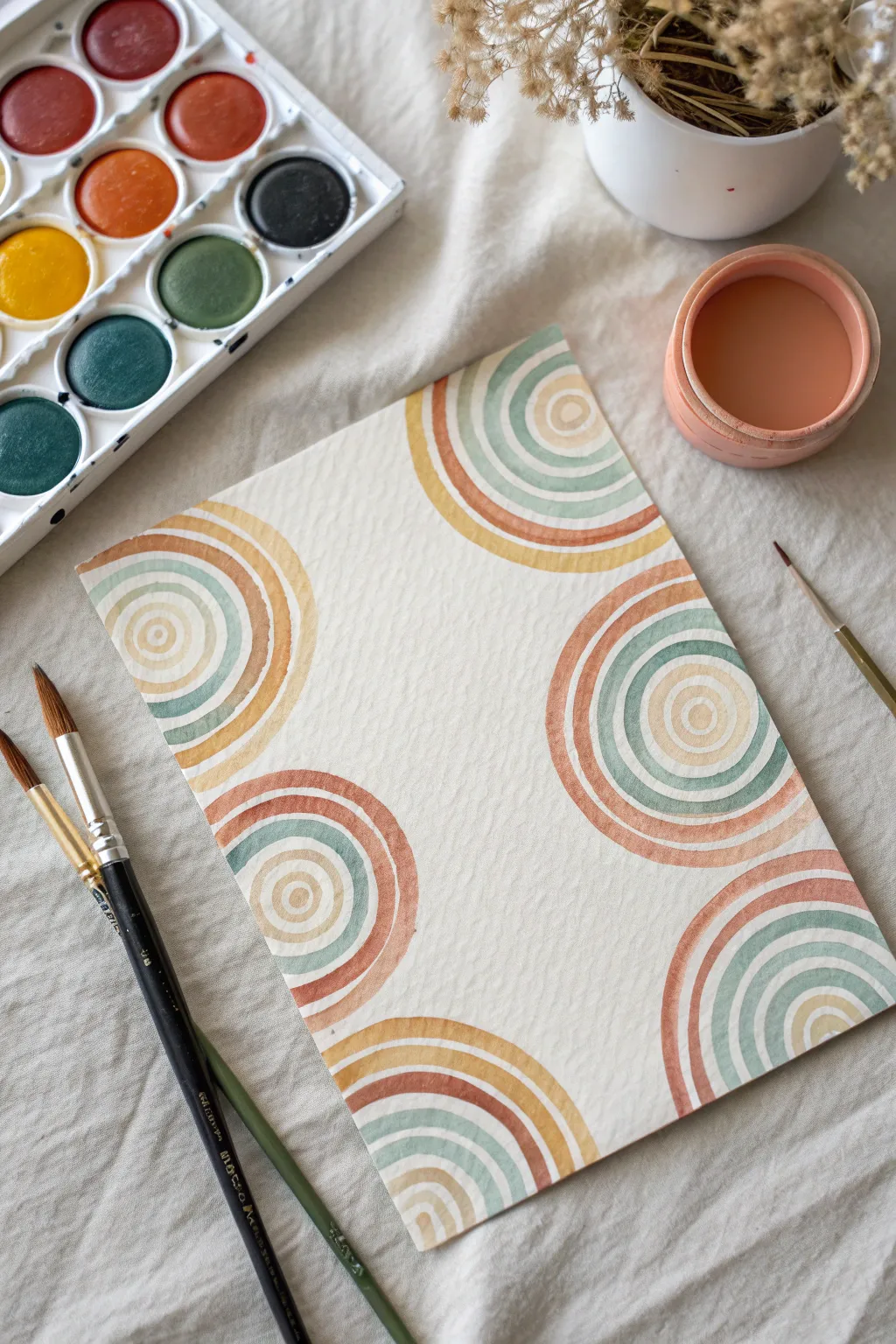
Embrace the soothing rhythm of repetition with this simple yet striking watercolor project featuring concentric arches. Using an earthy, muted palette, you’ll create a balanced composition that feels modern and organic.
Detailed Instructions
Materials
- Cold press watercolor paper (A4 or similar size)
- Watercolor palette with pans (rust red, mustard yellow, sage green, teal)
- Small round watercolor brush (size 2 or 4)
- Medium round watercolor brush (size 6 or 8)
- Cup of clean water
- Paper towel or rag
- Pencil (optional)
- Eraser (optional)
Step 1: Planning the Layout
-
Visualizing the Composition:
Observe the image to understand the placement. The design features six semi-circular clusters originating from the edges of the paper—two on the left, two on the right, and partial hints at the top and bottom corners. -
Light Sketching (Optional):
If you feel unsure about freehand painting, lightly mark center points along the paper’s edge where each set of concentric circles will begin. This acts as your anchor for the arches.
Step 2: Painting the First Cluster
-
Mixing Color 1:
Start by activating a mustard yellow or light ochre pigment with a little water until it has a milky consistency. I like to keep the mix fluid but pigmented. -
The Central Arc:
Choose a starting point on the left edge of your paper. Using your small round brush, paint a small, solid semi-circle against the edge. This is the ‘bullseye’ center. -
Mixing Color 2:
Clean your brush and mix a pale sage green. Ensure it’s distinct enough from the yellow but still shares that dusty, muted quality. -
Drawing the First Ring:
Paint a curved line around your initial yellow center. Leave a small gap of white paper between the yellow center and this green ring to keep the design airy. -
Adding Warmth:
Switch to a rust or terracotta red. Paint the next concentric arch, maintaining that consistent white gap between each stripe. -
Expanding the Pattern:
Continue adding wider arches, alternating colors or introducing a deeper teal. As the arches get larger, switch to your medium brush for smoother, longer strokes.
Brush Control Tip
For smooth curves, lock your wrist and move your whole arm from the elbow. This creates steadier, more natural arcs than just moving your fingers.
Step 3: Building the Composition
-
Starting the Second Cluster:
Move to the opposite side of the paper (the right edge). Pick a point slightly higher or lower than your first cluster to create dynamic asymmetry. -
Repeating the Process:
Repeat the concentric painting process. Start with a tiny center semi-circle and radiate outward with your rings. Feel free to swap the color order—maybe start with teal this time. -
Corner Accents:
Don’t forget the corners. Paint partial arches radiating from the very corners of the page. These will look like quarter-circle slices and help frame the central whitespace. -
Managing Wet Edges:
Be mindful of your hand placement. If a section is still wet, rotate the paper so you don’t smudge your fresh paint while working on a new cluster.
Add Metallic Details
Once the paint is fully dry, paint a few very thin rings using metallic gold watercolor or a gold pen in the white spaces for a touch of glamour.
Step 4: Refining and Finishing
-
Checking Consistency:
Look at your arches. If any lines look too faint or broke apart too much, you can carefully go over them with a second layer of glaze once the first is dry. -
Correcting White Gaps:
The charm of this piece lies in the breathing room between colors. If accidental bleeding occurs between rings, lift the excess paint immediately with a clean, thirsty brush. -
Adding Texture:
Let the paint naturally pool in some areas of the arches. As it dries, this creates ‘blooms’ or hard edges that give watercolors their characteristic texture. -
Balance Check:
Step back and view the whole page. If one side feels empty, add a small, partial arch cluster peeking in from the edge to balance the visual weight. -
Final Drying:
Allow the entire piece to dry flat completely. Don’t frame or move it vertically until the paper is cool to the touch and no longer damp.
This meditative process results in a beautiful piece suited for framing or scanning for stationery


Ombre Gradient Washes
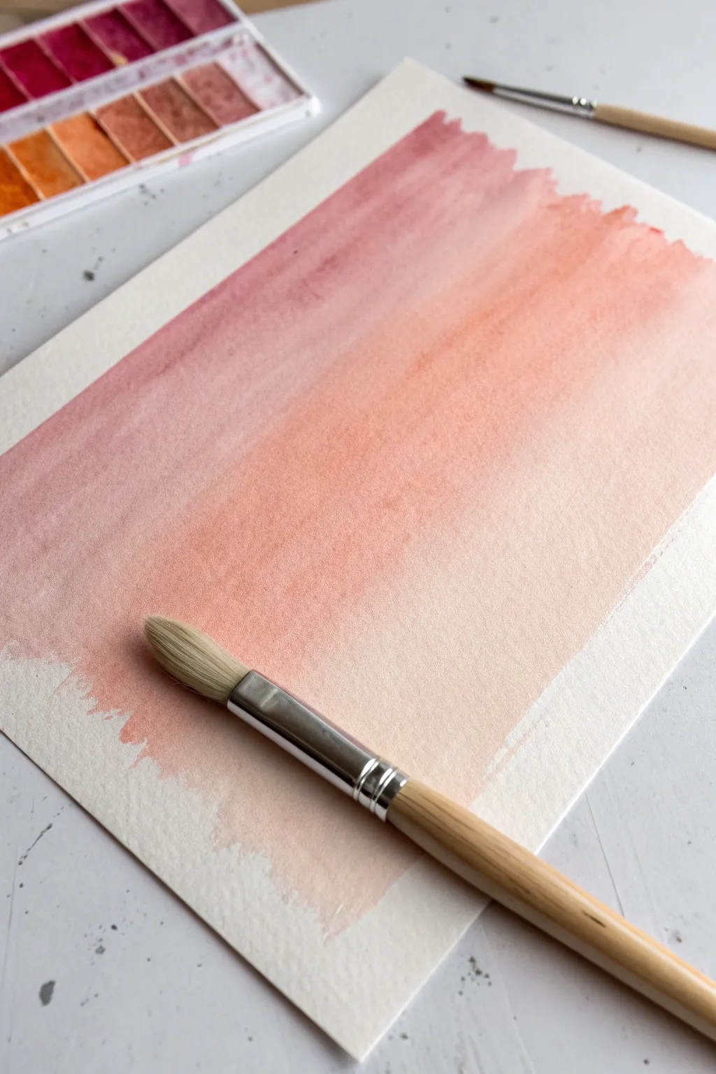
Capture the soft, fleeting colors of a sunset with this gentle watercolor gradient exercise. By blending dusty mauve into warm peach tones, you’ll create a seamless wash that feels both calming and ethereal.
Step-by-Step Tutorial
Materials
- Cold press watercolor paper (300 gsm recommended)
- Watercolor paints (Mauve/Dusty Rose and Warm Peach/Orange)
- Deep mixing palette
- Large round brush (Size 10 or 12)
- Clean water jar
- Paper towels
- Masking tape (optional, for securing paper)
Step 1: Preparation & Color Mixing
-
Secure the paper:
Start by taping your watercolor paper to a flat, hard surface. This prevents buckling when the paper gets wet, though for this loose style, you can simply work flat if using heavy paper. -
Mix the mauve tone:
In your palette, mix a dusty rose or mauve color. You want a high pigment-to-water ratio so the color is distinct but fluid. -
Mix the peach tone:
In a separate well, prepare a warm peach or light orange shade. Ensure it has a similar consistency to your first color. -
Pre-wet the brush:
Dip your large round brush into clean water and blot it slightly on a paper towel. It should be damp but not dripping.
Step 2: Applying the Gradient
-
Start the top wash:
Load your brush generously with the mauve paint. Apply a bold horizontal stroke across the top third of your paper. -
Create a bead of paint:
Tilt your board slightly if helpful, encouraging a small ‘bead’ or pool of wet paint to form at the bottom edge of your stroke. This bead is crucial for a smooth transition. -
Work downwards:
Without cleaning the brush, dip the very tip into your peach mixture. Paint the next stroke directly below the mauve, overlapping the wet edge slightly. -
Blend the transition:
Move the brush back and forth horizontally where the colors meet. Let the water do the work; don’t over-scrub, or the paper will pill. -
Introduce more peach:
Rinse your brush slightly, then load it fully with the pure peach color. Continue painting downwards, covering the middle section of the paper. -
Dilute the color:
As you move past the halfway point, dip your brush into clean water instead of more paint. This naturally dilutes the pigment remaining on the bristles. -
Fade to white:
Continue painting downward stroking horizontal lines. With each pass, add a little more clean water to the brush, allowing the peach to fade gently into the white of the paper. -
Shape the edges:
I like to leave the left and right edges somewhat rough and uneven. Let the brush naturally run out of paint at the sides for that organic, painterly look visible in the example.
Control the Flow
Work quickly while the paper is wet! If a section dries before you add the next color, you’ll get a hard line instead of a soft blend.
Step 3: Finishing Touches
-
Check for pooling:
Look at the bottom of your wash. If a large puddle has formed, dry your brush on a towel and gently touch the tip to the puddle to lift the excess water. -
Allow to dry flat:
Leave the artwork completely flat to dry. If you tilt it now, the water might run back up and create unwanted ‘cauliflower’ blooms in your smooth gradient. -
Adding texture (optional):
While the very bottom is still slightly damp, you can lightly splatter a tiny drop of clean water for subtle texture, though a smooth finish is classic for this style. -
Clean up:
Wash your brushes immediately with gentle soap and reshape the bristles while the painting dries completely.
Level Up: Lettering
Once fully dry, use this soft background as a canvas for calligraphy. Quote art looks stunning over a muted sunset gradient.
Enjoy the peaceful process of watching these gentle colors merge together
Credit-Card Paint Scrape Reveal
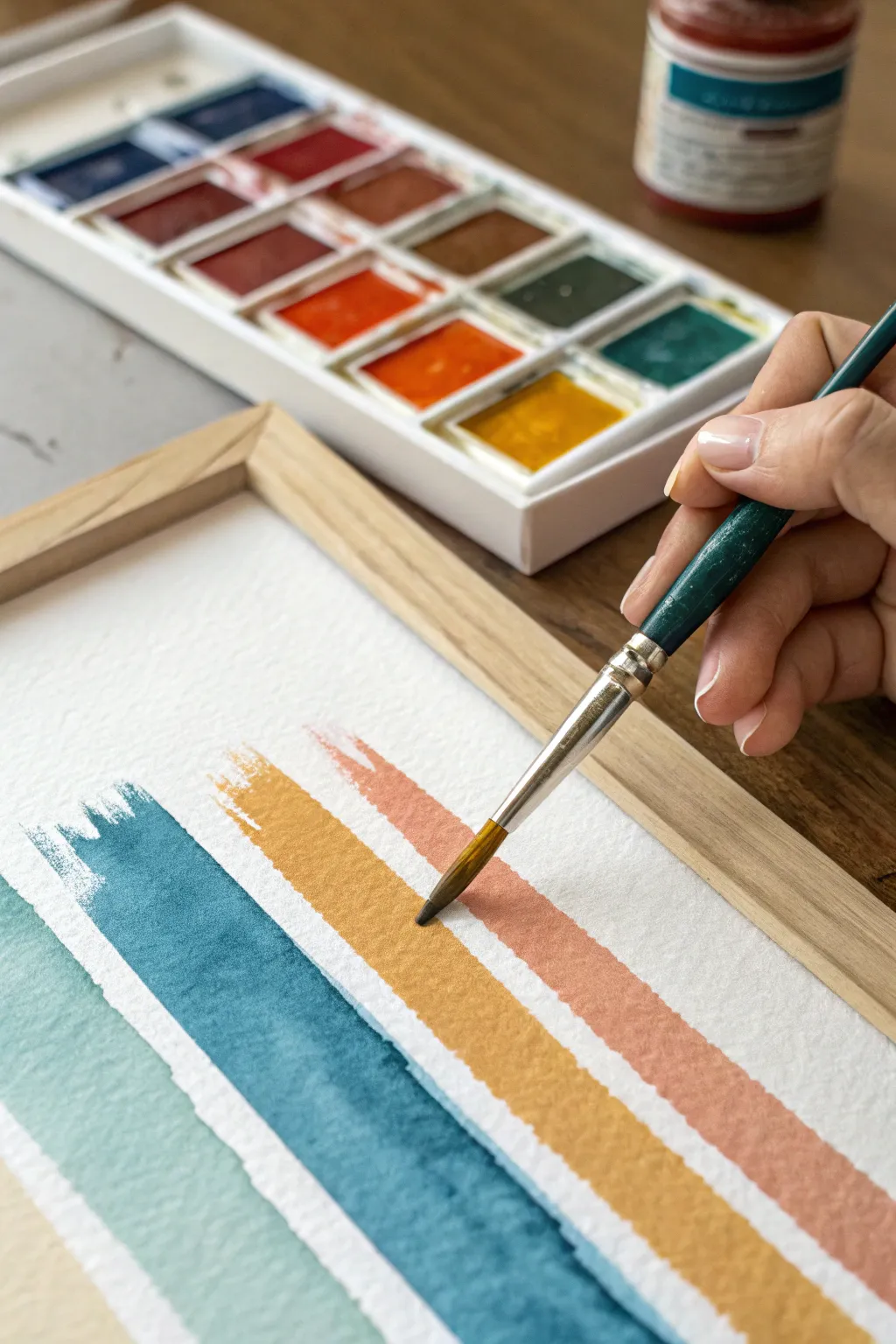
Master the art of clean, calming lines with this deceptively simple watercolor project. By layering earthy tones in rhythmic diagonal strokes, you can create a piece of modern abstract art that warms up any blank wall.
Detailed Instructions
Materials
- Cold press watercolor paper (300 gsm)
- Watercolor paints (pan set or tubes)
- Round synthetic paintbrush (size 6 or 8)
- Wooden frame (to fit your paper size)
- Water container
- Paper towel
- Masking tape or painter’s tape
- Ruler (optional)
- Pencil (optional)
Step 1: Preparation and Palette
-
Secure the paper:
Start by taping your watercolor paper to a flat, hard surface. This prevents buckling when the paper gets wet and creates a clean border around your artwork. -
Select your color scheme:
For the look in the photo, aim for a desaturated, earthy palette. Activate the colors in your pan with a few drops of water. -
Mix custom shades:
Create the signature colors: a muted teal (mix viridian with a touch of burnt sienna), a dusty blue (ultramarine with a hint of black), mustard yellow (ochre), and terra cotta (red mixed with burnt umber). -
Test opacity:
Swatch your colors on a scrap piece of paper. You want them to be vibrant but still transparent enough to show the paper’s texture.
Step 2: Painting the Texture
-
Load the brush:
Dip your round brush into the terra cotta mixture. Ensure the belly of the brush holds enough pigment to complete a long stroke. -
First stroke placement:
Starting near the bottom right, paint a diagonal line moving upward. Use the side of the brush rather than the tip to get a wide, organic edge. -
Create the rough edge:
Notice the ‘dry brush’ effect at the start of the stroke in the reference? Achieve this by moving quickly and not overloading the very tip of the brush with water. -
Switch colors:
Rinse your brush thoroughly. Pick up the mustard yellow paint next. -
Paint the second stripe:
Leave a thin ribbon of white space—about a quarter-inch—between the terra cotta line and your new yellow line. Paint parallel to the first stroke. -
Add the blue tones:
Continue the pattern moving toward the top left corner, painting the deep blue stripe followed by the lighter teal stripe. -
Embrace imperfection:
Don’t worry if the width of the stripes varies slightly. I actually prefer when they waver a bit, as it adds to the hand-painted charm. -
Fill the composition:
Continue painting stripes until you reach the opposite corner, repeating your color sequence if necessary to fill the page.
Dry Brush Technique
To get that scratchy, textured look at the start of your strokes, blot your brush slightly on a paper towel just before touching the paper to remove excess water.
Step 3: Finishing Touches
-
Allow to dry:
Let the painting sit undisturbed until the paper is cool to the touch and completely dry. Hasty framing can trap moisture. -
Flatten the artwork:
If the paper has warped slightly, place it under a heavy book overnight once it is fully dry. -
Remove tape:
Peel the masking tape away slowly at a 45-degree angle to reveal your crisp white borders. -
Frame it:
Place the artwork into a light wooden frame. A simple oak or pine frame complements the earthy color palette perfectly.
Metallic Accent
Add a thin stripe of gold watercolor or ink between two of the colored stripes for a touch of elegance that catches the light.
Now step back and admire how a few simple strokes have transformed into a sophisticated piece of decor
Sponge Dab Texture Fields
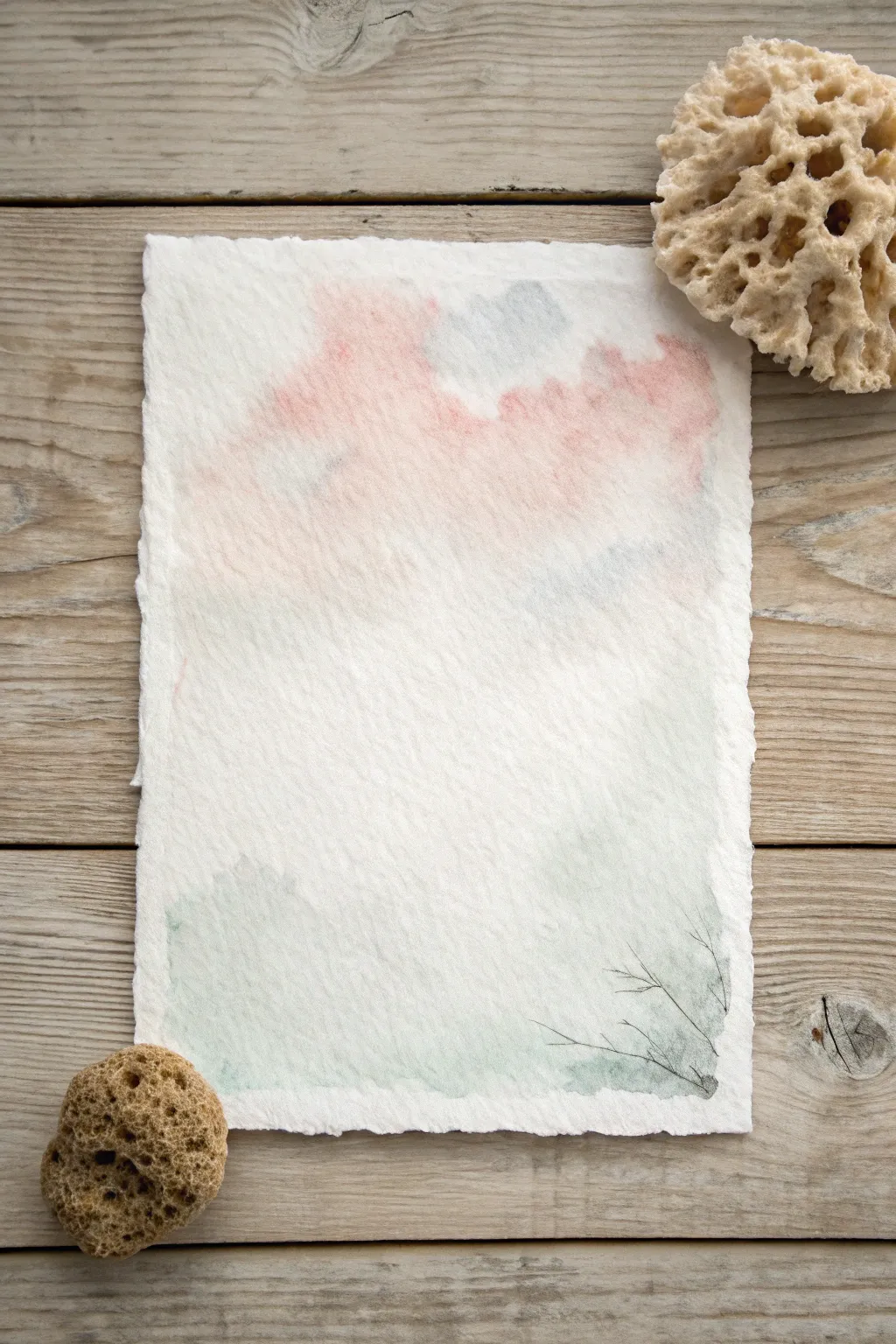
Create a serene, ethereal landscape that captures the softness of a misty morning using simple sponge techniques and delicate line work. This project celebrates the beauty of negative space and subtle color transitions on handmade paper.
How-To Guide
Materials
- Heavyweight cold press watercolor paper with deckle edges (300gsm or higher)
- Natural sea sponge (fine texture)
- Synthetic watercolor brush (size 4 round)
- Watercolor paints (Peach, Payne’s Grey, Sap Green)
- Clean water jar
- Paper towel
- Palette or mixing dish
- Optional: Fine liner brush for details
Step 1: Preparing the Atmosphere
-
Paper Selection:
Begin by selecting a high-quality sheet of watercolor paper with deckle edges. The rough texture and irregular border are essential for the rustic, organic look of this piece. -
Dampen the Sponge:
Soak your natural sea sponge in clean water until it is fully expanded and soft. Squeeze it out thoroughly so it is damp but not dripping wet. -
Mix the Sky Tone:
On your palette, dilute a small amount of Peach or soft Salmon watercolor with plenty of water. You want a very transparent, ghostly wash rather than a solid color. -
First Sky Application:
Dip a corner of your damp sponge into the peach mixture. dab off excess paint on a paper towel to avoid puddles. -
Creating Clouds:
Gently press the sponge onto the upper third of the paper. Use a light, dabbing motion to create irregular cloud-like shapes, leaving plenty of white paper showing through for an airy feel. -
Softening Edges:
While the paint is still wet, dip a clean corner of the sponge into clear water and dab around the edges of your peach shapes to feather them out, ensuring no hard lines remain. -
Adding Shadow Hints:
Mix a tiny drop of Payne’s Grey into your peach wash to create a dusty rose gray. Lightly sponge this into the lower sections of the pink clouds to suggest volume and shadow.
Step 2: Grounding the Composition
-
Reviewing the Center:
Pause and examine the middle of your paper. For this minimalist style, aim to keep the center mostly white or extremely faint, acting as a thick fog or mist. -
Mixing the Ground Color:
Combine Sap Green with a touch of Payne’s Grey and a lot of water. This should create a muted, cool sage green tone. -
Sponging the Base:
Using a clean area of your sponge, pick up the sage mixture. Lightly dab this along the bottom edge of the paper, concentrating the color in the bottom left and right corners. -
Fading Upward:
As you move slightly upward from the bottom edge, use less pressure and drier paint. Let the green fade seamlessly into the white ‘mist’ of the center page. -
Drying Time:
Allow the paper to dry completely. The surface must be bone dry before adding the final details, or fine lines will bleed and vanish.
Too Blotchy?
If sponge marks look too harsh, re-wet the sponge with clean water and gently dab the hard edges. This lifts pigment and softens the transition back to white.
Step 3: Defining Details
-
Prepare Detail Paint:
Mix a stronger, less diluted concentration of Payne’s Grey with a hint of green. This needs to be dark enough to stand out against the soft background washes. -
Loading the Brush:
Load your size 4 round brush (or a fine liner) with the dark mixture. Wipe the excess on the palette rim so the tip is sharp and holds a controlled amount of paint. -
Painting the Twigs:
In the bottom right corner, paint very thin, wispy lines extending upward from the green sponge marks. Use a flicking motion with your wrist to keep the lines energetic and tapering. -
Adding Branching:
Add tiny off-shoots to your main twigs. Keep these lines jagged and irregular to mimic dry winter branches or dormant grass. -
Final Assessment:
Step back and look at the balance. If the bottom feels too heavy, you can dab just a whisper of the green sponge texture slightly higher on the left side to counterbalance the twigs.
Add Subtle Sparkle
Mix a tiny amount of iridescent medium into your final sky wash. The shimmer will be invisible head-on but catches the light beautifully when tilted.
Display your finished piece on a rustic wood surface or float-mount it in a frame to show off those beautiful deckle edges
Household Object Stamping Patterns
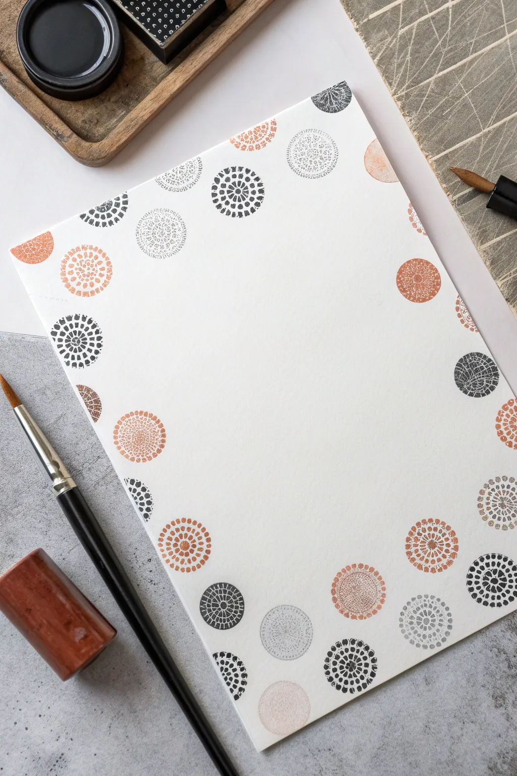
Create sophisticated stationery with this minimalist stamping project that transforms simple patterns into an elegant frame. By alternating muted tones of terracotta, charcoal, and soft grey, you can turn a plain sheet of paper into a stunning piece of art ready for calligraphy or framing.
Step-by-Step Tutorial
Materials
- High-quality white cardstock or watercolor paper
- Round foam stamps or flat circular objects (bottle caps work well)
- Patterned stamps (radial designs, mandalas, or textured fabric)
- Ink pads in terracotta/orange
- Ink pads in black/charcoal
- Ink pads in light grey
- Scrap paper for testing
- Damp cloth for cleaning stamps
Step 1: Setting the Composition
-
Paper Selection:
Choose a heavyweight paper that won’t buckle under the ink. A smooth hot-press watercolor paper or thick cardstock provides the crispest surface for detailed stamping. -
Visualizing the Frame:
Beforeinking, lay your clean stamps dry on the paper to map out a pleasing arrangement. Aim for a border that feels balanced but not perfectly symmetrical, leaving the center completely open for future text or drawing. -
Test Impressions:
Press your chosen stamps onto scrap paper first. This helps you gauge how much pressure is needed and allows you to see if the texture is transferring clearly.
Uneven Ink Coverage?
If the center of your stamp isn’t printing, place a thin mousepad or magazine under your paper. The slight give helps the stamp make full contact.
Step 2: Stamping the Primary Elements
-
Start with Black:
Begin by inking a patterned round stamp with black or charcoal ink. Place your first stamp near a corner, but not exactly at the edge. -
Create Anchors:
Stamp 3-4 more black circles around the perimeter. Space them widely apart to leave plenty of room for the other colors. Rotate the stamp slightly between impressions so the pattern doesn’t look identical each time. -
Add Terracotta Accents:
Switch to your terracotta or burnt orange ink. Clean the stamp if reusing the same one, or choose a stamp with a slightly different radial pattern. -
Fill the Gaps:
Stamp the orange circles in the spaces between the black ones. Allow some to conceptually ‘float’ higher or lower than the others to create movement. -
Partial Stamping:
For a dynamic look, stamp some circles so they run off the edge of the paper. This ‘bleed’ effect draws the eye outward and makes the composition feel professional.
Gilded Edges
Once dry, use a gold paint pen or metallic ink to add tiny dots or outline a few select circles to give the artwork a luxurious, finished look.
Step 3: Layering and Details
-
Introduce Grey Tones:
Identify the remaining open spaces in your border. Ink a stamp with light grey and press it firmly into these gaps. -
Varying Opacity:
I particularly like to stamp once on scrap paper and then immediately on the final work without re-inking. This ‘second generation’ stamping creates a softer, faded ghost image that adds depth. -
Overlap Strategy:
Don’t be afraid to let the edges of the circles touch or slightly overlap. This connects the individual elements into a cohesive frame rather than just floating islands. -
Review Balance:
Step back and look at the color distribution. If one area looks too heavy with dark colors, balance it with a light grey stamp on the opposite side. -
Adding Texture:
If your stamps are too solid, lightly dab the inked surface with a dry cloth before stamping to create a distressed, vintage texture. -
Final Micro-Details:
Use a very small circular stamp or even a pencil eraser dipped in ink to add tiny accent dots in empty pockets if the border feels too sparse. -
Drying Time:
Let the inks dry completely before touching the paper to avoid smearing the crisp edges. Pigment inks may take a bit longer than dye-based inks.
Your finished page now has a modern, artistic border ready for a handwritten poem or a special menu
Cut-Paper Collage With Painted Shapes
Embrace the soothing palette of warm earth tones with this geometric abstract art piece that blends painting and collage techniques. By combining painted textured paper with crisp white negative space, you’ll create a structured yet organic composition perfect for modern interiors.
How-To Guide
Materials
- Heavyweight watercolor paper or mixed media paper (A3 or A4)
- Acrylic paints or gouache (Terracotta, Ochre, Peach, Rust Red, Warm Brown)
- Flat paintbrushes (medium and large)
- Pencil and eraser
- Ruler
- Compass or circular objects for tracing
- Craft knife or precision scissors
- Cutting mat
- Glue stick or archival craft glue
- Palette for mixing
Step 1: Creating the Color Palette
-
Mix your base colors:
Start by preparing your palette. You want a cohesive family of warm tones. Mix a deep rust red, a sunny ochre yellow, a soft peach, and a neutral warm brown. Keep the consistency creamy and opaque. -
Paint your paper sheets:
Take several separate sheets of paper—lighter weight sketch paper works well here—and paint them fully with your mixed colors. Don’t worry about perfect smoothness; distinct brushstrokes add lovely texture to the final collage. -
Create variations:
For added depth, I like to mix a little white into some of the colors on a second pass to create tint variations. Paint at least one sheet for every major color you intend to use. -
Allow to dry completely:
Set these painted sheets aside. They must be bone dry before you attempt to cut them, otherwise the paper will tear and drag under the knife.
Clean Cuts Pro Tip
If cutting painted paper with a craft knife, change your blade frequently. Acrylic paint can dull blades quickly, and a dull blade will tear the paper rather than slicing it cleanly.
Step 2: Designing the Composition
-
Prep the base canvas:
While your painted sheets dry, take your main heavyweight backing paper. Use a ruler to lightly mark a centered rectangular border where your artwork will live, leaving a clean white margin around the edges. -
Sketch the grid:
Lightly draw a grid inside your defined rectangle. For the design shown, divide the space into equal quadrants or six even blocks depending on your desired scale. -
Draft the shapes:
Using a compass, draw semicircles within your grid blocks. Alternate their orientation—some facing up, some down—and intersect them with diagonal lines to create triangles. -
Plan the color flow:
Mark each section of your sketch with a small letter (e.g., ‘R’ for Rust, ‘O’ for Ochre) to plan a balanced distribution of color before you start cutting.
Step 3: Cutting and Assembling
-
Trace shapes onto painted paper:
Once your painted sheets are dry, use your compass (set to the same radius as your sketch) to draw the required semicircles and geometric shapes on the back of the painted paper. -
Cut the primary arcs:
Using sharp scissors or a craft knife on a cutting mat, carefully cut out your curved shapes. Ensure the edges are crisp and clean. -
Cut the linear details:
Cut out the triangular and rectangular components. Use a metal ruler as a guide for your craft knife to ensure perfectly straight lines. -
Dry fit the arrangement:
Place all your cut pieces onto the base paper without glue. This is the time to make adjustments if a gap looks too wide or a color balance feels off. -
Refine the negative space:
Pay close attention to the white gaps between shapes. These ‘channels’ of negative space should be uniform in width to give the piece a professional, mosaic-like look.
Make It 3D
Use foam adhesive squares instead of glue for some shapes. This raises them slightly off the background, creating subtle shadows and adding sculptural depth to your work.
Step 4: Final Adhesion
-
Begin gluing from the corner:
Start adhering your shapes, working from the top-left corner downwards. Apply glue to the back of the colored paper, extending all the way to the edges to prevent curling. -
Align carefully:
Place each piece slowly, aligning it with your faint pencil grid marks. Press down firmly with a clean cloth to smooth out any air bubbles. -
Complete the puzzle:
Continue gluing adjacent shapes, maintaining that consistent white gap between them. Step back occasionally to ensure the overall alignment remains straight. -
Clean up:
Once dry, use a high-quality white eraser to gently remove any visible pencil guidelines from the negative spaces. -
Add final details (optional):
If you want to add distinct crisp lines like in the inspiration photo, you can use a fine liner brush with matching paint to touch up edges or add very thin connecting lines.
Frame your geometric masterpiece in a simple light wood frame to highlight those beautiful warm tones
One-Line Abstract Faces and Profiles
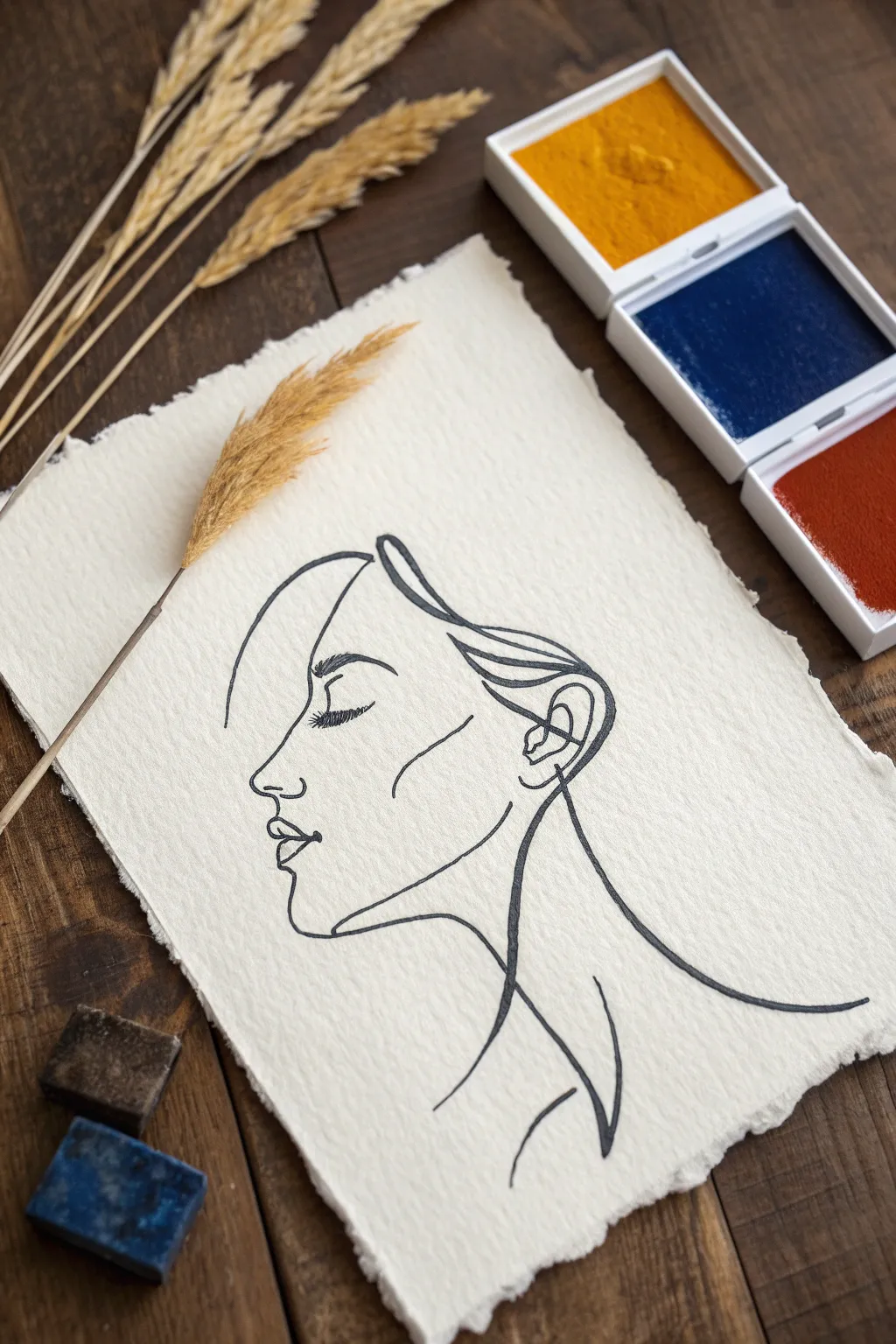
Capture the elegance of minimalism with this striking one-line drawing on handmade paper. This project teaches you to embrace fluidity and imperfection, creating a sophisticated portrait with a single, unbroken stroke of ink.
Step-by-Step Guide
Materials
- Heavyweight handmade paper (deckled edge)
- Black drawing ink or liquid watercolor
- Fine liner brush (size 0 or 00) or dip pen
- Sketching pencil (HB or H)
- Kneaded eraser
- Palanquin or smooth palette surface
- Paper towels
- Reference photo of a side profile
Step 1: Preparation and Sketching
-
Choose your paper:
Select a gorgeous sheet of heavyweight, handmade paper with a rough deckled edge. The texture of the paper adds crucial character to such a simple drawing. -
Study the form:
Before putting pencil to paper, look at your reference photo. Trace the profile in the air with your finger to get a feel for the continuous flow of the line. -
Lightly map the anchor points:
Using your HB pencil, mark the top of the forehead, the tip of the nose, and the chin lightly. These faint dots will keep your proportions in check. -
Sketch the silhouette:
Very faintly sketch the outline of the face. Keep your pencil pressure minimal so the graphite doesn’t dent the soft paper fibers. -
Refine the hair flow:
Draw loose, sweeping curves to indicate the hair. You don’t need individual strands; focus on the major shapes and how they frame the face. -
Establish the neck line:
Extend a graceful line down from the chin to form the neck and shoulder. This trailing line anchors the floating head.
Step 2: Applying the Ink
-
Load the brush:
Dip your fine liner brush into the black ink. You want it fully saturated but not dripping; distinct blobs will ruin the sleek aesthetic. -
Start at the hairline:
Begin your ink line at the top of the forehead, moving downward into the brow. Keep your hand relaxed to allow for natural variations in line thickness. -
Navigate the nose and lips:
Carefully trace the dip of the nose and the curves of the lips. I find a slightly slower speed here helps capture the delicate nuances of the profile. -
Create the eye detail:
Lift the brush momentarily if needed—this style looks continuous but doesn’t strictly have to be. Draw the closed eyelid and lashes with a slightly heavier pressure for emphasis. -
Outline the ear:
Move the line back to create the ear shape. Use simple, abstract spirals inside the ear outline rather than anatomical precision. -
Sweep through the hair:
Reload your brush if the ink runs dry. Execute the hair lines with quick, confident sweeps to mimic movement and volume. -
Connect the neck:
Bring the line down the back of the neck and curve it forward along the collarbone area. Let the line trail off naturally at the bottom. -
Thicken key areas:
Review your drawing while the ink is wet. Go back and slightly thicken the lash line or the shadow under the chin to add depth.
Ink Flow Secret
Add a single drop of water to your ink well. Slightly thinner ink flows smoother on textured paper, preventing skip marks.
Step 3: Finishing Touches
-
Let it dry completely:
Handmade paper is absorbent, so allow the ink at least 30 minutes to fully set into the fibers. -
Erase guidelines:
Gently dab—do not rub—the paper with a kneaded eraser to lift any visible pencil marks without pilling the paper surface. -
Flatten the paper:
If the ink has caused slight buckling, place the drawing between two sheets of clean paper and weigh it down with a heavy book overnight.
Add a Splash
Before inking, paint a loose, abstract shape of diluted watercolor (like ochre or terracotta) behind where the face will go.
Frame your minimal masterpiece in a floating glass frame to show off those beautiful rough edges
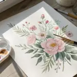
Simple Abstract Botanicals as Shapes
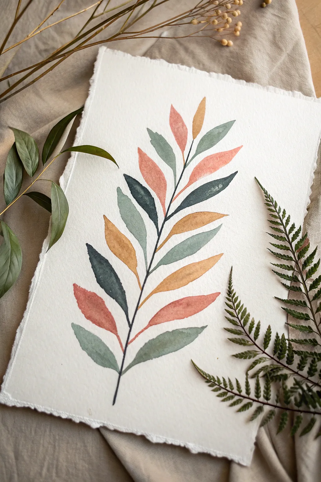
This project explores the beauty of simple botanical shapes using a muted, earthy color palette. By focusing on distinct leaf forms rather than realistic details, you’ll create a stylized and calming piece of natural art.
Step-by-Step
Materials
- Heavyweight watercolor paper (rough or cold press texture, 300gsm)
- Watercolor paints (Olive Green, Sap Green, Paine’s Grey or Indigo, Burnt Sienna, Yellow Ochre, Red Oxide)
- Round watercolor brushes (size 6 and size 2)
- Pencil (HB or H)
- Eraser
- Two jars of water
- Paper towels or cloth
- Ruler (optional)
Step 1: Planning the Composition
-
Prepare the paper:
If your paper doesn’t already have a deckle edge, you can gently tear the edges against a ruler to create that soft, handmade look. Tape your paper down to a board to prevent warping. -
Sketch the central stem:
Lightly draw a curved vertical line down the center of your page. Let it sway slightly to the left or right to give the branch a natural, organic feel rather than a rigid straight line. -
Mark leaf positions:
Sketch very faint guidelines for where each leaf will go. Aim for pairs or alternating placements, leaving a small gap between the leaf base and the stem. Keep the shapes simple—elongated ovals or almond shapes work best.
Fixing Water Blooms
If creates a ‘cauliflower’ bloom, wet the area slightly and dab with a clean, dry tissue to lift the pigment, then repaint once dry.
Step 2: Painting the Leaves
-
Mix your palette:
Prepare four distinct puddles of color: a muted sage green, a deep forest green mixed with a touch of indigo, a warm terracotta or salmon pink, and a golden mustard yellow. Keep the mixes watery but pigmented. -
Paint the bottom leaves:
Start at the bottom with your size 6 brush. Load it with the sage green mix and paint the lowest left leaf. Use the belly of the brush to create the width and lift to a point for the tip. -
Balance the color:
Switch to your darker forest green for the leaf directly opposite or slightly above the first one. Alternating colors as you move up helps balance the composition. -
Add warmth:
For the next set of leaves, dip into your terracotta or salmon mix. Paint a leaf on the left side, allowing the watery pigment to settle naturally into the paper’s texture. -
Introduce golden tones:
Use the mustard yellow for a leaf in the middle section. If the paint pools too much, you can dab it lightly with a dry brush, but leaving some variation adds character. -
Work your way up:
Continue ascending the stem, randomly alternating between your four colors. Try not to put two identical colors right next to each other. -
Paint the top leaves:
As you reach the top, make the leaves slightly smaller. I find that making the very top leaf a lighter color, like the sage or yellow, keeps the artwork feeling airy. -
Let the leaves dry:
Wait until the leaves are completely dry. If you paint the stem while the leaves are wet, the colors might bleed into each other, losing that crisp ‘shape’ aesthetic.
Add Subtle Veins
Once the leaves are totally dry, use a white gel pen or very diluted dark paint to add faint central vein lines for extra detail.
Step 3: Connecting the Elements
-
Mix the stem color:
create a very dark, near-black mixture using green and indigo or sepia. You want this to be opaque enough to stand out as a graphical element. -
Paint the main stem:
Using the size 2 brush and a steady hand, paint over your initial pencil line. Start from the bottom and gently taper the line as you reach the top. -
Attached the leaves:
Draw tiny, thin lines connecting the main stem to the base of each leaf. These petioles should be delicate so they don’t overpower the colorful leaf shapes. -
Review and refine:
Step back and look at the whole piece. If the stem looks too faint in areas, carefully go over it again to ensure a solid, dark line. -
Erase guidelines:
Once the paint is bone dry—give it extra time just to be safe—gently erase any visible pencil marks remaining around the edges of the leaves.
Display your botanical study in a floating frame to show off those beautiful deckled edges
Have a question or want to share your own experience? I'd love to hear from you in the comments below!