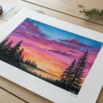
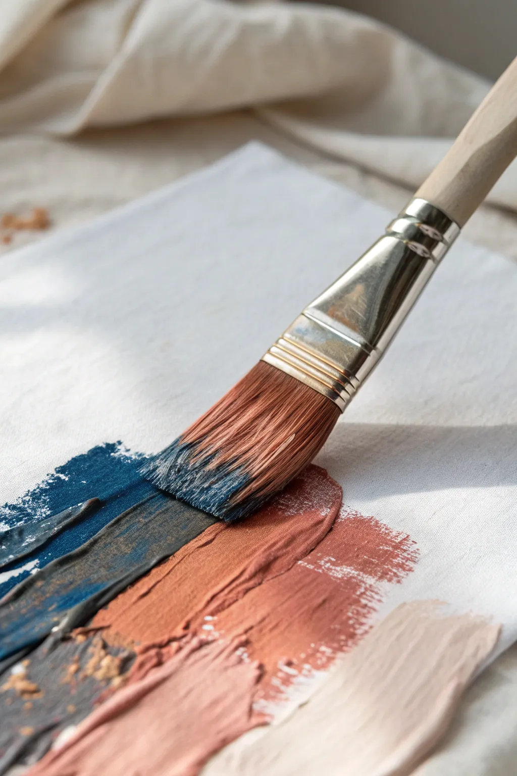
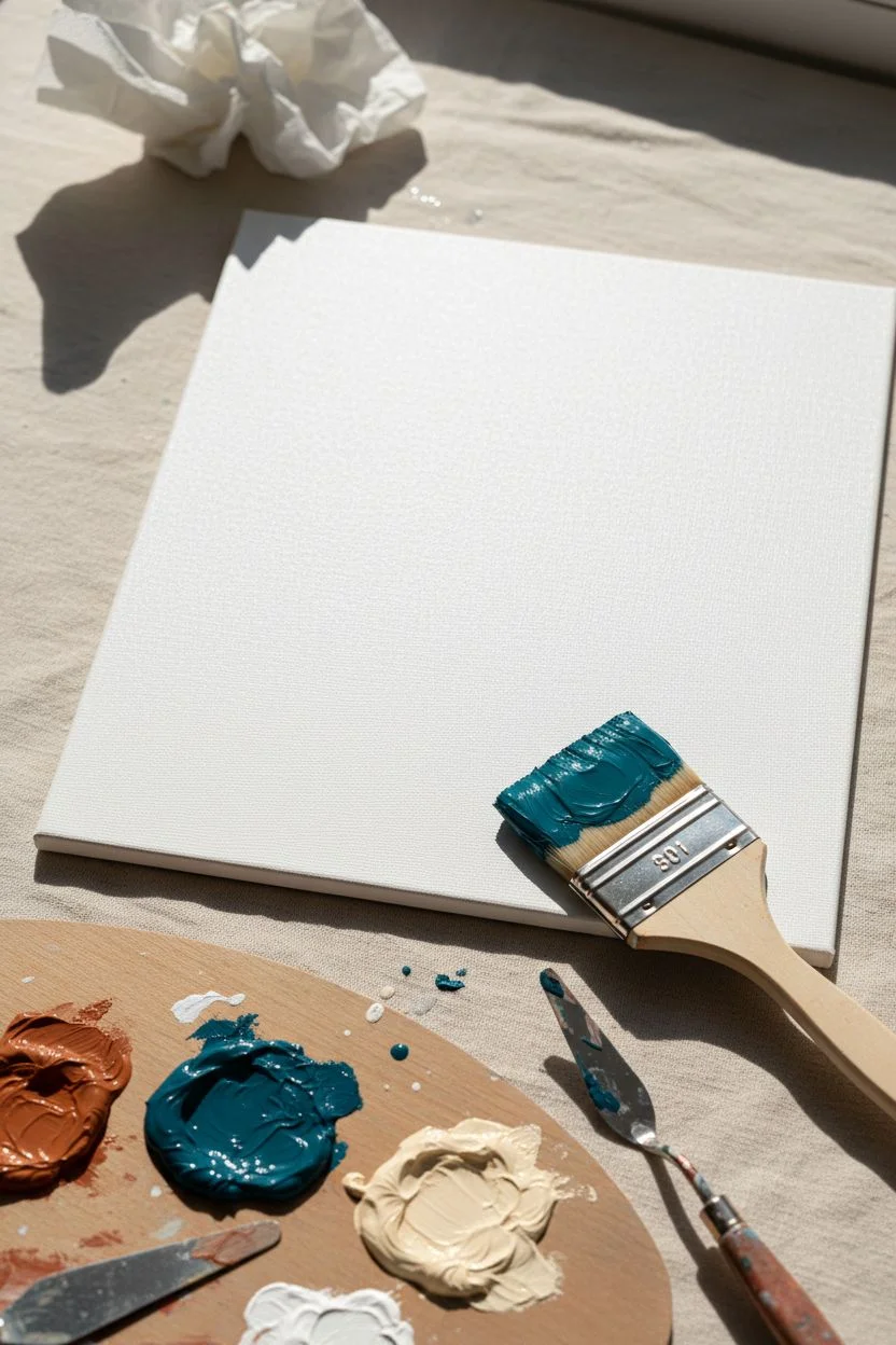
If you’ve been craving a fresh abstract oil painting direction, I’ve got you. These ideas lean into color, texture, and intuitive mark-making so you can start painting without overthinking.
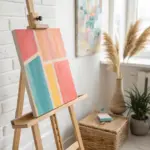
Color-Field Horizon Bands
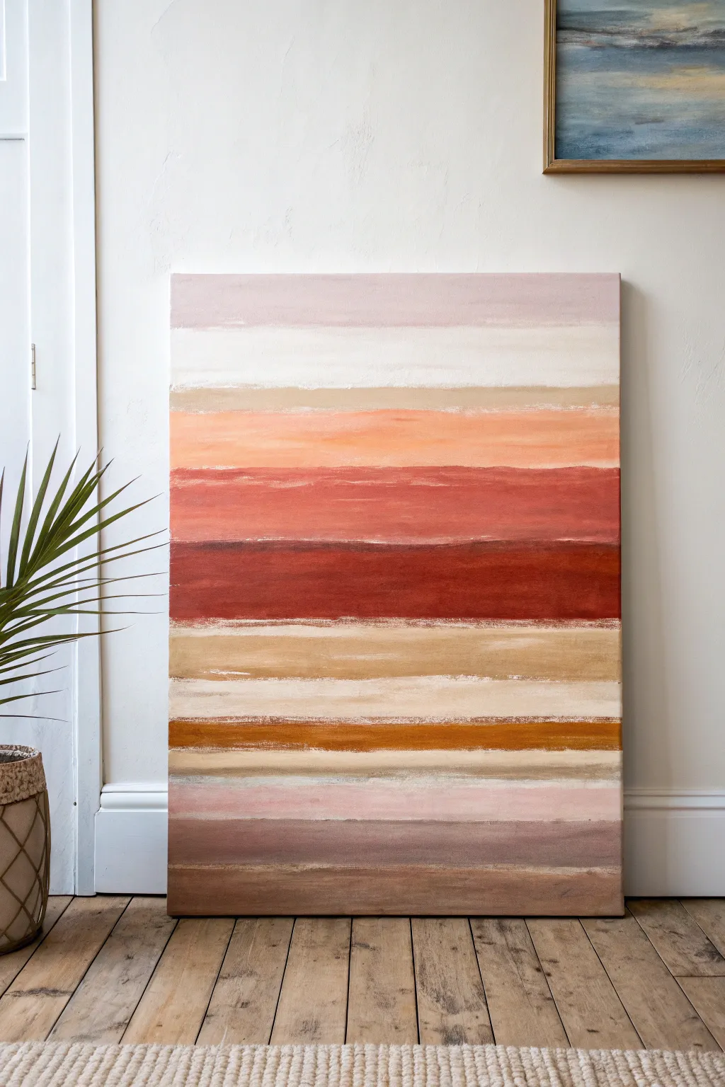
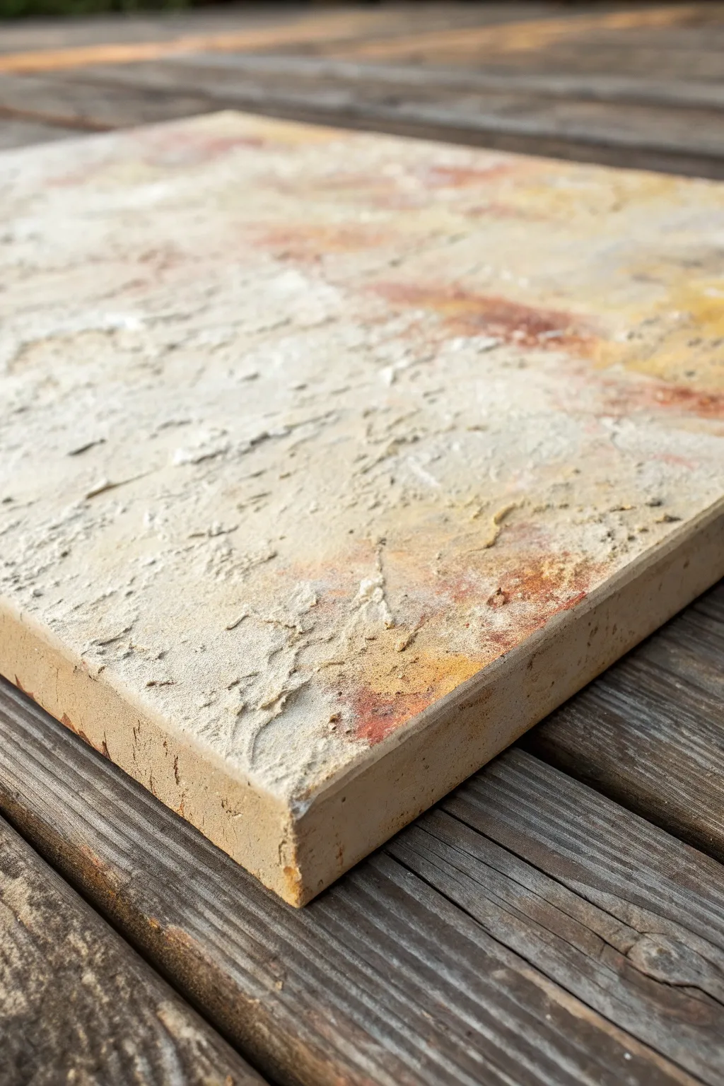
This color-field painting captures the soothing essence of a desert landscape through stacked horizontal bands of warm, earthy tones. By layering soft creams, muted pinks, terracottas, and deep ochres, you will create a structured yet organic piece that brings warmth to any room.
How-To Guide
Materials
- Large stretched canvas (e.g., 24×36 inches)
- Oil paints: Titanium White, Unbleached Titanium, Yellow Ochre, Burnt Sienna, Alizarin Crimson, Burnt Umber, Raw Umber
- Large flat bristle brushes (2-3 inches)
- Medium filbert brush for blending
- Palette knife (optional, for texture)
- Palette or mixing surface
- Odorless mineral spirits or painting medium (like Liquin)
- Rags or paper towels
Step 1: Preparation & Color Mixing
-
Prime the surface:
If your canvas isn’t pre-primed, apply two coats of gesso and let it dry completely. For this textured look, a slightly rougher weave or a thicker gesso application works well to grab the oil paint. -
Mix your base creams:
On your palette, create a large pile of a warm off-white. Mix Titanium White with a touch of Unbleached Titanium. Create a second variation by adding a tiny speck of Yellow Ochre for a sandy beige tone. -
Prepare the warm mid-tones:
Mix a soft peach by combining White with a small amount of Yellow Ochre and a dot of Alizarin Crimson. I like to keep this mixture quite pale initially, as you can always darken it later. -
Create the deep earth tones:
Prepare your darker bands: a rust red (Burnt Sienna + Alizarin Crimson), a deep ochre (Yellow Ochre + Burnt Umber), and a grounded brown-grey (Raw Umber + White).
Muddy Colors?
If your blurred edges turn gray or muddy, wipe your blending brush on a rag after every few strokes. A clean brush creates a soft gradient; a dirty one mixes all three colors into brown.
Step 2: Painting the Bands
-
Start at the top:
Using a large flat brush, apply a band of your palest muted pink at the very top edge of the canvas. Keep your strokes horizontal and loose, allowing some brush texture to show. -
Add the cream horizon:
Below the pink, paint a wide band of your mixed off-white. Don’t worry about a perfect straight line; a slightly wavering edge looks more organic and painterly. -
Blend the transition:
While the paint is still wet, use a clean, dry brush to gently sweep back and forth where the pink and cream meet. This softens the edge without muddying the colors completely. -
Introduce the peach tones:
Paint the next section down using your peach mixture, followed by a slightly darker orange-sherbet tone. Allow these bands to vary in thickness to create visual interest. -
Apply the bold center:
The middle of the canvas features the intense terracottas and rust reds. Load your brush generously and apply these colors across the center. You can use a palette knife here to drag the paint for extra texture. -
Create the lower transition:
Below the red block, introduce a narrow strip of sandy beige to break up the intensity. This acts as a visual ‘breather’ between the heavy reds and the lower earth tones. -
Paint the golden band:
Apply a distinct stripe of your deep ochre/gold mixture. This color should be rich and opaque, contrasting with the lighter bands above and below it. -
Fill the bottom section:
Finish the bottom third with alternating bands of muted pink-grey and deep brown. The lowest band should be the darkest (Raw Umber) to ‘ground’ the composition visually.
Add Metallic Flair
Mix a small amount of gold leaf or metallic bronze paint into the ochre band for a subtle shimmer that catches the light and adds a modern twist.
Step 3: Refining and Texturing
-
Softening hard edges:
Step back and look for any lines that feel too rigid. Use a soft filbert brush with a tiny bit of medium to feather edges that need to feel less architectural and more atmospheric. -
Dry brushing highlights:
Dip a dry brush into a small amount of pure Titanium White. Very lightly drag it horizontally over the dried or semi-dried darker bands to creative a weathered, woven texture. -
Enhancing the ‘white space’:
Go back into your cream and white bands. Add fresh, thick strokes of white on top to increase opacity and brightness, ensuring they pop against the darker colors. -
Checking the movement:
Ensure your brushstrokes all flow horizontally. If you see vertical start/stop marks, smooth them out with one long, final continuous stroke across the canvas width. -
Final cure:
Allow the painting to dry in a dust-free area. thick oil paint applications can take several days or even weeks to fully cure to the touch.
Hang your finished abstract piece in a well-lit spot to let those warm earth tones truly glow

Palette-Knife Impasto Peaks
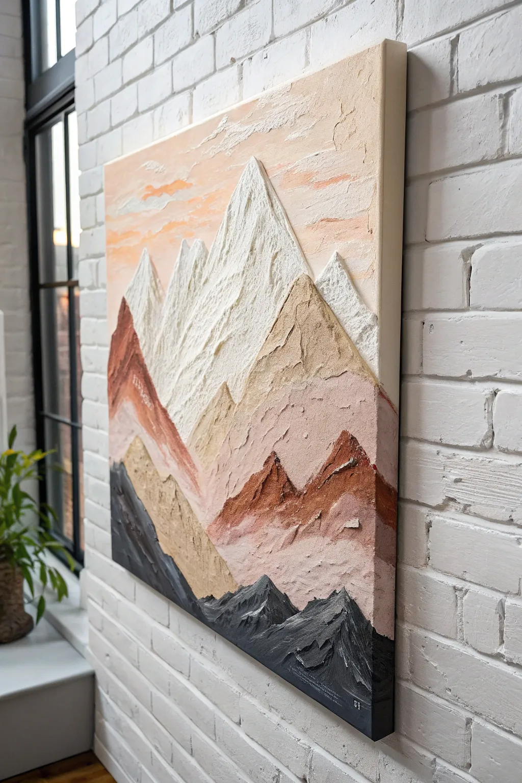
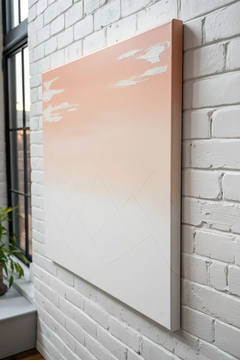
Capture the rugged beauty of mountain ranges with this highly textured impasto painting. Using heavy body acrylics and modeling paste, you will build literal mountain peaks off the canvas for a stunning, tactile 3D effect.
Detailed Instructions
Materials
- Stretched canvas (24×30 or similar)
- Heavy body acrylic paints (Titanium White, Mars Black, Burnt Sienna, Yellow Ochre, Raw Umber, Salmon/Peach)
- Modeling paste or texture gel (hard or flexible styling)
- Palette knives (assorted sizes, specifically diamond and trowel shapes)
- Large flat brush (for the sky)
- Palette or disposable mixing paper
- Pencil
Step 1: Preparation and Sky
-
Sketch the layout:
Begin by lightly sketching your mountain composition directly onto the canvas with a pencil. Focus on triangular, geometric shapes that overlap. Create distinct layers: a foreground of dark rocks, a middle ground of earthy hills, and towering peaks in the back. -
Mix the sky gradient:
On your palette, mix a generous amount of Titanium White with a small touch of Salmon or Peach color. Prepare a slightly darker orange mix for the horizon line to create depth. -
Paint the background:
Using a large flat brush, paint the sky area. Start with the darker peach tone near the mountain tops and blend upwards into the lighter white-peach mixture. Keep the strokes horizontal and smooth. -
Add subtle clouds:
While the sky is still wet, use a clean palette knife to scrape a tiny amount of pure white modeling paste across the upper corners to hint at wispy clouds.
Fixing Slumping Peaks
If your mountains are drooping, your paste-to-paint ratio is too low. Mix in more heavy modeling paste or a gel thickener to stiffen the body immediately.
Step 2: Building the Texture
-
Prepare the texture mix:
Mix your modeling paste with your acrylic colors on the palette. You want a ratio of about 60% paste to 40% paint to ensure the peaks hold their shape without cracking as they dry. -
Create the white peaks:
Start with the furthest mountains (the highest peaks). Load a diamond-shaped palette knife with the white paste mixture. Apply it thickly, starting from the tip of the sketched triangle and dragging downward. -
Sculpt the ridges:
Use the edge of your knife to create sharp ridges down the center of the white mountains. Let the texture be rough; don’t smooth it out. Allow the paste to pile up slightly to mimic snow. -
Mix the middle tones:
Create a sandy beige color by mixing White, Yellow Ochre, and a tiny dot of Raw Umber with fresh modeling paste. Prepare a separate terracotta mix using Burnt Sienna and White.
Add Metallic Glimmer
Mix a small amount of iridescent medium or gold mica flakes into the white snow mixture. It catches the light beautifully when viewed from side angles.
Step 3: Layering the Mountains
-
Apply the beige layer:
Working your way down the canvas, apply the sandy beige mixture to the mountains directly below the white peaks. Overlap the bottom of the white mountains slightly to establish distance. -
Add the terracotta hills:
Use the Burnt Sienna mix for the mid-ground hills on the left and right sides. Apply the paint with aggressive downward strokes of the knife to simulate rock faces and erosion. -
Introduce contrast:
For the lower middle section, mix a variegated color by taking some Burnt Sienna paste and swiping it with a little unmixed White. Apply this marbleized mix to create visual interest in the transitional zones. -
Mix the dark foreground:
Combine Mars Black with a small amount of Raw Umber and your modeling paste. This dark color will anchor the bottom of the painting.
Step 4: Final Details
-
Form the dark range:
Apply the dark grey/black mix to the very bottom triangular shapes. Press firmly with the knife to get deep grooves and high ridges, making this the most textured part of the painting. -
Highlight the dark rocks:
Once the black layer is applied but still wet, gently graze the tops of the texture with a knife carrying a tiny bit of white or light grey. This ‘dry brush’ effect with a knife highlights the ridges. -
Check the edges:
Inspect the sides of your canvas. I prefer to wrap the texture around the edges for a gallery-quality look, so extending your mountain shapes around the sides now. -
Refine the peaks:
Look for any peaks that have slumped. You can use the tip of a clean palette knife to gently pull the drying paste upward again to sharpen the points. -
Allow extensive drying time:
Because the impasto is very thick, lay the canvas flat to dry. It may take 24 to 48 hours to cure completely firm.
Once fully cured, your mountain range will stand out from the wall with incredible tactile depth and modern style


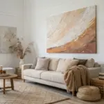
Atmospheric Abstract Landscape Swells
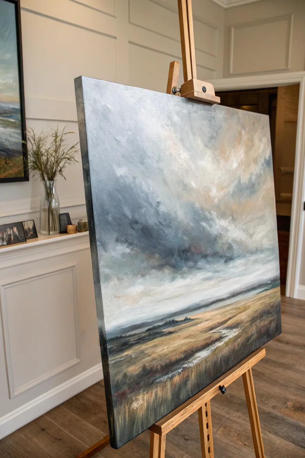
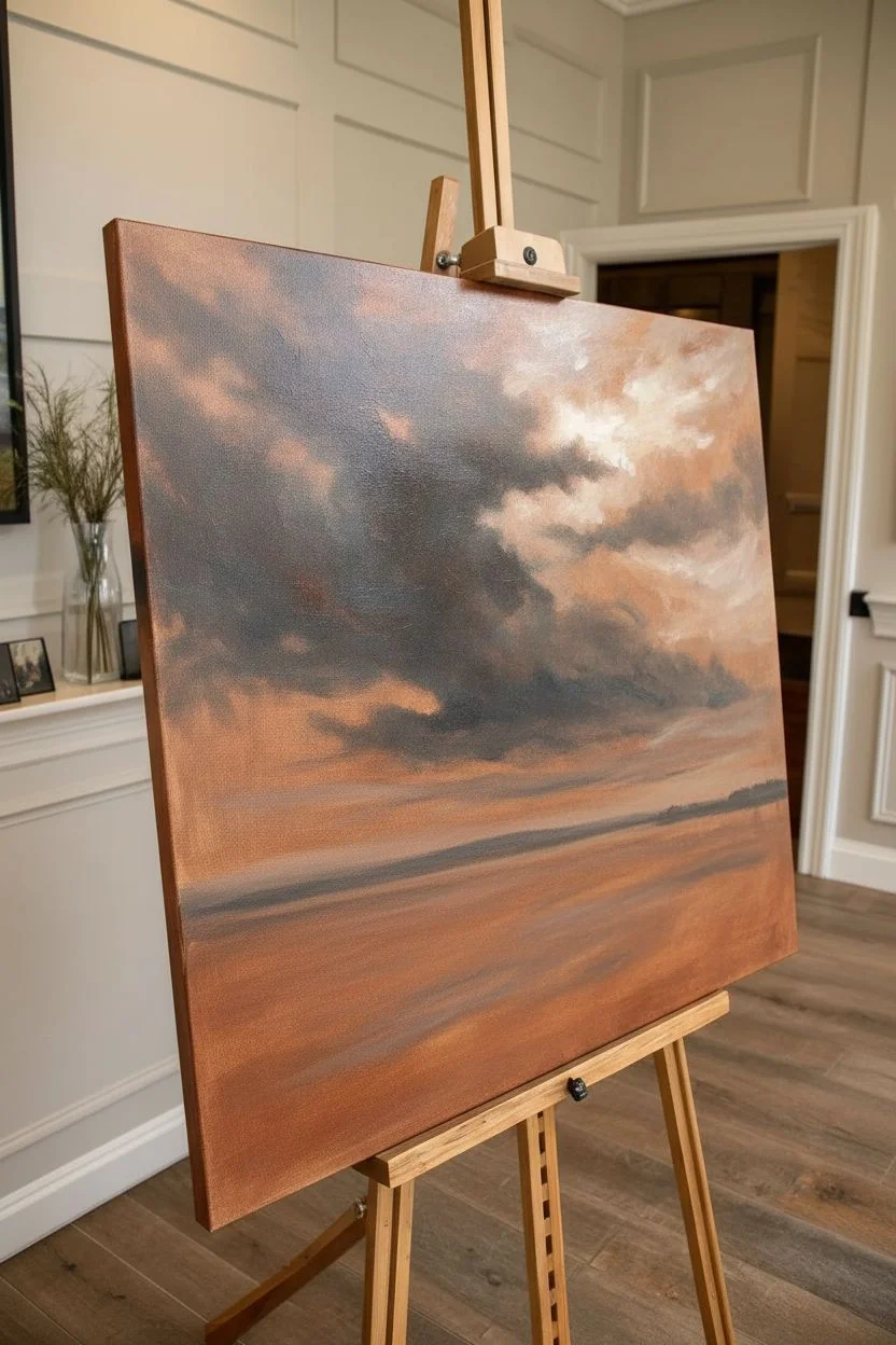
Capture the moody drama of an approaching storm over rugged terrain with this atmospheric oil painting project. You will focus on building deep, textured cloud formations that transition seamlessly into a sweeping, windswept foreground.
How-To Guide
Materials
- Large stretched canvas (e.g., 24×30 inches or larger)
- Oil paints: Titanium White, Payne’s Grey, Yellow Ochre, Burnt Sienna, Raw Umber, Prussian Blue, Alizarin Crimson
- Large flat bristle brushes (size 10-12)
- Medium filbert brushes
- Palette knife
- Odorless mineral spirits or turpentine
- Linseed oil or painting medium
- Lint-free rags or paper towels
- Wooden easel
Step 1: Setting the Atmosphere
-
Prime the Surface:
Begin by toning your white canvas with a thin wash of Burnt Sienna diluted with mineral spirits. Wipe it back with a rag to create a warm, neutral glow that will peek through later layers. -
Map the Horizon:
Using a thin mixture of Payne’s Grey and a small round brush, sketch a low horizon line about one-third of the way up the canvas. This composition emphasizes the sky’s dominance. -
Block in Dark Clouds:
Mix Payne’s Grey with a touch of Prussian Blue and Burnt Sienna to create a stormy charcoal color. Scumble this into the middle section of the sky, focusing on the heavy ‘belly’ of the storm clouds. -
Add Light Values:
Mix Titanium White with a tiny amount of Yellow Ochre and Alizarin Crimson for a warm, creamy off-white. Apply this to the upper right corner and areas just above the horizon where the light breaks through. -
Mid-Tone Transitions:
Create a mid-tone grey using your dark mixture and white. Use a large dry brush to blend the edges where the dark storm clouds meet the lighter areas, using a circular motion to keep the clouds soft and rolling.
Muddy colors?
If your clouds turn grey and muddy, stop blending! Let the layer dry completely, then apply fresh highlights on top. Overworking wet paint destroys distinct values.
Step 2: Building Texture and Depth
-
Thicken the Paint:
Switch to using less solvent and more paint straight from the tube or mixed with a little linseed oil. This body allows you to build physical texture on the canvas. -
Create Cloud Movement:
Load a large filbert brush with pure Titanium White and a dot of warmth. Scumble diagonally from the top right, creating dynamic sweeps that suggest wind movement pushing the clouds. -
Define the Horizon:
Paint the distant hills using a cool grey-blue mix (White + Payne’s Grey). Keep the edges soft and slightly blurred to approximate atmospheric perspective, making them recede into the distance. -
Establish the Field Base:
For the foreground ground, mix Yellow Ochre, Burnt Sienna, and White. Scrub this color into the bottom third horizontally, letting the brush bristles create natural streakiness.
Metallic sheen
Mix a tiny amount of iridescent silver medium into the grey cloud paint. It catches the light like rain mist and adds a subtle, magical glow to the storm.
Step 3: Foreground and Details
-
Deepen the Shadows:
Mix Raw Umber and Payne’s Grey. Apply this dark mixture to the bottom corners and the very bottom edge of the canvas to anchor the composition and lead the eye upward. -
suggestion of Water:
With a palette knife or flat brush, drag a streak of Titanium White mixed with a little sky grey horizontally across the foreground field to suggest a reflective creek or wet path. -
Add Grassy Texture:
Using a dry, worn fan brush or bristle brush, flick upward strokes of Yellow Ochre and White over the dark foreground base. I prefer to vary the pressure here to make the grass look wild rather than manicured. -
Refining Cloud Edges:
Return to the sky with a clean, dry blending brush. Very lightly sweep over the transition areas between the dark grey clouds and the white light to create a ‘sfumato’ or smoky effect. -
Highlight the Path:
Strengthen the light reflection in the foreground water/path with pure Titanium White applied thickly with a palette knife for a sharp, glistening contrast. -
Final Contrast Check:
Step back from the easel. If the storm doesn’t look threatening enough, glaze a transparent layer of dark blue-grey over the shadowed parts of the clouds once the underlayer is tacky. -
Paint the Sides:
Carry the painting around the edges of the deep canvas for a gallery-wrapped finish, matching the colors of the adjacent front face.
Allow your painting to dry in a dust-free area for several days before varnishing to protect that beautiful sheen
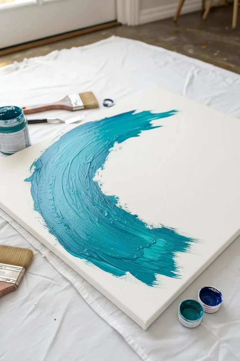
Minimal Seascape Line Abstraction
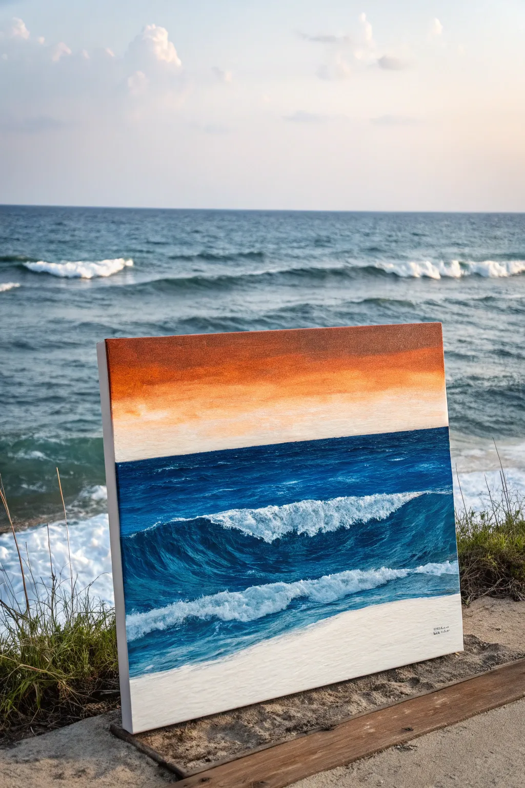
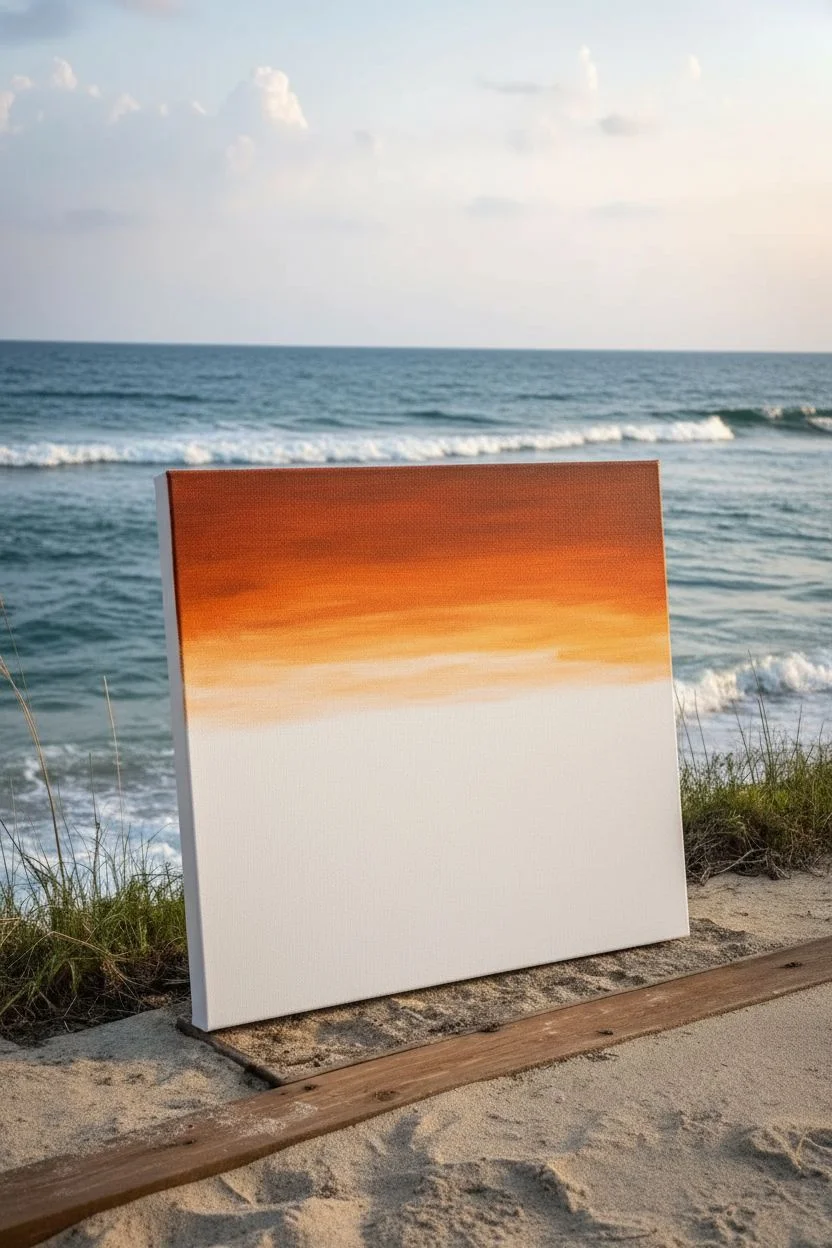
Capture the dramatic contrast between a fiery sunset sky and the cool, churning ocean in this semi-abstract acrylic or oil study. This painting emphasizes bold horizontal bands of color and energetic brushwork to mimic the movement of crashing waves.
Step-by-Step
Materials
- Stretched canvas (square format, e.g., 12×12 or 20×20 inches)
- Oil or heavy-body acrylic paints
- Colors: Titanium White, Phthalo Blue, Ultramarine Blue, Burnt Sienna, Cadmium Orange, Yellow Ochre
- Flat synthetic brushes (large 1-inch, medium 1/2-inch)
- Small round brush for details
- Palette knife
- Painters tape (optional)
- Palette for mixing
- Rag or paper towels
Step 1: Setting the Horizon
-
Divide the canvas:
Visualize your canvas in two distinct sections. The top third will be the sky, and the bottom two-thirds will be the ocean. You can use a strip of painter’s tape to create a razor-sharp horizon line if you prefer, or simply freehand it for a more organic feel. -
Base layer for the sky:
Mix a warm, deep orange using Cadmium Orange and a touch of Burnt Sienna. Apply this to the top third of the canvas, brushing horizontally. Use long, smooth strokes to create a gradient. -
Create the sunset glow:
While the orange paint is still wet (or using a retarder if working with acrylics), blend in some Yellow Ochre and Titanium White near the bottom of the sky section. This creates that hazy, glowing effect right where the sun meets the water. -
Darken the upper sky:
Add a tiny amount of Burnt Sienna or even a speck of blue to your orange mix to darken the very top edge of the canvas. This vignette effect draws the eye downward.
Muddy colors?
Clean your brush thoroughly when switching from the orange sky to the blue ocean. Orange and blue are opposites; mixing them accidentally creates a muddy brown grey.
Step 2: The Deep Blue Ocean
-
Establish the water line:
Remove the tape if you used it. Mix a deep, dark navy using Phthalo Blue and a touch of Burnt Sienna (to dull the blue slightly). Paint a straight, hard line right against the bottom of your sky color. -
Block in the water:
Fill the middle section of the canvas with a mix of Phthalo and Ultramarine Blue. Keep your brushstrokes horizontal to suggest the flat surface of distant water. -
Lighten the mid-ground:
As you move lower down the canvas, mix a little white into your blue. The water naturally gets lighter and more turquoise as the wave rises and the light shines through it. -
Plan the main wave:
Identify where the main crashing wave will be—roughly across the lower middle section. Use a darker blue shade to paint the ‘shadow’ side, the hollow curve of the rising wave. -
Curved strokes for movement:
Switch to curved brushstrokes inside that dark wave shape. Follow the curve of the water—up and over—to simulate the rolling motion.
Step 3: Crashing Foam and Details
-
First layer of foam:
Mix a light blue-grey color (White + tiny touch of Blue). Using a worn flat brush or a palette knife, scumble or scrape this color along the top edge of your wave to suggest the breaking crest. -
Add pure white highlights:
Load a smaller brush with thick Titanium White. Dab this onto the very top of the crest where the foam is thickest. Don’t smooth it out; let the texture of the paint stand like sea foam. -
Create the foreground wash:
At the very bottom of the canvas, paint a diagonal sweep of white mixed with a tiny bit of blue. This represents the spent wave washing up onto the sand. -
Connect the layers:
Between your main wave and the foreground wash, add choppy, short strokes of medium blue and white. This is the turbulent, messy water left behind after a wave breaks. -
Refine the wave face:
Go back into the dark curve of the wave. I like to add thin, lighter blue veins here to show the water stretching as it rises. -
Highlight the horizon:
Check your horizon line. If the contrast isn’t strong enough, add a very thin line of your darkest blue right against the bright sunset sky to make it pop. -
Texture the sand:
If visible, add a sandy beige tone (White + tiny touch of Ochre) to the very bottom corners to ground the painting.
Level Up: Texture
Use a palette knife for the white sea foam. Apply the paint thickly (impasto style) so it physically raises off the canvas, catching the light like real bubbles.
Step back and admire how the warm sky intensifies the cool blues of your finished ocean scene
BRUSH GUIDE
The Right Brush for Every Stroke
From clean lines to bold texture — master brush choice, stroke control, and essential techniques.
Explore the Full Guide
Monochrome Value-Only Abstract
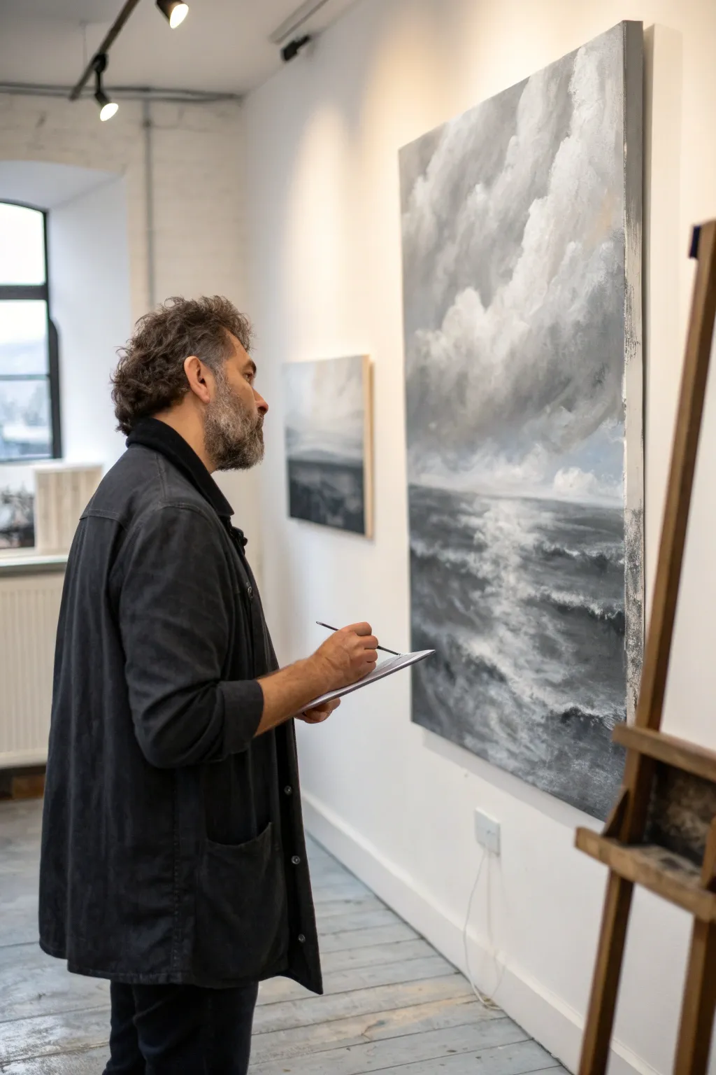
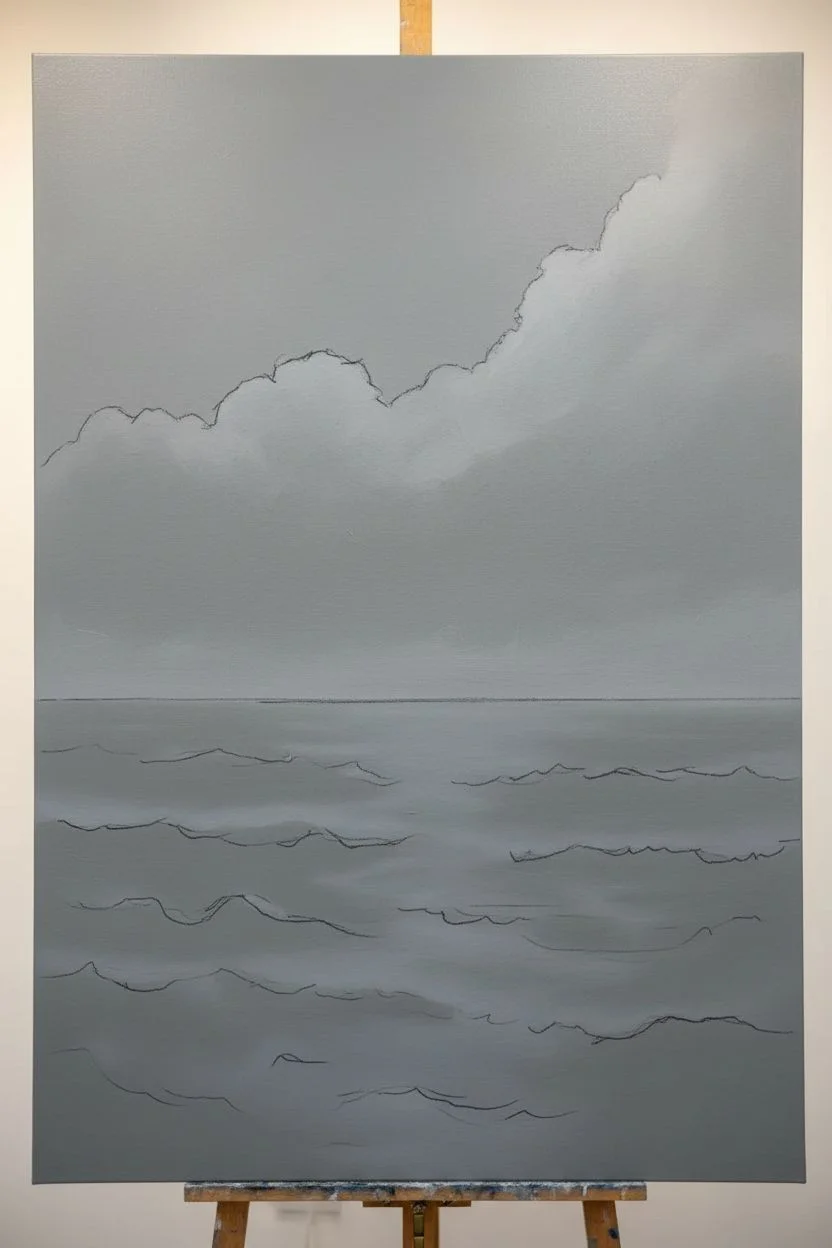
Master the drama of the ocean using only the power of values in this moody, semi-abstract oil painting. By limiting your palette to greys, blacks, and whites, you’ll focus intensely on the interplay between the turbulent sky and the reflective, choppy water.
How-To Guide
Materials
- Large stretched canvas (at least 24×36 inches)
- Titanium White oil paint
- Ivory Black oil paint
- Payne’s Grey oil paint
- Large flat bristle brushes (size 10-12)
- Medium filbert brushes
- Palette knife
- Odorless mineral spirits
- Lint-free rags or paper towels
- easel
Step 1: Setting the Atmosphere
-
Prime with a mid-tone:
Begin by covering your entire canvas with a wash of Payne’s Grey mixed with plenty of mineral spirits. This neutral, cool grey background eliminates the stark white of the canvas and helps establish the moody atmosphere right away. -
Establish the horizon:
Once the wash is tacky or dry, use a ruler or steady hand to mark a low horizon line, positioning it roughly one-third of the way up from the bottom. A lower horizon emphasizes the grand scale of the sky. -
Map out the large shapes:
Roughly sketch the composition using a thin mixture of black paint. Mark out big, billowing cloud formations in the upper section and horizontal wave patterns in the lower section without getting bogged down in detail.
Value Check Pro-Tip
Squint your eyes frequently while painting. This blurs the details and helps you see if your balance of light and dark values is correct without getting distracted by brushstrokes.
Step 2: Building the Turbulent Sky
-
Block in dark masses:
Mix Ivory Black with a touch of Payne’s Grey and apply it aggressively to the shadow areas of the clouds. Focus on the corners and the underbellies of the clouds to create weight and volume. -
Add mid-tone greys:
Create a gradient of greys on your palette by mixing black and white in varying ratios. Use a large brush to bridge the gap between your dark shadows and lighter areas, scumbling the paint to create soft, vaporous edges. -
Introduce light:
Load a clean brush with Titanium White and a tiny bit of grey. Apply this to the tops of the cloud formations where the light would naturally hit. Keep your brushstrokes loose and multidirectional to mimic the chaos of a storm. -
Soften the transitions:
Take a dry, clean badger hair blender or a soft synthetic brush and very gently feather the edges where different values meet. I prefer to do this while the paint is still very wet to get that blurry, atmospheric look characteristic of distant rain. -
Deepen the contrast:
Step back and evaluate the drama. If the sky looks flat, go back in with pure black in the deepest crevices of the clouds to push the contrast further.
Step 3: Creating the Choppy Sea
-
Lay the dark foundation:
For the ocean, start with a solid, dark horizontal band of Payne’s Grey and Black right at the horizon line. This area should be the darkest part of the water to create depth. -
Establish movement:
Using a flat brush, paint horizontal strokes that become wider and more erratic as you move down the canvas. Use darker greys for the troughs of the waves and lighter greys for the rising water. -
Create Reflection:
Identify where the light from the clouds hits the water. In the center of the canvas, drag lighter grey paint vertically downward, crisscrossing it with horizontal strokes to suggest shimmering reflection on the rough surface. -
Add texture with a palette knife:
Switch to a palette knife for the foreground waves. Mix a thick body of white and light grey, and scrape it across the canvas surface to create the physical texture of sea foam and cresting waves. -
Refine the wave crests:
Use a smaller filbert brush to add specific highlights to the tops of the waves. These should be short, sharp strokes of pure white that dance across the dark water surface.
Level Up: Glazing
Once the painting is fully dry (after a few weeks), apply a thin glaze of Phthalo Blue or Alizarin Crimson over the darks to add a subtle, almost subconscious color depth.
Step 4: Final Adjustments
-
Harmonize the elements:
Check the relationship between sky and sea. The water should reflect the mood of the sky. If the sky is very dark, ensure the water below it mirrors that intensity. -
Enhance the horizon:
Slightly blur the horizon line where the sea meets the sky. A razor-sharp line can look unnatural; a softer edge suggests distance and mist. -
Final highlights:
Add the brightest brights now. Place touches of thick impasto white on the most prominent cloud facing the light source and the nearest crashing wave for maximum impact.
Step back and admire the powerful, atmospheric storm you have captured on canvas
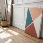
Warm vs. Cool Color Clash
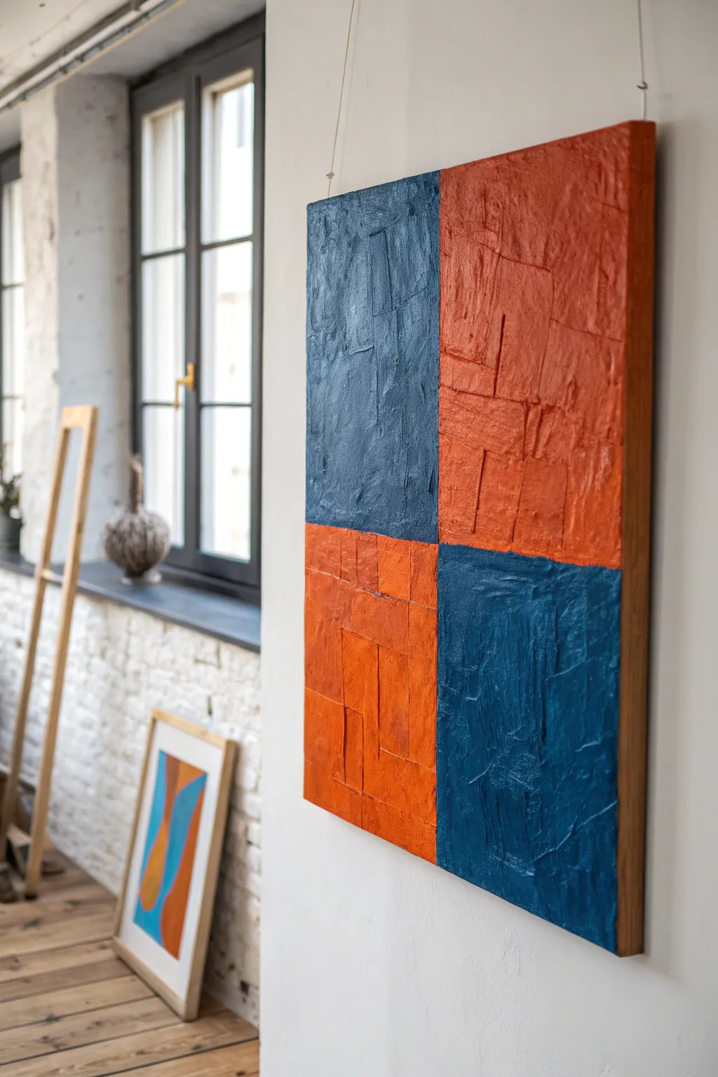
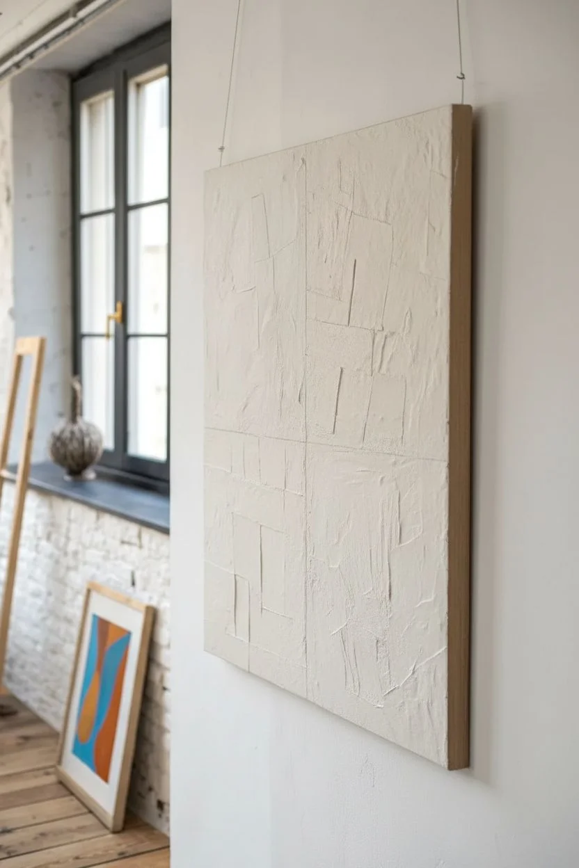
This striking abstract piece relies on the bold contrast between deep navy and warm terracotta set in a classic four-quadrant checkerboard. The real star here is the heavy, blocky texture underneath the paint, creating a sculptural surface that catches the light beautifully.
Step-by-Step
Materials
- Square canvas (24×24 inches or similar)
- Heavy body acrylic paints or oil paints (Navy Blue, Burnt Orange/Terracotta)
- Thick molding paste or texture medium
- Palette knife (large flat edge)
- Cardstock or heavy watercolor paper scraps
- PVA glue or matte medium
- Wide flat paintbrush (2-inch)
- Painters tape
- Ruler
- Pencil
- Deep wood floating frame (optional)
Step 1: Building the Foundation
-
Divvy up the canvas:
Begin by finding the exact center of your square canvas. Use your ruler to measure and mark the halfway points on all four sides. -
Draw the grid:
Lightly draw a vertical and a horizontal line connecting your marks to divide the canvas into four equal quadrants. This cross shape is your primary guide. -
Prepare texture blocks:
Cut your cardstock or heavy paper into various rectangles and squares. They don’t need to be uniform; in fact, slight irregularities add character. Aim for sizes ranging from 2 to 4 inches. -
Map out the texture:
Do a ‘dry run’ by laying these paper shapes onto the canvas within the quadrants. Arrange them so they overlap slightly and create a disjointed, brick-like pattern. -
Adhere the base layer:
One by one, glue these paper rectangles down using PVA glue or matte medium. Smooth them out but don’t worry about perfection; the edges create the necessary relief. -
Apply texture paste:
once the glue is dry, use a palette knife to frost the entire surface with molding paste. Working directly over the paper shapes creates varied heights. -
Refine the surface:
While the paste is wet, use the flat edge of your palette knife to scrape across the paper blocks. You want to define those rectangular ridges, making it look like stone slabs or thick impasto strokes. -
Let it cure completely:
This is crucial: allow the texture layer to dry for at least 24 hours. If the paste is thick, it might need up to 48 hours to be fully rock-hard.
Bleeding Lines?
If paint bleeds under the tape due to the rough texture, use a small angle brush to touch up the lines freehand. The texture forgives minor wobbles.
Step 2: Applying Color
-
Tape the boundaries:
Run a strip of painter’s tape exactly along the vertical center line to protect the right side of the canvas. Then, tape the horizontal line on the left side to isolate the top-left quadrant. -
Mix the cool tone:
Mix a deep Navy Blue. If using oils, keep it relatively thick; for acrylics, ensure it’s heavy body opacity to cover the white texture paste. -
Paint the first blue quadrant:
Apply the navy paint to the top-left quadrant. Use a stiff brush to jam the pigment into the crevices of your texture, then smooth over the top. -
Paint the second blue quadrant:
Move the tape as needed to expose the bottom-right quadrant and paint it with the same navy blue mixture. -
Dry and re-tape:
Allow the blue paint to dry to the touch so it won’t smudge. Carefully remove the tape and re-apply new tape over the dried blue edges to protect them. -
Mix the warm tone:
Prepare your Burnt Orange or Terracotta color. It should be rich and earthy to stand up against the dark blue. -
Fill the warm quadrants:
Paint the top-right and bottom-left quadrants with the orange hue. I find painting in different directions highlights the chaotic texture underneath. -
Create distinct edges:
Pay close attention to where the colors meet in the center. Use a smaller brush if necessary to ensure a crisp cross intersection without bleeding. -
Final reveal:
Remove all tape while the last coat is still slightly damp to get the cleanest lines possible. -
Seal and frame:
Once fully cured (allow several days for oils), apply a satin varnish. A simple wood floating frame completes the modern gallery look.
Add Metallic Depth
Dry brush a tiny amount of copper over the orange and gunmetal grey over the blue to catch light on the highest ridges of the texture.
Hang your new masterpiece in a well-lit spot to watch the shadows play across the textured surface throughout the day

PENCIL GUIDE
Understanding Pencil Grades from H to B
From first sketch to finished drawing — learn pencil grades, line control, and shading techniques.
Explore the Full Guide
Crisp Geometric Block Painting
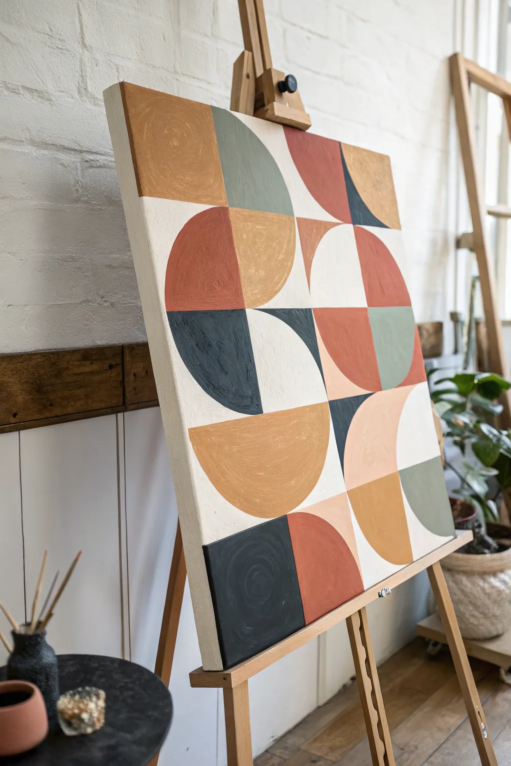
Embrace the harmony of shapes and earthy tones with this crisp yet organic geometric painting. By combining precise lines with textured brushwork, you’ll create a modern statement piece that feels warm and inviting.
Step-by-Step Tutorial
Materials
- Square stretched canvas (approx. 24×24 inches or similar)
- Acrylic paints (terracotta/rust, mustard yellow, sage green, charcoal black, off-white/cream)
- Painter’s tape or masking tape (low tack)
- A smooth compass or a collection of circular objects for tracing (plates, bowls)
- Ruler or T-square
- Pencil and eraser
- Flat synthetic brushes (various sizes: 1-inch and 1/2-inch)
- Round detail brush
- Palette or paper plate
- Cup of water and paper towels
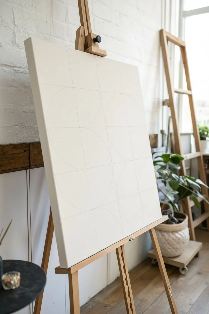
Step 1: Planning the Grid
-
Prime the Surface:
Start by applying a generous coat of off-white or cream paint to the entire canvas. This serves as your background color and ensures the raw canvas texture doesn’t swallow your subsequent layers. Let it dry completely. -
Measure the Grid:
Using your ruler, lightly divide your canvas into a 4×4 grid. If your canvas is 24 inches square, mark every 6 inches both horizontally and vertically. Connect these marks with faint pencil lines to create 16 equal squares. -
Sketch the Geometry:
Within each square, sketch your shapes. Referencing the photo, draw semicircles, quarter-circles, or full squares. Use your compass or trace household items like bowls to get perfect curves. Leave some areas as negative space (the background color).
Clean Lines Hack
Before applying color, paint a thin layer of your background cream color over the tape edge. This seals the gap, so any bleed is invisible!
Step 2: Blocking in Color
-
Tape for crisp lines:
Select the straight edges of your first few shapes to paint. Apply painter’s tape along these pencil lines. Press the tape edge down firmly with your fingernail to prevent paint bleed. -
Mix your palette:
Prepare your colors. I like to mix a tiny bit of the off-white into my terracotta and sage green; it makes the colors more opaque and cohesive with the background. -
Apply the first color:
Starting with the darkest tone (charcoal), paint the designated shapes. Use a flat brush and stroke away from the tape edge initially to further seal it. Apply two thin coats rather than one thick one for uneven coverage. -
Move to warm tones:
While the dark sections dry, identify non-adjacent areas for your terracotta rust color. Apply the paint with confident, directional strokes. Don’t worry about perfect smoothness; the texture adds character. -
Add the mustard accents:
Fill in the yellow-ochre or mustard shapes. This color often needs an extra coat as yellow pigments tend to be more translucent. -
Paint the Sage Green:
Fill in the green semicircles and quarter circles. Be mindful of where shapes touch; let adjacent wet paint dry before painting right next to it to avoid muddying the borders.
Step 3: Refining and Sealing
-
Peel and reveal:
Once the paint is dry to the touch, carefully peel back the tape at a sharp 45-degree angle. This is always the most satisfying part. -
Freehand the curves:
Tape is great for straight lines, but for the curved edges of your semicircles, a steady hand is best. Use a medium flat brush, load one corner with paint, and carefully sweep along your pencil curve marks. -
Touch up the background:
Assess your negative space. If any pencil lines are still visible or if you smeared a bit of color, use your small round brush and the original cream background color to tidy up the edges. -
Add texture strokes:
If the blocks look too flat, dry-brush a slightly lighter shade of the same color over the top in a circular motion to mimic the canvas texture shown in the inspiration image. -
Paint the edges:
Don’t forget the sides of the canvas. You can wrap the design around the edge or paint the sides a solid charcoal for a framed look. -
Final cure:
Let the entire piece cure for at least 24 hours before hanging or varnishing.
Wobbly Curves?
If painting curves freehand is difficult, use a specifically curved ‘filbert’ brush, or use flexibility tape meant for automotive detailing.
Step back and admire how these simple shapes come together to form a complex and balanced composition
Loose Gestural Brushstroke Layers
Master the art of the perfect, chunky brushstroke with this minimalist exercise in color and texture. By layering broad, uninterrupted movements of terracotta, deep teal, and cream, you’ll create a satisfying abstract composition that celebrates the physical act of painting.
Step-by-Step Guide
Materials
- Heavy body acrylic paints or oil paints (Deep Teal/Prussian Blue, Burnt Sienna/Terracotta, Titanium White, Cream)
- Flat, wide synthetic brush (approx. 1-1.5 inch width)
- Primed canvas panel or thick mixed-media paper
- Palette knife for mixing
- Paper towels or rag
- Palette or mixing plate
Step 1: Preparation & Color Mixing
-
Prepare your surface:
Begin with a clean, white surface. If you are using raw canvas, apply a coat of gesso and let it dry completely to ensure the paint glides smoothly without soaking in too fast. -
Mix the terracotta shade:
On your palette, mix Burnt Sienna with a touch of Titanium White to create a warm, earthy terracotta. The consistency should be thick and buttery, like soft toothpaste. -
Mix the deep teal:
Combine Prussian Blue with a tiny dot of Burnt Umber or Black to deepen it. You want a rich, dark value that contrasts heavily against the white background. -
Prepare the cream tone:
Mix a large amount of Titanium White with just a whisper of the terracotta mix or Yellow Ochre to create a soft, warm cream color. -
Load the brush fully:
This is crucial for the ‘one-swipe’ look. Dip your wide flat brush into the paint, ensuring the bristles are loaded about halfway up. Don’t scrape off the excess; you need a generous amount.
Muddy Colors?
If your strokes are turning into a brown mess, wipe your brush completely clean between every single color change. Wet-on-wet is great, but a dirty brush ruins the vibrancy.
Step 2: Applying the Foundation Layers
-
The first cream stroke:
Start at the bottom right of your composition. Place the brush flat and pull it upwards and towards the left in a gentle diagonal. Let the paint run out naturally as you lift the brush. -
Add the terracotta layer:
While the cream is still wet (or semi-dry if you prefer less blending), load your brush with the terracotta mix. Apply a broad stroke overlapping the left edge of the cream stroke. -
Control the pressure:
Maintain even, firm pressure at the start of the stroke to deposit the bulk of the pigment, then lighten your touch as you reach the end of the gesture to create that feathered texture. -
The teal accent:
Clean your brush thoroughly. Load it with the deep teal paint. Apply this stroke to the left of the terracotta, allowing it to overlap significantly. -
Create the friction break:
As you pull the teal stroke, press slightly harder so the paint breaks on the canvas weave near the tail of the stroke, creating a distressed, dry-brush effect.
Step 3: Refining & Wet-on-Wet Blending
-
The double-load technique:
For the focal point shown in the image, wipe your brush but don’t wash it fully. Dip one corner in teal and the other in terracotta. -
The decisive top stroke:
Place the brush at the top of your teal section. Pull downward decisively. The paints will streak together, creating a beautiful marbled transition where they meet. -
Let colors mingle:
I like to wiggle the brush almost imperceptibly as I pull this stroke; it encourages the teal and terracotta to bleed into each other without turning muddy. -
Leave ridges visible:
Resist the urge to smooth it out. The physical ridges of paint left by the bristles (impasto) catch the light and add dimension to the simple forms. -
Add dry crumbs:
If you look closely at the reference, there are tiny bits of dried paint or crumbs of pigment. You can flick a tiny bit of dry terracotta paint onto the wet teal area for organic texture. -
Final assessment:
Step back. The beauty lies in the imperfection of the edges. If a stroke looks too perfect, you can lightly drag a dry brush over the edge to roughen it up. -
Drying:
Because the paint application is thick, allow this piece to dry flat for at least 24 hours (for acrylics) or several days (for oils) to prevent the heavy ridges from slumping.
Add Texture Medium
Mix a modeling paste or heavy gel medium into your acrylics before painting. This makes the paint stiff, holding those dramatic brush ridges perfectly as they dry.
Enjoy the calming simplicity of these sweeping forms and let the texture speak for itself


Transparent Glaze Color Veils
Capture the serene beauty of sedimentary rock layers with this abstract fluid art technique using oil glazes. By layering transparent veils of terracotta, ochre, and cream, you’ll create a painting that feels both organic and deeply dimensional.
How-To Guide
Materials
- Stretched canvas (16×20 or similar)
- Oil paints: Burnt Sienna, Yellow Ochre, Titanium White, Raw Umber
- Liquin Original or similar glazing medium
- Odorless mineral spirits
- Large flat soft synthetic brushes (2-inch and 1-inch)
- Palette knife
- Lint-free rag or shop towels
- Glass or wooden palette
Step 1: Preparation and Base Layer
-
Prime the surface:
Ensure your canvas is clean and taut. Even if pre-primed, applying a fresh, thin coat of gesso creates a smoother surface for glazes to glide over. Let it dry completely. -
Mix the base tone:
Create a very pale, warm cream color by mixing a large amount of Titanium White with a tiny dot of Yellow Ochre and a hint of Burnt Sienna. -
Apply the foundation:
Cover the entire canvas with this cream mixture using your large brush. This layer should be opaque but not thick. Smooth out brushstrokes so the surface is even. -
Initial setting:
Allow this base layer to become touch-dry. Depending on your environment and paint thickness, this might take a day or two, but it’s crucial so you don’t muddy the subsequent layers.
Step 2: Creating the Veils
-
Prepare the glazing medium:
On your palette, mix your Liquin medium with a small amount of mineral spirits to create a fluid, honey-like consistency. -
Mix the terracotta glaze:
Combine Burnt Sienna with your glazing mixture. You want the paint to be transparent enough to see through, but pigmented enough to stain. Test it on a scrap paper first. -
Paint the primary diagonal:
Using a 2-inch brush, sweep a broad diagonal band of the terracotta glaze from the bottom left to the top right. Don’t worry about straight lines; let the edges waver organically. -
Soften the edges:
Take a clean, dry brush and gently feather the edges of your wet glaze into the dry cream background. This creates that soft, drifting smoke effect. -
Integrate the ochre:
Mix a Yellow Ochre glaze similar to the terracotta one. Apply thin ribbons of this alongside the terracotta sections, letting them overlap slightly to create new orange-brown hues.
Glaze Quality
For the smoothest transitions, hold your brush at a low angle, almost parallel to the canvas. This allows the bristles to skim the surface rather than digging into the paint layers.
Step 3: Adding Depth and Definition
-
Deepen the contrast:
Mix a stronger, less diluted amounts of Burnt Sienna and Raw Umber. Paint thin, dark veins inside the widest terracotta bands to simulate the distinct layers found in agate or canyon walls. -
Create white highlights:
Mix Titanium White with just a touch of medium. It should be semi-opaque. Drag this color alongside the darkest veins. The contrast between the dark vein and bright highlight creates instant volume. -
Forming the marbling:
While the layers are still wet or tacky, use a clean rag to gently wipe away paint in thin, wandering lines. This ‘subtractive’ method reveals the lighter base layer underneath. -
Blend transitions:
I find that using a very soft, large mop brush to lightly tap or sweep over the whole canvas helps unify the colors without muddying them, giving that polished stone look. -
Layering distinct bands:
Add a distinct, wider band of pale cream glaze in the lower right corner, counterbalancing the darker diagonal. Keep the motion flowing in the same general direction.
Muddy Colors?
If your colors start turning gray or muddy, stop immediately. It means you’re overworking wet layers. Let it dry overnight, then add fresh glazes on top of the dry surface.
Step 4: Finishing Touches
-
Assess the composition:
Step back and look for areas that feel too heavy. If a dark area dominates, glaze a thin layer of white over it to push it back. -
Refine the thin lines:
Use the edge of your palette knife or a rigger brush with thinned white paint to add the sharpest, finest highlight lines along the main ridges of your composition. -
Final cure:
Let the painting sit undisturbed in a dust-free area for several days until completely dry to the touch. -
Varnish:
Once fully cured (which can take months for oils), apply a gloss varnish to deepen the colors and give it that wet stone appearance.
Enjoy the peaceful process of watching your layered stone textures emerge on the canvas one veil at a time.
Textured Ground, Smooth Top Layers
This project creates a stunningly tactile abstract piece that mimics the weathered beauty of an ancient wall or natural stone. By layering heavy texture with washes of warm, earthy oils, you’ll achieve a fascinating interplay between rough, raised surfaces and smooth, glazed color.
Detailed Instructions
Materials
- Stretched canvas or wood panel (approx. 12×12 inches)
- Heavy body acrylic modeling paste or joint compound
- Palette knives (one large trowel style, one smaller)
- Gesso (white)
- Oil paints: Burnt Sienna, Yellow Ochre, Titanium White, Raw Umber
- Odorless mineral spirits or turpentine
- Soft synthetic flat brush (1-inch)
- Clean cotton rags or paper towels
- Fine grit sandpaper (optional)
Step 1: Building the Foundation
-
Prepare the substrate:
Begin by ensuring your canvas or wood panel is clean and dust-free. If you are using raw wood, apply a thin coat of gesso to seal the surface and let it dry completely. -
Apply the first texture layer:
Scoop out a generous amount of modeling paste onto the center of your panel. Use your large palette knife to spread it across the surface, aiming for roughly 80% coverage rather than perfect smoothness. -
Create directional peaks:
While the paste is wet, press the flat side of the knife into the surface and lift straight up to create small peaks. Then, gently drag the knife sideways to knock these peaks down, creating a rugged, stucco-like effect. -
Vary the thickness:
Intentionally leave some areas thicker than others. I like to scrape a few spots almost down to the canvas weave to create depth and contrast later on. -
Let it cure completely:
This is the hardest part—waiting. Let the texture layer dry overnight. It must be rock hard before you apply any paint, or you risk mixing wet paste into your oils.
Secret Ingredient
Mix a teaspoon of fine sand into your modeling paste before applying. This adds a gritty micro-texture that catches the dry-brush layer beautifully.
Step 2: Adding Earthy Glazes
-
Mix a wash solution:
Squeeze a small amount of Burnt Sienna and Yellow Ochre onto your palette. Pour a small pool of mineral spirits into a separate container. -
Apply the base wash:
Dip your brush heavily into the spirits and pick up a tiny bit of Yellow Ochre. Brush this very thin, watery mix over the entire textured surface. The mixture should seep into all the tiny crevices. -
Wipe back the high points:
Immediately take a clean rag and gently wipe the surface. Because the texture is raised, the rag will remove paint from the high points, leaving the ochre color settled deep in the valleys. -
Introduce rust tones:
Mix a slightly thicker consistency of Burnt Sienna with just a little mineral spirits. Dab this randomly in patches, focusing on corners or areas where you want a ‘rusted’ look. -
Blend the patches:
Using a clean, dry brush, feather out the edges of your Burnt Sienna patches so they transition softly into the lighter ochre background. -
Add deep contrast:
Mix a very small amount of Raw Umber with spirits. Use a small brush to drop this dark mixture selectively into the deepest cracks or divots of your texture for added dimension.
Step 3: Dry Brushing Highlights
-
Wait for the wash to set:
Allow the solvent-heavy wash layers to dry for about an hour. The surface should feel tacky but not wet. -
Load for dry brushing:
Put a fresh dollop of Titanium White on your palette. Do NOT add solvent. Dab your brush into the paint, then wipe most of it off onto a paper towel until the brush looks almost dry. -
Skim the surface:
Holding the brush parallel to the canvas, lightly skim it over the tops of the texture. You want the white paint to catch only on the highest ridges, highlighting the rough terrain. -
Intensify specific areas:
Repeat the dry brushing process in a few focal areas to make the white more opaque, creating a stark contrast against the rusty, stained recesses. -
Final assessment:
Step back and look at the balance. If an area feels too dark, add more white dry brushing. If it’s too white, glaze over it again with a thin ochre wash. -
Finish the edges:
Don’t forget the sides of your canvas or panel. Paint them a solid neutral color or continue the texture and wash effect around the edges for a gallery-ready look.
Muddy Colors?
If your white highlights start turning pink or beige, your base layer is still too wet. Stop immediately and let the under-layer dry fully before continuing.
Allow the finished piece to cure in a well-ventilated area for several days before hanging to ensure the oil layers harden completely
Sgraffito Carved Lines in Wet Oils

This striking abstract piece captures the essence of a coastline using broad diagonal bands of color and textural sgraffito lines. The technique relies on layering thick, heavy-bodied paint and carving back into it to reveal the canvas or underlayers beneath, creating a dynamic sense of movement and depth.
Step-by-Step Guide
Materials
- Stretched canvas (rectangular, portrait orientation)
- Oil paints (Prussian Blue, Ultramarine, Titanium White, Burnt Sienna, Cadmium Orange, Red Ochre)
- Palette knives (large for spreading, small/thin for mixing)
- Stylus tool, back of a paintbrush, or clean palette knife edge (for carving)
- Texture paste or impasto medium
- Gesso (optional for priming)
- Large flat brush (for initial blocking)
- Rags or paper towels
Step 1: Preparation and Mixing
-
Prime the surface:
Ensure your stretched canvas is clean. If you want a smoother starting point before the texture is applied, add a coat of gesso, though raw canvas can also work for a more rustic look. -
Mix the Impasto:
Mix a generous amount of impasto medium or texture paste into your white oil paint. You need a very thick consistency that will hold ridges and carved lines without slumping. -
Prepare the palettes:
Create three distinct color piles. First, a deep ocean mix using Prussian Blue and a touch of black or Payne’s Grey. Second, a warm sand tone using Titanium White mixed with a very small amount of Burnt Sienna or Yellow Ochre. -
Mix the vibrant band:
Create the striking orange-red hue. Mix Cadmium Orange with Red Ochre and a bit of Titanium White to give it opacity. Keep this mixture thick.
Step 2: Applying the Color Fields
-
Map out diagonals:
Lightly sketch or mentally map three main diagonal zones. The top left will be blue, the middle band will be the sandy white, and the lower right creates a complex interplay of the orange-red band followed by another section of sand and deep blue. -
apply the top blue:
Using a palette knife, apply the dark blue mixture to the top left corner. Spread it thickly in diagonal strokes, allowing the texture of the paint to build up. -
Create the white divide:
Clean your knife and apply the thick, sand-colored white impasto mixture next to the blue. Don’t worry about perfect lines; a rough, organic edge where the colors meet adds character. -
Add the red stripe:
Apply the vibrant orange-red mixture in a broad diagonal stripe below the white. Pull the knife firmly to create vertical striations within the diagonal band. -
Finish the bottom section:
Below the red stripe, add a final thinner band of the sand-white mixture, followed by a bottom corner of dark blue. This frames the energetic red section beautifully.
Paint Moving?
If the paint slumps back into the carved lines, it’s too thin. Mix more impasto paste or wait 30 minutes for the oil to tack up before carving again.
Step 3: Texturing and Sgraffito
-
Blend the transitions:
Gently swipe a clean, dry brush or knife parallel to the diagonal lines where colors meet. You want them to touch but not turn into mud. -
Initiate the carving:
While the paint is still very wet and thick, take your stylus tool or the handle end of a paintbrush. I find a slightly blunt tip works best to avoid tearing the canvas. -
Carve the blue section:
In the top blue area, carve thin, erratic lines that follow the diagonal movement. Apply enough pressure to scrape the paint away, revealing the white canvas underneath. -
Detail the white band:
Move to the white sandy section. Create varied marks here—some long scratches and some shorter, staccato dabs to mimic the texture of sand or foam. -
Scrape the red zone:
Create long, sweeping curves through the orange and red paint. These lines should mimic the flow of water or wind. -
Add cross-hatching effects:
In the bottom blue section, experiment with crossing your carved lines slightly or varying the pressure to create lines of different widths. -
Review and refine:
Step back and look at the composition. If a scraped line looks too uniform, simply push some wet paint back over it with your knife and re-carve it for a more organic feel. -
Add final highlights:
Use a small brush to flick tiny amounts of pure Titanium White onto the blue sections if you want to enhance the ‘crashing wave’ aesthetic.
Clean Lines
Wipe your carving tool on a rag after almost every stroke. Accumulated paint on the tool will smudge your crisp lines and muddy the vibrant colors.
Step 4: Finishing Touches
-
Clean up edges:
Check the sides of the canvas (the depth). You can either paint them a solid neutral color or wrap the painting’s design around the edges for a gallery-style finish. -
Allow specifically long drying time:
Because of the thick impasto and oil paint, place the canvas in a dust-free area and allow it to dry for at least one week to the touch, and several months to fully cure.
Once fully cured, the raised texture and carved recesses will catch the light beautifully, giving your space a modern coastal atmosphere
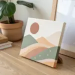
Big Shapes With Breathing Room
Embrace the beauty of negative space with this minimalist abstract piece that balances bold, organic curves with a soft, earthy color palette. The large scale and clean composition make it a striking focal point that feels both modern and warm.
Step-by-Step
Materials
- Large stretched canvas (approx. 30×40 inches)
- Acrylic or oil paints (Titanium White, Mars Black, Burnt Sienna, Yellow Ochre, Unbleached Titanium)
- Set of wide flat brushes (2-3 inches)
- Medium round brush for edges
- Pencil or charcoal stick for sketching
- Palette knife for mixing
- Paper plate or palette
- Cup of water or solvent
- Optional: masking tape (if you prefer sharper lines than freehand)
Step 1: Planning the Composition
-
Prepare the canvas:
Start with a primed canvas. If you want a warmer undertone, apply a very thin wash of Unbleached Titanium mixed with water across the entire surface and let it dry completely. -
Visualize the shapes:
Study the reference image. Notice how the shapes interact—they don’t touch but create distinct ‘channels’ of negative space between them. The central intersection creates a Y-shape of negative space. -
Sketch the outlines:
Using a pencil or charcoal stick, lightly draw the large curved forms. Don’t aim for perfect circles; these are organic, pebble-like shapes. Keep your grip loose to encourage fluid lines. -
Refine the spacing:
Step back and check the balance. Ensure the gaps between the shapes (the ‘breathing room’) feel intentional and relatively consistent in width, though variation adds character.
Fixing Wobbly Lines
If a curve looks too shaky, paint over the edge with the background cream color to reshaping it. It’s often easier to ‘cut in’ with the background color than to fix the shape itself.
Step 2: Mixing the Palette
-
Create the cream base:
Mix a large amount of Titanium White with a touch of Unbleached Titanium. This will be your negative space color. It needs to be opaque enough to cover any sketch lines. -
Mix the charcoal black:
Squeeze out Mars Black. I like to add a tiny dot of white or blue to soften it slightly so it isn’t too jarring against the softer earth tones. -
Mix the dusty pink:
Combine Burnt Sienna with Titanium White. Add a tiny amount of Yellow Ochre to warm it up until you get a soft, plaster-pink hue. -
Mix the rust orange:
Use Burnt Sienna as your base, mixing in a little Yellow Ochre and a minimal amount of Black to deepen it into a rich terracotta color.
Step 3: Painting the Forms
-
Start with the black sections:
Using a smaller flat brush or round brush, carefully paint the edges of the black shapes first to establish the boundary. Fill in the centers with a large wide brush using smooth strokes. -
Apply the rust tones:
Move on to the deep orange/rust shape on the right. Ensure the paint is thick enough to be opaque; you might need two coats for these darker pigments. -
Paint the pink curves:
Clean your brushes thoroughly and paint the lighter pink shapes. Watch the edges where they curve near the black shapes—maintain that buffer zone. -
Fill the negative space:
Take your cream mixture and carefully paint the background space between the colored forms. This ‘cutting in’ technique helps crisp up the lines of the colored shapes. -
Evaluate opacity:
Let the first layer dry for 20–30 minutes. If you see canvas texture showing through too much, apply a second coat to smooth out the blocks of color.
Add Texture
Mix a texture medium or modeling paste into your acrylics before painting the colored shapes. This adds a tactile, sculptural element that catches the light beautifully.
Step 4: Refining and Finishing
-
Tidy the edges:
Use a small, slightly damp round brush to clean up any wobbly lines where the colors meet the cream background. You want a crisp look, but a slight hand-painted wobble is perfectly fine. -
Check the corners:
Ensure the shapes extend all the way to the wrapped edge of the canvas if you want a gallery-wrapped look, painting the sides to match the front. -
Final drying:
Allow the painting to dry in a dust-free area for at least 24 hours (for acrylics) or several weeks (for oils). -
Optional varnish:
Once fully cured, apply a matte varnish to protect the surface and unify the sheen of the different paint colors.
Hang your new masterpiece in a bright room to let the natural light highlight the interplay of shapes
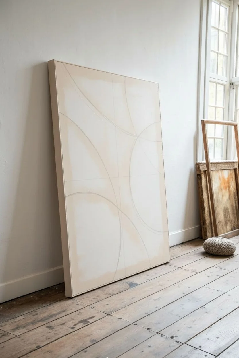
Paint to a Rhythm Pattern
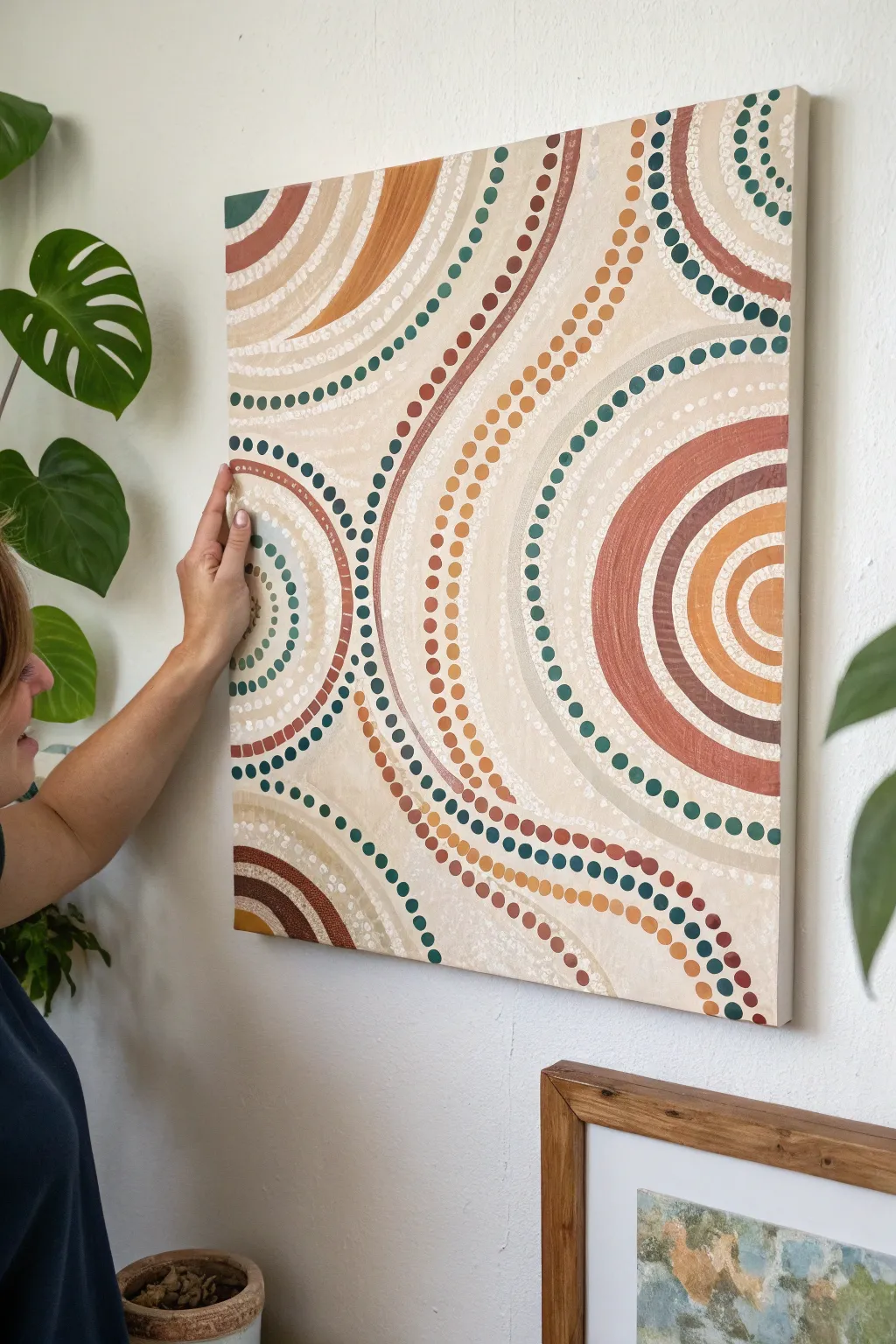
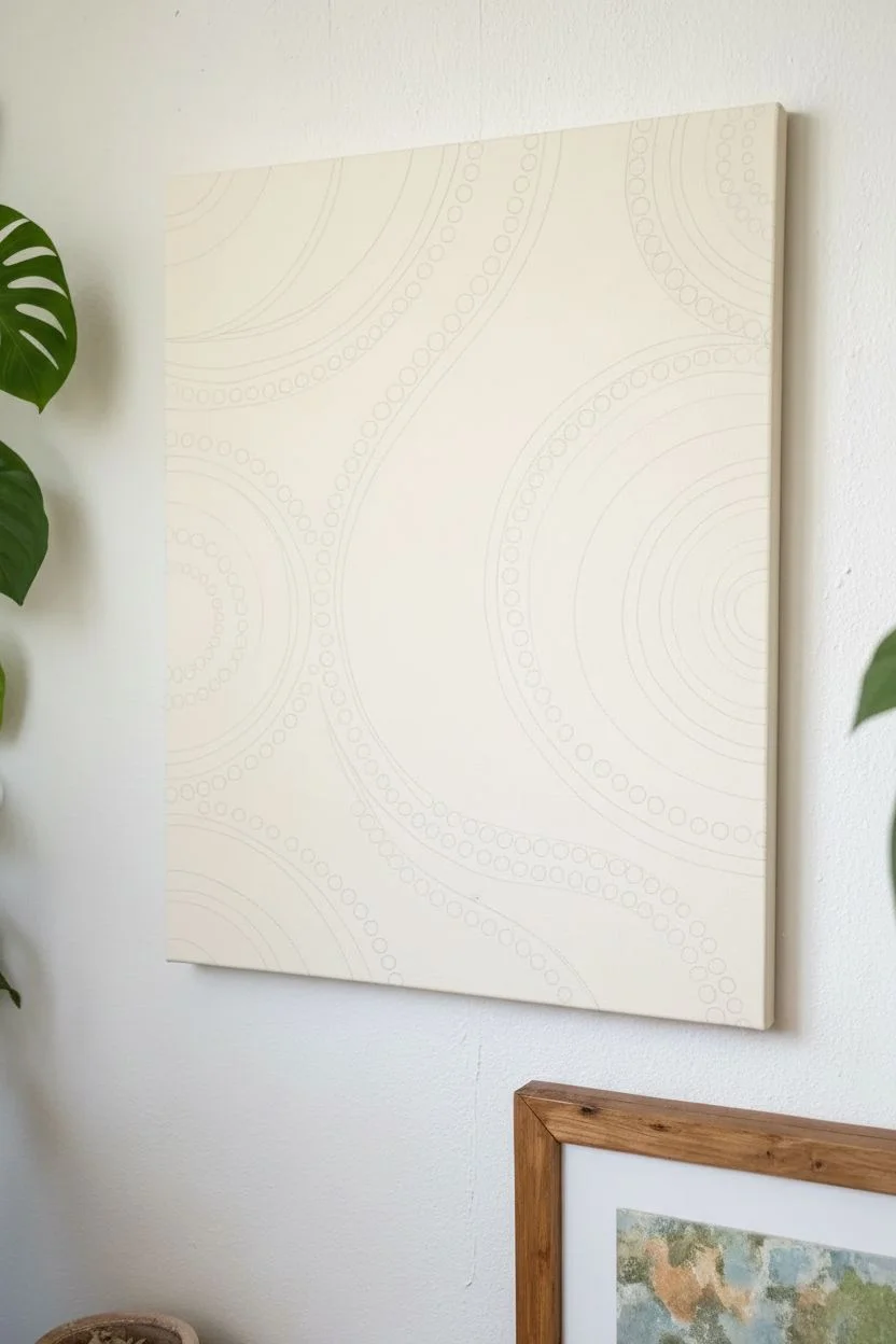
Embrace the soothing repetition of dot art with this large-scale abstract piece featuring sweeping curves and earthy circles. The interplay of solid bands and staccato dots creates a visual rhythm that feels both structured and organic, perfect for bringing warmth to a neutral wall.
Step-by-Step Tutorial
Materials
- Large square canvas (approx. 24×24 or 30×30 inches)
- Acrylic paints (terracotta, burnt sienna, yellow ochre, deep teal/forest green, cream, white)
- Flat shader brushes (medium and large)
- Dotting tools (various sizes) or ends of brush handles
- Pencil for sketching
- Compass or round objects for tracing
- Palette or paper plates
- Water cup and paper towels
Step 1: Planning the Flow
-
Prime the Surface:
Start by giving your canvas a solid base coat of cream or warm white paint. This ensures that any gaps between your dots and lines look intentional and cohesive rather than like bare fabric. Let this base layer dry completely before moving on. -
Sketch the Curves:
Visualize three main focal points. Using a pencil, lightly sketch large sweeping arcs and partial circles. Don’t aim for perfect geometry; let the curves flow off the edges of the canvas to create a sense of expansion. -
Define the Zones:
Within your large arcs, mark out parallel bands. Designate some bands to be painted solid and others to be filled with dots. Varying the width of these bands adds visual interest and prevents the pattern from looking too rigid.
Step 2: Painting Solid Bands
-
Mix Your Palette:
Prepare your earthy tones. Mix a burnt sienna, a warm ochre, and a deep forest green. I like to keep a pure white handy to mix tints of each color for subtle gradients. -
Apply the Arcs:
Using a flat shader brush, fill in the bands you designated for solid color. Use smooth, confident strokes that follow the curve of your pencil lines. -
Layering Textures:
For some of the lighter bands, try a ‘dry brush’ technique with white or cream over a beige base. This mimics a textured, sandy look that contrasts beautifully with the sharper dot work coming later. -
Create Contrast:
Ensure you place your darkest colors (like the deep green or dark brown) next to lighter cream sections. This high contrast is essential for making the pattern readable from a distance.
Uneven Dots?
If paint globs or creates peaks on your dots, gently tap the canvas underside while wet to flatten them, or lightly sand the peak once fully dry and repaint the top.
Step 3: The Rhythm of Dots
-
Select Dotting Tools:
Gather tools of different diameters. You can use professional dotting tools, but the back end of a paintbrush, a chopstick, or a pencil eraser work just as well for varied sizes. -
Start the Dot Chains:
Dip your tool into the paint—generously enough to leave a raised texture. Begin following the curve of a pencil line between your solid bands. Press straight down and lift straight up to create a crisp circle. -
Maintain Spacing:
Try to keep the spacing between dots consistent, akin to a steady drumbeat. If you are creating a double row of dots, stagger them slightly like bricks in a wall for a denser look. -
Vary Dot Sizes:
Use larger dots for the outer edges of a curve and gradually switch to smaller tools as you move inward, or vice versa. This graduation in size enhances the illusion of movement and depth. -
introduce Color Variation:
Don’t stick to just one color per line of dots. Consider alternating colors (e.g., green, cream, green) or transitioning from dark to light along a single curve to lead the eye across the canvas.
Add Metallic Flair
Swap the yellow ochre for a metallic gold paint in select dot rows. It catches the light beautifully and adds a modern, luxe feel to the earthy palette.
Step 4: Finishing Touches
-
Clean Up Edges:
Once the main paint is dry, look closer at your solid bands. If the edges are shaky, use a fine liner brush with the background cream color to tidy them up. -
Add Micro-Details:
For an extra layer of complexity, add tiny white ‘highlight’ dots on top of your largest dark solid dots. This mimics the look of Aboriginal art styles and adds a 3D effect. -
Seal the Work:
Allow the painting to dry for at least 24 hours (acrylics with thick dots can take a while to cure). Finish with a coat of satin varnish to protect the texture and unify the sheen.
Hang your rhythmic masterpiece in a well-lit spot to let the textures and patterns truly shine
Nature-Texture Abstraction Studies
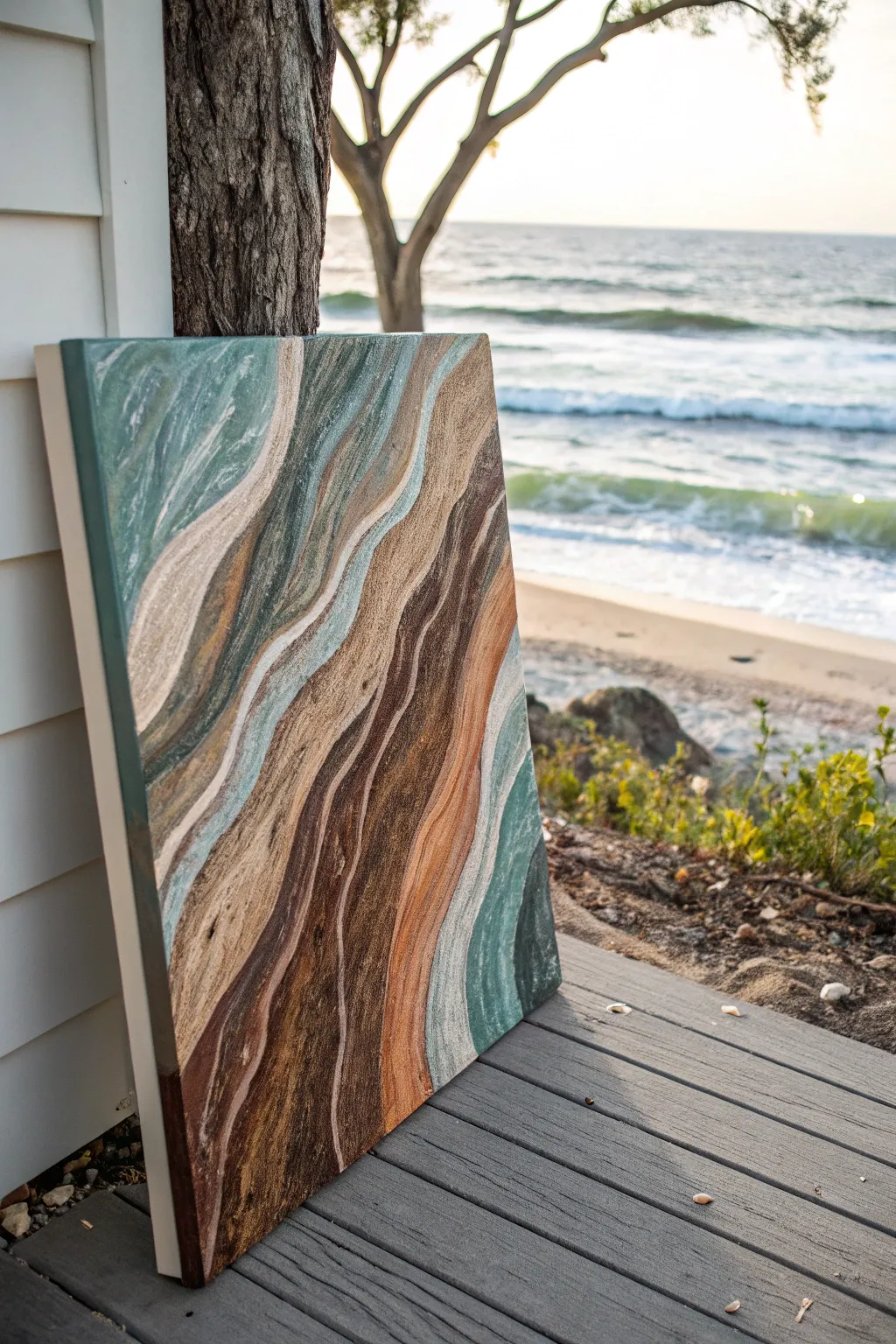
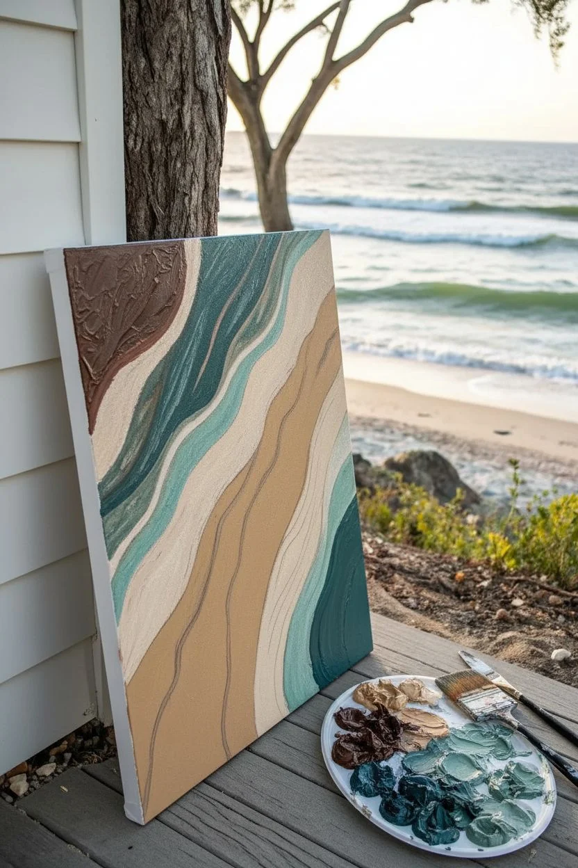
This abstract project captures the organic, flowing movement of coastal elements, blending the textures of driftwood grain with the soothing palette of sea glass and sand. Created with fluid techniques and heavy texturing, the final piece evokes the serene rhythm of the shoreline right in your home.
Step-by-Step
Materials
- Stretched canvas (16×20 or similar)
- Oil paints: Burnt Umber, Raw Sienna, Titanium White, Teal, Phthalo Green, Yellow Ochre
- Liquin Impasto or similar thickening medium
- Cold wax medium (optional, for matte texture)
- Palette knives (assorted sizes, wide and narrow)
- Large flat paintbrush (2-inch)
- Fan brush
- Lint-free rags or paper towels
- Disposable palette or glass surface
Step 1: Preparation and Base Layer
-
Surface Prep:
Begin by ensuring your canvas is taut and clean. If you want a smoother flow, apply a thin coat of gesso and let it dry completely before starting with oils. -
Mixing the Palette:
Prepare your color gradients on the palette. Mix a dark brown (Burnt Umber + touch of Black), a medium tan (Raw Sienna + White), a sandy cream (Yellow Ochre + lots of White), and two shades of teal (one deep, one pastel). -
Medium Integration:
Mix a generous amount of Liquin Impasto into each color pile. You want the paint to hold its shape but still glide smoothly across the canvas. -
Mapping the Flow:
Using a pencil or a thin wash of diluted Burnt Umber, sketched loose, wavy diagonal lines across the canvas to establish the direction of your ‘grain’ pattern.
Smoother Gradients
For ultra-smooth transitions between the brown and teal bands, wipe your palette knife clean after every single stroke to prevent unintentional muddy mixing.
Step 2: Creating the Driftwood Grain
-
Darkest Anchors:
Load a medium palette knife with your darkest brown mixture. Apply it in long, sweeping strokes following your sketched guide lines, focusing on the lower left corner and the central ‘spine’ of the composition. -
Mid-Tone Transition:
Immediately alongside the dark brown, apply the Raw Sienna mixture. Don’t worry about blending yet; just lay the colors side-by-side using the flat edge of the knife. -
Adding texture:
Turn your palette knife on its edge and gently scrape through the wet paint to create ridges and organic imperfections that mimic wood grain. -
The Sandy Highlights:
Introduce the cream/sandy color in thinner ribbons between the brown sections. This adds light and contrast to the heavier earth tones.
Paint looks flat?
If the texture disappears as it settles, your paint layer is too thin. Add more impasto medium or cold wax to bulk up the body of the paint.
Step 3: Integrating the Sea Tones
-
Teal Introduction:
Clean your knife thoroughly. Apply the deeper teal shade in swaths near the upper left and outer right edges, framing the earthy wood tones. -
Seafoam Accents:
Layer the lighter pastel teal right next to the darker green. I like to let this color slightly overlap the browns to suggest water washing over wood. -
Marble Effect:
Using a clean, dry fan brush, vary gently whisk only the edges where the teal meets the cream. Use a light touch to soften the transition without muddying the colors.
Step 4: Detailing and Refining
-
Defining Lines:
Load a small liner brush or the very tip of a small knife with Titanium White mixed with a little oil. Carefully drag thin, broken lines along the boundaries of the color shifts to create separation and highlight. -
Creating Movement:
Using a dry 2-inch flat brush, gently sweep in the direction of the waves over specific sections. This drags the grain and creates a striated, sedimentary look. -
Adding Sediment:
Splatter a tiny amount of thinned Umber paint onto the darker sections for a rugged, organic sandy texture. -
Edge Work:
Don’t forget the sides of the canvas. Extend your main color bands over the edges for a professional, gallery-wrapped finish. -
Final Contrast Check:
Step back and assess. If the piece looks too flat, add pure Burnt Umber into the deepest valleys of the wave pattern to increase the sense of depth. -
Drying:
Oil paints with impasto medium take time. Place the canvas in a dust-free area and allow it to cure for at least a week before touching the surface.
Now you have a stunning piece of abstract nature that brings the calm of the coast to your wall
Blind Intuitive Abstract Oil Session
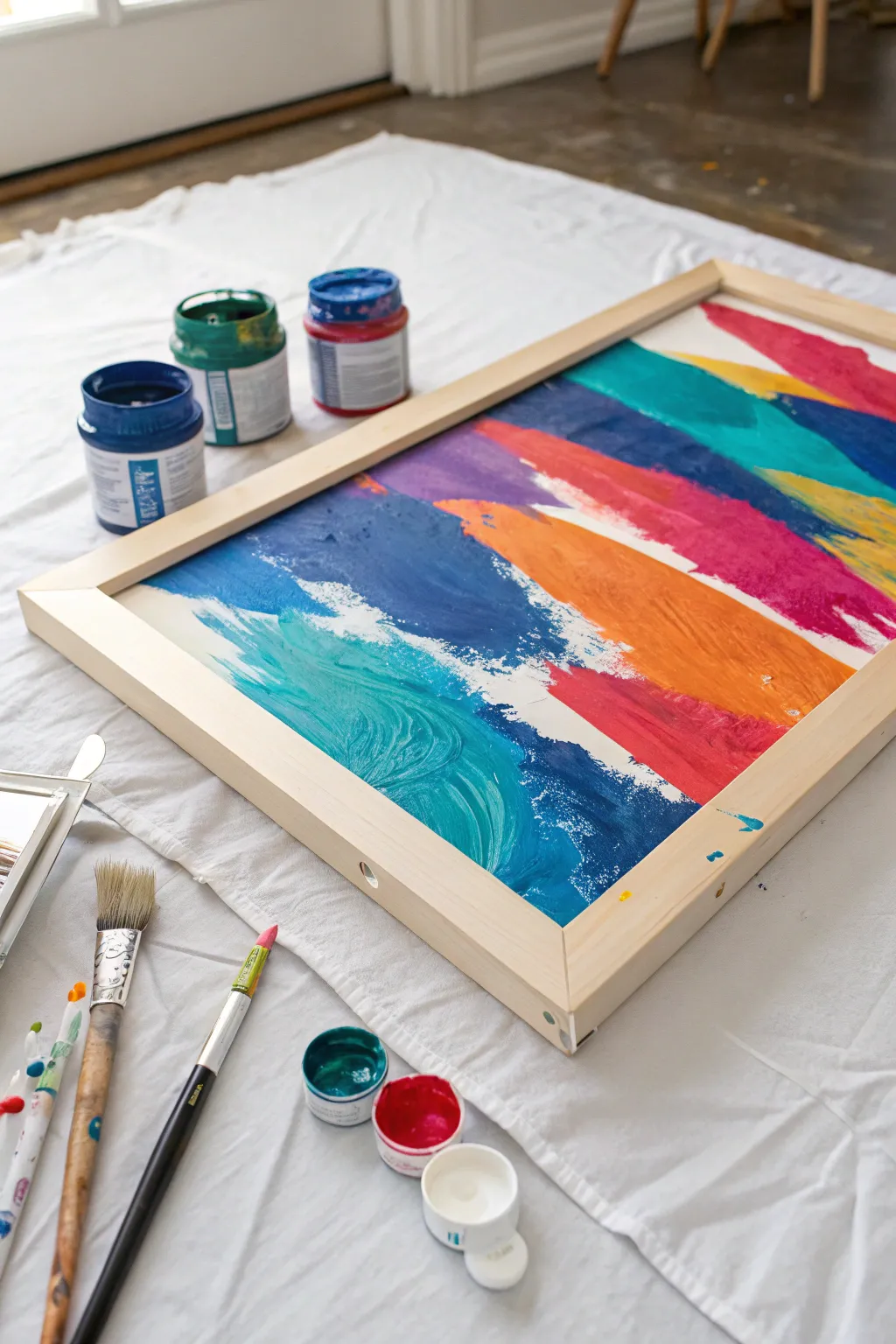
Embrace the freedom of abstract expressionism with this vibrant, sweeping design that feels like a colorful wave crashing onto the canvas. Using broad strokes and bold, saturated hues, you’ll create a lively piece that brings energy to any room.
Step-by-Step Guide
Materials
- Large stretched canvas or canvas board
- Light wood floating frame (sized to fit canvas)
- Acrylic or oil paints (Teal, Navy Blue, White, Violet, Bright Orange, Magenta, Yellow)
- Large flat bristle brush (2-3 inch)
- Medium round brush
- Palette knife
- Water cups or solvent jars
- Clean rags or paper towels
- Drop cloth
Step 1: Preparation and Base Layers
-
Set the Stage:
Lay down your drop cloth on a flat, sturdy surface like the floor or a large table. This painting involves energetic strokes, so having space to move your arm freely is essential. -
Prime the Surface (Optional):
If your canvas isn’t pre-primed, apply a coat of gesso. However, for this loose style, painting directly on a standard pre-primed canvas works perfectly well to grip the heavy pigment. -
Plan the Flow:
Visualize a diagonal flow from the bottom left to the top right. We aren’t sketching lines, but rather establishing a mental map of where the color bands will travel. -
Mix Your Teal:
On your palette, mix a vibrant teal using blue, green, and a touch of white to make it opaque. Do not over-mix; leaving some streaks of pure blue or green adds texture. -
Apply the First Wave:
Using the large flat brush, load it generously with teal paint. Start at the bottom left corner and sweep upward in a curved, wave-like motion towards the center. Let the brush texturize the paint naturally.
Clean Sweep
For the cleanest colors, wipe your brush on a rag between every major color change, even if you don’t rinse it. This prevents ‘muddy’ transition zones.
Step 2: Building the Rainbow
-
Deepen with Navy:
While the teal is still tacky, load a brush with navy blue. Apply this immediately next to and slightly overlapping the bottom of the teal wave to create depth and shadow. -
Create the White Break:
Clean your large brush thoroughly or grab a fresh one. Load it with titanium white. Apply a jagged, energetic stroke right above the teal wave, allowing the white to mix slightly with the wet teal for a ‘frothy’ look. -
Introduce Violet:
Move further up the canvas, leaving a small negative space or touching the white edge. Apply a broad stroke of violet or purple, sweeping in the same diagonal direction as your initial wave. -
Add the Orange Burst:
Key to this composition is the contrast. Load a clean brush with bright orange paint. Apply a bold, thick band adjacent to the purple and white sections. The warmth of the orange will make the cool blues pop. -
Layering Magenta:
Above the orange, sweep a heavy layer of magenta or deep pink. Allow your brush to run ‘dry’ at the tail end of the stroke to create that feathery, textured edge visible in the reference. -
Top Corner Accents:
Finish the color bands by adding strokes of yellow and a final touch of teal or blue in the very top right corner, echoing the colors from the bottom.
Level Up: Gold Leaf
Once the paint is dry, apply small flakes of gold leaf along the white ‘frothy’ sections to add a luxurious shimmer to the piece.
Step 3: Refining and Framing
-
Texture with Palette Knife:
While the paint is wet, use a palette knife to scrape or drag through thick areas of paint. This reveals layers underneath and adds that distinctive ‘scuffed’ look. -
Enhance the White Space:
I like to go back in with pure white paint and a smaller round brush to add distinct flecks and splashes near the transition zones between colors, simulating splashing water or light. -
Dry Brushing edges:
Use a dry bristle brush with very little paint to soften the edges of your bold color bands where they meet the white background canvas, making the transition feel organic. -
Allow to Cure:
Let the painting dry completely. If you used heavy body acrylics, this might take overnight; oils will take significantly longer to cure to the touch. -
Frame Selection:
Select a light wood floating frame. The natural blonde wood tone complements the bright colors without competing for attention. -
Mounting the Canvas:
Place your dry canvasface down into the frame (or follow your specific frame’s instructions). Secure it using offset clips or the provided hardware, ensuring an even gap around all sides. -
Final Varnish:
Once fully cured, apply a coat of gloss or satin varnish to protect the surface and unify the sheen of the different paint colors.
Hang your new masterpiece in a well-lit area to let those vibrant textures truly shine


Have a question or want to share your own experience? I'd love to hear from you in the comments below!