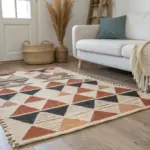
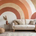
Whenever I’m stuck, abstract painting is my favorite way to loosen up and let color do the talking. Here are abstract painting ideas you can try right away, from clean geometric looks to wonderfully wild experiments.
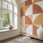
Geometric Tape Resist Shapes
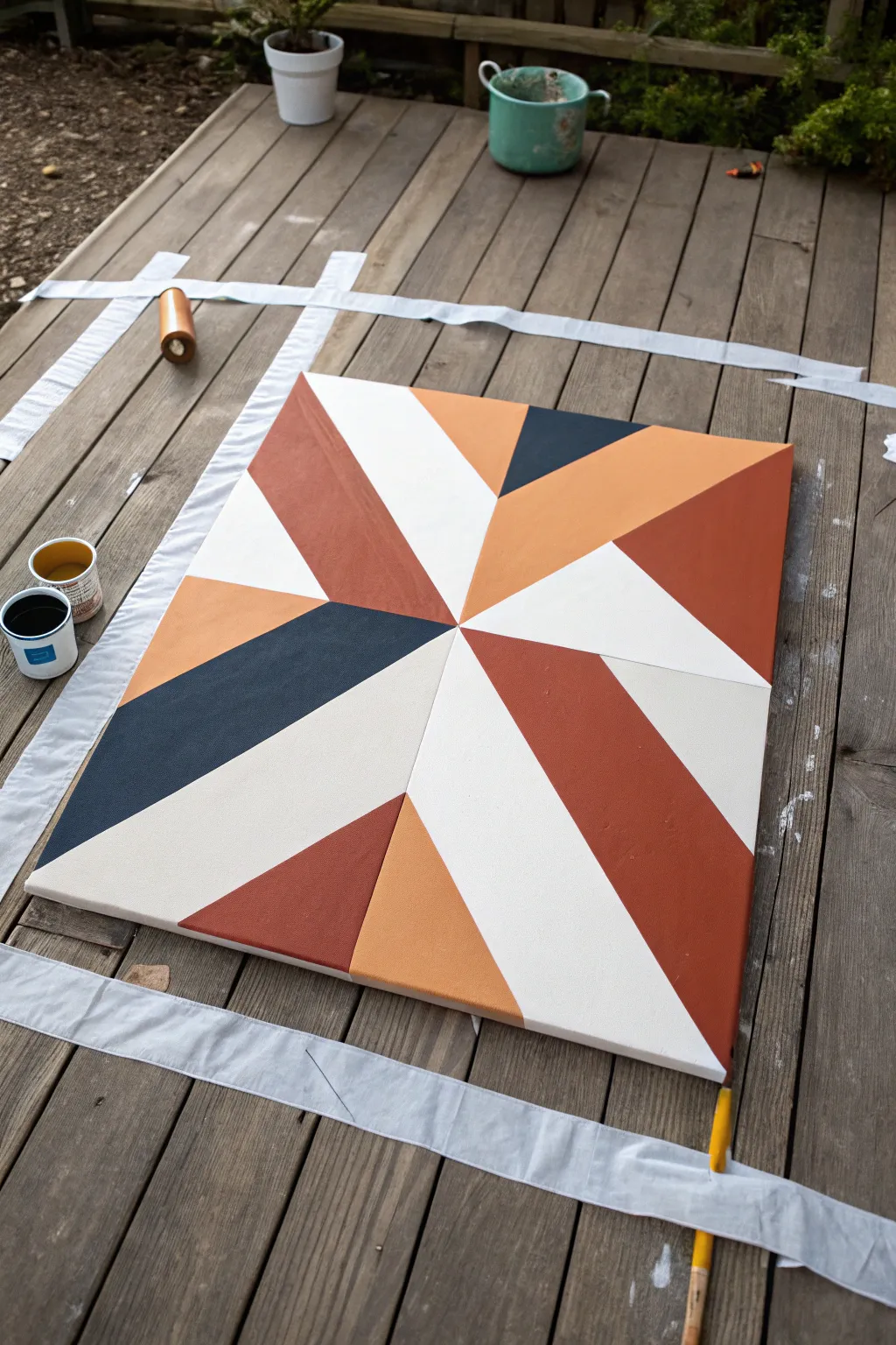
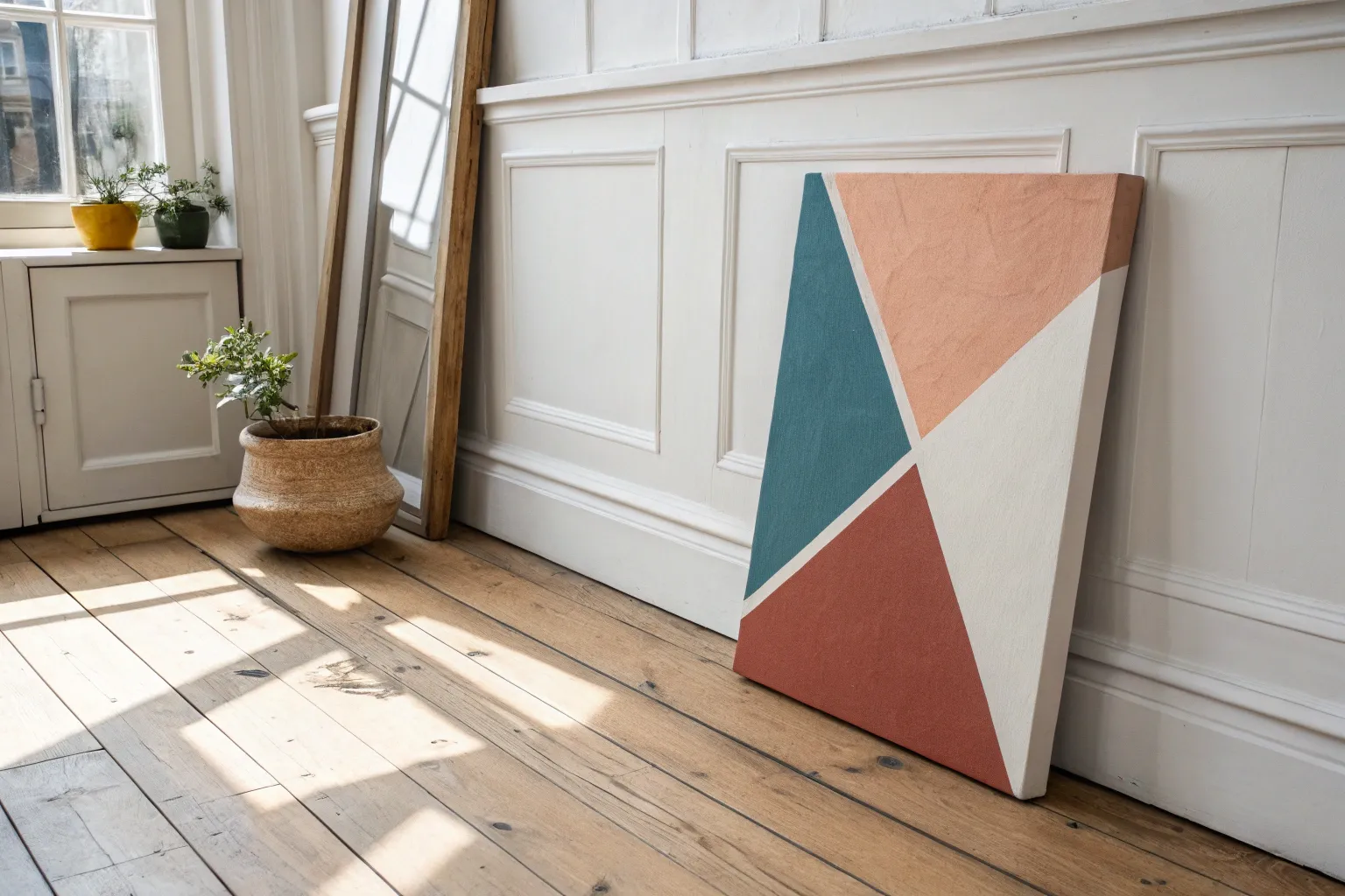
Embrace clean lines and warm, earthy tones with this modern geometric pinwheel design. Using a clever tape-resist technique, you can achieve crisp, professional-looking edges that make the colors pop against each other.
Step-by-Step Guide
Materials
- Square stretched canvas (approx. 24×24 inches)
- Acrylic paints (Terracotta, Navy Blue, Light Peach/Ochre, White)
- Painter’s tape or masking tape (1-inch width)
- Flat synthetic paintbrushes (medium and large)
- Ruler or straight edge
- Pencil
- Paper plate or palette
- Water cup
- Drop cloth or old sheet
Step 1: Preparation and Mapping
-
Prep your workspace:
Lay down a drop cloth or old sheet on a flat surface, like a deck or table, to protect the area from spills. Ensure your canvas is clean and dust-free. -
Mark the center:
Using your ruler, lightly measure and mark the exact center point of the canvas with a pencil. -
Draw the main diagonals:
Draw faint pencil lines connecting opposite corners, creating an ‘X’ that intersects at your center point. -
Add vertical and horizontal guides:
Draw a vertical line and a horizontal line through the center point, effectively dividing the canvas into eight equal triangular sections. -
Sketch the pinwheel subdivision:
Inside each of the eight triangles, draw a line from the center outward to the edge at a slight angle to create asymmetrical, jagged geometric shards rather than perfect pie slices. This creates the dynamic ‘pinwheel’ movement.
Step 2: Taping the Design
-
Apply the first round of tape:
Apply painter’s tape along the pencil lines you just drew. Crucially, you cannot tape every line at once because they overlap. Tape off a set of non-adjacent shapes first. -
Seal the edges:
Run your fingernail or a credit card firmly along the edges of the tape to ensure a tight seal. This prevents paint from bleeding underneath. -
Seal with base coat (Optional):
For razor-sharp lines, I like to brush a very thin layer of white paint (or clear matte medium) over the tape edges first. This seals any tiny gaps.
Clean Line Secret
Peel the tape away from the wet paint area, not toward it. Following this direction helps shear the paint film cleanly rather than dragging it.
Step 3: Painting the Sections
-
Mix your palette:
Prepare your acrylics. You want a deep navy, a warm terracotta rust, a lighter peach or ochre, and a creamy off-white. -
Paint the first set of shapes:
Fill in the exposed canvas shapes with your chosen colors. Use the flat brush to apply smooth, opaque layers. -
Apply a second coat:
Let the first layer dry to the touch (about 15-20 minutes). If the canvas texture is showing through too much, apply a second coat for solid, bold color. -
Remove tape while damp:
Once the final coat is tacky but not fully dry, gently peel back the painter’s tape at a 45-degree angle. This helps keep the paint from chipping. -
Let it cure:
Allow these painted sections to dry completely—usually at least an hour—before proceeding to the next step.
Go Metallic
Swap the navy blue or the peach tone for a metallic gold or copper acrylic paint. This adds a stunning shimmer when light hits the geometry.
Step 4: Finishing the Pattern
-
Tape the remaining sections:
Once the paint is bone dry, apply fresh tape over the painted edges to mask them off, exposing the remaining unpainted geometric/white sections. -
Paint the second batch:
Repeat the painting process for the remaining shapes, alternating colors to ensure no two identical colors touch directly. -
Focus on the white sections:
Use your off-white or cream paint to fill in the large, bright shards that act as negative space in the design. These lighter areas balance the heavy navy and rust tones. -
Final peel:
Carefully remove the second round of tape. Go slowly to avoid lifting any dried paint from the previous layers. -
Touch ups:
Inspect your lines. If there are small bleeds, use a tiny detailed brush and the appropriate color to tidy up the edges. -
Paint the sides:
Don’t forget the edges of the canvas. Paint them either solid white or extend the geometric colors over the side for a gallery-wrapped look.
Hang your new masterpiece in a well-lit room to show off those crisp, modern angles


Loose Abstract Brushstroke Layers
Embrace the soothing calm of neutrals with this highly textured abstract piece. By layering thick modeling paste and soft acrylics, you’ll create sweeping, tactile ridges that catch the light in beautiful ways.
Step-by-Step
Materials
- Stretched canvas (12×16 or similar size)
- Heavy body acrylic paint (Titanium White)
- Acrylic paint (Unbleached Titanium or Buff)
- Acrylic paint (Light peach or soft pink – optional for warmth)
- Modeling paste (flexible/light)
- Large flat synthetic brush (1 inch or wider)
- Palette knife
- Palette or paper plate
Step 1: Preparing the Base
-
Prime your surface:
Ensure your canvas is clean and taut. Even if it’s pre-primed, adding a quick, thin coat of white gesso can help the heavy textures adhere better later on. -
Mix the texture medium:
On your palette, scoop out a generous amount of modeling paste. You want enough to cover significant portions of the canvas roughly 1/8 inch thick. -
Create the base color:
Mix a small amount of your Unbleached Titanium (beige) paint into the modeling paste. You are looking for a very subtle tint, barely off-white, rather than a solid color.
Keep It Clean
Wipe your brush on a paper towel between color shifts rather than washing it in water. Excessive water can dilute the modeling paste structure and cause ridges to collapse.
Step 2: Building the Ridge Layers
-
Apply the first sweeping stroke:
Load your large flat brush heavily with the tinted paste mixture. Starting from one corner, make a broad, confident C-curve motion across the canvas. -
Create distinct ridges:
As you pull the brush, press down firmly at the start and lift slightly towards the end of the stroke. The bristles should leave deep, visible grooves in the thick paste. -
Intersecting movements:
Reload the brush and create a second curve that overlaps or intersects the first one. Don’t overwork the intersection; let the fresh stroke sit on top of the previous one to build dimension. -
Introduce pure white:
Wipe your brush slightly (don’t clean it fully). Dip it directly into the Titanium White paint or white modeling paste to get a cleaner, brighter tone. -
Add highlights:
Apply this lighter mixture in the negative spaces between your beige curves. The contrast between the beige and bright white adds visual depth. -
Vary the pressure:
For some strokes, use the flat side of the brush for wide bands. For others, twist the brush slightly to use the narrower edge, creating thinner, sharper ridges. -
Check the texture depth:
Look at the canvas from the side. You should see significant peaks and valleys in the paint. If an area looks too flat, dab more paste onto the brush and re-sweep that section.
Step 3: Adding Warmth and Detail
-
Mix a warming hue:
Take a tiny dot of the peach or pink paint and mix it with a fresh dollop of modeling paste and beige. The goal is a color that is almost indistinguishable from the beige but has a warm undertone. -
Accent strokes:
Apply this warmer tone sparingly. I like to place these strokes near the center or edges to guide the eye across the composition without overwhelming the neutral palette. -
Dry brushing for grit:
Once the main heavy layers are down, take a scant amount of the beige paint on a relatively dry brush. Lightly drag it perpendicular to the existing ridges to catch just the tops of the texture. -
Softening transitions:
If any ridge looks too sharp or mechanical, use a barely damp, clean brush to gently feather the edge before the paste dries. -
Review the composition:
Step back. The abstract pattern should feel balanced but organic, like wind patterns in sand. Add small dollops of texture in empty spots if needed. -
Final drying process:
Because the layers are thick, this painting needs significant drying time. Lay it flat in a dust-free area for at least 24 hours to ensure the interior of the thickest ridges hardens completely.
Cracking Issues?
If the paste cracks while drying, it was likely applied too thickly in one go. Fill cracks with a thin layer of paint or fluid medium mixed with paste once fully dry.
Once fully cured, your tactile masterpiece is ready to bring a touch of modern elegance to your wall


Soft Color Field Gradient
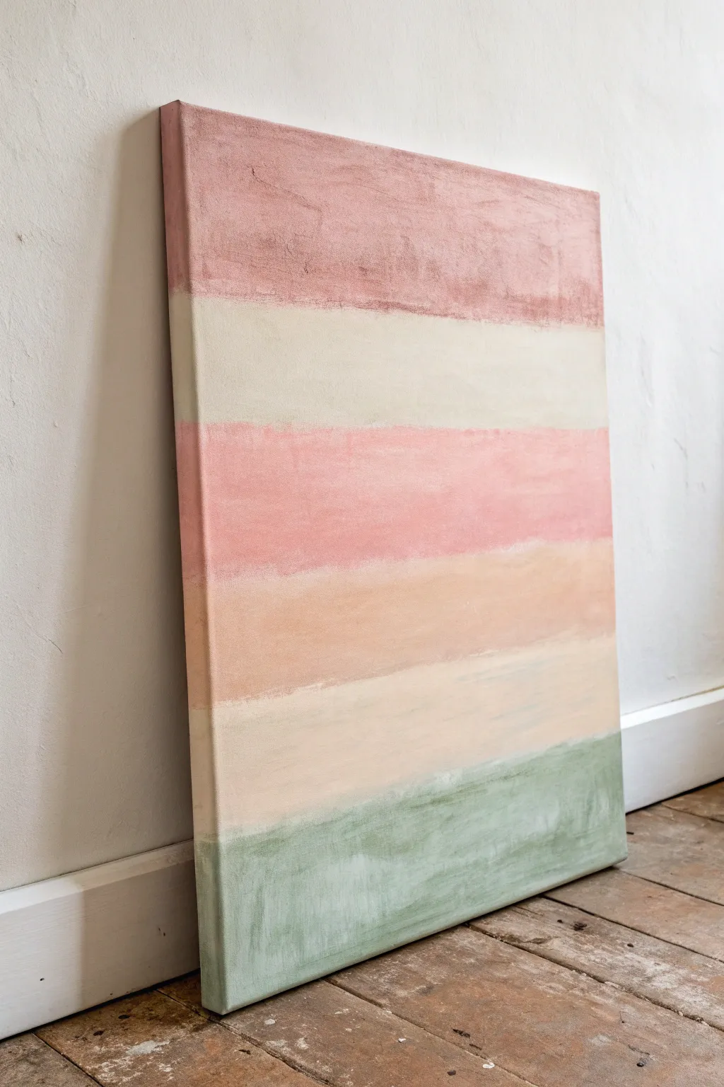
Achieve a serene, grounded atmosphere with this soft color field painting featuring gently blended horizontal bands. The textured, matte finish mimics the look of plaster or fresco, bringing a warm and organic feel to any modern space.
Step-by-Step Tutorial
Materials
- Stretched canvas (approx. 24×36 inches or similar)
- Acrylic paints (Matte finish preferred)
- Colors: Burnt Sienna, Unbleached Titanium, Rose Madder (or Soft Pink), Yellow Ochre, Sage Green, White
- Large flat brush (2-3 inches wide)
- Medium filbert brush for blending edges
- Palette knife (optional for texture)
- Water spritzer bottle
- Mixing palette or paper plates
- Paper towels or rag
- Painter’s tape (optional)
Step 1: Preparation and Base Mixing
-
Prepare your workspace:
Lay down a drop cloth or old newspaper to protect your floor, as this large-scale blending can sometimes lead to drips. -
Prime the canvas (optional):
If your canvas isn’t pre-primed, apply a coat of gesso. For this specific textured look, apply the gesso slightly unevenly with big brush strokes to create a subtle base texture. -
Mix the Mauve-Pink tone:
On your palette, mix a dollop of Burnt Sienna with a larger amount of White and a tiny touch of Rose Madder. You want a dusty, desaturated mauve-pink color for the top band. -
Mix the Cream tone:
Create the second color by mixing Unbleached Titanium with White. It should be a warm, sandy off-white, not a stark bright white. -
Mix the Rose tone:
For the third band, mix Rose Madder with White and a speck of Yellow Ochre to warm it up. This pink should be slightly more vibrant than the top band but still soft. -
Mix the Terracotta tone:
Create the fourth color using Yellow Ochre mixed with a bit of Burnt Sienna and White. Aim for a soft, peachy terracotta shade. -
Mix the Sage Green tone:
Finally, mix Sage Green with a significant amount of White and a tiny touch of Burnt Sienna to desaturate it. This will be the bottom grounding stripe.
Keep It Misty
If your acrylics are drying too fast to blend edges properly, lightly mist the canvas with your water spray bottle. This keeps the paint workable longer.
Step 2: Painting the Bands
-
Apply the top band:
Using your large flat brush, paint the top 1/6th of the canvas with your Mauve-Pink mix. Don’t worry about a perfectly straight bottom edge; a little wobble adds character. -
Paint the sides:
As you work, remember to wrap the color around the sides of the canvas so the piece looks finished from all angles. -
Apply the cream band:
Wash your brush well, then paint the cream band directly below the top one. Bring the cream paint right up to the wet edge of the mauve. -
Blend the first transition:
While both paints are still wet, use a clean, slightly damp brush to gently stroke back and forth horizontally where the colors meet. I like to keep this line slightly distinct but soft, avoiding a perfect gradient. -
Apply the rose band:
Paint the third stripe using your Rose mix. Ensure this band is roughly the same height as the others to maintain balance. -
Soften the rose edge:
Gently feather the top of the rose paint into the bottom of the cream band. Use light horizontal strokes to marry the two colors. -
Apply the terracotta band:
Paint the fourth section with your Peachy Terracotta mix. This color warms up the middle of the composition. -
Create texture:
If the paint feels too flat, blot the wet surface lightly with a crumpled paper towel or dry brush to lift small spots of pigment, mimicking a worn wall. -
Apply a second cream band:
Below the terracotta, paint another band of the Cream/Unbleached Titanium mix. This repeats the rhythm from the top half. -
Blend the lower transition:
Soften the line between the terracotta and the lower cream band. Allow some of the peach tone to streak slightly into the cream. -
Apply the base green band:
Finish by painting the bottom section with your Sage Green mix. This adds visual weight to the bottom of the painting. -
Feather the final edge:
Use your blending brush to gently pull the green paint upwards slightly into the cream band above it, creating a hazy horizon line.
Step 3: Finishing Touches
-
Check for opacity:
Step back and look for areas where the canvas weave shows through too much. Apply a second coat to any band that looks patchy, keeping the edges soft. -
Add dry brush highlights:
Once the painting is dry to the touch, load a dry brush with a tiny bit of white paint. Lightly drag it horizontally across the green and terracotta sections to add a weathered look. -
Final dry:
Allow the entire piece to dry for at least 24 hours. Since we aimed for a matte finish, varnishing is optional, but a matte varnish spray can help protect the surface without adding shine.
Texture Boost
Mix a tablespoon of baking soda or modeling paste into your paint colors before applying. This creates a gritty, stone-like surface texture.
Hang your new textural masterpiece in a well-lit spot to highlight the subtle shifts in color


Palette Knife Texture Blocks
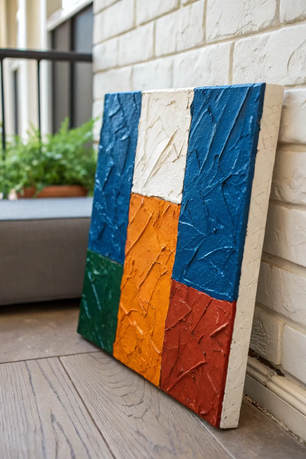
Embrace bold geometry and rich tactile surfaces with this striking impasto project. Using thick layers of modeling paste and vibrant acrylics, you’ll build rectangular zones of color that literally stand out from the canvas.
Step-by-Step
Materials
- Deep-edge gallery canvas (square or rectangular)
- Acrylic modeling paste or heavy gel medium
- Heavy body acrylic paints: Phthalo Blue, Titanium White, Cadmium Orange, Hookers Green, Cadmium Red
- Large palette knife (trowel shape)
- Painter’s tape or masking tape (approx. 1 inch width)
- Palette paper or disposable plate
- Pencil
- Ruler
Step 1: Planning and Taping
-
Map the grid:
Begin by deciding on your composition. Use a ruler and a light pencil to draw vertical and horizontal lines, creating distinct rectangular zones on your canvas. -
Define the boundaries:
Apply painter’s tape along your pencil lines to separate the color blocks. Press the edges of the tape down firmly to prevent paint from bleeding underneath later. -
Select your zones:
Decide which blocks you want to work on first. Since the colors touch, you will need to work in non-adjacent sections first (like a checkerboard) to keep the thick paint from merging.
Textural Integrity
Mix just a drop of gloss gel medium into your modeling paste. This prevents the paste from cracking or becoming too chalky as it dries, keeping those sharp ridges durable.
Step 2: Creating the Texture Base
-
Prepare the paste:
Scoop a generous dollop of modeling paste onto your palette. You want enough volume to cover one color block with a layer about 1/8th to 1/4th inch thick. -
Mix the first color:
Mix your first acrylic color (e.g., Phthalo Blue) into the modeling paste. The ratio should be roughly 70% paste to 30% paint to maintain stiffness while achieving good opacity. -
Apply the mixture:
Using the flat side of your palette knife, spread the colored paste into your first taped-off section like you are icing a cake. -
Create the texture:
Once the block is filled, use the edge and flat face of the knife to press into and lift the paste. Create sharp ridges and peaks by ‘slapping’ the knife flat against the surface and pulling straight up.
Fixing Messy Edges
If paint bleeds under the tape, wait for it to fully dry. Then, use a small flat brush and the adjacent color to carefully paint a straight line over the mistake.
Step 3: Filling the Composition
-
Repeat for non-touching blocks:
Move on to another section that doesn’t border the wet blue paint. For example, mix your Titanium White paste and apply it to the central upper block. -
Vary direction:
As you texture the white section, try changing the angle of your knife strokes slightly. This subtle shift adds visual interest to how light hits the finished piece. -
Add warmth:
Mix Cadmium Orange with paste. Apply this to the central vertical column below the white block. Remember to keep the texture rugged and uneven. -
Partial drying:
Here I prefer to let these first sections set for about 30-45 minutes. They don’t need to be fully cured, but the surface should be firm enough that removing the tape won’t cause them to slump. -
Remove tape carefully:
Gently peel away the painter’s tape to reveal the clean, sharp edges of your textured blocks.
Step 4: Completing the Grid
-
Fill the gaps:
Now that you have boundaries established by the semi-dry paint, mix your remaining colors (Hookers Green and Cadmium Red) with fresh paste. Carefully fill in the empty corner blocks. -
Detail the edges:
Use the very tip of your palette knife to push the wet paste right up against the dried edges of the previous colors, ensuring no bare canvas shows in the gaps. -
Clean up sides:
Check the deep edges of the canvas. You can either wrap the textured color around the sides for a sculptural look or wipe them clean for a crisp profile.
Step 5: Finishing Touches
-
Assess the peaks:
Look for any texture peaks that are excessively high or fragile. While the paste is still malleable, gently tap them down so they don’t break off easily later. -
Final dry time:
Thick impasto takes a long time to cure. Leave the painting flat in a dust-free area for at least 24-48 hours before hanging or varnishing.
Once fully cured, the raised surfaces will catch the light beautifully, giving your space a modern and artistic focal point
BRUSH GUIDE
The Right Brush for Every Stroke
From clean lines to bold texture — master brush choice, stroke control, and essential techniques.
Explore the Full Guide
Simple Fluid Puddle Pour
Achieve a soft, marbled aesthetic with this straightforward fluid art technique that blends coral, blush, and white into a dreamy landscape. The gentle swirls and organic cells create a calming, minimalist piece that fits perfectly with neutral home decor.
Step-by-Step Guide
Materials
- Square stretched canvas (8×8 or 10×10 inch)
- Acrylic craft paints (coral/peach, light pink, white, beige/tan)
- Pouring medium (like Floetrol or Liquitex)
- Small plastic cups (one for each color)
- Craft stir sticks
- Water (distilled is best)
- Cardboard box or drop cloth (for mess containment)
- Gloves
- Push pins (optional, to elevate canvas)
Step 1: Workspace and Paint Prep
-
Prepare the area:
Fluid art is messy, so start by covering your working surface very generously with the drop cloth or setting up inside a large, shallow cardboard box. -
Elevate the canvas:
Insert push pins into the four corners of the back of your canvas. This lifts it off the table, allowing paint to drip off cleanly without sticking the artwork to your surface. -
Mix the pouring medium:
In your small cups, mix your acrylic paints with the pouring medium. A standard ratio is often 1 part paint to 2 parts medium, but check your bottle’s instructions. -
Adjust consistency:
Stir gently. The consistency should resemble warm honey. If the mixture is too thick, add a few drops of water at a time until it flows smoothly off the stick. -
Check for bubbles:
Let the mixed paints sit for a few minutes so air bubbles can rise to the top and pop. This ensures a smoother finish later.
Paint Cracking?
If your paint cracks while drying, your mixture was likely too thick or the room is too cold. Add a tiny bit more water or medium next time.
Step 2: Creating the Puddle Pour
-
Create the first puddles:
Start by pouring small pools of your white paint onto random spots on the canvas. These don’t need to be uniform; just scatter them about. -
Layer the colors:
Pour your coral or peach color directly into the center of the white puddles. Follow this with the beige or light pink, pouring right into the center of the previous color. -
Repeat the process:
Continue creating new puddles and layering colors inside existing ones until most of the canvas surface is covered with paint. Don’t worry about the edges yet. -
Connect the puddles:
Pick up the canvas gently while keeping it relatively flat. Tilt it very slightly so the puddles begin to stretch and touch each other. -
Guide the flow:
I like to tilt the canvas heavily toward one corner first, letting the paint roll over the edge, then bring it back to the center. -
Cover the corners:
Systematically tilt toward the remaining three corners. Ensure the paint flows over every side so the edges of the canvas are fully coated. -
Refining the pattern:
Look at your composition. If you want more swirls, tilt the canvas in a circular motion to curve the lines of the marble effect. -
Fixing bare spots:
If you missed a tiny corner, dip your finger in the runoff paint on your table and dab it onto the bare spot. It will blend in seamlessly.
Step 3: Drying and Finishing
-
Level drying:
Place the canvas back down on a perfectly level surface. If it isn’t level, the design will keep shifting and sliding off while you aren’t looking. -
Pop surface bubbles:
Inspect the surface one last time. If you see tiny bubbles, you can pop them lightly with a toothpick or a quick pass of a culinary torch. -
Wait patiently:
Allow the painting to dry undisturbed for at least 24 to 48 hours. Resist the urge to touch it, as the center takes the longest to cure. -
Optional varnish:
Once fully cured (after a few weeks), imply a coat of gloss varnish to protect the surface and make those peach tones pop.
Add Metallic Flare
Mix a small amount of metallic gold or copper paint into your pour. It will create shimmering veins that catch the sunlight beautifully.
Enjoy the peaceful process of watching these gentle colors merge into your own unique marble masterpiece
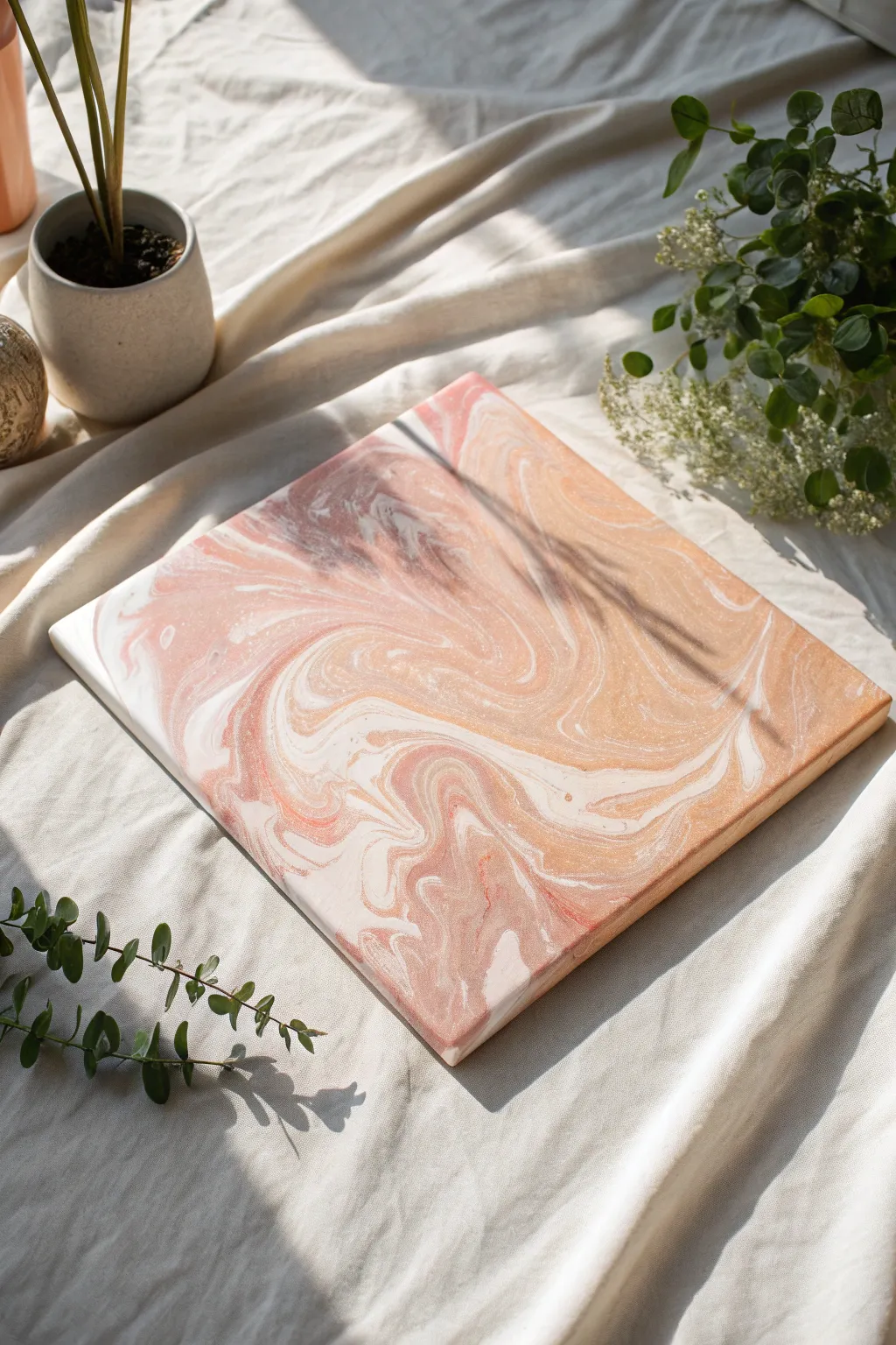
Marbled Swirls and Ribbons
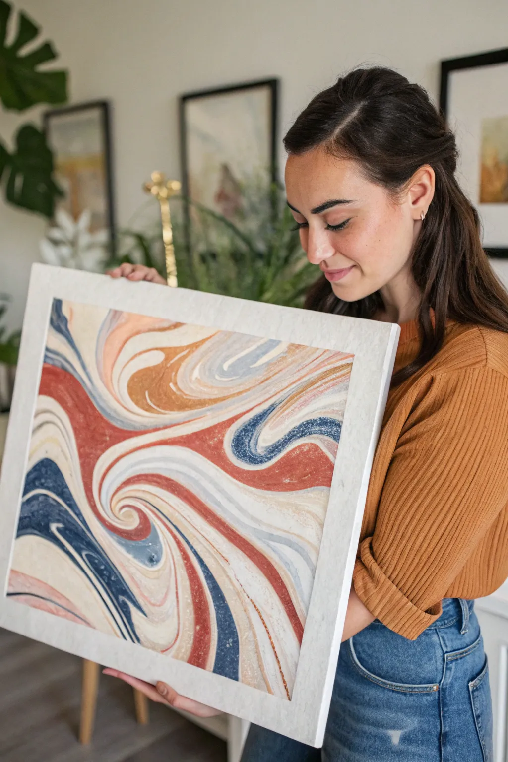
Capture the fluid elegance of classic paper marbling with this bold, ribbon-like abstract design. Featuring sweeping curves of rust, navy, and cream, this project creates a sophisticated statement piece that mimics the movement of liquid stone.
Step-by-Step
Materials
- High-quality watercolor paper or mixed media board (approx. 16×20 inches)
- Suminagashi marbling ink set or fluid acrylics
- Carrageenan or methyl cellulose (thickener size)
- Large marbling tray (must fit the paper flat)
- Whisk or blender
- Stylus, knitting needle, or wooden skewers
- Droppers or pipettes
- Newspaper or waste paper strips
- Alum (mordant) and sponge
- Iron (for flattening final print)
- Clean water source and rinse tray
Step 1: Preparing the Size
-
Mix the bath:
Begin by preparing your ‘size’—the thickened liquid that floats the paint. Mix your carrageenan or methyl cellulose powder with warm water according to the package directions. Use a whisk or blender to ensure there are absolutely no clumps. -
Let it rest:
Allow the mixture to sit undisturbed for at least 6 to 12 hours. This resting period is crucial for the bubbles to dissipate, ensuring a smooth surface for your print. -
Prepare the paper:
While the size rests, treat your paper with an alum solution if required by your ink type. Dissolve 1 tablespoon of alum in a cup of warm water, sponge it onto the paper, and mark the treated side lightly with a pencil. Let it dry completely under a heavy book to keep it flat.
Clean Lines
Wipe your stylus on a paper towel after every single stroke through the liquid. This prevents muddy colors and keeps those ribbon edges crisp and defined.
Step 2: Creating the Pattern
-
Skim the surface:
Once your size is ready and poured into the tray, gently drag a strip of newspaper across the surface to remove any settled dust or micro-bubbles. -
Drop the first colors:
Using a dropper, gently deposit your first color—start with the lightest cream or white tone—directly onto the surface of the liquid. Watch it spread into a circle. -
Build the bullseye:
Drop a contrasting color, like the deep navy, into the center of the first circle. Continue adding concentric rings, alternating between rust, tan, white, and blue until the tray is nearly full of circles. -
Wait for expansion:
Give the inks a moment to expand. If they aren’t spreading well, add a drop of dispersant (or ox gall) to the next color to push the boundaries outward.
Step 3: Combing and Swirling
-
Initial stylus pull:
Take your stylus or skewer. Starting from the top of the tray, draw a single vertical line down through the center of your concentric circles to split the pattern. -
Create the ribbons:
I find that slow, deliberate movements work best here. Drag your stylus in wide, S-shaped curves across the bath. Don’t over-mix; you want distinct, thick bands of color rather than a tight, feathery pattern. -
Deepen the swirls:
Locate the turning points of your S-curves. Use the stylus to hook into these turns and spiral them inwards slightly to create the focal swirl points seen in the reference image. -
Check the composition:
Look for any large gaps. You can carefully drop small accents of gold or white into the negative spaces, but be gentle so you don’t disturb the main ribbons.
Add Metallic Flair
Mix fine mica powder with a tiny bit of rubbing alcohol and sprinkle it over the wet size before printing to create shimmering veins within the marble.
Step 4: Printing and Finishing
-
Lay the paper:
Hold your treated paper by opposite diagonal corners. Gently lower the bottom middle of the paper onto the size, followed by the rest, rolling it down smoothly to prevent air pockets. -
Lift the print:
Let the paper float for just a few seconds. Carefully lift it by two corners, peeling it back off the liquid surface. The pattern is now transferred. -
Rinse gently:
Immediately take the paper to a sink or rinse tray. Run a very gentle stream of water over it to wash off the excess slime (size) without scrubbing the paint. -
Dry flat:
Lay the print face up on clean boards or hang it on a line to dry. The paper will likely buckle when wet. -
Flatten the work:
Once fully dry, place the artwork face down on a clean towel. Press the back with a warm, dry iron to flatten it perfectly before framing.
Now you have a stunning, one-of-a-kind piece of fluid art ready to frame and display

PENCIL GUIDE
Understanding Pencil Grades from H to B
From first sketch to finished drawing — learn pencil grades, line control, and shading techniques.
Explore the Full Guide
Black and White Mark-Making
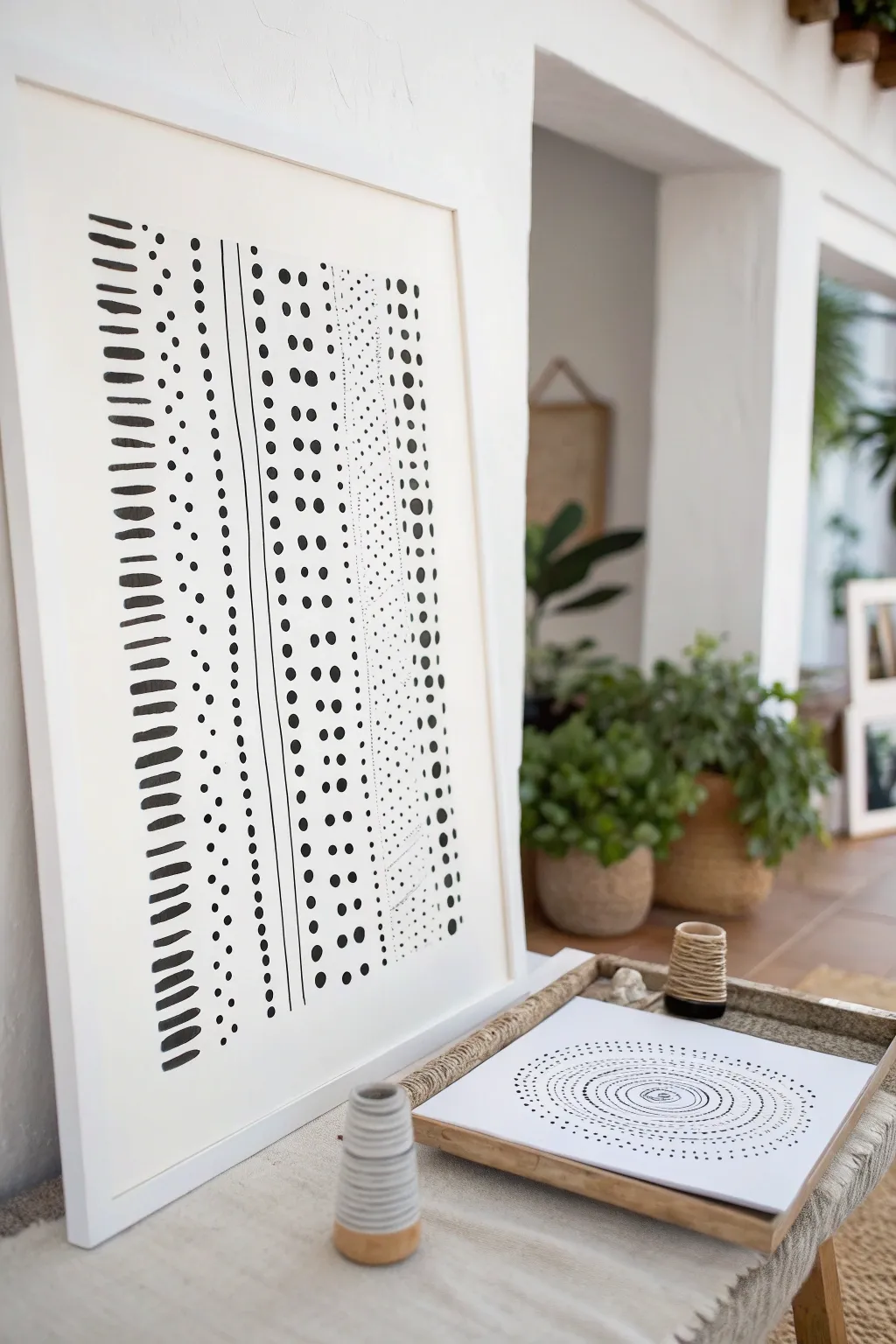
Embrace the meditative simplicity of black ink on paper with this striking abstract piece. By organizing organic dashes, dots, and lines into vertical columns, you can create a composition that feels both structured and delightfully handmade.
Detailed Instructions
Materials
- Large sheet of white multimedia paper or hot press watercolor paper (approx. 18×24 inches)
- Black India ink or high-flow black acrylic paint
- Round watercolor brush (size 6 or 8)
- Flat shader brush (1/2 inch)
- Fine liner brush or dipping pen
- Ruler or straight edge
- Pencil (HB or lighter)
- Kneaded eraser
- Painter’s tape
- Large white frame
Step 1: Setting the Structure
-
Prepare your surface:
Begin by taping down your large sheet of paper to a flat work surface. This prevents buckling if your paper gets saturated and keeps the edges crisp. -
Sketch the guides:
Using a pencil and a ruler, very lightly draw vertical lines down the length of the paper to separate your columns. These don’t need to be perfectly evenly spaced; varying the width of the columns adds visual interest. -
Plan your patterns:
Lightly mark which pattern will go in each column to ensure a balanced composition—for example, ‘heavy dashes’, ‘small dots’, ‘lines’, and ‘stippling’ alternating across the page.
Ink Concentration
Dilute your ink with a few drops of water for some columns. This creates grey variations that add depth alongside the solid black.
Step 2: Column 1: The Bold Dashes
-
Load the flat brush:
Saturate your 1/2 inch flat brush with black ink. You want it fully loaded but not dripping. -
Create the dashes:
Starting at the top left column, press the flat edge of the brush down horizontally and lift off quickly. Repeat this motion all the way down the column. -
Embrace imperfection:
Don’t worry if the spacing varies slightly or if the ink texture changes as the brush runs dry. These variations give the piece its organic character.
Step 3: Column 2: Delicate Texture
-
Switch to the round brush:
For the next column, use a round brush (size 6) to create a vertical stream of small, irregular dots or short marks. -
Building rhythm:
Keep your hand loose and tap the paper rhythmically. Try to keep the marks contained within your penciled guidelines.
Texture Twist
Try using a bamboo reed pen or even a stick from the garden instead of a brush for one column to get scratchy, unpredictable lines.
Step 4: Column 3: Linear Definition
-
Draw the vertical line:
Use a fine liner brush or a dipping pen to draw a long, continuous (or slightly broken) vertical line. This acts as a strong divider between the textured sections. -
Add flanking details:
You might choose to add a secondary, thinner line right next to it, or a column of tiny micro-dots hugging the line.
Step 5: Column 4: Heavy Stippling
-
Create larger dots:
Load the round brush heavily with ink. Press the tip firmly into the paper to create bold, round dots about the size of a pea. -
Stack and align:
Stack these dots in a vertical row. If the ink pools in the center of the dot, let it be; it will dry with a beautiful gradient effect.
Step 6: Column 5: The Micro-Texture Field
-
The stippling zone:
For a wide column of texture, use your smallest brush or a fine-tip pen. Fill the column with hundreds of tiny specks or micro-dashes. -
Density variation:
I like to make the dots denser near the edges of the column and slightly sparser in the middle to create a sense of volume.
Step 7: Refining and Framing
-
Dry check:
Allow the ink to dry completely. India ink can take a little while if applied thickly, usually about 30 minutes to an hour. -
Erase guides:
Once you are certain the ink is bone dry, gently use a kneaded eraser to lift away your pencil guidelines. Avoid rubbing too hard over the inked areas. -
Frame it up:
Place the artwork into a simple white frame. Using a mat creates a gallery-like finish, but floating the paper to show raw edges is also a beautiful look.
Hang your new minimalist masterpiece in a bright room where the high contrast can truly shine
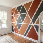
Limited Palette Moody Abstract
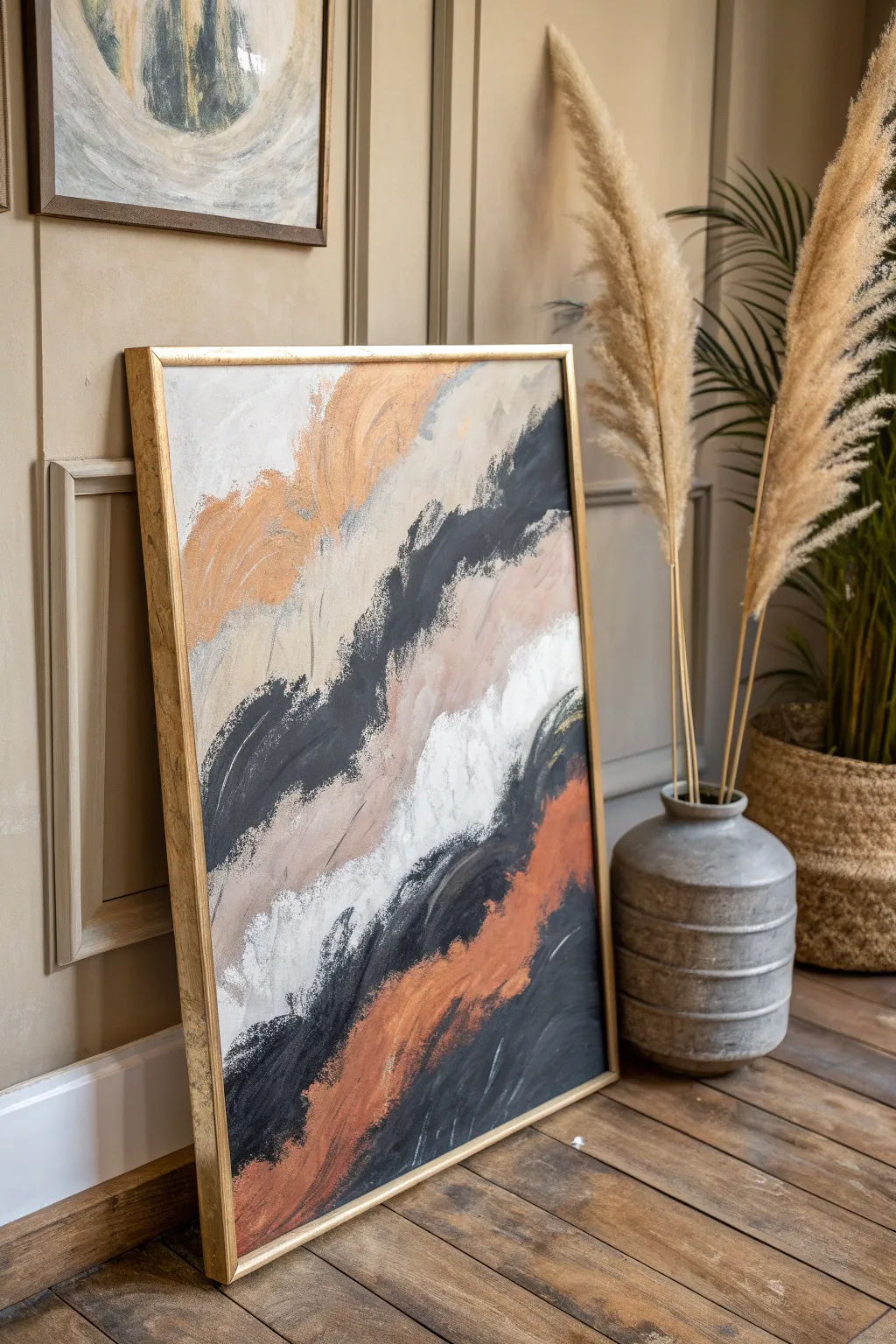
Embrace the elegance of simplicity with this large-scale abstract study in movement and contrast. Using sweeping, diagonal bands of terracotta, charcoal, and cream, this piece captures the raw energy of stone and earth textures in a sophisticated vertical format.
Step-by-Step
Materials
- Large rectangular canvas (approx. 24×36 inches or larger)
- Heavy body acrylic paints: Mars Black, Titanium White, Burnt Sienna, Yellow Ochre, Raw Umber
- Wide flat synthetic brushes (3-4 inch width)
- Palette knife or plastic scraper for texture
- Mixing palette or large paper plates
- Water container and rags
- Gold floating frame (optional, for finishing)
- Gesso (if canvas is unprimed)
Step 1: Preparation & Base Tones
-
Prepare the workspace:
Lay down a drop cloth or old sheet to protect your floor, as this painting uses broad strokes that can easily splatter. Prop your canvas vertically, either against a wall or on an easel, to get the right angle for the downward flow. -
Prime the surface:
Even if your canvas is pre-primed, apply a fresh coat of white gesso to ensure a smooth, toothy surface. This helps the heavy body acrylics grip the canvas without sinking in too quickly. -
Mix the neutral beige:
Create a warm, sandy beige by mixing a large amount of Titanium White with a touch of Yellow Ochre and a tiny dot of Raw Umber. You want a very pale, calming background tone. -
Establish the background:
Using your widest brush, paint the upper third and portions of the middle section with your sandy beige mix. Use loose, diagonal strokes starting from the top left, but leave large gaps where the darker colors will go. -
Create the terracotta:
Mix Burnt Sienna with a little Yellow Ochre and Titanium White to create a muted, earthy orange. It should look like clay or terracotta, not a bright pumpkin orange.
Edge Control
For the signature ‘ragged’ look, don’t use water on your brush. Let the bristles split and separate as the paint runs out to create rough, scratchy edges.
Step 2: Building the Composition
-
Apply the first bold sweep:
Load a clean wide brush heavily with the terracotta mix. Starting from the upper-middle left, sweep diagonally downward towards the center. Don’t overthink it; let the brush run dry at the edges to create a rough, textured look. -
Mix the charcoal grey:
Combine Mars Black with a small amount of White to create a deep, slate charcoal. Pure black can feel like a hole in the canvas, so this slight tint adds depth. -
Add the dark anchors:
Paint a strong, jagged diagonal band of the charcoal mix below your terracotta section. Use a scrubbing motion at the edges to feather the paint into the white space, creating that dynamic ‘dry brush’ effect seen in the reference. -
Introduce pure white:
Squeeze fresh Titanium White onto your palette. Apply a thick band of white in the center of the composition, sandwiched between the charcoal and the surrounding neutrals. This highlight is crucial for the high-contrast aesthetic. -
The bottom rust layer:
Mix a slightly darker version of your terracotta (add a tiny bit of Raw Umber). Apply a large swath of this color at the bottom right, sweeping upwards to meet the dark charcoal band.
Step 3: Refining Texture & Finish
-
Blend visually:
While the paint is tacky but not wet, use a dry, clean brush to lightly feather the boundaries where colors meet. You don’t want to create a new color, just soften the transition so it looks like shifting sand. -
Enhance the blacks:
Go back in with pure Mars Black in the deepest valleys of your dark stripes. Use a palette knife or the edge of a credit card to scrape this black across the dried texture for a gritty, organic finish. -
Layering the beige:
Return to your sandy beige mix. Add wispy, light strokes over parts of the charcoal and terracotta specific areas. This ‘veiling’ technique mimics natural geological strata. -
Check balance:
Step back about five feet. Look for spots that feel too heavy or empty. I like to add small, erratic dashes of the charcoal color in the lighter areas to connect the composition. -
Dry brush highlights:
Take a brush with a tiny amount of white paint and drag it very lightly over the darkest dried textures. This catches onto the canvas weave and adds surface interest. -
Allow to cure:
Let the painting dry completely for at least 24 hours. Because of the varying thickness of the paint, it needs time to set fully before framing. -
Framing:
Place the finished canvas into a thin, gold floating frame. The metallic edge warms up the beige tones and provides a sharp, professional boundary for the organic shapes within.
Metallic Accent
Mix a small amount of gold leaf or gold paint into the beige sections for a subtle shimmer that echoes the frame and catches the light beautifully.
Hang your new masterpiece in a well-lit spot to let the textures and earthy tones warm up your living space


Abstract Horizon Bands
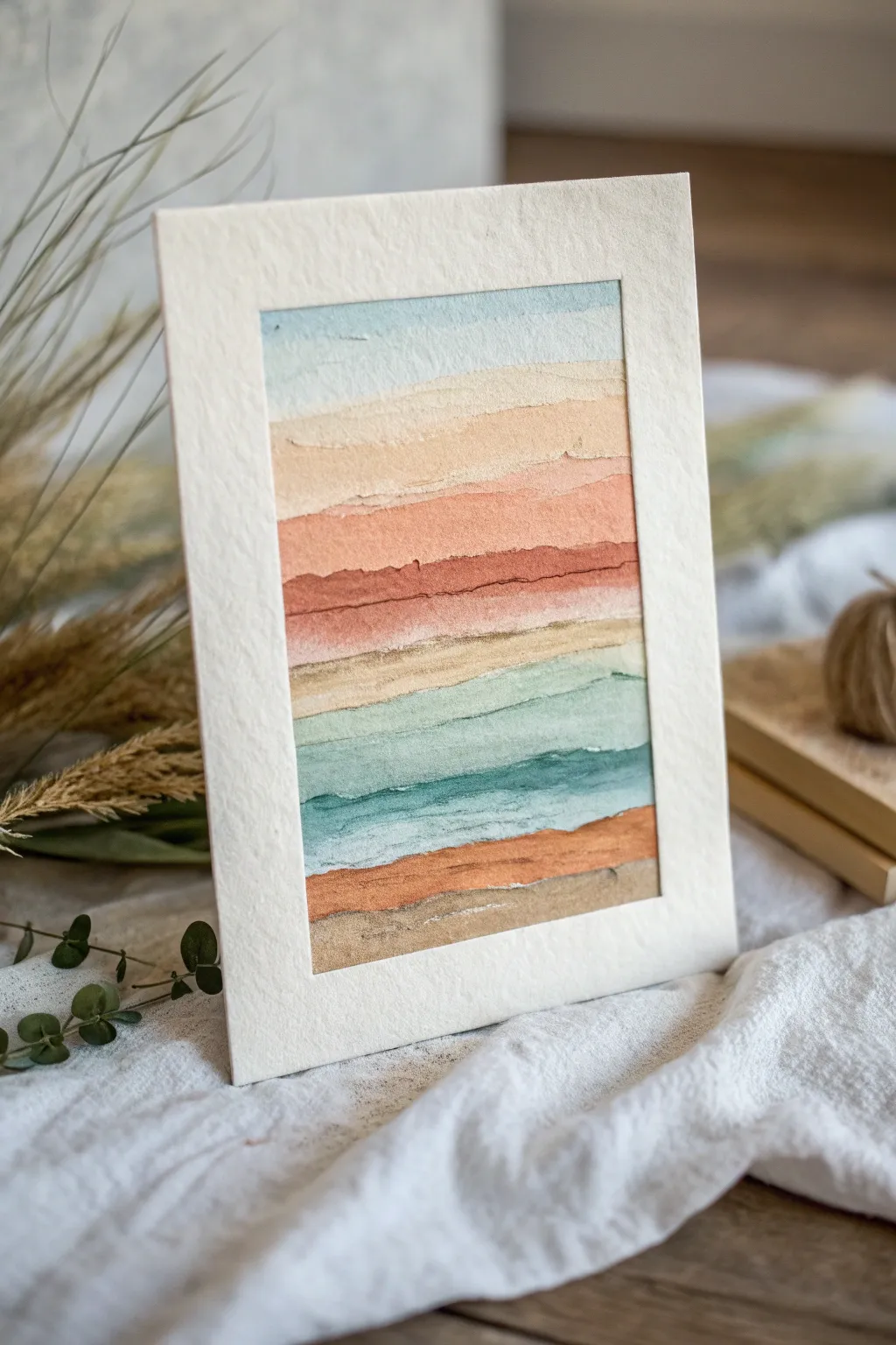
Capture the essence of a peaceful landscape with this abstract layered watercolor technique. By focusing on organic horizontal bands and subtle color transitions, you’ll create a piece that feels both structured and effortlessly fluid.
How-To Guide
Materials
- Cold press watercolor paper (300 gsm)
- Watercolor paints (indigo, burnt sienna, yellow ochre, terracotta, teal)
- Flat shader brush (size 1/2 inch or similar)
- Round brush (size 6)
- Small palette for mixing
- Two jars of water
- Masking tape
- Paper towels
- Pre-cut mat board or thick cardstock for framing
Step 1: Preparation and Sky Layer
-
Paper setup:
Begin by taping down your watercolor paper to a rigid board using masking tape. This prevents the paper from buckling as you apply wet washes. -
Identify the palette:
Prepare your colors. You will need a soft sky blue, creamy beige, warm terracotta, deep rust, ochre, teal, and a dark earthy brown. -
First wash:
Load your flat brush with a very dilute sky blue wash. Paint the top band across the paper, keeping the top edge straight but allowing the bottom edge to be slightly uneven. -
Softening the edge:
While the blue band is still damp, rinse your brush and run a clean, damp brush along the bottom edge to soften it slightly, preparing it for the next layer.
Wet Edge Control
To stop colors from bleeding too much into each other, leave a hair-thin gap of dry paper between bands. The eye will blend them, but the paint stays put.
Step 2: Building the Warm Middle
-
Creamy transition:
Mix a very pale wash of yellow ochre or unbleached titanium. Paint a band directly below the blue, allowing them to touch just barely. If they bleed a little, that’s perfect—it adds atmospheric depth. -
Deepening tones:
Moving downward, mix a warmer beige or light tan. Apply this band with a slightly more jagged motion to suggest distant cloud layers or land formations. -
Introducing warmth:
Mix a soft terracotta or salmon color. Paint a slightly thicker band below the beige. I like to let the pigment pool slightly in certain areas to create natural texture as it dries. -
The rust accent:
Create a stronger, more saturated rust or burnt sienna mix. Paint a thin, defining line right through the middle of your composition. This acts as a visual anchor. -
Creating texture:
While the rust layer is wet, drop in a tiny bit of darker brown in random spots along the band to create the look of roughness or sediment.
Gold Leaf Accent
For a luxe upgrade, wait until the paint is bone dry, then apply a thin line of gold leaf or metallic watercolor along the darkest rust horizon line.
Step 3: Cool Tones and Ground
-
Returning to neutrals:
Below the heavy rust line, paint a band of pale ochre or sandy yellow. Keep this layer fairly transparent to let the light of the paper shine through. -
The water element:
Switch to a teal or light turquoise mix. Paint two or three bands of this cool color, varying the saturation. Make the top teal band lighter and the bottom one slightly darker. -
Simulating waves:
Use the tip of your round brush to add a horizontal streak of darker teal wet-on-wet within the bottom teal band. -
Grounding the piece:
Mix a rich burnt orange or copper color. Paint a solid band below the water colors. -
Final earth layer:
Finish the bottom of the painting with a band of neutral grey-brown. Allow the bottom edge of this final stripe to be rough and textured, mimicking the unevenness of soil.
Step 4: Finishing Touches
-
Drying time:
Allow the painting to dry completely. Do not touch it until the paper is cool to the touch and flat. -
Tearing the edges:
Once dry, verify the size of your mat opening. Carefully tear the edges of your watercolor paper to size instead of cutting them, creating a lovely deckled edge. -
Mounting:
Center your artwork behind the mat frame. Use small pieces of tape on the back to secure it, ensuring the torn edges sit nicely within the window.
Now you have a tranquil, uniquely layered landscape ready to bring calm to any space
Abstract Botanical Stems
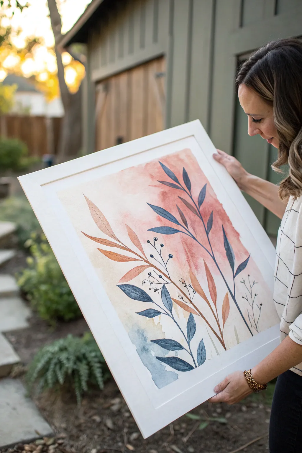
Embrace the imperfect beauty of nature with this large-scale watercolor botanical study, featuring sweeping stems and delicate berries against a dreamy, abstract wash. The warm terra cotta and cool indigo palette creates a balanced, calming piece that looks beautiful in any modern space.
Detailed Instructions
Materials
- Large sheet of hot press watercolor paper (18×24 or similar)
- Watercolor paints (Indigo, Burnt Sienna, Terra Cotta, Yellow Ochre)
- Large flat wash brush (1 inch or larger)
- Round watercolor brushes (Size 8 and Size 4)
- Detail liner brush
- Painter’s tape
- Masonite board or smooth surface for taping down paper
- Paper towels
- Two jars of water (one for rinsing, one for clean water)
- White or natural wood frame
Step 1: Preparation & Background
-
Secure your canvas:
Begin by taping your large watercolor paper securely to your board using painter’s tape. Ensure the tape creates a clean, even border on all four sides to give you that crisp edge later. -
Wet the paper:
Using your large flat brush and clean water, lightly wet the center area of the paper where you want the background cloud to be. You want a sheen, not puddles. -
Mix the background warmth:
Dilute a Terra Cotta or watered-down Burnt Sienna on your palette until it is very faint. Introduce this color to the wet paper in the upper center and right side, letting it bloom softly. -
Add cool accents:
While the paper is still slightly damp, introduce a very watered-down Indigo or Payne’s Gray to the bottom left area. Let these background washes touch and mingle slightly, but avoid overworking them so they stay fresh. -
Let it dry completely:
This is crucial – walk away and let the background layer bone dry before attempting any crisp lines on top, or your leaves will bleed into the wash.
Pro Tip: Leaf Shape
Compose with confidence! Paint the stems quickly rather than slowly dragging the brush. Fast strokes look smoother and more natural than hesitant, shaky lines.
Step 2: Painting the Foliage
-
Plan your composition:
Visualize three main stems: one large warm-toned stem curving from the bottom center to the right, one large blue stem rising vertically, and a smaller blue accent stem at the bottom. -
Paint the warm stem:
Mix a saturated Burnt Sienna with a touch of Yellow Ochre. Using the Size 8 round brush, paint a long, confident central stem sweeping upward. -
Add warm leaves:
While the stem is wet, add long, lance-shaped leaves. Press the belly of the brush down to widen the leaf and lift up to create a pointed tip. Vary the angles so they look organic. -
Create the blue stem:
Switch to your Indigo paint. Create a second major stem that crosses behind or near your first one, reaching taller toward the top right corner. -
Vary smooth strokes:
Paint the blue leaves with the same pressure-and-lift technique. I like to make the blue leaves slightly more slender than the brown ones to create visual contrast. -
Add the bottom accent:
Paint a shorter, heavier cluster of blue leaves in the bottom left corner, overlapping the pale blue background wash you created earlier. -
Layering transparency:
If a warm leaf crosses a blue leaf (or vice versa), let the first one dry completely before painting the second one over it. This allows the beautiful transparency of watercolor to show through the overlap.
Step 3: Details & Finishing
-
Switch to the liner brush:
To paint fine details, pick up your smallest liner brush or a size 1 round brush. Load it with a dark, concentrated mix of Indigo and a tiny bit of black. -
Draw berry stems:
Paint very thin, wiry lines weaving in between the main foliage. These lines should be somewhat erratic and angular, not smooth curves. -
Add the berries:
Dot the ends of these thin stems with small circles. Leave a tiny speck of white paper showing in the center of a few berries to represent a highlight. -
Add tiny sprigs:
On the far right side, add a few extremely faint, skeletal plant structures using a very dilute gray-brown mix, just to fill the negative space without competing for attention. -
The final reveal:
Once the entire painting is perfectly dry, carefully peel away the painter’s tape at a 45-degree angle to reveal your crisp white border. -
Frame your work:
Place the artwork into a simple white or light wood frame to keep the focus purely on the organic shapes and colors.
Level Up: Texture
Before the background wash dries completely, sprinkle a tiny pinch of table salt into the wet paint. Brush it off when dry for a subtle, starry texture effect.
You now have a serene, gallery-worthy botanical piece to hang in your home
Metallic Accents and Shine
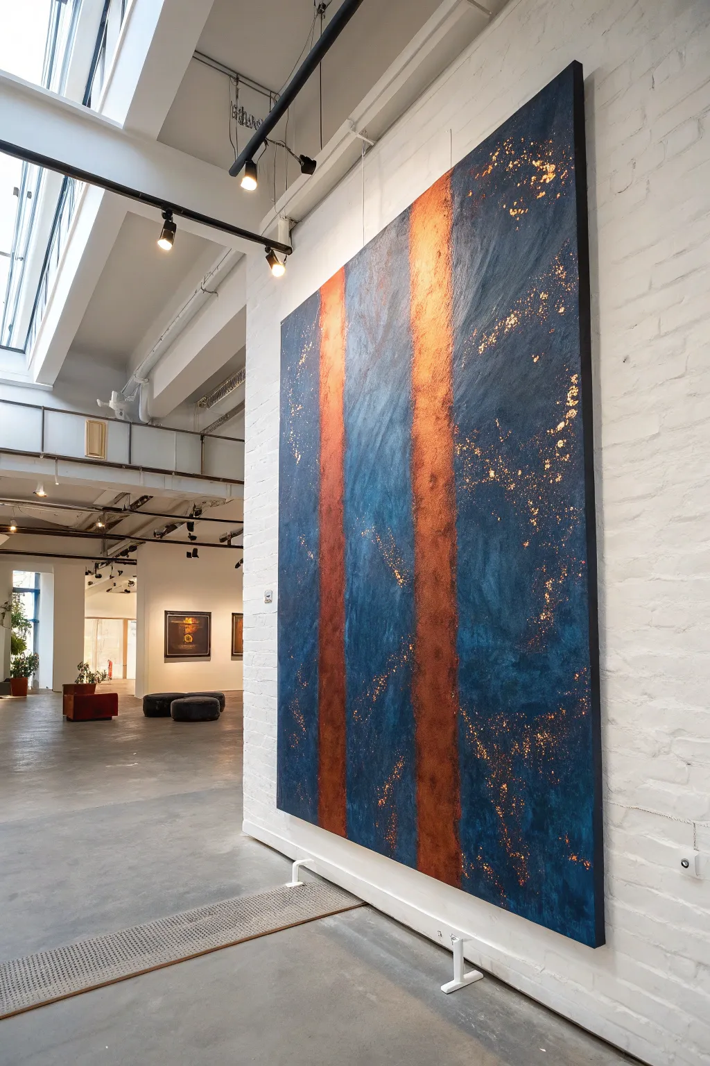
Capture the mysterious beauty of deep space with this large-scale abstract painting, featuring rich midnight blue textures intersected by striking pillars of glowing copper. This project uses negative space and metallic leafing to create a sophisticated, gallery-worthy statement piece that shimmers in the light.
Step-by-Step Guide
Materials
- Large canvas (48×60 inches or similar)
- Heavy body acrylic paint (Phthalo Blue, Mars Black, Prussian Blue)
- Imitation copper leaf sheets (gold leaf kit)
- Metal leaf adhesive (sizing)
- Metal leaf sealant
- Large flat paintbrush (2-3 inch)
- Medium round brush
- Palette knife or plastic scraper
- Artist sponge
- Painter’s tape (2-inch wide)
- Drop cloth
- Soft-bristled finishing brush
Step 1: Setting the Composition
-
Prepare the workspace:
Lay down your drop cloth. Since this is likely a large canvas, you might want to work flat on the floor or on a sturdy easel. Ensure the canvas is clean and dust-free. -
Mask the pillars:
Decide where you want your metallic pillars to live. Run two vertical strips of painter’s tape down the full length of the canvas. These don’t need to be perfectly straight; slightly angled placement adds dynamic tension. -
Widen the mask (optional):
If standard tape is too thin, place two strips side-by-side or use wider masking paper to block out areas that become the copper stripes later.
Sticky Situation
If the leaf tears while applying, don’t panic. Just patch the hole with a small scrap of leaf. The resulting texture often looks better than a perfect sheet.
Step 2: Building the Blue Abyss
-
Mix the base color:
On your palette, mix a large amount of Phthalo Blue with a touch of Mars Black. You want a very deep, almost navy color that isn’t quite pure black. -
Apply the base coat:
Using your large flat brush, paint the entire canvas surface, painting right over the tape edges to seal them. Don’t worry about texture yet; just get solid coverage. -
Create texture layers:
While the base is tacky, mix a slightly lighter shade by adding a tiny dot of white or Prussian Blue to your mix. Use a palette knife or scraper to drag this color across the canvas in rough, erratic motions. -
Sponge work:
Take a damp artist sponge and dab it into pure black paint. Lightly stipple areas around the edges and between the tape lines to create shadowy depth. -
Dry thoroughly:
Let the blue layers dry completely. This is crucial before moving to the metal leafing step. I usually leave it overnight for peace of mind.
Pro Tip: Depth Charge
Before applying the leaf adhesive, paint the white strip a dark terracotta color. If the leaf has tiny cracks, the warm underpainting will show through, enhancing the glow.
Step 3: Applying the Copper Glow
-
Remove the masking:
Carefully peel away the painter’s tape reveals the stark white canvas underneath (or whatever primer color your canvas had). These are your pillar zones. -
Apply adhesive sizing:
Paint the metal leaf adhesive (sizing) carefully into the white rectangular strips. Also, randomly dab small spots of adhesive into the blue areas where you want ‘stars’ or metallic flecks. -
Wait for tackiness:
Adhesive needs to get tacky, not wet. Wait about 20-30 minutes until the milky glue turns clear and feels sticky to the touch. -
Lay the copper leaf:
Gently place sheets of copper leaf over the sticky pillar areas. Overlap the edges slightly to ensure full coverage. -
Add scattered details:
Crumple leftover bits of copper leaf and press them onto the random adhesive spots you created in the blue field. -
Burnish the metal:
Use a soft, dry brush or a clean cloth to gently rub the copper leaf onto the canvas. This ensures it adheres firmly to the texture of the canvas weave.
Step 4: Revealing and Refining
-
Brush off excess:
Using a stiff, dry brush, vigorously sweep over the copper areas. The leaf will flake away from anywhere there wasn’t glue, leaving crisp edges on your pillars and organic shapes for your scattered stars. -
Distress the pillars (optional):
If the copper strips look too perfect, lightly dry-brush a very small amount of Navy Blue over parts of the copper to make it look weathered and integrated. -
Seal the artwork:
Copper leaf can oxidize and turn green over time. Apply a specialized metal leaf sealant or a gloss varnish over the metallic areas to preserve their warm shine. -
Final varnish:
Once the metal sealant is dry, coat the entire painting with a satin varnish to unify the sheen of the acrylic paint and the metal leaf.
Hang your finished masterpiece in a well-lit area where natural or track lighting can catch the changing reflections of the copper leaf
Stamped Patterns With Found Objects
This striking print combines the rustic charm of hand-carved stamps with a clean, modern grid layout. Using a two-tone palette of deep charcoal and terracotta, you’ll create a repeating series of split circles that play with texture, pattern, and negative space to suggest lunar phases.
Step-by-Step
Materials
- Soft-cut lino block or rubber stamp carving block
- Linoleum carving tool set (u-gauge and v-gauge)
- Block printing ink (Charcoal/Black and Terracotta/Copper)
- Brayer (rubber roller)
- Glass or acrylic sheet for rolling ink
- Heavyweight printmaking paper (smooth surface)
- Pencil & ruler
- Compass or circle template
- Craft knife or scissors
- Barren or clean wooden spoon
Step 1: Designing and Carving the Blocks
-
Draft your master circle:
Begin by deciding the size of your circles. Use a compass to draw a circle on your lino block. For this project, you will want a circle that is approximately 1.5 to 2 inches in diameter. -
Create the split design:
Draw a vertical line directly down the center of your circle to split it into two equal semi-circles. This vertical split is the foundational element of the entire composition. -
Draft the textural variations:
You will need multiple variations to achieve the look in the photo. Design one half-circle as a solid block. Design another with concentric carved arches (rainbow style). Design a third with a cross-hatch or grid pattern. -
Carve the outlines:
Using a fine V-gauge carving tool, carefully carve away the outline of your circles first. This defines the crisp edge. Then, carve the straight line separating the two halves. -
Carve the negative space:
Switch to a wider U-gauge tool to clear away the excess rubber outside your circle designs. Ensure you carve deep enough that the background won’t pick up ink. -
Detail the patterned halves:
For the patterned semi-circles, use your finest tool. Carve out the thin lines for the concentric arches and the small squares for the grid pattern, remembering that whatever you carve away will remain white. -
Separate the stamps:
Using a craft knife, carefully cut your rubber block so that the two halves of the circle are physically separate stamps. This allows you to ink the left and right sides in different colors easily.
Registration Tip
To align the two halves perfectly, mark a tiny pencil line on the *back* of your stamp blocks indicating exactly where the center straight edge is.
Step 2: Preparing the Paper Grid
-
Measure your paper:
Take your high-quality printmaking paper and determine the center. You will be creating a grid layout. -
Draw the grid lines:
Lightly use a pencil and ruler to draw a grid. Based on the artwork, create a 3×5 layout (three columns, five rows). Ensure the boxes are slightly larger than your stamps to leave breathing room. -
Mark the box boundaries:
Draw the final black grid lines over your pencil marks using a fine-liner pen or a very steady hand with ink, as these lines are part of the final aesthetic.
Step 3: Printing the Composition
-
Prepare your ink palette:
Squeeze a small amount of charcoal ink onto one side of your glass slab and terracotta ink on the other. Use your brayer to roll them out until you hear a ‘velcro’ creating a smooth, tacky layer. -
Plan the row sequence:
Look at the reference image. The pattern alternates. Some circles are solid/solid, others are solid/patterned. I find it helpful to sketch a tiny thumbnail map on scrap paper so I don’t get confused mid-print. -
Ink the first semi-circles:
Start with the top-left square. Ink the left half of your split circle with charcoal ink. Place it carefully aligned within the grid box. -
Ink the contrasting half:
Ink the corresponding right half-circle with the terracotta ink. Align it perfectly with the straight edge of the charcoal print you just made and press down. -
Apply pressure:
Use a baren or the back of a wooden spoon to rub firmly in a circular motion on the back of the stamp (or paper, if pressing paper onto block) to transfer the ink fully. -
Continue the pattern:
Work your way through the grid. The second row reverses the colors (terracotta left, charcoal right). The third row introduces the patterned stamps. -
Introduce textures:
For the bottom rows, use your concentric arch stamp and grid stamp. Mix and match these with the solid halves to create visual interest. -
Final dry:
Allow the print to dry completely for at least 24 hours. Oil-based printing inks may take longer, while water-soluble ones dry faster.
Patchy Prints?
If your print looks too ‘salty’ (white spots), you likely need a bit more ink on the brayer, or you need to apply more pressure with your spoon/baren.
Once the ink is fully cured, you can erase any visible pencil guidelines for a crisp finish
Plastic Wrap Lift Texture
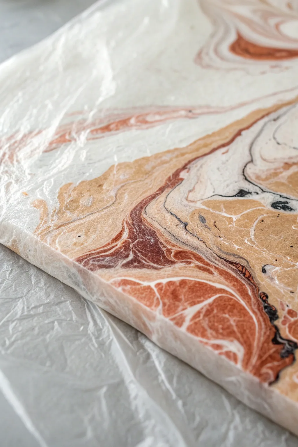
This technique uses everyday cling film to transform a simple acrylic pour into a fossilized, stone-like masterpiece. The plastic wrap creates intricate veins and ridges that mimic the look of polished agate or marble once dry.
Step-by-Step Guide
Materials
- Stretched canvas (square or rectangular)
- Floating medium or pouring medium
- Acrylic paints (Titanium White, Burnt Sienna, Raw Sienna/Beige, Lamp Black)
- Plastic cups for mixing
- Wooden stir sticks
- Plastic wrap (cling film)
- Spray bottle with water (optional)
- Gloves
- Drop cloth or protective covering
Step 1: Preparation & Mixing
-
Protect your workspace:
Fluid art is messy, so ensure you cover your table thoroughly with a drop cloth or heavy plastic sheeting. -
Mix the pouring medium:
In clean cups, mix your acrylic paints with the pouring medium. A standard ratio is usually 1 part paint to 2 parts medium, but check your specific brand’s bottle for the best results. -
Check consistency:
Stir the paints until they reach a consistency similar to warm honey. If the paint is too thick, add a few drops of water; if it’s too thin, it won’t hold the texture later. -
Prepare the pallet:
For this earth-tone look, I recommend mixing a larger volume of white compared to the rust (Burnt Sienna), beige (Raw Sienna), and black accents.
Muddy colors?
If your colors turn gray or brown, you likely over-tilted or over-mixed. Pour distinct ribbons and tilt less. Let the plastic wrap do the mixing work for you.
Step 2: The Pour
-
Base layer:
Pour a generous amount of the Titanium White mixture onto the center of the canvas and tilt it slightly to spread it towards the edges. -
Add accent colors:
Drizzle ribbons of the Burnt Sienna and Raw Sienna across the white base. Don’t worry about being neat; organic lines work best. -
Create contrast:
Add very thin veins of the Lamp Black. Use this sparingly, as black can easily overpower the softer earth tones. -
Tilt and swirl:
Gently tilt the canvas in various directions to let the paints flow together and marble. Stop tilting once you have a composition you enjoy, ensuring the paint layer is still relatively thick and wet.
Gloss it up
To truly mimic polished stone, finish the thoroughly dried piece with a high-gloss varnish or a layer of clear resin. It makes the depth pop.
Step 3: Texturing Technique
-
Prepare the plastic:
Tear off a piece of plastic wrap slightly larger than your canvas. Crinkle it up into a ball in your hands, then loosely unfold it—you want it wrinkled, not smooth. -
Apply the wrap:
Lay the wrinkled plastic wrap directly onto the wet paint surface. Do not stretch it tight; let the folds sit naturally on the paint. -
Create veins:
Using your fingertips, gently press down specifically where the plastic bunches up. This action pushes the paint aside and creates those distinct sharp lines visible in the example photo. -
Manipulate the pattern:
If you want specific shapes, you can pinch the plastic together while it’s on the canvas to draw paint into ridges. I like to twist a small section to create a focal point. -
Check coverage:
Ensure the plastic is making contact with the paint across the entire surface, even the edges, to ensure uniform texture.
Step 4: Drying & Reveal
-
Initial drying phase:
Leave the plastic wrap on the canvas. This is the hardest part—waiting! The paint needs to be partially or mostly dry before strictly removing the wrap. -
Wait time:
Allow the project to sit undisturbed for at least 24 hours. The plastic slows down the drying process significantly. -
The peel:
Once the paint feels firm through the plastic, gently peel back a corner to check. If the paint is wet, put it back. When ready, slowly peel the entire sheet off to reveal the crystallized texture underneath. -
Final cure:
Let the exposed painting cure for another 24 to 48 hours to ensure all moisture trapped in the ridges has evaporated.
Once fully cured, your unique fossilized abstract is ready to hang on the wall
Air-Blown Drips and Streams
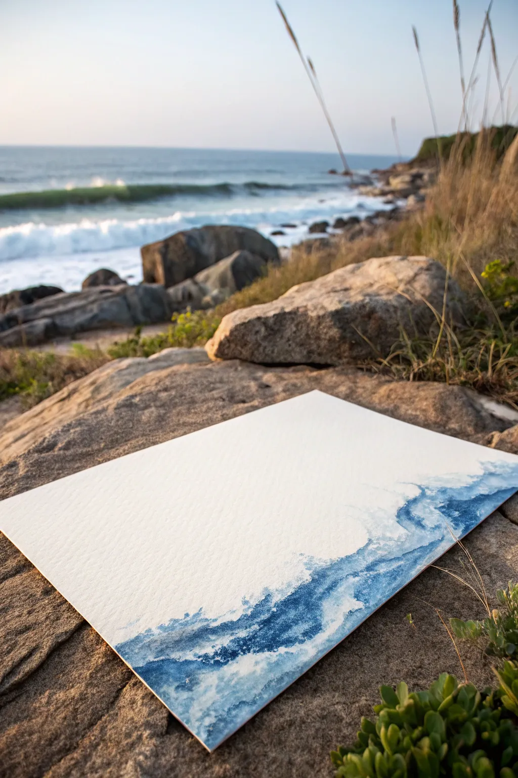
Capture the raw energy of the ocean with this minimalist yet evocative wave study. Using just one or two shades of blue and the force of air, you’ll guide liquid watercolor across textured paper to mimic the crashing surf.
Detailed Instructions
Materials
- Cold Press watercolor paper (heavyweight, 140lb/300gsm)
- Liquid watercolor or high-flow acrylic ink (Prussian Blue or Indigo)
- Plastic pipette or eyedropper
- Drinking straw
- Clean water jar
- Large round watercolor brush (size 10 or 12)
- Paper towels
- Masking tape
Step 1: Setting the Scene
-
Secure the paper:
Begin by taping down your cold press watercolor paper to a flat, movable board. This prevents warping and allows you to tilt the surface if needed. -
Pre-wet the edge:
Dip your large round brush into clean water. Paint an organic, wavy strip of clear water along the bottom right edge of the paper where you want the main body of the wave to be. Don’t soak it, just make it damp.
Problem: Muddy colors
If your blues look dull, you’re likely overworking the wet paper. Let the ink flow naturally and stop brushing once you’ve blown the air. Less manipulation keeps it fresh.
Step 2: Releasing the Tide
-
Drop the pigment:
Using your pipette, draw up some pure Indigo or Prussian Blue ink. Release several generous drops directly onto the wet strip you just painted. -
Initial flow:
Watch as the rich pigment naturally blooms into the wet paper. You can add a drop or two of water nearby to encourage the color to spread and soften. -
Position your straw:
Bring the end of your drinking straw close to the pool of wet ink—about an inch away from the surface. Aim the straw diagonally upward, towards the top-left corner of the paper. -
The first blow:
Blow a sharp, short burst of air through the straw. The ink will shoot outward, creating branch-like tendrils that look like sea spray. -
Chase the streams:
Follow the larger streams of ink with your straw. Give them smaller, gentler puffs of air to extend the lines further across the white space.
Pro Tip: Gravity assist
Don’t just rely on your lungs—tilt the board while the ink is wet! Letting gravity pull the heavy drips downward while you blow upward creates fantastic, chaotic motion.
Step 3: Adding Depth and Texture
-
Layering tone:
While the first layer is still damp (but not soaking), dilute a tiny bit of ink with water to make a lighter blue wash. -
Fill the body:
Use your brush to gently dab this lighter blue into the bottom section of the wave. This adds weight to the water without overpowering the delicate blown lines. -
Create defined edges:
Let the painting dry for about five minutes. Then, come back with semi-dry ink on your brush. -
Enhance the crash:
Add darker, sharper accents right at the base of the ‘splash’ marks. I find this creates a nice sense of contrast against the airy sprays. -
Splatter detailed spray:
Load your brush with diluted paint and tap the handle against your finger over the painting. This creates tiny speckles that resemble mist. -
Soften harsh lines:
If any blown line looks too thick or artificial, use a clean, damp brush to gently feather the edge before it fully dries.
Step 4: Finishing Touches
-
Final assessment:
Step back and look at the composition. If it feels unbalanced, add a small, faint blown stream to fill any awkward gaps. -
Dry thoroughly:
Allow the piece to dry completely flat. The heavy pools of ink initiated by the pipette may take longer than standard watercolor. -
Remove tape:
Once bone-dry, carefully peel away the masking tape at a 45-degree angle to reveal the crisp white border.
Now you have a dynamic seascape that captures the wild spirit of the coast
Paint to Music Rhythm Marks
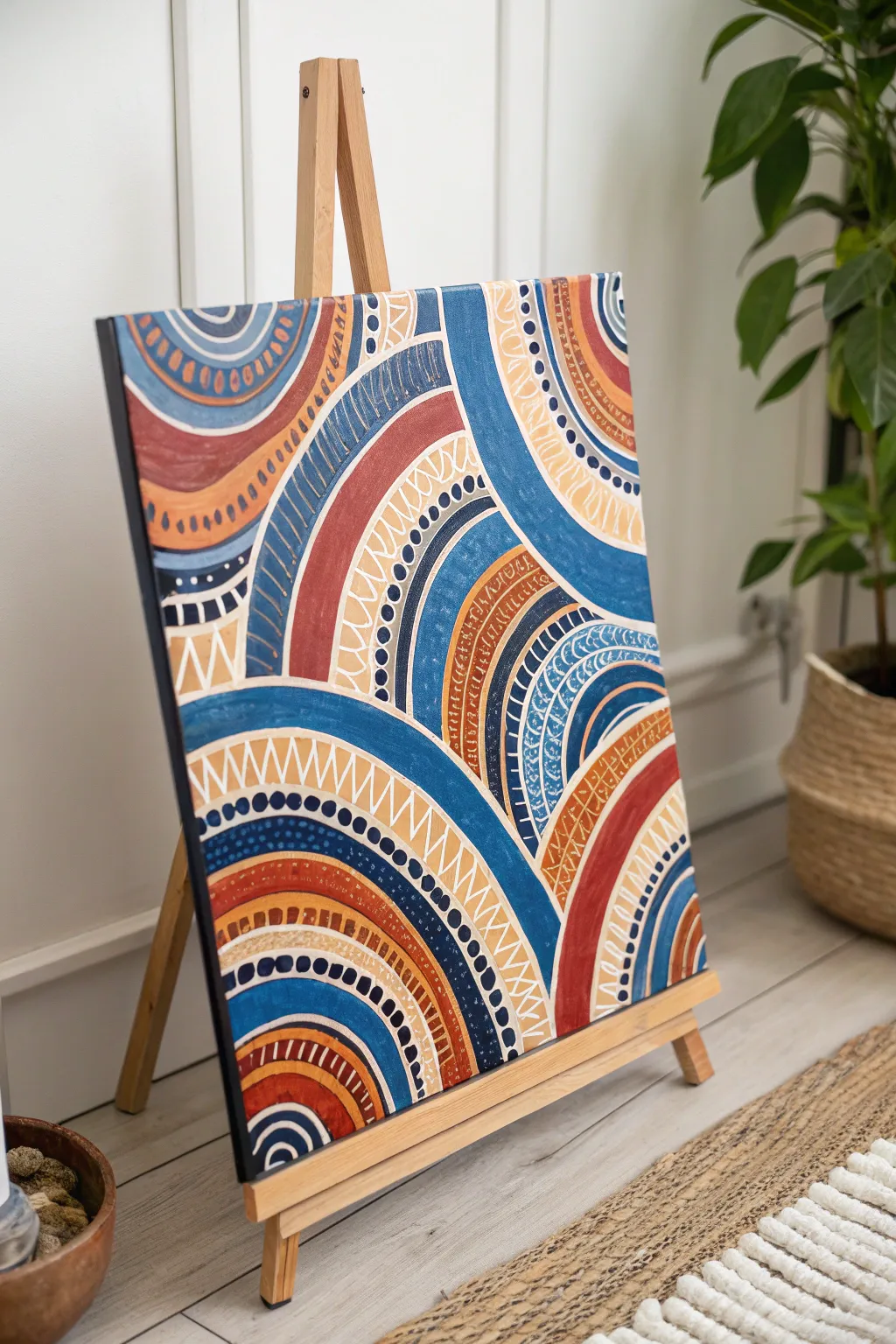
This vibrant abstract piece translates musical beats into a visual symphony of overlapping arches and patterned pathways. With a warm palette of terracotta, cream, and deep blues, the design builds rhythm through repetitive strokes like dots and dashes.
Step-by-Step Guide
Materials
- Square stretched canvas (approx. 16×20 inches or similar)
- Acrylic paints: Navy blue, denim blue, terracotta/burnt orange, cream/off-white, deep brown
- Flat shader brushes (medium and large)
- Small round detail brush (size 0 or 1)
- Pencil
- Circular objects for tracing (bowls, plates) or a compass
- Palette
- Water cup and paper towels
Step 1: Planning the Composition
-
Map out the foundation:
Begin with a blank canvas and a pencil. You aren’t aiming for perfect circles, but rather concentric arches that overlap and interact. Start by drawing a large semi-circle originating from the bottom left corner. -
Add intersecting curves:
Draw a secondary set of arches coming down from the top right corner. Allow these lines to intersect with your first set, creating interesting bounded shapes. -
Fill the gaps:
Continue adding arc segments in the remaining negative space, like the bottom right and top left. Vary the width of the bands between your pencil lines—some should be thick enough for bold color, others narrow for intricate patterns.
Shaky Lines?
If your hands are shaky for the detail work, rest your pinky finger on a dry section of the canvas to stabilize your hand while painting the fine patterns.
Step 2: Blocking in Color
-
Paint the navy bands:
Select your darkest navy blue. Using a medium flat brush, fill in the broad, outermost bands of your main arch clusters. Keep your edges crisp, but don’t worry about perfection as patterns will hide small wobbles later. -
Apply the terracotta tones:
Switch to your terracotta or burnt orange paint. Identify the alternating bands in your sketch and fill them in solid. I find that applying two thin coats gives a much smoother, opaque finish than one thick globs layer. -
Add lighter blue accents:
Mix a denim blue or select a lighter blue tone. Fill in intermediate bands to create a bridge between the deep navy and the warm orange tones. -
Incorporate the cream base:
Paint the remaining unpainted bands with your cream or off-white color. These light sections will serve as the high-contrast background for your most detailed linework. -
Let it dry completely:
Pause here. The base layers must be completely dry to the touch before you start the pattern work, otherwise, your fine lines will muddy into the wet paint.
Add Metallic Pop
Swap the cream paint for gold or copper metallic acrylic on just a few specific bands. It catches the light and adds a stunning sophisticated shimmer.
Step 3: Adding Rhythmic Patterns
-
Create the zigzag beat:
Load your small round brush with cream paint. On the widest terracotta or blue bands, paint a continuous zigzag line that spans the width of the band, following the curve of the arch. -
Layering the dots:
Choose a dark blue or black paint. Along the edges of your cream bands, paint a steady row of small dots. Keep the spacing consistent to mimic a steady drumbeat. -
Hatching lines:
On the denim blue sections, use a fine brush with white or light grey paint to create small, vertical hatch marks. These should look like little ‘ticks’ following the curve. -
The stacked pyramid pattern:
On the widest cream bands, use terracotta or brown paint to draw a continuous zigzag, but fill in the triangles on one side to create a ‘sawtooth’ or stacked pyramid effect. -
Double-line detailing:
Add definition by painting thin parallel lines inside the larger colored bands. For example, a thin white line running through the center of a navy band adds incredible depth. -
Micro-dashing:
Look for empty spaces in your larger bands. Fill these with rows of tiny horizontal dashes using a contrasting color, like white on terracotta or navy on cream. -
Refining the edges:
If any paint has bled over the lines, use your dark detail color to outline the major sections. This acts like a ‘lead’ line in stained glass, cleaning up the boundaries between colors. -
Final inspection:
Step back and look at the overall rhythm. If an area looks too empty, add a simple row of dots or a thin stripe to balance the visual weight across the canvas.
Hang your rhythmic masterpiece in a spot where it can energize the room with its visual beat


Have a question or want to share your own experience? I'd love to hear from you in the comments below!