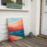
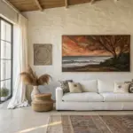
I love how the right abstract painting can instantly pull a living room together, especially when it’s scaled to the space and placed with intention. Here are my favorite ideas—from classic, easy wins above the sofa to more unexpected approaches that still feel totally at home in a cozy, modern hangout spot.
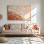
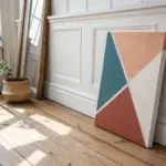
Oversized Anchor Piece Above the Sofa
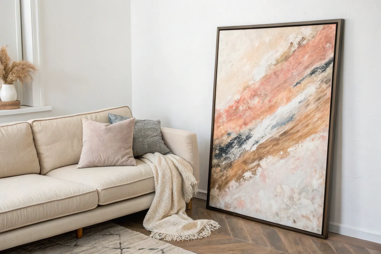
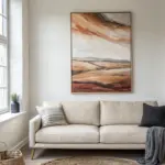
Create a stunning focal point for your living room with this oversized abstract painting, featuring sweeping diagonal motions that mimic desert sands and canyon walls. The warm terracotta, ochre, and soft cream tones blend effortlessly to bring an earthy, sophisticated warmth to neutral spaces.
Step-by-Step Guide
Materials
- Large stretched canvas (at least 36×48 inches)
- Acrylic paints: Burnt Sienna, Yellow Ochre, Titanium White, Unbleached Titanium (Cream), Mars Black
- Gesso (optional, for priming)
- Large flat paintbrushes (3-4 inch width)
- Medium round brush
- Palette knife
- Spray bottle with water
- Clean rags or paper towels
- Floating frame (light wood)
- Drop cloth
Step 1: Preparation and Base Layers
-
Prepare the workspace:
Lay down your drop cloth in a well-ventilated area. If your canvas isn’t pre-primed, apply a coat of white gesso and let it dry completely to ensure a smooth starting surface. -
Mix your base tone:
Create a warm off-white by mixing Titanium White with a small touch of Unbleached Titanium. This will serve as the background light that peeks through the darker colors. -
Apply the background:
Using your largest flat brush, cover the entire canvas in your off-white mixture. Don’t worry about perfect coverage; visible brushstrokes add to the final texture. -
Establish the flow:
With a slightly damp brush, sketch faint diagonal lines from the top left to bottom right using a very watery wash of Yellow Ochre. This guides the composition’s movement.
Step 2: Building the Warm Tones
-
Mix the terracotta:
Combine Burnt Sienna with a touch of Titanium White to create a soft, rusty terracotta shade. You want it vibrant but not jarringly bright. -
First color sweep:
Load a large flat brush generously with the terracotta mix. Starting from the top left quadrant, pull the brush down diagonally towards the center right using long, confident strokes. -
Add ochre accents:
While the terracotta is still slightly wet, introduce the Yellow Ochre. Apply it alongside the terracotta streaks, allowing the edges to blend naturally where they meet. -
Create transitions:
I like to use a clean, slightly damp brush to soften the boundaries between the ochre and terracotta, creating that wind-swept look rather than hard stripes. -
Layer in the cream:
Using the Unbleached Titanium, paint broad strokes in the white negative spaces. Overlap slightly with the colored sections to push some areas back into the distance.
Keep it Loose
Stand back frequently while painting. Since this piece is meant to be viewed from a distance, up-close perfection matters less than the overall flow and balance of the diagonal shapes.
Step 3: Adding Texture and Detail
-
Introduce charcoal accents:
Mix Mars Black with a lot of water or glazing medium to make it translucent. With a smaller brush, add thin, erratic marks and darker shadows near the terracotta sections. -
The dry brush technique:
Dip a dry brush into a tiny amount of pure Titanium White. Drag is lightly over the dried colored areas to highlight the canvas texture and create a weathered effect. -
Palette knife scraping:
Load a palette knife with thick white paint and scrape it partially over the colorful areas. This mimics the look of peeling paint or exposed rock faces. -
Softening harsh lines:
Step back and identify any strokes that look too rigid. Mist them lightly with your spray bottle and dab with a rag to diffuse the edges. -
Final dark touches:
Add a few intentional, darker marks of pure black or dark brown using the edge of your palette knife for sharp, contrasting details that ground the composition.
Muddy Colors?
If your colors start turning gray or brown where they mix, stop and let the bottom layer dry completely. Apply the next color on top of a dry surface to keep the hues distinct and vibrant.
Step 4: Finishing and Framing
-
Let it cure:
Allow the painting to dry for at least 24 hours. Acrylics dry fast to the touch, but thick layers need time to harden fully. -
Varnish the piece:
Apply a coat of satin or matte varnish to protect the artwork from dust and UV light without adding too much distracting shine. -
Install the frame:
Place the canvas into a light wood floating frame. Secure it from the back using offset clips or screws, ensuring an even gap around all sides. -
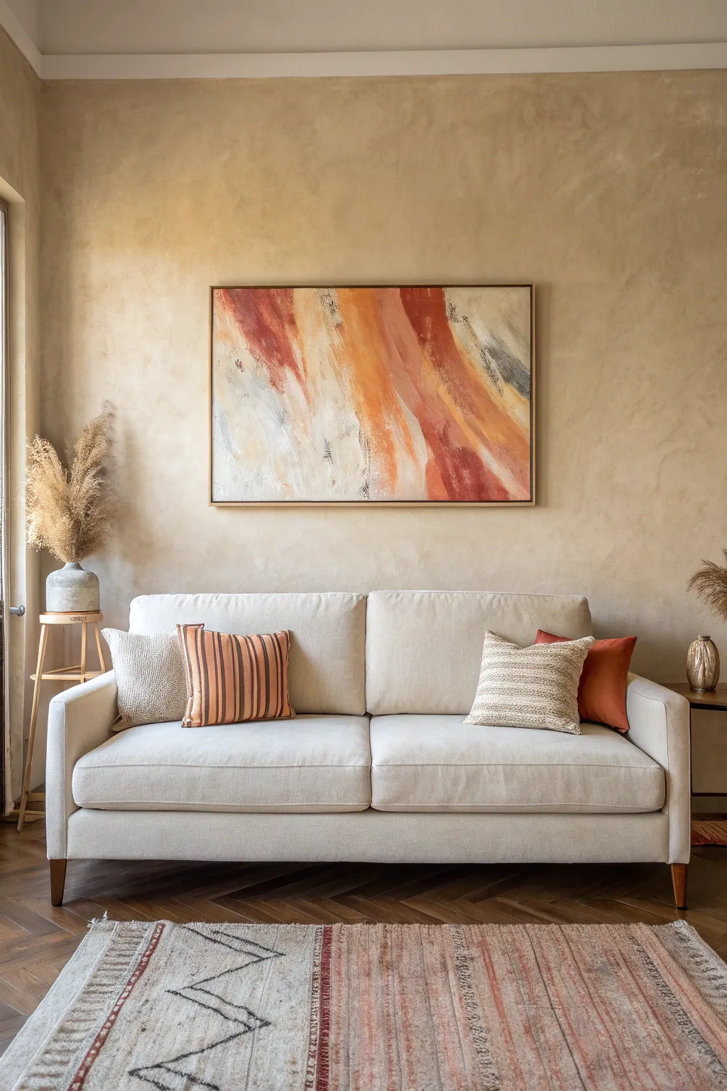
Hang firmly:
Mount the artwork securely above your sofa, ensuring it is centered and hangs roughly 6-8 inches above the top of the couch back.
Step back and admire how your new oversized art anchors the room with warmth and organic movement

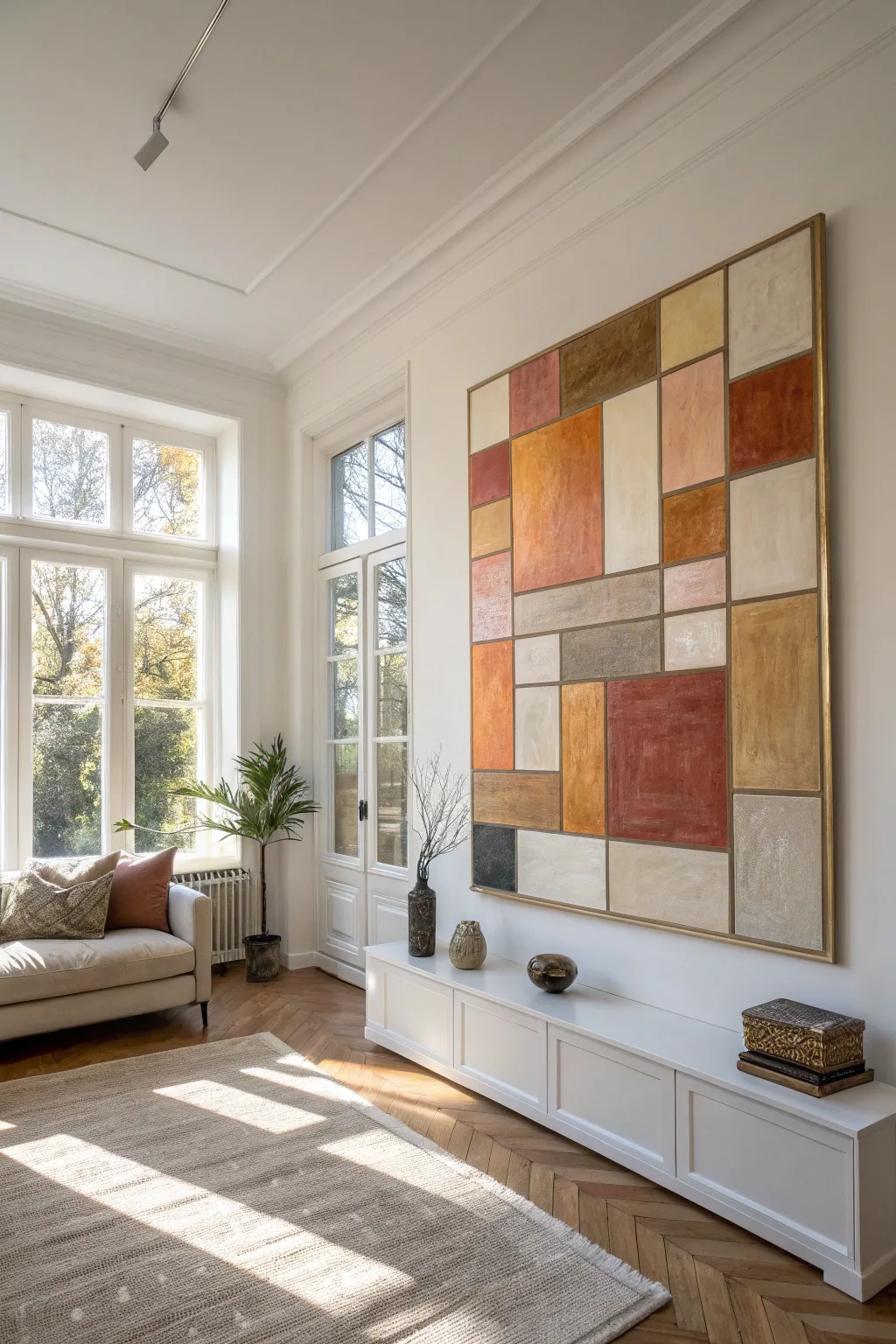
Color-Echo Palette Pulled From Pillows
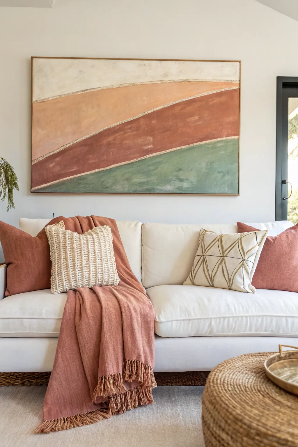
Achieve a high-end designer look with this DIY abstract canvas that uses soothing, earthy color blocks separated by elegant gold leaf detailing. The textured, sweeping curves create movement while anchoring your space with warm terracotta and sage tones.
Step-by-Step
Materials
- Large canvas (e.g., 36×48 inches)
- Acrylic paints: Titanium White, Unbleached Titanium (cream), Burnt Sienna, Yellow Ochre, Sap Green, and Raw Umber
- Gesso (optional but recommended for texture)
- Gold leaf sheets
- Gold leaf adhesive size
- Gold leaf sealant
- Various flat paintbrushes (2-inch and 3-inch widths)
- Small round brush for adhesive
- Soft, dry brush for burnishing gold leaf
- Masking tape or painter’s tape (optional for guidelines)
- Pencil
- Palette knife
- Mixing palette or paper plates
- Water cup and rags
Step 1: Planning and Sketching
-
Prime the canvas:
If you want extra texture before starting, apply a thin, uneven layer of gesso across the entire canvas using a palette knife or large brush. Let this dry completely to create a tactile base. -
Map the curves:
Lightly sketch three sweeping, curved lines across the canvas using a pencil. These lines should slope upward from left to right, creating four distinct sections. Don’t worry about perfection; organic wobbles add character. -
Prepare the gold path:
The pencil lines will eventually be gold. To ensure they stay clean, you can mask them off, but for this specific painted look, we will paint up to the line and add the gold last. Just ensure your pencil sketch is visible enough to guide you.
Step 2: Color Blocking
-
Mix the top cream shade:
Mix a large amount of Titanium White with a touch of Unbleached Titanium. You want an off-white, creamy shade that matches standard canvas drop cloth fabric. -
Paint the top section:
Using a large flat brush, fill the top section. Use horizontal sweeping strokes, but vary the pressure to let some brush texture show through. -
Mix the peach tone:
For the second section down, mix Titanium White, a small amount of Yellow Ochre, and a tiny dot of Burnt Sienna. You are aiming for a soft, sandy peach color. -
Paint the second section:
Apply the peach mixture to the second section. I like to bring the paint right up to the pencil line without crossing it, leaving a tiny gap if possible. -
Create the rust color:
Mix Burnt Sienna with a little Raw Umber and a touch of Red (if needed for warmth) to create a deep, earthy rust or terracotta shade for the third section. -
Fill the third section:
Paint the third strip with the rust color. This is the darkest, boldest section, so ensure your coverage is opaque. Multiple thin coats are better than one thick, gloopy one. -
Mix the sage green:
Combine Sap Green with Titanium White and a little Raw Umber to desaturate it. You want a muted, dusty sage green rather than a bright forest green. -
Paint the bottom section:
Fill the final bottom section with the sage mixture. Blend the strokes horizontally to mimic the flow of the land.
Sticky Situation
If the gold leaf tears or misses a spot, don’t panic. Just dab a tiny bit more adhesive on the bald spot, wait for it to get tacky, and press a fresh scrap of leaf onto it.
Step 3: Adding Texture and Detail
-
Add tonal variation:
While the paint is barely tacky or just dry, mix slightly lighter versions of each color. Dry brush these lighter tones randomly over their respective sections to add depth and a ‘worn’ aesthetic. -
Let it cure:
Allow the entire canvas to dry completely. This is crucial before applying the gold leaf adhesive.
Pro Tip: Depth of Field
When mixing your acrylics, don’t over-mix them on the palette. Leaving streaks of unmixed white or brown creates a beautiful, natural variations on the canvas.
Step 4: Gilding the Lines
-
Apply sizing adhesive:
Using a small round brush, paint a thin strip of gold leaf adhesive (sizing) directly over the pencil lines between your color blocks. The line should be about 1/4 to 1/2 inch thick. -
Wait for tackiness:
Wait for the adhesive to turn clear and become tacky (usually 15-30 minutes, check your bottle instructions). It should feel sticky but not wet. -
Apply gold leaf:
Gently press sheets of gold leaf over the sticky adhesive lines. It’s okay if the leaf overlaps the paint; it will only stick where the adhesive is. -
Burnish the gold:
Use a soft, dry brush to rub over the gold leaf in circular motions. This removes the excess leaf that isn’t stuck to the adhesive and polishes the gold that remains. -
Clean up edges:
Brush away all the loose gold flakes. If the edges of the gold lines feel too sharp, you can lightly distress them with a stiff brush. -
Seal the artwork:
Apply a sealant over the gold leaf to prevent tarnishing. You can varnish the whole painting if you desire a uniform sheen, or just seal the gold lines.
Hang your new masterpiece and enjoy the warmth it brings to your room
Soft Neutral Abstraction for Calm Vibes
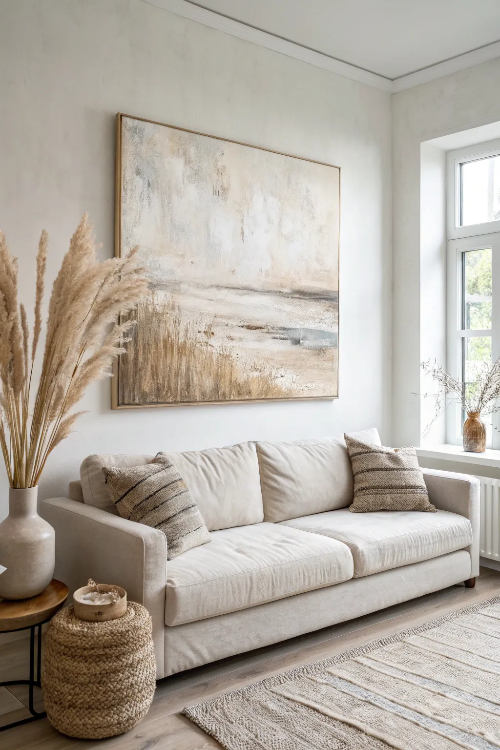
Bring the calming essence of a coastal morning into your home with this large-scale textured abstraction. Using a soothing palette of creams, beiges, and soft greys, this piece combines atmospheric blending with structured impasto strokes to mimic reeds swaying in a gentle breeze.
How-To Guide
Materials
- Large square canvas (e.g., 36″ x 36″ or larger)
- Heavy body acrylic paints (Titanium White, Unbleached Titanium, Raw Sienna, Burnt Umber, Payne’s Grey)
- Texture paste or modeling paste
- Large palette knife (trowel shape)
- Wide flat bristle brush (2-3 inches)
- Medium round brush
- Spray bottle with water
- Floetrol or acrylic glazing medium
- Cardboard scraps (optional for texture)
- Drop cloth
Step 1: Setting the Atmosphere
-
Prime with warmth:
Begin by covering your entire canvas with a mix of Unbleached Titanium and a tiny drop of Raw Sienna. Use your wide brush and loose, crisscrossing strokes. This doesn’t need to be perfect; it just establishes a warm, glowing undertone. -
Establish the horizon:
Visually divide your canvas. The bottom third will be the detailed ‘ground’ area, and the top two-thirds will be the sky. Mix Payne’s Grey with plenty of Titanium White to create a soft, misty grey. -
Paint the background wash:
Apply the grey mix across the middle section where the horizon would naturally sit. While the paint is still wet, spritz it lightly with water to encourage drips and softness. -
Create the upper sky:
Load your wide brush with Titanium White and blend it into the top of the grey section, working upward. Use broad, sweeping motions to create a cloudy, ethereal effect. I like to let the brush run dry near the edges to keep it looking airy. -
Add high-altitude warmth:
Dab a small amount of the warm base color (Unbleached Titanium) into the wet white sky area. Blend softly so it looks like sunlight breaking through clouds rather than a solid blob of paint.
Sticky Situation?
If your texture paste is dragging or clumping too much, dip your palette knife in water before scraping. This acts as lubricant for smoother lines.
Step 2: Building the Texture
-
Mix the texture paste:
On your palette, mix a generous amount of modeling paste with Raw Sienna and a touch of Burnt Umber. You want a color that resembles dried wheat or sand. -
Apply the ground layer:
Using the large palette knife, apply this textured mix to the bottom third of the canvas. Don’t smooth it out—scrape it upward to create vertical ridges. -
Scrape in the reeds:
While the paste is still pliable, use the edge of your palette knife (or a piece of stiff cardboard) to firmly embrace vertical lines. Start from the very bottom and flick your wrist upward, lifting off the canvas to create tapering lines that mimic tall grass. -
Partial drying time:
Allow the texture paste to set for about 30-45 minutes. It should be firm to the touch but not fully cured.
Go Upscale
Add gold leaf flakes into the ‘reed’ section while the paint is tacky. The metallic shimmer adds a luxurious element that catches the light beautifully.
Step 3: Adding Depth and Detail
-
Darken the shadows:
Dilute Burnt Umber with water or glazing medium until it’s inky. Use a medium round brush to paint into the deepest grooves of your texture paste reeds at the bottom. -
Define the horizon line:
Mix a darker grey-blue using Payne’s Grey and a touch of Umber. With the palette knife, scrape a horizontal ‘focal point’ line just above your textured reeds. This effectively separates the ground from the sky. -
Dry brush highlights:
Dip a dry, stiff brush into pure Titanium White. Gently drag it horizontally across the middle section of the painting to catch the ‘tooth’ of the canvas, creating a shimmering water effect. -
Highlight the grasses:
Switch back to your palette knife with a mix of Titanium White and Raw Sienna. Lightly skim the knife over the dried textured ridges at the bottom. This ‘grazing’ technique highlights the raised areas, making the reeds pop forward. -
Soften the transition:
Where the textured plants meet the smooth sky, use a slightly damp brush to blur the edges. You don’t want a hard sticker-like separation; the reeds should feel like they are fading into the mist. -
Final atmosphere check:
Step back about six feet. If any area looks too heavy, mix a translucent milky white glaze (water + paint) and wash over that specific spot to push it back into the distance. -
Seal the work:
Once the thick texture paste is completely dry (wait at least 24 hours), apply a matte varnish to protect the surface without adding distracting shine.
Hang your masterpiece in a brightly lit room and enjoy the tranquil atmosphere you have created
Bold Complementary Color Blocks for Energy
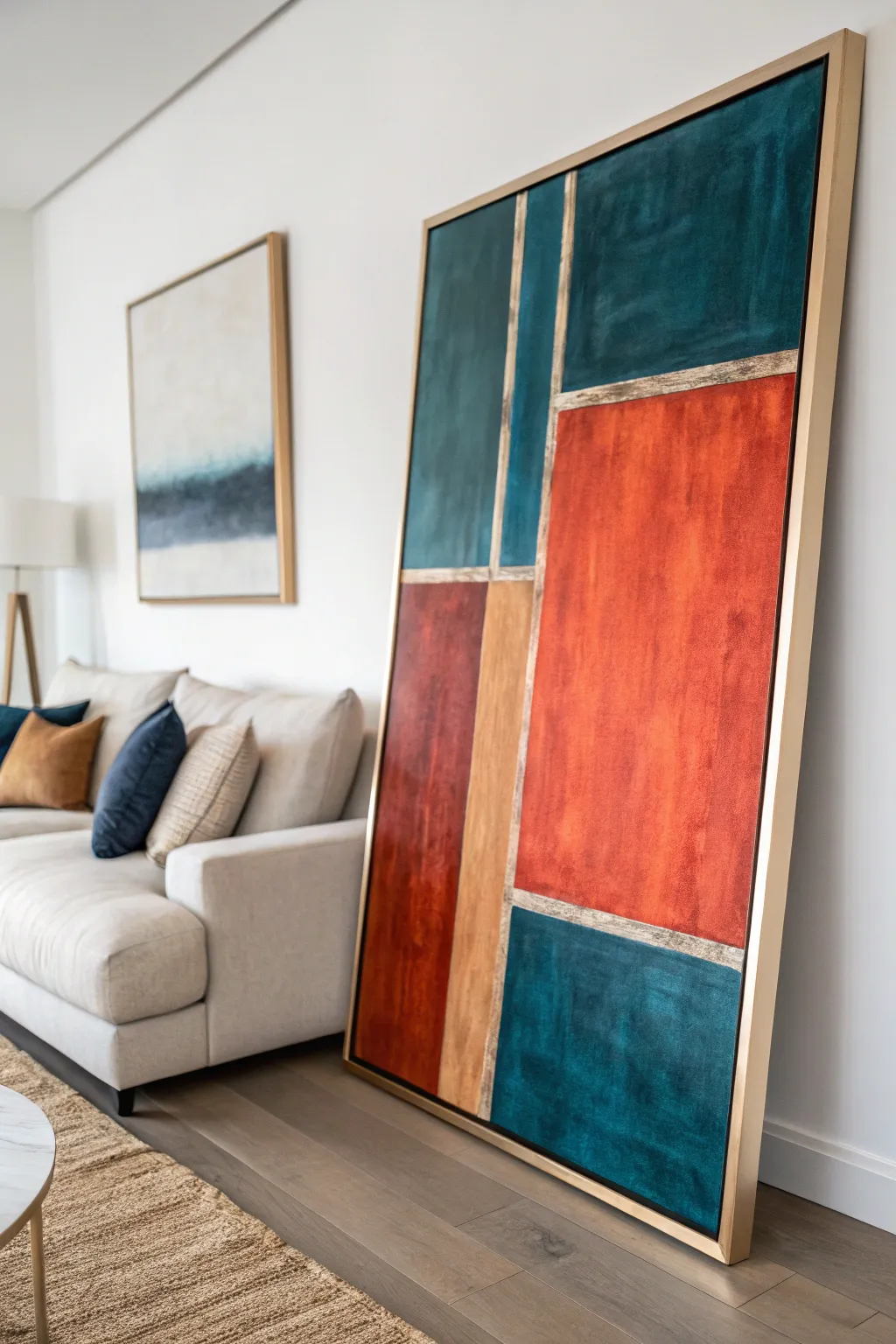
This stunning large-scale artwork commands attention with its vibrant interplay of deep teal, rich terracotta, and shimmering gold geometric blocks. The textured surface and metallic accents create a luxurious, modern focal point that adds significant warmth and dimension to any living space.
Step-by-Step Tutorial
Materials
- Large stretched canvas (e.g., 36” x 48” or larger)
- Heavy body acrylic paints (Deep Teal/Prussian Blue, Burnt Sienna/Terracotta, Titanium White, Black)
- Metallic Gold acrylic paint
- Gold leaf sheets and gilding adhesive (size)
- Modeling paste or texture gel (coarse or fine pumice)
- Painter’s tape (various widths)
- Large flat brushes (2-3 inches)
- Palette knives (assorted sizes)
- T-square or long ruler
- Pencil
- Matte or satin varnish
- Floating frame (optional, gold finish)
Step 1: Planning and Structure
-
Prepare the canvas:
Lay your large canvas on a flat, protected surface or mount it securely on an easel. Ensure the surface is clean and taut. -
Map out the grid:
Using a pencil and a T-square, lightly sketch the geometric composition. Start with a large vertical rectangle on the right (about 60% of width) and a narrower column on the left. Divide these columns horizontally to create the distinct color blocks seen in the reference. -
Define boundaries:
Apply painter’s tape over your pencil lines to mask off the areas that will eventually become the gold borders. This preserves the ‘grout lines’ between your color blocks.
Bleeding Lines?
If paint bled under the tape, wait for it to dry fully. Then, use a small flat brush and the background color (or gold) to touch up and sharpen the edges carefully.
Step 2: Creating Texture
-
Mix the texture medium:
In a mixing tray, combine your acrylic colors with modeling paste. A ratio of 2 parts paint to 1 part paste works well to build body without diluting the color too much. -
Apply the base texture:
Using a palette knife, apply the textured paint mixture to the canvas within the taped zones. Don’t aim for perfect smoothness; the beauty of this piece lies in the visible strokes and uneven surface. -
Build surface character:
Go back over the wet paint with a clean, dry brush or a crumbled rag. Dab and drag lightly to create the subtle, mottled ‘concrete’ look visible in the teal and orange sections.
Level Up: Antiquing
Mix a tiny amount of burnt umber glaze and lightly brush it over the gold leaf borders. Wipe it back immediately with a cloth to leave an aged, vintage patina in the crevices.
Step 3: Layering Color
-
Paint the Terracotta blocks:
Start with the large red-orange block. Mix Burnt Sienna with a touch of red and white to get that warm terracotta hue. Apply it thickly, allowing some darker undertones to show through for depth. -
Paint the Teal sections:
Mix Deep Teal or Prussian Blue with a tiny bit of black for the darker areas, and white for the lighter patches. Paint the top right and bottom right blocks, using vertical strokes to mimic the reference. -
Paint the accent blocks:
Fill the remaining smaller rectangular sections. Use a muted beige or gold-tinted ochre for the vertical strip on the left to balance the vibrant colors. -
Add depth with shadows:
While the paint is still tacky, use a dry brush with a slightly darker shade of each color to shadow the edges of the blocks. This creates a subtle vignette effect. -
Let it dry completely:
Texture paste takes longer to dry than standard acrylics. I like to let this dry overnight to ensure the thick layers are fully set before removing tape.
Step 4: Gilding and Finishing
-
Remove the tape:
Carefully peel away the painter’s tape to reveal the raw white canvas lines between your color blocks. -
Apply base gold paint:
Paint these exposed white strips with metallic gold acrylic paint. This acts as a base color in case the gold leaf has small gaps. -
Apply gilding adhesive:
Brush a thin layer of gilding size (adhesive) over the painted gold lines. Wait for it to become tacky (usually 15-20 minutes depending on the brand). -
Lay the gold leaf:
Gently press sheets of gold leaf onto the tacky lines. Use a soft, dry brush to smooth the leaf down and brush away excess flakes. -
Distress the gold:
For a vintage look, lightly scuff the gold leaf with a stiff bristle brush once dry. This reveals bits of the base paint underneath and softens the shine. -
Seal the artwork:
Apply a final coat of matte or satin varnish over the colored sections to protect the paint, and carefully seal the gold leaf with a designated metal leaf sealer to prevent tarnishing. -
Frame the piece:
Place the canvas into a gold floating frame to complete the high-end, gallery aesthetic.
Hang your masterpiece in a spot with good natural light to see those metallic accents truly catch the sun
BRUSH GUIDE
The Right Brush for Every Stroke
From clean lines to bold texture — master brush choice, stroke control, and essential techniques.
Explore the Full Guide
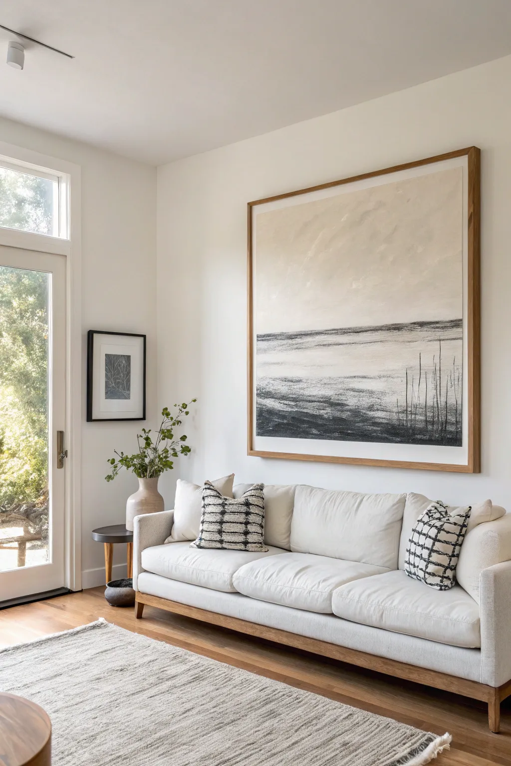
Black-and-White Gestural Statement
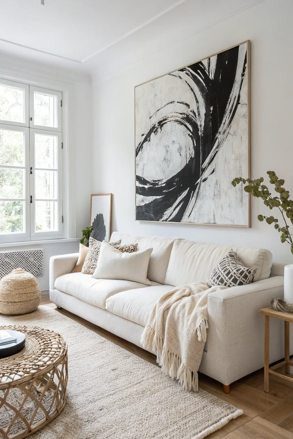
Emphasizing movement and bold contrast, this oversized abstract piece acts as a dynamic focal point without overwhelming a neutral space. The technique relies on confidence and large-scale gestural strokes to create that sweeping, calligraphy-inspired energy.
How-To Guide
Materials
- Large canvas (approx. 48×60 inches or larger)
- Gesso (white primer)
- Heavy body black acrylic paint (Mars Black or Carbon Black)
- Titanium White acrylic paint
- Large house painting brush (3-4 inch width)
- Wide palette knife or scraper tool
- Mixing buckets or large disposable plates
- Drop cloth
- Water spray bottle
- Floating frame (natural wood, optional)
Step 1: Preparation & Background
-
Prepare the workspace:
Lay down your drop cloth. Since this canvas is massive, it is often easier to work with it lying flat on the floor to control paint drips, though working vertically on a wall allows for more arm movement. -
Prime the surface:
Even if your canvas is pre-primed, apply a fresh coat of white gesso. This gives you a slight tooth and ensures the background is a bright, clean white. -
Create background texture:
While the gesso is wet, mix in a tiny amount of black or grey paint to create subtle ‘dirty white’ patches. Use a scraper or messy brush strokes to add visual noise so the background isn’t perfectly flat. -
Let it dry completely:
Wait for the background to be fully dry to the touch. This prevents your bold black strokes from turning into muddy grey mush.
Step 2: The Main Action
-
Load the large brush:
Pour a generous amount of heavy body black paint into a bucket. Dip your wide house-painting brush in, ensuring the bristles are fully saturated but not dripping uncontrollably. -
Practice the motion:
Before touching the canvas, practice the arm movement in the air. The painting features two main sweeping curves—a tighter inner circle and a larger outer swoop. -
Execute the first stroke:
Start near the center-left. With a confident, swift motion, sweep the brush upwards and curve it back down to create the inner loop. Don’t overthink it; hesitation causes shaky lines. -
Add the outer swoop:
Now, reload your brush. Start from the bottom left, sweeping aggressively up and to the right, crossing over the top of your previous shape. Let the brush hairs split and skip at the end of the stroke for that dry-brush look. -
Enhance the thickness:
Go back over the thickest parts of the black curves. I find that layering a second pass while the paint is tacky adds depth and makes the black truly opaque. -
Create distress marks:
Take a nearly dry brush with a tiny bit of black paint. Lightly drag it perpendicular to the main curves to add those rough, scratchy texture marks seen around the edges.
Paint Too Perfect?
If your lines look too solid, use rough sandpaper to scuff the dry black paint. This reveals the canvas texture and mimics the aged, weathered look of the original.
Step 3: Refinement & Details
-
Scrape and modify:
While the heavy black sections are still wet, use a palette knife or scraper to drag some paint outward or scrape through it to reveal the white canvas underneath. -
Add white highlights:
Once the black is mostly dry, take a clean brush with Titanium White. Dry-brush swiftly over parts of the black strokes to simulate light hitting the texture and break up solid blocks of color. -
Soften harsh edges:
If a curve looks too perfect or manufactured, use a damp cloth or a spray bottle to lightly smudge an edge. This organic imperfection is key to the style. -
Step back and assess:
View the painting from across the room. The composition should feel balanced but explosive. Add small splatter marks or stray lines if the negative space feels too empty. -
Final drying time:
Allow the thick layers of black paint to dry for at least 24 hours. Thick acrylic can skin over but remain wet underneath, so patience is required. -
Add the frame:
Install a thin, light wood floating frame around the canvas. leaving a small gap between the canvas edge and the wood to elevate the professional look.
Make It Bigger
Can’t afford a huge canvas? Buy a painter’s drop cloth, prime it with gesso, paint your design, and then stretch it over a DIY wooden frame for a budget-friendly statement.
Hang your massive masterpiece with pride and enjoy the dramatic energy it brings to your white walls
Horizontal “Landscape” Abstract for Sectionals
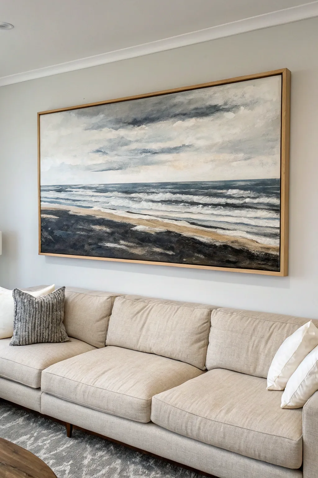
This expansive, panoramic canvas captures the moody drama of a storm rolling over a beach, perfect for anchoring the space above a large sectional. Using a limited palette of cool greys, deep blues, and textured blacks, you’ll create a layered, abstract interpretation of the crashing waves and cloudy sky.
Step-by-Step
Materials
- Large horizontal canvas (approximately 30″ x 60″ or custom size)
- Acrylic paints: Titanium White, Payne’s Grey, Mars Black, Ultramarine Blue, Raw Umber, Yellow Ochre
- Large flat brushes (2-3 inch)
- Medium filbert brushes
- Palette knife (large, trowel style)
- Water spray bottle
- Mixing palette or paper plates
- Framing lumber (oak or pine) – optional for frame
Step 1: Planning and Sky Layer
-
Define the Horizon:
Before putting paint to canvas, identify your horizon line. For this composition, place it slightly below the center line—about 40% of the way up from the bottom—to give prominence to the dramatic sky. -
Mix Sky Greys:
Create several puddles of grey on your palette. Mix Titanium White with small touches of Payne’s Grey and a tiny dot of Yellow Ochre to create a ‘warm’ grey for the lower clouds, and a darker, cooler grey for the stormier upper sections. -
Block in the Clouds:
Using a large flat brush, apply horizontal strokes of the lighter grey across the middle sky area. Keep the strokes loose and free; don’t worry about perfect blending yet. -
Add Drama:
While the first layer is still tacky, introduce the darker grey mix into the upper corners and top edge of the canvas. Use a cross-hatching motion to suggest turbulence in the clouds. -
Soften the Edges:
Take a clean, dry brush and lightly sweep it horizontally across the boundary where the light and dark greys meet. This creates that soft, wind-swept look typical of distant clouds.
Palette Knife Mastery
Don’t overmix paints on the palette knife. Letting streaks of white and grey remain separate creates natural, rocky textures when swiped across the canvas.
Step 2: Painting the Ocean
-
Establish the Deep Water:
Mix a deep ocean hue using Payne’s Grey, Ultramarine Blue, and a touch of Mars Black. Apply this as a solid, dark band right at the horizon line using a flat brush to ensure a straight edge. -
Create Wave Layers:
Lighten your deep blue mix with Titanium White. Paint horizontal bands below the horizon line, getting progressively lighter as you move down toward the shore. These represent the distant rollers. -
Scumble the Whitecaps:
Load a filbert brush with pure Titanium White. Drag the brush lightly sideways over the dried blue layers. This dry-brush technique, or scumbling, mimics the foam breaking on the waves without needing precise details. -
Blend the Transition:
Where the water meets the future sand area, mist the canvas lightly with your spray bottle. Use a soft brush to blur the bottom edge of the water, creating the misty effect of sea spray.
Go Metallic
Mix a tiny amount of iridescent silver medium into your white paint for the wave crests. It adds a subtle shimmer that catches the living room light.
Step 3: The Shoreline and Foreground
-
Lay the Sand Base:
Mix Raw Umber, Yellow Ochre, and plenty of White. Paint a long diagonal strip stretching from the middle-left to the bottom-right. This creates the wet sand where the water recedes. -
Darken the Foreground:
For the heavy, textured foreground (which could represent black volcanic sand or rocky shore), mix Mars Black with Raw Umber. Apply this boldly at the very bottom of the canvas. -
Introduce Texture:
Switch to your palette knife. Scoop up some of the black/brown mixture and smear it across the bottom section. Vary the pressure to leave thick ridges of paint. -
Highlight the Foam:
Once the dark sand is touch-dry, use the edge of your palette knife with a tiny amount of white paint. scrape it horizontally along the shoreline to create the sharp, foamy edge of the last wave hitting the sand.
Step 4: Final Details and Framing
-
Refine the Sky:
Stand back and look at the sky. If it feels too flat, glaze a very watered-down mix of Payne’s Grey over the darkest areas to add depth without covering your brushwork. -
Add Movement:
Use a small round brush to add a few thin, broken white lines in the deep water area to suggest rogue waves catching the light. -
Varnish:
Once the painting is completely dry (wait at least 24 hours due to the thick textures), apply a satin varnish to seal the vivid dark colors and protect the surface. -
Build the Float Frame:
Cut oak lattice strips to frame the outer edge of your canvas. Nail them directly into the canvas stretcher bars, leaving a small 1/8-inch gap between the canvas face and the wood for a professional ‘floating’ look.
Now your sofa has a stunning, custom-made focal point that anchors the entire room with coastal elegance

PENCIL GUIDE
Understanding Pencil Grades from H to B
From first sketch to finished drawing — learn pencil grades, line control, and shading techniques.
Explore the Full Guide
Fluid Marble Swirls With Metallic Accents
Transform your living space with this striking large-scale abstract painting that mimics natural stone formations. By layering fluid acrylics with bold black ribbons and shimmering gold leaf accents, you’ll create a sophisticated marble effect that looks professionally commissioned.
Step-by-Step Tutorial
Materials
- Large primed canvas (at least 36×48 inches recommended)
- High-quality acrylic paints (Titanium White, Mars Black, Cool Grey)
- Pouring medium (Liquitex or Floetrol)
- Metallic gold paint or gold leaf sheets with gilding size
- Large synthetic flat brushes (2-inch and 3-inch)
- Natural sea sponge or textured rag
- Palette knives (assorted sizes)
- Cups for mixing
- Water spray bottle
- Drop cloth or plastic sheeting
- Painter’s tape
- Gloss varnish or resin (optional for finish)
- Hairdryer (optional for moving paint)
Step 1: Preparation & Base Layer
-
Set up your workspace:
Lay down your drop cloth in a well-ventilated area. This project can get messy, so protect your floors well. Ensure your canvas is level if you plan to use a more fluid pouring technique, though for this specific textured look, an easel or flat table works fine. -
Mix your base whites:
In separate large cups, mix Titanium White acrylic heavily with pouring medium (about a 1:1 ratio) to increase flow but maintain opacity. Create a second cup with white and a tiny dot of black to make a very pale grey. -
Apply the white background:
Pour the white mixture across the majority of the canvas, spreading it with a large flat brush or trowel. You don’t want it perfectly smooth; leave some ridges and variations. -
Introduce the pale grey:
While the white is still wet, streak in the pale grey mixture. Use a damp sea sponge to gently blot the transitions, creating that cloudy, subtle marble background effect. -
Let the base set:
Allow this initial layer to dry until it is tacky but not fully cured. This helps the subsequent darker layers sit on top without becoming a muddy grey soup.
Pro Tip: The Blow Dryer Trick
To get wispy, smoke-like edges on your marble veins, use a hair dryer on the ‘cool’ setting to push the wet grey paint into the white sections.
Step 2: Creating the Dynamic Flow
-
Mix the dark wave:
Prepare a heavy body black acrylic paint mixed with a smaller amount of pouring medium. You want this mixture thicker than the white base so it holds its shape. -
Map the composition:
Visualize a diagonal river flowing from the top right to bottom left. Using a large brush, paint a bold, wavy black line following this path. It doesn’t need to be perfect; focus on the general motion. -
Thicken the dark sections:
Widen specific parts of your black line to create ‘pools’ of darkness. I like to use a palette knife here to scrape the paint slightly, creating interesting organic textures within the black areas. -
Add grey transitions:
Mix a medium charcoal grey. Apply this along the edges of your black river, blending it outward into the white background using a dry brush technique. This creates the ‘smoky’ edge typical of marble. -
Create veining:
Take a fine detail brush or the edge of a palette knife slightly loaded with watery black paint. Drag it from the main black river out into the white areas, shaking your hand slightly to create jittery, natural-looking veins. -
Soften harsh lines:
If any veins look too stark, mist them lightly with your water spray bottle and tilt the canvas slightly, or pat them with a clean rag to diffuse the pigment.
Step 3: The Golden Accents
-
Plan the metallic path:
Identify the areas where the black meets the white—these high-contrast zones are perfect for gold. The gold should act as a border or a highlight, not cover the whole piece. -
Apply the gold paint:
Using a stiff brush, apply metallic gold paint in jagged, rough strokes along the designated edges. Use a stippling (dabbing) motion to create a scattered, dust-like effect rather than a solid line. -
Add gold leaf (optional but recommended):
For the intense shine seen in the photo, apply gilding size (glue) to select focal points within the gold painted areas. Wait for it to become tacky (usually 10-15 minutes). -
Lay the gold sheets:
Gently press gold leaf sheets onto the tacky size. Use a dry, soft brush to smooth them down and brush away the excess flakes. This creates that brilliant, crinkled metal texture. -
Blend the metals:
Mix a little gold paint with water to make a glaze. Flick or splatter tiny droplets over the transition zones to harmonize the leaf with the rest of the painting.
Level Up: Resin Finish
Instead of varnish, pour a clear art resin over the dried painting. This creates a glass-like surface that makes the art look like a real slab of polished marble.
Step 4: Finishing Touches
-
Assess the balance:
Step back about 5 feet. Look for areas that feel too empty or too heavy. Add small white highlights on top of the black areas to add depth, simulating light hitting the stone. -
Refine the edges:
Paint the sides of your canvas black or white to give it a finished, gallery-wrapped look, so framing isn’t strictly necessary. -
Final cure:
Let the painting dry completely for at least 24-48 hours. The thick areas of gold and black need time to settle. -
Seal the work:
Apply a coat of gloss varnish. This deepens the black, makes the white look like polished stone, and protects the delicate gold leaf from tarnishing.
Hang your masterpiece proudly and enjoy the modern elegance it brings to your room
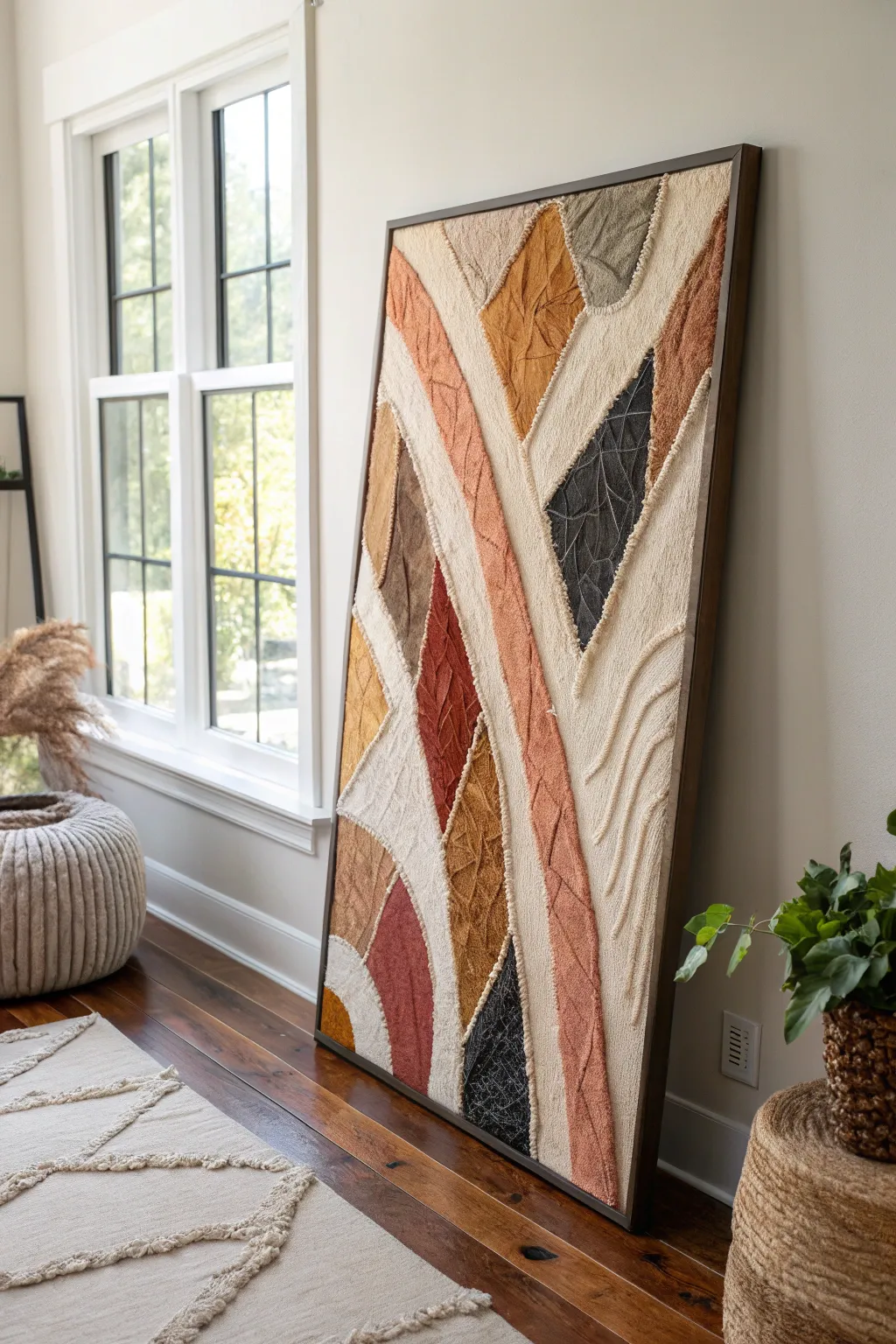
Textured Impasto in Warm Earth Tones
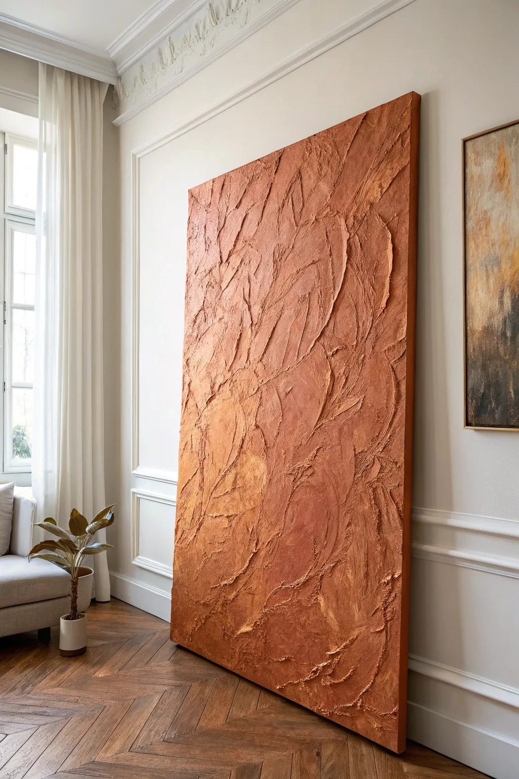
This striking, large-scale abstract piece brings warmth and dimension to any room with its deep earthy tones and rugged impasto surface. By layering heavy texture paste and rich acrylics, you will create a sculptural painting that mimics the look of sun-baked clay or rugged stone.
Detailed Instructions
Materials
- Large stretched canvas (gallery wrapped, heavy duty)
- Modeling paste or heavy structure gel (large tub)
- Plaster powder or sand (optional, for grit)
- Palette knives (various sizes, especially large trowels)
- Heavy body acrylic paints (Terracotta, Burnt Sienna, Raw Umber, Titanium White)
- Metallic acrylic paint (Copper or Bronze – optional)
- Wide flat brush or chip brush
- Spray bottle with water
- Drop cloth
- Matte varnish
Step 1: Preparing the Foundation
-
Setup workspace:
Lay down your drop cloth in a well-ventilated area. Since this project involves a large canvas and potentially messy paste, ensure you have ample floor space if you aren’t using an easel. -
Prime the canvas:
Even if your canvas is pre-primed, apply a base coat of a neutral beige or diluted Burnt Sienna acrylic paint. This ensures that no white canvas shows through the heavy texture later. -
Draft the flow:
Lightly sketch large, sweeping curves with a pencil or charcoal to guide where your texture ridges will flow. This piece relies on vertical, wave-like movement. -
Mix the texture medium:
In a bucket or large mixing bowl, combine your modeling paste with a small amount of the base paint color (Terracotta) so the paste isn’t stark white. If you want extra grit, mix in a handful of plaster powder or fine sand.
Crack Control
Thick impasto paste can sometimes crack as it dries. If cracks appear, don’t panic—embrace them as part of the aged aesthetic, or fill them with a second thin layer of paste before painting.
Step 2: Sculpting the Surface
-
First application:
Using a large palette knife or trowel, scoop generous amounts of the tinted paste onto the canvas. Don’t worry about precision yet; get the material on the surface. -
Create the ridges:
Use the edge of your trowel to scrape and push the paste into vertical, sweeping ridges. Vary the pressure to create thick peaks and thinner valleys. -
Detail the texture:
While the paste is wet, take a smaller palette knife to rough up specific areas. I like to twist the knife slightly to create unexpected jagged edges that catch the light. -
Add organic movement:
Use a dry chip brush to lightly drag across some of the wet peaks. This softens the plastic look of the paste and adds a more natural, weathered stone appearance. -
Dry time:
This is crucial: Let the texture dry completely. Depending on the thickness, this could take 24 to 48 hours. The paste must be hard to the touch before painting.
Fossil Effect
While the paste is wet, press natural objects like dried leaves, burlap, or coarse lace into the surface and then peel them away to leave intricate, fossil-like imprints in the texture.
Step 3: Layering Color
-
Dark wash application:
Mix Raw Umber with water to create a thin wash. Paint this into the deep crevices and valleys of the texture to create shadow depth. -
Wipe back:
Before the wash dries, gently wipe the raised surfaces with a damp rag, leaving the dark color only in the low points. -
Main color coat:
Load your wide brush with your main Terracotta or Burnt Sienna shade. Use a ‘dry brush’ technique to graze the brush over the textured surface, hitting the mid-tones and high points. -
Building dimension:
Mix a lighter version of your main color by adding a touch of Titanium White. Lightly sponge or brush this onto the topmost ridges to emphasize the three-dimensional effect. -
Metallic accents (optional):
If you want a hint of shimmer, lightly dab a tiny amount of copper paint onto the roughest textures. It should be barely visible, just enough to catch the light. -
Final blending:
Step back and assess. If any areas look too uniform, use a wet brush to blend the colors slightly, softening the transitions between shadow and highlight. -
Sealing the work:
Once the paint is fully cured, apply a coat of matte varnish. This protects the textured crevices from dust accumulation and unifies the sheen.
Now hang your monumental textured masterpiece and let the shifting daylight play across its rugged surface


Minimal Linework and Plenty of Negative Space
Capture the calm of a quiet coastline with this large-scale abstract landscape, focusing on texture and negative space. This piece balances subtle creamy washes with bold, jagged charcoal strokes to create a sophisticated focal point for any room.
Step-by-Step
Materials
- Large-scale canvas or prepared wooden panel (e.g., 40×40 inches)
- Titanium White acrylic paint
- Unbleached Titanium or Cream acrylic paint
- Mars Black acrylic paint or heavy body black
- Compressed charcoal sticks
- Charcoal pencils (soft and medium)
- Wide flat wash brushes (2-3 inch)
- Medium round brush
- Matte gel medium or decoupage glue
- Workable fixative spray (matte finish)
- Framing wood (oak or pine strips) for the exterior frame
- Clean rags or paper towels
Step 1: Setting the Atmosphere
-
Prime the surface:
Begin by covering your entire canvas with two coats of Titanium White acrylic paint to ensure a bright, clean base. Let the first coat dry completely before applying the second to achieve a smooth texture. -
Mix the sky tone:
On your palette, mix a large amount of Titanium White with a very small touch of Unbleached Titanium. You want a color that is barely off-white, mimicking a hazy, overcast sky. -
Apply the background wash:
Using a wide flat brush, paint the top two-thirds of the canvas with your mixed sky tone. Use loose, sweeping horizontal strokes. I often scumble the brush slightly in random areas to create cloud-like variety rather than a flat wall of color. -
Blend the transition:
While the sky paint is still slightly tacky, mix a slightly darker beige-grey tone and apply it softly near the planned horizon line (about one-third from the bottom). Blend this upwards into the lighter sky to create atmospheric depth. -
Let it cure:
Allow the background layers to dry thoroughly, preferably overnight, as you don’t want the wet acrylic to muddy the charcoal steps coming next.
Don’t Overwork The White
Resist the urge to make the top ‘perfect.’ Leaving visible brushstrokes in the white sky adds movement and prevents the piece from looking like a flat poster.
Step 2: Constructing the Horizon
-
Establish the horizon line:
Using a piece of vine charcoal or a pencil, lightly mark a straight horizontal line across the canvas, roughly 1/3 of the way up from the bottom. It doesn’t need to be perfectly ruler-straight; a little organic waver is desirable. -
Lay the dark foundation:
Dilute a small amount of Mars Black acrylic with water to create an ink-like consistency. Paint a distinct, uneven band just below your horizon line. -
Create the middle ground:
Below the black band, use a grey wash (black mixed with white and water) to fill the bottom section. Apply this unevenly, leaving some white canvas showing through to suggest light reflecting off water or sand. -
Dry brush texture:
Take a dry brush with a tiny amount of unmixed black paint and drag it horizontally across the grey area. This ‘dry brushing’ technique simulates the rough texture of shorelines and distant waves.
Framing Hack
Stain your wood frame strips with a ‘Golden Oak’ or ‘Pecan’ stain before attaching them. This warm tone contrasts beautifully with the stark black and white art.
Step 3: Adding Charcoal Details
-
Start the linework:
Switch to your compressed charcoal stick. Turn it on its side and drag it forcefully across the drying black acrylic areas to create rich, gritty textures that paint alone cannot achieve. -
Draw vertical elements:
Using a charcoal pencil or the sharp edge of a charcoal stick, draw thin, vertical lines rising from the bottom right corner. These represent reeds or marsh grass. Vary the height and pressure—some lines should be faint, others bold. -
Smudge selectively:
Use your finger or a dry rag to smudge the base of the ‘reeds’ into the dark ground, blending them so they feel rooted in the landscape rather than floating on top. -
Add heavy contrast:
Look for areas in the foreground that need weight. Apply heavy pressure with the charcoal stick in the bottom left and right corners to create deep black anchors for the composition. -
Refine the horizon:
Return to the horizon line with a fine charcoal pencil. Add a second, very thin line just above the main black bar to suggest a distant shore or a break in the water.
Step 4: Finishing and Framing
-
Seal the work:
Charcoal smudges easily, so take your canvas outside and spray it with a workable fixative. Apply two or three light coats rather than one heavy one to prevent dripping. -
Optional texture seal:
If you want a more painterly finish, mix a little clear matte medium with water and gently brush it over the darker painted areas (avoiding the charcoal sketch lines if possible) to seal the acrylic layers. -
Measure the frame:
Measure the outer dimensions of your finished canvas. Cut your oak or pine strips to length, creating simple butt joints or mitered corners depending on your woodworking comfort level. -
Attach the frame:
Nail the wood strips directly into the heavy stretcher bars of the canvas using finishing nails. The wood should sit flush with the back of the canvas, creating a shadow box effect on the front.
Hang your new masterpiece in a well-lit area to let the textures catch the light throughout the day
Triptych Set Spanning the Main Seating Area
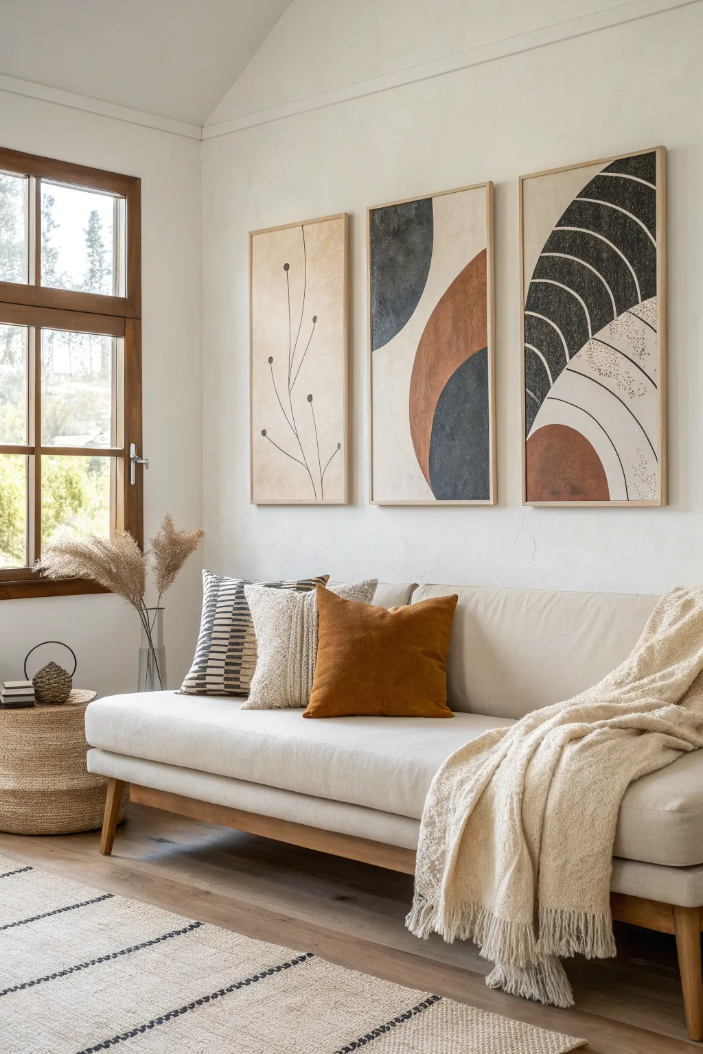
Bring a sense of calm sophistication to your living space with this striking three-piece abstract set. Combining organic curves, crisp lines, and a warm, earthy color palette, this triptych creates a cohesive visual anchor perfect for spanning a main seating area.
Step-by-Step Tutorial
Materials
- Three large gallery-wrapped canvases or wood panels (24×48 inches recommended)
- Acrylic paints (Titanium White, Unbleached Titanium, Burnt Siena, Mars Black, Payne’s Gray)
- Matte medium or texture paste
- Large flat paintbrush (2-3 inch)
- Medium round paintbrush
- Fine liner brush
- Painter’s tape or masking tape
- Pencil and large compass (or a string and tack/pencil)
- Ruler or yardstick
- Palette or mixing plate
- Floater frames (natural wood finish)
Step 1: Preparation and Background
-
Prime the surface:
Begin by ensuring your canvases or panels are clean. If you want that slightly gritty, aged texture visible in the reference, mix a small amount of texture paste or sand into your gesso before priming. -
Mix the base color:
Create a warm, creamy beige for the background. Mix Titanium White with a generous amount of Unbleached Titanium. You want a color that looks like raw canvas or parchment. -
Apply the base coat:
Using your large flat brush, cover all three canvases entirely with your beige mix. Use cross-hatching strokes to add subtle visual interest rather than painting in perfectly straight lines. Let this dry completely. -
Sketch the layout:
Lay the three canvases side-by-side on the floor with a 2-3 inch gap between them to simulate how they will hang. This is crucial for ensuring the flowing shapes connect visually across the separate panels. -
Draw the geometric forms:
Lightly sketch your design with a pencil. Mark out the large semi-circles and arches. Use a yardstick for the straight lines on the right panel and create a makeshift compass with string and a tack to get the large curves on the center and right panels perfectly consistent.
Wobbly Lines?
If painting freehand curves is difficult, use flexible masking tape (often used for auto detailing) to mask off your arches before painting for a crisp, perfect edge.
Step 2: Blocking in Color
-
Mix the earthy rust:
Combine Burnt Siena with a touch of Unbleached Titanium to soften it. This creates that warm terracotta shade used for the arches in the center and right panels. -
Paint the rust shapes:
Fill in the sketched areas for the rust color. I find using a medium round brush helps manipulate the paint around the curved edges smoothly. You may need two coats for full opacity. -
Mix the slate blue-grey:
Mix Payne’s Gray with a tiny drop of Mars Black and some white. You’re aiming for a deep, stormy blue-charcoal tone. -
Apply the dark tones:
Paint the semi-circle on the middle canvas and the upper arch section on the right canvas. Keep your hand steady on the edges, or use painter’s tape if you prefer a razor-sharp division. -
Create the botanical element:
On the left canvas, the design is distinct. Using a pencil, lightly draw the slender, organic stems and small floating circles.
Step 3: Detailing and Texture
-
Paint the thin lines:
Switch to your fine liner brush and thinned black paint. Carefully trace over your pencil lines on the left canvas to create the botanical drawing. Keep the pressure light for delicate stems. -
Add the dots:
Fill in the small circles at the ends of the stems on the left panel with solid black. Ensure they are fully opaque. -
Detail the right panel:
The rightmost panel features repeating curved lines within the dark arch. Use your liner brush and the clear beige background color to paint these thin, curved striations over the dried dark paint. -
Add speckling:
To mimic the stone-like texture, mix a watery wash of watered-down black paint. Dip an old toothbrush into it and run your thumb over the bristles to flick tiny speckles onto the beige areas of the rightmost canvas. -
Create distressed textures:
Take a dry, stiff-bristled brush with a tiny amount of the background beige color. Lightly scuff it over parts of the rust and charcoal shapes to give them a worn, vintage look.
Add Dimension
Mix fine sand or cornice cement into your rust and charcoal paint colors before applying. This creates physical grit that catches the light and adds a high-end tactile feel.
Step 4: Finishing Touches
-
Erase guidelines:
Once the paint is bone dry, gently erase any visible pencil marks, being careful not to smudge the paint. -
Seal the artwork:
Apply a coat of matte varnish over all three pieces. A glossy finish would distract from the earthy vibe, so stick to matte or satin. -
Frame the pieces:
Install the canvases into natural wood floater frames. The light wood tone complements the beige background and ties the set together. -
Hang firmly:
Mount the triptych on your wall, double-checking your measurements to maintain that consistent spacing you planned in the beginning.
Step back and admire how the connecting shapes flow across the wall to transform your room
Small-Scale Abstract Gallery Wall Near the TV
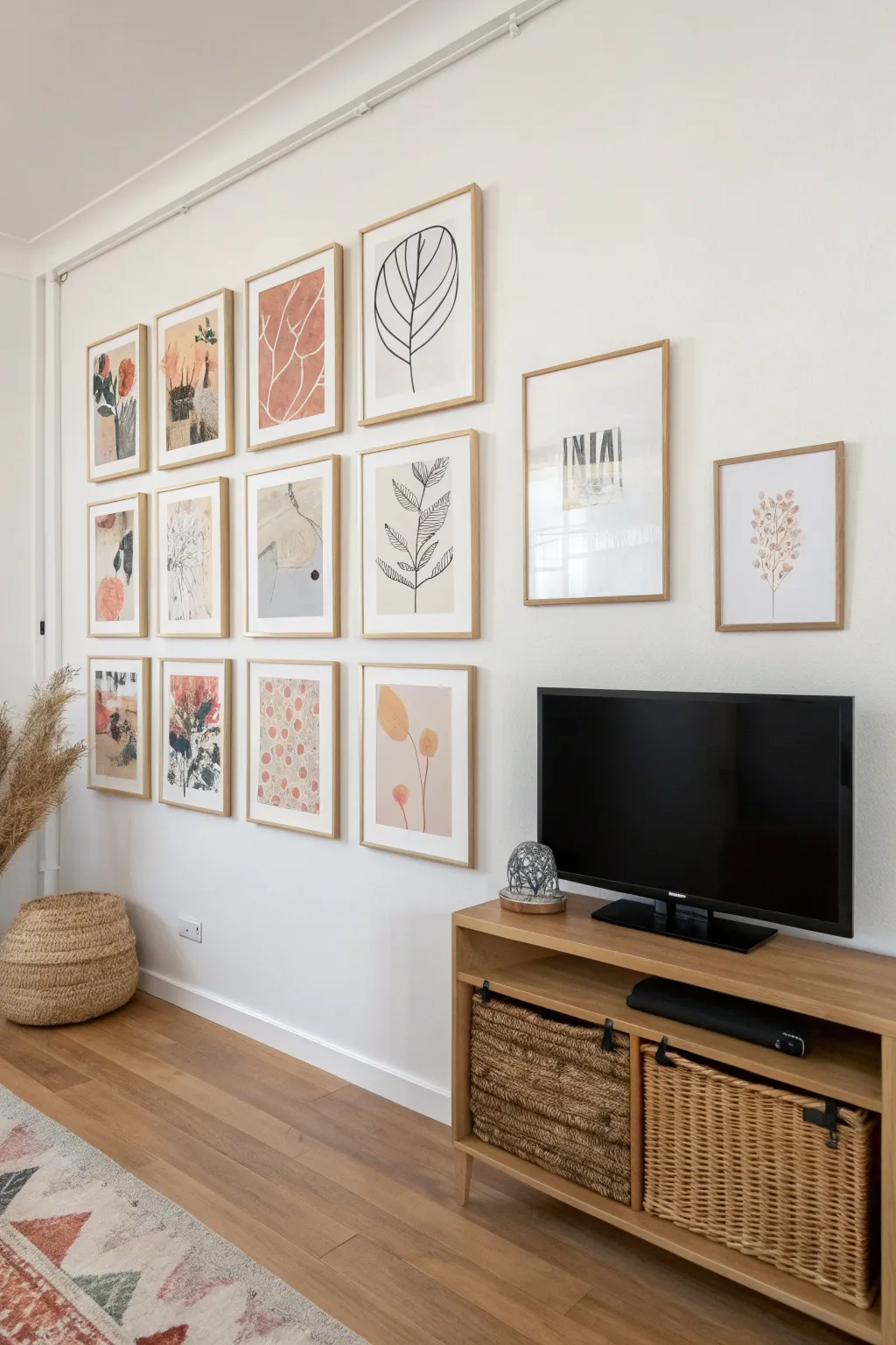
Transform a blank wall into a curated focal point with this cohesive collection of abstract and botanical prints. By blending organic leaf shapes with bold geometric lines and soft earthy tones like terracotta and sage, you’ll create a sophisticated gallery that feels both modern and hand-crafted.
How-To Guide
Materials
- 14 light wood frames (various sizes: 10 small/medium 12x16in, 4 medium/large 16x20in and 18x24in)
- Heavyweight watercolor paper or mixed media cardstock
- Acrylic paints (terracotta, sage green, ochre, black, white)
- Black ink fine-liner pens (0.5mm and 0.8mm)
- Wide flat brush (1-inch)
- Round watercolor brushes (sizes 4 and 8)
- Pencil and eraser
- Ruler
- Masking tape
- Water cups and palette
Step 1: Preparation & Layout
-
Map out your grid:
Before painting, decide the layout. The inspiration image uses a structured 4×3 grid on the left for smaller pieces, with two larger feature pieces offset to the right. Cut paper to fit your frames exactly. -
Define the color palette:
Mix your acrylics to create a cohesive earthy palette. You want a dusty rose/terracotta, a muted sage green, a warm beige, and a deep charcoal gray. Test these swatches together on a scrap piece of paper to ensure harmony.
Loose Brushwork Tip
For the abstract shapes, hold your paintbrush higher up on the handle. This reduces your control slightly, resulting in more fluid, expressive strokes that look less rigid.
Step 2: Creating the Botanical Line Art
-
Sketch the leaf structures:
For the black and white line art pieces (like the top center and middle right), lightly sketch large, simplified leaf veins using a pencil. Think of oval shapes with central spines. -
Ink the outlines:
Using a 0.8mm black pen, trace over your pencil lines with a confident, steady hand. I find that lifting the pen slightly at the end of a stroke gives the line a more organic, artistic feel. -
Add detailing:
Switch to the finer 0.5mm pen to add intricate vein details or small stippling dots near the base of the leaves for shading.
Step 3: Painting the Abstract Color Blocks
-
Tape geometric shapes:
For the pieces with sharp edges (like the framed piece in the second column, bottom row), apply masking tape to the paper to block out rectangular or triangular sections. -
Apply the base colors:
Fill the taped areas with your mixed terracotta and sage paints using the flat brush. Apply the paint smoothly but don’t worry about perfect coverage; visible brushstrokes add texture. -
Create soft organic shapes:
For the looser abstract pieces, ditch the tape. Use a round brush to paint distinct blobs or ‘pebbles’ in lighter beige and pink tones. Let these shapes overlap slightly for depth. -
Dry and peel:
Allow the painted sections to dry completely before carefully peeling away any masking tape at a 45-degree angle to reveal crisp lines.
Level Up: Texture
Mix a small amount of baking soda or plaster into your acrylic paint for the solid shape pieces. This creates a gritty, matte texture that mimics unglazed ceramic.
Step 4: Mixed Media Details
-
Layer ink over paint:
Once your color block paintings are dry, use the black ink pen to draw loose botanical sprigs or abstract scribbles directly over the colored areas. This bridges the gap between the two styles. -
Add ‘Polka Dot’ texture:
Recreate the spotted artwork (bottom row, third from left) by dipping the handle end of a paintbrush into terracotta paint and stamping it repeatedly in a loose irregular pattern. -
Incorporate text elements:
For the typographic piece (top right, large frame), paint broad vertical stripes in black and grey, let them dry, and then negative-paint or stencil bold letters like ‘INIA’ using white acrylic.
Step 5: Assembly
-
Flatten the artwork:
If the paint has caused the paper to buckle, place the dry artwork under a stack of heavy books overnight to flatten it out. -
Clean the glass:
Wipe down both sides of the glass in your frames to remove fingerprints or dust specks before inserting the art. -
Framing:
Place each artwork into its corresponding frame. For the larger pieces, consider using a white mat board (mount) to give the artwork more breathing room and a professional finish. -
Final arrangement:
Lay the framed pieces on the floor to verify your arrangement one last time before hanging them on the wall.
Step back and enjoy the calming, sophisticated atmosphere your personal art gallery brings to the room
Mantel Leaner Abstract for a Relaxed Look
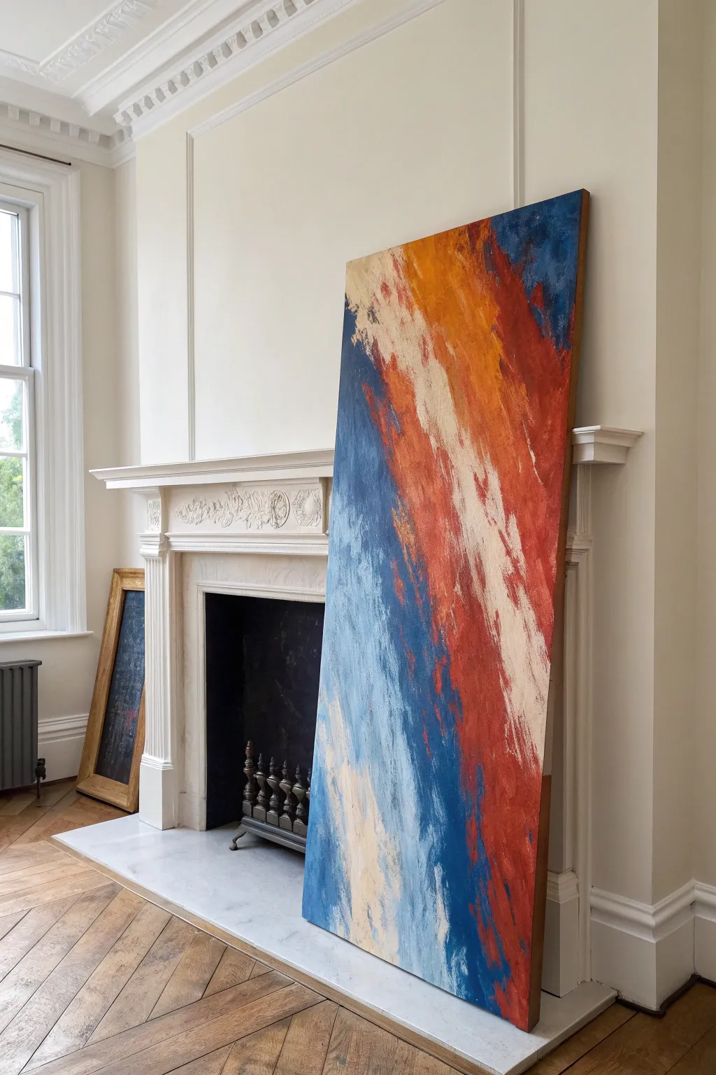
This arresting oversized canvas brings a modern, relaxed energy to any room by abandoning the rigidity of hanging hardware for a casual lean. Its dynamic composition relies on bold, diagonal sweeps of color in a palette of deep rusts, ochres, and ocean blues, creating movement that feels both powerful and grounded.
Step-by-Step Guide
Materials
- Large rectangular canvas (approx. 36” x 72”)
- Acrylic paints: Navy Blue, Cerulean Blue, Burnt Sienna, Cadmium Red Medium, Yellow Ochre, Titanium White, Unbleached Titanium (Cream)
- Large flat paintbrushes (3-4 inch width)
- Wide putty knife or palette knife
- Gesso (optional, for priming)
- Mixing buckets or large disposable plates
- Drop cloth
- Rags or paper towels
- Spray bottle with water
Step 1: Preparation and Background
-
Prepare the workspace:
Lay down a drop cloth in a well-ventilated area. Lean your large canvas against a wall or lay it flat on the floor; laying it flat gives you more control over drips, but leaning mimics the final placement. -
Prime the surface:
If your canvas isn’t pre-primed, apply two even coats of gesso, allowing it to dry completely between layers. This ensures the paint sits on top rather than soaking into the fabric. -
Map the diagonal flow:
Visualize a strong diagonal line cutting from the top left to the bottom right. This invisible line will dictate the direction of all your brushstrokes. -
Mix the base colors:
Prepare four main pools of paint: a deep navy mix, a mid-tone blue, a rust/red blend (Burnt Sienna with a touch of Cadmium Red), and a warm ochre/yellow. -
Apply the dominant blue:
Start with your largest brush and the navy mix. Apply wide, sweeping strokes starting from the bottom left corner, moving upwards diagonally towards the center. Don’t cover the whole canvas; leave plenty of white space.
Muddy colors?
If your blues and oranges are mixing into a dull brown where they meet, let the first color layer dry completely before applying the contrasting color next to it.
Step 2: Building the Layers
-
Introduce the warmth:
Switch to a clean brush and pick up your rust/red mixture. Start from the top right corner and sweep downwards diagonally, mirroring the angle of the blue section but leaving a gap in the middle. -
Blend the mid-tones:
While the paint is still tacky, use the mid-tone blue to soften the edges of the navy section. Use quick, confident strokes to create a feathered, rough texture rather than a smooth gradient. -
Add the ochre accents:
In the upper section, layer the yellow ochre directly over parts of the rust color. I like to let the brush run a bit dry here to create a scratchy, textured look that reveals the color beneath. -
Create the central channel:
Mix Titanium White with Unbleached Titanium to create a creamy off-white. Apply this heavily in the diagonal channel between the blue and red sections. -
Merge the boundaries:
Use your cream mixture to overlap into both the blue and red areas. Use a dry brush technique to drag the cream color into the darker zones, creating that jagged, energetic transition seen in the photo.
Add metallic flair
Once dry, dry-brush a small amount of gold or copper leafing paint along the ridges of the texture for a subtle shimmer that catches the light.
Step 3: Refining Texture and Detail
-
Scrape for texture:
Take a wide putty knife and gently scrape some of the wet cream paint across the blue and red sections. This flattens the paint ridges and creates a distressed, modern finish. -
Intensify the darks:
Go back in with your darkest navy blue. Add concentrated strokes along the bottom edge and sporadically through the blue section to add weight and depth. -
Highlight with pure white:
Add small, sharp streaks of pure Titanium White within the cream channel to heighten the contrast and make the center pop. -
Soften harsh blocks:
If any area looks too blocky, lightly mist it with water and use a rag to dab and blur the edges, reintegrating the diagonal motion. -
Final assessment:
Step back about ten feet to view the composition. Look for balance between the cool blues and warm reds. -
Dry and seal:
Allow the painting to dry for at least 24 hours. Once fully cured, consider applying a matte varnish to protect the surface, especially if it will be resting on the floor.
Place your finished masterpiece against the mantel or a blank wall to instantly add architectural height and color to your living space
Circular Motifs That Echo Round Furniture
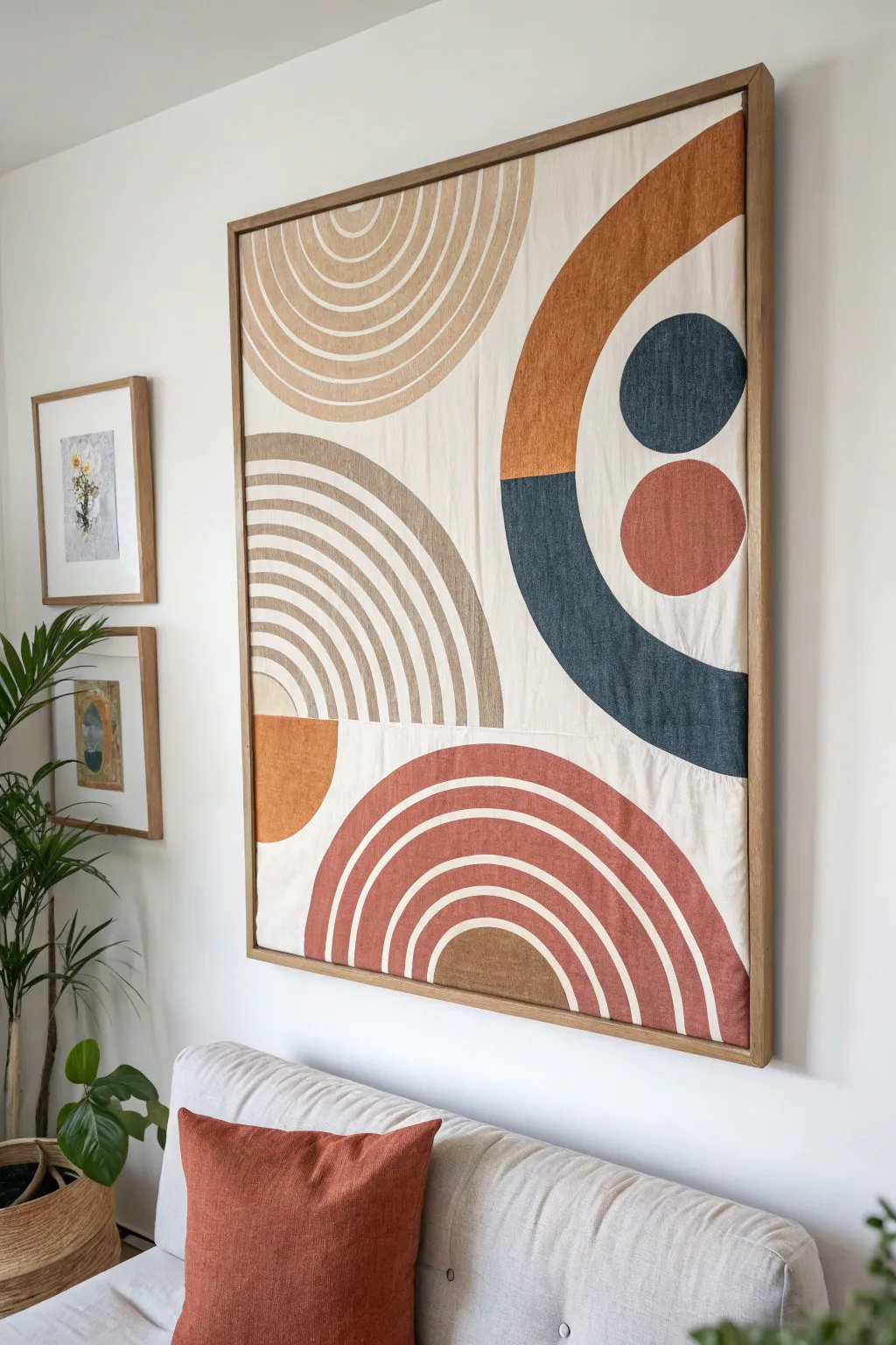
Bring warmth and organic shapes into your living space with this large-scale fabric art piece. Using simple geometric motifs like arches and circles in earthy tones, this project combines the softness of textile art with modern abstract design.
How-To Guide
Materials
- Large wooden canvas stretcher frame (approx. 36×48 inches)
- Heavyweight cotton duck cloth or canvas fabric (natural/unbleached)
- Fabric dyes or textile paints (terracotta, rust, charcoal blue, tan, beige)
- Fabric medium (if using acrylic paints)
- Wide foam brushes and synthetic bristle brushes
- Pencil and eraser
- Circular objects for tracing (bowls, plates) or a makeshift compass (string and pin)
- Painter’s tape
- Iron and ironing board
- Staple gun and staples
- Scissors
Step 1: Preparation & Base
-
Prepare the canvas:
Cut your cotton duck cloth so it is about 4-5 inches larger than your wooden frame on all sides. This extra allowance is crucial for stretching it later. -
Iron the fabric:
Lay the fabric flat and iron out any creases completely. A smooth surface is essential for clean geometric lines. -
Stretch the canvas:
Place the fabric face down and center the wooden frame on top. Pull the fabric tight and staple it to the back of the frame, starting in the middle of each side and working outward to the corners. Ensure it’s drum-tight.
Step 2: Design & Sketching
-
Plan the layout:
Lightly sketch your design onto the stretched fabric using a pencil. For the large circles and arches, create a makeshift compass by tying a string to a pencil and pinning the other end to the center point of your desired circle. -
Draft the concentric arches:
For the rainbow-like arches in the corners, use the same center point but shorten the string incrementally (about 1 inch) for each inner arch line to keep them perfectly parallel. -
Draw the solid shapes:
Sketch the large solid semi-circles and circular dots. The image features a large split circle on the right side; mark the horizontal division line clearly with a ruler.
Bleeding Lines?
If paint bleeds under tape on fabric, seal the tape edge first with a thin layer of clear matte medium or the background fabric color before applying your main color.
Step 3: Painting
-
Mix your colors:
If you are using acrylic paints, mix them with a fabric medium according to the bottle instructions. This prevents the paint from cracking and keeps the fabric texture visible. Create a palette of deep rust, soft beige, warm tan, and charcoal blue. -
Paint the solid arches:
Start with the large rust-colored arch at the bottom. Use a wide flat brush to carefully follow the pencil curve, then fill in the shape. I find it helpful to rotate the entire canvas so my hand is always in a comfortable position for the curves. -
Define the striped arches:
For the striped sections (top left and middle left), use a smaller flat brush. Paint alternating bands of beige and tan, leaving the natural fabric color showing between them as negative space if desired. -
Clean up edges:
For razor-sharp straight edges (like the split circle on the right), apply painter’s tape firmly along the line. Paint the charcoal blue section first, let it dry, then paint the rust section above or adjacent to it. -
Fill the circles:
Paint the solid blue and rust circles on the right side. Use a steady hand and a medium round brush to get the crisp circular edge. -
Layering check:
Some lighter colors like beige might need a second coat to look opaque against the natural canvas. Let the first layer dry to the touch before deciding.
Texture Pop
Mix a small amount of baking soda or fine sand into your terracotta paint for the solid arches to add a gritty, tactile dimension resembling real pottery.
Step 4: Finishing Touches
-
Dry completely:
Allow the painting to dry flat for at least 24 hours. Fabric tends to absorb moisture, so ensure it is fully cured. -
Set the paint:
Once dry, heat set the paint if your fabric medium requires it. You can do this by holding a hair dryer on high heat over the painted areas or carefully ironing the back of the canvas. -
Frame it out:
To achieve the high-end look in the photo, build or buy a simple floating frame made of oak or pine. The frame should fit snugly around your stretched canvas, adding a polished wood border. -
Secure frame:
Slide your stretched canvas into the floating frame and secure it from the back using L-brackets or screws.
Hang your masterpiece behind your sofa to instantly anchor the room with warmth and style
“Window Light” Shapes Inspired by the Room’s Sun
Create a stunning focal point for your sunlit room with this large-scale abstract painting, featuring a structured grid of warm, earthy tones. The interplay of burnt oranges, soothing creams, and grounding ochres mimics the natural warmth of window light hitting your interior space.
Detailed Instructions
Materials
- Large-scale gallery-wrapped canvas (suggested size 48″ x 60″ or larger)
- Acrylic paints (Titanium White, Burnt Sienna, Yellow Ochre, Raw Umber, Mars Black, Unbleached Titanium)
- Painter’s tape (1-inch width for precise lines)
- Yardstick or long T-square
- Pencil
- Large flat brushes (2-inch and 3-inch)
- Medium flat brush (1-inch)
- Palette knife (optional for texture)
- Matte or Satin varnish
- Gold leaf paint or metallic gold acrylic (for the frame detailing)
Step 1: Design & Preparation
-
Prepare your canvas:
Lay your large canvas flat on a clean drop cloth or sturdy table. Ideally, give the entire surface a base coat of Titanium White mixed with a tiny drop of Unbleached Titanium to create a warm, neutral primer layer. Let this dry completely. -
Map the grid:
Using your yardstick and a pencil broadly sketch out your grid pattern. Don’t worry about perfect symmetry; the charm of this piece lies in the varied sizes of the rectangles. Create a mix of large vertical blocks, small squares, and horizontal bands. -
Apply the tape mask:
Apply painter’s tape over your penciled lines. The tape represents the negative space between the color blocks. Press the edges of the tape down firmly with a credit card or your thumbnail to prevent paint bleed. -
Seal the tape edges:
I like to brush a very thin layer of your base white color over the edges of the tape. This trick ensures that if any paint bleeds under, it matches the background, keeping your final color lines razor-sharp.
Bleeding Lines?
If paint seeps under the tape, wait for it to fully dry. Then, use a flat-edged brush or a piece of tape as a guide to paint over the bleed with the background color for a crisp repair.
Step 2: Color Blocking
-
Mix the ochre tones:
Start with your lightest yellows. Mix Yellow Ochre with plenty of Titanium White to create a soft, sandy beige. Fill in about three or four scattered sections of your grid. -
Create the terracotta shades:
Next, mix Burnt Sienna with a touch of Yellow Ochre to create a warm terracotta. Apply this to two or three prominent rectangular sections. Use a crisscross brushstroke to minimize obvious streaks. -
Add deep earth reds:
Use pure Burnt Sienna or mix it with a tiny dot of Mars Black to deepen it into a brick red. Paint one or two focal squares with this stronger color to anchor the composition. -
Apply neutral greys and creams:
For the quieter sections, mix Raw Umber with copious amounts of White for a warm grey, or use straight Unbleached Titanium for creamy blocks. These neutrals give the eye a place to rest. -
Insert the contrast:
Select one small square, preferably near a corner, and paint it a charcoal grey using Mars Black mixed with a little White. This dark accent adds necessary visual weight.
Level Up: Glazing
After the main colors dry, mix acrylic glazing medium with a tiny amount of Burnt Umber. Brush this transparent wash over specific blocks to add instant age and richness.
Step 3: Texture & Refinement
-
Layer for depth:
Once the first layer is dry, go back over the larger color blocks. Don’t aim for solid opacity; instead, dry-brush a slightly lighter or darker version of the same hue over the top to create a weathered, textured look. -
Add subtle variation:
For a more organic feel, you can use a clean rag to lightly dab away wet paint in the center of some blocks, revealing a hint of the underlayer. This mimics the look of aged plaster or fresco. -
Remove the tape:
Carefully peel away the painter’s tape while the final paint layer is still slightly tacky but mostly dry. Pull the tape at a 45-degree angle to ensure a clean release. -
Touch up the lines:
Inspect your grid lines. If any color bled through, use a small detail brush and your base white color to tidy up the edges, re-establishing the clean separation between blocks.
Step 4: Finishing Touches
-
Refine the grid lines:
The exposed canvas lines (where the tape was) might look too stark white. I find it helps to glaze them slightly with a wash of very watered-down Raw Umber to soften the grid and make it look cohesive. -
Seal the artwork:
Once the painting feels completely dry to the touch (wait at least 24 hours), apply an even coat of matte or satin varnish to protect the surface and unify the sheen. -
Paint the edges (Faux Frame):
Instead of buying an expensive frame, simply paint the outer 1/2 inch edge of the canvas face and the sides with metallic gold paint or apply gold leaf. This creates an elegant framed illusion.
Hang your masterpiece near a window and watch how the natural light brings the warm tones to life throughout the day
Textile-Inspired Mixed Media That Matches the Rug
Bring the warmth of textiles to your walls with this large-scale mixed media piece that mimics the look of a tufted rug without needing a loom. Using a combination of heavy-body acrylics, modeling paste, and thick yarn, this project creates striking geometric zones of high texture and earthy tones.
How-To Guide
Materials
- Large canvas (e.g., 24×36 or larger) or plywood panel
- Wooden frame molding (1×2 pine strips)
- Wood stain (dark walnut)
- Thick cotton yarn or macramé cord (cream/natural)
- Tacky glue or heavy-duty craft glue
- Textured modeling paste or plaster
- Acrylic paints (terracotta, burnt sienna, ochre, charcoal, sage green, cream)
- Palette knives (various sizes)
- Chip brushes and old combs
- Pencil and ruler
- Matte varnish spray
Step 1: Planning and Prep
-
Frame construction:
Before starting the art, cut your 1×2 pine strips to frame the outer edge of your canvas or panel. Use miter cuts for corners if you have the tools, or simple butt joints for a rustic look. Stain the wood a deep walnut color and set aside to dry completely. -
Draft the design:
Lay your canvas flat. Using a pencil and a long straightedge, draw your geometric pattern lightly. Copy the image provided by creating large, intersecting shards and organic curves. Focus on balancing large cream areas with smaller, bolder color zones.
Cracking Paste?
If your modeling paste cracks while drying, it was applied too thick in one go. Fill cracks with a mix of paint and paste, then smooth over.
Step 2: Building Texture
-
Outline with yarn:
Cut lengths of your thick cotton yarn. Apply a thin bead of tacky glue along every pencil line you drew. Press the yarn firmly into the glue to create raised borders between every color section. -
Create the twisted rope effect:
For the prominent vertical borders, twist two strands of yarn together before gluing them down to create that rope-like texture seen in the reference image. Let the glue cure for at least an hour. -
Mix texture medium:
Scoop a generous amount of modeling paste into several cups. If you want colored texture immediately, mix your acrylic paint directly into the paste now (about a 70/30 ratio of paste to paint). I find mixing it beforehand ensures the color gets into every crevice.
Step 3: Painting and Sculpting
-
Apply base layers:
Start with the flattest sections, particularly the dark charcoal and sage green triangles. Apply the tinted paste with a palette knife, smoothing it out but leaving some natural ridges. -
Sculpt the cream wool effect:
For the large cream sections, apply a very thick layer of white paste. While wet, use a stiff chip brush to stipple the surface, tapping vertically to create a ‘tufted’ wool appearance. -
Create directional ridges:
In the terracotta and ochre sections, apply the colored paste and then drag a comb or the edge of your palette knife through it to create vertical or diagonal striations that mimic woven fabric grain. -
Add the wave details:
Look for the raised, wavy line in the bottom right cream section of the reference image. Roll a piece of modeling clay or use a very thick bead of caulk to form this S-curve, glue it down, and then paint over it with your textured cream paste to blend it in.
Real Fabric Insert
Instead of just painting texture, glue actual scraps of burlap or linen into the triangles before painting over them for authentic grit.
Step 4: Detailing and Assembly
-
Enhance texturing:
Once the first layer is touch-dry, go back in with a smaller tool or toothpick to conduct ‘sgraffito’ painting—scratching into the paint to reveal texture, especially on the darker grey sections to mimic leaf veins or fabric weave. -
Dry brushing intensity:
To make the textures really pop, take a dry brush with a lighter shade of paint (e.g., light peach on top of the terracotta) and lightly dust the tops of the raised ridges. This highlights the textile effect. -
Clean the borders:
If any paint got onto your yarn borders, carefully paint over the yarn with a fresh coat of cream or off-white paint to keep those defining lines crisp and clean. -
Partial drying check:
Let the piece sit for 24 hours. Because the paste is thick, the interior might still be soft even if the surface is dry. -
Final assembly:
Attach your pre-stained wooden frame to the outside of the canvas using finishing nails or wood glue and clamps. The dark wood creates a necessary boundary that makes the lighter colors vibrate. -
Seal:
Spray the entire piece with a matte varnish. Avoid glossy finishes, as you want this to look like fabric and wool, not plastic.
Hang your piece near a window where the side light will catch the ridges and emphasize that beautiful faux-textile depth
Abstract “Floor Plan” Lines for a Personal Twist
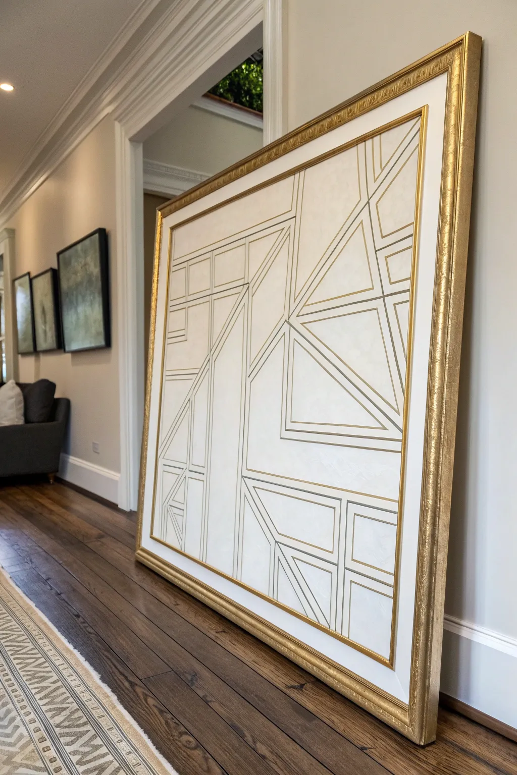
This sophisticated piece blends the precision of architectural blueprints with the luxury of Art Deco design, creating a stunning focal point for any room. Using metallic accents against a textured cream background, you’ll create a structured yet abstract composition that feels both classic and modern.
Step-by-Step Tutorial
Materials
- Large canvas (36×48 inches or larger recommended)
- Heavy body acrylic paint (Titanium White, Unbleached Titanium)
- Modeling paste or texture gel
- Wide palette knife or trowel
- Gold leaf paint or liquid gold leaf
- Gold paint marker (fine and medium tips)
- Painter’s tape (various widths: 1/4 inch, 1/2 inch)
- Ruler or vigorous T-square
- Pencil
- Ornate gold frame (to fit canvas size)
- Matte varnish
- Fine detail brush
Step 1: Preparation and Texture
-
Prime the surface:
Begin by ensuring your canvas is clean. Apply a base coat of Titanium White acrylic paint to prime the surface and create a bright, neutral foundation. -
Create the texture mix:
Mix your modeling paste with a small amount of Unbleached Titanium acrylic paint. You want a subtle, creamy off-white color that has significant body and thickness. -
Apply the background texture:
Using a wide palette knife or trowel, spread the texture mixture across the entire canvas. Don’t aim for perfect smoothness; subtle ridges and variations add depth that mimics plaster. -
Smooth the high points:
While the paste is still wet but slightly tacky, lightly drag a clean palette knife over the surface to knock down any overly sharp peaks, creating a soft, stucco-like finish. -
Wait for thorough drying:
Allow the textured base to dry completely. Since modeling paste is thick, I recommend leaving it overnight to ensure it is hard enough to withstand the taping process.
Step 2: Designing the Grid
-
Sketch the layout:
Lightly sketch your design with a pencil and long ruler. Draw a mix of rectangles, triangles, and intersecting lines that mimic a floor plan, focusing on creating balance rather than symmetry. -
Apply the main structure tape:
Use 1/4 inch painter’s tape to mask off the longest, primary lines of your design. Press the edges of the tape down firmly to prevent paint bleed. -
Seal the tape edges:
Paint a very thin layer of your cream base color over the edges of the tape. This trick locks the edge so that if any paint bleeds underneath, it matches the background. -
Create secondary shapes:
Add detail by taping off smaller geometric shapes nested within the larger sections. Vary the spacing to keep the eye moving across the canvas.
Bleed-Proof Lines
Textured surfaces are tricky for tape. Use a clear matte medium to seal tape edges before painting gold to effectively stop seepage.
Step 3: Gilding and Detailing
-
Paint the gold lines:
Using a flat brush, apply your gold leaf paint or liquid gold leaf into the exposed channels between the tape strips. Apply two coats for a rich, opaque metallic finish. -
The reveal:
Once the gold paint is dry to the touch but not fully cured, carefully peel back the painter’s tape at a 45-degree angle to reveal crisp, clean lines. -
Touch up edges:
If rough texture caused any bleed, use a small brush and your cream background paint to tidy up the edges of the lines. -
Add fine details:
Use a gold paint marker and a ruler to draw very thin, delicate interior lines inside the larger shapes. This mimics framing details found in architectural drawings. -
Protect the work:
Apply a coat of matte varnish over the entire canvas (being gentle over the gold areas) to seal the texture and protect the metallic luster from tarnishing over time. -
Frame the piece:
Install the finished canvas into a chunky, ornate gold frame. The heavy frame contrasts beautifully with the modern, linear artwork inside.
Variation is Key
Mix different gold shades—like antique bronze and bright champagne gold—for the lines to add subtle shimmer and dimension.
Hang your new masterpiece in a well-lit area where the light can catch the metallic lines and highlight the texture
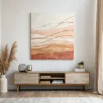
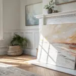
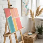

Have a question or want to share your own experience? I'd love to hear from you in the comments below!