When a wall feels blank, an abstract wall painting can turn it into the heartbeat of your whole space. I pulled together my favorite abstract wall painting ideas—from clean geometry to juicy texture—so you can pick a direction and start painting without overthinking it.
Oversized Abstract Canvas Focal Point
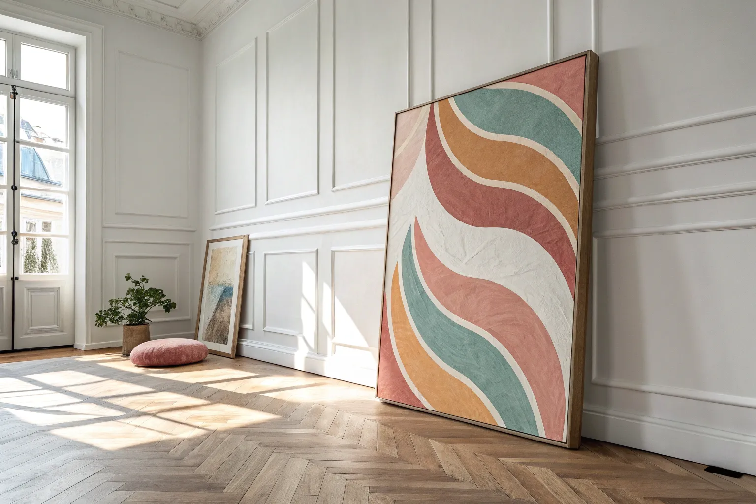
Bring the calming vastness of a desert horizon into your living room with this oversized abstract canvas project. By utilizing sweeping horizontal strokes and a textured layering technique, you’ll create a sophisticated focal point that balances warm earth tones with cool, atmospheric blues.
Step-by-Step Guide
Materials
- Large stretched canvas (at least 36×48 inches)
- Heavy body acrylic paints: Titanium White, Unbleached Titanium (buff), Burnt Sienna, Raw Umber, Payne’s Grey, and Prussian Blue
- Gesso (optional, for priming)
- Flow improver or water spray bottle
- Large flat paintbrush (3-4 inch width)
- Medium filbert brush
- Palette knife (large, trowel style)
- Cardboard scraps (for scraping)
- Mixing palette or paper plates
- Drop cloth
Step 1: Preparation and Base Layers
-
Prepare the canvas:
Lay down your drop cloth. If your canvas is raw, prime it with a coat of gesso and let it dry completely. If pre-primed, you can skip straight to painting. -
Map the horizon:
Visualize the painting in thirds. The bottom third will be the dark ground, the middle is a striking band of reddish-brown, and the top half is the sky. Make very faint pencil marks on the edges to guide you, but don’t draw lines across. -
Mix the sky tone:
On your palette, mix a large amount of Titanium White with a tiny touch of Unbleached Titanium and a speck of Payne’s Grey. You want a creamy, stormy off-white. -
Paint the upper section:
Using your largest flat brush, apply this mixture to the top half of the canvas. Use long, horizontal sweeping motions. Don’t worry about perfect coverage; let the brush texture show. -
Add atmospheric depth:
While the white is still slightly tacky, mix a little more Payne’s Grey into your white. Lightly dry-brush some subtle gray streaks near the very top edge to create a moody cloud feel.
Dry Brushing Secret
Wipe almost all paint off your brush onto a paper towel before touching the canvas. This ‘dry brush’ leaves scratchy, textured marks that mimic natural weathering perfectly.
Step 2: Building the Earth Tones
-
Create the warm band:
Mix Burnt Sienna with a little Raw Umber. Apply this directly below your sky section, creating a thick, bold band across the middle of the canvas. I like to let the edges be a bit ragged where it meets the sky. -
Intensify the red:
Load your brush with pure Burnt Sienna or a reddish ochre. Layer this over the brown band you just painted, focusing on the center of the band to make it pop with warmth. -
Transition zone:
Mix Unbleached Titanium with a touch of the Burnt Sienna. Use this lighter peach tone to blend the area where the red band meets the sky, softening the transition so it looks like distant haze. -
Establish the dark base:
For the bottom third, mix Payne’s Grey and Prussian Blue to create a deep, near-black navy. Apply this solidly at the very bottom, working your way up toward the red band. -
Blur the boundary:
Where the dark blue meets the red earth tone, create a ‘no-man’s land’ of texture. Don’t blend them smooth; instead, dab your brush to create a rough, dark textural line separating the two main colors.
Adding Metallic Flaire
Mix a small amount of gold leaf or metallic gold paint into that center white horizon line. It will catch the light beautifully and add a hidden shimmer to the artwork.
Step 3: Refining and Texturing
-
Introduce the palette knife:
Once the base layers are dry to the touch, mix a thick paste of Titanium White and Unbleached Titanium. Pick this up with the edge of your large palette knife. -
Scrape the horizon highlight:
Drag the knife horizontally across the painting, right where the dark blue bottom meets the red middle. This creates that striking, broken line of white that looks like light reflecting on water or sand. -
Add vertical interest:
Using a dry brush with very little paint (a mix of white and beige), lightly drag the brush casually down from the sky into the red band in a few spots to simulate rain or light shafts. -
Deepen the shadows:
Take your dark blue mixture again. Use a piece of cardboard or the palette knife to scrape thin, dark horizontal lines into the red and white sections, creating a distressed, weathered look. -
Soften the sky:
If the sky looks too flat, take a very watered-down wash of the Unbleached Titanium and brush it loosely over the dry upper section to warm it up. -
Final highlights:
Look for areas that need contrast. Add final touches of pure Titanium White with the palette knife in the center of the canvas to draw the eye. -
Seal the work:
Allow the heavy layers to dry for at least 24 hours. Once fully cured, apply a matte or satin varnish to protect the surface and unify the sheen.
Hang this commanding piece above your sofa and enjoy the serene atmosphere it adds to your space
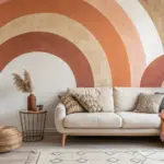
Neutral Minimalist Shapes
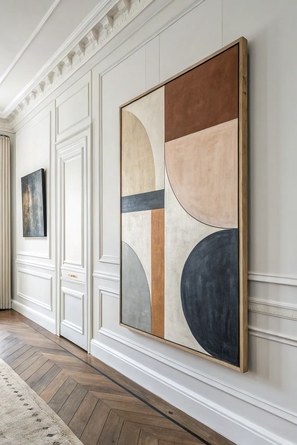
Bring the sophistication of a minimalist gallery into your home with this large-scale abstract painting. Featuring soft arches and bold color blocks in earthy charcoals, rusts, and creams, this piece balances warmth with structured modern design.
Step-by-Step
Materials
- Large canvas (min. 30×40 inches)
- Acrylic paints: Burnt Sienna, Unbleached Titanium, Black, Payne’s Grey, Raw Umber
- Floetrol or acrylic glazing medium
- Large flat brushes (2-inch and 1-inch)
- Painter’s tape (low tack)
- Pencil
- Large ruler or T-square
- Compass or string and pushpin (for circles)
- Light wood floating frame (optional)
Step 1: Planning and Sketching
-
Prime the surface:
Begin by applying a base coat of Unbleached Titanium or warm white across the entire canvas. This ensures your pencil lines show up clearly and gives the final colors a warm undertone. -
Divide the space:
Using a ruler, lightly draw a vertical line that splits the canvas, but offset it slightly to the right so it’s not perfectly centered. This asymmetry creates visual interest. -
Sketch the horizontal blocks:
Draw three main horizontal sections. The bottom section should be the largest, allowing space for the heavy charcoal shapes, while the middle section is a thinner band for the horizontal stripe detail. -
Draft the curves:
For the perfect arches and semi-circles, use a makeshift compass. Tie a string to a pencil, pin the string at the center point of your intended curve, and swing the pencil to draw a smooth arc. Sketch the large right-side semi-circle and the bottom charcoal quarter-circle.
Clean Curves Secret
For perfect curved edges without shaky hands, use flexible masking tape (often blue or green) specifically designed for curves. Press edge firmly.
Step 2: Applying the Colors
-
Mix the rust tone:
Combine Burnt Sienna with a touch of Raw Umber to deepen it. Apply this to the top right rectangle, using smooth, vertical strokes for a clean finish. -
Paint the peach arch:
Mix White, a tiny drop of Burnt Sienna, and Unbleached Titanium to create a soft peach-beige. Fill in the large semi-circle below the rust block. I like to keep my brush wet here to ensure the edges stay crisp against the pencil line. -
Create the grey-beige background:
For the negative space (the background areas on the top left and center), use a mixture of Unbleached Titanium with a speck of Raw Umber. It should look like distinct from your primer coat but still very neutral. -
Add the focal charcoal:
Mix Black with Payne’s Grey. Paint the large bottom-right semi-circle. This is the ‘weight’ of the painting, so apply two coats if necessary to make it completely opaque. -
Execute the horizontal stripe:
Use painter’s tape to mark off the thin horizontal rectangle on the left side. Paint this a dark slate grey (Black mixed with a little White and Blue). Peel the tape while the paint is still slightly damp. -
Fill the vertical bar:
Tape off the vertical rectangular bar that intersects the bottom left. Paint this with a lighter version of your rust mixture (add more Yellow Ochre if you have it, or just more White to the Burnt Sienna mix). -
Detail the final arch:
Paint the bottom-left quarter-circle in a medium cool grey. This visually balances the dark charcoal on the right.
Step 3: Refining and Finishing
-
Clean up edges:
Once the main blocks are dry, use a small angled brush and your background color to touch up any areas where the paint might have bled or the lines feel shaky. -
Add texture:
To mimic the organic look of the original, dry-brush a little lighter paint over the dark areas, or darker paint over the light areas. This adds a subtle ‘stone’ or ‘plaster’ effect to the flat colors. -
Outline details (optional):
For extreme definition, you can use a very thin liner brush with black paint to trace the intersection where the circular shapes meet the straight lines, though this is a stylistic choice. -
Varnish:
Apply a matte varnish over the entire piece. A glossy finish would distract from the earthy, natural vibe we are aiming for. -
Frame the piece:
Install the canvas into a light oak or pine floating frame. The gap between the canvas and the wood frame elevates the professional look instantly.
Uneven Coverage?
If lighter colors look streaky, don’t keep brushing wet paint. Let the first coat dry completely, then apply a second coat perpendicular to the first.
Hang your new masterpiece in a well-lit hallway or living area to let those earthy tones warm up the room


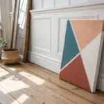
Color-Block Rectangles and Bands
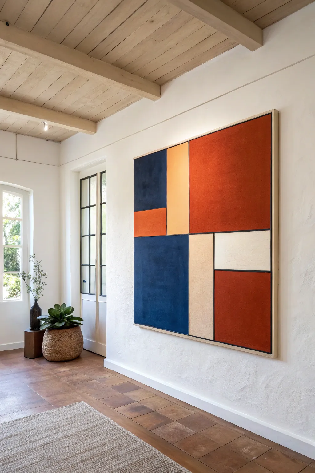
This striking, large-scale canvas combines the structured balance of Mondrian with a warm, earthy color palette perfect for contemporary interiors. By using simple masking techniques and layers of rich acrylics, you can create a professional-looking statement piece that anchors any hallway or living room.
How-To Guide
Materials
- Large square canvas (approx. 48″ x 48″ or similar ratio)
- Heavy-body acrylic paints (Deep Rust/Terracotta, Navy Blue, Warm Beige/Sand, Off-White, Black)
- Painter’s tape (various widths, 1″ and 0.5″)
- Large flat paintbrush (2-3 inches wide)
- Small flat brush or liner brush (for touch-ups)
- Black acrylic paint pen or thin black tape (optional for lines)
- Ruler or T-square
- Pencil
- Matte or Satin varnish
Step 1: Planning and Layout
-
Surface Preparation:
Begin by ensuring your canvas is clean and taut. If the canvas texture is too rough for your liking, apply a layer of gesso, smooth it with a palette knife, and sand lightly once dry for a sleeker finish. -
Sketch the Grid:
Using a pencil and a T-square, lightly sketch your geometric design directly onto the canvas. Focus on creating a balanced composition with a mix of large vertical rectangles and smaller horizontal blocks. -
Define Boundaries:
Decide on the thickness of your black dividing lines. The example uses very thin lines, so plan for gaps between your color blocks where the black will eventually go, or choose to paint the black lines first.
Step 2: The First Blocks
-
Tape the First Sections:
Apply painter’s tape along the pencil lines of the sections you intend to paint first. I find it easiest to work on non-adjacent colors first—for example, the large red section and the bottom blue section—so wet paint edges don’t touch. -
Seal the Tape Edges:
To ensure razor-sharp lines, brush a very thin layer of your base color (or clear matte medium) over the edge of the tape. This prevents the colored paint from bleeding underneath. -
Mix Your Red-Orange:
Combine your terracotta and a touch of deep rust to get that warm, earthy orange-red tone. Apply the first coat to the large upper right quadrant and the smaller middle-left rectangle. -
Apply the Navy Blue:
While the red dries, mix a deep navy blue. Paint the upper left square and the large bottom left rectangle. Use broad, horizontal strokes to build a subtle texture. -
Layering for Opacity:
Let the first coats dry completely. Apply a second coat to both the red and blue sections to achieve a solid, opaque finish where no canvas shows through. -
Remove First Tapes:
Carefully peel the tape away while the second coat is still slightly tacky to avoid pulling up dried paint chips.
Fixing Bleeds
If paint bleeds under the tape, wait for it to dry fully. Then, re-tape slightly over the mistake and paint over the bleed with the correct background color to erase the jagged edge.
Step 3: Completing the Colors
-
Tape Re-application:
Once the first set of colors is bone dry (wait at least an hour), tape off the boundaries for the remaining sections. Ensure the new tape goes over the dry painted areas gently to create clean borders. -
Paint the Beige Strips:
Mix a warm sand or beige tone. Paint the tall vertical strip in the center and the bottom middle column. This neutral tone helps balance the intensity of the blue and red. -
Add the White Accent:
Paint the small rectangular section in the middle right with off-white or cream. This high-contrast block acts as a ‘breathing space’ in the composition. -
Final Red Block:
Paint the remaining bottom right rectangle with your terracotta mix. Allow all these new sections to dry, apply a second coat if needed, and peel off the tape.
Textured Depth
Mix a little modeling paste or very fine sand into your acrylics before painting. This subtle grit adds an organic, tactile quality that makes the blocks feel less digital and more handmade.
Step 4: Defining Lines and Finishing
-
Create the Black Grid:
You now have color blocks separated by small gaps of unpainted canvas. Using a steady hand and a liner brush, paint these gaps black. Alternatively, stick thin black art tape or use a black paint pen for absolute precision. -
Clean Up Edges:
Inspect your corners and intersections. If any color bled or a line feels wobbly, use a small angled brush with the appropriate color to touch up the mistakes. -
Frame the Piece:
Paint the outer edges of the canvas black to frame the artwork, or specifically if you are using a floating frame, leave them white or continue the design over the edge. -
Seal the Work:
Once the entire painting has cured for 24 hours, apply a final coat of matte or satin varnish. This unifies the sheen of the different paint colors and protects the surface from dust.
Hang this substantial piece in a well-lit area to let the warm tones energize the room


Abstract Triptych Panel Set
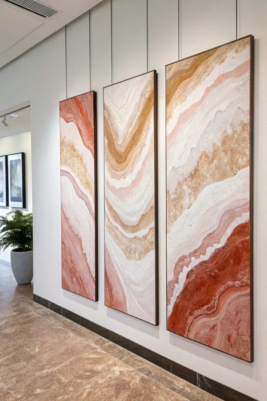
Recreate the majesty of striated canyon walls with this stunning three-panel abstract set. Using textural mediums and a warm, desert-inspired palette, you will build flowing layers that sweep continuously across all three canvases for a cohesive, high-end gallery look.
Detailed Instructions
Materials
- 3 Large stretched canvases (e.g., 24×48 inches)
- Modeling paste or heavy structure gel
- Fine sand or pumice gel additive
- Acrylic paints: Terracotta/Rust, Blush Pink, Ochre/Gold, Titanium White, Raw Sienna
- Large palette knives (various shapes)
- 2-inch and 3-inch flat synthetic brushes
- Sea sponge (optional)
- Metallic Gold acrylic paint or gold leaf kit
- Spray bottle with water
- Matte varnish
- Drop cloth
- Easel or flat work surface
Step 1: Preparation and Texture
-
Set the stage:
Arrange your three canvases side-by-side on your work surface or wall, leaving a small gap (about 1 inch) between them. This is crucial because you need to visualize the composition flowing uninterrupted from one panel to the next, like a single panoramic landscape. -
Mix the texture:
In a separate container, mix a large batch of modeling paste with a handful of fine sand. The consistency should feel like gritty cake frosting. This will give the painting that organic, stone-like quality seen in the reference. -
Draft the flow lines:
Lightly sketch the main swooping lines across the canvases with a pencil. Start high on the left, swoop down into the middle panel, and curve back up or down on the right. Think of topographical map lines or sedimentary rock layers. -
Apply base texture:
Using a large palette knife, apply the sandy modeling paste mixture to the areas that will be the lightest (the white/cream veins). Don’t make it smooth; let the knife create ridges and peaks. Let this dry completely, preferably overnight, as thick paste takes time to cure.
Step 2: Layering Color
-
Base coat wash:
Mix Titanium White with a tiny dot of Raw Sienna and a lot of water to create a milky wash. Brush this over the entire canvas, including the dried texture, to prime the surface and unify the background. -
The rust anchor:
Start with your darkest color, the Terracotta/Rust, at the bottom right of the third panel and the bottom left of the first panel. Use a damp brush to sweep the color upwards, following your sketched curves. I find feathering the edges immediately with a clean, damp brush helps avoid harsh lines. -
Mid-tone transitions:
Mix the Blush Pink with a little White. Apply this next to the rust sections, blending the wet paints slightly where they meet. Carry this pink band across the middle panel to connect the outer designs. -
Golden ochre veins:
Introduce the Ochre/Gold tone. Focus this color on the upper sections of the middle and right panels. Apply it heavily in some spots and create a ‘dry brush’ effect in others to let the white canvas peek through, mimicking shimmering sandstone. -
Highlighting the ridges:
Take pure Titanium White on a smaller brush. Lightly drag it over the raised texture ridges you created in phase one. The paint will catch on the bumps, emphasizing the gritty 3D effect without filling in the valleys.
Tape for Clean Breaks
If you struggle with distinct color zones, use painter’s tape to mask off areas. Tear the tape edge for a ragged, organic line rather than a straight cut.
Step 3: Refinement and Finish
-
Deepen the contrast:
Step back and look at the triptych as a whole. If the rust areas look too washed out, add a second layer of undiluted Terracotta paint to the deepest pockets to create visual weight at the bottom. -
Metallic accents:
Using Metallic Gold paint or gold leaf adhesive, trace thin, organic lines along the edges where the ochre meets the white. This adds a subtle luxurious shimmer that catches the light. -
Softening the transitions:
If any color transitions look too blocky, use a sea sponge or a crumpled rag with a dazzlingly small amount of white paint to dab over the border lines, creating a misty, soft-focus blend. -
Edge work:
Don’t forget the sides of the canvases! Extend your lines and colors around the edges (gallery wrap style) so the art looks professional from every angle. -
Final varnish:
Once the paint is fully dry (give it 24 hours to be safe), apply a coat of matte varnish. This seals the texture, protects the pigment, and unifies the sheen levels of the different paints. -
Installation:
Hang the panels with 2-3 inches of space between them to allow the eye to bridge the gap while maintaining the triptych effect.
Add Geode Sparkle
Embed crushed glass or coarse clear glitter into your wet modeling paste layers. Once dry and painted over, it creates hidden pockets of crystalline geode texture.
Step back and admire how your unique geological creation transforms the room with its warm, sweeping movement.
BRUSH GUIDE
The Right Brush for Every Stroke
From clean lines to bold texture — master brush choice, stroke control, and essential techniques.
Explore the Full Guide
Black-and-White Gesture Painting
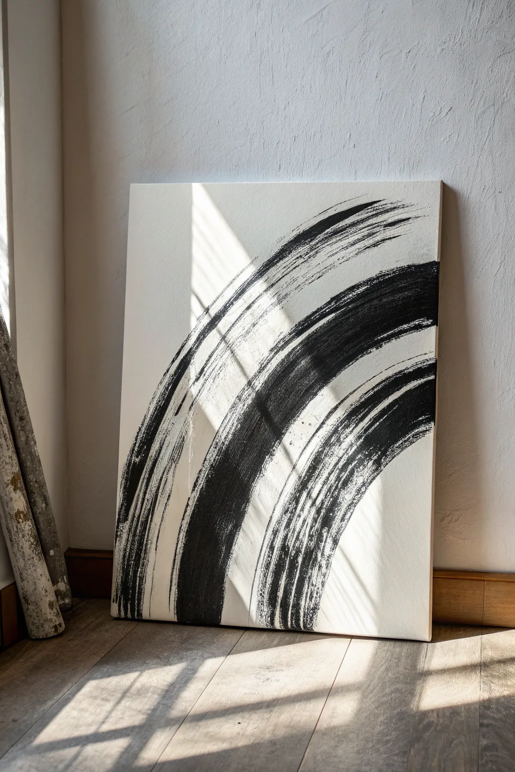
This striking black-and-white gesture painting relies on confident sweeping motions to create a bold minimalist statement. The textured brushstrokes mimic the organic feel of ink calligraphy but on a grand, modern scale suitable for any living space.
Detailed Instructions
Materials
- Large stretched canvas (at least 24×36 inches)
- Black heavy body acrylic paint
- Large flat bristle brush (3-4 inches wide) or a wide sumi brush
- Gesso (optional, if canvas isn’t primed)
- Drop cloth or newspapers
- Water container
- Palette or paper plate
- Matte spray varnish
Step 1: Preparation & Practice
-
Set the Stage:
Lay down your drop cloth in an open area where you can move your arm freely. This project requires full-body movement, not just wrist action. -
Prime the Surface:
Check your canvas surface. If it feels too rough, apply a coat of gesso to ensure a smoother glide for your brushstrokes. -
Prepare the Paint:
Squeeze a generous amount of black heavy body acrylic paint onto your palette. You want enough paint to load a large brush fully without stopping mid-stroke. -
Adjust Consistency:
Mix a tiny amount of water into the black paint. It should be fluid enough to drag smoothly but thick enough to leave those characteristic dry-brush textures at the edges. -
Practice Swings:
Before touching the canvas, practice the sweeping motion in the air. Visualize three large arcs starting from the bottom left and swooping up towards the top right.
Step 2: Painting the Gesture
-
Load the Brush:
Dip your wide brush into the black paint. Ensure the bristles are coated but not dripping; a slightly drier brush helps create the streaky texture seen in the reference. -
First Inner Arc:
Position your brush at the bottom edge of the canvas, slightly left of center. This will be the smallest, innermost curve. -
Execute the Stroke:
With a confident exhale, sweep the brush upward and to the right in a tight curve, lifting pressure gradually as the stroke tapers off near the middle right edge. -
Reload and Position:
Reload your brush with fresh paint. Position yourself for the second, middle stroke, starting just to the left of your first start point. -
Second Middle Arc:
This stroke needs to be longer and more dominant. Sweep upward parallel to the first curve but extend it higher, letting the bristles drag and skip over the canvas tooth near the top. -
Check the Texture:
Pause to observe the paint application. Don’t go back and fix imperfections; the ‘mistakes’ and dry patches give the piece its energy and authenticity. -
Prepare the Final Stroke:
Load the brush one last time for the outermost arc. This will frame the composition. -
Final Outer Arc:
Start at the bottom left corner and sweep wide, arching high towards the top right corner. I usually stand up for this one to get the full range of motion. -
Create Fade Out:
As you reach the end of this final stroke, twist your wrist slightly or lift the brush rapidly to create a feathery, trailing end.
Dry Brush Secret
To get that scratchy, organic texture, don’t wet your brush with water before picking up paint. A bone-dry brush creates the best separation between bristles.
Step 3: Finishing Touches
-
Assess Balance:
Step back about five feet to view the composition as a whole. You are looking for a dynamic flow where the three strokes feel related but distinct. -
Detailed Dry Brushing:
If any area looks too solid or heavy, you can take a nearly dry brush with no new paint and lightly drag it adjacent to a wet edge to soften it, though minimal touching is best. -
Cleanup Edges:
Use a damp cloth to wipe any accidental splatters on the white negative space. The background needs to remain pristine for high contrast. -
Allow to Dry:
Let the painting sit undisturbed for at least 24 hours. Because the paint is applied thickly in parts, it may take longer to cure than standard coats. -
Seal the Work:
Once fully dry, take the canvas outside or to a ventilated area. Apply a light coat of matte spray varnish to protect the black pigment from dust without adding unwanted gloss.
Elevate with Texture
Before painting, mix a little fine sand or pumice gel into your black acrylic. This adds a gritty, physical dimension to the strokes that catches the light.
Hang your new masterpiece in a spot with natural light to highlight the subtle textures of the brushwork
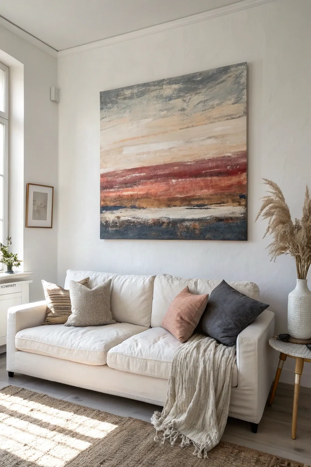
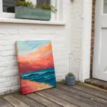
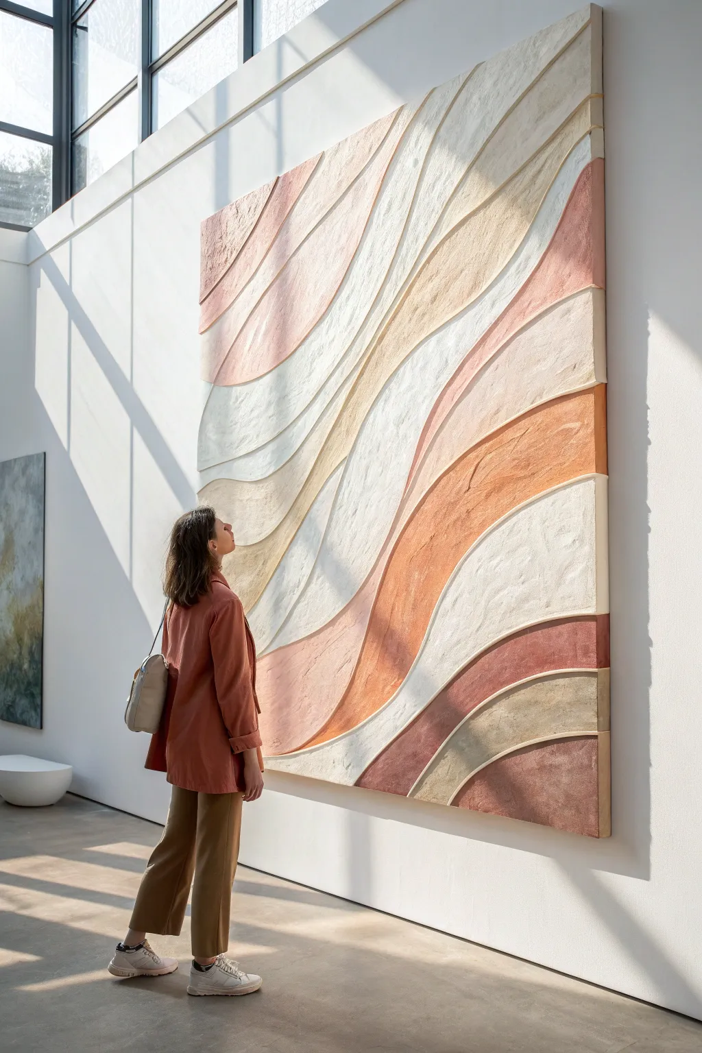
Soft Ombre Gradient Wall Wash
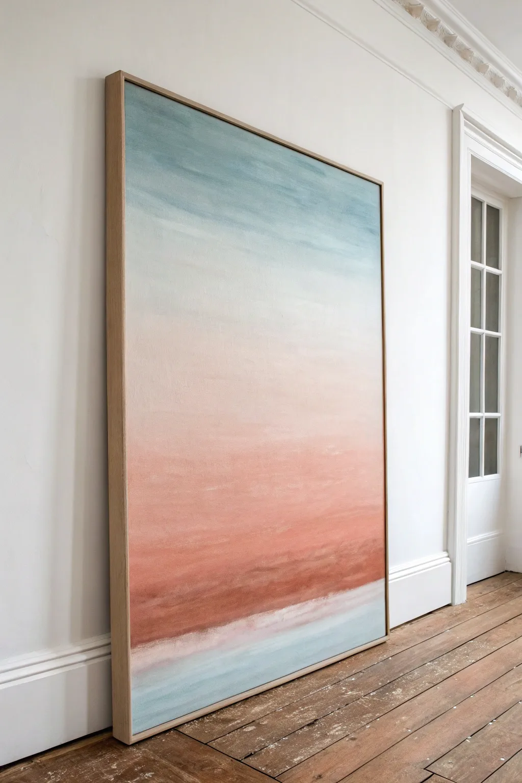
Capture the serene beauty of a sunrise with this large-scale abstract gradient painting. Using soft blending techniques, you’ll create a seamless drift from dusty blues to warm terracotta and blush tones, perfect for adding a tranquil focal point to any room.
Step-by-Step
Materials
- Large canvas (approx. 48″ x 72″)
- Floater frame (light oak or ash wood)
- Acrylic paints (Titanium White, Dusty Blue, Unbleached Titanium, Blush Pink, Burnt Sienna/Terracotta)
- Large flat paintbrush (3-inch or 4-inch)
- Medium filbert brush
- Soft blending brush or large hake brush
- Water spray bottle
- Palette or large mixing surface
- Drop cloth
- Gesso (optional, for priming)
Step 1: Preparation and Base Layer
-
Prime the Surface:
Begin by ensuring your large canvas is clean and taut. Apply an even coat of white gesso if the canvas isn’t pre-primed, creating a smooth, absorbent surface for the acrylics to grip. -
Map the Zones:
Visualize the canvas in horizontal bands. The top third will be blue, fading into a large middle section of white/cream, followed by blush pink, deepening into terracotta, with a final cool strip at the bottom. -
Pre-mix the Palette:
Set up your palette with generous piles of paint. You will need a lot of white to create the gradients. Mix a ‘dirty white’ using Titanium White and a tiny drop of Unbleached Titanium for the central transition area.
Step 2: Painting the Gradient
-
Start the Sky:
Using your large flat brush, load up the Dusty Blue mixed with a little white. Apply horizontal strokes across the top 10 inches of the canvas. -
Fade Downwards:
Without cleaning the brush perfectly, dip into your white pile. Paint the section immediately below the blue, overlapping the wet edge. Use long, sweeping horizontal strokes to drag the blue down into the white. -
Create the Haze:
Continue painting downwards with pure Titanium White mixed with the Unbleached Titanium. This central band should be the lightest part of the painting, taking up a significant portion of the upper-middle canvas. -
Introduce Warmth:
Clean your brush thoroughly. Pick up the Blush Pink mixed with plenty of white. Start blending this into the bottom wet edge of your creamy middle section, ensuring a very soft transition where no harsh line is visible. -
Deepen the Blush:
As you move lower, add less white to the pink mixture. Allow the color to become more saturated, creating a dusty rose band. -
Apply the Terracotta:
Mix Burnt Sienna with a touch of pink. Apply this darker, richer color below the rose section. I like to use slightly shorter, textured strokes here to mimic the density of earth or a horizon line. -
Add the Bottom Strip:
Leave a small gap or paint directly below the terracotta with a very light wash of the original Dusty Blue or a cool grey. This grounds the composition, suggesting water or a distant reflection.
Keep it Wet
Acrylics dry fast! Keep a spray bottle handy to lightly mist the canvas as you work. This keeps the paint workable for longer, allowing for those buttery, seamless gradient transitions.
Step 3: Blending and Refining
-
Mist and Blend:
While the paint is still tacky, lightly mist the canvas with water. Take a dry, soft blending brush (like a hake brush) and gently sweep back and forth over the transition zones to blur the color shifts. -
Build Textural interest:
Wait for the first layer to dry completely. Then, using a dry brush technique with very little paint, scumble lighter shades over the darker areas to create depth and an atmospheric, misty quality. -
Soften the Horizon:
If the terracotta line feels too heavy, glaze over it with a watered-down mix of pink and white. This transparency adds the ‘watercolor’ look typical of ombre wall art. -
Review from a Distance:
Step back about six feet. Look for any areas where the gradient stripes look too obvious. If found, mix an intermediate color and gently blend that specific area again.
Stroke Marks Showing?
If brushstrokes look too harsh, your paint might be too thick. Thin it slightly with a matte medium or water. Use a large, soft dry brush to feather out the strokes while the paint is damp.
Step 4: Framing
-
Dry Completely:
Allow the painting to cure for at least 24 hours before handling the framing process. -
Prepare the Frame:
Using a light oak floater frame adds a sophisticated, gallery-style finish. Ensure the frame’s internal dimensions are about 1/4 to 1/2 inch larger than the canvas for the ‘floating’ effect. -
Mount the Canvas:
Place the canvas inside the frame face up. Use spacers or cardboard chunks to center it perfectly within the frame gap. -
Secure the Backing:
Carefully flip the assembly over. Screw the frame into the stretcher bars of the canvas from the back, ensuring not to pierce the front of the artwork.
Hang your new masterpiece in a well-lit spot to fully enjoy the calming shift of colors.

PENCIL GUIDE
Understanding Pencil Grades from H to B
From first sketch to finished drawing — learn pencil grades, line control, and shading techniques.
Explore the Full Guide
Abstract Arches and Half-Suns
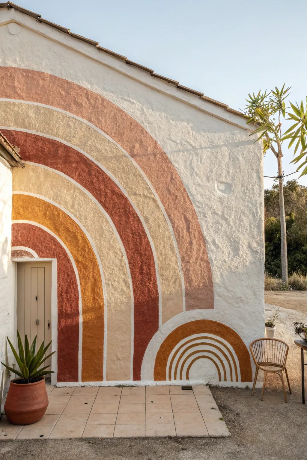
Transform a plain exterior wall into a stunning focal point with this large-scale mural featuring warm, earthy arches. The organic shapes and textured finish create a welcoming, desert-inspired vibe that perfectly frames entryways or open patio spaces.
How-To Guide
Materials
- Exterior masonry paint (white base)
- Exterior masonry paint (Terracotta/Rust)
- Exterior masonry paint (Mustard Yellow)
- Exterior masonry paint (Cream/Beige)
- Exterior masonry paint (Dark Brown/Burnt Umber)
- Pencil for sketching
- String/twine
- Nail or tack (for the focal point)
- Painter’s tape (optional)
- Assorted paintbrushes (2-inch flat brush, 1-inch angled brush)
- Small roller and tray
- Drop cloth
- Ladder (if scaling high)
Step 1: Preparation & Mapping
-
Prep the Surface:
Begin by cleaning your exterior wall thoroughly to remove dust and dirt. If the stucco is particularly rough or dirty, a pressure washer on a low setting works wonders. Ensure the surface is completely dry before proceeding. -
Base Coat:
Apply a fresh coat of white masonry paint to the entire wall if the existing surface looks tired. This provides a crisp, clean background that makes the warm earth tones pop. -
Set the Anchor Point:
Determine the center point for your main arches. For the large arch surrounding the door, locate a spot on the floor or bottom edge of the wall that aligns with where you want the center of the curves to originate. Securely tape or tack one end of your string here. -
Sketch the Curves:
Tie a pencil to the other end of the string. Pull the string taut and use it like a giant compass to lightly sketch the outermost arch. Shorten the string incrementally to draw the concentric inner arches, leaving equal spacing between each band. -
Draw the Small Arch:
Repeat the compass process for the smaller, half-sun design at the bottom right. Pick a new center point on the ground level and sketch these smaller, tighter concentric semi-circles.
Bleeding Lines?
On rough stucco, tape often fails. Instead, paint your line, then immediately do a quick touch-up with the background wall color along the edge to ‘seal’ the line for a crisp finish.
Step 2: Painting the Arches
-
First Stripe – Dark Detail:
Start with your darkest brown shade. Using a steady hand and a 1-inch angled brush, paint the outline of the outermost large arch. Since the wall is textured, I find dabbing the brush into the crevices helps create a solid line. -
Fill the Outer Band:
Once the outline is established, fill in the rest of that first band with the dark brown/burnt umber paint. -
Peach Tones:
Move inward to the next band using the terracotta or dark peach color. Use the angled brush to cut in the edges carefully against the white space, then fill the center of the stripe. -
Mustard Layer:
Paint the third band inward with the mustard yellow hue. If your stucco is very rough, a small roller can help push paint into the texture quickly, followed by a brush for the edges. -
Cream Highlights:
Apply the cream or beige paint to the next inner band. This lighter color acts as a breaker between the bolder hues. -
Inner Rust Arch:
Finish the main large rainbow with the deep rust color on the innermost bands. Paint carefully around the doorframe if your design intersects it.
Step 3: Creating the Half-Sun
-
Outline the Mini Arches:
Move down to your smaller sketched design. Using the 1-inch brush, carefully outline the separate bands of the ‘half-sun’ shape. -
Fill the Sun Bands:
Fill these smaller bands with alternating colors—mustard and cream work well here to contrast with the larger rust-heavy mural nearby. -
Touch Ups:
Step back and examine the wall from a distance. Use a small artist’s brush and white paint to tidy up any wobbly edges or drips that strayed outside the intended lines. -
Texture Check:
Walk close to the wall and check for white spots deep in the stucco texture that the roller or brush might have missed. Dab extra paint into these holidays for full coverage.
Level Up
Add a metallic gold pinstripe between two of the earth-tone bands. It catches the sunlight beautifully during golden hour and adds a hint of luxury to the rustic vibe.
Enjoy the warmth this custom mural brings to your outdoor living space
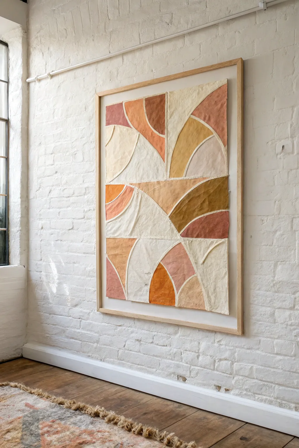
Line Art Figure over Color Fields
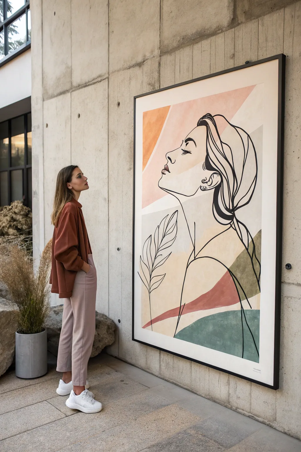
Merging minimalist line art with soft geometric color blocking, this large-scale project creates a striking contemporary focal point. The continuous line style flows effortlessly over muted earth tones, offering a sophisticated and calming aesthetic for modern interiors.
Step-by-Step Guide
Materials
- Large canvas (approx. 36×48 inches) or MDF panel
- Acrylic paints (muted terracotta, soft sage green, blush pink, cream, ochre)
- Wide flat paintbrush (2-3 inch)
- Fine liner brush or black acrylic paint marker (broad tip)
- Black acrylic paint (high flow or fluid body)
- Painter’s tape or low-tack masking tape
- Pencil and eraser
- Large ruler or straightedge
- Mixing palette
- Projector (optional but recommended for scale)
Step 1: Planning the Color Fields
-
Prepare the canvas:
Ensure your canvas is clean and primed. If you want a neutral base instead of stark white, apply a thin wash of cream or off-white acrylic over the entire surface and let it dry completely. -
Map the geometry:
Visualize the background as a series of abstract shapes. Using a pencil and ruler, lightly sketch large, angular sections. In this piece, think of overlapping triangles and irregular polygons radiating from the corners. -
Tape the boundaries:
Select one set of non-adjacent shapes to paint first. Apply painter’s tape along the pencil lines for crisp edges. Press the tape down firmly to prevent bleed-under. -
Mix your palette:
Mix your acrylics to achieve muted, earthy tones. You’ll need a dusty terracotta, a pale blush, a muted sage green, and a deeper moss green. I find adding a touch of white to each color unifies the palette beautifully. -
Apply the first colors:
Using the wide flat brush, fill in the taped-off sections. Use smooth, even strokes. For the lighter blush tones, you might need two coats for full opacity. -
Remove and rotate:
Peel off the tape while the paint is still slightly tacky to avoid chipping. Let these sections dry fully before taping off the adjacent shapes. -
Complete the background:
Repeat the taping and painting process for the remaining shapes—the sage green at the bottom right, the terracotta swoops, and the cream sections. Allow the entire canvas to cure overnight so the surface is hard enough for the line work.
Fixing Wobbly Lines
If a line gets shaky, don’t panic. Thicken the line intentionally at that spot to hide the wobble, making it look like a stylistic choice for shadow.
Step 2: The Line Art Figure
-
Draft the figure:
Sketch the profile lightly in pencil first. Focus on the focal point: a woman looking upward to the left. If you aren’t confident freehanding, project an image onto the canvas and trace the key contours. -
Refine the flow:
Review your pencil lines. The beauty of this style is the ‘continuous line’ look. Connect the hair to the neck, and the shoulder to the jawline, creating a fluid sense of movement. -
Draw the stylized plants:
Add the botanical element on the left side. These should be simple, single-line leaves that echo the curves of the figure, overlapping the background color blocks. -
Prepare the black paint:
Dilute your black acrylic paint slightly with water or a flow medium until it has an ink-like consistency. This ensures long, unbroken strokes without brush drag. -
Paint the main contours:
Using a fine liner brush or a broad-tip paint marker, begin tracing your pencil lines. Start with the face profile, moving with confidence. Hesitation causes shaky lines, so move from your shoulder, not your wrist. -
Vary line weight:
Add visual interest by thickening the line in certain areas, such as the curve of the hair, the back of the neck, or the shadow of the jaw. This adds depth to an otherwise flat illustration. -
Detail the features:
carefully paint the eye with heavy lashes and the lips. Keep these details sharp, as they draw the viewer’s attention immediately. -
Execute the hair:
Use long, sweeping strokes for the hair strands. Let some lines intersect and others float freely to maintain that abstract, illustrative quality. -
Clean up:
Once the black paint is bone dry, gently erase any visible pencil marks. If you made a mistake with the black line, you can touch it up with the background color paint.
Textured Finish
Mix baking soda or modeling paste into your colored paints before applying. This adds a grainy, stone-like texture that makes the piece look high-end.
Hang your masterpiece in a spot with good natural light to highlight the subtle interplay between the rigid geometry and organic lines


Marbled Swirls With Soft Edges
This stunning oversized canvas mimics the natural elegance of polished stone with its swirling veins of pink, burgundy, and brilliant gold. By layering fluid acrylics and metallic accents, you can create a high-end statement piece that transforms any hallway or living space.
How-To Guide
Materials
- Large-scale gallery wrapped canvas (e.g., 36×48 or larger)
- High-flow or fluid acrylic paints (Titanium White, Soft Pink/Blush, Deep Burgundy, Paynes Grey)
- Metallic gold paint or liquid gold leaf
- Pouring medium
- Slow-drying medium or retarder
- Large synthetic brushes (2-inch flat)
- Medium round brushes for veining
- Fine liner brush
- Spray bottle with water
- Gold floating frame (optional)
- Palette knives
- Plastic drop cloth
Step 1: Preparation & Base Composition
-
Prepare the workspace:
Lay down your plastic drop cloth in a well-ventilated area. Because we are working on a large scale, ensure you can walk around all sides of the canvas easily. -
Mix your base fluids:
In separate cups, mix your Titanium White, Soft Pink, and a very light Grey with pouring medium. You want a consistency similar to heavy cream—flowy but opaque. -
Apply the white foundation:
Pour the Titanium White mixture across the majority of the canvas, spreading it unevenly with a large flat brush or palette knife. This wet base helps subsequent colors glide naturally. -
Establish the blush zones:
While the white is wet, pour ribbons of the Soft Pink mixture diagonally across the canvas. Think about creating a ‘river’ shape that flows from top left to bottom right. -
Blend for softness:
Using a clean, damp large brush, gently sweep the boundaries where the pink meets the white. Use long, curved strokes to feather the edges, creating that smoky, ethereal marble look.
Muddy colors?
If your pinks and greys are turning brown where they meet, let the bottom layer dry for 15 minutes before adding the next color on top.
Step 2: Creating Depth & Veins
-
Introduce deep contrasts:
Mix Deep Burgundy with a small amount of Paynes Grey and pouring medium. Apply this darker shade sparingly along the edges of your pink ‘river’ to create depth and shadow. -
Soften the dark veins:
Mist the darker areas lightly with your water spray bottle. Tilt the canvas slightly or use a straw to blow the edges, encouraging the dark paint to branch out into delicate, organic fissures. -
Layer in secondary pinks:
Mix a lighter, sheerer version of your pink using more medium. Paint thin, translucent glazes over parts of the burgundy to make it look like it is receding beneath the surface of the stone. -
Add grey stratification:
Using a medium round brush, paint wiggly, nervous lines of Paynes Grey through the white areas. These shouldn’t be straight; let your hand shake slightly to mimic natural sedimentation. -
The dry brush technique:
I like to take a dry brush to the grey lines while they are distinct, lightly dragging them sideways to blur them into the background white, simulating ghost veins. -
Enhance the white highlights:
Go back in with pure Titanium White (no medium) on a palette knife. Scrape bright white highlights next to the darkest veins to increase the contrast and visual drama.
Add Crystal Texture
Sprinkle crushed glass glitter or clear resin stones into the wet white paint near the gold vein for a geode-inspired, 3D crystalline effect.
Step 3: The Golden Accent
-
Map the gold fissures:
Once the base layer is touch-dry (usually 1-2 hours), identify the main diagonal channel of your composition. This is where the gold will live. -
Apply the metallic flow:
Load a round brush with metallic gold paint or liquid gold leaf. Paint a bold, jagged line following the main vein of the marble, varying the thickness from thin threads to thick pools. -
Create fracturing:
Use a fine liner brush to pull tiny ‘lightning bolt’ shoots of gold away from the main thick line. These should travel into the white and pink areas, connecting the color block visually. -
Add textural interest:
Before the gold dries completely, dab a crumpled paper towel over the thickest parts of the gold. This lifts a bit of paint and creates a textured, weathered rock appearance. -
Final drying time:
Allow the entire painting to cure for at least 24-48 hours. Acrylics on this scale need time to settle completely flat. -
Varnish and frame:
Apply a coat of satin or high-gloss varnish to seal the painting and make the colors pop. Finish by installing the canvas into a minimal gold floating frame to match the metallic accents.
Hang your masterpiece in a well-lit area where the light can catch those shimmering gold details beautifully
Pour-Style Abstract on a Giant Panel
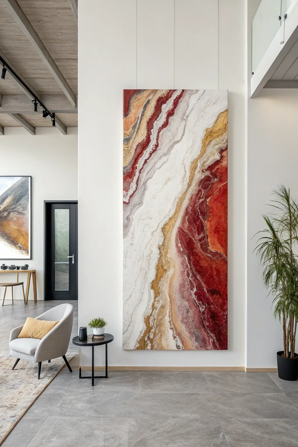
This striking, large-scale abstract panel mimics the natural bands of agate and marble using fluid art techniques on a grand scale. By manipulating layers of crimson, gold, and white, you will create a luxurious vertical statement piece that transforms an entire room.
Step-by-Step
Materials
- Large wooden panel (birch or MDF), approx. 4ft x 8ft
- Gesso primer (white)
- High-flow or fluid acrylic paints (Titanium White, Crimson Red, Burgundy, Yellow Ochre, Raw Sienna, Metallic Gold, Silver/Grey)
- Pouring medium (Floetrol or Liquitex)
- Silicone oil (optional for cells)
- Large plastic cups and mixing buckets
- Hairdryer or heat gun
- Straws (for blowing detail)
- High-gloss varnish or epoxy resin (for topcoat)
- Drop cloths and masking tape
- Level
- Plastic spreaders or palette knives
Step 1: Preparation & Base
-
Prepare the workspace:
Since this project is massive, layout a large drop cloth on a flat, level floor. Prop the wooden panel up on evenly spaced buckets or blocks so the edges are off the ground. -
Prime the surface:
Apply two generous coats of white gesso to the entire panel, ensuring you cover the sides. Let the first coat dry completely before sanding lightly and adding the second. -
Mix your pouring paints:
In separate buckets, mix your acrylics with your pouring medium. A standard ratio is 1 part paint to 2 parts medium, but I like to check that the consistency resembles warm honey. -
Create color variations:
Don’t just stick to one red or gold. Mix a ‘dirty’ gold using ochre and metallic pigments, and create a gradient of reds from bright crimson to deep wine to add depth. -
Prepare the ‘negative space’:
Mix a very large batch of white mixed with a touch of pearl or silver. This will be your primary flow color.
Control Your Flow
Add a few drops of water to your white paint to make it slightly thinner than the colors. This helps the colors float on top rather than sinking.
Step 2: The Pouring Process
-
Establish the white river:
Pour the white mixture diagonally across the panel in a thick, uneven band, roughly following the shape you want the central vein to take. -
Add color ribbons:
Begin pouring thin ribbons of gold, ochre, and red along the edges of your white river. Don’t worry about precision; let the paint wander naturally. -
Bloom the colors:
Using a hairdryer on a low, cool setting, gently push the colored paints into the white and vice versa. Aim to feather the edges rather than mixing them into a muddy color. -
Intensify the deep red:
Focus your darkest burgundy shades on the outer edges and corners of the composition to create a vignette effect that draws the eye toward the lighter center. -
Create strata lines:
Drag a palette knife or the edge of a plastic spreader gently through sections where colors meet to simulate the sedimentary lines found in agate. -
Add metallic veins:
Drizzle pure metallic gold directly from the cup in very thin lines along the transitional areas between the red and white zones.
Step 3: Refining & Finishing
-
Detail work:
Use a straw to blow air manually onto specific small areas where the paint looks too flat, creating intricate webbing and lace-like effects. -
Tilt the panel (carefully):
If the composition looks too static, get a partner to help you slightly tilt the panel to encourage the paint to stretch and elongate. Check your level again afterward. -
Eliminate bubbles:
Pass a heat gun quickly over the surface to pop any air bubbles trapped in the paint. Keep the gun moving constantly to avoid scorching the paint skin. -
Let it cure:
Allow the painting to dry undisturbed for at least 3 to 5 days. Large pours hold moisture underneath the surface skin for a long time. -
Clean the surface:
Once fully dry, wipe the surface with a lint-free cloth. If you used silicone oil, clean it gently with a mild soap solution to ensure the varnish adheres. -
Apply the gloss coat:
Finish with a layer of high-gloss varnish or a flood coat of art resin. This step is crucial to make the colors pop and give it that polished stone look.
Add Texture
While the paint is wet, sprinkle crushed glass mirror pieces or gold leaf flakes into the metallic veins for genuine 3D texture.
Once mounted, your fluid masterpiece will serve as a sophisticated focal point for the space
Ink-Bloom Abstract Effects on Canvas
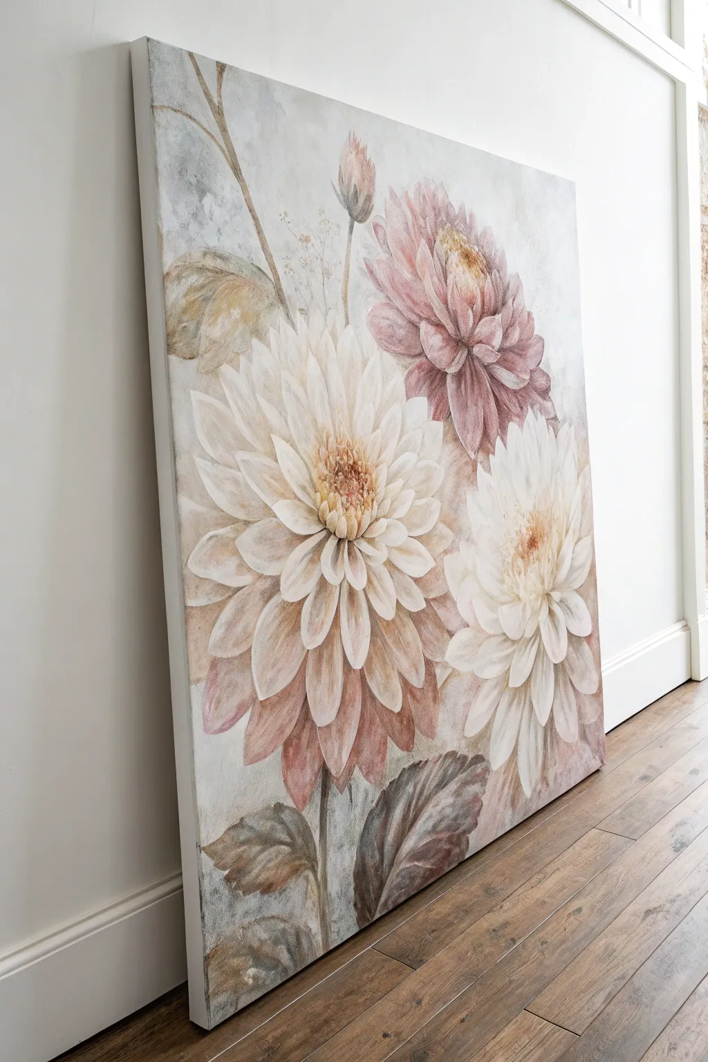
Capture the romantic elegance of faded garden florals with this large-scale canvas project. Using diluted acrylics and ink-like washes, you’ll create soft, translucent dahlia petals that seem to float against a misty background.
How-To Guide
Materials
- Large stretched canvas (at least 24×36 inches)
- Acrylic paints: Titanium White, Burnt Umber, Raw Sienna, Alizarin Crimson, Unbleached Titanium
- Acrylic glazing medium or flow improver
- Assorted brushes: Large flat brush, medium filbert, fine liner
- Spray bottle with water
- Palette knife
- Paper towels or lint-free rags
- Pencil for sketching
- Jar of water
Step 1: Preparation & Background
-
Prime the Surface:
Even if your canvas is pre-primed, apply a coat of white acrylic mixed with a tiny drop of Raw Sienna to create a warm, off-white base. This eliminates the harsh brightness of factory gesso. -
Rough Sketching:
Lightly sketch three main dahlia shapes using a pencil. Place the largest bloom left-of-center, a smaller bud or bloom near the top right, and a third partial bloom at the bottom right. Keep the lines very faint. -
Misty Background Wash:
Mix a very diluted wash of grey using Titanium White and a dot of Burnt Umber. Apply this loosely around your flower sketches, using a spray bottle to let the paint drip and feather slightly for that ‘ink-bloom’ look. -
Background Texture:
While the background is damp, blot specific areas with a paper towel to create cloud-like textures. I like to leave some areas almost white to create a sense of light.
Step 2: Painting the Dahlias
-
Mixing the Petal Base:
Create a ‘dusty pink’ base color by mixing Titanium White, a small amount of Alizarin Crimson, and a touch of Burnt Umber to desaturate the pink. -
Central Bloom – First Layer:
Start with the large central dahlia. Using a filbert brush, paint the outer petals using Unbleached Titanium mixed with plenty of glazing medium to keep them semi-transparent. -
Building the Core:
For the center of the large flower, use a slightly darker mix of Raw Sienna and Burnt Umber. Dab the paint in short, vertical strokes to simulate the tightly packed inner petals. -
Adding the Pink Bloom:
Move to the top right flower. Use your dusty pink mixture here. Paint the petals starting from the center outward, lifting the brush at the end of each stroke to create a tapered tip. -
The White Bloom:
For the bottom right flower, stick exclusively to Titanium White mixed with glazing medium. Ensure these petals overlap slightly with the background for a soft edge. -
Layering Translucency:
Once the first layers are dry, apply a second layer of petals over the central bloom using a very watered-down white. This creates the illusion of depth and fullness typical of dahlias.
Muddy Colors?
If your pinks and browns are turning grey, clean your water jar immediately. Acrylic washes are very sensitive to dirty water, which dulls the vibrancy needed for the floral effects.
Step 3: Detailing & Refining
-
Defining Petal Shapes:
Mix a ‘shadow’ color using water and Burnt Umber. Use a fine liner brush to outline the separation between petals, focusing only on the shadowed areas underneath the petals, not the tips. -
Enhancing the Centers:
Add concentrated dots of Raw Sienna and Burnt Umber to the very center of each flower using the tip of a small round brush. This draws the eye and anchors the composition. -
Painting Stems:
Mix olive green using Raw Sienna and a tiny touch of black or blue. Paint thin, winding stems extending downward from the blooms. -
Adding Leaves:
Paint large, jagged dahlia leaves near the bottom. Use a brownish-green mix (Burnt Umber + Green) and keep the application patchy and textural rather than solid and flat. -
Leaf Veining:
While the leaves are wet, scratch through the paint with the back of your brush handle or a palette knife to create subtle vein textures. -
Budgeting the Contrast:
Step back and assess your painting. If the flowers look too flat, glaze a tiny bit of darker pink or brown at the base of the petals where they meet the flower center. -
Final Highlights:
Add final touches of pure, thick Titanium White to the tips of the most prominent petals on the main dahlia to make them pop forward.
Pro Tip: Soft Edges
To get that dreamy look, dip a clean, damp brush over the edges of wet petals. This softens the crisp acrylic line into a watercolor-style blur.
Hang your new masterpiece in a well-lit area to let those subtle translucent layers really shine
Metallic Veins for a Luxe Pop
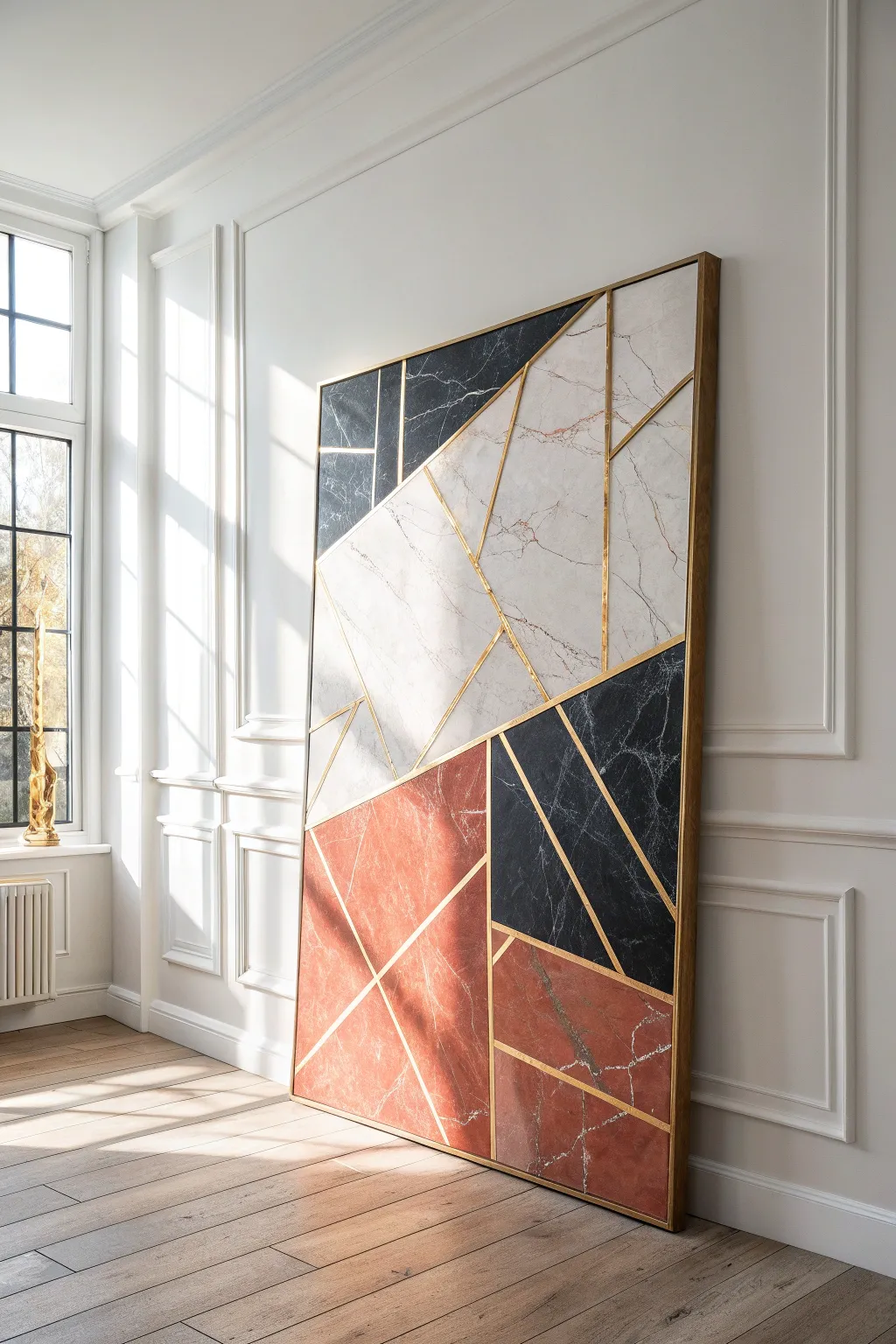
Transform a simple canvas into a stunning, high-end architectural feature using faux marble contact paper and metallic tape. This geometric design combines the luxury of veined stone with the modern edge of gold lines for a sophisticated pop.
Step-by-Step Tutorial
Materials
- Large canvas (at least 36×48 inches)
- Faux marble contact paper (white/grey, black, and terracotta/red varieties)
- Gold metallic washi tape or gold foil tape (1/4 inch width)
- Sharp craft knife (X-Acto)
- Metal ruler or straight edge
- Self-healing cutting mat
- Pencil
- Squeegee or plastic smoothing tool
- Gold spray paint (optional, for frame)
- Wooden lattice strips (for framing)
Step 1: Preparation & Layout
-
Prepare the canvas:
Start with a clean, dry canvas. If your canvas is raw, give it a quick coat of white acrylic paint or gesso to ensure the adhesive sticks well, though this isn’t strictly necessary for pre-primed canvases. -
Draft the design:
Lightly sketch your geometric pattern directly onto the canvas using a pencil and a long straight edge. While you don’t need to copy the image perfectly, try to balance large blocks of white marble with smaller accents of black and terracotta. -
Plan the color balance:
Mark each section with a small letter (W for white, B for black, R for red) to visualize the final distribution. Aim for a diagonal flow where the colors lead the eye across the piece.
Burnish for Brilliance
After applying the gold tape, run the back of a plastic spoon or a fingernail firmly over the tape. This ‘burnishing’ ensures it bonds tight and increases the metallic shine.
Step 2: Applying the Stone Effect
-
Cut the first section:
Measure one of your larger geometric shapes on the canvas. Transfer these measurements to the backing paper of your white faux marble contact paper, adding an extra half-inch on all sides for safety. -
Apply the contact paper:
Peel back a small corner of the backing. Align the paper with your pencil lines on the canvas, pressing down firmly. Slowly peel away the rest of the backing while simultaneously smoothing the front with a squeegee to prevent air bubbles. -
Trim the edges:
Once the shape is adhered, use your metal ruler and craft knife to trim the excess paper exactly along your original pencil guidelines. Be careful not to slice through the canvas fabric itself. -
Repeat for all shapes:
Continue this process, working section by section. I find it easiest to apply all the white sections first, followed by the terracotta, and finally the black, to keep the workflow organized. -
Manage the seams:
Don’t worry if the gaps between your sticker shapes aren’t perfectly tight. The gold tape in the next phase will cover these transitions, so a millimeter gap here or there is completely fine.
Bubbles in the Marble?
If you get a stubborn air bubble under the contact paper that won’t smooth out, prick it with a fine needle or the tip of your knife, then press the air out through the tiny hole.
Step 3: The Metallic Veins
-
Select your gold lines:
Choose a high-opacity gold tape. Gold foil tape is more durable and shiny than standard washi tape, which can sometimes be translucent. -
Apply the major lines:
Starting with the longest continuous lines in your design, apply the gold tape directly over the seams where your different marble papers meet. -
Add intersecting lines:
Apply the shorter, intersecting gold lines. Allow the tape to overlap slightly at the junctions. -
Trim the intersections:
To make the joints look professional, use your craft knife to carefully slice through the overlapping tape layers at the corners, then peel away the tiny excess bits for a clean, flush corner. -
Create false cuts:
For added complexity, apply gold tape strips across the middle of larger solid marble sections to simulate cut stone slabs, following the angles of your existing geometry.
Step 4: Framing & Finishing
-
Paint the frame strips:
Take your wooden lattice strips and spray paint them a metallic gold that matches your tape. Apply two light coats and let them dry completely. -
Measure and cut frame:
Measure the outer edges of your canvas. Cut the gold lattice strips to size using a miter box for 45-degree variations, or simple straight cuts for a modern box look. -
Attach the frame:
Use strong wood glue or a nail gun to attach the gold strips to the outer edge of the canvas stretcher bars. This frames the artwork and hides the raw edges of the contact paper. -
Seal the edges:
Check the perimeter of the artwork. If any contact paper is lifting near the frame, apply a tiny dot of craft glue to secure it permanently.
Step back and admire how the interplay of stone textures and gold lines brings a gallery-worthy atmosphere to your room
Palette Knife Impasto Color Ribbons
Transform a blank canvas into a stunning architectural statement with this textured relief painting. By combining thick molding paste with soft, desert-inspired tones, you’ll create elegant ribbons of color that mimic the natural stratification of sandstone canyons.
Detailed Instructions
Materials
- Large heavy-duty gallery wrapped canvas (e.g., 48″x60″ or larger)
- Heavy body acrylic paints (Terracotta, Titan Buff, Unbleached Titanium, Burnt Sienna, Antique Rose, White)
- Heavy modeling paste or molding paste (large tub)
- Plaster of Paris (optional, for extra grit)
- Wide palette knives (2″ and 4″ sizes)
- Piping bag with round tip (or a heavy-duty ziplock bag)
- Pencil
- Sandpaper (medium grit)
- Matte varnish spray
Step 1: Planning and Structure
-
Map the Flow:
Begin with your large canvas flat on a work table. Using a pencil, lightly sketch large, sweeping curves that span from the top left to the bottom right. These lines will become the raised ridges separating your color sections. -
Create the Boundaries:
Fill a piping bag with high-density heavy modeling paste. Pipe thick, consistent lines directly over your pencil marks. These raised borders act as dams to hold the texture and define the composition. -
Refine the Ridges:
Wet your finger or a small palette knife slightly and gently smooth the tops of your piped lines if they are too jagged, but keep them raised and distinct. Let these structural lines dry completely, preferably overnight, until they are rock hard.
Step 2: Creating the Texture
-
Mix the Texture Medium:
In a large bowl, mix your modeling paste with white acrylic paint. For that stone-like, gritty finish seen in the photo, I like to stir in a small amount of Plaster of Paris or fine sand. -
Apply the Base Layer:
Choose a section between two ridges. Using a large palette knife, scoop a generous amount of the texture mixture and spread it into the recess. Don’t smooth it out perfectly; you want valleys and peaks. -
Detailing the Surface:
While the paste is wet, use the edge of your knife to gently scrape or tap the surface, creating a rough, organic finish similar to travertine stone. -
Repeat the Fill:
Continue filling each section one by one. Vary the direction of your knife strokes slightly for each ‘ribbon’ to give the piece movement and differentiate the segments. -
Clean the Borders:
If you accidentally smeared paste over your raised ridge lines, wipe them clean immediately with a damp detailing brush or cloth to keep the separation crisp. -
Complete Drying:
Allow the entire textured surface to dry for at least 24-48 hours. Thick applications of paste need significant time to cure to the center.
Cracks in the Paste?
Thick paste can crack while drying. If this happens, mix a thin slurry of paste and water, brush it into the cracks, and smooth it over. It adds character!
Step 3: Painting the Layers
-
Prepare the Palette:
Squeeze out your acrylic colors: Terracotta, Antique Rose, and the creamy off-whites. You will be using a dry-brushing or glazing technique rather than opaque coverage. -
The Darkest Tones:
Start with the deepest terracotta sections. Mix the paint with a little water or glazing liquid. Brush it into the textured crevices of your chosen sections, then lightly wipe the high points with a rag to enhance depth. -
The Mid-Tones:
Move to the dusty pink and rose sections. Apply the paint primarily to the center of the ribbon, fading out slightly as it touches the raised border ridges. -
The Lightest Sections:
For the white and cream ribbons, use Unbleached Titanium. Apply it very sparingly, mostly highlighting the texture without covering the natural white of the modeling paste entirely. -
Highlighting the Ridges:
Using a small flat brush, paint the raised ridge lines in a pale, creamy off-white. This connects all the sections and provides a clean, architectural look. -
Blending Transitions:
If any color looks too flat, go back in with a slightly lighter shade and dry brush just the very tops of the texture bumps to create that sun-bleached stone effect. -
Final Seal:
Once the paint is fully dry, take the artwork outside and apply a light coat of matte varnish spray to protect the texture from dust and seal the porous plaster.
Pro Tip: Ombre Effect
Pre-mix three shades for each color ribbon (light, medium, dark). Apply dark at the bottom of a curve and blend up to light for a 3D shadow effect.
Hang your massive textured masterpiece in a well-lit spot where the changing daylight can play across the ridges and changing shadows.
Collage Shapes Under Painted Glazes
Embrace organic texture and warm, earthy tones with this sophisticated textile art piece. By layering raw-edge canvas shapes in a modern patchwork design, you create a tactile focal point that feels both structural and delightfully soft.
Step-by-Step
Materials
- Heavyweight unprimed canvas or cotton duck cloth (natural/cream)
- Fabric dyes or watered-down acrylic paints (terracotta, mustard, blush, deep ochre)
- Large wooden frame (custom or repurposed)
- Wide backing board or stretched canvas to fit frame
- Fabric scissors
- Pencil
- Large flat paintbrush
- Sewing machine (with heavy-duty needle)
- Cream or off-white thread
- Iron and ironing board
- Spray adhesive or fabric glue stick
Step 1: Preparation & Color
-
Cut the base fabric:
Cut your main backing canvas to fit exactly inside your frame. Leave about an inch of extra margin on all sides if you plan to wrap it around a board later. -
Prepare fabric scraps:
Gather smaller remnants of canvas for your colored shapes. These don’t need to be perfect squares; irregular pieces work fine as long as they are large enough for your planned shapes. -
Mix your washes:
Create watery consistencies of your chosen colors. I like to use fabric dye for a soaked-in look, but watered-down acrylics work perfectly fine too. Aim for a palette of burnt orange, mustard yellow, dusty pink, and warm brown. -
Paint the swatches:
Brush the color onto your scrap canvas pieces. Don’t worry about perfect coverage—a little mottling adds incredible texture. Leave plenty of canvas unpainted for the cream sections. -
Dry and press:
Allow all painted fabrics to dry completely. Once dry, iron them flat to ensure they are crisp and easier to cut.
Step 2: Designing the Composition
-
Sketch the layout:
Lightly sketch your design onto the large backing canvas using a pencil. Focus on large, sweeping curves and segmented quarter-circles to mimic the reference artwork. -
Create paper templates:
Trace the individual shapes from your backing canvas onto paper to create templates. This ensures your cut fabric pieces will fit together like a puzzle. -
Cut the fabric shapes:
Pin your paper templates to the colored canvas remnants and cut them out. Don’t hem the edges; the raw edge is part of the aesthetic. -
Dry fit the arrangement:
Lay out all your cut colored pieces onto the backing canvas to verify the fit. Tweak any edges with scissors if the gaps are too wide or the overlaps too bulky.
Fray Friend
To enhance the raw look, carefully run your fingernail or a stiff brush along the cut edges after sewing to encourage uniform fraying.
Step 3: Assembly & Finishing
-
Secure the pieces:
Use a light mist of spray adhesive or a dab of fabric glue to tack the pieces in place on the backing canvas. This keeps them from shifting while you sew. -
Set up the machine:
Thread your sewing machine with a neutral cream thread. Set it to a standard straight stitch length. -
Stitch the outlines:
Sew along the permeter of each shape, staying about 1/8th of an inch from the raw edge. This creates that slight fraying effect over time. -
Leave thread tails:
When you finish a section, you can snip the threads close for a clean look, or leave small tails for extra texture. -
Mount the artwork:
Stretch your finished patchwork canvas over a backing board or mounting card. Secure it on the back with tape or staples. -
Frame the piece:
Place the mounted artwork into your wooden frame. Do not use glass; the texture of the raw canvas is meant to be seen and touched.
Level Up: Dyed Dimensions
Before sewing, dip just the edges of your white canvas shapes into tea or coffee. It adds a subtle antique border that defines the shapes.
Hang your new textile masterpiece in a bright spot where the light can catch the subtle fraying and fabric textures
Sgraffito Scratch-Through Abstract Layers
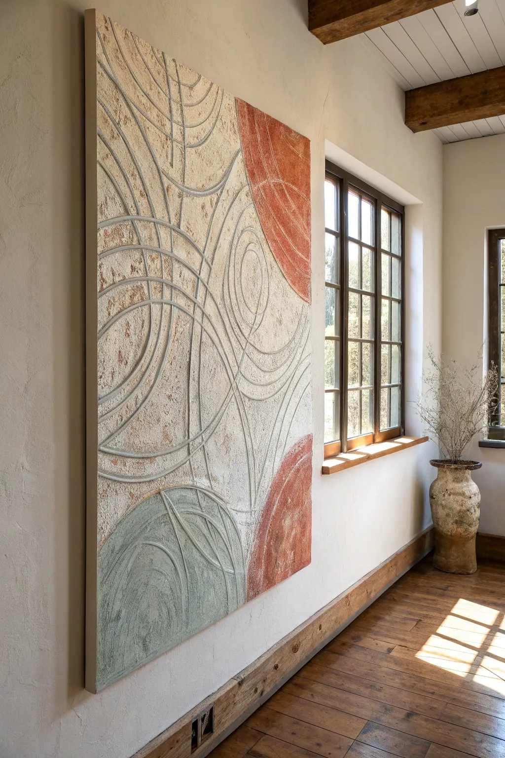
This large-scale textured art piece brings an organic, ancient feel to modern interiors using a sgraffito technique where lines are carved into wet plaster. The interplay of rough textures, sweeping concentric circles, and muted terracotta and sage tones creates a sophisticated, sculptural focal point.
How-To Guide
Materials
- Large wooden canvas or framed plywood panel (approx. 4’x6′)
- Venetian plaster or joint compound (large bucket)
- Wide drywall trowel or putty knife
- Acrylic paints (terracotta/burnt sienna, sage/muted green, warm beige)
- Glazing medium
- Clay carving tools or a blunt stylus (like the back of a paintbrush)
- Large sanding block (120-grit)
- Matte spray sealant
- Drop cloths and painters tape
Step 1: Preparation & Base Coat
-
Prepare the workspace:
Since this project involves plaster and sanding, lay down drop cloths to protect your floors and ensure the room is well-ventilated. -
Prime the surface:
If you are using raw wood or plywood, apply a coat of high-quality primer to ensure the plaster adheres properly and doesn’t soak too much moisture into the wood. -
Mix the base color:
Tint your joint compound or plaster with a small amount of warm beige acrylic paint. You want a consistent, off-white sandstone color as your foundation. -
Apply the first layer:
Using a wide trowel, spread a heavy, uneven layer of the tinted plaster across the entire panel. Aim for about 1/8 to 1/4 inch thickness. -
Add texture:
Don’t smooth it out perfectly; use the trowel to create subtle ridges and peaks. This roughness adds to the final ancient stone aesthetic.
Cracking Up?
If the plaster cracks while drying, don’t panic. Gently fill large cracks with fresh paste, or leave hairline cracks alone—they enhance the aged, archaeological look of the piece.
Step 2: Adding Color Zones
-
Mix secondary colors:
In separate containers, mix portions of plaster with terracotta paint and sage green paint. You want these colors to be muted and earthy, not vibrant. -
Apply the terracotta patches:
While the base is still wet or tacky, trowel the terracotta plaster onto specific zones. In the image, these are large semi-circles on the right side and top right corner. -
Apply the sage accent:
Add the sage green plaster to the bottom left area, blending the edges slightly with the beige base for a natural transition. -
Smooth the transitions:
Use a clean trowel to lightly knock down the ridges where colors meet, ensuring the surface is relatively unified in height but still visually textured.
Metallic Level Up
For a luxe touch, paint inside the carved grooves with a fine brush and gold leaf paint. The metallic shimmer inside the matte stone texture creates incredible contrast.
Step 3: The Sgraffito Technique
-
Wait for the sweet spot:
This is crucial: Let the plaster set until it is firm but not fully hard. If you touch it, it shouldn’t stick to your finger, but you should be able to make a dent with a fingernail. -
Draft the curves:
Using a very light touch with a pencil or skewer, map out your large sweeping circles. I find that freehanding these organic shapes looks better than using a strict compass. -
Carve the main lines:
Use a U-shaped clay tool or a blunt stylus to carve deep grooves along your drafted lines. Maintain steady pressure to create clean, visible channels. -
Vary line weight:
Create visual interest by doubling up some lines or carving slightly wider channels for the primary curves, leaving secondary curves thinner. -
Clean the debris:
As you carve, little crumbs of plaster will accumulate. Gently blow them away or brush them off with a soft, dry paintbrush so they don’t cure onto the surface.
Step 4: Finishing Touches
-
Full cure:
Allow the entire piece to dry completely. Depending on the thickness of your plaster and humidity, this could take 24 to 48 hours. -
Sand for highlights:
Take a sanding block and lightly sand the surface. This will knock down sharp peaks and expose the lighter colored plaster underneath the painted separation layers, enhancing the distressed look. -
Antique glaze wash:
Mix a tiny drop of brown paint with glazing medium and water. Brush this wash over the textured areas and wipe it back immediately with a rag. The dark pigment will settle into the carved grooves, making them pop. -
Seal the work:
Once fully dry, spray the entire piece with a matte sealant to prevent the plaster from dusting or chipping over time.
Hang your massive textured masterpiece in a well-lit area where natural light will catch the ridges and cast shadows into the carved lines
Room-Scale Mural Using a Simple Grid
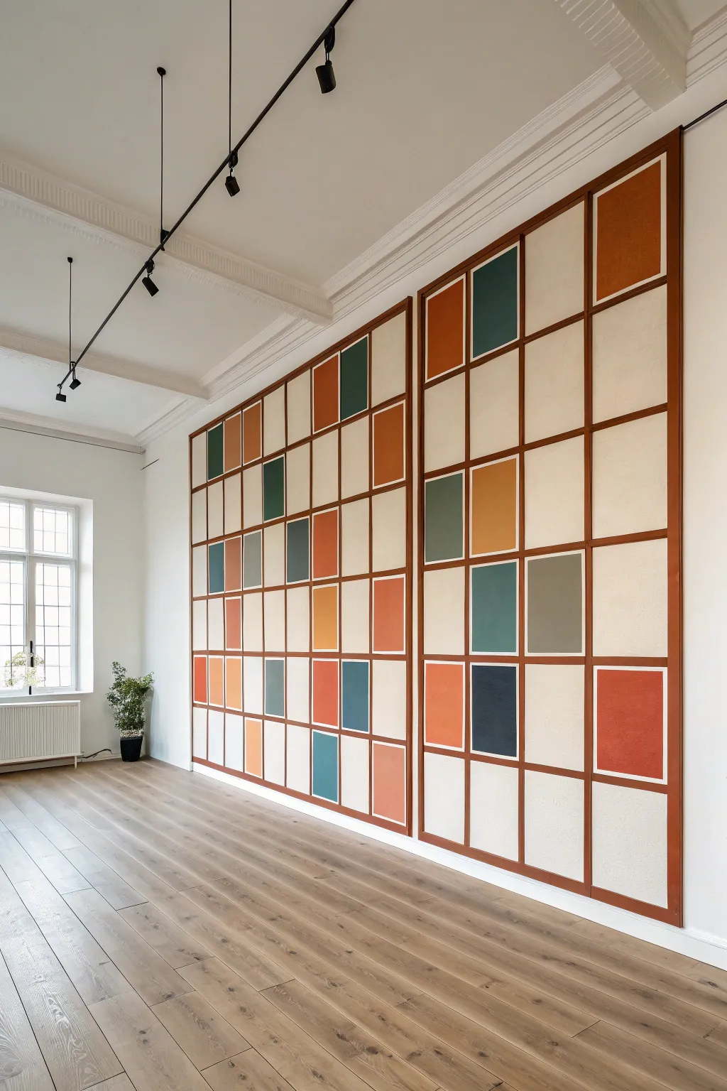
Transform a blank wall into a statement piece with this room-scale grid mural that blends modern geometric abstraction with the structured elegance of traditional Japanese Shoji screens. The design features a warm, wood-toned grid framework enclosing blocks of muted earth tones and rich jewel colors for a sophisticated architectural effect.
Step-by-Step Tutorial
Materials
- Latex interior wall paint (Eggshell finish: Off-white base)
- Latex interior wall paint (Sample pots: Burnt orange, teal, forest green, deep ochre, terracotta, navy)
- Latex interior wall paint (Satin or Semi-gloss finish: Warm chestnut brown for the grid lines)
- Painter’s tape (0.75-inch or 1-inch width for grid lines)
- Painter’s tape (2-inch width for masking)
- Laser level (highly recommended) or long spirit level
- Pencil and eraser
- Measuring tape
- 4-inch foam roller and handle
- Small angled sash brush (1.5-inch)
- Artist brush (flat, size 8 or 10)
- Drop cloth
- Paint tray and liners
Step 1: Planning and Preparation
-
Prep the surface:
Begin by cleaning your wall thoroughly to remove dust and grease. Patch any holes and sand them smooth. Apply your off-white base coat over the entire wall using the standard roller. This will serve as the ‘paper’ color behind your grid. Let this dry for at least 24 hours to ensure the tape won’t peel it up later. -
Design your layout:
Measure the total width and height of your wall. Decide on the size of your grid squares. In the inspiration image, the grid is divided into two large distinct sections, each 4 columns wide and 8 rows high. Sketch this on paper first to determine the dimensions of each cell. -
Mark vertical lines:
Using a laser level or a long spirit level, mark your vertical grid lines lightly with a pencil. Start from the center of the wall if you want symmetry, or from one edge if you prefer a continuous flow. Measure carefully to keep the spacing consistent. -
Mark horizontal lines:
Mark your horizontal lines to correspond with the vertical ones, creating a full grid of rectangles or squares. I find it helpful to stand back periodically to visually check that the lines look straight relative to the ceiling and floor.
Bleeding Lines?
If paint bleeds under the tape, wait for it to dry completely. Re-mask the area with a sharp edge of tape and paint over the mistake with the correct adjacent color.
Step 2: Taping the Grid
-
Tape the grid structure:
Apply the narrower painter’s tape (0.75-inch or 1-inch) directly over your pencil lines. This tape represents the wood-toned lattice. Press the edges of the tape down firmly with your fingertip or a credit card to prevent paint bleed. -
Seal the tape edges:
To get perfectly crisp lines, lightly brush a thin layer of your off-white base color over the edges of the tape. This seals the tape; any bleed-under will be the base color, not the dark grid color you’ll apply later. -
Plan colour placement:
Refer to your paper sketch or the reference image. Mark the specific boxes that will receive color with a small post-it note or a light pencil initial (e.g., ‘O’ for orange, ‘T’ for teal) directly on the wall. Leave approximately 60-70% of the squares as the plain off-white base.
Step 3: Painting the Color Blocks
-
Mask individual squares:
For each colored square, you need to tape off the *inside* edge of the grid tape to protect the surrounding white space. However, since the grid tape is already there, you can paint carefully within the grid lines. If you aren’t confident with a steady hand, add extra masking tape around the specific square you are working on. -
Paint the warm tones:
Start with your warm colors (burnt orange, terracotta, ochre). Use a small foam roller for larger squares or the sash brush for smaller ones. Apply two thin coats for opaque coverage, allowing 2-4 hours of drying time between coats. -
Paint the cool tones:
Switch to your cool colors (teal, forest green, navy). Apply these to their designated squares. Be careful not to drip onto the neighboring white squares. -
Detail the inner borders:
In the inspiration image, the colored blocks don’t touch the grid lines perfectly; they have a tiny white border, or sometimes they sit inside a white frame on top of the color. To achieve the main look, simply paint the color all the way to your grid tape. If you want the ‘picture frame’ look inside a square, create a smaller rectangle of tape inside the grid cell before painting the color.
Add Texture
For a truly customized look, mix a texture additive (like fine sand) into the colored paints to make the panels look like fabric or textured paper.
Step 4: Creating the Grid Effect
-
Remove color masking:
Once all colored squares are painted and dry to the touch, remove any extra protective masking tape you used around individual squares, but leave the main grid layout tape on the wall. -
Re-tape for the grid lines:
This is the crucial inversion step. You now need to mask *everything* except the lines where the grid tape currently is. Wait until the color blocks are fully cured (overnight is best). Then, place wide painter’s tape exactly next to the original grid tape lines on both sides, creating a channel. -
Peel the original grid tape:
Peel off the original 0.75-inch grid tape. You should now have an exposed strip of the original white wall, flanked by the new wide tape you just applied. -
Paint the lattice:
Using your sash brush, paint the exposed strip with the warm chestnut brown paint. This creates the wood-effect lattice. Use a satin or semi-gloss finish here to mimic the sheen of real varnished wood. -
Apply a second coat:
Applying a second coat of the brown paint ensures the grid looks solid and structural rather than streaky. Keep the layers thin to avoid a raised edge. -
The final reveal:
While the brown paint is still slightly tacky (not fully wet, but not rock hard), slowly peel away all remaining tape at a 45-degree angle. This prevents the paint from chipping. -
Touch ups:
Use a small artist brush to fix any tiny bleeds or uneven edges with the appropriate color. A steady hand here makes the difference between a paint job and a professional mural.
Step back and admire how this structured grid brings architectural depth and a modern gallery feel to your space

Have a question or want to share your own experience? I'd love to hear from you in the comments below!