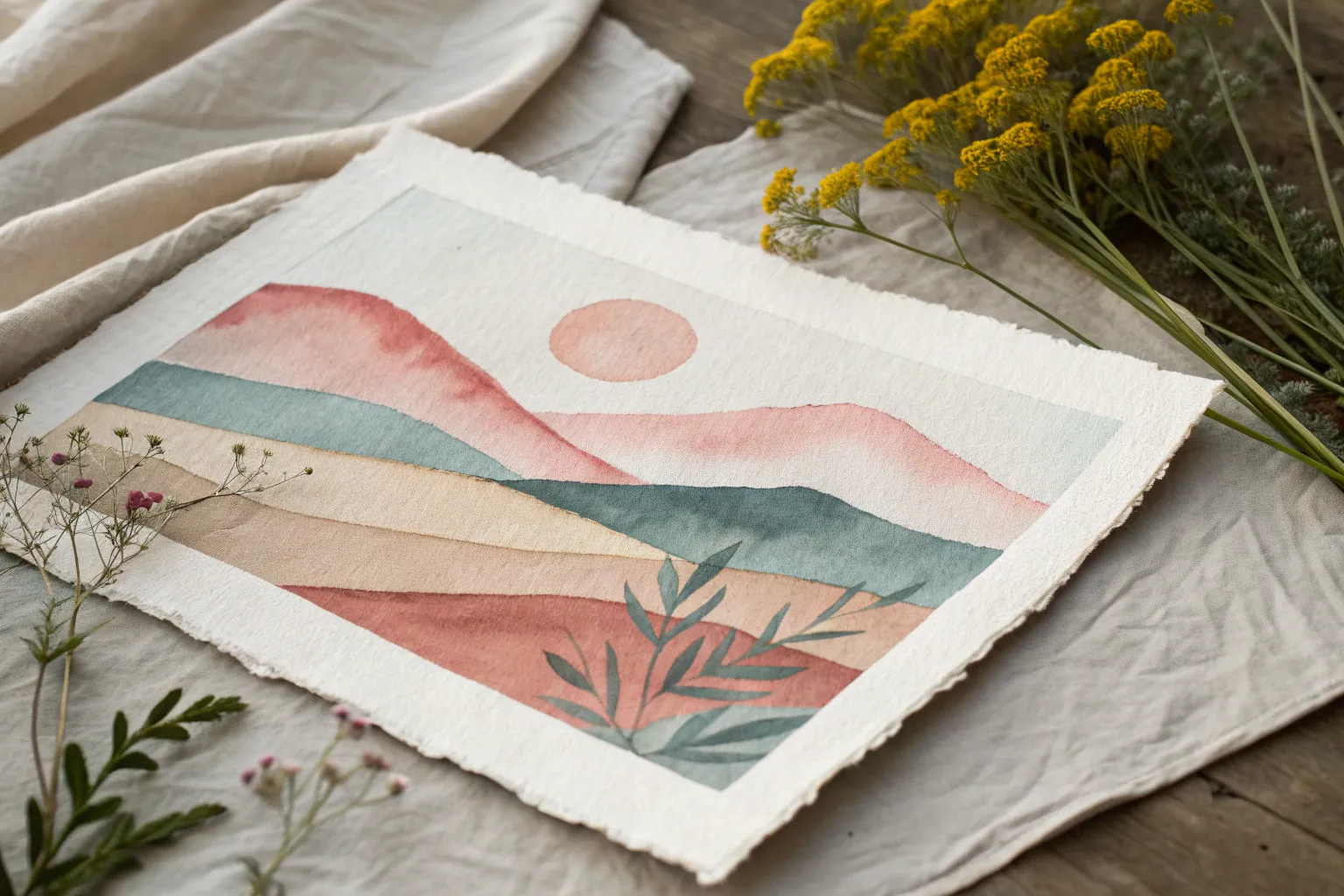
Whenever I feel stuck, I reach for abstract watercolor because it lets color, water, and movement do the heavy lifting. Here are my favorite non-representational prompts to help you start fast, stay loose, and end up with something you actually love looking at.
Wet-on-Wet Circles That Touch and Merge
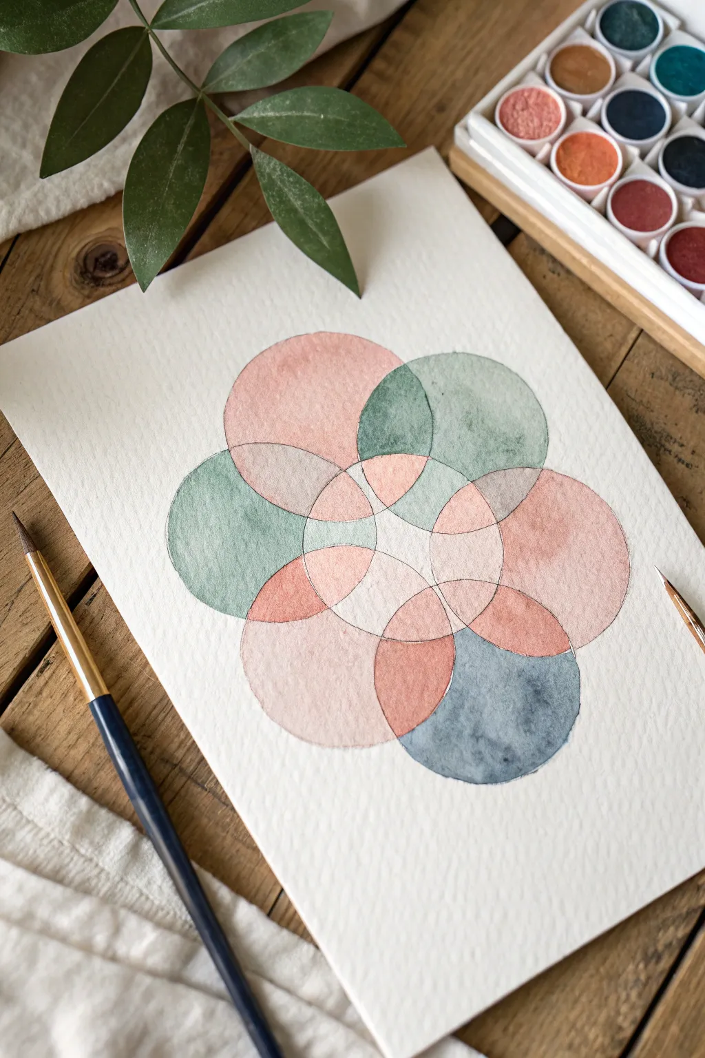
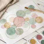
Create a calming, symmetrical composition using the overlapping circles of sacred geometry, softened by the gentle flow of watercolors. This project features muted tones of sage, blush, and slate blue merging within a structured floral pattern, perfect for practicing precision and wet-on-dry blending.
How-To Guide
Materials
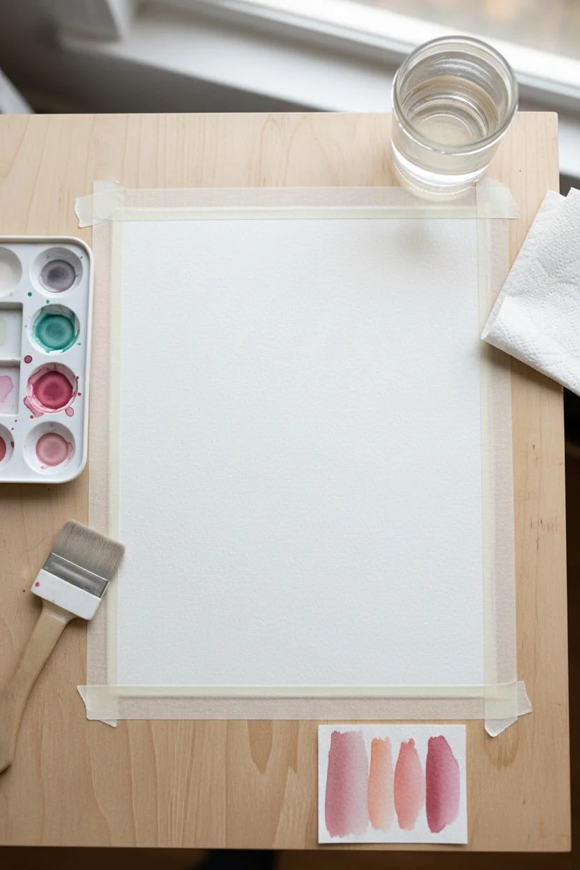
- Cold press watercolor paper (medium texture)
- Watercolor paints (Sage Green, Blush Pink/Peach, Slate Blue)
- Compass for drawing circles
- HB Pencil
- Kneaded eraser
- Round watercolor brush (size 4 or 6)
- Masking tape
- Jar of clean water
- Paper towels
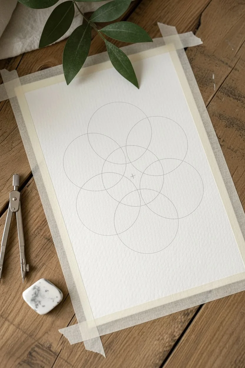
Step 1: Drafting the Geometry
-
Secure the paper:
Tape your watercolor paper down to a flat board or table to prevent buckling when the water is applied. -
Find the center:
Mark the exact center of your paper lightly with a pencil. This will be the anchor point for your first circle. -
Draw the central circle:
Set your compass to a radius of about 1.5 to 2 inches. Place the point on your center mark and draw the first circle very lightly. -
Mark intersecting points:
Keep the compass radius exactly the same. Place the point anywhere on the edge of the first circle and draw a second circle. This creates two intersection points on the first circle’s rim. -
Complete the flower pattern:
Move your compass point to one of these new intersections and draw another circle. Repeat this process around the central circle until you have a six-petaled flower shape surrounded by a ring of circles. -
Lighten the lines:
Roll your kneaded eraser gently over the entire drawing. The graphite lines should be barely visible—just enough to guide your brush without showing through the translucent paint.
Step 2: Painting the Overlaps
-
Prepare your palette:
Mix three puddles of watery paint: a soft sage green, a warm blush pink, and a muted slate blue. Test them on a scrap sketch to ensure the values are similar. -
Paint the first petal:
Start with the blush pink. Fill in one of the almond-shaped petals pointing toward the center. Use the tip of your round brush to carefully trace the curve before filling the middle. -
Paint a non-adjacent section:
While the first section is wet, skip the section immediately touching it. Paint an outer circle segment in sage green. Skipping sections prevents the wet colors from bleeding uncontrollably into each other. -
Continue the pattern:
Continue painting non-touching sections, alternating between your three colors. I like to keep the distribution somewhat random but balanced. -
Let the first layer dry:
Wait until all painted sections are completely dry to the touch. The paper should feel room temperature, not cool. -
Fill the gaps:
Now paint the remaining white sections that are adjacent to the dried paint. This ‘glazing’ technique allows you to butt the new color right up against the dry edge for crisp lines. -
Create darker intersections:
Where two circles overlap to create a smaller shape, apply a slightly more saturated version of one of the colors (or let the transparent paints naturally darken the area if you overlap them). -
Soften edges (optional):
If you want a softer look in certain larger circles, drop clear water into the paint while it’s still wet to create a ‘bloom’ texture. -
Final touches:
Look for any uneven edges. If necessary, use a damp, clean brush to gently lift pigment or smooth out a harsh line, though the natural watercolor texture adds character. -
Dry and reveal:
Ensure the artwork is bone dry before slowly peeling off the masking tape at a 45-degree angle.
Uneven Edges?
If paint pools at the edges creating a dark outline, your brush is too wet. Dry your brush slightly on a paper towel before loading paint to get an even, flat wash.
Pencil Control
Graphite can disappear permanently under wet paint or smudge into the color. Use a hard lead (H or 2H) and draft extremely lightly to avoid dirtying your pastel colors.
Enjoy the rhythmic process of filling these geometric shapes with soft color


Layered Glazing Ribbons for Transparent Overlaps
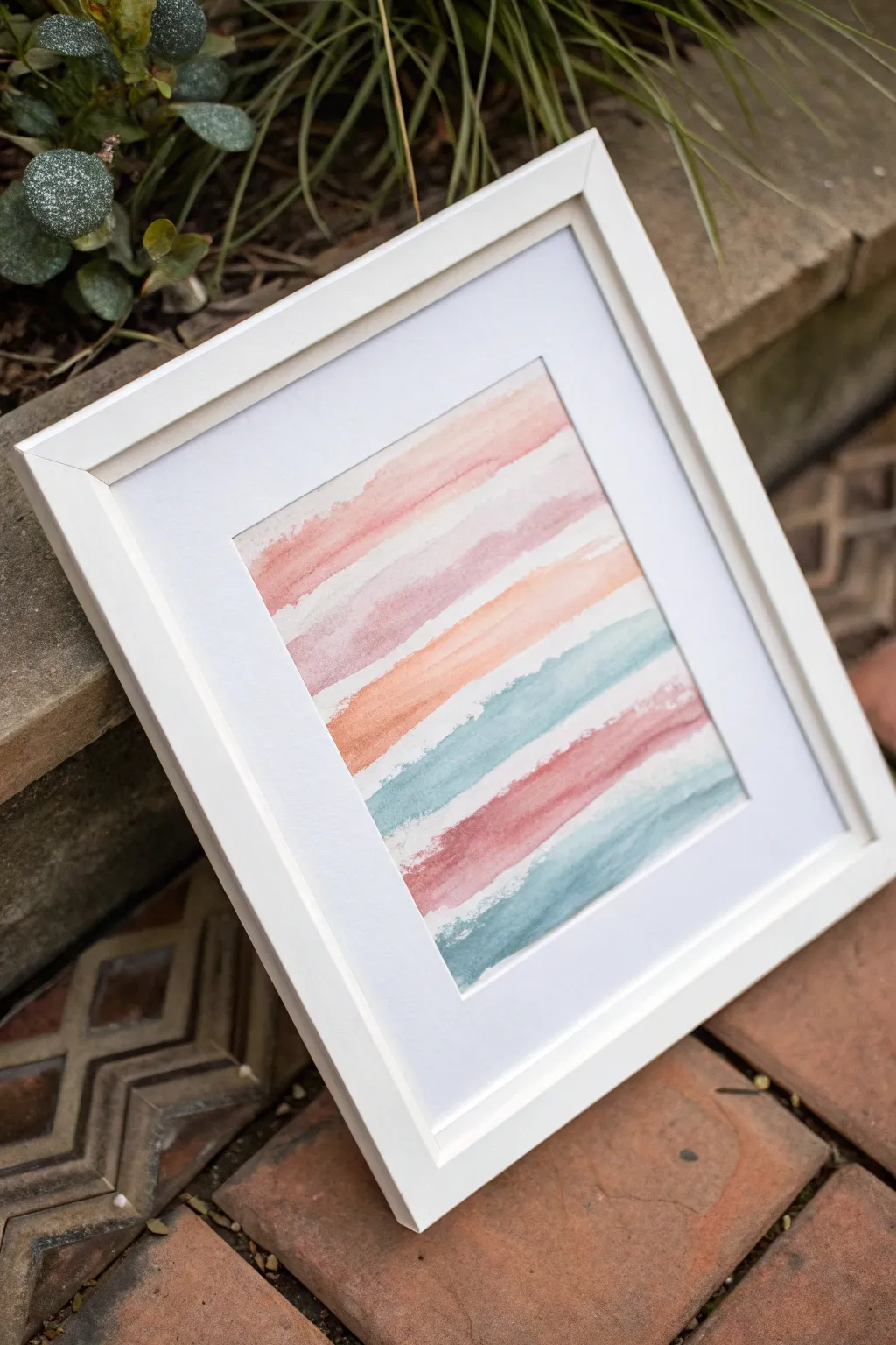
Create a soothing abstract composition using horizontal ribbons of soft pastel watercolors. This project explores the beauty of imperfect edges and transparent layering, resulting in a piece that feels both modern and serene.
Step-by-Step Tutorial
Materials
- Cold press watercolor paper (300 gsm recommended)
- Watercolor paints (soft pink, dusty rose, peach, teal, sage green)
- Flat shader brush (size 1 inch or 3/4 inch)
- Clean water jar
- Paper towels
- Painter’s tape or masking tape
- Drawing board or hard surface
- Picture frame with mat (optional)
Step 1: Preparation
-
Secure the paper:
Tape your watercolor paper down to a hard board or your work surface. Since we are creating organic edges, you don’t need to mask off the painting area itself, but securing the paper prevents it from buckling when wet. -
Premix your palette:
Prepare your colors in your palette wells before starting. You’ll want a dusty rose, a warm peach, a soft teal, and a deeper berry pink. Aim for a ‘tea-like’ consistency—fluid enough to flow but pigmented enough to show color. -
Test opacity:
Swipe a test stroke of each color on a scrap piece of paper. You want them to be translucent so the paper texture shines through, but distinct from one another.
Step 2: Painting the Ribbons
-
Load the brush:
Fully saturate your flat brush with your first color, the soft pink. Don’t overload it to the point of dripping, but make sure the bristles are holding plenty of fluid. -
The first stroke:
Starting near the top, drag your brush horizontally across the paper. Apply uneven pressure—press down firmly in some spots and lift slightly in others to create a textured, rough edge rather than a perfect line. -
Allow a partial dry:
Let this first stripe set for about a minute. It doesn’t need to be bone dry, but the sheen should just start to dull. -
Second ribbon:
Switch to your dusty rose color. Paint a second stripe below the first, leaving a very small gap of white paper between them. It’s okay if they accidentally touch in tiny spots; that adds character. -
Varying the width:
For the third stripe, use the warm peach tone. Try making this one slightly thicker or thinner than the previous ones to keep the composition dynamic. -
Transition to cool tones:
Rinse your brush thoroughly. Dip into the teal or soft blue mix. Apply this stripe below the peach, letting the cool tone contrast against the warm ones above. -
Creating texture:
As you pull this blue stroke across, try a ‘dry brush’ technique near the end of the line by not re-dipping your brush. This leaves a scratchy, organic texture where the paper tooth catches the pigment. -
Deepen the palette:
Load your brush with the deeper berry or dark pink shade. Apply this next stripe with confidence, allowing the color to pool slightly at the bottom edge of the stroke for a darker rim. -
Final cool stripe:
Finish the bottom of the composition with another teal or sage green ribbon. Mirror the technique of the top stripes, keeping the edges slightly ragged and natural.
Muddy colors?
If colors bleed and turn brown where they touch, wait a bit longer between stripes. The previous line should be damp, not soaking wet, before adding the next one near it.
Step 3: Finishing Touches
-
Check for blooming:
While the paint is still damp, look for areas where water might be pooling too much. You can gently lift excess water with the corner of a paper towel if needed, or let it dry for a natural ‘bloom’ effect. -
Dry completely:
Allow the painting to dry fully. This is crucial as watercolor tends to dry lighter than it looks when wet. -
Flatten the paper:
Once fully dry, carefully peel off the tape. If the paper has curled, you can place it under heavy books overnight to flatten it out. -
Framing:
Mount your artwork behind a mat board. This helps isolate the colorful ribbons and gives the rough edges of your painting a professional, finished look suitable for display.
Try metallic accents
Once the paint is bone dry, run a very thin line of gold watercolor or metallic ink along the bottom edge of just one or two ribbons for a subtle shimmer.
Hang your new abstract piece in a bright spot to let the transparency of the layers shine


Organic Stone Shape Stacks in a Calm Palette
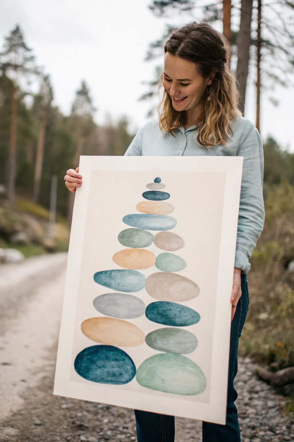
Capture the essence of balance and calm with this abstract watercolor piece featuring a column of smooth, stacked stone shapes. Using a soothing palette of teals, warm beiges, and soft greens, you will build a composition that feels grounded yet airy, perfect for bringing a zen atmosphere to any room.
How-To Guide
Materials
- Large watercolor paper (vertical orientation, cold press recommended for texture)
- Watercolor paints (Indigo, Teal or Turquoise, Sap Green, Burnt Sienna, Yellow Ochre, Lamp Black)
- Large round watercolor brush (size 10 or 12)
- Medium round watercolor brush (size 6 or 8)
- Pencil (HB or H)
- Kneaded eraser
- Two jars of water (one for rinsing, one for clean water)
- Paper towels for blotting
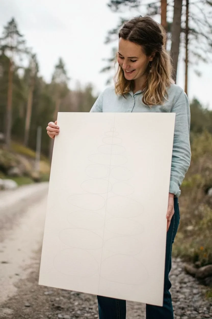
Step 1: Planning the Composition
-
Lightly sketch the structure:
Begin by lightly sketching a central vertical axis line down the middle of your paper to help you center the stack. Don’t press too hard; you want this line to be easily erasable. -
Draft the bottom foundation:
Draw the bottom-most shape first. It should be a large, wide, organic oval that feels heavy and grounded. Place two large stones side-by-side at the very base to create a wide foundation. -
Build the stack upward:
Working your way up, sketch the remaining ‘stones’ in diminishing sizes. The composition should taper gradually, like a cairn or a stylized tree. Aim for about 13-15 distinct shapes total, letting them nestle against each other rather than float apart. -
Refine the shapes:
Go back over your ovals and make them slightly irregular. Smooth river stones aren’t perfect circles; give them slight dips or gentle bulges to look organic. Once happy, gently lift the graphite with a kneaded eraser so the lines are barely visible.
Fixing Bleeds
If two wet stones touch and bleed, dry your brush on a towel and use it as a ‘thirsty brush’ to lift the excess pigment. Then, let it dry completely before refining the edge.
Step 2: Painting the Stone Textures
-
Prepare your palette:
Mix your colors on the palette before you start. Create puddle-like mixtures of a deep teal, a soft mossy green (mix Sap Green with a touch of Burnt Sienna), a warm sandy beige (Yellow Ochre diluted heavily), and a cool grey-blue. -
Paint the bottom left stone:
Load your large round brush with your deepest teal mixture. Paint the bottom-left stone using the wet-on-dry technique. Fill the shape, keeping the edges crisp but the interior varied in saturation. -
Add texture while wet:
While the paint is still wet, drop in a tiny bit of darker pigment (Indigo) near the bottom edge of the stone to suggest weight and shadow. Let the water move the pigment naturally. -
Paint the adjacent bottom stone:
Move to the bottom-right stone. Choose a lighter, contrasting color like the pale mint green or soft grey. Ensure the first stone is dry enough, or leave a microscopic hairline gap between them so the colors don’t bleed into each other. -
Work upwards with variety:
Continue painting the stones, moving upward row by row. Alternate your colors to create a balanced rhythm—don’t put two dark blue stones right next to each other. Use the warm beige tones to break up the cool blues and greens. -
Create distinct watermarks:
I like to let some puddles dry naturally on the paper without overworking them. This creates those beautiful ‘bloom’ edges and hard lines characteristic of watercolor, which adds texture to the smooth stones.
Level Up: Metallic Touch
Once the paint is fully dry, outline or embellish a few select stones with fine gold leaf or gold watercolor paint for a luxurious, modern accent.
Step 3: Refining and Layering
-
Build depth with transparency:
For the middle stones, try varying the opacity. Use more water for the lighter grey stones to make them look translucent and airy, contrasting with the heaviness of the base stones. -
Paint the pinnacle:
When you reach the top, use your smallest brush to carefully paint the final, tiny crowning stone. A medium-dark blue works well here to draw the eye up to the peak. -
Check for balance:
Step back and look at the overall color distribution. If a stone feels too flat after drying, you can glaze over it. Wait until it is bone dry, then wash a very diluted layer of a different hue over it to alter the temperature. -
Add subtle splatters (optional):
If you want a more textured look, load a brush with clean water or very pale paint and tap it against your finger to mist tiny droplets over the dry stones. This creates subtle water spots. -
Final clean up:
Once the entire painting is completely dry (give it at least an hour), use your eraser to remove any visible pencil guidelines, especially the central axis line.
Frame this serene stack in a simple wood frame to complement the organic shapes and enjoy your peaceful creation


Crisp-Edge Triangles and Tape-Resist Patterns
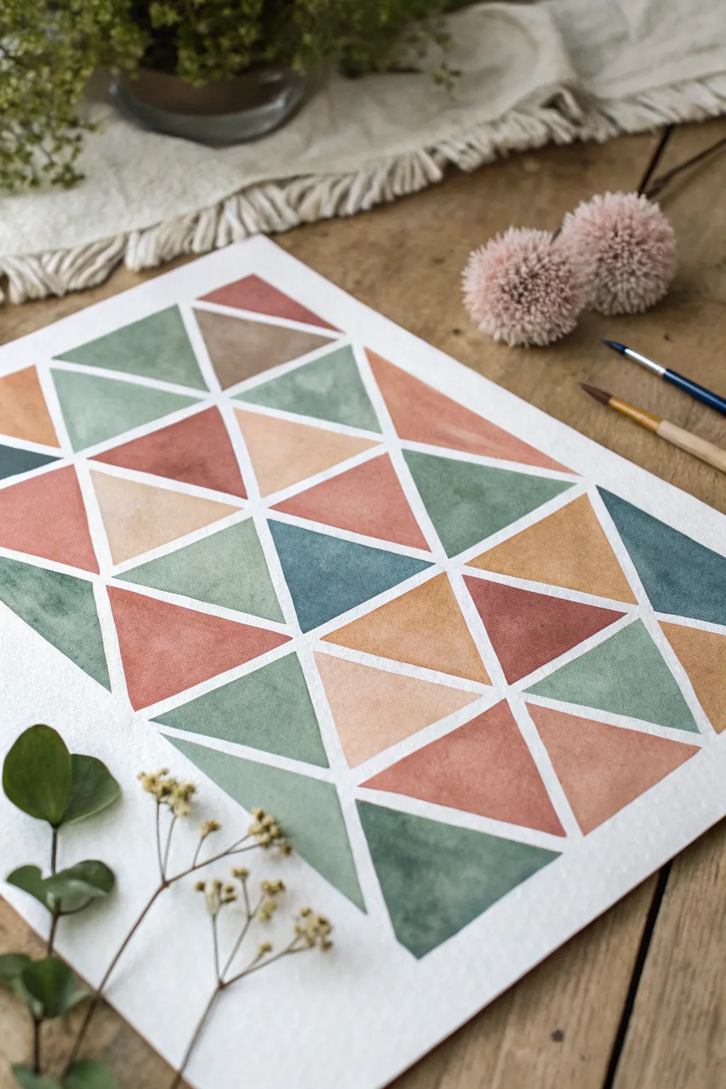
Achieve a sophisticated, modern look with this geometric watercolor project that balances structure and flow. By combining earthy tones with negative space, you’ll create a striking tesselated pattern perfect for minimalist decor.
Step-by-Step
Materials
- Cold press watercolor paper (300 gsm)
- Artist’s masking tape or washi tape (approx. 5-6mm width)
- Watercolor paints (terracotta, sage green, teal, beige, dusty rose)
- Round watercolor brushes (sizes 4 and 8)
- Pencil and ruler
- Palette for mixing
- Two jars of water
- Clean cloth or paper towel
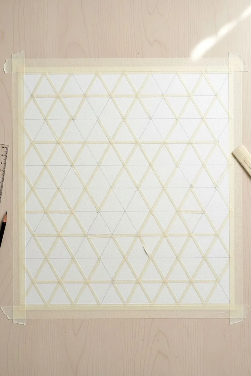
Step 1: Preparation & Mapping
-
Secure the paper:
Begin by taping down all four edges of your watercolor paper to a sturdy board or your work surface. This prevents buckling and creates a clean border. -
Draft the grid:
Using a ruler and a pencil, lightly mark out a grid of squares on your paper. For the scale shown in the example, 2-inch or 3-inch squares work well. -
Divide into triangles:
Draw diagonal lines through your squares to create triangles. Alternate the direction of the diagonal line in each adjacent square to create a varied, dynamic pattern rather than a uniform one. -
Apply the tape resist:
Carefully place your thin masking tape over every pencil line you just drew. Ensure you press down firmly on the edges of the tape to prevent paint from seeping underneath later. -
Check the intersections:
Where multiple strips of tape cross, press down extra hard with your fingernail or a bone folder. These intersections are the most common spots for leaks.
Clean Lines Pro-Tip
Before painting with color, paint clear water or white gouache over the tape edges. This seals the tape, meaning any bleed-through will be invisible!
Step 2: Mixing & Painting
-
Prepare the palette:
Mix your colors before you start painting. You want a cohesive earthy palette: mix a watery sage green, a deep terracotta, a muted teal, a warm beige, and a soft dusty pink. -
First color application:
Load your size 8 brush with the terracotta shade. Choose random triangles across the paper to fill in, ensuring no two touching triangles are the same color. -
Create texture:
When filling a triangle, try letting more pigment pool in one corner while keeping the opposite corner watery. This creates that lovely, natural watercolor gradient within the shape. -
Add the greens:
Rinse your brush thoroughly and switch to the sage green. Fill in another set of scattered triangles, balancing them against the warm tones you just placed. -
Introduce depth:
Use the darker teal color sparingly. Place these darker triangles near lighter beige ones to create high contrast and visual interest. -
Fill the gaps:
Work through your remaining beige and dusty pink mixtures to fill the final empty triangles. I find it helpful to stand back occasionally to ensure the color distribution feels balanced. -
Dry thoroughly:
Allow the painting to dry completely. This is crucial—if the paper is even slightly cool to the touch, it is still wet. Using a hair dryer on a low setting can speed this up.
Step 3: The Reveal
-
Warm the tape:
If you are worried about ripping the paper, you can gently warm the tape with a hair dryer for a few seconds to soften the adhesive. -
Peel carefully:
Peel the tape off slowly at a 45-degree angle, pulling away from the painted area. Start with the tape strips that were laid down last (the ones on top). -
Reveal the borders:
Once the inner grid is removed, peel away the four border tapes to reveal the clean, white frame around your artwork. -
Clean up:
If any pencil lines are visible in the white gaps, gently erase them with a kneaded eraser, being careful not to smudge the paint.
Bleeding Paint?
If paint leaked under the tape, wait for it to dry fully. Then, use a small stiff brush with clean water to gently scrub and lift the unwanted pigment.
Frame your geometric masterpiece and enjoy the satisfying contrast between the crisp white lines and the soft watercolor textures
BRUSH GUIDE
The Right Brush for Every Stroke
From clean lines to bold texture — master brush choice, stroke control, and essential techniques.
Explore the Full Guide
Monochrome Mood Studies in One Color Family
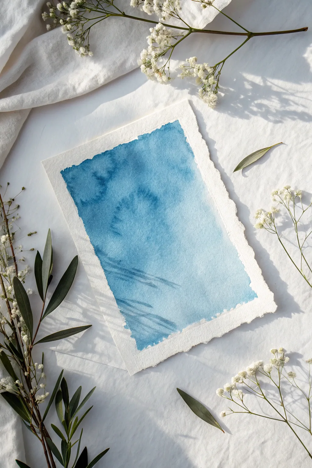
This serene project explores the depth and versatility of a single blue hue, capturing the feeling of deep ocean currents or a clouded sky. Using wet-on-wet techniques on beautiful deckled-edge paper creates organic movements and soft blooms that make each piece entirely unique.
Detailed Instructions
Materials
- Cold press watercolor paper (deckled edge preferred, approx. 300gsm)
- Professional grade watercolor paint (Prussian Blue or Indigo)
- Large round brush (size 10 or 12)
- Medium round brush (size 6 or 8)
- Clean water jar
- Paper towels
- Painter’s tape or masking tape
- Baking board or waterproof surface for taping
Step 1: Preparation and Base Wash
-
Prepare your workspace:
Since we are using a loose sheet of deckled paper, secure it gently to your board. Instead of taping over the edges (which would hide the beautiful texture), roll small loops of masking tape and place them underneath the back corners to hold the paper steady without covering the front. -
Mix your pigment:
Create a generous puddle of your chosen blue paint on your palette. You want a medium consistency—not ink-like, but not too watery yet. I like to prepare two puddles: one highly concentrated and one diluted with more water for lighter areas. -
Define the borders:
Using your medium brush and clean water, paint a rectangle in the center of the paper. Leave a deliberate border of about 1-1.5 inches of unpainted paper around the edges. The water should sit on the surface without puddling. -
Rough edges technique:
As you wet the paper, don’t make the rectangle perfectly straight. Allow the water to wiggle slightly at the edges to create that characteristic organic, rough border seen in the final piece. -
Initial color drop:
Load your large round brush with the diluted blue mix. Touch the wet paper gently, starting from the top right corner. Let the paint flow naturally into the wet surface, tilting the board slightly if needed to encourage movement. -
Building the gradient:
Continue adding the lighter wash across the entire wet rectangle. The goal here is just to get a base layer of soft blue, establishing the shape of the painting.
Mastering Water Control
For sharper blooms (backruns), wait until the paint loses its glossy sheen and turns satin-matte before dropping in clear water.
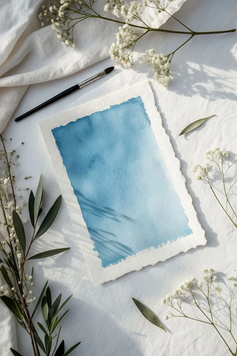
Step 2: Creating Depth and Texture
-
Deepening the hue:
While the paper is still wet (very important!), pick up the concentrated, darker pigment. Drop this into the left side of the composition, letting it bleed into the lighter wash. -
Controlled chaos:
Use the tip of your brush to guide the darker pigment into abstract cloud-like shapes. Don’t overwork it; let the water on the paper do the heavy lifting of blending the edges. -
Texturing with blooms:
This is crucial for the ‘cauliflower’ texture seen in the reference. Clean your brush and load it with just clear water. Touch the tip into the semi-drying areas of dark paint. The water will push the pigment away, creating those fascinating jagged edges. -
Lifting highlights:
If an area gets too dark, dry your brush on a paper towel and gently lift some pigment off the paper to regain lightness, specifically near the bottom center. -
Enhancing the edges:
Go back to the perimeter of your painted rectangle with a small brush and a bit of dark pigment. touch the very edge in random spots to create a crisp, dark rim that defines the roughness. -
Creating diagonal motion:
Add a few faint diagonal strokes near the bottom left using a semi-dry brush. This mimics the look of light rays or currents moving through the water.
Fixing Muddy Edges
If your edges are bleeding too far, your initial water rectangle was too wet. Let the paper dry completely and re-wet only the center to add more color.
Step 3: Final Details
-
The splash effect:
Load a small amount of clean water onto your brush and tap the handle over the darker sections. These tiny droplets will create miniature blooms, adding intricate texture to the solid blue fields. -
Reviewing the balance:
Step back and assess the contrast. You want a distinct difference between the deep, stormy blues on the left and the ethereal, pale blues on the right. -
Final drying:
Let the piece dry completely flat. Do not use a heat tool, as the forced air might blow the pigment around and ruin the delicate blooms you’ve created. -
Flattening the sheet:
Once fully dry, the paper might be slightly buckled. Place it under a clean sheet of paper and a heavy book overnight to restore the flat, crisp profile of the deckled sheet.
Display your monochrome masterpiece in a floating frame to show off those lovely deckled edges
Complementary Color Push-Pull Blocks
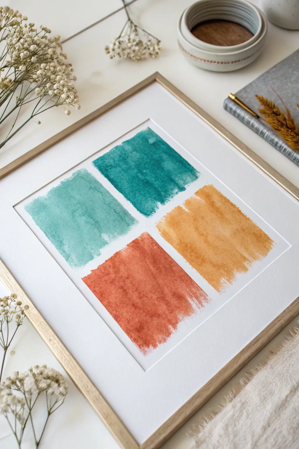
Create a modern minimalist statement piece by exploring the tension and harmony between warm and cool tones. This project uses four distinct color blocks painted with expressive, textural brushstrokes to bring a sophisticated yet rustic energy to any wall.
How-To Guide
Materials
- Cold press watercolor paper (140lb/300gsm, white)
- Watercolor paints (Teal, Prussian Blue, Burnt Sienna, Yellow Ochre)
- Flat wash brush (1-inch width)
- Ruler
- Pencil (HB or lighter)
- Painter’s tape or masking tape
- Rubber eraser
- Paper towels
- Two jars of water
- Wooden picture frame with mat (square opening)
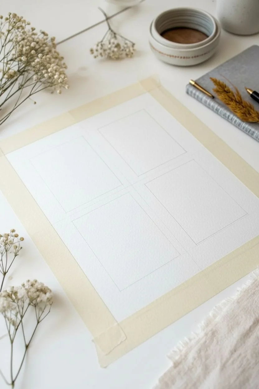
Step 1: Setting the Grid
-
Prepare the paper:
Cut your watercolor paper to fit your chosen frame. Tape the paper down to a hard board or table surface on all four sides to prevent buckling when wet. -
Measure the center:
Using your ruler, lightly mark the exact center of the paper both vertically and horizontally. This central crosshair will be the anchor for your four blocks. -
Draft the grid:
Draw four squares or rectangles around your center point. Aim for about a 1/2-inch to 1-inch gap between the blocks themselves to create that clean white negative space. -
Keep marks light:
Ensure your pencil lines are barely visible. We’ll be painting within these zones but not outlining them rigidly, so heavy graphite lines will be hard to hide later.
Step 2: Painting Cooling Tones
-
Mix the teal shade:
Load your palette with teal paint. Dilute it moderately with water—you want it fluid but strong enough to show texture. Test the opacity on a scrap piece of paper first. -
Paint the first block:
Start with the top-left block (or bottom-left depending on your orientation preference). Apply the teal using the flat brush. I like to pull the brush vertically from top to bottom. -
Create the dry edge:
As you reach the bottom of the block, let the brush run out of paint slightly. Don’t reload it immediately. This creates that lovely ragged, ‘dry brush’ finish at the edges. -
Mix the deep blue-green:
For the adjacent cool block, mix a small amount of Prussian Blue into your teal to get a deeper, darker ocean shade. -
Apply the darker block:
Paint the second cool block (top right). Use horizontal strokes this time if you want variation, or stick to vertical strokes to maintain uniformity. Ensure the edges remain somewhat rough and organic rather than perfectly straight.
Natural Texture
Don’t overwork the paint. The beauty lies in the single, confident strokes that leave ‘holidays’ (tiny white sparkles of paper) showing through.
Step 3: Adding Warm Contrast
-
Clean your tools:
Wash your brush thoroughly and switch to fresh water. Mixing warm and cool dirty water will muddy your vibrant orange tones. -
Mix the rust tone:
Prepare a rich Burnt Sienna or terracotta color. It should be saturated enough to visually balance the weight of the dark teal block. -
Paint the rust block:
Apply this color to the bottom-left position. Press firmly with the flat brush to get good coverage in the center, lifting pressure towards the edges to enhance the texture. -
Mix the ochre shade:
Finally, prepare a Yellow Ochre or deep mustard shade. Dilute it slightly more than the rust so it feels lighter and translucent. -
Complete the grid:
Fill in the final bottom-right quadrant with the ochre. Allow some of the white paper texture (the ‘tooth’) to show through the paint strokes. -
Softening touches:
If any block looks too solid, you can lift a tiny bit of pigment while it’s still damp using the corner of a clean paper towel to add cloudiness.
Scale It Up
Try this on a larger scale using 2-inch or 3-inch hake brushes. The wider bristles create dramatic, sweeping textures perfect for oversized prints.
Step 4: Finishing
-
Let it dry completely:
Allow the painting to dry flat for at least an hour. Watercolor dries lighter, so the colors will settle into their final hues. -
Erase guidelines:
Once bone dry, very gently use the rubber eraser to remove any visible pencil marks in the white gaps between the blocks. -
Frame the work:
Place the artwork inside a mat with a square opening. The mat draws the eye inward and cleans up the visual presentation immediately.
Hang your new abstract piece in a well-lit spot to let those organic watercolor textures shine

PENCIL GUIDE
Understanding Pencil Grades from H to B
From first sketch to finished drawing — learn pencil grades, line control, and shading techniques.
Explore the Full Guide
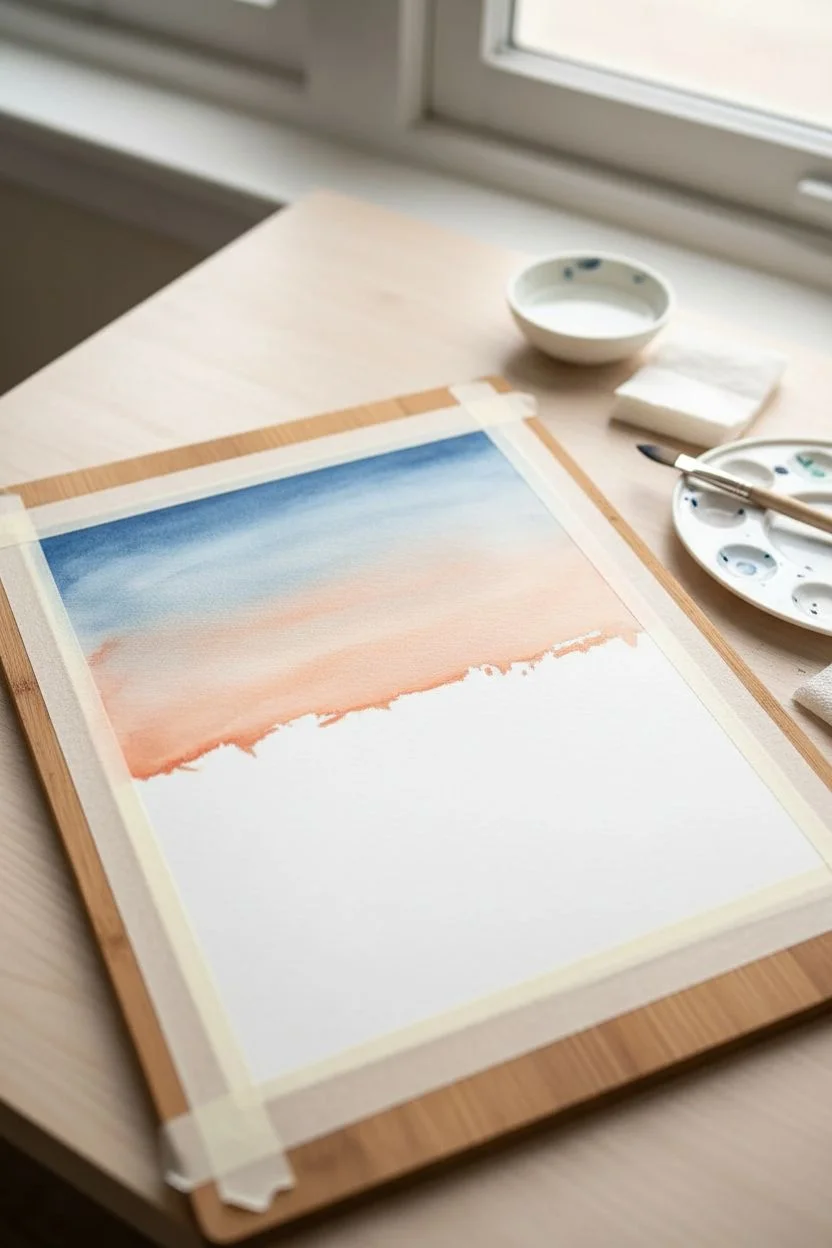
Abstract Horizons With Two Simple Washes
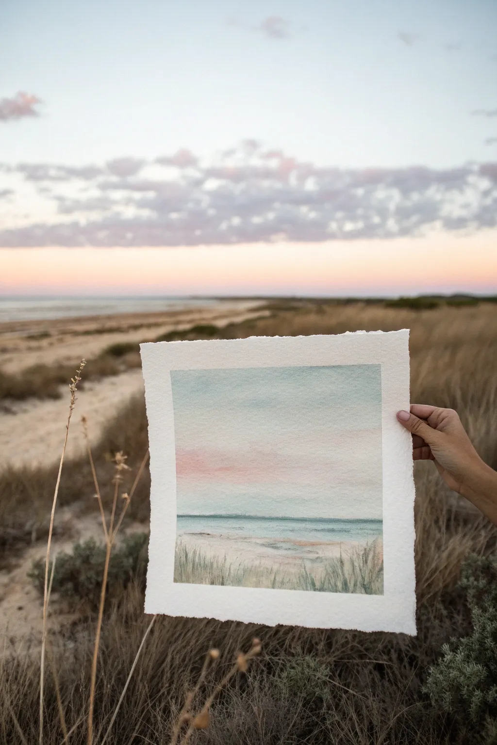
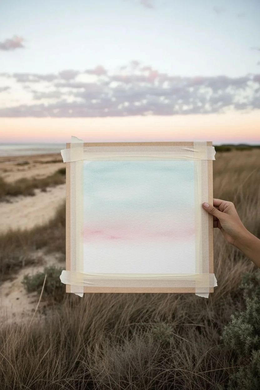
Capture the fleeing beauty of dusk at the beach with this serene watercolor landscape. By layering soft washes of pastel color and building up texture in the foreground, you’ll create a dreamy piece that mirrors nature’s own palette.
Step-by-Step Guide
Materials
- Cold press watercolor paper (deckle edge optional but recommended)
- Masking tape
- Watercolor paints: Cerulean Blue, Rose Madder or Alizarin Crimson, Burnt Sienna, Sap Green, Indigo
- Large flat wash brush (3/4 or 1 inch)
- Round brush (size 6 or 8)
- Small rigger or detail brush
- Jar of clean water
- Paper towels
- Art board or backing surface
Step 1: Setting the Sky
-
Prepare the paper:
Begin by taping down your watercolor paper to a rigid board. I prefer to leave a generous border masked off to create a clean, crisp frame against the deckled edge later. -
Pre-wet the sky area:
Using your large flat brush and clean water, gently wet the upper two-thirds of the paper. You want an even sheen, not puddles. -
Apply the blue wash:
Load your brush with a very watery mix of Cerulean Blue. Starting at the very top, sweep the color across the page, letting it naturally fade as you move downward. -
Add the sunset glow:
While the paper is still damp, rinse your brush and pick up a diluted Rose Madder. Gently touch this pink into the lower sky area just above where the horizon will be, allowing it to bleed softly upward into the fading blue. -
Soften the transition:
If the line between blue and pink looks too stark, use a clean, slightly damp brush to gently feather them together. -
Initial drying:
Let this sky layer dry completely. The paper must be bone dry before you begin the horizon line to prevent the ocean from bleeding into the sky.
Step 2: Painting the Sea
-
Establish the horizon:
Mix a slightly stronger value of your blue with a tiny touch of green. Using the round brush, paint a straight, horizontal line across the paper to mark the horizon. -
Fill the ocean:
Pull this turquoise-blue color downward. As you near the bottom of the ocean section, add more water to your brush to lighten the value. -
Create wave texture:
Before the ocean wash dries fully, drop in thin horizontal strokes of slightly darker blue (add a hint of Indigo) to suggest distant waves or ripples. -
Lift reflected light:
Wipe your brush dry on a paper towel and gently lift out a few horizontal highlights in the water to mimic sunlight reflecting on the surface.
Wetness Check
To check if your paper is ready for the “wet-in-wet” sky, tilt your board. The water should have a satin sheen but shouldn’t run down the page.
Step 3: Foreground Dunes
-
Base sand layer:
Mix a warm, sandy tone using Burnt Sienna and plenty of water. Paint the bottom third of the paper, overlapping slightly with the bottom edge of the ocean wash. -
Add variance:
While wet, drop in tiny spots of unmixed Burnt Sienna or even a touch of purple to create the grainy texture of sand. -
Dry again:
Allow the entire painting to dry thoroughly. The sand wash needs to be set before adding the crisp grass details. -
Mix grass colors:
Prepare a muddy green mixture using Sap Green and a touch of Burnt Sienna to dull it down. You want an organic, dried-grass color, not a bright kelly green. -
Paint tall grasses:
Switch to your rigger or small detail brush. Using quick, upward flicking motions, paint varying lengths of grass blades rising from the bottom edge. -
Vary the density:
Group some grasses in clusters and leave other areas sparse. I like to focus denser clumps on the sides to frame the view. -
Deepen the shadows:
Mix a darker value of green (add Indigo) and add a few darker blades near the absolute bottom edge to create depth. -
Reveal the painting:
Once everything is totally dry, carefully peel away the masking tape at a 45-degree angle to reveal your crisp borders.
Horizon Helper
Struggle with straight lines? Place a strip of masking tape directly on the dry sky wash to act as a ruler for your horizon line, then paint below it.
Step back and admire your peaceful coastal view, noticing how the subtle layers interact.
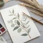
Botanical Impressions With Loose Leaf Gestures
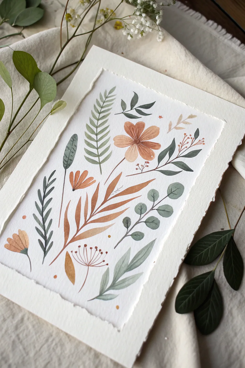
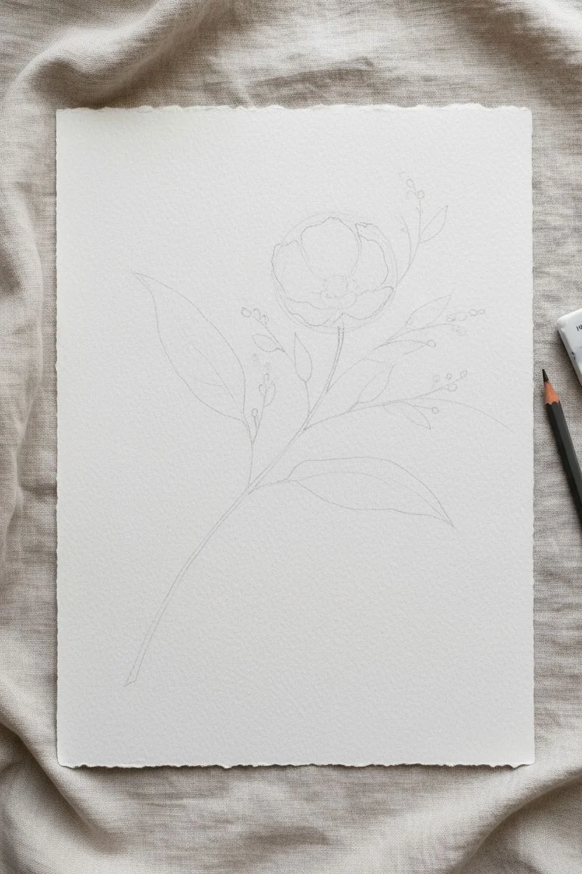
This project captures the delicate balance between structure and looseness, combining earthy terra-cotta tones with muted sage greens in a stylized floral composition. The result is a clean, modern botanical illustration on textured paper that feels both structured and organic.
Step-by-Step Guide
Materials
- Cold-press watercolor paper (300 gsm or heavier, rough texture preferred)
- Watercolor paints (Burnt Sienna, Terra Cotta/English Red, Sap Green, Payne’s Grey, Yellow Ocher)
- Round watercolor brushes (sizes 2, 4, and 6)
- Pencil (HB) and kneaded eraser
- Paper towels
- Two jars of water
- Mixing palette
Step 1: Planning and Sketching
-
Prepare your paper:
Cut your watercolor paper to size. For that rustic edge shown in the photo, you can carefully tear the paper against a ruler instead of cutting it, creating a deckled edge effect. -
Establish the composition:
Using an HB pencil, very lightly sketch the main spine of the central leaf branch. This large terra-cotta branch will anchor your entire composition, running diagonally from bottom left to top right. -
Map out focal points:
Lightly sketch the circle for the main flower near the top center. Don’t draw every petal; just mark the placement to ensure you have room. -
Outline secondary elements:
Roughly place the curved lines for the surrounding greenery stems. Keep your pencil pressure extremely light so the graphite doesn’t show through the transparent watercolor later.
Brushstroke Confidence
Don’t overwork the leaves. Lay the stroke down in one confident motion and leave it alone. The watermarks that form as it dries add character.
Step 2: Painting the Focal Elements
-
Mix your terra/rust tone:
Combine Burnt Sienna with a touch of English Red or Orange. You want a warm, earthy clay color. Test it on a scrap piece of paper to ensure it’s not too bright. -
Paint the central flower:
Starting with the main flower, use a size 6 brush to paint teardrop-shaped petals. Leave a tiny sliver of white space between the petals to define them without using outlines. -
Add the flower center:
While the petals are still slightly damp, drop a darker concentration of Burnt Sienna into the very center of the flower to create depth. -
Paint the large central fern:
Using the same rust mixture but perhaps diluted slightly more, paint the large diagonal branch. Start with the central stem, then use a size 4 brush to sweep the leaves outward, tapering them at the tips. -
Create the smaller orange blooms:
Paint the simple, fan-shaped flowers on the left side using the rust mix. These are just three or four quick brushstrokes stemming from a single point. -
Add details:
Before the paint fully dries on the smaller blooms, add fine lines or dots near the base with a size 2 brush for texture.
Step 3: Developing the Greenery
-
Mix a muted olive green:
Mix Sap Green with a tiny bit of Burnt Sienna or Red to desaturate it. This creates that natural, vintage botanical green. -
Paint the fern-like frond:
Create the tall, vertical fern on the upper left. Use a rhythmic stroke—press down, pull, and lift—to create the symmetrical leaves along the stem. -
Mix a blue-green shade:
For variety, mix Sap Green with Payne’s Grey or a touch of blue. Use this cooler green for the eucalyptus-style branch on the bottom right. -
Paint round leaves:
Paint the rounded eucalyptus leaves with a fluid motion. Vary the color saturation by adding more water to some leaves to create a sense of depth and translucency. -
Add the dark accent leaves:
Mix a very dark green (Green + Indigo or Payne’s Grey) for the sharper, darker leaves on the left and right sides. This high contrast anchors the painting.
Muddy Colors?
If your greens look brown, you’re mixing too aggressively on the paper. Clean your water jar frequently and mix colors completely on the palette first.
Step 4: Final Details and Accents
-
Fine line work:
Switch to your smallest brush (size 0 or 2). Use a dark brown or grey mix to paint the very thin stems connecting the floating leaves and flowers. -
Add delicate seed pods:
Paint the spindly, dandelion-like structures near the bottom. Use very fine lines for the stems and tiny dots for the seeds. -
Sprinkle decorative dots:
Dip your small brush in the rust color and place a few deliberate dots in the empty white spaces to balance the composition. -
Refine the central flower:
If the center of the main flower feels too soft, add a distinct star or dot pattern in dark brown once the layer is bone dry. -
Check balance:
Step back and look at the whole piece. If a particular area feels too empty, add a small, faint leaf shape or a simple stem line to fill it. -
Dry and flatten:
Let the paper dry completely for several hours. If the paper has buckled, you can weigh it down under a heavy book overnight.
Once framed, these botanical gestures bring a lovely sense of calm nature into any room.


Ink-Over-Wash Doodles for Structure and Contrast
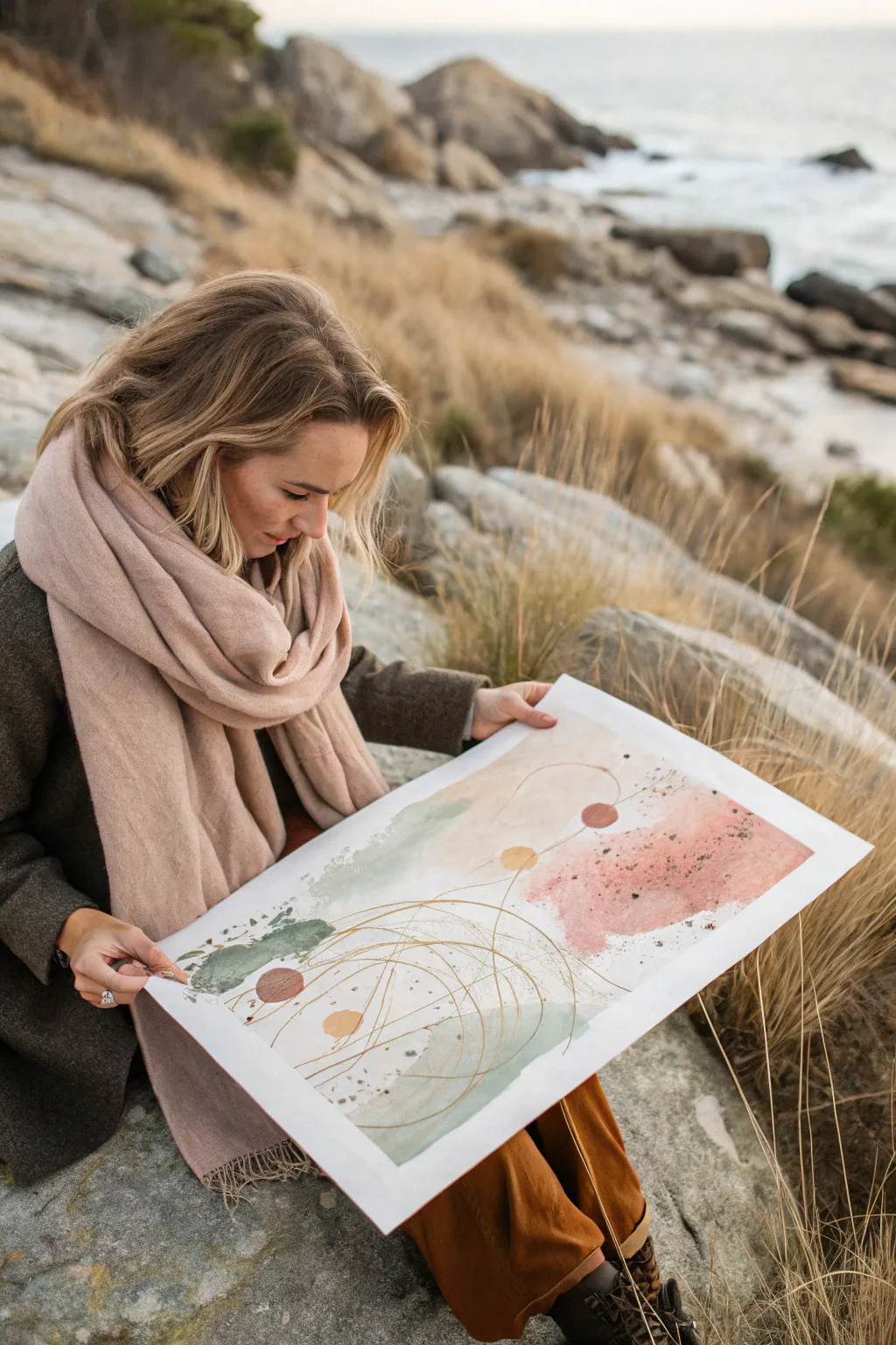
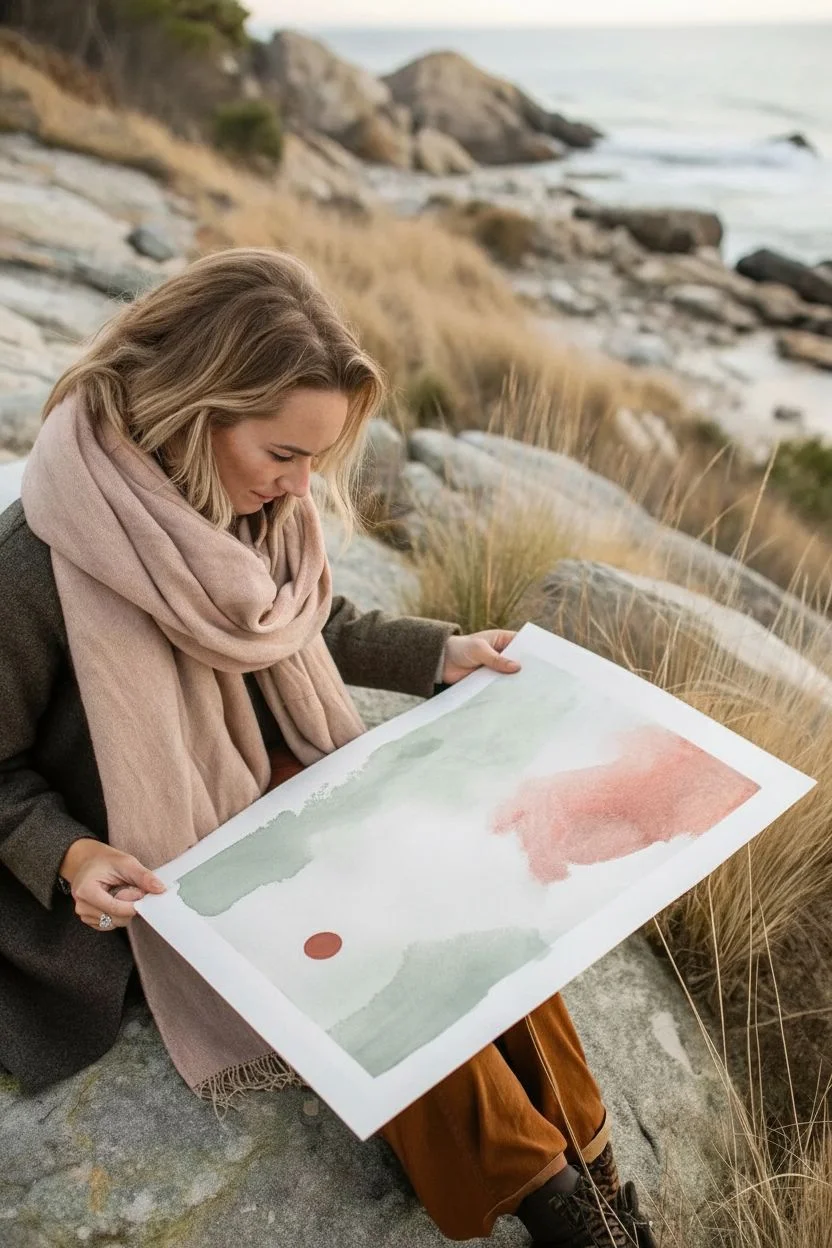
This abstract composition balances the softness of watercolor washes with the precision of metallic linework. The gentle interplay of sage green, dusty rose, and metallic gold creates a serene yet structured piece perfect for modern interiors.
Step-by-Step
Materials
- Large sheet of cold-press watercolor paper (A3 or larger)
- Watercolor paints (Sage Green, Dusty Rose/Pink, Terracotta, Charcoal)
- Large round watercolor brush (size 10 or 12)
- Gold ink or gold metallic watercolor paint
- Fine liner brush or gold archival ink pen
- Compass tool (optional, for perfect circles)
- Palette for mixing
- Jar of clean water
- Paper towels
- Toothbrush (for splatter)
Step 1: Laying the Foundation
-
Prepare your palette:
Begin by diluting your colors. You want transparent, watery pools of sage green, dusty rose, and a deeper terracotta. Aim for a milky consistency rather than thick paint. -
The first wash:
Load your large round brush with the sage green mixture. Apply it to the upper-left and lower-center areas of the paper using broad, sweeping strokes. -
Softening edges:
While the green paint is still wet, dip your brush in clean water and feather out the edges so they fade naturally into the white of the paper. -
Introducting warmth:
Clean your brush and pick up the dusty rose color. Apply a large, organic patch to the right side of the paper. -
Creating the bleed:
Allow the wet edge of the pink wash to slightly touch the damp green wash in the middle. Let the colors mingle naturally without over-mixing them with your brush. -
Adding depth:
While the rose section is still damp, drop in a slightly concentrated amount of pigment near the center of the patch to create subtle variation in tone. -
Grounding accents:
Paint a small, solid circle or organic shape using the darker terracotta or charcoal color in the lower-left area to anchor the composition.
Step 2: Texture and Details
-
The drying phase:
This is crucial: Let the painting dry completely. The paper must be bone-dry before you add the metallic layer, or the lines will bleed. -
Adding texture:
Once dry, load an old toothbrush with a dark grey or charcoal paint. Flick the bristles with your thumb to create a fine spray of speckles across the rose and green sections. -
Solid circles:
Using a smaller brush, paint two or three solid circles—one in gold, one in terracotta—placed deliberately within the negative space or overlapping the washes. -
Planning the orbits:
Visualize where your metallic lines will go. You want sweeping arcs that traverse from the bottom left to the top right, connecting the color patches. -
Drawing the arcs:
Load a fine liner brush with gold ink or metallic watercolor. Starting from a central point near the bottom, paint large, sweeping semi-circles and intersecting arcs. -
Varying line weight:
I like to vary the pressure slightly as I pull the brush, making some parts of the gold lines whisper-thin and others a bit bolder. -
Connecting elements:
Draw straight or slightly curved lines connecting the small solid painted circles to your larger orbital arcs, creating a geometric constellation effect. -
Final splatter:
For a finishing touch of magic, flick a tiny amount of the gold ink over the darker areas of the painting.
Clean Curves
If you don’t trust your freehand circles, use a compass with a brush attachment or lightly trace a bowl with a pencil before painting over it with gold ink.
Muddy Bleeds?
If your pink and green turn brown where they touch, you are over-mixing on the paper. Just let the wet edges touch once and walk away to let physics work.
Once the gold ink catches the light, you’ll see how the structured lines bring the soft background to life
Dry-Brush Grain and Scraped-Paint Streaks
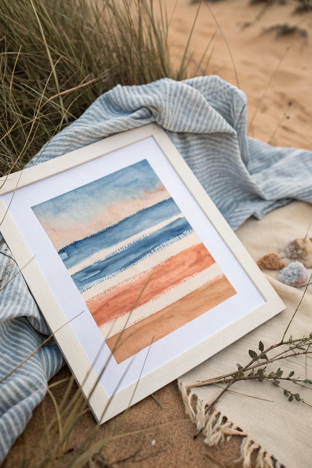
Capture the serene essence of a beach landscape abstracted into soft color bands and intriguing textures. This project combines classic wet-on-wet blending with a dry-brush and scraping technique to create organic, untouched edges that mimic the horizon line.
How-To Guide
Materials
- Cold press watercolor paper (heavier weight, around 300gsm is best)
- Watercolor paints (Indigo Blue, Payne’s Gray, Peach/Shell Pink, Burnt Sienna, Yellow Ochre)
- Wide flat brush (3/4 inch or larger)
- Round brush (size 8 or 10)
- Old plastic credit card or palette knife (for scraping)
- Masking tape or Washi tape
- Paper towels
- Two jars of water
- Wooden frame with mat board
Step 1: Preparation & Sky
-
Secure the paper:
Tape down all four edges of your watercolor paper to a sturdy board. This prevents buckling and creates a clean white border for framing later. -
Mix the sky gradient:
Prepare a watery mix of Indigo Blue with a touch of Payne’s Gray. On your palette, also prepare a very diluted Peach or Shell Pink for the lower sky transition. -
Base wash:
Using your large flat brush, wet the top third of the paper with clean water. While shiny, drop the blue mix into the top edge, letting it flow downward naturally. -
Blend the sunset hues:
Before the blue dries completely, introduce the pale peach color just below it. Gently blend the meeting point so the colors bleed slightly into each other without turning muddy. -
Create the first texture line:
While the bottom edge of the peach wash is still damp, take your dry flat brush (blotted on a towel) or the edge of a plastic card and drag it horizontally. This lifts pigment to create a rough, white ragged edge.
Card Scraper Trick
Cut jagged notches into the edge of your old credit card with scissors. When you scrape the wet paint, it creates multiple parallel lines instantly.
Step 2: Ocean & Horizon Bands
-
Dry the first section:
Allow the sky section to dry completely. It must be bone dry so the next blue layer doesn’t bleed upward uncontrollably. -
Mix ocean tones:
Create a stronger, more saturated mix of Indigo Blue. Load your flat brush but blot it slightly on a paper towel—you want the paint rich but the brush not dripping wet. -
Paint the deep blue band:
Paint a confident horizontal stripe across the paper, leaving a small white gap between this stripe and the peach sky above. The dry-ish brush will naturally create rough ‘skipped’ textures on the paper tooth. -
Scrape the wave crest:
Immediately after laying down the blue stripe, use the edge of your credit card or palette knife to scrape horizontally along the bottom edge of the wet paint. This pushes pigment aside and creates the ‘white cap’ effect. -
Add the second blue band:
Repeat the process immediately below with a slightly lighter blue mix. Leave a thin rugged gap between the two blue stripes to mimic distinct waves rolling in. -
Second scrape technique:
Perform the scraping motion again on the bottom of this second blue band. Vary the pressure—pressing harder removes more paint for a brighter white line.
Metallic Horizon
Once the painting is dry, trace the thin white gaps between color bands with a gold leaf pen or gold watercolor for a shimmering luxury finish.
Step 3: Sand & Earth Tones
-
Transition to earth tones:
Clean your water and brushes thoroughly. Mix a warm, rusty color using Burnt Sienna with a tiny touch of the Peach from earlier to harmonize the palette. -
Paint the wet sand:
Apply a broad stripe of this rust color below the blue waves. Use the side of your round brush here to create a softer, more organic shape than the rigid flat brush strokes. -
Dry brush texture:
Let the paint settle for 30 seconds, then drag a dry, clean brush along the top edge of this rust band to feather it upward slightly, creating a grainy texture. -
Mix the final sand color:
Combine Yellow Ochre with a lot of water and a hint of Burnt Sienna to create a soft, neutral tan color for the foreground sand. -
Apply the bottom band:
Fill the remaining bottom section of the paper with this tan mix. I like to keep this wash quite even and flat to ground the composition. -
Final drying time:
Let the entire piece dry completely flat. If the paper feels cold to the touch, it is still wet; wait until it is room temperature. -
Remove tape and frame:
Peel the tape away slowly at a 45-degree angle to reveal your crisp edges. Place the artwork behind a white mat and frame it to finish the look.
Hang your abstract seascape in a bright spot to bring a permanent sense of calm to your room
Drip-and-Tilt Watercolor Rivers Across the Page
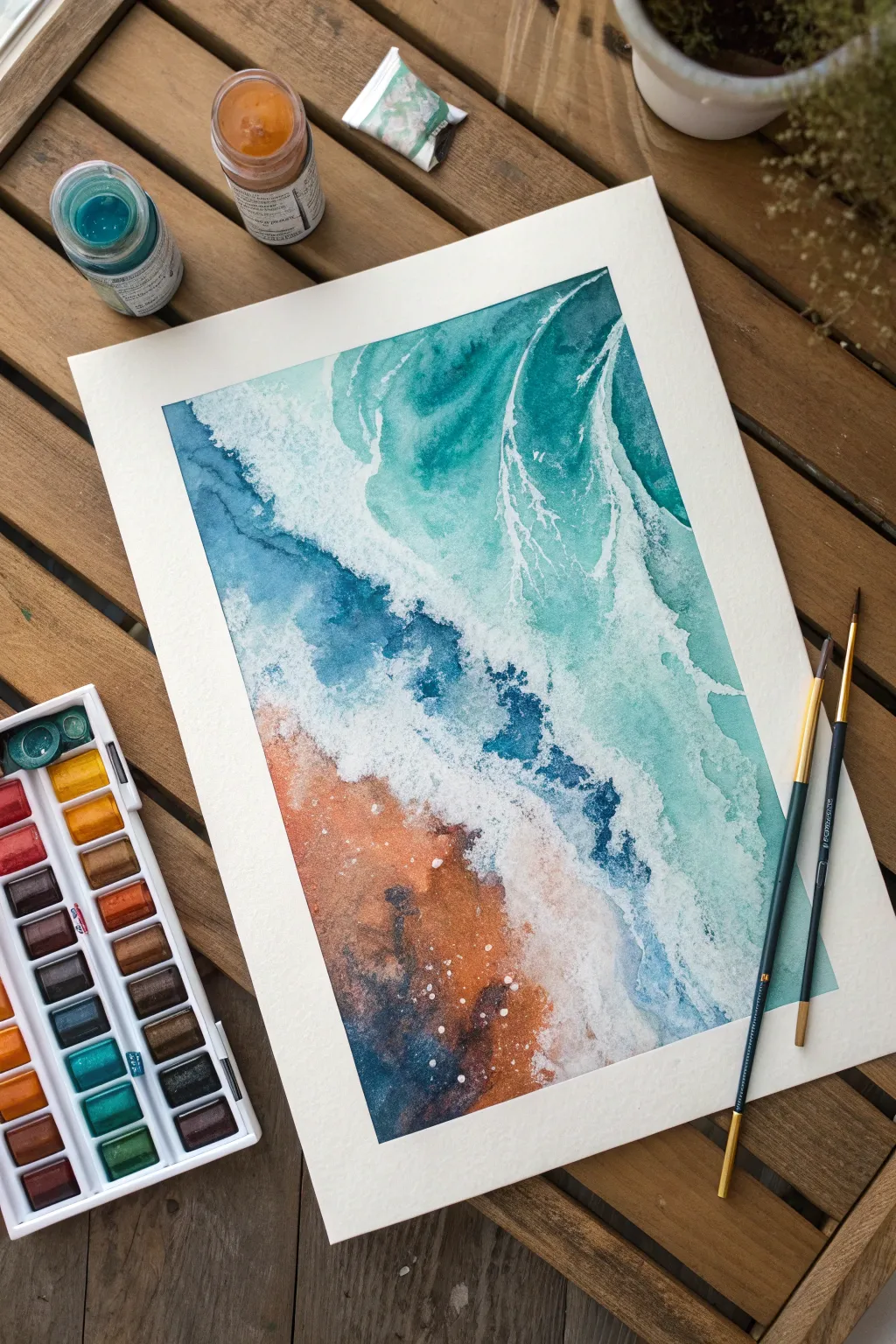
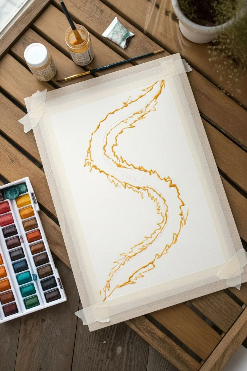
Capture the mesmerizing intersection of land and sea with this abstract aerial watercolor. Using fluid techniques and a vibrant palette of teals and earthy ochres, you’ll create a dynamic composition that mimics the natural ebb and flow of ocean tides.
Detailed Instructions
Materials
- Cold press watercolor paper (block or taped down)
- Watercolor paints: Turquoise, Phthalo Blue, Indigo, Burnt Sienna, Yellow Ochre
- White gouache or white ink
- Masking fluid (optional)
- Round brushes (sizes 4 and 8)
- Wide wash brush or hake brush
- Two jars of water
- Paper towels
- Salt (optional for texture)
Step 1: Setting the Scene
-
Prepare your paper:
If you aren’t using a watercolor block, tape your cold press paper securely to a board. This prevents buckling when we add lots of water later. -
Mock the composition:
Lightly sketch a diagonal flowing line from the top right to bottom left. This will separate your deep ocean from the foamy shoreline and sandy beach. -
Masking highlights:
To preserve pure white areas for the brightest sea foam, use a brush or quill to apply masking fluid in thin, jagged lines along your diagonal wave breaks. Let this dry completely.
Fixing Back-Runs
If cauliflower-like water blooms appear where they shouldn’t, wait for the spot to dry completely. Then, use a damp stiff brush to gently scrub and lift the harsh edge, smoothing it out.
Step 2: The Deep Ocean
-
Wet-on-wet base:
Using your large wash brush, wet the top right section of the paper with clean water. The paper should glisten but not have standing puddles. -
Drop in turquoise:
Load a size 8 brush with a vibrant turquoise paint. Touch the wet paper and let the color bloom, guiding it gently into wave-like shapes. Keep the color intense near the top edge. -
Add depth with indigo:
While the turquoise is still wet, introduce touches of indigo or deep phthalo blue into the darkest areas of the water to create the illusion of depth. -
Create flow:
Tilt your board slightly to encourage the paint to run diagonally down towards the ‘shoreline’, mimicking the movement of a current.
Step 3: The Sandy Shore
-
Mixing earth tones:
On your palette, mix burnt sienna with a touch of yellow ochre to create a warm, rusty sand color. Prepare a second, darker mix by adding a tiny bit of blue or violet to the brown. -
Painting the beach:
Wet the bottom left section of the paper. Apply the lighter sand mixture, allowing it to be irregular and textured. -
Adding sandy texture:
Drop the darker brown mix into the wet sand area, particularly near the bottom edge. I sometimes sprinkle a pinch of salt here while it’s wet to create a grainy, rocky texture. -
Merging the elements:
Carefully bring the ocean water and the wet sand together. Let them touch in some places, allowing the colors to bleed slightly into one another to create a soft, submerged look.
Add Metallic Shimmer
Mix a small amount of iridescent medium or metallic gold watercolor into your sand mixture. It creates a beautiful sun-kissed glimmer on the beach area when the light hits.
Step 4: Whitewash and Waves
-
Drying time:
Allow the entire painting to dry completely. If you used masking fluid, gently rub it off now to reveal the white paper underneath. -
Prepare opaque white:
Squeeze out some white gouache or white ink. It should be the consistency of heavy cream—opaque enough to cover the dark colors. -
Painting the main foam:
Using a smaller brush, paint the crashing wave line along the diagonal where the blue meets the sand. Use a stippling motion (dabbing the brush up and down) to create the fluffy texture of sea foam. -
Dragging dry brush:
Load your brush with white gouache, dab off excess moisture on a paper towel, and lightly drag the brush over the dry blue water. This ‘dry brush’ technique catches the paper’s tooth, looking like sea spray. -
Adding intricate veins:
Switch to your smallest detail brush. Paint fine, branching white lines reaching back into the turquoise water, resembling the lace-like patterns of retreating waves. -
Splatter effect:
Load a brush with watery white gouache and tap the handle against another brush over the painting to splatter tiny droplets of ‘spray’ across the wave line.
Step 5: Final Touches
-
Deepen contrasts:
Evaluate your painting. If the ocean needs more drama, glaze a very watery layer of dark teal over the deep water sections once the white is 100% dry. -
Define the shoreline:
Add a few dark accents of concentrated burnt umber or indigo right at the edge of the sand to suggest wet rocks or deep crevices under the water.
Now you have a dynamic seascape that freezes the motion of the ocean in time
Have a question or want to share your own experience? I'd love to hear from you in the comments below!