When you’re ready to level up, the best advanced drawing ideas are the ones that make you slow down and really observe. I pulled together my favorite challenges for sharpening value control, texture studies, and solid structure—the kind of projects that feel hard in a fun way.
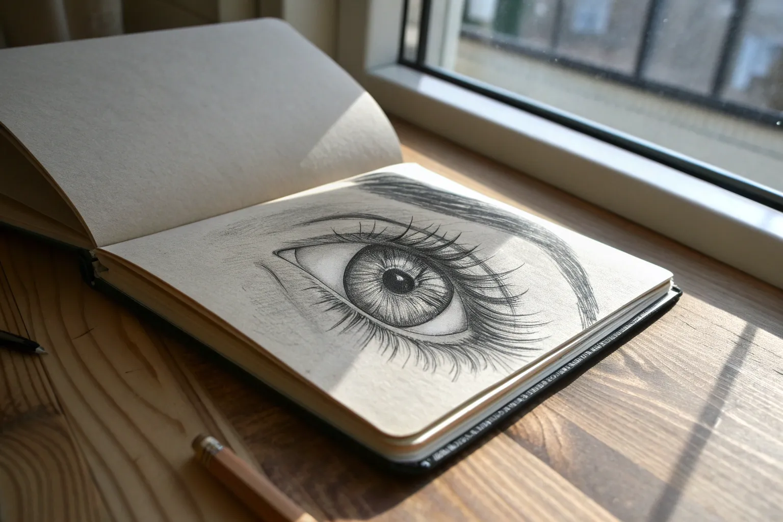
Hyper-Realistic Eye Texture Study
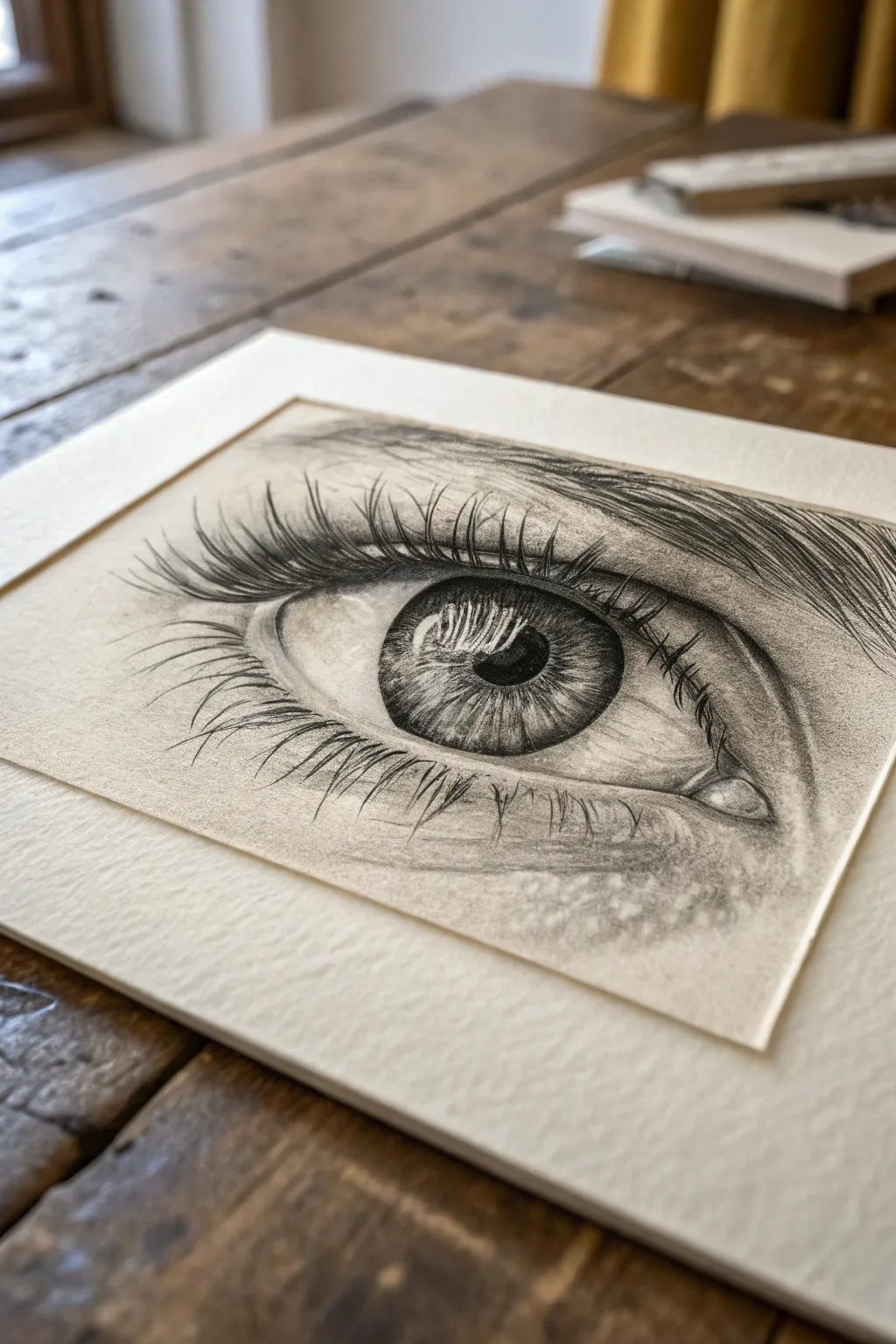
Dive into the intricate world of hyper-realism with this detailed pencil study of the human eye. By layering graphite and focusing on texture, you’ll capture the glossy reflection of the iris and the delicate sweep of eyelashes.
Step-by-Step
Materials
- High-quality smooth drawing paper (bristol or hot press watercolor paper)
- Graphite pencils (ranges 2H, HB, 2B, 4B, 6B)
- Mechanical pencil (0.5mm HB or 2B) for fine details
- Kneaded eraser
- Precision eraser (rendering stick or mono zero)
- Blending stumps (tortillons) and tissue
- Workable fixative spray
- Artist tape
- Pre-cut mat board for framing
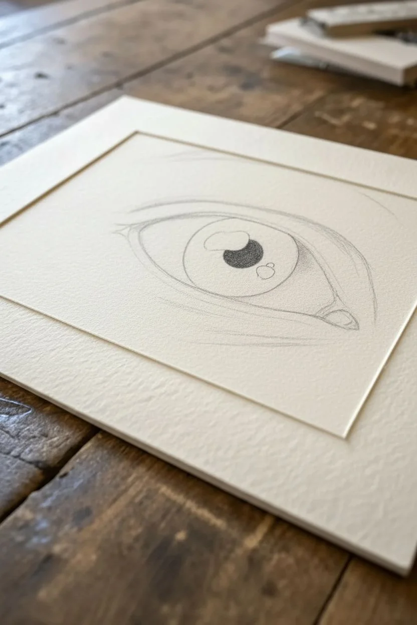
Step 1: Basic Structure & Iris Mapping
-
Outline the Shape:
Begin with a very light 2H pencil to sketch the almond shape of the eye. Mark the tear duct in the inner corner and lightly indicate the crease of the eyelid above. -
Define the Iris:
Draw a perfect circle for the iris using a compass or steady hand. Inside it, place the pupil in the center. Crucially, map out the shapes of the highlights (light reflections) now so you don’t accidentally color over them later. -
Darkest Darks First:
Switch to a 6B pencil and fill in the pupil, pressing firmly to get a deep, rich black. Avoid the mapped-out highlight area completely—leave that the pure white of the paper.
Keeping it Clean
Place a scrap piece of paper under your drawing hand at all times. This prevents the graphite from smudging onto the clean skin areas of the drawing or your hand oils from reaching the paper.
Step 2: The Iris: Depth & Detail
-
Radiating Spokes:
Using a sharp 2B pencil, draw lines radiating outward from the pupil like bicycle spokes. Vary the length and pressure to create natural variation. -
Outer Ring Shading:
Darken the outer limbal ring (the edge of the iris) with a 4B pencil. Blend this darkness slightly inward toward the center to create a convex, dimensional look. -
Mid-Tone Texture:
Fill the rest of the iris with HB and B strokes, layering over your ‘spokes.’ Keep the texture fibrous. I find that lifting small highlights out with a kneaded eraser at this stage adds incredible depth. -
Refining Reflections:
Within the main highlight area, lightly draw the reflection of eyelashes. These are actually tiny, curved negative spaces or light grey lines inside the white block that show the environment reflecting on the wet eye.
Level Up: Moisture
Use a white gel pen for the absolute brightest highlights in the tear duct and lower waterline. This extreme contrast creates a ‘wet’ look that pencil alone struggles to achieve.
Step 3: The Sclera & Skin Texture
-
Shading the Whites:
The ‘white’ of the eye (sclera) is spherical, so it needs shading at the corners. Use a dirty blending stump or a very light H pencil to add shadows under the upper lid and in the corners. Keep it subtle. -
Tear Duct Detailing:
Render the tear duct with soft, wet-looking fleshy tones. Outline small shapes for moisture highlights and shade around them with HB and 2B to make the tissue look glistening. -
Skin Grain:
Move to the skin around the eye. Instead of smooth shading, use small, circular motions (scumbling) or tiny varied ticks with an H or HB pencil to simulate pores and fine wrinkles. -
Creases and Folds:
Darken the eyelid crease with a 2B pencil. Adding tiny, distinctive cross-hatching lines perpendicular to the crease helps communicate the elasticity of the skin.
Step 4: Lashes & Final Touches
-
Mapping Lash Direction:
Before drawing dark lashes, visualize their curve. They don’t stick straight up; they swoop down and then curve upward (J-shape). Lightly mark a few guide lashes. -
Drawing Upper Lashes:
Use a sharp mechanical pencil or 4B. Start at the root on the eyelid line, press down, then flick the pencil up quickly to create a tapered point. Group them slightly; lashes often stick together. -
Reflected Lashes:
Don’t forget the reflection! Draw distorted, lighter versions of the lashes in the highlight of the iris you reserved earlier. -
Lower Lashes:
Draw the lower lashes much shorter and more sparse than the upper ones. They should originate from the outer edge of the lower waterline, not inside the eye. -
Waterline Highlight:
Use your precision eraser (mono zero) to lift a clean, sharp line of white right above the lower lashes. This wet rim catches the light and is essential for realism. -
Finishing Polish:
Do a final pass for contrast. Deepen the pupil and the shadow under the upper lid. Clean up any smudges on the paper border. -
Mount and Display:
Spray lightly with workable fixative to prevent smudging. Once dry, tape the back of your drawing to the mat board frame to give it a professional gallery finish.
Now step back and admire how a few graphite values have transformed into a soulful, watching gaze

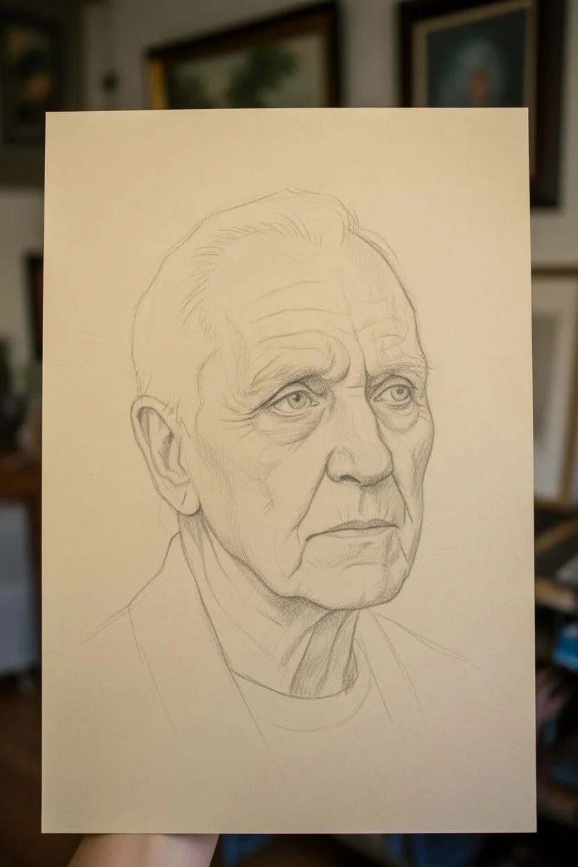
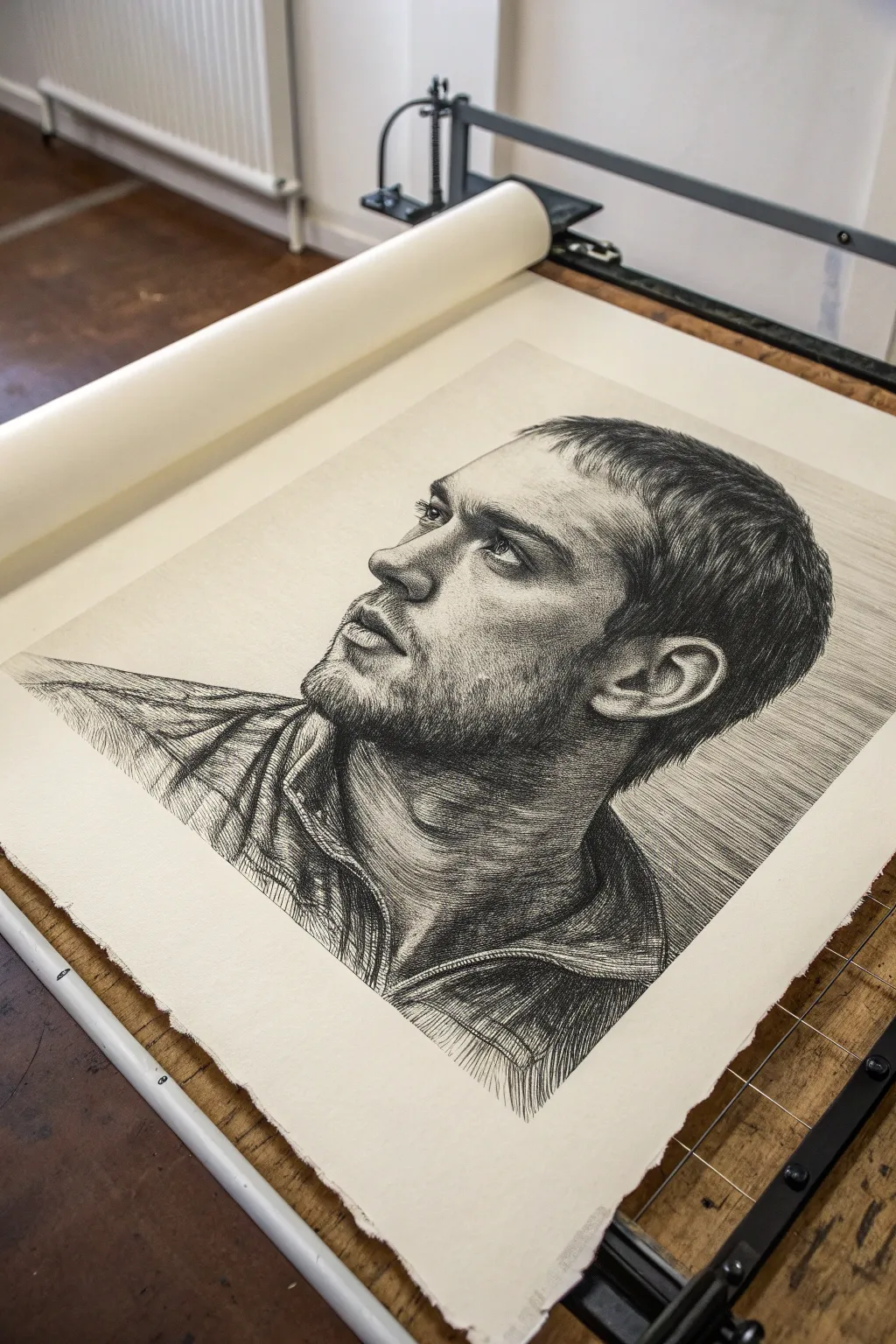
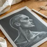
High-Contrast Portrait With Dramatic Lighting
Master the art of dramatic lighting with this high-contrast portrait study that focuses on facial structure and texture. By pushing your darks to their limit and carefully preserving your whites, you will sculpt a face that emerges powerfully from the shadows.
Step-by-Step Tutorial
Materials
- High-quality drawing paper (smooth or vellum finish, approx. 11×14 inches)
- Graphite pencils (ranges 2H to 8B)
- Black charcoal pencil (medium or soft) for deepest blacks
- Kneaded eraser
- Precision eraser (rendering stick or mono zero)
- Blending stumps (tortillons)
- Tissue or chamois cloth
- Masking tape (for clean borders)
- Workable fixative (optional)
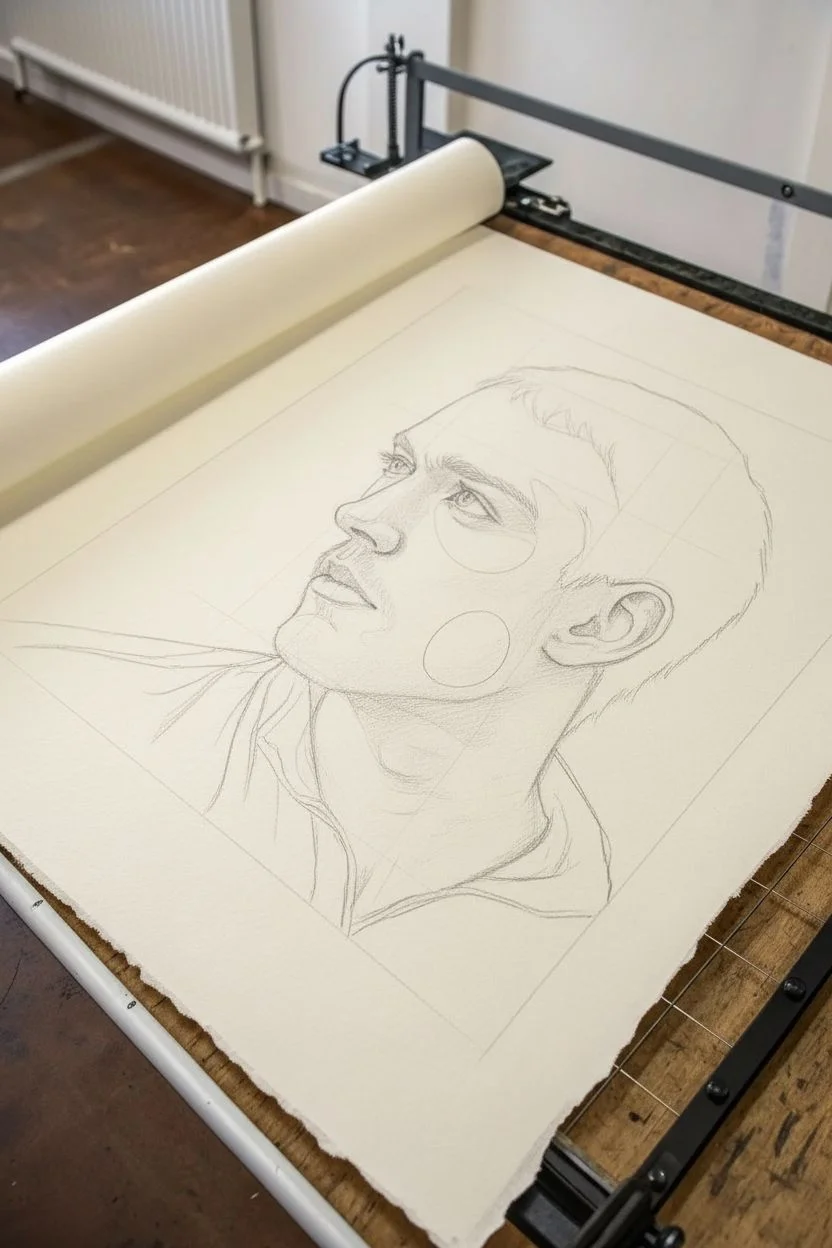
Step 1: Preparation and Outline
-
Border Setup:
Begin by taping down the edges of your paper with masking tape or artist’s tape. This not only secures your paper but creates the crisp, clean white border seen in the final piece, which contrasts beautifully with the dark background. -
Initial Blocking:
Using a 2H or HB pencil, lightly sketch the basic envelope of the head. Focus on the angle of the jawline and the slope of the nose. Keep these lines faint so they don’t show through later shading. -
Mapping Features:
Refine the placement of the eye, nose, and mouth. Pay close attention to the negative space between the nose and lips. In this three-quarter view, the far eye is partially obscured by the bridge of the nose. -
Shadow Mapping:
Lightly outline where your darkest shadows will fall—specifically the large block of shadow behind the head, the deep shadow under the jaw, and the core shadows on the cheek.
Clean Hands, Clean Art
Place a scrap sheet of paper under your drawing hand at all times. This prevents oils from your skin transferring to the paper and stops you from smudging your hard work.
Step 2: Establishing Values
-
Background Fill:
Start with the dark background to establish your darkest value immediately. Use a 4B or 6B graphite pencil (or charcoal for pitch black) to fill the large area behind the face. Apply in layers rather than pressing too hard at once to avoid damaging the paper tooth. -
Initial Eye Detailing:
Move to the eye. Sharpen a 2B pencil to a fine point for the iris and pupil. Leave the tiny white highlight completely blank paper—don’t rely on erasing it later for the brightest white. -
Sculpting the Nose:
Shade the side of the nose using an HB pencil. The transition from the bridge to the cheek needs to be soft. I find lightly blending with a tissue here helps establish that smooth skin texture early on. -
Cheekbone Definition:
Build the core shadow under the cheekbone using a 2B. This shadow defines the facial structure. Gradient it gently upward toward the eye socket and sharply downward toward the jawline.
Add an Aged Look
Instead of bright white paper, try this drawing on a toned tan or grey paper. Use a white charcoal pencil for the highlights to make the lighting pop even more dramatically.
Step 3: Refining Texture and Depth
-
Deepening Shadows:
Switch to your softer pencils (4B-6B) to punch up the contrast. Darken the nostril, the corner of the mouth, and the area where the ear meets the jaw. This high contrast is essential for the dramatic look. -
Lip Texture:
Render the lips using vertical strokes to mimic natural cracks and texture. The upper lip should be significantly darker than the lower lip, as it is angled away from the light source. -
Skin Micro-Texture:
For realistic skin, use a technique called ‘stippling’ or tiny circular motions with a sharp H or HB pencil on the cheek and nose areas. This suggests pores without drawing dots. -
The Ear:
Draw the intricate folds of the ear. The inner recesses need to be very dark (4B), while the cartilage ridges should catch the light. Sharp contrast here makes the ear look three-dimensional. -
Neck Transition:
Shade the neck with vertical strokes that follow the anatomy of the sternocleidomastoid muscle. Keep this area slightly rougher or softer than the face to keep the focus on the eyes.
Step 4: Hair and Final Touches
-
Base Hair Flow:
Establish the direction of the hair with broad strokes using a 2B pencil. Don’t draw individual strands yet; think of the hair as ribbons of value wrapping around the skull. -
Darkening Hair Roots:
Use a 6B or 8B to darken the roots and the areas where the hair tucks behind the ear. This separation creates volume. -
Flyaway Hairs:
With a freshly sharpened HB or H pencil, add wispy, individual flyaway hairs on the crown and near the forehead. These chaotic lines add realism to an otherwise structured portrait. -
Highlight Retrieval:
Take your precision eraser (or a sliced piece of regular eraser) and lift out thin highlights in the hair and small specular highlights on the moist parts of the eye and lower lip. -
Final Cleanup:
Carefully peel away the masking tape to reveal your crisp border. Use a kneaded eraser to pick up any stray smudge marks from the white areas.
Step back and admire how the careful balance of light and shadow brings a soulful intensity to your finished portrait

Aged Skin Study With Wrinkles and Pores
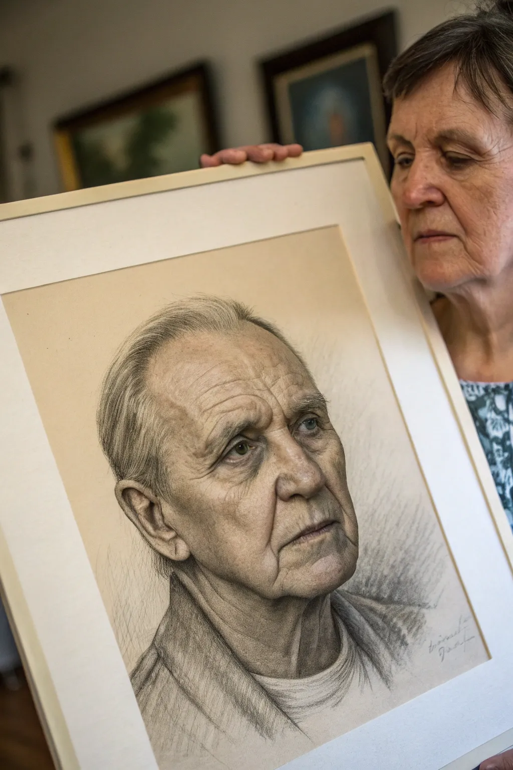
Capture the wisdom and texture of experience with this advanced observational study of aged skin. This project focuses on rendering intricate wrinkles, pores, and thinning hair using a combination of graphite and charcoal to achieve depth and striking realism.
Step-by-Step Guide
Materials
- High-quality drawing paper (smooth bristol or hot press watercolor paper)
- Graphite pencils (HB, 2B, 4B, 6B)
- Charcoal pencils (medium and soft)
- Willow charcoal stick
- Kneaded eraser
- Fine-point eraser (mechanical or stick)
- Blending stumps (tortillons) in various sizes
- Soft tissue or chamois cloth
- Fixative spray
Step 1: Structural Foundation
-
Establish the Head Shape:
Begin with a very light HB pencil to sketch the basic oval of the head. Mark the eye line slightly below the halfway point, as skin tends to sag with age, lowering features visually. -
Map Facial Features:
Lightly block in the deep-set eyes, the prominent nose cartilage, and the resting mouth. Pay attention to the asymmetry that naturally occurs in older faces. -
Outline Major Skin Folds:
Sketch the primary wrinkles: the deep nasolabial folds running from nose to mouth, the horizontal forehead creases, and the sagging skin around the jawline.
Pro Tip: Avoid ‘Wire’ Wrinkles
Never draw wrinkles as single dark lines. A wrinkle is a fold: it has a shadow side, a deep crevice, and a highlighted ridge. Draw the shadow and highlight to create the form.
Step 2: Developing the Eyes and Forehead
-
Deepen the Eye Sockets:
Using a 2B pencil, shade the hollows of the eyes. Older skin is thinner here, creating deeper shadows. Leave the iris bright for now to maintain life in the portrait. -
Refine the Forehead:
Work on the forehead wrinkles using a 4B pencil. Don’t just draw lines; shade gradients on either side of the wrinkle line to show the cylindrical volume of the skin fold. -
Add Pore Texture:
Lightly stipple visible pores across the forehead and nose bridge using a sharp HB pencil. Vary the pressure so it doesn’t look like a uniform grid. -
Highlighting the Ridges:
Use your kneaded eraser to lift pigment from the top ridges of the wrinkles. This high contrast between the deep crevice and the lit skin creates the 3D effect.
Level Up: Tinted Paper
Try this portrait on tan-toned paper. Use white charcoal for the highlights on the wrinkle ridges and hair to make the aging features pop dramatically.
Step 3: Mid-Face and Cheeks
-
Shade the Cheekbones:
Apply soft charcoal or a 6B graphite pencil to the shadow side of the face. Use a blending stump to smooth this out, representing the loss of collagen and subcutaneous fat. -
Detail the Nasolabial Fold:
Darken the deep crease running from the nose past the mouth corner. Ensure the shadow softens gradually as it moves outward toward the cheek. -
Render the Nose:
Focus on the bulbous nature of the nose tip. Use cross-hatching to build up shadows on the underside, and keep the highlights sharp on the bridge. -
Refine the Mouth Area:
Draw the thin lips, emphasizing the vertical cracks often seen in aged lips. Shade the area below the lower lip deeply to push the chin forward.
Step 4: Hair and Neck Texture
-
Draft the Hairline:
With a sharpened H or HB pencil, draw fine, individual strokes for the thinning hair. Follow the natural growth direction, curling slightly over the ears. -
Build Hair Density:
Layer darker 2B strokes behind the lighter ones to create depth, simulating the scalp showing through the thin hair. Leave white paper for the grey/white strands. -
Define the Neck Structures:
Sketch the prominent tendons (sternocleidomastoid muscles) and the loose skin (turkey neck) texture. The shadows here should be softer and less defined than on the face. -
Clothing Suggestion:
Use the side of a charcoal stick or a loose 6B pencil to quickly suggest the texture of the shirt collar and jacket. Keep this loose to ensure the focus remains on the face.
Step 5: Final Refining
-
Deepen Contrast:
Revisit the darkest areas—pupils, nostrils, and deep wrinkles—with your softest charcoal or black pencil to punch up the contrast. -
Micro-Details:
I like to use a mechanical eraser here to pull out tiny highlights on the moist lower eyelids and the very tips of the pores on the nose. -
Adding Age Spots:
Lightly dab irregular shapes with a tortillon loaded with graphite dust to create subtle liver spots or pigmentation variances on the cheeks and forehead. -
Final Seal:
Once satisfied, spray a light coat of fixative to prevent the darker charcoal areas from smudging.
Step back and admire the soulful depth you have captured in this textured study.

Foreshortened Pose From an Extreme Angle
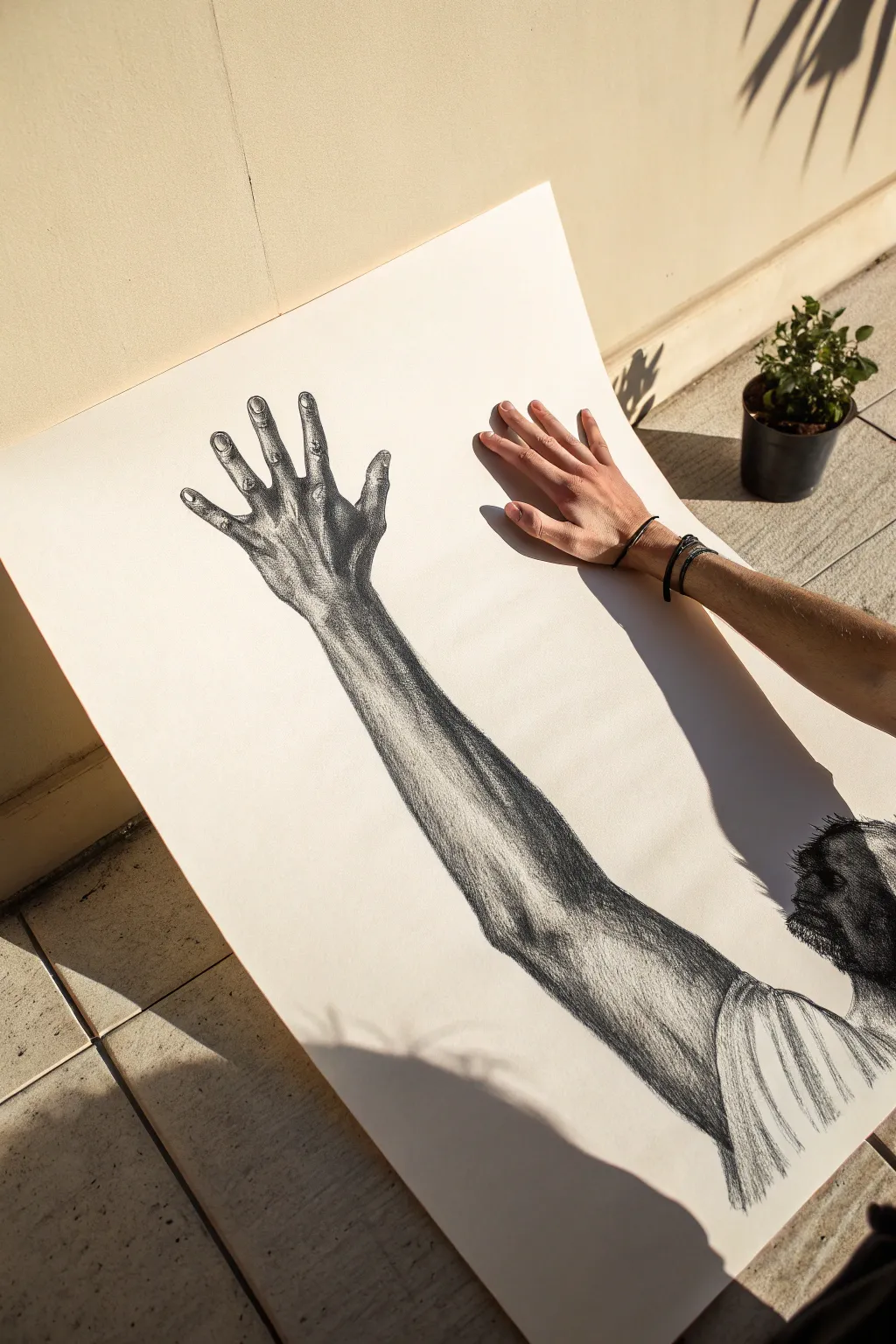
Master the art of extreme perspective with this striking charcoal drawing of an outstretched arm. By focusing on dramatic foreshortening, you will learn to create depth and volume that seemingly breaks the two-dimensional plane of your paper.
Step-by-Step Guide
Materials
- Large sheet of smooth Bristol or mixed media paper (at least A2 size)
- Charcoal sticks (vine and compressed)
- Charcoal pencils (soft, medium, hard)
- Kneaded eraser
- Paper blending stumps (tortillons)
- Fixative spray
- Reference photo of an arm reaching toward a camera
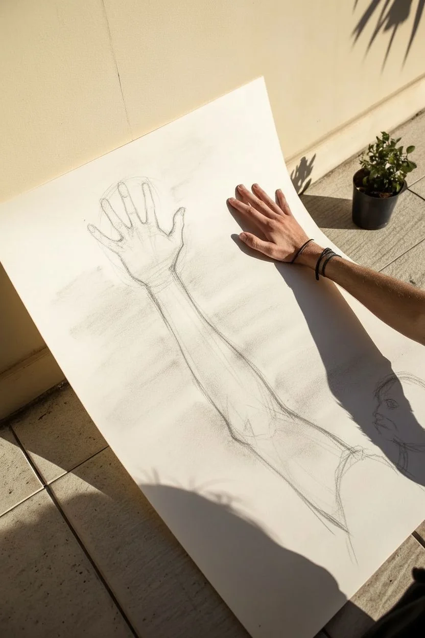
Step 1: Planning the Perspective
-
Establish the viewing angle:
Begin by observing your reference photo or model carefully. The key to this drawing is understanding that the hand will appear disproportionately large compared to the shoulder and head due to perspective. -
Map the major forms:
Lightly sketch the basic shapes using a vine charcoal stick. Draw a large, rough oval for the hand at the top left and a smaller cylinder for the forearm connecting it to the arm. Place the head in the bottom right corner as an anchor point. -
Refine the gesture:
Connect your shapes with a sweeping gesture line. Ensure the angle creates a diagonal composition across the page, leading the eye from the dense detail of the head up to the open hand. -
Block in the light and shadow:
Before adding detail, squint at your subject to see the main value masses. Use the side of your charcoal stick to lay down broad areas of shadow along the underside of the arm and the contours of the muscles.
Clean Edges
Keep a piece of scrap paper under your drawing hand at all times. This prevents your palm from smudging the charcoal you’ve already laid down.
Step 2: Drawing the Hand and Arm
-
Detail the fingers:
Switch to a medium charcoal pencil. Outline the fingers, paying close attention to the foreshortening of the phalanges. The fingertips should look rounded and close to the viewer, while the finger lengths may appear compressed. -
Sculpt the palm and wrist:
Deepen the shadows in the palm and the creases of the wrist. I find it helpful to draw the ‘negative space’ between the fingers to get the separation just right. -
Define the forearm muscles:
Follow the anatomy of the arm down the page. Use directional shading—strokes that wrap around the form—to emphasize the cylindrical shape of the forearm. Darken the edge of the arm against the white paper to make it pop. -
Add texture to the skin:
Use a kneaded eraser to lift out highlights on the knuckles, veins, and tendons. This ‘subtractive drawing’ technique creates the illusion of skin catching the light. -
Blend for volume:
Use a blending stump to soften the transitions between your core shadows and mid-tones. Be careful not to over-blend; you want to keep some texture to represent the skin’s surface.
Step 3: The Head and Final Touches
-
Sketch the profile:
Focus on the head in the bottom right corner. Since it is further away, keep the details slightly less sharp than the hand to enhance the depth of field effect. -
Render the hair and beard:
Use a soft, compressed charcoal stick for the darkest darks in the hair and beard area. Use short, flicking strokes to mimic the texture of coarse hair against the light skin. -
Connect the shoulder:
Draw the fabric of the shirt or the curve of the shoulder connecting the head to the arm. Keep these lines fluid to suggest the tension of the reaching pose. -
Enhance the contrast:
Take a step back and assess the drawing. Use your darkest charcoal to re-state the deepest shadows under the arm and around the fingers. High contrast is essential for a 3D look. -
Clean the background:
Use a clean eraser to remove any smudges from the white background paper. The stark white space around the arm emphasizes the silhouette. -
Final fixative:
Once satisfied, spray the drawing with a workable fixative in a well-ventilated area to prevent the charcoal from smudging.
Dramatic Tension
Make the hand interact with something! Draw a small object (like a butterfly or a floating geometric shape) just barely out of reach to add narrative.
Hang your finished piece where the lighting can play off the deep charcoal textures and enjoy the illusion of depth you have created

PENCIL GUIDE
Understanding Pencil Grades from H to B
From first sketch to finished drawing — learn pencil grades, line control, and shading techniques.
Explore the Full Guide
Curly Hair Study With Volume and Flyaways
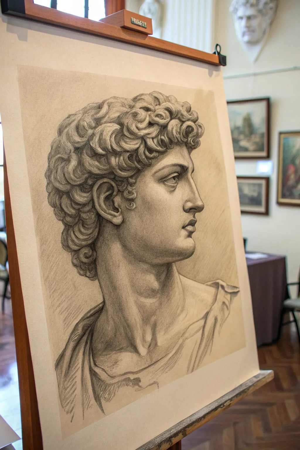
Master the art of classical realism with this detailed study of a sculptural bust, focusing heavily on rendering voluminous curls and smooth marble-like skin textures. This project balances precise anatomical structure with loose, expressive shading to create a drawing that feels three-dimensional and timeless.
Step-by-Step Tutorial
Materials
- High-quality drawing paper (smooth or vellum finish, slightly off-white)
- Graphite pencils (HB, 2B, 4B, 6B)
- Mechanical pencil (0.5mm HB or 2B) for fine details
- Kneaded eraser
- Precision eraser (stick or mono zero)
- Blending stump or tortillon
- Paper towel or tissue
- Artist tape (for securing paper to board)
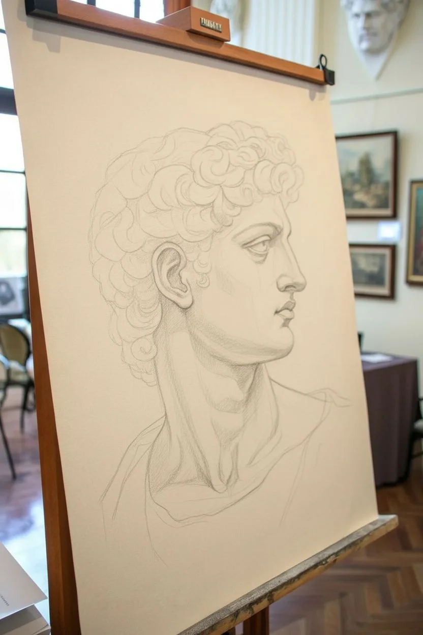
Step 1: Structural Underdrawing
-
Establishing the Envelope:
Begin by lightly sketching the overall ‘envelope’ or outer shape of the head using an HB pencil. Focus on the angle of the neck and the main axis of the face to ensure the profile captures that proud, upward gaze. -
Blocking Features:
Map out the major landmarks: the brow ridge, the nose, the line of the mouth, and the chin. Use straight, angular lines rather than curves at this stage to get accurate proportions. -
Mapping Hair Masses:
Instead of drawing individual curls, draw large, simple shapes to represent the clusters of hair. Think of the hair as a helmet or a sculpted mass sitting on top of the skull. -
Refining the Profile:
Go back over your profile line with slightly more pressure, refining the subtle curves of the nose bridge, lips, and the distinct angle of the jawline.
Sculptural Lighting
Treat the hair like carved stone, not real hair. Focus on planes and solid forms rather than individual strands. Shade entire clumps first before adding detail.
Step 2: Rendering Form and Volume
-
Initial Shading Pass:
Using a 2B pencil, apply a light, even layer of tone to the shadow side of the face (the side facing away from the light source). Keep your strokes close together to create a unified shadow shape. -
Sculpting Features:
Darken the deepest accents first—the nostril, the corner of the mouth, and the pupil area of the eye. This establishes your darkest values early on. -
Midtones and Transitions:
Work on the cheek and neck muscles. Use a 2B or 4B pencil to build transition tones from the light areas into the shadows. I find using circular shading motions helps create that smooth, marble-like skin texture. -
Softening Edges:
Use a stump or tissue to gently blend the shading on the cheek and neck, but be careful not to over-blend; you want to retain some texture. -
Defining the Neck:
Pay distinct attention to the sternocleidomastoid muscle (the large neck muscle). Shade the hollow at the base of the neck deeply to push it back in space.
Step 3: Detailed Hair Study
-
Separating Curls:
Return to the hair masses. Breaking down those large shapes, start defining individual curls with a 4B pencil. Remember that each curl has a light side, a dark side, and a cast shadow. -
Creating Depth in Hair:
Darken the crevices between the curls with a 6B pencil. These negative spaces are crucial for making the curls look like they are popping out from the head. -
Adding Volume:
Shade the underside of the hair mass where it meets the forehead and ears. This cast shadow grounds the hair onto the head so it doesn’t look like it’s floating. -
The Mechanical Touch:
Switch to your mechanical pencil to draw the fine, crisp edges of the curls. This contrast between the soft shading and sharp lines mimics the chiseled nature of stone.
Troubleshooting: Flatness
If the face looks flat, your midtones are likely too light. Be brave with your shading; marble isn’t white in shadow. Darken the core shadows to round out the form.
Step 4: Drapery and Final Polish
-
Sketching the Toga:
Outline the folds of the drapery around the shoulders. Keep these lines fluid and rhythmic. -
Shading Folds:
Apply broad, sweeping strokes with a 4B pencil to the drapery shadows. Keep the fabric rendering looser and sketchier than the face to keep proper focus on the portrait. -
Lifting Highlights:
Take your kneaded eraser and shape it into a point. ‘Lift’ or dab away graphite on the bridge of the nose, the top of the cheekbone, and the highest points of the curls. -
Final Contrast Check:
Step back and squint at your drawing. Deepen the darkest shadows one last time with a 6B pencil, particularly under the chin and behind the ear, to maximize the 3D effect.
Now you have a striking classical study that captures the weight and elegance of ancient sculpture
Fur and Feathers Rendering Challenge
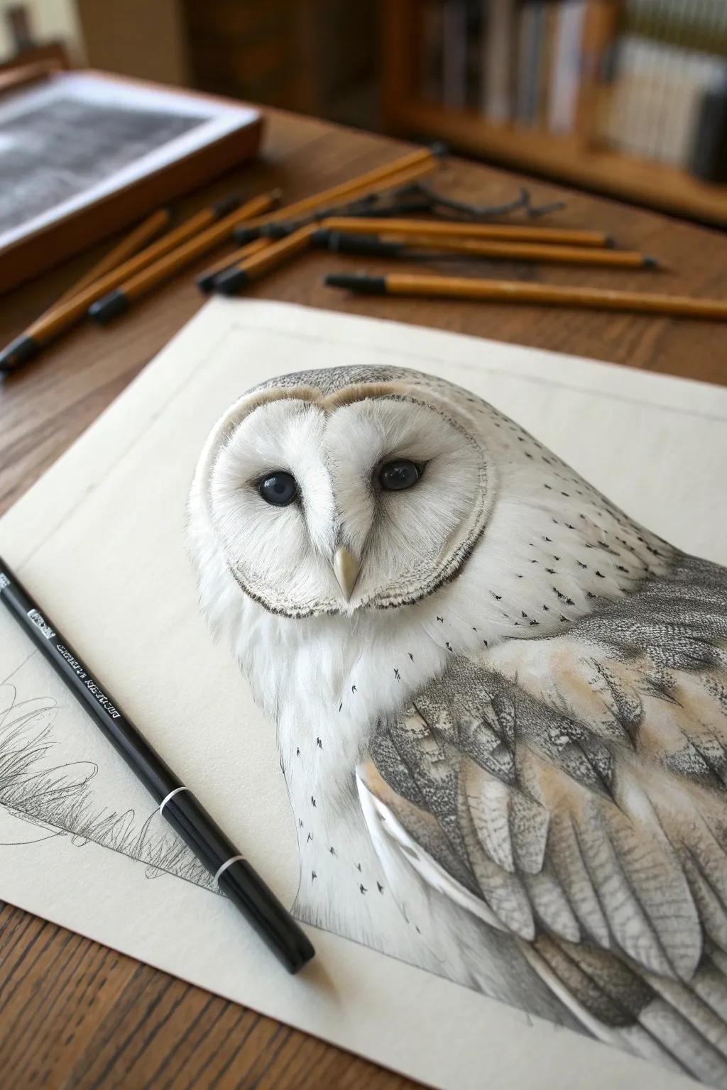
Master the art of rendering realistic textures with this striking barn owl study. By alternating between soft graphite blending and ultra-fine pen work, you’ll capture the delicate softness of facial discs and the overlapping complexity of wing feathers.
Step-by-Step Guide
Materials
- High-quality Bristol board or hot-press watercolor paper (smooth texture)
- Graphite pencils (HB, 2B, 4B)
- Fine-point black fineliners (0.05mm, 0.1mm, 0.3mm)
- White gel pen or gouache (for highlights)
- Blending stumps (tortillons)
- Kneaded eraser and precision eraser pen
- Soft brush (for sweeping away eraser dust)
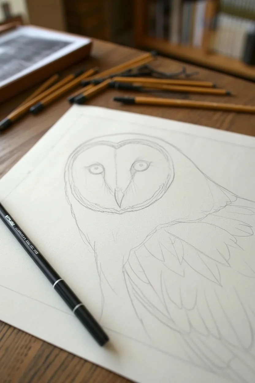
Step 1: Structural Foundation
-
Initial outline:
Begin with a very faint HB pencil sketch. Start with a heart shape for the face and an oval body angled slightly downward. Be careful not to press too hard, as you want these lines to disappear under the shading later. -
Map the features:
Lightly place the eyes and beak. Barn owl eyes are relatively small and dark, situated centrally within the facial discs. Draw the beak as a sharp, downward-curving hook right where the two facial discs meet. -
Define feather groups:
Sketch the major feather groupings on the wing rather than individual feathers. Look for the distinct layers: the shorter covert feathers near the shoulder and the longer flight feathers extending down.
Step 2: The Facial Disc
-
Eye depth:
Fill in the pupils with your darkest pencil (4B) or a black fineliner. Leave a tiny speck of white paper for the catchlight to bring the bird to life immediately. -
Creating the rim:
The barn owl’s distinctive facial rim needs a dark, textured border. Use a 2B pencil to stipple and draw tiny, radiating lines along the outer edge of the heart shape, creating a darker frame that fades inward. -
Radiating softness:
For the white face, use an HB pencil with extremely light pressure. Draw lines radiating from the eyes toward the outer rim. Blending is key here—I like to use a clean blending stump to smudge these lines outward, mimicking soft down. -
Beak details:
Shade the beak using a vertical gradient, keeping the top lightest and the tip dark. Add a tiny shadow underneath the beak to visually lift it off the feathers.
Pro Tip: Pencil sharpness
Feather texture relies on crisp lines. Rotate your pencil every few strokes to maintain a point, and sharpen frequently. A dull pencil creates a fuzzy, ‘fur-like’ look rather than crisp feathers.
Step 3: Wing and Body Plumage
-
Base wing shading:
Before adding detail, lightly shade the grey areas of the wing with a 2B pencil to establish the underlying value. This prevents the drawing from looking too flat or high-contrast later. -
Speckling technique:
The upper back and shoulder feathers have distinct tiny spots. Use your 0.05mm fineliner to dot these areas, varying the pressure to create a mix of bold and faint speckles. -
Flight feather shafts:
Draw the central shafts (rachis) of the long flight feathers first. This acts as a guide for the direction of the barbs. Make these lines firm but thinner towards the tip. -
Layering the barbs:
Using a sharp HB pencil, draw the individual barbs extending from the shafts. Ensure the lines curve slightly and overlap. On the lower wing, these should be tighter and smoother; on upper coverts, make them fluffier. -
Adding varied tones:
Introduce warmth if you wish to use colored pencils, or stick to graphite. Establish the darker grey/brown patterns on the feathers with a 4B pencil or 0.1mm pen to create the ‘barred’ look.
Level Up: Mixed Media
Wash a very diluted tea stain or watercolor earth tone over the wing feathers before drawing details. This adds an organic warmth that pure graphite sometimes lacks.
Step 4: Refining and Context
-
Chest texture:
The chest feathers are stark white with sparse speckling. Use a 2H or HB to create very faint, sparse ‘V’ shapes or ticks to suggest texture without darkening the area. -
Deepening shadows:
Identify where the wing overlaps the body. Use your darkest graphite (4B) or your 0.3mm pen to deepen the shadow under the wing edge, creating separation and volume. -
Highlight recovery:
Use a precision eraser or a white gel pen to pull back distinct highlights on the edges of the wing feathers and the top of the facial disc rim. -
Foreground sketch:
To ground the subject, sketch a loose, stylistic suggestion of grass or branches in the bottom left corner using the fine-point pen. Keep this minimal so it doesn’t distract from the owl.
Take a moment to step back and admire the complex layering you’ve achieved with just simple lines and shading
BRUSH GUIDE
The Right Brush for Every Stroke
From clean lines to bold texture — master brush choice, stroke control, and essential techniques.
Explore the Full Guide
Architectural Facade With a One-Point Perspective Grid
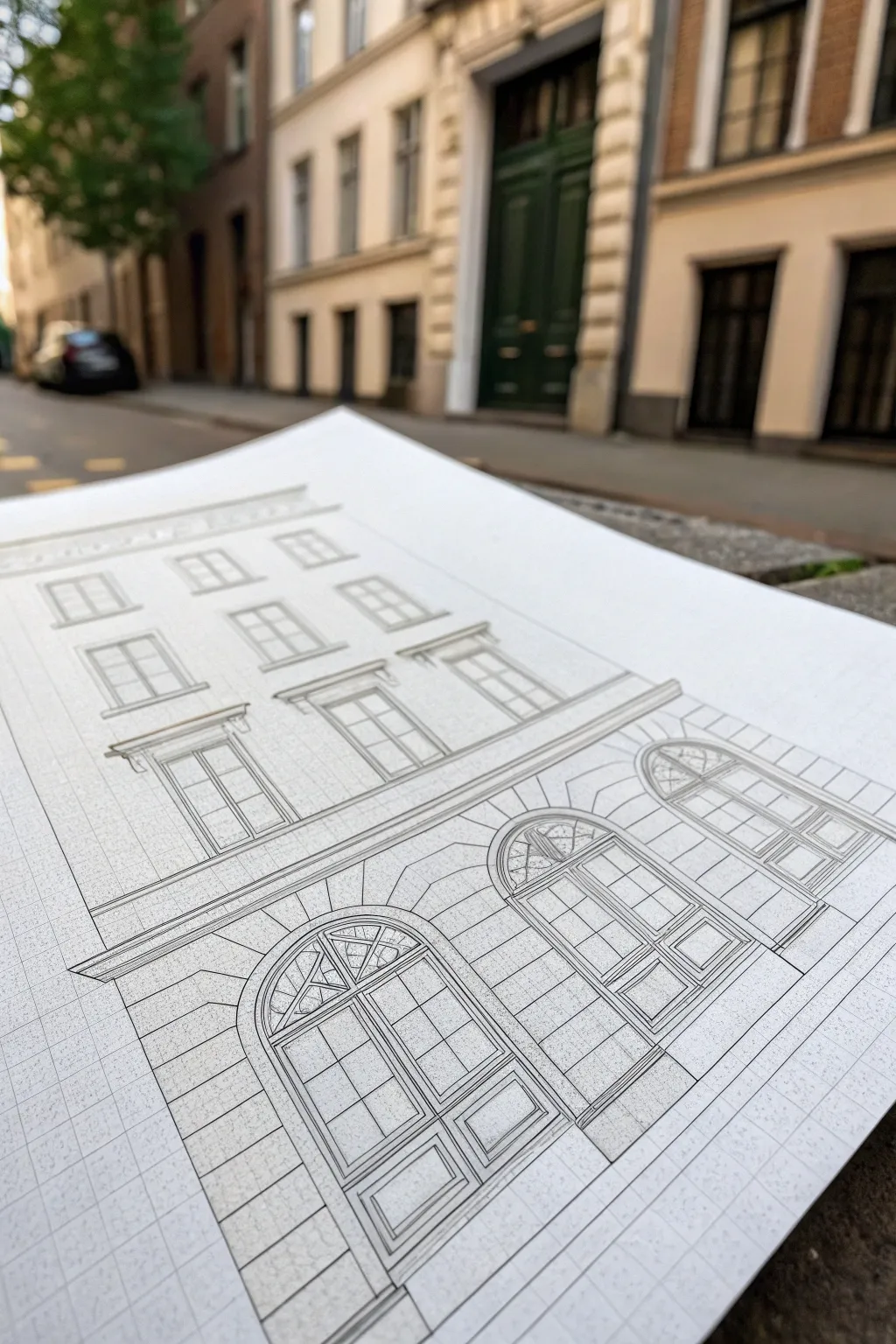
This project bridges the gap between technical drafting and artistic urban sketching, featuring a highly detailed building façade drawn on a structured grid. It captures the elegance of European architecture with crisp lines and dramatic perspective, all rendered in simple graphite.
Step-by-Step
Materials
- High-quality bright white drawing paper or Bristol board (A4 or A3)
- Mechanical pencil (0.5mm, HB lead)
- Graphite pencils (2H for guidelines, 2B for shading)
- Fine-point black fineliner (0.1mm) – optional for final inking
- Large transparent ruler (30cm or 50cm)
- T-square or triangle ruler (for perfect verticals)
- Kneaded eraser
- Precision eraser (stick eraser)
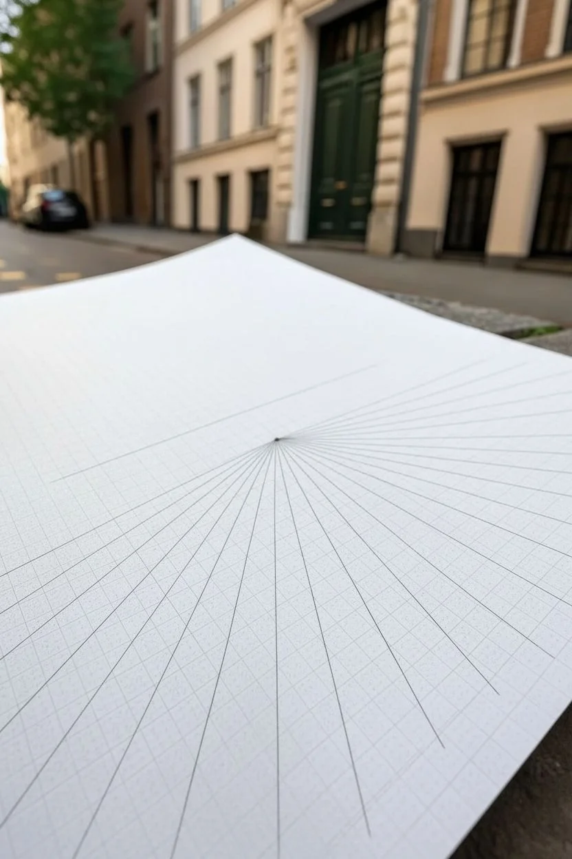
Step 1: Setting the Perspective Framework
-
Establish the horizon line:
Begin by drawing a faint horizontal line across your paper, roughly one-third of the way down from the top. This represents the viewer’s eye level. -
Mark the vanishing point:
Place a small dot on your horizon line. Since this is an angled view of a façade, place the vanishing point far off to the right side (even off the paper slightly if you want a subtle angle) or near the right edge. -
Draft the grid floor:
Using a ruler, draw a series of radiating lines from your vanishing point toward the bottom left of the paper. These will form the perspective lines for the horizontal elements of the building. -
Add vertical guidelines:
Draw perfectly vertical lines perpendicular to the bottom edge of your paper. Space them out to represent the width of the building sections and windows. The combination of these verticals and the radiating lines creates your perspective grid.
Slanted Spacing?
If vertical windows look like they are leaning, check your vertical guidelines against the paper edge. Even a 1-degree tilt ruins the illusion of stability.
Step 2: Constructing the Façade
-
Block in the main floors:
Using your 2H pencil, lightly sketch the horizontal bands that separate the ground floor, the middle floors, and the cornice at the top, following the angled perspective lines. -
Define the grand archways:
On the ground floor, sketch three large arches. Draw a centerline for each arch first to ensure symmetry. Use a loose hand to curve the top of the arch, connecting the vertical sides. -
Detail the arch windows:
Inside the arches, draw the fanlight windows (the semi-circles at the top). Divide them into intricate geometric sections—usually a central keystone with radiating muntins. -
Draft the doors:
Below the fanlights, draw the tall double doors. Add rectangular panels to the doors, ensuring the horizontal lines of the panels vanish toward your established point. -
Position the upper windows:
Move to the second and third floors. Draw rectangular boxes for the windows, aligning them vertically with the arches below where possible. Add a slight thickness to the window sills. -
Add window panes:
Divide the upper windows into classic ‘six-over-six’ or ‘four-over-four’ panes. Keep your pencil sharp here; muddy lines will ruin the technical look.
Step 3: Refining and Texturing
-
Strengthen the structural lines:
Switch to your mechanical pencil or a sharper HB pencil. Go over the main outline of the building, the window frames, and the door arches with a firm, confident stroke. -
Create stone texture:
On the ground floor, draw horizontal lines to simulate rusticated stonework (large blocks). I tend to leave slight gaps in these lines so the texture represents joint lines rather than stripes. -
Detail the cornices:
Add multiple thin parallel lines to the horizontal bands separating floors to suggest molding and depth. -
Add decorative headers:
Above the second-floor windows, draw small triangular or flat pediments. These architectural details add instant realism. -
Clean up guidelines:
Use your kneaded eraser to gently lift away the initial construction lines and the perspective grid where it distracts from the clear architectural features. -
Apply subtle shading:
Use the 2B pencil to add light shading inside the window panes to suggest glass reflection or interior depth. Shade strictly in one direction (diagonal hatching works well) for a clean, architectural style. -
Final perspective check:
Review the bottommost lines of the drawing. Ensure the base of the building anchors solidly to the ground grid you drew in the beginning.
Old World Charm
To make the building look aged, intentionally break the straight lines of the stone blocks slightly and add tiny stippling dots near corners to suggest grime.
Now you have a technically precise architectural study that looks ready for a blueprint presentation
Monochrome Ink Portrait Using Crosshatching and Scumbling
Capture the intensity of the human gaze with this sophisticated monochrome portrait that pushes ink techniques to their limit. By combining rigorous crosshatching with soft scumbling, you will create a highly dimensional finish that feels both classic and strikingly modern.
Step-by-Step Guide
Materials
- High-quality cotton rag paper (heavyweight, hot press needed for detail)
- Set of fine liner pens (0.05mm, 0.1mm, 0.3mm, 0.5mm)
- Graphite pencil (HB or H)
- Kneaded eraser
- Reference photo with strong directional lighting
- Ruler or lightbox (optional for grid transfer)
- Workable fixative spray
Step 1: Preparation and Contour
-
Analyze your reference:
Select a reference photo that features dramatic side lighting. High contrast is crucial for this style because crosshatching relies on shadow mapping rather than color variation to create form. -
Establish the envelope:
Using your HB pencil, lightly sketch the outermost shape of the head and shoulders. I prefer to use straight lines to block in the general angles first, focusing on the tilt of the head and the prominent jawline. -
Map key features:
Place the eye line, nose base, and mouth line. Pay special attention to the three-quarter perspective; the far eye will be partially obscured by the bridge of the nose. -
Refine the outline:
Tighten your pencil sketch to define the specific shapes of the ear, the collar of the shirt, and the hair direction. Keep your lines faint so they can be erased later without dragging graphite into the ink. -
Mark shadow zones:
Before touching pen to paper, lightly circle the darkest shadow areas on the face—under the jaw, the eye sockets, and inside the ear. These ‘topographic maps’ will guide your hatching density.
Step 2: Inking the Features
-
Start with the eyes:
Switch to a 0.05mm pen. Carefully outline the lids and iris. Do not outline the iris fully; leave a break for the highlight to keep the eyes looking wet and alive. -
Build the iris texture:
Use tiny, radiating lines from the pupil outward to darken the iris. Save the absolute darkest black (the pupil) for later to ensure you don’t overcommit too early. -
Hatch the nose and brow:
Using a 0.1mm pen, begin light hatching on the shadowed side of the nose. Use parallel diagonal lines. Do not crosshatch yet; just establish a single direction of tone. -
Define the ear:
The ear is a maze of convoluted shapes. Use darker contour lines for the deep recesses of the concha and lighter, broken lines for the outer helix to suggest soft cartilage. -
Detail the lips and beard:
For the stubble, don’t draw individual hairs everywhere. Instead, use short, directional dashes and stippling (scumbling) along the jawline. This suggests texture without looking rigid. Keep the upper lip darker than the lower lip.
Pro_tip: Follow the Flow
Don’t just hatch horizontally. Curve your hatch lines slightly to wrap around the form of the cheek or neck. This ‘contour hatching’ makes the drawing look 3D rather than flat.
Step 3: Developing Form and Texture
-
Primary crosshatching:
Return to the shadow side of the face with a 0.1mm pen. Lay a second set of parallel lines over your first set, moving at a slightly different angle (about 30 degrees). This creates the first level of depth. -
Deepening the shadows:
Switch to a 0.3mm pen for the darkest areas under the chin and neck. Adding weight here anchors the head. Use triple-hatching (three layers of lines) to create near-black values without losing paper texture entirely. -
Sculpting the hair:
The hair requires a different approach. Use long, sweeping strokes that follow the growth pattern from the crown. Group these strokes into clumps rather than drawing strands individually. -
Handling the clothing:
The shirt collar needs a rougher texture. Use looser, wider crosshatching than you used on the skin. This contrast in line quality helps distinguish fabric from flesh. -
Scumbling transition zones:
Where the shadow meets the light (the terminator line), use a ‘scumbling’ motion—tiny, controlled scribbles—to soften the transition. Rigid hatching here can make the face look metallic, whereas scumbling looks like skin pores. -
Background atmosphere:
To make the figure pop, add horizontal hatching to the background. Keep the lines densest right next to the light side of the face, fading them out as they move away. This creates a halo effect.
Level_up: Sepia Tones
For a vintage Renaissance study look, swap black liners for dark brown or sepia ink pens. Use a cream or off-white paper to enhance the warmth of the portrait.
Step 4: Final Touches
-
Erase pencil guides:
Wait at least 30 minutes for the ink to fully cure. Gently roll a kneaded eraser over the entire drawing to lift the initial graphite sketch. -
Reinforce the darkest darks:
Using your 0.5mm pen, go back into the pupils, nostrils, and the deep corner of the neck collar. These punchy blacks will increase the dynamic range of the image. -
White ink highlights (optional):
If you accidentally darkened a highlight in the eye or on the tip of the nose, a tiny dot of white gel pen can rescue the focal point. -
Protect the surface:
Since ink can fade or smudge if handled with moist hands, a light coat of matte spray fixative will seal the paper grain.
Step back and admire how thousands of simple lines have converged to capture a complex human expression.


Storytelling Comic Panel Sequence With Cinematic Framing
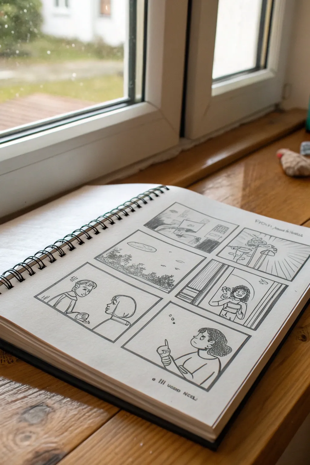
This project explores the art of visual storytelling by creating a dynamic six-panel comic sequence directly in a spiral sketchbook. You will learn to compose cinematic shots—from establishing landscapes to intimate character moments—using clean ink lines and strategic framing.
How-To Guide
Materials
- Spiral-bound sketchbook (A4 or similar size, smooth paper)
- Pencil (HB or H for sketching)
- Eraser (kneaded or soft vinyl)
- Fine liner pens (0.1mm, 0.3mm, 0.5mm black)
- Ruler (clear plastic is best for visibility)
- Reference photos for landscapes and figures (optional)
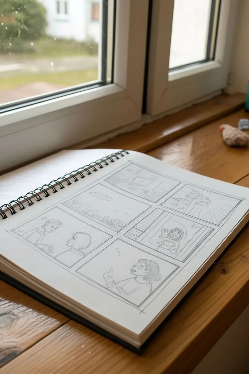
Step 1: Layout and Composition
-
Define the Panel Grid:
Begin by using your ruler and pencil to lightly draw a large rectangle that fills most of the page, leaving a distinct margin around the edges. Divide this main area into a grid. For this specific layout, create a top row with two panels (one wider, one narrower), a middle row with a large wide panel and a smaller vertical one, and a bottom row with two medium-sized panels. Don’t press too hard; these lines are guides. -
Create Gaps:
Thicken the space between your panels to create ‘gutters.’ Draw a second line about 2-3mm away from your initial grid divisions to separate the scenes clearly. This ensures the eye flows correctly from one image to the next. -
Sketch the Narrative Arc:
Lightly sketch the content of each panel with your pencil. Start with the top-left panel showing a wide establishing shot (like a landscape or room). Move to the next panel, perhaps zooming in on a detail. In the middle row, draft a conversation scene and a reaction shot. Finally, use the bottom row for character close-ups or a contemplative moment. -
Refine the Anatomy and Perspective:
Go back over your rough gestural sketches to tighten the drawing. Define the characters’ facial features, ensuring the eye lines match up in conversation panels. Check the perspective lines in your background shots, particularly in the landscape panel, to give the scene depth.
Mastering Perspective
Vary your ‘camera angles.’ Don’t draw every panel at eye level; try a birds-eye view for landscapes or an extreme close-up for emotional impact.
Step 2: Inking the Framework
-
Inking the Borders:
Switch to your thickest fine liner (0.5mm). Using the ruler, carefully trace over the panel borders. Creating a bold, solid frame helps contain the artwork and gives it that professional comic book look. Make sure the corners meet cleanly without overshooting. -
Outline Main Subjects:
Use a 0.3mm pen to outline the characters and major foreground elements. Keep your hand steady and try to use confident, continuous strokes rather than short, scratchy ones. For the characters in the bottom left, focus on the curve of the hair and the profile of the faces. -
Background Details:
Switch to your finest pen (0.1mm) for background elements. In the wide landscape panel, use delicate, broken lines to suggest trees, clouds, or distant buildings. This difference in line weight pushes the background back and keeps the focus on the foreground subjects.
Level Up: Grey Tones
Use a light grey alcohol marker or a diluted ink wash to add mid-tones. This adds instant depth without complex cross-hatching.
Step 3: Shading and Texturing
-
Hatching for Shadow:
Identify where your light source is coming from in each panel. Use simple hatching (parallel diagonal lines) to add shadows under chins, in folds of clothing, or on the shaded side of buildings. Keep the hatching consistent in direction. -
Adding Texture:
Add texture to specific areas to create visual interest. For the trees or bushes in the landscape panel, use small scribbles or stippling. For the character’s curly hair in the middle right panel, use small loops. I find adding small ‘speed lines’ or background rays in one panel adds dynamic energy. -
Final Clean Up:
Allow the ink to dry completely—give it at least 5 to 10 minutes to prevent smudging. Once dry, gently erase all the underlying pencil sketch lines. Brush away the eraser crumbs carefully to avoid creasing the paper. -
Adding Text or Symbols:
If your narrative needs dialogue or thought, add speech bubbles or simple thought clouds now. You can also add small floating symbols, like the bubbles in the bottom right panel, to indicate dreaming or thinking. -
Title and Date:
Finish by writing a small, stylistic title or caption at the bottom of the page or in the margin. Dating your work is a great habit to track your artistic progress.
Now you have a completed storyboard page ready to inspire your next graphic novel project

Have a question or want to share your own experience? I'd love to hear from you in the comments below!