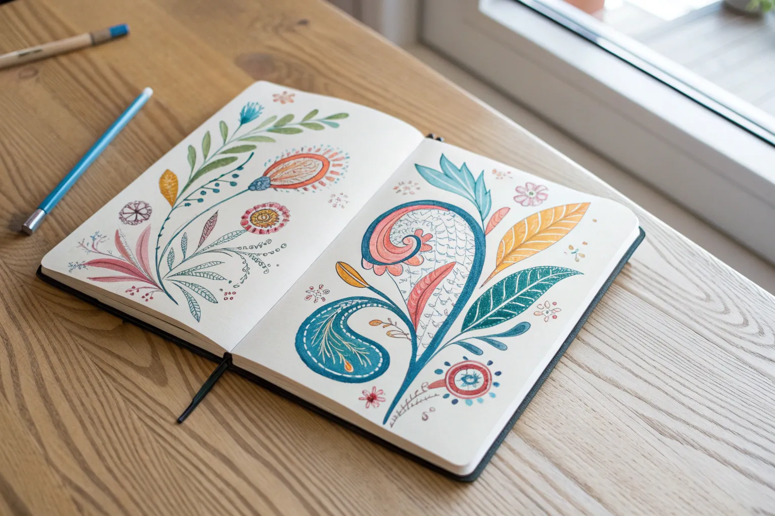
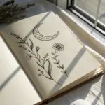
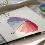
Sometimes all it takes is a simple idea and a gorgeous palette to make your sketchbook feel like a little gallery. Here are my go-to aesthetic drawing ideas with color—approachable, mood-driven, and made for those satisfying, color-harmonized pages.
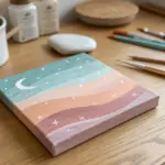
Sun, Moon, and Stars in a Two-Tone Palette
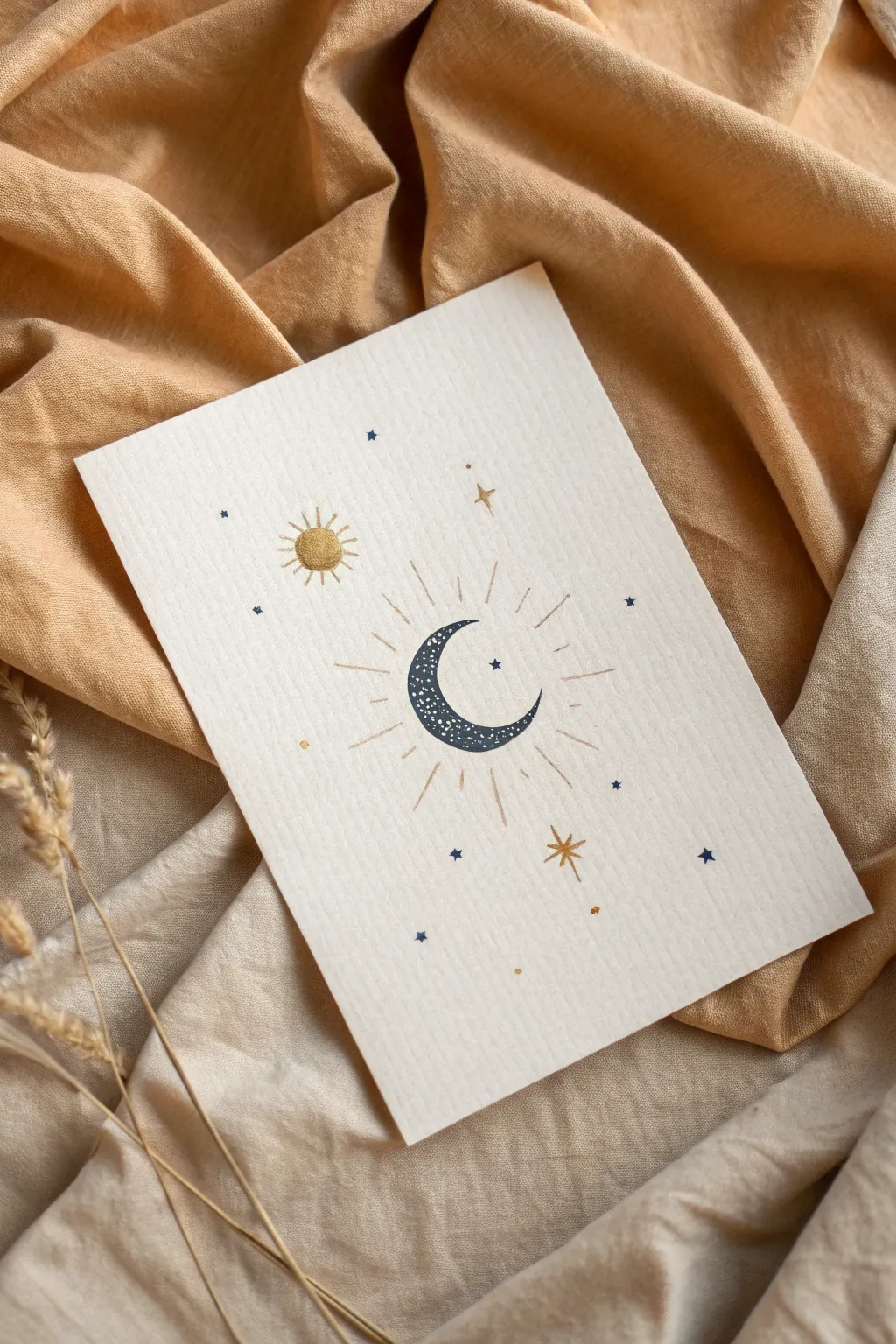
Bring the cosmos down to earth with this simple yet striking celestial illustration. Using a limited palette of deep navy and shimmering gold on textured paper creates a sophisticated, mystical vibe perfect for greeting cards or framed art.
Step-by-Step Guide
Materials
- Heavyweight textured cardstock (cream or off-white)
- Fine-liner pen or gel pen (deep navy blue)
- Metallic gold paint marker or gel pen (fine tip)
- Pencil (HB or lighter)
- Eraser
- Ruler
- Compass or circular object (like a small jar lid)
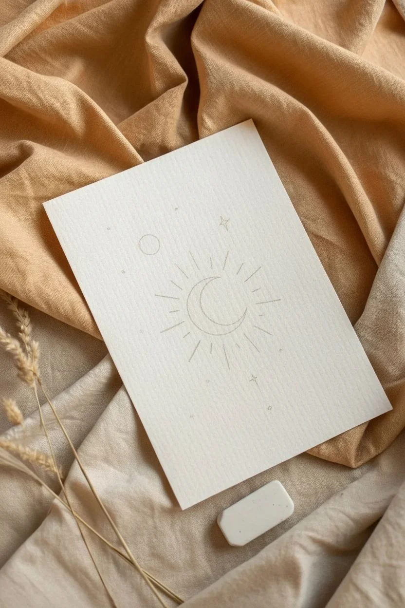
Step 1: Planning the Layout
-
Find the center:
Begin by lightly marking the center of your cardstock with a pencil. This will serve as the anchor point for your main element, ensuring the composition feels balanced. -
Sketch the moon shape:
Using a compass or a small circular object, lightly draw a circle in the center. Shift your compass or object slightly to the right and draw an intersecting curve inside the first circle to create a crescent moon shape. -
Position the sun:
To the upper left of the moon, lightly sketch a smaller circle for the sun. I like to keep this quite simple and distinctly separate from the main moon element. -
Draft the rays and stars:
Lightly sketch radiating lines coming outward from the moon. Then, mark small dots or tiny crosses where you want your scattered stars to go, balancing the empty space.
Keep it clean
Place a scrap piece of paper under your hand while drawing. This prevents oils from your skin from smudging the ink or warping the paper texture.
Step 2: Inking the Moon
-
Outline the crescent:
Take your navy blue fine-liner and carefully trace the outline of your crescent moon sketch. Work slowly to keep the curves smooth. -
Fill with texture:
Instead of coloring the moon solid black or blue, create texture by stippling. Make tiny, dense dots or small scribbles inside the crescent shape using the navy pen. -
Add negative space stars:
While filling in the moon, leave tiny specks of the paper showing through. These un-inked spots will act as craters or stars within the moon’s shadow. -
Refine the density:
Go back over the bottom curve of the crescent with more ink density to give the moon a sense of weight and dimension, fading slightly as you move toward the upper tip.
Step 3: Adding Golden Accents
-
Color the sun:
Switch to your metallic gold marker. Fill in the small circle for the sun completely. The metallic sheen contrasts beautifully with the matte navy ink. -
Detail the sun rays:
Draw short, straight lines radiating from the gold sun circle. Alternate strictly between short and slightly longer lines for a classic icon look. -
Draw the main rays:
Using the gold marker, trace the long, radiating lines coming from the moon. Vary the lengths to make the light feel organic and dynamic. -
Add major stars:
Draw a few four-pointed stars using the gold ink. Place one prominent star to the bottom right of the moon and a smaller one near the top.
Uneven circle fix
If your circle looks wobbly, don’t restart. Thicken the outline slightly in the uneven areas to smooth out the curve and hide the mistake.
Step 4: Final Celestial Details
-
Add navy stars:
Switch back to your navy pen. Draw tiny five-pointed stars or small asterisks in the empty areas to balance the composition. -
Create distant starlight:
Add singular dots of navy ink scattered randomly. These represent distant stars and help fill any awkward voids in the background. -
Incorporate gold dust:
With the gold marker, add very small dots interspersed among the navy stars. This brings the two colors together across the whole piece. -
Erase guidelines:
Wait at least 15-20 minutes to ensure all ink, especially the metallic marker, is completely dry. Gently erase any visible pencil sketch lines.
Now you have a serene piece of celestial art ready to frame or gift


Cute Clouds With Gradient Sky Coloring
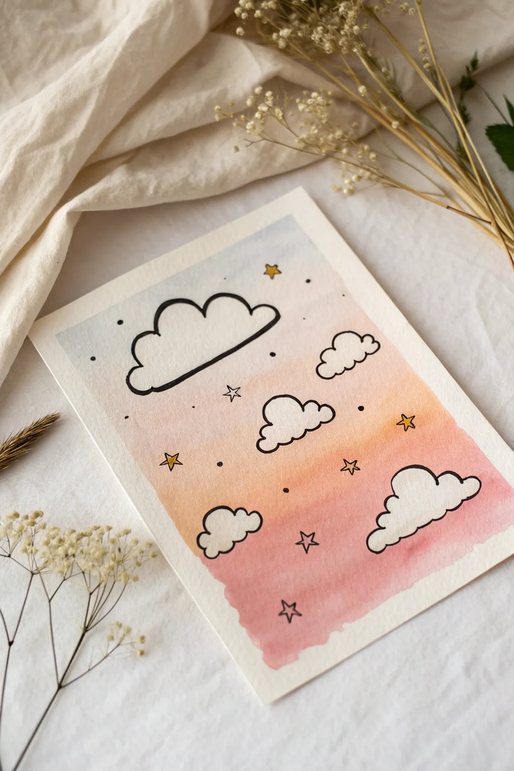
This whimsical art piece combines soft, blended watercolors with bold, illustrative doodles for a charming result. The soothing gradient from blue to peach to pink creates a perfect backdrop for the playful floating clouds and twinkling stars.
Detailed Instructions
Materials
- Cold press watercolor paper (300 gsm)
- Watercolor paints (Light Blue, Peach/Orange, Pink/Rose)
- Flat shader brush (approx. size 6-8)
- Round detail brush (approx. size 2-4)
- Black waterproof fine liner pen (0.5mm or 0.8mm)
- Gold gel pen or metallic marker
- Painter’s tape or washi tape
- Jar of clean water
- Paper towel
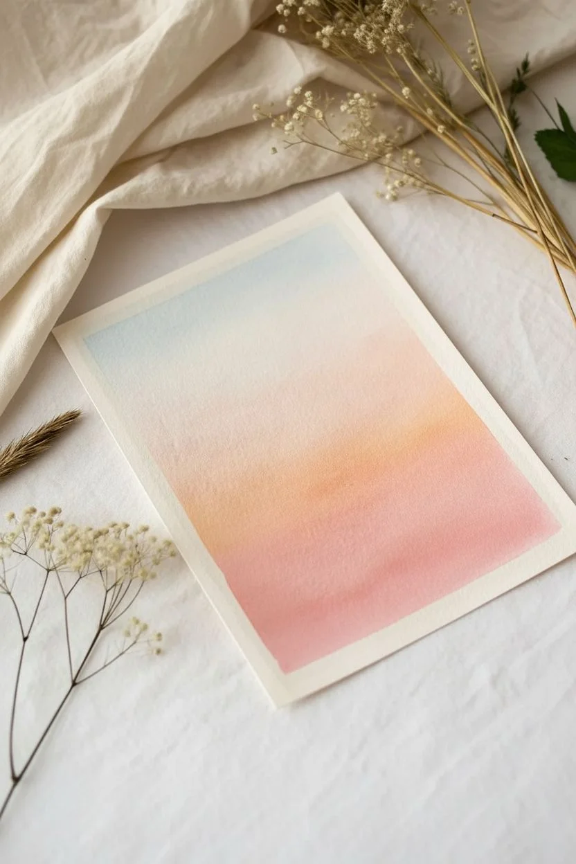
Step 1: Creating the Gradient Base
-
Prepare your paper:
Start by taping down your watercolor paper to a hard surface on all four sides. This prevents the paper from buckling when wet and creates a crisp white border around the finished edge. -
Wet the surface:
Using a clean flat brush, apply a very light, even layer of clean water across the entire area where you plan to paint. The paper should be damp and glistening, but not forming puddles. -
Apply the top blue layer:
Load your brush with a very diluted, watery light blue paint. Gently sweep it across the top third of the paper, letting the color naturally diffuse downwards into the clear water. -
Introduce the middle peach tone:
Rinse your brush thoroughly. Pick up a diluted peach or soft orange shade and paint the middle section, slightly overlapping with the blue area while it’s still damp to create a seamless transition. -
Add the bottom pink layer:
Finally, load up a soft pink or rose color. Paint the bottom third of the paper, blending it upward into the peach section. The goal is a smooth gradient where the colors melt into each other. -
Let it dry completely:
This is the most crucial step—patience is key. Let the gradient background dry completely before touching it again. It must be bone dry to the touch, or your black ink will bleed.
Pro Tip: Seamless Blending
Work quickly while the paper is damp! If the paper starts to dry, your colors won’t blend smoothly. If edges look harsh, lightly run a damp, clean brush along the transition line.
Step 2: Doodling the Elements
-
Outline the main cloud:
Using your black waterproof fine liner, draw a large, fluffy cloud in the upper left quadrant. Keep the lines somewhat thick and bold. I find that inconsistent, slightly wavy lines add to the cute aesthetic. -
Draw secondary clouds:
Add a medium-sized cloud near the center and smaller cloud clusters on the right and bottom. Vary their shapes—some can be taller, some flatter. -
Add the star shapes:
Draw several five-pointed stars scattered around the empty spaces. Keep them open (don’t fill them in just yet) and vary their sizes and rotations for a natural look. -
Dot the details:
Fill the smaller empty spaces with little black dots or tiny circles using the tip of your fine liner. This creates a magical, stardust effect. -
Add accent dots:
Place a few larger distinct black dots near the clouds to balance the composition, making sure not to overcrowd any single area.
Troubleshooting: Warped Paper
If your paper buckles heavily while painting, it might be too thin. Use 300gsm watercolor paper. If it’s still warped after drying, place the finished art under heavy books overnight.
Step 3: Finishing Touches
-
Fill the white clouds:
If your background color is too dark and shows through the clouds, you can carefully paint inside the cloud outlines with opaque white gouache or acrylic paint. If the background is light enough, you can skip this. -
Color the stars:
Use a gold gel pen or a metallic marker to carefully fill in the star shapes. The metallic shine contrasts beautifully with the matte watercolor background. -
Add star outlines (optional):
If you colored the stars and lost the definition, re-trace the outline with your thin black pen to make them pop again. -
Peel the tape:
Once everything is absolutely dry, slowly peel off the painter’s tape. Pull it away from the painting at a 45-degree angle to avoid tearing the paper.
Now you have a serene piece of sky art ready to frame or gift to a friend

Cozy Mug Sketch With Cinnamon-Toned Shadows

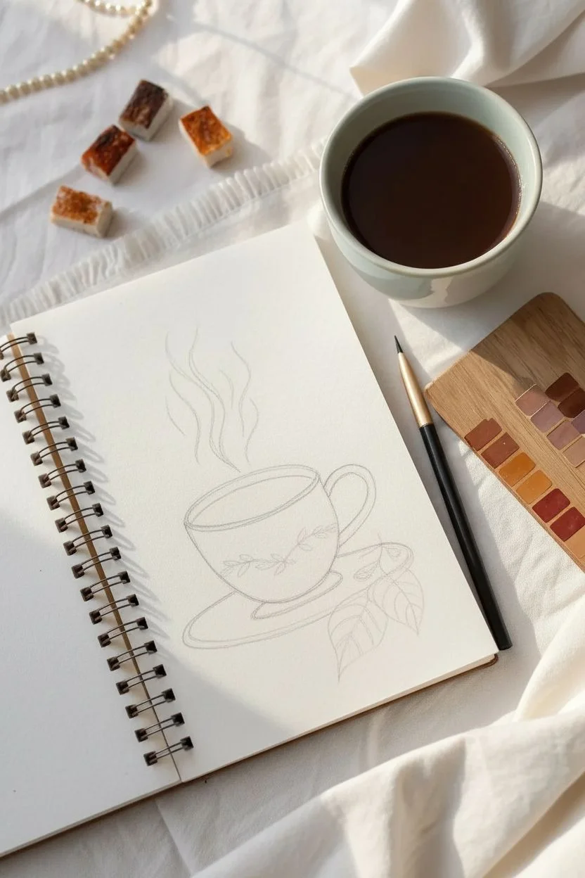
Capture the warmth of a morning brew with this monochromatic study using rich brown tones. This project focuses on confident line work and subtle shading to create a cozy, aromatic atmosphere on the page.
How-To Guide
Materials
- Heavyweight spiral sketchbook (cream or off-white paper recommended)
- Fine liner pen (brown or sepia)
- Watercolor or gouache paints (Burnt Sienna, Raw Umber, Yellow Ochre)
- Small round paintbrush (size 2 or 4)
- Pencil and eraser for initial sketch
- Small ceramic palette or mixing tray
Step 1: Sketching the Structure
-
Establish the cup shape:
Begin with a light pencil sketch. Draw a wide oval for the rim of the cup, then extend two curved lines downward to form the bowl shape, flattening slightly at the bottom. -
Add the handle and saucer:
Attach a C-shaped loop on the right side for the handle. Underneath the bowl, draw a larger, flatter oval to represent the saucer, ensuring it centers beneath the cup. -
Outline the floral motif:
Lightly trace a vine pattern across the center of the cup. Keep the leaves simple and oval-shaped, following the curve of the mug to suggest volume. -
Sketch the foreground elements:
In the bottom right, sketch two large leaves and a small cluster of shapes resembling cinnamon sticks or nuts resting on the saucer’s edge. -
Draft the steam:
above the cup, draw three to four wavy lines rising upward. I like to vary the length of these lines to make the steam look dynamic and natural.
Use Real Coffee
For an authentic sepia tone and lovely scent, you can actually paint with strong brewed espresso instead of watercolor paint.
Step 2: Inking the Lines
-
Ink the main outlines:
Using your brown fine liner, go over your pencil lines. Use a slightly heavier hand on the bottom of the cup and right side of the handle to suggest weight and shadow. -
Refine the decorative details:
Trace the vine pattern carefully. Add small center lines to the leaves on the cup for a delicate botanical touch. -
Detail the foreground leaves:
Ink the large leaves in the foreground, adding prominent central veins and smaller branching veins to give them texture. -
Erase pencil marks:
Wait for the ink to dry completely to avoid smudging, then gently erase all visible graphite lines.
Add Gold Accents
Use a metallic gold gel pen or paint to highlight the steam lines or the rim of the cup for a dash of elegance.
Step 3: Adding Color and Depth
-
Mix your base tone:
Prepare a watery wash of Burnt Sienna or a warm coffee brown on your palette. You want a translucent, tea-like consistency. -
Fill the coffee liquid:
Paint the inside of the oval rim. Leave a small, unpainted sliver on the left side to represent a reflection where the light hits the liquid. -
Shade the cup exterior:
Apply a very faint wash of brown to the shadowed side (right) of the cup and under the handle, fading it out towards the center to keep the ceramic looking white. -
Paint the decorative vine:
Using a slightly more concentrated brown, carefully fill in the vine leaves on the cup decoration. -
Color the saucer rim:
Run a line of diluted paint along the bottom edge of the saucer to define its thickness and separate it from the background. -
Enhance the steam:
Instead of outlining the steam with heavy ink, re-trace your wavy lines with a brush loaded with diluted brown paint for a softer, airy look. -
Shadow the foreground:
Add deeper brown tones to the veins of the foreground leaves and the small cluster of items on the saucer to bring them forward visually. -
Final shadow accents:
Once dry, use your darkest brown mix to add a thin shadow line right where the cup meets the saucer to ground the object.
Now you have a charming, warm-toned illustration perfect for a journaling spread or greeting card

Abstract Blobs Behind Clean Line Drawings
This elegant mixed-media piece combines the sharpness of fine-line illustration with the softness of a watercolor ‘shadow’. The interplay between the detailed black ink foreground and the loose, translucent pastel background creates a beautiful sense of depth and modern minimalism.
Step-by-Step Tutorial
Materials
- Cold press watercolor paper (A5 or A4 size)
- Fine liner pens (sizes 005, 01, and 03, black waterproof ink)
- Watercolor paints (Terracotta, Blush Pink, or Burnt Sienna)
- Round watercolor brush (size 6 or 8)
- HB Pencil
- Soft eraser
- Jar of clean water
- Paper towels
Step 1: Drafting the Composition
-
Lightly sketch the stems:
Begin with a sharpened HB pencil. Draw a gently curving line diagonally across your paper to represent the main stem. This will be your guide for the entire composition. -
Outline the background leaves:
Sketch the shapes of the leaves that will become the watercolor layer first. Place these slightly to the left of your center stem line. Keep the shapes simple—almond or lanceolate shapes work beautifully. -
Outline the foreground leaves:
Now, sketch the foreground leaves. These should overlap the background shapes but start from a slightly different point on the stem to create that offset ‘shadow’ affect. Don’t worry about details yet, just the perimeter shapes.
Pro Tip: Waterproof Ink
Make sure your fine liner is marked ‘archival’ or ‘waterproof’ if you plan to ink first. If you paint first (as shown), standard ink is fine, but waterproof pens are safer for mixed media.
Step 2: The Watercolor Layer
-
Mix your wash:
Prepare a watery mix of your chosen color. A muted terracotta or dusty pink works best for this aesthetic. Aim for a ‘tea-like’ consistency—you want it transparent. -
Paint the first leaf:
Using your round brush, carefully fill in the *background* leaf shape you sketched earlier. Use a single fluid motion if possible to avoid streaks. -
Continue the wash:
Paint the remaining background leaves and the faint stem connecting them. The paint should be consistent but slight variations in opacity add character. -
Let it dry completely:
This is crucial. The paper must be bone dry before you add ink, otherwise, your fine lines will bleed. I usually wait at least 20 minutes or use a hairdryer on a low setting.
Level Up: Metallic Pop
Once the piece is dry, trace just the central veins of the watercolor ‘shadow’ leaves with a gold gel pen. It adds a subtle shimmer that catches the light beautifully.
Step 3: Inking the Foreground
-
Outline the main stem:
Switch to your 03 fine liner (the thickest of the set). Trace the foreground stem line with a confident, smooth stroke. It should sit slightly to the right or on top of the painted layer. -
Outline the leaves:
Use the 01 fine liner to outline the foreground leaves. Give the edges a slightly jagged or serrated look rather than a perfect smooth curve to mimic nature. -
Add the central veins:
Draw the central vein in each leaf using the 01 pen. Let the line taper off and break slightly near the tip of the leaf for a lighter touch. -
Begin the texture details:
Switch to your finest pen (005). Start drawing small, diagonal lines branching out from the central vein toward the leaf edges. -
Cross-hatching technique:
To create the shaded look, add a second layer of diagonal lines in the opposite direction on the shadowed side of the leaves (usually the bottom half). -
Refine the edges:
Add tiny ticking marks along the perimeter of the inked leaves. This emphasizes the serrated texture and adds realism. -
Deepen the contrast:
Go back to areas where the leaves meet the stem. Add a few extra hatched lines here to create deep shadows, making the leaves look like they are popping off the page.
Step 4: Final Touches
-
Erase pencil marks:
Once you are absolutely certain the ink is dry, gently run your soft eraser over the entire drawing to remove the initial graphite guides. -
Assess the balance:
Look at the overlay. If the watercolor feels too faint, you can very carefully glaze a second layer over it, but usually, the subtle contrast is exactly what you want.
Now you have a sophisticated botanical illustration ready to frame or gift

PENCIL GUIDE
Understanding Pencil Grades from H to B
From first sketch to finished drawing — learn pencil grades, line control, and shading techniques.
Explore the Full Guide
Stylized Portrait With Color-Palette-Driven Hair and Outfit
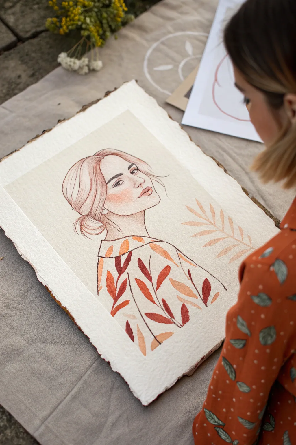
This elegant mixed-media piece combines delicate line art with a bold, autumnal color palette woven through both the figure’s clothing and the surrounding elements. The result is a cohesive, stylized portrait where the outfit mirrors nature’s organic leaf patterns.
Detailed Instructions
Materials
- Heavyweight cold-press watercolor paper (300gsm or higher)
- Deckle-edge paper cutter or ruler (optional)
- Pencil (HB for sketching)
- Fine liner pen (01 or 03 size, waterproof)
- Watercolor paints (burnt sienna, ochre, terracotta, deep red)
- Round watercolor brushes (sizes 2, 4, and 6)
- Kneaded eraser
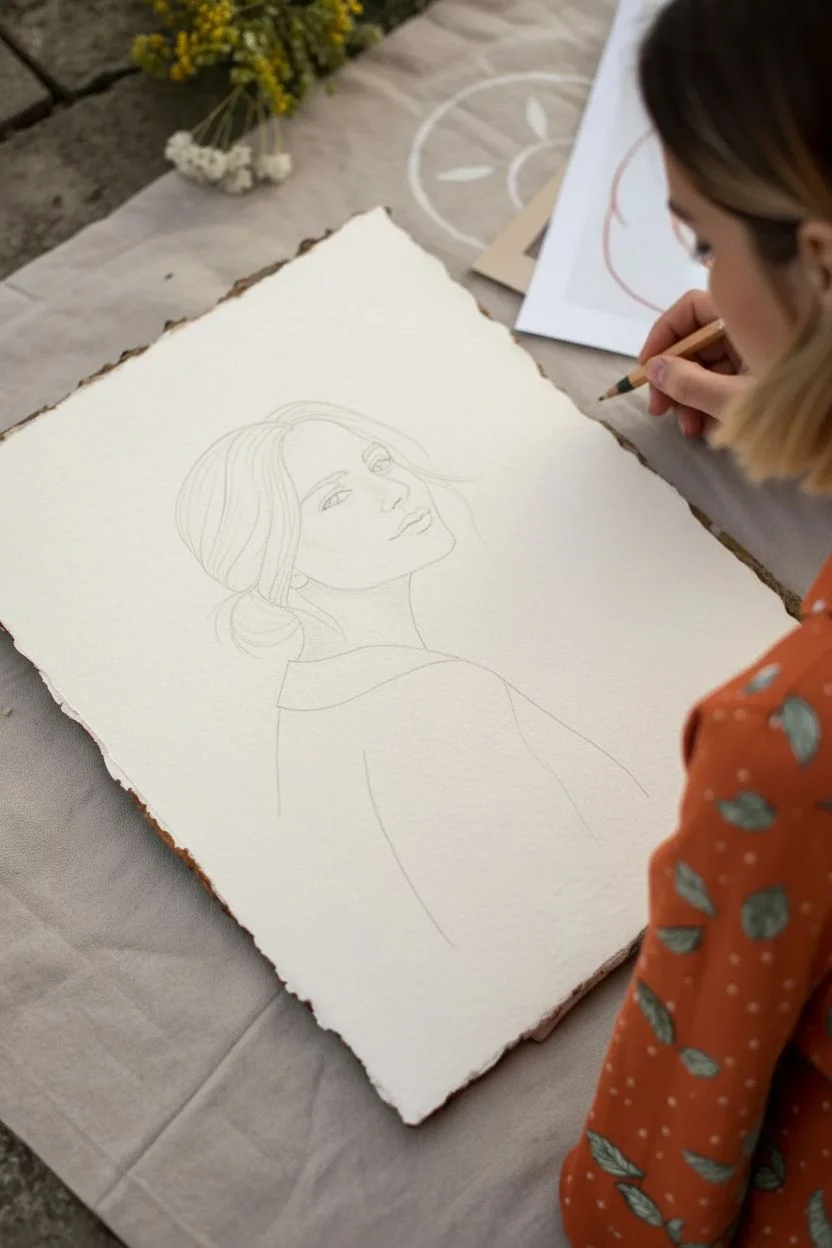
Step 1: Preparation and Sketching
-
Prepare the Paper:
Start by giving your paper that rustic, antique feel. If your paper doesn’t already have it, carefully tear the edges against a ruler or use a deckle-edge cutter to create a soft, textured border. -
Map the Figure:
Using your HB pencil, lightly sketch the basic structural oval for the head. Position it slightly off-center to the left to leave breathing room for the decorative elements on the right. -
Refine the Features:
Draw the facial features with a focus on simplicity. Sketch large expressive eyes, a defined nose, and relaxed lips. Keep the jawline soft and angle the head slightly upward for a contemplative look. -
Draft the Hairstyle:
Sketch the hair pulled back into a loose low bun. Add a few loose strands framing the face to create movement and prevent the portrait from feeling too stiff. -
Outline the Garment:
Draw the neckline of a collarless blouse or kimono-style top. Instead of realistic folds, keep the garment shape relatively flat to serve as a canvas for the leaf pattern later. -
Balance the Composition:
On the right side of the paper, sketch a simple stem with leaves floating in the negative space. This element should mirror the angle of the figure’s gaze.
Uneven Blotches in Wash?
If your skin tone wash dried with hard edges or ‘cauliflowers,’ re-wet the entire face area very gently with clean water and lift the excess pigment with a thirsty brush.
Step 2: Inking and Definition
-
Ink the Face:
Switch to your waterproof fine liner. Carefully trace the facial features, using a slightly thicker line for the upper lash line to define the eyes. -
Define the Hair:
Ink the hair outline, using long, fluid strokes. I find that breaking the line occasionally makes the hair look softer rather than like a solid helmet. -
Secure the Shapes:
Trace the outline of the clothing and the floating leaf branch. Once the ink is completely dry, gently lift the graphite sketch lines with a kneaded eraser.
Step 3: Adding Color
-
Mix the Skin Tone:
Create a very dilute wash using ochre and a tiny touch of red. Apply this loosely to the face and neck, keeping it semi-transparent to let the paper texture show through. -
Add Blush:
While the skin wash is still slightly damp, drop a more concentrated reddish-pink tone onto the cheek area. Let it bleed naturally for a soft, flushed effect. -
Paint the Pattern Base:
Mix a palette of autumnal tones: burnt sienna, deep red, and muted orange. On the clothing area, paint individual leaf shapes. -
Vary the Foliage:
Alternate colors for each leaf on the garment to create a vibrant pattern. Leave small gaps between the leaves to let the natural paper white act as the fabric background. -
Connect the Stems:
Using your smallest brush and a dark brown mix, paint thin stems connecting the leaves on the clothing. This grounds the pattern and makes it look like a textile print. -
Paint the Floating Element:
Fill in the floating branch on the right using a single, soft peach or pale terracotta wash. Keep this element lighter than the clothing to maintain visual hierarchy. -
Detail the Hair:
Add a wash of light brown or reddish-blonde to the hair. Once dry, add a few darker strokes to suggest depth near the bun and behind the ear. -
Final Touches:
Check the balance of the piece. If the outfit feels too heavy, you can add slight shading to the neck or reinforce the eyeliner to draw attention back to the face.
Metallic Accents
Once the watercolor is fully dry, trace the veins of the leaves on the clothing with a gold gel pen or metallic watercolor paint for a luxurious, shimmering finish.
This serene portrait captures a perfect balance of line and color, ready to be framed as a standalone piece or part of a gallery wall
Underwater Coral Doodles in a Tropical Palette
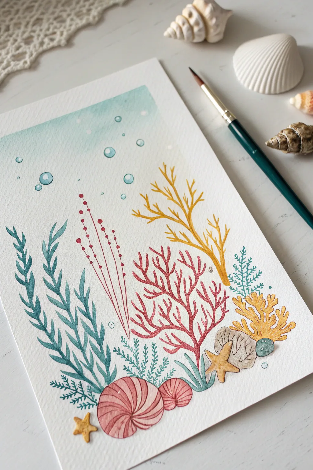
Dive into a relaxing creative session with this vibrant underwater scene featuring stylized coral, seaweed, and playful bubbles. This project combines watercolor washes with crisp line work for a charming illustration perfect for a journal or wall art.
Step-by-Step
Materials
- Cold press watercolor paper (A5 size recommended)
- Watercolor paint set (teal, coral pink, yellow ochre, warm red, sap green)
- Round watercolor brush (size 4 or 6)
- Fine liner pens (0.3mm or 0.5mm) in dark teal, red, and yellow-orange
- Pencil (HB) and eraser
- White gel pen
- Jar of water and paper towels
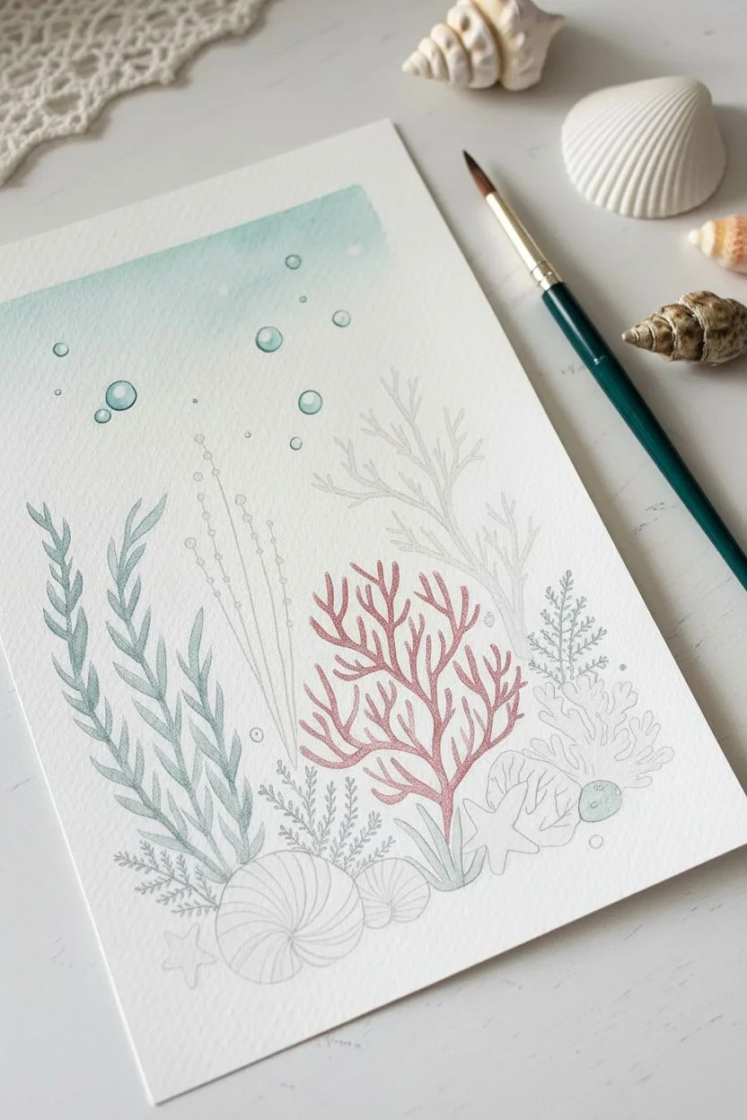
Step 1: Setting the Scene
-
Sketch the composition:
Begin by lightly sketching the placement of your main elements with an HB pencil. Draw the large, swirling shell shapes at the bottom center and the cluster of rocks and small coral to the right. -
Map out the plant life:
Sketch the tall, wavy seaweed on the left, the central branching coral fan, and the delicate twig-like coral on the right side. Keep your lines faint so they won’t show through the paint later. -
Add floating details:
Draw circles of varying sizes towards the top left to represent bubbles rising to the surface. Mark spots for the small starfish at the bottom left and on the rocks. -
Paint the background wash:
Mix a very diluted teal or weak turquoise watercolor wash. Apply this gently to the top third of the paper, fading it out as you move downwards to create a soft, watery gradient effect. Let this dry completely before moving on.
Fixing Paint Bleeds
If colors bleed into each other, wait for the spot to dry completely. Then, use a damp, clean brush to gently lift the unwanted pigment before re-painting the edge.
Step 2: Painting the Elements
-
Paint the large seaweed:
Using a teal-green mix, paint the leafy seaweed strands on the left. Use the tip of your brush to get sharp points on the leaves and press down for the wider sections. -
Color the central coral:
Mix a warm, reddish-pink hue. Carefully fill in the intricate branching structure in the center of the composition. A steady hand is helpful here to keep the branches thin and elegant. -
Add yellow coral accents:
Take a yellow ochre or gold paint and fill in the antler-like coral structure on the right side. Also, paint the small starfish at the bottom left and the one resting on the rocks. -
Fill the shells:
Paint the two round shells at the bottom in a soft coral pink. While the paint is still wet, you can drop in a slightly darker pink at the bottom edges for subtle shading. -
Paint rocks and filler elements:
Use a diluted grey or brown for the rocks on the bottom right. Paint the small, fern-like plant behind the shells with a sap green or teal. -
Add the bubbles:
For the bubbles near the top, paint just the edges or the bottom crescent of the circles with a pale blue-green, leaving the centers white to suggest transparency.
Add Metallic Shimmer
Make your ocean scene magical by using metallic gold watercolor for the yellow coral or the starfish. It will catch the light beautifully like sun through water.
Step 3: Refining with Details
-
Outline the yellow coral:
Once the paint is bone dry, use a yellow-orange fine liner to outline the yellow coral branch on the right. Add a central line down the main stem for texture. -
Texture the red coral:
Using a red or dark pink pen, outline the central red coral fan. I find that adding tiny stippling dots or small dashes inside the branches gives it a lovely organic texture. -
Detail the seaweed:
Outline the large teal seaweed on the left with a dark teal or green pen. Draw a central vein line down the middle of each leaf section. -
Define the delicate strands:
Draw the tall, thin red strands with the small berries using a red fine liner directly—no paint needed underneath. This makes them look sharp and distinct. -
Enhance the shells:
Use a brown or dark red pen to draw the spiral lines on the pink shells, following the curve of the shell to emphasize its roundness. -
Draw the rocks and starfish:
Outline the rocks with a thin black or brown pen. Give the starfish a simple outline and add a few tiny dots on their surface for a simplified texture. -
Add final bubble highlights:
Outline your painted bubbles with a thin teal pen. Finally, use a white gel pen to add a small ‘glint’ or reflection dot on the top right of each bubble and on the rounded parts of the shells.
Now step back and admire your own little slice of the ocean floor, ready to frame or gift
BRUSH GUIDE
The Right Brush for Every Stroke
From clean lines to bold texture — master brush choice, stroke control, and essential techniques.
Explore the Full Guide
Surreal Mashup: Animal With a Galaxy Color Fill
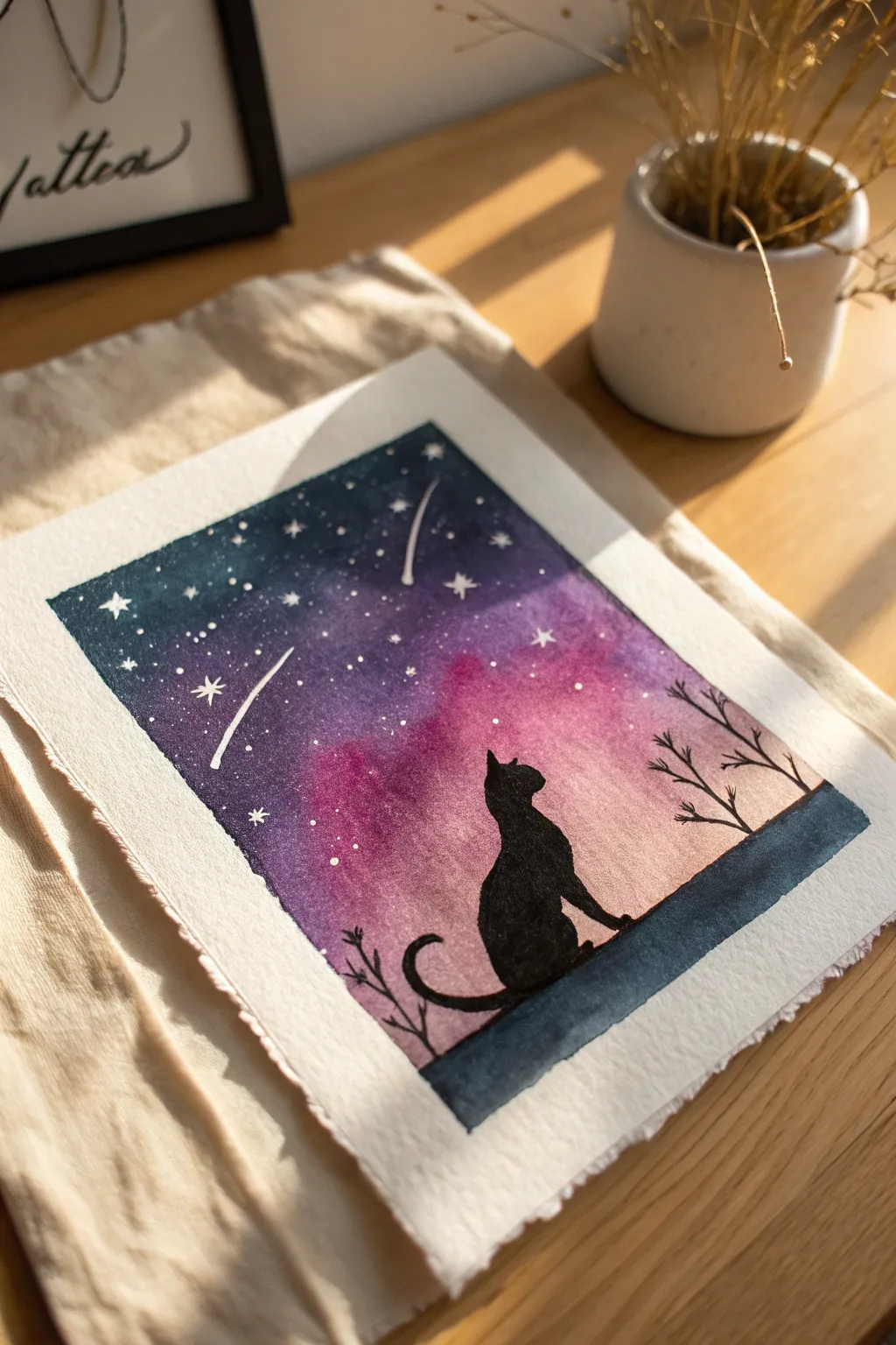
This dreamy watercolor project combines a vibrant, galactic wash with the stark simplicity of a silhouette. The result is a magical scene where a contemplative cat gazes into a swirling night sky full of stars.
Detailed Instructions
Materials
- Cold-press watercolor paper (300gsm)
- Watercolor paints (Indigo, Purple, Magenta, Pink)
- Black ink or black gouache
- White gel pen or white gouache
- Washi tape or masking tape
- Round brushes (size 8 or 10 for washes, size 2 for details)
- Pencil and eraser
- Clean water and paper towels
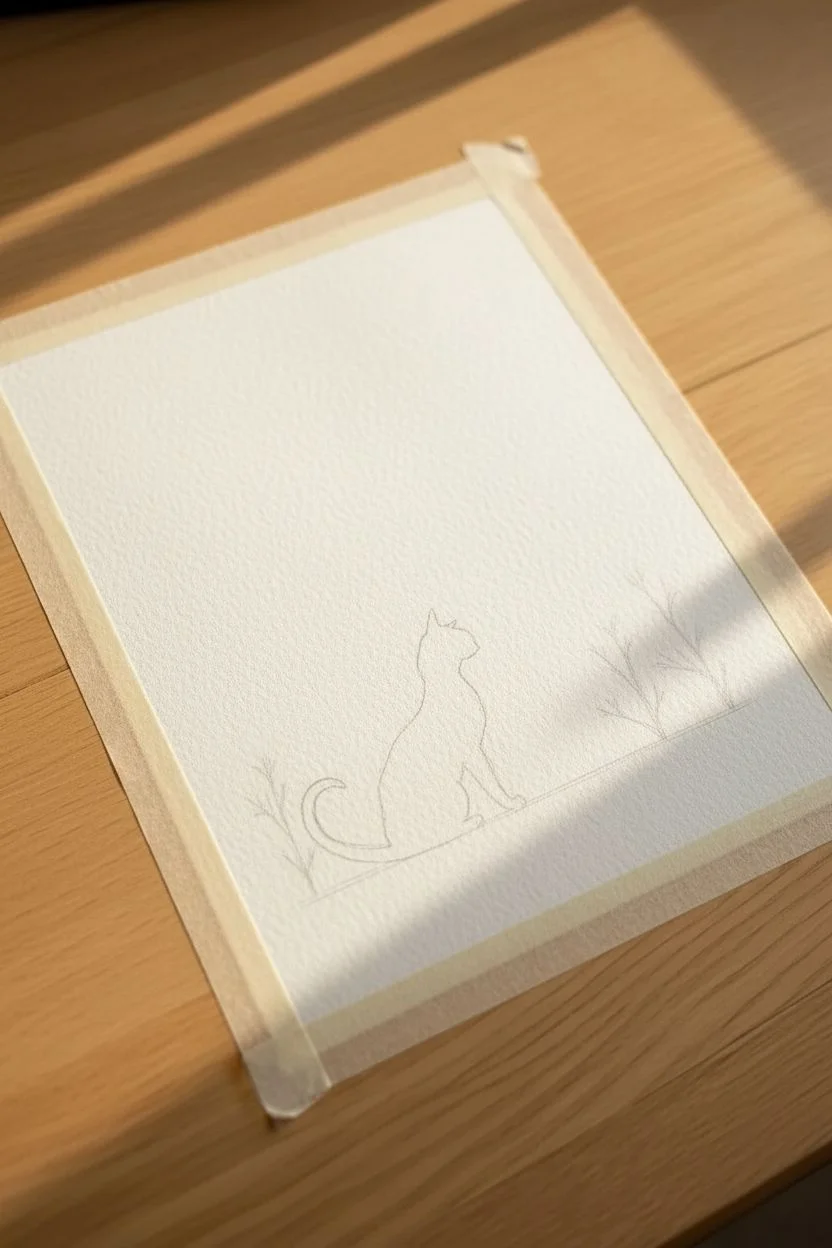
Step 1: Preparation and Sketching
-
Tape the edges:
Begin by taping down all four sides of your watercolor paper to a hard board. This creates the crisp white border seen in the image and prevents the paper from buckling when wet. -
Sketch the silhouette:
Before painting, lightly sketch the outline of the cat sitting in the center-bottom third of the page. Also, mark out where your ground line and side branches will be. Keep these pencil lines very faint so they don’t show through the final paint.
Tape Removal Trick
To prevent tearing the paper when finished, heat the tape gently with a hair dryer for a few seconds before peeling. The heat softens the adhesive.
Step 2: Painting the Galaxy Sky
-
Wet the sky area:
Using your larger round brush and clean water, apply a wash over the entire sky area, stopping just above the ground line. The paper should be glisten, but not form puddles. -
Apply the lightest pinks:
While the paper is wet, drop in your pink and magenta watercolors near the horizon line (just above the ground). Let the color bloom upwards naturally. -
Add deep purples:
Working quickly while the paper is still damp, introduce purple paint into the middle section of the sky, blending it slightly into the pinks below without overtaking them completely. -
Darken the top:
At the very top of the painting, apply your deepest indigo or dark blue. Allow this dark color to bleed down into the purple, creating a seamless gradient from night sky to glowing horizon. -
Let it dry completely:
This is crucial: allow the background wash to dry 100%. If the paper is even slightly cool to the touch, it’s not ready. Adding the silhouette too soon will cause the black ink to bleed into the sky.
Step 3: Adding the Silhouette
-
Paint the ground:
Using black gouache or waterproof ink, fill in the strip of ground at the bottom. I find that gouache gives a more matte, opaque finish than watercolor for this step. -
Outline the cat:
Switch to your size 2 detail brush and carefully trace the outline of your cat sketch with the black medium. Focus on the shape of the ears and the curve of the tail. -
Fill the cat shape:
Flood the interior of your cat outline with solid black. Ensure the coverage is even so you don’t see brushstrokes inside the silhouette. -
Add slight texture:
While the black is wet, you can lift a tiny bit of color near the chest or tail with a damp brush if you want varied tone, or keep it solid for a graphic look. -
Draw the branches:
On the right and left sides, paint delicate, thin branches rising from the ground or sides. Keep lines organic and slightly shaky to mimic natural wood.
Level Up: Salt Texture
Sprinkle coarse sea salt onto the wet sky wash before it dries. The salt pushes pigment away, creating incredible star-burst textures automatically.
Step 4: Starry Details
-
Splatter faint stars:
Load a brush with watered-down white gouache or acrylic. Tap the handle against another brush to splatter tiny specks of ‘distant stars’ over the purple and blue sections of the sky. -
Draw focal stars:
Using a white gel pen, draw a few specific, larger stars. Make simple four-point star shapes or small dots in clusters. -
Add shooting stars:
Draw one or two streaks of light with the gel pen to represent shooting stars. A quick, confident flick of the wrist creates the best motion blur effect. -
Final reveal:
Once all ink and paint are bone dry, carefully peel away the specialized tape at a 45-degree angle to reveal your crisp, professional borders.
Frame this cosmic piece to add a touch of celestial wonder to your desk or wall
Negative Space Illusion Using Bold Color Shapes
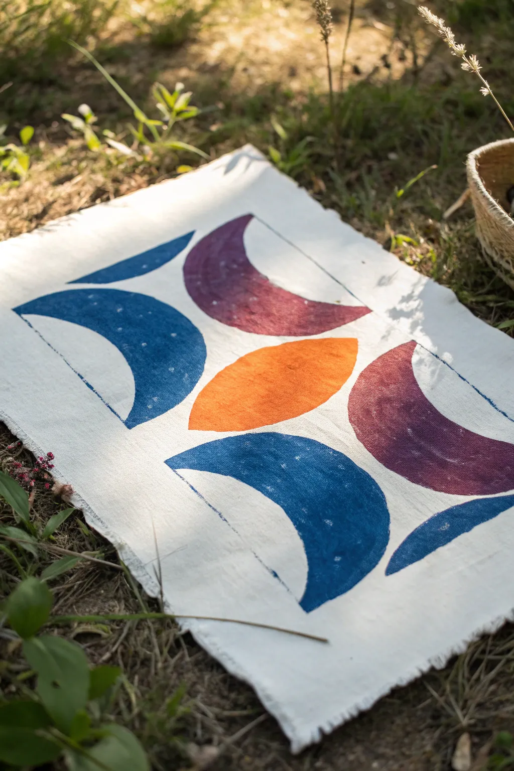
This striking project combines bold, earthy tones with negative space to create a modern geometric design inspired by lunar phases. Using simple stencils and fabric paint, you’ll achieve a crisp yet hand-crafted look on a textured canvas surface.
How-To Guide
Materials
- Heavyweight white cotton canvas or linen fabric (cut to approx. 12×18 inches)
- Fabric paints (Navy Blue, Deep Maroon/Plum, Burnt Orange)
- Stencil plastic sheets or heavy cardstock
- Craft knife and cutting mat
- Pencil
- Ruler
- Stencil brushes or high-density foam pouncers
- Painter’s tape
- Iron and ironing board
- Cardboard or protective paper
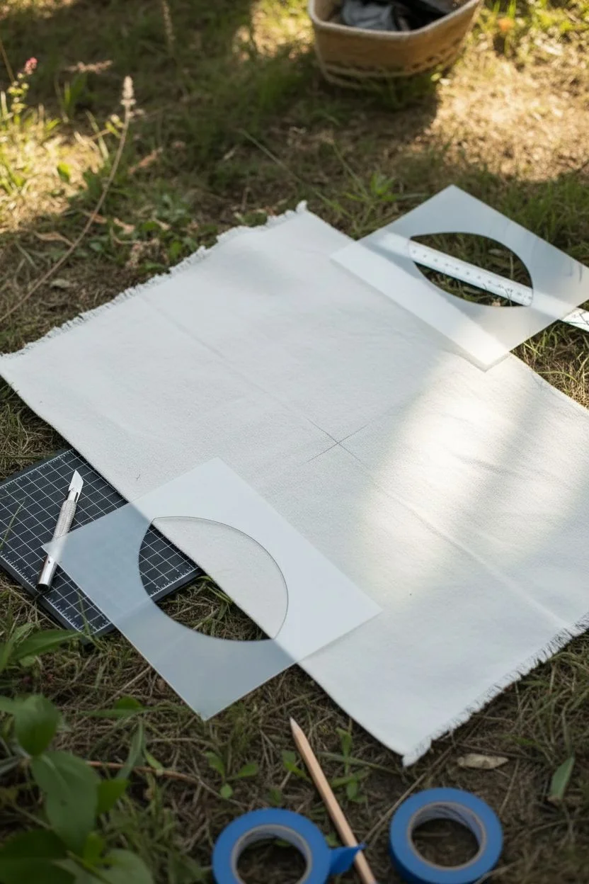
Step 1: Preparation & Design
-
Prepare the Fabric:
Cut your fabric to the desired size, leaving a little extra room on the edges for framing or hemming later. Iron the fabric completely flat to ensure a smooth painting surface. -
Create the Crescent Stencil:
Draw a perfect circle on your stencil material (about 4 inches in diameter). Draw a second, intersecting arc inside it to create a thick crescent moon shape. -
Create the Almond Stencil:
Draw an almond or ‘eye’ shape adjacent to your crescent design to serve as the central orange element. It should be roughly the same width as the crescent’s opening. -
Cut the Stencils:
Carefully cut out the negative shapes using a craft knife on a cutting mat. Keep your edges as sharp and clean as possible, as jagged cuts will show in the final print. -
Layout Planning:
Lay your fabric on a flat surface protected by cardboard (fabric paint can bleed through). Lightly mark the center of the fabric with a pencil to guide your first placement.
Crisp Edge Secret
Apply a very thin layer of Mod Podge over the stencil cutout before painting. This seals the edges so no color can bleed underneath.
Step 2: Painting the Design
-
Central Feature Application:
Secure the almond-shaped stencil in the exact center of the fabric using painter’s tape. -
Paint the Orange Shape:
Load your foam pouncer with Burnt Orange paint. Dab off excess paint onto a paper towel—you want a dry application to prevent bleeding under the stencil edge. -
Apply Texture:
Pounce the paint straight down onto the fabric. Apply a second coat if needed for opacity, but maintain that slightly textured, canvas-weave look. -
First Moon Placement:
Once the center is touch-dry, position the crescent stencil to the left of the orange shape. The curve of the moon should mimic the curve of the almond shape, creating a uniform gap of white space between them. -
Painting the Blue Moons:
Using the Navy Blue paint and a fresh pouncer, fill in the crescent shape. I prefer to lift the stencil straight up immediately after painting to keep the line crisp. -
Repeat the Blue:
Clean or flip your stencil and repeat the blue crescent process in the bottom center position, aligned vertically below the orange shape. -
Painting the Maroon Moons:
Switch to your Maroon/Plum paint. Position the stencil to the top and right sides of the central orange shape, creating a diagonal relationship with the blue moons. -
Adding Partial Shapes:
To create the illusion of the pattern continuing off the page, place your stencil so only a portion of the crescent shape sits on the fabric edges (top left, bottom right). -
Paint the Edges:
Apply the corresponding color (blue for corners near blue moons, maroon for corners near maroon moons) to these partial shapes, taping off the fabric edge if you want a clean border.
Uneven Coverage?
If the fabric texture is showing through too much, switch from a sponge to a stiff bristle brush and use a stippling motion to drive paint into the weave.
Step 3: Finishing Touches
-
Review and Touch Up:
inspect the edges of your shapes. If any paint bled slightly, you can carefully scrape it away with a craft knife if the paint is thick, or use a tiny bit of white paint to mask it. -
Drying Time:
Allow the entire piece to dry undisturbed for at least 24 hours. Fabric paint needs to cure fully before handling. -
Heat Setting:
Once dry, place a thin cloth over the design and iron it on a high heat setting (without steam) for 3-5 minutes. This seals the paint into the fibers. -
Fraying the Edges:
For the rustic look shown in the image, pull loose threads from the raw edges of the canvas to create a soft, frayed fringe.
Hang your new textile art using wooden poster rails or simply tack it up for an effortless bohemian vibe

Have a question or want to share your own experience? I'd love to hear from you in the comments below!