If you want your space to feel more you, a few aesthetic paintings can completely shift the mood of a room without changing the furniture. I’m sharing my favorite aesthetic painting ideas for room styling—starting with the classics and ending with the fun, unexpected stuff I love trying in my own studio.
Curated Gallery Wall Grid
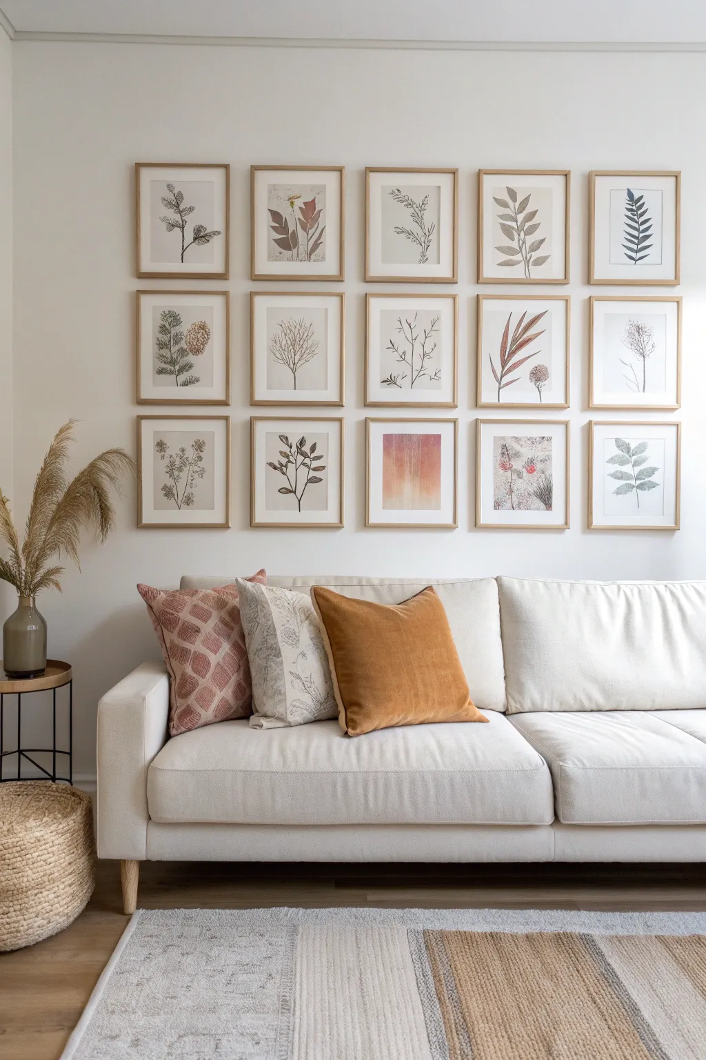
Bring the calming essence of nature indoors with this structured yet organic gallery wall. By combining uniform framing with delicate botanical illustrations and earthy watercolor tones, you’ll create a sophisticated focal point that feels both curated and serene.
Detailed Instructions
Materials
- 15 matching light wood frames (frames shown are roughly 11×14 or 12×16 with mats)
- 15 sheets of high-quality watercolor paper or heavy cardstock (sized to fit frames)
- Watercolor paint set (focus on olive green, sap green, burnt sienna, ochre)
- Fine liner pens (black or sepia, varying thicknesses like 0.3mm and 0.5mm)
- Round watercolor brushes (sizes 2, 4, and 6)
- Graphite pencil (HB) and soft eraser
- Measuring tape and painter’s tape
- Level tool (spirit level or laser level)
- Hammer and picture hanging hardware
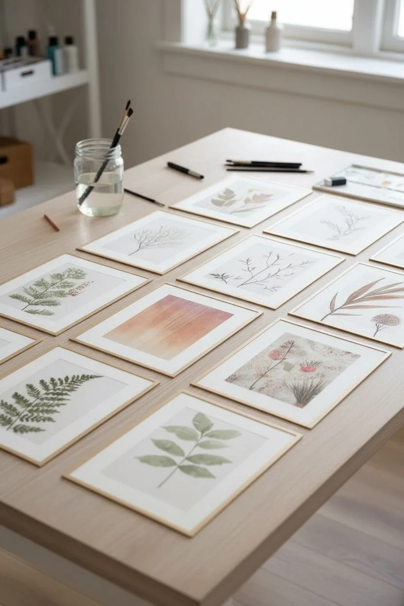
Step 1: Creating the Botanical Artworks
-
Plan your palette and subjects:
Before putting brush to paper, decide on a cohesive color theme. The example uses muted greens, browns, and rust tones. Sketch out rough ideas for 14 botanical subjects (leaves, ferns, seed pods) and one abstract gradient piece for the bottom center. -
Sketch light outlines:
Using your HB pencil, very lightly sketch the basic shapes of your plant specimens onto the watercolor paper. Keep the composition simple; center the subject leaving plenty of negative space for that airy, aesthetic look. -
Paint the fern leaves:
For the fern-style prints, load a size 4 brush with a diluted sap green. Paint the central stem first, then add individual leaflets with quick, light strokes that taper at the ends. -
Create the broad-leaf designs:
For broader leaves, outline the shape with a very pale wash of olive green. While still slightly damp, drop in hints of darker green or brown near the base to create depth. -
Paint the rust-colored botanicals:
Mix burnt sienna with a touch of ocher. Paint the tall, reedy grass shapes or seed pods. I like to keep these strokes a bit drier to mimic the texture of dried florals. -
Detail with ink:
Once the watercolor layers are completely dry, use your fine liner pens to add definition. Trace over stems, add veins to leaves, or create stippling effects on seed heads for texture. Don’t outline everything; let some watercolor edges stand alone. -
Create the focal abstract piece:
For the unique bottom-center piece, wet the entire rectangular area with clean water. Drop in bands of burnt sienna, ochre, and pale pink, tilting the paper to let them bleed vertically. Let this dry undisturbed. -
Finalize and erase:
Review all paintings. Once fully dry, gently erase any visible pencil marks that weren’t covered by paint or ink.
Uneven Gaps?
Cut a scrap piece of wood or stiff cardboard to the exact width of your desired gap (e.g., 2 inches). Use this as a physical spacer between frames while hanging to ensure perfect uniformity.
Step 2: Gallery Wall Installation
-
Prep the frames:
Clean the glass of your frames on both sides. Insert your finished botanical artworks, ensuring they are perfectly centered within the mats. Close the backing clips securely. -
Determine grid spacing:
Measure your available wall space. A grid looks best with uniform spacing; aim for 2 to 3 inches between each frame vertically and horizontally. Calculate the total width to ensure the grid is centered over your sofa. -
Mark the center point:
Find the center of your wall space at eye level. This will be the position for the middle frame of the middle row. Mark this lightly with a pencil. -
Establish the baseline:
Using a long level and painter’s tape, mark a horizontal line where the bottom edge of the middle row frames will sit. This ensures your entire grid stays straight. -
Hang the center frame:
Install the hardware for the absolute center frame first. Hang it and double-check it with your spirit level. -
Expand horizontally:
Hang the frames to the left and right of the center frame. careful to maintain your exact 2-3 inch spacing. Use a spacer (like a cut piece of cardboard) to make this faster. -
Hang the top row:
measure up from your center row frames to set the hooks for the top row. Ensure they align perfectly vertically with the frames below them. -
Hang the bottom row:
Repeat the process for the bottom row. This is where your abstract gradient piece goes (center column, bottom row) to anchor the visual weight. -
Final adjustments:
Step back and view the grid as a whole. Use a small level on top of every individual frame to ensure they are perfectly straight, nudging them slightly if needed.
Pro Tip: Visual Flow
Don’t place two visually ‘heavy’ or dark paintings right next to each other. Lay the framed art on the floor first to distribute the visual weight and colors evenly before hammering walls.
Now you have a stunning, museum-worthy botanical display that transforms your living space

Soft Botanical Line Art Trio
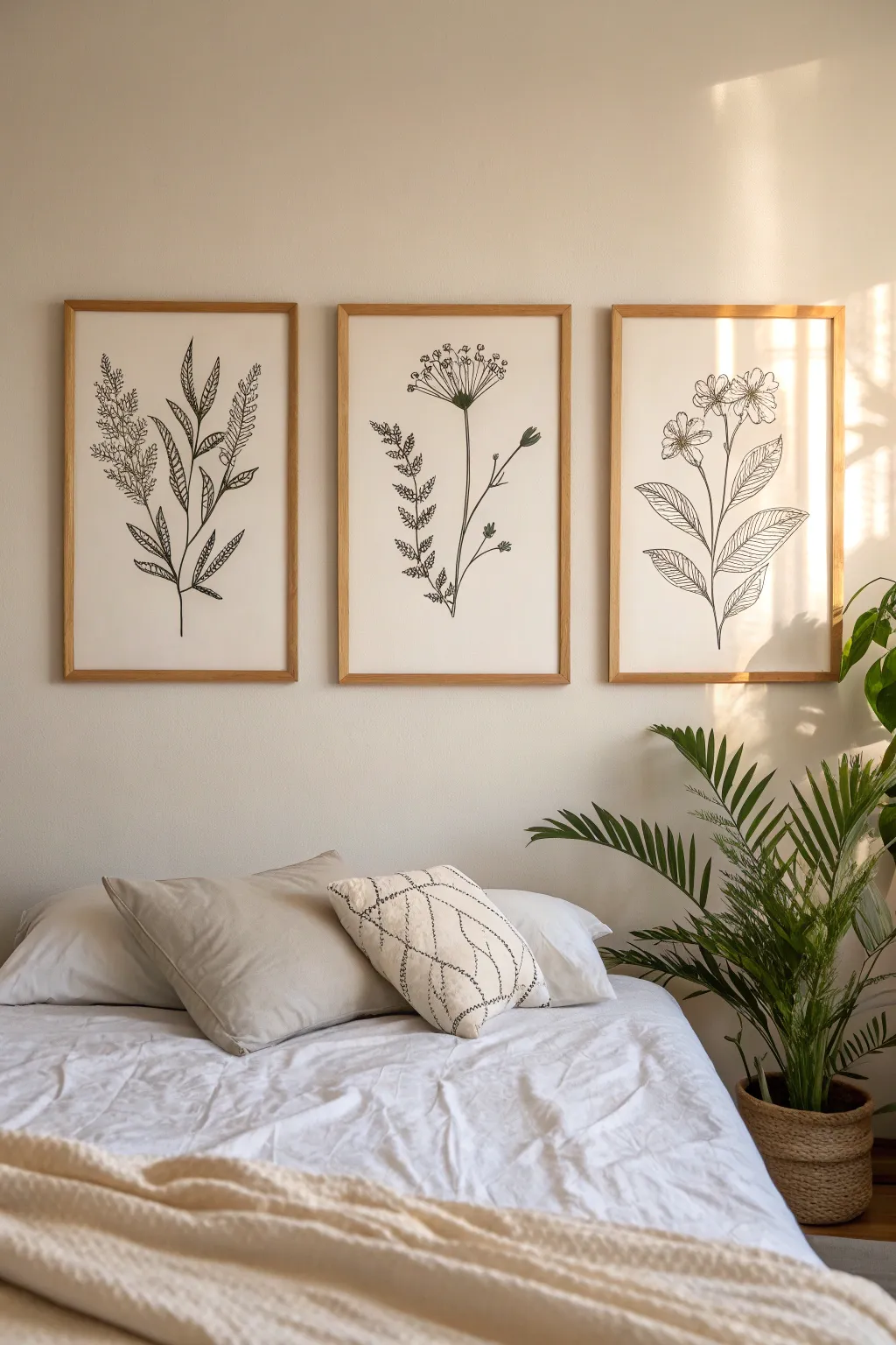
Bring the calming influence of nature indoors with this set of three simple yet elegant botanical line drawings. Using fine lines and negative space, these pieces create a soft, organic aesthetic perfect for a bedroom or reading nook.
Step-by-Step Guide
Materials
- 3 sheets of high-quality watercolor paper or heavy mixed-media paper (16×20 inches or size to fit frames)
- Black archival ink fine liner pens (sizes 0.3, 0.5, and 0.8)
- Graphite pencil (HB or 2H)
- Kneaded eraser
- Ruler
- Light wood frames (matching paper size)
- Tracing paper (optional)
- Masking tape
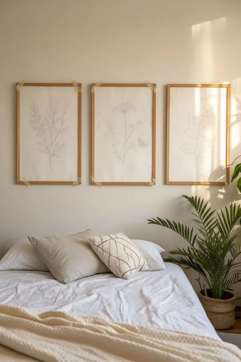
Step 1: Planning and Sketching
-
Prepare your workspace:
Clear a large, flat surface and tape down your watercolor paper sheets using masking tape on the corners to prevent them from slipping while you draw. -
Determine the composition:
Visualize the three separate botanicals. The left piece features feathery leaves, the center is a taller wildflower with an umbrella-like top, and the right showcases broader leaves with blooming flowers. Mark a very faint vertical center line on each page with your pencil and ruler to help with balance. -
Sketch the primary stems:
Using your HB pencil, lightly draw the main central stem for each plant. For the center artwork, keep the stem straight and tall. For the side pieces, give the stems a gentle, organic curve outward toward the edges of the paper to create visual symmetry across the trio. -
Outline the left leafy botanical:
On the first sheet, sketch long, slender leaves extending from the stem. Add clusters of tiny seed pods or smaller leaves at the top to mimic the texture of lavender or wheat. -
Draft the center wildflower:
On the middle sheet, draw a small circle at the top of the stem. From this center, radiate sketch lines outward to create the umbrella shape (umbel), adding small circles at the ends. Add a secondary, smaller stem branching off to the right. -
Sketch the right floral piece:
On the third sheet, draw large, ovate leaves with distinct veins near the bottom. At the top, sketch five-petaled open flowers. Keep your pencil pressure extremely light so it’s easy to erase later.
Steady Hand Trick
If your hands shake while drawing long stems, try moving your entire arm from the shoulder rather than just moving your wrist. This creates smoother, more confident curves.
Step 2: Inking and Detailing
-
Trace the main lines:
Switch to your 0.5mm pen. Carefully trace over your pencil stems and main leaf outlines. Focus on confident, continuous strokes rather than short, scratchy ones to maintain a clean aesthetic. -
Detail the left botanical:
Use the 0.3mm pen for the delicate upper textures. Create stippling (tiny dots) or short dashes to represent the fuzzy texture of the flowered tips. Use the 0.8mm pen to darken the bottom of the main stem for visual weight. -
Refine the center piece:
For the center wildflower, use the 0.3mm pin to draw the radiating spokes of the flower head. Draw tiny details on the smaller side branch. I like to let the ink dry for a few seconds before moving my hand to avoid smudging. -
Ink the right floral leaves:
On the third piece, use the 0.3mm pen to draw the intricate veins inside the large leaves. Keep these lines very thin and precise. Outline the petals with the 0.5mm pen. -
Add line weight variation:
Go back over key areas with the 0.8mm pen, specifically where stems overlap or where leaves attach to the stem. This subtle thickening adds depth and prevents the drawing from looking flat. -
Check for balance:
Place all three drawings side-by-side. Look for any areas that feel too empty and add a small leaf or bud if necessary to balance the visual weight across the trio.
Vintage Paper Effect
Before drawing, lightly stain your paper with diluted tea or coffee and let it dry flat. This warms up the background tone for an aged, antique scientific illustration look.
Step 3: Finishing Touches
-
Erase pencil marks:
Wait at least 30 minutes to ensure the ink is deeply set and completely dry. Take your kneaded eraser and gently roll it over the paper to lift away the graphite guidelines without damaging the paper surface. -
Inspect and clean:
Look closely for any gaps in your lines or faint pencil marks you missed. Touch up lines where needed to ensure they are solid black. -
Frame the artwork:
Clean the glass of your light wood frames on both sides. Place the artwork inside, ensuring it is perfectly centered. Secure the backing. -
Hang the trio:
Measure your wall space carefully. Hang the frames equidistant from each other (about 2-3 inches apart) to create a cohesive gallery feel.
Now you have a serene gallery wall that brings a timeless, organic touch to your space


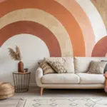
Boho Abstract Shapes in Earth Tones
Bring warmth and modern organic style to your space with this large-scale abstract painting featuring sweeping curves and a grounded color palette. The matte, textured finish mimics the look of a fresco, making it a sophisticated yet approachable DIY statement piece.
Step-by-Step Tutorial
Materials
- Large gallery-wrapped canvas (approx. 24×36 or larger)
- Floating wooden frame (light oak or unfinished pine)
- Acrylic paints (Terracotta, Sage Green, Ochre, Warm Beige, Titanium White)
- Baking soda or plaster powder (for texture)
- Medium and large flat paintbrushes
- Fine liner brush or white paint marker
- Pencil and eraser
- Palette or paper plates
- Painter’s tape or masking tape
- Mixing cups
Step 1: Planning & Sketching
-
Prepare the canvas surface:
Before sketching, wipe down your canvas with a dry cloth to remove dust. If you want an ultra-smooth base, apply a coat of gesso, but for this textured look, the raw canvas texture helps. -
Sketch the large curves:
Using a light pencil, draw your primary shapes. Note that the composition relies on large, sweeping “C” curves and crescent shapes that almost touch but leave negative space channels between them. -
Balance the layout:
Aim for asymmetry. Place a large terracotta shape in the upper right and a balancing sage green crescent in the lower left. Ensure the central channels of negative space (the beige background areas) flow smoothly. -
Refine the edges:
Go over your pencil lines to ensure the curves are smooth. Don’t worry about perfection; organic wobbles add to the boho charm.
Texture Pro Tip
Mix a small amount of white craft glue into your baking soda and paint mixture. This helps bind the powder, preventing the texture from flaking off over time.
Step 2: Mixing & Painting
-
Create the texture medium:
To achieve that matte, chalky finish seen in the photo, mix your acrylic paints with a texture additive. I like to add equal parts baking soda to paint for a sandy feel, or use a store-bought modeling paste for smoother dimension. -
Mix the background color:
Start by mixing a large batch of Warm Beige with plenty of White to create a creamy off-white. This will be your negative space color. -
Paint the negative space:
Fill in the background areas first—the channels between your shapes. Use a large flat brush and cross-hatch strokes to enhance the texture. Let this layer dry completely. -
Apply the Terracotta tones:
Mix a deep, rusty orange. Fill in the top right semi-circle and the bottom central shape. Apply the paint thick enough to hide brush strokes, dabbing it on if necessary to build texture. -
Add the Green & Ochre elements:
Paint the crescent shapes in Sage Green and the remaining curve in Ochre. Use a medium flat brush to cut in clean edges against the dried background color. -
Refine the edges:
Once the shapes are blocked in, use a smaller brush to tidy up the boundaries where colors meet the background. Crisp edges make the abstract forms pop. -
Add a second coat:
Depending on the opacity of your texture mix, you may need a second coat on the colored shapes to ensure solid, bold color saturation.
Step 3: Detailing & Framing
-
Plan the line work:
Wait until the painting is 100% dry. This is crucial. Lightly pencil in the geometric line details—simple circles bisected by straight lines—over the terracotta sections. -
Paint the fine lines:
Using a fine liner brush and thinned white acrylic (or a high-quality white paint pen), carefully trace your geometric pencil lines. Keep the pressure consistent for an even line width. -
Let it cure:
Allow the entire piece to cure overnight. The baking soda mix can take a little longer to harden fully than standard acrylics. -
Seal the artwork:
Since textured paint can crack or flake, gently brush on a layer of matte varnish or spray a fixative to seal the surface without adding unwanted gloss. -
Install the frame:
Place your finished canvas into the floating frame. Secure it from the back using the provided hardware or offset clips, ensuring an even gap around the perimeter.
Uneven Edges?
If you struggle with unsteady hands on curves, use flexible masking tape specifically designed for bending to mask off the shapes before painting.
Hang your new masterpiece in a well-lit living area to let the textures catch the natural light
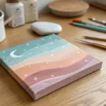
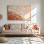
Pastel Ombre Horizon Canvas
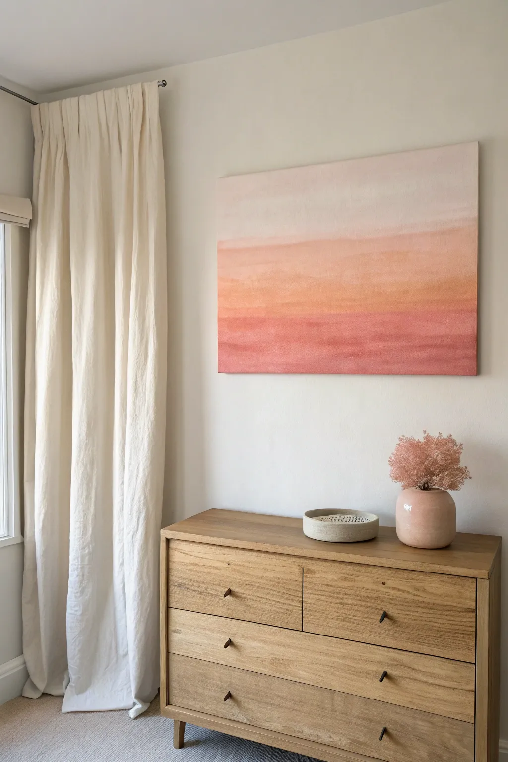
Capture the serene warmth of a fading sunset with this minimalist ombre canvas art. Featuring soft transitions from pale blush to deep terracotta, this piece adds a calming, modern aesthetic to any room.
How-To Guide
Materials
- Large rectangular stretched canvas (e.g., 24×36 inches)
- Acrylic paints: Titanium White, Unbleached Titanium, Peach, Terra Cotta, Rose Pink, Burnt Sienna
- Large flat paintbrush (2-3 inch width)
- Medium flat paintbrush (1 inch width)
- Soft blending brush or dry wash brush
- Palette or disposable paper plates
- Cup of water
- Spray bottle with water (for keeping paint workable)
- Clean rag or paper towels
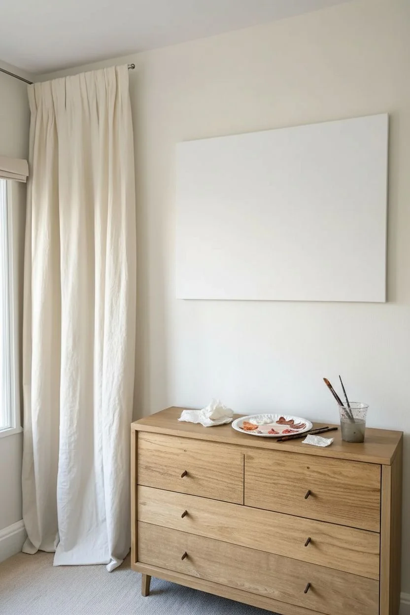
Step 1: Preparation and Base
-
Prepare your workspace:
Lay down a drop cloth or old newspaper to protect your table or floor. Set up your canvas flat or on an easel, ensuring it’s stable. -
Prime the canvas:
Even if your canvas is pre-primed, apply a fresh coat of Titanium White across the entire surface. This ensures a smooth, consistent base for the delicate gradient layers. -
Mix your palette:
Squeeze out your paints onto the palette. You’ll want to pre-mix four or five distinct shades ranging from very light cream to deep rose. Create a gradient lineup on your palette before touching the canvas to ensure the colors harmonize.
Step 2: Blocking in Color
-
Paint the top section:
Start at the very top of the canvas with your lightest mixture—mostly Titanium White with just a touch of Unbleached Titanium or a tiny drop of Peach. Paint the top 25% of the canvas using long, horizontal strokes. -
Apply the second band:
For the next section down, pick up a slightly stronger peach tone. Paint a horizontal band right below your first section, allowing the edges to touch but not blending them perfectly just yet. -
Add the middle warmth:
Move to your mid-tone—a mix of Peach and Terra Cotta. Apply this to the middle section of the canvas. The colors should be getting progressively darker and richer as you move downward. -
Deepen the hues:
Paint the fourth band using a Terra Cotta and Rose Pink mixture. This creates that ‘golden hour’ intensity found just above the horizon line. -
Finish the bottom edge:
Fill the final bottom section with your deepest color, a blend of Rose Pink and a hint of Burnt Sienna to ground the composition.
Wet-on-Wet is Key
Work quickly! Acrylics dry fast. Keep a spray bottle handy to mist the canvas lightly, keeping the paint blendable without making it runny.
Step 3: Blending and Refining
-
Moisten the paint:
If the paint has started to dry, lightly mist the canvas with your spray bottle. Acrylics need to be slightly wet to blend smoothly. -
Blend the upper transition:
Using a clean, large flat brush or a soft blending brush, gently brush back and forth along the seam between the top white section and the pale peach section. Use long, continuous strokes to blur the line. -
Work your way down:
Clean your brush (or wipe it thoroughly) and move to the next transition line. Blend the peach into the terra cotta using the same horizontal sweeping motion. -
Create distinct textural horizons:
Unlike a perfect airbrushed look, this style embraces slight texture. I like to leave a few faint, visible brushstrokes or slightly harder lines in the middle sections to mimic distant cloud layers or land masses. -
Check the gradient:
Step back from the canvas to view it from a distance. If a transition looks too harsh, add a tiny bit of intermediate color and blend again while wet. -
Paint the edges:
Don’t forget the sides of the canvas! Wrap the colors around the edges corresponding to the bands on the front for a professional, finished look that doesn’t require a frame. -
Final softening:
With a dry, soft brush, give the entire surface one last very light horizontal sweep to minimize heavy ridge lines and unify the texture. -
Let it cure:
Allow the painting to dry completely flat for at least 24 hours before hanging or sealing.
Muddy Colors?
If your blends start looking grey or muddy, stop blending immediately. Let it dry completely, then paint a fresh layer of pure color over the muddy spot.
Hang your new masterpiece in a spot where it can catch natural light to enhance the soft glow of the gradient
BRUSH GUIDE
The Right Brush for Every Stroke
From clean lines to bold texture — master brush choice, stroke control, and essential techniques.
Explore the Full Guide
Minimal Face Contour Portrait
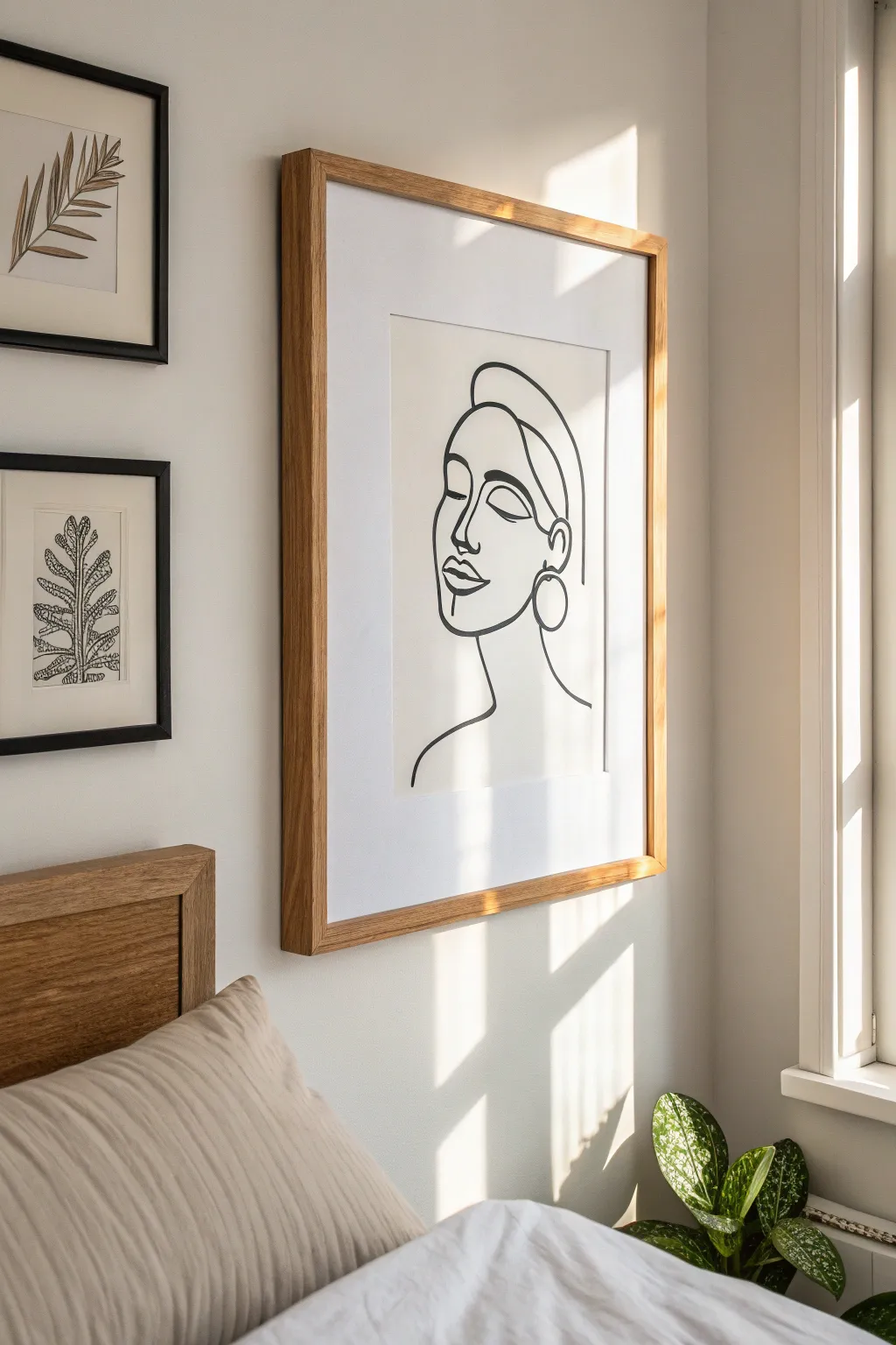
Capture the elegance of simplicity with this continuous line drawing that transforms a blank page into a sophisticated piece of modern art. This project relies on confident strokes and negative space to create a serene, aesthetic focal point for any room.
Step-by-Step Guide
Materials
- High-quality mixed media or watercolor paper (cream or off-white tones work best)
- Black ink brush pen or fine-tip black acrylic marker
- Pencil (HB or 2H)
- Kneaded eraser
- Drawing board or clipboard
- Frame with a wide mat (natural wood finish per the image)
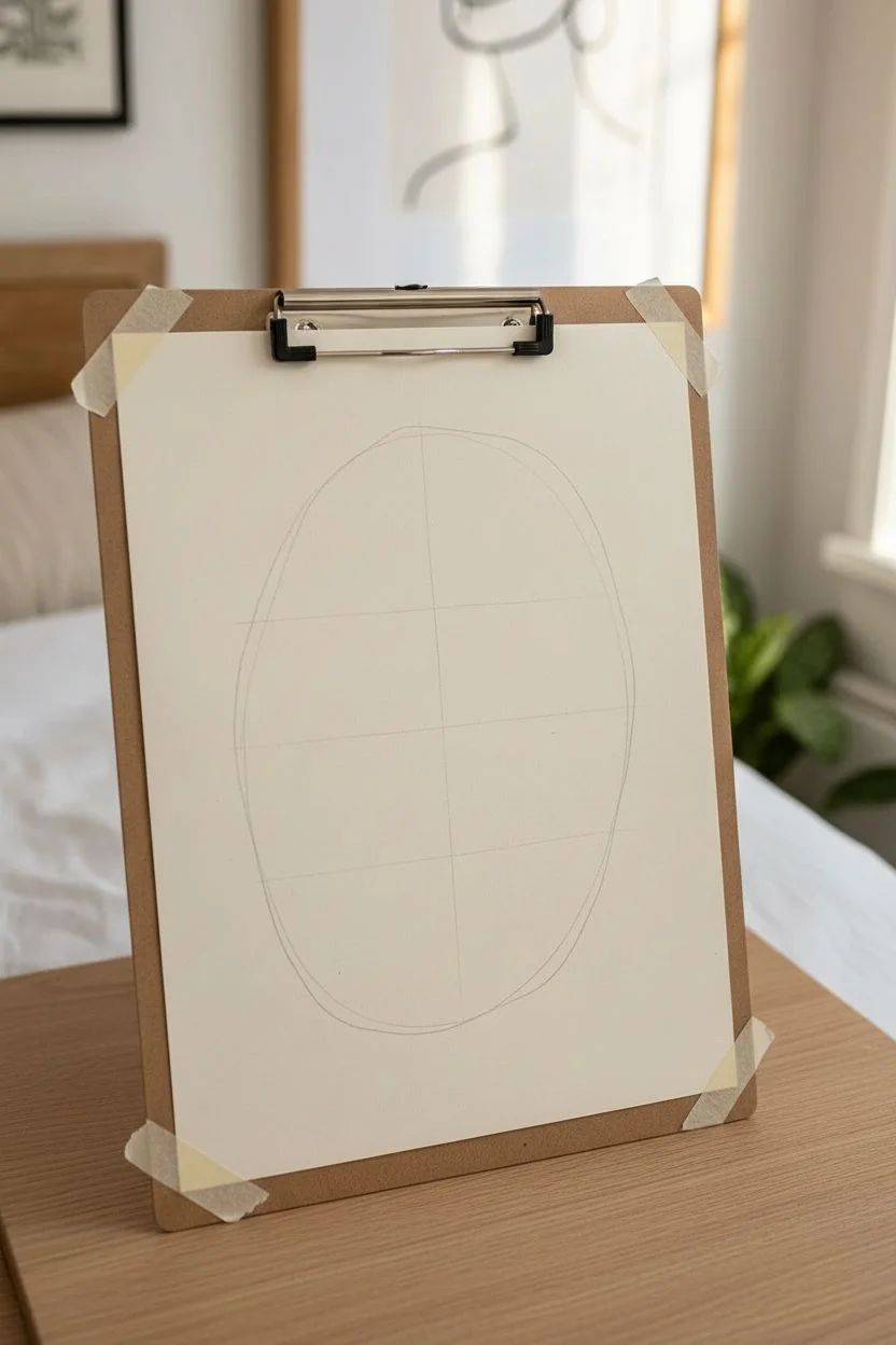
Step 1: Planning Composition
-
Prepare the workspace:
Secure your paper to a flat, hard surface using tape or a clipboard. Ensure the lighting is bright and even so you can see your pencil guidelines clearly. -
Establish the centerline:
Lightly sketch a very faint vertical line down the center of your page to help orient the face’s tilt and placement. -
Sketch the basic oval:
Using your pencil, draw a loose oval shape slightly angled to the left. This doesn’t need to be perfect; it’s just a boundary for the head. -
Mark feature placement:
Within the oval, lightly mark horizontal guidelines for where the eyes, nose, and mouth will sit. Keep the spacing generous to maintain that airy, minimal feel.
Step 2: Penciling the Contour
-
Draft the profile outline:
Start with the forehead and sweep down to define the cheekbone and jawline. Keep the line fluid, avoiding sharp, jagged edges. -
Define the nose and lips:
Sketch the curve of the nose bridge, connecting it directly to the eyebrow arch. Draw the lips as simple shapes—a fuller bottom lip and a thinner upper lip. -
Add the closed eye:
Draw a curved arch for the closed eyelid. Add a second, thinner line just above it to suggest the eyelid crease, which adds depth without clutter. -
Sketch the hair swipe:
Create a large, dramatic swoop starting from the forehead and tucking behind the ear area. Use long, sweeping motions. -
Draft the ear and earring:
Draw a simple ‘C’ shape for the ear. Attached to the lobe, sketch a large circle for the hoop earring, ensuring it hangs naturally. -
Neck and shoulders:
Extend a single line down from the jaw for the neck, curving outward to suggest the beginning of a shoulder.
Smooth Operator
Draw from your shoulder, not your wrist. Locking your wrist and moving your whole arm creates smoother, more confident curves essential for this style.
Step 3: Inking the Final Line
-
Test your pen:
Before touching the final paper, test your ink flow on a scrap sheet. You want a consistent, bold black line without skipping. -
Begin the inking process:
Start with the internal features. I usually tackle the eye and eyebrow first, as they anchor the expression. Apply steady, even pressure. -
Inking the profile:
Move to the nose and lips. Try to do the nose and brow in one continuous motion if possible, lifting the pen only when necessary. -
Varying line weight:
As you ink the outer jawline and hair, press slightly harder on the downstrokes to thicken the line. This adds a calligraphic elegance to the piece. -
Detailing the accessories:
Trace the earring circle carefully. A slight wobble here is actually okay—it adds to the hand-drawn organic aesthetic. -
Connect the neck:
Finish with the neck line. Let the line tape off gently at the bottom rather than stopping abruptly. -
Let it cure:
Allow the ink to dry completely for at least 30 minutes. If you erase too soon, the ink might smudge and ruin the clean background.
Texture Play
Instead of smooth paper, use cold-press watercolor paper. The rough texture will break up the ink lines slightly, giving the piece a vintage, artistic character.
Step 4: Finishing Touches
-
Erase guidelines:
Gently roll the kneaded eraser over the paper to lift the graphite pencil marks. Avoid scrubbing, which can damage the paper texture. -
Check for gaps:
Inspect your black lines. If any areas look too thin or grey, carefully go over them one last time to ensure a deep, solid black. -
Frame and mount:
Place the artwork behind a large white mat inside a wooden frame. The wide mat is crucial for achieving the gallery look shown in the photo.
This sophisticated yet simple portrait proves that sometimes a single line can say more than a full canvas
Calm Coastal Color Study
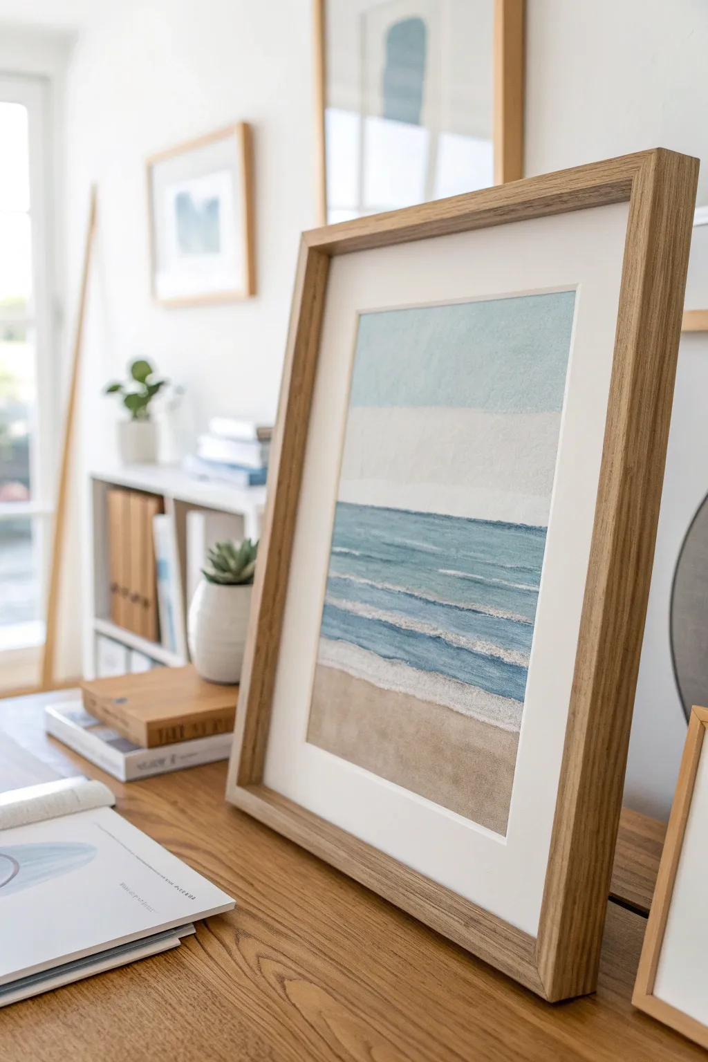
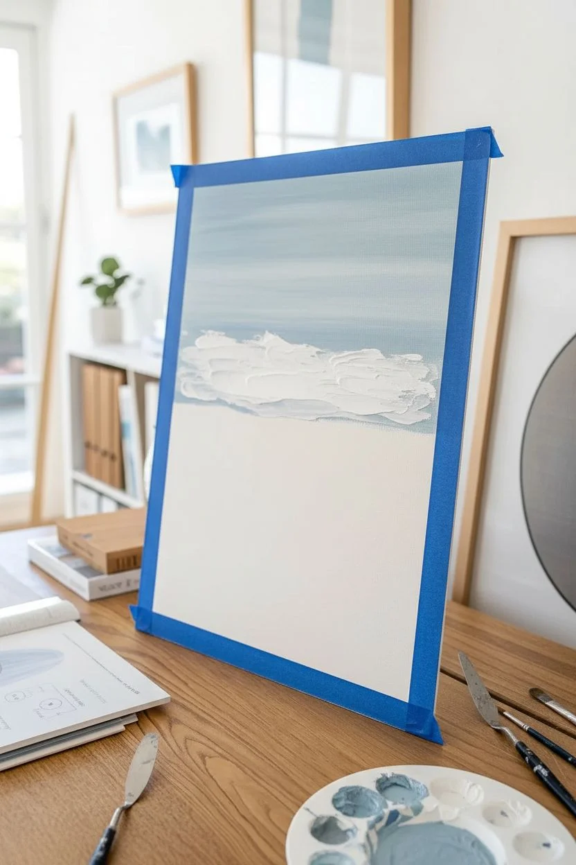
Capture the peaceful essence of the coast with this textured, semi-abstract seascape. Using a combination of heavy body layers and dry brush techniques, you’ll create soft transitions between sand, sea, and sky that feel both modern and timeless.
Step-by-Step
Materials
- Heavy body acrylic paints (titanium white, raw sienna, teal, cerulean blue, unbleached titanium)
- Modeling paste or thick texture medium
- Heavyweight watercolor paper or mixed media board (approx. A3 size)
- Flat synthetic brushes (1-inch and 1/2-inch)
- Palette knife
- Painter’s tape
- Palette for mixing
- Paper towels
Step 1: Preparation & Sky
-
Secure the surface:
Begin by taping down all four edges of your paper to a flat work surface. This creates a crisp white border and prevents warping when we add wet media. -
Mix the sky tone:
On your palette, mix a large amount of Titanium White with a tiny dot of Cerulean Blue to create a very pale, hazy sky blue. -
Apply the upper sky:
Using your large flat brush, paint the top third of the paper with horizontal strokes. Keep the paint relatively thin here for a smooth finish. -
Create the cloud bank:
Mix pure White with a touch of modeling paste. Use the palette knife to gently scrape this mixture horizontally across the middle of the sky section, creating a textured white band that represents distant clouds.
Step 2: The Ocean Layers
-
establishe the horizon:
Mix Teal with a bit of the previous sky blue. Use the edge of your flat brush to paint a straight, sharp line just below the white cloud bank. -
Block in deep water:
Fill the next section down (about 3 inches) with this teal mix. Don’t worry about perfect coverage; a little streakiness adds to the water effect. -
Lighten the shallows:
Add more White and a touch of Unbleached Titanium to your teal mix. Paint the section below the deep water, blending slightly where the two colors meet. -
Add wave texture:
Mix modeling paste with pure white paint. Using the edge of your palette knife, drag thin, broken lines horizontally across the blue sections to create the crests of waves. -
Define the shoreline wave:
Apply a thicker, more continuous line of the white paste mixture where the water will meet the sand. This represents the foamy edge of the tide coming in.
Uneven Horizon?
To fix a crooked horizon line, place a strip of painter’s tape across the dry sky area where you want the line to be. Paint the ocean up to the tape, let it dry, then peel.
Step 3: Sand & Finish
-
Mix the wet sand color:
Combine Raw Sienna with a good amount of White and a tiny drop of the blue mix to cool it down. This will be the damp sand. -
Paint the transition:
Apply this darker beige tone directly under the white shoreline wave. Blend it downward, fading it out slightly. -
Create dry sand:
Mix Raw Sienna with Unbleached Titanium for a warmer, lighter tan. Paint the bottom section of the paper, brushing upward to meet the wet sand area. -
Dry brush blending:
Wipe your brush almost completely dry. Gently drag the dry sand color over the wet sand color to create a soft, seamless gradient. -
Enhance wave peaks:
Go back in with a smaller brush and pure White. Highlight just the tops of your textured wave lines to make them pop against the blue water. -
Final texture check:
If I feel the water looks too flat, I carefully dab a little extra white texture on the wave closest to the viewer for added dimension. -
Remove tape:
Wait until the painting is completely dry to the touch. Slowly peel back the painter’s tape at a 45-degree angle to reveal your crisp edges.
Add Subtle Sparkle
Mix a tiny pinch of fine iridescent medium or pearl white acrylic into your wave crest paint. It mimics how sunlight catches the foam on the water.
Place your finished piece in a natural wood shadow box frame to complement the organic tones of the sand and sea

PENCIL GUIDE
Understanding Pencil Grades from H to B
From first sketch to finished drawing — learn pencil grades, line control, and shading techniques.
Explore the Full Guide
Moody Night-Sky Swirl Painting
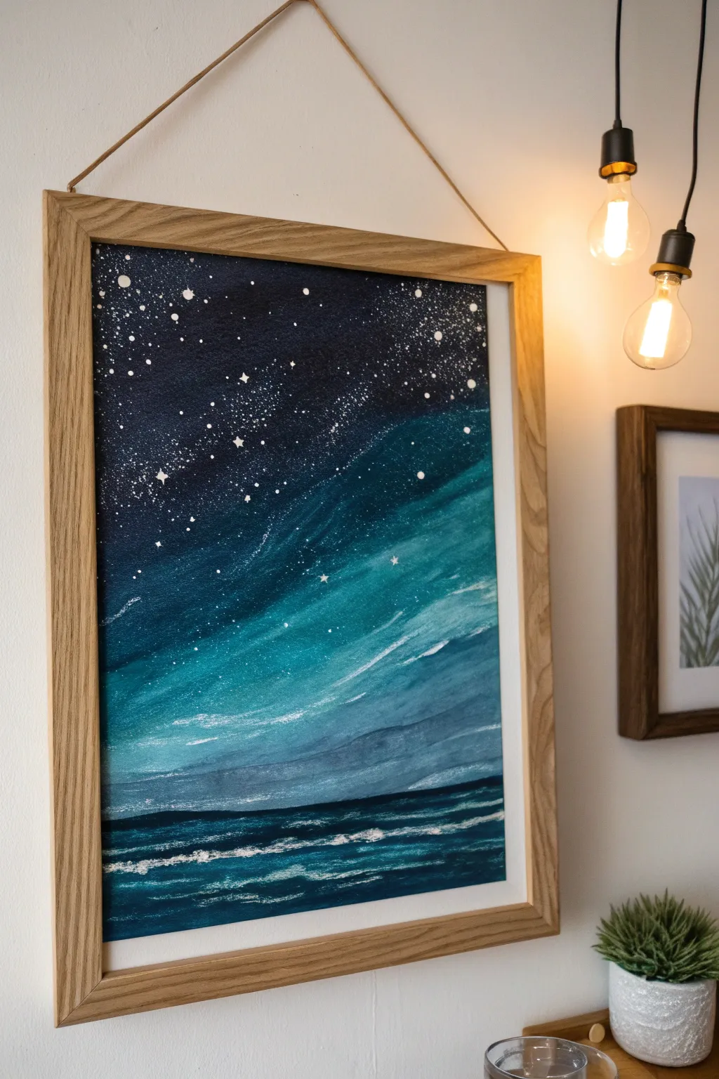
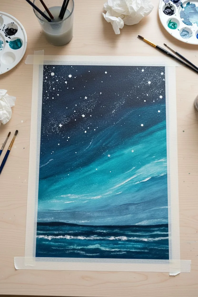
Blend the mysteries of the deep sea with the infinite night sky in this moody, atmospheric painting. Using a palette of deep indigos and vibrant teals, you’ll create a seamless transition between a starry galaxy and crashing waves.
Detailed Instructions
Materials
- Canvas board or watercolor paper (A3 size recommended)
- Acrylic paints: Carbon Black, Prussian Blue, Phthalo Turquoise, Titanium White
- Flat shader brushes (large and medium)
- Small round detail brush
- Old toothbrush (for spattering)
- Cup of water and paper towels
- Palette or mixing plate
- Masking tape (for clean borders)
Step 1: Setting the Sky
-
Prepare the canvas:
Tape down the edges of your paper or canvas to a flat surface. This keeps it secure and ensures a crisp, professional border when you peel it off later. -
Mix the darkest sky color:
Combine Prussian Blue with a touch of Carbon Black to create a deep, midnight navy. Apply this generously to the top third of the canvas using a large flat brush, using horizontal strokes. -
Introduce the teal transition:
While the navy is still wet, mix Phthalo Turquoise with a little Prussian Blue. Blend this into the bottom edge of your midnight sky, working your way down to the middle of the canvas. -
Create the ethereal swirl:
Mix Titanium White with Phthalo Turquoise to make a bright teal. Using diagonal, sweeping strokes, pull this color through the middle section to create the glowing, cloud-like bands. -
Soften the edges:
Clean your brush slightly and use it to feather the edges where the deep blue meets the bright teal. You want a smoky, drifted look rather than hard lines.
Muddy colors?
If your blend transforms into a dull gray, stop immediately. Let the first layer dry completely, then apply fresh color on top. Wet-on-dry layering prevents muddying better than overworking wet paint.
Step 2: The Sea & Stars
-
Establish the horizon:
Mix a dark, heavy blue-black using your Prussian Blue and Carbon Black. Paint a straight horizontal line about one-third of the way up from the bottom to define the horizon line. -
Paint the ocean base:
Fill the area below the horizon with a mix of Prussian Blue and Phthalo Turquoise. Keep your strokes strictly horizontal here to mimic the movement of water. -
Add wave depth:
Dip your medium flat brush into pure Carbon Black. Add thin, horizontal streaks near the bottom foreground and just under the horizon line to suggest shadows in the troughs of the waves. -
Create whitecaps:
Take a small amount of Titanium White on a dry brush. Drag it lightly across the top of the dark wave forms to create the look of sea foam and crashing water. -
Layer the foam:
Add a second, brighter layer of white on the foreground waves. Use a slightly stippling motion to give the foam texture and volume. -
Prepare the stars:
While the ocean dries, dilute a small amount of Titanium White with water until it has an ink-like consistency. -
Spatter the galaxy:
Dip an old toothbrush into the watered-down white paint. Hold it over the dark sky portion and flick the bristles with your thumb to spray tiny stars across the top. -
Paint distinct stars:
Using your smallest round brush, dot in a few larger, deliberate stars among the spray. I like to focus these near the transition zone between the dark sky and the teal clouds. -
Add starburst details:
Select three or four of the larger white dots and carefully pull tiny lines outward from the center to create twinkling cross-shapes. -
Final touches:
Step back and assess your contrast. If the clouds need more glow, add a very thin glaze of watered-down white over the lightest teal parts. -
Reveal the border:
Once the painting is completely dry—give it at least an hour—slowly and carefully peel away the masking tape to reveal the clean edges.
Star Control
Test your toothbrush flicking technique on a scrap piece of paper first. If the paint is too thick, you’ll get blobs; too thin, and it won’t show up. Aim for a distinct misty spray.
Frame your new celestial seascape in simple wood tones to let those deep blues truly shine
Warm Neutral Landscape Blocks
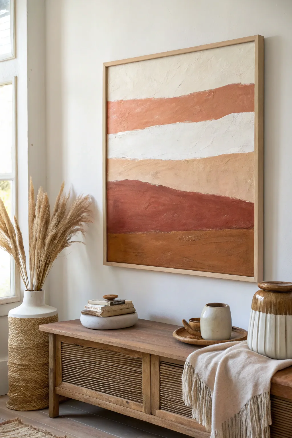
Bring the calming warmth of the desert into your home with this abstract landscape painting. Using a textured medium and a palette of rusty terracotta, cream, and sand tones, you’ll create organic, flowing layers that mimic sedimentary rock formations.
Step-by-Step Guide
Materials
- Large rectangular canvas (approx. 36×48 inches)
- Acrylic modeling paste or texture gel
- Gesso (white)
- Acrylic paints: Titanium White, Burnt Sienna, Yellow Ochre, Raw Umber, Unbleached Titanium
- Wide flat paintbrush (2-3 inch)
- Palette knife or plastic scraper
- Painters tape (optional)
- Mixing palette or paper plates
- Jar of water
- Light wood floating frame
Step 1: Preparing the Base
-
Prime the Surface:
Start by applying a thin, even coat of white gesso over the entire canvas to ensure a smooth, receptive surface for your heavy body paints. -
Create the Texture Mix:
In a separate container, mix equal parts white acrylic paint with modeling paste. You want a consistency similar to frosting that holds its shape but can be spread easily. -
Apply the Initial Texture:
Using your palette knife or plastic scraper, spread this white texture mix across the top third of the canvas. Don’t aim for perfection; rough, uneven strokes create the best organic look.
Cracking Paint?
Thick modeling paste can crack if dried too fast. Avoid direct sunlight or hair dryers; let it cure slowly in a room-temp area.
Step 2: Mixing and Mapping Colors
-
Mix the Terracotta Shade:
Combine Burnt Sienna with a touch of Titanium White and a tiny dab of Raw Umber to create a muted, rusty orange for the second band from the top. -
Create the Sand Tone:
Mix Unbleached Titanium with a drop of Yellow Ochre and plenty of White. This should be a soft, warm beige for the middle band. -
Mix the Deep Rust:
For the darker band near the bottom, use pure Burnt Sienna mixed with a little Raw Umber for depth. It should be the boldest color on the canvas. -
Create the Base Earth Tone:
Mix Yellow Ochre with Raw Umber to create a dirty, grounded brown for the very bottom stripe. -
Map the Lines:
Lightly sketch wavy, organic horizontal lines across the canvas with a pencil to designate where each color block will go. Avoid perfectly straight lines; let them dip and rise naturally.
Step 3: Layering the Landscape
-
Paint the Top Cream Band:
Paint over the dried texture at the top with a mix of Titanium White and a drop of Unbleached Titanium. Use horizontal strokes. -
Apply the Terracotta Band:
With your palette knife, mix some modeling paste into your terracotta paint mixture. Apply this to the second band, letting the bottom edge overlap unevenly into the section below. -
Add the Central White Stripe:
Below the terracotta, paint a band of heavily textured white. I find using the side of the palette knife helps drag the paint to create pitted, rocky effects. -
Paint the Sand Layer:
Apply the sand-colored beige mixture next. Use a dry brush technique here to let some of the canvas tooth show through, adding visual variety. -
Add the Deep Rust Layer:
Apply the dark rust color in a thick, bold band. This section anchors the painting, so ensure the color is opaque and rich. -
Paint the Bottom Foundation:
Finish the bottom section with your ochre-brown earth mix. Apply it thickly, possibly stippling the brush to create a dense, soil-like texture.
Level Up: Gold Leaf
Apply delicate flakes of gold leaf along the transition line between the rust and sand layers for a subtle, luxurious glimmer.
Step 4: Refining and Framing
-
Blend the Transitions:
While the paints are still tacky, use a clean, dry brush to very softly feather the edges where colors meet. You don’t want a full gradient, just a softer line than a hard stop. -
Add Highlights:
Once touch-dry, dry brush a little bit of the Unbleached Titanium over the highest ridges of the textured rust and ochre sections to catch the light. -
Check for Gaps:
Step back and look for any unintended white canvas showing through the colored sections. Patch these up with the appropriate color. -
Let it Cure:
Allow the painting to dry completely for at least 24 hours. The thick mounds of modeling paste take longer to cure than standard paint. -
Install the Frame:
Place the dried canvas into a light wood floating frame. Secure it from the back using the provided hardware to give it that gallery-finished appearance.
Hang your new masterpiece in a well-lit spot to let the shadows play across the beautiful textures you created


Simple Still Life for a Shelf Moment
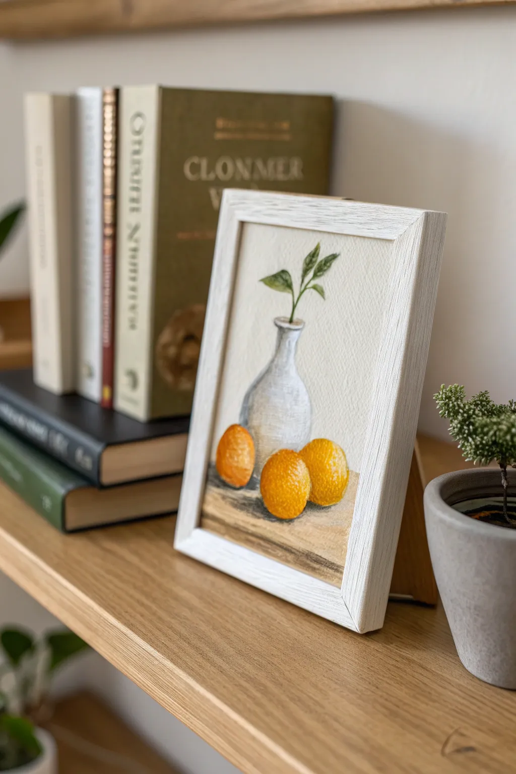
This charming mini still life captures simplicity with a minimalist white vase and three vibrant oranges resting on wood. The soft, textured finish gives it an approachable, organic feel perfect for brightening up a bookshelf or desk corner.
Detailed Instructions
Materials
- Heavyweight watercolor paper or cold-press illustration board (5×7 inches)
- Acrylic paints (primary yellow, cadmium orange, burnt sienna, titanium white, cerulean blue, sap green, raw umber)
- Small flat brush (size 4)
- Small round detail brush (size 0 or 1)
- Palette or mixing plate
- Pencil for sketching
- Cup of water and paper towels
- White or light wood frame (5×7 inches)
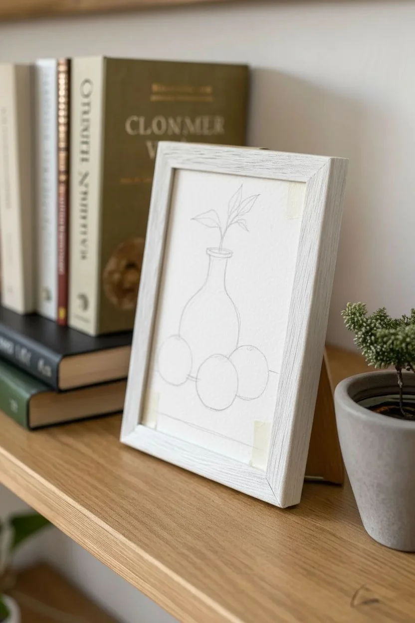
Step 1: Planning the Composition
-
Prepare the surface:
Cut your watercolor paper or illustration board to fit your specific frame size, likely 5×7 inches. If using paper, tape the edges down to a flat surface with masking tape to prevent warping while you paint. -
Lightly sketch the shapes:
Using a pencil with a light hand, outline the central vase first. It has a rounded bottom that tapers gracefully up to a narrow neck. Don’t worry about perfect symmetry; slight organic wobble adds charm. -
Add the fruit placement:
Sketch three circles for the oranges. Place one slightly behind the vase on the left, and nestle the other two in front of the vase on the right, slightly overlapping each other. -
Define the surface and greenery:
Draw a horizontal line about a third of the way up from the bottom to represent the table edge. Finally, sketch two simple stems branching out of the vase neck with a few almond-shaped leaves.
Fixing Flat Fruit
If your oranges look like flat stickers, deepen the shadow underneath them and add a brighter, distinct highlight on top. High contrast creates the 3D sphere illusion.
Step 2: Creating the Background & Base
-
Paint the wall background:
Mix a very large amount of titanium white with a tiny dot of raw umber to create a creamy off-white. Paint the entire background behind the vase and fruits, using vertical strokes for a clean look. -
Block in the wooden table:
Mix raw umber with a little burnt sienna and white. Paint the surface area below your horizon line. Keep the strokes horizontal to mimic wood grain. -
Establish the vase color:
The vase is primarily white but needs shadow to look round. Mix white with a tiny touch of cerulean blue and grey. Paint the entire vase this cool white tone initially. -
Shade the vase:
While the paint is still slightly tacky, use a slightly darker grey-blue mix to paint the left side and bottom curve of the vase, blending towards the center to create volume.
Step 3: Bringing the Fruit to Life
-
Base coat the oranges:
Mix cadmium orange with a touch of primary yellow for brilliance. Paint all three circular shapes with this solid base color. -
Add shadows to the fruit:
Mix a tiny amount of burnt sienna into your orange. Apply this darker shade to the bottom-left of each orange, where they rest on the table or touch the vase. This grounds them. -
Texture the peel:
I like to use a ‘stippling’ motion here. Take pure orange and dabbing small dots over the transition area between light and shadow to mimic the dimpled skin of citrus. -
Add highlights:
Mix white with yellow and dab a small, soft highlight on the upper right curve of each orange. This indicates where the light hits the texture.
Texture Tip
For realistic orange peel texture, let the paint get slightly tacky, then dab it with a dry, stiff brush. This leaves tiny peaks and valleys that catch the light naturally.
Step 4: Details and Formatting
-
Paint the stems:
Using your smallest round brush and a mix of sap green and raw umber, paint the thin stems emerging from the vase mouth. -
Fill in the leaves:
Paint the leaves with sap green. Once dry, add a lighter green (mixed with yellow) to one half of each leaf to suggest light hitting them. -
Deepen the cast shadows:
Mix a dark grey-brown (burnt sienna + excessive blue). Paint tight, dark shadows directly underneath the oranges and the vase where they touch the table. -
Determine table texture:
Using a dry brush with very little brown paint on it, lightly drag it horizontally across the table surface to enhance the wood grain effect. -
Final touches:
Assess the painting. If the vase rim looks undefined, use a watered-down grey to lightly outline just the top edge. -
Frame your work:
Allow the painting to dry completely for at least an hour. Remove the tape carefully and place it into your frame.
Step back and admire how a simple composition of fruit and ceramics can bring such warmth to your shelf display
Color-Paired Diptych Above the Bed
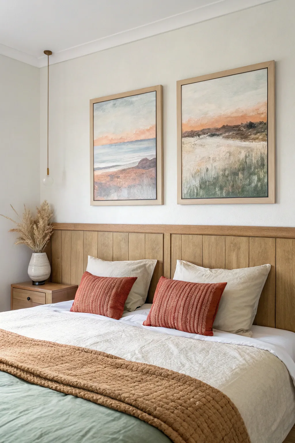
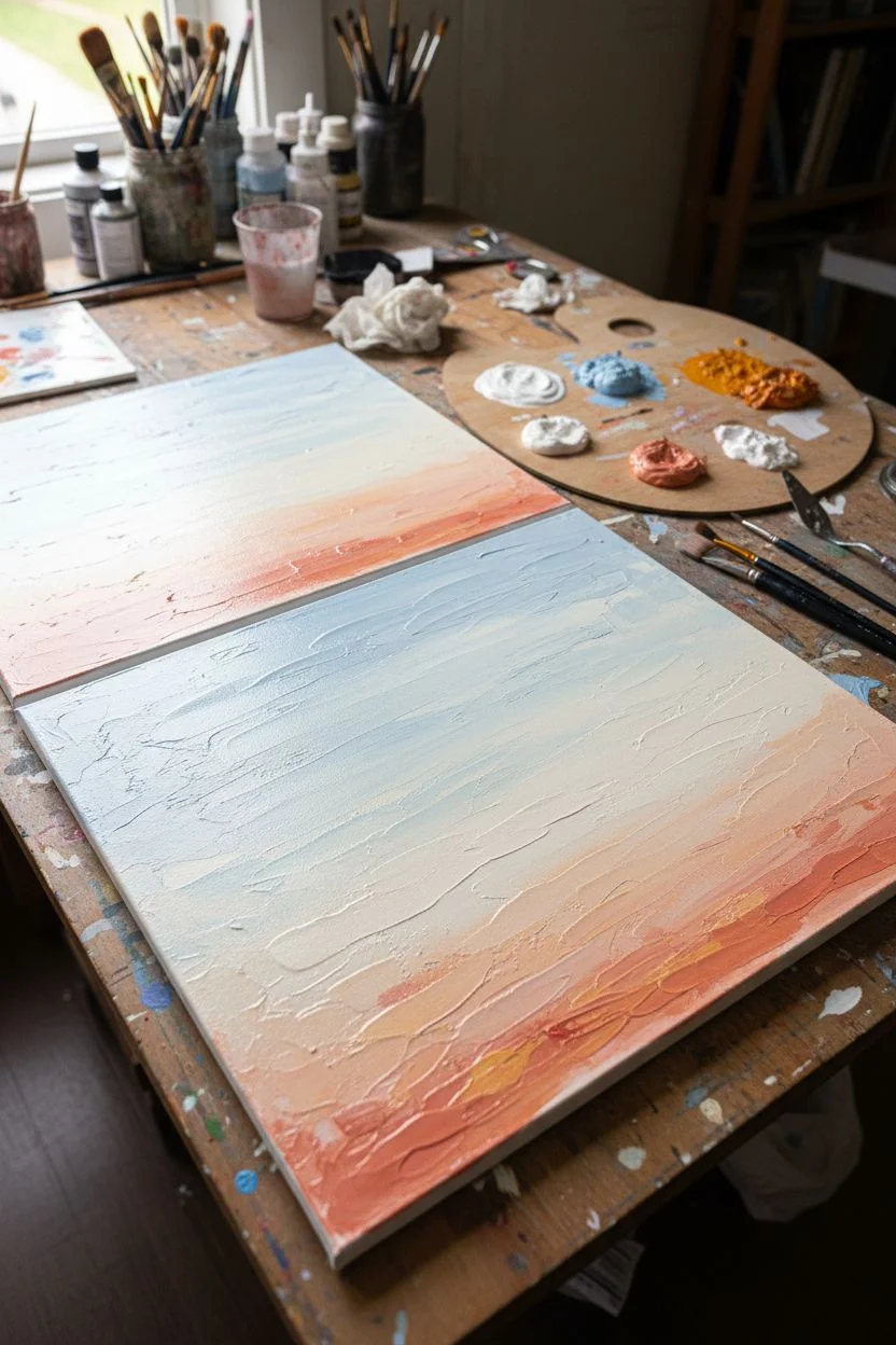
Bring the serene colors of a beach sunset into your bedroom with this pair of soft, impressionistic landscapes. These two pieces work together to create a continuous horizon line, blending warm terracotta hues with cool seafoam greens and blues.
How-To Guide
Materials
- Two 18×24 inch stretched canvases
- Acrylic paints (Titanium White, Unbleached Titanium, Burnt Siena, Yellow Ochre, Ultramarine Blue, Phthalo Green, Cadmium Red Light)
- Matte medium or texture paste
- Large flat brushes (1-2 inch)
- Medium filbert brush
- Palette knife
- Water cup and paper towels
- Two light wood floating frames
Step 1: Preparation & Sky Base
-
Texture the canvas:
Begin by applying a thin, uneven layer of matte medium or texture paste over both canvases using your palette knife. Create subtle horizontal strokes to mimic the direction of waves and clouds. Let this dry completely before painting. -
Mix your sky palette:
On your palette, prepare a large amount of Titanium White. Create three piles: one mixed with a touch of Ultramarine Blue for the upper sky, one with a tiny dot of Burnt Siena for a creamy mid-tone, and a third with Cadmium Red and Yellow Ochre for the peachy horizon. -
Paint the upper sky:
Use a large flat brush to sweep the blue-white mixture across the top third of both canvases. Keep your strokes loose and somewhat messy to allow the underlying texture to show through. -
Blend the transition:
While the top paint is still slightly tacky, brush the creamy off-white mixture below it. Use a dry brush to feather the two sections together, softening any hard lines. -
Add the sunset glow:
Apply the peachy-pink mixture near the center of the canvas where the horizon will be. Focus the color intensity on the bottom edge of the sky section, fading it upwards into the cream color.
Paint looking too flat?
If your landscape feels dimensionless, layer more paint! Let the first layer dry, then dry-brush lighter colors over the raised texture to create depth.
Step 2: Defining the Landscape
-
Establish the horizon line:
Place the two canvases side-by-side. Lightly pencil a horizon line across both so they align perfectly. In the left painting, this will be the water line; on the right, it will be the top of the dunes. -
Paint the distant water (Left Canvas):
Mix Titanium White, Ultramarine Blue, and a tiny bit of Phthalo Green to create a soft teal. Paint a horizontal band below the sky on the left canvas, keeping the color lighter near the horizon. -
Create the dune base (Right Canvas):
Mix Unbleached Titanium with Yellow Ochre and a touch of white. Block in the large dune shape on the right canvas, covering the bottom half. Use vertical, upward strokes to suggest tall grasses. -
Add the shore (Left Canvas):
Mix Burnt Siena with a little White to get a rust color. Paint the bottom section of the left canvas, creating a diagonal meeting point with the water. I like to scumble the paint here—scrubbing it in circles—to look like rough sand.
Level Up: Metallic Touch
Mix a tiny amount of gold leaf or metallic gold paint into your sand mixture. It will catch the light subtly, mimicking the sparkle of wet sand at sunset.
Step 3: Detailing & Texture
-
Deepen the dunes:
On the right canvas, mix Phthalo Green with Burnt Siena to create a deep, earthy olive. Use a filbert brush to add shadowy patches at the bottom of the dunes, flicking the brush upward to simulate grass blades. -
Add highlights to the grass:
Take your palette knife with some Unbleached Titanium and gently scrape it vertically over the dark olive areas. This catches the texture of the canvas and creates the look of sun-bleached dune grass. -
Refine the water:
Return to the left canvas. Use pure White on a small flat brush to add thin, horizontal lines across the water for wave crests. Add a slightly thicker white line where the water meets the sand for shore foam. -
Connect the scenes:
Carry a little bit of the rust-colored sand from the left canvas onto the far left edge of the right canvas. This visual bridge ensures the two paintings feel like one continuous panoramic view. -
Enhance the sunset clouds:
Mix a slightly stronger orange-pink. Dab this color sporadically into the sky area on both canvases, focusing on the area just above the horizon line to intensify the sunset effect. -
Final softening:
Use a clean, dry, soft brush to very lightly sweep over the entire surface in horizontal motions. This blurs sharp edges and gives the whole piece that dreamy, hazy quality. -
Frame your work:
Once the paint is fully cured (give it at least 24 hours), install the canvases into simple light wood floating frames to complete the organic, coastal aesthetic.
Hang your diptych with a few inches of space between the frames and enjoy your permanent sunset view
Monochrome Mini Paintings for a Nook
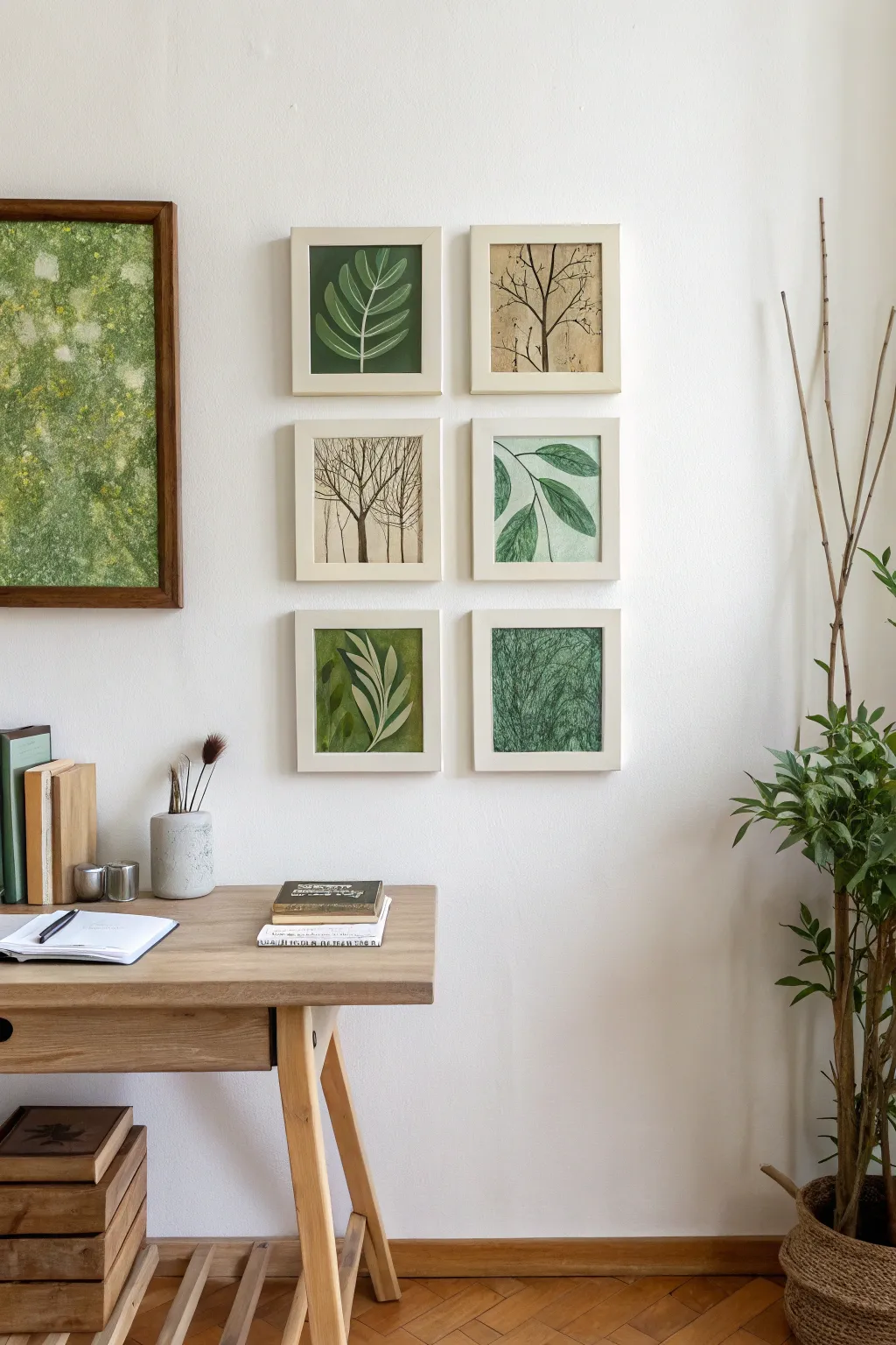
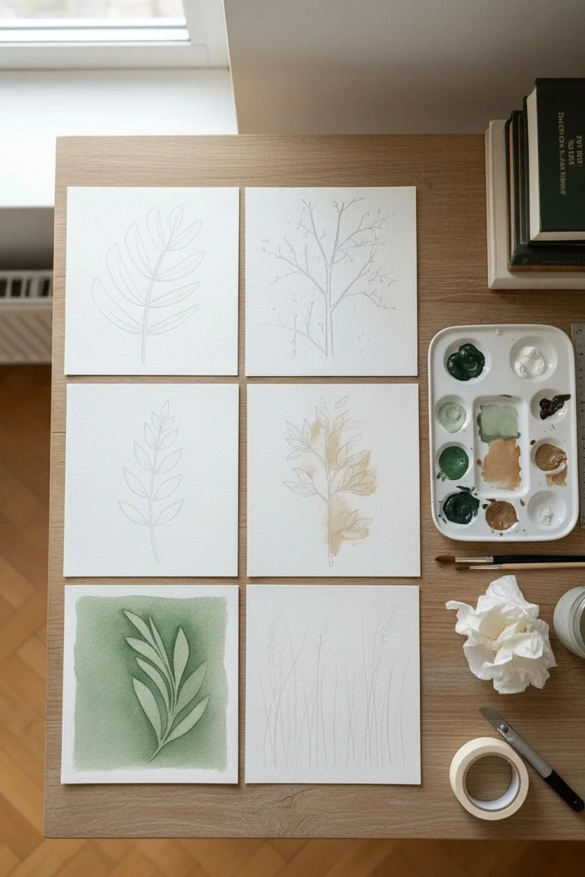
Transform a quiet corner into a natural sanctuary with this cohesive set of six mini botanical studies. Using a calming palette of sage, forest green, and earthy sepia, these simple yet elegant illustrations bring the outdoors in without requiring expert-level drawing skills.
Step-by-Step Guide
Materials
- 6 small square wooden frames (approx. 5×5 or 6×6 inches), preferably cream or light wood
- Heavyweight cold-press watercolor paper (300 gsm)
- Acrylic paints: Sap Green, Hooker’s Green, Burnt Umber, Raw Sienna, Titanium White
- Pencils (HB for sketching)
- Synthetic brushes: Round #2 and #4 for details, Flat #6 for washes
- Artist masking tape
- Palette for mixing
- Ruler and craft knife
- Water cups and paper towels
Step 1: Preparation & Planning
-
Cut Your Paper:
Measure the inside dimensions of your frames precisely. Cut your watercolor paper into six squares that fit these dimensions perfectly, ensuring clean, straight edges with your craft knife. -
Sketch the Grid:
Lay out the six squares on your table in a 2×3 grid to visualize the final composition. Lightly sketch a different botanical element on each: a fern leaf, a bare winter tree, a leafy branch, tall grasses, stem clusters, and intricate leaf veins. -
Prepare the Palette:
Squeeze out your greens, browns, and white. Create a few custom mixes: a pale sage (green + white + tiny touch of brown), a deep forest green, and a warm sepia wash (burnt umber + water). Keeping the palette limited ensures the gallery wall looks cohesive.
Paint Bleeding?
If fine lines bleed into the background, your base layer wasn’t dry enough. Use a hairdryer on the ‘cool’ setting to speed up drying between layers.
Step 2: Painting the Foliage
-
Leaf Study (Top Left):
Paint a solid square background of deep forest green. Once dry, use thinned white or pale sage paint with your #2 round brush to paint the simple outline and veins of a pinnate leaf floating in the center. -
Winter Tree (Top Right):
Mix a watery wash of Raw Sienna and paint a loose, organic background. While still slightly damp, use the Burnt Umber and a fine liner brush to originate a tree trunk at the bottom, branching out into fine, delicate twigs reaching the top. -
Bare Branches (Middle Left):
Leave the background plain white or a very faint cream wash. Using a mix of brown and black, paint a single vertical trunk with many fine distinct branches radiating upward, keeping lines crisp. -
Detailed Leaves (Middle Right):
Sketch a branch entering from the top left. Paint the leaves with varied shades of green—solid dark green for some, and outlined shapes filled with delicate cross-hatching for others to create texture. -
Abstract Fern (Bottom Left):
Apply a textured background of olive green. Paint a large, stylized fern frond using a lighter, creamy green. I like to add a few darker shadow leaves behind the main subject to create depth. -
Grass Texture (Bottom Right):
Cover the square in a mid-tone green wash. Once dry, take a fairly dry brush with darker green paint and use rapid, upward flicking motions to create the look of dense, tangled grass blades.
Add Texture
For the sepia backgrounds, dab the wet wash with a crumpled paper towel or sponge to create an organic, aged-paper look before painting the trees.
Step 3: Finishing Touches
-
Refine Details:
Step back and look at the set as a whole. Reinforce any lines that look too faint with a second coat of paint, particularly the dark branches. -
Erase Sketches:
Once you are absolutely certain the paint is bone dry, gently erase any visible pencil marks with a kneadable eraser to clean up the white spaces. -
Frame the Art:
Clean the glass of your frames to remove fingerprints. Place each painting into its frame, securing the backing clips tightly. -
Hang the Grid:
Measure your wall space carefully. Hang the frames in two vertical columns of three, keeping exactly 2-3 inches of space between each frame for a professional gallery look.
Now step back and enjoy the peaceful, organic atmosphere your new miniature art collection brings to the room
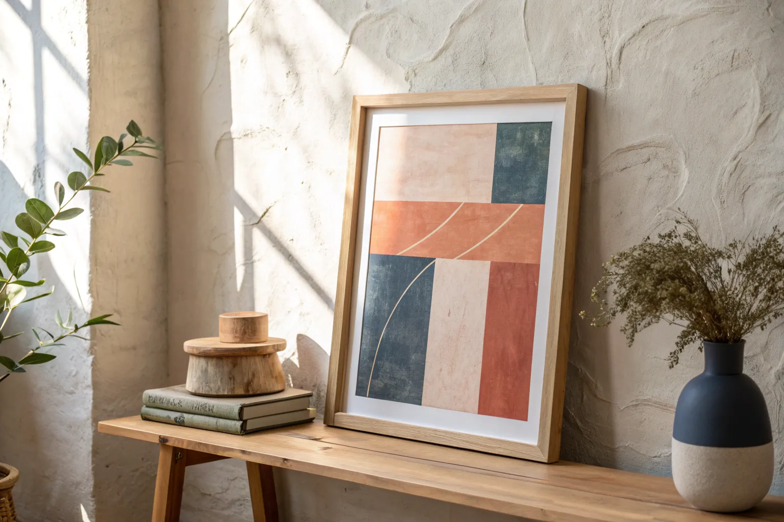
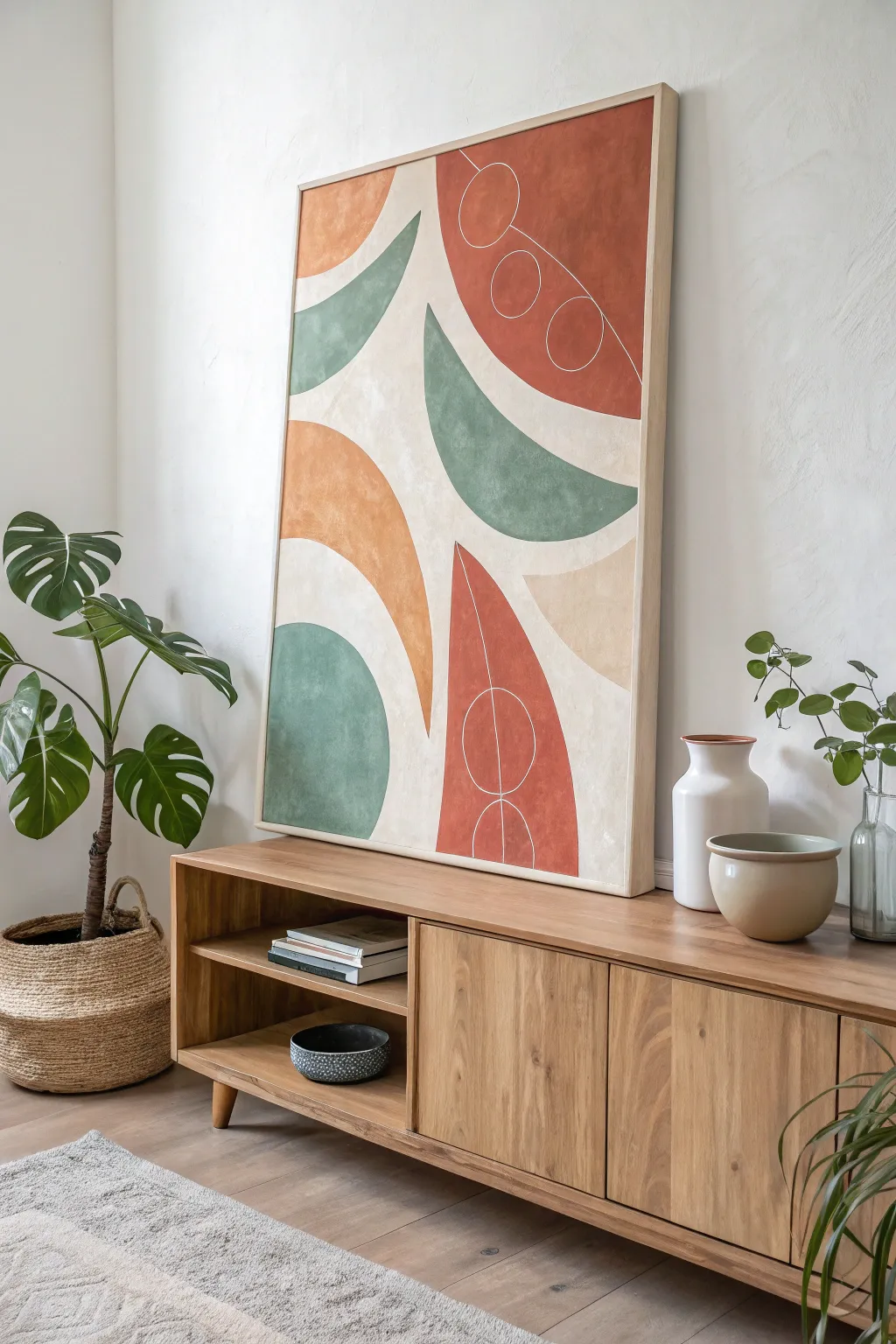
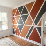
Painted Frame Illusion Around Art
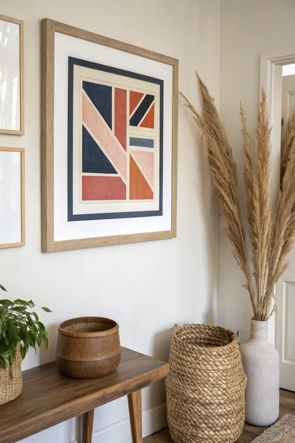
Create a stunning, modern focal point with this abstract geometric artwork that plays with deconstructed flag motifs. Using a warm palette of navy, rust, and blush, this project combines crisp lines with subtle texture for a high-end gallery look.
Detailed Instructions
Materials
- Large heavy-weight watercolor paper or mixed media paper (A2 or similar size)
- Wide wooden frame with mat
- Navy blue cardstock or mat board (for the inner border)
- Acrylic paints (Navy Blue, Rust/Terracotta, Blush Pink)
- Painter’s tape or masking tape (low tack)
- Ruler or T-square
- Pencil
- Flat paintbrushes (medium and small)
- Palette for color mixing
- Craft knife and cutting mat
- Glue stick or double-sided tape
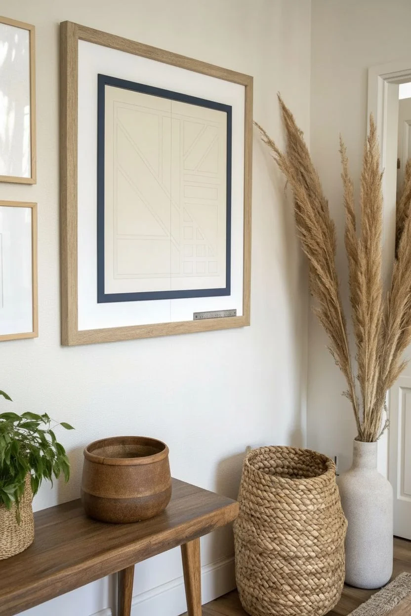
Step 1: Planning and Preparation
-
Scale your paper:
Begin by cutting your mixed media paper to fit inside the navy cardstock mount you plan to create later. Ensure it’s slightly smaller than your frame’s main mat opening to allow for that layered border effect. -
Mark the center:
Use a ruler and pencil to lightly find the center vertical line of your paper. This axis will act as the spine for your geometric design. -
Draft the major sections:
Lightly sketch the main geometric blocks. Start with the central vertical rectangle, then draft the diagonal triangles radiating outward, reminiscent of a flag pattern but simplified. -
Refine the geometry:
Use your ruler to sharpen the lines of the triangles and rectangles. Leave a consistent gap (about 1/4 inch) between each shape to let the paper’s white background create a natural grid.
Crisp Line Secret
Before applying your color, paint a thin layer of white acrylic or clear matte medium over the tape edge first. This seals the tape so your colors won’t bleed underneath.
Step 2: Painting the Design
-
Tape the first shapes:
Select a few non-adjacent shapes to paint first. Apply painter’s tape along the pencil lines on the *outside* of the shape area to ensure a crisp edge. -
Seal the tape edges:
I like to run a clean finger or the back of a spoon firmly over the tape edge to prevent paint bleed. This is crucial for sharp lines. -
Mix your navy:
Prepare a deep navy blue acrylic paint. Paint the large triangular sections on the left and upper right as shown in the inspiration image. -
Apply the rust tone:
While the navy dries, mix a terracotta or rust orange shade. Apply this to the bottom rectangle, the central vertical bar, and the middle right triangle. -
Add the blush accents:
Mix a soft blush pink. Fill in the remaining diagonal strips and triangles. This lighter color balances the visual weight of the darker tones. -
Let it dry completely:
Allow the first batch of shapes to dry fully before removing the tape. Peeling too early can smear the damp paint or tear the paper. -
Tape remaining sections:
Once the paper is dry, tape off the remaining shapes. Be careful placing tape over freshly painted areas; ensure they are deceptively dry or stick the tape to your clothes first to reduce tackiness. -
Finish painting:
Paint the final remaining geometric shapes with their respective colors (the small navy strip and any other remaining rust sections). -
Remove tape and touch up:
Peel off all tape slowly at a 45-degree angle. If any paint bled, use a tiny brush with white paint or a white gel pen to tidy up the negative space borders.
Step 3: Mounting and Framing
-
Cut the inner border:
Take your navy blue cardstock. Measure and cut a rectangular opening that is slightly smaller than your painted paper but larger than the artwork area, exposing a thin border of white paper around the paint. -
Layer the artwork:
Center your painting behind the navy cardstock ‘mat’ you just cut. Secure it from the back using painter’s tape or acid-free artists tape. -
Attach to main mat:
Now attach this layered stack behind the main white mat of your wooden frame. The navy cardstock acts as a secondary frame visually. -
Final assembly:
Place the entire stack into the wooden frame. Check for any dust or lint on the glass before closing up the back.
Textured Finish
Mix a tiny pinch of baking soda or fine sand into your rust and navy paints. This adds a subtle, gritty texture that mimics the look of vintage screen-printed art.
Hang your new geometric masterpiece in a well-lit spot to let the warm tones really shine
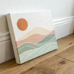
Tiny Matching Paintings on Unexpected Spots
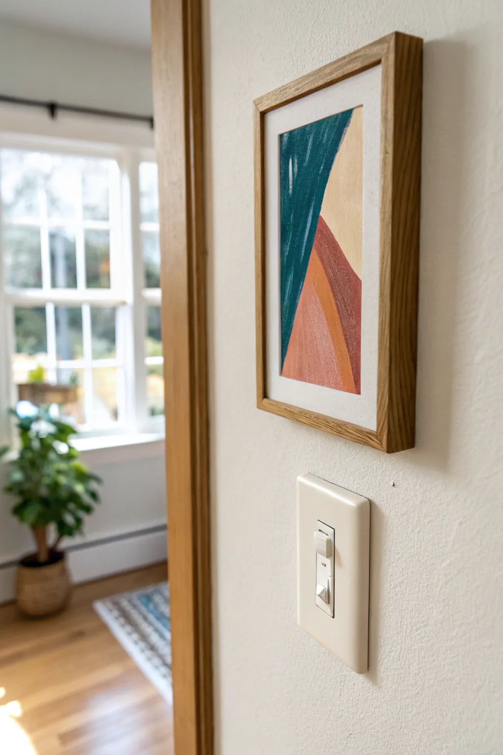
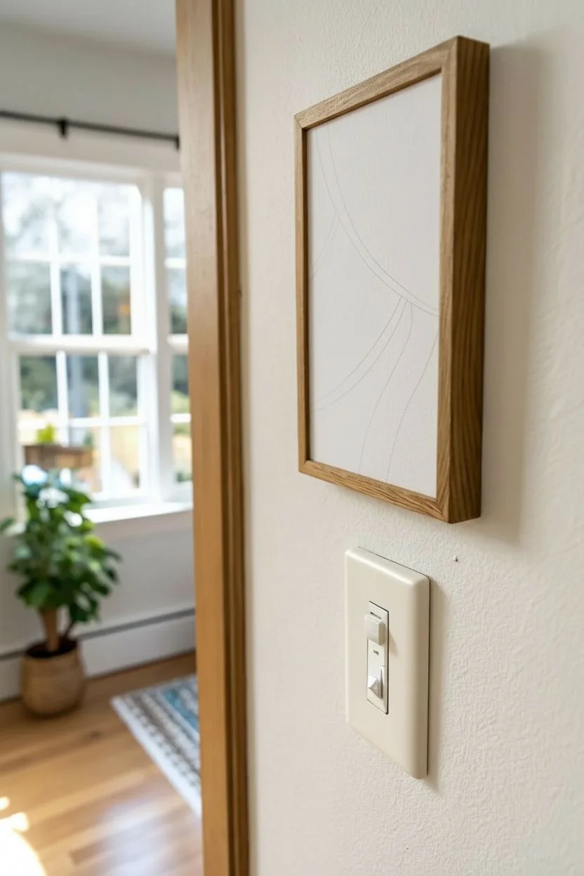
This charming project takes advantage of neglected wall space by adding a pop of color right next to a door frame. Using simple geometric forms and an earthy color palette, you’ll create a petite abstract piece that brings subtle warmth to a functional area.
Step-by-Step Tutorial
Materials
- Small stretched canvas (approx. 4×6 or 5×7 inches)
- Acrylic paints (Teal, Beige/Cream, Terracotta, Burnt Orange)
- Flat shader brushes (small and medium sizes)
- Pencil for sketching
- Painter’s tape (optional)
- Light wood floating frame
- Palette for mixing
- Cup of water and paper towels
Step 1: Drafting the Design
-
Canvas Prep:
Start with a clean, small canvas. If the texture is very rough, you might want to apply a layer of gesso first to smooth it out, though standard primed canvases work perfectly. -
Map Out the Composition:
Using a light pencil, sketch two main diagonal lines. One should curve slightly from the top left corner down towards the middle left edge. -
Define the Layers:
Draw the second sweeping curve starting from the bottom right area, moving upward to create overlapping mountain-like shapes. Keep the lines loose and organic rather than perfectly straight.
Uneven Edges?
If you struggle with shaky hands, use low-tack painter’s tape or washi tape to mask off each section. Let the paint dry fully before peeling the tape off slowly.
Step 2: Blocking in Color
-
Mix the Deep Teal:
Create a rich teal shade by mixing blue with a touch of green and a tiny bit of black to deepen it. Alternatively, use a tube of dark teal straight from the bottle. -
Paint the Top Left Section:
Fill in the upper left section created by your first pencil line with the teal paint. Use a flat brush to get a crisp edge along the curve. -
Apply the Cream Background:
For the upper right and background area, mix white with a drop of yellow ochre or brown to create a warm beige or cream tone. Paint this section carefully, meeting the teal edge. -
Dry Time:
Allow these first two large sections to dry completely before moving on to adjacent colors to prevent bleeding.
Level Up: Texture
Mix a small amount of modeling paste or baking soda into your acrylic paint before applying it. This creates a tactile, 3D effect that mimics plaster art.
Step 3: Layering the Warm Tones
-
Mix the Terracotta:
Prepare a reddish-brown terracotta color. If you only have bright red, tone it down with brown and a touch of white. -
Paint the Lower Curve:
Fill the bottom-most shape with this terracotta hue. Following the curve of the canvas edge keeps the composition grounded. -
Create the Orange Accent:
Mix an orange shade that sits between the beige and terracotta tones. It should look like a muted, earthy orange rather than a neon safety orange. -
Fill the Middle Stripe:
Paint the remaining sliver of space between the beige and the terracotta sections with your orange mix. This acts as a transitional color. -
Refine the Edges:
Once the main blocks are down, switch to your smallest brush. Go back over the boundaries where colors meet to sharpen the lines. -
Second Coat:
I usually find that cheaper acrylics need a second pass. If your colors look streaky, apply another thin layer once the first is dry.
Step 4: Final Touches and Framing
-
Check for Texture:
Look closely at the surface. If you want a more painterly look, you can dry-brush a tiny bit of lighter terracotta over the dark patch to add depth. -
Clean Up:
Use a damp cloth or a clean brush with a tiny bit of white paint to tidy up any spots where you might have accidentally gone ‘outside the lines’ on the white canvas border. -
Varnish (Optional):
If this will be in a high-traffic area, apply a matte varnish to protect the paint from dust and scratches. -
Mount in Frame:
Place your dried canvas into a light oak floating frame. Secure it from the back according to the frame’s instructions. -
Hang It Up:
Position the artwork on a small slice of wall, perhaps near a switch or door trim, to create that unexpected moment of design.
Enjoy the surprising burst of personality this tiny piece adds to your corner


Have a question or want to share your own experience? I'd love to hear from you in the comments below!