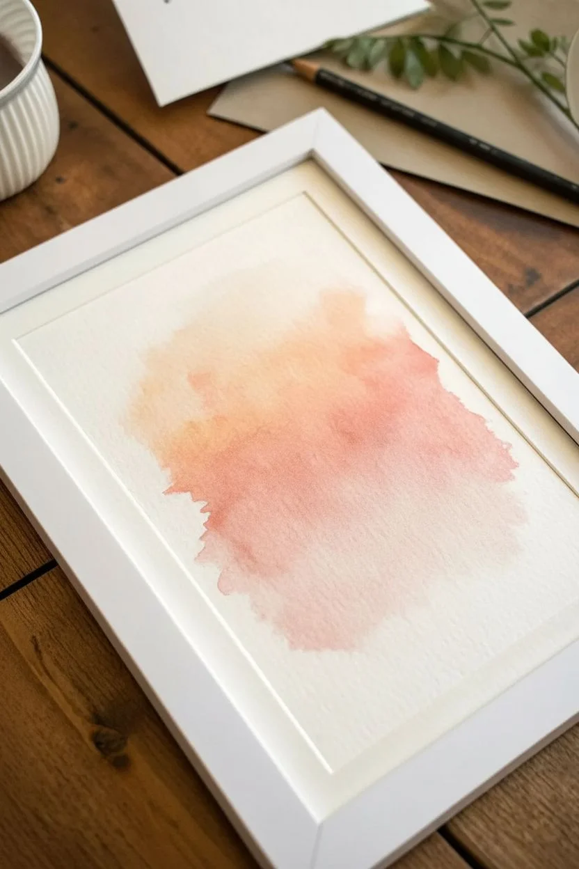
If you’re craving that calm, dreamy vibe that watercolors do so effortlessly, you’re in the right headspace. Here are my favorite aesthetic watercolor painting ideas that keep things simple, mood-forward, and seriously satisfying to paint.
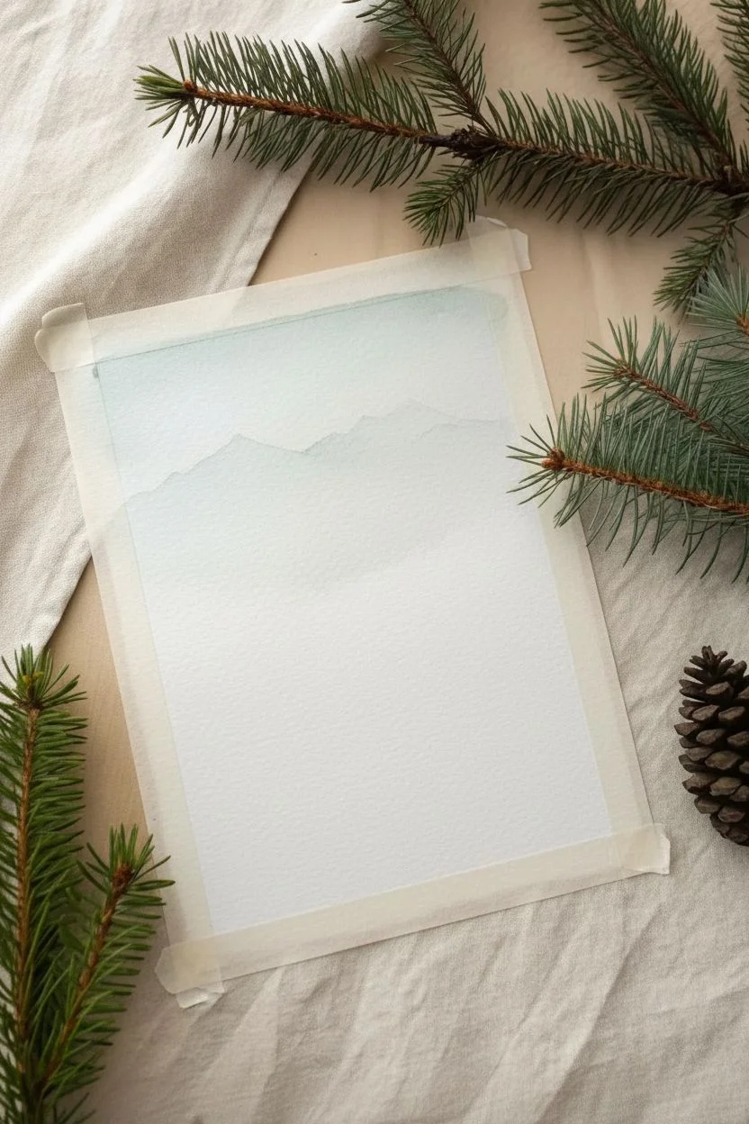
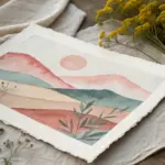
Dreamy Sunset Sky Gradients With Mountain Silhouettes
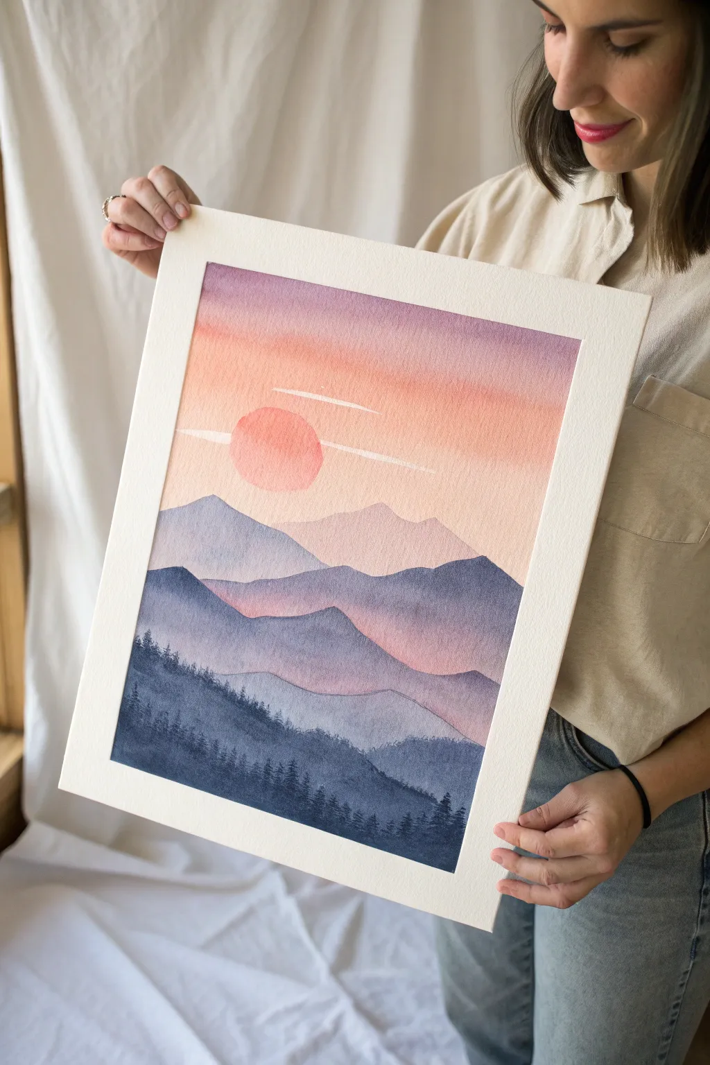
Capture the serene beauty of twilight with this layered mountain landscape, featuring soft color transitions from a warm peach sun to cool indigo peaks. This project is a perfect exploration of atmospheric perspective, teaching you how to build depth simply by darkening your color value with each new layer.
Step-by-Step
Materials
- Cold press watercolor paper (140lb/300gsm)
- Watercolor paints (Indigo, Alizarin Crimson, Cadmium Yellow, Ultramarine Blue, Payne’s Gray)
- Large flat wash brush (3/4 inch or 1 inch)
- Round brush (size 6 or 8)
- Small detail brush (size 0 or 1)
- Masking fluid (optional, for the sun)
- Artist tape
- Clean water jars
- Paper towels
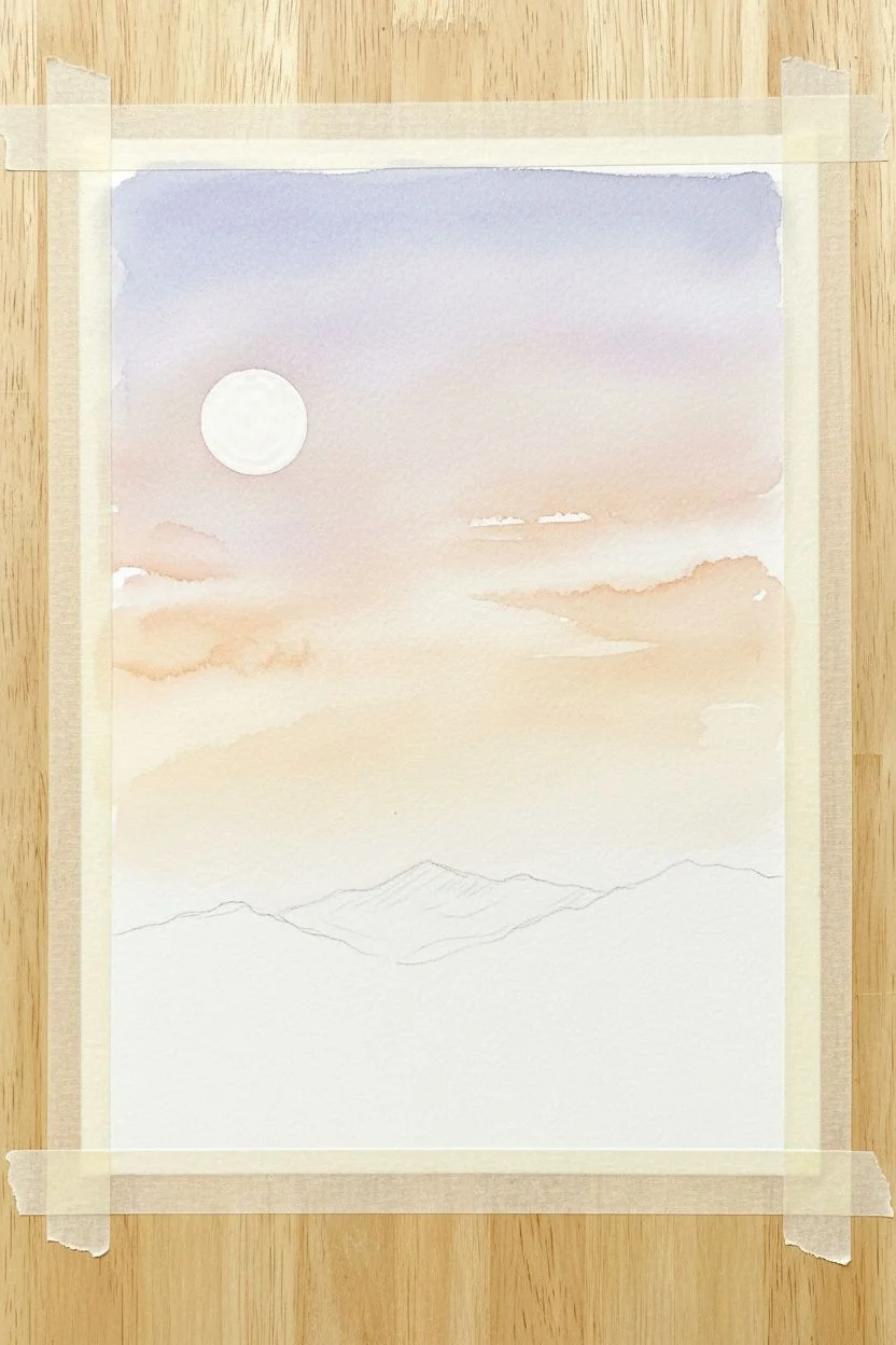
Step 1: Setting the Sky
-
Tape edges:
Secure your paper to a board using artist tape to create a crisp border and prevent buckling when the paper gets wet. -
Mask the sun:
Use a round object or freehand a circle for the sun in the upper left quadrant. Carefully fill this circle with masking fluid and let it dry completely. If you don’t have masking fluid, just work very carefully around this circle in the next step. -
Pre-wet the sky:
Using your large flat brush, apply a clean water glaze to the top two-thirds of the paper. You want the paper shiny and damp, but not holding puddles. -
Paint the upper gradient:
Mix a soft, diluted violet-purple. Apply this to the very top edge of the wet paper, letting it flow downwards. The wet-on-wet technique will keep the edges soft. -
Add the sunset glow:
While the paper is still damp, rinse your brush and pick up a pale peachy-orange mix. Blend this from the bottom of the sky area upwards, meeting the purple. Allow the colors to mingle naturally in the middle. -
Lift clouds:
While the sky wash is still damp but losing its sheen, use a clean, thirsty brush to lift out horizontal streaks across the sun area. This creates the soft, wispy clouds cutting across the light.
Muddy colors?
Ensure each mountain layer is 100% dry before painting the next. If the paper is cool to the touch, it’s still wet. Use a hair dryer to speed up the process.
Step 2: The Sun and Distant Peaks
-
Reveal the sun:
Once the sky is bone dry, gently rub away the masking fluid to reveal the white circle. -
Paint the sun:
Fill the sun circle with a warm, diluted coral or salmon pink. keep the wash fairly even, though a little variation adds texture. -
First mountain layer:
Mix a very pale, watery lavender-gray. With your round brush, paint the silhouette of the furthest mountain range right below the sun. The bottom of this shape should fade out into nothingness. -
Second mountain layer:
Wait for the previous layer to dry completely. Mix a slightly darker, warmer purple. Paint the next range of mountains, overlapping the first. The key here is to make the top edge crisp, but fill the body of the mountain with a translucent wash.
Step 3: Building Depth
-
Third layer transition:
Deepen your mix by adding a touch of Ultramarine Blue to the crimson and purple. Paint the third mountain range. This one should look distinctively darker than the ones behind it. -
Creating the valley:
For the fourth layer, shift the color temperature cooler. Use more blue and less pink. Paint this range lower down, creating a valley effect. I like to vary the height of the peaks significantly here to create visual interest. -
Deepening values:
Mix a strong Indigo with a touch of Payne’s Gray. This layer is much darker/opaque. Paint a large mountain mass that takes up a significant portion of the lower third. Ensure the top ridge is uneven and rugged.
Make it shimmer
Once the painting is dry, mix a tiny amount of gold gouache or metallic watercolor and lightly splatter it over the dark foreground trees for a magical effect.
Step 4: Foreground Details
-
The darkest layer:
Prepare your darkest mix yet—pure Indigo or Payne’s Gray with very little water. Paint the final foreground slope at the very bottom of the paper. -
Tree texture base:
While the foreground shape is wet, you can drop in concentrated pigment near the bottom edge to give it weight. -
Painting pine trees:
Switch to your smallest detail brush. Using the dark Indigo mix, paint tiny vertical lines along the ridge of the bottom two mountain layers. -
Adding foliage:
Using the very tip of the brush, tap tiny horizontal marks extending from those vertical lines to create the pine tree branches. Vary the heights and spacing—nature isn’t perfect. -
Final touches:
Check for any hard water lines you don’t like (though they can add character) and ensure your tree silhouettes are crisp against the lighter background layers.
Peel off the tape carefully away from the paper to reveal your clean edges and enjoy your peaceful landscape


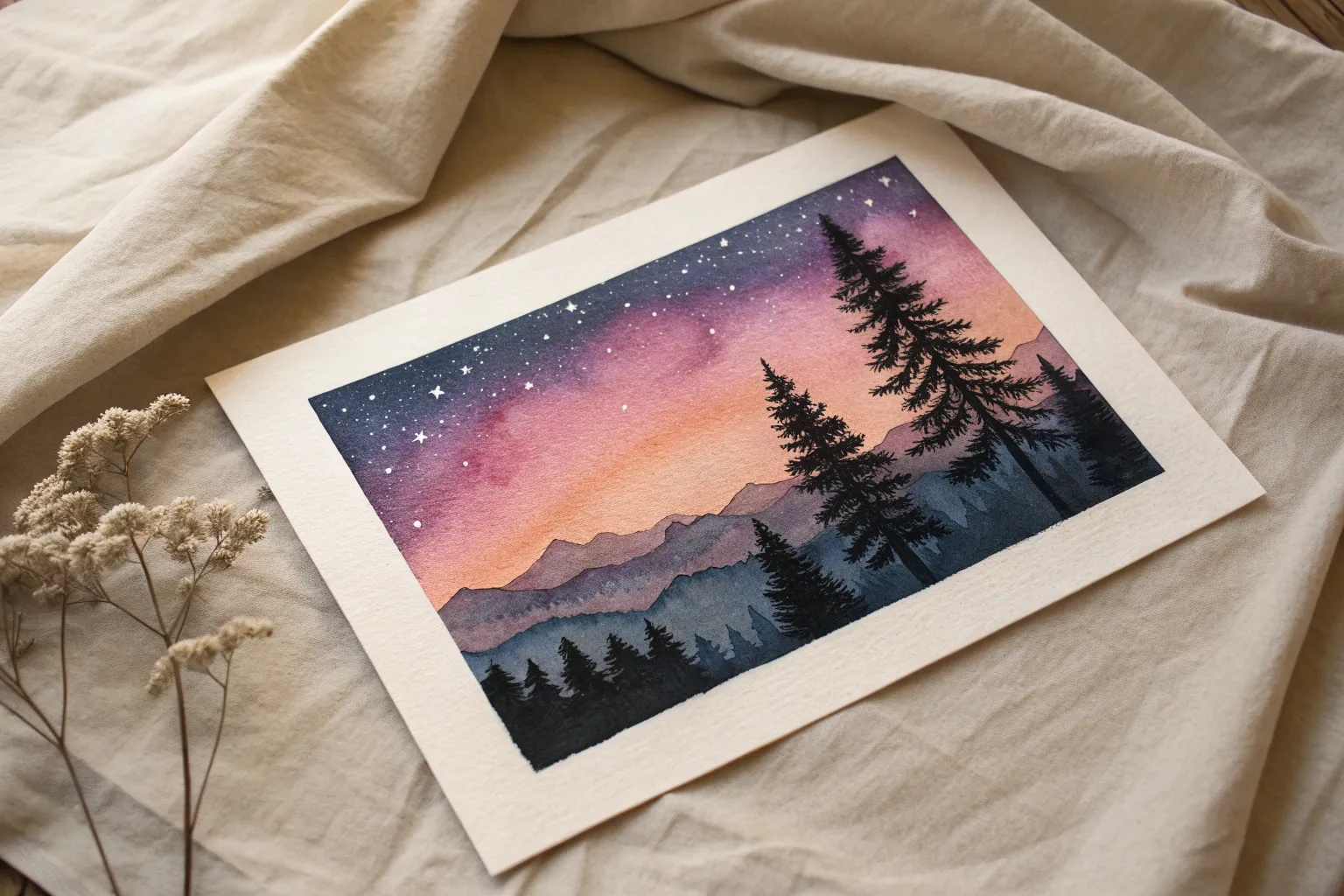
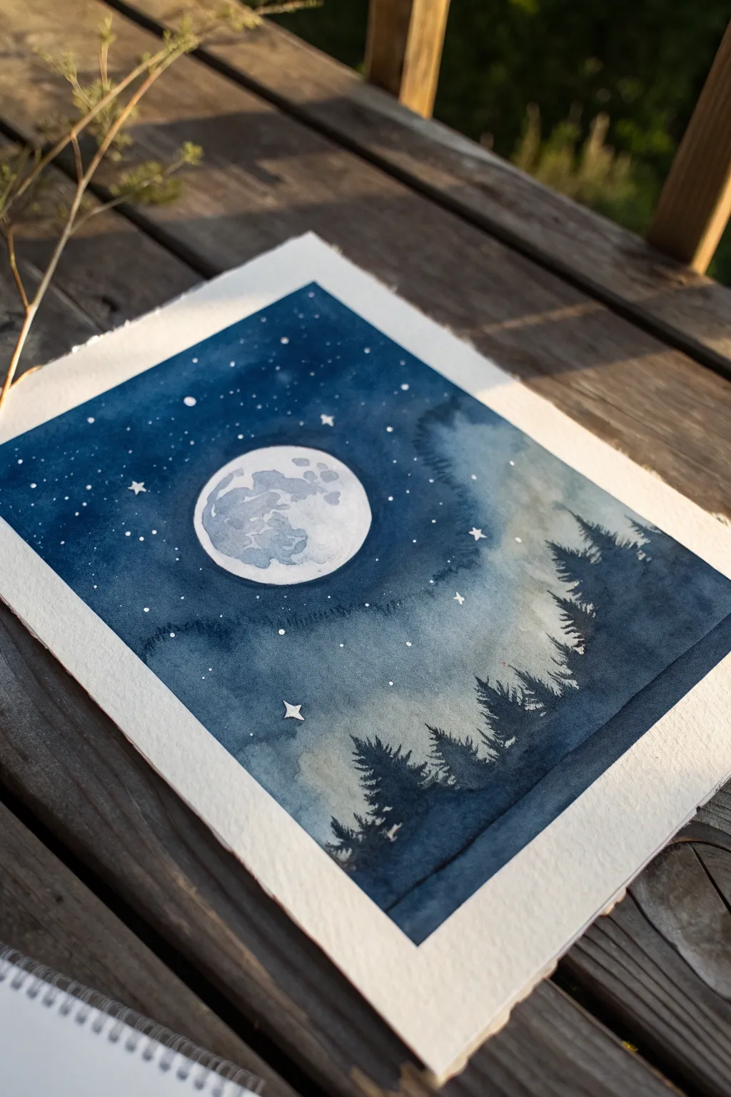
Starry Night Wash With Pine Tree Silhouettes
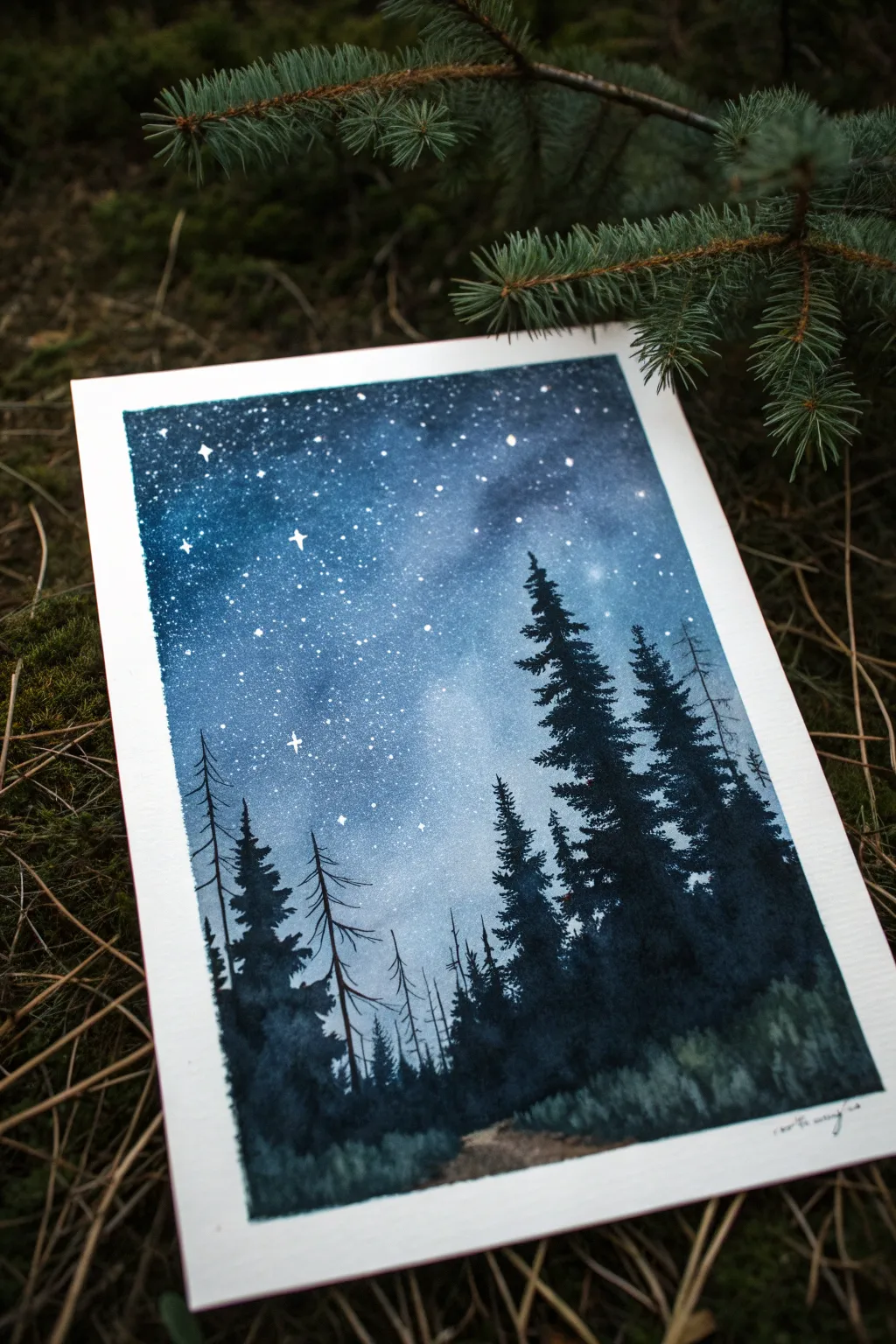
Capture the serene beauty of a crisp night sky with this moody watercolor piece. Using a simple wet-on-wet gradient technique, you’ll create a glowing galaxy background that perfectly frames sharp, dark pine tree silhouettes.
Detailed Instructions
Materials
- Cold Press Watercolor Paper (at least 300gsm/140lb)
- Masking Tape or Washi Tape
- Watercolors: Indigo, Prussian Blue, Payne’s Gray, Black
- White Gouache or White Gel Pen
- Large Flat Wash Brush
- Medium Round Brush (Size 6 or 8)
- Small Detail Brush (Size 0 or 1)
- Two Jars of Water
- Paper Towels
- Toothbrush (optional, for spatter)
- Hairdryer (optional, to speed up drying)
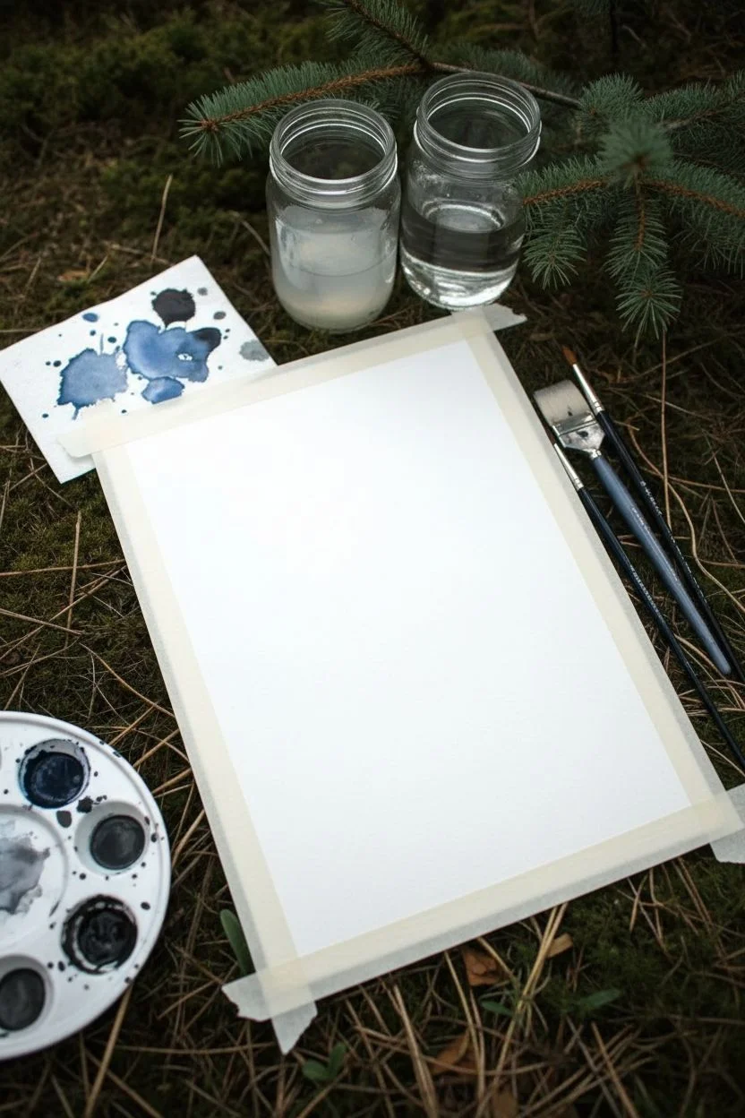
Step 1: Setting the Stage
-
Tape It Down:
Secure your watercolor paper to a hard board or your table using masking tape on all four sides. This creates that crisp white border shown in the image and prevents the paper from buckling under heavy water. -
Pre-mix Your Blues:
Before wetting the paper, prepare puddles of your sky colors. You’ll need a gradient ranging from a lighter blue (Prussian Blue diluted) to a very deep, almost black blue (Indigo mixed with Payne’s Gray).
Star Wars?
Painting stars on top of trees? Oops. Grab a damp brush and gently lift the white specks off black trees, or paint over the white dot with a fresh dab of black paint.
Step 2: The Galactic Sky
-
Wet the Surface:
Using your large flat brush, apply clean water evenly across the entire upper 3/4 of the paper where the sky will be. The paper should be glistening but not forming pools. -
Start the Gradient:
While the paper is wet, load your brush with the darkest blue mix. Paint across the very top edge, letting the pigment flow. -
Blend Downward:
Gradually introduce lighter blues as you work your way down the paper. Tilt your board slightly to help gravity blend the bands of color seamlessly typically known as a variegated wash. -
Add Depth:
While the wash is still wet, drop concentrated darkness (Indigo or Payne’s Gray) into the top corners to create a vignette effect, drawing the eye to the center. -
Keep the Horizon Light:
Ensure the bottom third of the sky area fades into a very pale, watery blue or even white. This creates the illusion of a glowing horizon behind the trees. -
Let It Dry Completely:
This is crucial: allow the sky layer to dry 100%. If the paper feels cool to the touch, it’s still damp. If you paint trees now, they will fuzzy out.
Make it Glow
Before the sky dries, lift out a specific area using a crumpled paper towel to create a brighter ‘Milky Way’ cloud, then cluster your stars densest in that light patch.
Step 3: The Starfield
-
Create Spatter:
Dilute a small amount of white gouache with water until it’s a milky consistency. Dip an old toothbrush or a stiff brush into it. -
Flick the Stars:
Hold the brush over the dry sky and tap the handle (or run your thumb over the bristles) to spray fine white specks across the darkness. -
Add Major Stars:
Using a white gel pen or a fine detail brush with undiluted gouache, manually paint a few larger ‘hero’ stars. Draw tiny crosses for a twinkling effect on the biggest ones.
Step 4: Forest Silhouettes
-
Mix the Shadow Color:
Create a thick, creamy mixture of Payne’s Gray and Black. You want this opaque enough to cover the background stars. -
Paint the Tree Line:
Using the medium round brush, start painting the mass of the forest at the bottom. Use a scrubbing motion to create texture for brush and low bushes. -
Build the Main Trees:
Switch to your smaller brush and paint vertical lines for the tree trunks rising into the sky. Vary the heights—some should be towering, others shorter. -
Add Pine Foliage:
Start at the top of a trunk and dab downward in a jagged, zigzag motion. Trees aren’t perfect triangles; leave gaps and make the branches wider as you go down. -
Create Depth:
I like to paint some trees with slightly more water (lighter gray) first, let them dry, and then paint darker, sharper trees in front. This creates atmospheric perspective. -
Dead Trees:
Intersperse a few thin, jagged lines without foliage to represent dead snags or bare trunks, adding realism to the forest density. -
Define the Path:
Leave a small gap or use a lighter, dirty brown wash at the very bottom center to suggest a dirt path leading into the woods.
Step 5: Finishing Touches
-
Refine the Foreground:
Use the detail brush to add tiny vertical strokes in the foreground ‘bushes’ to simulate tall grass blades catching the light. -
The Reveal:
Once the paint is completely bone dry, slowly peel off the masking tape at an angle, away from the painting, to reveal the clean border.
Step back and admire your own slice of the midnight wilderness


Soft Ocean Horizon With Minimal Waves
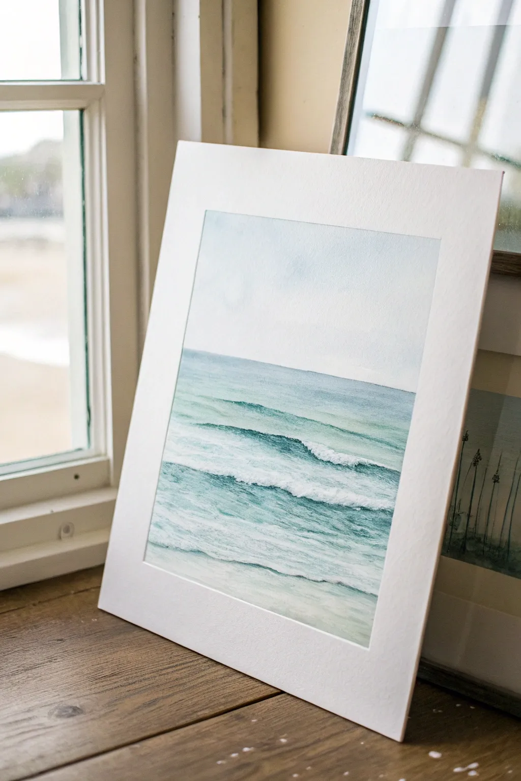
Capture the tranquil beauty of a calm sea with this minimalist watercolor project. Using gentle gradients and wet-on-dry techniques, you will build up layers of translucent teal and soft blue to create realistic rolling waves.
How-To Guide
Materials
- Cold press watercolor paper (140 lb/300 gsm)
- Watercolor paints: Cerulean Blue, Viridian Green, Prussian Blue, Payne’s Gray
- White gouache or white ink for highlights
- Large flat wash brush (1 inch)
- Round brushes (sizes 4 and 8)
- Masking tape
- Paper towels
- Two jars of water
- Mixing palette
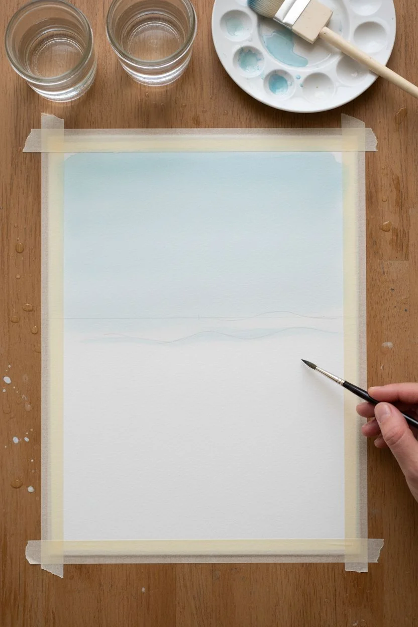
Step 1: Setting the Scene
-
Secure the Paper:
Begin by taping down all four edges of your watercolor paper to a board. Ensure the tape is firmly pressed to prevent buckling and create that crisp white border later. -
Light Sketching:
Using a hard pencil (H or 2H), very faintly draw your horizon line about one-third down from the top of the paper. Sketch a few gentle, horizontal guidelines to mark where your main wave crests will be. -
Sky Wash:
Mix a very dilute wash of Cerulean Blue with plenty of water. Wet the sky area with clean water first, then drop in the pigment near the top, fading it out to almost clear water as you reach the horizon line. -
Allow to Dry:
Let this initial sky layer dry completely. The paper should be flat and cool to the touch before you proceed to the ocean to prevent bleeding.
Pro Tip: Preserve Whites
Use masking fluid for the white foam crests before painting. It keeps the paper pristine and allows you to paint the water washes freely without avoiding spots.
Step 2: Building the Ocean
-
Horizon Line Definition:
Mix a slightly stronger blend of Cerulean Blue and a touch of Viridian. paint a crisp, straight line right at the horizon. Soften the bottom edge of this line slightly with a damp brush to start the water gradient. -
Base Water Layer:
Create a large puddle of light teal using Viridian and a tiny bit of blue. Apply a light wash over the entire water area, leaving thin horizontal strips of white paper untouched where the foam of the waves will be. -
Deepening the Distance:
While the paper is still slightly damp in the distance, add a slightly darker blue band just below the horizon to suggest depth. Let this blend naturally. -
Defining Wave Shadows:
Once the base layer is dry, mix a darker teal-blue using Prussian Blue and Viridian. With your round size 8 brush, paint underneath the white strips you left earlier. These are the shadows cast by the wave crests. -
Softening Edges:
Immediately after painting a shadow line, rinse your brush, blot it, and run the damp bristles along the bottom edge of the paint to soften it downward into the water.
Step 3: Refining Details
-
Mid-Ground Textures:
In the middle section of the painting, use a dryer brush technique. Load your brush with the teal mix and drag it quickly horizontally. The texture of the paper will catch the paint, looking like ripples on the water’s surface. -
Foreground Transparency:
For the water closest to the bottom, dilute your paint significantly. The water here is shallowest and clearest. I like to add a hint of warm yellow or ochre to the mix here to suggest sand beneath the water. -
Darkest Depths:
Identify the darkest points, usually right under the curling lip of the main wave. Mix a small amount of Prussian Blue with a touch of Payne’s Gray and apply thin, precise accents here for contrast. -
Adding Foam:
Take your white gouache or white ink. Using a small round brush or even an old toothbrush for spattering, add texture to the white strips you preserved earlier. Stipple the paint to create the frothy look of sea foam. -
Foam Shadows:
Mix a very watery, pale grey-blue. Carefully paint a tiny shadow on the underside of the white foam areas to give them volume and dimension, so they don’t look flat. -
Final Highlights:
Add tiny dashes of pure white gouache on the water surface between waves to represent sunlight catching the ripples. -
The Reveal:
Wait until the painting is bone dry. Slowly peel away the masking tape at a 45-degree angle, revealing the clean, white border that frames your seascape.
Troubleshooting: Blooms
If cauliflower-like blooms appear in your washes, you likely added water to a drying area. Wait for it to dry fully, then lightly glaze over it to blend.
Step back and breathe in the calm atmosphere of your beautiful new coastal artwork


Cotton-Candy Cloud Studies in Pastel Skies
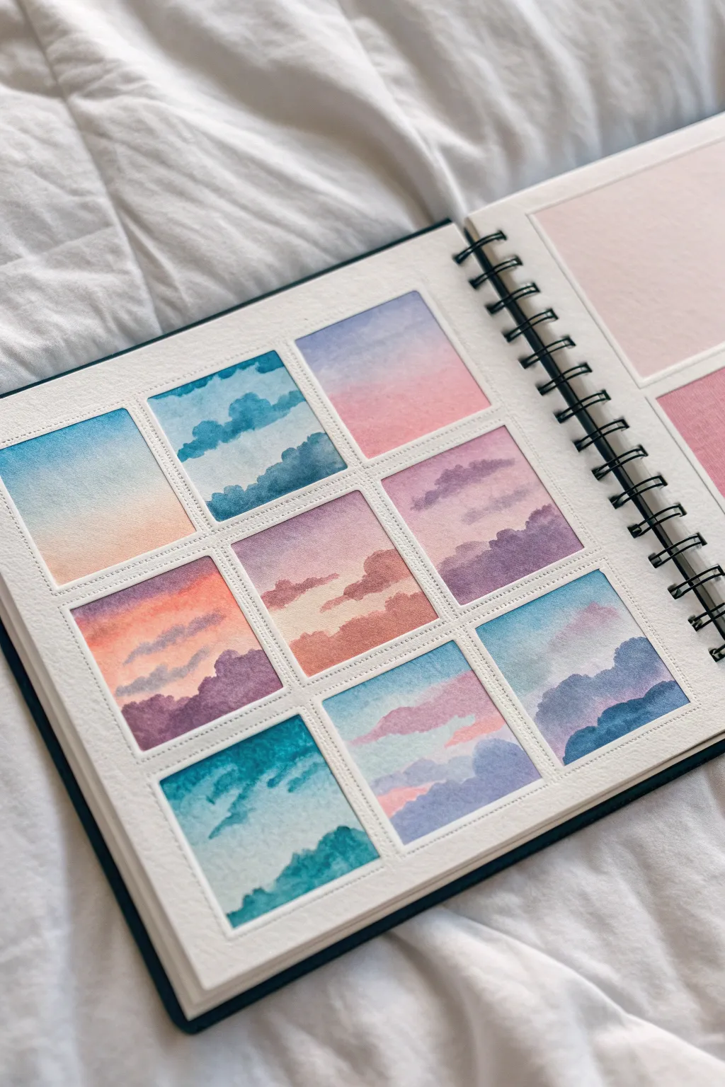
This project transforms a single sketchbook page into a mesmerizing study of light and atmosphere by breaking it down into nine miniature sky paintings. Using soft washes of blue, pink, and violet, you’ll practice capturing different cloud formations and gradients in a cohesive gallery of cotton-candy colors.
Step-by-Step
Materials
- Watercolor paper (at least 300gsm/140lb, cold press recommended)
- Artist-grade watercolor paints (primary blue, cool red/magenta, payne’s gray, purple)
- Masking tape or washi tape
- Synthetic round brush (size 4 or 6)
- Ruler and pencil
- Two jars of water (one for clean, one for dirty)
- Paper towels
- White gouache (optional, for highlights)
Step 1: Preparation & Grid Layout
-
Measure the grid:
Begin by measuring a 3×3 grid on your sketchbook page. Use a light pencil touch to mark nine equal squares, leaving about a half-inch margin between them to act as a crisp white border. -
Tape the borders:
Carefully apply masking tape or washi tape over the pencil lines you just drew. Ensure you press down firmly on the edges of the tape to prevent paint from seeping underneath and ruining your clean borders.
Sticky Situation?
To prevent the tape from ripping your paper upon removal, stick the tape to your pants or shirt first. This de-tacks the adhesive slightly for a gentler hold.
Step 2: Painting the Gradients (Wet-on-Wet)
-
Pre-wet the first square:
Start with the top-left square. Use your clean brush to apply a thin, even layer of clean water to the paper. The surface should sheen, but not puddle. -
Apply the first gradient:
Drop a diluted cerulean blue at the top of the wet square and a soft peach or pink at the bottom. Tilt the paper slightly to help the colors meet and blend softly in the middle without creating hard lines. -
Repeat for varying skies:
Move to the next squares, alternating your color combinations. Try a purple-to-blue fade for a twilight look, or a pink-to-orange blend for sunset. I like to keep the intensity low for these initial layers to maintain that pastel aesthetic. -
Let the base dry:
Allow all nine base gradients to dry completely. If the paper feels cool to the touch, it is still wet; wait until it is room temperature before proceeding.
Level Up: Golden Hour
Use metallic gold watercolor or a gold gel pen to line the very edges of just one or two clouds in each square. It creates a stunning ‘silver lining’ effect.
Step 3: Adding Clouds & Details
-
Mix shadow colors:
Prepare a mix for your clouds. A soft violet (made from blue and a touch of magenta) or a muted indigo works well. Ensure this paint mixture is thicker than your initial wash—think milk consistency. -
Paint fluffy cumulus shapes:
On the dried sky of one square, use the tip of your round brush to dab in the tops of clouds. Soften the bottom edges with a clean, slightly damp brush to make them fade into the atmosphere. -
Create wispy stratus clouds:
For a different texture in another square, drag your brush horizontally with very little paint (dry brush technique) to create long, thin streaks across a pink sky. -
Layering shapes:
In the darker twilight squares, paint silhouette-like cloud shapes at the bottom using a more saturated purple or Payne’s gray to suggest heavier, low-hanging clouds. -
Softening edges:
If a cloud edge looks too harsh, quickly run a damp brush along the perimeter to bloom the pigment slightly into the background. -
Adding depth:
Once your first layer of clouds is dry, add a second, smaller layer of darker pigment near the bottom of the cloud masses to create volume and shadow.
Step 4: Final Touches
-
Review contrast:
Step back and look at the grid as a whole. If any square looks too flat, add a tiny bit of concentrated color to the cloud shadows to make them pop. -
The reveal:
Wait until the paint is bone dry. Slowly and carefully peel off the masking tape at a 45-degree angle, pulling away from the painted area to ensure crisp, perfect edges.
Now you have a stunning collection of atmospheric studies that captures the shifting moods of the sky on a single page
BRUSH GUIDE
The Right Brush for Every Stroke
From clean lines to bold texture — master brush choice, stroke control, and essential techniques.
Explore the Full Guide
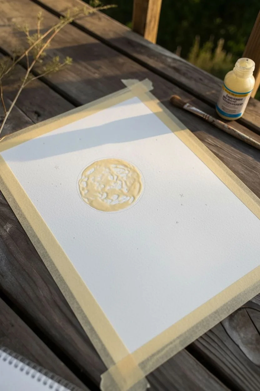
Moon Phases Floating in a Misty Indigo Sky
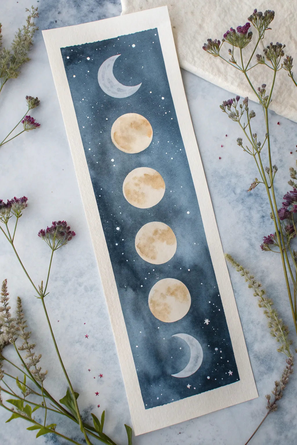
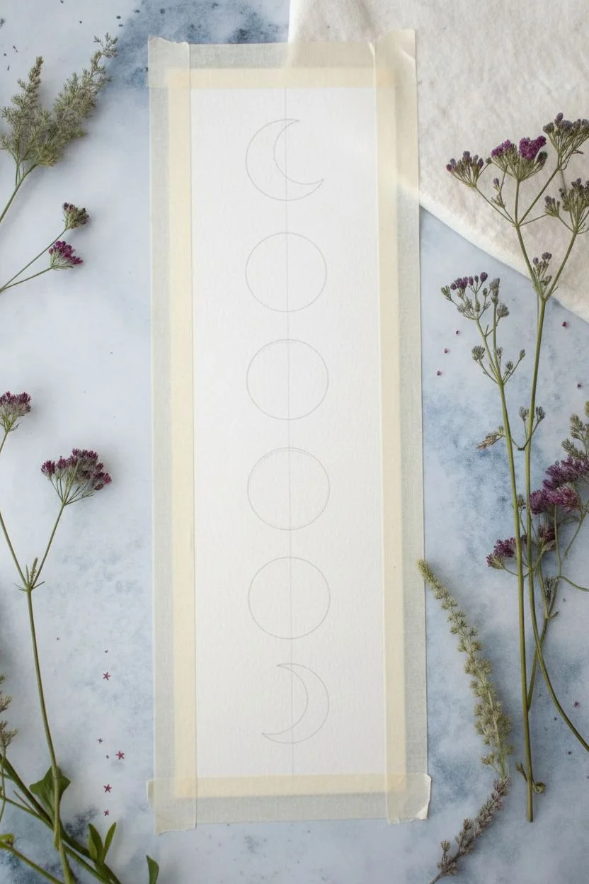
Capture the mystic progression of the lunar cycle on a vertical strip of watercolor paper. This project uses deep indigo washes and careful negative painting to create glowing moons suspended in a starry night sky.
Step-by-Step Guide
Materials
- Cold press watercolor paper (cut to approx. 2.5″ x 8″)
- Watercolor paints (Indigo, Payne’s Gray, Yellow Ochre, Burnt Sienna)
- White gouache or white gel pen
- Round brushes (size 2 and 6)
- Pencil and eraser
- Compass or circle stencil (optional)
- Clean water and paper towels
- Masking tape
Step 1: Preparation and Sketching
-
Secure the paper:
Tape down your strip of watercolor paper to a hard board using masking tape. Ensure the edges are sealed well to create a crisp white border once finished. -
Map the spacing:
Lightly mark a vertical centerline down the paper. Decide where your moons will go—this composition features a crescent at the top and bottom, with four full circles in the middle. -
Draw the moons:
Using a circle stencil, coin, or steady hand, sketch the four central circles. Draw the top and bottom crescents freehand, ensuring the curves face inward toward the center.
Uneven drying?
If you get ‘cauliflowers’ or hard edges in the background, your wash dried too fast. Next time, re-wet the whole background area with clean water before dropping in color.
Step 2: Painting the Moons
-
Base layer for moons:
Mix a very dilute wash of Yellow Ochre and a touch of Burnt Sienna. You want a pale, creamy color, not bright yellow. -
Apply the wash:
With your smaller brush, gently fill in the four central moon circles. Leave some tiny white gaps or lift pigment with a thirsty brush to create texture. -
Add craters:
While the moons are still damp (but not soaking), drop in slightly darker spots of the brownish mix to suggest craters and lunar seas. Let this dry completely. -
Paint the crescents:
For the top and bottom crescents, use a very watery, pale blue-grey mix instead of the yellow tone. This keeps them looking cool and distant.
Pro Tip: Lunar Glow
Before the dark background dries completely, run a clean, damp brush lightly along one edge of the moons to soften the harsh line into a gentle glow.
Step 3: Creating the Night Sky
-
Mix your darks:
Prepare a large puddle of deep night-sky color. I prefer mixing Indigo with a little Payne’s Gray to get that intense, inky blue. -
Outline carefully:
Using the size 2 brush, carefully paint the dark blue around the edges of your dried moon shapes. This technique, called negative painting, defines the moon edges without pencil lines. -
Fill the background:
Switch to the larger brush. While the outline is wet, pull that color outwards to fill the rest of the strip. -
Create the mist:
As you move away from the moon clusters, add more water to your brush to dilute the pigment. This creates the uneven, cloudy ‘mist’ effect visible in the reference. -
Darken the edges:
Drop simpler, concentrated pigment into the wet wash near the edges of the paper to create a vignette effect, framing the center light. -
Let it dry:
Allow the background to dry completely. If the paper feels cool to the touch, it is still wet.
Step 4: Starry Details
-
Prepare the stars:
Dilute a small amount of white gouache until it has the consistency of heavy cream. -
Splatter stars:
Load a brush with the white mixture and tap it against another brush handle over the painting to create fine splatters. Cover the moons with a scrap paper if you want to keep them clean. -
Add larger stars:
Use a fine-tip brush or white gel pen to manually add a few larger, specific stars or tiny cross-shapes for twinkling effects. -
Enhance outlines (optional):
If any moon edges look messy, you can carefully tidy them up with the white gel pen or a very steady hand with gouache. -
Reveal the border:
Once everything is bone dry, strictly peel the masking tape away at a 45-degree angle to reveal the crisp white edges.
Now you have a serene piece of the cosmos ready to mark your place in your favorite book
Palm Tree Silhouettes Against a Tropical Dusk Gradient
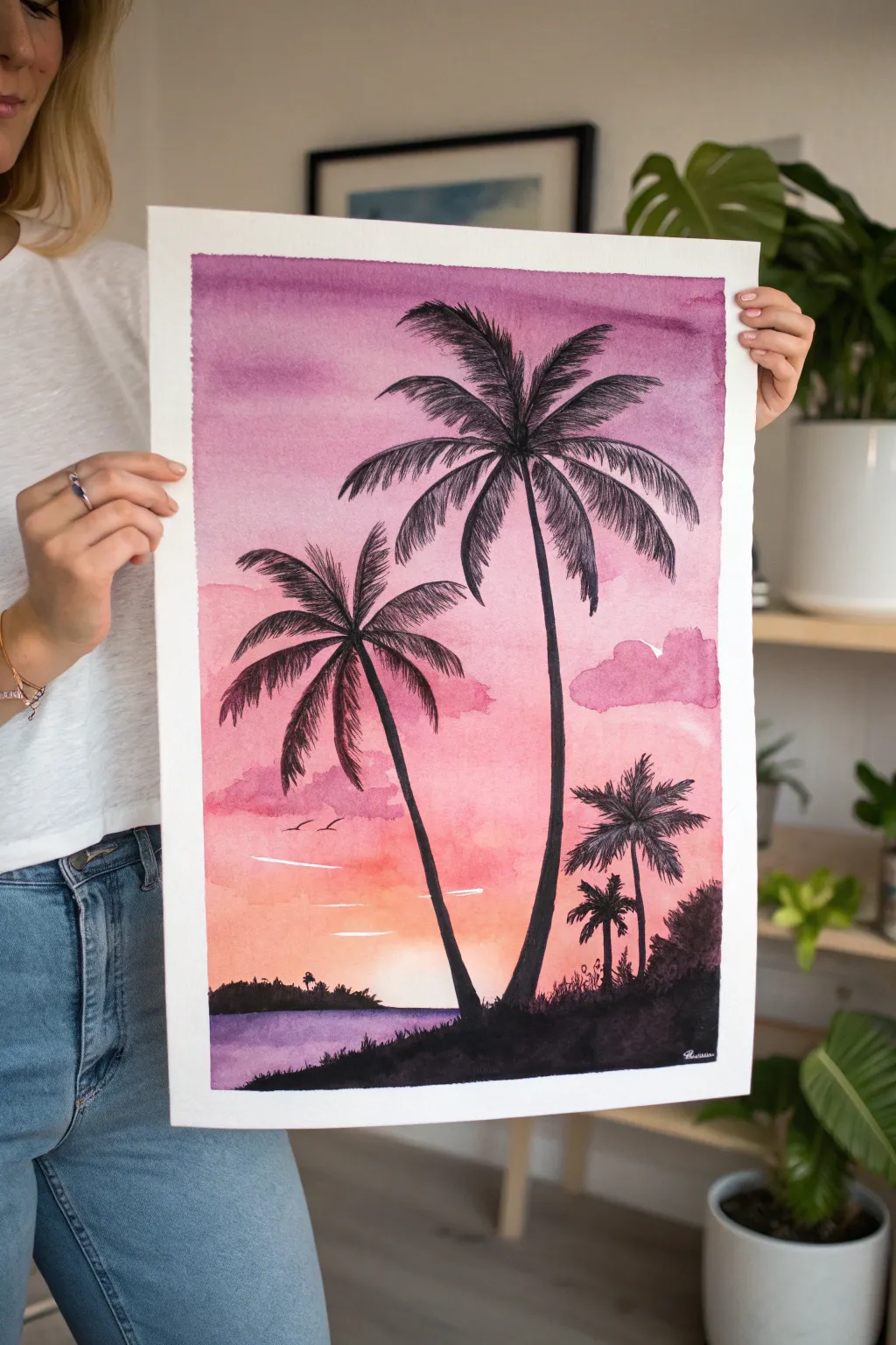
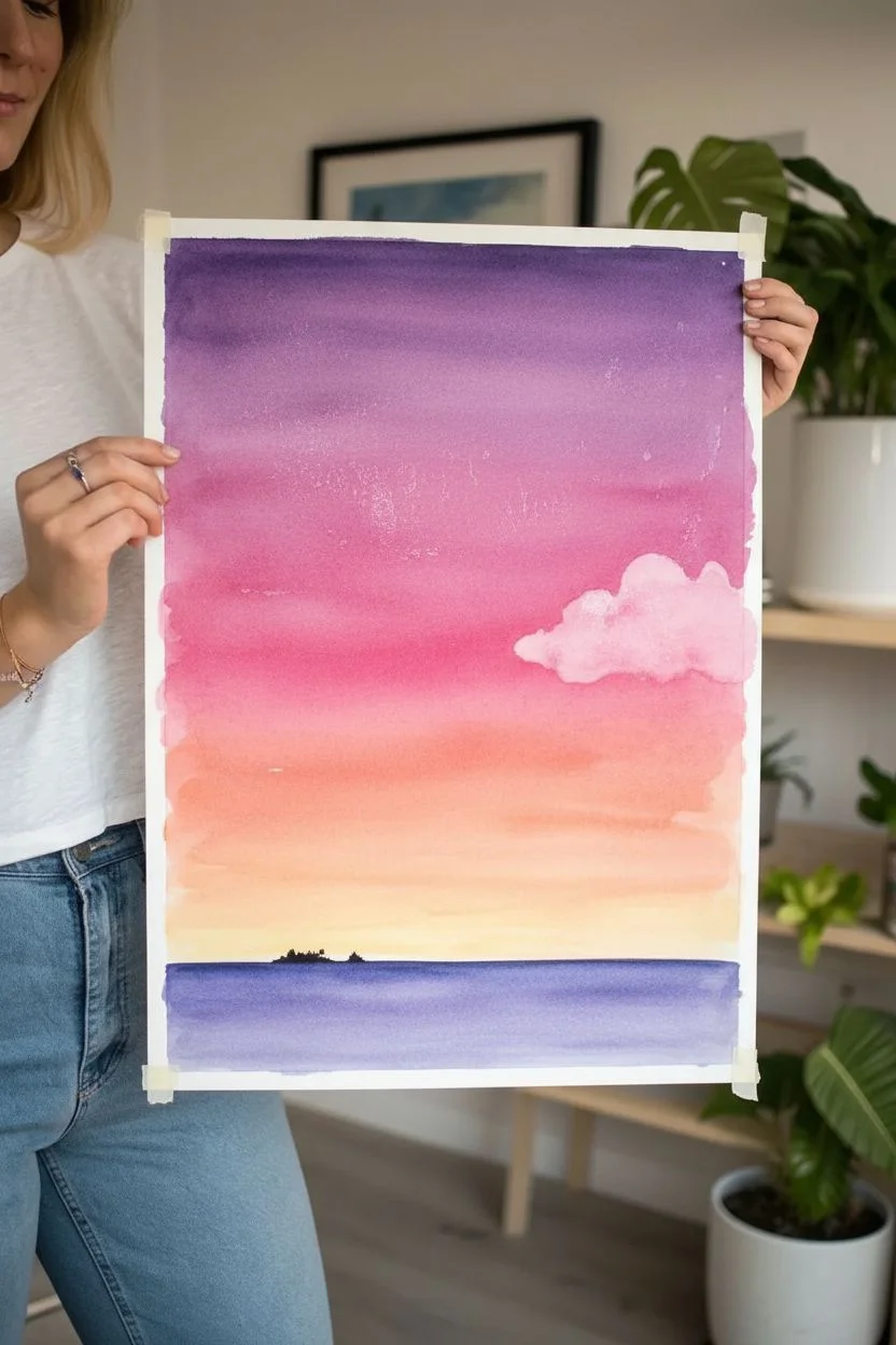
Capture the magic of a fading sunset with this vibrant watercolor piece, featuring a seamless gradient from deep violet to soft peach. The stark black palm tree silhouettes create a stunning contrast that brings the tropical atmosphere to life directly on your paper.
Step-by-Step Tutorial
Materials
- Cold press watercolor paper (140lb/300gsm)
- Watercolor paints (Violet/Purple, Magenta or Alizarin Crimson, Orange, Yellow)
- Black ink or highly concentrated watercolor/gouache
- Large flat wash brush or mop brush
- Round brushes (size 6 and size 2 for details)
- Painter’s tape
- Two jars of water
- Paper towels
- Mixing palette
Step 1: Creating the Sunset Gradient
-
Prepping the Paper:
Tape down all four edges of your watercolor paper to a board. This creates that crisp white border seen in the example and prevents buckling. -
Wet-on-Wet Base:
Using your large wash brush, wet the entire paper surface with clean water. The paper should define ‘glistening’ but not have standing puddles of water on it. -
Starting the Sky:
Load your brush with a watery mix of violet or purple. Apply horizontal strokes across the top third of the paper, letting the pigment flow and soften into the wet surface. -
Transitioning Colors:
While the violet is still wet, introduce a magenta or pinkish-red hue below it. Allow the colors to bleed into each other naturally—don’t overwork the seam. -
Adding Warmth:
Near the middle-lower section, blend in a soft orange, transitioning into a pale yellow near the horizon line to suggest the vanishing sun. -
Painting the Water:
Skip a tiny sliver of white paper for the horizon highlight, then paint the bottom section (the water) with a mix of violet and blue. Keep this area darker than the orange sky above it. -
Adding Cloud Textures:
While the pink section is damp (not wet), dab in a slightly more concentrated pink mix to create soft, fluffy cloud shapes on the right side. The damp paper will soften the edges for you. -
The Drying Phase:
This is crucial: Let the background dry completely. It must be bone dry before you add black, or the silhouettes will bleed into a fuzzy mess.
Muddy Gradient?
If your sky colors are turning brown, rinse your brush thoroughly between colors. Never mix purple and yellow directly on the paper; use pink or orange as a buffer zone.
Step 2: Painting the Silhouettes
-
Planning the Composition:
Lightly sketch the main trunk lines with a pencil if you need a guide. Notice the two main trees lean gently into the frame, not perfectly straight. -
Painting the Main Trunks:
Switch to your size 6 round brush and load it with black ink or concentrated black gouache. Paint the two tall trunks, starting thinner at the top and slightly thicker at the base. -
Creating Fronds:
For the palm leaves, start from the center of the tree top and flick your brush outward in arched lines. Use quick, confident strokes to taper the ends. -
Leaf Details:
Along each arched line, paint small, quick dashes downwards to create the individual leaflets. Vary the length to make them look ragged and natural. -
Foreground Land:
Paint a solid black, uneven mound at the very bottom right to represent the shoreline. Use a stippling motion along the top edge to suggest grass and foliage textures. -
Small Distant Palms:
Using your smallest brush (size 2), paint the smaller cluster of palm trees on the lower right side. Keep these much shorter to create a sense of depth and scale. -
Distant Horizon Detail:
On the left side of the horizon, paint a tiny, low silhouette of a distant island. Keep the top edge bumpy to simulate trees far away. -
Adding Birds:
With the very tip of your detail brush, add two or three tiny ‘V’ shapes in the pink area of the sky for birds. -
Final Touches:
If you want the white streaks in the water or sky seen in the reference, use a tiny amount of opaque white gouache to dry-brush a few horizontal highlights.
Level Up: Starry Night
Once the sky is dry (before painting trees), splatter tiny droplets of white gouache or acrylic ink on the dark purple top section for a starry transition.
Peel off the tape slowly at an angle to reveal your crisp edges and enjoy your personal slice of tropical paradise

PENCIL GUIDE
Understanding Pencil Grades from H to B
From first sketch to finished drawing — learn pencil grades, line control, and shading techniques.
Explore the Full Guide
Misty Forest Layers Using Wet-on-Wet Bleeds
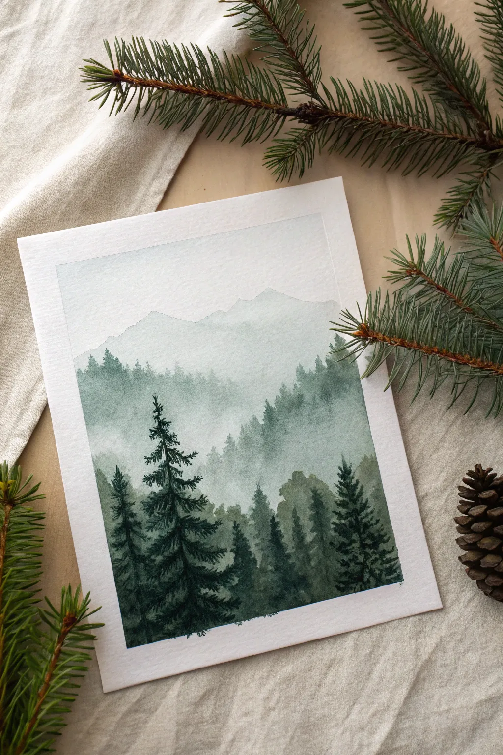
Capture the serene solitude of a foggy mountain range with this monochromatic forest study. By building up layers of increasingly saturated green, you’ll create a stunning sense of depth where distant trees fade into the mist.
Step-by-Step Guide
Materials
- Cold press watercolor paper (300 gsm)
- Masking tape
- Watercolor paints (Payne’s Grey, Perylene Green, or Indigo)
- Round brushes (size 8 for washes, size 2 for details)
- Jar of clean water
- Paper towels
- Palette for mixing
Step 1: Preparation & Sky
-
Secure your paper:
Tape down all four edges of your watercolor paper to a board or table. This creates that crisp white border seen in the final piece and prevents the paper from buckling when wet. -
Mix your base color:
Create a large puddle of your chosen dark green on your palette. For the first layer, dilute a small amount of this mix with plenty of water until it’s a very tea-like, pale grey-green. -
Paint the sky:
Using your larger brush, wet the top third of the paper with clean water. Drop in your palest wash near the top and let it diffuse downwards, fading to almost clear water before you reach the middle of the page. -
First mountain ridge:
While the paper is still slightly damp but no longer shiny, paint the silhouette of the furthest mountain range. Keep the edge soft and the color very faint to push it into the distance.
Hard Lines Appearing?
If your ‘mist’ dries with a hard line instead of a fade, your softening brush was too wet. Blot it more thoroughly on a paper towel before dragging the pigment down.
Step 2: Building Atmospheric Depth
-
Wait for dryness:
Let the sky and distant mountain layer dry completely. If you touch it and it feels cool, it’s still wet. -
Second layer of trees:
Saturate your green mix slightly more—aim for a coffee consistency. Paint a jagged, uneven line of tree tops across the middle of the page, overlapping the mountain layer. -
Create the mist effect:
Immediately rinse your brush and blot it on a towel so it’s damp but not dripping. Run this clean, damp brush along the bottom edge of your wet paint line to soften it, pulling the color down into a fade. -
Third layer variation:
Once the previous layer is dry, mix a slightly darker value. Paint another row of tree shapes slightly lower down. Vary the heights to make it look natural. -
Soften the edges again:
Repeat the process of softening the bottom edge with clean water. This blurring at the base of the trees is essential for the ‘foggy’ look. -
Add a transition layer:
Add a fourth layer that is darker still. Here, you can start defining individual tree shapes a bit more clearly, using the tip of your brush to make tiny vertical strokes for the tree peaks.
Level Up: Birds
Once dry, use a white gel pen or opaque white gouache to add extremely tiny, V-shaped birds soaring above the mist to give the landscape a massive sense of scale.
Step 3: Foreground Details
-
Mix the darkest value:
For the foreground, you want your paint to be thick and rich, with very little water added. It should look almost black-green. -
Paint the hero trees:
Switch to your smaller size 2 brush. On the left side, paint a tall, prominent pine tree. Start with a thin vertical line for the trunk. -
Add pine branches:
Using a stippling motion or short, quick dashes, build the branches outward from the trunk. Keep the branches wider at the bottom and narrower at the top. -
Fill the foreground:
Paint several more detailed, dark trees across the bottom of the paper. I like to vary the heights significantly here to create an interesting silhouette against the lighter background. -
Connect the base:
Fill in the bottom edge of the paper with your dark mix, ensuring the roots of these foreground trees merge into a solid dark mass. -
Final touches:
Look for any gaps in the foreground that need filling. You can add tiny specks or dots to suggest texture in the foliage. -
The reveal:
Once the painting is 100% bone dry, carefully peel away the masking tape at a 45-degree angle to reveal your clean edges.
Enjoy the calm that comes from watching your misty landscape slowly emerge from the page
Aurora-Inspired Sky Ribbons Over a Dark Landscape
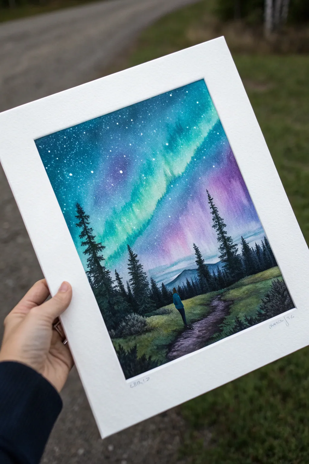
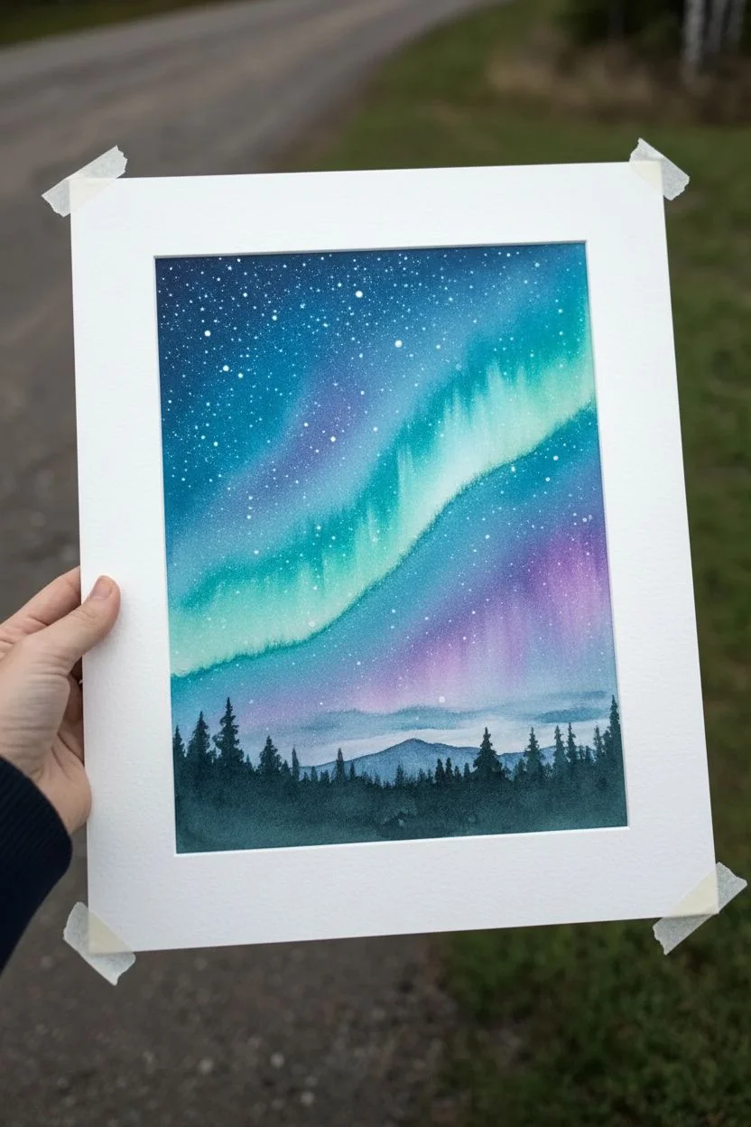
Capture the ethereal magic of the Aurora Borealis dancing over a silent forest with this atmospheric watercolor project. The contrast between the vibrant, luminous sky and the deep, rich shadows of the trees creates a breathtaking sense of scale and wonder.
How-To Guide
Materials
- Cold press watercolor paper (140lb/300gsm)
- Watercolor paints: Phthalo Blue, Turquoise, Dioxazine Purple, Magenta, Indigo, Sap Green, Payne’s Grey
- White gouache or white ink for stars
- Large round brush (size 10 or 12)
- Small detail brush (size 0 or 2)
- Masking tape
- Mixing palette
- Two jars of water
- Old toothbrush (optional)
Step 1: Setting the Sky Stage
-
Tape down boundaries:
Secure your paper to a board using masking tape on all four sides. This creates that crisp white border seen in the photo and prevents the paper from buckling during the heavy wash stages. -
Wet the sky area:
Generously wet the upper two-thirds of your paper with clean water. The paper should glisten but not have standing puddles. This prepares the surface for soft, blooming blends. -
Establish the aurora path:
While wet, drop in a light wash of turquoise or aqua diagonally across the paper. Let this represent the brightest ribbon of the aurora. Keep the edges soft and indefinite. -
Add depth to the night:
Surround your turquoise ribbon with darker blues like Phthalo Blue mixed with a touch of Indigo. Work quickly so the colors bleed into the turquoise slightly without overtaking it. -
Infuse violet hues:
On the right side of the sky and near the horizon line, drop in Dioxazine Purple and Magenta. Let these mingle with the blues to create the transition from the teal aurora to the dark night sky. -
Darken the cosmos:
Enhance the top corners with your deepest Indigo or Payne’s Grey mixture to frame the lights. The contrast is what makes the aurora glow. -
Create the stars:
While the sky is completely dry (wait until it’s bone dry!), dip an old toothbrush or stiff brush into white gouache. Flick the bristles to spray a fine mist of stars over the teal and purple sections. -
Detail larger stars:
Use your smallest brush and white gouache to manually dot in a few larger, brighter stars to create variety in the galaxy.
Cosmic Bloom
To get that feathery look in the aurora, lift some pigment out while the sky is damp using a clean, thirsty brush. This creates soft streaks of light.
Step 2: Grounding the Landscape
-
Paint the distant mountains:
Mix a diluted wash of Indigo and Payne’s Grey. Paint a faint, jagged mountain range low on the horizon line. Keep it pale so it looks far away. -
Lay the grassy base:
Mix Sap Green with a little brown or grey for a muted evening green. Paint the bottom third of the paper, leaving a rough, winding negative space for the path if you wish, or paint it all and darken the path later. -
Define the path:
Using a dark mix of purple and brown, paint the dirt path winding from the bottom center towards the trees. Use horizontal strokes to suggest the texture of earth. -
Paint the tree silhouettes:
Load a size 4 or 6 brush with a very concentrated, thick mix of Payne’s Grey and Green. Start painting the tall pine trees on either side. Use a tapping motion with the tip of the brush to create jagged pine textures. -
Vary tree heights:
Make the trees on the left and right taller to frame the composition, getting shorter as they recede toward the center horizon. -
Add mid-ground foliage:
Use a dry-brush technique with dark green to scumble in some bushes and grassy textures along the edges of the path and the base of the trees.
Make It Glossy
Once the painting is fully dry, add a touch of iridescent medium or glitter glaze over just the teal parts of the aurora for a magical shimmer.
Step 3: The Final Figure
-
Sketch the silhouette:
Once the background is dry, lightly pencil in a small figure standing on the path. Keep the pose simple—standing straight, looking up. -
Paint the figure:
Block in the figure’s clothing. Use a dark blue or teal for the jacket to tie it into the sky colors, and black or dark grey for the pants. -
Add highlights:
If the figure feels too flat, mix a tiny bit of white gouache with your jacket color and add a subtle highlight on the shoulder or head to suggest the moonlight hitting them. -
Reveal the border:
Wait until the painting is absolutely dry to the touch. Start peeling the masking tape away slowly at a 45-degree angle to reveal your clean, professional edge.
Now you have a serene piece of night sky art that captures the silent majesty of nature


Cozy Rainy Window Scene With Blurred City Lights
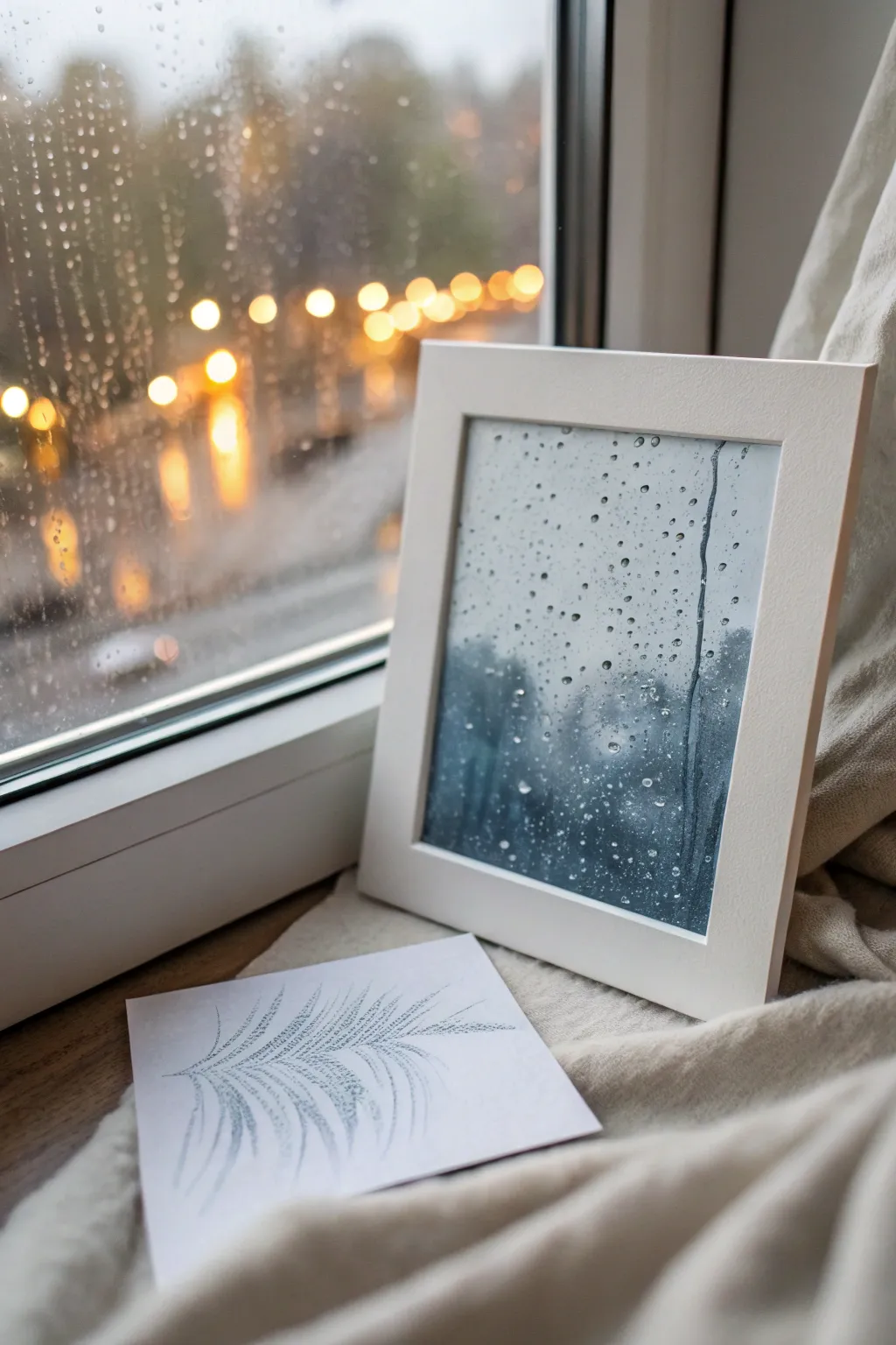
Capture the moody beauty of a rainy day without getting wet by painting this realistic window pane effect. Using watercolor lifting techniques and careful layering, you’ll recreate the sensation of droplets clinging to glass against a cool, stormy backdrop.
Detailed Instructions
Materials
- Cold Press Watercolor Paper (300 gsm)
- Pencil and Kneaded Eraser
- Masking Fluid (drawing gum)
- Small Round Brush (Size 2 or 4)
- Fine Liner Brush / Rigger Brush
- Watercolor Paints: Paynes Grey, Indigo, Prussian Blue, Burnt Umber
- Clean Water & Paper Towels
- White Gouache or White Gel Pen
- White or Light Wood Frame
Step 1: Preparation & Masking
-
Observe and Sketch:
Begin by lightly sketching the placement of your largest raindrops on the paper. You don’t need a lot of detail, just circles and ovals where you want the main water droplets to sit. -
Drawing the Trickle:
Add a long, wavy vertical line or two to represent a raindrop that has slid down the pane. Keep the line slightly jagged to mimic the surface tension of water. -
Apply Masking Fluid:
Using a very old brush or a silicone applicator tool, cover your sketched droplets and the trickle line with masking fluid. This will preserve the white of the paper for those bright highlights later. -
Waiting Game:
Let the masking fluid dry completely. If you touch it while it’s tacky, you risk tearing the paper surface or smearing the mask.
Unwanted Blooms?
If cauliflower-like edges form in your background wash, embrace them! In this specific project, water blooms look just like condensation or fog on the window pane.
Step 2: Creating the Moody Background
-
Wet-on-Wet Base:
Brush clean water over the entire paper surface, going right over the dried masking fluid. You want an even sheen, not puddles. -
First Color Wash:
Mix a diluted wash of Payne’s Grey and a touch of Prussian Blue. Apply this loosely over the wet paper to establish a soft, cool atmosphere. -
Deepening Values:
While the paper is still damp, drop in stronger concentrations of Indigo and Payne’s Grey near the bottom corners and edges to create depth and a shadowy effect. -
Creating Shapes:
Suggest blurry shapes in the background—perhaps distant trees or buildings—by adding slightly thicker paint into the wet surface. Keep everything soft and undefined; the focus is the glass, not the view. -
Dry Time:
Allow this background layer to dry completely. The paper should feel flat and room temperature to the touch before moving on.
Level Up: Warmth
Add tiny blurry circles of yellow ochre or orange in the background layer before it dries to mimic distant streetlights or traffic lights shining through the rain.
Step 3: Defining the Droplets
-
Remove the Mask:
Gently rub away the dried masking fluid using your finger or a rubber cement pickup tool. You will be left with stark white shapes. -
Softening Edges:
With a clean, damp brush, very gently soften one side of each white droplet shape so it blends slightly into the background color, leaving the opposite side crisp. -
Adding Shadows:
Mix a concentrated dark blue-grey (Indigo + Burnt Umber). Using your fine liner brush, paint a thin, dark shadow line inside the *top* edge of each droplet. This mimics refraction. -
Adding Reflected Color:
Paint the bottom half of the larger droplets with a slightly lighter version of your background color. The physics of water droplets flips the background image upside down inside the drop. -
The Trickle Effect:
For the long vertical trickle, paint the sides darker and leave a lighter channel down the middle to show curvature.
Step 4: Highlights & Finishing
-
Specular Highlights:
This is where the magic happens. Use white gouache or a white gel pen to add a tiny, brilliant white dot on the bottom curve of each droplet. -
Adding Texture:
I like to create a sense of condensation by splattering tiny specks of clean water onto areas that look too flat, blotting them up after a few seconds to lift small spots of color. -
Additional Micro-drops:
Use the tip of your smallest brush with a mid-tone grey to stipple tiny dots around the larger drops, representing fine mist or spray. -
Final Assessment:
Step back and look at the contrast. If the droplets don’t pop, darken the background immediately surrounding them to increase the illusion of transparency. -
Framing:
Once dry, place your artwork in a clean white frame. The wide mount shown in the image helps isolate current rainy mood effectively.
Now you have a serene, permanent rainy day captured on paper to make any corner feel cozy
Retro Instant-Photo Frame Mini Landscapes
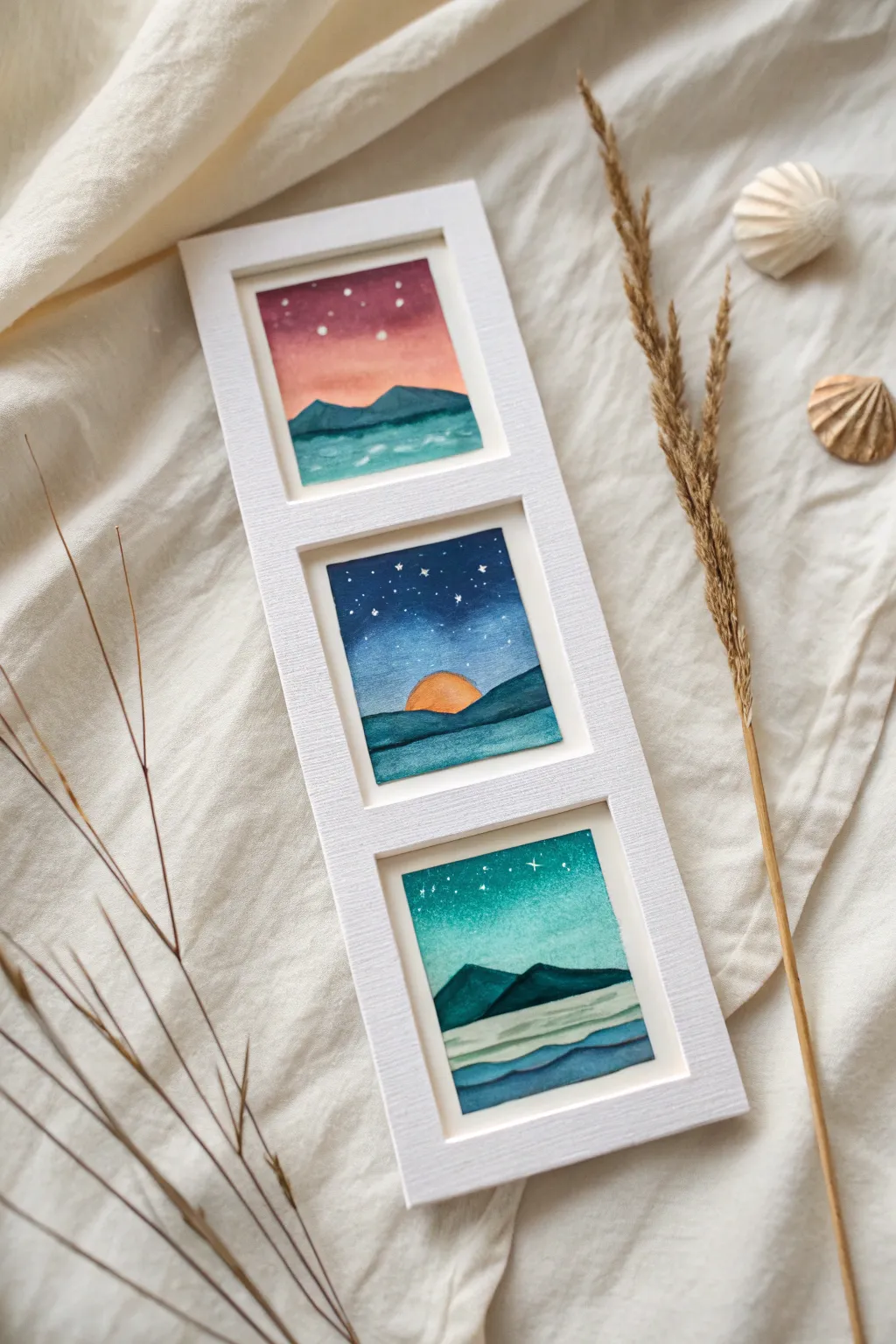
Capture the serene beauty of the cosmos with this triptych of miniature watercolor landscapes. Framing three distinct celestial moods in a vertical crisp white mount creates a stunning, modern piece of wall art that feels both expansive and intimate.
Step-by-Step Tutorial
Materials
- Cold press watercolor paper (cut into three 3×3 inch squares)
- Watercolor paints (Indigo, Phthalo Blue, Turquoise, Magenta, Orange, Purple)
- White vertical triple-aperture frame (approx. aperture size 2.5×2.5 inches)
- Masking tape or washi tape
- Small round brushes (size 0 and 2)
- Flat wash brush (size 1/2 inch)
- White gouache or white gel pen
- Jar of clean water
- Paper towels
- Mixing palette
Step 1: Setting the Stage
-
Paper Preparation:
Cut your watercolor paper into three small squares that are slightly larger than the frame’s window openings. This ensures you have an edge to tape down without losing the main image area. -
Taping Down:
Secure all three squares to your work surface using masking tape around the borders. This creates a clean, crisp edge and prevents the paper from buckling when wet.
Step 2: Painting the Top Scene: The Pink Twilight
-
Sky Gradient:
On the first square, wet the top two-thirds of the paper with clean water. Drop in purple at the very top, blending it down into magenta and finally a soft peach or pale orange near the horizon line. -
Mountain Range:
Once the sky is dry, mix a teal-blue shade. Paint a jagged mountain range across the horizon, ensuring the bottom edge is flat against where the water will start. -
Water Texture:
For the water, use a lighter turquoise mix. Paint horizontal strokes, leaving small gaps of white paper to suggest gentle waves reflecting light.
Star Splatter Trick
For a more natural galaxy look, load a toothbrush with white gouache and flick the bristles to create a spray of fine, random stars.
Step 3: Painting the Middle Scene: The Midnight Sun
-
Night Sky Base:
Start with a deep wash of indigo and phthalo blue for the sky, fading it slightly as you approach the center where the sun will sit. -
Adding the Sun:
While the blue is still slightly damp but not soaking, paint a semi-circle of bright orange rising from the horizon line. Let the orange bleed just a tiny bit into the blue for a glowing effect. -
Mid-Ground Hills:
Wait for the sky to dry completely. Paint a layer of dark teal hills overlapping the sun, creating depth and perspective. -
Foreground Ocean:
Fill the bottom section with deep blue horizontal strokes, layering darker pigment at the bottom edge to ground the composition.
Level Up: Metallic Pop
Use metallic gold watercolor instead of white for the stars and water highlights to give the piece a magical, shimmering finish.
Step 4: Painting the Bottom Scene: The Aurora Night
-
Teal Gradient:
Wet the sky area again. Start with a deep emerald green at the top, blending smoothly into a bright turquoise and fading to almost white near the mountains. -
Mountain Silhouettes:
Using a concentrated mix of indigo and green, paint sharp, triangular mountain peaks distinct from the other two scenes. -
Layered Waves:
Create the water using distinct bands of color. Start with a very pale wash near the mountains, and layer progressively darker blue ‘ribbons’ of waves as you move toward the bottom of the paper.
Step 5: Finishing Touches & Assembly
-
Starry Details:
Using a size 0 brush and white gouache (or a gel pen), dot tiny stars into the sky of all three paintings. Vary the size slightly, making the ‘North Star’ patterns more prominent in the blue sky scene. -
Sparkle Accents:
Add tiny white highlights to the mountain peaks or water crests to make the scene pop. -
The Reveal:
Wait until the paper is bone dry, then carefully peel away the masking tape at a 45-degree angle to reveal those satisfying crisp edges. -
Mounting:
Position each painting behind the mat board of your vertical frame. Use a small piece of tape on the back to secure them in place. -
Final Assembly:
Close up the frame back and clean the glass front for a polished gallery look.
Hang this trio in a narrow wall space or lean it on a shelf to bring a peaceful window into the night sky into your home
Galaxy Wash With Nebula Blooms and Star Splatter
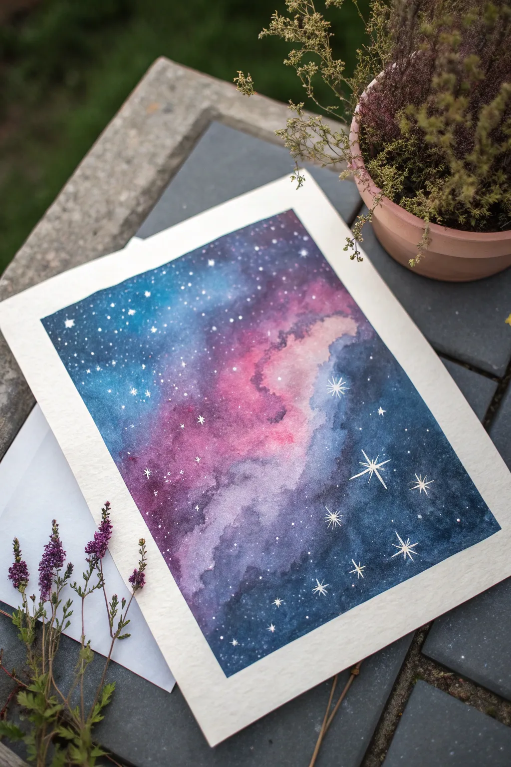
Capture the magic of deep space with this ethereal galaxy painting, featuring swirling nebulas of indigo, violet, and soft pink. This project teaches you wet-on-wet blending techniques to create seamless transitions and how to add sparkling star clusters for a dreamy finish.
Step-by-Step Guide
Materials
- Cold press watercolor paper (300 gsm recommended)
- Painter’s tape or masking tape
- Watercolor paints (Indigo, Prussian Blue, Violet, Magenta/Rose, Black)
- White opacity medium (e.g., Bleed Proof White, white gouache, or white gel pen)
- Round watercolor brushes (size 8 or 10 for blending, size 0 or 00 for details)
- Two jars of water (clean and dirty)
- Paper towels
- Palette or ceramic plate
- Pencil (optional)
Step 1: Preparation and Base
-
Tape the edges:
Secure your watercolor paper to a sturdy board or your work surface using painter’s tape. Press the edges down firmly to ensure a crisp, clean white border when you peel it off later. -
Prepare your palette:
Pre-mix generous puddles of your paint colors. You will need strong concentrations of indigo, deep blue, violet, and bright magenta. Having them ready is crucial since watercolors dry quickly. -
Pre-wet the paper:
Using a clean, large round brush, coat the entire paper surface with clean water. You want the paper to be glistening wet with an even sheen, but not so soaked that puddles form.
Colors turning into mud?
Avoid over-brushing! When blending wet-on-wet, place colors next to each other and let the water do the moving. Too many brush strokes mix all pigments into gray.
Step 2: Creating the Nebula
-
Start with the light:
While the paper is wet, drop in your lightest color—the magenta or rose—in a diagonal motion across the center. Let the paint bloom naturally on the wet surface. -
Add secondary tones:
Immediately introduce violet around the edges of the pink area. Allow the edges of the violet to touch and bleed into the pink, creating a soft, blurry transition between the colors. -
Deepen the cosmos:
Load your brush with your deep blue or Prussian blue. Apply this to the outer corners and the remaining large negative spaces, working your way inward toward the purple sections. -
Create darkness:
Mix indigo with a little black to create a ‘midnight’ shade. Drop this into the very corners and edges of the painting to create depth and contrast, making the center nebula appear to glow. -
Encourage blending:
Tilt your board slightly if the colors aren’t moving enough, or use a damp, clean brush to gently nudge colors together. Be careful not to overwork the center or the pink will become muddy. -
Lift clouds:
If a section feels too heavy or dark, dab a crumpled paper towel lightly onto the wet paint to lift color, creating a cloudy, fluffy texture within the nebula. -
Let it dry completely:
This is the hardest part—wait for the paper to be bone dry. If the paper feels cool to the touch, it’s still damp. Painting stars on damp paper will cause them to blur.
Add planetary depth
Before the background dries, sprinkle a pinch of table salt on the wettest dark blue areas. Brush it off when dry for a stunning, textured crater effect.
Step 3: Stars and Details
-
Prepare the stars:
Dilute your white gouache or Bleed Proof White with a tiny amount of water until it has the consistency of heavy cream. -
Splatter texture:
Load a medium brush with the white mixture. Hold it over the painting and tap the handle against another brush or your finger to spray fine mist-like stars across the dark areas. -
Concentrate the splatter:
Focus more splatters on the darker blue areas to create the look of distant galaxies, leaving the pink center slightly less cluttered for better contrast. -
Paint larger stars:
Switch to your smallest detail brush (size 0 or 00). Dip it into thick, undiluted white paint to manually dot slightly larger, distinct stars randomly around the composition. -
Add ‘glint’ stars:
Select 3 to 5 spots for focal stars. Using the fine tip brush, paint a small cross or an eight-pointed star shape (a long cross with a smaller ‘x’ in the center) to mimic a twinkling effect. -
Final touches:
Add tiny clusters of 2-3 dots close together in a few areas to suggest constellations or star groups. -
The reveal:
Once the white paint is completely dry, slowly peel away the masking tape at a 45-degree angle, pulling away from the artwork to prevent tearing the paper.
Frame your new cosmic creation or use it as a stunning cover for a handmade journal
Whale Silhouette Swimming Through a Starry Sky-Sea
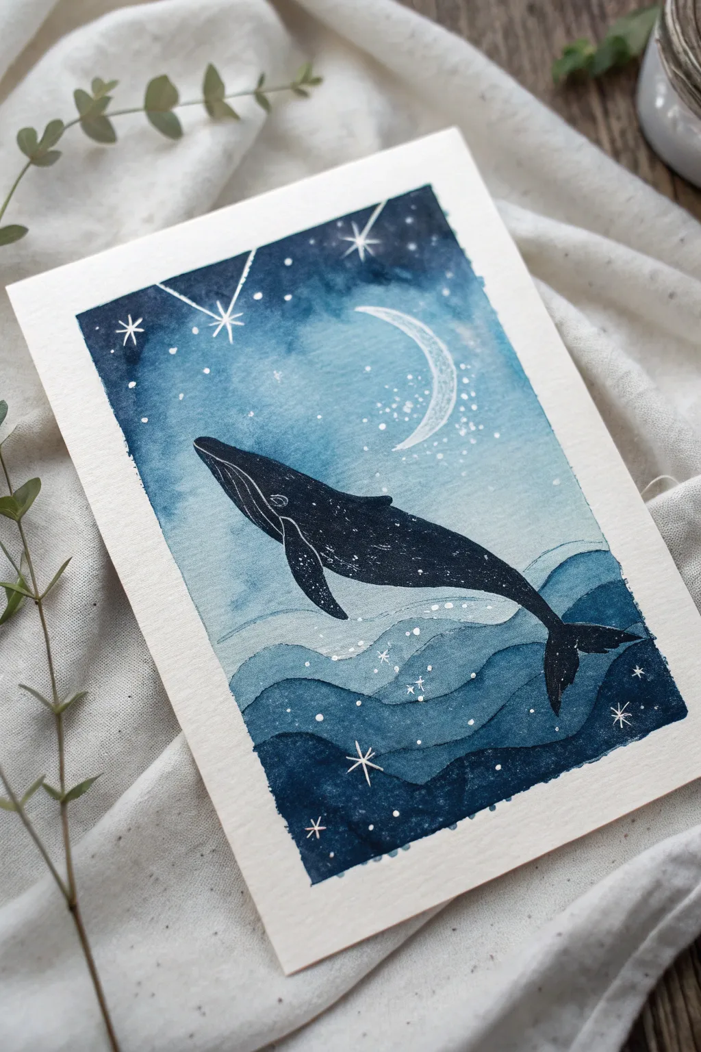
This dreamy watercolor painting merges the depths of the ocean with the vastness of space, featuring a majestic whale silhouette gliding past a crescent moon. The piece uses a monochromatic indigo palette to create a soothing, magical atmosphere perfect for bedroom decor or a thoughtful handmade card.
Step-by-Step Tutorial
Materials
- Cold press watercolor paper (300 gsm)
- Masking tape
- Watercolor paints (Indigo, Prussian Blue, Turquoise, Black)
- White gouache or white gel pen
- Round brushes (size 6 or 8 for washes, size 0 or 1 for details)
- Pencil and eraser
- Paper towels
- Two jars of water
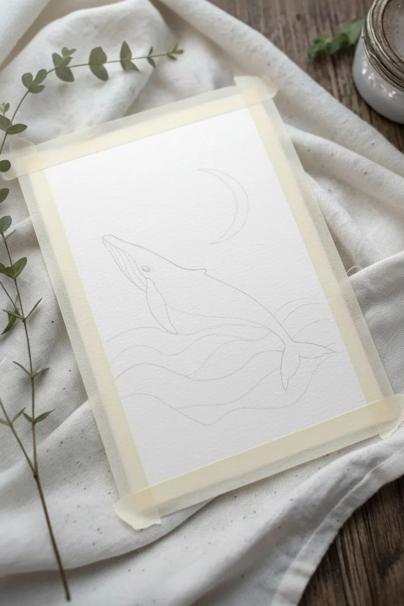
Step 1: Preparation and Sketching
-
Tape the edges:
Begin by securing your watercolor paper to a flat, hard surface using masking tape on all four sides. This creates that crisp white border seen in the final piece and prevents the paper from buckling when wet. -
Lightly sketch the composition:
Using a pencil with very light pressure, outline the main elements. Start with three wavy lines at the bottom for the sea layers. Then, draw the swimming whale shape in the center and a crescent moon in the upper right quadrant. Keep lines faint so they don’t show through the paint.
Keep it Clean
Wait for the entire background to be bone-dry before painting the black whale. If the background is damp, the black paint will bleed outward and ruin the silhouette.
Step 2: Painting the Background
-
Wet the sky area:
Dip your clean size 6 brush into water and gently wet the paper area above the waves, carefully painting *around* the whale and the moon shapes. The paper should be damp and glistening, but not soaking wet. -
Apply the initial wash:
Load your brush with a watery mix of Turquoise or a light diluted Prussian Blue. Drop this color into the wet sky area, letting it bloom softly. Keep the area near the moon lighter to suggest a glow. -
Deepen the sky corners:
While the paper is still damp, pick up a concentrated Indigo paint. Dab this dark color into the top corners and along the very top edge. Allow it to bleed naturally downward into the lighter blue to create a gradient. -
Add first texture layer:
If you want a subtle starry texture, sprinkle a tiny pinch of salt onto the wettest dark corners, or splatter tiny drops of clean water into the drying paint. Let this background layer dry completely before moving on.
Step 3: Creating the Ocean Layers
-
Paint the top wave:
Start with the highest wave layer (closest to the whale). Mix a medium tone of Prussian Blue. Fill in the shape defined by your pencil line, keeping the top edge sharp and blending the color slightly downwards. -
Paint the middle wave:
Once the top wave works are dry, move to the middle wave section. Use a darker shade, perhaps pure Indigo. Paint this strip, ensuring a crisp separation line between it and the lighter wave above. -
Paint the bottom depth:
For the very bottom section, use your darkest mix—Indigo with a touch of Black. This grounds the painting and creates a sense of deep ocean water. Let all ocean layers dry thoroughly.
Metallic Magic
For a magical upgrade, swap the white gouache stars for metallic silver or gold watercolor. It catches the light beautifully when you tilt the paper.
Step 4: The Whale and Details
-
Fill the whale silhouette:
Using a smaller round brush (size 2 or 4), fill in the whale sketch with a solid, opaque layer of dark Indigo or Black. Be very precise around the edges of the tail and fins to maintain the elegant shape. -
Add whale texture:
While the whale shape is fully dry, I like to use a white gel pen or thin white gouache to draw fine lines for the belly pleats. Add tiny stippled dots along the back and fins to mimic barnacles specifically where the light hits. -
Enhance the moon:
Paint the crescent moon with white gouache. You don’t need it to be perfectly solid; a slightly scratchy texture adds character. Add a few tiny dots around the curve to suggest moondust. -
Paint the constellation lines:
Using your finest brush (size 0) and white gouache (or a gel pen), draw the straight geometric lines connecting stars near the top left corner, mimicking a constellation. -
Add the stars:
Draw four-pointed stars and small dots throughout the sky and the dark ocean depths. The contrast of white stars against the dark waves ties the ‘sky-sea’ concept together perfectly. -
Highlight the waves:
Use your white pen to trace subtle, broken lines along the crests of the waves. Add small groupings of dots near the wave edges to represent sea foam or magical sparkles. -
Final reveal:
Once absolutely everything is dry to the touch, slowly peel away the masking tape at a 45-degree angle to reveal your crisp, clean borders.
Frame your mystic whale art or prop it on a shelf to enjoy your celestial ocean creation
Minimal Botanical Silhouettes Over Blush Washes
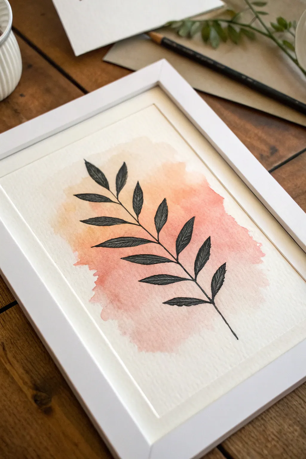
Marrying soft, organic watercolor washes with crisp ink lines creates a striking contrast that feels both modern and timeless. This project layers a precise black botanical silhouette over a dreamy, diffuse background of peach and rose tones.
How-To Guide
Materials
- Cold press watercolor paper (300 gsm)
- Watercolor paints (Peach, Rose Madder, or Yellow Ochre)
- Clean water and two jars
- Large round watercolor brush (size 10 or 12)
- Fine liner pigment pen (0.3mm and 0.5mm, waterproof black)
- Pencil (HB or H)
- Kneaded eraser
- Paper towels
- White or light wood frame (optional)
Step 1: Creating the Blush Backdrop
-
Prepare the wash area:
Begin by lightly determining the center of your paper. Using your large brush and clean water, dampen an irregular, cloud-like shape in the middle of the page, leaving roughly two inches of white space as a border. -
Mix the base color:
On your palette, mix a watery consistency of a peach or light orange tone. You want this to be very transparent, so ensure there is more water than pigment. -
Apply the first wash:
Touch your loaded brush to the damp area on the paper. I like to start in the center and let the color bloom outwards naturally toward the wet edges. -
Introduce a second tone:
While the first layer is still wet, drop in a slightly deeper rose or pink hue near the bottom right or top left of the wash. This creates a subtle gradient effect. -
Soften the edges:
If any edges look too hard, rinse your brush, blot it slightly on a towel, and gently run the damp bristles along the perimeter of the colored area to coax it into a soft fade. -
Let it dry completely:
This is crucial. The paper must be bone dry before you add ink, or the lines will bleed. Wait at least 30 minutes or use a hairdryer on a low, cool setting.
Bloom Control
To get those interesting textures in the paint (cauliflower edges), drop clean water into the semi-dry wash and let it push the pigment away.
Step 2: Sketching the Botanical
-
Map the stem:
Using an H or HB pencil, draw a single, slightly curved line diagonally across your dried watercolor wash. This will serve as the central spine of your branch. -
Mark leaf positions:
Lightly sketch small tick marks along the stem where you want your leaves to originate ensuring they alternate sides rather than sitting perfectly opposite each other for a more natural look. -
Outline the leaf shapes:
Draw elongated almond shapes for the leaves. Keep the tips pointed and the bases tapered where they meet the stem. -
Review the composition:
Step back and check the balance. The silhouette should feel grounded within the color wash but doesn’t need to stay strictly inside the painted borders.
Step 3: Inking the Silhouette
-
Trace the stem:
Switch to your 0.5mm waterproof pen. Carefully trace the central stem line, thickening it slightly at the bottom and tapering it as it reaches the top leaf. -
Outline the leaves:
Go over your pencil outlines for the leaves. Don’t worry about perfect smoothness; a little wobble adds organic character. -
Add the central veins:
Draw a thin line down the center of each leaf, stopping just short of the tip. -
Detail the texture:
Using the finer 0.3mm pen, draw diagonal hatching lines inside the leaves. Start from the center vein and stroke outward toward the edge. -
Build density:
To make the leaves look darker as seen in the photo, add a second layer of hatching in the opposite direction (cross-hatching) near the base of each leaf. -
Refine the edges:
Go back over the outer edges of the leaves with the 0.5mm pen to ensure the silhouette pops against the soft background. -
Erase pencil marks:
Wait at least 10 minutes for the ink to set fully, then gently gently roll the kneaded eraser over the drawing to lift any visible graphite. -
Frame your work:
Once finished, mount the painting in a simple white frame with a mat to emphasize the minimalist aesthetic.
Bleeding Lines?
If your ink feathers, the paper wasn’t dry enough. Stop immediately, dry it with a hair dryer, and switch to a new spot.
Hang this piece in a bright corner to enjoy the calming interplay between the fluid color and structured lines
Glazed Color Ribbons for a Dreamy Abstract Mood
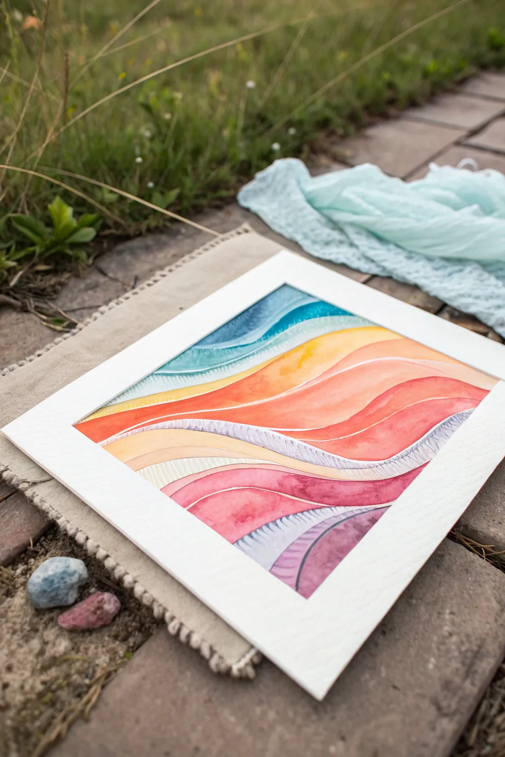

Capture the fluid motion of light and color with this vibrant abstract piece, featuring organic waves that flow seamlessly into one another. The combination of smooth glazed washes and delicate feathering creates a textured, dreamy landscape perfect for any skill level.
Step-by-Step Tutorial
Materials
- Cold-press watercolor paper (300 gsm or heavier)
- Watercolor paints (teal, yellow, orange, red, pink, violet)
- Round watercolor brushes (size 6 and size 2)
- Painter’s tape or masking tape
- Pencil (HB or lighter)
- Kneaded eraser
- Clean water jars (two)
- Paper towels
- White mat board (optional, for framing)
Step 1: Preparation & Sketching
-
Secure the paper:
Begin by taping down all four edges of your watercolor paper to a sturdy board or table. This prevents buckling and creates a crisp white border if you aren’t using a mat later. -
Draft the waves:
Using a light hand and a sharp pencil, draw flowing, organic wavy lines across the paper horizontally. Vary the width of the bands—some thin, some wide—to create a sense of movement and rhythm. -
Refine the composition:
Look at your stack of waves. Ensure they curve gently rather than zig-zag. Lighten the sketch with a kneaded eraser so the graphite won’t show through the transparent paint later.
Hairline Gap Strategy
Intentionally leave a microscopic sliver of dry white paper between wet color bands. This stops colors from bleeding together without waiting for layers to dry.
Step 2: Painting the Color Gradients
-
Mix your palette:
Prepare watery pools of your colors: teal, golden yellow, burnt orange, bright red, magenta, and varying shades of purple. You want the paint fluid but pigmented. -
Start at the top:
Load your size 6 brush with teal. Paint the topmost wave using a ‘wet-on-dry’ technique for sharp edges, but keep the interior of the shape juicy with pigment. -
Create a gradient:
While the teal strip is still wet, drop a slightly darker blue into the corners or curves to add depth. Let this strip dry completely before touching adjacent sections to avoid bleeding. -
Paint the warm bands:
Moving down, paint a yellow band. I like to leave a tiny sliver of white paper (a ‘hairline’) between wet sections if I’m impatient, but waiting for full dryness is safer for crisp edges. -
Oranges and reds:
Continue with the orange and red bands. For visual interest, try leaving a few intentional white highlight lines—thin unpainted streaks within the colored bands—to simulate light hitting a shiny ribbon. -
Deepen the tones:
As you move lower into the pinks and reds, slightly increase the pigment concentration. This weight at the bottom anchors the composition.
Step 3: Adding Texture & Detail
-
The feathered technique:
Notice the grey-violet bands that look textured? For these, mix a watery purple-grey. Paint the band, then quickly use a clean, slightly damp brush to lift pigment in small, rhythmic strokes. -
Adding directional lines:
Alternatively, use a very fine size 2 brush (damp, not soaking) to paint tiny, repetitive hatch marks into the wet purple glaze. This pushes the pigment aside and creates that ribbed texture. -
Layering glazes:
Once the base layers are bone dry, you can paint a second, very sheer layer of color over parts of the waves to intensify the saturation. -
Enhancing the white lines:
If you lost some of your white separation lines during painting, you can carefully re-introduce them using opaque white gouache or a white gel pen for cleanup. -
Final survey:
Check for any uneven pooling or hard watermarks (blooms) you dislike. You can often soften these by gently scrubbing with a damp stiff brush and blotting. -
Remove tape:
Once the paper is completely cool to the touch (meaning dry), slowly peel off the masking tape at a 45-degree angle away from the painting.
Fixing a Bleed
If two wet colors accidentally touch and bleed, don’t rub it! Quickly blot the mistake with the corner of a clean paper towel to lift the paint, then dry fully.
Place your finished abstract piece in a clean white mat to make those vivid colors truly pop
Negative Space Night Sky With a Single Bright Moon
Capture the serene beauty of a moonlit forest with this atmospheric watercolor project. By using negative painting techniques and careful layering, you’ll create a glowing moon and silhouetted pines that seem to emerge from a misty night sky.
Step-by-Step
Materials
- Cold press watercolor paper (140lb/300gsm), taped down
- Indigo watercolor paint
- Payne’s Grey watercolor paint
- White gouache or white ink
- Round brushes (size 8 for washes, size 2 for details)
- Masking fluid (drawing gum)
- Old brush or nib pen for masking fluid
- Clean water and mixing palette
- Paper towels
- Pencil and circular object (for tracing)
Step 1: Preparation and Masking
-
Sketch the moon:
Begin by lightly tracing a perfect circle in the upper center of your paper using a jar lid or roll of tape. Keep your pencil lines very faint so they don’t show through the final painting. -
Apply masking fluid:
Using an old brush or a silicone applicator, fill in the entire moon circle with masking fluid. This preserves the pure white of the paper. -
Add star details:
With the tip of your masking fluid tool, dot smaller stars scattered across the sky area. Add a few tiny cross-shapes to represent brighter, twinkling stars. -
Let it dry completely:
Wait until the masking fluid is distinctively rubbery and transparent before moving on. Touching it while wet will smudge the mask and ruin the crisp edges.
Step 2: Painting the Atmosphere
-
Wet the sky area:
Using your large round brush, wet the paper surrounding the masked moon with clean water. Do not wet the bottom third of the paper where the darkest trees will go yet. -
Start the first wash:
Load your brush with a watery mix of Indigo. Drop this color into the wet paper at the top corners, letting it bleed downwards. -
Create the glow:
As you get closer to the masked moon, dilute your paint significantly or just use water to soften the edges, creating a halo effect around the moon. -
Introduce mist:
While the paper is still damp, lift out some pigment on the right side using a thirsty (damp but clean) brush to suggest a bank of rolling mist or clouds. -
Deepen the sky:
While the first layer is still wet but settling, drop more concentrated Indigo and Payne’s Grey into the top corners and edges to create a vignette effect. -
Dry the wash:
Let this atmospheric layer dry completely. The paper should be flat and warm to the touch before proceeding.
Paint Bleeding?
If paint bleeds under your masking fluid, the paper might not have been dry enough when masked, or the fluid is too old. Wait longer next time or buy a fresh bottle.
Step 3: Trees and Moon Details
-
Paint the tree line:
Mix a strong, creamy consistency of Payne’s Grey and Indigo. Using the tip of your smaller brush, paint the silhouette of pine trees along the bottom right, varying their heights. -
Texture the trees:
Use a dabbing motion to create the texture of pine needles on the branches. Keep the tops sharp and pointy, but let the bottoms of the trees blur slightly into the dark foreground. -
Fill the foreground:
Fill the remaining bottom area with your darkest paint mixture, anchoring the trees. -
Remove the mask:
Once the paint is bone dry, gently rub away the masking fluid from the moon and stars with your finger or a rubber cement pickup. -
Paint the craters:
Dilute a tiny amount of Payne’s Grey with plenty of water. Paint organic, blotchy shapes inside the moon to represent craters toward the left side, keeping the right side mostly white for brightness. -
Soften edges:
Use a clean, damp brush to soften the hard edges of your crater shapes so they look like shadows rather than harsh spots. -
Add final sparkle:
If you lost any stars during the painting process, use a fine brush and white gouache to add final tiny dots to the darkest parts of the sky.
Adding Depth
Paint distant trees with a watered-down grey before adding the dark foreground trees. This creates atmospheric perspective and makes the forest look deeper.
Peeling off the tape reveals your crisp edges and completes this moody nocturne
Salt-and-Splatter Textures for Frosty, Ethereal Atmospheres
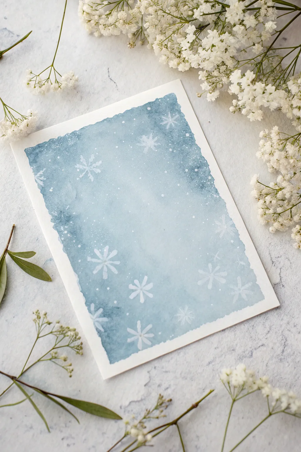
Capture the serene beauty of a snowy evening with this simple yet effective watercolor project. By combining masking fluid resist techniques with saltwater textures, you’ll create a frosty, ethereal blue gradient perfect for holiday cards or winter decor.
Step-by-Step Tutorial
Materials
- Cold press watercolor paper (300 gsm)
- Painter’s tape or masking tape
- Drawing gum (masking fluid)
- Small round synthetic brush (size 2 or 4)
- Large flat wash brush or mop brush
- Watercolor paints: Indigo, Prussian Blue, and Payne’s Gray
- Table salt or sea salt
- White gouache or white ink (optional for touch-ups)
- Clean water and mixing palette
- Paper towels
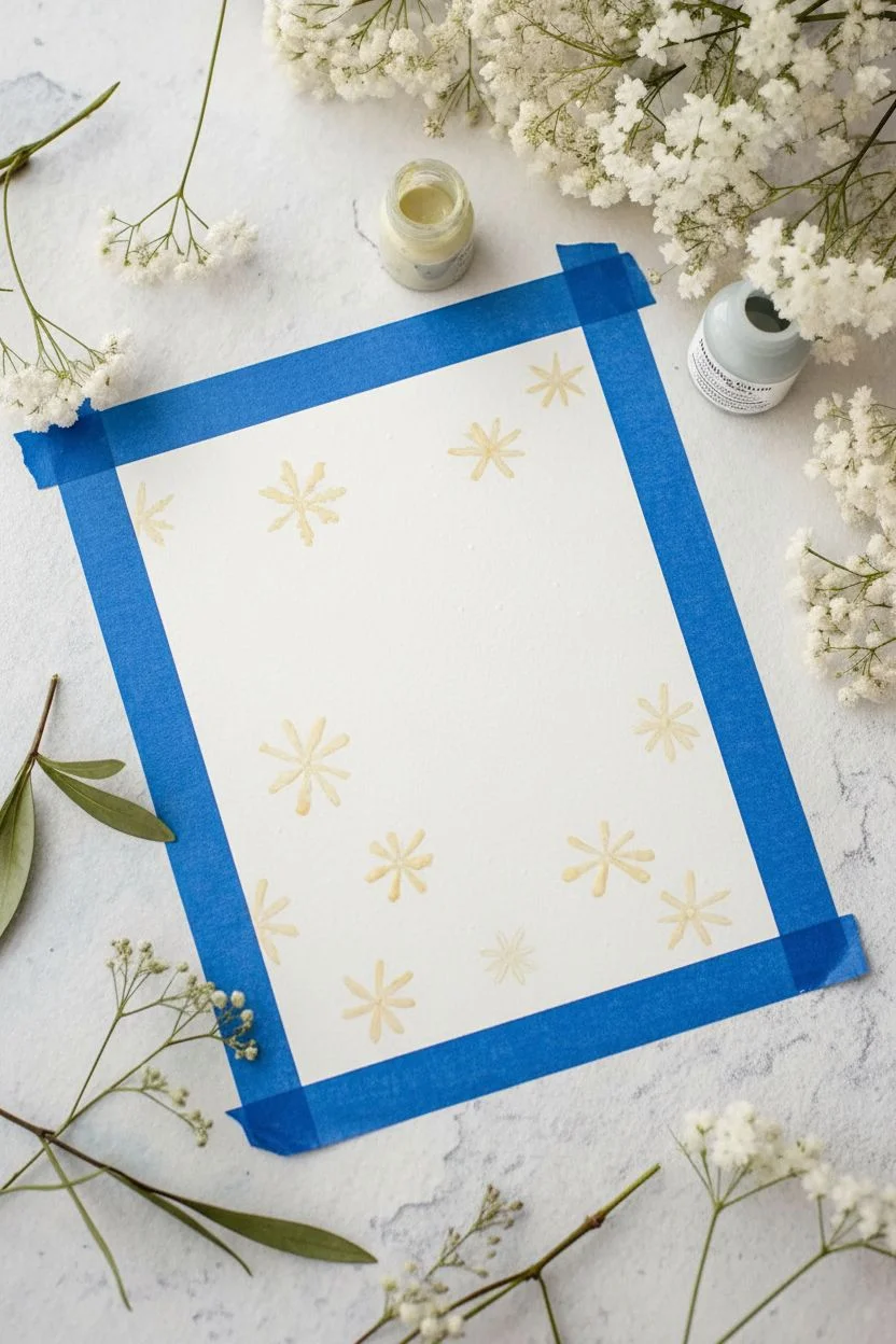
Step 1: Preparation & Masking
-
Secure the paper:
Tape your watercolor paper down firmly to a hard board using painter’s tape. Create a border of about half an inch on all sides to ensure a clean white frame later. -
Map out the snowflakes:
Using your smallest round brush, dip it into the masking fluid. I recommend wetting the brush with soapy water first to protect the bristles from clumping. -
Paint the flake structure:
Paint simple snowflake shapes directly onto the white paper. Start with a central cross, then add diagonal lines to form an eight-point star. -
Add intricate details:
To make them look like real flakes, add tiny ‘V’ shapes or dots at the ends of the snowflake arms. Vary the sizes, placing large ones near the edges and smaller ones toward the center. -
Let it cure fully:
Allow the masking fluid to dry completely. It should turn yellowish or transparent and feel tacky but not wet when touched.
Salt Dissolved Too Fast?
If the salt just disappears, your paper was too wet. Wait until the paper has lost its ‘glossy’ shine and looks satin or matte before sprinting the salt grains.
Step 2: creating the gradient wash
-
Pre-wet the paper:
Use your large wash brush to apply a layer of clean water over the entire taped area. This ‘wet-on-wet’ technique helps the colors flow seamlessly. -
Mix your winter blues:
Prepare a watery mix of Indigo and Prussian Blue on your palette. You want plenty of pigment but enough water to keep it fluid. -
Apply the dark edges:
While the paper is glistening wet, drop the darkest blue mix along the top and bottom edges of the paper. Let the color bloom naturally inward. -
Soften the center:
Rinse your brush slightly and pull the blue color toward the middle of the paper, diluting it so the center becomes a very pale, icy blue. -
Adjust the contrast:
If the edges look too pale, dab in more concentrated Indigo paint while the paper is still wet to deepen the vignette effect.
Step 3: Texturing & Finalizing
-
The salt technique:
While the wash is still wet (this timing is crucial), sprinkle a pinch of table salt over the darker blue areas. The salt will push the pigment away, creating crystalline textures. -
Add subtle splatters:
Load a small brush with clean water and tap it against your finger over the painting. These water blooms mimic falling snow. -
Patience is key:
Leave the paper completely undisturbed until it is bone dry. Moving it too soon can ruin the salt patterns. -
Remove the residue:
Once fully dry, gently brush off the salt crystals with your fingers or a dry cloth. -
Reveal the snowflakes:
Use a rubber cement pickup or your finger to gently rub away the dried masking fluid, revealing the crisp white paper underneath. -
Final white highlights:
If you want extra magic, use a bit of white gouache to add tiny dots for distant snow that overlaps the blue background. -
Peel the tape:
Slowly peel away the painter’s tape at a 45-degree angle to reveal your clean, crisp borders.
Add Sparkle
Mix a tiny amount of iridescent medium or pearlescent watercolor into your blue wash. The shimmer will only catch the light at certain angles, looking like real frost.
Enjoy the peaceful process of watching these icy textures emerge on the page

Have a question or want to share your own experience? I'd love to hear from you in the comments below!