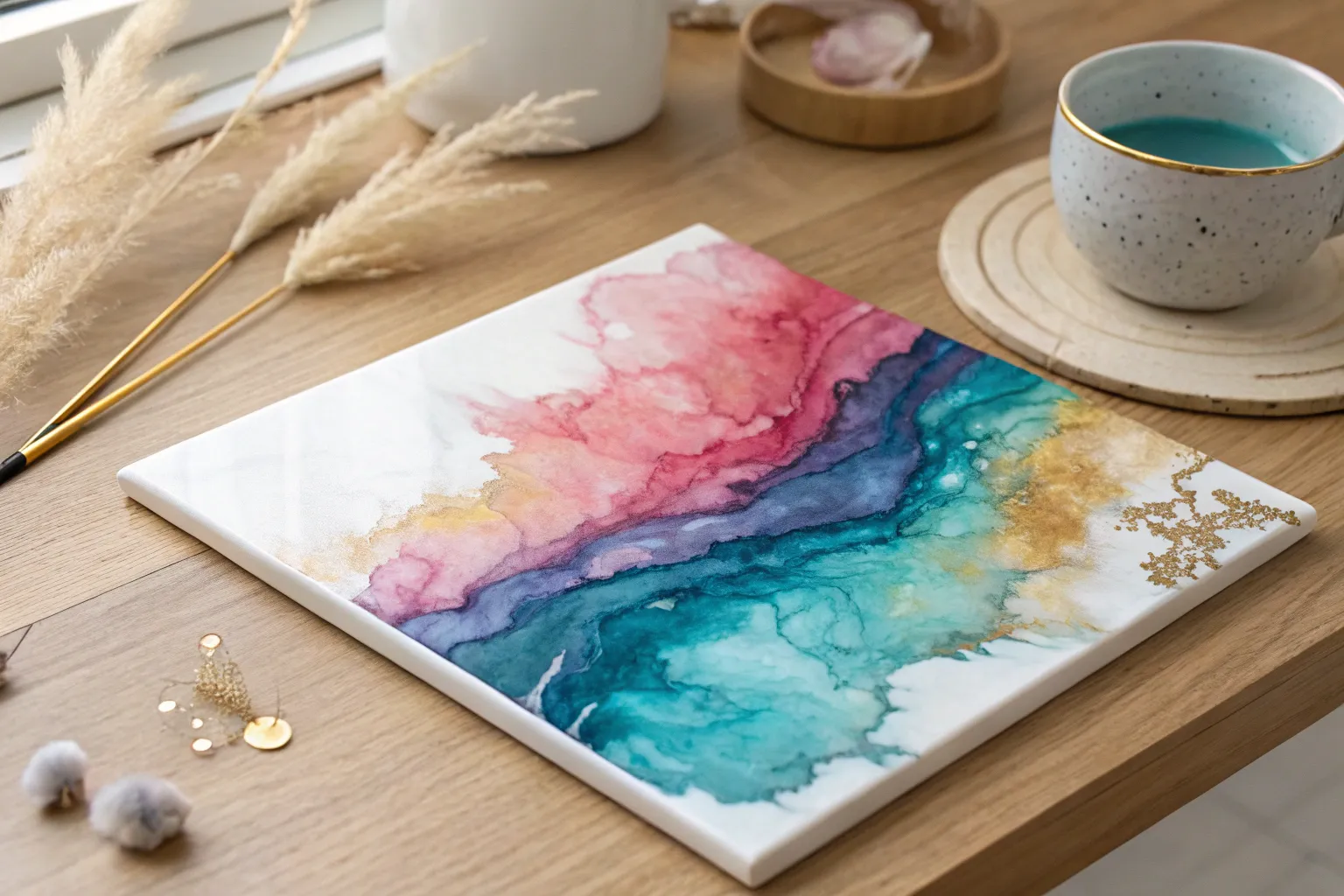
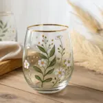
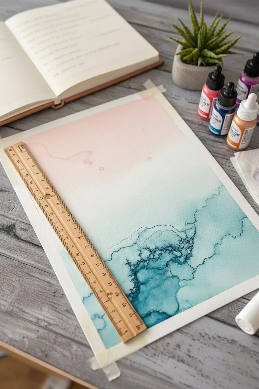
Alcohol inks are basically bottled magic: vibrant color, fast drying, and that swooshy, unpredictable flow that makes every piece feel alive. Here are my favorite alcohol ink art ideas to spark your next session—starting with classic crowd-pleasers and ending with some weirder studio experiments I can’t stop doing.
Smoky Wisps With Air Movement
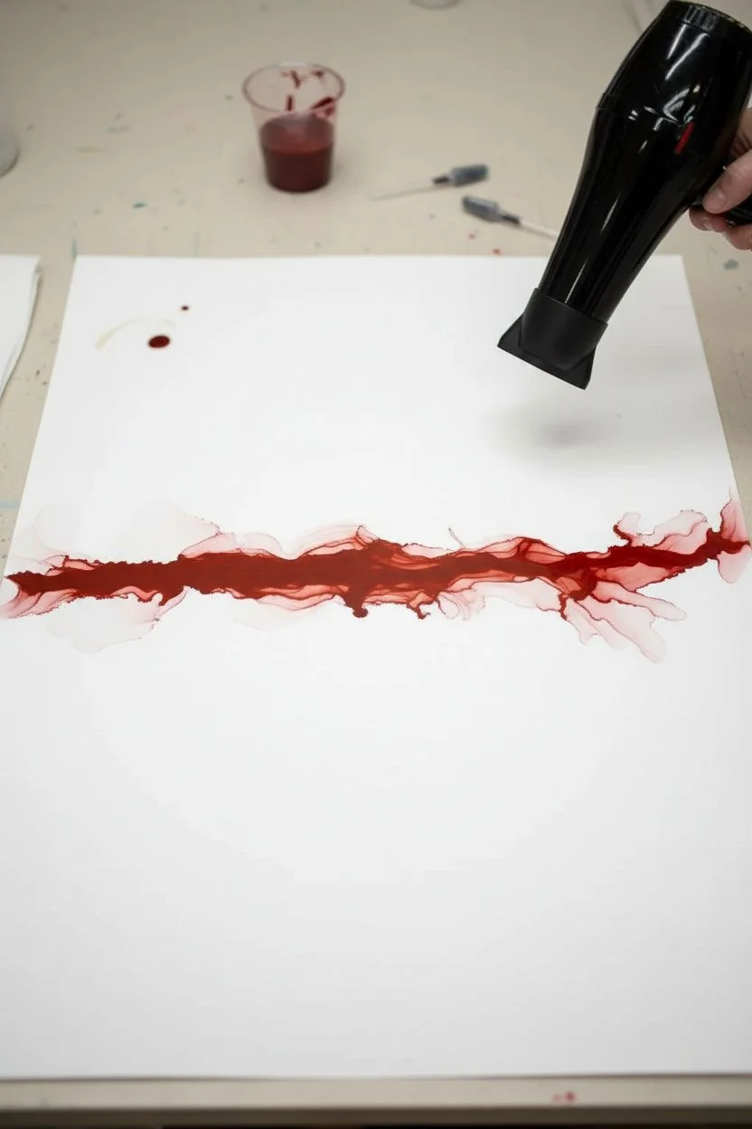
Capture the delicate beauty of drifting smoke and soft light with this dreamy alcohol ink project. By controlling airflow and layering translucent colors, you’ll create a sophisticated gradient that transitions seamlessly from deep jewel tones to barely-there whispers of pastel.
Step-by-Step Guide
Materials
- Yupo paper (white, A4 or similar size)
- Alcohol inks (Deep Teal/Emerald, Violet/Plum, Rose Pink, Pale Orange/Peach)
- Isopropyl alcohol (91% or higher) or blending solution
- Hair dryer with a ‘cool’ setting or an air blowing tool
- Small precision paint brush (optional)
- Glass dropper or squeeze bottle for alcohol
- White mat board and frame
- Protective gloves and workspace cover
Step 1: Setting the Flow
-
Prepare your canvas:
Secure your Yupo paper to your protected work surface using small loops of tape on the back. This prevents the paper from flying away when you introduce air. -
Lay the foundation:
Start at the bottom right corner where the heaviest color concentration will be. Drop a generous amount of blending solution or isopropyl alcohol onto this area. -
Introduce deep tones:
Add two drops of deep teal and violet ink directly into the puddle of alcohol. Let them swirl together naturally for a moment to create a dark, moody base. -
Begin the movement:
Using your air tool on the lowest setting, gently push the ink puddle diagonally upward toward the center of the page. Keep the nozzle low and parallel to the paper.
Muddy Colors?
If your teal and pink are mixing into a dull brown, let the first color layer dry completely before adding the next. Use fresh alcohol to reactivate just the edges.
Step 2: Creating the Gradient
-
Add the mid-tones:
Just above your dark pool, add a splash of fresh alcohol and a drop of rose pink. Allow the edge of the dark pool to bleed slightly into this new clear area. -
soften the transition:
Blow the pink ink upward and outward, purposefully thinning it out. You want the color to become more translucent as it moves away from the dark corner. -
Introduce warmth:
Further up the diagonal line, add a drop of pale orange or peach into a new area of alcohol. This will be your lightest color, mimicking sunlight breaking through. -
Create the wisps:
This is the crucial step for the ‘smoky’ look. Instead of drying the ink completely, use quick bursts of air to chase the wet edges of the ink outward, creating feathery tendrils. -
Define the veins:
As the ink begins to get sticky and dry, focus your air stream on the very edge of a distinct color block. Push hard against the drying edge to create those dark, defined rim lines or ‘veins.’
Metallic Accent
Mix a single drop of brass or gold metallic ink into your initial dark puddle. It will separate and float to the ‘veins’ for a shimmering, high-end finish.
Step 3: Refining and Framing
-
Assess the negative space:
Look at the top left of your paper. Keep this area largely white or extremely faint to provide breathing room for the composition. -
Reconnect broken lines:
If you have gaps in your flow that look unnatural, add a tiny drop of alcohol to re-wet the area and blow the colors back together. -
Enhance details:
For added drama, dip a fine brush in pure alcohol and drag it lightly through the darkest areas to create subtle bright streaks or lightning-like fissures. -
Dry completely:
Ensure all alcohol has evaporated. Yupo paper is non-porous, so the ink sits on top and can smudge if handled while tacky. -
Seal (optional):
To protect against UV fading, you can spray a light coat of varnish over the dry artwork outdoors. -
Mount artwork:
Position your dried artwork behind the mat. Move it around until you find the most pleasing composition of the gradient. -
Frame it up:
Secure the paper to the back of the mat with acid-free tape and place it into the frame to complete the sophisticated look.
Hang your new masterpiece in a spot with good natural light to truly appreciate the translucent layers
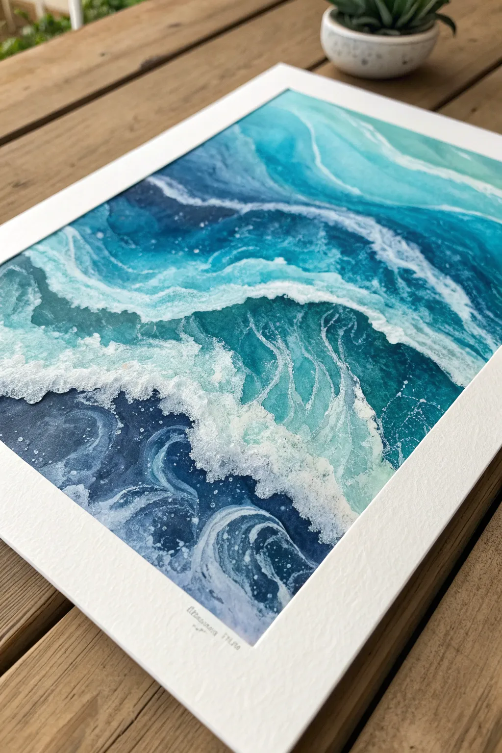
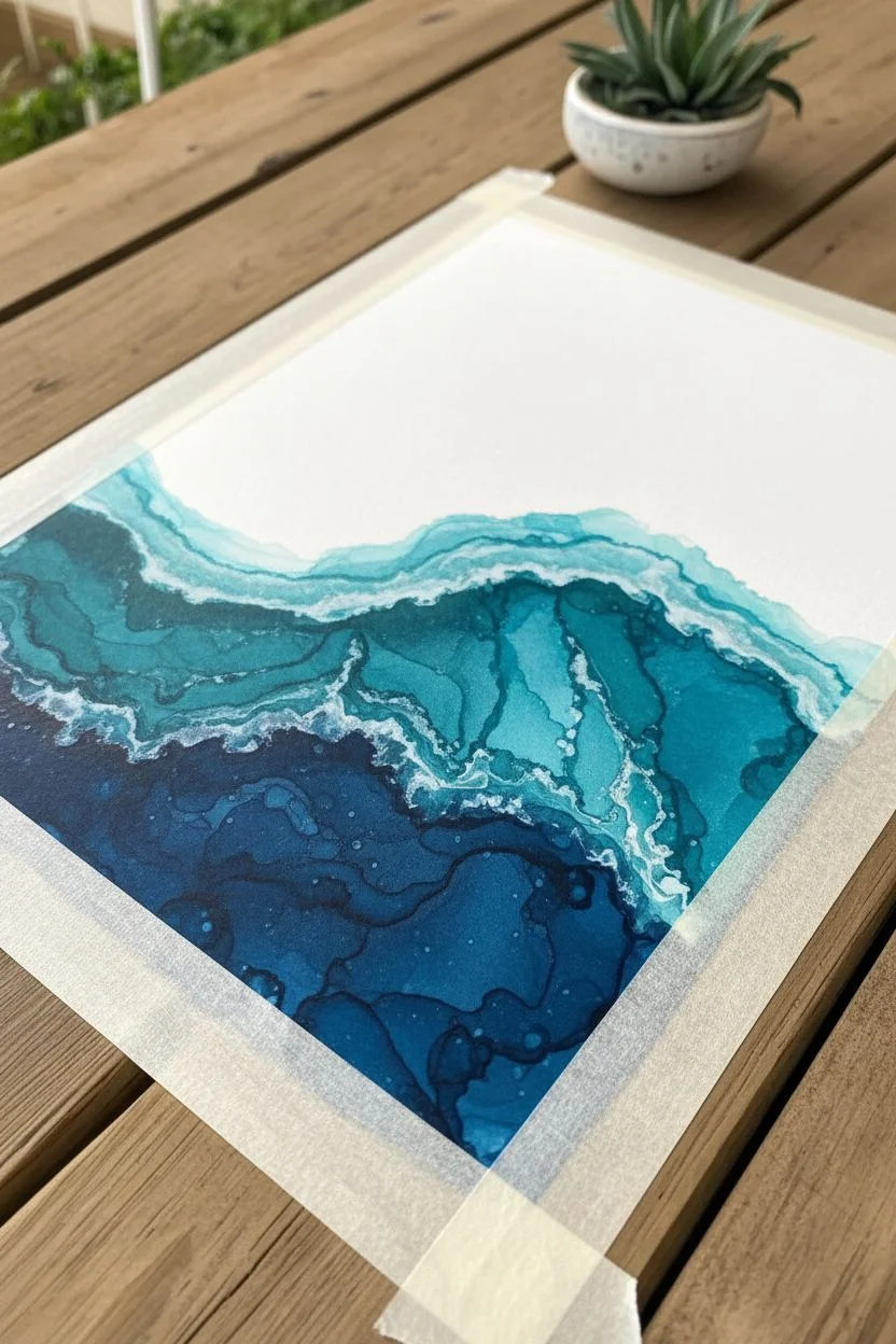
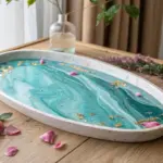
Color-Blocked Ink With Clean Negative Space
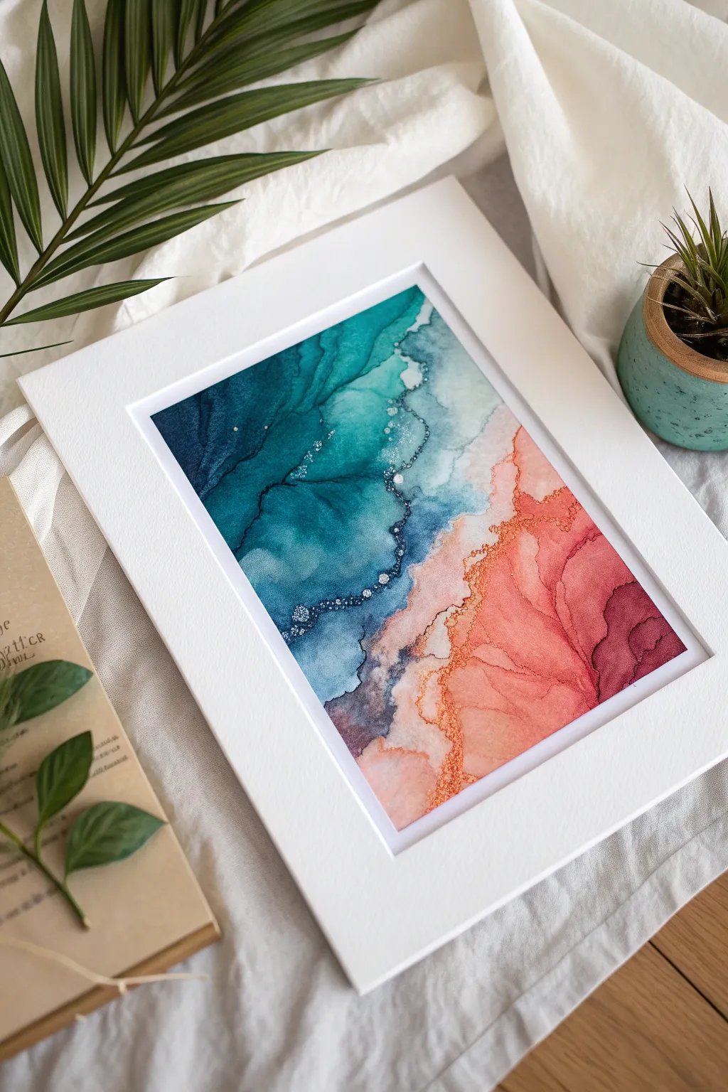
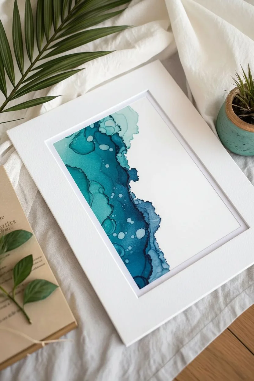
This striking design pairs deep oceanic teal with warm coral and magenta hues, separated by a delicate, frothy shoreline effect. The composition balances bold saturation with ethereal transitions, creating a modern piece that feels like an abstract aerial beachscape.
Step-by-Step
Materials
- Yupo paper or synthetic alcohol ink paper (A4 or similar size)
- Alcohol inks: Teal (or Lagoon Blue), Navy Blue, Peach, Coral, Magenta
- Metallic alcohol ink (Gold or Brass)
- Blending solution (clear)
- Isopropyl alcohol (91% or higher) in a needle-nosed bottle
- Hair dryer (cool setting) or heat tool
- Small round paintbrush
- Gloves and protective work surface covering
- White mat board and frame
Step 1: Setting the Ocean Scene
-
Prepare the canvas:
Secure your Yupo paper to a non-porous board using painter’s tape on the underside to keep it flat. Ensure your workspace is well-ventilated and covered. -
Lay the teal foundation:
On the left side of the paper, pour a generous amount of blending solution. Drop in your teal and navy blue inks, letting them pool together. -
Guide the flow:
Use your hair dryer on the ‘cool’ and ‘low’ setting to gently push the blue ink towards the center of the page. Try to create a diagonal boundary line rather than a straight vertical one. -
Create depth:
Add a few drops of pure isopropyl alcohol into the wet ink to create lighter cells and separation, mimicking the texture of deep water. -
Define the edge:
As the blue ink approaches the center diagonal, use the dryer to halt its progress. You want a distinct, slightly jagged edge here, not a smooth fade-out.
Step 2: Warming the Shoreline
-
Start the warm side:
Rotate your paper if it helps you reach the other side comfortably. Apply blending solution to the bottom right corner. -
Apply peach and coral:
Drop peach and coral inks into the fresh solution. Use the dryer to maneuver these lighter colors, blowing them upwards towards the teal but leaving a small gap of white space between them initially. -
Intensify with magenta:
Add drops of magenta to the far bottom right edge to create a gradient of intensity, suggesting deeper land or shadow. -
Merge the boundaries:
Carefully blow the warm colors toward the teal section. Allow them to touch in some areas while keeping them separated by thin veins of clear extender in others.
Don’t Overwork It
Alcohol inks muddies easily. If the teal and coral mix too much, you’ll get brown. Let the boundary line dry slightly before pushing the second color against it.
Step 3: Metals and Details
-
Mix the metallic:
Shake your gold or brass metallic ink very well to ensure the pigments are suspended. -
Apply the metallic vein:
Dip a small brush into the metallic ink or drop it directly onto the seam where the cool and warm colors meet. The metal will naturally seek out the edges of the dried ink pools. -
Create the frothy texture:
Dip a brush or a cotton swab into clean isopropyl alcohol and tap it gently along the metallic line. This disperses the metal slightly, creating a bubbled, ‘frothy’ look like sea foam. -
Refine the negative space:
If the colors merged too much, use a clean brush with alcohol to lift color away from the center line, re-establishing that crucial separation. -
Add floating accents:
Splatter tiny micro-droplets of pure alcohol or gold ink over the dark teal section to create stars or sun-glint effects. -
Dry completely:
Let the artwork sit undisturbed for at least 24 hours to ensure all alcohol has evaporated and the sheen is stable. -
Seal the work:
Spray with a UV-resistant archival varnish to prevent fading and protect the delicate surface. -
Frame it up:
Place the artwork behind a clean white mat. The wide white border is essential to highlight the vibrancy of the split-color composition.
Metallic Magic
Mix a drop of metallic gold into your initial teal pour. It will sink to the bottom and create subtle, shimmering sediment lines that only appear when dry.
Hang your finished abstract seascape in a bright room where the sunlight can catch those metallic details
Ocean Wave Swirls in Cool Blues
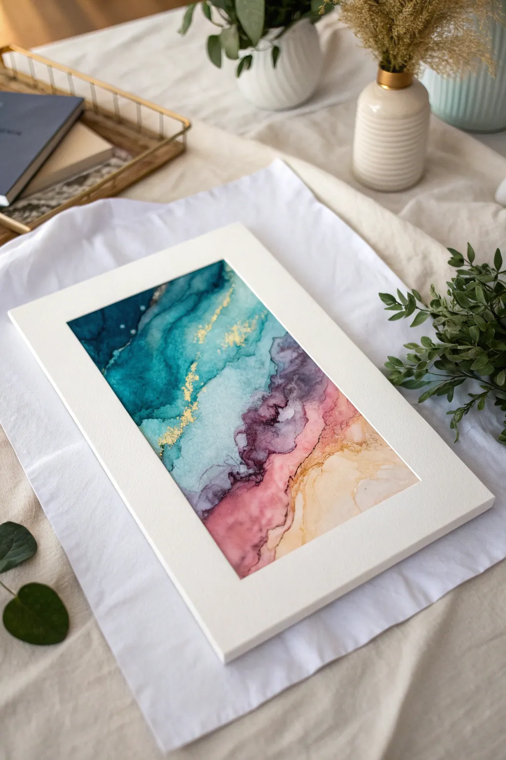
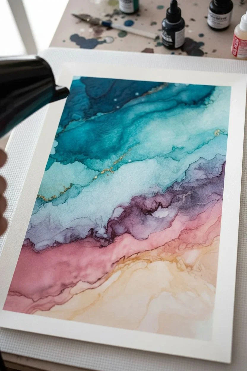
Capture the churning energy of the ocean with this dynamic alcohol ink project, featuring layers of teal, cobalt, and frothy white. By mastering the push and pull of inks with isopropyl alcohol and blown air, you’ll create a mesmerizing seascape full of movement and depth.
Step-by-Step Guide
Materials
- A3 or A4 synthetic paper (like Yupo or Grafix)
- Alcohol inks: Navy Blue, Teal/Turquoise, Sky Blue, and White mixative
- Blending solution or 91%+ Isopropyl Alcohol
- Air blower tool (hair dryer on cool setting, heat gun on low, or straw)
- Small twist-top bottles or needle-nose bottles for precision
- Gloves and protective work surface covering
- Paper towels for cleanup
Step 1: Establishing the Deep Water
-
Prepare your canvas:
Lay down your synthetic paper on a protected surface. Tape the edges down if you want a clean border, though letting the ink flow naturally to the edge creates a more organic look. -
Lay the darker base:
Start at the bottom left corner, applying a generous amount of Navy Blue ink followed by a splash of isopropyl alcohol. This area represents the deepest, darkest water. -
Guide the flow:
Use your air tool (or a straw for more control) to push the dark blue ink diagonally upwards across the page. Aim for swirling, uneven shapes rather than straight lines. -
Introduce mid-tones:
While the navy is still slightly wet, add drops of Teal and Sky Blue just above the dark area. Let them bleed into the navy slightly to create a natural gradient. -
Create the first swell:
Direct your airflow to push these lighter blues upward into a cresting wave shape. The key is to keep the air moving so the ink doesn’t pool in one spot too long.
Airflow Control
For the defined, rippled lines seen in the water, use a hairdryer with a concentrator nozzle attachment. It directs the air into a thin stream, giving you sharper lines.
Step 2: Building Layers and Movement
-
Add the upper currents:
Moving towards the top right of the paper, apply lighter washes of Sky Blue and plenty of blending solution. This will be the lighter, sun-lit water. -
Connect the zones:
Gently blow the lighter blue ink down towards your darker mid-section. You want visible ‘seams’ or hard edges where the inks meet, mimicking the surface tension of water. -
Construct the main wave:
Identify the central band where your main wave will crash. Apply a fresh line of Teal ink here to ensure the color is vibrant and saturated. -
Create wispy textures:
Using a hair dryer on the ‘cool’ setting, blow the ink back and forth rapidly. This helps develop those delicate, rippled lines that look like water currents.
Step 3: The Frothy Crash
-
Prepare the white mixative:
Shake your White ink thoroughly. It contains heavy pigments that settle quickly, and you need them suspended for opaque foam. -
Apply the foam line:
Drip the white ink along the ridges of your darkest blue sections. It creates the most dramatic contrast against the navy background. -
Disperse the foam:
Immediately hit the white drops with a burst of air. You want it to shatter and mix slightly with the blue underneath, creating a soft, misty teal effect. -
Detailing the crest:
Go back in with a very fine tool or a straw and blow small sections of white upwards to mimic spray flying off the top of the wave. -
Adding sea foam bubbles:
I like to dip a small brush or toothpick into isopropyl alcohol and lightly dot it onto the wettest blue areas. The alcohol pushes the pigment away, creating tiny cellular circles that look like bubbles. -
Review and refine:
Look for areas that feel too flat. Add a drop of dark blue to deepen shadows under the white foam to make the wave pop.
Metallic Shimmer
Mix a single drop of silver metallic mixative into your white ink before applying the foam. It adds a subtle, glistening sparkle that mimics sunlight hitting the ocean spray.
Step 4: Finishing Touches
-
Dry completely:
Let the artwork sit undisturbed for at least 24 hours. Synthetic paper takes longer to dry fully than regular paper. -
Seal the artwork:
Once bone dry, apply a UV-resistant varnish spray. Alcohol inks fade quickly in sunlight, so this step is crucial for longevity. -
Frame it up:
Mount your seascape in a white mat board frame to enhance the crisp, cool tones of the water.
Now you have a stunning, turbulent piece of the ocean to hang on your wall
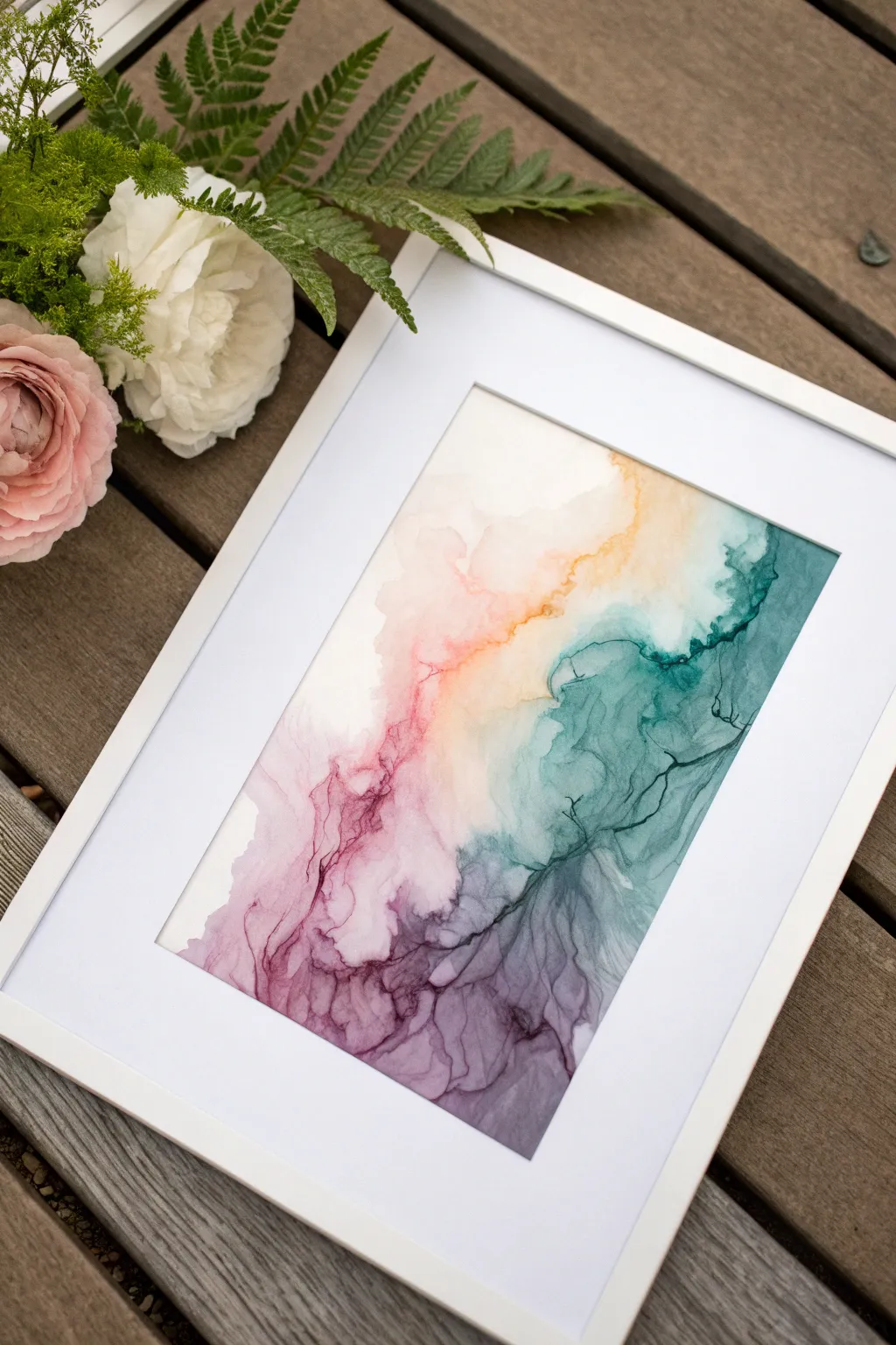
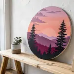
Sunset Ombre Skies for Mini Landscapes
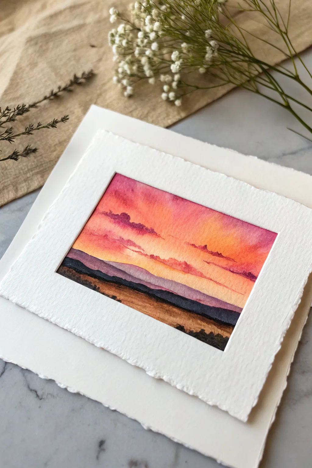
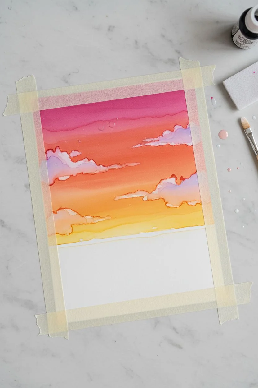
Capture the fleeting beauty of dusk with this vibrant miniature landscape featuring a glowing gradient sky and layered mountain silhouettes. Using alcohol inks on synthetic paper allows for seamless blending and creates those rich, translucent hues that makeup the perfect sunset.
Step-by-Step
Materials
- Synthetic paper (e.g., Yupo) cut to approx. 4×6 inches
- Alcohol inks: Magenta, bright orange, yellow, dark purple, and espresso brown
- Blending solution
- Rectangular masking tape or painter’s tape
- Isopropyl alcohol (91% or higher) in a small spray bottle
- Small round synthetic brush (size 2 or 4)
- Felt applicator tool
- Deckle-edge watercolor paper for mounting (optional)
- Double-sided tape
Step 1: Creating the Ombre Sky
-
Mask the borders:
Begin by taping down your synthetic paper to a flat, non-porous surface. Create a crisp rectangular border with the tape; this will give you those clean, sharp edges visible in the final piece. -
Prime the sky area:
Lightly moisten the upper two-thirds of your paper with blending solution. You want it damp but not swimming in fluid. -
Start with yellow:
Drop a small amount of yellow ink near the bottom of your sky area (just above where the horizon will be). Use your felt applicator to gently tap it across the paper. -
Introduce orange:
Immediately above the yellow, apply the bright orange ink. Let the colors touch and bleed into each other slightly. If the transition looks harsh, add a tiny drop of blending solution to help them merge. -
Add magenta warmth:
Apply the magenta ink to the top section of the sky. While the orange is still wet, encourage the magenta to flow downward just a bit to create a seamless gradient. -
Paint wispy clouds:
Put a drop of purple ink onto a palette or craft mat. Dip a fine brush into isopropyl alcohol, pick up a tiny bit of purple, and gently paint thin, horizontal cloud shapes across the orange and pink sections. The alcohol will push the underlying ink away slightly, creating soft, illuminated edges.
Step 2: Layering the Landscape
-
Define the distant mountains:
Dilute your dark purple ink with plenty of blending solution until it is quite pale. Paint a low, rolling mountain shape across the horizon line, overlapping the bottom of your yellow sky slightly. -
Deepen the middle ground:
Mix a slightly darker, less diluted purple. Paint a second mountain range below the first one, varying the peaks and valleys so it doesn’t look identical to the first layer. This creates instant depth. -
Build the foreground texture:
Switch to your espresso brown ink. Dab the ink along the bottom of the painted area using a rougher stippling motion with your brush to mimic textured ground or dry grasses. -
Add final dark accents:
For the very bottom edge and shadows, use undiluted dark purple or mix it with the brown for a nearly black hue. Apply this sparingly to the lowest points to anchor the composition. -
Reveal the edges:
Allow the ink to dry completely—this usually takes 10-15 minutes. Carefully peel away the masking tape at a 45-degree angle to reveal your crisp white borders.
Muddy colors?
If your purple mountains turn brown when overlapping the yellow sky, let the sky layer dry 100% first. Dry layering prevents unwanted mixing.
Step 3: Mounting and Finish
-
Prepare the mount:
Take a larger sheet of textured or deckle-edge paper. Center your finished painting on top of it to check the margins. -
Create the floated look:
Apply double-sided foam tape or standard double-sided tape to the back of your painting. -
Final assembly:
Press the painting firmly onto the textured backing paper. I find using a clean tissue to press down prevents finger oils from transferring to the artwork.
Add metallic sparkle
Mix a drop of gold alcohol ink mixative into the yellow horizon line for a sun-drenched, shimmering effect that catches the light.
Now you have a serene little window into a sunset world to display or give as a thoughtful card
BRUSH GUIDE
The Right Brush for Every Stroke
From clean lines to bold texture — master brush choice, stroke control, and essential techniques.
Explore the Full Guide
Silhouette Forest Over an Ink Wash
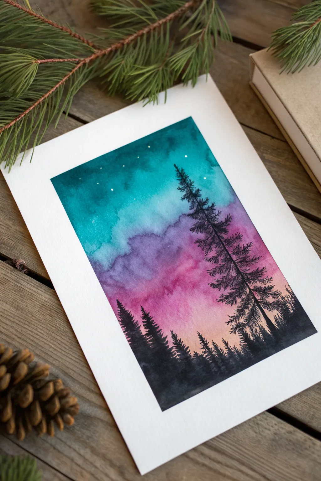
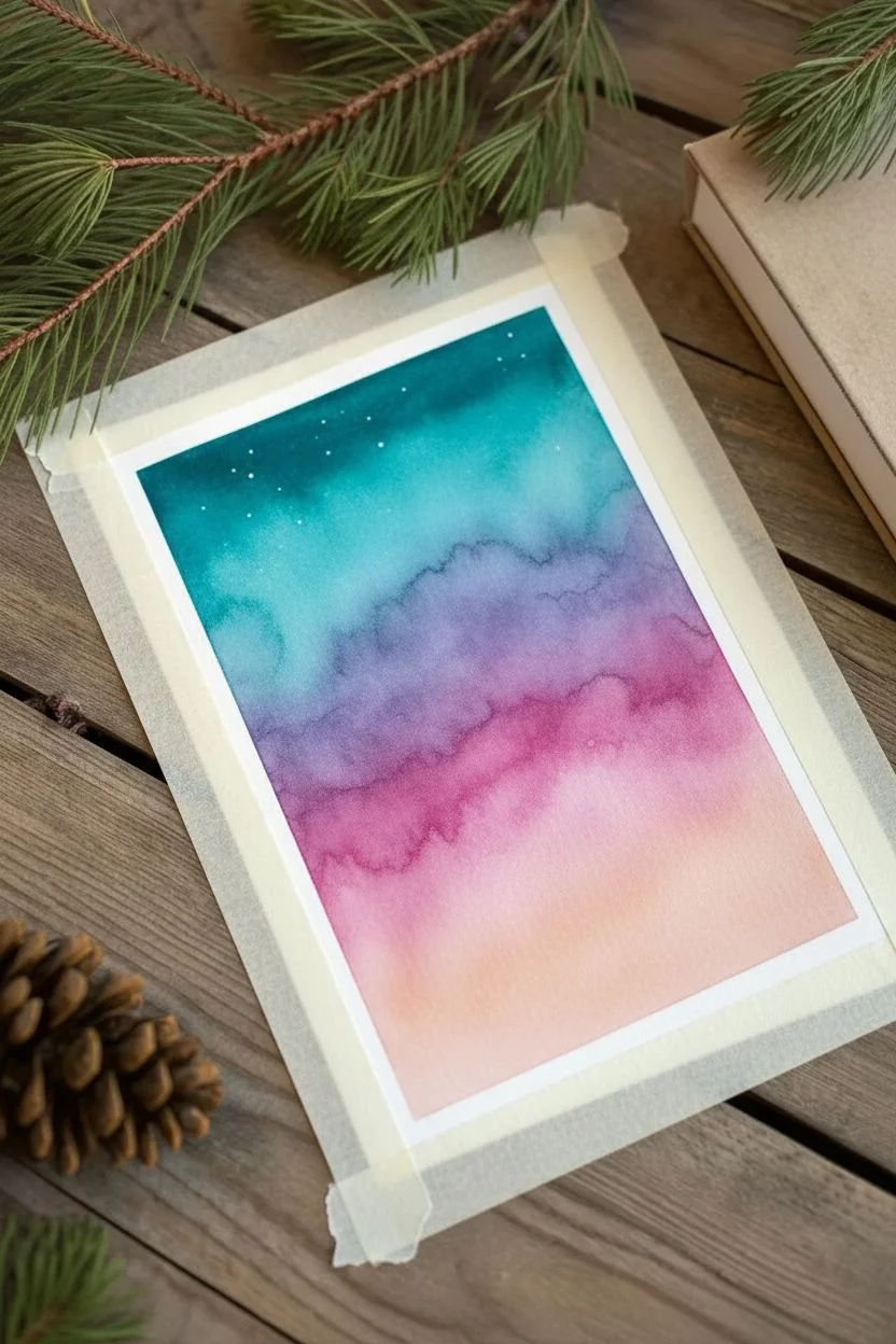
Capture the serene beauty of a twilight sky fading from teal to soft pink with this atmospheric painting. The crisp black silhouette of pine trees against the dreamy, blended background creates a striking contrast that is both modern and peaceful.
Detailed Instructions
Materials
- High-quality watercolor cardstock or cold-press paper
- Liquid watercolor paints (Teal/Turquoise, Violet, Magenta, Peach/Orange)
- Black ink or highly pigmented black watercolor
- Flat wash brush (1/2 inch or 3/4 inch)
- Fine liner brush (size 0 or 00)
- Clean water jar
- Paper towels
- White gel pen (optional for stars)
- Painter’s tape
Step 1: Creating the Sky Gradient
-
Prepare your canvas:
Tape down all four edges of your watercolor paper to a flat board or table surface. This simple step prevents the paper from warping as it gets wet and ensures you get that satisfying, crisp white border when you’re finished. -
Wet the paper:
Using your large wash brush and clean water, apply a generous coat of water across the entire rectangular area. The paper should be glisten with sheen but not have standing puddles. -
Start with Teal:
Load your brush with the teal or turquoise paint. Start at the very top of the rectangle and sweep the color across from left to right. It should be darkest at the top edge. -
Add the Violet layer:
Clean your brush quickly and load it with violet. Apply this directly below the teal while the paper is still wet, allowing the bottom edge of the teal to bleed naturally into the top of the violet. -
Blend in Magenta:
Moving downward, introduce the magenta tone. Stroke horizontally, letting it mix slightly with the violet above it to create a seamless transition rather than a hard stripe. -
Finish with Peach:
For the horizon line at the bottom, use a very diluted peach or light orange. This suggests the last light of the sun. Seamlessly blend it into the magenta layer above. -
Deepen the sky:
While the paper is still damp, I like to drop a little extra concentrated teal into the top corners to create a vignette effect, framing the scene. -
Create texture:
Allow the paint to settle. If you want a bit of cloud texture, you can gently dab a scrunched paper towel into the wet wash to lift just a tiny bit of color, though a smooth gradient works perfectly too. -
Add stars:
Before the sky is 100% dry, you can flick tiny droplets of clean water onto the teal section to create blooming ‘stars,’ or wait until it’s dry and use a white gel pen later. -
Dry completely:
This is crucial: Let the background layer dry completely. If you paint the trees too soon, they will bleed into the sky and lose their sharp edges. Use a hairdryer on low if you’re impatient.
Bleeding Lines?
If your black trees are spreading into the sky, the background paper is still damp. Stop immediately, let it dry fully (bone dry to the touch), and then resume painting.
Step 2: Painting the Silhouette
-
Outline the forest floor:
Switch to your black ink or concentrated black watercolor. Paint a solid, uneven strip across the bottom to represent the dense forest floor. -
Start the main tree:
Using your fine liner brush, draw a thin, vertical line slightly off-center on the right side. This will be the trunk of your tallest pine tree. -
Add top branches:
Starting at the top of the trunk, paint small, downward-sloping strokes. Make them very short and sparse at the apex of the tree. -
Build the tree volume:
Work your way down the trunk, making the branches wider and fuller as you descend. Use a stippling or flicking motion to mimic pine needles. -
Add secondary trees:
Paint smaller trunks on the left and right sides. Vary their heights so they don’t look like a picket fence; natural forests are random and uneven. -
Fill in the canopy:
Flesh out the smaller trees with the same downward, flicking brushstrokes. Allow some branches to overlap for a sense of depth. -
Refine the base:
Go back to the bottom black strip and paint tiny vertical flicks upward to suggest undergrowth and smaller saplings blending into the main trees. -
Clean up details:
Check for any gaps in the black silhouette where the colorful sky shows through unintentionally and fill them in solid black. -
Final touches:
If you didn’t add stars earlier, use a white gel pen to place a few tiny dots in the darkest teal part of the sky. -
Reveal the border:
Once the black ink is completely dry, slowly peel off the painter’s tape at a 45-degree angle to reveal your clean white border.
Metallic Magic
Add a magical touch by mixing a tiny amount of silver metallic watercolor into your black ink. The trees will subtly shimmer when the light hits them.
Frame your piece in a simple wooden frame to complement the natural theme and enjoy your handmade landscape
Desert Canyon Textures and Stone Striations
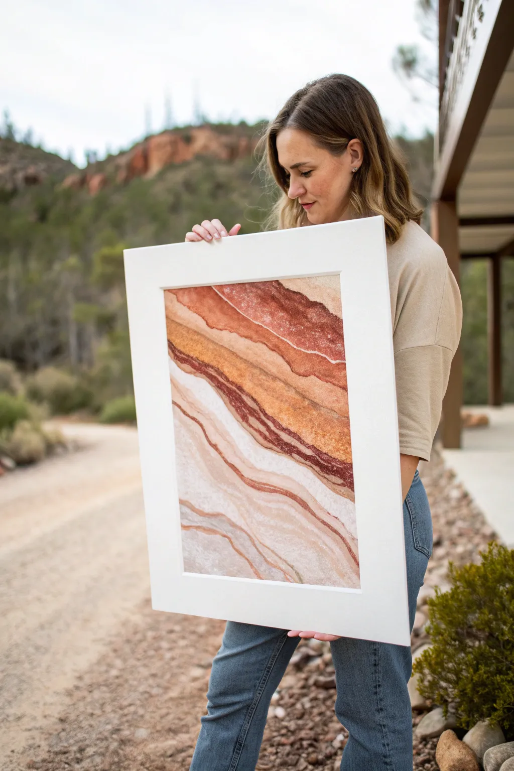
Capture the raw beauty of arid landscapes with this abstract alcohol ink piece, mimicking the natural striations of desert canyon walls. By layering warm earth tones and manipulating drying times, you’ll create organic, flowing bands of color that feel both ancient and modern.
Step-by-Step Tutorial
Materials
- Large sheet of synthetic paper (Yupo or Nara), approx. 18×24 inches
- Alcohol inks: Rust Red, Burnt Orange, Latte (or Tan), Caramel, and White mixative
- Blending solution (91% or higher Isopropyl Alcohol works too)
- Hair dryer with a cool setting or an air puffer tool
- Small plastic cups for mixing
- Pipettes
- Gloves and a well-ventilated workspace
- Large white mat board and frame for finishing
Step 1: Setting the Flow
-
Prepare your mixtures:
Before starting, pre-mix a few diluted shades in your small cups. I like to have a ‘pale sand’ cup (mostly blending solution with a drop of Tan) and a ‘deep canyon’ cup (Rust Red with a tiny bit of Caramel). This allows you to pour without stopping to open bottles constantly. -
Create the first horizon line:
Start about one-third of the way down from the top of your paper. Pour a generous line of clear blending solution across the width in a slightly wavy, organic motion. -
Drop the deep tones:
Immediately drop your Rust Red ink into the wet blending solution. Tilt the paper slightly to encourage the ink to flow along the wet path, creating that first bold, dark striation. -
Air manipulation:
Use your hair dryer on the ‘cool’ and ‘low’ setting to push the ink. Aim the airflow sideways across the line to spread it out, but keep the edge distinct. You want to dry this first line almost completely so it acts as a barrier for the next layer.
Airflow Control
For jagged rock lines, use a drinking straw to blow the ink instead of a dryer. The concentrated air creates sharper, more erratic edges perfect for stone textures.
Step 2: Layering the Canyon
-
Add the orange band:
Directly below your dried rust line, wet a new section with blending solution. Apply Burnt Orange ink. Use your air tool to push this lighter color slightly up into the edge of the rust line; because the rust is dry, the orange will just kiss the edge without muddying it. -
Introduce texture:
While the orange layer is still tacky but not soaking wet, spritz a tiny bit of pure alcohol from a distance. This creates small blooms and textural pockets that look like stone surfaces. -
The sandy transition:
Pour a wider band of blending solution below the orange. Drop in your Caramel ink, but use less ink and more solution here to keep it translucent. -
Create the white vein:
Mix a drop of White mixative with blending solution. Carefully pour a thin, wandering line through the wet caramel section. The white is heavier and will settle differently, creating a milky, quartz-like vein in the rock formation. -
Repeating the process:
Continue working your way down the paper. Allow each major band to dry before starting the next if you want hard edges (like sedimentary rock layers), or work wet-into-wet if you prefer a softer, blended sandstone look. -
Handling the bottom third:
For the paler, bottom section of the artwork, switch primarily to your ‘pale sand’ mixture. You want these layers to be very subtle, barely-there whispers of color. -
Adding the final dark accents:
Look at your composition. If it feels too light, go back and add a thin, concentrated line of Rust Red in between two dried lighter layers. The contrast mimics the iron-rich deposits found in real canyon walls.
Muddy Colors?
If your rust and orange turn brown, you’re overworking wet layers. Let one band dry completely (touch test it!) before adding a wet neighbor.
Step 3: Finishing and Framing
-
Reviewing the movement:
Step back and look at the flow. If any lines look too straight or unnatural, re-wet that specific area with a drop of alcohol and use the air tool to create a new curve or wobble. -
Full dry:
Let the piece sit undisturbed for at least 24 hours. Alcohol inks dry to the touch quickly but need time to fully cure and harden. -
Sealing the work:
Spray the artwork with a UV-resistant varnish. This is crucial as alcohol inks can fade in sunlight. Do two to three light coats rather than one heavy one. -
Matting:
Cut a wide white mat board. The wide white border is essential to this look—it isolates the textures and makes the earth tones pop. Position your artwork behind the mat window. -
Final Assembly:
Place the matted artwork into your frame. Ensure the glass or acrylic is clean, as any dust will distract from the delicate ink textures.
Hang your new desert-inspired masterpiece in a well-lit spot to let the translucent layers shine.

PENCIL GUIDE
Understanding Pencil Grades from H to B
From first sketch to finished drawing — learn pencil grades, line control, and shading techniques.
Explore the Full Guide
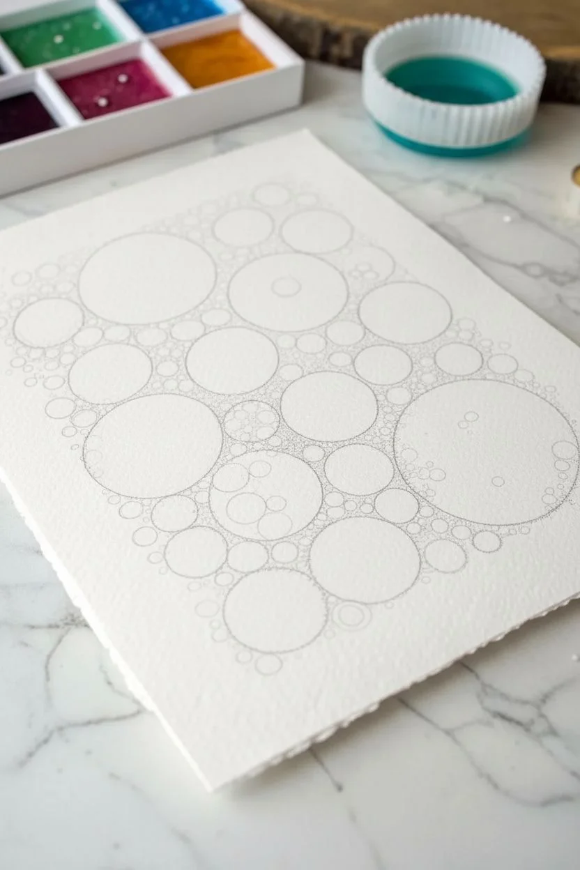
Circular Orbs and Bubble Clusters
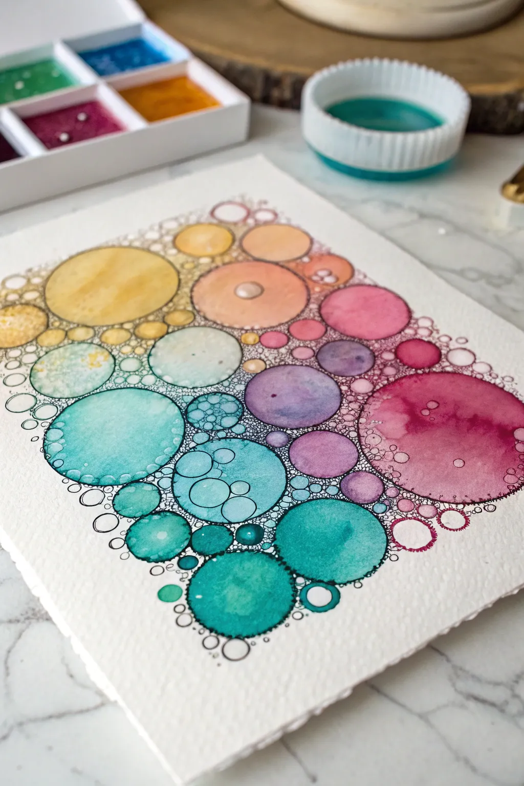
This vibrant project combines the fluidity of watercolors with precise line work to create a mesmerizing cluster of colorful bubbles. The result captures a dreamy transition of hues from warm yellows to cool teals, punctuated by delicate black ink details.
Step-by-Step Guide
Materials
- Cold press watercolor paper (300 gsm)
- Watercolor pan set (including yellow, orange, pink, purple, teal, and blue)
- Small round watercolor brush (size 2 or 4)
- Fine liner or micron pen (black, waterproof, size 01 or 03)
- Clean water container
- Paper towels
- Pencil (HB or H)
- Circular stencils or compass (optional)
Step 1: Planning and Sketching
-
Visualize the gradient:
Before putting pencil to paper, imagine a diagonal flow of color across your page. We want to move from warm tones in the top left (yellows, oranges) to cooler tones in the bottom right (teals, blues), with purples acting as the bridge in the middle. -
Sketch the primary circles:
Lightly sketch several large and medium-sized circles using a pencil. You can trace bottle caps or use a stencil for perfect rounds, or freehand them for an organic look. Arrange them so they are close but not touching. -
Fill the gaps:
Draw smaller circles in the spaces between your larger orbs. Vary the sizes significantly to create the effect of a clustered bubble grouping. -
Refine the composition:
Add tiny, pebble-sized circles around the outer edges of the main shape to give the composition a dissolving or floating appearance rather than a hard square edge.
Bloom Control
To get ‘blooms’ inside the circles, drop clear water onto damp paint. Don’t touch it again; let it dry naturally to create hard edges.
Step 2: Painting the Orbs
-
Start with warm tones:
Activate your yellow and orange paints with a wet brush. Paint the circles in the top left corner. For a luminous effect, paint a circle with clean water first, then drop the pigment in, letting it bloom naturally. -
Transition to pinks:
As you move diagonally down the cluster, clean your brush and switch to coral and pink tones. Paint the neighboring circles, perhaps allowing a little yellow to touch a wet pink circle to create a soft orange blend. -
Bridge with purple:
In the center and middle-right section, introduce purple and violet hues. Vary the saturation—make some circles deep and rich, while keeping others pale and watery. -
Cool down with teal:
Select your teal and turquoise paints for the bottom left and bottom center areas. These cool colors provide a striking contrast to the earlier warm tones. -
Finish with deep blues:
Fill the final circles at the bottom right with deep blues or darker teals to ground the composition. -
Add texture:
While some circles are still damp, drop in a tiny splash of clean water or a pinch of salt. This pushes the pigment away and creates those fascinating cauliflower-like textures seen in the reference. -
Patience is key:
Allow the paint to dry completely. If the paper feels cool to the touch, it is still damp. Proceeding too soon will cause your ink lines to bleed.
Step 3: Inking the Details
-
Outline the painted forms:
Using your waterproof fine liner, carefully trace the outline of each painted circle. It doesn’t have to be mechanically perfect; a slightly wavering line adds character. -
Create the interstitial bubbles:
In the white spaces between the colored circles, draw tiny, tight clusters of circles with your pen. I like to think of this as sea foam filling the gaps. -
Connect the shapes:
Where gaps are too small for a full circle, simply darken the interstices with black ink to add depth and contrast. -
Detail the larger orbs:
Add smaller drawn circles inside some of the larger painted ones to suggest highlights or surface bubbles.
Ink Bleeding?
If your black pen lines look fuzzy or spread out like spiderwebs, the paper is still wet. Stop immediately and wait or use a hairdryer.
Step back and admire how the simple repetition of circles creates a complex and harmonious piece of art
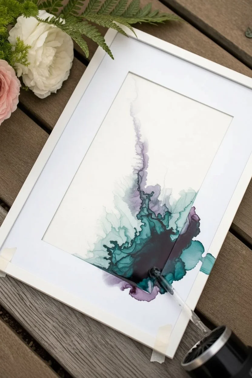
Dreamy Ink Orbs With Dripping Trails
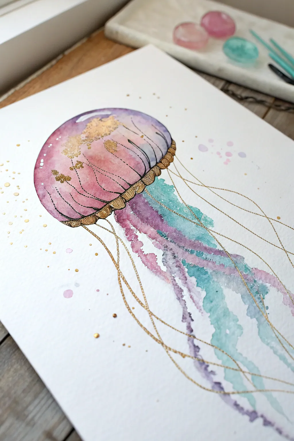
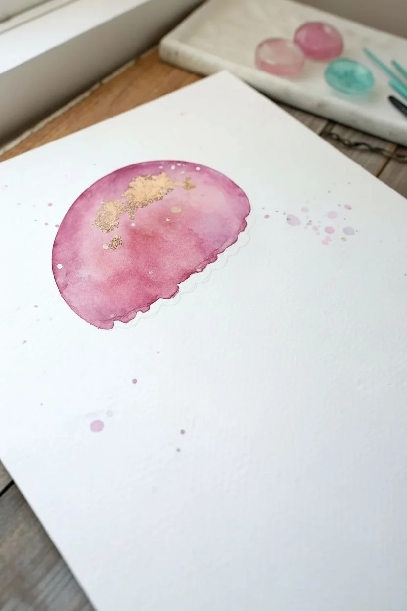
Capture the ethereal beauty of the deep blue with this shimmering jellyfish tutorial. By combining the fluid, unpredictable nature of alcohol inks with precise metallic accents, you’ll create a piece that feels both organic and luxuriously structured.
Step-by-Step Tutorial
Materials
- Alcohol inks (Magenta, Purple, Teal/Turquoise)
- Metallic mixative (Gold or Brass)
- Isopropyl alcohol (91% or higher) in a dropper bottle
- Yupo paper or alcohol ink cardstock (A4 or 5×7 inch)
- Fine liner brush or nib pen for metallic details
- Small round paintbrush (synthetic)
- Palette or small ceramic dish
- Pencil and eraser
- Paper towels
Step 1: Shaping the Bell
-
Sketch the outline:
Begin by lightly sketching a dome shape on your Yupo paper with a pencil. This will serve as the jellyfish’s bell. Keep the lines faint so they don’t show through the translucent ink later. -
Wetting the area:
Using your paintbrush and plain isopropyl alcohol, wet the inside of the dome shape. This creates a contained area for the ink to flow without spreading uncontrollably across the page. -
Applying the base color:
Drop a small amount of Magenta alcohol ink into the wet alcohol on the paper. Tilt the paper gently to let the color swirl and soften toward the edges. -
Adding depth:
While the pink is still damp, introduce a drop of Purple ink near the bottom edge of the bell. Let it bleed upward naturally to create a gradient effect. -
Creating texture:
Dip your brush in clean alcohol and flick tiny droplets onto the drying ink. This pushes the pigment away, creating the bubbly, organic texture seen in the upper bell. -
Gilding the bell:
Shake your gold metallic mixative well. Add a tiny drop directly onto the wettest part of the bell, or use a brush to dab it in, letting it interact with the drying inks for a speckled gold leaf effect.
Step 2: Creating the Tentacles
-
Preparing the flow:
Position your paper so the bottom of the jellyfish bell is at the top of an incline; gravity will help create the long tentacles. -
Starting the trails:
Load your brush with plenty of Teal ink and alcohol. Touch the brush to the bottom edge of the bell and let the ink run down the page in a wavy, uneven line. -
Layering colors:
Repeat this process with Purple ink, alternating placement so the colors sit side-by-side. If they touch and bleed together while wet, that’s perfect—it adds to the fluid look. -
Softening edges:
If a tentacle looks too harsh, run a brush dampened with pure alcohol along its edge to feather the color out into the white space. -
Adding background splatter:
Flick a small amount of diluted purple or pink ink around the jellyfish to mimic floating particles in the water. Let the entire piece dry completely before moving to the next phase.
Ink Spreading Too Fast?
If ink runs wild on Yupo, wait 10 seconds for the alcohol to evaporate slightly before dropping color. This thickens the liquid.
Step 3: Metallic Detailing
-
Structuring the rim:
Pour a small pool of gold metallic mixative onto your palette. Using a fine liner brush, paint the ruffled rim at the bottom of the bell, using small, repeating ‘U’ shapes. -
Defining the bell:
Outline the top dome of the jellyfish with a very thin, broken gold line. Add curved lines inside the bell to suggest volume and transparency. -
Drawing the fine filaments:
I like to switch to a very fine brush here. Paint long, incredibly thin gold lines extending from the bell’s rim down past the colored tentacles. Make these lines wavy and intersecting. -
Final accents:
Add small clusters of gold dots near the rim of the bell and scattered among the tentacles to catch the light. -
Clean up:
Once the metallic ink is dry, gently erase any visible pencil marks from your initial sketch.
Make It Sparkle
Mix a tiny pinch of mica powder into your isopropyl alcohol spray bottle for a subtle, all-over shimmer on the tentacles.
Now step back and admire how the light catches those beautiful gold details against the soft watercolor wash


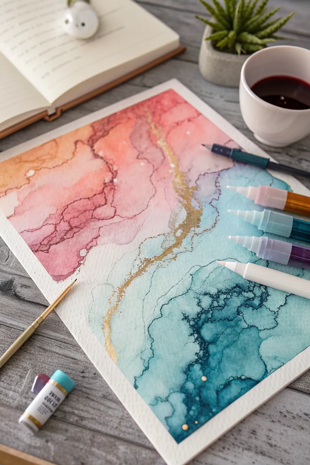
Stencil and Mask Patterns on Top of Ink
This project captures the mesmerizing flow of alcohol inks, blending deep teals and moody purples into soft peaches across a landscape-like composition. The standout feature is a delicate, vein-like golden texture that breaks through the colors, creating a sophisticated, organic finish perfect for framing.
Step-by-Step
Materials
- Yupo paper or other non-porous synthetic paper (A4 or A3 size)
- Alcohol inks: Deep Teal, Turquoise, Aubergine/Plum, Salmon Pink, Sandy Beige
- Metallic mixative: Gold or Brass
- High-percentage Isopropyl Alcohol (91% or 99%) or blending solution
- Air blower tool or hairdryer (cool setting)
- Small precision brush or pipette for gold details
- Pre-cut mat board (white)
- Small mixing cups
- Gloves and protective work surface
Step 1: Setting the Atmospheric Base
-
Prepare the workspace:
Begin by securing your Yupo paper to a flat, covered surface. Ensure you have good ventilation, as alcohol inks can have strong fumes. Have your air blower ready within reach. -
Start with the deep tones:
Apply a generous amount of Isopropyl Alcohol to the upper left quadrant of your paper. Drop in the Deep Teal and Turquoise inks, allowing them to swirl together naturally. -
Guide the flow:
Use your air blower or hairdryer on the cool setting to push the blue-green pool diagonally downwards towards the center. Aim to create soft, rolling edges rather than sharp lines. -
Transition to purple:
While the teal edge is still slightly wet, introduce Isopropyl Alcohol to the middle section. Add drops of Aubergine or Plum ink right at the border of the teal. -
Blend the intersection:
Gently blow the purple ink so it kisses the teal. This creates a dark, moody transition zone where the colors overlap. Don’t overwork it, or it may turn muddy. -
Soften with pinks:
Moving downwards, lay down a fresh pool of blending solution. Drop in Salmon Pink ink below the purple area. Use the air tool to feather this color upwards into the purple, creating a misty, sunset-like gradient. -
Anchor with neutrals:
For the bottom right corner, apply the Sandy Beige ink. This lighter color acts as a ‘shoreline’ or base, grounding the more vibrant colors above it. -
Create the fade-out:
Blow the beige ink outwards toward the edges of the paper, letting it thin out until it becomes almost transparent. This negative space keeps the composition breathable.
Control the Flow
If the ink moves too fast, wait 10 seconds after applying alcohol. As the alcohol evaporates, the solution thickens, allowing for slower, more precise manipulation.
Step 2: adding the Golden Veins
-
Prepare the metallic mixative:
Shake your Gold or Brass metallic mixative vigorously. The metal pigments settle quickly, so thorough mixing is crucial for a brilliant shine. -
Dilute the gold:
Pour a small amount of gold onto a palette or into a small cup. Add a few drops of alcohol to thin it slightly; this helps it travel along the existing ink paths. -
Identify the textural breaks:
Look closely at your dried ink layers. You will see natural ridges or ‘drying lines’ where the pools of ink settled. These are your roadmaps for the gold. -
Apply the gold accents:
Using a fine brush or a pipette, drop tiny amounts of the thinned gold along the transition line between the teal and the lighter blue areas. -
Disperse the metallic:
Before the gold dries, give it a quick, sharp puff of air. This shatters the drop, sending tendrils of gold shooting out into the surrounding color, mimicking natural stone veins. -
Repeat selectively:
Add a few more gold accents in the beige and pink sections, but keep them sparse. I usually prefer to keep the heaviest gold concentration in the upper teal section for contrast. -
Final drying:
Let the entire piece dry completely for several hours. Alcohol ink can feel dry to the touch quickly but remains chemically active for a while. -
Seal the artwork:
Once fully cured, spray the artwork with a non-yellowing UV archival varnish to prevent fading and protect the delicate surface. -
Matting and framing:
Place your white mat board over the artwork to find the most pleasing composition. Tape the artwork to the back of the mat using acid-free tape and place it in a frame.
Dimensional Depth
After the first layer dries, add a second layer of diluted ink in the darkest areas. This created transparency and depth that makes the artwork look 3D.
Now you have a stunning, ethereal piece of abstract art ready to brighten any room
Embossed Linework Over Fluid Color
Marrying the unpredictable, blooming nature of alcohol inks with the crisp precision of embossed linework creates a stunning contrast that elevates simple botanical art. This project layers a warm terra-cotta and deep teal background with a shimmering, raised flower illustration for a polished, professional look.
Step-by-Step Tutorial
Materials
- Yupo paper or other non-porous synthetic paper
- Alcohol inks (Terracotta/Peach, Teal/Deep Blue, and Metallic Gold or Copper extender)
- Isopropyl alcohol (91% or higher) or blending solution
- Air blower tool or straw
- Embossing pen (clear or black ink)
- Black embossing powder (fine detail)
- Heat gun tool
- Fine liner pen (black, alcohol-proof)
- White gel pen (optional for highlights)
- Square frame with mat board
Step 1: Creating the Fluid Background
-
Prepare the surface:
Cut your Yupo paper to size, ensuring it fits the mat opening of your chosen frame. Wipe the surface gently with a clean cloth to remove any oils from your fingers. -
Lay down the base fluid:
Drizzle a generous amount of blending solution or isopropyl alcohol onto the center and lower right sections of the paper. -
Drop the colors:
Add two drops of Terracotta alcohol ink near the center and two drops of Teal near the bottom right. Let them begin to spread naturally into the blending solution. -
Guide the flow:
Use an air blower tool to push the inks around. Aim to keep the Terracotta airy and light near the top left, while encouraging the Teal to pool more densely at the bottom. -
Soften edges:
If hard lines form where you don’t want them, add a tiny drop of clear alcohol and blow the ink outward again to create those dreamy, faded edges seen in the top left corner. -
Let it dry completely:
Allow the background to dry fully. This is crucial; if the paper is cold or damp, the embossing powder in the next phase will stick to the background, not just your lines.
Heat Sensitive Paper
Yupo paper can warp under high heat. Keep your heat gun moving constantly and hold it about 4-5 inches away from the surface to melt the powder without buckling the sheet.
Step 2: Sketching and Embossing
-
Draft the flower shape:
Lightly sketch a large, open-faced flower in the center using a graphite pencil. Keep the lines very faint so they won’t show through later. -
Trace with embossing pen:
Go over your pencil lines with a clear or slow-drying black embossing pen. Work in sections—do the center petals first—so the ink stays wet enough to hold the powder. -
Apply embossing powder:
Heavily sprinkle black embossing powder over your wet lines. Shake off the excess powder onto a scrap piece of paper to funnel back into the jar. -
Heat set the lines:
Use your heat gun to melt the powder. Keep the gun moving to avoid warping the synthetic paper. Watch for the powder to turn from matte to glossy and raised. -
Complete the drawing:
Repeat the tracing, dusting, and heating process for the outer leaves and the decorative stem sprigs on the right side.
Step 3: Detailing and Finishing
-
Add petal definition:
Using a fine-tip permanent black marker (one that won’t bleed on Yupo), drawn delicate interior lines on each petal to suggest veins and texture. -
Embellish the center:
For the flower’s stamen, use a stippling technique with your marker to create a cluster of tight dots. You can add tiny dots of white gel pen here for extra dimension. -
Shade the leaves:
I like to add very subtle cross-hatching to the lower leaves to give them weight and separate them visually from the petals. -
Clean up stray specs:
Inspect the white areas of the paper. If there are stray ink splatters or powder specs, gently scratch them off with a craft knife or clean them with a cotton swab dipped in alcohol. -
Mount and frame:
Place your artwork behind the mat board and secure it with acid-free tape. Insert it into the frame, ensuring the glass is clean on both sides.
Powder Sticking Everywhere?
If embossing powder sticks to the background, wipe the dried ink surface with an anti-static bag or a used dryer sheet before you start drawing with the embossing pen.
Now you have a sophisticated piece of botanical art that captures the fluid beauty of alcohol ink with striking definition.
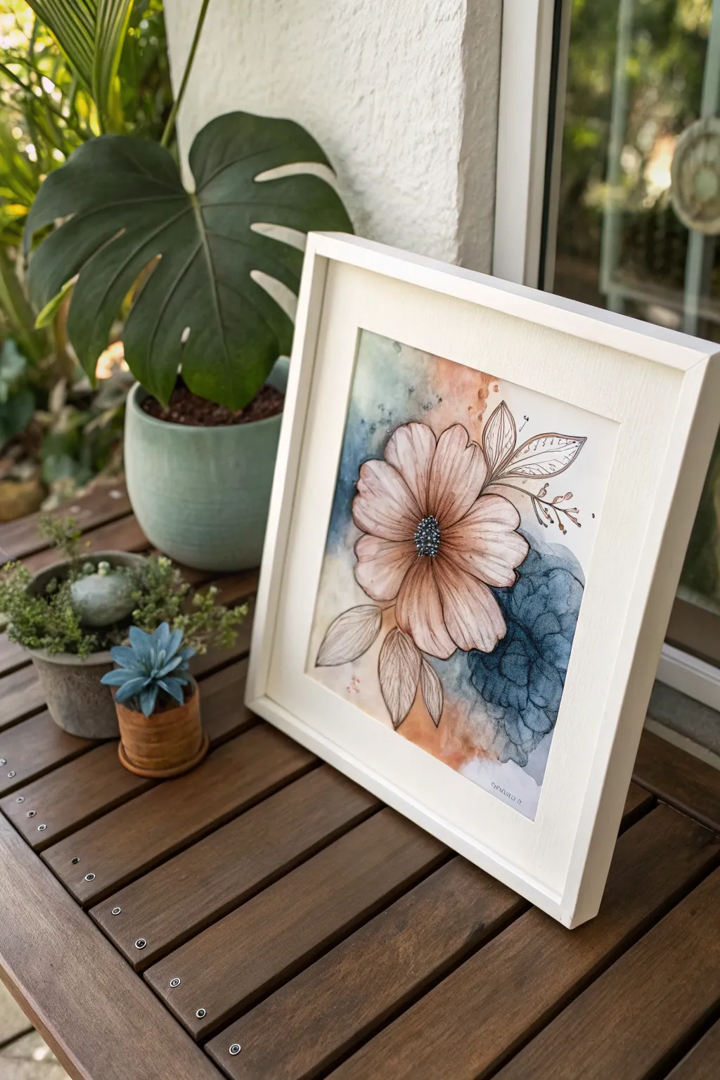
Loose Florals Finished With Pen Details
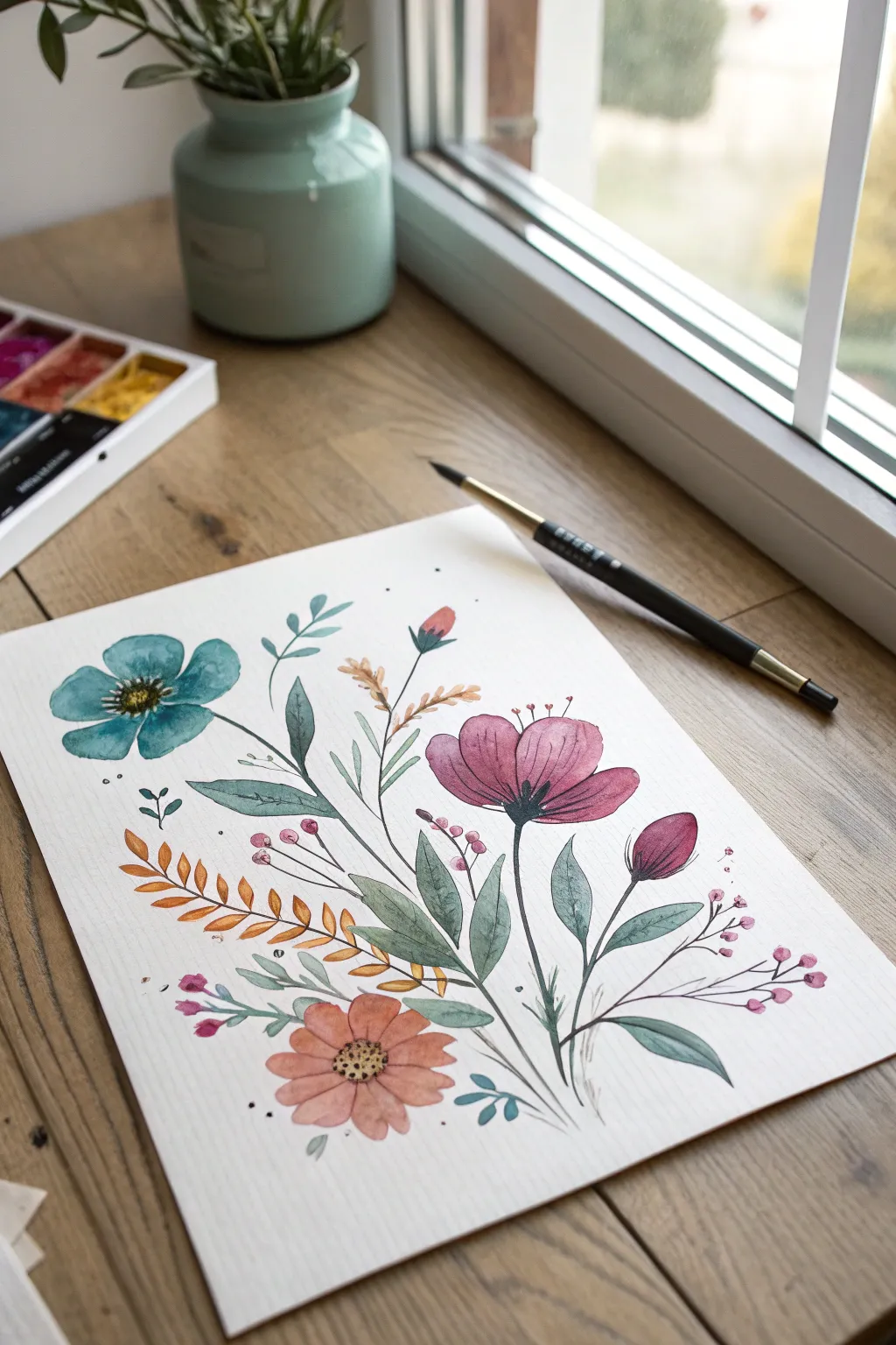
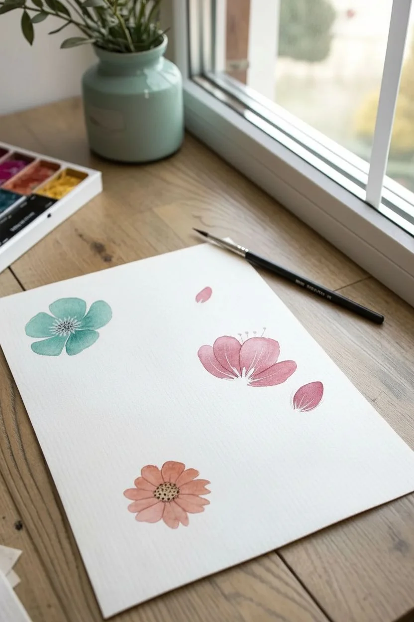
Capture the delicate beauty of a wildflower bouquet with this project that combines the fluidity of paint with the precision of fine liner pens. The result is a soft, vintage-inspired illustration featuring muted teals, earthy oranges, and dusty pinks brought to life with gentle line work.
Step-by-Step Guide
Materials
- High-quality watercolor paper (cold press recommended)
- Alcohol inks or fluid watercolors (Teal, Dusty Rose, Burnt Orange, Olive Green)
- Blending solution or rubbing alcohol (if using inks)
- Fine liner pen (Black or Dark Grey, 0.1mm or 0.3mm)
- Small round brush (size 2 or 4)
- Palette for mixing
- Paper towels
Step 1: Planning and First Wash
-
Light sketch:
Begin by very lightly sketching the main stems and the placement of your three primary flowers using a pencil. Keep these lines barely visible as guides. -
Teal bloom base:
Dilute your teal ink or watercolor heavily to create a soft, transparent wash. Apply this to the top-left flower shape, letting the edges stay slightly uneven for an organic feel. -
Main pink bloom:
Mix a dusty rose shade and paint the large, cup-shaped flower on the right side. Paint the petals loosely, leaving tiny slivers of white paper between them to define individual petals. -
Orange accent flower:
Using a muted burnt orange, paint the round flower at the bottom center. Ensure the color is not too opaque; you want the texture of the paper to show through. -
Adding buds:
Paint the small bud shapes: one rising above the teal flower using the same pink, and a smaller, tighter bud to the right of the main pink flower.
Step 2: Foliage and Stems
-
Main stems:
Switch to your olive green. With the tip of your round brush, draw thin, sweeping lines for the stems. Connect your flowers to a central imagined point near the bottom. -
Broad leaves:
Paint the larger, pointed leaves. Use a ‘press and lift’ motion: touch the tip to the paper, press down to widen the belly of the brush, and lift up as you drag to create a tapered point. -
Adding variety:
In the open spaces, add smaller sprigs. Paint some tiny leaves in teal and others in the main green for visual interest. -
Fern-like details:
Using the burnt orange color, paint a fern-like frond on the left side. Use quick, short strokes for the individual leaflets. -
Berry sprigs:
Load your brush with a concentrated pink and dot tiny circles around the composition, connecting them with very fine, hair-thin stems.
Bleed Control
To prevent alcohol ink from spreading too wildly, paint onto dry paper rather than wetting it first. This keeps your floral shapes distinct.
Step 3: Inking and Details
-
Wait for dryness:
Allow the painting to dry completely. If the paper is damp, your ink lines will bleed and lose their crispness. -
Outlining the teal flower:
Take your fine liner pen and loosely trace the petals of the teal flower. Don’t close every line; broken lines make the drawing breathe. -
Teal flower center:
Draw tiny stippled dots in the center of the teal flower to suggest pollen, darkening the density near the middle. -
Defining the pink flower:
Outline the pink petals. Add subtle hatching lines at the base of the petals, flicking the pen upward to suggest shadows and curvature. -
Orange flower center:
For the bottom orange flower, draw a distinct circle in the center filled with small dots. Outline the petals simply. -
Stem definition:
Trace the green stems. I find that adding an occasional second line next to the main stem adds a lovely illustrative quality. -
Leaf veins:
Draw a central vein in the large green leaves. Keep the line weight very light here. -
Floating details:
Add tiny ink dots or small circles floating around the bouquet to fill empty space and add whimsy. -
Final check:
Step back and see if any areas need a darker accent. You can go back in with a second layer of paint over the dried ink if you want to deepen the shadows in the flower centers.
Splatter Magic
Load a toothbrush with diluted gold metallic ink and flick it over the dry painting for a subtle, shimmering vintage dust effect.
This lovely floral illustration is perfect for framing or turning into a personalized greeting card
Storybook Creatures Drawn Into Ink Shapes
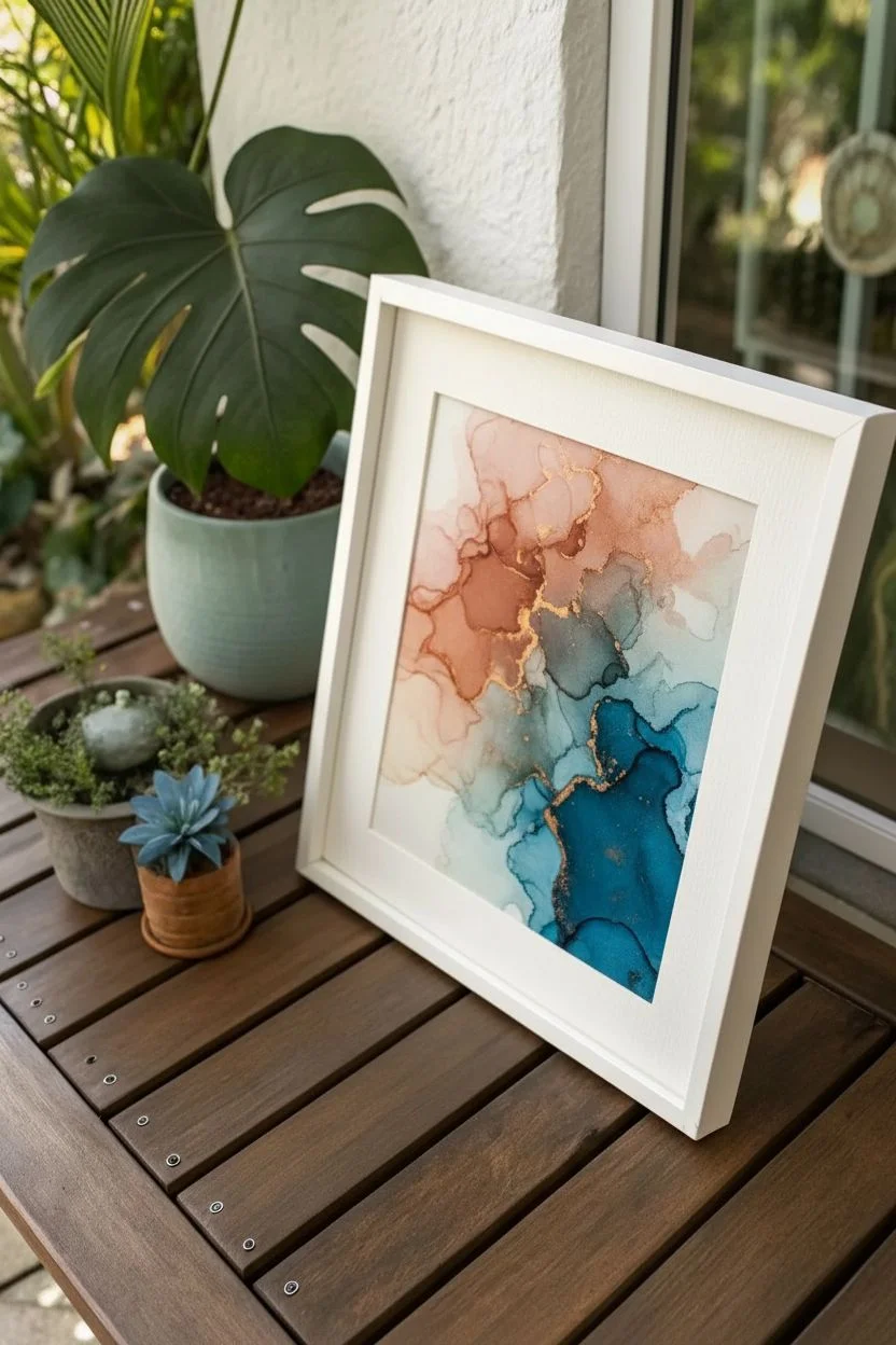
This stunning alcohol ink project creates a soft, dreamlike divide between warm coral tones and deep oceanic teals, separated by a delicate vein of gold. The result looks like a cross between a sliced gemstone and a topographical map, offering a sophisticated piece of fluid art.
Step-by-Step
Materials
- Alcohol inks (Coral/Peach, Magenta, Teal, Navy Blue)
- Metallic Gold alcohol ink or mixative
- Yupo paper or other non-porous synthetic paper
- Isopropyl alcohol (91% or higher) in a dropper bottle
- Fine liner brush
- White gel pen or fine white paint marker
- Air blower or straw (optional)
- Small mixing palette or cup
- Paper towels
Step 1: Planning the Flow
-
Prepare the workspace:
Lay down protective covering on your table, as alcohol ink stains permanently. Secure your sheet of Yupo paper flat with a tiny bit of tape on the back or corners if needed. -
Establish the divide:
Visualize a diagonal line splitting your paper roughly in half. The top left will be your warm zone, and the bottom right will be the cool zone. Keep this mental boundary clear as you work.
Muddy Centers?
If pink and blue mix in the middle, they turn brown. Keep a ‘demilitarized zone’ of white space between them until both sides are dry, then bridge them with gold.
Step 2: Creating the Warm Zone
-
Lay the foundation:
Start at the top left corner. Drip a generous amount of Isopropyl alcohol onto the paper, followed immediately by drops of your Peach or Coral ink. -
Add depth:
While the first layer is wet, add a drop of Magenta near the center of the pink puddle to create a darker core. Tilt the paper gently or use an air blower to spread the ink toward the diagonal boundary line. -
Soften edges:
As the ink approaches the empty space in the middle, use clear alcohol on a brush or dropper to feather the edges out so they aren’t too harsh just yet. -
Build layers:
Let the first wash dry slightly. Add more alcohol and ink in specific spots to create the hard-edged rings characteristic of alcohol ink. Sometimes I like to blow gently on the drying edge to encourage those distinct ‘tide lines’ to form.
Mapping the Terrain
Trace the dried ink edges with a topographic style. Use varied line weights (thick gold, thin black) to turn the abstract shapes into a fantasy map aesthetic.
Step 3: Creating the Cool Zone
-
Start the lower wash:
Turn your attention to the bottom right corner. Apply a pool of alcohol and drop in your Teal ink. -
Deepen the hue:
Introduce Navy Blue into the wet Teal areas to create shadowy depths. Use your breath or a tool to push this blue wave up toward the center, stopping just short of touching the pink section. -
Create texture:
Drop tiny dots of pure alcohol into the drying blue ink. This disperses the pigment and creates cell-like blooms and intricate textures that mimic stone. -
Dry completely:
Allow both standard color sections to dry fully. Alcohol ink dries fast, but ensure there are no shiny wet pools before proceeding to the detailing phase.
Step 4: The Golden Vein
-
Mix the gold:
Shake your gold metallic ink or mixative thoroughly. Place a few drops into a small palette or mixing cup. -
Paint the rift:
Dip a fine liner brush into the gold. carefully paint a jagged, organic line through the empty white channel separating the pink and blue sections. -
Feather the gold:
Don’t make the line too solid. dragging dry brush strokes of gold slightly into the pink and blue areas helps integrate the metallic element, making it look like a natural mineral vein. -
Add gold spatters:
Flick the bristles of your gold-loaded brush to create tiny metallic speckles across the colored sections for extra shimmer.
Step 5: Defining Details
-
Outline color shifts:
Once the main colors are bone dry, take a fine-point pen or a very fine brush dipped in dark ink. Trace some of the natural drying lines (the ‘tide marks’) to emphasize the shapes. -
Add white highlights:
Using a white gel pen or paint marker, draw very subtle, broken lines following the contours of the ink waves. This adds dimension and makes the layers pop. -
Connect the composition:
If there are areas that feel too separated, use the white pen or a fine dark liner to draw delicate ‘cracks’ extending from the gold vein into the color fields. -
Final assessment:
Step back and look at the balance. If the central white negative space feels too empty, add very faint washes of diluted color, but keep it lighter than the main sections. -
Seal the work:
Alcohol ink remains reactivatable. To protect your work, spray it with a UV-resistant archival varnish once you are completely finished and the ink is essentially cured (usually 24 hours).
Frame your new abstract masterpiece behind glass to protect its delicate surface and enjoy the shimmer
Have a question or want to share your own experience? I'd love to hear from you in the comments below!