When I’m craving alt painting vibes, I reach for ideas that feel a little moody, a little weird, and totally honest. Here are some alt painting ideas you can make your own—whether you want goth romance, creepy cute, or full-on surreal chaos.
Goth Portrait With Dramatic Lighting
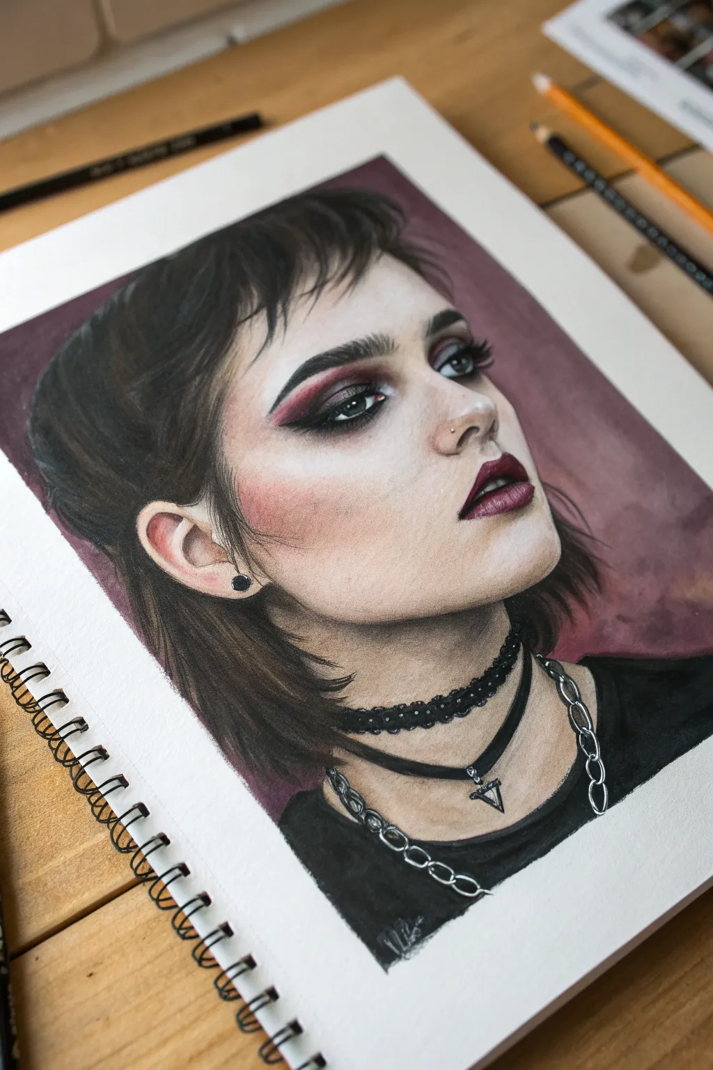
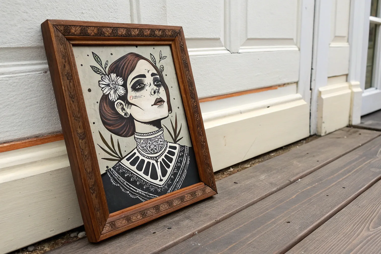
Capture the moody elegance of gothic style with this striking portrait tutorial that combines precision drawing with bold color choices. You will focus on high-contrast features like dramatic eyeliner and dark lips while keeping the skin textures soft and luminous.
Step-by-Step
Materials
- High-quality heavyweight drawing paper (smooth or Bristol board)
- Graphite pencils (HB, 2B, 4B)
- Polychromos or wax-based colored pencils (flesh tones, dark brown, black, burgundy, white)
- Soft pastel or watercolor for the background (burgundy/mauve)
- White gel pen or gouache for highlights
- Blending stumps (tortillons)
- Kneaded eraser
- Fine liner pen (black)
Step 1: Sketching the Foundation
-
Outline the proportions:
Begin with a light HB pencil to map out the face shape. The subject is in a 3/4 view, looking slightly upward. Pay close attention to the jawline’s curve and the ear placement. -
Define the features:
Lightly sketch the almond shape of the eyes, the nose bridge, and the full lips. Mark the hairline area, keeping the strokes loose to represent the wispy bangs. -
Map the accessories:
Draw the dual chokers around the neck. One is a thicker lace-style band, and the other is a thin cord with a triangular pendant. Add guidelines for the silver chains draping lower on the chest.
Master the Smoky Eye
To get that perfect gradient on the eyelids, lay down your red/burgundy color first. Add black only to the very edges and blend inward so the colors don’t become muddy.
Step 2: Layering Skin Tones
-
Base flesh layer:
Using a pale peach or cream colored pencil, apply a very light, even layer over the entire face, avoiding the eyes and lips. -
Build shadows:
Introduce a warm beige or light brown to shadow areas: under the chin, the hollows of the cheekbones, and the side of the nose. Keep your pencil pressure light and circular. -
Add the blush:
Gently layer a dusty rose or soft coral color onto the cheekbone area. Blend this outwards toward the ear to create that soft, flushed look seen in the reference. -
Refine skin texture:
Go back over your layers with a light cream pencil to burnish and blend the colors together, creating a smooth, skin-like finish.
Uneven Skin Tone?
If your pencil strokes look scratchy on the skin, use a colorless blender marker or a tiny amount of baby oil on a cotton swab to melt the wax pigment for a porcelain finish.
Step 3: Dramatic Features
-
Construct the eyes:
Start the eye makeup with a deep burgundy pencil in the crease. I like to layer black gradually over this to create a smoky gradient. -
Lashes and brows:
Use a sharp black pencil for the eyebrows, drawing individual hair strokes for a feathery texture. For the lashes, press firmly at the root and flick outward for a tapered look. -
Paint the lips:
Outline the lips with a dark plum color. Fill them in with a mix of deep red and brown, leaving the center of the lower lip slightly lighter to suggest volume. -
Eye details:
Color the iris a muted grey-blue, adding a dark pupil. Don’t forget the tiny red hue in the inner corner of the eye for realism.
Step 4: Hair and Background
-
Block in hair color:
Using a dark brown pencil, establish the main flow of the hair. Leave paper white showing for the highlight areas on the crown of the head. -
Deepen hair values:
Layer black over the darkest shadow areas of the hair, specifically behind the ear and at the nape of the neck. Use quick, flicking strokes for the bangs and loose strands. -
Create the background:
Apply a wash of burgundy watercolor or rub soft pastel dust into the background area. This flat, matte color makes the portrait pop forward.
Step 5: Accessories and Final Highlights
-
Detail the chokers:
Fill in the fabric chokers with solid black. For the lace texture, use a sharp point to create small looping patterns along the edge. -
Render the metallic chains:
Draw the chain links using a grey pencil, leaving the edges white. Use a black fineliner to define the negative space inside each link. -
Add the shirt:
Fill in the t-shirt area with deep charcoal or black, keeping the pressure slightly uneven to suggest fabric folds. -
Apply final highlights:
Using a white gel pen or white gouache, add tiny distinct dots of light to the tear ducts, the tip of the nose, the fullest part of the lip, and the metal jewelry to bring them to life.
Step back and admire the intense, dramatic mood you have captured in your finished portrait

Black Cat With Attitude
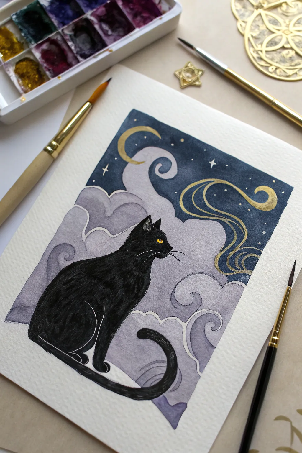
Capture the magic of a starlit night with this enchanting watercolor illustration. Featuring a sleek black cat against a backdrop of swirling lavender clouds and golden celestial details, this piece mixes solid ink work with soft watercolor washes.
Detailed Instructions
Materials
- Cold-pressed watercolor paper (300 gsm)
- Watercolor paints (Indigo, Payne’s Grey, Purple, Lavender, Black)
- Gold metallic watercolor or gouache
- Synthetic round brushes (size 2, 6, and a detail liner brush)
- Black waterproof fine liner or black gouache for the cat
- White gel pen (optional)
- Pencil and eraser
- Masking tape
- Mixing palette
- Water jar and paper towels
Step 1: Preparation & Sketching
-
Secure the edges:
Begin by taping down all four edges of your watercolor paper to a board or table. This creates a clean white border and prevents the paper from buckling when wet. -
Outline the composition:
Lightly sketch the rectangular frame of your painting first. Inside, draw the silhouette of the cat sitting on the bottom left, with its tail curling forward. Keep the lines faint. -
Map the sky:
Sketch the cloud shapes behind the cat using swirling, organic curves. Add the crescent moon near the top left and a flowing wind ribbon on the right side.
Step 2: Painting the Sky
-
Wash the clouds:
Mix a diluted wash of Lavender and a touch of Purple. Paint the cloud forms, keeping the edges soft but distinct from the dark sky area. Let the color fade slightly towards the bottom. -
Deepen the background:
For the night sky at the top, mix a rich Indigo with a bit of Payne’s Grey. Carefully paint around your moon and cloud outlines to create a stark contrast. -
Gradient effect:
While the cloud layer is still slightly damp, drop in deeper purple tones into the wet areas near the bottom of the cloud curves to create separate billowing shapes. -
Define cloud edges:
Once the first layer is dry, use a size 2 brush with a slightly darker purple mix to outline the tops of the cloud curves. This mimics a traditional illustration style and adds separation. -
Dry completely:
Allow the entire background to dry fully before moving on. I usually wait about 15-20 minutes or use a hairdryer on a low setting.
Bleeding Lines?
If your black cat bleeds into the clouds, wait for it to dry completely, then use white gouache to clean up the edge before repainting the black line.
Step 3: The Black Cat
-
Fill the silhouette:
Using concentrated black watercolor or black gouache, fill in the cat’s body. Use a steady hand to keep the edges crisp against the purple clouds. -
Add texture:
While the black is wet but settling, you can lift a tiny amount of pigment with a damp brush along the shoulder or thigh to suggest muscle, though a flat silhouette works beautifully too. -
The eyes:
Leave the small eye shape white, or paint it opaque yellow after the black is 100% dry. Add a tiny vertical pupil with a fine liner. -
Defining features:
Once the black body is dry, use a white gel pen or very thin white gouache to draw delicate whiskers and outline the ear and leg separation.
Cosmic Shimmer
Mix a tiny pinch of edible luster dust or iridescent medium into your purple cloud wash for clouds that subtly sparkle when the light hits them.
Step 4: Gold & Final Details
-
Celestial gold:
Load a small brush with metallic gold paint. Fill in the crescent moon and the swirling wind ribbon on the right side of the sky. -
Starry night:
Dot small gold or white stars into the dark indigo sky. Draw a few four-pointed stars for variety and sparkle. -
Cloud accents:
Add very thin white or silver lines along the edges of the purple clouds to give them a mystical outlines, separating the layers further. -
Reference check:
Look over the painting for any uneven edges. You can sharpen the outer rectangular border with a ruler and pen if paint bled under the tape. -
Reveal:
Gently peel away the masking tape at a 45-degree angle to reveal your crisp white borders.
Now you have a magical feline portrait perfect for hanging in a cozy reading nook

Moody Moon And Thorny Roses
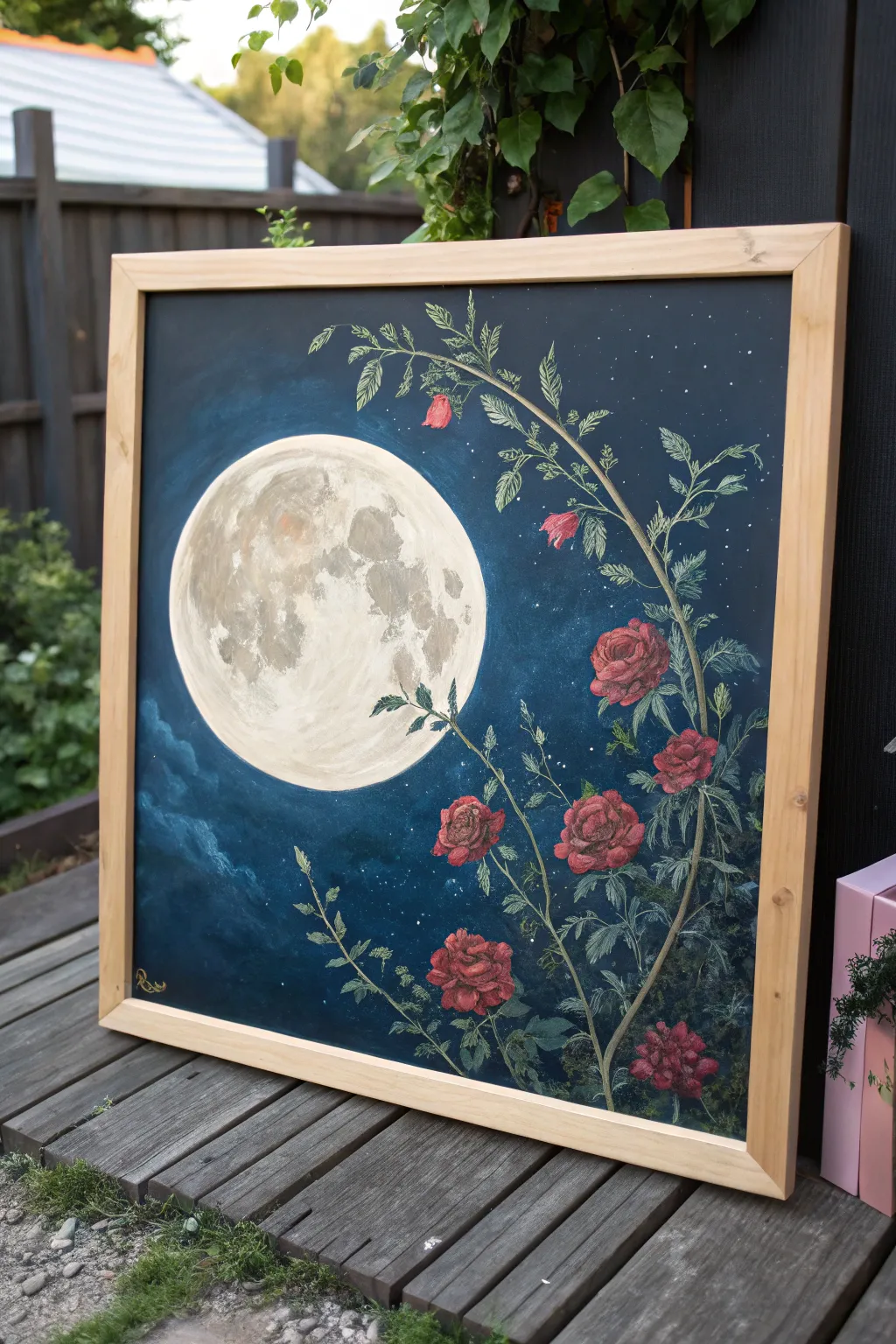
This captivating painting pairs the luminescence of a full moon with the deep, moody romance of crawling briar roses. The contrast between the cool, dark blue background and the textured warmth of the flowers creates a striking piece that feels both classic and magical.
How-To Guide
Materials
- Large square canvas (20×20 or similar)
- Acrylic paints (Phthalo Blue, Black, Titanium White, Burnt Umber, various Reds and Greens)
- Flat shader brushes (sizes 8 and 12)
- Round detail brushes (sizes 0, 2, and 4)
- Small natural sponge or crumpled paper towel
- Chalk or pencil for sketching
- Palette for mixing
- Jar of water and paper towels
- Wooden floating frame (optional)
Step 1: Setting the Night Sky
-
Background gradient:
Begin by covering the entire canvas with a mix of Phthalo Blue and a touch of Black. While the paint is still wet, blend in slightly lighter blue tones towards the center where the moon will sit, and darker, almost black tones at the very edges to create a vignetted depth. -
Adding texture:
Before the background dries completely, use a large, dry brush to scumble in some faint, cloud-like wisps on the lower left side using a mix of blue and a tiny bit of white. Keep these very subtle and hazy. -
Starry details:
Once the blue layer is dry, dilute a small amount of Titanium White with water until it’s inky. Load a stiff brush and flick the bristles to spatter tiny stars across the upper right quadrant of the canvas.
Moon Too Flat?
If the moon looks like a flat sticker, glaze a very thin, watery layer of white over the center. This pushes the grey textures back slightly and makes the sphere look more luminous.
Step 2: Painting the Moon
-
Sketching the orb:
Use a round object like a plate or a compass to lightly trace a large circle on the left center of the canvas. Fill this circle with a solid coat of Titanium White mixed with a tiny drop of yellow oxide or ochre to warm it up slightly. -
Creating lunar texture:
This is where I like to use a small piece of natural sponge. Dip it into a mix of light grey (white plus a dot of black and brown) and lightly dab it onto the moon’s surface to create craters and maria. Leave the edges brighter and focus the darker textures near the center and right side. -
Refining the glow:
With a dry brush and pure white paint, carefully glaze the outer rim of the moon to make it pop against the dark background. You can dry-brush a faint halo into the dark blue sky immediately surrounding the moon for extra glow.
Step 3: Growing the Vines
-
Mapping the branches:
Using thin chalk, sketch the main vine starting from the bottom right corner, curving upwards and arching over the moon. Add smaller offshoot branches that reach into the empty black space. -
Painting the stems:
Mix a muted olive green with a bit of brown. Using a size 2 round brush, paint the main stems. Keep the lines somewhat jagged and organic rather than perfectly smooth circles. -
Adding thorns:
With a size 0 detail brush and a slightly lighter green-brown mix, pull tiny, sharp triangles out from the stems to create the thorns. These small details add a lot of character to the silhouette.
Pro Tip: Jagged Leaves
For realistic rose leaves, don’t use smooth strokes. Use a small flat brush and press-lift-turn to create jagged, serrated edges naturally without having to paint every single point.
Step 4: Leaves and Roses
-
Leaf base layers:
Paint the serrated leaves using a deep forest green. Group them in varying directions along the vine. Don’t worry about details yet; just get the shapes down. -
Veins and highlights:
Mix a pale mint or sage green. Using your finest liner brush, carefully draw the central vein and tiny side veins on each leaf. Add thin outlines to some leaves to help them stand out against the dark night sky. -
Blocking in roses:
Identify where you want your blooms—cluster a few at the bottom right and trail them upwards. Paint rough circles of deep crimson red as the base for each flower. -
Defining petals:
Mix a lighter red (add a touch of white or orange). Paint curved, C-shaped strokes inside the red circles to simulate petals overlapping. Start from the center of the flower and work outward. -
Deepening shadows:
Mix a dark purple-red glaze. Apply this thinly between the petals and at the base of the flowers to give them volume and depth. -
Final highlights:
Add tiny touches of pale pink or white to the very edges of the uppermost petals on the roses that are ‘catching’ the moonlight. -
Finishing touches:
Step back and assess your composition. Add a few small floating petals or extra leaves if the composition feels unbalanced. Sign your work in gold or light yellow in the corner.
Once dry, frame your masterpiece in light wood to contrast the dark tones and hang it where it can catch the evening light


Ribcage Bouquet Still Life
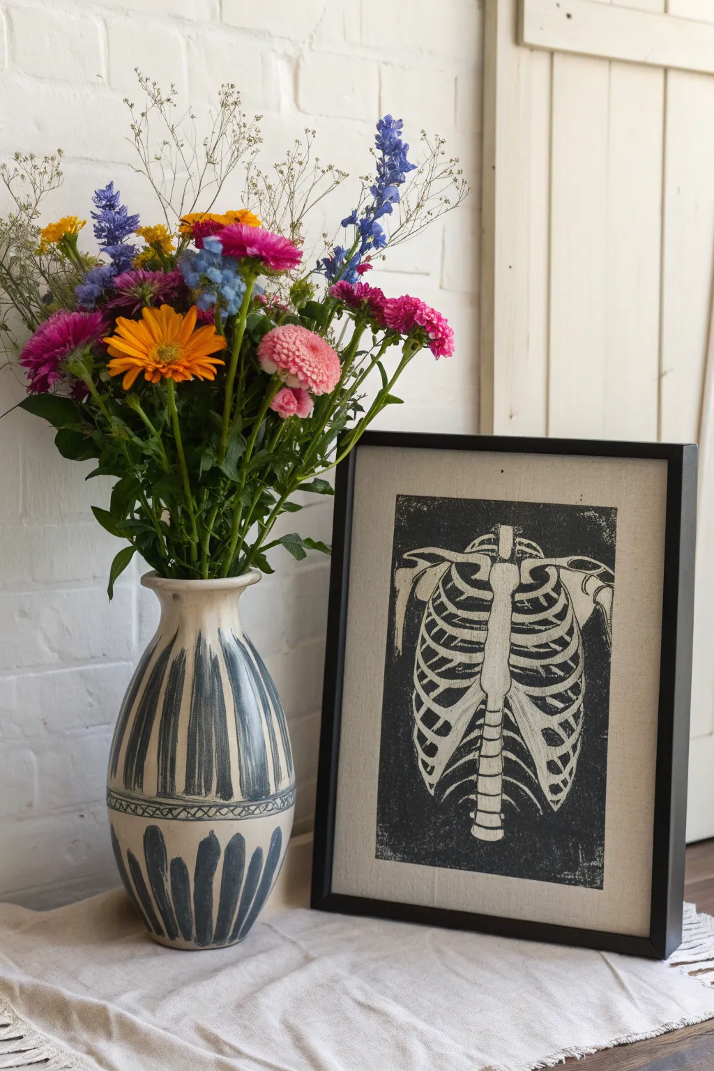
Contrast the vibrancy of life with the stark beauty of anatomy in this striking linocut project. This tutorial guides you through carving and printing a detailed ribcage design, resulting in a bold, graphic piece perfect for gallery walls or eclectic decor.
How-To Guide
Materials
- Soft-cut linoleum block (at least 8×10 inches)
- Linocut carving tools (V-gouge, U-gouge, knife)
- Black water-soluble block printing ink
- Brayer (rubber roller)
- Inking plate or piece of glass
- Barenya or a wooden spoon
- Cream or off-white printmaking paper or linen-textured cardstock
- Pencil and tracing paper
- Reference image of a human ribcage
- Black picture frame (8×10 or larger)
Step 1: Preparation & Transfer
-
Prepare your design:
Find a clear anatomical diagram of a human ribcage. You can draw this freehand for a stylized look or print out a reference image to size. Keep in mind that block printing reverses the image, though for a symmetrical skeleton, this matters less. -
Trace the ribs:
Place tracing paper over your reference image and carefully outline the sternum, the individual ribs, and the spinal column visible in the back. Simplify any overly complex tiny details, as these can be tricky to carve. -
Transfer to block:
Flip your tracing paper graphite-side down onto the linoleum block. Rub the back firmly with a bone folder or spoon to transfer the pencil lines onto the surface. Go over faint lines with a permanent marker if needed so they don’t smudge while you work.
Step 2: Carving the Anatomic Details
-
Outline the bones:
Using a small V-gouge tool, carefully carve along the outer edges of every bone. This establishes your ‘stop lines’ and prevents you from accidentally slicing into the parts you want to keep white. -
Clear small negative spaces:
Switch to a small U-gouge to clear the spaces *between* the ribs. I like to carve away from the bone edges toward the center of the gap to keep the bone edges sharp. -
Define the sternum:
Carve the details of the sternum (breastbone), leaving the main shape raised. Make sure to define the connection points where the ribs meet the cartilage. -
Texture the background:
For the large black background areas, you have a choice. This print features a ‘chatter’ texture—small, intentional gouge marks that catch ink. To achieve this, don’t carve the background perfectly smooth; leave shallow ridges or specks. -
Create the border:
Decide on the rectangular boundary of your print. Use a ruler and a knife tool or V-gouge to cut a straight, clean perimeter line around the entire ribcage composition. -
Clear large areas:
Use a wide U-gouge to remove the bulk of the material outside your border if you want a clean edge, or leave the texture uneven within the rectangle for that rustic, hand-stamped look shown in the photo.
Clean Lines
Warm your lino block with a hairdryer or heating pad for 30 seconds before carving. It softens the material, making it cut like butter and reducing jagged edges.
Step 3: Inking & Printing
-
Prepare the ink:
Squeeze a small line of black block printing ink onto your inking plate. Roll the brayer back and forth and up and down until the ink sounds like ‘velcro’—a sticky, sizzling noise that indicates an even, thin layer. -
Ink the block:
Roll the brayer over your carved block. Apply thin layers in multiple directions rather than one thick gloppy layer. Ensure the raised surfaces of the bones are evenly coated black (note: in this relief print, the background is black and the bones are white/negative space). -
Wait, reverse that thought:
Actually, looking at the reference artwork, this is a *negative* image. The background is black ink, and the bones are the paper showing through. Ensure you have carved away the *bones* and left the background raised. If you carved the background away in the previous steps, you will get black bones on white paper—which is also cool, but different! -
Correction for negative style:
To match the photo perfectly: You should be inking the *uncarved* flat surface. The carved-out bone shapes will remain ink-free. Check your block to ensure the background is solid and the rib shapes are recessed. -
Place the paper:
Carefully align your textured paper over the inked block. Once the paper touches the ink, do not shift it or the image will blur. -
Burnish the print:
Using a baron or the back of a wooden spoon, rub the back of the paper firmly in small circles. Apply pressure evenly across the entire image, paying special attention to the edges. -
The reveal:
Slowly peel back one corner of the paper to check ink transfer. If it looks spotty, layout it back down and rub more. When satisfied, pull the paper completely off the block. -
Dry and Frame:
Allow the print to dry completely (water-based inks take a few hours; oil-based take days). Once dry, mount it in a simple black frame to echo the stark contrast of the artwork.
Fabric Options
Instead of paper, print this design onto an unbleached linen tote bag or a piece of drop cloth for a textured, vintage medical chart aesthetic.
Hang your new modern memento mori near some fresh flowers for a poetic display of life and structure
BRUSH GUIDE
The Right Brush for Every Stroke
From clean lines to bold texture — master brush choice, stroke control, and essential techniques.
Explore the Full Guide
Creepy Cute Doll Or Plush Portrait
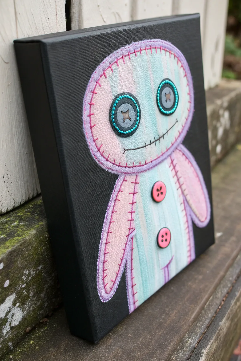
Embrace the eerie charm of this pastel voodoo doll portrait, set against a stark black background to make the colors really pop. The faux-fabric texture and oversized button eyes give it that perfect balance of spooky and adorable.
Detailed Instructions
Materials
- Small black stretched canvas (approx. 8×10 inches)
- White chalk pencil or watercolor pencil
- Acrylic paints: Pastel pink, mint green, white, black, grey
- Fine liner brush (size 0 or 00)
- Flat shader brush (size 4 or 6)
- Round brush (size 2)
- Embroidery needle and pink embroidery floss (optional, for texture)
- Two large black buttons (or paint to simulate them)
- Liquid glue or heavy gel medium (if using real buttons)
Step 1: Planning and Sketching
-
Prepare the Surface:
Start with a pre-primed black canvas. If you only have white, give it two solid coats of black acrylic gesso or matte black acrylic paint and let it dry completely. -
Sketch the Outline:
Using a white chalk pencil, lightly draw the basic shapes of the doll. Start with a large, flattened oval for the head. Add a smaller, rectangular body below it, and two dangling, sausage-shaped arms. -
Divide the Sections:
Draw faint vertical lines inside the head, body, and arms. These will guide your color changes, giving the appearance of different fabric scraps sewn together.
Chalk Marks Stuck?
If your white chalk sketch lines are still visible after painting, simply wipe them away gently with a damp Q-tip or a soft, damp cloth once the acrylic is 100% dry.
Step 2: Painting the Base
-
Mix Pastel Washes:
Mix your pastel pink and mint green with a tiny amount of water or glazing medium. You want the paint to be slightly translucent to mimic the texture of weathered fabric. -
Apply the Base Colors:
Fill in the vertical sections using your flat shader brush, alternating between the pink and mint green. Don’t worry about perfect blending; the hard edges help the ‘patchwork’ look. -
Whiten the Highlights:
While the paint is still tacky, drag a dry brush with a tiny bit of white paint down the center of each colored stripe to create a highlighted, fabric-sheen effect. -
Add Shadowing:
Using a very diluted grey or black wash, gently darken the edges where the arms meet the body and under the chin to create depth.
Real 3D Texture
Instead of painting the outer stitches, punch holes in the canvas with a thick needle and actually embroider the outline with real yarn for an amazing mixed-media touch.
Step 3: Creating the Stitched Look
-
Outline the Border:
Switch to your fine liner brush and mix a medium purple shade (mix pink with a touch of blue/grey). Paint a thick, consistent outline around the entire head, body, and arms. -
Paint the Stitches:
Dip your fine brush into a darker pink or magenta paint. Paint small, perpendicular hash marks all along the purple border you just created. Spacing matches the look of a blanket stitch. -
Detail the Seams:
Where the pink and mint stripes meet inside the body, paint tiny, dashed vertical lines in dark grey or black to simulate thread holding the fabric panels together.
Step 4: The Face and Details
-
Draw the Mouth:
Paint a long, slightly curved horizontal line across the lower face using black paint. Add small vertical hatch marks along the line to create the sewn-shut mouth look. -
Create the Button Eyes:
You can either paint large grey circles with teal dotted borders, or for a 3D effect, paint a grey circle base and glue real large buttons on top. -
Detailing the Eyes:
If painting: Fill the grey circles. Once dry, outline them with small teal dots. Paint a darker ‘x’ in the center to look like thread holes. -
Add Belly Buttons:
Paint two medium pink circles on the torso. Add four tiny black dots in the center of each for the buttonholes, and a slight crescent shadow underneath to make them pop. -
Final Fabric Texture:
I like to take a very dry bristle brush with a tiny amount of white paint and vertically dry-brush over the entire doll one last time to unify the ‘cloth’ texture.
Hang your spooky little friend on the wall to add a touch of whimsy to any room
Graffiti-Style Hearts And Scribbles
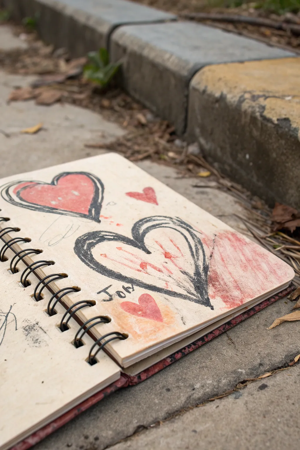
Capture the raw, expressive energy of street art right in your sketchbook with these loose, graffiti-style hearts. This project focuses on bold outlines, smudgy textures, and imperfect coloring to create an authentic urban aesthetic.
Step-by-Step Guide
Materials
- Spiral-bound sketchbook with off-white or cream mixed-media paper
- Thick varying-width charcoal stick or soft pastel (black)
- Red acrylic paint or heavy body gouache
- Small flat bristle brush
- Fingers or blending stump (tortillon)
- Graphite pencil (2B or 4B)
- Paper towel or rag
Step 1: Laying the First Heart
-
Position the main shape:
Start with your charcoal stick or soft pastel on the upper left side of the page. Draw a standard heart shape, but keep your wrist loose and fast. -
Thicken the outline:
Go over the outline several times. Don’t try to trace the first line perfectly; allow new lines to overlap and crisscross to create that sketched, energetic look. -
Add dimension:
Press harder on the left curve of the heart and the bottom point to vary the line weight, giving the shape a sense of movement. -
Color blocking:
Dip your flat brush into the red acrylic paint. Fill the inside of this top heart almost completely, but leave small patches of the paper showing through for texture. -
Blend the edges:
While the paint is tacky, gently drag a tiny bit of the charcoal outline into the red paint with your brush to dirty the color slightly at the borders.
Step 2: Creating the Gritty Centerpiece
-
Draw the larger heart:
Below the first heart, draw a larger, wider heart using the black charcoal. This one should feel heavier and more aggressive. -
Create a scratched texture:
Use the side of the charcoal stick to create a thick, gritty shadow on the left side of this heart’s outline. -
The interior splatter:
Instead of filling this heart solidly, take a small amount of red paint on a mostly dry brush. Use a stabbing or stippling motion to add bursts of red inside the shape. -
Smudging the color:
I like to use my finger here to smear the red paint downward and outward within the heart, blending it slightly with the paper grain but keeping it contained. -
Add scratch marks:
Take your charcoal again and make rapid, jagged back-and-forth shading marks inside the heart, layering over the red smears.
Loose is Best
Don’t lift your hand while drawing the heart outlines. Let the charcoal drag across the paper to create those accidental connecting lines.
Step 3: Details & Distress
-
Add accent hearts:
Paint a small, solid red heart floating to the right of the first heart, and another indistinct red smudge heart below the main central one. -
Smear the background:
On the far right edge of the page, use the red paint on a dry brush to create a large, rough patch of texture that fades out as it moves toward the center. -
Include text:
Using the sharp edge of your charcoal, scribble a short word like ‘Joy’ or a date near the bottom of the central heart. Make the letters blocky and uneven. -
Pencil scribbles:
Take your graphite pencil and add very faint, loopy scribbles in the negative space between the hearts to connect the composition. -
Final distressing:
Rub a dirty paper towel lightly over parts of the empty page to add subtle smudges and remove the ‘perfectly clean’ look of new paper.
Charcoal Too Messy?
If the charcoal is smearing everywhere uncontrollably, give the page a quick spray of workable fixative before adding the red paint layers.
Close your sketchbook with satisfaction knowing you have created a piece full of urban emotion and grit

PENCIL GUIDE
Understanding Pencil Grades from H to B
From first sketch to finished drawing — learn pencil grades, line control, and shading techniques.
Explore the Full Guide
Glitchy Gradient Abstract
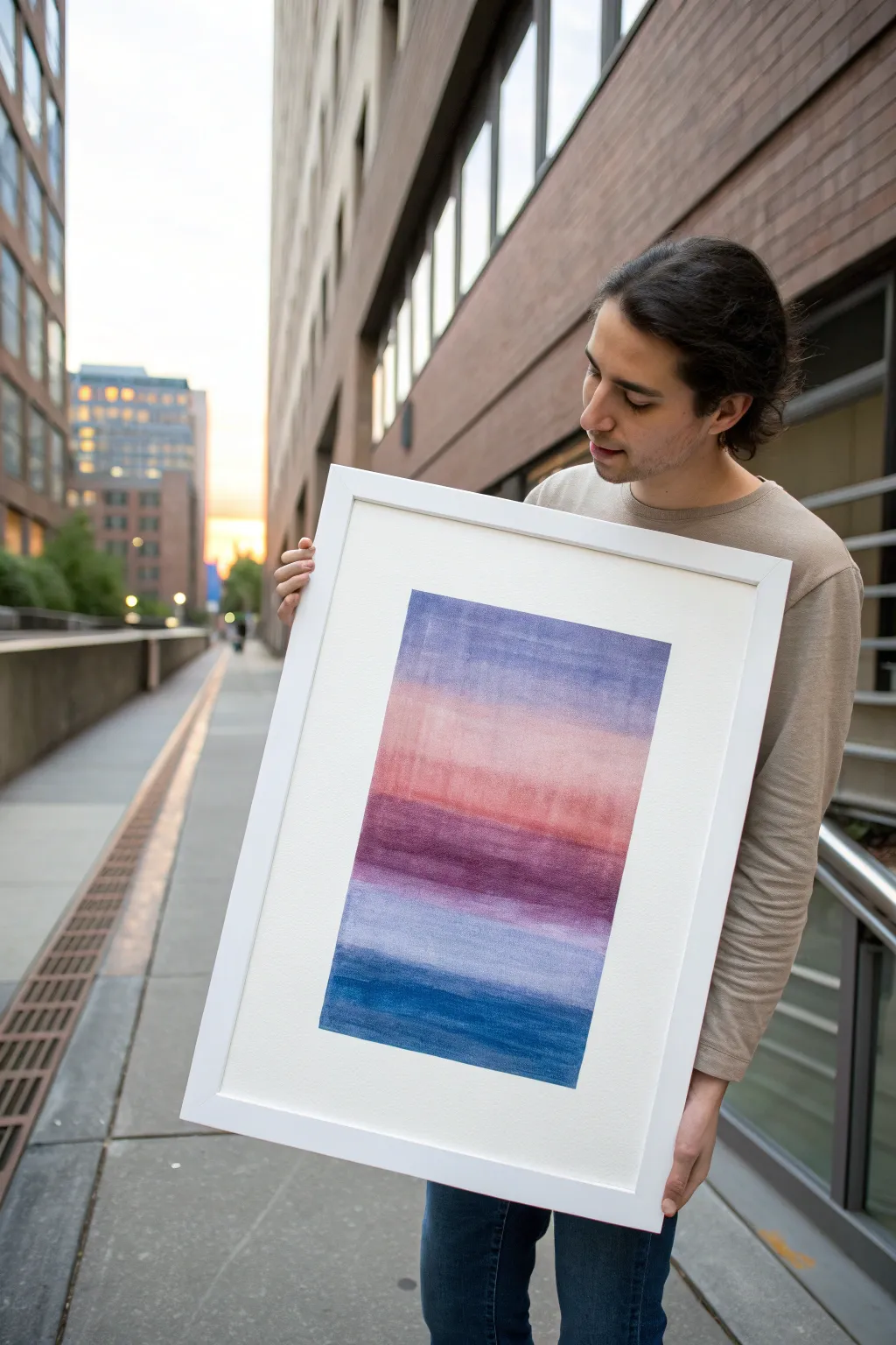
Capture the serene transition of a sunset sky with this layered watercolor gradient technique. Using broad, wet-on-wet horizontal strokes, you’ll build deep bands of lavender, rose, maroon, and indigo that seem to melt into one another.
Step-by-Step Tutorial
Materials
- Cold press watercolor paper (140lb/300gsm)
- Watercolor paints (Indigo, Alizarin Crimson, Burnt Sienna, Payne’s Grey, Cobalt Violet)
- Wide flat wash brush (1-inch or larger)
- Painter’s tape or masking tape
- MDF board or sturdy surface for taping
- Water cups (2)
- Paper towels
- White or light wood frame with wide mat
Step 1: Preparation & Base Tones
-
Secure the paper:
Tape your watercolor paper down firmly to your board using painter’s tape on all four sides. This prevents the paper from buckling when it gets wet and creates that crisp white border you see in the final piece. -
Pre-wet the paper:
Using your wide flat brush and clean water, lightly dampen the entire surface of the paper. You want an even sheen, not puddles, to help the initial colors flow softly. -
Mix the top lavender:
Create a watery wash of Cobalt Violet mixed with a tiny touch of Payne’s Grey to desaturate it. Load your brush fully. -
Apply the first horizon band:
Starting about an inch from the top tape line, drag your brush horizontally across the paper. Let the edges be slightly uneven and rough for a natural, glitchy look. -
Blend downward:
Dip your brush in water once to dilute the pigment on the bristles, then paint the next horizontal stroke directly below the first, letting them touch and bleed slightly.
Wetter is Better
For smoother gradients, wet the paper slightly before applying a new color band. This ‘wet-on-wet’ technique encourages natural bleeding.
Step 2: Warm Transitions
-
Mix the rose tone:
Clean your brush thoroughly. Mix Alizarin Crimson with a significant amount of water and a dot of Burnt Sienna to create a dusty rose or peach hue. -
Paint the middle band:
Apply this warm color in a broad band below the lavender section. If the paper is still damp, the purple and pink will soften into each other naturally; if it’s dry, you’ll get a harder edge which also works effectively. -
Create the deep maroon strip:
While the rose section is still slightly damp, mix a darker version of your red tone, adding a little Indigo to deepen it into a maroon. Paint a narrower, more intense strip right below the rose area. -
Let it settle:
Pause for about 5 minutes. I like to let this dry briefly so the next cool-toned layers don’t turn muddy when they touch the warm red.
Fixing “Cauliflowers”
If weird blooms appear as it dries, don’t panic. Wait until fully dry, then gently glaze over the area with a slightly damp brush to smooth it out.
Step 3: Cool Depths & Finishing
-
Second lavender layer:
Mix a fresh batch of your initial violet-grey wash. Apply a band of this cool color below the maroon strip, leaving a very small gap or just barely touching the layer above. -
Mix the deep indigo:
Prepare your darkest color: a rich, concentrated Indigo. You want this to be less watery than the previous layers to provide visual weight at the bottom. -
Paint the final block:
Apply the indigo at the very bottom of your composition. Use confident, sweeping horizontal strokes to fill the space solid. -
Soften the transition:
With a clean, damp brush, gently run over the boundary line between the second lavender band and the deep indigo bottom to blur the hardness just slightly. -
Add texture marks:
While the paint is drying but not fully set, drag a mostly dry brush horizontally across some of the bands to lift a tiny bit of pigment, creating subtle horizontal streaks. -
Dry completely:
Allow the painting to dry flat for at least 2-3 hours. The paper must be bone dry before you attempt to remove the tape to avoid tearing. -
Reveal the border:
Peel the tape away slowly at a 45-degree angle, away from the painting. This reveals the sharp, clean edges that frame the abstract gradient perfectly. -
Frame it up:
Place the artwork behind a wide white mat and into a simple frame to emphasize the modern, minimalist aesthetic.
Hang your new abstract piece in a well-lit spot to let those transparent watercolor layers truly shine
Black Canvas With Hot-Pink Symbols
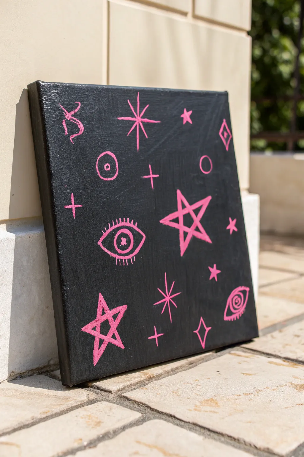
For a moody yet striking piece of alternative art, try this high-contrast painting featuring esoteric symbols on a stark black background. The hot-pink pops intensely against the darkness, creating a custom canvas that feels personal and a little mysterious.
Step-by-Step
Materials
- Square stretched canvas (approx. 12×12 inches)
- Black acrylic paint (matte or satin finish)
- Hot pink or neon magenta acrylic paint
- Medium flat paintbrush
- Small round detail brush (size 1 or 2)
- White chalk or a white charcoal pencil
- Paper plate or palette
- Cup of water and paper towels
Step 1: Setting the Stage
-
Prepare the canvas:
Start by laying down some newspaper or a drop cloth to protect your workspace. Place your blank white canvas in the center, ready for the base coat. -
Paint the background:
Squeeze a generous amount of black acrylic paint onto your palette. Using the medium flat brush, apply the paint in long, smooth strokes across the entire face of the canvas. -
Don’t forget the edges:
Make sure to paint the sides of the canvas as well. This gives the finished piece a professional, gallery-wrapped look without needing a frame. -
Apply a second coat:
Let the first layer dry for about 20 minutes. If you can still see the white texture of the canvas poking through, apply a second coat of black to ensure a deep, opaque background. -
Dry thoroughly:
Allow the black base to dry completely before moving on. The surface needs to be totally dry so your sketching doesn’t smudge into the black paint.
Paint opacity hack
If your pink paint is too transparent, paint the symbols in white first. Let that dry, then paint the pink on top for maximum neon brightness.
Step 2: Planning the Symbols
-
Sketch the layout:
Using a piece of white chalk or a white charcoal pencil, lightly sketch your symbols onto the black surface. The chalk provides a guide that is easy to wipe away later. -
Center the main elements:
Draw the largest five-pointed star slightly off-center to the right, and the large eye symbol towards the middle-left. These will anchor your composition. -
Add secondary symbols:
Sketch a smaller star in the bottom left corner and another eye shape in the bottom right corner. I usually vary the size to keep the eye moving across the canvas. -
Fill the gaps:
Draw smaller fillers like four-pointed sparkles, crosses, circles, diamonds, and squiggly lines in the remaining empty spaces. Keep them scattered randomly for an organic feel.
Make it glow
Swap standard acrylics for UV-reactive or glow-in-the-dark paint. Your symbols will look cool in daylight but totally vibrant under blacklight.
Step 3: Painting the Neon
-
Load the detail brush:
Switch to your small round detail brush. Dip it into the hot pink paint, rolling the tip slightly on the palette to keep it sharp and not overloaded. -
Outline the large star:
Start by tracing over your chalk lines for the large five-pointed star. Use steady pressure to keep the line width consistent. -
Paint the eye details:
Move on to the eye symbols. Paint the almond-shaped outlines, then carefully add the iris and pupil details. For the bottom right eye, create a spiral pupil for a surreal touch. -
Add lashes:
Using the very tip of your brush, flick small lines outward from the eye shapes to create the eyelashes. Quick, light strokes work best here. -
Trace the sparkles:
Paint the simple four-pointed stars and crosses. To get sharp points, start your stroke from the center of the shape and pull outward. -
Fill in the rest:
Go over the remaining small symbols—the circles, diamonds, and squiggles. Rotate the canvas if you need a better angle for your hand. -
Boost the brightness:
Neon paints can sometimes be translucent. If the pink looks dull against the black, let it dry and carefully paint a second layer directly over the first to make the color pop. -
Clean up:
Once the pink paint is fully dry to the touch, gently wipe away any visible chalk marks with a slightly damp paper towel or a soft cloth.
Hang your new mystic artwork on a wall that needs a bold splash of color and attitude
Have a question or want to share your own experience? I'd love to hear from you in the comments below!