If you’re craving amature painting ideas that look impressive without feeling intimidating, I’ve got you. In my studio, I lean on simple shapes, bold contrast, and forgiving textures so you can relax, play, and actually finish a piece you’re proud of.
Sunset Gradient With Tree Silhouettes
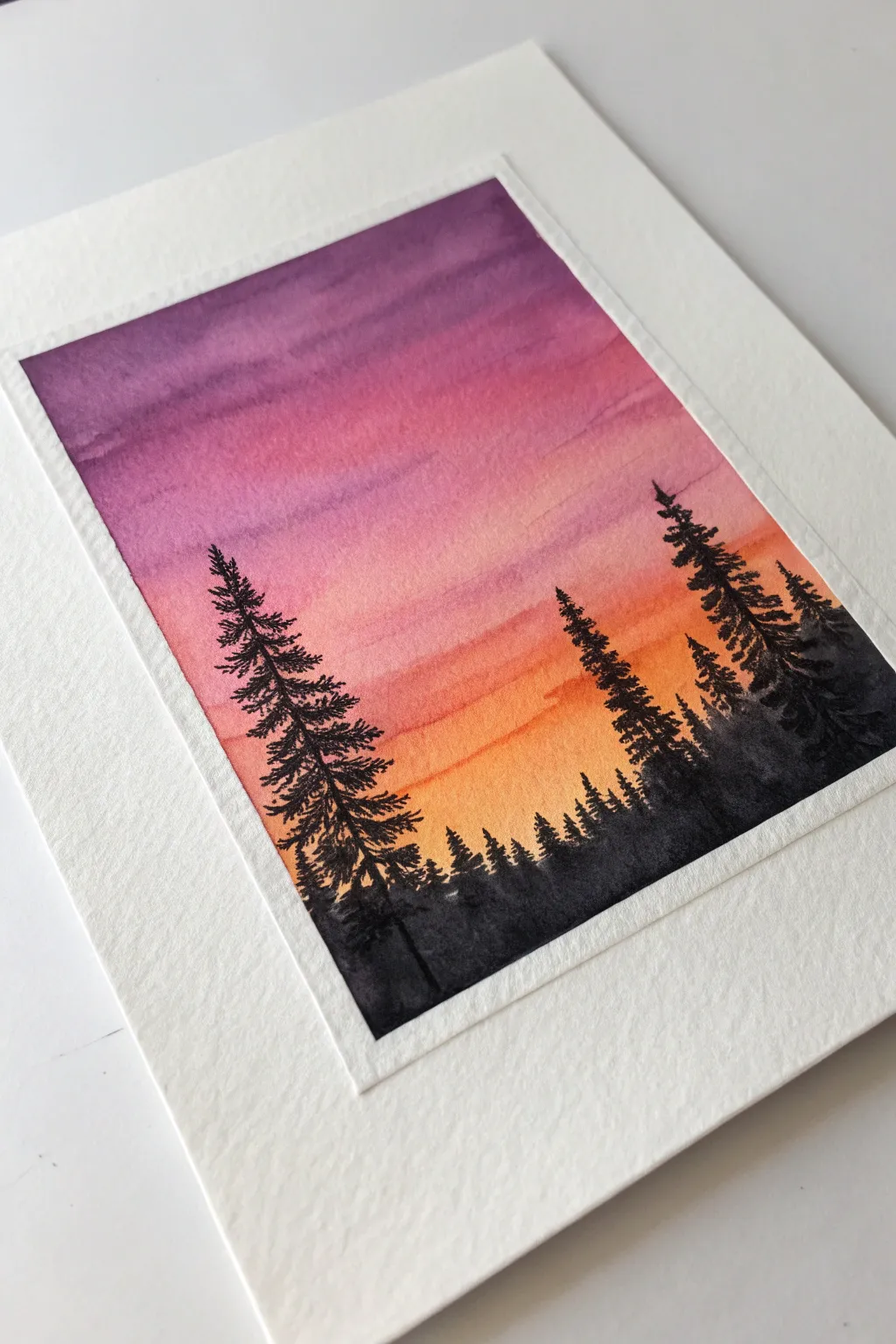
This stunning sunset gradient uses the wet-on-wet technique to blend vibrant violets into warm oranges, creating a dramatic backdrop for a simple forest silhouette. It captures the peaceful transition from day to dusk with striking contrast.
Step-by-Step
Materials
- Cold press watercolor paper (300 gsm recommended)
- Painter’s tape or masking tape
- Watercolor paints (Violet, Magenta, Cadmium Orange, Yellow Ochre, Lamp Black)
- Flat wash brush (3/4 inch or 1 inch)
- Round brush (Size 4 or 6 for details)
- Clean water jar
- Paper towels
- Finetip black liner pen (optional, for finest details)
Step 1: Preparing the Canvas
-
Tape the borders:
Secure your watercolor paper to a board or table using painter’s tape on all four sides. Press the edges of the tape down firmly to ensure a crisp, clean border and prevent paint from seeping underneath. -
Pre-wet the paper:
Using your large flat brush and clean water, apply a generous, even coat of water over the entire exposed paper area. The paper should look glistening and shiny, but water shouldn’t be pooling in puddles.
Step 2: Painting the Sunset Gradient
-
Apply the yellow base:
Load your flat brush with a watery mix of Yellow Ochre or light orange. Start painting a horizontal band about one-third of the way up from the bottom, leaving the very bottom area slightly lighter. -
Transition to orange:
While the yellow is still wet, rinse your brush slightly and pick up vivid Cadmium Orange. Paint a band directly above the yellow, letting the colors touch and naturally bleed into each other. -
Introduce pink tones:
Move further up the paper with a magenta or deep pink shade. Apply this band just above the orange, using long horizontal strokes to encourage a smooth blend between the warm tones. -
Add the purple sky:
For the top section, load your brush heavily with violet or deep purple. Paint the top third of the paper, merging it downwards into the pink layer. -
Refine the blend:
Clean and dry your flat brush slightly. Gently run the brush horizontally across the transition lines between colors to soften any harsh stripes, creating a seamless gradient from purple to yellow. -
Add subtle texture:
If you want the cloud-like streaks seen in the example, lift a tiny bit of color while it’s still damp or add a slightly more pigmented stroke of purple near the top. I find this creates a nice sense of atmospheric depth. -
Allow to dry completely:
Let the paper dry thoroughly. The silhouette layer must be applied on bone-dry paper to prevent the black ink or paint from bleeding into the sky (a technique called ‘blooming’). You can use a hairdryer on a low setting to speed this up.
Tape Removal Trick
To ensure your paper doesn’t rip when removing tape, heat the tape briefly with a hairdryer. This softens the adhesive and allows it to peel away cleanly.
Step 3: Painting the Silhouettes
-
Mix a dense black:
Prepare a very concentrated mix of Lamp Black watercolor, or use black gouache for extra opacity. The paint should be the consistency of heavy cream, not watery. -
Paint the horizon line:
Using your round brush, paint an uneven, jagged line across the bottom inch of the paper to represent the distant tree canopy and ground. -
Create the tree trunk:
Choose a spot on the left side for your main tree. Paint a thin vertical line extending upwards into the pink section of the sky. Make the line slightly thicker at the base. -
Add pine branches:
Starting from the top of the trunk, use the tip of your round brush to dab small, downward-sloping branches. Keep the top branches very narrow and widen the tree’s profile as you move down. -
Add texture to the tree:
Use a tapping or stippling motion with the brush tip for the lower branches to mimic the texture of pine needles, rather than painting individual leaves. -
Paint secondary trees:
Add a second, slightly shorter tree on the right side using the same technique. Varying the heights makes the composition look more natural and less symmetrical. -
Fill the background forest:
Between your main trees, paint smaller, simpler tree tops poking out of the bottom black horizon line to create the illusion of a dense forest in the distance.
Starry Night Option
Before painting the trees, flick a toothbrush loaded with white gouache or acrylic onto the purple section. This adds a scattering of stars for a night scene.
Step 4: Finishing Touches
-
Check opacity:
Once the black paint dries, it might look slightly faded. Go over the darkest areas again with another layer of black if needed to ensure a true silhouette effect. -
Remove the tape:
Wait until the painting is completely dry. Peel the masking tape away slowly at a 45-degree angle, away from the painted area, to reveal crisp white borders.
Frame your new sunset masterpiece or turn it into a beautiful handmade greeting card


Simple Mountain Layers in Soft Haze
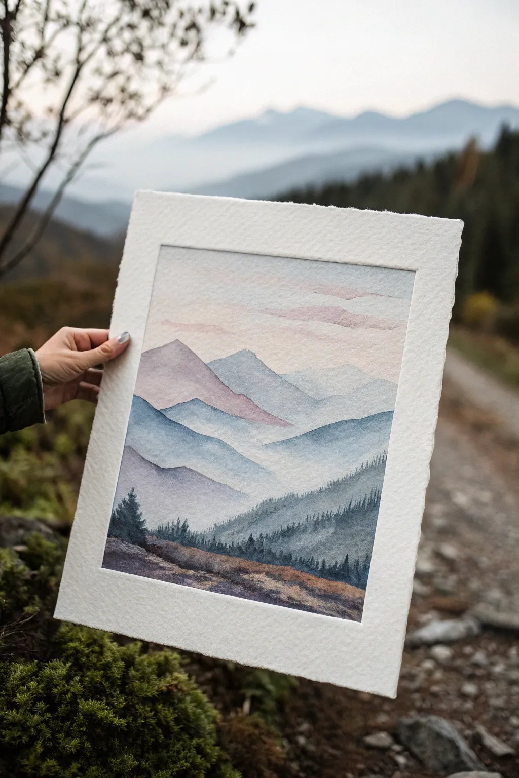
Learn to capture the serene beauty of rolling hills fading into the distance with this atmospheric watercolor study. By mastering color value and wet-on-wet blending, you’ll create a stunning sense of depth where mountains seem to evaporate into the morning mist.
How-To Guide
Materials
- Cold Press Watercolor Paper (300gsm/140lb)
- Watercolor Paints (Indigo, Paynes Gray, Alizarin Crimson, Burnt Sienna)
- Round Brushes (Size 8 and Size 4)
- Flat Wash Brush (1 inch)
- Masking Tape
- Two Jars of Water
- Paper Towels
- Mixing Palette
Step 1: Setting the Atmosphere
-
Paper Preparation:
Begin by taping down all four edges of your watercolor paper to a board. This creates that crisp white border seen in the photo and prevents the paper from buckling when wet. -
Sky Wash:
Mix a very watery, pale pink using a touch of Alizarin Crimson. With your large flat brush, wet the top third of the paper with clean water, then gently drop in the pale pink, letting it diffuse softly to create a morning glow. -
Distant Clouds:
While the sky is still slightly damp but not soaking, mix a faint purple-grey. Use the side of your round brush to sweep in horizontal, fragmented strokes near the top to suggest wispy clouds. -
First Mountain Layer:
Once the sky is bone dry, mix a translucent, pale lavender color. Paint the silhouette of the furthest mountain peak just below the clouds. Keep the edges soft by adding a little water to the bottom edge of this shape so it fades into white.
Pro Tip: The Bottom Edge
When doing the ‘mist’ technique, don’t let the water run all the way to the bottom of the page. Leave white space so the next layer of paint sits on dry paper, preventing uncontrolled bleeding.
Step 2: Building the Ranges
-
Mixing Blue-Greys:
For the subsequent layers, you will need a gradient of blue-grey. Mix Indigo with plenty of water for a light value. I like to prepare three puddles of paint, each slightly darker than the last, before I start painting these mid-layers. -
Second Layer:
Paint the next mountain ridge overlapping the lavender one. Use your lightest blue-grey mix. The top edge should be crisp and hard, defining the mountain’s shape. -
Creating the Haze:
Immediately after painting the hard top edge of the second mountain, rinse your brush and drag clean water along the bottom edge of the wet paint. This ‘graded wash’ technique pulls the color down into transparency, creating the misty valley effect. -
Third Layer:
Wait for the previous layer to dry completely. Now, take your medium-strength blue-grey puddle. Paint a new ridge lower down, changing the angle of the slope to create visual interest. -
Fourth Layer:
Repeat the graded wash technique: crisp top edge, watery bottom edge. This repetition establishes the atmospheric perspective where things get lighter and hazier as they recede. -
Adding Warmth:
For the fifth layer, mix a tiny touch of Alizarin Crimson or Burnt Sienna into your blue-grey to dull it slightly. Paint this layer closer to the foreground, keeping the value darker than the previous ones.
Step 3: Foreground and Details
-
Darkest Value Mix:
Prepare your darkest value yet—a strong mix of Indigo and Payne’s Gray with very little water. This will be for the detailed pine forest. -
Painting the Forest Ridge:
Using the tip of your size 4 brush, paint a jagged line of tiny vertical strokes along the top of the next ridge. Vary the heights to mimic distant pine trees. -
Filling the Hillside:
Fill in the body of this hill below the treeline with the dark blue-grey mix. While it’s wet, you can drop in hints of green or brown to suggest vegetation variation, but keep it subtle. -
Foreground Earth:
For the closest bottom section, switch to Burnt Sienna mixed with a little Indigo for a dark, earthy brown. Paint the ground with horizontal, textured strokes to suggest rough terrain. -
Adding Texture:
While the foreground brown is damp, splatter a few tiny drops of clean water or salt onto it. This blooms the pigment and creates a rocky, mossy texture effortlessly. -
Final Trees:
Use your strongest, thickest dark paint to add a few distinct pine trees on the left side of the foreground. Ensure these are sharp and opaque to anchor the composition. -
The Reveal:
Allow the entire painting to dry completely—patience is key here. Once dry, carefully peel away the masking tape at a 45-degree angle to reveal your clean, professional borders.
Level Up: Golden Hour
Instead of blue-greys, try this same layering process using shades of ochre turning into burnt umber to create a warm sunset scene rather than a misty morning look.
Step back and admire how simple layers of diluted pigment can build such a convincing illusion of vast, misty space

Easy Ocean Horizon at Golden Hour
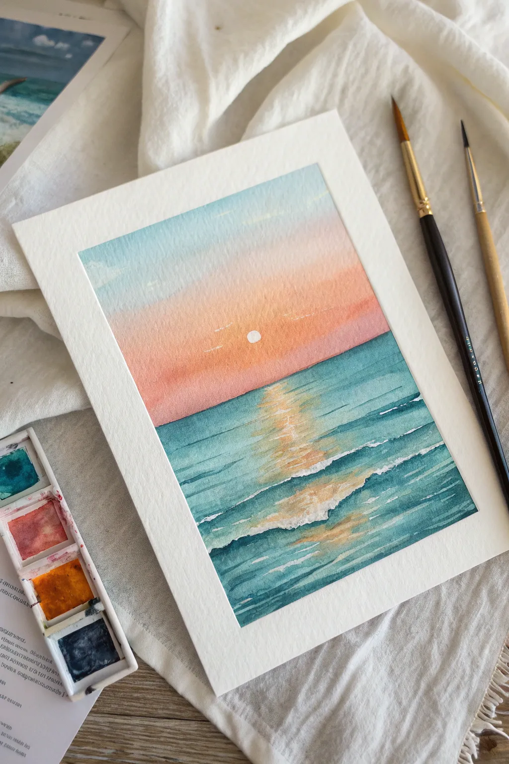
Capture the serene beauty of a setting sun reflecting over calm waves with this watercolor tutorial. You will create a soft gradient sky and sparkling water using simple blending and layering techniques.
Step-by-Step Tutorial
Materials
- Cold press watercolor paper (taped down)
- Watercolor paints: Teal/Turquoise, Indigo/Prussian Blue, Peach/Coral, Light Blue/Cerulean, Warm Yellow/Ocher
- Round brushes (size 6 or 8 for washes, size 2 for details)
- Clean water jar
- Paper towel
- White gel pen or white gouache
Step 1: Painting the Sky Gradient
-
Prepare the paper:
Begin by taping down all four edges of your watercolor paper to a board. This creates the crisp white border seen in the image and prevents buckling. -
Wet the sky area:
With a clean, damp brush, apply a light glaze of clean water to the upper two-thirds of the paper, stopping where your horizon line will be. -
Apply the blue sky:
Load your brush with a diluted light blue or cerulean. Paint across the very top of the paper, letting the wet surface help the pigment spread downwards slightly. -
Transition to warmth:
Clean your brush. Pick up a soft peach or coral tone. Start painting from the horizon line moving upward to meet the blue. -
Blend the gradient:
Where the peach meets the blue, gently tilt your board or use a slightly damp brush to blur the line, creating a soft purplish transition without muddying colors. -
Lift the sun:
While the paint is still damp but not soaking, use a clean, dry paper towel or thirsty brush to lift a small circle of paint right in the center of the peach area. This reserves the space for the sun.
Muddy Gradient?
If blue and orange mix too much, they turn brown. Keep a small gap of clean water between them initially and let them merge naturally on the paper.
Step 2: Establishing the Ocean Base
-
Define the horizon:
Wait until the sky is completely dry. Load a mix of teal and a touch of indigo onto your brush to get a deep ocean color. Paint a precise, straight line across the horizon. -
Map the reflection:
Before painting the rest of the water, visualize a vertical column directly under the sun. This area will stay lighter to mimic the reflection. -
First water wash:
Paint horizontal strokes of teal on either side of this invisible reflection column. Leave the center paper quite dry and white for now. -
Softening the edges:
With a damp, clean brush, soften the inner edges of your teal strokes so they fade gently into the white center column. -
Adding golden reflection:
Take a very dilute mix of warm yellow or ocher. Glaze this gently over the white center column, letting it mingle slightly with the damp teal edges.
Golden Sparkle
Mix a tiny pinch of gold metallic watercolor or iridescent medium into your yellow reflection paint for a genuine shimmer when the light hits it.
Step 3: Details and Highlights
-
Deepening the waves:
Once the base layer is dry, mix a stronger concentration of indigo and teal. Paint thin, horizontal lines across the water to represent the shadows of waves. -
Creating movement:
Make these wave lines thicker and more wavy near the bottom of the page, and very thin and straight near the horizon to create depth. -
Enhancing the reflection:
Add short, broken horizontal strokes of yellow-orange within the reflection path, layering them over the ripple shadows to show light catching the water. -
Sun detail:
Use a white gel pen or a dot of opaque white gouache to fill in the sun circle crisply. -
Seafoam highlights:
Use the white gel pen or gouache to add thin, scratchy lines along the tops of the nearest waves to suggest whitecaps and foam. -
Final touches:
Add a few tiny white flecks in the sky if you want faint clouds, and ensure the horizon line is sharp. Wait for everything to dry fully before removing the tape.
Peel off your tape carefully to reveal those crisp edges that make the sunset colors pop
Loose Wildflowers With Big Brush Petals
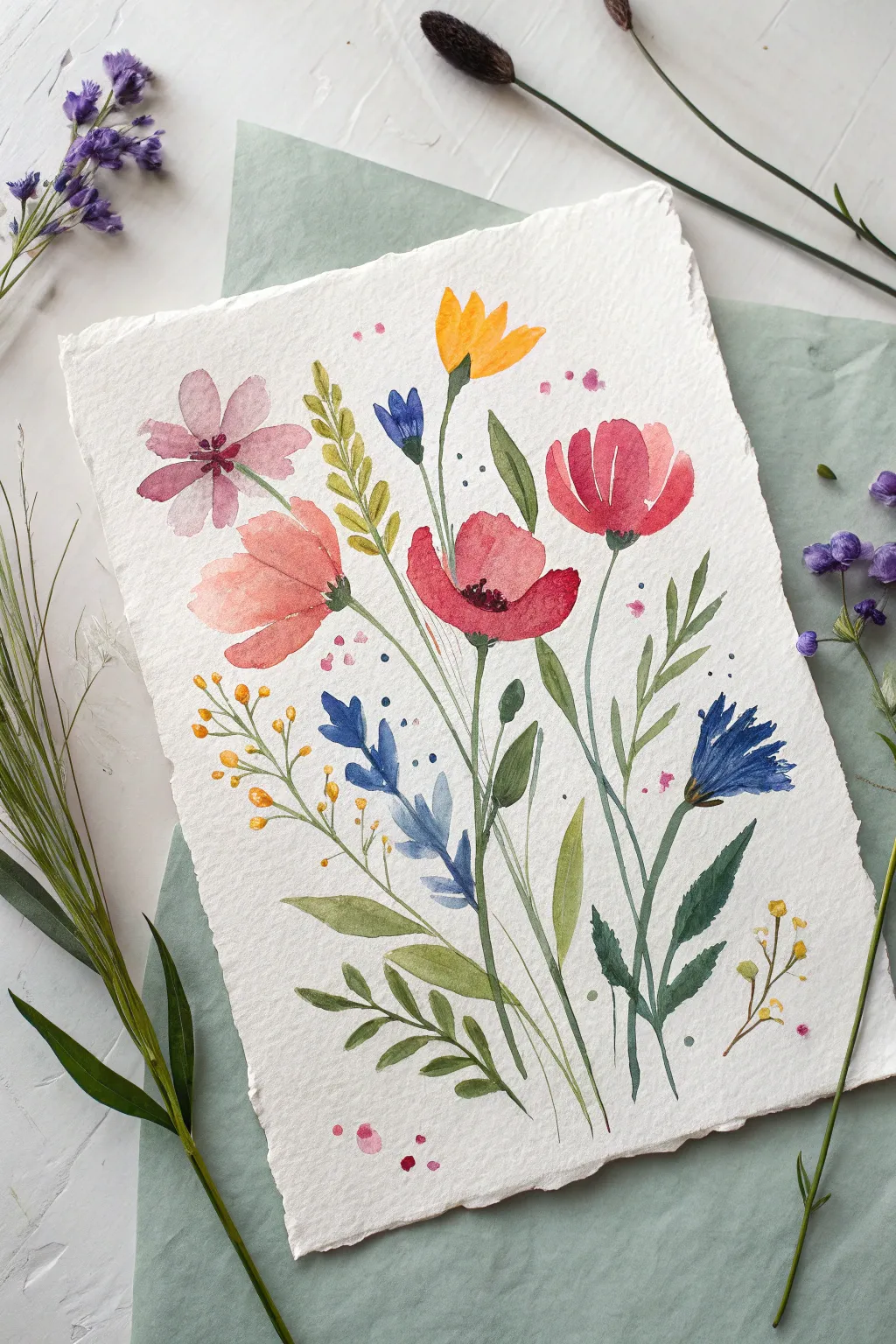
Capture the delicate beauty of a summer meadow with this loose and vibrant watercolor illustration. Featuring a lively arrangement of pink cosmos, red poppies, blue cornflowers, and yellow buttercups, this project embraces the unpredictable nature of watercolor to create something truly organic.
How-To Guide
Materials
- Cold press watercolor paper (deckle-edge preferred, approx. 300 gsm)
- Round watercolor brushes (Size 6 for petals, Size 2 for stems/details)
- Watercolor paints (Alizarin Crimson, Sap Green, Ultramarine Blue, Lemon Yellow, Orange, Burnt Umber)
- Jar of clean water
- Paper towels
- Pencil (HB or H) for light sketching
Step 1: Setting the Composition
-
Lightly sketch the layout:
Begin by very faintly sketching the general positions of the main flowers. You don’t need petals yet, just simple circles or ovals to mark where the poppy, cosmos, and cornflowers will sit. Keep your pencil lines extremely light so they don’t show through the translucent paint. -
Plan the flow:
Draw faint, sweeping lines to indicate the direction of the stems. Notice how they fan out from a central imaginary point at the bottom, curving slightly to give the bouquet movement.
Control the Bleed
To keep flowers distinct, wait for one shape to try before painting a neighbor. If they touch while wet, colors will bleed—though sometimes this happy accident looks great!
Step 2: Painting the Primary Blooms
-
Create the red poppy:
Load your Size 6 brush with a watery mix of Alizarin Crimson and a touch of Orange. Using the belly of the brush, press down and lift to create wide, irregular petal shapes. Leave a small negative space (white paper) in the center for the stamens later. -
Add the pink cosmos:
Dilute your red mix significantly with water to get a soft pale pink. Paint loose, teardrop-shaped petals radiating from a center point in the upper left. Let the edges be uneven for a natural look. -
Paint the peach-colored bloom:
Mix a soft coral or peach tone. To the left of the poppy, paint broad, sweeping strokes to form a side-facing flower profile. Allow the paint to pool slightly at the base of the petals for natural shading. -
Paint the yellow accents:
Using pure Lemon Yellow or a yellow-orange mix, dab in the small yellow flower at the top center using quick, upward strokes. Keep the paint fairly saturated here so it pops against the white paper.
Use Metallic Accents
After the painting is fully dry, trace a few stems or add dots to the flower centers with gold metallic watercolor or a gold gel pen for a shimmering, elegant finish.
Step 3: Adding Blues and Filler Flowers
-
Paint the cornflowers:
Switch to a cooler palette with Ultramarine Blue. Paint the spiky blue flower on the right side using a jagged, zig-zag motion with the tip of your brush. Create a smaller blue bud near the center. -
Layer in the blue hyacinth shape:
For the tall blue stalk on the lower left, use a series of small, leafy dabs stacked vertically. Vary the pressure to make some leaves fat and others thin. -
Add tiny yellow buds:
Using the tip of your small brush, dot tiny yellow circles on the left and bottom right to represent sprigs of craspedia or buds. Connect them with hair-thin green lines.
Step 4: Stems and Greenery
-
Mix your greens:
Prepare two shades of Sap Green: one mixed with yellow for a bright, sunny green, and one mixed with a tiny bit of blue or brown for a deeper shadow green. -
Draw the main stems:
Using your Size 2 brush and the lighter green, pull long, slender lines from the base of your flowers down to the bottom of the page. I like to break the line occasionally rather than drawing one solid stripe, which looks more organic. -
Add leafy elements:
While the stems are wet, add leaves attached to them. For the poppy (center red flower), use the darker green to add jagged, fern-like leaves near the base. -
Insert grassy fillers:
Fill the gaps between main stems with long, transparent blades of grass using very watered-down green paint. This adds volume to the bouquet without dominating the focal points.
Step 5: Details and Splatter
-
Darken the centers:
Once the flower heads are completely dry, mix a concentrated dark hue (Burnt Umber or a mix of red and green). Dot this into the centers of the poppy and cosmos to create stamens. -
Add texture to the cosmos:
With the very tip of your smallest brush and a slightly darker pink, draw tiny radiating lines from the center of the pink cosmos petals outward to suggest texture. -
Paint calyxes and connections:
Ensure every flower head is connected to its stem. Add small green triangles (calyxes) at the base of the yellow flower and the blue buds where they meet the stem. -
Add whimsical splatters:
Load a brush with watery pink or blue paint. Tap the handle against your finger over the paper to sprinkle tiny droplets around the flowers. This gives the piece that loose, illustrative energy.
Allow your beautiful bouquet to dry completely before framing or gifting this slice of eternal spring
BRUSH GUIDE
The Right Brush for Every Stroke
From clean lines to bold texture — master brush choice, stroke control, and essential techniques.
Explore the Full Guide
Night Sky Galaxy With Splatter Stars
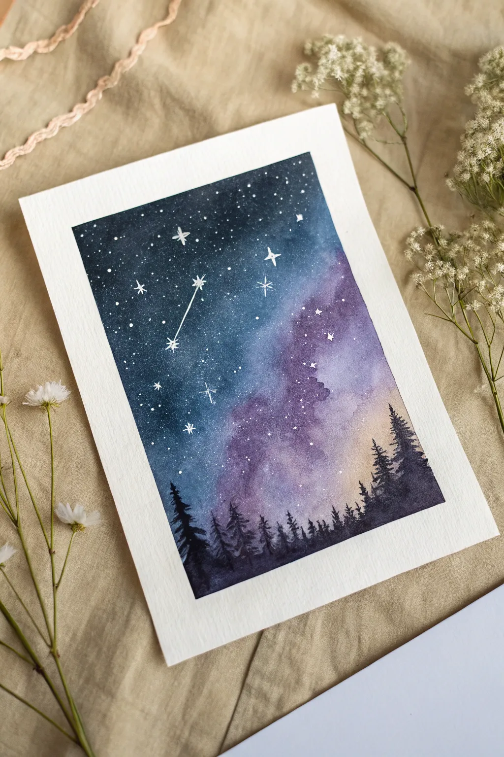
This enchanting watercolor project captures the ethereal beauty of a starry night sky above a dark forest silhouette. Using simple techniques like wet-on-wet blending and splatter stars, you can create a piece that looks incredibly complex but is beginner-friendly.
Step-by-Step
Materials
- Cold press watercolor paper (300 gsm)
- Painter’s tape or masking tape
- Watercolors (indigo, Prussian blue, violet, magenta, black)
- White gouache or white gel pen
- Large flat wash brush
- Medium round brush (size 6 or 8)
- Small detail brush (size 0 or 1)
- Two jars of water
- Paper towels
- Old toothbrush (optional for stars)
Step 1: Preparing the Background
-
Secure the paper:
Tape down all four edges of your watercolor paper to a board or table. Press the tape down firmly to ensure clean, crisp borders later. -
Wet the surface:
Using your large flat brush, apply a generous coat of clean water across the entire paper. The surface should be shiny and wet, but not forming puddles. -
Apply the glow:
Start with a light wash of violet and magenta in the lower right and center area. This will be the nebulous ‘cloud’ part of the galaxy. Let the colors bleed softly into the wet paper. -
Deepen the sky:
While the paper is still wet, drop in rich indigo and Prussian blue around the violet sections, particularly in the top left corner. I like to let these darker colors touch the violet edges so they blend naturally on their own. -
Add intensity:
To create depth, add a second layer of indigo or even a touch of black mixed with blue to the very top corners. The goal is a gradient from deep, dark space at the top to a glowing haze near the horizon. -
Create texture:
If -
First drying phase:
Allow the background to dry completely. This is crucial—if the paper is damp, your stars and trees will fuzzy out. You can use a hairdryer on a low setting to speed this up.
Starry Splatter Tip
Test your splatter technique on a scrap piece of paper first. If the droplets are too big, your paint is too watery. If nothing comes off, it’s too thick.
Step 2: The Starry Expanse
-
Prepare the stars:
Dilute a small amount of white gouache with water until it reaches a milky consistency. Alternatively, you can use white acrylic paint or white watercolor, though gouache is most opaque. -
Splatter technique:
Load a brush or an old toothbrush with the white mixture. Gently tap the brush handle against another brush over the painting, or flick the toothbrush bristles to create a spray of tiny stars. -
Control the density:
Focus the splatters more heavily in the darker blue areas to mimic the density of the Milky Way, leaving the purple nebulous clouds slightly sparser. -
Add hero stars:
Using your smallest detail brush or a white gel pen, hand-paint a few larger, four-pointed sparkles. A simple cross shape with a tiny dot in the center works perfectly for these twinkling giants. -
Connect a constellation:
Choose a few brighter stars and lightly connect them with very thin lines if you want to feature a specific constellation, or invent your own celestial pattern.
Step 3: The Silhouette Forest
-
Mix the darkest dark:
Create a saturated mix of black watercolor. Alternatively, you can use black gouache for an extra matte, opaque finish. -
Start the treeline:
Using a medium round brush, paint an uneven, jagged line across the bottom inch of the paper to establish the forest floor. -
Paint a tree trunk:
Switch to your smaller brush. Draw a thin vertical line extending upward from the ground. It doesn’t need to be perfectly straight; organic wiggles look more natural. -
Add pine branches:
Starting from the top of the trunk, use a stippling or tapping motion to create downward-sloping branches. Keep the top narrow and widen the tree as you move down. -
Vary the heights:
Continue adding trees across the horizon. Ensure they are different heights and widths to create a realistic rhythm. Some can be tall majestic pines, while others are just small saplings. -
Fill the gaps:
Once your main trees are in, go back and fill the spaces between the trunks with solid black so no ‘ground’ light shows through the dense forest floor. -
Final reveal:
Wait until the black paint is 100% dry. Then, slowly peel back the painter’s tape at a 45-degree angle to reveal those satisfying, crisp white edges.
Make It 3D
Once the painting is dry, use a metallic silver or gold pen to trace just the tips of the trees or the largest stars. It catches the light beautiful when framed.
Step back and admire your own slice of the infinite cosmos captured on paper
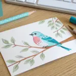
Stylized Bird on a Branch
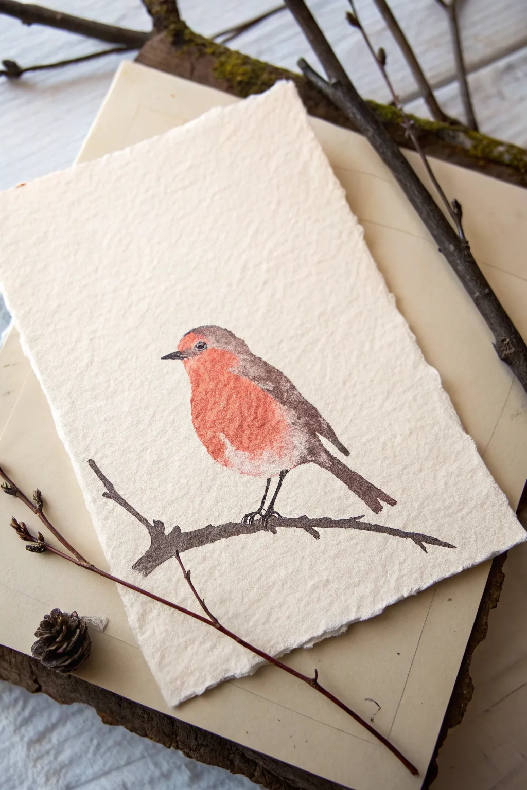
Capture the charm of a winter garden with this stylized robin watercolor painting. The textured handmade paper naturally softens the edges of the ink and paint, giving the piece a cozy, vintage feel perfect for a seasonal greeting card or framed miniature.
How-To Guide
Materials
- Heavyweight handmade cotton rag paper (rough texture/deckled edge)
- Black waterproof fine-liner pen (0.3mm or 0.5mm)
- Watercolor paints (Vermilion/Cadmium Red, Burnt Sienna/Brown, Burnt Umber/Dark Brown)
- Round watercolor brush (size 4 or 6)
- Fine detail brush (size 0 or 1)
- Pencil (HB or H)
- Kneaded eraser
- Clean water and paper towel
Step 1: Sketching the Silhouette
-
Plan the Composition:
Position your paper vertically. Observe the rough, deckled edges of your handmade paper; you’ll want to center the bird slightly above the midpoint to leave room for the branch below. -
Lightly Sketch the Body:
Using a light touch with your pencil, draw a simple oval shape for the bird’s body. The oval should tilt upwards to the left. Keep the lines very faint so they don’t show through the paint later. -
Define the Head and Tail:
Add a smaller circle on top of the left side of the oval for the head. Sketch a triangular shape extending downwards on the right side for the tail feathers. -
Place the Branch:
Draw a jagged, uneven line underneath the bird for the branch. Add a small ‘Y’ fork on the left and extend the branch to the right edge. It doesn’t need to be straight; bumps make it look natural. -
Mark the Color Zones:
Lightly outline the distinctive red breast area of the robin. It covers the face and chest, curving down towards the belly.
Bleeding Lines?
If ink spreads into spiderwebs, the paper is still damp inside. Use a hairdryer on low heat for 30 seconds, then test a tiny dot on a scrap piece of the same paper before continuing.
Step 2: Applying the Watercolor
-
Mix the Red Tone:
On your palette, mix Vermilion with a tiny touch of Burnt Sienna to create a warm, earthy red. Add enough water so the consistency is like tea. -
Paint the Breast:
Load your round brush (size 4 or 6) and fill in the chest area you sketched. Because this paper is highly textured and absorbent, I like to dab the paint on rather than stroke it, allowing the paper’s tooth to show through for texture. -
Soften the Edges:
Before the red paint fully dries, rinse your brush and blot it on a towel so it’s damp but not dripping. Gently run the damp brush along the bottom edge of the red patch to create a soft, feathery transition. -
Paint the Upper Body:
Mix a watery wash of Burnt Umber (a grayish-brown). Paint the top of the head, the back, and the wing area. Carefully bring this brown right up to the edge of the red, being mindful not to let them bleed too heavily into each other unless you want a very wet-on-wet look. -
Darken the Wing Tips:
While the brown layer is still slightly damp, drop a more concentrated, darker brown pigment onto the wing area and tail feathers to add depth and shadow. -
Paint the Branch:
Using the dark brown mixture, paint the branch silhouette. Use jagged, confident strokes to mimic the texture of wood bark. Let the brush skip over the paper bumps occasionally for a natural effect. -
Let it Dry Completely:
This step is crucial. The paper needs to be bone dry before you add ink, or the pen lines will bleed uncontrollably into the paper fibers. Wait at least 15-20 minutes.
Pro Tip: Paper Texture
Don’t fight the paper’s roughness. If the paint skips and leaves white speckles (holidays), leave them! This ‘dry brush’ effect mimics feathers perfectly without extra effort.
Step 3: Inking Details
-
Add the Eye:
With your fine-liner pen, draw a small circle for the eye within the red face area. Fill it in black, leaving a tiny speck of white paper for the highlight, which brings the bird to life. -
Draw the Beak:
Draw a small, sharp triangle pointing left for the beak. Keep it delicate; a heavy beak can change the character of the bird entirely. -
Outline the Legs:
Draw two thin legs extending from the belly to the branch. The legs should look spindly. Add tiny toes gripping the wood. -
Texturize the Wing:
Use very short, broken lines or stippling (dots) over the dried brown wing area to suggest feathers without drawing every single quill. -
Enhance the Silhouette:
If any edges of your paint looked too messy, you can define them selectively with broken ink lines. Don’t outline the whole bird; just hint at the back curve or the tail edge. -
Refine the Branch:
Add a few scratchy marks or knots to the branch with your pen to emphasize its roughness and ground the composition.
Now step back and admire how the rough texture of the paper gives your little robin a timeless, storybook quality.

PENCIL GUIDE
Understanding Pencil Grades from H to B
From first sketch to finished drawing — learn pencil grades, line control, and shading techniques.
Explore the Full Guide
Tape-Resist Geometric Color Blocks
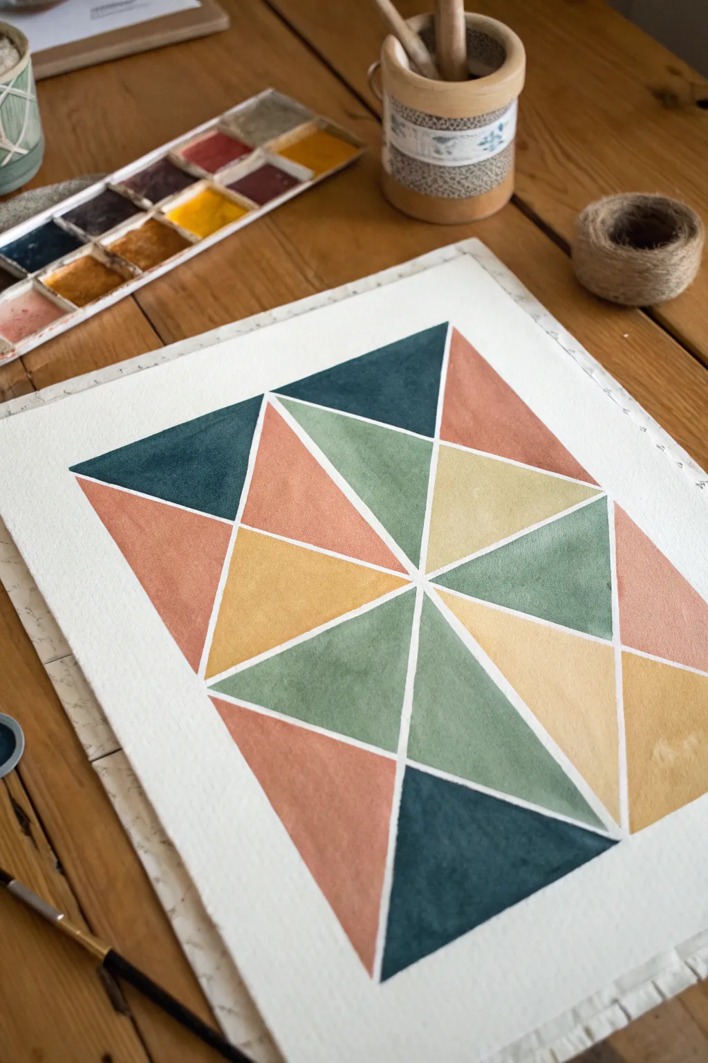
Achieve crisp, clean lines and a stunning mosaic effect with this simple tape-resist method. By blocking off sections of watercolor paper, you create a striking interplay of muted earth tones and negative space.
Detailed Instructions
Materials
- Cold press watercolor paper (minimum 140lb/300gsm)
- Painter’s tape or dedicated masking tape (approx 1/4 inch width)
- Watercolor paint set (pan or tube)
- Round watercolor brush (size 6 or 8)
- Jar of clean water
- Paper towels
- Pencil and ruler (optional)
- Wooden board or table surface
Step 1: Preparation and Taping
-
Secure the paper:
Begin by taping down the four edges of your watercolor paper to a hard board or your work surface. This prevents the paper from buckling when wet and creates a clean border. -
Plan the center:
Locate the approximate center of your paper. You can eyeball this or lightly mark it with a pencil for precision. -
Create the main axes:
Place a long strip of masking tape vertically down the center of the paper, and another horizontally across the middle, forming a large cross. -
Add diagonal divisions:
Apply two long strips of tape diagonally from corner to corner, intersecting through the center point. You should now have a ‘star’ shape resembling a sliced pie. -
Subdivide the spaces:
Within the large triangular sections created by the main tape lines, add shorter strips of tape connecting the lines to create smaller triangles. There is no strict rule here; aim for a balanced composition of various triangle sizes. -
Seal the edges:
Firmly run your fingernail or a bone folder along the edges of every piece of tape. I find this crucial to prevent paint from seeping underneath and ruining the crisp lines.
Bleeding Lines?
If paint bled under the tape, wait for it to dry completely. Then, use a small flat brush with stiff bristles and a little clean water to gently scrub and lift the excess pigment.
Step 2: Painting the Shapes
-
Prepare your palette:
Mix your watercolor paints. Aim for an earthy palette: a deep slate blue, a warm terracotta, a muted sage green, and a mustard yellow. Test the colors on a scrap piece of paper first. -
Start with the darkest tone:
Load your brush with the slate blue. Select 3-4 non-adjacent triangles across the composition and fill them in evenly. -
Apply the next color:
Rinse your brush thoroughly. Pick up the terracotta orange and fill in another set of triangles, ensuring they don’t touch if possible, though the tape protects them. -
Add the lighter tones:
Continue the process with the sage green and mustard yellow. Work methodically to distribute the colors so no large cluster of a single color forms. -
Create texture (optional):
While the paint is still damp in some sections, you can drop in a tiny bit of water or more pigment to create subtle ‘blooms’ and watercolor texture. -
Let it dry completely:
Allow the painting to dry fully. The paper should feel room temperature to the touch, not cool. Rushing this step is the most common mistake.
Step 3: The Reveal
-
Peel the tape:
Once bone dry, begin peeling the tape. Start from the center and pull slowly at a 45-degree angle away from the painted area. -
Remove border tape:
Finally, remove the tape securing the paper to the table to reveal your clean white borders. -
Erase guidelines:
If any pencil marks are visible in the white negative spaces, gently erase them now to finish the piece.
Pro Tip: Clear Coat
Before painting color, paint a thin layer of clear water or white gouache over the tape edges. This seals the gap so any seepage is invisible, keeping your color lines perfect.
Frame your geometric masterpiece or scan it to use as a unique digital background pattern
Abstract Heart in Chunky Brush Marks
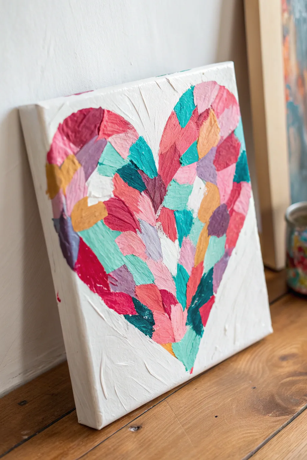
Create a vibrant, textured statement piece using the impasto technique to build a heart from distinct, chunky blocks of color. This beginner-friendly project relies on thick paint application to give the canvas a tactile, almost mosaic-like quality.
Step-by-Step
Materials
- Square stretched canvas (e.g., 10×10 or 12×12)
- Heavy body acrylic paints (magenta, teal, orange, light pink, lilac, white, yellow ochre)
- Modeling paste or gel medium (optional, for extra thickness)
- Flat shader brushes (medium size, around size 8-10)
- Palette knife (for mixing and applying)
- Pencil
- Paper plate or palette
Step 1: Preparation and Sketching
-
Prime the surface:
Begin by ensuring your canvas is clean. If you want a textured background, lay down a coat of white acrylic paint mix mixed with a little modeling paste using a palette knife, spreading it unevenly for a rough look. Let this dry completely. -
Outline the shape:
Lightly sketch a large heart shape on the canvas using a pencil. Don’t worry about perfect symmetry; a slightly organic shape adds to the charm of this style. -
Prepare your palette:
Squeeze out your heavy body acrylics. To achieve the thick, raised look seen in the photo, you need the paint to hold its shape. If your paint feels too fluid, mix each color with a dollop of thickening gel or modeling paste. -
Mix custom shades:
create variety by mixing your core colors with white to make pastel versions (like soft pink and mint) and with each other to create intermediate tones like coral or deep violet.
Muddy Colors?
If your distinct blocks are blending together, let one color section dry for 10 minutes before applying touching strokes next to it.
Step 2: Building the Heart
-
Start with the outline:
Using a flat brush loaded with a generous amount of paint, apply your first few blocks of color along the pencil line. Use a single, firm stroke for each block, pressing down and lifting off cleanly to leave a ridge of paint. -
Vary the stroke direction:
As you work, change the angle of your brush marks slightly. Some should go vertical, some diagonal, and some horizontal. This ‘quilt-like’ arrangement creates movement. -
Distribute colors evenly:
I find it helpful to place the dark, bold colors (like the deep magenta and teal) first, scattering them around the heart shape so they aren’t clumped together. -
Fill in the gaps:
Once your bold anchors are set, switch to your lighter pastels—the pinks, lilacs, and ochres—to fill the spaces in between. Wipe your brush thoroughly between color changes to keep the hues distinct. -
Maintain boundaries:
Keep the edges of the heart relatively crisp, but let the interior strokes overlap slightly. The goal is a solid fill without blending the wet paints into mud. -
Add white highlights:
Incorporate pure white or very pale tinted strokes sporadically throughout the heart. This adds brightness and helps separate the deeper colors.
Step 3: Finishing Touches
-
Check for coverage:
Look closely at the canvas. If you see too much bare canvas between strokes, dab in small amounts of paint to bridge the gaps without destroying the blocky texture. -
Refine the background:
If any colorful strokes went too far outside your heart outline, use clean white paint to ‘cut back’ into the shape, restoring the edge. -
Enhance texture:
If certain areas look too flat, go back over them with a loaded brush or palette knife, laying a second layer of thick paint right on top of the semi-dry layer. -
Clean up edges:
Paint the sides of your canvas white for a gallery-ready finish, or extend the background texture around the corners. -
Allow to cure:
Because the paint application is so thick, this piece will take longer to dry than a standard painting. Lay it flat in a dust-free area for at least 24 hours.
Add Sparkle
Mix a small amount of gold leaf flakes or iridescent medium into the transparent gel before applying top strokes for a subtle shimmer.
Hang your textured heart in a spot with good lighting to really show off the dimension of your brushwork


Rainy Umbrella Figures in Silhouette
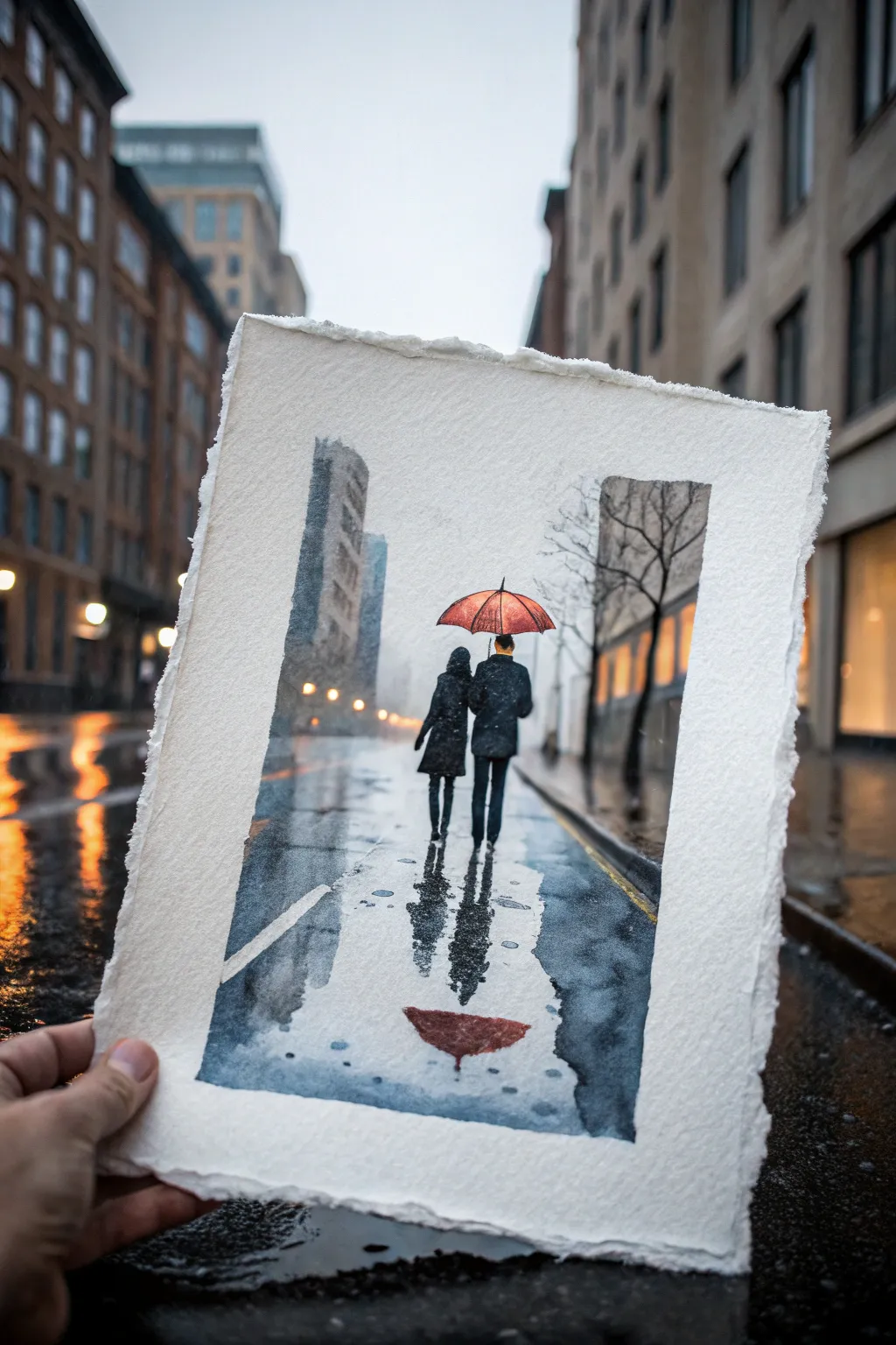
Capture the romantic mood of a drizzly city street with this atmospheric watercolor study. You’ll learn to master wet-on-wet techniques to create convincing reflections and make a vibrant red umbrella pop against a cool, grey palette.
Step-by-Step Tutorial
Materials
- Cold press watercolor paper (300 gsm, deckled edge preferred)
- Watercolor paints: Payne’s Grey, Ultramarine Blue, Burnt Sienna, Alizarin Crimson, Cadmium Red, Yellow Ochre
- Brushes: Large flat wash brush (1 inch), medium round brush (size 8), fine liner brush (size 2)
- Masking fluid (optional)
- White gouache or white gel pen
- Masking tape and drawing board
- Paper towels
- Two jars of water
Step 1: Planning and The First Wash
-
Sketch the composition:
Lightly sketch the horizon line about one-third up from the bottom. Outline the tall buildings on the left and right, leaving a gap in the center. Draw the two figures in the middle distance and the umbrella shape above them. Keep pencil lines faint. -
Mask the umbrella (optional):
If you want to keep the umbrella pristine, apply a thin layer of masking fluid to the umbrella shape. Alternatively, just be very careful to paint around it in the next steps. -
Wet the paper:
Using your large flat brush, wet the entire sky area and the street area with clean water, avoiding the figures and the umbrella. The paper should be glistening but not forming puddles. -
Establish the atmosphere:
Drop in a very diluted mix of Ultramarine Blue and a touch of Payne’s Grey for the sky. Let this wash bleed down into the street area to create a cohesive base tone. Keep the center area slightly lighter to suggest distance fog.
Edge Control
For the deckled edge look without buying expensive paper, tear your standard watercolor paper against a ruler after painting. It gives a lovely, handcrafted rustic feel.
Step 2: Building Architecture and Depth
-
Paint the distant buildings:
While the paper is still slightly damp (but not soaking), mix a cool grey using Ultramarine and Burnt Sienna. Paint the tall building silhouette on the left. Soften the edges with a clean, damp brush so it looks foggy and distant. -
Add the right-side structures:
Repeat the process for the structures on the right side. Use a slightly warmer grey tone here by adding a touch more Burnt Sienna to suggest light coming from shop windows. -
Deepen the shadows:
Mix a stronger, darker grey (Payne’s Grey). While the buildings are damp, drop this pigment into the lower sections of the buildings to anchor them to the ground. -
Create the tree silhouette:
Once the sky area is dry, use a liner brush with a dark grey mix to paint the bare tree branches on the right side. Keep the lines jagged and organic.
Muddy Colors?
If your grey reflections look muddy, let the layers dry completely between glazes. Patience prevents the pigments from churning up and turning brown.
Step 3: The Figures and Reflections
-
Paint the red umbrella:
If you used masking fluid, remove it now. Paint the umbrella with Cadmium Red. While wet, drop in Alizarin Crimson on the left side and near the ribs to create volume and shadow. -
Paint the figures:
Mix a very dark, nearly black tone using Payne’s Grey and Burnt Sienna. With a round brush, paint the silhouettes of the two figures. I find it helpful to connect their shapes slightly to show intimacy. -
Paint the legs:
Continue painting the legs. The pants should be dark, perhaps a deep blue for the man’s jeans. Note that the feet don’t need sharp definition as they will merge into the wet pavement. -
Create the main reflection:
Immediately below the feet, drag your brush downward using the same dark color. Use a vertical stroke that breaks up as you move lower, mimicking ripples in water. -
Paint the umbrella reflection:
Directly below the figures’ reflection, paint an inverted, distorted shape of the umbrella using a watered-down Alizarin Crimson. It should look -
Soften the reflection edges:
Take a clean, slightly damp brush and run it gently along the edges of the reflections to blur them into the wet street texture.
Step 4: Final Details and Highlights
-
Add warm street lights:
Mix a watery Yellow Ochre. paint soft, vertical streaks on the buildings and their reflections in the wet street to suggest glowing streetlamps or shop windows. -
Enhance road texture:
Use a dry brush technique with a medium grey to drag lightly across the foreground pavement. This catches the texture of the paper and creates the look of asphalt grain. -
Add the road markings:
Using white gouache or a gel pen, add the faint white line on the road to the left of the couple. Make it broken and slightly faded to match the rainy perspective. -
Final assessment:
Stand back and look at your painting. If the darks have dried too light (a common watercolor issue), carefully re-glaze the figures to make sure they provide strong contrast against the misty background.
Frame your rainy day scene in a simple mat to emphasize the moodiness of the composition
Cherry Blossom Branch With Dabbing Technique
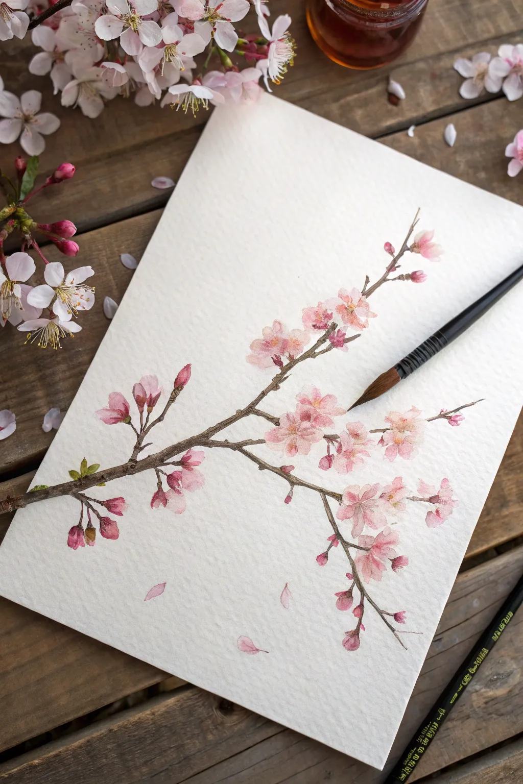
Capture the fleeting beauty of cherry blossoms with this delicate watercolor tutorial that focuses on soft textures and organic shapes. By using a simple dabbing technique, you will build up clusters of pink blooms that feel airy and natural against the textured paper.
Step-by-Step
Materials
- Cold press watercolor paper (300 gsm)
- Round watercolor brushes (Size 4 and Size 0 or 1 for details)
- Watercolor paints: Alizarin Crimson, Sap Green, Burnt Umber, Yellow Ochre
- Paper towel or cloth
- Jar of clean water
- HB Pencil
- Kneaded eraser
Step 1: Sketching the Bones
-
Map the Main Branch:
Begin with a very light HB pencil sketch. Draw a diagonal line starting from the lower left, extending upwards toward the right side of the paper. -
Add Offshoots:
Sketch smaller, thinner twigs branching off the main stem. Keep these lines slightly jagged and irregular to mimic the natural growth of a real tree branch. -
Place Flower Clusters:
Lightly draw small circles or oval shapes where you want your main flower clusters to be. Don’t draw individual petals yet; just mark the general placement. -
Soften Lines:
Once you are happy with the composition, use your kneaded eraser to lift most of the graphite, leaving only the faintest guide lines that won’t show through the paint.
Muddy Petals?
If your pinks are turning brown where they touch the branch, ensure the flowers are 100% dry before painting the wood. Use a hairdryer on low heat to speed this up.
Step 2: Painting the Blooms
-
Mix Your Pink:
Create a watery, pale pink wash by diluting Alizarin Crimson with plenty of water. You want this first layer to be very transparent. -
Dabbing First Petals:
Using your Size 4 brush, load it with the pale pink and gently dab small, petal-like shapes onto your paper. Let the brush tip dance on the surface to create organic, unforced shapes. -
Varying Saturation:
While the first dabs are still damp, touch a slightly more concentrated mix of pink into the centers of some flowers. This allows the color to bleed naturally outward, creating soft gradients. -
Painting Buds:
For the unopened buds at the tips of the branches, use a thicker mix of pink. Paint small, elongated teardrop shapes that are more saturated than the open blooms. -
Let it Dry:
Wait for these initial flower layers to dry completely. If you paint too soon, the branch color will bleed into the delicate petals.
Add Sparkle
Once fully dry, add tiny dots of white gouache or a white gel pen to the very center of the stamens. This catches the light and brings the blooms to life.
Step 3: Adding the Wood
-
Mix Branch Color:
Combine Burnt Umber with a touch of Sap Green to create a natural, woody brown. It shouldn’t be too dark or stark. -
Paint the Main Stem:
Using the tip of your brush, carefully paint the main branch. Vary the pressure on your brush stroke—press down for thicker sections and lift up for the tapering ends. -
Connect the Blooms:
Extend thin, delicate lines from the main branch to connect to your painted flower clusters. Remember that cherry blossom stems are tough and angular. -
Adding Texture:
While the brown paint is damp, drop in tiny specks of darker brown or black in the ‘knots’ of the wood to give it texture and dimension.
Step 4: Refining Details
-
Detailing Flower Centers:
Switch to your smallest detail brush (Size 0 or 1). Mix a small amount of Yellow Ochre or a deeper pink. -
Stamen Lines:
Paint incredibly fine lines radiating from the center of the open blossoms. Be spare with these; you don’t need them on every single flower. -
Tiny Sepals:
Using a mossy green mix (Sap Green with a bit of brown), paint the tiny leaf-like sepals at the base of the buds and where the flowers join the stems. -
Falling Petals:
To create movement, paint two or three single petals floating in the empty space below the branch, using your palest pink wash. -
Final Assessment:
Stand back and look at your composition. If any area looks too pale, add a very controlled glazing of pink to deepen the color, but be careful not to overwork the freshness.
Now step back and enjoy the permanent spring you have created on paper.
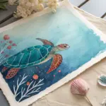
Underwater Gradient With Simple Fish Shapes
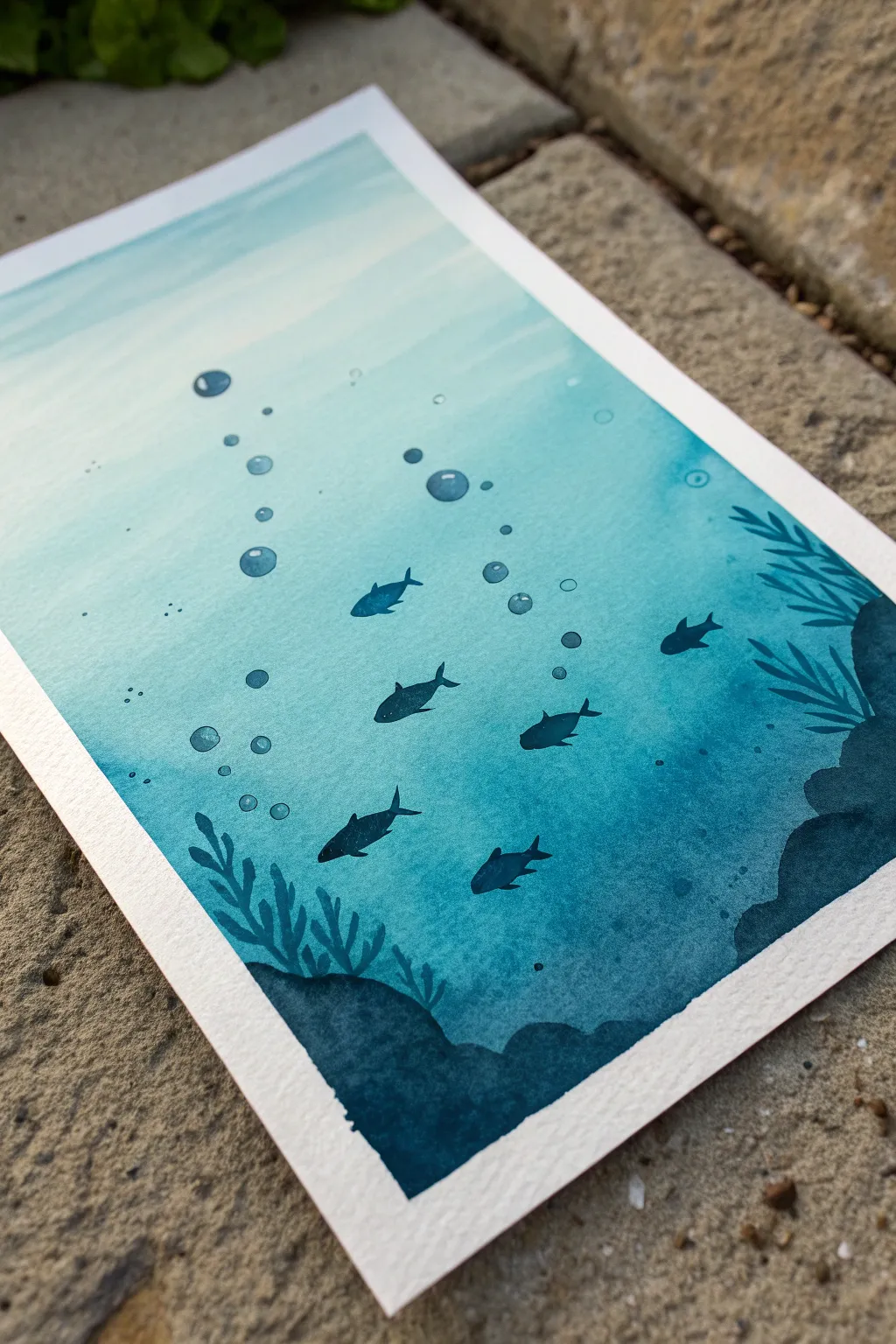
Capture the serene depth of the ocean with this beginner-friendly watercolor project that masters the art of the gradient wash. By combining a soothing monochromatic palette with high-contrast silhouettes, you’ll create a striking underwater scene that looks impressive but relies on simple shapes.
How-To Guide
Materials
- Cold press watercolor paper (300 gsm)
- Masking tape
- Watercolor paints (Phthalo Blue, Prussian Blue, or Indigo)
- Large flat wash brush (3/4 inch or 1 inch)
- Medium round brush (size 6 or 8)
- Small detail brush (size 0 or 2)
- Two jars of water
- Paper towels
- Mixing palette
- Board or hard surface to tape paper down
Step 1: Preparation and Base Gradient
-
Secure the paper:
Tape all four edges of your watercolor paper to a board using masking tape. Press the edges down firmly to prevent paint from seeping underneath and to create that crisp white border later. -
Mix your gradients:
Prepare three pools of blue paint on your palette. One should be very watery and pale for the surface light, one medium-strength teal or blue, and one highly concentrated dark blue (add a touch of black or Payne’s Grey if needed for depth) for the bottom. -
Pre-wet the paper:
Using your large flat brush and clean water, evenly wet the entire surface of the paper. You want a consistent sheen, not puddles of water. -
Apply the lightest tone:
Starting at the top of the paper, brush on your palest blue mixture. Let gravity help pull the pigment down slightly by propping your board up at a slight angle. -
Blend the mid-tones:
While the paper is still wet, switch to your medium-strength blue. Start applying it about one-third of the way down, brushing horizontally and letting it bleed softly into the lighter section above. -
Add the deep depths:
Load your brush with the darkest blue concentration. Apply this to the bottom third of the paper, working your way up to meet the mid-tone. Use horizontal strokes to encourage a smooth gradient transition. -
Refine the wash:
If the transition looks harsh, clean your brush, dampen it slightly, and gently run it horizontally across the meeting point of the two colors to soften the blend. Do not overwork the paper. -
Create water texture:
While the wash is still damp but losing its shine, you can drop in tiny amounts of clean water or slightly darker pigment near the top to suggest light filtering through currents, but keep it subtle. -
Let it dry completely:
This is crucial. The paper must be bone dry before you add any sharp details. You can use a hairdryer on a low setting or let it air dry until the paper feels room temperature to the touch.
Fixing “Blooms”
If water drops create cauliflower-like blooms in your gradient, don’t panic. Wait for it to dry, then gently scrub the edge with a damp stiff brush to soften it into a water texture.
Step 2: Silhouettes and Details
-
Mix the silhouette color:
Create a thick, creamy mixture of your darkest blue. It should have very little water, almost the consistency of heavy cream, to ensure opacity. -
Paint the seafloor landscape:
Using the medium round brush, paint undulating rocky shapes at the bottom corners. Let them rise up on the sides to frame the scene, keeping the edges organic and uneven. -
Add plant life:
Switch to your small detail brush. Pull thin, wavy lines upward from the rock formations to create kelp or seagrass. Vary the lengths and thicknesses to make it look natural. -
Sketch the fish shapes:
Visualize where your school of fish will swim. Using the tip of your round brush and the dark paint, creating simple almond or oval shapes for the bodies. I like to vary their sizes to create a sense of distance. -
Refine fish details:
Add small triangle shapes for the tail fins and tiny distinct strokes for dorsal fins. Ensure all fish are generally swimming in the same direction to mimic schooling behavior. -
Lift out bubbles:
Clean your small brush and dampen it with clear water. Gently scrub small circles in the water above the fish to lift some pigment, creating soft, transparent bubbles. Pat the lifted area with a paper towel. -
enhance bubbles:
To make the bubbles pop, outline the bottom curve of each bubble with a thin line of dark blue paint, and add a tiny dot of white gouache or unpainted paper highlight on the top if you lost the highlight. -
Final touches:
Add a few tiny specks or dots of dark paint around the fish and rocks to represent debris or small particles in the water, adding texture to the scene. -
Reveal the border:
Once the painting is 100% dry, slowly peel away the masking tape at a 45-degree angle, pulling away from the painting area to avoid tearing the paper.
Add Magic Shimmer
Mix a tiny amount of iridescent medium or metallic watercolor into your top wash layer. It mimics sunlight refracting through the water surface beautifully.
Step back and admire the moody, peaceful depth you’ve created with just a few shades of blue
Have a question or want to share your own experience? I'd love to hear from you in the comments below!