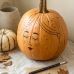
When I’m feeling anger, I like to put it on paper before it spills into the rest of my day. These anger drawing ideas will help you turn heat, tension, and frustration into lines, shapes, and imagery that actually feels honest.
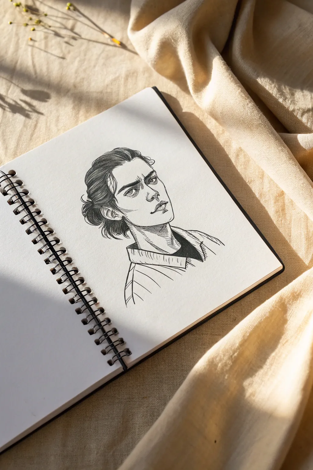
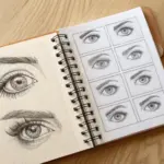
Furrowed Brows Close-Up
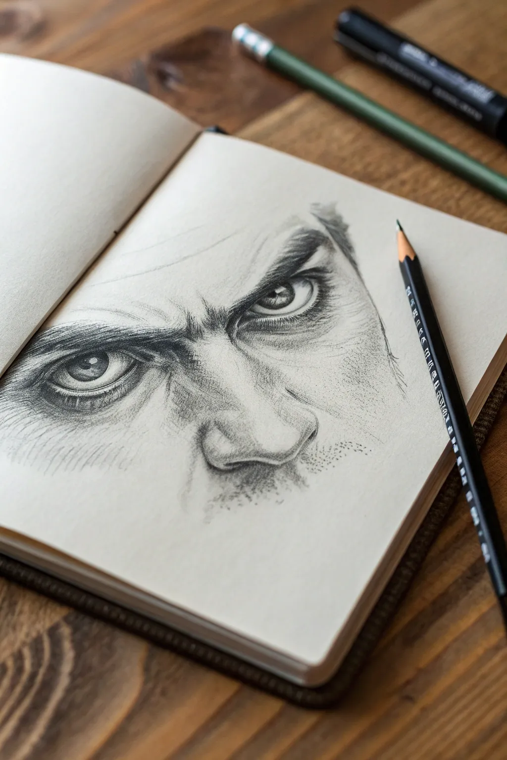
Master the art of emotive portraiture with this focused study of furrowed brows and piercing eyes. This graphite pencil sketch captures the raw tension of anger through dramatic shading and meticulous attention to skin texture.
Step-by-Step Guide
Materials
- Sketchbook with smooth, off-white paper
- Set of graphite pencils (HB, 2B, 4B, 6B)
- Mechanical pencil (0.5mm HB) for fine details
- Kneaded eraser
- Blending stump or tortillon
- Sharpener
Step 1: Structural Layout
-
Map the anchor points:
Begin with a light HB pencil to mark the position of the eyes. Draw two horizontal almond shapes, spacing them about one eye-width apart. These don’t need to be perfect yet; just establish the placement on your page. -
Indicate the brow line:
Visualize a heavy V-shape dipping down between the eyes. sketch the brow ridges low and close to the eyelids to immediately establish that angry, intense expression. -
Draft the nose structure:
Lightly draw the bridge of the nose and the top of the nostrils. Focus on the central ‘scrunch’ area between the eyes, indicating where the skin folds.
Step 2: Rendering the Eyes
-
Outline the iris and pupil:
Inside your eye outlines, draw perfect circles for the irises. Note that the upper eyelids should cover the top portion of the irises significantly to intensify the glare. Place smaller circles in the center for the pupils. -
Add the catchlights:
Before shading, reserve a small, crisp white rectangle or circle in each eye for the reflection. This spark of life is crucial for a realistic look. -
Darken the pupils:
Using a 4B pencil, fill in the pupils with a solid, dark tone. Trace the outer ring of the iris firmly, leaving the center slightly lighter for texture later. -
Shade the iris fibers:
With a sharp mechanical pencil, draw tiny radiating lines from the pupil outward toward the edge of the iris. Keep the top part of the iris darker, as if shadowed by the heavy upper lid. -
Define the eyelids:
Use a 2B pencil to emphasize the thickness of the lower lid. Draw a secondary line just below the eye to show the ‘bag’ or tension under the eye.
Keep it Sharp
For the realistic eyebrow hairs and iris details, your pencil must be needle-sharp. Keep sandpaper handy to constantly re-point your lead every few minutes.
Step 3: Building Texture and Depth
-
Detail the eyebrows:
Switch to a sharp 4B pencil. Instead of drawing a solid block, create the eyebrows using hundreds of short, directional strokes. The hairs should start growing upward near the nose and sweep outward toward the temples. -
Deepen the shadows:
Apply your darkest shading (6B) in the deepest crevices: right under the brow bone, the inner corners of the eyes, and underneath the curve of the eyebrow hairs. -
Create the nose bridge wrinkles:
On the bridge of the nose, draw horizontal, slightly curved lines. Soften these lines with a blending stump so they look like folds of skin rather than cracks. -
Shade the skin:
Use a 2B pencil on its side to lightly shade the skin around the eyes and nose. Follow the contours of the face—curving around the nose bridge and the cheekbones. -
Blend for smoothness:
Gently rub your shading with a tortillon or blending stump. This unifies the pencil strokes into a smooth skin tone. Be careful not to smudge your crisp eyebrow hairs. -
Add pore texture:
I like to take a dull HB pencil and gently stipple tiny dots across the nose and under the eyes. This subtle texture mimics pores and adds incredible realism to the skin.
Smudge Control
Graphite smears easily. Place a scrap piece of paper under your drawing hand to protect the finished areas while you work on other sections.
Step 4: Final Refinements
-
Enhance the contrast:
This drawing relies on drama. Revisit your darkest darks—the pupils, the nostrils, and the deep shadow of the brow—and press firmly to ensure high contrast against the paper. -
Clean up highlights:
Take your kneaded eraser and mold it into a fine point. ‘Lift’ pigment from the center of the nose, the brow ridge, and the crest of the cheekbones to create bright skin highlights. -
Suggest facial hair:
If you want the stubble look shown in the reference, use quick, random stippling motions with a 2B pencil on the lower cheeks and upper lip area. -
Soften edges:
Let the drawing fade out at the edges rather than having a hard border. Use your blending stump to feather the graphite outward into the white of the page.
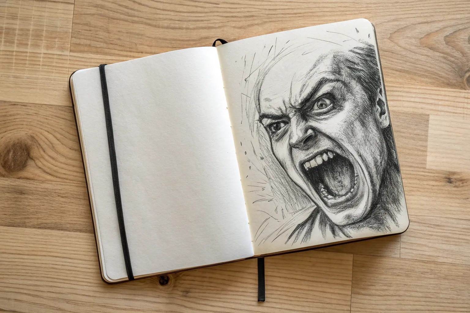
You’ve now captured a powerful human emotion with nothing but pencil and paper


Screaming Mouth Study
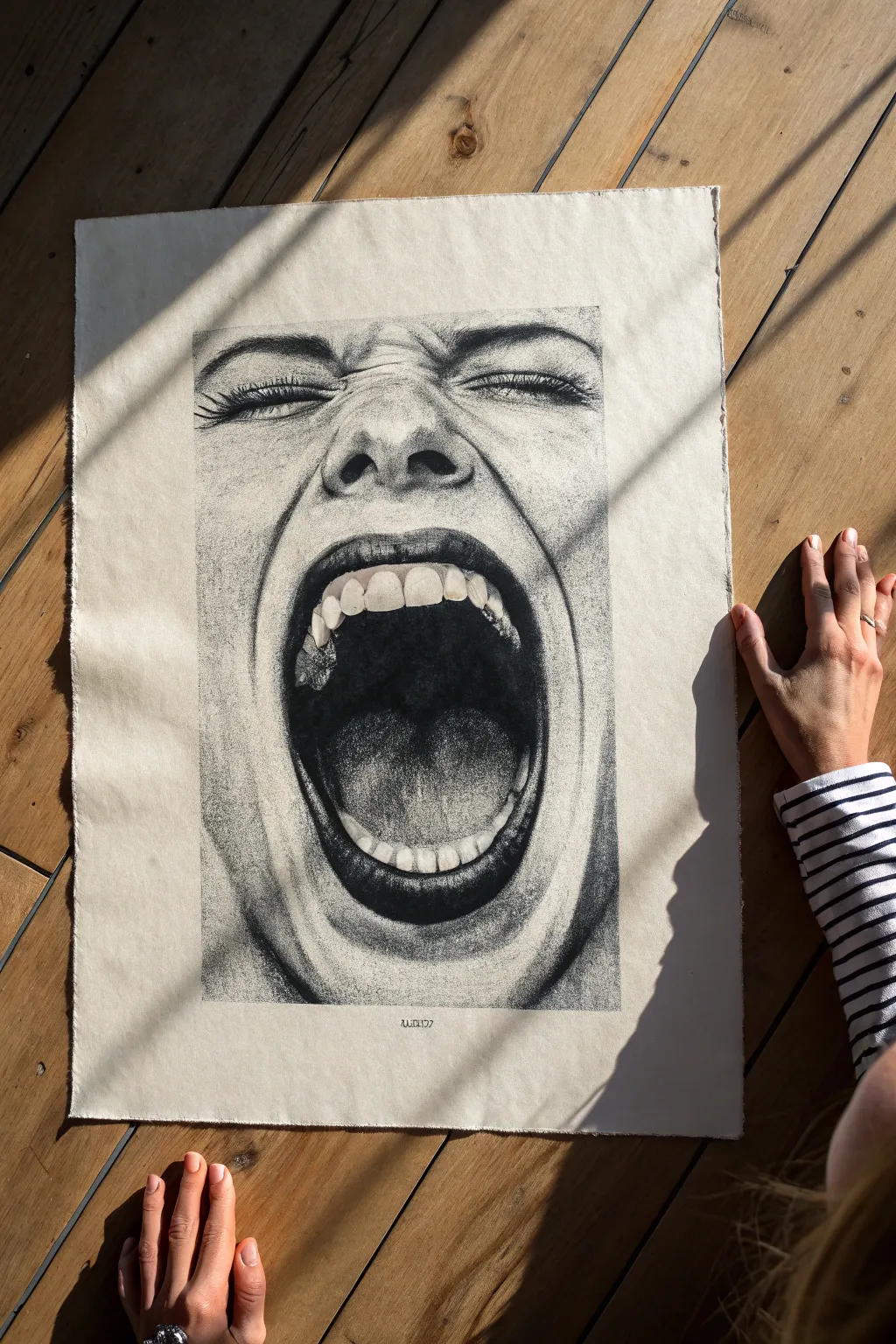
Capture raw emotion with this intense study of a screaming mouth created entirely through stippling. Using thousands of tiny ink dots, you will build up rich gradients and texture to form a hyper-realistic, high-contrast portrait on textured paper.
Step-by-Step
Materials
- High-quality textured paper (approx. 18×24 inches, off-white or cream)
- Set of fine liner pens (sizes 0.05mm, 0.1mm, 0.3mm, 0.5mm)
- Graphite pencil (HB or 2H)
- Kneaded eraser
- Reference photo of a screaming face
- Ruler (optional for grid method)
- Masking tape (for securing paper)
Step 1: Planning and Sketching
-
Prepare your surface:
Begin by taping your large sheet of textured paper to a flat, hard surface. This prevents the paper from shifting while you work and keeps the corners crisp. -
Lightly outline the major forms:
Using a sharp HB or 2H pencil, sketch the main contours of the face. Focus heavily on the oval shape of the open mouth and the squinting eyes. Keep these lines extremely faint, as you want them to disappear under the ink later. -
Map the teeth and tongue:
Carefully draw the shapes of the upper and lower teeth. Pay attention to the perspective; the back teeth will appear smaller. Sketch the heavy shadow shape inside the mouth, leaving the tongue area slightly distinct. -
Indicate shadow zones:
Lightly circle areas that will be the darkest blacks—the back of the throat, the nostrils, and the corners of the eyes. This map will guide your stippling density.
Step 2: The Stippling Process
-
Start with the darkest tones:
Take your 0.5mm pen and begin placing dots in the absolute darkest area: the back of the throat. Don’t rush to make it solid black immediately; build up layers of dots until the paper white is mostly gone. -
Define the mouth contour:
Switch to a 0.3mm pen to work on the lips. The lips need to look cracked and textured, so concentrate dots in the vertical fissures of the lip skin. Leave small gaps for highlights. -
gradient the tongue:
The tongue requires a softer texture. Use a 0.1mm pen here. Create a gradient that gets darker toward the back of the mouth and lighter near the teeth. I find it helps to work in small circular clusters to keep the texture organic. -
Render the teeth:
Teeth are not stark white. Use your finest 0.05mm pen to add very sparse dots near the gum line and the biting edges. This subtle shading gives them volume and roundness without making them look gray. -
Sculpt the nose and cheeks:
Move outward to the skin. This area relies on negative space. Use the 0.05mm or 0.1mm pen to place widely spaced dots that define the shadowy wrinkle lines around the nose (nasolabial folds). -
Detail the eyes:
The eyes are tightly shut, creating deep wrinkles. Densely stipple the lash line with a 0.3mm pen, then fade out into the crow’s feet wrinkles with lighter dots. The eyebrows should be built up with directional dots that follow the hair growth.
Uneven Dot Density?
If an area looks blotchy, don’t panic. Instead of adding more ink to the dark spot, slowly build up the surrounding area to match its density, effectively blending the ‘mistake’ into the shading.
Step 3: Refining Contrast and Texture
-
Deepen the throat void:
Go back to the open mouth with your thickest pen. Add another layer of dots to ensure the ‘black’ is truly deep and velvety contrasting broadly against the teeth. -
Smooth the skin transitions:
Look for areas where the shading looks too abrupt on the cheeks or forehead. Bridge these gaps with very fine, sparse dots using the 0.05mm pen to create a smooth, skin-like transition. -
Add skin irregularities:
Real skin isn’t perfect. Add tiny, random clusters of dots across the nose and cheeks to simulate pores and freckles. This breaks up the uniform texture and adds realism. -
Erase pencil guidelines:
Once the ink is completely dry—give it at least 30 minutes—gently roll a kneaded eraser over the entire drawing to lift the initial graphite sketch without smudging your ink work. -
Final assessment:
Step back from the drawing to view it from a distance. If the mouth doesn’t feel deep enough, add more density to the center. If the highlights on the brow bone are too bright, knock them back with a dusting of dots.
Mixed Media Detail
For ultra-deep blacks in the throat without hours of dotting, lay down a base of black India ink wash first, then stipple over it once dry to maintain the texture.
Step back and admire the powerful intensity of your completed stipple portrait.

Clenched Fist With Tension Lines
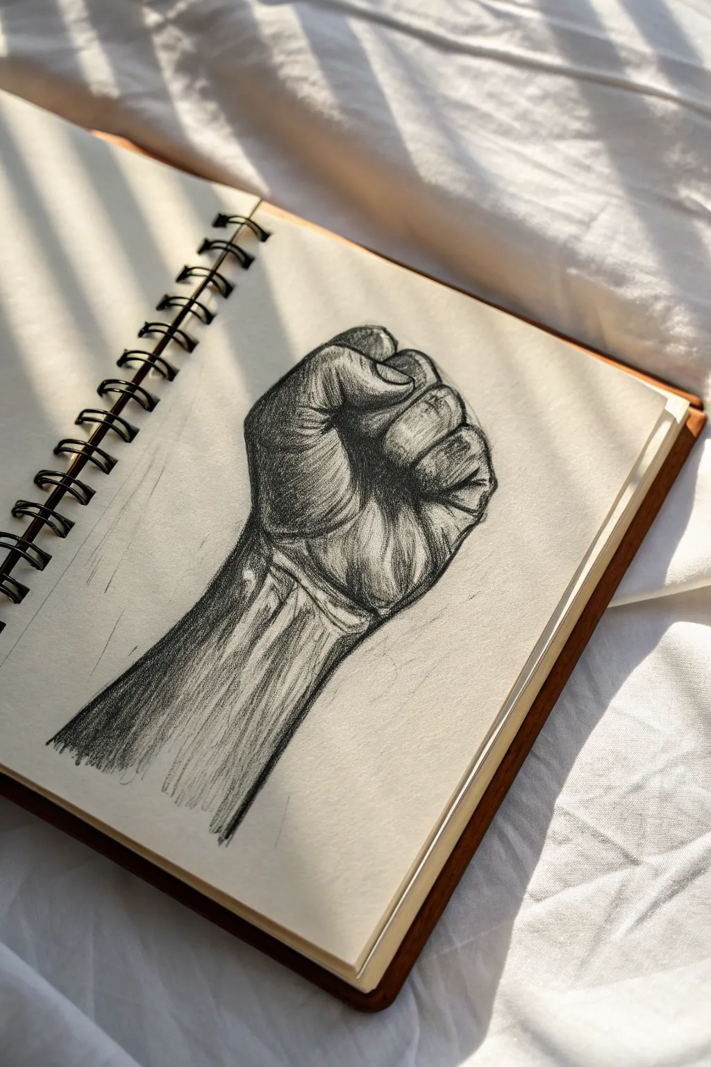
This project specifically explores how to capture the raw emotion of anger through anatomical tension. By focusing on heavy shading and sharp contour lines, you will create a powerful, realistic drawing of a fist that looks ready to strike.
Step-by-Step Tutorial
Materials
- Sketchbook with slightly textured paper
- HB pencil (for initial outlines)
- 2B and 4B graphite pencils (for shading)
- Kneaded eraser
- Blending stump or cotton swab
- Fine-point mechanical pencil (optional for details)
Step 1: Blocking Out the Structure
-
Establish the wrist angle:
Begin by drawing two diagonal parallel lines representing the forearm. Angle them slightly to the right to match the perspective in the reference. -
Define the palm shape:
At the end of the wrist lines, sketch a rough square shape. This box will serve as the base of the hand where the fingers will eventually curl in. -
Position the thumb:
Draw an oval shape overlapping the left side of your square base. The thumb in a fist tucks over the index and middle fingers, so position it horizontally across the top third of the palm box. -
Add finger segments:
Sketch the folded fingers as a series of connected, rectangular blocks stacking vertically next to the thumb. Don’t worry about details yet; just get the mass of the knuckles in place.
Fixing Smudged Highlights
If your drawing gets too dark or smudgy, take your kneaded eraser and shape it into a fine point. Simply ‘stamp’ or lift the graphite off the knuckles and tendons to restore the bright highlights.
Step 2: Refining the Anatomy
-
Outline the thumb knuckle:
Refine the thumb shape, emphasizing the sharp angle of the knuckle. Draw the thumbnail as a small, compressed oval to show the pressure being applied. -
Separate the fingers:
Draw the lines separating the folded fingers. Notice how the index finger is tucked tightest beneath the thumb, while the pinky finger on the far right creates the outer edge of the fist. -
Sketch the wrist tendons:
Lightly draw verbal lines running up the forearm. These aren’t just outlines; they represent the tendons straining against the skin. -
Add skin folds:
Mark the creases where the wrist meets the hand. Since the hand is bent backward slightly, these lines should look compressed and deep.
Level Up: Dramatic Lighting
make the shadows pure black ink instead of pencil. Use a brush pen for the darkest crevices between fingers to create extreme, comic-book style contrast.
Step 3: Shading and Tension
-
Establish the light source:
Observe that the light is coming from the top right. This means your darkest shadows will be on the left side of the arm and deep within the crevices of the fingers. -
Apply base shading:
Using the side of a 2B pencil, add a light layer of graphite over the entire arm, leaving the top of the knuckles and the upper forearm white for highlights. -
Darken the deep creases:
Switch to a 4B pencil. Press firmly to darken the lines between the fingers and the deep fold where the thumb presses against the index finger. -
Shade the forearm:
Use directional strokes running lengthwise down the arm. I like to make these strokes quick and somewhat rough to mimic the texture of muscle tension. -
Create the heavy shadow block:
On the left side of the wrist and palm, apply heavy, dense shading. This high contrast is crucial for making the form look 3D. -
Define the knuckles:
Add circular shading around the knuckle bumps. Leave the very center of each knuckle light to show the bone pressing against the skin. -
Blend selectively:
Use a blending stump to soften the transition from the dark shadow on the left to the mid-tones. Keep the strokes along the tendons rougher to maintain that strained look. -
Add tension lines:
With a sharp pencil, draw thin, scratchy lines radiating from the wrist and around the knuckles. These little details emphasize the vibration of anger.
Now you have a dynamic study of human anatomy that conveys emotion through simple lines and shadow


Anger As Fire in the Head
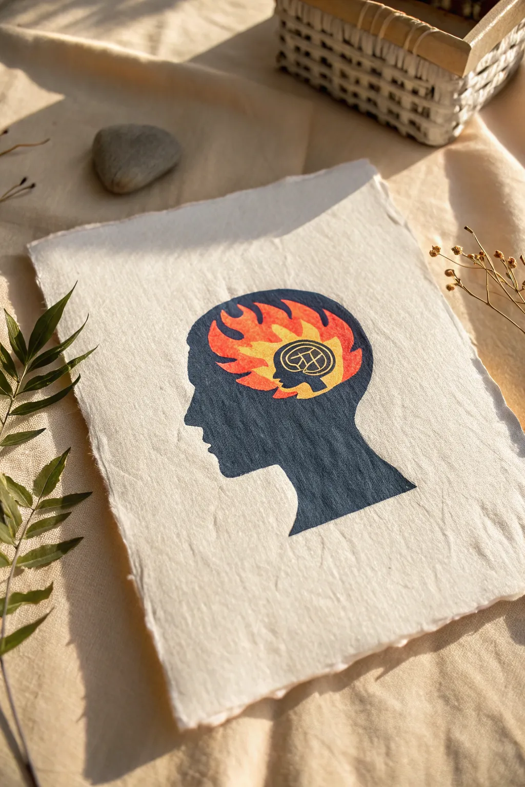
Visualizing anger as a contained fire is a powerful artistic exercise, and this project captures that intensity with striking contrast. Using a block printing technique on textured paper creates a raw, handmade feel that perfectly suits the emotional subject matter.
Step-by-Step Guide
Materials
- Soft linoleum block or rubber carving block (4×6 inch)
- Linoleum carving tools (V-gouge and U-gouge)
- Block printing ink (Black, Red, Orange, Yellow)
- Brayer (rubber roller)
- Bench hook or non-slip mat
- Handmade or textured cotton paper (white or cream)
- Pencil and tracing paper
- Baren or a clean wooden spoon
- Palette knife
- Small paintbrush for touch-ups
Step 1: Design & Carving
-
Draft the concept:
Begin by sketching the side profile of a human head on plain paper. Inside the cranium area, draw stylized flames. Near the forehead or eye region, sketch a small circular motif containing a brain-like or geometric symbol. -
Transfer the image:
Trace your final design onto tracing paper. Flip the tracing paper over (graphite side down) onto your linoleum block. Rub the back firmly to transfer the image; remember, your print will be a mirror image of the block, so this flipping step is crucial. -
Carve the negative space:
Using your V-gouge, carefully carve away the linoleum outside the head silhouette. This background area needs to be cleared so only the paper shows through. -
Detail the interior:
Switch to a smaller gouge to carve out the flame shapes inside the head. You are carving away the parts that will eventually be colored red/orange, leaving the black silhouette intact. Carve out the small circular symbol near the front as well.
Patchy Print?
If your print looks salty or speckled, you likely didn’t use enough ink or pressure. Apply a slightly thicker layer of ink next time, or dampen the paper very slightly with a spray mist before printing.
Step 2: Printing the Base Silhouette
-
Prepare the black ink:
Squeeze a small line of black block printing ink onto your inking plate or piece of glass. Roll the brayer back and forth until the ink sounds like ‘velcro’—a sticky, sizzling noise that indicates an even coat. -
Ink the block:
Roll the black ink onto your carved linoleum block. Ensure the entire head silhouette is fully covered, but be careful not to flood the fine lines in the inner symbol. -
Print the outline:
Place your textured handmade paper gently on top of the inked block. Using a baren or the back of a wooden spoon, rub the back of the paper in circular motions. Applying firm, even pressure helps transfer the ink into the paper’s texture. -
Reveal the print:
Slowly peel the paper back from one corner to reveal your black silhouette. The flame areas and the small symbol should be white (the color of the paper) at this stage. Let this dry completely, usually for about 24 hours depending on your ink.
Deckle Edge Effect
To get the torn look shown in the photo, create a ‘water tear.’ Paint a line of water where you want the edge, wait a moment for it to soak, then gently pull the paper apart along the wet line.
Step 3: Adding the Fire
-
Mix the fire gradient:
On your palette, place dabs of red, orange, and yellow ink near each other but not fully mixed. I like to use a clean brush or a small sponge for this part rather than a brayer to control the placement. -
Paint the flames:
Carefully paint into the white negative spaces where the flames are. Start with red at the outer edges of the flames, transitioning to orange, and finally yellow at the center to create a glowing effect. -
Fill the symbol:
For the small circular icon near the eye, use a fine-tip brush and very thinned-down orange or yellow ink (or even watercolor) to fill only the background of the circle, leaving the black lines distinct. -
Refine edges:
Because the paper is textured, you might have some rough edges. Use a very fine brush with a tiny amount of black ink to sharpen the profile or clean up the jawline if the print missed any spots. -
Dry and press:
Allow the colored sections to dry thoroughly. Once dry, place the print under a heavy book for a day to flatten out any buckling caused by the moisture.
Step back and observe how the vibrant colors contrast against the stark silhouette, creating a truly impactful piece of art

PENCIL GUIDE
Understanding Pencil Grades from H to B
From first sketch to finished drawing — learn pencil grades, line control, and shading techniques.
Explore the Full Guide
Steam Coming Out of Ears
Learn how to draw a striking portrait that conveys simmering frustration through subtle facial cues rather than comic exaggeration. This ink sketch focuses on the piercing gaze and tense posture of a character trying to keep their cool.
How-To Guide
Materials
- Sketchbook with smooth heavyweight paper
- HB graphite pencil for initial sketching
- Kneaded eraser
- Fine liner pens (sizes 0.1, 0.3, and 0.5)
- White gel pen (optional for highlights)
Step 1: Laying the Foundations
-
Establish the head shape:
Start lightly with your HB pencil. Draw a loose oval for the head, tilting it slightly to the left to suggest an over-the-shoulder glance. -
Map out facial guidelines:
Draw a vertical centerline that curves with the form of the face, placing it off-center to the right for a 3/4 view. Add a horizontal line for the eyes about halfway down the oval. -
Draft the jawline:
Define a strong, angular jawline. Since the character is turning his head, emphasize the tension in the neck muscles connecting to the jaw. -
Sketch the hair volume:
Outline the general shape of the hair. This figure has hair swept back from the forehead with some messy strands falling loose near the ear and nape.
Fix That Expression
If the face looks too neutral, darken and thicken the eyebrows, bringing them closer together. A small, sharp shadow line under the lower lip also adds instant tension.
Step 2: Constructing the Features
-
Place the eyes:
Sketch almond-shaped eyes along your guide line. The eyebrows should be drawn low and close to the eyes, furrowed downwards near the nose to indicate anger. -
Define the nose and mouth:
Draw the nose bridge connecting directly to the brow. Position the mouth slightly lower than usual; the lips should be set in a firm, displeased line, perhaps slightly asymmetrical to show a scowl. -
Add ear details:
Sketch the visible ear on the left side. It plays a key role here—make sure it sits between the eye and nose line horizontally. -
Detail the neck and collar:
Draw the sternocleidomastoid muscles (the V-shape in the neck) sharply to show the head turn. Sketch a simple collared shirt neckline to frame the portrait.
Step 3: Inking the Outline
-
Trace the main contours:
Using a 0.3 pen, carefully go over your pencil lines. Keep your hand steady but allow for some variation in line weight—thicker on the jaw shadow side, thinner on the lit forehead. -
Refine the hair strands:
Use long, sweeping strokes with the 0.3 pen for the hair. Follow the flow from the roots backward. I usually like to group strands together rather than drawing every single hair. -
Ink the facial features:
Switch to a 0.1 pen for delicate areas like the eyes and nose. Be careful not to outline the lips completely; just suggest the shadow line between them and the bottom curve of the lower lip.
Literal Interpretation
To match the ‘steam from ears’ theme, use a white gel pen or thin grey marker to draw playful, swirling vapor lines rising specifically from behind the ear area.
Step 4: Shading and Texturing
-
Fill the darks:
Use a 0.5 pen to fill in the deepest shadows, particularly under the chin, the inner shirt collar, and the darkest recesses of the hair. -
Hatching the shadows:
With the 0.1 pen, add fine hatching lines under the jaw, under the nose, and in the eye sockets. Keep the lines parallel and evenly spaced for a clean look. -
Detail the eyebrows:
Use short, quick flicks to build up the texture of the thick eyebrows. Make them dense to enhance the harsh expression. -
Add hair texture:
Go back into the hair with the 0.1 pen to add thinner, stray hairs. This messy texture adds to the feeling of agitation. -
Emphasize neck tension:
Add linear hatching along the neck muscles. The direction of your lines should follow the form of the muscle, curving around the cylinder of the neck. -
Clean up:
Once the ink is completely dry—wait at least five minutes to be safe—gently erase all underlying pencil sketch lines.
Now you have a moody character sketch that perfectly illustrates the quiet before the storm
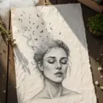
Messy Hair Scribble Storm
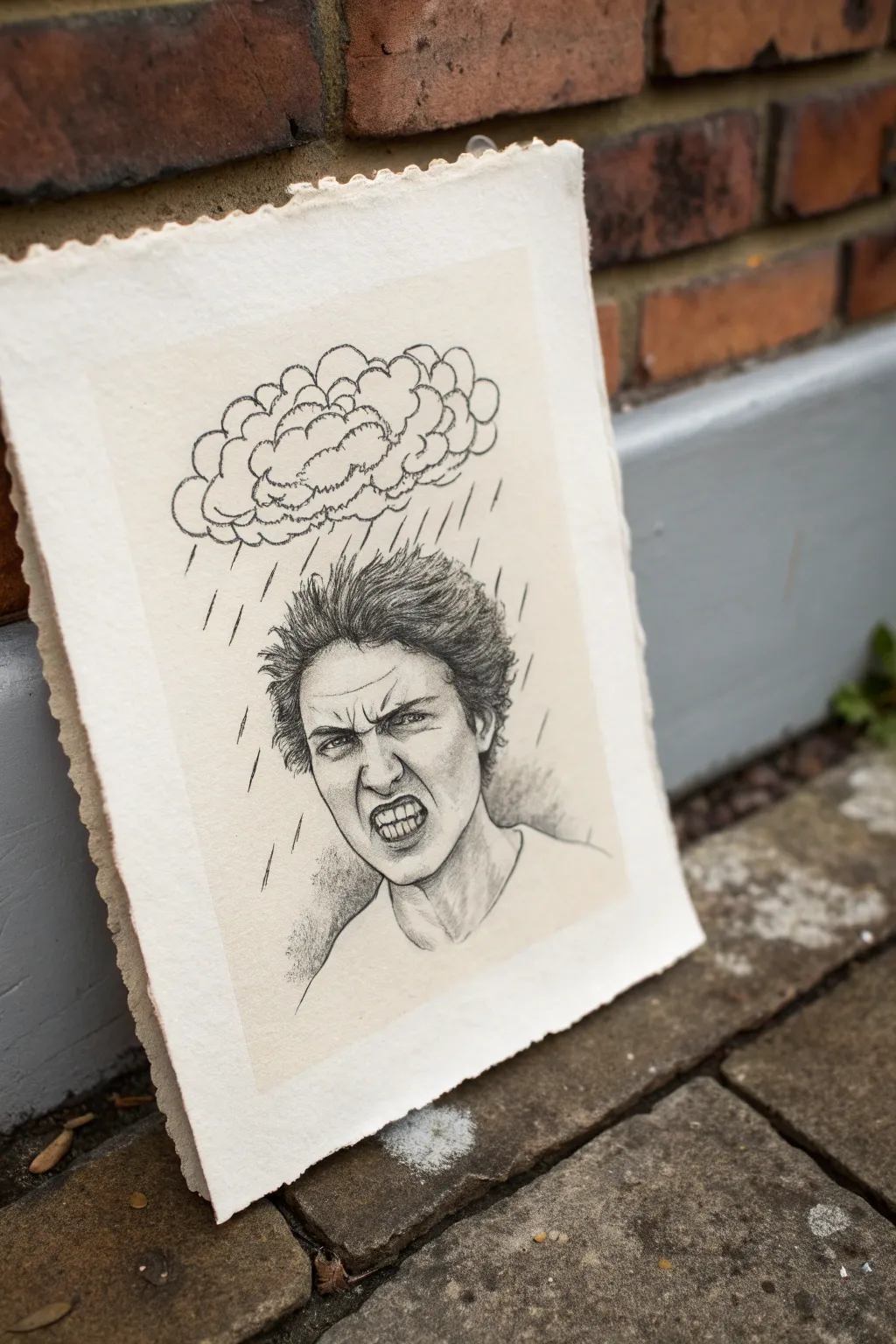
Visualizing frustration can be therapeutic, and this sketch captures that perfectly by combining a realistic portrait with a cartoonish raincloud element. You’ll create a striking black-and-white drawing on textured deckle-edge paper that emphasizes raw emotion through messy hair and sharp rain lines.
How-To Guide
Materials
- Heavyweight textured paper with deckle edge (cotton rag or watercolor paper)
- Graphite pencils (HB, 2B, 4B, 6B)
- Kneaded eraser
- Precision mechanical eraser (optional)
- Blending stump or tortillon
- Ruler (optional for rain lines)
Step 1: Planning and Sketching
-
Sketch the silhouette:
Start with a light HB pencil to outline the basic head shape. Keep the composition centered but leave plenty of room at the top for the cloud. -
Map out facial features:
Use faint guidelines to place the eyes, nose, and mouth. The expression is key here—scrunch the brows down low and open the mouth slightly to prepare for the clenched teeth. -
Draft the cloud structure:
Above the head, lightly draw a bulbous, lumpy cloud shape. It doesn’t need to be perfect; think of it like a floating brain or a cluster of bubbles hovering just over the hair.
Uneven Teeth?
If teeth look cartoonish, focus on drawing the *shadows* between them and the gums rather than outlining every single tooth individually.
Step 2: Drawing the Face
-
Define the eyes and brows:
Switch to a 2B pencil. Darken the eyebrows, drawing them angled sharply inward. Add wrinkles between the brows to emphasize the scowl. -
Detail the eyes:
Draw the iris and pupils sharply, staring intensely forward. Add darkness around the eyelids to show tension. -
Sculpt the nose and cheeks:
Use light shading rather than hard lines for the nose bridge. Add ‘scowl lines’ running from the nose wings down past the corners of the mouth. -
Draw the snarling mouth:
This is a focal point. Outline the lips pulled back in a grimace. Carefully draw the teeth, ensuring they look clenched together rather than individual chiclets. -
Shade the teeth:
Lightly shade the gums and the spaces between teeth with an HB pencil to give them depth without making them look decayed.
Pro Tip: Hair Texture
Don’t draw every strand. Create clumps of value first, then add loose, flying stray hairs at the very end for that electric, frantic look.
Step 3: Creating Texture and Atmosphere
-
Build the messy hair:
Using a 4B pencil, draw the hair with quick, erratic flicking motions. Make the strands point upward and outward as if charged with static electricity. I like to keep my wrist loose here to prevent the hair from looking too stiff. -
Deepen the shading:
Take a 6B pencil to the darkest areas—the pupils, nostrils, and the deep shadows under the chin and jawline. This high contrast brings the anger to life. -
Blend for realism:
Use a blending stump to smooth out the skin shading on the cheeks and forehead, but leave the hair rough and textured. -
Outline the cloud:
Go back to the cloud with a 4B pencil. Use a slightly shaky or bumpy line to give it a heavy, ominous weight. Add internal loops to show the billowy volume. -
Add the rain:
With sharp, decisive strokes, draw straight lines falling from the cloud. Vary their lengths and angles slightly to mimic a chaotic downpour hitting the figure. -
Refine the background:
Add subtle shading behind the shoulders to ground the figure, fading it out into the paper’s texture. -
Final highlights:
Use a kneaded eraser to lift pigment from the tip of the nose, the forehead, and the tops of the hair clumps to create highlights.
Now you have a powerful visual representation of a stormy mood captured on paper
BRUSH GUIDE
The Right Brush for Every Stroke
From clean lines to bold texture — master brush choice, stroke control, and essential techniques.
Explore the Full Guide
Anger Tear Tracks and Red Eyes
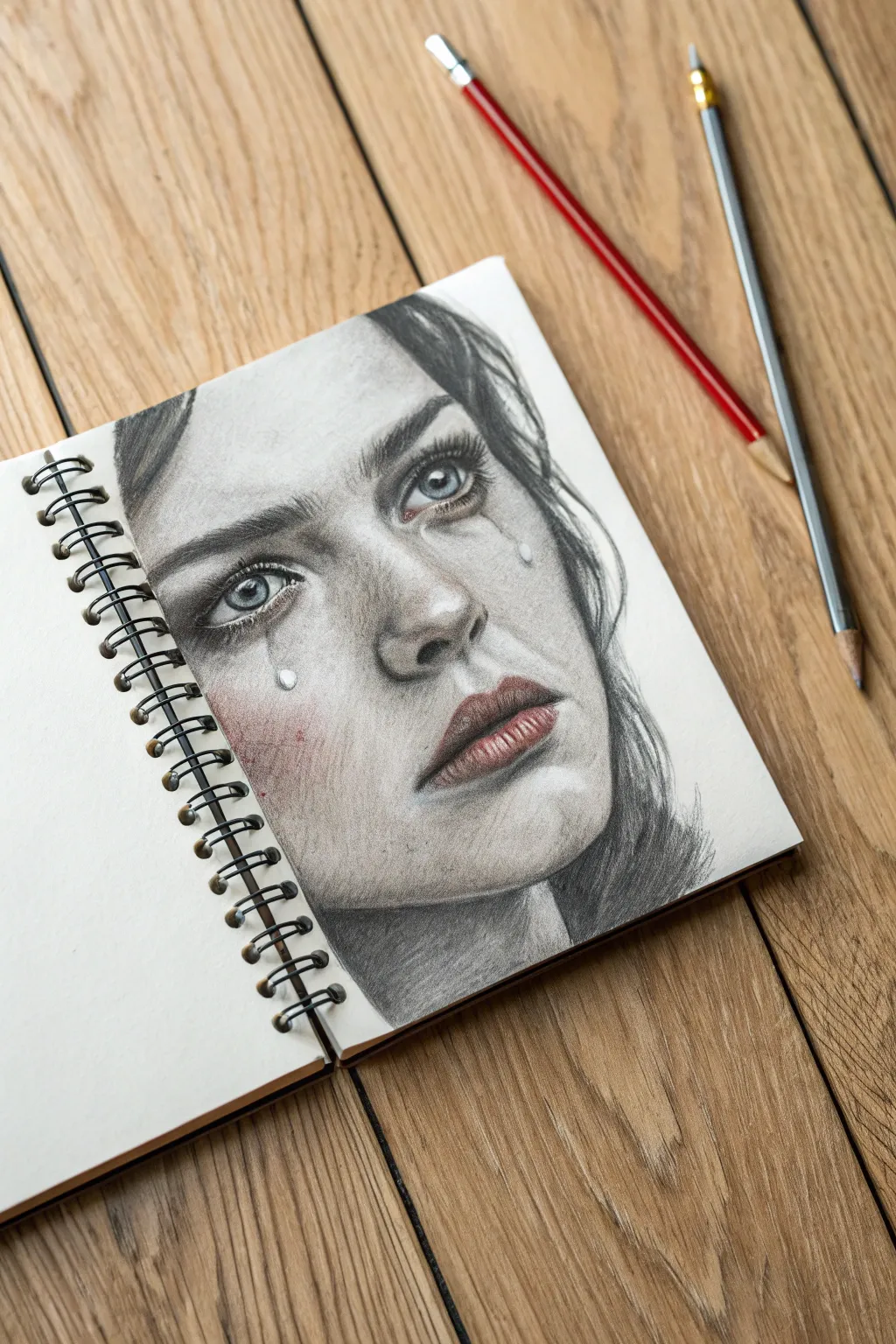
This emotive pencil study focuses on capturing raw emotion through the subtle application of color on a graphite base. The combination of hyper-realistic shading with stark, translucent tear tracks creates a compelling portrait of suppressed anger and sorrow.
Detailed Instructions
Materials
- Spiral-bound sketchbook (heavyweight paper)
- Graphite pencils (HB, 2B, 4B, 6B)
- Red colored pencil (wax or oil-based)
- White gel pen or gouache
- Blending stumps (tortillons)
- Kneaded eraser
- Pencil sharpener
Step 1: Drafting the Features
-
Establish the framework:
Start with a light HB pencil to sketch the basic outline of the face. Focus on the tilt of the head and the heavy, downturned angle of the eyebrows which will convey the core emotion. -
Refine the eyes:
Sketch the almond shape of the eyes. Pay close attention to the iris placement; having them slightly upward gazing adds to the feeling of holding back tears. -
Map the tear tracks:
Lightly draw the path of the tears. Draw one distinct droplet on the left cheek and a longer, trailing track on the right cheek. Keep these lines very faint for now.
Step 2: Graphite Shading
-
Base skin tones:
Using a 2B pencil and a light hand, shade the forehead, nose, and cheeks. Use a blending stump to smooth the graphite into a soft skin texture, avoiding the areas mapped for tears. -
Deepen the shadows:
Switch to a 4B pencil to deepen the shadows around the eye sockets, under the nose, and the hollows of the cheeks. This high contrast is crucial for realism. -
Define the eyebrows:
Use short, flicking strokes with a sharp 6B pencil to create individual brow hairs. Make them dense and slightly furrowed. -
Render the irises:
Fill in the pupils with solid black. Shade the irises with radiating lines, leaving small white circles for the catchlights to make the eyes look wet and glassy. -
Draw the hair:
Block in the hair with broad strokes of the 6B pencil. Use the edge of the lead for volume and the tip for individual stray strands falling across the forehead.
Pro Tip: Realistic Tears
Tears aren’t just water; they act as lenses. When shading a tear track, slightly lighten the skin tone underneath the droplet to mimic refraction before adding the white highlight.
Step 3: Color & Texture
-
Apply the red tone:
Take your red colored pencil and very lightly shade the tip of the nose, the cheeks, and the rim of the lower eyelids. This indicates the flushing associated with crying. -
Enhance the lips:
Layer the red pencil over the lips, pressing slightly harder in the center. Texture the lips with vertical hatching lines to show cracks and fullness. -
Blend the color:
Use a clean tortillon to blend the red pigment into the gray graphite. I prefer to do this gradually so the transition looks like flushed skin rather than makeup. -
Detail the tears:
With a sharp pencil, darken the shadow on one side of the tear track and the drop. This cast shadow gives the liquid volume. -
Add highlights:
Use a white gel pen or a fine brush with white gouache to add the brightest highlights. Place a tiny dot inside the tear drop and along the wet rim of the lower eyelid. -
Create skin texture:
Lightly stipple a few pores on the nose and cheeks using a dirty blending stump or a dull HB pencil to break up the smoothness.
Troubleshooting: Muddy Colors
If blending graphite and red pencil creates a muddy look, apply a workable fixative spray over the graphite layer first. Once dry, layer the red pencil on top for cleaner saturation.
Step 4: Final Touches
-
Reinforce contrast:
Go back with your darkest pencil (6B) and re-darken the pupils, nostrils, and corners of the mouth to make the features pop. -
Soften edges:
Use the kneaded eraser to lift barely noticeable highlights on the bridge of the nose and the forehead. -
Clean up:
Erase any smudges surrounding the face to ensure the portrait stands out clearly against the white paper.
Now you have a deeply expressive portrait that captures a fleeting, powerful moment
Shattered Glass Reflection Face
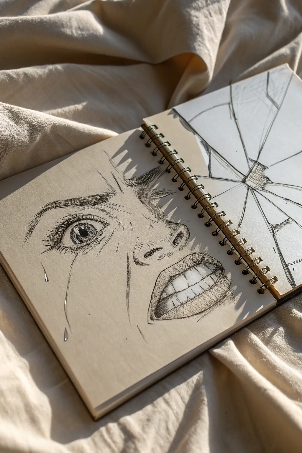
Capturing raw emotion, this striking sketchbook spread juxtaposes a detailed, expressive facial study with the abstract geometry of broken glass. Using tan-toned paper adds instant depth and allows for dramatic highlights, making the anger and anguish feel immediate and visceral.
Step-by-Step Guide
Materials
- Tan-toned sketchbook (spiral bound)
- Graphite pencils (HB, 2B, 4B)
- Fine liner pens (Black, 0.1mm and 0.5mm)
- White Gel pen or charcoal pencil
- Ruler
- Kneaded eraser
Step 1: Planning the Reflection
-
Map out the composition:
Begin by lightly sketching the layout across two facing pages. On the left page, mark the placement for a large, zoomed-in portion of a face. On the right page, draw a central point near the spiral binding where the ‘impact’ occurred, radiating lines outward to represent cracks. -
Define the face proportions:
On the left page, sketch the rough outlines of the eye, nose, and open mouth. The angle is crucial here—tilt the features slightly upwards to convey distress. Keep your pencil pressure very light so you can erase easily later. -
Draft the glass shards:
On the right page, use a ruler to sharpen those radiating lines. Connect them with jagged, perpendicular lines to create the individual shards of glass. Some shards should be large, others tiny slivers near the impact zone.
Step 2: Drawing the Emotion
-
Outline the eye:
Switch to a sharper pencil or fine liner. carefully outline the eye shape. Draw the iris and pupil, leaving a small white reflection spot to make it look wet and alive. Add the creases of the eyelid, exaggerating them slightly to show the tension of the expression. -
Detail the iris:
Fill in the iris with radiating lines from the pupil outward. Darken the outer ring of the iris to add depth. I like to shade the upper part of the eyeball slightly to show the shadow cast by the eyelid. -
Lashes and brows:
Draw the eyelashes in clumps rather than individual uniform hairs. Sketch the eyebrow with quick, upward strokes, furrowing it deeply toward the nose bridge to emphasize anger. -
Nose and skin texture:
Define the nostril with a dark, confident curve. Add light hatching lines around the nose bridge and under the eye to suggest skin crinkling and tension. These lines shouldn’t be solid; use broken strokes. -
The mouth and teeth:
Outline the open mouth. Draw the teeth clearly, but avoid outlining each individual tooth too harshly; instead, suggest their separation with small ticks at the gum line and biting edge. Shade the gums slightly darker than the teeth. -
Shading for volume:
Using a 2B or 4B pencil, shade the inside of the mouth (the negative space) completely dark. This high contrast will make the teeth pop. Begin adding shading to the lips, using vertical curved lines to mimic their texture. -
Adding tears:
Draw a thin, winding path for a tear running down the cheek. Don’t outline it heavily; instead, create the ‘tear’ shape by darkening the skin right next to it, leaving the tear itself the color of the paper.
Teeth looking flat?
Avoid outlining teeth with thick lines. Instead, shade the gums and the dark space inside the mouth to let the teeth emerge as negative space. It looks much more realistic.
Step 3: The Shattered Glass
-
Inking the cracks:
Take your fine liner and go over your ruler lines on the right page. Variate the line weight—make the main cracks thicker and the connecting spider-web cracks thinner. -
Adding dimension to shards:
Pick a light source direction. Shade one side of each ‘shard’ lightly with graphite to give the illusion that the glass is distinct from the paper behind it. -
The impact point:
Near the spiral binding where the cracks converge, create a dense cluster of tiny shapes and cross-hatching. This represents the pulverized glass at the center of the smash.
Pro Tip: Line Weight
Vary your pressure. Use heavy, dark strokes for the depths of the mouth and pupil, but feather-light, broken strokes for skin wrinkles to avoid aging the face unintentionally.
Step 4: Final Touches
-
Deepen the darks:
Return to the face. Re-darken the pupil, the inside of the mouth, and the deepest facial creases. This contrast is what gives the drawing its intensity. -
White highlights:
Using a white gel pen or charcoal pencil, add bright highlights. Hit the ‘wet’ areas: the tear duct, the bottom of the visible tear, the curve of the lower lip, and the brightest point on the teeth. -
Glass reflections:
Add a few sharp white lines along the edges of the big glass shards on the right page. This suggests the sharp, reflective edge of broken glass.
Close your sketchbook gently to preserve the graphite and step back to appreciate the emotional intensity of your work

Have a question or want to share your own experience? I'd love to hear from you in the comments below!