If you want a drawing that feels like a real keepsake, the secret is to anchor it to the couple’s specific story—dates, places, little rituals, and all. Here are my favorite anniversary drawing ideas, starting with the classics you can sketch fast and building up to more creative, personalized showstoppers.
Hand-Lettered Happy Anniversary Card Front


Celebrate love with this clean and classic hand-lettered card design that proves sometimes less is truly more. Using stark black ink on crisp white cardstock, you’ll create a professional-looking greeting characterized by elegant typography and simple heart motifs.
How-To Guide
Materials
- High-quality white cardstock (square, 5×5 or 6×6 inches folded)
- Pencil (HB or 2H)
- Eraser (kneaded or white polymer)
- Ruler
- Fine-tip black drawing pen (0.3mm or 0.5mm)
- Medium-tip black brush pen or calligraphy marker
- Black marker (bullet tip)
Step 1: Planning and Layout
-
Prepare the card base:
Cut your white cardstock to size if it isn’t pre-cut. A square format works best for this design, so try cutting a 10×5 inch strip and folding it in half to create a 5×5 inch card. Ensure the crease is sharp using a bone folder or the back of a spoon. -
Mark the margins:
Using your ruler and pencil, lightly mark a horizontal guideline about 1/2 inch from the top edge and another 1/2 inch from the bottom edge. These will serve as the anchors for your border hearts. -
Draft the text placement:
Locate the visual center of the card. Lightly sketch two horizontal lines near the middle. The top line will hold the word ‘HAPPY’ in serif font, and the line below it will be for ‘Anniversary’ in script. -
Space the letters:
Roughly sketch the letters with a pencil to get the spacing right. ‘HAPPY’ should be centered and upright. ‘Anniversary’ should be slightly wider, flowing across the card beneath it.
Step 2: Lettering the Sentiment
-
Draw the main serif text:
Switch to your fine-tip black pen. Carefully outline the word ‘HAPPY’ using a classic serif font style. Keep the vertical lines slightly thicker than the horizontal crossbars if you want to mimic the printed look shown in the reference. -
Fill the serif letters:
Once the outlines are precise, fill in the letters completely with black ink. I find that going over the edges a second time helps sharpen the corners of the serifs. -
Letter the script text:
For ‘Anniversary’, use a medium-tip brush pen or simply thicken the downstrokes of your standard pen to create a faux-calligraphy look. The style should be bouncy and fluid, contrasting with the rigid text above. -
Connect the script:
Ensure the letters in ‘Anniversary’ connect smoothly. Pay attention to the ‘r’ and ‘s’ shapes, keeping them loose and legible.
Ink Smearing?
If your eraser drags ink across the paper, the ink wasn’t fully dry. Use a piece of clean scrap paper under your hand as a guard while you draw to prevent oils from affecting drying time.
Step 3: Adding Decorative Elements
-
Sketch the center hearts:
Directly below the text, lightly pencil in three hearts. The middle heart should be slightly taller and narrower, while the two outer hearts are smaller and float slightly higher. -
Ink the center hearts:
Trace over these three hearts with your fine-tip pen. Keep the line weight consistent and thin; do not fill these in. They should remain open outlines. -
Plan the border spacing:
Along your top and bottom pencil guidelines, make small tick marks to space out the tiny border hearts evenly. You’ll want about 7 hearts across the top and 7 across the bottom. -
Draw the border hearts:
Using the bullet tip marker or a thick drawing pen, draw the small hearts along the top and bottom edges. These should be fully filled in with solid black ink. -
Refine the shapes:
Go back over the solid hearts to ensure they are uniform in size and have smooth, rounded tops. They should look like stamped impressions.
Add Some Shine
For a subtle upgrade, go over the three outline hearts in the center with a clear gel glitter pen or clear embossing powder. It adds texture without disrupting the minimalist black-and-white theme.
Step 4: Finishing Touches
-
Let the ink cure:
Wait at least 10 to 15 minutes for the ink to dry completely. Black markers can smudge easily on smooth cardstock if you rush this step. -
Erase guidelines:
Gently erase all pencil lines. Hold the paper taut with one hand while erasing to prevent the paper from crinkling or buckling. -
Inspect the contrast:
Check your lettering for any white spots or uneven edges. Touch up the ‘HAPPY’ text or the border hearts with your finest pen to get that crisp, professional finish.
Now you have a timeless, elegant card ready to make someone’s special day even more memorable

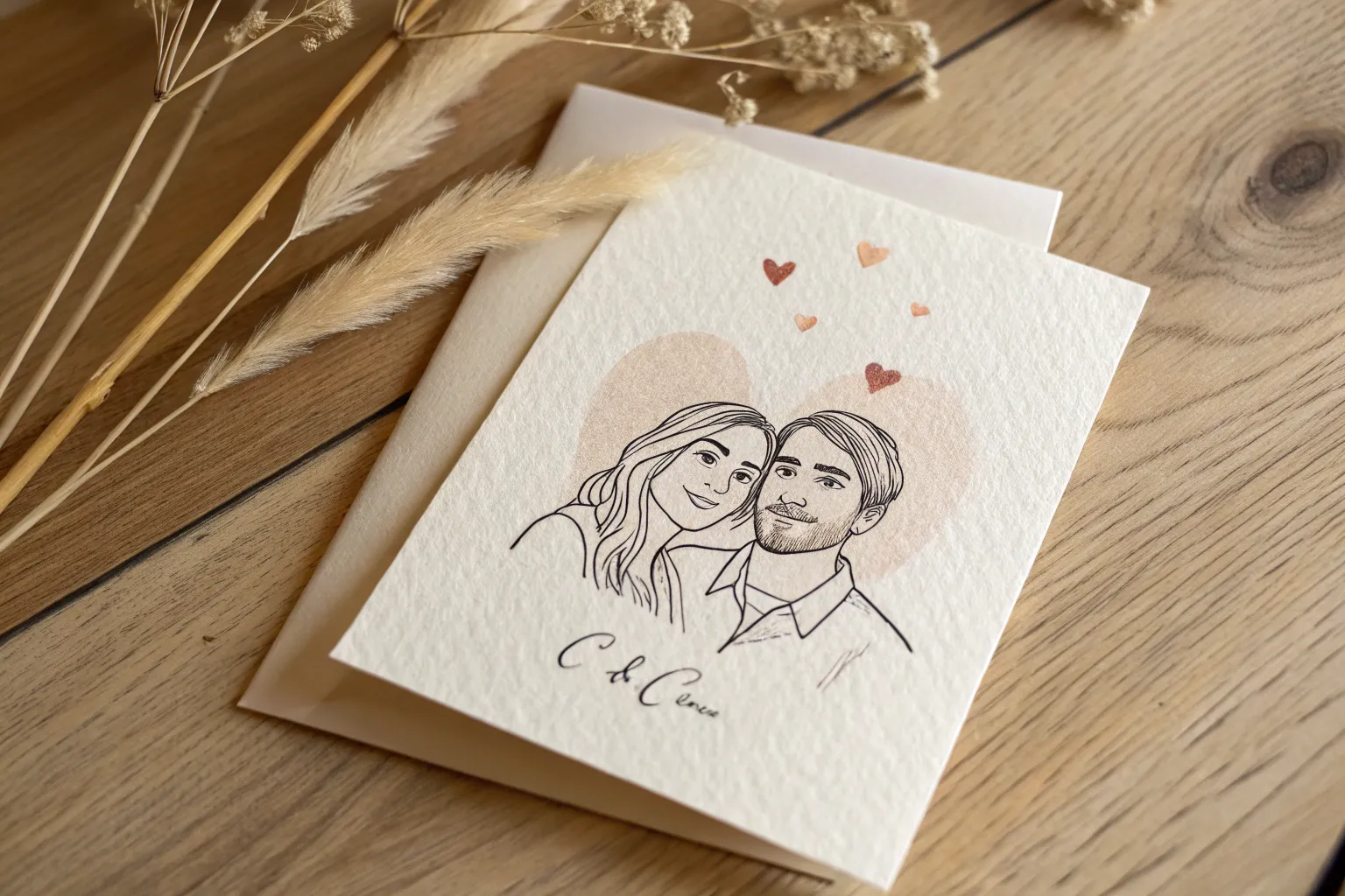
Simple Line-Art Couple Portrait
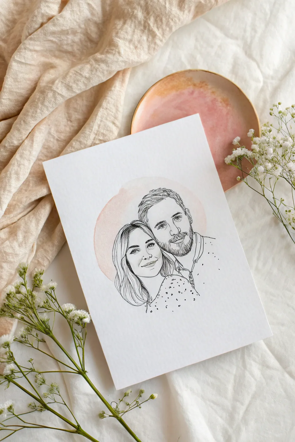
Capture the essence of your favorite couple with this elegant mixed-media portrait that combines crisp black line work with a soft, romantic watercolor wash. The result is a modern, personalized keepsake that feels both artistic and heartfelt without requiring photorealistic shading skills.
Step-by-Step Guide
Materials
- Heavyweight watercolor paper (300gsm cold press recommended)
- Fine liner pens (sizes 005, 01, and 03)
- Pencil (HB or 2H)
- Eraser (kneaded eraser creates less dust)
- Watercolor paint (pale pink or peach)
- Medium round watercolor brush (size 6 or 8)
- Reference photo of the couple
- Light box or bright window (optional for tracing)
Step 1: Preparation & Sketching
-
Select your reference:
Choose a clear photo where the couple’s heads are close together. Good lighting is key so you can see facial features clearly. -
Prepare your composition:
If you aren’t confident drawing freehand, print your photo to the size you want the final artwork to be. Alternatively, edit the photo digitally to turn it black and white and high contrast to help you see the main lines. -
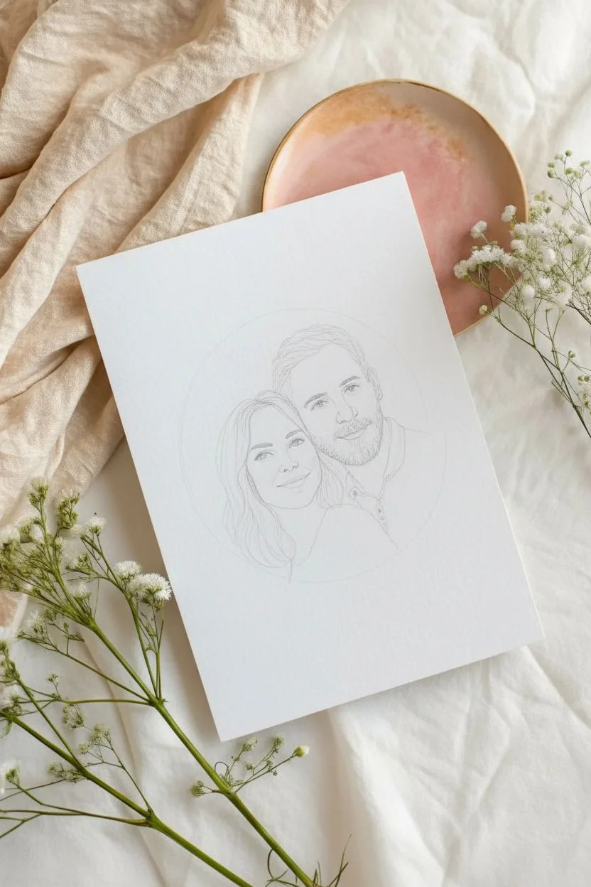
Create the base sketch:
Lightly sketch the outlines of the figures onto your watercolor paper using an HB or 2H pencil. Focus on the jawlines, hair shapes, eyes, nose, and mouth placement. -
Refine the details:
Keep your pencil marks extremely faint. You only need enough information to guide your pen later. Avoid shading with the pencil; stick to pure contours.
Tracing Made Easy
Tape your photo to a window on a sunny day with your watercolor paper taped over it. The sunlight acts as a perfect natural lightbox for tracing key outlines.
Step 2: The Watercolor Backdrop
-
Mix your wash:
Create a very diluted puddle of pale pink or peach watercolor paint. You want a whisper of color, not a saturated blotch, so add plenty of water. -
Paint the circle:
Paint a loose, circular shape roughly where the couple’s heads will be. It doesn’t need to be a perfect circle—an slightly organic, imperfect round shape adds charm. -
Soften edges:
While the paint is still wet, you can dab the edges with a clean, damp brush if you want them softer, or let them dry naturally for a crisp watercolor edge like in the example. -
Let it dry completely:
This is crucial. The paper must be bone dry before you start inking, otherwise your fine liner pens might bleed or drag on the damp fibers.
Step 3: Inking the Portrait
-
Outline main features:
Using an 01 size pen, start inking the primary facial features like eyes and noses. Go slow and use deliberate strokes. -
Define the hair:
Switch to a slightly thicker 03 pen for the main hair outlines to give them weight. For the individual strands inside the hair shape, switch back to an 005 or 01 to keep the texture light and airy. -
Capture the facial hair:
For beards or stubble, use short, vertical hatching strokes with your finest pen tip (005). Don’t outline every hair; suggest the texture through clusters of lines. -
Add clothing details:
Outline the collars and shoulders simply. If the clothing has a pattern (like the dots in the example), add those freely now to create visual interest. -
Vary line weight:
I like to go back over the ‘shadow side’ of the jawline or neck with a slightly thicker line. This adds subtle dimension without actual shading.
Golden Touch
Once the black ink is dry, use a gold metallic paint pen to add small accents, like jewelry or dots on the clothing, for a luxe anniversary vibe.
Step 4: Finishing Touches
-
Erase pencil marks:
Once you are absolutely certain the ink is dry (give it at least 15 minutes), gently erase your initial pencil sketch. Hold the paper taut so it doesn’t crinkle. -
Assess the balance:
Look at the drawing from a distance. If the watercolor circle looks too faint, you can carefully glaze another very light layer over it, staying within the original lines. -
Sign your work:
Add a tiny signature or the date near the bottom edge in your smallest pen size.
Now you have a timeless piece of art ready to be framed and gifted to someone special


Hands With Rings Close-Up Drawing
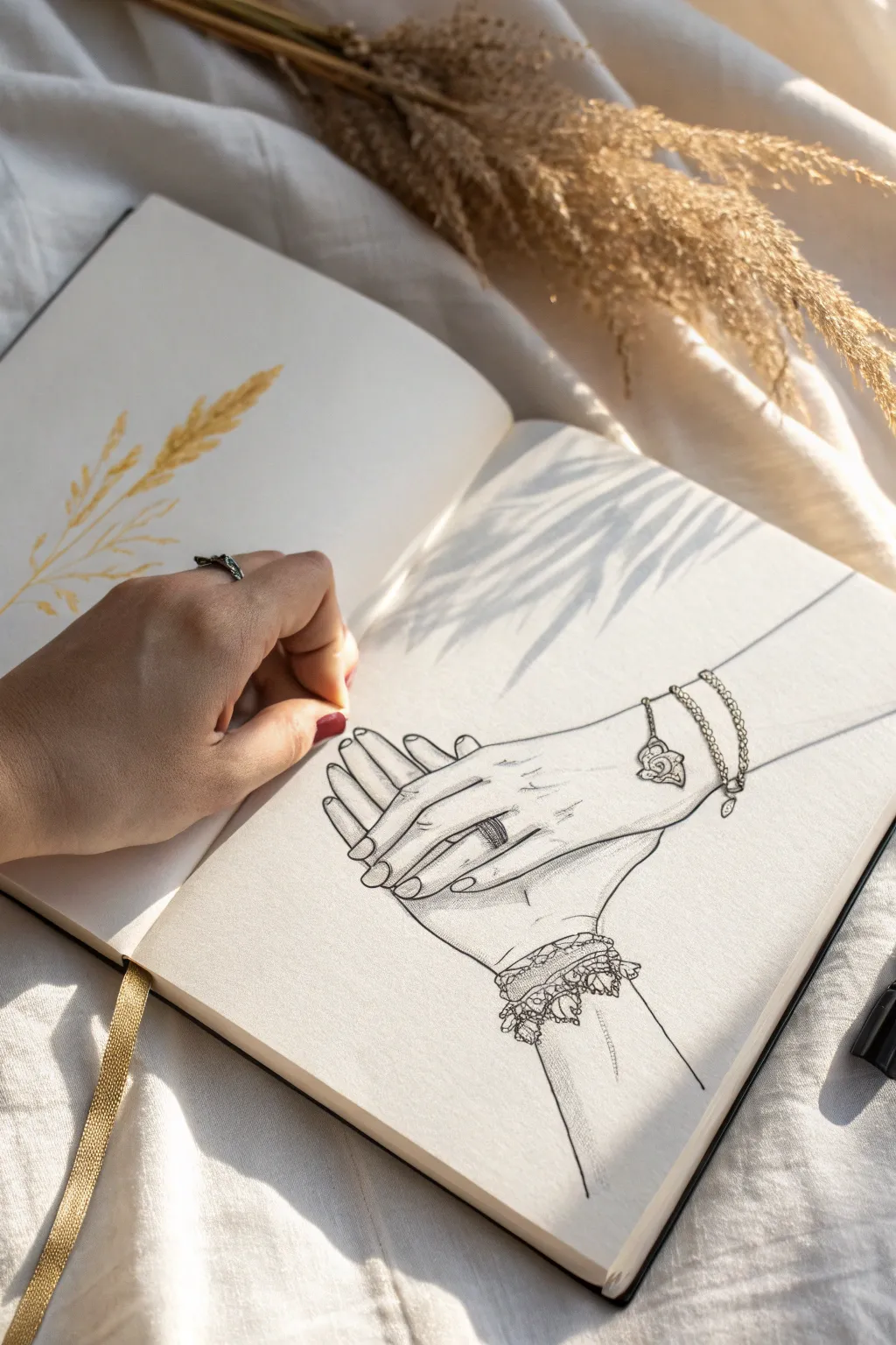
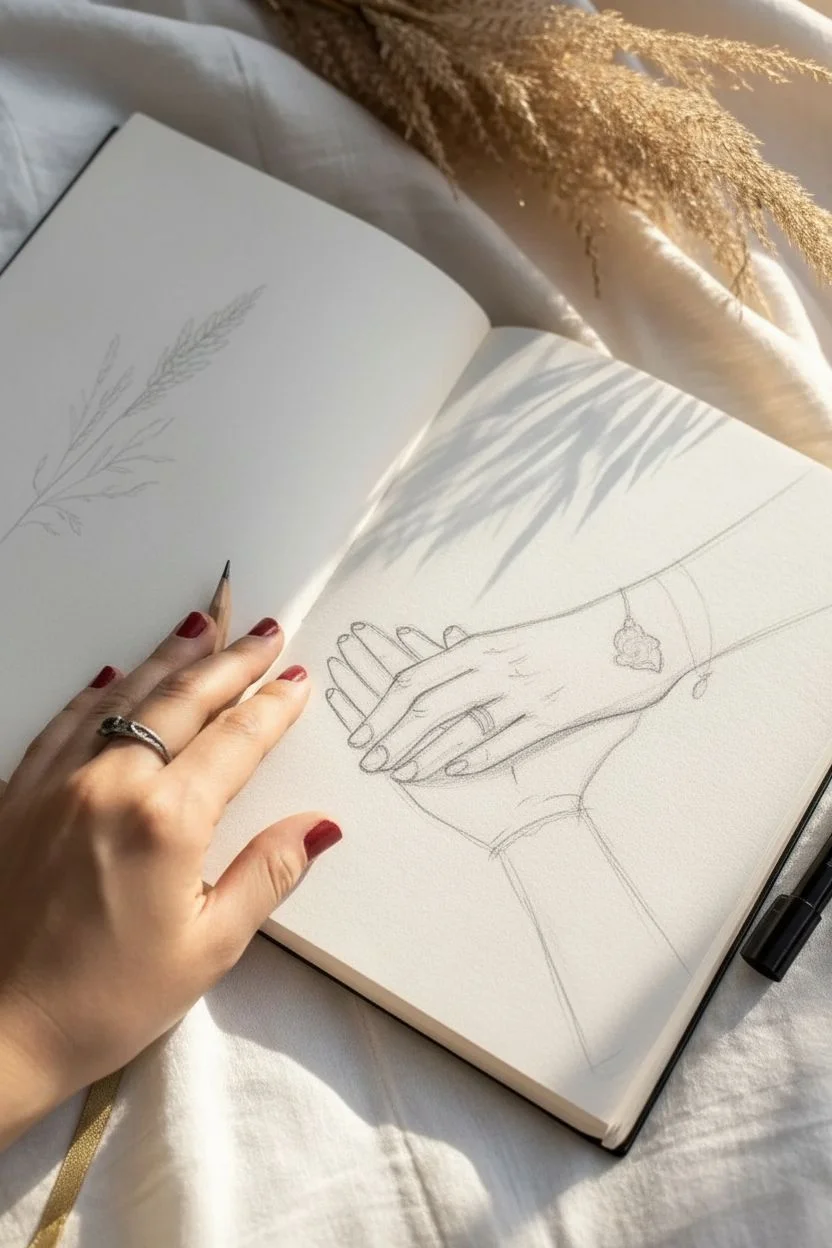
Capture the intimacy of a relationship with this delicate line art drawing of two hands gently clasping. This sketch focuses on the fine details of jewelry and lace to symbolize precious shared moments.
Detailed Instructions
Materials
- Smooth heavyweight sketchbook paper
- HB graphite pencil
- Fine liner pens (sizes 0.1, 0.3, and 0.5)
- Kneaded eraser
- Ruler (optional)
Step 1: Planning and Sketching
-
Establish the Hand Composition:
Begin by lightly sketching the basic shapes of the two hands. Draw the lower hand first, resting palm-up, as a simple blocky shape for the palm and elongated ovals for fingers. -
Position the Upper Hand:
Sketch the outline of the second hand resting on top. Ensure the palm creates a gentle curve over the bottom hand’s fingers, suggesting a soft, comfortable grasp rather than a tight grip. -
Refine Finger Placement:
Draw the individual fingers. For the bottom hand, only the tips might be visible wrapping around. For the top hand, sketch slender fingers extending slightly past the bottom hand’s palm, paying attention to the knuckles’ placement. -
Add the Wrist Lines:
Extend lines for the wrists and forearms. These lines should taper slightly towards the elbows to create perspective and draw the eye toward the clasped hands. -
Sketch Jewelry Details:
Lightly pencil in the accessories. Add the band of a ring on the top hand’s ring finger and sketch the draping curves of the bracelet chains around the wrist. -
Draft the Lace Cuff:
Around the bottom hand’s wrist, sketch the rough outline of a lace frill. Don’t worry about the intricate pattern yet; just establish the width and wavy silhouette of the fabric.
Uneven Proportions?
Take a photo of your sketch with your phone before inking. Viewing the image on a screen often reveals awkward finger lengths or wrist angles you missed on paper.
Step 2: Inking the Outlines
-
Outline the Hands:
Using a 0.3 fine liner, trace over your definitive pencil lines for the hands. Keep your hand steady and use continuous strokes for the long lines of the arms to keep them smooth. -
Detail the Fingernails:
Switch to a 0.1 pen for the fingernails. Draw the cuticles and the free edge of the nail with very delicate, thin lines to keep the hands looking elegant. -
Ink the Ring:
With the 0.3 pen, carefully outline the ring. If it has a stone or texture, use tiny dots or hatching to suggest sparkle without darkening it too much. -
Create the Bracelet Chains:
For the bracelet chains, I find it easiest to draw huge numbers of tiny interconnected ovals or ‘U’ shapes depending on the chain style. Add the heart charm dangling naturally with gravity. -
Illustrate the Lace Pattern:
Using the 0.1 pen, draw the intricate lace cuff. Create a pattern of small flowers or geometric nets, letting the ink lines break slightly to suggest the delicate, airy nature of the fabric.
Pro Tip: Shadow Continuity
Make sure all your hatching lines go in the same direction. Consistent diagonal shading makes the drawing look cleaner and deeper than scribbled shading.
Step 3: Shading and Finishing
-
Erase Pencil Guidelines:
Wait until the ink is completely dry—usually about 5 to 10 minutes—then gently erase all graphite marks with a kneaded eraser to leave a clean black-and-white image. -
Add Skin Textures:
Use the 0.05 or 0.1 pen to add very faint crease lines at the knuckles and palms. These should be broken lines, not solid, to show skin folds without aging the hands excessively. -
Shade Contact Points:
Apply light hatching (diagonal lines) where the hands touch or overlap. This casts a shadow from the top hand onto the bottom one, adding depth and dimension. -
Deepen the Jewelry shadows:
Add slightly heavier shading under the bracelet and ring. This small shadow makes the metal items look like they are sitting on top of the skin rather than drawn into it. -
Review Line Weight:
Look over the drawing. Strengthen the outermost contour lines with a 0.5 pen to separate the subject from the background, making the hands pop off the page.
This sentimental artwork serves as a timeless reminder of connection and makes a beautiful anniversary gift.


Anniversary Toast Still Life (Flutes and Cake)
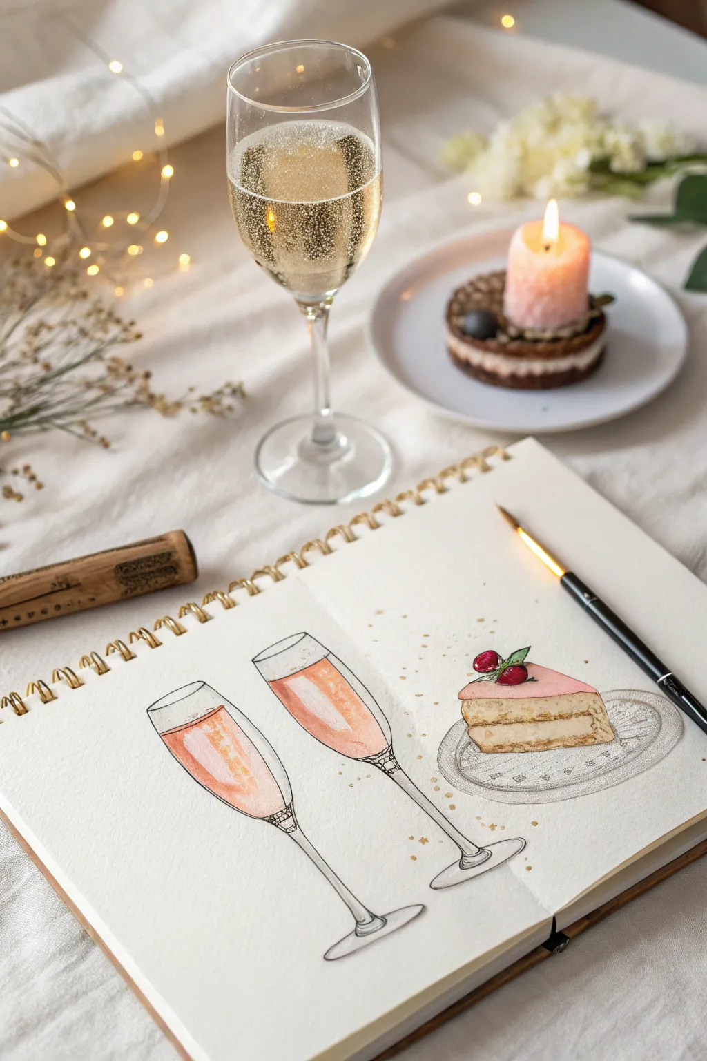
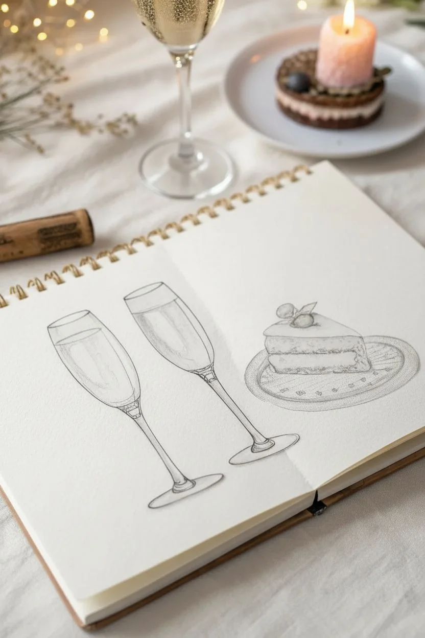
Capture the effervescence of a special occasion with this delicate watercolor and ink illustration featuring two clinking champagne flutes and a slice of celebratory cake. This project combines crisp linework with soft, blended washes to create a romantic keepsake directly in your sketchbook.
Step-by-Step Guide
Materials
- Heavyweight sketchbook (hot press or mixed media paper preferred)
- Fine liner pens (sizes 005, 01, and 03, black ink)
- Watercolor paint set
- Round watercolor brush (size 4 or 6)
- Small detail brush (size 0 or 1)
- Pencil (HB or 2H)
- Kneaded eraser
- Gold metallic watercolor or gel pen
- Jar of clean water
- Paper towel
Step 1: Pencil Sketching
-
Draft the Flute Shapes:
Start by drawing two tall, slender ovals for the flute rims, tilting them slightly towards each other. From the base of each oval, extend long, tapered lines downward to form the bowl of the glasses. -
Add Stems and Bases:
Draw thin, straight lines descending from the glass bowls to create the stems. Finish with a flat, wide oval at the bottom for the foot of each glass. -
Sketch the Cake Slice:
To the right of the glasses, sketch a triangular prism shape for the cake slice. Define the layers inside the cake and top it with a thick layer of frosting. -
Refine Details:
Lightly sketch the liquid level inside the flutes. Add small circles for the garnish on top of the cake, such as berries or mint leaves, and draw a simple oval underneath the cake to represent a plate.
Uneven Washes?
If your watercolor dries with harsh watermarks, try pre-wetting the paper area with clean water first (wet-on-wet technique). This helps color bloom softly without hard edges.
Step 2: Inking the Outline
-
Trace Primary Lines:
Using your 01 fine liner, carefully trace over your pencil lines. Focus on smooth, continuous strokes for the long lines of the champagne flutes. -
Add Decorative Details:
Switch to a 005 pen for delicate details. Add a small decorative band where the stem meets the bowl of the glass. Draw tiny, imperfect dots and lines on the plate to suggest a pattern or texture. -
Clean Up:
Once the ink is completely dry—I usually wait at least 5 minutes to be safe—gently erase the underlying pencil structure with your kneaded eraser.
Step 3: Watercolor Washes
-
Paint the Champagne Base:
Mix a very dilute wash of peach or salmon pink. While the paper is dry, paint the liquid area inside the flutes, leaving a few white gaps near the top or sides to represent glass reflections. -
Deepen the Liquid Color:
While the first layer is still damp, drop in a slightly more saturated reddish-orange hue at the bottom of the liquid area. Let this bleed upward naturally to create a gradient effect. -
Color the Cake Sponge:
Mix a warm ochre or biscuit color. Paint the cake layers, keeping the wash fairly flat. Leave the cream filling layer white or paint it with an extremely pale cream wash. -
Frost the Cake:
Use a light pink wash for the frosting on top of the cake. If you want shadowing, wait for it to dry and add a second, thinner stroke of pink on one side. -
Paint the Plate:
Apply a very light grey wash to the plate area. Keep the edges soft by using a damp brush to feather the paint outwards, so it doesn’t look like a solid cutout.
Level Up: Lettering
Use the negative space above the cake to add calligraphy. Writing ‘Cheers to us’ or the anniversary date in gold ink ties the whole memory together nicely.
Step 4: Final Flourishes
-
Add Glass Reflections:
Once the ‘champagne’ is dry, use a very dilute blue-grey to paint thin vertical lines along the empty top parts of the glass bowls and the stems to simulate transparency. -
Detail the Berries:
Paint the berries on the cake with a deep crimson or alizarin crimson. Leave a tiny speck of white paper on each berry for a highlight. -
Create Bubbles:
Using your gold metallic paint or a gel pen, add tiny dots rising through the liquid in the glasses. Cluster them slightly at the bottom and let them drift upward. -
Confetti Sprinkles:
Splatter or deliberately dot small gold spots around the glasses and cake on the white background to give the composition a festive, celebratory atmosphere.
Now you have a charming visual memory of your anniversary toast preserved forever in your sketchbook
BRUSH GUIDE
The Right Brush for Every Stroke
From clean lines to bold texture — master brush choice, stroke control, and essential techniques.
Explore the Full Guide
Cute Animal Couple That Matches Their Vibe
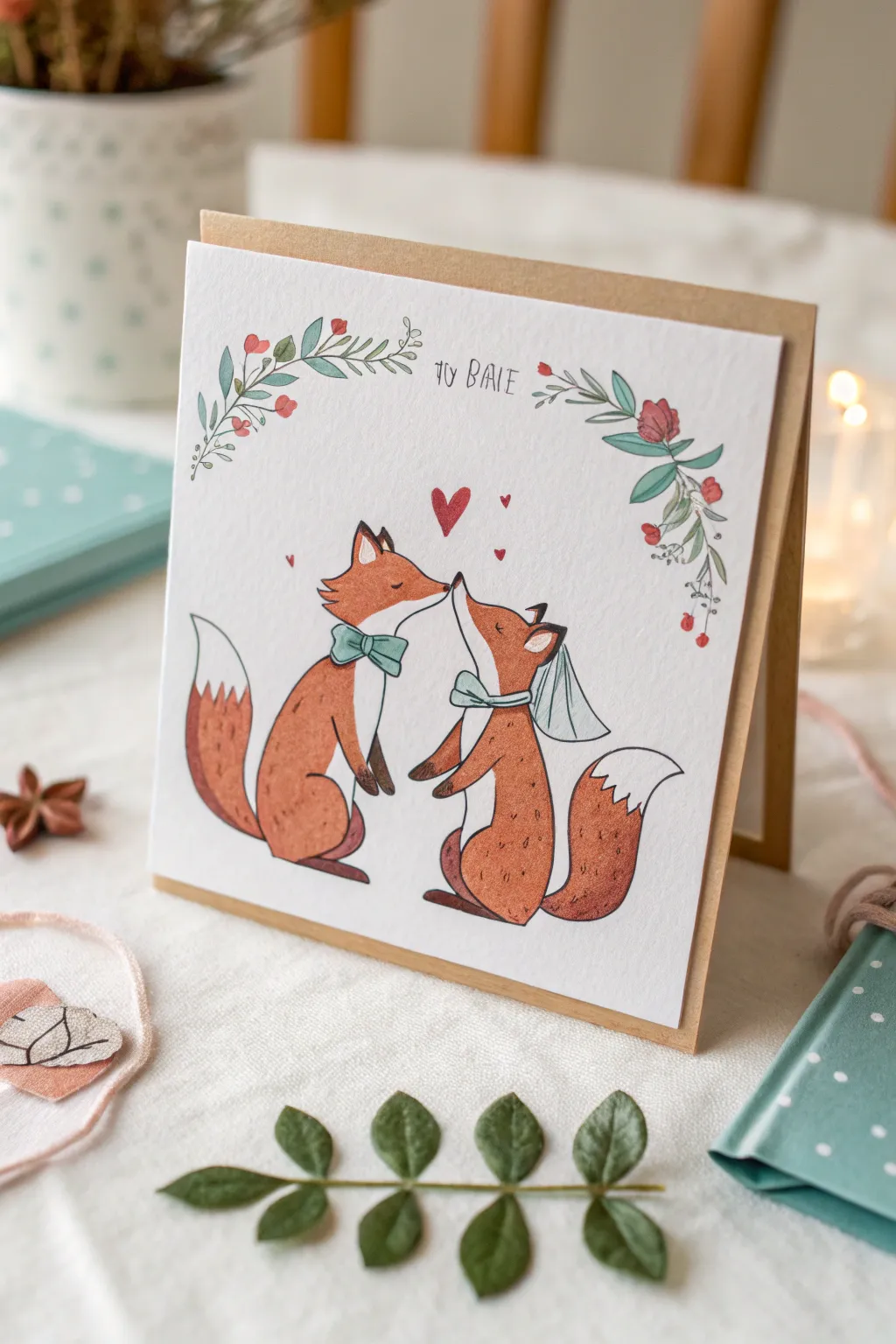
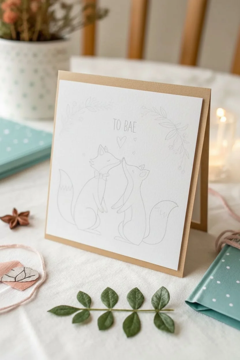
Celebrate your special someone with this adorable card featuring a pair of foxes sharing a tender moment beneath a floral arch. The combination of delicate ink lines and warm watercolor washes gives this piece a cozy, rustic charm perfect for an anniversary.
Detailed Instructions
Materials
- Heavyweight watercolor paper (300gsm cold press is ideal)
- Kraft paper cardstock (for the folded card base)
- Fine liner pens (0.1mm and 0.3mm, waterproof)
- Watercolor paints (burnt sienna, yellow ochre, sap green, alizarin crimson, turquoise)
- Small round brushes (size 2 and 4)
- Pencil and eraser
- Double-sided tape or glue stick
- Ruler
Step 1: Sketching the Composition
-
Prepare your paper:
Cut your watercolor paper to a square slightly smaller than your kraft card base. A 5×5 inch square usually works well for a standard greeting card. -
Outline the foxes:
Lightly sketch two fox shapes facing each other in the center of the paper. Start with simple ovals for the bodies and triangular shapes for heads, ensuring their noses are just touching. -
Add details:
Refine the fox shapes. give them pointed ears, fluffy tails that curve upward, and small feet. Sketch a bow tie on the left fox and a delicate veil or ribbon on the right fox. -
Draw the floral arch:
Above the foxes, sketch two curving branches meeting in the middle but leaving a gap for text. Add small leaves and simple bud shapes along the stems. -
Place the hearts and text:
Lightly pencil in floating hearts between the foxes. Write your chosen text, like ‘TO BAE,’ in the gap between the floral branches using a tall, thin serif font.
Step 2: Inking the Design
-
Trace with fine liner:
Using a 0.1mm waterproof pen, carefully trace over your pencil lines. Use broken or light strokes for fur texture, especially on the chest and tail tips. -
Add line weight:
Switch to a 0.3mm pen to thicken the outer contours of the foxes slightly, making them pop from the background. Keep facial features delicate. -
Erase guidelines:
Wait for the ink to dry completely to avoid smudging. Gently erase all visible pencil marks until the page is clean.
Smudged Ink?
If ink smears while erasing, stop! Let it dry fully. You can fix small smudges by painting over them with white gouache or acrylic.
Step 3: Watercolor Application
-
Paint the fur base:
Mix a warm orange using burnt sienna and a touch of yellow ochre. Apply a light wash to the fox bodies, avoiding the chest patches, tail tips, and inner ears. -
Add definition:
While the first layer is still slightly damp, drop more concentrated burnt sienna into the shadowed areas—under the chin, at the base of the tail, and along the back legs. -
Paint the accessories:
Use a diluted turquoise or sage green for the bow ties. Let the paint pool slightly at the knot for natural shading. -
Color the florals:
Paint the leaves with a soft sap green. For the berries and flowers, use a watery alizarin crimson. Do the same for the floating hearts. -
Lettering touch-up:
Go over your text one last time with the fine liner to ensure it’s crisp and legible against the white paper.
Add Sparkle
Mix a tiny bit of metallic gold watercolor into the foxes’ fur or trace the lettering with a gold gel pen for an elegant shimmer.
Step 4: Assembly
-
Final drying:
Allow the painted panel to dry completely. If the paper has buckled, press it under a heavy book for an hour. -
Mount the card:
Apply double-sided tape or glue to the back of the watercolor square. Center it on the front of your folded kraft cardstock and press down firmly.
Now you have a charming, handmade keepsake ready to be gifted to your favorite person
Mini Comic Strip of Favorite Anniversary Memories
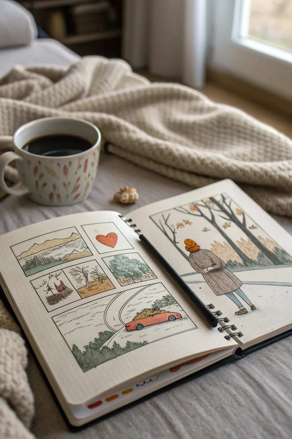
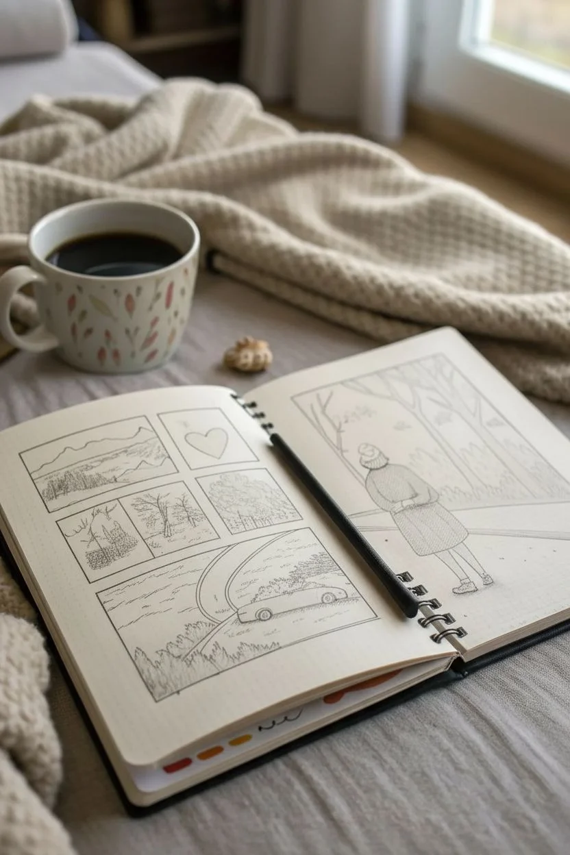
Capture the sweet, fleeting moments of your relationship with this cozy, illustrated spread. Using a combination of simple panels and a larger feature illustration, this project uses delicate lines and earthy tones to tell your unique love story.
Step-by-Step Tutorial
Materials
- Dot grid sketchbook or journal (A5 size)
- Fine liner pens (0.1mm, 0.3mm, and 0.5mm, black waterproof ink)
- Watercolor set or watercolor pencils (muted earthy palette)
- Small round water brush or paintbrush (size 2 or 4)
- Pencil (HB or 2B)
- Eraser
- Ruler
Step 1: Planning and Layout
-
Draft the panel structure:
Begin on the left page by quickly sketching out a 2×2 grid for your smaller memories, leaving the bottom third of the page open for a wider panoramic panel. On the right page, mark out a large rectangular frame that takes up about two-thirds of the upper space. -
Ink the borders:
Once you are happy with the spacing, use your ruler and a 0.5mm fine liner to draw the definitive borders for all your panels. Keep the lines crisp but don’t worry if they aren’t mechanically perfect; a little wobble adds character. -
Sketch the mini-scenes:
Inside the left-page panels, lightly pencil in your memories. Include a landscape view, a symbolic object (like a heart), a close-up of nature, and perhaps a specific tree or location significant to you. Reserve the bottom wide panel for a scene featuring a car or journey. -
Sketch the main portrait:
On the right page, pencil a figure walking through a forest scene. Focus on the back view of the figure wearing a coat and beanie, looking up at tall, stylized trees. Use the dot grid to help keep proportions realistic.
Bleed-Through Blues
If your markers bleed through the paper, glue two pages together before starting, or use colored pencils instead of watercolor for a safer, dry application.
Step 2: Inking the Details
-
Outline the main figure:
Switch to a 0.3mm pen. Carefully ink the figure on the right page. Use short, hatched lines to create the texture of a knitted coat and the ribbing on the beanie. Leave the face obscured or simple to maintain a nostalgic anonymity. -
Ink the trees and background:
Draw the tree trunks in the background using long, vertical strokes. Add small, scattered leaves falling around the figure to suggest an autumn setting. Keep the background lines slightly thinner (0.1mm) to push them back in space. -
Ink the left-page memories:
Go back to the left page and ink your small scenes. For the landscape, use jagged lines for mountains. For the heart panel, keep it simple. When drawing the car in the bottom panel, ensure the wheels sit firmly on the road line. -
Add textural depth:
Use your finest 0.1mm pen to add stippling (small dots) or cross-hatching to the shadowed areas—under the car, on the tree bark, and in the folds of the coat. Erase all pencil marks once the ink is completely dry.
Date Stamp Detail
Use a vintage manual date stamp in the corner of the layout. It adds an authentic ‘journal entry’ aesthetic that perfectly matches this sketchbook style.
Step 3: Adding Color
-
Select your palette:
Choose a muted, autumnal color scheme: burnt orange, olive green, slate blue, and warm beige. Test your colors on a scrap piece of paper first to ensure they aren’t too vibrant. -
Paint the figure:
Lightly wash the coat in a soft taupe or grey, using a texture pattern if desired. Paint the beanie a warm mustard or orange. Keep the wash sheer so the ink lines show through clearly. -
Color the nature elements:
Use a diluted olive green for the pine trees on the left page. For the larger trees on the right, use a mix of brown and grey for the trunks, adding touches of yellow ochre for the falling leaves. -
Fill the smaller panels:
Color the heart in a soft rust red. For the car scene, use a brighter coral or red for the vehicle to make it pop against the grey road and green foliage. Leave the sky areas mostly white or use an extremely faint blue wash. -
Unify the spread:
Look at the double-page spread as a whole. I prefer to add tiny touches of the same orange used on the right page to the left page panels—perhaps on a leaf or a small detail—to visually connect the two sides.
Step 4: Finishing Touches
-
Add handwritten elements:
In the negative space around the car panel or between frames, add tiny, squiggly lines to simulate handwritten notes or actual short captions about the memory. -
Deepen shadows:
Once the watercolor is bone dry, go back with the 0.3mm pen and re-darken any lines that got washed out. Add cast shadows under the figure’s boots to ground them.
Now you have a beautifully illustrated keepsake of your journey together that is ready to be admired.

PENCIL GUIDE
Understanding Pencil Grades from H to B
From first sketch to finished drawing — learn pencil grades, line control, and shading techniques.
Explore the Full Guide
Fold-Out “Love Zine” of the Whole Relationship
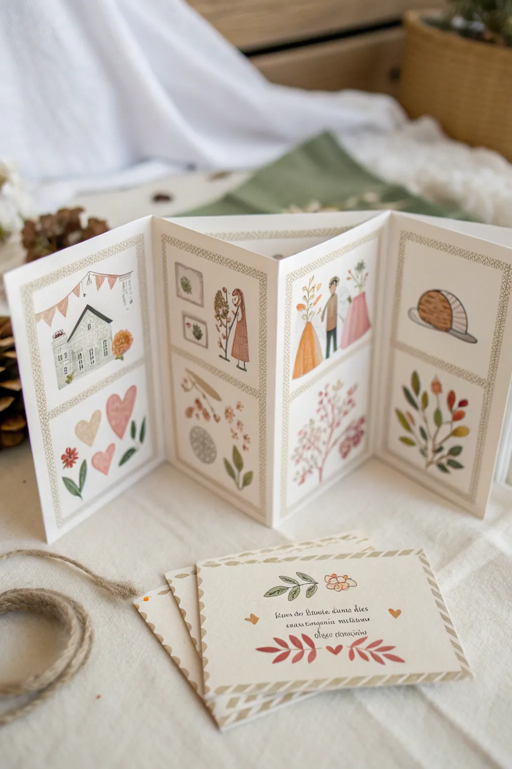
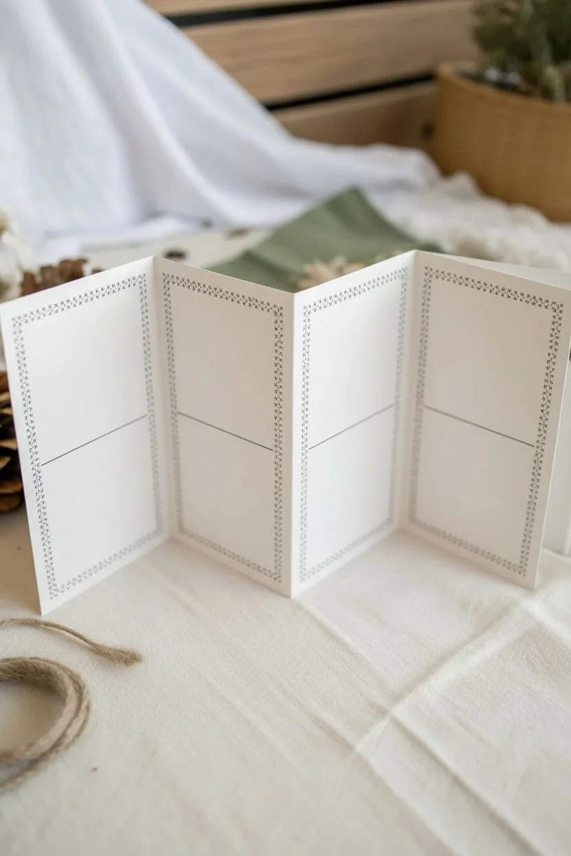
Capture the sweetest moments of your relationship in this charming four-panel accordion zine, featuring delicate illustrations and decorative borders. This keepsake unfolds to tell a visual story, perfect for celebrating an anniversary with a handmade touch.
Step-by-Step
Materials
- Heavyweight drawing paper or mixed media paper (A3 or long strip)
- Ruler
- Pencil and eraser
- Bone folder (optional but recommended)
- Fine liner pens (brown or black, 0.1mm and 0.3mm)
- Watercolor paints or quality markers (soft, earthy tones)
- Small round brushes (size 2 and 4)
- Washi tape or decorative tape (optional for borders)
- Scrap paper for testing colors
Step 1: Structure & Layout
-
Measure and cut the paper:
Begin by cutting a long strip of heavyweight paper. For the size shown, a strip approximately 6 inches high by 24 inches long works well, but you can adjust based on your paper supply. -
Score the fold lines:
Divide your strip horizontally into four equal sections. Use a ruler to mark these intervals lightly with a pencil. Score these lines using a bone folder or the back of a butter knife to ensure crisp, clean folds. -
Accordion fold:
Fold the paper along your scored lines in an alternating zigzag pattern (mountain, valley, mountain) so the structure stands up on its own like a screen. -
Define the borders:
Using a ruler and pencil, lightly draw a rectangular border inside each of the four panels, leaving about a half-inch margin. Then, draw a horizontal line across the middle of each panel to split them into top and bottom sections. -
Ink the frame patterns:
Go over your pencil border lines with a fine liner. To replicate the look in the photo, draw a double line and fill the space between them with a small repeating pattern, such as tiny ‘x’ shapes or a braided rope design.
Step 2: Illustrating the Story
-
Sketch the narrative:
Lightly sketch your imagery in pencil. In the first panel, draw a cozy house to represent ‘home.’ In the second, sketch frames on a wall and a figure (perhaps blooming or gardening). The third panel can depict a couple, and the fourth a simple object like a loaf of bread or cake. -
Add nature elements:
In the bottom sections of each panel, sketch botanical motifs. Think loose hearts, blooming branches, scattered leaves, and simple floral sprigs that complement the top illustrations. -
Outline with ink:
Once you are happy with the sketches, trace over them with a water-resistant fine liner. Keep your lines delicate and slightly broken in places for that hand-drawn, whimsical feel. -
Erase pencil marks:
Wait until the ink is completely dry—I usually give it a full 10 minutes to be safe—then gently erase all underlying pencil sketch lines.
Keep it Consistent
Mix a small puddle of your 3 main colors before starting. Returning to the same puddle ensures color harmony across all panels.
Step 3: Bringing it to Life with Color
-
Paint the first panel:
Using watercolors, paint the house in soft greys or blues. Add warmth by painting the hearts below in soft pinks and muted reds. Keep the washes sheer. -
Color the middle scenes:
On the second and third panels, use earthy tones like terracotta, sage green, and mustard yellow for clothes and plants. Let colors bleed slightly for a soft effect, or use a ‘wet-on-dry’ technique for more control. -
Finish the final panel:
Paint the food item in warm browns. For the botanical sprigs below, varied shades of green and autumn orange create a nice rhythm across the bottom of the zine. -
Add detail to the borders:
If your border pattern feels too plain, lightly wash over it with a very pale beige or grey paint to ground the frames.
Interactive pockets
Glue a small paper pocket onto one of the bottom panels to tuck in a tiny love note, movie ticket stub, or pressed flower.
Step 4: The Matching Card
-
Prep the card stock:
Cut a separate piece of paper for the flat card shown in the foreground. This should be roughly the size of one of your zine panels. -
Decorative edging:
Draw a diagonal striped border around the edges of this card using a gold or light brown marker to mimic vintage airmail piping. -
Lettering:
In the center, carefully hand-letter a favorite quote or personal message in a serif script. Add small vine and heart doodles above and below the text. -
Final touches:
Check the entire project for any stray pencil marks or areas that need a touch more color contrast. Let everything dry flat before displaying.
Now you have a beautifully illustrated keepsake that stands tall as a testament to your shared affection

Have a question or want to share your own experience? I'd love to hear from you in the comments below!