If you’re in the mood to draw something bold, spirited, and a little bit fierce, Aries gives you endless visual fuel. Here are my favorite Aries drawing ideas—from classic ram imagery to more stylized, story-driven designs you can make totally your own.
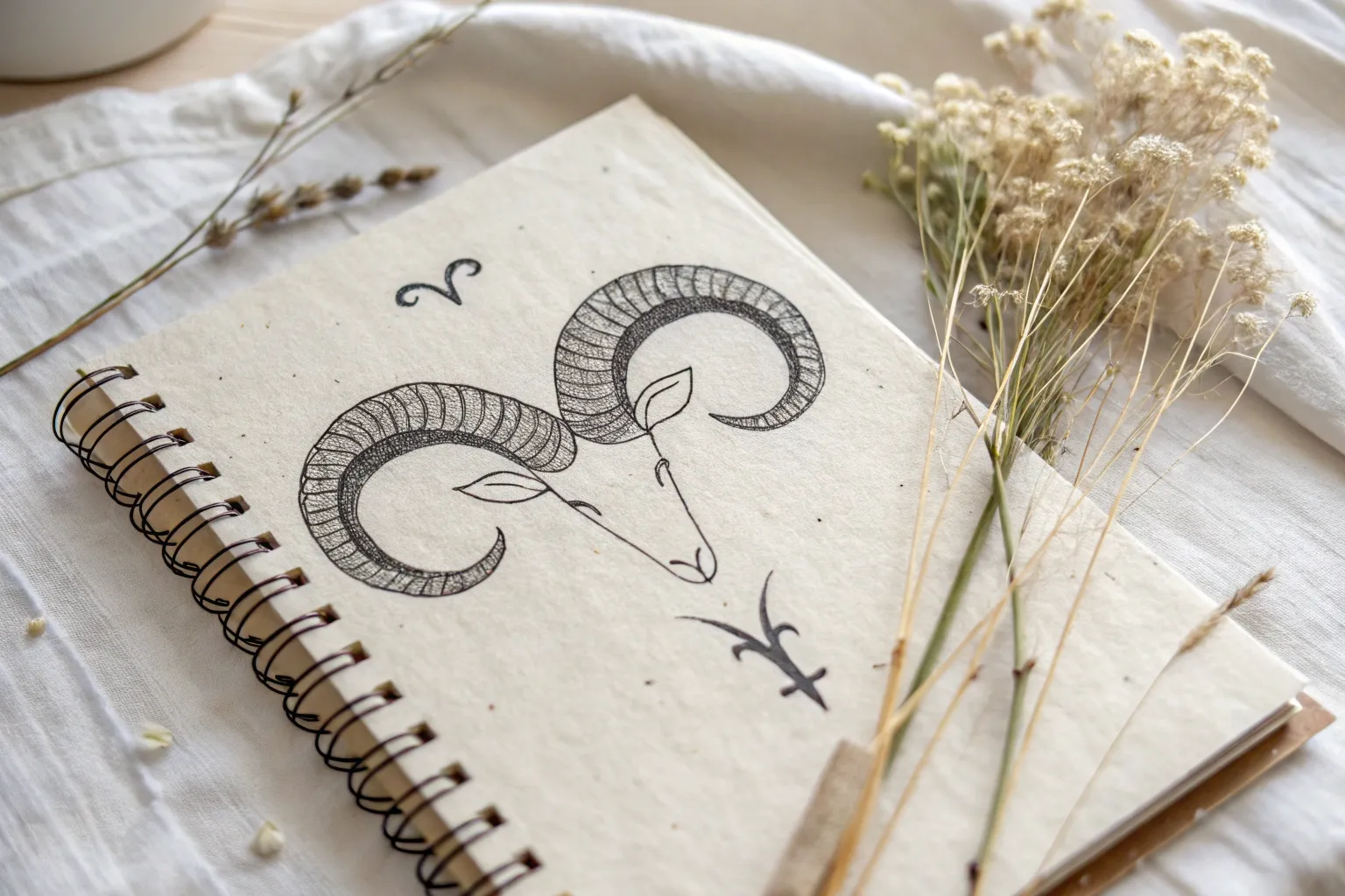
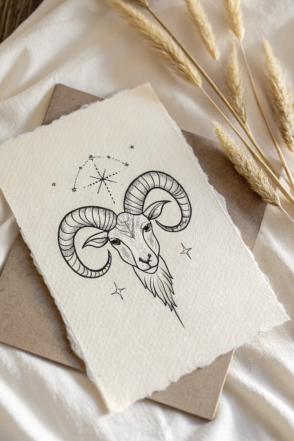
Classic Ram Head Portrait
Capture the stoic elegance of the Aries sign with this detailed pen and ink ram portrait. Using techniques reminiscent of classic engraving, you will build up texture through careful hatching to create a piece that feels timeless and sophisticated.
Detailed Instructions
Materials
- High-quality drawing paper or bristol board (smooth surface preferred)
- HB graphite pencil
- Kneaded eraser
- Fine liner pens (sizes 0.05, 0.1, 0.3, and 0.5mm)
- Ruler (optional for reference lines)
Step 1: Sketching the Structure
-
Basic Shapes:
Begin with a faint HB pencil sketch. Draw a downward-pointing wedge shape for the head and two large, sweeping curves coming off the top corners to map out the majestic spiral horns. -
Refining the Face:
Define the snout within your wedge shape. Mark the position for the eyes about halfway down the head, setting them wide apart. Sketch distinct, triangular ears just below the base of the horns. -
Defining the Horns:
Thicken the horn curves, tapering them as they spiral outward and curl back towards the face. Lightly mark the transverse ridges—the bumpy rings—that travel along the length of the horns, curving with the form. -
Adding Fur Details:
Outline the thick neck fur, drawing jagged, flowing shapes that extend downward from the chin and cheeks to suggest a heavy coat. Once satisfied with the proportions, gently roll a kneaded eraser over the sketch to lift excess graphite, leaving only a ghost image.
Uneven Ink Flow?
If your fine liner starts skipping, wipe the tip gently on a scrap piece of paper. Ink can dry on the very tip or pick up paper fibers that block flow.
Step 2: Inking Outlines
-
Facial Contours:
Switch to a 0.3mm fine liner. carefully trace the main outlines of the face, keeping the line work closer to the eyes and nose slightly delicate. Don’t close every line perfectly; leave slight gaps where the light hits. -
Horn Structure:
Outline the horns with the 0.3mm pen. Use a steady hand to trace the ridges you sketched earlier. These lines should curve around the cylindrical shape of the horn to emphasize its volume. -
Fur Boundaries:
Using a 0.5mm pen for a bolder look, outline the thick mane around the neck. Use quick, flicking strokes that taper at the ends to simulate clumps of hair rather than drawing a solid, continuous line.
Step 3: Shading and Texturing
-
Hatching the Face:
With a 0.05mm or 0.1mm pen, begin shading the face using fine hatching lines. Follow the curvature of the snout and cheeks. Place lines closer together near the eyes and under the jaw to create depth. -
Detailing the Eyes:
Fill in the pupils with the 0.5mm pen, leaving a tiny white dot for the catchlight. Use the 0.05mm pen to draw tiny, radiating lines in the iris for realistic detail. -
Texturing the Horns:
This is the most time-consuming part. In the valleys between the horn ridges, use short, curved hatching strokes with the 0.1mm pen. I find it helpful to concentrate the ink on the underside of the curve to suggest shadow. -
Enhancing Horn Volume:
Add cross-hatching to the darkest areas of the horns, particularly near the base and the underside of the spiral. Keep the top surfaces relatively clear of ink to represent highlights. -
Rendering the Mane:
Switch back to the 0.3mm pen for the neck fur. Draw long, flowing lines following the direction of hair growth. Overlap these strokes to create dense, shadowed areas deep within the fur. -
Deepening Shadows:
Use the 0.5mm pen to selectively darken the deepest shadows—under the chin, inside the ear, and beneath the heavy curve of the horns. This high contrast brings the drawing to life. -
Stippling Accents:
To finish, use the 0.05mm pen to add light stippling (dots) on the nose and forehead. This softens the transition between the hatched shadows and the bright paper highlights. -
Final Clean Up:
Wait at least 15 minutes for the ink to fully cure. erase any remaining pencil marks completely to reveal the crisp black lines against the white paper.
Hatching Direction
Always curve your hatching lines to match the 3D form of the object. Straight lines on a round horn will flatten the image instantly.
Your finished ram portrait now has the timeless quality of a vintage engraving, perfect for framing or gifting.
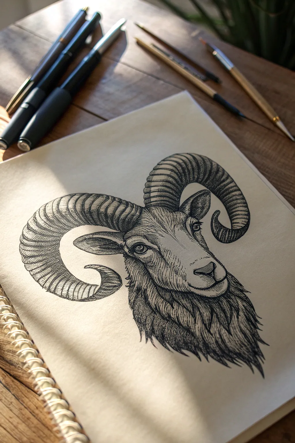
Ram Head in Three-Quarter View
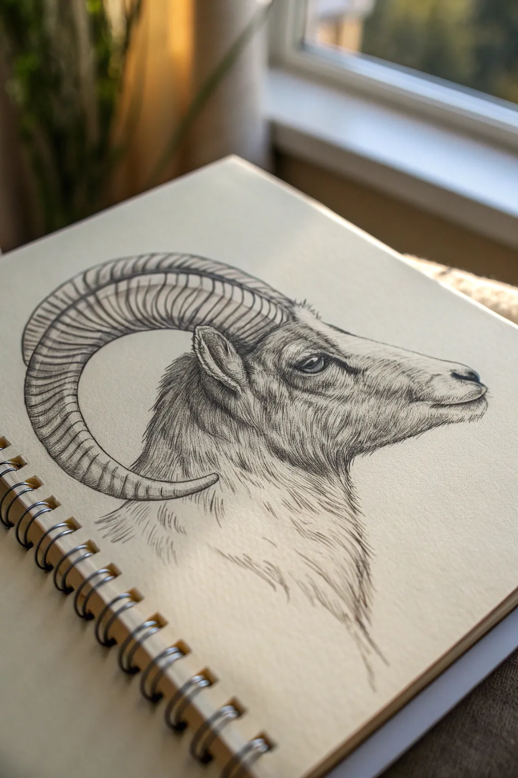
This project captures the noble profile of a ram, focusing on the intricate texture of its fur and the sweeping curve of its iconic horn. Using simple pencil strokes, you will build up layers of detail to create a realistic, three-quarter view portrait that rests beautifully on a sketchbook page.
Step-by-Step
Materials
- Sketchbook with cream or off-white paper (medium tooth)
- H or HB pencil for initial outlining
- 2B and 4B graphite pencils
- Fine liner pen (optional, for final darkening)
- Kneaded eraser
- Blending stump (optional)
Step 1: Laying the Foundation
-
Establish the head shape:
Start by lightly sketching a wedge shape for the head. The snout should be slightly blunt, tapering back towards the jaw and neck. Keep your lines very faint using an H or HB pencil so they can be erased or covered later. -
Position the horn curve:
Draw a large, sweeping ‘C’ shape starting from the top of the head, curving backward and then looping forward underneath the ear area. This is the central spine of the horn. -
Thicken the horn:
Add the thickness to the horn by drawing parallel curves to your initial line. The horn should be thickest at the base on the skull and taper to a point near the neck. -
Place the features:
Mark the position of the eye about halfway down the head’s length. Sketch a small, diamond-shaped ear just below the base of the horn. Add a small nostril curve and the mouth line near the snout.
Horn Volume Trick
When drawing the ridges on the horn, don’t make them straight lines. Curve them slightly towards the pointer tip to make the horn look round and 3D instantly.
Step 2: Defining the Contours
-
Refine the facial structure:
Using a slightly firmer pressure, outline the specific bumps of the snout, the brow ridge above the eye, and the jawline. -
Detail the eye:
This is the focal point. Draw the almond shape clearly, adding a small circle for a highlight. Darken the pupil and add thick lines for the eyelids to give weight and depth. -
Segment the horn:
Draw curved, transverse lines across the width of the horn. These ridges give the ram’s horn its distinctive texture. Space them closer together towards the tip and wider near the base to suggest perspective.
Add an Ink Wash
For a mixed-media look, go over your darkest graphite lines with a waterproof fine liner, then lightly brush over the shadows with a diluted gray ink wash or watercolor.
Step 3: Texturing and Shading
-
Start the fur texture:
Switch to a 2B pencil. Begin adding short, directional strokes around the nose and mouth. The fur here is short, so keep your pencil marks brief and close together. -
Build the neck fur:
Move down to the neck and cheek. Here, the fur is longer. Use longer, sweeping strokes that follow the curve of the neck downward. Let the lines fade out at the bottom to create a vignette effect. -
Shade the horn:
Shade the underside of the horn ridges to create volume. Use vertical hatching lines that follow the curve of the horn segments. I like to keep the top edge of the horn lighter to indicate a light source from above. -
Deepen the shadows:
With a 4B pencil, go into the darkest areas: inside the ear, beneath the jaw, and the deep creases of the eye. This high contrast brings the drawing to life. -
Refine the ridges:
Add cross-contour lines to the ridges of the horn. Make these lines curve with the roundness of the horn to emphasize its cylindrical shape. -
Texture the ear:
Add short, fluffy strokes inside and on the back of the ear. The ear should feel soft compared to the hard horn. -
Final fur details:
Go over the neck and cheek fur again, darkening overlapping areas to suggest layers of hair. Ensure the direction of the fur flows naturally away from the face.
Step 4: Polishing the Piece
-
Check values:
Look for areas that need more contrast. The area right behind the horn base often casts a shadow on the neck; darken this slightly. -
Clean up highlights:
Use your kneaded eraser to lift off any graphite smudges on the snout or the top of the horn to create bright highlights. -
Soften edges:
Use the eraser to feather the bottom edge of the neck drawing so it fades seamlessly into the paper.
Now you have a striking, dignified portrait that anchors your sketchbook page with strength and detail

Aries Glyph as Minimal Line Art
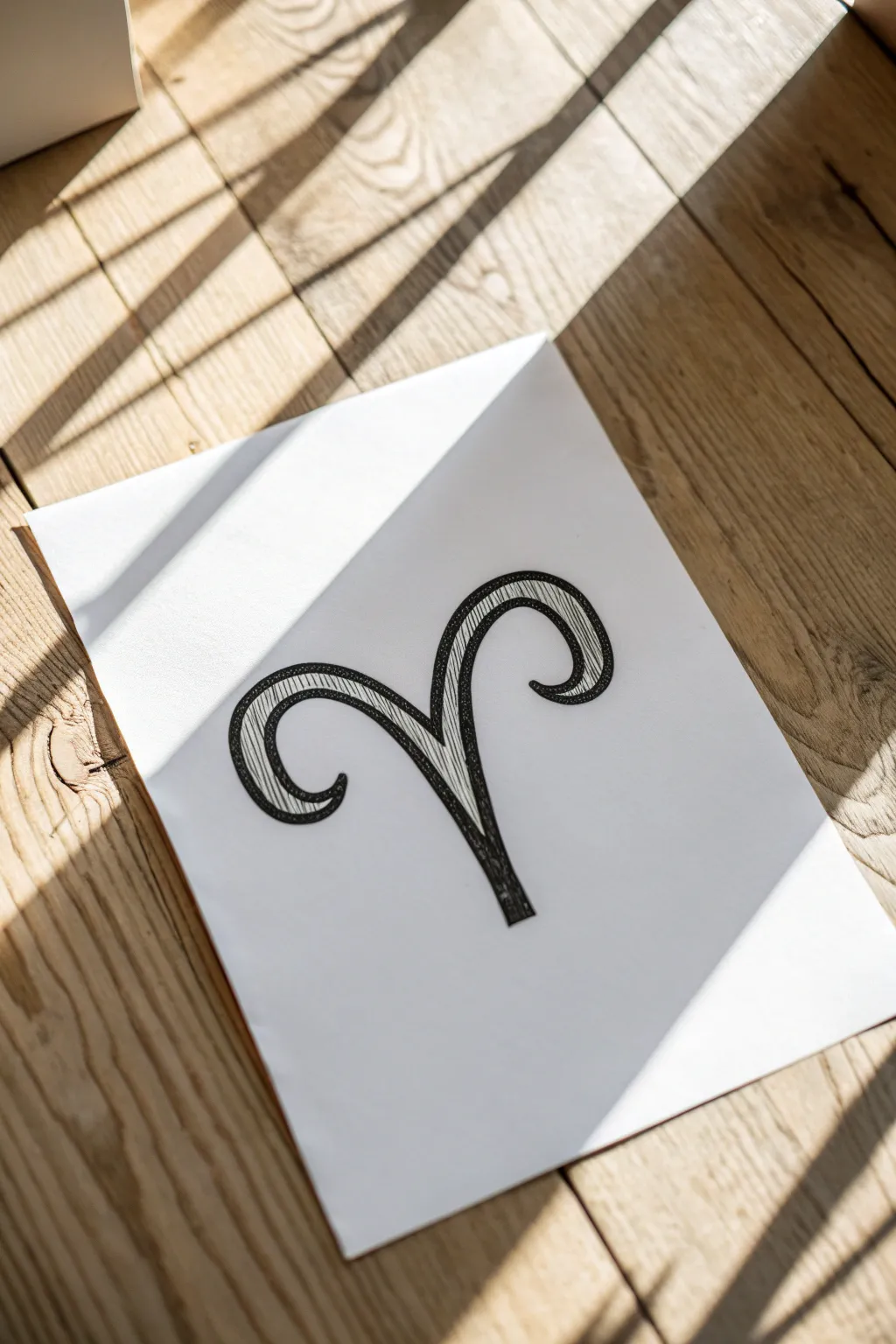
This minimalist yet bold design takes the classic Aries ram horns and gives them dimension through a double-line technique. The result is a striking black-and-white glyph that looks great as a standalone art print or a sketchbook focal point.
Step-by-Step Guide
Materials
- White drawing paper or cardstock (smooth bristol works best)
- Pencil (HB or H)
- Eraser
- Fine liner pen (01 or 03 size)
- Thicker black marker (felt tip or brush pen)
- Ruler (optional for centering)
Step 1: Planning the Shape
-
Mark the center:
Begin by finding the approximate center of your paper. Draw a very faint vertical line or just a dot to act as your center anchor point. This will be where the ‘stem’ of the glyph originates. -
Draft the central stem:
Using your pencil, sketch a vertical line starting from your center point and moving upward. Curve it slightly outward at the top left and top right, creating a ‘V’ shape that resembles a fountain spray. -
Sketch the left curl:
Starting from the top of your left ‘V’ line, curve the pencil stroke downward and outward in a large arc. Bring it back inward at the bottom to form a tight circular spiral that points toward the center stem. -
Sketch the right curl:
Repeat this motion on the right side. Try to mirror the left arc as closely as possible, bringing the curl down and inward so the spirals sit at roughly the same height.
Symmetry Hack
Draw one half of the glyph on a folded piece of scrap paper first. Rub the back with graphite to transfer a perfect mirror image to your main paper.
Step 2: Creating the Hollow Effect
-
Draw the outer boundary:
Now, sketch a second line parallel to your original shape on the *outside*. Keep a consistent distance of about 3-5mm from your first line to create a thick, ribbon-like appearance. -
Close the ends:
At the bottom of the central stem, connect your two lines with a straight horizontal line. At the tips of the two spirals, taper the lines together to sharp points or rounded caps, depending on your preference. -
Refine the curves:
Step back and look at your pencil draft. I find it helpful here to thicken any areas that look too thin or adjust curves that aren’t quite symmetrical before committing to ink.
Step 3: Inking and Filling
-
Outline the perimeter:
Take your thicker black marker or felt tip pen. Carefully trace over your final pencil lines, creating a solid, bold outline for the entire glyph. -
Erase pencil marks:
Wait a moment for the ink to dry completely to avoid smudging. Then, gently erase all visible pencil guidelines so only the clean black outline remains. -
Add internal texture:
Switch to your finer detail pen (01 or 03). Inside the hollow shape you’ve created, draw thin, scratchy lines following the curve of the horns. -
Layer the shading:
Focus these texture lines heavily near the bottom of the stem and the inner curves of the spirals. This hatching technique creates a shadowed, three-dimensional effect. -
Create highlights:
Leave the top arches of the horns mostly white, with very few or no internal lines. This negative space acts as a highlight where the ‘light’ hits the curved surface. -
Darken the boundaries:
Go back over the main outline one last time if needed to smooth out any jittery edges or to add varied line weight for a more organic look.
Wobbly Lines?
If your curves aren’t smooth, don’t restart. Thicken the outline intentionally. A bolder outer line often hides minor shakes and jittery strokes.
Now you have a dynamic zodiac symbol ready to be framed or gifted to an Aries friend


Aries Glyph With Floral Frame
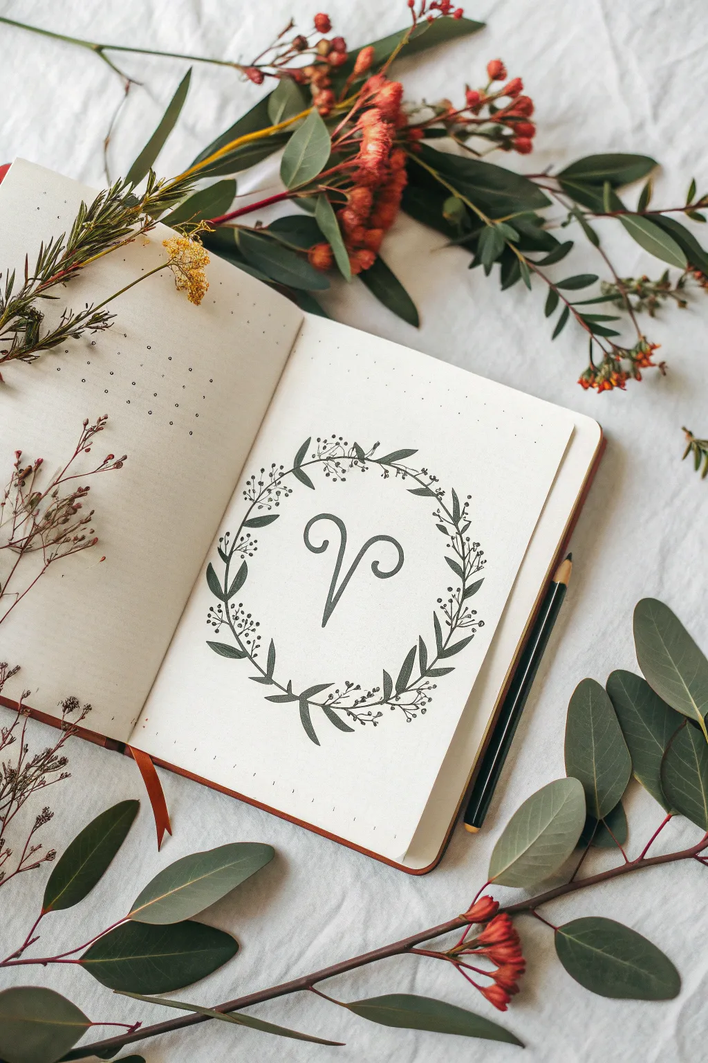
Celebrate the bold energy of the Ram with this elegant, minimalist bullet journal spread. Featuring the iconic Aries glyph nestled within a delicate wreath of leaves and berries, this design balances strength with nature-inspired beauty.
How-To Guide
Materials
- A5 dotted notebook or bullet journal
- Pencil (HB or 2B)
- Eraser (kneaded preferred)
- Fine liner pen (0.3mm or 0.5mm, black)
- Ruler
- Circle template or compass (optional)
Step 1: Planning and Sketching
-
Center constraints:
Begin by finding the visual center of your notebook page. Lightly mark this center point with your pencil, as this will anchor your entire composition. -
Create the circle guide:
Using a compass or a circular object like a small bowl (approximately 3-4 inches in diameter), lightly draw a perfect circle around your center point. This line serves as the spine for your floral wreath. -
Draft the glyph stem:
Inside the circle, start sketching the Aries symbol. Draw a vertical line that angles slightly to the right at the bottom, resembling a checkmark stem. Keep it centered but leave room at the top for the horns. -
Add the horns:
From the top of your stem, draw two large, curling loops outward. The left loop should curve up and around, and the right loop should mirror it, creating the classic Ram shape. I often sketch these strokes quite loosely at first to get the symmetry right. -
Thicken the symbol:
Go back over your single-line sketch of the glyph and add thickness to the lines to give it a calligraphy feel. Taper the ends of the horns to a point, and make the ‘stem’ slightly thicker at the bottom.
Step 2: Drawing the Wreath
-
Plotting main branches:
On your circular guide line, mark 4-5 points where the main stems of the wreath will overlap. The style here is continuous, but visualize the vines flowing in a clockwise or counter-clockwise direction. -
Adding large leaves:
Start drawing the larger leaves along the circle’s path. Use simple, elongated almond shapes. Arrange them in pairs or alternating patterns, pointing generally in the direction of the vine’s flow. -
Varying the foliage:
In the gaps between your larger leaves, sketch smaller, more delicate sprigs. These should look like tiny stems branching off the main circle. -
Berry clusters:
At the tips of these smaller sprigs, draw clusters of small circles to represent berries or buds. Group them in threes or fours for a natural, organic look. -
Wrapping the stems:
Connect all your leaves and berry sprigs with a slightly thickening line that follows your original circle guide. Allow the ends of the stems to cross over each other slightly at the bottom for a woven effect.
Symmetry Struggles?
If the horns look uneven, draw a vertical line down the center of the glyph. Measure outward from that line to ensure both curls extend the same distance.
Step 3: Inking and Refining
-
Ink the glyph:
Take your black fine liner and carefully trace the outline of your Aries glyph. Fill in the shape solid black to make it the focal point of the page. -
Ink the leaves:
Trace your leaf outlines. For visual interest, draw a single line down the center of the larger leaves to indicate the vein, but leave the smaller leaves open. -
Ink the berries:
Outline the berry clusters. You can choose to color these in solid black or leave them as open circles for a lighter, airier texture. -
Connect the vines:
Draw the main vine connecting everything. Use confident, smooth strokes to avoid shaky lines. It’s okay if you deviate slightly from the pencil sketch to make the flow look better. -
Erase guidelines:
Wait at least 5-10 minutes for the ink to dry completely. Once safe, gently erase all your pencil marks, including the initial circle guide, to reveal the clean design.
Pro Tip: Leaf Variety
Mix filled and unfilled shapes. Coloring in just a few specific leaves solid black adds depth and guides the eye around the circle without overwhelming the central glyph.
This simple yet striking design is a perfect way to start your zodiac-themed journal layouts

PENCIL GUIDE
Understanding Pencil Grades from H to B
From first sketch to finished drawing — learn pencil grades, line control, and shading techniques.
Explore the Full Guide
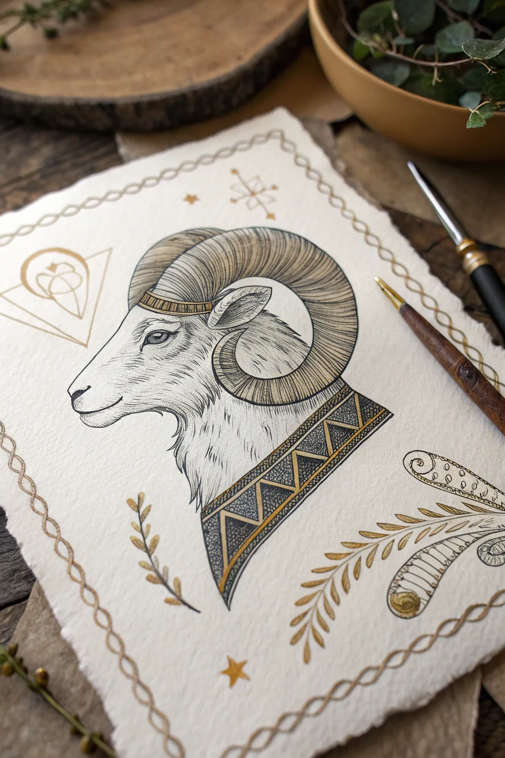
Ram Horn Study Page
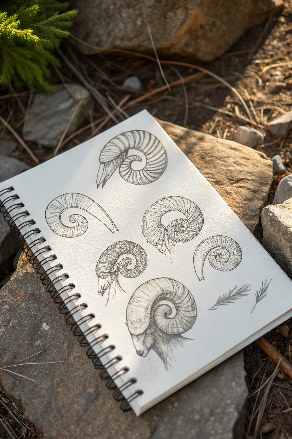
This sketchbook study breaks down the complex spiral of ram horns into approachable pencil drawings, ranging from simple outlines to fully shaded renderings. It’s a perfect exercise for mastering texture, volume, and organic curves using simple graphite techniques.
Detailed Instructions
Materials
- Spiral-bound sketchbook (heavyweight sketching paper recommended)
- Graphite pencils (HB, 2B, 4B)
- Fine-liner pen (optional, for final definition)
- Kneaded eraser
- Reference photos of ram horns (various angles)
Step 1: Laying the Groundwork
-
Analyze the spiral:
Before putting pencil to paper, observe the logarithmic spiral shape of a ram’s horn. Notice how it starts thick at the base and tapers significantly as it curls inward. -
Sketch basic curves:
Using a light HB pencil, draw several sweeping ‘C’ curves in different orientations on your page. These will form the spines of your various horn studies. -
Define the thickness:
For each curve, add a parallel line that tapers closer to the spine as it reaches the center point. Close off the tip with a blunt or pointed end, depending on the age of the ram you are depicting. -
Mark the ridges:
Lightly draw perpendicular lines across the horn’s body to indicate the annular ridges. These shouldn’t be straight ladder rungs; curve them slightly to follow the cylindrical form of the horn.
Step 2: Developing Texture and Volume
-
Outline refinement:
Switch to a 2B pencil. Go over your initial outlines, making the lines darker and more confident. Add small bumps or irregularities along the outer edges where the ridges protrude. -
Cross-contour lines:
Begin adding detail to the ridges. Instead of straight lines, draw tighter, curved lines that wrap around the form. This is crucial for making the horn look like a 3D tube rather than a flat shape. -
Hatching technique:
Use short, directional strokes (hatching) running along the length of the horn, between the ridges. This mimics the fibrous texture of keratin. -
Add deep shadows:
With a 4B pencil, darken the inner curve of the spiral and the undersides of the ridges. Strong contrast here will make the horn pop off the page.
Curve Control
When drawing the ridges, imagine you are drawing rubber bands wrapped around a cylinder. The curvature of these lines tells the viewer the horn is round, not flat.
Step 3: The Profile Study
-
Sketch the head base:
For the prominent bottom-center drawing, sketch the basic structure of the ram’s skull beneath the horn base. Focus on the eye socket placement and the nasal bridge. -
Connect horn to head:
Draw the base of the horn wrapping solidly around the ear and skull. The connection point should look sturdy and thick. -
Fur texture:
Using quick, flicking pencil strokes, suggest fur around the base of the horn and down the neck. Keep these loose to contrast with the hard surface of the horn. -
Detailing the eye:
Add the eye just below the horn’s curve. Keep it dark but leave a tiny speck of white paper for the highlight to bring life to the animal.
Try Sepia Ink
For a vintage naturalist feel, try doing this study with a dark brown fine-liner or dip pen on slightly off-white or cream-colored paper.
Step 4: Final Touches
-
Varying styles:
Ensure your page has variety. Leave simple outlines for some horns (like the one on the mid-left), while fully rendering others with dense cross-hatching. -
Clean up highlights:
Take your kneaded eraser and gently lift graphite from the top curves of the horns. This creates a natural highlight where the light hits the ridges. -
Add decorative elements:
Draw a couple of small, simple leaf sprigs or pine needles in the bottom right corner to balance the composition and fill empty negative space. -
Review contrast:
Look over the entire page. If any drawings look too grey or washed out, re-visit the deepest crevices with your sharpest 4B pencil to anchor the forms.
You now have a beautiful page of studies that capture the rugged elegance of nature
Bold Tattoo-Style Aries Linework
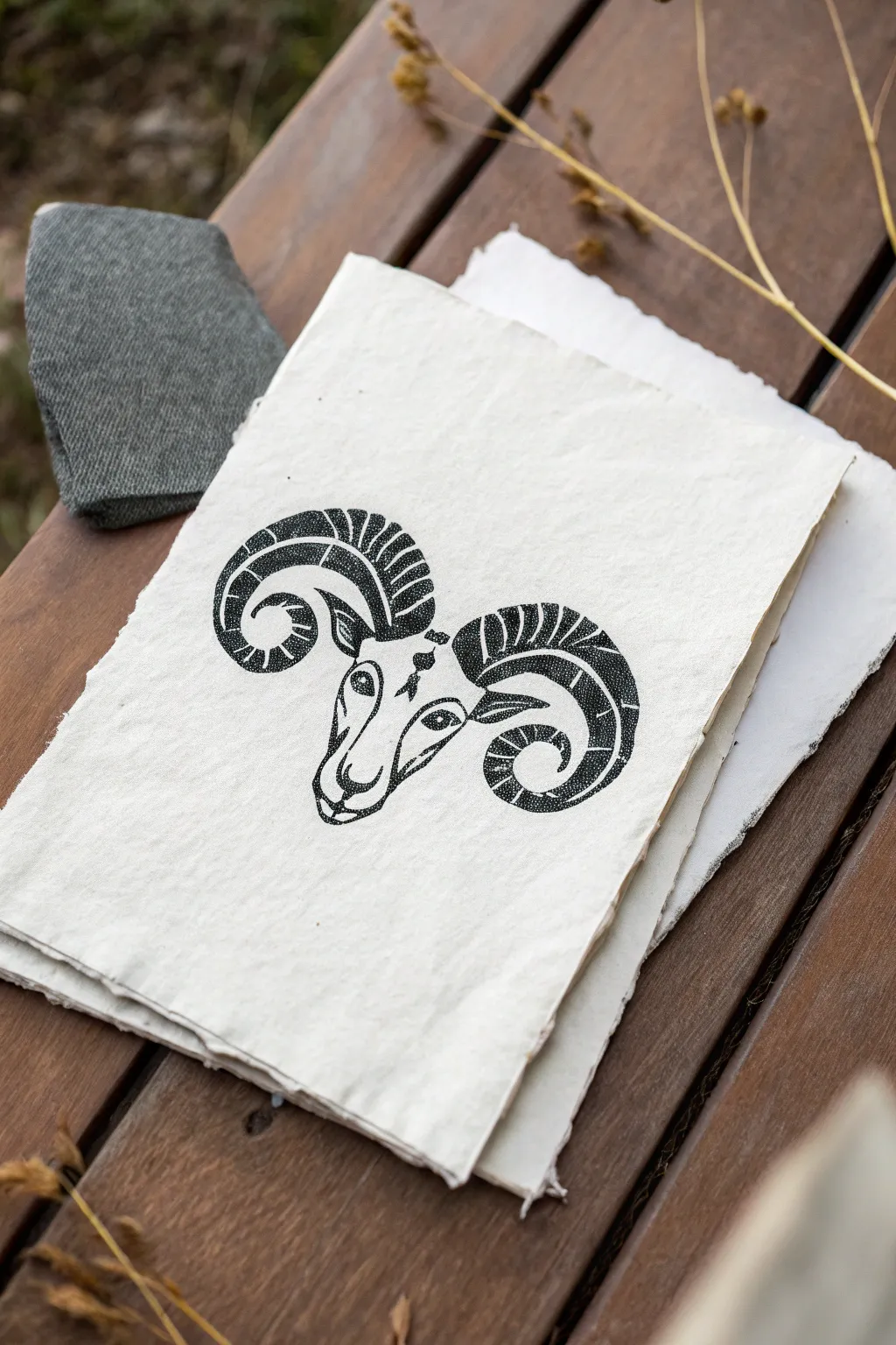
This striking project combines the raw, organic texture of handmade paper with the crisp, bold lines of tattoo-style illustration. The result is a timeless Aries symbol that feels like an artifact discovered in an artist’s sketchbook.
Step-by-Step Guide
Materials
- Handmade deckled-edge paper (heavyweight cotton rag)
- Fine liner pens (0.1mm, 0.3mm, 0.5mm)
- Thick brush pen or calligraphy marker (black)
- HB graphite pencil
- Kneaded eraser
- Ruler
- Reference image of a ram skull or head
Step 1: Conceptual Sketching
-
Center constraints:
Begin by lightly marking the center of your handmade paper with your pencil. Because deckled edges are irregular, trust your eye more than a ruler to find the visual center for the ram’s forehead. -
Basic geometry:
Sketch an inverted triangle shape for the ram’s face. At the top corners of the triangle, draw two large, outward-spiraling curves to map out the primary flow of the horns. -
Facial structure:
Refine the face shape. Draw a diamond shape for the forehead and extend lines down for the snout. Mark the position of the eyes wide on the sides of the head, giving them an angled, determined look. -
Refining the horns:
Thicken the spiraled lines into full horn shapes. The horns should curve down, back up, and curl inward at the tips. Ensure they have significant weight at the base where they attach to the skull. -
Segmenting:
Divide the length of the horns into curved segments. These ridges give the horns their characteristic texture and depth. Keep the spacing relatively even but not mechanically perfect.
Working with Cotton Rag
Handmade paper is very absorbent. Move your pen quickly to prevent ink bleeding. Test your pens on a scrap piece first to see how the fiber reacts to the ink flow.
Step 2: Inking the Outlines
-
Bold perimeter:
Switch to your thick brush pen or 0.5mm liner. Carefully trace the outer silhouette of the horns and the main jawline. I prefer using a slightly heavier hand here to make the design pop against the textured paper. -
Interior details:
Use a 0.3mm pen for the inner details. Outline the eyes, the nose bridge, and the individual segments within the horns. Use smooth, confident strokes to mimic the feel of a tattoo needle. -
Adding the third eye:
If you are following the reference closely, ink the small diamond or starburst shape in the center of the forehead. This adds a mystical element to the piece. -
Erase guidelines:
Wait at least ten minutes for the ink to settle into the cotton fibers. Once completely dry, gently gently dab and rub with a kneaded eraser to remove visible graphite without abrading the paper surface.
Step 3: Texturing and Shading
-
Stippling foundation:
This is the most crucial step for that ‘printmaking’ look. Take your 0.1mm fine liner and begin stippling (dotting) inside the dark sections of the horns. -
Building density:
Concentrate your dots heavily at the bottom of each horn segment to create a shadow. As you move upward within the segment, space the dots further apart to create a gradient. -
Solid blacks:
For the deepest shadows—like the pupils, nostrils, and the very undersides of the horn curves—use your brush pen to fill them in with solid black ink. This high contrast anchors the drawing. -
Hatching details:
Add subtle hatching lines (short, parallel strokes) along the bridge of the nose and under the eye sockets. This defines the bone structure without overwhelming the face. -
Texture matching:
Look closely at the horn ridges. Add small, jagged lines along the segment dividers to make the horns look weathered and organic rather than smooth plastic. -
Final assessment:
Step back and check the balance. If the horns feel too light compared to the face, go back in with more stippling layers to darken the values.
Antique Finish
Prepare a weak wash of coffee or dark tea. Splatter tiny droplets around the horns using an old toothbrush for a weathered, vintage manuscript aesthetic.
Frame your finished ram floating in a shadow box to show off those beautiful paper edges
BRUSH GUIDE
The Right Brush for Every Stroke
From clean lines to bold texture — master brush choice, stroke control, and essential techniques.
Explore the Full Guide
Aries Constellation Background
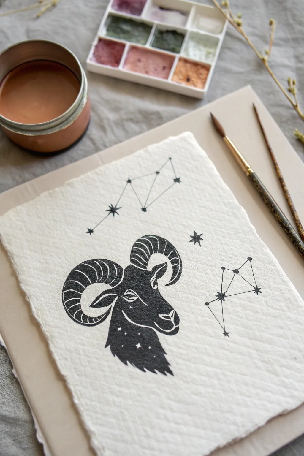
Capture the bold energy of the Ram with this sophisticated astrological illustration. Using high-contrast black ink against beautifully textured handmade paper creates an artwork that feels both ancient and modern.
How-To Guide
Materials
- Heavyweight cold-press watercolor paper or handmade cotton rag paper (deckled edge preferred)
- Black waterproof fine liner pens (sizes 01 and 05)
- Black watercolor paint or gouache
- Small round detail brush (size 1 or 2)
- Pencil and eraser
- Ruler
- Reference image of the Aries constellation
Step 1: Drafting the Layout
-
Paper Preparation:
Select a piece of distinctively textured paper. If using a large sheet, tear the edges gently against a ruler rather than cutting them to achieve that rustic, deckled look seen in the example. -
Centering the Ram:
Lightly sketch a central vertical line to help with symmetry, then draw the basic oval shape for the Ram’s head in the lower center of the page. -
Sketching the Horns:
Draft the large, curling horns. Start from the top of the head and loop them outwards and downwards, curving back in toward the cheeks. Ensure the curves are voluminous and segmented. -
Defining the Face:
Refine the facial features within your oval. Sketch the snout, lips, and almond-shaped eye. Add the shaggy fur texture at the neck, creating jagged points that point downward. -
Placing the Constellations:
Using a ruler, lightly map out the Aries constellation pattern. Place one iteration floating above the head and a smaller version to the right side for balance.
Clean Lines Pro-Tip
If your hand shakes while doing the long straight constellation lines, exhale slowly as you draw each segment. This stabilizes your muscles for straighter ink work.
Step 2: Inking the Ram
-
Outlining in Ink:
Switch to your waterproof fine liner (size 05). Carefully outline the entire silhouette of the ram, including the outer edges of the horns and the shaggy beard. -
Adding Horn Detail:
Draw the internal segments of the horns. Use curved lines that follow the circular flow of the horn to give it a 3D, ribbed appearance. -
White Negative Space:
Identify the areas that will remain white: the highlights on the nose, the detailed eye, lines separating the horn segments, and the stars within the neck fur. Outline these shapes carefully so you don’t paint over them. -
Filling the Black:
Using your small brush and black watercolor (or gouache for a matte finish), fill in the ram’s head and horns. I find working slowly around the fine white lines requires a steady hand, so stabilize your wrist on the table. -
Adding Neck Stars:
If you struggle to paint around tiny stars in the neck fur, you can paint the area solid black and add the stars later using a white gel pen or opaque white gouache.
Level Up: Metallic Touch
Mix a tiny amount of gold mica powder or watercolor into your black paint before filling the ram. It will give a subtle, magical shimmer only visible when the light hits.
Step 3: Mapping the Stars
-
Connecting the Dots:
Use your ruler and the finest pen (size 01) to draw thin, crisp lines connecting your pencil-sketched constellation points. -
Drawing Star Points:
At each intersection or endpoint of the constellation lines, draw a small, solid star or a bold dot. Vary them slightly in size to create visual interest. -
Adding Celestial Flair:
Draw a few standalone stars around the composition. A classic six-point star (a cross with an ‘X’ over it) works perfectly for that vintage astronomy vibe. -
Final Erasure:
Wait until the ink and paint are completely bone-dry. Gently erase any visible pencil sketch lines, being careful not to snag the textured paper surface. -
Quality Check:
Inspect your solid black areas. If the paper texture shows through too much, apply a second coat of black paint to ensure a deep, bold silhouette.
Display your celestial artwork in a simple floating frame to show off those beautiful deckled edges
Aries and Fire Element Motif
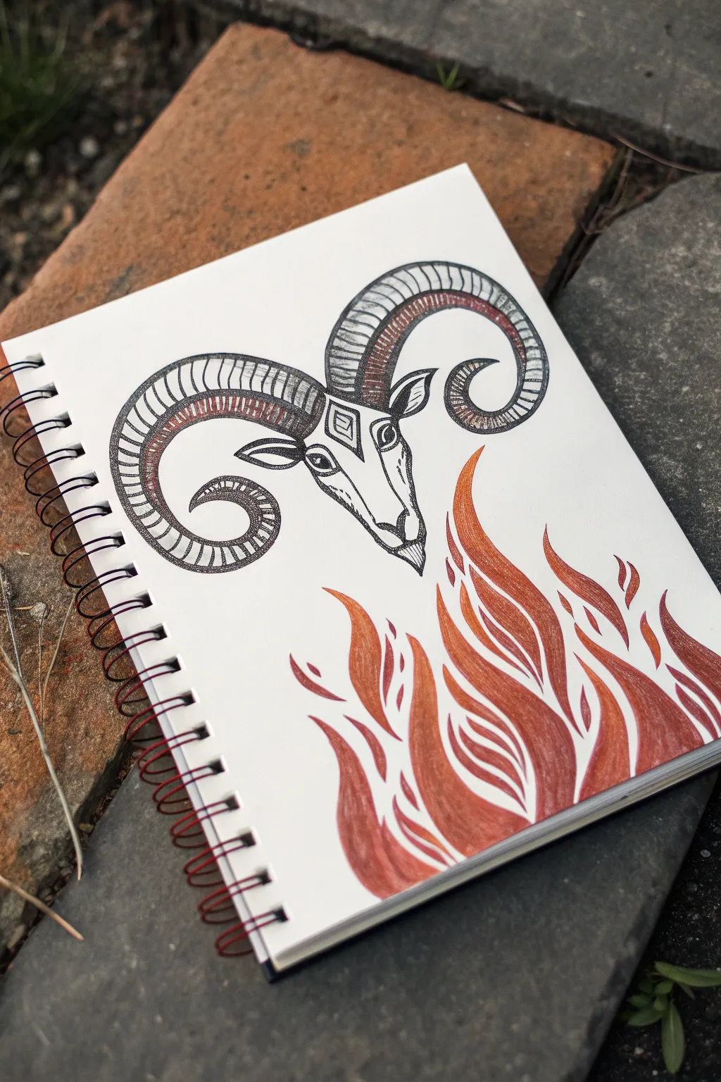
Capture the fiery spirit of the first zodiac sign with this bold illustration featuring a stylized ram’s head hovering above stylized flames. The contrast between rigid pen work and flowing fire creates a dynamic composition perfect for an sketchbook entry.
Step-by-Step Guide
Materials
- Sketchbook or drawing paper (heavyweight preferred)
- HB Pencil and eraser
- Fine liner pens (0.3mm and 0.5mm, black)
- Colored pencils (reds, oranges, browns, warm grey)
- Optional: White gel pen for highlights
Step 1: Drafting the Ram
-
Basic Shapes:
Start lightly with your pencil. Draw an inverted triangle for the ram’s face, making the bottom point slightly distinct for the nose/chin area throughout the process. Add two large, curving C-shapes extending from the top corners of the triangle to map out the majestic horns. -
Face Structure:
Refine the face shape. Draw a diamond shape on the forehead as a decorative element. Place the eyes on the sides of the head, angling them downward slightly for a serious expression, and sketch the nose ridges leading down to the muzzle. -
Horn Definition:
Thicken the horn sketches. They should start wide at the skull and taper to points as they curl around. Ensure the curves are symmetrical; one curling left, one curling right. -
Adding Ears:
Tuck two leaf-shaped ears just below the base of the horns. They should point horizontally outward, balancing the vertical length of the face.
Step 2: Inking the Line Work
-
Outline the Ram:
Switch to your 0.5mm fine liner. Trace over your pencil lines for the main outline of the head and the outer edges of the horns. Keep your hand steady for clean, crisp lines. -
Horn Texture:
Use the 0.3mm pen for details. Instead of smooth horns, draw segmented ridges. Draw curved lines across the width of the horns at regular intervals to create that classic ribbed texture. -
Facial Details:
Ink the eyes, leaving a tiny white spot for reflection if you wish. Draw the diamond motif on the forehead and the lines defining the snout. Use short, hatched lines near the nose and under the eyes to suggest depth without heavy shading.
Pro Tip: Symmetry
Draw a faint vertical centerline through the paper before starting. This helps ensure the ram’s horns curl out exactly the same distance on both sides.
Step 3: Drawing the Flames
-
Flame Outline:
With pencil, sketch wavy, organic shapes rising from the bottom right corner. Imagine them licking upwards towards the ram. Create separate ‘tongues’ of fire that interlock but don’t necessarily touch. -
Internal Shapes:
Inside the larger flame shapes, draw smaller, internal teardrop or leaf shapes. This creates ‘negative space’ within the fire, giving it a stylized, graphic look similar to tribal art or woodblock prints. -
Inking the Fire:
Once happy with the flow, trace the positive shapes of the flames with your colored pencil or a colored fine liner if you have one. I prefer using the colored pencil directly for a softer edge here, but you can outline in red ink for a sharper look.
Level Up: Metallic Pop
Use a gold gel pen or metallic marker for the diamond on the forehead and the segments of the horns to make the celestial ram truly shine.
Step 4: Color and Shading
-
Coloring the Rams Horns:
Take a rust-orange or brown colored pencil. Shade the inner curve of the horns heavily, fading out as you move toward the outer curve. This gradient gives the horns volume and roundness. -
Horn Texture Enhancement:
Go back over the colored shading with your fine black pen. Add stippling (tiny dots) or hatching over the colored areas to gritty up the texture and integrate the ink with the color. -
Base Flame Layer:
Using an orange colored pencil, fill in the bottom areas of your flame shapes. Press firmly at the base for saturation and release pressure as you move up the flame tips. -
Deepening the Fire:
Layer a deep red or burgundy pencil over the orange, focusing on the lowest parts and the ‘spines’ of the flames. Leave the very tips or edges lighter or even white to suggest glowing heat. -
Negative Space:
Ensure the white gaps inside the flames remain clean. If you accidentally colored into them, use an eraser shield or a sharp edge of your eraser to clean them up. This white space is crucial for the stylized effect. -
Final Touches:
Add very subtle shading to the ram’s face using a warm grey pencil, just under the brow and along the nose bridge. Erase any remaining stray pencil sketch lines to finish.
Now you have a striking zodiac illustration ready to spark up your art portfolio


Aries With Mars Symbol Accent
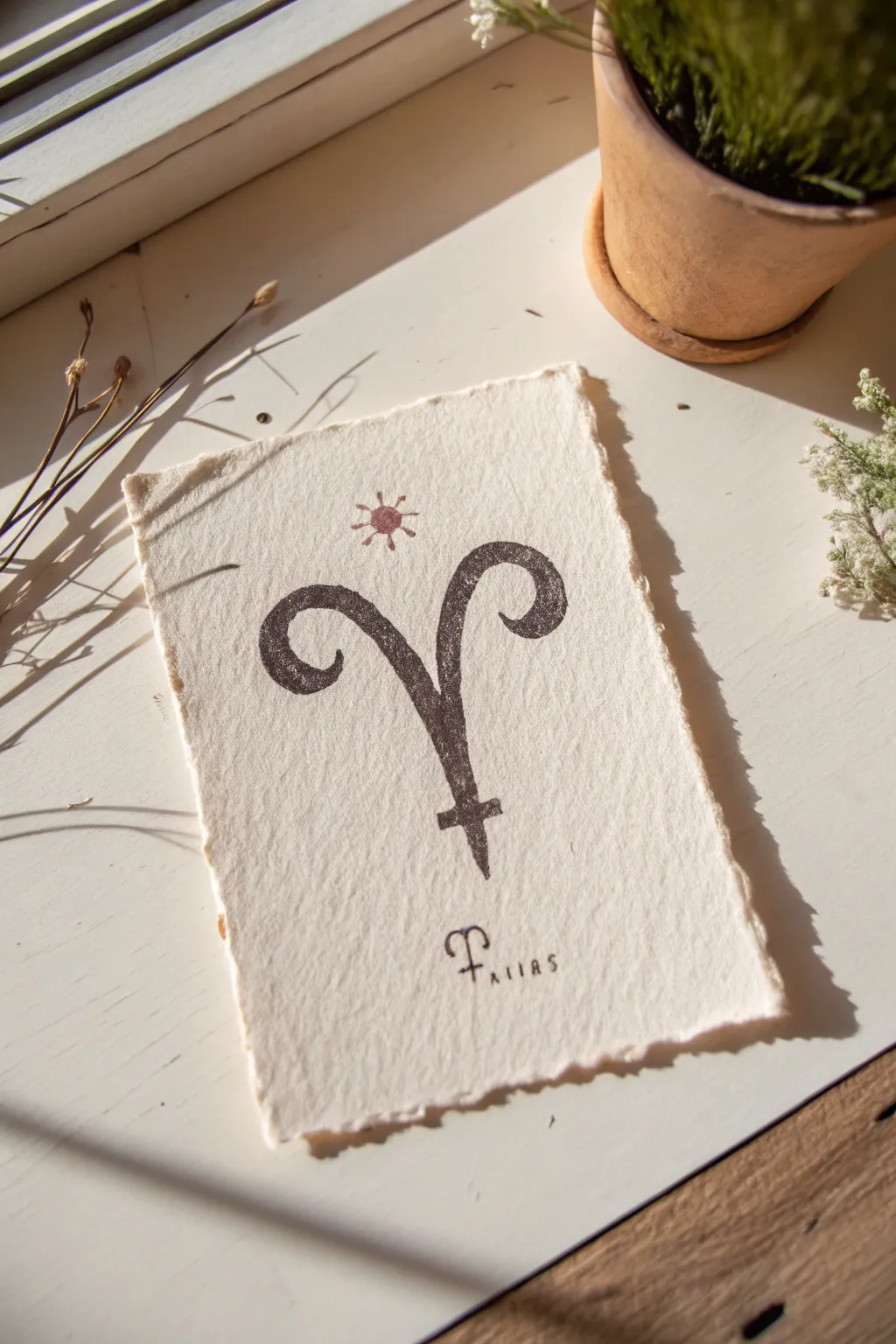
Celebrate the fiery energy of the first zodiac sign with this beautiful, minimalist art print on handmade paper. This project combines the classic Aries ram horns with the astrological symbol for Mars, creating a unique glyph that speaks to strength and new beginnings.
How-To Guide
Materials
- Handmade cotton rag paper (deckle edge, A5 or 5×7 size)
- Linoleum carving block (soft cut is easier for beginners)
- Linoleum cutter tool with V-gouge and U-gouge blades
- Pencil and tracing paper
- Black block printing ink (water-soluble)
- Copper or reddish-brown pigment ink pad (for the sun/star)
- Fine point black archival pen (0.3mm or 0.5mm)
- Brayer (rubber roller)
- Glass plate or acrylic sheet for rolling ink
- Baren or a clean wooden spoon
Step 1: Design and Transfer
-
Draft your symbol:
Sketch your design on plain paper first. The core shape is the Aries ‘V’ with curling horns. Instead of ending the V in a point, extend it downward into a vertical line crossed by a short horizontal bar, mimicking the Mars symbol structure but inverted or stylized. -
Refine the curves:
Thicken the lines of your sketch to mimic the look of a print. The horns should have a nice, weighty curve that tapers slightly near the ends. -
Trace onto block:
Place tracing paper over your finalized sketch and trace the outline with a soft pencil. Flip the tracing paper graphite-side down onto your linoleum block. -
Transfer the image:
Rub the back of the tracing paper firmly with your spoon or a fingernail to transfer the graphite image onto the block. Remember, the image on the block will be the mirror opposite of your final print.
Patchy Prints?
If your print looks too salty or grainy, your ink might be too dry or applied too thinly. Add a tiny drop of water (for water-based ink) and recharge your brayer.
Step 2: Carving the Block
-
Outline with V-gouge:
Fit your cutter with the fine V-gouge blade. Carefully carve along the very outer edges of your symbol lines. Keep the blade at a low angle to avoid digging too deep too fast. -
Clear large areas:
Switch to a wider U-gouge blade. Carve away the negative space (the background) around your symbol. I usually carve away from the design outward to prevent accidental slips. -
Create texture:
You don’t need the background to be perfectly smooth. Leaving some shallow ridges in the negative space can add character, though for this minimal look, try to keep the immediate area around the symbol quite clean. -
Clean up edges:
Go back with your fine blade and neaten any jagged edges around the horns and the crossbar. Brush away all carving crumbs.
Deckle Edge DIY
Can’t find handmade paper? Tear a sheet of heavy watercolor paper against a ruler edge while it’s wet. This mimics the soft, fuzzy deckle edge perfectly.
Step 3: Printing the Glyph
-
Prepare the ink:
Squeeze a small amount of black block printing ink onto your glass plate or acrylic sheet. It should be about the size of a coin. -
Charge the brayer:
Roll the brayer back and forth through the ink until it sounds ‘sticky,’ like velcro pulling apart. The layer of ink on the roller should be thin and even. -
Ink the block:
Roll the inked brayer over your carved block. Apply ink in multiple directions to ensure solid coverage on the raised symbol. -
Position the paper:
Gently lay your handmade paper on top of the inked block. This method allows you to center it by eye or feel the edges of the block through the paper. -
Burnish the print:
Using a baren or the back of a wooden spoon, rub the back of the paper in small circles. Apply firm, even pressure, especially over the thick curves of the horns. -
The reveal:
Slowly peel the paper back from one corner. If the ink looks patchy, you can sometimes lay it back down carefully to rub more, but usually, a slightly distressed look adds to the charm.
Step 4: Details & Finishing Touches
-
Dry time:
Let the black ink dry completely. Water-soluble inks dry faster, usually within an hour, but oil-based will take longer. -
Add the celestial accent:
Above the horns, draw a small circle with small radiating rays using the copper or reddish-brown pigment ink. I sometimes use a small eraser stamp for the circle and draw the rays by hand for a consistent look. -
Lettering:
At the bottom right, use your fine point archival pen to write ‘Aries’ in tiny, spaced-out capital letters. -
Final flourish:
Next to the word Aries, draw a tiny, simplified version of the main symbol using the fine pen to echo the large print.
Frame your celestial artwork in a floating frame to show off those beautiful rough edges
Geometric Aries Badge
Combine the bold energy of the ram with elegant geometry in this striking blackwork illustration. Using simple dotted lines and crisp ink work, you’ll create a mystical badge perfect for sketchbook pages or custom tattoo designs.
Step-by-Step Guide
Materials
- Heavyweight drawing paper or sketchbook (smooth or vellum finish)
- Pencil (HB or 2H for light drafting)
- Ruler
- Compass (optional but helpful)
- Fine liner pen (01 or 03 size)
- Thicker graphic pen or brush pen (for bold outlines)
- Eraser (kneaded is best)
Step 1: Drafting the Geometry
-
Establish the Center:
Begin by finding the center of your page. Lightly mark a central point with your pencil; this will anchor the entire composition. -
Draw the Main Triangle:
Measure a large equilateral triangle pointing upwards. Keep your pencil pressure very light, as these lines will eventually be dotted. -
Create the Star:
Overlay a second, inverted equilateral triangle of the same size. This creates a six-pointed star (hexagram) shape around your central point. -
Add Inner Guides:
Inside the star, sketch a circle where the ram’s head will sit. This ensures the organic animal shape stays balanced within the rigid geometry.
Precision Pro-Tip
For the dotted geometric lines, don’t tap the pen straight down. Instead, make tiny, deliberate circles or short dashes to prevent damaging the nib.
Step 2: Sketching the Ram
-
Outline the Head Shape:
In the center circle, draft the elongated shape of the ram’s face. Narrow it down towards the nose and keep the forehead broad. -
Curve the Horns:
Draw two large, spiraling C-curves extending from the forehead. They should curl outward and then tuck back in towards the cheeks. -
Detail the Segments:
Add the ribbed texture to the horns by drawing curved lines across the width of the horns. These should follow the contour of the spiral. -
Place Facial Features:
Mark the positions for the eyes on the sides of the head and a Y-shape for the nose and mouth. Keep the eyes somewhat angular to match the fierce energy.
Uneven Horns?
Symmetry is hard! If one horn looks larger, thicken the outer line of the smaller horn to visually balance the weight without redrawing everything.
Step 3: Inking the Design
-
Ink the Ram Outline:
Switch to your thicker graphic pen or brush pen. Go over the main outline of the ram’s head and the outer edges of the horns, using confident, fluid strokes. -
Refine the Horns:
Use a slightly thinner nib to ink the internal ribbing lines of the horns. I like to thicken the line slightly where the curve turns underneath to suggest shadow. -
Add Facial Detail:
Ink the eyes and nose. Add a small patch of stippling (tiny dots) on the forehead to create a woolly or textured appearance. -
Create the Dotted Geometry:
Using your 01 fine liner, trace over your pencil triangles using a dotted line technique. Keep the spacing consistent and the dots distinct. -
Double the Lines:
Add a second row of dots slightly inside or outside the first triangle lines to create a ‘double-exposure’ geometric effect. -
Add Corner Accents:
Fill in small solid black triangles at the three main points of the upward-pointing triangle to anchor the design visually.
Step 4: Final Touches
-
Incorporate Mystical Symbols:
Add small decorative elements like tiny circles or runes near the bottom points of the star to enhance the esoteric vibe. -
Erase Guidelines:
Wait until the ink is completely dry—give it a few minutes—and then gently erase all your underlying pencil marks. -
Review and Darken:
Check your blacks. If the main outline of the ram looks grey compared to the sharp dots, go over it once more to ensure deep, solid contrast.
Now you have a bold astrological illustration that perfectly balances nature and mathematics
Ram Head With Rose and Thorns
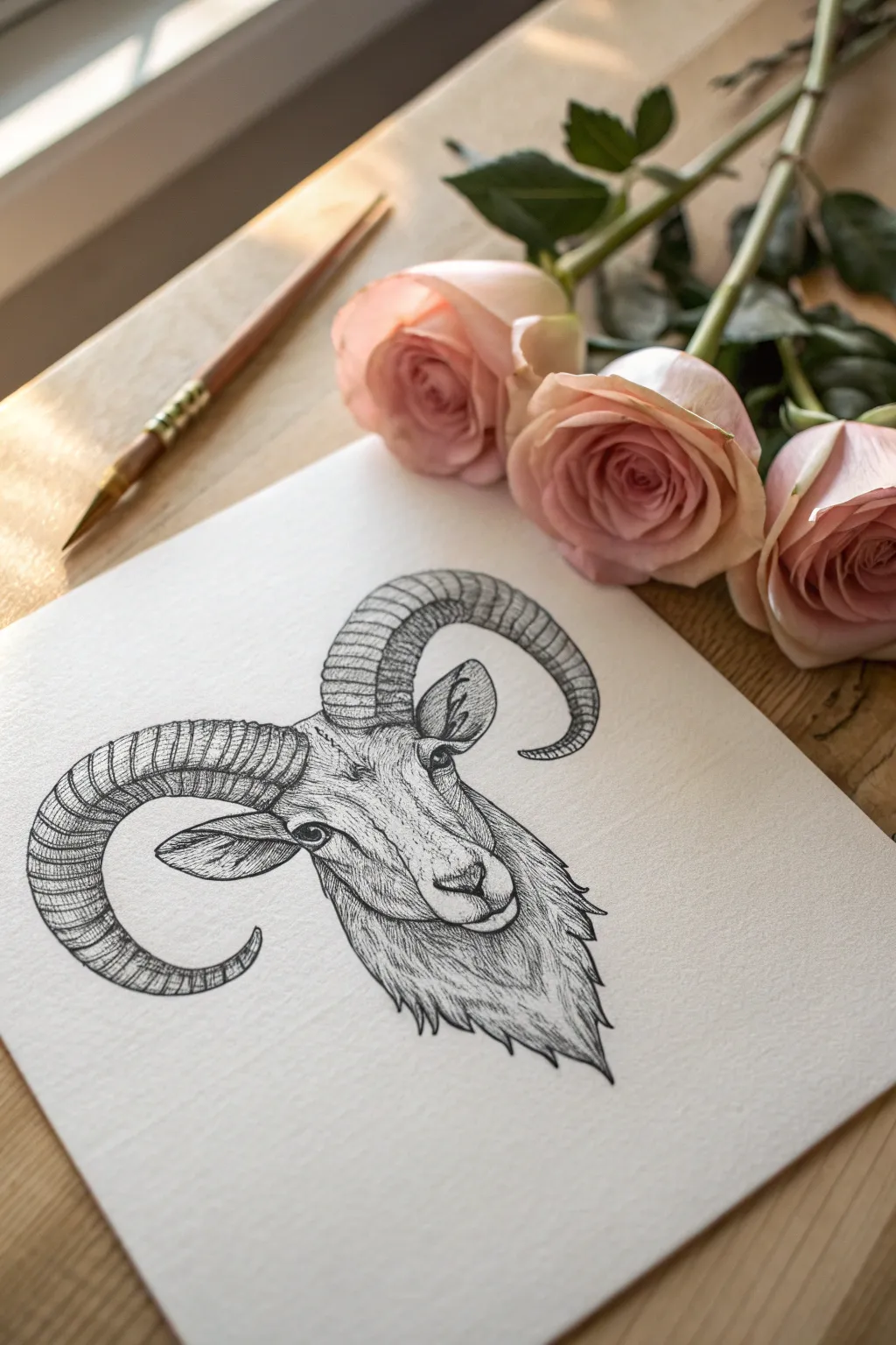
Capture the strength of Aries with this detailed pen-and-ink style ram portrait focused on texture and form. You’ll use fine linework and hatching techniques to build up the woolly fur and the impressive curve of the horns.
Step-by-Step
Materials
- Heavyweight textured drawing paper (vellum finish)
- HB or 2B graphite pencil for sketching
- Kneaded eraser
- Fine liner pens (sizes 005, 01, and 03)
- Ruler (optional for symmetry check)
Step 1: Structural Sketch
-
Establish the axis:
Begin by lightly drawing a central vertical line to help you maintain symmetry, followed by a horizontal line where the eyes will sit. Draw a rough oval for the main head shape and a smaller oval near the bottom for the snout. -
Map out the horns:
Using large, sweeping C-curves, sketch the gesture of the horns emerging from the top of the head. They should curve outward, down, and then hook slightly back up at the tips. Keep these lines faint so they can be adjusted. -
Refine the facial features:
Place the eyes on your horizontal guide, spacing them wide apart. Sketch the triangular nose and the mouth line. Add the ears just below the horns, tucked slightly backward. -
Outline the fur direction:
Lightly indicate the direction of the fur growth around the neck and cheeks. Instead of drawing individual hairs yet, just draw arrows or light patches to remind yourself which way the texture should flow.
Ink Patience
Wait at least 15 minutes before erasing pencil lines. Even if ink looks dry, it may still smear on textured paper.
Step 2: Inking the Outlines
-
Define the main contours:
Switch to your 03 fine liner. Carefully trace the outer edges of the horns and the main shape of the face. For the neck fur, use jagged, broken lines to suggest tufts of hair rather than a solid smooth line. -
Detail the eyes and nose:
With the 01 pen, ink the eyes, leaving a tiny white circle for the highlight to bring life to the ram. Ink the nostrils and the mouth line, keeping the pressure steady. -
Segment the horns:
Draw the ridges across the horns using curved lines that follow the cylindrical form. These shouldn’t be straight ladder rungs; curve them to show the roundness of the horn structure. -
Erase pencil guides:
Once the foundational ink is completely dry, gently run your kneaded eraser over the entire drawing to lift the graphite sketch, leaving only your clean ink lines.
Floral Framing
Lightly sketch roses behind the horns before inking to integrate the ram with floral elements for a classic tattoo-style look.
Step 3: Texturing and Shading
-
Shade the horns:
Using the 005 pen, apply fine hatching lines along the bottom edge of each horn segment. I find that starting from the outline and flicking inward creates a natural shadow gradient. -
Cross-hatch the horn curves:
Deepen the shadows on the underside of the horns with a second layer of hatching at a slight angle. This cross-hatching adds weight and makes the horns look solid and heavy. -
Texture the face:
Switch back to the 01 pen. use short, stippled dots and tiny dashes across the bridge of the nose and cheeks. Keep the center of the forehead lighter to suggest light hitting the bone structure. -
Build the neck fur:
Create the dense wool texture on the neck by drawing long, flowing lines that group together. vary your line length, allowing some lines to overlap to create depth in the fur. -
Darken the ears:
Add shadows inside the ears using dense hatching. Leave the rim of the ear lighter to distinguishing the outer edge from the inner cavity. -
Deepen contrast:
Look for the darkest areas—under the chin, beneath the horns, and the pupil of the eye. Go over these spots again with the 03 pen to punch up the contrast. -
Refine the snout:
Add very subtle stippling (dots) around the muzzle area. This suggests a softer, velvety texture compared to the coarser wool on the neck. -
Final assessment:
Step back and check the balance. If the horns look too flat, add a few more curved lines on the upper ridges to emphasize their roundness.
Now you have a striking Aries illustration ready to be framed or gifted to your favorite fire sign
Aries Zodiac Wordmark Combo
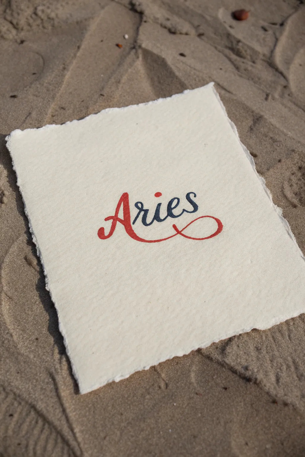
This elegant wordmark project combines the raw, natural texture of deckled-edge paper with crisp, stylized calligraphy. The contrast between warm terracotta red and cool slate blue perfectly captures the fiery yet balanced nature of the Aries sign.
Step-by-Step Tutorial
Materials
- Heavyweight cold-press watercolor paper or cotton rag paper (300gsm+)
- Pencil (HB or H)
- Kneaded eraser
- Fine-tip brush markers or calligraphy pens (Terracotta Red and Slate Blue)
- Optional: Fine liner pen for outlining
- Ruler
- Cup of water and flat brush (for deckling)
Step 1: Preparing the Paper
-
Measure your canvas:
Start by measuring a roughly 5×7 inch rectangle on your watercolor paper. Don’t cut it yet; we need room to create the torn edges. -
Create the water line:
Dip a flat brush into clean water and run it along your measured lines. You want the paper to be damp but not soaking wet. Let it sit for about 30 seconds to soften the fibers. -
Tear the edges:
Place your ruler firmly along the wet line. Gently pull the excess paper upward and toward the ruler to tear it. This creates that beautiful, soft ‘deckled’ edge look. -
Flatten and dry:
If the edges curl slightly, place the paper under a heavy book for a few minutes once it’s dry to ensure a flat writing surface.
Bleeding Lines?
If ink bleeds loosely into the paper fibers, your paper might be too damp or low quality. Try a drier marker or higher GSM cotton paper.
Step 2: Penciling the Design
-
Find the center:
Lightly mark the center of your paper with a pencil. This will help you balance the wordmark so it doesn’t drift too far left or right. -
Draft the ‘A’:
Sketch a large, capital ‘A’ in a cursive style. Give the left leg a slight inward curl. -
Draft the ‘ries’:
Continue sketching the lowercase letters ‘r-i-e-s’ following the ‘A’. Keep the sizing uniform—about half the height of your capital ‘A’. -
The signature swoosh:
From the bottom right leg of the ‘A’, draw a long, sweeping curve that goes under the entire word. Loop it back up and around the end of the ‘s’ to tie the whole composition together. -
Refine the thickness:
Go back over your single lines and thicken the downstrokes (the parts of the letter where your hand moves downward) to mimic calligraphy script.
Step 3: Inking the Design
-
Start with red:
Using your terracotta red marker or pen, carefully fill in the ‘A’. Focus on keeping your edges crisp. -
Continue the swoosh:
Extend that red ink into the sweeping underline. I typically do this in one steady motion to avoid shaky lines, stopping right where it meets the ‘s’. -
Switch to blue:
Take your slate blue marker and fill in the ‘r’, ‘i’, ‘e’, and ‘s’. Be very careful where the red swoop intersects with the blue ‘s’—try not to blend the wet inks. -
The final detail:
Using the red marker again, add a distinct, bold dot above the ‘i’. This small pop of color balances the red ‘A’ at the beginning.
Add Metallic Flair
Trace the thin upstrokes of your letters with a fine gold gel pen. The subtle shimmer adds a celestial quality perfect for zodiac art.
Step 4: Finishing Touches
-
Let it cure:
Allow the ink to dry completely. Since watercolor paper is absorbent, give it an extra 5-10 minutes to ensure no smudging occurs. -
Erase guidelines:
Gently roll your kneaded eraser over the design to pick up any visible pencil marks without damaging the paper texture. -
Texture check:
If the paper grain made your edges look rough, do a second careful pass with your markers to sharpen the outline of the letters.
Now you have a beautifully handcrafted zodiac print ready to be framed or gifted.
Aries “Ram Girl” Character Portrait
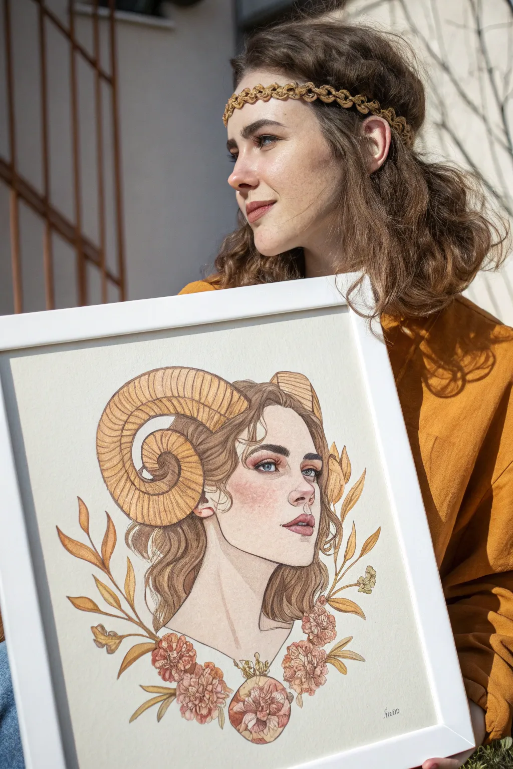
Capture the fiery yet grounded spirit of an Aries with this delicate mixed-media portrait. Combining precise ink lines with soft watercolor washes, you’ll create a character that embodies the ram symbol through elegant horns and framing florals.
How-To Guide
Materials
- Hot press watercolor paper (smooth finish)
- H or HB pencil for sketching
- Kneaded eraser
- Fine liner pens (sepia or dark brown, sizes 01 and 03)
- Watercolor paint set (focus on ochre, burnt sienna, peach, and muted greens)
- Colored pencils (brown, terracotta, soft pink)
- Small round paintbrushes (sizes 2 and 4)
- White gel pen (optional)
Step 1: Structure & Sketching
-
Map the proportions:
Begin with a gentle pencil sketch to establish the head placement. Draw an oval for the face and a long, elegant neck. Ensure the head is slightly turned to a three-quarter view to match the reference. -
Draft the horns:
This is the defining Aries feature. Sketch large curves emerging from just above the ears, spiraling backward and curling around the ear. Keep the left horn prominent and the right horn receding in perspective. -
Refine facial features:
Lightly sketch the eyes, nose, and lips. Aim for a calm expression with slightly heavy eyelids and full lips. Don’t worry about perfect details yet; just get the placement right. -
Add nature elements:
Draw loose, wavy hair falling around the neck. Frame the bottom of the portrait with a symmetrical arrangement of leaves curving upward and clusters of peony-like flowers at the base.
Fixing Flat Horns
If the horns look 2D, curve your shading lines. When adding texture ridges, ensure they wrap around the cylindrical form, curving C-shapes rather than straight lines.
Step 2: Inking the Lines
-
Outline the face:
Using your 01 sepia fine liner, carefully trace the profile, jawline, and neck. Keep your hand steady but allow for slight variation in line weight to keep it organic. -
Detail the horns:
Switch to a slightly thicker pen if available, or just press slightly harder. Ink the spiral shape, and then add the ridges across the horns. These curved lines are crucial for showing the texture and volume of the ram’s horns. -
Inking hair and florals:
Use loose, flowing strokes for the hair strands. For the leaves and flowers, use confident lines, adding a central vein to the leaves but keeping the flower petals soft and overlapping. -
Erase guidelines:
Once the ink is completely dry—give it a few minutes to be safe—gently go over the entire drawing with a kneaded eraser to lift all the graphite.
Pro Tip: Layer Harmony
Use the same ochre color from the horns in the skin tone mix and the leaves. Repeating a single pigment across different areas ties the whole color palette together nicely.
Step 3: Adding Color
-
Base skin tone:
Mix a very dilute wash of peach and a touch of ochre. Apply a flat, pale layer to the face and neck. While it’s still damp, drop a tiny bit of stronger pink onto the cheeks, nose, and lips for a natural flush. -
Painting the horns:
Use a warm yellow ochre or raw sienna for the horns. Apply a light wash first, then add darker brown pigment to the undersides of the ridges to create shadow and dimension. -
Hair shadows:
I prefer to tackle hair by painting only the shadows first. Use a diluted light brown to map out where the hair waves dip, leaving the ‘high’ points of the waves the white of the paper. -
Botanical hues:
Paint the leaves in varying shades of autumn gold and muted brownish-green. For the flowers at the bottom, use a soft terracotta or rusty pink wash, keeping it light and airy.
Step 4: Refining & Finishing
-
Deepen the eyes:
With a fine brush or colored pencil, add blue or grey to the irises. Use a dark brown pencil to gently reinforce the lash line and eyebrows. -
Enhance texture with pencil:
Once the paint is bone dry, use sharp colored pencils to add texture. Use a brown pencil to add strands to the hair and define the ridges on the horns further. -
Warm up the cheeks:
Take a soft pink colored pencil and lightly shade over the dried watercolor blush on the cheeks and nose tip. This adds a velvety texture that paint alone can’t achieve. -
Final highlights:
If needed, use a white gel pen to add a tiny catchlight in the eyes and on the tip of the nose. -
Framing:
To match the reference look, mount your finished piece in a simple white frame with a white mat to let the warm tones breathe.
Hang this portrait in your creative space to channel that bold Aries energy every day
Aries Warrior Ram Concept
This regal portrait combines the classic symbolism of the ram with decorative geometric elements to create a sophisticated zodiac tribute. The combination of delicate ink stippling and bold metallic accents gives the finished piece a timeless, manuscript-like quality.
Step-by-Step Tutorial
Materials
- Heavyweight textured art paper (watercolor or mixed media, cream/off-white)
- HB or 2H graphite pencil for sketching
- Fine liner pens (0.05, 0.1, 0.3mm) in black
- Gold metallic marker or gold gouache paint with fine brush
- Kneaded eraser
- Ruler
- Compass (optional)
Step 1: Drafting the Warrior
-
Establish the framework:
Begin by lightly sketching a large circle for the main curvature of the horn and an intersecting oval for the ram’s head. Draw a slight diagonal line descending from the neck to define where the decorative collar will sit. -
Shape the profile:
Refine the snout and jawline. The nose should have a gentle downward slope, ending in a soft curve for the mouth. Keep the eye almond-shaped and positioned well below the horn’s base. -
Outline the great horn:
Sketch the massive, curling horn starting from the forehead. It should spiral backward and curve around the ear, tapering as it tucks under. Add transverse lines along the horn’s length to indicate its ridges. -
Define the ear and fur:
Place the ear just below the horn, sticking out horizontally. Sketch loose, jagged lines along the neck and chest to suggest thick, woolly fur texture rather than a smooth line. -
Add the collar geometry:
Draw the collar shape at the base of the neck. Use a ruler to ensure the zigzag pattern inside is precise, creating a band of repeating triangles. -
Sketch decorative border elements:
Lightly pencil in the surrounding elements: a chain-link border along the paper’s edge, a geometric symbol in the top left, and fern-like botanical sprigs at the bottom right.
Uneven Ink Flow?
Textured paper can sometimes snag fine pens. If your lines look shaky, switch to a slightly thicker nib (0.3mm) for main outlines and save the 0.05mm only for shading.
Step 2: Inking the Details
-
Outline the main features:
Switch to a 0.1mm fine liner. Carefully go over your pencil lines for the profile, eye, and horn. Keep the line weight consistent but allow it to be slightly broken on the fur to maintain softness. -
Texturing the horn:
Using a 0.05mm pen, draw fine, closely spaced lines following the curve of each ridge on the horn. Leave a small gap in the inking on the upper curve to create a natural highlight. -
Detailing the face:
Add subtle stippling (tiny dots) around the eye and snout to create depth. Shade the pupil dark black, leaving a tiny white crisp circle for the reflection. -
Drawing the fur:
Use quick, short strokes with your 0.1mm pen to ink the neck fur. The strokes should flow downward and outward, mimicking the growth direction of the hair. -
Inking the collar pattern:
Outline the triangular geometric pattern on the collar. Fill the background triangles with tight cross-hatching or stippling to create a dark contrast against the soon-to-be gold areas. -
Border and symbols:
Trace the chain-link border with a steady hand. Outline the geometric symbol in the corner and the botanical leaves at the bottom, keeping these lines clean and unbroken. -
Erase guidelines:
Wait until the ink is completely dry—I usually give it at least 5 minutes—then gently remove all pencil marks with a kneaded eraser to avoid smudging.
Step 3: Applying Metallic Accents
-
Gilding the horn:
Use your gold metallic marker or paint to add a thin band of gold at the base of the horn where it meets the forehead. This acts like a decorative headband. -
Filling the collar:
Carefully color the zigzag lines of the collar with gold. The contrast between the black ink hatching and the metallic gold really makes this section pop. -
Accenting the border:
Trace over the chain-link border design with gold. For a vintage look, you don’t need to fill it completely; just tracing the links is effective. -
Botanical highlights:
Fill select leaves in the bottom right corner with gold, or simply outline the stems to tie the composition together. -
Symbolic details:
Add gold touches to the geometric symbol in the top left corner and sprinkle a few small gold stars or four-pointed shapes around the ram’s head. -
Final assessment:
Step back and look for balance. If the drawing feels top-heavy, add a small gold star near the bottom.
Pro Tip: Vintage Vibe
To get that parchment look, lightly stain your paper with watered-down tea and let it dry completely flat before you even start your initial pencil sketch.
Enjoy the commanding presence of your finished Aries artwork.
Aries Horns as Decorative Border
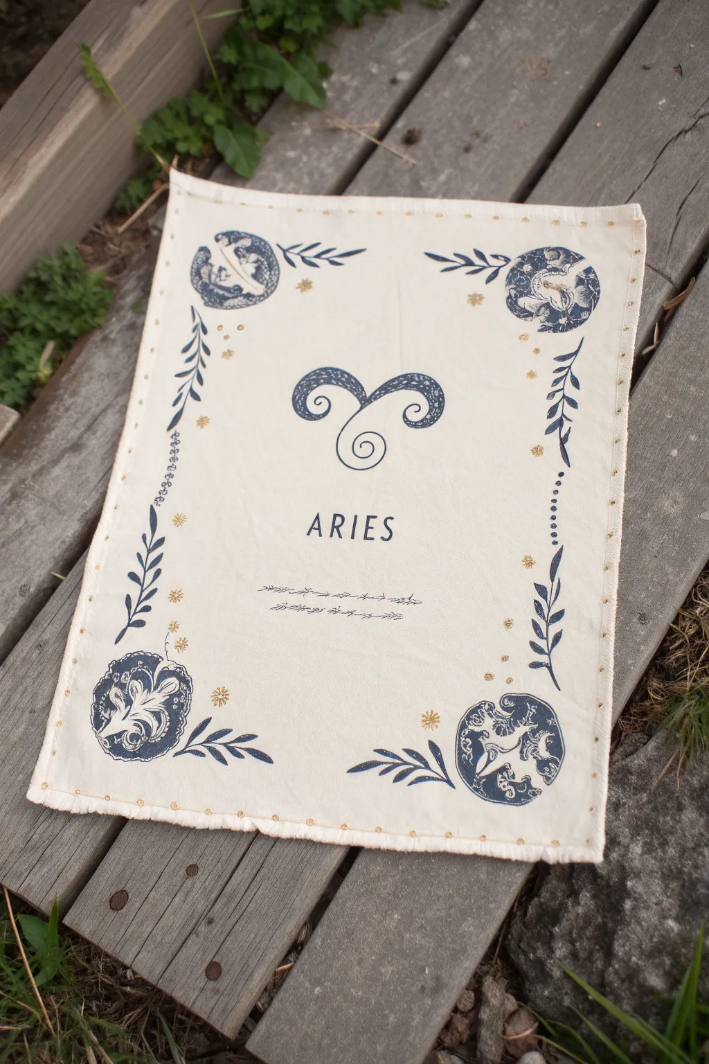
Transform a simple piece of natural fabric into a mystical astrological art piece featuring the Ram’s horns. The design uses deep indigo block-print styles paired with delicate gold accents to create an ancient, celestial aesthetic.
How-To Guide
Materials
- Cream or off-white cotton or linen fabric (rectangular cut)
- Deep indigo or navy blue fabric paint
- Metallic gold fabric paint
- Fine liner paintbrush (size 0 or 00)
- Medium round paintbrush (size 4)
- Pencil and ruler
- Fabric medium (optional, if using acrylics)
- Cardboard or stencil acetate (for templates)
- Iron (to set the paint)
Step 1: Preparation & Layout
-
Prepare the fabric canvas:
Cut your cream cotton or linen to your desired size, leaving an extra half-inch on all sides for hemming later. Iron the fabric completely flat to ensure a smooth painting surface. -
Mark the center:
Using a ruler, lightly find the exact center of the fabric with your pencil. This is where the main horn motif will sit. -
Draft the central design:
Lightly sketch the curling Aries ram horns in the center. The design should look like a letter ‘T’ that curls outward and downward into spirals. Add a smaller spiral at the bottom center of the horns. -
Lettering guide:
About two inches below the horns, use your ruler to draw a straight, faint guide line for the text. Sketch the word ‘ARIES’ in a tall, sans-serif font, centering it under the horns. -
Sketch the borders:
In each of the four corners, lightly draw a circular zone for the motifs. Connect these corners with vertical lines of leaves or vines running up the sides, and horizontal decorative scribbles above and below the text.
Step 2: Painting the Blue Elements
-
Paint the horns:
Load your medium brush with deep indigo paint. Fill in the ram horns, using the fine tip of the brush to keep the edges crisp. I find it easier to outline the shape first, then fill the inside. -
Add horn texture:
While the paint is wet or just slightly tacky, you can gently scratch back into it with a dry brush or toothpick to create a weathered, block-print texture, or simply paint small lighter blue dots for detail if preferred. -
Lettering:
Switch to your fine liner brush. Carefully paint the ‘ARIES’ letters with the indigo paint. Use slow, deliberate strokes to keep the line width consistent. -
Corner motifs:
Paint the circular designs in the four corners. These look like stylized floral or celestial orbs. Don’t worry about perfect symmetry; the handmade look adds charm. -
Leaf borders:
Paint the leafy vines climbing up the left and right sides. Use a ‘press and lift’ motion with your brush to create the tapered leaf shapes naturally. -
Horizontal accents:
Paint the thin, scratchy horizontal lines beneath the text and near the vines. These should look like abstract thorns or waves.
Clean Lines Hack
If you struggle with hand-lettering, print the word ‘ARIES’ on paper, slip it under your fabric, and trace it using a light box or a sunny window.
Step 3: Gold Accents & Finishing
-
Add starry gold details:
Dip the back end of your paintbrush or a small dotting tool into the metallic gold paint. Place small dots around the border vines and scattered near the corner motifs to represent stars. -
Paint gold sparklers:
Use the fine liner brush to paint tiny eight-pointed stars or asterisks in gold within the empty spaces of the border. This brings the celestial theme to life. -
Edge detailing:
Along the very outer edge of the fabric, paint small, evenly spaced gold dots to simulate a stitched border or studded edge. -
Dry completely:
Let the fabric sit undisturbed for at least 24 hours to ensure the paint is fully cured. -
Heat set the design:
Place a thin scrap cloth over your design and iron on a high, dry setting (appropriate for cotton/linen) for 3-5 minutes. This seals the paint into the fibers. -
Fray the edges:
If you want the rustic look shown in the image, pull a few threads from each side of the fabric to create a raw, frayed edge.
Blobby Paint?
If your fabric paint is too thick and creating raised ridges, thin it slightly with water or a fabric medium for a smoother, more ink-like flow.
Hang your finished celestial panel or use it as a centerpiece for your tarot readings
Aries Constellation Inside the Horns
Capture the spirit of the zodiac with this refined ink illustration featuring a majestic ram’s head adorned with subtle celestial details. The piece combines clean line work with delicate stippling textures on torn-edge paper for a vintage, artisanal feel.
Detailed Instructions
Materials
- Heavyweight textured sketching paper (cream or off-white)
- Fine liner pens (sizes 0.05, 0.1, 0.3, and 0.5)
- HB Graphite pencil
- Kneaded eraser
- Ruler
- Compass (optional for constellation curves)
Step 1: Drafting the Structure
-
Establish the centerline:
Begin by lightly sketching a vertical line down the center of your paper to ensure symmetry. Mark the top of the head, the nose location, and the tip of the beard. -
Block out the head shape:
Draw an elongated shield shape for the ram’s face. Keep the top wider for the forehead and taper it down to a soft point for the chin. -
Curve the horns:
Start the horns at the very top corners of the forehead. Sketch large, sweeping C-curves that curl outwards and then spiral tightly back inwards towards the cheeks. Ensure the left and right horns mirror each other as closely as possible. -
Add facial features:
Place the eyes wide on the head, just below where the horns connect. Sketch a small Y-shape for the nose and mouth area near the bottom of the face shield.
Uneven Dots?
If your stippling looks messy, slow down and tap straight down rather than at an angle. Angled taps create ‘tails’ that look like dashes instead of dots.
Step 2: Refining the Lines
-
Outline the horns:
Using a 0.3 pen, trace over your horn sketches. Add the internal ridges by drawing curved lines across the width of the horns. These should curve with the form of the horn to show roundness. -
Detail the ears and face:
Draw the ears poking out horizontally from just beneath the horns. Switch to a 0.1 pen for the facial outline to keep it delicate, adding small details around the eyes to give them depth. -
Ink the beard:
Create the beard using jagged, flowing vertical strokes that come to a sharp point. Use quick flicking motions with your pen to simulate hair texture. -
Erase pencil guides:
Once the main ink lines are completely dry, gently run your kneaded eraser over the entire drawing to lift the graphite sketch.
Step 3: Shading with Stippling
-
Start the stippling process:
Using your finest 0.05 pen, begin adding tiny dots (stippling) to the areas that need shadow. Focus on the underside of the horns and the inner curves. -
Deepen the horn texture:
Increase the density of dots near the ridges of the horns. This gradient from dense dots to white space creates a 3D cylindrical effect. -
Shadow the face:
Add light stippling down the sides of the nose bridge and under the eyes. I find that keeping the center of the forehead mostly clear helps highlight the bone structure. -
Darken the eyes:
Fill in the pupils with solid black using a 0.5 pen, leaving a tiny white circle for a highlight. Stipple heavily around the eyelids.
add gold leaf
For a magical upgrade, use gold leaf size and foil on the constellation stars or the horn ridges to make the artwork catch the light beautifully.
Step 4: Celestial Elements
-
Draw the constellation:
Above the horns, use a ruler to lightly pencil the geometric shape of the Aries constellation. Ink the connecting lines with dashed or dotted strokes. -
Add the stars:
At the points of the constellation, draw small 4-pointed stars or simple distinct dots to represent the celestial bodies. -
Incorporate sparkles:
Draw a few standalone 4-pointed stars (rhombus shapes with curved sides) floating around the ram’s head to balance the composition.
Step 5: Finishing Touches
-
Review contrast:
Step back and look at your drawing. If the horns look too flat, go back in with the 0.05 pen and add another layer of dots to the darkest areas. -
Create the deckled edge:
Place a ruler flat against the edge of your paper. While pressing down firmly, tear the paper upwards against the ruler’s edge to create that soft, fibrous ‘deckled’ look seen in the example.
Display your finished illustration on a contrasting background or frame it to showcase those lovely torn edges
Aries and Leo Pair Drawing
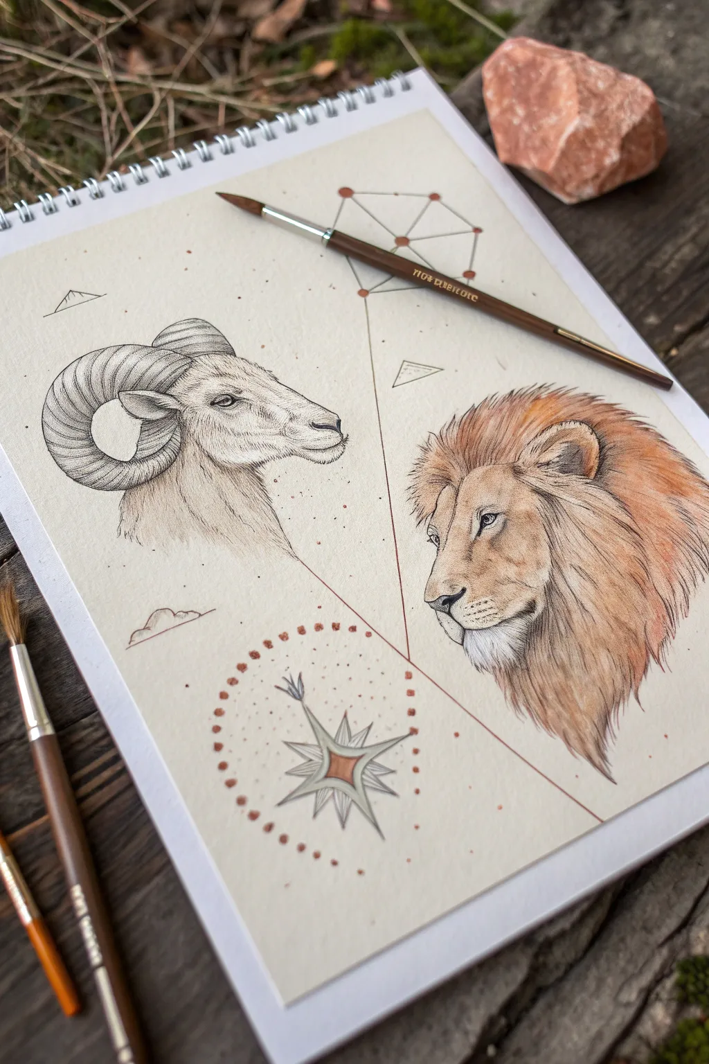
This elegant mixed-media illustration combines the stoic ram of Aries with the regal lion of Leo in a harmonious, geometrically balanced composition. Using fine ink lines for texture and soft watercolor washes for warmth, you’ll create a piece that feels both scientific and mythical.
Step-by-Step
Materials
- Heavyweight mixed-media or watercolor paper (smooth or hot press)
- Fine liner pens (sizes 0.05, 0.1, and 0.3, black)
- Graphite pencil (HB or H) and kneaded eraser
- Watercolor paints (Burnt Sienna, Yellow Ochre, Raw Umber, Sepia, touch of Red Iron Oxide)
- Round watercolor brushes (size 2 and 4)
- Ruler or straight edge
- Compass or circle template (optional)
Step 1: Planning the Composition
-
Establish the framework:
Begin by lightly sketching a large triangle structure with your pencil to anchor the composition. Place a vertex near the bottom center for the compass rose, and two imaginary points higher up where the animal heads will sit. -
Map the animal forms:
Roughly sketch the head shapes. For the ram on the left, focus on the curve of the horns circling the ear. For the lion on the right, outline the mane’s volume and the muzzle’s direction. Keep these lines very faint so they are easily erased later. -
Add geometric elements:
Draw the connecting lines. Sketch a straight line originating from the top center down towards the bottom right, and another cross-secting line. Add the constellation framework at the very top using dots connected by lines. -
Draft the compass rose:
At the bottom center, sketch an eight-pointed star inside a faint circle. Add a ring of small dots or circles surrounding this element to frame it nicely.
Ink Confidence
Work from left to right (if right-handed) when inking to prevent smudging your pencil sketch. Let the ink dry fully before erasing pencil lines.
Step 2: Inking the Aries Ram
-
Outline the ram:
Using a 0.1 fine liner, carefully trace the outline of the ram’s profile. Use broken, short strokes for the fur on the neck, but smoother, continuous lines for the horns. -
Texture the horns:
The horns require patience. Draw the transverse ridges (the rings around the horn) with curved lines. Add fine hatching and cross-hatching between these ridges to create depth and roundness. -
Stipple the face:
Switch to a 0.05 pen for the face. Use stippling (tiny dots) around the eye, nose, and cheek to create soft shading without harsh lines. This gives the skin a velvety texture. -
Detail the fur:
Use directional hatching on the neck. Flick the pen downward to mimic the flow of hair, keeping the lines dense near the jawline for shadow and sparse towards the chest.
Step 3: Inking the Leo Lion
-
Define the lion’s features:
With the 0.1 pen, draw the lion’s eye, nose, and mouth. The eye should have a heavy upper lid. Pay close attention to the whisker pads, using small dots rather than lines. -
Draw the mane:
The mane needs volume. Use long, flowing strokes with a 0.1 or 0.3 pen. Don’t outline every single hair; instead, draw clumps of hair layered over each other, moving outward from the face. -
Shade the face:
Use very fine hatching on the bridge of the nose and under the eye. Keep the touch light to avoid making the lion look too dark or heavy.
Paper Aging Effect
Before starting, lightly stain your paper with cold tea or coffee and let it dry flat. This gives the drawing an immediate vintage, manuscript feel.
Step 4: Watercolor and Final Details
-
Prepare your palette:
Mix a watery wash of Yellow Ochre and Burnt Sienna. You want semi-transparent tea-colored tones, not thick paint. -
Paint the lion:
Apply the golden-brown mix to the lion’s mane, letting it fade out at the edges. Add a touch of Red Iron Oxide to the wetter areas for warmth. Leave the muzzle and around the eyes mostly white. -
Shade the ram:
The ram is much subtler. Use a very dilute wash of Raw Umber or Sepia just on the shadowed side of the neck and the underside of the horns. This minimalist approach contrasts beautifully with the colorful lion. -
Connecting lines:
Using a ruler and a reddish-brown fineliner (or a brush with very steady hand), ink the geometric lines connecting the elements. Add small solid dots at the intersection points. -
Finish the compass:
Paint the central diamond of the compass rose with a touch of rust/red watercolor. Use a pen or a small brush to create the circle of dots surrounding it using the same reddish-brown tone.
Now you have a stunning duality piece that captures the calm strength of the ram and the fiery spirit of the lion
Aries Sticker Sheet Mini Icons
Embrace the fiery energy of the ram with this meticulously arranged page of Aries-themed iconography. This tutorial guides you through creating a mini icon sticker sheet layout directly in your journal, blending bold black ink with warm, earthy tones for a magical aesthetic.
Detailed Instructions
Materials
- Spiral-bound dot grid notebook or high-quality drawing paper
- Fine liner pen (Black, 0.3mm or 0.5mm)
- Brush pen or marker (Burnt Sienna/Terracotta color)
- Pencil (HB for sketching)
- Eraser (kneaded preferred)
- Ruler (optional, for spacing)
Step 1: Layout and Planning
-
Grid Preparation:
Begin by lightly marking the center of your page to anchor the composition. The dot grid paper is incredibly helpful here; count the dots to ensure symmetrical spacing if you want a neat look, though a scattered approach works too. -
Centerpiece Sketching:
Sketch the central word ‘ARIES’ in the middle of the page using a loose, hand-lettered style. Directly below it, pencil in the largest element: the detailed ram skull icon. -
Placing Primary Symbols:
Lightly sketch the positions for the other major icons. Place the classic Aries glyph (the curved ‘V’ shape) to the left of the title. Add the ‘M’ symbol (Scorpio/Virgo style glyph used here as a stylistic element) near the top right and bottom locations to balance the page visual weight. -
Scattering Smaller Details:
Fill the empty negative spaces with sketches of smaller icons: crescent moons, various star shapes (four-point, five-point, and six-point), simple leaf sprigs, and geometric shapes like circles or headphones.
Step 2: Inking the Outline
-
Defining the Central Text:
Switch to your terracotta colored marker. Carefully trace over your ‘ARIES’ lettering. Keep the lines relatively thin and consistent, or use a bullet tip for immediate definition. -
Inking the Ram Skull:
Using your black fine liner, outline the central ram skull. This is the most complex drawing. Start with the horns, spiraling them inward, then define the skull shape. Add tiny stippling dots or small lines near the horn ridges for texture. -
Black Iconography:
Proceed to ink the other black symbols. Outline the solid crescent moon (leaving the inside empty for now), the headphones symbol, the pentagram star, and the detailed decorative ram horns in the top left corner. -
Foliage and Accents:
ink the small leaf sprigs. Notice that some leaves are filled in with black ink while others might remain open. For this look, fill the leaves solid black for high contrast. -
Color Accents:
Pick up your terracotta marker again. draw the simple ‘V’ Aries glyphs, the ‘M’ glyphs at the top and bottom, and outline the large six-pointed star on the right side.
Smudge Prevention
Dot grid paper is often smooth and non-absorbent, meaning ink sits on top longer. Place a scrap piece of paper under your hand while drawing to prevent oil transfer and accidental smearing.
Step 3: Refining and detailing
-
Filling the Darks:
Go back with your black pen or a slightly thicker marker to fill in the solid areas. This includes the crescent moon, the ear cups of the headphones, and the small leaf sprigs. Ensure the black is opaque and solid. -
Adding Starbursts:
Use the terracotta marker to draw tiny solid stars scattered throughout the background. These should be small, filled-in five-point stars or simple diamond shapes to add a magical ‘confetti’ effect. -
Line Weight Variation:
Check your black outlines. I find that thickening the outer edge of symbols like the pentagram or the striped circle glyph helps them pop off the page more effectively. -
Texture Details:
Add the final details, such as the stripes inside the circle glyph at the bottom right, or internal lines on the terracotta starbursts. -
Dots and Dust:
Using the tip of your black pen, add very tiny single dots primarily around the clusters of drawings. This stippling effect ties the separate elements together into a cohesive sheet. -
Cleanup:
Once you are absolutely certain the ink is dry (wet ink smears easily on smooth dot grid paper), gently erase all your pencil guides.
Sticker Sheet Hack
Draw these on adhesive label paper instead of directly in a notebook. Once finished, you can cut them out individually to create your own functional planner stickers.
Now you have a stunning page of celestial artwork ready to inspire your astrological journey
Abstract Aries Horn Swirl Design
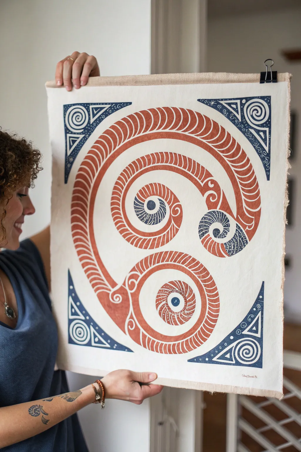
Channel the bold energy of Aries with this striking block-printed tapestry. Featuring a large, rhythmic ram’s horn spiral in warm terracotta tones accented by geometric indigo corners, this project combines traditional linocut techniques with a modern mythological aesthetic.
Step-by-Step
Materials
- Large sheet of linoleum or soft-cut carving block (at least A3 size)
- Linocut carving tools (V-gouge and U-gouge)
- White cotton canvas or heavy linen fabric (approx. 20×24 inches)
- Screen printing ink or block printing ink (fabric safe) in Terracotta/Rust Red and Navy Blue
- Brayer (rubber roller)
- Barren or a clean wooden spoon
- Pencil and tracing paper
- Sharp crafting knife
- Ruler
- Glass slab or acrylic sheet (for rolling ink)
- Iron (for heat setting)
Step 1: Design and Transfer
-
Draft the master spiral:
Begin by sketching the main Aries motif on paper. Draw a large central spiral that splits into three distinct curled ends—representing the ram’s horns. Focus on creating a thick, segmented body for the horns, almost like a segmented worm or shell pattern. -
Add geometric corners:
Design four triangular corner pieces. These should feature spirals, triangles, and small circular details to frame the central organic shape. -
Transfer to the block:
Place tracing paper over your sketch and trace the lines. Flip the tracing paper onto your linoleum block (so the image is reversed) and rub the back with a spoon or pencil to transfer the graphite onto the surface. Go over lines with a permanent marker if they are faint.
Patchy Print?
If the print looks too distressed or light, your fabric might be too textured. Try misting the fabric lightly with water before printing to help it accept the ink.
Step 2: Carving the Block
-
Carve the negative space:
Using a V-gouge, carefully carve away the outline of the horn shape. Remember, whatever you carve away will remain the color of the fabric (white/cream), and what remains raised will be printed. -
Detail the segments:
Switch to a finer V-tool to carve the rhythmic, curved lines inside the main horn body. These repetitive slashes create the texture of the horn. -
Carve the intricate centers:
For the very center of the spirals where the blue accents will go, carve these areas carefully. If you want to print multiple colors easily, you might choose to carve the ‘blue’ sections on a separate small block, or use a ‘jigsaw’ method where you cut the lino block into pieces to ink them separately. -
Clear large areas:
Use a wide U-gouge to clear away all the background material around the spirals and triangles. Ensure these areas are deep enough that the roller won’t accidentally catch them.
Step 3: Inking and Printing
-
Prepare the fabric:
Iron your canvas or linen perfectly flat. Lay it on a slightly padded surface (like a felt blanket) to help ensure a clean print transfer. -
Ink the main body:
Squeeze a line of Terracotta ink onto your glass slab. Roll the brayer back and forth until it has a velvety ‘hissing’ texture. Roll the ink evenly over the main horn sections of the lino block. -
Ink the accents:
Using a separate brayer or a small dabber, apply the Navy Blue ink to the specific detail areas—the geometric corners and the inner accents of the spirals. If you are using the jigsaw method, simply ink the separate pieces now and reassemble them like a puzzle. -
Position the block:
Carefully lift the inked block and hover it over the center of your fabric. Once you are aligned, commit to the placement and drop it straight down. Do not shift it once it touches the fabric. -
Burnish the print:
Using a barren or the back of a wooden spoon, rub firmly in circular motions all over the back of the block. I like to apply extra pressure on the edges and the detailed segmented areas to ensure the ink penetrates the fabric weave. -
The reveal:
Lift one corner of the block just slightly to check coverage. If it looks patchy, lay it back down carefully and rub more. Once satisfied, peel the block off slowly.
Add Gold Leaf
Brush a little sizing glue onto the dried blue spirals and apply gold leaf. The metallic shine against the matte terracotta creates a stunning contrast.
Step 4: Finishing Touches
-
Dry completely:
Allow the print to dry for at least 24-48 hours. Oil-based fabric inks can take longer than water-based ones, so be patient. -
Heat set:
Once fully dry, iron the reverse side of the fabric on a high heat setting (without steam) for about 3-5 minutes to make the ink permanent and washable. -
Mounting:
Leave the raw edges for a rustic look or hem them. Attach clips or sew a channel at the top for a wooden dowel to hang your masterpiece.
Hang your new tapestry in a creative space to inspire boldness and initiative


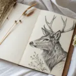
Have a question or want to share your own experience? I'd love to hear from you in the comments below!