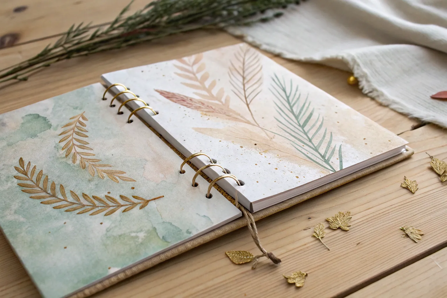
When a piece feels “stuck,” it’s usually not the subject—it’s the background begging for a little love. Here are my go-to art background ideas that build depth, mood, and texture without stealing the spotlight from whatever you add on top.
Soft Watercolor Washes and Color Gradients
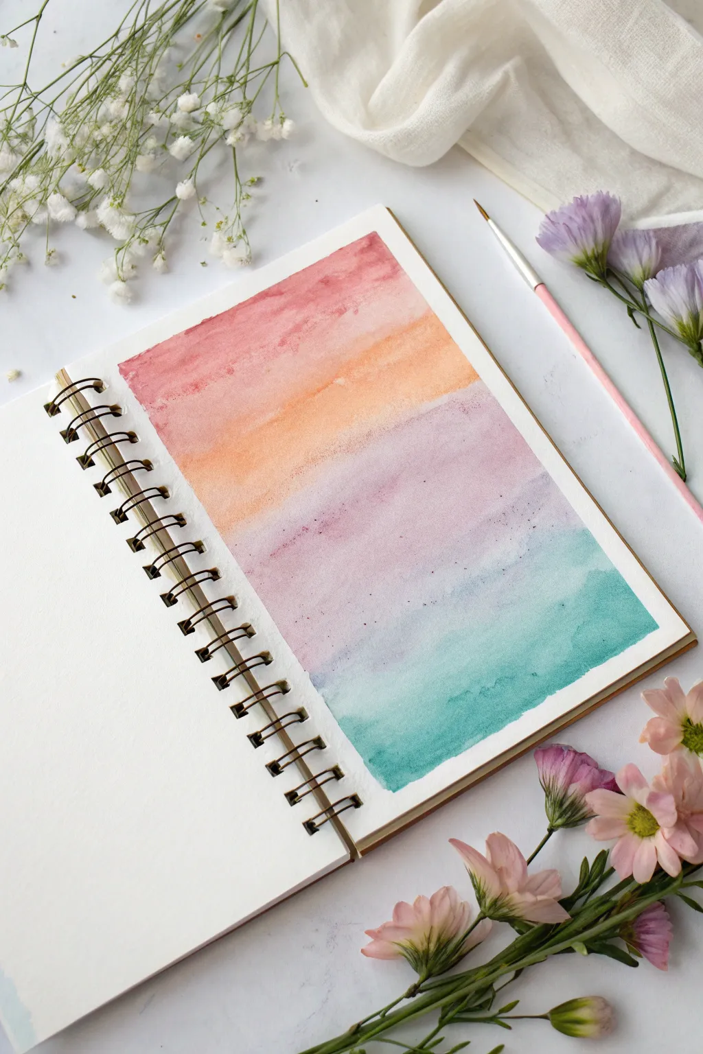
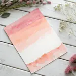
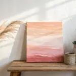
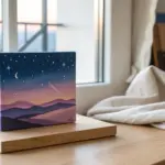
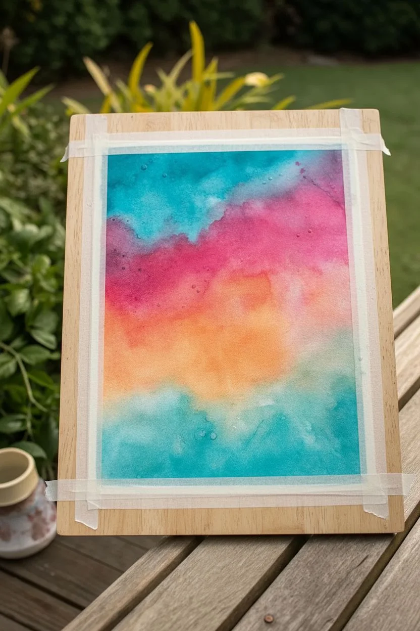
Capture the serene beauty of a twilight sky with this simple yet stunning watercolor gradient. This project creates a smooth, calming transition of colors from warm pinks to cool teals, perfect for an art journal background or a standalone piece.
Step-by-Step
Materials
- Spiral-bound watercolor sketchbook (cold press paper recommended)
- Watercolor paints (Red/Coral, Orange, Purple, Teal/Turquoise)
- Medium round watercolor brush (size 6 or 8)
- Jar of clean water
- Paper towels
- Washi tape or masking tape (optional for borders)
Step 1: Preparation and First Layer
-
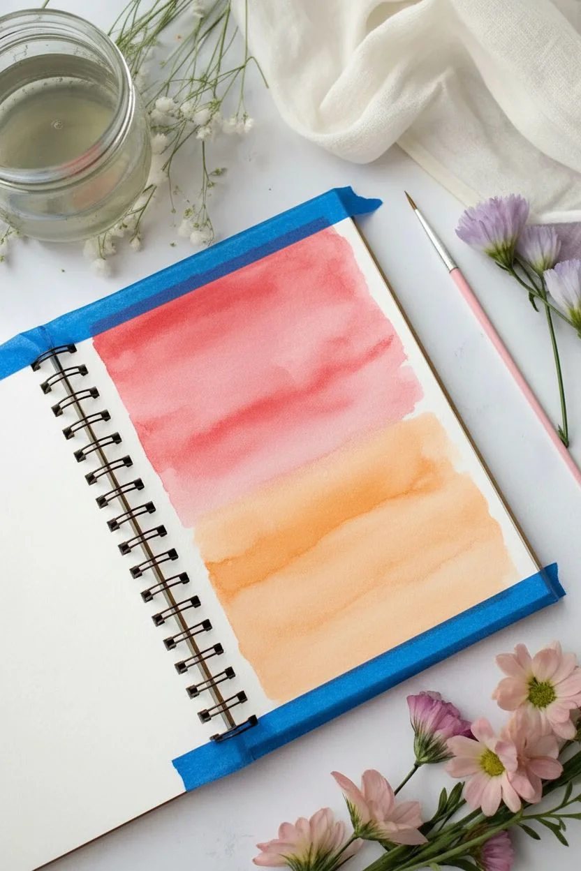
Tape the Edges:
If you want clean, crisp edges like a framed photo, apply a strip of masking tape or washi tape along the top, bottom, and right edge of your page. Press it down firmly to prevent paint from sneaking underneath. -
Pre-wet the Paper:
Load your brush with clean water and gently brush it over the rectangular area where you plan to paint. The paper should be damp and glistening, but not soaking wet with puddles. -
Mix the Top Color:
On your palette, mix a vibrant pink or coral red with a fair amount of water. You want a color that flows easily but isn’t too pale. -
Apply the Pink Wash:
Starting at the very top of your wet area, paint a horizontal band of the pink color. Let the wet paper help pull the pigment slightly downwards. -
Prepare the Orange:
Quickly clean your brush and pick up your orange paint. Ensure it has a similar water-to-pigment ratio as your pink layer. -
Blend Pink into Orange:
Paint a horizontal stripe of orange directly below the pink, allowing the wet edges to touch. run your brush gently along the seam where they meet to encourage them to bleed into one another.
Step 2: Transitioning to Cool Tones
-
Mix the Lavender:
Wash your brush thoroughly. Mix a soft purple or lavender shade. If your purple is too dark, dilute it with more water to match the lightness of the orange. -
Apply the Purple Band:
Paint the purple band below the orange. This transition can turn muddy if you overwork it, so lay the color down and let the water do the blending work for you. -
Soften the Transition:
If the line between orange and purple looks too harsh, clean your brush, dampen it slightly (don’t soak it), and gently drag it across the boundary line once. -
Prepare the Teal:
For the final color, mix a cool teal or turquoise. This will be the heaviest color at the bottom, mimicking the deep horizon or sea. -
Paint the Base:
Apply the teal paint at the bottom of your gradient area, meeting the purple edge. Paint all the way down to your bottom tape line. -
Detailed Blending:
While the paint is still wet, you can tilt the notebook slightly to encourage gravity to pull the colors together, creating a seamless drift from purple to blue. -
Add Texture (Optional):
If you like the speckled look seen in some areas, tap a loaded brush against your finger over the drying paint to creates tiny, subtle splatters.
Keep the Flow
Work quickly! If the paper dries before you add the next color, you’ll get hard lines instead of a soft gradient.
Step 3: Finishing Touches
-
Let it Dry:
Allow the paper to dry completely. It must be bone dry before you touch the tape, otherwise, you risk ripping the paper surface. -
Remove Tape:
Peel the tape away slowly at a 45-degree angle, pulling away from the painted area to reveal your crisp, clean edges. -
Flatten the Page:
If your paper has buckled slightly from the water, you can close the sketchbook and place a heavy book on top overnight to flatten it out again.
Starry Night Effect
Once dry, use a white gel pen or white gouache to flick tiny ‘stars’ over the gradient for a celestial galaxy look.
Now you have a serene, colorful backdrop ready for lettering or further illustration

Wet-on-Wet Cloudy Blends for Dreamy Depth
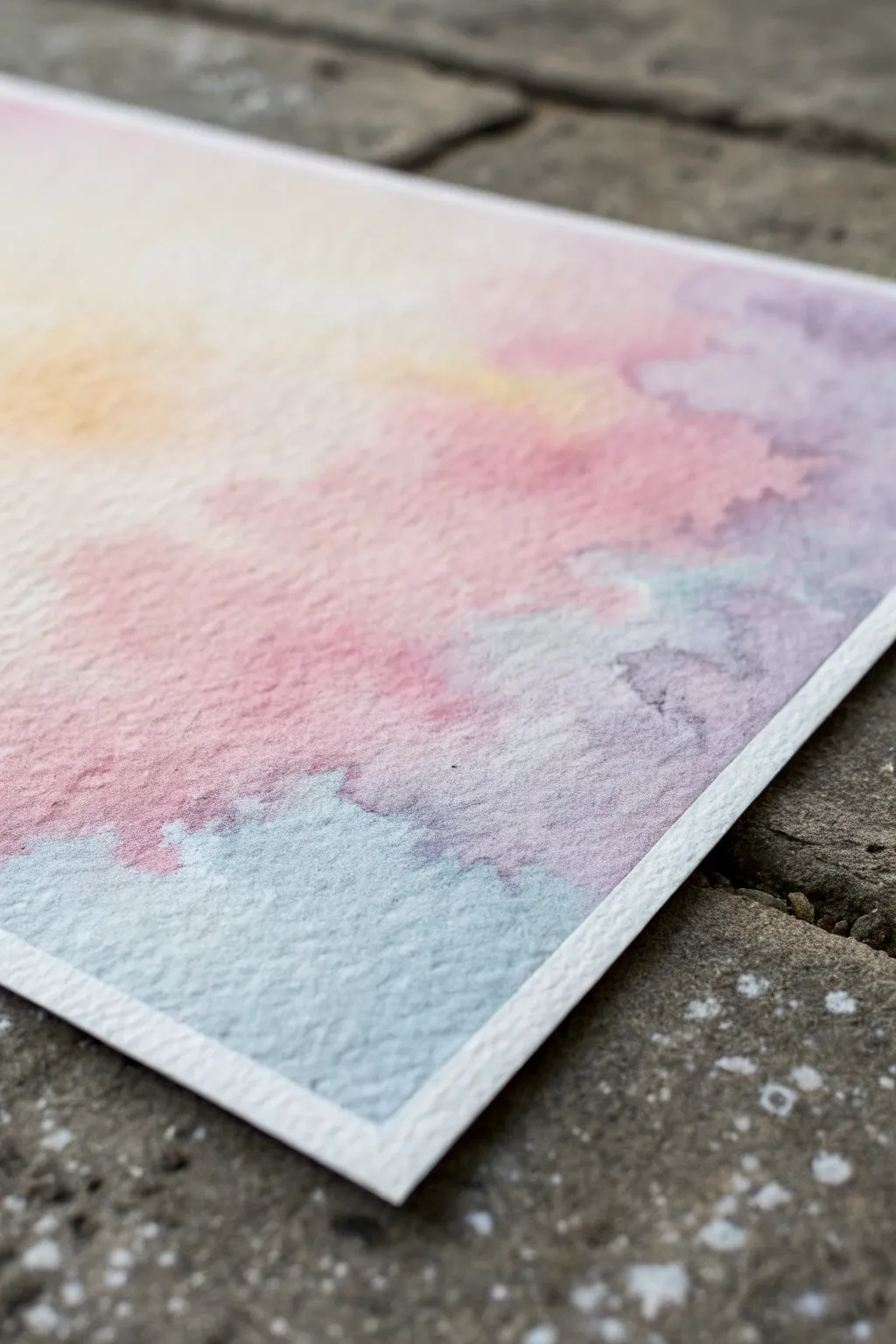
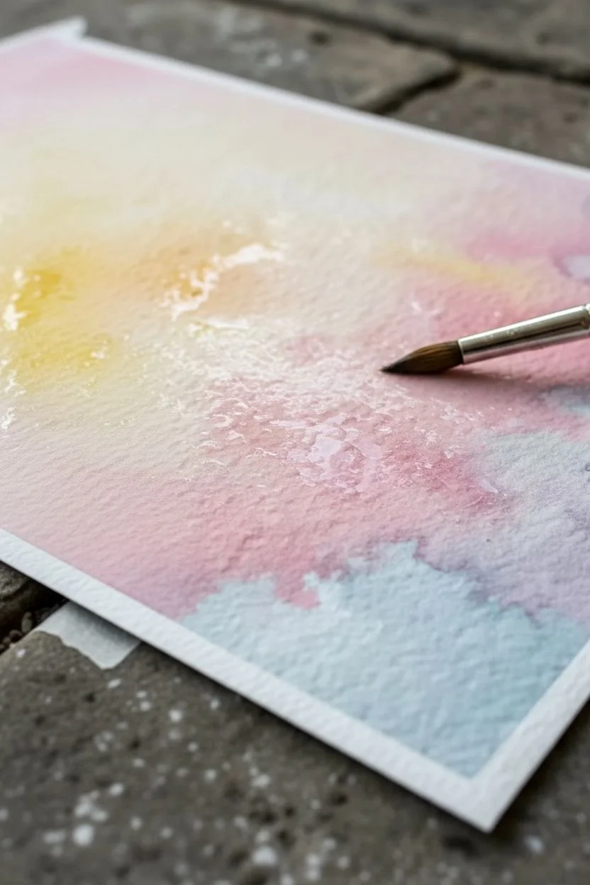
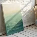
This project captures the ethereal beauty of a sunset sky using soft, bleeding watercolors on textured paper. By mastering wet-on-wet blending, you will create seamless transitions between yellow, pink, and grey-blue hues that mimic drifting clouds.
Step-by-Step Guide
Materials
- Cold-press watercolor paper (300 gsm or higher)
- Watercolor paints (cadmium yellow, permanent rose, ultramarine blue, purple)
- Large round brush (size 10 or 12)
- Two jars of clean water
- Painter’s tape or washi tape
- Paper towels
- Mixing palette
Step 1: Preparation and Base Layer
-
Surface Prep:
Begin by taping down all four edges of your watercolor paper to a board or table. This prevents buckling and creates that crisp white border seen in the final piece. -
Clean Water Glaze:
Load your large brush with clean water and coat the entire paper surface evenly. You want an even sheen that glistens but doesn’t have standing puddles of water. -
Sunlight Start:
Mix a very dilute wash of cadmium yellow. Apply this gently to the upper left quadrant of the paper, allowing it to bloom naturally into the wet surface. -
Softening Edges:
Clean your brush and wipe just a little moisture off on a towel. Gently run the damp brush along the outer edges of the yellow patch to ensure it fades invisibility into the white paper.
Textured Paper Matters
For this grainy look, use ‘Rough’ or ‘Cold Press’ paper. The texture valleys hold pigment, creating natural depth.
Step 2: Building the Cloud Layers
-
Mixing the Pink:
Create a watery mix of permanent rose. While the paper is still damp (but not dripping), drop this color diagonally across the center, moving from right to left. -
Creating Texture:
Instead of brushing back and forth, I prefer to dab the pink pigment onto the paper. This creates irregular shapes that look more like fluffy cloud formations. -
Introducing Purple:
Mix a soft purple using your rose and a touch of ultramarine blue. Apply this adjacent to the pink areas, particularly on the right side, letting the two colors touch and bleed together on the page. -
Checking Moisture:
Pause for a moment. If the paper has started to dry and lose its sheen, wait for it to dry completely and re-wet it gently, or mist it lightly with a spray bottle before continuing. -
Adding the Low Clouds:
Prepare a cool grey-blue mix (ultramarine with a tiny touch of orange or leftover purple). Apply this to the bottom left corner, creating a distinct cloud bank. -
Connecting the Hues:
Guide the blue-grey mix upward slightly so it meets the pink section. Watch as the pigments interact in the water; don’t overwork this boundary or you’ll get mud.
Step 3: Refinement and Finish
-
Deepening Shadows:
While the blue section is technically still wet but settling, drop slightly more concentrated pigment into the centers of the blue shapes to add volume and weight to the clouds. -
Lifting Highlights:
Rinse your brush and dry it thoroughly. If any area looks too heavy, touch the dry brush to the wet paper to lift pigment away, creating soft highlights. -
Splatter Texture (Optional):
For added atmosphere, load a brush with clean water and tap it over the painting. The water droplets will push the pigment away, creating tiny, star-like blooms. -
Patience is Key:
Allow the painting to dry undisturbed on a flat surface. Using a hair dryer can sometimes blow the wet pigment around and ruin your soft blends. -
The Reveal:
Once the paper is bone dry and cool to the touch, slowly peel away the tape at a 45-degree angle to reveal your clean edges.
Preventing Blooms
If you see ‘cauliflowers’ (hard edges) forming, it means you added water to a drying area. Wait for it to dry fully, then glaze over.
Enjoy the calming process of watching colors merge into your own personal sunset sky


Simple Value Fade From Dark to Light
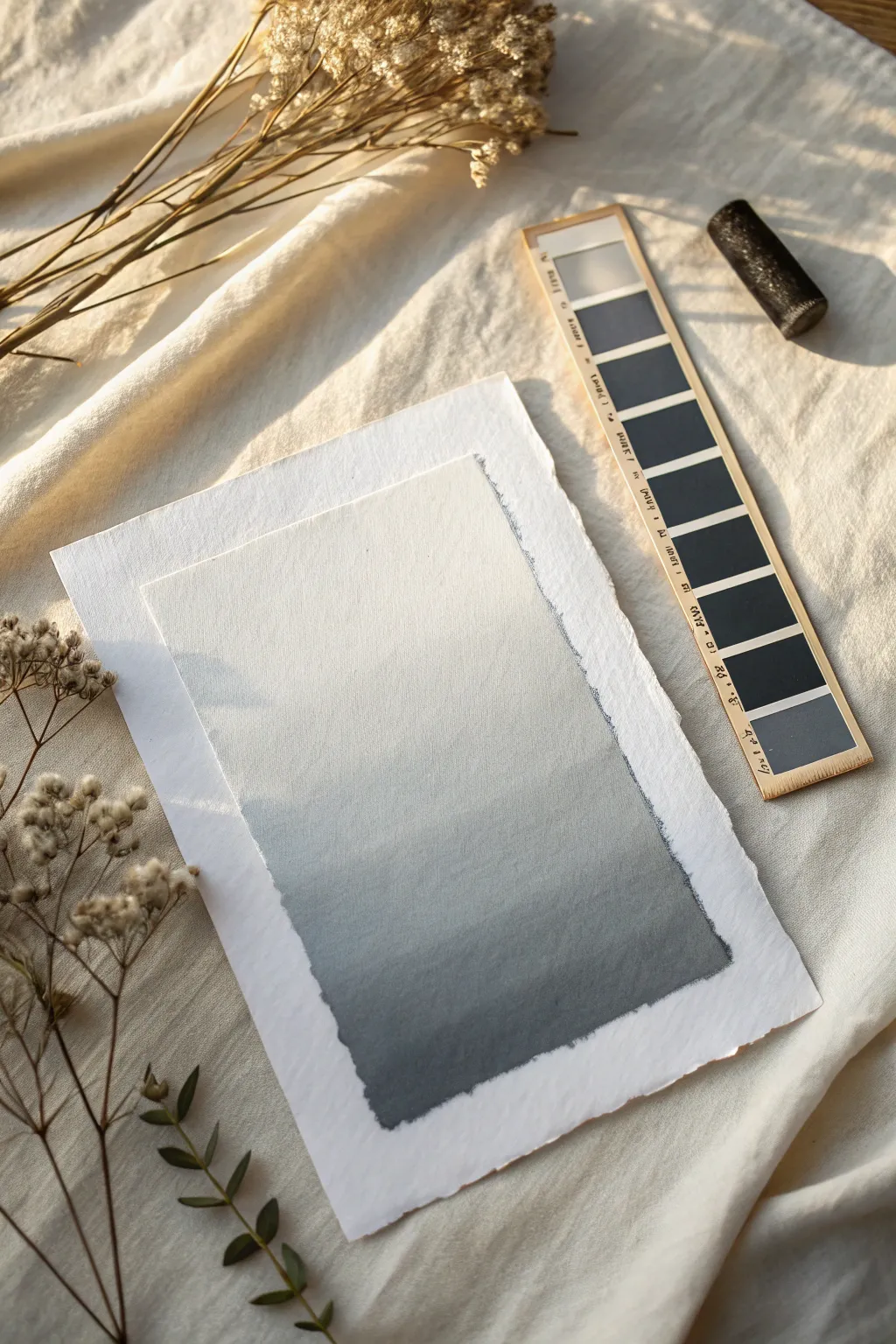
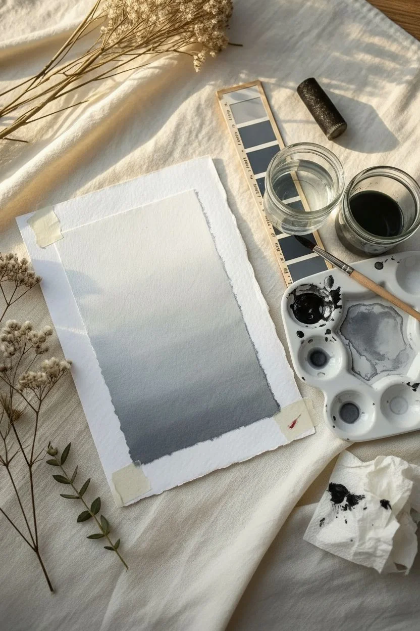
Achieve a sophisticated, minimalist look with this simple value fade technique, transforming a single color into a stunning gradient spectrum. The result is a calming, atmospheric backdrop perfect for calligraphy or standalone display on beautiful deckle-edged paper.
Step-by-Step Guide
Materials
- High-quality cotton watercolor paper (rough or cold press)
- Black watercolor or gouache paint
- Flat wash brush (1-inch width)
- Two jars of water (one for clean, one for dirty)
- Palette or ceramic mixing dish
- Paper towel or rag
- Masking tape (optional, for securing paper)
- Ruler or straight edge (to mask edges if desired)
Step 1: Preparation and Mixing
-
Select your paper:
Begin with a piece of heavy cotton watercolor paper. If you want the rustic look shown in the example, gently tear the edges of a larger sheet against a ruler to create a soft, deckled border rather than a sharp cut. -
Secure the workspace:
If your paper is lightweight, tape it down to a board to prevent warping. For heavier paper (300gsm+), you can simply place it on a flat, clean surface. -
Prepare the paint:
Squeeze a generous amount of black watercolor or gouache onto your palette. Gouache will give a more opaque, matte finish, while watercolor will be more transparent and airy. -
Create a concentrated dark mix:
Add just a few drops of water to your paint to activate it, creating a rich, ink-like consistency intended for the darkest bottom section. -
Prepare a water gradient:
On your palette, drag some of the concentrated paint into separate wells or sections, adding progressively more water to each to test your grey values beforehand.
Uneven Streaks?
Streaks happen if the paint dries too fast. Keep the leading edge of your wash wet at all times. If a section dries, re-wet the area gently with a clean brush before continuing upward.
Step 2: Painting the Gradient
-
Wet the paper:
Using your clean flat brush, lightly dampen the entire surface of the paper with clean water. This ‘wet-on-wet’ technique helps the paint colors bleed and blend smoothly. -
Apply the darkest value:
Load your brush with the most concentrated black paint. Start at the very bottom edge of the paper, painting a bold horizontal strip across the width. -
Soften the edge:
Dip your brush quickly into the water jar, blotting slightly on a paper towel so it’s damp but not dripping. Run this across the top edge of your black stripe to encourage the pigment to flow upward. -
Introduce the mid-tones:
Pick up a slightly watered-down grey mix from your palette. Apply this just above the dark stripe, blending into the wet edge you just created. -
Work your way up:
Continue moving upward in horizontal strokes. For each new stroke, dip your brush in clean water to dilute the remaining pigment on the bristles, naturally creating lighter and lighter greys. -
Control the fade:
If I notice a harsh line forming, I quickly run a clean, damp brush back and forth over the transition line to smooth it out before the paint has a chance to dry. -
Approach the top:
As you reach the top third of the paper, your brush should carry almost clear water with just a whisper of pigment, allowing the white of the paper to show through completely near the upper edge. -
Refine the edges:
Allow the paint to naturally pool slightly at the rough edges of the paper. This emphasizes the handmade texture and creates a beautiful, organic frame.
Tilt for Flow
To help gravity do the blending work for you, prop your painting board up at a slight 15-degree angle. This encourages the pigment to flow naturally downward into the wet edge.
Step 3: Drying and Finishing
-
Add depth (optional):
While the bottom is still slightly damp, you can drop in a tiny bit more concentrated black pigment along the very bottom edge to intensify the contrast. -
Final drying:
Let the paper dry completely flat. Do not use a hairdryer, as the strong airflow might push the pigment around and ruin your smooth gradient. -
Assess the fade:
Once dry, colors often look lighter than when wet. Check if your darks are dark enough. If not, carefully apply a second glaze layer at the bottom, but be gentle to lift existing paint. -
Flatten the paper:
If the paper has buckled slightly from the water, place it under a heavy book overnight (sandwich it between clean sheets of paper first) to press it flat. -
Layering:
To complete the aesthetic shown in the photo, mount your finished gradient artwork on top of a slightly larger sheet of plain white textured paper using double-sided tape or a glue stick.
Creating a seamless value scale takes a little practice, but the result is a serene and professional-looking background ready for your next project


Stamp-and-Lift Marks for Ghostly Texture
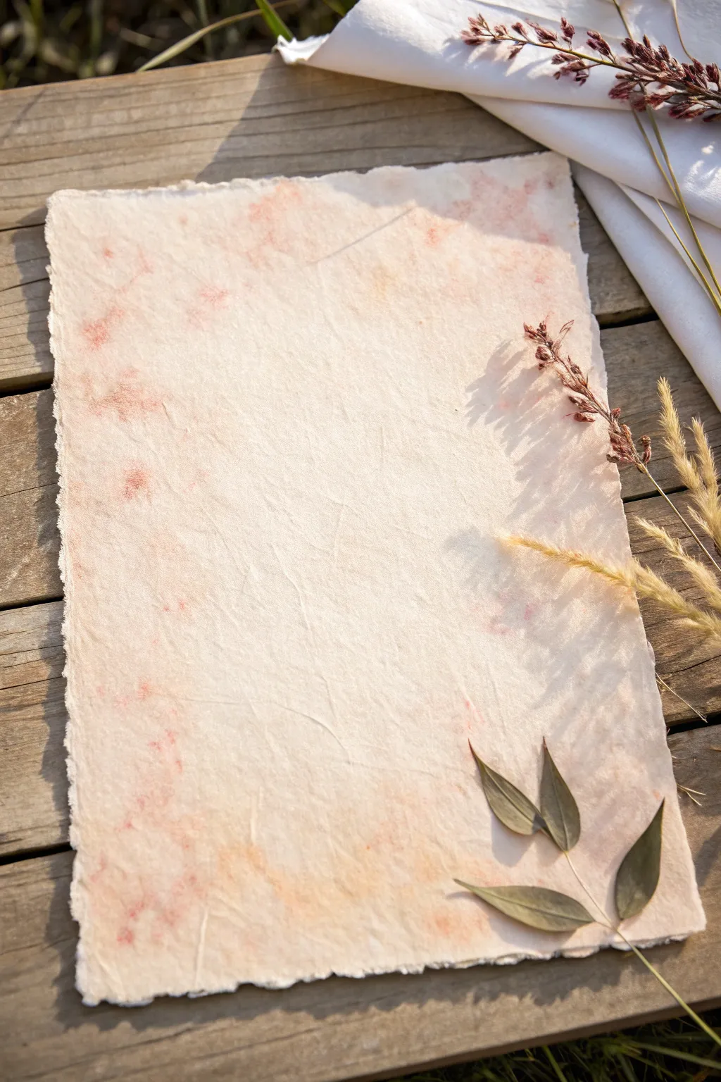
Soft, mottled textures meet handmade charm in this delicate paper project. By using a clever lifting technique, you can create a background that looks like ancient, sun-bleached parchment kissed with hints of rose and coral.
Detailed Instructions
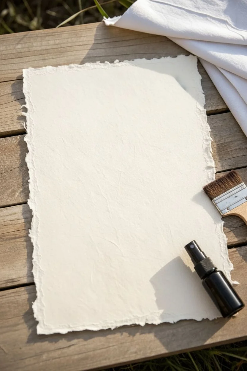
Materials
- Thick cotton watercolor paper (300gsm or heavier) or handmade recycled paper
- Liquid watercolor paints (coral, rose, and pale peach shades)
- Natural sea sponge
- Clean cotton rags or paper towels
- Spray bottle with water
- Deckle edge ruler or tearing tool (optional)
- Flat synthetic wash brush (1 inch)
- Dried botanicals (eucalyptus leaves, dried grass, wild oats)
- Matte gel medium or craft glue
Step 1: Preparing the Base
-
Shape the Paper:
Begin by creating the rustic, irregular edge characteristic of handmade paper. If you aren’t using pre-formed handmade sheets, dampen the edges of your heavy watercolor paper with a wet brush. -
Tear the Edges:
While the edges are damp, gently tear away thin strips of paper to create a soft, fibrous deckle edge. Pull away from the center of the sheet to ensure the fibers are exposed rather than cut straight. -
Presoak the Surface:
Lightly mist the entire surface of your paper with the spray bottle. You want the paper damp to the touch but not soaking wet; this helps the color spread organically without harsh lines.
Step 2: Creating the Ghostly Texture
-
Mix Your Palette:
Dilute your coral and rose liquid watercolors with water in small dishes. Aim for a very watery consistency, more like a tint than an opaque paint. -
Initial Wash:
Using the flat wash brush, apply patches of clear water to random areas of the paper, mostly focusing loosely around the borders. -
Drop in Color:
While the isolated water patches are wet, dip your brush into the diluted coral paint and touch it to the wet areas. Watch the color bloom and spread. -
Sponge Application:
Dampen your natural sea sponge and wring it out completely. Dip a corner into the rose-colored wash and lightly dab it onto the paper, focusing on the corners and edges to frame the empty center. -
The Lifting Technique:
This is the crucial step for that ‘ghostly’ look. Immediately after applying color, take a clean, dry rag or paper towel and firmly press it straight down onto the wet paint. -
Lift and Repeat:
Lift the rag straight up without dragging. This removing some pigment while leaving a soft, imprinted texture behind. I find doing this quickly prevents the color from settling too deeply. -
Layering Textures:
Repeat the sponge-and-lift process using the pale peach tone. Overlap some of the previous areas to build visual depth without darkening the overall value too much. -
Softening Hard Lines:
Scan the paper for any harsh edges. If a paint blotch looks too defined, mist it lightly with water and dab again with a clean rag to fade it out. -
Drying Phase:
Allow the paper to dry completely flat. If it starts to buckle, you can weigh down the corners or tape it to a board, but natural warping adds to the handmade aesthetic here.
Uneven Blotches?
If the paint looks too dark or solid, re-wet the spot heavily and blot aggressively with a dry paper towel to strip pigment back to a faint stain.
Step 3: Botanical Finishing Touches
-
Select Your Botanicals:
Choose a small sprig of dried wild oats or grass, and three small olive-green dried leaves (like dried eucalyptus or olive leaves). -
Arrange the Composition:
Place your dried elements in the bottom right corner. Let the tall grasses sweep upward along the right edge, and arrange the leaves to anchor the bottom corner. -
Adhere the Greenery:
Apply a tiny amount of matte gel medium to the back of the flattest part of the leaves. Press them gently onto the paper. -
Attach Fine Stems:
For the delicate grass stems, use a toothpick to apply microscopic dots of glue to the stalk, ensuring no glue seeps out to stain the paper. -
Final Press:
Place a scrap piece of paper over the botanicals and place a lightweight book on top for 10 minutes to ensure they bond flatly to the textured surface.
Add Vintage Speckles
Flick a toothbrush dipped in weak coffee or tea over the dry paper to add tiny organic speckles for an aged, antique manuscript effect.
Now you have a beautifully textured, handmade-style sheet perfect for calligraphy or mounting a cherished photo
BRUSH GUIDE
The Right Brush for Every Stroke
From clean lines to bold texture — master brush choice, stroke control, and essential techniques.
Explore the Full Guide
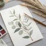
High-Contrast Black Linework Over Color Washes
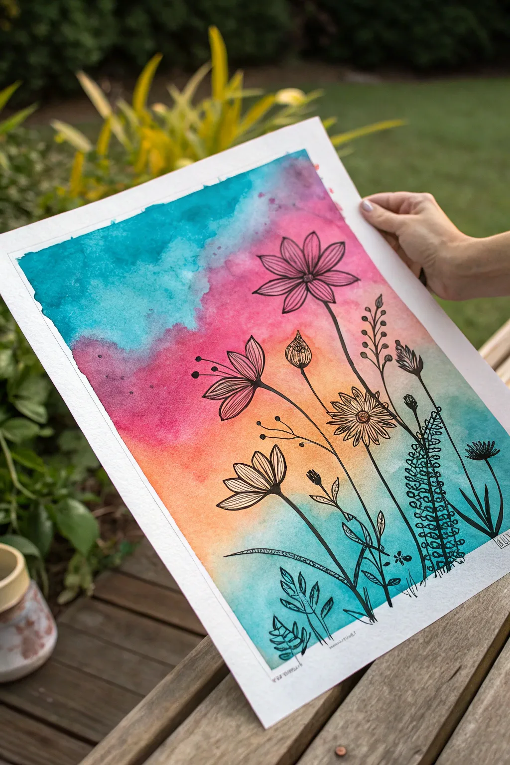
Blend the soft, unpredictable beauty of watercolor washes with the crisp precision of black ink in this stunning botanical composition. The vibrant gradient background creates a luminous stage for the delicate wildflower silhouettes, making them pop with high contrast.
Detailed Instructions
Materials
- High-quality watercolor paper (cold press, 140lb/300gsm, A3 size recommended)
- Watercolor paints (Turquoise/Teal, Magenta/Pink, Orange, Warm Yellow)
- Large flat brush or mop brush for washes
- Water containers (two: one dirty, one clean)
- Paper towels
- Painter’s tape or masking tape
- Drawing board or hard surface
- Fine liner pens (sizes 0.3, 0.5, and 0.8, waterproof/archival ink)
- Pencil and eraser (optional for sketching)
Step 1: Setting the Stage
-
Secure Your Paper:
Begin by taping the edges of your watercolor paper down to a drawing board or hard surface. This prevents the paper from buckling when it gets wet and creates that beautiful, crisp white border you see in the final piece. -
Prepare Your Colors:
Pre-mix your watercolor puddles in a palette. You will need a juicy consistency for a vibrant turquoise, a bright magenta, a warm orange, and a hint of yellow. Having them ready prevents the paper from drying out while you mix. -
Wet the Paper:
Using your large brush and clean water, apply an even coat of water across the entire area inside the tape. The paper should glisten with a sheen but shouldn’t have standing pools of water.
Ink Confidence
Commit to your lines! If you make a ‘mistake’ or a wobble, simply draw another leaf or stem over it. In organic botanical art, imperfections often look like natural growth.
Step 2: Creating the Wash
-
Apply the Turquoise:
Starting at the top left corner, drop in the turquoise paint. Let it bloom and flow naturally towards the center, tilting the board slightly if needed to encourage movement. -
Introduce Magenta:
While the turquoise is still wet, add the magenta to the top right and center area. Allow the edges of the pink and blue to touch and mingle slightly to create soft purple transitions, but don’t overwork them or they may turn muddy. -
Adding Warmth:
Move lower down the page with your orange and yellow hues. Blend the orange into the bottom of the pink section, creating a sunset-like gradient. -
Anchor with Teal:
Bring the turquoise or teal color back in at the very bottom right and left corners. This frames the warm center and adds weight to the bottom of the composition. -
Texture and Bloom:
If you want extra texture, drop tiny droplets of clear water onto the drying paint in the upper sections. This pushes the pigment away and creates star-like ‘blooms’ or cauliflower effects. -
The Crucial Drying Phase:
Let the paper dry completely. This is non-negotiable. I usually wait at least an hour or use a hairdryer on a low, cool setting. If the paper is even slightly damp, your ink lines will bleed and lose their crispness.
Step 3: Inking the Botanicals
-
Planning the Layout:
Lightly sketch the main stems with a pencil if you aren’t confident going straight in with ink. Plan for a variety of heights, with taller flowers reaching towards the top right and shorter foliage at the bottom. -
Drawing the Main Bloom:
Using a 0.5 pen, draw the large cosmos-style flower in the upper pink area. Start with the center oval and draw the petals radiating outward, keeping the lines loose and imperfect. -
Adding Stems:
Draw the long, slender stems extending downward. Don’t use a ruler; a slightly shaky or curved hand-drawn line looks more organic and natural for plant life. -
Detailing Lower Flowers:
Create the lower flowers in the orange zone. Draw a side-profile flower (like a coneflower) with petals swept back, and a full-face daisy-like bloom nearby. Vary your pen pressure to create interest. -
Include Buds and Pods:
Add visual variety by drawing closed buds or seed pods on tall, thin stems. Use a stippling technique (tiny dots) inside the pods to suggest texture and volume. -
Ferns and Foliage:
On the right side, draw a tall, vertical fern-like structure using small loops or circles climbing up a central stem. This contrasts beautifully with the flat petals of the flowers. -
Grounding Elements:
Fill the bottom area with shorter, broader leaves and grass blades. Use the thicker 0.8 pen here to add visual weight to the base of the artwork, making it feel grounded. -
Final Touches:
Inspect your work for balance. Add tiny floating seeds, small dots, or extra twigs in empty spaces to balance the composition. Sign your name in the bottom corner. -
The Reveal:
Once the ink is fully dry, slowly peel away the painter’s tape at a 45-degree angle away from the artwork to reveal your crisp white edges.
Metallic Accent
After the black ink dries, use a gold or silver gel pen to add tiny highlights to the flower centers or trace the edge of one petal for a subtle, shimmering effect.
Frame your masterpiece in a simple black frame to let those colors truly sing


Have a question or want to share your own experience? I'd love to hear from you in the comments below!