If you’ve ever stared at a blank page thinking, “What should I even offer for commissions?”, you’re not alone. Here are some tried-and-true art commission ideas (plus a few spicy ones) that help you show your skills clearly and make it easy for clients to say yes.
Classic Portrait From a Photo
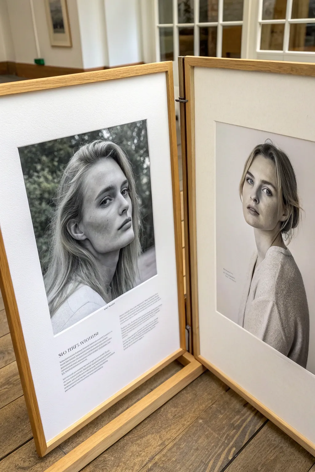
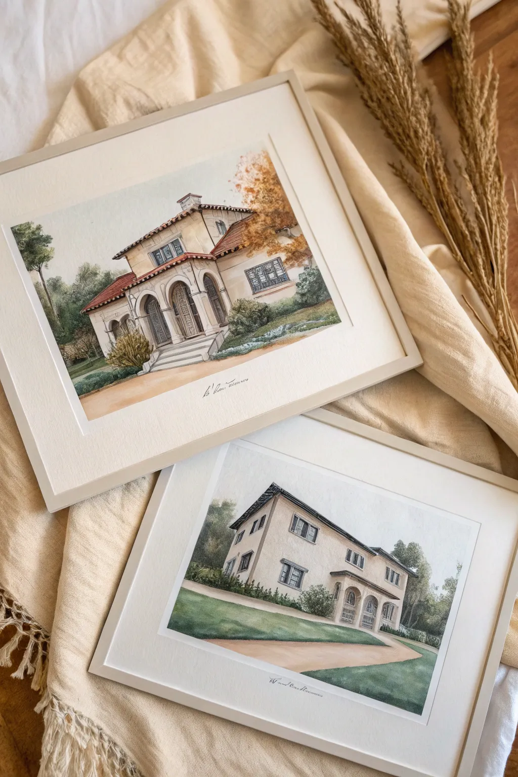
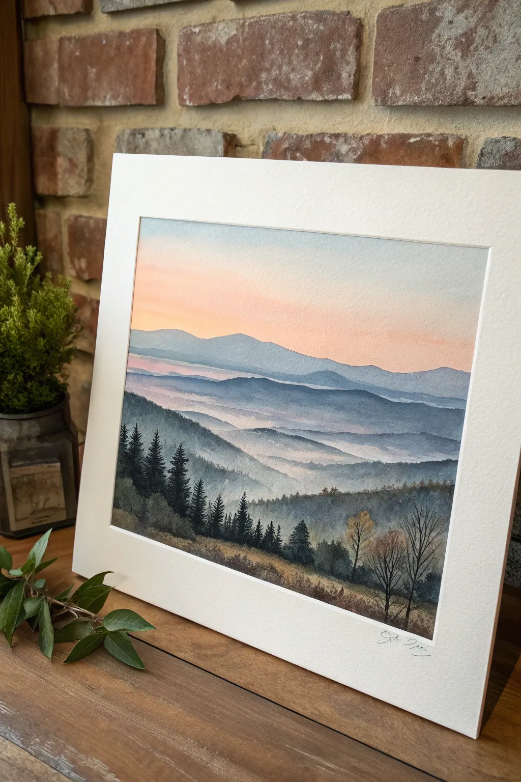
Transform standard portrait photography into a gallery-worthy statement piece with this custom hinged display. By mounting two large-scale monochromatic prints in deep mats and joining the frames, you create a freestanding diptych that brings architectural elegance to any room.
Step-by-Step
Materials
- Two high-resolution digital portrait photos
- Large format printer or professional printing service
- Heavyweight matte photo paper or fine art paper
- Two matching light oak or birch wood frames (approx. A2 or 16×20 inches)
- Two custom-cut acid-free white mats (4-inch borders)
- Acid-free mounting tape or linen hinging tape
- Two brass or bronze decorative cabinet hinges
- Drill with small pilot bit
- Screwdriver
- Measuring tape
- Pencil
- Layout software (InDesign or similar) for typography
Step 1: Image Preparation & Printing
-
Select and convert images:
Choose two complementary portraits. Convert them to black and white in your photo editing software, adjusting the curves to ensure deep blacks and crisp highlights for a classic look. -
Add typographic elements:
Using layout software, place your image on a canvas size that matches your intended print size. Leave generous negative space at the bottom. -
Insert text:
Below the portrait on the left layout, add a title or description in a classic serif font to mimic a museum placard. Keep the text alignment justified or centered depending on your preference. -
Proof and print:
Print a small test strip to check contrast. Once satisfied, print both images on heavyweight fine art paper at a local print shop or using a large-format printer. -
Trim the prints:
Carefully cut the prints to size, ensuring you leave about a 1/4 inch overlap beyond the mat opening to make mounting easier.
Alignment Issues?
If frames don’t stand straight, the hinges might be misaligned. Loosen screws slightly, adjust the frame height with shims, and retighten.
Step 2: Mounting and Framing
-
Clean the workspace:
Clear a large flat table and ensure it is free of dust or debris that could get trapped under the glass. -
Position the print:
Place the mat face down on the table. Position your print face down on top of it, aligning the image within the window. I like to hold it up to a light source briefly to double-check the centering. -
Secure the artwork:
Use a T-hinge method with acid-free tape at the top of the print only. This allows the paper to expand and contract with humidity changes without buckling. -
Clean the glass:
Use a microfiber cloth and glass cleaner to remove every speck of dust and fingerprints from the inside of the frame glass. -
Assemble the frame sandwich:
Layer the glass, the matted print, and the backing board into the wooden frame. -
Close the frames:
Secure the backing using the frame’s flexible points or turn buttons. Repeat this entire process for the second portrait.
Make it Double-Sided
Use double-sided frames and mount two photos back-to-back. This creates a flexible room divider that looks beautiful from any angle.
Step 3: Creating the Hinge Mechanism
-
Align the frames:
Stand both frames upright on a flat surface, side-by-side, deciding which will be the left and right panel. A small gap between them is necessary for movement. -
Mark hinge placement:
Measure about 6 inches down from the top and 6 inches up from the bottom on the joining edges. Mark these spots with a pencil for your hinges. -
Drill pilot holes:
Holding the hinge in place against the frame edge, carefully drill shallow pilot holes. This prevents the hardwood frame from splitting. -
Attach the hinges:
Screw the hinges into the first frame securely. Bring the second frame alongside and screw the other side of the hinges in. -
Test the movement:
Gently fold the frames inward and outward to ensure they move smoothly without binding. The angle allows them to stand freely without additional support.
Enjoy your sophisticated, freestanding gallery display that turns memories into fine art


Custom Pet Portraits
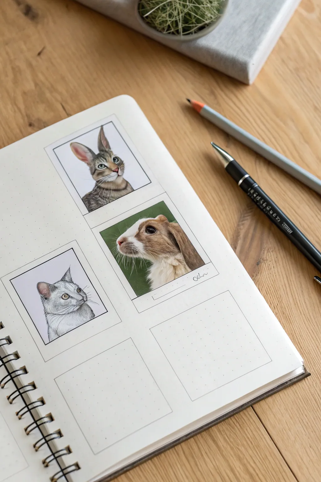
Capture the personality of your furry friends with this charming layout that mimics the vintage appeal of instant photos. Using a dot-grid journal as your canvas, you’ll create a series of miniature, hyper-realistic animal portraits framed in classic white borders.
Step-by-Step Guide
Materials
- Spiral-bound dot grid sketchbook (A5 or similar)
- Fine liner pens (black, sizes 0.05, 0.1, 0.3)
- High-quality colored pencils (wax or oil-based)
- Ruler
- Pencil (HB or H for sketching)
- Kneaded eraser
- White gel pen (for highlights)
- Reference photos of pets
Step 1: Planning the Layout
-
Measure the frames:
Begin by deciding on the size of your ‘Polaroids.’ A standard square format works best, such as 2.5 x 2.5 inches for the image area, with a slightly wider border at the bottom. -
Sketch the grid:
Using your ruler and the dot grid as a guide, lightly pencil in the outlines for four to six frames across your page spread. Leave consistent spacing between them for a clean look. -
Define the borders:
Draw the inner squares where the portraits will go. Ensure the bottom margin of each frame is roughly double the width of the top and side margins to mimic that iconic instant film style. -
Ink the structural lines:
Go over your ruled frame lines with a 0.1 or 0.3 black fine liner. Keep your hand steady, but don’t worry if the lines aren’t machine-perfect; a little wobble adds character.
Fur Realism Tip
Keep your pencils needle-sharp. Blunt tips will mash the paper tooth and create a waxy blur instead of crisp, individual fur strands.
Step 2: Drafting the Portraits
-
Select your subjects:
Choose reference photos where the animal’s head is clear and well-lit. Profiles and three-quarter views, like the rabbit and cat shown, create a dynamic composition. -
Light framing:
Inside your first ink square, lightly sketch the basic shapes of the animal’s head. Focus on positioning eyes and ears correctly before committing to details. -
Refine the sketch:
Tighten up your pencil sketch, adding guidelines for fur direction and facial features. Gently roll a kneaded eraser over the sketch to lift excess graphite so it won’t smudge your colors.
Step 3: Color and Fur Texture
-
Base layers:
For the rabbit portrait, start with a light wash of color. Use a cream or light ochre pencil, applying very light pressure to map out the fur patches without filling the tooth of the paper. -
Building depth:
Gradually layer darker browns and warm greys. I find it helpful to use short, flicking strokes that mimic the direction of the fur growth. -
The eyes:
For the eye, use a sharp dark brown or black pencil for the pupil. Leave a tiny speck of white paper for the catchlight, or add it later with a gel pen. This brings the animal to life immediately. -
Adding texture:
Switch to a very sharp darker pencil (like a walnut brown) to define individual hairs. Focus contrast around the nose, ears, and under the chin. -
Cool tones for the cat:
For the grey cat portrait, restart the process using cool greys and slate blues. Use a 0.05 fine liner to delicately stipple or hatch the darkest areas of shadow around the ears. -
Whiskers and fine details:
Use a white gel pen or a very sharp indentation tool to create whiskers. If using a gel pen, apply it last with a swift, confident stroke.
Go 3D
Allow parts of the drawing, like large rabbit ears or whiskers, to break the boundary of the inner square and overlap the white frame for a 3D effect.
Step 4: Finishing Touches
-
Drop shadows:
To make the Polaroids pop off the page, draw a very faint L-shaped shadow on the bottom and right side of each frame using a light grey marker or pencil. -
Clean up:
Erase any remaining stray pencil marks from your initial grid layout. -
Personalize it:
In the wider bottom margin of the frame, use a fine tip pen to write the pet’s name or the date in a cursive, handwritten style. -
Leave spaces:
Leave one or two frames empty with just the dot grid showing. This negative space balances the layout and implies future projects.
Now you have a gallery of miniature masterpieces that preserves your pets’ expressions forever


Couple or Anniversary Portrait
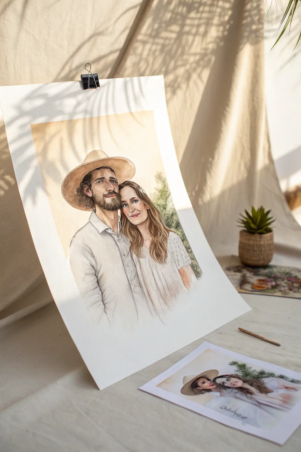
Capture the warmth of a relationship with this delicate mixed-media portrait that combines the softness of watercolor washes with the precision of colored pencils. The finished piece features a glowing, sun-drenched background and tender detailing, perfect for commemorating an anniversary or special bond.
Step-by-Step Tutorial
Materials
- Heavyweight watercolor paper (300gsm cold press recommended)
- Watercolor paints (Yellow Ochre, Burnt Sienna, Payne’s Grey, Alizarin Crimson)
- Polychromos or wax-based colored pencils (Earth tones, skin tones, dark brown)
- Soft round brushes (sizes 4, 8, and 12)
- Graphite pencil (HB or 2H) for sketching
- Kneadable eraser
- Reference photo of the couple
- Masking tape
- Drawing board
Step 1: Drafting and Initial Washes
-
Prepare your surface:
Tape your watercolor paper securely to a drawing board on all four sides. This prevents the paper from buckling when you add water later. -
Sketch the outline:
Using an HB or 2H pencil, lightly sketch the contours of the couple. Focus on the main shapes: the hat, head tilts, shoulders, and the flow of hair. Keep lines faint so they won’t show through transparent paint layers. -
Refine facial features:
Carefully map out the eyes, nose, and mouth placement. Accuracy here is key for likeness, so take your time measuring distances relative to one another. -
Apply the background wash:
Mix a very watery wash of Yellow Ochre with a touch of Burnt Sienna. Using a large size 12 brush, apply this to the background area, letting it fade out softly towards the bottom edges for a vignette effect. -
Add first skin tones:
Mix a pale skin tone using Yellow Ochre and a tiny dot of Alizarin Crimson. Paint a flat, light wash over the faces and necks, leaving the whites of the eyes and teeth unpainted. -
Block in the clothing:
Dilute a cool gray or very pale blue-grey. Loosely paint the shirt and dress areas, allowing the paint to pool slightly in the folds for natural shading. Keep this very sheer; we want a high-key, airy look.
Step 2: Building Depth and Texture
-
Deepen facial shadows:
Once the first layer is bone dry, mix a slightly darker skin tone. Use a size 4 brush to gently glaze shadows under the hat brim, the eye sockets, under the nose, and the neck. -
Add warmth to cheeks:
While the face is barely damp, drop a tiny hint of rose or warm pink onto the cheeks and the tip of the nose for a healthy glow. -
Paint the hair base:
Mix the appropriate hair colors for each subject—dark brown for the man and a golden brown for the woman. Apply these as mid-tone washes, following the direction of hair growth. -
Detail the hat:
Paint the hat with a stronger mix of Yellow Ochre and Raw Umber. Let the underside of the brim remain darker to cast a shadow on the man’s forehead. -
Introduce background texture:
I rarely leave a background perfectly flat, so while the background is dry, sparsely wet a few areas and drop in slightly more pigment to suggest distant foliage or light dappling.
Muddy colors?
Wait for each layer to dry completely before glazing. If the paper is cool to the touch, it’s still damp. Painting over damp layers lifts the pigment and creates mud.
Step 3: Fine Details with Pencil
-
Define the eyes:
Switch to sharp colored pencils. Use dark browns and greys to outline the eyelids, define the iris, and draw the eyelashes. Avoid pure black to keep the look soft. -
Refining the beard and hair:
Use a dark brown pencil to draw individual hairs in the beard and mustache, creating texture that watercolor alone can’t achieve. Add flowing strands to the woman’s hair with lights and darks. -
Enhance clothing folds:
Use a cool grey pencil to lightly hatch over the dried watercolor shadows on the clothes. This sharpens the creases and adds a graphic, illustrative quality. -
Contouring the faces:
Very lightly shade with a terracotta or peach pencil along the jawline and cheekbones to create smooth gradients that transition into the light. -
Final highlights:
If you lost any highlights, use a white gel pen or white gouache to add tiny catchlights in the eyes or on the tip of the nose.
Make it Shine
Use a gold paint pen or metallic watercolor to outline the hat brim or add accents to jewelry for an elegant touch that catches the light beautifully.
Remove the tape carefully to reveal those crisp white edges and enjoy the timeless feel of your new portrait

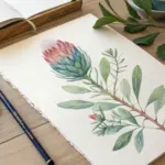
Wedding Bouquet or Dress Commission
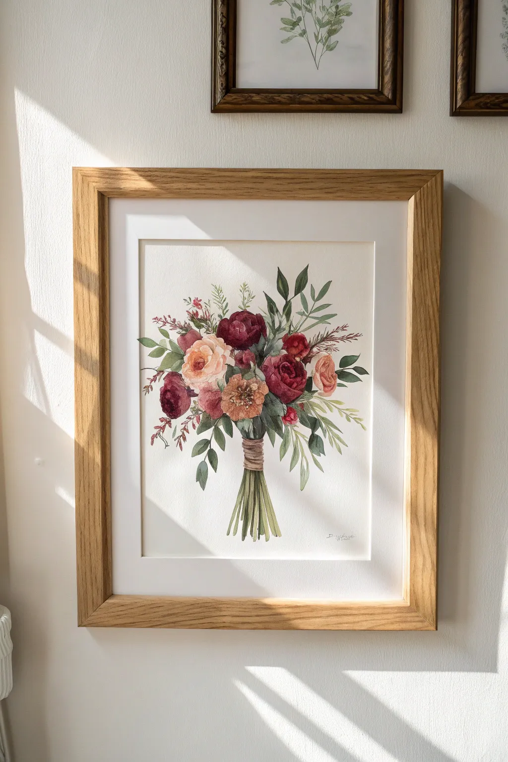
Preserve the ephemeral beauty of a wedding bouquet with this delicate watercolor tutorial. By layering rich hues of burgundy with soft peaches and varied greens, you’ll create a timeless botanical study full of natural movement.
How-To Guide
Materials
- Hot press watercolor paper (300gsm)
- Watercolor paints (Alizarin Crimson, Burnt Sienna, Yellow Ochre, Sap Green, Indigo, Paynes Gray)
- Round brushes (sizes 2, 6, and 10)
- HB Pencil and kneaded eraser
- Masking tape
- Palette
- Two water jars
- Paper towels
- Natural light wood frame (with mat)
Step 1: Sketching and Preparation
-
Secure the paper:
Tape your watercolor paper down to a board on all four sides to prevent buckling. Ensure you leave enough border for the matting later. -
Outline the main shapes:
Lightly sketch the general oval shape of the bouquet composition using an HB pencil. Mark the position of the large focal flowers first—the central peach rose and the deep red peonies. -
Refine the details:
Fill in the smaller filler flowers and the general direction of the foliage stems. Draw the stems at the bottom gathered tightly together. -
Soften the sketch:
Roll a kneaded eraser over your drawing to lift up excess graphite. The lines should be barely visible so they don’t show through the transparent paint.
Muddy water warning
Change your water frequently. If your rinse water gets brown, your vibrant peach and green colors will turn dull and gray instantly.
Step 2: First Wash: The Flowers
-
Paint the peach roses:
Mix a watery wash of Yellow Ochre and a touch of Alizarin Crimson. Paint the petals of the light roses using a wet-on-dry technique, leaving white paper showing for the highlights on the petal edges. I find it helpful to look at reference photos to keep the shapes organic. -
Start the burgundy blooms:
Mix Alizarin Crimson with a tiny bit of Indigo for a deep red. Paint the darker flowers, focusing on the outer shapes but keeping the centers slightly lighter for now. -
Add warmth to the center:
While the first layers are drying, mix Burnt Sienna with Yellow Ochre for the center textured flower. Dab this color in with a stippling motion to suggest pollen and density. -
Initial foliage wash:
Using a size 10 brush, lay down a pale wash of Sap Green for the leaves. Vary the tone by adding water for lighter leaves and a touch of blue for darker, shadowed leaves.
Step 3: Adding Depth and Definition
-
Deepen the dark flowers:
Once the first layer is dry, mix a concentrated Alizarin Crimson and Indigo. Paint the shadows between the petals of the burgundy flowers to create a 3D effect. -
Refine the peach roses:
Use a slightly stronger mix of the peach color to define the inner swirls of the rose petals. Keep your brush strokes loose and curved. -
Layer the leaves:
Switch to a size 6 brush. Paint a second layer on the foliage, defining the shapes of individual eucalyptus leaves and ferns. Leave some of the pale first wash visible for light. -
Paint the stems:
Mix Sap Green with a little brown. Paint the stems extending downward, ensuring they look gathered. Use long, confident strokes. -
Detail the binding:
Using Burnt Sienna and a size 2 brush, paint the twine or ribbon wrapping the stems. Add horizontal lines to mimic the texture of the wrapping material.
Level Up: Metallic Pop
Use a fine liner brush and gold gouache to add tiny accents to the distinct flower centers or leaf veins for a luxurious wedding feel.
Step 4: Final Details
-
Add fine foliage accents:
Use your smallest brush to paint the delicate, wispy filler stems and tiny buds sticking out from the main bouquet. -
Enhance contrast:
Mix a very dark green or Paynes Gray. Add tiny touches of this darkest value in the deepest crevices where the stems meet the flowers to create separation. -
Final stem adjustments:
Ensure the bottom of the stem ‘handle’ looks natural. Add varied greens to the cut ends of the stems to show dimension. -
Sign and Frame:
Once completely dry, remove the tape carefully. Sign your piece in pencil or fine ink near the bottom right. Place only the finished artwork into the mat and assemble that into your wooden frame.
Now you have a sentimental keepsake that captures the romance of the big day forever
BRUSH GUIDE
The Right Brush for Every Stroke
From clean lines to bold texture — master brush choice, stroke control, and essential techniques.
Explore the Full Guide
Home or Venue Portrait
Capture the timeless charm of a home or venue with these detailed watercolor portraits, characterized by clean lines, warm tones, and precise architectural accuracy. This project balances the structured beauty of perspective drawing with the soft, organic flow of watercolor washes for a professional finish.
Detailed Instructions
Materials
- Hot press watercolor paper (140lb/300gsm)
- H or 2H pencil for drafting
- Waterproof fine liner pens (0.1mm and 0.05mm, sepia or black)
- Watercolor paint set (essential colors: Yellow Ochre, Burnt Sienna, Payne’s Grey, Sap Green, Ultramarine)
- Round brushes (Script liner size 0, Round size 4, Round size 8)
- Ruler or T-square
- Kneaded eraser
- Masking fluid (optional)
- Plain white or cream framing mat
Step 1: Drafting and Drawing
-
Reference preparation:
Begin by selecting a high-quality photo of the home. Increase the contrast digitally if needed to better understand the shadows and highlights. Using a ruler, lightly grid your reference image to help transfer the proportions accurately. -
Pencil framework:
On your hot press paper, lightly sketch the horizon line and vanishing points. Use an H or 2H pencil to rough in the main geometric shapes of the house, paying strict attention to perspective. Measure twice to ensure the rooflines and windows align correctly. -
Refining details:
Flesh out the architectural details like moldings, window panes, and roof tiles. Keep your pencil pressure very light so grooves aren’t left in the paper. Sketch in the rough placement of trees and bushes, keeping their forms organic to contrast the rigid building. -
Inking the structure:
Using a 0.1mm waterproof fine liner, carefully go over your architectural lines. Use a ruler for long, straight edges like walls, but freehand the textures like stone work or roof tiles to keep the drawing lively. I prefer sepia ink for a warmer, vintage look, but black works too. -
Erasing:
Wait at least 15 minutes for the ink to fully cure. Gently roll a kneaded eraser over the entire drawing to lift the graphite guidelines without abrading the paper surface.
Warped Walls?
If your perspective looks skewed, check your vanishing points. Tape string to your table edge to physically visualize where lines should converge while sketching.
Step 2: Applying Color Washes
-
First wall wash:
Mix a large puddle of very dilute Yellow Ochre with a touch of Burnt Sienna for the stucco walls. Using the size 8 brush, apply a flat, even wash across the building facade, carefully painting around windows. -
Roof base tones:
While the walls dry, mix Burnt Sienna with a tiny drop of Alizarin Crimson. Paint the roof tiles. Don’t worry about individual tiles yet; just get the local color down. Vary the intensity slightly to suggest light hitting different pitches of the roof. -
Window reflections:
For the glass, use a very watery Payne’s Grey mixed with Ultramarine. Paint the window panes, leaving tiny slivers of white paper for highlights. This instantly adds dimension. -
Shadow shapes:
Once the first layers are bone dry, mix a shadow color—purple or a cool grey works well. Glaze this over parts of the walls under the eaves, inside porches, and on the side of the house facing away from the light source.
Level Up: Seasonal Flair
Customize the commission by changing the foliage colors. Use burnt oranges/reds for an autumn vibe or add white gouache on rooflines for a winter scene.
Step 3: Landscaping and Final Details
-
Layering greens:
Start the foliage with a bright, yellowish green (Sap Green mixed with Lemon Yellow). Paint the trees and bushes loosely. Let this dry, then come back with a darker, cool green to dab in texture and shadow on the bottom and right sides of the foliage clumps. -
Lawn wash:
Wet the area for the lawn with clean water first. Drop in green pigment and let it spread naturally for a soft, grassy effect. While damp, pull some color horizontally to mimic the plane of the ground. -
Driveway texture:
Paint the driveway or path with a wash of Yellow Ochre or a warm grey. While it’s still damp, splatter tiny dots of darker brown from a stiff brush to simulate gravel texture. -
Deepening contrast:
Switch to your size 0 script liner. Mix a dark, concentrated brown-black. Carefully refine the darkest details: window frames, iron railings, and the deepest crevices in the roof tiles. -
Sky wash:
Flip the painting upside down to prevent drips running into the house. Wet the sky area and drop in a very faint wash of Cobalt Blue, fading it out as it approaches the horizon. -
Final assessment:
Step back. Use opaque white gouache if you need to reclaim any lost highlights on glossy surfaces or add final sparkles to the foliage.
Once framed with a crisp mat, your architectural portrait is ready to become a cherished heirloom.
Memorial Keepsake Artwork
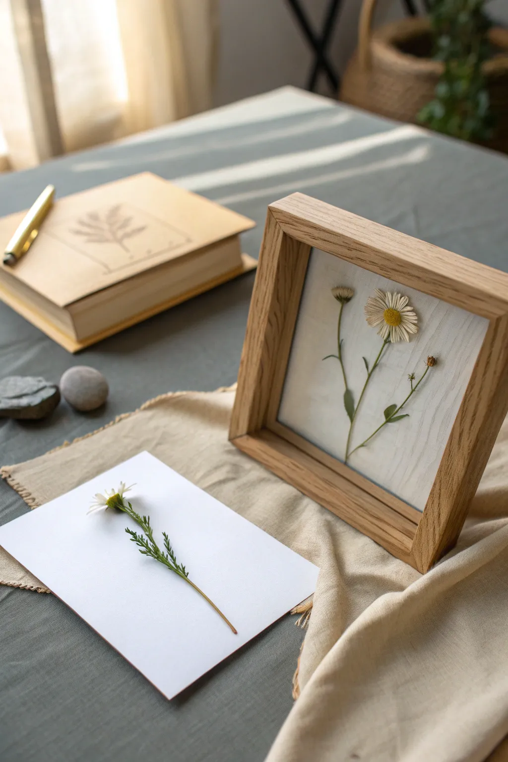
This delicate memorial piece captures the fleeting beauty of nature by preserving botanicals in a minimalist wooden shadowbox. The result is a timeless, airy display that honors a special memory or simply celebrates the quiet elegance of wildflowers.
Step-by-Step Guide
Materials
- Fresh daisies or wildflowers (for pressing)
- Deep wooden shadowbox frame (oak or light wood finish)
- Heavyweight white textured cardstock or watercolor paper
- Flower press or heavy books
- Parchment paper/blotting paper
- Fine-point tweezers
- Acid-free craft glue or matte medium
- Small paintbrush or toothpick (for glue application)
- Scissors
- Glass cleaner and microfiber cloth
Step 1: Selecting and Pressing
-
Choose your blooms:
Select fresh flowers that are free of blemishes or brown spots. For this specific look, search for a primary daisy with a prominent yellow center and a few smaller buds or side stems to create a natural composition. -
Prep the stems:
Trim the stems to a length that will fit comfortably within your frame, leaving a little extra length just in case. Remove any bulkier leaves that might create uneven lumps during pressing. -
Arrange for pressing:
Open your flower press or heavy book and lay down a sheet of parchment paper. Place your flowers face down. For the main daisy, gently fan out the petals so they lay flat and aren’t overlapping awkwardly. -
Apply compression:
Cover the flowers with another sheet of parchment paper and close the press or book. Add significant weight on top—heavy encyclopedias or cast-iron pans work well if you aren’t using a mechanical press. -
Wait patiently:
Let the flowers dry completely. This usually takes 2-3 weeks. Don’t peek too early, or you risk tearing the delicate damp petals. They are ready when they feel papery and stiff.
Pro Tip: Moisture Control
If you live in a humid area, place a tiny silica gel packet behind the backing board (hidden from view). This prevents mold and keeps petals crisp over time.
Step 2: Preparing the Background
-
Disassemble the frame:
Take your shadowbox frame apart. Remove the glass and the backing board. Clean the glass thoroughly on both sides with glass cleaner and a microfiber cloth to remove dust and fingerprints. -
Cut the mounting paper:
Measure the inside dimensions of your frame’s backing board. Cut your heavyweight textured cardstock to this exact size. -
Dry styling:
Before gluing anything, lay your cut paper on a flat surface. Using tweezers, gently lift your pressed flowers and arrange them on the paper. Play with the composition until the taller stem and shorter buds feel balanced.
Level Up: Vintage Aging
Tea-stain your watercolor paper before mounting the flowers. Dip the paper in strong brewed tea and let dry for an antique, heirloom aesthetic.
Step 3: Mounting and Assembly
-
Apply adhesive:
Squeeze a tiny dot of acid-free glue onto a scrap piece of paper. I like to use a toothpick to pick up a microscopic amount of glue rather than applying it directly from the bottle. -
Secure the main stem:
Gently flip the main flower stem over. Dab tiny points of glue on the heavier parts of the plant: the back of the flower head, thick nodes on the stem, and the center of the leaves. -
Place the botanical:
Turn the flower right-side up and place it onto your pre-determined spot on the textured paper. Press down very gently with a clean fingertip or a soft cloth to ensure contact. -
Add supporting elements:
Repeat the gluing process for any smaller buds or floating leaves. Ensure they are placed intentionally to mimic how the plant might grow in nature. -
Final drying:
Allow the glue to set completely for at least an hour. This prevents any moisture from the glue from fogging up the glass later. -
Reassemble the frame:
Place the glass back into the frame. Insert the spacer (if your shadowbox has one) to keep the glass away from the flower, or simply place your mounted artwork directly against the glass if you prefer a compressed look. -
Secure the backing:
Insert the backing board behind your artwork and secure the tabs or clips of the frame. Make sure the artwork is centered and hasn’t shifted during assembly.
Now you have a serene piece of botanical art that captures a moment in time forever

PENCIL GUIDE
Understanding Pencil Grades from H to B
From first sketch to finished drawing — learn pencil grades, line control, and shading techniques.
Explore the Full Guide
Original Character (OC) Illustration
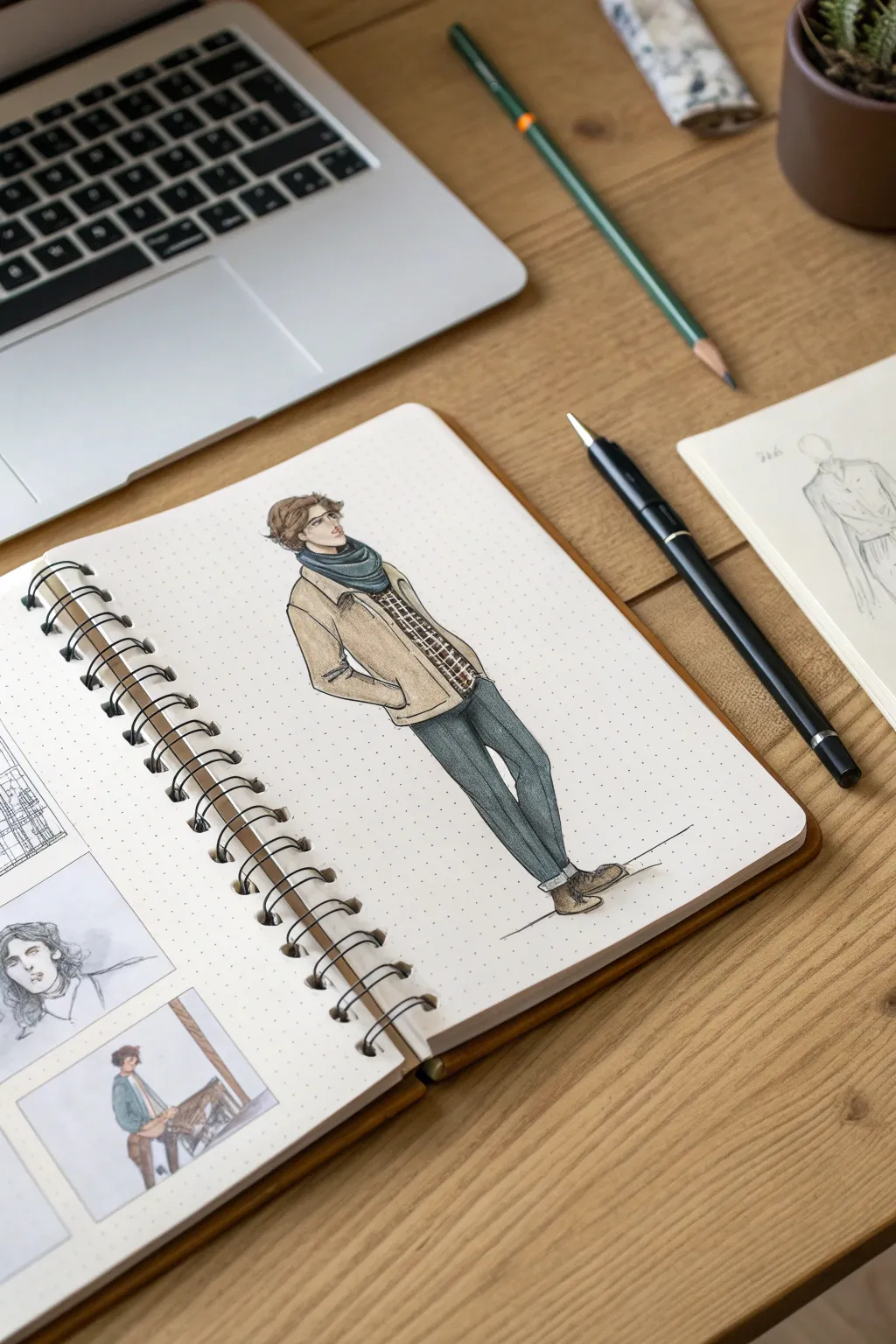
Bring your original character to life with this clean, fashion-forward illustration style, perfectly suited for commission reference sheets. This project focuses on capturing personality through posture and outfit details using a mix of fine liners and markers on dot grid paper.
How-To Guide
Materials
- Spiral-bound dot grid sketchbook (A4 or A5)
- H or HB drawing pencil
- Kneaded eraser
- Fine liner pens (0.1mm, 0.3mm, 0.5mm, black)
- Alcohol markers (skin tones, beige/tan, dark teal/blue, grey, brown)
- White gel pen (optional for highlights)
Step 1: Drafting the Pose
-
Establish the Line of Action:
Start lightly with your H pencil to draw a simple curved line representing the spine and overall posture. Since this character is leaning back slightly with hands in pockets, the line should have a gentle ‘S’ curve. -
Block in the Anatomy:
Using simple geometric shapes, map out the head, torso, and pelvis. Sketch stick-figure lines for the arms and legs, paying attention to the proportions—keep the legs long and lean for that stylized fashion look. -
Refine the Body Shape:
Flesh out the limbs around your stick figure guides. Sketch the hands disappearing into the pocket area to define the casual stance. -
Adding Volume to Clothing:
Draw the outfit over the body form. Sketch a loose, open jacket, a scarf wrapped around the neck, and slim-fit trousers. Remember that fabric gathers at the elbows, knees, and ankles.
Pro Tip: Dot Grid Guide
Use the dot grid to ensure symmetry! When drawing the shoes or checking leg length, simply count the dots horizontally or vertically to keep proportions accurate without a ruler.
Step 2: Inking the Outline
-
Initial Inking – Facial Features:
Switch to your finest pen (0.1mm). Carefully ink the eyes, nose, and jawline. Keep the lines delicate for the face to maintain an expressive look without heaviness. -
Outline the Hair:
Use the 0.1mm pen to draw the hair in clumps rather than individual strands. Follow the flow towards the back of the neck, keeping the strokes loose. -
Inking the Clothing:
Change to a 0.3mm pen for the clothing outlines. Use confident, continuous strokes for the long lines of the pant legs and jacket edges. -
Adding Fabric Weight:
Thicken the line weight slightly where shadows would naturally fall, such as under the arm, at the bottom of the jacket, and the inseam of the trousers. This grounds the figure. -
Detailing the Patterns:
With the 0.1mm pen, draw the plaid pattern on the shirt underneath the jacket tightly. I find it helps to draw the vertical lines first, then the horizontal ones. -
Erase Sketches:
Once the ink is completely dry—give it a full minute—gently erase all underlying pencil marks with the kneaded eraser so the paper is clean for coloring.
Trouble: Smudged Ink?
If your fine liner smears when you apply marker, switch to pigment-based waterproof pens. Alternatively, color the shapes first with marker and add the ink lines on top once dry.
Step 3: Coloring and Shading
-
Base Skin Tones:
Apply a light wash of your skin tone marker to the face and neck. Let it dry, then go over the areas under the hair and chin again to create shadow depth. -
Hair Color:
Fill in the hair with a medium brown marker. Leave a few tiny uncolored gaps near the crown of the head to represent natural shine. -
Coloring the Jacket:
Use a warm beige or tan marker for the jacket. Use even vertical strokes to fill the shape. While the ink is wet, add a second layer to the side of the torso and under the arm to build dimension. -
Scarf and Trousers:
Select a dark teal or slate blue for the scarf and pants. Color these areas fully. For the denim look on the pants, you can let the marker streak slightly vertically. -
Shoes and Details:
Color the boots with a dark brown or grey marker. Don’t forget the small details like the shirt pattern—dab a little color into the plaid squares. -
Final Shadows:
Using a cool grey marker, add a subtle drop shadow on the floor beneath the shoes to anchor the character to the ground. -
Finishing Touches:
Optionally, use a white gel pen to add tiny highlights to the eyes or the tip of the nose to make the character pop.
Now you have a stylish character reference ready to share or keep in your portfolio
Character Portrait Badges and Icons
Create a gallery of character personalities with this charming sheet of miniature portraits. Using gouache or acrylic markers, you’ll capture twelve distinct faces in a cohesive, sticker-style layout that celebrates diversity and style.
Detailed Instructions
Materials
- Heavyweight watercolor paper or mixed media cardstock (white)
- Compass or circular object (approx. 1.5 inch diameter)
- Pencil (HB or 2H)
- Gouache paints or high-quality acrylic markers (matte finish)
- Fine liner pens (black, 0.1mm and 0.3mm)
- Small round brushes (sizes 0, 2, and 4)
- Palette for mixing skin tones
Step 1: Planning the Layout
-
Grid Preparation:
Begin by lightly measuring a grid on your paper to ensure even spacing. You want 3 columns and 4 rows. Leave generous margins on all sides to frame the artwork. -
Drawing Circles:
Using a compass or a small circular object like a bottle cap, lightly trace twelve circles within your grid. Keep the pencil pressure very light so the lines don’t show through later. -
Sketching Characters:
Inside each circle, sketch the rough outlines of your characters. Vary the hairstyles, angles (profile, 3/4 view, frontal), and clothing necklines for visual interest. Don’t worry about facial details yet, just the main shapes.
Step 2: Blocking in Color
-
Background Base:
Choose a limited color palette for the backgrounds—muted teal, mustard yellow, and rust red work beautifully together. Paint the background space inside the circles first, carefully cutting in around your sketched character silhouettes. -
Mixing Skin Tones:
Mix a variety of skin tones on your palette. Apply these flat colors to the face and neck areas. Gouache dries quickly, so work one circle at a time to get a smooth, opaque application. -
Hair Shapes:
Once the skin and background areas are dry—I usually give it about 10 minutes—paint the hair shapes. Use contrasting colors against the background choice; for example, red hair pops against a teal background. -
Clothing Blocks:
Fill in the clothing shapes at the bottom of each circle. Keep these shapes simple, as you will add patterns later.
Uneven Circles?
If painting perfect circles is difficult, try painting the background as a square first. Once dry, place a stencil over it and paint white gouache around the outside to mask it into a circle.
Step 3: Adding Details
-
Facial Features:
Switch to your smallest brush (size 0) or a very fine marker. Carefully paint the eyes, noses, and mouths. Keep the precision high; simple dots or small lines can effectively suggest features in this miniature scale. -
Defining Hair Texture:
Add linear details to the hair using a varied tone of the base hair color. Add swoops for bobs, curls for textured hair, or straight lines for sleek styles. -
Clothing Patterns:
Decorate the clothing areas. Add stripes, polka dots, leopard print, or floral motifs. This is where you can tie the color palette together by reusing background colors as accent hues on the clothes. -
Jewelry Accents:
Paint tiny accessories like earrings or necklaces. A dab of gold paint or a bright contrasting color adds a lovely finish to each portrait.
Make Them Stickers
Instead of a single art print, paint these on self-adhesive sticker paper. Once finished, use a circle punch corresponding to your design size to punch them out instant laptop decals.
Step 4: Refining and Finishing
-
Clean Edges:
Check the perimeter of each circle. If your paint went outside the lines, use opaque white gouache to carefully clean up the edges and make the circles crisp again. -
Final Outlines:
Evaluate if any features need more definition. A very sparing use of a black fine liner can help define a jawline or an eye if the paint contrast isn’t strong enough. -
Erase Grid:
Once you are absolutely certain the paint is bone dry, gently erase any visible pencil grid lines from the white paper surrounding the circles.
Display your finished sheet as a celebration of character design or cut them out to use as personalized gift tags


Family Illustration in a Storybook Style
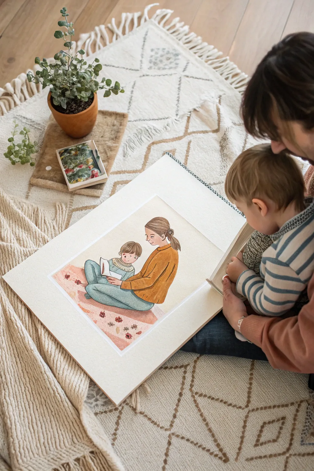
Capture the tenderness of everyday parenting with this charming, storybook-style illustration. Using a delicate blend of watercolor and colored pencil, you can create a soft, heartwarming keepsake that freezes a quiet reading moment in time.
Step-by-Step
Materials
- Hot press watercolor paper (140lb/300gsm)
- Watercolor paints (pan or tube set)
- Round watercolor brushes (sizes 2, 4, and 6)
- Colored pencils (wax or oil-based)
- H or HB pencil for sketching
- Kneaded eraser
- Masking tape
- Drawing board
- Mixing palette
- Paper towels
- Reference photo of subjects
Step 1: Conceptualizing & Sketching
-
Gather your reference:
Begin by selecting a photo of a parent and child interacting, ideally reading or sitting together. This style simplifies reality, so look for clear silhouettes and distinct clothing shapes rather than perfect facial details. -
Prepare the surface:
Tape your hot press watercolor paper to a drawing board. The smooth texture of hot press is crucial for the colored pencil detailing later. -
Draft the composition:
Lightly sketch the figures using an H pencil. Keep the lines incredibly faint. Aim for simplified proportions—slightly larger heads and softer features enhance that classic storybook aesthetic. -
Refine the pose:
Focus on the connection between figures. Draw the mother’s arm encircling the child and the child’s focus on the book. Simplify clothing folds into major shapes, avoiding tiny wrinkles. -
Clean up:
Use a kneaded eraser to lift almost all the graphite, leaving only the ghost of an outline to guide your painting.
Fixing Muddy Colors
If your watercolor and pencil mix looks muddy, your paint was likely too wet. Let it dry fully, then erase the pencil gently. Re-apply pencil only on bone-dry paper.
Step 2: Watercolor Washes
-
Mix skin tones:
Create a pale, watery wash for the skin. I usually mix a touch of yellow ochre with a tiny bit of cadmium red. Apply this to the faces and hands, keeping it very transparent. -
Paint the clothing base:
Mix a warm mustard yellow for the mother’s sweater and a muted teal for the child’s outfit. Apply these as flat washes. Don’t worry about shading yet; just get an even, clean color laid down. -
Add the rug:
Paint a soft, irregular rectangle beneath them using a diluted dusty pink or coral. Keep the edges slightly organic to suggest a textile texture rather than a hard geometric shape. -
Initial hair layering:
Lay down a base color for the hair (light brown or sandy blonde). Let the paint pool slightly to create natural variations, but keep it lighter than the final hair color will be. -
Let it dry completely:
Wait for the paper to be bone dry. If you touch it and it feels cool, it’s still wet. This pause is essential before switching mediums.
Texture Trick
To replicate the sweater texture, place a piece of textured paper or fabric under your artwork while coloring. The pencil will pick up the pattern.
Step 3: Determining Details
-
Outline with colored pencil:
Select colored pencils slightly darker than your paint colors. Gently outline the figures. Use a burnt sienna pencil for the mother’s sweater and a deep slate blue for the pants. -
Add clothing texture:
On the mother’s sweater, use short, directional strokes with the colored pencil to mimic the knit texture. Shade the areas where the arm bends and under the torso to create volume. -
Detail the faces:
Switch to a sharpened brown or dark grey pencil for facial features. Draw simple dot eyes, small noses, and gentle smiles. Add a touch of pink pencil to the cheeks for a rosy flush. -
Refine the hair:
Use individual pencil strokes to draw hair strands over the watercolor base. Follow the curve of the head, adding a few flyaways for a realistic, cozy feel. -
Pattern the rug:
Use a dark red or maroon pencil to draw small floral motifs or geometric patterns on the pink watercolor rug. Keep them loose and sketchy to maintain the illustrative style. -
Final shading:
Lightly cross-hatch with a grey pencil underneath the figures to ground them on the rug, giving them weight so they don’t look like they are floating. -
Mounting:
Once finished, carefully remove the tape. Attach your artwork to a larger piece of white mount board or foam core to give it a wide, professional gallery border.
Display this heartwarming piece on a shelf or gift it to a loved one to celebrate quiet family connections
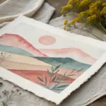
Travel Memory Landscape Commission
Capture the serene beauty of rolling hills and distant peaks with this watercolor landscape project. By layering washes of color and utilizing atmospheric perspective, you’ll create a sense of vast depth perfect for commemorating a favorite travel view.
How-To Guide
Materials
- Cold press watercolor paper (140lb/300gsm)
- Watercolor paints (Indigo, Payne’s Grey, Burnt Sienna, Yellow Ochre, Rose Madder)
- Masking tape
- Plywood or hardboard for mounting
- Large flat wash brush (1 inch)
- Round brushes (sizes 4 and 8)
- Fine liner or rigger brush
- Two jars of water
- Paper towels
- Watercolor palette
Step 1: Setting the Scene
-
Prepare your surface:
Tape your watercolor paper down securely to a board on all four sides. This prevents the paper from buckling when wet and ensures you have a crisp, clean border for framing later. -
Sketch the horizon:
Using a hard pencil (like an H or 2H), very lightly sketch the undulating lines of the mountain ridges. Create about 4-5 layers of mountains, ensuring they overlap naturally to show distance. -
Wet the sky:
Take your large flat brush and generously wet the sky area with clean water. The paper should be glisten but not have standing puddles. -
Paint the sunrise gradient:
Start with a pale blue wash at the very top. Quickly rinse your brush and pick up a diluted pale yellow or ochre for the middle sky. Finally, blend a soft rose or pink near the horizon line, letting the wet paper merge the colors seamlessly.
Preventing Blooms
Water blooms occur if you add water to drying paint. If a layer is damp/cool to the touch, don’t touch it! Wait until it is fully dry before glazing.
Step 2: Layering the Distance
-
Mix your distant color:
Create a very watery mix of Indigo and a touch of Rose Madder. The distant mountains should be pale and cool-toned to simulate atmospheric haze. -
Paint the furthest ridge:
Once the sky fits is completely dry, paint the most distant mountain ridge. Paint a clean edge along the top, then soften the bottom edge of this shape with clean water so it fades into white. -
Wait and darken:
Allow the first ridge to dry completely. For the next ridge forward, add slightly more pigment to your blue-grey mix. Paint this shape, overlapping the previous one, and again fade the bottom edge out with water. -
Introduce valley mist:
For the middle ridges, as you fade the bottom of the mountain shape, leave irregular patches of white paper. This negative space creates the illusion of thick fog settling in the valleys. -
Add warmth:
As you move to the closer ridges, mix a tiny bit of Burnt Sienna into your blue-grey. This warms the color slightly and brings the mountains visually forward.
Step 3: Foreground Detail
-
Deepen the foreground values:
For the closest mountain layer, mix a strong, saturated dark green using Indigo and Burnt Sienna. Paint the rolling hill shape, keeping the edges rougher to suggest vegetation texture. -
Texture the hill:
While the foreground hill is damp (not soaking wet), drop in hints of pure Burnt Sienna or Ochre to create the look of dried grass or fall foliage. -
Practice your pines:
On a scrap piece of paper, practice painting pine trees with your size 4 round brush. Use a vertical stroke for the trunk and quick, dabbing horizontal strokes that get wider toward the bottom. -
Paint the forest line:
Using your practiced technique, paint a variation of pine trees along the ridge of the closest hill. Group them in clusters of three or five for a natural look, varying their heights significantly. -
Add detail trees:
Switch to your rigger or fine liner brush. Mix a very dark, near-black brow. Paint the delicate, skeletal branches of deciduous trees in the immediate foreground on the right side. -
Incorporate fall colors:
diluted Yellow Ochre or Burnt Orange, gently dab over the branches of the deciduous trees to suggest lingering autumn leaves. Keep this transparent so the branches show through. -
Final touches:
Check your contrast. If the foreground needs more punch, glaze a thin layer of dark blue-green over the shadowed areas of the pine trees once the previous layer is dry. -
Reveal the border:
Wait until the paper is bone dry—touch it with the back of your hand to be sure. Slowly peel away the masking tape at a 45-degree angle to reveal your crisp white edges.
Sparkle Effect
Use a toothbrush to lightly splatter clean water onto the foreground while it’s still wet. This creates tiny textured spots that look like dew or frost.
Mat and frame your finished landscape to bring a permanent window of tranquility into your home.
Food and Drink Still Life Commission
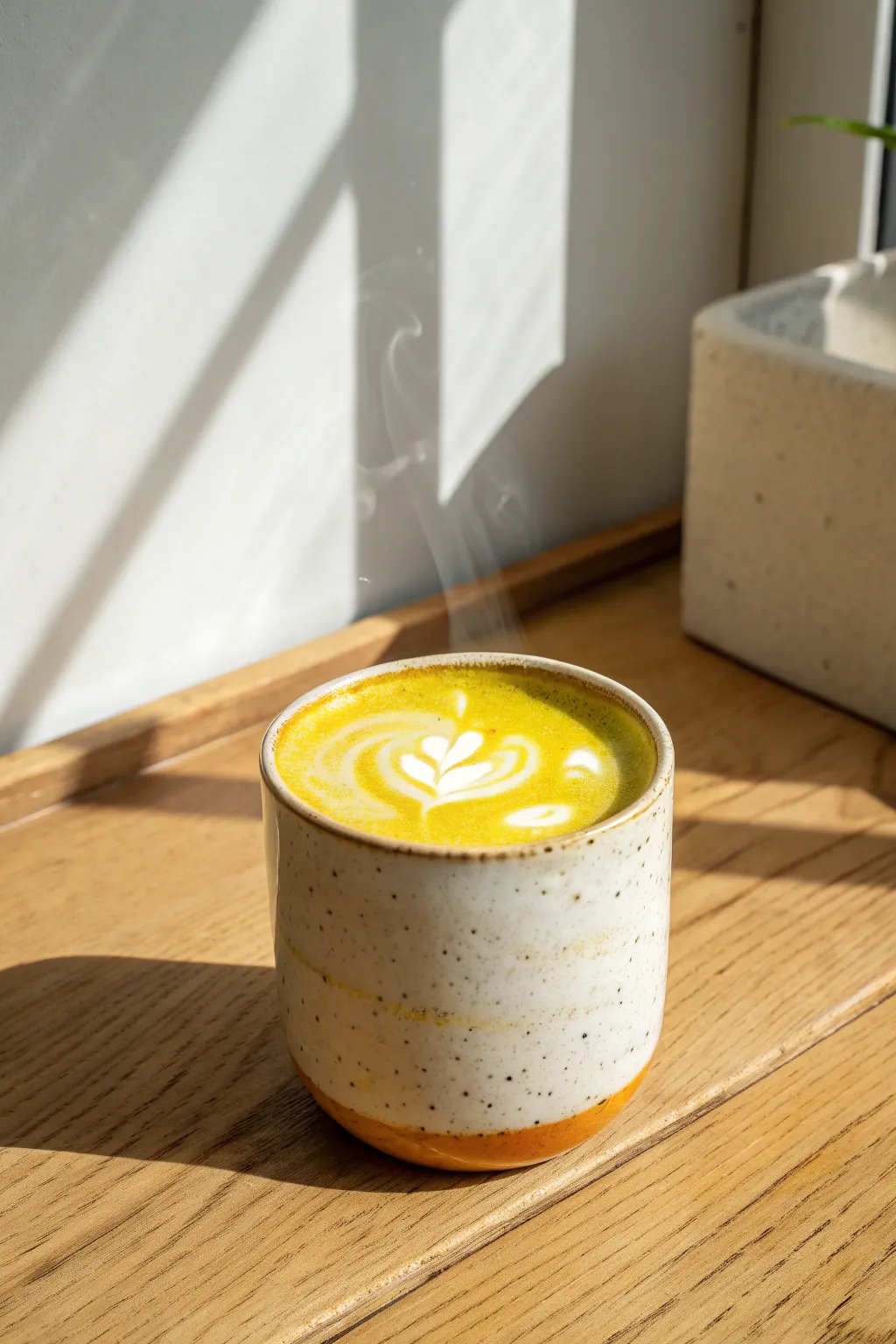
Capture the warmth and serenity of a morning coffee break with this digital painting tutorial. You’ll recreate the interplay of strong sunlight, delicate steam, and the vibrant yellow of a turmeric latte sitting on a textured wooden table.
Step-by-Step Tutorial
Materials
- Digital drawing tablet (iPad or Wacom)
- Painting software (Procreate, Photoshop, or Krita)
- Textured blending brushes (Goauche or Pastel styles)
- Soft airbrush for lighting effects
- Reference photo of a latte
- Color palette: Ochers, deep oranges, warm creams, and wood browns
Step 1: Setting the Scene
-
Establish the background:
Start with a canvas of mid-tone warm brown. Block in the basic shapes: a diagonal split for the wall and the table surface. -
Map the light:
Identify where the strong light source is coming from (top left). Sketch rough diagonal lines across the background wall to indicate the shadow of a window frame. -
Draft the cup shape:
Sketch the cylinder of the cup in the center. Give it slightly curved sides to mimic the handmade ceramic look, rather than perfect straight lines. -
Define the perspective:
Draw the ellipse for the top of the liquid carefully. Since we are viewing it from a high angle, the oval should be fairly open, not too flat.
Pro Tip: Liquid Tension
Add a tiny, dark shadow line just inside the rim of the cup before the liquid starts. This visual gap sells the meniscus effect where liquid meets ceramic.
Step 2: Building Texture and Form
-
Base coat the wood:
Paint the table area with a warm oak color. Use a rake brush or a streak-textured brush to create the wood grain direction, following horizontal lines. -
Render the ceramic:
Fill the cup shape with a creamy off-white. Use a soft round brush to add a subtle shadow on the left side, curving around the form to give it volume. -
Add the speckles:
On a new layer set to ‘Multiply’, tap a spatter brush lightly over the cup to create the ceramic speckles. Lower the opacity so they look baked in, not floating on top. -
Base the liquid:
Fill the inner oval with a vibrant, muddy yellow-green to represent the turmeric or matcha blend. Keep the edges slightly soft where it meets the cup rim.
Step 3: Latte Art and Details
-
Create the foam base:
With a lighter, creamy yellow, swirl in the background of the foam. The liquid isn’t perfectly flat; use small, circular strokes to suggest micro-foam texture. -
Draw the tulip pattern:
Switch to a nearly pure white brush. Paint the heart shapes of the latte art, starting with the largest curve at the bottom and stacking smaller hearts upward. -
Drag the tail:
Draw a thin white line straight through the center of your heart stack to ‘pull’ the design together, simulating the barista’s final pour motion. -
Add surface bubbles:
Dot a few tiny highlights around the latte art to show where larger bubbles have formed on the surface.
Troubleshooting: Flat Steam
If your steam looks like solid gray streaks, lower the layer opacity to 20% and use the eraser tool to carve out uneven, rhythmic gaps in the smoke.
Step 4: Atmosphere and Lighting
-
Cast the hard shadows:
On a layer set to ‘Multiply’, paint the strong diagonal shadows on the wall and table. The shadow from the cup should stretch long and to the right. -
Rim lighting:
Add a crisp, bright white line along the right rim of the cup and the top right edge of the liquid to show where the sun hits hardest. -
Paint the steam:
Create a new layer. Using a very soft smudge brush or smoke brush, paint wisps rising from the cup. I like to keep this very transparent so it doesn’t obscure the background. -
Refine the wood shadows:
deepening the shadows specifically where the cup meets the table (occlusion shadow) to ground the object so it doesn’t look like it’s floating. -
Warm overlay:
Finally, add a large soft airbrush layer of warm orange over the sunlit areas, set to ‘Overlay’ or ‘Soft Light’ to unify the colors and boost the sunny feeling.
Step back and enjoy the cozy, sun-drenched atmosphere you have created on your digital canvas
Abstract Piece Matched to Room Colors
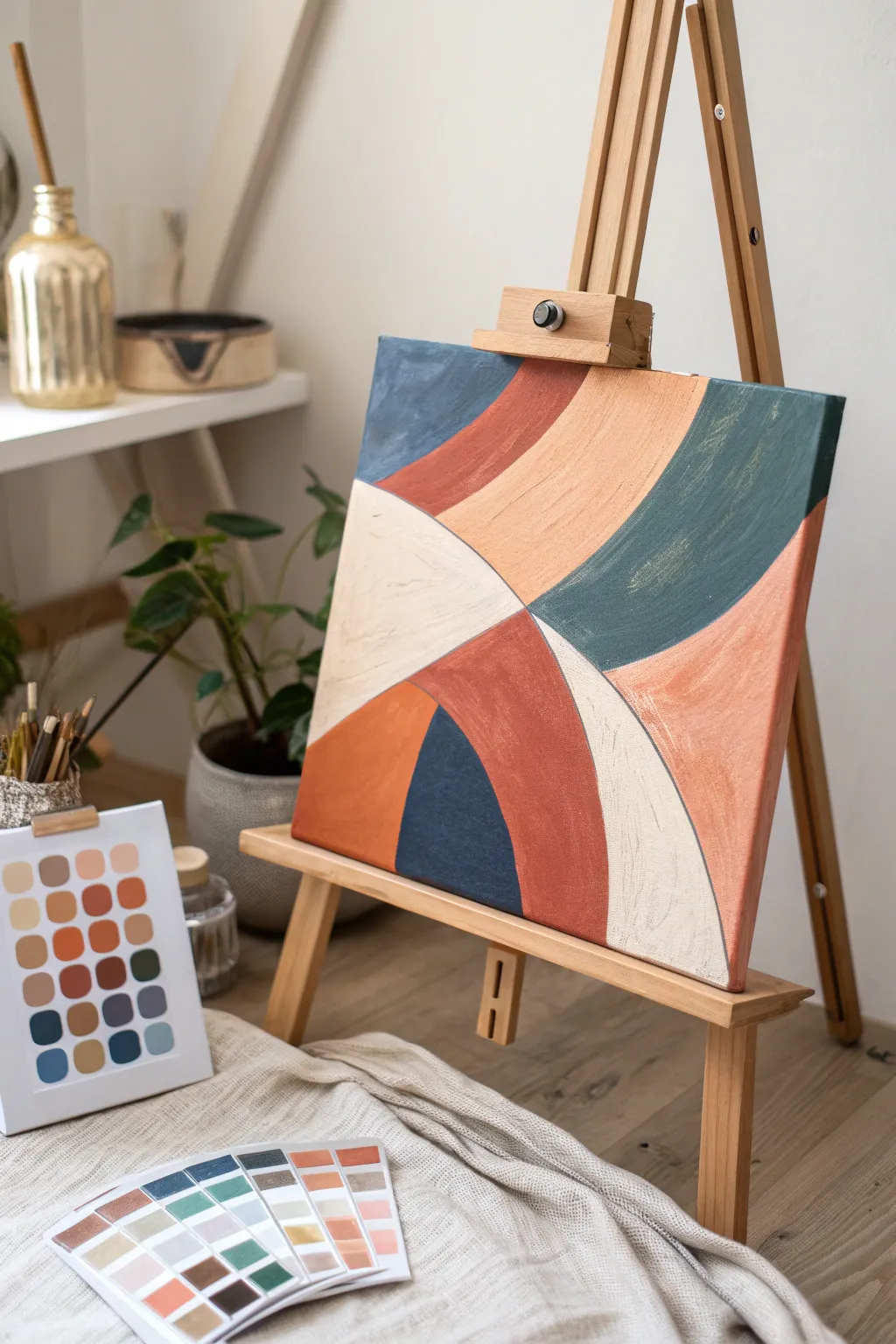
This project explores the harmony of warm earth tones mingled with cool blues and teals in a flowing, geometric composition. The result is a sophisticated piece of abstract art that feels both modern and organically structured, perfect for tying a room’s color palette together.
How-To Guide
Materials
- Square stretched canvas (approx. 16×16 inches)
- Acrylic paints (Terra cotta, deep navy, slate teal, peach, warm beige/cream, burnt orange)
- Flat shader brushes (medium and large sizes)
- Pencil
- Palette paper or mixing tray
- Standard masking tape or flexible curve tape (optional)
- Cup of water and paper towels
Step 1: Planning and Sketching
-
Analyze the composition:
Before putting pencil to canvas, study how the painting is divided. Notice that the curves radiate from a central point slightly offset to the left, creating fan-like sections that sweep outward. -
Mark the focal point:
Lightly mark a small dot on your canvas where the four main quadrants intersect. In this design, it’s roughly one-third of the way up from the bottom and one-third in from the left edge. -
Refine the intersection:
Note that the shapes don’t meet at a sharp point but rather kiss at a soft junction. Keep your intersection mark loose to allow for adjustment. -
Sketch the primary curves:
Using a light hand with your pencil, draw the sweeping lines that divide the canvas into four main quadrants. Imagine a large ‘X’ that has melted into soft curves. -
Add the secondary subdivisions:
Inside the top-right and bottom-right sections, draw additional curved lines parallel to your first marks. These will create the striped effect within those larger blocked areas. -
Check balance:
Step back and ensure the sections feel balanced. The cream section on the left should feel like a solid anchor against the detailed stripes on the right.
Smooth Curves
Struggling with steady hands? Use flexible painter’s tape designed for curves to mask off sections. Paint one color, let it dry, move the tape, and paint the next.
Step 2: Color Filling
-
Mix the cream tone:
Start with white acrylic and add a tiny touch of yellow oxide or raw sienna to create a warm, milky cream color. This will be for the large left-hand section. -
Paint the lightest section:
Apply the cream paint to the designated shape on the left. Use a flat brush to cut in clean edges along your pencil lines, then fill the center. -
Mix the terra cotta hues:
Create two variations of terra cotta: one deeper, reddish-brown version and one softer, peachier version with more white mixed in. -
Apply the deep terra cotta:
Paint the section directly below the cream shape and the curving stripe in the top-right quadrant with your darker rust color. I find applying two thin coats gives smoother coverage than one thick one. -
Add the peach tone:
Fill in the wide, central curve of the top section and the far-right edge piece with your lighter peach mixture. -
Mix the cool tones:
Prepare a deep navy blue and a slate teal (greenish-blue). You may need to mute the teal slightly with a drop of orange or brown so it isn’t too electric. -
Paint the navy accent:
Carefully paint the bottom-center shape with the deep navy. This dark anchor point helps ground the lighter colors above it. -
Apply the teal band:
Fill the large, sweeping curve in the upper-right area with your slate teal. Keep your brushstrokes moving in the direction of the curve to enhance the flow.
Textural Depth
Mix a structured gel medium or modeling paste into your acrylics before painting. This adds physical texture that mimics the visible brushstrokes seen in the original.
Step 3: Refining and Sealing
-
Touch up edges:
Once the first layers are dry, use a small flat brush to sharpen the lines where colors meet. You want crisp boundaries without needing black outlines. -
Evaluate opacity:
Check for any streaky areas, particularly in the dark navy or the light cream sections. Add a second coat if the canvas texture is showing through too much. -
Paint the sides:
Don’t forget the edges of the canvas. Extend the design wrapping around the sides for a professional, gallery-ready finish. -
Let it cure:
Allow the painting to dry overnight before handling to ensure the thicker layers of acrylic have hardened completely.
Hang your new geometric masterpiece in a spot where it can catch natural light and show off the subtle textures
Sketch vs. Line Art vs. Full Color Tiers
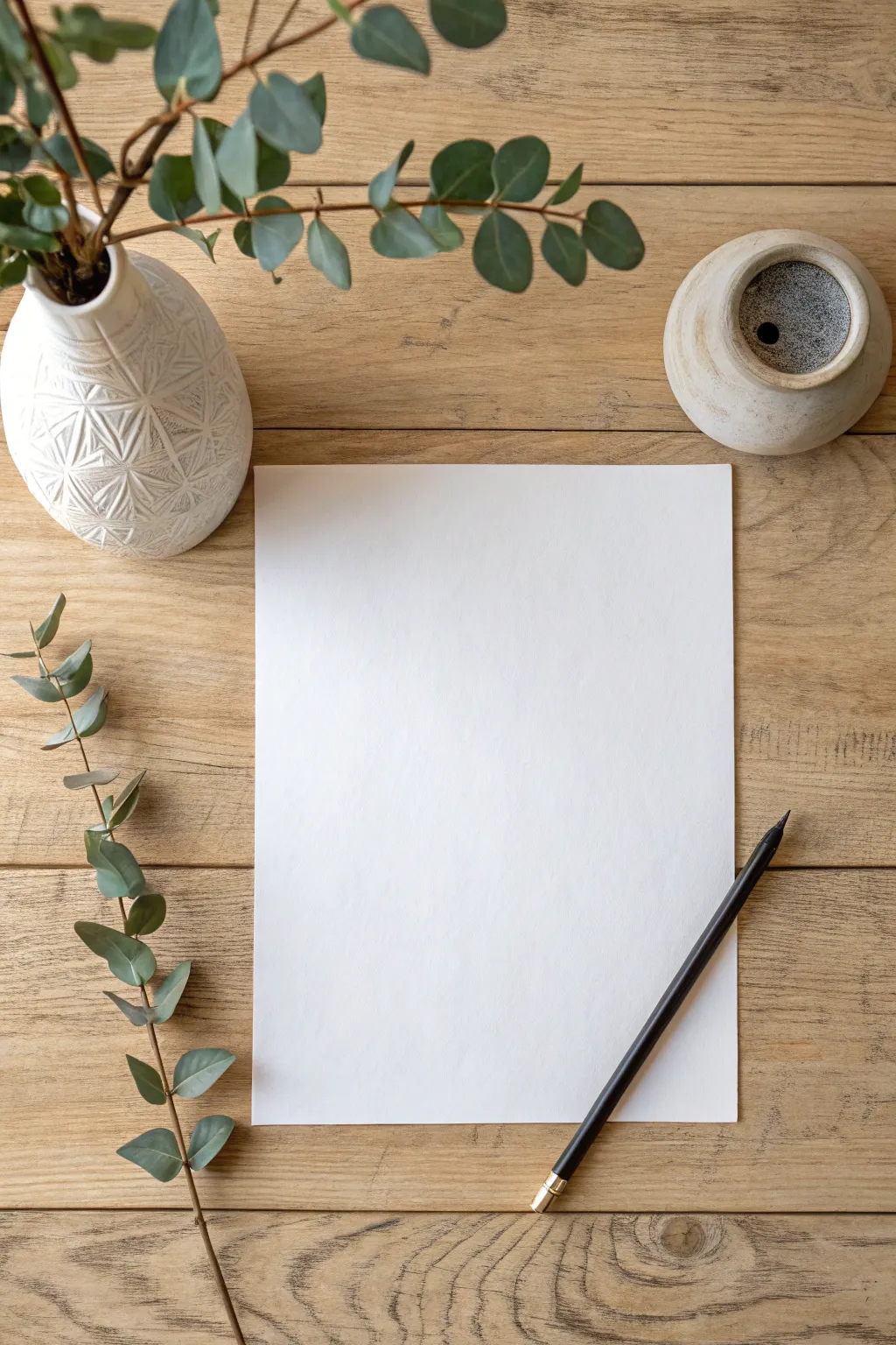
This project focuses on creating the perfect, minimalist flat-lay setup to showcase or prepare for a tiered sketching commission. By arranging natural textures like wood and eucalyptus alongside quality paper, you create an inviting atmosphere that elevates even a blank page into a promise of art.
Step-by-Step Guide
Materials
- Textured wooden surface (table or backdrop board)
- Heavyweight drawing paper (A4 or Letter size)
- Fresh or dried eucalyptus branches
- White ceramic vase with geometric relief pattern
- Small rustic pottery vessel or ink pot
- Black graphite pencil or charcoal stick
- Natural light source
Step 1: Establishing the Foundation
-
Prepare the surface:
Begin by selecting a surface with distinct wood grain character. If you don’t have a rustic table, a high-quality vinyl backdrop or a stained wooden board works beautifully as a base. -
Cleaning and clearing:
Wipe down the wooden surface with a slightly damp cloth to remove dust, but ensure it is completely dry before placing any paper down to avoid warping. -
Position the main subject:
Place your sheet of heavyweight drawing paper directly in the center of the frame. This blank canvas represents the potential of the ‘Sketch’ or ‘Line Art’ tier you are offering. -
Check paper alignment:
Adjust the paper slightly so it isn’t perfectly rigid; a very slight angle can feel more organic, though keeping it relatively straight maintains a professional look.
Natural Texture Tip
Use fresh eucalyptus for a vibrant green pop, or dried silver dollar eucalyptus for a muted, desaturated look that matches black and white graphite sketches perfectly.
Step 2: Arranging the Botanicals
-
Prepare the vase:
Take your white geometric vase and place it in the upper left corner of your composition. The texture on the ceramic adds depth without distracting from the paper. -
Styling the bouquet:
Insert several tall stems of eucalyptus into the vase. I like to let them naturally droop and extend towards the center, creating a visual canopy over the paper. -
Pruning for balance:
Trim any leaves that might cast confusing shadows directly onto the main drawing area. You want the shadows to be soft and peripheral. -
Adding the loose stem:
Select a single, long stem of eucalyptus with well-spaced leaves. Lay this along the left side of the paper, following the vertical line but curving slightly inward at the bottom. -
Intersecting lines:
Allow the tip of the loose stem to just barely cross the bottom edge of the paper or the frame boundary, creating a sense of continuity beyond the image.
Level Up: Tier Visualization
Actually draw a faint outline on the paper to represent the ‘Sketch’ tier, then ink half of it for ‘Line Art’ to show the transition in one image.
Step 3: Accessories and Lighting
-
Place the secondary vessel:
Position the small rustic pot in the upper right quadrant. This balances the visual weight of the vase on the left. -
Add the tool:
Lay a sharp black pencil or charcoal stick diagonally across the bottom right corner of the paper. -
Angle the tool:
Ensure the tip of the pencil points toward the center of the page, subconsciously inviting the viewer to pick it up and start drawing. -
Lighting setup:
Position your setup near a window with indirect sunlight. Since this mocks up a sketch tier, soft, diffuse light is preferable to harsh direct sun. -
Manage shadows:
Observe where the eucalyptus leaves cast shadows. If they are too dark, use a white foam board on the opposite side of the light source to bounce fill light back into the scene. -
Final adjustment:
Take a test photo or step back. Often, nudging the paper a millimeter to the right or rotating the pencil five degrees makes the difference between messy and curated.
With your scene set perfectly, you are ready to photograph your commission sheet or begin the actual sketching process
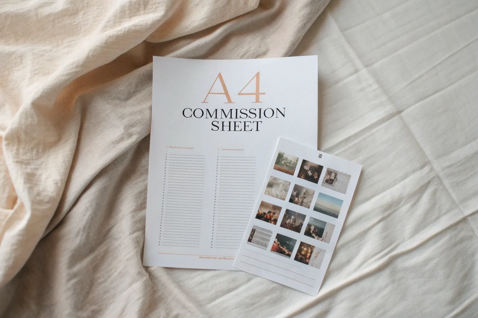
Bust vs. Half-Body vs. Full-Body Options
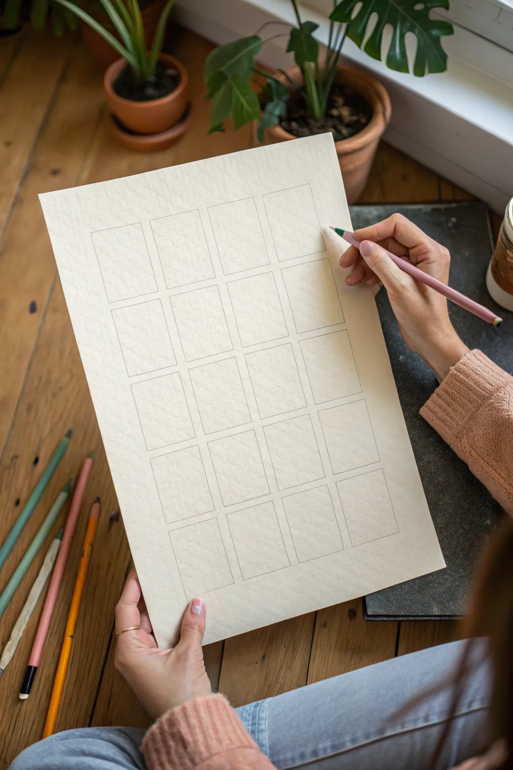
This tutorial guides you through creating a clean, organized layout page for planning multiple art commissions or character studies. The result is a simple yet professional-looking grid of frames on high-quality textured paper, perfect for visualizing variations like bust, half-body, and full-body options side-by-side.
How-To Guide
Materials
- Heavyweight textured paper (e.g., watercolor or mixed media paper, 300gsm)
- HB or light sketching pencil (e.g., a warm grey or light sepia tone)
- Ruler or T-square
- Kneaded eraser
- Work surface or drawing board
Step 1: Preparation & Planning
-
Select your paper:
Choose a heavyweight paper with a bit of tooth. The texture visible in the reference suggests a cold-press watercolor paper, which adds a lovely, professional feel to even simple sketches. -
Determine grid size:
Before drawing, calculate the spacing. You’ll want a grid of 4 columns by 5 rows. Measure the total width of your paper and subtract the margins you want on the sides. -
Calculate frame dimensions:
Divide the remaining active width by 4 for the columns, leaving a small gap (gutter) between each. Repeat this process for the vertical height to fit 5 rows. -
Mark the margins:
Using your ruler, lightly tick off the outer margins on all four sides of the paper to establish the main drawing area.
Uneven Spacing?
If your boxes look crooked, don’t erase everything. Create a ‘template’ rectangle from cardstock and trace it instead of measuring every single line individually.
Step 2: Drafting the Grid
-
Mark vertical guides:
along the top and bottom horizontal margins, mark the starting and ending points for each of the four columns. -
Mark horizontal guides:
Along the left and right vertical margins, mark the top and bottom edges for each of the five rows. Ensure your measurements are precise so the boxes don’t drift. -
Draw the verticals:
Use a T-square or steady ruler to connect your top and bottom marks. Draw these lines very lightly; you want them to be barely visible guides. -
Draw the horizontals:
Connect your side marks to create the horizontal lines. You should now have a faint grid of intersecting lines across the page.
Colored Leads
Using a colored lead (like Col-Erase) for the grid prevents the lines from smearing when you later sketch inside the boxes with graphite or ink.
Step 3: Finalizing the Frames
-
Define the first box:
Starting at the top left, darken the rectangle formed by the intersection of your guide lines. Use a slightly firmer pressure now, or switch to a colored pencil like the dusty pink shown for a softer aesthetic. -
Complete the first row:
Move across the page, defining the next three rectangles. I find it helps to rotate the paper slightly if my hand starts to smudge previous lines. -
Work down the columns:
Continue strictly outlining the 20 rectangles. Focus on keeping the corners sharp and the lines straight, rather than sketchy. -
Check for consistency:
Step back and look at the grid. The gaps between the boxes (the gutters) should be uniform in size, creating a clean rhythm. -
Clean up:
Once all 20 boxes are outlined, use your kneaded eraser to gently lift away any guide lines that extend past the box corners or sit inside the gutters. -
Final polish:
Dab the eraser over any accidental smudges on the paper grain to ensure the white space remains pristine and ready for your art.
You now have a perfectly organized commission sheet ready to be filled with character concepts
Add-On Menu for Backgrounds and Props
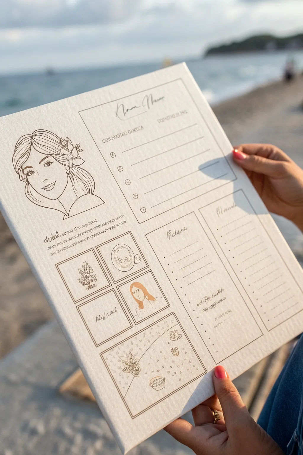
Present your creative services with style using this elegant, illustrated commission menu that resembles a restaurant order card. The design features delicate line art portraits and structured layout boxes printed on high-quality textured paper for a professional yet handcrafted feel.
Step-by-Step
Materials
- Heavyweight textured cardstock (cream or off-white, 300gsm)
- Digital drawing tablet (iPad or Wacom) & stylus
- Digital art software (Procreate or Photoshop)
- Fine-point pigment liner pens (0.1mm, 0.3mm, 0.5mm) for traditional touches
- Ruler
- High-quality inkjet printer capable of handling thick paper
- Sepia or brown ink brush pen (optional for headers)
Step 1: Conceptual Layout & Digital Draft
-
Define the grid:
Begin by sketching a rough layout on your digital canvas. Create a large vertical rectangle divided into asymmetrical sections: a large portrait area on the top left, list lines on the right, and smaller grid boxes at the bottom. -
Set the typography:
Choose a font pairing that mimics hand-lettering. Use a flowing script for the headers (like ‘Add-Ons’ or ‘Extras’) and a clean, legible serif font for the subheaders and lists. -
Draft the boxes:
Draw clean, thin rectangular frames for the bottom section. These will house your visual examples. I prefer to use the rectangle tool to ensure perfectly straight lines, then slightly roughen them later for an organic look. -
Create the main illustration:
In the top left corner, sketch a character bust. Keep the lines clean and sweeping, focusing on hair volume and facial expression. This serves as the ‘mascot’ for your menu.
Ink Choice Matters
Avoid pure black for your line work. A deep espresso or charcoal grey looks much softer on cream paper and creates a vintage, nostalgic aesthetic.
Step 2: Refining Line Work
-
Inking the portrait:
Switch to a mono-weight brush in deep sepia or dark brown. Trace your sketch with confident, smooth strokes. Leave the hair open without too much shading to maintain a clean, graphic style. -
Adding floral details:
Draw small floral accents tucked into the character’s hair. Use thinner lines here (equivalent to a 0.1mm pen) to differentiate these delicate textures from the main facial features. -
Structuring the list area:
On the right side, draw horizontal lines for your text fields. Add small bullet points—circles or hearts—at the start of each line to indicate where commission options like ‘Detailed Background’ or ‘Extra Prop’ will be listed. -
Creating example thumbnails:
Inside the bottom grid boxes, draw miniature illustrations representing your add-ons. For example, draw a small plant for ‘nature props’ or a tiny cup for ‘small objects.’ Keep these simple and icon-like. -
Adding the ‘Details’ section:
Between the portrait and the bottom grid, insert a small paragraph of dummy text or actual policy text (like ‘digital delivery only’) in a stylized, almost illegible script font to add visual texture.
Step 3: Printing & Finishing
-
Paper selection:
Choose a cardstock with a visible tooth or texture, like cold-press watercolor paper or linen-textured cover stock. The texture adds a premium, tactile quality that plain paper lacks. -
Test print:
Run a test print on standard paper first to check your margins. Ensure the brown ink tone prints clearly and isn’t too light against the off-white background. -
Final printing:
Feed your textured cardstock into the printer’s manual feed tray to prevent jamming. Print at the highest quality setting (‘Photo’ or ‘Best’) to ensure crisp lines. -
Golden accents (Optional):
Once printed and dry, take a gold gel pen or metallic marker and carefully highlight small details, like the flower centers or specific keywords, to catch the light. -
Manual texturing:
If the print looks too perfect, go over the main border lines with a physical fine liner pen. The slight wobble of a human hand brings warmth to the precise digital layout. -
Color washing:
For the thumbnail illustrations, apply extremely faint washes of watercolor or colored pencil—just a hint of peach or sage—to make them pop without overwhelming the monochromatic design.
Interactive Menu
Laminate the finished sheet with a matte finish. You can now use dry-erase markers to check off boxes or write custom prices for clients during conventions.
This beautiful menu is now ready to showcase your artistic offerings to potential clients with professional flair
Clear Do’s and Don’ts Boundary Box
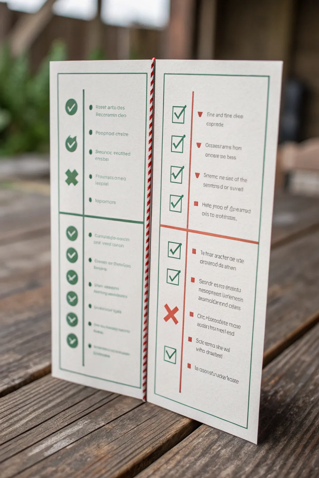
Establish clear boundaries with clients using this elegant, fold-out commission guide featuring distinct “Do’s and Don’ts” sections. This clean layout uses a split-panel design to visually separate what you offer from what you decline, making your terms approachable yet professional.
Step-by-Step Tutorial
Materials
- Graphic design software (Adobe InDesign, Illustrator, or Canva)
- Heavyweight matte cardstock (100lb or similar)
- High-quality inkjet or laser printer
- Bone folder
- Ruler
- Craft knife or paper trimmer
- Red and white baker’s twine (optional binding)
- Hole punch (small diameter)
Step 1: Digital Layout & Design
-
Set up the canvas:
Open your design software and create a new document sized to 8.5 x 11 inches (landscape). Create a guide down the exact vertical center to define your fold line, effectively giving you two 4.25 x 11-inch panels. -
Define the color palette:
Choose a muted, professional palette to match the reference. Select an off-white or cream background, a deep forest green for accepted items (the “Do’s”), and a muted brick red for the declined items (the “Don’ts”). -
Create the structural borders:
Draw thin rectangular borders inside each panel, leaving a generous margin of about 0.5 inches from the edge. This framing adds an official, structured look to the lists. -
Design the “Do’s” iconography:
On the left panel, create a column of circular icons. Use filled green circles with white checkmarks for positive items. I like to include a few variations, like an “X” icon for restricted items within the allowed category, to show nuance. -
Design the “Don’ts” iconography:
On the right panel, switch to square checkbox styles. Draw open squares with green checkmarks for requirements and large red “X” marks for hard boundaries. This visual language instantly communicates the rules. -
Add text placeholders:
Select a clean, sans-serif font. Next to each icon, create a text box for the specific term or condition. Use dummy text (Lorem Ipsum) first to get the spacing right, ensuring lines are evenly distributed vertically. -
Input specific terms:
Replace the dummy text with your actual commission terms. Keep the text concise—short phrases like “Original Characters,” “NSFW Content,” or “Commercial Use” working best for this list format. -
Add the central spine detail:
To mimic the bound look in the reference, design a thin vertical strip pattern (resembling red and white baker’s twine) along the center fold line, or leave this space blank if you plan to physically bind two separate cards.
Fixing Cracked Ink
If the printed ink cracks along the fold line, trying scoring the back of the paper rather than the front. This stretches the paper fibers gently instead of compressing the ink layer.
Step 2: Printing & Assembly
-
Test print:
Print a draft on standard copy paper first. Fold it in half to check that your margins are symmetrical and that no text is getting swallowed by the center crease. -
Final print:
Load your heavyweight matte cardstock into the printer. Ensure your print settings are set to “High Quality” or “Photo” to make the green and red tones crisp and sharp. -
Trim the edges:
Using a metal ruler and a sharp craft knife, trim any white borders from the paper if you printed on a sheet larger than your design. Ensure the cuts are perfectly straight for a professional finish. -
Score the fold:
Place your ruler along the center vertical line. Run a bone folder firmly along this line to create a channel. This breaks the paper fibers and prevents the ink from cracking when you fold it. -
Create the fold:
Gently fold the card along the scored line. Press down firmly with the bone folder to flatten the crease, ensuring the two panels align perfectly at the edges. -
Add decorative binding (Optional):
If you printed two separate single cards instead of a folded one, align them back-to-back. punch small holes along the inner edge. -
Thread the twine:
Weave the red and white baker’s twine through the holes to bind the pages together, matching the aesthetic seen in the center of the reference image.
Interactive Checklist
Print the “Don’ts” side with empty checkboxes and laminate the card. This allows you to use a dry-erase marker to customize restrictions for different clients during consultations.
Set this card on your convention table or scan it for your website to clarify your workflow with style
Timeline, Revisions, and Payment Snapshot

Create a clean, minimalist client intake form that keeps your art commission process organized and professional. This layout features a crisp checklist design perfect for tracking timelines, revision rounds, and payment milestones at a glance.
How-To Guide
Materials
- Computer with design software (Canva, Illustrator, or Word)
- Heavyweight bright white printer paper (28lb or cardstock)
- Wooden clipboard with metal clip
- Slim gold or metallic pen
- Kraft paper tag or small envelope
- Scissors or paper trimmer
- Ruler
Step 1: Designing the Layout
-
Set up the document:
Open your preferred design software and create a new project sized to A4 or Letter (8.5 x 11 inches). Set your margins to at least 1 inch on all sides to keep the design feeling airy and centered. -
Create the main header:
Type the word ‘CHECKLIST’ at the top center. Choose a thin, sans-serif font (like Montserrat or Helvetic Neue) in all caps. Increase the tracking (letter spacing) slightly for that modern, editorial look seen in the reference. -
Draft the checkbox column:
Create a vertical column of seven square boxes on the left side of the page. Ensure the stroke weight is thin and consistent. I like to copy and paste one perfect square to ensure they are all identical in size. -
Add the writing lines:
Draw horizontal lines extending from the right of each checkbox. Use the same line weight as your boxes. These lines should stop about an inch from the right edge of the paper to maintain balance. -
Design the footer section:
At the bottom, add smaller text fields for administrative details like ‘Date’, ‘Project’, or ‘Client Name’. Use a smaller point size than your header and create underlines for filling in this data manually later.
Use Hand-Drawn Fonts
For the checkmarks, select a ‘handwriting’ style font rather than a generic icon. It makes the printed sheet look like it’s already been interacted with.
Step 2: Adding the Graphics
-
Insert checkmarks:
To mimic the ‘in-progress’ look, find a vector checkmark icon. Place these icons inside the top three boxes only. Change the color to a distinct dark slate blue or charcoal gray to make them pop against the black outlines. -
Adjust visual hierarchy:
Review your design. Ensure the checkmarks sit slightly unevenly or look hand-drawn rather than rigid computer graphics; this adds a touch of realism to the printed piece. -
Prepare for printing:
Do a final spell check and alignment check. Ensure the grayscale values are set to 100% black for crisp lines, unless you specifically want a softer charcoal look.
Step 3: Assembly and Styling
-
Print the document:
Load your heavyweight paper into the printer. High-quality paper prevents ink bleed and feels more substantial on the clipboard. Print at the highest quality setting. -
Trimming (optional):
If you want the sheet to be smaller than the clipboard board itself, use a paper trimmer to shave off about 0.5 inches from the sides and bottom, creating a nice border when clipped. -
Attach to clipboard:
Center your printed checklist under the metal clip of the wooden board. Make sure it sits straight; the wood grain framing the white paper is key to the aesthetic. -
Create the side card:
Cut a small rectangle from kraft paper or a brown envelope. If you have a grey cardstock scrap, adhere a small white label or logo to it to mimic the business card shown in the reference. -
Final arrangement:
Place a sleek metallic pen alongside the clipboard. This signals that the document is ready for use and adds a metallic texture that contrasts nicely with the wood and paper.
Make It Reusable
Laminate the printed checklist with a matte finish. You can use a dry-erase marker to check off boxes, wipe it clean, and reuse it for every new art commission.
Now you have a stylish, functional way to track your commission progress that looks great on your desk.

Have a question or want to share your own experience? I'd love to hear from you in the comments below!