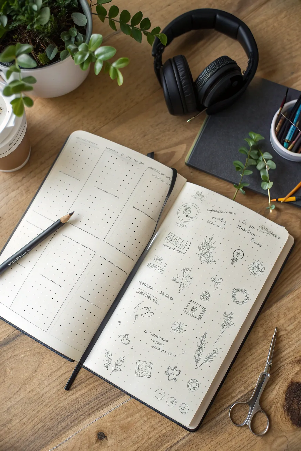
If you’ve ever stared down a blank spread and felt your brain go totally quiet, you’re not alone—I still get that sometimes. These art journal ideas are the kind of pages I lean on when I want something doable, satisfying, and full of room to be imperfect.
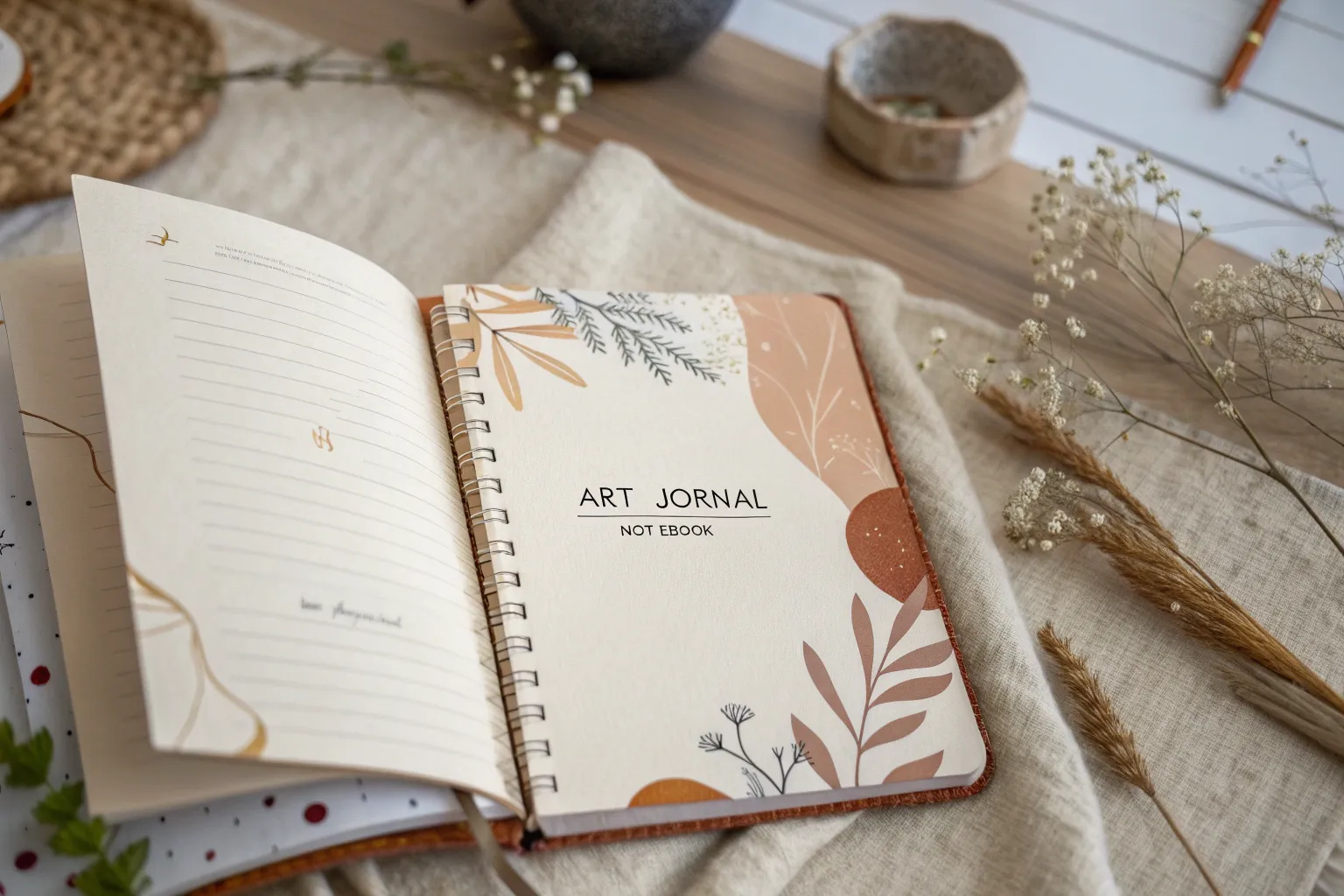
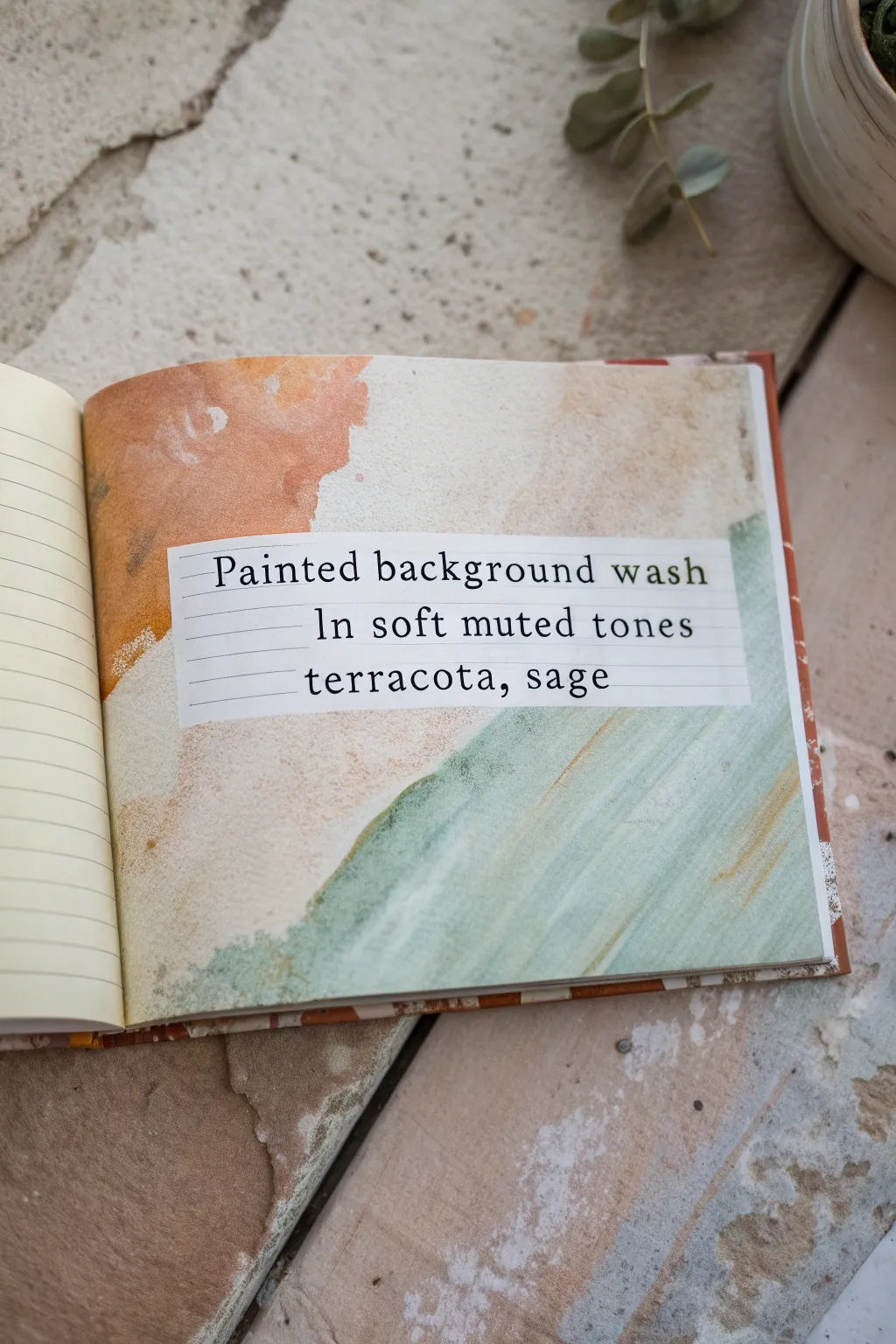
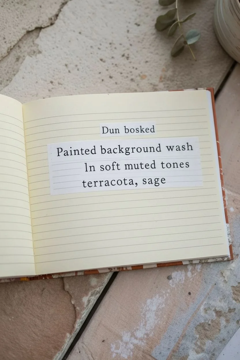
Watercolor Wash Background With Loose Writing
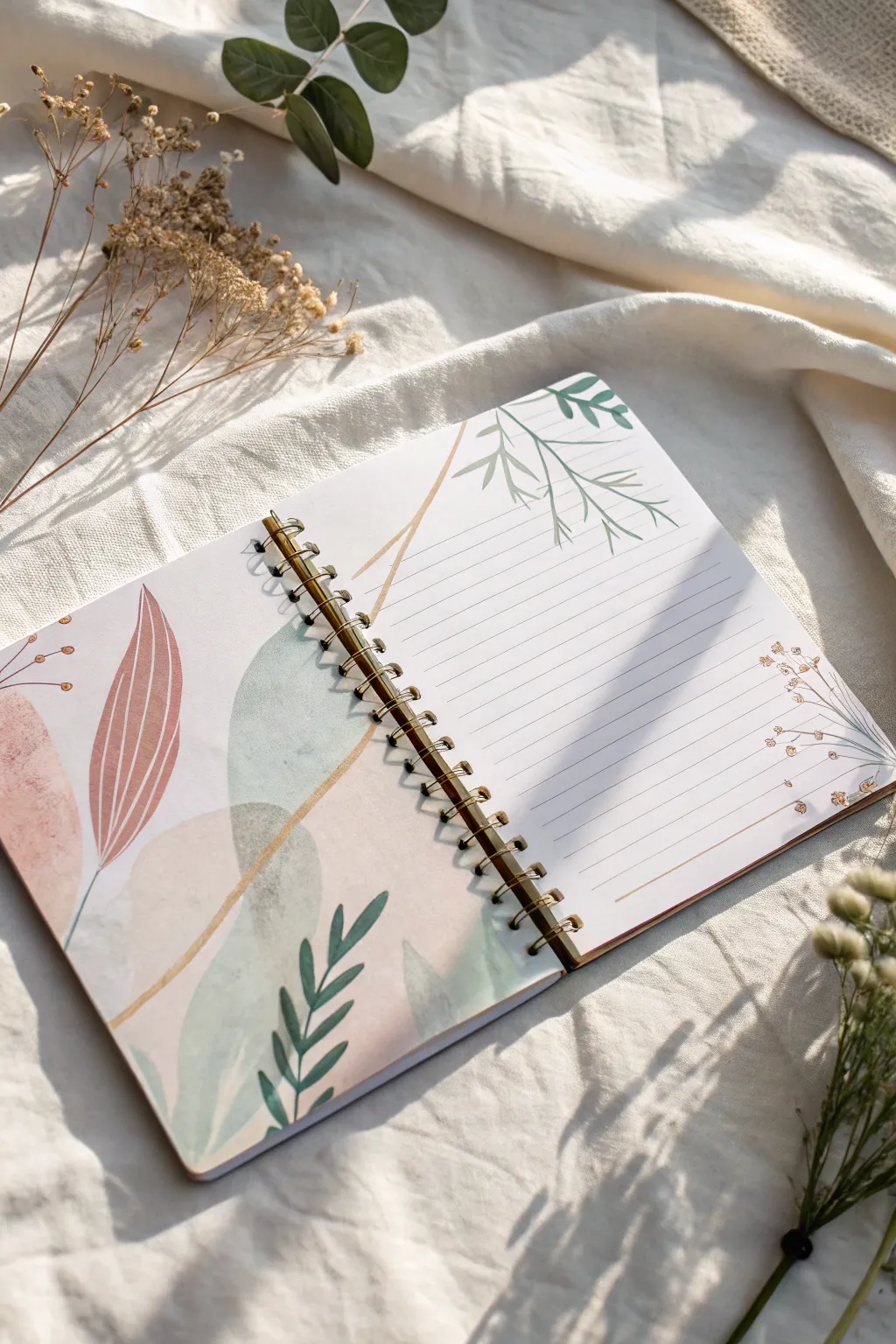
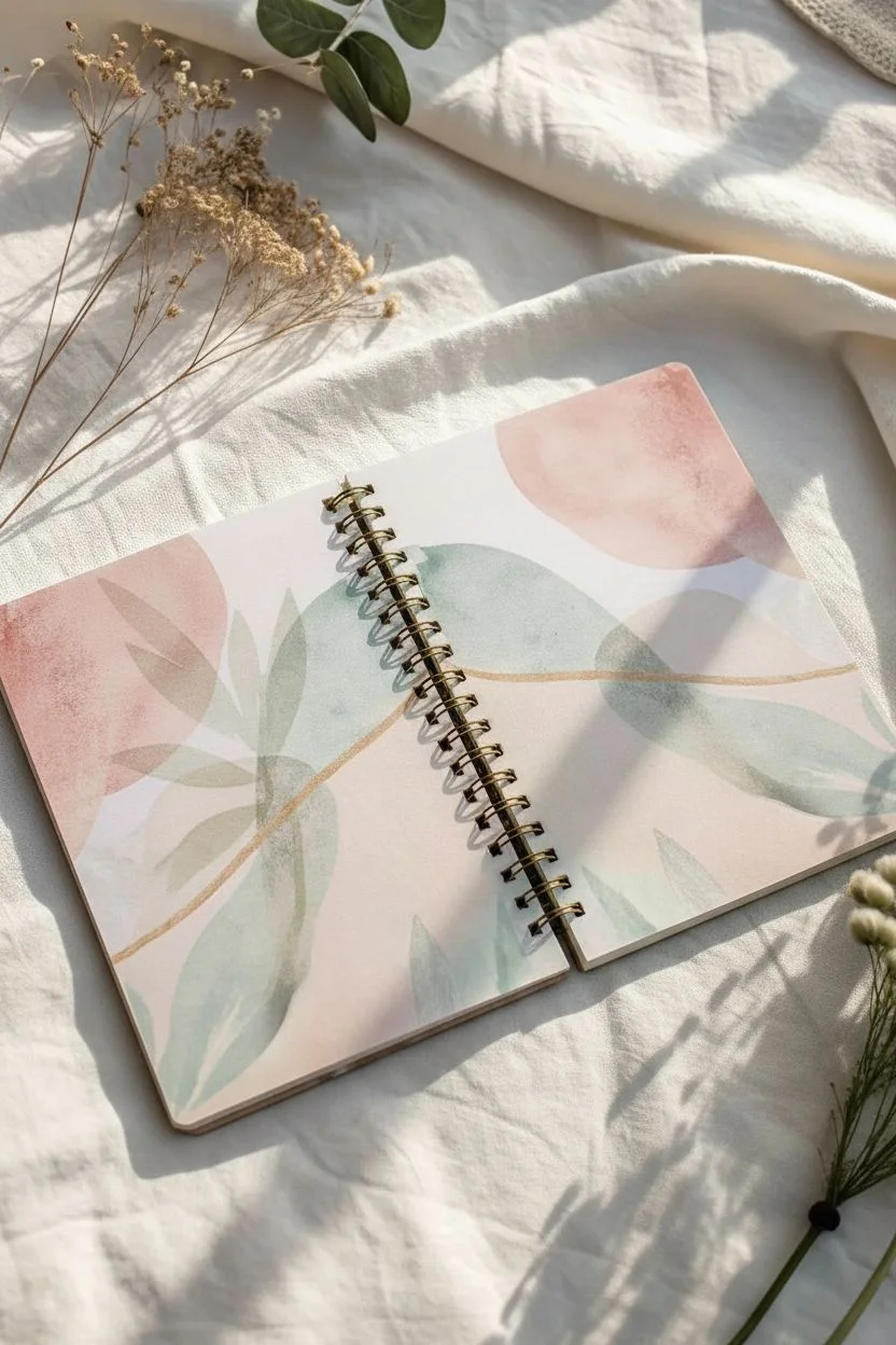
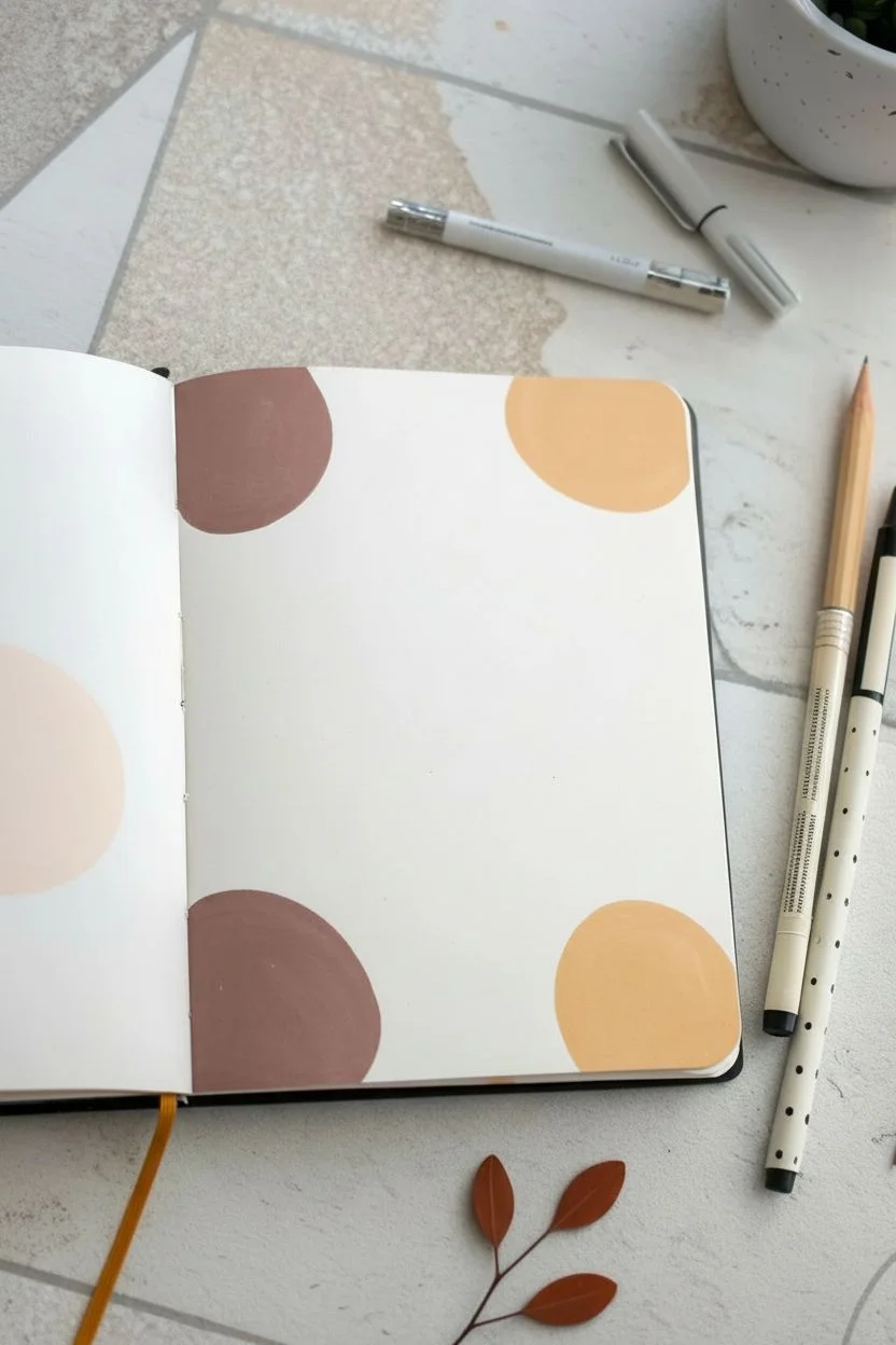
Create a serene, nature-inspired journal spread that blends soft watercolor washes with delicate line work. This project features a dreamy composition of abstract shapes and botanical elements that flow seamlessly across the spiral binding.
Detailed Instructions
Materials
- Spiral-bound mixed media or watercolor sketchbook
- Watercolor paints (muted pink, sage green, sandy beige, dark green)
- Round watercolor brush (size 6 or 8)
- Small detail brush (size 0 or 2)
- Fine liner pen (brown or archival black, 0.3mm)
- Ruler (optional)
- Gold gel pen or metallic watercolor (optional)
- Water cups and paper towels
Step 1: Painting the Abstract Background
-
Test your colors:
Before hitting the page, mix a dusty rose, a pale sage green, and a warm beige on your palette. Add plenty of water to create transparent, milky washes rather than opaque blocks of color. -
Lay the foundation:
On the left page, paint large, organic oval shapes using the beige and dusty rose mixtures. Let these shapes overlap slightly to create interesting transparency effects where the colors meet. -
Add soft foliage:
While the background shapes are drying, use your sage green mix to paint large, leaf-like swoops. These main phantom leaves should look like soft shadows behind the sharper details to come later. -
Extend the design:
Carry a subtle wash of the beige or rose color onto the left side of the right-hand page, creating a visual bridge across the spiral binding so the two pages feel connected.
Step 2: Adding the Botanical Details
-
Paint the main leaf:
On the left page, mix a stronger, more saturated teal-green. Paint a prominent branch with climbing leaves rising from the bottom edge, overlaying your dried abstract background washes. -
Create the pink focal point:
Using a slightly darker shade of your dusty rose, paint a large, stylized leaf shape on the left page. Leave a thin line of white negative space down the center to suggest the vein. -
Add trailing vines:
On the top of the right page, use a diluted green to paint light, airy botanical sprigs hanging down from the top edge. Keep these loose and gesture-like, ensuring they don’t interfere too much with the writing space. -
Let it dry completely:
This is crucial. Walk away for ten minutes or use a heat tool. If the paper is damp, your pen lines in the next step will bleed and feather.
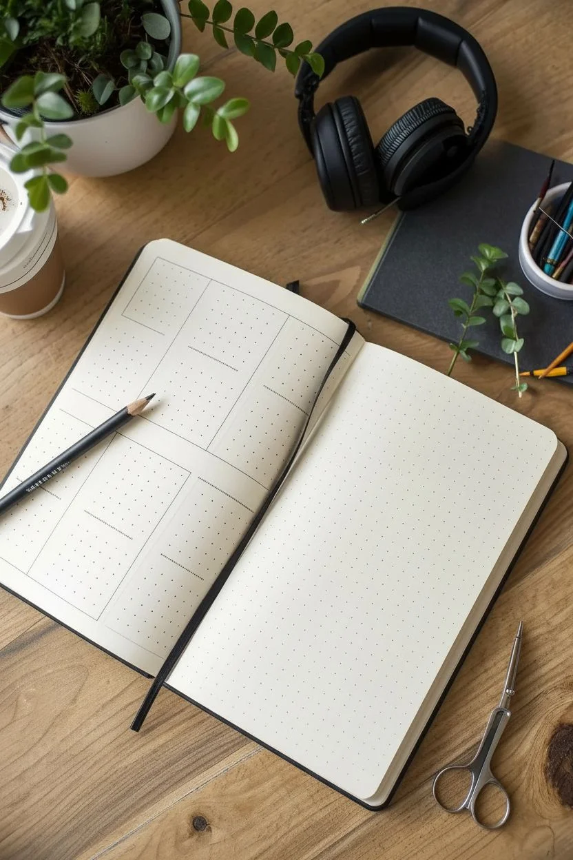
Clean Edges Trick
To get writing lines that look printed, put a sheet of lined paper underneath your sketching page as a guide, or lightly mark intervals with a pencil before committing to ink.
Step 3: Line Work and Structure
-
Draw delicate florals:
On the bottom right of the lined page, sketch tiny, clustered wildflowers using your fine liner pen. Keep the stems thin and fragile-looking. -
Add floating stems:
On the left page, draw a few thin, brown stems that extend into the air, adding small circles or ‘berries’ at the tips to fill empty negative space. -
Detail the leaves:
Use your fine pen to add central veins to the large abstract leaves you painted earlier. You don’t need to outline the whole shape; just a suggestive line up the middle adds enough definition. -
Create writing lines:
On the right page, use a ruler and the fine liner to draw horizontal writing lines. Start about a third of the way down the page, leaving the top watercolor area open for a title or date. -
Accent with gold:
If desired, take a gold gel pen or metallic watercolor and trace a single bold stem line weaving through your left-page composition for a touch of elegance.
Level Up: Mixed Media
Press actual dried flowers or small fern leaves between the pages for a few days, then glue them onto the spread to mix real nature with your painted version.
Now you have a beautifully custom space ready for your thoughts and daily reflections


Quote Page With Bold Hand Lettering

This minimalist art journal layout features distinct, organic color blocks that perfectly frame your favorite quote. The bold, hand-lettered focal point creates a modern and clean aesthetic that is surprisingly simple to achieve.
Step-by-Step
Materials
- Art journal or sketchbook with thick paper
- Gouache or acrylic paint (rust brown and mustard yellow)
- Round paintbrush (size 6 or 8)
- Black brush pen or calligraphy marker
- Pencil
- Eraser
- Palette or mixing surface
Step 1: Painting the Background Shapes
-
Prepare your colors:
Mix your paints to achieve a matte, opaque consistency. You want a warm rust brown and a soft mustard yellow. If using gouache, add just enough water to make it creamy like heavy cream. -
Outline the first brown shape:
Start with the rust brown paint. In the top-left corner of your right-hand page, paint the outline of a large, rounded quarter-circle or organic blob shape. -
Fill the top-left shape:
Fill in the outline you just created with the brown paint, ensuring smooth coverage so no brush strokes are visibly distracting. It doesn’t need to be a perfect circle; a slightly organic shape adds character. -
Create the bottom-left shape:
Using the same rust brown color, move to the bottom-left corner of the same page. Paint a similar sized rounded shape, creating a diagonal balance with the top one. -
Switch to yellow:
Clean your brush thoroughly. Pick up your mustard yellow paint and move to the top-right corner. Paint a rounded organic shape here, perhaps slightly smaller than the brown ones. -
Finish the background corners:
Paint the final shape in the bottom-right corner using the mustard yellow. When finished, you should have four blobs framing the center of the page. -
Optional left page accent:
If you want to carry the theme across the spread, paint a partial pale beige shape bleeding off the edge of the left-hand page for continuity. -
Let it dry completely:
Allow the paint to dry fully before moving on. Gouache and acrylic dry relatively fast, but patience here prevents smudging later.
Uneven Paint Coverage?
If your painted shapes look streaky after drying, apply a second thin layer of paint. Ensure the first layer is 100% dry before adding the second to avoid lifting the texture.
Step 2: Drafting the Lettering
-
Visualize the spacing:
Look at the negative white space in the center of your page. This is your canvas for the quote. -
Sketch guidelines:
Using a pencil and a very light touch, sketch three horizontal baselines where your text will sit. I like to keep the vertical spacing even, but slightly tight to keep the block of text cohesive. -
Pencil in the text:
Lightly sketch your quote in simple block capitals. For this project, write ‘QUOTE’ on the top line, ‘PAGE’ in the middle, and ‘CONCEPT’ on the bottom line. Center each word horizontally. -
Refine the letterforms:
Go back over your pencil sketch to thicken the downstrokes slightly or adjust the kerning (spacing between letters) so the layout feels balanced.
Step 3: Inking and Finishing
-
Trace the lettering:
Take your black brush pen or marker. Carefully trace over your pencil lines. Use firm, confident strokes to avoid wobble. -
Thicken the strokes:
To mimic the faux-calligraphy look, thicken the vertical ‘downstrokes’ of each letter. For example, the left and right sides of the ‘O’ and the vertical line of the ‘T’. -
Style the ‘Q’:
Give the tail of the ‘Q’ a playful, curved flourish that tucks underneath the letter slightly. -
Vary the heights:
Let the letters bounce slightly; for instance, the middle crossbar of the ‘E’ or ‘A’ can sit a bit lower or higher than center for a hand-drawn feel. -
Let the ink set:
Wait a few minutes to ensure the black marker is completely dry to the touch to prevent smearing during erasing. -
Erase pencil marks:
Gently erase any visible pencil guidelines. Be careful around the painted areas, as some erasers can pick up pigment from gouache. -
Final assessment:
Step back and check the balance. If the letters look too thin against the bold color shapes, thicken the lines just a tiny bit more.
Add Dimension
Use a white gel pen to add tiny highlights or doodle flowers inside the colored circles. Or, add a drop shadow to your black letters with a gray marker.
Your page is now ready to be filled with inspiring words surrounded by these joyful pops of color


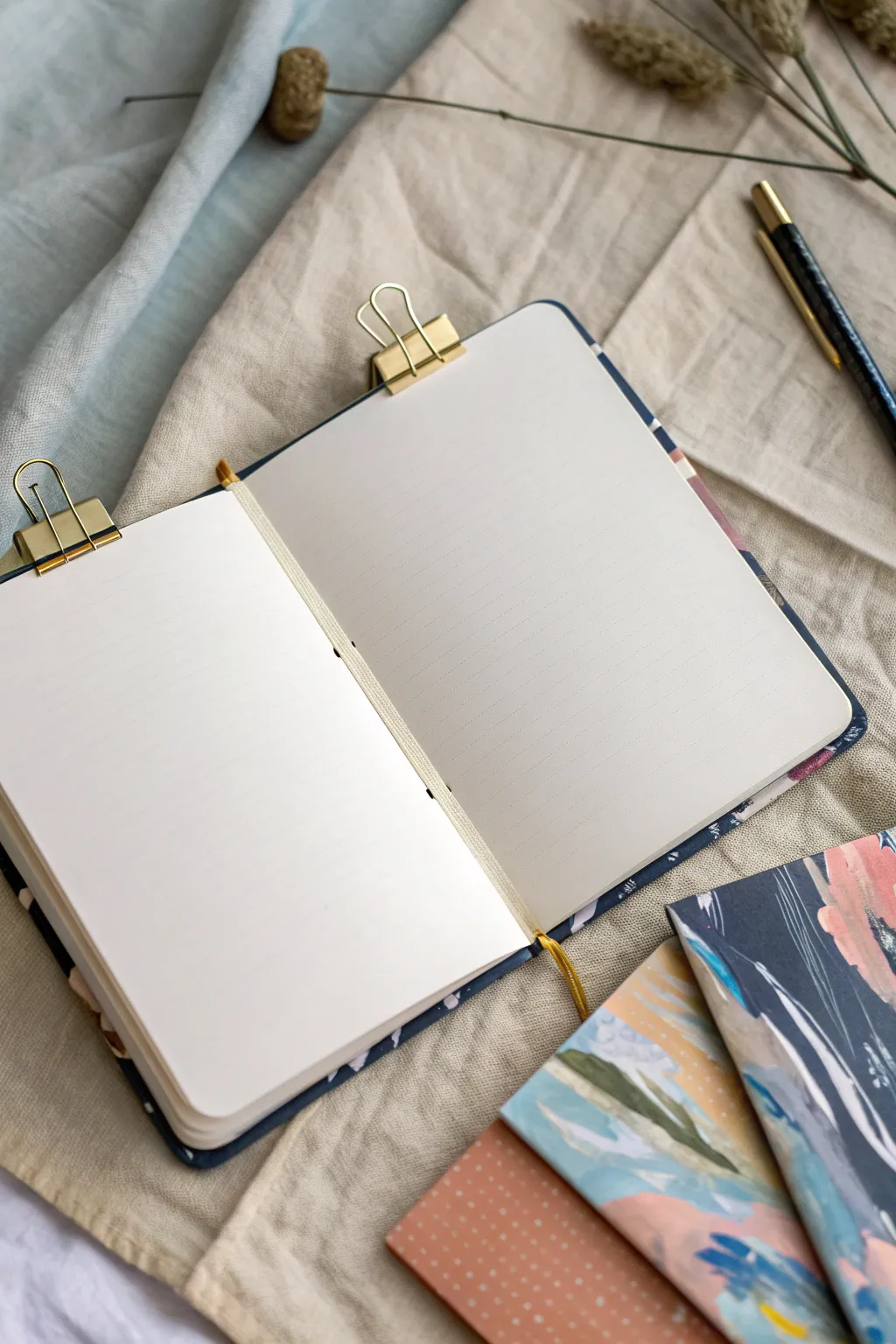
Collage Cluster With Ephemera and Captions
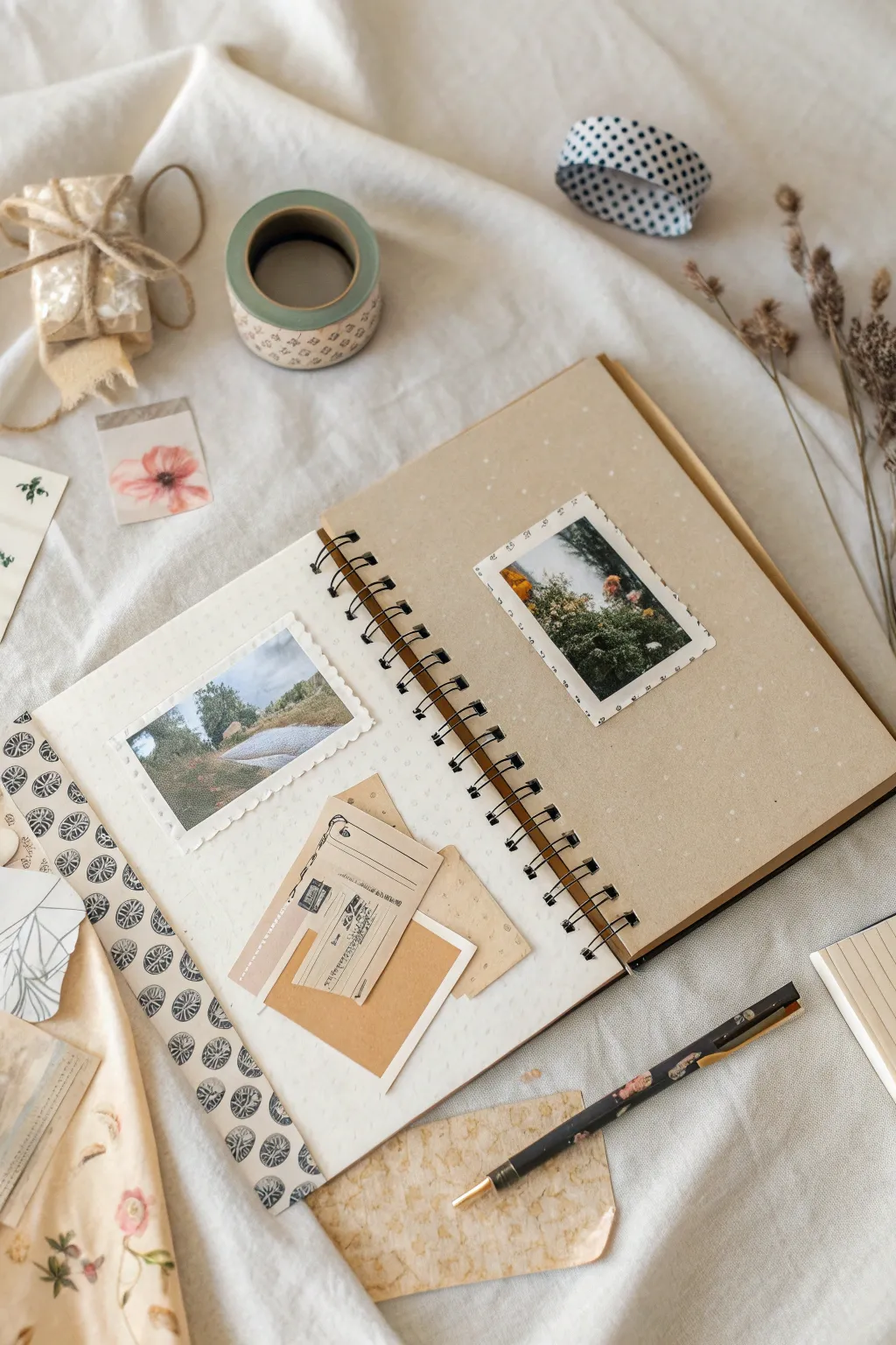
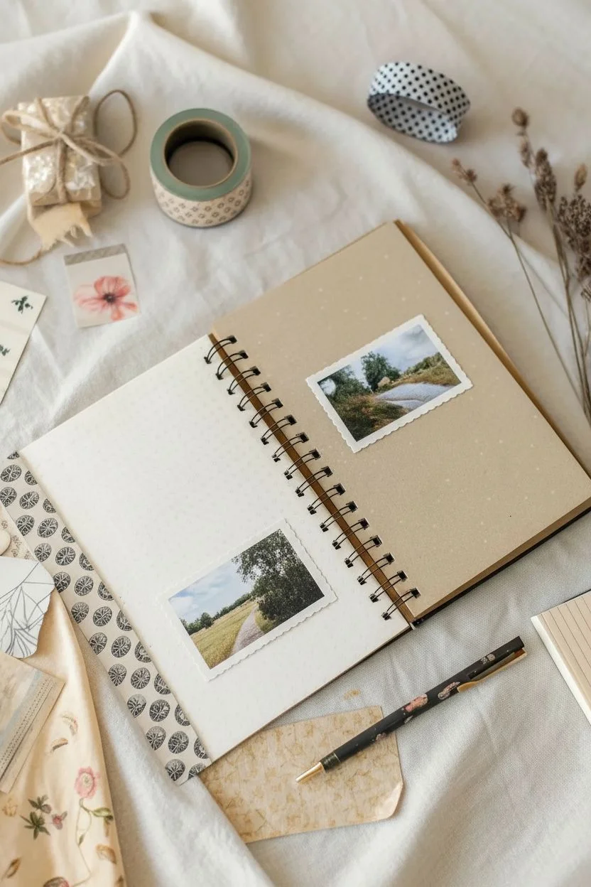
Capture the quiet beauty of a moment with this layered art journal spread that combines soft textures creating a nostalgic feel. By mixing vintage-style papers, scalloped photos, and subtle washi tape accents, you’ll create a harmonious design that feels both organized and organic.
How-To Guide
Materials
- Spiral-bound mixed media journal (white and kraft paper pages)
- Two landscape-oriented photographs (nature scenes)
- Decorative edge scissors (scalloped pattern)
- White gel pen (fine point)
- Vintage ephemera pack (tickets, aged paper scraps)
- Washi tape (patterned strips and solid colors)
- Adhesive roller or double-sided tape
- Kraft paper scraps
- Ruler
- Black fine-liner pen
Step 1: Planning the Spread
-
Select your base:
Begin with an open spiral-bound journal. Ideally, choose a section where a white page faces a kraft (brown) paper page to create a pleasing contrast between light and warm tones. -
Choose your focal points:
Select two photographs that share a similar color palette or mood. Landscape shots with greenery or muted colors work wonderfully for this natural aesthetic. -
Dry fit the arrangement:
Before gluing anything down, place your photos on the pages to test their positioning. Aim to place the left photo slightly lower on the page and the right photo slightly higher to create a dynamic diagonal flow.
Sticky Situation?
If your vintage papers are too brittle to glue flat without tearing, mount them onto a sturdy piece of cardstock first, then cut them out. This adds stability before gluing.
Step 2: Preparing the Photos
-
Create a scalloped edge:
Take your first photo—the one intended for the left page—and use decorative scissors to trim a white border around the image. Leave about a quarter-inch of white space to let the scallop shape stand out. -
Add a drawn border:
For the second photo on the kraft page, keep the edges straight. Instead of cutting, use a fine-point black pen to draw a faux-stitch or dashed border directly onto the white margin of the print. -
Mount the right photo:
Apply adhesive to the back of the right-hand photo. Center it vertically on the kraft page but shift it slightly toward the outer edge.
Step 3: Layering the Left Page
-
Form the paper cluster:
Gather 2-3 pieces of vintage ephemera, such as old tickets, grid paper, or torn kraft scraps. Arrange them in a messy stack where the corners peek out from behind one another. -
Adhere the background layers:
Glue these paper scraps down on the lower half of the left page. Position them so they will eventually sit just below your main photo. -
Place the main photo:
Adhere your scalloped photo above the paper cluster. Let the bottom edge of the photo overlap the top of your paper stack slightly to connect the elements. -
Add a final paper accent:
Take a small, rectangular piece of contrasting paper (like a mini envelope or card) and glue it on top of the cluster, tilting it slightly for a casual look.
Color Harmony Tip
Pick washi tape patterns that pull a specific color from your photographs. If your photo has green trees, a geometric monochrome or soft sage tape ties the spread together.
Step 4: Adding Details
-
Apply washi tape:
Run a long strip of patterned washi tape vertically down the far left edge of the white page. This acts as a border that frames the composition. -
Incorporate loose elements:
Using a small dab of glue or a tiny clip, attach a translucent vellum sticker or a flower cutout near the top left corner to balance the weight of the bottom cluster. -
Create texture with dots:
To mimic the look of the notebook shown, take your white gel pen and add tiny, random dots across the kraft page background. Keep them sparse to add meaningful texture without overwhelming the photo. -
Detail the tape:
If you have extra decorative tape, place a small spool or a few torn strips near the top of the workspace to suggest the creative process, or actually adhere a small tab of tape to the top of the left photo.
Enjoy the peaceful process of arranging these memories into a beautiful keepsake you can look back on


Mood Tracker Icons Turned Into a Painted Grid
Transform your daily mood tracking into a vibrant piece of abstract art with this gradient grid layout. Small, hand-drawn icons add a layer of personal symbolism without overwhelming the clean, colorful aesthetic.
Step-by-Step Tutorial
Materials
- Dotted or grid journal notebook (A5 size recommended)
- Ruler
- Pencil (HB or 2B)
- Black fine-liner or gel pen (for grid lines, optional)
- Watercolor paints or high-quality markers (yellow, orange, red, green, blue)
- White gel pen (0.8mm or 1.0mm tip)
- Small paintbrush (if using watercolor)
- Water cup and paper towel
Step 1: Setting the Structure
-
Measure the Page:
Start by measuring the usable width and height of your journal page to determine the best size for your squares. A 6×6 arrangement works perfectly for a standard month. -
Mark the Grid:
Use your pencil and ruler to mark out a grid of 36 squares (6 across and 6 down). Leave a small margin (about 2-3mm) between each square for a cleaner, tiled look. -
Lightly Pencil Lines:
Connect your marks to form the grid. Keep your pencil pressure very light so the graphite doesn’t smudge into the lighter paint colors later. -
Clean Up:
If you made any errors or heavy marks, use a kneadable eraser to lift the graphite until the lines are barely visible guidelines.
Ink Flow Tip
If your white gel pen stops writing over watercolor, wipe the tip gently on your finger or a damp cloth to remove paper dust or dried paint.
Step 2: Painting the Gradient
-
Plan the Color Flow:
Decide on your gradient direction. The example flows diagonally from warm yellows in the top left to cool blues and deep reds in the corners. -
Start with Yellows:
Mix a pale, buttery yellow watercolor. Paint the first few squares in the top left corner. Vary the saturation slightly between blocks for interest. -
Transition to Green:
Slowly introduce a touch of green to your yellow mix. Paint the squares cascading down the left side, moving from lime green to a deeper forest green near the bottom. -
Add the Blues:
Prepare a cool blue tone. Fill the middle-to-bottom section of the grid. I like to let the green and blue sections touch on a few squares to create a teal transition. -
Introduce Warm Reds:
On the far right side, paint the remaining blocks with deep terracotta, clay red, and maroon tones. This provides a strong contrast to the pale starting corner. -
Let it Dry completely:
This is crucial: allow the paint to dry completely. If the paper is damp, the white pen used in the next phase will tear the paper or fade out.
Adding Texture
Instead of icons, try using different hatch marks, stippling, or tiny geometric patterns in white ink to represent mood intensity levels.
Step 3: Adding the Icons
-
Choose Your Symbols:
Select simple symbols to represent different moods or activities. Hearts, clouds, moons, suns, and simple geometric shapes work best. -
Test the White Pen:
Scribble with your white gel pen on a scrap piece of dark paper to ensure the ink is flowing smoothly and opaque. -
Draw the Icons:
Begin drawing your icons in the center of the painted squares. Keep the lines simple and consistent in thickness. -
Use Negative Space:
Notice how some squares have filled icons (solid white hearts) while others are outline-only. Alternating these creates a nice visual rhythm. -
Add Solid Blocks:
Leave some blocks without icons, or fill them with simple pattern dots or dashes instead of a specific symbol. -
Final Touches:
Once the white ink is dry, check for any areas that need a second coat to make the white really pop against the darker paint colors.
Enjoy watching your month fill up with color and simple, expressive little drawings
BRUSH GUIDE
The Right Brush for Every Stroke
From clean lines to bold texture — master brush choice, stroke control, and essential techniques.
Explore the Full Guide
Gratitude List With Simple Doodles and Borders
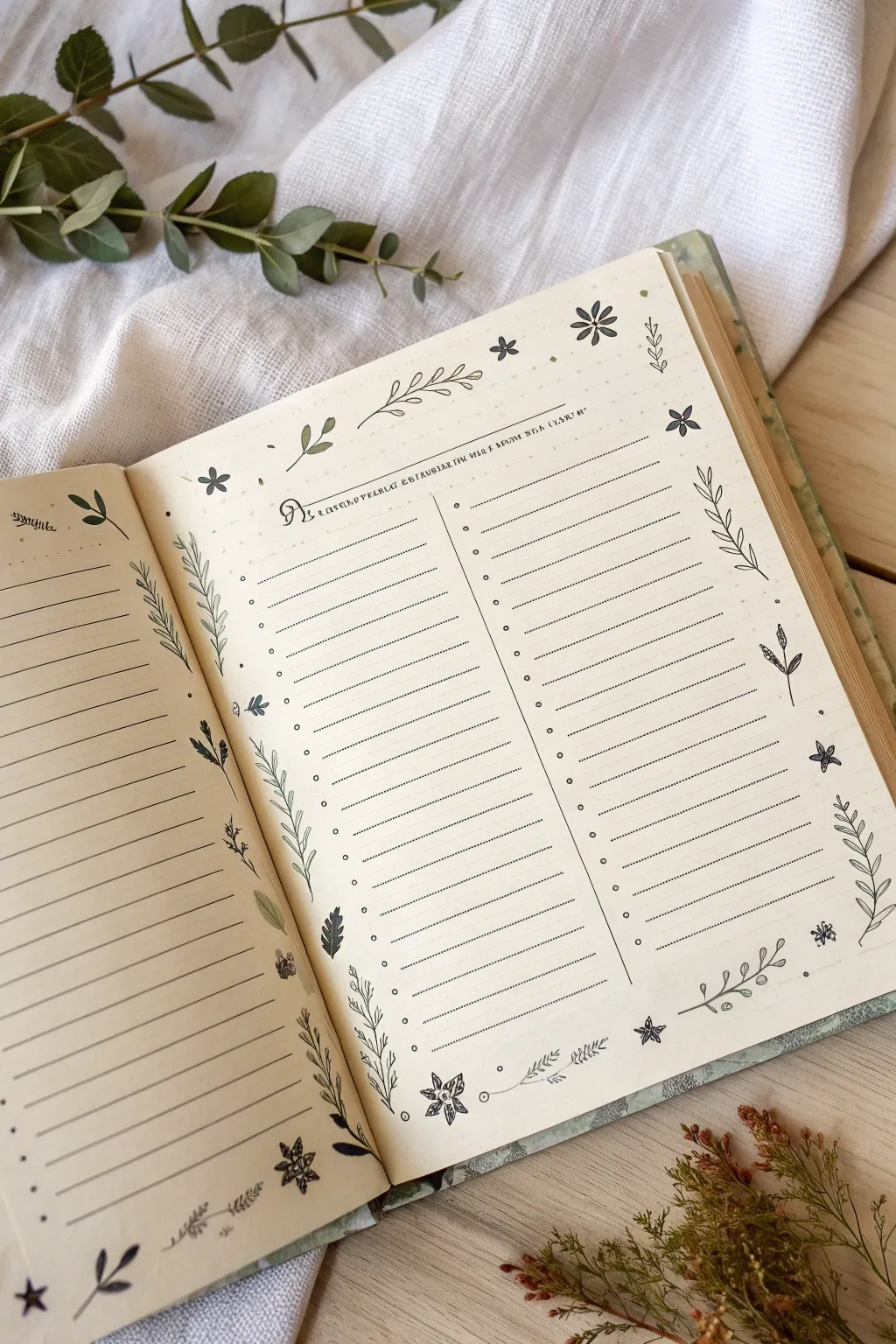
Embrace the calming practice of gratitude with this nature-inspired journal spread featuring delicate line art and structured list-making. The soft, minimalist aesthetic combines functional list columns with charming floral borders, making it perfect for documenting daily thanks or seasonal observations.
How-To Guide
Materials
- A5 or B5 Art Journal (blank or dotted pages preferred)
- Fine liner pen (black, 0.3mm or 0.5mm)
- Ruler
- Pencil and eraser
- Clear plastic blending mat or ruler edge (for spacing)
- Optional: Pale green marker or watercolor for subtle accents
Step 1: Planning the Layout
-
Mark the margins:
Begin by lightly penciling a 1-inch border around the outer edges of your right-hand page. This will serve as the dedicated space for your floral doodles later. -
Divide the page:
Find the vertical center of the right page and draw a light pencil line from top to bottom to separate your two list columns. Leave a small gap (about 1 cm) in the very middle to keep the lists distinct. -
Header spacing:
Measure about 1.5 inches down from the top of the page. Draw a horizontal guideline here—this space will house your title and decorative header elements.
Ink Smudges?
If your ruler smears the ink while drawing lines, tape a penny to the underside of the ruler. This raises the edge off the paper, preventing ink drag.
Step 2: Drawing the Structure
-
Inking the columns:
Using your ruler and fine liner, draw a solid vertical line down the center of the page, stopping just short of your floral border area at the top and bottom. This anchors the two lists. -
Creating the list lines:
On the right page, draw horizontal lines within your two columns using the fine liner. Space them approximately 0.5 cm apart. You can make these lines dotted or dashed for a softer look, or keep them solid as shown in the reference. -
Adding bullets:
Place a small, open circle or distinct dot at the start of each line on the left side of both columns. These bullet points help organize your entries neatly. -
Mirroring the left page:
For the left-hand page, extend the horizontal writing lines across the entire width, leaving a similar margin on the outer edge for doodles. I usually prefer to match the line spacing exactly to the right page for visual harmony.
Step 3: Adding the Botanical Details
-
Top border header:
At the very top of the right page, draw a few simple, loose leaves floating horizontally. Add a small text header like ‘Gratitude’ or a date in a small, serif font centered above the columns. -
Corner anchors:
Start your doodles by drawing larger floral elements in the four corners of the page spread. Try a simple five-petal flower or a sprig with opposite leaves to anchor the design. -
Vine borders:
Along the vertical outer margins, draw long, curving texturized lines to represent stems. Allow some to curve inward toward the text and others to sway outward. -
Leaf variations:
Populate your stems with a variety of leaf shapes. Mix standard almond-shaped leaves with fern-like fronds and tiny rounded buds to keep the eye interested. -
Filler flowers:
Scatter small, simple icons between the larger vines. Draw tiny six-pointed stars, miniature daisies, and single floating leaves to fill empty negative space without overcrowding it. -
Bottom border finish:
Repeat the horizontal vine motif along the bottom edge of the page. This ‘frames’ your list effectively. Add a slightly larger flower cluster in the bottom center for balance.
Go Vintage
Pre-stain your paper with strong tea or coffee before drawing. The tan, crinkled texture creates an immediate antique naturalist field-guide aesthetic.
Step 4: Refining and Finishing
-
Erase guidelines:
Wait for the ink to become completely dry to the touch. Gently erase all your initial pencil markings, being careful not to smudge the fine lines. -
Add texture marks:
Go back in with your pen and add tiny details: a central vein in the larger leaves, small dots in the flower centers, or little stipple dots around the border to add depth. -
Optional accent color:
If you wish, use a very pale green marker to color in just a few selected leaves. Keep it desaturated to maintain the vintage, minimal feel of the spread. -
Final check:
Scan the page for any gaps in your border that feel too empty and add a tiny floating seed or dot to balance the composition.
Fill your new columns with things you are thankful for and enjoy the peaceful simplicity of your design
“Currently” Page With Little Sketches of Your Week
Capture the fleeing moments of your week with this charming ‘Currently’ layout, combining structure with free-flowing creativity. This spread pairs a neat, grid-based planner page on the left with a playground of tiny, meaningful sketches on the right to document memories, meals, and moods.
Step-by-Step Guide
Materials
- A5 Dot grid journal (cream or ivory paper recommended)
- Black fine liner pen (0.3mm or 0.5mm)
- Graphite pencil (HB or similar)
- Ruler
- Eraser
Step 1: Structuring the Planner Page
-
Define the grid:
On the left-hand page, start by mentally dividing the space into six equal sections. Use your ruler to lightly mark these divisions with a pencil first to ensure symmetry. -
Draw the main dividers:
Using your fine liner, draw two vertical lines and one horizontal line to create a 2×3 grid of boxes. Leave a small margin around the outer edges of the page for a clean look. -
Add detail boxes:
Within the top two rectangular sections, draw smaller internal boxes or headers. These will serve as specific trackers or date headers later. -
Create the lower grid:
For the bottom left section, draw a distinct internal boundary line. This creates a dedicated ‘notes’ or ‘focus’ area separate from the daily logs. -
Erase guidelines:
Once your ink is completely dry, gently erase the initial pencil markings to reveal a crisp, clean layout.
Ink Smearing?
If your fine liner smears when you erase pencil lines, switch to a pigment-based archival ink pen and wait at least 5-10 minutes before erasing guidelines.
Step 2: Sketching the ‘Currently’ Page
-
Scatter logical groupings:
Move to the right page. Visualize where you want clusters of drawings. I like to start near the center and work outward to prevent overcrowding one corner. -
Draw botanical elements:
Sketch a few small sprigs of pine or leaves. Use short, quick strokes to mimic needle textures or leaf veins. -
Add daily objects:
Incorporate small icons representing your week, like a tiny coffee brewing setup, a stamp, or a wrapped gift. Keep the lines simple and illustrative rather than realistic. -
Include framed memories:
Draw small rectangular or square frames, then sketch a tiny symbol inside, like a rose or a landscape. This represents a ‘snapshot’ of a memory. -
Incorporate varied icons:
Add diverse shapes like a small ice cream cone, a pretzel, or a circular diagram. Varying the scale of these items makes the page feel dynamic. -
Sketch floral details:
Fill empty gaps with single flowers or wreaths. A simple five-petal flower or a circle of leaves adds softness to the layout.
Step 3: Adding Text and Finishing Touches
-
Write whimsical headers:
Next to your sketches, add small captions or headers in a loose, cursive script. Phrases like ‘music’ or ‘eating’ work well to label your doodles. -
Add descriptive notes:
Underneath specific drawings, write 2-3 lines of tiny print text describing the event. Keep the handwriting small to match the delicate nature of the sketches. -
Apply shading:
Use your pencil to add very subtle shading to the sketches. A light smudge of graphite on one side of a frame or leaf gives the flat doodles a bit of dimension. -
Balance the white space:
Step back and look at the page. If there are large empty spots, fill them with tiny dots or stippling to connect the disparate elements without adding clutter.
Add Subtle Color
Use colored pencils to add a single pop of color—like sage green for the plants or pale yellow for lights—to keep the minimalist vibe while adding warmth.
You now have a beautifully personalized snapshot of your week ready to be filled with memories

PENCIL GUIDE
Understanding Pencil Grades from H to B
From first sketch to finished drawing — learn pencil grades, line control, and shading techniques.
Explore the Full Guide
Botanical Study Spread With Labels and Notes
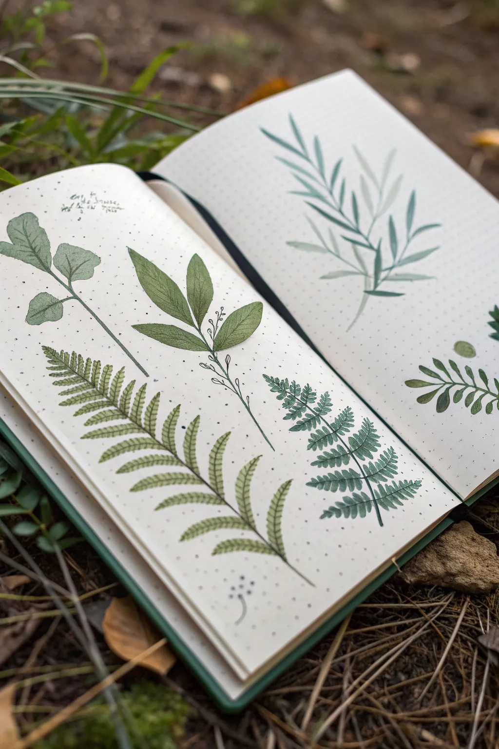
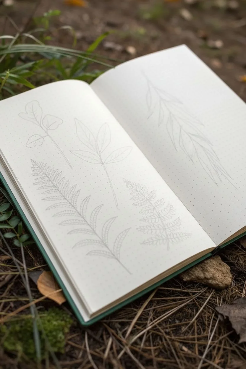
Capture the delicate details of forest flora with this serene botanical study spread. Using gouache or watercolor on dotted grid paper creates a lovely blend of scientific observation and artistic interpretation.
Step-by-Step
Materials
- A5 dotted grid journal (heavyweight paper recommended)
- Set of gouache or high-quality watercolor paints
- Round synthetic brushes (Size 0 for details, Size 2 and 4 for leaves)
- Pencil (HB or H)
- Fine liner pen (dark green or black, 0.1mm)
- Mixing palette
- Water cups and paper towels
- Reference photos of ferns and leaves (or real specimens)
Step 1: Planning the Composition
-
Lightly sketch the layout:
Begin by observing your blank spread. Using your HB pencil, very faintly sketch the central spines or stems of your plants to establish the flow. Place a large fern frond curving across the bottom left page and a vertical leafy stem above it. -
Outline the leaf shapes:
Around your stem guidelines, lightly draw the basic shapes of the leaves. For the fern, mark the length of the pinnules (the small leaflets) so they taper naturally towards the tip. -
Plan the right page:
On the opposite page, sketch a taller, more willow-like plant structure that reaches from the bottom center towards the top corners to balance the spread.
Bleed-Through Blues?
If your journal paper is thin (under 100gsm), gouache is safer than watercolor as it uses less water. Place a scrap sheet under the page while painting.
Step 2: Painting the Base Layers
-
Mix your first green:
Create a muted olive green by mixing sap green with a touch of yellow ochre and white gouache. This will be the base color for the broad-leafed plant on the top left. -
Paint the broad leaves:
Using a size 4 brush, fill in the sketched leaf shapes. If using gouache, aim for an opaque, flat layer. If using watercolor, keep it translucent but even. -
Mix a vibrant fern green:
For the large fern, mix a brighter, fresher green—hooker’s green mixed with lemon yellow works well here. -
Paint the fern fronds:
Switch to a size 2 brush. Starting from the stem, paint each small leaflet with a single confident stroke, pressing down and lifting up to create a tapered point. -
Create a cool-toned mix:
For the plant on the right page, mix a blue-green or teal shade by adding a little phthalo blue or turquoise to your basic green mix. -
Paint the right-side foliage:
Using long, fluid strokes with your size 2 brush, paint the slender leaves. Let the brush create the shape by varying pressure—light at the start, heavy in the middle, and light at the tip.
Step 3: Adding Details and Depth
-
Add vein details:
Once the broad leaves on the left generally dry, mix a slightly darker version of your olive green. Use a size 0 brush to paint a central vein and delicate branching veins. -
Shade the fern:
Dilute a dark green paint to create a glaze. Lightly run this along the central spine of the fern and at the base of the leaflets to add dimension and mimic the shadow of the forest floor. -
Layering the second fern:
Paint a darker, smaller fern tucked beside the first one using a deep forest green. This contrast makes the main fern pop forward. -
Refining stems:
Go back over your main stems with a steady hand and a size 0 brush, ensuring they connect seamlessly to the leaves.
Pressed Flower Effect
For a mixed-media twist, glue a real pressed wildflower onto the page alongside your painted studies to blur the line between art and nature.
Step 4: Inking and Finishing Touches
-
Fine line accents:
If you want a more illustrative look, use your fine liner to add tiny dots or ‘stippling’ near the base of the stems or to outline specific sections for emphasis. -
Add botanical notes:
In the negative space around the plants, use a small, neat handwriting style to add scribbled ‘field notes’ or labels. These don’t need to be legible text; squiggly lines mimicking text often look more artistic. -
Splatter texture:
I like to load a toothbrush or stiff brush with diluted dark green paint and flick it gently over the pages to create a speckled, organic texture. -
Erase guidelines:
Wait until the paint and ink are completely bone-dry. Gently erase any visible pencil marks to clean up the spread.
Now you have a tranquil botanical record to flip through whenever you need a moment of calm
Celestial Night Sky With Ink Stars and Journaling
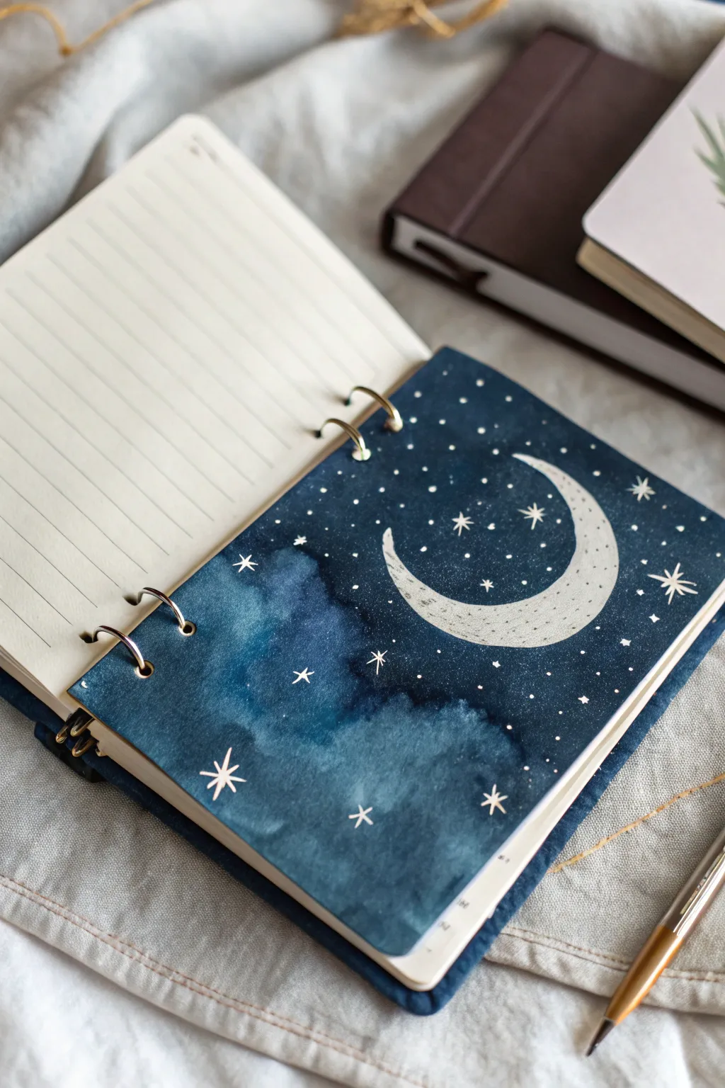
Transform a plain journal page into a dreamy window to the cosmos with this celestial watercolor project. The deep, moody blues create a perfect backdrop for bright metallic or white ink stars, bringing a touch of magic to your daily entries.
Detailed Instructions
Materials
- Heavyweight watercolor paper or mixed-media paper (sized to your journal)
- Watercolor paints (Indigo, Prussian Blue, Black)
- White gouache or white gel pen
- Silver or gold metallic ink/paint pen
- Pencil and eraser
- Round watercolor brushes (size 6 and size 2)
- Hole punch (if adding to a ring binder)
- Clean water and paper towels
- Painter’s tape or masking tape
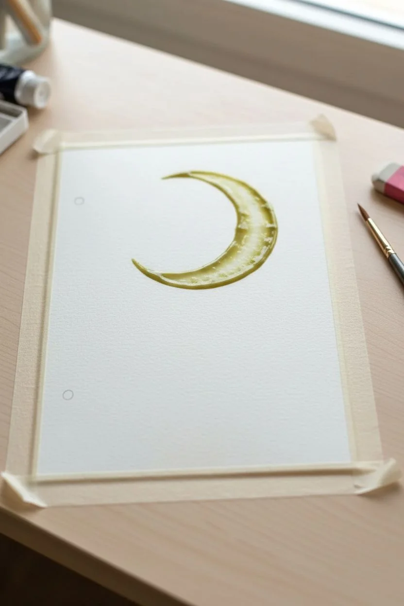
Step 1: Preparation and Sketching
-
Paper Preparation:
Cut your watercolor paper to the exact dimensions of your journal pages. If you are inserting this into an existing ring binder, measure the hole placement now but don’t punch them just yet. -
Secure the Page:
Tape the edges of your paper down to a flat surface using painter’s tape. This prevents the paper from buckling when we add the wet washes later. -
Sketch the Moon:
Lightly draw a crescent moon shape in the upper right quadrant of the page. Make the crescent slightly thicker in the middle and tapered at the ends. -
Masking the Moon:
If you have masking fluid, apply it carefully over your moon sketch. If not, simply be very mindful to paint around this shape in the next steps to keep the paper white.
Step 2: Painting the Atmosphere
-
First Wash:
Wet the entire paper (avoiding the moon) with clean water. Drop in a light wash of Prussian Blue to establish a base tone. -
Deepening the Blues:
While the paper is still damp, load your brush with Indigo. Start applying it near the edges and corners, letting it bleed inward to create a vignette effect. -
Creating Clouds:
To get that cloudy texture shown in the bottom left, lift some pigment out while it’s wet using a thirsty brush or a crumpled paper towel. Alternatively, dab in a slightly lighter blue mix. -
Adding Depth:
Mix a tiny amount of black into your Indigo. Apply this darkest shade to the very outer edges and the space furthest from the moon to create high contrast. -
Smooth the Transitions:
Use a clean, damp brush to soften any hard edges between your light and dark blue areas, ensuring the sky looks seamless and atmospheric. -
Drying Time:
Allow the background to dry completely. This is crucial before adding details.
Bleeding Edges?
If paint seeps under your tape, use a slightly thicker white gouache mixture to paint a clean border over the mistake, or trim the paper slightly smaller.
Step 3: Celestial Details
-
Filling the Moon:
If you used masking fluid, rub it off now. Paint the moon carefully with white gouache. You can water it down slightly for a translucent look or keep it opaque. -
Moon Texture:
Once the white base is dry, use a very fine brush and a diluted grey wash to add tiny dots and faint curves to the moon, mimicing craters. -
Primary Stars:
Using a white gel pen or a fine brush with white gouache, draw several large, eight-pointed stars scattered across the page. Focus on the darker areas for better contrast. -
Secondary Stardust:
I like to fill the empty spaces with tiny dots and smaller four-pointed stars. Vary the pressure to make some stars look brighter than others. -
Metallic Accents:
Take your silver or gold metallic pen and trace over a few of the larger stars to give them a subtle shimmer that catches the light. -
Finishing Touches:
Once everything is fully dry, carefully peel off the tape. Use your hole punch to align the holes with your journal rings and snap the new page into place.
Constellation Magic
Personalize the sky by arranging your smaller stars into real constellations like Cassiopeia or Orion, or map out your own zodiac sign.
Now you have a stunning, hand-painted divider that adds a peaceful night-time atmosphere to your journal collection


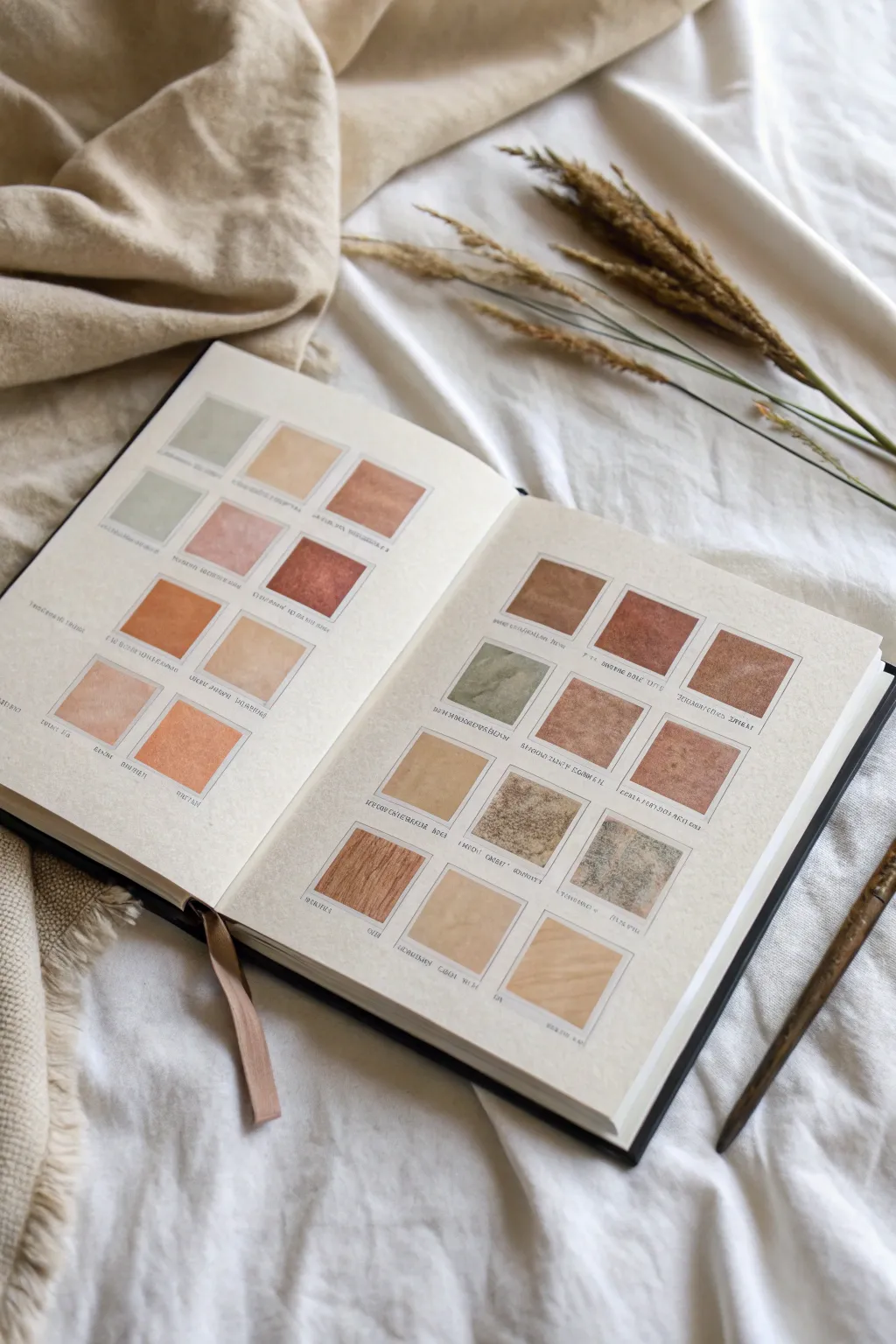
Color Palette Page With Swatches and Feelings
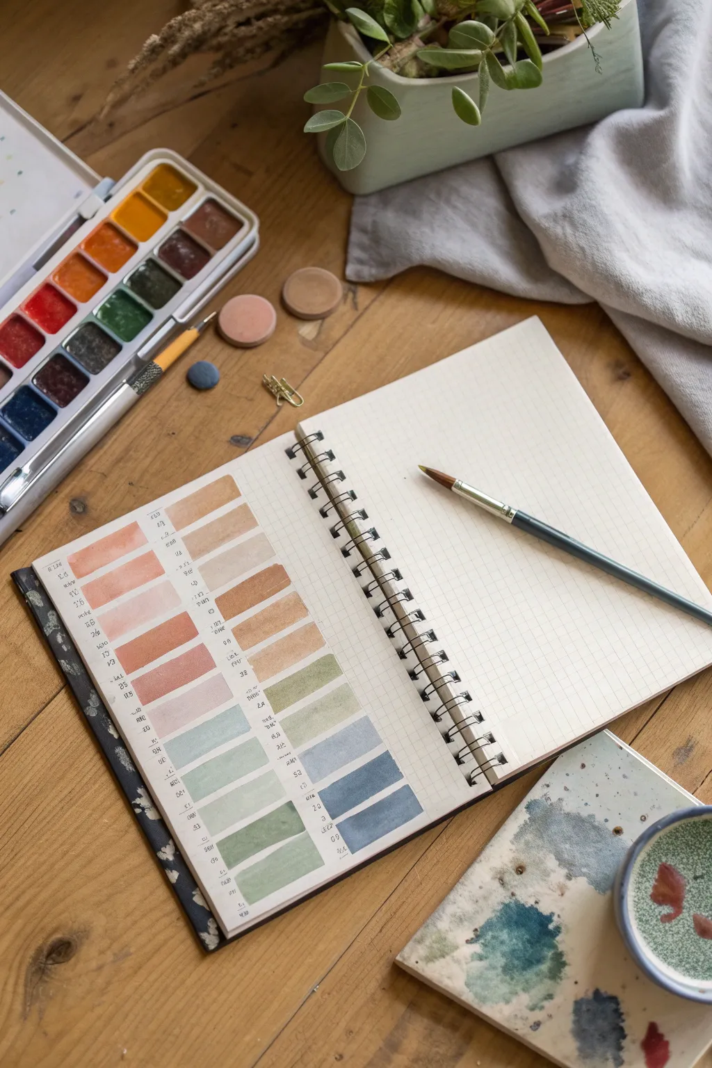
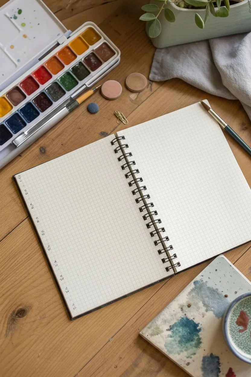
Transform a simple grid page into a visually satisfying reference tool by cataloging your watercolor mixes. This organized layout showcases a gradient of warm earthy tones transitioning into cool slate blues and mossy greens, creating a calming visual anchor for future projects.
Step-by-Step Tutorial
Materials
- Spiral-bound notebook with grid or dot grid paper
- Watercolor pan set (featuring earth tones, ochres, blues, greens)
- Round watercolor brush (size 4 or 6)
- Fine-point black liner pen (0.1mm or 0.3mm)
- Small jar of water
- Paper towel
- Ruler (optional)
Step 1: Planning the Layout
-
Assess your page:
Open your notebook to a fresh spread. Since we are using grid paper, identify the vertical lines that will serve as the left-hand guides for your two main columns of swatches. -
Define the columns:
Visualize two distinct columns. The left column will house your warm, skin-tone, and terracotta shades, while the right column will hold the cooler greens and blues. Leave a generous margin between them for a clean look. -
Set text guides:
Using your fine liner pen, create tiny text markers along the left edge of where your color blocks will go. These small scribbles act as placeholders for color names or mixing ratios later.
Step 2: Painting Warm Tones
-
Mix the first peach:
Load your brush with water and pick up a light wash of ochre mixed with a touch of red. You want a pale, peachy skin tone for the top left swatch. -
Apply the first swatch:
Paint a rectangular block, roughly 1.5 inches wide and 0.5 inches tall. Use the grid lines to keep the edges relatively straight, but allow the natural watercolor texture to show. -
Darken the mix:
Add a tiny bit more pigment to your existing puddle—perhaps a burnt sienna—to create a slightly deeper, warmer tan color. -
Continue the gradient:
Paint the next rectangular block directly below the first, leaving one or two grid rows of white space between them to prevent bleeding. -
Introduce terracotta:
Transition into reddish-browns. Mix burnt sienna with a touch of red oxide to create a rich terracotta shade for the middle of the left column. -
Ending with earth:
Finish the left column by moving into deeper browns. Your final swatches should be a dark umber or chocolate tone to ground the warm gradient.
Control the Bleed
Work top-to-bottom. If you’re right-handed, consider painting the left column first so your hand doesn’t smudge wet paint while working on the right side.
Step 3: Painting Cool Tones
-
Clean your brush:
Rinse your brush thoroughly. You don’t want any muddy brown residue contaminating the fresh greens and blues of the second column. -
Start with sage:
Begin the right-hand column (aligned horizontally with the bottom half of the left column) using a pale, desaturated green. Mix clear water with sap green and a dot of grey. -
Shift to slate:
As you move down the column, add a cool blue to your green mix. The goal is a dusty blue-green or slate color for the next few rectangles. -
Deepen the blue:
Add indigo or Payne’s grey to the mix. Paint the lower rectangles with this deeper, moodier blue tone, maintaining the same spacing as the first column. -
Complete the palette:
For the final swatches at the bottom, use your strongest, most pigmented blue-grey mix to create a bold finish to the page.
Wrinkled Paper?
Standard notebook paper isn’t sized for watercolor. Use very little water (a ‘dry brush’ technique) to minimize buckling, or embrace the crinkle as part of the journal aesthetic.
Step 4: Finishing Touches
-
Let it dry:
Wait for all paint swatches to be completely dry to the touch. The paper may buckle slightly depending on its weight, which adds character. -
Add notations:
Go back to your small text scribbles on the left of each swatch. Ensure they are legible if you wrote color names, or simply add small aesthetic marks to mimic the look of a color chart. -
Flatten the page:
If the paper has curled significantly from the water, you can gently close the book with a heavy weight on top overnight to smooth it out.
Now you have a serene reference page that serves as both a color guide and a piece of abstract art in itself
Pattern Play Spread With Repeating Marks and Lines
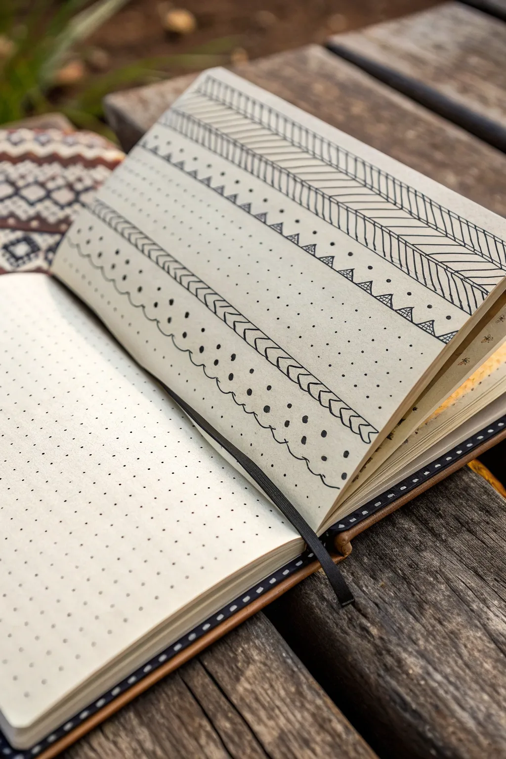
Embrace the meditative quality of repetitive mark-making with this striking black-and-white pattern spread. Using simple geometric shapes and variated line weights, you’ll transform a standard dotted page into a texture-rich tapestry of designs that feels both structured and organic.
Step-by-Step Guide
Materials
- Dotted notebook or bullet journal
- Fine liner pen (01 or 03 nib)
- Thick felt-tip pen or marker (08 nib or brush pen)
- Ruler (optional but helpful for straight lines)
- Pencil and eraser
Step 1: Planning and Structure
-
Define the Bands:
Start by lightly sketching horizontal guidelines across your page with a pencil. Vary the width of these bands—make some wide for complex patterns and others narrow for simple borders. Aim for about 5-6 distinct horizontal sections. -
Secure the Page:
Since you’ll be drawing near the spine, use a binder clip or hold the page flat with your non-dominant hand to ensure your horizontal lines don’t curve unintentionally as they approach the center.
Restless Hand?
If your straight lines are coming out shaky, try exhaling steadily as you draw the line. Moving your arm from the shoulder rather than just the wrist also helps stabilize long strokes.
Step 2: The Chevron Header
-
Draw the Top Border:
For the topmost band, use your fine liner to draw a series of diagonal lines slanting downward from left to right. Keep the spacing consistent, using the grid dots as a guide. -
Complete the Herringbone:
Draw a second set of diagonal lines slanting apart from the first set to create a herringbone or chevron effect. Ensure the points meet neatly. -
Add Vertical Definitions:
Enclose this chevron pattern by drawing straight horizontal lines above and below it. I find adding a second, slightly thicker line right next to the first adds a nice graphical weight.
Add a Pop
Use a metallic gold or silver gel pen to fill in specific shapes (like the inner triangles or select dots) for a touch of elegance that catches the light.
Step 3: Geometric Details
-
Triangle Rows:
In the next band down, draw a row of small, equilateral triangles sitting on a baseline. Leave a little bit of breathing room between each shape. -
Double the Triangles:
Draw a smaller triangle inside each of the larger ones. This ‘nested’ look adds instant complexity without much effort. -
Connect with Dots:
Place a single, solid black dot between the peaks of each triangle to tie the row together visually.
Step 4: Stippling and Textures
-
Create a Stippled Field:
Dedicate a wide middle section to a simple stippling pattern. Using your fine liner, rhythmically tap dots across the band. Keep them somewhat random but evenly distributed so no area looks too heavy. -
Draw the Braided Border:
Below the stippled area, create a ‘braided’ arrow pattern. Draw a horizontal line of contiguous `>` shapes (chevrons pointing right). -
Close the Shapes:
Connect the open tips of the chevrons back to the main line to form a row of sideways triangles or arrowheads. -
Add Inner Lines:
Draw small parallel lines inside each arrowhead to mimic shading or texture.
Step 5: scallops and Heavy Dots
-
Draw the Wavy Line:
For the next section, draw a loose, organic scalloped line. Let it dip and rise gently across the page. -
Echo the Wave:
Draw a second wavy line directly underneath the first, following its curves closely to create a double-line effect. -
Add Floating Dots:
Above the waves, switch to your thicker marker. Place bold, heavy dots that float in the curves of the scallops. -
Disperse Smaller Dots:
Switch back to the fine liner and add tiny micro-dots around the heavy ones to soften the transition between the white space and the dark ink.
Step 6: Final Touches
-
Review Line Weights:
Look over the entire spread. If some borders feel too thin, trace over them again with the thicker pen to create contrast against the delicate stippling. -
Erase Guidelines:
Once the ink is completely dry—give it a full minute so it doesn’t smudge—carefully erase your initial pencil guidelines.
Now you have a beautifully textured reference page for future pattern inspiration.
Hand Tracing as a “Holding and Letting Go” Page
Capture the essence of a fleeting moment by combining vintage aesthetics with structured journaling. This project creates a minimalist but poignant spread featuring a textured monochrome print and neat, handwritten reflection.
How-To Guide
Materials
- A5 Spiral-bound journal or sketchbook (lined or blank)
- Vintage-style black and white nature photo or print
- Black fine-liner pen (0.3mm or 0.5mm)
- Glue stick or double-sided tape
- Ruler
- Loose dried grass stems or pressed flowers (for styling/inspiration)
- Old book page or textured paper (optional backing)
Step 1: Preparing the Focal Image
-
Select your imagery:
Choose a photograph that evokes a sense of nostalgia or nature. A black and white image with high contrast, like the tangled branches shown here, works beautifully. -
Trim to size:
Cut your image into a small rectangle, approximately 3×4 inches. Keep the edges sharp and straight. -
Create a border (optional):
Use a black pen to draw a very thin, uneven line just inside the perimeter of the photo to define the edge.
Glue Wrinkles?
If the paper buckles from wet glue, switch to a dry adhesive roller or double-sided tape. Placing a heavy book on the closed journal overnight also flattens waves.
Step 2: Layout and Composition
-
Position the image:
Open your journal to a fresh spread. Place the cut image on the left-hand page, slightly centered but leaning toward the middle of the page. -
Test the placement:
Before gluing, envision where your text will go below it. Leave ample white space around the image to let it breathe. -
Adhere the image:
Apply glue evenly to the back of the photo, ensuring the corners are covered. Press it firmly onto the page, smoothing from the center outward to avoid bubbles.
Step 3: Adding the Narrative
-
Plan your text block:
Decide on a short reflection or quote. In the example, the text is kept justified and compact, sitting directly below the image. -
Draw guidelines:
If your journal is unlined, use a ruler and a pencil to lightly mark straight horizontal lines for your writing. I find this helps maintain that crisp, vintage textbook feel. -
Write the header:
At the very top left of the page, write a small date or subject header in a simple, spaced-out sans-serif font. -
Transcribe your reflection:
Using your fine-liner, write your chosen text below the image. Keep your handwriting small and neat. -
Create structure:
Try to keep the left and right margins of your text block aligned with the width of the photograph above it for a cohesive column look. -
Erase pencil marks:
Once the ink is completely dry, gently erase any pencil guidelines you drew to clean up the page.
Design Tip
To mimic the ‘aged’ look of the photo, lightly sand the surface of your print with fine-grit sandpaper or dab it with a used tea bag before gluing it down.
Step 4: Atmospheric Details
-
Add a secondary element:
On the facing page (the right side), keep it mostly blank to emphasize the left side, or duplicate the line structure without the image. -
Incorporate nature:
Take a few stalks of dried grass or wheat. You can tape these into the gutter of the book or simply lay them on the page for a temporary photo if you are documenting your work. -
Reference material:
To enhance the ‘study’ vibe, tuck a page from an old botanical book or a larger landscape print behind the left side of your journal. -
Final smooth:
Run your hand over the glued image one last time to ensure the edges aren’t lifting.
Now you have a serene, gallery-like spread that turns a simple memory into a piece of art
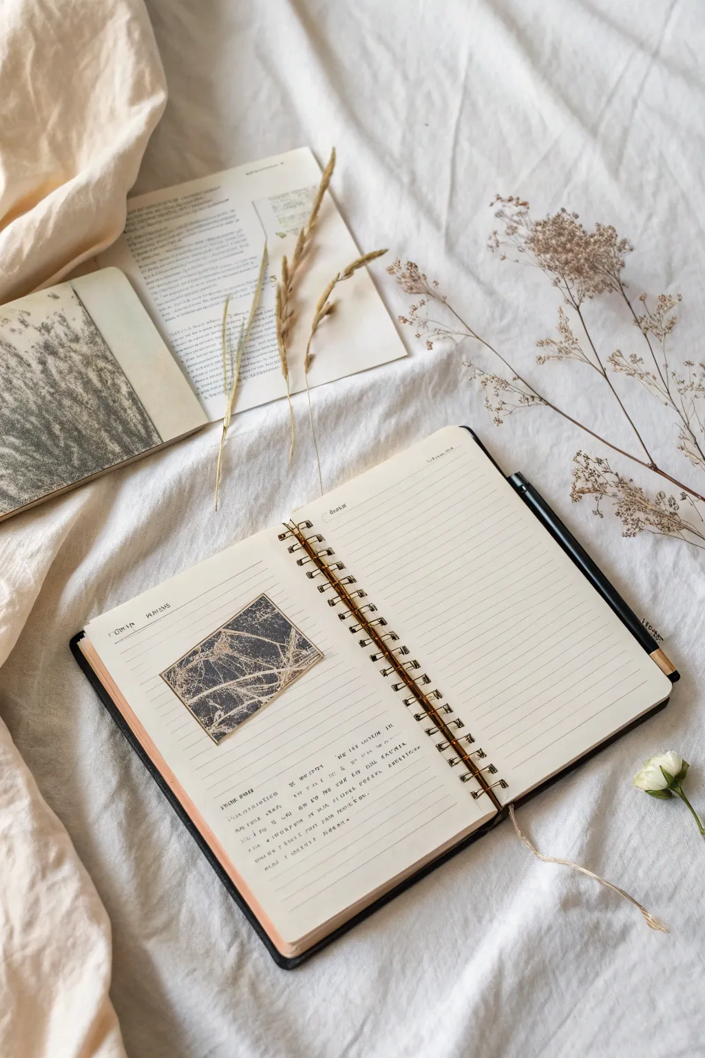
Dictionary-Style “Feeling Definition” Spread
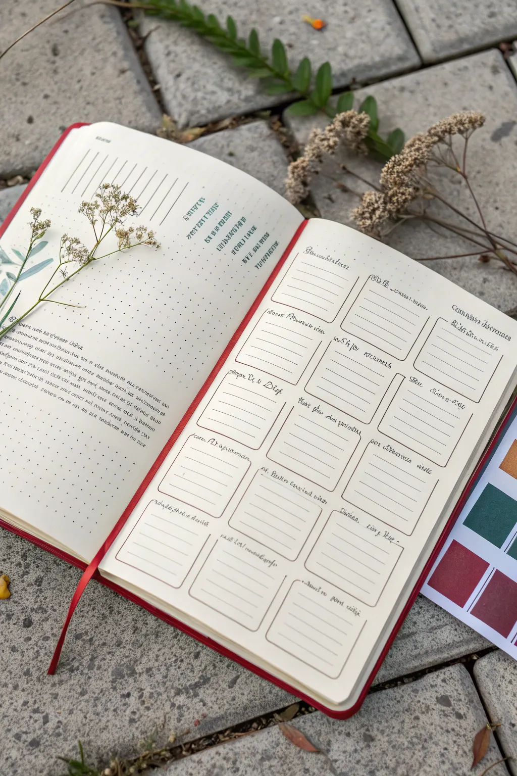
This dictionary-style layout combines structured reflection with botanical elegance, perfect for cataloging specific emotions or daily observations. Using a clean grid system and delicate pressed florals creates a spread that feels both rigorous and organic.
Step-by-Step Guide
Materials
- A5 dot grid notebook or journal (cream paper preferred)
- Fine liner pens (black, 0.1mm and 0.3mm)
- Ruler
- Pencil and eraser
- Real pressed baby’s breath or similar tiny dried flowers
- Clear craft glue or matte gel medium
- Rubber sentiment stamps (vintage font)
- Black ink pad
- Optional: Color swatch stickers or washi tape for bordering
Step 1: Drafting the Grid Layout
-
Measure margins:
Begin on the right-hand page. Using your ruler and pencil, mark a 1-inch top margin and a half-inch margin on the sides and bottom. This white space frames your work. -
Calculate box sizes:
Divide the usable space into three distinct columns. Calculate the width of each column based on your page width, leaving a small gap between them. -
Sketch the boxes:
Lightly sketch four rows of rectangular boxes within your columns. Aim for boxes that are roughly 2 inches tall to accommodate writing. -
Round the corners:
Instead of sharp 90-degree angles, gently round the corners of each sketched rectangle with your pencil to soften the look. -
Ink the outlines:
Trace over your pencil lines with a 0.3mm fine liner. Keep your hand steady but don’t worry about machine perfection; slight wobbles add character. -
Add internal lines:
Switch to a thinner 0.1mm pen. Draw faint horizontal lines inside each box to guide your future writing, leaving a header space at the top of each box.
Smudge Prevention
If your ruler drags ink across the page, stick small felt pads or coins underneath it. This lifts the edge off the paper just enough to prevent smearing.
Step 2: Creating the Definition Page
-
Set the left page structure:
On the left page, create a text-heavy layout. Draw faint pencil guidelines for a large block of text at the bottom third of the page. -
Stamp headers:
Using vintage-style alphabet stamps or a steady hand with a calligraphy pen, add headers or ‘dictionary words’ in the upper right quadrant of the left page. -
Journal the definitions:
Fill the text block at the bottom. You can transcribe actual dictionary definitions of emotions or write your own poetic interpretations of feelings. -
Add decorative lines:
Draw a few purely decorative diagonal lines or geometric shapes near the top left corner to balance the composition.
Step 3: Botanical Touches & Finishing
-
Select your specimen:
Choose a delicate sprig of dried baby’s breath or a similar flat, pressed wildflower. Ensure it isn’t too thick, or the book won’t close properly. -
Position the flora:
Lay the flower on the left page so its stem interacts with your text block or decorative lines. I find placing it slightly off-center looks best. -
Adhere the stem:
Apply tiny dots of clear craft glue or matte gel medium along the stem and the back of the larger blooms. Press firmly for thirty seconds. -
Ink the headers:
Go back to the right page and use a script font or small stamps to add titles above each box (e.g., ‘Sorrow’, ‘Joy’, ‘Envy’). -
Erase guidelines:
Once all ink is completely dry, gently erase all remaining pencil marks to leave a crisp, clean finish. -
Add reference tabs (optional):
If you are using color themes, attach small color swatch stickers to the edge of the page or create a separate reference card as shown in the photo.
Level Up: Color Coding
Use a mild highlighter to color the header space of each box according to ‘mood zones’ (e.g., blue for sad emotions, yellow for happy ones).
Now you have a structured yet beautiful space to dissect and understand your emotions one definition at a time
Painted Frames for Tiny Moments From Today
Create a calming, visually satisfying index of natural colors and textures in your art journal. This spread transforms simple color swatching into a beautiful grid display, incorporating mixed media elements to capture the subtle variations of earthy tones.
Step-by-Step Tutorial
Materials
- Art journal or sketchbook (heavyweight paper is best)
- Pencil
- Ruler
- Watercolor or gouache paints (earth tones: sienna, ochre, umber, sage green, blush)
- Scrap pieces of textured paper, dried leaves, or fine fabric
- Matte gel medium or craft glue
- Fine-point black pen (archival ink)
- Small flat paint brushes
- Scissors or craft knife
Step 1: Planning the Grid
-
Measure and Mark:
Begin by deciding on the layout of your grid. Using a ruler and a light pencil touch, mark out a series of evenly spaced squares across both pages. A 3×3 or 4×3 layout works beautifully depending on your page size. -
Draw the Frames:
Lightly sketch the borders of each square box. Leave enough white space between each square to allow for captions later, which gives the layout a clean, scientific aesthetic.
Swatch Uniformity
Use a square piece of cardstock as a tracing template. This ensures every single box in your grid is identical without measuring each time.
Step 2: Creating Painted Swatches
-
Mix Your Palette:
Prepare your palette with a range of earthy colors. Mix burnt sienna with white for softness, or add a touch of green to your browns to create sage-like hues. Aim for a gradient of warm neutrals. -
Apply the First Wash:
Select several squares on the left page to be pure paint swatches. Fill these squares carefully with your mixed colors using a flat brush to keep edges crisp and neat. -
Layering Transparency:
For some squares, dilute the paint significantly with water to create a translucent, washed-out look. This adds variety and depth to the collection. -
Dry Completely:
Let the painted squares dry fully before moving on. Rushing this step can cause the colors to bleed or the paper to buckle.
Step 3: Adding Texture and Mixed Media
-
Select Textured Materials:
Gather your textured scraps. Look for materials that match your painted color palette—bits of kraft paper, linen scraps, or even pressed dried leaves act as perfect physical swatches. -
Cut to Size:
Measure these materials against your drawn grid boxes. Cut them slightly smaller than the pencil borders so they sit neatly inside the ‘frame’ you drew. -
Adhere the Textures:
Apply a thin, even layer of matte gel medium to the back of your textured pieces. Press them firmly into the empty grid squares on the right-hand page. -
Simulate Texture with Paint:
If you don’t have physical materials, you can mimic texture. Use a dry brush technique or dab a sponge dipped in darker paint over a dried base color to create a stone or fabric effect.
Buckling Paper?
If your sketchbook paper ripples from the wet paint, place a sheet of wax paper over the dry spread and close the book under heavy weights overnight.
Step 4: Final Details
-
Adding Captions:
Once everything is dry and glued down, use your fine-point black pen to add small text beneath each square. You can write the actual color name, the date, or a poetic description of the texture. -
Refining Borders:
If you want a sharper look, re-trace the pencil borders of your squares with a very fine ink line, or leave them pencil-only for a softer, organic feel. -
Optional Aging:
I sometimes like to lightly distress the edges of the paper swatches with a little ink pad or sandpaper to make the journal feel well-traveled and vintage.
Your finished spread will serve as a serene reference guide for future color palettes and texture ideas
Layered Backgrounds: Acrylic, Then Ink, Then Collage
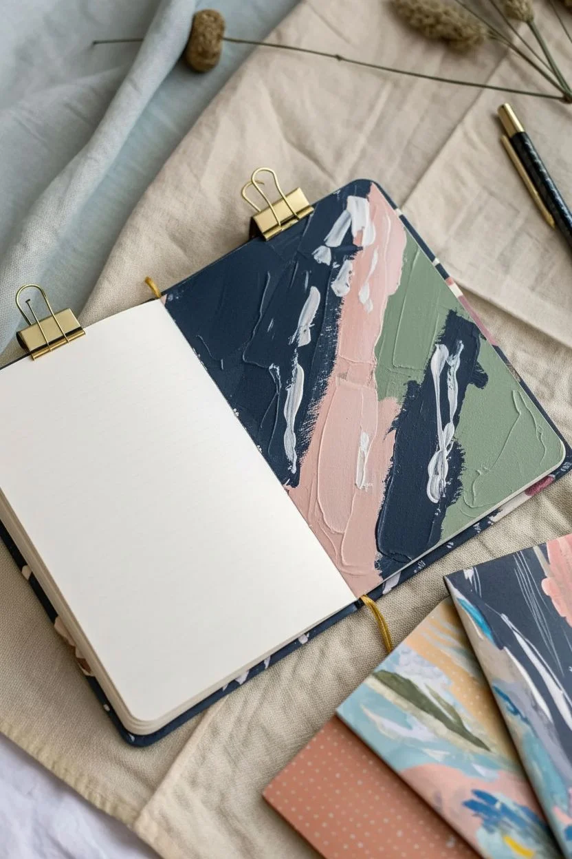
Transform plain notebook covers into vibrant, painterly art pieces using a layering technique that builds depth and texture. This project creates a stunning, modern abstract look with sweeping brushstrokes and pops of ink, perfect for personalized journals or unique sketchbooks.
How-To Guide
Materials
- Plain notebook or journal with a cardstock cover
- Acrylic paints (navy blue, peach, white, sage green, blush pink)
- Black India ink or acrylic ink
- Flat paintbrushes (medium and large)
- Fine detail brush or dip pen (optional)
- Palette or mixing plate
- Paper towels
- Water cup
- Clear matte sealer or varnish
Step 1: Base Layering
-
Prepare the Surface:
Lay your notebook flat on a protected work surface. If the cover is glossy, lightly sand it with fine-grit sandpaper to help the paint adhere better. -
First Broad Strokes:
Load a large flat brush with navy blue acrylic paint. Apply this color boldly to roughly one-third of the cover, using sweeping, diagonal motions. Don’t worry about perfect coverage; texture is good here. -
Adding Contrast:
White the navy is still tacky but not wet, clean your brush and pick up a blush pink or peach tone. paint adjacent to the blue areas, letting the edges overlap slightly to create organic mixing. -
Building the Composition:
Introduce a sage green or muted teal to balance the warmth of the peach. Paint this in smaller sections, perhaps filling in gaps or creating a border effect on one side. -
Highlighting:
Use white paint to add brightness. Apply it sparingly over the darker colors or in empty spaces, using quick, confident strokes to mimic the energy seen in the reference photo. -
Dry Time:
Allow this base layer of acrylics to dry completely. This is crucial so your next layers don’t turn into a muddy mix.
Step 2: Ink and Detail
-
Ink Accents:
Once the acrylic base is dry, take your black ink. Using a smaller brush or a dropper, add gestural lines or distinct marks over the painted areas. -
Creating Movement:
Try dragging the ink through sections of lighter paint if you want a stark contrast. The goal is to have the black ink cut through the soft pastels for visual interest. -
Mark Making:
Experiment with different marks—dots, dashes, or erratic lines using a fine brush or even the edge of a piece of cardboard dipped in paint. -
Softening Edges:
If a line feels too harsh, you can gently feather it out with a damp brush before it sets, blending it slightly into the background color. -
Layering More Paint:
I often find that adding a second layer of the peach or white paint *over* some of the dried ink creates wonderful depth. Use a dry brush technique here to keep it semi-transparent.
Dry Brushing Trick
Wipe most paint off your brush before applying the top white layers. This ‘dry brush’ technique lets the texture of the canvas or paper show through creates a scratchy, artistic look.
Step 3: Finishing Touches
-
Final Assessment:
Step back and look at the composition. If it feels too dark, add more white or peach strokes on top. If it lacks definition, add a few more crisp ink lines. -
Sealing the Artwork:
Once you are completely happy with the design and it is fully dry (give it at least an hour), apply a thin coat of clear matte sealer. -
Protecting the Spine:
Ensure the sealer covers the edges and near the spine to prevent peeling during daily use. -
Ready for Use:
Let the sealer cure according to the bottle instructions before tossing your new custom journal into your bag.
Add Gold Leaf
Elevate the design by applying small flakes of gold leaf to the wet acrylic paint or using gold ink for final details to catch the light.
Now you have a beautifully customized journal that is as inspiring on the outside as the ideas you will put inside
Stitched Paper Add-Ons for Texture and Secrets
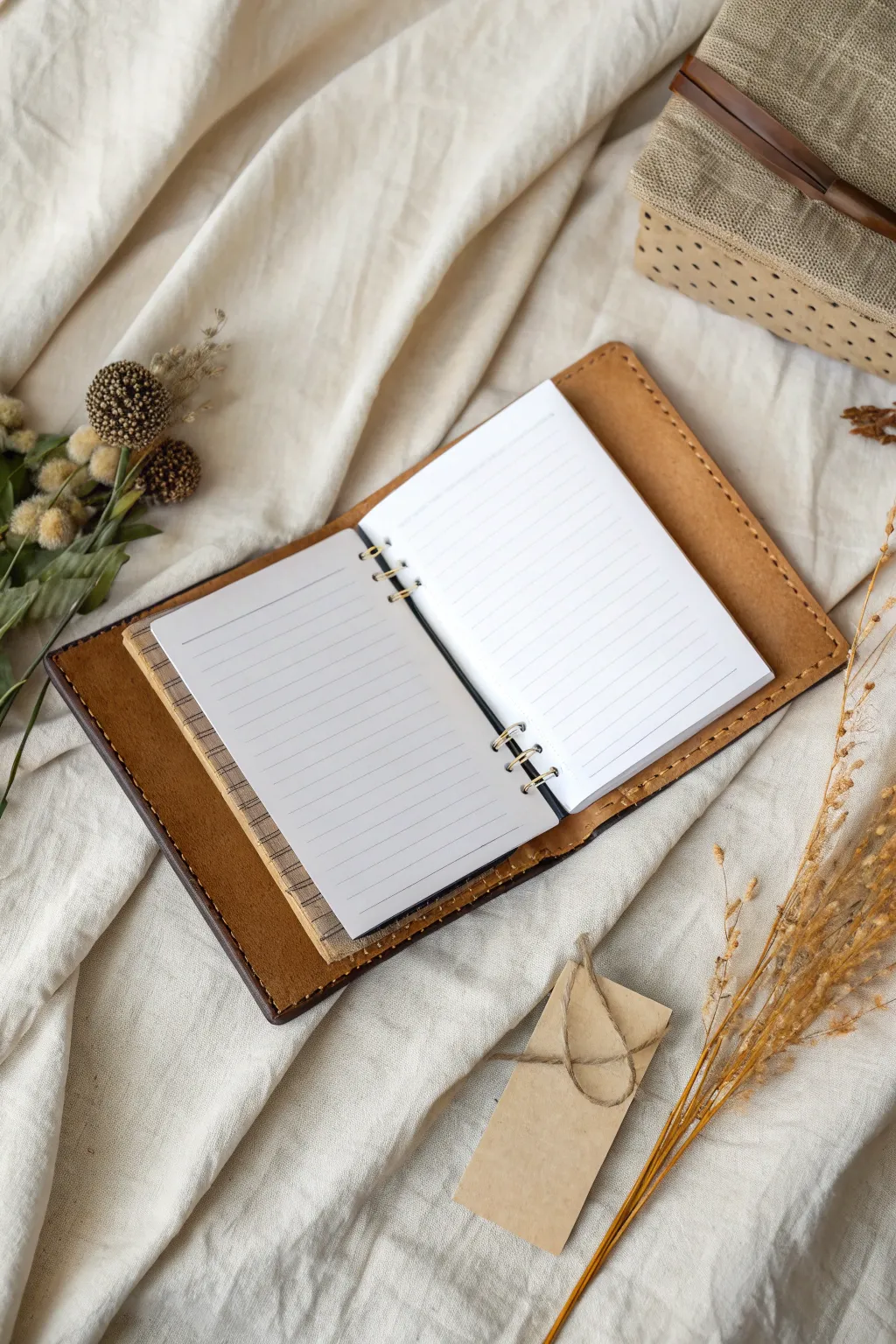
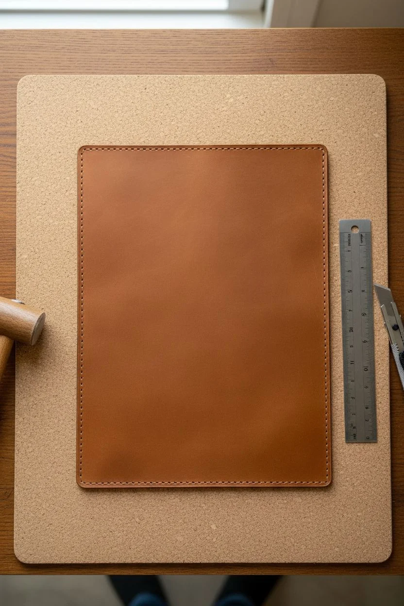
This project transforms a standard ring-bound notebook into a tactile treasure by adding a custom leather cover and stitched fabric layers. The combination of warm cognac leather, rustic stitching, and layered textures creates an inviting space for your thoughts and sketches.
Step-by-Step Tutorial
Materials
- Vegetable-tanned leather (4-5 oz weight)
- Small ring binder mechanism (6-ring or similar)
- Lined paper refill pack
- Heavyweight textured fabric or handmade paper (for the add-on layer)
- Waxed thread (cream or light brown)
- Leather stitching chisels or awl
- Two stitching needles
- Mallet
- Cork or rubber mats
- Metal ruler
- Utility knife or rotary cutter
- Edge burnisher (optional)
- Leather adhesive/glue
Step 1: Preparing the Leather Cover
-
Measure your insert:
Lay your paper refill and ring binder mechanism flat to determine the dimensions. You’ll want the leather cover to extend about 1/2 inch beyond the paper on all sides when closed. -
Cut the leather:
Using your metal ruler and utility knife, carefully cut a rectangle of vegetable-tanned leather to your measured dimensions. -
Mark stitch lines:
Use a wing divider or ruler to lightly scribe a line about 1/8 inch from the edge all around the perimeter of the leather rectangle. -
Punch stitching holes:
Place the leather on your cutting mat. Align your stitching chisels on the scribed line and tap firmly with a mallet to punch holes evenly around the entire border.
Clean Corners
When stitching around corners, punch an extra hole right at the 90-degree turn. This allows the thread to round the bend smoothly without bunching the leather.
Step 2: Creating the Stitched Add-On
-
Select your texture material:
Choose a piece of textured fabric, burlap, or heavy handmade paper that complements the leather tone. This will act as a decorative underlay or pocket. -
Cut to size:
Trim this material to be slightly larger than your paper pages but smaller than the leather cover. It should peek out visibly like in the reference image. -
Add decorative stitching:
Use a sewing machine or hand-stitch a simple grid pattern onto this fabric layer using a contrasting dark thread. This mimics the ‘stitched paper’ aesthetic. -
Punch binder holes:
Align the fabric layer with your lined paper and use a hole punch to create matching holes so it fits into the ring mechanism.
Loose Mechanism?
If using screw-in posts for the binder mechanism, add a drop of clear nail polish or thread locker to the threads before tightening to prevent them from wiggling loose over time.
Step 3: Assembly and Finishing
-
Saddle stitch the cover:
Thread two needles with a length of waxed thread four times the perimeter of your cover. Using the saddle stitch technique, sew around the entire edge of the leather for that professional craftsman look. -
Secure the thread:
When you complete the loop, backstitch two or three holes, trim the thread close, and carefully melt the ends with a lighter to seal them. -
Install the binder mechanism:
Position the ring binder spine in the center of the inner leather cover. You can secure this with rivets (requiring a setter) or strong leather adhesive. -
Burnish edges (optional):
For a smoother finish, rub a little water or gum tragacanth on the raw leather edges and rub briskly with a wood burnisher until glossy. -
Insert the pages:
Open the rings and layer your materials: place the textured fabric add-on at the back or interspersed between sections, then add your lined paper. -
Condition the leather:
I like to finish by rubbing a small amount of leather conditioner or neatsfoot oil over the cover to deepen the color and protect the surface.
Now you have a beautifully handcrafted journal ready to be filled with your sketches and plans
Travel Memory Page Using Maps and Little Symbols
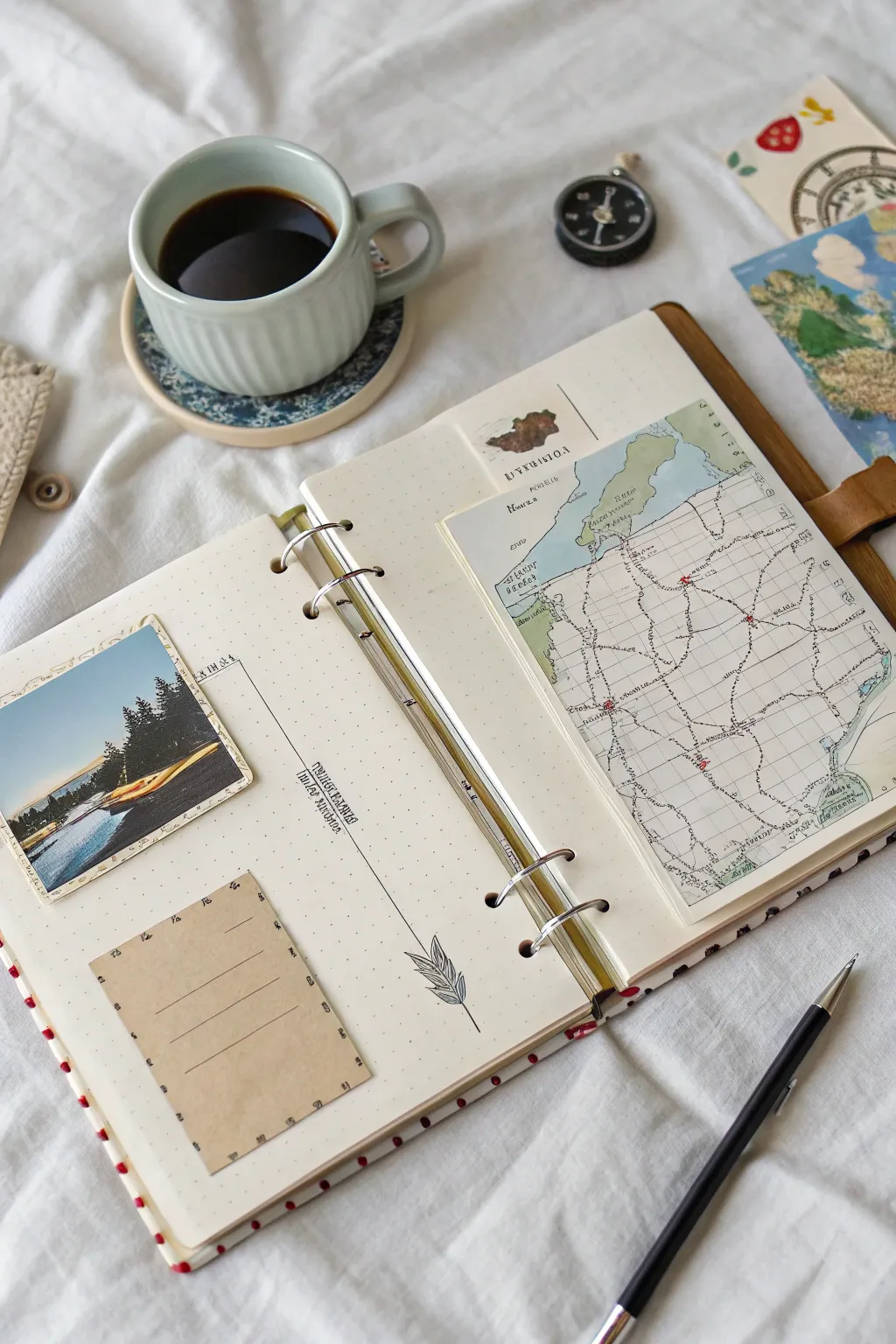
Capture the essence of your wanderlust with this tactile travel journal spread, combining vintage maps, personal photos, and delicate journaling spots. This project is perfect for documenting a specific trip or simply celebrating the spirit of exploration in your art journal.
Step-by-Step Guide
Materials
- A5 or similar ring-bound notebook with dotted paper
- Vintage map or printed map reproduction (approximately 5×7 inches)
- Small landscape photograph (approx. 3×3 inches)
- Kraft paper or brown notepad sheet
- Fine liner pen (black, 0.3mm or 0.5mm)
- Glue stick or double-sided tape runner
- Ruler
- Compass charm or small metal embellishment (optional)
- Washi tape or small paper scraps for layering
- Scissors
Step 1: Setting the Scene: Left Page Layout
-
Select your photo:
Choose a moody landscape photo from your travels that has strong contrast. Trim it into a neat square, roughly 3×3 inches. -
Position the photo:
Adhere the photo to the upper-left quadrant of the left page, leaving a generous margin from the top and left edge to let the dotted paper show through. -
Prepare the note spot:
Cut a rectangle of kraft paper, approximately 2.5 x 3.5 inches. If your paper doesn’t have lines, you can lightly draw three or four horizontal lines near the bottom for future text. -
Anchor the layout:
Glue the kraft paper rectangle in the lower-left section of the page, slightly offset from the photo above to create a dynamic, diagonal visual flow. -
Connect the elements:
Using a ruler and your fine liner pen, draw a thin, crisp line connecting the bottom right corner of the photo area down towards the space between the two glued elements. -
Add nature details:
At the very end of your drawn line, sketch a simple, stylized leaf or feather illustration. Keep the lines clean and minimalist to match the aesthetic. -
Include vertical text:
Along the vertical line you just drew, write a location name, date, or short phrase sideways. Use a serif font or careful block lettering for a vintage look.
Vintage Vibes
Distress the edges of your map and kraft paper with a little brown ink or by running a scissor blade along the edge for a worn look.
Step 2: Mapping the Journey: Right Page Layout
-
Prepare the map:
Take your vintage map or printout. It needs to be slightly smaller than the page itself. If you want a layered look, cut a smaller, separate map snippet to peek out from the top. -
Create the top tab:
Glue the small map snippet near the top edge of the right page. You can add a tiny label or stamp a word like ‘EXPLORE’ or a location name over this piece. -
Mount the main map:
Position the large map piece so it dominates the right page but leaves a border of the dotted notebook visible. I like to visually align the top of this map with the top of the photo on the left page for symmetry. -
Mark your route:
If appropriate for your story, use a red pen or marker to draw a dotted line or small ‘X’ marks on the map to signify stops along your journey. -
Add tactile touches:
For extra dimension, attach a small compass charm or a similar metal embellishment to the notebook rings or clip it the top of the page.
Step 3: Final Flourishes
-
Check balance:
Open the spread flat and look at the balance between the heavy map on the right and the lighter elements on the left. -
Fill the kraft paper:
Write your main journal entry or a poignant quote on the lines of the kraft paper block using your black pen. -
Clean up edges:
Ensure all corners are glued down flat so they don’t catch when you close the book. Erase any stray pencil marks if you sketched your doodle first.
Route Stitching
Instead of drawing your travel route on the map with pen, use a needle and red embroidery floss to stitch the path for texture.
Now you have a beautifully balanced spread ready to hold your favorite travel memories
Dream Log Spread With Surreal Collage and Scribbles
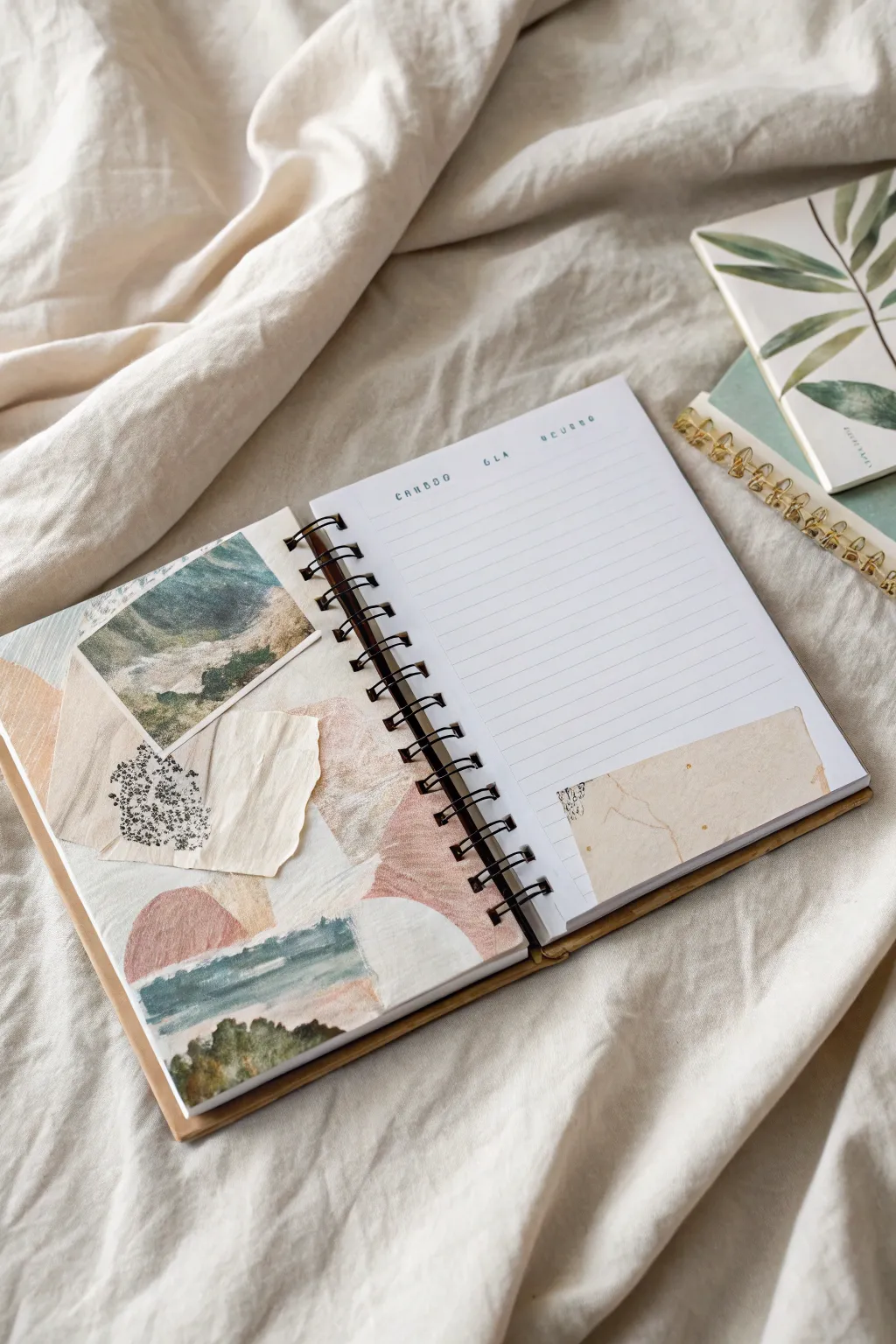
Capture the fragmented and ethereal nature of your dreams with this layered mixed-media spread. By blending torn paper scraps, faint washes of paint, and specific imagery, you’ll create a soft, surreal landscape that perfectly complements a written dream log.
Detailed Instructions
Materials
- Spiral-bound lined notebook or journal
- Matte gel medium, glue stick, or PVA glue
- Watercolor paints (muted tones: earthy pinks, sage greens, blues)
- Small flat brush
- Vintage magazine cutouts or landscape photos
- Scrap paper (cream, textured, or coffee-stained)
- Black ink pen or fine liner
- Scissors
Step 1: Setting the Background
-
Prep the left page:
Begin on the left-hand page of your spread. Apply a very thin, watery wash of cream or off-white acrylic paint if the page is too bright white, or leave it natural if using a cream journal. -
Establish the color palette:
Mix a muted, desaturated color palette using watercolors. You want a soft ‘desert rose’ pink, a dusty sage green, and a faded denim blue. -
Paint organic shapes:
On the bottom half of the left page, paint loose, hill-like shapes. Let the pink and green sections overlap slightly while wet to create soft, dreamy edges. -
Add texture with scraps:
While the paint is drying, tear a piece of cream-colored scrap paper into a rough, irregular shape with deckled edges. -
Layer the paper:
Glue this torn cream paper near the center of the painted area. This acts as a neutral anchor for the busier elements to come.
Collage Harmony
To make disparate scraps look cohesive, lightly brush a very watered-down layer of white gesso over the collage edges to blend them.
Step 2: Building the Collage
-
Select your focal image:
Find a landscape photo—mountains or a forest work well—and cut a small rectangular section from it. It doesn’t need to be a perfect square; a slight angle adds interest. -
Position the focal point:
Place the landscape cutout on the upper left side of the page, overlapping it partially with the cream paper you just glued down. -
Secure the image:
Adhere the photo using your glue stick or gel medium, ensuring the corners are flat. -
Introduce pattern:
Locate a scrap of paper with a small black pattern—stippling, dots, or small botanical line drawings work perfectly. -
Tear and place:
Rip a small, triangular fragment of this patterned paper. Tuck it slightly underneath the bottom edge of the cream paper layer, creating a sense of depth. -
Add a landscape strip:
Find another landscape element, perhaps a painted scenery strip or a photo of a horizon. Glue this horizontally across the bottom third of the page to ground the composition.
Step 3: Final Touches & Writing Space
-
Address the right page:
Turn your attention to the right-hand page. This area is primarily for writing, so we will keep decoration minimal. -
Create a corner accent:
Tear a rectangular strip of the same cream or coffee-stained paper used on the left page. -
Attach the accent:
Glue this strip to the bottom right corner of the lined page. I like to leave the top edge torn and rough to match the organic feel of the opposite page. -
Stamp or write headers:
Using a small alphabet stamp set or your pen, add simple headers at the top of the right page, spaced out widely (e.g., ‘C A N D I D’, ‘G L A’, ‘O C U R R O’). -
Optional stippling:
If desired, add tiny black ink dots or scribbles on the corner accent paper to mimic the patterned scrap on the left page.
Add Hidden Text
Write a secret dream meaning or hidden thought on the lined page, then glue the bottom corner scrap strictly over it as a flap.
Now you have a serene, inviting space ready to catch your morning thoughts and dream fragments
Found Poetry Page Built From Cut Words and Paint
This serene art journal page combines the fluid beauty of a watercolor wash with the structured charm of found poetry. By layering soft, muted tones behind carefully selected text, you’ll create a visually soothing composition that speaks both through color and words.
Step-by-Step Tutorial
Materials
- Small notebook or art journal (mixed media paper ideal)
- Watercolor paints or fluid acrylics
- Soft round paintbrush (size 6 or 8)
- Water cup and paper towels
- Old book pages, magazines, or a printed sheet of text
- Scissors or a craft knife
- Glue stick or liquid matte medium
- Ruler (optional)
Step 1: Planning and Preparation
-
Select your palette:
Choose two dominant colors for your background wash. The example uses a warm terracotta orange and a cool sage green to create a natural, earthy contrast. -
Source your words:
Leaf through old book pages, magazines, or type out your own phrases on a computer if you want specific wording like the example. Look for words that evoke a feeling or describe an artistic process. -
Cut the strips:
Carefully cut out your chosen phrases. Keep the strips relatively thin, leaving just a small margin of white space above and below the letters. Varying the lengths adds visual interest. -
Dry fit the layout:
Place the paper strips onto your blank journal page without gluing them yet. Experiment with positioning—placing them slightly off-center usually creates a dynamic composition.
Step 2: Painting the Background
-
Prepare the wash:
Dilute your terracotta paint with plenty of water. You want a translucent, fluid consistency that will bloom on the paper rather than sitting heavily on top. -
Apply the first color:
Start applying the terracotta wash from the top left corner. Use sweeping, diagonal strokes that fade out towards the center of the page. Don’t worry about perfect edges; organic shapes are better here. -
Blend out the edges:
While the paint is still wet, dip your brush in clean water and soften the edges of the orange section so it fades gently into the white of the paper. -
Add the sage accents:
Clean your brush thoroughly and pick up the diluted sage green paint. Apply this to the bottom right area, using broad strokes that move upward towards the center. -
Overlap gently:
Allow the green wash to slightly touch or overlap the orange areas. Since watercolors are transparent, this might create a neutral brownish tone where they meet, which adds to the earthy vibe. -
Encourage texture:
For that mottled, authentic watercolor look, dab a little extra pigment into the wet areas and let it spread naturally. Leave some whitespace untouched to keep the page feeling airy. -
Let it dry completely:
Wait for the paint to be bone dry. If the paper is cool to the touch, it’s still damp. Painting over damp paper can cause the paper fibers to pill when you try to glue.
Wrinkle Rescue
If your journal page buckles heavily from the water, let it dry completely, then shut the book and place a heavy stack of books on top overnight to flatten it out.
Step 3: Assembling the Poetry
-
Apply adhesive:
Flip your text strips over and apply a smooth layer of glue stick or a thin coat of matte medium to the back. -
Position the first strip:
Place the top strip of text first. Aim for the upper middle section of your painted area, ensuring it grabs attention immediately. -
Align subsequent lines:
Place the second and third strips below the first. You can align them rigidly to the left or right, or stagger them slightly like stairs for a more relaxed feel. -
Smooth it down:
Use a clean finger or a bone folder to press the strips firmly onto the page, smoothing out any air bubbles or wrinkles. -
Wipe away excess:
If any glue oozed out from beneath the strips, gently wipe it away immediately with a slightly damp finger or cloth.
Add Subtle Detail
Once the paint is dry, use a white gel pen or a fine black liner to trace loose, sketchy outlines around the watercolor shapes for a more illustrative look.
Now you have a beautifully customized page that turns simple colors and words into art
Interactive Fold-Out Spread for a “Before and After” Story
Embrace the soothing tones of terracotta and sage with this minimalist ring-bound journal spread. This project combines soft, organic shapes with structured geometric arches to create a balanced, earthy aesthetic perfect for daily planning or gratitude journaling.
How-To Guide
Materials
- Small 6-ring binder mechanism (A6 or Personal size)
- Heavyweight kraft cardstock (for the cover)
- Thick watercolor paper or mixed media paper (approx. 200-300 GSM)
- Gouache or matte acrylic paints (Terracotta, Sage Green, Beige, White, Navy Blue)
- Round paintbrushes (size 4 and size 0/1 for details)
- Hole punch (adjustable 6-hole punch recommended)
- Ruler and pencil
- Jute twine or leather cord
- Scissors or a paper trimmer
Step 1: Crafting the Binder Base
-
Cut the cover:
Measure and cut a piece of heavyweight kraft cardstock to be slightly larger than your open ring mechanism. A standard size is often around 7 inches wide by 5 inches tall when open, but adjust to fit your specific rings. -
Create the spine:
Mark the center of your kraft cardstock where the spine will be. Score two vertical lines about 0.75 to 1 inch apart to create a distinct spine section that accommodates the ring diameter. -
Attach the mechanism:
Center your ring binder mechanism on the inside of the spine. Mark the attachment holes with a pencil, punch them out, and secure the mechanism using rivets or the screws provided with the hardware. -
Add a closure:
Punch a small single hole in the center of the back cover’s edge. Loop a piece of jute twine through it and knot it securely on the inside; this will wrap around the journal to keep it closed.
Step 2: Preparing the Pages
-
Size the paper:
Cut your watercolor or mixed media paper into sheets that fit your binder size. For this spread, you will need two sheets that mirror each other. -
Punch holes:
Align your paper sheets carefully and use the 6-hole punch to create the binding holes. Check that they fit smoothly into your binder mechanism before painting.
Clean Lines Tip
For the geometric arches, use a compass or trace circular objects (likelids or bowls) lightly in pencil first to ensure your curves are smooth and parallel.
Step 3: Painting the Left Page: Organic Flora
-
Base layer options:
You can leave the background plain, or apply a very watery wash of beige gouache for a tinted look. If tinting, let it dry completely before proceeding. -
Paint the foliage:
Using a size 4 round brush, paint large, loose leaf shapes at the bottom of the page. Use terracotta for the main rounded leaves in the foreground. -
Add varied tones:
While the first leaves dry, paint slender, taller leaf shapes in sage green and muted blue-grey tucked behind the terracotta ones to create depth. -
Detailing the leaves:
Once the broad shapes are dry, mix a lighter shade of your base colors (add white) and use a fine brush to add simple line veins or outlines to the leaves for definition. -
The speckled background:
Dip a small brush into diluted terracotta or beige paint. Gently tap the brush handle against your finger to splatter tiny dots across the upper half of the page, or manually dot them for precise control.
Level Up: Texture
Stitch directly onto the paper using embroidery floss along the painted arch lines. A simple running stitch adds incredible tactile dimension.
Step 4: Painting the Right Page: Abstract Arches
-
Outline the arches:
Lightly sketch two rainbow-like arch formations with a pencil—one originating from the top left corner and another from the bottom right corner. -
Paint the top arch:
Using a steady hand and a fine liner brush, paint concentric curved lines in the top left corner. Alternate between navy blue, terracotta, and soft beige. -
Add dot accents:
Enhance the top arch by adding a row of small navy dots following the outermost curve. I personally find this adds a lovely rhythmic texture to the design. -
Paint the bottom arch:
Mirror the style in the bottom right corner but use lighter, airier tones like pale beige, sheer white, and muted yellow-ochre to balance the visual weight. -
Final assembly:
Ensure all paint is fully dry to prevent pages sticking together. Snap the pages into your kraft binder and arrange them to complete the spread.
Now you have a serene, artistically personalized journal ready to hold your thoughts

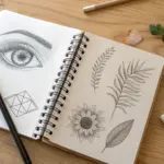
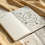

Have a question or want to share your own experience? I'd love to hear from you in the comments below!