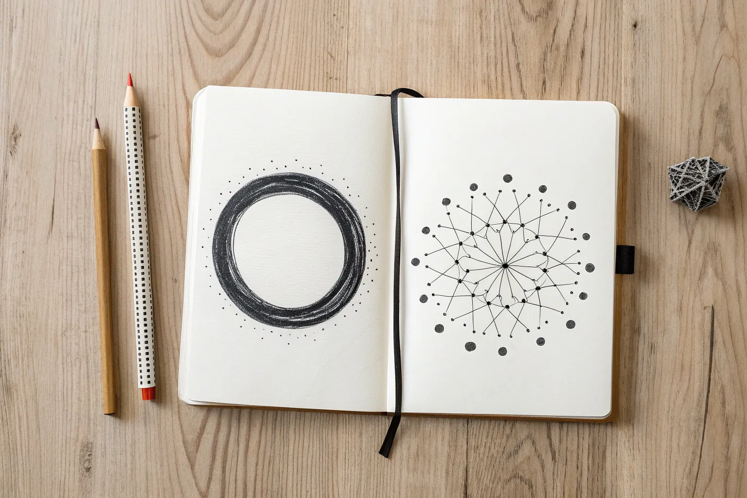
If you’ve ever made a drawing that feels exciting but still “stable,” you’ve already brushed up against asymmetrical balance. These ideas are my favorite ways to practice visual weight—so your pieces feel dynamic without tipping over.
Notan: Solid Shape vs. Fragmented Echo
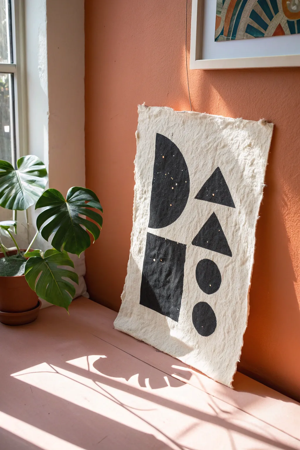
This rustic, minimalist wall hanging explores the concept of Notan through bold, black geometric shapes on raw, unbleached fabric. The result is a striking example of asymmetrical balance that adds an organic, modern touch to any space.
Step-by-Step Tutorial
Materials
- Heavyweight unbleached cotton canvas or linen scrap (approx. 11×17 inches)
- Black fabric paint or acrylic paint mixed with textile medium
- Gold leaf flakes or gold paint pen
- Flat shader paintbrush (medium size)
- Round detail brush (small)
- Ruler
- Pencil or disappearing fabric marker
- Paper plate or palette
- Needle and thread (optional for hanging)
- Iron and pressing cloth
Step 1: Preparing the Canvas
-
Cut and fray:
Begin by cutting your fabric to your desired rectangular dimension, leaving about an extra inch on all sides. Instead of hemming the edges, pull loose threads along the perimeter to create a soft, frayed fringe about a quarter-inch deep. -
Press the fabric:
Iron the fabric completely flat to ensure a smooth painting surface. If the canvas is very wrinkled, use a bit of steam, but make sure it is fully dry before you begin sketching. -
Plan the composition:
Lightly sketch a vertical centerline to help guide your asymmetry. On the left, draw a large semi-circle near the top and a vertical rectangle near the bottom. -
Sketch right-side elements:
On the right side of the centerline, sketch two triangles stacked vertically near the top, followed by two circles stacked vertically near the bottom. Ensure the spacing feels balanced against the heavier shapes on the left.
Clean Lines on Texture
For sharper lines on rough canvas, put a piece of masking tape along your pencil lines, press it down firmly, and paint away from the tape edge.
Step 2: Painting the Shapes
-
Outline first:
Dip your small round brush into the black fabric paint. Carefully outline the edges of your first shape—I usually start with the large semi-circle—to establish a crisp border. -
Fill in the solid areas:
Switch to the flat shader brush to fill in the body of the shape. Apply the paint somewhat thickly to get an opaque, solid black coverage that contrasts sharply with the cream fabric. -
Paint the rectangle:
Move to the bottom left and paint the rectangular block. Use the flat edge of your brush to keep the sides straight and corners sharp. -
Paint the triangles:
On the right side, fill in the two triangles. Pay attention to the points; use the detail brush again if needed to keep the tips sharp rather than rounded. -
Paint the circles:
Finally, paint the two circles at the bottom right. Rotate the fabric physically if it helps you maintain a smooth curve while painting the round edges. -
Check for opacity:
Let the first coat dry for about 20 minutes. If the fabric texture is showing through too much, apply a second coat of black to achieve a deep, matte finish.
Step 3: Adding Detail and Finishing
-
Dry completely:
Allow the black paint to dry completely. This is crucial because wet black paint can easily smudge onto the clean negative space. -
Create the celestial effect:
To mimic the starry look in the image, take a gold paint pen or a small brush with metallic gold paint. Gently tap small dots of varying sizes directly onto the black shapes. -
Cluster the stars:
Don’t evenly spacing the gold dots; cluster a few together and leave other areas empty to create a natural, random constellation effect. -
Set the paint:
Once all paint is dry (check your specific paint instructions, usually 24 hours), heat set the design. Place a pressing cloth over the painted side and iron on a cotton setting for 2-3 minutes to make the ink permanent. -
Prepare for hanging:
You can hang this simply by using small nails through the top corners of the fabric mesh, or create a small thread loop on the back using a needle and thread for invisible mounting.
Antique Wash
Before painting, dip the fabric in tea or coffee and let it dry. This stains the fabric a darker beige, giving the finished piece an aged, vintage parchment look.
Hang your new fiber art near a window where the light can catch those subtle gold details

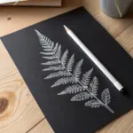
Foreground Heavy, Background Light
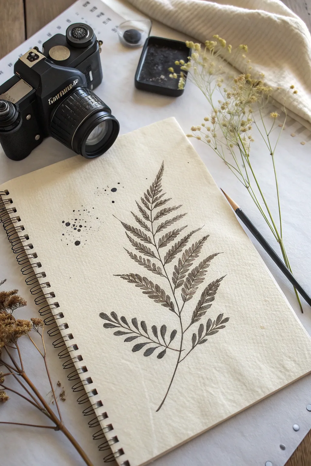
This project captures the intricate pattern of a fern frond using fine liner pens on textured sketchbook paper. By combining crisp outlines with delicate internal shading, you’ll create a piece that feels both scientific and artistically balanced.
Step-by-Step Guide
Materials
- Spiral-bound sketchbook (heavyweight or mixed media paper preferred)
- HB graphite pencil
- Kneaded eraser
- Fine liner pens (sizes 0.1, 0.3, and 0.5 mm, black ink)
- Water-soluble black ink or diluted watercolor (optional for splatter)
- Small paintbrush or toothpick
Step 1: Planning the Structure
-
Establish the curve:
Begin with your HB pencil. Lightly draw a single, gentle S-curve running diagonally from the bottom right to the middle of the page. This will be the main stem (rachis) of your fern. -
Mark leaf positions:
Along this main stem, make small tick marks to indicate where each pair of leaflets (pinnae) will emerge. Space them wider apart at the bottom and gradually closer together as you move toward the tip. -
Sketch the leaflet shapes:
Draw the basic triangular outlines of the leaflets extending from your tick marks. The bottom leaflets should be broader and more rounded, becoming narrower and more pointed near the top of the frond. -
Refine the edges:
Go back over your triangular shapes and add jagged, sawtooth edges to create that classic fern texture. Keep your pencil pressure very light so these lines are easy to erase later.
Natural Variation
Don’t make your fern perfectly symmetrical. Nature is imperfect; make one leaflet slightly folded or missing a tip to add realism to your botanical study.
Step 2: Inking the Outline
-
Define the stem:
Switch to a 0.3 mm fine liner. Carefully trace the main central stem, making it slightly thicker at the base and tapering it to a fine point at the top. -
Outline the leaflets:
Using a 0.1 mm pen, trace the jagged edges of each leaflet. Don’t worry about perfectly straight lines; a slightly organic, trembling hand creates a more natural look. -
Add central veins:
Draw a thin central vein down the middle of each individual leaflet, connecting it back to the main stem. Use quick, confident flicks of the pen for these lines. -
Erase pencil guides:
Once the ink is completely dry—I usually give it at least five minutes—gently use your kneaded eraser to lift away all the graphite guidelines.
Smudge Alert
Fine liner ink can stay wet longer on smooth paper. Place a scrap piece of paper under your drawing hand to prevent oils and smudges from ruining your work.
Step 3: Adding Texture and Detail
-
Directional shading:
With your 0.1 mm pen, start adding tiny, closely spaced hatching lines along one side of each leaflet’s central vein. This creates depth and makes the leaves look slightly folded. -
Deepen the contrast:
Switch to the 0.3 mm pen to darken the areas where the leaflets attach to the main stem. This little bit of shadow helps anchor the leaves visually. -
Texturing the lower leaves:
For the bottom-most leaves which are larger and more rounded, use stippling (tiny dots) instead of lines to suggest a softer, older texture. Concentrate dots near the center vein. -
Refining the tips:
Check the very tips of the top leaves. If they look too blunt, sharpen them by extending the ink line just a hair further out.
Step 4: Finishing Touches
-
Balancing the composition:
Notice the empty space to the left of your fern. We will add abstract splatter marks here to create that asymmetrical balance. -
Prepare the splatter:
Dip a small brush or a toothpick into black ink or very diluted black watercolor. You don’t need much liquid. -
Apply the effect:
Hold the brush over the empty area on the left and tap the handle firmly to shake drops loose. Aim for a mix of tiny specks and 2-3 larger droplets. -
Final assessment:
Look at the overall balance. If the fern feels too light compared to the ink splatters, go back and thicken the shadow side of the main stem with your 0.5 mm pen.
Now you have a serene botanical illustration that balances precise detail with organic spontaneity
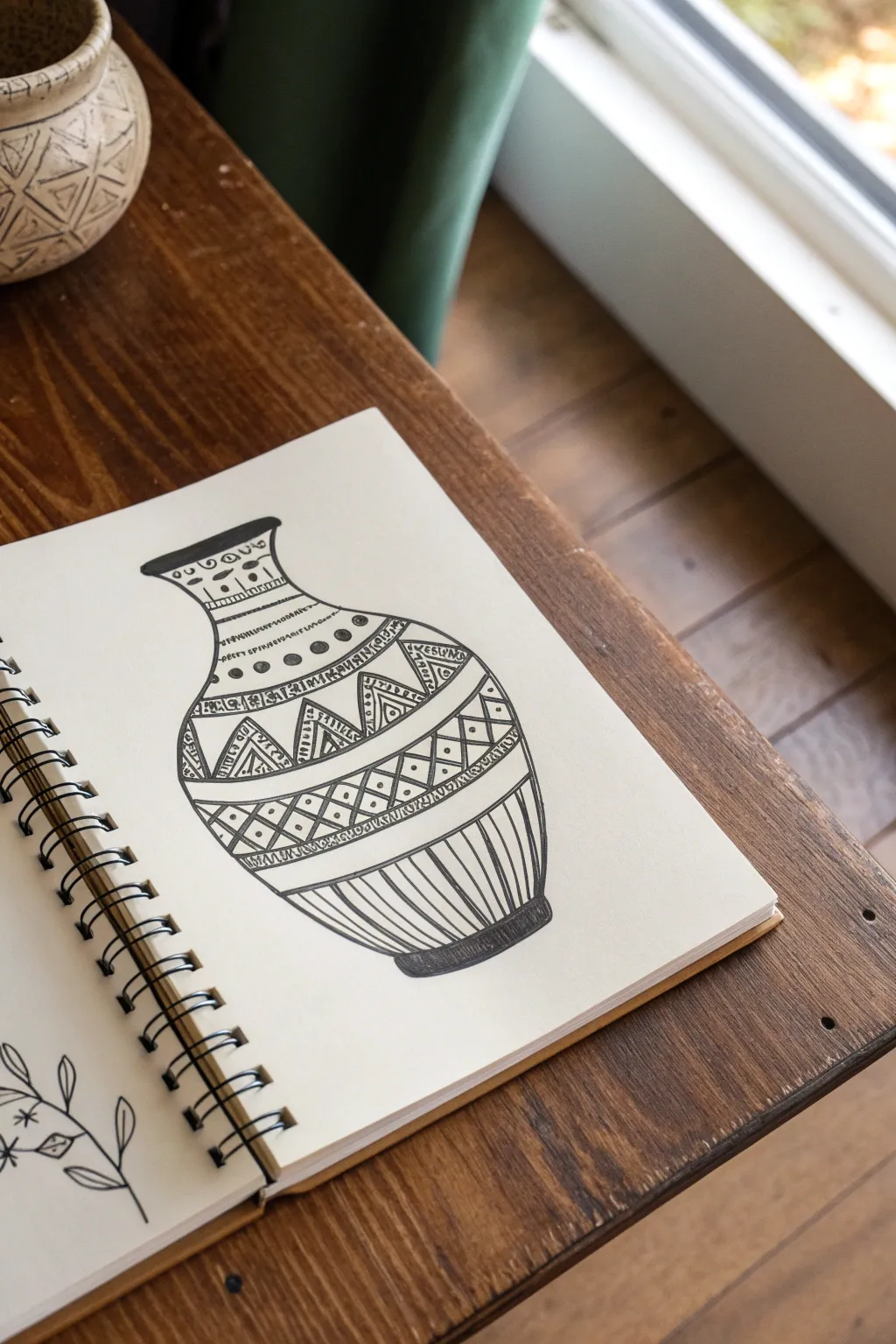
Edge Crop With Counterweight Detail
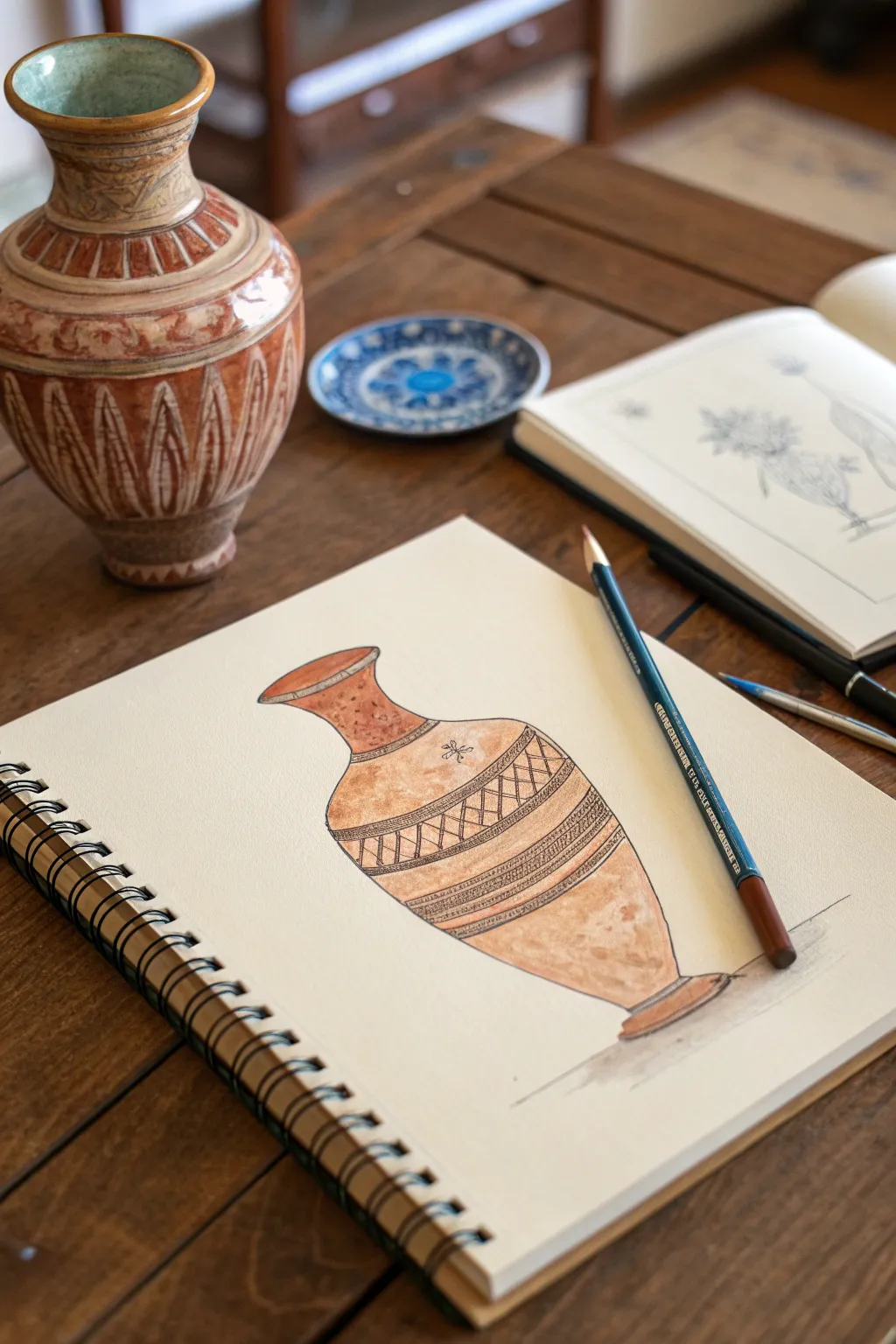
Capture the timeless elegance of ceramic design with this mixed-media sketching project. Using a combination of graphite, warm colored pencils, and fine ink liners, you will recreate the textures and geometric patterns of an earthenware vessel.
Detailed Instructions
Materials
- Spiral-bound sketchbook or mixed-media paper (smooth texture)
- HB Graphite pencil
- Kneaded eraser
- Brown, rust, and terracotta colored pencils (water-soluble optional)
- Fine liner pen (0.3mm or 0.5mm, black or sepia)
- Blending stump or cotton swab
- Ruler (optional)
Step 1: Structural Sketching
-
Establish the centerline:
Begin by lightly drawing a vertical centerline in the middle of your page. This invisible axis is crucial for maintaining symmetry in your vase. -
Mark key proportions:
Along the centerline, make small horizontal dashes to mark the top rim, the narrowest point of the neck, the widest point of the body, and the base. -
Create the ellipses:
Sketch light oval shapes (ellipses) at each key mark you made. Remember that the rim is an open ellipse, while the ellipses lower down the body should appear slightly rounder due to perspective. -
Connect the form:
Connect the outer edges of your ellipses with smooth, flowing lines to create the silhouette of the vase. Focus on the graceful curve from the neck blooming out to the shoulder and tapering down to the foot. -
Define the rim:
Thicken the top ellipse to give the rim dimension, showing the thickness of the clay material. Refine the base so the vase feels grounded rather than floating.
Curve Consistency
Turn your sketchbook upside down to check your symmetry. Errors in the curvature of the vase’s sides become much more obvious from a reversed perspective.
Step 2: Applying Color and Tone
-
Base layer shading:
Using a light terracotta or tan colored pencil, apply a soft, even wash of color over the entire vase shape. Keep your pencil strokes light and follow the curvature of the form. -
Build the shadows:
Select a darker rust or brown pencil to define the volume. Shade strongly along the left side and bottom edge to indicate a light source coming from the top right. -
Highlight the form:
Leave the upper right shoulder and the rim significantly lighter. You can use a clean eraser to lift pigment here if it got too dark, preserving a sense of shine on the glaze. -
Blend the gradients:
Use a blending stump or a white colored pencil to smooth the transition between your shadow and light areas, creating a convincing roundness to the ceramic surface. -
Texture mottling:
Add small, random flecks or stippling with your brown pencil to mimic the natural imperfections and texture of fired clay.
Step 3: Inking the Patterns
-
Outline the bands:
With your fine liner pen, carefully draw the horizontal bands that wrap around the belly of the vase. These lines should curve slightly downward to match the form’s volume. -
Draw the geometric motif:
Inside the central wide band, draw a zig-zag or diamond pattern. I find it helpful to mark the peaks and valleys first with dots before connecting them with ink lines. -
Add hatch marks:
Within the geometric shapes, draw closely spaced diagonal hatch marks. This adds density and mimics the incised decoration often found on ancient pottery. -
Refine the bands:
Add smaller decorative elements to the thinner bands above and below the main pattern, such as tiny vertical dashes or a running stitch pattern. -
Final outlines:
Go over the main silhouette of the vase with your ink pen. Use a broken or varied line weight—thicker on the shadow side, thinner on the light side—to keep the drawing feeling organic. -
Grounding shadow:
Using a graphite pencil or a grey marker, add a small cast shadow underneath and to the left of the base to firmly plant the object on the surface.
Aged Aesthetic
Wash over the finished drawing with strong coffee or tea. This tints the paper and causes slight ink bleed, making the sketch look like an artifact itself.
Now you have a beautifully rendered study that captures the rustic charm of traditional pottery

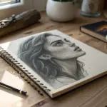
Portrait: Turned Head and Shoulder Weight
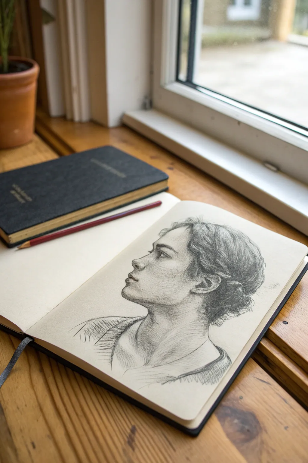
This project explores the delicate balance of a profile portrait, capturing the upward gaze and the subtle weight of the shoulder turn. The result is a striking graphite sketch that feels both intimate and classically structured, perfect for practicing anatomical proportions and light.
Step-by-Step
Materials
- High-quality sketchbook (smooth or medium tooth paper)
- Graphite pencils (HB, 2B, 4B, and 6B)
- Kneaded eraser
- Precision mechanical eraser (optional for highlights)
- Blending stump or tortillon
- Sharpener
Step 1: Structural Foundation
-
Establish the Head Shape:
Begin with a light HB pencil. Lightly sketch a circle for the cranial mass and extend a jawline downwards and outwards to the left to indicate the profile angle. -
Mark the Guidelines:
Draw faint horizontal lines to mark the placement of the brow, the base of the nose, and the bottom of the chin. Remember that the head is tilted slightly back, so curve these lines upward. -
Sketch the Neck and Shoulder:
Extend the neck lines down from the jaw and back of the head. Sketch a sloping curve for the shoulder to create the asymmetrical composition, ensuring the shoulder closest to the viewer drops lower. -
Map the Facial Features:
Lightly block in the triangular shape of the nose, the indentation of the eye socket, and the plane of the cheek. Use simple geometric shapes to ensure the proportions feel correct before adding detail.
Step 2: Defining the Features
-
Refine the Profile Line:
Switch to a 2B pencil. Carefully trace the contour of the forehead, the bridge of the nose, and the lips. Pay attention to the subtle dips and curves, particularly the philtrum and the chin’s prominence. -
Draw the Eye:
Place the eye within the socket, focusing on the side view of the eyelid and the iris. The gaze should be directed upward and outward. Keep the lines soft. -
Shape the Ear:
Position the ear between the brow and nose lines, but set back on the head. Sketch the C-shape of the outer ear and the inner cartilage details. -
Block in Hair Mass:
Without drawing individual strands, outline the overall shape of the hair. Indicate how it is pulled back into a low distinct bun or knot at the nape of the neck.
Flat Profile?
If the face looks flat, increase the contrast between the illuminated front planes (nose, forehead) and the shaded side planes (cheek, jaw). A darker shadow under the chin adds instant depth.
Step 3: Shading and Form
-
Establish Light Source:
Determine that the light is coming from the front/top. Begin shading the side of the face away from the light—the jawline, under the chin, and the neck—using visible diagonal hatching strokes. -
Deepen the Shadows:
Using a 4B pencil, darken the area under the jaw and the nape of the neck. This contrast is crucial for separating the head from the neck. -
Model the Cheek and Temple:
Lightly shade the temple and the hollow of the cheek to give the face dimensionality. I like to keep my pencil strokes loose here to maintain the sketch-like quality. -
Detail the Hair Texture:
Use the 4B and 6B pencils to add flow to the hair. Draw long, sweeping curves that follow the direction of the strands being pulled back. Leave areas of white paper for highlights where the hair catches the light. -
Refine the Ear:
Darken the deepest crevices of the ear to make it pop, ensuring it doesn’t look flat against the side of the head.
Add Mood
Instead of white paper, try this sketch on tan or grey toned paper. Use a white charcoal pencil to add dramatic highlights to the nose bridge and forehead for a more 3D effect.
Step 4: Final Touches
-
Add Clothing Hints:
Sketch the collar of the shirt using loose, gestural scribbles. Use cross-hatching to indicate the shadow and texture of the fabric on the shoulder without over-detailing it. -
Sharpen the Eye:
Go back to the eye with a sharp 4B pencil. Darken the pupil and the upper lash line. Use your kneaded eraser to lift a tiny highlight in the eye for life. -
Enhance Contrast:
Review the drawing for value balance. Deepen the shadows in the hair bun and under the chin with your 6B pencil to anchor the drawing. -
Soft Blending:
Optionally, use a blending stump on the skin tones for a smoother look, but leave the hair and clothing hatching rough for textural contrast. -
Clean Up:
Use the kneaded eraser to clean up any smudges around the profile outline, making the silhouette crisp against the white paper.
Step back and admire how the simple lines of graphite have captured a fleeting moment of contemplation.

PENCIL GUIDE
Understanding Pencil Grades from H to B
From first sketch to finished drawing — learn pencil grades, line control, and shading techniques.
Explore the Full Guide
Landscape: Huge Sky vs. Tiny Ground Detail
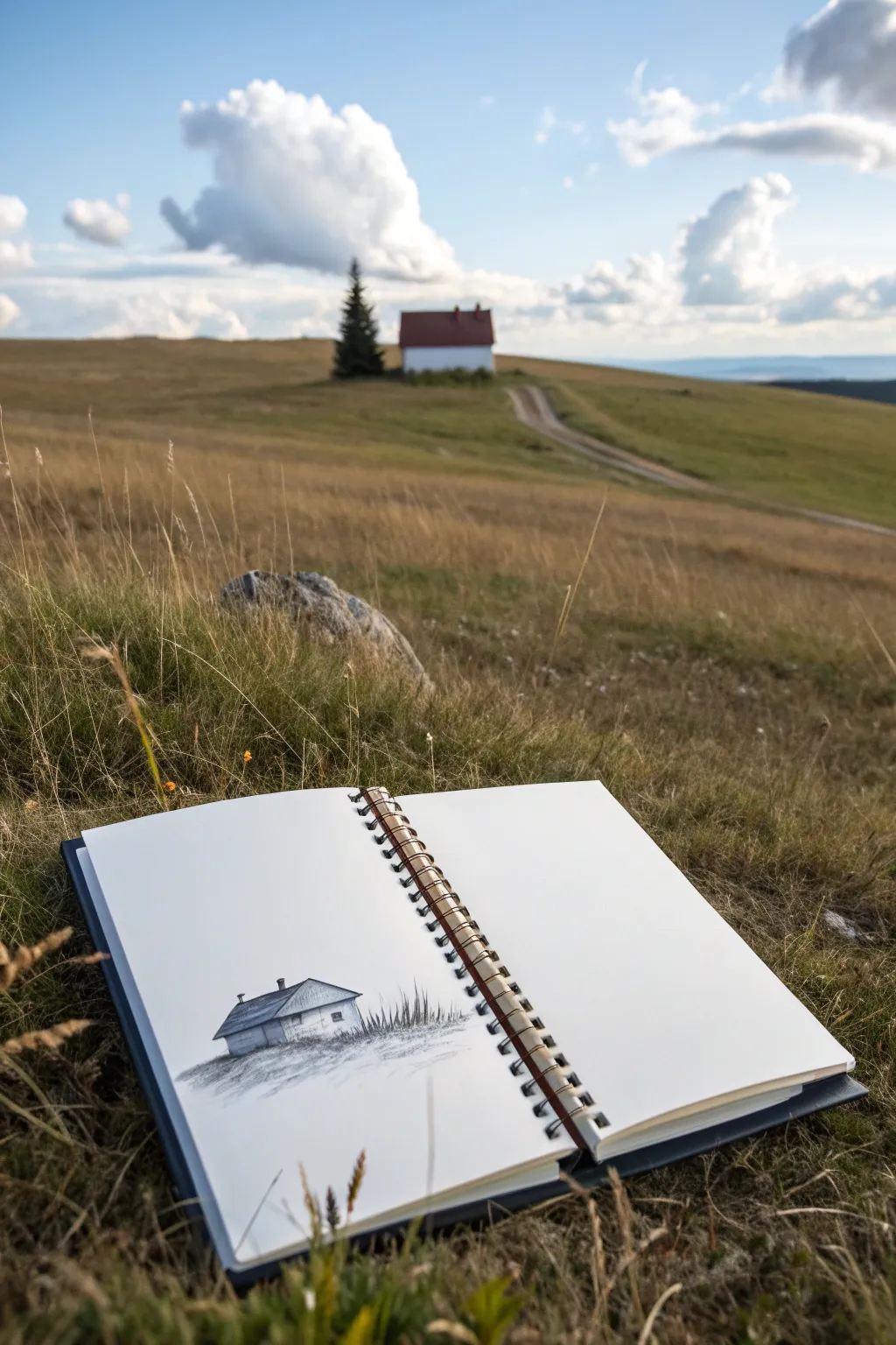
Capture the serene isolation of a distant cottage using simple pencil techniques in this sketchbook study. This project focuses on placing a small focal point low on the page to emphasize the vastness of the empty space above it, creating a striking asymmetrical balance.
Step-by-Step Tutorial
Materials
- Spiral-bound sketchbook with smooth or mixed-media paper
- HB graphite pencil (for initial sketching)
- 2B and 4B graphite pencils (for shading)
- Fine-point mechanical pencil (0.5mm)
- Soft kneadable eraser
- Blending stump (optional)
Step 1: Setting the Scene
-
Placement:
Visualize the page as a large expanse of sky. Position your horizon line very low, roughly in the bottom quarter of the paper. -
Outline the cabin:
Using your HB pencil with a light touch, sketch a simple rectangular box shape for the base of the cabin sitting just below your horizon line. -
Add the roof:
Draw a pitched roof on top of the box. Extend the roofline slightly past the walls to create eaves. -
Define the structure:
Use the mechanical pencil to carefully refine the straight lines of the walls and the angles of the roof, ensuring the perspective looks solid. -
Add architectural details:
Very lightly sketch small rectangles for the windows and a small chimney shape on the roof ridge.
Fixing Smudges
Graphite smears easily on white space. Keep a piece of clean scrap paper under your drawing hand to protect the paper while you work.
Step 2: Shading and Texture
-
Establish light source:
Decide on a light source (likely from the top right). Use the 2B pencil to lightly shade the left-facing wall and the side of the roof facing away from the light. -
Darken the shadows:
Switch to your 4B pencil to deepen the shadows under the eaves and on the shadowed side of the house for higher contrast. -
Texture the roof:
Use short, directional strokes with the mechanical pencil to suggest shingles or metal roofing material without drawing every single detail. -
Ground the structure:
I find it helpful to create a ‘nest’ for the building so it doesn’t float. Scribble a dark, dense shadow directly underneath the base of the cabin. -
Draw grassy textures:
Extending from that dark base, use quick, upward flicks with the HB pencil to create the look of tall grasses surrounding the foundation. -
Create the slope:
Sketch faint, horizontal lines extending to the left and right of the cabin to suggest the curve of the hillside. -
Foreground details:
Add a few darker, thicker grass blades in the immediate foreground using the 4B pencil to create depth. -
Soften edges:
If you have a blending stump, gently smudge the base shadow into the ground to make the transition between house and earth feel natural. -
Refine the sky:
Leave the huge sky largely blank to maintain that sense of scale, but perhaps add one or two extremely faint, barely-there lines to suggest distant clouds or wind. -
Final touches:
Use your kneadable eraser to lift any graphite smudges from the white space, keeping the ‘sky’ area pristine.
Level Up: Environment
Add a tiny, distant tree line on the horizon using very faint, vertical hatching to give the landscape even more massive scale.
Enjoy the quiet dramatic feeling of seeing your tiny cabin sitting alone under all that open paper
Thick Line Weight vs. Fine Detail
This striking ink illustration balances bold, heavy outlines with intricate geometric bands, creating a vase that feels both modern and grounded. By focusing on varying line weights, you’ll learn how to direct the viewer’s eye and add significant depth to a flat object without using shading.
Step-by-Step Guide
Materials
- Spiral-bound sketchbook or drawing paper
- Pencil (HB or H)
- Eraser
- Fine liner pen (01 or 03 size)
- Thick marker or brush pen (black)
- Ruler (optional)
Step 1: Sketching the Form
-
Establish the centerline:
Begin by lightly drawing a vertical line down the center of your page with your pencil. This axis will act as your guide to keep the vase symmetrical. -
Mark the proportions:
Make horizontal dashes along the centerline to mark the top rim, the narrowest part of the neck, the widest part of the body, and the base. -
Sketch the outline:
Connect your marks with a fluid, curving line. Create a flared rim, a tapering neck, a bulbous body, and a sturdy foot at the bottom. Keep these lines light and loose so they are easy to adjust. -
Section the vase:
Draw light curved horizontal lines across the body of the vase. These curves should bow downward slightly to mimic the roundness of the form. Space them out irregularly to create bands of different widths for your patterns.
Step 2: Inking the Foundation
-
Outline the silhouette:
Switch to your thick marker or brush pen. Carefully trace the outer silhouette of the vase, the top rim, and the bottom base. The thick line weight here is crucial for separating the object from the paper. -
Fill the heavy sections:
Using the same thick marker, color in the bottom base completely solid black. Do the same for the very top rim; this anchors the drawing visually. -
Define the major bands:
Switch to your medium or fine liner pen. Trace the horizontal section lines you sketched earlier. These will serve as the boundaries for your pattern work.
Uneven Curves?
If your horizontal curves look wobbly, try turning the sketchbook sideways. Pulling the pen toward you often yields a smoother arc than pushing it away or drawing sideways.
Step 3: Adding Geometric Details
-
Create the top neck pattern:
In the top band near the neck, draw a row of simple arch shapes or semi-circles. Add a small dot in the center of each arch for detail. -
Add simple stripes:
Move to the next band down. Draw two parallel lines close together to create a thin stripe. Below that, add a row of evenly spaced dots that follow the curve of the vase. -
Draw the zigzag band:
In the widest central band, draw a large zigzag line creating a series of triangles. Inside the upward-pointing triangles, draw concentric smaller triangles. -
Detail the triangles:
Fill the space inside the downward-pointing triangles with simple vertical hatching lines. This contrast prevents the area from looking too empty. -
Add the diamond texture:
In the band below the zigzags, create a cross-hatching pattern of diagonal lines to form a grid of diamonds. Place a tiny dot in the center of each diamond. -
Create the vertical striped base:
For the large bottom section of the vase body, draw long, vertical lines that curve slightly with the form of the pot. Space them somewhat loosely for a ribbed effect.
Make it Pop
Add a heavy shadow on just one side of the vase’s exterior using your thickest marker. This simple addition instantly breaks symmetry and adds dramatic dimensionality.
Step 4: Refinement
-
Thicken select lines:
Look at your dividing lines between the pattern bands. I usually like to go back and thicken every other horizontal line slightly to create better separation between the different textures. -
Clean up:
Wait at least five minutes to ensure the ink is completely dry. Gently erase all your underlying pencil marks, being careful not to smudge the ink.
Now you have a beautifully patterned vessel that perfectly demonstrates the power of contrasting line weights
BRUSH GUIDE
The Right Brush for Every Stroke
From clean lines to bold texture — master brush choice, stroke control, and essential techniques.
Explore the Full Guide
Repetition With One Intentional Break
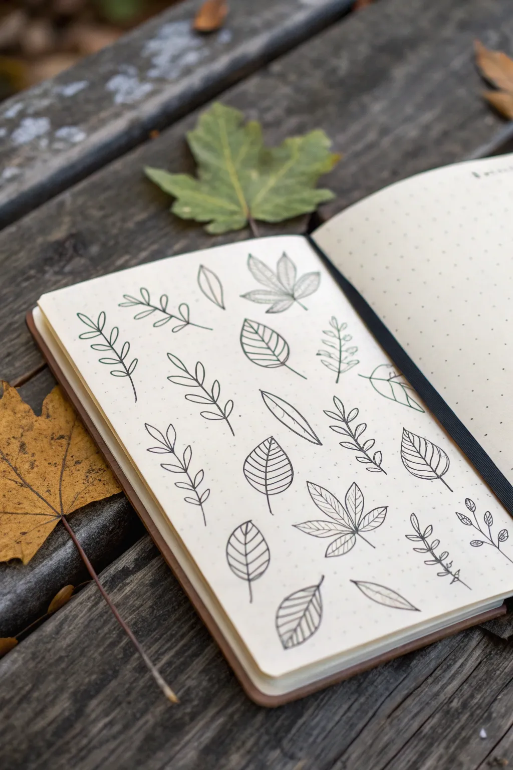
Capture the essence of autumn with this simple yet striking leaf pattern spread. Using clean black lines on dotted paper creates a wonderfully organized yet organic field of botanical doodles.
How-To Guide
Materials
- A5 dotted grid notebook or journal
- Fine liner pen (0.3mm or 0.5mm, black)
- Pencil (HB)
- Eraser
- Ruler (optional, intended for spacing checks)
Step 1: Planning the Layout
-
Observe the grid:
Open your notebook to a fresh dotted page. Take a moment to look at the grid structure; this will be your invisible guide for keeping the leaves somewhat aligned without feeling rigid. -
Visualize the columns:
Mentally divide the page into roughly four imaginary columns. You don’t need to draw lines, just establish where your main vertical flows will be to ensure the pattern covers the page evenly.
Step 2: Drawing the Base Stems
-
Start the fern-like stems:
Begin with the tall, thin stems. Draw a slightly curved central line about 1-2 inches long. These will become your fern-like or compound leaves. Place a few of these randomly across the page. -
Add broad leaf spines:
In the empty spaces between your thin stems, draw shorter, single center lines. These will serve as the spines for the wider, single leaves like the beech or birch shapes. -
Sketch the maple spines:
For the maple-style leaves, draw a main vertical stem and two diagonal lines branching out from the same bottom point, creating a skeletal structure for a palmate leaf.
Grid Guide
Use the dots! Instead of guessing symmetry, count dots (e.g., 2 dots left, 2 dots right) to make your leaves perfectly balanced.
Step 3: Fleshing Out the Leaves
-
Draw simple compound leaves:
Return to your first set of tall stems. Draw small, teardrop shapes extending outward on both sides of the stem, getting slightly smaller as you reach the tip. -
Create alternate compound leaves:
On other tall stems, try an ‘alternate’ pattern where the small leaflets are staggered—left, then right, then left—rather than directly opposite each other. -
Outline the broad leaves:
Go to your single spines. Draw a continuous curved line around the spine to create a classic oval or spade leaf shape. Keep the bottom slightly wider than the top. -
Detail the maple leaves:
Outline the maple skeletons with jagged, pointed edges connecting the tips of your radiating lines. I find it easier to draw the three main points first, then connect them with V-shapes. -
Add a chestnut leaf:
Find a bare spot and draw five teardrop shapes radiating from a single central point, looking like a hand or a fan. This mimics a horse chestnut leaf.
Wobbly Lines?
Don’t stress if curves aren’t perfect. Organic shapes in nature are rarely perfect geometrical lines. A wobble looks like natural texture.
Step 4: Adding Veins and Texture
-
Stripe the broad leaves:
On your wide, single leaves, draw straight or slightly curved diagonal lines from the center spine to the outer edge. Space them evenly to create a graphical, striped look. -
Vein the chestnut leaves:
Add a central line down the middle of each ‘finger’ of your chestnut leaf. add tiny angled dashes branching off these center lines for detail. -
Simple veins for maples:
Add subtle internal veins to the maple leaves. Keep these lines very light and thin so the leaf doesn’t look too cluttered. -
Review the balance:
Take a step back and look at the spread. Identify any large white gaps that feel empty compared to the rest of the page. -
Fill the gaps:
Draw small, single floating leaves or tiny sprigs in those empty spaces. This creates that ‘falling leaves’ effect and balances the composition.
Step 5: Final Touches
-
Refine the lines:
Go over any sketchy or broken lines with your fine liner to ensure consistent line weight throughout the page. The charm is in the clean, confident strokes. -
Add stem details:
Thicken the very bottom of the stems just a tiny bit where they would attach to a branch. It adds a subtle sense of weight. -
Erase pencil marks:
Once the ink is completely dry—give it a full minute just to be safe—gently erase any preliminary pencil sketches or guide marks.
Now you have a serene, botanical page spread ready for journaling or simply enjoying as art
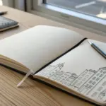
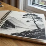
Lopsided Structure on a Solid Base
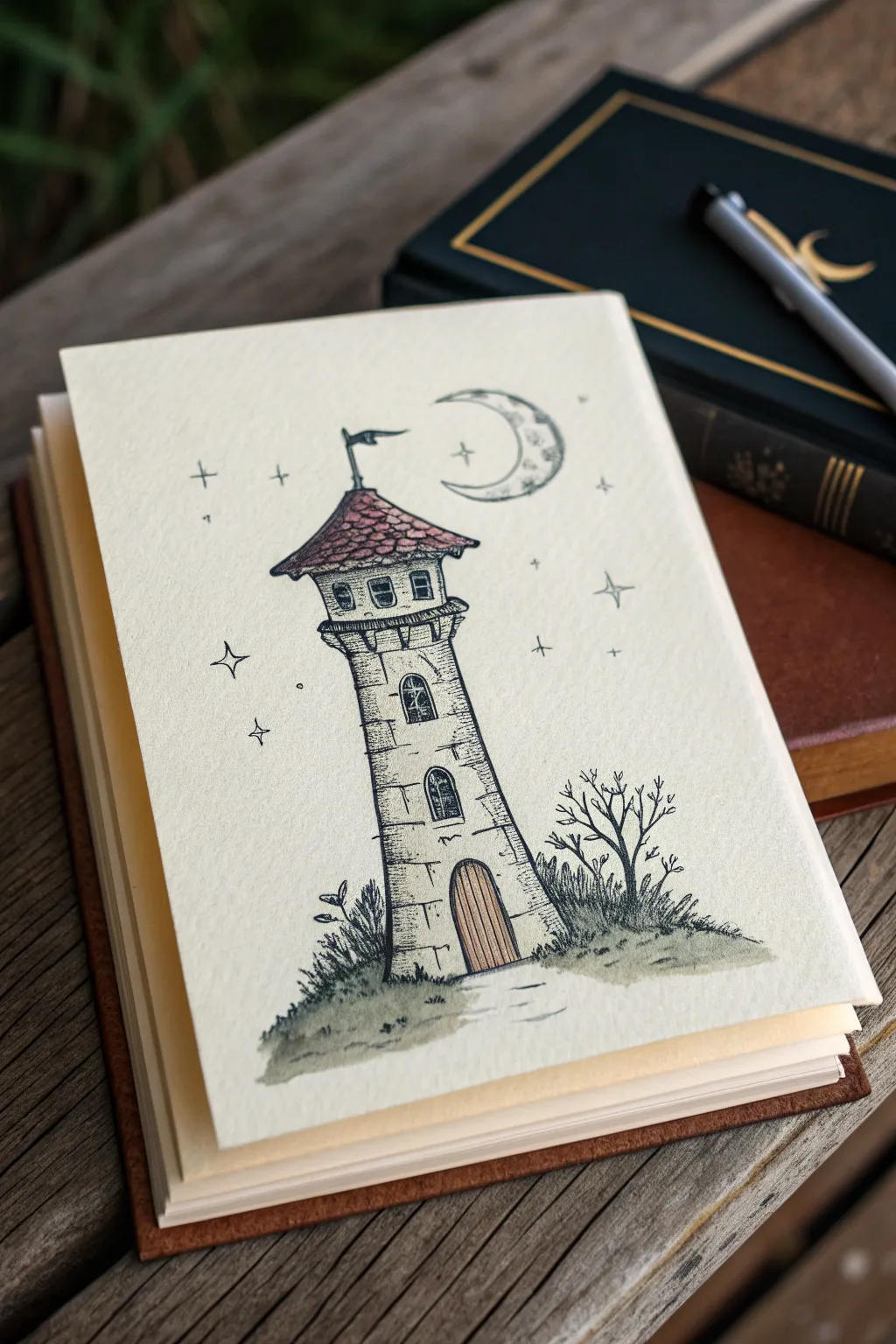
This charming pen-and-ink drawing captures a slightly crooked tower standing tall against a starry sky. The design uses asymmetrical balance by offsetting the tower’s curve with open space and scattered stars, creating a cozy storybook aesthetic.
Step-by-Step
Materials
- Cream or off-white textured sketch paper (heavyweight, at least 160gsm)
- Fine liner pens (sizes 0.1, 0.3, and 0.5)
- Pencil (HB or 2H)
- Kneaded eraser
- Watercolor paints or alcohol markers (muted greens, browns, and slate blue)
- Small round paintbrush (size 2 or 4)
Step 1: Pencil Structure
-
Draft the hill:
Begin by lightly sketching a sloping hill at the bottom of your page. Position the peak of the hill slightly off-center to the right, which will serve as the foundation for our asymmetrical composition. -
Outline the tower’s lean:
Draw the central axis for the tower rising from the hill. Instead of making it perfectly vertical, give it a subtle curve or tilt to the left. This intentional ‘lopsided’ feel adds character. -
Define the tower segments:
Sketch the main body of the tower as a tall, tapering cylinder. Divide it into three sections with horizontal bands to indicate floors or stone ledges. -
Add the roof and topper:
Cap the tower with a conical roof that overhangs the walls significantly. Draw a small flag pole at the very peak, letting the flag wave toward the right to balance the tower’s leftward lean.
Step 2: Inking the Details
-
Ink the main outlines:
Switch to your 0.5 pen to ink the main silhouette of the tower and the roof. Use a slightly broken or ‘shaky’ line quality here; perfect straight lines will look too rigid for this rustic style. -
Detail the stonework:
Using a 0.3 pen, start drawing random horizontal bricks on the tower walls. Don’t fill every space; suggest texture by clustering bricks near the edges and the base. -
Draw the windows and door:
Ink the arched doorway at the bottom and the small arched windows on the upper levels. I like to thicken the shadows inside the window frames to give them depth. -
Texture the roof:
Create a shingle effect on the conical roof using small, overlapping ‘U’ or scallop shapes. Keep these loose and organic rather than grid-like. -
Add the surrounding nature:
Use the 0.1 pen to draw wispy grass blades along the hill’s edge and a small, leafless tree on the right side. The tree branches should reach upward and outward to fill the negative space.
Ink Smearing?
If your watercolors are smearing the pen lines, switch to waterproof archival ink pens (like microns). Alternatively, do the watercolor wash first, let it dry fully, then draw on top.
Step 3: Celestial Elements
-
Sketch the crescent moon:
Place a large crescent moon in the upper right sky. Give it a ‘face’ profile if you like, or simply add craters and texture with stippling dots. -
Scatter the stars:
Draw a mix of four-pointed stars and tiny dots around the tower. Distribute them unevenly, placing a few more on the left to counterbalance the visual weight of the moon on the right.
Make it Shine
Use a gold or silver gel pen to trace over the stars and the crescent moon. This adds a subtle, magical shimmer that catches the light when the page is turned.
Step 4: Washing and Finishing
-
Erase pencil lines:
Once the ink is completely dry, gently roll your kneaded eraser over the entire drawing to lift the graphite guides. -
Paint the roof:
Dilute a reddish-brown watercolor or marker ink. Apply a wash to the roof shingles, keeping it translucent so the ink lines show throughclearly. -
Tint the door and ground:
Use a warm brown for the wooden door vertical planks. For the grassy hill, apply a desaturated olive green wash, letting it fade out into the paper white at the bottom edges. -
Shadowing the tower:
Mix a very watery grey or slate blue. Paint a thin shadow line down the right side of the tower cylinder to enhance the cylindrical form. -
Final stippling:
Take your finest 0.1 pen again and add tiny dots (stippling) at the base of the tower and under the roof eaves to deepen the darkest shadows.
Now you have a beautifully balanced scene that proves perfect symmetry isn’t necessary for a captivating drawing


Have a question or want to share your own experience? I'd love to hear from you in the comments below!