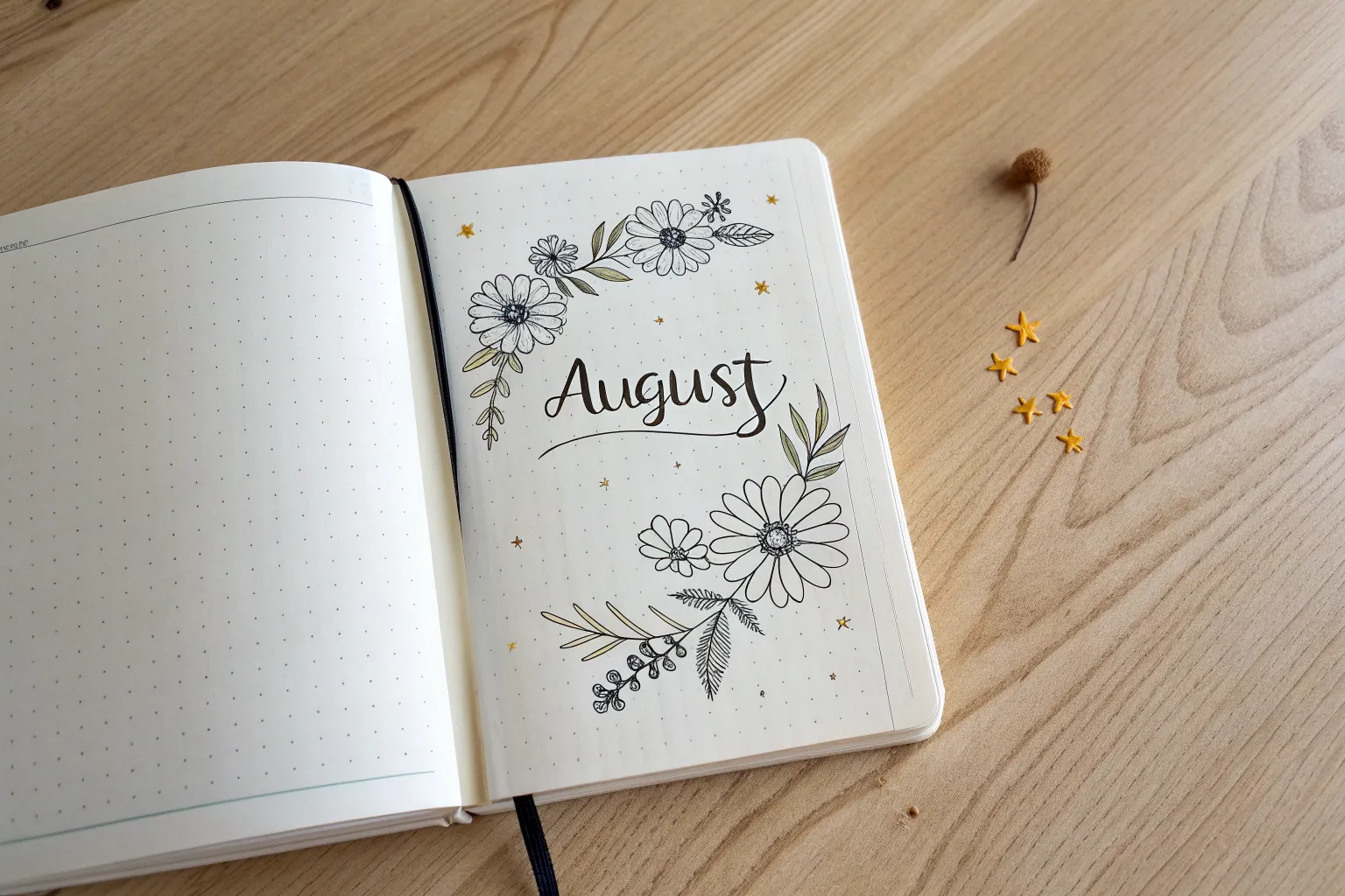
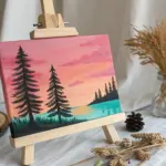
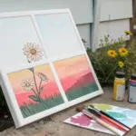
August has this special mix of late-summer glow and “new chapter” energy, and it’s perfect for fresh sketchbook pages. Here are some August drawing ideas that work beautifully as monthly cover pages, headers, and artsy little layouts you’ll actually want to look at all month.
Bold Block Lettering for an August Title Page
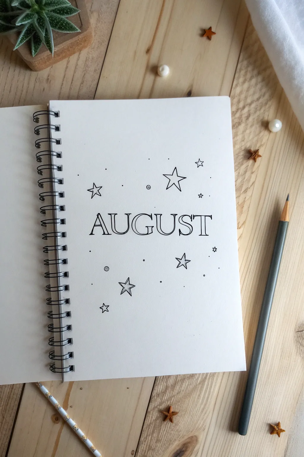
Kick off the month with this minimalist and airy title page that focuses on clean lines and negative space. The combination of bold, outlined serif lettering and scattered doodle stars creates a theme that feels both classic and dreamy.
Detailed Instructions
Materials
- A5 Dot grid or blank notebook
- HB Pencil
- Eraser
- Fine liner pen (0.3mm or 0.5mm, black)
- Ruler (optional but helpful)
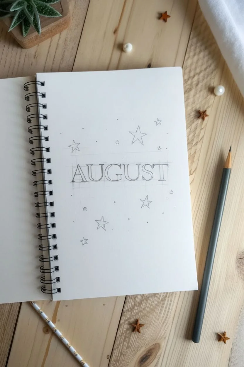
Step 1: Drafting the Layout
-
Find the center:
Start by locating the approximate visual center covering the middle third of your page. Since the word ‘AUGUST’ has six letters, the gap between ‘G’ and ‘U’ will be your absolute center point. -
Sketch the baseline:
Lightly sketch a horizontal baseline in pencil where your letters will sit. If you are using blank paper, you might want to use a ruler to keep this straight. -
Block out the letters:
Using your pencil, lightly write out the word ‘AUGUST’ in a simple serif font. Don’t worry about the outlines yet; just focus on getting the spacing even and the height consistent. Generous spacing between letters gives it that airy feel. -
Add thickness:
Go back over your single-line sketch and draw boxes around the lines to create the block letter shape. Pay attention to the serifs (the little feet at the ends of the strokes); sketch them as rectangular slabs rather than curves to match the reference style. -
Position the stars:
Sketch five main stars around the text. Place a large one above the ‘ST’, a medium one below ‘AG’, and a few smaller ones scattered to balance the composition. Use the classic five-point star shape.
Wobbly Lines?
If your straight lines are shaky, use a ruler for the vertical stems of the letters. For stars, plot 5 dots first, then connect them.
Step 2: Inking the Designs
-
Trace the text:
Take your black fine liner and carefully trace over your pencil outlines for the word ‘AUGUST’. Keep your hand steady and try to connect the lines cleanly at the corners of the serifs. -
Double-check connections:
Ensure that all lines within the letters are closed. The beauty of this style relies on the crisp, enclosed shapes of the empty letters. -
Ink the main stars:
Trace your five-point star sketches. Similar to the text, we want these to be outlines only, leaving the insides white. -
Add inner details:
Inside the larger stars, draw a second, smaller star shape that mimics the outer contour. This creates a slightly dimensional ‘cookie cutter’ look.
Step 3: Final Details
-
Erase pencil marks:
Wait a minute for the ink to fully dry to avoid smudging. Then, gently erase all the underlying pencil sketches, leaving just the crisp black ink. -
Add stardust dots:
Using the tip of your pen, tap small dots randomly around the stars and lettering. I find that grouping 2-3 dots near the larger stars helps anchor them. -
Draw mini-circles:
Interperse a few tiny open circles (like bubbles) among the dots. Keep these very small, just large enough to see the white space in the center. -
Create distance stars:
Draw three or four tiny four-point stars (like little diamonds or sparkles) in the emptier areas to fill out the galaxy effect without overcrowding the page. -
Balance the composition:
Step back and look at the page. If any area looks too empty, add a single dot or a tiny cross-star to balance the visual weight.
Level Up
Use a metallic gold or silver gel pen to fill in the tiny circular highlights or to shadow the right side of the block letters.
Your elegant, starry title page is ready to welcome the new month

Back-to-School Doodle Collage for August
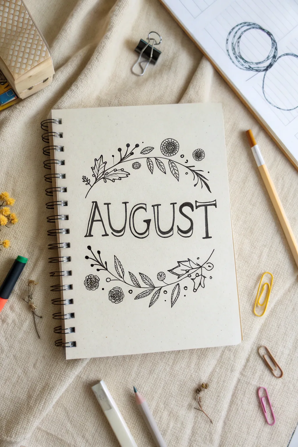
Welcome the upcoming school year with this elegant floral title page. Featuring a bold, retro-style serif font encircled by delicate botanical line art, this design perfectly balances simplicity with intricate detail.
Step-by-Step
Materials
- Spiral-bound notebook or sketchbook (cream or beige paper recommended)
- Fine liner pen (black, size 01 or 03)
- Medium felt-tip pen (black, size 05 or 08)
- Pencil (HB or H for light sketching)
- Eraser (kneaded eraser works best)
- Ruler (optional)
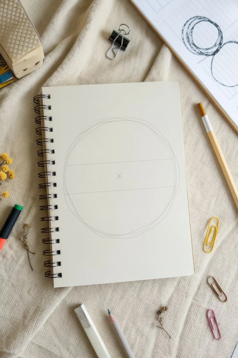
Step 1: Setting the Structure
-
Find the center:
Begin by finding the visual center of your notebook page. Lightly mark the center point with your pencil. -
Draft the text area:
Sketch two very faint horizontal guidelines about 1.5 inches apart across the middle of the page. This is where your ‘AUGUST’ lettering will live. -
Outline the circle shape:
Lightly sketch a large circle around your text area to serve as the guide for your wreath. It doesn’t need to be perfect; a loose shape is fine as the leaves will break the line later.
Pro Tip: Line Variation
Use a thicker pen for the ‘AUGUST’ lettering and a superfine pen for the wreath. This contrast prevents the doodle from looking cluttered.
Step 2: Lettering the Title
-
Sketch the skeleton:
Using your pencil, draft the word ‘AUGUST’ in simple, tall capital letters. Center the middle ‘G’ and ‘U’ near your center mark so the word is balanced. -
Add weight to the letters:
Transform the stick letters into block letters by adding thickness. Give them slightly spurred serifs—small triangular flicks at the ends of each stroke—for a classic vintage look. -
Ink the main outlines:
Take your medium felt-tip pen (05 or 08) and carefully trace the outline of your letters. Do not fill them in yet. -
Create the 3D shadow:
Using the same pen, add a drop shadow to the right side of each letter. Instead of filling this shadow straight black, fill it with closely spaced diagonal hatching lines for texture. -
Refine the inner details:
Inside the open space of each letter, draw a thin, single line that follows the shape of the letter, staying slightly off-center to the left. This adds dimension.
Troubleshooting: Smudges
If you smudge wet ink, turn it into a leaf or flower petal. Organic doodles are forgiving; simply draw over the mistake to hide it.
Step 3: Drawing the Floral Wreath
-
Establish the main stems:
Switch to your thinner fine liner (01 or 03). Along the top arc of your pencil circle, draw a primary curved stem that sweeps from left to right. -
Draw the bottom stem:
Repeat the process for the bottom arc, drawing a curved stem sweeping from left to right, creating a frame around the text. -
Add holly-style leaves:
On the left side of the top branch and right side of the bottom branch, sketch a few jagged, holly-shaped leaves. Add a central vein to each one. -
Incorporate oval leaves:
Fill in gaps along the stem with simple, smooth oval leaves. For visual interest, stripe the insides of some leaves with diagonal lines, while leaving others plain. -
Draw button flowers:
Scatter loose circles along the wreath line. Fill these with cross-hatching or concentric grids to create texturized ‘button’ flowers. -
Add delicate sprigs:
Extend tiny, thin lines off the main stem that end in small black dots or tiny open circles. These berries add airiness to the dense arrangement. -
Balance the composition:
Step back and look for empty spots. Add small floating circles or extra tiny leaves to balance the top and bottom visual weight.
Step 4: Finishing Touches
-
Erase guidelines:
Wait at least 5-10 minutes for all ink to dry completely. Gently erase all pencil marks, being careful not to smudge the ink or crinkle the paper. -
Strengthen lines:
If any lines look too faint after erasing, go back over them with your fine liner to make the black pop against the cream paper.
You now have a beautifully hand-lettered cover page ready to start your August journaling.
Hanging Planets as an August Header
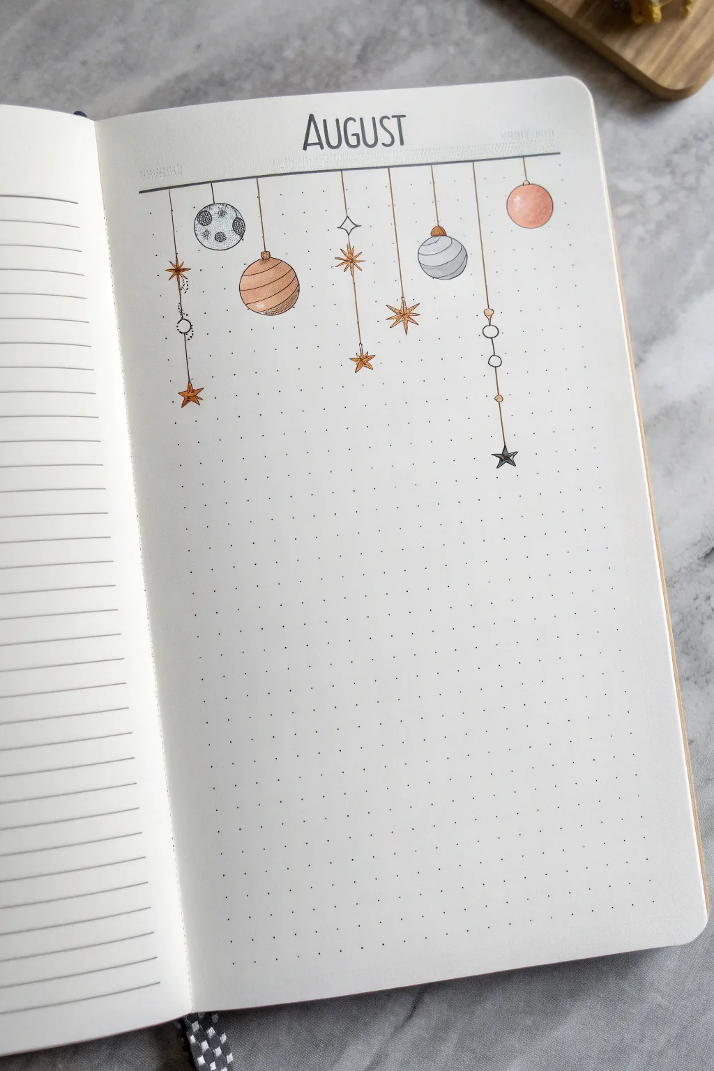
Transform your bullet journal page into a whimsical night sky with these dangling planets and stars. This minimalist header uses fine lines and soft earth tones to create a balanced, airy composition perfect for an August setup.
Step-by-Step Guide
Materials
- Dotted notebook (bullet journal style)
- Black fineliner pens (0.1mm and 0.3mm)
- Grey marker or brush pen
- Muted orange/terracotta marker or brush pen
- Ruler
- Pencil and eraser
- Circle template or compass (optional)
Step 1: Setting the Stage
-
Pencil placement:
Begin by lightly sketching the word ‘AUGUST’ at the top center of your page using a pencil. Leave about an inch of space above it for breathing room. -
Draw the header line:
Use your ruler to draw a straight horizontal line directly beneath your lettering. Extend this line across the width of the page, stopping about 1.5 cm from each edge. -
Add the text:
Go over your ‘AUGUST’ lettering with a 0.3mm fineliner. Use a tall, narrow sans-serif font to match the clean aesthetic of the mobile illustration. -
Thicken the main bar:
With the same pen, trace over your horizontal line again to make it slightly bolder than the intricate doodles hanging below. You can add tiny decorative dots or dashes at the very ends of the line.
Step 2: Drafting the Shapes
-
Map out vertical strings:
Using a pencil and ruler, draw vertical lines dropping down from the main bar. Vary the lengths significantly—some short, some long—to create visual interest. You’ll need about 7-8 lines spaced irregularly. -
Sketch the celestial bodies:
At the end of these lines, lightly sketch your shapes. Mix circles for planets and moons with star shapes. Try to alternate them so two large circles aren’t right next to each other. -
Add detail elements:
On the longer strings, add interim details before the final shape. Sketch small beads (tiny circles) or diamond shapes along the string to break up the vertical line. -
Refine the stars:
For the stars, sketch an eight-point shape: a long vertical cross intersecting with a smaller ‘X’ shape. Make the points sharp and spindly.
Steady Hands
For the straight hanging lines, exhale slowly as you draw downward. Following the dots in your notebook helps keep vertical lines perfectly perpendicular.
Step 3: Inking and Details
-
Ink the strings:
Switch to your finer 0.1mm pen. Carefully trace the vertical distinct lines. If your hand shakes a little, don’t worry—it adds to the hand-drawn charm. -
Outline the shapes:
Ink the outlines of your planets and stars. For planets like Jupiter, draw slightly curved horizontal stripes inside. For the moon, draw small craters. -
Create connection points:
Where the string meets the planet or star, draw a tiny loop or hook shape so it looks physically attached, rather than just floating. -
Erase guidelines:
Once the ink is completely dry, gently erase all your pencil marks. Be thorough so the colors remain clean.
Make it Shine
Use a white gel pen to add tiny highlights on the solid colored planets after the marker ink dries. This makes them look like shiny glass ornaments.
Step 4: Adding Color
-
Color the terracotta planets:
Take your muted orange marker. Fill in the striped planet, alternating painted stripes with white space. Color the solid round planet on the far right completely. -
Add grey touches:
Use the grey marker for the moon (coloring around the craters) and the striped grey planet. The grey adds a nice cool-toned contrast to the warm orange. -
Highlight the stars:
Carefully color just the center of the stars with orange, or color the whole star if it is small. I prefer leaving the tips of the larger stars white for a sparkling effect. -
Add final sparkle:
For the singular black star at the bottom right, use your black pen to color it in solid, leaving a tiny white dot in the center for a highlight. -
Connect the accents:
If you drew tiny beads on the strings, add a dot of orange or grey to them now to tie the whole color palette together.
Enjoy the calm atmosphere this celestial header brings to your monthly planning pages


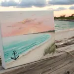
Coastal Lighthouse Frame for an August Title
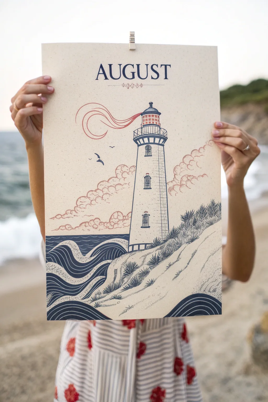
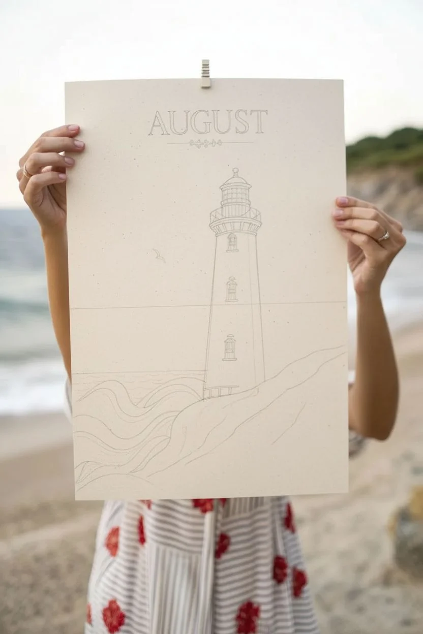
Capture the essence of late summer with this striking nautical illustration that balances bold linework with soft, vintage-inspired colors. The finished piece mimics the look of a classic two-color screen print, featuring a sturdy lighthouse watching over stylized waves and dunes.
Step-by-Step Tutorial
Materials
- Cream or off-white heavy cardstock or mixed media paper (A3 or 11×17 size)
- Navy blue fine liner pens (0.3mm and 0.5mm)
- Navy blue brush marker or gouache paint
- Muted coral or rust-red colored pencil or watercolor marker
- Ruler
- Pencil and eraser
- Letter stencils (serif font) or printed reference
Step 1: Setting the Scene
-
Establish the layout:
Begin by lightly sketching a horizon line about one-third of the way up from the bottom of your paper. Draw the main vertical shape of the lighthouse slightly off-center to the right, tapering it gently as it goes up. -
Map the dunes:
Sketch a diagonal slope rising from the bottom left corner up towards the right side of the lighthouse base. This will be your sand dune foreground. -
Define the ocean:
To the left of the dune, lightly block in the area for the sea. Instead of a flat line, sketch rolling, ribbon-like curves that will become the stylized waves later. -
Add the title:
At the very top, measure the center point. Using a ruler for alignment and stencils or a steady hand, lightly pencil in the word “AUGUST” in a classic serif font. Include a small decorative flourish or line underneath the text.
Vintage Texture Hack
To mimic the speckled look of an old print, use a dry toothbrush with a tiny bit of navy paint and flick it lightly over the wave area before inking.
Step 2: Drawing the Lighthouse
-
Construct the tower details:
Using your 0.3mm navy pen, ink the outline of the lighthouse. Add two small arched windows on the tower shaft and distinct horizontal bands to separate the top lantern room. -
Detail the lantern room:
Draw the railing around the top gallery using small vertical ticks. Create the glass pane grid on the lantern itself, and fill the roof cap with solid navy blue, leaving a tiny highlight if desired. -
Add texture to the masonry:
Give the tower a weathered look by adding very light, broken horizontal dashes and stippling (small dots) up and down the sides. Keep the center relatively clear to suggest roundness.
Wobbly Lines?
If your straight lines on the lighthouse aren’t perfect, don’t worry. A slightly organic, hand-drawn wiggle adds to the rustic, illustrative charm.
Step 3: Inking the Landscape
-
Create the waves:
This is a key stylistic element. Use your thicker navy marker or brush pen to draw the waves as thick, flowing ribbons. Leave thin gaps between the dark lines to let the cream paper show through, creating a linocut effect. -
Fill the deep ocean:
Behind the ribbon waves, fill horizontally with solid navy blue or thick horizontal hatching to represent the deeper water against the horizon. -
Texture the dunes:
Switch back to the fine liner. Use stippling (lots of dots) to create sand texture on the dune slope. Concentrate the dots near the bottom edges and shadows, fading them out as you move up the slope. -
Draw coastal vegetation:
Add tufts of dune grass along the ridge of the sand. Use quick, upward flicking strokes to make spiky clusters of grass. Group them densely near the lighthouse base and sporadically down the slope.
Step 4: Applying Color and Atmospherics
-
Draw the smoke details:
With a fine red pen or colored pencil, draw a whimsical, swirling smoke shape drifting from the lighthouse lantern to the left. Use three or four parallel curved lines that loop back on themselves. -
Add the clouds:
Using the same muted red tool, sketch billowy cumulus clouds low on the horizon behind the lighthouse. Instead of solid lines, use broken, scallop-shaped strokes to keep them feeling airy and vintage. -
Color accents:
Color in the grid of the lantern room with the red tone. You can also lightly shade the bottom of the clouds or add a few red accent dots to the decorative flourish under the title. -
Finalize the text:
Go over your “AUGUST” lettering with the thick navy marker or brush pen. Ensure the serifs are sharp and crisp. I find it helpful to rotate the paper to get the best angle for these straight lines. -
Finishing touches:
Add two or three small silhouette birds flying near the lighthouse using the fine navy pen. Erase any remaining pencil sketch lines once the ink is totally dry.
Hang your new print with a wooden clip or frame it to bring a breath of sea air into your home


Have a question or want to share your own experience? I'd love to hear from you in the comments below!