There is something incredibly freeing about covering a blank canvas with color before worrying about the details of your main subject. I have collected my favorite methods to help you create stunning foundations that set the perfect mood for your artwork.
Seamless Ombré Gradients
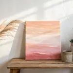
Capture the warmth of twilight with this stunning gradient painting that transitions seamlessly from deep violet to vibrant orange. Using simple wet-on-wet blending techniques, you’ll create a professional-looking abstract piece that adds a pop of modern color to any room.
Detailed Instructions
Materials
- Stretched canvas (gallery wrapped recommended)
- Heavy body acrylic paints (Deep Violet, Magenta, Bright Orange)
- Wide flat synthetic brush (2-3 inch)
- Medium flat brush (1 inch)
- Palette or disposable plate
- Water container
- Paper towels
- Fine mist spray bottle (optional)
- Slow-drying medium or retarder (optional)
Step 1: Base Color Application
-
Prepare your palette:
Squeeze generous amounts of violet, magenta, and orange paint onto your palette so you don’t have to pause for mixing later. -
Paint the top section:
Load the wide flat brush with violet paint and apply it to the top third of the canvas surface. -
Cover the edges:
Immediately paint the top edge and the upper third of the side edges with violet to ensure a wrap-around look. -
Apply the bottom color:
Rinse your brush thoroughly and dry it, then apply bright orange paint to the bottom third of the canvas. -
Finish the base structure:
Paint the bottom edge and the lower third of the sides with orange to match the front face. -
Fill the center:
With a clean brush, fill the remaining middle section with magenta paint, allowing it to butt up against the wet violet and orange sections.
Step 2: Creating the Gradient
-
Begin the upper blend:
While the paint is still wet, use long horizontal strokes to brush back and forth exactly where the violet and magenta meet. -
Smooth the transition:
Gradually work your brush slightly downwards into the magenta zone to pull a little darkness down, softening the line. -
Clean your tool:
Wipe your brush on a paper towel to remove excess dark pigment before moving to the lighter area. -
Address the lower blend:
Using the same horizontal motion, blend the seam where the magenta meets the orange. -
Refine the orange zone:
Work up slightly from the orange into the pink to create a warm, glowing transition without losing the pure orange at the bottom. -
Keep it workable:
I like to mist the canvas very lightly with water if the acrylics start to drag or dry too quickly during this process. -
Match the sides:
Use the medium brush to blend the colors on the side edges of the canvas, ensuring the gradient lines up with the front face.
Fixing Muddy Colors
If colors look brown or muddy, you may be over-blending. Wipe your brush clean frequently and avoid mixing the purple directly with the orange.
Step 3: Finalizing
-
Feather out streaks:
Check the entire surface for harsh brush marks and gently feather them out with a dry brush while damp. -
Let it dry:
Allow the first layer to dry completely for about 30 to 60 minutes. -
Assess opacity:
If the canvas weave is showing through or the colors look thin, repeat the entire blocking and blending process for a second coat. -
Final dry:
Let the final coat cure fully, preferably overnight, before handling or hanging.
Pro Tip: Acrylic Retarder
Mix a few drops of slow-drying medium or retarder into your paints. This keeps acrylics wet longer, giving you a stress-free window to perfect that smooth fade.
With your beautiful sunset gradient complete, you have a vibrant focal point ready to brighten up your living space

Deep Galaxy Night Skies
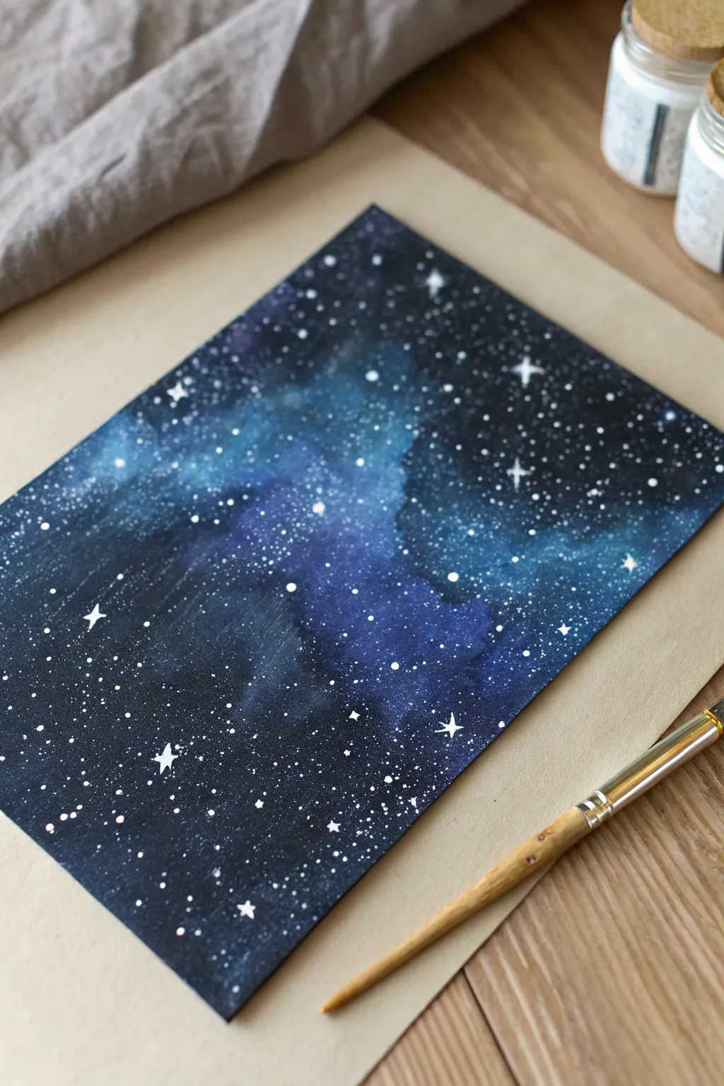
Capture the infinite mystery of space with this moody, deep-hued watercolor project. By blending rich dark tones with a vibrant nebula path, you’ll create a mesmerizing backdrop perfect for art journals or framed decor.
Step-by-Step Guide
Materials
- Cold press watercolor paper (300 gsm)
- Masking tape or washi tape
- Watercolors or Gouache (Teal, Purple, Indigo, Black)
- Opaque White Gouache or White Ink
- Large round brush (size 8-10)
- Fine detail brush (size 0 or 1)
- Old toothbrush or stiff fan brush
- 2 jars of water
- Paper towels
Step 1: Setting the Atmosphere
-
Secure the canvas:
Tape down all four edges of your watercolor paper to a board or table; this creates a crisp border and prevents buckling when the paper gets wet. -
Prime the surface:
Using your large clean brush, apply a thin, even coat of clean water across the entire paper surface to prepare for the wet-on-wet technique. -
Create the nebula core:
Load your brush with teal or light turquoise paint and paint a loose, diagonal cloud shape stretching across the center of the paper. -
Add transition colors:
While the paper is still wet, drop purple or violet paint along the edges of the teal strip, allowing the colors to bleed slightly into one another. -
Soft blending:
Clean and dampen your brush, then gently tickle the area where the teal and purple meet to create a seamless, smoky transition.
Star Consistency Tip
Test your splatter on a scrap paper first. If the drops look like streaks, your paint is too watery. If nothing comes off the brush, the paint is too thick.
Step 2: Deepening the Cosmos
-
Define the void:
Apply a rich indigo or navy blue to the remaining white areas of the paper, working quickly so the paint can still merge with the purple borders. -
Darken the corners:
Mix black with your indigo and apply this deepest shade specifically to the four corners and the very edges of the paper to create a vignette effect. -
Enhance texture:
I like to take a crumpled paper towel and very lightly dab a few spots in the teal nebula to lift pigment, creating a cloudy texture. -
First drying phase:
Let this base layer dry completely; if the paper feels cold to the touch, it is still damp, so wait a bit longer or use a hair dryer. -
Intensify darkness:
If your dried dark corners look faded, glaze a second layer of black-indigo mix over them to achieve that deep, opaque space look shown in the photo. -
Final smooth:
Use a damp brush to feather the edges of this second dark layer so it doesn’t leave harsh lines against the lighter center, then let it dry thoroughly.
Step 3: A Galaxy of Stars
-
Prepare starlight:
Squeeze a pea-sized amount of white gouache onto your palette and mix it with a tiny drop of water until it has the consistency of heavy cream. -
The flicking technique:
Dip an old toothbrush or a stiff fan brush into the white mix, hold it over the paper, and tap the handle or run your thumb over the bristles to spray fine mist dots. -
Concentrate the Milky Way:
Focus the splattering density heavily along the diagonal teal nebula to simulate the concentration of stars in the Milky Way. -
Add hero stars:
Switch to your fine detail brush and dip it into the solid white gouache. -
Paint star flares:
Select 3 to 5 spots on the dark background and meticulously paint small four-point crosses to represent twinkling major stars. -
Vary the sizes:
Use the tip of the fine brush to manually dot a few slightly larger round stars randomly throughout the dark areas to break up the uniformity of the splatter. -
The reveal:
Wait for the white paint to dry completely, then carefully peel away the masking tape at a 45-degree angle to reveal the clean, sharp edges.
Level Up: Silhouette
Once the background is finished, use black ink to paint a jagged line of mountain peaks or tiny pine trees along the bottom edge for a landscape scene.
You now have a window into deep space that captures the magical silence of the cosmos.
Wet-on-Wet Watercolor Washes
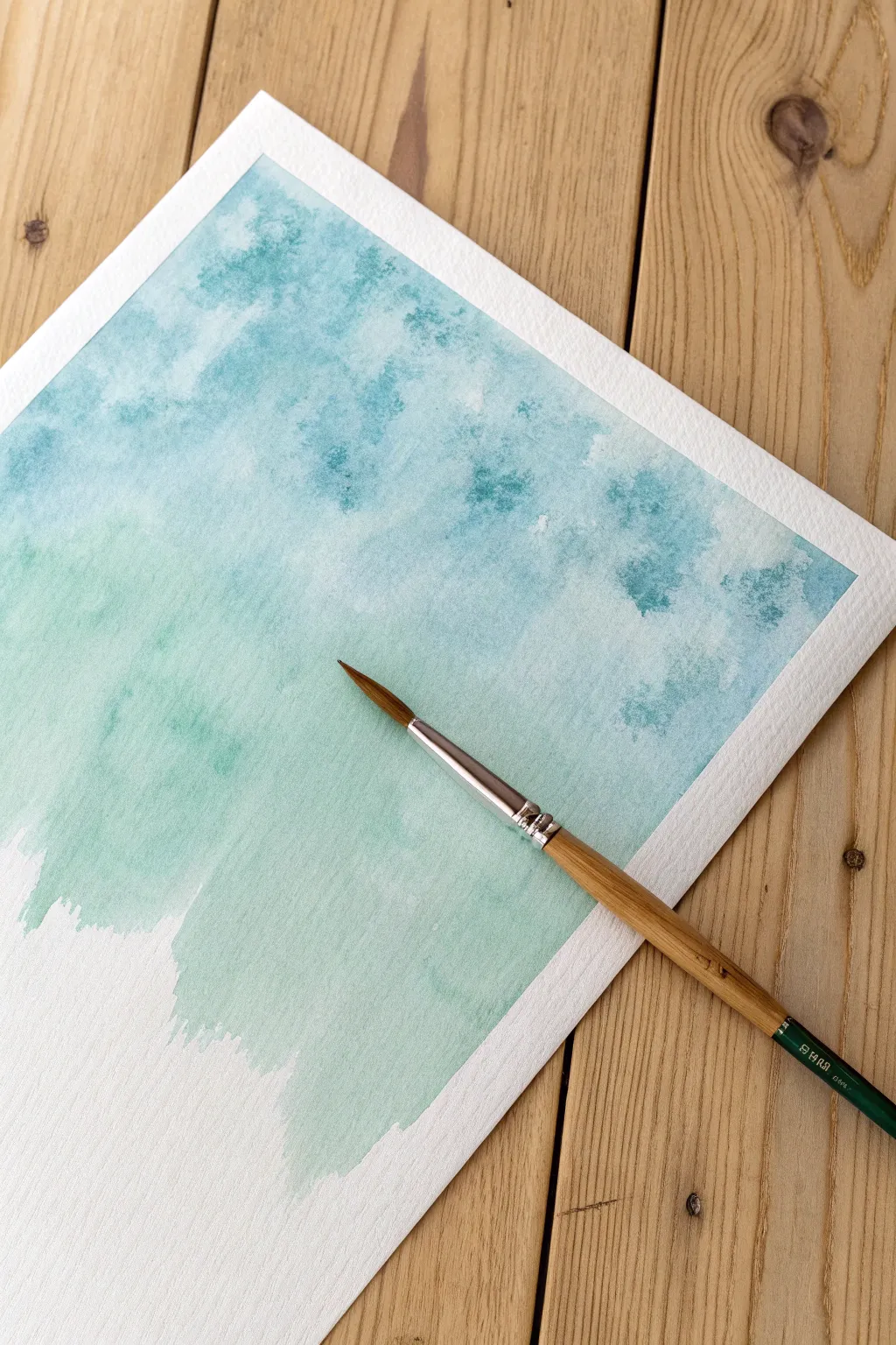
Capture the calmness of the sea with this textured wet-on-wet watercolor background. By letting water do the heavy lifting, you will create organic blooms and a soft fade perfect for hand lettering or art journaling.
Detailed Instructions
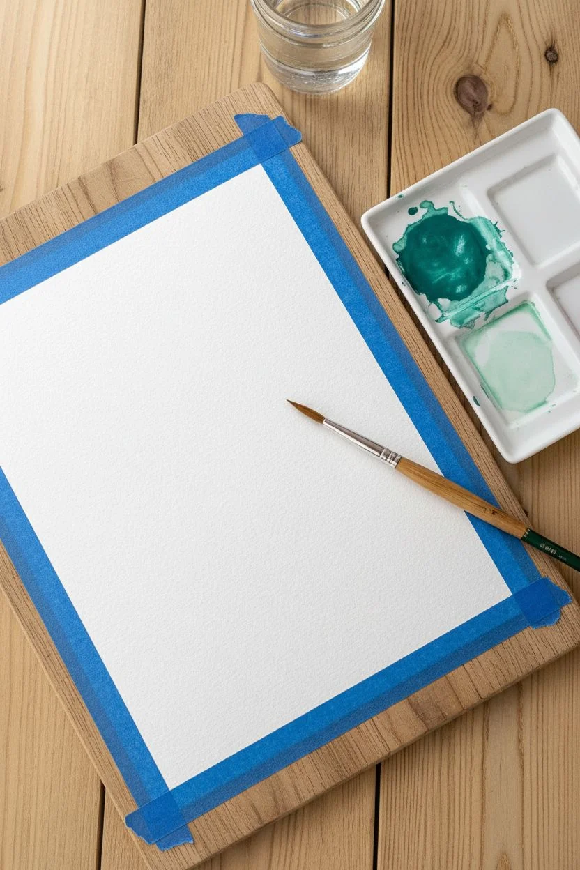
Materials
- Cold press watercolor paper (140lb/300gsm)
- Masking tape or painter’s tape
- Watercolor paints (Turquoise, Phthalo Blue, Emerald Green)
- Round watercolor brush (size 8 or 10)
- Jar of clean water
- Mixing palette
- Paper towels
- Rigid backing board
Step 1: Preparation
-
Secure the paper:
Tape your watercolor paper down to a rigid board on all four sides, ensuring the tape is straight to create a crisp border later. -
Seal the edges:
Run your fingernail or a spoon handle firmly along the inner edge of the tape to prevent paint from seeping underneath. -
Mix the main color:
On your palette, mix a generous amount of turquoise with a touch of emerald green to get a rich, sea-glass teal. -
Prepare a lighter shade:
In a separate well, dilute some of that teal mixture with plenty of water to create a very pale, minty wash.
Bloom Control
To get those cloudy textures, add clear water drops when the paint is damp, not soaking wet. If it’s too wet, the drops will just disappear.
Step 2: Applying the Wash
-
Wet the paper:
Dip your round brush in clean water and coat the top two-thirds of the paper evenly. -
Check the sheen:
I like to tilt the board to the light—you want the paper to glisten with a satin sheen, but not have standing puddles of water. -
Apply saturated color:
Load your brush with the concentrated teal mix and dab it randomly into the wet upper section. -
Encourage texture:
Instead of smooth strokes, use a dabbing motion to deposit pigment, allowing it to explode and cloud outward naturally. -
Start the gradient:
Dip your brush quickly into your water jar to release some pigment, then paint just below the dark area. -
Blend downward:
Use the lighter mint mixture to pull the color down towards the dry bottom section of the paper. -
Create the fade:
Clean your brush thoroughly so it just holds clear water. -
Feather the edge:
Drag the wet brush along the bottom edge of the paint so it fades roughly into the white paper, creating a jagged, organic finish.
Torn Paper?
If the tape rips your paper upon removal, you are pulling too fast. Heat the tape briefly with a hair dryer to soften the adhesive before peeling.
Step 3: Texturing and Finishing
-
Create blooms:
While the top section is still damp but losing its sheen, splatter a few tiny drops of clean water into the pigment. -
Let it settle:
These water drops will push the pigment away, creating the beautiful ‘cauliflower’ textures seen in the reference image. -
Dry partially:
Allow the paper to sit flat until the shine has completely disappeared. -
Dry completely:
Wait for the paper to be bone dry to the touch; the paper should feel room temperature, not cool. -
Remove tape:
Peel the masking tape away slowly at a 45-degree angle, pulling away from the painting to ensure a clean white border.
Enjoy the soothing process of watching the colors blend and create your own unique seascape.


Soft Scumbled Clouds
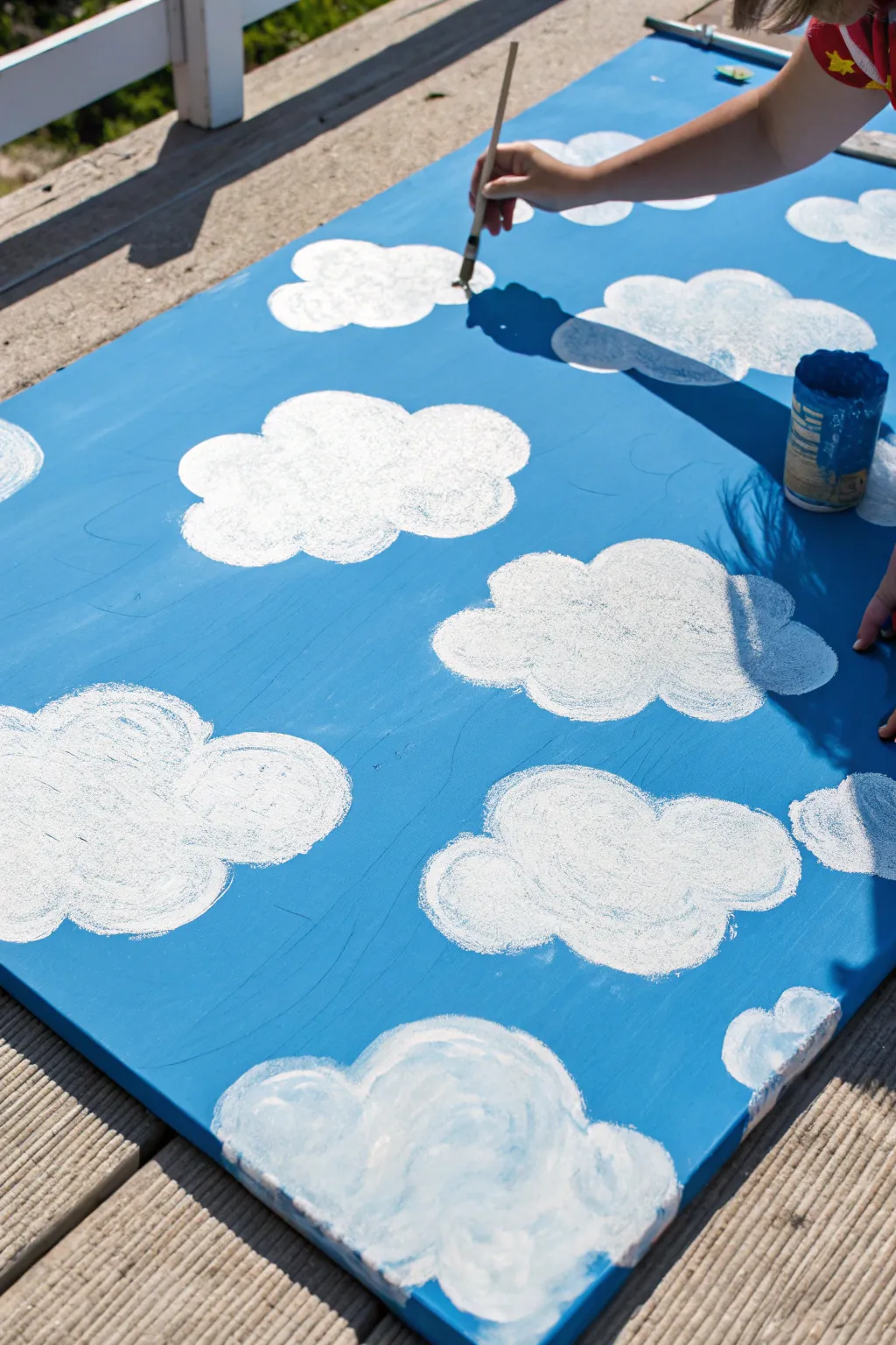
Transform a plain board or canvas into a whimsical summer sky using a simple scumbling technique. This method creates soft, fluffy textures that give your painted clouds a lovely organic feel without needing complex shading skills.
Step-by-Step Tutorial
Materials
- Large wooden board, canvas, or plywood sheet
- Sky blue acrylic paint (base)
- Titanium white acrylic paint
- pencil
- Medium-sized round bristle brush
- Paper towels or rag
- Paint jar or palette
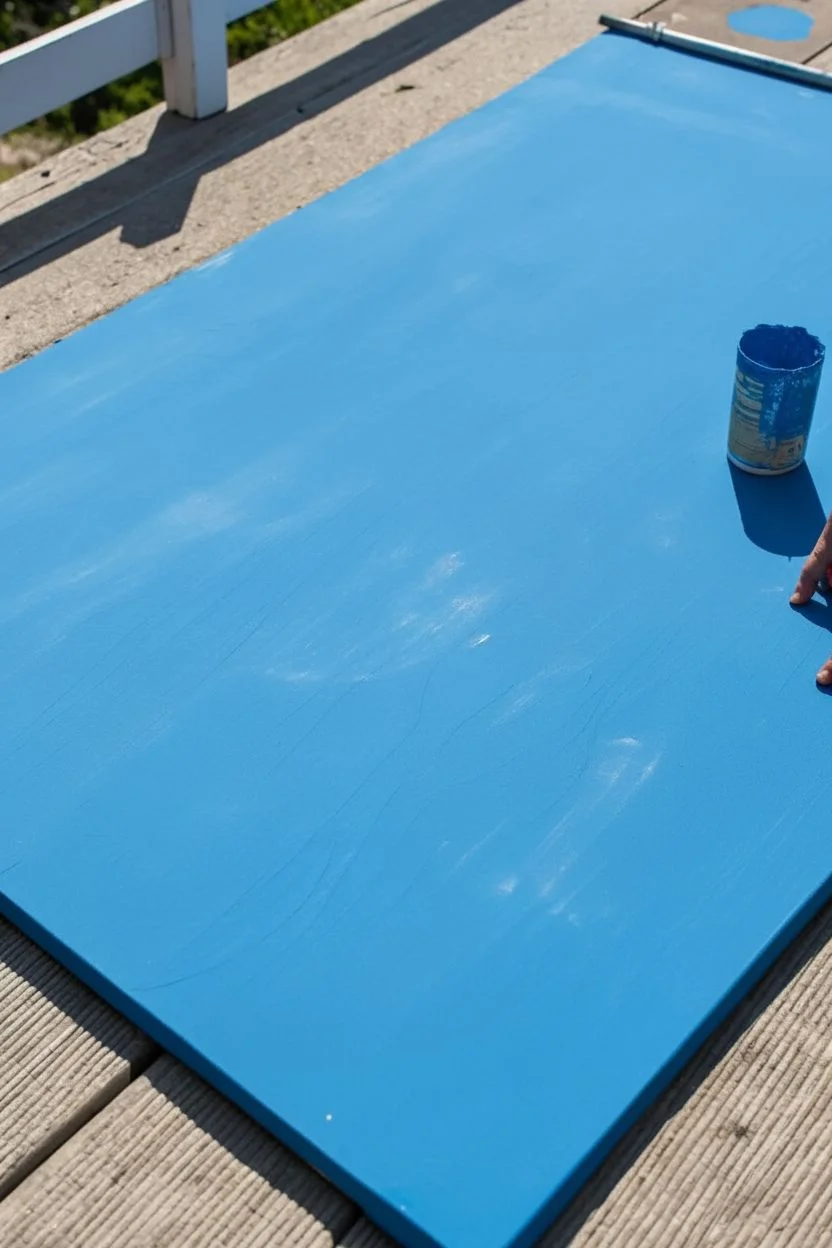
Step 1: Setting the Scene
-
Prepare the surface:
Ensure your painting surface is clean and smooth. If you are using a wooden board like the one in the photo, give it a quick sanding to remove any splinters. -
Apply the blue base:
Coat the entire surface with your sky blue acrylic paint. Use broad, even strokes to create a flat background. -
Let it dry:
Allow the blue paint to dry completely. This is crucial because painting white over wet blue will result in a muddy smear rather than crisp clouds. -
Second coat:
If the wood grain or canvas texture is still showing through too much, apply a second coat of blue and let it dry again.
Step 2: Mapping the Sky
-
Plan the composition:
Visualize where you want your clouds to drift. A scattered, random arrangement usually looks more natural than neat rows. -
Sketch the shapes:
Using a pencil, lightly draw the outlines of your clouds directly onto the blue surface. Focus on creating fluffy cumulus shapes with bumpy tops and slightly flatter bottoms. -
Vary the sizes:
Draw some large, dominant clouds and intersperse them with smaller cloud fragments to create depth and visual interest. -
Check the spacing:
Step back to ensure the balance feels right before you commit with paint. The pencil lines provide a helpful guide so you don’t get lost while painting.
Dry Brush Secret
Do not wet your brush with water before picking up white paint. A bone-dry brush is essential for creating that scratchy, textured ‘scumbled’ look that mimics real cloud vapor.
Step 3: Painting the Clouds
-
Load the brush:
Dip a dry round brush into your white acrylic paint. You want paint on the bristles, but not a dripping glob. -
Offload excess paint:
Tap the brush on a paper towel or the side of your palette. I find removing a bit of bulk paint helps achieve that airy texture right away. -
Start scumbling:
Begin in the center of one of your sketched cloud outlines. Use a scrubbing, circular motion with the brush perpendicular to the board. -
Work outward:
Push the paint from the center toward the pencil edges using small, swirling strokes. This technique, called scumbling, creates a broken texture. -
Create transparency:
As your brush runs out of paint near the edges, let the blue background show through slightly. This creates a soft, wispy perimeter rather than a hard sticker-like edge. -
Build the highlights:
Reload your brush with fresh white paint and dab it into the upper curves and center of the cloud to make these areas opaque and bright. -
Define the curves:
Use the brush to emphasize the rounded “bumps” of the cloud tops, ensuring the white is solidest at the top and fluffier near the bottom. -
Repeat the process:
Move on to the next outline, repeating the dry-brush scumble technique until all clouds are filled in. -
Final touches:
Step back and look for any spots that need a bright white pop. Add a final dab of thick white to the very tops of the clouds for a sun-kissed look.
Add Sunny Depth
Mix a tiny dot of grey or light purple into your white and apply it very sparingly to the bottom edge of the clouds to give them 3D volume and shadow.
Once the white paint cures, you will have a cheerful endless summer sky ready to brighten up any room or garden party
BRUSH GUIDE
The Right Brush for Every Stroke
From clean lines to bold texture — master brush choice, stroke control, and essential techniques.
Explore the Full Guide
Textured Sponge Dabbing
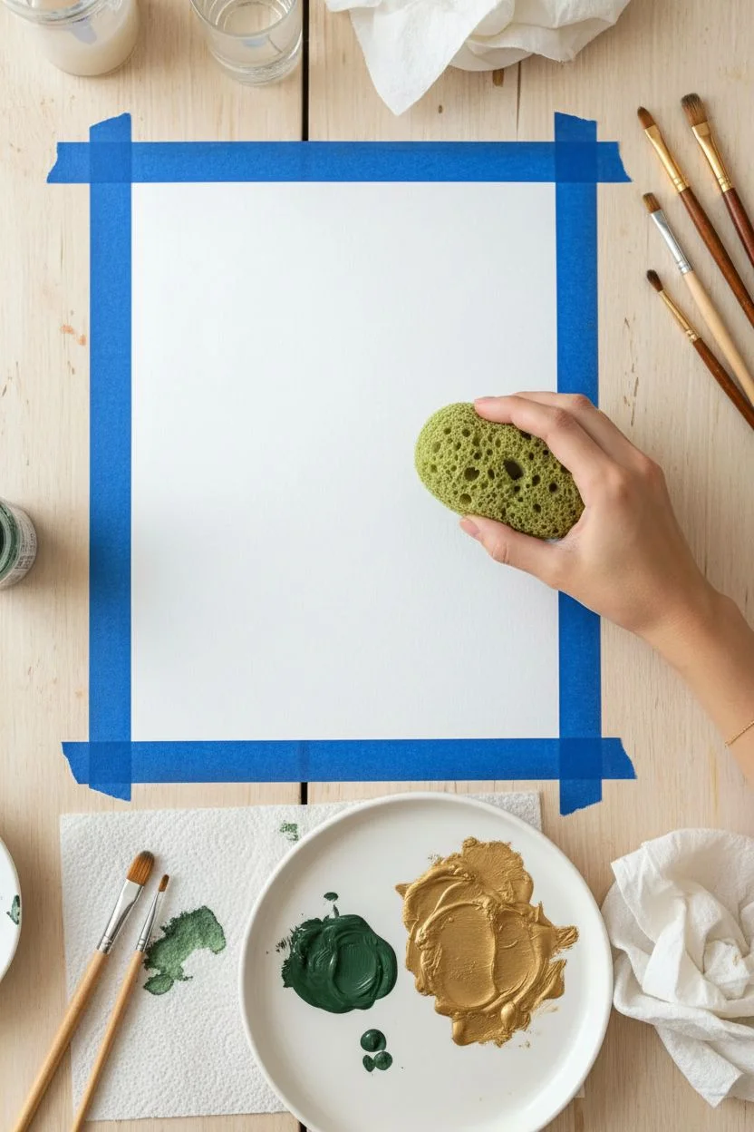
Capture the organic beauty of the forest floor accented with luxurious metallic touches in this textured painting. Using a sea sponge creates complex, airy patterns that look professional yet are incredibly simple to produce.
Step-by-Step Guide
Materials
- Heavyweight watercolor paper (300gsm)
- Dark moss green acrylic paint
- Metallic gold acrylic paint
- Natural sea sponge (with large pores)
- Ceramic palette or flat plate
- Paper towels
- Water container
- Masking tape
- Small round brush (optional)
Step 1: Preparation
-
Secure the paper:
Tape down all four edges of your watercolor paper to a flat surface using masking tape to prevent buckling. -
Prepare the sponge:
Soak your natural sea sponge in water until it expands fully, then squeeze it out tightly until it is just barely damp. -
Dispense base color:
Squeeze a generous amount of the moss green acrylic paint onto your palette. -
Dispense accent color:
Add a separate pool of metallic gold paint to the palette, keeping it distinct from the green for now. -
Load the sponge:
Dip one side of the damp sponge into the green paint, blotting the excess onto a paper towel to avoid blobs.
Pore Perfection
To maintain distinct ‘holes’ in your texture, apply the paint with a straight up-and-down motion. Dragging or wiping the sponge will smear the paint and ruin the celled look.
Step 2: Creating Texture
-
Begin the base layer:
Start dabbing the sponge onto the paper in an irregular, diagonal patch, using a light up-and-down motion. -
Vary the pressure:
Press slightly harder in the center of the shape to create solid areas of color, and lighter toward the edges for a distressed look. -
Leave negative space:
Be mindful to leave small patches of white paper showing through the green texture to keep the composition airy. -
Rotate the tool:
I like to rotate the sponge in my hand every few dabs so the pore pattern doesn’t look repetitive. -
Let it set:
Allow the green layer to dry for about 5 to 10 minutes so the colors won’t turn muddy when you add the gold.
Level Up: Layered Depth
Mix a tiny drop of black into your green for a third, darker layer. Apply this first as a shadow layer before adding the standard green and gold for a 3D effect.
Step 3: Adding Gold & Finishing
-
Load the accent color:
Finding a clean spot on your sponge (or using a second piece), dip it into the metallic gold paint. -
Test the density:
Blot the gold sponge on your palette first; you want a ‘dry brush’ effect rather than a wet globs. -
Apply the gold:
Dab the gold paint partially over the dried green areas and partially onto the clean white paper. -
Highlight the edges:
Concentrate some gold dabs on the outer edges of the green shape to create a shimmering border. -
Add stray creates:
Stamp a few isolated gold marks slightly away from the main cluster to create a drifting, organic feel. -
Create splatters:
If desired, load a small round brush with watered-down gold paint and tap it against your finger to flick tiny droplets onto the paper. -
Dry completely:
Let the artwork sit until the thickest parts of the acrylic paint are fully dry to the touch. -
Reveal the border:
Gently peel away the masking tape at a 45-degree angle to reveal your crisp, clean edges.
Once dry, you have a sophisticated, textured abstract piece that radiates natural elegance.
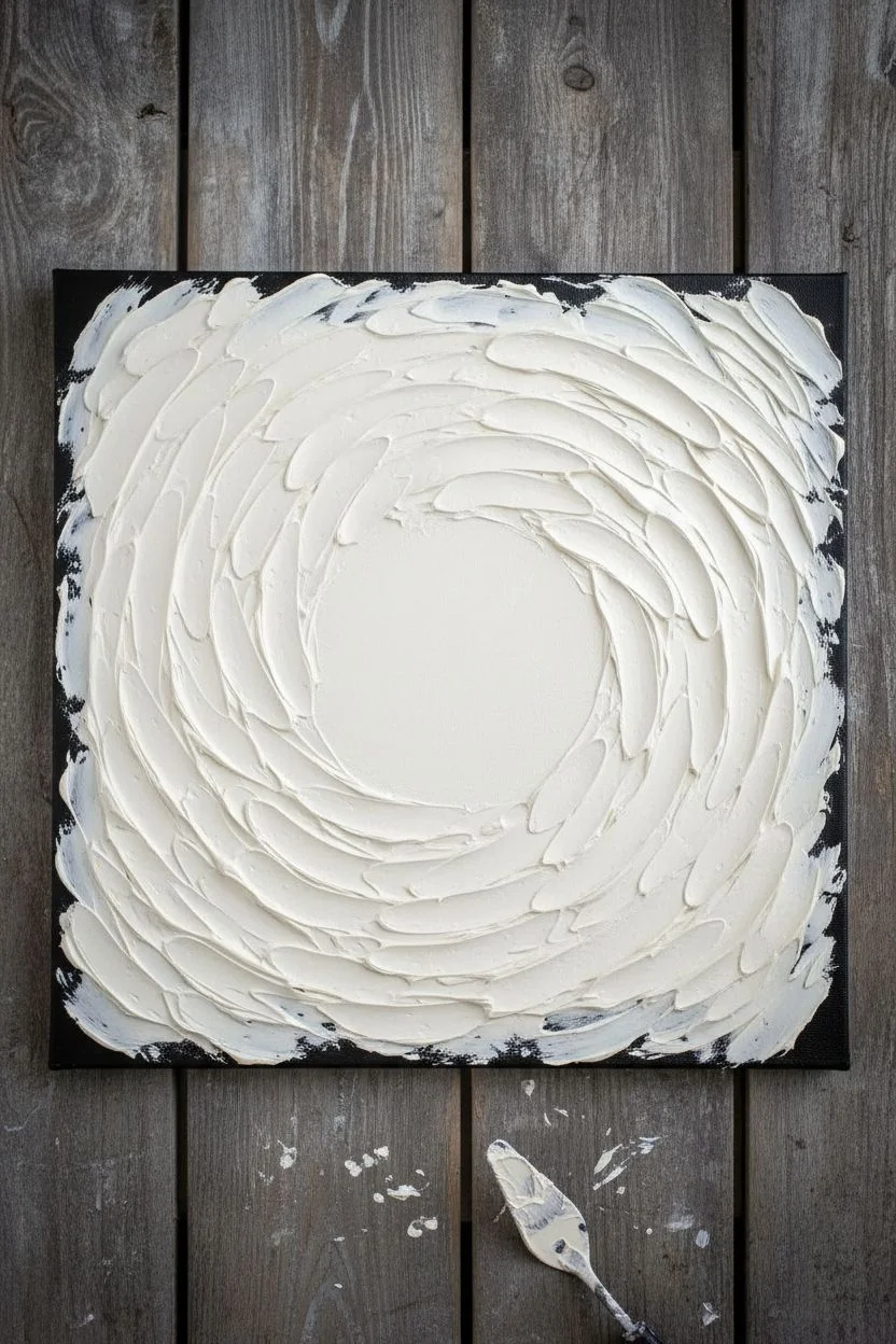
Moody Vignette Edges
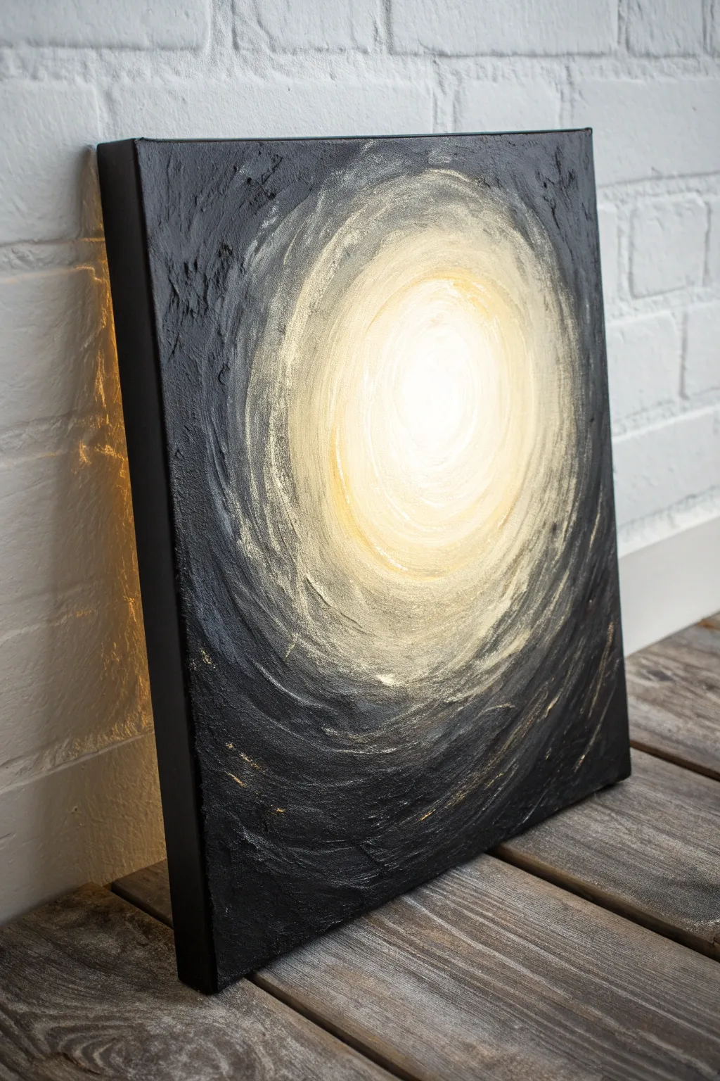
Capture the drama of light and shadow with this textured abstract piece. Using heavy body structure and high-contrast blending, you will create a glowing tunnel effect that draws the eye deep into the canvas.
Detailed Instructions
Materials
- Square stretched canvas
- Modeling paste or heavy structure gel
- Palette knife
- Acrylic paints (Titanium White, Yellow Ochre, Mars Black)
- Large flat paintbrush
- Medium filbert brush
- Palette and water cup
Step 1: Sculpting the Surface
-
Apply paste:
Lay the canvas flat and scoop a generous amount of modeling paste onto the surface using a palette knife. -
Build edges:
Spread the paste thickly around the outer perimeter, leaving the layer much thinner towards the center. -
Create swirls:
Use the edge of your knife to carve deep, circular grooves into the wet paste, spiraling inwards to mimic a vortex. -
Smooth center:
Flatten the paste in the absolute center slightly creates a smoother surface for the ‘light source’ to sit on. -
Dry completely:
Allow the texture to cure fully, which may take several hours or overnight depending on the thickness of the paste.
Rough it Up
Don’t try to be too neat with the modeling paste. Rugged, uneven ridges create better shadows and highlights during the dry-brushing phase.
Step 2: Igniting the Center
-
Paint the core:
Load a medium filbert brush with pure Titanium White and paint a solid circle in the middle of the canvas. -
Start the gradient:
Pick up a small amount of Yellow Ochre without cleaning your white brush. -
Blend outward:
Paint a ring around the white core, blending the wet paints together to create a soft, pale yellow halo. -
Deepen the gold:
Gradually add more Yellow Ochre as you spiral further out, following the curved ridges of your dried texture.
Step 3: Shadowing the Edges
-
Paint the sides:
Switch to a large flat brush with Mars Black and paint the outer edges of the canvas frame for a finished look. -
Fill the corners:
Work the black paint from the corners inward, pushing the pigment deep into the heavy texture crevices. -
Feather the transition:
As you approach the yellow zone, wipe most of the paint off your brush so it is nearly dry. -
Dry brush blending:
Lightly flick the semi-dry brush over the transition area, letting the black paint catch the top of the ridges while leaving the golden valleys visible. -
Create atmosphere:
I prefer to smudge the boundary between black and yellow slightly to create a smoky look rather than a sharp line.
Metallic Magic
To take it to the next level, mix a little metallic gold paint into the transition zone where the black meets the light for a shimmering, ethereal effect.
Step 4: Final Touches
-
Reinforce the glow:
Clean your small brush and apply a fresh, thick dab of Titanium White to the very center to maximize contrast. -
Enhance texture:
If the black areas look too flat, dry brush a tiny amount of grey or metallic gold over the highest ridges to emphasize the depth. -
Final cure:
Let the paint dry completely before displaying your moody masterpiece.
Enjoy the mysterious atmosphere this glowing vignette brings to your space.

PENCIL GUIDE
Understanding Pencil Grades from H to B
From first sketch to finished drawing — learn pencil grades, line control, and shading techniques.
Explore the Full Guide
Simple Bubble Wrap Stamping
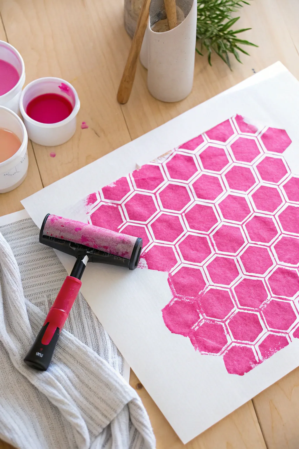
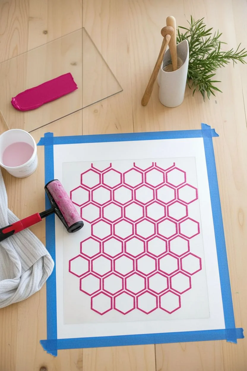
Create a vibrant, modern background pattern using a simple stenciling and rolling technique. This project results in a bold geometric design with a lovely hand-printed texture, perfect for wall art or stationery.
Step-by-Step
Materials
- Heavyweight white mixed-media paper or cardstock
- Magenta block printing ink or heavy body acrylic paint
- Hard rubber brayer (roller)
- Geometric honeycomb stencil
- Flat palette or plexiglass sheet for rolling ink
- Painter’s tape
- Paper towels
- Scrap paper
Step 1: Setting the Stage
-
Prepare your workspace:
Clear a flat table and cover it with a drop cloth or old newspaper to protect the surface from ink. -
Secure the paper:
Place your sheet of white mixed-media paper in the center of your workspace. -
Tape the corners:
Use small loops of painter’s tape on the back of the paper, or tape down the corners directly to keep it from sliding while you work. -
Prepare the stencil:
Lay your honeycomb stencil over the paper. Decide if you want it centered or offset for a more organic look. -
Lock the stencil:
Secure the edges of the stencil firmly with painter’s tape so it doesn’t shift during the rolling process.
Pro Tip: avoiding slightly bleed
Don’t overload your brayer! It’s better to do multiple thin layers of rolling than one thick, goopy layer that might squish underneath the stencil lines.
Step 2: Inking the Brayer
-
Dispense ink:
Squeeze a small line of magenta printing ink onto your flat palette or tray. -
Start rolling:
Lift your brayer and place it into the ink, rolling it forward and lifting it back to the starting point. -
Distribute evenly:
Roll the brayer back and forth vigorously on the palette to spread the ink across the entire roller drum. -
Listen for the sound:
I always listen for a specific sticky, static-like hissing sound; this tells you the ink is perfectly primed and tacky. -
Check coverage:
Ensure the roller has a thin, velvety layer of color without any thick globs or dry spots.
Level Up: Ombré Effect
Place pink ink on one side of your brayer and orange on the other. When you roll them out on the palette, they will blend in the middle, creating a beautiful sunset gradient.
Step 3: Printing the Pattern
-
Begin application:
Place the inked brayer on top of the stencil at one edge of your design area. -
Roll firmly:
Roll the brayer over the stencil with firm, consistent downward pressure to ensure the ink reaches the paper through the stencil openings. -
Change direction:
Roll vertically and then horizontally over the same area to ensure the geometric shapes are fully filled with color. -
Reload if needed:
If the color starts to look faint, roll your brayer on the palette again to pick up more fresh ink. -
Create variation:
For a rugged look like the photo, let the ink fade out naturally at the bottom edges rather than creating a perfect square border.
Step 4: The Reveal
-
Check your work:
Carefully lift one corner of the stencil just a peek to ensure the pink hexagons are crisp. -
Remove the stencil:
Peel the stencil straight up and away from the paper to avoid smudging the wet edges. -
Clean up:
Immediately place the stencil in water or wipe it down with a damp cloth before the acrylic or ink hardens. -
Dry time:
Let the artwork sit undisturbed for about 15 to 30 minutes until the ink is completely dry to the touch.
Frame your new geometric print or use it as a striking background for a scrapbook layout.
Alcohol Ink Blooms
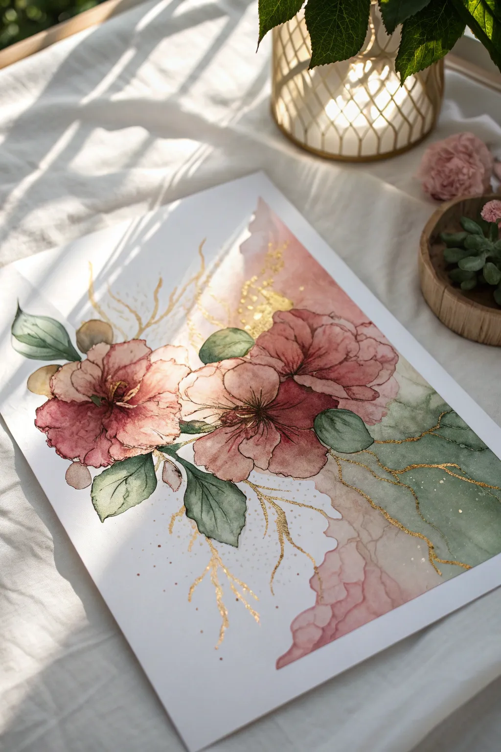
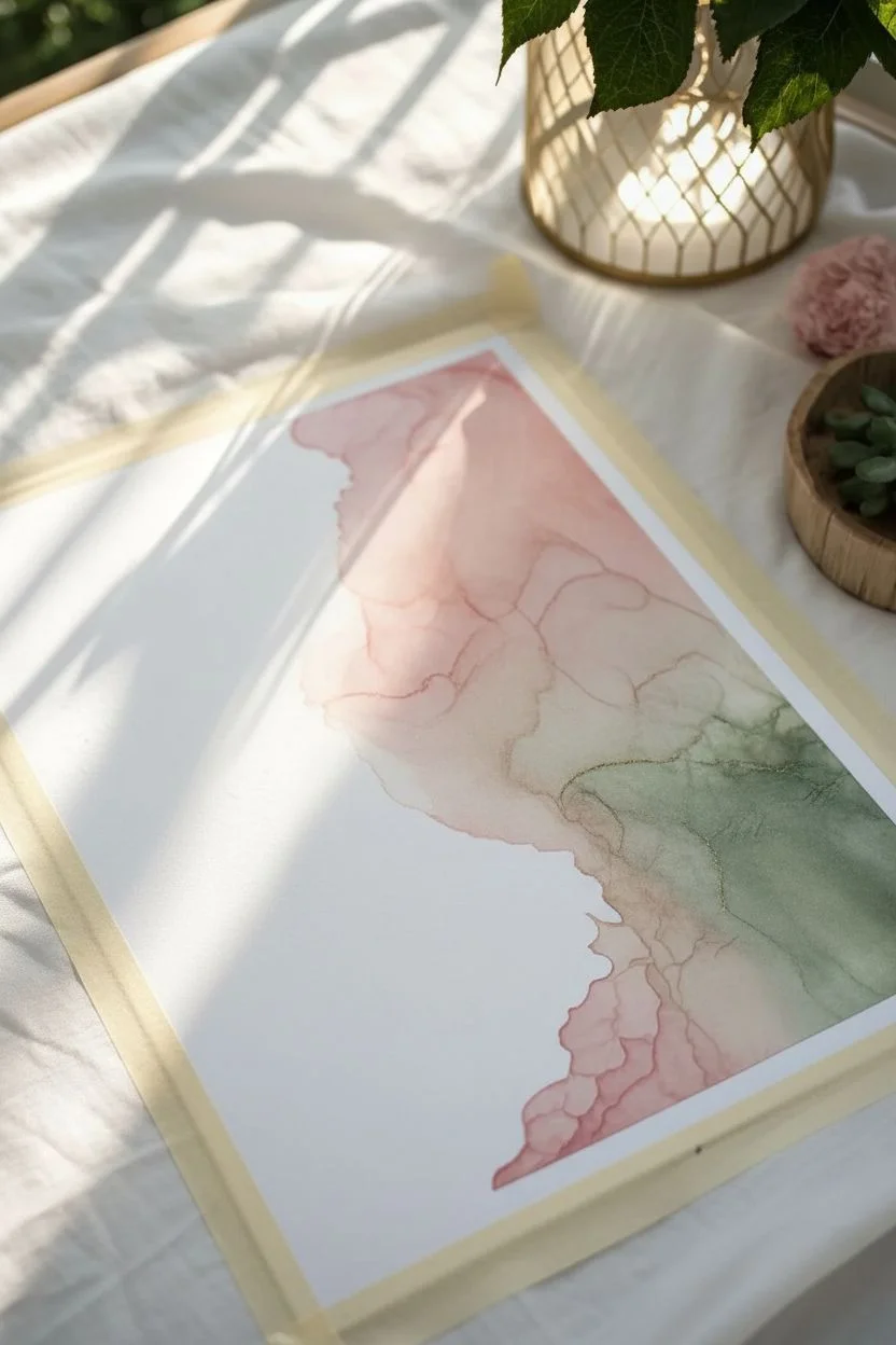
Capture the delicate beauty of blooming roses against an ethereal, fluid background with this mixed-media project. By combining the unpredictability of alcohol inks with precise gold detailing, you will create a piece that feels both organic and luxuriously refined.
How-To Guide
Materials
- Yupo paper (white, A4 size)
- Alcohol inks (Dusty Rose, Sage Green, Sepia)
- Alcohol ink blending solution
- Isopropyl alcohol (91% or higher)
- Metallic Gold tint or brass mixative
- Fine liner pen (Black or Sepia, waterproof)
- Small round synthetic brushes (Size 2 and 4)
- Air blower tool or drinking straw
- Palette tray
Step 1: Creating the Ethereal Base
-
Prepare the substrate:
Secure your Yupo paper to your work surface with drafting tape. Because alcohol inks stain instantly, ensure your table is well-protected. -
Wet the surface:
Squeeze a generous amount of blending solution onto the bottom right diagonal half of the paper. You want the surface slick but not pooling over the edges. -
Apply initial color bursts:
Drop Dusty Rose ink into the center area where the blooms will sit. Add drops of Sage Green below and to the right of the pink for the foliage base. -
Move the ink:
Using your air blower or a straw, gently push the inks outward. Aim for soft, wispy edges that fade into the white negative space on the left side. -
Layer the wash:
Once the first layer is tacky, add a few more drops of blending solution and ink to the outer edges to create those beautiful, water-like ripples seen in the background. -
Let it settle:
Must let this background layer dry completely before proceeding. It should feel dry to the touch, which usually takes about 10–15 minutes.
Sticky Situation?
If the ink feels too sticky or thick while painting the petals, your brush is too dry. Dip it into pure isopropyl alcohol to restore flow and transparency.
Step 2: Defining the Flora
-
Sketch the composition:
Lightly visualize where your three main flowers rest. Using a size 4 brush dipped in pure alcohol, gently ‘lift’ away some pigment in three circular distinct shapes to create highlights for the petals. -
Paint the petals:
Pour a little Dusty Rose into your palette. Using a brush, paint the petal shapes back in, keeping the color denser in the center and sheerer toward the edges. -
Deepen the contrast:
Mix a tiny drop of Sepia with the Rose. Paint thin, dark strokes radiating from the center of the flowers to mimic the depth of the stamen area. -
Define the leaves:
Transition to the Sage Green ink. Paint distinct leaf shapes extending from the blooms, layering them over the dried background wash for a translucent effect. -
Outline details:
Take your fine liner pen. I prefer to use a loose hand here to sketch the outlines of the petals and leaves, adding jagged, nervous lines rather than perfect circles to create organic texture. -
Add center details:
Stipple small dots and tiny lines in the center of each flower with the pen to represent the pollen and anthers.
Step 3: The Golden Touch
-
Prepare gold accents:
Shake your Gold mixative bottle vigorously until the ball bearing rattles loudly, ensuring the metallic pigments are fully suspended. -
Create veins:
Dip a fine detail brush or a nib pen into the gold. Draw ‘lightning bolt’ style veins extending from the flower clusters out into the white space. -
Embellish the wash:
Trace varying organic lines through the green sections of the background wash. This mimics the look of kintsugi or natural mineral veins. -
Add stamen highlights:
Place tiny dots of pure gold right in the center of the darkest parts of your flowers to make them pop. -
Final splatter:
Load a slightly larger brush with gold and tap the handle against a finger to flick tiny golden speckles across the petals and surrounding white space. -
Seal the work:
Once fully dry (give it a few hours), spray with a UV-resistant archival varnish to prevent fading and smudging.
Pro Tip: Breath Control
When using a straw to blow the gold veins, blow sharply and quickly rather than blowing a long, consistent stream. This creates those dramatic, electric jagged lines.
Framing this piece behind glass will enhance the metallic shimmer and protect those delicate layers for years to come.


Subtractive Stencil Wiping
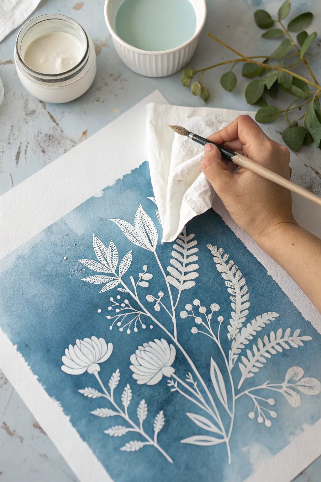
Create a striking negative-space botanical simply by removing paint rather than adding it. This technique uses a subtractive method to lift indigo watercolor through a stencil, revealing the crisp white paper underneath for a cyanotype-inspired look.
Step-by-Step Tutorial
Materials
- Cold press watercolor paper (300 gsm)
- Indigo or Prussian Blue watercolor paint
- Large flat wash brush
- Stiff synthetic brush (size 4 or 6)
- Small round detail brush
- Floral stencil
- Paper towels or cotton rag
- Masking tape
- Two jars of water
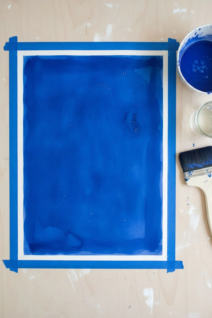
Step 1: Setting the Blue Stage
-
Secure the base:
Begin by taping down all four edges of your watercolor paper to a board or table to prevent buckling. -
Mix your hue:
In a palette, mix a generous amount of Indigo paint with water. Aim for a milky consistency—strong enough to be dark, but fluid enough to flow. -
Apply the wash:
Using your large flat brush, cover the entire paper surface with the blue paint. -
Create subtle texture:
While the wash is still wet, you can tap in a few drops of clean water or a slightly darker mix to create natural variations in the background. -
Total drying time:
Allow the paper to dry completely. The paper must be bone-dry and warm to the touch, or the stencil will stick and damage the background.
Stubborn Paint?
If paint isn’t lifting to bright white, check your pigment. Some blues are ‘staining’. For this technique, non-staining colors lift easiest. If stuck, try a tiny piece of magic eraser.
Step 2: The Lifting Technique
-
Position the design:
Place your floral stencil over the dried blue painting. Decide on a composition that fills the space nicely. -
Secure the stencil:
Use small pieces of masking tape to hold the stencil firmly in place so it doesn’t shift while you scrub. -
Prepare the lifting brush:
Dip your stiff synthetic brush into clean water, then dab it on a towel so it is damp, not dripping wet. -
Scrub the shape:
Gently scrub the paper through the opening of one stencil leaf or flower petal to reactivate the paint. -
Lift immediately:
I usually hold a crumpled paper towel in my other hand so I can blot the spot instantly after scrubbing to lift the pigment away. -
Repeat the process:
Continue loosening paint and blotting it up, working section by section across the stencil design. -
Clean as you go:
Rinse your brush frequently in clean water to ensure you aren’t pushing blue pigment back into the white areas. -
Reveal the work:
Once you have lifted all the main shapes, carefully peel back the tape and lift the stencil straight up.
Step 3: Freehand Refinement
-
Connect the stems:
Stencils often have gaps (bridges) in the stems. Switch to a clean, damp round brush to manually lift paint and connect these lines. -
Sharpen edges:
If any paint seeped under the stencil, use the damp round brush to ‘erase’ and tidy up the edges of your flowers. -
Add floating details:
Using the tip of your brush, lift out small circular dots or floating pollen specs to add whimsy to the negative space. -
Add internal texture:
For extra detail, you can use a fine liner brush with diluted blue paint to add veins or stamens back inside the white lifted areas. -
Final drying:
Let the paper sit for a final dry to ensure the lifted areas don’t smudge.
Crisper Whites
If lifting alone leaves a greyish tint, wait for the piece to dry completely and go over the lifted floral shapes with White Gouache or a white gel pen for a high-contrast pop.
Peel off your border tape and admire your clean, refreshing botanical silhouettes.
Vertical Rain Curtains
This atmospheric project utilizes a classic wax resist technique to create the illusion of falling rain against a moody, colorful sky. By combining textured paper with a seamless watercolor gradient, you’ll achieve a professional-looking background that feels both serene and dynamic.
Step-by-Step Guide
Materials
- Cold-press watercolor paper (300gsm for texture)
- Painter’s tape or masking tape
- White wax crayon or white oil pastel
- Watercolor paints (Prussian Blue, Teal, Dioxazine Purple)
- Round watercolor brush (size 6 or 8)
- Water jar
- Mixing palette
- Paper towels
Step 1: Creating the Resist Layer
-
Tape the borders:
Begin by taping down all four edges of your watercolor paper to a board or table to create a crisp, clean border and prevent warping. -
inspect texture:
Run your hand over the paper; ensure you are using the rougher side of the cold-press paper, as this texture helps catch the wax in the next step. -
Draw the rain lines:
Take your white wax crayon or oil pastel and draw vertical lines starting from the top edge down toward the bottom. -
Vary the stroke:
Apply firm pressure to ensure a good amount of wax transfers to the paper, but vary the line finish—let some lines break or taper off before reaching the bottom. -
Add variance:
Draw a few shorter lines and varying widths to make the rain pattern look organic rather than perfectly uniform. -
Check the resist:
Tilt your paper under a light source to check the sheen; ensure you have enough coverage, as these waxy areas will remain pure white later.
Invisible Ink Tip
It can be hard to see white crayon on white paper. Tilt your head frequently to catch the light on the shiny wax trails, ensuring you haven’t missed a spot.
Step 2: Preparing the Palette
-
Activate the paints:
Drop a little clean water into your blue, teal, and purple paint pans to soften the pigment. -
Mix the deep blue:
On your palette, create a puddle of Prussian Blue with a moderate amount of water so the color is strong and saturated. -
Mix the transition color:
Prepare a separate puddle of Teal or Turquoise adjoining the blue area on your palette. -
Mix the shadow tone:
Prepare a puddle of Dioxazine Purple, keeping this mixture fairly concentrated for the right side of the gradient.
Metallic Upgrade
Once the watercolor is fully dry, trace extremely thin lines of silver or gold metallic paint alongside a few white streaks to add a magical shimmer to the rain.
Step 3: Applying the Wash
-
Start on the left:
Load your round brush with the Prussian Blue and begin painting a vertical strip on the far left side of the paper. -
Observe the texture:
Paint directly over your crayon lines; I love watching the paint bead up and retreat from the wax instantly to reveal the white paper. -
Introduce teal:
While the blue edge is still wet, pick up the Teal paint and apply it to the center section of the paper. -
Blend the transition:
Gently gently brush where the blue meets the teal to encourage them to bleed together softly without over-mixing. -
Add the purple:
Rinse your brush slightly and load it with the Dioxazine Purple, applying it to the remaining right-hand section of the paper. -
Refine the gradient:
Use a damp brush to smooth the transition between the teal and purple sections, ensuring a seamless fade from cool blue to warm violet. -
Let it settle:
Allow the paint to sit for a moment; the pigment will settle into the valleys of the paper texture around the wax lines. -
Dry the artwork:
Let the painting dry completely flat to avoid runs, or use a craft heat tool if you are in a hurry. -
Reveal the border:
Once the paper is bone dry to the touch, carefully peel away the masking tape at a 45-degree angle.
Now you have a striking, textured backdrop perfect for framing or using as a base for calligraphy.

Have a question or want to share your own experience? I'd love to hear from you in the comments below!