When I’m building a piece, a great background pattern is my secret weapon for adding texture, rhythm, and that satisfying “pulled-together” look. Here are my favorite background pattern ideas—starting with the classics you’ll use constantly, then drifting into the more playful, unexpected options.
Classic Polka Dots
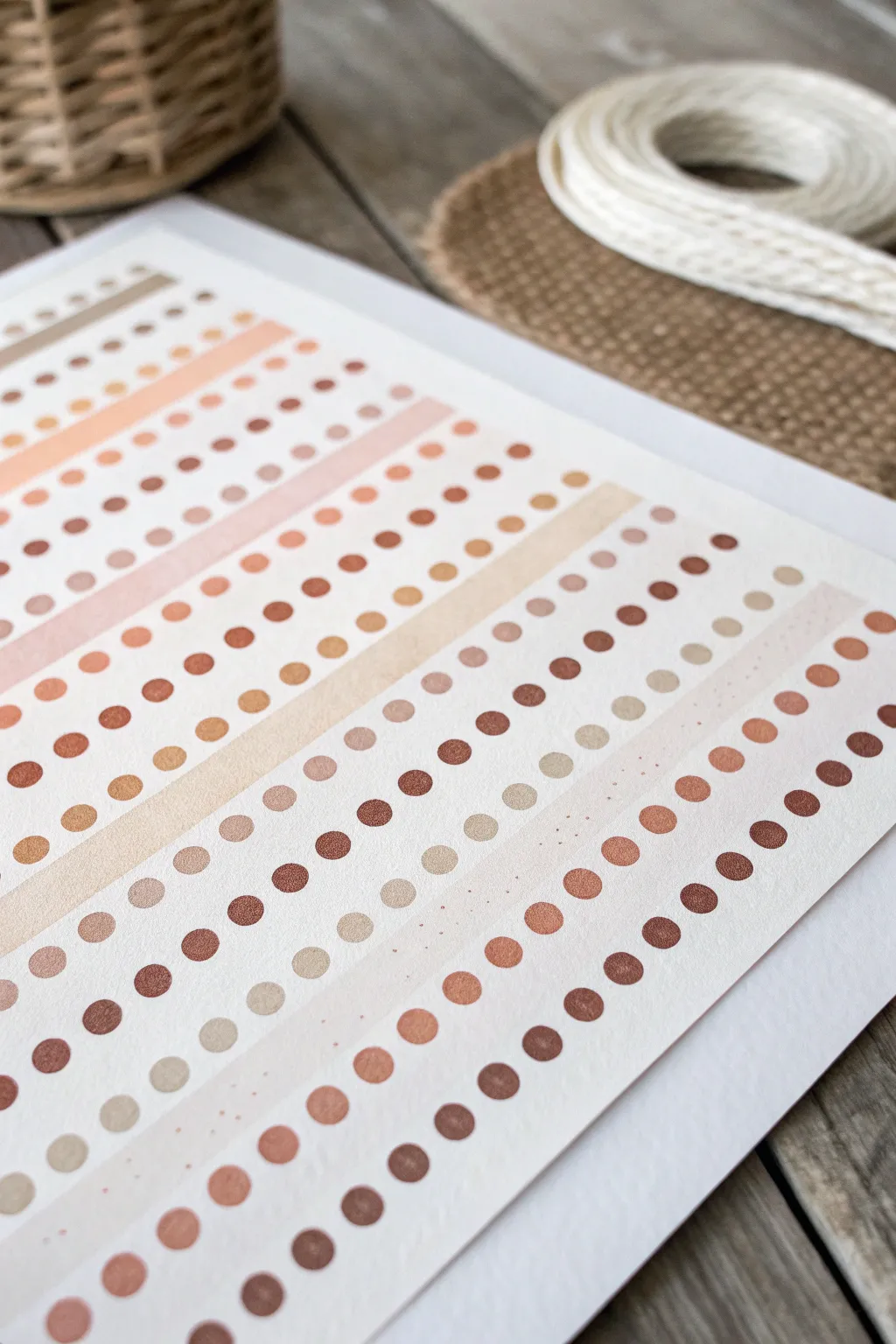
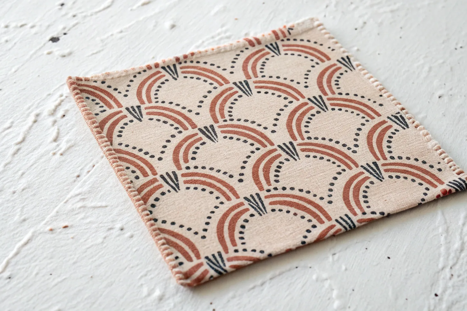
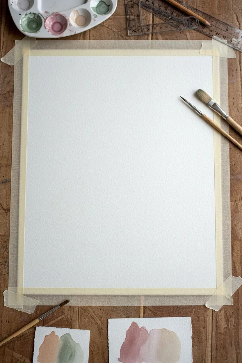
Create your own sophisticated planner stickers or background paper with this soothing, warm-toned design. Featuring a rhythmic pattern of polka dots and soft stripes in a terracotta and beige palette, this project transforms simple shapes into an elegant, functional work of art.
Step-by-Step Tutorial
Materials
- High-quality watercolor paper (hot press for smoothness or cold press for texture)
- Watercolor paints or gouache in warm earth tones (burnt sienna, ochre, peach, brown, sepia)
- Round watercolor brushes (size 2 and 4)
- Washi tape or masking tape
- Ruler
- HB Pencil
- Eraser
- Mixing palette
- Two jars of water
- Paper towels
Step 1: Planning the Layout
-
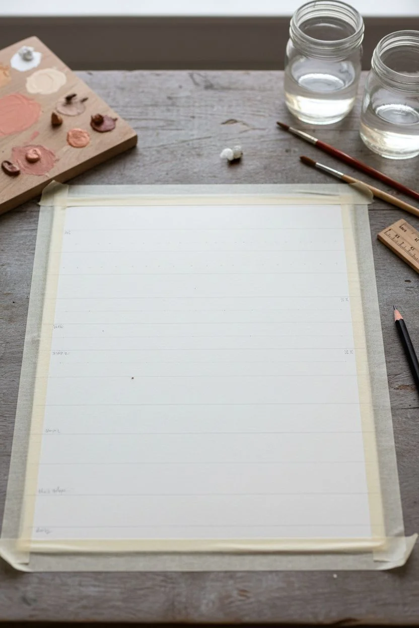
Secure the paper:
Tape your watercolor paper down to a flat surface or drawing board using masking tape. This prevents buckling when the paper gets wet and gives you a clean border. -
Draw guide lines:
Using a ruler and a very light pencil touch, mark horizontal lines across your paper. Space them evenly, perhaps every 0.5 to 0.75 inches, depending on how dense you want your pattern. -
Designate rows:
Decide which rows will be solid stripes and which will be dot rows. A good rhythm to follow from the reference is: two rows of dots, one solid stripe, three rows of dots, then a thick stripe. Varying this creates visual interest.
Brush Loading Secret
Load your brush fully but wipe the excess on the rim. This prevents a bead of water from rushing down and ruining your perfect circle shape.
Step 2: Mixing the Palette
-
Create a color chart:
Mix five to six distinct warm shades. Aim for a spectrum: a deep chocolate brown, a rich terracotta/rust, a medium caramel, a soft peach, a pale beige, and a very light cream. -
Test consistency:
Test your colors on a scrap piece of paper. For the dots, you want a creamy milk consistency so they hold their shape but are opaque enough. -
Pre-mix ample amounts:
Ensure you mix enough of each color before you start painting so you don’t run out halfway through a row, which could lead to mismatched hues.
Sticker Sheet Hack
Paint this design directly onto full-sheet sticker paper instead of watercolor paper to instantly create custom planner stickers or huge washi tapes.
Step 3: Painting the Stripes
-
Paint the first broad stripe:
Select a light peach or beige tone for the solid stripes. Using your size 4 brush, paint a continuous horizontal band across one of your designated stripe rows. -
Add variance:
For the thicker stripes, I like to let the brush naturally run a bit dry or pool slightly in areas, creating that lovely uneven watercolor texture. -
Paint thin accent stripes:
Using the tip of your brush, add very thin, pale lines between some of the dot rows. These act as subtle separators and add delicacy to the pattern. -
Let stripes dry:
Allow these solid bands to dry completely before painting any dots near them to prevent bleeding.
Step 4: Creating the Polka Dots
-
Start the first dot row:
Choose a medium terracotta color. Load your size 2 brush and gently press the belly of the brush onto the paper to create a round mark. Lift straight up. -
Maintain spacing:
Move horizontally along your pencil guide, placing dots at regular intervals. Don’t worry about microscopic precision; hand-painted irregularities add charm. -
Vary the dot sizes:
For the next row, use a darker brown and create slightly smaller dots. Alternating dot sizes row by row adds depth to the design. -
Create a gradient effect:
In some rows, try dipping your brush in water halfway through without reloading paint. This makes the dots gradually become more transparent and lighter as you move across the page. -
Add density:
For rows near the solid stripes, pack the dots slightly closer together. This creates a visual anchor for the lighter, airier rows. -
Incorporate micro-dots:
Between the larger dot rows, use the very fine tip of your brush to add tiny specks or ‘dust’ in a very detailed line. This mimics the texture of washi tape.
Step 5: Finishing Touches
-
Check for gaps:
Step back and look at the overall pattern. If a row feels too sparse, add a few tiny dots to fill the visual space without overcrowding. -
Erase pencil lines:
Once the painting is 100% bone dry (wait at least an hour), very gently erase your pencil guidelines. Be careful not to scrub over the painted areas. -
Flatten the artwork:
If the paper has buckled slightly, place it under a heavy book overnight to flatten it out perfectly.
Now you have a stunning, hand-painted pattern sheet ready to be scanned, cut into stickers, or framed as abstract art
Simple Stripes in Repeat
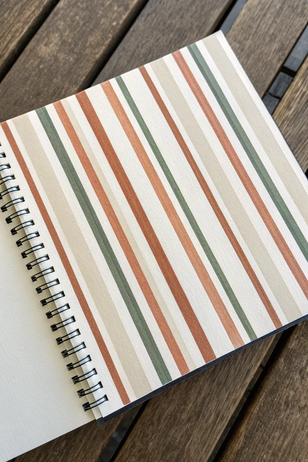
This project focuses on creating a sophisticated, repeating stripe pattern using a warm, earthy color palette. The design features alternating bands of terracotta, sage green, and light beige to create a cozy, vintage-inspired look perfect for notebook covers or art journal backgrounds.
How-To Guide
Materials
- Heavyweight mixed media paper or cardstock
- Ruler or straight edge
- Pencil for light sketching
- Acrylic paints or markers (Terracotta/Burnt Orange, Sage/Olive Green, Cream/Beige, White)
- Flat shader brushes (various widths: 1/4 inch, 1/2 inch)
- Painter’s tape or washi tape (optional for crisp lines)
- Palette for mixing paint
- Water cup and paper towels
Step 1: Planning and Base Layer
-
Prepare the Surface:
Start with a clean sheet representing your page. If you are painting directly into a sketchbook like the one shown, place a scrap piece of paper underneath the page to protect the rest of the book. -
Apply Base Color:
Paint the entire page with a coat of white or very light cream acrylic paint. This ensures your colored stripes will pop and provides a uniform texture. Let this layer dry completely before moving on. -
Mark Guidelines:
Using a ruler and a pencil, lightly mark the top and bottom edges of your paper at regular intervals. I find that marking every 1/2 inch or 1 inch helps keep the rhythm, though we will vary the stripe widths slightly for visual interest. -
Calculate the Repeat:
Decide on your repeating sequence. The pattern in the image follows a sequence: Wide Cream, Thin Terracotta, Medium Cream, Thin Sage Green, Medium Cream, Thick Terracotta. Sketch faint vertical lines connecting your top and bottom marks to map out where these color bands will go.
Use Tape for Precision
Apply painter’s tape firmly and seal the edge with a thin layer of base color first. This blocks colored paint from bleeding under.
Step 2: Painting the Texture
-
Mix the Terracotta:
On your palette, mix a burnt orange with a tiny touch of brown to get that warm, earthy terracotta shade. Test it on a scrap piece of paper to ensure it feels natural. -
Paint the Terracotta Stripes:
Using a flat brush corresponding to the width of your stripe, paint the vertical terra cotta lines. Use the edge of the brush against your ruler if you have a steady hand, or apply painter’s tape along your pencil lines for perfectly crisp edges. -
Mix the Sage Green:
Create a muted green by mixing olive green with a little white and a dot of grey. It should look soft and organic, not neon. -
Paint the Green Stripes:
Fill in the green stripes according to your planned sequence. Allow a small gap or a specific cream stripe between the green and terracotta to prevent colors from muddying if they touch. -
Refine the Cream Bands:
Mix a warm beige or light tan color. Paint the remaining white spaces with this cream tone. This softens the contrast compared to the stark white base coat.
Step 3: Finishing Touches
-
Check for Opacity:
Acrylics can sometimes dry semi-transparent. If the white base is showing through too much on the darker stripes, apply a second coat once the first is dry to get a solid, opaque finish. -
Clean Up Edges:
If you used tape, peel it off slowly at a 45-degree angle while the paint is still slightly tacky to avoid ripping the paper. If you freehanded, use a small detail brush with the cream paint to tidy up any wobbly lines. -
Add Texture (Optional):
To mimic the paper texture seen in the photo, you can dry brush a very faint layer of white horizontally across the stripes, giving it a linen-like appearance. -
Final Drying:
Let the entire page set for at least an hour. Ensure it is completely dry before closing the sketchbook to prevent pages sticking together.
Wobbly Lines?
If your stripes aren’t perfectly straight, embrace it! A slightly organic edge can make the pattern feel more hand-painted and authentic.
Now you have a beautifully patterned page that brings a touch of warmth to your sketchbook

Clean Checkerboard Blocks
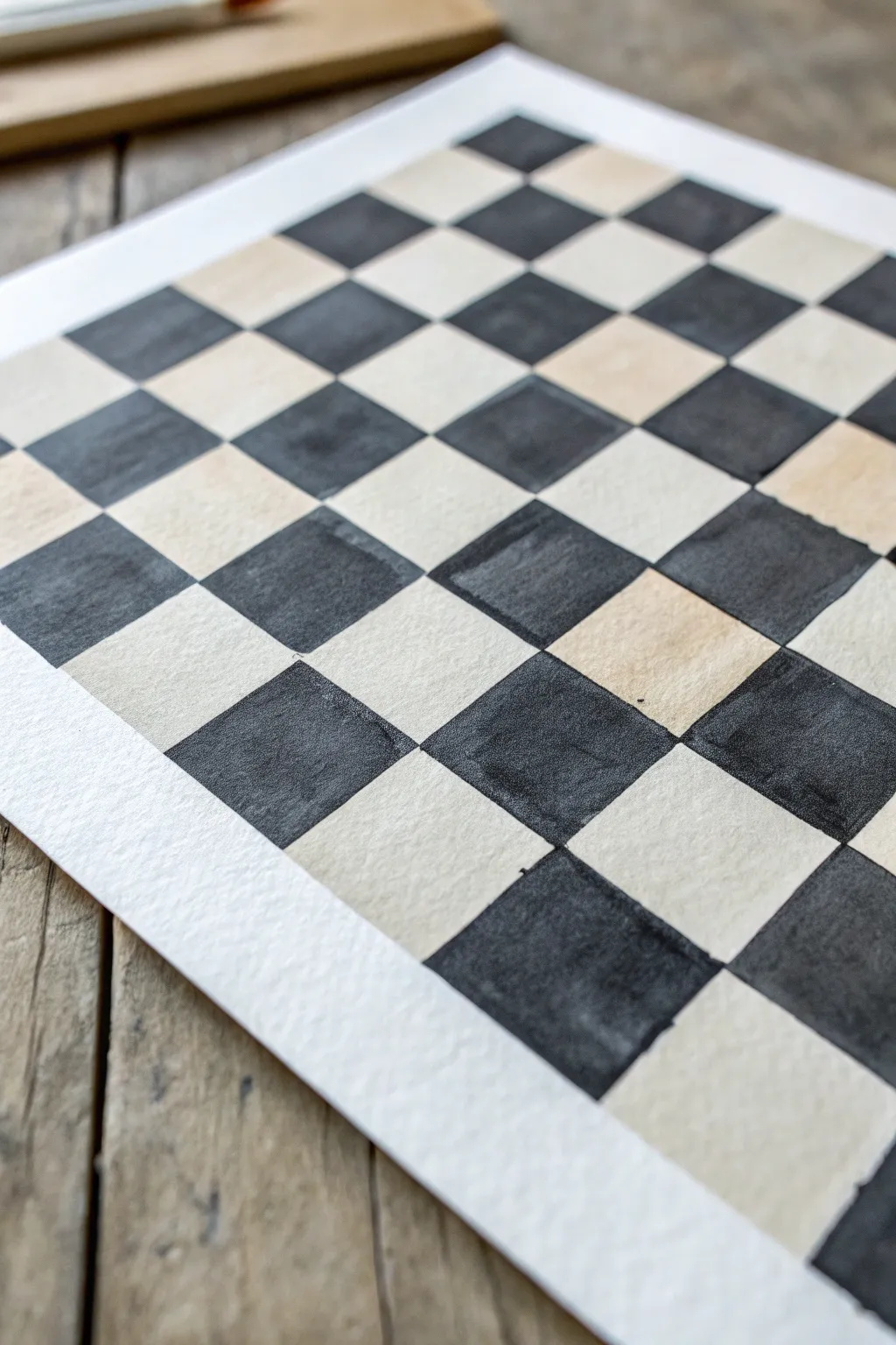
This project creates a striking graphic background using simple geometric repetition and the beauty of high-contrast values. The result is a clean yet organic checkerboard pattern where the texture of the paper and the slight variations in the hand-painted squares add sophisticated character.
Step-by-Step
Materials
- Cold press watercolor paper (140lb/300gsm)
- Black watercolor paint or India ink
- Wide flat brush (approx. 1/2 inch or 3/4 inch)
- Ruler
- HB or 2H pencil
- Kneaded eraser
- Painter’s tape or masking tape
- Cup of water
- Paper towels
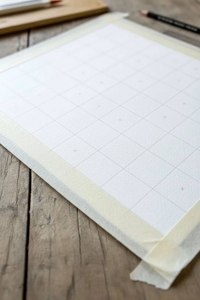
Step 1: Grid Preparation
-
Secure the paper:
Begin by taping down your watercolor paper to a sturdy board or your work surface. This prevents buckling when the paint is applied and creates a clean white border around the final piece. -
Measure the width:
Measure the total width of your desired painted area. Divide this number by 8 (for a standard chess board look) or your desired number of squares to determine the exact size of each individual block. -
Mark the intervals:
Using a ruler and a light pencil touch, make small tick marks along the top and bottom edges of your paper corresponding to your block width measurements. -
Connect the verticals:
Lightly draw straight vertical lines connecting your tick marks from top to bottom. Keep your pencil pressure minimal so the graphite doesn’t show through later. -
Mark horizontal intervals:
Repeat the measuring process along the left and right sides of the paper, using the same block measurement to ensure perfect squares. -
Complete the grid:
Connect the horizontal tick marks with your ruler to finish the grid. You should now have a faint, perfect mesh of squares covering your paper. -
Mark the ‘fill’ squares:
To avoid confusion once you start painting, place a tiny, barely visible ‘x’ in every other square. This simple trick saves you from the common mistake of painting two adjacent blocks the same color.
Bleeding Lines?
If edges are fuzzy, your paint is too watery or the paper is damp. Use less water and a higher quality cold-press paper which holds sharp edges better than student-grade varieties.
Step 2: Painting the Pattern
-
Mix your pigment:
Prepare a generous amount of black watercolor or pour out your India ink. If using watercolor, aim for a rich, opaque consistency like heavy cream to get that deep, solid black shown in the photo. -
Load the brush:
Saturate your flat brush with the black pigment. A flat brush is essential here because its square edge acts like a stamp, making it easier to get crisp straight lines. -
Outline the first square:
Start at the top left corner (if that is a black square). Carefully use the edge of the brush to paint the perimeter of the box, staying just inside your pencil lines. -
Fill the center:
Once the edges are defined, fill in the center of the square with smooth, even strokes. Don’t overwork the paper; let the natural texture of the cold press grain show through. -
Work diagonally:
I find it helpful to paint in diagonal lines or skip around the board rather than going strictly row-by-row. This prevents your hand from smudging wet paint as you move across the paper. -
Mind the corners:
Pay special attention to where the corners of the black squares touch. You want them to meet at a precise point without overlapping deeply into the white squares. -
Refine edges:
As you work, if an edge looks too ragged, do a quick, confident pull with the flat edge of your brush to straighten it out before the paint dries completely.
Pro Tip: Masking Fluid
For clinically sharp edges, apply masking fluid or tape over the ‘white’ squares before painting. Just ensure the paper is sturdy enough to handle the adhesive removal.
Step 3: Finishing Touches
-
Allow to dry:
Let the piece dry completely flat. The heavy black pigment can take longer to settle than lighter washes, so be patient to avoid smearing. -
Erase guidelines:
Once bone dry, take your kneaded eraser and gently lift away any visible pencil lines in the white squares. Do not rub vigorously over the black paint, as it might smear. -
Add texture (optional):
If you want the white squares to look aged like the photo, you can apply a very dilute wash of tea or raw sienna watercolor, avoiding the black squares, or leave them crisp white for high contrast. -
Remove tape:
Peel the painter’s tape away slowly at a 45-degree angle, pulling away from the artwork to reveal your crisp, clean border.
Now you have a bold, geometric foundation ready to be framed or scanned for digital design
Triangles and Tessellations
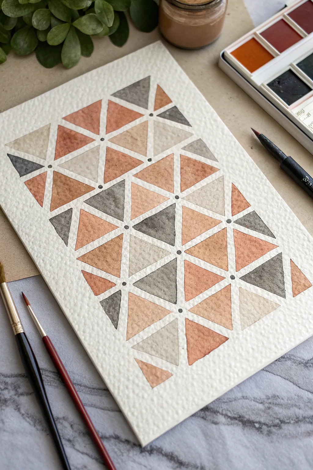
Embrace the soothing rhythm of repetition with this modern geometric watercolor piece. By combining muted earth tones with crisp negative space, you’ll create a sophisticated pattern that feels both structured and organic.
Detailed Instructions
Materials
- Cold press watercolor paper (300gsm or heavier)
- Watercolor paints (terracotta, raw sienna, payne’s grey, burnt umber)
- Ruler or straight edge
- Pencil (HB or lighter)
- Kneaded eraser
- Small round brushes (size 2 and 4)
- Fine tip black liner pen or very fine brush with black ink
- Rinsing water and paper towels
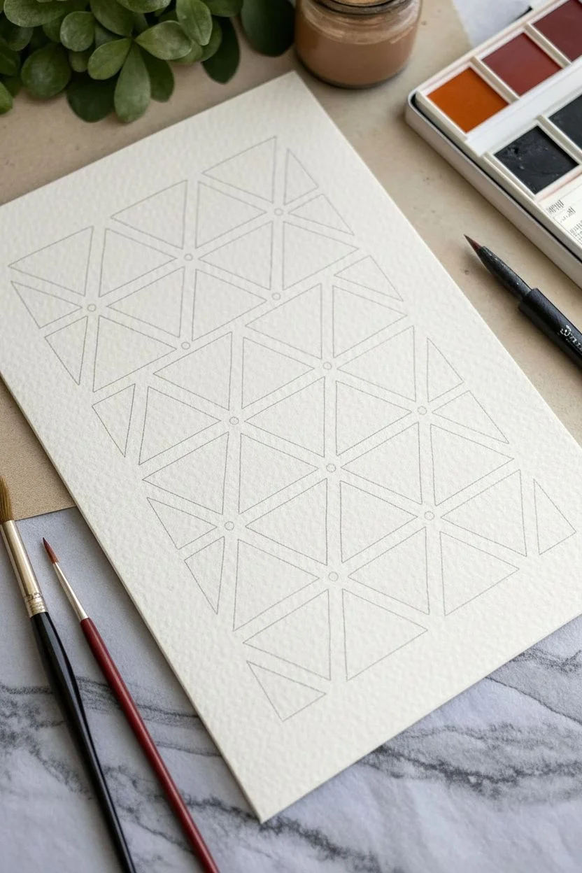
Step 1: Drafting the Grid
-
Establish the grid:
Start by lightly drawing a series of horizontal and vertical parallel lines on your paper to create a grid of squares. A 2-inch or 5cm square is a manageable size for beginners. -
Add diagonals:
Draw diagonal lines through your squares, running from corner to corner. You want to create X shapes within each square, effectively dividing each square into four equal triangles. -
Refine the triangles:
Once your basic X-grid is down, carefully lay out your final triangle shapes. The goal is to leave a consistent ‘gutter’ or channel of white space between every single triangle, so they never actually touch. I like to freehand this slightly inside the pencil guidelines to keep it looking organic. -
Clean up guidelines:
Very gently roll a kneaded eraser over your pencil lines. You want the graphite to be barely visible—just enough to guide your brush, but faint enough to disappear under light paint washes.
Keep Edges Crisp
Load your brush fully but wipe the excess on the rim. A flooded brush makes it hard to paint sharp corners without spilling into the white gaps.
Step 2: Painting the Triangles
-
Prepare your palette:
Mix four distinct puddles of color: a warm terracotta, a soft beige (diluted raw sienna), a watery grey, and a deeper brown. Ensure you have plenty of water mixed in for transparency. -
Start with terracotta:
Select random triangles scattered across the page and fill them with your terracotta mix. Try not to place two of the same color right next to each other. -
Apply the beige tones:
While the first set dries, rinse your brush and pick up the pale beige wash. Fill in about a quarter of the remaining triangles, keeping your edges crisp against the white gutters. -
Add the grey accents:
Introduce the grey tone next. This cool color balances the warm earth tones. Use this color a bit more sparingly than the others to create visual focal points. -
Finish with deep brown:
Fill the final empty triangles with the darker brown shade. If a section looks too heavy, touch a clean, damp paper towel to the wet paint to lift some pigment. -
Creating texture:
As the paint dries, you might notice ‘blooms’ or uneven drying. Don’t correct these; the granulation of the pigment on the textured paper adds beautiful character to simple shapes. -
Let it dry completely:
Wait until the paper is bone dry and cool to the touch. If you paint the next step too soon, the ink might bleed into damp fibers.
Step 3: Final Details
-
Mark the intersections:
Locate the central points where the tips of four triangles converge. Using a fine-tip black pen or a tiny detail brush with concentrated black paint, place a single, deliberate dot in the center of the white space -
Check consistency:
Work your way across the entire grid, adding these focal dots at every four-point intersection. This small detail tightens the whole composition and guides the eye. -
Erase remnants:
Once the ink is absolutely dry, use your eraser one last time to remove any stray pencil marks that might still be visible in the white gutters.
Uneven Drying?
If you get ‘cauliflowers’ in the paint, your brush was likely too wet when you went back to fix a spot. Leave them alone; they add great rustic texture!
Step back and admire how simple shapes and colors can weave together into a complex and satisfying tapestry
BRUSH GUIDE
The Right Brush for Every Stroke
From clean lines to bold texture — master brush choice, stroke control, and essential techniques.
Explore the Full Guide
Chevron Zigzag Rhythm
Capture the rhythmic flow of waves or sand dunes with this minimalist embroidered textile project. Using a simple running stitch on crisp white fabric, you create a striking chevron pattern that feels both modern and organic.
How-To Guide
Materials
- White linen or cotton fabric (approx. 18×24 inches or desired size)
- Dark green embroidery floss (stranded cotton)
- Embroidery needle (size 7-9)
- Fabric marking pen (water-soluble or heat-erasable)
- Clear quilting ruler
- Embroidery hoop (optional but recommended for tension)
- Scissors
- Iron and ironing board
Step 1: Preparation & Marking
-
Prepare the fabric:
Begin by washing and ironing your white fabric to ensure it is pre-shrunk and perfectly smooth. Square up the edges to your desired dimensions, leaving a half-inch allowance for hemming later. -
Establish the grid:
Lay your fabric flat on a hard surface. Using your ruler and fabric pen, lightly mark horizontal parallel guidelines across the width of the fabric. Space these lines about one inch apart to determine the height of your zigzags. -
Mark vertical guides:
Mark vertical tick marks along the top and bottom horizontal lines every 1.5 to 2 inches. This spacing controls the width of your zigzags. -
Connect the peaks:
Connect your tick marks diagonally to form the zigzag pattern. Draw lines connecting the bottom tick mark to the top tick mark of the next section, creating a continuous V-shape across the row. -
Faint lines:
Keep these guide lines faint; you only need to see them just enough to stitch over them. -
Repeat the pattern:
Continue drawing these zigzag rows down the entire length of the fabric. I find it helpful to check the alignment periodically to ensure the ‘valleys’ of one row align with the ‘valleys’ of the row below it.
Step 2: Stitching the Design
-
Thread the needle:
Cut a manageable length of dark green embroidery floss. Separate three strands from the six-strand skein to achieve the medium line weight seen in the photo. -
Secure the thread:
Knot the end of your thread and bring the needle up from the back of the fabric at the starting point of your first zigzag line. -
Begin the running stitch:
Stitch along your marked line using a standard running stitch. Keep your stitch length consistent, roughly 1/8th of an inch long. -
Mind the gap:
Try to keep the space between stitches equal to the length of the stitches themselves for a balanced look. This negative space is key to the design’s airy feel. -
Navigate the points:
When you reach a peak or a valley of the zigzag, take care to place a stitch right at the apex. This keeps the points sharp rather than rounded. -
Maintain tension:
Be careful not to pull the thread too tight, which creates puckering. If you are using a hoop, move it gently as you progress across the fabric. -
Finishing a length:
When your thread runs low, bring the needle to the back, weave it under the last few stitches to secure it, and trim the excess. -
Continue the rhythm:
Repeat the process for all drawn rows. Put on some music and enjoy the repetitive, meditative nature of the work.
Clean Corner Turns
To get perfectly sharp points on your chevrons, always end a stitch exactly at the turn. If your spacing is off, shorten the last two stitches slightly to make it fit.
Step 3: Finishing Touches
-
Remove markings:
Once all stitching is complete, remove your guide lines. If you used a water-soluble pen, spritz with water; if heat-erasable, run a warm iron over the piece (avoiding the thread if possible to keep it lofty). -
Hem the edges:
Fold the edges of the fabric under twice to create a clean hem. Pin in place. -
Stitch the hem:
Sew the hem using a simple straight stitch on a sewing machine or invisible hand stitches for a more refined finish. -
Final press:
Give the entire piece a final press on the reverse side. This sets the stitches and ensures the fabric lies perfectly flat.
Go Geometric
Instead of parallel rows, vary the width of the zigzags, or switch thread colors every three rows to create a gradient ombre effect for a bolder look.
Now you have a beautifully handcrafted piece that adds texture and pattern to any setting
Plaid and Crosshatch Layers
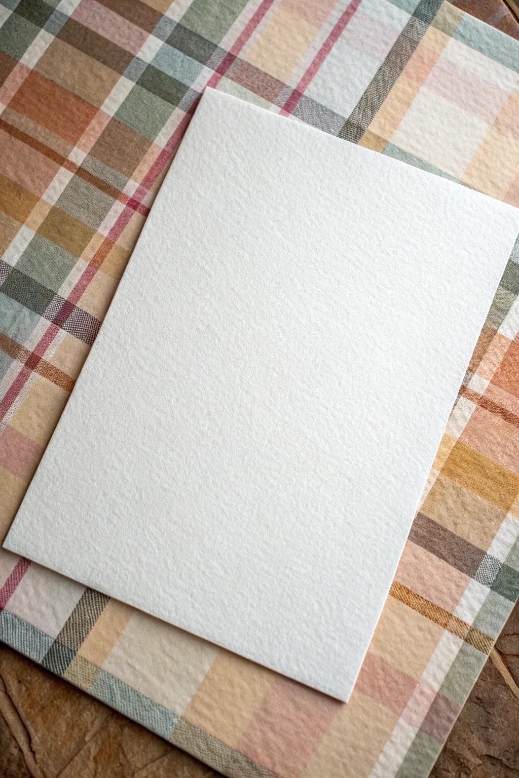
This project explores the interplay between subtle, muted plaid patterns and stark, high-texture cardstock. The result is a sophisticated backdrop perfect for stationery design or minimalist art displays.
Step-by-Step Tutorial
Materials
- Heavyweight cold-press watercolor paper (140lb/300gsm)
- Textured linen or canvas paper (for the top layer)
- Watercolor paints (Sage Green, Dusty Rose/Mauve, Burnt Sienna, Payne’s Gray)
- Flat shader brushes (1/2 inch and 1 inch)
- Painter’s tape or masking tape
- Ruler or straight edge
- Pencil (H or 2H)
- Paper cutter or craft knife
- Mixing palette
- Paper towels
Step 1: Preparation & Palettes
-
Prepare the Base Paper:
Begin by securing your large sheet of heavyweight watercolor paper to your workspace using painter’s tape on all four sides. This prevents buckling when we apply the washes for the plaid. -
Mix Muted Tones:
On your palette, prepare watery washes of your four main colors. Mix Burnt Sienna with a touch of white or water to create a beige-tan. Dull down your Sage Green with a tiny drop of red if it’s too bright. -
Create the Dusty Rose:
For that specific vintage pink seen in the example, water down your Dusty Rose pigment significantly. We want transparency so layers can overlap beautifully. -
Test Your Colors:
Before committing to the main sheet, swatch your mixed colors on a scrap piece of the same paper. Let them dry to ensure they have that earthy, desaturated look.
Wet-on-Dry Precision
For crisp plaid lines, let each color layer dry completely before crossing it with a perpendicular line. This stops colors from bleeding into muddy blobs.
Step 2: Painting the Plaid
-
Establish Vertical Anchors:
Using the 1-inch flat brush, paint broad vertical stripes of the beige-tan wash. Don’t measure these too precisely; varying the spacing slightly adds to the organic fabric look. -
Add Sage Elements:
While the beige is damp but not soaking, switch to the 1/2 inch brush. Paint vertical distinct sage green stripes adjacent to or slightly overlapping the beige. -
Horizontal Crossing:
Rotate your paper or your hand position to paint horizontal stripes. Start with broad beige strokes that cross the vertical ones to create the basic grid structure. -
Layering the Rose:
Take your diluted Dusty Rose wash. Using the edge of the flat brush for thinner lines, paint vertical and horizontal accents. I find that placing these near the green stripes creates a lovely color vibration. -
Intersecting Darker Tones:
Mix a very watery Payne’s Gray. Add thin, decisive lines where the pattern feels too open. These dark accents simulate the thread weaving found in real fabric. -
Create the Checkered Overlaps:
Where a horizontal stripe of one color crosses a vertical stripe of another, dab a slightly more saturated version of the darker color. This mimics the opacity of woven threads crossing. -
Dry Texture Technique:
Once the base wash is semi-dry, use a nearly dry brush with the beige paint to scumble lightly over the whole pattern. This enhances the woven textile appearance. -
Final Drying:
Allow the plaid sheet to dry completely. A hair dryer on a low setting can speed this up, but air drying prevents warping best.
Adding Fabric Grit
Rub a piece of fine-grit sandpaper gently over the dried plaid painting to distress the fibers and make it look even more like real flannel cloth.
Step 3: The Pop-Up Layer
-
Cutting the Top Card:
Take your bright white textured linen or canvas paper. Cut a rectangle that is roughly 5×7 inches (or proportional to your background sheet). -
Ensuring Clean Edges:
Use a sharp craft knife and a ruler for this cut. Fuzzy edges will detract from the crisp contrast we want against the painted background. -
Checking the Texture:
Examine the surface of your cut card. If the texture is directional (like laid paper), orient it vertically to contrast or compliment your plaid pattern. -
Positioning:
Place the white card centrally on your dried plaid painting, angled slightly. The slight tilt creates a casual, ‘stationery on a table’ aesthetic. -
Creating Shadow (Optional):
To make the card pop, you can lightly trace the bottom right edge with a very faint gray watercolor wash on the plaid paper, blurring it outward to simulate a refined drop shadow.
Now you have a beautifully textured composition ready to serve as a backdrop for calligraphy or product photography

PENCIL GUIDE
Understanding Pencil Grades from H to B
From first sketch to finished drawing — learn pencil grades, line control, and shading techniques.
Explore the Full Guide
Random Speckles and Splatter
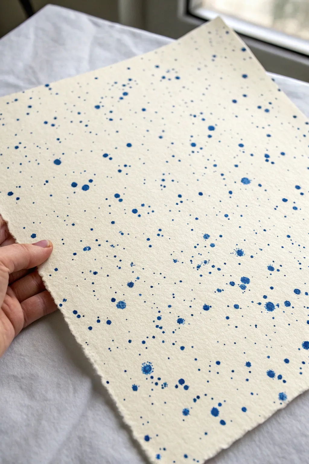
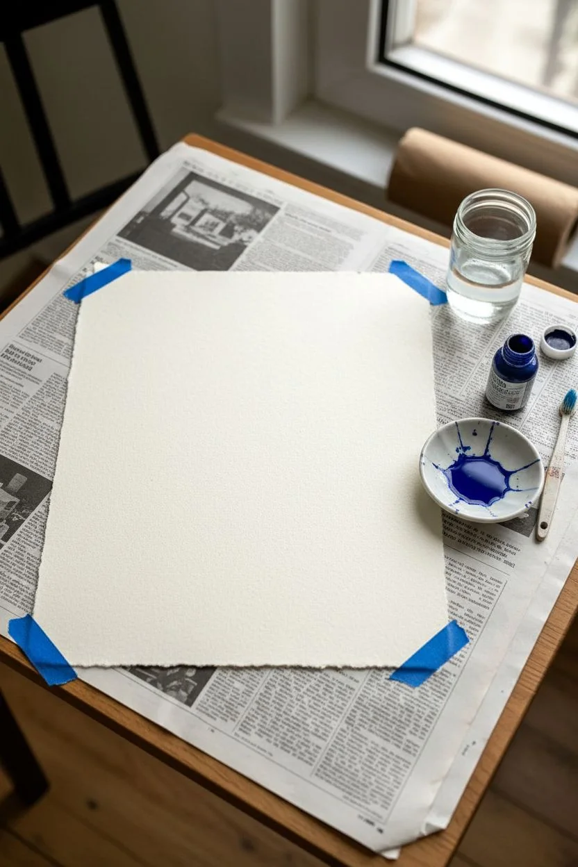
Create a sophisticated and organic background texture using the simplest of tools and a bit of energetic expression. This project uses high-quality paper and deep indigo ink to produce a lively speckled pattern that looks stunning as gift wrap, bookbinding paper, or standalone art.
How-To Guide
Materials
- Heavyweight textured paper (watercolor or handmade cotton rag)
- Deep blue acrylic ink or liquid watercolor
- Small to medium bristle brush (an old toothbrush works too)
- Wide flat brush (for wetting the paper)
- Protecting surface (newspaper or drop cloth)
- Water container
- Paper towels
Step 1: Preparation
-
Set up your workspace:
Begin by covering a large table or floor area with newspaper or a plastic drop cloth. Splatter techniques are inherently messy, and stray droplets trace a surprisingly wide path. -
Select your paper:
Choose a paper with a distinct tooth or texture. The example image uses a deckle-edged paper, which adds a lovely artisanal feel to the final piece. -
Prepare the ink:
Shake your blue acrylic ink or liquid watercolor bottle thoroughly. Pour a small amount into a shallow dish or palette well. You want the pigment to be intense and fluid.
Clean Edges Pro-Tip
For a sharp border around your splatter, mask the edges of your paper with washi tape before starting. Peel it off only after the ink is fully dry.
Step 2: Creating the Base Texture
-
Secure the paper:
If your paper is lightweight, tape down the corners with low-tack painter’s tape to prevent curling. For heavier cardstock, simply laying it flat is usually sufficient. -
Load the brush:
Dip a stiff-bristled brush or an old toothbrush into your blue ink. Don’t overload it; if it’s dripping wet, tap the excess onto a paper towel first. -
Test your technique:
Before hitting the main paper, hold your brush over a scrap piece. Run your thumb across the bristles to flick the ink downward. Note how the distance from the paper changes the spray density.
Level Up: Metallic Accent
Once the blue ink is dry, repeat the splatter process sparingly with gold or liquid copper ink for a luxurious, starry night effect.
Step 3: Applying the Splatter
-
Begin the first layer:
Start applying fine speckles across the entire surface. Hold the brush about 12 inches above the paper for a wider, mist-like dispersion. -
Create variation:
Move your hand continuously while flicking the bristles to ensure the pattern looks random and organic rather than clustered in grid-like shapes. -
Add medium droplets:
Reload your brush with a bit more ink this time. Lower your hand closer to the paper—about 6 inches away—and flick the bristles more aggressively to create slightly larger dots. -
Tap method for larger spots:
To get those distinct, larger blobs seen in the reference, switch techniques. Load a round brush with plenty of ink and hold it horizontally over the paper. -
Strike the brush:
Tap the handle of your loaded brush against your other hand or a second brush handle. This impact knocks heavier drops of ink onto the surface. -
Control the placement:
Target specific empty areas with this tapping method. I like to aim for the ‘negative space’ to balance the visual weight of the composition.
Step 4: Refining and Drying
-
Check density:
Step back and view the paper from a distance. Look for areas that seem too sparse compared to others and add a few localized flicks to even it out. -
Let the wet spots bloom:
If you are using slightly absorbent paper, let the larger wet drops sit for a moment. They will soak in and create soft, feathered edges naturally. -
Initial drying:
Allow the paper to lay flat undisturbed for at least 20 minutes. Moving it while wet can cause the larger droplets to run into streaks. -
Assess the color:
Once the ink is dry, check if the blue looks vibrant enough. Acrylic inks dry permanent, but some watercolors might dry lighter than expected. -
Optional second pass:
If you want more depth, repeat the fine splatter step over the dry layer. This layering creates a sense of depth as the new dots sit crisply on top of the old ones. -
Final cure:
Leave the project to dry completely, ideally overnight, especially if you used heavy droplets of ink which take longer to evaporate.
You now have a beautifully textured, custom sheet ready for your next creative endeavor
Wavy Lines That Flow
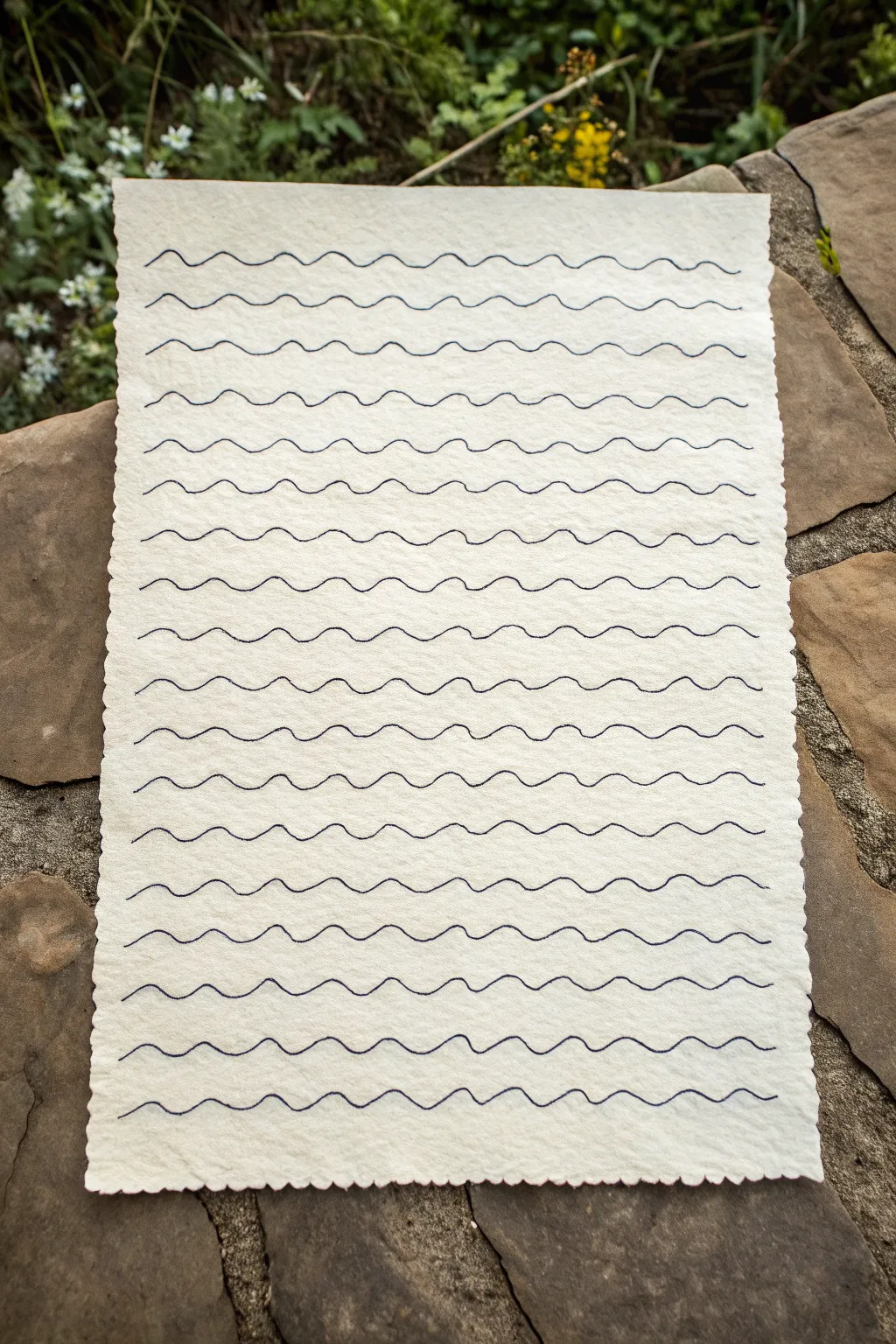
This simple yet meditative project transforms a sheet of textured paper into a rhythmic pattern of flowing blue lines. The result is a calming background that mimics the gentle motion of the sea, perfect for stationery or mixed-media art.
Step-by-Step Tutorial
Materials
- Heavyweight textured paper (watercolor or handmade cotton rag)
- Fine-tip dark blue gel pen or archival ink liner (0.5mm or 0.7mm)
- Ruler or straight edge
- Pencil (HB or H)
- Kneaded eraser
- Deckle edge ruler (optional, for tearing edges)
Step 1: Preparation
-
Select your paper:
Choose a paper with visible tooth and texture. A cold-press watercolor paper or a piece of handmade cotton rag paper works beautifully because the ink will skip slightly over the bumps, adding organic character. -
Create the edges:
If your paper has straight, machine-cut edges, you’ll want to soften them to match the rustic look. Place a ruler firmly against the edge of the paper. -
Tear carefully:
Gently pull the paper upward and toward the ruler to tear it. This creates a soft, deckled effect. Repeat this process on all four sides until you have your desired dimensions. -
Mark your spacing:
Using a pencil and a ruler, make very faint tick marks along the left and right edges of the paper. Space these marks approximately 0.5 to 0.75 inches apart, depending on how dense you want your pattern to be. -
Draft guide lines:
Lightly connect your tick marks with a ruler to create faint horizontal guidelines across the page. These will help keep your waves from drifting diagonally as you draw.
Flow State Secret
Don’t lift your pen mid-line. If you must pause, stop at the very bottom of a ‘trough’ in the wave. It hides the start/stop point much better than stopping at a peak.
Step 2: Drawing the Waves
-
Test your pen:
Before starting on the final piece, scribble on a scrap of the same paper type to ensure your blue ink flows smoothly but doesn’t bleed too much into the fibers. -
Start the first wave:
Begin at the top left guideline. Position your pen tip just above the pencil line. -
Establish the rhythm:
Draw a continuous, wavy line. The key is to keep the peaks and troughs of the wave relatively consistent in height. Aim for a gentle, rolling motion rather than sharp zig-zags. -
Use your arm:
Try to move your entire forearm rather than just your wrist. This helps maintain a fluid line all the way across the page without awkward breaks. -
Follow the guides:
As you draw, use the pencil line as a center point—let your wave dip slightly below and rise slightly above it. I find it helpful to look a few inches ahead of where I’m drawing to keep the line straight. -
Complete the first row:
Continue the pattern until you run off the right edge of the paper. Don’t worry if the line isn’t perfectly uniform; minor wobbles add to the handmade charm. -
Move to the next line:
Reposition your hand for the second row. Try to offset the waves slightly from the row above—where the top row goes up, you don’t necessarily need to match it, but keeping a similar ‘frequency’ creates a cohesive look. -
Maintain consistent pressure:
Keep your pen pressure even. Textured paper can be tricky, so ensure you aren’t pressing so hard that the tip catches in the paper fibers. -
Fill the page:
Work your way down the sheet, row by row. This repetitive action can be quite relaxing. Take a break if your hand starts to cramp to ensure your lines stay fluid.
Oops, I Smudged!
If you smear wet ink, don’t wipe it! Turn the mistake into a feature by thickening that specific wave line, or wait for it to dry and use a white gel pen to touch up the gap.
Step 3: Finishing Touches
-
Let the ink dry:
Wait at least 15 to 20 minutes for the ink to fully set. Gel pens on textured paper can take longer to dry than you might expect. -
Erase guidelines:
Gently roll a kneaded eraser over the page to lift the pencil guidelines. Do not rub vigorously, as this might damage the paper surface or smear the ink. -
Flatten the paper:
If the ink has caused the paper to buckle slightly, verify it is completely dry, then place it under a heavy book overnight to flatten it out.
You now have a beautiful sheet of hand-patterned paper ready to be used as a backdrop or a standalone piece of art


Doodle Marks as Fillers
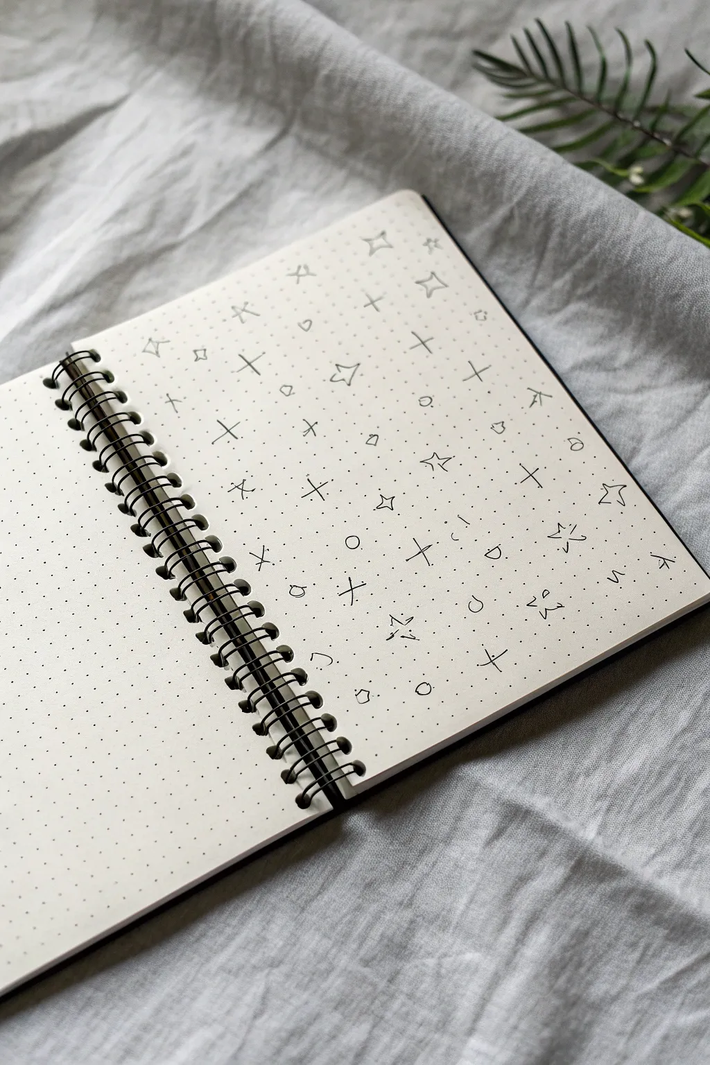
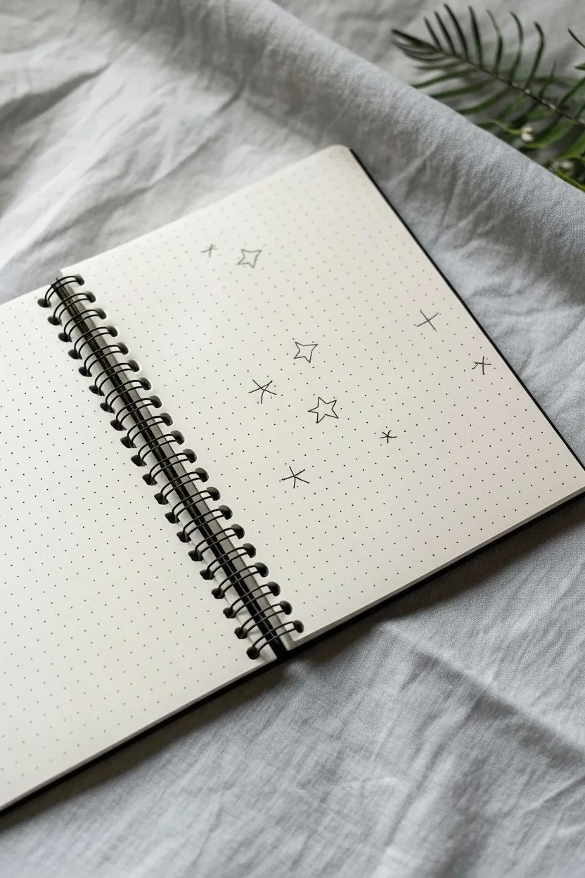
Fill your journal pages with this dreamy, scattered pattern that feels like a quiet night sky captured in ink. Using a simple dot grid as a guide, you’ll create an organic, flowing texture perfect for backgrounds or soothing mindfulness practice.
Step-by-Step
Materials
- Dot grid notebook or journal (A5 size recommended)
- Fine liner pen (black, 0.3mm or 0.5mm tip)
- Pencil (optional, for practice)
- Eraser
Step 1: Planning the Layout
-
Open spread setup:
Begin with your notebook lying flat. While we will focus on filling one page, having the full spread open gives you space to rest your hand comfortably. Ensure the paper surface is clean and free of eraser dust. -
Analyze the grid:
Take a moment to look at your dot grid. Instead of seeing strict rows and columns, visualize the dots as anchor points for a loose, scattered arrangement. We won’t be drawing on every single dot.
Step 2: Drafting the Main Elements
-
Start with the stars:
Choose a random spot near the center of the page. Draw a small, simple star by sketching a five-pointed outline. It doesn’t need to be perfect; a slightly wonky shape adds to the hand-drawn charm. -
Scatter the stars:
Moving outward from your first star, draw 4-5 more stars across the page. Space them out widely, leaving plenty of empty grid space between them. Try to vary their rotation slightly so they don’t all look identical. -
Add larger cross-stars:
Now, introduce a second type of star: the simple cross. Draw a vertical line intersecting a horizontal line (like a plus sign). Make these roughly the same height as your outline stars. -
Distribute the crosses:
Fill in some of the larger gaps between your outline stars with these cross-stars. Aim for a balance where no two identical shapes are right next to each other.
Grid Freedom
Don’t force shapes to align perfectly with the dots. Use the dots only for spacing reference, drawing ‘between’ them for a more organic look.
Step 3: Adding Detail and Texture
-
Draw the geometric accents:
Look for medium-sized empty spaces. In these spots, draw small, tilted squares or diamond shapes. Keep these smaller than your stars. -
Incorporate circles:
Scatter small, open circles throughout the pattern. I find these mimic tiny moons or planets. Keep them roughly the size of a single grid square or slightly smaller. -
Add ‘sparkle’ marks:
For the smallest details, draw tiny ‘x’ marks or very small crosses. These act as distant stars. Place them in the tighter gaps between larger elements. -
Create tiny clusters:
Occasionally, draw two or three very small dots close together. This breaks up the rhythm and prevents the pattern from looking too rigid or manufactured.
Galaxy Glow
Use a light gray or pastel highlighter to color over just the stars, or add tiny patches of watercolor wash behind clusters for a nebula effect.
Step 4: Refining the Composition
-
Check for density:
Step back and look at the page as a whole. You want an airy, open feel. If a spot looks too empty, add a small circle or a tiny cross. Avoid overcrowding any single area. -
Fill the edges:
Don’t be afraid to draw right up to the edge of the paper. Drawing a half-star or a partial circle cut off by the page edge makes the pattern feel infinite. -
Vary line weight (optional):
If you want more depth, go back over just the outline stars to make their lines slightly bolder than the surrounding sparkles. -
Final review:
Scan the page for any awkward gaps. A single dot or a tiny diamond is usually the perfect fix for these spaces. -
Let it set:
Allow the ink to dry completely for a minute or two before closing the book to prevent any smudging on the facing page.
Now you have a serene, celestial backdrop ready for your next journal entry or to enjoy as standalone art
Paper Grain and Fiber Illusions
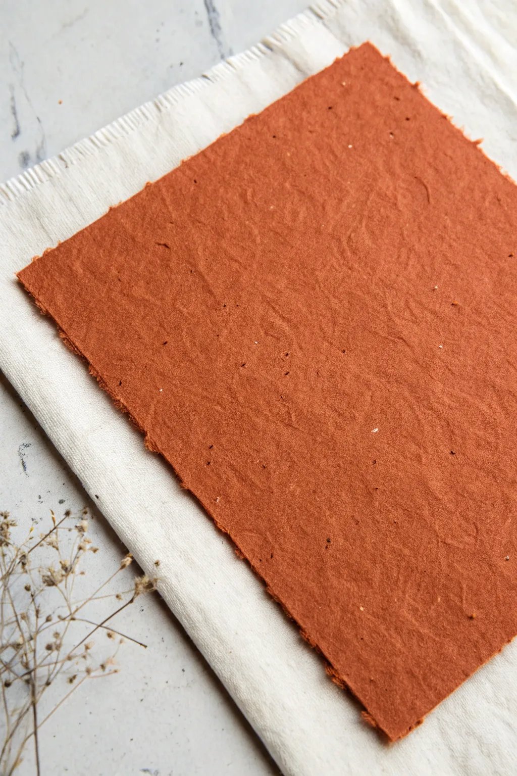
Transform scraps into stunning textured stationery with this handmade paper project. The result creates a rich, earthy sheet featuring authentic deckled edges and visible fiber speckles perfect for backdrops or invitations.
Detailed Instructions
Materials
- Scrap paper (white office paper and brown paper bags/cardboard)
- Water
- Blender
- Mold and deckle (screen frame)
- Large plastic tub/vat
- Sponge
- Cotton cloths or couching sheets
- Terracotta or rust-colored acrylic paint (or fabric dye)
- Iron (optional)
- Dried botanicals or spices (optional for texture)
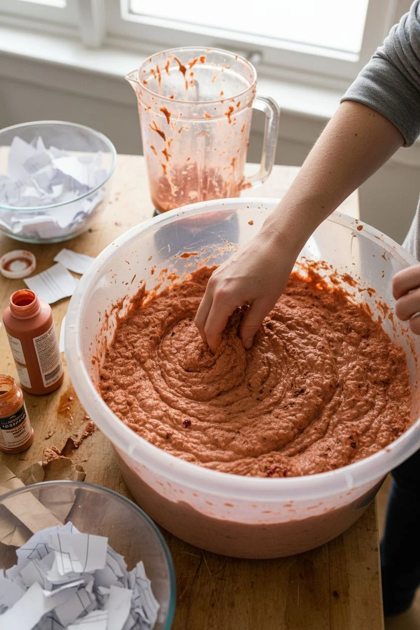
Step 1: Preparing the Pulp
-
Sort and shred:
Begin by tearing your scrap paper into small, postage-stamp-sized pieces. For that warm, earthy look, mix about 70% white paper with 30% brown paper bag or kraft paper. -
Soak the materials:
Place the torn paper in a bowl and cover it completely with warm water. Let it soak for at least a few hours, though leaving it overnight produces the smoothest pulp. -
Blend the mixture:
Transfer a handful of soaked paper into your blender and fill the rest with water (about a 1:4 paper-to-water ratio). Blend on high until no large distinct pieces remain, creating a consistency like oatmeal. -
Add color:
While the pulp is still in the blender, add a hearty squeeze of terracotta or rust-colored acrylic paint. Blend briefly to mix. I find adding a pinch of paprika or dried flower petals here creates those lovely dark specks visible in the final texture.
Step 2: Pulling the Sheets
-
Prepare the vat:
Fill your large plastic tub about halfway with warm water. Pour your colored pulp mixture into the tub and stir gently with your hand to disperse the fibers evenly. -
Dip the mold:
Hold your mold and deckle firmly together (screen side up). Dip them into the vat at a 45-degree angle, sliding them to the bottom, then level them out flat underneath the water. -
Lift and drain:
Slowly lift the mold straight up out of the water. Let the water drain through the screen while giving it a very gentle side-to-side shake to interlock the fibers and even out the pulp layer. -
Remove the deckle:
Once the water stops dripping constantly, carefully lift off the top frame (the deckle). You should see the rough ‘deckled’ edge formed around your paper sheet.
Natural Speckles
To get those tiny dark spots shown in the photo, crush dried tea leaves or coffee grounds and sprinkle them into the vat just before dipping your frame.
Step 3: Couching and Drying
-
Prepare the transfer:
Lay a damp cotton cloth or felt flat on a smooth surface. This will be your ‘couching’ surface. -
Flip the mold:
Turn the screen mold upside down and place it firmly onto the damp cloth in one smooth motion. Press down on the back of the screen mesh. -
Sponge away water:
Take a sponge and press it firmly against the back of the screen mesh to soak up excess water. Squeeze the sponge out and repeat until the paper begins to release from the mesh. -
Lift the screen:
Gently peel one edge of the screen up. If the paper sticks, press it back down and sponge more. Lift the screen away completely, leaving the wet paper sheet on the cloth. -
Initial drying:
Let the paper air dry on the cloth for several hours or overnight. As it dries, the color will lighten slightly and the texture will become more pronounced. -
Flattening the sheet:
Once the paper is barely damp or fully dry, peel it off the cloth. To get it relatively flat but still textured, place it between two dry cloths and weigh it down with heavy books. -
Final texture touch:
If you want the wrinkled, organic surface shown in the image rather than a perfectly flat sheet, skip the heavy pressing. Instead, let it air dry completely free-standing, which allows natural warping and crinkling.
Embossing Effects
While the paper is wet on the couching cloth, press a piece of lace or textured fabric gently into the surface to leave a ghostly, imprinted pattern.
Enjoy using your beautifully textured paper for calligraphy, collage, or simply as a striking photo backdrop
Repeating Brushstroke Bands
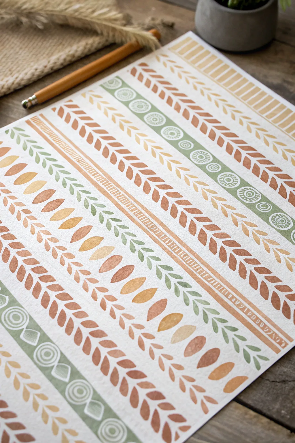
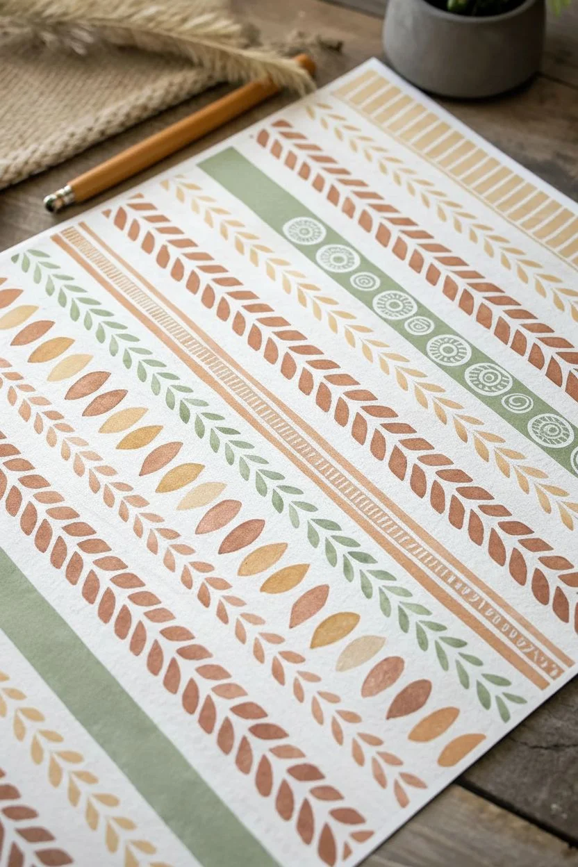
Create a stunning, earthy background pattern using simple repeating brushstrokes to form rhythmic bands of color. This project combines loose watercolor leaves with structured geometric lines for a warm, bohemian aesthetic perfect for journals or wall art.
Step-by-Step Tutorial
Materials
- Heavyweight watercolor paper or mixed media paper (smooth texture preferred)
- Watercolor paints (shades of terracotta, ochre, sage green, and rusty brown)
- Round paintbrushes (size 4 and 6)
- Flat shader brush (small size for geometric lines)
- White gel pen or fine white paint marker
- Ruler (optional, for spacing guidance)
- Jar of water and paper towels
Step 1: Preparation & Color Mixing
-
Prepare your palette:
Mix your paints to achieve that warm, autumnal palette. You’ll need a deep terracotta, a lighter mustard yellow, a soft sage green, and a muted brown. Dilute them slightly with water so they flow easily but retain good opacity. -
Map out zone widths:
Visualize or lightly pencil-mark parallel rows across your paper. You don’t need straight lines for every row, but knowing where your wide bands versus narrow accent bands will go helps keep the composition balanced.
Uneven spacing?
Don’t stress if your bands aren’t parallel! Determine the widest gap and fill it with tiny dots or small dashes to turn the mistake became a deliberate detail.
Step 2: Painting the Organic Bands
-
Start with the central leaf vine:
Using your size 6 round brush and terracotta paint, create a central vine pattern. Press the belly of the brush down and lift up quickly to create teardrop shapes that mimic leaves, alternating sides along an invisible center line. -
Add a sage green border:
Leave a small gap of white space, then paint a thick, solid band of sage green. Keep the edges relatively clean but don’t worry about perfection; the hand-painted look is part of the charm. -
Create the double-leaf variation:
For the next wide band, switch to your ochre or mustard tone. Instead of a single vine, paint pairs of longer, thinner leaves reaching outward in a chevron-like formation. -
Paint loose geometric dashes:
Using the flat brush or the tip of a round brush, paint a row of short, vertical dashes in a rusty brown shade. Space them evenly to create a ‘railroad track’ effect. -
Incorporate large loose leaves:
Paint a row of large, disconnected oval shapes in varied earth tones. These serve as a looser, more abstract spacer between the structured vines. -
Add secondary vine rows:
Repeat the vine technique from the first step using different colors on either side of your existing bands. Vary the size of your brushstrokes—make some leaves tiny and delicate, and others bold and full. -
Fill the edges:
Continue adding stripes of patterns until you reach the edges of the paper. Mix up the order: a solid band, a vine band, a dash band, and repeat. -
Let it dry completely:
Before moving to the detail phase, ensure the paint is bone dry to prevent the white ink from bleeding or clogging.
Go Metallic
Swap the white gel pen for a gold metallic marker or gold watercolor paint for the final detailing phase to add a luxurious shimmer to the earth tones.
Step 3: Adding White Details
-
Decorate the green bands:
Take your white gel pen or paint marker. On the dried sage green band, draw a series of repeating circles. -
Add interior details:
Inside each white circle, draw a smaller spiral or concentric circle pattern to mimic tribal or batik textiles. -
Detail the geometric stripes:
Find a narrower solid band (like the orange/ochre stripe shown in the reference) and draw tiny white tick marks or a ‘ladder’ pattern inside it. -
Add texture to solid shapes:
If you have any large solid leaf shapes, you can add a simple white vein line down the center for extra definition. -
Erase guide lines:
If you used any pencil marks for spacing earlier, gently erase them now, being careful not to smudge the artwork.
Now you have a beautifully textured patterned sheet ready to be framed or used as custom wrapping paper
Mini Sprigs and Tiny Leaves
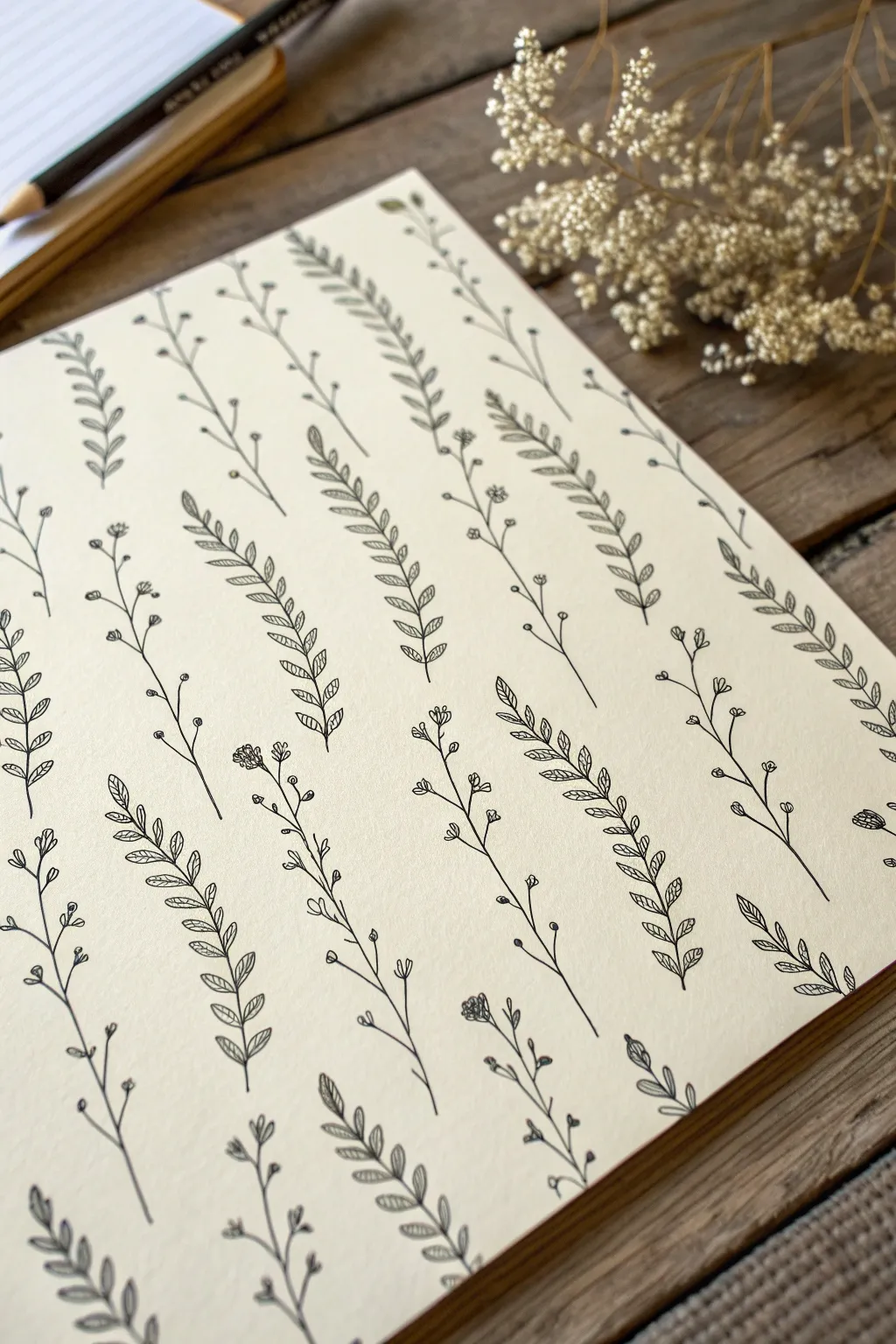
Embrace the meditative quality of botanical doodles with this simple yet elegant pattern sheet. By repeating just two core designs—a delicate leafy branch and a whimsical floral sprig—you can create a cohesive background that feels organic and organized all at once.
Detailed Instructions
Materials
- Cream or off-white sketchbook paper (smooth grain)
- Fine liner pen (0.1mm or 0.3mm black ink)
- Pencil (HB or 2H)
- Ruler
- Eraser
Step 1: Setting the Grid
-
Map the columns:
Visualize the page as vertical columns. Use a ruler and pencil to very lightly mark faint vertical guidelines spaced about 1.5 to 2 inches apart. -
Plan the spacing:
Along these vertical lines, mark small ticks where the base of each stem will start. Stagger these starting points between columns so the pattern looks alternated rather than strictly grid-like.
Step 2: Drawing the Leafy Branches
-
Draw the main stem:
Starting from your pencil tick, draw a single, slightly curved line upward with your fine liner. A gentle ‘S’ curve adds more life than a straight line. -
Add leave pairs:
Beginning at the bottom, draw small, almond-shaped leaves extending from the stem. Angle them upward and slightly outward. -
Create veins:
Inside each small leaf, draw a single central vein line. Keep these lines quick and light; they don’t need to touch the edges of the leaf outline. -
Taper the top:
As you move up the stem, make the leaves slightly smaller. Finish the sprig with a single, tiny leaf at the very tip. -
Repeat the process:
Continue this leaf pattern on every *other* column you marked out. This establishes the first half of your alternating pattern.
Pro Tip: Pen Pressure
Vary your pressure slightly. Press harder at the base of leaves and lift off toward the tip for a tapered, natural look.
Step 3: Adding the Floral Sprigs
-
Start the floral stems:
In the empty columns between your leafy branches, draw thin, wandering stems. These can be slightly more jagged or angular than the leafy ones. -
Branch out:
Draw tiny sub-branches shooting off the main stem. Keep these very thin and delicate. -
Draw the buds:
At the end of each sub-branch, draw a tiny cluster of three or four small circles or loops to represent flower buds. -
Add detail dots:
For texture, place a single tiny dot in the center of some of the flower clusters. This mimics the look of baby’s breath or similar dried florals. -
Vary the height:
Ensure these floral sprigs roughly match the height of the leafy branches next to them to maintain visual balance across the page.
Level Up: Watercolor Wash
Once the ink is totally dry, paint a very pale, diluted wash of sage green over the leaves to add soft color without hiding the lines.
Step 4: Finishing Touches
-
Review the density:
Look at the overall composition. If a gap feels too large between sprigs, I sometimes add a tiny floating leaf or a loose petal to fill the negative space. -
Let the ink set:
Allow the drawing to dry completely for at least 15 minutes to prevent smudging. -
Erase guidelines:
Gently erase your pencil column lines and tick marks using a high-quality eraser to leave the black ink distinct and clean.
Now you have a serene, botanical-filled page that’s perfect for scanning as digital wallpaper or using as a custom wrapping paper design
Curling Vines and Scrollwork
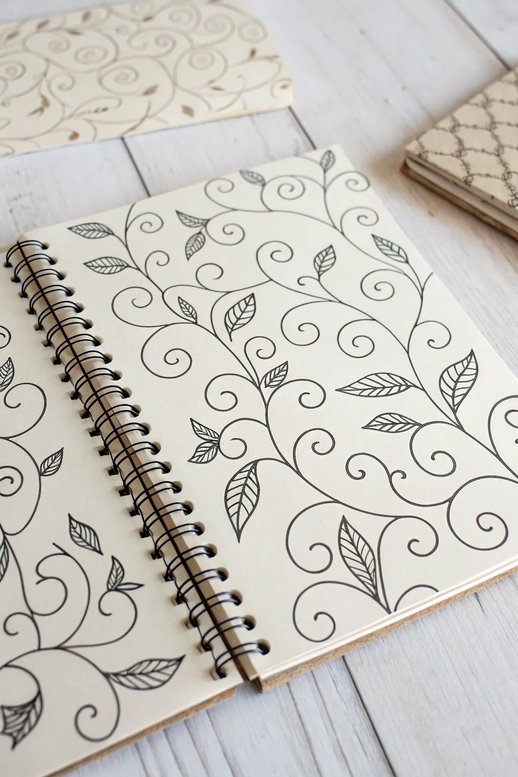
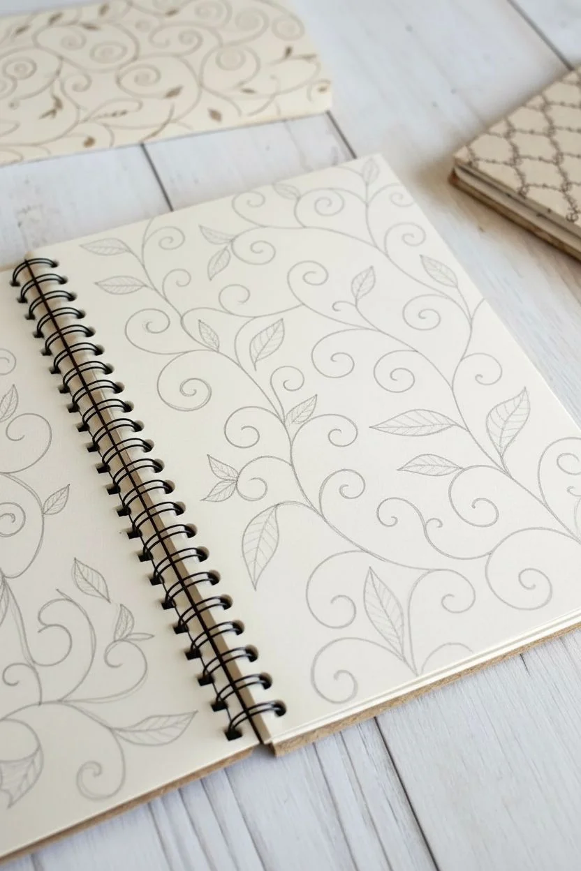
Transform a plain sketchbook page into a mesmerizing garden of ink with this flowing vine pattern. Using simple repetitive strokes, you’ll build a complex-looking design that feels organic, graceful, and deeply satisfying to draw.
Step-by-Step Guide
Materials
- Sketchbook or high-quality drawing paper (smooth bristol is excellent)
- Pencil (HB or 2H for light sketching)
- Eraser (kneadable preferred)
- Black fine liner pen (0.3mm or 0.5mm)
- Ruler (optional, if you want grid guidance)
Step 1: Setting the Flow
-
Visualize the spine:
Begin by mentally dividing your page. You don’t need a rigid grid, but imagine invisible vertical channels where your vines will grow upward. This keeps the overall pattern balanced without looking stiff. -
Draft the S-curves:
With your pencil, lightly sketch a series of large, loose ‘S’ shapes moving vertically up the page. Let them undulate gently. These are the main stems of your vines. -
Add secondary curls:
Branching off from the main ‘S’ curves, sketch smaller spiral shoots. These should curve outward and then curl back in on themselves like fern fronds. -
Refine the spirals:
Check the spacing of your spirals. You want them to fill the negative space without colliding. Adjust the tightness of the curls so they look like graceful scrolls.
Fixing Shaky Lines
If a long curve looks jittery, thicken the line slightly to smooth out the wobble. Going over it again with confident speed often hides clear mistakes.
Step 2: Inking the Vines
-
Trace the main stems:
Take your black fine liner and carefully go over your pencil lines for the main stems. Keep your wrist loose to ensure smooth, confident curves rather than shaky segmented lines. -
Ink the spirals:
Continue inking the spiral offshoots. As you reach the center of a spiral, try to taper your pressure slightly so the line ends delicately. -
Connect the flow:
Ensure all your connections are smooth. Where a branch meets the main stem, thicken the junction very slightly to mimic how real plants grow—this adds weight and realism.
Natural Flow Tip
Turn your sketchbook as you draw curves so your hand creates the arc naturally. Pull the pen toward you rather than pushing away for smoother lines.
Step 3: Adding the Leaves
-
Placement strategy:
Identify the convex parts of your curves—the ‘outer’ bumping part of the stem feels like the most natural place for a leaf to sprout. Plan for one or two leaves per major visible curve section. -
Draw the leaf outline:
Draw simple almond or teardrop shapes for the leaves. Keep the tip pointed and the base tapered where it touches the vine. -
Add the central vein:
Draw a single curved line down the center of each leaf. I find it distinctive to curve this vein slightly to match the motion of the leaf itself. -
Detail with veins:
Add small diagonal lines branching from the central vein to the leaf edges. Keep these light and rhythmic. -
Vary the sizes:
Draw smaller, simpler leaves near the tighter spirals or the tips of the vines, and larger, fully detailed leaves on the thicker main stems.
Step 4: Finishing Touches
-
Erase pencil marks:
Wait until the ink is completely dry—give it a full minute or two to be safe. Then, gently erase all your initial pencil guidelines. -
Assess the density:
Look at the overall composition. If there are large empty gaps, add tiny standalone spirals or small detached leaves to balance the visual weight. -
Refine line weight:
Go back over any major stem lines that feel too thin. A subtle thickening on the underside of curves can create a nice illusion of depth.
Now you have a beautifully intricate page that brings a touch of nature to your sketchbook
Silhouette Motifs as Shadow Layers
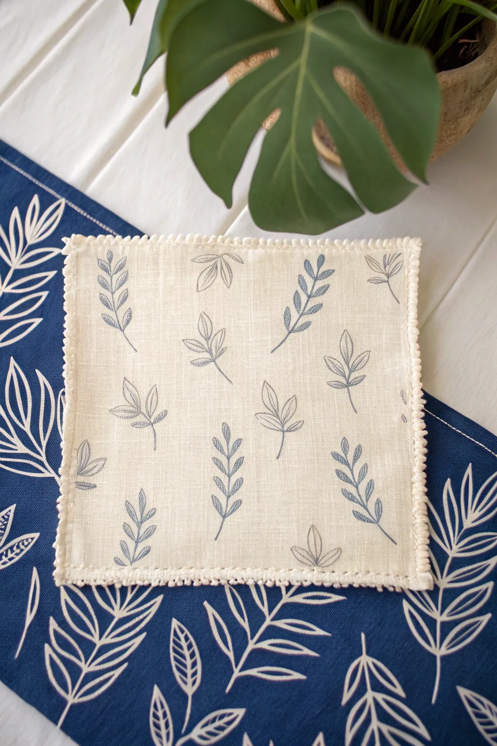
This project creates a sophisticated linen coaster featuring dainty shadow-leaf motifs against a creamy background. The design plays on negative space and fine lines, finished with a charming picot edge that adds a masterful handmade touch.
Detailed Instructions
Materials
- Light cream or oatmeal-colored linen fabric
- Navy blue fabric paint or fine-tip fabric marker
- Fine liner brush (size 0 or 00, if painting)
- Leaf stencil or template
- Disappearing fabric ink pen
- Matching cream embroidery thread or pearl cotton
- Embroidery needle
- Iron and ironing board
- Masking tape
- Small embroidery hoop (optional)
Step 1: Preparation & Layout
-
Prepare the fabric:
Cut your cream linen into a 6×6 inch square. If your linen is prone to fraying, you might want to treat the very edges with a fray check or zig-zag stitch, though we will finish them later. -
Map out the pattern:
Plan the placement of your leaf motifs. You want a scattered, tossed look rather than perfect rows. Use a disappearing ink pen to lightly mark where the stem of each leaf should originate to ensure balanced spacing. -
Secure the workspace:
Tape your linen square to a flat, hard surface. This keeps the fabric taut and prevents it from shifting while you apply the delicate design work.
Step 2: Creating the Leaf Motif
-
Outline the stems:
Using your fine liner brush dipped in navy fabric paint or a fabric marker, draw the central curved stems first. Keep the lines incredibly thin—barely a whisper of color. -
Add leaf shapes:
Draw the outline of individual leaves extending from the stems. Some leaves can be simple ovals, while others can be split. The key is to keep the outlines crisp and unfilled to create that ‘shadow’ effect. -
Detailing the veins:
Carefully draw a single vein line down the center of each leaf. I find that lifting the brush pressure at the end of the stroke creates a valuable tapered look. -
Repeat and rotate:
Work your way across the fabric, rotating the direction of the leaves. Ensure some stems curve left and others curve right to mimic natural movement. -
Set the ink:
Once your design is complete, allow it to dry thoroughly according to the paint manufacturer’s instructions. Usually, this takes about 24 hours. -
Heat set:
Iron the back of the fabric on a high setting (appropriate for linen) to permanently set the design. This ensures your coaster is washable.
Fixing Wobbly Lines
If a painted line gets too thick or shaky, let it dry completely. Then, use a white opaque fabric marker to carefully touch up the edges and thin the line back down.
Step 3: Finishing the Edges
-
Fold the hem:
Press a narrow double-fold hem under on all four sides of the square. A scant 1/4 inch fold works best for this delicate scale. -
Baste the hem:
Use a simple running stitch to temporarily hold the hem in place if you struggle with pins on such a small piece. -
Prepare the thread:
Thread your needle with a length of pearl cotton or embroidery floss that matches your linen color. Knot the end securely. -
Start the picot edge:
Insert your needle into the edge of the hem. Create a small loop by wrapping the thread around the needle tip before pulling it through, creating a knotted picot stitch. -
Spacing the loops:
Make a standard blanket stitch for two or three stitches, then add another picot loop. The rhythm should be consistent to create that beaded edge effect seen in the reference. -
Turn the corners:
When you reach a corner, place three stitches into the same corner hole to help the thread fan out gracefully around the 90-degree turn. -
Complete the border:
Continue this stitching pattern all the way around the square. Tie off your thread securely on the back side and trim any excess. -
Final press:
Give the coaster one final press with the iron, being careful not to flatten your beautiful picot edging too much.
Pro Tip: Stencil Hack
Don’t have a steady hand? Cut a leaf shape from freezer paper. Iron the shiny side onto your fabric to create a temporary, removable stencil for perfect outlines.
Enjoy using your elegant new coaster for your morning coffee or as a lovely handmade gift
Tone-on-Tone Overprint Layers
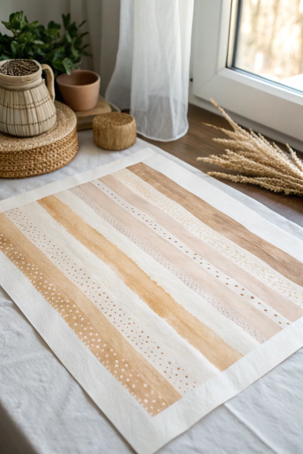
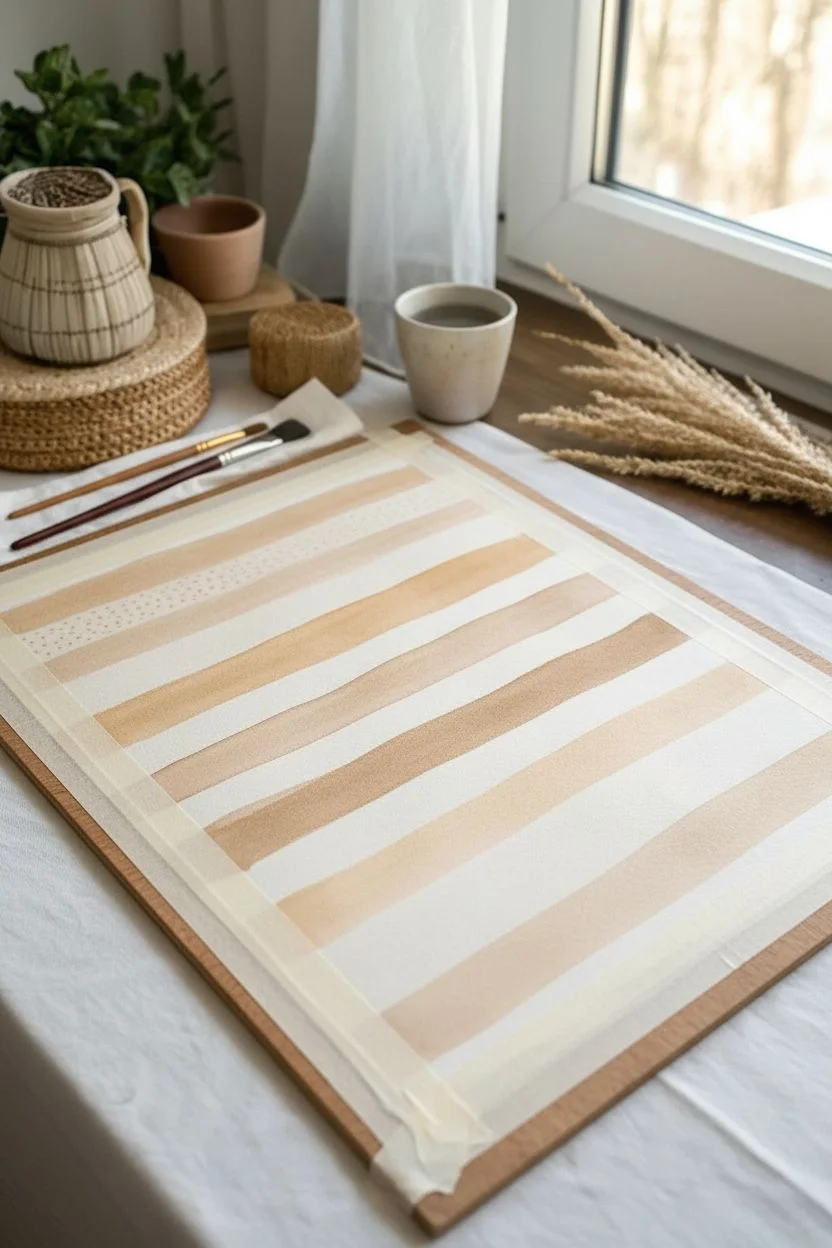
Capture the serene beauty of natural tones with this layered watercolour project. By combining wide washes with delicate speckled overlays, you will build a sophisticated, tone-on-tone background that feels both modern and organic.
How-To Guide
Materials
- High-quality watercolour paper (hot press for smoothness or cold press for texture)
- Wide flat wash brush (1-2 inches)
- Small round detail brush (size 2 or 4)
- Watercolour paints (Raw Sienna, Burnt Umber, Yellow Ochre, Sepia)
- Painter’s tape or masking tape
- Two cups of water (one for washing, one for clean water)
- Paper towels
- Ruler and pencil (optional)
Step 1: Preparation and Base Washes
-
Secure the paper:
Start by taping down your watercolour paper to a flat, hard surface. This prevents buckling when the paper gets wet and leaves you with a clean, professional border once finished. -
Plan your spacing:
Visualize where your stripes will go. You can lightly mark the edges with a pencil if you want precision, but freelancing allows for a lovely organic feel. -
Mix your lightest tone:
Create a very watery wash of Yellow Ochre or diluted Raw Sienna. You want a translucent look, almost like tea staining. -
Paint the first broad stripe:
Using your wide flat brush, load it with the light wash and drag it horizontally across the paper in one smooth motion. Don’t worry if the edges are slightly uneven; that adds character. -
Create a darker band:
While the first stripe dries slightly, mix a slightly stronger concentration of Raw Sienna. Paint a second stripe parallel to the first, leaving a gap of white space between them. -
Add a contrasting cool tone:
Mix a tiny bit of Burnt Umber or a cool grey-brown. Paint a thinner stripe with this mixture to break up the warmth of the ochres. -
Complete the base layout:
Continue painting horizontal bands of varying widths and opacity down the sheet. Leave specific stripes blank or very pale, as these will become the background for your detailed patterns later. -
Let it dry completely:
This is crucial. Walk away for a bit or use a hairdryer on a low setting. If the paper is damp, the next layers will bleed and lose their crisp definition.
Bleeding Between Stripes?
If stripes are bleeding into each other, your distinct bands aren’t dry enough. Wait until a stripe is dull (no shine) before painting its neighbor or leave a white gap
Step 2: Adding Texture and Pattern
-
Mix a concentrated pigment:
For the overprinting effect, you need a mixture with less water and more pigment—something closer to the consistency of heavy cream. A mix of Sepia and Raw Sienna works beautifully here. -
Start the dotted texture:
Switch to your small round brush. Dip just the tip into the concentrated paint. On one of your dried medium-tone stripes, begin adding small, intentional dots. -
Vary the dot density:
Cluster the dots closer together on one side of a stripe and let them fade out as you move across. This creates a subtle gradient effect. -
Create a ‘negative space’ pattern:
For a different texture, take a clean, slightly damp brush. Gently lift pigment off a semi-dry darker stripe in small circles to create light spots against a dark background. -
Add fine line details:
Using the very tip of your small brush and a dark Sepia mix, paint a row of tiny dashes or micro-dots along the edge of one of the wider bands to define it. -
Layer a wash over a pattern:
This is a fun trick: paint a very sheer, watery glaze over a section where you’ve already added dots. It pushes the pattern back, making it look submerged and subtle. -
Review and refine:
Step back from your work. If a certain area looks too empty, add a few stray speckles. If a stripe looks too flat, layer a second wash of the same color over half of it to create a hard edge. -
Remove the tape:
Once the paper is bone dry—and I mean completely dry—finish up by slowly peeling the tape away at a 45-degree angle to reveal your crisp white edges.
Metallic Accent Upgrade
Mix metallic gold watercolour or gouache into your final dot patterns. The subtle shimmer against the matte earthy tones adds incredible elegance
Hang your finished piece in a natural wood frame or use it as a custom wrapping paper design
Wormy Labyrinth Lines
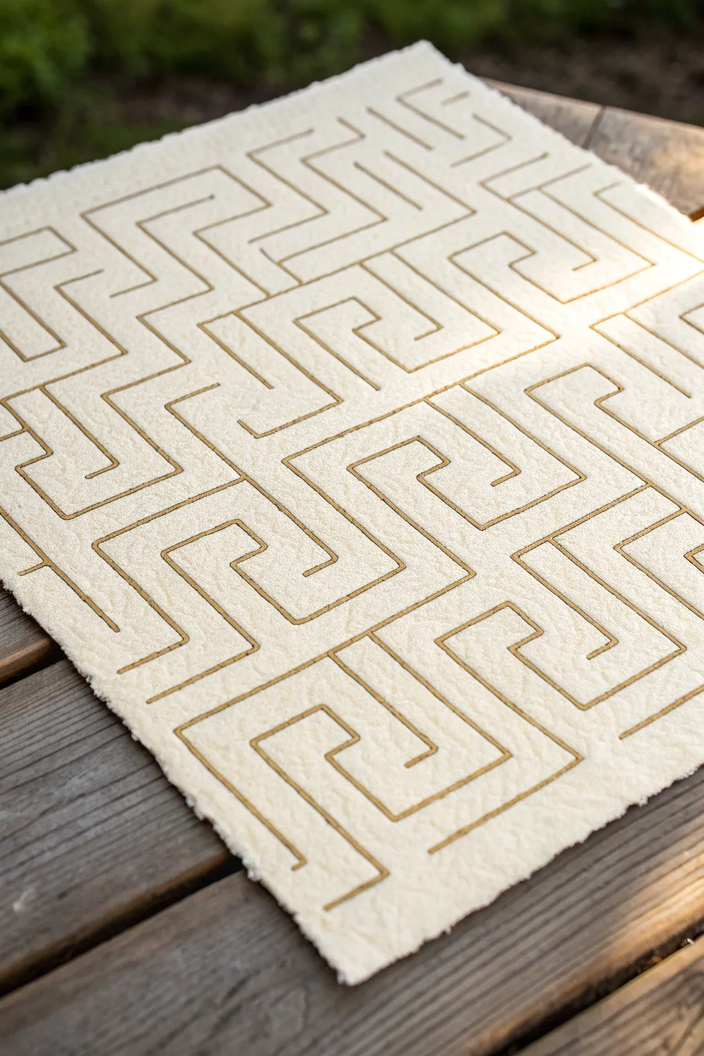
This elegant project combines the rustic texture of heavy handmade paper with the sophisticated gleam of gold line work. Focusing on a repeating ‘meander’ or Greek key motif, you will create a labyrinthine pattern that feels both ancient and modern.
Step-by-Step Guide
Materials
- Heavyweight handmade paper (cotton rag or rough watercolor blocks)
- Gold paint marker (fine to medium tip) or gold gouache and liner brush
- Pencil (HB or 2H)
- Ruler or quilting square
- Eraser (kneaded)
- Scrap paper for sketching
- Flat work surface
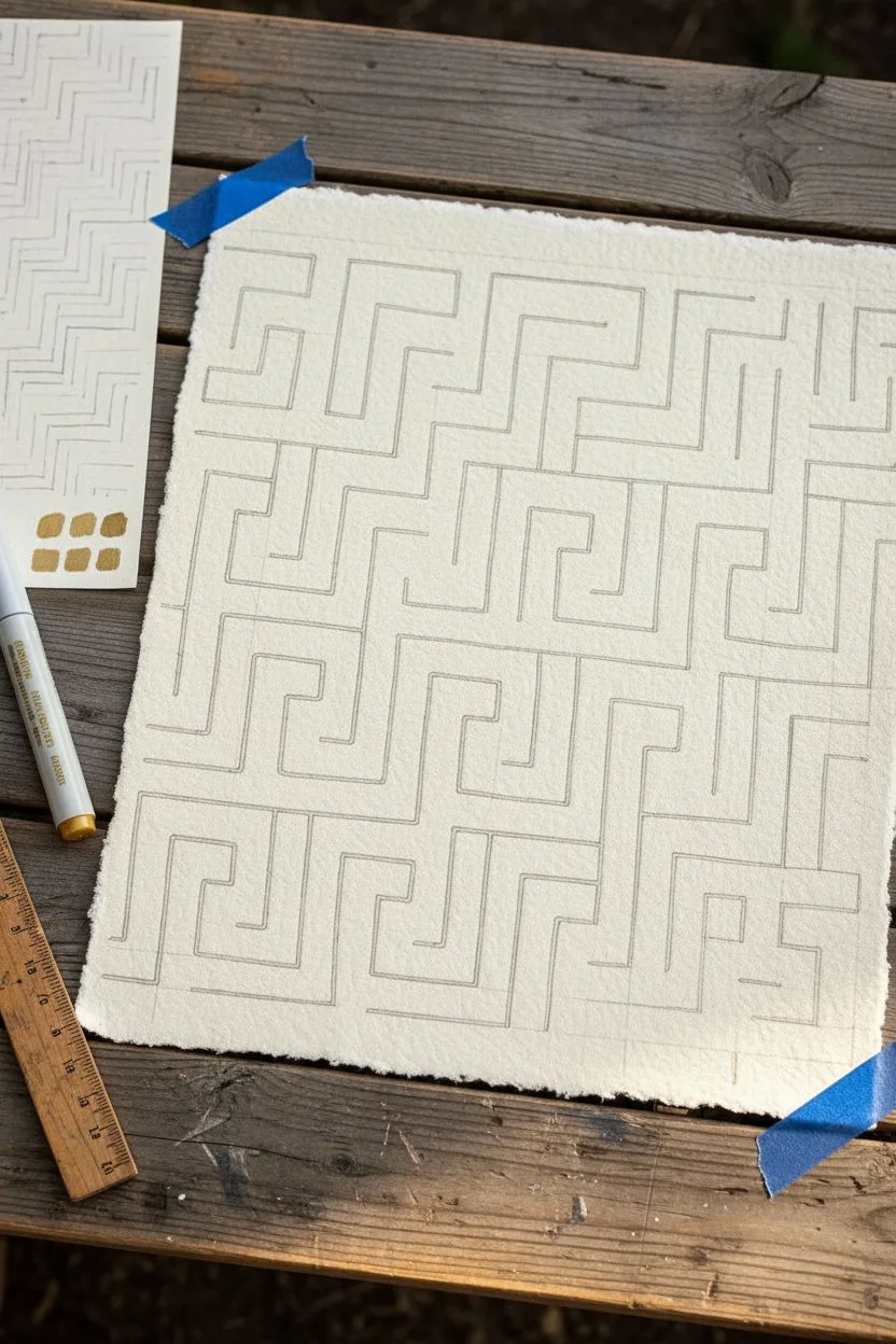
Step 1: Planning the Pattern
-
Analyze the motif:
Before touching your final paper, study the ‘wormy’ meander pattern. It consists of interlocking ‘L’ and ‘U’ shapes that fold back on themselves. Sketch a few practice versions on scrap paper to get a feel for the continuous line logic. -
Establish a grid:
Lightly draw a grid on your scrap paper to understand the spacing. The pattern relies on consistent channel widths to look cohesive, so deciding on a unit of measurement (like 1/2 inch) early is crucial. -
Test your gold medium:
On a spare corner or separate sheet of the same paper type, test your gold marker or paint. Handmade paper can be very absorbent; check if the ink bleeds or if you need a drier application method.
Step 2: Drafting the Design
-
Secure the paper:
Tape down your handmade paper to a flat surface using painter’s tape on the very edges, or just weight the corners if the deckled edge is delicate. -
Mark major guides:
Using a ruler and a very light touch with your pencil, mark the outer boundaries for your pattern area. Leave a generous margin of unworked paper around the edges to frame the design. -
Sketch the start:
Start drafting the pattern lightly in pencil. Begin at one corner or the center, drawing the basic ‘S’ or spiral shapes that form the core of the labyrinth blocks. -
Maintain consistent spacing:
As you expand the pattern across the page, keep checking the distance between your parallel lines. If one section gets too wide or narrow, the interlocking effect will break. -
Connect the sections:
The beauty of this pattern is how the geometric blocks nest together. Draw the connecting lines that bridge your initial spiral shapes, ensuring every path has a clear ‘wall’ separating it from the neighbor. -
Review pencil lines:
Stand back and look at your pencil draft. Use your kneaded eraser to gently lift any mistakes or lines that became too dark. The goal is a faint guideline, not a deep groove.
Taming Texture
Handmade paper texture can cause ‘skips.’ If your marker struggles, switch to a thin liner brush and gold gouache for better flow into the paper’s valleys.
Step 3: Applying the Gold
-
Prepare the pen:
Shake your gold paint marker well to ensure the metallic pigment is mixed. Press the nib on scrap paper to get the flow started smoothly. -
Start lining:
Begin tracing over your pencil lines. Working from the top left corner (if you are right-handed) downwards prevents your hand from smudging wet ink. -
Navigate the texture:
Handmade paper is bumpy. Move your hand slightly slower than usual to let the ink soak into the crevices of the paper texture, ensuring a solid line rather than a skipped one. -
Handle corners crisply:
When you reach a corner, lift the pen tip slightly or pause to pivot. Sharp, distinct 90-degree turns are essential for the ‘meander’ look. -
Check density:
I like to pause occasionally to check the opacity. If the gold looks thin or absorbed, wait for it to dry completely and then carefully retrace that segment for a brighter shine. -
Complete the full pattern:
Continue until all pencil lines are covered. Maintain a steady pressure so line width remains uniform across the entire piece.
Level Up: Debossing
Before inking, use a bone folder and ruler to firmly press the pattern lines into the paper. Inking inside these grooves adds deeper dimension.
Step 4: Finishing Touches
-
Let it dry:
Allow the gold ink to dry fully. Metallic markers often take longer than regular ink to set, especially on thick, fibrous paper. -
Erase guidelines:
Once you are 100% sure the ink is dry, gently dab (do not scrub) with a kneaded eraser to lift any visible pencil markings between the gold lines. -
Enhance edges (Optional):
If your paper has a nice deckled edge, you can lightly brush the very rim with a dry brush and a tiny bit of gold paint to tie the edge to the center motif. -
Flatten if needed:
If the moisture from the ink curled the paper slightly, place the artwork under a clean sheet of paper and a heavy book overnight to flatten it out.
Enjoy the rhythmic process of creating this golden path and the stunning texture it brings to your space
Topographic Contour Repeats
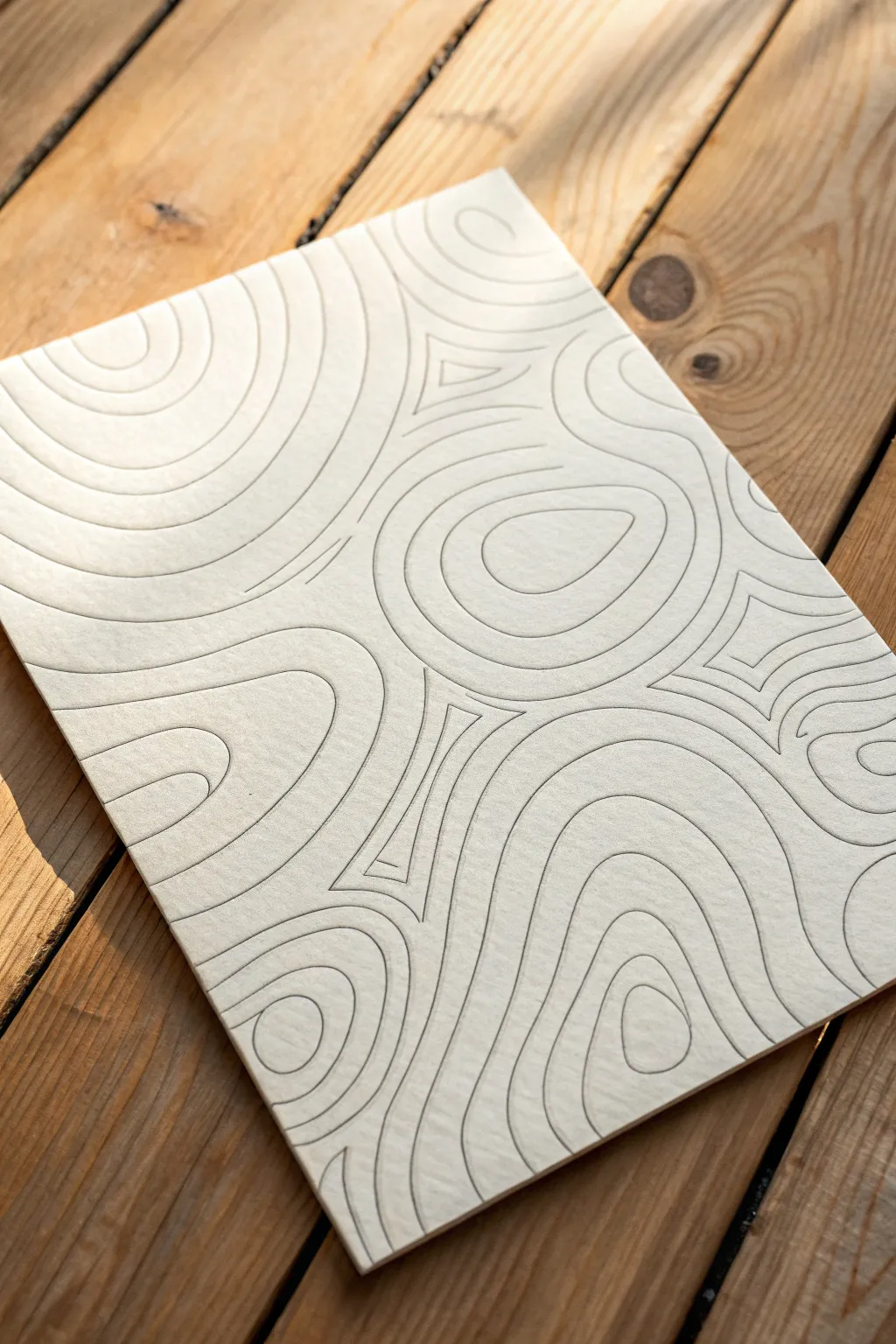
This project creates a soothing, minimalist piece of art that mimics the natural flow of topographic contour lines. By using thick, textured cotton paper and precise grey linework, you’ll achieve a sophisticated look that feels both organic and structured.
Step-by-Step Tutorial
Materials
- High-quality, cold-press watercolor paper (300gsm or heavier)
- Fine liner pens (0.3mm or 0.5mm) in warm grey or graphite grey
- Pencil (HB or 2H)
- Soft eraser
- Ruler (optional, for spacing checks)
- Smooth work surface
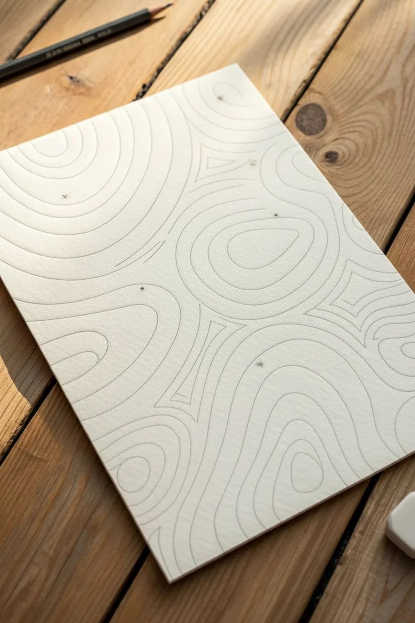
Step 1: Planning and Foundation
-
Select your paper:
Choose a heavy watercolor paper with a visible tooth or texture. The texture adds a crucial tactile element to the final piece, catching the light and giving the linework depth. -
Establish anchor points:
Lightly mark 3 to 4 random focal points on your page with a pencil. These don’t need to be dots, just general areas where your ‘hills’ or circular formations will center. -
Draft the primary shapes:
Using your pencil, sketch the innermost shapes at your chosen focal points. These should be irregular ovals, teardrops, or kidney bean shapes rather than perfect circles.
Clean Lines Pro-Tip
Rotate your paper constantly as you draw. Pulling the pen toward your body usually results in smoother, more controlled curves than pushing it away.
Step 2: Developing the Pattern
-
Start the first ink lines:
Switch to your fine liner pen. I prefer a warm grey ink over stark black for a softer, more natural appearance. Carefully trace your initial pencil centers. -
Draw the first concentric ring:
Draw a line around your first center shape, maintaining a consistent distance of about 3-4mm. Work slowly to keep the gap uniform. -
Expand the rings outward:
Continue adding rings around each focal point. As the shapes grow larger, allow them to become slightly more distorted or elongated, just like ripples in water. -
Managing spacing:
Keep your spacing consistent between lines. If your hand shakes slightly, embrace it; the textured paper will absorb small imperfections, adding to the organic feel. -
Encountering neighbors:
Eventually, the expanding rings from different focal points will get close to each other. Stop drawing a ring before it overlaps with a neighboring set of lines.
Troubleshooting Smudges
Textured paper holds ink longer than smooth paper. If you smudge a line, don’t wipe it. Let it dry, then carefully scratch the excess ink off with a precision craft knife.
Step 3: Connecting the Texture
-
Create the convergence zones:
Where two sets of rings meet, you will create ‘valleys’. Instead of crossing lines, draw a curved line that hugs the contours of both neighboring shapes, bridging the gap. -
Fill the triangular voids:
You will often find three-sided gaps between three converging circle sets. Fill these areas with smaller, nested triangular shapes that softer corners to match the flow. -
Extend to the edges:
Continue the pattern until you run off the edge of the paper. Don’t try to squeeze a full shape in; let the lines cut off naturally for a continuous look. -
Check density:
Step back and look at the overall density. If there are large white spaces that feel empty compared to the rest, add a few interior lines to tighten the pattern. -
Dry completely:
Let the ink sit for at least 30 minutes to ensure it is fully bonded with the paper fibers before touching it again. -
Erase guidelines:
Gently run your soft eraser over the entire piece to remove any visible graphite marks from your initial planning phase.
Now you have a stunning, organic textured art piece ready for framing or display
Glitchy Pixel Weave
Recreate the classic look of gingham fabric using a clever needlepoint technique that mimics the woven structure of cloth. This project uses two contrasting colors plus white to build a graphic, pixelated texture that feels both traditional and surprisingly modern.
Step-by-Step Guide
Materials
- Plastic canvas sheets (7-count or 10-count work well for chunky definition)
- Worsted weight yarn in three shades per swatch (e.g., Navy/Royal Blue/White or Dark Brown/Tan/White)
- Tapestry needle (size 18 or 20)
- Scissors
- Pinking shears (optional, for trimming felt backing later)
- Felt sheet (for backing)
- Fabric glue
Step 1: Planning the Pattern
-
Understand the motif:
Visualize the gingham check. It consists of three distinct zones: a solid dark block, a mixed ‘halftone’ block, and a solid light block. For this pixelated effect, we will build these blocks using alternating stitches. -
Define your grid:
Decide on your block size. The swatches shown use a 6×6 stitch square for each color block. This size provides enough room to show the ‘woven’ detail without becoming overwhelming. -
Select your palette:
Choose a dark color (A), a medium color (B), and a white (C). For the blue swatch, A is navy, B is royal blue, and C is white. The ‘mixed’ blocks are where the magic happens.
Step 2: Stitching the Blocks
-
Start with the darkest block:
Begin at a corner of your plastic canvas. Thread your needle with the darkest color (Color A). Create a 6×6 square of continental stitches (or simple half-cross stitches). Ensure all stitches slant in the same direction. -
Create the vertical mix:
Move to the right of your dark block. This new 6×6 block represents the vertical warp threads. Alternate horizontal rows of stitching: one row of Color A, one row of white (Color C), repeated three times to fill the square. -
Form the horizontal mix:
Return to your first block and move directly below it. This block represents horizontal weft threads. Here, you will alternate vertical columns of stitching: one column of Color A, one column of white. -
Stitch the lightest block:
Fill the empty corner between your two mixed blocks. This area represents the white space in woven fabric. Originally, I thought solid white would work best, but to maintain the ‘glitchy’ texture, use a checkerboard stitch pattern of white and your medium tone (Color B). -
Alternative texture method:
Looking closely at the sample, an easier ‘pixel’ method is to simply use the medium tone (Color B) as a solid block where the mixed threads would be. This creates a cleaner, less busy gingham. -
Refine the pattern logic:
Let’s stick to the visual accuracy of the photo: Darkest blocks are solid dark yarn. Lightest blocks are solid white yarn. The ‘medium’ transition blocks are actually a 1×1 checkerboard pattern of dark and white stitches. -
Execute the checkerboard stitch:
For those transition blocks, stitch one dark stitch, then one white stitch, alternating across the row. On the next row, reverse the order to create a tiny checkerboard effect. This mimics the weave perfectly.
Uneven Grids
Double-check your counting! If one block is 5 stitches wide and another is 6, the pattern will drift immediately. Mark your grid on the plastic canvas with a washable marker first.
Step 3: Expanding the Swatch
-
Repeat the sequence:
Continue building out your rows. A row of pattern logic is: Dark Solid, Mixed Checkerboard, Dark Solid, Mixed Checkerboard. -
Create the alternating row:
The row below follows this pattern: Mixed Checkerboard, White Solid, Mixed Checkerboard, White Solid. -
Maintain tension:
Plastic canvas is forgiving, but try to keep your yarn tension consistent so the squares remain uniform in size. -
Check the back:
If using plastic canvas, you don’t need to obscure the back perfectly, but try to weave loose ends under existing stitches to keep it tidy.
Texture Shift
Swap the ‘mixed’ checkerboard blocks for a solid medium-tone yarn (like light denim blue or caramel). This simplifies the work while keeping the gingham vibe.
Step 4: Finishing Touches
-
Inspect the edges:
Once your rectangle reaches the desired size, inspect the perimeter. Ensure every hole on the edge has been stitched into for coverage. -
Trim the canvas:
Cut away the excess plastic canvas carefully. Leave exactly one bar of plastic beyond your stitching to prevent unraveling. -
Create the sawtooth edge:
To mimic the pinking shear cut shown in the image, you have a choice. You can physically cut the plastic canvas in a zigzag (risky), or back the piece with felt. -
Prepare the backing:
Cut a piece of stiff white felt slightly larger than your stitched swatch. Here I prefer to use actual pinking shears on the felt to create that zig-zag border instantly. -
Mount the work:
Apply a strong fabric glue to the back of your stitched plastic canvas. Center it onto the white felt, ensuring the pinked felt edges peek out evenly, framing the piece. -
Press and dry:
Place a heavy book over the project while the glue cures to ensure a flat, crisp finish.
You now have a visually striking textile sample that captures the digital-meets-analog aesthetic perfectly
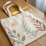
Have a question or want to share your own experience? I'd love to hear from you in the comments below!