
Bathroom walls are the perfect little canvas for turning an everyday space into something calming, playful, or quietly stylish. I love how the right bathroom wall art can soften tile, warm up bright fixtures, and make even a tiny room feel intentional.
Classic Framed Print Above the Toilet
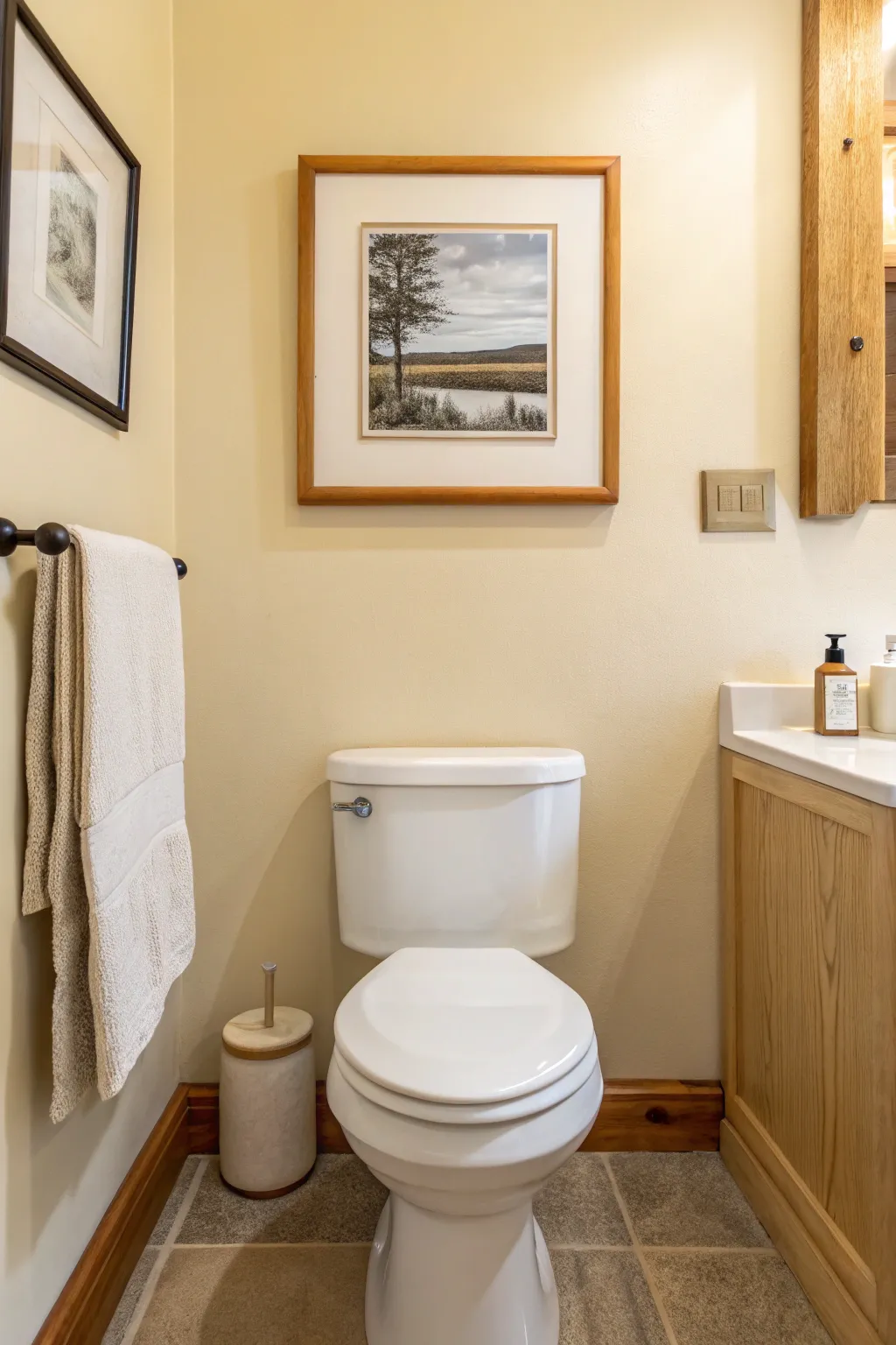
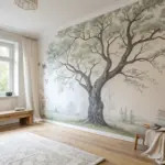
Elevate your bathroom’s aesthetic with this serene, framed landscape print that whispers of quiet lakeside mornings. The classic combination of a warm wood frame, a generous white mat, and a monochromatic nature photograph creates a sophisticated focal point above the toilet.
Step-by-Step
Materials
- High-resolution landscape photo (digital file)
- Wide wooden picture frame (approx. 16×20 inches, medium oak finish)
- Custom precut mat board (Off-white/Cream, 4-inch borders)
- Acid-free mounting tape or photo corners
- Glass or acrylic glazing
- Kraft paper or dust cover paper
- Double-sided tape (ATG gun preferred)
- Picture hanging wire and D-rings
- Wall hook or nail
- Microfiber cloth
- Hammer
- Level
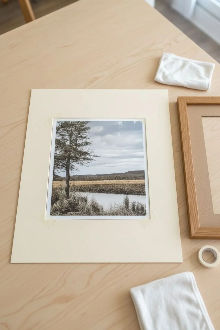
Step 1: Sourcing and Preparing the Art
-
Select your image:
Find a high-resolution photograph of a tranquil landscape. Look for scenes with distinct foreground elements, like the textured tree and grasses in the example, and a soft background horizon line. -
Edit for tone:
Using photo editing software, desaturate the image to remove vibrant colors. Add a very slight warm filter or sepia tone to match the beige warmth of the bathroom walls shown in the inspiration photo. -
Print the photograph:
Print the image on high-quality matte or luster photo paper. The print size should be significantly smaller than your frame to allow for a wide mat—for a 16×20 frame, an 8×10 or 11×14 print often works best to achieve that gallery look. -
Clean the workspace:
Ensure your assembly table is completely free of dust and debris. I like to lay down a clean towel to protect the frame face from scratches while working.
Humidity Seal
Since this is for a bathroom, adhere a thin strip of acid-free foil tape over the gap where the glass meets the slightly rabbet inside. This seals out moisture.
Step 2: Mounting and Framing
-
Prepare the frame:
Disassemble your wooden frame, removing the backing board and glazing. Clean the glass thoroughly on both sides with a microfiber cloth to remove streaks and fingerprints. -
Position the photo:
Place your mat board face down. Center your printed photo face down over the window opening. Use small pieces of artist’s tape to temporarily hold it in place while you check the alignment from the front. -
Secure the mount:
Once perfecting the alignment, use acid-free mounting tape along the top edge of the photo only (T-hinge method). This allows the paper to expand and contract with bathroom humidity without buckling. -
Stack the layers:
Place the clean glass back into the frame rebate. Lower the matted photo into the frame, ensuring no dust specs are trapped between the print and the glass. -
Insert the backing:
Place the backing board into the frame. Secure it tightly using the flexible points or brads included with your frame; if you’re using a custom frame, you may need a point driver tool here.
Step 3: Finishing and Hanging
-
Apply the dust cover:
For a professional finish, apply double-sided tape to the back rim of the wood frame. Lay a sheet of kraft paper over the back, pull it taut, and press it onto the tape. -
Trim the excess:
Use a sharp craft knife to carefully trim the excess kraft paper flush with the edge of the frame. -
Install hanging hardware:
Measure about one-third of the way down from the top of the frame. Screw D-rings into the side rails of the frame at these marks. -
Wire the frame:
Thread picture hanging wire through the D-rings, leaving a little slack but not enough to show above the frame’s top edge. Twist the wire ends securely around themselves. -
Determine placement:
Hold the frame above the toilet to find the visual center. Aim for the bottom of the frame to be 8-10 inches above the toilet tank for balanced spacing. -
Mark the wall:
Use a pencil to lightly mark where the hook should go, accounting for the slack in your wire. -
Install wall anchor:
Hammer your hook or nail into the marked spot. Using a proper picture hook supports the weight better than a bare nail. -
Hang and level:
Place the frame wire onto the hook. Place a small spirit level on top of the frame and adjust until perfectly straight.
Double Mat Depth
Use two mat boards—a colored inner mat (maybe a soft taupe) revealed by just 1/4 inch, and the main cream mat on top. This adds depth and elegance.
Now you have a timeless piece of art that brings a sense of calm to your daily routine
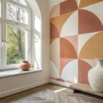
Oversized Statement Art Above the Bathtub
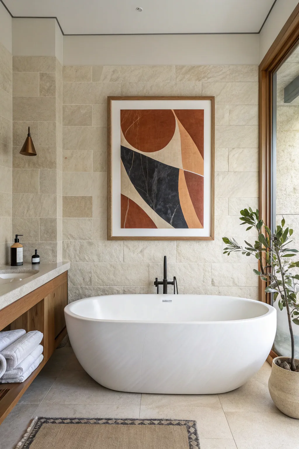
Embrace the soothing palette of the desert with this oversized abstract canvas that perfectly anchors a bathroom wall. Featuring bold curves and sharp angles in terracotta, charcoal, and warm beige, this piece mirrors the tranquility of natural stone textures.
Step-by-Step Guide
Materials
- Large watercolor paper (e.g., 24×36 inches) or primed canvas
- Gouache or matte acrylic paints (burnt sienna, black, unbleached titanium, yellow ochre)
- Wide flat wash brush (2 inch)
- Medium round brush (size 8)
- Fine detail brush (size 0 or 2) for white lines
- Artist tape or light tack masking tape
- Compass or round objects for tracing (plates, lids)
- Ruler or straight edge
- Pencil and eraser
- Natural wood frame (custom size or poster size)
- White mat board (optional, to fit frame)
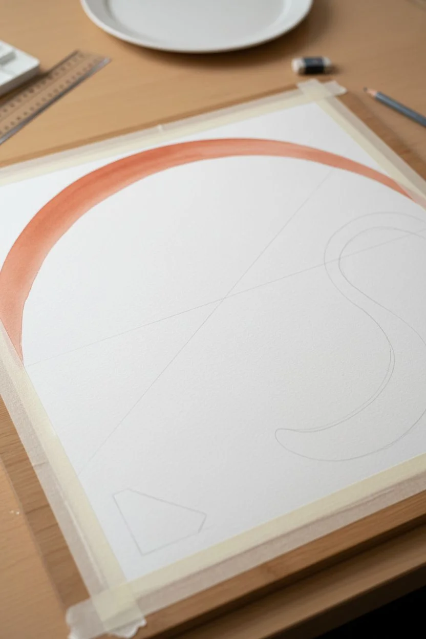
Step 1: Planning the Composition
-
Prepare your surface:
If using watercolor paper, tape it down securely to a flat board on all four sides to prevent buckling. If using a canvas, ensure it is clean and dust-free. -
Sketch the main arc:
Start by drawing the large, dominant terracotta circle section at the top. Use a large compass or trace a large round platter to get a clean curve that fills the upper third of the composition. -
Define the diagonal divide:
Using a ruler, lightly sketch the sharp diagonal line that cuts through the center, separating the dark charcoal section from the lighter beige areas. -
Map out the organic shapes:
Freehand the remaining irregular shapes—the sweeping beige curve on the right and the smaller terracotta section at the bottom left. Keep your pencil lines light so they don’t show through later.
Uneven Lines?
If you struggle with steady hands for the long geometric lines, use artist tape to block off the shapes. Paint one section, let it dry, peel, and re-tape for the next.
Step 2: Painting the Color Blocks
-
Mix the terracotta tone:
Combine burnt sienna with a touch of red oxide and yellow ochre to create a warm, earthy rust color. Test it on a scrap piece of paper first to ensure it matches the warmth of the inspiration. -
Fill the upper section:
Using the wide flat brush, paint the top circular section with your terracotta mix. Apply the paint smoothly, but allow some natural brush texture to remain for an organic feel. -
Create the charcoal hue:
Mix black with a tiny drop of white and perhaps a hint of blue or brown to create a soft, complex charcoal tone rather than a flat, dead black. -
Paint the central wedge:
Carefully paint the central triangular shape with the charcoal mix. Use the edge of the flat brush to get sharp, crisp lines along the diagonal border. -
Apply the neutral tones:
Mix unbleached titanium with a small amount of yellow ochre for the lighter sections. Fill in the swooping curve on the right side and the background areas. -
Add the bottom accent:
Paint the bottom left geometric shape with a slightly darker variation of your original terracotta mix to add subtle depth to the composition. -
Let it dry completely:
Allow the entire painting to dry for at least 2-3 hours. The paint needs to be fully set before you add the delicate overlay details.
Step 3: Details and Framing
-
Mix the detail color:
Dilute a small amount of white acrylic or gouache with water until it reaches an ink-like consistency that flows easily off a fine brush. -
Paint the fine white lines:
Using your finest brush, carefully paint the thin, delicate scratch-like lines seen in the dark charcoal section and the terracotta areas. These should be organic and slightly wavy, not perfectly straight. -
Touch up edges:
I find it helpful to stand back at this stage; scan the piece for any uneven edges where colors meet and tidy them up with a small angle brush if necessary. -
Seal the artwork (optional):
If this is going in a humid bathroom, applying a clear matte spray fixative or varnish will protect the paper and paint from moisture damage. -
Frame the piece:
Place your artwork into a light natural wood frame. Using a bright white mat board adds a professional gallery look and gives the geometric shapes breathing room.
Add Texture
Mix a teaspoon of baking soda or fine sand into your terracotta paint before applying. This adds a gritty, stone-like texture that mimics the bathroom tiles.
Hang your new masterpiece centered above the tub to create a sophisticated focal point for your daily soak
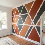
Triptych Set to Fill Wide Wall Space
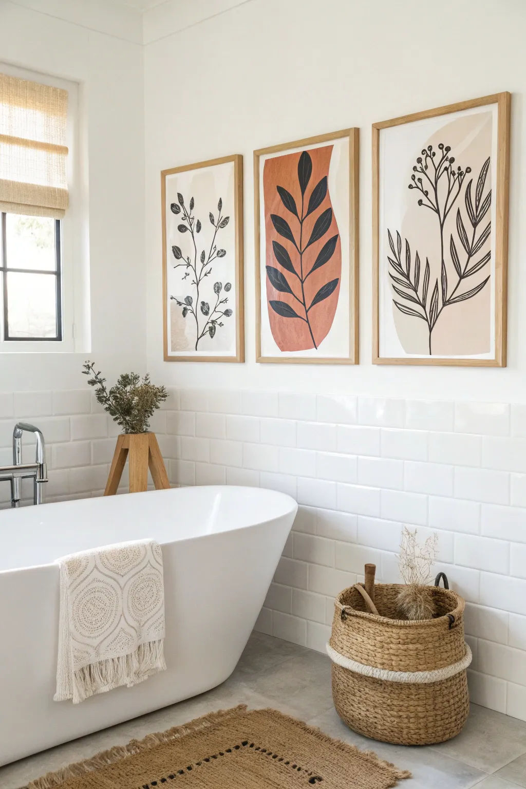
Bring serene vibes to your bathroom with this trio of minimalist botanical prints featuring organic shapes and bold line work. This project captures the essence of modern boho design, combining soft earth tones with crisp black silhouettes to fill empty wall space beautifully.
Detailed Instructions
Materials
- 3 sheets of heavy watercolor paper or mixed media paper (A3 or A2 size)
- Acrylic paints (terracotta/rust, beige/sand, cream, soft grey)
- Black ink or high-flow acrylic paint
- Fine liner brushes (sizes 0 and 2)
- Medium flat brush (for abstract shapes)
- Pencil and eraser
- 3 matching light wood frames
- Painter’s tape or masking tape
- Palette or mixing plate
- Water cups and paper towels
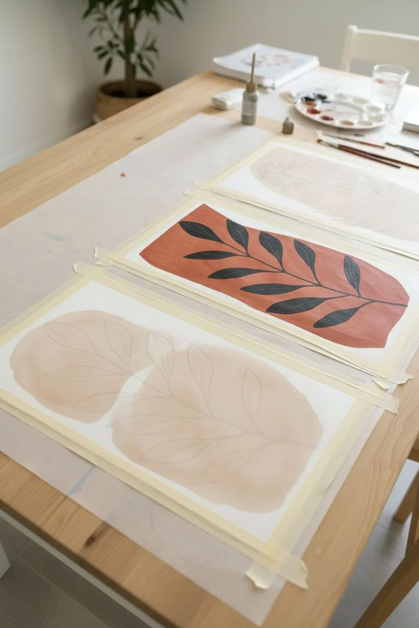
Step 1: Planning and Abstract Base
-
Tape your borders:
Start by taping down your paper to a flat surface. This secures the paper against buckling and creates a crisp white border if you plan to frame without a mat. -
Sketch the layout:
Lightly sketch the general composition for all three pieces simultaneously. You want a cohesive look, so plan where your abstract color blobs will sit on each page to ensure they flow together visually. -
Mix your base colors:
Prepare your palette with earthy tones. Mix a warm terracotta, a soft beige, and a very pale cream. Aim for a matte finish consistency. -
Paint the abstract shapes:
Using the medium flat brush, paint large, organic shapes on the paper. These serve as the background for your leaves. Don’t worry about perfect edges; a little wobble adds character. -
Layering tones:
For the center piece, I like to use the boldest color (terracotta) as the main shape. Flank it with the softer beige and cream shapes on the left and right panels to balance the visual weight. -
Let it dry completely:
Allow the background paint to dry fully. If you rush this steps, the black lines you add later might bleed into the damp paint.
Use Flow Aid
Mix a drop of acrylic flow improver into your black paint. This helps create those seamless, long stem lines without the brush dragging or stopping mid-stroke.
Step 2: Adding Botanical Line Work
-
Draft the stems:
With a very light pencil touch, draw the main stem lines over your dry abstract shapes. Design different leaf varieties for each panel: one vine-like, one broad-leafed, and one with berries or buds. -
Prepare the black medium:
Load a fine liner brush with black ink or slightly watered-down black acrylic paint. Test the flow on a scrap piece of paper to ensure smooth, continuous lines. -
Paint the center stem:
Start with the middle panel (the broad leaves). Paint the central stem first, starting from the bottom and thinning the line as you reach the top. -
Fill in the broad leaves:
Add the large leaves to the center stem. Use the pressure of the brush to create width in the middle of the leaf and lift off to create sharp points at the tips. -
Paint the left panel vine:
Move to the left artwork. Paint a wandering, curved stem. Add small, rounded leaves and delicate line details for veins. -
Detail the right panel:
For the third piece, focus on vertical energy. Paint long, upward-reaching stems and add clusters of small circles for berries or buds at the tips. -
Refine the details:
Go back over your leaves and add central veins or small gaps where the light might hit. This negative space keeps the black shapes from feeling too heavy. -
Erase pencil marks:
Once the black ink is bone dry, gently erase any visible pencil sketches underneath the illustrations.
Step 3: Finishing Touches
-
Matte check:
Double-check that your paint is completely dry to the touch, especially the thicker black areas. -
Clean the glass:
While the art settles, clean the glass of your frames inside and out to remove streaks or dust. -
Frame the trio:
Place your artwork into the frames. If your paper is smaller than the frame, center it on a white backing board or mat. -
Hang and align:
Hang the frames side-by-side with equal spacing (about 2-3 inches apart) to complete the triptych effect.
Texture Play
Use textured watercolor paper or add a pinch of baking soda to your background paint colors for a plaster-like, tactile finish.
Step back and admire how these simple shapes create a sophisticated, spa-like atmosphere in your bathroom
Mini Gallery Wall for Awkward Narrow Corners
Transform an overlooked bathroom nook into a serene focal point with this perfectly curated mini gallery wall. Featuring delicate botanical prints and a mix of natural wood and black frames, this project brings warmth and organic texture to small spaces.
Step-by-Step
Materials
- 9 small picture frames (mix of light wood and black finishes)
- Botanical art prints or pressed dried plants
- Textured art paper (white and cream)
- Pencil
- Bubble level
- Measuring tape
- Painter’s tape or kraft paper (for templates)
- Hammer and nails or adhesive hanging strips
Step 1: Curating the Collection
-
Select the artwork:
Gather a collection of botanical imagery. Look for simple line drawings of leaves, ferns, or floral stems. You can also press real leaves or use abstract textures that evoke nature. -
Vary the paper tones:
To achieve the organic look shown here, don’t stick to stark white paper. Mix in cream, oatmeal, or textured handmade paper backgrounds for some of the prints to add depth. -
Choose your frames:
Sourcing the right frames is key. Aim for mostly slim, light wood frames to match the vanity, but include 2-3 black frames to add contrast and ground the arrangement. -
Prepare the art:
Cut your botanical prints or mount your pressed plants to fit the frame openings. Leave generous white (or cream) space around the subject to keep the look airy and uncluttered.
Loose Frames?
If frames tilt forward, stick adhesive felt pads or bumper pads to the bottom back corners. This pushes the bottom out slightly to align vertically with the wall.
Step 2: Planning the Layout
-
Measure the wall space:
Measure the width of the wall section above the tile wainscoting. You want the arrangement to feel centered horizontally within that specific strip of wall. -
Create paper templates:
Trace each frame onto kraft paper or newspaper and cut them out. Mark exactly where the hanging hardware is located on the back of the frame onto these paper templates. -
Test the arrangement:
Using painter’s tape, stick your paper templates to the wall. Aim for a grid of three columns and three rows. The spacing between frames should be uniform—about 2 to 3 inches usually looks best. -
Balance the colors:
Step back and look at your template layout. I like to visualize where the black frames will go at this stage; distribute them (like the top right and middle right in the photo) so they don’t clump together.
Step 3: Installation
-
Start with the center:
Locate the paper template for the middle frame of the center row. Ensure it is perfectly centered on the wall segment and check it with a bubble level. -
Nail through the template:
Once you are happy with the position, hammer the nail directly through the marked spot on your paper template. This ensures perfect placement without extra measuring. -
Work outwards:
Install the hardware for the remaining frames, working from the center outward. Check the level of every single template before hammering to keep your grid crisp. -
Remove templates:
Gently tear away the paper templates from the wall, leaving the nails or hooks in place. -
Hang the frames:
Place your framed artwork onto the nails. Use the bubble level one last time on top of each frame to ensure they are hanging perfectly straight. -
Secure the corners:
In high-traffic areas like bathrooms, frames can shift. Place a small dot of museum putty or a command strip on the bottom corners of each frame to keep them permanently level.
Grid Precision
Cut a ‘spacer’ block from scrap wood or cardboard that equals your desired gap size. Use it between frames as you hang them for instant, perfect spacing.
Step 4: Styling the Space
-
Bridge the gap:
If you have an adjacent wall, hang a larger piece of art there (like the larger vertical frames shown) to wrap the gallery feel around the corner. -
Add organic elements:
Place a vase with dried branches or stems on the vanity below the art. The physical plants will visually connect with the botanical prints above.
Now you have a charming, gallery-worthy corner that makes your daily routine feel a little more artistic
BRUSH GUIDE
The Right Brush for Every Stroke
From clean lines to bold texture — master brush choice, stroke control, and essential techniques.
Explore the Full Guide
Art on Floating Shelves Over the Vanity
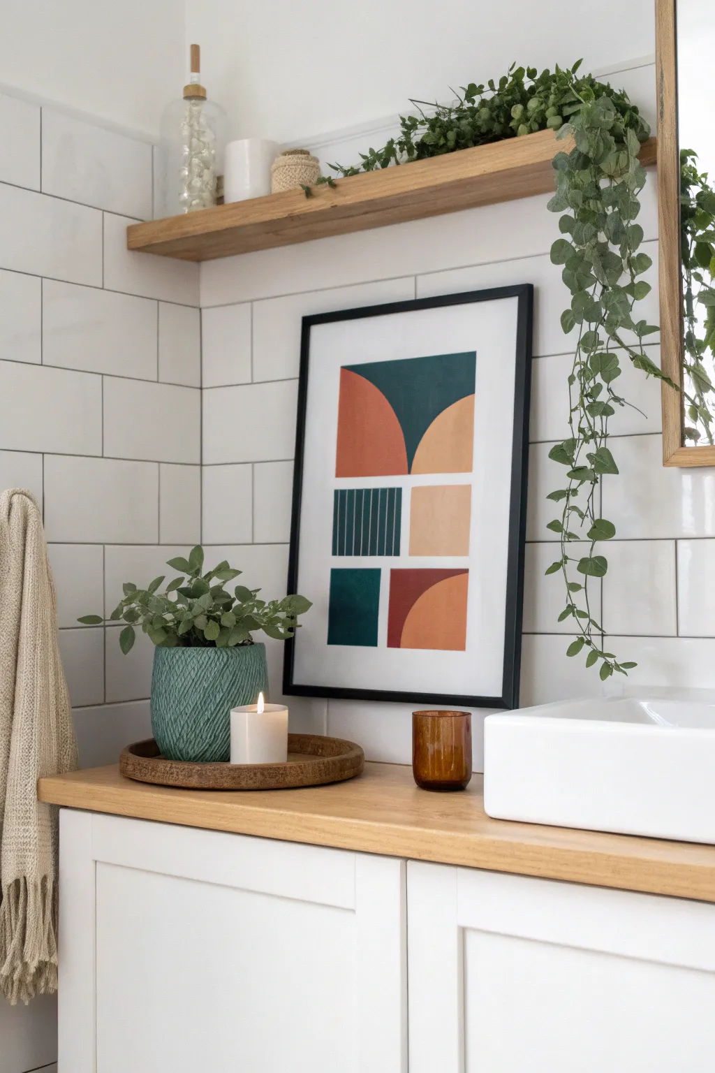
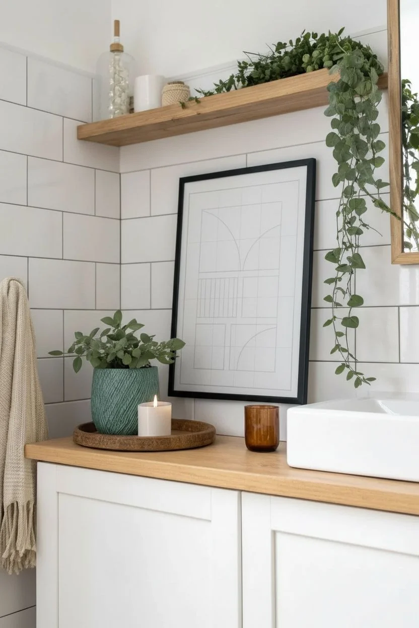
Bring a splash of modern warmth to your bathroom with this bold, geometric abstract piece featuring a harmonious mix of deep teal, terracotta, and soft peach tones. This project uses simple masking techniques and acrylic paints to create crisp, clean lines and striking shapes.
Step-by-Step Guide
Materials
- Heavyweight mixed media paper or canvas board (A3 or similar size)
- Acrylic paints: deep teal, burnt orange/terracotta, peach/flesh tint, white
- Painter’s tape or low-tack masking tape
- Ruler and pencil
- Flat synthetic brushes (medium and small)
- Fine liner brush for details
- Compass or round objects for tracing curves
- Palette for mixing paint
- Black frame with matting
Step 1: Planning the Layout
-
Analyze the grid:
Visualize the artwork as an invisible grid. Notice how the composition is roughly divided into three vertical columns and three horizontal rows, though the shapes don’t fill every slot perfectly. -
Mark the boundaries:
Using your ruler and pencil, lightly draw a rectangular border on your paper where your design will live, leaving a generous white margin around the edges like in the photo. -
Sketch the grid lines:
Lightly pencil in the internal grid lines. It doesn’t need to be mathematically perfect; a little organic variation adds character. Aim for roughly equal sections. -
Draw the main shapes:
Sketch the large semi-circles and rectangles. Use a compass or trace a bowl for the curved edges of the orange and teal semi-circles in the top and bottom sections. -
Detail the striped block:
In the middle-left section, draw a rectangle that will later become the teal box with thin vertical stripes.
Step 2: Painting the Solid Blocks
-
Prepare the palette:
Squeeze out your paints. Mix the teal with a tiny dot of black if you need it deeper, and adjust your orange with a little white to get that perfect terracotta shade. -
Tape for crisp edges:
Apply painter’s tape along the straight edges of your first shape—let’s start with the large top-left terracotta semi-circle—to ensure a sharp line against the background. -
Paint the terracotta curves:
Carefully paint the curved edge freehand with a flat brush, or use masking fluid if you are less confident. Fill in the rest of the shape with a solid coat of burnt orange paint. -
Fill the adjacent teal shape:
Move to the top middle section. Paint the deep teal shape that mirrors the curve. I find using a smaller flat brush helps maneuver around the curve without crossing the line. -
Add the peach tone:
Paint the top-right quarter-circle and the middle-right square using the soft peach color. Apply two coats if the first looks streaky. -
Complete the bottom shapes:
Paint the bottom-left teal square and the bottom-right terracotta quarter-circle. Ensure the colors are opaque and bold. -
Let it dry completely:
Allow all the solid color blocks to dry fully before moving on to the intricate striped section to avoid smudging.
Clean Lines Secret
To prevent paint bleed, paint a thin layer of white (or your background color) over the tape edge first. This seals the tape so your colored paint line is razor sharp.
Step 3: Adding the Details
-
Paint the striped base:
For the middle-left rectangle, paint the entire block with the deep teal color first and let it dry thoroughly. -
Draw stripe guides:
Once the teal base is bone dry, use a ruler and a white pencil or chalk to mark very faint vertical guidelines for your stripes. -
Paint thin lines:
Using your finest liner brush and slightly thinned peach or white paint (mixed to match the other peach blocks), carefully paint thin vertical lines over the teal background. -
Erase pencil marks:
Once the entire painting is completely dry—give it a few hours just to be safe—gently erase any remaining visible pencil grid lines.
Texture Twist
Mix a little baking soda or modeling paste into your acrylic paint. This adds a subtle, gritty texture that mimics the look of a vintage screen print or gouache.
Step 4: Framing
-
Clean up edges:
If any paint bled under the tape or edges look rough, use a small brush with white paint (or your paper color) to touch up and sharpen the boundaries. -
Mount artwork:
Center your dry artwork on the backing board of your frame. If your paper is smaller than the frame, use a white mat board to give it a professional gallery look. -
Final assembly:
Place the glass or acrylic over the mat, secure the backing, and your geometric masterpiece is ready to hang.
Hang your new abstract art confidently over the vanity and enjoy the sophisticated pop of color it brings to your daily routine
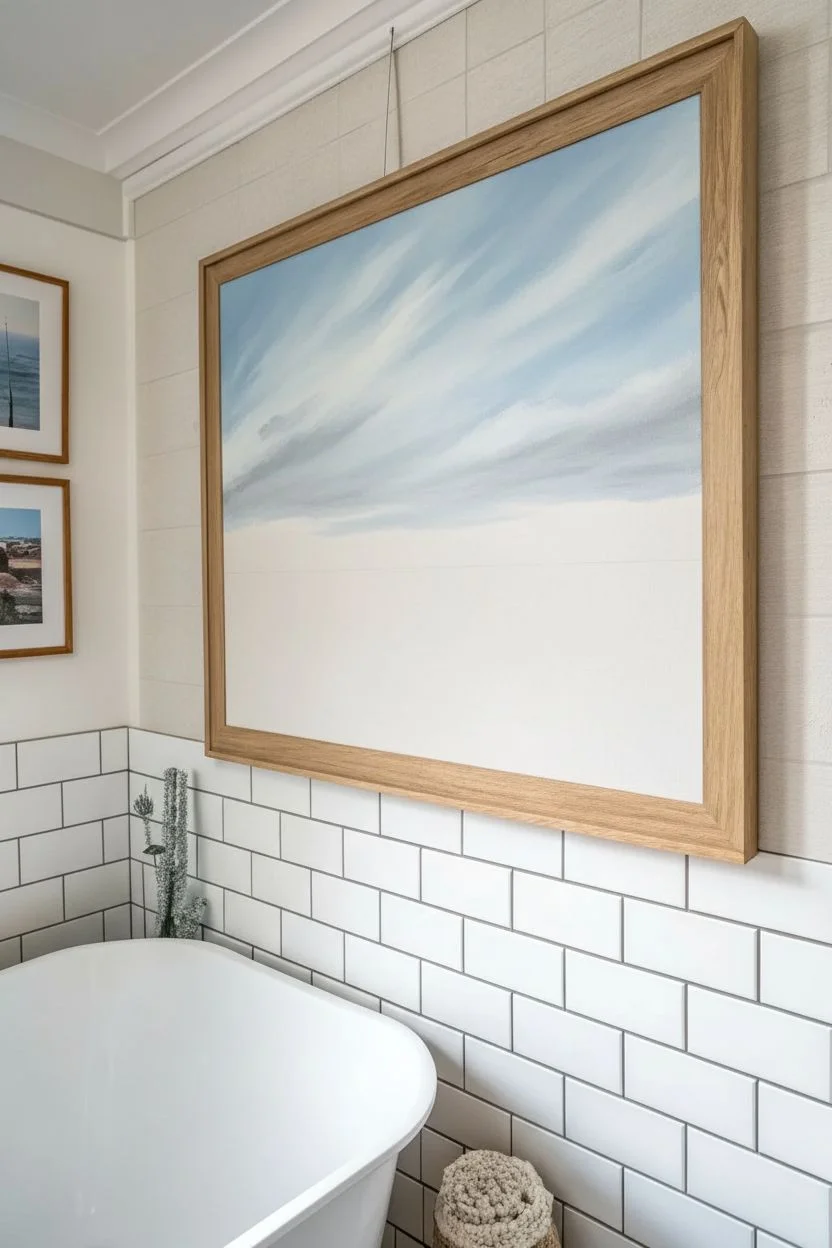
Coastal Seascape Painting for a Calm Bathroom Mood
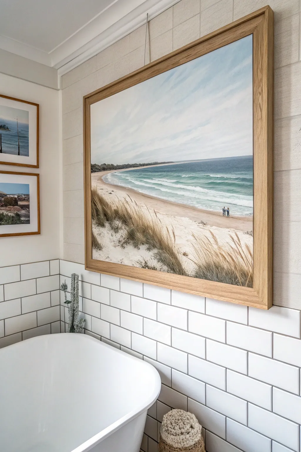
Transform your bathroom into a tranquil retreat with this expansive coastal seascape painting, featuring rolling dunes, gentle turquoise waves, and a sense of infinite horizon. This project captures the calming essence of the sea using soft acrylic blending techniques and textured brushwork for the dune grasses.
How-To Guide
Materials
- Large stretched canvas (at least 24×30 inches or larger)
- Acrylic paints: Titanium White, Ultramarine Blue, Phthalo Green, Yellow Ochre, Burnt Sienna, Raw Umber, Payne’s Grey
- Large flat brush (2-3 inch) for sky and water base
- Medium filbert brush for waves and sand
- Small round brush or rigger brush for grass details
- Fan brush (optional for grass texture)
- Palette knife
- Water container and paper towels
- Easel or flat workspace
- Oak or light wood floating frame (optional)
Step 1: Setting the Scene: Sky and Horizon
-
Establish the Horizon Line:
Begin by deciding where your sea meets the sky. For this composition, draw a faint pencil line roughly one-third of the way down from the top of the canvas to keep the focus on the foreground beach. -
Mix the Sky Gradient:
Create a pale, airy blue by mixing a large amount of Titanium White with a tiny touch of Ultramarine Blue and a speck of Payne’s Grey. You want a color that feels almost white but has cool undertones. -
Paint the Sky:
Using your large flat brush, cover the sky area with broad, horizontal strokes. While the paint is still wet, blend in pure White near the horizon line to create atmospheric perspective, making the distance look hazy and soft. -
Add Soft Clouds:
Mix a slightly darker grey-blue (add a bit more Payne’s Grey to your sky mix). Use a dry brush technique to scumble in diagonal, sweeping cloud formations. Keep edges soft and indistinct to mimic the movement of coastal wind.
Pro Tip: Atmospheric Haze
To make the distant shoreline recede realistically, mix a little sky color into your land paint for the furthest points. This ‘blue shift’ creates instant depth.
Step 2: The Sea and Shoreline
-
Block in Deep Water:
Mix Ultramarine Blue with a touch of Phthalo Green and Payne’s Grey for the deep ocean color. Apply this in a horizontal band right at the horizon line, keeping the top edge crisp and straight against the sky. -
Transition to Turquoise:
As you move closer to the shore, lighten your blue mix with White and add more Phthalo Green. This creates that vibrant turquoise hue typical of shallow coastal waters. Blend this wet-into-wet with the deeper blue band above. -
Paint the Breaking Waves:
Using a filbert brush and pure Titanium White, paint the foamy lines of breaking waves. Instead of straight lines, use irregular, slightly curved strokes to show the water rushing forward. I like to let the turquoise peek through in areas to show the water’s transparency. -
Create the Wet Sand:
Where the water recedes, the sand is darker and reflective. Mix Yellow Ochre, a touch of Burnt Sienna, and White to create a sand color. Paint a band below the waves, sweeping your brush horizontally to mimic the flat, wet surface.
Level Up: Texture Gel
Mix clear modeling paste into your white acrylic before painting the wave crests. Use a palette knife to apply it for real 3D foam texture on the water.
Step 3: Foreground Dunes and Texture
-
Lay the Sand Foundation:
For the dry beach and dunes, use a lighter version of your sand mix—mostly White with just a hint of Yellow Ochre and Raw Umber. Block in the large triangular shape of the dune in the bottom left corner, sweeping upward to the right. -
Build Dune Volume:
Add shadows to the dunes using a mix of Raw Umber and White. Paint these shadows on the sides of the mounds that would be facing away from the light, giving the sand hills three-dimensional form. -
Start the Grassy Base:
Mix a dark earthy green-brown using Raw Umber, Sap Green (or Phthalo Green mixed with Ochre), and a touch of Payne’s Grey. Use an old, splayed brush or fan brush to tap in the dark undergrowth at the base of the dunes. -
Paint Individual Grass Blades:
Switch to a rigger brush or fine round brush. Use a mix of Yellow Ochre and White to paint long, sweeping lines of dune grass. Start from the base and flick your wrist upward to create thin, tapered tips. -
Layering the Grass:
Add variety by mixing different shades—some bleached white dried grasses, some richer golden stalks. Overlap strokes to create density, ensuring the grass leans in the same direction as the wind suggested by your clouds. -
Adding Distant Figures:
To give the painting scale, use a very small brush to paint two tiny figures walking near the water’s edge. Keep them simple—just small shapes for torsos and legs—using dark blue or grey tones to silhouette them against the light sand.
Step 4: Finishing and Framing
-
Refine Highlights:
Step back and look at the whole piece. Add crisp white highlights to the crests of the waves and the brightest parts of the sand where the sun hits. -
Varnish the Painting:
Once fully dry (wait at least 24 hours), apply a coat of matte or satin varnish. This protects the acrylics from bathroom humidity and unifies the sheen of the different colors. -
Frame the Artwork:
To match the inspiration image, install the canvas into a light oak floating frame. This style leaves a small gap between the canvas edge and the frame, giving it a gallery-quality finish perfect for a modern space.
Hang your new masterpiece and let the coastal calmness wash over your space.

PENCIL GUIDE
Understanding Pencil Grades from H to B
From first sketch to finished drawing — learn pencil grades, line control, and shading techniques.
Explore the Full Guide
Soft Abstract Shapes That Echo Tile Colors
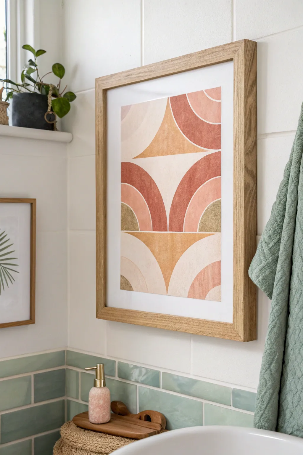
Bring warmth and modern geometric style to your bathroom with this abstract arches wall art project. The design features soothing curves and an earthy palette including terracotta, peach, and mustard tones that beautifully echo natural tile colors.
Detailed Instructions
Materials
- High-quality watercolor or mixed media paper (A3 or A2 size)
- Pencil
- Ruler
- Compass or round objects for tracing (various sizes)
- Acrylic paints or gouache (terracotta, peach, mustard yellow, beige, muted gold)
- Paintbrushes (flat and round, varying sizes)
- Painter’s tape or masking tape
- Eraser
- Palette for mixing paint
- Two water jars (one for clean, one for dirty)
- Paper towels
- Light wood frame with mat board
Step 1: Preparation & Layout
-
Paper Setup:
Begin by taping down your paper to a work surface or board using painter’s tape on all four edges. This prevents buckling when painting and creates a crisp white border if you paint to the edge. -
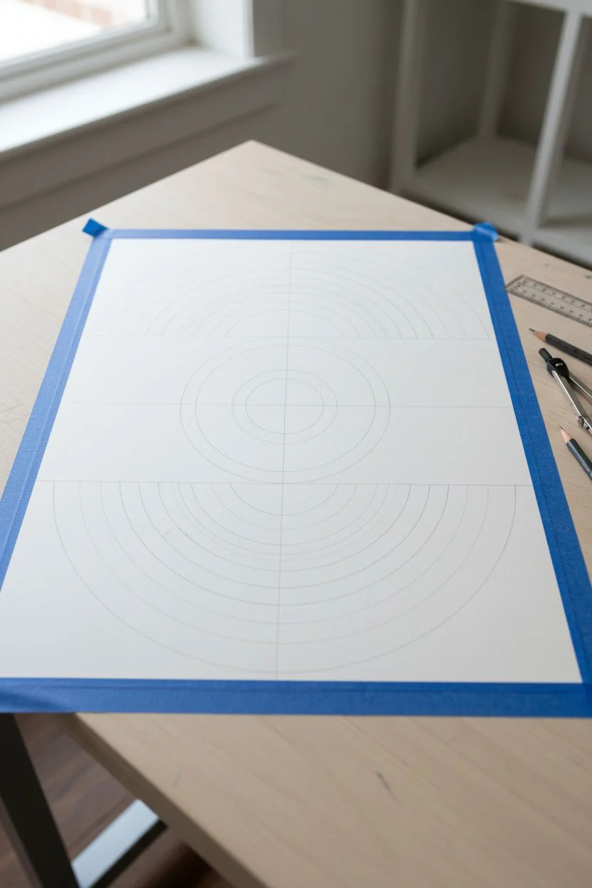
Plan the Grid:
Using a ruler and a light pencil touch, measure the width of your paper and divide it vertically into two equal columns. Draw a faint vertical line down the center. -
Horizontal Divisions:
Divide the paper horizontally into three main sections. The top and bottom sections should be roughly equal in height, while the middle section can vary slightly depending on your preference. -
Drafting the Top Arches:
In the top section, place your compass point on the outer edges of the paper, aligned with the bottom line of that section. Draw large quarter-circles that curve inward towards the center line. -
Drafting the Middle Arches:
For the middle section, position your compass point on the bottom line of the section, right in the center. Draw two large quarter-circles radiating outward towards the paper’s edges. -
Drafting the Bottom Arches:
Repeat the process from the top section for the bottom panel, drawing quarter-circles starting from the outer edges and curving inward. -
Adding Layers:
Within each large quarter-circle or arch shape, use the compass to draw smaller, concentric arcs inside them. Aim for 2-3 layers per shape to create the rainbow-like effect seen in the original.
Clean Curves Secret
Struggle with steady hands? Use flexible curve tape found at auto body shops to mask off your curved lines before painting for razor-sharp edges.
Step 2: Painting the Design
-
Mixing Palette:
Prepare your acrylics or gouache. Mix a deep terracotta, a soft peach, a warm beige, and a mustard yellow. I like to keep a muted gold metallic paint handy for accents. -
Painting the Darkest Tones:
Start with your darkest color, the deep terracotta. Fill in the specific bands of the arches according to your design plan. Use a flat brush for clean edges along the curved pencil lines. -
Applying Mid-Tones:
Next, paint the peach or soft pink sections. Be careful not to let wet paint touch the adjacent terracotta sections to avoid bleeding; wait for neighboring sections to dry if needed. -
Adding Mustard Accents:
Fill in the triangular voids created between the arches with the mustard yellow or gold paint. This negative space becomes a positive shape essential to the composition. -
Neutral Bands:
Paint the remaining bands in warm beige or cream hues. These lighter tones help separate the bolder colors and keep the piece feeling airy. -
Texture Technique:
For a more organic look, apply the paint relatively thinly so the texture of the paper shows through, or dry-brush slightly to create a weathered, matte finish. -
Clean Up Edges:
Once the main colors are dry, use a fine round brush to touch up any uneven lines where colors meet. If you used gouache, be careful not to reactivate the bottom layer.
Step 3: Finishing Touches
-
Erase Guidelines:
Wait until the painting is completely bone-dry. Then, gently erase any visible pencil marks remaining in the unpainted white areas or on the edges. -
Remove Tape:
Peel off the painter’s tape slowly, pulling it away from the painting at a 45-degree angle to ensure clean edges and prevent paper tearing. -
Framing:
Place your artwork inside the light wood frame. Using a white mat board creates a professional gallery look and gives the visual ‘breathing room’ seen in the inspiration image. -
Hanging:
Hang the piece in your bathroom, ensuring it is positioned to complement other earthy elements like towels or tile work.
Level Up: Texture
Mix a teaspoon of baking soda into your acrylic paint before applying. This creates a gritty, terra-cotta texture that adds amazing depth to the arches.
Now you have a serene, custom piece of art that perfectly ties your bathroom’s color scheme together
Mirror-Adjacent Pair to Visually Double the Impact
These earthy, botanical-inspired prints bring warmth and organic texture to any bathroom wall. Using a faux-block printing technique, you’ll create modern silhouette art that mirrors the natural tones of wood and stone.
Step-by-Step Guide
Materials
- Two 8×10 inch wooden frames (natural oak finish)
- Two sheets of heavyweight watercolor paper or mixed media paper (at least 140lb)
- Terracotta or burnt sienna acrylic paint
- Soft gesso (white)
- Wide foam brush or brayer roller
- Carving block rubber or a sheet of crafting foam
- Linoleum cutter tool (if using block rubber) or ballpoint pen (if using foam)
- Pencil and eraser
- Ruler
- Matte finish spray sealant
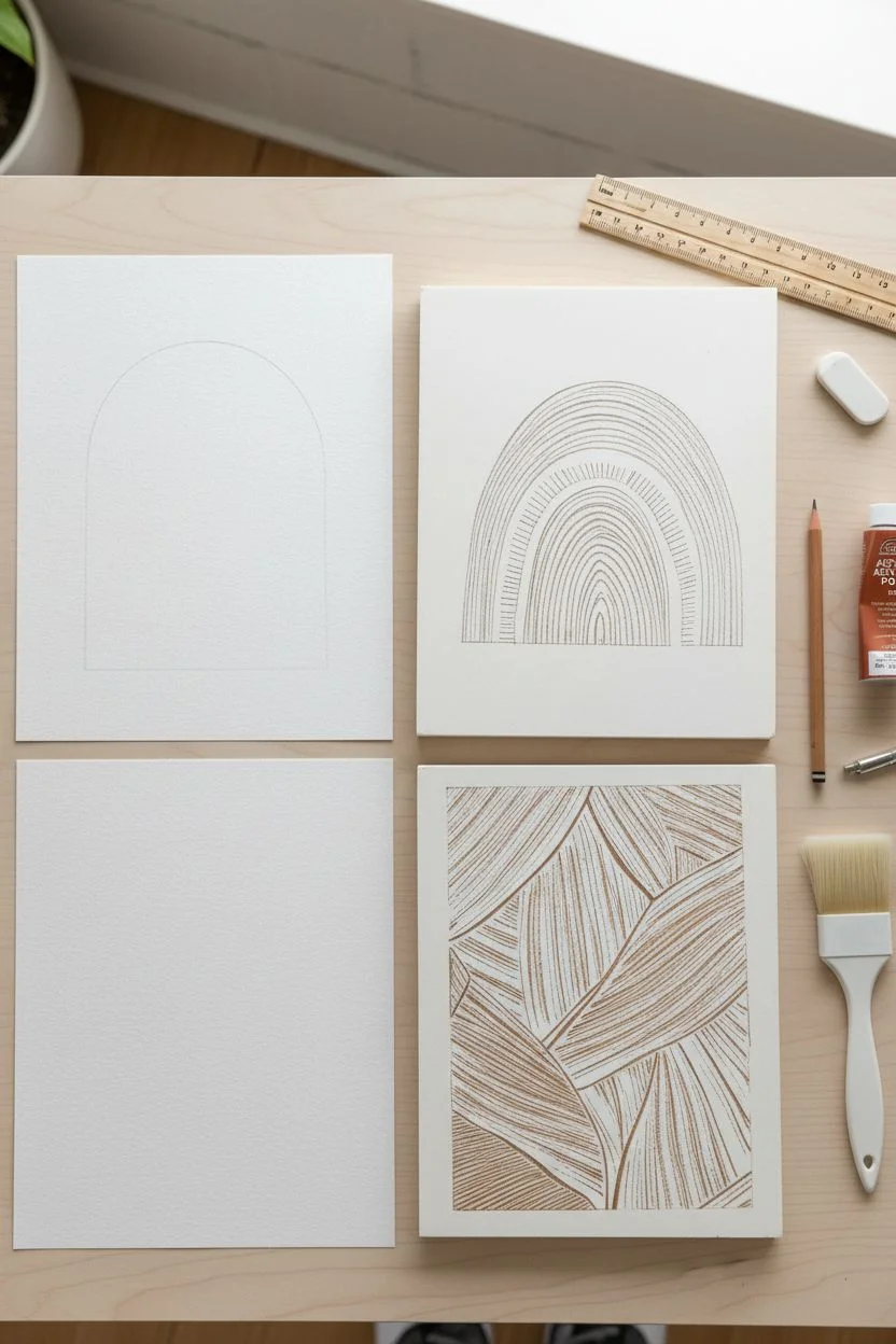
Step 1: Design & Preparation
-
Prepare the paper:
Cut your watercolor paper to fit the frames exactly. Wipe down the surface gently to ensure no dust particles are present. -
Draft the rainbow arch:
For the top artwork, lightly sketch an arch shape on your carving block or crafting foam. It should fill about two-thirds of the vertical space. Keep the lines simple—concentrate on the outer silhouette. -
Draft the leaf pattern:
For the bottom artwork, sketch a series of overlapping broad leaves on a second piece of foam or block. Think ‘abstract tropical’ rather than realistic—large, sweeping shapes work best. -
Create texture:
This is the crucial step. If using a carving block, use the linoleum cutter to gouge out thin lines within the arch and leaf shapes. If using craft foam, press hard with a dull pencil to create indentations. These indented lines will remain white when printed. -
Detail the arch:
For the rainbow arch, carve concentric semi-circles inside the main shape. Vary the texture: create some sections with vertical hashes and others with solid lines to mimic the woven look in the reference. -
Detail the leaves:
For the leaf design, carve directional veins. Follow the natural curve of each leaf, ensuring the lines are close together to create that dense, textured visual.
Step 2: Printing Process
-
Mix your color:
Squeeze out your terracotta acrylic paint. I find that mixing in a tiny drop of white gesso creates a chalkier, more matte finish that looks more like authentic block ink. -
Apply the paint:
Use a foam brush or brayer to apply a thin, even layer of paint onto your carved block or foam stamp. Avoid over-inking, or the paint will flood the tiny textured lines you just carved. -
Test print:
Press your stamp onto a scrap piece of paper first. This helps you gauge how much pressure is needed and if there are any areas that need deeper carving. -
Print the Rainbow:
Center your rainbow stamp on the first sheet of final paper. Press down firmly and evenly with the palm of your hand. Don’t wiggle it. Lift straight up to reveal the print. -
Print the Leaves:
Repeat the process for the leaf design. Because the leaf pattern is rectangular, ensure you align the edges of the stamp parallel to the paper edges. -
Touch up texture:
While the paint is wet, you can use a clean toothpick to gently scratch out any lines that got filled with too much paint, restoring the white space. -
Dry completely:
Let the prints dry flat for at least 2 hours. The thick acrylic needs time to set fully into the paper fibers.
Uneven Paint?
Don’t panic if the print looks patchy. This ‘salt and pepper’ look adds vintage charm. If it’s too light, paint directly on the dry print with a fine brush to darken specific areas.
Step 3: Framing & Display
-
Seal the art:
Once bone dry, take the prints outside and give them a very light coat of matte spray sealant to protect the pigment from bathroom humidity. -
Clean the glass:
Remove the backing from your wooden frames and clean the glass on both sides to remove fingerprints. -
Mount artwork:
Place your prints into the frames. If your paper is thinner, place a piece of cardstock behind it to keep it pressed flat against the glass. -
Secure the back:
Close the frame tabs tightly. Ensure the hanging hardware is positioned correctly at the top center involved. -
Hang vertically:
Position the frames on the wall, stacking them vertically with about 2-3 inches of space between them to mimic the photo’s layout.
Go metallic
Mix a small amount of bronze or gold shimmer medium into your terracotta paint. It catches the light subtly and pairs beautifully with the white negative space.
Step back and admire how these simple shapes add sophisticated, geometric warmth to your space


Unexpected Ceiling-to-Wainscot Vertical Art on Tile
Transform a narrow strip of wall space into a gallery-worthy moment with this towering, abstract textured art panel. The design features sweeping curves of teal, rust, ochre, and cream enriched by a tactile, raised surface that mimics sand or stone.
Step-by-Step Guide
Materials
- Tall plywood panel (approx. 12″ x 60″)
- 1×2 inch oak lumber for framing
- Joint compound or texture paste
- Notched trowel or varied texture tools
- High-grit sandpaper
- Acrylic paints (Teal, Rust Red, Golden Yellow, Warm White)
- Painter’s tape (multi-width)
- Pencil
- Wood glue and clamps
- Matte clear sealant spray
Step 1: Preparation & Design
-
Size your panel:
Cut your plywood base to the desired dimensions. A tall, narrow ratio (like 1:5) works best to create that vertical drama shown in the photo. -
Frame it first:
Cut your oak 1×2 lumber to frame the plywood. Miter the corners for a cleaner look, then glue and clamp the frame to the plywood edges. Let this cure fully before adding texture so you don’t damage the finish later. -
Sketch the flow:
Lightly sketch your design onto the plywood using a pencil. Aim for large, sweeping curves that intersect and flow from top to bottom. Don’t overthink it; organic shapes work best.
Clean Lines Hack
Use “frog tape” or high-quality painter’s tape purely as a guide for your texture. Peel it off while the compound is still wet to get crisp, raised edges between color zones.
Step 2: Building Texture
-
Mix your medium:
Prepare your texturing medium. Standard joint compound works well, but you can mix in a little fine sand if you want extra grit. -
Apply the base sections:
Working one color section at a time, apply a layer of joint compound about 1/8-inch thick. Stay within your pencil lines for that specific section. -
Create directional patterns:
While the compound is wet, use tools to create the patterns. For the cream sections, I like to use a swirl motion. For the colored stripes, use a small notched trowel or stiff brush to create linear ridges that follow the curve of the shape. -
Repeat and isolate:
Continue filling in each section. If you’re worried about merging sections, let one dry before doing its neighbor, or use painter’s tape to mask off the dry areas. -
Let it cure:
Allow the entire panel to dry completely, preferably overnight. The thickest parts of the texture need to be rock hard.
Add Metallic Flair
Mix a small amount of gold mica powder into the yellow ochre paint or lightly brush gold leaf onto the ridges of that section for a subtle, high-end shimmer.
Step 3: Painting & Finishing
-
Sand rough peaks:
Gently run fine-grit sandpaper over the dried texture. You aren’t trying to remove the pattern, just knocking off any sharp, jagged peaks that might flake off later. -
Seal the texture:
Apply a coat of primer or white base paint over the texture. This prevents the porous compound from soaking up all your colored paint. -
Paint the warm white:
Start with the lightest section (the cream/white swirls) using a stiff brush to get paint into all the crevices. -
Apply the colors:
Paint the remaining sections in rust red, deep teal, and golden ochre. Use a dry-brushing technique on the raised ridges to highlight the texture effectively. -
Clean the frame:
If any paint got onto your oak frame, carefully sand it off or wipe it away with a damp cloth immediately. -
Protect the piece:
Once the paint is fully dry, spray the entire artwork with a matte clear sealant. This is crucial for a bathroom setting to protect against humidity.
Hang your vertical masterpiece securely and enjoy the customized height it adds to the room
Have a question or want to share your own experience? I'd love to hear from you in the comments below!