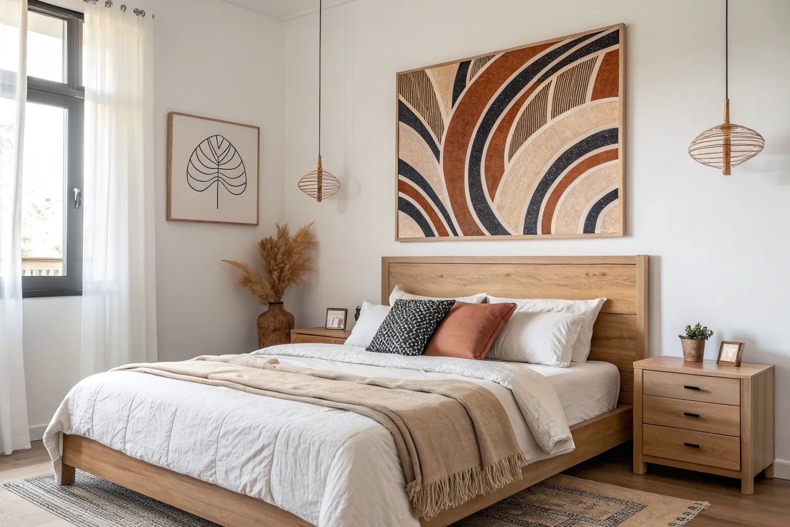
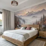
If you’ve ever stared at that blank space above the bed and felt stuck, you’re not alone—I treat it like a little stage where the whole bedroom mood gets set. Here are my favorite bedroom canvas ideas that feel restful, personal, and perfectly scaled to your headboard.
Oversized Abstract Over the Headboard
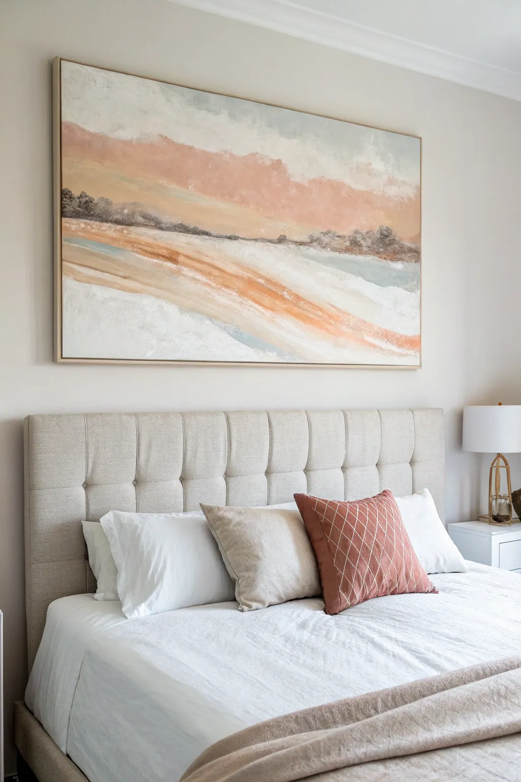
Bring the calming colors of dawn into your bedroom with this oversized abstract landscape canvas. Using layers of acrylics and texture paste, you will create a soft, ethereal composition featuring rolling peach hills and a misty white sky that perfectly anchors a sleeping space.
Step-by-Step Guide
Materials
- Large canvas (approx. 48″ x 36″ or larger)
- Floating wood frame (natural oak finish)
- Heavy body acrylic paints (Titanium White, Unbleached Titanium, Burnt Siena, Raw Umber, Peach, Light Blue/Grey)
- Modeling paste or texture medium
- Large flat paintbrush (2-3 inches)
- Medium palette knife
- Large palette knife or spackling tool
- Spray water bottle
- Paper towels or clean rags
- Gesso (optional, for priming)
Step 1: Preparation & Base Texture
-
Prime the Surface:
Begin by ensuring your large canvas is clean. If it isn’t pre-primed, apply a coat of white gesso to seal the fabric and create a bright foundation for your colors. -
Apply Texture Paste:
Using your large palette knife or spackling tool, scoop out generous amounts of modeling paste. Spread this across the canvas, focusing heavily on the bottom two-thirds where the ‘land’ forms will be. -
Create Movement:
While the paste is wet, use the edge of the knife to create horizontal, sweeping ridges. Vary the pressure to create peaks and valleys that mimic rolling hills or waves, then let this layer dry completely (usually 4-6 hours or overnight).
Muddy Color Rescue
If your peach and grey tones start mixing into a dull brown, stop immediately. Let the current layer dry completely before adding fresh paint on top to keep colors distinct and bright.
Step 2: Blocking in the Sky
-
Mix Sky Colors:
On your palette, mix a large amount of Titanium White with a tiny touch of Light Blue/Grey. You want an almost-white shade that feels cool and airy. -
Paint the Upper Canvas:
Using the large flat brush, apply this mixture to the top third of the canvas. Use broad, crisscross strokes to avoid hard lines, keeping the coverage semi-opaque so some canvas texture shows through. -
Add Warmth to the Clouds:
While the white is still wet, introduce a small amount of Peach mixed with White. Blend this softly into the lower part of the sky area, creating a hazy transition where the sky meets the land.
Step 3: Developing the Landscape
-
Establish the Horizon:
Mix Burnt Siena with a bit of Raw Umber to create a dark, earthy brown. Use your medium palette knife to apply this along the horizon line (about 1/3 down from the top), stamping the color to simulate distant trees or a ridge line. -
Layering the Hills:
Mix a soft Peach color using Burnt Siena, Peach, and White. Apply this in a wide, sweeping diagonal band below the dark horizon line, following the texture ridges you created earlier. -
Adding Light Tones:
Below the peach band, apply a mixture of Unbleached Titanium and White. Use the palette knife to drag the paint over the textured ridges; holding the knife flat allows the paint to catch only on the raised areas, leaving the valleys empty. -
Deepening the Contrast:
Mix a stronger orange-brown tone. Apply this selectively within the peach ‘hills’ to create depth and shadow, blending the edges slightly with a dry brush or rag to keep the look soft.
Pro Tip: The Scrape Method
For organic texture, apply paint thickly, then immediately scrape 80% of it off with a clean putty knife. This leaves pigment only in the canvas weave for a weathered, vintage look.
Step 4: Refining and Softening
-
Mist and Blend:
Lightly mist the canvas with water. Take a clean, damp rag and gently wipe areas where colors meet, specifically between the white foreground and the peach hills, to create a dreamy, washed effect. -
Highlight the Foreground:
Load your palette knife with thick Titanium White. Apply this to the very bottom section of the canvas, dragging it upwards slightly to meet the sandy tones, mimicking foam or bright snow. -
Enhance the Skyline:
Return to the horizon line with a small brush. Add tiny touches of dark grey to the brown ridge to define the ‘trees’ without making them too sharp or realistic. -
Final Glaze:
Create a watery glaze with water and a tiny drop of Peach paint. I refrain from doing this evenly; instead, brush it randomly over the white sky areas to tie the color palette together warmly. -
Assess and Dry:
Step back about 10 feet to view the composition. Add final white highlights to the highest texture peaks if needed, then allow the painting to cure for at least 24 hours. -
Framing:
Once fully dry, place the canvas into the natural oak floating frame. Secure it from the back according to the frame’s instructions to achieve that polished, gallery-ready look.
Hang your new masterpiece centered over the bed and enjoy the peaceful atmosphere creates


Soft Botanical Triptych
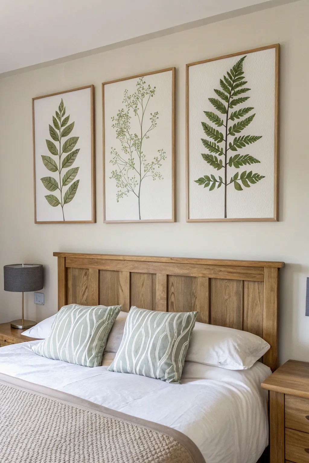
Bring the calming essence of nature indoors with this large-scale botanical triptych. Featuring soft, watercolour-style foliage on oversized panels, these minimalist pieces create a stunning focal point above a bed or sofa without overwhelming the space.
How-To Guide
Materials
- 3 large artist canvases or heavy watercolour paper panels (approx. 24×36 inches)
- 3 slim wooden floating frames (oak or pine finish)
- Acrylic paints (Olive Green, Sap Green, Burnt Umber, White)
- Flow improver or glazing medium
- Pencil (HB)
- Large flat brush (1-inch)
- Medium filbert brush
- Fine liner brush
- Mixing palette
- Paper towels
- Water container
Step 1: Planning and Sketching
-
Prepare the substrate:
If you are using raw canvases, prime them with gesso first to create a smooth surface; for heavy watercolour paper, tape the edges down to a board to prevent warping. -
Define the stem line:
Lightly draw a central vertical line on each panel using your HB pencil. -
Sketch the left leaf design:
For the first panel, sketch a central stem with pairs of oval-shaped leaves branching off horizontally, slightly angling upwards as you reach the top. -
Sketch the center delicate design:
On the middle panel, draw a very thin, wandering main stem that forks gently. Instead of full leaves, mark areas for tiny clusters of foliage. -
Sketch the right fern design:
On the third panel, sketch a fern-like structure with triangular fronds extending symmetrically from the central spine. -
Review consistency:
Stand back and check that the scale of the leaves feels balanced across all three panels before you pick up a brush.
Uneven Paint Coverage?
If acrylics look streakier than desired, add more flow improver rather than water. This levels the brushstrokes for a smoother, print-like finish.
Step 2: Painting the Foliage
-
Mix your base green:
Combine Olive Green with a touch of White and a drop of glazing medium to create a semi-transparent, watercolour-like consistency. -
Paint the stems:
Using the fine liner brush and a mix of Sap Green and a tiny bit of Burnt Umber, carefully trace over your pencil stem lines. -
Base coat the left leaves:
With the filbert brush, fill in the oval leaves on the left panel using your olive mix. Keep the paint thin so the texture of the canvas shows through. -
Add leaf details:
While the paint is still damp, drop a slightly darker green (Sap Green) into the center spine of each leaf to create a natural gradient. -
Create the center foliage:
For the middle panel, dispense with formal leaf shapes. Use the tip of your liner brush to stipple tiny dots and dashes along the delicate branches to mimic airy buds or seeds. -
Paint the fern fronds:
On the right panel, use the filbert brush turned on its side to create the jagged edges of the fern leaves, pulling the stroke from the outer edge inward toward the stem. -
Refine the edges:
Go back with a clean, damp brush to soften any hard edges, enhancing that soft, botanical illustration look. -
Add vein details:
Once the base layers are dry, mix a thin, dark green wash and use the liner brush to paint delicate veins on the larger leaves of the left and right panels.
Step 3: Finishing and Framing
-
Erase guidelines:
Gently erase any visible pencil lines that weren’t covered by paint, ensuring the background remains pristine. -
Protect the artwork:
Apply a clear matte varnish spray to seal the paint and protect it from dust and UV light. -
Frame the panels:
Place each canvas into its slim wooden floating frame. Secure them from the back using the hardware provided with your frames. -
Install the triptych:
Hang the three pieces side-by-side, leaving about 2-3 inches of space between them for a cohesive gallery feel.
Textured Background
Apply a light wash of ‘Antique White’ or diluted tea to the background before painting. This warms up the canvas for a vintage botanical chart vibe.
Step back and enjoy the tranquil atmosphere your new botanical art brings to the room
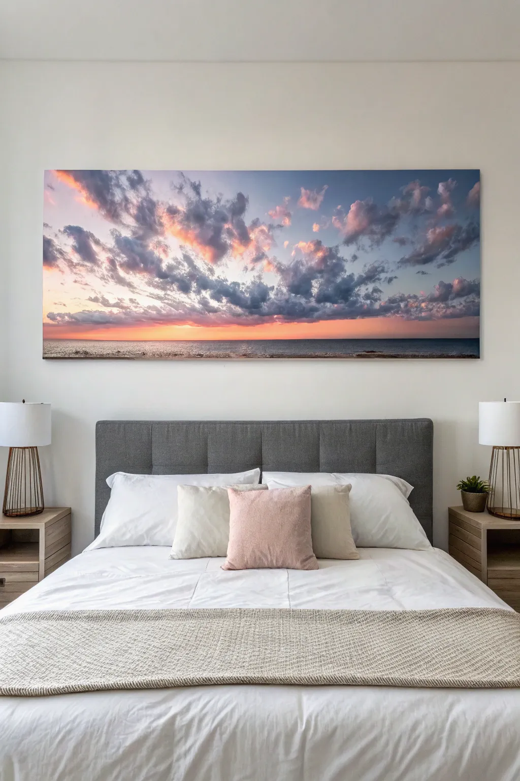
Serene Horizon Landscape Diptych
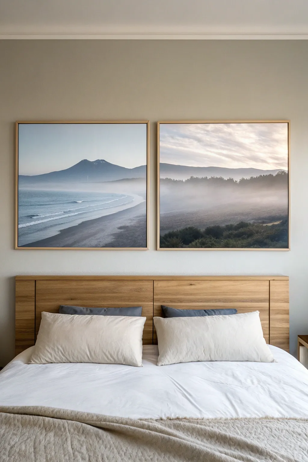
Transform a single breathtaking landscape photo into a sophisticated two-panel statement piece for your bedroom. This project guides you through splitting, printing, and framing a panoramic image to create a sense of expansive tranquility above your bed.
Step-by-Step Tutorial
Materials
- High-resolution panoramic landscape photo (digital file)
- Photo editing software (Photoshop, Lightroom, or free alternatives like GIMP)
- Two large matching picture frames (e.g., 24×30 inches or similar)
- Two custom photo prints sized to your frames
- Pre-cut mat board (optional, depending on frame style)
- Framing tape or acid-free artist tape
- Glass cleaner and microfiber cloth
- Measuring tape
- Level
- Painter’s tape
- Hammer and picture hanging hardware
Step 1: Digital Preparation
-
Select your image:
Choose a high-resolution landscape photograph that has a strong horizontal composition. Misty mountains, coastlines, or horizons work best because the continuous line connects the two frames visually. -
Measure your space:
Before cropping, measure the wall space above your headboard. Ideally, the total width of both frames plus a 2-4 inch gap between them should be slightly narrower than the width of your bed. -
Crop and split:
Open your image in your photo editing software. Crop the image to a panoramic ratio that matches your two frames side-by-side. For example, if using two 24×30 frames, your crop should be roughly 48×30. -
Create the left panel:
Select the left half of your cropped image. Carefully copy this section into a new file with the exact dimensions of your first frame. Ensure you are working at 300 DPI for crisp print quality. -
Create the right panel:
Repeat the process for the right half. It is crucial that the ‘seam’ where the image splits aligns perfectly, so double-check your crop coordinates. -
Color correction:
I like to slightly desaturate the blues and greens at this stage to achieve that misty, serene look. Softening the contrast can also help mimic the ethereal quality seen in the example.
Step 2: Printing and Assembly
-
Order prints:
Send your two files to a professional photo lab. Request a matte or luster finish rather than glossy; this reduces glare from bedroom lighting and enhances the soft, painterly feel of the landscape. -
Clean frame glass:
While waiting for prints, disassemble your frames. Clean the inside of the glass thoroughly with glass cleaner and a microfiber cloth to remove any dust or streaks. -
Prep the workspace:
Lay a clean towel or sheet on a large table. Place your first frame face down and remove the backing board. -
Mount the print:
Carefully place your print into the frame. If using a mat, attach the print to the back of the mat board using a ‘T-hinge’ method with acid-free tape so the paper can breathe. -
Check for dust:
Before closing the frame, lift it up and inspect the front for any trapped lint or dust specs. A quick blast of canned air can remove stubborn particles. -
Seal the frame:
Replace the backing board and secure the clips or points. Repeat the entire assembly process for the second frame.
Seamless Horizons
When editing, avoid splitting the image exactly where a crucial detail (like a tree trunk or sun) is located. Try to place the split in a ‘quiet’ area like open water or misty sky.
Step 3: Installation
-
Find the center point:
Measure the width of your headboard and mark the center point on the wall with a small piece of painter’s tape. -
Calculate spacing:
Decide on the gap between frames. A gap of 2 to 4 inches is standard; too wide and the image loses continuity, too narrow and it looks crowded. -
Mark hanging spots:
Measure the distance from the hanging hardware on the back of the frame to the top edge. Transfer these measurements to the wall, leveling carefully. -
Hang and level:
Install your wall hooks. Hang the frames and place a level across the top of both to ensure they are perfectly aligned horizontally. -
Final adjustment:
Stand back and check the ‘horizon line’ of the image. The line should appear to pass seamlessly from one frame to the other across the gap.
Canvas Texture Illusion
Print on canvas paper or use a ‘canvas texture’ overlay in Photoshop before printing. This adds tactile depth without the cost of a real canvas wrap.
Step back and enjoy the peaceful atmosphere your custom landscape diptych brings to the room


Dreamy Peony or Rose Close-Up
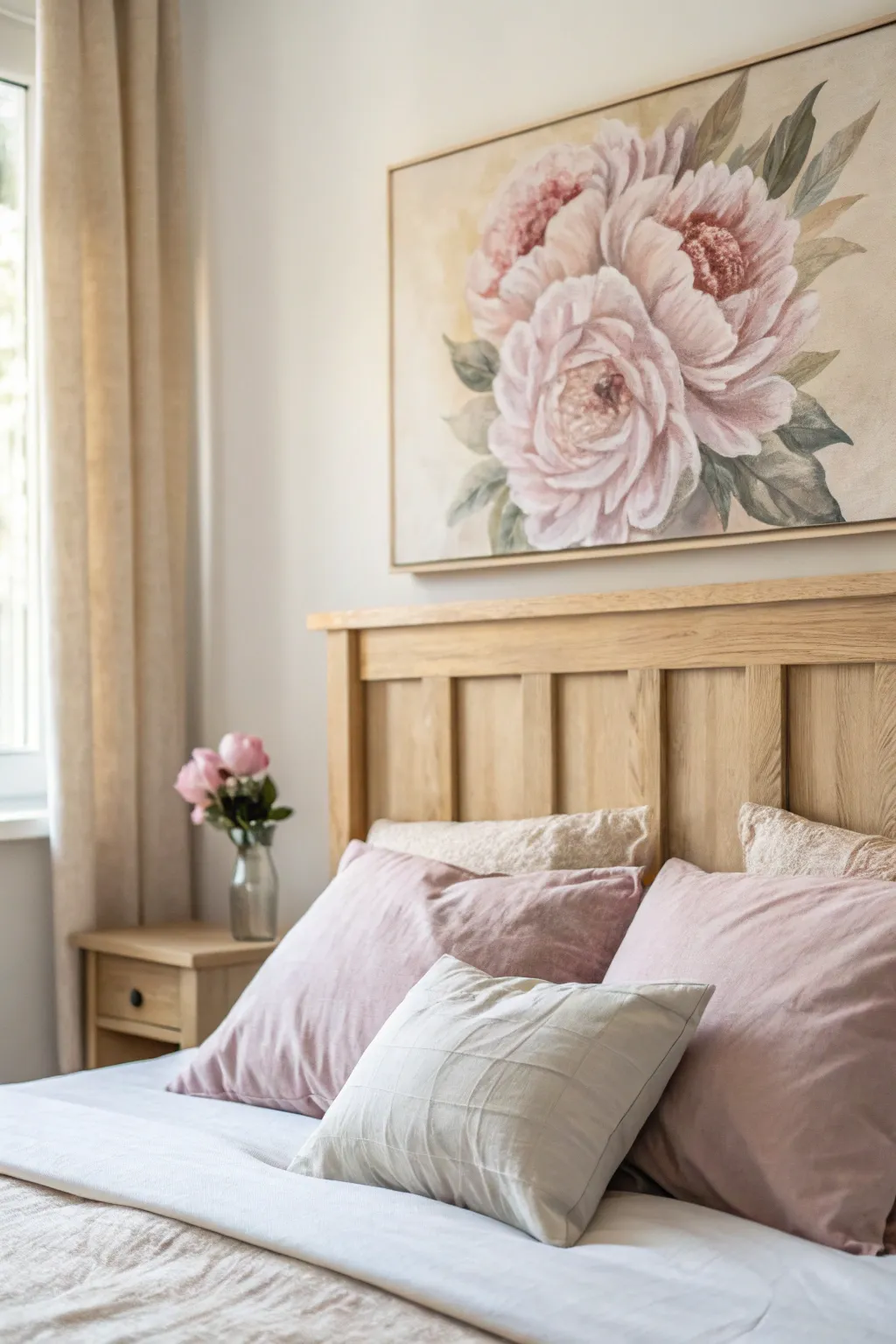
Soft, romantic, and undeniably elegant, this large-scale floral painting brings a serene focal point to any bedroom. Using layers of acrylics to build depth in the petals, you will create a dreamy composition of oversized pink peonies that feels vintage yet fresh.
Step-by-Step
Materials
- Large rectangular stretched canvas (approx. 24×36 inches or larger)
- Acrylic paints: Titanium White, Alizarin Crimson, Burnt Umber, Yellow Ochre, Sap Green, Chromium Oxide Green
- Gesso (if canvas is unprimed)
- Assorted brushes: Large flat brush (2 inch), medium filbert (size 8-10), small round brush (size 2-4)
- Palette knife
- Water container and paper towels
- Pencil for sketching
- Floating frame (light wood tone)
Step 1: Preparation and Sketching
-
Prime the Surface:
Begin by applying a coat of gesso to your canvas if it isn’t pre-primed. Even if it is, a fresh thin coat can help smooth out the texture slightly for softer flower petals. Let this dry completely. -
Create a Neutral Base:
Mix a very pale wash of Yellow Ochre and Titanium White with plenty of water. Apply this over the entire canvas to tone it, removing the stark white background. This warm undertone will peek through later for a vintage feel. -
Map the Composition:
Using a pencil and a light touch, sketch three large circles to represent the main flower heads. Place the largest one slightly off-center for visual interest, with two smaller blooms tucked behind or beside it. -
Refine the Shapes:
Sketch the general petal shapes within your circles. Don’t worry about perfect botanical accuracy; focus on the flow of the petals unfurling from the center. Add large leaf shapes framing the outer edges.
Step 2: Blocking and Underpainting
-
Mix the Shadow Pink:
Create a dusty rose color by mixing Alizarin Crimson with a touch of Burnt Umber and White. Use your medium filbert brush to block in the darkest areas of the flowers, typically at the base of the petals and the very center of the blooms. -
Establish the Mid-Tones:
Add more White to your dusty rose mix to create a soft, medium pink. Apply this to the middle sections of the petals, blending the edges slightly into the shadow areas while the paint is still tacky. -
Block in Greenery:
Mix Sap Green with a tiny bit of Burnt Umber and White to get a muted sage color. Paint the leaf shapes, keeping the strokes loose. I find that varying the direction of your brushstrokes here helps mimic the natural vein structure of leaves. -
Deepen the Foliage:
Mix a darker green using Chrome Oxide Green and a touch of Crimson (it neutralizes green effectively). Paint the shadows behind the flowers and underneath the leaves to make the pink blooms pop forward.
Pro Tip: Extending Drying Time
Acrylics dry fast. Keep a spray bottle of water handy and mist your palette and canvas lightly every 10 minutes to keep the paint workable for smoother blending.
Step 3: Building Layers and Detail
-
Define the Petal Edges:
Load a clean filbert brush with a mix of mostly Titanium White and a whisper of Crimson. Carefully paint the outer edges and tips of the petals. Use a curving motion to emphasize the cup-like shape of the peony. -
Blend the Transitions:
While the highlight paint is wet, use a dry, soft brush to gently feathers the white edges into the pink mid-tones. You want a soft, dreamy transition, not hard lines. -
Intensify the Centers:
Mix a deep maroon using Alizarin Crimson and Burnt Umber. With a small round brush, dab this into the very center of the open peonies to create depth. -
Add Texture to Centers:
Using a tiny bit of Yellow Ochre mixed with White, stipple small dots over the dark center area to represent the stamens. Keep these loose and clustered. -
Highlight the Leaves:
Mix your sage green with more White and a specific touch of Yellow Ochre. Paint heavily diluted highlights on the tips of the leaves where the light would naturally hit.
Level Up: Texture Pop
Mix impasto gel or modeling paste into your white highlight paint. Apply this with a palette knife on the foremost petals for real 3D texture.
Step 4: Final Touches and Framing
-
Softening the Background:
Return to your background color (the pale warm white). Use a large brush to tidy up the negative space around the flowers, cutting in close to the petals to refine their shapes if they got messy. -
Glazing for Unity:
Once the painting is fully dry, mix a tiny amount of Alizarin Crimson with a glazing medium or lots of water. Apply a very thin, transparent wash over select shadow areas to deepen the color without losing detail. -
Final Highlights:
Take pure Titanium White on your smallest brush. Add tiny, crisp highlights to the very tips of the petals to catch the eye and create a sense of dimension. -
Varnish and Frame:
Allow the painting to cure for at least 24 hours. Apply a satin varnish to protect the surface. Finally, install the canvas into a light wood floating frame to match the airy aesthetic of the bedroom.
Hang your new masterpiece above the bed and enjoy the everlasting bloom of these soft peonies
BRUSH GUIDE
The Right Brush for Every Stroke
From clean lines to bold texture — master brush choice, stroke control, and essential techniques.
Explore the Full Guide
Minimal Line Art Faces in Pairs
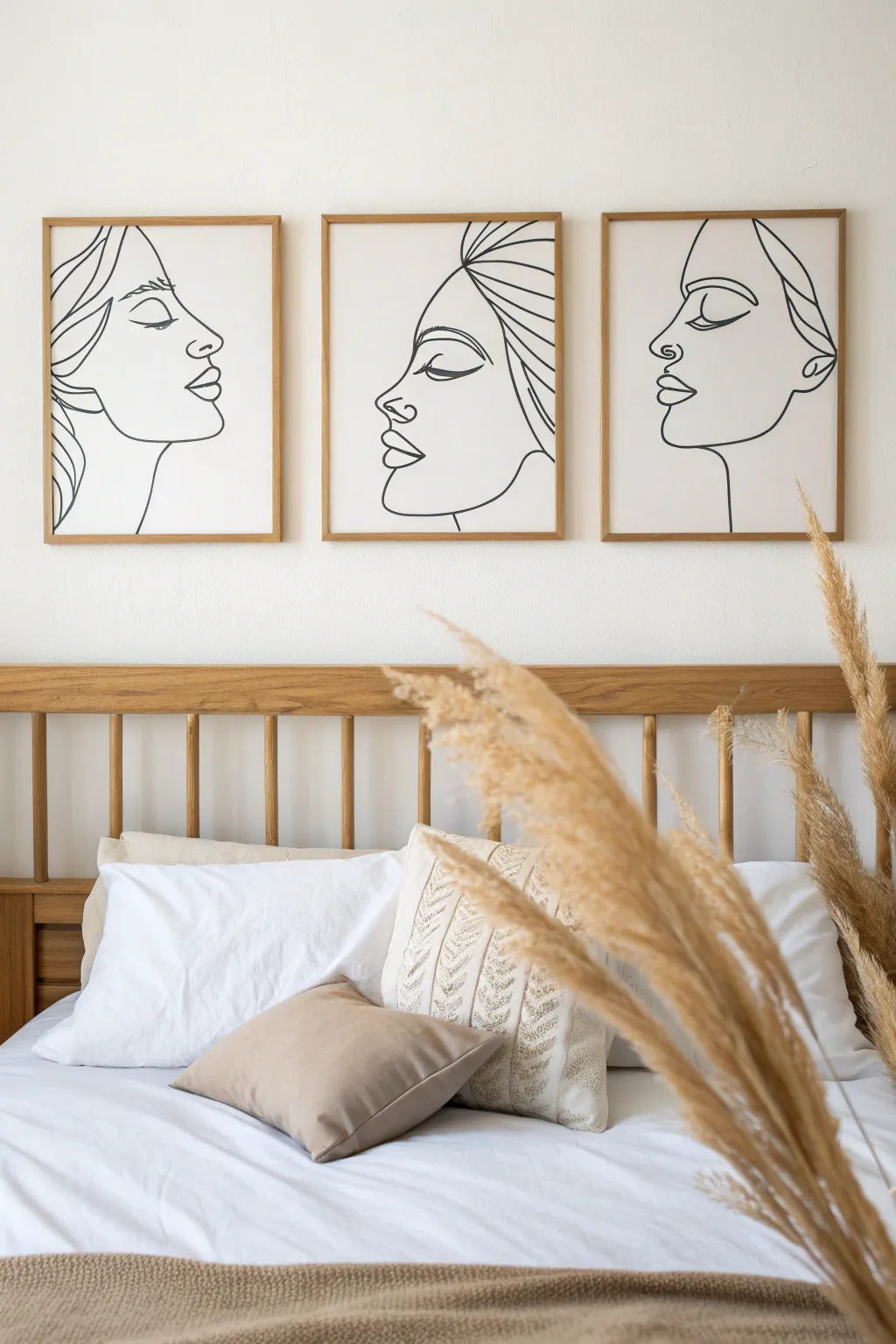
Achieve a sophisticated gallery look with this set of three continuous line drawings featuring serene facial profiles. The stark black lines against a soft cream background create a modern, tranquil atmosphere perfect for a bedroom sanctuary.
Step-by-Step Guide
Materials
- 3 large white art paper sheets or pre-primed canvases (approx. 18×24 inches)
- Light wood picture frames to fit your chosen size
- Black ink marker (brush tip) or black acrylic paint
- Fine round paintbrush (size 2 or 3) if using acrylics
- Pencil (HB or H)
- Kneadable eraser
- Graphite transfer paper (optional)
- Masking tape
- Large ruler or straightedge
Step 1: Planning and Sketching
-
Prepare the surfaces:
Lay out your three canvases or paper sheets side-by-side on a large flat surface. Ensure they are oriented vertically and aligned perfectly to visualize how the three faces will interact. -
Define the composition:
Decide on the direction of the gaze. In the reference, the outer faces look inward while the center face looks left. Lightly mark the center point of each canvas to help center the profiles. -
Draft the first profile:
On the first canvas, use your pencil to lightly sketch the forehead and nose bridge. Keep the pressure very light so these guide lines are easy to erase later. -
Add facial features:
Sketch the eye, nostril, and lips. In minimalist line art, less is more; focus on the suggestion of shapes rather than closing every loop. Specifically, simplify the eye to a sweeping lash line and a brow curve. -
Complete the first outline:
Draw the jawline sweeping down into the neck. Add a few flowing lines to suggest hair or a headscarf shape at the top or back of the head. -
Repeat for the remaining faces:
Sketch the other two profiles on their respective canvases. I find it helpful to step back frequently to ensure the scale of the heads matches across all three pieces. -
Refine the lines:
Go over your sketches and identify exactly which lines you want to keep. The goal is a ‘continuous line’ aesthetic, so try to connect segments where it feels natural. -
Optional transfer method:
If freehand drawing feels daunting, print out line art templates, place graphite transfer paper face down on your canvas, and trace the designs firmly to transfer the guide lines.
Step 2: Inking and Finishing
-
Test your medium:
Before touching the final artwork, practice your strokes on a scrap piece of paper. If using acrylics, thin the black paint slightly with a drop of water to improve flow. -
Begin the final lines:
Starting from the top of the drawing, begin tracing over your pencil marks with the black brush marker or paintbrush. Use your whole arm, not just your wrist, to keep curves smooth. -
Vary line weight:
Apply slightly more pressure on shadowed areas like the underside of the jaw or eyelids to create a thicker line, and lift slightly for delicate areas like the nose bridge. -
Commit to the stroke:
Try to make long, confident movements. If your hand shakes, pause at a natural intersection point (like the corner of a lip) before continuing. -
Let it dry completely:
Allow the ink or paint to dry fully. For acrylics, this might take 30 minutes; for markers, give it at least 10 minutes to prevent smudging. -
Erase guide lines:
Gently dab—don’t scrub—the artwork with a kneadable eraser to lift away any visible pencil marks without damaging the paper surface. -
Frame the artwork:
Clean the glass of your frames on both sides. Place your finished artwork inside the light wood frames, ensuring they are centered and free of dust. -
Hang horizontally:
Mount the three frames on the wall with equal spacing between them (about 2-3 inches apart) to create a cohesive triptych effect.
Fixing Wobbly Lines
If a line goes jagged, don’t paint over it. Instead, engage the ‘thick vs. thin’ style. Thicken the wobbly section deliberately to make it look like an intentional stylistic choice.
Add Subtle Texture
Before drawing, apply a coat of white gesso mixed with a tiny bit of sand or plaster to the canvas. This adds a tactile, fresco-like texture that elevates the simple line work.
Step back and admire the calm elegance these harmonious profiles bring to your space
Neutral Texture Canvas With Plaster-Like Layers
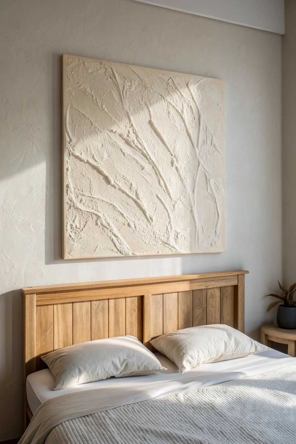
Embrace the serene beauty of negative space and rich texture with this tactile artwork that mimics the look of sculpted plaster. By layering modeling paste on a large canvas, you can create organic, sweeping lines that catch the morning light beautifully.
Step-by-Step Tutorial
Materials
- Large canvas (e.g., 36×36 inch or larger depending on bed size)
- Modeling paste (heavy body) or joint compound
- Gesso primer
- Cream or off-white acrylic paint
- Large putty knife or palette knife
- Small palette knife or old credit card
- Wide flat brush
- Painter’s tape or drop cloth
- Sandpaper (fine grit)
- Matte varnish spray
Step 1: Preparation and Priming
-
Prepare your workspace:
Since this project involves thick paste that can get messy, lay down a drop cloth or old newspapers on a flat table or floor space. Ensure the surface is level so the paste doesn’t slide while drying. -
Prime the canvas:
Even if your canvas came pre-primed, adding a fresh coat of gesso creates a toothier surface for the heavy paste to grip. Apply an even layer with a wide flat brush and let it dry completely for about an hour. -
Plan your composition:
Study the reference image and notice the diagonal flow of the texture. Lightly sketch a few directional lines with a pencil on the canvas if you want a guide, or decide to work intuitively for a more organic feel.
Cracking Up?
Thick paste often cracks while drying. Don’t panic! Mix a thinner batch of paste with a little water and fill the cracks with your finger, or embrace them for an ancient, weathered aesthetic.
Step 2: Building the Texture
-
Mix your medium:
Scoop a generous amount of modeling paste into a mixing container. If you want the texture itself to have color, you can mix a small amount of your cream acrylic paint directly into the paste now, though painting later ensures better coverage. -
Apply the base layer:
Using the large putty knife, spread a thin, skim coat of paste over the entire canvas. This doesn’t need to be perfectly smooth; a little underlying texture adds depth to the final piece. -
Create the primary ridges:
Load your putty knife with a thick glob of paste. Starting from one corner, drag the knife diagonally across the canvas, varying your pressure to create high ridges and low valleys. -
Introduce secondary lines:
Switch to a smaller palette knife or the edge of an old credit card. Make intersecting lines that branch off your main ridges, mimicking the veins of a leaf or cracks in dried earth. -
Rough up the surface:
To achieve that gritty, plaster-like look seen in the photo, dab the flat side of your knife onto wet areas and pull straight up. This creates small peaks and rough patches alongside the smooth strokes. -
Refine the edges:
Run your knife along the edges of the canvas to ensure the paste wraps around slightly or ends cleanly, depending on your preference. I find cleaning the edges now saves a lot of sanding later. -
The first dry:
This is the patience phase. Because the texture is thick, let the canvas dry flat for at least 24 hours. The center of the thickest ridges needs to be fully hardened before you paint.
Step 3: Finishing and Sealing
-
Sand high spots:
Once fully dry, run your hand gently over the surface. If there are any uncomfortably sharp spikes of dried paste, lightly knock them down with fine-grit sandpaper. -
Dust off debris:
Use a clean, dry brush or a vacuum with a brush attachment to remove all sanding dust. You want a clean surface for the paint to adhere properly. -
Apply the first color coat:
Pour your cream or warm beige acrylic paint onto a palette. Using a wide brush, paint the entire canvas, working the bristles into the deep crevices and texture pockets. -
Check for gaps:
Inspect the artwork from different angles. Texture creates shadows that can hide white spots, so touch up any areas where the raw white paste is still peeking through. -
Add a highlight layer (Optional):
For extra dimension, mix a tiny bit of white into your base color. Lightly dry-brush this lighter shade on just the very tops of the texture ridges to accentuate the relief effect. -
Seal the artwork:
Once the paint is bone dry, take the canvas to a well-ventilated area. Apply a light coat of matte varnish spray to protect the surface from dust and UV light without adding unwanted shine. -
Install hardware:
Attach heavy-duty D-rings or a wire to the back of the canvas frame. Ensure your wall anchor is rated for the weight, as the modeling paste adds surprising heft to the piece.
Natural Texture
For an earthier look, mix fine sand or coffee grounds into your modeling paste before applying it. This creates a gritty, stone-like surface that catches light beautifully.
Hang your new masterpiece in a spot where natural sunlight can rake across the surface to dramatically highlight the texture you created

PENCIL GUIDE
Understanding Pencil Grades from H to B
From first sketch to finished drawing — learn pencil grades, line control, and shading techniques.
Explore the Full Guide
Bedding-Matched Color Block Panels
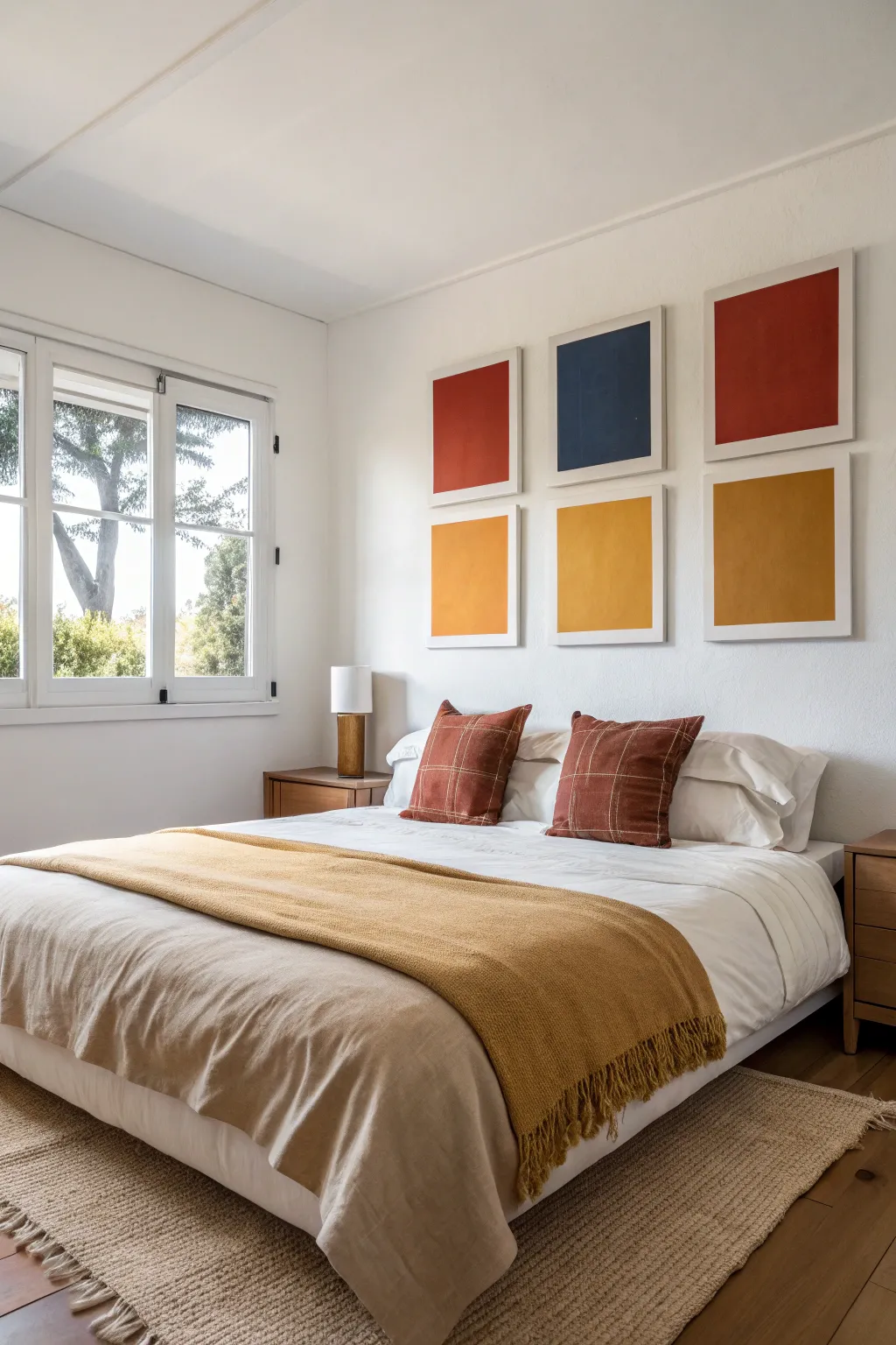
Bring warmth and structure to your bedroom walls with this vibrant six-piece canvas series. By matching the rust and mustard tones of the bedding, this project creates a cohesive, modern look that feels intentional and gallery-worthy.
Step-by-Step
Materials
- 6 rectangular art panels (canvas boards or heavy watercolor paper roughly 16×20 inches)
- Acrylic paints (Terracotta/Rust, Deep Navy or Indigo, Mustard Yellow/Ochre)
- Wide flat brush (2-3 inch)
- Painter’s tape (1 inch width)
- Ruler or T-square
- Pencil
- Mixing palette or paper plates
- Cup of water
- Paper towels
- 6 matching white frames with mats (to fit your panels)
Step 1: Planning and Preparation
-
Select your palette:
Examine your bedroom decor to choose your three core colors. For this look, aim for a deep rust, a rich navy blue, and a warm mustard yellow. -
Prepare the workspace:
Lay down a drop cloth or newspaper on a flat table. Since we are making six panels, ensure you have enough room to let them dry simultaneously. -
Measure the borders:
Use your ruler to measure a consistent border on each canvas board or paper sheet. You want roughly a 2-inch margin of white space around the colored block. -
Mark the corners:
Lightly mark the corners of your inner rectangle with a pencil. These marks will guide your painter’s tape placement.
Step 2: Creating the Grid
-
Tape the boundaries:
Apply painter’s tape along your pencil marks to create a perfect inner rectangle. Press the edges of the tape down firmly with your fingernail or a credit card to prevent paint bleed. -
Seal the tape edge:
For razor-sharp lines, I like to brush a tiny amount of white paint (or clear matte medium) along the inner edge of the tape. This seals any microscopic gaps. -
Organize your layout:
Decide which colors go where. The reference image uses a specific pattern: Top row (L-R) is Rust, Navy, Rust; Bottom row is Yellow, Yellow, Yellow. Lay your boards out in this order to visualize the final balance.
Clean Lines Hack
Peel the tape away from the painted area rather than toward it. This simple directional change minimizes the risk of pulling up chunks of your fresh paint.
Step 3: Painting the Blocks
-
Mix the Rust tone:
Pour your terracotta or rust paint onto the palette. If it’s too bright, add a tiny drop of brown or green to desaturate it for that earthy look. -
Apply the first coat of Rust:
Using the wide flat brush, paint vertical strokes inside the taped area for the designated rust panels. Don’t worry about complete opacity yet. -
Mix the Navy tone:
Prepare your navy blue. Ensure it is dark and moody; mix in a touch of black if your blue is too primary. -
Paint the Navy panel:
Apply the first coat to the center top panel. Keep your brush strokes vertical and even. -
Mix the Mustard tone:
Prepare the mustard yellow. This color often needs more layers, so ensure you have plenty mixed. -
Paint the bottom row:
Cover the three bottom panels with the yellow paint. Extend the paint slightly onto the tape to ensure a clean edge later. -
Apply second coats:
Once the first layer is dry to the touch (usually 15-20 minutes), apply a second coat to all panels. Cross-hatch your strokes if you want a linen texture, or keep them vertical for a smooth look.
Fixing Bleeds
Paint bled under the tape? Don’t panic. Wait for it to dry completely, then use an X-Acto knife to gently scrape the excess off before covering with white paint.
Step 4: Finishing Touches
-
Remove the tape:
While the second coat is still slightly tacky (not fully dry), carefully peel back the painter’s tape at a 45-degree angle. This prevents the dry paint from chilling or peeling. -
Touch up edges:
Inspect your white borders. If any paint bled through, use a small detail brush and white paint to tidy up the lines once the color is fully dry. -
Final cure:
Let all six panels dry completely overnight to ensure the paint hardens before framing. -
Frame and hang:
Place each panel into its frame. Hang them in a tight grid formation, keeping about 2-3 inches of space between frames for a cohesive gallery wall effect.
Step back and admire how this striking grid of color instantly elevates the mood of your room
Calm Watercolor Wash Set
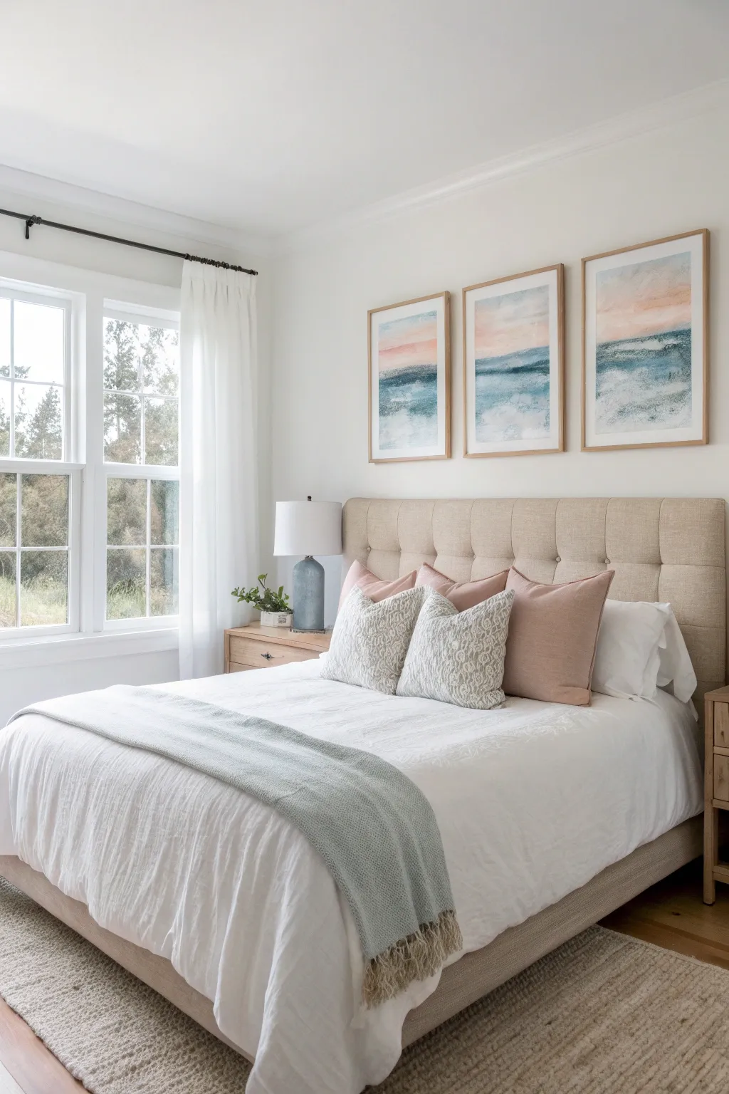
Bring the serene colors of the seaside into your space with this set of three flowing watercolor wash paintings. This beginner-friendly project uses wet-on-wet techniques to blend soft peach skies into deep teal waters, creating a cohesive and calming abstract vista.
Detailed Instructions
Materials
- 3 sheets of cold press watercolor paper (16×20 inches or size of choice)
- Watercolor paints: Peach, Rose Madder, Cerulean Blue, Prussian Blue, and Indigo
- Large flat wash brush (1-2 inch)
- Medium round brush (size 10 or 12)
- Painter’s tape or masking tape
- Masonite board or sturdy surface for taping
- Two jars of water
- Paper towels
- Sea salt (optional for texture)
- 3 wooden frames
Step 1: Preparation and The Sky
-
Secure Your Paper:
Begin by taping down all four edges of your first sheet of watercolor paper onto your board. This prevents the paper from buckling when it gets wet and creates a clean white border for framing later. -
Wet the Sky Area:
Using your large flat brush and clean water, dampen the top third of the paper. You want the surface to create a glossy sheen but not have standing puddles of water. -
Apply the Peach Tone:
Load your brush with a watery mix of Peach paint. Gently sweep horizontal strokes across the very top and middle of the wet sky section, letting the pigment diffuse naturally. -
Add Hints of Rose:
While the paper is still wet, drop in very subtle hints of diluted Rose Madder near the horizon line (where the sky will meet the water). This adds warmth similar to a sunset. -
Softening Edges:
Clean your brush, dab it on a paper towel so it’s damp but not dripping, and run it along the bottom edge of your peach color to fade it out into white. Allow this section to dry completely before moving down.
Wet-on-Wet Magic
Work quickly while the paper is glossy. If it starts to dry to a matte finish, stop adding paint or you’ll get hard edges instead of soft clouds.
Step 2: The Ocean Layers
-
Define the Horizon:
Mix a medium-strength Cerulean Blue. Paint a firm horizontal line across the middle of the paper to establish your horizon line. It doesn’t need to be perfectly straight; a little wobble looks organic. -
Create the First Wave:
Immediately below the horizon line, use a wet brush to pull that blue pigment downward, fading it into a lighter wash. Leave some areas of the white paper showing through to represent crashing foam. -
Deepen the Colors:
While the blue area is still damp, charge your brush with Prussian Blue. tap this darker color into the wet areas, specifically just below the horizon line and in the lower third of the painting. -
Add Salt Texture:
I like to sprinkle a tiny pinch of sea salt onto the wettest blue sections at this stage. As it dries, the salt pushes the pigment away, creating beautiful bloom textures that look like sea spray. -
The Darkest Depths:
Mix a small amount of Indigo with Prussian Blue for your darkest value. Apply this sparingly in horizontal streaks near the bottom edge to anchor the composition. -
Dry and Repeat:
Let this first painting dry completely. Repeat the entire process for the second and third sheets of paper. Try to match the horizon line height across all three, but vary the cloud and wave patterns slightly so they look like a continuous scene.
Muddy Waters?
If your peach sky bleeds into the blue water and turns brown, you didn’t let the sky dry enough. Use a distinct ‘dry zone’ of white paper between them.
Step 3: Finishing and Framing
-
Remove Salt:
Once the paintings are bone dry—and give them extra time to be sure—gently brush off any salt crystals with a dry, clean hand or soft brush. -
peel the Tape:
Carefully peel away the painter’s tape. Pull the tape away from the paper at a 45-degree angle to ensure a crisp edge without tearing the surface. -
Flattening (If Needed):
If your paper has warped slightly from the water, place the dry paintings face down on a clean surface and stack heavy books on top of them overnight. -
Check Alignment:
Lay all three paintings on the floor side-by-side. Check that the colors flow nicely from one to the next. If one looks too light, you can add another glaze of color now. -
Framing:
Place your artwork into the frames. For the look in the photo, simple light wood frames work best to complement the airy, natural vibe of the watercolors.
Enjoy the peaceful atmosphere your new coastal triptych brings to the room


Curated Mini Canvas Gallery Above the Bed
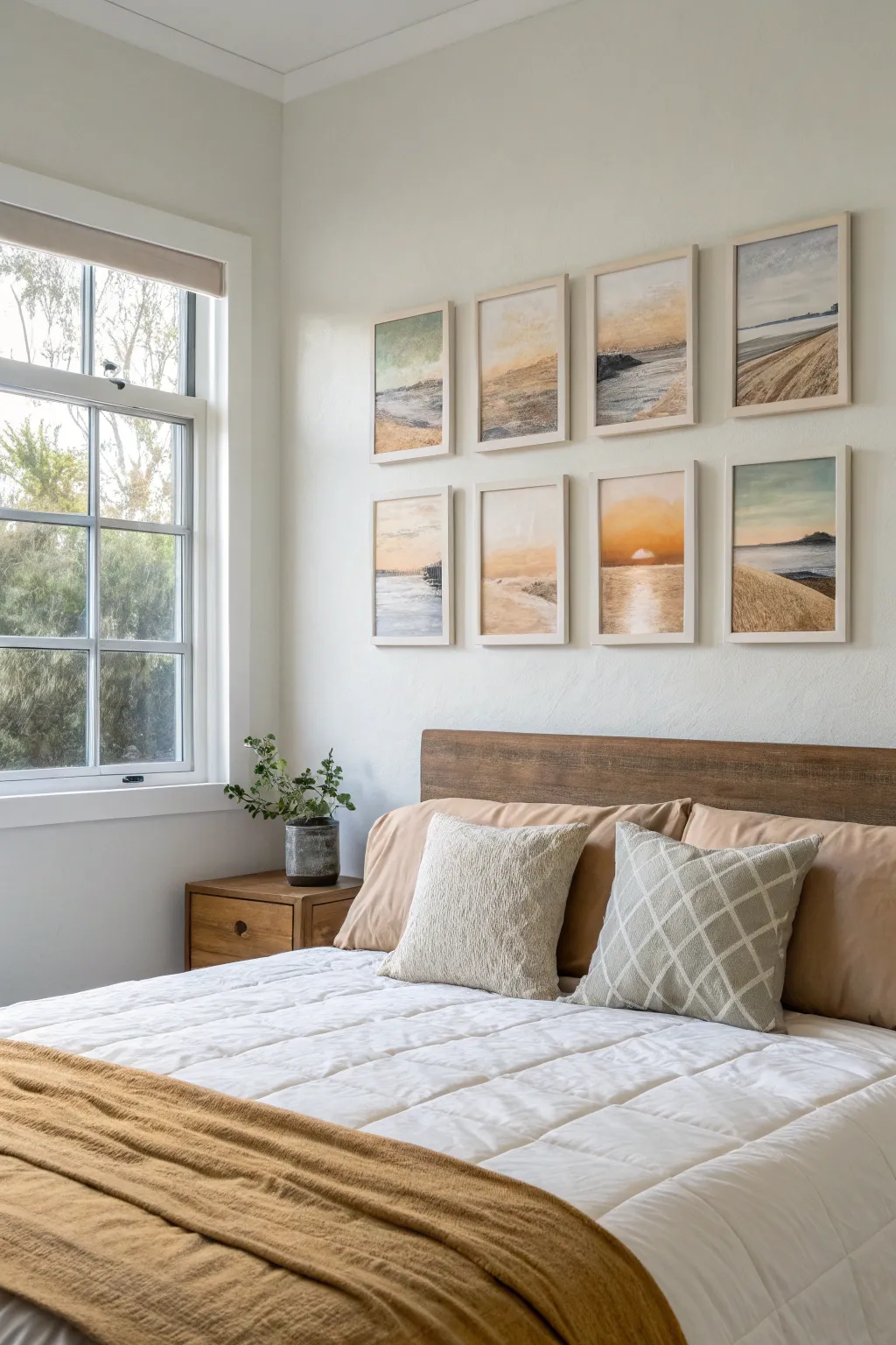
Bring the calming influence of the seaside into your bedroom with this cohesive collection of eight painterly landscapes. This project focuses on creating a harmonious grid of soft, sandy-hued artworks that work together to create a single visual statement.
Step-by-Step
Materials
- 8 small stretched canvases or canvas panels (8×10 or 11×14 inches)
- 8 light wood aesthetic floating frames (sized to fit canvases)
- Acrylic paints (Titanium White, Unbleached Titanium, Yellow Ochre, Burnt Sienna, Raw Umber, Ultramarine Blue, Teal or Turquoise)
- Misting spray bottle with water
- Set of soft synthetic brushes (various flats and a fan brush)
- Palette knifes (optional)
- Painters tape
- Spirit level
- Command strips or wall hanging hardware
Step 1: Planning the Horizon Line
-
Establish the palette:
Before touching brush to canvas, pre-mix your core colors. You want a cohesive look, so create a large batch of ‘sand’ (White + Unbleached Titanium + touch of Yellow Ochre) and ‘sea/sky’ (White + tiny dot of Ultramarine + wash of Teal). Keep these mixes loose; slight variations across the eight canvases are desirable. -
Map the grid:
Lay your eight blank canvases on the floor in a 4×2 grid to visualize the final layout. Lightly sketch a horizon line on each canvas with a pencil. Vary the height of the horizon—some low, some high, some in the middle—to keep the eye moving across the collection. -
Prime the surface:
Apply a thin wash of Unbleached Titanium mixed with water over every canvas. This kills the harsh white of the fabric and gives a warm, sandy undertone that will peek through later layers.
Cohesive Palette Trick
Mix one ‘master’ color (like Unbleached Titanium) into every single other color you use on the palette. This guarantees all 8 paintings share a common DNA and will look unified.
Step 2: Painting the Atmospheres
-
Create the sky gradients:
Start at the top of each canvas. Mix Titanium White with a very small amount of blue or warm ochre. Using a large flat brush, paint horizontal strokes, fading into pure white as you approach the horizon line. -
Soften the transitions:
I like to keep a misting bottle handy here to lightly spritz the sky paint while it’s wet. Blend the colors vigorously with a dry, soft brush to achieve that hazy, atmospheric look found in coastal sunsets. -
Paint the water:
For the ocean sections, use your teal/blue mix but dull it down with a touch of Raw Umber so it isn’t too electric. Apply this in flat horizontal bands below the horizon line. -
Add reflection:
Where the sun might be hitting the water (especially in the sunset pieces), drag pure white paint vertically down into the wet blue paint to suggest shimmering reflections. -
Forming the dunes:
For the sandy foregrounds, use your ‘sand’ mixture. Apply the paint thicker here. Use sweeping, curved strokes to mimic the shape of dunes or shoreline. Don’t worry about perfect realism; you want an impressionistic feel.
Add Subtle Texture
Mix a small amount of modeling paste or fine sand into your foreground paint colors to give the dunes real physical texture that catches the light.
Step 3: Adding Detail and Texture
-
Enhance texture:
Once the base layers are tacky but not fully dry, use a scruffy, dry brush or a palette knife to drag thicker Burnt Sienna or Raw Umber lightly over the ‘sand’ areas. This dry-brushing technique highlights the canvas weave and simulates grains of sand and grass shadows. -
Insert focal points:
Choose 2 or 3 canvases to have distinct features, like a dark rock formation or a pier silhouette. Use a small round brush with dark Umber to paint these shapes, keeping the edges slightly blurred to match the soft aesthetic. -
Final highlights:
Add the brightest brights last. crisp white touches on the crest of a wave or the center of a setting sun will bring the images to life. -
Let them cure:
Allow all eight canvases to dry completely for at least 24 hours. Acrylics dry fast to the touch, but the thicker texture areas need time to harden.
Step 4: Framing and Installation
-
Frame the work:
Place each dry canvas into the light wood floating frames. Secure them according to the frame manufacturer’s instructions, usually involving offset clips or screws from the back. -
Measure the wall:
Find the center point above your headboard. Measure the total width of your 4×2 arrangement, including about 2-3 inches of spacing between each frame. -
Mark the guide:
Use painter’s tape to mark a level line on the wall representing the bottom edge of the top row of frames. This gives you a hard reference line to work from. -
Hang the top row:
Install the top four frames first, using a spacer (like a block of wood) between them to ensure the gaps are perfectly identical. -
Hang the bottom row:
Install the bottom four frames directly below the top ones, using the same spacer to maintain the vertical gap. Check everything with a spirit level one last time.
Step back and enjoy the calming rhythm your new coastal gallery brings to the room
Five-Panel Split Canvas Gradient
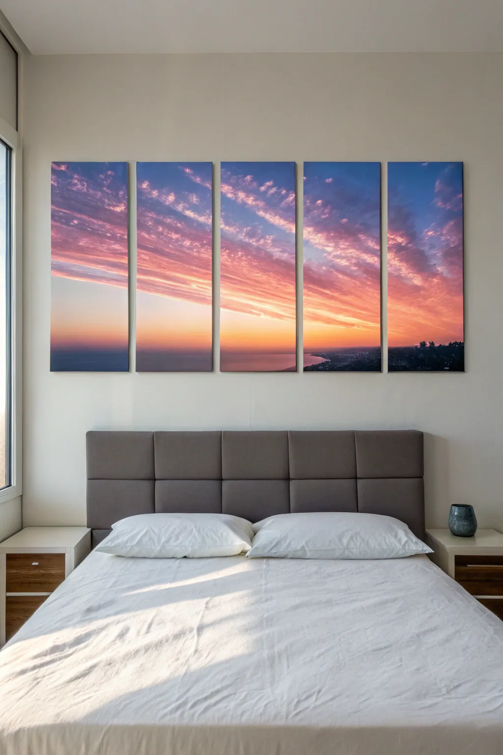
Transform your bedroom wall with a dramatic, cinematic panorama split across five separate canvases. This project creates a striking modern aesthetic where a single breathtaking sunset photograph flows seamlessly from one panel to the next.
Step-by-Step Guide
Materials
- High-resolution digital landscape photo (sunset theme)
- 5 blank stretched canvases (e.g., 12×36 inches each)
- Photo editing software (Photoshop, GIMP, or online splitter)
- Large format printer or professional printing service
- Spray adhesive or heavy-duty gel medium
- Brayer or clean soft cloth
- Craft knife or scalpel with fresh blades
- Self-healing cutting mat
- Level and measuring tape
- pencil
- Picture hanging hardware
Step 1: Digital Preparation
-
Select the perfect image:
Choose a high-resolution landscape photo (at least 300 DPI at full size). Sunset scenes with horizontal cloud striations work best because the lines visually connect the panels across the gaps. -
Measure your wall space:
Decide on the total width you want the artwork to cover. Don’t forget to account for the gaps between panels—usually 1 to 2 inches works well. -
Set up your digital canvas:
I usually open my editing software and create a new document that matches the total combined width and height of my five canvases plus the gap measurements. -
Create the split lines:
Using guides, mark five vertical columns representing your physical canvases. Make sure to factor in the bleed—the part of the image that will wrap around the sides of the canvas frames. -
Crop and slice:
Crop the image into five individual files. Ensure each file includes about 1.5 to 2 inches of extra image on all sides for the gallery wrap effect.
Step 2: Printing and Mounting
-
Print the panels:
Send your five files to a large format printer. Use high-quality canvas paper or canvas cloth for an authentic textured look. -
Position the first print:
Lay your first print face down on a clean, flat surface. Place the corresponding canvas frame face down centered on the print. -
Check alignment:
Ensure the horizon line or major features fall exactly where you planned. You can hold it up to a light source to see through the back of the print for precise positioning. -
Apply adhesive:
Apply a thin, even layer of spray adhesive or gel medium to the face of the canvas frame. If using gel, work quickly so it doesn’t dry too fast. -
Press and smooth:
Firmly press the canvas onto the back of the print. Flip it over and use a brayer or soft cloth to smooth out any air bubbles, working from the center outward.
Fixing Alignment Issues
If a horizon line doesn’t match perfectly after hanging, use small adhesive felt pads on the bottom corners of the lower panel to slightly tilt it, or adjust the hanging wire length.
Step 3: Wrapping and Finishing
-
Cut the corners:
Using a craft knife, make diagonal cuts at the corners of the excess canvas paper to allow for neat folding. Be careful not to cut too close to the frame corner itself. -
Wrap the long sides:
Apply adhesive to the side and back wooden bars. Pull the canvas taut and wrap it around the edge, securing it firmly to the back. Imagine you are wrapping a tight present. -
Secure the short sides:
Repeat the process for the top and bottom edges. Fold the corners neatly (hospital corners work great here) for a professional finish. -
Repeat for all panels:
Follow the same mounting and wrapping process for the remaining four panels. Consistency in tension is key so they all look identical on the wall. -
Install hanging hardware:
Attach sawtooth hangers or wire to the back of each canvas. Measure down from the top edge to ensure the hardware is at the exact same height on every panel. -
Hang with precision:
Use a level and measuring tape to mark your wall. The spacing between panels is crucial; keep a consistent 1.5-inch gap to maintain the illusion of a continuous horizon.
Add Texture and Depth
For a ‘level up’ finish, apply clear acrylic gel medium over the printed canvas with a paintbrush. Follow the lines of the clouds to add real texture and brushstrokes.
Step back and enjoy the sweeping view of your new custom horizon right from your bed
Moon Phases in Soft Neutrals

Transform your bedroom into a dreamy sanctuary with this set of six vertically oriented moon phase panels. By combining deep midnight blues with soft metallic golds and pearlescent whites, you’ll capture the quiet magic of the night sky in a modern, gallery-style arrangement.
How-To Guide
Materials
- 6 rectangular canvases (12×24 inch or similar narrow aspect ratio)
- Acrylic paints: Mars Black, Phthalo Blue (or Navy), Titanium White, Unbleached Titanium, Metallic Gold, Bronze
- Large flat brush (2-3 inch) for backgrounds
- Medium filbert brush for moon shapes
- Small round detail brush (size 1 or 2)
- Natural sea sponge (small piece)
- Old toothbrush
- Circle templates or compass (varying sizes if desired, or one constant size)
- Chalk or pastel pencil (white or light grey)
- Matte or satin varnish
Step 1: Preparing the Night Sky
-
Mix the base color:
Create a deep, rich midnight hue by mixing a large amount of Mars Black with a touch of Phthalo Blue. You want a color that reads as black but has a subtle cool undertone, rather than a flat, dead black. -
Apply the background:
Using your large flat brush, paint the entire surface of all six canvases with your midnight mix. Don’t forget to paint the edges for a finished, frameless look. Let this base coat dry completely. -
Add clear night depth:
For a bit of atmospheric depth, mix a very thin glaze (mostly water or glazing medium) of Navy Blue. Wash this lightly over random areas of the black background to break up the solidity without making it look blue. Let dry. -
Create the stars:
Dilute a small amount of Titanium White paint with water until it’s the consistency of heavy cream. Dip an old toothbrush into this mix. -
Splatter technique:
Hold the toothbrush over the canvases and run your thumb along the bristles to flick tiny specks of paint. Do this sparingly; you want a distant star field, not a snowstorm. Focus slightly more density near where the moon will sit.
Starry Mess Control
Is the splatter paint getting everywhere? Test your toothbrush flick on cardboard first. If drops are too big, your paint is too watery. Too small/faint means the paint is too thick.
Step 2: Drafting the Moons
-
Plan the phases:
Arrange your six dry canvases in order. Decide on your sequence: typically Full Moon, Gibbous, Quarter, Crescent (waxing to waning). Lightly mark the center of each canvas. -
Trace the outlines:
Use a circle template, large bowl, or compass to trace your main moon circle onto each canvas using a piece of chalk. The chalk is easy to wipe away later if you make a mistake. -
Define the shadow:
For the crescent and gibbous phases, draw the curved line that separates light from dark (the terminator line) inside your main circle. This defines exactly how much moon is visible on each panel.
Moon Texture Hack
Crumple a small piece of plastic wrap and dab it into the wet moon paint, then lift straight up. This creates organic, crater-like ridges superior to brush strokes.
Step 3: Painting the Texture
-
Block in the Full Moon:
Start with the full moon panel. Mix Titanium White with a tiny dot of black to make a cool light grey. Fill in the circle. While wet, blot it gently with a damp sea sponge to creating crater textures. -
Add dimension to the Full Moon:
While the grey is tacky, sponge on pure Titanium White highlights on the upper left and some darker grey lowlights on the bottom right to give it a spherical appearance. -
Paint the Metallic Moons:
For the subsequent phases (gibbous through crescent), switch to your warm palette. Mix Metallic Gold with a touch of Unbleached Titanium. Fill in the lit portion of the moon shapes. -
Texture the gold phases:
I like to use the sponge again here, dabbing Bronze paint into the wet gold base. This creates the ‘seas’ and craters of the moon surface without needing precise painting skills. -
Create the shadow side:
The ‘dark’ side of the moon isn’t invisible. Mix a very transparent dark grey glaze and paint the unlit portion of your moon circles so they are just barely lighter than the starry background. -
Softening the edge:
Where the light meets the shadow (the terminator line), use a dry filbert brush to gently smudge the paint. moon shadows are rarely razor-sharp; a soft transition looks more realistic.
Step 4: Final Details
-
Add specific stars:
Use your smallest detail brush and pure Titanium White to paint a few larger, brighter stars or a small cross-shape ‘twinkle’ (like the one in the first panel) to serve as focal points. -
Clean up:
Once the paint is fully dry—give it a few hours—take a slightly damp cloth and wipe away any remaining chalk guidelines. -
Seal the work:
Apply a coat of satin or matte varnish across all canvases. This unifies the sheen between the matte black background and the metallic moon details. -
Hang accurately:
Use a level to hang the panels with equal spacing (about 2-3 inches apart) to ensure the phases flow visually from one to the next.
Step back and admire the celestial rhythm you’ve created right over your bed
Couple Silhouette Walk at Dusk
Immortalize a romantic evening walk with this stunning large-scale canvas print that captures the warmth of a sunset and the intimacy of a silhouette. This project transforms a simple backlit photo into a dramatic focal point perfect for creating a serene atmosphere in any bedroom.
Step-by-Step Guide
Materials
- High-resolution digital camera or pro smartphone
- Photo editing software (Lightroom, Photoshop, or similar)
- Large wrapped canvas (approx. 30×40 inches or custom size)
- Online or local canvas printing service
- Measuring tape
- Pencil
- Level
- Heavy-duty picture hanging hardware (z-bar or D-rings)
- Wall anchors and screws
- Hammer or drill
Step 1: Capturing the Shot
-
Scout the location:
Find a coastal location or open field with a clear view of the horizon where the sun sets. Look for an elevated grassy dune or path that allows the subjects to be framed against the sky rather than a busy background. -
Time it right:
Plan your shoot for ‘golden hour,’ roughly 30 minutes before sunset, extending into the ‘blue hour’ just after the sun dips below the horizon. This provides the crucial soft, colorful gradient in the sky without harsh daytime shadows. -
Position the subjects:
Have the couple walk away from the camera toward the light source. Ensure they are holding hands or walking close enough to verify their connection, but with enough separation to define their individual shapes. -
Expose for the sky:
To create a true silhouette, set your camera exposure based on the bright sky, not the people. This naturally underexposes the foreground, turning the couple and the terrain into rich, dark shapes. -
Frame widely:
Shoot slightly wider than you think necessary. Large canvas wraps utilize 1-2 inches of image for the wrapped edges, so you need extra negative space around the subjects.
Step 2: Editing and Preparation
-
Enhance the silhouette:
Import your photo into editing software. Drag the ‘Shadows’ and ‘Blacks’ sliders down to deepen the silhouette figures, ensuring they are solid black or very dark grey without distracting details. -
Boost sunset vibrancy:
Increase the ‘Vibrance’ and ‘Saturation’ slightly to make the oranges, purples, and blues in the clouds pop. I find that tweaking the ‘Temperature’ slider towards warmth helps accentuate the sunset glow. -
Sharpen details:
Apply a moderate amount of sharpening, specifically focusing on the edges of the silhouette against the sky. Crisp edges are vital for large-format printing. -
Check resolution:
Verify the image is at least 150-300 DPI at the final print size (e.g., if printing 40 inches wide, you ideally want 6000+ pixels across). -
Order the print:
Upload your file to a canvas printing service. Select a ‘Gallery Wrap’ option (usually 1.5 inches thick) and choose a matte finish to reduce glare from bedroom lighting.
Fixing Noisy Skies
If enlarging the photo makes the sky look grainy or ‘noisy,’ apply a noise reduction filter selectively to just the sky portion in your editing software to smooth out the gradients.
Step 3: Installation
-
Determine placement:
Hold the canvas above the headboard to find the visual center. A good rule of thumb is to leave 8-10 inches of space between the top of the headboard and the bottom of the frame. -
Mark the wall:
Lightly mark the top corners of the canvas on the wall with a pencil. Use your tape measure to find the center point between these marks. -
Install hardware:
Attach the wall mount or hanging hook at your measured center point, accounting for the wire or bracket drop distance on the back of the canvas. -
Hang and level:
Place the canvas onto the hardware. Rest a spirit level on top of the frame and adjust slightly until the bubble is perfectly centered. -
Clean up:
Eraser any visible pencil marks on the wall and give the canvas front a quick dusting with a dry microfiber cloth.
Make It Moody
For a dramatic variation, convert the image to high-contrast black and white. This emphasizes form and texture over color, giving the bedroom a modern, art-gallery aesthetic.
Now you have a breathtaking, personal piece of art that anchors your bedroom with peaceful twilight vibes
Cloudscape Ombre for a Sleepy Mood
Transform your bedroom into a serene retreat with this massive, emotive cloudscape that captures the fleeting moments between sunset and dusk. Using soft blending techniques and a panoramic format, you’ll recreate the gentle transition from warm coral hues to cool evening blues.
Step-by-Step
Materials
- Large panoramic stretched canvas (ex: 24×60 inches)
- Acrylic paints: Titanium White, Payne’s Grey, Phthalo Blue, Dioxazine Purple, Cadmium Orange, Alizarin Crimson, Primary Yellow
- Large flat brush (2-3 inch)
- Medium filbert brush
- Round detailing brushes (various sizes)
- Slow-drying medium or retarder
- Palette knife
- Large mixing palette
- Water spray bottle
- Easel or drop cloth for floor working
Step 1: Setting the Horizon
-
Prepare the canvas:
Begin by priming your large canvas with a fresh coat of gesso if it isn’t pre-primed, ensuring a smooth surface. Place the canvas on your easel or a protected flat surface. Since this is a very wide format, I find taping a level line across the bottom third helps keep that crucial horizon line perfectly straight. -
Mix the sky gradient:
On your palette, prepare three main piles of paint for the sky’s background: a deep grey-blue for the top (Phthalo Blue + Payne’s Grey + White), a mid-tone purple-grey, and a soft peach-orange for the horizon area. Add a retarder to your acrylics to keep them wet longer for blending. -
Paint the background gradient:
Using your large flat brush, apply the deep blue mix to the top third of the canvas using long, horizontal strokes. Working quickly, move down to the purple mid-tones, blending upwards into the blue while the paint is still wet. -
Add the sunset glow:
Near the horizon line (above your tape), paint the warm peach and orange tones. Blend this area carefully upward into the purple section to create that soft, ombre transition characteristic of twilight. -
Paint the water base:
Remove the tape. Mix a dark, cool grey-blue for the ocean. Apply this below the horizon line using firm horizontal strokes to mimic the flatness of the sea. Darken the color slightly as you move toward the bottom edge of the canvas to create depth. -
Establish the horizon shine:
While the water layer is wet, mix a little of the sky’s orange with white. Lightly drag this color right at the horizon line where the water meets the sky, creating the distant reflection of the remaining sun.
Step 2: Sculpting the Clouds
-
Block in shadow shapes:
Switch to a medium filbert brush. Mix a dark, stormy grey using Payne’s Grey and a touch of Purple. Scumble in the rough shapes of the large, main cloud bank stretching diagonally across the center right. Don’t worry about details yet; focus on the heavy bottoms of the clouds. -
Create mid-tone volume:
Add a slightly lighter grey-blue to your brush without fully cleaning it. Apply this color to the upper portions of your dark cloud shapes, using a circular scrubbing motion to fluff them up and create volume. -
Highlight the cloud tops:
Mix a soft pinkish-white. With a smaller brush, dab the very tops of the clouds where they would catch the last light of the sun. Keep these edges soft; hard lines will ruin the fluffy effect. -
Add scattered clouds:
On the left side of the canvas, paint smaller, fractured cloud wisps using the same shadow and highlight colors. These should angle slightly upward toward the corners to create dynamic movement leading the eye across the artwork. -
Soften edges:
Clean off a soft, dry brush. Very gently sweep it over the edges of your clouds to blur them slightly into the background sky. This ‘sfumato’ effect is key for a realistic atmospheric look. -
Intensify the sunset backlight:
Mix a vibrant orange-yellow glaze (lots of medium, little paint). Carefully glaze the sky area specifically behind the darkest clouds on the left. This high contrast makes the clouds pop forward.
Muddy Clouds?
If your cloud colors are turning into a singular grey blob, let the background sky layer dry 100% before painting clouds on top. Wet-on-dry keeps colors distinct.
Step 3: Ocean Details and Finishing
-
Texture the water:
Using a palette knife or small flat brush, skim a mix of white and pale peach horizontally across the water surface. Allow the canvas weave to grab the paint, creating the illusion of sparkling ripples without painting individual waves. -
Darken the shoreline:
If you want a hint of shoreline at the bottom, stipulate a very dark brown-black line at the absolute bottom edge and add texture to suggest sand or wet rocks. -
Enhance cloud bottoms:
Go back to your main clouds. Mix a warm, dark violet and glaze the undersides of the clouds. This reflects the warm earth glow bouncing back up, adding realism to the shadows. -
Final highlights:
Add tiny touches of pure white mixed with a speck of yellow to the most intense light source area near the horizon and the brightest ripples on the water. -
Varnish:
Once the painting is completely dry (wait at least 48 hours for thick acrylics), apply a satin varnish. A high gloss might reflect too much bedroom light, but satin will deepen the dark blues beautifully.
Pro Tip: Edges Matter
Keep the edges of the canvas neat by painting the image wrap-around style on the sides. It creates a modern, frameless look perfect for minimalist bedrooms.
Now you have a stunning, peaceful panoramic centerpiece ready to anchor your bedroom design
Geometric Shapes Echoing the Headboard
Echo the gentle curves of your headboard with these soothing, geometric arch paintings. Using a muted earth-tone palette and simple masking techniques, you can create high-end gallery wall art that brings a sense of calm symmetry to your bedroom.
Step-by-Step Tutorial
Materials
- Two large framed canvases (approx. 24×30 inches)
- Acrylic paints (terracotta, sage green, warm beige, dark brown, white)
- Pencil and large compass (or string and thumbtack)
- Painter’s tape or masking tape (various widths)
- Flat paintbrushes (1-inch and 1/2-inch)
- Fine detail brush
- Ruler or T-square
- Palette or paper plate for mixing
- Water cup and paper towels
Step 1: Planning and Sketching
-
Prepare the Background:
Begin by painting both canvases with a solid base coat of warm beige or off-white acrylic paint. This ensures a uniform texture and warmth behind your geometric shapes. Let this base layer dry completely before moving on. -
Mark the Horizon Line:
Decide where the bottom arches will sit. Using a ruler or T-square, lightly draw a horizontal line across the lower third of each canvas to ground your composition. -
Draft the Upper Arch:
Locate the center point for your main upper arch. Using a compass (or a string tied to a pencil and anchored with a tack), draw a large semi-circle that dominates the top half of the canvas. Keep your pencil pressure light so lines are easily erasable later. -
Draft the Lower Arches:
On the first canvas, draw two smaller semi-circles rising from your horizon line—one in the bottom left corner and one in the bottom right. For the second canvas, you can mirror this or create a single large central rainbow shape as seen in the right-hand artwork. -
Create the Rainbow Bands:
Inside each large arch outline, draw concentric inner arches spaced roughly 1 to 1.5 inches apart. I find it helpful to measure these gaps first to ensure the bands remain consistent in width.
Uneven Arches?
If freehanding curves is tricky, trace household items like dinner plates or mixing bowls to get perfect semi-circles for your sketches.
Step 2: Painting the Design
-
Mix Your Palette:
Prepare your colors. Mix a soft terracotta, a muted sage green, and a deep brown. If the colors feel too vibrant, add a touch of the background beige or a tiny drop of black to desaturate them for that earthy, bohemian look. -
Paint the Solid Shapes:
Start by blocking in the solid semi-circles at the bottom. Use a flat brush to carefully follow the curved edge. Painting the solid shapes gives you a visual anchor for the rest of the piece. -
Paint the Outer Bands:
Begin painting the concentric strips of the main upper arch. Alternate colors—perhaps a beige outer ring, followed by the background color (negative space), then a terracotta ring. Rotate the canvas if needed to keep your hand steady on the curves. -
Refine the Edges:
Use your smaller flat brush or the fine detail brush to clean up the edges of your arches. If you have a steady hand, freehand is best for a natural look, but you can also use curved painter’s tape if you prefer razor-sharp lines. -
Add Texture Details:
For the ‘texture’ visible in some bands, use a dry-brush technique. Dip a dry brush into a slightly lighter shade of the band color, wipe most of it off on a paper towel, and lightly drag it over the painted area to create a weathered, stone-like effect. -
Paint the Inner Core:
For the innermost semi-circle of the rainbow, consider using a stippling technique or adding a subtle dot pattern with the tip of your brush to differentiate it from the smooth outer bands.
Step 3: White Line Work
-
Prepare White Paint:
To create the clean white lines that define the arches (as seen in the left canvas), thin down your white acrylic paint slightly with water so it flows smoothly like ink. -
Outline the Arches:
Using your finest detail brush, carefully paint thin white lines that separate the color bands. This mimics a print-making style and adds crisp definition to the shapes. -
Add Vertical Lines (Optional):
For the variation shown in the left painting, paint thin white vertical lines through the main solid arch shapes to break up the color block and add geometric interest. -
Final White Glaze:
If you want the washed-out look seen at the bottom of the right canvas, mix a very watery white glaze. Lightly brush it over the bottom section to create a faded, ethereal foundation for the rainbow. -
Final Review:
Step back and look at both canvases together. Touch up any wobbly lines with the background color and ensure your colors feel balanced across both pieces.
Add Dimension
Mix baking soda into your acrylic paint before applying the main arches. This creates a gritty, plaster-like texture that adds depth.
Hang your new masterpieces side-by-side to bring a modern, architectural softness to your room
Metallic Highlights for Soft Night Glow
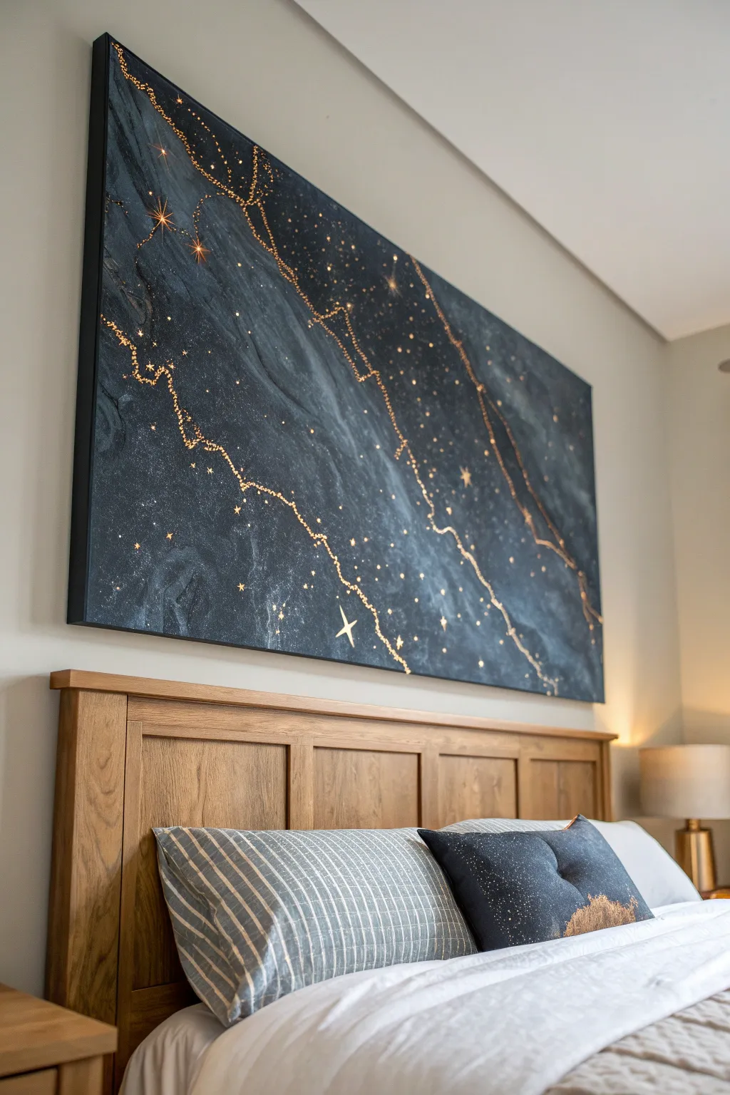
Transform a blank canvas into a stunning, moody night sky pierced by ribbons of gold. This large-scale piece combines fluid acrylic pouring techniques with precise metallic detailing to create a sophisticated focal point that shimmers in low light.
How-To Guide
Materials
- Large stretched canvas (e.g., 36” x 48”)
- Black acrylic paint
- Navy blue acrylic paint
- Dark grey acrylic paint
- White pearl metallic acrylic paint
- Floetrol or pouring medium
- Gold leaf sheets (imitation or real)
- Gold leaf adhesive size
- Soft gilding brush or fluffy makeup brush
- Detail brush (size 0 or 1)
- Gold acrylic paint or metallic marker
- High-gloss varnish
- Water spray bottle
- Plastic drop cloth
- LED fairy lights (optional for an backlit effect)
Step 1: Creating the Nebula Background
-
Prepare your workspace:
Lay down a plastic drop cloth to catch any drips, as this process can get messy. Ensure your canvas is level by placing cups underneath the four corners. -
Mix your base colors:
In separate cups, mix your black, navy blue, and dark grey paints with the pouring medium. Aim for a ratio of about 1:2 (paint to medium) until the consistency resembles warm honey. -
Add a pearl shimmer:
Mix a small amount of the white pearl metallic paint with medium. This will add that subtle, milky depth to the dark background without overpowering it. -
Apply the dark base:
Pour the black and navy mixtures generously onto the canvas. Use a wide spread tool or tilt the canvas gently to ensure complete coverage of the surface and edges. -
Create the marble effect:
Drizzle the dark grey and pearl white mixtures in random, diagonal streaks across the wet dark base. I like to mimic the direction of a mountain range or a lightning strike. -
Blend and soften:
Use a hair dryer on a cool, low setting or a straw to blow the lighter colors into the dark base. This creates the smoky, fluid transitions typical of marble or nebulae. -
Mist for texture:
Lightly mist the wet paint with water from a height of about two feet. This separates the pigments slightly, creating tiny cell-like structures that look like stars or rock textures. -
Let it cure:
Allow the background to dry completely. For a poured painting this thick, this will take at least 24 to 48 hours.
Step 2: Gilding the Veins
-
Plan the fault lines:
Once dry, look at the natural patterns formed by the paint. Identify the strongest diagonal drifts and lightly trace jagged paths along them with a pencil. -
Apply adhesive size:
Using a thin detail brush, paint the gold leaf adhesive over your pencil lines. Make the lines intentionally shaky and uneven to resemble natural stone veins. -
Branch out:
Extend smaller, thinner veins branching off from the main lines. Add small dots of adhesive scattered nearby to create the illusion of distant stars or gold dust. -
Wait for tackiness:
Let the adhesive sit for about 15-30 minutes (check your bottle’s instructions) until it becomes clear and tacky to the touch. It shouldn’t be wet. -
Lay the gold leaf:
Gently press sheets of gold leaf over the tacky adhesive areas. Don’t worry about being neat; the leaf will only stick where the glue is. -
Brush off excess:
Use a soft, fluffy brush to vigorously sweep away the loose gold leaf. The crisp, jagged gold lines will be revealed underneath. -
Paint stars:
Dip a fine brush or a toothpick into metallic gold acrylic paint. Add distinct four-point stars (a simple cross shape) in the darker negative spaces for a celestial touch. -
Seal the artwork:
Apply a coat of high-gloss varnish over the entire canvas. This protects the gold leaf from tarnishing and makes the dark colors look deeper and richer.
Clean Edges Pro-Tip
Before pouring your paint, tape off the underside edges of the canvas with painter’s tape. Once the painting is dry, peel the tape away to remove dripping stalactites for a professional finish.
Step 3: Adding the Sparkle (Optional)
-
Install backlight:
For the glowing effect seen in similar installations, poke tiny holes through the centers of your painted stars using a needle. -
Attach fairy lights:
Flip the canvas over and tape battery-operated LED fairy lights to the back, positioning the bulbs directly over the pinholes you created.
Level Up: Texture
Mix fine sand or crushed glass into your dark grey acrylic paint before pouring. This creates a tactile, gritty texture that catches light differently than the smooth finish.
Hang your luminous creation above the bed to enjoy a private view of the cosmos every night
Hidden Personal Symbols in a Calm Abstract
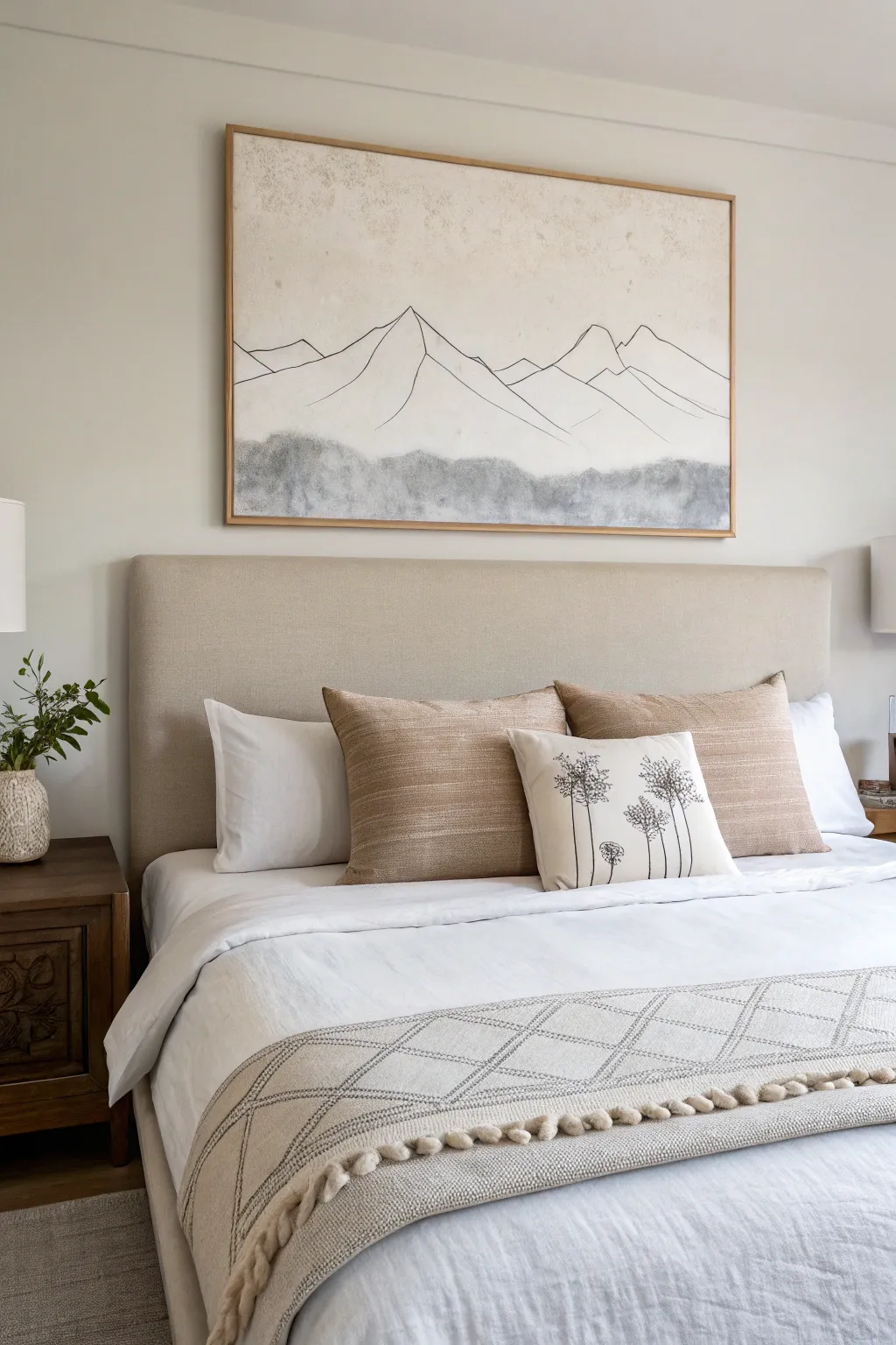
Create a serene focal point for your bedroom with this large-scale mountain landscape that blends stark line work with soft, atmospheric textures. The piece combines precise geometric peaks with a moody, organic wash at the base, perfectly capturing the quiet majesty of nature.
Detailed Instructions
Materials
- Large canvas (approx. 30×40 inches or larger)
- Acrylic paint (warm beige/parchment, dark grey, black)
- Matte gel medium
- High-flow acrylic or black ink
- Fine liner brush (size 0 or 1)
- Wide flat wash brush (2-3 inches)
- Natural sea sponge
- Pencil for sketching
- Ruler or straight edge
- Water spray bottle
- Floating frame (wood finish)
Step 1: Preparing the Atmospheric Background
-
Prime the Surface:
Begin by coating your entire canvas with a layer of gesso if it isn’t pre-primed. If you want extra texture, dab the wet gesso with a crumpled paper towel in random spots. -
Mix the Base Tone:
Create a warm, antique white shade by mixing white acrylic with a tiny drop of yellow ochre and a pinprick of burnt umber. You want a color that looks like old parchment. -
Apply the Base Coat:
Paint the entire canvas with your mixed base tone using the wide flat brush. Apply two coats if necessary for full coverage, letting the first dry completely before adding the second. -
Create Texture:
While the second coat is still slightly tacky, I like to dry-brush a very faint, slightly darker version of your base color near the top corners to simulate age and depth.
Pro Tip: Steady Hand
For the crispest mountain lines, rest your pinky finger on the dry canvas as a pivot point while painting. It stabilizes your hand and allows for smoother strokes.
Step 2: Drafting the Mountains
-
Establish the Horizon:
Use a ruler to lightly mark a horizontal guide about one-third of the way up from the bottom of the canvas. This doesn’t need to be a visible line, just a reference for where your mountains will sit. -
Sketch the Peaks:
Using a pencil, lightly draw the outlines of the mountains. Focus on creating three to four main peaks, varying their heights and angles for a natural look. -
Add Dimension Lines:
Sketch interior lines extending down from the peaks to suggest ridges and slopes. Keep these lines minimal; you don’t need to shade the mountains, just suggest their volume. -
Review Composition:
Step back about six feet to view your sketch. Ensure the composition feels balanced and not too cluttered before you commit to paint.
Troubleshooting: Shaky Lines
If a line goes crooked, don’t panic. Wait for it to dry, then paint over the mistake with your beige base color. Once that’s dry, you can re-draw the line.
Step 3: Inking and Washes
-
Line Work:
Load your fine liner brush with black high-flow acrylic or ink. Carefully trace over your pencil lines. Keep your hand steady but allow for slight natural variations in line thickness. -
Varying Line Weight:
To add visual interest, make the outer contours of the mountains slightly thicker than the interior ridge lines. -
Prepare the Grey Wash:
Mix a dark grey acrylic paint with water until it has the consistency of heavy cream. You can also mix in a little matte gel medium to keep the paint workable longer. -
Apply the Foothills:
Using the sea sponge, dab the grey wash along the bottom third of the canvas, beneath your mountain lines. This represents the forested foothills or mist. -
Blend the Top Edge:
While the grey paint is wet, spritz the top edge of the grey area lightly with water. Use a clean, damp brush to soften the transition so it looks like fading mist rather than a hard line. -
Darken the Base:
Add a second, darker layer of grey (mixed with a touch of black) to the very bottom edge of the canvas to ground the image. -
Final Cleanup:
Once everything is bone dry, gently erase any visible pencil marks that weren’t covered by the ink.
Step 4: Finishing Touches
-
Protective Coat:
Apply a clear matte varnish over the entire painting to seal the work and protect it from dust. A spray varnish works best to avoid smearing the ink lines. -
Frame Assembly:
Place your finished canvas into a light wood floating frame. Secure it from the back using offset clips or the hardware provided with your frame kit.
Hang your new masterpiece above the bed and enjoy the peaceful atmosphere it brings to your room


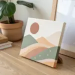
Have a question or want to share your own experience? I'd love to hear from you in the comments below!