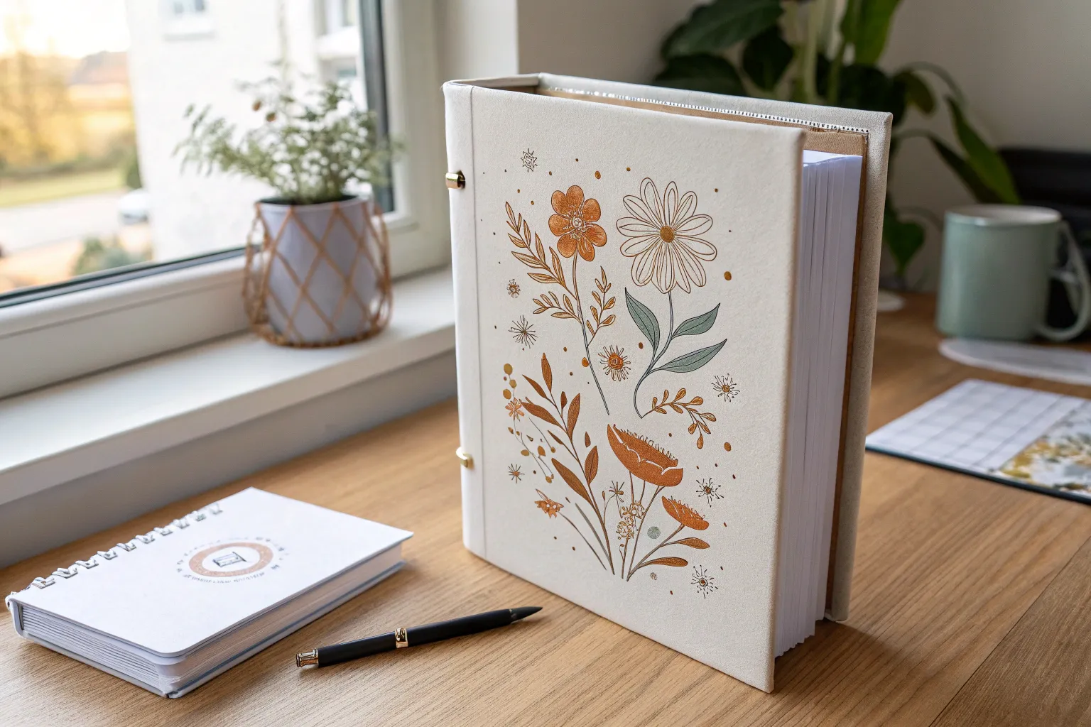
A plain binder cover is basically a blank canvas, and I love how fast a few lines and letters can turn it into something that feels totally yours. Here are my favorite binder drawing ideas for cover inserts and pockets, starting with classic go-to looks and ending with some more unexpected, artsy twists.
Big Bubble Letters With Mini Doodles
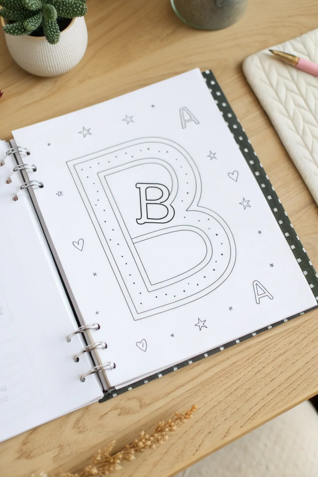
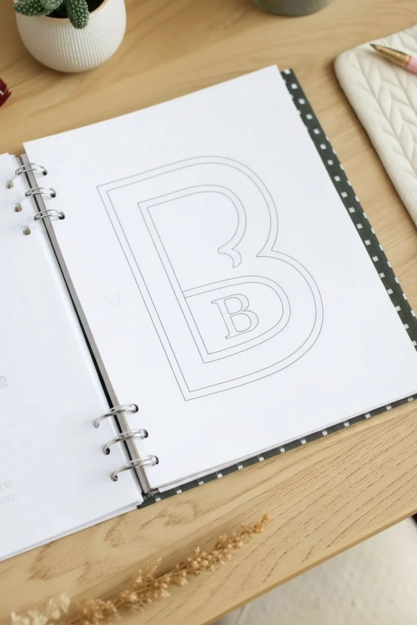
Transform a plain binder page into a personalized statement with this charming doodle art. Featuring a bold, double-outlined initial filled with delicate stippling and surrounded by floating shapes, this design is perfect for notebook covers or section dividers.
Step-by-Step
Materials
- White A4 or A5 paper (punched for binder)
- Pencil (HB or lighter)
- Eraser
- Fine liner pen (0.3mm or 0.5mm, black)
- Ruler (optional, but helpful for spacing)
Step 1: Drafting the Main Shape
-
Center the letter:
Begin by lightly sketching a large capital letter ‘B’ (or your chosen initial) in the center of your page with a pencil. Aim to make it fill about two-thirds of the vertical space to leave room for decorations. -
Create the bubble effect:
Draw an outline around your initial sketch to create a thick bubble letter shape. Keep the width consistent—about an inch wide works well for a standard page. -
Add the inner border:
Sketch a second line inside your bubble letter, parallel to the outer edge. Leave a gap of about 3-4mm between these lines. This channel will house your dot details later. -
Sketch the central letter:
In the open negative space within the bubble letter, draw a smaller, serif-style version of the same capital letter. I like to center it visually rather than measuring perfectly, as it adds character. -
Refine the curves:
Go over your pencil lines to ensure all curves are smooth and the straight edges are relatively crisp before committing to ink.
Step 2: Inking the Design
-
Ink the main outlines:
Using your fine liner pen, carefully trace the outermost boundary of the large bubble letter. Use steady, confident strokes to avoid wobbly lines. -
Trace the inner border:
Ink the inner parallel line you sketched earlier. Try to maintain that consistent spacing you established in the pencil phase. -
Outline the center letter:
Trace the smaller serif letter sitting in the middle. Pay attention to the serifs (the little feet and headers of the letter) to keep them sharp. -
Erase pencil marks:
Wait a minute or two for the ink to dry completely to prevent smudging. Then, gently erase all the underlying pencil sketches.
Uneven Curves?
If your hand shakes on long curves, try locking your wrist and moving your whole arm. Alternatively, draw the curve as a series of short, connecting dashes first.
Step 3: Adding Details & Polish
-
Stipple the border:
Inside the channel between your two main outlines, start adding small dots. Space them out randomly but evenly. Don’t clutter them too much; let the white space breathe. -
Draw secondary letters:
In the background, sketch two smaller outlines of the letter ‘A’—one near the top right and one near the bottom right. Ink these with a simple, thin double-line style. -
Add celestial elements:
Scatter 4-5 small five-pointed stars around the main letter. Draw these as simple outlines rather than filling them in. -
Include hearts:
Draw 3-4 small outline hearts in the remaining empty spaces to balance the composition. -
Sprinkle tiny details:
Fill the smallest empty gaps with tiny asterisks or single dots. These act as ‘confetti’ to tie the whole page together without overwhelming the main subject. -
Final check:
Look over the drawing for any missed pencil lines or uneven ink spots. Clean up with an eraser one last time if needed.
Make it Pop
Add a drop shadow to the right side of the main letter using a light grey marker or a 2B pencil. This gives the bubble letter a 3D sticker effect.
Enjoy your beautifully customized binder page that makes opening your notebook a joy


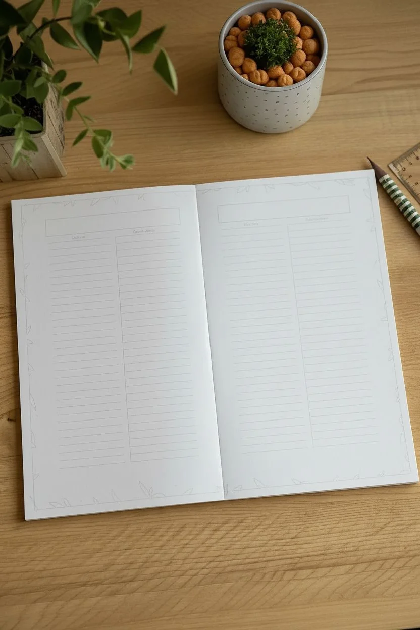
Clean Title Block With a Simple Border
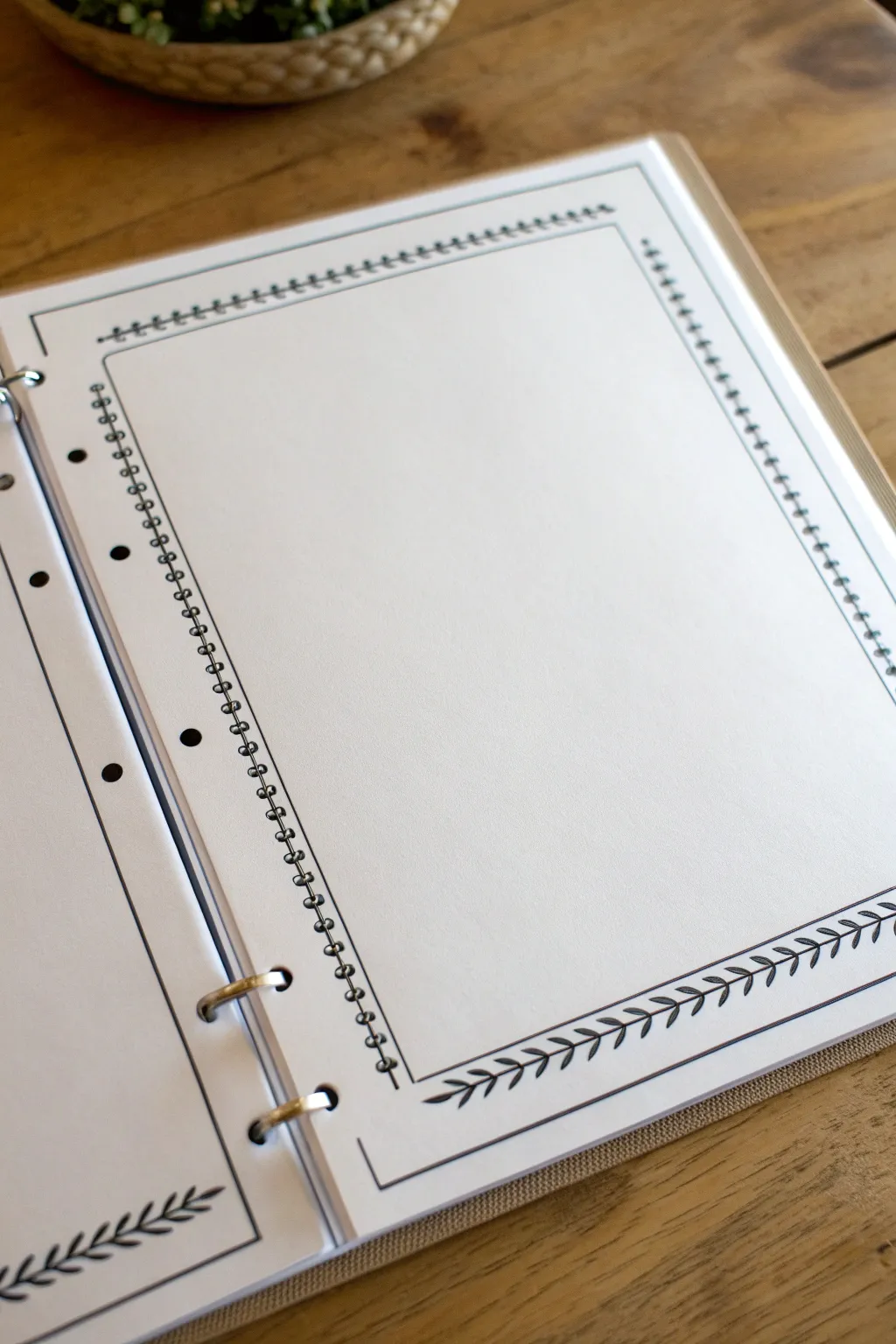
This elegant border design transforms a plain binder page into a structured canvas for your notes or title pages. By combining crisp straight lines with a simple, repetitive leaf motif, you achieve a clean, professional look that frames your content beautifully without overwhelming it.
Detailed Instructions
Materials
- A4 or Letter-sized paper (pre-punched or plain)
- Fine-liner pen (black, 0.3mm or 0.5mm)
- Ruler (clear acrylic works best)
- Pencil (HB or lighter)
- Eraser (soft, white vinyl)
- Binder (for final storage)
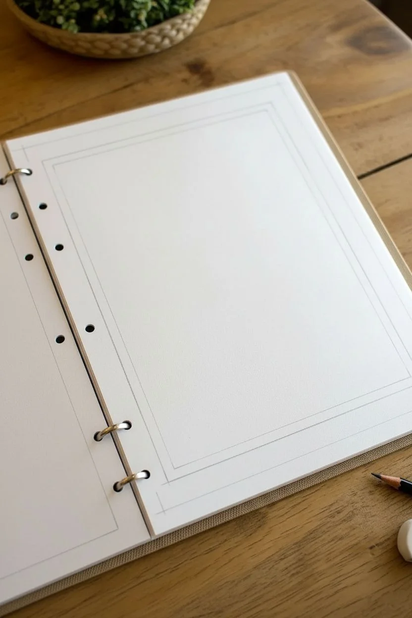
Step 1: Planning and Outline
-
Define the margins:
Place your ruler along the edge of your paper. For a standard binder page, I like to leave about a 1-inch margin on the punched side (left) to avoid the holes, and a 0.5-inch margin on the other three sides. -
Draw the outer guide:
Using a light pencil, draw a rectangle connecting these margin points. This will be the absolute outer limit of your design. -
Create the inner frame:
Measure exactly 3-4mm inward from your first pencil rectangle. lightly draw a second, smaller rectangle inside the first. This space between the lines is where your decorative border will eventually live. -
Mark the corners:
At each corner where your lines meet, make sure the intersections are clean. You want distinct 90-degree angles to serve as anchor points for the ink work later.
Uneven Leaf Spacing?
Draw faint tick marks with a pencil every half-inch along the stem before inking. These marks act as anchor points for where each leaf pair should sit.
Step 2: Inking the Structure
-
Ink the outer line:
Take your fine-liner pen and ruler. Carefully trace over the outer pencil rectangle. Stop right at the corners—don’t let the lines cross over each other. -
Ink the inner line:
Similarly, trace the inner pencil rectangle with your pen. Keep your pressure consistent so the line weight matches the outer box perfectly. -
Connect the corners (optional):
If you want a contained ‘box’ look, draw tiny diagonal lines connecting the inner and outer corners, but for this open-style frame, you can leave the channel between the lines open. -
Let the ink set:
Wait a minute or two for the ink to dry completely to prevent smudging, then gently erase all your pencil guidelines.
Step 3: Drawing the Botanical Details
-
Start the vine stem:
Focus on the bottom border first. Draw a single, slightly curved or straight line through the center of the channel you created between the two ink boxes. This is the central stem. -
Add first leaves:
Starting from the left corner, draw small, oval-shaped leaves coming off the top of the stem. Angle them slightly towards the right. -
Add opposing leaves:
Now draw corresponding leaves on the bottom side of the stem, positioned slightly staggered between the top leaves rather than directly opposite them. -
Continue the pattern:
Work your way across the entire bottom edge, maintaining a consistent size for your leaves. Consistency is key to the clean aesthetic. -
Rotate and repeat:
Turn your page and repeat the vine process for the right-hand vertical border. Draw the central stem first, then add the staggered leaves. -
Mirror the design:
Complete the top border next. Ensure the leaves flow in a direction that visually connects with the side borders (usually clockwise or counter-clockwise flow looks best). -
Finish the final side:
Do the left-hand border last. Be mindful of the binder holes—if your border is close to them, you might need to break the pattern slightly to accommodate the punches.
Level Up: Color Accents
Use a green fine-liner for the leaves and a black pen for the straight border lines. This adds a subtle pop of nature without ruining the minimalist vibe.
Step 4: Final Touches
-
Check for gaps:
Look closely at your vine work. If any sections feel sparse, add a tiny extra leaf or a small dot to fill the negative space without overcrowding it. -
Clean up:
Do one final pass with your eraser to remove any remaining graphite shadows, ensuring the paper is pristine white. -
Bind it:
Place the finished sheet into your binder rings carefully to ensure the holes align perfectly with your new custom border.
Your page is now perfectly framed and ready to hold your most important notes or title headings


Nameplate Banner That Says “This Belongs To”
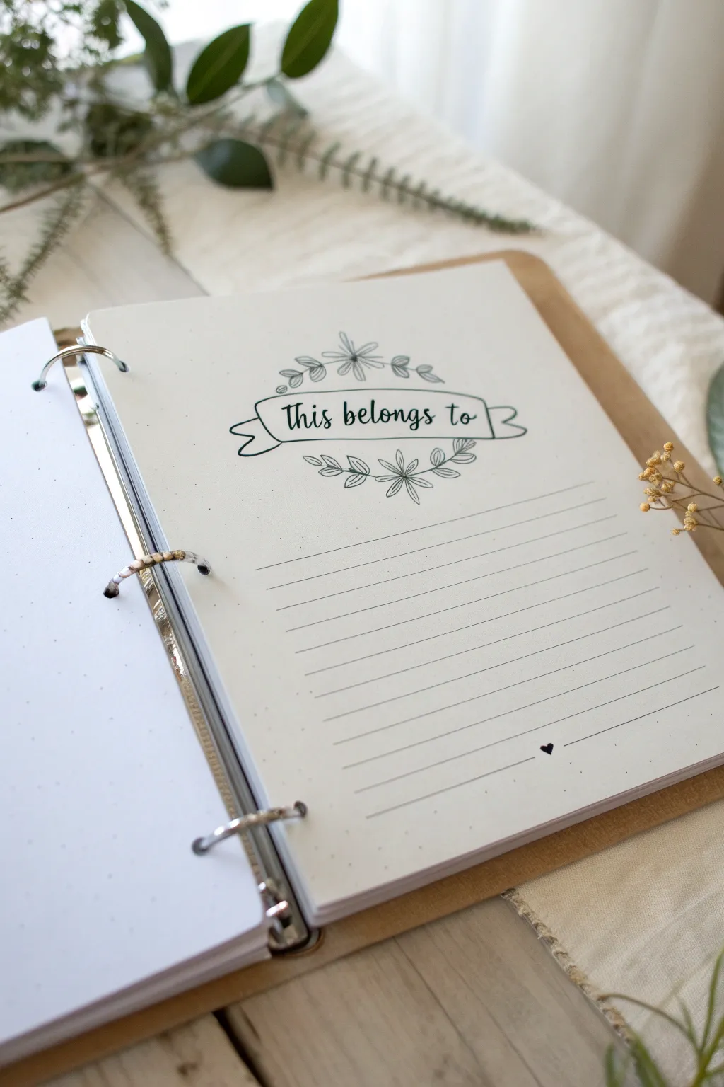
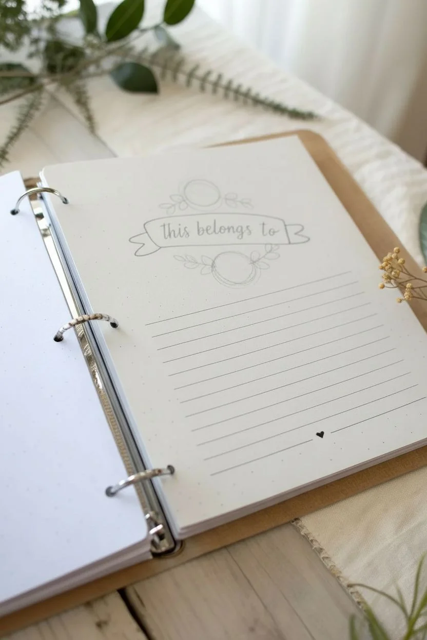
Add a touch of personalized charm to the very first page of your journal or binder with this delicate, hand-drawn nameplate design. Featuring a classic ribbon banner flanked by whimsical botanical doodles and clean writing lines, it creates a welcoming introduction to your creative space.
Step-by-Step Tutorial
Materials
- Binder or journal with dotted or blank paper
- Fine liner pen (black, 0.3mm or 0.5mm)
- Ruler
- Pencil
- Eraser
- Green fine liner or marker (optional, for text)
- Scrap paper for practice
Step 1: Drafting the Layout
-
Find the center:
Begin by finding the visual center of your page. If you are using dot grid paper, count the dots to ensure symmetry; otherwise, lightly mark the center point with your pencil. -
Sketch the banner shape:
Using your pencil, lightly sketch a long, horizontal rectangle with wavy top and bottom lines to create the main body of the floating ribbon banner. It should be about 3-4 inches wide. -
Add banner folds:
Draw the folded ends of the ribbon. Extend a small line down from the top corners of your rectangle, then curve a ‘tail’ out to the side and notch the end with a V-shape. Connect the tail back to the main body with a short diagonal line. -
Position the foliage:
Lightly sketch a small circle directly above the middle of the banner and another directly below it. These will be the centers of your main flowers. Draw faint curved lines extending outward from these flowers to map out where the leaves will go. -
Mark writing lines:
Use your ruler to draw faint pencil guidelines for the name section below the banner. I like to space these about 1cm apart, creating 6-8 distinct lines. Add a tiny heart mark at the bottom center.
Step 2: Inking the Design
-
Ink the banner:
Take your black fine liner and trace over your pencil sketch of the banner. Keep your hand steady and confident. The lines don’t need to be mechanically perfect; a little wobble adds hand-drawn character. -
Draw the top flower:
Start the upper floral motif by drawing a simple daisy-like flower in the center. Give it five or six long, slender petals radiating from the center dot. -
Add upper leaves:
extending from the petals, draw pairs of small, oval-shaped leaves along the curved branch lines you sketched earlier. Keep the leaves simple with a single line through the middle of each. -
Mirror the bottom floral:
Repeat the process for the floral motif underneath the banner. Draw a matching daisy-like flower and extend leafy branches outward to the left and right, mirroring the top design. -
Refine the details:
Check your floral drawings. If there are any gaps near the banner, add tiny extra leaves or small dots to fill the space and make the design look cohesive.
Oops, skipped a line?
If you smudge ink while erasing, don’t panic. Turn the smudge into a falling leaf, a small dot cluster, or fix it with a white gel pen or correction tape.
Step 3: Adding Text and Finishing Touches
-
Letter the heading:
Inside the banner, carefully write ‘This belongs to’ in a cursive or serif script. You can switch to a dark green pen here for a subtle pop of color, or stick with black for a classic look. -
Draw the writing lines:
Using your ruler and the black fine liner, ink the horizontal lines below the artwork. Start your lines from the left margin area and stop them uniformly on the right side. -
Ink the heart:
Fill in the tiny heart at the bottom center of your lines with solid black ink to anchor the page composition. -
Erase guidelines:
Wait at least 5-10 minutes to ensure all ink is completely dry. Then, gently erase all your pencil sketches and guidelines to reveal the clean design. -
Final assessment:
Review your work. If you feel the banner needs more weight, you can go back and slightly thicken the outer contour lines of the ribbon.
Make it yours
Instead of leaves, try drawing tiny stars or geometric shapes around the banner for a celestial or modern look. Use watercolor to fill the leaves.
Now you have a beautifully personalized opening page ready for your name


Full-Page Doodle Collage Background
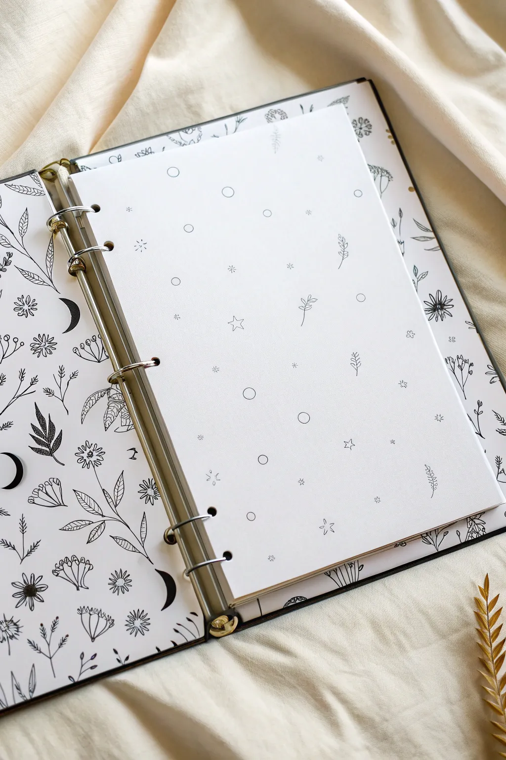
Transform a plain binder into a mystical journal with this cohesive double-layer doodle design. By creating a dense, busy pattern for the covers and a minimalist version for the insert, you achieve a beautiful balance of negative space and intricate detail.
Detailed Instructions
Materials
- White or cream cardstock (A4 or letter size)
- Black fine-liner pens (0.1, 0.3, and 0.5 sizes)
- Pencil and eraser
- 6-ring binder mechanism (or an existing binder to cover)
- Hole puncher (adjustable 6-hole preferred)
- Ruler
- Scissors or craft knife
- Glue stick or double-sided tape
Step 1: Planning the Layout
-
Measure your binder:
Start by measuring the inside panels of your binder. You will need to cut two pieces of cardstock to fit these dimensions exactly, serving as the backdrop for your dense doodle collage. -
Cut the insert page:
Cut a third piece of heavy paper or cardstock to serve as the central divider page. This should be slightly smaller than the cover panels so it nests comfortably inside the rings. -
Punch the holes:
Before drawing, align your central insert paper with your binder rings. mark the hole locations with a pencil and punch them out carefully. Doing this now prevents ruining a finished drawing later if the punch misaligns.
Step 2: Drawing the Background Collage
-
Establish the theme:
For the two cover panels, the goal is a “full-page” look. The theme here combines botanical elements (leaves, flowers) with celestial motifs (crescent moons, stars). Keeping the theme consistent is key to the aesthetic. -
Start with the largest icons:
Using a pencil, lightly sketch the largest elements first. Place crescent moons and large floral clusters randomly across the page. Aim for about 5-6 large focal points per page. -
Ink the main elements:
Switch to your 0.5 fine-liner pen. Carefully trace over your pencil sketches for the moons and large flowers. Ensure the lines are crisp and confident. -
Fill the gaps with medium flora:
Use a 0.3 pen to draw medium-sized leafy branches and simple daisy shapes in the open spaces. I like to rotate the paper as I draw so the plants seem to grow in every direction, not just ‘up’. -
Add texture and detail:
Go back into your leaves and petals. Add veins to the leaves and small dots to the flower centers. Fill the crescent moons with solid black ink to give the composition visual weight. -
Populate the tiny spaces:
Switch to your finest 0.1 pen. Look for awkward white gaps between the larger drawings. Fill these with tiny stars, single dots, small sprigs, or drifting petals. This creates that dense, wallpaper-like effect. -
Erase guidelines:
Once the ink is completely dry (give it at least 15 minutes to avoid smudges), gently erase all underlying pencil marks. -
Mount the panels:
Apply glue or double-sided tape to the back of your two finished collage sheets. Carefully press them onto the inside covers of your binder, smoothing out any air bubbles.
Ink Confidence
Don’t stress about perfect symmetry in nature doodles. Wobbly lines on leaves often look organic and better than ruler-straight ones. Embrace the ‘mistakes’ as texture.
Step 3: Creating the Minimalist Insert
-
Visualize the spacing:
For the central page shown in the image, the style changes drastically. Instead of a crowded collage, you want vast open space. Imagine invisible grid lines to help distribute elements evenly but sparsely. -
Draft the ‘floating’ elements:
Lightly sketch small, isolated motifs. Use simple circles, single five-point stars, and tiny leaf sprigs. Keep at least 2 inches of space between each doodle. -
Ink with fine lines:
Use your 0.1 or 0.3 pen exclusively for this page to keep it delicate. Ink the circles and stars. Do not fill them in; keep them as open outlines. -
Add delicate details:
Draw the tiny sprigs of leaves. Unlike the cover, don’t add heavy shading or thick outlines. Simplicity is your friend here. -
Check balance:
Step back and look at the page. If a spot looks too empty, add a tiny asterisk or dot. It should look like a pattern of falling snow or confetti. -
Final clean up:
Erase your pencil marks very gently. Place the page into the binder rings to see the contrast between the busy covers and the serene insert.
Smudge Alert
If you are left-handed, place a piece of scrap paper under your drawing hand as you work across the page. This prevents the oils from your skin from smearing the fresh ink.
Now you have a stunning, hand-drawn binder interior that balances intricate floral chaos with minimalist calm

PENCIL GUIDE
Understanding Pencil Grades from H to B
From first sketch to finished drawing — learn pencil grades, line control, and shading techniques.
Explore the Full Guide
Simple Floral Corners and Leafy Vines
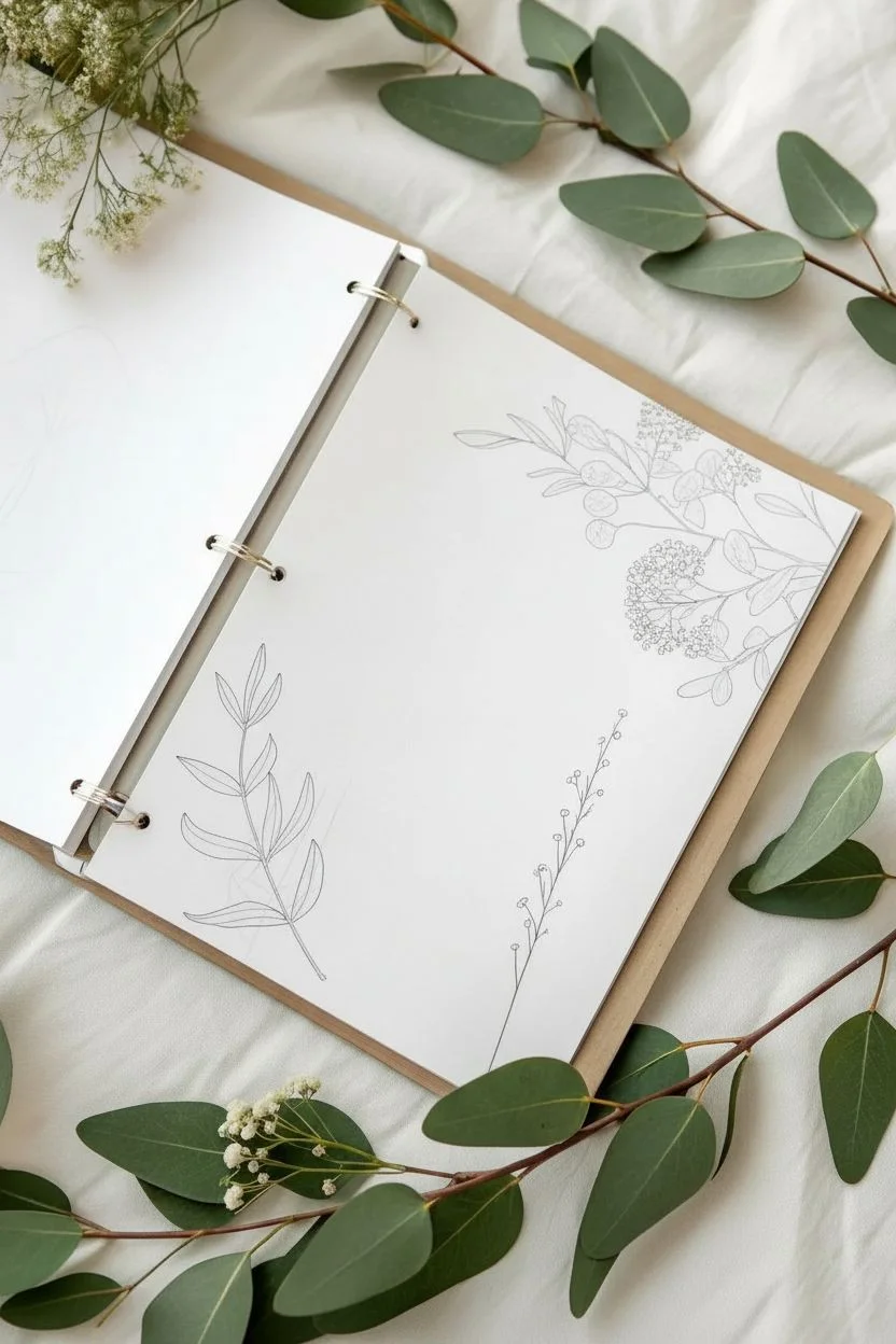
Transform plain binder inserts into a personalized botanical garden with these delicate, minimalist floral sketches. This project brings a serene, nature-inspired aesthetic to your organization system using simple line work and soft washes of color.
How-To Guide
Materials
- High-quality ring binder inserts or heavy drawing paper (punched)
- Fine liner pen (0.1mm or 0.3mm, black or sepia)
- Graphite pencil (HB or H)
- Kneaded eraser
- Colored pencils (muted greens like sage, olive, mint) OR watercolor paints
- Small round brush (if using watercolors)
- Reference images of eucalyptus and baby’s breath
Step 1: Planning the Composition
-
Assess your page space:
Open your binder to a blank spread. Notice how the page on the right uses the corners to frame the empty space. Decide where you want your ‘white space’ to be for future notes or photos. -
Sketch the main stems:
Using your HB pencil, lightly draw the main curved lines for the stems. On the bottom left, curve a single stem upward. On the top right, create a cascading effect with two or three intersecting main branches coming from the corner. -
Add leaf placements:
Along the bottom-left stem, sketch elongated oval shapes for leaves. Keep them opposite each other or slightly staggered. For the top-right corner, mix rounder eucalyptus shapes with smaller, purely linear branches.
Step 2: Inking the Outlines
-
Trace the bottom stem:
Switch to your fine liner. Starting at the base of the bottom-left stem, draw the central line. As you reach a leaf junction, lift your pen and draw the leaf shape with a confident, continuous stroke. -
Detail the simple leaves:
Add a central vein to each leaf on the bottom cluster, but stop the line before it hits the tip of the leaf for a lighter, more modern look. -
Ink the upper corner:
Move to the top right. Outline the rounder eucalyptus leaves first. I suggest varying the pressure—press slightly harder on the shadowed underside of the leaves. -
Draw the detailed fillers:
For the baby’s breath or filler flowers in the top corner, use tiny, stippled circles or small clustered loops. Keep these lines very light and delicate compared to the leaves. -
Create the wispy vine:
On the bottom right of the page, draw a very thin, singular vertical stem. Add tiny circles at the tips of short branches to mimic buds or seeds. -
Erase guidelines:
Wait at least 15 minutes for the ink to fully set. Gently roll a kneaded eraser over the page to lift the graphite sketches without damaging the paper surface.
Uneven Ink Lines?
Don’t panic if your hand shakes. Go back and slightly thicken the line in certain spots to make the wobble look like a deliberate variation in line weight.
Step 3: Adding Subtle Color
-
Select your palette:
Choose a very desaturated green. If using watercolors, dilute a sap green with a touch of brown and lots of water. If using pencils, choose sage or olive tones. -
Color the bottom leaves:
Gently fill in the leaves on the bottom left. Don’t press hard; you want a translucent effect. Leave tiny slivers of white paper showing near the veins to simulate light reflection. -
Wash the upper eucalyptus:
For the top right, color the round leaves with a slightly different green tone, perhaps leaning towards blue-green. Apply the color somewhat loosely; it doesn’t need to stay perfectly inside the lines. -
Tint the filler flowers:
Take a very pale yellow or cream color and dab it lightly over the clustered flower heads in the top corner. This should only be a whisper of color. -
Review and refine:
Step back and look at the spread. If the green looks too flat, add a slightly darker shade just at the base of the leaves where they meet the stem to create depth. -
Final drying:
Let the pages sit open until completely dry to prevent any color transfer when you close the binder.
Natural Variety
Avoid making every leaf identical. Purposefully draw a few leaves slightly folded or turned sideways to make the botanical arrangement feel organic.
Your custom binder pages are now ready to be filled with thoughts, memories, or plans
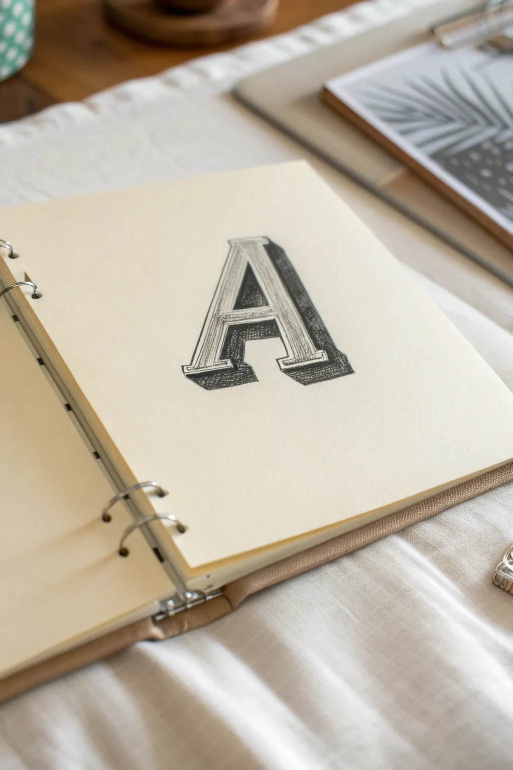
Rainbow Gradient Letters for a Happy Boost
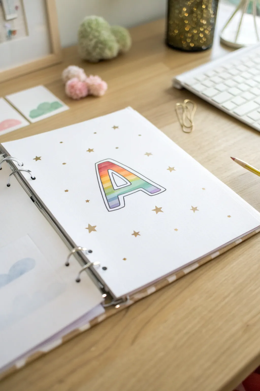
Brighten up your school binder or planner with this cheerful, personalized cover page featuring a bold initial. The soft rainbow gradient inside the letter pops beautifully against the crisp white paper, surrounded by festive golden stars.
Step-by-Step Guide
Materials
- A4 or Letter size white paper (heavyweight or cardstock preferred)
- Pencil (HB)
- Eraser
- Fine-liner black marker (0.5mm or 0.8mm)
- Colored pencils or alcohol markers (Red, Orange, Yellow, Green, Blue, Purple)
- Gold metallic marker or gel pen
- Ruler (optional)
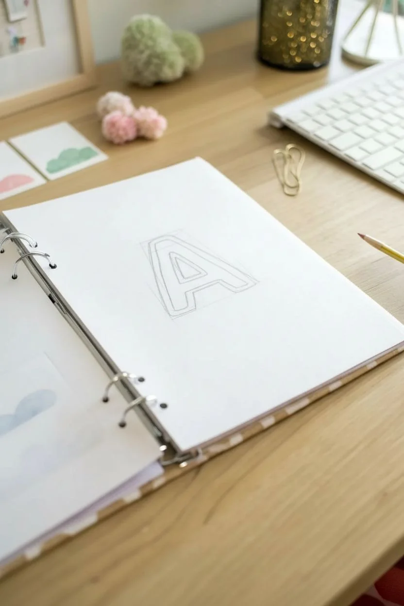
Step 1: Sketching the Framework
-
Center your subject:
Find the rough center of your page. You don’t need to measure perfectly, but eyeing it helps ensure the letter has enough breathing room. -
Draw the basic letter shape:
Using your pencil lightly, sketch a large block letter ‘A’ (or your chosen initial). Aim for a sans-serif style with thick, even legs to allow plenty of space for the coloring. -
Create the inner border:
Sketch a second line inside your block letter, mirroring the outer shape. This creates a thin white border that will separate the color from the outline later. -
Refine the curves:
Soften any sharp corners slightly if you want a friendlier look, or keep them sharp for a geometric feel. Erase any stray sketch lines so your workspace is clean.
Step 2: Adding Cultural Color
-
Plan your gradient:
Look at the space inside your inner sketched line. Visually divide the letter horizontally into six rough sections for your rainbow stripes. -
Start with red:
Color the top section of the letter with your red pencil or marker. Apply the color gently at first. -
Blend into orange:
Add the orange section immediately below the red. Where the two colors meet, lightly overlap the orange onto the red to create a smooth transition. -
Add yellow sunshine:
Fill the next section with yellow, blending it upwards into the orange. Keep your strokes horizontal to maintain the gradient flow. -
Transition to cool tones:
Apply the green section next. Ensure the transition from yellow to green is soft; you might need to go back and forth with the pencils to get the mix right. -
Deepen with blue and purple:
Finish the bottom legs of the letter with blue, then purple at the very tips. I like to press a little harder here to ground the letter with deeper color.
Uneven Blending?
If your colored pencil gradient looks stripey, use a white colored pencil or a colorless blender marker to smooth out the transition lines.
Step 3: Inking and Details
-
Outline the inner shape:
Take your black fine-liner and carefully trace the line that touches the drawing’s colored section. -
Outline the outer shape:
Trace the outermost pencil line of the letter. This creates that stylish white gap between the black lines, giving the drawing a sticker-like appearance. -
Connect the outlines (optional):
If you have any floating island shapes (like the triangle inside the ‘A’), ensure both the color border and the outer border are inked cleanly around it. -
Erase pencil marks:
Wait until the ink is completely dry—usually about a minute—then thoroughly erase any remaining graphite lines.
Level Up: Glossy Finish
Once the drawing is done, apply a layer of clear glossy drying glaze (like Mod Podge Dimensional Magic) just over the colored letter to make it shine like a sticker.
Step 4: The Finishing Sparkle
-
Scatter the stars:
Using your gold metallic marker, draw small five-pointed stars randomly around the letter. -
Vary the sizes:
Make some stars slightly larger and others tiny dots or diamonds to create a sense of depth and whimsy. -
Add floating dots:
Place a few single gold dots in the empty spaces between stars to balance out the composition without making it look cluttered. -
Punch holes:
If this is going into a binder, use a hole punch on the left edge now so you can frame your artwork instantly.
Now you have a vibrant, custom cover page that is ready to organize your day with a bit of joy
BRUSH GUIDE
The Right Brush for Every Stroke
From clean lines to bold texture — master brush choice, stroke control, and essential techniques.
Explore the Full Guide
Minimal Monochrome Line Art Cover
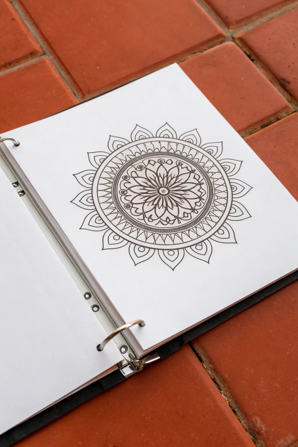
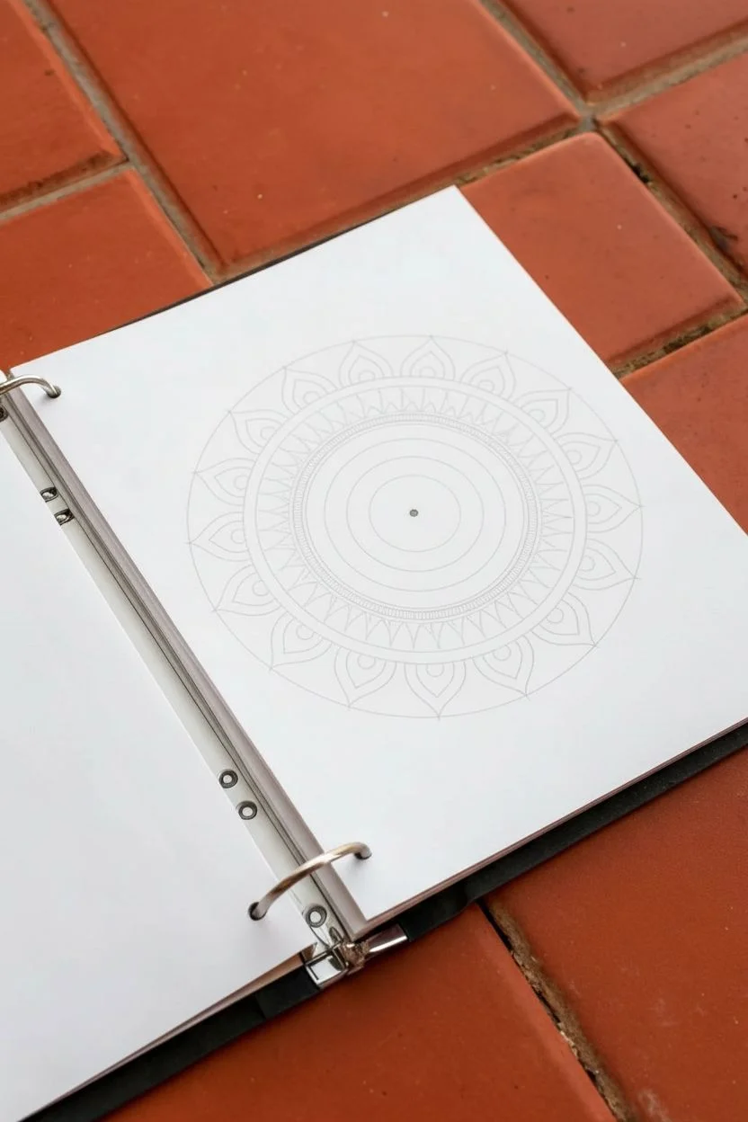
Transform a plain binder insert into a meditative piece of art with this elegant monochrome mandala. Using simple geometric shapes and repetitive linework creates a mesmerizing design that looks complex but is surprisingly therapeutic to draw.
How-To Guide
Materials
- A white sheet of paper (standard A4 or letter size)
- A standard binder or journal
- A compass for drawing circles
- A pencil (HB or lighter)
- An eraser
- Fine liner pens (sizes 0.1mm, 0.3mm, and 0.5mm)
Step 1: Setting the Foundation
-
Find the center:
Begin by finding the exact center of your paper. You can do this by lightly marking the intersection of two diagonal lines or measuring the midpoint. This central dot will be the anchor for your entire design. -
Draw guide circles:
Set your compass point on the center mark. Draw a series of light concentric circles. Start with a very small one (about 1 inch wide), then progressively add 3-4 larger circles outward, leaving varying gaps between them for different patterns. Keep these pencil lines faint, as they will be erased later. -
Sketch the petal guides:
For the outermost ring, lightly sketch the tips of the large flower petals to ensure they are evenly spaced around the circumference. You don’t need to draw the full petals yet, just mark where the points will land.
Symmetry Hack
Use a protractor to divide your circle into 8 or 12 equal ‘slices’ with pencil lines. This grid helps keep your repeating petal patterns perfectly spaced.
Step 2: Drawing the Core
-
Inking the center:
Using your 0.3mm fine liner, draw a small circle at the very center. Inside this circle, add tiny stamen lines or a small dot to give the flower focus. -
Create the first petals:
Draw the first layer of petals radiating from the center circle. These should be slender, teardrop shapes that touch the first guide circle you drew earlier. -
Add detail to petals:
Inside each of these primary petals, sketch a faint central vein line. I find that doubling up the outline on one side gives it a subtle shadow effect. -
Fills and flourishes:
Between the tips of the first petal layer, draw small, simple swirls or tiny leaves to fill the negative space before the next ring boundary.
Level Up: Gold Accents
Use a metallic gold gel pen to fill in the tiny circles or the central vein of the petals. The subtle shimmer adds a luxurious touch to the black and white.
Step 3: Expanding the Pattern
-
Define the middle ring:
Draw a solid ink circle over your next pencil guide. Create a second ink circle just a few millimeters outside it to create a narrow band. -
Fill the band:
Fill this narrow band with tiny hatch marks or repeated dots using a 0.1mm pen. This adds texture without overwhelming the design. -
Zig-zag section:
In the next open ring space, draw a continuous zig-zag line all the way around. The points of the zig-zag should touch the inner and outer boundaries of this section. -
Double the zig-zag:
Draw a second zig-zag line parallel to the first one. This creates a ribbon-like effect. It’s okay if the lines aren’t perfectly machine-straight; the hand-drawn quality adds charm.
Step 4: The Outer Border
-
Draw the main petals:
Now, tackle the large outer petals. Using your 0.5mm pen for a bolder line, draw the pointed arches for the lotus-like border. Base them on the guide marks you made in the beginning. -
Inner petal details:
Inside each large outer petal, draw a smaller, identical petal shape floating in the center. This creates a layered, ‘Russian nesting doll’ look. -
Add circular accents:
At the base of each large outer petal, where the petals meet the main circle, draw a small circle. This acts like a ‘jewel’ connecting the border to the center. -
Refine lines:
Go over your main structural circles with the 0.5mm pen to ensure the concentric rings stand out clearly against the delicate inner patterns.
Step 5: Finishing Touches
-
Erase pencil marks:
Wait at least 15 minutes for the ink to be completely bone-dry. Then, gently erase all your initial pencil circles and guide marks. Be careful not to crinkle the paper. -
Final inspection:
Scan your drawing for any broken lines or uneven connection points. Use the 0.1mm pen to fix tiny gaps or thicken lines that look too thin. -
Punch and file:
Once fully clean, punch holes in the paper corresponding to your binder rings and snap your new custom cover art into place.
Now you have a serene, custom-designed cover that brings a little peace to your organization system
3D Block Letters With Drop Shadow Drama
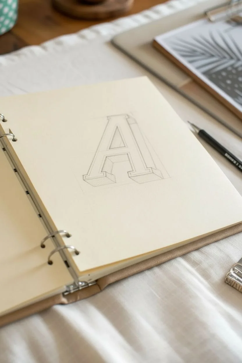
Master the art of dimension with this striking 3D block letter sketch. Using simple graphite shading techniques inside your binder, you’ll transform a flat character into a structural object that seems to pop right off the page.
Detailed Instructions
Materials
- Mechanical pencil (HB or 2B lead)
- Graphite pencil (4B or 6B for darker shading)
- Ruler or straight edge
- Binder with cream or white paper
- Kneaded eraser
- Fine-tip eraser (optional)
Step 1: Drafting the Structure
-
Define the face height:
Start by lightly marking the top and bottom limits of your letter ‘A’ with horizontal dashes to ensure it’s centered on the page. -
Draw the primary triangle:
Use your ruler to draw a large, centered triangle shape. This will be the outer skeleton of the letter. Keep your lines very faint so strict erasing isn’t needed later. -
Create the letter thickness:
Draw a smaller triangle inside the first one. Connect the bottoms with horizontal lines to form the familiar ‘A’ legs. Add the horizontal crossbar in the middle. -
Refine the serif details:
At the bottom of each leg, sketch small rectangular ‘feet’ or slabs. Do the same for the apex of the A, flattening the top point into a small horizontal line. -
Establish the perspective angle:
Decide on your light source; for this drawing, the shadow falls to the right. Draw short diagonal lines (about 45 degrees) extending from every corner on the right side of the letter. -
Connect the depth lines:
Connect the ends of these diagonal lines with straight vertical or horizontal lines that run parallel to the original letter face. This creates the 3D block effect.
Step 2: Inking and Outlining
-
Harden the outlines:
Take your mechanical pencil and go over the main outline of the letter face with a firmer hand. Press harder to create a crisp, dark boundary. -
Add the inner border:
Draw a secondary outline inside the main face of the ‘A’, roughly 2-3mm from the edge. This ‘inline’ adds a vintage typography feel. -
Detail the serif corners:
Sharpen the corners of the slab serifs at the bottom and top. Make sure lines meet cleanly without overshooting.
Smudge Control
Place a scrap piece of paper under your drawing hand. This prevents your palm from dragging graphite across the white page.
Step 3: Shading for Depth
-
Start the side shading:
Using your softer 4B or 6B pencil, begin filling in the 3D side panels you created earlier. Use a uniform hatching stroke. -
Darken the crossbar depth:
Locate the depth area under the crossbar (the middle hole of the A). Shade this area darkest, as it would receive the least light. -
Apply cross-hatching:
Go back over your shaded areas with strokes in the opposite direction. This cross-hatching builds a dense, textural grey that mimics professional printing. -
Create the drop shadow:
Sketch a cast shadow on the ground surface, extending from the bottom right of the legs. Keep this shape geometric and sharp. -
Darken the base shadow:
Fill the cast shadow with your darkest graphite tone. I prefer to press quite firmly here to anchor the letter to the ‘ground’. -
Clean up highlights:
Use a kneaded eraser to tap the main face of the letter, lifting any accidental smudges to keep the paper white. -
Final contrast check:
Reinforce the boundary line where the white face meets the dark shadow. A high-contrast edge is the secret to a believable 3D effect.
Level Up: Texture
Instead of solid shading, try stippling (tiny dots) or horizontal lines inside the 3D sides for a retro engraving style.
Now you have a bold typographic centerpiece ready to start a new chapter in your journal


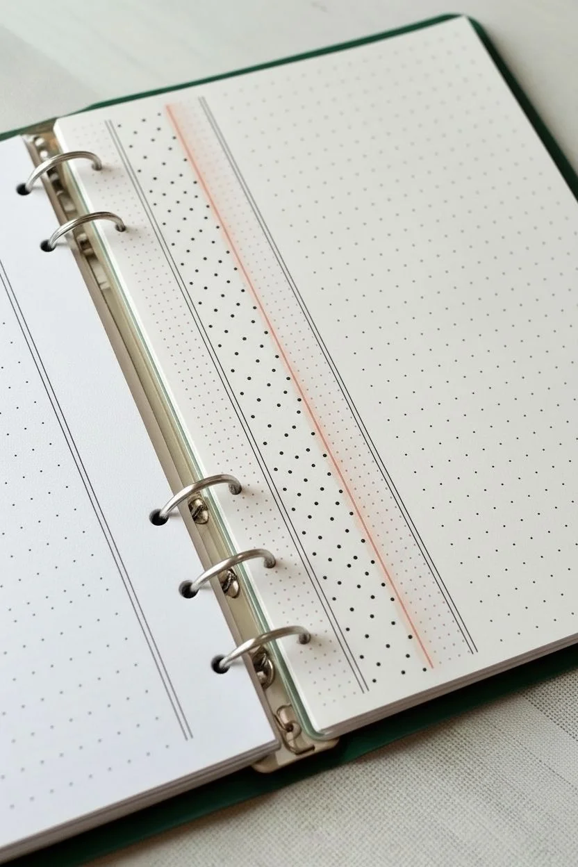
Grid Paper Illusion With Handwritten Notes
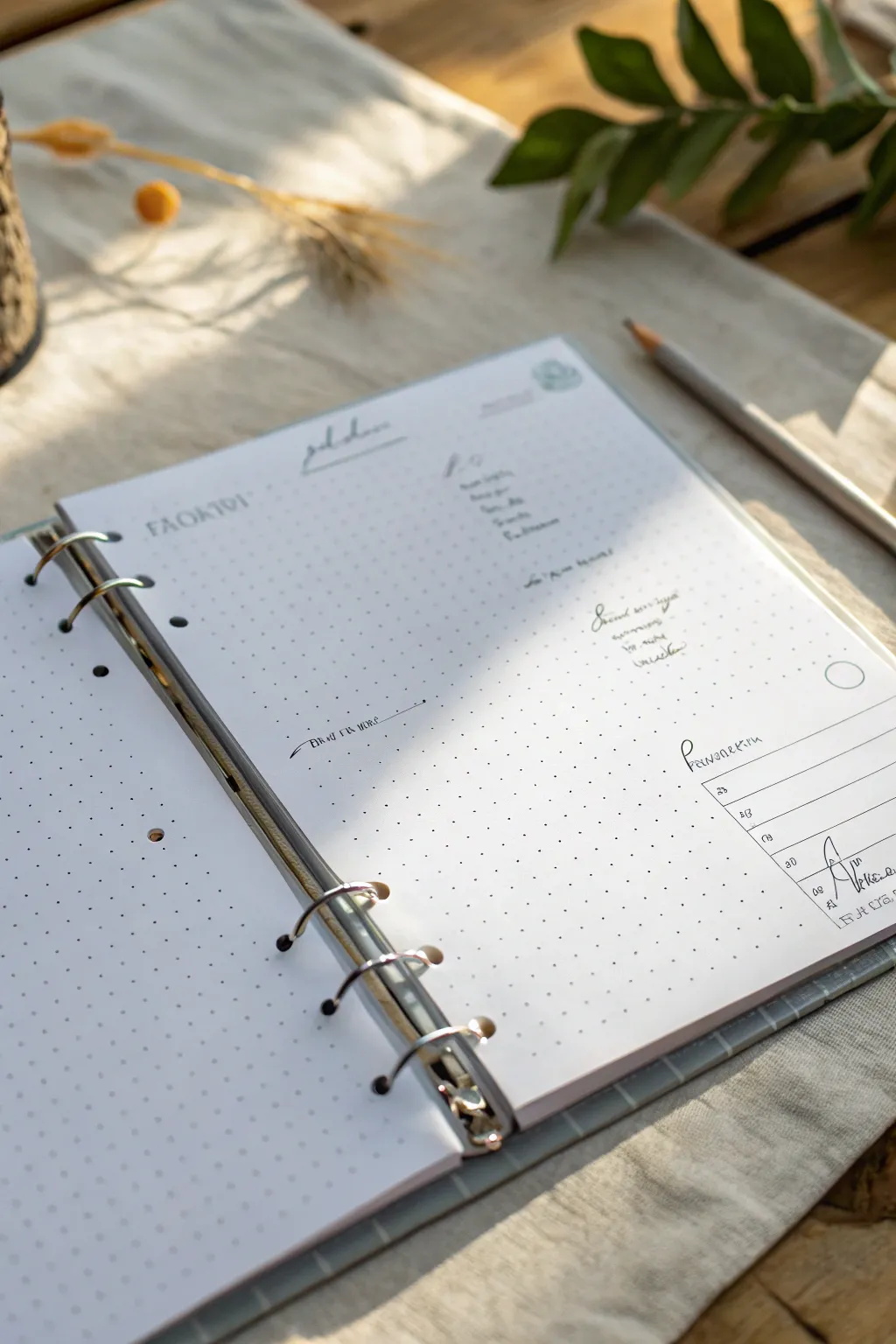
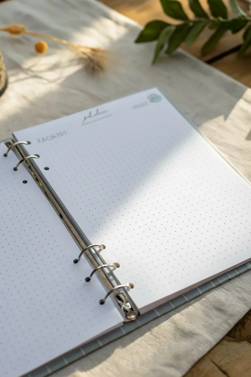
This tutorial teaches you how to hand-draw a convincing dot-grid journal page without buying specialty paper. The result is a clean, minimal layout featuring delicate handwritten headers and a neat tracking chart, all executed with precise pen work.
Step-by-Step Tutorial
Materials
- Blank white paper (A5 size or custom cut to fit your binder)
- Pencil (HB or H)
- Ruler (clear grid ruler preferred)
- Fine liner pen (0.1mm or 0.3mm, black)
- Light grey fine liner or felt tip pen
- Eraser
- B6 or A5 Binder mechanism (optional, for reference)
Step 1: Creating the Dot Grid Base
-
Measure margins:
Start with your blank sheet of paper. Using a ruler and pencil, lightly mark a 1-centimeter margin around all four edges of the paper to frame your grid area. -
Mark horizontal intervals:
Along the top margin line, make small tick marks every 0.5 centimeters. Repeat this along the bottom margin line to ensure your vertical lines will be straight. -
Mark vertical intervals:
Rotate the paper and do the same along the side margins, placing a tick mark every 0.5 centimeters. -
Grid the page:
Align your ruler with corresponding top and bottom ticks. Instead of drawing lines, gently tap your fine liner pen at the intersection of where the horizontal and vertical invisible lines would meet. Work row by row. -
Check consistency:
As you dot, keep a steady rhythm. The dots should be subtle. If you find your hand shaking, take a break; plotting an entire page of dots requires patience. -
Erase guidelines:
Once the ink is completely dry, carefully erase your pencil margin marks so only the ink dots remain, creating a clean ‘printed’ look.
Uneven Dots?
If your hand-drawn dots aren’t perfectly aligned, don’t scrap the page. The slight irregularity adds organic charm that printed paper lacks. Just keep moving forward.
Step 2: Adding Handwritten Elements
-
Draft the header:
In the upper left quadrant, lightly sketch the word ‘FAVORITE’ (or your chosen topic) in all-caps using a pencil. -
Ink the header:
Go over the pencil with your black fine liner. Keep the letters spaced widely apart (kerning) for an airy, modern aesthetic. -
Create a sub-header:
To the right of the main header, write a secondary title in a loose, cursive script. Extending the underline of this word creates a nice visual separation. -
List content columns:
On the right side of the page, align a list of items vertically. Use the dot grid you created to keep the starting letters perfectly straight without needing new guide lines. -
Add a floating quote:
In the middle-right open space, write a short phrase or quote in a slanted cursive style. Varying the angle here adds visual interest against the rigid grid. -
Draw a directional arrow:
On the left side, roughly halfway down, draw a straight horizontal line with an arrow tip pointing left. Write a small caption like ‘Read this more’ just above the line.
Pro Tip: Ghost Grid
Place a printed graph paper sheet underneath your blank page. If your paper is thin enough, you can simply trace the dots instead of measuring every single interval.
Step 3: Drawing the Tracker Box
-
Outline the box:
In the bottom right corner, use your ruler to draw a horizontal rectangle. It should span about 6 grid dots wide and 4 dots high. -
Add row dividers:
Draw three horizontal lines inside the box to create four rows. Keep the spacing equal by counting your dots. -
Insert column dividers:
Draw a vertical line to separate the date column from the description column. I usually place this about 1.5 cm from the left edge of the box. -
Fill in the header:
Write a title for the table, such as ‘Parameters’ or ‘Schedule’, just above the top line in a stylistic font, letting the first letter loop extravagantly. -
Populate with data:
Fill the rows with tiny, neat handwriting. Include dates on the left and short notes on the right. -
Final clean up:
Inspect the page for any stray pencil marks and erase them gently. Punch holes on the left side to fit your binder mechanism.
Now you have a beautifully customized layout read to be snapped into your binder
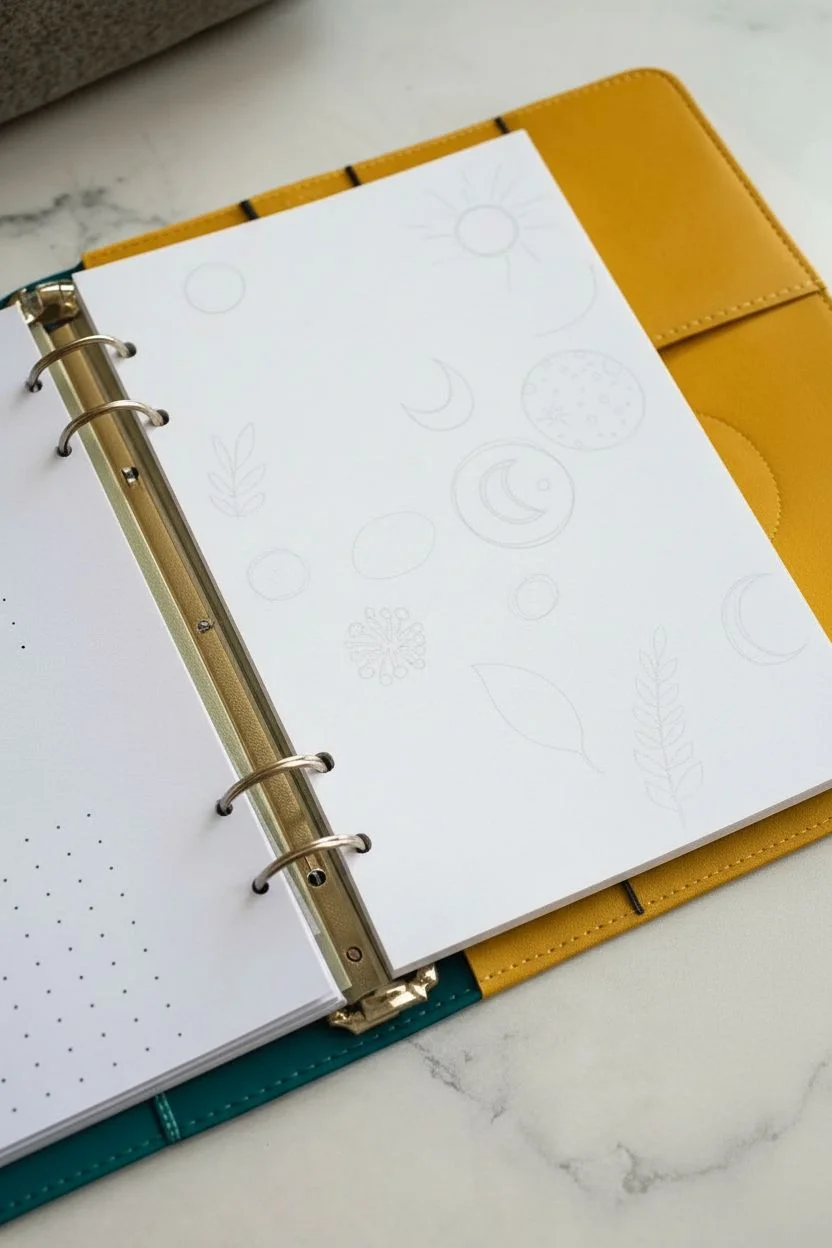
Split Page Design: Half Doodles, Half Clean
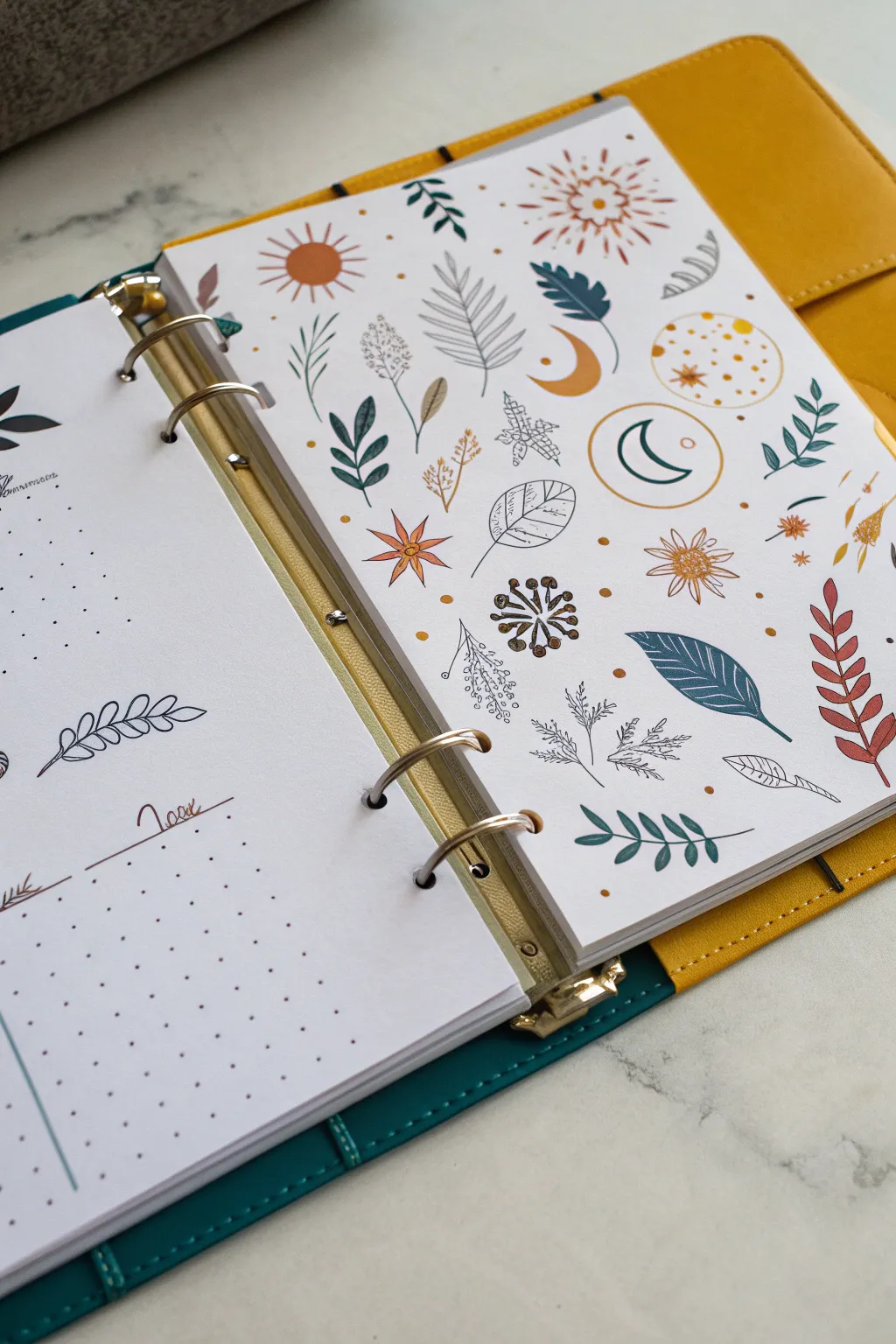
This tutorial guides you through creating a stunning, sticker-like pattern page that serves as a beautiful dashboard or divider in your binder. Combining earthy tones with celestial and botanical motifs, this full-page doodle art brings a warm, bohemian aesthetic to your planner setup.
Step-by-Step Tutorial
Materials
- A5 or Personal size 6-ring binder paper (blank or dot grid)
- Fine liner pens (black, 0.3mm and 0.5mm)
- Colored markers or felt-tip pens (muted teal, mustard yellow, terracotta/rust, light grey)
- Gold gel pen or metallic marker
- Pencil and eraser
- Ruler (optional for spacing)
Step 1: Setting the Layout
-
Visualize the spacing:
Before drawing, imagine an invisible grid on your blank page. You want the icons to be scattered randomly but evenly, avoiding large empty gaps or clustered overlapping spots. -
Light pencil sketch:
Using a pencil, lightly sketch the positions of your largest elements first. These will be the suns, large moon crescents, and the circular moon phase illustration. Place about 5-6 of these main focal points across the page so they anchor the design.
Color Harmony Tip
Stick to a strict palette of 3-4 muddy, natural colors (mustard, sage, rust, charcoal). This makes random doodles look cohesive.
Step 2: Drawing the Celestial Elements
-
Create the main suns:
Ink your sun motifs. Draw a solid terracotta circle for the center of one sun, adding simple radiating lines. For another sun, draw a hollow circle with intricate, patterned rays—alternating between straight lines and small dots. -
Add moon crescents:
Draw a few crescent moons. Fill one in solid mustard yellow. For another, draw just the outline in a circle frame, perhaps in a teal or dark green color, to add variety. -
Detail the full moon disk:
Near the top right or center, create a circular ‘moon texture’ doodle. Outline a circle in mustard yellow and fill it with small dots, tiny stars, and craters to mimic a stylized moon surface.
Step 3: Adding Botanical Motifs
-
Draw simple leaf sprigs:
Using your teal or dark green marker, draw several simple leaf sprigs. Keep the shapes basic—a central stem with opposite, almond-shaped leaves. -
Create fern-like fronds:
Sketch a few more complex leaves that look like ferns. Draw a curved stem and add many small, thin lines coming off it. I find a 0.3mm black fine liner works best for these delicate lines to keep them looking crisp. -
Add varied foliage shapes:
Intersperse different leaf shapes. Try some broad, single leaves with vein details drawn in black ink, and some long, thin grasses in rust or mustard colors. -
Draw stylized flowers:
Look for empty spots and add stylized flowers. A simple star-shaped flower with long, thin petals in terracotta looks great. You can also add a dandelion-style puff using small dashes radiating from a center point.
Level Up: Vellum Overlay
Draw the main outlines on the paper, but color the solid shapes on a sheet of vellum overlaid on top for a dreamy, layered effect.
Step 4: Filling and Refining
-
Incorporate abstract shapes:
Fill medium-sized gaps with abstract botanical shapes, like a cluster of berries (small circles on stems) in brown or dark red. -
Add linear details:
Go back over your colored shapes with a black fine liner. Add veins to the solid colored leaves or outline the mustard moon shapes to make them pop against the white paper. -
Sprinkle in gold accents:
Use your gold gel pen to add tiny details. Color in the centers of flowers, add small dots to the sun rays, or draw tiny standalone stars. -
Fill the tiny voids:
Look for any remaining awkward white spaces. Fill these with very small ‘confetti’ elements: single dots, tiny hollow circles, or little groups of three specks in gold or rust. -
Erase pencil lines:
Once the ink is completely dry—give it a good few minutes to prevent smudging—gently erase your initial planning sketches. -
Review the balance:
Take a step back and look at the page as a whole. If one area feels too ‘heavy’ with dark colors, add a small, light outline doodle nearby to balance the visual weight.
Step 5: Layout Integration
-
Punch the holes:
If you drew on loose paper, carefully punch the 6 holes to fit your binder, ensuring you don’t punch through a major doodle if possible. -
Pair with a functional page:
Place this artwork on the right side of your spread. On the left page, keep the design minimal with simple bullet lists or grids, perhaps repeating just one small leaf motif from the right page to tie the spread together.
Now you have a gorgeous, custom-illustrated dashboard that adds a personal artistic touch to your daily planning.
Pattern Sampler Strips Like a Mini Swatch Book
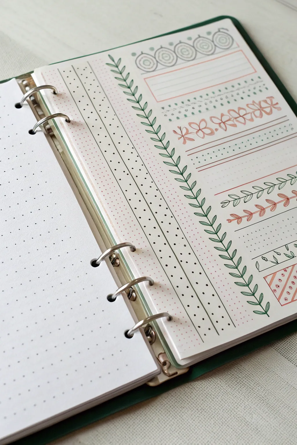
Transform a plain planner page into a delightful sampler of hand-drawn patterns that mimic the look of stacked washi tape strips. This project combines geometric precision with organic leaf motifs in a soothing palette of sage green and soft coral.
Step-by-Step Guide
Materials
- A5 size dotted notebook paper (6-ring punched)
- Fine liner pen (black, 0.3mm or 0.5mm)
- Brush pen or marker (Sage Green)
- Brush pen or marker (Soft Coral/Peach)
- Ruler or straight edge
- Pencil and eraser (optional for sketching)
Step 1: Setting the Structure
-
Define the vertical column:
Begin by drawing two parallel vertical lines on the left side of your page using your black fine liner and ruler. Space them about 2-3 dot grid squares apart to create a long, thin column running nearly the full height of the page. -
Divide the column:
Inside this vertical column, draw a third vertical line down the center to split it into two equal strips. -
Add the dots:
In the left-hand subdivision, place small black dots in a somewhat random, scattered pattern. Keep the density light so it feels airy. -
Create the second dot pattern:
In the right-hand subdivision, repeat the dotting process, but try to stagger them differently than the first strip to distinguish the two sections. -
Initial shading:
Using your soft coral marker, lightly color over the dotted vertical strip area if you wish, or leave it monochrome. I prefer to add a very faint wash of color behind these dots to make them pop.
Grid Counting Trick
Don’t guess on spacing! Count the dot grid squares before drawing lines. For most borders, a height of 2 or 3 grid squares provides the perfect proportion for doodling.
Step 2: Drawing the Botanical Borders
-
Draft the vine spine:
To the right of your vertical column, draw a single, long vertical line from top to bottom using your green pen. This will serve as the stem for your main leafy border. -
Add the leaves:
Starting at the top, draw small, simple pointed oval leaves extending outward from the stem. Alternate the leaves left and right as you move down the line, keeping them evenly spaced. -
Draw horizontal guides:
Moving to the main body of the page, use your ruler to lightly pencil in horizontal guidelines where you want your different pattern strips to sit. -
Create the top geometric banner:
At the very top, draw a row of distinct circular motifs in black ink. Draw a small circle, surround it with a larger concentric circle, and add small tick marks on the outer edge. -
Box it in:
Draw a rectangular box around your circle motif row using the coral marker, and add a second empty rectangular box directly below it for writing a header later.
Step 3: Detailed Pattern Layers
-
Stipple the green bands:
Below your header boxes, create a sense of texture by dabbing small, dense dots with your green marker. Make two rows of this stippled pattern to look like fabric. -
Draw the flower chain:
With the coral marker, draw a horizontal row of simple four-petal flowers. Connect them slightly at the tips so they form a continuous chain across the page. -
Add line accents:
Under the flowers, use the coral marker to draw two bold horizontal lines. Then, use the green fine liner to add a row of tiny dots between them. -
Sketch the leaf garland:
Further down, switch to your black pen to draw a horizontal vine. Draw a wavy or straight central stem, then add small pairs of leaves. Color every other leaf grouping with the green marker for contrast. -
Create the coral vine:
Repeat the previous step but use the coral marker entirely for the stem and leaves. This creates a softer, monochrome vine look directly below the black and green one. -
Draw the herringbone vine:
Near the bottom, draw a vertical stem in green. Instead of standard leaves, draw V-shapes encasing the stem, stacking them downward to create a geometric fern or wheat-like pattern. -
Final diagonal fill:
In the bottom right corner, draw a small rectangle. Fill it with diagonal coral stripes and place tiny black circles between the stripes for a playful finish.
Uneven Spacing?
If your repeating patterns (like the flowers) start to drift or change size, lightly pencil vertical tick marks every 4 dots to create ‘containers’ for each motif.
Now you have a reference page of beautiful borders ready to decorate your future journal entries
Photo-Inspired Sketch Collage Insert
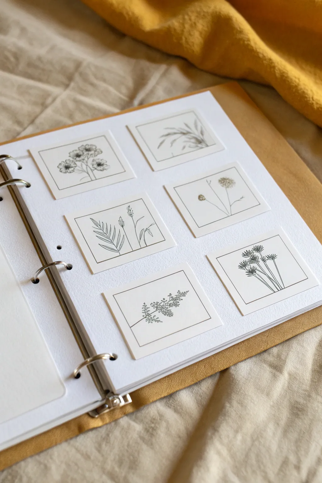
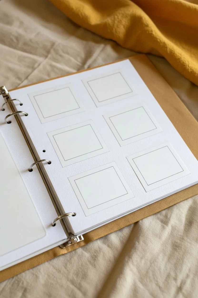
Transform a standard binder page into an elegant gallery of nature studies with this clean, gridded layout. By framing delicate ink sketches within perfect squares, you create a cohesive and sophisticated look that turns simple doodling into a polished art piece.
How-To Guide
Materials
- Heavyweight white cardstock or sketchbook paper (size A4 or letter)
- Fine-liner pen (black, 0.1mm or 0.3mm nib)
- Pencil (HB or 2H)
- Ruler
- Eraser
- Paper trimmer or scissors
- Three-ring binder
- Double-sided tape or glue stick
Step 1: Planning the Layout
-
Measure the base:
Start by selecting a sheet of heavyweight paper that fits your binder. If using a standard three-ring binder, ensure your paper is punched and ready before you begin attaching artwork to avoid alignment issues later. -
Cut the sketch squares:
Using a paper trimmer for accuracy, cut six identical squares from a separate sheet of bright white drawing paper. A size of 2.5 x 2.5 inches works beautifully for this layout, leaving enough negative space around the sketches. -
Create the inner borders:
On each small square, lightly draw a pencil border about 1/4 inch from the edge. This will act as the frame for your botanical illustrations. -
Ink the frames:
Carefully trace over your pencil border lines with your fine-liner pen. Keep your hand steady and lift the pen cleanly at the corners to create crisp, sharp boxes.
Step 2: Drawing the Botanicals
-
Select your subjects:
Choose six different wildflowers or grasses to feature. Look for variety in shapes—some tall and thin like wheat, others clustered like yarrow, or soft and flowing like ferns. -
Sketch the first stem:
Begin with a pencil sketch of a simple poppy or anemone shape. Draw the main stem rising from the bottom edge of the frame, allowing it to curve slightly for a natural look. -
Add foliage details:
Lightly sketch leaves branching off the stem. For the fern-like drawing, focus on symmetry; for the wildflowers, asymmetrical placement tends to look more organic. -
Ink the outlines:
Go over your pencil sketches with the fine-liner. Use confident, single strokes for stems and delicate, broken lines for details like flower petals or grass tips. -
Add textual shading:
Use stippling (tiny dots) or fine hatching lines to add depth to the center of flowers or the shadowed side of stems. I like to keep this minimal to maintain the airy aesthetic. -
Erase guidelines:
Once the ink is completely dry—give it a good five minutes to be safe—gently erase all underlying pencil marks from your botanicals and the borders.
Ink Confidence
Jittery lines actually help botanical drawings look more natural. Don’t worry about perfect straightness; slight wobbles mimic real plant stems.
Step 3: Assembly
-
Arrange the composition:
Lay your main binder page flat. Place the six finished drawings on top in a 2×3 grid pattern. Don’t glue yet; just adjust the spacing until the margins look balanced. -
Measure the grid spacing:
Use a ruler to ensure the gaps between the squares are uniform. A gap of about 1 inch usually provides enough breathing room between images. -
Mark placement dots:
Make tiny, faint pencil marks at the corners where each square will sit. This ensures you don’t lose your alignment when applying adhesive. -
Apply adhesive:
Apply double-sided tape or a thin layer of glue to the back of the first drawing. Pay special attention to the corners to prevent them from curling up later. -
Secure the artwork:
Press the square firmly onto the binder page, aligning it with your pencil marks. Repeat this process for the remaining five squares. -
Final clean-up:
Erase any visible placement dots on the main page. Place the completed sheet into your binder rings carefully to finish your botanical gallery.
Go 3D
Press a small dried flower or leaf inside one of the frames instead of drawing it for a beautiful mixed-media element.
Your personalized binder page is now ready to inspire you every time you open your notes
Interactive Cover: Color-In Doodle Page Insert
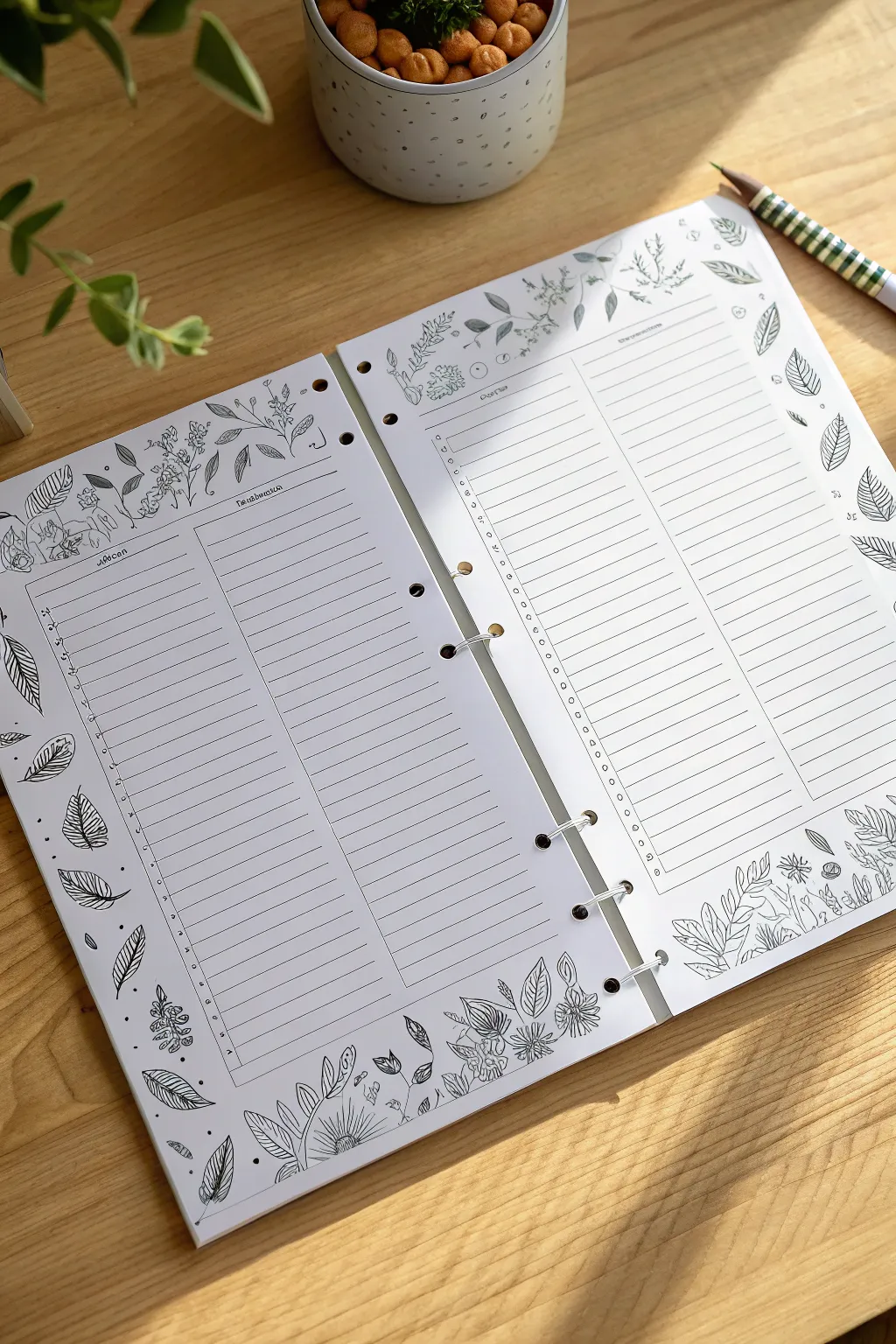
Transform your organizational system into a relaxing creative outlet with these hand-drawn planner pages. Featuring delicate floral borders and clean lined sections, these inserts serve as both a functional to-do list and a calming coloring canvas.
Step-by-Step
Materials
- Heavyweight drawing paper or cardstock (A5 or A4 size)
- Fine liner pens (sizes 0.1, 0.3, and 0.5)
- Ruler or straight edge
- Pencil (HB or 2H)
- Eraser
- 6-hole punch (compatible with your binder)
- Binder rings or an empty binder
Step 1: Setting the Structure
-
Paper measurement:
Begin by cutting your heavyweight paper to the exact size of your binder’s existing pages. If you are using standard A5 binder paper, simply use a fresh sheet as a size guide. -
Marking the margins:
Using your pencil and ruler, lightly mark a 0.5-inch margin around the entire perimeter of the page. This ensures your artwork doesn’t get cut off or punched through later. -
Drawing the column layout:
Divide the central area of your page into two main vertical columns. Leave a small gap between them for visual breathing room. -
Creating headers:
Draw thin horizontal boxes at the top of each column. These will serve as headers for your lists (like ‘Priority,’ ‘To Do,’ or ‘Notes’). -
Adding writing lines:
With your ruler, lightly pencil in horizontal lines within your columns, spacing them about 0.25 inches apart. Don’t press too hard, as these will be inked over later.
Step 2: Inking the Borders
-
Sketching floral shapes:
In the open space at the top and bottom of the page, lightly sketch organic shapes for leaves and flowers. Vary the size so some leaves overlap the border slightly. -
Inking the outlines:
Switch to your 0.3 fine liner. Carefully trace the outline of your botanical doodles. Use smooth, continuous strokes rather than sketching to keep the look clean. -
Adding leaf details:
Use the finer 0.1 pen to add veins to the leaves. For some leaves, draw a single center line; for others, add intricate cross-hatching or detailed vein patterns to create variety. -
Embellishing with dots:
Scatter small clusters of dots or tiny circles around your flowers and leaves. This fills empty negative space and adds a whimsical texture to the illustration. -
Defining the edges:
If you want a contained look, draw a thin frame around the entire page, breaking the line wherever a leaf or flower overlaps it to create depth.
Ink Confidence
Use waterproof pigment liners instead of water-based pens. This allows you to color in your doodles later with markers or watercolors without smudging the lines.
Step 3: Finalizing the Layout
-
Inking the grid:
Go back to your penciled columns. Use the 0.3 or 0.5 pen to draw the vertical dividers and the horizontal header boxes. -
Adding checkboxes:
Along the left side of each column, draw small circles or squares at the start of every line. These will be your checkboxes for completed tasks. -
Lining the rows:
Ink the horizontal writing lines with your precise 0.1 pen. Keeping these lines thinner than the border art ensures your writing will stand out later. -
Completing the header:
At the very top of each column, you can add small banner ribbons or simple text prompts like ‘Date’ or ‘Subject’ in a serif font. -
Erasing guidelines:
Wait at least 5-10 minutes to ensure the ink is completely dry. Then, gently erase all underlying pencil marks to reveal a crisp, clean design. -
Punching holes:
Align your hole punch with the inner edge of the paper. Punch the holes carefully, ensuring they don’t cut through your beautiful floral drawings.
Uneven Spacing?
If your hand-drawn lines look too wobbly, place a piece of graph paper underneath your drawing sheet. Use it as a visible guide through the paper to keep rows straight.
Slot your fresh pages into your binder and envoy the satisfaction of organizing your day on a canvas you created yourself


Have a question or want to share your own experience? I'd love to hear from you in the comments below!