There’s something ridiculously satisfying about black and white paint—no color decisions, just pure mood, light, and drama. I love how a simple high-contrast canvas can look bold and modern while still being totally doable at any skill level.
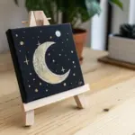
Glowing Moon Over a Dark Sky
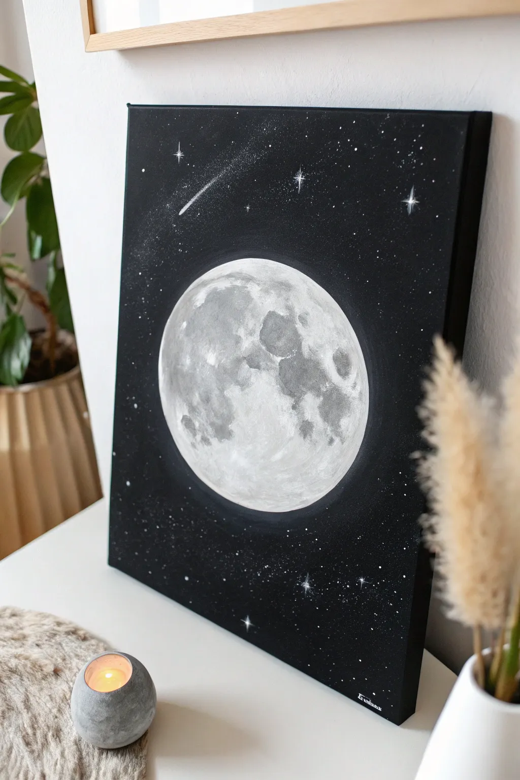
Capture the mystic beauty of the night sky with this striking monochromatic moon painting. Using simple black and white acrylics, you’ll learn to build layers of texture that make the craters pop against the deep void of space.
Step-by-Step Guide
Materials
- Stretched canvas (rectangular, e.g., 16×20 inches)
- Black acrylic paint (matte finish preferred)
- Titanium white acrylic paint
- Grey acrylic paint (or mix black and white)
- Wide flat brush for background
- Medium round brush
- Small detail brush (liner brush)
- Round object for tracing (plate or bowl)
- Pencil or white chalk pencil
- Old toothbrush (optional for spattering stars)
- Sponge or paper towel for texture
Step 1: Setting the Scene
-
Prepare the canvas:
Begin by ensuring your canvas is clean and dust-free. If the canvas wasn’t pre-primed, apply a coat of gesso, but standard store-bought canvases are usually ready to go. -
Paint the void:
Squeeze out a generous amount of black acrylic paint. Using your wide flat brush, cover the entire canvas in a solid, opaque layer of black including the sides for a finished look. -
Establish the background:
Let the first coat dry completely. If the canvas weave is still showing through too much, apply a second coat of black to ensure a deep, rich void. -
Outline the subject:
Once the black background is 100% dry, place your round object (like a dinner plate) in the center of the canvas. Lightly trace around it using a white chalk pencil or a regular graphite pencil—chalk is easier to wipe away later.
Dry Brushing Tip
For realistic craters, keep your brush very dry. Wipe most paint onto a paper towel before touching the canvas to create scratchy, rocky textures.
Step 2: Painting the Moon
-
Base layer:
Mix a light grey shade using mostly white with a tiny dot of black. Fill in your circle completely with this flat grey color to create a neutral base for the texture. -
Mapping the maria:
Study the reference image or a photo of the real moon. Using a darker grey mixture, block in the large, uneven shapes of the lunar maria (the dark seas) with a medium round brush. These shapes don’t need to be perfect; organic blotches work best. -
Adding texture:
Here I prefer to use a slightly dry sponge or a scrunched-up paper towel. Dip it lightly into a medium-grey paint, blot off the excess, and dab it gently over the darker grey areas to soften the edges and add that cratered, rocky look. -
Highlighting:
Clean your brush and switch to pure titanium white. Paint the brightest areas on the rim of the moon and the highlights between the dark craters. Use short, dabbing strokes to mimic rough terrain. -
Blending frontiers:
While the paint is still slightly tacky, use a soft, damp brush to gently feather the transitions between your dark grey seas and the bright white highlands. -
Defining craters:
With your smallest detail brush and a dark grey (almost black) mix, paint small C-shapes inside the lighter areas to suggest specific impact craters. Add a tiny dot of white on the opposite side of each C-shape to create depth. -
Brightening the edge:
Clarify the outer circle of the moon with a clean line of white paint to ensure it looks sharp against the black background.
Uneven Circles?
If your moon’s edge looks wobbly after painting, use black paint and a flat brush to ‘cut back’ into the shape from the outside to tidy the line.
Step 3: Starlight Details
-
Creating the glow:
Mix a very translucent glaze using water and a tiny bit of white paint. Paint a very thin ring around the outside of the moon, fading it quickly into the black, to give it a subtle atmospheric glow. -
Spattering stars:
Dilute some white paint with water until it’s inky. Dip an old toothbrush into it, point it at the canvas, and run your thumb over the bristles to spray fine mist ‘stars’ across the black areas. Cover the moon with a piece of paper first to keep it clean. -
Large stars:
Use your smallest liner brush to dot in a few larger, distinct stars manually among the mist. -
Twinkling accents:
Select 3-5 of your larger stars to turn into twinkling lights. Paint a thin cross hair (+) through the dot, dragging the paint outwards so the lines taper off to nothing. -
Shooting star:
Identify a spot in the upper quadrant for the shooting star. Place a dot of white, then quickly drag your brush tailing off behind it to create the streak. You can dry-brush a little faint dust around the tail for realism. -
Final touches:
Step back and assess your contrast. If the moon looks too flat, dab a little more pure white onto the brightest highlights to increase the 3D effect.
Hang your celestial masterpiece on a wall where it can catch the light and add a quiet serenity to the room


Classic Tree Silhouette at Dusk
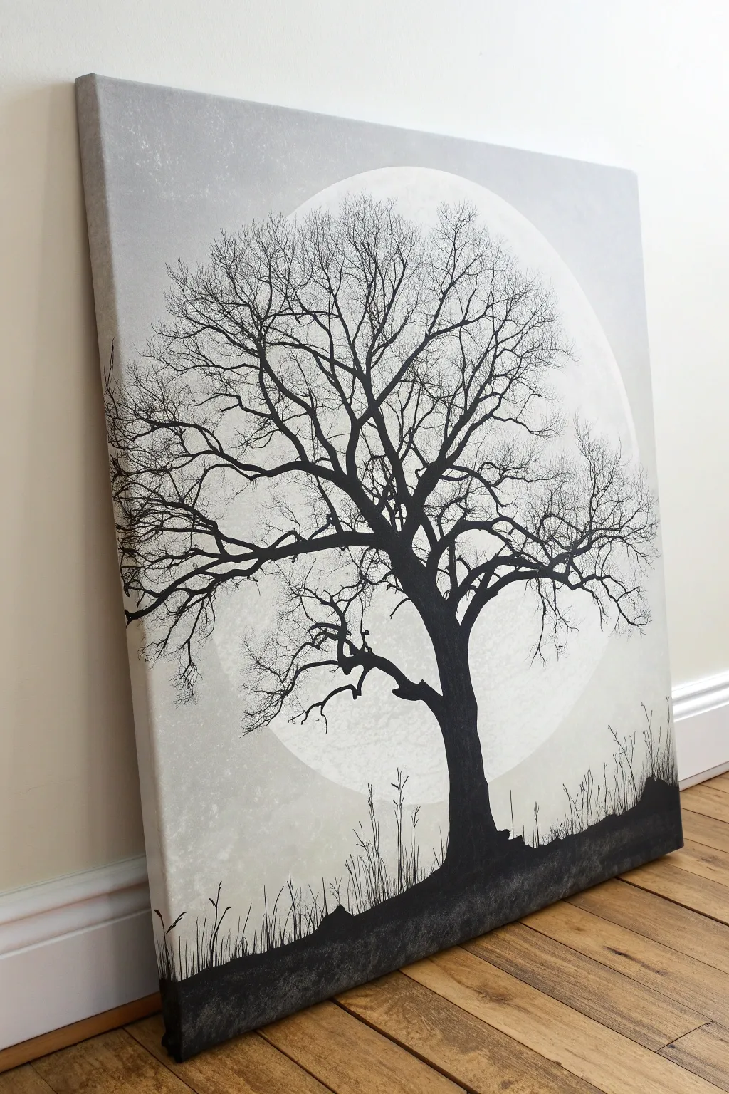
This striking black and white canvas captures the quiet drama of a leafless tree standing against a massive, hazy moon. By focusing on high contrast and delicate branch work, you’ll create a piece of art that feels both timeless and modern.
How-To Guide
Materials
- Large stretched canvas (square or rectangular)
- Acrylic paints: Titanium White, Mars Black, Neutral Grey
- Large flat brush (for background)
- Medium round brush (for main trunk)
- Fine liner brush (size 0 or 00, for twigs)
- Sponge or scrunched paper towel
- Pencil and large circular object (like a dinner plate or mixing bowl)
- Palette and water cup
- Easel or flat working surface
Step 1: Setting the Scene
-
Prime the canvas:
Start by giving your canvas a solid base coat of white acrylic paint. Even if the canvas is pre-primed, this fresh layer ensures your subsequent blending will be smoother and more consistent. -
Map the moon:
Once the base is dry, place your large circular object (like a mixing bowl) onto the upper center of the canvas. Lightly trace around it with a pencil to define the boundary of your moon. -
Create the atmospheric sky:
Mix a very light grey using a lot of white and a tiny dot of black. Using your large flat brush, paint the area outside the circle, working from the edges inward toward the pencil line. -
Add texture to the sky:
While the grey paint is still wet, dab a scrunched paper towel or a dry sponge randomly across the corners and edges. This lifts small amounts of paint and adds a subtle, cloudy texture that prevents the background from looking too flat. -
Paint the moon’s surface:
Fill in the circle with pure white paint. To make it glow, immediately mix a watery, translucent wash of very pale grey and sponge it lightly onto parts of the moon to create craters and depth, keeping the edges soft.
Ink Flow Tip
Add a few drops of water or flow improver to your black paint for the tiny twigs. This helps the paint glide off the liner brush smoothly for sharp, crisp lines.
Step 2: Growing the Tree
-
Anchor the ground:
Using black paint, create an uneven, rolling horizon line near the bottom of the canvas. Fill in the area below completely solid black to serve as the ground. -
Outline the trunk:
With a medium round brush and slightly watered-down black paint, sketch the main trunk. Position it slightly off-center for better composition, making the base wide and tapering as it moves upward into the moon. -
Fill the trunk:
Fill in the trunk shape with solid black paint. I like to make the edges slightly rough rather than perfectly smooth to mimic the texture of bark. -
Start the main branches:
Switch to a smaller round brush. Extend thick branches outward from the top of the trunk, ensuring they twist and turn organically rather than shooting out straight. -
Establish the canopy shape:
Continue splitting your main branches into smaller V-shapes. Spread them out so they fill the space in front of the moon, creating a balanced skeleton for the finer details.
Step 3: Fine Details
-
master the twig work:
Switch to your fine liner brush. This is the most crucial step—loading the brush with fluid, ink-like black paint allows you to drag long, unbroken lines without lifting your hand. -
Add intricate twigging:
Paint hundreds of tiny, fine lines extending from your secondary branches. Let them cross over each other and reach toward the top edge of the canvas to create that dense, leafless winter look. -
Refine the connection points:
Check where thin branches meet thick ones. Thickening these joining points slightly with a tiny dab of paint makes the structure look sturdy and realistic. -
Plant the grass:
Return to the bottom black strip. Using the liner brush again, flick quick, upward strokes to create tall grasses and weeds growing out of the silhouette. -
Final assessment:
Step back five feet from the canvas. Look for any bald spots in the canopy that need a few more twigs, or areas where the black paint needs a second coat to be truly opaque.
Spooky Variation
Mist the bottom of the canvas lightly with watered-down white acrylic after the black dries to create a low-hanging fog effect around the tree roots.
Hang your finished silhouette artwork in a well-lit room to let that stark contrast truly shine.

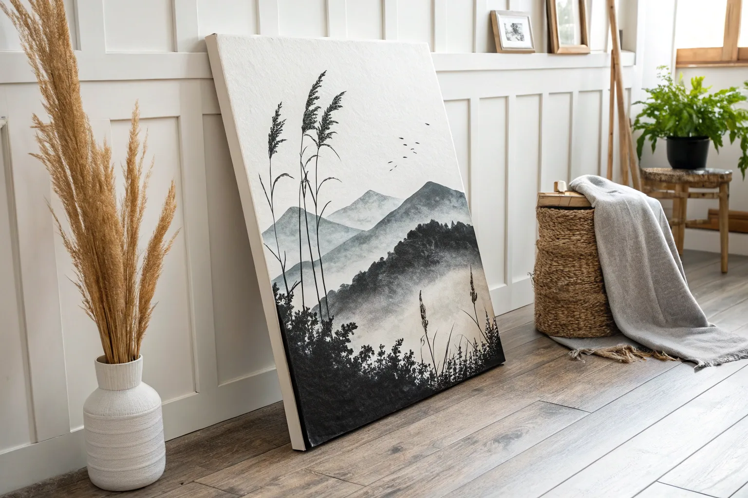
Minimal Mountain Range Layers
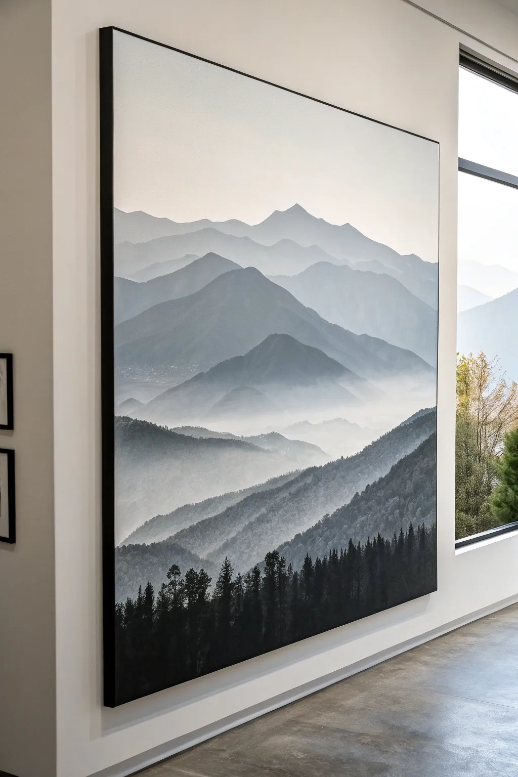
This striking large-scale canvas captures the serene majesty of a receding mountain range through careful layering of grayscale tones. By working from the faint background forward to the bold foreground, you’ll create a powerful sense of atmospheric depth and mystery.
Detailed Instructions
Materials
- Large stretched canvas (vertical orientation)
- Black acrylic paint
- Titanium white acrylic paint
- Large flat brush (2-3 inch) for blending
- Medium filbert brush
- Small fan brush or liner brush for trees
- Palette knife
- Mixing palette with plenty of space
- Water spray bottle
- Pencil
- Paper towels
Step 1: Planning the Horizon Layers
-
Prime the Surface:
Start by giving your large canvas a fresh coat of titanium white paint across the entire surface. This ensures a smooth, bright base for your sky and helps the subsequent glazes glide easier. -
Sketch the Ridgelines:
Using a pencil, lightly sketch 5-6 wavy, overlapping lines horizontally across the canvas. Space them out vertically, starting from the top third down to the bottom. These will mark the tops of your varying mountain ranges. -
Prepare Your Palette:
Squeeze out a large amount of white paint and a smaller amount of black on opposite sides of your palette. You will be mixing progressive shades of grey, starting with the very lightest.
Step 2: Painting the Sky and Background
-
Paint the Sky Gradient:
Mix a tiny speck of black into a pile of white to create an off-white, barely-there grey. Paint the sky area above your highest pencil line, blending it into pure white at the very top edge using a damp large flat brush. -
First Mountain Layer:
Add just a slightly larger touch of black to your previous mix. Paint the most distant mountain shape, keeping the top edge crisp but using water to fade the bottom of this shape into a misty blur before it hits the next pencil line. -
Second Mountain Layer:
Mix the next shade darker—a soft dove grey. Paint the next mountain range down. Focus on varying the peaks; allow some to be sharper and others rolling. I like to drag the paint downward and fade it out with a mist of water to create that foggy valley effect. -
Dry Blending:
While the paint is still slightly tacky, use a clean, dry brush to gently sweep horizontally across the bottom of the painted sections to soften any hard transitions into the ‘fog’.
Fog Looks Streaky?
If your mist transitions look rough or brushy, mist the canvas lightly with water and use a large, dry makeup brush (like a kabuki brush) to swirl and soften the paint while it’s still damp.
Step 3: Mid-Ground Ranges
-
Deepening the Values:
Create a medium-grey tone for the middle mountains. As you paint these central shapes, make the mountain silhouettes slightly larger and more dramatic than the distant ones. -
Adding Texture:
Switch to a filbert brush for this middle section. Instead of a flat wash, dab the paint slightly to suggest rugged terrain or distant forests on the slopes, still keeping the bottom edge of the range misty and faded. -
Valley Mists:
Mix a semi-transparent glaze of white paint and water. Lightly drag this over the ‘valleys’ between your mountain ridges to enhance the separation between layers. -
Fourth Layer Definition:
Mix a dark charcoal grey. Paint the mountain range just above the bottom third of the canvas. This layer should have stronger definition and less transparency than the ones above it. -
Slope Detail:
On this charcoal layer, use the edge of your brush to suggest downward-sloping ridges and ravines. The light source is diffuse, but slight highlights on the upper ridges can add dimension.
Pro Tip: Atmospheric Perspective
Remember the golden rule of landscapes: objects become lighter, bluer (or cooler grey), and less detailed the further away they are. Keep your background layers almost white for maximum depth.
Step 4: Refining the Foreground
-
The Darkest Range:
Mix a near-black grey (about 90% black, 10% white). Paint the large, sloping hill shape near the bottom, creating a solid base for your foreground forest. -
Roughing in Texture:
While this dark layer is wet, stipple the surface with a coarse brush to mimic the dense texture of a forest canopy seen from a distance. -
Planning the Trees:
Load a fan brush or liner brush with pure black paint. Along the very bottom edge and the lowest ridge line, start tapping in vertical lines to serve as tree trunks. -
Detailing Pine Shapes:
Using the corner of a fan brush or a small round brush, tap in zigzag motions down your tree trunks to create pine branches. Make the trees vary in height for realism. -
Establishing the Silhouette:
Ensure the bottom-most trees are solid black and densely packed. As you move slightly higher up the ridge, allow the trees to be slightly smaller and spaced out to show perspective. -
Final Mist Glaze:
Once everything is fully dry, assess the ‘fog’. If you need more depth, dry-brush a very small amount of white paint horizontally at the base of the darkest mountains to push them back slightly from the trees.
Step back and admire how simple grayscale tones can create such a vast, immersive world on your wall
City Skyline in Bold Contrast
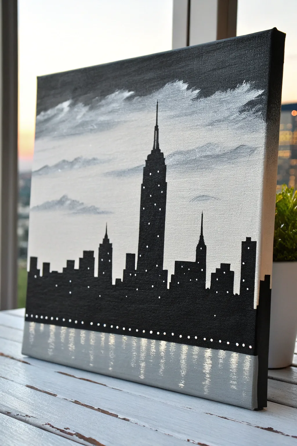
Capture the iconic energy of New York City with this striking high-contrast skyline painting that blends shimmering metallics with bold silhouettes. The simple limited palette makes it achievable for beginners while delivering a sophisticated, modern look perfect for any apartment wall.
Step-by-Step
Materials
- Square stretched canvas (e.g., 12×12 or 16×16 inches)
- Black acrylic paint
- Titanium white acrylic paint
- Silver metallic acrylic paint
- Wide flat brush (1-2 inch) for background
- Medium flat brush for water/reflections
- Small round detail brush
- Ruler or straight edge
- Pencil
- Palette or mixing plate
- Cup of water and paper towels
Step 1: Setting the Scene: The Sky
-
Prepare the gradient:
Begin by squeezing out white, silver, and a tiny dot of black paint onto your palette. You want a predominate mix of silver and white for a bright, atmospheric sky. -
Apply the base sky:
Using your wide flat brush, paint the upper two-thirds of the canvas with a mix of white and silver. Keep your brushstrokes horizontal and loose to mimic the natural flow of the atmosphere. -
Create cloudy textures:
While the base layer is still slightly wet, pick up a little bit of grey (mix white with a speck of black) on the corner of your brush. Dab and sweep this gently into the sky area to create soft, drifting clouds. -
Refine the clouds:
Now, take pure white paint and highlight the tops of these cloud formations. Use a light, feathery touch to blend the edges into the silvery background so they don’t look too stiff. -
Establish the horizon line:
Decide where your water line begins. Paint a faint, straight horizontal guideline about one-fifth of the way up from the bottom using a light grey wash. Everything below this will process differently.
Straight Edge Secret
Use drafting tape or a ruler to guide your brush for the straight sides of the buildings, ensuring crisp, professional architectural lines.
Step 2: Building the City
-
Draft the silhouette:
Once the sky is completely dry, lightly sketch the outline of the buildings with a pencil. Place the Empire State Building slightly off-center for a dynamic composition, making it the tallest peak. -
Vary building heights:
Sketch the surrounding buildings, ensuring you vary their heights and widths. Add iconic details like the spire on the Chrysler Building to the right and smaller blocky rectangles for general skyscrapers. -
Fill the silhouette:
Using your medium flat brush and pure black acrylic paint, fill in the sketched city shapes. Apply the paint thickly to ensure it is opaque; you don’t want the background sky showing through the buildings. -
Sharpen the edges:
Switch to your small detail brush to refine the edges of the buildings. Use this brush to paint the delicate antenna spire of the main skyscraper, keeping the line as thin and straight as possible. -
Paint the water base:
Below the city skyline, paint a quick, solid coat of grey (a mix of silver and a drop of black). This acts as the mid-tone for the water.
Step 3: Illumination and Reflection
-
Add window lights:
Dip the very tip of your smallest brush (or a toothpick) into white paint. Dot random patterns of lights onto the black buildings. Be sparse; clusters of lights look more realistic than a uniform grid. -
Detail the main tower:
For the central skyscraper, add vertical columns of white dots to mimic its illuminated windows. I usually group these slightly tighter near the top spire section. -
Paint the waterline lights:
along the very bottom edge of the black city silhouette, paint a horizontal row of evenly spaced white dots. These represent streetlights along the waterfront. -
Create reflections:
Using a clean flat brush with silver paint, drag vertical strokes downward from the city into the water area. Use a ‘dry brush’ technique here—wipe most paint off first—to let the grey background show through. -
Strengthen the shimmer:
Add white highlights into the water directly beneath the tallest buildings. Use zig-zag or wobbly horizontal motions to simulate ripples distorting the light reflections. -
Add the edge wrap:
Extend the painting onto the sides of the canvas if you are not framing it. Continue the grey sky and black water line around the edges for a finished, gallery-ready appearance.
Make it Metallic
Mix a clear glitter medium into the white paint used for the window lights. When the light hits the canvas, the city will literally sparkle.
Step back and admire your sophisticated urban landscape
BRUSH GUIDE
The Right Brush for Every Stroke
From clean lines to bold texture — master brush choice, stroke control, and essential techniques.
Explore the Full Guide
Simple Botanical Line Art
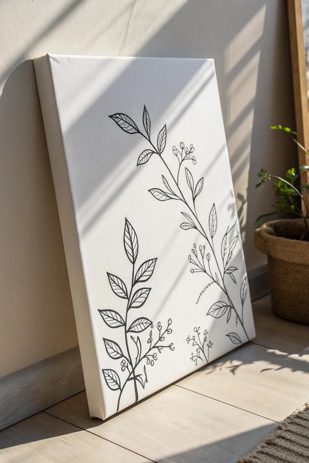
Capture the delicate beauty of nature with this stark yet elegant line art project. Using high-contrast black ink against a crisp white canvas, you will create two sweeping botanical stems that bring a modern, organic touch to any room.
Detailed Instructions
Materials
- Rectangular stretched canvas (e.g., 16×20 inches)
- White acrylic gesso (optional, for smoother texture)
- Wide flat brush (for gesso)
- Pencil (HB or 2H)
- White eraser
- Ruler (optional)
- Black acrylic paint or black paint marker (fine and medium tips)
- Fine liner brush (if using paint)
- Palette or small dish
- Paper towels
- Clear matte varnish spray
Step 1: Preparation & Sketching
-
Prime the Surface:
Even if your canvas is pre-primed, applying an extra coat of white gesso can smooth out the heavy weave texture. Use a wide flat brush to apply a thin, even layer and let it dry completely. -
Map Out the Composition:
Visualize the placement of the two main stems. The larger stem should start from the bottom right and sweep diagonally upward toward the top center. The smaller stem will sit in the bottom left corner. -
Draw the Primary Stem Lines:
Lightly sketch the central spine of the main right-side plant using your pencil. Create a gentle, organic curve rather than a straight line to mimic natural growth. -
Sketch the Secondary Stem:
Draw the central line for the smaller plant on the lower left. This one should stand more upright but clearly distinct from the larger neighbor. -
Add Leaf Placement:
Mark the points along the stems where leaves will emerge. Alternate them—left, then right—as you move up the stem to create balance. -
Refine Leaf Shapes:
Sketch the outline of the leaves. Aim for an elongated almond shape with pointed tips. Keep the sizes varied, with larger leaves at the bottom and smaller ones near the top. -
Detail the Floral Buds:
Sketch small clusters of buds or berries branching off near the base of the stems and interspersed between leaves. These should be simple circles on thin stalks.
Fixing Shaky Lines
If your lines aren’t smooth, don’t panic. Intentionally thicken the line slightly to hide the wobble, or embrace it—organic lines often look more natural than perfect ones
Step 2: Inking & Painting
-
Outline the Stems:
Using a medium-tip black paint marker or a liner brush loaded with fluid black acrylic, carefully trace over your pencil lines for the main stems. Keep your hand steady and maintain a consistent line weight. -
Outline the Leaves:
Trace the perimeter of each leaf. Ensure the points where the leaf stems (petioles) meet the main branch are clean and connected. -
Add the Midribs:
Draw a central vein (midrib) down the center of each leaf. I find it helps to stop this line just short of the leaf tip to keep the look airy. -
Draw Leaf Veins:
Inside each leaf, add diagonal veins branching from the midrib. Keep these lines slightly thinner than the outline if possible for a delicate effect. -
Define the Buds:
Trace the small floral clusters. You have the option here to fill the tiny circles in solid black or leave them as open rings; the reference shows open rings for a lighter feel. -
Thicken Key Intersections:
Go back to where the smaller branches meet the main stem. Add a tiny bit of weight or thickness to these V-shapes to mimic the natural joints of a plant. -
Check Consistency:
Step back and look at the artwork from a distance. If some lines look too faint compared to others, carefully go over them a second time to darken the black.
Try Gold Leaf
For a luxe twist, apply gold leaf on just the berries or buds. The metallic shine against the matte black and white creates a stunning, gallery-worthy focal point
Step 3: Finishing Touches
-
Dry and Erase:
Allow the black paint or ink to dry fully—wait at least an hour to be safe. Once dry, gently erase any visible pencil marks remaining around the design. -
Clean Up Edges:
If you accidentally smudged any black ink, use a small brush with white paint or gesso to tidy up the mistakes and restore the crisp background. -
Seal the Work:
To protect the stark contrast from dust and fading, spray the entire canvas with a clear matte varnish in a well-ventilated area.
Place your finished canvas where natural light can play across the surface, highlighting the elegant simplicity of your work
Abstract Brushstroke Statement Piece
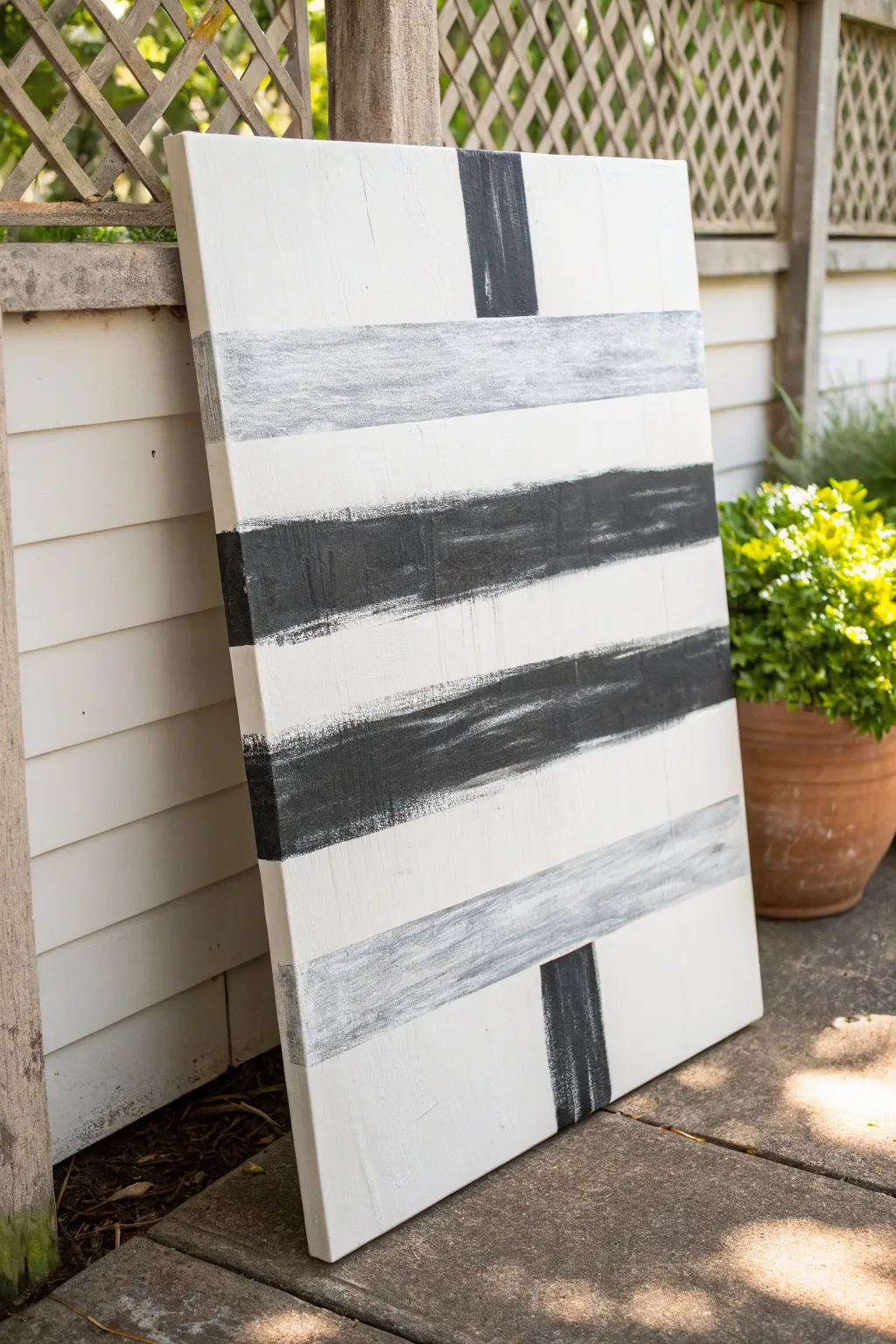
This arresting vertical canvas combines bold, graphic lines with soft, textured brushwork for a modern minimalist look. The alternating bands of deep charcoal and distressed grey create a balanced yet spontaneous rhythm that fits perfectly in contemporary spaces.
Step-by-Step
Materials
- Large rectangular stretched canvas (approx. 24×36 inches or similar)
- White acrylic paint (heavy body preferred)
- Black acrylic paint
- Grey acrylic paint (or mix white + black)
- Large 3-inch flat wash brush or chip brush (rough bristles are good)
- Painter’s tape or masking tape (1.5 to 2 inch width)
- Palette or paper plate
- Water cup
- Paper towels
- Ruler or measuring tape
- Pencil
Step 1: Setting the Foundation
-
Prime the Surface:
Even if your canvas is pre-primed, apply a fresh coat of white acrylic paint over the entire surface. This gives you a uniform texture to work with and ensures the background is a bright, opaque white. -
Create Texture:
While the white base coat is still wet, use long, vertical strokes with your large brush. This subtle brush texture will show through later layers and add depth to the minimal design. -
Let it Dry:
Allow the base coat to dry completely. This is crucial because you will be applying tape soon, and you don’t want to peel up your fresh white paint. Give it at least 30-40 minutes. -
Plan the Layout:
Visualize the composition: you have two thinner grey bands, two thick black bands, and two short vertical accent marks. Lightly mark the positions with a pencil on the edges of the canvas to guide your taping. -
Tape the Horizontal Lines:
Apply strips of painter’s tape horizontally across the canvas to define where your painted stripes will go. Press the edges of the tape down firmly to minimize bleed-through, but don’t worry about perfection; this style embraces a bit of roughness.
Step 2: Painting the Horizontal Bands
-
Prepare the Grey Mix:
Mix a small amount of black into your white paint to create a medium-light grey. Alternatively, use a tube grey. You want this color to be distinct from the white background but much lighter than the black bands. -
Dry brush the Grey Bands:
Load your large flat brush with a very small amount of grey paint. Wipe most of it off on a paper towel. This ‘dry brush’ technique is key. Creating the top and bottom horizontal bands requires a light touch so the canvas texture shows through. -
Feather the Edges:
Apply the grey paint within the taped area using horizontal strokes. Allow the brush to run out of paint as you go, creating a scratchy, uneven finish rather than a solid block of color. -
Paint the Bold Black Bands:
Switch to pure black paint for the two central sets of stripes. These bands are heavier and darker. Apply the paint more generously here, though keeping a slight dry-brush effect at the very edges can maintain stylistic consistency. -
Double-Check Density:
Look at the black bands. If they look too solid, lightly drag a clean, dry brush through the wet paint horizontally to lift a little pigment and expose the texture. -
Remove Horizontal Tape:
Carefully peel away the horizontal tape strips while the paint is still slightly tacky. Pulling slowly at a 45-degree angle helps keep the lines relatively clean.
Pro Tip: The Bristol Trick
Use a rough ‘chip brush’ from a hardware store instead of a fine art brush. The stiff, uneven bristles naturally create that scratchy, weathered texture effortlessly.
Step 3: Adding Vertical Accents
-
Dry Completely:
Ensure the horizontal bands are fully dry before proceeding. Touching wet black paint while measuring for the next step can cause unwanted smudges. -
Tape the Vertical Marks:
Place vertical strips of painter’s tape to create the two short vertical accents—one at the top center and one near the bottom right. Use the horizontal lines you just painted as the stopping points for your tape. -
Paint the Vertical Accents:
Using your black paint, fill in these vertical rectangular spaces. I like to use vertical brushstrokes here to contrast with the horizontal movement of the main stripes. -
Create Distress:
Before the vertical accents dry, use a paper towel to lightly blot or dab the paint. This lifts some color and ensures these marks look weathered like the rest of the piece, not like perfect stickers. -
Remove Vertical Tape:
Gently remove the final pieces of tape to reveal the vertical accents. -
Touch Up:
Inspect the edges where the paint meets the white background. If there is significant bleeding under the tape, use a small brush with white paint to crisp up the line, or leave it if you prefer the organic look. -
Side Cleanup:
Check the sides of your canvas. Decide whether you want the stripes to wrap around the edges or if you prefer to paint the sides a solid white for a clean framed look. -
Final Varnish:
Once the entire painting has cured (usually 24 hours), apply a matte varnish to protect the surface without adding unwanted gloss.
Troubleshooting: Bleeding Tape
If paint bled under your tape, don’t panic. Wait for it to dry, then take a small flat brush with titanium white paint and carefully cut back over the mistake to clean the edge.
Hang this commanding piece in a well-lit area where the natural light can highlight the textures of your dry-brush technique

PENCIL GUIDE
Understanding Pencil Grades from H to B
From first sketch to finished drawing — learn pencil grades, line control, and shading techniques.
Explore the Full Guide
Graphic Shapes and Clean Geometry
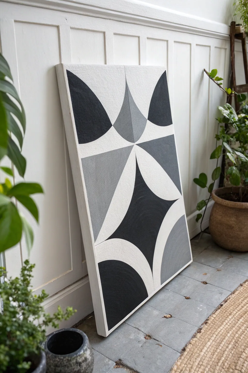
Embrace the bold simplicity of mid-century graphic design with this striking abstract painting. Using sharp geometric intersections and a strict greyscale palette, you will build a sophisticated artwork that feels both retro and contemporary.
Step-by-Step Guide
Materials
- Large rectangular stretched canvas (at least 24×36 inches)
- Acrylic paints: Carbon Black, Titanium White, Neutral Grey
- High-density foam roller
- Flat shader brushes (various sizes)
- Angle brush (for sharp edges)
- Painter’s tape or drafting tape
- Large compass or string and pencil
- Long ruler or T-square
- Pencil and eraser
- Matte gel medium (optional, for texture)
- Easel or flat work surface
Step 1: Planning and Mapping
-
Prepare the Surface:
Begin by ensuring your canvas is taut and clean. Give it a base coat of Titanium White using a foam roller to establish a bright, uniform background. Let this dry completely before moving on. -
Mark the Vertical Center:
Using your ruler, measure the exact width of the canvas and draw a very light vertical line down the center. This axis is crucial for the symmetry of the design. -
Establish the Horizontal Midpoint:
Measure the height and mark a horizontal line roughly two-thirds of the way up the canvas. This painting isn’t perfectly centered; the ‘starburst’ intersection sits slightly higher than the middle. -
Draw the Primary Arches:
Using a large compass (or a string tied to a pencil and pinned to the central axis focal point), draw two large semi-circles or arches that sweep downwards from the central intersection point. -
Map the Upper Quadrants:
From that same high intersection point, draw inverted arches sweeping upwards towards the top corners. These will form the top black shapes and the central grey spike. -
Create the Lower Diamond:
Measure downward from your central point to create the large diamond shape in the bottom half. Use your curved tool to bow the sides of the diamond inward, giving it that distinct concave graphic look. -
Refine the Intersections:
Review your pencil lines. The design relies on ‘kissing’ curves—where shapes meet at sharp points. Erase any stray marks and darken the final lines slightly so they are visible through the first layer of paint.
Stay Sharp
Use a hairdryer on a cool setting to speed up drying between taped sections, ensuring you don’t smudge wet paint.
Step 2: Painting the Structure
-
Tape the First Shapes:
Choose non-adjacent shapes to paint first—for example, the top left black curve and the bottom central black diamond. Apply painter’s tape firmly along the pencil lines. -
Seal the Tape Edges:
I always brush a tiny amount of the base color (white) or matte medium along the tape edge first. This blocks the pores and prevents the dark paint from bleeding underneath. -
Apply the Black:
Load a flat brush with Carbon Black. Paint the designated black sections, using smooth strokes. You may need two coats to get that opaque, solid look. -
Peel and Wait:
Remove the tape while the paint is still slightly tacky to avoid ripping the dried film perfectly crisp lines. Allow those black sections to cure fully. -
Tape the Grey Zones:
Once the black is dry, tape off the areas designated for grey—specifically the central top ‘tear drop’ spike and the lower right corner section. -
Mix Your Greys:
Prepare a mid-tone grey. If you want subtle variation like the original, mix a slightly lighter grey for the central spike and a darker grey for the triangular section on the left. -
Paint the Grey Sections:
Apply the grey paint to the taped sections. Use an angle brush to get really sharp points where the grey meets the white negative space. -
Freehand the Tight Corners:
Some intersections might be too tight for tape. Use a small angle brush or liner brush to carefully fill in the points where black, white, and grey meet, ensuring no canvas shows through. -
Texture the Surface:
The reference image has a slight linen texture. To mimic this, you can stipple the final wet layer of paint slightly with a dry brush, or simply let the canvas weave show through by not over-polishing the paint.
Color Shift
Swap the grey for navy blue or terracotta to adapt this geometric style to a warmer or coastal interior theme.
Step 3: Final Touches
-
Clean Up Edges:
Inspect all your color boundaries. If any white lines are messy, use Titanium White on a small detail brush to cut back in and sharpen the shapes. -
Paint the Canvas Sides:
Decide whether to wrap the design around the edges or paint the sides a solid white for a framed look. Solid white usually looks cleaner for this graphic style. -
Finishing Varnish:
Once the entire piece is bone dry (give it 24 hours), apply a coat of matte varnish. This unifies the sheen of the different paint colors and protects that crisp white from dust.
Hang your geometric masterpiece in a well-lit spot to let the sharp contrast define the room
Yin-Yang Duality With Two Forms
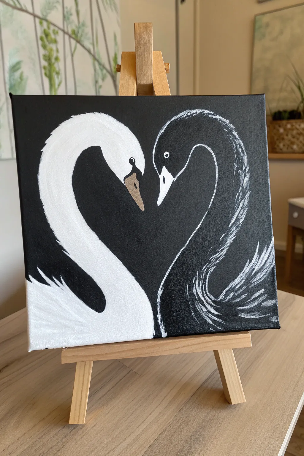
Embrace the elegance of balance with this striking painting featuring two swans forming a heart shape against a stark black background. The contrast between the solid white swan and the outlined black swan creates a beautiful visual play on positive and negative space.
How-To Guide
Materials
- Square stretched canvas (approx. 10×10 or 12×12 inches)
- Black acrylic paint (Matte or Carbon Black)
- White acrylic paint (Titanium White)
- Beige or light taupe acrylic paint (for the beak)
- Flat shader brush (medium size)
- Round detail brush (small size, approx. #0 or #1)
- Pencil or white chalk pencil
- Palette or paper plate
- Cup of water and paper towels
Step 1: Preparation & Background
-
Prime the canvas:
Begin by covering the entire front and visible sides of your canvas with a solid coat of black acrylic paint. I find using a larger flat brush helps get smooth, even coverage quickly. -
Let it dry completely:
Wait for the black background to dry fully. If the canvas shows any white spots or streaks, apply a second coat to ensure a deep, opaque black surface. -
Sketch the outline:
Using a white chalk pencil or a regular pencil lightly, sketch the basic heart shape that the two swan necks will form in the center. Lightly map out the S-curve of the necks and the bulky shapes of the bodies at the bottom.
Chalk It Up
Use a white chalk pencil for your initial sketch on the black canvas. It’s visible while painting but wipes away easily with a damp Q-tip if you make a mistake or change lines.
Step 2: Painting the White Swan
-
Fill the body shape:
Load your medium brush with Titanium White. Start filling in the body of the left swan, following the curve of the neck down to the base. -
Create feathered edges:
At the back of the white swan’s neck and along the tail feathers, use a flicking motion with your brush to create a jagged, feather-like texture rather than a smooth line. -
Refine the opacity:
White paint over black often looks translucent at first. Let the first layer dry to the touch, then apply a second coat to make the white bright and solid. -
Paint the face details:
Switch to your small detail brush. Carefully paint around the eye area (leaving a small black circle) and shape the beak area. -
Add the beak color:
Mix a tiny amount of beige or taupe paint. Use the detail brush to fill in the beak of the white swan, keeping the tip sharp.
Metallic Accents
Swap the beige beak paint for metallic gold or copper acrylic. This adds a subtle shimmer that elevates the piece from simple monochrome to elegant decor.
Step 3: Painting the Black Swan
-
Outline the silhouette:
For the right swan, we aren’t filling it in. Instead, use thin white paint on your detail brush to outline the top curve of the head and the back of the neck. -
Texture the neck:
Use very short, scratchy strokes with white paint along the back of the neck to mimic ruffled feathers catching the light. Keep the front throat line smooth. -
Detail the eye:
Paint a small white circle for the eye. Once dry, add a tiny dot of black in the center to create the pupil. -
Paint the beak:
Paint the beak solid white to make it stand out against the black background. Add a small black line or distinct shape near the base of the beak for realism. -
Define the wing feathers:
Moving to the body, use long, sweeping, curved strokes of white to suggest the tips of the wing feathers. Leave plenty of black space showing through; you are only highlighting the edges. -
Create the tail feathers:
At the bottom right, flick the brush upward and outward with white paint to create loose, expressive tail feathers.
Step 4: Final Touches
-
Refine the heart shape:
Look at the negative space between the two beaks and necks. Use black paint to tidy up edges if needed to ensure the ‘heart’ gap is clearly defined. -
Check for contrast:
Strengthen any white highlights on the black swan that may have faded as they dried. -
Add the catchlight:
Place a minuscule white dot inside the black eye of the white swan to bring it to life. -
Clean up edges:
Inspect the painting for any unwanted smudges or chalk lines. Use black paint to cover mistakes or a damp cloth to wipe away remaining chalk sketch lines.
Allow your painting to dry completely before displaying this symbol of harmony and balance


Face Profile in Negative Space
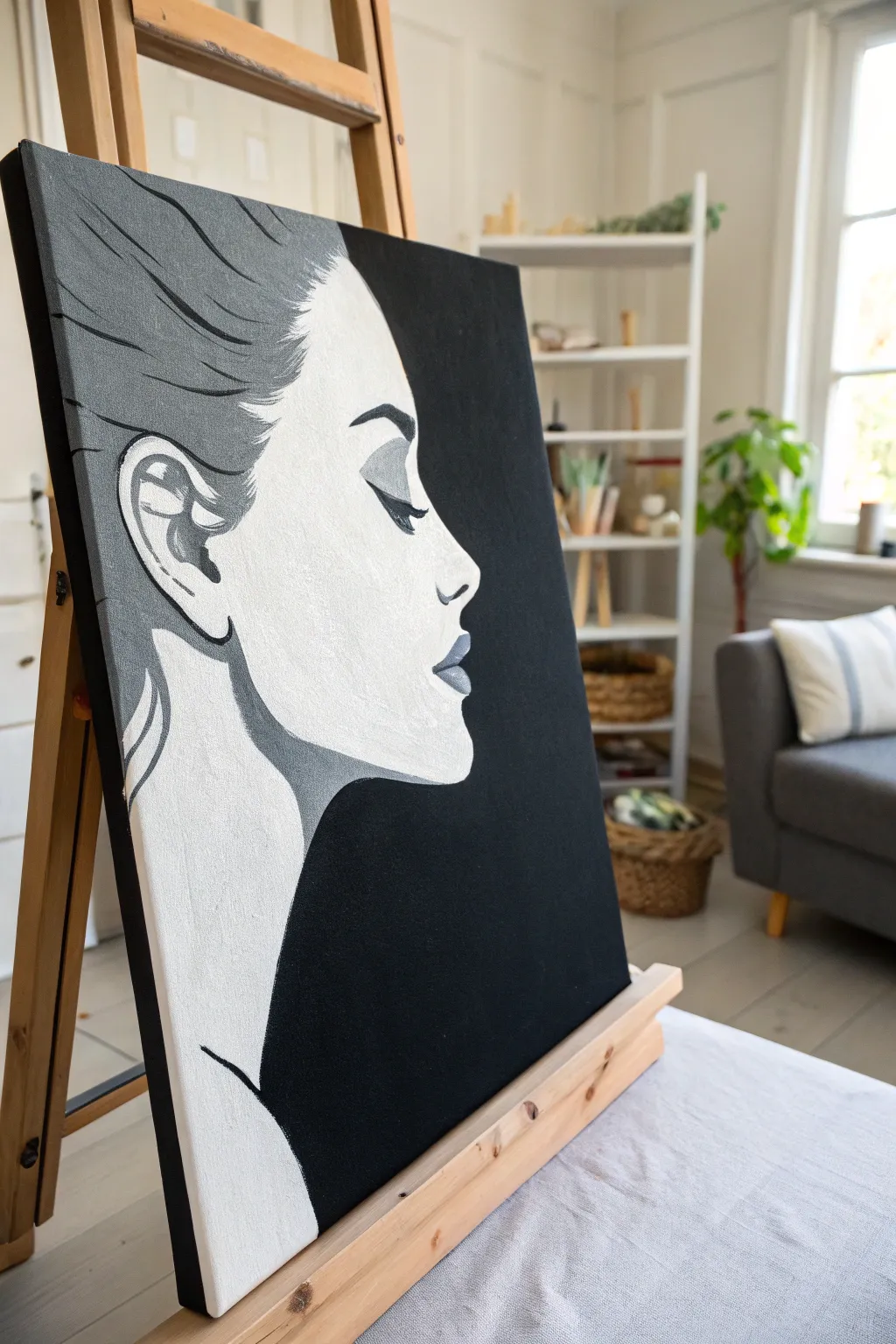
Capture the stark beauty of a silhouette with this high-contrast acrylic painting project. By balancing deep black negative space against bright white highlights and soft grey mid-tones, you’ll create a striking, modern portrait that demands attention.
Detailed Instructions
Materials
- Stretched canvas (16×20 inches or larger recommended)
- Acrylic paint: Mars Black, Titanium White
- Pencil (HB or 2B)
- Eraser
- Large flat brush (1-inch width)
- Medium filbert brush
- Small round detail brush (size 0 or 1)
- Palette or mixing plate
- Water cup and paper towels
- Easel (optional but helpful)
Step 1: Preparation & Sketching
-
Grid or reference setup:
Begin by observing the reference image closely. Visualize the canvas divided into thirds; the face profile occupies the left two-thirds, while the negative space dominates the right and bottom right. -
Outline the profile:
Lightly sketch the silhouette of the face using your pencil. Focus on the smooth curve of the forehead, the indent of the eye socket, the bridge of the nose, and the fullness of the lips. -
Define the hair and neck:
Sketch the flowing lines of the hair sweeping back from the forehead. Draw the long, elegant curve of the neck extending down towards the bottom edge of the canvas. -
Mark shadow areas:
Inside your outline, lightly draw the boundaries where the shadows will fall. Specifically, mark the shapes for the ear, the eyelid crease, the nostril, the lips, and the shadow under the jawline.
Keep it Crisp
For the sharpest profile edge against the black background, use a little water on your liner brush to improve paint flow, or use masking tape for the long straight sections of the neck.
Step 2: Base Layers & Blocking
-
Mix a mid-tone grey:
On your palette, mix a substantial amount of black and white to create a medium steel grey. This will be the primary color for the hair and shadow details. -
Paint the background:
Using your large flat brush and pure glorious Mars Black, paint the entire negative space to the right of the face profile. Ensure the edge where the background meets the face is crisp and clean. -
Fill the silhouette base:
Once the black background is safe, switch to a clean brush and fill in the main face area with Titanium White. Two coats might be necessary to ensure the canvas weave is fully covered and the white is opaque. -
Block in hair mass:
Apply your mixed grey to the hair area. Use long, sweeping strokes that follow the direction of the hair strands, moving from the forehead towards the back of the head.
Metallic Twist
Replace the standard grey mix with silver metallic acrylic paint for the hair and shadows. It catches the light beautifully and adds a modern, glamorous texture.
Step 3: Defining Features
-
Paint the eye shadow:
With the medium grey and a smaller brush, carefully paint the almond shape of the eyelid and the crease above it. This establishes the heavy-lidded look. -
Detail the ear:
Reference the complex shapes within the ear. Paint the inner shadows grey, leaving distinct white areas to represent the cartilage catching the light. -
Define the jawline:
Paint a thick, curving grey line under the chin and along the neck muscle. This shadow separates the face from the neck and adds three-dimensional volume. -
Add lip definition:
Paint the lips grey. If you want more depth, mix a slightly darker charcoal grey for the corners of the mouth and the line between the lips.
Step 4: Refinement & Details
-
Intensify the blacks:
Switch back to your small round detail brush and pure black paint. Carefully paint the eyelashes, the eyebrow arch, and the deepest crevices inside the ear. -
Refine hair texture:
Using the detail brush, add thin black lines into the grey hair mass to suggest individual strands and separation. I find that quick, flicking motions work best here. -
Clean up edges:
Inspect the boundary between the white face and the black background. Use your small brush to sharpen any wobbly lines or fix smudges. -
Highlight the lips:
Mix a very light grey (almost white) and add a tiny dab to the center of the lower lip to make it look moist and plump. -
Final smooth check:
Look for any patchiness in the large black area. Apply a second coat of black if needed to achieve a deep, velvety void.
Step back and admire the sophisticated drama of your high-contrast portrait
Animal Silhouette With a Spotlight Glow
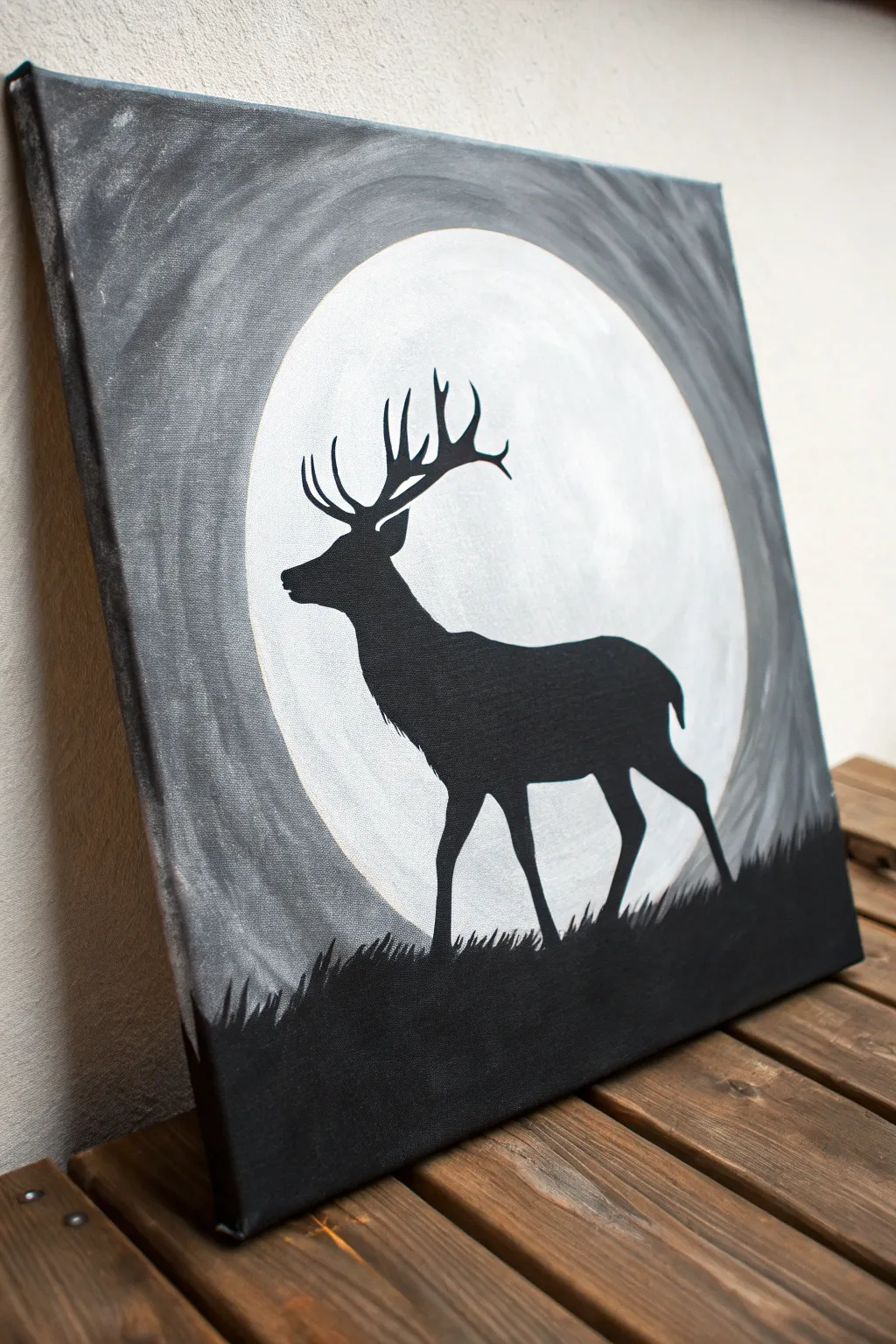
This striking high-contrast piece utilizes simple silhouette techniques against a glowing lunar backdrop to create a dramatic atmosphere. The swirling grey sky adds depth and movement, making the still figure of the stag pop with quiet intensity.
Step-by-Step Guide
Materials
- Canvas (square, e.g., 12×12 inches)
- Acrylic paints: Titanium White, Mars Black
- Large flat brush (1-inch width)
- Medium round brush
- Small liner or detail brush
- Circular object for tracing (plate or bowl)
- Pencil
- Palette or paper plate
- Water cup and paper towels
Step 1: Planning the Composition
-
Trace the moon:
Place your circular object in the center of the canvas. It should take up a significant portion of the space, leaving a few inches of border around the edges. Lightly trace the circle with a pencil. -
Sketch the horizon:
Draw a faint, slightly uneven horizontal line across the bottom fifth of the canvas. This doesn’t need to be straight; a little waviness suggests natural terrain. -
Outline the stag:
Sketch the silhouette of the stag standing on the horizon line. Focus on the main shapes: the curve of the chest, height of the legs, and the branching antlers. Don’t worry about shading; just get the outline right.
Fixing Wobbly Circles
If your hand isn’t steady enough to paint a perfect circle around the moon, wait for the white paint to dry fully, then place your bowl back over it as a shield while painting the grey sky.
Step 2: Painting the Sky and Moon
-
Paint the bright moon:
Using a flat brush, fill in the moon circle with pure Titanium White. Apply a second coat if the canvas texture is still visible, ensuring a solid, bright opacity. -
Mix your grey tone:
On your palette, mix white with a very small dot of black to create a medium-light grey. I like to keep this mix slightly imperfect so it has natural variation. -
Start the background swirl:
Begin painting the area immediately outside the moon’s pencil line. Use curved brushstrokes that follow the round shape of the moon, radiating outward. -
Darken the edges:
As you move toward the canvas corners, gradually mix a bit more black into your grey paint. This creates a vignette effect that focuses attention on the center. -
Blend the sky:
While the paint is still wet, use a clean, dry brush to soften the transitions between the lighter grey near the moon and the darker grey at the corners. The strokes should maintain that circular, swirling motion. -
Refine the moon’s edge:
Carefully cut in around the white moon with your grey paint to crisp up the circle. If you accidentally painted inside the line, you can touch up the white later once the grey is dry.
Make It Mystical
Mix a tiny drop of metallic silver paint into the white for the moon or the grey sky swirls. It adds a subtle shimmer that catches the light beautifully when viewed from differnt angles.
Step 3: Creating the Silhouette
-
Fill the ground:
Switch to your medium brush and load it with pure Mars Black. Paint the entire bottom section below your horizon line solid black. -
Add grass texture:
Using the tip of a smaller brush, flick short, quick strokes upward from the black ground into the bottom of the moon and sky area. Vary the height and angle to mimic wild grass. -
Block in the body:
Fill in the main body of the stag with solid black paint. Use a round brush for smooth curves along the back and chest. -
Paint the legs:
Carefully paint the legs. Remember that deer legs are quite slender; use a smaller brush here to keep lines crisp, paying attention to the bent joints. -
Detail the head and neck:
Paint the neck and head profile. The snout should be tapered, and adding small tufts of fur texture on the back of the neck adds realism.
Step 4: Final Details
-
Paint the antlers:
Switch to your finest liner brush. Paint the main beams of the antlers extending up and back. Keep your hand steady and use very light pressure. -
Add the tines:
Add the smaller points (tines) branching off the main antler beams. Taper them to sharp points at the ends for a realistic silhouette look. -
Check opacity:
Once the black paint dries, check for any patchy spots where the canvas shows through. Apply a second coat of black to the silhouette if needed to make it solid and opaque. -
Final touch-ups:
Inspect the white moon. If any grey or black smudged into it, carefully paint over the mistake with white for a flawless finish.
Hang your artwork in a spot that receives good light to let the contrast really shine
Foggy Forest Value Study
Capture the serene depth of a foggy forest with this large-scale acrylic value study. By layering washes of gray and building up to deep blacks, you’ll create a striking atmospheric perspective where trees seem to fade into the mist.
Step-by-Step Tutorial
Materials
- Large vertical canvas (e.g., 24×36 inches or larger)
- Black acrylic paint (heavy body preferred)
- White acrylic paint (heavy body preferred)
- Glazing medium or matte medium
- Large flat brush (2-3 inches) for background
- Medium filbert brush
- Small round detail brush
- Rigger or liner brush for branches
- Palette knife (optional for texture)
- Water container and mixing palette
- Spray bottle with water
Step 1: Setting the Atmosphere
-
Prime the Surface:
Begin by covering your entire canvas with a generous coat of titanium white paint. While this is wet, start mixing a very pale gray on your palette. -
Create the Furthest Mist:
While the white base is still damp, brush in your pale gray mix near the vertical center of the canvas. Use horizontal strokes and blend it upwards and downwards into pure white to create a soft, undefined foggy area. -
Establish the Backdrop Trees:
Mix a slightly darker, transparent gray by adding plenty of glazing medium or water to a drop of black paint. Paint faint, vertical shapes to represent the most distant trees. These should be barely visible, like ghosts in the fog. -
Soften the Edges:
Before the distant trees dry completely, use a clean, dry brush to feather their edges. This blurring effect is crucial for pushing them into the background. -
Layer the Mid-Ground:
Once the first layer is dry, mix a cool mid-tone gray. Paint a second row of trees, slightly thicker than the first. These should be more distinct but still hazy. -
Add Canopy Shapes:
Using the corner of a filbert brush, tap in loose, irregular shapes near the tops of your mid-ground trees to suggest pine needle clusters. keep these translucent and light.
Mist looks streaky?
If your fog blending looks harsh, use a dry, soft mop makeup brush to buff out brushstrokes while the paint is still wet. This creates a perfect airbrushed look.
Step 2: Building the Foreground
-
Mix Deep Charcoal:
Create a dark charcoal color, almost black but not quite. I usually keep pure black in reserve for the final touches to maintain depth. -
Paint the Dominant Trunks:
Identify where you want your main foreground trees. Using a flat brush turned on its edge, paint long, confident vertical lines from the bottom extending off the top of the canvas. -
Texture the Bark:
While the dark paint is wet, drag a mostly dry brush with a tiny bit of white down the side of the trunk. This dry-brushing technique mimics the rough texture of bark catching the diffuse light. -
Anchor the Bottom:
At the very bottom of the canvas, paint dark, heavy shadows and small shrub-like shapes. This grounds the painting and gives the tall trees a foundation. -
Add Low-Level Mist:
Mix a glaze of water and white paint. Lightly brush this over the bottom few inches of the dark trunks. This ‘floating mist’ separates the foreground from the ground, adding immense scale.
Custom Scale
For a more dramatic perspective, paint the foreground tree trunk much wider at the bottom than the top, implying the viewer is looking up at a towering giant.
Step 3: Detailing and Refining
-
Paint Branches:
Switch to a liner or rigger brush with thinned dark paint. Pull fine branches extending horizontally from the main trunks. Remember that pine branches often droop slightly before curving up at the tips. -
Stipple Pine Needles:
Using a small round brush or an old, splayed bristle brush, stipple dark clumps of pine needles onto the new branches. Focus these heaviest on the foreground trees. -
Mist Glazing:
If any tree looks too stark or contrasting against the background, apply a very thin wash of white glazing medium over it to push it back into the fog. -
Final Black Accents:
Use pure black paint to touch up the darkest shadows on the closest tree trunk and the deepest parts of the bottom foliage. This highest contrast point draws the eye. -
Review Values:
Step back five feet from the canvas. Check that you have a smooth transition from the faded background to the sharp foreground. -
Varnish:
Once fully cured (wait at least 24 hours), apply a matte varnish. A glossy finish often ruins the foggy effect, so matte is essential here.
Hang your finished piece in a well-lit room to let the subtle gradients create a window into a quiet forest
Ocean Waves in Ink-Wash Style
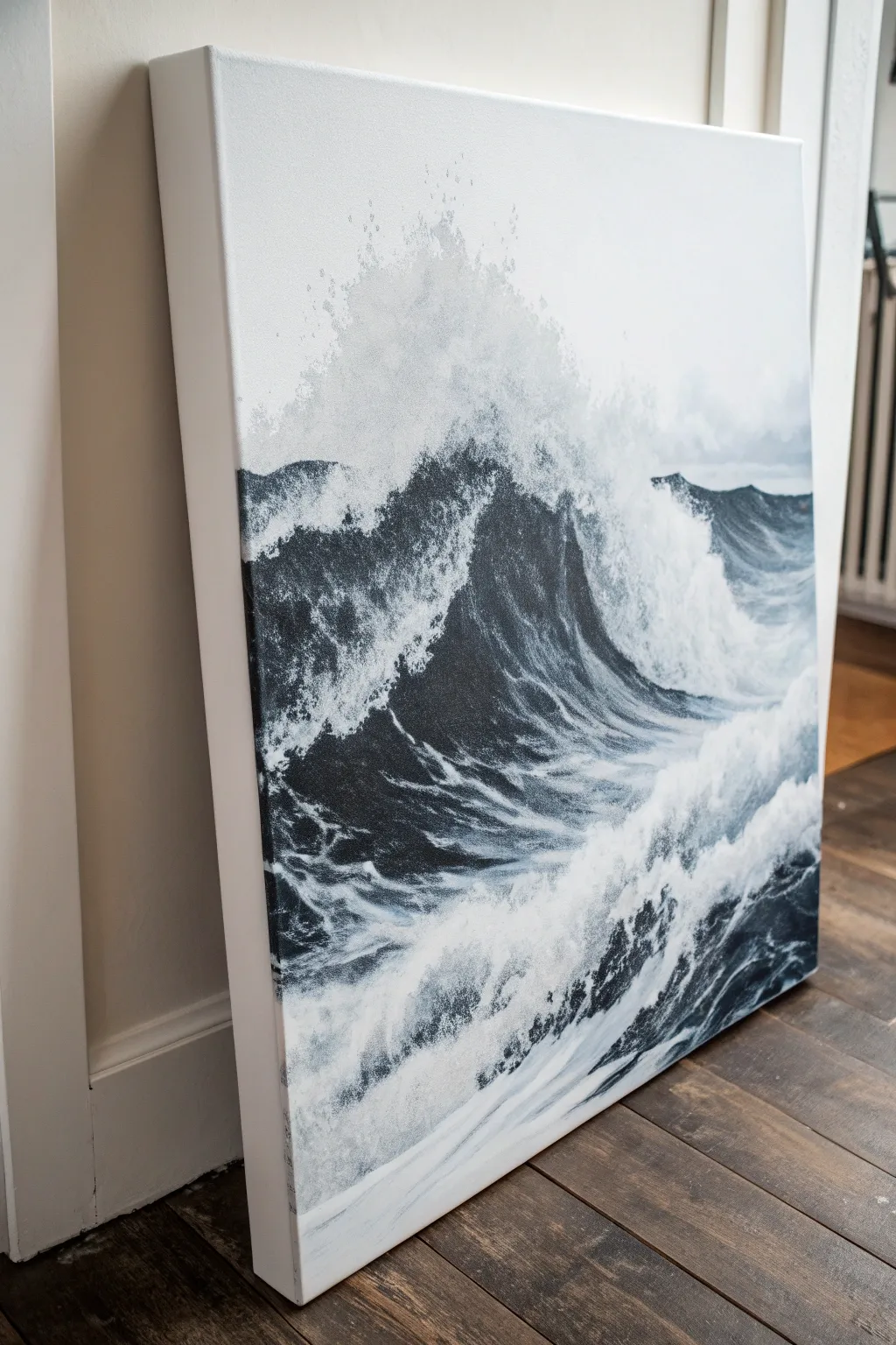
Capture the raw power of the ocean using a monochromatic palette with this dramatic ink-wash style canvas project. By balancing deep charcoal blacks with stark whites, you will create a high-contrast seascape that feels both timeless and energetic.
Step-by-Step Guide
Materials
- Large stretched canvas (square or rectangular)
- White gesso
- Mars Black acrylic paint (heavy body)
- Titanium White acrylic paint (heavy body)
- Flow improver or acrylic glazing medium
- Large flat paintbrush (2-3 inch)
- Medium filbert brush
- Small round detail brush
- Sea sponge or crumpled paper towel
- Spray bottle with water
- Palette knife
- Mixing containers
- Reference photo of crashing waves
Step 1: Preparation & Base Composition
-
Prime the Surface:
Begin by applying a fresh coat of white gesso to your canvas, even if it came pre-primed. This ensures a bright, crisp white background which is crucial for the foam highlights later. -
Sketch the primary forms:
Using a very diluted grey wash (black paint mixed with lots of water), loosely sketch the main wave shape. Focus on the large diagonal surge of the central wave and the horizon line. -
Block in the deepest darks:
Identify the shadowed trough of the wave—the area directly ‘under’ the crashing lip. Paint this section with pure Mars Black to establish your darkest value early on. -
Establish the horizon:
Paint the distant water line with a dark grey mix. Keep this edge relatively soft compared to the sharp foreground waves to create a sense of depth.
Step 2: Building the Wave Body
-
Create the mid-tones:
Mix a medium charcoal grey using black, a touch of white, and flow improver. Paint the curving body of the wave, blending it upwards from the dark trough. -
Add directional strokes:
While the grey paint is still wet, use your filbert brush to pull strokes upward towards the wave’s crest. This mimics the movement of water being pulled up by gravity. -
Introduce texture:
Dip a sea sponge into a semi-dry grey mixture and lightly dab the transition areas between the dark water and the white canvas. This begins to suggest churning water and foam. -
Soften the edges:
Mist the canvas lightly with your spray bottle in the upper sky area to ensure the top spray looks misty and not too hard-edged.
Muddy Greys?
If your whites are turning grey, dry your brush completely between colors. Acrylics dry fast, so wait for the black layer to be touch-dry before layering white on top.
Step 3: Detailing the Crash & Foam
-
Stipple the crest:
Using a worn-out brush or a stippling motion, apply pure Titanium White heavily along the top edge of the breaking wave where the foam is thickest. -
Create the spray effect:
Load a stiff brush with watered-down white paint. Flick the bristles with your thumb to splatter fine droplets above the wave crest, simulating airborne sea spray. -
Carve out the veins:
I like to use a small round brush with white paint to trace the ‘veins’ of foam that crisscross the dark body of the wave. Keep these lines squiggly and organic. -
Enhance the foreground churn:
Paint the bottom foreground with a chaotic mix of white and light grey. Use quick, short strokes to show the water boiling and retreating after a crash.
Add Subtle Color
For a moody shift, mix a tiny drop of Phthalo Blue or Payne’s Grey into your black. It remains monochromatic but adds a deep, oceanic coolness.
Step 4: Final Polish
-
Refine the contrasts:
Step back and assess your values. Re-apply pure black to the deepest shadows if they have dried to a dull grey. -
Highlight the lip:
Add the brightest white highlights right at the sharpest point of the wave lip to make it look wet and reflective. -
Clean up the edges:
Paint the sides of your canvas white for a gallery-ready look, or extend the painting around the edges depending on your preference. -
Seal the work:
Once fully dry (give it at least 24 hours), apply a satin or gloss varnish. A gloss finish works particularly well here as it mimic the wetness of the ocean.
Hang your powerful seascape where it can command the room and remind you of the ocean’s energy
Marbled Swirls on a Three-Canvas Set
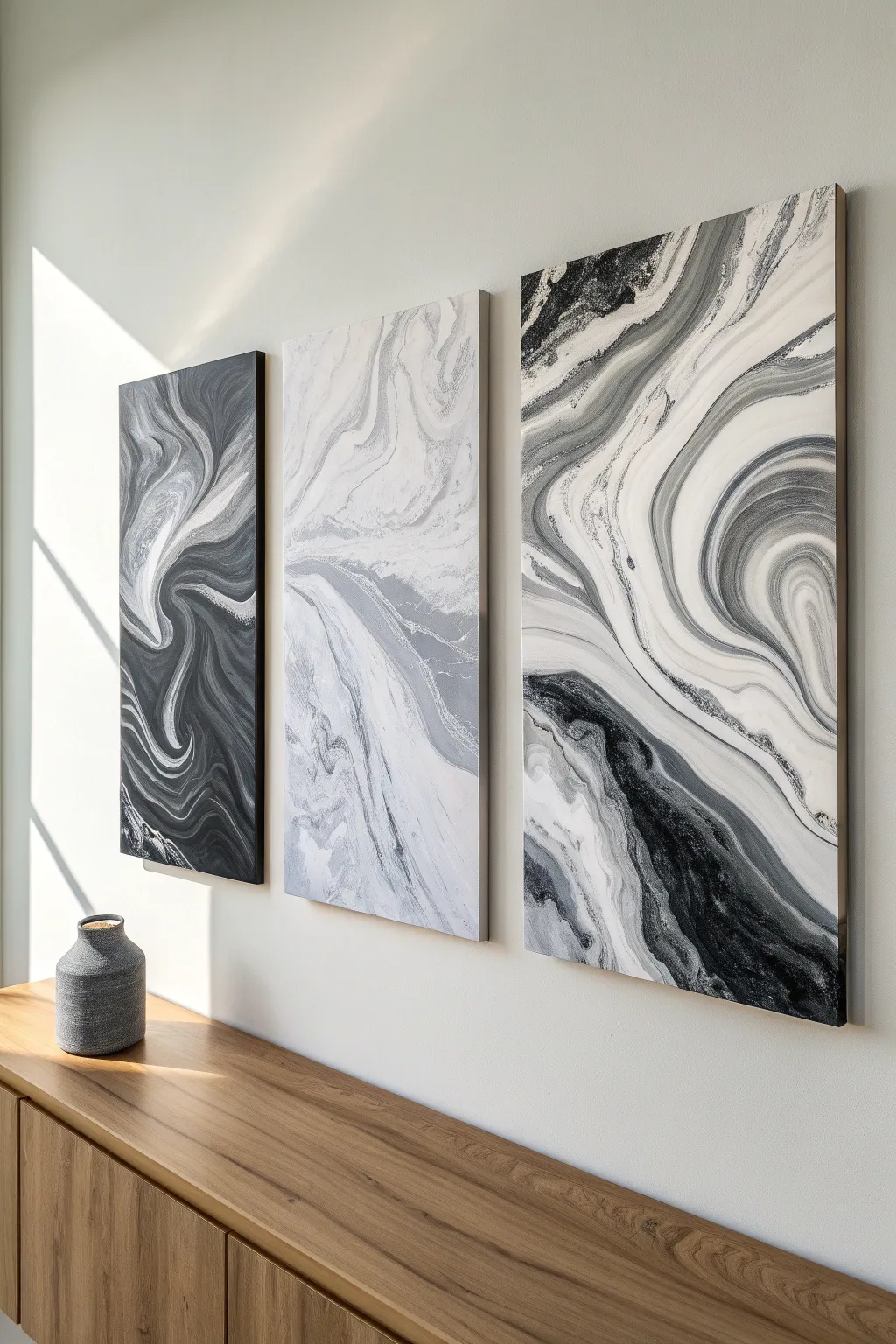
Bring the elegance of natural stone formations to your walls with this stunning three-piece fluid art project. Using a simple dirty pour or Dutch pour technique, you’ll create mesmerizing veins of black, white, and grey that flow seamlessly across separate canvases.
Step-by-Step Tutorial
Materials
- 3 large stretched canvases (e.g., 24×36 inches)
- Black acrylic paint
- Titanium white acrylic paint
- Grey acrylic paint (or mix black and white)
- Pouring medium (Floetrol or specialized medium)
- Silicone oil (optional for cells)
- Plastic cups for mixing (large and small)
- Stirring sticks
- Hairdryer with a cool setting
- Drop cloth or plastic sheeting
- Painter’s tape
- Push pins or canvas risers
Step 1: Preparation and Mixing
-
Space Setup:
Fluid art gets messy, so cover your entire work surface and floor with a heavy drop cloth. Ensure the surface is perfectly level using a spirit level; if it tilts, your design will slide right off the canvas while drying. -
Prepare the Canvases:
Flip each canvas over and insert push pins into the four wooden corners, or set them on risers. This lifts the canvas off the table, allowing paint to drip freely over the edges without sticking the artwork to your surface. -
Tape the Backs:
Apply painter’s tape along the underside edges of the canvas frame. This catches the drips and makes cleanup instant later—just peel off the tape once dry for clean professional edges. -
Mix Your Paints:
In separate large cups, mix your black, white, and grey paints with your pouring medium. A standard ratio is 1 part paint to 2 parts medium, but follow the bottle instructions. You want a consistency like warm honey—liquid enough to flow, but thick enough to hold color separation. -
Add Water Carefully:
If I find the mixture is too thick, I like to add water a few drops at a time. Stir gently to avoid creating air bubbles, which can cause surface imperfections later. -
Optional Silicone:
If you want small ‘cells’ or bubble-like effects within the swirls, add 1-2 drops of silicone oil to the grey and black mixtures only. Stir very briefly.
Muddy Colors?
If your black and white resemble grey sludge, you likely over-manipulated the paint. Do fewer passes with the hairdryer and stop as soon as the design looks pleasing.
Step 2: The Pouring Technique
-
Base Layer Application:
Pour a generous amount of white paint mixture over the entire surface of all three canvases. This ‘negative space’ layer helps the colored paints glide smoothly. -
Spread the Base:
Use a palette knife or a hairdryer on a low, cool setting to blow the white base out to the edges and corners, ensuring full coverage. -
Create the Color Stream:
Pour puddles or ribbons of your black and grey paint directly onto the white base. For the look in the image, try pouring diagonally across the canvas to mimic natural stone veins. -
Layering for Depth:
Don’t just pour one big blob; alternate thin streams of black next to grey, and add smaller ribbons of white on top of the dark colors to create dimension. -
The Dutch Pour Method:
Using your hairdryer on the ‘cool’ and ‘low’ setting, blow the white base paint slightly *over* the colored puddles first. This technique creates a soft, foggy edge to the swirls. -
Blow Out the Design:
Now, direct the airflow to push the paint outward across the canvas. Follow the direction of your initial pour, chasing the paint towards the edges and corners.
Step 3: Refining and Drying
-
Fine-Tuning Composition:
Look for areas that are too heavy or blob-like. Use a straw to manually blow into specific areas to create delicate, wispy tendrils or detailed swirls that the hairdryer might miss. -
Tilting:
Gently lift and tilt the canvas slightly to stretch the design if certain bands look too compressed. Be careful not to over-tilt, or you’ll lose the distinct separation between black and white. -
Check the Edges:
Ensure the paint has flowed over the sides for a gallery-wrapped look. Use a finger to dab paint onto any bald spots on the corners. -
Pop Bubbles:
Run a kitchen torch or heat gun quickly over the surface (keep it moving!). This pops air bubbles and, if you used silicone, will help bring up those small cells. -
Protect While Drying:
Fluid art takes a long time to dry—often 24 to 72 hours. Cover the canvases with large cardboard boxes to prevent dust or pet hair from settling into the wet paint.
Add Metallic Lux
Mix a small amount of silver or pearl metallic acrylic into your white or grey stream. It adds a subtle shimmer that mimics quartz crystal veins.
Once fully cured and varnished, your triptych will look elegant and sophisticated hanging in your living space
Half-and-Half Texture Split Canvas
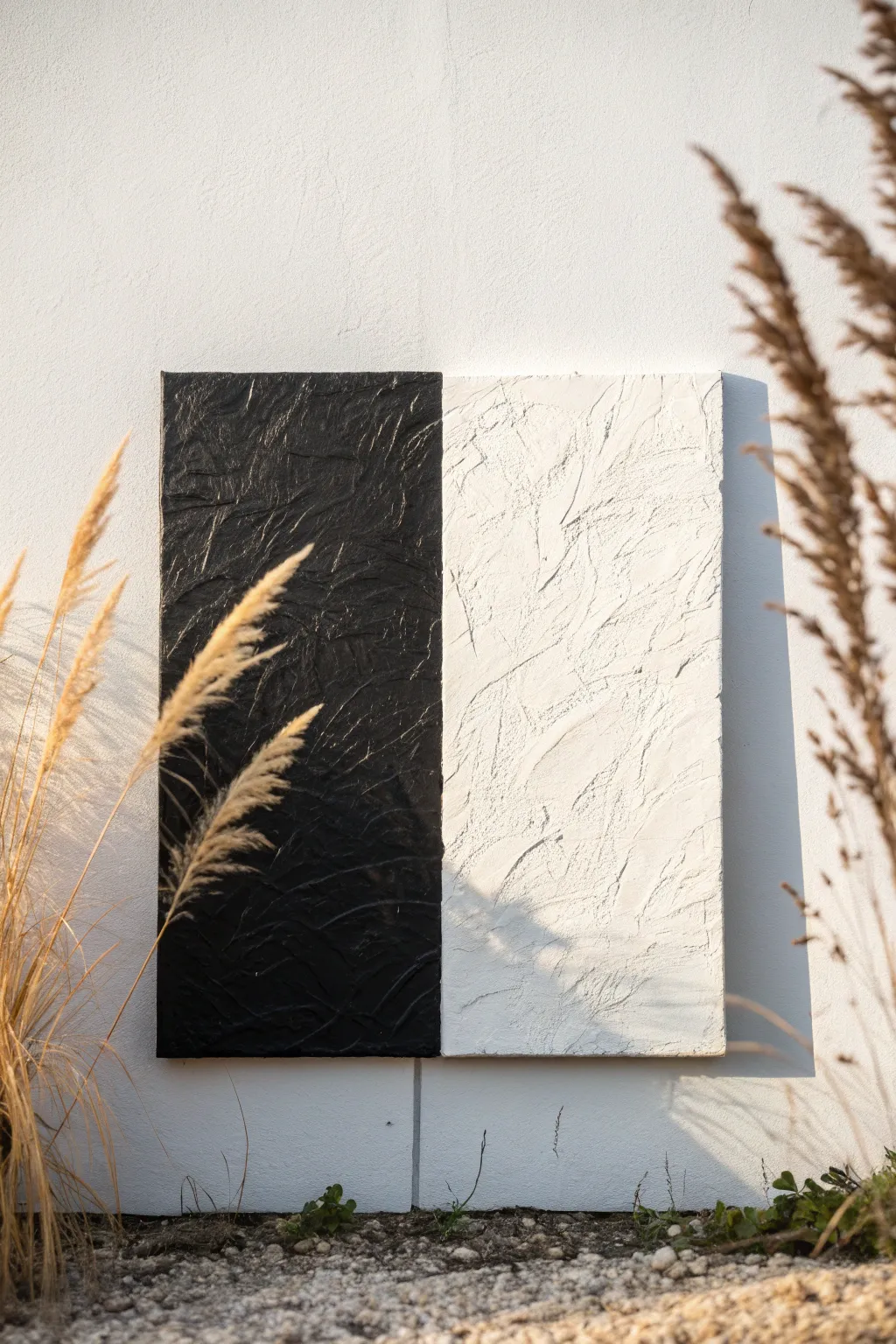
Embrace the beauty of bold contrast with this minimalistic yet striking project that plays with light and shadow. By combining heavy tactile texture with a stark monochrome palette, you’ll create a sophisticated piece where the surface relief does all the talking.
Detailed Instructions
Materials
- Square stretched canvas (24×24 inches recommended)
- Heavy body acrylic paint (Mars Black and Titanium White)
- Modeling paste or texture gel (heavy structure)
- Large palette knife or trowel
- Painter’s tape (wide width)
- Gesso (optional, for priming)
- Ruler or measuring tape
- Pencil
- Matte varnish (optional)
Step 1: Preparation and Base
-
Prime the surface:
If your canvas isn’t pre-primed, apply two coats of gesso to ensure a sturdy foundation for the heavy texture paste. Let it dry completely between coats. -
Measure the center:
Place your canvas on a flat work surface. Use a ruler to find the exact vertical center of the canvas and mark it lightly with a pencil at the top and bottom edges. -
Define the divide:
Run a strip of wide painter’s tape vertically down the center line you just marked. Press the edges of the tape down firmly to prevent any paste or paint from bleeding underneath.
Step 2: Creating Texture
-
Mix the dark texture:
Scoop a generous amount of modeling paste onto a mixing palette. Mix black acrylic paint directly into the paste until you achieve a deep, uniform charcoal color. Mixing it now ensures the color permeates the texture, making chips less visible later. -
Apply the dark side:
Using a palette knife, apply the black mixture to the left side of the canvas. Spread it thick—about 1/4 inch deep is ideal for this look. -
Sculpt the surface:
While the paste is wet, use the flat side of your knife to press, lift, and scrape the surface. Create varied ridges and valleys; random, multidirectional strokes work best to catch the light. -
Clean your tools:
Thoroughly clean your palette knife and mixing surface before switching to the white side to avoid muddying the pristine white section. -
Mix the light texture:
Repeat the mixing process with fresh modeling paste and white acrylic. I find adding just a touch of white paint helps the modeling paste stay truly bright white rather than drying translucent. -
Apply the light side:
Spread the white mixture onto the right side of the canvas, butting it right up against the painter’s tape. -
Match the texture:
Sculpt the white paste using similar motions to the black side. Try to maintain a consistent ‘visual’ weight so one side doesn’t look smoother than the other. -
Remove the tape:
Carefully peel back the painter’s tape while the paste is still wet. Pull it away at a 45-degree angle to leave a crisp, clean line between the two textured fields. -
Refine the seam:
If the removal of the tape created a ridge that is too high, gently tap it down with a clean, small palette knife to blend the edge slightly without merging the colors.
Cracking Issues?
Thick paste can crack if force-dried. Let it cure slowly away from direct heat or fans. If cracks appear, simply fill them with a little extra paint.
Step 3: Finishing Touches
-
Allow extensive drying time:
Because the texture is thick, let the canvas dry flat for at least 24 to 48 hours. The surface may feel dry to the touch sooner, but the underside needs time to harden. -
Inspect for coverage:
Once fully dry, check for any pinholes or white spots on the black side where the paste might have cracked. Touch these up with a small brush and black paint. -
Enhance the black:
For a truly velvety look, brush a coat of matte black paint over the textured black section. This unifies the sheen and deepens the shadows in the crevices. -
Brighten the white:
similarly, brush a fresh coat of titanium white over the right side to ensure it is opaque and crisp against the dark half. -
Seal the work:
Apply a spray varnish to seal the piece. A matte finish is recommended here, as a glossy finish can create distracting glare on the high-texture points.
Add Metallic Foil
For a luxe touch, apply gold leaf along the central seam line after the texture dries. The metallic glint creates a stunning bridge between the monochrome halves.
Hang your artwork in a spot with side-lighting to really make those dramatic textures pop off the wall
Bold Minimal Word With Painterly Edges
Embrace the power of negative space with this striking minimalist project that turns clean typography into high-impact art. The simple black text against a crisp white background creates a modern, sophisticated look perfect for weddings, events, or entryway decor.
Step-by-Step Guide
Materials
- Large stretched canvas (24×36 inches or larger)
- White gesso or primer
- High-quality white acrylic paint (matte finish)
- Black acrylic paint or black paint marker (chisel tip)
- Wide flat brush or foam roller
- Computer and printer for stencil creation
- Graphite transfer paper OR chalk
- Painter’s tape or low-tack masking tape
- Pencil
- Ruler or T-square
- Fine liner brush (size 0 or 1)
- Small angled shader brush
- Easel or wooden base block (optional for display)
Step 1: Preparing the Surface
-
Prime the canvas:
Begin by applying a generous coat of white gesso to your canvas. Even if it came pre-primed, adding a fresh layer creates a smoother, more professional surface for the lettering. -
Apply the base coat:
Once the gesso is dry, use a foam roller or wide brush to apply your matte white acrylic paint. This ensures the background is a pure, bright white rather than the raw fabric color. -
Let it cure:
Allow the white base layer to dry completely for at least 2-3 hours. A fully dry surface is crucial to prevent the transfer paper from smudging or the tape from peeling up paint later.
Step 2: Creating the Layout
-
Design your text:
Use a word processor or design software to type out your phrase. Choose a classic serif font to match the reference image’s elegant look—fonts like Garamond, Bodoni, or Times New Roman work well. -
Print and scale:
Since the canvas is large, you will likely need to print the lettering across multiple sheets of paper (tiled printing) to get the correct scale. -
Assemble the template:
Trim the margins off your printed pages and tape the sheets together to reconstruct the full phrase at actual size. -
Position the text:
Lay your paper template onto the dry canvas. Use a long ruler or T-square to measure from the edges, ensuring the text is perfectly centered horizontally and vertically. -
Secure the template:
Once you are happy with the placement, tape the paper template securely to the canvas top using painter’s tape to create a hinge.
Use a Steady Hand
Rest your pinky finger on a dry part of the canvas while painting lines. This anchors your hand and acts as a pivot point for smoother, straighter strokes.
Step 3: Transferring the Design
-
Insert transfer medium:
Lift the paper template and slide a sheet of graphite transfer paper underneath, dark side facing down toward the canvas. If you don’t have transfer paper, you can rub the back of your printout with charcoal. -
Trace the outline:
Using a pencil or a ballpoint pen, trace the outline of every letter carefully. Press firmly enough to transfer the line but not so hard that you dent the canvas. -
Check your progress:
Lift a corner of the paper periodically to ensure the lines are transferring clearly before you remove the entire template. -
Clean up lines:
Remove the paper and transfer sheet. Use a ruler and pencil to sharpen any straight lines or serifs that might look faint or wobbly from the tracing process.
Level Up: Texture
Mix a modeling paste into your white base coat before painting. Apply it with a palette knife for visible texture that contrasts beautifully with the flat text.
Step 4: Painting the Typography
-
Outline the letters:
Dip a fine liner brush into slightly thinned black acrylic paint. Carefully paint the outline of each letter, starting from the outside edges and working inward. -
Fill the centers:
Switch to a small angled shader brush for the thicker parts of the letters. Fill in the bodies of the text with opaque black paint. -
Refine the edges:
Go back over the sharp corners and thin serifs (the little feet on the letters) with your smallest brush to make them crisp. -
Apply a second coat:
Allow the first layer of black to dry. I find a second coat is almost always necessary to get that solid, deep black coverage without brushstrokes showing through. -
Touch up the background:
If any black paint strayed outside the lines, use a small brush with your white background paint to cover the mistake once the black is fully dry. -
Construct the base:
If mimicing the display in the photo, attach a 2×4 wooden plank to the bottom of the canvas frame using wood screws from the back, acting as a sturdy, rustic footer.
Place your finished canvas on an easel or shelf to add a bold typographic statement to your space
Stencil-Like Pattern With Soft Overspray
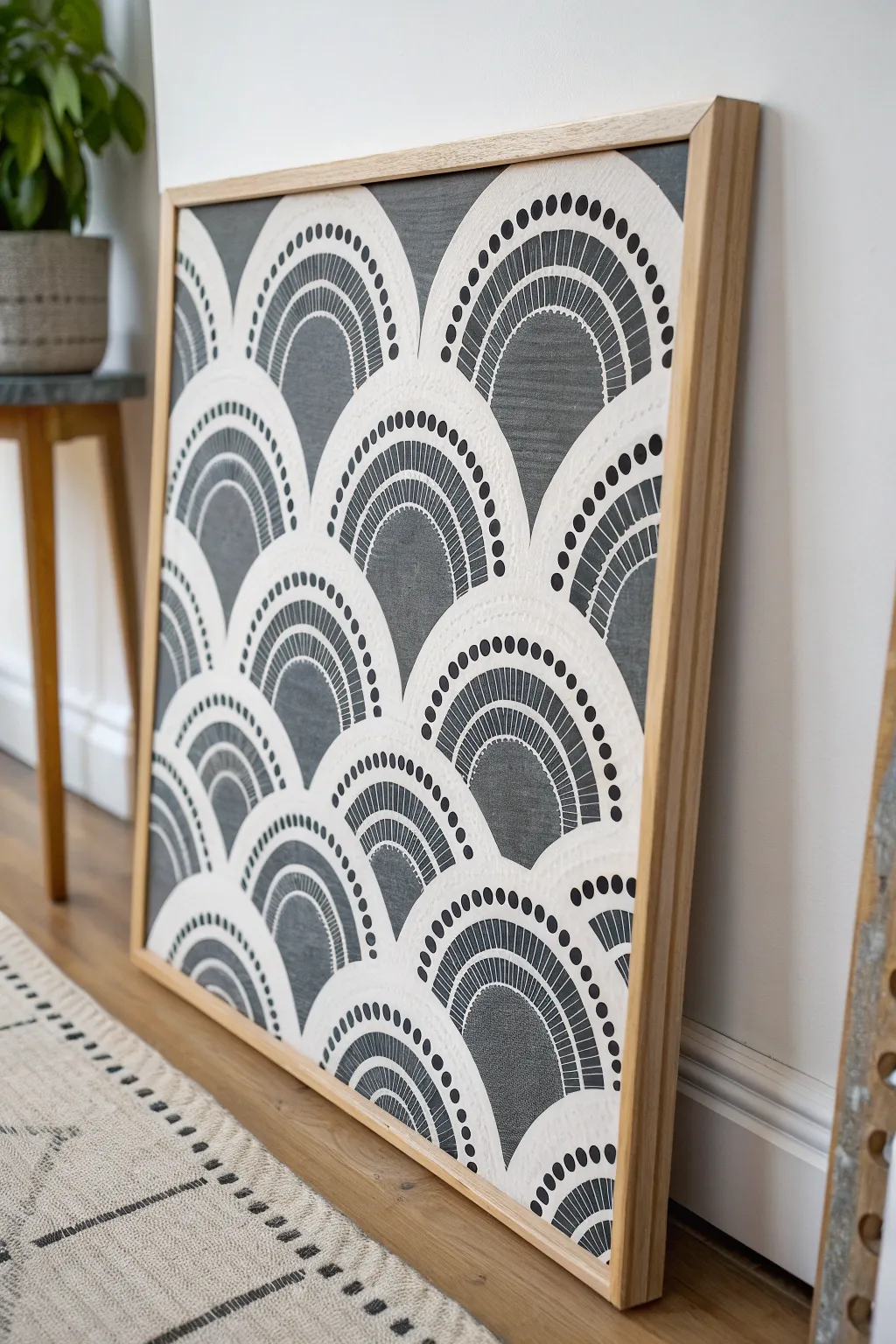
Create a striking piece of modern decor with this scalloped arch pattern that combines bold geometric shapes with delicate stenciled details. The high-contrast black and white design features repeating arches and rhythmic dots, giving the illusion of a complex textile weave or a printed fabric.
Step-by-Step
Materials
- Large stretched canvas (at least 24×30 inches)
- Matte black acrylic paint or chalk paint
- Off-white or cream acrylic paint
- Cardstock or acetate sheets (for making stencils)
- Craft knife and cutting mat
- Repositionable spray adhesive
- Small foam pouncer or stencil brush
- Wide flat paintbrush (2-inch)
- Painter’s tape
- Ruler and pencil
- Natural wood floating frame (optional)
- Acrylic sealer spray (matte finish)
Step 1: Preparation & Base Coat
-
Prime the canvas:
Start by laying your canvas on a flat, protected surface. If your canvas isn’t pre-primed, apply two coats of gesso to create a smooth working surface, sanding lightly between coats. -
Apply the background color:
Paint the entire canvas surface with your matte black acrylic paint. I prefer using a roller for this step to avoid visible brushstrokes and achieve that deep, solid charcoal look. -
Let it cure:
Allow the black base coat to dry completely, preferably overnight, to ensure the paint has fully hardened before applying adhesive stencils.
Clean Edges Every Time
To prevent ‘fuzzy’ edges, always dab excess paint off your brush onto a paper towel before painting. The brush should feel almost dry to the touch.
Step 2: Creating the Stencils
-
Draft the arch design:
On a piece of cardstock or acetate, draw a single arch shape that is roughly 4-5 inches wide. Inside this main arch, draw a smaller concentric arch, leaving about a 1-inch band between them. -
Add detail elements:
Within the internal band of the arch, sketch small vertical dashes or lines to mimic the ‘fringe’ look seen in the reference. Along the outer curve of the main arch, mark positions for a row of dots. -
Cut the stencil:
Using a sharp craft knife on a cutting mat, carefully cut out the negative space where the white paint will go. You want to cut out the thick border around the arch, the inner line details, and the dots along the top. -
Make duplicates:
Trace and cut 2-3 extra stencils. Having multiples allows you to work on different sections while one stencil is being cleaned or dried.
Step 3: Painting the Pattern
-
Plan the layout:
Measure your canvas and lightly mark horizontal guidelines with a white chalk pencil to ensure your rows of arches stay level. The rows should overlap slightly, like fish scales. -
Prep the stencil:
Flip your stencil over and apply a light mist of repositionable spray adhesive. Let it get tacky for about 60 seconds before placing it on the canvas; this prevents sticky residue. -
Position the first row:
Start at the bottom left corner. Press the stencil firmly against the black canvas, paying special attention to the thin bridges between the cutouts to prevent paint bleed. -
Stippling technique:
Load a foam pouncer with a small amount of off-white paint and blot most of it off on a paper towel until the brush is almost dry. Lightly tap (stipple) the paint over the stencil openings. -
Build opaque layers:
Instead of one heavy coat, build up the white opacity with two or three light passes. This ‘dry brush’ method creates that slightly textured, soft edge seen in the artwork. -
Repeat the process:
Carefully lift the stencil and move it to the right to create the next arch in the row. Ensure the edges touch but don’t awkwardly overlap. Continue until the bottom row is complete. -
Offset the second row:
Start the second row, positioning the center of the arch directly above the valley between two arches below it. This staggered placement creates the classic scallop pattern. -
Handle the edges:
When you reach the edges of the canvas, let the stencil hang off the side. Simply paint only the portion that falls on the canvas surface to imply the pattern continues indefinitely.
Add Metallic Flair
Swap the cream paint for metallic gold or copper acrylics for the small dots above the arches to add a subtle, glamorous shimmer to the design.
Step 4: Finishing Touches
-
Clean up lines:
Once the white paint is fully dry, inspect your work. If any white paint looks too thin or faint, go back in with a small detail brush to brighten it up. -
Fix imperfections:
If paint bled under the stencil, use a small brush and your black base paint to tidy up the edges and sharpen the geometry. -
Seal the artwork:
To protect the surface from dust and fading, spray the entire piece with a clear matte acrylic sealer in a well-ventilated area. -
Frame it:
Finish the look by installing the canvas into a light natural wood floating frame, leaving a small gap between the canvas edge and the frame for a professional gallery aesthetic.
Hang your new geometric masterpiece in a well-lit spot where the contrast can truly pop.
Op Art Lines for a Wow-Factor Illusion
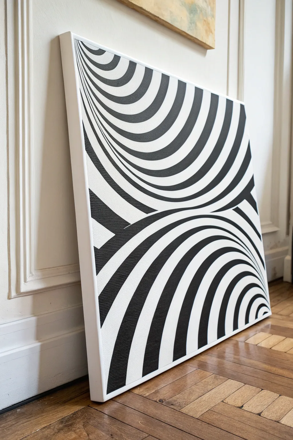
Transform a flat canvas into a mesmerizing visual experience with this striking black and white optical illusion. By manipulating curved lines and high contrast, you will create a sense of deep, dual vortexes that seem to pull the viewer right into the artwork.
Detailed Instructions
Materials
- Large square canvas (approx. 24×24 inches)
- White Gesso (acrylic primer)
- Graphite pencil (HB or 2B)
- Large eraser
- Flexible ruler or french curve set
- Long straight ruler
- Compass (optional for initial arcs)
- Black acrylic paint (high pigment/opaque)
- White acrylic paint (for touch-ups)
- Flat shader brushes (various sizes: 1/4 inch, 1/2 inch)
- Round detail brush (size 1 or 2)
- Painter’s tape or masking tape (optional)
Step 1: Preparation and Grid Layout
-
Prime the Surface:
Begin by applying a smooth coat of white Gesso to your canvas. Even if the canvas is pre-primed, a fresh layer ensures the smoothest possible surface for your sharp lines. Let it dry completely. -
Sand for Smoothness:
Once dry, lightly sand the gessoed surface with fine-grit sandpaper. Op Art relies on crispness, so removing canvas texture bumps now will make painting much easier later. -
Mark the Horizon:
Using your long ruler and pencil, lightly draw a single curved line that splits the canvas roughly horizontally, slightly below the center. This wave will serve as the meeting point for the two illusionary planes. -
Establish the Top Focal Point:
Identify a ‘vanishing point’ for the top section. It should be located off the canvas, up and to the left. You don’t need to mark it, but visualize all your vertical lines radiating from this imaginary spot. -
Draft the Top Vertical Curves:
Draw the vertical lines for the top section. These should start wide at the top edge and narrow significantly as they approach the central horizon line, curbing inward to create the funnel effect. -
Draft the Bottom Vertical Curves:
Repeat this process for the bottom section, but reversed. Visualize a focal point deep down to the right. Draw vertical curves that are wide at the bottom edge and pinch together as they curve up toward the central horizon. -
Create the Horizontal Curves (Rings):
Now, add the horizontal cross-contours. For the top section, draw concentric curved lines that ‘smile’ downward. Space them wider near the top edge and progressively closer together as they go deeper into the tunnel. -
Complete the Grid:
Draw the horizontal curves for the bottom section. These should arch upward like rainbows. Again, keep the spacing wide at the bottom and very tight near the center line to exaggerate depth.
Step 2: Painting the Contrast
-
Identify the Pattern:
Before painting, mark every other square in your distorted checkerboard with a small ‘x’ in pencil. This prevents the disastrous mistake of painting two adjacent squares black. -
Outline the Black Shapes:
Using your round detail brush and slightly thinned black paint, carefully outline the edges of your ‘x’ marked shapes. Getting these borders crisp now creates a barrier for filling them in. -
Fill Large Areas:
Switch to a flat shader brush to fill in the centers of the larger black shapes near the outer edges of the canvas. Apply paint smoothly to avoid brushstrokes. -
Fill Tight Spaces:
For the smaller shapes near the vortex center, stick to smaller brushes. I find it helpful to turn the canvas upside down occasionally to get a better angle on tight corners. -
Refine the Edges:
Go back over the black areas with a second coat if the canvas texture is showing through. Op Art demands solid, opaque black for the full effect. -
Clean Up with White:
Inevitably, slip-ups happen. Use your white acrylic paint and a clean, sharp brush to tidy up any black paint that crossed into the white zones. -
Erase Guide Lines:
Once the paint is 100% dry (give it a few hours just to be safe), gently erase any remaining visible pencil marks in the white areas. -
Enhance the White:
If your original canvas white looks dull compared to the stark black, carefully paint the white squares with fresh white acrylic for a brilliant, clean finish. -
Seal the Work:
Finish with a layer of spray varnish. A matte varnish works best for Op Art because it reduces glare, allowing the illusion to be seen clearly from all angles.
Curve Control
If freehand drawing feels shaky, use a flexible sewing ruler or a strip of cardboard bent to shape to trace your initial curves.
Smudge Alert
Pencil graphite smudges easily on white gesso. Place a sheet of clean scrap paper under your hand while drawing the grid to keep the surface pristine.
Step back and enjoy the dizzying depth of your new modern masterpiece
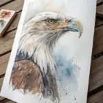
Have a question or want to share your own experience? I'd love to hear from you in the comments below!