Black and white painting is where contrast does all the talking—moody, graphic, and surprisingly calming to make. If you’ve ever wanted your art to feel bold without juggling a whole rainbow, these black and white painting ideas will keep you happily busy.
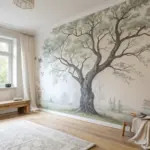
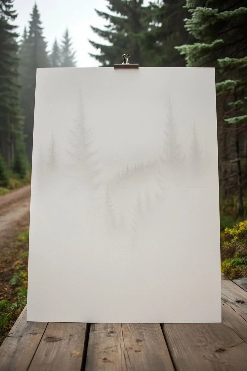
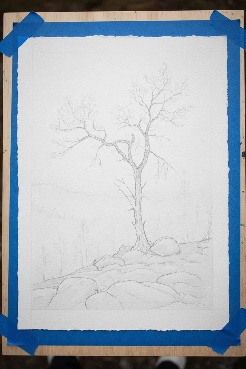
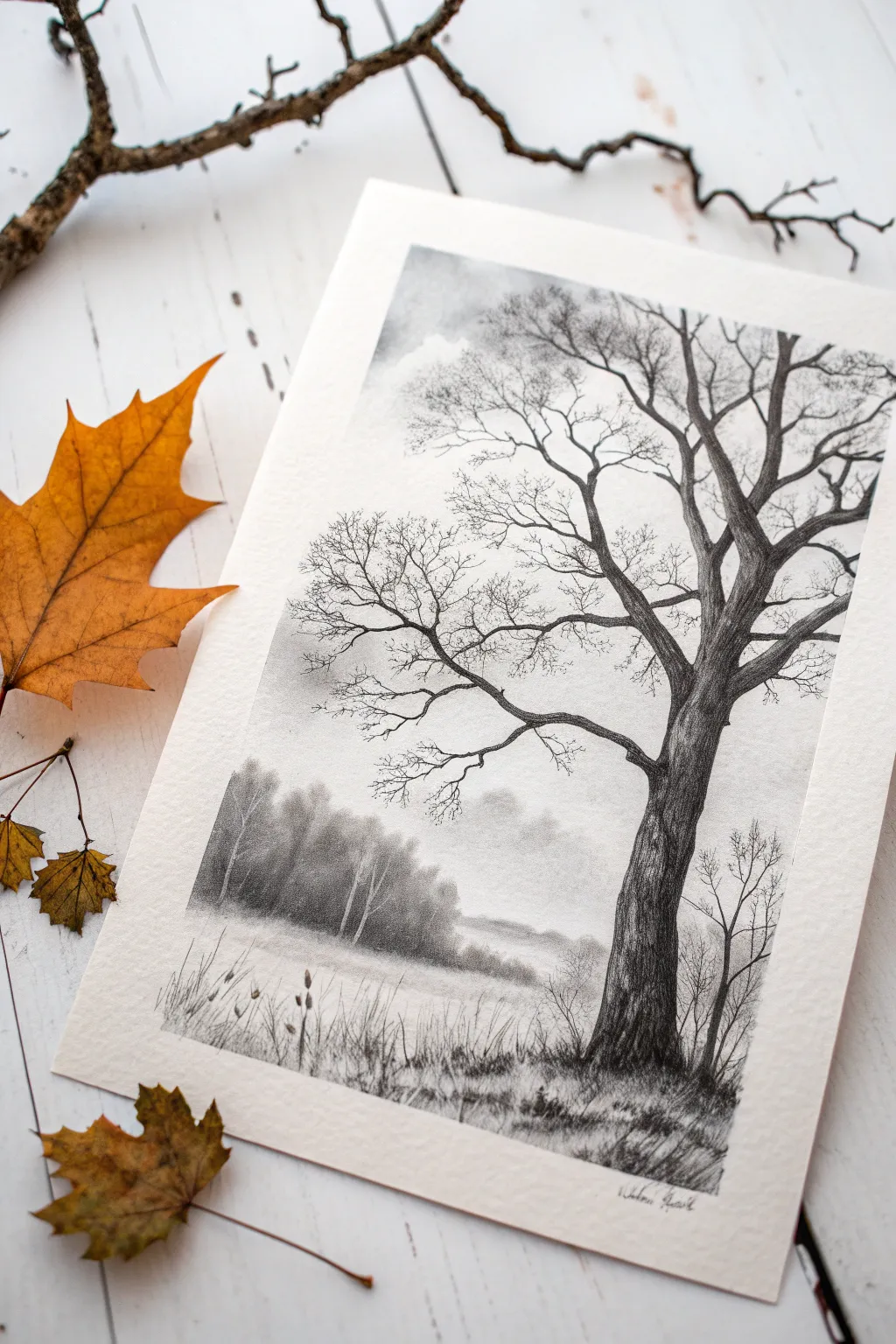
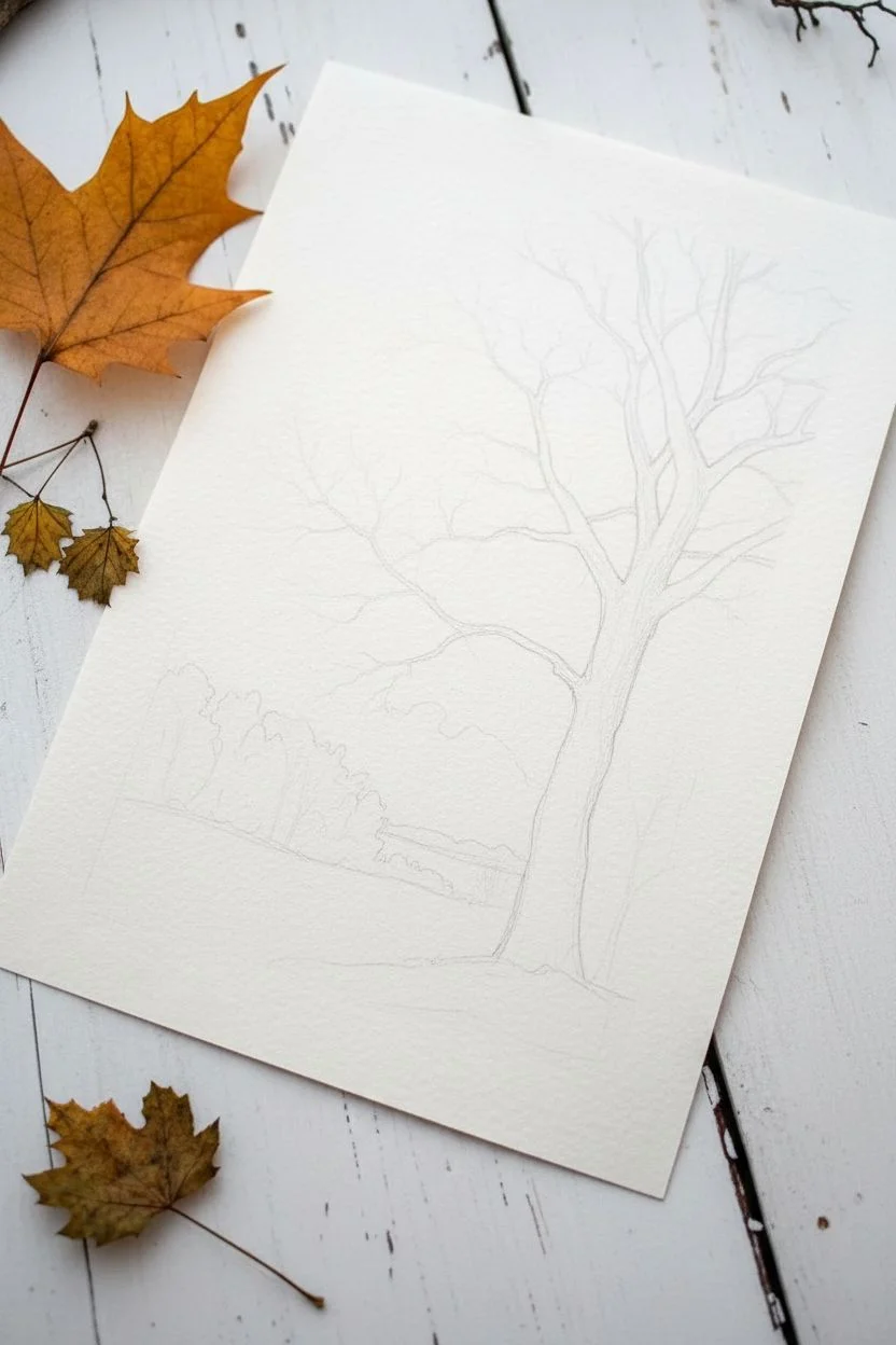
Bare Tree Silhouette on a Foggy Background
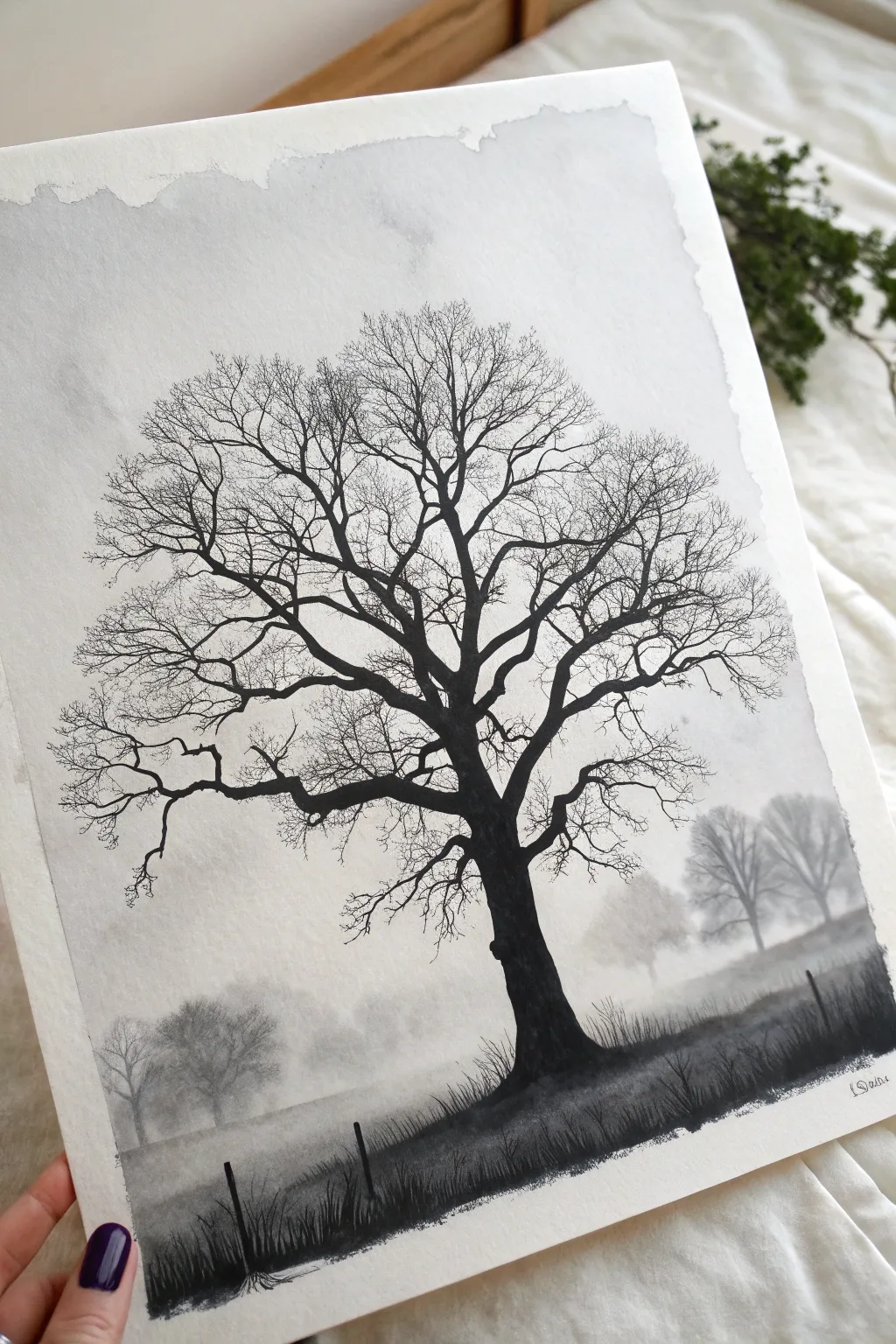
Capture the stark beauty of winter with this atmospheric black and white landscape featuring a majestic bare tree against soft fog. Using simple ink washes and detailed brushwork, you’ll build depth from a hazy background to a crisp, high-contrast foreground.
Step-by-Step Guide
Materials
- Heavyweight watercolor paper (300gsm cold press recommended)
- Black India ink or concentrated black watercolor
- Water container for rinsing
- Palette with multiple wells for mixing gray values
- Large flat brush or wash brush (1 inch)
- Round brushes (sizes 6 and 2)
- Fine liner brush or rigger brush (size 0 or 00)
- Paper towels
- Masking tape
Step 1: Setting the Atmosphere
-
Prepare your workspace:
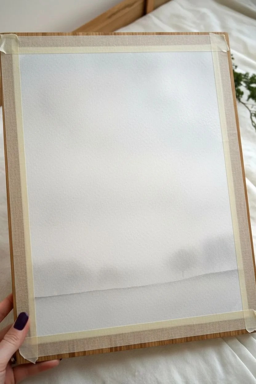
Begin by taping down all four edges of your watercolor paper to a rigid board. This prevents the paper from buckling when you apply the wet washes in the next steps. -
Mix your values:
In your palette, prepare three puddles of ink: a very pale, watery gray (about 10% black), a medium gray (50% black), and pure undiluted black for the final details. -
Wet the paper:
Using your large flat brush and clean water, gently wet the entire surface of the paper until it has a uniform sheen, but avoid creating standing puddles. -
Create the sky gradient:
While the paper is still damp, load your brush with the scarcest amount of the pale gray wash. Start at the top corners and let the pigment bloom downward naturally to create a soft, uneven vignette effect. -
Add distant fog:
With the paper still slightly damp (but not soaking), paint a horizontal band of pale gray across the bottom third of the page to represent the misty horizon line. -
Dry completely:
Allow this initial layer to bone dry. This is crucial—if you proceed too soon, your crisp tree will bleed into the background.
Step 2: Mid-Ground and Depth
-
Paint distant trees:
Using the medium gray wash and a size 6 round brush, dab in soft, indistinct tree shapes along the horizon line on the left and right sides, keeping the center relatively clear. -
Soften the edges:
Immediately after painting the distant trees, take a clean, slightly damp brush and run it along the bottom edge of these shapes to blur them into the ‘fog’ below. -
Lay the ground foundation:
Switch to a stronger gray mix. Paint a uneven, sloping hill shape at the very bottom of the paper, darker than your background but lighter than the final tree will be.
Ink Flow Secret
For the tiniest twigs, add a drop of water to your black ink. Making it flow like milk helps the liner brush glide longer without breaking the line.
Step 3: The Main Silhouette
-
Start the trunk:
Load a size 6 brush with pure black ink. Position the base of the trunk just right of the center in the foreground, painting upward with a thick, confident stroke that tapers slightly as it rises. -
Form the main branches:
Split the trunk into two or three major arteries. Think of a ‘Y’ shape that multiplies. Keep your wrist loose to avoid stiff, straight lines; nature is full of bends and knots. -
Add secondary limbs:
Switch to a size 2 brush. Extending from the main branches, paint thinner limbs reaching outward and upward. Let your hand shake slightly to give the wood a gnarled, organic texture. -
Paint the fine twigs:
Using your finest liner brush or rigger, add the delicate canopy of twigs. Use just the very tip of the brush and a flicking motion. These lines should be hair-thin. -
Create density:
I like to cross some of the fine twigs over each other. This overlapping builds a realistic ‘mesh’ look that mimics a dense winter crown.
Oops! Blotched It?
If you drop ink on the sky, turn it into a flying bird. Use a tiny brush to pull wings out from the splatter. Mistakes are just birds in disguise!
Step 4: Foreground Details
-
Anchor the tree:
Return to the base of the trunk with pure black ink. Add small, upward strokes to simulate grass blades growing around the roots, blending the tree seamlessly into the ground. -
Add fence posts:
Paint a few short, vertical black lines in the foreground to suggest an old fence line. Make the ones on the right larger and the ones on the left smaller to aid perspective. -
Texture the field:
Use a dry-brush technique (remove most ink from the brush on a paper towel) to drag rough texture across the foreground hill, suggesting tall, wild grass. -
Final assessment:
Step back and look at your composition. If the canopy looks too sparse in areas, add a few more hair-thin twigs to balance the visual weight against the heavy trunk.
Peel off the tape carefully to reveal those crisp white borders which frame your misty landscape perfectly.

Birds on a Wire Minimal Scene
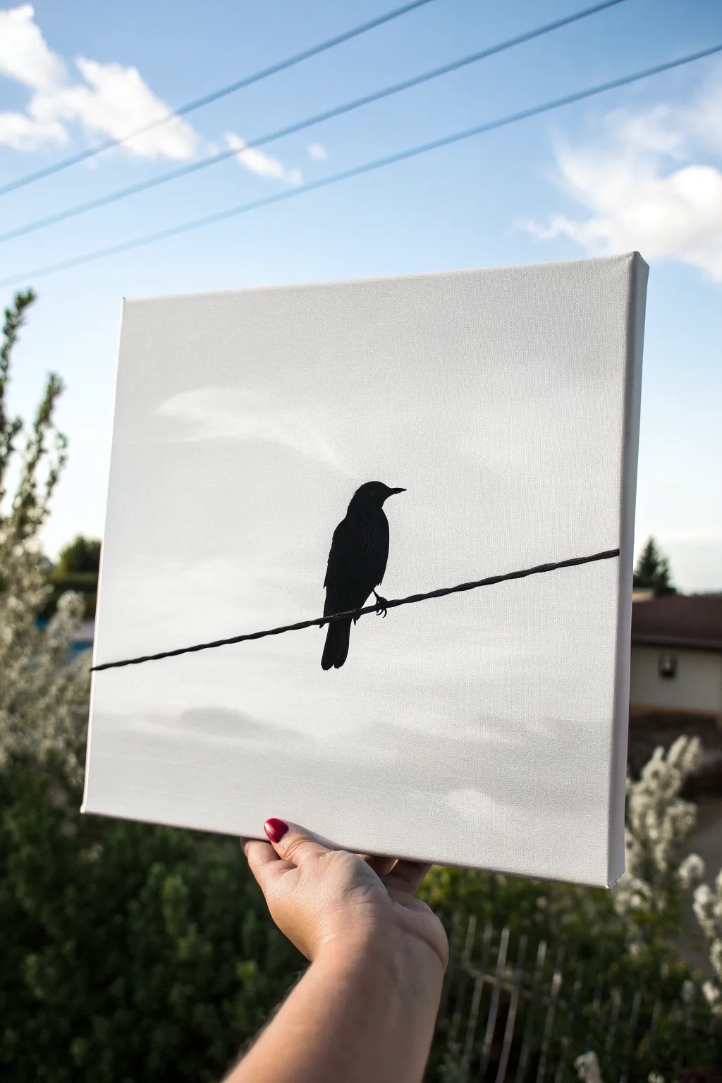
Capture the stark beauty of nature with this high-contrast monochromatic piece. This project focuses on sharp lines and subtle atmospheric backgrounds to create a striking silhouette that looks professional yet is surprisingly simple to achieve.
Detailed Instructions
Materials
- Stretched canvas (square or rectangular)
- White acrylic paint
- Black acrylic paint
- Grey acrylic paint (optional, for mixing)
- Wide flat brush or blending brush
- Small round detail brush (size 0 or 1)
- Medium round brush (size 4)
- Pencil for sketching
- Ruler
- Palette or paper plate
- Water cup and paper towels
Step 1: Creating the Atmosphere
-
Prime the canvas:
Start by coating your entire canvas with a fresh layer of titanium white acrylic paint. Even if the canvas is pre-primed, this ensures a smooth, consistent surface for blending. -
Mix a cloudy grey:
While the white is still wet, mix a tiny drop of black into a pile of white to create a very faint, misty grey. You want this to be barely darker than the white canvas. -
Paint the abstract sky:
Using your wide flat brush, sweep horizontal strokes of the pale grey across the canvas. I find that keeping the strokes loose and slightly uneven mimics the organic feel of distant clouds. -
Blend the background:
Clean your brush and use it dry to gently feather the edges of your grey strokes into the white background. The goal is a soft, dreamlike focus with no harsh lines. -
Let it dry completely:
Allow the background to dry fully before moving on. This is crucial because any moisture will cause the sharp black lines in the next phase to bleed.
Clean Lines Only
If your hand shakes while painting the long wire, try using a painter’s stick or rest your pinky finger on a dry part of the canvas to stabilize your stroke.
Step 2: Drafting the Composition
-
Mark the wire position:
Decide where your wire will sit. Place it slightly below the center line of the canvas for a balanced composition. -
Sketch the wire:
Use a ruler and pencil to draw a straight line across the canvas. To make it look realistic, you can add a barely perceptible downward curve in the middle to suggest the weight of the wire. -
Outline the bird:
Lightly sketch the bird’s silhouette sitting on the wire. Focus on the overall shape: a rounded body, a sleek tail pointing down, and a small head with a beak pointing right. -
Refine the details:
Check your sketch from a distance. Ensure the feet grip the wire and the tail extends slightly below the wire line for perspective.
Add Some Friends
Make this a series by creating two companion canvases: one with two birds facing each other, and another with a bird taking flight, to hang as a triptych.
Step 3: Painting the Silhouette
-
Paint the wire:
Load your medium round brush with pure black acrylic paint. Carefully trace over your pencil line for the wire. -
Add wire thickness:
The wire shouldn’t be too thin. Go over the line again to give it a little weight, simulating a heavy electrical cable. You can add tiny, deliberate bumps to suggest texture. -
Fill the bird’s body:
Switch to your medium brush to fill in the main body of the bird with solid black paint. Apply the paint thick enough so no background light shines through. -
Paint the head and beak:
Use the small detail brush for the upper part of the bird. Carefully define the curve of the head and the sharp point of the beak. -
Detail the feathers:
While the paint is wet, use the tip of your detail brush to fluff out the edges of the chest slightly, making the bird look like it has feathers rather than a smooth plastic surface. -
Define the tail:
Paint the tail feathers extending downwards. Keep the edges relatively sharp here to differentiate the tail from the softer body feathers. -
Anchor the feet:
Use your smallest brush to paint tiny claws gripping the wire. This small detail is what truly connects the subject to the scene. -
Final touch-ups:
Step back and look for any grey spots in your black silhouette. Add a second coat of black if necessary to achieve a matte, deep void of color.
Hang your minimalist masterpiece in a well-lit area to let the stark contrast really pop against your wall


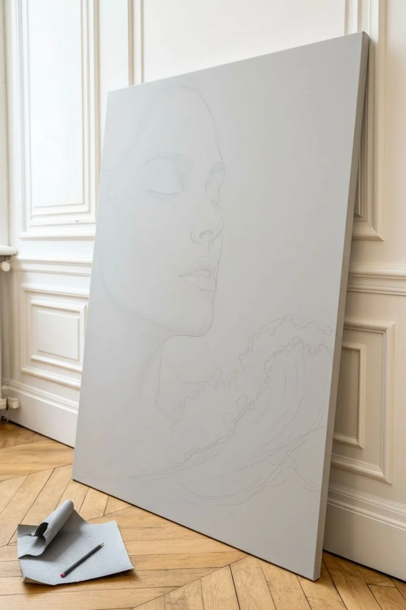
Black and White Portrait With Dramatic Lighting
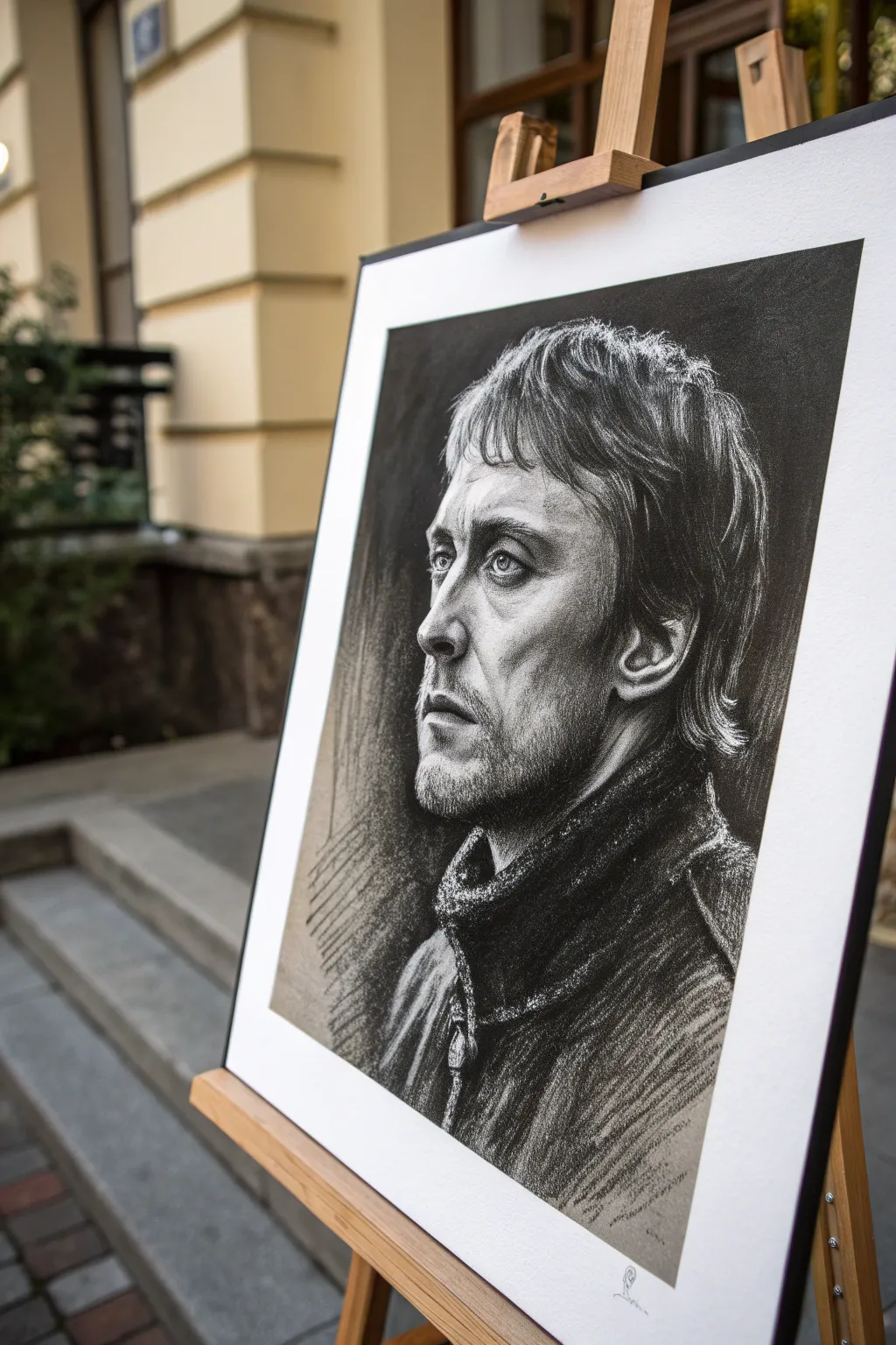
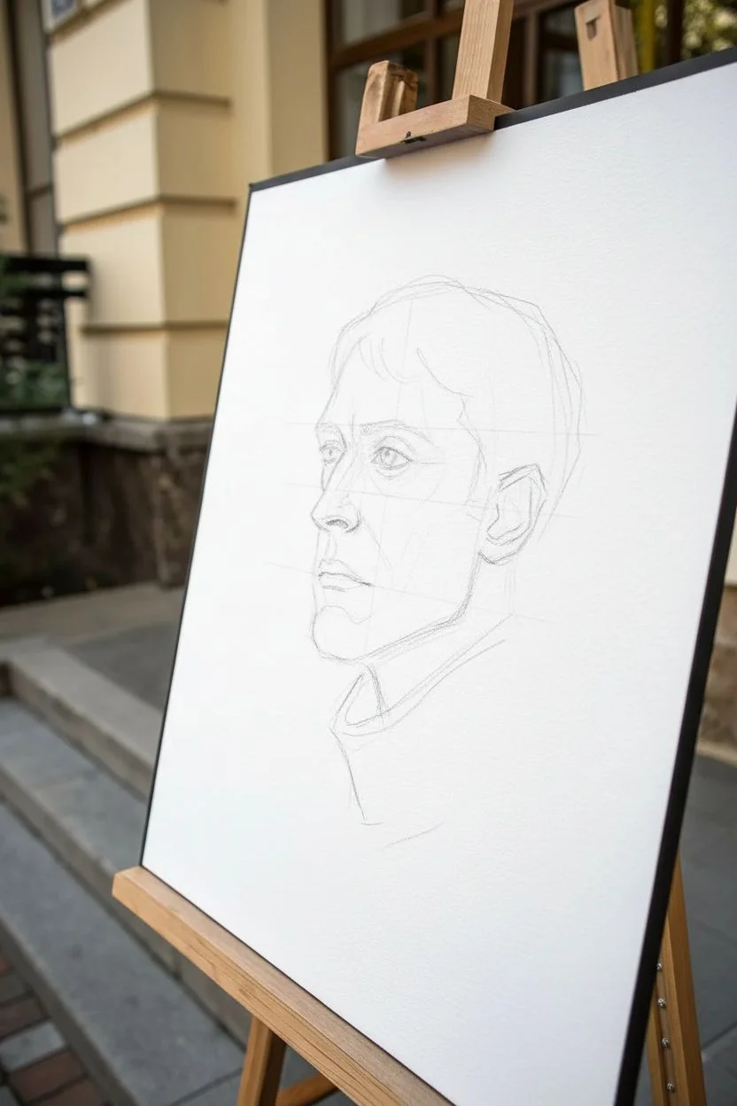
Capture the intensity of human emotion with this striking black and white charcoal portrait, featuring deep contrasting shadows and harsh highlights. This project is excellent for practicing value scales and facial structure without worrying about color mixing.
Step-by-Step Tutorial
Materials
- Heavyweight drawing paper (smooth or vellum finish, approx. 18×24 inches)
- Willow or vine charcoal sticks (soft/medium)
- Compressed charcoal sticks (for deepest blacks)
- White charcoal pencil or white pastel (for highlights)
- Kneaded eraser
- Blending stump (tortillon)
- Workable fixative spray
- Drawing board and tape
Step 1: Setting the Foundation
-
Map the proportions:
Begin by lightly sketching the basic oval of the head and the center line of the face using a stick of willow charcoal. Because the subject is looking to the side in a three-quarter view, shift the center line slightly off-center. Keep your strokes incredibly light and loose so they can be easily moved or erased later. -
Placement of features:
Mark the horizontal lines for the eyes, nose base, and mouth. Observe the subject carefully; the eyes are deep-set, and the nose has a strong bridge. Rough in the shapes of the eye sockets, the triangle of the nose, and the line of the mouth, focusing purely on placement rather than detail. -
Determine the light source:
Identify where the light hits the strongest. In this reference, the light is coming from the front-left, illuminating the nose bridge and forehead while casting the cheek and neck into shadow. Lightly outline the boundary between the light and shadow shapes on the face.
Step 2: Building Values and Depth
-
Establish the mid-tones:
Using the side of your willow charcoal, gently rub a base layer of grey over the shadow side of the face, neck, and the hair area. Don’t press hard; you just want to kill the white of the paper in these shadow zones. Use a tissue or your finger to smooth this initial tone into a soft grey haze. -
Deepen the background:
To make the portrait pop, fill in the background area behind the light side of the face with dark, heavy charcoal strokes. This negative space painting defines the profile without needing a hard outline. I find it helpful to leave the background somewhat textured and loose to contrast with the skin. -
Carve the darkest features:
Switch to a stick of compressed charcoal for the absolute darkest areas. Focus on the pupils, the nostrils, the hard line of the jaw, and the deep folds of the scarf or collar. Apply firm pressure to get a rich, velvety black that willow charcoal can’t quite achieve. -
Model the nose and eyes:
Return to the facial features with a sharpened charcoal stick or pencil. refine the shape of the iris and the eyelids. Carefully shade the side of the nose, blending the charcoal smoothly towards the cheek to create the illusion of roundness and volume. -
Texture the stubble:
For the facial hair, use a blend of stippling (dots) and short, directional dashes along the jawline and upper lip. Don’t draw every hair; instead, create a patchy texture that sits on top of the skin tone you established earlier.
Muddy Shadows?
If your shadows look messy or grey instead of deep black, you may be over-blending. Apply fresh compressed charcoal and leave it alone—don’t rub it. Texture adds depth.
Step 3: Texturing and Refining
-
Rough in the hair:
Treat the hair as large masses of value first, rather than individual strands. Shade the dark underside of the bangs and the hair behind the ear. Once the mass is established, use the sharp edge of a charcoal stick to flick in loose, flowing lines that follow the direction of hair growth. -
Clothing texture:
The collar appears thick and textured, likely wool or heavy fabric. Use broad, sweeping strokes with the side of your charcoal stick to mimic the weave. Let the paper’s grain show through here to suggest rough fabric texture, pressing harder in the deep folds around the neck. -
Lifting lights:
Take your kneaded eraser and shape it into a point or wedge. ‘Draw’ with the eraser by lifting charcoal off the paper to reveal the highlights on the cheekbone, the bridge of the nose, and the forehead. This subtractive method creates soft, realistic transitions. -
Adding sharp highlights:
For the brightest points where the light hits most intensely—like the reflection in the eye, the tip of the nose, and strands of grey hair—use a white charcoal pencil or white pastel. Apply these sparingly; too much white can make the drawing look chalky. -
Refining the edges:
Look at the edges of the face. Some should be sharp (like the bridge of the nose against the dark background), while others (like the curve of the shadowed cheek) should be soft and lost. Use a blending stump to soften any edges that look too like a cutout.
Pro Tip: The Squint Test
Squint your eyes while looking at your subject and your drawing. This blurs the details and helps you see if your big shapes of light and dark match the reference perfectly.
Step 4: Final Touches
-
Check the contrast:
Step back from your easel to view the image as a whole. If the drawing looks flat, your darks imply aren’t dark enough. Re-apply compressed charcoal to the deepest crevices to ensure the full tonal range is present. -
Final background integration:
Ensure the subject feels grounded in the space. You might add some varied hatching lines to the background or faint suggestions of the jacket shoulders fading out at the bottom to give the piece a finished, artistic look. -
Seal the work:
Charcoal smudges incredibly easily. Once you are completely satisfied, take the drawing outside or to a well-ventilated area and spray it with a workable fixative to protect your hard work.
Step back and admire how just a few pieces of burnt wood were able to create such a lifelike presence on the paper


Negative Space Animal Silhouette
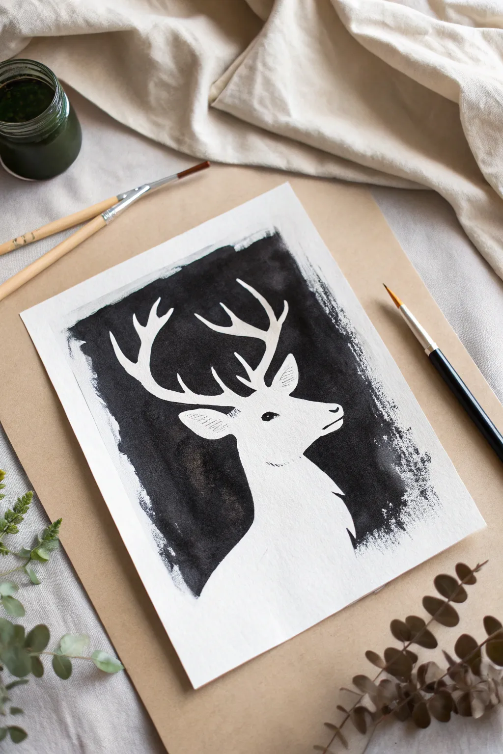
Capture the stillness of nature with this striking high-contrast negative space painting. By painting around your subject rather than painting the subject itself, you create a luminous white silhouette that seems to glow against a textural, dark background.
Step-by-Step
Materials
- Heavyweight watercolor paper or mixed media paper (at least 140lb/300gsm)
- Black India ink or high-flow black acrylic paint
- Pencil (HB or H)
- Kneaded eraser
- Small round paintbrushes (specifically a liner brush for edges)
- Medium round or flat paintbrush for filling areas
- Paper plate or palette
- Masking fluid (optional, for beginners)
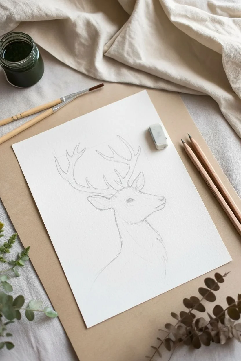
- A reference photo of a stag profile
Step 1: Sketching the Subject
-
Prepare your workspace:
Lay down your materials on a flat surface. Since we are working with black ink, ensure you have protective paper or a drop cloth underneath your work area to catch any accidental drips. -
Analyze the reference:
Look closely at your stag reference photo. Focus on the outline shape—the majestic antlers, the curve of the neck, and the snout—rather than interior details like fur or eyes. -
Draft the outline:
Lightly sketch the stag’s profile onto your paper using an HB or H pencil. Keep your lines faint so they are easy to erase later. Start with the main body mass and neck. -
Detail the features:
Refine the snout, ears, and eye placement. Even though the eye will be a small black dot later, positioning it correctly now is crucial for the animal’s expression. -
Draw the antlers:
Sketch the antler structure carefully. Ensure the tines branch out naturally. Remember, these will remain white paper, so the space *between* the antlers is what you will eventually paint.
Use Liquid Frisket
Struggling with steady hands? Paint liquid masking fluid over the stag sketch first. Let it dry, paint the black freely, then peel the mask off.
Step 2: Defining the Negative Space
-
Outline delicate areas:
Pour a small amount of black India ink or high-flow acrylic onto your palette. Dip a fine liner brush into the ink and carefully trace the exterior of your pencil lines, starting with the complex areas like the antlers. -
Work outward:
Once you have outlined a tine or an ear, use the same brush to slightly thicken the line outward, creating a small buffer zone of black. This prevents accidental slips into the white space when you use larger brushes later. -
Add interior details:
Switch to your fine brush again to paint the eye. It should be a crisp almond shape with a small highlight left white if possible. Add the nostril and the line of the mouth. -
Texture the ears:
Using a very dry brush with minimal ink, create tiny hatching lines inside the ear to suggest depth and fur texture without filling it in completely solid.
Add Metallic Accents
Once the black ink is fully dry, paint the antlers with gold metallic watercolor for a luxurious, festive twist on the original design.
Step 3: Filing the Background
-
Switch brushes:
Change to a medium round or flat brush to cover more ground. Dip it generously into your ink. -
Paint the background block:
Begin filling in the rectangular area around the stag. Ideally, create a rough, painterly rectangle rather than a geometrically perfect box to give it that handmade, artistic feel. -
Approach the silhouette:
Paint carefully up to the ‘buffer zones’ you created earlier. The black background should merge seamlessly with your fine outlines. -
Create edge texture:
As you paint the outer boundaries of the black rectangle, let the brush drag slightly on the paper’s tooth. This dry-brush technique creates a lovely, ragged edge that looks organic. -
Add fur details:
While the background ink is wet, you can pull tiny flicks of black ink into the white neck area to simulate fur standing up on the back of the neck or throat. -
Let it dry completely:
Allow the ink to dry fully. India ink can look dry on the surface while still being wet underneath, so give it at least 20-30 minutes. -
Clean up sketch lines:
Once you are absolutely certain the ink is dry, gently use a kneaded eraser to lift any visible pencil lines remaining in the white areas.
Frame your high-contrast masterpiece in a simple wood frame to emphasize the organic feel of the silhouette
BRUSH GUIDE
The Right Brush for Every Stroke
From clean lines to bold texture — master brush choice, stroke control, and essential techniques.
Explore the Full Guide
Ocean Waves Using Only Value and Edge Control
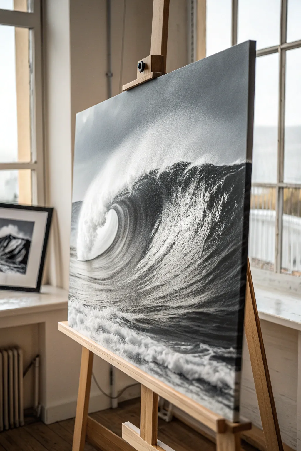
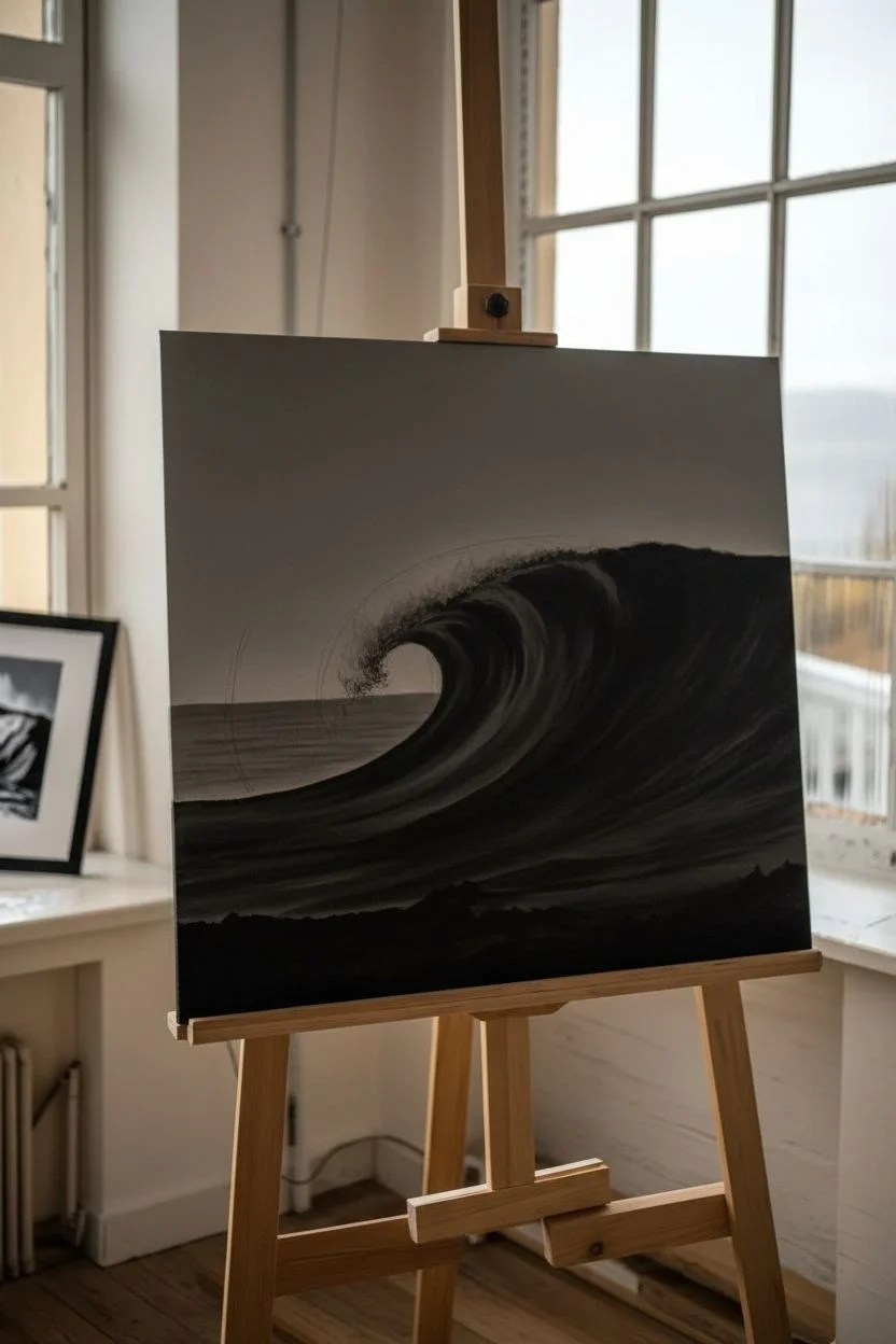
Capture the raw power of the ocean using nothing but black and white. This large-scale painting focuses on mastering value transitions and edge control to create a photorealistic, dramatic seascape that commands attention.
Step-by-Step Guide
Materials
- Large canvas (e.g., 24×36 or larger)
- Titanium White acrylic paint (heavy body recommended)
- Carbon Black or Mars Black acrylic paint
- Gesso (if canvas isn’t pre-primed)
- Large flat brushes (2-3 inch)
- Medium filbert brushes
- Small round or detail brushes
- Old fan brush or texture brush
- Spray water bottle
- Palette knife
- Large mixing palette
- Charcoal vine or pencil for sketching
Step 1: Preparation and The Dark Foundation
-
Prime the Surface:
Ensure your canvas is smooth. If it has a heavy texture, apply a coat of gesso and sand it down lightly once dry. A smooth surface helps achieve those seamless water gradients. -
Map the Composition:
Using vine charcoal or a very light pencil, sketch the main curve of the wave. Mark the horizon line relatively low to give the wave dominance, and outline the ‘eye’ or tube of the wave. -
Mix a Middle Grey:
Mix a significant amount of a mid-tone grey. Paint the entire sky area with this tone initially to establish a neutral background against which the highlights will pop. -
Block in Deepest Shadows:
Take pure Carbon Black on a large flat brush. Paint the underside of the wave’s lip and the deep trough of the water in the foreground. Be bold here; you need extreme darks to make the white spray look bright later. -
Establish the Horizon:
Paint the distant horizon line with a dark grey (not pure black). The ocean gets lighter as it approaches the viewer, so keep the distance moody and dark.
Mist Control
For ultra-realistic mist, dip a toothbrush in watery white paint and run your thumb over the bristles to spray fine droplets. Practice on scrap paper first!
Step 2: Building Form and Gradient
-
Create the Barrel Gradient:
Mix three shades of grey: dark, medium, and light. Inside the curve of the wave (the barrel), apply the dark grey near the top and blending down into the lighter grey near the bottom. -
Wet-on-Wet Blending:
While the paint inside the barrel is still tacky, use a clean, dry filbert brush to smooth out the transitions between your grey strips. The goal is a seamless curve that looks like bent glass. -
Texturing the Face:
On the face of the wave, use a dry-brush technique with a lighter grey. Allow the canvas tooth to grab the paint, creating the illusion of ripples and water tension stretching across the surface. -
The Falling Lip:
Where the wave begins to curl over, use vertical brush strokes that follow the downward momentum of the water. Start dark at the top and lighten the value as you move down into what will become the spray.
Add Color Glazes
Once fully dry, glaze a very thin, transparent layer of Phthalo Blue or Turquoise over the deep shadow part of the wave barrel for a subtle, deep ocean feel.
Step 3: High Drama: Spray, Foam, and Mist
-
Initial Brights:
Load a fan brush or an old bristle brush with pure Titanium White. Stipple gently along the crest of the wave where it breaks into foam. Keep these marks loose and organic. -
Creating the Mist:
Mix a very watery glaze of white paint. Apply this thinly at the base of the wave’s crash. Use a dry brush to haze out the edges, creating the atmospheric misty effect of pulverized water. -
Foreground Foam:
In the dark foreground water, paint web-like patterns of seafoam using a small round brush and light grey paint. It shouldn’t be pure white yet; reserve that for the highlights. -
Highlighting the Foam:
Go back over the thickest parts of your foreground foam with pure white inside the grey lines you just painted. This creates volume and dimension in the bubbles. -
The Back Spray:
Adding ‘flyaway’ spray off the back of the wave crest is crucial for capturing wind speed. Flick a small brush loaded with watered-down white paint backward (against the wave direction) to create tiny droplets. -
Refine the Edges:
Check the edge of your main wave curl. It needs to be crisp against the sky. If it got messy during the mist phase, use your background grey to sharpen the line from behind. -
Final Contrast Check:
Step back five feet. Look for areas that feel flat. Add pure black into the deepest crevices of the wave face or pure white to the brightest explosion of spray to maximize the dynamic range.
Step back and admire the powerful motion you’ve captured in static pigment
City Skyline at Night With Glowing Windows
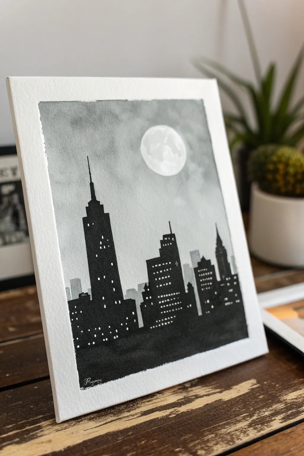
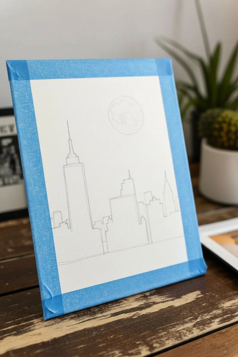
Capture the quiet majesty of a sleeping city with this atmospheric black-and-white painting. Using simple gradients and sharp silhouettes, you’ll create a striking skyline that glows under a soft, cloudy moon.
How-To Guide
Materials
- Cold press watercolor paper (A4 or similar size)
- Painter’s tape or masking tape
- Black watercolor paint or black india ink
- White gouache or white gel pen
- Large flat brush (for washes)
- Medium round brush
- Small detail brush (size 0 or 1)
- Jar of clean water
- Paper towel
- Pencil and eraser
- Circular object for tracing (like a coin or bottle cap)
Step 1: Setting the Scene
-
Prepare your canvas:
Begin by taping down all four edges of your watercolor paper to a hard board or your work surface. This creates a crisp white border and keeps the paper from buckling when wet. -
Draft the moon:
Decide on the placement of your moon in the upper right quadrant. Lightly trace a circle using a coin or bottle cap. Keep your pencil lines very faint so they don’t show through later. -
Outline the skyline:
Sketch a rough horizon line about one-third up from the bottom. Then, draw the basic shapes of your skyscrapers. Include a tall, dominant building on the left (like the Empire State Building) and vary the heights of surrounding buildings to create visual interest.
Pro Tip: Masking Fluid
For a perfect moon, apply liquid masking fluid over the circle before painting the sky. Rub it off after the sky dries for a flawless white orb.
Step 2: Creating the Atmosphere
-
Mix a light grey wash:
On your palette, dilute a small amount of black paint with plenty of water to create a watery, pale grey. You want this to be transparent. -
Protect the moon:
Carefully paint clear water around the outside of your pencil moon circle, but keep the inside of the circle completely dry for now. This reserves the bright white of the paper. -
Paint the initial sky wash:
Using your large flat brush, apply the pale grey wash across the entire sky area, working around the moon. Let the water carry the pigment naturally. -
Add cloud texture:
While the paper is still damp, dab in slightly darker grey patches randomly throughout the sky. The wet paper will soften these edges, creating a cloudy, atmospheric look. -
Paint the moon’s craters:
Once the sky is semi-dry, use a very dilute grey to paint subtle, blotchy textures inside the moon circle. Leave some areas pure white to make it look luminous. -
Let it dry completely:
Allow the background to dry fully. If the paper feels cool to the touch, it is still wet. Patience here prevents the black skyline from bleeding into your sky.
Troubleshooting: Bleeding
If black paint bleeds into your sky, blot it immediately with a clean paper towel corner. Let it dry, then gently touch up with white gouache later.
Step 3: Building the City
-
Mix a solid black:
Prepare a rich, opaque black on your palette. If using watercolor, use less water; if using ink, use it straight from the bottle for maximum darkness. -
Paint the distant buildings:
For buildings that appear further away (behind the main skyline), mix a medium-dark grey. Paint these shapes first. This creates depth, making the black buildings in front pop. -
Fill the main silhouette:
Using your medium round brush and the solid black paint, carefully fill in the silhouettes of the main foreground buildings. Ensure the edges are crisp and straight. -
Add architectural details:
Switch to your small detail brush. Add the fine antenna spire to the tallest building and clarify any stepped rooflines or pointed tops. -
Anchor the bottom:
Ensure the bottom section of the painting is filled with solid black to ground the image, creating a dark base for the city to sit on.
Step 4: Lighting the Windows
-
Wait for total dryness:
This is crucial. The black paint must be 100% dry before you add white, or it will turn into a muddy grey smear. -
Prepare your lights:
Squeeze out a small dot of white gouache or get your white gel pen ready. Gouache is often better for opaque, bright dots -
Dot the windows:
Using the smallest tip brush or gel pen, start adding rows of tiny windows. I like to vary the pattern—some windows grouped together, some isolated, to mimic a real city at night. -
Create variation:
Don’t make them perfect grids. Skip some spaces to suggest lights are off in certain rooms. This irregularity makes the scene look more realistic. -
The final reveal:
Once the white dots are dry, gently peel off the masking tape at a 45-degree angle to reveal your clean, crisp white border.
Enjoy the peaceful urban view you’ve created and try framing it to enhance the depth.

PENCIL GUIDE
Understanding Pencil Grades from H to B
From first sketch to finished drawing — learn pencil grades, line control, and shading techniques.
Explore the Full Guide
Pine Forest Depth Study in Three Values
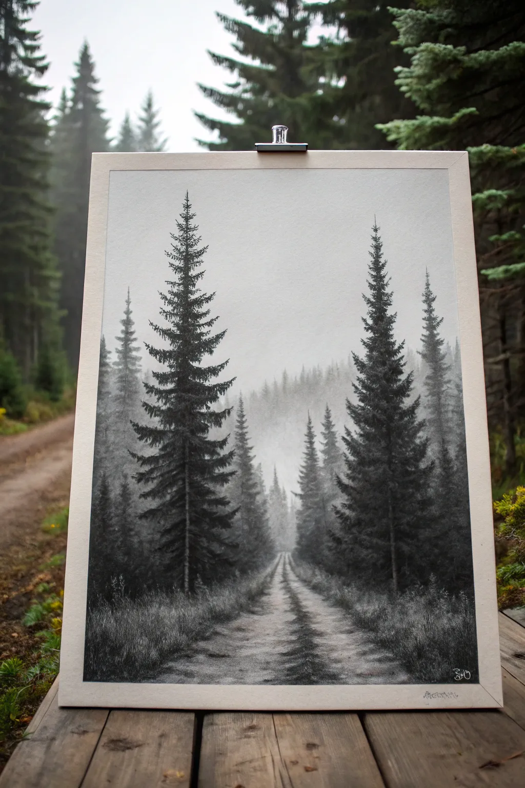
Master the art of atmospheric perspective with this moody black and white landscape. By using just three main values—dark foreground, mid-tone middle ground, and misty white background—you will create a striking sense of depth that draws the viewer straight down the forest path.
Detailed Instructions
Materials
- Heavyweight drawing paper (smooth or vellum finish)
- Charcoal pencils (HB, 2B, 4B, and 6B)
- Willow charcoal sticks
- Kneaded eraser
- Blending stumps (tortillons)
- White pastel pencil or white charcoal (optional highlights)
- Workable fixative spray
- Artist tape or clips
- Drawing board
Step 1: Setting the Atmosphere
-
Secure your paper:
Begin by taping or clipping your paper securely to your drawing board. This prevents the paper from shifting while you work and keeps the edges crisp if you plan to frame it later. -
Establish the horizon:
Lightly sketch a very faint horizon line about a third of the way up from the bottom. Mark a vanishing point in the center where your road will disappear into the fog. -
Lay down the mist:
Using a soft willow charcoal stick, lightly rub a layer of grey value across the upper half of the paper. Use a large blending stump or tissue to smooth this out completely, creating a soft, foggy gray sky. It should be barely there—just enough so the paper isn’t stark white. -
Sketch the distant tree line:
With an HB charcoal pencil, very faintly sketch vertical strokes in the background to suggest distant trees. Keep these strokes short and hazy; they should look like they are disappearing into the fog. Blending them slightly with a clean finger helps push them back into the distance.
Muddy background?
If your distant fog looks dirty rather than misty, your blending stump might be saturated with old charcoal. Use a fresh stump or a clean tissue for the delicate sky areas.
Step 2: Building the Path
-
Outline the road:
Draw the converging lines of the road meeting at your vanishing point. The road should be wider at the bottom (foreground) and narrow to a point in the distance. -
Add road texture:
Using the side of a 2B pencil, add horizontal and diagonal scumbling marks to the road surface. Focus darker patches in the center of the road and along the tire tracks, leaving lighter areas for puddles or dry dirt reflecting light. -
Define the grass edges:
Along the sides of the road, use upward, flicking strokes with a 4B pencil to create tall grasses. Make the grass in the foreground taller and more distinct, while the grass further back should be shorter and less defined.
Atmospheric Depth
Remember the golden rule of depth: objects get lighter, smaller, and less detailed the further back they are. Only the two front trees should have your darkest blacks.
Step 3: The Hero Trees
-
Place the main trunks:
Identify the placement of your two large foreground trees. Draw a straight vertical line for each trunk using a 4B pencil, ensuring they extend almost to the top of the paper to enhance the scale. -
Start the branches from the top:
Starting at the apex of the left tree, use short, downward-slanting strokes to create the needle clusters. Keep the top very narrow and sparse. -
Thicken the mid-section:
As you move down the trunk, make your branches wider and denser. I like to twist the charcoal pencil slightly as I press down to create random, organic textures that mimic pine needles. -
Create deep shadows:
Switch to your darkest 6B pencil for the lower branches. Press firmly to create rich, black values near the trunk, letting the pressure off as you move toward the tips of the branches. This high contrast is crucial for the foreground. -
Repeat for the right tree:
Recreate the process for the large tree on the right side. Ensure the trees aren’t perfectly symmetrical; distinct irregularities make them look natural. -
Add supporting trees:
Draw the mid-ground trees (the ones slightly behind the main two) using a 2B pencil. These should be darker than the background mist but lighter than the foreground giants, establishing that crucial middle value.
Step 4: Refining Details
-
Ground the trees:
Darken the base of the trees where they meet the grass. Add more chaotic, grassy strokes here to show weeds growing around the trunks. -
Lift highlights:
Use your kneaded eraser to tap and lift charcoal from the center of the road and the tips of the foreground grass. This simulates light hitting the path and adds texture. -
Smooth the transition:
Check the area where the road meets the foggy background. If the line is too sharp, lightly smudge it so the road seems to dissolve into the mist. -
Final darks:
做 one last pass with your 6B pencil. Reinforce the darkest shadows in the closest pine branches and the deepest ruts of the road. This anchors the image. -
Protect your work:
Once you are satisfied with the values, take the drawing outside and apply a light coat of workable fixative to prevent the charcoal from smudging.
Step back and admire how simple gradient changes have transformed a flat piece of paper into a deep, misty forest path
Rainy Street Reflections With Loose Brushwork
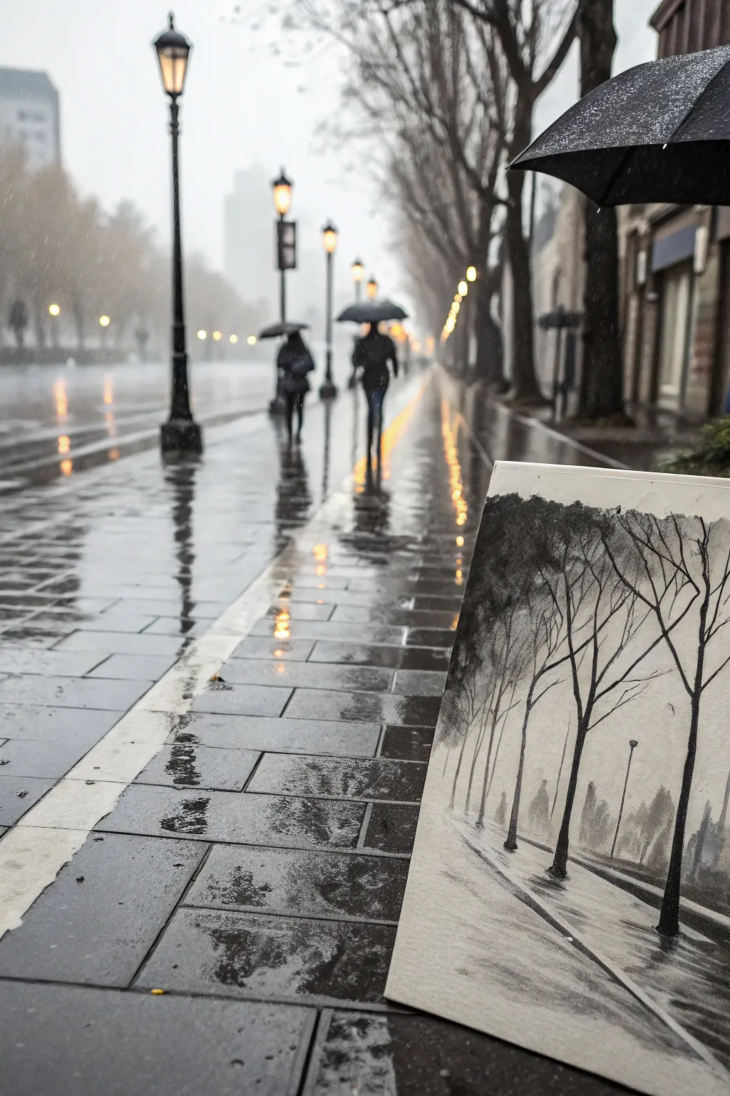
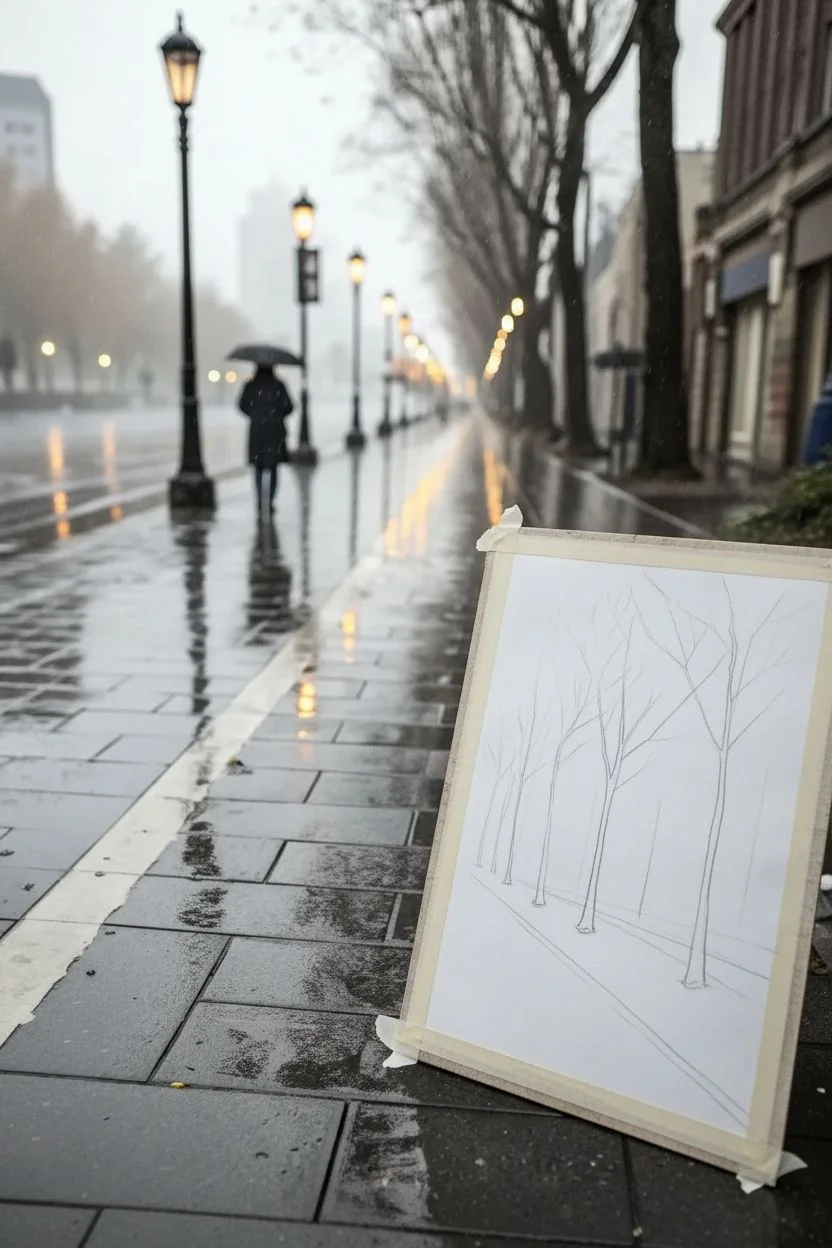
Capture the moody atmosphere of a rainy city street using a blend of charcoal and ink wash. This monochrome study focuses on stark tree silhouettes and the beautiful, blurry reflections that define wet pavement.
Step-by-Step Guide
Materials
- Heavyweight mixed media or watercolor paper (cold press)
- Black India ink or liquid watercolor
- Soft charcoal vine
- Compressed charcoal stick (medium/dark)
- White gel pen or white gouache
- Assorted brushes (flat wash, round detail)
- Water container and paper towels
- Kneaded eraser
- Masking tape
Step 1: Setting the Scene
-
Paper Preparation:
Begin by taping down your paper to a rigid board on all four sides. This prevents buckling when we add the washes later and creates a clean, professional border. -
Establishing the Horizon:
Lightly sketch a low horizon line about one-third up from the bottom of the page using your vine charcoal. Draw a diagonal line receding from the bottom right corner toward the center left to establish the curb or pathway edge. -
Placing the Trees:
Mark the vertical positions of the trees. Start with the largest tree in the foreground on the right, and then add progressively smaller, thinner lines as you move left and backward into the distance to create depth.
Smudge Control
Place a scrap piece of paper under your drawing hand. This acts as a bridge, preventing your palm from smearing the charcoal you’ve already laid down.
Step 2: Building Atmospheric Washes
-
The Misty Background:
Dilute a tiny drop of India ink in a large amount of water to create a very pale grey. Wash this over the background area, keeping it lighter near the bottom horizon to suggest mist. I like to keep this layer very wet and loose. -
Distant Shapes:
While the paper is still slightly damp, introduce a slightly darker grey wash to suggest distant buildings or foliage masses in the background. Let the edges bleed slightly for a soft-focus effect. -
Foreground Ground Plane:
Apply a medium-grey wash to the pavement area in the foreground. Use horizontal brushstrokes here to mimic the flatness of the ground, leaving a few deliberate white gaps for the brightest highlights on the wet stone. -
Drying Time:
Allow the paper to dry completely before moving to the bold charcoal steps. If the paper is cool to the touch, it’s still too wet.
Warm it Up
For a sepia or vintage photograph look, swap the black India ink for a walnut ink or a strong brew of coffee for your initial washes.
Step 3: Defining the Silhouettes
-
Main Tree Trunks:
Take your compressed charcoal stick and draw the main tree trunks boldly. Press harder at the base and lift pressure as you move up. The line should be slightly jagged to look organic. -
Adding Branches:
Switch to a finer charcoal piece or a sharpened edge. Draw the branches extending upward and outward. Remember that winter trees have branches that overlap and cross; don’t make them too neat. -
Canopy Texture:
Smudge some charcoal dust lightly near the tops of the trees to suggest fine twigs or remaining leaves without drawing every single detail. -
The Dark Curve:
Reinforce the curb line with a strong, dark stroke of compressed charcoal. This line acts as a visual anchor leading the viewer’s eye into the scene.
Step 4: Reflections & Details
-
Ground Reflections:
Beneath each tree trunk, pull dark charcoal strokes vertically downward into the pavement area. Smudge these downwards with your finger or a dry brush to create the blurry look of reflections on wet stone. -
Streetlamps:
Use a fine detail brush with undiluted black ink to add the thin vertical lines of the distant streetlamp posts. Keep them much thinner than the trees. -
Ghostly Figures:
If you wish to add life to the distance, dab small, elongated shapes with a diluted grey wash to suggest walking figures in the mist. Keep them indistinct and mysterious. -
Texture on Pavement:
Lightly drag the side of your charcoal stick across the foreground pavement. The texture of the paper will catch the charcoal, creating a grainy effect that looks like asphalt or stone.
Step 5: Final Highlights
-
Lifting Light:
Use your kneaded eraser to lift off charcoal in horizontal streaks across the pavement, enhancing the feeling of water pooling on the ground. -
Brightest Points:
Finally, use a white gel pen or a tiny touch of white gouache to add sharp highlights to the wettest parts of the curb or the tops of the streetlamps. -
Sealing:
Once finished, spray your artwork with a fixative in a well-ventilated area to prevent the charcoal from smudging.
Step back and enjoy the moody, reflective atmosphere you’ve captured on paper.


Abstract Marble Swirl Fluid Look
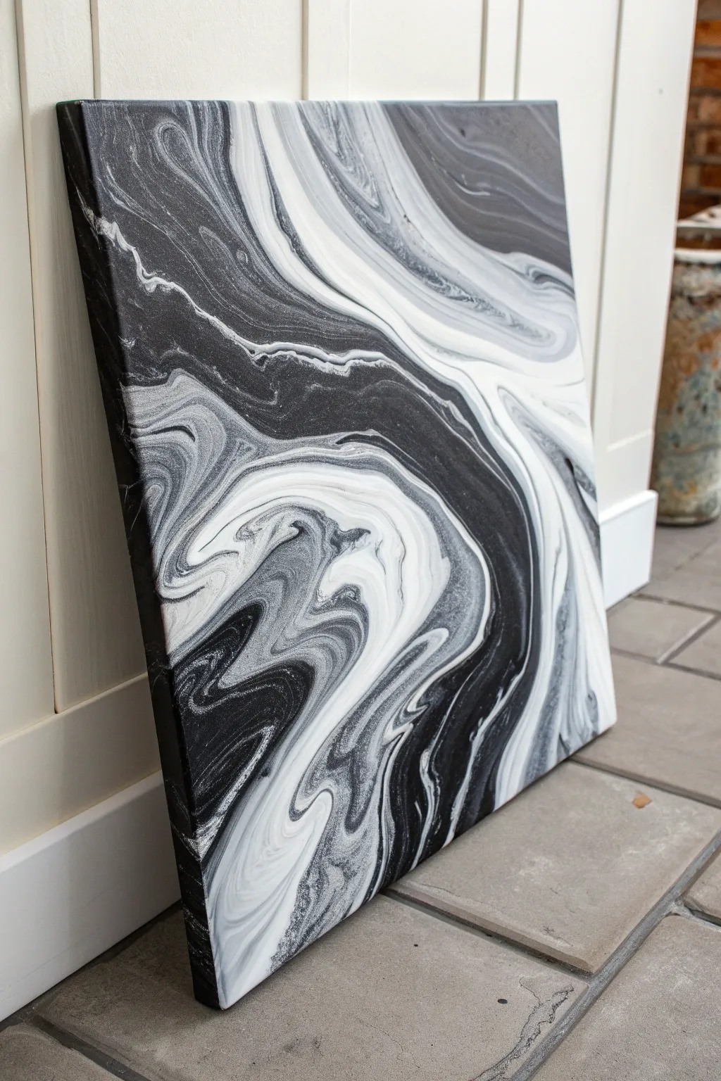
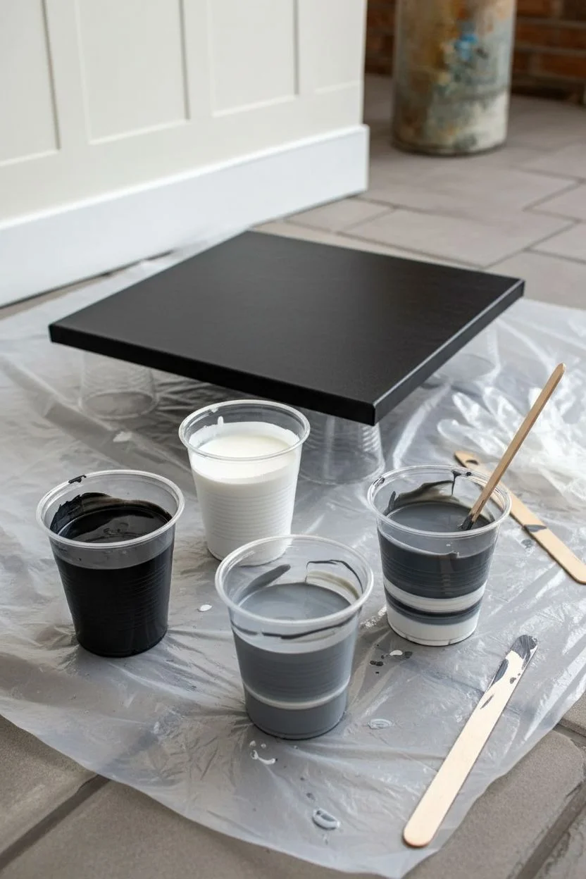
Capture the elegance of natural stone with this striking high-contrast fluid art piece. Using just black and white acrylics, you’ll create sophisticated gray transitions and organic marble veining that looks incredibly professional.
How-To Guide
Materials
- Square stretched canvas (e.g., 12×12 or 16×16 inches)
- Black acrylic paint
- White acrylic paint
- Pouring medium (Floetrol or Liquitex)
- Four plastic cups
- Stirring sticks
- Disposable gloves
- Drop cloth or plastic sheeting
- Hairdryer (optional for moving paint)
- Butane torch (optional for popping bubbles)
Step 1: Preparation & Mixing
-
Workspace setup:
Begin by covering your entire work area with a drop cloth or plastic sheeting, as fluid art can get messy. Elevate your canvas on four inverted cups to allow paint to drip freely off the edges. -
Mix the black base:
In the first cup, mix one part black acrylic paint with roughly two parts pouring medium. Stir slowly but thoroughly until the consistency resembles warm honey. This will be your primary dark tone. -
Mix the white base:
Repeat the process in a second cup with white paint and pouring medium. Aim for the exact same consistency as your black mix to ensure they flow together smoothly without one sinking into the other. -
Create a grey mid-tone:
Pour a small amount of your mixed black and mixed white into a third cup. Stir them together to create a medium charcoal grey. This bridge color adds depth and prevents the stark contrast from looking too harsh. -
Prepare the dirty pour cup:
Take your fourth empty cup. Pour a layer of white at the bottom, followed by a layer of black, then grey. Do not stir this cup. -
Layer the paints:
Continue layering the colors into the dirty pour cup in random amounts. Add a splash of white, then a heavy pour of black. Repeat until the cup is full.
Muddy colors?
Avoid over-tilting or stirring the paint once it’s on the canvas. If you move it back and forth too many times, the black and white will mix into a flat grey blob instead of distinct veins.
Step 2: The Pouring Process
-
The flip cup technique:
Place your canvas face down on top of the full cup. Hold the cup and canvas tight against each other and quickly flip them over so the cup is upside down on the canvas surface. -
Release the paint:
Wait a moment for the paint to settle, then gently lift the cup straight up. The paint will rush out in a puddle. Let it spread naturally for a few seconds. -
Initial tilting:
Gently tilt the canvas just slightly to the left and right. You aren’t trying to cover the corners yet; you just want to open up the puddle and see the initial cells or veins forming. -
Adding negative space:
If you want areas of pure black like in the photo, pour some reserved black mixture directly onto the corners of the canvas now. This helps the marble pattern slide over the canvas easier. -
Stretch the pattern:
Tilt the canvas more aggressively now. Guide the paint toward one corner, watching the marble veins stretch and elongate. Bring the paint back to the center before tilting toward the opposite corner. -
Refine the composition:
Look at the flow. If you lose too much white, pour a thin ribbon of white directly into a black area and tilt again to incorporate it. I like to let gravity do most of the work here to keep the lines organic. -
Cover the edges:
Ensure the paint has flowed over all four sides. Use a finger dipped in the overflow paint to dab any dry spots on the corners or sides so the texture is uniform.
Step 3: Detailing & Curing
-
Enhance veining:
If you want thinner, more delicate veins, you can gently blow on specific areas with a straw or use a hairdryer on a cool, low setting to push the white layers over the black. -
Pop air bubbles:
Pass a butane torch quickly over the surface of the painting. Keep it moving constantly and stay about 6 inches away. This pops trapped air bubbles and creates a smoother finish. -
Check the drip alignment:
Run a clean stick or your finger along the underside edge of the canvas frame to remove hanging drips. This prevents the paint on top from continuing to pull downward as it sets. -
Drying setup:
Leave the canvas on the raised cups in a dust-free area. It needs to dry completely level to prevent the design from shifting. -
Final cure time:
Allow the painting to dry for at least 24 to 48 hours. The surface might look dry sooner, but fluid acrylics are thick and need time to harden fully underneath.
Add metallic flair
Mix a small amount of silver or pearl metallic paint into your layering cup. It will add a subtle shimmer to the grey transitions that catches the light beautifully when dry.
Once fully cured, your canvas will display a timeless stone-like topography perfect for modern decor
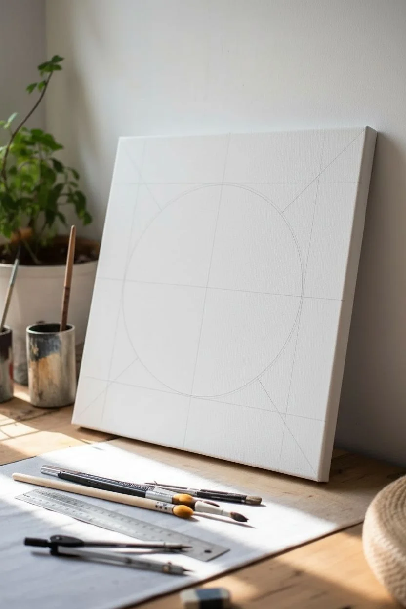
Geometric Shapes With Clean Hard Edges
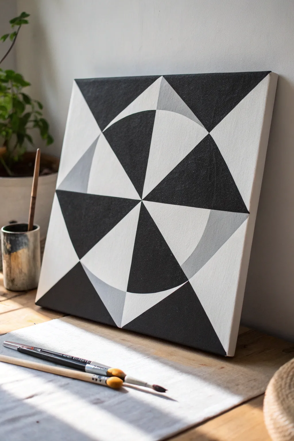
This striking artwork relies on high-contrast black, white, and grey tones arranged in a sharp, geometric composition that plays with visual depth. By combining crisp triangles and curved segments, you’ll create a modern piece that looks incredibly professional but is surprisingly approachable to paint.
Step-by-Step
Materials
- Square stretched canvas (e.g., 12×12 or 16×16 inches)
- Acrylic paint (Mars Black, Titanium White)
- Flat synthetic brushes (various widths like 1 inch and 1/2 inch for clean edges)
- Small round brush for touch-ups
- Ruler or straight edge
- Compass or a circular object (like a dinner plate) to trace
- Pencil and eraser
- Painter’s tape or artist’s masking tape
- Palette or mixing plate
- Cup of water and paper towels
Step 1: Drafting the Design
-
Establish the center:
Begin by finding the exact center of your square canvas. Use your ruler to lightly draw diagonal lines from corner to corner; the point where they intersect is your center. -
Draw the primary X:
Using the diagonal lines you just made as a guide, draw distinct lines connecting opposite corners of the canvas. This divides your square into four large triangles meeting in the middle. -
Add the cross:
Measure the halfway point of each of the four outer edges of the canvas. Draw a vertical line and a horizontal line connecting these points through the center. You should now have eight equal triangular ‘slices’ radiating from the center. -
Create the circle:
Place the point of your compass at the definitive center point. Draw a large circle that fills about 70-80% of the canvas width. If you don’t have a compass, center a large plate or bowl over the crosshairs and trace it lightly. -
Mark the outer corners:
Identify the four corners of the canvas. Draw a straight line connecting adjacent mid-points of the canvas edges, effectively creating a diamond shape or a ‘square’ tilted on its side inside your canvas bounds.
Step 2: Planning and Mixing
-
Map your values:
Look closely at the reference image. The pattern alternates between black, white, and a mid-tone grey. Lightly mark each section with a ‘B’, ‘W’, or ‘G’ in pencil so you don’t get confused once you start painting. -
Mix the grey:
Squeeze out a generous amount of Titanium White and add a small dot of Mars Black. Mix thoroughly until you achieve a smooth, neutral mid-grey. I prefer to mix slightly more than I think I need to ensure the color remains consistent throughout the project. -
Tape the first sections:
To get those hard edges, apply painter’s tape along the pencil lines for your first set of shapes (start with the black sections that don’t touch each other). Press the tape down firmly with your thumbnail to prevent bleeding.
Bleeding Lines?
If paint bleeds under your tape, wait for it to dry completely. Then, use the background color to carefully paint a straight line over the mistake using a ruler as a hand-rest.
Step 3: Painting the Layers
-
Paint the black segments:
Load your flat brush with black paint. Apply it to the designated black triangles and curved segments. Brush away from the tape edge initially to further minimize potential bleeding under the tape. -
Apply a second coat:
Acrylic black can sometimes look streaky. Let the first coat dry to the touch (about 10-15 minutes), then apply a second coat for a solid, opaque matte finish. -
Remove tape and dry:
Peel the tape off slowly at a 45-degree angle while the paint is still slightly tacky but mostly dry. Allow these black sections to dry completely before taping over them for the next color. -
Paint the grey sections:
Once the black is dry, tape off the boundaries for the grey areas. These are typically the smaller triangles near the perimeter or specific curved sections of the pinwheel. Apply your pre-mixed grey paint smoothly. -
Fill the white areas:
Finally, address the white sections. Even if your canvas is primed white, painting these sections with Titanium White gives the piece a consistent texture and sheen. Use a clean brush and apply two thin coats.
Level Up: Texture Contrast
For a tactile twist, mix a matte medium into your black paint and a gloss medium into the white. The difference in sheen adds a subtle, sophisticated layer of depth.
Step 4: Finishing Touches
-
Clean up edges:
Inspect your lines. If any paint bled under the tape or if a hand-painted edge is wobbly, use a small liner brush or angle brush with the correcting color to sharpen the boundary. -
Paint the sides:
Decide how you want the edges of the canvas to look. You can wrap the design around the sides, or simply paint all four edges solid white or black for a framed appearance. -
Erase guidelines:
Once the painting is 100% dry, gently erase any visible pencil marks that remain in the lighter sections of the canvas.
Step back and enjoy the mesmerizing optical depth of your new geometric artwork
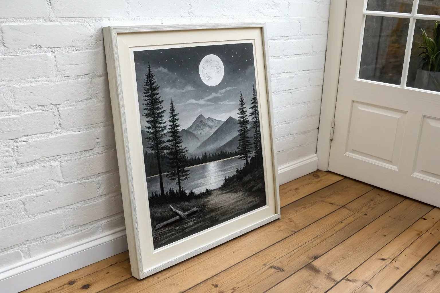
Ink-Wash Style Landscape With Soft Gradients
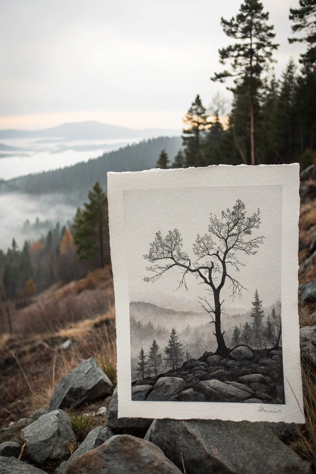
Capture the moody beauty of a mountain ridge with this monochromatic landscape painting that balances precise detail with soft, atmospheric fades. By combining crisp ink lines for the foreground tree with diluted washes for the misty background, you’ll create a striking sense of depth and solitude.
Step-by-Step Guide
Materials
- Cold press watercolor paper (300 gsm)
- Black waterproof fine liner pens (0.1, 0.3, and 0.5 sizes)
- Black India ink or concentrated liquid watercolor
- Synthetic round brushes (sizes 2, 6, and 12)
- Pencil (HB) and kneaded eraser
- Mixing palette with multiple wells
- Jar of clean water
- Paper towels
Step 1: Planning and Sketching
-
Tape the paper:
Secure your watercolor paper to a board using artist’s tape. This prevents the paper from buckling when we apply the wet washes later. Leave a small border if you want a clean edge, or tear the edges of the paper beforehand for a rustic, deckled look like in the photo. -
Establish the horizon:
Lightly sketch a low horizon line about one-third up from the bottom of the page. This will be the top of your rocky foreground. -
Outline the main subject:
Sketch the primary tree slightly off-center to the right. Focus on the twisting, gnarly shape of the trunk and the major branches. Don’t worry about the tiny twigs yet. -
Map the rocks:
Draw the basic shapes of the boulders in the immediate foreground. Keep these shapes large and blocky, tapering off as they go down the slope.
Clean Edges, Please
If your ink bleeds uncontrollably into the sky, your paper was too wet. Wait until the paper loses its sheen and is just damp—cool to the touch—before applying the next layer of wash.
Step 2: Creating the Atmospheric Background
-
Prepare your washes:
In your palette, mix three pools of ink: a very pale grey (mostly water), a medium grey, and a dark grey. Keep clear water nearby for blending. -
Paint the distant sky:
Using your largest brush, apply clean water to the sky area down to the horizon. While wet, drop in touch of the palest grey wash near the top, fading it to pure white as you reach the horizon line. -
First layer of misty hills:
Once the sky is dry, paint the furthest mountain ridge using the very pale grey. Use a bumpy, uneven stroke to suggest faraway treelines. Let this dry completely. -
Middle ground forest:
Using the medium grey wash, paint a layer of treelines slightly lower than the first ridge. While the wash is still wet, use a size 6 brush to drop in slightly darker pigment at the bottom of these trees to ground them. -
Add vertical definition:
Switch to a smaller brush and the medium-dark wash. Paint tiny vertical lines emerging from the fog in the middle ground to suggest individual pine trees peaking through the mist.
Step 3: The Foreground and Rocks
-
Base layer for rocks:
Paint the foreground rocks with a medium-dark grey wash. Leave the tops of the boulders unpainted to represent highlights where the light hits the stone. -
Deepening shadows:
While the rocks are damp but not soaking, drop concentrated black ink into the crevices between boulders and the underside of the rock shapes to create weight and contrast. -
Texture the stones:
Once the rocks are dry, use a nearly dry brush with dark ink to scumble texture over the shadowed sides of the rocks, giving them a rough, granite-like appearance. -
Foreground foliage:
Using pure black ink and a small brush, dab in the silhouette of small pine trees and shrubs on the left and right sides of the foreground ridge. Keep the edges sharp.
Tinting for Mood
Mix a tiny drop of sepia tone or blue watercolor into your grey washes. A warm sepia creates a vintage photo look, while blue emphasizes a cold, winter morning atmosphere.
Step 4: The Sentinel Tree
-
Inking the trunk:
Use your 0.5 fine liner pen or a small brush with pure black ink to outline and fill the main trunk. Add craggy bumps and twists to show age. -
Branch structure:
Switch to a 0.3 pen. extend the main branches outward. Remember that branches usually get thinner the further they grow from the trunk. Use jagged, angular lines rather than smooth curves. -
Detailed twigs:
Using the 0.1 pen, draw delicate networks of fine twigs at the ends of the branches. I prefer to use a stippling or tiny scribbling motion here to suggest the clusters of fine growth or dried leaves. -
Root anchor:
Ensure the tree feels connected to the ground by darkening the area where the trunk meets the rocks. Add a few visible roots grasping the boulders. -
Final contrast check:
Look at the whole piece from a distance. If the misty background looks too pale, add a very light glaze of grey over the wooded areas. If the foreground needs more punch, restate the darkest shadows in the rocks with pure black ink.
Peel off the tape carefully to reveal your crisp borders and enjoy the quiet atmosphere of your mountain scene
Textured Black Background With White Scratch Details
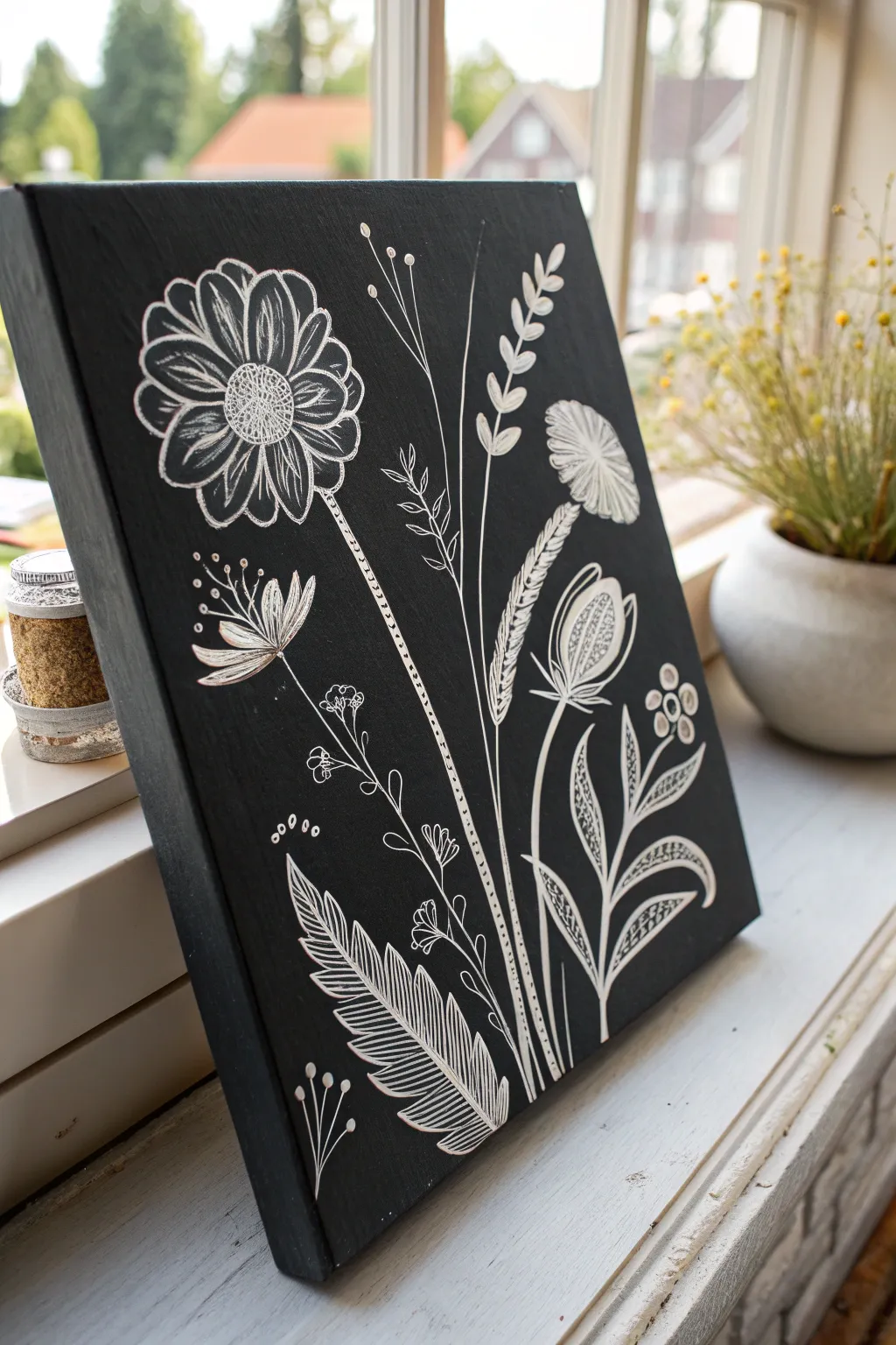
Create a striking piece of botanical art that mimics the look of a traditional woodcut or scratchboard using simple painting techniques. The stark contrast between the deep, matte black background and the delicate white linework brings a modern yet rustic charm to any windowsill.
Step-by-Step
Materials
- Stretched canvas (rectangular, approx. 11×14 or similar)
- Black acrylic paint (matte finish is best)
- White gel pen (bold point) or white acrylic paint marker
- Wide flat paintbrush
- Pencil (HB or lighter)
- Ruler
- Paper for sketching (optional)
- White chalk or white charcoal pencil (optional for drafting)
Step 1: Preparing the Canvas
-
Prime the background:
Squeeze a generous amount of black acrylic paint directly onto your canvas. Using a wide flat brush, spread the paint evenly across the entire surface. -
Add texture:
While painting, use vertical brushstrokes to create a subtle, striated texture. This slight groove in the paint adds depth and mimics the wood grain often seen in rustic art. -
Paint the edges:
Don’t forget the sides of the canvas. Extend your black paint around the edges to give the piece a finished, professional look without needing a frame. -
Allow to cure:
Let the canvas dry completely. Paint scratches easily if artwork is started too soon, so I ensure it’s bone dry—usually waiting at least 2-3 hours or overnight.
Step 2: Drafting the Design
-
Plan the composition:
Visualize three main vertical stems. The largest flower will be on the upper left, a feathery seed head on the right, and various leaves and smaller buds filling the lower space. -
Lightly sketch outlines:
Use a regular pencil or a white charcoal pencil to very lightly mark the positions of the main stems and the centers of the flowers. Keep the pressure light to avoid denting the canvas.
Ink Not Flowing?
Canvas canvas be rough on pens. If your gel pen skips, scribble on a scrap piece of paper to clear the ballpoint, or switch to a paint marker for smoother flow.
Step 3: Drawing the Main Florals
-
Start the daisy:
Begin with the large flower on the top left. Using your white pen or marker, draw a small circle for the center, filling it with tiny stippled dots. -
Add daisy petals:
Draw long, looped petals radiating from the center. Add sketchy, internal lines within each petal to give them a textured, illustrative quality. -
Draw the main stem:
Bring a line down from the daisy. Instead of a solid line, use a series of small white dots or dashed lines to represent the stem texture, stopping near the bottom. -
Create the seed head:
On the upper right, draw a semi-circle shape. Fill it with tight, radiating lines that fan out like a dandelion puff or thistle. -
Detail the bulb:
Below the seed head, draw a teardrop-shaped flower bud. fill the inside with patterned dots to suggest seeds waiting to open.
Add Subtle Color
Once the white ink is dry, use colored pencils to very lightly shade inside the petals or leaves for a muted, chalkboard-art aesthetic.
Step 4: Adding Foliage and Filler
-
Draw the large leaf:
At the bottom left, draw a large, fern-like leaf curving upward. Create a central spine and draw distinct, striped veins for a graphic look. -
Add smaller leaves:
Near the bottom right, draw leafy stems branching out. Use a ‘fill’ pattern on some leaves—like tiny dots or cross-hatching—while leaving others as simple outlines. -
Insert wheat grass:
Draw a tall, thin stem rising near the center. Add V-shaped dashes climbing up the stem to resemble a head of wheat or wild grass. -
Draw delicate sprays:
Fill the empty space between the main flowers with very thin, wiry lines topped with tiny circles or ‘Y’ shapes to look like baby’s breath or wildflowers. -
Refine the lines:
Go back over key areas like the daisy center or the large leaf veins to thicken the white lines and increase the contrast against the black. -
Clean up sketch marks:
Once the white ink is fully dry, gently erase any visible pencil or charcoal guidelines with a soft eraser.
Place your finished canvas on a well-lit shelf to let the high-contrast botanicals shine
Surreal Portrait Blending Into Clouds or Water
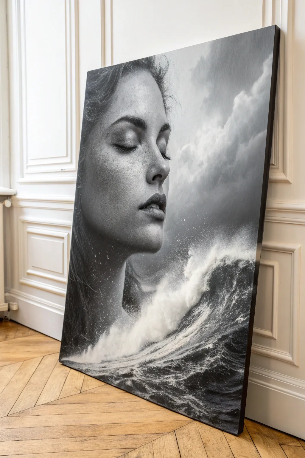
This striking large-scale project merges the serenity of a portrait with the raw power of the ocean, creating a seamless double-exposure illusion entirely in black and white. Using acrylics or oils on a large panel, you’ll learn to blend realism with atmospheric textures to achieve this dreamlike composition.
Step-by-Step Guide
Materials
- Large wooden painting panel or heavy-duty canvas (approx 36×48 inches)
- Black and White Acrylic Gesso
- Acrylic or Oil Paints (Mars Black, Titanium White, Paynes Grey)
- Wide flat brushes (2-3 inch) for background blocking
- Soft synthetic blending brushes (various sizes)
- Detail round brushes (size 0, 2, 4)
- Sea sponge or crumpled paper towel for texture
- Reference photo of a profile portrait
- Reference photo of crashing waves
- Graphite transfer paper
- Painter’s tape
- Glazing medium
Step 1: Preparation and Sketching
-
Prime the Surface:
Begin by coating your large panel with white gesso to ensure a smooth, non-absorbent surface. If you want a moodier undertone, mix a drop of black into the gesso for a very light grey base. -
Layout the Composition:
Using your reference images, lightly sketch the profile of the face on the left side, ensuring the chin and neck area remains vague. Map out the trajectory of the wave rising from the bottom right to crash into the neck area. -
Refine the Transition Zone:
Mark the specific area where the skin turns into water foam. This is usually around the jawline and collarbone; keep your pencil lines faint here as they need to disappear later.
Trouble with blending?
If acrylics dry too fast for smooth skin gradients, add a retarder medium to keep the paint wet longer, or spray a fine mist of water onto the canvas periodically.
Step 2: Building the Foundation
-
Establish the Darks:
Mix a deep charcoal grey using Mars Black and a touch of Paynes Grey. Apply this to the background sky area on the right, keeping it darker near the wave and lighter towards the top. -
Block in the Hair:
Using a thinner black mixture, block in the dark mass of hair on the left. Don’t worry about individual strands yet; focus on the volume and the shadow it casts on the forehead. -
Map the Shadows:
Paint the core shadows of the face—the eye socket, the nostril, the corner of the mouth, and the underside of the jaw. Use a mid-tone grey here, not full black. -
Underpaint the Wave:
Lay down a dark grey base for the water body. This dark underpainting is crucial because the white foam we add later needs a dark background to pop against.
Step 3: Rendering the Portrait
-
Soft Gradient Skin:
Mix three values of grey: shadow, mid-tone, and highlight. Working wet-in-wet, blend these on the face to create smooth skin transitions. I like to use a large, soft filbert brush to blur any harsh lines. -
Detailing the Face:
Switch to your smaller brushes to refine the closed eye and lips. Keep the contrast high here—dark eyelashes against light skin—to draw the viewer’s focus to the face’s expression. -
Adding Freckles and Texture:
Dilute some black paint slightly and carefully flick or stipple tiny dots across the nose and cheeks to mimic skin texture and freckles.
Level Up: Celestial Touch
Add tiny, sharp stars in the darkest part of the hair or sky using a white gel pen or fine liner brush to introduce a cosmic dimension to the surrealism.
Step 4: Creating the Surreal Elements
-
Cloud Foundation:
In the sky area, use a dry-brush scumbling technique with titanium white to create soft, billowing cloud shapes. Keep the edges vague to maintain a dreamlike atmosphere. -
Forming the Wave Structure:
Paint the curvature of the water using dynamic, sweeping strokes of light grey. Follow the motion of the water rising up. -
Stippling the Foam:
Using an old, frayed brush or a sea sponge, tap thick titanium white paint along the crest of the wave. Allow this texture to spill over into the neck area of the portrait. -
Merging Skin and Water:
This is the critical step: where the neck meets the wave, glaze a thin layer of white over the grey skin tone to make it look semi-transparent, like mist rising. -
Adding Spray Details:
Load a toothbrush or stiff brush with watered-down white paint. Run your thumb over the bristles to spray fine mist droplets around the wave crest and onto the cheek. -
Water Highlights:
Paint sharp, bright white squiggles and lines in the dark part of the water to represent surface tension and ripples catching the light. -
Hair Integration:
Drag a few wispy strands of hair into the cloudy background and some into the water spray to physically connect the three elements. -
Final Glaze:
Once fully dry, apply a very thin glaze of transparent black or grey over the deepest shadows to unify the contrast between the realistic face and the textured nature elements.
Step back and admire how the stillness of the face contrasts beautifully with the movement of the storm you have created
One Pop Accent on a Black and White Scene
Capture the quiet dignity of a winter landscape with this detailed charcoal and graphite illustration. This project focuses on realistic textures, from the rough bark of a dormant tree to the soft, hazy mist of a distant forest line.
Step-by-Step Tutorial
Materials
- High-quality watercolor paper or heavy drawing paper (hot press for smoother details)
- Graphite pencils (HB, 2B, 4B, 6B)
- Charcoal pencil (medium or soft) for deepest blacks
- Blending stumps (tortillons)
- Kneaded eraser
- Small painting brush (optional, for charcoal powder)
- White gel pen or gouache (for highlights)
- Fixative spray
Step 1: Setting the Scene
-
Establish the horizon:
Begin by lightly sketching a low horizon line about one-third of the way up your paper using an HB pencil. Keep this line faint and irregular, suggesting rolling terrain rather than a flat surface. -
Map the main tree:
Pencil in the primary structure of the large foreground tree on the right side. Start with a thick, sturdy trunk that tapers upward, extending the main branches aggressively toward the top left corner to create a dynamic composition. -
Sketch the distant treeline:
Lightly outline a mass of trees in the background on the left. These shapes should be simple and soft, devoid of sharp details, to push them visually into the distance.
Step 2: Creating Atmosphere
-
Shade the sky:
Using the side of a 2B pencil or a bit of graphite powder, add a very soft, cloudy texture to the sky area. Use a tissue or large blending stump to smooth this out, creating a hazy, overcast mood. -
Render the distant forest:
Fill in the background trees with a mid-tone grey. Use the side of your pencil to create vertical strokes, mimicking the density of a forest. Blur the top edges with a blending stump to suggest mist or fog obscuring the canopy. -
Define the tree trunks:
While the background shading is still fresh, use a sharp eraser or a fine 4B pencil to imply thin white trunks or darker stems within the misty forest mass. -
Ground cover texture:
Below the horizon line, create a field of dry grass. Use short, upward flicking strokes with an H or HB pencil. Keep the strokes lighter and smaller near the horizon and gradually larger as you move down the page.
Smudge Control
Smearing graphite is common. Place a clean sheet of scrap paper under your drawing hand as a bridge while working to keep oils and friction from ruining your shading.
Step 3: Detailing the Hero Tree
-
Establish the bark texture:
Switch to your 4B and 6B pencils to start texturing the main tree trunk. Use short, erratic vertical lines to mimic rough bark, leaving small slivers of white paper showing through for natural highlights. -
Deepen the shadows:
Identify the light source (coming from the left) and darken the right side of the trunk significantly. I like to layer a bit of charcoal pencil here for a rich, matte black that anchors the image. -
Branch structure:
Extend the dark values up into the main branches. Observe how branches taper; ensure they get thinner as they move away from the trunk. Use a sharp point for the tips. -
Adding fine twigs:
Draw the intricate network of fine twigs at the ends of the branches using a sharp 2B pencil. Use a shaky, organic hand motion to prevent the lines from looking too straight or artificial. -
Secondary tree details:
Add the smaller, skeletal trees to the right of the main trunk. Keep these slightly lighter in value than the main tree to show they are slightly further back, using finer lines for their branches.
Seasonal Shift
To turn this into a snowy winter scene, use liquid masking fluid on branches before shading the sky, then peel it off to reveal crisp, snow-covered limbs.
Step 4: Foreground and Final Touches
-
Enhance the foreground grass:
In the immediate foreground at the bottom, use forceful, dark strokes to create tall, wild grasses. Mix graphite strokes with charcoal accents to create depth and contrast against the trunk base. -
Add nature’s debris:
Draw small, distinct details like seed heads or dried weeds poking up through the grass in the bottom left corner. These distinct shapes add realism to the chaotic grass texture. -
Refine highlights:
Use your kneaded eraser to lift out brightness on the sun-facing side of the tree trunk and any prominent grass blades. If needed, use a white gel pen sparingly for the sharpest highlights. -
Review contrast:
Step back and assess your values. Should the distant trees be darker? Is the sky too uniform? Add shading where necessary to ensure the main tree pops against the background. -
Protect your work:
Once satisfied, spray the artwork with a fixative in a well-ventilated area to prevent the graphite and charcoal from smudging.
Frame this moody piece with a wide white mat to emphasize the stark beauty of the winter branches
Minimal Triptych of a Single Scene in Three Panels
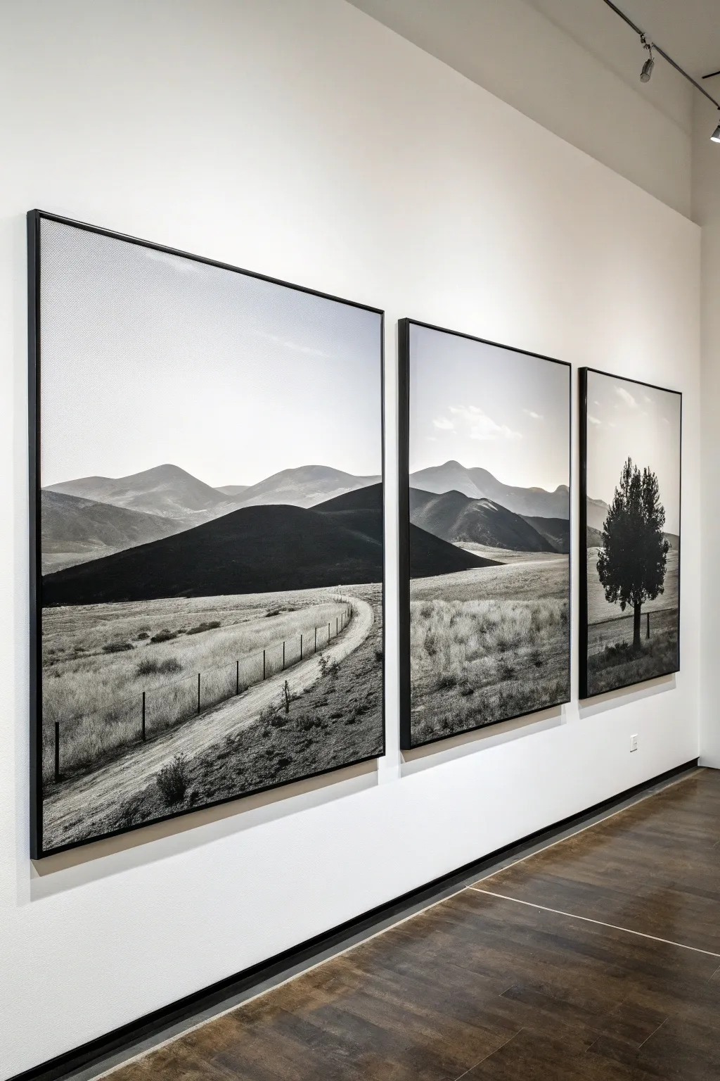
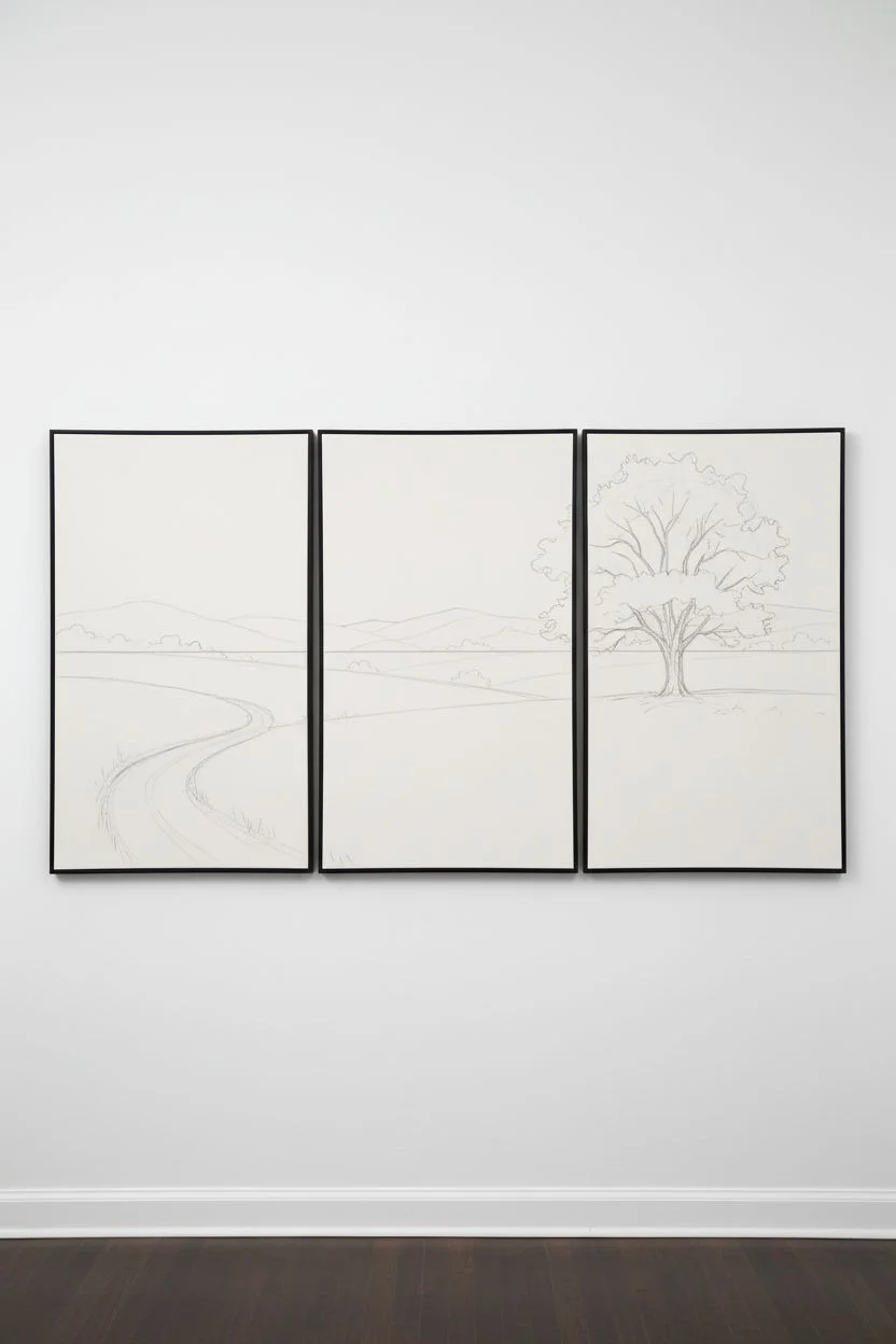
Transform a single sweeping landscape into a sophisticated gallery-style display by splitting the scene across three large canvases. This minimalist black and white triptych captures the quiet drama of rolling hills and a solitary tree, creating a cohesive visual journey that feels both modern and timeless.
Step-by-Step
Materials
- Three large gallery-wrapped canvases (same height, varying widths to taste, or equal sizes)
- Acrylic paints: Mars Black, Titanium White, Raw Umber (for subtle warmth)
- Wide flat synthetic brushes (2-3 inch)
- Medium filbert brushes (for hills)
- Small round brushes (for grass and tree details)
- Fan brush (optional, for grass texture)
- Ruler or yardstick
- Charcoal vine or soft graphite pencil
- Painter’s tape or masking tape
- Acrylic glazing medium
- Easel or large flat work surface
- Reference photo of a landscape with a clear horizon line
Step 1: Planning and Sketching
-
Prepare the workspace:
Arrange your three canvases side-by-side on your wall or floor exactly how they will hang, leaving about a 2-inch gap between them to account for the negative space. -
Establish the horizon line:
Using a long straightedge or yardstick, lightly draw a continuous horizon line across all three canvases with vine charcoal to ensure the landscape flows seamlessly. -
Draft the composition:
Sketch the major landforms. Place the winding dirt road starting in the bottom left of the first canvas, fading into the middle. Position the large feature tree prominently in the third canvas. -
Check the flow:
Step back and verify that hills in the background connect logically from one panel to the next, bridging the physical gaps between the canvases.
Step 2: Painting the Sky and Background
-
Mix the sky gradient:
Create a large volume of very light gray by mixing plenty of Titanium White with a tiny dot of Mars Black. You want a smooth, pale tone. -
Apply the sky base:
Using your widest brush, paint the upper portion of all three canvases. I prefer to paint the sky slightly lighter near the horizon line to simulate atmospheric perspective. -
Paint distant mountains:
Mix a mid-tone gray. Paint the furthest mountain ranges with a flat brush, keeping the edges soft to make them recede into the distance. -
Layer the closer hills:
Darken your gray mixture significantly. Paint the darker, closer hills in the middle ground, ensuring the undulating shapes continue from the left panel into the center panel.
Pro Tip: Consistent Hues
Mix a large ‘mother batch’ of your main gray tones before starting. If you remix grays later, they might shift slightly warmer or cooler, breaking the illusion that the three panels are one continuous scene.
Step 3: Developing the Foreground
-
Block in the darkest masses:
Use nearly pure black to paint the heavy shadow areas of the nearest hills and the silhouette of the foreground land. -
Create the road texture:
On the left panel, mix a light, dirty gray. Use horizontal, sweeping strokes to suggest a dirt track, adding darker streaks for wheel ruts. -
Add the fence line posts:
Using a small round brush and black paint, add tiny vertical ticks along the road to suggest fence posts, getting smaller as the road recedes. -
Texture the grassy fields:
Mix a variety of light grays. Using a dry fan brush or an old bristle brush, flick upward lightly to create texture that resembles dry grass in the fields. -
Refine the grass layering:
Layer lighter ‘grass’ strokes over darker base layers to create depth, focusing on the bottom third of all three panels.
Troubleshooting: Disconnected Lines
If your horizon lines don’t match up when hung, lean the canvases against a wall together again. Repaint the connector points across the gaps, then separate them to finish the details on the wrapped edges.
Step 4: The Solitary Tree and Details
-
Paint the tree trunk:
On the right panel, use a small flat brush with black paint to create the sturdy, vertical trunk of the tree. -
Stipple the foliage:
Use a rough hog bristle brush or a sponge. Dip it in black suitable for deep shadows and stipple the general shape of the tree canopy. -
Add highlights to leaves:
Mix a dark gray and lightly stipple over the black leaf masses, focusing on the top right side where the light hits the tree. -
Connect the panels visually:
Check the edges of each canvas. Wrap the painting around the sides (gallery wrap style) so the image looks finished even when viewed from an angle. -
Final adjustments:
Stand back and look at the triptych as a whole. Add small shadows or highlights to ensure the lighting direction is consistent across all three pieces. -
Varnish and seal:
Once fully dry, apply a matte or satin varnish to unify the sheen and protect the deep blacks from scuffing.
Hang your new triptych with careful spacing to let the landscape flow naturally across your wall
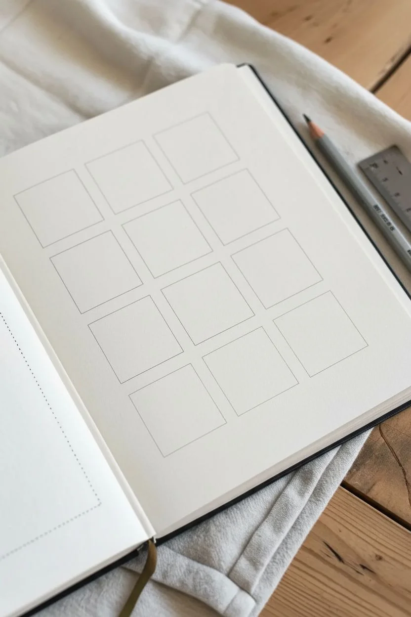
Tiny Thumbnail Grid for Black and White Practice
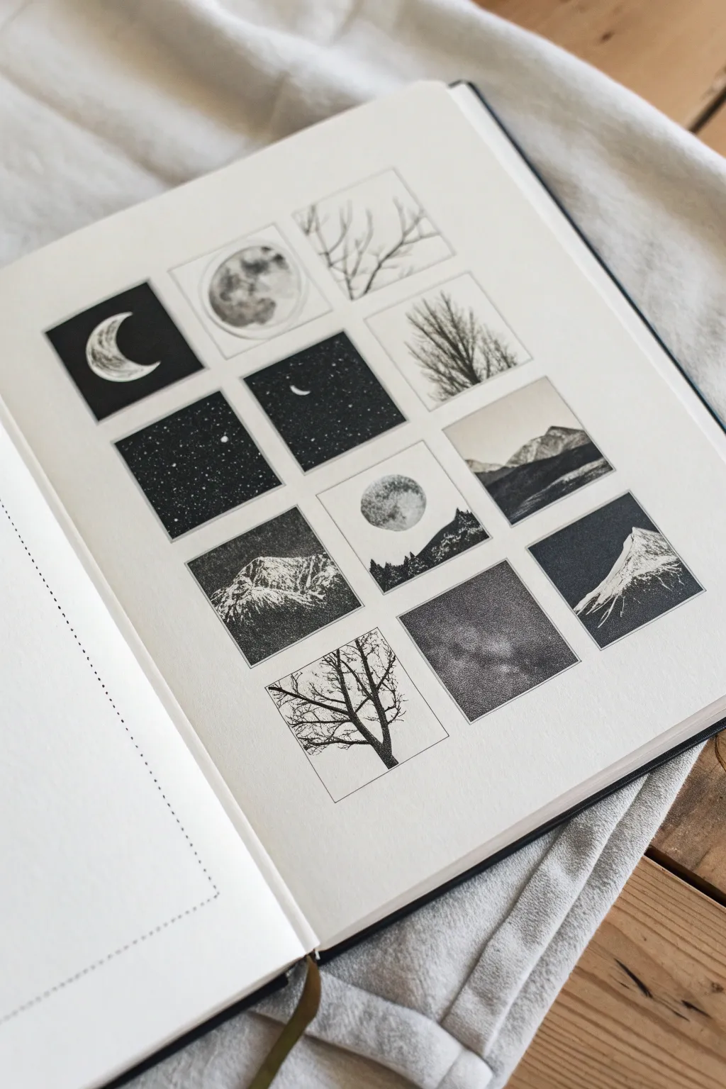
This project features a neatly organized grid of twelve miniature landscapes and celestial studies, perfect for practicing composition without the pressure of a large canvas. Using high-contrast black and white techniques, you will create a cohesive collection of mountains, trees, and night skies.
Step-by-Step Tutorial
Materials
- High-quality sketchbook or Bristol paper
- Ruler
- Pencil (HB or 2B)
- Eraser
- Fine liner pens (sizes 005, 01, 03, and 05)
- Black ink or gouache
- Small round brush (size 0 or 2)
- White gel pen or white gouache
Step 1: Planning the Grid
-
Measure margins:
Begin by finding the center of your page to ensure your grid sits symmetrically. Measure equal margins from the top, bottom, and sides, leaving enough white space to frame the artwork cleanly. -
Draw the grid structure:
Using your ruler and a light pencil touch, draw a grid of twelve squares. A 3-column by 4-row layout works perfectly here. Aim for squares that are about 1.5 to 2 inches in size. -
Space the thumbnails:
Leave a small, consistent gap—about 1/4 inch—between each square. This negative space is crucial as it prevents the individual drawings from bleeding into one another visually.
Variation Tip
Swap the ink for charcoal pencils to get a softer, smokier look. Smudged charcoal works beautifully for moody clouds and diffuse nebula effects in the night sky panels.
Step 2: Sketching the Concepts
-
Drafting celestial elements:
Lightly sketch your moon phases in a few scattered squares to balance the composition. Try a crescent moon in the top left and a full moon near the center. -
Outlining landscapes:
Sketch simple outlines for mountain ranges in three or four alternative squares. Vary the angles; have some slopes rising from the left and others from the right. -
Adding organic forms:
In the remaining empty squares, draw the skeletal structures of bare winter trees. Focus on erratic, branching lines rather than perfect symmetry.
Fixing Smudges
If you accidentally smudge ink into the white border, don’t panic. Use a little white gouache paint or a white Posca marker to cover the mistake and redefine the straight edge.
Step 3: Inking and Filling
-
Solid black backgrounds:
For the night sky panels, carefully outline the moon or stars first. Then, use your largest pen or a brush with black ink to fill the background with solid black, leaving the celestial bodies white. -
Stippling the mountains:
To create the texture of rocky mountains, avoid solid coloring. Instead, use a 01 fine liner to stipple (make tiny dots) on the shadowed side of the mountain peaks. -
Building mountain density:
Increase the density of your dots as you move deeper into the shadowed areas. This gradient effect gives the mountains weight and three-dimensionality. -
Detailing the trees:
Switch to your finest pen (005) for the tree branches. Ink the trunk first, making it thicker at the base, and let the lines become whisper-thin as they reach the edges of the box. -
Inverse silhouettes:
For variety, create one or two squares where the subject is black against a white background, such as a silhouette of a treeline against a pale sky. -
Creating the moon texture:
For full moons, don’t leave them stark white. Lightly dab diluted grey ink or use very sparse stippling to suggest craters and lunar maria.
Step 4: Atmosphere and Final Touches
-
Adding stars:
Once your solid black ink areas are completely dry, take a white gel pen to dot in tiny stars. Vary their pressure to create distant and nearby stars. -
Refining edges:
Go back over the square borders with a ruler and a 03 pen to ensure the frame edges are crisp and sharp, cleaning up any ink that might have feathered. -
Erasing pencil marks:
Wait until you are absolutely certain the ink is dry—I usually give it an extra ten minutes just to be safe—and gently erase all underlying pencil grid lines. -
Protecting the graphite:
If you used heavy graphite for any shading, place a clean sheet of scrap paper under your hand as you finalise details to prevent smudging your crisp white borders.
Now you have a stunning gallery of miniature worlds that showcases the power of simple contrast
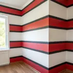


Have a question or want to share your own experience? I'd love to hear from you in the comments below!