That big, quiet blank canvas can feel exciting and intimidating at the exact same time. When you just need a solid nudge, these blank canvas painting ideas will help you make the first move and keep the momentum going.
Try Easy Abstract Color Blocks
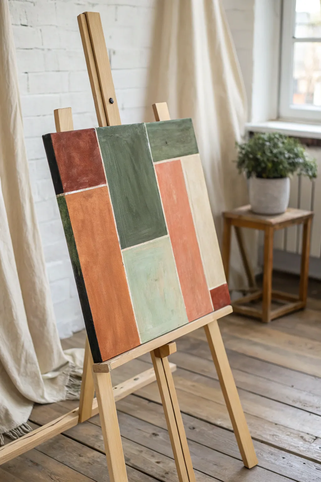
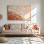
Create a sophisticated focal point for any room with this muted, earth-toned abstract painting. By using simple masking techniques, you can achieve crisp lines and structured geometry while keeping a hand-painted, organic feel.
Step-by-Step Tutorial
Materials
- Stretched canvas (rectangular)
- Acrylic paints (terracotta, olive green, sage green, salmon pink, beige, burnt umber, black)
- Painter’s tape or artists’ masking tape (various widths if desired)
- Flat synthetic brushes (1-inch and 2-inch)
- Palette or paper plate
- Palette knife (for mixing)
- Ruler or straight edge
- Pencil
- Jar of water
- Paper towels
Step 1: Planning the Layout
-
Prepare your canvas:
Ensure your canvas is clean and dust-free. If it isn’t pre-primed, apply a coat of gesso and let it dry completely before starting. -
Sketch the grid:
Using a pencil and ruler, lightly sketch out your geometric design directly on the canvas. Aim for an asymmetrical balance of rectangles and squares, varying their sizes to keep the composition interesting. -
Apply the tape:
Place strips of painter’s tape over your pencil lines. The area covered by the tape will remain white (or your base canvas color), creating the negative space grid between the color blocks. -
Seal the edges:
Run your finger or a bone folder firmly along the edges of the tape to ensure a tight seal. This is crucial to prevent paint from bleeding underneath and ruining your crisp lines. -
Optional base coat:
To ensure super crisp lines, I sometimes paint a thin layer of white (or the canvas base color) over the tape edges first. This seals any tiny gaps with the background color rather than the pigmented paint.
Step 2: Painting the Blocks
-
Mix the terracotta:
On your palette, mix burnt sienna with a touch of white and a tiny bit of red to create a warm terracotta shade. -
Paint the first section:
Identify a large vertical rectangular section for the terracotta tone. Use a flat brush to fill it in, painting slightly onto the tape to ensure full coverage. -
Mix the olive green:
Combine sap green with a little burnt umber and a touch of yellow ochre. You want a deep, rich olive tone. -
Apply the dark green:
Find a central or upper block for this dark value. Apply the paint with vertical strokes, allowing some texture to show through for an organic look. -
Create the sage tone:
Take some of your olive mixture and add a significant amount of titanium white to create a soft, muted sage green. -
Fill the lower block:
Paint a block adjacent to the terracotta with this lighter sage color. This helps balance the visual weight of the darker colors. -
Mix the salmon pink:
Mix red, yellow, and a generous amount of white. Keep it muted—not neon—by adding a tiny dot of brown if it looks too bright. -
Paint the accent strip:
Apply this salmon pink to a tall, narrow vertical section. This adds warmth and brightness to the earth-toned palette. -
Add the neutral beige:
Use unbleached titanium or mix white with a drop of yellow ochre and brown for a creamy beige. Fill the remaining large side panel with this neutral tone. -
Add dark accents:
Paint the final small corner blocks or thin strips with a dark brown or soft black to ground the composition.
Seal the Deal
Before adding color, paint a thin layer of white over the tape edges. This seals the tape, meaning any bleed-under is invisible white paint, leaving your colored edges perfectly sharp.
Step 3: Finishing Touches
-
Apply second coats:
Acrylics can be translucent. If the canvas texture shows through too much, apply a second coat to your color blocks once the first layer is touch-dry. -
Let it cure:
Allow the painting to dry strictly until it is dry to the touch, but not fully cured. Waiting too long makes the tape hard to remove, but wet paint can smudge. -
Remove the tape:
Carefully peel back the tape at a 45-degree angle. Pull slowly and steadily to reveal the crisp white grid lines underneath. -
Touch up:
If any paint bled through, use a small detail brush and white paint to tidy up the lines. If a specific block looks uneven, re-tape strictly that edge and add a touch more color. -
Varnish:
Once fully cured (after 24 hours), apply a satin or matte varnish to protect the surface and unify the sheen of the different paint colors.
Texture Play
Mix a little modeling paste or sand into your acrylics for the terracotta and dark green blocks. This adds tactile contrast against the smoother beige and pink sections.
Hang your new masterpiece in a well-lit spot to highlight the subtle texture and warm tones


Paint a Classic Sunset Silhouette
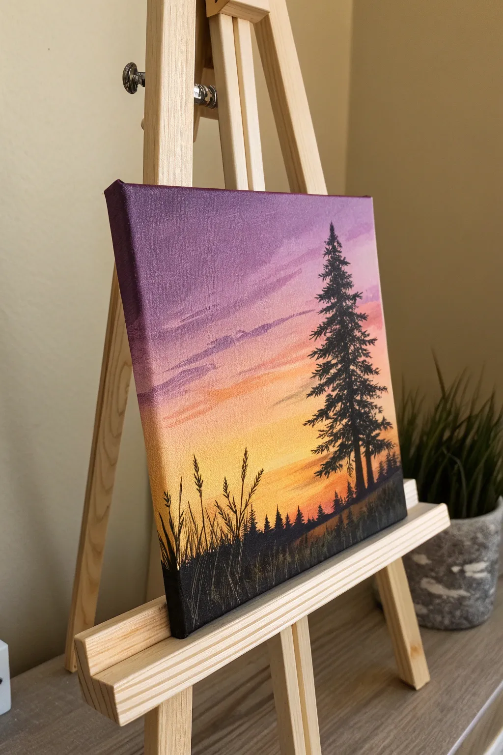
Capture the serene beauty of twilight with this stunning yet beginner-friendly acrylic painting. A vibrant gradient sky sets the stage for a bold, contrasting silhouette of a majestic pine tree and tall grasses.
Detailed Instructions
Materials
- Small square canvas (e.g., 6×6 or 8×8)
- Acrylic paints: Titanium White, Cadmium Yellow, Orange, Magenta, Violet/Purple, Black
- Large flat brush (for background)
- Small round brush or liner brush (for details)
- Fan brush (optional, for pine branches)
- Cup of water
- Palette or paper plate
- Paper towels
Step 1: Setting the Sky
-
Prep the Colors:
Squeeze out your sky colors onto the palette: Violet, Magenta, Orange, Yellow, and White. Keep Black separate for later. -
Start at the Top:
Dip your clean, damp flat brush into the violet paint. Apply a solid band of color across the top quarter of the canvas, ensuring you paint around the edges for a finished look. -
Blend Downward:
Without cleaning the brush perfectly, pick up some magenta. Paint just below the violet, overlapping slightly to blend the two hues where they meet. Use long, horizontal strokes. -
Add Warmth:
Wipe your brush on a paper towel. Pick up the orange paint and continue the gradient downward, blending it into the wet pink edge above. -
Brighten the Horizon:
Mix a little white with your yellow paint to make it opaque and bright. Apply this to the bottom section of the canvas, blending it upwards into the orange layer. -
Refine the Blend:
While the paint is still tacky, use a soft, dry brush to gently sweep back and forth across the transition lines to smooth out the gradient. -
Create Cloud Wisps:
Mix a pale lavender using violet and plenty of white. Using the edge of your flat brush, lightly streak in some thin, horizontal cloud shapes in the upper purple section. Keep them subtle.
Bumpy Blends?
If acrylic paint dries too fast while blending the sky, dampening your brush slightly with water or using a slow-drying medium can help extend working time.
Step 2: Painting the Foreground
-
Dry Time:
Allow the sky to dry completely. If you paint the black silhouette over wet sky paint, the colors will muddy and turn gray. -
Establish the Horizon Line:
Using black paint and a medium brush, paint a slightly uneven, sloping hill at the very bottom of the canvas. Fill it in solid black. -
Draw the Tree Trunk:
Switch to a smaller brush. Determine the placement of your main tree on the right side. Paint a vertical line for the trunk, making it slightly thicker at the base and tapering at the top. -
Start the Branches:
Starting at the top of the tree, use the tip of a small brush to dab tiny horizontal marks. As you move down, make the branches wider and slightly drooping. -
Build Tree Volume:
Continue down the trunk, staggering the branches left and right. I like to leave small gaps of sky peeking through the foliage so the tree doesn’t look like a solid triangle. -
Add Distant Trees:
Along the horizon line to the left of your big tree, paint tiny vertical spikes to represent a distant forest line. Vary their heights to keep it looking natural. -
Detail the Grasses:
Using your thinnest liner brush (or a rigger brush with thinned black paint), flick upward from the bottom black mass to create tall blades of grass on the left side. -
Add Seed Heads:
On a few of the tallest grass blades, add small textured dots or dashes near the tips to resemble wheat or reed seed heads. -
Final Touches:
Check your edges to ensure the purple sky wraps around the sides of the canvas, and verify that the black silhouette is fully opaque. Let it dry completely.
Sharpen Your Lines
For the crispest grass blades, add a drop of water to your black paint until it has an ink-like consistency. This helps the paint flow smoothly off a liner brush.
Now you have a tranquil sunset scene that brings a pop of color to any small space

Make a Layered Mountain Scene
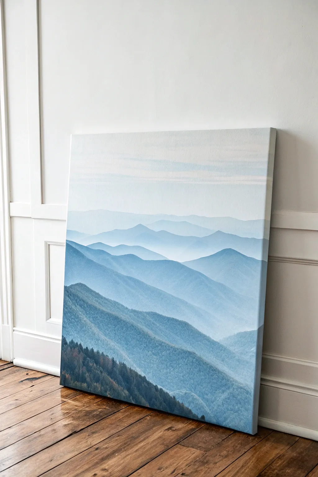
Create a serene and spacious atmosphere in your home with this layered mountain landscape that masterfully uses atmospheric perspective. By gradually lightening your paint mixture as you move up the canvas, you’ll achieve a stunning sense of depth and distance.
Step-by-Step
Materials
- Large stretched canvas (vertical orientation)
- Acrylic paints: Phthalo Blue, Mars Black, Titanium White, and a touch of Burnt Umber
- Wide flat brush (2-3 inch) for sky and gradients
- Medium angle shader brush
- Small round brush for tree details
- Palette or paper plates for mixing
- Cup of water and paper towels
- Pencil for light sketching
Step 1: Planning and Sky
-
Establish the horizon:
Begin by lightly sketching undulating horizontal lines across your canvas to map out your mountain ranges. Start about one-third of the way down from the top and create 5-7 distinct ridge lines, ensuring they overlap and vary in shape to look natural. -
Mix the sky tone:
On your palette, mix a large amount of Titanium White with just the tiniest speck of Phthalo Blue and a pinhead of Black. You want a very pale, cool grey-blue that is almost white. -
Paint the sky:
Using your large flat brush, paint the entire sky area from the top down to your first pencil line. Use long, horizontal strokes to ensure a smooth, cloud-like finish. -
Soften the transition:
While the sky paint is still slightly wet, add a hint more white to your brush and sweep across the very top edge to create a subtle gradient.
Step 2: The Distant Ranges
-
First mountain layer:
Using your sky mixture, add a pea-sized amount of Phthalo Blue. Paint the most distant mountain ridge. This layer should be barely darker than the sky, representing the furthest points on the horizon. -
Second mountain layer:
Add another small touch of blue to your mix. Paint the next ridge down. Ensure you paint slightly over the top of the next line below it so there are no white gaps between layers. -
Creating mist:
Use a dry, clean brush to lightly gently feather the bottom edge of this layer while it’s wet. This helps create the illusion of mist settling in the valleys. -
Third mountain layer:
Darken your mixture again, this time adding a tiny dot of Black to desaturate the blue slightly. Paint the third ridge, focusing on smooth, flowing contours along the top edge.
Uneven Gradients?
If your mountains look too stripey or separated, use a clean, slightly damp brush to gently blend the wet paint at the bottom of a ridge into the drying paint of the ridge above it.
Step 3: Mid-Ground Depth
-
Deepening the blues:
For the middle ridges, add more Phthalo Blue and a slightly larger amount of Black. The goal is a medium steely blue. Paint the next two ridges, allowing the shapes to become a bit more pronounced and jagged closer to the viewer. -
Adding texture:
Switch to your medium angle brush. I find that using a slightly drier brush here allows the canvas texture to show through, mimicking rough terrain on these middle mountains. -
Define the valleys:
Mix a slightly lighter version of your current blue and gently glaze the bottom third of these middle mountains. This reinforces the foggy, atmospheric look.
Warm It Up
For a sunset vibe, swap the cool blues for shades of burnt orange, pink, and deep purple. Use the same layering technique but keep the sun as the lightest point.
Step 4: Foreground Detail
-
The closest ridge:
Mix your darkest shade yet: Phthalo Blue, plenty of Black, and a touch of Burnt Umber to warm it up. Paint the large, sweeping mountain closest to the bottom, covering the remaining white space. -
Texture base coat:
While this dark layer is wet, dab your brush firmly to create a stippled, uneven texture rather than a smooth finish. This simulates the density of a forest canopy. -
Painting individual trees:
Switch to your small round brush. Mix a dark, almost black-blue. Along the very top ridge of this foreground mountain, paint tiny vertical ticks and varying triangular spikes. -
Building forest density:
Work your way down the foreground slope, adding clusters of tiny tree shapes. Don’t try to paint every single tree; instead, suggest them with quick, vertical dabs and irregular overlapping shapes. -
Final highlights:
Mix a slightly lighter, muted green-blue by adding a touch of yellow or orange if available (or just more white/blue). Lightly dab this onto the tops of the foreground trees to catch the imaginary light.
Step back and admire the tranquil depth you have built layer by layer on your canvas

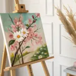
Paint Loose Florals in a Jar
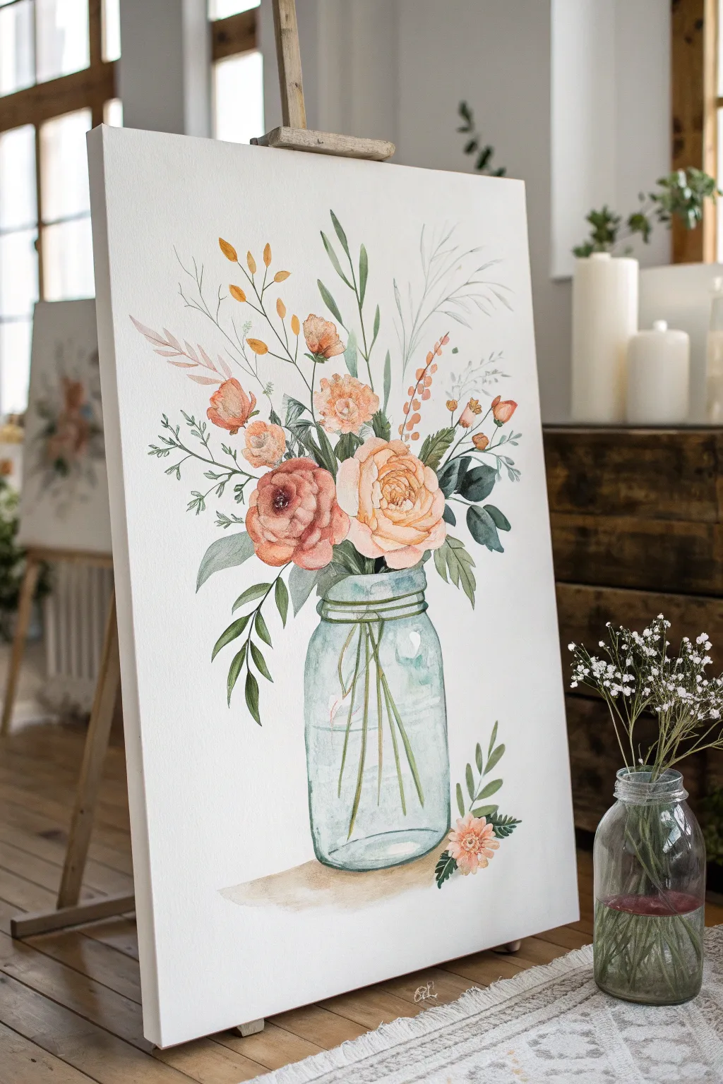
Capture the airy elegance of a minimalist floral arrangement with this gentle watercolor tutorial. You will learn to build up layers of soft peach and rust tones to create blooming roses nestled in a classic glass mason jar.
How-To Guide
Materials
- Watercolor paper block (cold press, 140lb/300gsm) or watercolor canvas
- Watercolor paints (Peach, Burnt Sienna, Sap Green, Indigo, Cerulean Blue, Yellow Ochre)
- Round brushes (size 4, 8, and 12)
- Fine liner brush (size 0 or 1)
- Pencil (HB or H) and kneaded eraser
- Two jars of water
- Paper towels
- Palette or white ceramic plate
Step 1: Planning and Sketching
-
Establish the composition:
Begin by lightly sketching a central vertical line to guide your placement. Draw a simple rectangle with rounded bottom corners for the jar at the bottom third of your canvas. -
Draft the flower shapes:
Lightly sketch loose circles and ovals above the jar rim to indicate where the main blooms will sit. Keep these shapes faint; they are just placeholders for your paint. -
Add stem guidelines:
Draw faint lines extending from the flower heads down into the jar area. Don’t press too hard, as you want the watercolor to cover these lines later.
Glass Effect Tip
Leave the paper completely white in vertical strips on the jar. These unpainted areas act as strong reflections, making the glass look shiny and round.
Step 2: Painting the Mason Jar
-
Create a watery wash:
Mix a very dilute puddle of Cerulean Blue with a tiny touch of Sap Green. Using your size 12 brush, apply a watery wash to the jar shape, leaving white spaces for highlights. -
Define the rim:
While the wash is still damp but not soaking, use a size 8 brush with a slightly more concentrated blue-green mix to paint the threaded rim of the jar. -
Paint the water line:
Add a horizontal stroke inside the jar about two-thirds up to suggest the water level. Let the color bleed slightly into the damp wash below for a realistic glass effect. -
Add stem illusions:
Before the jar dries completely, use a clean, slightly damp brush to lift out vertical streaks where the stems will be, or paint faint green lines into the wet blue for a distorted glass look.
Add Texture
Once the painting is totally dry, use a white gel pen to add tiny dots to the center of the flowers or highlight the jar threads for extra sparkle.
Step 3: Blooming the Flowers
-
Start the main rose:
Mix a soft creamy peach color. With the size 8 brush, start at the center of your main focal flower with tight, curved C-strokes, gradually working outward with larger, waterier strokes. -
Deepen the contrast:
While the peach rose is still damp, drop in a mix of Burnt Sienna and Peach into the center and the crevices between petals to create depth and shadow. -
Paint secondary blooms:
Create the darker, rust-colored flower on the left using similar C-strokes but with a higher concentration of Burnt Sienna and a touch of red. Allow the edges to remain loose and organic. -
Add smaller buds:
Use the size 4 brush to dab small spots of orange-peach near the top of the arrangement to represent buttons or unopened ranunculus buds.
Step 4: Adding Greenery and Details
-
Paint main leaves:
Mix Sap Green with a little Indigo for a cool, deep green. Use the size 8 brush to press and lift, creating leaf shapes that tuck under the main blooms and droop slightly over the jar rim. -
Create stems inside the jar:
Now that the jar layer is dry, paint crisp green stems extending from the waterline down to the bottom of the jar. Vary the angles so they look gathered. -
Add airy filler sprigs:
Switch to your fine liner brush. Mix a very pale grey-green and sketch tall, wispy grasses and fern-like sprigs reaching high above the flowers to give the bouquet height. -
Refine with dark accents:
Mix a dark green-black. Use the tip of your smallest brush to add tiny veins to the leaves and emphasize the center of the darkest flower for a focal point. -
Ground the object:
Mix a watery beige or light brown. Paint a soft, diffuse shadow underneath the jar to ground it, letting it fade out at the edges.
Step back and admire the fresh, organic feel of your floral arrangement.
BRUSH GUIDE
The Right Brush for Every Stroke
From clean lines to bold texture — master brush choice, stroke control, and essential techniques.
Explore the Full Guide
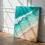
Keep It Calm With an Ocean Horizon
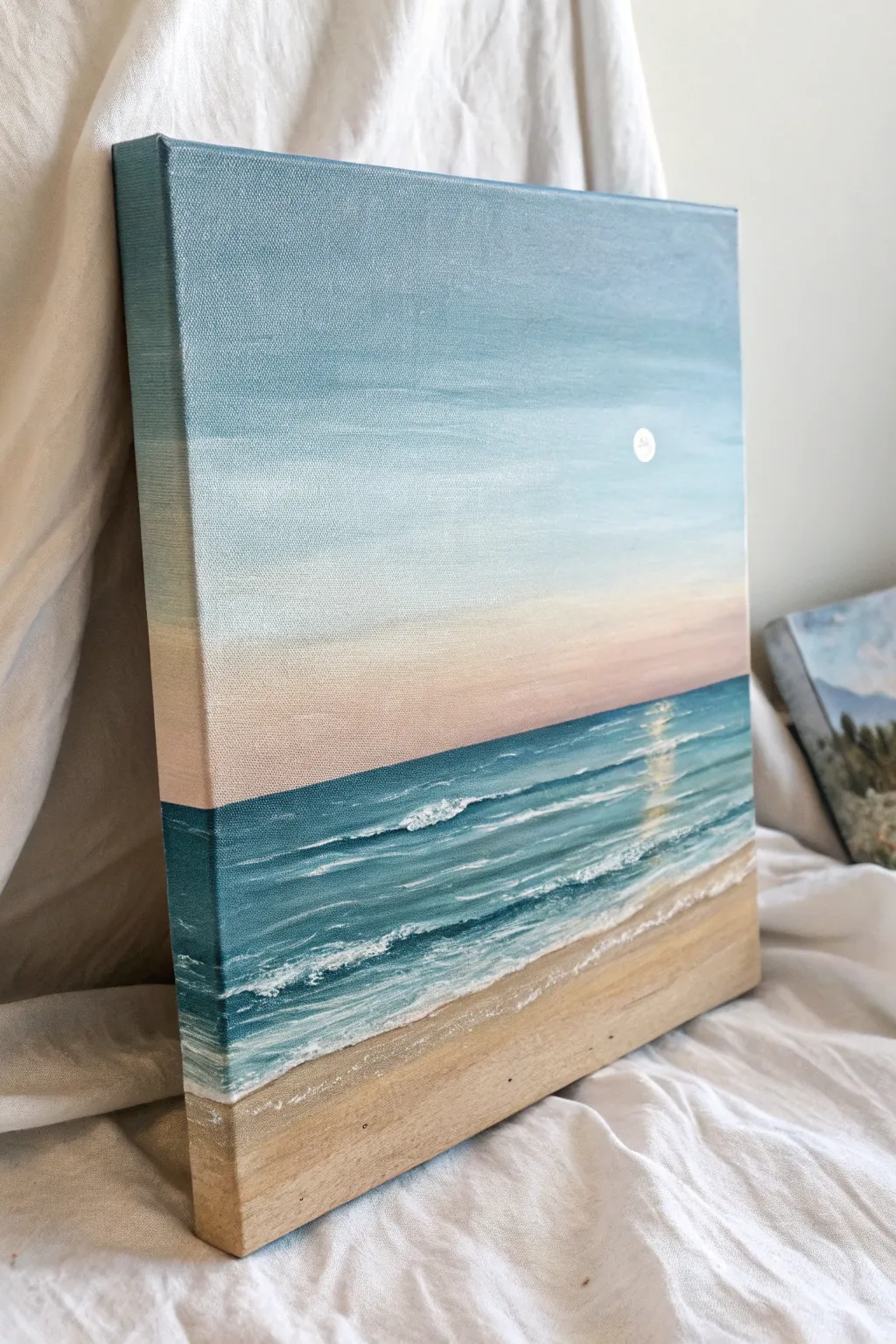
Capture the peaceful essence of a quiet beach with this simple yet stunning acrylic painting. Soft gradients in the sky meet rhythmical waves to create a tranquil scene that looks lovely from every angle, thanks to the painted edges.
Step-by-Step Guide
Materials
- Square stretched canvas (approx. 10×10 or 12×12 inches)
- Acrylic paints (Titanium White, Phthalo Blue, Teal/Turquoise, Alizarin Crimson, Yellow Ochre, Burnt Umber)
- Flat brush (1 inch)
- Small round brush (size 2 or 4)
- Filbert brush (medium)
- Palette or paper plate
- Cup of water and paper towels
- Painter’s tape (optional)
Step 1: Setting the Scene
-
Define the Horizon:
Decide where your water will meet the sky. For this composition, place the horizon line about one-third of the way up from the bottom edge. You can use a ruler and a very light pencil line or a strip of painter’s tape to keep it perfectly straight. -
Mix the Sky Blue:
On your palette, mix a generous amount of Titanium White with a tiny touch of Phthalo Blue. You want a very pale, airy blue. Using your large flat brush, paint the top third of the canvas using long, horizontal strokes. -
Wrap the Edges:
Don’t stop at the corners! As you paint the top section, carry that same pale blue paint around the sides and top edge of the canvas. This gallery-wrap effect gives the finished piece a polished, professional look without a frame. -
Create the Sunset Fade:
While the blue is still slightly wet, wipe your brush clean. Mix Titanium White with a very small dot of Alizarin Crimson and a speck of Yellow Ochre to create a soft, dusty pink. Apply this below the blue, blending gently upward where the colors meet to create a seamless transition. -
Paint the Lower Sky:
Continue painting down toward your horizon line with this pinkish hue. As you get closer to the water line, add even more white to the mix so the sky looks brightest right at the horizon. Remember to paint the corresponding sections on the side edges of the canvas too.
Fixing Muddy Blends
If your sky gradient turns muddy or gray while blending, stop and let it dry completely. Then, apply a fresh, thin layer of your pink and blue colors and try blending again with a clean, slightly damp brush.
Step 2: Painting the Ocean
-
Block in the Sea:
Mix Teal (or Turquoise) with a little Phthalo Blue and a touch of White. Using the flat brush, paint a crisp horizontal line right against your sky. Fill in the ocean area, making the color slightly darker near the horizon and lighter as you move downward. -
Add Ocean Depth:
To give the water dimension, stroke in some darker blue (Phthalo mixed with a tiny bit of Burnt Umber) in the middle distance. Keep your brush strokes strictly horizontal to mimic the flatness of the water surface. -
Create the Sand:
Mix Yellow Ochre, Titanium White, and a tiny bit of Burnt Umber to get a warm beige sand color. Paint the bottom section of the canvas, angling the shoreline diagonally so the beach is wider on the right side. -
Blend the Shoreline:
Where the water meets the sand, allow the wet blue paint to slightly mix with the wet tan paint. This muddy transition is actually perfect—it creates the illusion of wet sand beneath a receding wave. -
Finish the Edges:
Just as you did with the sky, paint the sides and bottom edge of the canvas with the matching ocean and sand colors. Verify that the horizon line on the sides matches the front.
Step 3: Details and Highlights
-
Start the Waves:
Switch to your medium filbert brush. Mix a color that is lighter than your ocean base (add more white to your teal mix). Paint gentle horizontal streaks across the water to suggest varying currents and light hitting the surface. -
Add Sea Foam:
Using a small round brush and pure Titanium White, paint the breaking waves. Focus on a main wave line near the shore. Use a tapping or stippling motion rather than a straight line to create the fluffy, foamy texture of turbulent water. -
Create Water Movement:
Add thinner, broken white lines further back in the ocean to represent distant swells. Keep these lines very thin and faint compared to the foreground waves. -
Sunlight Reflection:
Mix a very pale yellow-white. In the center-right area of the water, paint a vertical column of short, horizontal dashes. This creates the shimmering reflection of the sun or moon on the water. -
Paint the Moon:
Using the handle end of a small brush or a very small round brush, place a solid white dot in the sky, aligned above your water reflection. -
Detail the Shore:
Mix a slightly darker sand color (add a little more umber). Gently dry-brush this onto the dry sand area to add texture, making it look a bit grainy rather than perfectly smooth. -
Final Foam Highlights:
Go back to your main shoreline wave with thick white paint. Add a few bold, impasto highlights on the crests of the foam for a 3D effect. I prefer to let this sit right on top of the canvas texture.
Make It Sparkle
Once the painting is fully dry, you can mix a tiny amount of iridescent medium or glitter glaze into your white paint and go over the sun reflection and wave crests for a magical shimmer.
Step back and enjoy the calming atmosphere your new ocean view brings to the room
Blend a Smooth Ombre Fade
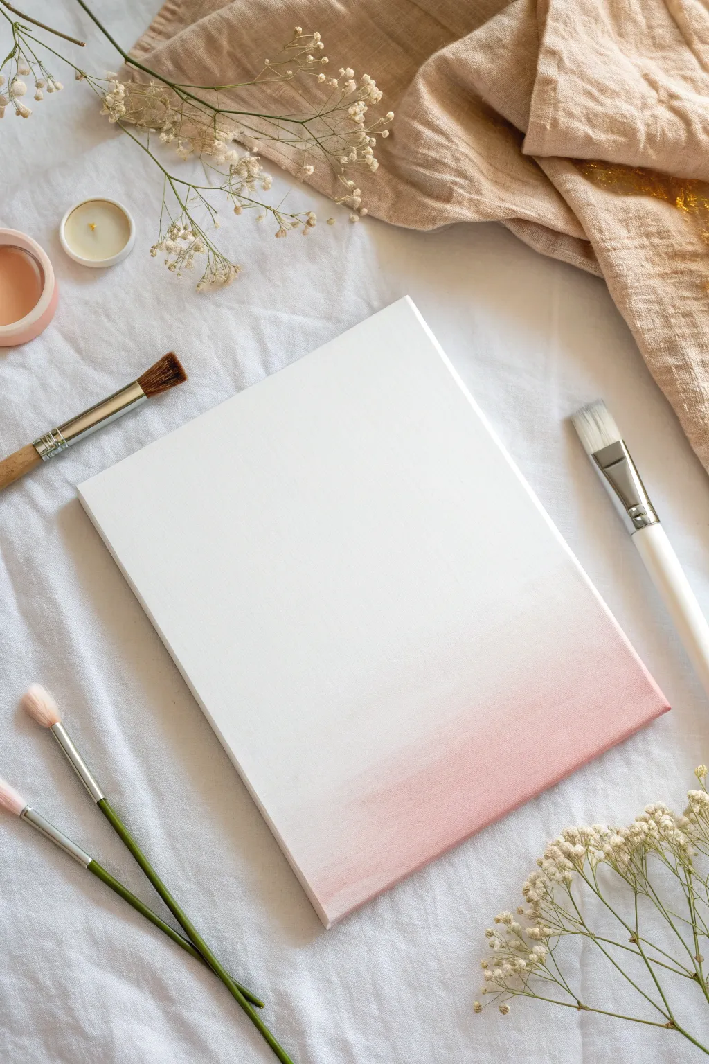
Transform a stark white canvas into a piece of delicate, minimalist art with this subtle blush pink gradient. The seamless transition from white to soft pink creates a dreamy, atmospheric effect that looks beautiful on any wall.
Detailed Instructions
Materials
- Stretched canvas (rectangular)
- White acrylic paint (heavy body preferred)
- Soft pink acrylic paint (or red to mix)
- Large flat wash brush (synthetic bristles)
- Medium flat brush
- Palette or mixing plate
- Cup of water
- Paper towels
Step 1: Preparation & Base Coat
-
Prepare your workspace:
Lay down a protective covering on your table. Since we are working with white, make sure your brushes are exceptionally clean to avoid muddying the pristine background. -
Mix a large batch of white:
Squeeze a generous amount of white acrylic paint onto your palette. You will need more white than you think, as acrylics dry quickly and you need enough wet paint to blend smoothly. -
Apply the first base coat:
Using your large flat wash brush, cover the entire canvas in a layer of white paint. Use long, horizontal strokes to ensure even coverage. -
Check for texture:
Look at the canvas from an angle. If you see too much canvas weave texture, let this first layer dry completely and then apply a second coat of white. -
Prepare for wet-on-wet blending:
Acrylic blending works best when the surface is wet. Before adding color, apply a fresh, thick layer of white paint over the bottom third of the canvas where the gradient will be. Do not let this dry.
Step 2: Creating the Color Transition
-
Mix your blush tone:
On your palette, take a small amount of pink (or a tiny dot of red mixed into white) to create a very soft, pastel blush color. It should be barely darker than the white canvas. -
Apply the darkest point:
Dip a medium flat brush into your blush mix. Paint a horizontal strip along the very bottom edge of the canvas. This will be the most saturated part of your gradient. -
Begin the upward blend:
Without cleaning your brush, pick up a little bit of pure white. Paint a stroke directly above your pink line, slightly overlapping the wet pink paint. -
Work the transition zone:
Move your brush back and forth horizontally where the pink and white meet. The wet white base you applied earlier will help the colors melt together. -
Lighten the mixture:
Wipe off your brush on a paper towel. Dip it into pure white paint, then blend the upper edge of your pink section upward, feathering it out until it disappears into the white background. -
Smooth out brushstrokes:
I find it helpful to take a large, dry, clean brush at this stage and very lightly sweep it horizontally across the gradient to soften any harsh bristle marks.
Fixing Choppy Blends
Paint drying too fast? Add a drop of ‘acrylic retarder’ medium to your paint. It slows drying time, giving you longer to perfect that smoky, seamless fade.
Step 3: Refining the Ombré
-
Evaluate the fade:
Step back five feet. Does the fade look smooth, or are there stripes of color? If you see stripes, the transition needs more work. -
Correcting harsh lines:
If a line is too harsh, add a tiny bit of water to your brush (just damp, not dripping) and very gently scrub the boundary between the two shades to reactivate the paint slightly. -
Deepen the bottom edge:
If the pink looks too washed out after blending, add a second thin layer of your blush color just at the very bottom edge to re-establish the contrast. -
paint the sides:
Don’t forget the edges of the canvas! Carry the gradient around the sides of the canvas frame for a professional, finished look that doesn’t require framing. -
Clean up edges:
If any pink paint accidentally got onto the upper white section, wait for it to dry completely, then paint over the mistake with opaque titanium white. -
Final drying:
Let the canvas sit undisturbed in a dust-free area for at least a few hours. Acrylics may feel dry to the touch quickly, but the layers need time to cure.
Add Metallic Accents
Once the ombré is fully dry, gently splatter diluted gold paint or add a thin gold leaf line at the bottom edge for a touch of elegance.
Hang your new artwork in a spot that gets soft light to highlight the delicate color transition

PENCIL GUIDE
Understanding Pencil Grades from H to B
From first sketch to finished drawing — learn pencil grades, line control, and shading techniques.
Explore the Full Guide
Use Tape for Crisp Geometric Lines
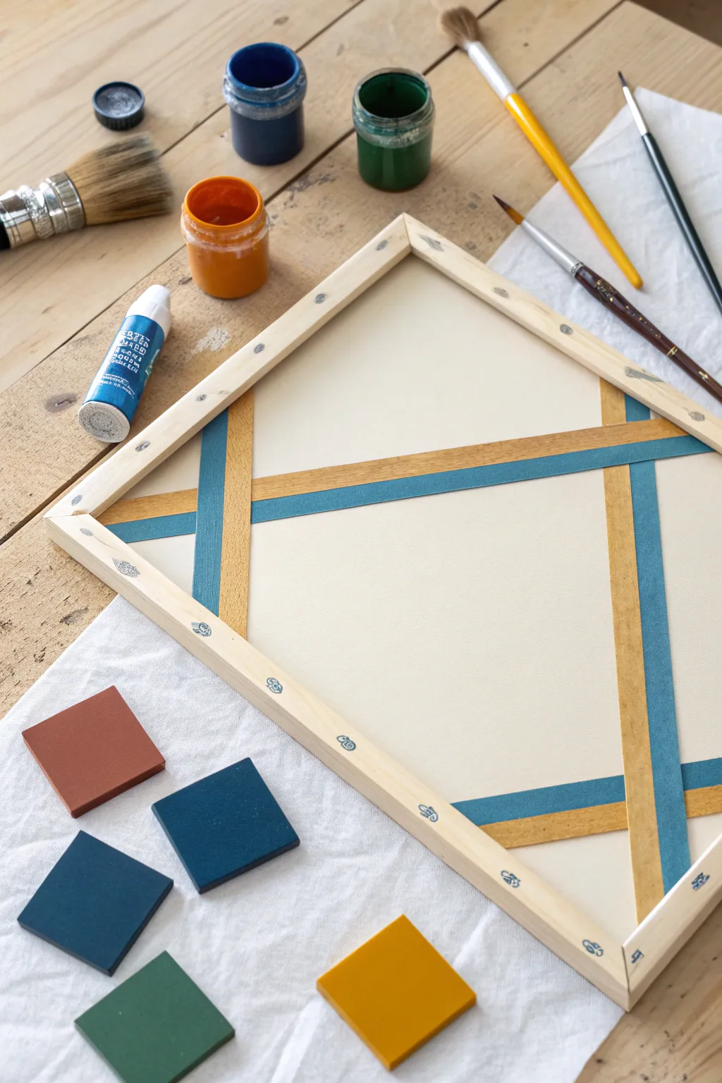
Achieve striking, modern wall art with nothing more than masking tape and acrylic paint. This project uses a resist technique to create crisp, interlocking lines of teal and gold against a clean background, resulting in a sophisticated geometric design.
Step-by-Step Guide
Materials
- Stretched canvas or wood panel
- Painter’s tape or dedicated masking tape (art grade)
- Acrylic paints (Teal, Metallic Gold, Off-White/Cream)
- Flat paintbrushes (various sizes)
- Small square tiles or paint chips for color testing (optional)
- Palette or small containers for mixing
- Jar of water
- Paper towels
Step 1: Planning and Surface Prep
-
Prime the Surface:
Begin by applying an even base coat of off-white or cream acrylic paint to your entire canvas. This ensures a uniform background color once the tape is removed later. -
Dry Thoroughly:
Allow this base coat to dry completely. If the paint is even slightly tacky, the tape may lift it up in the next phase, so patience is key here. -
Visualize the Layout:
Before laying down tape, visualize a large diamond shape intersected by horizontal bands. You can create a light sketch with a pencil if you feel more comfortable having a guide.
Step 2: Applying the Masking Tape
-
Create the First Set of Lines:
Apply strips of painter’s tape to the canvas to block out the areas you want to remain cream-colored eventually. Start with the vertical or diagonal lines that form the sides of the diamond shape. -
Add Crossing Lines:
Lay down the horizontal strips of tape across the canvas, intersecting your previous lines. Ensure the tape extends over the wooden frame edges to anchor it securely. -
Seal the Edges:
Firmly press down along the edges of every piece of tape with your fingernail or a credit card. This burnishing step is critical to prevent paint from bleeding underneath. -
Seal with Base Coat (Optional):
For razor-sharp lines, I like to brush a tiny amount of the base cream color over the tape edges. This fills any microscopic gaps with the background color rather than the bold colors.
Bleeding Lines?
If paint seeps under the tape, wait for it to fully dry. Then, use a small angled brush and your background color to carefully ‘erase’ the mistake by painting over the bleed.
Step 3: Painting the Colors
-
Select Your Zones:
Decide which exposed geometric strips will be teal and which will be gold. The design in the image uses alternating or interlocking color placements for a woven effect. -
Paint the Vertical Bands:
Using a flat brush, carefully fill in the designated vertical strips with your teal acrylic paint. Apply thin, even layers rather than one thick glob. -
Paint the Horizontal Bands:
Switch brushes and apply the metallic gold paint to the horizontal strips (or vice versa, depending on your chosen pattern). -
Refine the Intersections:
Pay close attention to where the bands of color seem to cross. You may need a smaller flat brush to paint clean lines right up to the tape edge without mixing colors. -
Apply Second Coats:
Acrylics, especially metallics like gold, often need a second coat for full opacity. Let the first layer dry to the touch before adding the second.
Pro Tip: Tape Removal
Don’t rip the tape off like a bandage. Pulling slowly and keeping your hand close to the canvas surface (rather than pulling up into the air) drastically reduces the risk of peeling paint.
Step 4: The Reveal
-
Monitor Drying Time:
Allow the paint to set but not fully cure to a rock-hard state. Removing tape while the paint is slightly flexible helps prevent chipping. -
Peel Slowly:
Gently peel back the tape at a 45-degree angle away from the painted area. Do this slowly to ensure clean edges. -
Touch Up:
Inspect your lines. If any paint bled through, use a tiny detailed brush and your base cream color to tidy up the edges.
Hang your new geometric masterpiece and enjoy the satisfyingly crisp lines you created
Paint a Starry Night Sky
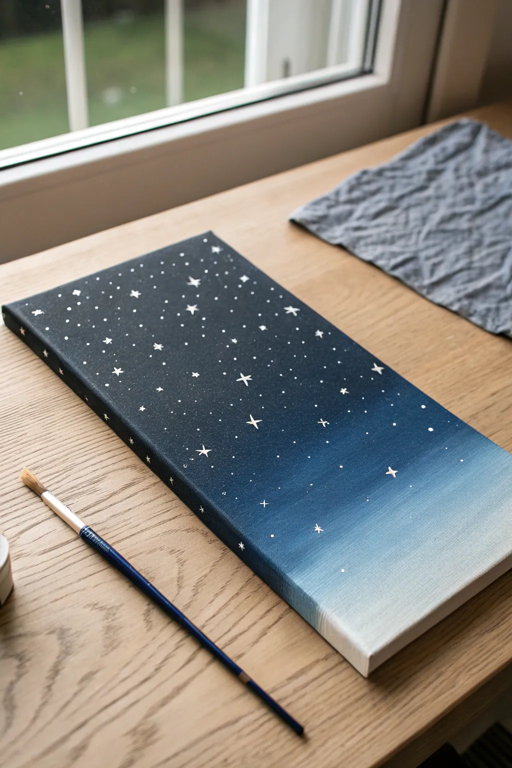
This soothing canvas project captures the quiet beauty of a night sky transitioning into dawn. Using a simple gradient technique and delicate brushwork, you’ll create a dreamy celestial scene that looks stunning on any wall.
How-To Guide
Materials
- Rectangular stretched canvas (approx. 6×12 inches)
- Acrylic paint: Deep Navy Blue (or Indigo)
- Acrylic paint: Black
- Acrylic paint: Titanium White
- Acrylic paint: Sky Blue
- Wide flat brush (approx. 1 inch)
- Small round detail brush (size 0 or 1)
- Palette or paper plate
- Cup of water and paper towels
Step 1: Creating the Gradient Base
-
Prepare your palette:
Squeeze out your paints onto the palette. You will need a large amount of the deep navy, a moderate amount of black, and smaller dollops of sky blue and white. Leave space between them for mixing. -
Start with the darkest tone:
Mix a little black into your deep navy blue to create a very dark, midnight shade. Using the wide flat brush, paint the top third of the canvas with horizontal strokes. -
Paint the edges:
Don’t forget to wrap the paint around the top and side edges of the canvas as you go. This gives the finished piece a polished, gallery-ready look without needing a frame. -
Transition to navy:
Clean your brush slightly or wipe it off. Pick up pure deep navy blue and apply it below the darkest section, blending the wet edges where the two colors meet. Use long, smooth horizontal strokes to create a seamless fade. -
Introduce lighter blue:
Mix a touch of white into your sky blue. Apply this lighter shade below the navy section, again blending the seam while the paint is still wet. I find working quickly here helps prevent harsh lines. -
Finish with the horizon:
For the bottom inch or two of the canvas, use mostly titanium white with just the tiniest hint of blue. Blend this upwards into the sky blue section to create a soft, glowing horizon line. -
Smooth the transition:
Take a clean, slightly damp flat brush and run it horizontally across the entire canvas from top to bottom one last time to smooth out any brushstrokes and perfect the gradient. -
Let it dry completely:
Allow the background gradient to dry fully. This is crucial—if the background is wet, your stars will smear and look gray instead of crisp white.
Clean Brush Tip
For the tiniest stars, use the back end of your paintbrush handle. Dip it in white paint and dot it onto the canvas for perfect, uniform circles.
Step 2: Adding the Stars
-
Prepare for detail work:
Switch to your smallest round detail brush. Thin a small amount of titanium white paint with a drop of water. The consistency should be inky, allowing the paint to flow smoothly off the brush tip. -
Paint the larger stars:
Choose a few random spots in the darker upper section of the sky for your brightest stars. Paint small ‘plus’ signs (+) to create four-pointed stars. Vary the size slightly to add depth. -
Refine the star shape:
To make the four-pointed stars look sharper, gently pull the paint outward from the center of the ‘plus’ sign to taper the points. Keep the touch very light. -
Add medium stars:
Dip the very tip of your brush into the white paint and gently dot it onto the canvas. Place these medium-sized dots randomly, focusing mostly on the upper two-thirds of the painting. -
Create distant constellations:
For the smallest, most distant stars, use just the very point of the brush to tap tiny specks of white. Cluster some together and leave other areas sparser for a natural look. -
Extend to the edges:
Remember to paint a few stars wrapping around the sides of the canvas, particularly on the darker painted edges, to continue the immersive effect. -
Check the balance:
Step back and look at your composition. Ensure the stars are denser in the dark sky and fade out as they reach the lighter horizon. Add a few more tiny dots if any area looks too empty. -
Final drying time:
Let the white stars dry completely. Since the dots are small, this should only take a few minutes.
Blending Woes?
If acrylics dry too fast while blending the gradient, lightly mist the canvas with water or use a ‘slow drying medium’ to keep the paint workable longer.
Place your finished starry sky near a window or on a desk to add a touch of calm to your day


Add Simple Birch Trees
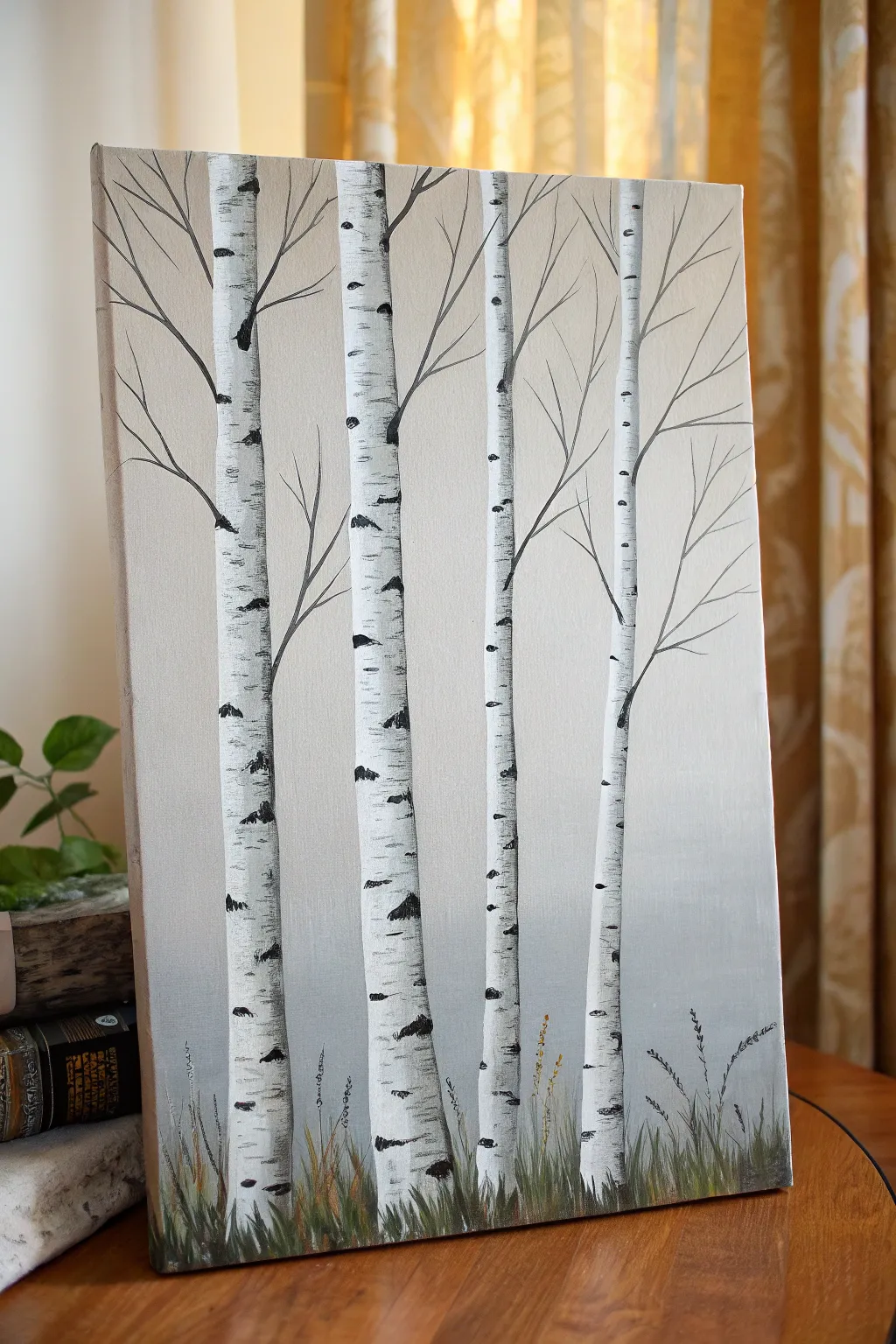
Transform a plain canvas into a serene woodland scene with this surprisingly simple birch tree painting. The design relies on a soft, neutral background and striking vertical lines to create a piece that feels both modern and nature-inspired.
Step-by-Step
Materials
- Rectangular stretched canvas (e.g., 12×16 inch)
- Acrylic paints: White, Black, Light Grey, Burnt Umber, Olive Green
- Flat shader brush (approx. 1 inch)
- Small flat brush or filbert brush (approx. 1/2 inch)
- Fine liner brush or rigger brush
- Palette knife (optional, for texture)
- Cup of water and paper towels
- Painter’s tape (optional)
Step 1: Creating the Atmosphere
-
Prepare the gradient background:
Begin by squeezing out plenty of titanium white and a small drop of light grey onto your palette. We want a very subtle, misty look, not a stormy sky. -
Paint the top section:
Using your large flat brush, apply a mix of mostly white with a tiny hint of grey to the top two-thirds of the canvas. Use horizontal strokes to keep it smooth. -
Blend the horizon:
As you work your way down to the bottom third, gradually mix in a slightly darker grey. Blend the transition area while the paint is still wet so there are no harsh lines, creating a foggy ‘ground’ effect. -
Let it dry completely:
This step is crucial; if the background is wet, your crisp white trees will turn muddy. A hair dryer can speed this up if you’re impatient like me.
Use a Card
For ultra-crisp black bark markings, dip the edge of an old credit card or stiff cardboard into black paint and scrape it across the trunk horizontally.
Step 2: Constructing the Trunks
-
Map out the trees:
Load a medium flat brush with pure titanium white. Paint four vertical stripes representing the tree trunks. Vary the spacing between them so they don’t look like fence posts. -
Vary the width:
Make the trunks slightly tapered—wider at the bottom and getting thinner as they reach the top edge of the canvas. The trees on the left can satisfy the rule of thirds by being slightly thicker. -
Add a second coat:
Acrylic white can be translucent. Once the first layer is dry to the touch, apply a second coat of white to ensure the trunks stand out largely against the grey background. -
Create shadow definition:
Mix a very watery grey wash. Run a thin line of this shadow along just the left edge of each trunk to give them cylindrical volume.
Step 3: Adding the Birch Markings
-
Start the characteristic stripes:
Using black paint and a small flat brush or the edge of a palette knife, creating the iconic horizontal markings. Start from the side of the trunk and pull inward. -
Randomize the patterns:
Don’t make them uniform. Some marks should be thick wedges, others just thin lines. Leave distinct gaps of white space between them. -
Add the ‘eyes’:
In the middle of the white spaces, occasionally paint a small, flatter oval or diamond shape. These mimic the knots found natural birch bark. -
Detail the base:
At the very bottom of the trunks where they meet the grass, use more black paint to anchor them, blending it slightly upward into the white bark.
Seasonal Shift
Change the season easily! Splatter white paint over the bottom for snow, or dab tiny orange and yellow dots on the branches for an autumn vibe.
Step 4: Fine Details and Foliage
-
Paint the branches:
Switch to your fine liner brush with watered-down black or dark grey paint. Paint thin, spindly branches reaching upward and outward from the main trunks. -
Connect branches to bark:
Make sure your branches emerge from the darker markings or knots on the trunk, not just floating on the white parts. This looks more organic. -
Create the grassy base:
Mix olive green with a touch of burnt umber and black. Using your liner brush or an old fan brush, flick short, quick strokes upward at the bottom of the canvas. -
Layer the grass:
Add some lighter green or yellow ochre strokes over the dark grass to create depth. Vary the height so the grass looks wild and natural. -
Add final wild growth:
Using the very tip of your liner brush and black paint, add a few tall, thin weeds or seed heads poking out of the grass for a delicate finish.
Step back and admire your quiet, elegant forest scene—it’s ready to bring a touch of nature to any wall.
Outline Minimal Line Art Over Color
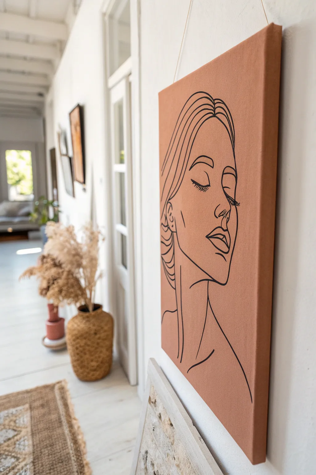
Embrace the effortless elegance of continuous line art with this striking DIY canvas project. By pairing a warm, earthy terracotta base with crisp black linework, you can create a sophisticated piece of decor that feels both modern and timeless.
Step-by-Step Tutorial
Materials
- Stretched canvas (rectangular, medium grain)
- Acrylic paint (Terracotta or Burnt Sienna mixed with Unbleached Titanium)
- Acrylic paint (Carbon Black) or a thick black paint marker
- Wide flat brush (2-3 inch)
- Fine round brush (size 1 or 2) or fine-tip paint pen
- Pencil (HB or H)
- Eraser
- Tracing paper (optional)
- White chalk (optional)
- Reference image of a face profile
Step 1: Setting the Stage
-
Prepare the canvas:
Start by wiping down your canvas with a dry cloth to remove any dust. Set up your workspace with drop cloths or newspaper to catch stray paint drips. -
Mix the perfect shade:
To achieve that warm, earthy background, mix burnt sienna with a touch of unbleached titanium or white. You want a matte, terracotta hue that isn’t too bright orange. -
Apply the first coat:
Using your wide flat brush, apply a smooth, even layer of the terracotta paint across the entire front of the canvas. Use long, horizontal strokes to minimize brush marks. -
Don’t forget the edges:
Paint the sides (the gallery wrap edges) of the canvas with the same color. This gives the artwork a polished, professional look without needing a frame. -
Let it dry completely:
Wait for the first coat to dry fully to the touch. This usually takes about 20-30 minutes depending on humidity. You don’t want to drag wet paint around with the second coat. -
Apply a second coat:
For a truly opaque and solid background color, apply a second coat of paint. This time, try painting vertical strokes to create a subtle cross-hatch texture or stick to horizontal for smoothness.
Pro Tip: Smooth Sailing
To help your brush glide effortlessly for long lines, mix a fluid medium into your heavy body acrylics instead of just water. It prevents the paint from breaking up.
Step 2: Drafting the Design
-
Find your reference:
Choose a line drawing reference of a woman’s profile. Look for ‘continuous line face art’ online if you need inspiration for the simplified style. -
Sketch lightly:
Using a pencil, very lightly sketch your design onto the dry painted canvas. I find using a piece of white chalk is safer here, as it wipes away easily with a damp cloth if you make a mistake. -
Refining the proportions:
Focus on the placement of the closed eye, the nose, and the lips. The beauty of this style is in the flow, so keep your pencil loose and refrain from pressing hard. -
Defining the hair:
Sketch the hair simply as flowing outlines rather than individual strands. These long curves will frame the face beautifully.
Level Up: Texture Play
Mix baking soda into your terracotta base paint before applying it. This creates a gritty, plaster-like texture that adds an antique, fresco feel to the background.
Step 3: Inking the Lines
-
Select your tool:
Decide between a fine round detail brush with thinned black acrylic paint or a high-quality black acrylic paint marker. A marker offers more control for beginners. -
Test flow:
If using a brush, mix a tiny drop of water into your black paint so it flows like ink. Test a line on a scrap paper first to ensure it’s not too drippy. -
Start with the face:
Begin outlining the facial features first—the eyelids, eyelashes, nose, and lips. Keep your hand steady and try to maintain a consistent line thickness. -
Varying line weight:
For added dimension, you can thicken lines slightly on the shadow side of the face, specifically under the jawline or the bottom lip. -
Flowing hair lines:
Move to the hair and neck. Execute these longer lines with confidence, moving your entire arm rather than just your wrist to get smooth, sweeping curves. -
Clean up:
Once the black ink is completely dry, gently erase any visible pencil or chalk marks. Be gentle to avoid rubbing off the base paint layer. -
Final check:
Step back and look at the composition. If any black lines look patchy, go over them one last time to ensure a deep, solid black contrast.
Hang your new minimalist masterpiece in a bright hallway or living space to add a sophisticated touch of warmth to your home
Do a Monochrome Value Study
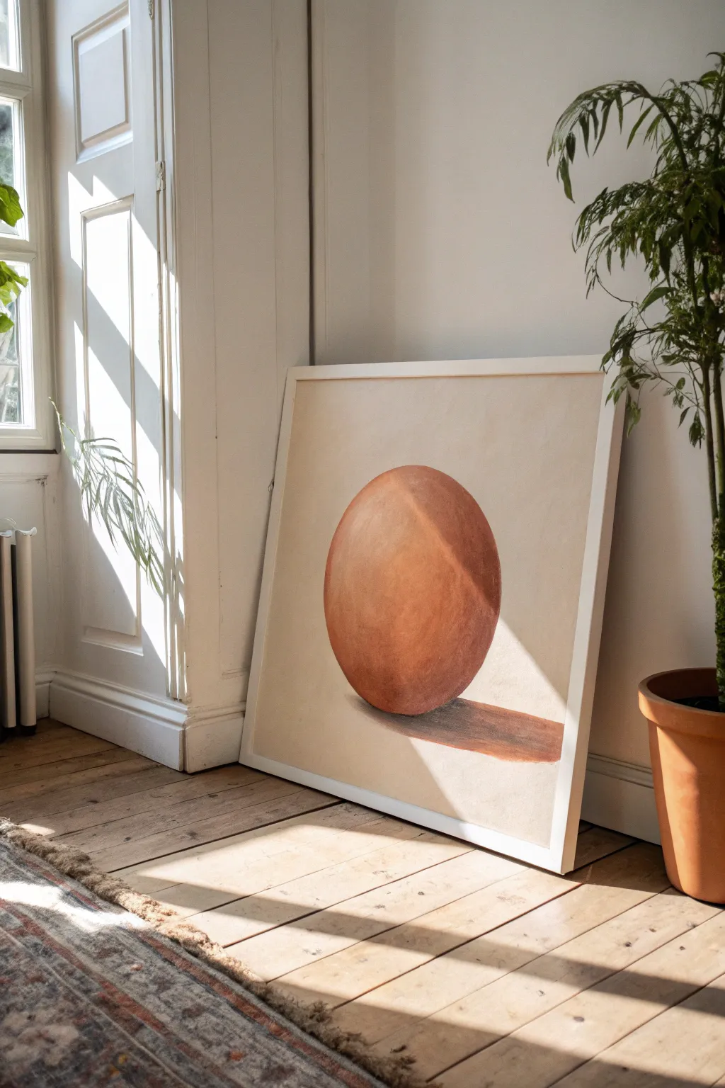
Master the fundamentals of light and form with this striking monochromatic study of a simple sphere. Using warm, earthy terracotta tones against a neutral background, you’ll create a piece that feels both modern and classically disciplined.
How-To Guide
Materials
- Square canvas (approx. 24×24 inches)
- Acrylic paints: Burnt Sienna, Yellow Ochre, Titanium White, Burnt Umber, Raw Sienna
- Large flat brush (2-inch)
- Medium filbert brush
- Small round brush for details
- Palette knife
- Pencil and string (or large compass)
- Water cup and paper towels
Step 1: Setting the Foundation
-
Prepare the background tone:
Mix a generous amount of Titanium White with a tiny touch of Yellow Ochre and a dot of Burnt Sienna. You want a very pale, warm beige—almost an off-white plaster color. -
Apply the base coat:
Using your large flat brush, cover the entire canvas with this pale beige mixture. Create smooth, even strokes, or add a little texture with a palette knife if you prefer a rougher finish. Let this layer dry completely. -
Draft the circle:
Find the center of your canvas. Tie a piece of string to a pencil, hold the string’s end at the center point, and lightly draw a large, perfect circle. Ensure it has plenty of breathing room from the edges of the canvas.
Step 2: Blocking in the Form
-
Mix the mid-tone:
On your palette, create your main ‘local color’ for the sphere. Mix Burnt Sienna with a little Raw Sienna to get a rich, warm terracotta hue. -
Fill the shape:
Use the filbert brush to paint the entire circle with this terracotta mix. Don’t worry about shading yet; just get a solid, opaque shape down. I find two thin coats work better than one thick one here. -
Establish the light source:
Decide on your light direction. In the reference, the light is coming from the top right, meaning the highlight will be there and the shadow will be on the bottom left. -
Create the shadow mix:
Take your terracotta mix and add a small amount of Burnt Umber. Do not use black, as it deadens the color. You want a deep, rusty brown.
Smooth Blending
Keep a spray bottle of water nearby. misting your paints lightly keeps acrylics wet longer, allowing you to create that seamless, soft gradient on the sphere’s surface.
Step 3: Building Dimension
-
Paint the core shadow:
Apply the dark shadow mix to the bottom left curve of the sphere. Use a crescent moon shape that hugs the edge. -
Blend the shadow:
While the paint is still wet, clean your brush slightly and blend the edge of the shadow into the mid-tone center. Use soft, curved strokes that follow the roundness of the ball. -
Mix the highlight:
Clean your palette area. Mix Titanium White with a small amount of your original terracotta color to create a soft peach highlight tone. -
Apply the light:
Paint the top right area of the sphere with this lighter color. Blend it gently downward into the mid-tone, keeping the transition smooth to suggest a matte, clay-like surface. -
Add reflected light:
Mix a slightly lighter version of your shadow tone. Paint a very thin strip along the absolute bottom-left edge of the sphere, separating the dark shadow from the outline. This suggests light bouncing off the table.
Add Texture
For a distinct stone look, mix a little fine sand or pumice gel into your paint during the ‘Blocking in the Form’ phase to give the sphere a tactile, realistic finish.
Step 4: Cast Shadow and Finishing
-
Map the cast shadow:
On the ‘table’ surface below the sphere, lightly sketch a long, stretched oval shape extending to the right. -
Paint the cast shadow:
Mix Burnt Umber with a touch of Burnt Sienna. Fill in the cast shadow shape. Make the part of the shadow touching the sphere the darkest. -
Soften shadow edges:
As the shadow stretches away from the object, use a dry brush to feather the edges slightly, making them softer than the sharp edge of the ball itself. -
Refine the sphere edge:
Using a small round brush and your background color, carefully tidy up the outer rim of the circle to ensure it is perfectly round and crisp. -
Final glaze (Optional):
Once everything is bone dry, you can mix a tiny amount of Burnt Sienna with glazing medium and wash it over the transition zones to unify the gradient even further.
Step back and admire how a simple geometric shape transforms into a realistic object with just a few shifts in value
Build Texture With a Palette Knife
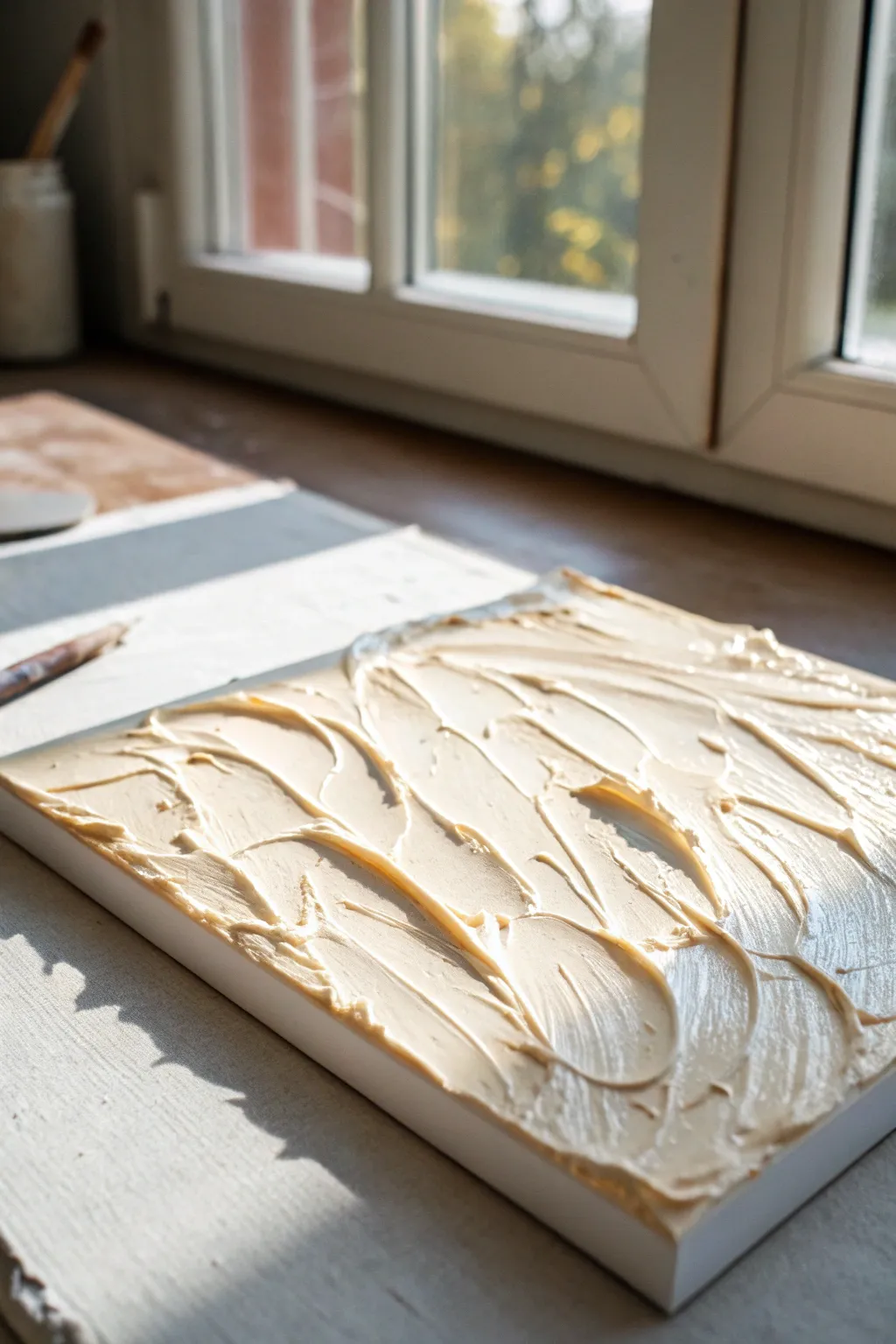
Transform a plain white canvas into a sculptural masterpiece using nothing more than modeling paste and rhythmic motion. This project relies on thick, sweeping strokes to create a creamy, monochromatic surface that plays beautifully with natural light.
Step-by-Step Guide
Materials
- Stretched canvas (square format recommended)
- Heavy body acrylic gel or modeling paste
- Cream or beige acrylic paint
- Large palette knife (trowel shape)
- Small palette knife (diamond shape)
- Mixing palette or paper plate
- Drop cloth
Step 1: Preparation and Mixing
-
Set up your workspace:
Lay down your drop cloth in a well-lit area. Ideally, position your workspace near a window so you can see the shadows cast by the texture as you work. -
Secure the canvas:
Place your canvas flat on the table rather than on an easel. This gravity-friendly position prevents the heavy paste from sliding down before it sets. -
Create the base mixture:
Scoop a generous amount of modeling paste onto your mixing palette. You will need enough to cover the entire canvas in a layer at least 1/4 inch thick. -
Tint the paste:
Add a small squeeze of cream or beige acrylic paint to the white paste. I like to keep the color very subtle, closer to an off-white, to let the texture do the talking. -
Mix thoroughly:
Fold the paint into the paste using your large palette knife until the color is uniform and no white streaks remain.
Step 2: Building the Foundation
-
Apply the initial layer:
Scoop a large dollop of the tinted paste onto the center of the canvas. -
Spread to edges:
Using the flat side of the large palette knife, spread the paste outward toward the corners. -
Ensure full coverage:
Work the paste all the way to the very edges of the canvas, ensuring no bare canvas shows through. The layer should be thick and opaque. -
Smooth the surface slightly:
Run the knife lightly over the top to create a relatively even surface thickness, though it doesn’t need to be perfectly smooth yet.
Cracking Issues?
If hairline cracks appear while drying, your paste layer might be too thick in one go. Mix a little gloss gel medium into the paste next time to increase flexibility.
Step 3: Sculpting the Waves
-
Start the swooping motion:
Clean your large palette knife. Starting from one corner, press the flat edge into the paste and curve your wrist to create a large, C-shaped swoop. -
Overlap the strokes:
Move across the canvas, creating overlapping semi-circles and waves. Let the ridges of paste build up where one stroke ends and another begins. -
Vary the pressure:
Press harder at the start of a stroke and lift gently at the end to create tapered, feathery tails in the texture. -
Add chaotic direction:
Don’t align all strokes in one direction. Turn your wrist to make some strokes go vertical and others horizontal, mimicking the chaotic nature of churning water or frosting. -
Refine with the small knife:
Switch to your smaller palette knife to add tinier details and breaks in the larger waves. -
Create distinct ridges:
Use the edge of the small knife to lift little peaks of paste, pulling upward quickly to sharpen the texture.
Metallic Glaze
Once fully dry, dry-brush a tiny amount of metallic gold or pearl paint solely onto the highest peaks of the texture to catch the light.
Step 4: Finishing Touches
-
Review the composition:
Step back or view the canvas from a low angle to check the height of the texture. If any area looks too flat, add a bit more paste and re-sculpt that section. -
Clean the edges:
Run your finger or a clean tool along the side edges of the canvas to remove any overhanging paste for a crisp, professional finish. -
Allow to cure:
Leave the artwork flat to dry. Due to the thickness of the paste, this process can take 24 to 48 hours to fully harden.
Hang your textured piece near a light source to watch the shadows shift throughout the day
Collage First, Paint on Top
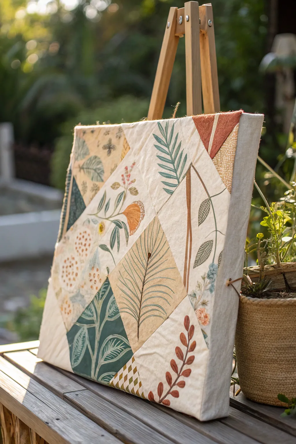
This project transforms a standard canvas into a textured, quilt-inspired masterpiece by combining fabric collage with delicate painting. The resulting artwork captures an organic, earthy aesthetic with its geometric patchwork base and overlay of fine botanical illustrations.
How-To Guide
Materials
- Blank gallery-wrapped canvas (square)
- Assorted cotton fabrics (in cream, beige, mustard, deep green, and burnt orange) with subtle patterns
- Fabric glue or Mod Podge (matte finish)
- Wide flat paintbrush (for gluing)
- Fine liner brushes (sizes 00 and 1)
- Acrylic paints (olive green, forest green, burnt sienna, cream, slate blue)
- Scissors or rotary cutter
- Ruler and pencil
- Iron and ironing board
- Clear matte acrylic sealer (optional)
Step 1: Creating the Patchwork Base
-
Plan your geometry:
Begin by sketching a geometric ‘quilt’ pattern heavily on paper first. This design uses large triangles and diamonds to break up the square space. You want a mix of large cream zones for painting and smaller colored zones for contrast. -
Cut fabric shapes:
Using your paper sketch as a guide, cut your fabric scraps into corresponding shapes. Add a small 1/4-inch overlap to the edges of each shape to ensure you don’t have gaps showing the white canvas underneath. -
Iron for crispness:
Press every fabric piece flat with an iron before adhering. Wrinkles will become permanent once glued, so getting them smooth now is crucial for a professional look. -
Apply the base adhesive:
Working one section at a time, brush a generous, even layer of fabric glue or Mod Podge directly onto the canvas surface where your first shape will go. -
Place and smooth:
Lay the fabric piece onto the wet glue. Use a clean, dry cloth or a brayer to smooth it out from the center toward the edges, eliminating any air bubbles. -
Continue the collage:
Repeat the process for adjacent shapes. Where fabrics meet, carefully overlap them slightly to create a seamless ‘sewn’ look. Pay special attention to wrapping the fabric around the thick sides of the gallery canvas for a finished edge. -
Seal the surface:
Once the entire canvas is covered and dry, apply a thinned coat of matte Mod Podge over the top of the fabric. This seals the fibers and creates a stiffer, more paint-friendly surface.
Step 2: Painting Botanical Details
-
Sketch the flora:
Lightly sketch your botanical designs directly onto the dry fabric surface using a soft pencil. Focus on varied leaf shapes—ferns, broad leaves, and vines—that span across the different fabric zones to unify the composition. -
Mix your greens:
On your palette, mix a few variations of green. I like to have a muddy olive, a deep forest green, and a blue-tinted sage ready to create depth. -
Paint the stems:
Using your finest liner brush and thinned acrylic paint (almost ink-like consistency), trace the main stems of your plants. Long, confident strokes work best here. -
Block in leaves:
Fill in the leaf shapes. For the fern-like fronds, use quick, short strokes pulling away from the stem. For broad leaves, outline first and then fill with a slightly translucent wash of color to let the fabric texture show through. -
Add veining and details:
Once the base leaf colors are dry, use a contrasting color (like cream on dark leaves or dark green on light leaves) to paint delicate veins and central lines. -
Paint floral accents:
Add small touches of color, like the burnt orange pods or small blue buds seen in the image. Keep these sparse to maintain the earthy color palette. -
Refine edges:
Prop the canvas up on your easel and step back. Use your smallest brush to sharpen the tips of leaves or fix any wobbly stem lines. -
Final matte seal:
Allow the paint to cure for 24 hours. If desired, finish with a light spray of matte acrylic sealer to protect the artwork from dust and UV light without adding shine.
Fabric fraying?
If fabric edges fray while gluing, dab a tiny amount of glue on your finger and smooth the loose threads down. Once painted over or sealed, they will disappear.
Use fabric medium
Mix a drop of textile medium into your acrylics. It helps the paint glide smoothly over the fabric weave rather than getting stuck in the texture.
Now you have a textured, multi-layered artwork that brings a touch of handcrafted nature into your home
Try Blind-Contour on Canvas
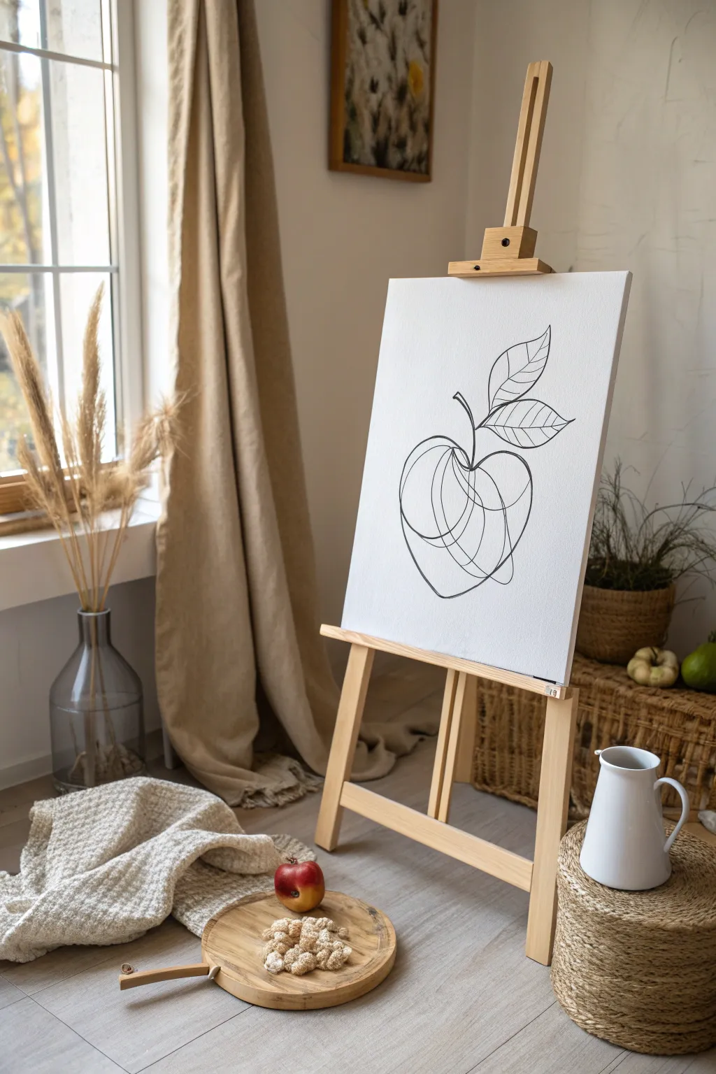
Sometimes less is truly more, and this elegant black-and-white canvas proves it by capturing the essence of an apple with a fluid, continuous line style. This project embraces imperfection, creating a modern, abstract look that serves as a striking focal point in any room.
How-To Guide
Materials
- Rectangular stretched canvas (e.g., 16×20 or 18×24 inches)
- Black acrylic paint
- Medium round brush (size 4 or 6) with a good point
- Pencil (HB or lighter)
- Eraser
- Sheet of scrap paper (for practice)
- Small palette or plate
- Paper towels
- Cup of water
Step 1: Preparation & Practice
-
Prepare your workspace:
Set up your canvas on an easel or lay it flat on a clean table. Ensure you have good lighting so you can see your pencil lines clearly. -
Practice the continuous flow:
Before touching the canvas, grab your scrap paper and a pencil. Practice drawing an apple shape without lifting your hand, letting the lines cross over each other intentionally to create volume. -
Visualize the composition:
Look at your blank canvas and decide where the apple will sit. Aim for the center, leaving plenty of negative white space around the edges to maintain that airy, minimalistic aesthetic.
Clean Up Edges
If you make a mistake or a line gets too thick, wait for the black paint to dry fully. Then, use white acrylic paint to ‘erase’ or reshape the black line.
Step 2: Sketching the Apple
-
Outline the main body:
Using your pencil very lightly, sketch the basic round shape of the apple. It doesn’t need to be perfectly circular; a slightly lopsided heart shape often looks more organic. -
Add the internal curves:
Inside the main apple shape, lightly draw 2-3 curved lines that sweep from the bottom dimple up toward the stem area. These lines mimic the roundness of the fruit. -
Sketch the stem:
Draw a short, slightly curved line extending upward from the top dip of the apple to indicate the stem. -
Position the leaves:
Sketch two leaf shapes attached to the stem. Place one slightly higher and one lower, pointing to the right for a balanced composition. -
Draft the leaf veins:
Lightly pencil in a central vein for each leaf, then add angled lines branching off for the smaller veins. Keep these simple and graphic. -
Refine the continuous look:
Go over your sketch to ensure the lines look connected. Even though you are sketching separate parts, visualize how the paint will flow from one section to the next as if it’s one long wire.
Add a Splash of Color
For a modern twist, paint a rough, semi-transparent circle of red or green watercolor wash behind the apple sketch before doing the black line work.
Step 3: Painting the Design
-
Prepare the paint:
Squeeze a small amount of black acrylic paint onto your palette. I find adding a tiny drop of water helps the paint flow more smoothly off the brush for long lines. -
Load the brush:
Dip your round brush into the paint and roll it slightly on the palette to shape the bristles into a fine tip. You want the brush fully loaded but not dripping. -
Start at the base:
Begin painting at the bottom center of the apple. Apply gentle pressure to keep the line width relatively consistent, tracing over your pencil sketch. -
Create the overlapping curves:
Paint the swooping lines inside the apple body. Don’t worry if your hand shakes slightly; these little quivers add character to the ‘blind contour’ style. -
Connect to the stem:
Bring your painted line up to the top and seamlessly transition into the stem stroke, maintaining a fluid motion. -
Paint the leaves:
Outline the leaves carefully. For the pointed tips, lift your brush gradually as you reach the end of the stroke to taper the line. -
Add leaf details:
Paint the internal veins of the leaves. Use just the very tip of your brush here to make these lines slightly thinner than the main outline. -
Review line weight:
Step back and look at the artwork. If any main outlines look too thin or broken, carefully go over them again to thicken the line and unify the design.
Step 4: Finishing Touches
-
Let the paint cure:
Allow the black paint to dry completely. This usually takes about 20-30 minutes for acrylics, depending on how thick your application was. -
Erase guidelines:
Once you are absolutely certain the paint is dry and hard, take your eraser and gently remove any visible pencil marks that are peeking out from under the paint.
Step back and admire the sophisticated simplicity of your new blind-contour style masterpiece


Have a question or want to share your own experience? I'd love to hear from you in the comments below!