A blue background can be calm, dramatic, or downright electric—it all depends on how you build the layers. Here are my favorite blue background painting ideas to help you set the mood fast and make your main subject pop.
Classic Blue Gradient Sky
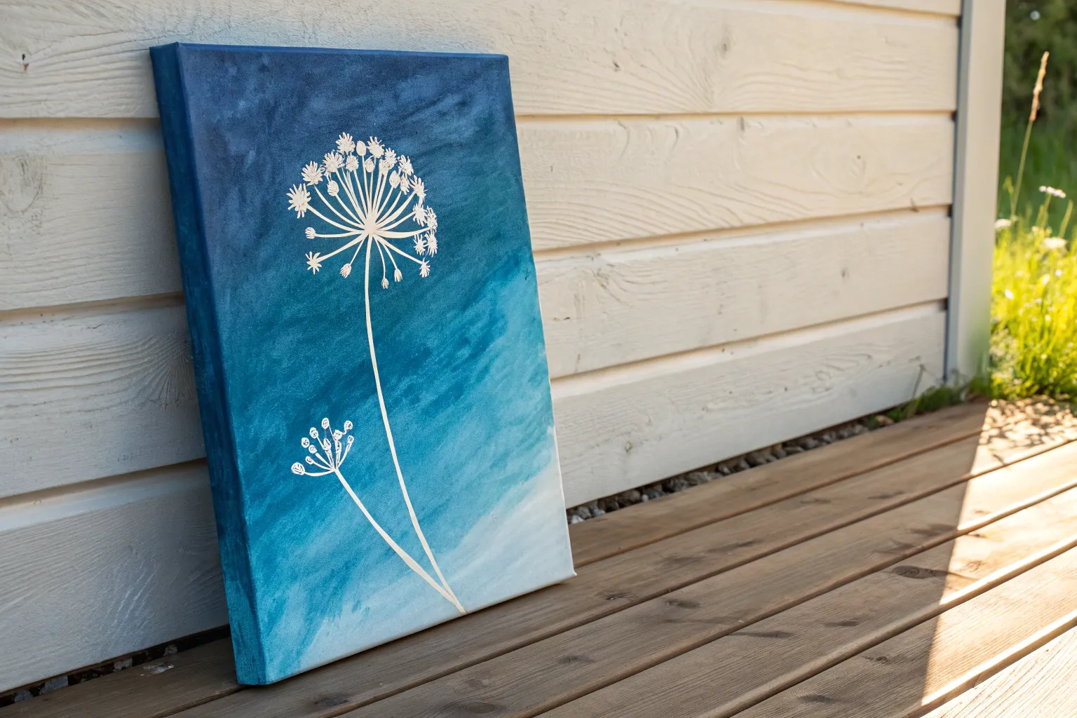
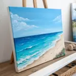
This project captures the calming essence of the coast with a focus on a smooth, majestic blue gradient sky meeting a gentle shoreline. By mastering the art of wet-on-wet blending, you will create a seamless transition from deep midnight blue to a soft, hazy horizon.
How-To Guide
Materials
- Stretched canvas (rectangular, portrait orientation)
- Acrylic paints: Phthalo Blue (or Prussian Blue), Ultramarine Blue, Titanium White, Raw Sienna, Burnt Umber
- Large flat wash brush (2-inch)
- Medium flat brush (1-inch)
- Small round detail brush
- Fan brush (optional)
- Palette or paper plate
- Water cup
- Paper towels
- Table easel or flat surface
Step 1: Creating the Gradient Sky
-
Prepare the Deepest Blue:
Start by mixing a dark, rich blue on your palette. Combine Phthalo Blue with a tiny touch of Burnt Umber or Black to deepen it without making it muddy. This will be your top sky color. -
Apply the Top Band:
Using your large flat wash brush, apply this dark blue mixture horizontally across the top 20% of the canvas. Ensure you paint the top and side edges of the canvas as well for a polished gallery wrap look. -
Mix the Mid-Tone Blue:
Without cleaning your brush fully, pick up pure Phthalo Blue or mix in a little Ultramarine Blue. Paint the next section below the dark band, overlapping slightly with the wet edge above. -
Blend the Upper Sky:
Use long, horizontal strokes to blend the dark blue into the mid-tone blue. The goal is to eliminate any hard lines. If the paint feels draggy, dampen your brush very slightly with water. -
Create the Light Blue Transition:
Clean your large brush. Mix a generous amount of Titanium White into your blue to create a light sky blue. Apply this band below the mid-tone section, covering the middle area of the canvas. -
Fade to White:
For the area just above the horizon line, use almost pure Titanium White with just a whisper of blue. This creates that atmospheric glow often seen at the beach. -
Final Sky Blend:
With a clean, dry brush, gently sweep back and forth across the entire sky area to smooth out the transition from dark top to pale bottom. I find light pressure works best here to avoid lifting the paint.
Fixing Choppy Blends
If your gradient looks streaky, the paint dried too fast. Mist the canvas lightly with water or use a ‘slow-dry’ medium in your paint to keep it workable longer for smoother transitions.
Step 2: Painting the Ocean
-
Establish the Horizon:
Allow the sky to dry completely. Use a ruler or painter’s tape to mark a straight horizon line about 1/4 to 1/3 up from the bottom. -
Paint the Deep Water:
Mix a deep ocean blue using Ultramarine and a touch of Phthalo. Using the medium flat brush, paint a dark, sharp line right against your horizon mark. This deep color represents distance. -
Lighten the Shallows:
Gradually add White and a tiny dot of Raw Sienna (to create a turquoise hint) into your blue mix as you paint downward. The water should get lighter and more transparent as it approaches the sand. -
Add Ocean Texture:
While the ocean paint is still tacky, use a dry brush to streak horizontal lines of lighter blue and white across the water surface to suggest movement and distant swells.
Level Up: Texture
Mix real sand or a texture gel into your beige paint for the beach section. It adds genuine grit and dimensionality that catches the light beautifully when hung.
Step 3: Sand and Sea Foam
-
Base Coat the Sand:
Mix Raw Sienna with a lot of Titanium White to get a warm beige color. Paint the remaining bottom section of the canvas, brushing horizontally. Add a tiny bit of Burnt Umber near the very bottom corners for depth. -
Create the Wet Sand Line:
Where the water meets the sand, mix a slightly darker, brownish-grey version of your sand color. Paint a thin strip here to show where the sand is saturated by the tide. -
Paint the Sea Foam:
Load a small round brush or a fan brush with pure Titanium White. Gently tap or stipple the paint along the shoreline where the blue water meets the wet sand to create the crashing wave foam. -
Soften the Wave Edge:
Using a clean, damp brush, gently smudge the bottom edge of the white foam into the sand. This makes the wave look like it’s sliding onto the beach rather than sitting on top of it. -
Add Wave Highlights:
Add thin, horizontal white lines in the blue water area near the shore to indicate small breaking waves rolling in. -
Final Touches:
Step back and assess your gradient. If needed, dry brush a little extra white foam for brightness. Check that your canvas edges are fully painted.
Hang your finished piece in a well-lit spot to let those blue hues truly shine

Starry Night on a Blue Background
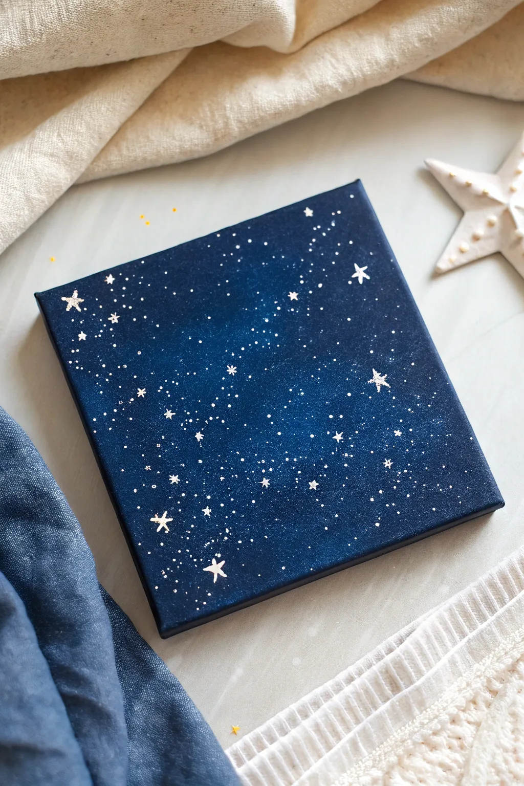
Capture the magic of a clear winter evening with this simple yet stunning starry night painting. Using just a few shades of blue and some metallic accents, you’ll create a galaxy effect that looks far more complex than it actually is.
Step-by-Step Guide
Materials
- Small square canvas (e.g., 6×6 or 8×8 inches)
- Acrylic paints: Navy Blue, Phthalo Blue (or a bright primary blue), Black, and Titanium White
- Metallic paint: Silver or Gold (optional for extra shimmer)
- Flat paintbrushes (medium and large)
- Fine detail liner brush (size 0 or 00)
- Old toothbrush (for spattering)
- Cup of water
- Paper towels
- Palette or paper plate
Step 1: Creating the Deep Space Background
-
Prepare your palette:
Squeeze out generous amounts of Navy Blue and Black onto your palette, with a smaller amount of the brighter Phthalo Blue and white. -
Base coat the edges:
Using a larger flat brush, mix a little black into your navy blue to create a very dark, midnight shade. Paint the outer edges and corners of the canvas with this dark mixture. -
Blend inward:
Without cleaning your brush, pick up pure Navy Blue. Paint a ring just inside your dark corners, blending the wet edges together so the transition is smooth. -
Add the glowing center:
Wipe your brush slightly (don’t wash it fully). Pick up the brighter Phthalo Blue and paint the center area, blending it outward into the navy ring. -
Highlight the core:
While the paint is still wet, add a tiny dot of white to your bright blue mixture and softly blend it into the very center of the canvas. This creates a subtle glow and depth. -
Paint the sides:
Don’t forget to paint the sides of the canvas with the dark navy mixture for a finished, gallery-wrapped look. -
Let it dry completely:
Allow the background to dry fully. If you try to add stars too soon, they will turn light blue instead of crisp white.
Blob Control
If you accidentally spatter a massive blob of white paint, don’t panic. Quickly dab it with a damp Q-tip, or let it dry and paint over it with your navy blue background color.
Step 2: Adding the Stars
-
Prepare the spatter mix:
Mix a small amount of white paint with water until it reaches the consistency of heavy cream or ink. It needs to be fluid enough to fly off bristles but opaque enough to show up. -
Test the spray:
I always test my spatter on a scrap piece of paper first to make sure I don’t get huge blobs. -
Create distant stars:
Dip an old toothbrush into the thinned white paint. Point the bristles toward the canvas and run your thumb over them to spray a fine mist of tiny stars over the entire surface. -
Vary the density:
Try to concentrate the spray slightly more in the lighter center area to mimic the Milky Way, leaving the dark corners a bit sparser. -
Paint larger stars:
Switch to your fine liner brush. Dip it into slightly thinned white paint (not as runny as the spatter mix) and hand-paint specific stars. -
Shape the hero stars:
Paint a few distinct five-pointed stars or four-pointed ‘cross’ stars scattered randomly. Use the very tip of the brush to keep the points sharp. -
Add variance:
Dot in various sizes of round stars using the end of your paintbrush handle or the tip of the liner brush to bridge the gap between the tiny mist and the big stars.
Pro Tip: Depth of Field
Make your background spatter stars slightly grey-blue rather than pure white. Then, make only the largest hand-painted stars pure white to create a 3D depth effect.
Step 3: Final Details
-
Add metallic touches:
If you want a magical shimmer, take a tiny bit of silver or gold metallic paint and dot it over a few of the larger white stars. -
Refine shapes:
If any hand-painted stars look too transparent, go over them with a second coat of white once the first layer is dry. -
Seal the painting:
Once everything is bone dry (give it at least a few hours), you can apply a coat of gloss varnish to make the dark blues really pop and protect the finish.
Enjoy the peaceful atmosphere your new starry creation brings to the room

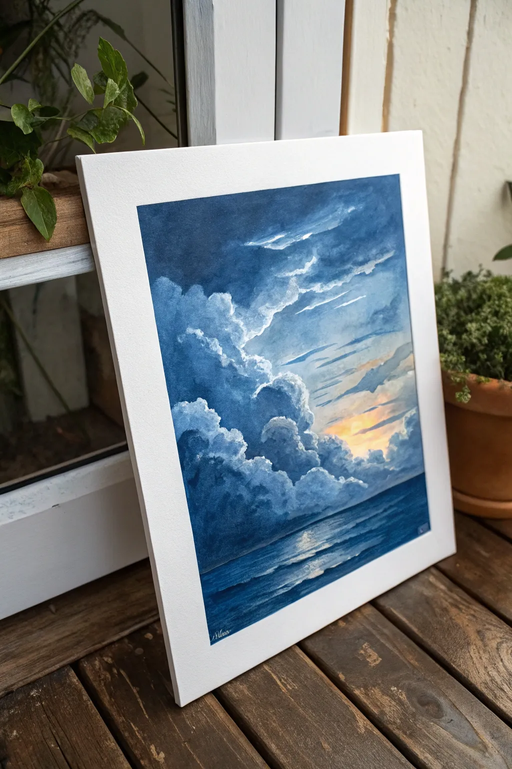
Moon Glow Over Deep Blue
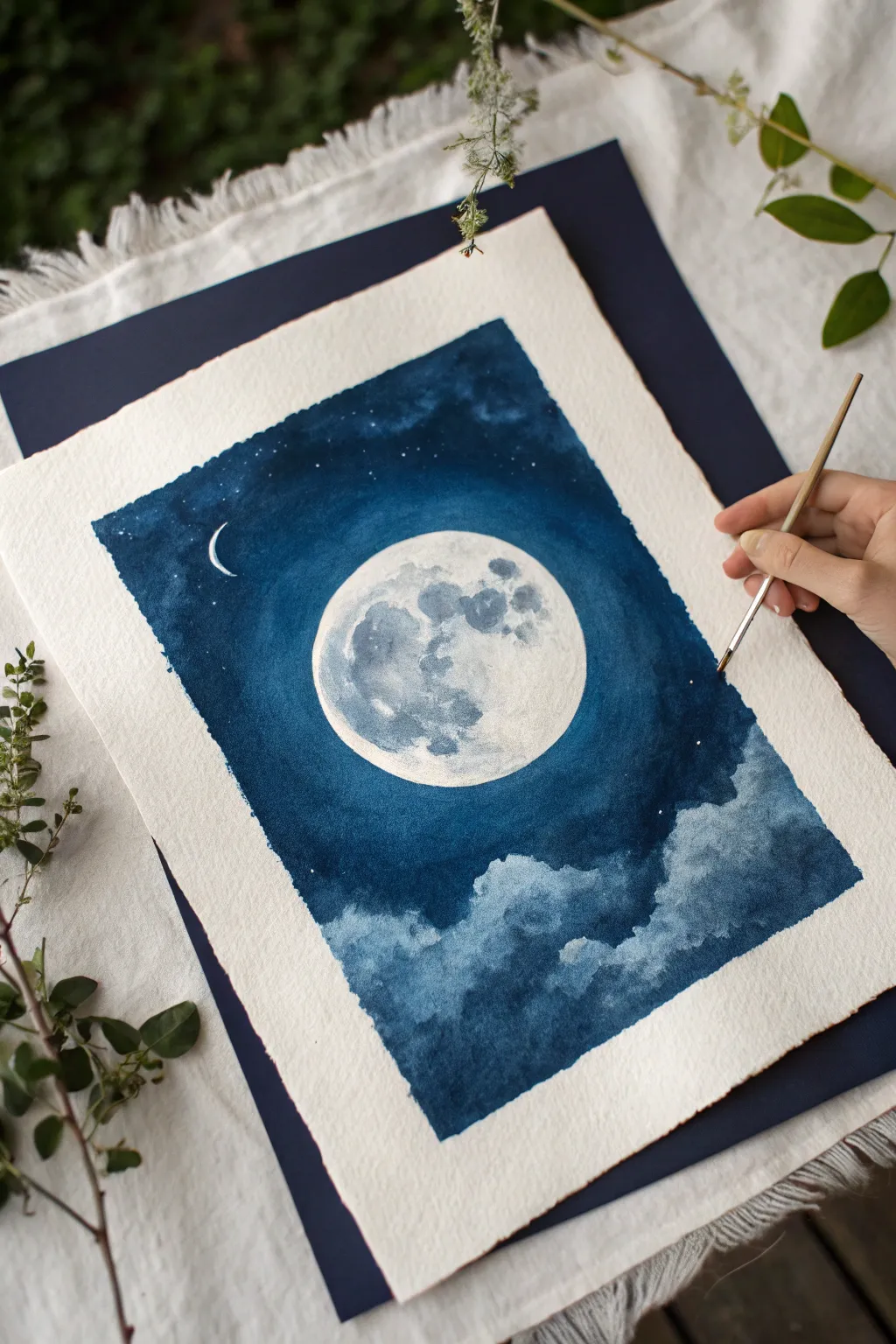
Capture the serene beauty of a moonlit night with this atmospheric watercolor study. By layering deep indigo washes around a luminous full moon, you’ll create a striking contrast that feels both calm and magical.
Step-by-Step Tutorial
Materials
- Cold press watercolor paper (300gsm, 100% cotton recommended)
- Painter’s tape or masking fluid (optional)
- Watercolor paints: Indigo, Prussian Blue, Payne’s Gray, Titanium White (gouache or watercolor)
- Round brushes: Size 8 or 10 for washes, Size 2 or 0 for details
- Pencil and round object for tracing
- Paper towels
- Two jars of water
Step 1: Preparation and Sketching
-
Prepare your paper:
Tape down your cold press watercolor paper onto a flat board. This prevents buckling when you apply heavy washes of water and paint. You can leave rough, deckled edges exposed if you prefer that organic look. -
Trace the moon:
Place a round object, like a roll of tape or a small jar lid, slightly centered but offset in the upper half of the paper. Lightly trace a circle with a pencil. -
Masking (optional):
If you struggle with brush control, apply masking fluid carefully inside the moon circle to protect the white paper. Let it dry completely before painting. Otherwise, just paint carefully around the edge.
Step 2: Painting the Sky
-
Mix your deep blue:
Create a rich, dark mixture using Indigo and a touch of Prussian Blue. You want a high pigment-to-water ratio for that deep night sky effect. -
Initial wash around the moon:
Load a larger round brush with your dark blue mix. Carefully paint around the circumference of your moon circle first. This defines the shape while your brush is full and sharp. -
Expand the sky:
Work outwards from the moon, filling the upper portion of the paper with the dark blue. Keep the edge wet to avoid hard lines forming where you don’t want them. -
Create a glow effect:
As you move slightly away from the moon’s edge, dampen your brush with clean water and soften the transition slightly, so the blue isn’t a hard cutout but feels like it’s glowing. -
Leaving space for clouds:
Stop painting the solid blue wash about two-thirds of the way down the page. Leave an irregular, jagged edge where the clouds will begin.
Pro Tip: Lift for Glow
To enhance the moon’s glow, use a clean, damp brush to gently lift a thin ring of blue pigment right around the moon’s edge after the sky is dry.
Step 3: Adding the Clouds
-
Softening the bottom edge:
While the blue edge at the bottom is still slightly damp, take a wet brush and drag some of that pigment down into the white space to create soft, fluffy cloud tops. -
Defining cloud structures:
Mix a slightly lighter, watered-down version of Payne’s Gray or Indigo. Paint the shadows of the clouds, leaving the tops of the cloud forms white to reflect the moonlight. -
Adding cloud depth:
Drop darker pigment into the bottom sections of the clouds while wet. This wet-on-wet technique creates a natural, billowy texture. -
Let it dry:
Allow the entire background layer to dry completely. The paper should feel cool but not damp to the touch.
Level Up: Metallic Magic
Mix a tiny bit of silver iridescent medium or metallic watercolor into your moon craters or stars for a piece that truly shimmers in the light.
Step 4: Moon Details and Stars
-
Painting the moon craters:
Using a very watery gray mix (diluted Payne’s Gray), dab irregular shapes inside the moon circle. Focus these darker spots on the left side to suggest shadows and craters. -
Adding texture:
Blot some of the wet gray paint with a tissue to create a textured, crater-like surface. The moon shouldn’t be solid gray, but mottled. -
Painting the crescent:
With opaque white gouache or undiluted white watercolor on a fine detail brush, paint a very small, thin crescent shape in the upper left dark sky for a whimsical touch. -
Adding the stars:
Load a toothbrush or stiff brush with white paint. Flick the bristles to spatter tiny stars across the dark blue sky. I like to add a few purposeful larger stars by hand with a size 0 brush.
Now you have a tranquil night scene ready to frame or gift
Silhouette Trees Against Twilight Blue
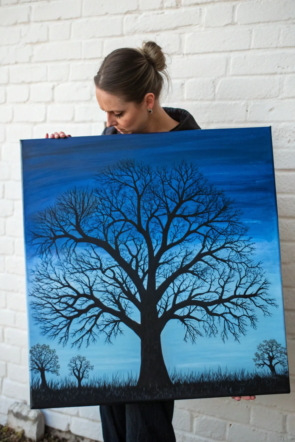
Capture the stark beauty of bare branches against a deepening sky with this dramatic acrylic painting. The gradient blue background creates the perfect moody atmosphere for a crisp, detailed tree silhouette.
Step-by-Step Guide
Materials
- Large square canvas (approx. 24×24 inches)
- Acrylic paints: Phthalo Blue, Ultramarine Blue, Titanium White, Mars Black
- Large flat brush (2-inch)
- Medium filbert brush
- Small round detail brush (size 0 or 1)
- Liner brush (size 00)
- Palette or paper plate
- Water cup and paper towels
- Easel (optional but helpful for large canvases)
Step 1: Creating the Twilight Gradient
-
Prepare the palette:
Squeeze out generous amounts of Phthalo Blue, Ultramarine Blue, and Titanium White onto your palette. You will need a lot of paint to cover a large canvas smoothly. -
Paint the top band:
Using your large flat brush, mix a deep, dark blue using mostly Phthalo Blue with a touch of Ultramarine. Apply this horizontal band across the top 1/4 of the canvas using long, sweeping strokes. -
Start the transition:
Without cleaning the brush perfectly, pick up some pure Phthalo Blue. Paint the next section down, blending slightly upwards into the darker band while the paint is still wet to soften the line. -
Lighten the middle:
Wipe off your brush. Mix Phthalo Blue with a small amount of Titanium White. Apply this to the middle section of the canvas, brushing back and forth horizontally to blend it into the section above. -
Create the horizon glow:
For the bottom third, mix a much lighter shade using mostly White with just a hint of Phthalo Blue. Paint this area all the way to the bottom edge, blending upward into the mid-tone blue. -
Smooth the blend:
While the entire surface is still slightly tacky, use a clean, dry flat brush to lightly sweep back and forth across the transition lines. This creates that seamless, dreamlike twilight effect. -
Let it dry:
Allow the background to dry completely. If the canvas shows through, you may need a second coat, following the same gradient steps.
Step 2: Painting the Foreground
-
Establish the ground:
Switch to a medium brush and load it with pure Mars Black. Paint a solid, uneven strip along the very bottom of the canvas to establish the ground level. -
Add grassy texture:
Using the tip of a smaller brush or an old, splayed brush, flick short, quick vertical strokes upward from the black ground strip to simulate tall, wild grass silhouettes. -
Anchor the main tree:
With the medium filbert brush and black paint, start the trunk of the main tree in the center. Make the base wide and taper it slightly as you move upward toward the middle of the canvas. -
Branch structure:
As the trunk reaches the center, split it into two or three thick main branches. I like to twist the brush slightly as I pull the paint to create organic, knotty shapes rather than straight lines. -
Add secondary branches:
Switch to a small round brush. Extend smaller branches outwards from the main limbs, ensuring they taper and get thinner as they move away from the trunk. -
Paint the fine twigs:
Use your liner brush with thinned black paint (add a drop of water to improve flow). Paint delicate, web-like twigs at the very ends of the branches. Crossing them over each other adds realistic complexity. -
Balance the composition:
Step back and look at the tree’s crown. Add more twigs to any ‘bald’ spots to ensure the silhouette fills the blue space nicely. -
Add distant trees:
Paint two much smaller tree silhouettes in the background on the left and right sides. Keep these simple—just a thin trunk and a messy cloud of branches—to suggest distance. -
Final inspection:
Check for any light spots showing through your black paint. Touch up the trunk opacity if needed to ensure a solid, dark silhouette.
Flow Improvement
For the finest twigs, try mixing a tiny drop of ink into your black acrylic paint. This makes the paint flow like water without losing its intense darkness.
Starry Night
Before painting the black trees, flick an old toothbrush loaded with watered-down white paint across the dry blue sky to create distant stars.
Hang your masterpiece on a white wall to let the deep blues and stark contrast truly pop
BRUSH GUIDE
The Right Brush for Every Stroke
From clean lines to bold texture — master brush choice, stroke control, and essential techniques.
Explore the Full Guide
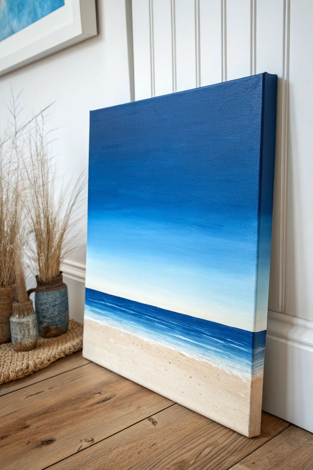
Ocean Horizon with Blue Sky Backdrop
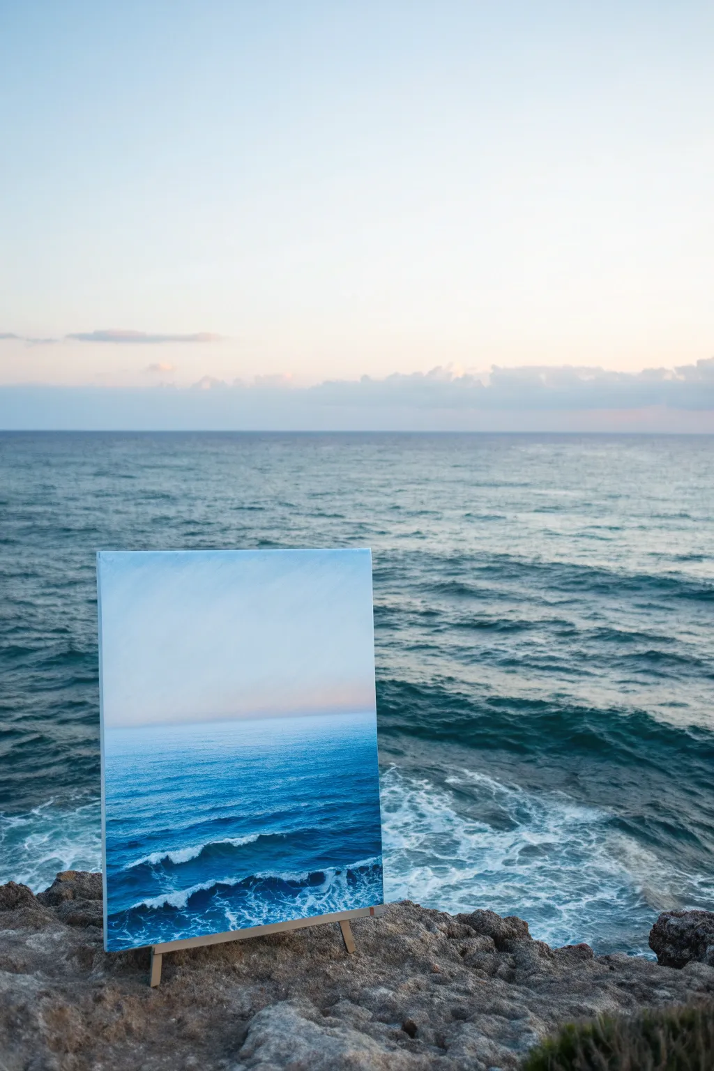
Capture the serenity of the sea with this painterly ocean landscape that blends choppy waves into a calm, hazy horizon. The soft gradient sky meets deep turquoise waters to create a peaceful, realistic scene perfect for bringing coastal calm into any room.
Detailed Instructions
Materials
- Rectangular stretched canvas (e.g., 18×24 inches)
- Acrylic paints: Phthalo Blue, Ultramarine Blue, Titanium White, Burnt Umber, a touch of faint Pink or Peach
- Large flat brush (1-2 inch) for background blending
- Medium filbert brush for waves
- Small round brush for foam detailing
- Palette knife (optional for texture)
- Water cup and paper towels
- easel or drop cloth
Step 1: Setting the Sky and Horizon
-
Prime the canvas:
Begin by covering the entire canvas with a thin coat of Titanium White. This helps the subsequent layers of blue and pastel glide on smoother and stay luminous. -
Establish the horizon line:
Decide where your sky meets the sea. For this composition, place your horizon line slightly above the vertical center, roughly 60% up the canvas. Use a ruler and a very light pencil line or a strip of painter’s tape to keep it perfectly straight. -
Mix the sky gradient:
Prepare a very pale blue by mixing a tiny dot of blue into a large amount of white. Separately, mix a soft, warm white using a hint of pink or peach. The sky needs to be incredibly subtle. -
Paint the upper sky:
Using your large flat brush, paint the top of the canvas with the pale blue mixture. Use horizontal strokes to keep the texture consistent with the atmosphere. -
Blend the lower sky:
While the top is still wet, introduce the warm pinkish-white mixture near the horizon line. Blend upwards into the blue to create a misty, soft transition that mimics early morning light.
Uneven Horizon?
If your horizon line is crooked, it ruins the illusion of depth. Place a strip of masking tape across the canvas before painting the sky and sea separate, then peel it off for a razor-sharp edge.
Step 2: Creating the Deep Water
-
Mix the deep ocean color:
Combine Phthalo Blue with a touch of Burnt Umber or a darker blue like Ultramarine. You want a rich, dark teal color for the water furthest from the viewer. -
Paint the horizon edge:
Carefully paint a crisp, straight line right against your sky. I prefer to hold my breath for a moment here to get the steadiest hand possible. This line defines the infinite distance. -
Ideally create a gradient downwards:
As you move down from the horizon, slowly add tiny amounts of white and turquoise to your dark mix. The water should get slightly lighter and more vibrant as it approaches the middle of the canvas. -
Add distant texture:
Using a smaller flat brush, add faint, horizontal streaks of lighter blue in the distance. These shouldn’t look like waves yet, just the suggestion of movement on the surface.
Level Up: Texture
Mix a heavy body gel or modeling paste into your white paint for the foreground waves. Apply it with a palette knife to physically raise the foam off the canvas for a tactile, 3D effect.
Step 3: The Foreground Swell
-
Establish the wave shapes:
Switch to your medium filbert brush. Using a mix of Ultramarine and white, map out the darker shadows of the choppy water in the bottom third of the canvas. Use curved, C-shaped strokes. -
Layer in the mid-tones:
Mix a vibrant mid-tone blue. fill in the areas around your dark shadows, blending the edges slightly so the waves feel fluid rather than rigid. -
Create the wave crests:
Identify where the waves are breaking. Use diagonal strokes moving from left to right to mimic the natural roll of the ocean. -
Add white water highlights:
Load a small round brush or a clean filbert with pure Titanium White. Apply this to the tops of your wave shapes, dragging the paint downwards loosely to create the look of foam sliding down the water. -
Detail the foam patterns:
For the sea foam in the immediate foreground, use a stippling motion (dabbing the brush). Create irregular, lace-like patterns where the water is churning. -
Soften the edges:
If your white foam looks too stark, glaze over it slightly with a very watered-down blue wash to push some of the foam beneath the surface. -
Final highlights:
Add the brightest, thickest touches of white only on the very peaks of the waves to catch the ‘light.’ This creates the 3D effect of the water moving toward you.
Step back and admire how the infinite horizon opens up your space with a breath of fresh sea air
Underwater Blues with Light Rays
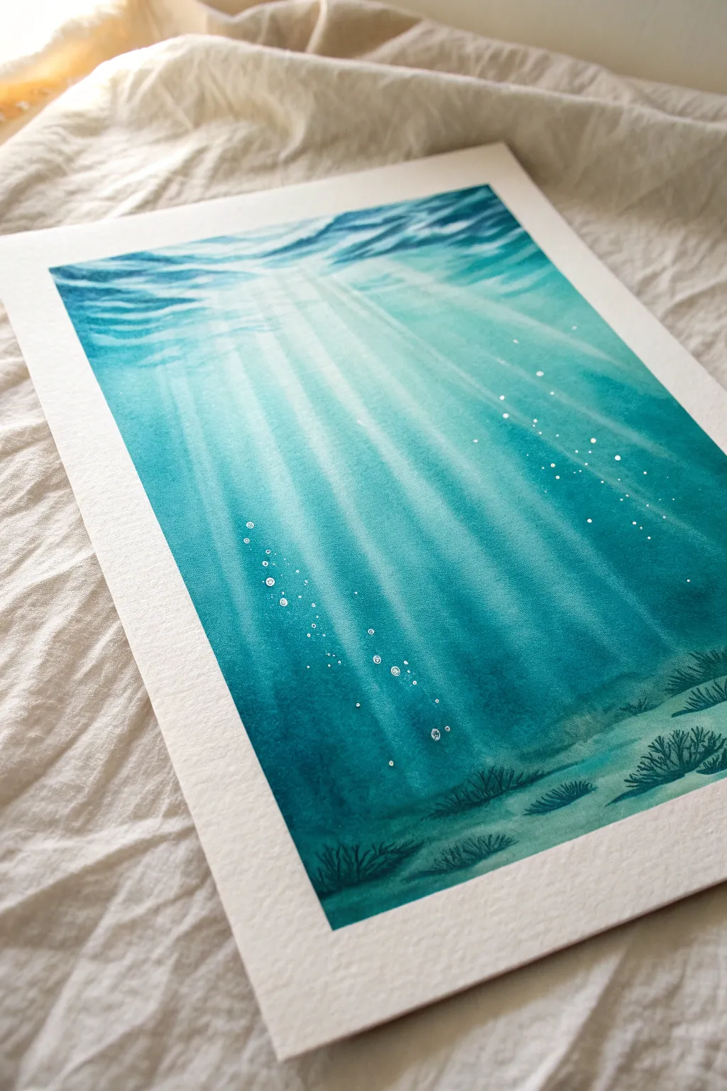
Capture the serene beauty of the deep ocean with this underwater watercolor painting, featuring dramatic light rays piercing through turquoise waters. This project plays with gradients and negative space to create a stunning sense of depth and luminosity.
Step-by-Step
Materials
- Cold press watercolor paper (300gsm, taped down)
- Watercolor paints: Turquoise, Phthalo Blue, Prussian Blue, and a touch of Cerulean
- Flat wash brush (3/4 or 1 inch)
- Round brushes (sizes 4 and 8)
- White gouache or white gel pen
- Masking fluid (optional but helpful)
- Two jars of water
- Paper towels
- Hairdryer (optional for speeding up drying)
Step 1: Setting the Scene
-
Prepare the paper:
Begin by securely taping your watercolor paper to a board using masking tape or painter’s tape. This prevents buckling and creates that crisp white border seen in the example. -
Sketch the rays:
Lightly sketch diagonal lines radiating from a point near the top center of the page. These will guide where your shafts of light will fall. Keep the pencil marks very faint so they disappear under the paint later. -
Pre-wet the paper:
Using your large flat brush, apply a clean coat of water across the entire paper surface. You want it damp with a sheen, but not soaking wet with puddles.
Pro Tip: The Lifting Hack
A ‘thirsty brush’ is key for light rays. Clean your brush and squeeze out excess water before lifting paint. If the brush is too wet, it will flood the area and create blooms instead of rays.
Step 2: Layering the Ocean
-
First light wash:
Mix a very watery, pale Turquoise. Paint horizontal strokes across the top third of the paper, letting the color naturally diffuse downwards. -
Mid-tone gradient:
While the paper is still damp, introduce a slightly more saturated Turquoise mixed with a little Cerulean. Apply this starting from the middle of the page, blending it upwards gently into the lighter wash. -
Deepening the blue:
Mix Phthalo Blue with your Turquoise for a richer teal color. Apply this to the bottom third of the painting, allowing wet-on-wet magic to blend it softly into the mid-tones. -
Defining the rays (Lifting):
Before the paint dries completely, use a clean, slightly damp flat brush to ‘lift’ paint away. Follow your pencil guides, wiping the brush on a paper towel after every stroke to remove pigment and reveal the white paper beneath, creating the light shafts. -
First drying phase:
Allow this initial layer to dry completely. The paper must be bone dry before the next step to keep the light rays defined.
Step 3: Building Depth and Contrast
-
Glazing the darks:
Mix a strong Prussian Blue. Using a round brush, paint huge, broad strokes *between* the light rays you created. You are now painting the ‘shadow’ water, leaving the lighter previous layer visible as the beams of light. -
Soften edges:
Dip a clean brush in water and run it along the edges of your dark strokes. This softens the transition between the dark water and the light rays so they look ethereal rather than rigid. -
Surface texture:
Near the very top of the painting, use slightly darker blue scribbles to mimic the rippling surface water texture where the light enters. -
Deep trenches:
Apply the darkest concentration of Prussian Blue (almost neat paint) to the bottom corners and the lowest section of the painting. This anchors the image and suggests deep ocean floor.
Troubleshooting: Muddy Rays?
If your light rays disappeared during glazing, don’t worry. Wait for everything to dry, then re-establish them using dilute white gouache dry-brushed lightly over the ray areas.
Step 4: Details & Seabed
-
Painting the seabed:
Once the blue background is dry, dilute a mix of Prussian Blue and deep Turquoise. Paint uneven, rolling shapes at the very bottom to suggest sandy mounds or rocks. -
Adding seaweed:
Using your smallest round brush (size 4), paint delicate, grassy clumps growing from the seabed. Use quick, upward flicking motions to make the seaweed look like it’s swaying in the current. -
Varying vegetation:
Make some seaweed clumps darker and distinct, and others lighter and more washed out to suggest they are further away in the distance. -
Adding bubbles:
Using opaque white gouache or a white gel pen, add small clusters of circles rising upwards. Start with tiny dots near the bottom and make them slightly larger as they ascend. -
Detailed sparkle:
Add tiny white specks suspended in the water column, particularly within the light rays, to look like dust motes or plankton catching the sun. -
Final reveal:
Wait until the painting is absolutely dry to the touch. Gently peel away the tape at a 45-degree angle to reveal your crisp, clean border.
Step back and admire your luminous underwater scene, perfect for bringing a calm coastal vibe to any room

PENCIL GUIDE
Understanding Pencil Grades from H to B
From first sketch to finished drawing — learn pencil grades, line control, and shading techniques.
Explore the Full Guide
Waterfall Mist on a Blue Background
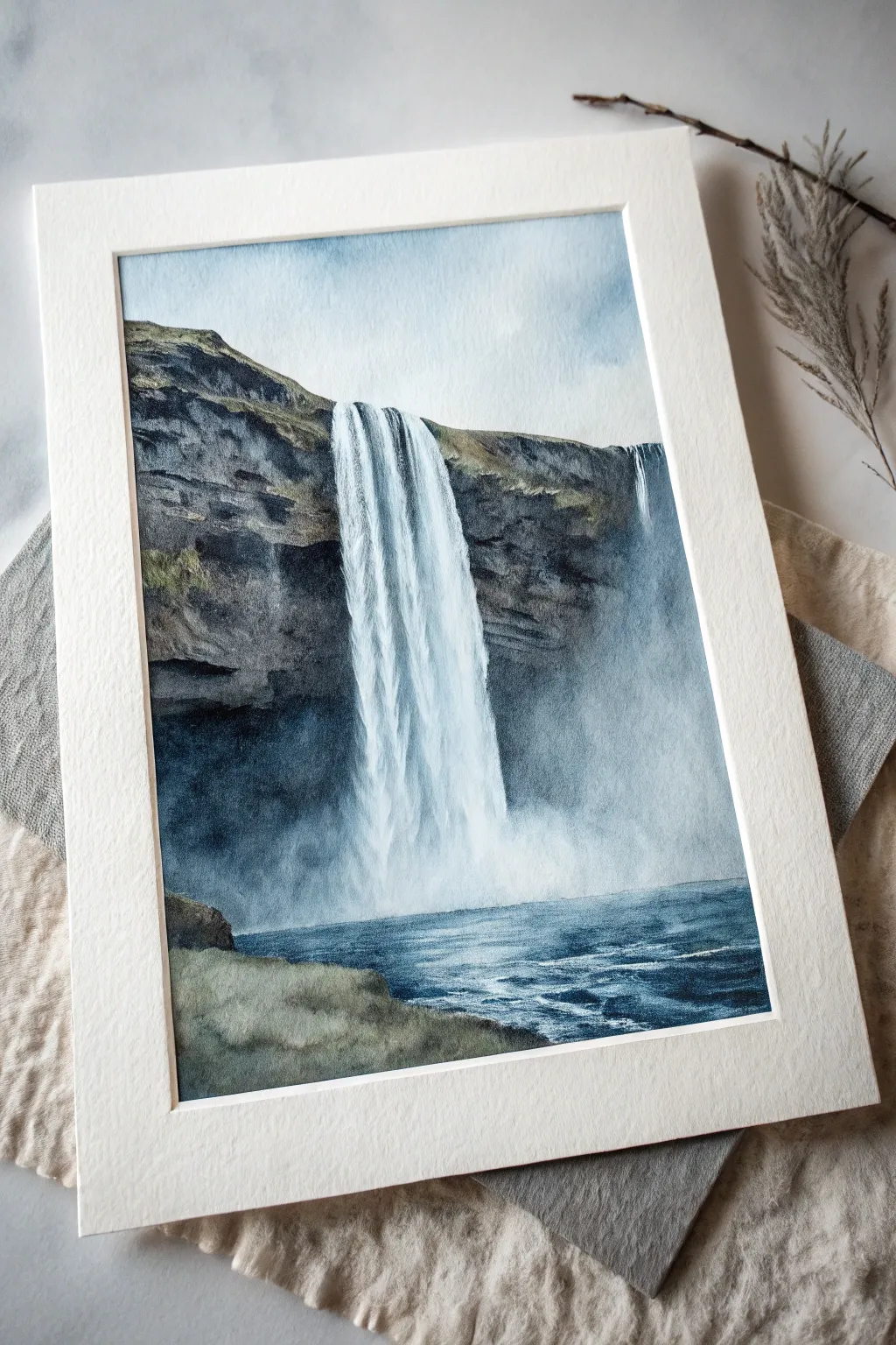
Capture the majestic power of cascading water against rugged cliffs in this moody watercolor piece. Through careful layering of indigo blues and earth tones, you will learn to balance detailed rock textures with the softness of rising mist.
How-To Guide
Materials
- Cold Press Watercolor Paper (140lb/300gsm)
- Watercolor paints (Indigo, Payne’s Grey, Burnt Umber, Yellow Ochre, Cobalt Blue, Titanium White/White Gouache)
- Masking fluid
- Round brushes (sizes 2, 6, and 10)
- Flat brush (1 inch)
- Palette
- Two jars of water
- Paper towels
- Painter’s tape and drawing board
Step 1: Preparation and Sketching
-
Secure the paper:
Tape your watercolor paper down firmly to your board on all four sides. This prevents buckling when the paper gets wet and creates that crisp white border seen in the final piece. -
Light pencil sketch:
Using a hard pencil (H or HB), lightly sketch the horizon line for the water and the vertical cliff edge. Outline the shape of the waterfall, keeping the lines faint so they don’t show through the transparent paint later. -
Mask the falls:
Apply masking fluid carefully over the entire waterfall area and the small secondary trickle on the right. Use an old brush or a silicone tool for this, creating ragged, vertical streaks at the bottom to mimic splashing water.
Mist Management
To keep the mist looking airy, blot the base of the waterfall with a clean, crumpled tissue while the paint is still wet. This lifts pigment and creates a natural cloud texture.
Step 2: Painting the Cliffs and Sky
-
Wet-on-wet sky:
Once the masking fluid is perfectly dry, wet the sky area with clean water. Drop in a very dilute mix of Indigo and a touch of Cobalt Blue, letting it fade to near white as it touches the top of the cliff. -
Base cliff tones:
Mix a light wash of Yellow Ochre and Burnt Umber. Apply this loosely to the grassy areas at the top of the cliff and the foreground land on the left. Let this first layer dry completely. -
Building rock structure:
Mix a dark, rocky grey using Payne’s Grey and Burnt Umber. With your size 6 brush, paint the rock faces, leaving some of the underlying warm ochre showing through to suggest sunlight hitting the mossy patches. -
Deepening shadows:
While the rock layer is still damp (but not soaking), drop in concentrated Indigo and Payne’s Grey into the crevices and the area directly behind the waterfall mist to create depth. -
Dry brush texture:
Once the cliffs are dry, use a size 2 brush with very little paint (dry brush technique) to drag dark brown texture horizontally across the rocks, mimicking geological strata.
Add Drama
For a moodier scene, deepen the Indigo values behind the waterfall mist. High contrast between the dark rocks and white mist makes the water look more powerful.
Step 3: The Water and Finishing Touches
-
Remove masking:
Gently rub away the masking fluid to reveal the pristine white paper of the waterfall. Check for any hard edges that need softening. -
Falling water shadows:
Mix a very watery, pale blue-grey. Paint vertical stripes down the white waterfall to suggest the volume and movement of the water columns, leaving bright white highlights in between. -
Creating the mist:
At the base of the falls, wet the paper and drop in soft clouds of Cobalt Blue and Titanium White (or white gouache) to create a foggy, indistinct transition between the falling water and the river. -
River base layer:
Paint the water at the bottom with horizontal strokes of Indigo and Cobalt Blue. Keep the strokes looser and lighter near the mist, and darker as they move toward the foreground. -
Water movement:
Use a rigger brush or the tip of your size 2 brush with dark Indigo to paint distinct ripples and waves in the foreground water. Keep lines horizontal to flatten the perspective. -
Foreground grass:
Glaze over the bottom-left landmass with a mix of Indigo and Sap Green (or just more Yellow Ochre/Blue mix) to ground the painting. -
Final highlights:
Use a touch of opaque white gouache to add sparkles or foam tops to the river waves and to enhance the brightness of the mist at the base of the falls.
Peel off the tape carefully to reveal your crisp edges and frame your masterpiece
White Flowers on Navy Blue
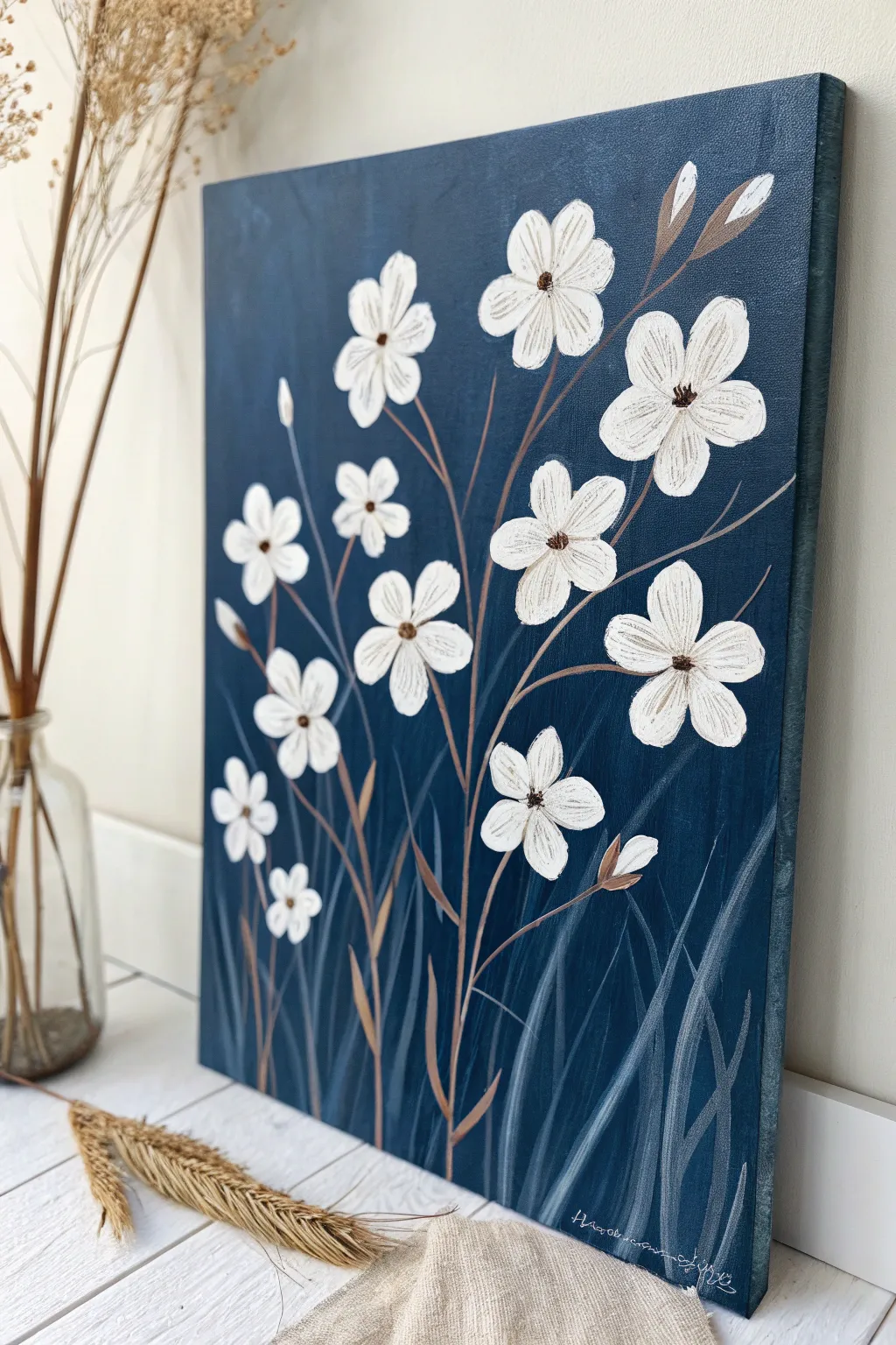
This elegant painting features stark white wildflowers dancing against a deep navy background, creating a striking high-contrast look that fits modern farmhouse or minimalist decor. The technique relies on layering delicate strokes to give the petals texture and dimension without losing their simplicity.
Step-by-Step Guide
Materials
- Stretched canvas (11×14 or similar size)
- Acrylic paints: Navy Blue (or Phthalo Blue + Black), Titanium White, Burnt Umber, Raw Sienna
- Large flat brush (1 inch)
- Medium round brush (size 6 or 8)
- Small liner brush (size 1 or 0)
- Palette or paper plate
- Cup of water and paper towels
Step 1: Setting the Scene
-
Prepare the Base:
Squeeze out a generous amount of Navy Blue paint. If your blue is too bright, mix in a tiny touch of black to deepen it, aiming for a rich, midnight hue. -
Paint the Background:
Using the large flat brush, cover the entire canvas in long, vertical strokes. Ensure you paint the sides of the canvas as well for a polished, frame-free look. -
Add Subtle Texture:
While the background is still slightly wet, you can add very faint streaks of a slightly lighter blue or grey-blue here and there to break up the solid color, though keeping it solid is perfectly fine too. -
Dry Completely:
Let this base layer dry fully. The background must be bone dry before you add the white flowers, or the colors will muddy and turn light blue.
Muddy Petals?
If your white paint turns light blue as you apply it, your background wasn’t dry enough. Stop immediately, let it dry completely, and apply a fresh coat of white over the mistake.
Step 2: Composing the Stems
-
Mix the Stem Color:
Create a warm brown by mixing Burnt Umber with a tiny bit of white or Raw Sienna to make it stand out against the dark blue. -
Map the Composition:
Using your small liner brush and the brown mix, paint thin, varying height lines starting from the bottom. Curve them gently; avoid perfectly straight lines to keep the organic feel. -
Add Branching:
From your main stems, paint smaller offshoot branches where you will eventually place the flower heads. Vary the angles so the bouquet looks full and natural. -
Paint the Buds:
At the tips of the shortest or highest stems, paint small tear-drop shapes in brown. These will be the sepals holding the unopened flower buds.
Step 3: Blooming the Flowers
-
First Petal Layer:
Load your medium round brush with Titanium White. Start with the largest flowers. Press the tip of the brush down and pull inward toward the center to create a teardrop petal shape. -
Complete the Circle:
Repeat this press-and-pull motion 5 or 6 times around a central point to form a star-like flower shape. Don’t worry about perfect coverage on the first pass; streaky is actually good here. -
Paint Smaller Blooms:
Using the same technique but with less pressure, scatter smaller flower heads on the other stems. I like to have some facing forward and others tilted slightly sideways for variety. -
Add the Buds:
On the brown tear-drop shapes you painted earlier, add a small sliver of white peeking out of the top to represent a closed flower bud. -
Second White Coat:
Once the first layer of white is dry to the touch, go back over the petals with a second coat of white. Use a slightly drier brush to leave visible brushstrokes, adding texture to the petals. -
Define the Centers:
Mix a dark brown (Burnt Umber + Black). Using the very tip of your small brush, dab a small, fuzzy circle in the center of each open flower. -
Highlight the Centers:
While the brown center is wet, tap a tiny spec of Raw Sienna or White into the middle of the brown dot to give it a 3D effect.
Add Metallic Flair
Swap the plain brown centers for gold leaf or metallic gold paint. It adds a sophisticated shimmer that looks incredible against the matte navy background.
Step 4: Finishing Touches
-
Create Depth:
Mix a very watery, translucent grey-blue color (White + tiny amount of your background Blue + water). -
Paint Ghost Grass:
Using the liner brush, paint long, sweeping grass-like strokes at the very bottom of the canvas. These should look faint and stick to the background, creating depth behind the main stems. -
Refine Petals:
If needed, take your fine liner brush with a tiny bit of brown paint and add very delicate, thin lines radiating from the flower center onto the white petals for added detail. -
Final Inspection:
Check for any gaps in the background paint or stems that need thickening. Sign your name in white or light grey in the bottom corner.
Now you have a serene floral piece that brings a calming, botanical atmosphere to any room


Wildflowers Over a Sky Blue Wash
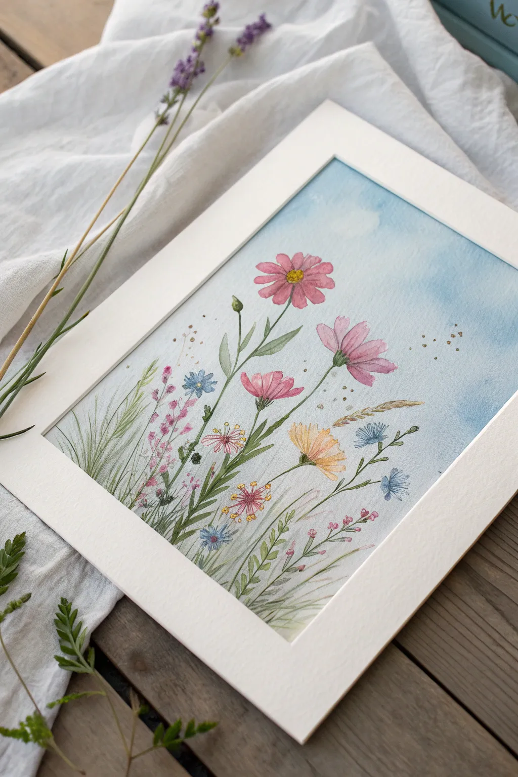
Capture the airy beauty of a summer meadow with this delicate watercolor composition. By laying down a soft sky-blue wash first, you create an effortless atmosphere for these floating blooms and swaying grasses.
How-To Guide
Materials
- Cold press watercolor paper (300 gsm)
- Watercolor paints (Cerulean Blue, Sap Green, Alizarin Crimson, Yellow Ochre, Ultramarine Blue, Burnt Sienna)
- Round watercolor brushes (size 8 for wash, size 2 and 00 for details)
- White gouache or white gel pen
- Gold metallic watercolor paint or gold ink
- Pencil and kneaded eraser
- Masking tape
- Two jars of water
- Paper towels
Step 1: Setting the Sky
-
Prepare the paper:
Begin by taping down all four edges of your watercolor paper to a hard board using masking tape. This prevents buckling when we add the background wash. -
Wet the surface:
Using your large size 8 brush and clean water, gently wet the entire surface of the paper until it has a uniform sheen, avoiding puddles. -
Apply the blue wash:
Mix a watery consistency of Cerulean Blue. Starting from the top, sweep the color across the paper, letting it naturally fade and become more transparent as you reach the bottom third of the page. -
Create cloud textures:
While the blue paint is still damp, blot a few areas near the top with a crumpled paper towel to lift the color, suggesting soft, white clouds. -
Let it dry completely:
Allow the background to bone dry. If the paper feels cool to the touch, it’s still damp. I often use a hairdryer on a low setting to speed this up.
Step 2: Painting the Blooms
-
Sketch the layout:
Lightly sketch the main stems and flower heads with a pencil. Keep the lines faint so they don’t show through the transparent petals. -
Paint the pink cosmos:
Mix a diluted Alizarin Crimson. Paint the petals of the large pink flowers, leaving tiny gaps of white paper between petals to define their shape. -
Add petal depth:
While the pink petals are slightly damp, drop a tiny amount of more concentrated pink or purple at the base of each petal to create a natural gradient. -
Paint secondary flowers:
Use a mix of Yellow Ochre and a touch of orange for the lower yellow daisy-like flower, using loose strokes to imply texture. -
Add blue accents:
Using Ultramarine Blue, paint the small blue wildflowers scattered throughout the composition. Keep these shapes simple and star-like. -
Define the centers:
Once dry, paint the centers of the cosmos with a bright yellow mix, stippling in tiny brown dots for texture.
Bloom Troubleshooting
If your flower colors are bleeding into the blue sky, the background wasn’t fully dry. Let it dry longer or use a hairdryer before painting the floral layer.
Step 3: Stems and Details
-
Paint main stems:
Switch to your size 2 brush. Mix Sap Green with a touch of blue for a cool green tone, and paint long, sweeping lines for the flower stems. -
Add leaves:
Paint slender, lance-shaped leaves attached to the main cosmos stems. Vary the green by adding more yellow or water for some leaves to create depth. -
Create grassy textures:
Using the very tip of the brush or a size 00, flick upward strokes at the bottom of the page to create fine grasses. Use a pale, watery green for background grass and a darker mix for the foreground. -
Golden touches:
Using gold metallic paint or ink, add tiny dots around the flower heads and on the tips of some grasses to mimic pollen or magical dust. -
White highlights:
Use a white gel pen or opaque white gouache to add tiny details to the flower centers or fine hairs on the stems. -
Final dark accents:
Mix a dark green-brown. Add very fine lines for the smallest twigs and tiny specks in the atmosphere to suggest floating seeds. -
Remove tape:
Once absolutely dry, peel the masking tape away slowly at a 45-degree angle to reveal the crisp white border.
Level Up: Texture
Before the final details dry, sprinkle a tiny pinch of salt onto the wet green leaves. Brush it off when dry for a crystallized, organic texture.
Place your finished piece in a simple mat frame to let the delicate colors truly shine
Snowy Mountains in Icy Blue Haze
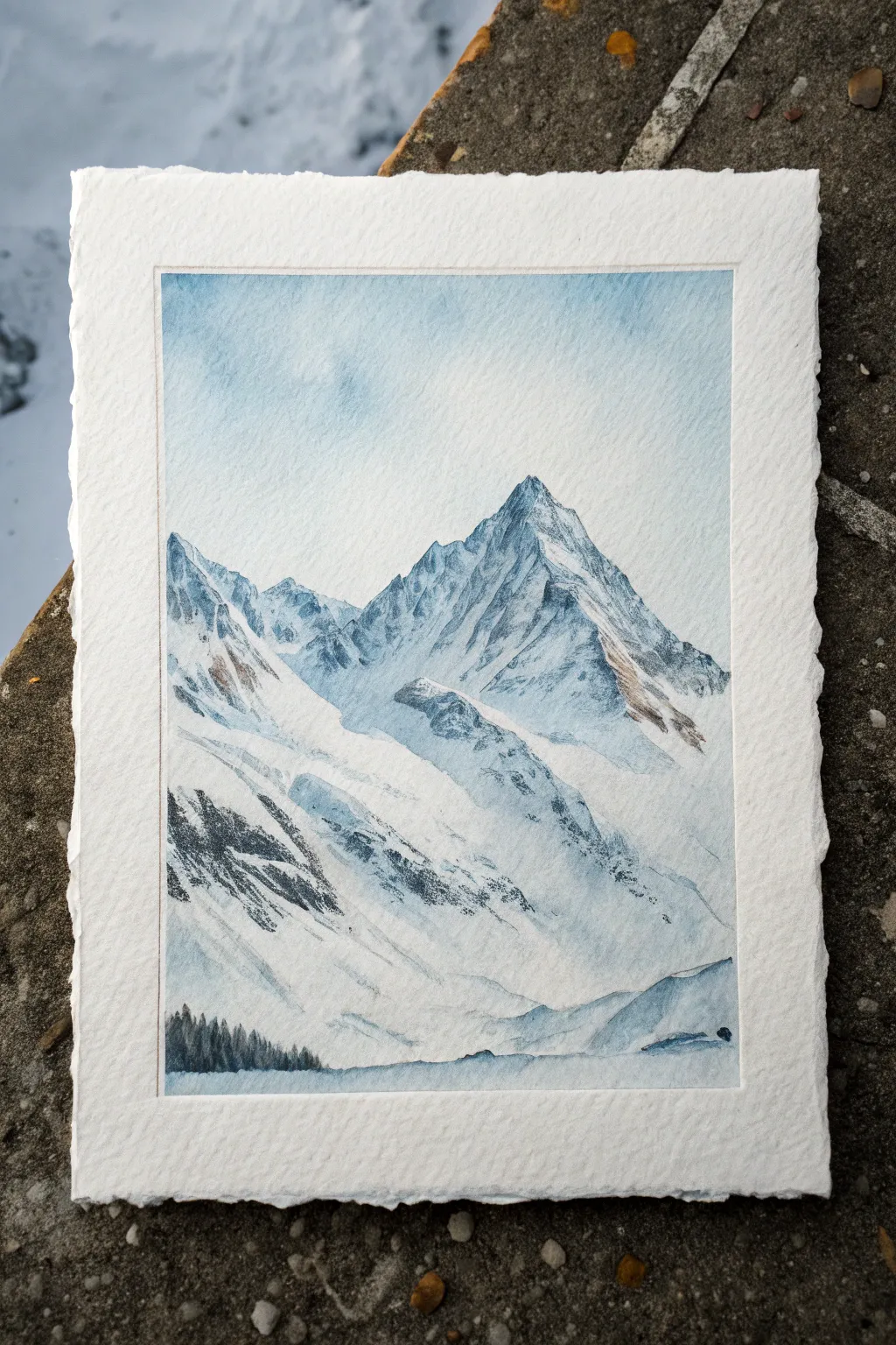
Capture the pristine silence of a winter summit with this watercolor tutorial. Using limited cold tones and heavily textured paper, you’ll create atmospheric mountain peaks that feel frozen in time.
Step-by-Step Guide
Materials
- Cold pressed watercolor paper (300gsm/140lb or heavier) with rough texture
- Pencil (HB or 2H)
- Kneaded eraser
- Watercolor paints: Indigo, Prussian Blue, Burnt Umber, Payne’s Grey
- White Gouache (optional for highlights)
- Round brushes (sizes 2, 6, and 10)
- Rigger or liner brush
- Two jars of water
- Masking fluid (optional)
- Painter’s tape or a board for mounting
Step 1: Drafting the Heights
-
Mount your paper:
Tape your watercolor paper down securely to a board. For this project, leaving a clean border helps maintain the white space, but if you want the deckle edge look shown in the photo, you can float-mount the paper or tape carefully from the back. -
Sketch the ridge line:
Using an HB pencil, very lightly sketch the main triangular shapes of the mountains. Focus on the jagged contour lines where the mountain meets the sky and the major diagonal ridges running down the slopes. -
Map the shadows:
Lightly outline where the deepest shadows will fall on the right side of the peaks. Keep your pencil lines faint; watercolor is transparent and heavy graphite will show through.
Muddy Shadows?
If your shadows look brown or dirty, you likely added too much orange/brown to the mix. Stick to cool blues (Indigo, Prussian) and only use tiny dots of umber to desaturate them.
Step 2: The Sky and Base Layer
-
Prepare the sky wash:
Mix a very watery, pale wash of Prussian Blue. You want this to be barely tinted water. -
Paint the background:
Apply this pale wash to the sky area. For a mottled, atmospheric look like the reference, wet the paper first (wet-on-wet) and drop the color in unevenly, letting it bloom slightly. -
Create the atmospheric base:
While the sky is drying, mix a slightly stronger pale blue. Apply a very light, loose wash over the shadowed sides of the mountains. Leave the sunlit snowy faces predominantly white paper.
Step 3: Defining the Peaks
-
Mix your shadow color:
Create a cool shadow mixes using Indigo and a touch of Payne’s Grey. It should be transparent but deeper than your sky tone. -
Carve the peak edges:
Using a size 6 brush, paint the shadowed facets of the highest peak. Use the tip of the brush to create the jagged ‘toothed’ edge where the rock meets the snow. -
Dry brush texture:
Load your brush with pigment but blot excess water on a paper towel. Drag the brush quickly down the side of the mountain to create a broken, scratchy texture that mimics rocky terrain peeking through snow. -
Soften the lower slopes:
As you move down the mountain, introduce more water to your brush to fade the hard edges into a misty, lighter blue wash near the valley floor.
Level Up: Salt Texture
While the shadow wash on the mountain is still damp, sprinkle a pinch of table salt on it. As it dries, the salt pushes pigment away, creating a perfect crystalline frost effect.
Step 4: Adding Rock and Contrast
-
Mix the rock tone:
Combine Payne’s Grey with a small amount of Burnt Umber to create a dark, desaturated slate color. -
Detail the ridges:
With a size 2 brush, paint thin, jagged lines along the spines of the mountains. These dark veins define the structure. -
Enhance the deep crevices:
Look for the pockets on the mountain face where snow wouldn’t stick. Dab your dark slate mix into these areas, keeping the shapes irregular and organic. -
Layering the foreground:
The mountain in the lower-left foreground needs strong contrast. Use the dry brush technique again with your dark slate mix to create the heavy rocky texture shown in the reference.
Step 5: Final Atmosphere
-
Add the tree line:
Using a rigger or a very fine pointed brush, mix a thick, dark Indigo. Paint tiny vertical strokes in the bottom left corner to suggest a distant pine forest. vary the heights slightly for realism. -
Glaze the shadows:
Once the rock layers are totally dry, mix a diluted pure blue glaze. Run this over the shadowed side of the mountain again to unify the rocky textures and make the shadows feel colder. -
Gouache highlights:
If you lost any crucial bright whites, dab a tiny bit of white gouache on the sunlit peaks to make them pop against the blue sky. -
Final assessment:
Step back and check your values. The foreground rocks should be the darkest, and the distant peak should feel airy and light.
Once dry, reveal your crisp mountain landscape and enjoy the cool tranquility it brings to the room
Sailboat Silhouette on Blue Water
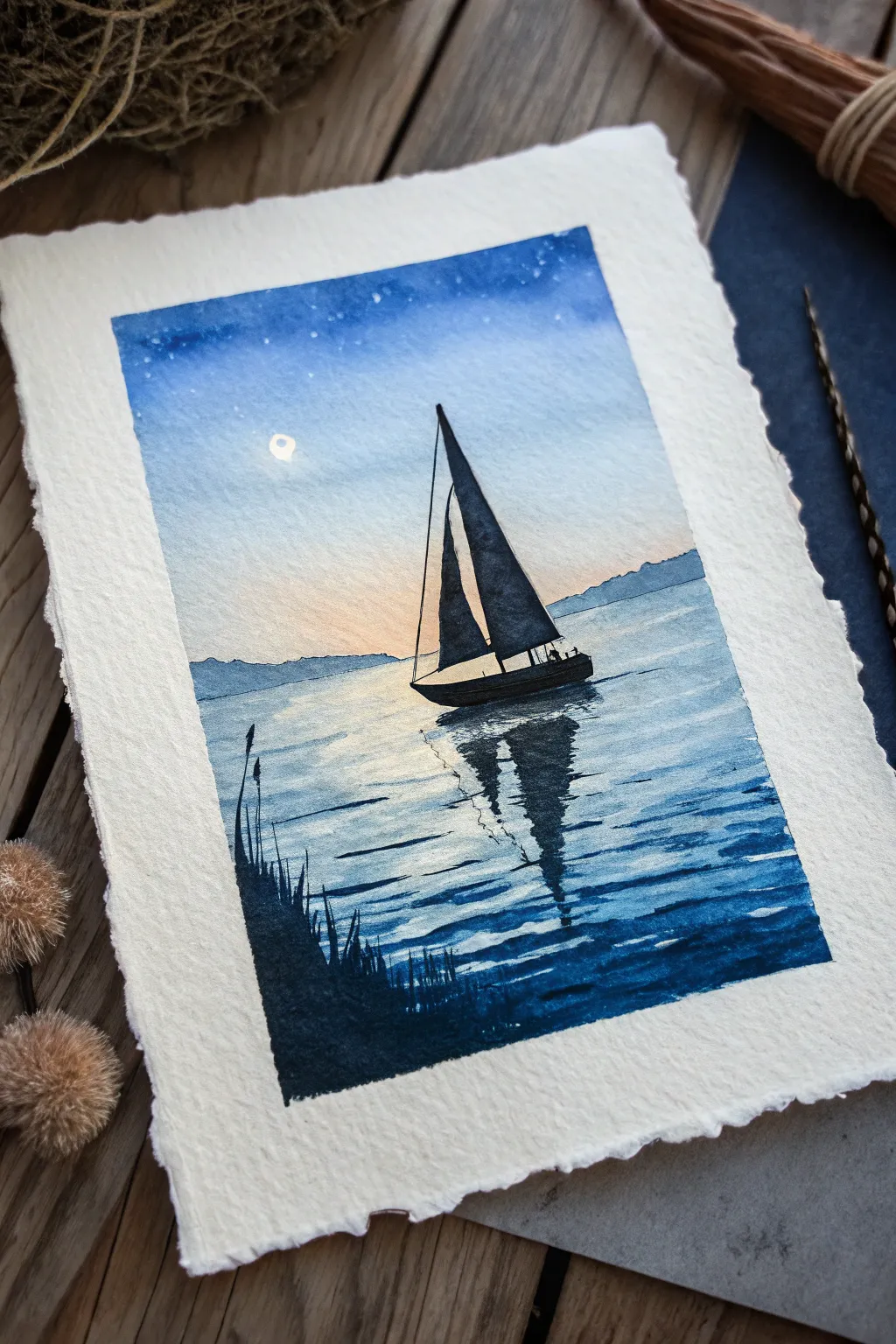
Capture the serene stillness of dusk with this atmospheric watercolor piece featuring a bold sailboat silhouette against a gradient sky. The painting uses wet-on-wet techniques to create a soft, glowing horizon that transitions beautifully into deep indigo water.
Detailed Instructions
Materials
- Cold press watercolor paper (300 gsm) with deckled edges
- Watercolor paints (Indigo, Prussian Blue, Payne’s Gray, Burnt Sienna, Lamp Black, White Gouache)
- Flat wash brush (3/4 inch)
- Round brushes (sizes 2, 6, and 10)
- Masking fluid (optional)
- Masking tape and board
- Jars of water & paper towels
- Pencil and eraser
Step 1: Setting the Scene
-
Outline the Composition:
Lightly sketch the horizon line about 1/3 of the way up from the bottom. Draw the basic triangular shapes of the sails and the hull of the boat near the center, leaning slightly to imply motion. Add the faint outline of distant mountains on the horizon. -
Masking the Moon:
If you want a crisp white moon, apply a tiny dot of masking fluid in the upper left quadrant. Alternatively, you can carefully paint around this circular spot or use white gouache at the very end.
Master the Fade
To get a perfect sky gradient, tilt your paper board slightly. Gravity pulls the heavy blue pigment down into the lighter peach horizon, creating a seamless blend without brush marks.
Step 2: The Sky Gradient
-
Wet the Sky:
Using your large flat brush, apply clean water to the entire sky area above the mountains. The paper should be glisten but not have standing puddles. -
Painting the Deep Blue:
Start at the very top edge with a concentrated mix of Indigo and Prussian Blue. Paint horizontally across the top, letting the color bleed downwards into the wet paper. -
Creating the Glow:
Rinse your brush and pick up a very dilute wash of Burnt Sienna or a warm peach tone. Paint just above the mountain line, blending upwards to meet the blue. The colors should mix naturally to create a soft, desaturated lavender transition. -
Adding Stars:
While the top blue section is still slightly damp (but not soaking), load a stiff brush with white gouache or diluted white watercolor. Tap the handle against another brush to splatter tiny stars into the upper sky. -
Painting Distant Mountains:
Once the sky is mostly dry, mix a watery, pale blue-grey. Paint the distant mountains with a jagged top edge. They should look hazy and atmospheric, not sharp.
Make it Metallic
Use metallic silver or pearlescent watercolor for the moon and the brightest highlights on the water ripples. It adds a magical shimmer when the light hits the painting.
Step 3: The Water and Reflections
-
Base Water Wash:
For the water, wet the area below the mountains. Apply a light wash of Prussian Blue, leaving a vertical path of white paper directly under the boat and moon for the reflection. -
Deepening Values:
While the wash is still wet, stroke in darker horizontal lines of Indigo towards the bottom corners, creating depth. Keep the strokes looser and wider as you move down the page. -
Texturing the Water:
Switch to a size 6 round brush. With a damp, almost dry brush loaded with darker blue, add horizontal ripples across the white reflection area. I like to keep these strokes quick and broken to mimic shimmer.
Step 4: The Silhouette
-
Painting the Boat:
Wait until the background is bone dry. Mix a concentrated solution of Payne’s Gray and Lamp Black—it should be opaque like ink. Carefully fill in the sailboat’s hull and sails. -
Adding Details:
Use your smallest size 2 brush to paint the mast, the rigging lines, and small silhouette figures on the deck. Precision is key here to make the boat look realistic. -
The Reflection:
Using the same dark black mixture, paint the reflection of the boat directly underneath the hull. Use a zig-zag motion to distort the shape, making the reflection look broken by waves. -
Deepening the Reflection:
Drag the black reflection downwards, letting the paint fade slightly as it moves away from the boat.
Step 5: Final Details
-
Foreground Grasses:
On the bottom left corner, paint silhouette grasses and reeds rising up from the water’s edge. Use quick, upward flicking strokes with your liner or small round brush. -
Water Ripples:
Add a few final, very thin distinct lines of dark indigo in the foreground water to separate the waves. -
Revealing the Moon:
If you used masking fluid, rub it away gently with your finger. If needed, soften the edges of the moon with a slightly damp clean brush to make it glow.
Let your masterpiece dry completely before framing it to preserve the delicate watercolor texture.
Koi Fish in a Deep Blue Pond
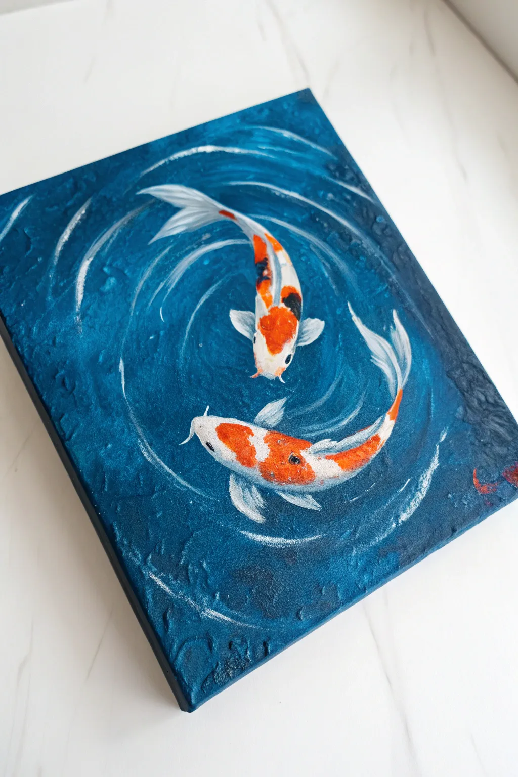
Capture the serene movement of koi fish circling in deep water with this highly textured acrylic painting. Using thick impasto techniques creates realistic ripples that make the fish appear submerged just beneath the surface.
How-To Guide
Materials
- Small gallery-wrapped canvas (e.g., 8×10 or 6×8)
- Acrylic paints: Phthalo Blue, Prussian Blue, Titanium White, Cadmium Orange, Cadmium Red, Black
- Texture paste (modeling paste) or heavy body gel medium
- Palette knife
- Round synthetic brushes (sizes 2 and 4)
- Fine liner brush (size 0 or 00)
- Palette for mixing
Step 1: Building the Water
-
Base Color Application:
Begin by covering the entire canvas with a flat layer of Phthalo Blue mixed with a tiny touch of black. Ensure you paint the sides of the canvas as well for a finished gallery look. Let this base layer dry completely. -
Mixing the Texture:
Mix a generous amount of texture paste with your dark blue acrylic paint. Aim for a slightly lighter shade than your base coat by adding a drop of Titanium White to the mixture. -
Applying Background Texture:
Use a palette knife to spread the tinted texture paste over the canvas. Don’t smooth it out perfectly; dab and scrape the knife to create a rough, choppy surface that mimics agitated water depth. -
Creating the Ripples:
While the paste is still wet, use the edge of your palette knife or a coarse brush handle to carve circular swooshing motions. These raised ridges will eventually become the white-capped ripples. -
Drying Time:
Allow the texture layer to dry fully. This is crucial—texture paste can take several hours or even overnight to cure depending on thickness. It must be hard to the touch.
Step 2: Painting the Koi
-
Sketch the Outline:
Using a thin brush and thinned white paint (or a white chalk pencil), lightly sketch the shapes of two koi fish swimming in a circle—think of the yin-yang symbol for placement. -
Blocking the Bodies:
Fill in the fish silhouettes with pure Titanium White. This opaque underlayer ensures the orange colors applied later will pop against the dark blue background. -
Adding Orange Tones:
Mix Cadmium Orange with a touch of Red. Apply this to the patterned areas of the koi (heads and backs), leaving some white sections exposed for the traditional markings. I like to blend the edges while wet for a softer transition. -
Painting Fins and Tails:
Use diluted white paint for the fins and tails. Apply it in thin, translucent streaks to mimic the delicate, gauzy nature of fish fins moving through water. -
Adding Black Accents:
For the mottled koi, add small, deliberate patches of black on top of the orange or white areas. Keep these markings irregular and organic. -
Detailing the Eyes:
With your smallest liner brush, dot a tiny black circle for the eyes on the sides of the head. Add a microscopic speck of white as a highlight to bring them to life. -
Adding Whiskers:
Carefully pull two thin lines extending from the mouth area using the liner brush and white paint to create the barbels (whiskers).
Pro Tip: Texture Hack
If you don’t have modeling paste, mix baking soda with your acrylic paint and glue to create a thick, gritty paste perfect for water effects.
Step 3: Highlights & Depth
-
Dry Brushing Ripples:
Dip a dry, flat brush into Titanium White and wipe most of it off on a paper towel. Very gently drag the brush over the raised ridges of your textured background to catch only the high points. -
Enhancing the Swirl:
Intensify the white highlights specifically following the circular motion around the fish. This creates the illusion of movement and current generated by their swimming. -
Submerging the Tails:
To make the fish look underwater, glaze a very thin wash of Phthalo Blue over the ends of the tails and fins. This pushes them ‘deeper’ into the pond visually. -
Final Adjustments:
Check the contrast. If the water looks too flat, glaze some darker shadows around the fish bodies using thinned dark blue or black to make the fish appear to float above the depths.
Level Up: Metallic Shim
Mix a tiny bit of pearlescent medium or silver paint into your ripple highlights. It catches the light like real sun hitting the water.
Step back and admire the peaceful movement you have captured in paint
Gold-Look Accents on Blue Texture
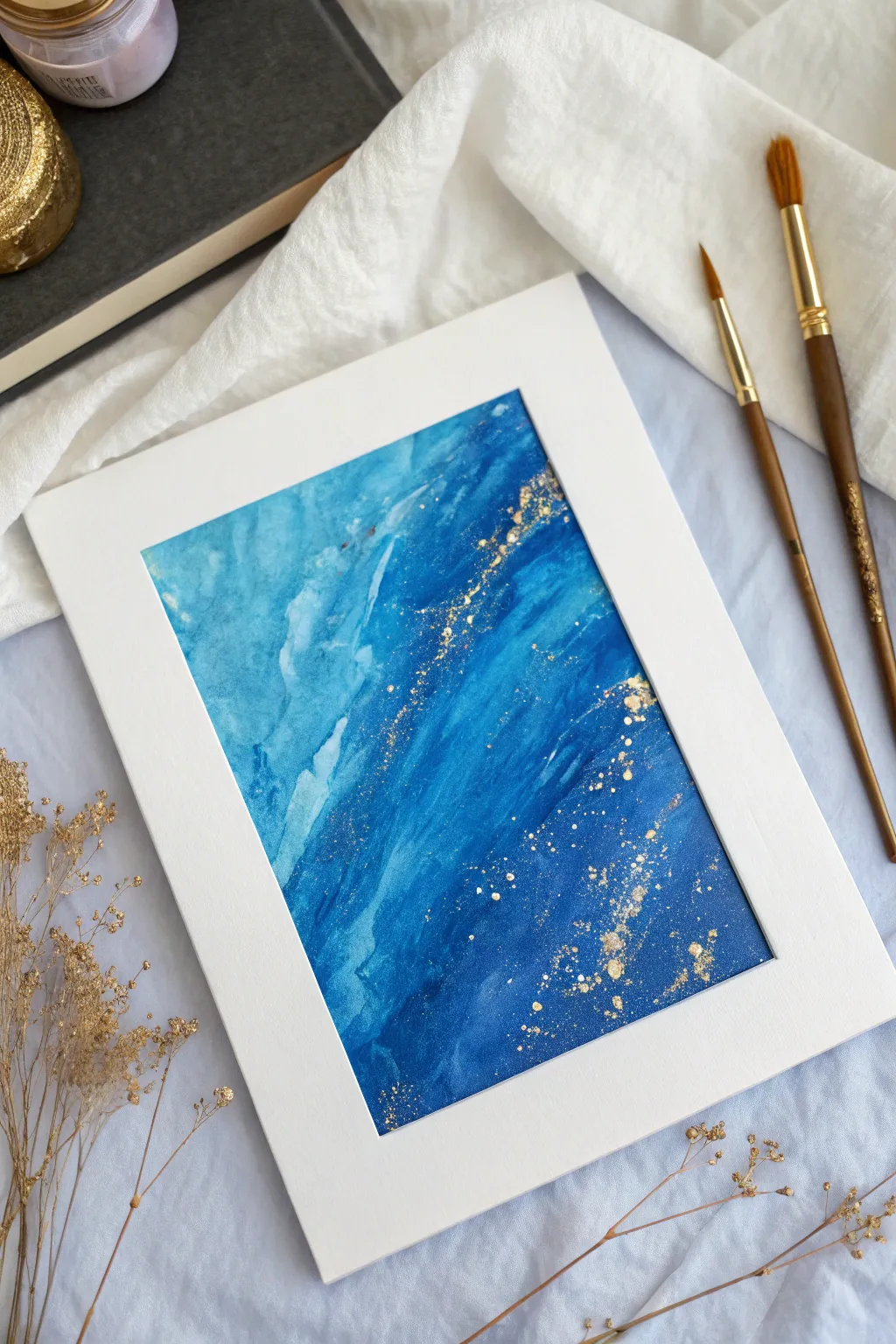
This abstract watercolor piece marries the calming depth of oceanic blues with the luxurious sparkle of gold accents. The textured layers create a sense of movement, reminiscent of waves crashing or a galaxy swirling, making it a sophisticated addition to any gallery wall.
How-To Guide
Materials
- Cold press watercolor paper (300 gsm)
- Watercolor paints (Cerulean Blue, Prussian Blue, Indigo)
- Metallic gold watercolor paint or gold gouache
- Round watercolor brush (size 10 or 12)
- Small round detail brush (size 2 or 4)
- Two jars of water
- Painter’s tape
- Paper towels
- Old toothbrush (optional for splatter)
- White mat frame for finishing
Step 1: Setting the Scene
-
Prepare your workspace:
Begin by taping down all four edges of your watercolor paper to a hard board or your table. This prevents buckling and creates a clean border. -
Pre-wet the paper:
Brush a light, even layer of clean water over the entire surface of the paper until it has a satin sheen, but no puddles.
Gold paint turns green?
If your gold paint looks greenish, the blue layer underneath wasn’t dry enough! Ensure the background is bone-dry before splattering to keep the gold bright.
Step 2: Layering the Blues
-
Start with the lightest blue:
Load your large brush with a diluted Cerulean Blue. Apply this to the upper-left quadrant, letting the wet-on-wet technique diffuse the edges naturally. -
Introduce mid-tones:
While the paper is still damp, mix a bit of Prussian Blue. Sweep this diagonally across the center, allowing it to bleed slightly into the lighter blue. -
Create depth with Indigo:
Using a more concentrated Indigo mix, focus on the bottom-right corner. Dab the pigment in to create a deep, rich foundation. -
Blend the transitions:
With a clean, slightly damp brush, gently soften any harsh lines where the colors meet, encouraging a diagonal flow from light (top left) to dark (bottom right). -
Add texture with lifting:
While the paint is settling, use a crumpled paper towel to gently lift small patches of pigment in the lighter areas. This creates a cloud-like or frothy wave texture. -
Intensify the darks:
Once the first layer is semi-dry, go back in with pure Indigo on the bottom right to ensure that deep, dramatic contrast. -
Let it dry completely:
Walk away and let the paper dry fully. This is crucial before adding the gold to prevent it from bleeding into the blue.
Level Up: Salt Texture
Sprinkle coarse sea salt onto the wet indigo paint in the drying phase. Brush it off when dry for a stunning, crystalline texture under the gold.
Step 3: The Golden Touch
-
Prepare the gold medium:
Mix your metallic gold paint or gouache with a small amount of water. You want a creamy consistency—thick enough to be opaque, but fluid enough to splatter. -
Create the main gold vein:
Load a medium brush with gold. Instead of painting a solid line, dab erratic, organic spots along the diagonal transition line where the light blue meets the dark blue. -
Splatter technique:
Dip an old toothbrush or a stiff brush into the gold paint. Hold it over the dark blue section and flick the bristles with your thumb to create a spray of fine gold stars. -
Controlled large droplets:
I like to load a small round brush with gold and tap the handle against my other hand over specific areas to create larger, purposeful drips. -
Refine the gold path:
Using a fine detail brush, add tiny clusters of dots around the larger gold splashes to mimic the look of gold dust or sea foam. -
Final assessment:
Step back and see if the balance feels right. Add a few stray gold specks in the lighter blue area to tie the composition together. -
Remove the tape:
Once everything is bone dry, carefully peel away the painter’s tape at a 45-degree angle to reveal your crisp white edges. -
Mount and frame:
Place your finished artwork behind a white mat board to replicate the professional gallery look shown in the image.
Now you have a shimmering piece of abstract art that captures the magic of starlight on deep water
Storm Clouds Built from Blue Layers
Capture the raw power and beauty of a brewing storm at sea with this moody, monochromatic study accented by a touch of sunset warmth. By layering rich indigos and Prussian blues, you’ll build massive, billowing cumulus clouds that seem to loom right off the paper.
Step-by-Step Guide
Materials
- Cold Press watercolor paper (300 gsm or heavier), taped to a board
- Watercolor paints: Indigo, Prussian Blue, Ultramarine, Burnt Umber (for mixing greys), and Cadmium Yellow or Yellow Ochre
- Large round brush (size 10 or 12)
- Medium round brush (size 6)
- Small detail brush or rigger brush
- Clean water and mixing palette
- Paper towels or a cotton rag
- Masking tape
Step 1: Planning and The First Wash
-
Tape your borders:
Secure your watercolor paper to a board using masking tape on all four sides. This creates the crisp white border seen in the reference image and keeps the paper flat while wet. -
Sketch the horizon:
Lightly pencil in a horizon line about one-quarter of the way up from the bottom. Outline the major cloud shapes, focusing on the large billowing mass on the left side. -
Wet the sky area:
Use your large brush to apply clean water to the entire sky area, stopping just short of your pencil lines for the clouds to keep some edges crisp. -
Establish the light source:
While the paper is wet, drop a dilute wash of Cadmium Yellow or Yellow Ochre into the lower right quadrant of the sky where the sun is peeking through. Let it bleed softly into the surrounding wet area.
Step 2: Building the Cloud Structure
-
Mix your base blues:
Prepare a large puddle of medium-strength blue on your palette. A mix of Ultramarine with a touch of Indigo works well for the mid-tones. -
Define the cloud tops:
Using the medium round brush, paint the upper edges of the clouds. I find rolling the brush slightly as I paint helps mimic the fluffy, organic texture of cumulus clouds. -
Create soft edges:
Rinse your brush and use damp (not dripping) bristles to soften the bottom edges of these initial blue shapes, allowing them to fade into the white of the paper. -
Paint the upper atmosphere:
For the very top of the sky, brush in a darker, smooth wash of Prussian Blue. Use horizontal strokes and leave some thin white gaps to suggest high-altitude cirrus clouds caught in the wind. -
Deepen the shadows:
Mix a strong concentration of Indigo and a tiny bit of Burnt Umber to create a dark, stormy grey-blue. Apply this to the undersides of the large cloud mass, emphasizing the heavy volume. -
Feather the transitions:
Blend the dark shadow areas into the lighter mid-tones using a clean, damp brush. You want to maintain the distinct ‘cauliflower’ shapes of the clouds while giving them 3D volume.
Keep Your Whites Bright
Work carefully around the cloud edges. The brightest white in watercolor is the paper itself—once covered, it’s hard to get that brilliance back.
Step 3: The Ocean and Details
-
Lay the ocean base:
Once the sky is mostly dry, wet the ocean area below the horizon line. Apply a horizontal wash of your mid-tone blue, darker at the bottom and lighter near the horizon. -
Refine the horizon line:
With a steady hand and a loaded brush, paint a straight, sharp horizon line in deep Indigo. Ensure this line is perfectly level to anchor the viewer’s perspective. -
Add wave motion:
While the ocean wash is still damp, use a smaller brush to paint horizontal streaks of darker blue to suggest rolling waves. -
Create the sun reflection:
Lift out some pigment directly under the sun area using a thirsty brush or paper towel, or paint around this area to leave white sparkles on the water. -
Intensify contrast:
Return to the clouds with your darkest Indigo mix. Add final deep shadows into the crevices of the cloud formation to maximize the dramatic contrast against the white edges. -
Final highlights:
If you lost any bright white edges on the clouds, use a tiny amount of opaque white gouache or white gel pen to reclaim those crisp highlights catching the sun. -
Remove the tape:
Wait until the painting is completely bone-dry. Carefully peel the tape away at a 45-degree angle to reveal your clean white borders.
Framing for Impact
This monochromatic piece looks stunning in a simple white mat and a driftwood or dark wood frame, which echoes the natural elements of sea and storm.
Step back and admire the powerful atmosphere you’ve captured in your stormy seascape
City Skyline at Blue Hour
Capture the magic of the city as day turns to night with this stunning skyline silhouette. By blending soft acrylic gradients against crisp black architecture, you can recreate the iconic mood of blue hour right in your own studio.
Detailed Instructions
Materials
- Square canvas or heavy watercolor paper (12×12 inches suggested)
- Acrylic paints: Ultramarine Blue, Phthalo Blue, White, Peach (or Light Orange), Black
- Wide flat brush (2 inch) for blending
- Medium flat brush
- Small round detail brush (size 0 or 1)
- Painter’s tape
- Ruler
- Pencil
- Reference photo of New York City skyline (or your favorite city)
- Palette for mixing
Step 1: Setting the Scene
-
Prepare your surface:
If you are using paper, tape down all four edges to a hard board with painter’s tape. This creates a crisp white border (like a mat) and prevents the paper from buckling when wet. -
Map the horizon:
Determine where your buildings will sit. For this composition, mark a light pencil line across the bottom third of the canvas. This ensures plenty of room for that expansive blue sky.
Smooth Gradients
Keep a spray bottle of water nearby. A light mist over the canvas while blending the sky keeps acrylics workable longer for a smoother look.
Step 2: Painting the Sky Gradient
-
Mix the top color:
On your palette, mix a small amount of black into your Ultramarine Blue to create a deep, rich twilight color. Apply this broad stroke across the very top 2 inches of your canvas. -
Transition to mid-blue:
Clean your wide brush but leave it slightly damp. Pick up pure Phthalo Blue and paint the next band down, slightly overlapping the dark top band. Use long horizontal strokes to blend them where they meet. -
Lighten the hue:
Mix Phthalo Blue with a generous amount of White. Apply this lighter blue band below the mid-blue, blending upwards into the previous section while the paint is still wet. -
Create the sunset glow:
Clean your brush thoroughly. Paint a band of pure Peach or Light Orange near your pencil horizon line. I like to keep this band fairly narrow to concentrate the warmth. -
Blend the meeting point:
This is the crucial step. Mix a tiny bit of White and Peach with your lightest Blue mixture. Use this transitional color to bridge the gap between the blue sky and the orange horizon, creating a soft purple-grey haze. -
Smooth it out:
With a clean, slightly damp wide brush, run long, continuous horizontal strokes across the entire sky from top to bottom and back up to ensure a seamless gradient. -
Let it cure:
Allow the background to dry completely. If the paper or canvas feels cool to the touch, it’s still wet. It must be bone dry before painting sharp silhouettes.
Step 3: Constructing the Skyline
-
Sketch the major landmarks:
Using your reference photo, lightly sketch the outlines of the tallest skyscrapers with a pencil. Focus on the Empire State Building or similar focal points first to establish scale. -
Fill the central spire:
Switch to your medium flat brush and load it with pure Black acrylic. Carefully fill in the main central skyscraper, using the flat edge of the brush to create straight vertical walls. -
Add flanking buildings:
Paint the silhouettes of the medium-sized buildings on either side of the center tower. Vary their heights and widths to create a realistic, jagged rhythm to the skyline. -
Detailing the antenna:
Switch to your smallest round brush (size 0). Paint the delicate antenna needle at the very top of your main skyscraper. You can steady your hand by resting your pinky finger on a dry part of the painting. -
Create the lower density:
Fill in the rest of the horizon line with smaller, blockier shapes to represent distant buildings. These don’t need much detail; just irregular rectangular shapes will do. -
Add lit windows:
This step is optional but effective. Mix a tiny amount of yellow with white. Using the very tip of your detail brush, dot a few tiny pinpoints of light into the black building silhouettes. -
Final touches:
Check the bottom edge. Ensure the black paint goes all the way down to the tape or canvas edge for a solid foundation. Remove the tape slowly at a 45-degree angle to reveal your crisp borders.
City Lights
Use a metallic gold or copper paint pen to add the tiny window lights. The metallic sheen catches the light beautifully against the matte black.
Place your finished piece in a light wood frame to contrast with the deep blue tones and display it proudly
Cactus Silhouettes on Dusty Blue Dusk
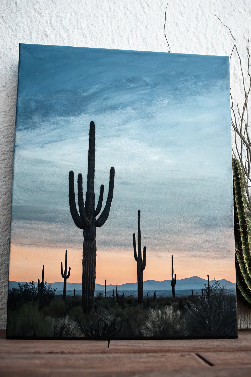
Capture the serene beauty of the Sonoran desert with this atmospheric acrylic painting, featuring striking saguaro silhouettes against a soft, gradient sky. The smooth transition from dusty blue to warm peach creates a peaceful dusk effect that brings calm to any room.
Step-by-Step Tutorial
Materials
- Canvas (stretched, approx. 16×20 inches)
- Acrylic paints: Titanium White, Ultramarine Blue, Phthalo Blue, Black, Burnt Umber, Cadmium Orange, Yellow Ochre
- Large flat brush (2 inch) for blending
- Medium flat brush (1/2 inch)
- Small round brush (size 2 or 4)
- Detail liner brush (size 0 or 00)
- Palette
- Cup of water and paper towels
- Pencil for sketching (optional)
Step 1: Painting the Gradient Sky
-
Mix the sky blue:
Begin by creating a dusty blue shade. Mix Titanium White with a small amount of Ultramarine Blue and a tiny touch of Burnt Umber or Black to desaturate it effectively. This shouldn’t be a bright electric blue, but rather a muted evening tone. -
Apply the top layer:
Using your large flat brush, paint the top third of the canvas with this dusty blue mixture. Use long, horizontal strokes from edge to edge to ensure smooth coverage. -
Mix the transition colors:
While the first layer is wet, mix a slightly lighter version of your blue by adding more white. Paint this in the middle section of the canvas, blending it upwards into the darker blue. -
Introduce the clouds:
Before the blue paint dries, use a smaller dry brush with just a whisper of white paint to scrub in some wispy cloud textures. Use a light, circular motion to create that feathery, wind-swept look visible in the upper section. -
Create the sunset horizon:
For the bottom third, mix Titanium White with a small dot of Cadmium Orange and a hint of Yellow Ochre. This pale peach color represents the fading sun. -
Blend the horizon:
Apply the peach mixture near the bottom, blending it upward into the lighter blue area. I find that working quickly while both paints are wet creates the smoothest, most natural gradient. -
Add the distant mountains:
Once the sky is tacky or dry, mix a cool grey-blue color. Paint a low, rolling mountain range silhouette right along the horizon line where the peach sky ends. Keep the edges soft to imply atmospheric distance.
Problem: Patchy Sky?
If acrylics dry too fast and leave streaks, mix a retarder medium into your paint. Alternatively, mist the canvas lightly with a spray bottle of water to keep paints workable longer.
Step 2: Creating the Cactus Silhouettes
-
Mix the silhouette color:
The cacti aren’t pitch black, but a very dark brownish-black. Mix Black with Burnt Umber to create a deep, rich dark tone. -
Position the main cactus:
Imagine the rule of thirds. Using a pencil or thin diluted paint, lightly mark the vertical line for your main saguaro slightly to the left of the center. -
Paint the main trunk:
Using a medium flat brush turned on its edge, paint the thick, straight trunk of the largest cactus. It should be widest at the base and taper very slightly as it goes up. -
Add the iconic arms:
Switch to a smaller round brush to paint the cactus arms. The signature saguaro shape usually has arms that curve outward and then straight up. Paint one lower arm on the left and a higher one on the right for balance. -
Texture the cactus:
While the dark paint is wet, use a detail brush to pull tiny vertical lines down the length of the cactus. This mimics the ribs or pleats of the cactus skin. -
Place background cacti:
Paint the smaller, distant cacti using the same dark mixture. Make them significantly shorter and thinner to create depth. Place one medium one on the right side and several tiny ones in the far distance. -
Paint the foreground brush:
At the very bottom of the canvas, paint a dark, uneven band of soil and vegetation. Use a scruffy, old brush to dab and stipple dark paint, creating the look of desert scrub bushes. -
Add highlights to the brush:
Mix a tiny bit of grey-green into your dark mixture. Lightly tap this onto the tops of the foreground bushes to simulate moonlight or fading light catching the leaves.
Pro Tip: Depth Perception
Make the distant mountains slightly lighter and bluer than the foreground cacti. This ‘atmospheric perspective’ trick instantly pushes them into the distance and adds realism.
Step 3: Final Details
-
Refine the edges:
Use your liner brush with the black-brown mixture to sharpen any fuzzy edges on the cactus arms. A crisp silhouette is key to the realism of this style. -
Add subtle prickly details:
If you want extra detail, use the liner brush to add microscopic dots or tiny lines along the edges of the main cactus arms to suggest spines, though keep them subtle.
Hang your desert landscape in a spot where it can catch the evening light and enjoy the view
Geometric Shapes Floating on Blue
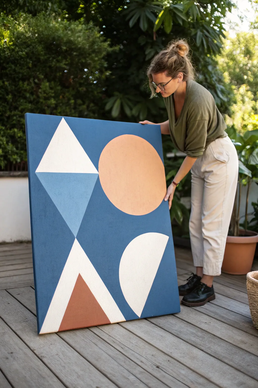
Bring bold structure and soothing tones to your space with this oversized geometric artwork. Featuring floating shapes in peach, white, and earthy red against a deep denim blue, this piece captures the essence of mid-century abstract design.
Step-by-Step Guide
Materials
- Large stretched canvas (at least 24×36 inches)
- Acrylic paint: Deep denim blue, titanium white, peach/light orange, sky blue, terracotta/rust red
- Painters tape (various widths, preferably delicate surface)
- Large flat brush or foam roller (for background)
- Medium angled synthetic brush
- Small round detail brush
- Pencil
- Ruler or straight edge
- Large round object for tracing (like a mixing bowl or plate) or a string compass
- Paper palette or disposable plate
- Cup of water and paper towels
Step 1: Preparing the Foundation
-
Prime the background:
Begin by covering the entire canvas with your deep denim blue acrylic paint. Use a large flat brush or a mini foam roller to ensure an even, smooth coat without distinct brushstrokes. -
Add a second coat:
Once the first layer is touch-dry, examine it for any streaks. Apply a second coat of blue to create a rich, opaque, velvety matte finish that will make the geometric shapes pop. -
Dry completely:
Let the background dry fully, preferably overnight or for several hours. This is crucial because applying tape to wet paint will ruin your foundation.
Crisp Circles Tip
For perfect circles without freehanding, trace a plate lightly with pencil, then use a very fine liner brush for the outline before filling the center.
Step 2: Mapping the Geometry
-
Plan the layout:
Lightly sketch your design with a pencil directly on the blue paint. Start with the large triangle in the upper left corner and the circle in the upper right quadrant. -
Draft the lower shapes:
Draw the large semi-circle emerging from the bottom right edge. Then, sketch the tall, narrow triangle near the bottom left corner, overlapping it with a smaller triangle at its base. -
Tape the straight edges:
Apply painter’s tape along the pencil lines for all the straight-edged shapes (the triangles). Press the edges of the tape down firmly with your fingernail to prevent paint bleed. -
Seal the tape:
I like to brush a very thin layer of the background blue paint over the tape edges first. This seals the tape so any seepage is just the background color, ensuring razor-sharp lines later.
Level Up: Texture
Mix a small amount of baking soda or modeling paste into the paint for the geometric shapes to give them a raised, tactile 3D effect against the flat blue.
Step 3: Painting the Shapes
-
Paint the white triangle:
Fill in the top-left triangle with titanium white using your medium angled brush. You may need 2-3 coats to get full coverage over the dark blue. -
Fill the peach circle:
Carefully hand-paint the peach circle in the upper right. Since this is a curve, use the medium angled brush to cut in the edge slowly, rotating the canvas if it helps you maintain a steady hand. -
Add the light blue accent:
Paint the inverted triangle shape directly beneath the white triangle using a soft sky blue. Ensure the line where it meets the white triangle is crisp. -
Create the bottom semi-circle:
Paint the large semi-circle at the bottom right with titanium white. Use multiple thin layers rather than one thick globby one for the smoothest texture. -
Paint the terracota triangle:
Fill in the smaller triangle at the bottom left with the rust/terracotta red color. This earthy tone grounds the composition beautifully.
Step 4: Finishing Touches
-
Remove the tape:
While the paint is still slightly tacky (not completely bone dry), gently peel away the painter’s tape at a 45-degree angle to reveal your crisp lines. -
Touch up edges:
Inspect the edges of your hand-painted circles. Use a small round detail brush with the background blue color to tidy up any wobbles or uneven curves. -
Clean up straight lines:
If any paint bled under the tape despite sealing it, carefully correct those spots with the detail brush and a bit of the denim blue paint. -
Seal (optional):
If you want to protect the painting, consider applying a clear matte varnish over the entire piece once it has cured for 24-48 hours.
Hang your new masterpiece in a well-lit spot to let those calm, modern colors transform the room
Line Art Over a Blue Wash
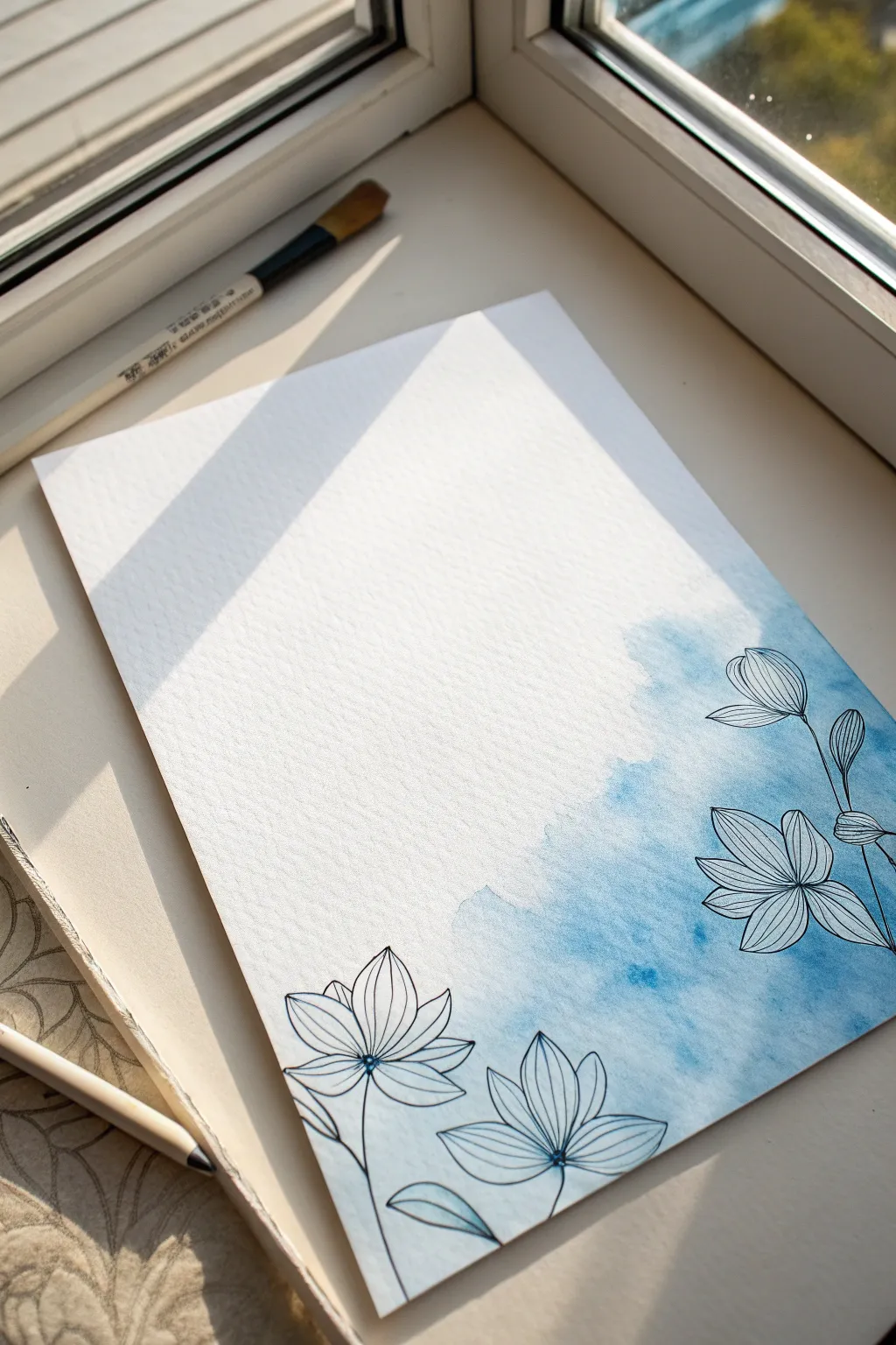
This elegant mixed-media piece combines the free-flowing nature of watercolor with the precision of fine line art. You’ll create a dreamy, misty blue corner that serves as a soft backdrop for crisp, botanical illustrations.
Step-by-Step Tutorial
Materials
- Cold press watercolor paper (A4 or 9×12 inch)
- Blue watercolor paint (ultramarine or prussian blue)
- Large round watercolor brush (size 10 or 12)
- Clean water jar
- Paper towels
- Fine liner pen (0.3mm or 0.5mm, waterproof black ink)
- Pencil (HB or H)
- Palette for mixing
Step 1: Creating the Blue Wash
-
Prepare the paper:
Tape your watercolor paper down to a flat surface or drawing board using artist’s tape. This prevents the paper from buckling when it gets wet and ensures clean edges if you paint to the side. -
Mix your blue:
On your palette, mix a generous amount of blue watercolor with water. You want a medium transparency—strong enough to show color but watery enough to flow easily. -
Wet the corner:
Using your large round brush and clean water, gently wet the bottom right corner of the paper. Extend the wet area diagonally upwards towards the middle, keeping the edges irregular. -
Drop in color:
Load your brush with the blue paint mixture. Touch the tip to the wettest part of the paper in the very bottom right corner. Let the pigment explode and bleed into the clear water. -
Guide the flow:
Tilt your board slightly if needed to encourage the paint to move. Use a clean, damp brush to soften the upper edges of the blue area so it fades out into the white paper rather than leaving a hard line. -
Add texture:
While the wash is still damp, dab a few spots with a crumpled paper towel to lift some pigment, creating cloud-like textures. Alternatively, drop a tiny bit of clean water back into the semi-dry paint for blooms. -
Let it dry completely:
This is crucial. The paper must be bone dry before you start drawing, or your ink will bleed and ruin the crisp lines. I usually give it at least 20-30 minutes.
Bloom Control
To get those beautiful cauliflower-like textures in the watercolor, wait until the wash loses its shine and starts to turn satin-matte, then drop in a tiny bit of clear water.
Step 2: Adding the Line Art
-
Sketch the layout:
Lightly sketch the flower placement with a pencil. aim for three main blooms: one large flower in the bottom center, one on the right edge, and a smaller bud or flower higher up on the right. -
Draw the center petals:
Start with the bottom-center flower. Using your waterproof fine liner, draw a small center point, then outline elongated, pointed petals radiating outward. -
Add petal details:
Inside each petal, draw delicate veins. Keep your hand loose; these lines should follow the curve of the petal from base to tip to give the flower volume. -
Draw the right-side flower:
Move to the bloom on the right edge. Draw this one angled slightly upwards. Give it similar pointed petals, ensuring some overlap with the blue wash area for contrast. -
Create the upper bud:
Sketch the highest flower as a bud or partially opened bloom. Keep the shape simpler, with fewer petals tightly clustered together. -
Connect with stems:
Draw thin, elegant stems connecting your flowers. Let the lines meander slightly rather than being perfectly straight, pulling them down towards the bottom edge of the paper. -
Add leaves:
Sketch a few simple leaves attached to the stems or floating near the base. Keep the leaf shapes simple—just an outline and a center vein is enough. -
Inking the stems:
Go over your pencil stems with the fine liner. You can double up the line in some shadow areas to add subtle weight to the drawing. -
Final touches:
Erase any visible pencil marks gently. Check the balance of the composition. If a flower center looks too empty, add a few tiny stippling dots for texture.
Metallic Magic
Once the black ink is dry, use a gold or silver gel pen to trace just the veins of the petals. This adds a subtle shimmer that looks stunning when the light hits it.
Frame your new artwork in a simple white frame to let the blue wash truly breathe
Tape-Resist Constellations in Blue
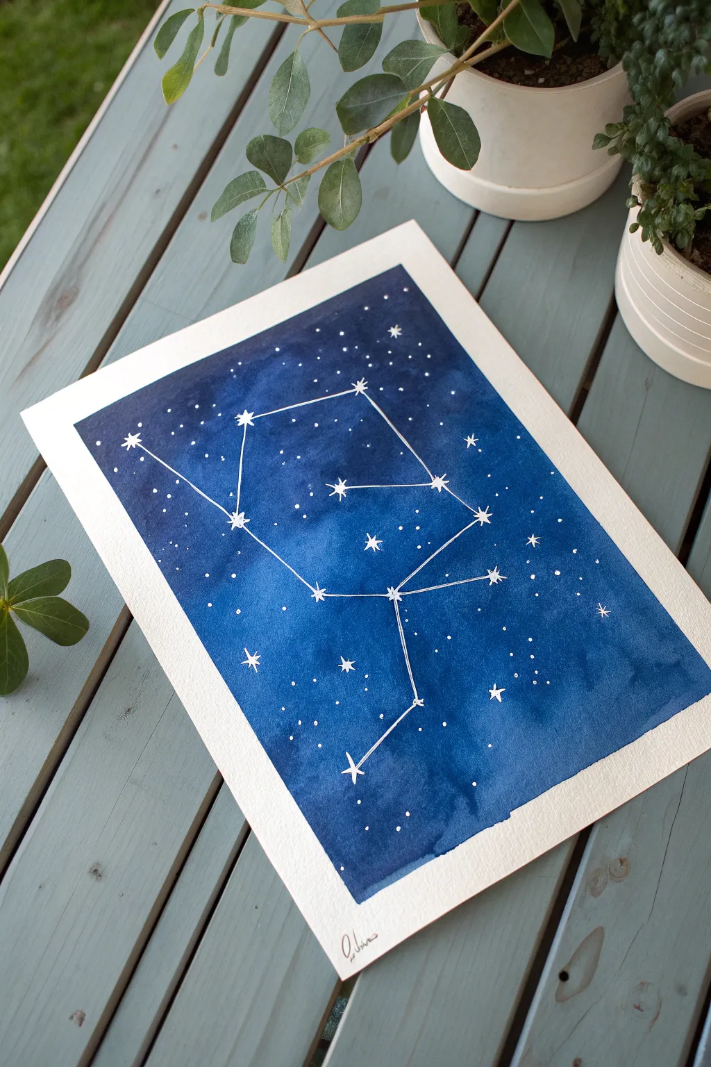
Capture the magic of the night sky with this striking watercolor project featuring the Virgo constellation. The deep indigo wash creates a dramatic backdrop for delicate white stars, making it a perfect piece of wall art for astronomy lovers.
Step-by-Step Guide
Materials
- Cold press watercolor paper (140lb/300gsm)
- Artist’s painter’s tape or masking tape
- Watercolor paints (Indigo, Prussian Blue, maybe a touch of Black)
- Large flat wash brush (1 inch or larger)
- Small round brush (size 0 or 1)
- White gel pen or white gouache
- Pencil and eraser
- Ruler
- Constellation reference image (Virgo shown here)
- Paper towels and water cup
Step 1: Preparation & Sketching
-
Secure the Borders:
Begin by taping your watercolor paper down to a hard board or table surface. Place the tape carefully along all four edges to create a clean, even white border about half an inch wide. Press the edges of the tape down firmly to prevent paint seepage. -
Map the Stars:
Using a very light pencil touch, mark the positions of the main stars in your chosen constellation. You don’t need to draw the connecting lines yet, just focus on the placement of the star points. -
Mask the Stars (Optional):
If you want pure white paper stars, use tiny dots of masking fluid on your pencil marks now. However, for the crispest look seen in the photo, we will actually paint over everything and add the stars on top later.
Bleeding Borders?
If paint bled under the tape, use white acrylic paint or gouache to touch up the edges. A flat brush works best to re-establish that sharp line.
Step 2: Creating the Night Sky
-
Mix Your Deep Blue:
Create a rich, dark puddle of paint on your palette. I like to mix Indigo with a bit of Prussian Blue for depth. You want a high pigment-to-water ratio so the color is intense. -
Apply the Wash:
Using your large flat brush, apply the blue paint across the entire paper inside the taped area. Work somewhat quickly to get an even coat, known as a ‘flat wash’. -
Add Atmosphere:
While the paint is still wet, drop in slightly darker blue or even a tiny bit of black in the corners or random patches to create varied depth in your galaxy. -
Texture Technique:
If you want a subtle texture, sprinkle a tiny pinch of salt onto the wet paint in a few spots. This pushes the pigment away and creates star-like blooms. -
Let It Dry completely:
This is crucial. Walk away and let the paint dry until the paper is flat and feels room temperature to the touch. If you rush this, the white ink in the next steps will bleed.
Step 3: Detailing the Galaxy
-
Draw Main Stars:
Using a white gel pen or a fine brush with white gouache, draw symbols for the major stars over your pencil marks. Create 5-point or 8-point stars for the brightest ones, and simple dots for the others. -
Connect the Constellation:
With a ruler and your white pen, draw thin, straight lines connecting the main stars to form the constellation shape. Keep the pressure light so the lines don’t overpower the stars. -
Adding Distant Stars:
Fill the empty blue space with tiny white dots to represent distant stars. Vary the spacing—cluster some together and leave other areas darker. -
Create Sparkles:
Choose a few random background stars to turn into tiny crosses or diamonds. This adds a twinkling effect to the background field. -
Final White Layers:
Go back over your main constellation stars with a second layer of white ink if the blue background is showing through too much. You want them to pop. -
Add Signature:
Sign your name at the bottom in a contrasting ink or pencil within the white border area. -
Reveal the Border:
Very slowly peel the tape away from the paper. Pull the tape ‘away’ from the painting at a 45-degree angle to ensure a crisp edge without tearing the paper.
Make It Shimmer
Mix a small amount of metallic silver or iridescent medium into your white gouache for the stars. They will catch the light beautifully when viewed from an angle.
Hang your celestial masterpiece near a window to let the natural light highlight those deep indigo tones
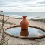

Have a question or want to share your own experience? I'd love to hear from you in the comments below!